プレビュー準備中デザインリファレンスを見る
DESIGN REFERENCE
あめいろ工務店|街のイラストと縦書きで伝える家づくり
手描きの街並みと縦書きコピーが印象的な工務店サイト。白とグレーの余白、木の質感を伝える住宅写真、チャコールの大型パネル、右端の固定ナビゲーションが特徴です。
Ameiro Home / あめいろ工務店 — Style Reference
A hand-drawn neighborhood unfolds across a quiet architectural canvas.
Original URL: ameiro-home.com
Final URL: ameiro-home.com
Theme: white and pale gray, with charcoal product panels and a dark works section.
Inspected: October 5, 2026, at 05:50:57 JST; supplied retrieval timestamp: 2026-10-04T20:50:57.318Z.
Viewports: desktop 1440 × 1000 and mobile 390 × 844 CSS pixels.
Scope: the current company homepage. Visual evidence covers the desktop opening, housing lineup, and footer, plus the mobile opening and footer. Rendered text and sampled computed styles additionally document events, company information, consultation links, works, editorial content, and contact routes. Linked pages and opened navigation states were not inspected.
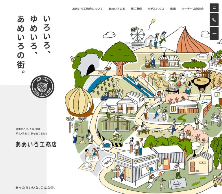
Ameiro Home presents housebuilding as the creation of a neighborhood. Its opening pairs three vertical columns of bold Japanese copy with a dense illustrated town: winding paths, timber houses, trees, builders, families, outdoor cooking, a Ferris wheel, and a mountain. A circular onion emblem connects the company identity to this friendly, slightly irregular drawing style.
The interface around that artwork is restrained. White space, pale gray fields, charcoal rectangles, small navigation labels, and thin rules organize a substantial company website. Interior photography introduces real materials and inhabited rooms. Large alternating photo-and-copy panels give the housing lineup weight, while a fixed utility rail keeps navigation and contact options accessible along the right edge.
The important relationship is between expressive illustration and disciplined information layout. Preserve the town, the vertical opening copy, the generous reading rhythm, the dark photographic panels, and the illustrated footer as connected parts of one identity.
閉じる
Ameiro Home / あめいろ工務店 — Style Reference
A hand-drawn neighborhood unfolds across a quiet architectural canvas.
Original URL: ameiro-home.com
Final URL: ameiro-home.com
Theme: white and pale gray, with charcoal product panels and a dark works section.
Inspected: October 5, 2026, at 05:50:57 JST; supplied retrieval timestamp: 2026-10-04T20:50:57.318Z.
Viewports: desktop 1440 × 1000 and mobile 390 × 844 CSS pixels.
Scope: the current company homepage. Visual evidence covers the desktop opening, housing lineup, and footer, plus the mobile opening and footer. Rendered text and sampled computed styles additionally document events, company information, consultation links, works, editorial content, and contact routes. Linked pages and opened navigation states were not inspected.
Ameiro Home presents housebuilding as the creation of a neighborhood. Its opening pairs three vertical columns of bold Japanese copy with a dense illustrated town: winding paths, timber houses, trees, builders, families, outdoor cooking, a Ferris wheel, and a mountain. A circular onion emblem connects the company identity to this friendly, slightly irregular drawing style.
The interface around that artwork is restrained. White space, pale gray fields, charcoal rectangles, small navigation labels, and thin rules organize a substantial company website. Interior photography introduces real materials and inhabited rooms. Large alternating photo-and-copy panels give the housing lineup weight, while a fixed utility rail keeps navigation and contact options accessible along the right edge.
The important relationship is between expressive illustration and disciplined information layout. Preserve the town, the vertical opening copy, the generous reading rhythm, the dark photographic panels, and the illustrated footer as connected parts of one identity.
How to Read This Reference
- Measured means a value appears in the supplied rendered DOM, computed styles, or element rectangles. Measurements describe the captured state and viewport.
- Calculated means a value is derived from those measurements, such as column gaps or panel proportions.
- Visual estimate means a dimension or treatment is read from a supplied current-page screenshot without a corresponding sampled element.
- Source-declared means a custom property exists in the supplied evidence. Its existence alone does not prove that it colors a particular visible element.
- Recommended means implementation guidance for a new build. Recommended breakpoints, hover responses, accessibility behavior, and CSS approximations are not claims about the original implementation.
- Token aliases in this document are descriptive unless explicitly identified as source variables.
The original root font size is 10px at both inspected widths. Several wrappers also inherit 10px / 10px; that is not the actual reading size of all their descendants. The Quick Start uses explicit component sizes and can coexist with a conventional application root.
Tokens — Colors
Default Palette
| Name | Value | Evidence / source token | Role |
|---|---|---|---|
| White canvas | #ffffff |
Source --color-white; visually observed |
Main opening field, white contact buttons, reversed icon artwork |
| Pale gray field | #efefef |
Source --color-gray13; visual correspondence |
Approximation for the left background strip and footer; those background selectors were not sampled |
| Charcoal ink | #333333 |
Computed; source --color-black3 |
Main text, utility buttons, housing panels, works section, footer ground |
| Works card gray | #494949 |
Computed; source --color-dark-gray5 |
Cards within the darker works section |
| Product copy gray | #cacaca |
Computed; source --color-gray9 |
Housing-panel descriptions, secondary marks, and detail labels |
| Warm reversed neutral | #dfdddb |
Computed works-header color | Works heading treatment and its light directory button |
| Event green | #91a966 |
Computed; source --color-green2 |
Rounded event category labels |
| Consultation gray | #d7d7d7 |
Computed panel background | Free-consultation and model-house promotional panels |
| New-item gold | #caa563 |
Computed text color | Small NEW marker under an event title |
Application note: the sampled body background is transparent. The visible white page is established by the rendered composition; do not interpret the body’s transparent declaration as a separate visual color.
Supporting Source Colors
| Color | Value | Confirmed scope |
|---|---|---|
| Soft gold | #ebd088 |
Computed background of the offscreen menu’s phone contact link; source --color-gold4 |
| Light olive green | #98b566 |
Computed background of the offscreen menu’s LINE contact link; source --color-green3 |
| Contact gray | #cecece |
Computed background of the offscreen menu’s email contact link; source --color-gray21 |
| Muted orange | #da9a7d |
Declared as --color-orange; a specific rendered use was not established |
| Warm yellow | #eacf87 |
Declared as --color-gold5; a specific rendered use was not established |
The opened menu was not captured. Its sampled contact colors should not be substituted for the white footer buttons or charcoal fixed rail.
The illustration contains brighter leaf greens, peach, ochre, cream, and blue. These are artwork colors, not a verified set of interface tokens. Keep that richer palette inside imagery rather than distributing it across every control.
Tokens — Typography
Japanese Interface and Reading Text
- Computed stack:
YakuHanJP_Noto, 'Noto Sans JP', sans-serif. - Common weight:
500for navigation, descriptions, and event titles. - Emphasis:
700for principal Japanese headings, works titles, and detail links. - Character: clean, substantial Japanese sans-serif with generous line spacing. The warmth comes from composition and artwork rather than an invented handwritten body font.
- Implementation alias:
--font-body.
The vertical opening statement specifically computes to 'Noto Sans JP', sans-serif, weight 700, without the leading family used by the general body stack.
Condensed Latin Metadata
- Computed family:
'Bebas Kai', sans-serif. - Source variable:
--font-Bebas-Kai. - Observed uses: numbered section markers, dates, and
NEW. - Computed weight:
500. - Tracking: typically
0.08emin sampled metadata.
These condensed details create a second typographic register without competing with Japanese prose. A font-family declaration establishes the intended stack; individual font-file loading was not independently verified.
Graphic Lettering and Logos
The circular company emblem, company wordmark, BinO marks, and several section headings must be treated separately from live body text. Sampled section H2 elements have font-size: 0px but nonzero visual boxes; the exact mechanism and asset files were not supplied.
Do not infer a display font from those graphics. Likewise, a housing-card H3 computing to 16px does not explain the much larger visible BinO artwork centered over its photograph.
Type Scale
All values below are measured unless marked otherwise. Tracking is expressed in em where the supplied pixel values produce a clear ratio.
| Role | Desktop size / line height | Mobile size / line height | Weight | Tracking |
|---|---|---|---|---|
| Vertical opening copy | 47 / 76px |
20.8 / 33.634px |
700 | 0.18em |
| Desktop horizontal navigation | 14 / 14px |
Not displayed | 500 | Normal |
| Offscreen menu links | 20 / 20px |
14 / 14px |
500 | Normal |
| Opening poem | 18 / 62.5px |
12 / 36.049px |
500 | 0.06em |
| Numbered section marker | 29 / 29px |
16.5 / 16.5px |
500 | 0.08em |
| Company-story heading | 32 / 55.568px |
18 / 33.786px |
700 | 0.12em / 0.10em |
| Company-story body | 16 / 38.5px |
12 / 34px |
500 | 0.06em / 0.04em |
| Housing-section introduction | 30 / 51px |
18 / 30.6px |
700 | 0.06em |
| Event title | 18 / 24px |
14 / 20px |
500 | Normal |
| Event category | 14 / 14px |
10 / 10px |
500 | Normal |
Event NEW |
11 / 11px |
11 / 11px |
500 | 0.08em |
| Housing description | 13 / 28.5px |
Absent from mobile rendered text | 500 | Normal |
| Housing details label | 16 / 16px |
14 / 14px |
700 | 0.06em |
| Consultation heading | 24 / 24px |
18 / 18px |
700 | 0.14em |
| Works title | 22 / 34px |
16 / 24.727px |
700 | Normal |
| Works date | 18 / 18px |
12.5 / 12.5px |
500 | 0.08em |
| Directory action label | 16 / 16px |
12 / 12px |
500 | Normal |
The housing-panel statement looks approximately 22–24px on desktop, but its own computed node is not included. Treat that size as a visual estimate.
Tokens — Spacing & Shapes
The site does not reveal one universal spacing increment. Its rhythm combines small fixed control gaps, percentage-based mobile gutters, wide reading margins, and large section intervals.
Source Layout Variables
| Source variable | Supplied value | Interpretation |
|---|---|---|
--design-size-pc |
1400 |
Desktop design reference; not proof of a universal 1400px container |
--design-size-sp |
375 |
Mobile design reference |
--inner-percent-pc |
94% |
Declared container value; individual components use other widths |
--inner-percent-medium |
100% - 2 × (35 / 375 × 100%) |
Approximately 81.333%; matches the mobile reading container |
--side-width-large-vw |
17.5 / 375 × 100vw |
18.2px at the inspected mobile width |
--header-height--px |
Desktop 100px; mobile 68px |
Header token; the captured mobile header itself has a zero-height layout box |
Spacing Scale
| Use | Desktop | Mobile | Evidence |
|---|---|---|---|
| Utility rail right / top inset | 20 / 20px |
15 / 15px |
Measured |
| Gap between utility contact controls | 6px |
6px |
Calculated; mobile menu-to-phone gap is 4px |
| Horizontal primary-navigation gap | 25px |
Navigation hidden | Calculated |
| Reading-container side margin | 170px |
36.406px |
Measured |
| Wide housing-panel side margin | 28px |
18.203px |
Measured |
| Event horizontal gap | 40px |
20px |
Calculated |
| Mobile event row gap | — | 37px |
Calculated from the tallest first-row card |
| Gap between housing panels | 13px |
9px |
Calculated |
| Housing copy horizontal inset | Approximately 87.5px |
Detail region begins 20px inside card |
Calculated / measured |
| Space above desktop housing details label | 52px |
0px padding on sampled label |
Computed |
| Works section top / bottom padding | 150 / 156px |
86 / 115px |
Computed |
| Works card outer padding | 22px 18px 60px |
11px 9px 36px |
Computed |
Border Radius and Silhouettes
| Element | Treatment | Evidence |
|---|---|---|
| Utility controls | 3px radius |
Computed |
| Directory action | 3px 3px 3px 0px |
Computed |
| Housing panels | 10px outer radius |
Computed and visible |
| Consultation panels | 10px radius |
Computed |
| Works cards | 10px radius |
Computed |
| Event category | 100px radius, producing a pill |
Computed |
| Company seal | Circular, with hand-drawn concentric outlines | Visual |
| Reservation badge | Irregular illustrated circle with projecting details | Visual |
| Footer contact button | Long white shape with a slanted right edge | Visual |
| Footer ground | Broad charcoal hill with an angular crest | Visual |
Layout Measurements
| Element | Desktop 1440 × 1000 |
Mobile 390 × 844 |
|---|---|---|
| Document height | 10297.44px |
10332.22px |
| Standard content width | 1100px |
317.188px |
| Opening-copy bounding box | 227.953 × 352.125px |
100.875 × 155.844px |
| Opening-copy position | x 92.844, y 86px |
x 21.828, y 32px |
| Menu button | 50 × 50px |
34 × 34px |
| Initial utility contact button | 50 × 74px |
34 × 50px |
| Event card width | 245px |
148.594px |
| Event category | 100 × 30px |
64 × 18px |
| Housing card width | 1384px |
353.594px |
| Order-house card height | 692px |
513.375px |
| BinO card height | 692px |
479.688px |
| Desktop housing photo / copy width | 914.422 / 469.578px |
Stacked block layout |
| Works card width | 377px |
240px |
| Gap between works cards | 8px |
4px |
The desktop housing split is approximately 66.07% photography / 33.93% copy, calculated from element widths. It is not a 50/50 composition.
Components
Opening Town Composition
Role: introduces the company through a picture of everyday life and collective housebuilding.
Place the Japanese statement in three vertical columns toward the upper left, reading right to left: いろいろ、, ゆめいろ、, and あめいろの街。. The source uses live text at 47px, weight 700, with unusually generous 0.18em tracking. Vertical layout is visually established; the exact writing-mode declaration was not supplied.
A circular onion seal sits below the statement and crosses the white/gray boundary. In the desktop capture, the seal is roughly 150px across. On mobile it is approximately 66px. These are visual estimates.
The illustrated town occupies the right and lower parts of the opening. It extends beyond the desktop viewport’s right and bottom edges. On mobile, it moves below the upper copy, remains slightly cropped on the right, and shows most of its island-like composition before the brand statement beneath it.
The pale gray strip starts about 492px down the desktop capture and occupies approximately 295px of its width. On mobile, it begins around 169px and is approximately 113px wide. Those are visual estimates, equivalent to roughly 20.5% and 29% of the respective viewport widths.
The opening H1 region sits at x 102.844, y 751.656px on desktop and x 31.188, y 591.453px on mobile. It combines the smaller supporting copy with the company wordmark. Its computed 16px describes the wrapper, not the visible wordmark’s graphic size.
Primary Navigation and Returning Brand Mark
Role: gives access to the broader company site while keeping the opening illustration prominent.
The desktop navigation is a single horizontal row near the top right. Seven current labels cover company information, housebuilding, lineup, events, works, model houses, and owner conversations. Links use 14px / 14px, weight 500, with 10px vertical padding and approximately 25px gaps.
The normal brand mark is translated above the initial viewport. Its measured box is 257 × 60px on desktop and 191 × 44px on mobile. Later captures show branding in the upper-left corner. A 400ms transform transition is declared, but the exact scroll threshold and all intermediate logo variants are unverified.
The horizontal navigation disappears at the inspected mobile width. The right-side menu button remains.
Fixed Utility Rail
Role: persistent menu, phone-information, LINE, and Instagram access.
Stack four charcoal controls along the right edge. The menu symbol has two short white horizontal bars. Other controls contain a white phone outline, compact LINE lettering, and a white Instagram outline. Their small 3px corners keep the rail crisp without looking completely mechanical.
At the desktop opening, the menu is 50 × 50px; the three contact controls are 50 × 74px. On mobile, these become 34 × 34px and 34 × 50px. Lower-page screenshots show the contact controls shortened to approximately square shapes. Those lower-state dimensions are visual estimates; their transition rules were not sampled.
The phone rail link points to /contact/#area-tel, rather than immediately initiating a call. A separate tel: link exists in the contact area. LINE and Instagram have external destinations in the link inventory. No external handoff was exercised.
Offscreen Menu Content
Role: extended site navigation and additional contact choices.
The DOM contains a separate offscreen navigation set with white links: home, company information, housebuilding, lineup, events, works, model houses, HOB, staff, owner conversations, blog, recruitment, company overview, and the parent company.
Its links compute to 20px on desktop and 14px on mobile. The three contact links use soft gold, light olive green, and gray backgrounds. Desktop contact rectangles measure about 296 × 66px; mobile rectangles measure about 250 × 50px.
An opened-menu screenshot is not supplied. Do not treat these offscreen coordinates as its open layout, infer a particular opening direction, or claim tested focus management.
Opening Poem
Role: slows the page from an illustrated first impression into the company’s philosophy.
The poem begins with あったらいいな、こんな街。. It is a narrow, left-aligned text block with deliberately spacious leading. Desktop text measures 18px / 62.5px in a box about 489px wide. Mobile text becomes 12px / 36.049px within the 317px reading container.
Its desktop top is approximately 1201px; its mobile top is approximately 759px. The mobile opening capture therefore reveals the beginning of this prose near its lower edge. Preserve the pause between the wordmark and the poem instead of treating the entire opening as a fixed one-screen banner.
Numbered Section Heading
Role: gives the long homepage an editorial sequence.
Sections use compact markers #1 through #5. Sampled markers use Bebas Kai, 29px desktop and 16.5px mobile, with 0.08em tracking. They are paired with separate graphic heading areas and, where applicable, a directory action or explanatory line.
The works graphic measures 236 × 44px on desktop and 144 × 27px on mobile. Preserve the relationship between the small number and the larger heading graphic; do not enlarge the section number into the primary title.
Event Card Grid
Role: exposes four timely opportunities to visit, learn, or consult.
The desktop grid has four 245px cards separated by 40px, fitting the 1100px content container exactly. Mobile uses two columns of 148.594px, with a 20px horizontal gap.
Each card is a single link containing media, a centered green category pill, a Japanese title, and an optional small gold NEW marker. The title uses 18px / 24px on desktop and 14px / 20px on mobile.
Badge coordinates are consistent with a square media area and a pill overlapping its lower edge by half its height: 15px desktop and 9px mobile. The image rectangle itself was not sampled, so this square-thumbnail construction is a calculated interpretation.
Cards have transparent outer backgrounds in the sampled styles. Their heights vary with title wrapping and the presence of NEW; there is no evidence that every card is forced to equal height.
The event-directory action sits beside the desktop heading. In the mobile rendered order, it moves below the four cards and measures approximately 316 × 54px.
Company Story
Role: explains the builder’s regional identity and history.
On desktop, the principal text group begins at approximately x 836px and is 501px wide. Its heading uses 32px / 55.568px, weight 700, with 0.12em tracking. Body text is 16px / 38.5px, leaving substantial space between lines.
On mobile, the text group becomes the standard 317px reading column. The heading drops to 18px; body text becomes 12px / 34px. Desktop manual line breaks are relaxed or reorganized in the mobile rendered text.
Three small button elements occur in the preceding media area. Their purpose, visual symbols, and behavior were not established; they are not sufficient evidence of autoplay or a specific slideshow interface.
The inspected text and footer identify あめいろ工務店 as the housing division of 株式会社さかぐち. This identity is supported by the original page.
Alternating Housing Panels
Role: presents the two principal housing offers as substantial visual destinations.
Each desktop panel measures 1384 × 692px, with a 10px outer radius. The whole panel is a link. The order-house panel places charcoal copy on the left and photography on the right. The BinO panel reverses that order.
The BinO photograph shows a timber-floored dining and kitchen space with exposed ceiling beams, a pendant lamp, wooden furniture, and sheer curtains. A large white BinO mark is centered over the photograph. The image appears darkened enough to support the white mark; the overlay technique and opacity are not supplied.
The copy panel contains a smaller product mark, a short Japanese statement, a description, and a detail label preceded by a thin horizontal stroke. Its text column is approximately 295px wide inside a 470px panel. Descriptions are 13px / 28.5px in #cacaca. Detail labels are 16px, bold, with 0.06em tracking and 52px top padding.
On mobile, the links change from flex to block layout and become 353.594px wide. Their heights differ: approximately 513px for order houses and 480px for BinO. Long descriptions and secondary product-label text are absent from the mobile rendered text, while the short statement and detail label remain. The mobile detail label is 14px bold.
Because the entire panel is already a link, its internal detail wording should remain a label rather than a nested anchor.
Consultation and Model-House Panels
Role: offers the next practical step after exploring the housing lineup.
The desktop panels measure 617 × 336px, use a #d7d7d7 background and 10px radius, and are vertically staggered by about 109px. Their hierarchy consists of a small introductory phrase, graphic English wording, and a bold Japanese heading.
The Japanese heading is 24px, weight 700, with 0.14em tracking. On mobile, each panel becomes 353.594 × 233px, the panels stack with about 65px between them, and the heading becomes 18px.
These geometry and background values are DOM-supported. No corresponding detailed screenshot was supplied to establish additional illustration, hover, or image treatments.
Works Strip
Role: supplies photographic evidence of completed homes.
This section changes the page to #333333, with #494949 cards and white titles. Desktop section padding is 150px above and 156px below; mobile padding is 86px and 115px.
Cards form a horizontal strip. Desktop cards are 377px wide with 8px gaps; mobile cards are 240px wide with 4px gaps. In the mobile DOM sample, the central card begins at x 75px, leaving partial neighboring cards visible at both sides.
A card includes a large media region, a product/category mark, a bold project title, and a condensed date. Desktop titles use 22px / 34px, while mobile titles use 16px / 24.727px. Dates use Bebas Kai at 18px and 12.5px respectively.
Six unique projects appear repeatedly across offscreen positions. This supports a carousel-style structure, but it does not establish autoplay speed, drag behavior, keyboard controls, or the animation library. The supplied captures do not establish the individual project-image crops.
Editorial Updates
Role: maintains a current stream of events, blog posts, and construction reports.
Section #5 contains categorized article links and dates, including event, blog, and construction-report labels. Entries repeat in the rendered text, suggesting another repeated content track, but its detailed styles and controls are outside the sampled element set.
Preserve the editorial distinction between event information, personal posts, and progress reports. Do not assign this section the exact works-card geometry without further evidence.
Reservation Badge and Contact Routes
Role: keeps a friendly invitation to visit visible deeper into the page.
Lower-page captures show an illustrated circular badge attached to the right edge around the middle of the viewport. It contains ご予約はこちら, a small Hello! speech bubble, balloons, and a figure. The central badge is approximately 120px wide on desktop and 80px on mobile; projecting artwork makes the full silhouette larger.
It is absent from the supplied opening captures. The visibility threshold and any entrance or continuous animation are unverified.
The link inventory includes an in-page contact target /#l-contact, a contact page, a LINE reservation destination, a document-request query, and a direct telephone link. The illustrated badge was not clicked, and its precise binding is not exposed in the sampled nodes. Do not model it as a completed reservation transaction.
Footer Directory and Contact Buttons
Role: consolidates company identity, navigation, and contact options at the end of the long page.
The desktop footer is a broad pale gray field. A company-information column sits left of three navigation groups. The identity block includes the circular seal, supporting copy, the housing-division name, the wordmark, and an address.
Navigation uses simple chevrons and indented subcategories. Beneath it, three white contact buttons sit in one row. Each has a short leading horizontal stroke and a slanted right edge. Their visible height is approximately 48px on desktop.
On mobile, the footer links become stacked rows with fine horizontal separators. The blog row displays a plus sign, suggesting an expandable group; its behavior was not tested. Three contact buttons stack below, each approximately 314 × 54px, with about 9px between them.
The MILK and BinO logos form a separate centered row of outbound brand links. They are not evidence of website-production credits. A small, widely tracked copyright line follows. Its 2021 year is footer content, not the inspection date.
Illustrated Footer Horizon
Role: returns the visitor to the same neighborhood world as the opening.
A mountain, Ferris wheel, clouds, a person walking a dog, trees, and a person with a ladder sit along a charcoal ground shape. The ground rises to an angular crest and fills the bottom edge. It should read as part of the illustration rather than a generic CSS wave.
The desktop horizon leaves substantial space above the scenery. On mobile, the figures and landscape scale down into a compact strip above the dark base. A slender upward arrow with TOP sits near the right edge; its observed link target is /#document-top.
Tokens — Motion & Interaction
The evidence supplies computed transition declarations and static states. It does not include a recording of every transition or exercised hover endpoints.
| Treatment | Measured declaration / evidence | Interpretation and limit |
|---|---|---|
| General links and buttons | 0.28s cubic-bezier(0.25, 0.46, 0.45, 0.94) |
Shared short transition; the changed hover properties were not captured |
| Returning header identity | Transform, 0.4s cubic-bezier(0.645, 0.045, 0.355, 1) |
Supports a translated identity state; exact trigger is unknown |
| Opening statement | Opacity and transform, 0.9s cubic-bezier(0.215, 0.61, 0.355, 1) |
Reveal-capable styling; initial offsets were not supplied |
| Company-story elements | Same 0.9s transition, with 0.08s, 0.16s, and 0.32s delays |
Staggered reveal declarations |
| Consultation panels | Same 0.9s transition with 0.08s and 0.16s delays |
Staggered panel treatment |
| Unidentified mobile decorative node | Opacity and transform, 0.64s cubic-bezier(0.175, 0.885, 0.32, 1.275) |
An overshooting easing exists; do not assign it to a specific visible character |
| Works content track | Repeated cards at horizontal offscreen positions | Carousel-style layout; timing and input behavior unverified |
| Fixed utility and reservation elements | Similar viewport positions in separated captures | Persistent viewport placement is visually supported; state thresholds are not |
Sampled elements commonly report animation: none. That does not prove that all descendants, pseudo-elements, image formats, or JavaScript-driven artwork are static.
For reuse, preserve the distinction between quick control feedback and slower content reveals. Any chosen reveal distance, photo zoom, menu entrance, or carousel autoplay is a new implementation decision and must be labeled accordingly.
Surfaces
| Layer | Appearance | Purpose |
|---|---|---|
| Opening canvas | White with an offset pale gray strip | Separates vertical identity from the town without enclosing either in a card |
| Reading areas | Open light backgrounds | Gives poetry and company information a calm pace |
| Event cards | Transparent outer surface with a small green category pill | Keeps current information light and scannable |
| Housing panels | Charcoal copy beside large photography | Makes the housing offers substantial and immersive |
| Consultation panels | Medium-light gray with modest rounding | Separates practical next steps |
| Works section | Charcoal field and slightly lighter charcoal cards | Creates a distinct portfolio chapter |
| Footer | Pale gray, white contact shapes, charcoal ground | Combines a practical directory with an illustrated ending |
| Persistent controls | Small charcoal rectangles and a white illustrated badge | Keeps utilities recognizable over changing page content |
No conventional drop-shadow elevation is visible in the supplied screenshots. Separation comes from solid color changes, image boundaries, thin lines, and drawn outlines. The reservation badge’s irregular contour belongs to the illustration rather than a general card-shadow system.
Imagery
Illustrated Neighborhood
The opening illustration is a continuous scene rather than a collection of isolated feature icons. Paths connect construction, gardening, cooking, walking, play, and completed houses. Thin, slightly uneven dark outlines enclose mostly flat color. Small human figures and domestic details make the scene approachable.
Important motifs include the onion-shaped balloon, onion emblem, rounded tree canopies, pale paths, timber construction, peach-colored foliage, and the mountain/Ferris-wheel skyline. Preserve their relationship and scale hierarchy. A collection of unrelated stock icons would not reproduce the composition.
Housing Photography
The supplied housing capture emphasizes timber grain, natural light, practical furniture, exposed beams, and lived-in rooms. The large image area has architectural depth and a believable viewpoint. It is framed by charcoal copy, with a white product mark over the image.
Use authorized architectural photography with compatible warmth and composition. Avoid excessive orange grading; the visible wood itself carries the warmth. The exact darkening overlay and source crop are unknown.
Marks and Utility Artwork
The circular company seal is a distinct brand asset with concentric outlines, onion linework, and surrounding lettering. BinO uses its own cup symbol and letterforms. Preserve these marks as supplied assets rather than approximating them with a generic font.
The utility rail uses simple white outline symbols. These should remain visually quieter than the illustrated scene and reservation badge.
Observed Asset References
No original image URLs, filenames, intrinsic image sizes, or font-file URLs were included in the evidence. The following inventory describes verified visual roles, not downloadable files.
| Asset role | Evidence | Implementation guidance |
|---|---|---|
| Main illustrated town | Desktop and mobile opening captures | Preserve one coherent composition; tune positioning to the actual authorized asset |
| Company seal and wordmark | Opening, header, and footer captures | Keep separate scalable marks and appropriate accessible names |
| BinO interior photograph | Desktop housing capture | Use a large crop with sufficient contrast for the overlaid white mark |
| BinO marks | Housing and footer captures | Use brand artwork rather than recreated lettering |
| Reservation badge | Lower desktop and mobile captures | Preserve projecting balloons and figure; do not clip it to a perfect circle |
| Footer scenery | Desktop and mobile footer captures | Retain the horizon, characters, and ground as one coordinated composition |
| Event and project media | Content structure and card measurements | Obtain actual media before deciding final crops and aspect ratios |
A single flattened page screenshot is not a substitute for these assets: live text, navigation, responsive crops, and accessible content must remain independent.
Layout & Responsive Behavior
Desktop Composition
The opening is asymmetrical. A relatively narrow identity zone occupies the left, while the town expands beyond the right boundary. The upper navigation sits over the open white field, and the fixed utility rail forms a separate vertical edge.
The standard reading and event container is 1100px wide, centered at x 170px. Housing panels deliberately exceed that width, reaching to 28px from each viewport edge. The works section spans the full width and exposes a horizontal card strip. This alternation between narrow reading areas and broad visual sections is central to the page’s rhythm.
Mobile Composition
At 390px, the page is recomposed rather than uniformly scaled:
- The horizontal navigation disappears, while the right utility rail remains.
- The opening statement stays vertical and shrinks from
47pxto20.8px. - The illustrated town moves beneath the top copy; the wordmark appears below the main scene.
- The standard reading gutter becomes about
36.4px; wide-panel gutters are about18.2px. - Events change from four columns to two. Their directory link moves below the grid.
- The company-story text becomes a single reading column with reorganized line breaks.
- Housing panels stack internally, and long descriptions are absent from the rendered mobile text.
- Consultation panels become a vertical pair.
- Works retain a horizontal strip with a centered
240pxcard and neighboring previews. - Footer navigation becomes divided rows; contact buttons become a vertical stack.
The measured mobile content formula is consistent with:
/* Source-supported mobile proportions */
--reading-gutter: calc(100vw * 35 / 375);
--wide-gutter: calc(100vw * 17.5 / 375);
At 390px, these produce 36.4px and 18.2px respectively. They should not be applied indiscriminately to the hero, utility rail, or every footer element.
Responsive Limits
Only the two stated viewports were supplied. Tablet layouts, landscape phones, exact breakpoint thresholds, browser zoom, and wider monitors were not tested. The desktop and mobile document heights happen to be similar; this does not imply a fixed total page height.
The mobile header’s declared height token is 68px, but its captured layout box is 0px. Do not insert an automatic 68px blank strip above the mobile opening solely because that custom property exists.
Do’s and Don’ts
Do
- Make the illustrated neighborhood the opening’s principal visual asset.
- Preserve the three-column vertical Japanese statement and circular onion seal.
- Keep the interface predominantly white, pale gray, and charcoal.
- Confine most brighter colors to the artwork and small semantic accents.
- Use the evidenced Japanese sans-serif stack and condensed metadata family.
- Preserve generous line spacing in the poem and company story.
- Alternate narrow reading containers with broad photographic panels.
- Keep the desktop housing split close to two-thirds image and one-third copy.
- Retain the compact right utility rail and the separate illustrated reservation invitation.
- Use the same illustrated world at the beginning and end of the page.
- Treat mobile as a deliberate rearrangement with different content density.
Don’t
- Don’t reduce the homepage to a single conversion banner; its company, product, portfolio, and editorial routes are part of the experience.
- Don’t replace the town with unrelated stock illustrations or a generic house icon.
- Don’t place every section inside identical white cards with shadows.
- Don’t spread olive, gold, and orange across all navigation controls.
- Don’t replace graphic brand lettering with an unverified display font.
- Don’t turn the desktop housing panels into equal-width columns.
- Don’t copy inherited
10pxwrapper text as the general reading size. - Don’t assume repeated DOM cards prove autoplay or a particular slider library.
- Don’t invent movement for the town’s figures, balloons, or trees from static screenshots.
- Don’t apply the desktop navigation, gutters, or long product descriptions unchanged to mobile.
- Don’t let the floating badge cover primary text or controls in a new implementation.
Recommended Implementation Additions
These are recommendations for a new implementation, not verified original-site behavior:
- Give the menu button an accessible name,
aria-expanded, and an explicit relationship to its navigation panel. Keep closed navigation out of keyboard focus, and restore focus after closing. - Increase mobile utility targets toward at least
44 × 44px, adjusting spacing and reserved edge clearance. The observed34pxcontrols are a fidelity measurement, not an accessibility recommendation. - Provide real heading text for graphic section titles. Preserve the visual artwork while avoiding empty semantic headings.
- Keep the vertical opening statement as real Japanese text with a sensible reading order. Decorative town details can use empty alternative text when nearby prose conveys the message.
- Add visible focus indicators around complete linked housing panels, event cards, and contact actions.
- Ensure the reservation badge and returning header do not obscure anchor destinations or focused elements.
- Offer reduced-motion behavior. Essential content should remain visible if reveal initialization fails.
- If a carousel is used, provide manual navigation, keyboard access, and a pause option for any automatic movement. Exclude decorative clones from focus and duplicate announcements.
- Consider increasing the observed
12pxmobile prose for a new audience while retaining its spacious leading and narrow measure. - Use responsive image sources and reserve dimensions before decoding. Load below-the-fold photographs progressively while prioritizing the opening artwork.
- Verify the mobile footer’s expandable groups and contact handoffs before presenting them as completed interactions.
Agent Prompt Guide
Quick Color Reference
- Main canvas:
#ffffff. - Pale field and footer approximation:
#efefef. - Text, fixed utilities, housing panels, and works background:
#333333. - Works cards:
#494949. - Product copy:
#cacaca. - Works heading/action neutral:
#dfdddb. - Event categories:
#91a966. - Consultation panels:
#d7d7d7. - Small new-item marker:
#caa563.
Overall Prompt
“Create a Japanese regional homebuilder company homepage inspired by Ameiro Home. Build a white and pale gray opening with three columns of bold vertical Japanese copy on the left, a circular onion-style brand seal, and a large hand-drawn neighborhood extending across the right and lower areas. Use clean Japanese sans-serif text, condensed numbered section markers, generous prose leading, and a compact charcoal utility rail fixed to the right. Follow with events, a company story, alternating charcoal-and-photography housing panels, consultation links, a dark works strip, editorial updates, and a large illustrated footer. Preserve the contrast between lively domestic illustration and restrained information design. Recompose the layout on mobile with two-column events, stacked housing panels, shorter product text, and stacked footer actions.”
Example Component Prompts
- Opening: “An asymmetrical homebuilder opening with
いろいろ、ゆめいろ、あめいろの街。in three vertical columns, bold Noto Sans JP, charcoal text, a circular illustrated seal, and a richly detailed town on white. Add a pale gray strip behind the lower-left identity. Let the illustration extend beyond the right edge.” - Utility rail: “Four compact charcoal controls at the upper-right edge: a two-bar menu, phone outline, LINE label, and Instagram outline. Use 3px corners, white symbols, and small consistent gaps. Keep this rail separate from the horizontal desktop navigation.”
- Event grid: “Four open event cards across a centered 1100px desktop container. Use square media areas, centered olive-green category pills overlapping the lower image edge, medium-weight Japanese titles, and a tiny condensed gold NEW marker where needed. Switch to two columns on mobile.”
- Housing panel: “A broad 10px-rounded linked panel split approximately 66% architectural photograph and 34% charcoal copy. Place a white product mark over a timber-rich dining-room photograph. In the copy panel, stack a smaller mark, a short bold Japanese statement, muted gray description, and a detail label with a short leading rule. Reverse the arrangement for the neighboring offer.”
- Works strip: “A full-width charcoal portfolio section with slightly lighter charcoal project cards, white Japanese titles, and condensed dates. Use 377px desktop cards with 8px gaps, then 240px mobile cards with 4px gaps and visible neighboring previews. Do not add autoplay unless explicitly requested.”
- Footer: “A pale gray company directory with a brand-and-address column, three desktop navigation groups, white contact buttons with slanted right ends, and centered related-brand marks. Finish with a hand-drawn mountain, Ferris wheel, walker and dog, trees, and ladder figure along a charcoal hill. Stack contact actions and divide navigation rows on mobile.”
Quick Start
CSS Custom Properties
This is an implementation scaffold, not the original stylesheet. It preserves measured colors, typography, card proportions, and the inspected mobile gutters. The 60rem breakpoint, hero-image positioning, photo overlay opacity, manual works scrolling, and hover underline are recommended approximations.
Use .ameiro-site as the page wrapper. Housing links contain .housing-media and .housing-copy; the reverse modifier changes their desktop order. Event links contain a media element, category, and title. Supply authorized illustration, photography, and logo assets separately; no asset filenames are asserted here. Font declarations require appropriately loaded font resources.
:root {
  /* Evidence-based interface colors */
  --color-paper: #ffffff;
  --color-field: #efefef;
  --color-ink: #333333;
  --color-card: #494949;
  --color-copy-inverse: #cacaca;
  --color-warm-inverse: #dfdddb;
  --color-event: #91a966;
  --color-consultation: #d7d7d7;
  --color-new: #caa563;

  /* Computed font stacks */
  --font-body: YakuHanJP_Noto, 'Noto Sans JP', sans-serif;
  --font-hero: 'Noto Sans JP', sans-serif;
  --font-meta: 'Bebas Kai', sans-serif;
  --weight-body: 500;
  --weight-bold: 700;

  /* Measured desktop values */
  --text-hero: 47px;
  --text-section-number: 29px;
  --text-event: 18px;
  --text-work: 22px;
  --content-max: 1100px;
  --reading-gutter: calc(100vw * 35 / 375);
  --wide-gutter: 28px;
  --header-clearance: 100px;
  --utility-size: 50px;
  --utility-contact-height: 74px;
  --utility-inset: 20px;
  --event-gap: 40px;
  --work-width: 377px;
  --work-gap: 8px;
  --radius-control: 3px;
  --radius-panel: 10px;

  /* Measured transition timings */
  --ease-control: cubic-bezier(0.25, 0.46, 0.45, 0.94);
  --ease-reveal: cubic-bezier(0.215, 0.61, 0.355, 1);
  --motion-control: 280ms;
  --motion-reveal: 900ms;
}

.ameiro-site,
.ameiro-site * {
  box-sizing: border-box;
}

.ameiro-site {
  color: var(--color-ink);
  background: var(--color-paper);
  font-family: var(--font-body);
  font-size: 16px;
  font-weight: var(--weight-body);
  line-height: 1.8;
}

.ameiro-site img { display: block; max-width: 100%; }
.ameiro-site a { color: inherit; }
.ameiro-site button { font: inherit; }
.ameiro-site [id] {
  scroll-margin-top: calc(var(--header-clearance) + 16px);
}

.reading-container {
  width: min(
    var(--content-max),
    calc(100% - 2 * var(--reading-gutter))
  );
  margin-inline: auto;
}

.wide-container {
  width: calc(100% - 2 * var(--wide-gutter));
  margin-inline: auto;
}

.primary-nav {
  display: flex;
  justify-content: flex-end;
  align-items: center;
  gap: 25px;
  height: 100px;
  padding-right: 106px;
}

.primary-nav a {
  padding-block: 10px;
  font-size: 14px;
  line-height: 1;
  text-decoration: none;
}

.utility-rail {
  position: fixed;
  z-index: 40;
  top: max(var(--utility-inset), env(safe-area-inset-top));
  right: max(var(--utility-inset), env(safe-area-inset-right));
  display: flex;
  flex-direction: column;
  gap: 6px;
}

.utility-rail > * {
  display: grid;
  place-items: center;
  width: var(--utility-size);
  height: var(--utility-contact-height);
  padding: 0;
  border: 0;
  border-radius: var(--radius-control);
  color: var(--color-paper);
  background: var(--color-ink);
  text-decoration: none;
}

.utility-rail > button { height: var(--utility-size); }
.utility-rail svg { width: 24px; height: 24px; }

/* State supplied by application logic; threshold is not source-verified. */
.is-scrolled .utility-rail > a { height: var(--utility-size); }

/* Hero placement is a visual approximation for a supplied town asset. */
.hero {
  position: relative;
  isolation: isolate;
  min-height: 1120px;
  overflow: hidden;
}

.hero::before {
  content: '';
  position: absolute;
  z-index: -1;
  top: 492px;
  bottom: 0;
  left: 0;
  width: 20.5%;
  background: var(--color-field);
}

.hero-title {
  position: absolute;
  top: 86px;
  left: 6.448%;
  margin: 0;
  writing-mode: vertical-rl;
  text-orientation: upright;
  font-family: var(--font-hero);
  font-size: var(--text-hero);
  font-weight: var(--weight-bold);
  line-height: 1.61702;
  letter-spacing: 0.18em;
}

.hero-title > span { display: block; white-space: nowrap; }
.hero .hero-art {
  position: absolute;
  top: 100px;
  left: 29.2%;
  width: 85%;
  max-width: none;
  height: auto;
}

.hero-seal {
  position: absolute;
  top: 436px;
  left: 13.6%;
  width: 152px;
}

.hero-lockup {
  position: absolute;
  top: 751.7px;
  left: 7.142%;
  max-width: calc(100% - 7.142%);
}

.opening-poem {
  font-size: 18px;
  line-height: 62.5px;
  letter-spacing: 0.06em;
}

.section-number {
  margin: 0 0 10px;
  font-family: var(--font-meta);
  font-size: var(--text-section-number);
  line-height: 1;
  letter-spacing: 0.08em;
}

.event-grid {
  display: grid;
  grid-template-columns: repeat(4, minmax(0, 1fr));
  gap: 37px var(--event-gap);
}

.event-card { display: block; text-decoration: none; }
.event-media { width: 100%; aspect-ratio: 1; object-fit: cover; }
.event-category {
  position: relative;
  display: flex;
  align-items: center;
  justify-content: center;
  width: 100px;
  height: 30px;
  margin: -15px auto 12px;
  border-radius: 100px;
  background: var(--color-event);
  font-size: 14px;
  line-height: 1;
}

.event-title {
  margin: 0;
  font-size: var(--text-event);
  font-weight: 500;
  line-height: 24px;
}

.event-new {
  margin-top: 9px;
  color: var(--color-new);
  font: 500 11px/1 var(--font-meta);
  letter-spacing: 0.08em;
  text-align: center;
}

.housing-list { display: grid; gap: 13px; }
.housing-card {
  display: grid;
  grid-template-columns: 66.07% 33.93%;
  aspect-ratio: 2 / 1;
  overflow: hidden;
  border-radius: var(--radius-panel);
  color: var(--color-copy-inverse);
  background: var(--color-ink);
  text-decoration: none;
}

.housing-card--reverse { grid-template-columns: 33.93% 66.07%; }
.housing-card--reverse .housing-media { order: 2; }
.housing-card--reverse .housing-copy { order: 1; }
.housing-media { position: relative; min-width: 0; min-height: 0; }
.housing-photo { width: 100%; height: 100%; object-fit: cover; }

/* Recommended approximation; original overlay opacity is unknown. */
.housing-media::after {
  content: '';
  position: absolute;
  inset: 0;
  background: rgb(0 0 0 / 20%);
  pointer-events: none;
}

.housing-media .product-mark {
  position: absolute;
  z-index: 1;
  top: 50%;
  left: 50%;
  width: 32%;
  height: auto;
  transform: translate(-50%, -50%);
}

.housing-copy {
  display: flex;
  flex-direction: column;
  justify-content: center;
  padding: 40px clamp(24px, 6.078vw, 88px);
}

.housing-statement {
  margin: 38px 0 28px;
  font-size: 23px;
  font-weight: 700;
  line-height: 1.7;
  letter-spacing: 0.1em;
}

.housing-summary { margin: 0; font-size: 13px; line-height: 28.5px; }
.housing-detail {
  display: flex;
  align-items: center;
  gap: 14px;
  margin-top: 52px;
  font-size: 16px;
  font-weight: 700;
  line-height: 1;
  letter-spacing: 0.06em;
}

.housing-detail::before {
  content: '';
  width: 20px;
  height: 1px;
  background: currentColor;
}

.works-section {
  padding-block: 150px 156px;
  color: var(--color-warm-inverse);
  background: var(--color-ink);
}

/* Recommended manual strip; this does not reproduce unverified autoplay. */
.works-track {
  display: flex;
  align-items: flex-start;
  gap: var(--work-gap);
  overflow-x: auto;
  padding: 4px 28px 20px;
  scroll-snap-type: x proximity;
}

.work-card {
  flex: 0 0 var(--work-width);
  padding: 22px 18px 60px;
  border-radius: var(--radius-panel);
  color: white;
  background: var(--color-card);
  text-decoration: none;
  scroll-snap-align: center;
}

.work-title { font-size: var(--text-work); line-height: 34px; font-weight: 700; }
.work-date { font: 500 18px/1 var(--font-meta); letter-spacing: 0.08em; }

.site-footer { padding-top: 80px; background: var(--color-field); }
.footer-directory { display: grid; grid-template-columns: 300px 1fr; gap: 44px; }
.footer-links { display: grid; grid-template-columns: repeat(3, 1fr); gap: 28px; }
.footer-contacts { display: grid; grid-template-columns: repeat(3, 1fr); gap: 12px; }

/* Shape approximation; the focus outline remains outside the clipped fill. */
.slant-action {
  position: relative;
  isolation: isolate;
  display: flex;
  align-items: center;
  gap: 14px;
  min-height: 48px;
  padding: 12px 28px 12px 24px;
  color: var(--color-ink);
  text-decoration: none;
}

.slant-action::before {
  content: '';
  position: absolute;
  z-index: -1;
  inset: 0;
  border-radius: 3px 3px 3px 0;
  background: white;
  clip-path: polygon(0 0, calc(100% - 18px) 0, 100% 100%, 0 100%);
}

.slant-action::after {
  content: '';
  order: -1;
  flex: 0 0 20px;
  height: 1px;
  background: currentColor;
  opacity: 0.45;
}

.footer-brands { display: flex; justify-content: center; align-items: center; gap: 36px; }
.footer-scenery { width: 100%; height: auto; }
.reservation-badge { position: fixed; z-index: 30; top: 50vh; right: 0; width: 120px; }
.reservation-badge[hidden] { display: none; }

.ameiro-site :focus-visible {
  outline: 2px solid currentColor;
  outline-offset: 4px;
}

/* Recommended hover endpoint; only the original timing was measured. */
@media (hover: hover) {
  .housing-card:hover .housing-detail,
  .event-card:hover .event-title { text-decoration: underline; }
}

@media (max-width: 60rem) {
  :root {
    --text-hero: 20.8px;
    --text-section-number: 16.5px;
    --text-event: 14px;
    --text-work: 16px;
    --wide-gutter: calc(100vw * 17.5 / 375);
    --header-clearance: 68px;
    --utility-size: 34px;
    --utility-contact-height: 50px;
    --utility-inset: 15px;
    --event-gap: 20px;
    --work-width: 240px;
    --work-gap: 4px;
  }

  .primary-nav { display: none; }
  .utility-rail > button { margin-bottom: -2px; }
  .utility-rail svg { width: 18px; height: 18px; }
  .hero { min-height: 700px; }
  .hero::before { top: 169px; width: 29%; }
  .hero-title { top: 32px; left: 5.6%; }
  .hero .hero-art { top: 190px; left: 9.7%; width: 105%; }
  .hero-seal { top: 162px; left: 19%; width: 66px; }
  .hero-lockup { top: 591.45px; left: 8%; }
  .opening-poem { font-size: 12px; line-height: 36.049px; }
  .event-grid { grid-template-columns: repeat(2, minmax(0, 1fr)); }
  .event-category { width: 64px; height: 18px; margin-top: -9px; margin-bottom: 10px; font-size: 10px; }
  .event-title { line-height: 20px; }
  .housing-list { gap: 9px; }
  .housing-card { display: block; aspect-ratio: auto; }
  .housing-media { aspect-ratio: 1.28; }
  .housing-copy { padding: 34px 20px 73px; }
  .housing-copy .product-mark-small,
  .housing-summary { display: none; }
  .housing-statement { margin: 0 0 20px; font-size: 18px; line-height: 1.875; }
  .housing-detail { margin-top: 0; font-size: 14px; }
  .works-section { padding-block: 86px 115px; }
  .works-track { padding-inline: calc((100% - var(--work-width)) / 2); }
  .work-card { padding: 11px 9px 36px; }
  .work-title { line-height: 24.727px; }
  .work-date { font-size: 12.5px; }
  .footer-directory,
  .footer-links,
  .footer-contacts { grid-template-columns: 1fr; }
  .footer-contacts { gap: 9px; }
  .slant-action { min-height: 54px; font-size: 12px; }
  .reservation-badge { width: 80px; }
}

@media (prefers-reduced-motion: reduce) {
  .ameiro-site *,
  .ameiro-site *::before,
  .ameiro-site *::after {
    animation: none !important;
    transition: none !important;
    scroll-behavior: auto !important;
  }
  .ameiro-site .reveal {
    opacity: 1 !important;
    transform: none !important;
  }
}
The hero coordinates are calibrated approximately to the two supplied captures. Adjust them to the actual artwork’s intrinsic bounds, then test intermediate widths. Menu logic, returning-brand thresholds, reservation visibility, and optional reveal initialization require separate implementation; essential content should render without those scripts.
Tailwind v4 Token Mapping
Optional aliases for a project already using Tailwind v4. These do not imply that the original website uses Tailwind. Define the custom properties above first.
@theme inline {
  --color-ameiro-paper: var(--color-paper);
  --color-ameiro-field: var(--color-field);
  --color-ameiro-ink: var(--color-ink);
  --color-ameiro-card: var(--color-card);
  --color-ameiro-copy-inverse: var(--color-copy-inverse);
  --color-ameiro-event: var(--color-event);
  --color-ameiro-new: var(--color-new);

  --font-ameiro-body: var(--font-body);
  --font-ameiro-meta: var(--font-meta);
  --text-ameiro-hero: var(--text-hero);
  --text-ameiro-event: var(--text-event);
  --text-ameiro-work: var(--text-work);

  --spacing-ameiro-reading: var(--reading-gutter);
  --spacing-ameiro-wide: var(--wide-gutter);
  --radius-ameiro-control: var(--radius-control);
  --radius-ameiro-panel: var(--radius-panel);
}
Sources & Evidence
- Inspected original and final website: https://ameiro-home.com/. The supplied browser record reports HTTP
200and the same original and final URL. - Capture time:
2026-10-04T20:50:57.318Z, equivalent to October 5, 2026, 05:50:57 JST. - Desktop evidence: three supplied
1440 × 1000captures showing the opening, housing lineup, and footer; rendered text, link destinations, custom properties, and sampled computed styles. - Mobile evidence: two supplied
390 × 844captures showing the opening and footer; corresponding rendered text, links, custom properties, and sampled computed styles. - Geometry: sampled body heights of approximately
10297.44pxdesktop and10332.22pxmobile. Element rectangles support the type, spacing, grid, panel, and horizontal-track measurements recorded above. - Capture procedure: the supplied process allowed at least five seconds of initial observation, awaited document loading, visible image decoding, finite motion, and sampled layout/text stability within bounded waits, and traversed intermediate scroll positions. Continuous animations were paused during readiness checks and then resumed.
- Interaction limits: no menu opening, footer expansion, hover endpoint, carousel manipulation, form submission, external contact handoff, or back-to-top click was documented. Link destinations and CSS transition declarations establish available routes and styling, not successful completion of those interactions.
- Asset limits: original image paths, font-file URLs, complete stylesheets, and runtime scripts were not supplied. No additional browsing, command execution, or file inspection was performed for this reference.
This document describes the supplied current homepage evidence. Values inferred from screenshots, calculated from rectangles, and proposed for implementation are distinguished from measured styles throughout.
# Ameiro Home / あめいろ工務店 — Style Reference

> A hand-drawn neighborhood unfolds across a quiet architectural canvas.

**Original URL:** [ameiro-home.com](https://ameiro-home.com/)
**Final URL:** [ameiro-home.com](https://ameiro-home.com/)
**Theme:** white and pale gray, with charcoal product panels and a dark works section.
**Inspected:** October 5, 2026, at 05:50:57 JST; supplied retrieval timestamp: `2026-10-04T20:50:57.318Z`.
**Viewports:** desktop `1440 × 1000` and mobile `390 × 844` CSS pixels.
**Scope:** the current company homepage. Visual evidence covers the desktop opening, housing lineup, and footer, plus the mobile opening and footer. Rendered text and sampled computed styles additionally document events, company information, consultation links, works, editorial content, and contact routes. Linked pages and opened navigation states were not inspected.

Ameiro Home presents housebuilding as the creation of a neighborhood. Its opening pairs three vertical columns of bold Japanese copy with a dense illustrated town: winding paths, timber houses, trees, builders, families, outdoor cooking, a Ferris wheel, and a mountain. A circular onion emblem connects the company identity to this friendly, slightly irregular drawing style.

The interface around that artwork is restrained. White space, pale gray fields, charcoal rectangles, small navigation labels, and thin rules organize a substantial company website. Interior photography introduces real materials and inhabited rooms. Large alternating photo-and-copy panels give the housing lineup weight, while a fixed utility rail keeps navigation and contact options accessible along the right edge.

The important relationship is between expressive illustration and disciplined information layout. Preserve the town, the vertical opening copy, the generous reading rhythm, the dark photographic panels, and the illustrated footer as connected parts of one identity.
閉じる
# Ameiro Home / あめいろ工務店 — Style Reference

> A hand-drawn neighborhood unfolds across a quiet architectural canvas.

**Original URL:** [ameiro-home.com](https://ameiro-home.com/)
**Final URL:** [ameiro-home.com](https://ameiro-home.com/)
**Theme:** white and pale gray, with charcoal product panels and a dark works section.
**Inspected:** October 5, 2026, at 05:50:57 JST; supplied retrieval timestamp: `2026-10-04T20:50:57.318Z`.
**Viewports:** desktop `1440 × 1000` and mobile `390 × 844` CSS pixels.
**Scope:** the current company homepage. Visual evidence covers the desktop opening, housing lineup, and footer, plus the mobile opening and footer. Rendered text and sampled computed styles additionally document events, company information, consultation links, works, editorial content, and contact routes. Linked pages and opened navigation states were not inspected.

Ameiro Home presents housebuilding as the creation of a neighborhood. Its opening pairs three vertical columns of bold Japanese copy with a dense illustrated town: winding paths, timber houses, trees, builders, families, outdoor cooking, a Ferris wheel, and a mountain. A circular onion emblem connects the company identity to this friendly, slightly irregular drawing style.

The interface around that artwork is restrained. White space, pale gray fields, charcoal rectangles, small navigation labels, and thin rules organize a substantial company website. Interior photography introduces real materials and inhabited rooms. Large alternating photo-and-copy panels give the housing lineup weight, while a fixed utility rail keeps navigation and contact options accessible along the right edge.

The important relationship is between expressive illustration and disciplined information layout. Preserve the town, the vertical opening copy, the generous reading rhythm, the dark photographic panels, and the illustrated footer as connected parts of one identity.

## How to Read This Reference

- **Measured** means a value appears in the supplied rendered DOM, computed styles, or element rectangles. Measurements describe the captured state and viewport.
- **Calculated** means a value is derived from those measurements, such as column gaps or panel proportions.
- **Visual estimate** means a dimension or treatment is read from a supplied current-page screenshot without a corresponding sampled element.
- **Source-declared** means a custom property exists in the supplied evidence. Its existence alone does not prove that it colors a particular visible element.
- **Recommended** means implementation guidance for a new build. Recommended breakpoints, hover responses, accessibility behavior, and CSS approximations are not claims about the original implementation.
- Token aliases in this document are descriptive unless explicitly identified as source variables.

The original root font size is `10px` at both inspected widths. Several wrappers also inherit `10px / 10px`; that is not the actual reading size of all their descendants. The Quick Start uses explicit component sizes and can coexist with a conventional application root.

## Tokens — Colors

### Default Palette

| Name | Value | Evidence / source token | Role |
| --- | --- | --- | --- |
| White canvas | `#ffffff` | Source `--color-white`; visually observed | Main opening field, white contact buttons, reversed icon artwork |
| Pale gray field | `#efefef` | Source `--color-gray13`; visual correspondence | Approximation for the left background strip and footer; those background selectors were not sampled |
| Charcoal ink | `#333333` | Computed; source `--color-black3` | Main text, utility buttons, housing panels, works section, footer ground |
| Works card gray | `#494949` | Computed; source `--color-dark-gray5` | Cards within the darker works section |
| Product copy gray | `#cacaca` | Computed; source `--color-gray9` | Housing-panel descriptions, secondary marks, and detail labels |
| Warm reversed neutral | `#dfdddb` | Computed works-header color | Works heading treatment and its light directory button |
| Event green | `#91a966` | Computed; source `--color-green2` | Rounded event category labels |
| Consultation gray | `#d7d7d7` | Computed panel background | Free-consultation and model-house promotional panels |
| New-item gold | `#caa563` | Computed text color | Small `NEW` marker under an event title |

**Application note:** the sampled body background is transparent. The visible white page is established by the rendered composition; do not interpret the body’s transparent declaration as a separate visual color.

### Supporting Source Colors

| Color | Value | Confirmed scope |
| --- | --- | --- |
| Soft gold | `#ebd088` | Computed background of the offscreen menu’s phone contact link; source `--color-gold4` |
| Light olive green | `#98b566` | Computed background of the offscreen menu’s LINE contact link; source `--color-green3` |
| Contact gray | `#cecece` | Computed background of the offscreen menu’s email contact link; source `--color-gray21` |
| Muted orange | `#da9a7d` | Declared as `--color-orange`; a specific rendered use was not established |
| Warm yellow | `#eacf87` | Declared as `--color-gold5`; a specific rendered use was not established |

The opened menu was not captured. Its sampled contact colors should not be substituted for the white footer buttons or charcoal fixed rail.

The illustration contains brighter leaf greens, peach, ochre, cream, and blue. These are artwork colors, not a verified set of interface tokens. Keep that richer palette inside imagery rather than distributing it across every control.

## Tokens — Typography

### Japanese Interface and Reading Text

- **Computed stack:** `YakuHanJP_Noto, 'Noto Sans JP', sans-serif`.
- **Common weight:** `500` for navigation, descriptions, and event titles.
- **Emphasis:** `700` for principal Japanese headings, works titles, and detail links.
- **Character:** clean, substantial Japanese sans-serif with generous line spacing. The warmth comes from composition and artwork rather than an invented handwritten body font.
- **Implementation alias:** `--font-body`.

The vertical opening statement specifically computes to `'Noto Sans JP', sans-serif`, weight `700`, without the leading family used by the general body stack.

### Condensed Latin Metadata

- **Computed family:** `'Bebas Kai', sans-serif`.
- **Source variable:** `--font-Bebas-Kai`.
- **Observed uses:** numbered section markers, dates, and `NEW`.
- **Computed weight:** `500`.
- **Tracking:** typically `0.08em` in sampled metadata.

These condensed details create a second typographic register without competing with Japanese prose. A font-family declaration establishes the intended stack; individual font-file loading was not independently verified.

### Graphic Lettering and Logos

The circular company emblem, company wordmark, BinO marks, and several section headings must be treated separately from live body text. Sampled section H2 elements have `font-size: 0px` but nonzero visual boxes; the exact mechanism and asset files were not supplied.

Do not infer a display font from those graphics. Likewise, a housing-card H3 computing to `16px` does not explain the much larger visible BinO artwork centered over its photograph.

### Type Scale

All values below are measured unless marked otherwise. Tracking is expressed in em where the supplied pixel values produce a clear ratio.

| Role | Desktop size / line height | Mobile size / line height | Weight | Tracking |
| --- | --- | --- | --- | --- |
| Vertical opening copy | `47 / 76px` | `20.8 / 33.634px` | 700 | `0.18em` |
| Desktop horizontal navigation | `14 / 14px` | Not displayed | 500 | Normal |
| Offscreen menu links | `20 / 20px` | `14 / 14px` | 500 | Normal |
| Opening poem | `18 / 62.5px` | `12 / 36.049px` | 500 | `0.06em` |
| Numbered section marker | `29 / 29px` | `16.5 / 16.5px` | 500 | `0.08em` |
| Company-story heading | `32 / 55.568px` | `18 / 33.786px` | 700 | `0.12em` / `0.10em` |
| Company-story body | `16 / 38.5px` | `12 / 34px` | 500 | `0.06em` / `0.04em` |
| Housing-section introduction | `30 / 51px` | `18 / 30.6px` | 700 | `0.06em` |
| Event title | `18 / 24px` | `14 / 20px` | 500 | Normal |
| Event category | `14 / 14px` | `10 / 10px` | 500 | Normal |
| Event `NEW` | `11 / 11px` | `11 / 11px` | 500 | `0.08em` |
| Housing description | `13 / 28.5px` | Absent from mobile rendered text | 500 | Normal |
| Housing details label | `16 / 16px` | `14 / 14px` | 700 | `0.06em` |
| Consultation heading | `24 / 24px` | `18 / 18px` | 700 | `0.14em` |
| Works title | `22 / 34px` | `16 / 24.727px` | 700 | Normal |
| Works date | `18 / 18px` | `12.5 / 12.5px` | 500 | `0.08em` |
| Directory action label | `16 / 16px` | `12 / 12px` | 500 | Normal |

The housing-panel statement looks approximately `22–24px` on desktop, but its own computed node is not included. Treat that size as a visual estimate.

## Tokens — Spacing & Shapes

The site does not reveal one universal spacing increment. Its rhythm combines small fixed control gaps, percentage-based mobile gutters, wide reading margins, and large section intervals.

### Source Layout Variables

| Source variable | Supplied value | Interpretation |
| --- | --- | --- |
| `--design-size-pc` | `1400` | Desktop design reference; not proof of a universal 1400px container |
| `--design-size-sp` | `375` | Mobile design reference |
| `--inner-percent-pc` | `94%` | Declared container value; individual components use other widths |
| `--inner-percent-medium` | `100% - 2 × (35 / 375 × 100%)` | Approximately `81.333%`; matches the mobile reading container |
| `--side-width-large-vw` | `17.5 / 375 × 100vw` | `18.2px` at the inspected mobile width |
| `--header-height--px` | Desktop `100px`; mobile `68px` | Header token; the captured mobile header itself has a zero-height layout box |

### Spacing Scale

| Use | Desktop | Mobile | Evidence |
| --- | --- | --- | --- |
| Utility rail right / top inset | `20 / 20px` | `15 / 15px` | Measured |
| Gap between utility contact controls | `6px` | `6px` | Calculated; mobile menu-to-phone gap is `4px` |
| Horizontal primary-navigation gap | `25px` | Navigation hidden | Calculated |
| Reading-container side margin | `170px` | `36.406px` | Measured |
| Wide housing-panel side margin | `28px` | `18.203px` | Measured |
| Event horizontal gap | `40px` | `20px` | Calculated |
| Mobile event row gap | — | `37px` | Calculated from the tallest first-row card |
| Gap between housing panels | `13px` | `9px` | Calculated |
| Housing copy horizontal inset | Approximately `87.5px` | Detail region begins `20px` inside card | Calculated / measured |
| Space above desktop housing details label | `52px` | `0px` padding on sampled label | Computed |
| Works section top / bottom padding | `150 / 156px` | `86 / 115px` | Computed |
| Works card outer padding | `22px 18px 60px` | `11px 9px 36px` | Computed |

### Border Radius and Silhouettes

| Element | Treatment | Evidence |
| --- | --- | --- |
| Utility controls | `3px` radius | Computed |
| Directory action | `3px 3px 3px 0px` | Computed |
| Housing panels | `10px` outer radius | Computed and visible |
| Consultation panels | `10px` radius | Computed |
| Works cards | `10px` radius | Computed |
| Event category | `100px` radius, producing a pill | Computed |
| Company seal | Circular, with hand-drawn concentric outlines | Visual |
| Reservation badge | Irregular illustrated circle with projecting details | Visual |
| Footer contact button | Long white shape with a slanted right edge | Visual |
| Footer ground | Broad charcoal hill with an angular crest | Visual |

### Layout Measurements

| Element | Desktop `1440 × 1000` | Mobile `390 × 844` |
| --- | --- | --- |
| Document height | `10297.44px` | `10332.22px` |
| Standard content width | `1100px` | `317.188px` |
| Opening-copy bounding box | `227.953 × 352.125px` | `100.875 × 155.844px` |
| Opening-copy position | `x 92.844, y 86px` | `x 21.828, y 32px` |
| Menu button | `50 × 50px` | `34 × 34px` |
| Initial utility contact button | `50 × 74px` | `34 × 50px` |
| Event card width | `245px` | `148.594px` |
| Event category | `100 × 30px` | `64 × 18px` |
| Housing card width | `1384px` | `353.594px` |
| Order-house card height | `692px` | `513.375px` |
| BinO card height | `692px` | `479.688px` |
| Desktop housing photo / copy width | `914.422 / 469.578px` | Stacked block layout |
| Works card width | `377px` | `240px` |
| Gap between works cards | `8px` | `4px` |

The desktop housing split is approximately **66.07% photography / 33.93% copy**, calculated from element widths. It is not a 50/50 composition.

## Components

### Opening Town Composition

**Role:** introduces the company through a picture of everyday life and collective housebuilding.

Place the Japanese statement in three vertical columns toward the upper left, reading right to left: `いろいろ、`, `ゆめいろ、`, and `あめいろの街。`. The source uses live text at `47px`, weight `700`, with unusually generous `0.18em` tracking. Vertical layout is visually established; the exact writing-mode declaration was not supplied.

A circular onion seal sits below the statement and crosses the white/gray boundary. In the desktop capture, the seal is roughly `150px` across. On mobile it is approximately `66px`. These are visual estimates.

The illustrated town occupies the right and lower parts of the opening. It extends beyond the desktop viewport’s right and bottom edges. On mobile, it moves below the upper copy, remains slightly cropped on the right, and shows most of its island-like composition before the brand statement beneath it.

The pale gray strip starts about `492px` down the desktop capture and occupies approximately `295px` of its width. On mobile, it begins around `169px` and is approximately `113px` wide. Those are visual estimates, equivalent to roughly `20.5%` and `29%` of the respective viewport widths.

The opening H1 region sits at `x 102.844, y 751.656px` on desktop and `x 31.188, y 591.453px` on mobile. It combines the smaller supporting copy with the company wordmark. Its computed `16px` describes the wrapper, not the visible wordmark’s graphic size.

### Primary Navigation and Returning Brand Mark

**Role:** gives access to the broader company site while keeping the opening illustration prominent.

The desktop navigation is a single horizontal row near the top right. Seven current labels cover company information, housebuilding, lineup, events, works, model houses, and owner conversations. Links use `14px / 14px`, weight `500`, with `10px` vertical padding and approximately `25px` gaps.

The normal brand mark is translated above the initial viewport. Its measured box is `257 × 60px` on desktop and `191 × 44px` on mobile. Later captures show branding in the upper-left corner. A `400ms` transform transition is declared, but the exact scroll threshold and all intermediate logo variants are unverified.

The horizontal navigation disappears at the inspected mobile width. The right-side menu button remains.

### Fixed Utility Rail

**Role:** persistent menu, phone-information, LINE, and Instagram access.

Stack four charcoal controls along the right edge. The menu symbol has two short white horizontal bars. Other controls contain a white phone outline, compact LINE lettering, and a white Instagram outline. Their small `3px` corners keep the rail crisp without looking completely mechanical.

At the desktop opening, the menu is `50 × 50px`; the three contact controls are `50 × 74px`. On mobile, these become `34 × 34px` and `34 × 50px`. Lower-page screenshots show the contact controls shortened to approximately square shapes. Those lower-state dimensions are visual estimates; their transition rules were not sampled.

The phone rail link points to `/contact/#area-tel`, rather than immediately initiating a call. A separate `tel:` link exists in the contact area. LINE and Instagram have external destinations in the link inventory. No external handoff was exercised.

### Offscreen Menu Content

**Role:** extended site navigation and additional contact choices.

The DOM contains a separate offscreen navigation set with white links: home, company information, housebuilding, lineup, events, works, model houses, HOB, staff, owner conversations, blog, recruitment, company overview, and the parent company.

Its links compute to `20px` on desktop and `14px` on mobile. The three contact links use soft gold, light olive green, and gray backgrounds. Desktop contact rectangles measure about `296 × 66px`; mobile rectangles measure about `250 × 50px`.

An opened-menu screenshot is not supplied. Do not treat these offscreen coordinates as its open layout, infer a particular opening direction, or claim tested focus management.

### Opening Poem

**Role:** slows the page from an illustrated first impression into the company’s philosophy.

The poem begins with `あったらいいな、こんな街。`. It is a narrow, left-aligned text block with deliberately spacious leading. Desktop text measures `18px / 62.5px` in a box about `489px` wide. Mobile text becomes `12px / 36.049px` within the `317px` reading container.

Its desktop top is approximately `1201px`; its mobile top is approximately `759px`. The mobile opening capture therefore reveals the beginning of this prose near its lower edge. Preserve the pause between the wordmark and the poem instead of treating the entire opening as a fixed one-screen banner.

### Numbered Section Heading

**Role:** gives the long homepage an editorial sequence.

Sections use compact markers `#1` through `#5`. Sampled markers use Bebas Kai, `29px` desktop and `16.5px` mobile, with `0.08em` tracking. They are paired with separate graphic heading areas and, where applicable, a directory action or explanatory line.

The works graphic measures `236 × 44px` on desktop and `144 × 27px` on mobile. Preserve the relationship between the small number and the larger heading graphic; do not enlarge the section number into the primary title.

### Event Card Grid

**Role:** exposes four timely opportunities to visit, learn, or consult.

The desktop grid has four `245px` cards separated by `40px`, fitting the `1100px` content container exactly. Mobile uses two columns of `148.594px`, with a `20px` horizontal gap.

Each card is a single link containing media, a centered green category pill, a Japanese title, and an optional small gold `NEW` marker. The title uses `18px / 24px` on desktop and `14px / 20px` on mobile.

Badge coordinates are consistent with a square media area and a pill overlapping its lower edge by half its height: `15px` desktop and `9px` mobile. The image rectangle itself was not sampled, so this square-thumbnail construction is a calculated interpretation.

Cards have transparent outer backgrounds in the sampled styles. Their heights vary with title wrapping and the presence of `NEW`; there is no evidence that every card is forced to equal height.

The event-directory action sits beside the desktop heading. In the mobile rendered order, it moves below the four cards and measures approximately `316 × 54px`.

### Company Story

**Role:** explains the builder’s regional identity and history.

On desktop, the principal text group begins at approximately `x 836px` and is `501px` wide. Its heading uses `32px / 55.568px`, weight `700`, with `0.12em` tracking. Body text is `16px / 38.5px`, leaving substantial space between lines.

On mobile, the text group becomes the standard `317px` reading column. The heading drops to `18px`; body text becomes `12px / 34px`. Desktop manual line breaks are relaxed or reorganized in the mobile rendered text.

Three small button elements occur in the preceding media area. Their purpose, visual symbols, and behavior were not established; they are not sufficient evidence of autoplay or a specific slideshow interface.

The inspected text and footer identify あめいろ工務店 as the housing division of 株式会社さかぐち. This identity is supported by the original page.

### Alternating Housing Panels

**Role:** presents the two principal housing offers as substantial visual destinations.

Each desktop panel measures `1384 × 692px`, with a `10px` outer radius. The whole panel is a link. The order-house panel places charcoal copy on the left and photography on the right. The BinO panel reverses that order.

The BinO photograph shows a timber-floored dining and kitchen space with exposed ceiling beams, a pendant lamp, wooden furniture, and sheer curtains. A large white BinO mark is centered over the photograph. The image appears darkened enough to support the white mark; the overlay technique and opacity are not supplied.

The copy panel contains a smaller product mark, a short Japanese statement, a description, and a detail label preceded by a thin horizontal stroke. Its text column is approximately `295px` wide inside a `470px` panel. Descriptions are `13px / 28.5px` in `#cacaca`. Detail labels are `16px`, bold, with `0.06em` tracking and `52px` top padding.

On mobile, the links change from flex to block layout and become `353.594px` wide. Their heights differ: approximately `513px` for order houses and `480px` for BinO. Long descriptions and secondary product-label text are absent from the mobile rendered text, while the short statement and detail label remain. The mobile detail label is `14px` bold.

Because the entire panel is already a link, its internal detail wording should remain a label rather than a nested anchor.

### Consultation and Model-House Panels

**Role:** offers the next practical step after exploring the housing lineup.

The desktop panels measure `617 × 336px`, use a `#d7d7d7` background and `10px` radius, and are vertically staggered by about `109px`. Their hierarchy consists of a small introductory phrase, graphic English wording, and a bold Japanese heading.

The Japanese heading is `24px`, weight `700`, with `0.14em` tracking. On mobile, each panel becomes `353.594 × 233px`, the panels stack with about `65px` between them, and the heading becomes `18px`.

These geometry and background values are DOM-supported. No corresponding detailed screenshot was supplied to establish additional illustration, hover, or image treatments.

### Works Strip

**Role:** supplies photographic evidence of completed homes.

This section changes the page to `#333333`, with `#494949` cards and white titles. Desktop section padding is `150px` above and `156px` below; mobile padding is `86px` and `115px`.

Cards form a horizontal strip. Desktop cards are `377px` wide with `8px` gaps; mobile cards are `240px` wide with `4px` gaps. In the mobile DOM sample, the central card begins at `x 75px`, leaving partial neighboring cards visible at both sides.

A card includes a large media region, a product/category mark, a bold project title, and a condensed date. Desktop titles use `22px / 34px`, while mobile titles use `16px / 24.727px`. Dates use Bebas Kai at `18px` and `12.5px` respectively.

Six unique projects appear repeatedly across offscreen positions. This supports a carousel-style structure, but it does not establish autoplay speed, drag behavior, keyboard controls, or the animation library. The supplied captures do not establish the individual project-image crops.

### Editorial Updates

**Role:** maintains a current stream of events, blog posts, and construction reports.

Section `#5` contains categorized article links and dates, including event, blog, and construction-report labels. Entries repeat in the rendered text, suggesting another repeated content track, but its detailed styles and controls are outside the sampled element set.

Preserve the editorial distinction between event information, personal posts, and progress reports. Do not assign this section the exact works-card geometry without further evidence.

### Reservation Badge and Contact Routes

**Role:** keeps a friendly invitation to visit visible deeper into the page.

Lower-page captures show an illustrated circular badge attached to the right edge around the middle of the viewport. It contains `ご予約はこちら`, a small `Hello!` speech bubble, balloons, and a figure. The central badge is approximately `120px` wide on desktop and `80px` on mobile; projecting artwork makes the full silhouette larger.

It is absent from the supplied opening captures. The visibility threshold and any entrance or continuous animation are unverified.

The link inventory includes an in-page contact target `/#l-contact`, a contact page, a LINE reservation destination, a document-request query, and a direct telephone link. The illustrated badge was not clicked, and its precise binding is not exposed in the sampled nodes. Do not model it as a completed reservation transaction.

### Footer Directory and Contact Buttons

**Role:** consolidates company identity, navigation, and contact options at the end of the long page.

The desktop footer is a broad pale gray field. A company-information column sits left of three navigation groups. The identity block includes the circular seal, supporting copy, the housing-division name, the wordmark, and an address.

Navigation uses simple chevrons and indented subcategories. Beneath it, three white contact buttons sit in one row. Each has a short leading horizontal stroke and a slanted right edge. Their visible height is approximately `48px` on desktop.

On mobile, the footer links become stacked rows with fine horizontal separators. The blog row displays a plus sign, suggesting an expandable group; its behavior was not tested. Three contact buttons stack below, each approximately `314 × 54px`, with about `9px` between them.

The MILK and BinO logos form a separate centered row of outbound brand links. They are not evidence of website-production credits. A small, widely tracked copyright line follows. Its `2021` year is footer content, not the inspection date.

### Illustrated Footer Horizon

**Role:** returns the visitor to the same neighborhood world as the opening.

A mountain, Ferris wheel, clouds, a person walking a dog, trees, and a person with a ladder sit along a charcoal ground shape. The ground rises to an angular crest and fills the bottom edge. It should read as part of the illustration rather than a generic CSS wave.

The desktop horizon leaves substantial space above the scenery. On mobile, the figures and landscape scale down into a compact strip above the dark base. A slender upward arrow with `TOP` sits near the right edge; its observed link target is `/#document-top`.

## Tokens — Motion & Interaction

The evidence supplies computed transition declarations and static states. It does not include a recording of every transition or exercised hover endpoints.

| Treatment | Measured declaration / evidence | Interpretation and limit |
| --- | --- | --- |
| General links and buttons | `0.28s cubic-bezier(0.25, 0.46, 0.45, 0.94)` | Shared short transition; the changed hover properties were not captured |
| Returning header identity | Transform, `0.4s cubic-bezier(0.645, 0.045, 0.355, 1)` | Supports a translated identity state; exact trigger is unknown |
| Opening statement | Opacity and transform, `0.9s cubic-bezier(0.215, 0.61, 0.355, 1)` | Reveal-capable styling; initial offsets were not supplied |
| Company-story elements | Same `0.9s` transition, with `0.08s`, `0.16s`, and `0.32s` delays | Staggered reveal declarations |
| Consultation panels | Same `0.9s` transition with `0.08s` and `0.16s` delays | Staggered panel treatment |
| Unidentified mobile decorative node | Opacity and transform, `0.64s cubic-bezier(0.175, 0.885, 0.32, 1.275)` | An overshooting easing exists; do not assign it to a specific visible character |
| Works content track | Repeated cards at horizontal offscreen positions | Carousel-style layout; timing and input behavior unverified |
| Fixed utility and reservation elements | Similar viewport positions in separated captures | Persistent viewport placement is visually supported; state thresholds are not |

Sampled elements commonly report `animation: none`. That does not prove that all descendants, pseudo-elements, image formats, or JavaScript-driven artwork are static.

For reuse, preserve the distinction between quick control feedback and slower content reveals. Any chosen reveal distance, photo zoom, menu entrance, or carousel autoplay is a new implementation decision and must be labeled accordingly.

## Surfaces

| Layer | Appearance | Purpose |
| --- | --- | --- |
| Opening canvas | White with an offset pale gray strip | Separates vertical identity from the town without enclosing either in a card |
| Reading areas | Open light backgrounds | Gives poetry and company information a calm pace |
| Event cards | Transparent outer surface with a small green category pill | Keeps current information light and scannable |
| Housing panels | Charcoal copy beside large photography | Makes the housing offers substantial and immersive |
| Consultation panels | Medium-light gray with modest rounding | Separates practical next steps |
| Works section | Charcoal field and slightly lighter charcoal cards | Creates a distinct portfolio chapter |
| Footer | Pale gray, white contact shapes, charcoal ground | Combines a practical directory with an illustrated ending |
| Persistent controls | Small charcoal rectangles and a white illustrated badge | Keeps utilities recognizable over changing page content |

No conventional drop-shadow elevation is visible in the supplied screenshots. Separation comes from solid color changes, image boundaries, thin lines, and drawn outlines. The reservation badge’s irregular contour belongs to the illustration rather than a general card-shadow system.

## Imagery

### Illustrated Neighborhood

The opening illustration is a continuous scene rather than a collection of isolated feature icons. Paths connect construction, gardening, cooking, walking, play, and completed houses. Thin, slightly uneven dark outlines enclose mostly flat color. Small human figures and domestic details make the scene approachable.

Important motifs include the onion-shaped balloon, onion emblem, rounded tree canopies, pale paths, timber construction, peach-colored foliage, and the mountain/Ferris-wheel skyline. Preserve their relationship and scale hierarchy. A collection of unrelated stock icons would not reproduce the composition.

### Housing Photography

The supplied housing capture emphasizes timber grain, natural light, practical furniture, exposed beams, and lived-in rooms. The large image area has architectural depth and a believable viewpoint. It is framed by charcoal copy, with a white product mark over the image.

Use authorized architectural photography with compatible warmth and composition. Avoid excessive orange grading; the visible wood itself carries the warmth. The exact darkening overlay and source crop are unknown.

### Marks and Utility Artwork

The circular company seal is a distinct brand asset with concentric outlines, onion linework, and surrounding lettering. BinO uses its own cup symbol and letterforms. Preserve these marks as supplied assets rather than approximating them with a generic font.

The utility rail uses simple white outline symbols. These should remain visually quieter than the illustrated scene and reservation badge.

### Observed Asset References

No original image URLs, filenames, intrinsic image sizes, or font-file URLs were included in the evidence. The following inventory describes verified visual roles, not downloadable files.

| Asset role | Evidence | Implementation guidance |
| --- | --- | --- |
| Main illustrated town | Desktop and mobile opening captures | Preserve one coherent composition; tune positioning to the actual authorized asset |
| Company seal and wordmark | Opening, header, and footer captures | Keep separate scalable marks and appropriate accessible names |
| BinO interior photograph | Desktop housing capture | Use a large crop with sufficient contrast for the overlaid white mark |
| BinO marks | Housing and footer captures | Use brand artwork rather than recreated lettering |
| Reservation badge | Lower desktop and mobile captures | Preserve projecting balloons and figure; do not clip it to a perfect circle |
| Footer scenery | Desktop and mobile footer captures | Retain the horizon, characters, and ground as one coordinated composition |
| Event and project media | Content structure and card measurements | Obtain actual media before deciding final crops and aspect ratios |

A single flattened page screenshot is not a substitute for these assets: live text, navigation, responsive crops, and accessible content must remain independent.

## Layout & Responsive Behavior

### Desktop Composition

The opening is asymmetrical. A relatively narrow identity zone occupies the left, while the town expands beyond the right boundary. The upper navigation sits over the open white field, and the fixed utility rail forms a separate vertical edge.

The standard reading and event container is `1100px` wide, centered at `x 170px`. Housing panels deliberately exceed that width, reaching to `28px` from each viewport edge. The works section spans the full width and exposes a horizontal card strip. This alternation between narrow reading areas and broad visual sections is central to the page’s rhythm.

### Mobile Composition

At `390px`, the page is recomposed rather than uniformly scaled:

- The horizontal navigation disappears, while the right utility rail remains.
- The opening statement stays vertical and shrinks from `47px` to `20.8px`.
- The illustrated town moves beneath the top copy; the wordmark appears below the main scene.
- The standard reading gutter becomes about `36.4px`; wide-panel gutters are about `18.2px`.
- Events change from four columns to two. Their directory link moves below the grid.
- The company-story text becomes a single reading column with reorganized line breaks.
- Housing panels stack internally, and long descriptions are absent from the rendered mobile text.
- Consultation panels become a vertical pair.
- Works retain a horizontal strip with a centered `240px` card and neighboring previews.
- Footer navigation becomes divided rows; contact buttons become a vertical stack.

The measured mobile content formula is consistent with:

```css
/* Source-supported mobile proportions */
--reading-gutter: calc(100vw * 35 / 375);
--wide-gutter: calc(100vw * 17.5 / 375);
```

At `390px`, these produce `36.4px` and `18.2px` respectively. They should not be applied indiscriminately to the hero, utility rail, or every footer element.

### Responsive Limits

Only the two stated viewports were supplied. Tablet layouts, landscape phones, exact breakpoint thresholds, browser zoom, and wider monitors were not tested. The desktop and mobile document heights happen to be similar; this does not imply a fixed total page height.

The mobile header’s declared height token is `68px`, but its captured layout box is `0px`. Do not insert an automatic 68px blank strip above the mobile opening solely because that custom property exists.

## Do’s and Don’ts

### Do

- Make the illustrated neighborhood the opening’s principal visual asset.
- Preserve the three-column vertical Japanese statement and circular onion seal.
- Keep the interface predominantly white, pale gray, and charcoal.
- Confine most brighter colors to the artwork and small semantic accents.
- Use the evidenced Japanese sans-serif stack and condensed metadata family.
- Preserve generous line spacing in the poem and company story.
- Alternate narrow reading containers with broad photographic panels.
- Keep the desktop housing split close to two-thirds image and one-third copy.
- Retain the compact right utility rail and the separate illustrated reservation invitation.
- Use the same illustrated world at the beginning and end of the page.
- Treat mobile as a deliberate rearrangement with different content density.

### Don’t

- Don’t reduce the homepage to a single conversion banner; its company, product, portfolio, and editorial routes are part of the experience.
- Don’t replace the town with unrelated stock illustrations or a generic house icon.
- Don’t place every section inside identical white cards with shadows.
- Don’t spread olive, gold, and orange across all navigation controls.
- Don’t replace graphic brand lettering with an unverified display font.
- Don’t turn the desktop housing panels into equal-width columns.
- Don’t copy inherited `10px` wrapper text as the general reading size.
- Don’t assume repeated DOM cards prove autoplay or a particular slider library.
- Don’t invent movement for the town’s figures, balloons, or trees from static screenshots.
- Don’t apply the desktop navigation, gutters, or long product descriptions unchanged to mobile.
- Don’t let the floating badge cover primary text or controls in a new implementation.

## Recommended Implementation Additions

These are recommendations for a new implementation, not verified original-site behavior:

- Give the menu button an accessible name, `aria-expanded`, and an explicit relationship to its navigation panel. Keep closed navigation out of keyboard focus, and restore focus after closing.
- Increase mobile utility targets toward at least `44 × 44px`, adjusting spacing and reserved edge clearance. The observed `34px` controls are a fidelity measurement, not an accessibility recommendation.
- Provide real heading text for graphic section titles. Preserve the visual artwork while avoiding empty semantic headings.
- Keep the vertical opening statement as real Japanese text with a sensible reading order. Decorative town details can use empty alternative text when nearby prose conveys the message.
- Add visible focus indicators around complete linked housing panels, event cards, and contact actions.
- Ensure the reservation badge and returning header do not obscure anchor destinations or focused elements.
- Offer reduced-motion behavior. Essential content should remain visible if reveal initialization fails.
- If a carousel is used, provide manual navigation, keyboard access, and a pause option for any automatic movement. Exclude decorative clones from focus and duplicate announcements.
- Consider increasing the observed `12px` mobile prose for a new audience while retaining its spacious leading and narrow measure.
- Use responsive image sources and reserve dimensions before decoding. Load below-the-fold photographs progressively while prioritizing the opening artwork.
- Verify the mobile footer’s expandable groups and contact handoffs before presenting them as completed interactions.

## Agent Prompt Guide

### Quick Color Reference

- Main canvas: `#ffffff`.
- Pale field and footer approximation: `#efefef`.
- Text, fixed utilities, housing panels, and works background: `#333333`.
- Works cards: `#494949`.
- Product copy: `#cacaca`.
- Works heading/action neutral: `#dfdddb`.
- Event categories: `#91a966`.
- Consultation panels: `#d7d7d7`.
- Small new-item marker: `#caa563`.

### Overall Prompt

“Create a Japanese regional homebuilder company homepage inspired by Ameiro Home. Build a white and pale gray opening with three columns of bold vertical Japanese copy on the left, a circular onion-style brand seal, and a large hand-drawn neighborhood extending across the right and lower areas. Use clean Japanese sans-serif text, condensed numbered section markers, generous prose leading, and a compact charcoal utility rail fixed to the right. Follow with events, a company story, alternating charcoal-and-photography housing panels, consultation links, a dark works strip, editorial updates, and a large illustrated footer. Preserve the contrast between lively domestic illustration and restrained information design. Recompose the layout on mobile with two-column events, stacked housing panels, shorter product text, and stacked footer actions.”

### Example Component Prompts

1. **Opening:** “An asymmetrical homebuilder opening with `いろいろ、ゆめいろ、あめいろの街。` in three vertical columns, bold Noto Sans JP, charcoal text, a circular illustrated seal, and a richly detailed town on white. Add a pale gray strip behind the lower-left identity. Let the illustration extend beyond the right edge.”
2. **Utility rail:** “Four compact charcoal controls at the upper-right edge: a two-bar menu, phone outline, LINE label, and Instagram outline. Use 3px corners, white symbols, and small consistent gaps. Keep this rail separate from the horizontal desktop navigation.”
3. **Event grid:** “Four open event cards across a centered 1100px desktop container. Use square media areas, centered olive-green category pills overlapping the lower image edge, medium-weight Japanese titles, and a tiny condensed gold NEW marker where needed. Switch to two columns on mobile.”
4. **Housing panel:** “A broad 10px-rounded linked panel split approximately 66% architectural photograph and 34% charcoal copy. Place a white product mark over a timber-rich dining-room photograph. In the copy panel, stack a smaller mark, a short bold Japanese statement, muted gray description, and a detail label with a short leading rule. Reverse the arrangement for the neighboring offer.”
5. **Works strip:** “A full-width charcoal portfolio section with slightly lighter charcoal project cards, white Japanese titles, and condensed dates. Use 377px desktop cards with 8px gaps, then 240px mobile cards with 4px gaps and visible neighboring previews. Do not add autoplay unless explicitly requested.”
6. **Footer:** “A pale gray company directory with a brand-and-address column, three desktop navigation groups, white contact buttons with slanted right ends, and centered related-brand marks. Finish with a hand-drawn mountain, Ferris wheel, walker and dog, trees, and ladder figure along a charcoal hill. Stack contact actions and divide navigation rows on mobile.”

## Quick Start

### CSS Custom Properties

This is an implementation scaffold, not the original stylesheet. It preserves measured colors, typography, card proportions, and the inspected mobile gutters. The `60rem` breakpoint, hero-image positioning, photo overlay opacity, manual works scrolling, and hover underline are recommended approximations.

Use `.ameiro-site` as the page wrapper. Housing links contain `.housing-media` and `.housing-copy`; the reverse modifier changes their desktop order. Event links contain a media element, category, and title. Supply authorized illustration, photography, and logo assets separately; no asset filenames are asserted here. Font declarations require appropriately loaded font resources.

```css
:root {
  /* Evidence-based interface colors */
  --color-paper: #ffffff;
  --color-field: #efefef;
  --color-ink: #333333;
  --color-card: #494949;
  --color-copy-inverse: #cacaca;
  --color-warm-inverse: #dfdddb;
  --color-event: #91a966;
  --color-consultation: #d7d7d7;
  --color-new: #caa563;

  /* Computed font stacks */
  --font-body: YakuHanJP_Noto, 'Noto Sans JP', sans-serif;
  --font-hero: 'Noto Sans JP', sans-serif;
  --font-meta: 'Bebas Kai', sans-serif;
  --weight-body: 500;
  --weight-bold: 700;

  /* Measured desktop values */
  --text-hero: 47px;
  --text-section-number: 29px;
  --text-event: 18px;
  --text-work: 22px;
  --content-max: 1100px;
  --reading-gutter: calc(100vw * 35 / 375);
  --wide-gutter: 28px;
  --header-clearance: 100px;
  --utility-size: 50px;
  --utility-contact-height: 74px;
  --utility-inset: 20px;
  --event-gap: 40px;
  --work-width: 377px;
  --work-gap: 8px;
  --radius-control: 3px;
  --radius-panel: 10px;

  /* Measured transition timings */
  --ease-control: cubic-bezier(0.25, 0.46, 0.45, 0.94);
  --ease-reveal: cubic-bezier(0.215, 0.61, 0.355, 1);
  --motion-control: 280ms;
  --motion-reveal: 900ms;
}

.ameiro-site,
.ameiro-site * {
  box-sizing: border-box;
}

.ameiro-site {
  color: var(--color-ink);
  background: var(--color-paper);
  font-family: var(--font-body);
  font-size: 16px;
  font-weight: var(--weight-body);
  line-height: 1.8;
}

.ameiro-site img { display: block; max-width: 100%; }
.ameiro-site a { color: inherit; }
.ameiro-site button { font: inherit; }
.ameiro-site [id] {
  scroll-margin-top: calc(var(--header-clearance) + 16px);
}

.reading-container {
  width: min(
    var(--content-max),
    calc(100% - 2 * var(--reading-gutter))
  );
  margin-inline: auto;
}

.wide-container {
  width: calc(100% - 2 * var(--wide-gutter));
  margin-inline: auto;
}

.primary-nav {
  display: flex;
  justify-content: flex-end;
  align-items: center;
  gap: 25px;
  height: 100px;
  padding-right: 106px;
}

.primary-nav a {
  padding-block: 10px;
  font-size: 14px;
  line-height: 1;
  text-decoration: none;
}

.utility-rail {
  position: fixed;
  z-index: 40;
  top: max(var(--utility-inset), env(safe-area-inset-top));
  right: max(var(--utility-inset), env(safe-area-inset-right));
  display: flex;
  flex-direction: column;
  gap: 6px;
}

.utility-rail > * {
  display: grid;
  place-items: center;
  width: var(--utility-size);
  height: var(--utility-contact-height);
  padding: 0;
  border: 0;
  border-radius: var(--radius-control);
  color: var(--color-paper);
  background: var(--color-ink);
  text-decoration: none;
}

.utility-rail > button { height: var(--utility-size); }
.utility-rail svg { width: 24px; height: 24px; }

/* State supplied by application logic; threshold is not source-verified. */
.is-scrolled .utility-rail > a { height: var(--utility-size); }

/* Hero placement is a visual approximation for a supplied town asset. */
.hero {
  position: relative;
  isolation: isolate;
  min-height: 1120px;
  overflow: hidden;
}

.hero::before {
  content: '';
  position: absolute;
  z-index: -1;
  top: 492px;
  bottom: 0;
  left: 0;
  width: 20.5%;
  background: var(--color-field);
}

.hero-title {
  position: absolute;
  top: 86px;
  left: 6.448%;
  margin: 0;
  writing-mode: vertical-rl;
  text-orientation: upright;
  font-family: var(--font-hero);
  font-size: var(--text-hero);
  font-weight: var(--weight-bold);
  line-height: 1.61702;
  letter-spacing: 0.18em;
}

.hero-title > span { display: block; white-space: nowrap; }
.hero .hero-art {
  position: absolute;
  top: 100px;
  left: 29.2%;
  width: 85%;
  max-width: none;
  height: auto;
}

.hero-seal {
  position: absolute;
  top: 436px;
  left: 13.6%;
  width: 152px;
}

.hero-lockup {
  position: absolute;
  top: 751.7px;
  left: 7.142%;
  max-width: calc(100% - 7.142%);
}

.opening-poem {
  font-size: 18px;
  line-height: 62.5px;
  letter-spacing: 0.06em;
}

.section-number {
  margin: 0 0 10px;
  font-family: var(--font-meta);
  font-size: var(--text-section-number);
  line-height: 1;
  letter-spacing: 0.08em;
}

.event-grid {
  display: grid;
  grid-template-columns: repeat(4, minmax(0, 1fr));
  gap: 37px var(--event-gap);
}

.event-card { display: block; text-decoration: none; }
.event-media { width: 100%; aspect-ratio: 1; object-fit: cover; }
.event-category {
  position: relative;
  display: flex;
  align-items: center;
  justify-content: center;
  width: 100px;
  height: 30px;
  margin: -15px auto 12px;
  border-radius: 100px;
  background: var(--color-event);
  font-size: 14px;
  line-height: 1;
}

.event-title {
  margin: 0;
  font-size: var(--text-event);
  font-weight: 500;
  line-height: 24px;
}

.event-new {
  margin-top: 9px;
  color: var(--color-new);
  font: 500 11px/1 var(--font-meta);
  letter-spacing: 0.08em;
  text-align: center;
}

.housing-list { display: grid; gap: 13px; }
.housing-card {
  display: grid;
  grid-template-columns: 66.07% 33.93%;
  aspect-ratio: 2 / 1;
  overflow: hidden;
  border-radius: var(--radius-panel);
  color: var(--color-copy-inverse);
  background: var(--color-ink);
  text-decoration: none;
}

.housing-card--reverse { grid-template-columns: 33.93% 66.07%; }
.housing-card--reverse .housing-media { order: 2; }
.housing-card--reverse .housing-copy { order: 1; }
.housing-media { position: relative; min-width: 0; min-height: 0; }
.housing-photo { width: 100%; height: 100%; object-fit: cover; }

/* Recommended approximation; original overlay opacity is unknown. */
.housing-media::after {
  content: '';
  position: absolute;
  inset: 0;
  background: rgb(0 0 0 / 20%);
  pointer-events: none;
}

.housing-media .product-mark {
  position: absolute;
  z-index: 1;
  top: 50%;
  left: 50%;
  width: 32%;
  height: auto;
  transform: translate(-50%, -50%);
}

.housing-copy {
  display: flex;
  flex-direction: column;
  justify-content: center;
  padding: 40px clamp(24px, 6.078vw, 88px);
}

.housing-statement {
  margin: 38px 0 28px;
  font-size: 23px;
  font-weight: 700;
  line-height: 1.7;
  letter-spacing: 0.1em;
}

.housing-summary { margin: 0; font-size: 13px; line-height: 28.5px; }
.housing-detail {
  display: flex;
  align-items: center;
  gap: 14px;
  margin-top: 52px;
  font-size: 16px;
  font-weight: 700;
  line-height: 1;
  letter-spacing: 0.06em;
}

.housing-detail::before {
  content: '';
  width: 20px;
  height: 1px;
  background: currentColor;
}

.works-section {
  padding-block: 150px 156px;
  color: var(--color-warm-inverse);
  background: var(--color-ink);
}

/* Recommended manual strip; this does not reproduce unverified autoplay. */
.works-track {
  display: flex;
  align-items: flex-start;
  gap: var(--work-gap);
  overflow-x: auto;
  padding: 4px 28px 20px;
  scroll-snap-type: x proximity;
}

.work-card {
  flex: 0 0 var(--work-width);
  padding: 22px 18px 60px;
  border-radius: var(--radius-panel);
  color: white;
  background: var(--color-card);
  text-decoration: none;
  scroll-snap-align: center;
}

.work-title { font-size: var(--text-work); line-height: 34px; font-weight: 700; }
.work-date { font: 500 18px/1 var(--font-meta); letter-spacing: 0.08em; }

.site-footer { padding-top: 80px; background: var(--color-field); }
.footer-directory { display: grid; grid-template-columns: 300px 1fr; gap: 44px; }
.footer-links { display: grid; grid-template-columns: repeat(3, 1fr); gap: 28px; }
.footer-contacts { display: grid; grid-template-columns: repeat(3, 1fr); gap: 12px; }

/* Shape approximation; the focus outline remains outside the clipped fill. */
.slant-action {
  position: relative;
  isolation: isolate;
  display: flex;
  align-items: center;
  gap: 14px;
  min-height: 48px;
  padding: 12px 28px 12px 24px;
  color: var(--color-ink);
  text-decoration: none;
}

.slant-action::before {
  content: '';
  position: absolute;
  z-index: -1;
  inset: 0;
  border-radius: 3px 3px 3px 0;
  background: white;
  clip-path: polygon(0 0, calc(100% - 18px) 0, 100% 100%, 0 100%);
}

.slant-action::after {
  content: '';
  order: -1;
  flex: 0 0 20px;
  height: 1px;
  background: currentColor;
  opacity: 0.45;
}

.footer-brands { display: flex; justify-content: center; align-items: center; gap: 36px; }
.footer-scenery { width: 100%; height: auto; }
.reservation-badge { position: fixed; z-index: 30; top: 50vh; right: 0; width: 120px; }
.reservation-badge[hidden] { display: none; }

.ameiro-site :focus-visible {
  outline: 2px solid currentColor;
  outline-offset: 4px;
}

/* Recommended hover endpoint; only the original timing was measured. */
@media (hover: hover) {
  .housing-card:hover .housing-detail,
  .event-card:hover .event-title { text-decoration: underline; }
}

@media (max-width: 60rem) {
  :root {
    --text-hero: 20.8px;
    --text-section-number: 16.5px;
    --text-event: 14px;
    --text-work: 16px;
    --wide-gutter: calc(100vw * 17.5 / 375);
    --header-clearance: 68px;
    --utility-size: 34px;
    --utility-contact-height: 50px;
    --utility-inset: 15px;
    --event-gap: 20px;
    --work-width: 240px;
    --work-gap: 4px;
  }

  .primary-nav { display: none; }
  .utility-rail > button { margin-bottom: -2px; }
  .utility-rail svg { width: 18px; height: 18px; }
  .hero { min-height: 700px; }
  .hero::before { top: 169px; width: 29%; }
  .hero-title { top: 32px; left: 5.6%; }
  .hero .hero-art { top: 190px; left: 9.7%; width: 105%; }
  .hero-seal { top: 162px; left: 19%; width: 66px; }
  .hero-lockup { top: 591.45px; left: 8%; }
  .opening-poem { font-size: 12px; line-height: 36.049px; }
  .event-grid { grid-template-columns: repeat(2, minmax(0, 1fr)); }
  .event-category { width: 64px; height: 18px; margin-top: -9px; margin-bottom: 10px; font-size: 10px; }
  .event-title { line-height: 20px; }
  .housing-list { gap: 9px; }
  .housing-card { display: block; aspect-ratio: auto; }
  .housing-media { aspect-ratio: 1.28; }
  .housing-copy { padding: 34px 20px 73px; }
  .housing-copy .product-mark-small,
  .housing-summary { display: none; }
  .housing-statement { margin: 0 0 20px; font-size: 18px; line-height: 1.875; }
  .housing-detail { margin-top: 0; font-size: 14px; }
  .works-section { padding-block: 86px 115px; }
  .works-track { padding-inline: calc((100% - var(--work-width)) / 2); }
  .work-card { padding: 11px 9px 36px; }
  .work-title { line-height: 24.727px; }
  .work-date { font-size: 12.5px; }
  .footer-directory,
  .footer-links,
  .footer-contacts { grid-template-columns: 1fr; }
  .footer-contacts { gap: 9px; }
  .slant-action { min-height: 54px; font-size: 12px; }
  .reservation-badge { width: 80px; }
}

@media (prefers-reduced-motion: reduce) {
  .ameiro-site *,
  .ameiro-site *::before,
  .ameiro-site *::after {
    animation: none !important;
    transition: none !important;
    scroll-behavior: auto !important;
  }
  .ameiro-site .reveal {
    opacity: 1 !important;
    transform: none !important;
  }
}
```

The hero coordinates are calibrated approximately to the two supplied captures. Adjust them to the actual artwork’s intrinsic bounds, then test intermediate widths. Menu logic, returning-brand thresholds, reservation visibility, and optional reveal initialization require separate implementation; essential content should render without those scripts.

### Tailwind v4 Token Mapping

Optional aliases for a project already using Tailwind v4. These do not imply that the original website uses Tailwind. Define the custom properties above first.

```css
@theme inline {
  --color-ameiro-paper: var(--color-paper);
  --color-ameiro-field: var(--color-field);
  --color-ameiro-ink: var(--color-ink);
  --color-ameiro-card: var(--color-card);
  --color-ameiro-copy-inverse: var(--color-copy-inverse);
  --color-ameiro-event: var(--color-event);
  --color-ameiro-new: var(--color-new);

  --font-ameiro-body: var(--font-body);
  --font-ameiro-meta: var(--font-meta);
  --text-ameiro-hero: var(--text-hero);
  --text-ameiro-event: var(--text-event);
  --text-ameiro-work: var(--text-work);

  --spacing-ameiro-reading: var(--reading-gutter);
  --spacing-ameiro-wide: var(--wide-gutter);
  --radius-ameiro-control: var(--radius-control);
  --radius-ameiro-panel: var(--radius-panel);
}
```

## Sources & Evidence

- **Inspected original and final website:** [https://ameiro-home.com/](https://ameiro-home.com/). The supplied browser record reports HTTP `200` and the same original and final URL.
- **Capture time:** `2026-10-04T20:50:57.318Z`, equivalent to October 5, 2026, 05:50:57 JST.
- **Desktop evidence:** three supplied `1440 × 1000` captures showing the opening, housing lineup, and footer; rendered text, link destinations, custom properties, and sampled computed styles.
- **Mobile evidence:** two supplied `390 × 844` captures showing the opening and footer; corresponding rendered text, links, custom properties, and sampled computed styles.
- **Geometry:** sampled body heights of approximately `10297.44px` desktop and `10332.22px` mobile. Element rectangles support the type, spacing, grid, panel, and horizontal-track measurements recorded above.
- **Capture procedure:** the supplied process allowed at least five seconds of initial observation, awaited document loading, visible image decoding, finite motion, and sampled layout/text stability within bounded waits, and traversed intermediate scroll positions. Continuous animations were paused during readiness checks and then resumed.
- **Interaction limits:** no menu opening, footer expansion, hover endpoint, carousel manipulation, form submission, external contact handoff, or back-to-top click was documented. Link destinations and CSS transition declarations establish available routes and styling, not successful completion of those interactions.
- **Asset limits:** original image paths, font-file URLs, complete stylesheets, and runtime scripts were not supplied. No additional browsing, command execution, or file inspection was performed for this reference.

This document describes the supplied current homepage evidence. Values inferred from screenshots, calculated from rectangles, and proposed for implementation are distinguished from measured styles throughout.関連するデザイン
スタイルやページの種類、ジャンルが近いデザインを集めました。