プレビュー準備中デザインリファレンスを見る
日本のWebデザインを、AIの制作リファレンスに。
DESIGN REFERENCE
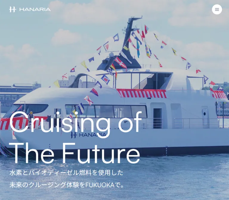
海と船の大きな写真、白い英字見出し、淡い背景と濃紺のフッターが特徴の公式サイト。スクロール後の丸いヘッダーやピル型リンクを、ゆったりした余白と組み合わせています。
オリジナルサイトを見るA white passenger vessel against blue water, framed by generous space and quiet, rounded controls.
Website / original URL: hanaria.jp Final URL: https://hanaria.jp/, HTTP 200; no redirect recorded. Theme: pale content surfaces, white typography over photography, and a deep navy closing section. No user-selectable theme was demonstrated. Inspected: September 23, 2026, at 02:45 JST. The supplied collection timestamp is September 22, 2026, at 17:45:51.658 UTC. Viewports: desktop 1440 × 1000 CSS px; mobile 390 × 844 CSS px. Scope: the current Japanese homepage: opening hero, persistent header, news, introductory story, large vessel photograph, gallery preview, and footer. Screenshots show desktop opening/middle/footer states and mobile opening/footer states; rendered DOM measurements supplement the intervening sections.
HANARIA’s homepage introduces the vessel and its energy concept while providing current announcements, background information, and gallery access. Its strongest visual elements are the ship itself, oversized English lettering, and long stretches of open space. The interface stays restrained: medium-weight navigation, small circular menu controls, white pill links, and minimal decorative color.
The page moves from an edge-to-edge maritime image into pale editorial sections, then closes with dark photographic and footer surfaces. Rounded geometry appears at very different scales: a compact language capsule, a circular menu, a floating navigation bar, and a photograph with exceptionally large corners. The footer’s enormous HANARIA wordmark provides a second brand statement after the opening image.
A white passenger vessel against blue water, framed by generous space and quiet, rounded controls.
Website / original URL: hanaria.jp Final URL: https://hanaria.jp/, HTTP 200; no redirect recorded. Theme: pale content surfaces, white typography over photography, and a deep navy closing section. No user-selectable theme was demonstrated. Inspected: September 23, 2026, at 02:45 JST. The supplied collection timestamp is September 22, 2026, at 17:45:51.658 UTC. Viewports: desktop 1440 × 1000 CSS px; mobile 390 × 844 CSS px. Scope: the current Japanese homepage: opening hero, persistent header, news, introductory story, large vessel photograph, gallery preview, and footer. Screenshots show desktop opening/middle/footer states and mobile opening/footer states; rendered DOM measurements supplement the intervening sections.
HANARIA’s homepage introduces the vessel and its energy concept while providing current announcements, background information, and gallery access. Its strongest visual elements are the ship itself, oversized English lettering, and long stretches of open space. The interface stays restrained: medium-weight navigation, small circular menu controls, white pill links, and minimal decorative color.
The page moves from an edge-to-edge maritime image into pale editorial sections, then closes with dark photographic and footer surfaces. Rounded geometry appears at very different scales: a compact language capsule, a circular menu, a floating navigation bar, and a photograph with exceptionally large corners. The footer’s enormous HANARIA wordmark provides a second brand statement after the opening image.
--h- are implementation aliases. Original custom-property names are identified separately.| Name | Value | Evidence / token | Role |
|---|---|---|---|
| Sea Mist | #eef4f4 |
Measured source --color-bg and --background-color; alias --h-bg |
Pale content canvas, clearly visible around the large rounded vessel image |
| Charcoal | #36373e |
Measured source --color; alias --h-ink |
Main text, dark brand treatment, and controls on light surfaces |
| White | #ffffff |
Measured source --color-white; alias --h-white |
Hero text, white action pills, menu background, and reversed footer content |
| Secondary Charcoal | #44454a |
Measured source --color-secondary |
Secondary interface color; not a separate dominant surface |
| Slate | #6f7b90 |
Measured inactive category text and source RGB tuple; alias --h-muted |
Inactive news categories and secondary language text |
| Pale Slate | #b1bdd3 |
Measured source --color-gray-light; alias --h-soft |
Footer utility links and copyright |
| Border Gray | #e3e6eb |
Measured source --color-border-rgb; alias --h-border |
Available subtle rule/control-border color; individual borders were not fully sampled |
| Gallery Dark | #1e2333 |
Measured gallery section background; alias --h-gallery |
Foundation beneath the gallery imagery |
| Footer Navy | Approximately #131932 |
Visual estimate only; alias --h-footer |
Large dark footer field |
| Utility Blue | #6880dc |
Measured source --link-color |
General link token and skip-link text; ordinary visible homepage links often override it |
The ocean supplies most of the saturated blue. Treat that blue as photographic content rather than a universal button color.
The body element itself computes to white, while the page’s background variables and the visible feature-image surround are pale blue-gray. These are different layers. Similarly, the footer element computes to a transparent background even though its visible backing is navy; the supplied element sample does not identify the exact backing declaration.
The extracted stylesheet variables also include red, green, yellow, submit-button colors, WordPress presets, and a Swiper default blue. Their presence does not establish visible homepage usage. Do not add colorful badges, gradients, form panels, or carousel controls merely because those tokens exist.
The scrolled header appears white or slightly translucent off-white. Its precise opacity was not supplied. The CSS Quick Start uses a near-white surface as an approximation.
The measured body stack begins with yakuhanjp, Satoshi, 'Noto Sans JP', followed by platform sans-serif fallbacks including Helvetica Neue, Hiragino, Yu Gothic, Verdana, and Meiryo.
These are declared families, not proof that every face loaded successfully or supplied every glyph. The visual result is a clean sans-serif system with restrained weight contrast. English display text looks regular and open; Japanese navigation and headings use moderate emphasis rather than heavy bold.
--font-normal: 400.--font-bold: 500.16px / 25.6px, weight 400.17px / 34px at both widths, giving Japanese paragraphs substantial breathing room.The header identity combines a geometric symbol and a distinctive HANARIA wordmark. Its link measures 200 × 28px on desktop and 150 × 28px on mobile. The mobile parent heading is wider than its visible link, so use the link measurement when sizing the artwork.
The heading’s computed 1px font size belongs to the logo implementation; it is not the visible wordmark’s type size. Preserve the identity as authorized artwork rather than typesetting HANARIA in an unrelated font. The footer wordmark is also artwork-like; its asset format was not supplied.
| Role | Desktop | Mobile | Weight / evidence |
|---|---|---|---|
| English hero statement | Approximately 128px, around 1.1 leading |
Approximately 60px, around 1.1 leading |
Visual estimates; exact element styles not supplied |
| Japanese hero heading | 29px / 29px |
18px / 18px |
Measured 400; separate line wrappers create additional spacing |
| Header navigation | 15px / 24px |
Hidden in supplied mobile header | Measured 500 |
| Header language button | 14px / 14px |
Not visible in mobile header | Measured 400 |
| News heading wrapper | 24px / 38.4px |
20px / 32px |
Measured 500; nested label sizes not individually supplied |
| Pill-link label | 16px / 25.6px |
Same | Measured 500 |
| Category button | 16px / 25.6px |
Same | Measured 500 |
| News item title | 15px / 21px |
Same | Measured 500 |
| Story heading | 60px / 96px |
38px / 60.8px |
Measured 500 |
| Story paragraph | 17px / 34px |
Same | Measured 400 |
| Gallery heading | 86.4px / 69.12px |
40px / 32px |
Measured 500; unusually tight 0.8 leading |
| Footer contact | 16px / 25.6px |
Same | Measured 400 |
| Footer navigation | 15px / 24px |
Not present in supplied mobile footer | Measured 400 |
| Footer language button | 14px / 14px |
15px / 14px |
Measured 400 |
| Footer utility links | 13px / 20.8px |
Same | Measured 400 |
| Copyright | 12px / 19.2px |
Same | Measured 400 |
Preserve the English statement exactly when reproducing this page: “Cruising of” / “The Future”. It uses two lines in both opening captures. Its large scale is specific to the hero; ordinary content does not inherit that scale.
Density: expansive sections surrounding compact, legible controls.
Root scale: the inspected document uses a conventional 16px root; no miniature-rem system is indicated.
| Use | Desktop | Mobile | Status |
|---|---|---|---|
| Main content side gutter | 60px |
20px |
Measured from news/story content positions |
| Footer side gutter | 80px |
30px |
Measured |
| Header outer padding | 10px 13px |
0 |
Measured |
| Logo link left position | 37px |
16px |
Measured |
| News content top clearance | 120px |
60px |
Derived from section and header positions |
| Gap between story columns | 15px |
Stacked | Derived from measured column edges |
| Category button gap | 5px |
5px |
Derived from adjacent rectangles |
| Category button padding | 10px 20px |
8px 15px |
Measured |
| News row vertical padding | 36.8px |
24px |
Measured |
| Pill-link padding | 11.2px 48px 11.2px 27.2px |
Same | Measured; larger right inset reserves arrow space |
| Japanese hero line gap | 23.2px |
7.2px |
Measured flex gap |
| Japanese hero bottom clearance | 72px |
39px |
Derived from heading bounds and viewport height |
| Footer top padding | 70px |
70px |
Measured; desktop has additional interior empty space |
| Element | Value | Evidence |
|---|---|---|
| Action pill | 30px |
Measured |
| Category button | 30px |
Measured; transparent background in sampled state |
| Menu button | 30px radius on a 46px or 40px square |
Measured; rendered as a circle |
| Language control | 15px |
Measured |
| General source radius token | clamp(36px, 6vw, 48px) |
Measured variable; usage is not established for every component |
| Scrolled desktop header | Approximately 34px |
Visual estimate from a roughly 67px-high capsule |
| Scrolled mobile header | Approximately 24px lower corners |
Visual estimate; flush to the top and sides |
| Large feature-image corners | Approximately 220–240px at desktop |
Visual estimate; much larger than the general radius token |
Do not use one radius everywhere. The large photograph’s geometry is a major compositional feature, while news rows remain flat and rectangular.
| Element | Desktop | Mobile |
|---|---|---|
| Document height | 6539.31px |
5233.69px |
| Opening hero | 1440 × 1000px |
390 × 844px |
| Header outer box | 1440 × 87px |
390 × 61px |
| Menu button | 46 × 46px |
40 × 40px |
| News section | 770.77px high |
735.28px high |
| News heading region | 318.75px wide |
350px wide, shared horizontal heading/action row |
| News list region | 986.25px wide |
350px wide |
| News row | About 120.39px high |
94.80px for one title line; 115.80px for two |
| Story text columns | Two 652.5px columns |
One 350px column |
| Large rounded photograph | Approximately 1262 × 802px in the supplied middle capture |
No corresponding mobile image capture supplied |
| Gallery section | 879.09px high |
421.97px high |
| Footer | 1000px high |
599.47px high |
The story/media section’s measured bounds are approximately 2659.45px high on desktop and 2449.78px on mobile. These large bounds do not establish a fixed-height CSS rule or a pinned animation. Avoid copying them as mandatory spacer heights.
Anatomy: linked symbol/wordmark at left; two desktop text links; a compact language selector; a circular menu button at right.
The opening state is transparent over the ship image. Branding and text navigation are white, while the menu remains a white circle with dark horizontal strokes. Desktop links read HANARIAとは and お知らせ. The language trigger reads JP with a small chevron.
In the middle and footer captures, a pale capsule sits near the desktop viewport’s top edge: approximately 13px from either side and 10px from the top. The brand and navigation switch to dark. Its restrained surface has no prominent shadow.
At 390px, the direct navigation and header language control disappear. Only the 150px-wide brand and 40px menu remain. The scrolled surface spans the full width with rounded lower corners.
The header remains at the top across the supplied scroll positions. The evidence does not identify whether this is implemented with fixed positioning, sticky positioning, or another mechanism. The menu’s open state was not captured.
Anatomy: edge-to-edge ship imagery; visible fine diagonal texture; header overlay; oversized English statement; smaller two-line Japanese heading.
The desktop image places the white vessel diagonally across the lower portion of the viewport, with blue water, a harbor, and sky providing scale. The English statement occupies the lower right. The Japanese heading sits at lower left, starting at x = 60px and ending 72px above the viewport bottom.
The Japanese heading is:
水素とバイオディーゼル燃料を使用した
未来のクルージング体験を。
On mobile, the image uses a much tighter crop. The vessel extends beyond the viewport rather than shrinking to fit completely. The English statement moves above the Japanese copy in a single lower-left stack with a 20px main inset. The copy ends about 39px above the bottom.
Fine diagonal lines are visible across the opening images, including the hull and sky. Their implementation is unknown: they may belong to an overlay or the media itself. A repeating CSS gradient is an approximation, not an extracted source technique.
The captures establish a photographic hero, but do not establish whether it is a still image, a video frame, or part of an image sequence. No autoplay, loop duration, or playback control should be claimed.
Anatomy: Japanese section label, English News label, and a white View All pill with a right arrow.
Desktop places this group in a narrow left region beside the news list. Mobile places the heading and the 135 × 49.97px action on one row: heading at x = 20px, action at x = 235px.
The desktop geometry can be reconstructed with four equal tracks and 15px gutters: one track for the heading and three for the list. This is a derived layout model, not an observed grid-template-columns declaration.
Three buttons appear in one horizontal sequence: すべて, お知らせ, and 運航情報.
The sampled first category uses charcoal text; the others use slate. Their computed backgrounds are transparent. Preserve this restrained treatment rather than assuming the selected category is a bright filled pill. Any pseudo-element treatment was outside the supplied element sample.
Desktop controls are approximately 45.59px high; mobile controls are approximately 41.59px high. The 5px gap stays consistent. They are actual button elements, but no resulting filter change was supplied.
Anatomy: a full-row link containing a date/category metadata line and a Japanese title below.
The current evidence contains three dated entries. The first is dated 2026.04.09 and titled 【お知らせ】大阪に初就航します❁. These entries establish the component structure and current content state, not permanent sample content for future implementations.
Rows span the full list region without separate card fills or rounded corners. Desktop vertical padding is 36.8px; mobile uses 24px. Titles retain 15px / 21px at both widths, so longer mobile titles naturally become two lines and increase row height by 21px.
Adjacent row rectangles are separated by approximately 1px, consistent with a fine divider. Its exact border declaration was not included. Use a subtle rule in a recreation, clearly treating its color and construction as implementation choices.
Anatomy: one medium-weight label, generous left padding, reserved space for a slim right arrow, and a white capsule surface.
The English action measures 135 × 49.97px. The Japanese 詳しくみる action measures approximately 157.83 × 49.97px. Both retain the same dimensions on mobile. They link to deeper content rather than functioning as oversized primary conversion buttons.
Extracted labels appear twice in some anchors. The visible component shows one label. If layered text is used for an effect, expose only one accessible name and do not infer an unobserved rolling animation from the duplicate nodes.
Anatomy: a large Japanese statement, an explanatory paragraph, and a white detail link.
The heading reads ともに出航しよう、みらいの海へ。. On desktop, its column begins at x = 60px; the paragraph and link begin at x = 727.5px. Both columns are 652.5px wide with a 15px gap.
On mobile, the heading, paragraph, and link stack at x = 20px. The heading reduces from 60px to 38px; paragraph typography stays at 17px / 34px. The measured heading-to-paragraph gap is 30px, and the paragraph-to-action gap is also 30px.
Keep the paragraph comfortable and unboxed. This section explains the vessel’s concept through editorial text and imagery rather than a repeated feature-card grid.
The supplied desktop middle capture centers a front-facing vessel image on the pale canvas. Its visible box runs approximately from x = 89px to 1351px, and from y = 99px to 901px within that capture.
The ship is aligned almost symmetrically, with its wake creating white directional lines through the surrounding blue water. Large corner cutouts make the image feel shaped into the page rather than framed by a border. There is no visible caption over this captured image.
Unlike the opening hero, this photograph appears clean without the conspicuous diagonal texture. Keep that distinction. Mobile dimensions, crop, corner radius, and any scroll-driven resizing remain unverified.
Anatomy: photographic mosaic, dark backing/treatment, white Gallery heading, and a white View all pill.
The DOM gives a dark foundation of #1e2333. The mobile footer capture shows part of the gallery mosaic: exterior vessel views, interiors, and a group scene, separated by narrow gutters. The visible images are darkened enough to sit comfortably beneath white interface elements. The exact overlay opacity and complete tile arrangement were not supplied.
On desktop, the heading starts at approximately x = 823.33px, placing the caption in the right portion of the section. Mobile moves it to x = 20px, with a 40px heading and the same 135px-wide action.
The gallery link points to /gallery/. A slider, automatic tile movement, lightbox, or drag behavior was not demonstrated.
Anatomy: navy field; corporate contact block; desktop navigation; language control; utility links; copyright; oversized wordmark.
The current footer visibly names 商船三井テクノトレード株式会社, with an address, telephone link, and motech.co.jp link. This is direct evidence for the current corporate contact shown by the homepage; it does not independently establish every operational or legal responsibility for the vessel.
Desktop contact text begins 80px from the left. Two navigation columns sit farther right, with links for the top page, vessel information, news, and gallery. The language capsule aligns toward the right below the main contact/navigation group. Utility links sit lower left, with copyright lower right.
The desktop footer is one viewport tall and leaves a large uninterrupted navy region above the contact content. Do not compress it into a conventional narrow utility strip.
On mobile, contact content uses 30px side gutters and begins 70px below the footer’s start. The main navigation columns are absent from the supplied mobile footer. The language control moves left; 運営会社 and プライバシーポリシー become separate lines. Copyright remains small and right aligned.
A subtle horizontal rule introduces an enormous white HANARIA wordmark across almost the full page width. It is visibly cropped by the lower capture boundary and creates a strong closing gesture.
The desktop lettering is architectural in scale, while mobile retains the full-width treatment at a smaller size. Use the appropriate authorized wordmark artwork and a controlled overflow region; an ordinary text heading will not reproduce its letterforms.
The DOM contains Japanese and English destination links, with English pointing to /en/. The footer selector has an upward chevron; the header version uses a downward chevron. Expanded states and keyboard behavior were not inspected.
A skip link labeled 本文までスキップする points to #content. Its resting box measures 1 × 1px, consistent with a visually hidden utility. The menu button has the text メニューを開閉する. These are useful semantic provisions, but focus behavior and the full accessibility tree were not supplied.
| Element / treatment | Measured declaration | What the evidence establishes |
|---|---|---|
| Header text links | 0.2s cubic-bezier(.165, .84, .44, 1) |
A transition is declared; hover endpoint was not captured |
| Language button | 0.2s cubic-bezier(.165, .84, .44, 1) for border radius, background color, and color |
These properties can transition; expanded styling remains unverified |
| Menu button | 0.3s cubic-bezier(.19, 1, .22, 1) |
A transition exists; no open/close sequence was supplied |
| Category buttons | 0.3s cubic-bezier(.19, 1, .22, 1) |
Declared control transition; filtering result untested |
| White action links | 0.5s cubic-bezier(.19, 1, .22, 1) for border color and color |
A slower color/border response is declared |
| News and gallery headings | 1s cubic-bezier(.165, .84, .44, 1) for opacity and transform |
Supports an opacity/transform treatment; reveal distance and trigger not supplied |
Source easing aliases include --easeOutQuart and --easeOutExpo, matching the two curves above.
animation: none; this does not rule out child, pseudo-element, media, or JavaScript-driven motion.Recommended motion direction: use the measured easing curves for quiet interface responses. Keep essential content visible before enhancement. If implementing a new reveal, a short opacity/translation effect can fit this design, but its distance and trigger should be documented as new choices. Provide a static equivalent for reduced motion.
| Layer | Appearance | Purpose |
|---|---|---|
| Opening hero | Full-bleed maritime image with visible fine diagonal texture | Establishes vessel identity and scale |
| Content canvas | Pale blue-gray | Gives dark editorial text and white pills a calm setting |
| Scrolled header | White or near-white rounded bar | Keeps navigation legible over changing backgrounds |
| News rows | Flat, unboxed content with fine separation | Supports scanning without visual card weight |
| Feature photograph | Clean photographic surface with very large corners | Provides a deliberate visual pause |
| Gallery | Dark foundation beneath a photo mosaic | Introduces multiple views while supporting white captions |
| Footer | Deep navy with white and pale-slate details | Provides a spacious institutional close |
The supplied views show no general drop-shadow elevation system or glass-blur treatment. Depth comes primarily from photography, tonal changes, and large-scale geometry.
Use real vessel imagery as the page’s primary visual material. The current opening capture combines white hull surfaces, deep blue water, a built harbor, and clear sky. The middle photograph changes viewpoint to a nearly symmetrical frontal composition with a prominent wake. These contrasting views make the vessel recognizable while giving the long page variety.
The gallery broadens the subject matter to include interiors, people, and onboard spaces. Preserve that documentary range when extending the page. A sequence composed entirely of distant sea horizons would lose the specificity visible here.
object-fit: cover or equivalent art direction for the opening media; do not stretch the image to match the viewport.No image src, video source, or brand asset URL was included in the supplied evidence. The following identifies visible assets without inventing paths.
| Asset | Current evidence | URL availability |
|---|---|---|
| Opening vessel/harbor media | Desktop and mobile opening captures | Not supplied |
| Front-facing vessel and wake | Desktop middle capture | Not supplied |
| Exterior/interior/group gallery imagery | Partial mobile gallery visible above footer | Not supplied |
| Header symbol and wordmark | All current captures | Not supplied |
| Oversized footer wordmark | Desktop and mobile footer captures | Not supplied |
Use authorized assets when available. The CSS can reproduce the layout and controls, but cannot substitute for the vessel photography or brand letterforms.
The rendered homepage follows this order: full-height hero, news, introductory story with an extended media region, an unlabeled section, gallery, and footer.
The unlabeled section measures approximately 300px high on desktop and 253.19px on mobile. Its content and purpose were not exposed; do not turn it into an invented booking banner or feature module.
The news and following story section have approximately 70px of overlap in their measured bounding ranges at both widths. The source mechanism is unknown. Because rendered rectangles can reflect transforms and positioning, their offsets should not be copied directly into a sequence of fixed spacers.
| Element | Desktop | Mobile |
|---|---|---|
| Opening composition | Japanese copy lower left; English statement lower right | English statement and Japanese copy stack at lower left |
| Hero media | Broad harbor/vessel scene | Tight crop across the vessel |
| Header | Brand, direct links, language, menu | Brand and menu only |
| Scrolled header surface | Inset floating capsule | Full-width top bar with rounded lower corners |
| News heading | Narrow left region beside list | Heading and action share a top row |
| News list | Wide right region | Full content width below categories |
| Story | Two text columns | Heading, paragraph, and action stack |
| Gallery caption | In right portion of section | Left aligned with main mobile gutter |
| Footer navigation | Two link columns visible | Main link columns absent in supplied view |
| Footer utilities | Horizontal grouping | Language and legal links stack |
| Footer height | 1000px |
Approximately 599px |
The design keeps ordinary text readable rather than scaling everything down. News titles remain 15px; action labels remain 16px; story text remains 17px. Larger headings and layout relationships absorb most of the responsive change.
Recommended breakpoint: the Quick Start uses 768px as an implementation choice. The actual source breakpoint was not supplied. Test intermediate widths and narrow phones independently.
Recommended viewport handling: use stable viewport units for the opening composition and include safe-area allowances where needed. The evidence establishes viewport-sized hero boxes at the two inspected sizes, but not the exact viewport-unit declarations.
#eef4f4 content surfaces, charcoal text, white controls, and dark closing sections.500.17px / 34px story copy on mobile.These are recommendations for a new implementation, not verified behavior of the original:
40px circle while offering a larger invisible hit area where layout permits.#eef4f4.#36373e.#ffffff.#6f7b90.#b1bdd3.#1e2333.#131932, a visual estimate to calibrate against the current capture.“Create a Japanese passenger-vessel homepage inspired by the current HANARIA composition. Use full-viewport ship photography, white two-line English display text, small Japanese supporting copy, and a transparent opening header with a white circular menu. On desktop, place the English statement at the lower right and the Japanese copy at the lower left; stack both at the lower left on mobile. Follow with pale blue-gray editorial sections, a dated news list, spacious Japanese story copy, and a large front-facing ship photograph with exaggerated rounded corners. Close with a dark photo gallery and a spacious navy footer carrying an oversized white wordmark. Use the declared Satoshi/Noto Sans JP direction when available, mostly 400/500 weights, white arrow pills, and subtle controls. Treat media playback and unobserved interactions as separate implementation decisions.”
This is an adaptation of the measured endpoints, not the original stylesheet. It keeps a conventional root size. The English hero sizes, footer navy, large image radius, mobile feature-image treatment, and 768px breakpoint are recommendations or visual approximations.
Supply authorized images and brand artwork. No original asset paths were provided. The header uses a data-scrolled='true' state supplied by application logic; its original trigger is unknown. The gallery backdrop can be an authorized composed mosaic or a separately implemented image layout.
:root {
  /* Measured colors, except the estimated footer navy. */
  --h-bg: #eef4f4;
  --h-ink: #36373e;
  --h-white: #fff;
  --h-muted: #6f7b90;
  --h-soft: #b1bdd3;
  --h-border: #e3e6eb;
  --h-gallery: #1e2333;
  --h-footer: #131932;

  /* Shortened version of the declared font stack. */
  --h-font: yakuhanjp, Satoshi, 'Noto Sans JP',
    -apple-system, BlinkMacSystemFont, 'Helvetica Neue',
    'Hiragino Sans', 'Yu Gothic', Meiryo, sans-serif;
  --h-regular: 400;
  --h-medium: 500;

  --h-gutter: 20px;
  --h-footer-gutter: 30px;
  --h-grid-gap: 15px;
  --h-pill-radius: 30px;
  --h-general-radius: clamp(36px, 6vw, 48px);
  --h-display: clamp(46px, 15.385vw, 60px);
  --h-story-title: 38px;
  --h-gallery-title: 40px;

  --h-quart: cubic-bezier(.165, .84, .44, 1);
  --h-expo: cubic-bezier(.19, 1, .22, 1);
}

* { box-sizing: border-box; }

body {
  margin: 0;
  color: var(--h-ink);
  background: var(--h-bg);
  font: var(--h-regular) 16px/1.6 var(--h-font);
}

button, a { -webkit-tap-highlight-color: transparent; }
button { font: inherit; }
img { display: block; max-width: 100%; }

.container {
  width: calc(100% - 2 * var(--h-gutter));
  margin-inline: auto;
}

/* Recommended focus treatment. */
:where(a, button):focus-visible {
  outline: 2px solid currentColor;
  outline-offset: 4px;
}

.skip-link {
  position: fixed;
  z-index: 100;
  inset: 12px auto auto 12px;
  padding: 10px 16px;
  color: var(--h-ink);
  background: var(--h-white);
  transform: translateY(-160%);
}
.skip-link:focus { transform: none; }

/* State is supplied by the application, not by this CSS. */
.site-header {
  position: fixed;
  z-index: 50;
  inset: 0 0 auto;
  color: var(--h-white);
}
.header-inner {
  display: flex;
  align-items: center;
  justify-content: space-between;
  min-height: 61px;
  padding: 10px 11px 10px 16px;
  border-radius: 0 0 24px 24px;
  transition: background-color .3s var(--h-expo),
    color .3s var(--h-expo);
}
.site-header[data-scrolled='true'] .header-inner {
  color: var(--h-ink);
  background: rgb(255 255 255 / .94);
}
.brand {
  display: block;
  width: 150px;
  color: inherit;
}
.brand svg {
  display: block;
  width: 100%;
  height: 28px;
  fill: currentColor;
}
.header-actions {
  display: flex;
  align-items: center;
  gap: 15px;
}
.header-nav, .header-language { display: none; }
.menu-button {
  display: grid;
  place-items: center;
  width: 40px;
  height: 40px;
  padding: 0;
  border: 1px solid transparent;
  border-radius: 30px;
  color: var(--h-ink);
  background: var(--h-white);
  cursor: pointer;
  transition: border-color .3s var(--h-expo);
}
.site-header[data-scrolled='true'] .menu-button {
  border-color: var(--h-border);
}
.menu-lines {
  display: grid;
  gap: 4px;
  width: 18px;
}
.menu-lines span {
  display: block;
  height: 1px;
  background: currentColor;
}

.hero {
  position: relative;
  isolation: isolate;
  height: 100svh;
  color: var(--h-white);
  background: var(--h-gallery);
}
.hero__media {
  position: absolute;
  z-index: -2;
  inset: 0;
  width: 100%;
  height: 100%;
  object-fit: cover;
  object-position: center;
}
.hero::after {
  /* Approximation of the visible texture, not extracted CSS. */
  content: '';
  position: absolute;
  z-index: -1;
  inset: 0;
  pointer-events: none;
  background: repeating-linear-gradient(
    125deg,
    rgb(0 0 0 / .16) 0 1px,
    transparent 1px 3px
  );
}
.hero__content {
  position: absolute;
  inset: auto var(--h-gutter) 39px;
  display: flex;
  flex-direction: column;
  align-items: flex-start;
  gap: 16px;
}
.hero__title {
  margin: 0;
  font-size: var(--h-display);
  font-weight: 400;
  line-height: 1.1;
}
.hero__title span { display: block; }
.hero__copy {
  display: flex;
  flex-direction: column;
  gap: 7.2px;
  margin: 0;
  padding-left: 3px;
  font-size: clamp(15px, 4.615vw, 18px);
  font-weight: 400;
  line-height: 1;
}

.pill-link {
  position: relative;
  display: inline-block;
  min-height: 50px;
  padding: 11.2px 48px 11.2px 27.2px;
  border: 1px solid transparent;
  border-radius: var(--h-pill-radius);
  color: var(--h-ink);
  background: var(--h-white);
  font-size: 16px;
  font-weight: 500;
  line-height: 25.6px;
  text-decoration: none;
  white-space: nowrap;
  transition: color .5s var(--h-expo),
    border-color .5s var(--h-expo);
}
.pill-link__arrow {
  position: absolute;
  inset: 50% 18px auto auto;
  transform: translateY(-50%);
}

.news { padding-block: 60px 120px; }
.news__header {
  display: flex;
  align-items: center;
  justify-content: space-between;
  padding-bottom: 40px;
}
.news__heading {
  display: flex;
  flex-direction: column;
  gap: 3px;
  margin: 0;
  font-size: 20px;
  font-weight: 500;
  line-height: 1.6;
}
.news__main { padding-top: 35px; }
.category-list {
  display: flex;
  flex-wrap: wrap;
  gap: 5px;
}
.category-button {
  padding: 8px 15px;
  border: 0;
  border-radius: 30px;
  color: var(--h-muted);
  background: transparent;
  font-size: 16px;
  font-weight: 500;
  line-height: 25.6px;
  cursor: pointer;
  transition: color .3s var(--h-expo);
}
.category-button[aria-pressed='true'] {
  color: var(--h-ink);
}
.news-list {
  margin: 40px 0 0;
  padding: 0;
  list-style: none;
}
.news-row {
  display: block;
  padding-block: 24px;
  border-bottom: 1px solid var(--h-border);
  color: inherit;
  text-decoration: none;
}
.news-row__meta {
  display: flex;
  flex-wrap: wrap;
  gap: 16px;
  margin: 0;
}
.news-row__title {
  margin: 0;
  font-size: 15px;
  font-weight: 500;
  line-height: 21px;
}

.story__text {
  display: grid;
  gap: 30px;
}
.story__title {
  margin: 0;
  font-size: var(--h-story-title);
  font-weight: 500;
  line-height: 1.6;
}
.story__copy p {
  margin: 0 0 30px;
  font-size: 17px;
  line-height: 34px;
}
.media-panel {
  /* Mobile geometry is recommended, not observed. */
  width: calc(100% - 40px);
  aspect-ratio: 4 / 3;
  margin: 80px auto;
  overflow: hidden;
  border-radius: 48px;
}
.media-panel img {
  width: 100%;
  height: 100%;
  object-fit: cover;
  object-position: center;
}

.gallery {
  position: relative;
  isolation: isolate;
  display: grid;
  align-items: center;
  min-height: 422px;
  overflow: hidden;
  color: var(--h-white);
  background: var(--h-gallery);
}
.gallery__backdrop {
  position: absolute;
  z-index: -2;
  inset: 0;
  width: 100%;
  height: 100%;
  object-fit: cover;
}
.gallery::after {
  /* Tune this recommended overlay against the chosen images. */
  content: '';
  position: absolute;
  z-index: -1;
  inset: 0;
  background: rgb(19 25 50 / .55);
}
.gallery__content { margin-inline: 20px; }
.gallery__title {
  margin: 0 0 40px;
  font-size: var(--h-gallery-title);
  font-weight: 500;
  line-height: .8;
}

.site-footer {
  display: flex;
  flex-direction: column;
  padding-top: 70px;
  color: var(--h-white);
  background: var(--h-footer);
}
.footer__content {
  margin-top: auto;
  padding: 0 var(--h-footer-gutter) 40px;
}
.footer__contact p { margin: 0; }
.footer__contact p:first-child { margin-bottom: 10px; }
.footer__contact a { color: inherit; }
.footer__nav { display: none; }
.footer__language {
  display: flex;
  justify-content: flex-start;
  margin-top: 75px;
}
.language-button {
  display: inline-flex;
  align-items: center;
  gap: 5px;
  min-height: 31px;
  padding: 6px 12px;
  border: 1px solid rgb(255 255 255 / .5);
  border-radius: 15px;
  color: inherit;
  background: transparent;
  font-size: 15px;
  line-height: 14px;
}
.footer__legal { margin-top: 30px; }
.footer__legal-links {
  display: flex;
  flex-direction: column;
  gap: 14.4px;
}
.footer__legal a {
  color: var(--h-soft);
  font-size: 13px;
  line-height: 20.8px;
  text-decoration: none;
}
.footer__copyright {
  margin: 60px 0 0;
  color: var(--h-soft);
  font-size: 12px;
  line-height: 19.2px;
  text-align: right;
}
.footer__wordmark {
  height: 80px;
  padding: 40px 8px 0;
  overflow: hidden;
  border-top: 1px solid rgb(255 255 255 / .12);
}
.footer__wordmark svg {
  display: block;
  width: 100%;
  height: auto;
  fill: currentColor;
}

/* Recommended breakpoint; only endpoint layouts were inspected. */
@media (min-width: 768px) {
  :root {
    --h-gutter: clamp(32px, 4.167vw, 60px);
    --h-footer-gutter: clamp(40px, 5.556vw, 80px);
    --h-display: clamp(64px, 8.889vw, 128px);
    --h-story-title: clamp(38px, 4.167vw, 60px);
    --h-gallery-title: clamp(40px, 6vw, 86.4px);
  }
  .site-header { padding: 10px 13px; }
  .header-inner {
    min-height: 67px;
    padding: 10px 19px 10px 24px;
    border-radius: 40px;
  }
  .brand { width: 200px; }
  .header-nav {
    display: flex;
    gap: 16px;
    margin-right: 10px;
  }
  .header-nav a {
    color: inherit;
    font-size: 15px;
    font-weight: 500;
    text-decoration: none;
    transition: color .2s var(--h-quart);
  }
  .header-language {
    display: inline-flex;
    align-items: center;
    justify-content: center;
    gap: 5px;
    width: 50px;
    height: 25px;
    padding: 3px 5px 3px 8px;
    border: 1px solid currentColor;
    border-radius: 15px;
    color: inherit;
    background: transparent;
    font-size: 14px;
    line-height: 14px;
  }
  .menu-button { width: 46px; height: 46px; }
  .hero__content {
    bottom: 72px;
    display: grid;
    grid-template-columns: minmax(0, 1fr) auto;
    align-items: end;
    gap: 40px;
  }
  .hero__title { grid-area: 1 / 2; }
  .hero__copy {
    grid-area: 1 / 1;
    max-width: 522px;
    padding-left: 0;
    gap: 23.2px;
    font-size: 29px;
  }
  .news { padding-block: 120px 160px; }
  .news__layout {
    display: grid;
    grid-template-columns: repeat(4, minmax(0, 1fr));
    gap: 15px;
  }
  .news__header {
    display: block;
    grid-column: span 1;
    padding-bottom: 0;
  }
  .news__heading { margin-bottom: 24px; font-size: 24px; }
  .news__main { grid-column: span 3; }
  .category-button { padding: 10px 20px; }
  .news-row { padding-block: 36.8px; }
  .story__text {
    grid-template-columns: repeat(2, minmax(0, 1fr));
    gap: 15px;
  }
  .story__copy { padding-top: 15px; }
  .media-panel {
    width: 87.64%;
    max-width: 1262px;
    height: 80svh;
    aspect-ratio: auto;
    margin-block: 160px;
    border-radius: clamp(96px, 16.667vw, 240px);
  }
  .gallery { min-height: clamp(520px, 61.05vw, 879px); }
  .gallery__content {
    width: 35.88%;
    margin-left: 57.18%;
    margin-right: 0;
  }
  .site-footer { min-height: 100svh; }
  .footer__content { padding-bottom: 74px; }
  .footer__top {
    display: grid;
    grid-template-columns: repeat(2, minmax(0, 1fr));
    gap: 15px;
  }
  .footer__nav {
    display: grid;
    grid-template-columns: repeat(2, minmax(0, 227.5px));
    align-content: start;
    gap: 14.4px 15px;
  }
  .footer__nav a {
    color: inherit;
    font-size: 15px;
    line-height: 24px;
    text-decoration: none;
  }
  .footer__language {
    justify-content: flex-end;
    margin-top: 100px;
  }
  .language-button { font-size: 14px; }
  .footer__legal {
    display: flex;
    align-items: center;
    justify-content: space-between;
    margin-top: 42px;
  }
  .footer__legal-links { flex-direction: row; gap: 20px; }
  .footer__copyright { margin: 0; }
  .footer__wordmark { height: 184px; padding-inline: 20px; }
}

@media (prefers-reduced-motion: reduce) {
  .header-inner,
  .header-nav a,
  .menu-button,
  .pill-link,
  .category-button {
    transition: none;
  }
}
The CSS intentionally leaves content visible and does not invent a media timeline, menu panel, or category-filter implementation. Wire those behaviors separately with semantic controls and explicit state management. Footer spacing and the feature-image box approximate the captured composition rather than reproducing unknown positioning logic.
Optional aliases for a project already using Tailwind v4. Define the custom properties above first. This does not imply that the original site uses Tailwind.
@theme inline {
  --color-sea-mist: var(--h-bg);
  --color-charcoal: var(--h-ink);
  --color-slate-muted: var(--h-muted);
  --color-slate-soft: var(--h-soft);
  --color-gallery-dark: var(--h-gallery);
  --color-footer-navy: var(--h-footer);

  --font-sans: var(--h-font);
  --text-hero: var(--h-display);
  --text-story-title: var(--h-story-title);
  --text-gallery-title: var(--h-gallery-title);
  --text-story-body: 17px;
  --text-news-title: 15px;

  --spacing-page-gutter: var(--h-gutter);
  --spacing-footer-gutter: var(--h-footer-gutter);
  --radius-pill: var(--h-pill-radius);
  --radius-content: var(--h-general-radius);
}
2026-09-22T17:45:51.658Z, equivalent to September 23, 2026, at 02:45:51.658 JST.1440 × 1000 viewport; opening hero, middle vessel image, and footer screenshots; rendered document height approximately 6539.31px.390 × 844 viewport; opening hero and gallery/footer screenshots; rendered document height approximately 5233.69px./about/, /news/, /gallery/, /company/, and /en/ are linked by the homepage. Their destination pages were not inspected for this reference.https://www.motech.co.jp/. No production-credit claim is established by the supplied original-page evidence.This reference describes the current homepage represented by those captures and measurements. Visual estimates and implementation recommendations are marked separately from measured source values.
# HANARIA — Style Reference

> A white passenger vessel against blue water, framed by generous space and quiet, rounded controls.

**Website / original URL:** [hanaria.jp](https://hanaria.jp/)
**Final URL:** [https://hanaria.jp/](https://hanaria.jp/), HTTP 200; no redirect recorded.
**Theme:** pale content surfaces, white typography over photography, and a deep navy closing section. No user-selectable theme was demonstrated.
**Inspected:** September 23, 2026, at 02:45 JST. The supplied collection timestamp is September 22, 2026, at 17:45:51.658 UTC.
**Viewports:** desktop **1440 × 1000 CSS px**; mobile **390 × 844 CSS px**.
**Scope:** the current Japanese homepage: opening hero, persistent header, news, introductory story, large vessel photograph, gallery preview, and footer. Screenshots show desktop opening/middle/footer states and mobile opening/footer states; rendered DOM measurements supplement the intervening sections.

HANARIA’s homepage introduces the vessel and its energy concept while providing current announcements, background information, and gallery access. Its strongest visual elements are the ship itself, oversized English lettering, and long stretches of open space. The interface stays restrained: medium-weight navigation, small circular menu controls, white pill links, and minimal decorative color.

The page moves from an edge-to-edge maritime image into pale editorial sections, then closes with dark photographic and footer surfaces. Rounded geometry appears at very different scales: a compact language capsule, a circular menu, a floating navigation bar, and a photograph with exceptionally large corners. The footer’s enormous HANARIA wordmark provides a second brand statement after the opening image.
# HANARIA — Style Reference

> A white passenger vessel against blue water, framed by generous space and quiet, rounded controls.

**Website / original URL:** [hanaria.jp](https://hanaria.jp/)
**Final URL:** [https://hanaria.jp/](https://hanaria.jp/), HTTP 200; no redirect recorded.
**Theme:** pale content surfaces, white typography over photography, and a deep navy closing section. No user-selectable theme was demonstrated.
**Inspected:** September 23, 2026, at 02:45 JST. The supplied collection timestamp is September 22, 2026, at 17:45:51.658 UTC.
**Viewports:** desktop **1440 × 1000 CSS px**; mobile **390 × 844 CSS px**.
**Scope:** the current Japanese homepage: opening hero, persistent header, news, introductory story, large vessel photograph, gallery preview, and footer. Screenshots show desktop opening/middle/footer states and mobile opening/footer states; rendered DOM measurements supplement the intervening sections.

HANARIA’s homepage introduces the vessel and its energy concept while providing current announcements, background information, and gallery access. Its strongest visual elements are the ship itself, oversized English lettering, and long stretches of open space. The interface stays restrained: medium-weight navigation, small circular menu controls, white pill links, and minimal decorative color.

The page moves from an edge-to-edge maritime image into pale editorial sections, then closes with dark photographic and footer surfaces. Rounded geometry appears at very different scales: a compact language capsule, a circular menu, a floating navigation bar, and a photograph with exceptionally large corners. The footer’s enormous HANARIA wordmark provides a second brand statement after the opening image.

## How to Read This Reference

- **Measured** means a value is present in the supplied rendered DOM, computed styles, or custom properties. Dimensions are rounded where appropriate.
- **Visual estimate** means a value or treatment is inferred from the supplied current screenshots. It is not a sampled color or an extracted CSS declaration.
- **Derived** means arithmetic based on measured geometry, such as the width of a content grid.
- **Recommended** means guidance for a new implementation, including the CSS below. It does not establish how the original was built.
- Token names beginning with `--h-` are implementation aliases. Original custom-property names are identified separately.
- Only two viewport widths were inspected. Intermediate breakpoints, open menus, hover endpoints, filtering results, and language-selector behavior remain unverified.
- Repeated labels in extracted text represent repeated DOM content, not instructions to print labels twice. Individual letters in the hero extraction likewise do not indicate vertical writing.

## Tokens — Colors

### Default Palette

| Name | Value | Evidence / token | Role |
| --- | --- | --- | --- |
| Sea Mist | `#eef4f4` | Measured source `--color-bg` and `--background-color`; alias `--h-bg` | Pale content canvas, clearly visible around the large rounded vessel image |
| Charcoal | `#36373e` | Measured source `--color`; alias `--h-ink` | Main text, dark brand treatment, and controls on light surfaces |
| White | `#ffffff` | Measured source `--color-white`; alias `--h-white` | Hero text, white action pills, menu background, and reversed footer content |
| Secondary Charcoal | `#44454a` | Measured source `--color-secondary` | Secondary interface color; not a separate dominant surface |
| Slate | `#6f7b90` | Measured inactive category text and source RGB tuple; alias `--h-muted` | Inactive news categories and secondary language text |
| Pale Slate | `#b1bdd3` | Measured source `--color-gray-light`; alias `--h-soft` | Footer utility links and copyright |
| Border Gray | `#e3e6eb` | Measured source `--color-border-rgb`; alias `--h-border` | Available subtle rule/control-border color; individual borders were not fully sampled |
| Gallery Dark | `#1e2333` | Measured gallery section background; alias `--h-gallery` | Foundation beneath the gallery imagery |
| Footer Navy | Approximately `#131932` | Visual estimate only; alias `--h-footer` | Large dark footer field |
| Utility Blue | `#6880dc` | Measured source `--link-color` | General link token and skip-link text; ordinary visible homepage links often override it |

The ocean supplies most of the saturated blue. Treat that blue as photographic content rather than a universal button color.

The body element itself computes to white, while the page’s background variables and the visible feature-image surround are pale blue-gray. These are different layers. Similarly, the footer element computes to a transparent background even though its visible backing is navy; the supplied element sample does not identify the exact backing declaration.

### Palette Boundaries

The extracted stylesheet variables also include red, green, yellow, submit-button colors, WordPress presets, and a Swiper default blue. Their presence does not establish visible homepage usage. Do not add colorful badges, gradients, form panels, or carousel controls merely because those tokens exist.

The scrolled header appears white or slightly translucent off-white. Its precise opacity was not supplied. The CSS Quick Start uses a near-white surface as an approximation.

## Tokens — Typography

### Declared Font Stack

The measured body stack begins with **`yakuhanjp, Satoshi, 'Noto Sans JP'`**, followed by platform sans-serif fallbacks including Helvetica Neue, Hiragino, Yu Gothic, Verdana, and Meiryo.

These are declared families, not proof that every face loaded successfully or supplied every glyph. The visual result is a clean sans-serif system with restrained weight contrast. English display text looks regular and open; Japanese navigation and headings use moderate emphasis rather than heavy bold.

- **Normal weight:** source `--font-normal: 400`.
- **Emphasis weight:** source `--font-bold: 500`.
- **Default body:** measured `16px / 25.6px`, weight `400`.
- **Tracking:** normal on the sampled text elements.
- **Story copy:** measured `17px / 34px` at both widths, giving Japanese paragraphs substantial breathing room.

### Brand Artwork

The header identity combines a geometric symbol and a distinctive HANARIA wordmark. Its link measures **200 × 28px** on desktop and **150 × 28px** on mobile. The mobile parent heading is wider than its visible link, so use the link measurement when sizing the artwork.

The heading’s computed `1px` font size belongs to the logo implementation; it is not the visible wordmark’s type size. Preserve the identity as authorized artwork rather than typesetting HANARIA in an unrelated font. The footer wordmark is also artwork-like; its asset format was not supplied.

### Type Scale

| Role | Desktop | Mobile | Weight / evidence |
| --- | --- | --- | --- |
| English hero statement | Approximately `128px`, around `1.1` leading | Approximately `60px`, around `1.1` leading | Visual estimates; exact element styles not supplied |
| Japanese hero heading | `29px / 29px` | `18px / 18px` | Measured `400`; separate line wrappers create additional spacing |
| Header navigation | `15px / 24px` | Hidden in supplied mobile header | Measured `500` |
| Header language button | `14px / 14px` | Not visible in mobile header | Measured `400` |
| News heading wrapper | `24px / 38.4px` | `20px / 32px` | Measured `500`; nested label sizes not individually supplied |
| Pill-link label | `16px / 25.6px` | Same | Measured `500` |
| Category button | `16px / 25.6px` | Same | Measured `500` |
| News item title | `15px / 21px` | Same | Measured `500` |
| Story heading | `60px / 96px` | `38px / 60.8px` | Measured `500` |
| Story paragraph | `17px / 34px` | Same | Measured `400` |
| Gallery heading | `86.4px / 69.12px` | `40px / 32px` | Measured `500`; unusually tight `0.8` leading |
| Footer contact | `16px / 25.6px` | Same | Measured `400` |
| Footer navigation | `15px / 24px` | Not present in supplied mobile footer | Measured `400` |
| Footer language button | `14px / 14px` | `15px / 14px` | Measured `400` |
| Footer utility links | `13px / 20.8px` | Same | Measured `400` |
| Copyright | `12px / 19.2px` | Same | Measured `400` |

Preserve the English statement exactly when reproducing this page: **“Cruising of” / “The Future”**. It uses two lines in both opening captures. Its large scale is specific to the hero; ordinary content does not inherit that scale.

## Tokens — Spacing & Shapes

**Density:** expansive sections surrounding compact, legible controls.
**Root scale:** the inspected document uses a conventional `16px` root; no miniature-rem system is indicated.

### Spacing Scale

| Use | Desktop | Mobile | Status |
| --- | --- | --- | --- |
| Main content side gutter | `60px` | `20px` | Measured from news/story content positions |
| Footer side gutter | `80px` | `30px` | Measured |
| Header outer padding | `10px 13px` | `0` | Measured |
| Logo link left position | `37px` | `16px` | Measured |
| News content top clearance | `120px` | `60px` | Derived from section and header positions |
| Gap between story columns | `15px` | Stacked | Derived from measured column edges |
| Category button gap | `5px` | `5px` | Derived from adjacent rectangles |
| Category button padding | `10px 20px` | `8px 15px` | Measured |
| News row vertical padding | `36.8px` | `24px` | Measured |
| Pill-link padding | `11.2px 48px 11.2px 27.2px` | Same | Measured; larger right inset reserves arrow space |
| Japanese hero line gap | `23.2px` | `7.2px` | Measured flex gap |
| Japanese hero bottom clearance | `72px` | `39px` | Derived from heading bounds and viewport height |
| Footer top padding | `70px` | `70px` | Measured; desktop has additional interior empty space |

### Border Radius

| Element | Value | Evidence |
| --- | --- | --- |
| Action pill | `30px` | Measured |
| Category button | `30px` | Measured; transparent background in sampled state |
| Menu button | `30px` radius on a `46px` or `40px` square | Measured; rendered as a circle |
| Language control | `15px` | Measured |
| General source radius token | `clamp(36px, 6vw, 48px)` | Measured variable; usage is not established for every component |
| Scrolled desktop header | Approximately `34px` | Visual estimate from a roughly `67px`-high capsule |
| Scrolled mobile header | Approximately `24px` lower corners | Visual estimate; flush to the top and sides |
| Large feature-image corners | Approximately `220–240px` at desktop | Visual estimate; much larger than the general radius token |

Do not use one radius everywhere. The large photograph’s geometry is a major compositional feature, while news rows remain flat and rectangular.

### Layout Measurements

| Element | Desktop | Mobile |
| --- | --- | --- |
| Document height | `6539.31px` | `5233.69px` |
| Opening hero | `1440 × 1000px` | `390 × 844px` |
| Header outer box | `1440 × 87px` | `390 × 61px` |
| Menu button | `46 × 46px` | `40 × 40px` |
| News section | `770.77px` high | `735.28px` high |
| News heading region | `318.75px` wide | `350px` wide, shared horizontal heading/action row |
| News list region | `986.25px` wide | `350px` wide |
| News row | About `120.39px` high | `94.80px` for one title line; `115.80px` for two |
| Story text columns | Two `652.5px` columns | One `350px` column |
| Large rounded photograph | Approximately `1262 × 802px` in the supplied middle capture | No corresponding mobile image capture supplied |
| Gallery section | `879.09px` high | `421.97px` high |
| Footer | `1000px` high | `599.47px` high |

The story/media section’s measured bounds are approximately `2659.45px` high on desktop and `2449.78px` on mobile. These large bounds do not establish a fixed-height CSS rule or a pinned animation. Avoid copying them as mandatory spacer heights.

## Components

### Persistent Header

**Anatomy:** linked symbol/wordmark at left; two desktop text links; a compact language selector; a circular menu button at right.

The opening state is transparent over the ship image. Branding and text navigation are white, while the menu remains a white circle with dark horizontal strokes. Desktop links read `HANARIAとは` and `お知らせ`. The language trigger reads `JP` with a small chevron.

In the middle and footer captures, a pale capsule sits near the desktop viewport’s top edge: approximately `13px` from either side and `10px` from the top. The brand and navigation switch to dark. Its restrained surface has no prominent shadow.

At `390px`, the direct navigation and header language control disappear. Only the `150px`-wide brand and `40px` menu remain. The scrolled surface spans the full width with rounded lower corners.

The header remains at the top across the supplied scroll positions. The evidence does not identify whether this is implemented with fixed positioning, sticky positioning, or another mechanism. The menu’s open state was not captured.

### Full-Viewport Hero

**Anatomy:** edge-to-edge ship imagery; visible fine diagonal texture; header overlay; oversized English statement; smaller two-line Japanese heading.

The desktop image places the white vessel diagonally across the lower portion of the viewport, with blue water, a harbor, and sky providing scale. The English statement occupies the lower right. The Japanese heading sits at lower left, starting at `x = 60px` and ending `72px` above the viewport bottom.

The Japanese heading is:

`水素とバイオディーゼル燃料を使用した`

`未来のクルージング体験を。`

On mobile, the image uses a much tighter crop. The vessel extends beyond the viewport rather than shrinking to fit completely. The English statement moves above the Japanese copy in a single lower-left stack with a `20px` main inset. The copy ends about `39px` above the bottom.

Fine diagonal lines are visible across the opening images, including the hull and sky. Their implementation is unknown: they may belong to an overlay or the media itself. A repeating CSS gradient is an approximation, not an extracted source technique.

The captures establish a photographic hero, but do not establish whether it is a still image, a video frame, or part of an image sequence. No autoplay, loop duration, or playback control should be claimed.

### News Section Header

**Anatomy:** Japanese section label, English `News` label, and a white `View All` pill with a right arrow.

Desktop places this group in a narrow left region beside the news list. Mobile places the heading and the `135 × 49.97px` action on one row: heading at `x = 20px`, action at `x = 235px`.

The desktop geometry can be reconstructed with four equal tracks and `15px` gutters: one track for the heading and three for the list. This is a derived layout model, not an observed `grid-template-columns` declaration.

### News Category Controls

Three buttons appear in one horizontal sequence: `すべて`, `お知らせ`, and `運航情報`.

The sampled first category uses charcoal text; the others use slate. Their computed backgrounds are transparent. Preserve this restrained treatment rather than assuming the selected category is a bright filled pill. Any pseudo-element treatment was outside the supplied element sample.

Desktop controls are approximately `45.59px` high; mobile controls are approximately `41.59px` high. The `5px` gap stays consistent. They are actual button elements, but no resulting filter change was supplied.

### News Row

**Anatomy:** a full-row link containing a date/category metadata line and a Japanese title below.

The current evidence contains three dated entries. The first is dated `2026.04.09` and titled `【お知らせ】大阪に初就航します❁`. These entries establish the component structure and current content state, not permanent sample content for future implementations.

Rows span the full list region without separate card fills or rounded corners. Desktop vertical padding is `36.8px`; mobile uses `24px`. Titles retain `15px / 21px` at both widths, so longer mobile titles naturally become two lines and increase row height by `21px`.

Adjacent row rectangles are separated by approximately `1px`, consistent with a fine divider. Its exact border declaration was not included. Use a subtle rule in a recreation, clearly treating its color and construction as implementation choices.

### White Arrow Pill

**Anatomy:** one medium-weight label, generous left padding, reserved space for a slim right arrow, and a white capsule surface.

The English action measures `135 × 49.97px`. The Japanese `詳しくみる` action measures approximately `157.83 × 49.97px`. Both retain the same dimensions on mobile. They link to deeper content rather than functioning as oversized primary conversion buttons.

Extracted labels appear twice in some anchors. The visible component shows one label. If layered text is used for an effect, expose only one accessible name and do not infer an unobserved rolling animation from the duplicate nodes.

### Introductory Story

**Anatomy:** a large Japanese statement, an explanatory paragraph, and a white detail link.

The heading reads `ともに出航しよう、みらいの海へ。`. On desktop, its column begins at `x = 60px`; the paragraph and link begin at `x = 727.5px`. Both columns are `652.5px` wide with a `15px` gap.

On mobile, the heading, paragraph, and link stack at `x = 20px`. The heading reduces from `60px` to `38px`; paragraph typography stays at `17px / 34px`. The measured heading-to-paragraph gap is `30px`, and the paragraph-to-action gap is also `30px`.

Keep the paragraph comfortable and unboxed. This section explains the vessel’s concept through editorial text and imagery rather than a repeated feature-card grid.

### Large Rounded Vessel Photograph

The supplied desktop middle capture centers a front-facing vessel image on the pale canvas. Its visible box runs approximately from `x = 89px` to `1351px`, and from `y = 99px` to `901px` within that capture.

The ship is aligned almost symmetrically, with its wake creating white directional lines through the surrounding blue water. Large corner cutouts make the image feel shaped into the page rather than framed by a border. There is no visible caption over this captured image.

Unlike the opening hero, this photograph appears clean without the conspicuous diagonal texture. Keep that distinction. Mobile dimensions, crop, corner radius, and any scroll-driven resizing remain unverified.

### Gallery Preview

**Anatomy:** photographic mosaic, dark backing/treatment, white `Gallery` heading, and a white `View all` pill.

The DOM gives a dark foundation of `#1e2333`. The mobile footer capture shows part of the gallery mosaic: exterior vessel views, interiors, and a group scene, separated by narrow gutters. The visible images are darkened enough to sit comfortably beneath white interface elements. The exact overlay opacity and complete tile arrangement were not supplied.

On desktop, the heading starts at approximately `x = 823.33px`, placing the caption in the right portion of the section. Mobile moves it to `x = 20px`, with a `40px` heading and the same `135px`-wide action.

The gallery link points to `/gallery/`. A slider, automatic tile movement, lightbox, or drag behavior was not demonstrated.

### Footer Contact and Navigation

**Anatomy:** navy field; corporate contact block; desktop navigation; language control; utility links; copyright; oversized wordmark.

The current footer visibly names **商船三井テクノトレード株式会社**, with an address, telephone link, and [motech.co.jp](https://www.motech.co.jp/) link. This is direct evidence for the current corporate contact shown by the homepage; it does not independently establish every operational or legal responsibility for the vessel.

Desktop contact text begins `80px` from the left. Two navigation columns sit farther right, with links for the top page, vessel information, news, and gallery. The language capsule aligns toward the right below the main contact/navigation group. Utility links sit lower left, with copyright lower right.

The desktop footer is one viewport tall and leaves a large uninterrupted navy region above the contact content. Do not compress it into a conventional narrow utility strip.

On mobile, contact content uses `30px` side gutters and begins `70px` below the footer’s start. The main navigation columns are absent from the supplied mobile footer. The language control moves left; `運営会社` and `プライバシーポリシー` become separate lines. Copyright remains small and right aligned.

### Footer Wordmark

A subtle horizontal rule introduces an enormous white HANARIA wordmark across almost the full page width. It is visibly cropped by the lower capture boundary and creates a strong closing gesture.

The desktop lettering is architectural in scale, while mobile retains the full-width treatment at a smaller size. Use the appropriate authorized wordmark artwork and a controlled overflow region; an ordinary text heading will not reproduce its letterforms.

### Language and Accessibility Utilities

The DOM contains Japanese and English destination links, with English pointing to `/en/`. The footer selector has an upward chevron; the header version uses a downward chevron. Expanded states and keyboard behavior were not inspected.

A skip link labeled `本文までスキップする` points to `#content`. Its resting box measures `1 × 1px`, consistent with a visually hidden utility. The menu button has the text `メニューを開閉する`. These are useful semantic provisions, but focus behavior and the full accessibility tree were not supplied.

## Tokens — Motion & Interaction

### Measured Transition Declarations

| Element / treatment | Measured declaration | What the evidence establishes |
| --- | --- | --- |
| Header text links | `0.2s cubic-bezier(.165, .84, .44, 1)` | A transition is declared; hover endpoint was not captured |
| Language button | `0.2s cubic-bezier(.165, .84, .44, 1)` for border radius, background color, and color | These properties can transition; expanded styling remains unverified |
| Menu button | `0.3s cubic-bezier(.19, 1, .22, 1)` | A transition exists; no open/close sequence was supplied |
| Category buttons | `0.3s cubic-bezier(.19, 1, .22, 1)` | Declared control transition; filtering result untested |
| White action links | `0.5s cubic-bezier(.19, 1, .22, 1)` for border color and color | A slower color/border response is declared |
| News and gallery headings | `1s cubic-bezier(.165, .84, .44, 1)` for opacity and transform | Supports an opacity/transform treatment; reveal distance and trigger not supplied |

Source easing aliases include `--easeOutQuart` and `--easeOutExpo`, matching the two curves above.

### Observed States and Limits

- The header has distinct transparent and pale-surface states across scroll captures. The transition threshold and timing were not recorded.
- Hero text is split into individual characters in the rendered text extraction. This suggests character-level structure, but establishes no animation order, delay, or duration.
- Repeated link-label nodes may support visual effects. Their presence alone does not verify a rolling hover treatment.
- Sampled elements report `animation: none`; this does not rule out child, pseudo-element, media, or JavaScript-driven motion.
- The collection included an initial observation of at least five seconds and bounded readiness checks. Perpetual animations were paused during readiness checks and resumed afterward. These static results are not a motion recording.

**Recommended motion direction:** use the measured easing curves for quiet interface responses. Keep essential content visible before enhancement. If implementing a new reveal, a short opacity/translation effect can fit this design, but its distance and trigger should be documented as new choices. Provide a static equivalent for reduced motion.

## Surfaces

| Layer | Appearance | Purpose |
| --- | --- | --- |
| Opening hero | Full-bleed maritime image with visible fine diagonal texture | Establishes vessel identity and scale |
| Content canvas | Pale blue-gray | Gives dark editorial text and white pills a calm setting |
| Scrolled header | White or near-white rounded bar | Keeps navigation legible over changing backgrounds |
| News rows | Flat, unboxed content with fine separation | Supports scanning without visual card weight |
| Feature photograph | Clean photographic surface with very large corners | Provides a deliberate visual pause |
| Gallery | Dark foundation beneath a photo mosaic | Introduces multiple views while supporting white captions |
| Footer | Deep navy with white and pale-slate details | Provides a spacious institutional close |

The supplied views show no general drop-shadow elevation system or glass-blur treatment. Depth comes primarily from photography, tonal changes, and large-scale geometry.

## Imagery

Use real vessel imagery as the page’s primary visual material. The current opening capture combines white hull surfaces, deep blue water, a built harbor, and clear sky. The middle photograph changes viewpoint to a nearly symmetrical frontal composition with a prominent wake. These contrasting views make the vessel recognizable while giving the long page variety.

The gallery broadens the subject matter to include interiors, people, and onboard spaces. Preserve that documentary range when extending the page. A sequence composed entirely of distant sea horizons would lose the specificity visible here.

### Crop and Treatment Rules

- Preserve the ship as the focal subject, even when part of it extends beyond a mobile crop.
- Use `object-fit: cover` or equivalent art direction for the opening media; do not stretch the image to match the viewport.
- Keep the desktop front-facing feature image centered around the vessel and wake.
- Apply the hero’s diagonal treatment only where supported by the visual reference. Do not automatically texture the clean feature image.
- Use a restrained dark treatment over the gallery when captions overlap it. Its exact opacity is a recommendation to tune against chosen images.
- Keep brand artwork crisp. Asset file formats and original media dimensions were not exposed.

### Observed Asset References

No image `src`, video source, or brand asset URL was included in the supplied evidence. The following identifies visible assets without inventing paths.

| Asset | Current evidence | URL availability |
| --- | --- | --- |
| Opening vessel/harbor media | Desktop and mobile opening captures | Not supplied |
| Front-facing vessel and wake | Desktop middle capture | Not supplied |
| Exterior/interior/group gallery imagery | Partial mobile gallery visible above footer | Not supplied |
| Header symbol and wordmark | All current captures | Not supplied |
| Oversized footer wordmark | Desktop and mobile footer captures | Not supplied |

Use authorized assets when available. The CSS can reproduce the layout and controls, but cannot substitute for the vessel photography or brand letterforms.

## Layout & Responsive Behavior

### Page Sequence

The rendered homepage follows this order: full-height hero, news, introductory story with an extended media region, an unlabeled section, gallery, and footer.

The unlabeled section measures approximately `300px` high on desktop and `253.19px` on mobile. Its content and purpose were not exposed; do not turn it into an invented booking banner or feature module.

The news and following story section have approximately `70px` of overlap in their measured bounding ranges at both widths. The source mechanism is unknown. Because rendered rectangles can reflect transforms and positioning, their offsets should not be copied directly into a sequence of fixed spacers.

### Desktop to Mobile Changes

| Element | Desktop | Mobile |
| --- | --- | --- |
| Opening composition | Japanese copy lower left; English statement lower right | English statement and Japanese copy stack at lower left |
| Hero media | Broad harbor/vessel scene | Tight crop across the vessel |
| Header | Brand, direct links, language, menu | Brand and menu only |
| Scrolled header surface | Inset floating capsule | Full-width top bar with rounded lower corners |
| News heading | Narrow left region beside list | Heading and action share a top row |
| News list | Wide right region | Full content width below categories |
| Story | Two text columns | Heading, paragraph, and action stack |
| Gallery caption | In right portion of section | Left aligned with main mobile gutter |
| Footer navigation | Two link columns visible | Main link columns absent in supplied view |
| Footer utilities | Horizontal grouping | Language and legal links stack |
| Footer height | `1000px` | Approximately `599px` |

The design keeps ordinary text readable rather than scaling everything down. News titles remain `15px`; action labels remain `16px`; story text remains `17px`. Larger headings and layout relationships absorb most of the responsive change.

**Recommended breakpoint:** the Quick Start uses `768px` as an implementation choice. The actual source breakpoint was not supplied. Test intermediate widths and narrow phones independently.

**Recommended viewport handling:** use stable viewport units for the opening composition and include safe-area allowances where needed. The evidence establishes viewport-sized hero boxes at the two inspected sizes, but not the exact viewport-unit declarations.

## Do’s and Don’ts

### Do

- Let the ship photography carry the page’s identity.
- Preserve the desktop split between lower-left Japanese copy and lower-right English display text.
- Stack the hero text near the lower left on mobile and retain the dramatic crop.
- Use pale `#eef4f4` content surfaces, charcoal text, white controls, and dark closing sections.
- Keep regular and medium weights dominant; the measured emphasis weight is `500`.
- Preserve the contrast between small control radii and enormous feature-image corners.
- Keep news as a dated editorial list with generous row padding.
- Maintain readable `17px / 34px` story copy on mobile.
- Give the footer substantial space and finish with the oversized wordmark.
- Treat duplicate DOM labels as implementation layers, not visible repeated copy.

### Don’t

- Don’t replace the homepage structure with a generic conversion funnel or a grid of feature cards.
- Don’t introduce bright CTA colors from unused stylesheet variables.
- Don’t typeset a substitute logo and present it as the original brand artwork.
- Don’t shrink the complete vessel image into the mobile viewport at the expense of the observed immersive crop.
- Don’t add prominent card shadows, glass panels, or ornamental gradients.
- Don’t apply the hero texture to every photograph.
- Don’t assume a video, carousel, parallax sequence, or pinned section from static images alone.
- Don’t infer filter behavior, menu layout, or hover motion from control labels and transition declarations.
- Don’t copy measured document heights as mandatory fixed-height sections.
- Don’t treat the source’s submit-button navy as the measured footer background.

## Recommended Implementation Additions

These are recommendations for a new implementation, not verified behavior of the original:

- Preserve the skip link and make it clearly visible on keyboard focus.
- Give menu and language controls explicit expanded states, controlled-region relationships, and reliable keyboard behavior.
- Use one accessible label for any visually duplicated link text; mark decorative duplicate layers as hidden from assistive technology.
- Preserve one coherent content-heading hierarchy. The source contains a logo heading as well as the hero heading; a recreation can use a labeled brand link and a single main heading.
- Keep the mobile menu’s visible `40px` circle while offering a larger invisible hit area where layout permits.
- Verify white hero text against both the water and bright hull portions of each crop. Adjust local shading or text placement when necessary.
- Keep filters keyboard-operable and communicate the active category and changed results without relying only on color.
- If the hero uses moving media, provide an appropriate static poster and reduced-motion behavior; do not assume motion is essential to understanding the page.
- Use responsive image sizes, reserve image space, and defer below-the-fold media where appropriate. Original loading behavior was not established.
- Keep substantive photography descriptions meaningful and decorative mosaic/brand duplication out of repetitive alternative text.

## Agent Prompt Guide

### Quick Color Reference

- Pale content canvas: `#eef4f4`.
- Main text and dark logo treatment: `#36373e`.
- Hero text and action-pill surface: `#ffffff`.
- Inactive category text: `#6f7b90`.
- Footer secondary text: `#b1bdd3`.
- Measured gallery backing: `#1e2333`.
- Approximate footer navy: `#131932`, a visual estimate to calibrate against the current capture.
- Saturated blue comes mainly from maritime imagery.

### Overall Prompt

“Create a Japanese passenger-vessel homepage inspired by the current HANARIA composition. Use full-viewport ship photography, white two-line English display text, small Japanese supporting copy, and a transparent opening header with a white circular menu. On desktop, place the English statement at the lower right and the Japanese copy at the lower left; stack both at the lower left on mobile. Follow with pale blue-gray editorial sections, a dated news list, spacious Japanese story copy, and a large front-facing ship photograph with exaggerated rounded corners. Close with a dark photo gallery and a spacious navy footer carrying an oversized white wordmark. Use the declared Satoshi/Noto Sans JP direction when available, mostly 400/500 weights, white arrow pills, and subtle controls. Treat media playback and unobserved interactions as separate implementation decisions.”

### Example Component Prompts

1. **Header:** “Create two persistent header states: transparent with white identity over photography, then a near-white inset capsule with dark identity over content. At 1440px use a 200px brand link, small navigation, a compact JP selector, and a 46px circular menu. At 390px show a 150px brand and a 40px menu in a 61px-high bar.”
2. **Hero:** “Use a white vessel on deep blue harbor water, cropped edge to edge. Keep ‘Cruising of’ and ‘The Future’ on two large lines. Place the Japanese heading at a 60px desktop left inset, or beneath the English text at a 20px mobile inset. Add only a subtle approximation of the observed diagonal texture.”
3. **News:** “Build a flat announcement section with a narrow desktop heading column and wide list region. Use three restrained category buttons, dated rows, 15px medium-weight titles, fine separators, and a 135px white arrow pill. On mobile move the heading/action above the categories and allow titles to wrap.”
4. **Feature image:** “Center a front-facing passenger vessel and its wake inside a large rounded photograph on #eef4f4. At a 1440 × 1000 reference size, target a roughly 1262 × 802px image and approximately 240px corners. Keep the image clean and free of text overlays. Design the mobile crop separately because it was not captured.”
5. **Footer:** “Create a spacious navy footer with white corporate contact text, restrained desktop link columns, pale-slate legal details, and an enormous white wordmark below a fine rule. On mobile use 30px gutters, stack language and utility links, and retain the full-width wordmark ending.”

## Quick Start

### CSS Custom Properties

This is an adaptation of the measured endpoints, not the original stylesheet. It keeps a conventional root size. The English hero sizes, footer navy, large image radius, mobile feature-image treatment, and `768px` breakpoint are recommendations or visual approximations.

Supply authorized images and brand artwork. No original asset paths were provided. The header uses a `data-scrolled='true'` state supplied by application logic; its original trigger is unknown. The gallery backdrop can be an authorized composed mosaic or a separately implemented image layout.

```css
:root {
  /* Measured colors, except the estimated footer navy. */
  --h-bg: #eef4f4;
  --h-ink: #36373e;
  --h-white: #fff;
  --h-muted: #6f7b90;
  --h-soft: #b1bdd3;
  --h-border: #e3e6eb;
  --h-gallery: #1e2333;
  --h-footer: #131932;

  /* Shortened version of the declared font stack. */
  --h-font: yakuhanjp, Satoshi, 'Noto Sans JP',
    -apple-system, BlinkMacSystemFont, 'Helvetica Neue',
    'Hiragino Sans', 'Yu Gothic', Meiryo, sans-serif;
  --h-regular: 400;
  --h-medium: 500;

  --h-gutter: 20px;
  --h-footer-gutter: 30px;
  --h-grid-gap: 15px;
  --h-pill-radius: 30px;
  --h-general-radius: clamp(36px, 6vw, 48px);
  --h-display: clamp(46px, 15.385vw, 60px);
  --h-story-title: 38px;
  --h-gallery-title: 40px;

  --h-quart: cubic-bezier(.165, .84, .44, 1);
  --h-expo: cubic-bezier(.19, 1, .22, 1);
}

* { box-sizing: border-box; }

body {
  margin: 0;
  color: var(--h-ink);
  background: var(--h-bg);
  font: var(--h-regular) 16px/1.6 var(--h-font);
}

button, a { -webkit-tap-highlight-color: transparent; }
button { font: inherit; }
img { display: block; max-width: 100%; }

.container {
  width: calc(100% - 2 * var(--h-gutter));
  margin-inline: auto;
}

/* Recommended focus treatment. */
:where(a, button):focus-visible {
  outline: 2px solid currentColor;
  outline-offset: 4px;
}

.skip-link {
  position: fixed;
  z-index: 100;
  inset: 12px auto auto 12px;
  padding: 10px 16px;
  color: var(--h-ink);
  background: var(--h-white);
  transform: translateY(-160%);
}
.skip-link:focus { transform: none; }

/* State is supplied by the application, not by this CSS. */
.site-header {
  position: fixed;
  z-index: 50;
  inset: 0 0 auto;
  color: var(--h-white);
}
.header-inner {
  display: flex;
  align-items: center;
  justify-content: space-between;
  min-height: 61px;
  padding: 10px 11px 10px 16px;
  border-radius: 0 0 24px 24px;
  transition: background-color .3s var(--h-expo),
    color .3s var(--h-expo);
}
.site-header[data-scrolled='true'] .header-inner {
  color: var(--h-ink);
  background: rgb(255 255 255 / .94);
}
.brand {
  display: block;
  width: 150px;
  color: inherit;
}
.brand svg {
  display: block;
  width: 100%;
  height: 28px;
  fill: currentColor;
}
.header-actions {
  display: flex;
  align-items: center;
  gap: 15px;
}
.header-nav, .header-language { display: none; }
.menu-button {
  display: grid;
  place-items: center;
  width: 40px;
  height: 40px;
  padding: 0;
  border: 1px solid transparent;
  border-radius: 30px;
  color: var(--h-ink);
  background: var(--h-white);
  cursor: pointer;
  transition: border-color .3s var(--h-expo);
}
.site-header[data-scrolled='true'] .menu-button {
  border-color: var(--h-border);
}
.menu-lines {
  display: grid;
  gap: 4px;
  width: 18px;
}
.menu-lines span {
  display: block;
  height: 1px;
  background: currentColor;
}

.hero {
  position: relative;
  isolation: isolate;
  height: 100svh;
  color: var(--h-white);
  background: var(--h-gallery);
}
.hero__media {
  position: absolute;
  z-index: -2;
  inset: 0;
  width: 100%;
  height: 100%;
  object-fit: cover;
  object-position: center;
}
.hero::after {
  /* Approximation of the visible texture, not extracted CSS. */
  content: '';
  position: absolute;
  z-index: -1;
  inset: 0;
  pointer-events: none;
  background: repeating-linear-gradient(
    125deg,
    rgb(0 0 0 / .16) 0 1px,
    transparent 1px 3px
  );
}
.hero__content {
  position: absolute;
  inset: auto var(--h-gutter) 39px;
  display: flex;
  flex-direction: column;
  align-items: flex-start;
  gap: 16px;
}
.hero__title {
  margin: 0;
  font-size: var(--h-display);
  font-weight: 400;
  line-height: 1.1;
}
.hero__title span { display: block; }
.hero__copy {
  display: flex;
  flex-direction: column;
  gap: 7.2px;
  margin: 0;
  padding-left: 3px;
  font-size: clamp(15px, 4.615vw, 18px);
  font-weight: 400;
  line-height: 1;
}

.pill-link {
  position: relative;
  display: inline-block;
  min-height: 50px;
  padding: 11.2px 48px 11.2px 27.2px;
  border: 1px solid transparent;
  border-radius: var(--h-pill-radius);
  color: var(--h-ink);
  background: var(--h-white);
  font-size: 16px;
  font-weight: 500;
  line-height: 25.6px;
  text-decoration: none;
  white-space: nowrap;
  transition: color .5s var(--h-expo),
    border-color .5s var(--h-expo);
}
.pill-link__arrow {
  position: absolute;
  inset: 50% 18px auto auto;
  transform: translateY(-50%);
}

.news { padding-block: 60px 120px; }
.news__header {
  display: flex;
  align-items: center;
  justify-content: space-between;
  padding-bottom: 40px;
}
.news__heading {
  display: flex;
  flex-direction: column;
  gap: 3px;
  margin: 0;
  font-size: 20px;
  font-weight: 500;
  line-height: 1.6;
}
.news__main { padding-top: 35px; }
.category-list {
  display: flex;
  flex-wrap: wrap;
  gap: 5px;
}
.category-button {
  padding: 8px 15px;
  border: 0;
  border-radius: 30px;
  color: var(--h-muted);
  background: transparent;
  font-size: 16px;
  font-weight: 500;
  line-height: 25.6px;
  cursor: pointer;
  transition: color .3s var(--h-expo);
}
.category-button[aria-pressed='true'] {
  color: var(--h-ink);
}
.news-list {
  margin: 40px 0 0;
  padding: 0;
  list-style: none;
}
.news-row {
  display: block;
  padding-block: 24px;
  border-bottom: 1px solid var(--h-border);
  color: inherit;
  text-decoration: none;
}
.news-row__meta {
  display: flex;
  flex-wrap: wrap;
  gap: 16px;
  margin: 0;
}
.news-row__title {
  margin: 0;
  font-size: 15px;
  font-weight: 500;
  line-height: 21px;
}

.story__text {
  display: grid;
  gap: 30px;
}
.story__title {
  margin: 0;
  font-size: var(--h-story-title);
  font-weight: 500;
  line-height: 1.6;
}
.story__copy p {
  margin: 0 0 30px;
  font-size: 17px;
  line-height: 34px;
}
.media-panel {
  /* Mobile geometry is recommended, not observed. */
  width: calc(100% - 40px);
  aspect-ratio: 4 / 3;
  margin: 80px auto;
  overflow: hidden;
  border-radius: 48px;
}
.media-panel img {
  width: 100%;
  height: 100%;
  object-fit: cover;
  object-position: center;
}

.gallery {
  position: relative;
  isolation: isolate;
  display: grid;
  align-items: center;
  min-height: 422px;
  overflow: hidden;
  color: var(--h-white);
  background: var(--h-gallery);
}
.gallery__backdrop {
  position: absolute;
  z-index: -2;
  inset: 0;
  width: 100%;
  height: 100%;
  object-fit: cover;
}
.gallery::after {
  /* Tune this recommended overlay against the chosen images. */
  content: '';
  position: absolute;
  z-index: -1;
  inset: 0;
  background: rgb(19 25 50 / .55);
}
.gallery__content { margin-inline: 20px; }
.gallery__title {
  margin: 0 0 40px;
  font-size: var(--h-gallery-title);
  font-weight: 500;
  line-height: .8;
}

.site-footer {
  display: flex;
  flex-direction: column;
  padding-top: 70px;
  color: var(--h-white);
  background: var(--h-footer);
}
.footer__content {
  margin-top: auto;
  padding: 0 var(--h-footer-gutter) 40px;
}
.footer__contact p { margin: 0; }
.footer__contact p:first-child { margin-bottom: 10px; }
.footer__contact a { color: inherit; }
.footer__nav { display: none; }
.footer__language {
  display: flex;
  justify-content: flex-start;
  margin-top: 75px;
}
.language-button {
  display: inline-flex;
  align-items: center;
  gap: 5px;
  min-height: 31px;
  padding: 6px 12px;
  border: 1px solid rgb(255 255 255 / .5);
  border-radius: 15px;
  color: inherit;
  background: transparent;
  font-size: 15px;
  line-height: 14px;
}
.footer__legal { margin-top: 30px; }
.footer__legal-links {
  display: flex;
  flex-direction: column;
  gap: 14.4px;
}
.footer__legal a {
  color: var(--h-soft);
  font-size: 13px;
  line-height: 20.8px;
  text-decoration: none;
}
.footer__copyright {
  margin: 60px 0 0;
  color: var(--h-soft);
  font-size: 12px;
  line-height: 19.2px;
  text-align: right;
}
.footer__wordmark {
  height: 80px;
  padding: 40px 8px 0;
  overflow: hidden;
  border-top: 1px solid rgb(255 255 255 / .12);
}
.footer__wordmark svg {
  display: block;
  width: 100%;
  height: auto;
  fill: currentColor;
}

/* Recommended breakpoint; only endpoint layouts were inspected. */
@media (min-width: 768px) {
  :root {
    --h-gutter: clamp(32px, 4.167vw, 60px);
    --h-footer-gutter: clamp(40px, 5.556vw, 80px);
    --h-display: clamp(64px, 8.889vw, 128px);
    --h-story-title: clamp(38px, 4.167vw, 60px);
    --h-gallery-title: clamp(40px, 6vw, 86.4px);
  }
  .site-header { padding: 10px 13px; }
  .header-inner {
    min-height: 67px;
    padding: 10px 19px 10px 24px;
    border-radius: 40px;
  }
  .brand { width: 200px; }
  .header-nav {
    display: flex;
    gap: 16px;
    margin-right: 10px;
  }
  .header-nav a {
    color: inherit;
    font-size: 15px;
    font-weight: 500;
    text-decoration: none;
    transition: color .2s var(--h-quart);
  }
  .header-language {
    display: inline-flex;
    align-items: center;
    justify-content: center;
    gap: 5px;
    width: 50px;
    height: 25px;
    padding: 3px 5px 3px 8px;
    border: 1px solid currentColor;
    border-radius: 15px;
    color: inherit;
    background: transparent;
    font-size: 14px;
    line-height: 14px;
  }
  .menu-button { width: 46px; height: 46px; }
  .hero__content {
    bottom: 72px;
    display: grid;
    grid-template-columns: minmax(0, 1fr) auto;
    align-items: end;
    gap: 40px;
  }
  .hero__title { grid-area: 1 / 2; }
  .hero__copy {
    grid-area: 1 / 1;
    max-width: 522px;
    padding-left: 0;
    gap: 23.2px;
    font-size: 29px;
  }
  .news { padding-block: 120px 160px; }
  .news__layout {
    display: grid;
    grid-template-columns: repeat(4, minmax(0, 1fr));
    gap: 15px;
  }
  .news__header {
    display: block;
    grid-column: span 1;
    padding-bottom: 0;
  }
  .news__heading { margin-bottom: 24px; font-size: 24px; }
  .news__main { grid-column: span 3; }
  .category-button { padding: 10px 20px; }
  .news-row { padding-block: 36.8px; }
  .story__text {
    grid-template-columns: repeat(2, minmax(0, 1fr));
    gap: 15px;
  }
  .story__copy { padding-top: 15px; }
  .media-panel {
    width: 87.64%;
    max-width: 1262px;
    height: 80svh;
    aspect-ratio: auto;
    margin-block: 160px;
    border-radius: clamp(96px, 16.667vw, 240px);
  }
  .gallery { min-height: clamp(520px, 61.05vw, 879px); }
  .gallery__content {
    width: 35.88%;
    margin-left: 57.18%;
    margin-right: 0;
  }
  .site-footer { min-height: 100svh; }
  .footer__content { padding-bottom: 74px; }
  .footer__top {
    display: grid;
    grid-template-columns: repeat(2, minmax(0, 1fr));
    gap: 15px;
  }
  .footer__nav {
    display: grid;
    grid-template-columns: repeat(2, minmax(0, 227.5px));
    align-content: start;
    gap: 14.4px 15px;
  }
  .footer__nav a {
    color: inherit;
    font-size: 15px;
    line-height: 24px;
    text-decoration: none;
  }
  .footer__language {
    justify-content: flex-end;
    margin-top: 100px;
  }
  .language-button { font-size: 14px; }
  .footer__legal {
    display: flex;
    align-items: center;
    justify-content: space-between;
    margin-top: 42px;
  }
  .footer__legal-links { flex-direction: row; gap: 20px; }
  .footer__copyright { margin: 0; }
  .footer__wordmark { height: 184px; padding-inline: 20px; }
}

@media (prefers-reduced-motion: reduce) {
  .header-inner,
  .header-nav a,
  .menu-button,
  .pill-link,
  .category-button {
    transition: none;
  }
}
```

The CSS intentionally leaves content visible and does not invent a media timeline, menu panel, or category-filter implementation. Wire those behaviors separately with semantic controls and explicit state management. Footer spacing and the feature-image box approximate the captured composition rather than reproducing unknown positioning logic.

### Tailwind v4 Token Mapping

Optional aliases for a project already using Tailwind v4. Define the custom properties above first. This does not imply that the original site uses Tailwind.

```css
@theme inline {
  --color-sea-mist: var(--h-bg);
  --color-charcoal: var(--h-ink);
  --color-slate-muted: var(--h-muted);
  --color-slate-soft: var(--h-soft);
  --color-gallery-dark: var(--h-gallery);
  --color-footer-navy: var(--h-footer);

  --font-sans: var(--h-font);
  --text-hero: var(--h-display);
  --text-story-title: var(--h-story-title);
  --text-gallery-title: var(--h-gallery-title);
  --text-story-body: 17px;
  --text-news-title: 15px;

  --spacing-page-gutter: var(--h-gutter);
  --spacing-footer-gutter: var(--h-footer-gutter);
  --radius-pill: var(--h-pill-radius);
  --radius-content: var(--h-general-radius);
}
```

## Sources & Evidence

- **Inspected original and final page:** [https://hanaria.jp/](https://hanaria.jp/). The supplied browser collection records HTTP 200 at the same URL.
- **Capture timestamp:** `2026-09-22T17:45:51.658Z`, equivalent to September 23, 2026, at 02:45:51.658 JST.
- **Desktop evidence:** `1440 × 1000` viewport; opening hero, middle vessel image, and footer screenshots; rendered document height approximately `6539.31px`.
- **Mobile evidence:** `390 × 844` viewport; opening hero and gallery/footer screenshots; rendered document height approximately `5233.69px`.
- **Rendered DOM and computed styles:** element rectangles, text, destination links, declared font stacks, font sizes, weights, line heights, padding, radii, color values, transition declarations, and root custom properties supplied for both viewports.
- **Observed destinations:** `/about/`, `/news/`, `/gallery/`, `/company/`, and `/en/` are linked by the homepage. Their destination pages were not inspected for this reference.
- **Current corporate contact evidence:** the inspected homepage footer displays 商船三井テクノトレード株式会社 and links to `https://www.motech.co.jp/`. No production-credit claim is established by the supplied original-page evidence.
- **Inspection limits:** readiness checks included at least five seconds of initial observation and bounded waits for document, layout, text, and image stability. Scroll positions were sampled, but open menus, filter responses, hover endpoints, language expansion, media playback, and keyboard flows were not demonstrated. Service workers and SharedWorkers were disabled during collection. Asset URLs and a complete stylesheet were not supplied.

This reference describes the current homepage represented by those captures and measurements. Visual estimates and implementation recommendations are marked separately from measured source values.スタイルやページの種類、ジャンルが近いデザインを集めました。