プレビュー準備中デザインリファレンスを見る
DESIGN REFERENCE
ユートピアアグリカルチャー|牧場のイラストと大きなセリフ体
淡いミント色の牧場風景、大きなセリフ体、深緑のフッターが特徴。企業紹介・読み物・商品案内をつなぐブランドサイトのデザイン資料。
Utopia Agriculture — Style Reference
A pastoral landscape framed by monumental serif lettering, quiet Japanese copy, and deep green utility spaces.
Website: utopiaagriculture.com Original URL: https://www.utopiaagriculture.com/ Final URL: https://www.utopiaagriculture.com/ Theme: mint and warm-white introductory surfaces, illustrated green landscapes, an olive-green Products section, and a dark teal footer. No user-selectable theme was evidenced. Inspected: October 6, 2026, at 00:40:07 JST; supplied retrieval timestamp: October 5, 2026, at 15:40:07.174 UTC. Viewports: 1440 × 1000 desktop and 390 × 844 mobile, in CSS pixels. Scope: the current homepage, using three desktop captures, two mobile captures, and the supplied rendered DOM/computed-style records. Visual coverage includes the opening landscape, the Approach-to-Journal transition, the desktop footer, the mobile opening, and the lower mobile footer. Additional homepage sections are documented where DOM evidence supports them. Linked pages, purchase flows, menu opening, newsletter submission, and promotion dismissal were not exercised.
Utopia Agriculture presents its farming, research, editorial content, and confectionery products as one connected brand world. This is a corporate and editorial homepage with commerce entry points. Its identity comes from the combination of an expansive illustrated landscape and exceptionally large, tightly spaced English serif headings. Japanese explanations stay much smaller and use generous line spacing.
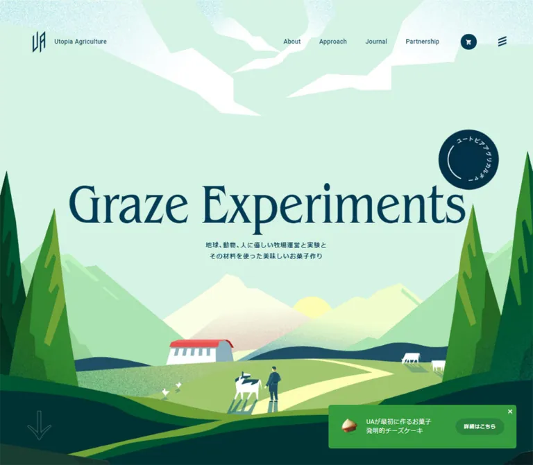
The desktop opening is a full-screen pastoral composition: mint sky, angular white clouds, distant mountains, a pale winding path, cows, people, and a small red-roofed building. Tall foreground trees frame the title. Below, asymmetric text placement and irregular illustration boundaries create continuity between sections. The footer turns the page into a quiet dark teal field, while a persistent green cheesecake promotion keeps a compact product route visible.
閉じる
Utopia Agriculture — Style Reference
A pastoral landscape framed by monumental serif lettering, quiet Japanese copy, and deep green utility spaces.
Website: utopiaagriculture.com Original URL: https://www.utopiaagriculture.com/ Final URL: https://www.utopiaagriculture.com/ Theme: mint and warm-white introductory surfaces, illustrated green landscapes, an olive-green Products section, and a dark teal footer. No user-selectable theme was evidenced. Inspected: October 6, 2026, at 00:40:07 JST; supplied retrieval timestamp: October 5, 2026, at 15:40:07.174 UTC. Viewports: 1440 × 1000 desktop and 390 × 844 mobile, in CSS pixels. Scope: the current homepage, using three desktop captures, two mobile captures, and the supplied rendered DOM/computed-style records. Visual coverage includes the opening landscape, the Approach-to-Journal transition, the desktop footer, the mobile opening, and the lower mobile footer. Additional homepage sections are documented where DOM evidence supports them. Linked pages, purchase flows, menu opening, newsletter submission, and promotion dismissal were not exercised.
Utopia Agriculture presents its farming, research, editorial content, and confectionery products as one connected brand world. This is a corporate and editorial homepage with commerce entry points. Its identity comes from the combination of an expansive illustrated landscape and exceptionally large, tightly spaced English serif headings. Japanese explanations stay much smaller and use generous line spacing.
The desktop opening is a full-screen pastoral composition: mint sky, angular white clouds, distant mountains, a pale winding path, cows, people, and a small red-roofed building. Tall foreground trees frame the title. Below, asymmetric text placement and irregular illustration boundaries create continuity between sections. The footer turns the page into a quiet dark teal field, while a persistent green cheesecake promotion keeps a compact product route visible.
How to Read This Reference
- Measured means a value appears directly in the supplied rendered DOM or computed-style records. Geometry is rounded for readability where appropriate.
- Estimated means an appearance or dimension was judged from the original-page captures. Estimated hex colors are implementation approximations, not sampled or recovered source declarations.
- Calculated means a relationship was derived from recorded measurements. It does not establish the original CSS formula.
- Recommended means an implementation choice for reuse, including corrections to the captured mobile behavior.
- All custom-property names below are descriptive aliases. The supplied custom-property inventory was empty.
- A node's computed style is not always the final visible treatment. Several anchor wrappers have transparent backgrounds or browser-blue text while their visible contents use the branded palette.
- The mobile evidence contains clipped content and unusual geometry. Preserve those findings as inspection limitations; do not reproduce them as intentional design rules.
Tokens — Colors
Default Palette
| Name | Value | Suggested token | Evidence and role |
|---|---|---|---|
| Mint Sky | #D6F2E4 |
--color-mint |
Measured: body background at both viewports; the dominant opening sky also appears mint |
| Deep Blue Ink | #003B54 |
--color-ink |
Measured: body text, navigation, Japanese headings, and large section headings; visually used for the opening title and primary pill |
| Warm White | #FBF8F8 |
--color-paper |
Measured: story and footer foreground text; the pale Approach/Journal surface visually resembles this color, but its background declaration was not supplied |
| Pasture Olive | #457834 |
--color-pasture |
Measured: Products section background and the Home entry in the sampled menu markup |
| Pale Cream | #F6F9E6 |
--color-cream |
Measured: Products foreground and newsletter supporting text |
| Deep Teal | #003233 |
--color-deep |
Measured: newsletter submit-button fill; also a close visual approximation of the large footer field |
| Promotion Green | Approximately #309B38 |
--color-promo |
Estimated: persistent cheesecake promotion surface; exact fill was not exposed |
| Field White | Approximately #FFFFFF |
--color-field |
Estimated: newsletter input surface |
The palette has distinct jobs. Mint provides air; blue establishes readable structure; several greens build depth in the illustration; olive supports the product story; dark teal closes the page. Warm white and cream keep reversed text softer than a universal pure-white treatment.
The illustration contains additional yellow-green, forest-green, mountain-green, white, and coral-red accents. These are artwork colors, not evidence of a larger interface token system. In particular, the barn's red roof is a small scene detail, not a general CTA color.
Do not promote the sampled rgb(0, 0, 238) on certain anchor wrappers into the design palette. Those records do not match the visible treatment of the corresponding controls.
Theme Presets
No theme selector or alternate user-controlled palette was evidenced. The changes from mint to pale editorial surfaces, olive, and dark teal belong to the homepage's section sequence.
Tokens — Typography
Condensed Serif — Display Headings
- Measured family declaration:
itc-benguiat-condensed, serif. - Measured weight:
400. - Confirmed roles: Approach, Journal, Products, and the large links present in the menu markup.
- Character: tall, expressive serif forms with tight spacing and a slightly nostalgic editorial tone.
- Measured tracking:
-0.02emfor the sampled display headings and menu links. - Opening title: “Graze Experiments” visually belongs to the same display language, but its own font-family and font-size record was not supplied.
Use the named face when properly licensed and available. The CSS declaration establishes the requested family, not a supplied font file or permission to redistribute it. A generic serif fallback will preserve the broad hierarchy but may change the title's width substantially.
Heebo and Japanese Sans — Navigation and Body
Measured general stack:
heebo, "ヒラギノ角ゴ ProN W3", Meiryo, "メイリオ", sans-serif
Navigation and the small English brand name use weight 500. General paragraphs use 400. The opening Japanese statement uses 600 and wider tracking.
Measured Japanese content stack:
YakuHanJP, heebo, "ヒラギノ角ゴ ProN W3", Meiryo, "メイリオ", sans-serif
This stack appears on Japanese section headings, paragraphs, and article titles. Preserve its punctuation-handling role when reproducing the original typography setup; it is not another large display face.
Newsletter and Identity Artwork
The visible “News Letter” heading is serif, approximately 34–36px on desktop and 20px on mobile. Its exact family and size were not included in the sampled elements.
The narrow header symbol and the large angular footer wordmark are identity artwork. Their construction should not be approximated by typing ordinary characters in the display font.
Type Scale
| Role | Desktop | Mobile | Evidence and treatment |
|---|---|---|---|
| Root font size | 10px |
10px |
Measured; do not confuse this with the body size |
| General body and sampled navigation | 14.2px, weight 400 or 500 |
13.5px |
Measured; default tracking 0.284px / 0.27px, equivalent to 0.02em |
| Japanese paragraphs | 14.2px / 26.98px |
13.5px / 22.95px |
Measured; line-height ratios 1.9 and 1.7 |
| Opening Japanese statement | 14.2px / 25.56px, weight 600 |
13.5px / 24.3px, weight 600 |
Measured; 0.08em tracking |
| Japanese section subheading | 24.2px / 36.3px |
19px / 28.5px |
Measured; regular weight and 1.5 line height |
| English section heading | 144px / 129.6px |
62.4px / 49.92px |
Measured; regular serif, -0.02em tracking |
| Section-heading bottom padding | 28.8px |
12.48px |
Measured; both equal 0.2em |
| Journal article title | 17.2px, weight 400 |
13.5px, weight 600 |
Measured; desktop and mobile presentations differ |
| Footer links | 16.2px / 32.4px |
15px / 30px |
Measured; 2 line-height ratio |
| Newsletter explanation | 13.2px |
13.5px |
Measured; supplied line height is normal |
| Large menu links | 100px / 90px |
36.4px / 29.12px |
Measured in menu markup; opened state not visually verified |
| Opening English title | Approximately 140–150px |
Approximately 60–65px |
Visual estimates; the mobile title is horizontally clipped |
| Mobile promotion CTA wrapper | — | 13px |
Measured; visible nested lettering was not separately sampled |
At 1440px wide, 144px equals 10vw; at 390px, 62.4px equals 16vw. These are calculated equivalences, not proof that the original stylesheet uses those formulas.
Tokens — Spacing & Shapes
Density: broad scenic and editorial space around small utility controls.
Geometry: irregular landscape edges, mostly unboxed text, pill-shaped navigation actions, circular icon controls, and a lightly rounded rectangular promotion. There is no visible general-purpose elevated-card system.
Spacing Scale
| Relationship | Desktop evidence | Mobile evidence | Interpretation |
|---|---|---|---|
| Main editorial left edge | 270px |
39px |
Measured; equivalent to 18.75vw and 10vw at the tested widths |
| Standard mobile content width | — | 312px |
Measured; 80% of the viewport |
| Narrow Approach/Products paragraph | 331.61px |
312px |
Measured; desktop copy remains deliberately narrow |
| Story paragraph width | 450px |
312px |
Measured |
| Heading-to-paragraph gap in sampled desktop copy | Approximately 29px |
Approximately 14.25px |
Calculated from adjacent boxes |
| Paragraph-to-primary-action gap | 100px in sampled desktop sections |
33px in Approach/Products; 52.5px in the story |
Calculated from boxes; not one universal spacing token |
| Journal horizontal interval | 640px |
Not reliable | Measured desktop item origins differ by 640px |
| Journal item gap | 100px |
Not reliable | Calculated from 640px interval minus 540px item width |
| Desktop promotion viewport clearance | Approximately 20px right and bottom |
Flush with bottom and side edges | Screenshot estimate |
The desktop content is not uniformly centered. The main section titles start at x = 270px, while their measured boxes extend to x = 1350px. The footer's principal content occupies x = 270–1170px. Preserve this distinction between a broad heading/illustration composition and a narrower reading region.
Border Radius
| Element | Value or appearance | Evidence |
|---|---|---|
| Editorial surfaces and image-link boxes | Square/unboxed | Screenshot appearance and sampled wrapper radii of 0 |
| Main “View more” action | Full pill | Screenshot appearance; roughly half-height corner curvature |
| Promotion CTA | 18.318px desktop; 16.77px mobile |
Measured wrapper radii |
| Newsletter submit | 18.318px on a 36.625px desktop square; 28px on a 28px mobile square |
Measured; both render circular |
| Promotion outer container | Approximately 4px desktop |
Screenshot estimate; mobile appears effectively edge-to-edge |
| Newsletter field | Approximately 3–4px |
Screenshot estimate |
Layout Measurements
| Element | Desktop | Mobile | Confidence |
|---|---|---|---|
| Document height | 6353px |
10565px |
Recorded; mobile includes abnormal layout measurements |
| Main element height | 5473.92px |
9437.56px |
Recorded snapshot geometry |
| First story-section start | 1000px |
759.61px |
Measured; mobile value is about 90% of viewport height, without proving a 90vh source rule |
| Header box | 1440 × 180px |
390 × 0px |
Measured; mobile children still have nonzero boxes |
| Header symbol | 25 × 42.48px |
18 × 30.59px |
Measured |
| Main CTA link box | 191.69 × 63.89px |
182.25 × 60.75px |
Measured |
| Journal image-link box | 540 × 349.70px |
Abnormally large; see responsive notes | Measured desktop ratio approximately 1.544:1 |
| Footer identity artwork | 180 × 216px |
104 × 124.80px |
Measured |
| Newsletter field | Approximately 450 × 55px |
Approximately 312 × 38px |
Screenshot estimate |
| Persistent product promotion | Approximately 429 × 96px |
Approximately 390 × 59px |
Screenshot estimate |
Both main CTA sizes are consistent with a width of 13.5 × body font size and a height of 4.5 × body font size. This is a useful calculated relationship, not a recovered CSS declaration.
Components
Site Header
Role: brand identity, section navigation, and commerce access.
On desktop, a transparent header floats over the mint sky. The small angular symbol begins at x = 70px, beside a modest “Utopia Agriculture” wordmark. Navigation sits on the right: About, Approach, News, Journal, Partnership, and Products. A dark circular cart symbol and a compact mark made from slanted strokes complete the row.
The measured header is 180px high with 0 35px 0 70px padding. Navigation text is 14.2px, weight 500; the broad link boxes provide more space than their visible labels suggest. Do not add a white navigation bar, bottom rule, or shadow to the desktop opening.
The cart anchor points to https://hokkaido-special.com/cart. This is evidence of an external commerce route, not evidence that the cart was opened or a transaction was attempted.
The mobile DOM retains identity, cart, and menu controls, but the supplied mobile opening does not visibly show them. Its header parent reports zero height. The correct finding is a discrepancy between captured appearance and node geometry; neither a functioning collapsed header nor its cause can be confirmed.
Illustrated Opening
Role: communicate the farming world before asking the visitor to explore the organization or products.
The desktop composition fills the first 1000px of page height. Large mint sky areas keep the center quiet. White angular clouds frame the upper edge, distant mountains build a low horizon, and very tall trees enter from both sides. A small sun, barn, grazing cows, person, and winding pale path establish scale.
“Graze Experiments” spans most of the center in dark blue serif lettering. Below it is the two-line source statement:
地球、動物、人に優しい牧場運営と実験と
その材料を使った美味しいお菓子作り
A dark circular seal with curved lettering and an arc appears above the title's right side. A faint outlined downward arrow sits near the lower left. Their shapes suggest motion or navigation, but their actions and animation were not exercised.
The scene relies on artwork. Geometric contours alone are insufficient: grain, atmospheric color, overlapping terrain, and the tiny human/animal figures carry much of the identity.
Grazing and Brand Story
Role: explain the relationship between farming practices, environmental aims, ingredients, and confectionery.
The DOM contains “Grazing Ranch” and “Delicious for the Earth / the Animal / the People,” followed by a Japanese heading, two substantial paragraphs, and an About us link.
On desktop, the Japanese text starts at x = 720px in a 450px-wide column. The measured paragraph treatment is 14.2px / 26.98px in warm-white text. On mobile, the copy occupies the standard 312px region at x = 39px and the action is centered.
This section was not separately shown in the supplied captures. Its text, typography, and layout measurements are evidenced; its full background composition and English display treatment are not. The section wrapper is transparent, so do not infer its visible backdrop from that declaration alone.
Approach Feature
Role: introduce farming operations, research, and related initiatives.
This section pairs a narrow text column on the left with a very large illustrated terrain fragment extending across the right. Its visible lower edge is diagonal and irregular rather than a rectangular image crop. The artwork contains trees, hills, cows, people, and a pale path, continuing the opening scene's vocabulary.
The large English Approach heading is recorded at 144px; the supplied middle capture begins below it. Visible Japanese content starts with a regular 24.2px / 36.3px subheading, followed by a paragraph about 332px wide. A dark blue View more pill sits approximately 100px below the paragraph.
The illustration reaches into the visual territory of the following Journal heading. Keep this interlocking composition: a small bounded image beside a generic content card would lose the original relationship.
Primary Pill Link
Role: provide a clear route from a narrative section to a dedicated page.
The visible Approach action consists of a dark blue capsule, a light “View more” label toward the left, and a small right arrow toward the right. Its sampled anchor box is approximately 192 × 64px; the screenshot silhouette is slightly larger.
The same overall link footprint is recorded for About us, Journal View more, and Discover. Their exact visible fills should not be assumed identical because the sections use different foreground colors and the recorded anchors can be transparent wrappers.
Duplicated text such as “View more View more” occurs in the DOM. Only one label is visibly presented in the supplied capture. This may support layered presentation, but a text-roll hover effect was not verified. In a new implementation, expose one accessible link name even if decorative duplicate spans are used.
Journal Rail
Role: connect the brand's environmental themes with longer editorial content.
The desktop DOM records six article entries. Each contains an image link, a date, a Japanese title link, and a Read link. Subjects include dairy, restaurants, social media and environmental issues, soil, marine ecosystems, and animal welfare.
The measured image-link boxes are 540 × 349.70px. Their left edges occur at x = 270, 910, 1550, 2190, 2830, and 3470px: a horizontal sequence with 100px gaps. This establishes an offscreen rail arrangement. It does not establish whether movement is controlled by dragging, arrows, automatic playback, or another mechanism.
The Journal title is visible in the middle capture, but the article imagery is below that crop. Do not invent the thumbnails' photographic style, crop treatment, or hover animation. The sampled article wrappers have no rounded-card geometry.
Mobile text exposure includes the two 2026 entries, while broader section text still contains older records. This is not sufficient to infer a deliberate latest-two content policy. Mobile item geometry is abnormal and is documented below.
Products Section
Role: connect the farming story with products made using its ingredients.
The recorded section uses a measured #457834 background and #F6F9E6 foreground. A 144px Products heading precedes a narrow Japanese paragraph and a Discover link. On mobile, the heading becomes 62.4px and the paragraph uses the standard 312px width.
“Buy now” and “Online” also occur in the section text, but their exact visible anatomy and targets were not supplied. No screenshot isolates this section's principal product artwork. Preserve the confirmed olive/cream typography system without inventing a product-card grid, pricing layout, or purchase interaction.
Persistent Cheesecake Promotion
Role: keep one specific product route available during broader brand exploration.
The promotion appears in the same lower-right desktop position across all three desktop captures. Its visible anatomy is:
- Bright green, lightly rounded rectangular surface.
- Small cutout image of cheesecake pieces at the left.
- Two compact lines: “UAが最初に作るお菓子” and “発明的チーズケーキ”.
- A darker rounded link labeled “詳細はこちら”.
- A small close mark at the upper-right corner.
The link points to /products/cheesewonder/. The desktop container is approximately 429px wide and 96px high with 20px viewport clearance. On mobile it becomes an edge-to-edge bottom bar approximately 59px high. Its CTA wrapper measures 117 × 33.53px, and its dark blue outer treatment is more conspicuous in the mobile capture.
The repeated viewport placement strongly supports persistent positioning, although the supplied records do not include the container's position property. Dismissal, persistence after dismissal, and storage behavior remain unverified.
Subscription and notification text also exists in the DOM, partly outside the viewport. Those records do not prove additional visible banners or a rotation sequence. The subscription label “新規受付 停止中” concerns that offering; it is not evidence that the website is discontinued.
Newsletter Form
Role: offer ongoing product and company updates.
A serif “News Letter” heading and the smaller source label “メールマガジン登録” introduce a white email field. A dark circular arrow button sits inside the field at the right. Supporting Japanese copy is immediately below.
On desktop, the block starts at x = 720px and spans about 450px. The field is approximately 55px high; the measured submit button is a 36.625px circle. On mobile, the block uses approximately 312px of width, with a 28px visible button inside a shallower field.
The image shows the placeholder “Email,” but the input's full attributes and accessible labeling were not supplied. Submission, validation, success messages, and error states were not tested.
Footer Navigation and Identity
Role: close the visual story while keeping corporate, editorial, product, and social routes accessible.
A narrow illustrated horizon bridges into a large dark teal field. On desktop, the angular cream identity artwork occupies a 180 × 216px area at x = 270px. A Follow us on line with Instagram and Twitter symbols sits below. The newsletter and navigation share the right-side 450px column.
Below the newsletter, Sitemap occupies two narrow columns, while Products forms a neighboring list. The sitemap includes Home, About, Approach, News, Journal, Partnership, FAQ, and Contact. Product links are CHEESE WONDER, CHEESE WONDER BROWN CLASSIC, and WONDER SAND.
Footer links are simple light text, with 16.2px / 32.4px desktop typography. Muted group labels provide hierarchy without divider cards. Contact includes a small diagonal arrow. A large faint outlined upward arrow appears near the lower-left edge; its click behavior was not verified.
On mobile, newsletter, sitemap, and products stack vertically. Sitemap retains two columns; Products uses the full content width, allowing CHEESE WONDER BROWN CLASSIC to stay on one line in the supplied capture. The lower capture shows a muted ©UA mark. The identity artwork is present earlier in the mobile DOM, outside this lower screenshot.
Menu and Cart Markup
Role: additional navigation and commerce states, documented only to the extent supported by DOM evidence.
The menu markup contains large serif Home, News, About, Approach, Journal, Partnership, and Products links, plus smaller FAQ, contact, and social links. Large links are measured at 100px on desktop and 36.4px on mobile. Home has the olive-green foreground in the sampled state.
A cart area contains the empty-state text “お客様のカートに商品はありません”. Its sampled desktop coordinates are outside the viewport. Neither the menu nor cart was visually inspected in an opened state. Do not treat their node rectangles as proof of an observed overlay layout or opening animation.
Tokens — Motion & Interaction
| Element | Recorded declaration | What it supports | What remains unverified |
|---|---|---|---|
| Header | height 0.6s |
A 600ms height transition is defined | Trigger, endpoint heights, and scroll behavior |
| Brand and desktop navigation links | color 0.6s |
A 600ms color transition is defined | Hover/focus destination color |
| Cart/account links | transform 0.8s cubic-bezier(0.66, 0, 0.34, 1) |
An 800ms transform transition with symmetric easing | Transform values and initiating interaction |
| Large menu links | color 0.8s cubic-bezier(0.32, 0.94, 0.6, 1) |
An 800ms color transition with a strong early response | Open-state presentation and hover result |
| Newsletter submit | width 0.6s cubic-bezier(0.32, 0.94, 0.6, 1) |
A 600ms width transition is defined | Whether it responds to hover, focus, submission, or another state |
| Persistent promotion | Same viewport position across scroll captures | Persistent screen placement | Entrance, exit, dismissal, and repeat-visit behavior |
| Circular seal and scenic layers | Static appearance only | Their visible arrangement | Rotation, parallax, wind, or scroll-driven animation |
The supplied capture process waited for finite visible or potentially revealing animations and sampled layout stability. Perpetual animations were paused during readiness checks and resumed afterward. These precautions improve capture reliability but do not identify animation semantics or prove that every delayed state appeared.
Many sampled elements report animation: none and a transition shorthand of all without an evidenced duration. Neither should be interpreted as proof that the entire site is static or that every node has a meaningful animated transition.
Recommended motion direction: retain the source's relatively deliberate 600–800ms navigation/state transitions where appropriate, but avoid inventing dramatic scene movement. Any new hover treatment or decorative animation should be identified as an adaptation and support reduced motion.
Surfaces
| Surface | Appearance | Evidence and use |
|---|---|---|
| Opening canvas | Mint field with layered landscape artwork | Body color measured; composition visually confirmed |
| Approach/Journal area | Pale warm field with dark blue text | Visually confirmed; exact background declaration not sampled |
| Story area | Warm-white text over an unverified underlying composition | Foreground measured; full scene not captured |
| Products area | Olive field with pale cream text | Both colors measured |
| Footer | Large dark teal field with cream/light text | Visually confirmed; exact field hex approximated using the measured submit-button color |
| Newsletter field | White, shallow, minimally rounded rectangle | Visually confirmed; no elevated-card treatment |
| Main pill | Blue capsule with light content | Confirmed in the Approach capture |
| Product promotion | Bright green compact panel | Visually confirmed; approximate color |
Separation comes from large color fields, artwork silhouettes, whitespace, and contrast. Avoid introducing a general system of drop shadows, frosted panels, gradients on buttons, or rounded editorial cards. Grain belongs primarily to the illustration, not every text and form surface.
Imagery
The landscape combines polygonal construction with soft grain. Mountain faces, conifers, paths, and terrain edges are angular, while granular shading prevents the scene from feeling like a sterile diagram. The small figures and cows are simplified silhouettes with just enough contrast to remain legible.
Depth comes from scale and overlap: tall foreground trees, medium-distance fields and figures, pale mountains, and a low sun. The paths pull the eye toward the center. White animals and a red-roofed barn provide tiny focal points without competing with the typography.
The Approach image extends the same world as a large irregular fragment. The footer reduces the scenery to a narrow horizon and small silhouettes. These are related compositions, not interchangeable image rectangles.
The cheesecake promotion uses a small product cutout, creating a direct visual link between the illustrated farming story and a tangible food product. The principal Products and Journal imagery cannot be characterized from the supplied crops.
Do not infer a rendering technology from the angular style. The evidence does not establish whether the scene is made from SVG, raster layers, canvas, WebGL, or a combination. Unlike pixel art, this illustration does not call for image-rendering: pixelated.
Observed Asset References
No original asset URLs, image filenames, or intrinsic dimensions were included in the supplied DOM evidence. References below identify observed visual roles rather than inventing downloadable paths.
| Asset role | Evidence | Reuse guidance |
|---|---|---|
| Opening pastoral scene | Desktop opening and mobile opening captures | Preserve grain, scene hierarchy, side-tree framing, and a quiet sky for text |
| Approach terrain fragment | Desktop middle capture | Retain the irregular edge and large composition extending toward Journal |
| Footer landscape strip | Desktop footer capture | Use a shallow scenic transition rather than a hard horizontal divider |
| Header symbol and footer identity artwork | Captures and measured link boxes | Use authorized identity assets; preserve their different proportions |
| Cheesecake cutout | Persistent promotion in all supplied page captures | Keep it small, recognizable, and visually separate from illustrated scenery |
| Journal thumbnail slots | Desktop link rectangles only | Image content, asset paths, and crop treatment remain unknown |
Use authorized original assets when available. A reusable implementation can reproduce the layout and controls in CSS, but the brand's scenery and identity artwork require separate assets.
Layout & Responsive Behavior
Desktop Structure
The homepage follows a long sequence: opening landscape, grazing/story content, Approach, Journal, Products, then footer. Recorded section starts are approximately y = 1000, 2288, 3329, and 4487px for the story, Approach, Journal, and Products respectively. Small overlaps in measured boxes indicate that these should not be treated as a perfectly tiled stack of independent panels.
A repeated x = 270px left edge aligns the principal editorial headings, Approach copy, Journal rail, Products copy, and footer identity. The story copy and footer newsletter begin at x = 720px. This creates a strong left/right alternation without requiring a visible grid.
Large headings and landscape fragments occupy much more width than body copy. The footer's two principal halves each span approximately 450px. The Journal rail intentionally extends beyond the right edge in its sampled desktop arrangement.
Mobile Observations
- Standard content regions use x = 39px and width = 312px: 10% margins on a 390px viewport.
- Display section headings fall from 144px to 62.4px. Japanese subheadings fall from 24.2px to 19px; body copy changes only slightly, from 14.2px to 13.5px.
- Main actions become approximately
182 × 61pxand are centered in the sampled content regions. - The opening remains an immersive crop. Foreground trees occupy much of the width, and the English title is visibly clipped at both edges. The measured Japanese heading box is 481px wide with x = −45.5px.
- The desktop navigation links are absent from mobile text exposure. Although compact header controls have measured boxes, they are not visible in the supplied opening image.
- Footer content stacks, while the sitemap retains two columns. Product links receive the full 312px width.
- The persistent promotion becomes a bottom bar spanning the full viewport width.
Mobile Limitations and Anomalies
The mobile Journal image-link records are approximately 8843.88px wide and 2707.05px high. Several mobile descendant y coordinates also precede their section-wrapper coordinates. This could reflect transforms, layout faults, or capture-state effects; the supplied material does not establish the cause.
The 10565px mobile document height therefore should not be treated as a target page length. Neither should the huge Journal boxes be copied into a responsive layout. A screenshot of that section and an interaction inspection would be needed to determine its actual mobile presentation.
The lower mobile capture contains a black strip between the visible teal footer and the fixed green promotion. Its origin is unknown. Do not add a black spacer as a brand element.
Recommended adaptation: preserve the 80%-width reading column, serif/sans contrast, and persistent product route, while allowing the hero title to wrap or scale within the viewport. Constrain article media to its content width and keep navigation reliably visible. These are usability improvements, not claims about the captured implementation.
Do’s and Don’ts
Do
- Use the measured mint, blue, olive, warm-white, and cream colors for their established roles.
- Pair expressive, tightly tracked serif headings with restrained Japanese sans-serif text.
- Preserve the mismatch in scale between monumental headings and narrow reading columns.
- Keep desktop navigation transparent over the opening scene.
- Use irregular landscape edges to connect adjacent sections.
- Preserve grain and atmospheric layering in the artwork.
- Keep primary actions as simple pills with small directional arrows.
- Give the footer substantial breathing room and a clear newsletter/navigation hierarchy.
- Keep the cheesecake promotion compact and subordinate to the scenic composition.
- Separate DOM-only findings from visually verified components.
Don’t
- Don’t reduce the homepage to a single product-conversion layout; retain its corporate, research, editorial, and product routes.
- Don’t replace the landscape with generic farming stock photography or smooth gradient blobs.
- Don’t turn Approach or Journal into a uniform rounded-card grid.
- Don’t use a bold geometric sans-serif for every heading.
- Don’t center every desktop section inside the same narrow container.
- Don’t treat a transparent anchor wrapper as proof that its visible button has no fill.
- Don’t add browser-blue wrappers or the barn's red accent to the general action palette.
- Don’t claim verified parallax, seal rotation, slider controls, or text-roll effects from still captures.
- Don’t reproduce mobile headline clipping, invisible navigation, or enormous Journal widths as intentional responsive behavior.
- Don’t fabricate image paths, font files, production credits, or purchase-state behavior.
Recommended Implementation Additions
These recommendations extend the observed design; they were not verified features of the original page.
- Keep essential hero text within the mobile viewport. Crop decorative scenery independently from the text layer.
- Provide a reliable mobile header with keyboard-operable navigation and an explicit expanded state for its menu control.
- Give cart, menu, newsletter submit, close, and directional controls accessible names. Decorative arrows should not duplicate link names.
- Use one logical page heading, followed by coherent section headings. The sampled page includes both the small brand name and Japanese statement as H1 nodes.
- Give newsletter input a persistent accessible label, email-specific input behavior, and clear validation and success states.
- Increase small mobile submit and dismissal targets to at least 44 × 44px without requiring equally large visible glyphs.
- Reserve sufficient bottom space for the persistent promotion, including safe-area insets, so links remain reachable.
- Constrain Journal media to its container. If using a horizontal rail, provide keyboard access and an understandable way to navigate it.
- Respect reduced-motion preferences and avoid hiding essential text while waiting for decorative animation.
- Check contrast on muted footer group labels and faint directional controls; retain subtlety through spacing rather than making necessary controls difficult to perceive.
- Supply appropriate text alternatives for informative artwork and product images. Treat purely decorative scene layers as decorative.
Agent Prompt Guide
Quick Color Reference
- Opening mint:
#D6F2E4, measured. - Primary ink:
#003B54, measured. - Warm light color:
#FBF8F8, measured as foreground; a recommended approximation for the pale editorial surface. - Products background:
#457834, measured. - Products/newsletter cream:
#F6F9E6, measured. - Footer approximation:
#003233, measured on its submit control and visually consistent with the field. - Promotion approximation:
#309B38, estimated. - Avoid a general shadow/elevation system.
Overall Prompt
“Create a corporate and editorial homepage for a farming and confectionery brand using a full-screen pastoral illustration, mint sky #D6F2E4, deep blue text #003B54, and huge tightly tracked condensed serif headings. Use angular mountains and conifers with fine grain, a pale winding path, tiny cows and people, and a small red-roofed barn. Keep Japanese paragraphs narrow, regular-weight, and generously spaced. Arrange desktop sections asymmetrically, with large illustration fragments extending toward neighboring headings. Include an editorial article rail, an olive Products section, and a spacious dark teal footer with newsletter, sitemap, and product links. Add a compact green cheesecake promotion at the lower right, becoming a bottom bar on mobile. Keep mobile text and navigation fully visible; the captured clipping is not a feature to reproduce.”
Example Component Prompts
- Opening: “Build a mint pastoral opening with a quiet central sky, angular foreground trees at both edges, layered mountain greens, tiny animals, and a pale path. Place a very large dark blue serif ‘Graze Experiments’ title over the sky, with two small centered Japanese lines beneath. Use authorized artwork or placeholders identified as such. Do not invent parallax or rotation.”
- Approach feature: “Place a large regular condensed-serif Approach heading over a narrow Japanese text column, aligned to an asymmetric desktop inset. Add a dark blue pill with a right arrow. Let a grainy illustrated terrain fragment dominate the right side and end in an irregular diagonal edge near the next section.”
- Journal: “Create a light editorial section with a monumental Journal heading and unboxed article entries. At 1440px, use approximately 540px-wide media slots and 100px gaps. Include date, Japanese title, and a small Read link. Use native horizontal scrolling as an explicit implementation choice, and constrain media to the reading column on mobile.”
- Footer: “Create a spacious dark teal footer with angular cream identity artwork on the left and a newsletter plus navigation on the right. Use a white email field, a circular arrow submit control, quiet group labels, and simple light text links. Stack the blocks on mobile while retaining a two-column sitemap.”
- Product promotion: “Create a compact bright green persistent panel with a cheesecake cutout, the source lines ‘UAが最初に作るお菓子’ and ‘発明的チーズケーキ’, a darker pill labeled ‘詳細はこちら’, and an accessible close control. Use approximately 429 × 96px on desktop; adapt to a full-width mobile bottom bar with safe-area clearance.”
Quick Start
CSS Custom Properties
This is an implementation adaptation, not recovered source CSS. It preserves the measured palette, type hierarchy, desktop alignment, and CTA proportions. The 800px breakpoint is recommended; the original breakpoint was not supplied. Mobile heading containment, native rail scrolling, larger form targets, and explicit focus states are recommended additions.
Load licensed fonts and authorized imagery separately. The CSS does not provide the landscape, identity artwork, navigation scripts, submission logic, or promotion-dismissal behavior. Use .section-shell for headings and narrow copy; place .journal-track outside that padded shell so its offset is applied only once.
:root {
  /* Measured colors; surface uses are explained above. */
  --color-mint: #d6f2e4;
  --color-ink: #003b54;
  --color-paper: #fbf8f8;
  --color-pasture: #457834;
  --color-cream: #f6f9e6;
  --color-deep: #003233;

  /* Visual approximations for unsampled fills. */
  --color-promo: #309b38;
  --color-promo-action: #278638;
  --color-field: #ffffff;

  --font-display: itc-benguiat-condensed, serif;
  --font-body: heebo, "ヒラギノ角ゴ ProN W3", Meiryo,
    "メイリオ", sans-serif;
  --font-japanese: YakuHanJP, var(--font-body);

  --text-body: 14.2px;
  --text-subheading: 24.2px;
  --text-section: clamp(80px, 10vw, 144px);
  --text-article: 17.2px;
  --text-footer: 16.2px;
  --leading-body: 1.9;
  --leading-display: 0.9;
  --tracking-body: 0.02em;
  --tracking-display: -0.02em;

  --editorial-inset: 18.75vw;
  --copy-width: 331.61px;
  --space-action: 100px;
  --radius-pill: 999px;
  --radius-small: 4px;
  --safe-bottom: env(safe-area-inset-bottom, 0px);

  --motion-color: 600ms ease;
  --motion-transform: 800ms cubic-bezier(0.66, 0, 0.34, 1);
  --motion-control: 600ms cubic-bezier(0.32, 0.94, 0.6, 1);
}

* {
  box-sizing: border-box;
}

body {
  margin: 0;
  color: var(--color-ink);
  background: var(--color-paper);
  font-family: var(--font-body);
  font-size: var(--text-body);
  letter-spacing: var(--tracking-body);
}

img {
  display: block;
  max-inline-size: 100%;
}

button,
input {
  font: inherit;
}

button,
a {
  -webkit-tap-highlight-color: transparent;
}

[hidden] {
  display: none !important;
}

.site-header {
  position: absolute;
  inset: 0 0 auto;
  z-index: 20;
  display: flex;
  align-items: center;
  justify-content: space-between;
  min-block-size: 180px;
  padding-inline: 70px 35px;
  background: transparent;
}

.brand,
.header-tools,
.desktop-nav {
  display: flex;
  align-items: center;
}

.brand {
  gap: 21.3px;
  color: inherit;
  text-decoration: none;
  font-weight: 500;
}

.brand__symbol {
  inline-size: 25px;
  block-size: auto;
}

.desktop-nav a {
  padding: 21.3px;
  color: inherit;
  text-decoration: none;
  font-weight: 500;
  transition: color var(--motion-color);
}

.icon-control {
  display: grid;
  place-items: center;
  min-inline-size: 44px;
  min-block-size: 44px;
  border: 0;
  color: inherit;
  background: transparent;
  cursor: pointer;
}

.hero {
  position: relative;
  isolation: isolate;
  min-block-size: 100svh;
  overflow: hidden;
  background: var(--color-mint);
}

.hero__art {
  position: absolute;
  inset: 0;
  z-index: -1;
  inline-size: 100%;
  block-size: 100%;
  object-fit: cover;
  object-position: center bottom;
}

.hero__copy {
  position: absolute;
  inset-block-start: 37%;
  inset-inline-start: 50%;
  inline-size: min(90%, 1200px);
  transform: translateX(-50%);
  text-align: center;
}

.hero__title {
  margin: 0;
  font-family: var(--font-display);
  font-size: clamp(72px, 10vw, 144px);
  font-weight: 400;
  line-height: 0.95;
  letter-spacing: var(--tracking-display);
}

.hero__tagline {
  margin: 24px 0 0;
  font-size: var(--text-body);
  font-weight: 600;
  line-height: 1.8;
  letter-spacing: 0.08em;
}

.section-shell {
  padding-inline: var(--editorial-inset) 6.25vw;
}

.section-title {
  margin: 0;
  padding-block-end: 0.2em;
  font-family: var(--font-display);
  font-size: var(--text-section);
  font-weight: 400;
  line-height: var(--leading-display);
  letter-spacing: var(--tracking-display);
}

.section-subheading {
  margin: 29px 0;
  font-family: var(--font-japanese);
  font-size: var(--text-subheading);
  font-weight: 400;
  line-height: 1.5;
}

.section-copy {
  max-inline-size: var(--copy-width);
  margin: 0;
  font-family: var(--font-japanese);
  line-height: var(--leading-body);
}

.pill-link {
  display: inline-flex;
  align-items: center;
  justify-content: space-between;
  inline-size: 13.5em;
  min-block-size: 4.5em;
  margin-block-start: var(--space-action);
  padding-inline: 2.2em;
  border-radius: var(--radius-pill);
  color: var(--color-paper);
  background: var(--color-ink);
  font-size: var(--text-body);
  text-decoration: none;
}

.approach {
  position: relative;
  isolation: isolate;
  padding-block: 220px 240px;
}

.approach__art {
  position: absolute;
  z-index: -1;
  inset-block-start: 0;
  inset-inline-end: 0;
  inline-size: 58%;
  block-size: auto;
  pointer-events: none;
}

/* Recommended native rail; original navigation was not tested. */
.journal-track {
  display: grid;
  grid-auto-flow: column;
  grid-auto-columns: min(37.5vw, 540px);
  gap: 100px;
  inline-size: calc(100% - var(--editorial-inset));
  margin-inline-start: var(--editorial-inset);
  padding-block-end: 20px;
  overflow-x: auto;
  scroll-snap-type: x proximity;
}

.journal-item {
  min-inline-size: 0;
  scroll-snap-align: start;
}

.journal-item__media {
  display: block;
  aspect-ratio: 540 / 349.7;
  overflow: hidden;
}

.journal-item__media img {
  inline-size: 100%;
  block-size: 100%;
  object-fit: cover;
}

.journal-item__title {
  margin: 0;
  padding-block: 1em;
  font-family: var(--font-japanese);
  font-size: var(--text-article);
  font-weight: 400;
}

.journal-item a {
  color: inherit;
  text-decoration: none;
}

.products {
  padding-block: 240px 200px;
  color: var(--color-cream);
  background: var(--color-pasture);
}

.site-footer {
  padding-block: 200px 160px;
  color: var(--color-cream);
  background: var(--color-deep);
}

.footer-inner {
  display: grid;
  grid-template-columns: minmax(0, 1fr) minmax(0, 1fr);
  inline-size: 62.5%;
  margin-inline: auto;
}

.footer-brand img {
  inline-size: 180px;
  block-size: auto;
}

.newsletter-title {
  margin: 0 0 18px;
  font-family: var(--font-display);
  font-size: 36px;
  font-weight: 400;
}

.newsletter-field {
  display: flex;
  align-items: center;
  gap: 8px;
  min-block-size: 55px;
  padding: 5px 8px 5px 13px;
  border-radius: var(--radius-small);
  background: var(--color-field);
}

.newsletter-field input {
  flex: 1;
  min-inline-size: 0;
  min-block-size: 40px;
  border: 0;
  color: var(--color-ink);
  background: transparent;
  font-size: 16px;
}

/* Recommended larger target than the sampled visible button. */
.newsletter-submit {
  flex: 0 0 44px;
  inline-size: 44px;
  block-size: 44px;
  border: 0;
  border-radius: 50%;
  color: var(--color-cream);
  background: var(--color-deep);
  cursor: pointer;
}

.newsletter-note {
  margin: 14px 0 0;
  font-size: 13.2px;
  line-height: 1.6;
}

.footer-links {
  display: grid;
  grid-template-columns: minmax(0, 1fr) minmax(0, 1fr);
  margin-block-start: 50px;
}

.sitemap-links {
  display: grid;
  grid-template-columns: minmax(0, 1fr) minmax(0, 1fr);
}

.footer-links a {
  color: var(--color-paper);
  font-size: var(--text-footer);
  line-height: 2;
  text-decoration: none;
}

.product-links a {
  display: block;
}

.promo {
  position: fixed;
  z-index: 30;
  inset-inline-end: 20px;
  inset-block-end: calc(20px + var(--safe-bottom));
  display: grid;
  grid-template-columns: 48px minmax(0, 1fr) 110px;
  align-items: center;
  gap: 12px;
  inline-size: min(429px, calc(100vw - 40px));
  min-block-size: 96px;
  padding: 20px 48px 20px 20px;
  border-radius: var(--radius-small);
  color: var(--color-cream);
  background: var(--color-promo);
}

.promo__copy {
  margin: 0;
  font-size: 13px;
  line-height: 1.6;
}

.promo__cta {
  display: grid;
  place-items: center;
  min-block-size: 44px;
  padding-inline: 8px;
  border-radius: var(--radius-pill);
  color: inherit;
  background: var(--color-promo-action);
  font-size: 13px;
  font-weight: 600;
  text-decoration: none;
}

.promo__close {
  position: absolute;
  inset-block-start: 0;
  inset-inline-end: 0;
  inline-size: 44px;
  block-size: 44px;
  border: 0;
  color: inherit;
  background: transparent;
  cursor: pointer;
}

:where(a, button, input):focus-visible {
  outline: 2px solid currentColor;
  outline-offset: 4px;
}

@media (max-width: 800px) {
  :root {
    --text-body: 13.5px;
    --text-subheading: 19px;
    --text-section: clamp(42px, 16vw, 72px);
    --text-article: 13.5px;
    --text-footer: 15px;
    --leading-body: 1.7;
    --leading-display: 0.8;
    --editorial-inset: 10vw;
    --copy-width: 100%;
    --space-action: 33px;
  }

  .site-header {
    min-block-size: 75px;
    padding-inline: 27px 12px;
  }

  .brand {
    gap: 12px;
  }

  .brand__symbol {
    inline-size: 18px;
  }

  .desktop-nav {
    display: none;
  }

  .hero {
    min-block-size: 90svh;
  }

  .hero__copy {
    inset-block-start: 50%;
    inline-size: 80%;
  }

  /* Recommended containment instead of the observed clipping. */
  .hero__title {
    font-size: clamp(40px, 12vw, 64px);
    line-height: 1;
    text-wrap: balance;
  }

  .hero__tagline {
    margin-block-start: 24px;
  }

  .section-shell {
    padding-inline: 10vw;
  }

  .section-subheading {
    margin-block: 16px;
  }

  .pill-link {
    display: flex;
    margin-inline: auto;
  }

  .approach,
  .products {
    padding-block: 100px;
  }

  .approach__art {
    position: relative;
    inline-size: 100%;
    margin-block-start: 50px;
  }

  .journal-track {
    grid-auto-flow: row;
    grid-auto-columns: auto;
    grid-template-columns: minmax(0, 1fr);
    gap: 36px;
    inline-size: 80%;
    margin-inline: auto;
    overflow: visible;
    scroll-snap-type: none;
  }

  .journal-item__title {
    font-weight: 600;
  }

  .site-footer {
    padding-block: 100px calc(130px + var(--safe-bottom));
  }

  .footer-inner {
    grid-template-columns: minmax(0, 1fr);
    gap: 80px;
    inline-size: 80%;
  }

  .footer-brand img {
    inline-size: 104px;
  }

  .newsletter-title {
    font-size: 20px;
  }

  .newsletter-note {
    font-size: 13.5px;
  }

  .footer-links {
    grid-template-columns: minmax(0, 1fr);
    gap: 24px;
    margin-block-start: 80px;
  }

  .promo {
    inset-inline: 0;
    inset-block-end: 0;
    grid-template-columns: 40px minmax(0, 1fr) 117px;
    gap: 8px;
    inline-size: 100%;
    min-block-size: 64px;
    padding: 8px 44px calc(8px + var(--safe-bottom)) 12px;
    border-radius: 0;
  }

  .promo__copy {
    font-size: 12px;
    line-height: 1.45;
  }
}

@media (prefers-reduced-motion: reduce) {
  .site-header,
  .desktop-nav a,
  .icon-control,
  .newsletter-submit,
  .promo {
    transition: none;
    animation: none;
  }

  .journal-track {
    scroll-behavior: auto;
  }
}
The code deliberately uses a conventional document root instead of copying the original 10px root. Its newsletter input and control targets are larger than the captured mobile form. The mobile Approach arrangement is a practical stacked adaptation because its full original layout was not visually supplied.
Tailwind v4 Token Mapping
Optional aliases for an implementation already using Tailwind v4. This is not evidence that the original site uses Tailwind. Define the custom properties above first.
@theme inline {
  --color-mint: #d6f2e4;
  --color-ink: #003b54;
  --color-paper: #fbf8f8;
  --color-pasture: #457834;
  --color-cream: #f6f9e6;
  --color-deep: #003233;
  --color-promo: #309b38;

  --font-editorial: var(--font-display);
  --font-interface: var(--font-body);
  --font-content-ja: var(--font-japanese);

  --text-copy: var(--text-body);
  --text-section-display: var(--text-section);
  --text-content-heading: var(--text-subheading);
  --text-article-heading: var(--text-article);
  --text-footer-link: var(--text-footer);

  --spacing-editorial-inset: var(--editorial-inset);
  --spacing-copy-column: var(--copy-width);
  --spacing-action-gap: var(--space-action);

  --radius-capsule: 999px;
  --radius-utility: 4px;
}
Sources & Evidence
- Inspected original/final page: Utopia Agriculture homepage. Both supplied URLs are identical; recorded HTTP status is 200.
- Capture time: October 5, 2026, 15:40:07.174 UTC / October 6, 2026, 00:40:07.174 JST.
- Desktop evidence: 1440 × 1000 CSS-pixel opening, middle, and footer captures, plus rendered text, link destinations, element rectangles, and computed styles. Recorded document height: 6353px.
- Mobile evidence: 390 × 844 CSS-pixel opening and lower-footer captures, plus rendered text, link destinations, element rectangles, and computed styles. Recorded document height: 10565px, with substantial layout anomalies.
- Collection behavior: the supplied process waited for document load, finite animations, sampled layout/text stability, and visible-image decoding within stated limits. It traversed intermediate scroll positions. SharedWorkers and service workers were disabled during inspection.
- Interaction limits: scrolling is represented by the supplied captures. No click results, hover recordings, form submissions, cart operations, menu-open captures, or promotion-dismissal outcomes were supplied. Recorded transition declarations are distinguished from observed interaction results.
- Coverage limits: principal Journal imagery, the full Products composition, and the complete story-section appearance are not shown. No asset inventory, source stylesheet rules, font files, or verified responsive breakpoint definitions were provided.
- Analysis method: this reference uses only the supplied original-page captures and rendered evidence. No additional browsing, commands, file access, or linked-page inspection was performed.
This document describes the captured current homepage. Measurements are evidence-specific, visual approximations are labeled, and the reusable CSS includes explicit responsive and accessibility recommendations.
# Utopia Agriculture — Style Reference

> A pastoral landscape framed by monumental serif lettering, quiet Japanese copy, and deep green utility spaces.

**Website:** [utopiaagriculture.com](https://www.utopiaagriculture.com/)
**Original URL:** https://www.utopiaagriculture.com/
**Final URL:** https://www.utopiaagriculture.com/
**Theme:** mint and warm-white introductory surfaces, illustrated green landscapes, an olive-green Products section, and a dark teal footer. No user-selectable theme was evidenced.
**Inspected:** October 6, 2026, at 00:40:07 JST; supplied retrieval timestamp: October 5, 2026, at 15:40:07.174 UTC.
**Viewports:** 1440 × 1000 desktop and 390 × 844 mobile, in CSS pixels.
**Scope:** the current homepage, using three desktop captures, two mobile captures, and the supplied rendered DOM/computed-style records. Visual coverage includes the opening landscape, the Approach-to-Journal transition, the desktop footer, the mobile opening, and the lower mobile footer. Additional homepage sections are documented where DOM evidence supports them. Linked pages, purchase flows, menu opening, newsletter submission, and promotion dismissal were not exercised.

Utopia Agriculture presents its farming, research, editorial content, and confectionery products as one connected brand world. This is a corporate and editorial homepage with commerce entry points. Its identity comes from the combination of an expansive illustrated landscape and exceptionally large, tightly spaced English serif headings. Japanese explanations stay much smaller and use generous line spacing.

The desktop opening is a full-screen pastoral composition: mint sky, angular white clouds, distant mountains, a pale winding path, cows, people, and a small red-roofed building. Tall foreground trees frame the title. Below, asymmetric text placement and irregular illustration boundaries create continuity between sections. The footer turns the page into a quiet dark teal field, while a persistent green cheesecake promotion keeps a compact product route visible.
閉じる
# Utopia Agriculture — Style Reference

> A pastoral landscape framed by monumental serif lettering, quiet Japanese copy, and deep green utility spaces.

**Website:** [utopiaagriculture.com](https://www.utopiaagriculture.com/)
**Original URL:** https://www.utopiaagriculture.com/
**Final URL:** https://www.utopiaagriculture.com/
**Theme:** mint and warm-white introductory surfaces, illustrated green landscapes, an olive-green Products section, and a dark teal footer. No user-selectable theme was evidenced.
**Inspected:** October 6, 2026, at 00:40:07 JST; supplied retrieval timestamp: October 5, 2026, at 15:40:07.174 UTC.
**Viewports:** 1440 × 1000 desktop and 390 × 844 mobile, in CSS pixels.
**Scope:** the current homepage, using three desktop captures, two mobile captures, and the supplied rendered DOM/computed-style records. Visual coverage includes the opening landscape, the Approach-to-Journal transition, the desktop footer, the mobile opening, and the lower mobile footer. Additional homepage sections are documented where DOM evidence supports them. Linked pages, purchase flows, menu opening, newsletter submission, and promotion dismissal were not exercised.

Utopia Agriculture presents its farming, research, editorial content, and confectionery products as one connected brand world. This is a corporate and editorial homepage with commerce entry points. Its identity comes from the combination of an expansive illustrated landscape and exceptionally large, tightly spaced English serif headings. Japanese explanations stay much smaller and use generous line spacing.

The desktop opening is a full-screen pastoral composition: mint sky, angular white clouds, distant mountains, a pale winding path, cows, people, and a small red-roofed building. Tall foreground trees frame the title. Below, asymmetric text placement and irregular illustration boundaries create continuity between sections. The footer turns the page into a quiet dark teal field, while a persistent green cheesecake promotion keeps a compact product route visible.

## How to Read This Reference

- **Measured** means a value appears directly in the supplied rendered DOM or computed-style records. Geometry is rounded for readability where appropriate.
- **Estimated** means an appearance or dimension was judged from the original-page captures. Estimated hex colors are implementation approximations, not sampled or recovered source declarations.
- **Calculated** means a relationship was derived from recorded measurements. It does not establish the original CSS formula.
- **Recommended** means an implementation choice for reuse, including corrections to the captured mobile behavior.
- All custom-property names below are descriptive aliases. The supplied custom-property inventory was empty.
- A node's computed style is not always the final visible treatment. Several anchor wrappers have transparent backgrounds or browser-blue text while their visible contents use the branded palette.
- The mobile evidence contains clipped content and unusual geometry. Preserve those findings as inspection limitations; do not reproduce them as intentional design rules.

## Tokens — Colors

### Default Palette

| Name | Value | Suggested token | Evidence and role |
| --- | --- | --- | --- |
| Mint Sky | `#D6F2E4` | `--color-mint` | **Measured:** body background at both viewports; the dominant opening sky also appears mint |
| Deep Blue Ink | `#003B54` | `--color-ink` | **Measured:** body text, navigation, Japanese headings, and large section headings; visually used for the opening title and primary pill |
| Warm White | `#FBF8F8` | `--color-paper` | **Measured:** story and footer foreground text; the pale Approach/Journal surface visually resembles this color, but its background declaration was not supplied |
| Pasture Olive | `#457834` | `--color-pasture` | **Measured:** Products section background and the Home entry in the sampled menu markup |
| Pale Cream | `#F6F9E6` | `--color-cream` | **Measured:** Products foreground and newsletter supporting text |
| Deep Teal | `#003233` | `--color-deep` | **Measured:** newsletter submit-button fill; also a close visual approximation of the large footer field |
| Promotion Green | Approximately `#309B38` | `--color-promo` | **Estimated:** persistent cheesecake promotion surface; exact fill was not exposed |
| Field White | Approximately `#FFFFFF` | `--color-field` | **Estimated:** newsletter input surface |

The palette has distinct jobs. Mint provides air; blue establishes readable structure; several greens build depth in the illustration; olive supports the product story; dark teal closes the page. Warm white and cream keep reversed text softer than a universal pure-white treatment.

The illustration contains additional yellow-green, forest-green, mountain-green, white, and coral-red accents. These are artwork colors, not evidence of a larger interface token system. In particular, the barn's red roof is a small scene detail, not a general CTA color.

Do not promote the sampled `rgb(0, 0, 238)` on certain anchor wrappers into the design palette. Those records do not match the visible treatment of the corresponding controls.

### Theme Presets

No theme selector or alternate user-controlled palette was evidenced. The changes from mint to pale editorial surfaces, olive, and dark teal belong to the homepage's section sequence.

## Tokens — Typography

### Condensed Serif — Display Headings

- **Measured family declaration:** `itc-benguiat-condensed, serif`.
- **Measured weight:** `400`.
- **Confirmed roles:** Approach, Journal, Products, and the large links present in the menu markup.
- **Character:** tall, expressive serif forms with tight spacing and a slightly nostalgic editorial tone.
- **Measured tracking:** `-0.02em` for the sampled display headings and menu links.
- **Opening title:** “Graze Experiments” visually belongs to the same display language, but its own font-family and font-size record was not supplied.

Use the named face when properly licensed and available. The CSS declaration establishes the requested family, not a supplied font file or permission to redistribute it. A generic serif fallback will preserve the broad hierarchy but may change the title's width substantially.

### Heebo and Japanese Sans — Navigation and Body

**Measured general stack:**

```css
heebo, "ヒラギノ角ゴ ProN W3", Meiryo, "メイリオ", sans-serif
```

Navigation and the small English brand name use weight `500`. General paragraphs use `400`. The opening Japanese statement uses `600` and wider tracking.

**Measured Japanese content stack:**

```css
YakuHanJP, heebo, "ヒラギノ角ゴ ProN W3", Meiryo, "メイリオ", sans-serif
```

This stack appears on Japanese section headings, paragraphs, and article titles. Preserve its punctuation-handling role when reproducing the original typography setup; it is not another large display face.

### Newsletter and Identity Artwork

The visible “News Letter” heading is serif, approximately 34–36px on desktop and 20px on mobile. Its exact family and size were not included in the sampled elements.

The narrow header symbol and the large angular footer wordmark are identity artwork. Their construction should not be approximated by typing ordinary characters in the display font.

### Type Scale

| Role | Desktop | Mobile | Evidence and treatment |
| --- | --- | --- | --- |
| Root font size | `10px` | `10px` | Measured; do not confuse this with the body size |
| General body and sampled navigation | `14.2px`, weight `400` or `500` | `13.5px` | Measured; default tracking `0.284px` / `0.27px`, equivalent to `0.02em` |
| Japanese paragraphs | `14.2px / 26.98px` | `13.5px / 22.95px` | Measured; line-height ratios `1.9` and `1.7` |
| Opening Japanese statement | `14.2px / 25.56px`, weight `600` | `13.5px / 24.3px`, weight `600` | Measured; `0.08em` tracking |
| Japanese section subheading | `24.2px / 36.3px` | `19px / 28.5px` | Measured; regular weight and `1.5` line height |
| English section heading | `144px / 129.6px` | `62.4px / 49.92px` | Measured; regular serif, `-0.02em` tracking |
| Section-heading bottom padding | `28.8px` | `12.48px` | Measured; both equal `0.2em` |
| Journal article title | `17.2px`, weight `400` | `13.5px`, weight `600` | Measured; desktop and mobile presentations differ |
| Footer links | `16.2px / 32.4px` | `15px / 30px` | Measured; `2` line-height ratio |
| Newsletter explanation | `13.2px` | `13.5px` | Measured; supplied line height is `normal` |
| Large menu links | `100px / 90px` | `36.4px / 29.12px` | Measured in menu markup; opened state not visually verified |
| Opening English title | Approximately `140–150px` | Approximately `60–65px` | Visual estimates; the mobile title is horizontally clipped |
| Mobile promotion CTA wrapper | — | `13px` | Measured; visible nested lettering was not separately sampled |

At 1440px wide, `144px` equals `10vw`; at 390px, `62.4px` equals `16vw`. These are calculated equivalences, not proof that the original stylesheet uses those formulas.

## Tokens — Spacing & Shapes

**Density:** broad scenic and editorial space around small utility controls.

**Geometry:** irregular landscape edges, mostly unboxed text, pill-shaped navigation actions, circular icon controls, and a lightly rounded rectangular promotion. There is no visible general-purpose elevated-card system.

### Spacing Scale

| Relationship | Desktop evidence | Mobile evidence | Interpretation |
| --- | --- | --- | --- |
| Main editorial left edge | `270px` | `39px` | Measured; equivalent to `18.75vw` and `10vw` at the tested widths |
| Standard mobile content width | — | `312px` | Measured; `80%` of the viewport |
| Narrow Approach/Products paragraph | `331.61px` | `312px` | Measured; desktop copy remains deliberately narrow |
| Story paragraph width | `450px` | `312px` | Measured |
| Heading-to-paragraph gap in sampled desktop copy | Approximately `29px` | Approximately `14.25px` | Calculated from adjacent boxes |
| Paragraph-to-primary-action gap | `100px` in sampled desktop sections | `33px` in Approach/Products; `52.5px` in the story | Calculated from boxes; not one universal spacing token |
| Journal horizontal interval | `640px` | Not reliable | Measured desktop item origins differ by `640px` |
| Journal item gap | `100px` | Not reliable | Calculated from `640px` interval minus `540px` item width |
| Desktop promotion viewport clearance | Approximately `20px` right and bottom | Flush with bottom and side edges | Screenshot estimate |

The desktop content is not uniformly centered. The main section titles start at x = 270px, while their measured boxes extend to x = 1350px. The footer's principal content occupies x = 270–1170px. Preserve this distinction between a broad heading/illustration composition and a narrower reading region.

### Border Radius

| Element | Value or appearance | Evidence |
| --- | --- | --- |
| Editorial surfaces and image-link boxes | Square/unboxed | Screenshot appearance and sampled wrapper radii of `0` |
| Main “View more” action | Full pill | Screenshot appearance; roughly half-height corner curvature |
| Promotion CTA | `18.318px` desktop; `16.77px` mobile | Measured wrapper radii |
| Newsletter submit | `18.318px` on a `36.625px` desktop square; `28px` on a `28px` mobile square | Measured; both render circular |
| Promotion outer container | Approximately `4px` desktop | Screenshot estimate; mobile appears effectively edge-to-edge |
| Newsletter field | Approximately `3–4px` | Screenshot estimate |

### Layout Measurements

| Element | Desktop | Mobile | Confidence |
| --- | --- | --- | --- |
| Document height | `6353px` | `10565px` | Recorded; mobile includes abnormal layout measurements |
| Main element height | `5473.92px` | `9437.56px` | Recorded snapshot geometry |
| First story-section start | `1000px` | `759.61px` | Measured; mobile value is about 90% of viewport height, without proving a `90vh` source rule |
| Header box | `1440 × 180px` | `390 × 0px` | Measured; mobile children still have nonzero boxes |
| Header symbol | `25 × 42.48px` | `18 × 30.59px` | Measured |
| Main CTA link box | `191.69 × 63.89px` | `182.25 × 60.75px` | Measured |
| Journal image-link box | `540 × 349.70px` | Abnormally large; see responsive notes | Measured desktop ratio approximately `1.544:1` |
| Footer identity artwork | `180 × 216px` | `104 × 124.80px` | Measured |
| Newsletter field | Approximately `450 × 55px` | Approximately `312 × 38px` | Screenshot estimate |
| Persistent product promotion | Approximately `429 × 96px` | Approximately `390 × 59px` | Screenshot estimate |

Both main CTA sizes are consistent with a width of `13.5 × body font size` and a height of `4.5 × body font size`. This is a useful calculated relationship, not a recovered CSS declaration.

## Components

### Site Header

**Role:** brand identity, section navigation, and commerce access.

On desktop, a transparent header floats over the mint sky. The small angular symbol begins at x = 70px, beside a modest “Utopia Agriculture” wordmark. Navigation sits on the right: About, Approach, News, Journal, Partnership, and Products. A dark circular cart symbol and a compact mark made from slanted strokes complete the row.

The measured header is 180px high with `0 35px 0 70px` padding. Navigation text is `14.2px`, weight `500`; the broad link boxes provide more space than their visible labels suggest. Do not add a white navigation bar, bottom rule, or shadow to the desktop opening.

The cart anchor points to `https://hokkaido-special.com/cart`. This is evidence of an external commerce route, not evidence that the cart was opened or a transaction was attempted.

The mobile DOM retains identity, cart, and menu controls, but the supplied mobile opening does not visibly show them. Its header parent reports zero height. The correct finding is a discrepancy between captured appearance and node geometry; neither a functioning collapsed header nor its cause can be confirmed.

### Illustrated Opening

**Role:** communicate the farming world before asking the visitor to explore the organization or products.

The desktop composition fills the first 1000px of page height. Large mint sky areas keep the center quiet. White angular clouds frame the upper edge, distant mountains build a low horizon, and very tall trees enter from both sides. A small sun, barn, grazing cows, person, and winding pale path establish scale.

“Graze Experiments” spans most of the center in dark blue serif lettering. Below it is the two-line source statement:

> 地球、動物、人に優しい牧場運営と実験と
> その材料を使った美味しいお菓子作り

A dark circular seal with curved lettering and an arc appears above the title's right side. A faint outlined downward arrow sits near the lower left. Their shapes suggest motion or navigation, but their actions and animation were not exercised.

The scene relies on artwork. Geometric contours alone are insufficient: grain, atmospheric color, overlapping terrain, and the tiny human/animal figures carry much of the identity.

### Grazing and Brand Story

**Role:** explain the relationship between farming practices, environmental aims, ingredients, and confectionery.

The DOM contains “Grazing Ranch” and “Delicious for the Earth / the Animal / the People,” followed by a Japanese heading, two substantial paragraphs, and an About us link.

On desktop, the Japanese text starts at x = 720px in a 450px-wide column. The measured paragraph treatment is `14.2px / 26.98px` in warm-white text. On mobile, the copy occupies the standard 312px region at x = 39px and the action is centered.

This section was not separately shown in the supplied captures. Its text, typography, and layout measurements are evidenced; its full background composition and English display treatment are not. The section wrapper is transparent, so do not infer its visible backdrop from that declaration alone.

### Approach Feature

**Role:** introduce farming operations, research, and related initiatives.

This section pairs a narrow text column on the left with a very large illustrated terrain fragment extending across the right. Its visible lower edge is diagonal and irregular rather than a rectangular image crop. The artwork contains trees, hills, cows, people, and a pale path, continuing the opening scene's vocabulary.

The large English Approach heading is recorded at `144px`; the supplied middle capture begins below it. Visible Japanese content starts with a regular `24.2px / 36.3px` subheading, followed by a paragraph about 332px wide. A dark blue View more pill sits approximately 100px below the paragraph.

The illustration reaches into the visual territory of the following Journal heading. Keep this interlocking composition: a small bounded image beside a generic content card would lose the original relationship.

### Primary Pill Link

**Role:** provide a clear route from a narrative section to a dedicated page.

The visible Approach action consists of a dark blue capsule, a light “View more” label toward the left, and a small right arrow toward the right. Its sampled anchor box is approximately `192 × 64px`; the screenshot silhouette is slightly larger.

The same overall link footprint is recorded for About us, Journal View more, and Discover. Their exact visible fills should not be assumed identical because the sections use different foreground colors and the recorded anchors can be transparent wrappers.

Duplicated text such as “View more View more” occurs in the DOM. Only one label is visibly presented in the supplied capture. This may support layered presentation, but a text-roll hover effect was not verified. In a new implementation, expose one accessible link name even if decorative duplicate spans are used.

### Journal Rail

**Role:** connect the brand's environmental themes with longer editorial content.

The desktop DOM records six article entries. Each contains an image link, a date, a Japanese title link, and a Read link. Subjects include dairy, restaurants, social media and environmental issues, soil, marine ecosystems, and animal welfare.

The measured image-link boxes are `540 × 349.70px`. Their left edges occur at x = 270, 910, 1550, 2190, 2830, and 3470px: a horizontal sequence with 100px gaps. This establishes an offscreen rail arrangement. It does not establish whether movement is controlled by dragging, arrows, automatic playback, or another mechanism.

The Journal title is visible in the middle capture, but the article imagery is below that crop. Do not invent the thumbnails' photographic style, crop treatment, or hover animation. The sampled article wrappers have no rounded-card geometry.

Mobile text exposure includes the two 2026 entries, while broader section text still contains older records. This is not sufficient to infer a deliberate latest-two content policy. Mobile item geometry is abnormal and is documented below.

### Products Section

**Role:** connect the farming story with products made using its ingredients.

The recorded section uses a measured `#457834` background and `#F6F9E6` foreground. A 144px Products heading precedes a narrow Japanese paragraph and a Discover link. On mobile, the heading becomes 62.4px and the paragraph uses the standard 312px width.

“Buy now” and “Online” also occur in the section text, but their exact visible anatomy and targets were not supplied. No screenshot isolates this section's principal product artwork. Preserve the confirmed olive/cream typography system without inventing a product-card grid, pricing layout, or purchase interaction.

### Persistent Cheesecake Promotion

**Role:** keep one specific product route available during broader brand exploration.

The promotion appears in the same lower-right desktop position across all three desktop captures. Its visible anatomy is:

1. Bright green, lightly rounded rectangular surface.
2. Small cutout image of cheesecake pieces at the left.
3. Two compact lines: “UAが最初に作るお菓子” and “発明的チーズケーキ”.
4. A darker rounded link labeled “詳細はこちら”.
5. A small close mark at the upper-right corner.

The link points to `/products/cheesewonder/`. The desktop container is approximately 429px wide and 96px high with 20px viewport clearance. On mobile it becomes an edge-to-edge bottom bar approximately 59px high. Its CTA wrapper measures `117 × 33.53px`, and its dark blue outer treatment is more conspicuous in the mobile capture.

The repeated viewport placement strongly supports persistent positioning, although the supplied records do not include the container's `position` property. Dismissal, persistence after dismissal, and storage behavior remain unverified.

Subscription and notification text also exists in the DOM, partly outside the viewport. Those records do not prove additional visible banners or a rotation sequence. The subscription label “新規受付 停止中” concerns that offering; it is not evidence that the website is discontinued.

### Newsletter Form

**Role:** offer ongoing product and company updates.

A serif “News Letter” heading and the smaller source label “メールマガジン登録” introduce a white email field. A dark circular arrow button sits inside the field at the right. Supporting Japanese copy is immediately below.

On desktop, the block starts at x = 720px and spans about 450px. The field is approximately 55px high; the measured submit button is a 36.625px circle. On mobile, the block uses approximately 312px of width, with a 28px visible button inside a shallower field.

The image shows the placeholder “Email,” but the input's full attributes and accessible labeling were not supplied. Submission, validation, success messages, and error states were not tested.

### Footer Navigation and Identity

**Role:** close the visual story while keeping corporate, editorial, product, and social routes accessible.

A narrow illustrated horizon bridges into a large dark teal field. On desktop, the angular cream identity artwork occupies a `180 × 216px` area at x = 270px. A Follow us on line with Instagram and Twitter symbols sits below. The newsletter and navigation share the right-side 450px column.

Below the newsletter, Sitemap occupies two narrow columns, while Products forms a neighboring list. The sitemap includes Home, About, Approach, News, Journal, Partnership, FAQ, and Contact. Product links are CHEESE WONDER, CHEESE WONDER BROWN CLASSIC, and WONDER SAND.

Footer links are simple light text, with `16.2px / 32.4px` desktop typography. Muted group labels provide hierarchy without divider cards. Contact includes a small diagonal arrow. A large faint outlined upward arrow appears near the lower-left edge; its click behavior was not verified.

On mobile, newsletter, sitemap, and products stack vertically. Sitemap retains two columns; Products uses the full content width, allowing CHEESE WONDER BROWN CLASSIC to stay on one line in the supplied capture. The lower capture shows a muted ©UA mark. The identity artwork is present earlier in the mobile DOM, outside this lower screenshot.

### Menu and Cart Markup

**Role:** additional navigation and commerce states, documented only to the extent supported by DOM evidence.

The menu markup contains large serif Home, News, About, Approach, Journal, Partnership, and Products links, plus smaller FAQ, contact, and social links. Large links are measured at `100px` on desktop and `36.4px` on mobile. Home has the olive-green foreground in the sampled state.

A cart area contains the empty-state text “お客様のカートに商品はありません”. Its sampled desktop coordinates are outside the viewport. Neither the menu nor cart was visually inspected in an opened state. Do not treat their node rectangles as proof of an observed overlay layout or opening animation.

## Tokens — Motion & Interaction

| Element | Recorded declaration | What it supports | What remains unverified |
| --- | --- | --- | --- |
| Header | `height 0.6s` | A 600ms height transition is defined | Trigger, endpoint heights, and scroll behavior |
| Brand and desktop navigation links | `color 0.6s` | A 600ms color transition is defined | Hover/focus destination color |
| Cart/account links | `transform 0.8s cubic-bezier(0.66, 0, 0.34, 1)` | An 800ms transform transition with symmetric easing | Transform values and initiating interaction |
| Large menu links | `color 0.8s cubic-bezier(0.32, 0.94, 0.6, 1)` | An 800ms color transition with a strong early response | Open-state presentation and hover result |
| Newsletter submit | `width 0.6s cubic-bezier(0.32, 0.94, 0.6, 1)` | A 600ms width transition is defined | Whether it responds to hover, focus, submission, or another state |
| Persistent promotion | Same viewport position across scroll captures | Persistent screen placement | Entrance, exit, dismissal, and repeat-visit behavior |
| Circular seal and scenic layers | Static appearance only | Their visible arrangement | Rotation, parallax, wind, or scroll-driven animation |

The supplied capture process waited for finite visible or potentially revealing animations and sampled layout stability. Perpetual animations were paused during readiness checks and resumed afterward. These precautions improve capture reliability but do not identify animation semantics or prove that every delayed state appeared.

Many sampled elements report `animation: none` and a transition shorthand of `all` without an evidenced duration. Neither should be interpreted as proof that the entire site is static or that every node has a meaningful animated transition.

**Recommended motion direction:** retain the source's relatively deliberate 600–800ms navigation/state transitions where appropriate, but avoid inventing dramatic scene movement. Any new hover treatment or decorative animation should be identified as an adaptation and support reduced motion.

## Surfaces

| Surface | Appearance | Evidence and use |
| --- | --- | --- |
| Opening canvas | Mint field with layered landscape artwork | Body color measured; composition visually confirmed |
| Approach/Journal area | Pale warm field with dark blue text | Visually confirmed; exact background declaration not sampled |
| Story area | Warm-white text over an unverified underlying composition | Foreground measured; full scene not captured |
| Products area | Olive field with pale cream text | Both colors measured |
| Footer | Large dark teal field with cream/light text | Visually confirmed; exact field hex approximated using the measured submit-button color |
| Newsletter field | White, shallow, minimally rounded rectangle | Visually confirmed; no elevated-card treatment |
| Main pill | Blue capsule with light content | Confirmed in the Approach capture |
| Product promotion | Bright green compact panel | Visually confirmed; approximate color |

Separation comes from large color fields, artwork silhouettes, whitespace, and contrast. Avoid introducing a general system of drop shadows, frosted panels, gradients on buttons, or rounded editorial cards. Grain belongs primarily to the illustration, not every text and form surface.

## Imagery

The landscape combines polygonal construction with soft grain. Mountain faces, conifers, paths, and terrain edges are angular, while granular shading prevents the scene from feeling like a sterile diagram. The small figures and cows are simplified silhouettes with just enough contrast to remain legible.

Depth comes from scale and overlap: tall foreground trees, medium-distance fields and figures, pale mountains, and a low sun. The paths pull the eye toward the center. White animals and a red-roofed barn provide tiny focal points without competing with the typography.

The Approach image extends the same world as a large irregular fragment. The footer reduces the scenery to a narrow horizon and small silhouettes. These are related compositions, not interchangeable image rectangles.

The cheesecake promotion uses a small product cutout, creating a direct visual link between the illustrated farming story and a tangible food product. The principal Products and Journal imagery cannot be characterized from the supplied crops.

Do not infer a rendering technology from the angular style. The evidence does not establish whether the scene is made from SVG, raster layers, canvas, WebGL, or a combination. Unlike pixel art, this illustration does not call for `image-rendering: pixelated`.

### Observed Asset References

No original asset URLs, image filenames, or intrinsic dimensions were included in the supplied DOM evidence. References below identify observed visual roles rather than inventing downloadable paths.

| Asset role | Evidence | Reuse guidance |
| --- | --- | --- |
| Opening pastoral scene | Desktop opening and mobile opening captures | Preserve grain, scene hierarchy, side-tree framing, and a quiet sky for text |
| Approach terrain fragment | Desktop middle capture | Retain the irregular edge and large composition extending toward Journal |
| Footer landscape strip | Desktop footer capture | Use a shallow scenic transition rather than a hard horizontal divider |
| Header symbol and footer identity artwork | Captures and measured link boxes | Use authorized identity assets; preserve their different proportions |
| Cheesecake cutout | Persistent promotion in all supplied page captures | Keep it small, recognizable, and visually separate from illustrated scenery |
| Journal thumbnail slots | Desktop link rectangles only | Image content, asset paths, and crop treatment remain unknown |

Use authorized original assets when available. A reusable implementation can reproduce the layout and controls in CSS, but the brand's scenery and identity artwork require separate assets.

## Layout & Responsive Behavior

### Desktop Structure

The homepage follows a long sequence: opening landscape, grazing/story content, Approach, Journal, Products, then footer. Recorded section starts are approximately y = 1000, 2288, 3329, and 4487px for the story, Approach, Journal, and Products respectively. Small overlaps in measured boxes indicate that these should not be treated as a perfectly tiled stack of independent panels.

A repeated x = 270px left edge aligns the principal editorial headings, Approach copy, Journal rail, Products copy, and footer identity. The story copy and footer newsletter begin at x = 720px. This creates a strong left/right alternation without requiring a visible grid.

Large headings and landscape fragments occupy much more width than body copy. The footer's two principal halves each span approximately 450px. The Journal rail intentionally extends beyond the right edge in its sampled desktop arrangement.

### Mobile Observations

- Standard content regions use x = 39px and width = 312px: 10% margins on a 390px viewport.
- Display section headings fall from 144px to 62.4px. Japanese subheadings fall from 24.2px to 19px; body copy changes only slightly, from 14.2px to 13.5px.
- Main actions become approximately `182 × 61px` and are centered in the sampled content regions.
- The opening remains an immersive crop. Foreground trees occupy much of the width, and the English title is visibly clipped at both edges. The measured Japanese heading box is 481px wide with x = −45.5px.
- The desktop navigation links are absent from mobile text exposure. Although compact header controls have measured boxes, they are not visible in the supplied opening image.
- Footer content stacks, while the sitemap retains two columns. Product links receive the full 312px width.
- The persistent promotion becomes a bottom bar spanning the full viewport width.

### Mobile Limitations and Anomalies

The mobile Journal image-link records are approximately `8843.88px` wide and `2707.05px` high. Several mobile descendant y coordinates also precede their section-wrapper coordinates. This could reflect transforms, layout faults, or capture-state effects; the supplied material does not establish the cause.

The 10565px mobile document height therefore should not be treated as a target page length. Neither should the huge Journal boxes be copied into a responsive layout. A screenshot of that section and an interaction inspection would be needed to determine its actual mobile presentation.

The lower mobile capture contains a black strip between the visible teal footer and the fixed green promotion. Its origin is unknown. Do not add a black spacer as a brand element.

**Recommended adaptation:** preserve the 80%-width reading column, serif/sans contrast, and persistent product route, while allowing the hero title to wrap or scale within the viewport. Constrain article media to its content width and keep navigation reliably visible. These are usability improvements, not claims about the captured implementation.

## Do’s and Don’ts

### Do

- Use the measured mint, blue, olive, warm-white, and cream colors for their established roles.
- Pair expressive, tightly tracked serif headings with restrained Japanese sans-serif text.
- Preserve the mismatch in scale between monumental headings and narrow reading columns.
- Keep desktop navigation transparent over the opening scene.
- Use irregular landscape edges to connect adjacent sections.
- Preserve grain and atmospheric layering in the artwork.
- Keep primary actions as simple pills with small directional arrows.
- Give the footer substantial breathing room and a clear newsletter/navigation hierarchy.
- Keep the cheesecake promotion compact and subordinate to the scenic composition.
- Separate DOM-only findings from visually verified components.

### Don’t

- Don’t reduce the homepage to a single product-conversion layout; retain its corporate, research, editorial, and product routes.
- Don’t replace the landscape with generic farming stock photography or smooth gradient blobs.
- Don’t turn Approach or Journal into a uniform rounded-card grid.
- Don’t use a bold geometric sans-serif for every heading.
- Don’t center every desktop section inside the same narrow container.
- Don’t treat a transparent anchor wrapper as proof that its visible button has no fill.
- Don’t add browser-blue wrappers or the barn's red accent to the general action palette.
- Don’t claim verified parallax, seal rotation, slider controls, or text-roll effects from still captures.
- Don’t reproduce mobile headline clipping, invisible navigation, or enormous Journal widths as intentional responsive behavior.
- Don’t fabricate image paths, font files, production credits, or purchase-state behavior.

## Recommended Implementation Additions

These recommendations extend the observed design; they were not verified features of the original page.

- Keep essential hero text within the mobile viewport. Crop decorative scenery independently from the text layer.
- Provide a reliable mobile header with keyboard-operable navigation and an explicit expanded state for its menu control.
- Give cart, menu, newsletter submit, close, and directional controls accessible names. Decorative arrows should not duplicate link names.
- Use one logical page heading, followed by coherent section headings. The sampled page includes both the small brand name and Japanese statement as H1 nodes.
- Give newsletter input a persistent accessible label, email-specific input behavior, and clear validation and success states.
- Increase small mobile submit and dismissal targets to at least 44 × 44px without requiring equally large visible glyphs.
- Reserve sufficient bottom space for the persistent promotion, including safe-area insets, so links remain reachable.
- Constrain Journal media to its container. If using a horizontal rail, provide keyboard access and an understandable way to navigate it.
- Respect reduced-motion preferences and avoid hiding essential text while waiting for decorative animation.
- Check contrast on muted footer group labels and faint directional controls; retain subtlety through spacing rather than making necessary controls difficult to perceive.
- Supply appropriate text alternatives for informative artwork and product images. Treat purely decorative scene layers as decorative.

## Agent Prompt Guide

### Quick Color Reference

- Opening mint: `#D6F2E4`, measured.
- Primary ink: `#003B54`, measured.
- Warm light color: `#FBF8F8`, measured as foreground; a recommended approximation for the pale editorial surface.
- Products background: `#457834`, measured.
- Products/newsletter cream: `#F6F9E6`, measured.
- Footer approximation: `#003233`, measured on its submit control and visually consistent with the field.
- Promotion approximation: `#309B38`, estimated.
- Avoid a general shadow/elevation system.

### Overall Prompt

“Create a corporate and editorial homepage for a farming and confectionery brand using a full-screen pastoral illustration, mint sky `#D6F2E4`, deep blue text `#003B54`, and huge tightly tracked condensed serif headings. Use angular mountains and conifers with fine grain, a pale winding path, tiny cows and people, and a small red-roofed barn. Keep Japanese paragraphs narrow, regular-weight, and generously spaced. Arrange desktop sections asymmetrically, with large illustration fragments extending toward neighboring headings. Include an editorial article rail, an olive Products section, and a spacious dark teal footer with newsletter, sitemap, and product links. Add a compact green cheesecake promotion at the lower right, becoming a bottom bar on mobile. Keep mobile text and navigation fully visible; the captured clipping is not a feature to reproduce.”

### Example Component Prompts

1. **Opening:** “Build a mint pastoral opening with a quiet central sky, angular foreground trees at both edges, layered mountain greens, tiny animals, and a pale path. Place a very large dark blue serif ‘Graze Experiments’ title over the sky, with two small centered Japanese lines beneath. Use authorized artwork or placeholders identified as such. Do not invent parallax or rotation.”
2. **Approach feature:** “Place a large regular condensed-serif Approach heading over a narrow Japanese text column, aligned to an asymmetric desktop inset. Add a dark blue pill with a right arrow. Let a grainy illustrated terrain fragment dominate the right side and end in an irregular diagonal edge near the next section.”
3. **Journal:** “Create a light editorial section with a monumental Journal heading and unboxed article entries. At 1440px, use approximately 540px-wide media slots and 100px gaps. Include date, Japanese title, and a small Read link. Use native horizontal scrolling as an explicit implementation choice, and constrain media to the reading column on mobile.”
4. **Footer:** “Create a spacious dark teal footer with angular cream identity artwork on the left and a newsletter plus navigation on the right. Use a white email field, a circular arrow submit control, quiet group labels, and simple light text links. Stack the blocks on mobile while retaining a two-column sitemap.”
5. **Product promotion:** “Create a compact bright green persistent panel with a cheesecake cutout, the source lines ‘UAが最初に作るお菓子’ and ‘発明的チーズケーキ’, a darker pill labeled ‘詳細はこちら’, and an accessible close control. Use approximately 429 × 96px on desktop; adapt to a full-width mobile bottom bar with safe-area clearance.”

## Quick Start

### CSS Custom Properties

This is an implementation adaptation, not recovered source CSS. It preserves the measured palette, type hierarchy, desktop alignment, and CTA proportions. The 800px breakpoint is recommended; the original breakpoint was not supplied. Mobile heading containment, native rail scrolling, larger form targets, and explicit focus states are recommended additions.

Load licensed fonts and authorized imagery separately. The CSS does not provide the landscape, identity artwork, navigation scripts, submission logic, or promotion-dismissal behavior. Use `.section-shell` for headings and narrow copy; place `.journal-track` outside that padded shell so its offset is applied only once.

```css
:root {
  /* Measured colors; surface uses are explained above. */
  --color-mint: #d6f2e4;
  --color-ink: #003b54;
  --color-paper: #fbf8f8;
  --color-pasture: #457834;
  --color-cream: #f6f9e6;
  --color-deep: #003233;

  /* Visual approximations for unsampled fills. */
  --color-promo: #309b38;
  --color-promo-action: #278638;
  --color-field: #ffffff;

  --font-display: itc-benguiat-condensed, serif;
  --font-body: heebo, "ヒラギノ角ゴ ProN W3", Meiryo,
    "メイリオ", sans-serif;
  --font-japanese: YakuHanJP, var(--font-body);

  --text-body: 14.2px;
  --text-subheading: 24.2px;
  --text-section: clamp(80px, 10vw, 144px);
  --text-article: 17.2px;
  --text-footer: 16.2px;
  --leading-body: 1.9;
  --leading-display: 0.9;
  --tracking-body: 0.02em;
  --tracking-display: -0.02em;

  --editorial-inset: 18.75vw;
  --copy-width: 331.61px;
  --space-action: 100px;
  --radius-pill: 999px;
  --radius-small: 4px;
  --safe-bottom: env(safe-area-inset-bottom, 0px);

  --motion-color: 600ms ease;
  --motion-transform: 800ms cubic-bezier(0.66, 0, 0.34, 1);
  --motion-control: 600ms cubic-bezier(0.32, 0.94, 0.6, 1);
}

* {
  box-sizing: border-box;
}

body {
  margin: 0;
  color: var(--color-ink);
  background: var(--color-paper);
  font-family: var(--font-body);
  font-size: var(--text-body);
  letter-spacing: var(--tracking-body);
}

img {
  display: block;
  max-inline-size: 100%;
}

button,
input {
  font: inherit;
}

button,
a {
  -webkit-tap-highlight-color: transparent;
}

[hidden] {
  display: none !important;
}

.site-header {
  position: absolute;
  inset: 0 0 auto;
  z-index: 20;
  display: flex;
  align-items: center;
  justify-content: space-between;
  min-block-size: 180px;
  padding-inline: 70px 35px;
  background: transparent;
}

.brand,
.header-tools,
.desktop-nav {
  display: flex;
  align-items: center;
}

.brand {
  gap: 21.3px;
  color: inherit;
  text-decoration: none;
  font-weight: 500;
}

.brand__symbol {
  inline-size: 25px;
  block-size: auto;
}

.desktop-nav a {
  padding: 21.3px;
  color: inherit;
  text-decoration: none;
  font-weight: 500;
  transition: color var(--motion-color);
}

.icon-control {
  display: grid;
  place-items: center;
  min-inline-size: 44px;
  min-block-size: 44px;
  border: 0;
  color: inherit;
  background: transparent;
  cursor: pointer;
}

.hero {
  position: relative;
  isolation: isolate;
  min-block-size: 100svh;
  overflow: hidden;
  background: var(--color-mint);
}

.hero__art {
  position: absolute;
  inset: 0;
  z-index: -1;
  inline-size: 100%;
  block-size: 100%;
  object-fit: cover;
  object-position: center bottom;
}

.hero__copy {
  position: absolute;
  inset-block-start: 37%;
  inset-inline-start: 50%;
  inline-size: min(90%, 1200px);
  transform: translateX(-50%);
  text-align: center;
}

.hero__title {
  margin: 0;
  font-family: var(--font-display);
  font-size: clamp(72px, 10vw, 144px);
  font-weight: 400;
  line-height: 0.95;
  letter-spacing: var(--tracking-display);
}

.hero__tagline {
  margin: 24px 0 0;
  font-size: var(--text-body);
  font-weight: 600;
  line-height: 1.8;
  letter-spacing: 0.08em;
}

.section-shell {
  padding-inline: var(--editorial-inset) 6.25vw;
}

.section-title {
  margin: 0;
  padding-block-end: 0.2em;
  font-family: var(--font-display);
  font-size: var(--text-section);
  font-weight: 400;
  line-height: var(--leading-display);
  letter-spacing: var(--tracking-display);
}

.section-subheading {
  margin: 29px 0;
  font-family: var(--font-japanese);
  font-size: var(--text-subheading);
  font-weight: 400;
  line-height: 1.5;
}

.section-copy {
  max-inline-size: var(--copy-width);
  margin: 0;
  font-family: var(--font-japanese);
  line-height: var(--leading-body);
}

.pill-link {
  display: inline-flex;
  align-items: center;
  justify-content: space-between;
  inline-size: 13.5em;
  min-block-size: 4.5em;
  margin-block-start: var(--space-action);
  padding-inline: 2.2em;
  border-radius: var(--radius-pill);
  color: var(--color-paper);
  background: var(--color-ink);
  font-size: var(--text-body);
  text-decoration: none;
}

.approach {
  position: relative;
  isolation: isolate;
  padding-block: 220px 240px;
}

.approach__art {
  position: absolute;
  z-index: -1;
  inset-block-start: 0;
  inset-inline-end: 0;
  inline-size: 58%;
  block-size: auto;
  pointer-events: none;
}

/* Recommended native rail; original navigation was not tested. */
.journal-track {
  display: grid;
  grid-auto-flow: column;
  grid-auto-columns: min(37.5vw, 540px);
  gap: 100px;
  inline-size: calc(100% - var(--editorial-inset));
  margin-inline-start: var(--editorial-inset);
  padding-block-end: 20px;
  overflow-x: auto;
  scroll-snap-type: x proximity;
}

.journal-item {
  min-inline-size: 0;
  scroll-snap-align: start;
}

.journal-item__media {
  display: block;
  aspect-ratio: 540 / 349.7;
  overflow: hidden;
}

.journal-item__media img {
  inline-size: 100%;
  block-size: 100%;
  object-fit: cover;
}

.journal-item__title {
  margin: 0;
  padding-block: 1em;
  font-family: var(--font-japanese);
  font-size: var(--text-article);
  font-weight: 400;
}

.journal-item a {
  color: inherit;
  text-decoration: none;
}

.products {
  padding-block: 240px 200px;
  color: var(--color-cream);
  background: var(--color-pasture);
}

.site-footer {
  padding-block: 200px 160px;
  color: var(--color-cream);
  background: var(--color-deep);
}

.footer-inner {
  display: grid;
  grid-template-columns: minmax(0, 1fr) minmax(0, 1fr);
  inline-size: 62.5%;
  margin-inline: auto;
}

.footer-brand img {
  inline-size: 180px;
  block-size: auto;
}

.newsletter-title {
  margin: 0 0 18px;
  font-family: var(--font-display);
  font-size: 36px;
  font-weight: 400;
}

.newsletter-field {
  display: flex;
  align-items: center;
  gap: 8px;
  min-block-size: 55px;
  padding: 5px 8px 5px 13px;
  border-radius: var(--radius-small);
  background: var(--color-field);
}

.newsletter-field input {
  flex: 1;
  min-inline-size: 0;
  min-block-size: 40px;
  border: 0;
  color: var(--color-ink);
  background: transparent;
  font-size: 16px;
}

/* Recommended larger target than the sampled visible button. */
.newsletter-submit {
  flex: 0 0 44px;
  inline-size: 44px;
  block-size: 44px;
  border: 0;
  border-radius: 50%;
  color: var(--color-cream);
  background: var(--color-deep);
  cursor: pointer;
}

.newsletter-note {
  margin: 14px 0 0;
  font-size: 13.2px;
  line-height: 1.6;
}

.footer-links {
  display: grid;
  grid-template-columns: minmax(0, 1fr) minmax(0, 1fr);
  margin-block-start: 50px;
}

.sitemap-links {
  display: grid;
  grid-template-columns: minmax(0, 1fr) minmax(0, 1fr);
}

.footer-links a {
  color: var(--color-paper);
  font-size: var(--text-footer);
  line-height: 2;
  text-decoration: none;
}

.product-links a {
  display: block;
}

.promo {
  position: fixed;
  z-index: 30;
  inset-inline-end: 20px;
  inset-block-end: calc(20px + var(--safe-bottom));
  display: grid;
  grid-template-columns: 48px minmax(0, 1fr) 110px;
  align-items: center;
  gap: 12px;
  inline-size: min(429px, calc(100vw - 40px));
  min-block-size: 96px;
  padding: 20px 48px 20px 20px;
  border-radius: var(--radius-small);
  color: var(--color-cream);
  background: var(--color-promo);
}

.promo__copy {
  margin: 0;
  font-size: 13px;
  line-height: 1.6;
}

.promo__cta {
  display: grid;
  place-items: center;
  min-block-size: 44px;
  padding-inline: 8px;
  border-radius: var(--radius-pill);
  color: inherit;
  background: var(--color-promo-action);
  font-size: 13px;
  font-weight: 600;
  text-decoration: none;
}

.promo__close {
  position: absolute;
  inset-block-start: 0;
  inset-inline-end: 0;
  inline-size: 44px;
  block-size: 44px;
  border: 0;
  color: inherit;
  background: transparent;
  cursor: pointer;
}

:where(a, button, input):focus-visible {
  outline: 2px solid currentColor;
  outline-offset: 4px;
}

@media (max-width: 800px) {
  :root {
    --text-body: 13.5px;
    --text-subheading: 19px;
    --text-section: clamp(42px, 16vw, 72px);
    --text-article: 13.5px;
    --text-footer: 15px;
    --leading-body: 1.7;
    --leading-display: 0.8;
    --editorial-inset: 10vw;
    --copy-width: 100%;
    --space-action: 33px;
  }

  .site-header {
    min-block-size: 75px;
    padding-inline: 27px 12px;
  }

  .brand {
    gap: 12px;
  }

  .brand__symbol {
    inline-size: 18px;
  }

  .desktop-nav {
    display: none;
  }

  .hero {
    min-block-size: 90svh;
  }

  .hero__copy {
    inset-block-start: 50%;
    inline-size: 80%;
  }

  /* Recommended containment instead of the observed clipping. */
  .hero__title {
    font-size: clamp(40px, 12vw, 64px);
    line-height: 1;
    text-wrap: balance;
  }

  .hero__tagline {
    margin-block-start: 24px;
  }

  .section-shell {
    padding-inline: 10vw;
  }

  .section-subheading {
    margin-block: 16px;
  }

  .pill-link {
    display: flex;
    margin-inline: auto;
  }

  .approach,
  .products {
    padding-block: 100px;
  }

  .approach__art {
    position: relative;
    inline-size: 100%;
    margin-block-start: 50px;
  }

  .journal-track {
    grid-auto-flow: row;
    grid-auto-columns: auto;
    grid-template-columns: minmax(0, 1fr);
    gap: 36px;
    inline-size: 80%;
    margin-inline: auto;
    overflow: visible;
    scroll-snap-type: none;
  }

  .journal-item__title {
    font-weight: 600;
  }

  .site-footer {
    padding-block: 100px calc(130px + var(--safe-bottom));
  }

  .footer-inner {
    grid-template-columns: minmax(0, 1fr);
    gap: 80px;
    inline-size: 80%;
  }

  .footer-brand img {
    inline-size: 104px;
  }

  .newsletter-title {
    font-size: 20px;
  }

  .newsletter-note {
    font-size: 13.5px;
  }

  .footer-links {
    grid-template-columns: minmax(0, 1fr);
    gap: 24px;
    margin-block-start: 80px;
  }

  .promo {
    inset-inline: 0;
    inset-block-end: 0;
    grid-template-columns: 40px minmax(0, 1fr) 117px;
    gap: 8px;
    inline-size: 100%;
    min-block-size: 64px;
    padding: 8px 44px calc(8px + var(--safe-bottom)) 12px;
    border-radius: 0;
  }

  .promo__copy {
    font-size: 12px;
    line-height: 1.45;
  }
}

@media (prefers-reduced-motion: reduce) {
  .site-header,
  .desktop-nav a,
  .icon-control,
  .newsletter-submit,
  .promo {
    transition: none;
    animation: none;
  }

  .journal-track {
    scroll-behavior: auto;
  }
}
```

The code deliberately uses a conventional document root instead of copying the original 10px root. Its newsletter input and control targets are larger than the captured mobile form. The mobile Approach arrangement is a practical stacked adaptation because its full original layout was not visually supplied.

### Tailwind v4 Token Mapping

Optional aliases for an implementation already using Tailwind v4. This is not evidence that the original site uses Tailwind. Define the custom properties above first.

```css
@theme inline {
  --color-mint: #d6f2e4;
  --color-ink: #003b54;
  --color-paper: #fbf8f8;
  --color-pasture: #457834;
  --color-cream: #f6f9e6;
  --color-deep: #003233;
  --color-promo: #309b38;

  --font-editorial: var(--font-display);
  --font-interface: var(--font-body);
  --font-content-ja: var(--font-japanese);

  --text-copy: var(--text-body);
  --text-section-display: var(--text-section);
  --text-content-heading: var(--text-subheading);
  --text-article-heading: var(--text-article);
  --text-footer-link: var(--text-footer);

  --spacing-editorial-inset: var(--editorial-inset);
  --spacing-copy-column: var(--copy-width);
  --spacing-action-gap: var(--space-action);

  --radius-capsule: 999px;
  --radius-utility: 4px;
}
```

## Sources & Evidence

- **Inspected original/final page:** [Utopia Agriculture homepage](https://www.utopiaagriculture.com/). Both supplied URLs are identical; recorded HTTP status is 200.
- **Capture time:** October 5, 2026, 15:40:07.174 UTC / October 6, 2026, 00:40:07.174 JST.
- **Desktop evidence:** 1440 × 1000 CSS-pixel opening, middle, and footer captures, plus rendered text, link destinations, element rectangles, and computed styles. Recorded document height: 6353px.
- **Mobile evidence:** 390 × 844 CSS-pixel opening and lower-footer captures, plus rendered text, link destinations, element rectangles, and computed styles. Recorded document height: 10565px, with substantial layout anomalies.
- **Collection behavior:** the supplied process waited for document load, finite animations, sampled layout/text stability, and visible-image decoding within stated limits. It traversed intermediate scroll positions. SharedWorkers and service workers were disabled during inspection.
- **Interaction limits:** scrolling is represented by the supplied captures. No click results, hover recordings, form submissions, cart operations, menu-open captures, or promotion-dismissal outcomes were supplied. Recorded transition declarations are distinguished from observed interaction results.
- **Coverage limits:** principal Journal imagery, the full Products composition, and the complete story-section appearance are not shown. No asset inventory, source stylesheet rules, font files, or verified responsive breakpoint definitions were provided.
- **Analysis method:** this reference uses only the supplied original-page captures and rendered evidence. No additional browsing, commands, file access, or linked-page inspection was performed.

This document describes the captured current homepage. Measurements are evidence-specific, visual approximations are labeled, and the reusable CSS includes explicit responsive and accessibility recommendations.関連するデザイン
スタイルやページの種類、ジャンルが近いデザインを集めました。