プレビュー準備中デザインリファレンスを見る
日本のWebデザインを、AIの制作リファレンスに。
DESIGN REFERENCE
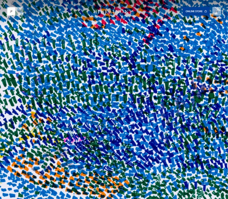
画面いっぱいの鮮やかなアートから、白い余白と繊細な明朝体の企業紹介へ展開。ロイヤリティの循環図、右側の章ナビゲーション、モバイルの下部操作バーが特徴です。
オリジナルサイトを見るA vivid artwork fills the entrance; quiet typography and generous white space carry the corporate story.
Website: heralbony.jp Original URL: https://www.heralbony.jp/ Final URL: https://www.heralbony.jp/ Theme: white editorial canvas, warm dark text, deep blue controls, and richly colored artwork Inspected: September 22, 2026; supplied evidence retrieved at 13:35:35.553 UTC / 22:35:35.553 JST Viewports: desktop 1440 × 1000 and mobile 390 × 844 CSS pixels Scope: the current Japanese corporate homepage. Visual evidence covers the desktop opening, circulation section, and footer, plus the mobile opening and lower footer. Rendered DOM and computed-style samples additionally cover the intervening business, artist, global, project, mission, news, and careers sections. Linked destination pages were not inspected.
HERALBONY introduces itself through artwork before explaining its business. The opening is almost entirely a dense field of short blue, green, and multicolored marks. A restrained wordmark and small utility controls sit over this image. Farther down, the presentation becomes spacious and precise: Japanese editorial headings, tiny English labels, fine rules, diagrams, and photography sit on white.
This is a substantial corporate homepage with several destinations and audiences. Brand products, collaborations, education, artists, exhibitions, news, recruitment, contact, and downloads coexist within its structure. The online store is a prominent external destination, rather than the organizing model for every section.
The defining relationship is between expressive artwork and disciplined framing. Preserve that relationship through the full page: immersive media, measured editorial pauses, compact navigation, a staged royalty explanation, and a footer that works as a useful directory.
A vivid artwork fills the entrance; quiet typography and generous white space carry the corporate story.
Website: heralbony.jp Original URL: https://www.heralbony.jp/ Final URL: https://www.heralbony.jp/ Theme: white editorial canvas, warm dark text, deep blue controls, and richly colored artwork Inspected: September 22, 2026; supplied evidence retrieved at 13:35:35.553 UTC / 22:35:35.553 JST Viewports: desktop 1440 × 1000 and mobile 390 × 844 CSS pixels Scope: the current Japanese corporate homepage. Visual evidence covers the desktop opening, circulation section, and footer, plus the mobile opening and lower footer. Rendered DOM and computed-style samples additionally cover the intervening business, artist, global, project, mission, news, and careers sections. Linked destination pages were not inspected.
HERALBONY introduces itself through artwork before explaining its business. The opening is almost entirely a dense field of short blue, green, and multicolored marks. A restrained wordmark and small utility controls sit over this image. Farther down, the presentation becomes spacious and precise: Japanese editorial headings, tiny English labels, fine rules, diagrams, and photography sit on white.
This is a substantial corporate homepage with several destinations and audiences. Brand products, collaborations, education, artists, exhibitions, news, recruitment, contact, and downloads coexist within its structure. The online store is a prominent external destination, rather than the organizing model for every section.
The defining relationship is between expressive artwork and disciplined framing. Preserve that relationship through the full page: immersive media, measured editorial pauses, compact navigation, a staged royalty explanation, and a footer that works as a useful directory.
--scrollbar: 0px; it did not expose a complete original design-token system.| Name | Value | Suggested token | Evidence and role |
|---|---|---|---|
| White Canvas | #FFFFFF |
--color-canvas |
Measured body background; also the selected language surface and white cookie panel appearance |
| Warm Ink | #231815 |
--color-ink |
Measured body text; gives the editorial interface a warmer character than neutral black |
| HERALBONY Blue | #004098 |
--color-action |
Measured online-store and Accept fills; visually repeated in small section markers |
| Quiet Gray | rgba(35, 24, 21, 0.03) |
--color-wash |
Measured mobile artist/global section background |
| Flattened Quiet Gray | approximately #F8F8F8 |
--color-soft |
Calculated by compositing Quiet Gray over white and rounding channels; also a close visual estimate for the footer panel |
| Reject Gray | #DADADA |
--color-neutral-control |
Measured Reject button fill |
| Fine Rule | approximately #D9D9D9 |
--color-rule |
Screenshot estimate for dividers, diagram outlines, and outlined actions |
| Reversed Text | #FFFFFF |
--color-on-art |
Measured on several project text elements and visually present in the opening wordmark and blue action labels |
The blue is a structural accent. It identifies the store action, consent acceptance, and small navigation markers. The many blues, greens, reds, oranges, and yellows inside the opening artwork belong to the image, not to a broad UI category palette.
Parent-color caveat: the store link and Accept button containers report dark inherited text in the sampled data, while their visible labels are white. Use white for the reproduced visible label. The supplied samples do not identify the exact child selector responsible.
No selectable color themes were evidenced. The supplied states show contextual contrast changes: a light wordmark over artwork and a dark wordmark over white content. This is a surface-dependent header treatment, not evidence of a dark-mode setting.
noto-sans-cjk-jp, sans-serif.The body's 13px line height is a reset-like baseline, not the reading rhythm of the whole page. Actual paragraphs use substantially more leading.
noto-sans, sans-serif.Uppercase English labels act as quiet indexing information. Keep them small and restrained rather than making every category a display headline.
shippori-mincho, serif.The visible circulation headline also has a Mincho appearance, but its actual text-bearing child was not sampled. Using Shippori Mincho for a reconstructed editorial heading is a recommendation consistent with the confirmed text elsewhere, not a measured assignment for that heading.
eb-garamond, serif.These captions bring a small gallery-label quality to the imagery. They are content attributions, not website production credits.
The wordmark appears as widely spaced serif capitals. Its measured header container is 170 × 36px at both viewports. The container's inherited Noto Sans declaration does not establish the logo's typeface or asset format. Use an authorized wordmark asset instead of approximating it with a guessed font.
Native button containers report Arial at approximately 13.33px. Their visible inner labels look smaller in the screenshots. Treat a roughly 10–11px utility label as an estimate for reproduction, not a recovered child style.
| Role | Desktop | Mobile | Evidence status |
|---|---|---|---|
| GMT / JP clocks | 9px / 9px | 9px / 9px | Measured; 4px vertical gap between lines |
| Side-rail labels | 10px / 10px; 0.52px tracking | Not visible in supplied mobile states | Measured desktop |
| Opening scroll cue | 10px / 20px | 10px / 20px | Measured; mobile cue is obscured by consent panel |
| Location/image captions | 11px / 22px | 10px / 20px | Measured |
| Directory links | 13px, weight 400 | 13px, weight 400 | Measured |
| Artist captions | 14px / 28px | 12px / 24px | Measured EB Garamond |
| Project body copy | 14px / 28px, weight 300 | 12px / 24px, weight 300 | Measured |
| News titles | 16px / 28px | 12px / 24px | Measured |
| Mission prose | 16px / 32px | 14px / 24px | Measured Shippori Mincho |
| Circulation node labels | 12px / 24px | 9px / 18px | Measured Shippori Mincho |
| Circulation phase label | 16px / 25.6px | 12px / 19.2px | Measured Shippori Mincho |
| Large Japanese section heading | Approximately 32px with 52px line spacing | Approximately 24px with 40px line spacing | Desktop visual estimate; mobile estimate informed by heading-box heights |
| Small action labels | Approximately 10–11px | Approximately 10–11px | Screenshot estimate; inner styles unavailable |
Do not introduce an oversized typographic hero. The opening artwork already provides the page's visual intensity.
Density: sparse editorial sections surrounding compact controls. Geometry: mostly rectangles with small radii; circles are reserved for the circulation diagram.
The HTML root is measured at 10px in both supplied viewport samples. A viewport-derived root formula was not supplied. Measured dimensions below use CSS pixels to avoid ambiguity.
A practical adaptation can retain a conventional root and use explicit pixel or rem equivalents. Do not assume that a measured 40px control came from a particular source rem declaration.
| Use | Desktop | Mobile | Evidence |
|---|---|---|---|
| Main editorial left inset | 64px | 20px | Measured |
| Header horizontal inset | 32px | 20px | Measured |
| Gap between language group and clocks | 20px | 20px | Calculated from measured control bounds |
| Store-to-menu gap | 12px | Menu moves to lower utility area | Measured desktop geometry |
| Store-button horizontal padding | 14px | 14px | Measured |
| Business-card vertical separation | 40px | 20px | Calculated from successive card bounds |
| Common major-section separation | 200px | Often 90–120px | Desktop repeated measured geometry; mobile varies by section |
| Footer outside inset | 28px | 20px | Measured |
| Footer bottom clearance | 30px | 100px | Measured footer padding |
| Cookie action gap | 8px | 8px | Calculated from measured button bounds |
The first content heading is positioned above its section's sampled box. Other narrative elements also extend outside parent rectangles. Absolute document coordinates should not be converted directly into ordinary flow margins without accounting for that positioning.
| Element | Value | Evidence |
|---|---|---|
| Store and outlined actions | 4px | Measured |
| Language choices | 4px | Measured |
| Business link blocks | 4px | Measured |
| Consent action buttons | 4px | Measured |
| Mobile utility-bar top corners | 20px | Measured |
| Sound-control container | 20px | Measured; visual availability unverified |
| Circulation nodes | Circular | Screenshot observation |
| Footer/image corners | Approximately 3–4px | Screenshot estimate |
Avoid expanding this into a universal pill-button or large rounded-card system.
| Element | Desktop 1440 × 1000 | Mobile 390 × 844 | Evidence |
|---|---|---|---|
| Document height | 26,979.92px | 20,198.05px | Measured |
| Standard editorial section | x = 64px; width = 1120px | x = 20px; width = 350px | Measured |
| Desktop right rail | Boundary near x = 1296px; about 144px reserved | Not visible | Screenshot estimate; label x = 1308px measured |
| Header wordmark container | 170 × 36px | 170 × 36px | Measured |
| Store control | 125.27 × 40px | 125.27 × 40px | Measured |
| Language choice | 36 × 36px | 36 × 36px | Measured |
| Menu control | 40 × 40px | 40 × 40px | Measured |
| Business link block | 1120 × 408px | 350 × 417.5px; academy block 449.5px high | Measured |
| Standard editorial text link | 128 × 22px | 111 × 22px | Measured |
| Circulation section | 8000px high | 6752px high | Measured; exactly eight viewport heights in both samples |
| Circulation caption region | 480px wide | 330px wide | Measured paragraph bounds |
| Mission prose column | 350px wide | 276px wide | Measured; desktop column sampled offscreen horizontally |
| Footer wrapper | 586.67px high | 1261.23px high | Measured, including bottom padding |
| Consent panel | Approximately 552 × 56px | Approximately 242 × 112px | Screenshot estimate |
The standard desktop content frame is deliberately left of the full viewport center. Its center is x = 624px, while the wordmark is centered at x = 720px. Preserve this distinction when aligning diagrams and headings.
Role: establish the identity through an artwork before introducing corporate information.
The artwork reaches all four viewport edges in the opening capture. It contains short, irregular, densely repeated marks on a pale ground. Cyan and cobalt dominate, with deep green, red, orange, yellow, and occasional magenta accents. The marks form larger fields and loose arcs without becoming a regular repeating UI pattern.
Only a small number of interface elements compete with it: the wordmark, language/time utilities on desktop, the blue store action, menu control, scroll cue, and consent panel. There is no large promotional headline or feature-card overlay in the observed opening.
On mobile, the artwork fills a tall portrait frame and is cropped much more tightly. Use a cover-style composition with deliberate art direction. The source media format, intrinsic dimensions, and any playback behavior were not supplied.
Role: persistent identity, language access, time display, and access to commerce and navigation.
The measured header spans the viewport and has 32px horizontal padding. Most controls occupy a band from y = 32px to y = 72px.
Anatomy:
The wordmark is white over the opening artwork and dark over the white sections. The store button remains blue. Its visible label and small bag icon are white.
A sound-control element appears in the DOM with a 135 × 40px desktop box and a translucent white background. It is not visibly established in the supplied opening screenshot. Do not insert it into every reproduced header solely because it exists in the DOM.
Role: retain immediate brand/store access while making navigation utilities available in a lower bar.
The mobile top header has a 20px horizontal inset. The wordmark stays 170px wide at the left, and the store button retains its desktop dimensions at the right. The store button begins at y = 11px.
A separate utility region contains the language switch, clocks, and menu. Its measured size is 390 × 80px with 20px rounded top corners. In the initial sample it is positioned just below the viewport at y = 844px. In the lower-page screenshot it occupies the bottom 80px of the screen.
The two states support a context-dependent lower utility bar. They do not establish the exact reveal threshold, scroll-direction rule, or animation trigger. A new implementation should coordinate its visibility with the consent panel and provide safe-area clearance.
Role: orient the reader within the long homepage.
A fine vertical line near the right edge separates a narrow navigation strip from the editorial canvas. The visible labels are ABOUT, BUSINESS, CIRCULATION, MISSION, NEWS, and CAREERS.
Labels are measured at 10px with 0.52px tracking, with approximately 27px between successive rows. Small pale square marks sit on the rule. In the supplied circulation state, the current label is darker and heavier, and its square is blue and approximately 8px wide.
The rail is not visible over the initial artwork or in the supplied mobile screenshots. Its links have empty href strings in the sampled data; navigation may be script-controlled. Click behavior and focus handling were not tested.
Role: pair a substantive Japanese statement with a small English chapter identifier.
The circulation example places the Japanese heading at the left, broken into two deliberate lines, followed by a small blue square and the English CIRCULATION label. The heading is approximately 32px with about 52px line spacing in the desktop screenshot.
Keep the Japanese statement visually dominant and the English label compact. The heading does not sit inside a decorative card. Its surrounding white space is a primary layout device.
Several other sections share this heading/label hierarchy in the DOM. Their exact rendered child typography was not included in the sample.
Role: introduce the company's distinct business destinations.
Three business links are present in the current DOM: Brand, Collaboration, and Training, Research and Education / HERALBONY ACADEMY. The introductory sentence still refers to two businesses, so the actual linked entries should guide any structural analysis.
Desktop blocks are measured as 1120 × 408px flex containers, separated by 40px. Their text region begins around x = 768px and is 384px wide. The structure combines media, business identification, a Japanese explanation, and a Learn More link.
Mobile blocks become 350px-wide block containers, separated by 20px. The inner text is approximately 318.5px wide with 15.75px side insets. Longer academy copy increases the final block's height.
The supplied screenshots do not show these blocks directly. Their responsive geometry and content anatomy are supported by the DOM; their complete image treatment and hover appearance remain unverified.
Role: connect business services to artists, international activity, and cultural initiatives.
Artist and global content pair editorial statements with larger media areas, compact labels, descriptions, and right-aligned Learn More links. Mobile gives the combined section a measured 3% warm-ink wash and reduces its inner prose/link regions to approximately 315px.
The two project features contain ROUTINERECORDS and HERALBONY ARTPRIZE identities, white explanatory text, and official-site links. Desktop descriptions occupy 256px-wide regions; mobile descriptions span 350px and use 12px/24px text. A Play Sound control is present in the music-project DOM.
These measurements support an immersive project treatment, but the supplied screenshots do not establish its exact background imagery, media format, or audio behavior. Avoid inventing those details.
Role: explain the movement of art rights, production work, remuneration, and royalties.
This is the most distinctive explanatory component in the captured middle section. A large dotted circular path sits in the editorial frame, with four white circular nodes and a central stage caption.
The captured second stage shows:
プロデュース above the circle.(2/4) indicator and the corresponding explanatory copy.The path is approximately 480px in diameter in the screenshot. Node diameters appear to range from about 140px to 160px in this state. Outlines are very pale gray; a fine blue dashed segment provides emphasis. The thin hand-drawn icons remain subordinate to the overall diagram.
The four DOM stages describe licensing art data, producing a partner initiative, receiving payment, and paying a portion of revenue to the artist as usage fees. Their paragraph rectangles substantially overlap. They should not be interpreted as four vertically stacked paragraphs in the captured composition.
The section measures exactly eight viewport heights at both inspected sizes: 8000px and 6752px. This strongly supports a long staged scroll treatment. The exact pinning implementation, stage thresholds, node movement, and path animation were not supplied. Only the second visual stage is captured.
For adaptation, preserve the four-party visual rhythm, centered phase explanation, and quiet linework. Keep all four explanations available in an accessible static fallback before adding scroll enhancement.
Role: present the company's purpose with artwork and reflective prose.
The DOM includes the statement 異彩を、放て。, an artwork title, a longer Japanese mission text, and an artist caption. The prose uses measured Shippori Mincho styling and a narrow reading column.
On desktop, some mission content is sampled far to the right of the viewport, including a paragraph at approximately x = 2956px. Together with a 6061px-high section, this suggests a staged composition extending horizontally. It does not prove the complete scroll direction or animation choreography.
On mobile, the prose is positioned within the viewport at x = 57px with a width of 276px. This creates a notably quieter reading measure than the standard 350px content frame.
Role: provide current corporate information after the principal narrative.
The news region contains four linked entries with category, date, and Japanese title. Desktop uses two columns of approximately 480px-wide entries. Within each entry, the title occupies a 288px region offset from the left, consistent with a media-and-text arrangement.
Mobile uses a single sequence of 315px-wide entries, with 189px title regions. Text reduces from 16px/28px to 12px/24px. The different content lengths produce different row heights; do not force every entry into an identical text box.
The careers section ends with a PEOPLE label, an interview-series description, and a fine underlined Career Site link. The desktop footer screenshot shows the lower edge of its people image above the description. The link sits at the right of the narrower, approximately 928px-wide content grouping.
Role: offer navigation without adding a large filled control to every section.
Learn More, About Us, All News, and Career Site appear in compact link regions, generally 128 × 22px on desktop and 111 × 22px on mobile. The measured containers include 11px bottom padding. The screenshot shows a restrained bottom rule and a small right-pointing arrow.
Preserve the short measure and fine line. Hover motion or underline animation was not demonstrated.
Role: present two distinct routes for prospective partners.
Each route combines an English editorial heading, a short Japanese explanation, and a bordered rectangular action. Buttons are measured at 160 × 40px in the main contact region, with 4px radii and 16px horizontal padding.
The footer repeats this pair. On desktop they occupy a right-hand column. On mobile they sit side by side, each approximately 147.6px wide. Their descriptions wrap across multiple short lines above 40px-high controls.
The small mail and download symbols are visually faint. A new implementation should preserve their delicacy while improving contrast and accessible naming where needed.
Role: make the full organization navigable at the end of the narrative.
The footer is a pale-gray inset panel rather than a full-bleed colored band. On desktop it begins 28px from the viewport sides; its inner content starts at x = 64px. A smaller wordmark sits above the directory, with another language switch at the upper right.
Desktop anatomy:
The four lower tile images are approximately 192 × 120px in the screenshot, using an 8:5 ratio. Their small editorial captions sit below the image rather than over it.
On mobile, the footer becomes a much taller composition inside a 350px-wide panel. The store promotion changes to a horizontal image-and-caption block measuring about 314.1 × 146.9px. Contact and download remain paired. The four photographic links form a two-column grid, with approximately 147.1 × 92px images and a roughly 20px horizontal gap. Social links follow later in the DOM.
This is meaningful reordering, not a uniformly scaled desktop footer. Keep destination labels as text, retain useful groupings, and preserve the 100px bottom clearance for the lower utility bar.
Role: present consent choices without replacing the page with a modal veil.
The desktop panel is a small white bar near the lower right: approximately 552 × 56px, 40px from the right edge and 33px from the bottom. It contains a short uppercase message, Reject and Accept controls, and a close glyph. The buttons measure 80 × 28px with an 8px gap.
On mobile, it becomes an approximately 242 × 112px centered panel. The message occupies the first row, the two 78 × 28px buttons share the second row, and the close glyph sits at the upper right. It is 20px above the viewport bottom in the opening screenshot and approximately 100px above it when the utility bar is visible.
Accept uses the same deep blue as the store action. Reject uses gray. The surrounding page remains undimmed. A subtle shadow or edge separation is visible, but its CSS values were not supplied.
Consent dismissal, storage, expiry, and the semantic difference between closing and rejecting were not tested. Reproduce the panel's anatomy separately from implementing a verified consent policy.
| Element or treatment | Measured transition | What the evidence supports |
|---|---|---|
| Main utility header | 0.8s cubic-bezier(0.19, 1, 0.22, 1) |
A defined easing and duration; changed property and trigger not supplied |
| Language links | 0.6s cubic-bezier(0.25, 0.46, 0.45, 0.94) |
Transition definition; hover/selection sequence not exercised |
| Side-rail links | 0.6s cubic-bezier(0.25, 0.46, 0.45, 0.94) |
Transition definition plus a visible active circulation state |
| Sound container and social links | 0.5s cubic-bezier(0.19, 1, 0.22, 1) |
Defined transition, not proof of sound playback or a specific hover effect |
| Consent controls | 0.8s cubic-bezier(0.19, 1, 0.22, 1) |
Defined transition; dismissal outcome untested |
| Circulation stage paragraphs | 0.8s cubic-bezier(0.19, 1, 0.22, 1) |
Overlapping stage regions and transition styling |
| Circulation phase labels | 1.2s cubic-bezier(0.19, 1, 0.22, 1) 0.4s |
Longer, delayed phase-label treatment |
| Mobile business links | opacity 1.8s and mask-position 2.2s cubic-bezier(0.165, 0.84, 0.44, 1) |
Explicit opacity/mask reveal styling; mask artwork and trigger unknown |
| GMT and JP clocks | Different displayed seconds across captures | Values update between captured states; update cadence was not measured |
The supplied collection traversed the page and captured a settled circulation stage. It did not record the complete interaction sequence. Do not assign an unsupported animation library, parallax factor, autoplay mode, or frame rate.
Many sampled elements report animation: none, and others show only transition: all without a nonzero duration. Neither is sufficient to describe the whole site as static: JavaScript-driven transforms and descendant effects may exist.
For a new implementation, favor restrained reveals and stage transitions that settle cleanly. Keep links and content usable before enhancement. A reduced-motion version should expose the full narrative without requiring a long empty scroll track.
| Layer | Appearance | Purpose |
|---|---|---|
| Opening | Full-bleed artwork | Immediate visual identity |
| Editorial canvas | White with warm dark text | Long-form corporate narrative |
| Quiet content wash | Very pale warm gray | Grouping for selected content, confirmed on mobile artist/global region |
| Footer | Pale inset panel | Dense directory, commerce, and support destinations |
| Primary control | Deep blue, small radius, white label | Store and consent acceptance |
| Secondary control | Transparent or gray, fine outline where visible | Contact, download, language, and rejection |
| Diagram | White circles and very fine gray/blue lines | Explain the royalty cycle without competing with artwork |
| Floating consent | White, minimal edge separation | Persistent utility without a full-screen backdrop |
| Mobile utility dock | White, rounded top corners | Lower-screen navigation access |
There is no broad elevated-card system in the supplied screenshots. Most structure comes from alignment, spacing, rules, and image boundaries.
The opening artwork supplies the page's strongest texture and color. Preserve the uneven marks, visible pale ground, dense layering, and irregular movement across the composition. A mathematically regular dotted pattern or a smooth gradient would lose its character.
Later photography shows art in use: patterned neckties, product arrangements, a garden campaign image, a public-facing graphic installation, and a white exhibition interior. These images ground the expressive artwork in products, environments, and organizational activity.
The circulation illustrations use fine monochrome linework. Social marks remain compact recognizable glyphs. The interface does not use a large decorative icon family.
Use natural image rendering for both artwork and photography. No evidence supports pixelated scaling or a global duotone filter.
No original image, SVG, video, or font-file URLs were included in the supplied evidence. The following inventory identifies visible assets without inventing paths.
| Asset | Observed location | Treatment and limitation |
|---|---|---|
| Dense blue/green artwork | Desktop and mobile opening | Full viewport; portrait crop on mobile; author and media format not established |
| HERALBONY wordmark | Headers and footer | White over opening artwork, dark over white; preserve the authentic graphic |
| Emblem, handshake, palette/brush | Desktop circulation stage | Fine monochrome graphics inside white circular nodes |
| Patterned neckties | Store promotion | Vertical image/caption card on desktop, horizontal composition on mobile |
| Garden brand image | First footer image link | Landscape image with visible brand lettering |
| Patterned product arrangement | Collaboration footer link | Landscape tabletop product photography |
| Graphic installation | Projects footer link | Dense printed/graphic visual detail |
| Exhibition interior | Art Exhibition footer link | White gallery walls and colorful artworks |
| People photograph | Careers section edge | Only a partial desktop crop is visible in the supplied capture |
| Artist captions | About and mission DOM | Midori Kudo and Sanae Sasaki; do not transfer either attribution to the opening artwork without evidence |
CSS can reproduce the framing, but the source artwork and wordmark carry much of the identity. Use authorized originals or clearly separate replacement assets with their own attribution.
The desktop page alternates a viewport-filling opening with a left-aligned editorial frame. Standard sections are 1120px wide at x = 64px, while a separate narrow rail occupies the right side. The centered header wordmark aligns to the whole browser width, not to that content frame.
Mobile reduces the standard content width to 350px with 20px margins. It also changes component structure: business rows stack, news becomes a single sequence, the store promotion becomes horizontal, and footer tiles move from four columns to two.
| Behavior | Desktop observation | Mobile observation |
|---|---|---|
| Opening media | Wide, full viewport | Tall, tightly cropped, full viewport |
| Identity | Wordmark centered | Wordmark left aligned |
| Utilities | Language, clocks, and menu at top | Language, clocks, and menu appear in lower dock in the scrolled capture |
| Section orientation | Right-side rail visible in circulation | No rail visible |
| Business blocks | Horizontal flex layout | Vertical block layout |
| News | Two columns | One column |
| Mission prose | Narrow column sampled within an extended horizontal composition | Narrow inset column within the viewport |
| Footer photography | Four tiles in one row | Two-by-two grid |
| Footer store promotion | Image above caption | Image beside caption |
| Consent | Lower-right horizontal bar | Centered stacked panel, lifted when dock appears |
The circulation section retains its unusually long eight-viewport height at both sizes. Its mobile caption width shrinks from 480px to 330px, and node-label type reduces from 12px to 9px. The mobile diagram itself was not supplied as a screenshot, so exact node placement and path appearance remain unverified.
The original breakpoint values were not exposed. The Quick Start uses 1024px as a recommended transition between its two layouts. Intermediate tablet widths, landscape phones, browser zoom, and safe-area behavior require separate validation.
#004098 as the principal action color and #231815 as the warm text color.These are recommendations for a new implementation, not verified features of the original page:
#FFFFFF.#231815.#004098.#F8F8F8.#DADADA.#D9D9D9, an adaptation estimate.“Create a Japanese creative-company homepage with a full-viewport artwork opening and a spacious white corporate narrative below. Use warm dark text #231815, deep blue actions #004098, small uppercase English navigation labels, Japanese Mincho editorial text, thin rules, and restrained 4px radii. Center an authentic wordmark in the desktop viewport while aligning the main content frame to a generous left inset and reserving a narrow right-side section rail. Include business features, a four-stage circular royalty explanation, mission content, news, careers, and a substantial photographic directory footer. On mobile, keep the wordmark and store action at the top, place language/time/menu utilities in a coordinated lower dock, and rearrange footer content into compact paired groups. Use authorized artwork; treat animation and responsive breakpoints as implementation choices requiring validation.”
This is an implementation scaffold, not extracted source CSS. It uses measured colors and control dimensions, estimated editorial typography, and a recommended 1024px breakpoint. Load authorized fonts and graphics separately; family names alone do not load the original font files.
Expected groups include .desktop-header, .mobile-header, .utility-dock, .hero, .content-shell, .section-nav, .business-card, .circulation-map, .footer-panel, and .cookie-panel. Header groups contain a .brand, language/time utilities, and action controls. Footer grid areas are assigned through the classes below.
The attributes data-surface, data-dock-visible, and aria-current are recommended application state hooks. Their names are not from the original page. This scaffold does not implement consent storage, audio, menu behavior, or scroll-stage progression.
:root {
  /* Measured colors */
  --color-canvas: #ffffff;
  --color-ink: #231815;
  --color-action: #004098;
  --color-neutral-control: #dadada;
  --color-wash: rgb(35 24 21 / 3%);

  /* Calculated or visually estimated surfaces */
  --color-soft: #f8f8f8;
  --color-rule: #d9d9d9;

  /* Families exposed by the supplied computed styles */
  --font-ui: 'noto-sans-cjk-jp', sans-serif;
  --font-utility: 'noto-sans', sans-serif;
  --font-editorial: 'shippori-mincho', serif;
  --font-caption: 'eb-garamond', serif;

  --text-clock: 9px;
  --text-rail: 10px;
  --text-control: 11px; /* Visible-label estimate */
  --text-ui: 13px;
  --text-prose: 16px;
  --text-heading: 32px; /* Editorial estimate */

  --page-inset: 64px;
  --header-inset: 32px;
  --content-width: 1120px;
  --rail-width: 144px;
  --section-gap: 200px;
  --radius-control: 4px;
  --dock-height: 80px;
  --safe-bottom: env(safe-area-inset-bottom, 0px);

  /* Measured transition timing aliases */
  --ease-settle: cubic-bezier(0.19, 1, 0.22, 1);
  --ease-utility: cubic-bezier(0.25, 0.46, 0.45, 0.94);
  --duration-header: 800ms;
  --duration-utility: 600ms;
}

* { box-sizing: border-box; }

body {
  margin: 0;
  color: var(--color-ink);
  background: var(--color-canvas);
  font-family: var(--font-ui);
  font-size: var(--text-ui);
  line-height: 1.8; /* Recommended reading baseline */
  letter-spacing: 0.04em;
}

button, a { -webkit-tap-highlight-color: transparent; }
a { color: inherit; }
button { font: inherit; }
img { display: block; max-width: 100%; }
[hidden] { display: none !important; }

:where(a, button):focus-visible {
  outline: 2px solid var(--color-action);
  outline-offset: 4px;
}

.desktop-header {
  position: fixed;
  z-index: 50;
  inset: 32px var(--header-inset) auto;
  display: grid;
  grid-template-columns: 1fr 170px 1fr;
  align-items: center;
  height: 40px;
}

.header-utilities, .header-actions {
  display: flex;
  align-items: center;
}

.header-utilities { gap: 20px; }
.header-actions { justify-content: flex-end; gap: 12px; }

.brand {
  display: block;
  width: 170px;
  height: 36px;
  align-self: end;
  color: var(--color-ink);
}

.brand img, .brand svg {
  width: 100%;
  height: 100%;
  object-fit: contain;
}

/* Use an authorized logo variant or currentColor-compatible graphic. */
body[data-surface='art'] .brand { color: #ffffff; }

.language-switch {
  display: grid;
  grid-template-columns: repeat(2, 36px);
  padding: 2px;
  border-radius: var(--radius-control);
  background: var(--color-soft);
}

.language-switch a {
  display: grid;
  place-items: center;
  width: 36px;
  height: 36px;
  border-radius: var(--radius-control);
  font-size: var(--text-control);
  line-height: 1;
  text-decoration: none;
}

.language-switch a[aria-current] { background: #ffffff; }

.clocks {
  display: grid;
  gap: 4px;
  font: 400 var(--text-clock)/1 var(--font-utility);
  letter-spacing: 0;
}

.clocks p { margin: 0; }

.store-button, .outline-button {
  display: inline-flex;
  align-items: center;
  justify-content: space-between;
  gap: 8px;
  min-height: 40px;
  padding-inline: 14px;
  border: 0;
  border-radius: var(--radius-control);
  font: 400 var(--text-control)/1 var(--font-utility);
  text-decoration: none;
  text-transform: uppercase;
}

.store-button {
  width: 125.27px;
  color: #ffffff;
  background: var(--color-action);
}

.outline-button {
  width: 160px;
  max-width: 100%;
  padding-inline: 16px;
  border: 1px solid var(--color-rule);
  background: transparent;
}

.menu-button {
  display: grid;
  place-items: center;
  width: 40px;
  height: 40px;
  padding: 0;
  border: 0;
  border-radius: var(--radius-control);
  color: var(--color-ink);
  background: rgb(255 255 255 / 70%);
}

.mobile-header, .utility-dock { display: none; }

.hero {
  position: relative;
  height: 100svh;
  overflow: hidden;
}

.hero-art {
  width: 100%;
  height: 100%;
  object-fit: cover;
  object-position: center;
}

.scroll-cue {
  position: absolute;
  bottom: 35px;
  left: 50%;
  margin: 0;
  transform: translateX(-50%);
  color: #ffffff;
  font: 400 10px/20px var(--font-utility);
}

.content-shell {
  width: min(var(--content-width), calc(100% - 320px));
  margin-left: var(--page-inset);
}

.content-section { margin-block: var(--section-gap); }

.section-title {
  margin: 0 0 16px;
  font: 400 var(--text-heading)/1.625 var(--font-editorial);
  letter-spacing: 0.04em;
}

.section-label {
  display: flex;
  align-items: center;
  gap: 5px;
  margin: 0;
  font: 400 14px/1.2 var(--font-caption);
  text-transform: uppercase;
}

.section-label::before {
  content: '';
  width: 8px;
  height: 8px;
  background: var(--color-action);
}

.section-nav {
  position: fixed;
  z-index: 5;
  inset: 0 0 0 auto;
  display: flex;
  flex-direction: column;
  justify-content: center;
  gap: 17px;
  width: var(--rail-width);
  padding-inline: 11px;
  border-left: 1px solid var(--color-rule);
}

.section-nav a {
  position: relative;
  font: 400 var(--text-rail)/10px var(--font-ui);
  letter-spacing: 0.52px;
  text-decoration: none;
  text-transform: uppercase;
}

.section-nav a::before {
  content: '';
  position: absolute;
  top: 3px;
  left: -14px;
  width: 4px;
  height: 4px;
  background: var(--color-rule);
}

.section-nav a[aria-current='location'] { font-weight: 700; }

.section-nav a[aria-current='location']::before {
  top: 1px;
  left: -16px;
  width: 8px;
  height: 8px;
  background: var(--color-action);
}

.business-list { display: grid; gap: 40px; }

.business-card {
  display: grid;
  grid-template-columns: 60% minmax(0, 1fr);
  min-height: 408px;
  overflow: hidden;
  border-radius: var(--radius-control);
  color: inherit;
  text-decoration: none;
}

.business-card > img {
  width: 100%;
  height: 100%;
  object-fit: cover;
}

.business-copy { padding: 48px 32px; }

.editorial-link {
  display: flex;
  align-items: center;
  justify-content: space-between;
  width: 128px;
  min-height: 22px;
  padding-bottom: 11px;
  border-bottom: 1px solid var(--color-rule);
  font: 400 11px/1 var(--font-utility);
  text-decoration: none;
  text-transform: uppercase;
}

/* Static diagram scaffold; supply phase content and graphics separately. */
.circulation-map {
  position: relative;
  width: min(480px, 100%);
  aspect-ratio: 1;
  margin: 56px auto;
  border: 1px dashed var(--color-rule);
  border-radius: 50%;
}

.circulation-node {
  position: absolute;
  display: grid;
  place-content: center;
  width: 140px;
  aspect-ratio: 1;
  padding: 16px;
  transform: translate(-50%, -50%);
  border: 1px solid var(--color-rule);
  border-radius: 50%;
  background: #ffffff;
  text-align: center;
  font: 400 12px/24px var(--font-editorial);
}

.circulation-node:nth-of-type(1) { left: 14.6%; top: 14.6%; }
.circulation-node:nth-of-type(2) { left: 85.4%; top: 14.6%; }
.circulation-node:nth-of-type(3) { left: 85.4%; top: 85.4%; }
.circulation-node:nth-of-type(4) { left: 14.6%; top: 85.4%; }

.circulation-caption {
  position: absolute;
  inset: 34% 5%;
  display: grid;
  place-content: center;
  text-align: center;
  font: 400 14px/26px var(--font-editorial);
}

.mission-prose {
  max-width: 350px;
  font: 400 16px/32px var(--font-editorial);
  letter-spacing: 0.04em;
}

.site-footer {
  position: relative;
  z-index: 10;
  padding: 0 28px 30px;
}

.footer-panel {
  display: grid;
  grid-template-columns: minmax(0, 1fr) 224px 160px;
  grid-template-areas:
    'identity identity identity'
    'directory store actions'
    'gallery store actions'
    'legal legal legal';
  gap: 32px 35px;
  padding: 48px 36px 40px;
  border-radius: 4px;
  background: var(--color-soft);
}

.footer-identity { grid-area: identity; }
.footer-directory { grid-area: directory; }
.footer-gallery { grid-area: gallery; }
.store-promo { grid-area: store; }
.footer-actions { grid-area: actions; }
.footer-legal { grid-area: legal; }

.footer-directory {
  display: grid;
  grid-template-columns: repeat(3, minmax(0, 1fr));
  gap: 24px;
  padding-top: 24px;
  border-top: 1px solid var(--color-rule);
}

.footer-gallery {
  display: grid;
  grid-template-columns: repeat(4, minmax(0, 1fr));
  gap: 21px;
}

.footer-gallery img {
  width: 100%;
  aspect-ratio: 8 / 5;
  object-fit: cover;
  border-radius: 4px;
}

.footer-gallery figcaption {
  margin-top: 8px;
  text-align: center;
  font: 400 10px/1.4 var(--font-caption);
  text-transform: uppercase;
}

.footer-gallery figure { margin: 0; }

.store-promo {
  align-self: start;
  overflow: hidden;
  border-radius: 4px;
  background: #ffffff;
  text-decoration: none;
}

.store-promo > img {
  width: 100%;
  aspect-ratio: 5 / 4;
  object-fit: cover;
}

.store-promo-copy { padding: 32px 16px; text-align: center; }
.footer-actions { display: grid; align-content: start; gap: 48px; }
.footer-action { text-align: center; }

.cookie-panel {
  position: fixed;
  z-index: 80;
  right: 40px;
  bottom: 33px;
  display: grid;
  grid-template-columns: 1fr auto;
  align-items: center;
  gap: 32px;
  width: 552px;
  min-height: 56px;
  padding: 14px 64px 14px 24px;
  border-radius: 4px;
  background: #ffffff;
  box-shadow: 0 1px 14px rgb(35 24 21 / 4%); /* Estimate */
}

.cookie-message {
  margin: 0;
  font: 400 11px/14px var(--font-utility);
  letter-spacing: 0.02em;
  text-transform: uppercase;
}

.cookie-actions { display: flex; gap: 8px; }

.cookie-actions button {
  width: 80px;
  height: 28px;
  padding: 0;
  border: 0;
  border-radius: 4px;
  font: 400 10px/1 var(--font-utility);
  text-transform: uppercase;
}

.cookie-reject { color: #555555; background: var(--color-neutral-control); }
.cookie-accept { color: #ffffff; background: var(--color-action); }

/* Enlarged close target is a recommended accessibility addition. */
.cookie-close {
  position: absolute;
  top: 6px;
  right: 6px;
  display: grid;
  place-items: center;
  width: 44px;
  height: 44px;
  padding: 0;
  border: 0;
  color: var(--color-ink);
  background: transparent;
}

@media (max-width: 1023px) {
  :root {
    --page-inset: 20px;
    --header-inset: 20px;
    --section-gap: 100px;
    --text-heading: 24px;
  }

  .desktop-header, .section-nav { display: none; }

  .mobile-header {
    position: fixed;
    z-index: 50;
    inset: 11px 20px auto;
    display: flex;
    align-items: center;
    justify-content: space-between;
    height: 40px;
  }

  .utility-dock {
    position: fixed;
    z-index: 60;
    inset: auto 0 0;
    display: flex;
    align-items: center;
    gap: 20px;
    height: calc(var(--dock-height) + var(--safe-bottom));
    padding: 20px 20px calc(20px + var(--safe-bottom));
    border-radius: 20px 20px 0 0;
    background: #ffffff;
    transform: translateY(100%);
    visibility: hidden;
    transition: transform var(--duration-header) var(--ease-settle);
  }

  .utility-dock .menu-button { margin-left: auto; background: var(--color-soft); }

  body[data-dock-visible='true'] .utility-dock {
    transform: translateY(0);
    visibility: visible;
  }

  .content-shell {
    width: calc(100% - 40px);
    margin-inline: 20px;
  }

  .section-title { line-height: 40px; }
  .section-label { font-size: 12px; }
  .business-list { gap: 20px; }
  .business-card { display: block; min-height: 0; }
  .business-card > img { height: auto; aspect-ratio: 3 / 2; }
  .business-copy { padding: 32px 4.5%; }
  .editorial-link { width: 111px; }

  .circulation-map { width: min(330px, calc(100% - 20px)); }
  .circulation-node { width: 111px; padding: 12px; font-size: 9px; line-height: 18px; }
  .circulation-caption { inset-inline: 0; font-size: 12px; line-height: 24px; }

  .mission-prose {
    max-width: 276px;
    margin-inline: auto;
    font-size: 14px;
    line-height: 24px;
  }

  .site-footer { padding: 0 20px calc(100px + var(--safe-bottom)); }

  .footer-panel {
    grid-template-columns: minmax(0, 1fr);
    grid-template-areas: 'identity' 'directory' 'store' 'actions' 'gallery' 'legal';
    gap: 40px;
    padding: 35px 18px 40px;
  }

  .footer-directory { grid-template-columns: repeat(2, minmax(0, 1fr)); gap: 20px; }
  .footer-gallery { grid-template-columns: repeat(2, minmax(0, 1fr)); gap: 15px 20px; }
  .footer-gallery figcaption { margin-top: 4px; font-size: 8px; }

  .store-promo { display: grid; grid-template-columns: 58.5% 41.5%; }
  .store-promo-copy { align-self: center; padding: 16px 8px; }
  .footer-actions { grid-template-columns: repeat(2, minmax(0, 1fr)); gap: 20px; }
  .footer-actions .outline-button { width: 100%; }

  .cookie-panel {
    right: auto;
    bottom: calc(20px + var(--safe-bottom));
    left: 50%;
    display: flex;
    flex-direction: column;
    gap: 18px;
    width: min(242px, calc(100% - 40px));
    min-height: 112px;
    padding: 28px 24px 24px;
    transform: translateX(-50%);
  }

  .cookie-actions button { width: 78px; }
  .cookie-close { top: 0; right: 0; }

  body[data-dock-visible='true'] .cookie-panel {
    bottom: calc(100px + var(--safe-bottom));
  }
}

@media (prefers-reduced-motion: reduce) {
  /* Also disable narrative pinning in the enhancement controller. */
  .utility-dock { transition: none; }
  .business-card { opacity: 1; mask-image: none; }
}
The business image ratio, some footer track widths, and the static diagram positions are adaptation choices. They are useful starting points, not recovered source formulas. Keep the circulation diagram in normal flow until a tested controller can handle progression, resize, keyboard access, and reduced motion.
When hiding the utility dock, also remove its controls from keyboard interaction, for example with inert. When a consent panel is dismissed, remove it from both visual and accessibility presentation. These behaviors require application logic beyond this CSS.
Optional mapping for a project already using Tailwind v4. This is not evidence that the original website uses Tailwind. Define the properties above first.
@theme inline {
  --color-canvas: #ffffff;
  --color-ink: #231815;
  --color-action: #004098;
  --color-soft: #f8f8f8;
  --color-rule: #d9d9d9;
  --color-neutral-control: #dadada;

  --font-ui: 'noto-sans-cjk-jp', sans-serif;
  --font-utility: 'noto-sans', sans-serif;
  --font-editorial: 'shippori-mincho', serif;
  --font-caption: 'eb-garamond', serif;

  --text-clock: 9px;
  --text-utility: 11px;
  --text-body: 13px;
  --text-editorial: 16px;

  --spacing-page: var(--page-inset);
  --spacing-section: var(--section-gap);
  --radius-control: 4px;
  --radius-dock: 20px;
}
2026-09-22T13:35:35.553Z.This reference describes the current supplied homepage evidence. Measured values, visual estimates, calculations, and recommended implementation choices are distinguished throughout.
# HERALBONY — Style Reference

> A vivid artwork fills the entrance; quiet typography and generous white space carry the corporate story.

**Website:** [heralbony.jp](https://www.heralbony.jp/)
**Original URL:** https://www.heralbony.jp/
**Final URL:** https://www.heralbony.jp/
**Theme:** white editorial canvas, warm dark text, deep blue controls, and richly colored artwork
**Inspected:** September 22, 2026; supplied evidence retrieved at 13:35:35.553 UTC / 22:35:35.553 JST
**Viewports:** desktop 1440 × 1000 and mobile 390 × 844 CSS pixels
**Scope:** the current Japanese corporate homepage. Visual evidence covers the desktop opening, circulation section, and footer, plus the mobile opening and lower footer. Rendered DOM and computed-style samples additionally cover the intervening business, artist, global, project, mission, news, and careers sections. Linked destination pages were not inspected.

HERALBONY introduces itself through artwork before explaining its business. The opening is almost entirely a dense field of short blue, green, and multicolored marks. A restrained wordmark and small utility controls sit over this image. Farther down, the presentation becomes spacious and precise: Japanese editorial headings, tiny English labels, fine rules, diagrams, and photography sit on white.

This is a substantial corporate homepage with several destinations and audiences. Brand products, collaborations, education, artists, exhibitions, news, recruitment, contact, and downloads coexist within its structure. The online store is a prominent external destination, rather than the organizing model for every section.

The defining relationship is between expressive artwork and disciplined framing. Preserve that relationship through the full page: immersive media, measured editorial pauses, compact navigation, a staged royalty explanation, and a footer that works as a useful directory.
# HERALBONY — Style Reference

> A vivid artwork fills the entrance; quiet typography and generous white space carry the corporate story.

**Website:** [heralbony.jp](https://www.heralbony.jp/)
**Original URL:** https://www.heralbony.jp/
**Final URL:** https://www.heralbony.jp/
**Theme:** white editorial canvas, warm dark text, deep blue controls, and richly colored artwork
**Inspected:** September 22, 2026; supplied evidence retrieved at 13:35:35.553 UTC / 22:35:35.553 JST
**Viewports:** desktop 1440 × 1000 and mobile 390 × 844 CSS pixels
**Scope:** the current Japanese corporate homepage. Visual evidence covers the desktop opening, circulation section, and footer, plus the mobile opening and lower footer. Rendered DOM and computed-style samples additionally cover the intervening business, artist, global, project, mission, news, and careers sections. Linked destination pages were not inspected.

HERALBONY introduces itself through artwork before explaining its business. The opening is almost entirely a dense field of short blue, green, and multicolored marks. A restrained wordmark and small utility controls sit over this image. Farther down, the presentation becomes spacious and precise: Japanese editorial headings, tiny English labels, fine rules, diagrams, and photography sit on white.

This is a substantial corporate homepage with several destinations and audiences. Brand products, collaborations, education, artists, exhibitions, news, recruitment, contact, and downloads coexist within its structure. The online store is a prominent external destination, rather than the organizing model for every section.

The defining relationship is between expressive artwork and disciplined framing. Preserve that relationship through the full page: immersive media, measured editorial pauses, compact navigation, a staged royalty explanation, and a footer that works as a useful directory.

## How to Read This Reference

- **Measured** means a value is present in the supplied rendered DOM or computed-style evidence. Coordinates describe that sampled state, including any transforms or offscreen positioning.
- **Estimated** means a dimension, color, or visual treatment is inferred from the five original-page screenshots. Estimates are not pixel samples or recovered CSS declarations.
- **Calculated** means a value follows arithmetically from measured evidence, such as a section height divided by the viewport height.
- **Recommended** means an implementation choice for a new site. Breakpoints, accessibility enhancements, state attributes, and the Quick Start architecture fall into this category unless stated otherwise.
- Token names below are descriptive aliases. The supplied custom-property inventory exposed only `--scrollbar: 0px`; it did not expose a complete original design-token system.
- Parent styles are not always the visible glyph styles. Several headings, buttons, and logo containers report inherited 13px sans-serif text while their visible contents clearly use other treatments. Do not copy those parent measurements indiscriminately.
- DOM text includes content from menus and overlapping narrative states. Its presence does not prove that all of it was simultaneously visible.

## Tokens — Colors

### Default Palette

| Name | Value | Suggested token | Evidence and role |
| --- | --- | --- | --- |
| White Canvas | `#FFFFFF` | `--color-canvas` | Measured body background; also the selected language surface and white cookie panel appearance |
| Warm Ink | `#231815` | `--color-ink` | Measured body text; gives the editorial interface a warmer character than neutral black |
| HERALBONY Blue | `#004098` | `--color-action` | Measured online-store and Accept fills; visually repeated in small section markers |
| Quiet Gray | `rgba(35, 24, 21, 0.03)` | `--color-wash` | Measured mobile artist/global section background |
| Flattened Quiet Gray | approximately `#F8F8F8` | `--color-soft` | Calculated by compositing Quiet Gray over white and rounding channels; also a close visual estimate for the footer panel |
| Reject Gray | `#DADADA` | `--color-neutral-control` | Measured Reject button fill |
| Fine Rule | approximately `#D9D9D9` | `--color-rule` | Screenshot estimate for dividers, diagram outlines, and outlined actions |
| Reversed Text | `#FFFFFF` | `--color-on-art` | Measured on several project text elements and visually present in the opening wordmark and blue action labels |

The blue is a structural accent. It identifies the store action, consent acceptance, and small navigation markers. The many blues, greens, reds, oranges, and yellows inside the opening artwork belong to the image, not to a broad UI category palette.

**Parent-color caveat:** the store link and Accept button containers report dark inherited text in the sampled data, while their visible labels are white. Use white for the reproduced visible label. The supplied samples do not identify the exact child selector responsible.

### Theme Presets

No selectable color themes were evidenced. The supplied states show contextual contrast changes: a light wordmark over artwork and a dark wordmark over white content. This is a surface-dependent header treatment, not evidence of a dark-mode setting.

## Tokens — Typography

### Japanese Interface — Noto Sans CJK JP

- **Measured family:** `noto-sans-cjk-jp, sans-serif`.
- **Measured body baseline:** 13px, weight 400, 13px line height, 0.52px tracking.
- **Roles supported by samples:** interface containers, news text, project descriptions, navigation containers, and circulation paragraph wrappers.
- **Prose variations:** project descriptions use weight 300 and 14px/28px on desktop, reducing to 12px/24px on mobile. News titles use 16px/28px on desktop and 12px/24px on mobile.

The body's 13px line height is a reset-like baseline, not the reading rhythm of the whole page. Actual paragraphs use substantially more leading.

### Latin Utility Text — Noto Sans

- **Measured family:** `noto-sans, sans-serif`.
- **Roles:** GMT/JP clocks, image captions, scroll cue, and directory links.
- **Measured examples:** clocks at 9px/9px; desktop image captions at 11px/22px; footer directory links at 13px, weight 400.
- Menu-link samples use weight 300, but the menu's open visual state was not captured.

Uppercase English labels act as quiet indexing information. Keep them small and restrained rather than making every category a display headline.

### Japanese Editorial Text — Shippori Mincho

- **Measured family:** `shippori-mincho, serif`.
- **Confirmed roles:** circulation node labels, circulation phase labels, and mission prose.
- **Measured mission prose:** 16px/32px with 0.64px tracking on desktop; 14px/24px with 0.56px tracking on mobile.
- **Measured diagram labels:** 12px/24px on desktop and 9px/18px on mobile.

The visible circulation headline also has a Mincho appearance, but its actual text-bearing child was not sampled. Using Shippori Mincho for a reconstructed editorial heading is a recommendation consistent with the confirmed text elsewhere, not a measured assignment for that heading.

### Artist Captions — EB Garamond

- **Measured family:** `eb-garamond, serif`.
- **Measured desktop:** 14px/28px, weight 400, 0.56px tracking.
- **Measured mobile:** 12px/24px, weight 400, 0.48px tracking.
- **Confirmed examples:** the artist captions Midori Kudo and Sanae Sasaki in their respective content sections.

These captions bring a small gallery-label quality to the imagery. They are content attributions, not website production credits.

### Wordmark and Button Containers

The wordmark appears as widely spaced serif capitals. Its measured header container is 170 × 36px at both viewports. The container's inherited Noto Sans declaration does not establish the logo's typeface or asset format. Use an authorized wordmark asset instead of approximating it with a guessed font.

Native button containers report Arial at approximately 13.33px. Their visible inner labels look smaller in the screenshots. Treat a roughly 10–11px utility label as an estimate for reproduction, not a recovered child style.

### Type Scale

| Role | Desktop | Mobile | Evidence status |
| --- | --- | --- | --- |
| GMT / JP clocks | 9px / 9px | 9px / 9px | Measured; 4px vertical gap between lines |
| Side-rail labels | 10px / 10px; 0.52px tracking | Not visible in supplied mobile states | Measured desktop |
| Opening scroll cue | 10px / 20px | 10px / 20px | Measured; mobile cue is obscured by consent panel |
| Location/image captions | 11px / 22px | 10px / 20px | Measured |
| Directory links | 13px, weight 400 | 13px, weight 400 | Measured |
| Artist captions | 14px / 28px | 12px / 24px | Measured EB Garamond |
| Project body copy | 14px / 28px, weight 300 | 12px / 24px, weight 300 | Measured |
| News titles | 16px / 28px | 12px / 24px | Measured |
| Mission prose | 16px / 32px | 14px / 24px | Measured Shippori Mincho |
| Circulation node labels | 12px / 24px | 9px / 18px | Measured Shippori Mincho |
| Circulation phase label | 16px / 25.6px | 12px / 19.2px | Measured Shippori Mincho |
| Large Japanese section heading | Approximately 32px with 52px line spacing | Approximately 24px with 40px line spacing | Desktop visual estimate; mobile estimate informed by heading-box heights |
| Small action labels | Approximately 10–11px | Approximately 10–11px | Screenshot estimate; inner styles unavailable |

Do not introduce an oversized typographic hero. The opening artwork already provides the page's visual intensity.

## Tokens — Spacing & Shapes

**Density:** sparse editorial sections surrounding compact controls.
**Geometry:** mostly rectangles with small radii; circles are reserved for the circulation diagram.

### Responsive Unit

The HTML root is measured at 10px in both supplied viewport samples. A viewport-derived root formula was not supplied. Measured dimensions below use CSS pixels to avoid ambiguity.

A practical adaptation can retain a conventional root and use explicit pixel or rem equivalents. Do not assume that a measured 40px control came from a particular source rem declaration.

### Spacing Scale

| Use | Desktop | Mobile | Evidence |
| --- | --- | --- | --- |
| Main editorial left inset | 64px | 20px | Measured |
| Header horizontal inset | 32px | 20px | Measured |
| Gap between language group and clocks | 20px | 20px | Calculated from measured control bounds |
| Store-to-menu gap | 12px | Menu moves to lower utility area | Measured desktop geometry |
| Store-button horizontal padding | 14px | 14px | Measured |
| Business-card vertical separation | 40px | 20px | Calculated from successive card bounds |
| Common major-section separation | 200px | Often 90–120px | Desktop repeated measured geometry; mobile varies by section |
| Footer outside inset | 28px | 20px | Measured |
| Footer bottom clearance | 30px | 100px | Measured footer padding |
| Cookie action gap | 8px | 8px | Calculated from measured button bounds |

The first content heading is positioned above its section's sampled box. Other narrative elements also extend outside parent rectangles. Absolute document coordinates should not be converted directly into ordinary flow margins without accounting for that positioning.

### Border Radius

| Element | Value | Evidence |
| --- | --- | --- |
| Store and outlined actions | 4px | Measured |
| Language choices | 4px | Measured |
| Business link blocks | 4px | Measured |
| Consent action buttons | 4px | Measured |
| Mobile utility-bar top corners | 20px | Measured |
| Sound-control container | 20px | Measured; visual availability unverified |
| Circulation nodes | Circular | Screenshot observation |
| Footer/image corners | Approximately 3–4px | Screenshot estimate |

Avoid expanding this into a universal pill-button or large rounded-card system.

### Layout Measurements

| Element | Desktop 1440 × 1000 | Mobile 390 × 844 | Evidence |
| --- | --- | --- | --- |
| Document height | 26,979.92px | 20,198.05px | Measured |
| Standard editorial section | x = 64px; width = 1120px | x = 20px; width = 350px | Measured |
| Desktop right rail | Boundary near x = 1296px; about 144px reserved | Not visible | Screenshot estimate; label x = 1308px measured |
| Header wordmark container | 170 × 36px | 170 × 36px | Measured |
| Store control | 125.27 × 40px | 125.27 × 40px | Measured |
| Language choice | 36 × 36px | 36 × 36px | Measured |
| Menu control | 40 × 40px | 40 × 40px | Measured |
| Business link block | 1120 × 408px | 350 × 417.5px; academy block 449.5px high | Measured |
| Standard editorial text link | 128 × 22px | 111 × 22px | Measured |
| Circulation section | 8000px high | 6752px high | Measured; exactly eight viewport heights in both samples |
| Circulation caption region | 480px wide | 330px wide | Measured paragraph bounds |
| Mission prose column | 350px wide | 276px wide | Measured; desktop column sampled offscreen horizontally |
| Footer wrapper | 586.67px high | 1261.23px high | Measured, including bottom padding |
| Consent panel | Approximately 552 × 56px | Approximately 242 × 112px | Screenshot estimate |

The standard desktop content frame is deliberately left of the full viewport center. Its center is x = 624px, while the wordmark is centered at x = 720px. Preserve this distinction when aligning diagrams and headings.

## Components

### Artwork Opening

**Role:** establish the identity through an artwork before introducing corporate information.

The artwork reaches all four viewport edges in the opening capture. It contains short, irregular, densely repeated marks on a pale ground. Cyan and cobalt dominate, with deep green, red, orange, yellow, and occasional magenta accents. The marks form larger fields and loose arcs without becoming a regular repeating UI pattern.

Only a small number of interface elements compete with it: the wordmark, language/time utilities on desktop, the blue store action, menu control, scroll cue, and consent panel. There is no large promotional headline or feature-card overlay in the observed opening.

On mobile, the artwork fills a tall portrait frame and is cropped much more tightly. Use a cover-style composition with deliberate art direction. The source media format, intrinsic dimensions, and any playback behavior were not supplied.

### Desktop Identity and Utility Header

**Role:** persistent identity, language access, time display, and access to commerce and navigation.

The measured header spans the viewport and has 32px horizontal padding. Most controls occupy a band from y = 32px to y = 72px.

Anatomy:

- Left: a two-choice JP/EN group with 36px square choices inside an approximately 76 × 40px surface.
- Next: stacked GMT and JP clocks, separated from the language group by 20px.
- Center: a 170 × 36px wordmark container, independent of the widths of the left and right utility groups.
- Right: a blue 125.27 × 40px store link, followed by a 12px gap and a 40px square menu control.

The wordmark is white over the opening artwork and dark over the white sections. The store button remains blue. Its visible label and small bag icon are white.

A sound-control element appears in the DOM with a 135 × 40px desktop box and a translucent white background. It is not visibly established in the supplied opening screenshot. Do not insert it into every reproduced header solely because it exists in the DOM.

### Mobile Top Identity and Bottom Utilities

**Role:** retain immediate brand/store access while making navigation utilities available in a lower bar.

The mobile top header has a 20px horizontal inset. The wordmark stays 170px wide at the left, and the store button retains its desktop dimensions at the right. The store button begins at y = 11px.

A separate utility region contains the language switch, clocks, and menu. Its measured size is 390 × 80px with 20px rounded top corners. In the initial sample it is positioned just below the viewport at y = 844px. In the lower-page screenshot it occupies the bottom 80px of the screen.

The two states support a context-dependent lower utility bar. They do not establish the exact reveal threshold, scroll-direction rule, or animation trigger. A new implementation should coordinate its visibility with the consent panel and provide safe-area clearance.

### Desktop Section Rail

**Role:** orient the reader within the long homepage.

A fine vertical line near the right edge separates a narrow navigation strip from the editorial canvas. The visible labels are ABOUT, BUSINESS, CIRCULATION, MISSION, NEWS, and CAREERS.

Labels are measured at 10px with 0.52px tracking, with approximately 27px between successive rows. Small pale square marks sit on the rule. In the supplied circulation state, the current label is darker and heavier, and its square is blue and approximately 8px wide.

The rail is not visible over the initial artwork or in the supplied mobile screenshots. Its links have empty href strings in the sampled data; navigation may be script-controlled. Click behavior and focus handling were not tested.

### Editorial Section Heading

**Role:** pair a substantive Japanese statement with a small English chapter identifier.

The circulation example places the Japanese heading at the left, broken into two deliberate lines, followed by a small blue square and the English CIRCULATION label. The heading is approximately 32px with about 52px line spacing in the desktop screenshot.

Keep the Japanese statement visually dominant and the English label compact. The heading does not sit inside a decorative card. Its surrounding white space is a primary layout device.

Several other sections share this heading/label hierarchy in the DOM. Their exact rendered child typography was not included in the sample.

### Business Link Blocks

**Role:** introduce the company's distinct business destinations.

Three business links are present in the current DOM: Brand, Collaboration, and Training, Research and Education / HERALBONY ACADEMY. The introductory sentence still refers to two businesses, so the actual linked entries should guide any structural analysis.

Desktop blocks are measured as 1120 × 408px flex containers, separated by 40px. Their text region begins around x = 768px and is 384px wide. The structure combines media, business identification, a Japanese explanation, and a Learn More link.

Mobile blocks become 350px-wide block containers, separated by 20px. The inner text is approximately 318.5px wide with 15.75px side insets. Longer academy copy increases the final block's height.

The supplied screenshots do not show these blocks directly. Their responsive geometry and content anatomy are supported by the DOM; their complete image treatment and hover appearance remain unverified.

### Artist, Global, and Project Features

**Role:** connect business services to artists, international activity, and cultural initiatives.

Artist and global content pair editorial statements with larger media areas, compact labels, descriptions, and right-aligned Learn More links. Mobile gives the combined section a measured 3% warm-ink wash and reduces its inner prose/link regions to approximately 315px.

The two project features contain ROUTINERECORDS and HERALBONY ARTPRIZE identities, white explanatory text, and official-site links. Desktop descriptions occupy 256px-wide regions; mobile descriptions span 350px and use 12px/24px text. A Play Sound control is present in the music-project DOM.

These measurements support an immersive project treatment, but the supplied screenshots do not establish its exact background imagery, media format, or audio behavior. Avoid inventing those details.

### Circulation Diagram

**Role:** explain the movement of art rights, production work, remuneration, and royalties.

This is the most distinctive explanatory component in the captured middle section. A large dotted circular path sits in the editorial frame, with four white circular nodes and a central stage caption.

The captured second stage shows:

- An HERALBONY emblem node at upper left.
- A partner-company node with a fine handshake illustration at upper right.
- An artist node with a palette-and-brush illustration at lower left.
- A second HERALBONY emblem node at lower right.
- The phase label `プロデュース` above the circle.
- A centered `(2/4)` indicator and the corresponding explanatory copy.

The path is approximately 480px in diameter in the screenshot. Node diameters appear to range from about 140px to 160px in this state. Outlines are very pale gray; a fine blue dashed segment provides emphasis. The thin hand-drawn icons remain subordinate to the overall diagram.

The four DOM stages describe licensing art data, producing a partner initiative, receiving payment, and paying a portion of revenue to the artist as usage fees. Their paragraph rectangles substantially overlap. They should not be interpreted as four vertically stacked paragraphs in the captured composition.

The section measures exactly eight viewport heights at both inspected sizes: 8000px and 6752px. This strongly supports a long staged scroll treatment. The exact pinning implementation, stage thresholds, node movement, and path animation were not supplied. Only the second visual stage is captured.

For adaptation, preserve the four-party visual rhythm, centered phase explanation, and quiet linework. Keep all four explanations available in an accessible static fallback before adding scroll enhancement.

### Mission Narrative

**Role:** present the company's purpose with artwork and reflective prose.

The DOM includes the statement `異彩を、放て。`, an artwork title, a longer Japanese mission text, and an artist caption. The prose uses measured Shippori Mincho styling and a narrow reading column.

On desktop, some mission content is sampled far to the right of the viewport, including a paragraph at approximately x = 2956px. Together with a 6061px-high section, this suggests a staged composition extending horizontally. It does not prove the complete scroll direction or animation choreography.

On mobile, the prose is positioned within the viewport at x = 57px with a width of 276px. This creates a notably quieter reading measure than the standard 350px content frame.

### News and Careers

**Role:** provide current corporate information after the principal narrative.

The news region contains four linked entries with category, date, and Japanese title. Desktop uses two columns of approximately 480px-wide entries. Within each entry, the title occupies a 288px region offset from the left, consistent with a media-and-text arrangement.

Mobile uses a single sequence of 315px-wide entries, with 189px title regions. Text reduces from 16px/28px to 12px/24px. The different content lengths produce different row heights; do not force every entry into an identical text box.

The careers section ends with a PEOPLE label, an interview-series description, and a fine underlined Career Site link. The desktop footer screenshot shows the lower edge of its people image above the description. The link sits at the right of the narrower, approximately 928px-wide content grouping.

### Editorial Text Links

**Role:** offer navigation without adding a large filled control to every section.

Learn More, About Us, All News, and Career Site appear in compact link regions, generally 128 × 22px on desktop and 111 × 22px on mobile. The measured containers include 11px bottom padding. The screenshot shows a restrained bottom rule and a small right-pointing arrow.

Preserve the short measure and fine line. Hover motion or underline animation was not demonstrated.

### Contact and Download Pair

**Role:** present two distinct routes for prospective partners.

Each route combines an English editorial heading, a short Japanese explanation, and a bordered rectangular action. Buttons are measured at 160 × 40px in the main contact region, with 4px radii and 16px horizontal padding.

The footer repeats this pair. On desktop they occupy a right-hand column. On mobile they sit side by side, each approximately 147.6px wide. Their descriptions wrap across multiple short lines above 40px-high controls.

The small mail and download symbols are visually faint. A new implementation should preserve their delicacy while improving contrast and accessible naming where needed.

### Directory Footer

**Role:** make the full organization navigable at the end of the narrative.

The footer is a pale-gray inset panel rather than a full-bleed colored band. On desktop it begins 28px from the viewport sides; its inner content starts at x = 64px. A smaller wordmark sits above the directory, with another language switch at the upper right.

Desktop anatomy:

- Three directory groups covering company information, business/project destinations, and careers/news/legal resources.
- A compact row of social marks and a visible certification emblem.
- Four photographic navigation tiles in one row beneath the directory.
- A store promotion with a necktie photograph above a white caption area.
- Separate contact and download routes at the far right.
- A quiet copyright line near the lower left.

The four lower tile images are approximately 192 × 120px in the screenshot, using an 8:5 ratio. Their small editorial captions sit below the image rather than over it.

On mobile, the footer becomes a much taller composition inside a 350px-wide panel. The store promotion changes to a horizontal image-and-caption block measuring about 314.1 × 146.9px. Contact and download remain paired. The four photographic links form a two-column grid, with approximately 147.1 × 92px images and a roughly 20px horizontal gap. Social links follow later in the DOM.

This is meaningful reordering, not a uniformly scaled desktop footer. Keep destination labels as text, retain useful groupings, and preserve the 100px bottom clearance for the lower utility bar.

### Cookie Consent Panel

**Role:** present consent choices without replacing the page with a modal veil.

The desktop panel is a small white bar near the lower right: approximately 552 × 56px, 40px from the right edge and 33px from the bottom. It contains a short uppercase message, Reject and Accept controls, and a close glyph. The buttons measure 80 × 28px with an 8px gap.

On mobile, it becomes an approximately 242 × 112px centered panel. The message occupies the first row, the two 78 × 28px buttons share the second row, and the close glyph sits at the upper right. It is 20px above the viewport bottom in the opening screenshot and approximately 100px above it when the utility bar is visible.

Accept uses the same deep blue as the store action. Reject uses gray. The surrounding page remains undimmed. A subtle shadow or edge separation is visible, but its CSS values were not supplied.

Consent dismissal, storage, expiry, and the semantic difference between closing and rejecting were not tested. Reproduce the panel's anatomy separately from implementing a verified consent policy.

## Tokens — Motion & Interaction

| Element or treatment | Measured transition | What the evidence supports |
| --- | --- | --- |
| Main utility header | `0.8s cubic-bezier(0.19, 1, 0.22, 1)` | A defined easing and duration; changed property and trigger not supplied |
| Language links | `0.6s cubic-bezier(0.25, 0.46, 0.45, 0.94)` | Transition definition; hover/selection sequence not exercised |
| Side-rail links | `0.6s cubic-bezier(0.25, 0.46, 0.45, 0.94)` | Transition definition plus a visible active circulation state |
| Sound container and social links | `0.5s cubic-bezier(0.19, 1, 0.22, 1)` | Defined transition, not proof of sound playback or a specific hover effect |
| Consent controls | `0.8s cubic-bezier(0.19, 1, 0.22, 1)` | Defined transition; dismissal outcome untested |
| Circulation stage paragraphs | `0.8s cubic-bezier(0.19, 1, 0.22, 1)` | Overlapping stage regions and transition styling |
| Circulation phase labels | `1.2s cubic-bezier(0.19, 1, 0.22, 1) 0.4s` | Longer, delayed phase-label treatment |
| Mobile business links | `opacity 1.8s` and `mask-position 2.2s cubic-bezier(0.165, 0.84, 0.44, 1)` | Explicit opacity/mask reveal styling; mask artwork and trigger unknown |
| GMT and JP clocks | Different displayed seconds across captures | Values update between captured states; update cadence was not measured |

The supplied collection traversed the page and captured a settled circulation stage. It did not record the complete interaction sequence. Do not assign an unsupported animation library, parallax factor, autoplay mode, or frame rate.

Many sampled elements report `animation: none`, and others show only `transition: all` without a nonzero duration. Neither is sufficient to describe the whole site as static: JavaScript-driven transforms and descendant effects may exist.

For a new implementation, favor restrained reveals and stage transitions that settle cleanly. Keep links and content usable before enhancement. A reduced-motion version should expose the full narrative without requiring a long empty scroll track.

## Surfaces

| Layer | Appearance | Purpose |
| --- | --- | --- |
| Opening | Full-bleed artwork | Immediate visual identity |
| Editorial canvas | White with warm dark text | Long-form corporate narrative |
| Quiet content wash | Very pale warm gray | Grouping for selected content, confirmed on mobile artist/global region |
| Footer | Pale inset panel | Dense directory, commerce, and support destinations |
| Primary control | Deep blue, small radius, white label | Store and consent acceptance |
| Secondary control | Transparent or gray, fine outline where visible | Contact, download, language, and rejection |
| Diagram | White circles and very fine gray/blue lines | Explain the royalty cycle without competing with artwork |
| Floating consent | White, minimal edge separation | Persistent utility without a full-screen backdrop |
| Mobile utility dock | White, rounded top corners | Lower-screen navigation access |

There is no broad elevated-card system in the supplied screenshots. Most structure comes from alignment, spacing, rules, and image boundaries.

## Imagery

The opening artwork supplies the page's strongest texture and color. Preserve the uneven marks, visible pale ground, dense layering, and irregular movement across the composition. A mathematically regular dotted pattern or a smooth gradient would lose its character.

Later photography shows art in use: patterned neckties, product arrangements, a garden campaign image, a public-facing graphic installation, and a white exhibition interior. These images ground the expressive artwork in products, environments, and organizational activity.

The circulation illustrations use fine monochrome linework. Social marks remain compact recognizable glyphs. The interface does not use a large decorative icon family.

Use natural image rendering for both artwork and photography. No evidence supports pixelated scaling or a global duotone filter.

### Observed Asset References

No original image, SVG, video, or font-file URLs were included in the supplied evidence. The following inventory identifies visible assets without inventing paths.

| Asset | Observed location | Treatment and limitation |
| --- | --- | --- |
| Dense blue/green artwork | Desktop and mobile opening | Full viewport; portrait crop on mobile; author and media format not established |
| HERALBONY wordmark | Headers and footer | White over opening artwork, dark over white; preserve the authentic graphic |
| Emblem, handshake, palette/brush | Desktop circulation stage | Fine monochrome graphics inside white circular nodes |
| Patterned neckties | Store promotion | Vertical image/caption card on desktop, horizontal composition on mobile |
| Garden brand image | First footer image link | Landscape image with visible brand lettering |
| Patterned product arrangement | Collaboration footer link | Landscape tabletop product photography |
| Graphic installation | Projects footer link | Dense printed/graphic visual detail |
| Exhibition interior | Art Exhibition footer link | White gallery walls and colorful artworks |
| People photograph | Careers section edge | Only a partial desktop crop is visible in the supplied capture |
| Artist captions | About and mission DOM | Midori Kudo and Sanae Sasaki; do not transfer either attribution to the opening artwork without evidence |

CSS can reproduce the framing, but the source artwork and wordmark carry much of the identity. Use authorized originals or clearly separate replacement assets with their own attribution.

## Layout & Responsive Behavior

The desktop page alternates a viewport-filling opening with a left-aligned editorial frame. Standard sections are 1120px wide at x = 64px, while a separate narrow rail occupies the right side. The centered header wordmark aligns to the whole browser width, not to that content frame.

Mobile reduces the standard content width to 350px with 20px margins. It also changes component structure: business rows stack, news becomes a single sequence, the store promotion becomes horizontal, and footer tiles move from four columns to two.

| Behavior | Desktop observation | Mobile observation |
| --- | --- | --- |
| Opening media | Wide, full viewport | Tall, tightly cropped, full viewport |
| Identity | Wordmark centered | Wordmark left aligned |
| Utilities | Language, clocks, and menu at top | Language, clocks, and menu appear in lower dock in the scrolled capture |
| Section orientation | Right-side rail visible in circulation | No rail visible |
| Business blocks | Horizontal flex layout | Vertical block layout |
| News | Two columns | One column |
| Mission prose | Narrow column sampled within an extended horizontal composition | Narrow inset column within the viewport |
| Footer photography | Four tiles in one row | Two-by-two grid |
| Footer store promotion | Image above caption | Image beside caption |
| Consent | Lower-right horizontal bar | Centered stacked panel, lifted when dock appears |

The circulation section retains its unusually long eight-viewport height at both sizes. Its mobile caption width shrinks from 480px to 330px, and node-label type reduces from 12px to 9px. The mobile diagram itself was not supplied as a screenshot, so exact node placement and path appearance remain unverified.

The original breakpoint values were not exposed. The Quick Start uses 1024px as a recommended transition between its two layouts. Intermediate tablet widths, landscape phones, browser zoom, and safe-area behavior require separate validation.

## Do’s and Don’ts

### Do

- Let the opening artwork occupy the full viewport with minimal text over it.
- Keep `#004098` as the principal action color and `#231815` as the warm text color.
- Preserve the change of pace from dense artwork to broad white editorial space.
- Keep the desktop content frame left of viewport center while centering the header wordmark independently.
- Pair Japanese editorial text with small English utility labels.
- Preserve thin rules, small blue square markers, and restrained 4px control radii.
- Treat the royalty explanation as a meaningful four-stage narrative.
- Reorganize the footer and header utilities for mobile instead of shrinking their desktop arrangement.
- Coordinate consent-panel placement with the mobile dock.
- Keep artwork captions attached to the correct artwork context.

### Don’t

- Don’t cover the opening with a giant headline, multiple promotional buttons, and feature cards.
- Don’t use every artwork color as a separate UI accent.
- Don’t turn the editorial sections into a dashboard of elevated rounded cards.
- Don’t guess the wordmark font from its parent element's computed style.
- Don’t describe all headings as 13px sans-serif because their wrappers inherit that value.
- Don’t equate a hidden menu's DOM content with a verified open-menu design.
- Don’t invent autoplay, sound behavior, consent persistence, or scroll thresholds.
- Don’t reproduce an eight-viewport blank section without working progression and a fallback.
- Don’t force the footer into one column on mobile when its paired actions and two-column image grid are visible.
- Don’t assign the opening artwork to an artist based on a caption from another section.

## Recommended Implementation Additions

These are recommendations for a new implementation, not verified features of the original page:

- Give the menu, close, mail, download, and social controls explicit accessible names.
- Increase effective pointer targets around the small consent buttons and close glyph. Preserve compact visible dimensions where necessary with additional hit-area space.
- Provide a clearly visible focus indicator and enough contrast for the faint outlined-action icons.
- Use real links for section navigation, with meaningful fragment targets and an exposed current-section state.
- Keep a semantic list of all four circulation stages available without JavaScript. Enable sticky progression only after its controller is ready.
- Honor reduced motion by showing the full narrative in ordinary document flow and disabling mask-based hiding.
- Treat sound as an explicit user-controlled feature with a reliable muted state; do not infer autoplay from a Play Sound label.
- Make body copy and utility text resilient to text enlargement. The original 9–12px mobile details are compact and should not determine every accessibility decision.
- Coordinate fixed elements with safe-area insets and test consent, footer links, and the lower dock together.
- Supply responsive image sizes and prioritize the opening artwork without delaying readable content.
- Verify current content counts before reuse, including the mismatch between the business introduction and its three linked entries.

## Agent Prompt Guide

### Quick Color Reference

- Main page: `#FFFFFF`.
- Main text: `#231815`.
- Store action, consent acceptance, active markers: `#004098`.
- Quiet grouped surface: approximately `#F8F8F8`.
- Reject fill: `#DADADA`.
- Fine borders: approximately `#D9D9D9`, an adaptation estimate.
- Rich multicolor treatment belongs primarily to artwork and photography.

### Overall Prompt

“Create a Japanese creative-company homepage with a full-viewport artwork opening and a spacious white corporate narrative below. Use warm dark text `#231815`, deep blue actions `#004098`, small uppercase English navigation labels, Japanese Mincho editorial text, thin rules, and restrained 4px radii. Center an authentic wordmark in the desktop viewport while aligning the main content frame to a generous left inset and reserving a narrow right-side section rail. Include business features, a four-stage circular royalty explanation, mission content, news, careers, and a substantial photographic directory footer. On mobile, keep the wordmark and store action at the top, place language/time/menu utilities in a coordinated lower dock, and rearrange footer content into compact paired groups. Use authorized artwork; treat animation and responsive breakpoints as implementation choices requiring validation.”

### Example Component Prompts

1. **Artwork opening:** “A full-viewport artwork with dense irregular blue and green marks on a pale ground. Overlay a small white wordmark, compact desktop language/time utilities, and a deep blue store button. Keep the composition free of large promotional copy. Provide a deliberate portrait crop for mobile.”
2. **Section rail:** “A narrow desktop navigation rail along a fine gray vertical rule. Use 10px uppercase labels spaced about 27px apart. Mark the current chapter with a small deep-blue square and stronger text, while keeping the main editorial canvas spacious.”
3. **Royalty diagram:** “A quiet circular explanation on white: a fine dashed ring, four outlined white nodes, delicate emblem/handshake/palette graphics, a phase label above, and a centered numbered explanation. Provide four semantic stages first; add optional scroll progression without hiding the fallback.”
4. **Footer:** “A pale-gray inset corporate directory with a small wordmark, grouped text links, compact social marks, four landscape photographic links, a necktie-based store promotion, and separate contact/download actions. On mobile, use a horizontal store promotion, paired actions, and a two-by-two photo grid.”
5. **Consent panel:** “A compact white cookie panel without a dimmed backdrop. Desktop: a lower-right horizontal bar with message, gray Reject button, blue Accept button, and close control. Mobile: a centered stacked panel that rises above the visible bottom utility dock. Keep consent behavior separate from the visual component.”

## Quick Start

### CSS Custom Properties

This is an implementation scaffold, not extracted source CSS. It uses measured colors and control dimensions, estimated editorial typography, and a recommended 1024px breakpoint. Load authorized fonts and graphics separately; family names alone do not load the original font files.

Expected groups include `.desktop-header`, `.mobile-header`, `.utility-dock`, `.hero`, `.content-shell`, `.section-nav`, `.business-card`, `.circulation-map`, `.footer-panel`, and `.cookie-panel`. Header groups contain a `.brand`, language/time utilities, and action controls. Footer grid areas are assigned through the classes below.

The attributes `data-surface`, `data-dock-visible`, and `aria-current` are recommended application state hooks. Their names are not from the original page. This scaffold does not implement consent storage, audio, menu behavior, or scroll-stage progression.

```css
:root {
  /* Measured colors */
  --color-canvas: #ffffff;
  --color-ink: #231815;
  --color-action: #004098;
  --color-neutral-control: #dadada;
  --color-wash: rgb(35 24 21 / 3%);

  /* Calculated or visually estimated surfaces */
  --color-soft: #f8f8f8;
  --color-rule: #d9d9d9;

  /* Families exposed by the supplied computed styles */
  --font-ui: 'noto-sans-cjk-jp', sans-serif;
  --font-utility: 'noto-sans', sans-serif;
  --font-editorial: 'shippori-mincho', serif;
  --font-caption: 'eb-garamond', serif;

  --text-clock: 9px;
  --text-rail: 10px;
  --text-control: 11px; /* Visible-label estimate */
  --text-ui: 13px;
  --text-prose: 16px;
  --text-heading: 32px; /* Editorial estimate */

  --page-inset: 64px;
  --header-inset: 32px;
  --content-width: 1120px;
  --rail-width: 144px;
  --section-gap: 200px;
  --radius-control: 4px;
  --dock-height: 80px;
  --safe-bottom: env(safe-area-inset-bottom, 0px);

  /* Measured transition timing aliases */
  --ease-settle: cubic-bezier(0.19, 1, 0.22, 1);
  --ease-utility: cubic-bezier(0.25, 0.46, 0.45, 0.94);
  --duration-header: 800ms;
  --duration-utility: 600ms;
}

* { box-sizing: border-box; }

body {
  margin: 0;
  color: var(--color-ink);
  background: var(--color-canvas);
  font-family: var(--font-ui);
  font-size: var(--text-ui);
  line-height: 1.8; /* Recommended reading baseline */
  letter-spacing: 0.04em;
}

button, a { -webkit-tap-highlight-color: transparent; }
a { color: inherit; }
button { font: inherit; }
img { display: block; max-width: 100%; }
[hidden] { display: none !important; }

:where(a, button):focus-visible {
  outline: 2px solid var(--color-action);
  outline-offset: 4px;
}

.desktop-header {
  position: fixed;
  z-index: 50;
  inset: 32px var(--header-inset) auto;
  display: grid;
  grid-template-columns: 1fr 170px 1fr;
  align-items: center;
  height: 40px;
}

.header-utilities, .header-actions {
  display: flex;
  align-items: center;
}

.header-utilities { gap: 20px; }
.header-actions { justify-content: flex-end; gap: 12px; }

.brand {
  display: block;
  width: 170px;
  height: 36px;
  align-self: end;
  color: var(--color-ink);
}

.brand img, .brand svg {
  width: 100%;
  height: 100%;
  object-fit: contain;
}

/* Use an authorized logo variant or currentColor-compatible graphic. */
body[data-surface='art'] .brand { color: #ffffff; }

.language-switch {
  display: grid;
  grid-template-columns: repeat(2, 36px);
  padding: 2px;
  border-radius: var(--radius-control);
  background: var(--color-soft);
}

.language-switch a {
  display: grid;
  place-items: center;
  width: 36px;
  height: 36px;
  border-radius: var(--radius-control);
  font-size: var(--text-control);
  line-height: 1;
  text-decoration: none;
}

.language-switch a[aria-current] { background: #ffffff; }

.clocks {
  display: grid;
  gap: 4px;
  font: 400 var(--text-clock)/1 var(--font-utility);
  letter-spacing: 0;
}

.clocks p { margin: 0; }

.store-button, .outline-button {
  display: inline-flex;
  align-items: center;
  justify-content: space-between;
  gap: 8px;
  min-height: 40px;
  padding-inline: 14px;
  border: 0;
  border-radius: var(--radius-control);
  font: 400 var(--text-control)/1 var(--font-utility);
  text-decoration: none;
  text-transform: uppercase;
}

.store-button {
  width: 125.27px;
  color: #ffffff;
  background: var(--color-action);
}

.outline-button {
  width: 160px;
  max-width: 100%;
  padding-inline: 16px;
  border: 1px solid var(--color-rule);
  background: transparent;
}

.menu-button {
  display: grid;
  place-items: center;
  width: 40px;
  height: 40px;
  padding: 0;
  border: 0;
  border-radius: var(--radius-control);
  color: var(--color-ink);
  background: rgb(255 255 255 / 70%);
}

.mobile-header, .utility-dock { display: none; }

.hero {
  position: relative;
  height: 100svh;
  overflow: hidden;
}

.hero-art {
  width: 100%;
  height: 100%;
  object-fit: cover;
  object-position: center;
}

.scroll-cue {
  position: absolute;
  bottom: 35px;
  left: 50%;
  margin: 0;
  transform: translateX(-50%);
  color: #ffffff;
  font: 400 10px/20px var(--font-utility);
}

.content-shell {
  width: min(var(--content-width), calc(100% - 320px));
  margin-left: var(--page-inset);
}

.content-section { margin-block: var(--section-gap); }

.section-title {
  margin: 0 0 16px;
  font: 400 var(--text-heading)/1.625 var(--font-editorial);
  letter-spacing: 0.04em;
}

.section-label {
  display: flex;
  align-items: center;
  gap: 5px;
  margin: 0;
  font: 400 14px/1.2 var(--font-caption);
  text-transform: uppercase;
}

.section-label::before {
  content: '';
  width: 8px;
  height: 8px;
  background: var(--color-action);
}

.section-nav {
  position: fixed;
  z-index: 5;
  inset: 0 0 0 auto;
  display: flex;
  flex-direction: column;
  justify-content: center;
  gap: 17px;
  width: var(--rail-width);
  padding-inline: 11px;
  border-left: 1px solid var(--color-rule);
}

.section-nav a {
  position: relative;
  font: 400 var(--text-rail)/10px var(--font-ui);
  letter-spacing: 0.52px;
  text-decoration: none;
  text-transform: uppercase;
}

.section-nav a::before {
  content: '';
  position: absolute;
  top: 3px;
  left: -14px;
  width: 4px;
  height: 4px;
  background: var(--color-rule);
}

.section-nav a[aria-current='location'] { font-weight: 700; }

.section-nav a[aria-current='location']::before {
  top: 1px;
  left: -16px;
  width: 8px;
  height: 8px;
  background: var(--color-action);
}

.business-list { display: grid; gap: 40px; }

.business-card {
  display: grid;
  grid-template-columns: 60% minmax(0, 1fr);
  min-height: 408px;
  overflow: hidden;
  border-radius: var(--radius-control);
  color: inherit;
  text-decoration: none;
}

.business-card > img {
  width: 100%;
  height: 100%;
  object-fit: cover;
}

.business-copy { padding: 48px 32px; }

.editorial-link {
  display: flex;
  align-items: center;
  justify-content: space-between;
  width: 128px;
  min-height: 22px;
  padding-bottom: 11px;
  border-bottom: 1px solid var(--color-rule);
  font: 400 11px/1 var(--font-utility);
  text-decoration: none;
  text-transform: uppercase;
}

/* Static diagram scaffold; supply phase content and graphics separately. */
.circulation-map {
  position: relative;
  width: min(480px, 100%);
  aspect-ratio: 1;
  margin: 56px auto;
  border: 1px dashed var(--color-rule);
  border-radius: 50%;
}

.circulation-node {
  position: absolute;
  display: grid;
  place-content: center;
  width: 140px;
  aspect-ratio: 1;
  padding: 16px;
  transform: translate(-50%, -50%);
  border: 1px solid var(--color-rule);
  border-radius: 50%;
  background: #ffffff;
  text-align: center;
  font: 400 12px/24px var(--font-editorial);
}

.circulation-node:nth-of-type(1) { left: 14.6%; top: 14.6%; }
.circulation-node:nth-of-type(2) { left: 85.4%; top: 14.6%; }
.circulation-node:nth-of-type(3) { left: 85.4%; top: 85.4%; }
.circulation-node:nth-of-type(4) { left: 14.6%; top: 85.4%; }

.circulation-caption {
  position: absolute;
  inset: 34% 5%;
  display: grid;
  place-content: center;
  text-align: center;
  font: 400 14px/26px var(--font-editorial);
}

.mission-prose {
  max-width: 350px;
  font: 400 16px/32px var(--font-editorial);
  letter-spacing: 0.04em;
}

.site-footer {
  position: relative;
  z-index: 10;
  padding: 0 28px 30px;
}

.footer-panel {
  display: grid;
  grid-template-columns: minmax(0, 1fr) 224px 160px;
  grid-template-areas:
    'identity identity identity'
    'directory store actions'
    'gallery store actions'
    'legal legal legal';
  gap: 32px 35px;
  padding: 48px 36px 40px;
  border-radius: 4px;
  background: var(--color-soft);
}

.footer-identity { grid-area: identity; }
.footer-directory { grid-area: directory; }
.footer-gallery { grid-area: gallery; }
.store-promo { grid-area: store; }
.footer-actions { grid-area: actions; }
.footer-legal { grid-area: legal; }

.footer-directory {
  display: grid;
  grid-template-columns: repeat(3, minmax(0, 1fr));
  gap: 24px;
  padding-top: 24px;
  border-top: 1px solid var(--color-rule);
}

.footer-gallery {
  display: grid;
  grid-template-columns: repeat(4, minmax(0, 1fr));
  gap: 21px;
}

.footer-gallery img {
  width: 100%;
  aspect-ratio: 8 / 5;
  object-fit: cover;
  border-radius: 4px;
}

.footer-gallery figcaption {
  margin-top: 8px;
  text-align: center;
  font: 400 10px/1.4 var(--font-caption);
  text-transform: uppercase;
}

.footer-gallery figure { margin: 0; }

.store-promo {
  align-self: start;
  overflow: hidden;
  border-radius: 4px;
  background: #ffffff;
  text-decoration: none;
}

.store-promo > img {
  width: 100%;
  aspect-ratio: 5 / 4;
  object-fit: cover;
}

.store-promo-copy { padding: 32px 16px; text-align: center; }
.footer-actions { display: grid; align-content: start; gap: 48px; }
.footer-action { text-align: center; }

.cookie-panel {
  position: fixed;
  z-index: 80;
  right: 40px;
  bottom: 33px;
  display: grid;
  grid-template-columns: 1fr auto;
  align-items: center;
  gap: 32px;
  width: 552px;
  min-height: 56px;
  padding: 14px 64px 14px 24px;
  border-radius: 4px;
  background: #ffffff;
  box-shadow: 0 1px 14px rgb(35 24 21 / 4%); /* Estimate */
}

.cookie-message {
  margin: 0;
  font: 400 11px/14px var(--font-utility);
  letter-spacing: 0.02em;
  text-transform: uppercase;
}

.cookie-actions { display: flex; gap: 8px; }

.cookie-actions button {
  width: 80px;
  height: 28px;
  padding: 0;
  border: 0;
  border-radius: 4px;
  font: 400 10px/1 var(--font-utility);
  text-transform: uppercase;
}

.cookie-reject { color: #555555; background: var(--color-neutral-control); }
.cookie-accept { color: #ffffff; background: var(--color-action); }

/* Enlarged close target is a recommended accessibility addition. */
.cookie-close {
  position: absolute;
  top: 6px;
  right: 6px;
  display: grid;
  place-items: center;
  width: 44px;
  height: 44px;
  padding: 0;
  border: 0;
  color: var(--color-ink);
  background: transparent;
}

@media (max-width: 1023px) {
  :root {
    --page-inset: 20px;
    --header-inset: 20px;
    --section-gap: 100px;
    --text-heading: 24px;
  }

  .desktop-header, .section-nav { display: none; }

  .mobile-header {
    position: fixed;
    z-index: 50;
    inset: 11px 20px auto;
    display: flex;
    align-items: center;
    justify-content: space-between;
    height: 40px;
  }

  .utility-dock {
    position: fixed;
    z-index: 60;
    inset: auto 0 0;
    display: flex;
    align-items: center;
    gap: 20px;
    height: calc(var(--dock-height) + var(--safe-bottom));
    padding: 20px 20px calc(20px + var(--safe-bottom));
    border-radius: 20px 20px 0 0;
    background: #ffffff;
    transform: translateY(100%);
    visibility: hidden;
    transition: transform var(--duration-header) var(--ease-settle);
  }

  .utility-dock .menu-button { margin-left: auto; background: var(--color-soft); }

  body[data-dock-visible='true'] .utility-dock {
    transform: translateY(0);
    visibility: visible;
  }

  .content-shell {
    width: calc(100% - 40px);
    margin-inline: 20px;
  }

  .section-title { line-height: 40px; }
  .section-label { font-size: 12px; }
  .business-list { gap: 20px; }
  .business-card { display: block; min-height: 0; }
  .business-card > img { height: auto; aspect-ratio: 3 / 2; }
  .business-copy { padding: 32px 4.5%; }
  .editorial-link { width: 111px; }

  .circulation-map { width: min(330px, calc(100% - 20px)); }
  .circulation-node { width: 111px; padding: 12px; font-size: 9px; line-height: 18px; }
  .circulation-caption { inset-inline: 0; font-size: 12px; line-height: 24px; }

  .mission-prose {
    max-width: 276px;
    margin-inline: auto;
    font-size: 14px;
    line-height: 24px;
  }

  .site-footer { padding: 0 20px calc(100px + var(--safe-bottom)); }

  .footer-panel {
    grid-template-columns: minmax(0, 1fr);
    grid-template-areas: 'identity' 'directory' 'store' 'actions' 'gallery' 'legal';
    gap: 40px;
    padding: 35px 18px 40px;
  }

  .footer-directory { grid-template-columns: repeat(2, minmax(0, 1fr)); gap: 20px; }
  .footer-gallery { grid-template-columns: repeat(2, minmax(0, 1fr)); gap: 15px 20px; }
  .footer-gallery figcaption { margin-top: 4px; font-size: 8px; }

  .store-promo { display: grid; grid-template-columns: 58.5% 41.5%; }
  .store-promo-copy { align-self: center; padding: 16px 8px; }
  .footer-actions { grid-template-columns: repeat(2, minmax(0, 1fr)); gap: 20px; }
  .footer-actions .outline-button { width: 100%; }

  .cookie-panel {
    right: auto;
    bottom: calc(20px + var(--safe-bottom));
    left: 50%;
    display: flex;
    flex-direction: column;
    gap: 18px;
    width: min(242px, calc(100% - 40px));
    min-height: 112px;
    padding: 28px 24px 24px;
    transform: translateX(-50%);
  }

  .cookie-actions button { width: 78px; }
  .cookie-close { top: 0; right: 0; }

  body[data-dock-visible='true'] .cookie-panel {
    bottom: calc(100px + var(--safe-bottom));
  }
}

@media (prefers-reduced-motion: reduce) {
  /* Also disable narrative pinning in the enhancement controller. */
  .utility-dock { transition: none; }
  .business-card { opacity: 1; mask-image: none; }
}
```

The business image ratio, some footer track widths, and the static diagram positions are adaptation choices. They are useful starting points, not recovered source formulas. Keep the circulation diagram in normal flow until a tested controller can handle progression, resize, keyboard access, and reduced motion.

When hiding the utility dock, also remove its controls from keyboard interaction, for example with `inert`. When a consent panel is dismissed, remove it from both visual and accessibility presentation. These behaviors require application logic beyond this CSS.

### Tailwind v4 Token Mapping

Optional mapping for a project already using Tailwind v4. This is not evidence that the original website uses Tailwind. Define the properties above first.

```css
@theme inline {
  --color-canvas: #ffffff;
  --color-ink: #231815;
  --color-action: #004098;
  --color-soft: #f8f8f8;
  --color-rule: #d9d9d9;
  --color-neutral-control: #dadada;

  --font-ui: 'noto-sans-cjk-jp', sans-serif;
  --font-utility: 'noto-sans', sans-serif;
  --font-editorial: 'shippori-mincho', serif;
  --font-caption: 'eb-garamond', serif;

  --text-clock: 9px;
  --text-utility: 11px;
  --text-body: 13px;
  --text-editorial: 16px;

  --spacing-page: var(--page-inset);
  --spacing-section: var(--section-gap);
  --radius-control: 4px;
  --radius-dock: 20px;
}
```

## Sources & Evidence

- [HERALBONY Japanese homepage](https://www.heralbony.jp/): original and final URL are identical; supplied response status is HTTP 200. The page title, wordmark, corporate content, and footer identify the same organization.
- **Capture date:** September 22, 2026. Evidence retrieval timestamp: `2026-09-22T13:35:35.553Z`.
- **Desktop evidence:** 1440 × 1000 CSS pixels; screenshots of the artwork opening, circulation stage two, and lower careers/footer region; rendered text, links, element rectangles, and computed-style samples across the homepage.
- **Mobile evidence:** 390 × 844 CSS pixels; screenshots of the artwork opening and lower footer; rendered DOM and computed-style samples covering the same overall page structure.
- **Capture preparation:** the supplied collection allowed at least five seconds of initial observation and used bounded waits for document load, visible image decoding, finite motion, and sampled layout/text stability. Perpetual animations were paused during readiness checks and resumed afterward. SharedWorkers and service workers were disabled.
- **Observed state changes:** different page scroll positions, a visible second circulation stage, changing clock values, surface-dependent wordmark contrast, and an initially offscreen mobile utility region that is visible in the lower-page capture.
- **Inspection limitations:** no independent browsing or execution was performed for this reference. Full menu behavior, hover states, keyboard interaction, audio playback, consent persistence, all four circulation transitions, complete mission choreography, exact responsive breakpoints, actual font-file resolution, and source media URLs remain unverified.

This reference describes the current supplied homepage evidence. Measured values, visual estimates, calculations, and recommended implementation choices are distinguished throughout.スタイルやページの種類、ジャンルが近いデザインを集めました。