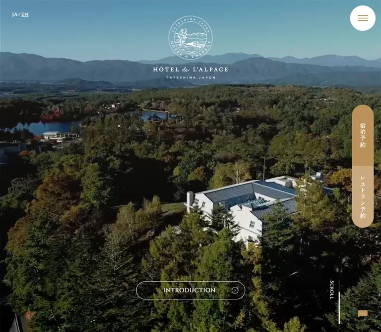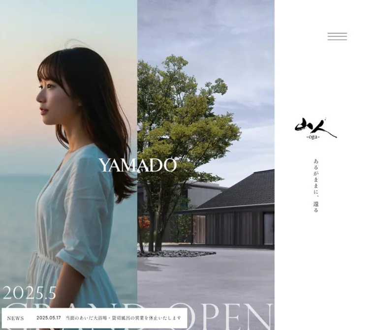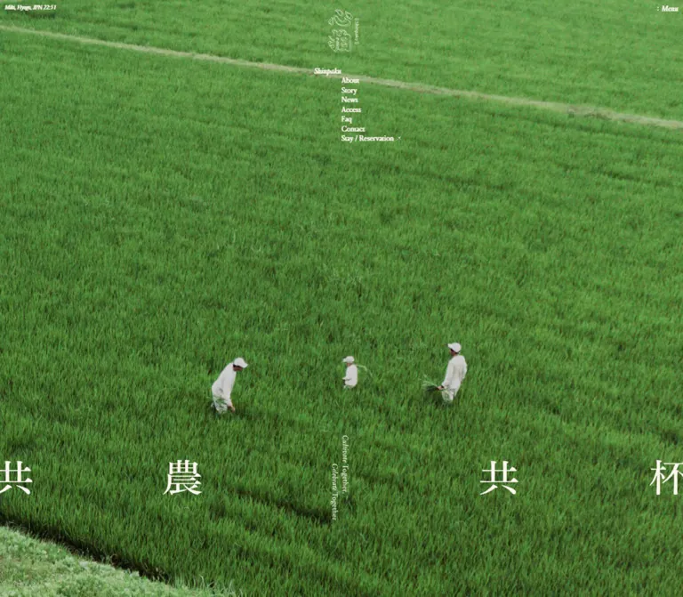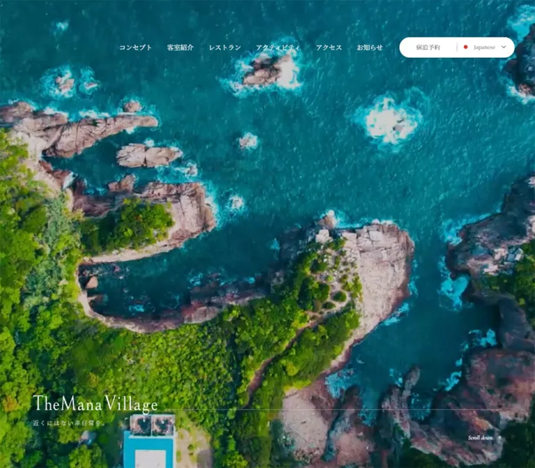
プレビュー準備中デザインリファレンスを見る
日本のWebデザインを、AIの制作リファレンスに。
DESIGN REFERENCE
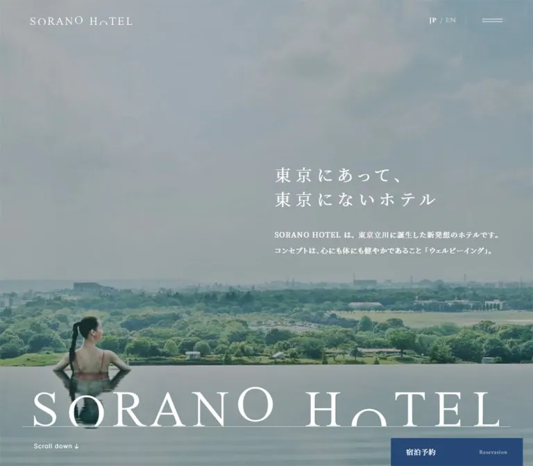
建築と緑の大きな写真、余白を生かした明朝体、温かみのある白と紺色の予約導線が特徴のホテル公式サイト。客室の写真タイル、横スクロールの宿泊プラン、モバイルで再構成されるフッターを備える。
オリジナルサイトを見るArchitectural photography, fine serif typography, and generous pale space, with navy reservation controls kept within reach.
Website: SORANO HOTEL
Original URL: https://soranohotel.com/
Final URL: https://soranohotel.com/
Theme: light content surfaces with darkened photographic regions; no selectable theme was verified.
Inspected: September 22, 2026, from the supplied browser inspection retrieved at 2026-09-22T13:36:45.688Z.
Viewports: desktop 1440 × 1000 and mobile 390 × 844 CSS pixels.
Scope: the current Japanese hotel homepage: introductory hero, information and availability links, well-being narrative, news, room categories, accommodation plans, dining, spa, access, gallery, related destinations, reservation section, and footer. Visual captures cover the desktop hero, rooms-to-plans transition, and footer, plus the mobile hero and lower footer. Rendered DOM measurements provide additional coverage of the intervening sections. Linked pages and opened overlays were not inspected.
SORANO HOTEL presents a complete hospitality website, with editorial discovery and practical service navigation sharing the same long page. The opening image gives architecture and greenery almost the entire screen. White Japanese serif copy sits toward the right on desktop, while an exceptionally large brand wordmark stretches along the lower edge. The subsequent page switches to warm off-white, restrained dark text, large photographs, and long intervals between sections.
The design's character comes from its proportions: small navigation, widely tracked Japanese copy, large English section labels, nearly borderless image collections, and square navy actions. It uses different compositions for different information: an asymmetric news layout, four adjoining room photographs, a horizontal plan collection, and a broad institutional footer. Preserve these distinctions when adapting it.
Architectural photography, fine serif typography, and generous pale space, with navy reservation controls kept within reach.
Website: SORANO HOTEL
Original URL: https://soranohotel.com/
Final URL: https://soranohotel.com/
Theme: light content surfaces with darkened photographic regions; no selectable theme was verified.
Inspected: September 22, 2026, from the supplied browser inspection retrieved at 2026-09-22T13:36:45.688Z.
Viewports: desktop 1440 × 1000 and mobile 390 × 844 CSS pixels.
Scope: the current Japanese hotel homepage: introductory hero, information and availability links, well-being narrative, news, room categories, accommodation plans, dining, spa, access, gallery, related destinations, reservation section, and footer. Visual captures cover the desktop hero, rooms-to-plans transition, and footer, plus the mobile hero and lower footer. Rendered DOM measurements provide additional coverage of the intervening sections. Linked pages and opened overlays were not inspected.
SORANO HOTEL presents a complete hospitality website, with editorial discovery and practical service navigation sharing the same long page. The opening image gives architecture and greenery almost the entire screen. White Japanese serif copy sits toward the right on desktop, while an exceptionally large brand wordmark stretches along the lower edge. The subsequent page switches to warm off-white, restrained dark text, large photographs, and long intervals between sections.
The design's character comes from its proportions: small navigation, widely tracked Japanese copy, large English section labels, nearly borderless image collections, and square navy actions. It uses different compositions for different information: an asymmetric news layout, four adjoining room photographs, a horizontal plan collection, and a broad institutional footer. Preserve these distinctions when adapting it.
4.4rem means 44px. The Quick Start uses explicit pixel tokens without changing the host application's root size.| Name | Value | Source token | Role and evidence |
|---|---|---|---|
| Warm White | #f9f8f6 |
--color-bg-primary |
Measured body background; the main content and footer canvas |
| Dark Ink | #1a1a1a |
--color-font-dark, --color-dark, --color-link |
Measured body and ordinary link text |
| Reservation Navy | #274875 |
--color-dark-blue |
Measured reservation, availability, and contact fills; also the hero's underlying section background |
| Action Blue | #5988c6 |
--color-blue |
Declared accent consistent with the small circular arrow treatment; the chat launcher looks similar, but its own computed fill was not supplied |
| Quiet Gold | #a89469 |
--color-gold |
Declared accent consistent with the footer membership icons |
| Pale Stone | #f4f2ef |
--color-bg-light-gray |
Measured mobile availability-panel background |
| Soft Gray | #eeebe7 |
--color-bg-gray, --color-gray |
Supporting neutral declared in the source |
| Reversed White | #ffffff |
Measured element color | Hero copy, initial navigation, and labels on navy actions |
| Fine Dark Rule | rgba(0,0,0,0.12) |
--color-border-gray |
Source divider token; consistent with the restrained rules visible in the footer |
| Fine White Rule | rgba(255,255,255,0.3) |
--color-border-white-gray |
Source token suitable for separation over dark imagery; individual photographed rules were not measured |
The warm white is important. It keeps the empty regions related to the hotel's natural materials rather than making the page feel like a bright software interface. Navy supplies the strongest solid color. Gold remains a small detail, not a large background treatment.
| Source token | Value | Interpretation |
|---|---|---|
--color-dark-blue-hover |
#1f3a5e |
Declared darker navy state; no hovered capture was supplied |
--color-blue-hover |
#476d9e |
Declared blue state |
--color-gold-hover |
#867654 |
Declared gold state |
--color-bg-dark-blue |
#30517b |
Additional dark blue; a visible use was not established |
--color-sorano-bllue |
#88ade2 |
Pale blue token; spelling preserved from the source |
--color-beige |
#d1c3bc |
Supporting material color; not a dominant surface in the supplied captures |
--color-border-light-gray |
rgba(0,0,0,0.06) |
Very subtle separation |
--color-border-dark-gray |
rgba(0,0,0,0.25) |
Stronger neutral separation |
Do not promote every exposed custom property into the visual palette. Editor defaults, social-brand variables, and slider-library defaults also appear in the evidence, but they do not establish the homepage's visible color hierarchy.
Declared stack: notoSerifJp, "Noto Serif JP", "游明朝", "Yu Mincho", yumincho, "Hiragino Mincho Pro", serif.
This stack is directly measured on the hero heading and paragraph, primary Japanese navigation, news titles, plan titles, and many footer links. The normal source weight is 350; medium emphasis is 500. Avoid replacing this quiet hierarchy with uniformly bold headings.
The headline uses unusually wide tracking: 0.3em. Ordinary Japanese body copy generally uses 0.1em, with generous line spacing. These are separate settings; applying the headline tracking to every paragraph would make the content unnecessarily difficult to scan.
Declared stack: "Cardo" followed by the Japanese serif stack.
Cardo is directly present in computed styles for MEMBERSHIP, JP, EN, and the lower Reservation heading. The large English section labels are visibly serif in the desktop capture. Their exact descendant styles are absent from the element sample, so their apparent 44px desktop size is an inference supported by the declared heading tokens and 52.8px wrapper height.
The stylized SORANO HOTEL wordmark is artwork. Do not assume that typing the brand name in Cardo reproduces its distinctive letterforms.
Declared stack: "Inter", "Noto Sans JP", hiragino-kaku-gothic-pron, "Hiragino Sans", "Hiragino Kaku Gothic ProN", "Yu Gothic", yugothic, meiryo, sans-serif.
The body defaults to this stack at 14px / 28px on desktop and 13px / 26px on mobile. Many content descendants explicitly switch to serif. Utility elements such as the scroll cue and the footer's Follow us label provide a restrained contrast to the editorial typography.
A computed family list establishes the selected stack, not independent proof that every named font file loaded successfully.
| Role | Desktop | Mobile | Weight / tracking | Evidence |
|---|---|---|---|---|
| Body default | 14px / 28px |
13px / 26px |
350, 0.1em |
Measured on body |
| Hero heading | 32px / 48px |
24px / 36px |
350, 0.3em |
Measured |
| Hero paragraph | 14px / 30.8px |
11px / 24.2px |
350, 0.1em |
Measured |
| Japanese primary navigation | 13px / 13px |
Hidden in initial mobile header | 500, 0.1em |
Measured desktop links |
| Language links | 13px / 13px |
12px / 12px |
400, 0.1em |
Measured |
| Large English section label | Approximately 44px / 52.8px |
Approximately 32px / 38.4px |
Serif; source English heading tracking is 0.06em |
Declared tokens, wrapper dimensions, and desktop visual evidence; child style not sampled |
| Well-being heading | 40px / 68px |
28px / 47.6px |
350, 0.1em |
Measured |
| News title | 14px / 25.2px |
13px / 23.4px |
500, 0.1em |
Measured |
| Plan title | 16px / 28.8px |
14px / 25.2px |
500, 0.1em |
Measured |
| Dining descriptive detail | 12px / 21.6px |
11px / 19.8px |
350, 0.1em |
Measured |
| Lower Reservation heading | 32px / 38.4px |
24px / 28.8px |
500, 0.06em |
Measured Cardo stack |
| Footer navigation | 12px / 18px |
11px / 16.5px |
350, 0.1em |
Measured |
| Contact button | 13px / 19.5px |
12px / 18px |
350, 0.1em |
Measured |
Wrapper caution: the sampled H2 for PLAN reports inherited 14px Inter on desktop, yet its visible label is a large serif title. Its 52.8px height is also inconsistent with a single ordinary 14px line. Do not use the wrapper's inherited font declaration to reconstruct the visible title.
The root remains 10px in both supplied snapshots. Responsive changes come from token overrides and layout changes, rather than a shrinking root.
| Property | Desktop source | Mobile source | Inspected result |
|---|---|---|---|
| Root size | 10px |
10px |
Source rem conversion is stable |
| Site inset | 6.25vw |
min(8vw, 4rem) |
90px desktop; nominal 31.2px mobile, rendered as about 31.19px |
| Header height | 8rem |
7rem |
80px / 70px |
| Main inner width | Viewport minus two site insets | Same relationship | 1260px / approximately 327.63px |
The header and room photographs deliberately use different horizontal insets from the ordinary content. A single universal container would erase part of the original composition.
All values below are source custom properties converted using the measured 10px root.
| Source token | Desktop | Mobile | Typical scale |
|---|---|---|---|
--space-element-4xs |
8px |
6px |
Fine separation |
--space-element-2xs |
16px |
14px |
Small content spacing |
--space-element-xs |
24px |
20px |
Compact component spacing |
--space-element-sm |
36px |
24px |
Text-group spacing |
--space-element-md |
48px |
32px |
Medium internal spacing |
--space-element-lg |
64px |
48px |
Large internal spacing |
--space-element-xl |
80px |
56px |
Broad content separation |
--space-element-2xl |
96px |
64px |
Editorial spacing |
--space-element-3xl |
120px |
80px |
Large editorial spacing |
--space-section-sm |
100px |
60px |
Small section interval |
--space-section-md |
150px |
80px |
Plan and gallery top spacing |
--space-section-lg |
220px |
100px |
Major section top spacing |
These are not a rigid grid governing every measurement. The plan collection has a calculated 40px desktop gap and 25px mobile gap. The news section retains a measured 200px bottom padding on mobile, despite the smaller general section tokens.
| Element | Treatment | Evidence |
|---|---|---|
| Reservation and contact buttons | 0 |
Measured |
| Room and plan link boxes | 0 |
Measured |
| Membership panels | Square, thin outline | Measured zero radius; outline visible in captures |
| Small directional accents | Circular | Visual evidence |
| Chat launcher | Circular, approximately 70 × 70px |
Screenshot estimate |
| AI chat hint | Small rounded white box with light shadow | Screenshot evidence; exact radius and shadow unmeasured |
The chat hint is a utility exception. It does not establish a rounded, elevated card system for the main website.
| Element | Desktop | Mobile |
|---|---|---|
| Hero | 1440 × 1000px |
390 × 844px |
| Header brand link | 200 × 17px, at 60, 31.5 |
160 × 13.59px, at 20, 28.20 |
| Menu button | 40 × 40px, at 1340, 20 |
40 × 40px, at 330, 15 |
| Hero copy width | 442.78px |
297.63px |
| Hero heading origin | 907.22, 355.83 |
46.19, 325.63 |
| Floating reservation | 260 × 55px; right 20px, bottom 0 |
200 × 48px; right 0, bottom 0 |
| Availability link | 600 × 68.80px |
330 × 68.80px |
| Room tile | 349.25 × 498.92px |
388 × 258.66px |
| Plan link box | 393.33 × 716.63px |
295.91 × 556.28px |
| Plan title left inset | 70px within card |
48px within card |
| Footer membership link | 475.34 × 81.69px |
327.63 × 76.80px |
| Footer contact link | 240 × 45.5px |
327.63 × 44px |
Plan link heights include the image, title, and remaining link layout. They are not image heights. The desktop room screenshot clips the upper part of the tiles; the full tile dimensions above come from the DOM.
Role: hotel identity, service navigation, language choice, and menu access.
At the top of the desktop hero, a transparent 80px header places the 200px-wide brand artwork 60px from the left. Japanese service links begin around x=533, followed by membership, language links, and a two-line menu mark. Adjacent primary links have a measured 24px horizontal separation. White text floats directly over the image without a filled navigation bar.
The mobile header is 70px high. Its brand artwork shrinks to 160px and starts at x=20. Only the language links and menu remain alongside it; the full service navigation is absent from the visible mobile header.
The menu mark remains visible in the supplied scrolled captures, including over the pale footer. The complete header's scroll visibility logic was not recorded. Do not assume that the desktop navigation remains permanently visible or that an opaque sticky bar appears.
Role: communicate the hotel's atmosphere before presenting the detailed directory of services.
The desktop capture shows a lobby with symmetrical timber roof members, tall glazing, greenery, low seating, and a strong central perspective. The mobile capture shows a dining environment with tall glass divisions and reflections. Both receive a dark visual treatment that supports white text. The overlay's actual color and opacity are not supplied.
The desktop copy block sits 90px from the right. Its two-line heading is followed by a 32px gap and a two-line paragraph. On mobile, the copy becomes a centered-width block with left-aligned text: approximately 297.63px wide, inset 46.19px from the viewport. The heading-to-paragraph gap becomes 24px, and the paragraph wraps to four lines.
The source heading is “東京にあって、東京にないホテル”. Its tracking and line breaks carry much of the composition; it should not become a large bold centered sales headline.
A large white wordmark occupies nearly the entire lower width, above a thin horizontal line. The desktop artwork is approximately 1320px wide with 60px side insets; mobile is approximately 350px wide with 20px side insets. These are screenshot estimates. A small Scroll down link sits beneath the line at the ordinary content inset and targets #news.
The differing background scenes do not establish whether the source uses video, a slideshow, responsive media, or different capture timing. Preserve the composition without inventing a playback mechanism.
Role: bring operational notices and booking access immediately below the atmospheric opening.
On desktop, the 121px information region combines an INFO label, two compact dated notices, and a membership link on the right. The notice titles use 13px serif type. The membership link begins around x=870 and occupies approximately 479px.
On mobile, notices remain compact while membership moves beneath them, producing a region approximately 139.8px high. The exported notice titles occupy one-line boxes even when the underlying strings are long; the exact truncation implementation was not supplied.
The following availability link is a centered navy rectangle measuring 600 × 68.8px on desktop. Mobile gives it a 330px width inside a 370px pale-stone panel with 20px horizontal and 30px vertical padding. Its label, “空室検索”, remains 16px on both viewports. The supplied href leads to an external accommodation availability service; that destination was not opened.
Role: connect the visual atmosphere to the hotel's stated concept.
The rendered section contains a large image, three instances of SORANO HOTEL WELL-BEING, a white serif heading, a paragraph, and a quality link. Desktop separates heading and body into broad columns; mobile stacks them within a narrower 286px column at x=52.
The heading is measured at 40px / 68px on desktop and 28px / 47.6px on mobile. The body remains much smaller at 14px / 28px and 13px / 26px respectively.
The section occupies approximately 3804.66px of desktop document height and 2425.52px on mobile. This unusual footprint may include structural or effect-related space, but the evidence does not establish pinning, parallax, or a scroll-linked timeline. Do not reproduce that footprint with an arbitrary fixed-height blank block. The repeated wording also does not, by itself, prove a moving marquee.
Role: publish current announcements without giving every item identical visual weight.
Desktop uses one large featured story on the left and three compact rows on the right. The feature link measures approximately 570.66 × 464.63px. The right column measures 609.34px wide, and its rows are 118px high in the sampled layout. The calculated gap between the main columns is 80px.
The compact desktop rows leave 40px between image and text. From the measured text origins, their image allocation is approximately 177px wide. Titles are 14px serif at weight 500, paired with smaller date and category information.
Mobile retains the hierarchy instead of making every item equal: a full-width feature is followed by compact image-and-text rows. The small-row image allocation becomes 80px with a 20px gap. Titles become 13px / 23.4px. The news-index link moves below the collection and aligns right.
Role: make the four accommodation categories visually navigable.
Four adjoining portrait photographs span nearly the desktop width, using 20px outer insets and calculated 1px gaps. The links are STANDARD, STUDIO, SUITE, and DOG FRIENDLY. Each tile is approximately 349.25 × 498.92px, with white serif category text over a darkened photograph. Labels sit around the vertical middle of the full tiles; the supplied middle-page capture begins partway through them.
On mobile, the four categories stack as wide landscape tiles. Each measures 388 × 258.66px, corresponding closely to a 3:2 ratio, with 1px outside edges and 1px vertical separation. This is a real composition change, not four miniature portrait cards squeezed into a row.
The desktop text export includes detailed room specifications, but the resting screenshot shows only the category names. Their reveal mechanism was not exercised. The mobile visible text export includes only the English category names. Do not invent a verified hover-to-reveal panel from this difference.
Each tile links to the corresponding anchor on the rooms page. The room-index link appears beside the introduction on desktop and below the tile stack on mobile.
Role: browse a large, changing set of bookable stay concepts.
The PLAN section begins with 150px desktop top padding and 80px on mobile. Its large English heading sits left. On desktop, small previous/next marks, a fine vertical separator, and an index link occupy the right side of the heading row. The index link pairs restrained text with a blue circular arrow.
The horizontal collection begins at the normal content inset. Desktop cards are approximately 393.33px wide with 40px gaps: three complete cards fit the main 1260px content width, and a sliver of the next card extends toward the viewport edge. Mobile cards are approximately 295.91px wide with 25px gaps. At the initial measured position, the next card begins at x=352.09, leaving a visible continuation cue.
Images are visually tall crops. A 3:4 image ratio with a 32px desktop or 24px mobile caption gap is a useful reconstruction estimate consistent with the measured title positions; the image element's exact computed ratio was not supplied.
Titles are offset inward from the image's left edge: 70px desktop and 48px mobile. They use medium-weight Japanese serif type at 16px and 14px respectively. Preserve this asymmetric caption placement instead of centering every title or wrapping the image and text in a filled card.
Horizontal placement and visible controls establish a browsing affordance. Dragging, arrow outcomes, looping, autoplay, and keyboard behavior remain unverified.
Role: combine an editorial introduction with practical venue choices.
The desktop introduction places its image to the left of a 610px text column beginning at x=740. The heading, Japanese paragraph, and detail link form a quiet vertical stack. Below, three venue links occupy approximately 393.33px each with 40px gaps. Their supplied source photographs are square, 786 × 786px.
Each venue includes its name, floor, short description, and service hours. The detail text is notably small: 12px / 21.6px on desktop and 11px / 19.8px on mobile.
Mobile stacks the introduction and all three venues into the approximately 327.63px content width. The main English heading occupies two lines in the measured layout. Venue blocks vary in height as their descriptions wrap; keep their text content-driven.
Role: feature a major hotel amenity, then provide two more specific entry points.
Desktop gives the large spa image most of the horizontal composition. The text column begins at x=958 and is approximately 392px wide. Below the introduction and detail link are two experience links for gym/pool programs and spa treatments, each with measured 24px vertical padding.
Mobile stacks the image and text. The spa text uses a slightly narrower 317.63px column at x=36.19, five pixels further inward than the ordinary content inset. This is a local composition detail, not a new universal margin.
The source text identifies a rooftop infinity pool, but the exact rendered image treatment in this section is not documented by a dedicated screenshot. Use the supplied asset reference without inventing additional effects.
Role: answer practical travel questions and connect the hotel to its surroundings.
The desktop access copy occupies a secondary inner column beginning near x=195.22, approximately 524.78px wide. Its paragraph, access link, and map link remain compact. Mobile returns this content to the ordinary approximately 327.63px width, with additional line breaks in the travel and parking information.
The gallery provides a hotel-gallery link plus YouTube and Instagram destinations. Desktop places those links in one centered row. Mobile places the hotel-gallery link on its own line, followed by the two social destinations.
Two related image-and-text links follow. Desktop presents them side by side; mobile stacks them while retaining an image beside the text within each link. This distinction prevents the page from becoming a monotonous sequence of identical full-width cards.
Role: collect separate reservation routes before the footer.
The desktop section has a measured 509.58px height, including 180px vertical padding. A white Cardo heading sits above four navy buttons, each 285 × 79.19px, with 40px horizontal gaps. The destinations cover accommodation, the restaurant, the rooftop bar, and treatments.
Mobile uses 100px vertical padding and four stacked buttons measuring approximately 327.63 × 66.8px with 10px gaps. The heading becomes 24px. A photographic region immediately above the footer is visible in the desktop capture, but its exact background asset URL is not present in the supplied evidence.
The accommodation link uses a script-action href; the other supplied destinations are reservation-service URLs. No resulting booking state was inspected.
Role: provide a complete service directory, contact details, memberships, social destinations, partner marks, and legal information.
The desktop footer is approximately 851.92px tall. A black wordmark sits above a fine horizontal rule, with a small back-to-top arrow at the far right. The brand artwork is visually about 300px wide; the measured 1240px home-link rectangle is its container, not the logo itself.
Two navigation columns occupy the left. A 240px-wide navy contact button sits beneath them. Two outlined membership panels occupy the right, each approximately 475.34 × 81.69px, separated by 8px. Their anatomy is a gold icon, title and short supporting copy, then a right arrow. One uses a lock-like icon and the other a gift-like icon.
Address and telephone information sit lower down, followed by corporate links. Social icons form a restrained gray row at the right. A second divider separates these from six small partner or association marks and the legal links. These logos are navigation content; their presence does not establish an operator or website-production role.
Mobile preserves two columns for the main directory, but moves contact and membership panels into full-width rows. The contact button becomes 327.63 × 44px. Membership panels use 12px vertical and 20px horizontal padding and grow vertically through text wrapping. Corporate links stack at left while the social group occupies the right. The partner marks remain a compact single row, and legal links become a vertical list.
Role: keep booking and assistance available while browsing the long page.
The navy reservation rectangle stays at the lower right across all supplied current-page captures. Desktop uses a 20px right inset and a 260 × 55px box. Mobile uses a 200 × 48px box flush with the right and bottom edges. The Japanese label “宿泊予約” is paired with a much smaller English caption; the observed caption reads Resevation.
A blue circular chat launcher sits approximately 20px from the right and 70px above the bottom on both viewports. Its visual diameter is approximately 70px. A small white AI chat hint and a close mark sit to its left. These dimensions are screenshot estimates because widget rectangles were not included in the computed sample.
The controls visibly overlap page content in some captures. Preserve their accessibility and availability, but allow more clearance in a new implementation so legal links and keyboard focus are not obscured. The chat conversation, dismissal behavior, and reservation panel were not opened.
| Treatment | Recorded value or evidence | What can be concluded |
|---|---|---|
| Main navigation and language links | opacity 0.5s cubic-bezier(0.33, 1, 0.68, 1), color 0.5s cubic-bezier(0.33, 1, 0.68, 1) |
A defined soft opacity/color transition; resulting interaction states were not captured |
| Subnavigation link opacity | opacity 0.6s |
Defined on sampled restaurant, spa, and membership sublinks; no opened submenu was observed |
| Menu control background | background-color 0.3s |
A defined state transition |
| Menu blend treatment | mix-blend-mode 0.5s cubic-bezier(0.33, 1, 0.68, 1) |
A transition declaration exists; its actual visual interpolation and states were not verified |
| Floating reservation fill | background-color 0.4s |
Defined transition; the target hover color was not exercised |
| Scroll cue | Href targets #news |
Anchor destination confirmed; smooth-scroll timing unknown |
| Back-to-top control | Href targets #top |
Destination confirmed; scroll behavior untested |
| Plan browsing | Horizontal card positions and visible desktop arrows | Collection affordance confirmed; movement mechanics untested |
| Hero media | Different photographic scenes across current captures | Media composition confirmed; playback type, duration, and sequencing unknown |
| Well-being repeated text | Three exported instances | Repetition confirmed; marquee movement unverified |
Many sampled elements report animation: none and a bare transition value of all. That does not prove an animated transition, nor does it rule out motion on descendants, pseudo-elements, media, or JavaScript-driven properties.
The inspection included an initial observation of at least five seconds and scrolling with readiness checks. It was not a frame-by-frame motion study. A faithful adaptation should use restrained transitions supported by the values above and label any added fades, image zooms, or scroll effects as new behavior.
| Layer | Appearance | Function |
|---|---|---|
| Main canvas | Solid warm white #f9f8f6 |
Gives photography and small text room to breathe |
| Photographic hero | Edge-to-edge image with a dark visual wash | Atmosphere and white-text contrast |
| Room categories | Adjacent darkened photographs with white labels | Direct visual navigation |
| Editorial collections | Images and captions directly on the canvas | Avoids unnecessary card containers |
| Primary actions | Solid navy, square corners, white labels | Reservation, availability, and contact |
| Membership panels | Canvas-colored interior with fine outline | Groups two membership routes without elevation |
| Footer | Same pale canvas, thin rules, small marks | Institutional information and service directory |
| Chat hint | White, lightly rounded, subtle shadow | Small floating utility exception |
There is no broad system of shadows, glass panels, or rounded cards in the supplied main-page captures. Separation comes from space, image edges, thin rules, and changes in scale.
The current visual evidence emphasizes daylight, timber, glass, pale upholstery, dark stone floors, and planted views. The desktop lobby photograph is particularly architectural: repeating diagonal members lead toward a central vanishing point, while the foreground furniture establishes depth. The mobile dining image uses reflections and vertical glazing to fill a narrow composition.
Room photographs show lived-in spatial qualities rather than isolated product shots. The dog-friendly tile includes a dog within the room scene. Plan images mix architecture, wellness subjects, and partner campaign artwork. The turquoise campaign image in the plan strip is content-specific color, not a reason to extend turquoise throughout the interface.
Use subject-aware cropping. Desktop room tiles are tall; mobile room tiles are wide. Preserve the bed, seating, dog, or architectural feature that explains each category. Avoid applying one fixed crop position indiscriminately.
The hero and room photographs appear darkened, but exact overlay values are unmeasured. A starting overlay of roughly 25–40% dark opacity is a recommendation for testing, not a recovered source value. Validate contrast against each chosen image.
The theme-image paths below are relative to https://soranohotel.com/cms/wp-content/themes/soranohotel/assets/images/. They were exposed in the original page's rendered evidence; they are not bundled with this reference.
| Asset | Observed relative path | Supplied intrinsic dimensions |
|---|---|---|
| Well-being main image | top/well_being_main.jpg |
2880 × 1620 |
| Standard room | top/rooms_standard.jpg |
699 × 1000 |
| Studio room | top/rooms_studio.jpg |
699 × 1000 |
| Suite room | top/rooms_suite.jpg |
699 × 1000 |
| Dog-friendly room | top/rooms_dog_friendly.jpg |
700 × 1000 |
| Dining introduction | top/restaurant_bar_main_image.png |
1220 × 1150 |
| Restaurant venue | top/restaurant_bar_restaurant.jpg |
786 × 786 |
| Rooftop bar venue | top/restaurant_bar_bar.jpg |
786 × 786 |
| Lounge venue | top/restaurant_bar_lounge.jpg |
786 × 786 |
| Spa feature | top/spa.jpg |
1714 × 1754 |
| Access image | top/access_image_01.jpg |
1004 × 944 |
| Business-use link | top/link_business_use.jpg |
400 × 300 |
| GREEN SPRINGS link | top/link_green_springs.jpg |
400 × 300 |
Additional original-page asset references include /cms/wp-content/uploads/2026/03/322A0616-1-593x800.jpg for a plan and /cms/wp-content/uploads/2024/11/2410soranohotel_samb01.jpg within the gallery.
The hero media URL and brand-artwork URL were not exposed in the supplied sample. Do not substitute a guessed filename or identify another section's image as the hero. Use authorized photography and brand assets when implementing this design.
| Area | Desktop observation | Mobile observation |
|---|---|---|
| Header | Brand, full service navigation, membership, languages, menu | Brand, languages, menu |
| Hero copy | Right-side block; 32px heading | Narrow left-aligned block centered horizontally; 24px heading |
| Hero height | Matches the 1000px viewport | Matches the 844px viewport |
| Main content inset | 6.25vw, giving 90px |
min(8vw, 40px), giving approximately 31.2px |
| Information | Notices beside membership | Notices above membership |
| News | Large feature beside three small rows | Feature above three small rows |
| Rooms | Four adjoining portrait tiles | Four stacked landscape tiles |
| Plans | Three full cards plus continuation | One full card plus continuation |
| Dining venues | Three columns | One vertical sequence |
| Reservation section | Four equal buttons in one row | Four stacked full-width buttons |
| Footer | Directory left, membership right, broad horizontal lower rows | Directory remains two columns; most other groups stack |
| Floating booking | Right inset 20px; 260px wide | Flush right; 200px wide |
The document heights are approximately 14,119.58px desktop and 13,996.19px mobile. Their similarity does not imply a shared fixed-height layout: the well-being region becomes shorter while rooms and dining consume more vertical space through stacking.
The site alternates full-width media with several content widths. The ordinary desktop container is 1260px wide, rooms use a 1400px band, and some narrative regions use narrower inner columns. On mobile, most text uses the 327.63px container, while the hero and well-being copy are narrower and room imagery nearly touches the edges.
Index links for news, rooms, and plans move from desktop heading areas to positions below their collections on mobile. Preserve this reading order rather than leaving every action above a long mobile collection.
Recommended breakpoint strategy: collapse major content columns around 768px and hide the full header navigation earlier, around 1280px. These are starting points for an adaptation, not recovered source breakpoints. Check intermediate widths against actual navigation length and the longest Japanese labels.
#f9f8f6 as the main canvas and navy #274875 for the strongest actions.0.3em tracking and ordinary text closer to 0.1em.These are improvements for a new implementation, not verified features of the original site:
javascript:void(0) as an implementation pattern.#f9f8f6.#1a1a1a.#274875 with white text.#5988c6.#a89469.#f4f2ef.rgba(0,0,0,0.12).“Create an editorial homepage for a Japanese hotel using the current SORANO HOTEL composition as a reference. Start with full-viewport architectural photography, a transparent white navigation header, a modest two-line Japanese serif headline positioned toward the right on desktop, and a very wide brand artwork near the bottom. Use warm white #f9f8f6 for the long content page, dark text #1a1a1a, and square navy #274875 reservation controls. Pair Japanese serif body copy with English serif section labels, wide tracking, fine rules, and generous 150–220px desktop section intervals. Give news an asymmetric feature-and-list layout, rooms four adjoining portrait photographs, and plans a horizontal collection with tall images and indented captions. On mobile, stack room categories as landscape photographs, retain a next-card glimpse for plans, and reorganize the comprehensive footer. Treat media playback and overlay behavior as separate requirements rather than inventing them.”
This is an adaptation, not extracted source CSS. It preserves the measured palette and key endpoint proportions while using a conventional application root. The 768px layout breakpoint, 1280px navigation breakpoint, static-image hero, 3:4 plan crop, focus treatment, and native scrolling behavior are recommendations. Supply authorized font files, photography, and logo artwork separately.
Apply the classes to semantic sections, links, and buttons. .hero-media is an image in this starter; .hero-wordmark and .brand-art should use artwork rather than styled plain text. Booking and chat controls need actual destinations or implemented behavior before they are exposed to users.
:root {
  /* Source-derived colors */
  --hotel-paper: #f9f8f6;
  --hotel-ink: #1a1a1a;
  --hotel-navy: #274875;
  --hotel-navy-hover: #1f3a5e;
  --hotel-blue: #5988c6;
  --hotel-gold: #a89469;
  --hotel-stone: #f4f2ef;
  --hotel-rule: rgb(0 0 0 / 12%);

  /* Source-declared families; load authorized fonts separately */
  --hotel-serif: 'notoSerifJp', 'Noto Serif JP', 'Yu Mincho',
    'Hiragino Mincho Pro', serif;
  --hotel-english: 'Cardo', var(--hotel-serif);
  --hotel-sans: 'Inter', 'Noto Sans JP', 'Hiragino Sans',
    'Yu Gothic', sans-serif;

  --hotel-weight: 350;
  --hotel-medium: 500;
  --hotel-body-size: 14px;
  --hotel-section-size: 44px;
  --hotel-page-inset: 6.25vw;
  --hotel-header-height: 80px;
  --hotel-section-gap: 220px;
  --hotel-plan-gap: 40px;
  --hotel-booking-height: 55px;
  --hotel-ease: cubic-bezier(0.33, 1, 0.68, 1);
  --hotel-safe-bottom: env(safe-area-inset-bottom, 0px);

  /* Recommended starting value; tune for the selected image */
  --hotel-photo-wash: rgb(8 18 24 / 32%);
}

.sorano-page,
.sorano-page *,
.sorano-page *::before,
.sorano-page *::after {
  box-sizing: border-box;
}

.sorano-page {
  margin: 0;
  color: var(--hotel-ink);
  background: var(--hotel-paper);
  font: var(--hotel-weight) var(--hotel-body-size) / 2 var(--hotel-sans);
  letter-spacing: 0.1em;
}

.sorano-page img {
  display: block;
  max-width: 100%;
}

.sorano-page a {
  color: inherit;
}

.hotel-container {
  margin-inline: var(--hotel-page-inset);
}

.hotel-section {
  padding-block-start: var(--hotel-section-gap);
}

.hotel-title {
  margin: 0;
  font: 400 var(--hotel-section-size) / 1.2 var(--hotel-english);
  letter-spacing: 0.06em;
}

.hotel-copy {
  font-family: var(--hotel-serif);
  line-height: 2;
}

.site-header {
  position: absolute;
  inset: 0 0 auto;
  z-index: 20;
  display: flex;
  align-items: center;
  gap: 48px;
  height: var(--hotel-header-height);
  padding-inline: 60px 157px;
  color: white;
}

.brand-art {
  width: 200px;
  height: auto;
}

.site-nav {
  display: flex;
  align-items: center;
  gap: 24px;
  margin-inline-start: auto;
}

.site-nav a,
.language-links a {
  text-decoration: none;
  font-family: var(--hotel-serif);
  font-size: 13px;
  line-height: 1;
  transition: opacity 500ms var(--hotel-ease),
    color 500ms var(--hotel-ease);
}

.language-links {
  display: flex;
  gap: 16px;
  margin-inline-start: auto;
  white-space: nowrap;
}

.language-links a {
  font-family: var(--hotel-english);
}

.menu-button {
  position: fixed;
  top: 20px;
  right: 60px;
  z-index: 40;
  display: grid;
  place-items: center;
  width: 40px;
  height: 40px;
  padding: 0;
  border: 0;
  background: transparent;
  color: white;
  cursor: pointer;
}

.menu-button span {
  width: 40px;
  height: 1px;
  background: currentColor;
  box-shadow: 0 5px 0 currentColor;
}

/* Recommended state hook; the source scroll logic is unknown. */
.menu-button[data-surface='light'] {
  color: var(--hotel-ink);
}

.hotel-hero {
  position: relative;
  min-height: 700px;
  height: 100svh;
  overflow: hidden;
  background: var(--hotel-navy);
  color: white;
}

.hero-media,
.hotel-hero::after {
  position: absolute;
  inset: 0;
  width: 100%;
  height: 100%;
}

.hero-media {
  object-fit: cover;
  object-position: center;
}

.hotel-hero::after {
  content: '';
  background: var(--hotel-photo-wash);
  pointer-events: none;
}

.hero-copy {
  position: absolute;
  z-index: 1;
  top: 45%;
  right: var(--hotel-page-inset);
  width: min(31vw, 500px);
  transform: translateY(-50%);
  font-family: var(--hotel-serif);
}

.hero-copy h1 {
  margin: 0;
  font-size: 32px;
  font-weight: var(--hotel-weight);
  line-height: 1.5;
  letter-spacing: 0.3em;
}

.hero-copy p {
  margin: 32px 0 0;
  font-size: 14px;
  line-height: 2.2;
}

.hero-wordmark {
  position: absolute;
  z-index: 1;
  right: 60px;
  bottom: 78px;
  left: 60px;
  border-bottom: 1px solid rgb(255 255 255 / 60%);
}

.hero-wordmark img,
.hero-wordmark svg {
  display: block;
  width: 100%;
  height: auto;
}

.hero-scroll {
  position: absolute;
  z-index: 1;
  left: var(--hotel-page-inset);
  bottom: 28px;
  font-size: 12px;
  text-decoration: none;
}

.room-grid {
  display: grid;
  grid-template-columns: repeat(4, minmax(0, 1fr));
  gap: 1px;
  margin-inline: 20px;
}

.room-card {
  position: relative;
  display: grid;
  place-items: center;
  aspect-ratio: 699 / 1000;
  overflow: hidden;
  color: white !important;
  text-decoration: none;
}

.room-card img,
.room-card::after {
  position: absolute;
  inset: 0;
  width: 100%;
  height: 100%;
}

.room-card img {
  object-fit: cover;
  object-position: var(--room-focus, center);
}

.room-card::after {
  content: '';
  background: rgb(0 0 0 / 30%);
}

.room-card h3 {
  position: relative;
  z-index: 1;
  margin: 0;
  font: 400 24px / 1.2 var(--hotel-english);
  letter-spacing: 0.06em;
}

.plan-section {
  padding-block-start: 150px;
}

.collection-heading {
  display: flex;
  align-items: center;
  justify-content: space-between;
  gap: 32px;
  margin: 0 var(--hotel-page-inset) 48px;
}

/* Native scrolling is the recommended fallback, not recovered behavior. */
.plan-rail {
  display: grid;
  grid-auto-flow: column;
  grid-auto-columns: calc(
    (100vw - 2 * var(--hotel-page-inset) - 80px) / 3
  );
  gap: var(--hotel-plan-gap);
  overflow-x: auto;
  padding: 0 var(--hotel-page-inset) 24px;
  scroll-padding-inline: var(--hotel-page-inset);
  scroll-snap-type: x proximity;
}

.plan-card {
  min-width: 0;
  text-decoration: none;
  scroll-snap-align: start;
}

.plan-card img {
  width: 100%;
  aspect-ratio: 3 / 4;
  object-fit: cover;
  object-position: var(--plan-focus, center);
}

.plan-card h3 {
  margin: 32px 0 0 70px;
  font: var(--hotel-medium) 16px / 1.8 var(--hotel-serif);
  letter-spacing: 0.1em;
  overflow-wrap: anywhere;
}

.hotel-action {
  display: flex;
  align-items: center;
  justify-content: center;
  min-height: 44px;
  padding: 20px;
  border: 0;
  border-radius: 0;
  background: var(--hotel-navy);
  color: white !important;
  font: var(--hotel-weight) 16px / 1.8 var(--hotel-serif);
  letter-spacing: 0.1em;
  text-decoration: none;
}

.booking-fab {
  position: fixed;
  right: 20px;
  bottom: 0;
  z-index: 50;
  display: flex;
  align-items: center;
  justify-content: space-between;
  width: 260px;
  min-height: calc(var(--hotel-booking-height) + var(--hotel-safe-bottom));
  padding: 0 30px var(--hotel-safe-bottom);
  border: 0;
  border-radius: 0;
  background: var(--hotel-navy);
  color: white !important;
  font: 350 14px / 1.5 var(--hotel-serif);
  letter-spacing: 0.1em;
  text-decoration: none;
  transition: background-color 400ms;
}

.booking-fab small {
  font: 400 10px / 1.2 var(--hotel-english);
  letter-spacing: 0.1em;
}

.site-footer {
  padding: 80px var(--hotel-page-inset)
    calc(80px + var(--hotel-safe-bottom));
}

.footer-brand-row {
  display: flex;
  align-items: center;
  justify-content: space-between;
  gap: 24px;
  padding-bottom: 48px;
  border-bottom: 1px solid var(--hotel-rule);
}

.footer-brand-row img {
  width: 300px;
  height: auto;
}

.footer-main {
  display: grid;
  grid-template-columns: minmax(0, 1fr) minmax(0, 475px);
  gap: 64px;
  padding-block: 48px 96px;
}

.footer-nav {
  display: grid;
  grid-template-columns: repeat(2, minmax(0, 1fr));
  gap: 12px 40px;
  font: 350 12px / 1.5 var(--hotel-serif);
}

.footer-nav a {
  text-decoration: none;
}

.membership-list {
  display: grid;
  align-content: start;
  gap: 8px;
}

.membership-card {
  display: grid;
  grid-template-columns: 24px minmax(0, 1fr) 12px;
  align-items: center;
  gap: 30px;
  padding: 20px 20px 20px 30px;
  border: 1px solid var(--hotel-rule);
  text-decoration: none;
}

.membership-icon {
  color: var(--hotel-gold);
}

.membership-title {
  margin: 0;
  font: 400 16px / 1.5 var(--hotel-serif);
  letter-spacing: 0;
}

.membership-description {
  margin: 2px 0 0;
  font: 350 11px / 1.6 var(--hotel-serif);
}

.footer-legal {
  display: flex;
  flex-wrap: wrap;
  gap: 12px 24px;
  padding-top: 32px;
  border-top: 1px solid var(--hotel-rule);
  font: 350 12px / 1.5 var(--hotel-serif);
}

.sorano-page :focus-visible {
  outline: 2px solid currentColor;
  outline-offset: 4px;
}

@media (hover: hover) {
  .site-nav a:hover,
  .language-links a:hover {
    opacity: 0.7;
  }

  .booking-fab:hover,
  .hotel-action:hover {
    background: var(--hotel-navy-hover);
  }
}

/* Recommended early navigation collapse. */
@media (max-width: 1279px) {
  .site-nav {
    display: none;
  }
}

/* Recommended structural breakpoint; endpoint values are source-derived. */
@media (max-width: 767px) {
  :root {
    --hotel-body-size: 13px;
    --hotel-section-size: 32px;
    --hotel-page-inset: min(8vw, 40px);
    --hotel-header-height: 70px;
    --hotel-section-gap: 100px;
    --hotel-plan-gap: 25px;
    --hotel-booking-height: 48px;
  }

  .site-header {
    gap: 16px;
    padding-inline: 20px 101px;
  }

  .brand-art {
    width: 160px;
    max-width: none;
  }

  .language-links a {
    font-size: 12px;
  }

  .menu-button {
    top: 15px;
    right: 20px;
  }

  .hotel-hero {
    min-height: 640px;
  }

  .hero-copy {
    top: 50%;
    right: calc(var(--hotel-page-inset) + 15px);
    left: calc(var(--hotel-page-inset) + 15px);
    width: auto;
  }

  .hero-copy h1 {
    font-size: 24px;
  }

  .hero-copy p {
    margin-top: 24px;
    font-size: 11px;
  }

  .hero-wordmark {
    right: 20px;
    bottom: 60px;
    left: 20px;
  }

  .hero-scroll {
    bottom: 20px;
    font-size: 11px;
  }

  .room-grid {
    grid-template-columns: minmax(0, 1fr);
    margin-inline: 1px;
  }

  .room-card {
    aspect-ratio: 3 / 2;
  }

  .plan-section {
    padding-top: 80px;
  }

  .collection-heading {
    margin-bottom: 40px;
  }

  .plan-rail {
    grid-auto-columns: 76vw;
  }

  .plan-card h3 {
    margin: 24px 0 0 48px;
    font-size: 14px;
  }

  .booking-fab {
    right: 0;
    width: 200px;
    padding-inline: 20px;
    font-size: 13px;
  }

  .site-footer {
    padding-top: 48px;
  }

  .footer-brand-row img {
    width: min(240px, 75%);
  }

  .footer-main {
    grid-template-columns: minmax(0, 1fr);
    gap: 32px;
    padding-block: 48px 64px;
  }

  .footer-nav {
    font-size: 11px;
  }

  .membership-card {
    gap: 20px;
    padding: 12px 20px;
  }

  .membership-title {
    font-size: 14px;
  }

  .footer-legal {
    flex-direction: column;
    font-size: 11px;
  }
}

/* Recommended support for enlarged text and short landscape screens. */
@media (max-height: 600px) {
  .hotel-hero {
    min-height: 700px;
  }
}

@media (prefers-reduced-motion: reduce) {
  .sorano-page *,
  .sorano-page *::before,
  .sorano-page *::after {
    animation: none !important;
    transition: none !important;
    scroll-behavior: auto !important;
  }
}
For mobile collection index links, use grid areas or separate layout slots to place them after the collection while keeping one semantic link. The starter does not implement the original menu, room-detail reveals, chat, booking interface, or unverified media effects.
Optional aliases for a project already using Tailwind v4. This does not imply that the original website uses Tailwind. Define the custom properties above first.
@theme inline {
  --color-hotel-paper: var(--hotel-paper);
  --color-hotel-ink: var(--hotel-ink);
  --color-hotel-navy: var(--hotel-navy);
  --color-hotel-blue: var(--hotel-blue);
  --color-hotel-gold: var(--hotel-gold);
  --color-hotel-stone: var(--hotel-stone);

  --font-editorial: var(--hotel-serif);
  --font-display: var(--hotel-english);
  --font-utility: var(--hotel-sans);

  --text-hotel-body: var(--hotel-body-size);
  --text-hotel-section: var(--hotel-section-size);
  --spacing-hotel-inset: var(--hotel-page-inset);
  --spacing-hotel-section: var(--hotel-section-gap);
  --radius-hotel: 0px;
}
200.2026-09-22T13:36:45.688Z, equivalent to 22:36:45.688 in Japan Standard Time.1440 × 1000 CSS-pixel viewport; supplied current-page captures of the hero, room/plan transition, and footer; rendered document height approximately 14,119.58px.390 × 844 CSS-pixel viewport; supplied current-page captures of the hero and lower footer; rendered document height approximately 13,996.19px.This reference describes the current homepage represented by those captures and measurements. Screenshot estimates, calculated relationships, and recommended implementation choices are labeled separately from directly measured source values.
# SORANO HOTEL — Style Reference

> Architectural photography, fine serif typography, and generous pale space, with navy reservation controls kept within reach.

**Website:** [SORANO HOTEL](https://soranohotel.com/)
**Original URL:** https://soranohotel.com/
**Final URL:** https://soranohotel.com/
**Theme:** light content surfaces with darkened photographic regions; no selectable theme was verified.
**Inspected:** September 22, 2026, from the supplied browser inspection retrieved at `2026-09-22T13:36:45.688Z`.
**Viewports:** desktop `1440 × 1000` and mobile `390 × 844` CSS pixels.
**Scope:** the current Japanese hotel homepage: introductory hero, information and availability links, well-being narrative, news, room categories, accommodation plans, dining, spa, access, gallery, related destinations, reservation section, and footer. Visual captures cover the desktop hero, rooms-to-plans transition, and footer, plus the mobile hero and lower footer. Rendered DOM measurements provide additional coverage of the intervening sections. Linked pages and opened overlays were not inspected.

SORANO HOTEL presents a complete hospitality website, with editorial discovery and practical service navigation sharing the same long page. The opening image gives architecture and greenery almost the entire screen. White Japanese serif copy sits toward the right on desktop, while an exceptionally large brand wordmark stretches along the lower edge. The subsequent page switches to warm off-white, restrained dark text, large photographs, and long intervals between sections.

The design's character comes from its proportions: small navigation, widely tracked Japanese copy, large English section labels, nearly borderless image collections, and square navy actions. It uses different compositions for different information: an asymmetric news layout, four adjoining room photographs, a horizontal plan collection, and a broad institutional footer. Preserve these distinctions when adapting it.
# SORANO HOTEL — Style Reference

> Architectural photography, fine serif typography, and generous pale space, with navy reservation controls kept within reach.

**Website:** [SORANO HOTEL](https://soranohotel.com/)
**Original URL:** https://soranohotel.com/
**Final URL:** https://soranohotel.com/
**Theme:** light content surfaces with darkened photographic regions; no selectable theme was verified.
**Inspected:** September 22, 2026, from the supplied browser inspection retrieved at `2026-09-22T13:36:45.688Z`.
**Viewports:** desktop `1440 × 1000` and mobile `390 × 844` CSS pixels.
**Scope:** the current Japanese hotel homepage: introductory hero, information and availability links, well-being narrative, news, room categories, accommodation plans, dining, spa, access, gallery, related destinations, reservation section, and footer. Visual captures cover the desktop hero, rooms-to-plans transition, and footer, plus the mobile hero and lower footer. Rendered DOM measurements provide additional coverage of the intervening sections. Linked pages and opened overlays were not inspected.

SORANO HOTEL presents a complete hospitality website, with editorial discovery and practical service navigation sharing the same long page. The opening image gives architecture and greenery almost the entire screen. White Japanese serif copy sits toward the right on desktop, while an exceptionally large brand wordmark stretches along the lower edge. The subsequent page switches to warm off-white, restrained dark text, large photographs, and long intervals between sections.

The design's character comes from its proportions: small navigation, widely tracked Japanese copy, large English section labels, nearly borderless image collections, and square navy actions. It uses different compositions for different information: an asymmetric news layout, four adjoining room photographs, a horizontal plan collection, and a broad institutional footer. Preserve these distinctions when adapting it.

## How to Read This Reference

- **Measured** means a value appears in the supplied computed styles, custom properties, or element rectangles. Measurements are CSS pixels unless stated otherwise.
- **Calculated** means arithmetic based on those measurements, such as column gaps or content width.
- **Estimated** means a visual reading of an attached current-page screenshot. It is not a sampled pixel value or a recovered CSS declaration.
- **Recommended** means an implementation choice for a new site. Recommendations are not claims about the original site's behavior.
- Source custom properties retain their original names when quoted. Other token names and all Quick Start classes are implementation aliases.
- The source root is **10px at both inspected widths**. Consequently, its `4.4rem` means 44px. The Quick Start uses explicit pixel tokens without changing the host application's root size.
- A measured element can be a wrapper rather than the visible glyph or image. In particular, the section-heading wrappers and footer logo link require this distinction.
- Desktop and mobile were both inspected, but the exact CSS breakpoints and intermediate tablet layouts were not supplied.

## Tokens — Colors

### Default Palette

| Name | Value | Source token | Role and evidence |
| --- | --- | --- | --- |
| Warm White | `#f9f8f6` | `--color-bg-primary` | Measured body background; the main content and footer canvas |
| Dark Ink | `#1a1a1a` | `--color-font-dark`, `--color-dark`, `--color-link` | Measured body and ordinary link text |
| Reservation Navy | `#274875` | `--color-dark-blue` | Measured reservation, availability, and contact fills; also the hero's underlying section background |
| Action Blue | `#5988c6` | `--color-blue` | Declared accent consistent with the small circular arrow treatment; the chat launcher looks similar, but its own computed fill was not supplied |
| Quiet Gold | `#a89469` | `--color-gold` | Declared accent consistent with the footer membership icons |
| Pale Stone | `#f4f2ef` | `--color-bg-light-gray` | Measured mobile availability-panel background |
| Soft Gray | `#eeebe7` | `--color-bg-gray`, `--color-gray` | Supporting neutral declared in the source |
| Reversed White | `#ffffff` | Measured element color | Hero copy, initial navigation, and labels on navy actions |
| Fine Dark Rule | `rgba(0,0,0,0.12)` | `--color-border-gray` | Source divider token; consistent with the restrained rules visible in the footer |
| Fine White Rule | `rgba(255,255,255,0.3)` | `--color-border-white-gray` | Source token suitable for separation over dark imagery; individual photographed rules were not measured |

The warm white is important. It keeps the empty regions related to the hotel's natural materials rather than making the page feel like a bright software interface. Navy supplies the strongest solid color. Gold remains a small detail, not a large background treatment.

### Supporting Source Tokens

| Source token | Value | Interpretation |
| --- | --- | --- |
| `--color-dark-blue-hover` | `#1f3a5e` | Declared darker navy state; no hovered capture was supplied |
| `--color-blue-hover` | `#476d9e` | Declared blue state |
| `--color-gold-hover` | `#867654` | Declared gold state |
| `--color-bg-dark-blue` | `#30517b` | Additional dark blue; a visible use was not established |
| `--color-sorano-bllue` | `#88ade2` | Pale blue token; spelling preserved from the source |
| `--color-beige` | `#d1c3bc` | Supporting material color; not a dominant surface in the supplied captures |
| `--color-border-light-gray` | `rgba(0,0,0,0.06)` | Very subtle separation |
| `--color-border-dark-gray` | `rgba(0,0,0,0.25)` | Stronger neutral separation |

Do not promote every exposed custom property into the visual palette. Editor defaults, social-brand variables, and slider-library defaults also appear in the evidence, but they do not establish the homepage's visible color hierarchy.

## Tokens — Typography

### Japanese Editorial Serif

**Declared stack:** `notoSerifJp, "Noto Serif JP", "游明朝", "Yu Mincho", yumincho, "Hiragino Mincho Pro", serif`.

This stack is directly measured on the hero heading and paragraph, primary Japanese navigation, news titles, plan titles, and many footer links. The normal source weight is `350`; medium emphasis is `500`. Avoid replacing this quiet hierarchy with uniformly bold headings.

The headline uses unusually wide tracking: `0.3em`. Ordinary Japanese body copy generally uses `0.1em`, with generous line spacing. These are separate settings; applying the headline tracking to every paragraph would make the content unnecessarily difficult to scan.

### English Serif

**Declared stack:** `"Cardo"` followed by the Japanese serif stack.

Cardo is directly present in computed styles for `MEMBERSHIP`, `JP`, `EN`, and the lower `Reservation` heading. The large English section labels are visibly serif in the desktop capture. Their exact descendant styles are absent from the element sample, so their apparent 44px desktop size is an inference supported by the declared heading tokens and 52.8px wrapper height.

The stylized SORANO HOTEL wordmark is artwork. Do not assume that typing the brand name in Cardo reproduces its distinctive letterforms.

### Utility Sans Serif

**Declared stack:** `"Inter", "Noto Sans JP", hiragino-kaku-gothic-pron, "Hiragino Sans", "Hiragino Kaku Gothic ProN", "Yu Gothic", yugothic, meiryo, sans-serif`.

The body defaults to this stack at `14px / 28px` on desktop and `13px / 26px` on mobile. Many content descendants explicitly switch to serif. Utility elements such as the scroll cue and the footer's `Follow us` label provide a restrained contrast to the editorial typography.

A computed family list establishes the selected stack, not independent proof that every named font file loaded successfully.

### Type Scale

| Role | Desktop | Mobile | Weight / tracking | Evidence |
| --- | --- | --- | --- | --- |
| Body default | `14px / 28px` | `13px / 26px` | `350`, `0.1em` | Measured on body |
| Hero heading | `32px / 48px` | `24px / 36px` | `350`, `0.3em` | Measured |
| Hero paragraph | `14px / 30.8px` | `11px / 24.2px` | `350`, `0.1em` | Measured |
| Japanese primary navigation | `13px / 13px` | Hidden in initial mobile header | `500`, `0.1em` | Measured desktop links |
| Language links | `13px / 13px` | `12px / 12px` | `400`, `0.1em` | Measured |
| Large English section label | Approximately `44px / 52.8px` | Approximately `32px / 38.4px` | Serif; source English heading tracking is `0.06em` | Declared tokens, wrapper dimensions, and desktop visual evidence; child style not sampled |
| Well-being heading | `40px / 68px` | `28px / 47.6px` | `350`, `0.1em` | Measured |
| News title | `14px / 25.2px` | `13px / 23.4px` | `500`, `0.1em` | Measured |
| Plan title | `16px / 28.8px` | `14px / 25.2px` | `500`, `0.1em` | Measured |
| Dining descriptive detail | `12px / 21.6px` | `11px / 19.8px` | `350`, `0.1em` | Measured |
| Lower Reservation heading | `32px / 38.4px` | `24px / 28.8px` | `500`, `0.06em` | Measured Cardo stack |
| Footer navigation | `12px / 18px` | `11px / 16.5px` | `350`, `0.1em` | Measured |
| Contact button | `13px / 19.5px` | `12px / 18px` | `350`, `0.1em` | Measured |

**Wrapper caution:** the sampled `H2` for `PLAN` reports inherited 14px Inter on desktop, yet its visible label is a large serif title. Its 52.8px height is also inconsistent with a single ordinary 14px line. Do not use the wrapper's inherited font declaration to reconstruct the visible title.

## Tokens — Spacing & Shapes

### Responsive Unit

The root remains 10px in both supplied snapshots. Responsive changes come from token overrides and layout changes, rather than a shrinking root.

| Property | Desktop source | Mobile source | Inspected result |
| --- | --- | --- | --- |
| Root size | `10px` | `10px` | Source rem conversion is stable |
| Site inset | `6.25vw` | `min(8vw, 4rem)` | `90px` desktop; nominal `31.2px` mobile, rendered as about `31.19px` |
| Header height | `8rem` | `7rem` | `80px` / `70px` |
| Main inner width | Viewport minus two site insets | Same relationship | `1260px` / approximately `327.63px` |

The header and room photographs deliberately use different horizontal insets from the ordinary content. A single universal container would erase part of the original composition.

### Spacing Scale

All values below are source custom properties converted using the measured 10px root.

| Source token | Desktop | Mobile | Typical scale |
| --- | --- | --- | --- |
| `--space-element-4xs` | `8px` | `6px` | Fine separation |
| `--space-element-2xs` | `16px` | `14px` | Small content spacing |
| `--space-element-xs` | `24px` | `20px` | Compact component spacing |
| `--space-element-sm` | `36px` | `24px` | Text-group spacing |
| `--space-element-md` | `48px` | `32px` | Medium internal spacing |
| `--space-element-lg` | `64px` | `48px` | Large internal spacing |
| `--space-element-xl` | `80px` | `56px` | Broad content separation |
| `--space-element-2xl` | `96px` | `64px` | Editorial spacing |
| `--space-element-3xl` | `120px` | `80px` | Large editorial spacing |
| `--space-section-sm` | `100px` | `60px` | Small section interval |
| `--space-section-md` | `150px` | `80px` | Plan and gallery top spacing |
| `--space-section-lg` | `220px` | `100px` | Major section top spacing |

These are not a rigid grid governing every measurement. The plan collection has a calculated 40px desktop gap and 25px mobile gap. The news section retains a measured 200px bottom padding on mobile, despite the smaller general section tokens.

### Border Radius

| Element | Treatment | Evidence |
| --- | --- | --- |
| Reservation and contact buttons | `0` | Measured |
| Room and plan link boxes | `0` | Measured |
| Membership panels | Square, thin outline | Measured zero radius; outline visible in captures |
| Small directional accents | Circular | Visual evidence |
| Chat launcher | Circular, approximately `70 × 70px` | Screenshot estimate |
| AI chat hint | Small rounded white box with light shadow | Screenshot evidence; exact radius and shadow unmeasured |

The chat hint is a utility exception. It does not establish a rounded, elevated card system for the main website.

### Layout Measurements

| Element | Desktop | Mobile |
| --- | --- | --- |
| Hero | `1440 × 1000px` | `390 × 844px` |
| Header brand link | `200 × 17px`, at `60, 31.5` | `160 × 13.59px`, at `20, 28.20` |
| Menu button | `40 × 40px`, at `1340, 20` | `40 × 40px`, at `330, 15` |
| Hero copy width | `442.78px` | `297.63px` |
| Hero heading origin | `907.22, 355.83` | `46.19, 325.63` |
| Floating reservation | `260 × 55px`; right `20px`, bottom `0` | `200 × 48px`; right `0`, bottom `0` |
| Availability link | `600 × 68.80px` | `330 × 68.80px` |
| Room tile | `349.25 × 498.92px` | `388 × 258.66px` |
| Plan link box | `393.33 × 716.63px` | `295.91 × 556.28px` |
| Plan title left inset | `70px` within card | `48px` within card |
| Footer membership link | `475.34 × 81.69px` | `327.63 × 76.80px` |
| Footer contact link | `240 × 45.5px` | `327.63 × 44px` |

Plan link heights include the image, title, and remaining link layout. They are not image heights. The desktop room screenshot clips the upper part of the tiles; the full tile dimensions above come from the DOM.

## Components

### Main Header

**Role:** hotel identity, service navigation, language choice, and menu access.

At the top of the desktop hero, a transparent 80px header places the 200px-wide brand artwork 60px from the left. Japanese service links begin around x=533, followed by membership, language links, and a two-line menu mark. Adjacent primary links have a measured 24px horizontal separation. White text floats directly over the image without a filled navigation bar.

The mobile header is 70px high. Its brand artwork shrinks to 160px and starts at x=20. Only the language links and menu remain alongside it; the full service navigation is absent from the visible mobile header.

The menu mark remains visible in the supplied scrolled captures, including over the pale footer. The complete header's scroll visibility logic was not recorded. Do not assume that the desktop navigation remains permanently visible or that an opaque sticky bar appears.

### Full-Viewport Hero

**Role:** communicate the hotel's atmosphere before presenting the detailed directory of services.

The desktop capture shows a lobby with symmetrical timber roof members, tall glazing, greenery, low seating, and a strong central perspective. The mobile capture shows a dining environment with tall glass divisions and reflections. Both receive a dark visual treatment that supports white text. The overlay's actual color and opacity are not supplied.

The desktop copy block sits 90px from the right. Its two-line heading is followed by a 32px gap and a two-line paragraph. On mobile, the copy becomes a centered-width block with left-aligned text: approximately 297.63px wide, inset 46.19px from the viewport. The heading-to-paragraph gap becomes 24px, and the paragraph wraps to four lines.

The source heading is “東京にあって、東京にないホテル”. Its tracking and line breaks carry much of the composition; it should not become a large bold centered sales headline.

A large white wordmark occupies nearly the entire lower width, above a thin horizontal line. The desktop artwork is approximately 1320px wide with 60px side insets; mobile is approximately 350px wide with 20px side insets. These are screenshot estimates. A small `Scroll down` link sits beneath the line at the ordinary content inset and targets `#news`.

The differing background scenes do not establish whether the source uses video, a slideshow, responsive media, or different capture timing. Preserve the composition without inventing a playback mechanism.

### Information Strip and Availability Search

**Role:** bring operational notices and booking access immediately below the atmospheric opening.

On desktop, the 121px information region combines an `INFO` label, two compact dated notices, and a membership link on the right. The notice titles use 13px serif type. The membership link begins around x=870 and occupies approximately 479px.

On mobile, notices remain compact while membership moves beneath them, producing a region approximately 139.8px high. The exported notice titles occupy one-line boxes even when the underlying strings are long; the exact truncation implementation was not supplied.

The following availability link is a centered navy rectangle measuring 600 × 68.8px on desktop. Mobile gives it a 330px width inside a 370px pale-stone panel with 20px horizontal and 30px vertical padding. Its label, “空室検索”, remains 16px on both viewports. The supplied href leads to an external accommodation availability service; that destination was not opened.

### Well-Being Narrative

**Role:** connect the visual atmosphere to the hotel's stated concept.

The rendered section contains a large image, three instances of `SORANO HOTEL WELL-BEING`, a white serif heading, a paragraph, and a quality link. Desktop separates heading and body into broad columns; mobile stacks them within a narrower 286px column at x=52.

The heading is measured at 40px / 68px on desktop and 28px / 47.6px on mobile. The body remains much smaller at 14px / 28px and 13px / 26px respectively.

The section occupies approximately 3804.66px of desktop document height and 2425.52px on mobile. This unusual footprint may include structural or effect-related space, but the evidence does not establish pinning, parallax, or a scroll-linked timeline. Do not reproduce that footprint with an arbitrary fixed-height blank block. The repeated wording also does not, by itself, prove a moving marquee.

### News Collection

**Role:** publish current announcements without giving every item identical visual weight.

Desktop uses one large featured story on the left and three compact rows on the right. The feature link measures approximately 570.66 × 464.63px. The right column measures 609.34px wide, and its rows are 118px high in the sampled layout. The calculated gap between the main columns is 80px.

The compact desktop rows leave 40px between image and text. From the measured text origins, their image allocation is approximately 177px wide. Titles are 14px serif at weight 500, paired with smaller date and category information.

Mobile retains the hierarchy instead of making every item equal: a full-width feature is followed by compact image-and-text rows. The small-row image allocation becomes 80px with a 20px gap. Titles become 13px / 23.4px. The news-index link moves below the collection and aligns right.

### Room Category Tiles

**Role:** make the four accommodation categories visually navigable.

Four adjoining portrait photographs span nearly the desktop width, using 20px outer insets and calculated 1px gaps. The links are `STANDARD`, `STUDIO`, `SUITE`, and `DOG FRIENDLY`. Each tile is approximately 349.25 × 498.92px, with white serif category text over a darkened photograph. Labels sit around the vertical middle of the full tiles; the supplied middle-page capture begins partway through them.

On mobile, the four categories stack as wide landscape tiles. Each measures 388 × 258.66px, corresponding closely to a 3:2 ratio, with 1px outside edges and 1px vertical separation. This is a real composition change, not four miniature portrait cards squeezed into a row.

The desktop text export includes detailed room specifications, but the resting screenshot shows only the category names. Their reveal mechanism was not exercised. The mobile visible text export includes only the English category names. Do not invent a verified hover-to-reveal panel from this difference.

Each tile links to the corresponding anchor on the rooms page. The room-index link appears beside the introduction on desktop and below the tile stack on mobile.

### Accommodation Plan Strip

**Role:** browse a large, changing set of bookable stay concepts.

The `PLAN` section begins with 150px desktop top padding and 80px on mobile. Its large English heading sits left. On desktop, small previous/next marks, a fine vertical separator, and an index link occupy the right side of the heading row. The index link pairs restrained text with a blue circular arrow.

The horizontal collection begins at the normal content inset. Desktop cards are approximately 393.33px wide with 40px gaps: three complete cards fit the main 1260px content width, and a sliver of the next card extends toward the viewport edge. Mobile cards are approximately 295.91px wide with 25px gaps. At the initial measured position, the next card begins at x=352.09, leaving a visible continuation cue.

Images are visually tall crops. A 3:4 image ratio with a 32px desktop or 24px mobile caption gap is a useful reconstruction estimate consistent with the measured title positions; the image element's exact computed ratio was not supplied.

Titles are offset inward from the image's left edge: 70px desktop and 48px mobile. They use medium-weight Japanese serif type at 16px and 14px respectively. Preserve this asymmetric caption placement instead of centering every title or wrapping the image and text in a filled card.

Horizontal placement and visible controls establish a browsing affordance. Dragging, arrow outcomes, looping, autoplay, and keyboard behavior remain unverified.

### Dining Introduction and Venue Cards

**Role:** combine an editorial introduction with practical venue choices.

The desktop introduction places its image to the left of a 610px text column beginning at x=740. The heading, Japanese paragraph, and detail link form a quiet vertical stack. Below, three venue links occupy approximately 393.33px each with 40px gaps. Their supplied source photographs are square, `786 × 786px`.

Each venue includes its name, floor, short description, and service hours. The detail text is notably small: 12px / 21.6px on desktop and 11px / 19.8px on mobile.

Mobile stacks the introduction and all three venues into the approximately 327.63px content width. The main English heading occupies two lines in the measured layout. Venue blocks vary in height as their descriptions wrap; keep their text content-driven.

### Spa and Experience Links

**Role:** feature a major hotel amenity, then provide two more specific entry points.

Desktop gives the large spa image most of the horizontal composition. The text column begins at x=958 and is approximately 392px wide. Below the introduction and detail link are two experience links for gym/pool programs and spa treatments, each with measured 24px vertical padding.

Mobile stacks the image and text. The spa text uses a slightly narrower 317.63px column at x=36.19, five pixels further inward than the ordinary content inset. This is a local composition detail, not a new universal margin.

The source text identifies a rooftop infinity pool, but the exact rendered image treatment in this section is not documented by a dedicated screenshot. Use the supplied asset reference without inventing additional effects.

### Access, Gallery, and Related Links

**Role:** answer practical travel questions and connect the hotel to its surroundings.

The desktop access copy occupies a secondary inner column beginning near x=195.22, approximately 524.78px wide. Its paragraph, access link, and map link remain compact. Mobile returns this content to the ordinary approximately 327.63px width, with additional line breaks in the travel and parking information.

The gallery provides a hotel-gallery link plus YouTube and Instagram destinations. Desktop places those links in one centered row. Mobile places the hotel-gallery link on its own line, followed by the two social destinations.

Two related image-and-text links follow. Desktop presents them side by side; mobile stacks them while retaining an image beside the text within each link. This distinction prevents the page from becoming a monotonous sequence of identical full-width cards.

### Lower Reservation Section

**Role:** collect separate reservation routes before the footer.

The desktop section has a measured 509.58px height, including 180px vertical padding. A white Cardo heading sits above four navy buttons, each 285 × 79.19px, with 40px horizontal gaps. The destinations cover accommodation, the restaurant, the rooftop bar, and treatments.

Mobile uses 100px vertical padding and four stacked buttons measuring approximately 327.63 × 66.8px with 10px gaps. The heading becomes 24px. A photographic region immediately above the footer is visible in the desktop capture, but its exact background asset URL is not present in the supplied evidence.

The accommodation link uses a script-action href; the other supplied destinations are reservation-service URLs. No resulting booking state was inspected.

### Footer and Membership Panels

**Role:** provide a complete service directory, contact details, memberships, social destinations, partner marks, and legal information.

The desktop footer is approximately 851.92px tall. A black wordmark sits above a fine horizontal rule, with a small back-to-top arrow at the far right. The brand artwork is visually about 300px wide; the measured 1240px home-link rectangle is its container, not the logo itself.

Two navigation columns occupy the left. A 240px-wide navy contact button sits beneath them. Two outlined membership panels occupy the right, each approximately 475.34 × 81.69px, separated by 8px. Their anatomy is a gold icon, title and short supporting copy, then a right arrow. One uses a lock-like icon and the other a gift-like icon.

Address and telephone information sit lower down, followed by corporate links. Social icons form a restrained gray row at the right. A second divider separates these from six small partner or association marks and the legal links. These logos are navigation content; their presence does not establish an operator or website-production role.

Mobile preserves two columns for the main directory, but moves contact and membership panels into full-width rows. The contact button becomes 327.63 × 44px. Membership panels use 12px vertical and 20px horizontal padding and grow vertically through text wrapping. Corporate links stack at left while the social group occupies the right. The partner marks remain a compact single row, and legal links become a vertical list.

### Persistent Reservation and Chat Controls

**Role:** keep booking and assistance available while browsing the long page.

The navy reservation rectangle stays at the lower right across all supplied current-page captures. Desktop uses a 20px right inset and a 260 × 55px box. Mobile uses a 200 × 48px box flush with the right and bottom edges. The Japanese label “宿泊予約” is paired with a much smaller English caption; the observed caption reads `Resevation`.

A blue circular chat launcher sits approximately 20px from the right and 70px above the bottom on both viewports. Its visual diameter is approximately 70px. A small white `AI chat` hint and a close mark sit to its left. These dimensions are screenshot estimates because widget rectangles were not included in the computed sample.

The controls visibly overlap page content in some captures. Preserve their accessibility and availability, but allow more clearance in a new implementation so legal links and keyboard focus are not obscured. The chat conversation, dismissal behavior, and reservation panel were not opened.

## Tokens — Motion & Interaction

| Treatment | Recorded value or evidence | What can be concluded |
| --- | --- | --- |
| Main navigation and language links | `opacity 0.5s cubic-bezier(0.33, 1, 0.68, 1), color 0.5s cubic-bezier(0.33, 1, 0.68, 1)` | A defined soft opacity/color transition; resulting interaction states were not captured |
| Subnavigation link opacity | `opacity 0.6s` | Defined on sampled restaurant, spa, and membership sublinks; no opened submenu was observed |
| Menu control background | `background-color 0.3s` | A defined state transition |
| Menu blend treatment | `mix-blend-mode 0.5s cubic-bezier(0.33, 1, 0.68, 1)` | A transition declaration exists; its actual visual interpolation and states were not verified |
| Floating reservation fill | `background-color 0.4s` | Defined transition; the target hover color was not exercised |
| Scroll cue | Href targets `#news` | Anchor destination confirmed; smooth-scroll timing unknown |
| Back-to-top control | Href targets `#top` | Destination confirmed; scroll behavior untested |
| Plan browsing | Horizontal card positions and visible desktop arrows | Collection affordance confirmed; movement mechanics untested |
| Hero media | Different photographic scenes across current captures | Media composition confirmed; playback type, duration, and sequencing unknown |
| Well-being repeated text | Three exported instances | Repetition confirmed; marquee movement unverified |

Many sampled elements report `animation: none` and a bare transition value of `all`. That does not prove an animated transition, nor does it rule out motion on descendants, pseudo-elements, media, or JavaScript-driven properties.

The inspection included an initial observation of at least five seconds and scrolling with readiness checks. It was not a frame-by-frame motion study. A faithful adaptation should use restrained transitions supported by the values above and label any added fades, image zooms, or scroll effects as new behavior.

## Surfaces

| Layer | Appearance | Function |
| --- | --- | --- |
| Main canvas | Solid warm white `#f9f8f6` | Gives photography and small text room to breathe |
| Photographic hero | Edge-to-edge image with a dark visual wash | Atmosphere and white-text contrast |
| Room categories | Adjacent darkened photographs with white labels | Direct visual navigation |
| Editorial collections | Images and captions directly on the canvas | Avoids unnecessary card containers |
| Primary actions | Solid navy, square corners, white labels | Reservation, availability, and contact |
| Membership panels | Canvas-colored interior with fine outline | Groups two membership routes without elevation |
| Footer | Same pale canvas, thin rules, small marks | Institutional information and service directory |
| Chat hint | White, lightly rounded, subtle shadow | Small floating utility exception |

There is no broad system of shadows, glass panels, or rounded cards in the supplied main-page captures. Separation comes from space, image edges, thin rules, and changes in scale.

## Imagery

The current visual evidence emphasizes daylight, timber, glass, pale upholstery, dark stone floors, and planted views. The desktop lobby photograph is particularly architectural: repeating diagonal members lead toward a central vanishing point, while the foreground furniture establishes depth. The mobile dining image uses reflections and vertical glazing to fill a narrow composition.

Room photographs show lived-in spatial qualities rather than isolated product shots. The dog-friendly tile includes a dog within the room scene. Plan images mix architecture, wellness subjects, and partner campaign artwork. The turquoise campaign image in the plan strip is content-specific color, not a reason to extend turquoise throughout the interface.

Use subject-aware cropping. Desktop room tiles are tall; mobile room tiles are wide. Preserve the bed, seating, dog, or architectural feature that explains each category. Avoid applying one fixed crop position indiscriminately.

The hero and room photographs appear darkened, but exact overlay values are unmeasured. A starting overlay of roughly 25–40% dark opacity is a **recommendation for testing**, not a recovered source value. Validate contrast against each chosen image.

### Observed Asset References

The theme-image paths below are relative to `https://soranohotel.com/cms/wp-content/themes/soranohotel/assets/images/`. They were exposed in the original page's rendered evidence; they are not bundled with this reference.

| Asset | Observed relative path | Supplied intrinsic dimensions |
| --- | --- | --- |
| Well-being main image | `top/well_being_main.jpg` | `2880 × 1620` |
| Standard room | `top/rooms_standard.jpg` | `699 × 1000` |
| Studio room | `top/rooms_studio.jpg` | `699 × 1000` |
| Suite room | `top/rooms_suite.jpg` | `699 × 1000` |
| Dog-friendly room | `top/rooms_dog_friendly.jpg` | `700 × 1000` |
| Dining introduction | `top/restaurant_bar_main_image.png` | `1220 × 1150` |
| Restaurant venue | `top/restaurant_bar_restaurant.jpg` | `786 × 786` |
| Rooftop bar venue | `top/restaurant_bar_bar.jpg` | `786 × 786` |
| Lounge venue | `top/restaurant_bar_lounge.jpg` | `786 × 786` |
| Spa feature | `top/spa.jpg` | `1714 × 1754` |
| Access image | `top/access_image_01.jpg` | `1004 × 944` |
| Business-use link | `top/link_business_use.jpg` | `400 × 300` |
| GREEN SPRINGS link | `top/link_green_springs.jpg` | `400 × 300` |

Additional original-page asset references include `/cms/wp-content/uploads/2026/03/322A0616-1-593x800.jpg` for a plan and `/cms/wp-content/uploads/2024/11/2410soranohotel_samb01.jpg` within the gallery.

The hero media URL and brand-artwork URL were not exposed in the supplied sample. Do not substitute a guessed filename or identify another section's image as the hero. Use authorized photography and brand assets when implementing this design.

## Layout & Responsive Behavior

| Area | Desktop observation | Mobile observation |
| --- | --- | --- |
| Header | Brand, full service navigation, membership, languages, menu | Brand, languages, menu |
| Hero copy | Right-side block; 32px heading | Narrow left-aligned block centered horizontally; 24px heading |
| Hero height | Matches the 1000px viewport | Matches the 844px viewport |
| Main content inset | `6.25vw`, giving 90px | `min(8vw, 40px)`, giving approximately 31.2px |
| Information | Notices beside membership | Notices above membership |
| News | Large feature beside three small rows | Feature above three small rows |
| Rooms | Four adjoining portrait tiles | Four stacked landscape tiles |
| Plans | Three full cards plus continuation | One full card plus continuation |
| Dining venues | Three columns | One vertical sequence |
| Reservation section | Four equal buttons in one row | Four stacked full-width buttons |
| Footer | Directory left, membership right, broad horizontal lower rows | Directory remains two columns; most other groups stack |
| Floating booking | Right inset 20px; 260px wide | Flush right; 200px wide |

The document heights are approximately `14,119.58px` desktop and `13,996.19px` mobile. Their similarity does not imply a shared fixed-height layout: the well-being region becomes shorter while rooms and dining consume more vertical space through stacking.

The site alternates full-width media with several content widths. The ordinary desktop container is 1260px wide, rooms use a 1400px band, and some narrative regions use narrower inner columns. On mobile, most text uses the 327.63px container, while the hero and well-being copy are narrower and room imagery nearly touches the edges.

Index links for news, rooms, and plans move from desktop heading areas to positions below their collections on mobile. Preserve this reading order rather than leaving every action above a long mobile collection.

**Recommended breakpoint strategy:** collapse major content columns around 768px and hide the full header navigation earlier, around 1280px. These are starting points for an adaptation, not recovered source breakpoints. Check intermediate widths against actual navigation length and the longest Japanese labels.

## Do’s and Don’ts

### Do

- Use warm white `#f9f8f6` as the main canvas and navy `#274875` for the strongest actions.
- Give architecture and greenery enough image area to establish the hotel's atmosphere.
- Pair light Japanese serif copy with restrained English serif labels and small sans-serif utilities.
- Keep the hero headline at `0.3em` tracking and ordinary text closer to `0.1em`.
- Preserve the distinction between a modest hero headline and an exceptionally wide brand wordmark.
- Keep primary buttons and image boundaries square.
- Use different collection layouts for news, rooms, plans, and venue information.
- Convert room photographs from portrait columns to landscape rows on mobile.
- Retain the visible next-card cue in the plan collection.
- Keep plan captions offset inward from the image edge.
- Use thin rules and space to organize the footer.
- Keep a practical reservation route available throughout the page.

### Don’t

- Do not reduce the homepage to a single-purpose promotional funnel; its service directory and operational information are central.
- Do not turn every section into matching rounded cards with shadows.
- Do not treat campaign artwork colors as global interface colors.
- Do not use the 14px heading-wrapper measurement for the large visible English labels.
- Do not reproduce the brand wordmark with an ordinary font and assume it is equivalent.
- Do not force all content into one universal inset or maximum width.
- Do not keep four narrow room columns on a phone.
- Do not mistake a plan link's total height for its image height.
- Do not invent hero autoplay, parallax, marquee speed, submenu behavior, or carousel gestures.
- Do not hardcode the unusually tall well-being section as empty space without understanding its behavior.
- Do not copy the floating widget overlap in ways that make content unreachable.
- Do not copy source rem numbers into a 16px-root application without conversion.

## Recommended Implementation Additions

These are improvements for a new implementation, not verified features of the original site:

- Give the menu, carousel controls, back-to-top control, chat launcher, and social icons explicit accessible names.
- Use real buttons for opening interfaces and real links for navigation. Do not reproduce `javascript:void(0)` as an implementation pattern.
- Provide visible focus states and at least 44px practical touch targets, including around visually small arrows and social marks.
- Make the plan collection keyboard-accessible, with an ordinary horizontal scrolling fallback if slider scripting fails.
- Keep meaningful mobile body copy readable. The original hero paragraph is 11px; increasing it while preserving its narrow composition is a reasonable accessibility adaptation.
- Check white-text contrast on every media frame or image crop. If motion is added, provide reduced-motion behavior and a stable poster alternative.
- Reserve clearance for persistent controls, browser safe areas, and focused links near the footer. Consider collapsing the chat hint on narrow screens.
- Supply accurate image alternatives where the subject conveys information, while avoiding redundant narration of purely decorative brand artwork.
- Keep long plan titles and important notices available without relying only on clipping or hover.

## Agent Prompt Guide

### Quick Color Reference

- Main canvas: warm white `#f9f8f6`.
- Main text: dark ink `#1a1a1a`.
- Booking, availability, and contact: navy `#274875` with white text.
- Small directional accent: blue `#5988c6`.
- Membership icon accent: gold `#a89469`.
- Secondary panel: pale stone `#f4f2ef`.
- Neutral divider: `rgba(0,0,0,0.12)`.
- Photo darkening: choose per image; the original overlay opacity is unknown.

### Overall Prompt

“Create an editorial homepage for a Japanese hotel using the current SORANO HOTEL composition as a reference. Start with full-viewport architectural photography, a transparent white navigation header, a modest two-line Japanese serif headline positioned toward the right on desktop, and a very wide brand artwork near the bottom. Use warm white #f9f8f6 for the long content page, dark text #1a1a1a, and square navy #274875 reservation controls. Pair Japanese serif body copy with English serif section labels, wide tracking, fine rules, and generous 150–220px desktop section intervals. Give news an asymmetric feature-and-list layout, rooms four adjoining portrait photographs, and plans a horizontal collection with tall images and indented captions. On mobile, stack room categories as landscape photographs, retain a next-card glimpse for plans, and reorganize the comprehensive footer. Treat media playback and overlay behavior as separate requirements rather than inventing them.”

### Example Component Prompts

1. **Hero:** “Build a full-screen hotel hero with an architectural image, a tested dark overlay, white 32px Japanese serif copy with 0.3em tracking, and a separate oversized brand artwork above a fine lower rule. At 390px, use a roughly 298px copy block, 24px heading, and a compact logo/language/menu header.”
2. **Room categories:** “Create four adjoining portrait photo links labeled STANDARD, STUDIO, SUITE, and DOG FRIENDLY. Use white centered serif labels, square edges, 1px separators, and 20px desktop outer margins. Stack them as nearly full-width 3:2 landscape tiles on mobile.”
3. **Plan collection:** “Create an unboxed horizontal accommodation-plan collection on warm white. At 1440px, show three approximately 393px cards with 40px gaps and a next-card glimpse. Use tall photo crops and 16px Japanese serif captions inset 70px from each image's left edge. On a phone, use approximately 296px cards, 25px gaps, and 48px caption insets.”
4. **Membership panel:** “Create a square outlined membership link with a small gold icon at left, a serif title and compact two-line description, and a small arrow at right. Use the page's warm white as the interior, no shadow, and approximately 475px desktop or full content width on mobile.”
5. **Footer:** “Design a spacious pale hotel footer with a black brand artwork, fine horizontal rules, two service-navigation columns, a navy contact link, two outlined membership panels, compact contact details, gray social icons, a small partner-logo row, and legal links. Stack major groups on mobile while retaining two navigation columns.”

## Quick Start

### CSS Custom Properties

This is an adaptation, not extracted source CSS. It preserves the measured palette and key endpoint proportions while using a conventional application root. The 768px layout breakpoint, 1280px navigation breakpoint, static-image hero, 3:4 plan crop, focus treatment, and native scrolling behavior are recommendations. Supply authorized font files, photography, and logo artwork separately.

Apply the classes to semantic sections, links, and buttons. `.hero-media` is an image in this starter; `.hero-wordmark` and `.brand-art` should use artwork rather than styled plain text. Booking and chat controls need actual destinations or implemented behavior before they are exposed to users.

```css
:root {
  /* Source-derived colors */
  --hotel-paper: #f9f8f6;
  --hotel-ink: #1a1a1a;
  --hotel-navy: #274875;
  --hotel-navy-hover: #1f3a5e;
  --hotel-blue: #5988c6;
  --hotel-gold: #a89469;
  --hotel-stone: #f4f2ef;
  --hotel-rule: rgb(0 0 0 / 12%);

  /* Source-declared families; load authorized fonts separately */
  --hotel-serif: 'notoSerifJp', 'Noto Serif JP', 'Yu Mincho',
    'Hiragino Mincho Pro', serif;
  --hotel-english: 'Cardo', var(--hotel-serif);
  --hotel-sans: 'Inter', 'Noto Sans JP', 'Hiragino Sans',
    'Yu Gothic', sans-serif;

  --hotel-weight: 350;
  --hotel-medium: 500;
  --hotel-body-size: 14px;
  --hotel-section-size: 44px;
  --hotel-page-inset: 6.25vw;
  --hotel-header-height: 80px;
  --hotel-section-gap: 220px;
  --hotel-plan-gap: 40px;
  --hotel-booking-height: 55px;
  --hotel-ease: cubic-bezier(0.33, 1, 0.68, 1);
  --hotel-safe-bottom: env(safe-area-inset-bottom, 0px);

  /* Recommended starting value; tune for the selected image */
  --hotel-photo-wash: rgb(8 18 24 / 32%);
}

.sorano-page,
.sorano-page *,
.sorano-page *::before,
.sorano-page *::after {
  box-sizing: border-box;
}

.sorano-page {
  margin: 0;
  color: var(--hotel-ink);
  background: var(--hotel-paper);
  font: var(--hotel-weight) var(--hotel-body-size) / 2 var(--hotel-sans);
  letter-spacing: 0.1em;
}

.sorano-page img {
  display: block;
  max-width: 100%;
}

.sorano-page a {
  color: inherit;
}

.hotel-container {
  margin-inline: var(--hotel-page-inset);
}

.hotel-section {
  padding-block-start: var(--hotel-section-gap);
}

.hotel-title {
  margin: 0;
  font: 400 var(--hotel-section-size) / 1.2 var(--hotel-english);
  letter-spacing: 0.06em;
}

.hotel-copy {
  font-family: var(--hotel-serif);
  line-height: 2;
}

.site-header {
  position: absolute;
  inset: 0 0 auto;
  z-index: 20;
  display: flex;
  align-items: center;
  gap: 48px;
  height: var(--hotel-header-height);
  padding-inline: 60px 157px;
  color: white;
}

.brand-art {
  width: 200px;
  height: auto;
}

.site-nav {
  display: flex;
  align-items: center;
  gap: 24px;
  margin-inline-start: auto;
}

.site-nav a,
.language-links a {
  text-decoration: none;
  font-family: var(--hotel-serif);
  font-size: 13px;
  line-height: 1;
  transition: opacity 500ms var(--hotel-ease),
    color 500ms var(--hotel-ease);
}

.language-links {
  display: flex;
  gap: 16px;
  margin-inline-start: auto;
  white-space: nowrap;
}

.language-links a {
  font-family: var(--hotel-english);
}

.menu-button {
  position: fixed;
  top: 20px;
  right: 60px;
  z-index: 40;
  display: grid;
  place-items: center;
  width: 40px;
  height: 40px;
  padding: 0;
  border: 0;
  background: transparent;
  color: white;
  cursor: pointer;
}

.menu-button span {
  width: 40px;
  height: 1px;
  background: currentColor;
  box-shadow: 0 5px 0 currentColor;
}

/* Recommended state hook; the source scroll logic is unknown. */
.menu-button[data-surface='light'] {
  color: var(--hotel-ink);
}

.hotel-hero {
  position: relative;
  min-height: 700px;
  height: 100svh;
  overflow: hidden;
  background: var(--hotel-navy);
  color: white;
}

.hero-media,
.hotel-hero::after {
  position: absolute;
  inset: 0;
  width: 100%;
  height: 100%;
}

.hero-media {
  object-fit: cover;
  object-position: center;
}

.hotel-hero::after {
  content: '';
  background: var(--hotel-photo-wash);
  pointer-events: none;
}

.hero-copy {
  position: absolute;
  z-index: 1;
  top: 45%;
  right: var(--hotel-page-inset);
  width: min(31vw, 500px);
  transform: translateY(-50%);
  font-family: var(--hotel-serif);
}

.hero-copy h1 {
  margin: 0;
  font-size: 32px;
  font-weight: var(--hotel-weight);
  line-height: 1.5;
  letter-spacing: 0.3em;
}

.hero-copy p {
  margin: 32px 0 0;
  font-size: 14px;
  line-height: 2.2;
}

.hero-wordmark {
  position: absolute;
  z-index: 1;
  right: 60px;
  bottom: 78px;
  left: 60px;
  border-bottom: 1px solid rgb(255 255 255 / 60%);
}

.hero-wordmark img,
.hero-wordmark svg {
  display: block;
  width: 100%;
  height: auto;
}

.hero-scroll {
  position: absolute;
  z-index: 1;
  left: var(--hotel-page-inset);
  bottom: 28px;
  font-size: 12px;
  text-decoration: none;
}

.room-grid {
  display: grid;
  grid-template-columns: repeat(4, minmax(0, 1fr));
  gap: 1px;
  margin-inline: 20px;
}

.room-card {
  position: relative;
  display: grid;
  place-items: center;
  aspect-ratio: 699 / 1000;
  overflow: hidden;
  color: white !important;
  text-decoration: none;
}

.room-card img,
.room-card::after {
  position: absolute;
  inset: 0;
  width: 100%;
  height: 100%;
}

.room-card img {
  object-fit: cover;
  object-position: var(--room-focus, center);
}

.room-card::after {
  content: '';
  background: rgb(0 0 0 / 30%);
}

.room-card h3 {
  position: relative;
  z-index: 1;
  margin: 0;
  font: 400 24px / 1.2 var(--hotel-english);
  letter-spacing: 0.06em;
}

.plan-section {
  padding-block-start: 150px;
}

.collection-heading {
  display: flex;
  align-items: center;
  justify-content: space-between;
  gap: 32px;
  margin: 0 var(--hotel-page-inset) 48px;
}

/* Native scrolling is the recommended fallback, not recovered behavior. */
.plan-rail {
  display: grid;
  grid-auto-flow: column;
  grid-auto-columns: calc(
    (100vw - 2 * var(--hotel-page-inset) - 80px) / 3
  );
  gap: var(--hotel-plan-gap);
  overflow-x: auto;
  padding: 0 var(--hotel-page-inset) 24px;
  scroll-padding-inline: var(--hotel-page-inset);
  scroll-snap-type: x proximity;
}

.plan-card {
  min-width: 0;
  text-decoration: none;
  scroll-snap-align: start;
}

.plan-card img {
  width: 100%;
  aspect-ratio: 3 / 4;
  object-fit: cover;
  object-position: var(--plan-focus, center);
}

.plan-card h3 {
  margin: 32px 0 0 70px;
  font: var(--hotel-medium) 16px / 1.8 var(--hotel-serif);
  letter-spacing: 0.1em;
  overflow-wrap: anywhere;
}

.hotel-action {
  display: flex;
  align-items: center;
  justify-content: center;
  min-height: 44px;
  padding: 20px;
  border: 0;
  border-radius: 0;
  background: var(--hotel-navy);
  color: white !important;
  font: var(--hotel-weight) 16px / 1.8 var(--hotel-serif);
  letter-spacing: 0.1em;
  text-decoration: none;
}

.booking-fab {
  position: fixed;
  right: 20px;
  bottom: 0;
  z-index: 50;
  display: flex;
  align-items: center;
  justify-content: space-between;
  width: 260px;
  min-height: calc(var(--hotel-booking-height) + var(--hotel-safe-bottom));
  padding: 0 30px var(--hotel-safe-bottom);
  border: 0;
  border-radius: 0;
  background: var(--hotel-navy);
  color: white !important;
  font: 350 14px / 1.5 var(--hotel-serif);
  letter-spacing: 0.1em;
  text-decoration: none;
  transition: background-color 400ms;
}

.booking-fab small {
  font: 400 10px / 1.2 var(--hotel-english);
  letter-spacing: 0.1em;
}

.site-footer {
  padding: 80px var(--hotel-page-inset)
    calc(80px + var(--hotel-safe-bottom));
}

.footer-brand-row {
  display: flex;
  align-items: center;
  justify-content: space-between;
  gap: 24px;
  padding-bottom: 48px;
  border-bottom: 1px solid var(--hotel-rule);
}

.footer-brand-row img {
  width: 300px;
  height: auto;
}

.footer-main {
  display: grid;
  grid-template-columns: minmax(0, 1fr) minmax(0, 475px);
  gap: 64px;
  padding-block: 48px 96px;
}

.footer-nav {
  display: grid;
  grid-template-columns: repeat(2, minmax(0, 1fr));
  gap: 12px 40px;
  font: 350 12px / 1.5 var(--hotel-serif);
}

.footer-nav a {
  text-decoration: none;
}

.membership-list {
  display: grid;
  align-content: start;
  gap: 8px;
}

.membership-card {
  display: grid;
  grid-template-columns: 24px minmax(0, 1fr) 12px;
  align-items: center;
  gap: 30px;
  padding: 20px 20px 20px 30px;
  border: 1px solid var(--hotel-rule);
  text-decoration: none;
}

.membership-icon {
  color: var(--hotel-gold);
}

.membership-title {
  margin: 0;
  font: 400 16px / 1.5 var(--hotel-serif);
  letter-spacing: 0;
}

.membership-description {
  margin: 2px 0 0;
  font: 350 11px / 1.6 var(--hotel-serif);
}

.footer-legal {
  display: flex;
  flex-wrap: wrap;
  gap: 12px 24px;
  padding-top: 32px;
  border-top: 1px solid var(--hotel-rule);
  font: 350 12px / 1.5 var(--hotel-serif);
}

.sorano-page :focus-visible {
  outline: 2px solid currentColor;
  outline-offset: 4px;
}

@media (hover: hover) {
  .site-nav a:hover,
  .language-links a:hover {
    opacity: 0.7;
  }

  .booking-fab:hover,
  .hotel-action:hover {
    background: var(--hotel-navy-hover);
  }
}

/* Recommended early navigation collapse. */
@media (max-width: 1279px) {
  .site-nav {
    display: none;
  }
}

/* Recommended structural breakpoint; endpoint values are source-derived. */
@media (max-width: 767px) {
  :root {
    --hotel-body-size: 13px;
    --hotel-section-size: 32px;
    --hotel-page-inset: min(8vw, 40px);
    --hotel-header-height: 70px;
    --hotel-section-gap: 100px;
    --hotel-plan-gap: 25px;
    --hotel-booking-height: 48px;
  }

  .site-header {
    gap: 16px;
    padding-inline: 20px 101px;
  }

  .brand-art {
    width: 160px;
    max-width: none;
  }

  .language-links a {
    font-size: 12px;
  }

  .menu-button {
    top: 15px;
    right: 20px;
  }

  .hotel-hero {
    min-height: 640px;
  }

  .hero-copy {
    top: 50%;
    right: calc(var(--hotel-page-inset) + 15px);
    left: calc(var(--hotel-page-inset) + 15px);
    width: auto;
  }

  .hero-copy h1 {
    font-size: 24px;
  }

  .hero-copy p {
    margin-top: 24px;
    font-size: 11px;
  }

  .hero-wordmark {
    right: 20px;
    bottom: 60px;
    left: 20px;
  }

  .hero-scroll {
    bottom: 20px;
    font-size: 11px;
  }

  .room-grid {
    grid-template-columns: minmax(0, 1fr);
    margin-inline: 1px;
  }

  .room-card {
    aspect-ratio: 3 / 2;
  }

  .plan-section {
    padding-top: 80px;
  }

  .collection-heading {
    margin-bottom: 40px;
  }

  .plan-rail {
    grid-auto-columns: 76vw;
  }

  .plan-card h3 {
    margin: 24px 0 0 48px;
    font-size: 14px;
  }

  .booking-fab {
    right: 0;
    width: 200px;
    padding-inline: 20px;
    font-size: 13px;
  }

  .site-footer {
    padding-top: 48px;
  }

  .footer-brand-row img {
    width: min(240px, 75%);
  }

  .footer-main {
    grid-template-columns: minmax(0, 1fr);
    gap: 32px;
    padding-block: 48px 64px;
  }

  .footer-nav {
    font-size: 11px;
  }

  .membership-card {
    gap: 20px;
    padding: 12px 20px;
  }

  .membership-title {
    font-size: 14px;
  }

  .footer-legal {
    flex-direction: column;
    font-size: 11px;
  }
}

/* Recommended support for enlarged text and short landscape screens. */
@media (max-height: 600px) {
  .hotel-hero {
    min-height: 700px;
  }
}

@media (prefers-reduced-motion: reduce) {
  .sorano-page *,
  .sorano-page *::before,
  .sorano-page *::after {
    animation: none !important;
    transition: none !important;
    scroll-behavior: auto !important;
  }
}
```

For mobile collection index links, use grid areas or separate layout slots to place them after the collection while keeping one semantic link. The starter does not implement the original menu, room-detail reveals, chat, booking interface, or unverified media effects.

### Tailwind v4 Token Mapping

Optional aliases for a project already using Tailwind v4. This does not imply that the original website uses Tailwind. Define the custom properties above first.

```css
@theme inline {
  --color-hotel-paper: var(--hotel-paper);
  --color-hotel-ink: var(--hotel-ink);
  --color-hotel-navy: var(--hotel-navy);
  --color-hotel-blue: var(--hotel-blue);
  --color-hotel-gold: var(--hotel-gold);
  --color-hotel-stone: var(--hotel-stone);

  --font-editorial: var(--hotel-serif);
  --font-display: var(--hotel-english);
  --font-utility: var(--hotel-sans);

  --text-hotel-body: var(--hotel-body-size);
  --text-hotel-section: var(--hotel-section-size);
  --spacing-hotel-inset: var(--hotel-page-inset);
  --spacing-hotel-section: var(--hotel-section-gap);
  --radius-hotel: 0px;
}
```

## Sources & Evidence

- **Inspected original website:** [https://soranohotel.com/](https://soranohotel.com/).
- **Reported final URL:** [https://soranohotel.com/](https://soranohotel.com/), with HTTP status `200`.
- **Capture record:** September 22, 2026, retrieval timestamp `2026-09-22T13:36:45.688Z`, equivalent to 22:36:45.688 in Japan Standard Time.
- **Desktop evidence:** `1440 × 1000` CSS-pixel viewport; supplied current-page captures of the hero, room/plan transition, and footer; rendered document height approximately `14,119.58px`.
- **Mobile evidence:** `390 × 844` CSS-pixel viewport; supplied current-page captures of the hero and lower footer; rendered document height approximately `13,996.19px`.
- **DOM and style evidence:** visible-text exports, link destinations, element rectangles, computed font and color declarations, padding, transition declarations, and responsive custom properties. These support the measured values and calculations in this reference.
- **Observed inspection activity:** page loading, an initial observation of at least five seconds, and scrolling through intermediate positions with layout and image-readiness checks. The record describes a 15-second overall readiness limit and a five-second pending-image limit; these do not prove that every delayed state was captured.
- **Limitations:** no menu, FAQ interface, booking interface, membership interaction, chat conversation, hover reveal, carousel control, language destination, or linked page was exercised in the supplied evidence. Exact breakpoints, hero-media implementation, animation sequencing, and font-file loading were not independently established. SharedWorkers and service workers were disabled during the supplied inspection.

This reference describes the current homepage represented by those captures and measurements. Screenshot estimates, calculated relationships, and recommended implementation choices are labeled separately from directly measured source values.スタイルやページの種類、ジャンルが近いデザインを集めました。