プレビュー準備中デザインリファレンスを見る
DESIGN REFERENCE
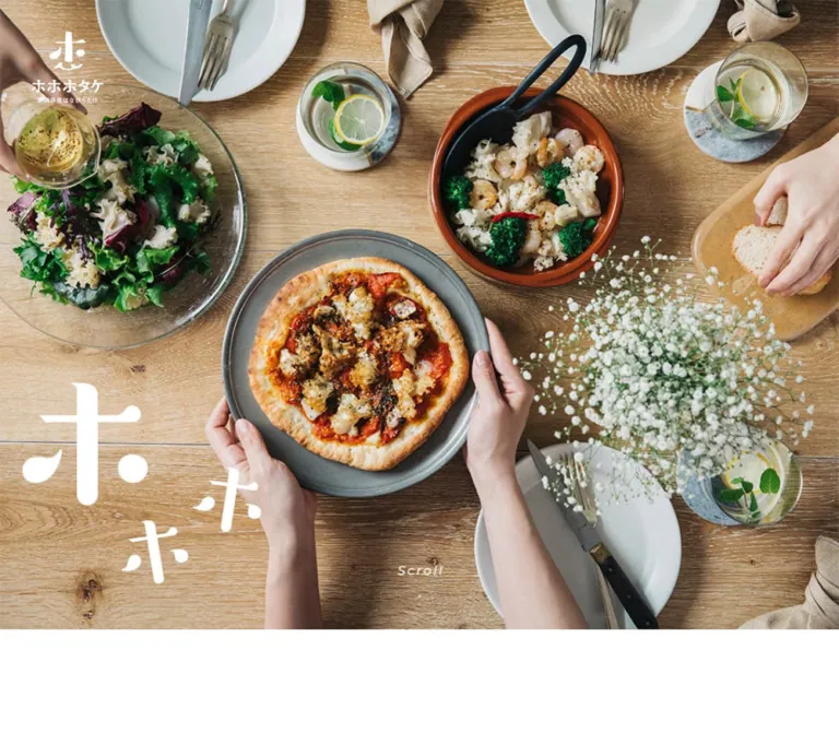
ホホホタケ — 写真と余白で伝える、はなびらたけのブランドサイト
白と温かなベージュを基調に、料理や生産現場の写真、縦書きコピー、ゆったりした文字組みを組み合わせた食品ブランドサイト。商品、取扱店、レシピ、企業紹介を一つの長いページで展開しています。
Hohohotake — Style Reference
Delicate mushroom frills, generous white space, and warm food photography, arranged like a quiet editorial feature.
Website: hohohotake.com Original URL: https://hohohotake.com/ Final URL: https://hohohotake.com/ Theme: light; white and warm beige with black typography Inspected: October 5, 2026, 05:24 JST — supplied retrieval timestamp: October 4, 2026, 20:24:14.831 UTC Viewports: 1440 × 1000 desktop and 390 × 844 mobile, in CSS pixels Scope: the current Japanese brand homepage, including its introduction, mushroom information, three brand commitments, products, stockists, five recipe entries, company story, and footer. Original-page screenshots cover the opening, desktop stockists, company photography, and desktop/mobile footer states. The rendered DOM supplies additional measurements throughout the document. Menu opening, recipe actions, language switching, and external destinations were not exercised.
Hohohotake presents a food brand through appetite, texture, and the people producing it. Its opening is dominated by photography rather than a large sales headline. The following sections alternate white and pale beige, using modest Japanese headings, unusually generous line spacing, restrained navigation, and occasional organic decorations. A vertical introductory message gives the page an editorial pause before the more practical product and retailer information.
This is a brand website with a product catalogue, retailer directory, recipe content, and company narrative. Contact links are present, but they do not dictate every section. Its strongest reusable relationships are large photographs against small typography, narrow reading columns inside broad margins, and soft shapes used selectively for controls and retailer tiles.
閉じる
Hohohotake — Style Reference
Delicate mushroom frills, generous white space, and warm food photography, arranged like a quiet editorial feature.
Website: hohohotake.com Original URL: https://hohohotake.com/ Final URL: https://hohohotake.com/ Theme: light; white and warm beige with black typography Inspected: October 5, 2026, 05:24 JST — supplied retrieval timestamp: October 4, 2026, 20:24:14.831 UTC Viewports: 1440 × 1000 desktop and 390 × 844 mobile, in CSS pixels Scope: the current Japanese brand homepage, including its introduction, mushroom information, three brand commitments, products, stockists, five recipe entries, company story, and footer. Original-page screenshots cover the opening, desktop stockists, company photography, and desktop/mobile footer states. The rendered DOM supplies additional measurements throughout the document. Menu opening, recipe actions, language switching, and external destinations were not exercised.
Hohohotake presents a food brand through appetite, texture, and the people producing it. Its opening is dominated by photography rather than a large sales headline. The following sections alternate white and pale beige, using modest Japanese headings, unusually generous line spacing, restrained navigation, and occasional organic decorations. A vertical introductory message gives the page an editorial pause before the more practical product and retailer information.
This is a brand website with a product catalogue, retailer directory, recipe content, and company narrative. Contact links are present, but they do not dictate every section. Its strongest reusable relationships are large photographs against small typography, narrow reading columns inside broad margins, and soft shapes used selectively for controls and retailer tiles.
How to Read This Reference
- Measured means a value appears in the supplied rendered DOM or computed-style export. Measurements belong to the recorded viewport and capture state.
- Screenshot estimate means a visual approximation from the original-page captures. It is not a sampled stylesheet value.
- Calculated means arithmetic based on measured values, such as the gap between two columns. It does not establish the original CSS formula.
- Recommended means an implementation choice for a new project. Breakpoints, accessibility additions, and the starter CSS are explicitly adaptations.
- Token names beginning with
--hoho-are reference aliases, not original source variables. - An element's computed font or color may describe a wrapper around artwork or nested text. Several logo, utility, and section-label wrappers do not describe the visible lettering accurately.
- Offscreen reveal transforms can place children beyond their parent section rectangles. Treat document coordinates as inspection records; do not reproduce the page by assigning every section a fixed height.
Tokens — Colors
Core Palette
| Name | Value | Reference token | Evidence and role |
|---|---|---|---|
| White | #ffffff |
--hoho-white |
Measured. Root canvas, introduction, commitments, products, recipes, company section, and the additional-stockists tile |
| Warm Beige | #f6efe5 |
--hoho-cream |
Measured as rgb(246, 239, 229). Mushroom information, stockists, footer, menu control, and TOP control |
| Black | #000000 |
--hoho-ink |
Measured. Main copy, ordinary visible labels, and company/footer links |
| Warm Dot | approximately #d2a475 |
--hoho-dot |
Screenshot estimate. Small three-dot section markers; not a general action color |
| Quiet Gray | approximately #aaa69f |
--hoho-muted-visual |
Screenshot estimate. Muted copyright and quieter utility details; the mechanism producing the appearance was not exported |
The warm beige is a structural background, not a colored card system applied everywhere. White cards stand out inside the beige stockist section, while most other content sits directly on its section surface.
Photography supplies orange, brown, green, and cream. These image colors should not become additional interface accents. The white mushroom frills connect the bright production imagery to both the white canvas and the warmer food photographs.
Values That Are Not Visual Brand Tokens
The export contains --swiper-theme-color: #007aff and --swiper-navigation-size: 44px. These establish that slider-related defaults exist in the page environment; they do not establish visible blue navigation or a particular carousel behavior.
Several image-bearing links report browser blue, rgb(0, 0, 238), while their visible artwork is white or black. Do not introduce blue text throughout the reconstruction on that basis. Likewise, the footer copyright wrapper reports black even though its captured appearance is gray. Nested styling, artwork, or opacity may contribute; the export does not identify which.
Tokens — Typography
Japanese Sans-serif Text
Measured family stack:
YuGothic, '游ゴシック体 Pr6N M', 'Yu Gothic Pr6N M',
'Hiragino Kaku Gothic ProN', 'Hiragino Sans', Meiryo, sans-serif
This is a declared stack, not proof of which font file actually rendered. The supplied evidence does not identify a downloaded custom text font.
Body copy generally uses weight 500, with a line height near twice the font size and tracking around 0.1em. Main editorial headings also use weight 500; product names use 700. The result is clear and deliberate without relying on very large type or heavy display lettering.
Vertical Introduction
The actual message is 笑顔を / 咲かせましょう. The mobile screenshot shows two vertical columns, read from the right column to the left. Its exceptionally open tracking is part of the composition: 12px at a desktop font size of 24px, and 10.335px at 20.67px on mobile.
Use real vertical text for an adaptation rather than inserting a line break after every character. writing-mode: vertical-rl is the recommended implementation; the property itself was not included in the export.
Brand and Utility Artwork
The brand uses a distinctive smiling emblem and custom Japanese wordmark. Large white ホ characters also appear as photographic decoration in the mobile opening. Preserve these as supplied brand artwork when available; the body font is not a substitute.
Jp / En, Scroll, and TOP appear as small, tracked, slanted Latin labels. Their parent anchors compute to 10px, but that is not a reliable measurement of the visible glyphs. Visually, the desktop utility lettering is approximately 15–17px; mobile lettering is approximately 13–16px. The actual utility font is unverified.
Type Scale
| Role | Desktop measurement | Mobile measurement | Weight / tracking | Notes |
|---|---|---|---|---|
| Root | 10px |
10px |
400 |
Source sizing convention, not the normal visible body size |
| General body wrapper | 10px |
10px |
500; 1px |
Descendants supply their actual text sizes |
| Vertical introduction | 24px / 48px |
20.67px / 41.34px |
500; 0.5em |
Very open vertical rhythm |
| Introductory paragraph | 16px / 35.2px |
13.65px / 30.03px |
500; 0.05em |
Centered beneath the heading on mobile |
| About headings | 24px / 48px |
24.96px / 49.92px |
500; 0.15em |
Mobile headings are slightly larger, not uniformly reduced |
| About body | 14px / 28px |
14px / 28px |
500; 0.1em |
Stable reading size |
| Commitments and product copy | 14px / 28px |
14.43px / 28.86px |
500; 0.1em |
Slight mobile scaling |
| Product names | 26px, normal line height |
26.91px, normal line height |
700; 0.15em |
Measured title boxes are about 42–43px high |
| Stockist introduction | 16px, normal line height |
14.43px, normal line height |
500; 0.05em |
More compact than recipe introduction |
| Stockist instruction | 12px, normal line height |
12.48px, normal line height |
500; 0.05em |
Secondary explanatory text |
| Recipe introduction | 16px / 32px |
16px / 32px |
500; 0.1em |
Size retained on mobile |
| Recipe titles | 24px / 48px |
24px / 48px |
500; 0.1em |
White-backed multiline title boxes |
| Recipe descriptions | 14px / 28px |
14px / 28px |
500; 0.1em |
Reflows from wide desktop copy to a narrow mobile column |
| Company heading | 24px / 48px |
24.96px / 49.92px |
500; 0.1em |
Distinct from the smaller section label |
| Company paragraph | 14px / 28px |
14.43px / 28.86px |
500; 0.1em |
Two-column desktop, stacked mobile |
| Footer links | 12px, normal line height |
12.48px, normal line height |
500; 0.1em |
Small and widely spaced |
| Copyright wrapper | 12px, normal line height |
10.53px, normal line height |
500; 0.05em |
Two lines on mobile |
Section-label caveat: the sampled section-heading wrappers compute to 20px / 20px, weight 700, but desktop rectangles are only 16px high and the visible labels look approximately 16px and medium weight. Mobile wrapper heights are approximately 40.92px. Use the screenshots to reproduce the final label appearance; do not assume the wrapper's font is the visible title font.
Tokens — Spacing & Shapes
Main Geometry
| Element | Desktop | Mobile | Evidence |
|---|---|---|---|
| Standard content column | 960px, from x = 240 to 1200 |
285.86px, from x = 52.06 to 337.92 |
Measured |
| Content share of viewport | 66.67% |
approximately 73.30% |
Calculated; not the original CSS rule |
| Side margin | 240px |
approximately 52.06px |
Measured |
| Intro heading box | 96 × 260px |
approximately 81.11 × 218.39px |
Measured |
| About copy column | 350px |
285.86px |
Measured |
| Commitment columns | Three columns of 228px |
One column of 285.86px |
Measured |
| Commitment column gaps | 138px |
Stacked sections separated by about 83.06px |
Calculated |
| Product columns | Two columns of 472px |
One column of 285.86px |
Measured |
| Product column gap | 16px |
Not applicable | Calculated |
| Stockist grid | Three columns of 310px |
One column of 285.86px |
Measured widths; desktop appearance confirmed visually |
| Stockist desktop gaps | 15px horizontally and vertically |
Logo-link baselines advance about 182.02px |
Desktop screenshot and calculated positions |
| Contact / brochure link | 350 × 80px |
approximately 285.86 × 83.06px |
Measured |
| Recipe action | 228 × 60px |
approximately 237.11 × 62.39px |
Measured |
| Menu / TOP control | 80 × 80px |
approximately 62.39 × 62.39px |
Measured |
| Footer height | approximately 182.78px |
approximately 394.66px |
Measured |
The narrow mobile reading width is deliberate. At 390px, paragraphs generally occupy only about 286px, while hero and recipe regions can reach the viewport edges. Do not replace every mobile section with the same 16px side padding.
Spacing Scale
| Use | Desktop measurement | Mobile measurement |
|---|---|---|
| Introduction vertical padding | 150px top and bottom |
70.59px top, 83.07px bottom |
| About section padding | 155px top, 200px bottom |
83.07px top, 104.13px bottom |
| Commitments padding | 150px top, 100px bottom |
83.07px top and bottom |
| Products padding | 140px top, 200px bottom |
83.07px top and bottom |
| Stockists padding | 150px top, 200px bottom |
83.07px top, 104.13px bottom |
| Recipes padding | 155px top, 100px bottom |
83.07px top and bottom |
| Company padding | 155px top, 150px bottom |
83.07px top and bottom |
| Footer padding | 50px top, 40px bottom |
62.4px top, 104.13px bottom |
| Commitment artwork-to-copy gap | approximately 25px |
approximately 25px |
| Company mobile heading-to-copy gap | Not applicable | approximately 31.19px |
Several mobile values correspond to convenient viewport percentages: 83.07px = 21.3vw, 62.4px = 16vw, and 24.96px = 6.4vw at 390px. These equivalences are calculated from one mobile sample. They do not prove the source uses those formulas at every width.
Shape Language
| Element | Value / appearance | Status |
|---|---|---|
| Additional-stockists desktop tile | 12px radius |
Measured |
| Other stockist tiles | Matching soft rectangular corners | Screenshot-confirmed appearance; individual image wrappers were not measured |
| Additional-stockists mobile link | 80px radius |
Measured; changes to a pill |
| Contact and recipe links | 80px radius |
Measured |
| Desktop menu / TOP | 30px radius |
Measured |
| Mobile menu / TOP | 24.96px radius |
Measured |
| Company gallery images | Approximately 12px corners |
Screenshot estimate |
| Recipe title backings | 0px radius |
Measured |
The page has no visible general-purpose shadow hierarchy. Its separation comes from background changes, open space, image edges, and a few rounded white surfaces.
Components
Photographic Opening
Role: establish appetite, product texture, and brand character before explanatory copy.
The desktop opening fills the supplied 1440 × 1000 frame. A cooked fish dish, white mushroom frills, green vegetables, a dark plate, and warm wooden surroundings dominate the composition. Overlapping photographic layers are visible in the capture; this suggests a transition state but does not establish a slideshow sequence or timing.
The compact white brand mark sits at approximately (40px, 40px) in a measured 91 × 98px heading box. Jp / En sits at the upper right. A small Scroll cue appears near the lower center. There is no large text panel covering the food in this captured state.
At 390px wide, the photographic opening is square: the introduction begins at document y = 390px. The image shows gloved hands holding the mushroom, with large white decorative ホ forms near the lower right. The brand heading box is approximately 46.80 × 54.28px, positioned 20.66px from the top and left.
On desktop, the introduction begins at y = 1080px, but the hero element itself was not exported. That establishes the total preceding region, not a verified 4:3 image ratio. The starter CSS uses a viewport-high desktop opening as an adaptation.
Persistent Language and Reading Controls
Role: keep navigation available without placing a conventional header bar across the photography.
The language anchors link to / and /en. Desktop anchor positions begin around x = 1303px, y = 40px; mobile positions begin around x = 276.53px, y = 20.66px. The Japanese label appears visually quieter than the English label in the captures. Selection behavior was not tested.
A compact three-line menu symbol appears inside a beige rounded square in scrolled captures. It is absent from the supplied opening frames. The control is 80px square on desktop and about 62.39px square on mobile. Its desktop screenshot position is approximately 50px from the top and left; mobile is approximately 31px from each edge.
The exported anchor y positions differ from those visible offsets. Treat them as state-dependent coordinates rather than proof of a fixed inset. Persistence is supported by repeated scrolled screenshots; the actual positioning and reveal rules were not exported.
The matching TOP control sits toward the lower right, with small dot artwork above its slanted label. On beige footer backgrounds, its beige surface visually merges with the surrounding section. Its exported href is #; scrolling behavior was not tested.
Navigation Contents
Role: provide direct access to the long page's sections.
The DOM contains a brand mark, six section links, and a contact link in a narrow navigation group. The link column is 350px wide on desktop and 285.86px on mobile. Desktop link text computes to 16px / 32px; mobile computes to 13.65px / 27.3px.
Verified section targets include #About, #Wish, #Products, #Case, and #Recipes. The company link is recorded as #, so a working company jump cannot be inferred from its label alone. The #Case link is labeled 飲食店での導入事例, while the captured body section is headed 取扱いのあるお店.
The menu was not opened in the supplied screenshots. Its backdrop, transition, focus handling, and close behavior remain unverified. Do not turn the presence of DOM links into a claim that a particular overlay was observed.
Introductory Statement
Role: connect the product's appearance and taste to the brand's social purpose.
Desktop geometry places the vertical heading at x = 365px and the paragraph at x = 631px. The paragraph is approximately 385.78px wide. White space is the main organizing element; there is no enclosing panel.
On mobile, the two vertical columns are centered above a centered paragraph. The heading begins about 70.59px below the square opening, and the paragraph begins approximately 51.86px after the heading box. The paragraph gains a deliberate break after the first phrase.
Preserve the contrast between the very open heading and the smaller, readable body. Do not turn the vertical message into an oversized horizontal headline on mobile.
Section Label and Dot Motif
Role: mark chapters without introducing large title bands.
Desktop captures show a small warm three-dot marker before a modest black section label. The content column begins at x = 240px; the text begins just after the marker. Similar small dot groups appear beside footer and directory links, usually in black.
These are restrained brand details. They are not bullet lists, progress indicators, or a reason to add dotted borders throughout the page. The CSS Quick Start includes an approximate three-dot construction, not an extracted original asset.
Mushroom Information Rows
Role: explain rarity, cultivation, appearance, and cooking versatility.
The beige information section contains two desktop flex rows, each 960 × 350px. The first copy column starts at x = 240px; the second starts at x = 850px. Both copy columns are 350px wide, creating an alternating composition around the other media region.
Headings use two lines at 24px / 48px, followed by 14px / 28px paragraphs. On mobile, each row becomes a block within the 285.86px reading column. Its heading is approximately 24.96px, and its paragraph retains 14px type.
Image elements were not included in this portion of the export, and these rows are not among the supplied visual frames. Their exact image dimensions, crops, and internal decoration must therefore remain unspecified.
Three Commitments
Role: explain benefits to customers, the local community, and the producer.
Desktop uses three widely separated columns at x = 240, 606, and 972px, each 228px wide. Each contains a square, textless heading region followed by a paragraph. The square regions measure 228 × 228px; they appear to hold non-text content, but that content is not visible in the supplied screenshots.
Mobile stacks the three entries. Their square regions become approximately 237.11 × 237.11px, centered within the reading column, while paragraphs use the full 285.86px width. Keep these entries open on the canvas rather than enclosing them in generic feature cards.
Product Pair
Role: distinguish the main mushroom from its base portion.
The two products are ホホホタケ and ホホホの子. Desktop entries are 472px wide with a 16px gap. Each has a substantial region before its title, a bold product name, and a two-line description. The export supports the structure but does not provide the product image bounds or files.
On mobile, the entries become a single column. Titles grow slightly to 26.91px, retain 0.15em tracking, and are followed by 14.43px / 28.86px copy. The second entry starts about 83.06px after the first section box ends.
Two large rounded links follow: お問い合わせはこちら and 商品パンフレットはこちら. They are side by side on desktop and stacked on mobile. The contact destination and a Google Drive brochure destination are recorded, but neither was opened. The computed anchor backgrounds are transparent; borders and pseudo-element treatments were not included in the evidence.
Stockist Directory
Role: connect the brand narrative to places where the product can be bought or eaten.
This is the best visually documented content component. It sits on beige, with white mushroom-outline illustrations cropped by both viewport edges. A compact section label is followed by an introduction and a smaller instruction explaining that retailer links lead to their websites.
Desktop uses a three-by-two arrangement. Each visible tile is approximately 310 × 175px, with 15px gutters and soft corners. The first five tiles contain retailer or restaurant marks; the sixth contains text and a small three-dot link cue.
Visible marks include ISETAN, QUEEN’S ISETAN, TOYOSU ICHIBA, KEISHOUEN, and 錦水 / Hotel Chinzanso Tokyo. Some tiles include small location restrictions below the mark. Preserve the original logo proportions and give those notes a separate visual tier. Do not equalize every logo to the same width.
The image-bearing anchors themselves report only 10px height because of their inline structure. That is not the visible tile height; use the screenshot and the separately measured 310 × 175px additional-stockists tile.
On mobile, all five logo links share the same x coordinate and 285.86px width, confirming a single column. Their anchor baselines advance by approximately 182.02px. The final text link changes to an approximately 285.86 × 85.06px pill with an 80px radius. Its different mobile shape is measured, not an inferred adaptation.
Recipe Features
Role: show distinct culinary uses in a slower editorial sequence.
Five entries are present: steamed fish, a grilled mushroom dish, a clear soup, a tomato pizza, and seasoned rice. Their labels remain actual Japanese content in the original page.
Desktop entries are 960px wide, with starts spaced 830px apart. Each contains a positioned white-backed title, a broad description below the upper region, and a rounded 詳しいレシピ action at the right. The description is 678px wide; the action is 228px wide; the calculated horizontal gap is 54px.
Titles use 24px / 48px, weight 500, and 2.4px tracking, with 10px horizontal padding and square corners. Positions vary by entry: some are inset near the upper right, others near the upper left, and one is lower on the right. This asymmetry should follow the composition of the associated media.
The title and caption geometry suggests a large photographic feature, but recipe image elements and full recipe screenshots were not supplied. Exact crops, image heights, and photo-to-title overlap are not independently verified.
On mobile, recipe section boxes become the full 390px viewport width. Titles begin around x = 51.86px; descriptions return to the 285.86px reading column. The action is approximately 237.11px wide and aligns with the right edge of that column, leaving a larger inset on its left.
All five recipe anchors point to # in the export. A modal, download, expanded recipe, or navigation destination cannot be claimed without interaction evidence.
Company Story and Photo Strip
Role: connect the food product to the people, place, and production experience behind it.
The section names 大井川電機製作所 and presents the heading 電球をつくる会社が、キノコをつくる。. On desktop, the heading occupies the left side of the 960px content area; a 472px paragraph begins at x = 728px. On mobile, the heading and paragraph stack within the standard reading column.
A horizontal photo strip follows. The desktop screenshot shows approximately 472 × 350px images with around 13px gaps: a factory exterior, a worker handling mushrooms, and a staff group. A cropped preceding image is visible at the left edge. Corners are softly rounded, around 12px by visual estimate.
The mobile strip is approximately 182px high and extends beyond both viewport edges. A mushroom close-up and the factory exterior are visible. The complete mobile tile width cannot be measured from the cropped frame.
The strip's oversized extent is an observed layout feature. Autoplay, dragging, looping, and speed are not verified. A native horizontal scroller is a reasonable recommended implementation until the original behavior is established.
Footer
Role: close with brand identity, company destinations, contact access, and a quiet ownership line.
The footer is beige. Desktop padding is 50px above and 40px below. A black horizontal brand lockup sits at the content column's left edge, followed by a lower row containing three links and copyright. Link groups use small three-dot marks, not large arrow buttons.
On mobile, the footer is approximately 394.66px high. Its brand lockup begins at x = 52.06px; its measured heading box is about 171.59 × 45.20px. The three links stack vertically, followed by a subdued, right-aligned, two-line copyright area. The TOP control remains at the lower right.
The original page's company copy, company link, and OIGAWA ELECTRIC CO., LTD. copyright independently support the operator identity. No production credit is visible in the supplied original-page evidence.
Tokens — Motion & Interaction
| Treatment | Recorded evidence | What can be concluded |
|---|---|---|
| Intro heading and paragraph reveal | opacity 0.7s ease-out, transform 0.7s ease-out |
A 700ms fade/transform transition is defined; displacement and trigger are not exported |
| Commitment artwork reveal | Same 700ms transition | Declared reveal treatment; no verified entrance direction |
| Commitment paragraphs and product text | Same transition with 0.05s delay |
A 50ms delayed tier is defined |
| Recipe title reveal | Same transition with 0.1s delay |
A 100ms delayed tier is defined |
| Many links | opacity 0.3s ease-out |
A 300ms opacity transition exists; target opacity is unknown |
| Hero photographic overlap | Visible in the desktop capture | Consistent with a dissolve or layered transition; sequence, trigger, interval, and easing are unverified |
| Company photo strip | Different portions visible across captures | Confirms overflow composition, not autoplay or a particular drag model |
| Menu contact wrapper | Export includes 0s 0.35s |
Insufficient to reconstruct an animation; do not treat it as a complete motion specification |
| TOP and section anchors | Link destinations recorded | Intended navigation affordances exist; scrolling and history behavior were not tested |
A generic transition: all without a nonzero duration is not evidence of visible animation. Similarly, animation: none on a sampled wrapper does not rule out JavaScript motion, image changes, or animated descendants.
For an adaptation, keep reveals gentle and let photography remain the main event. Do not invent a parallax system, spring physics, or a carousel interval from these snapshots. The Quick Start supplies an optional 8px reveal displacement as a recommendation, not a source measurement.
Surfaces
| Surface | Appearance | Function |
|---|---|---|
| Main reading canvas | White, unboxed | Introduction, products, recipes, company narrative |
| Informational band | Solid warm beige | Mushroom information and stockists |
| Stockist tile | White, softly rounded | Separates third-party marks from the beige field |
| Recipe title backing | White, square cornered | Keeps a small multiline title distinct from surrounding media |
| Floating control | Beige rounded square | Menu and return-to-top utilities |
| Footer | Warm beige | Closes the long document with subdued navigation |
| Decorative linework | White organic mushroom contours | Adds product-specific texture at section edges |
Avoid adding soft shadows to compensate for sparse layout. The original design is comfortable letting white space and imagery carry separation.
Imagery
The original captures show two complementary photographic treatments. Food imagery is warm, tactile, and close: dark crockery, orange fish, green vegetables, and pale mushroom frills. Production imagery is brighter and cooler, with white workwear, gloved hands, daylight, a factory exterior, and a staff group.
Preserve the mushroom's ruffled edges and off-white color. They are the visual connection between ingredients, finished dishes, organic line illustrations, and the brand's cheerful character. Use crops that keep the texture legible rather than reducing every image to a distant scene.
The photography can extend to the viewport edges, while explanatory copy remains narrow. Do not apply one aspect ratio to every image category. Hero media, product imagery, retailer marks, and documentary photographs have different jobs.
Observed Asset References
The supplied export does not include image src values or an asset manifest. No filenames can be verified.
| Asset family | Verified visual evidence | Reuse guidance |
|---|---|---|
| White stacked brand lockup | Desktop and mobile openings | Use the actual emblem and lettering when authorized |
| Black horizontal brand lockup | Desktop and mobile footers | Preserve its compact proportions and small origin line |
| Food hero photography | Desktop opening | Retain warm light, close texture, and the plate's visual mass |
| Mushroom handling photography | Mobile opening | Retain the mushroom's pale frills against hands and white clothing |
Large white ホ artwork |
Mobile opening | Treat as brand decoration, not ordinary heading text |
| Mushroom contour drawings | Desktop stockist section edges | Keep white linework peripheral and cropped |
| Retailer and restaurant marks | Desktop stockist grid | Preserve each mark's aspect ratio and any associated restrictions |
| Factory, worker, staff, and mushroom photographs | Company strips across desktop/mobile captures | Use a consistent documentary treatment with rounded image boundaries |
| Three-dot link marks | Section labels and footer/directory links | Keep small; exact artwork is not supplied |
CSS can reproduce layout and spacing, but the custom identity and photography need appropriate source assets. Do not substitute unrelated stock photographs and expect the same character.
Layout & Responsive Behavior
Observed Document Structure
These are rounded document-space measurements, not recommended fixed section heights.
| Region | Desktop top / height | Mobile top / height |
|---|---|---|
| Introduction | 1080 / 560px |
390 / 604.08px |
| Mushroom information | 2040 / 1321px |
1306.08 / 1623.89px |
| Three commitments | 3361 / 823px |
2929.97 / 1741.64px |
| Products | 4184 / 1079px |
4671.61 / 1590.81px |
| Stockists | 5663 / 894px |
6574.42 / 1415.03px |
| Recipes | 6557 / 4779px |
7989.45 / 4326.73px |
| Company | 11336 / 931px |
12316.19 / 875.95px |
| Footer | 12267 / 182.78px |
13192.14 / 394.66px |
| Total document | approximately 12449.78px |
approximately 13586.80px |
There are unclassified intervals of 400px on desktop and 312px on mobile between certain exported section wrappers, including before mushroom information and before stockists. The text-oriented export does not identify everything occupying those intervals. They must not automatically be interpreted as blank padding or invented image bands.
Desktop Composition
A repeated 960px center column organizes most of the page. The design varies the internal split: narrow alternating about copy, three widely spaced commitment columns, two nearly adjacent product columns, three stockist columns, and full-width recipe features.
The company gallery escapes this grid, as does the photographic opening. That alternation between contained copy and expansive imagery is more important than copying every section's total height.
Mobile Composition
- The opening becomes a
390 × 390pxsquare in the observed viewport. - The vertical introductory message remains vertical and moves above centered body copy.
- About rows, commitments, and products become single-column blocks.
- Stockists become one column; the final directory tile becomes a pill.
- Recipe section boxes span the viewport, while their copy remains in the narrow reading column.
- Company text stacks, but its photo strip continues beyond the viewport edges.
- Footer links stack and copyright becomes two lines.
- Body text is not uniformly reduced: recipe introduction remains
16px, recipe titles remain24px, and several other headings become slightly larger.
No tablet or intermediate viewport was supplied. The original breakpoint cannot be recovered from two samples. The Quick Start uses 767px as a recommended working breakpoint and requires validation with real content.
Do’s and Don’ts
Do
- Use measured white, beige
#f6efe5, and black as the structural palette. - Give photographs enough space to show the mushroom's texture.
- Preserve the vertical introductory statement and its unusually open tracking.
- Keep the desktop reading grid near 960px and the observed mobile text column near 73.3% of the viewport.
- Use
14px / 28pxas a key body relationship, with the documented larger introductory roles. - Keep product names bold while allowing editorial headings to remain medium weight.
- Preserve the stockist grid's white tiles, restrained rounding, and logo-specific proportions.
- Let recipe and gallery media escape the narrow mobile text column.
- Use small dot marks as recurring brand details.
- Treat menu, recipe, and gallery behavior as separate implementation work where evidence is incomplete.
Don’t
- Don't recast the site as a generic conversion page with oversized slogans and repeated bright purchase buttons.
- Don't use the exported slider blue as a brand accent.
- Don't infer the visible logo or utility font from its parent wrapper.
- Don't turn all sections into rounded cards or add a shadow to every content group.
- Don't replace the custom emblem with a typeset character from the body font.
- Don't flatten the mobile layout into uniformly padded boxes.
- Don't shrink every mobile font or remove the deliberate line spacing.
- Don't invent recipe modals or autoplay settings because links and slider defaults are present.
- Don't force fixed section heights from coordinates that may include reveal transforms.
- Don't invent asset paths, production roles, or unseen artwork.
Recommended Implementation Additions
These are recommendations for a new implementation, not verified features of the original site:
- Implement the menu trigger as a button with an accessible name and synchronized
aria-expanded. If its panel is modal, provide appropriate focus management and Escape handling. - Give image-only retailer links meaningful names. Empty extracted link text alone does not prove that the original image alternatives are missing.
- Keep decorative mushroom drawings and dot motifs out of the accessibility tree.
- Provide visible keyboard focus and comfortable hit areas without enlarging the delicate visible lettering unnecessarily.
- Preserve the vertical message as readable text and test its reading order with assistive technology.
- Respect reduced-motion preferences. Keep all content visible when reveal scripting fails, and provide a static option for any added automatic image movement.
- Increase the contrast of very pale copyright or utility text when it communicates useful information. The starter CSS uses a darker recommended muted color.
- Give recipe actions real destinations or a complete, keyboard-operable disclosure behavior. Do not ship inert
#links as finished recipe controls. - Keep the horizontal gallery operable by keyboard and touch. Offer pause controls if automatic movement is added.
- Validate narrow phones, text enlargement, long translated labels, and tablet widths; those states were not inspected.
Agent Prompt Guide
Quick Color Reference
- Main canvas: white
#ffffff. - Informational bands, footer, floating controls: warm beige
#f6efe5. - Main text and marks: black
#000000. - Section dots: muted warm tan, approximately
#d2a475; estimated. - Secondary visual text: pale gray in the captures; use a darker accessible gray when adapting.
- Rich color comes primarily from photographs and third-party logos.
- Avoid a separate saturated action color.
Overall Prompt
“Create a Japanese food-brand website inspired by Hohohotake. Use white and warm beige #f6efe5, black Japanese sans-serif text, a 960px desktop reading grid, generous section spacing, and close food photography that reveals delicate mushroom frills. Begin with a photographic opening and a compact white brand mark, followed by a quiet vertical Japanese statement. Alternate product explanation, three open commitment columns, a two-product presentation, a white-on-beige stockist grid, editorial recipe features, and a company photo strip. Use small three-dot details, soft rectangular utility controls, and restrained pill links. At 390px, keep a square opening, a roughly 286px text column, stacked products and stockists, full-width recipe regions, and a horizontally overflowing documentary photo strip. Use only the supplied brand and image assets; keep unverified interactions separate from the visual reconstruction.”
Example Component Prompts
- Introduction: “On white, place the Japanese message
笑顔を / 咲かせましょうin two vertical columns. Use medium-weight sans-serif, very open tracking, and generous space around it. Put smaller, generously led copy alongside on desktop and centered below on mobile.” - Stockist directory: “Build a 960px-wide grid of three 310 × 175px white tiles with 15px gaps on warm beige. Center each supplied retailer logo at its natural proportions and reserve room for a small restriction note. Use approximately 12px corners and no shadow. On mobile, stack the tiles and turn the final text-only directory link into a pill.”
- Recipe feature: “Create a large food-media feature with a modest, square-cornered white title backing. Use 24px Japanese text with 48px line height. Place descriptive copy below and a restrained rounded recipe link at the right. On mobile, let the media region reach the viewport edges, return copy to a 73.3vw column, and right-align the action within it. Choose image crops from supplied assets; do not invent a modal behavior.”
- Company section: “Use a two-column company statement on white, with a medium-weight 24px heading at left and a 472px paragraph at right. Follow with a photo strip of factory, worker, and team images, approximately 472 × 350px on desktop, with soft corners and small gaps. Keep the mobile text stacked and the photo strip horizontally accessible.”
- Footer: “Create a beige footer with a compact black horizontal brand lockup, three small company/contact links with uneven dot cues, and subdued copyright. Use a horizontal lower row on desktop and stacked links on mobile. Place a matching beige rounded TOP control near the lower right.”
Quick Start
CSS Custom Properties
This is a reusable adaptation, not extracted source CSS. It keeps a conventional root size and expresses measured dimensions directly. Main colors, desktop column widths, body typography, control sizes, and transition durations follow the evidence. The 767px breakpoint, viewport-height desktop hero, focus styles, 8px reveal offset, gallery scrolling, and darker muted text are recommendations. Image sizing outside the documented gallery remains dependent on the assets supplied to the implementation.
:root {
  /* Measured core palette */
  --hoho-white: #ffffff;
  --hoho-cream: #f6efe5;
  --hoho-ink: #000000;

  /* Estimated decoration and recommended readable secondary text */
  --hoho-dot: #d2a475;
  --hoho-muted: #6f6a63;

  /* Measured family declaration; actual resolved font may vary */
  --hoho-font-body: YuGothic, '游ゴシック体 Pr6N M',
    'Yu Gothic Pr6N M', 'Hiragino Kaku Gothic ProN',
    'Hiragino Sans', Meiryo, sans-serif;
  --hoho-text-body: 14px;
  --hoho-text-display: 24px;
  --hoho-leading-body: 2;
  --hoho-tracking-body: 0.1em;

  --hoho-content: 960px;
  --hoho-section-space: 150px;
  --hoho-section-end: 200px;
  --hoho-radius-card: 12px;
  --hoho-radius-pill: 80px;
  --hoho-control: 80px;
  --hoho-control-radius: 30px;
  --hoho-link-motion: 300ms ease-out;
  --hoho-reveal-motion: 700ms ease-out;
}

* {
  box-sizing: border-box;
}

body {
  margin: 0;
}

.hoho-site {
  color: var(--hoho-ink);
  background: var(--hoho-white);
  font-family: var(--hoho-font-body);
  font-size: var(--hoho-text-body);
  font-weight: 500;
  line-height: var(--hoho-leading-body);
  letter-spacing: var(--hoho-tracking-body);
}

.hoho-site a {
  color: inherit;
}

.hoho-site img {
  display: block;
  max-width: 100%;
}

.hoho-container {
  width: min(var(--hoho-content), calc(100% - 64px));
  margin-inline: auto;
}

.hoho-section {
  padding-block: var(--hoho-section-space);
}

.hoho-section--cream {
  background: var(--hoho-cream);
  padding-bottom: var(--hoho-section-end);
}

.hoho-site p {
  margin-block: 0;
}

.section-label {
  display: flex;
  align-items: center;
  gap: 10px;
  margin: 0 0 80px;
  font-size: 16px; /* Visible-label approximation */
  font-weight: 500;
  line-height: 1.5;
  letter-spacing: 0.05em;
}

/* Approximation of the small original dot artwork */
.section-label::before {
  content: '';
  flex: 0 0 14px;
  width: 14px;
  height: 14px;
  background:
    radial-gradient(circle at 50% 20%, var(--hoho-dot) 1.5px, transparent 2px),
    radial-gradient(circle at 20% 80%, var(--hoho-dot) 1.5px, transparent 2px),
    radial-gradient(circle at 80% 80%, var(--hoho-dot) 1.5px, transparent 2px);
}

.editorial-title {
  margin: 0 0 30px;
  font-size: var(--hoho-text-display);
  font-weight: 500;
  line-height: 2;
  letter-spacing: 0.15em;
}

/* Desktop hero height is a recommendation, not an exported rule. */
.hoho-hero {
  position: relative;
  height: 100svh;
  overflow: hidden;
  background: var(--hoho-cream);
}

.hoho-hero > .hero-media {
  width: 100%;
  height: 100%;
  object-fit: cover;
}

.hero-brand {
  position: absolute;
  top: 40px;
  left: 40px;
  width: 91px;
}

.hero-scroll {
  position: absolute;
  bottom: 60px;
  left: 50%;
  transform: translateX(-50%);
  color: var(--hoho-white);
  font-size: 16px;
  font-style: italic;
  letter-spacing: 0.1em;
}

.language-switch {
  position: fixed;
  z-index: 30;
  top: 40px;
  right: 40px;
  display: flex;
  align-items: center;
  font-size: 16px; /* Approximation of visible utility lettering */
  font-style: italic;
  line-height: 1.2;
}

.language-switch a {
  padding: 3px 12px;
  text-decoration: none;
}

.language-switch [aria-current='page'] {
  color: var(--hoho-muted);
}

.floating-control {
  position: fixed;
  z-index: 30;
  display: grid;
  place-items: center;
  width: var(--hoho-control);
  height: var(--hoho-control);
  padding: 0;
  border: 0;
  border-radius: var(--hoho-control-radius);
  color: var(--hoho-ink);
  background: var(--hoho-cream);
  cursor: pointer;
  text-decoration: none;
}

.floating-menu {
  top: 50px;
  left: 50px;
}

.floating-top {
  right: 40px;
  bottom: 40px;
  font-size: 16px;
  font-style: italic;
}

/* A controller supplies the reading state; its threshold is unverified. */
.hoho-site:not(.is-reading) .floating-control {
  visibility: hidden;
  pointer-events: none;
}

.hoho-intro {
  padding-block: 150px;
}

.intro-layout {
  display: grid;
  grid-template-columns: 96px 386px;
  gap: 170px;
  width: min(710px, calc(100% - 64px));
  margin-inline: auto;
}

.intro-title {
  margin: 0;
  writing-mode: vertical-rl;
  font-size: 24px;
  font-weight: 500;
  line-height: 2;
  letter-spacing: 0.5em;
}

.intro-copy {
  font-size: 16px;
  line-height: 2.2;
  letter-spacing: 0.05em;
}

.story-row {
  display: grid;
  grid-template-columns: 350px minmax(0, 1fr);
  gap: 138px;
  align-items: center;
}

.story-row + .story-row {
  margin-top: 150px;
}

.story-row.is-reversed {
  grid-template-columns: minmax(0, 1fr) 350px;
}

.story-row.is-reversed .story-copy {
  grid-column: 2;
  grid-row: 1;
}

.story-row.is-reversed .story-media {
  grid-column: 1;
  grid-row: 1;
}

.wish-grid {
  display: grid;
  grid-template-columns: repeat(3, 228px);
  justify-content: space-between;
}

.wish-art {
  width: 228px;
  height: 228px;
  margin: 0 auto 25px;
  object-fit: contain;
}

.product-grid,
.company-grid {
  display: grid;
  grid-template-columns: repeat(2, minmax(0, 1fr));
  gap: 16px;
}

.product-image {
  width: 100%;
  height: auto;
}

.product-name {
  margin: 24px 0 16px;
  font-size: 26px;
  font-weight: 700;
  line-height: 1.6;
  letter-spacing: 0.15em;
}

.action-row {
  display: flex;
  justify-content: center;
  gap: 16px;
  margin-top: 100px;
}

.pill-link {
  display: flex;
  align-items: center;
  justify-content: space-between;
  width: 350px;
  min-height: 80px;
  padding: 16px 30px;
  border: 1px solid currentColor; /* Recommended boundary */
  border-radius: var(--hoho-radius-pill);
  background: transparent;
  font-size: 14px; /* Recommended text size; source wrapper is 10px */
  line-height: 1.6;
  text-decoration: none;
  transition: opacity var(--hoho-link-motion);
}

.stockist-intro {
  font-size: 16px;
  letter-spacing: 0.05em;
}

.stockist-note {
  margin-top: 8px !important;
  font-size: 12px;
  letter-spacing: 0.05em;
}

.stockist-grid {
  display: grid;
  grid-template-columns: repeat(3, minmax(0, 1fr));
  gap: 15px;
  margin-top: 50px;
}

.stockist-card {
  display: flex;
  flex-direction: column;
  align-items: center;
  justify-content: center;
  aspect-ratio: 310 / 175;
  padding: 24px;
  border-radius: var(--hoho-radius-card);
  color: var(--hoho-ink);
  background: var(--hoho-white);
  text-decoration: none;
  transition: opacity var(--hoho-link-motion);
}

.stockist-card img {
  max-width: 100%;
  max-height: 75px;
  object-fit: contain;
}

.stockist-card small {
  margin-top: 14px;
  font-size: 11px;
  line-height: 1.5;
}

.stockist-more {
  align-items: flex-start;
  padding-inline: 35px;
  font-size: 16px;
  line-height: 1.6;
}

.recipe-intro {
  font-size: 16px;
  line-height: 2;
}

.recipe-list {
  margin-top: 100px;
}

.recipe-card + .recipe-card {
  margin-top: 120px;
}

.recipe-visual {
  position: relative;
}

.recipe-visual > img {
  width: 100%;
  height: auto;
}

.recipe-title {
  position: absolute;
  top: 40px;
  right: 30px;
  width: fit-content;
  margin: 0;
  padding-inline: 10px;
  background: var(--hoho-white);
  font-size: 24px;
  font-weight: 500;
  line-height: 2;
  letter-spacing: 0.1em;
}

.recipe-title.is-left {
  right: auto;
  left: 30px;
}

.recipe-title.is-lower {
  top: auto;
  bottom: 40px;
}

.recipe-caption {
  display: grid;
  grid-template-columns: minmax(0, 1fr) 228px;
  gap: 54px;
  align-items: start;
  margin-top: 40px;
}

.recipe-caption .pill-link {
  width: 228px;
  min-height: 60px;
  padding-right: 40px;
}

/* Native scrolling is a recommended gallery behavior. */
.company-gallery {
  display: flex;
  gap: 13px;
  overflow-x: auto;
  margin-top: 80px;
  padding-inline: 24px;
  scroll-snap-type: x proximity;
}

.company-gallery img {
  flex: 0 0 472px;
  width: 472px;
  max-width: none;
  height: 350px;
  border-radius: var(--hoho-radius-card);
  object-fit: cover;
  scroll-snap-align: center;
}

.site-footer {
  padding-block: 50px 40px;
  background: var(--hoho-cream);
}

.footer-brand {
  width: 165px;
}

.footer-bottom,
.footer-links {
  display: flex;
  align-items: center;
}

.footer-bottom {
  justify-content: space-between;
  gap: 30px;
  margin-top: 30px;
}

.footer-links {
  gap: 50px;
}

.footer-links a {
  font-size: 12px;
  text-decoration: none;
}

.copyright {
  color: var(--hoho-muted);
  font-size: 12px;
  letter-spacing: 0.05em;
}

/* Content remains visible unless a controller explicitly marks it pending. */
[data-reveal] {
  transition:
    opacity var(--hoho-reveal-motion),
    transform var(--hoho-reveal-motion);
  transition-delay: var(--reveal-delay, 0ms);
}

[data-reveal].is-pending {
  opacity: 0;
  transform: translateY(8px); /* Recommended, not measured */
}

.hoho-site :focus-visible {
  outline: 2px solid var(--hoho-ink);
  outline-offset: 5px;
}

@media (hover: hover) {
  /* Hover target opacity is recommended; only duration was measured. */
  .pill-link:hover,
  .stockist-card:hover,
  .footer-links a:hover {
    opacity: 0.7;
  }
}

/* Recommended breakpoint; only 1440px and 390px were inspected. */
@media (max-width: 767px) {
  :root {
    --hoho-section-space: 21.3vw;
    --hoho-section-end: 26.7vw;
    --hoho-control: 16vw;
    --hoho-control-radius: 6.4vw;
  }

  .hoho-container {
    width: 73.3%;
  }

  .section-label {
    display: block;
    margin-bottom: 16vw;
  }

  .section-label::before {
    display: block;
    margin-bottom: 10px;
  }

  .hoho-hero {
    height: auto;
    aspect-ratio: 1;
  }

  .hero-brand {
    top: 5.3vw;
    left: 5.3vw;
    width: 12vw;
  }

  .hero-scroll {
    display: none; /* Matches the supplied mobile opening frame */
  }

  .language-switch {
    top: 5.3vw;
    right: 5.3vw;
    font-size: 14px;
  }

  .floating-menu {
    top: 8vw;
    left: 8vw;
  }

  .floating-top {
    right: 8vw;
    bottom: 8vw;
    font-size: 14px;
  }

  .hoho-intro {
    padding-block: 18.1vw 21.3vw;
  }

  .intro-layout {
    display: block;
    width: 73.3%;
  }

  .intro-title {
    margin-inline: auto;
    font-size: 5.3vw;
  }

  .intro-copy {
    margin-top: 13.3vw !important;
    font-size: 3.5vw;
    text-align: center;
  }

  .editorial-title {
    font-size: 6.4vw;
  }

  .story-row,
  .story-row.is-reversed,
  .wish-grid,
  .product-grid,
  .company-grid {
    display: block;
  }

  .story-row + .story-row {
    margin-top: 16vw;
  }

  .story-media {
    margin-top: 8vw;
  }

  .wish-grid > * + *,
  .product-grid > * + * {
    margin-top: 21.3vw;
  }

  .wish-art {
    width: 60.8vw;
    max-width: 100%;
    height: auto;
    aspect-ratio: 1;
  }

  .wish-grid p,
  .product-grid p,
  .company-grid p {
    font-size: 3.7vw;
  }

  .product-name {
    font-size: 6.9vw;
  }

  .action-row {
    flex-direction: column;
    gap: 21.3vw;
    margin-top: 120px;
  }

  .pill-link {
    width: 100%;
    min-height: 21.3vw;
    padding-inline: 8vw;
  }

  .stockist-intro {
    font-size: 3.7vw;
  }

  .stockist-note {
    font-size: 3.2vw;
  }

  .stockist-grid {
    grid-template-columns: 1fr;
    gap: 5.3vw;
  }

  .stockist-more {
    aspect-ratio: auto;
    min-height: 85px;
    border-radius: 80px;
    font-size: 3.5vw;
  }

  /* The recipe list sits outside the narrow reading container. */
  .recipe-list {
    margin-top: 21.3vw;
  }

  .recipe-card {
    width: 100%;
  }

  .recipe-card + .recipe-card {
    margin-top: 21.3vw;
  }

  .recipe-title,
  .recipe-title.is-left,
  .recipe-title.is-lower {
    position: relative;
    inset: auto;
    max-width: 73.3%;
    margin: -36px 0 0 13.3%; /* Recommended overlap; adapt to the asset */
    padding-inline: 2.7vw;
  }

  .recipe-caption {
    display: block;
    width: 73.3%;
    margin: 8vw auto 0;
  }

  .recipe-caption .pill-link {
    width: 60.8vw;
    min-height: 16vw;
    margin: 10.7vw 0 0 auto;
  }

  .company-grid p {
    margin-top: 8vw;
  }

  .company-gallery {
    margin-top: 16vw;
  }

  .company-gallery img {
    flex-basis: 63vw; /* Recommended width consistent with the visible height */
    width: 63vw;
    height: auto;
    aspect-ratio: 472 / 350;
  }

  .site-footer {
    padding-block: 16vw 26.7vw;
  }

  .footer-brand {
    width: 44vw;
  }

  .footer-bottom,
  .footer-links {
    display: block;
  }

  .footer-links a {
    display: block;
    margin-bottom: 10.5px;
    font-size: 3.2vw;
  }

  .copyright {
    margin-top: 40px !important;
    font-size: 2.7vw;
    text-align: right;
  }
}

@media (prefers-reduced-motion: reduce) {
  [data-reveal],
  [data-reveal].is-pending {
    opacity: 1;
    transform: none;
    transition: none;
  }

  .pill-link,
  .stockist-card {
    transition: none;
  }

  .company-gallery {
    scroll-behavior: auto;
    scroll-snap-type: none;
  }
}
Structure notes: place .recipe-list outside the narrow .hoho-container; give each desktop .recipe-card the container class so it is 960px wide before the mobile override. Place .recipe-title inside .recipe-visual, after its image. Place .recipe-caption after that visual. Supply the real brand, product, and retailer assets. The CSS does not provide a menu controller, recipe disclosure, automatic hero transitions, or a carousel engine.
Tailwind v4 Token Mapping
Optional mapping for a project already using Tailwind v4. This does not claim that the original website uses Tailwind. Define the custom properties above first.
@theme inline {
  --color-hoho-white: var(--hoho-white);
  --color-hoho-cream: var(--hoho-cream);
  --color-hoho-ink: var(--hoho-ink);
  --color-hoho-dot: var(--hoho-dot);
  --color-hoho-muted: var(--hoho-muted);

  --font-hoho: var(--hoho-font-body);
  --text-hoho-body: 14px;
  --text-hoho-intro: 16px;
  --text-hoho-display: 24px;
  --text-hoho-product: 26px;

  --spacing-hoho-section: var(--hoho-section-space);
  --spacing-hoho-control: var(--hoho-control);
  --radius-hoho-card: var(--hoho-radius-card);
  --radius-hoho-pill: var(--hoho-radius-pill);
  --radius-hoho-control: var(--hoho-control-radius);
}
Sources & Evidence
- Hohohotake — current Japanese homepage: original and final URL are identical; the supplied inspection reports HTTP 200 and the page title
ホホホタケ - 食卓を咲かせる幻のキノコ. - Capture time: October 4, 2026, 20:24:14.831 UTC, equivalent to October 5, 2026, 05:24:14.831 JST. This reference analyzes that supplied inspection; no separate live visit was performed.
- Original-page visual evidence: three desktop frames at 1440 × 1000 and two mobile frames at 390 × 844, covering the opening, stockist directory, company/photo-strip area, and footer.
- Rendered evidence: full-page text and link inventories, selected element rectangles, computed colors, typography, padding, radii, transitions, and two slider-related custom properties at both viewports.
- Inspection procedure: the supplied browser observed the initial page for at least five seconds and applied bounded checks for document loading, finite motion, layout/text stability, and image decoding. Readiness checks had a 15-second overall limit, with a five-second image wait; scroll positions had a 10-second settling limit. Perpetual animations were temporarily paused during readiness checks and then resumed. SharedWorkers and service workers were disabled.
- Limits: no asset manifest, complete stylesheet, resolved-font report, interaction recording, or intermediate viewport was supplied. Not every DOM-measured section has a corresponding visible screenshot. Menu opening, recipe activation, external links, English-page content, hover target states, hero timing, and gallery controls remain unverified. Declared transitions and static frames cannot establish all runtime behavior.
All measured tokens and site-specific observations above come from the supplied original-page evidence. Estimates and implementation additions are labeled separately.
# Hohohotake — Style Reference

> Delicate mushroom frills, generous white space, and warm food photography, arranged like a quiet editorial feature.

**Website:** [hohohotake.com](https://hohohotake.com/)
**Original URL:** https://hohohotake.com/
**Final URL:** https://hohohotake.com/
**Theme:** light; white and warm beige with black typography
**Inspected:** October 5, 2026, 05:24 JST — supplied retrieval timestamp: October 4, 2026, 20:24:14.831 UTC
**Viewports:** 1440 × 1000 desktop and 390 × 844 mobile, in CSS pixels
**Scope:** the current Japanese brand homepage, including its introduction, mushroom information, three brand commitments, products, stockists, five recipe entries, company story, and footer. Original-page screenshots cover the opening, desktop stockists, company photography, and desktop/mobile footer states. The rendered DOM supplies additional measurements throughout the document. Menu opening, recipe actions, language switching, and external destinations were not exercised.

Hohohotake presents a food brand through appetite, texture, and the people producing it. Its opening is dominated by photography rather than a large sales headline. The following sections alternate white and pale beige, using modest Japanese headings, unusually generous line spacing, restrained navigation, and occasional organic decorations. A vertical introductory message gives the page an editorial pause before the more practical product and retailer information.

This is a brand website with a product catalogue, retailer directory, recipe content, and company narrative. Contact links are present, but they do not dictate every section. Its strongest reusable relationships are large photographs against small typography, narrow reading columns inside broad margins, and soft shapes used selectively for controls and retailer tiles.
閉じる
# Hohohotake — Style Reference

> Delicate mushroom frills, generous white space, and warm food photography, arranged like a quiet editorial feature.

**Website:** [hohohotake.com](https://hohohotake.com/)
**Original URL:** https://hohohotake.com/
**Final URL:** https://hohohotake.com/
**Theme:** light; white and warm beige with black typography
**Inspected:** October 5, 2026, 05:24 JST — supplied retrieval timestamp: October 4, 2026, 20:24:14.831 UTC
**Viewports:** 1440 × 1000 desktop and 390 × 844 mobile, in CSS pixels
**Scope:** the current Japanese brand homepage, including its introduction, mushroom information, three brand commitments, products, stockists, five recipe entries, company story, and footer. Original-page screenshots cover the opening, desktop stockists, company photography, and desktop/mobile footer states. The rendered DOM supplies additional measurements throughout the document. Menu opening, recipe actions, language switching, and external destinations were not exercised.

Hohohotake presents a food brand through appetite, texture, and the people producing it. Its opening is dominated by photography rather than a large sales headline. The following sections alternate white and pale beige, using modest Japanese headings, unusually generous line spacing, restrained navigation, and occasional organic decorations. A vertical introductory message gives the page an editorial pause before the more practical product and retailer information.

This is a brand website with a product catalogue, retailer directory, recipe content, and company narrative. Contact links are present, but they do not dictate every section. Its strongest reusable relationships are large photographs against small typography, narrow reading columns inside broad margins, and soft shapes used selectively for controls and retailer tiles.

## How to Read This Reference

- **Measured** means a value appears in the supplied rendered DOM or computed-style export. Measurements belong to the recorded viewport and capture state.
- **Screenshot estimate** means a visual approximation from the original-page captures. It is not a sampled stylesheet value.
- **Calculated** means arithmetic based on measured values, such as the gap between two columns. It does not establish the original CSS formula.
- **Recommended** means an implementation choice for a new project. Breakpoints, accessibility additions, and the starter CSS are explicitly adaptations.
- Token names beginning with `--hoho-` are reference aliases, not original source variables.
- An element's computed font or color may describe a wrapper around artwork or nested text. Several logo, utility, and section-label wrappers do not describe the visible lettering accurately.
- Offscreen reveal transforms can place children beyond their parent section rectangles. Treat document coordinates as inspection records; do not reproduce the page by assigning every section a fixed height.

## Tokens — Colors

### Core Palette

| Name | Value | Reference token | Evidence and role |
| --- | --- | --- | --- |
| White | `#ffffff` | `--hoho-white` | Measured. Root canvas, introduction, commitments, products, recipes, company section, and the additional-stockists tile |
| Warm Beige | `#f6efe5` | `--hoho-cream` | Measured as `rgb(246, 239, 229)`. Mushroom information, stockists, footer, menu control, and TOP control |
| Black | `#000000` | `--hoho-ink` | Measured. Main copy, ordinary visible labels, and company/footer links |
| Warm Dot | approximately `#d2a475` | `--hoho-dot` | Screenshot estimate. Small three-dot section markers; not a general action color |
| Quiet Gray | approximately `#aaa69f` | `--hoho-muted-visual` | Screenshot estimate. Muted copyright and quieter utility details; the mechanism producing the appearance was not exported |

The warm beige is a structural background, not a colored card system applied everywhere. White cards stand out inside the beige stockist section, while most other content sits directly on its section surface.

Photography supplies orange, brown, green, and cream. These image colors should not become additional interface accents. The white mushroom frills connect the bright production imagery to both the white canvas and the warmer food photographs.

### Values That Are Not Visual Brand Tokens

The export contains `--swiper-theme-color: #007aff` and `--swiper-navigation-size: 44px`. These establish that slider-related defaults exist in the page environment; they do not establish visible blue navigation or a particular carousel behavior.

Several image-bearing links report browser blue, `rgb(0, 0, 238)`, while their visible artwork is white or black. Do not introduce blue text throughout the reconstruction on that basis. Likewise, the footer copyright wrapper reports black even though its captured appearance is gray. Nested styling, artwork, or opacity may contribute; the export does not identify which.

## Tokens — Typography

### Japanese Sans-serif Text

**Measured family stack:**

```css
YuGothic, '游ゴシック体 Pr6N M', 'Yu Gothic Pr6N M',
'Hiragino Kaku Gothic ProN', 'Hiragino Sans', Meiryo, sans-serif
```

This is a declared stack, not proof of which font file actually rendered. The supplied evidence does not identify a downloaded custom text font.

Body copy generally uses weight `500`, with a line height near twice the font size and tracking around `0.1em`. Main editorial headings also use weight `500`; product names use `700`. The result is clear and deliberate without relying on very large type or heavy display lettering.

### Vertical Introduction

The actual message is `笑顔を / 咲かせましょう`. The mobile screenshot shows two vertical columns, read from the right column to the left. Its exceptionally open tracking is part of the composition: `12px` at a desktop font size of `24px`, and `10.335px` at `20.67px` on mobile.

Use real vertical text for an adaptation rather than inserting a line break after every character. `writing-mode: vertical-rl` is the recommended implementation; the property itself was not included in the export.

### Brand and Utility Artwork

The brand uses a distinctive smiling emblem and custom Japanese wordmark. Large white `ホ` characters also appear as photographic decoration in the mobile opening. Preserve these as supplied brand artwork when available; the body font is not a substitute.

`Jp / En`, `Scroll`, and `TOP` appear as small, tracked, slanted Latin labels. Their parent anchors compute to `10px`, but that is not a reliable measurement of the visible glyphs. Visually, the desktop utility lettering is approximately 15–17px; mobile lettering is approximately 13–16px. The actual utility font is unverified.

### Type Scale

| Role | Desktop measurement | Mobile measurement | Weight / tracking | Notes |
| --- | --- | --- | --- | --- |
| Root | `10px` | `10px` | `400` | Source sizing convention, not the normal visible body size |
| General body wrapper | `10px` | `10px` | `500`; `1px` | Descendants supply their actual text sizes |
| Vertical introduction | `24px / 48px` | `20.67px / 41.34px` | `500`; `0.5em` | Very open vertical rhythm |
| Introductory paragraph | `16px / 35.2px` | `13.65px / 30.03px` | `500`; `0.05em` | Centered beneath the heading on mobile |
| About headings | `24px / 48px` | `24.96px / 49.92px` | `500`; `0.15em` | Mobile headings are slightly larger, not uniformly reduced |
| About body | `14px / 28px` | `14px / 28px` | `500`; `0.1em` | Stable reading size |
| Commitments and product copy | `14px / 28px` | `14.43px / 28.86px` | `500`; `0.1em` | Slight mobile scaling |
| Product names | `26px`, normal line height | `26.91px`, normal line height | `700`; `0.15em` | Measured title boxes are about 42–43px high |
| Stockist introduction | `16px`, normal line height | `14.43px`, normal line height | `500`; `0.05em` | More compact than recipe introduction |
| Stockist instruction | `12px`, normal line height | `12.48px`, normal line height | `500`; `0.05em` | Secondary explanatory text |
| Recipe introduction | `16px / 32px` | `16px / 32px` | `500`; `0.1em` | Size retained on mobile |
| Recipe titles | `24px / 48px` | `24px / 48px` | `500`; `0.1em` | White-backed multiline title boxes |
| Recipe descriptions | `14px / 28px` | `14px / 28px` | `500`; `0.1em` | Reflows from wide desktop copy to a narrow mobile column |
| Company heading | `24px / 48px` | `24.96px / 49.92px` | `500`; `0.1em` | Distinct from the smaller section label |
| Company paragraph | `14px / 28px` | `14.43px / 28.86px` | `500`; `0.1em` | Two-column desktop, stacked mobile |
| Footer links | `12px`, normal line height | `12.48px`, normal line height | `500`; `0.1em` | Small and widely spaced |
| Copyright wrapper | `12px`, normal line height | `10.53px`, normal line height | `500`; `0.05em` | Two lines on mobile |

**Section-label caveat:** the sampled section-heading wrappers compute to `20px / 20px`, weight `700`, but desktop rectangles are only `16px` high and the visible labels look approximately 16px and medium weight. Mobile wrapper heights are approximately `40.92px`. Use the screenshots to reproduce the final label appearance; do not assume the wrapper's font is the visible title font.

## Tokens — Spacing & Shapes

### Main Geometry

| Element | Desktop | Mobile | Evidence |
| --- | --- | --- | --- |
| Standard content column | `960px`, from x = `240` to `1200` | `285.86px`, from x = `52.06` to `337.92` | Measured |
| Content share of viewport | `66.67%` | approximately `73.30%` | Calculated; not the original CSS rule |
| Side margin | `240px` | approximately `52.06px` | Measured |
| Intro heading box | `96 × 260px` | approximately `81.11 × 218.39px` | Measured |
| About copy column | `350px` | `285.86px` | Measured |
| Commitment columns | Three columns of `228px` | One column of `285.86px` | Measured |
| Commitment column gaps | `138px` | Stacked sections separated by about `83.06px` | Calculated |
| Product columns | Two columns of `472px` | One column of `285.86px` | Measured |
| Product column gap | `16px` | Not applicable | Calculated |
| Stockist grid | Three columns of `310px` | One column of `285.86px` | Measured widths; desktop appearance confirmed visually |
| Stockist desktop gaps | `15px` horizontally and vertically | Logo-link baselines advance about `182.02px` | Desktop screenshot and calculated positions |
| Contact / brochure link | `350 × 80px` | approximately `285.86 × 83.06px` | Measured |
| Recipe action | `228 × 60px` | approximately `237.11 × 62.39px` | Measured |
| Menu / TOP control | `80 × 80px` | approximately `62.39 × 62.39px` | Measured |
| Footer height | approximately `182.78px` | approximately `394.66px` | Measured |

The narrow mobile reading width is deliberate. At 390px, paragraphs generally occupy only about 286px, while hero and recipe regions can reach the viewport edges. Do not replace every mobile section with the same 16px side padding.

### Spacing Scale

| Use | Desktop measurement | Mobile measurement |
| --- | --- | --- |
| Introduction vertical padding | `150px` top and bottom | `70.59px` top, `83.07px` bottom |
| About section padding | `155px` top, `200px` bottom | `83.07px` top, `104.13px` bottom |
| Commitments padding | `150px` top, `100px` bottom | `83.07px` top and bottom |
| Products padding | `140px` top, `200px` bottom | `83.07px` top and bottom |
| Stockists padding | `150px` top, `200px` bottom | `83.07px` top, `104.13px` bottom |
| Recipes padding | `155px` top, `100px` bottom | `83.07px` top and bottom |
| Company padding | `155px` top, `150px` bottom | `83.07px` top and bottom |
| Footer padding | `50px` top, `40px` bottom | `62.4px` top, `104.13px` bottom |
| Commitment artwork-to-copy gap | approximately `25px` | approximately `25px` |
| Company mobile heading-to-copy gap | Not applicable | approximately `31.19px` |

Several mobile values correspond to convenient viewport percentages: `83.07px = 21.3vw`, `62.4px = 16vw`, and `24.96px = 6.4vw` at 390px. These equivalences are calculated from one mobile sample. They do not prove the source uses those formulas at every width.

### Shape Language

| Element | Value / appearance | Status |
| --- | --- | --- |
| Additional-stockists desktop tile | `12px` radius | Measured |
| Other stockist tiles | Matching soft rectangular corners | Screenshot-confirmed appearance; individual image wrappers were not measured |
| Additional-stockists mobile link | `80px` radius | Measured; changes to a pill |
| Contact and recipe links | `80px` radius | Measured |
| Desktop menu / TOP | `30px` radius | Measured |
| Mobile menu / TOP | `24.96px` radius | Measured |
| Company gallery images | Approximately `12px` corners | Screenshot estimate |
| Recipe title backings | `0px` radius | Measured |

The page has no visible general-purpose shadow hierarchy. Its separation comes from background changes, open space, image edges, and a few rounded white surfaces.

## Components

### Photographic Opening

**Role:** establish appetite, product texture, and brand character before explanatory copy.

The desktop opening fills the supplied 1440 × 1000 frame. A cooked fish dish, white mushroom frills, green vegetables, a dark plate, and warm wooden surroundings dominate the composition. Overlapping photographic layers are visible in the capture; this suggests a transition state but does not establish a slideshow sequence or timing.

The compact white brand mark sits at approximately `(40px, 40px)` in a measured `91 × 98px` heading box. `Jp / En` sits at the upper right. A small `Scroll` cue appears near the lower center. There is no large text panel covering the food in this captured state.

At 390px wide, the photographic opening is square: the introduction begins at document y = `390px`. The image shows gloved hands holding the mushroom, with large white decorative `ホ` forms near the lower right. The brand heading box is approximately `46.80 × 54.28px`, positioned `20.66px` from the top and left.

On desktop, the introduction begins at y = `1080px`, but the hero element itself was not exported. That establishes the total preceding region, not a verified `4:3` image ratio. The starter CSS uses a viewport-high desktop opening as an adaptation.

### Persistent Language and Reading Controls

**Role:** keep navigation available without placing a conventional header bar across the photography.

The language anchors link to `/` and `/en`. Desktop anchor positions begin around x = `1303px`, y = `40px`; mobile positions begin around x = `276.53px`, y = `20.66px`. The Japanese label appears visually quieter than the English label in the captures. Selection behavior was not tested.

A compact three-line menu symbol appears inside a beige rounded square in scrolled captures. It is absent from the supplied opening frames. The control is `80px` square on desktop and about `62.39px` square on mobile. Its desktop screenshot position is approximately 50px from the top and left; mobile is approximately 31px from each edge.

The exported anchor y positions differ from those visible offsets. Treat them as state-dependent coordinates rather than proof of a fixed inset. Persistence is supported by repeated scrolled screenshots; the actual positioning and reveal rules were not exported.

The matching `TOP` control sits toward the lower right, with small dot artwork above its slanted label. On beige footer backgrounds, its beige surface visually merges with the surrounding section. Its exported `href` is `#`; scrolling behavior was not tested.

### Navigation Contents

**Role:** provide direct access to the long page's sections.

The DOM contains a brand mark, six section links, and a contact link in a narrow navigation group. The link column is `350px` wide on desktop and `285.86px` on mobile. Desktop link text computes to `16px / 32px`; mobile computes to `13.65px / 27.3px`.

Verified section targets include `#About`, `#Wish`, `#Products`, `#Case`, and `#Recipes`. The company link is recorded as `#`, so a working company jump cannot be inferred from its label alone. The `#Case` link is labeled `飲食店での導入事例`, while the captured body section is headed `取扱いのあるお店`.

The menu was not opened in the supplied screenshots. Its backdrop, transition, focus handling, and close behavior remain unverified. Do not turn the presence of DOM links into a claim that a particular overlay was observed.

### Introductory Statement

**Role:** connect the product's appearance and taste to the brand's social purpose.

Desktop geometry places the vertical heading at x = `365px` and the paragraph at x = `631px`. The paragraph is approximately `385.78px` wide. White space is the main organizing element; there is no enclosing panel.

On mobile, the two vertical columns are centered above a centered paragraph. The heading begins about `70.59px` below the square opening, and the paragraph begins approximately `51.86px` after the heading box. The paragraph gains a deliberate break after the first phrase.

Preserve the contrast between the very open heading and the smaller, readable body. Do not turn the vertical message into an oversized horizontal headline on mobile.

### Section Label and Dot Motif

**Role:** mark chapters without introducing large title bands.

Desktop captures show a small warm three-dot marker before a modest black section label. The content column begins at x = `240px`; the text begins just after the marker. Similar small dot groups appear beside footer and directory links, usually in black.

These are restrained brand details. They are not bullet lists, progress indicators, or a reason to add dotted borders throughout the page. The CSS Quick Start includes an approximate three-dot construction, not an extracted original asset.

### Mushroom Information Rows

**Role:** explain rarity, cultivation, appearance, and cooking versatility.

The beige information section contains two desktop flex rows, each `960 × 350px`. The first copy column starts at x = `240px`; the second starts at x = `850px`. Both copy columns are `350px` wide, creating an alternating composition around the other media region.

Headings use two lines at `24px / 48px`, followed by `14px / 28px` paragraphs. On mobile, each row becomes a block within the `285.86px` reading column. Its heading is approximately `24.96px`, and its paragraph retains `14px` type.

Image elements were not included in this portion of the export, and these rows are not among the supplied visual frames. Their exact image dimensions, crops, and internal decoration must therefore remain unspecified.

### Three Commitments

**Role:** explain benefits to customers, the local community, and the producer.

Desktop uses three widely separated columns at x = `240`, `606`, and `972px`, each `228px` wide. Each contains a square, textless heading region followed by a paragraph. The square regions measure `228 × 228px`; they appear to hold non-text content, but that content is not visible in the supplied screenshots.

Mobile stacks the three entries. Their square regions become approximately `237.11 × 237.11px`, centered within the reading column, while paragraphs use the full `285.86px` width. Keep these entries open on the canvas rather than enclosing them in generic feature cards.

### Product Pair

**Role:** distinguish the main mushroom from its base portion.

The two products are `ホホホタケ` and `ホホホの子`. Desktop entries are `472px` wide with a `16px` gap. Each has a substantial region before its title, a bold product name, and a two-line description. The export supports the structure but does not provide the product image bounds or files.

On mobile, the entries become a single column. Titles grow slightly to `26.91px`, retain `0.15em` tracking, and are followed by `14.43px / 28.86px` copy. The second entry starts about `83.06px` after the first section box ends.

Two large rounded links follow: `お問い合わせはこちら` and `商品パンフレットはこちら`. They are side by side on desktop and stacked on mobile. The contact destination and a Google Drive brochure destination are recorded, but neither was opened. The computed anchor backgrounds are transparent; borders and pseudo-element treatments were not included in the evidence.

### Stockist Directory

**Role:** connect the brand narrative to places where the product can be bought or eaten.

This is the best visually documented content component. It sits on beige, with white mushroom-outline illustrations cropped by both viewport edges. A compact section label is followed by an introduction and a smaller instruction explaining that retailer links lead to their websites.

Desktop uses a three-by-two arrangement. Each visible tile is approximately `310 × 175px`, with `15px` gutters and soft corners. The first five tiles contain retailer or restaurant marks; the sixth contains text and a small three-dot link cue.

Visible marks include ISETAN, QUEEN’S ISETAN, TOYOSU ICHIBA, KEISHOUEN, and 錦水 / Hotel Chinzanso Tokyo. Some tiles include small location restrictions below the mark. Preserve the original logo proportions and give those notes a separate visual tier. Do not equalize every logo to the same width.

The image-bearing anchors themselves report only `10px` height because of their inline structure. That is not the visible tile height; use the screenshot and the separately measured `310 × 175px` additional-stockists tile.

On mobile, all five logo links share the same x coordinate and `285.86px` width, confirming a single column. Their anchor baselines advance by approximately `182.02px`. The final text link changes to an approximately `285.86 × 85.06px` pill with an `80px` radius. Its different mobile shape is measured, not an inferred adaptation.

### Recipe Features

**Role:** show distinct culinary uses in a slower editorial sequence.

Five entries are present: steamed fish, a grilled mushroom dish, a clear soup, a tomato pizza, and seasoned rice. Their labels remain actual Japanese content in the original page.

Desktop entries are `960px` wide, with starts spaced `830px` apart. Each contains a positioned white-backed title, a broad description below the upper region, and a rounded `詳しいレシピ` action at the right. The description is `678px` wide; the action is `228px` wide; the calculated horizontal gap is `54px`.

Titles use `24px / 48px`, weight `500`, and `2.4px` tracking, with `10px` horizontal padding and square corners. Positions vary by entry: some are inset near the upper right, others near the upper left, and one is lower on the right. This asymmetry should follow the composition of the associated media.

The title and caption geometry suggests a large photographic feature, but recipe image elements and full recipe screenshots were not supplied. Exact crops, image heights, and photo-to-title overlap are not independently verified.

On mobile, recipe section boxes become the full `390px` viewport width. Titles begin around x = `51.86px`; descriptions return to the `285.86px` reading column. The action is approximately `237.11px` wide and aligns with the right edge of that column, leaving a larger inset on its left.

All five recipe anchors point to `#` in the export. A modal, download, expanded recipe, or navigation destination cannot be claimed without interaction evidence.

### Company Story and Photo Strip

**Role:** connect the food product to the people, place, and production experience behind it.

The section names 大井川電機製作所 and presents the heading `電球をつくる会社が、キノコをつくる。`. On desktop, the heading occupies the left side of the `960px` content area; a `472px` paragraph begins at x = `728px`. On mobile, the heading and paragraph stack within the standard reading column.

A horizontal photo strip follows. The desktop screenshot shows approximately `472 × 350px` images with around `13px` gaps: a factory exterior, a worker handling mushrooms, and a staff group. A cropped preceding image is visible at the left edge. Corners are softly rounded, around 12px by visual estimate.

The mobile strip is approximately `182px` high and extends beyond both viewport edges. A mushroom close-up and the factory exterior are visible. The complete mobile tile width cannot be measured from the cropped frame.

The strip's oversized extent is an observed layout feature. Autoplay, dragging, looping, and speed are not verified. A native horizontal scroller is a reasonable recommended implementation until the original behavior is established.

### Footer

**Role:** close with brand identity, company destinations, contact access, and a quiet ownership line.

The footer is beige. Desktop padding is `50px` above and `40px` below. A black horizontal brand lockup sits at the content column's left edge, followed by a lower row containing three links and copyright. Link groups use small three-dot marks, not large arrow buttons.

On mobile, the footer is approximately `394.66px` high. Its brand lockup begins at x = `52.06px`; its measured heading box is about `171.59 × 45.20px`. The three links stack vertically, followed by a subdued, right-aligned, two-line copyright area. The TOP control remains at the lower right.

The original page's company copy, company link, and `OIGAWA ELECTRIC CO., LTD.` copyright independently support the operator identity. No production credit is visible in the supplied original-page evidence.

## Tokens — Motion & Interaction

| Treatment | Recorded evidence | What can be concluded |
| --- | --- | --- |
| Intro heading and paragraph reveal | `opacity 0.7s ease-out, transform 0.7s ease-out` | A 700ms fade/transform transition is defined; displacement and trigger are not exported |
| Commitment artwork reveal | Same 700ms transition | Declared reveal treatment; no verified entrance direction |
| Commitment paragraphs and product text | Same transition with `0.05s` delay | A 50ms delayed tier is defined |
| Recipe title reveal | Same transition with `0.1s` delay | A 100ms delayed tier is defined |
| Many links | `opacity 0.3s ease-out` | A 300ms opacity transition exists; target opacity is unknown |
| Hero photographic overlap | Visible in the desktop capture | Consistent with a dissolve or layered transition; sequence, trigger, interval, and easing are unverified |
| Company photo strip | Different portions visible across captures | Confirms overflow composition, not autoplay or a particular drag model |
| Menu contact wrapper | Export includes `0s 0.35s` | Insufficient to reconstruct an animation; do not treat it as a complete motion specification |
| TOP and section anchors | Link destinations recorded | Intended navigation affordances exist; scrolling and history behavior were not tested |

A generic `transition: all` without a nonzero duration is not evidence of visible animation. Similarly, `animation: none` on a sampled wrapper does not rule out JavaScript motion, image changes, or animated descendants.

For an adaptation, keep reveals gentle and let photography remain the main event. Do not invent a parallax system, spring physics, or a carousel interval from these snapshots. The Quick Start supplies an optional 8px reveal displacement as a recommendation, not a source measurement.

## Surfaces

| Surface | Appearance | Function |
| --- | --- | --- |
| Main reading canvas | White, unboxed | Introduction, products, recipes, company narrative |
| Informational band | Solid warm beige | Mushroom information and stockists |
| Stockist tile | White, softly rounded | Separates third-party marks from the beige field |
| Recipe title backing | White, square cornered | Keeps a small multiline title distinct from surrounding media |
| Floating control | Beige rounded square | Menu and return-to-top utilities |
| Footer | Warm beige | Closes the long document with subdued navigation |
| Decorative linework | White organic mushroom contours | Adds product-specific texture at section edges |

Avoid adding soft shadows to compensate for sparse layout. The original design is comfortable letting white space and imagery carry separation.

## Imagery

The original captures show two complementary photographic treatments. Food imagery is warm, tactile, and close: dark crockery, orange fish, green vegetables, and pale mushroom frills. Production imagery is brighter and cooler, with white workwear, gloved hands, daylight, a factory exterior, and a staff group.

Preserve the mushroom's ruffled edges and off-white color. They are the visual connection between ingredients, finished dishes, organic line illustrations, and the brand's cheerful character. Use crops that keep the texture legible rather than reducing every image to a distant scene.

The photography can extend to the viewport edges, while explanatory copy remains narrow. Do not apply one aspect ratio to every image category. Hero media, product imagery, retailer marks, and documentary photographs have different jobs.

### Observed Asset References

The supplied export does not include image `src` values or an asset manifest. No filenames can be verified.

| Asset family | Verified visual evidence | Reuse guidance |
| --- | --- | --- |
| White stacked brand lockup | Desktop and mobile openings | Use the actual emblem and lettering when authorized |
| Black horizontal brand lockup | Desktop and mobile footers | Preserve its compact proportions and small origin line |
| Food hero photography | Desktop opening | Retain warm light, close texture, and the plate's visual mass |
| Mushroom handling photography | Mobile opening | Retain the mushroom's pale frills against hands and white clothing |
| Large white `ホ` artwork | Mobile opening | Treat as brand decoration, not ordinary heading text |
| Mushroom contour drawings | Desktop stockist section edges | Keep white linework peripheral and cropped |
| Retailer and restaurant marks | Desktop stockist grid | Preserve each mark's aspect ratio and any associated restrictions |
| Factory, worker, staff, and mushroom photographs | Company strips across desktop/mobile captures | Use a consistent documentary treatment with rounded image boundaries |
| Three-dot link marks | Section labels and footer/directory links | Keep small; exact artwork is not supplied |

CSS can reproduce layout and spacing, but the custom identity and photography need appropriate source assets. Do not substitute unrelated stock photographs and expect the same character.

## Layout & Responsive Behavior

### Observed Document Structure

These are rounded document-space measurements, not recommended fixed section heights.

| Region | Desktop top / height | Mobile top / height |
| --- | --- | --- |
| Introduction | `1080 / 560px` | `390 / 604.08px` |
| Mushroom information | `2040 / 1321px` | `1306.08 / 1623.89px` |
| Three commitments | `3361 / 823px` | `2929.97 / 1741.64px` |
| Products | `4184 / 1079px` | `4671.61 / 1590.81px` |
| Stockists | `5663 / 894px` | `6574.42 / 1415.03px` |
| Recipes | `6557 / 4779px` | `7989.45 / 4326.73px` |
| Company | `11336 / 931px` | `12316.19 / 875.95px` |
| Footer | `12267 / 182.78px` | `13192.14 / 394.66px` |
| Total document | approximately `12449.78px` | approximately `13586.80px` |

There are unclassified intervals of `400px` on desktop and `312px` on mobile between certain exported section wrappers, including before mushroom information and before stockists. The text-oriented export does not identify everything occupying those intervals. They must not automatically be interpreted as blank padding or invented image bands.

### Desktop Composition

A repeated `960px` center column organizes most of the page. The design varies the internal split: narrow alternating about copy, three widely spaced commitment columns, two nearly adjacent product columns, three stockist columns, and full-width recipe features.

The company gallery escapes this grid, as does the photographic opening. That alternation between contained copy and expansive imagery is more important than copying every section's total height.

### Mobile Composition

- The opening becomes a `390 × 390px` square in the observed viewport.
- The vertical introductory message remains vertical and moves above centered body copy.
- About rows, commitments, and products become single-column blocks.
- Stockists become one column; the final directory tile becomes a pill.
- Recipe section boxes span the viewport, while their copy remains in the narrow reading column.
- Company text stacks, but its photo strip continues beyond the viewport edges.
- Footer links stack and copyright becomes two lines.
- Body text is not uniformly reduced: recipe introduction remains `16px`, recipe titles remain `24px`, and several other headings become slightly larger.

No tablet or intermediate viewport was supplied. The original breakpoint cannot be recovered from two samples. The Quick Start uses `767px` as a recommended working breakpoint and requires validation with real content.

## Do’s and Don’ts

### Do

- Use measured white, beige `#f6efe5`, and black as the structural palette.
- Give photographs enough space to show the mushroom's texture.
- Preserve the vertical introductory statement and its unusually open tracking.
- Keep the desktop reading grid near 960px and the observed mobile text column near 73.3% of the viewport.
- Use `14px / 28px` as a key body relationship, with the documented larger introductory roles.
- Keep product names bold while allowing editorial headings to remain medium weight.
- Preserve the stockist grid's white tiles, restrained rounding, and logo-specific proportions.
- Let recipe and gallery media escape the narrow mobile text column.
- Use small dot marks as recurring brand details.
- Treat menu, recipe, and gallery behavior as separate implementation work where evidence is incomplete.

### Don’t

- Don't recast the site as a generic conversion page with oversized slogans and repeated bright purchase buttons.
- Don't use the exported slider blue as a brand accent.
- Don't infer the visible logo or utility font from its parent wrapper.
- Don't turn all sections into rounded cards or add a shadow to every content group.
- Don't replace the custom emblem with a typeset character from the body font.
- Don't flatten the mobile layout into uniformly padded boxes.
- Don't shrink every mobile font or remove the deliberate line spacing.
- Don't invent recipe modals or autoplay settings because links and slider defaults are present.
- Don't force fixed section heights from coordinates that may include reveal transforms.
- Don't invent asset paths, production roles, or unseen artwork.

## Recommended Implementation Additions

These are recommendations for a new implementation, not verified features of the original site:

- Implement the menu trigger as a button with an accessible name and synchronized `aria-expanded`. If its panel is modal, provide appropriate focus management and Escape handling.
- Give image-only retailer links meaningful names. Empty extracted link text alone does not prove that the original image alternatives are missing.
- Keep decorative mushroom drawings and dot motifs out of the accessibility tree.
- Provide visible keyboard focus and comfortable hit areas without enlarging the delicate visible lettering unnecessarily.
- Preserve the vertical message as readable text and test its reading order with assistive technology.
- Respect reduced-motion preferences. Keep all content visible when reveal scripting fails, and provide a static option for any added automatic image movement.
- Increase the contrast of very pale copyright or utility text when it communicates useful information. The starter CSS uses a darker recommended muted color.
- Give recipe actions real destinations or a complete, keyboard-operable disclosure behavior. Do not ship inert `#` links as finished recipe controls.
- Keep the horizontal gallery operable by keyboard and touch. Offer pause controls if automatic movement is added.
- Validate narrow phones, text enlargement, long translated labels, and tablet widths; those states were not inspected.

## Agent Prompt Guide

### Quick Color Reference

- Main canvas: white `#ffffff`.
- Informational bands, footer, floating controls: warm beige `#f6efe5`.
- Main text and marks: black `#000000`.
- Section dots: muted warm tan, approximately `#d2a475`; estimated.
- Secondary visual text: pale gray in the captures; use a darker accessible gray when adapting.
- Rich color comes primarily from photographs and third-party logos.
- Avoid a separate saturated action color.

### Overall Prompt

“Create a Japanese food-brand website inspired by Hohohotake. Use white and warm beige `#f6efe5`, black Japanese sans-serif text, a 960px desktop reading grid, generous section spacing, and close food photography that reveals delicate mushroom frills. Begin with a photographic opening and a compact white brand mark, followed by a quiet vertical Japanese statement. Alternate product explanation, three open commitment columns, a two-product presentation, a white-on-beige stockist grid, editorial recipe features, and a company photo strip. Use small three-dot details, soft rectangular utility controls, and restrained pill links. At 390px, keep a square opening, a roughly 286px text column, stacked products and stockists, full-width recipe regions, and a horizontally overflowing documentary photo strip. Use only the supplied brand and image assets; keep unverified interactions separate from the visual reconstruction.”

### Example Component Prompts

1. **Introduction:** “On white, place the Japanese message `笑顔を / 咲かせましょう` in two vertical columns. Use medium-weight sans-serif, very open tracking, and generous space around it. Put smaller, generously led copy alongside on desktop and centered below on mobile.”
2. **Stockist directory:** “Build a 960px-wide grid of three 310 × 175px white tiles with 15px gaps on warm beige. Center each supplied retailer logo at its natural proportions and reserve room for a small restriction note. Use approximately 12px corners and no shadow. On mobile, stack the tiles and turn the final text-only directory link into a pill.”
3. **Recipe feature:** “Create a large food-media feature with a modest, square-cornered white title backing. Use 24px Japanese text with 48px line height. Place descriptive copy below and a restrained rounded recipe link at the right. On mobile, let the media region reach the viewport edges, return copy to a 73.3vw column, and right-align the action within it. Choose image crops from supplied assets; do not invent a modal behavior.”
4. **Company section:** “Use a two-column company statement on white, with a medium-weight 24px heading at left and a 472px paragraph at right. Follow with a photo strip of factory, worker, and team images, approximately 472 × 350px on desktop, with soft corners and small gaps. Keep the mobile text stacked and the photo strip horizontally accessible.”
5. **Footer:** “Create a beige footer with a compact black horizontal brand lockup, three small company/contact links with uneven dot cues, and subdued copyright. Use a horizontal lower row on desktop and stacked links on mobile. Place a matching beige rounded TOP control near the lower right.”

## Quick Start

### CSS Custom Properties

This is a reusable adaptation, not extracted source CSS. It keeps a conventional root size and expresses measured dimensions directly. Main colors, desktop column widths, body typography, control sizes, and transition durations follow the evidence. The 767px breakpoint, viewport-height desktop hero, focus styles, 8px reveal offset, gallery scrolling, and darker muted text are recommendations. Image sizing outside the documented gallery remains dependent on the assets supplied to the implementation.

```css
:root {
  /* Measured core palette */
  --hoho-white: #ffffff;
  --hoho-cream: #f6efe5;
  --hoho-ink: #000000;

  /* Estimated decoration and recommended readable secondary text */
  --hoho-dot: #d2a475;
  --hoho-muted: #6f6a63;

  /* Measured family declaration; actual resolved font may vary */
  --hoho-font-body: YuGothic, '游ゴシック体 Pr6N M',
    'Yu Gothic Pr6N M', 'Hiragino Kaku Gothic ProN',
    'Hiragino Sans', Meiryo, sans-serif;
  --hoho-text-body: 14px;
  --hoho-text-display: 24px;
  --hoho-leading-body: 2;
  --hoho-tracking-body: 0.1em;

  --hoho-content: 960px;
  --hoho-section-space: 150px;
  --hoho-section-end: 200px;
  --hoho-radius-card: 12px;
  --hoho-radius-pill: 80px;
  --hoho-control: 80px;
  --hoho-control-radius: 30px;
  --hoho-link-motion: 300ms ease-out;
  --hoho-reveal-motion: 700ms ease-out;
}

* {
  box-sizing: border-box;
}

body {
  margin: 0;
}

.hoho-site {
  color: var(--hoho-ink);
  background: var(--hoho-white);
  font-family: var(--hoho-font-body);
  font-size: var(--hoho-text-body);
  font-weight: 500;
  line-height: var(--hoho-leading-body);
  letter-spacing: var(--hoho-tracking-body);
}

.hoho-site a {
  color: inherit;
}

.hoho-site img {
  display: block;
  max-width: 100%;
}

.hoho-container {
  width: min(var(--hoho-content), calc(100% - 64px));
  margin-inline: auto;
}

.hoho-section {
  padding-block: var(--hoho-section-space);
}

.hoho-section--cream {
  background: var(--hoho-cream);
  padding-bottom: var(--hoho-section-end);
}

.hoho-site p {
  margin-block: 0;
}

.section-label {
  display: flex;
  align-items: center;
  gap: 10px;
  margin: 0 0 80px;
  font-size: 16px; /* Visible-label approximation */
  font-weight: 500;
  line-height: 1.5;
  letter-spacing: 0.05em;
}

/* Approximation of the small original dot artwork */
.section-label::before {
  content: '';
  flex: 0 0 14px;
  width: 14px;
  height: 14px;
  background:
    radial-gradient(circle at 50% 20%, var(--hoho-dot) 1.5px, transparent 2px),
    radial-gradient(circle at 20% 80%, var(--hoho-dot) 1.5px, transparent 2px),
    radial-gradient(circle at 80% 80%, var(--hoho-dot) 1.5px, transparent 2px);
}

.editorial-title {
  margin: 0 0 30px;
  font-size: var(--hoho-text-display);
  font-weight: 500;
  line-height: 2;
  letter-spacing: 0.15em;
}

/* Desktop hero height is a recommendation, not an exported rule. */
.hoho-hero {
  position: relative;
  height: 100svh;
  overflow: hidden;
  background: var(--hoho-cream);
}

.hoho-hero > .hero-media {
  width: 100%;
  height: 100%;
  object-fit: cover;
}

.hero-brand {
  position: absolute;
  top: 40px;
  left: 40px;
  width: 91px;
}

.hero-scroll {
  position: absolute;
  bottom: 60px;
  left: 50%;
  transform: translateX(-50%);
  color: var(--hoho-white);
  font-size: 16px;
  font-style: italic;
  letter-spacing: 0.1em;
}

.language-switch {
  position: fixed;
  z-index: 30;
  top: 40px;
  right: 40px;
  display: flex;
  align-items: center;
  font-size: 16px; /* Approximation of visible utility lettering */
  font-style: italic;
  line-height: 1.2;
}

.language-switch a {
  padding: 3px 12px;
  text-decoration: none;
}

.language-switch [aria-current='page'] {
  color: var(--hoho-muted);
}

.floating-control {
  position: fixed;
  z-index: 30;
  display: grid;
  place-items: center;
  width: var(--hoho-control);
  height: var(--hoho-control);
  padding: 0;
  border: 0;
  border-radius: var(--hoho-control-radius);
  color: var(--hoho-ink);
  background: var(--hoho-cream);
  cursor: pointer;
  text-decoration: none;
}

.floating-menu {
  top: 50px;
  left: 50px;
}

.floating-top {
  right: 40px;
  bottom: 40px;
  font-size: 16px;
  font-style: italic;
}

/* A controller supplies the reading state; its threshold is unverified. */
.hoho-site:not(.is-reading) .floating-control {
  visibility: hidden;
  pointer-events: none;
}

.hoho-intro {
  padding-block: 150px;
}

.intro-layout {
  display: grid;
  grid-template-columns: 96px 386px;
  gap: 170px;
  width: min(710px, calc(100% - 64px));
  margin-inline: auto;
}

.intro-title {
  margin: 0;
  writing-mode: vertical-rl;
  font-size: 24px;
  font-weight: 500;
  line-height: 2;
  letter-spacing: 0.5em;
}

.intro-copy {
  font-size: 16px;
  line-height: 2.2;
  letter-spacing: 0.05em;
}

.story-row {
  display: grid;
  grid-template-columns: 350px minmax(0, 1fr);
  gap: 138px;
  align-items: center;
}

.story-row + .story-row {
  margin-top: 150px;
}

.story-row.is-reversed {
  grid-template-columns: minmax(0, 1fr) 350px;
}

.story-row.is-reversed .story-copy {
  grid-column: 2;
  grid-row: 1;
}

.story-row.is-reversed .story-media {
  grid-column: 1;
  grid-row: 1;
}

.wish-grid {
  display: grid;
  grid-template-columns: repeat(3, 228px);
  justify-content: space-between;
}

.wish-art {
  width: 228px;
  height: 228px;
  margin: 0 auto 25px;
  object-fit: contain;
}

.product-grid,
.company-grid {
  display: grid;
  grid-template-columns: repeat(2, minmax(0, 1fr));
  gap: 16px;
}

.product-image {
  width: 100%;
  height: auto;
}

.product-name {
  margin: 24px 0 16px;
  font-size: 26px;
  font-weight: 700;
  line-height: 1.6;
  letter-spacing: 0.15em;
}

.action-row {
  display: flex;
  justify-content: center;
  gap: 16px;
  margin-top: 100px;
}

.pill-link {
  display: flex;
  align-items: center;
  justify-content: space-between;
  width: 350px;
  min-height: 80px;
  padding: 16px 30px;
  border: 1px solid currentColor; /* Recommended boundary */
  border-radius: var(--hoho-radius-pill);
  background: transparent;
  font-size: 14px; /* Recommended text size; source wrapper is 10px */
  line-height: 1.6;
  text-decoration: none;
  transition: opacity var(--hoho-link-motion);
}

.stockist-intro {
  font-size: 16px;
  letter-spacing: 0.05em;
}

.stockist-note {
  margin-top: 8px !important;
  font-size: 12px;
  letter-spacing: 0.05em;
}

.stockist-grid {
  display: grid;
  grid-template-columns: repeat(3, minmax(0, 1fr));
  gap: 15px;
  margin-top: 50px;
}

.stockist-card {
  display: flex;
  flex-direction: column;
  align-items: center;
  justify-content: center;
  aspect-ratio: 310 / 175;
  padding: 24px;
  border-radius: var(--hoho-radius-card);
  color: var(--hoho-ink);
  background: var(--hoho-white);
  text-decoration: none;
  transition: opacity var(--hoho-link-motion);
}

.stockist-card img {
  max-width: 100%;
  max-height: 75px;
  object-fit: contain;
}

.stockist-card small {
  margin-top: 14px;
  font-size: 11px;
  line-height: 1.5;
}

.stockist-more {
  align-items: flex-start;
  padding-inline: 35px;
  font-size: 16px;
  line-height: 1.6;
}

.recipe-intro {
  font-size: 16px;
  line-height: 2;
}

.recipe-list {
  margin-top: 100px;
}

.recipe-card + .recipe-card {
  margin-top: 120px;
}

.recipe-visual {
  position: relative;
}

.recipe-visual > img {
  width: 100%;
  height: auto;
}

.recipe-title {
  position: absolute;
  top: 40px;
  right: 30px;
  width: fit-content;
  margin: 0;
  padding-inline: 10px;
  background: var(--hoho-white);
  font-size: 24px;
  font-weight: 500;
  line-height: 2;
  letter-spacing: 0.1em;
}

.recipe-title.is-left {
  right: auto;
  left: 30px;
}

.recipe-title.is-lower {
  top: auto;
  bottom: 40px;
}

.recipe-caption {
  display: grid;
  grid-template-columns: minmax(0, 1fr) 228px;
  gap: 54px;
  align-items: start;
  margin-top: 40px;
}

.recipe-caption .pill-link {
  width: 228px;
  min-height: 60px;
  padding-right: 40px;
}

/* Native scrolling is a recommended gallery behavior. */
.company-gallery {
  display: flex;
  gap: 13px;
  overflow-x: auto;
  margin-top: 80px;
  padding-inline: 24px;
  scroll-snap-type: x proximity;
}

.company-gallery img {
  flex: 0 0 472px;
  width: 472px;
  max-width: none;
  height: 350px;
  border-radius: var(--hoho-radius-card);
  object-fit: cover;
  scroll-snap-align: center;
}

.site-footer {
  padding-block: 50px 40px;
  background: var(--hoho-cream);
}

.footer-brand {
  width: 165px;
}

.footer-bottom,
.footer-links {
  display: flex;
  align-items: center;
}

.footer-bottom {
  justify-content: space-between;
  gap: 30px;
  margin-top: 30px;
}

.footer-links {
  gap: 50px;
}

.footer-links a {
  font-size: 12px;
  text-decoration: none;
}

.copyright {
  color: var(--hoho-muted);
  font-size: 12px;
  letter-spacing: 0.05em;
}

/* Content remains visible unless a controller explicitly marks it pending. */
[data-reveal] {
  transition:
    opacity var(--hoho-reveal-motion),
    transform var(--hoho-reveal-motion);
  transition-delay: var(--reveal-delay, 0ms);
}

[data-reveal].is-pending {
  opacity: 0;
  transform: translateY(8px); /* Recommended, not measured */
}

.hoho-site :focus-visible {
  outline: 2px solid var(--hoho-ink);
  outline-offset: 5px;
}

@media (hover: hover) {
  /* Hover target opacity is recommended; only duration was measured. */
  .pill-link:hover,
  .stockist-card:hover,
  .footer-links a:hover {
    opacity: 0.7;
  }
}

/* Recommended breakpoint; only 1440px and 390px were inspected. */
@media (max-width: 767px) {
  :root {
    --hoho-section-space: 21.3vw;
    --hoho-section-end: 26.7vw;
    --hoho-control: 16vw;
    --hoho-control-radius: 6.4vw;
  }

  .hoho-container {
    width: 73.3%;
  }

  .section-label {
    display: block;
    margin-bottom: 16vw;
  }

  .section-label::before {
    display: block;
    margin-bottom: 10px;
  }

  .hoho-hero {
    height: auto;
    aspect-ratio: 1;
  }

  .hero-brand {
    top: 5.3vw;
    left: 5.3vw;
    width: 12vw;
  }

  .hero-scroll {
    display: none; /* Matches the supplied mobile opening frame */
  }

  .language-switch {
    top: 5.3vw;
    right: 5.3vw;
    font-size: 14px;
  }

  .floating-menu {
    top: 8vw;
    left: 8vw;
  }

  .floating-top {
    right: 8vw;
    bottom: 8vw;
    font-size: 14px;
  }

  .hoho-intro {
    padding-block: 18.1vw 21.3vw;
  }

  .intro-layout {
    display: block;
    width: 73.3%;
  }

  .intro-title {
    margin-inline: auto;
    font-size: 5.3vw;
  }

  .intro-copy {
    margin-top: 13.3vw !important;
    font-size: 3.5vw;
    text-align: center;
  }

  .editorial-title {
    font-size: 6.4vw;
  }

  .story-row,
  .story-row.is-reversed,
  .wish-grid,
  .product-grid,
  .company-grid {
    display: block;
  }

  .story-row + .story-row {
    margin-top: 16vw;
  }

  .story-media {
    margin-top: 8vw;
  }

  .wish-grid > * + *,
  .product-grid > * + * {
    margin-top: 21.3vw;
  }

  .wish-art {
    width: 60.8vw;
    max-width: 100%;
    height: auto;
    aspect-ratio: 1;
  }

  .wish-grid p,
  .product-grid p,
  .company-grid p {
    font-size: 3.7vw;
  }

  .product-name {
    font-size: 6.9vw;
  }

  .action-row {
    flex-direction: column;
    gap: 21.3vw;
    margin-top: 120px;
  }

  .pill-link {
    width: 100%;
    min-height: 21.3vw;
    padding-inline: 8vw;
  }

  .stockist-intro {
    font-size: 3.7vw;
  }

  .stockist-note {
    font-size: 3.2vw;
  }

  .stockist-grid {
    grid-template-columns: 1fr;
    gap: 5.3vw;
  }

  .stockist-more {
    aspect-ratio: auto;
    min-height: 85px;
    border-radius: 80px;
    font-size: 3.5vw;
  }

  /* The recipe list sits outside the narrow reading container. */
  .recipe-list {
    margin-top: 21.3vw;
  }

  .recipe-card {
    width: 100%;
  }

  .recipe-card + .recipe-card {
    margin-top: 21.3vw;
  }

  .recipe-title,
  .recipe-title.is-left,
  .recipe-title.is-lower {
    position: relative;
    inset: auto;
    max-width: 73.3%;
    margin: -36px 0 0 13.3%; /* Recommended overlap; adapt to the asset */
    padding-inline: 2.7vw;
  }

  .recipe-caption {
    display: block;
    width: 73.3%;
    margin: 8vw auto 0;
  }

  .recipe-caption .pill-link {
    width: 60.8vw;
    min-height: 16vw;
    margin: 10.7vw 0 0 auto;
  }

  .company-grid p {
    margin-top: 8vw;
  }

  .company-gallery {
    margin-top: 16vw;
  }

  .company-gallery img {
    flex-basis: 63vw; /* Recommended width consistent with the visible height */
    width: 63vw;
    height: auto;
    aspect-ratio: 472 / 350;
  }

  .site-footer {
    padding-block: 16vw 26.7vw;
  }

  .footer-brand {
    width: 44vw;
  }

  .footer-bottom,
  .footer-links {
    display: block;
  }

  .footer-links a {
    display: block;
    margin-bottom: 10.5px;
    font-size: 3.2vw;
  }

  .copyright {
    margin-top: 40px !important;
    font-size: 2.7vw;
    text-align: right;
  }
}

@media (prefers-reduced-motion: reduce) {
  [data-reveal],
  [data-reveal].is-pending {
    opacity: 1;
    transform: none;
    transition: none;
  }

  .pill-link,
  .stockist-card {
    transition: none;
  }

  .company-gallery {
    scroll-behavior: auto;
    scroll-snap-type: none;
  }
}
```

**Structure notes:** place `.recipe-list` outside the narrow `.hoho-container`; give each desktop `.recipe-card` the container class so it is 960px wide before the mobile override. Place `.recipe-title` inside `.recipe-visual`, after its image. Place `.recipe-caption` after that visual. Supply the real brand, product, and retailer assets. The CSS does not provide a menu controller, recipe disclosure, automatic hero transitions, or a carousel engine.

### Tailwind v4 Token Mapping

Optional mapping for a project already using Tailwind v4. This does not claim that the original website uses Tailwind. Define the custom properties above first.

```css
@theme inline {
  --color-hoho-white: var(--hoho-white);
  --color-hoho-cream: var(--hoho-cream);
  --color-hoho-ink: var(--hoho-ink);
  --color-hoho-dot: var(--hoho-dot);
  --color-hoho-muted: var(--hoho-muted);

  --font-hoho: var(--hoho-font-body);
  --text-hoho-body: 14px;
  --text-hoho-intro: 16px;
  --text-hoho-display: 24px;
  --text-hoho-product: 26px;

  --spacing-hoho-section: var(--hoho-section-space);
  --spacing-hoho-control: var(--hoho-control);
  --radius-hoho-card: var(--hoho-radius-card);
  --radius-hoho-pill: var(--hoho-radius-pill);
  --radius-hoho-control: var(--hoho-control-radius);
}
```

## Sources & Evidence

- [Hohohotake — current Japanese homepage](https://hohohotake.com/): original and final URL are identical; the supplied inspection reports HTTP 200 and the page title `ホホホタケ - 食卓を咲かせる幻のキノコ`.
- **Capture time:** October 4, 2026, 20:24:14.831 UTC, equivalent to October 5, 2026, 05:24:14.831 JST. This reference analyzes that supplied inspection; no separate live visit was performed.
- **Original-page visual evidence:** three desktop frames at 1440 × 1000 and two mobile frames at 390 × 844, covering the opening, stockist directory, company/photo-strip area, and footer.
- **Rendered evidence:** full-page text and link inventories, selected element rectangles, computed colors, typography, padding, radii, transitions, and two slider-related custom properties at both viewports.
- **Inspection procedure:** the supplied browser observed the initial page for at least five seconds and applied bounded checks for document loading, finite motion, layout/text stability, and image decoding. Readiness checks had a 15-second overall limit, with a five-second image wait; scroll positions had a 10-second settling limit. Perpetual animations were temporarily paused during readiness checks and then resumed. SharedWorkers and service workers were disabled.
- **Limits:** no asset manifest, complete stylesheet, resolved-font report, interaction recording, or intermediate viewport was supplied. Not every DOM-measured section has a corresponding visible screenshot. Menu opening, recipe activation, external links, English-page content, hover target states, hero timing, and gallery controls remain unverified. Declared transitions and static frames cannot establish all runtime behavior.

All measured tokens and site-specific observations above come from the supplied original-page evidence. Estimates and implementation additions are labeled separately.関連するデザイン
スタイルやページの種類、ジャンルが近いデザインを集めました。