プレビュー準備中デザインリファレンスを見る
DESIGN REFERENCE
くわざわ|福島県石川町の老舗和菓子店
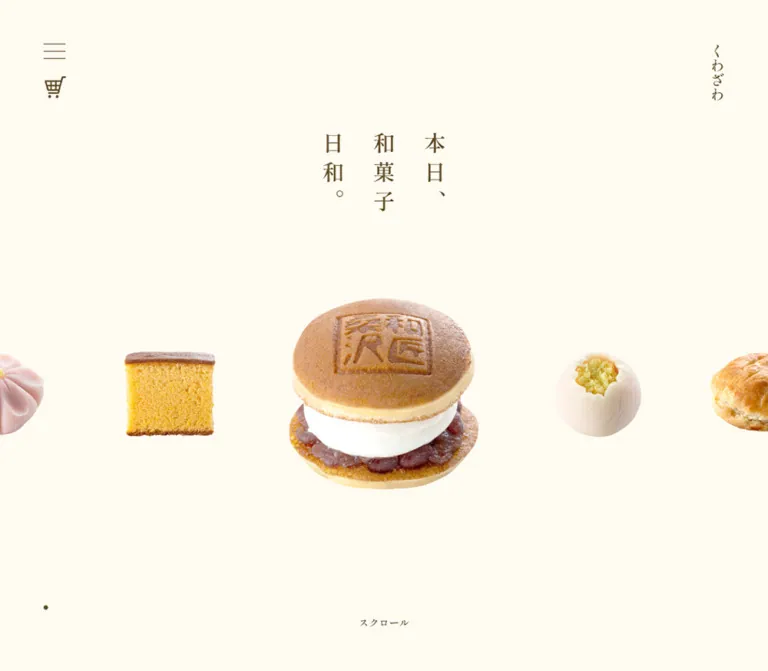
生成りと焦げ茶、縦書きの明朝体、和菓子の切り抜き写真を組み合わせた店舗サイト。広い余白と交互配置の商品紹介で、手仕事の温かさを伝えています。
Kuwazawa — Style Reference
Individually presented Japanese sweets, suspended across a warm cream page with the quiet spacing of a confectionery display.
Website: kuwazawa-wagashi.com Original URL: https://kuwazawa-wagashi.com/ Final URL: https://kuwazawa-wagashi.com/ Theme: light; warm cream canvas with deep brown typography and linework Inspected: October 2, 2026, at 03:22 JST; supplied retrieval timestamp: October 1, 2026, 18:22:23.935 UTC Viewports: desktop 1440 × 1000 CSS pixels; mobile 390 × 844 CSS pixels Scope: the current homepage, including its opening product showcase, store introduction, five featured products, six additional product links, three editorial links, Instagram heading, external shop invitation, and business footer. Visual evidence comprises three desktop captures and two mobile captures, supported by rendered DOM and computed styles across the page. Linked pages and the external shop were not inspected.
Kuwazawa is a confectionery brand and store website with a product catalog and routes into editorial content and shopping. Its homepage introduces the shop through restraint: a short vertical Japanese headline, a handful of isolated sweets, small utility controls, and unusually generous empty space. There is no large promotional button competing with the food in the opening view.
The interface has two principal colors: cream #fffbf2 and brown #5a4620. Product photography supplies the remaining color: golden sponge, red bean filling, white cream, delicate seasonal confectionery, and fruit. Shippori Mincho carries the Japanese text, while small Oswald labels give English utilities a compact, upright rhythm. The page becomes more descriptive as it scrolls, moving from floating products to alternating image-and-text presentations, smaller catalog entries, editorial links, and practical store information.
閉じる
Kuwazawa — Style Reference
Individually presented Japanese sweets, suspended across a warm cream page with the quiet spacing of a confectionery display.
Website: kuwazawa-wagashi.com Original URL: https://kuwazawa-wagashi.com/ Final URL: https://kuwazawa-wagashi.com/ Theme: light; warm cream canvas with deep brown typography and linework Inspected: October 2, 2026, at 03:22 JST; supplied retrieval timestamp: October 1, 2026, 18:22:23.935 UTC Viewports: desktop 1440 × 1000 CSS pixels; mobile 390 × 844 CSS pixels Scope: the current homepage, including its opening product showcase, store introduction, five featured products, six additional product links, three editorial links, Instagram heading, external shop invitation, and business footer. Visual evidence comprises three desktop captures and two mobile captures, supported by rendered DOM and computed styles across the page. Linked pages and the external shop were not inspected.
Kuwazawa is a confectionery brand and store website with a product catalog and routes into editorial content and shopping. Its homepage introduces the shop through restraint: a short vertical Japanese headline, a handful of isolated sweets, small utility controls, and unusually generous empty space. There is no large promotional button competing with the food in the opening view.
The interface has two principal colors: cream #fffbf2 and brown #5a4620. Product photography supplies the remaining color: golden sponge, red bean filling, white cream, delicate seasonal confectionery, and fruit. Shippori Mincho carries the Japanese text, while small Oswald labels give English utilities a compact, upright rhythm. The page becomes more descriptive as it scrolls, moving from floating products to alternating image-and-text presentations, smaller catalog entries, editorial links, and practical store information.
How to Read This Reference
- Measured means a value appears in the supplied rendered DOM or computed-style evidence. Dimensions refer to element boxes, which can include transparent image space.
- Visually observed means the treatment is visible in the supplied original-page captures. Approximate photographic bounds and stroke widths are labeled as estimates.
- Calculated means a relationship is derived from measured values, such as the featured product being 1.8 times the width of an adjacent product slot.
- Recommended means implementation guidance for a new site. Proposed CSS selectors, variables, breakpoints, focus treatments, and layout formulas are not recovered source code.
- The evidence contains no populated custom-property inventory. All token names below are descriptive aliases.
- DOM presence does not prove visibility. Navigation text appears in the evidence even though the supplied screenshots show the menu closed. Several wrappers use
font-size: 0; their children supply the visible typography. - Motion declarations establish durations and easing, but not complete keyframes, scheduling, input support, or interaction outcomes.
Tokens — Colors
Default Palette
| Name | Value | Suggested token | Evidence and role |
|---|---|---|---|
| Warm Cream | #fffbf2 / rgb(255, 251, 242) |
--color-paper |
Measured body background at both viewports; continuous canvas throughout the visible page |
| Confectionery Brown | #5a4620 / rgb(90, 70, 32) |
--color-ink |
Measured visible headings, paragraphs, links, brand text, and footer labels; visually shared by icons and fine rules |
| Transparent Surface | transparent |
--color-surface |
Measured on the sampled content sections and links; lets the body color remain continuous |
The distinction between canvas and content surface is intentionally small: most content has no separate panel fill. Hierarchy comes from placement, scale, photography, and spacing.
Pure white #ffffff is recorded on navigation labels that are not visible in the closed-menu captures. It is contextual evidence for another state, not a third default-page color. The open navigation surface was not captured, so its background must not be inferred from those white labels.
The root and body report default black text and a Times family, but the visible Japanese content has explicit brown Shippori Mincho styling. Do not use the root defaults as the primary visual palette or typography.
Photography contains many additional colors. Keep these within the images rather than turning orange, green, or red bean tones into unrelated interface accents. No alternate theme control is visible in the supplied evidence.
Tokens — Typography
Japanese Editorial Text — Shippori Mincho
- Measured computed family:
"Shippori Mincho", serif. - Weights:
500for descriptive copy;600for headings, product names, detail links, and much of the footer. - Character: fine Japanese serif forms with enough weight to stay legible against the pale canvas.
- Role: nearly all visible Japanese identity, storytelling, catalog, and business information.
- Suggested alias:
--font-editorial: 'Shippori Mincho', serif.
The computed family is directly supported. The evidence does not include font-file URLs or a network-level verification of the font resources.
English Utility Text — Oswald
- Measured computed family:
Oswald, sans-serif. - Weights:
400for the shop caption and footer copyright;500for the Instagram heading. - Tracking:
0.5pxon these utility labels. - Role: small, condensed Latin labels that punctuate a primarily Japanese serif page.
- Suggested alias:
--font-utility: 'Oswald', sans-serif.
Oswald is a secondary voice. It does not replace the Japanese type in product descriptions or primary headings.
Vertical Headline
The opening copy is 本日、和菓子日和。, displayed as three vertical columns, read from right to left. The screenshot shows 本日、 in the right column, 和菓子 in the middle, and 日和。 at the left.
The measured desktop heading box is 210 × 120px; mobile is 174 × 114px. Desktop type is 30px, with 70px line height and 10px letter spacing. Mobile changes to 28px, 58px line height, and the same 10px letter spacing.
In this vertical composition, the line-height value contributes to separation between columns. Do not reinterpret it as a conventional horizontal heading with a 70px baseline interval. A recommended implementation uses writing-mode: vertical-rl with three explicit text groups; the evidence confirms the appearance, not the original writing-mode declaration.
Type Scale
All values in this table are measured computed styles.
| Role | Desktop size / line height | Mobile size / line height | Weight | Tracking |
|---|---|---|---|---|
| Opening vertical headline | 30 / 70px |
28 / 58px |
600 | 10px |
| Introductory brand statement | 30 / 60px |
24 / 48px |
600 | Normal |
| Main section headings | 24 / 48px |
24 / 48px |
600 | Normal |
| Featured product name | 24 / 48px |
20 / 40px |
600 | Normal |
| Featured product description | 18 / 42px |
16 / 32px |
500 | Normal |
| Store introduction paragraph | 18 / 48px |
16 / 32px |
500 | Normal |
Detail link, 詳しく |
18 / 42px |
18 / 42px |
600 | Normal |
| Additional product name | 18 / 32px |
16 / 26px |
600 | Normal |
| Editorial link title | 20 / 40px |
20 / 40px |
600 | Normal |
| Editorial link description | 16 / 32px |
16 / 32px |
500 | Normal |
| Japanese shop invitation | 20 / 20px |
18 / 18px |
600 | -1px |
| Footer business name | 20 / 20px |
18 / 18px |
600 | -1px |
| Footer business information | 14 / 24px |
14 / 28px |
600 | Normal |
| Contact label | 14 / 32px |
14 / 32px |
600 | Normal |
ONLINE SHOP |
14 / 14px |
14 / 14px |
400 | 0.5px |
| Instagram heading | 14 / 14px |
14 / 14px |
500 | 0.5px |
| Footer copyright | 14 / 20px |
14 / 20px |
400 | 0.5px |
The DOM-present navigation uses 20 / 20px primary labels and 18 / 20px product labels on desktop. These become 18 / 18px and 16 / 16px on mobile. Their visibility and layout in an opened menu were not tested.
The スクロール wrapper measures 90 × 14px but has a computed font size of zero. The visible lettering therefore cannot be assigned a trustworthy font size from that wrapper. The Quick Start uses a recommended 12px text substitute, not a measured source size.
Tokens — Spacing & Shapes
Density: sparse at the page level, with carefully grouped text inside each product presentation.
There is no evidence of a single universal spacing unit. Repeated values such as 15, 30, 45, and 60px provide useful aliases, but should not be presented as an extracted source scale.
Spacing Scale
| Use | Measured value | Interpretation |
|---|---|---|
| Desktop product name to description | 10px |
Difference between the sampled title box bottom and paragraph top |
| Mobile product name to description | 15px |
The narrower layout slightly increases this local gap |
| Desktop description to detail link | 20px |
Keeps the action connected to its product copy |
| Mobile description to detail link | 15px |
Same relationship in the stacked layout |
| Editorial title to description | 15px |
Shared by both viewports |
| Typical mobile content inset | 30px |
Produces a 330px content width at 390px |
| Mobile secondary catalog inset | 20px |
Produces a 350px section content width |
| Typical mobile section padding | 45px vertically |
Used by the featured-products section |
| Typical desktop section padding | 60px vertically |
Used by several major sections |
| Desktop editorial column gap | 80px |
Calculated from 250px-wide links positioned 330px apart |
| Mobile editorial item gap | 60px |
Calculated between consecutive 339px-tall link boxes |
| Shop link to footer seal | 120px desktop; 90px mobile |
Calculated from the link bottom and seal top |
| Footer bottom clearance | Approximately 60px |
Calculated from the last footer content and document height |
Section padding is only part of the spacious result. Large internal offsets and image footprints also contribute. Do not reproduce the layout by assigning 60px padding to otherwise tightly packed cards.
Border Radius and Rules
| Element | Value or appearance | Evidence status |
|---|---|---|
| Contact pill | 150 × 36px, 18px radius |
Measured |
| DOM-present navigation shop pill | 120 × 36px, 18px radius |
Measured; opened navigation not shown |
| Editorial photographs | Circular crops | Visually observed |
| Footer brand seal | 80 × 80px box; square artwork |
Measured box and visible shape |
| Product imagery | Natural cutout silhouette | Visually observed; no enclosing card |
| Detail-link rule | Approximately 45 × 1px |
Screenshot estimate |
| Menu strokes | Approximately 30 × 1px |
Screenshot estimate |
| Shop invitation separator | Approximately 30 × 1px |
Screenshot estimate |
There is no visible general-purpose shadow or elevated-card system. Natural shading inside food photographs is part of the asset, not evidence for a CSS drop shadow.
Layout Measurements
| Element | Desktop | Mobile | Notes |
|---|---|---|---|
| Document height | 6627.28px |
7099.55px |
Computed body dimensions; capture summary rounds these values |
| Opening section | 1440 × 1000px |
390 × 844px |
Matches each inspected viewport |
| Headline position | x615, y200 |
x108, y174 |
Top-left of the heading box |
| Ordinary hero product slot | Usually 160 × 160px |
Usually 110 × 110px |
One pastry link is slightly shorter because of its aspect ratio |
| Featured hero product slot | 288 × 288px |
198 × 198px |
Both are 1.8 times the ordinary slot width |
| Feature heading/content span | 750px |
330px |
Measured heading width; desktop centered at x345 |
| Editorial link | 250 × 359px |
330 × 339px |
Desktop three-column arrangement; mobile stack |
| Shop invitation link | 180 × 190px |
180 × 188px |
Remains narrow and centered |
| Footer seal | 80 × 80px |
80 × 80px |
Retains its size across both viewports |
| Contact link | 150 × 36px |
150 × 36px |
Retains its size across both viewports |
The product slot is not the opaque photograph boundary. For example, the desktop featured slot is 288px wide, while the visible white confection occupies substantially less of that width. Preserve transparent padding and judge the silhouette visually before changing the slot size.
Components
Persistent Edge Controls
Role: provide menu and shop access while leaving the main composition open.
Desktop places a 30px menu control at approximately x60, y56, with a 30px cart link beneath it at x61, y105. A vertical くわざわ home link sits near the upper-right edge in a 20 × 80px box at x1360, y60.
The controls remain in the same visible positions in the desktop opening, middle, and footer captures, supporting a persistent edge-navigation treatment. The supplied element records do not include the CSS position property itself.
Mobile moves the utilities to a horizontal pair at the upper right: cart at x275, y25, menu at x330, y26, both in 30px boxes. The brand link still exists at x30, y31, but its text color is fully transparent in the sampled state. Do not add a visible mobile wordmark on the basis of its DOM presence alone, or infer when it becomes visible.
Use brown linework directly on cream, without a full-width header bar or a filled icon tile. The cart is visibly a shopping-cart drawing; no particular icon library is established.
Recommended adaptation: retain 30px artwork but enlarge the surrounding interactive target to at least 44px.
DOM-Present Navigation
Role: connect the homepage to products, store information, editorial content, and shopping.
The evidence includes home, the #recommend product-section anchor, eleven product destinations, an anko page, store information, trivia, telephone access, an external shop link, Instagram, and contact access.
The captured menu control is an anchor with a javascript:void(0); destination. This establishes the presence of a scripted control but does not establish its opening behavior. None of the screenshots shows the opened navigation.
For a new implementation, use a named button with aria-expanded and an associated navigation region. Define keyboard dismissal, focus handling, and a scrollable mobile menu as recommended behavior. The evidence does not support prescribing a particular overlay color, opening direction, or menu animation.
Full-Viewport Product Showcase
Role: communicate the store's products and visual identity before presenting explanatory copy.
The composition has four layers:
- A full-viewport cream field.
- A small three-column vertical headline above the visual center.
- A horizontal sequence of isolated product photographs, with one enlarged central item.
- A tiny centered scroll cue near the bottom.
At desktop, ordinary product slots begin around y500; the featured slot begins at y436, keeping its center aligned with the smaller slots. The captured central product is a white seasonal confection with a yellow center. Castella and a cream-filled dorayaki appear to its left; a flaky pastry and chocolate confection appear to its right.
At mobile, ordinary slots begin around y422, and the featured slot begins at y378. The captured central item is the chocolate confection, with neighboring products partly clipped at the viewport edges. The strip preserves individual product scale instead of shrinking every desktop item to fit the screen.
The desktop and mobile frames show different active products. Animated slot declarations support a changing presentation, but these captures do not establish a permanent device-specific selection.
Product images are links to individual product pages. Preserve that connection in an implementation. No previous/next arrows or clearly identified carousel pagination are visible. A small brown dot appears near the left edge in the captures, but its function is unknown; it must not be labeled as a pagination control without further evidence.
Store Introduction
Role: explain the shop's history and handmade products after the visual opening.
The homepage identifies the business as くわざわ in Ishikawa, Fukushima, and describes its founding with 創業明治二十年. A two-line statement precedes a compact paragraph about traditional manju, cream-filled dorayaki, and seasonal confectionery.
The desktop introduction section measures 645px tall, with a 30 / 60px statement and 18 / 48px descriptive text. Mobile measures 562px tall, with a 24 / 48px statement and 16 / 32px body text inside 30px horizontal insets.
These are measured section bounds, not recommended fixed heights. Let the content determine height when changing the copy, language, or font loading behavior.
Featured Product Presentation
Role: give five signature products individual attention without enclosing them in cards.
Each presentation combines a food or ingredient composition with a short text group: product name, three-line description, and 詳しく link. The five featured products are くわどら, 上生菓子, 茶まんじゅう, みかんの丘, and バターどら焼き.
Desktop text placement alternates. The first, third, and fifth text groups occupy the left column; the second and fourth occupy the right. Measured text centers near x532.5 and x907.5 imply two 375px column regions inside the 750px content span. This is a calculated layout relationship, not a recovered grid declaration.
Individual desktop copy widths vary from roughly 248 to 299px. The site does not stretch the paragraphs to fill each column. In the visible manju presentation, the left text group begins around x394 and the right image combines a wooden spoon of red beans with a whole and a halved bun. The half reveals the filling, making the product's interior part of the composition.
On mobile, the product text boxes occupy the full 330px content width. The detail links are centered at x142.5 in 105px-wide boxes. The layout becomes a vertical presentation; the supplied mobile DOM establishes its text and action geometry, while the exact product-image arrangement is not separately visible in the mobile screenshots.
Keep the alternating desktop rhythm, generous vertical separation, and small text footprint. A dense commerce grid would lose the individual presentation of each sweet.
Detail Link
Role: provide a quiet continuation into a product page.
The link consists of the serif label 詳しく followed by a short, straight brown rule. There is no filled background, enclosure, or arrowhead in the visible treatment.
The measured link box is 105 × 42px at both viewports. Its child label uses Shippori Mincho at 18 / 42px, weight 600. The rule is approximately 45px long by visual estimation.
Use a semantic anchor with a destination-specific accessible name. The repeated visible label can remain unchanged while assistive text identifies the relevant product. No hover extension or sliding rule was verified.
Additional Product Catalog
Role: expose the remaining six products in a more compact browsing area.
Under 他のじまんのお菓子, six small product-and-name links form one desktop row. The items include an apple pastry, castella, a moon-themed sweet, chocolate confectionery, baked doughnuts, and a cream-cheese product.
The mobile DOM shows three columns and two rows. The first row starts at approximately y4505 and the second at y4672. Names use two or three lines, with 16 / 26px type. Long names gain additional line breaks rather than being forced into small single-line labels.
There are no measured prices, rating badges, or add-to-cart buttons in this component. Each entry leads to a product page. Use natural product proportions, centered labels, and an unboxed layout.
Editorial Link Trio
Role: move from individual sweets into ingredients, the shop, and confectionery knowledge.
Three desktop links use circular photographs above centered titles and two-line descriptions:
あんこをとる: a bowl of red bean paste.私たちについて: a shop-interior photograph.和菓子雑学: a close view of sculpted confectionery.
The desktop link boxes are 250px wide at x265, x595, and x925, creating an 80px gap between them. Circular photographs appear approximately 210–220px in diameter in the supplied crop; that diameter is an estimate because image-element bounds were not supplied.
Titles use 20 / 40px serif text, weight 600. Descriptions use 16 / 32px, weight 500, separated from the title by 15px.
On mobile, the three links stack into 330px-wide, 339px-tall boxes with 60px between them. The section consequently grows from 644px on desktop to 1317px on mobile. Retain the photograph/title/description grouping when stacking.
Instagram Area
Role: mark the site's social-content area.
The visible component is a small centered Instagram heading in Oswald at 14 / 14px, weight 500, with 0.5px tracking. Its section is 254px tall on desktop and 179px on mobile.
No Instagram post tiles are visible in the supplied capture, and the evidence does not establish an active embedded feed. Preserve this observation as a limitation: do not invent a post grid, claim a loading failure, or assume the empty area is permanently intentional. The separate footer Instagram link is directly evidenced.
Online Shop Invitation
Role: make the transition to the external storefront feel like another confectionery presentation.
A small cream-filled dorayaki sits above オンラインショップ, followed by a short horizontal rule and the Oswald caption ONLINE SHOP. The entire group is one link to https://kuwazawa.base.shop/.
The link box is centered and 180px wide at both viewports, measuring 190px tall on desktop and 188px on mobile. The Japanese label starts 110px below the top of the link box. Its font changes from 20px to 18px on mobile; the English caption stays at 14px.
The visible food silhouette is approximately 80–90px wide. Its exact image box was not supplied. This is an illustrated text link with ample surrounding space, not a large filled purchase button.
Business Footer
Role: establish the shop's identity and present practical contact information.
Desktop arranges an 80px square calligraphic seal at the left, the shop name and business details beside it, and contact/social information at the right. The outer visible span runs approximately from x220 to x1220, giving a 1000px composition.
The center text records opening hours, the regular closing day, telephone and fax numbers, and the shop's Fukushima address. Telephone access is a tel: link. The right-hand contact link is a thin outlined pill labeled お問い合わせ, measuring 150 × 36px with an 18px radius. Below it, a 20px Instagram icon appears beside the Oswald copyright line @2022 okashinokuwazawa.
Mobile changes to a centered vertical arrangement: seal, shop name, opening information, contact details, contact pill, and social/copyright row. The 80px seal and 150px contact pill retain their dimensions. Business information remains 14px but increases its line height from 24 to 28px, with explicit wrapping into shorter lines.
The footer independently identifies the business as くわざわ. It does not establish a separate legal entity or a website production credit.
Tokens — Motion & Interaction
| Treatment | Supplied evidence | What can be concluded | What remains unverified |
|---|---|---|---|
| Hero product movement | 2.5s ease-in-out forwards slide_on8 through slide_on14 on sampled product anchors |
The showcase has named CSS animation states lasting 2.5 seconds with ease-in-out timing and forwards fill | Keyframes, movement direction, delays, total cycle, autoplay interval, and trigger logic |
| Hero emphasis | Desktop 160px ordinary slots and 288px featured slot; mobile 110px and 198px | Featured slot width is 1.8 times the ordinary width in both captures | Whether emphasis is implemented through transforms, dimensions, or coordinated rules |
| Contact background transition | background-color 0.5s ease-in-out |
A 500ms background-color transition is declared | The triggered endpoint and whether hover, focus, or another state activates it |
| Contact label transition | color 0.5s ease-in-out |
A matching text-color transition is declared | Exact state colors |
| Header brand text | color 0.5s ease-in-out; mobile sampled color has zero alpha |
The brand text can transition in color and is transparent in the sampled mobile state | Visibility trigger and behavior during scrolling or menu use |
| Product navigation | Product-page hrefs on hero and catalog links | Links have explicit destinations | Destination-page layout and navigation transition |
| Section navigation | Homepage #recommend link |
An in-page product anchor is provided | Smooth scrolling, focus movement, or active-section behavior |
| Menu control | Scripted anchor and DOM-present navigation | A menu affordance is present | Open/close interaction, animation, dismissal, and focus management |
The sampled transition: all shorthand on many wrappers supplies no meaningful duration by itself. It is not evidence that every element animates.
The capture process waited for document load, image decoding, and sampled layout stability, and handled visible finite animations. Perpetual animations were temporarily paused during readiness checks and then resumed. This is useful capture preparation, but it is not a frame-by-frame motion recording or a complete interaction test.
Recommended behavior: preserve the calm pace if implementing a changing showcase. Offer a pause mechanism for persistent automatic movement, avoid moving a focused link out of view, and provide a static reduced-motion state. The CSS starter below deliberately uses a static showcase composition because the original scheduling and keyframes are not available.
Surfaces
| Layer | Appearance | Structural role |
|---|---|---|
| Page canvas | Uniform warm cream | Connects every section into one continuous page |
| Product presentation | Transparent image surroundings and unboxed copy | Gives the food room to carry the hierarchy |
| Editorial photography | Circular crops against cream | Distinguishes editorial routes from isolated product cutouts |
| Utility controls | Brown line drawings without tiles | Maintains access without a heavy header |
| Detail action | Serif text plus a hairline | Signals continuation with little visual weight |
| Contact action | Transparent pill with a fine brown outline | Adds one restrained enclosed control near the footer |
| Brand seal | Square brown calligraphic artwork | Anchors the business information |
No visible paper texture, gradient field, glass effect, or section-by-section background alternation is needed to reproduce the inspected page. The warmth comes from the exact cream tone, typography, and photography.
Imagery
The dominant image treatment is clean food photography isolated from its background. Products retain natural irregularities: crumb edges, cream layers, flaky pastry, powdered cracks, fine confectionery folds, and the texture of red bean filling. Those details make the sparse layout feel substantive.
Use soft, natural-looking light and believable color. Preserve highlights on cream and pale confectionery; do not tint every product brown to match the interface. The cream canvas should remain visible around the silhouette. Avoid generic rectangular photo cards for the featured sweets.
Ingredient images help explain the product: the visible manju section combines red beans in a wooden spoon with a whole bun and a cut face. Fruit imagery also appears at the edge of the following presentation. Maintain this relationship between ingredient, exterior, and interior when commissioning replacement assets.
Photography for editorial routes uses circular crops instead of transparent cutouts. The footer uses a distinct square seal. These three image geometries—isolated product, circular editorial photo, square identity mark—form a small but purposeful system.
Observed Asset References
Image source URLs, filenames, intrinsic dimensions, and file formats were not included in the supplied DOM evidence. The table identifies visible assets by their occurrence; it does not invent an asset manifest.
| Visual asset | Observed occurrence | Treatment |
|---|---|---|
| Castella, cream-filled dorayaki, seasonal white confection, flaky pastry, chocolate confection | Desktop opening capture | Isolated photographs in an animated product strip |
| Powdered chocolate confection with clipped neighbors | Mobile opening capture | Enlarged central cutout, with horizontal overflow clipped to the viewport |
| Red beans on a wooden spoon; whole and halved brown manju | Desktop middle capture | Ingredient-and-product composition beside copy |
| Bean paste, shop interior, sculpted sweets | Desktop lower-page capture | Circular editorial crops |
| Small cream-filled dorayaki | Desktop and mobile shop invitation | Unboxed product image above bilingual shop labels |
| Square calligraphic brand seal | Desktop and mobile footer | Brown identity artwork at an 80px display size |
| Cart and Instagram symbols | Header and footer captures | Brown line icons; source format and library unknown |
Use authorized original assets when available. If substituting imagery, match the transparent margins, lighting, viewing angle, and apparent silhouette size, not only the nominal image width.
Layout & Responsive Behavior
Page Sequence
The homepage preserves its content order across both measured viewports. The main changes are arrangement, line wrapping, and spacing.
| Region | Desktop measured height | Mobile measured height | Responsive observation |
|---|---|---|---|
| Opening showcase | 1000px |
844px |
Full inspected viewport; clipped product strip on mobile |
| Store introduction | 645px |
562px |
Smaller typography and 30px mobile insets |
| Five featured products | 3027.28px |
2825.55px |
Alternating desktop columns become vertical presentations |
| Additional products | 607px |
603px |
Six columns become three columns and two rows |
| Editorial links | 644px |
1317px |
Three desktop columns become a long mobile stack |
| Instagram area | 254px |
179px |
Heading remains small; surrounding space decreases |
These heights describe the captured content, not fixed section-height rules. The overall mobile document is about 472px taller, even though its hero and several upper regions are shorter. The stacked editorial links and expanded footer account for much of the lower-page growth.
Desktop Composition
The design uses several content widths rather than one repeated container:
- Full viewport for the hero and its horizontal strip.
- A measured 750px span for the featured-products heading and the associated two-column rhythm.
- Approximately 910px across the three editorial link boxes.
- Approximately 1000px across the footer.
- A narrow 180px centered shop invitation.
These widths let the page alternate between expansive display and close reading. A single 1200px-wide grid for every section would flatten that rhythm.
Mobile Composition
At 390px, most primary content uses 30px side insets, yielding 330px of usable width. The secondary product grid uses 20px insets. Header utilities move to the upper right, while the sampled header brand text becomes transparent.
The headline remains vertical and only drops from 30 to 28px. The centered hero product remains substantial at a 198px slot width. Adjacent products are intentionally clipped, preserving the horizontal showcase instead of compressing it into a miniature full row.
The footer becomes a centered identity-and-contact stack. Product detail actions retain an 18px label and 105px box, and the contact pill retains its 150px width. The design does not uniformly scale every desktop measurement down.
Breakpoint and Viewport Limits
Only 1440 × 1000 and 390 × 844 were supplied. No tablet, landscape-phone, zoomed, or very short viewport was inspected. The source breakpoint values, safe-area rules, and exact viewport-height units are not available.
The Quick Start uses a recommended 768px breakpoint and modern small-viewport units. These are implementation choices. Validate intermediate widths, address wrapping, keyboard focus, and hero clipping before treating the adaptation as production-ready.
Do’s and Don’ts
Do
- Keep the canvas
#fffbf2and the principal text and linework#5a4620. - Preserve the modest vertical headline and its generous inter-column spacing.
- Use Shippori Mincho for Japanese copy and reserve Oswald for compact Latin utilities.
- Let transparent product photography provide color and visual detail.
- Retain the 1.8-to-1 featured/ordinary product-slot relationship when adapting the showcase.
- Keep desktop product descriptions narrow within the alternating two-column composition.
- Use the text-plus-rule treatment for
詳しくlinks. - Distinguish product cutouts, circular editorial photographs, and the square footer seal.
- Preserve the mobile three-column secondary catalog and single-column editorial stack.
- Keep store information readable and accessible at the end of the page.
- Mark unobserved menu and motion behavior as implementation decisions.
Don’t
- Do not replace the homepage with a generic promotional layout dominated by a large CTA.
- Do not put every product into a rounded white card with a shadow.
- Do not add bright interface accents to compete with the food photography.
- Do not apply a fake paper texture or brown filter to the entire design.
- Do not replace Japanese serif text with a uniform sans-serif system.
- Do not shrink the entire hero strip to fit all products inside a phone width.
- Do not treat transparent image padding as accidental empty space.
- Do not mistake zero-font-size wrappers or root Times defaults for the visible typography.
- Do not interpret hidden navigation labels as a screenshot of an opened menu.
- Do not invent carousel controls, swipe support, autoplay intervals, or hover endpoints.
- Do not add an Instagram feed or infer a loading error from the supplied empty area.
- Do not hardcode the observed full-page section heights as content-independent requirements.
Recommended Implementation Additions
These are recommendations for a new implementation, not verified features of the original site:
- Give the menu, cart, logo, and Instagram links explicit accessible names. The supplied text extraction alone does not establish their current accessible names.
- Use a real button for the menu and provide a keyboard-operable navigation region with visible focus and reliable dismissal.
- Enlarge 30px utility artwork to a minimum 44px interactive target without making the drawings visually heavier.
- Keep product names available to assistive technology on image-only hero links. Use empty alt text only for imagery that duplicates adjacent linked text.
- Add product-specific accessible context to repeated
詳しくlinks. - If the showcase moves automatically, provide pause behavior and stop or adapt movement while an item has keyboard focus.
- Under reduced motion, present a complete static arrangement with one featured product and accessible routes to the remaining catalog.
- Load the declared font weights deliberately and reserve image dimensions to avoid disruptive layout changes.
- Preserve natural text wrapping at increased text sizes. Do not clip an address or product name to reproduce a screenshot height.
- Keep an external shop destination clear, and choose same-tab or new-tab behavior intentionally; the original target behavior was not supplied.
- If adding a social feed, provide a stable empty or unavailable state with a direct profile link.
Agent Prompt Guide
Quick Color Reference
- Canvas and ordinary surfaces:
#fffbf2. - Text, rules, icons, and outlines:
#5a4620. - Contact action: cream/transparent interior with a fine brown outline.
- Product color: natural photographic color, not a new UI palette.
- Structure: spacing and image geometry rather than shadows or background panels.
Overall Prompt
“Create a Japanese confectionery brand homepage inspired by Kuwazawa's inspected design. Use a continuous warm cream canvas #fffbf2, deep brown text and linework #5a4620, Shippori Mincho for Japanese copy, and small Oswald utility captions. Begin with a full-viewport composition containing the vertical three-column copy 本日、和菓子日和。 and a horizontal row of transparent food cutouts, with one central product 1.8 times the ordinary slot width. Place small menu and cart controls at the desktop upper left and a vertical brand link at the upper right. Follow with a short store introduction, five spacious alternating product presentations, six smaller catalog links, three circular-photo editorial links, a centered illustrated shop invitation, and a practical business footer. On mobile, move utilities to the upper right, clip neighboring hero products, stack the main product and editorial content, use a three-column secondary catalog, and center the footer. Treat carousel scheduling and menu behavior as separately specified interactions.”
Example Component Prompts
- Opening showcase: “A cream full-height screen with a small vertical Japanese headline near the upper center. Arrange isolated castella, dorayaki, seasonal confectionery, pastry, and chocolate photographs across the middle; enlarge one product while preserving transparent margins. Brown 30px utility drawings sit at the edges. No visible card containers or large promotional button.”
- Featured manju presentation: “Inside a 750px desktop composition, place a narrow brown serif text block at left and a natural food composition at right: red beans in a wooden spoon above a whole and halved brown manju. Use a 24px product name, 18px description with 42px line height, and an 18px
詳しくlink followed by a short hairline. Stack the presentation on mobile with 30px side insets.” - Editorial trio: “Three unboxed links on cream, each with a circular photograph, a centered 20px Japanese serif title, and a two-line 16px description. Use approximately 250px-wide desktop link groups with 80px gaps. Stack them into a single column on mobile with 60px between groups.”
- Shop invitation: “A narrow, centered link with a small cream-filled dorayaki above
オンラインショップ, a 30px brown rule, andONLINE SHOPin 14px Oswald. Keep the whole composition approximately 180px wide and leave substantial cream space around it.” - Mobile footer: “Center an 80px square calligraphic seal above the shop name, opening information, telephone and address. Use brown Japanese serif text, 14px details with 28px line height, a 150px outlined contact pill, and a small Instagram/copyright row. Keep generous spacing without adding a footer background panel.”
Quick Start
CSS Custom Properties
This is an implementation starter, not the original stylesheet. It preserves the measured palette, declared font families, type hierarchy, principal widths, and hero slot sizes. It uses recommended layout formulas, a 768px breakpoint, larger utility hit areas, a static hero, and an optional contact hover treatment.
Load authorized Shippori Mincho weights 500/600 and Oswald weights 400/500 separately. Font-file and image URLs were not supplied. The CSS does not download assets or implement a menu controller or carousel scheduler.
:root {
  /* Measured palette and declared font families */
  --color-paper: #fffbf2;
  --color-ink: #5a4620;
  --font-editorial: 'Shippori Mincho', serif;
  --font-utility: 'Oswald', sans-serif;
  --weight-copy: 500;
  --weight-heading: 600;

  /* Desktop text values */
  --text-body: 18px;
  --leading-body: 42px;
  --text-product: 24px;
  --leading-product: 48px;
  --text-section: 24px;
  --text-utility: 14px;
  --tracking-utility: 0.5px;

  /* Aliases based on observed dimensions */
  --feature-width: 750px;
  --editorial-width: 910px;
  --wide-width: 1000px;
  --gutter: 30px;
  --space-small: 15px;
  --space-medium: 30px;
  --space-large: 60px;
  --hero-item: 160px;
  --hero-featured: 288px;
  --radius-contact: 18px;
  --rule: 1px;
  --motion-control: 500ms ease-in-out;
}

* { box-sizing: border-box; }

body {
  margin: 0;
  background: var(--color-paper);
  color: var(--color-ink);
  font-family: var(--font-editorial);
  font-size: var(--text-body);
  font-weight: var(--weight-copy);
  line-height: var(--leading-body);
}

img { display: block; max-inline-size: 100%; }
a { color: inherit; text-decoration: none; }
button { font: inherit; color: inherit; }

/* Recommended keyboard treatment */
:where(a, button):focus-visible {
  outline: 2px solid var(--color-ink);
  outline-offset: 5px;
}

/* Larger targets retain approximately 30px visible artwork. */
.edge-actions {
  position: fixed;
  z-index: 20;
  inset-block-start: 49px;
  inset-inline-start: 53px;
  display: flex;
  flex-direction: column;
  gap: 5px;
}

.edge-action {
  display: grid;
  place-items: center;
  inline-size: 44px;
  block-size: 44px;
  padding: 7px;
  border: 0;
  background: transparent;
  cursor: pointer;
}

.edge-action :is(img, svg) {
  inline-size: 30px;
  block-size: 30px;
}

.edge-brand {
  position: fixed;
  z-index: 20;
  inset-block-start: 60px;
  inset-inline-end: 60px;
  writing-mode: vertical-rl;
  font-size: 20px;
  font-weight: 600;
  line-height: 20px;
}

.hero {
  position: relative;
  block-size: 100vh;
  block-size: 100svh;
  overflow: hidden;
}

.hero-title {
  position: absolute;
  inset-block-start: 20%;
  left: 50%;
  transform: translateX(-50%);
  margin: 0;
  writing-mode: vertical-rl;
  inline-size: 120px;
  block-size: 210px;
  font-size: 30px;
  font-weight: 600;
  line-height: 70px;
  letter-spacing: 10px;
}

.hero-title span {
  display: block;
  white-space: nowrap;
}

/* Static five-item composition; the third item is featured. */
.sweet-stage {
  position: absolute;
  top: 50%;
  left: 0;
  right: 0;
  height: var(--hero-item);
}

.sweet {
  position: absolute;
  top: 0;
  left: calc(50% + var(--offset, 0px));
  width: var(--hero-item);
  height: var(--hero-item);
  transform: translateX(-50%);
}

.sweet:nth-child(1) { --offset: -560px; }
.sweet:nth-child(2) { --offset: -310px; }
.sweet:nth-child(3) { --offset: 0px; }
.sweet:nth-child(4) { --offset: 310px; }
.sweet:nth-child(5) { --offset: 560px; }

.sweet.is-featured {
  top: calc((var(--hero-item) - var(--hero-featured)) / 2);
  width: var(--hero-featured);
  height: var(--hero-featured);
}

.sweet img {
  width: 100%;
  height: 100%;
  object-fit: contain;
}

.hero-scroll {
  position: absolute;
  bottom: 60px;
  left: 50%;
  transform: translateX(-50%);
  margin: 0;
  width: 90px;
  text-align: center;
  font-size: 12px; /* Recommended substitute for the unmeasured glyph size. */
  line-height: 14px;
}

.section-title {
  margin: 0;
  text-align: center;
  font-size: var(--text-section);
  font-weight: 600;
  line-height: 48px;
}

/* Spacing here is an adaptation, not a recovered source formula. */
.product-feature {
  display: grid;
  grid-template-columns: repeat(2, minmax(0, 1fr));
  align-items: center;
  gap: 32px 0;
  width: min(var(--feature-width), calc(100% - 2 * var(--gutter)));
  margin: 120px auto;
}

.product-info {
  grid-column: 1;
  grid-row: 1;
  justify-self: center;
  width: min(100%, 300px);
}

.product-visual {
  grid-column: 2;
  grid-row: 1;
  justify-self: center;
  width: min(100%, 330px);
  margin: 0;
}

.product-visual img { width: 100%; height: auto; }
.product-feature.is-reversed .product-info { grid-column: 2; }
.product-feature.is-reversed .product-visual { grid-column: 1; }

.product-info h3 {
  margin: 0 0 10px;
  font-size: var(--text-product);
  font-weight: 600;
  line-height: var(--leading-product);
}

.product-info p { margin: 0 0 20px; }

.detail-link {
  display: inline-flex;
  align-items: center;
  gap: 6px;
  width: 105px;
  min-height: 42px;
  font-size: 18px;
  font-weight: 600;
  line-height: 42px;
}

.detail-link::after {
  content: '';
  flex: 0 0 45px;
  height: 1px;
  background: currentColor;
}

.secondary-grid {
  display: grid;
  grid-template-columns: repeat(6, minmax(0, 1fr));
  gap: 30px 20px;
  width: min(var(--wide-width), calc(100% - 60px));
  margin: 90px auto;
  text-align: center;
}

.secondary-grid img {
  width: 110px;
  height: 100px;
  object-fit: contain;
  margin-inline: auto;
}

.secondary-grid p {
  margin: 20px 0 0;
  font-size: 18px;
  font-weight: 600;
  line-height: 32px;
}

.story-grid {
  display: grid;
  grid-template-columns: repeat(3, minmax(0, 1fr));
  gap: 80px;
  width: min(var(--editorial-width), calc(100% - 60px));
  margin: 120px auto;
  text-align: center;
}

.story-image {
  width: min(220px, 100%); /* Approximation based on the desktop capture. */
  aspect-ratio: 1;
  object-fit: cover;
  border-radius: 50%;
  margin: 0 auto 20px;
}

.story-grid h3 {
  margin: 0 0 15px;
  font-size: 20px;
  font-weight: 600;
  line-height: 40px;
}

.story-grid p {
  margin: 0;
  font-size: 16px;
  line-height: 32px;
}

.utility {
  font-family: var(--font-utility);
  font-size: 14px;
  font-weight: 400;
  line-height: 14px;
  letter-spacing: 0.5px;
}

.shop-link {
  display: flex;
  flex-direction: column;
  align-items: center;
  width: 180px;
  margin: 0 auto 120px;
  text-align: center;
}

.shop-link img {
  width: 90px; /* Recommended image box; source image bounds were unavailable. */
  height: 90px;
  object-fit: contain;
  margin-bottom: 20px;
}

.shop-link-title {
  margin: 0;
  font-size: 20px;
  font-weight: 600;
  line-height: 20px;
  letter-spacing: -1px;
}

.shop-link-rule {
  width: 30px;
  height: 1px;
  margin: 24px 0 21px;
  background: currentColor;
}

.site-footer {
  display: grid;
  grid-template-columns: 80px minmax(0, 1fr) 195px;
  gap: 25px;
  width: min(var(--wide-width), calc(100% - 60px));
  margin-inline: auto;
  padding-bottom: 60px;
}

.footer-seal { width: 80px; height: 80px; }

.footer-info h2 {
  margin: 2px 0 10px;
  font-size: 20px;
  font-weight: 600;
  line-height: 20px;
  letter-spacing: -1px;
}

.footer-info p {
  margin: 0;
  font-size: 14px;
  font-weight: 600;
  line-height: 24px;
}

.footer-actions {
  display: flex;
  flex-direction: column;
  align-items: flex-end;
  gap: 24px;
}

.contact-link {
  display: inline-flex;
  align-items: center;
  justify-content: center;
  width: 150px;
  min-height: 36px;
  border: 1px solid currentColor;
  border-radius: 18px;
  background: transparent;
  font-size: 14px;
  font-weight: 600;
  line-height: 32px;
  transition: background-color var(--motion-control), color var(--motion-control);
}

.footer-social {
  display: flex;
  align-items: center;
  gap: 26px;
  white-space: nowrap;
}

.footer-social img { width: 20px; height: 20px; }
.footer-social .utility { margin: 0; line-height: 20px; }

/* Recommended endpoint; the source hover colors were not captured. */
@media (hover: hover) {
  .contact-link:hover {
    background: var(--color-ink);
    color: var(--color-paper);
    border-color: var(--color-ink);
  }
}

/* Recommended breakpoint, not an observed source breakpoint. */
@media (max-width: 48rem) {
  :root {
    --text-body: 16px;
    --leading-body: 32px;
    --text-product: 20px;
    --leading-product: 40px;
    --hero-item: 110px;
    --hero-featured: 198px;
  }

  .edge-actions {
    inset-inline-start: auto;
    inset-inline-end: 23px;
    inset-block-start: 18px;
    flex-direction: row;
    gap: 11px;
  }

  .cart-control { order: 1; }
  .menu-control { order: 2; }
  .edge-brand { display: none; }

  .hero-title {
    inset-block-start: calc(20% + 5px);
    inline-size: 114px;
    block-size: 174px;
    font-size: 28px;
    line-height: 58px;
  }

  .sweet:nth-child(2) { --offset: -195px; }
  .sweet:nth-child(4) { --offset: 195px; }

  /* Hide fully offscreen links in this static starter. */
  .sweet:nth-child(1),
  .sweet:nth-child(5) { display: none; }

  .product-feature {
    grid-template-columns: minmax(0, 1fr);
    margin-block: 90px;
    text-align: center;
  }

  .product-feature .product-visual {
    grid-column: 1;
    grid-row: 1;
  }

  .product-feature .product-info {
    grid-column: 1;
    grid-row: 2;
    width: 100%;
  }

  .product-info h3,
  .product-info p { margin-bottom: 15px; }

  .secondary-grid {
    grid-template-columns: repeat(3, minmax(0, 1fr));
    width: calc(100% - 40px);
    gap: 30px 12px;
  }

  .secondary-grid img { width: 80px; height: 70px; }
  .secondary-grid p { margin-top: 15px; font-size: 16px; line-height: 26px; }

  .story-grid {
    grid-template-columns: minmax(0, 1fr);
    gap: 60px;
    margin-block: 90px;
  }

  .story-image { width: 200px; }
  .shop-link { margin-bottom: 90px; }
  .shop-link-title { font-size: 18px; line-height: 18px; }

  .site-footer {
    grid-template-columns: minmax(0, 1fr);
    justify-items: center;
    gap: 30px;
    width: 100%;
    text-align: center;
  }

  .footer-info { width: 100%; padding-inline: 20px; }
  .footer-info h2 { margin: 0 0 30px; font-size: 18px; line-height: 18px; }
  .footer-info p { line-height: 28px; }
  .footer-info p + p { margin-top: 15px; }
  .footer-actions { align-items: center; gap: 44px; margin-top: 15px; }
  .footer-social { gap: 20px; }
}

@media (prefers-reduced-motion: reduce) {
  .contact-link { transition: none; }
  /* Any added showcase controller should select a stable static state. */
}
Minimal Component Markup
These class names are implementation aliases. The image placeholder must be replaced with an authorized asset; it is not an observed source filename. Use five .sweet links inside .sweet-stage, with the third carrying .is-featured, to use the static hero styles above.
<h1 class='hero-title' aria-label='本日、和菓子日和。'>
  <span>本日、</span>
  <span>和菓子</span>
  <span>日和。</span>
</h1>

<article class='product-feature'>
  <figure class='product-visual'>
    <img
      src='REPLACE_WITH_AUTHORIZED_IMAGE_URL'
      alt='Whole and halved brown manju beside a wooden spoon of red beans'
    >
  </figure>
  <div class='product-info'>
    <h3>茶まんじゅう</h3>
    <p>
      自家製のあんこを味わって欲しい<br>
      愛され続ける茶色のフォルム。<br>
      変わらぬ美味しさの茶まんじゅう。
    </p>
    <a
      class='detail-link'
      href='https://kuwazawa-wagashi.com/item/chamanju.php'
      aria-label='Read more about tea manju'
    >詳しく</a>
  </div>
</article>
Set the production document language to Japanese and localize accessible labels accordingly. Add actual image width and height attributes after the replacement assets are known. The explicit line breaks above quote the inspected copy arrangement; remove or adapt them when text size, language, or content changes.
Tailwind v4 Token Mapping
Optional aliases for a project already using Tailwind v4. This is not evidence that the original site uses Tailwind. Define the custom properties above first.
@theme inline {
  --color-paper: #fffbf2;
  --color-ink: #5a4620;
  --font-editorial: 'Shippori Mincho', serif;
  --font-utility: 'Oswald', sans-serif;
  --text-copy: var(--text-body);
  --text-product-name: var(--text-product);
  --text-section-heading: 24px;
  --text-small-utility: 14px;
  --spacing-page-gutter: 30px;
  --spacing-section: 60px;
  --spacing-product-slot: var(--hero-item);
  --spacing-featured-slot: var(--hero-featured);
  --radius-contact-pill: 18px;
}
Sources & Evidence
- Inspected original and final page: Kuwazawa homepage. Both supplied URLs are identical, and the supplied response status is HTTP 200.
- Capture date: October 1, 2026, 18:22:23.935 UTC, equivalent to October 2, 2026, 03:22:23.935 JST.
- Desktop evidence: 1440 × 1000 CSS-pixel viewport; opening, middle-product, and lower-page/footer captures; rendered DOM with computed colors, font families, sizes, weights, line heights, element bounds, link destinations, and sampled motion declarations. Computed document height: approximately 6627.28px.
- Mobile evidence: 390 × 844 CSS-pixel viewport; opening and footer captures; rendered DOM covering the full homepage. Computed document height: approximately 7099.55px.
- Observed navigation destinations: product detail pages,
#recommend, ingredient/store/trivia pages, contact, telephone, Instagram, and the external shop are evidenced by homepage hrefs. Their presence does not establish successful interaction or the design of the destination pages. - Motion limits: named 2.5-second hero animations and 500ms color transitions were supplied. Keyframes, event handlers, complete timing cycles, hover endpoints, menu operation, touch gestures, and reduced-motion behavior were not inspected.
- Asset limits: image source URLs and intrinsic image metadata were not supplied. Visual image descriptions come from the original-page captures; proposed image sizes and CSS substitutes are labeled where estimated or recommended.
- Inspection method: this reference analyzes the supplied captures and rendered evidence. No additional browsing, command execution, or file access was performed. Capture readiness checks do not prove delayed social content, every interaction state, or semantic completeness.
This reference describes the homepage served at the supplied inspection time. The CSS and prompts are reusable adaptations of the evidenced design, with recommendations separated from measured source behavior.
# Kuwazawa — Style Reference

> Individually presented Japanese sweets, suspended across a warm cream page with the quiet spacing of a confectionery display.

**Website:** [kuwazawa-wagashi.com](https://kuwazawa-wagashi.com/)
**Original URL:** https://kuwazawa-wagashi.com/
**Final URL:** https://kuwazawa-wagashi.com/
**Theme:** light; warm cream canvas with deep brown typography and linework
**Inspected:** October 2, 2026, at 03:22 JST; supplied retrieval timestamp: October 1, 2026, 18:22:23.935 UTC
**Viewports:** desktop 1440 × 1000 CSS pixels; mobile 390 × 844 CSS pixels
**Scope:** the current homepage, including its opening product showcase, store introduction, five featured products, six additional product links, three editorial links, Instagram heading, external shop invitation, and business footer. Visual evidence comprises three desktop captures and two mobile captures, supported by rendered DOM and computed styles across the page. Linked pages and the external shop were not inspected.

Kuwazawa is a confectionery brand and store website with a product catalog and routes into editorial content and shopping. Its homepage introduces the shop through restraint: a short vertical Japanese headline, a handful of isolated sweets, small utility controls, and unusually generous empty space. There is no large promotional button competing with the food in the opening view.

The interface has two principal colors: cream `#fffbf2` and brown `#5a4620`. Product photography supplies the remaining color: golden sponge, red bean filling, white cream, delicate seasonal confectionery, and fruit. Shippori Mincho carries the Japanese text, while small Oswald labels give English utilities a compact, upright rhythm. The page becomes more descriptive as it scrolls, moving from floating products to alternating image-and-text presentations, smaller catalog entries, editorial links, and practical store information.
閉じる
# Kuwazawa — Style Reference

> Individually presented Japanese sweets, suspended across a warm cream page with the quiet spacing of a confectionery display.

**Website:** [kuwazawa-wagashi.com](https://kuwazawa-wagashi.com/)
**Original URL:** https://kuwazawa-wagashi.com/
**Final URL:** https://kuwazawa-wagashi.com/
**Theme:** light; warm cream canvas with deep brown typography and linework
**Inspected:** October 2, 2026, at 03:22 JST; supplied retrieval timestamp: October 1, 2026, 18:22:23.935 UTC
**Viewports:** desktop 1440 × 1000 CSS pixels; mobile 390 × 844 CSS pixels
**Scope:** the current homepage, including its opening product showcase, store introduction, five featured products, six additional product links, three editorial links, Instagram heading, external shop invitation, and business footer. Visual evidence comprises three desktop captures and two mobile captures, supported by rendered DOM and computed styles across the page. Linked pages and the external shop were not inspected.

Kuwazawa is a confectionery brand and store website with a product catalog and routes into editorial content and shopping. Its homepage introduces the shop through restraint: a short vertical Japanese headline, a handful of isolated sweets, small utility controls, and unusually generous empty space. There is no large promotional button competing with the food in the opening view.

The interface has two principal colors: cream `#fffbf2` and brown `#5a4620`. Product photography supplies the remaining color: golden sponge, red bean filling, white cream, delicate seasonal confectionery, and fruit. Shippori Mincho carries the Japanese text, while small Oswald labels give English utilities a compact, upright rhythm. The page becomes more descriptive as it scrolls, moving from floating products to alternating image-and-text presentations, smaller catalog entries, editorial links, and practical store information.

## How to Read This Reference

- **Measured** means a value appears in the supplied rendered DOM or computed-style evidence. Dimensions refer to element boxes, which can include transparent image space.
- **Visually observed** means the treatment is visible in the supplied original-page captures. Approximate photographic bounds and stroke widths are labeled as estimates.
- **Calculated** means a relationship is derived from measured values, such as the featured product being 1.8 times the width of an adjacent product slot.
- **Recommended** means implementation guidance for a new site. Proposed CSS selectors, variables, breakpoints, focus treatments, and layout formulas are not recovered source code.
- The evidence contains no populated custom-property inventory. All token names below are descriptive aliases.
- DOM presence does not prove visibility. Navigation text appears in the evidence even though the supplied screenshots show the menu closed. Several wrappers use `font-size: 0`; their children supply the visible typography.
- Motion declarations establish durations and easing, but not complete keyframes, scheduling, input support, or interaction outcomes.

## Tokens — Colors

### Default Palette

| Name | Value | Suggested token | Evidence and role |
| --- | --- | --- | --- |
| Warm Cream | `#fffbf2` / `rgb(255, 251, 242)` | `--color-paper` | Measured body background at both viewports; continuous canvas throughout the visible page |
| Confectionery Brown | `#5a4620` / `rgb(90, 70, 32)` | `--color-ink` | Measured visible headings, paragraphs, links, brand text, and footer labels; visually shared by icons and fine rules |
| Transparent Surface | `transparent` | `--color-surface` | Measured on the sampled content sections and links; lets the body color remain continuous |

The distinction between canvas and content surface is intentionally small: most content has no separate panel fill. Hierarchy comes from placement, scale, photography, and spacing.

Pure white `#ffffff` is recorded on navigation labels that are not visible in the closed-menu captures. It is contextual evidence for another state, not a third default-page color. The open navigation surface was not captured, so its background must not be inferred from those white labels.

The root and body report default black text and a Times family, but the visible Japanese content has explicit brown Shippori Mincho styling. Do not use the root defaults as the primary visual palette or typography.

Photography contains many additional colors. Keep these within the images rather than turning orange, green, or red bean tones into unrelated interface accents. No alternate theme control is visible in the supplied evidence.

## Tokens — Typography

### Japanese Editorial Text — Shippori Mincho

- **Measured computed family:** `"Shippori Mincho", serif`.
- **Weights:** `500` for descriptive copy; `600` for headings, product names, detail links, and much of the footer.
- **Character:** fine Japanese serif forms with enough weight to stay legible against the pale canvas.
- **Role:** nearly all visible Japanese identity, storytelling, catalog, and business information.
- **Suggested alias:** `--font-editorial: 'Shippori Mincho', serif`.

The computed family is directly supported. The evidence does not include font-file URLs or a network-level verification of the font resources.

### English Utility Text — Oswald

- **Measured computed family:** `Oswald, sans-serif`.
- **Weights:** `400` for the shop caption and footer copyright; `500` for the Instagram heading.
- **Tracking:** `0.5px` on these utility labels.
- **Role:** small, condensed Latin labels that punctuate a primarily Japanese serif page.
- **Suggested alias:** `--font-utility: 'Oswald', sans-serif`.

Oswald is a secondary voice. It does not replace the Japanese type in product descriptions or primary headings.

### Vertical Headline

The opening copy is `本日、和菓子日和。`, displayed as three vertical columns, read from right to left. The screenshot shows `本日、` in the right column, `和菓子` in the middle, and `日和。` at the left.

The measured desktop heading box is `210 × 120px`; mobile is `174 × 114px`. Desktop type is `30px`, with `70px` line height and `10px` letter spacing. Mobile changes to `28px`, `58px` line height, and the same `10px` letter spacing.

In this vertical composition, the line-height value contributes to separation between columns. Do not reinterpret it as a conventional horizontal heading with a 70px baseline interval. A recommended implementation uses `writing-mode: vertical-rl` with three explicit text groups; the evidence confirms the appearance, not the original writing-mode declaration.

### Type Scale

All values in this table are measured computed styles.

| Role | Desktop size / line height | Mobile size / line height | Weight | Tracking |
| --- | --- | --- | --- | --- |
| Opening vertical headline | `30 / 70px` | `28 / 58px` | 600 | `10px` |
| Introductory brand statement | `30 / 60px` | `24 / 48px` | 600 | Normal |
| Main section headings | `24 / 48px` | `24 / 48px` | 600 | Normal |
| Featured product name | `24 / 48px` | `20 / 40px` | 600 | Normal |
| Featured product description | `18 / 42px` | `16 / 32px` | 500 | Normal |
| Store introduction paragraph | `18 / 48px` | `16 / 32px` | 500 | Normal |
| Detail link, `詳しく` | `18 / 42px` | `18 / 42px` | 600 | Normal |
| Additional product name | `18 / 32px` | `16 / 26px` | 600 | Normal |
| Editorial link title | `20 / 40px` | `20 / 40px` | 600 | Normal |
| Editorial link description | `16 / 32px` | `16 / 32px` | 500 | Normal |
| Japanese shop invitation | `20 / 20px` | `18 / 18px` | 600 | `-1px` |
| Footer business name | `20 / 20px` | `18 / 18px` | 600 | `-1px` |
| Footer business information | `14 / 24px` | `14 / 28px` | 600 | Normal |
| Contact label | `14 / 32px` | `14 / 32px` | 600 | Normal |
| `ONLINE SHOP` | `14 / 14px` | `14 / 14px` | 400 | `0.5px` |
| Instagram heading | `14 / 14px` | `14 / 14px` | 500 | `0.5px` |
| Footer copyright | `14 / 20px` | `14 / 20px` | 400 | `0.5px` |

The DOM-present navigation uses `20 / 20px` primary labels and `18 / 20px` product labels on desktop. These become `18 / 18px` and `16 / 16px` on mobile. Their visibility and layout in an opened menu were not tested.

The `スクロール` wrapper measures `90 × 14px` but has a computed font size of zero. The visible lettering therefore cannot be assigned a trustworthy font size from that wrapper. The Quick Start uses a recommended 12px text substitute, not a measured source size.

## Tokens — Spacing & Shapes

**Density:** sparse at the page level, with carefully grouped text inside each product presentation.

There is no evidence of a single universal spacing unit. Repeated values such as 15, 30, 45, and 60px provide useful aliases, but should not be presented as an extracted source scale.

### Spacing Scale

| Use | Measured value | Interpretation |
| --- | --- | --- |
| Desktop product name to description | `10px` | Difference between the sampled title box bottom and paragraph top |
| Mobile product name to description | `15px` | The narrower layout slightly increases this local gap |
| Desktop description to detail link | `20px` | Keeps the action connected to its product copy |
| Mobile description to detail link | `15px` | Same relationship in the stacked layout |
| Editorial title to description | `15px` | Shared by both viewports |
| Typical mobile content inset | `30px` | Produces a 330px content width at 390px |
| Mobile secondary catalog inset | `20px` | Produces a 350px section content width |
| Typical mobile section padding | `45px` vertically | Used by the featured-products section |
| Typical desktop section padding | `60px` vertically | Used by several major sections |
| Desktop editorial column gap | `80px` | Calculated from 250px-wide links positioned 330px apart |
| Mobile editorial item gap | `60px` | Calculated between consecutive 339px-tall link boxes |
| Shop link to footer seal | `120px` desktop; `90px` mobile | Calculated from the link bottom and seal top |
| Footer bottom clearance | Approximately `60px` | Calculated from the last footer content and document height |

Section padding is only part of the spacious result. Large internal offsets and image footprints also contribute. Do not reproduce the layout by assigning 60px padding to otherwise tightly packed cards.

### Border Radius and Rules

| Element | Value or appearance | Evidence status |
| --- | --- | --- |
| Contact pill | `150 × 36px`, `18px` radius | Measured |
| DOM-present navigation shop pill | `120 × 36px`, `18px` radius | Measured; opened navigation not shown |
| Editorial photographs | Circular crops | Visually observed |
| Footer brand seal | `80 × 80px` box; square artwork | Measured box and visible shape |
| Product imagery | Natural cutout silhouette | Visually observed; no enclosing card |
| Detail-link rule | Approximately `45 × 1px` | Screenshot estimate |
| Menu strokes | Approximately `30 × 1px` | Screenshot estimate |
| Shop invitation separator | Approximately `30 × 1px` | Screenshot estimate |

There is no visible general-purpose shadow or elevated-card system. Natural shading inside food photographs is part of the asset, not evidence for a CSS drop shadow.

### Layout Measurements

| Element | Desktop | Mobile | Notes |
| --- | --- | --- | --- |
| Document height | `6627.28px` | `7099.55px` | Computed body dimensions; capture summary rounds these values |
| Opening section | `1440 × 1000px` | `390 × 844px` | Matches each inspected viewport |
| Headline position | `x615, y200` | `x108, y174` | Top-left of the heading box |
| Ordinary hero product slot | Usually `160 × 160px` | Usually `110 × 110px` | One pastry link is slightly shorter because of its aspect ratio |
| Featured hero product slot | `288 × 288px` | `198 × 198px` | Both are 1.8 times the ordinary slot width |
| Feature heading/content span | `750px` | `330px` | Measured heading width; desktop centered at x345 |
| Editorial link | `250 × 359px` | `330 × 339px` | Desktop three-column arrangement; mobile stack |
| Shop invitation link | `180 × 190px` | `180 × 188px` | Remains narrow and centered |
| Footer seal | `80 × 80px` | `80 × 80px` | Retains its size across both viewports |
| Contact link | `150 × 36px` | `150 × 36px` | Retains its size across both viewports |

The product slot is not the opaque photograph boundary. For example, the desktop featured slot is 288px wide, while the visible white confection occupies substantially less of that width. Preserve transparent padding and judge the silhouette visually before changing the slot size.

## Components

### Persistent Edge Controls

**Role:** provide menu and shop access while leaving the main composition open.

Desktop places a 30px menu control at approximately `x60, y56`, with a 30px cart link beneath it at `x61, y105`. A vertical `くわざわ` home link sits near the upper-right edge in a `20 × 80px` box at `x1360, y60`.

The controls remain in the same visible positions in the desktop opening, middle, and footer captures, supporting a persistent edge-navigation treatment. The supplied element records do not include the CSS position property itself.

Mobile moves the utilities to a horizontal pair at the upper right: cart at `x275, y25`, menu at `x330, y26`, both in 30px boxes. The brand link still exists at `x30, y31`, but its text color is fully transparent in the sampled state. Do not add a visible mobile wordmark on the basis of its DOM presence alone, or infer when it becomes visible.

Use brown linework directly on cream, without a full-width header bar or a filled icon tile. The cart is visibly a shopping-cart drawing; no particular icon library is established.

**Recommended adaptation:** retain 30px artwork but enlarge the surrounding interactive target to at least 44px.

### DOM-Present Navigation

**Role:** connect the homepage to products, store information, editorial content, and shopping.

The evidence includes home, the `#recommend` product-section anchor, eleven product destinations, an anko page, store information, trivia, telephone access, an external shop link, Instagram, and contact access.

The captured menu control is an anchor with a `javascript:void(0);` destination. This establishes the presence of a scripted control but does not establish its opening behavior. None of the screenshots shows the opened navigation.

For a new implementation, use a named button with `aria-expanded` and an associated navigation region. Define keyboard dismissal, focus handling, and a scrollable mobile menu as recommended behavior. The evidence does not support prescribing a particular overlay color, opening direction, or menu animation.

### Full-Viewport Product Showcase

**Role:** communicate the store's products and visual identity before presenting explanatory copy.

The composition has four layers:

1. A full-viewport cream field.
2. A small three-column vertical headline above the visual center.
3. A horizontal sequence of isolated product photographs, with one enlarged central item.
4. A tiny centered scroll cue near the bottom.

At desktop, ordinary product slots begin around `y500`; the featured slot begins at `y436`, keeping its center aligned with the smaller slots. The captured central product is a white seasonal confection with a yellow center. Castella and a cream-filled dorayaki appear to its left; a flaky pastry and chocolate confection appear to its right.

At mobile, ordinary slots begin around `y422`, and the featured slot begins at `y378`. The captured central item is the chocolate confection, with neighboring products partly clipped at the viewport edges. The strip preserves individual product scale instead of shrinking every desktop item to fit the screen.

The desktop and mobile frames show different active products. Animated slot declarations support a changing presentation, but these captures do not establish a permanent device-specific selection.

Product images are links to individual product pages. Preserve that connection in an implementation. No previous/next arrows or clearly identified carousel pagination are visible. A small brown dot appears near the left edge in the captures, but its function is unknown; it must not be labeled as a pagination control without further evidence.

### Store Introduction

**Role:** explain the shop's history and handmade products after the visual opening.

The homepage identifies the business as `くわざわ` in Ishikawa, Fukushima, and describes its founding with `創業明治二十年`. A two-line statement precedes a compact paragraph about traditional manju, cream-filled dorayaki, and seasonal confectionery.

The desktop introduction section measures 645px tall, with a `30 / 60px` statement and `18 / 48px` descriptive text. Mobile measures 562px tall, with a `24 / 48px` statement and `16 / 32px` body text inside 30px horizontal insets.

These are measured section bounds, not recommended fixed heights. Let the content determine height when changing the copy, language, or font loading behavior.

### Featured Product Presentation

**Role:** give five signature products individual attention without enclosing them in cards.

Each presentation combines a food or ingredient composition with a short text group: product name, three-line description, and `詳しく` link. The five featured products are `くわどら`, `上生菓子`, `茶まんじゅう`, `みかんの丘`, and `バターどら焼き`.

Desktop text placement alternates. The first, third, and fifth text groups occupy the left column; the second and fourth occupy the right. Measured text centers near `x532.5` and `x907.5` imply two 375px column regions inside the 750px content span. This is a calculated layout relationship, not a recovered grid declaration.

Individual desktop copy widths vary from roughly 248 to 299px. The site does not stretch the paragraphs to fill each column. In the visible manju presentation, the left text group begins around x394 and the right image combines a wooden spoon of red beans with a whole and a halved bun. The half reveals the filling, making the product's interior part of the composition.

On mobile, the product text boxes occupy the full 330px content width. The detail links are centered at x142.5 in 105px-wide boxes. The layout becomes a vertical presentation; the supplied mobile DOM establishes its text and action geometry, while the exact product-image arrangement is not separately visible in the mobile screenshots.

Keep the alternating desktop rhythm, generous vertical separation, and small text footprint. A dense commerce grid would lose the individual presentation of each sweet.

### Detail Link

**Role:** provide a quiet continuation into a product page.

The link consists of the serif label `詳しく` followed by a short, straight brown rule. There is no filled background, enclosure, or arrowhead in the visible treatment.

The measured link box is `105 × 42px` at both viewports. Its child label uses Shippori Mincho at `18 / 42px`, weight 600. The rule is approximately 45px long by visual estimation.

Use a semantic anchor with a destination-specific accessible name. The repeated visible label can remain unchanged while assistive text identifies the relevant product. No hover extension or sliding rule was verified.

### Additional Product Catalog

**Role:** expose the remaining six products in a more compact browsing area.

Under `他のじまんのお菓子`, six small product-and-name links form one desktop row. The items include an apple pastry, castella, a moon-themed sweet, chocolate confectionery, baked doughnuts, and a cream-cheese product.

The mobile DOM shows three columns and two rows. The first row starts at approximately y4505 and the second at y4672. Names use two or three lines, with `16 / 26px` type. Long names gain additional line breaks rather than being forced into small single-line labels.

There are no measured prices, rating badges, or add-to-cart buttons in this component. Each entry leads to a product page. Use natural product proportions, centered labels, and an unboxed layout.

### Editorial Link Trio

**Role:** move from individual sweets into ingredients, the shop, and confectionery knowledge.

Three desktop links use circular photographs above centered titles and two-line descriptions:

- `あんこをとる`: a bowl of red bean paste.
- `私たちについて`: a shop-interior photograph.
- `和菓子雑学`: a close view of sculpted confectionery.

The desktop link boxes are 250px wide at x265, x595, and x925, creating an 80px gap between them. Circular photographs appear approximately 210–220px in diameter in the supplied crop; that diameter is an estimate because image-element bounds were not supplied.

Titles use `20 / 40px` serif text, weight 600. Descriptions use `16 / 32px`, weight 500, separated from the title by 15px.

On mobile, the three links stack into 330px-wide, 339px-tall boxes with 60px between them. The section consequently grows from 644px on desktop to 1317px on mobile. Retain the photograph/title/description grouping when stacking.

### Instagram Area

**Role:** mark the site's social-content area.

The visible component is a small centered `Instagram` heading in Oswald at `14 / 14px`, weight 500, with `0.5px` tracking. Its section is 254px tall on desktop and 179px on mobile.

No Instagram post tiles are visible in the supplied capture, and the evidence does not establish an active embedded feed. Preserve this observation as a limitation: do not invent a post grid, claim a loading failure, or assume the empty area is permanently intentional. The separate footer Instagram link is directly evidenced.

### Online Shop Invitation

**Role:** make the transition to the external storefront feel like another confectionery presentation.

A small cream-filled dorayaki sits above `オンラインショップ`, followed by a short horizontal rule and the Oswald caption `ONLINE SHOP`. The entire group is one link to `https://kuwazawa.base.shop/`.

The link box is centered and 180px wide at both viewports, measuring 190px tall on desktop and 188px on mobile. The Japanese label starts 110px below the top of the link box. Its font changes from 20px to 18px on mobile; the English caption stays at 14px.

The visible food silhouette is approximately 80–90px wide. Its exact image box was not supplied. This is an illustrated text link with ample surrounding space, not a large filled purchase button.

### Business Footer

**Role:** establish the shop's identity and present practical contact information.

Desktop arranges an 80px square calligraphic seal at the left, the shop name and business details beside it, and contact/social information at the right. The outer visible span runs approximately from x220 to x1220, giving a 1000px composition.

The center text records opening hours, the regular closing day, telephone and fax numbers, and the shop's Fukushima address. Telephone access is a `tel:` link. The right-hand contact link is a thin outlined pill labeled `お問い合わせ`, measuring `150 × 36px` with an 18px radius. Below it, a 20px Instagram icon appears beside the Oswald copyright line `@2022 okashinokuwazawa`.

Mobile changes to a centered vertical arrangement: seal, shop name, opening information, contact details, contact pill, and social/copyright row. The 80px seal and 150px contact pill retain their dimensions. Business information remains 14px but increases its line height from 24 to 28px, with explicit wrapping into shorter lines.

The footer independently identifies the business as `くわざわ`. It does not establish a separate legal entity or a website production credit.

## Tokens — Motion & Interaction

| Treatment | Supplied evidence | What can be concluded | What remains unverified |
| --- | --- | --- | --- |
| Hero product movement | `2.5s ease-in-out forwards slide_on8` through `slide_on14` on sampled product anchors | The showcase has named CSS animation states lasting 2.5 seconds with ease-in-out timing and forwards fill | Keyframes, movement direction, delays, total cycle, autoplay interval, and trigger logic |
| Hero emphasis | Desktop 160px ordinary slots and 288px featured slot; mobile 110px and 198px | Featured slot width is 1.8 times the ordinary width in both captures | Whether emphasis is implemented through transforms, dimensions, or coordinated rules |
| Contact background transition | `background-color 0.5s ease-in-out` | A 500ms background-color transition is declared | The triggered endpoint and whether hover, focus, or another state activates it |
| Contact label transition | `color 0.5s ease-in-out` | A matching text-color transition is declared | Exact state colors |
| Header brand text | `color 0.5s ease-in-out`; mobile sampled color has zero alpha | The brand text can transition in color and is transparent in the sampled mobile state | Visibility trigger and behavior during scrolling or menu use |
| Product navigation | Product-page hrefs on hero and catalog links | Links have explicit destinations | Destination-page layout and navigation transition |
| Section navigation | Homepage `#recommend` link | An in-page product anchor is provided | Smooth scrolling, focus movement, or active-section behavior |
| Menu control | Scripted anchor and DOM-present navigation | A menu affordance is present | Open/close interaction, animation, dismissal, and focus management |

The sampled `transition: all` shorthand on many wrappers supplies no meaningful duration by itself. It is not evidence that every element animates.

The capture process waited for document load, image decoding, and sampled layout stability, and handled visible finite animations. Perpetual animations were temporarily paused during readiness checks and then resumed. This is useful capture preparation, but it is not a frame-by-frame motion recording or a complete interaction test.

**Recommended behavior:** preserve the calm pace if implementing a changing showcase. Offer a pause mechanism for persistent automatic movement, avoid moving a focused link out of view, and provide a static reduced-motion state. The CSS starter below deliberately uses a static showcase composition because the original scheduling and keyframes are not available.

## Surfaces

| Layer | Appearance | Structural role |
| --- | --- | --- |
| Page canvas | Uniform warm cream | Connects every section into one continuous page |
| Product presentation | Transparent image surroundings and unboxed copy | Gives the food room to carry the hierarchy |
| Editorial photography | Circular crops against cream | Distinguishes editorial routes from isolated product cutouts |
| Utility controls | Brown line drawings without tiles | Maintains access without a heavy header |
| Detail action | Serif text plus a hairline | Signals continuation with little visual weight |
| Contact action | Transparent pill with a fine brown outline | Adds one restrained enclosed control near the footer |
| Brand seal | Square brown calligraphic artwork | Anchors the business information |

No visible paper texture, gradient field, glass effect, or section-by-section background alternation is needed to reproduce the inspected page. The warmth comes from the exact cream tone, typography, and photography.

## Imagery

The dominant image treatment is clean food photography isolated from its background. Products retain natural irregularities: crumb edges, cream layers, flaky pastry, powdered cracks, fine confectionery folds, and the texture of red bean filling. Those details make the sparse layout feel substantive.

Use soft, natural-looking light and believable color. Preserve highlights on cream and pale confectionery; do not tint every product brown to match the interface. The cream canvas should remain visible around the silhouette. Avoid generic rectangular photo cards for the featured sweets.

Ingredient images help explain the product: the visible manju section combines red beans in a wooden spoon with a whole bun and a cut face. Fruit imagery also appears at the edge of the following presentation. Maintain this relationship between ingredient, exterior, and interior when commissioning replacement assets.

Photography for editorial routes uses circular crops instead of transparent cutouts. The footer uses a distinct square seal. These three image geometries—isolated product, circular editorial photo, square identity mark—form a small but purposeful system.

### Observed Asset References

Image source URLs, filenames, intrinsic dimensions, and file formats were not included in the supplied DOM evidence. The table identifies visible assets by their occurrence; it does not invent an asset manifest.

| Visual asset | Observed occurrence | Treatment |
| --- | --- | --- |
| Castella, cream-filled dorayaki, seasonal white confection, flaky pastry, chocolate confection | Desktop opening capture | Isolated photographs in an animated product strip |
| Powdered chocolate confection with clipped neighbors | Mobile opening capture | Enlarged central cutout, with horizontal overflow clipped to the viewport |
| Red beans on a wooden spoon; whole and halved brown manju | Desktop middle capture | Ingredient-and-product composition beside copy |
| Bean paste, shop interior, sculpted sweets | Desktop lower-page capture | Circular editorial crops |
| Small cream-filled dorayaki | Desktop and mobile shop invitation | Unboxed product image above bilingual shop labels |
| Square calligraphic brand seal | Desktop and mobile footer | Brown identity artwork at an 80px display size |
| Cart and Instagram symbols | Header and footer captures | Brown line icons; source format and library unknown |

Use authorized original assets when available. If substituting imagery, match the transparent margins, lighting, viewing angle, and apparent silhouette size, not only the nominal image width.

## Layout & Responsive Behavior

### Page Sequence

The homepage preserves its content order across both measured viewports. The main changes are arrangement, line wrapping, and spacing.

| Region | Desktop measured height | Mobile measured height | Responsive observation |
| --- | --- | --- | --- |
| Opening showcase | `1000px` | `844px` | Full inspected viewport; clipped product strip on mobile |
| Store introduction | `645px` | `562px` | Smaller typography and 30px mobile insets |
| Five featured products | `3027.28px` | `2825.55px` | Alternating desktop columns become vertical presentations |
| Additional products | `607px` | `603px` | Six columns become three columns and two rows |
| Editorial links | `644px` | `1317px` | Three desktop columns become a long mobile stack |
| Instagram area | `254px` | `179px` | Heading remains small; surrounding space decreases |

These heights describe the captured content, not fixed section-height rules. The overall mobile document is about 472px taller, even though its hero and several upper regions are shorter. The stacked editorial links and expanded footer account for much of the lower-page growth.

### Desktop Composition

The design uses several content widths rather than one repeated container:

- Full viewport for the hero and its horizontal strip.
- A measured 750px span for the featured-products heading and the associated two-column rhythm.
- Approximately 910px across the three editorial link boxes.
- Approximately 1000px across the footer.
- A narrow 180px centered shop invitation.

These widths let the page alternate between expansive display and close reading. A single 1200px-wide grid for every section would flatten that rhythm.

### Mobile Composition

At 390px, most primary content uses 30px side insets, yielding 330px of usable width. The secondary product grid uses 20px insets. Header utilities move to the upper right, while the sampled header brand text becomes transparent.

The headline remains vertical and only drops from 30 to 28px. The centered hero product remains substantial at a 198px slot width. Adjacent products are intentionally clipped, preserving the horizontal showcase instead of compressing it into a miniature full row.

The footer becomes a centered identity-and-contact stack. Product detail actions retain an 18px label and 105px box, and the contact pill retains its 150px width. The design does not uniformly scale every desktop measurement down.

### Breakpoint and Viewport Limits

Only 1440 × 1000 and 390 × 844 were supplied. No tablet, landscape-phone, zoomed, or very short viewport was inspected. The source breakpoint values, safe-area rules, and exact viewport-height units are not available.

The Quick Start uses a recommended 768px breakpoint and modern small-viewport units. These are implementation choices. Validate intermediate widths, address wrapping, keyboard focus, and hero clipping before treating the adaptation as production-ready.

## Do’s and Don’ts

### Do

- Keep the canvas `#fffbf2` and the principal text and linework `#5a4620`.
- Preserve the modest vertical headline and its generous inter-column spacing.
- Use Shippori Mincho for Japanese copy and reserve Oswald for compact Latin utilities.
- Let transparent product photography provide color and visual detail.
- Retain the 1.8-to-1 featured/ordinary product-slot relationship when adapting the showcase.
- Keep desktop product descriptions narrow within the alternating two-column composition.
- Use the text-plus-rule treatment for `詳しく` links.
- Distinguish product cutouts, circular editorial photographs, and the square footer seal.
- Preserve the mobile three-column secondary catalog and single-column editorial stack.
- Keep store information readable and accessible at the end of the page.
- Mark unobserved menu and motion behavior as implementation decisions.

### Don’t

- Do not replace the homepage with a generic promotional layout dominated by a large CTA.
- Do not put every product into a rounded white card with a shadow.
- Do not add bright interface accents to compete with the food photography.
- Do not apply a fake paper texture or brown filter to the entire design.
- Do not replace Japanese serif text with a uniform sans-serif system.
- Do not shrink the entire hero strip to fit all products inside a phone width.
- Do not treat transparent image padding as accidental empty space.
- Do not mistake zero-font-size wrappers or root Times defaults for the visible typography.
- Do not interpret hidden navigation labels as a screenshot of an opened menu.
- Do not invent carousel controls, swipe support, autoplay intervals, or hover endpoints.
- Do not add an Instagram feed or infer a loading error from the supplied empty area.
- Do not hardcode the observed full-page section heights as content-independent requirements.

## Recommended Implementation Additions

These are recommendations for a new implementation, not verified features of the original site:

- Give the menu, cart, logo, and Instagram links explicit accessible names. The supplied text extraction alone does not establish their current accessible names.
- Use a real button for the menu and provide a keyboard-operable navigation region with visible focus and reliable dismissal.
- Enlarge 30px utility artwork to a minimum 44px interactive target without making the drawings visually heavier.
- Keep product names available to assistive technology on image-only hero links. Use empty alt text only for imagery that duplicates adjacent linked text.
- Add product-specific accessible context to repeated `詳しく` links.
- If the showcase moves automatically, provide pause behavior and stop or adapt movement while an item has keyboard focus.
- Under reduced motion, present a complete static arrangement with one featured product and accessible routes to the remaining catalog.
- Load the declared font weights deliberately and reserve image dimensions to avoid disruptive layout changes.
- Preserve natural text wrapping at increased text sizes. Do not clip an address or product name to reproduce a screenshot height.
- Keep an external shop destination clear, and choose same-tab or new-tab behavior intentionally; the original target behavior was not supplied.
- If adding a social feed, provide a stable empty or unavailable state with a direct profile link.

## Agent Prompt Guide

### Quick Color Reference

- Canvas and ordinary surfaces: `#fffbf2`.
- Text, rules, icons, and outlines: `#5a4620`.
- Contact action: cream/transparent interior with a fine brown outline.
- Product color: natural photographic color, not a new UI palette.
- Structure: spacing and image geometry rather than shadows or background panels.

### Overall Prompt

“Create a Japanese confectionery brand homepage inspired by Kuwazawa's inspected design. Use a continuous warm cream canvas `#fffbf2`, deep brown text and linework `#5a4620`, Shippori Mincho for Japanese copy, and small Oswald utility captions. Begin with a full-viewport composition containing the vertical three-column copy `本日、和菓子日和。` and a horizontal row of transparent food cutouts, with one central product 1.8 times the ordinary slot width. Place small menu and cart controls at the desktop upper left and a vertical brand link at the upper right. Follow with a short store introduction, five spacious alternating product presentations, six smaller catalog links, three circular-photo editorial links, a centered illustrated shop invitation, and a practical business footer. On mobile, move utilities to the upper right, clip neighboring hero products, stack the main product and editorial content, use a three-column secondary catalog, and center the footer. Treat carousel scheduling and menu behavior as separately specified interactions.”

### Example Component Prompts

1. **Opening showcase:** “A cream full-height screen with a small vertical Japanese headline near the upper center. Arrange isolated castella, dorayaki, seasonal confectionery, pastry, and chocolate photographs across the middle; enlarge one product while preserving transparent margins. Brown 30px utility drawings sit at the edges. No visible card containers or large promotional button.”
2. **Featured manju presentation:** “Inside a 750px desktop composition, place a narrow brown serif text block at left and a natural food composition at right: red beans in a wooden spoon above a whole and halved brown manju. Use a 24px product name, 18px description with 42px line height, and an 18px `詳しく` link followed by a short hairline. Stack the presentation on mobile with 30px side insets.”
3. **Editorial trio:** “Three unboxed links on cream, each with a circular photograph, a centered 20px Japanese serif title, and a two-line 16px description. Use approximately 250px-wide desktop link groups with 80px gaps. Stack them into a single column on mobile with 60px between groups.”
4. **Shop invitation:** “A narrow, centered link with a small cream-filled dorayaki above `オンラインショップ`, a 30px brown rule, and `ONLINE SHOP` in 14px Oswald. Keep the whole composition approximately 180px wide and leave substantial cream space around it.”
5. **Mobile footer:** “Center an 80px square calligraphic seal above the shop name, opening information, telephone and address. Use brown Japanese serif text, 14px details with 28px line height, a 150px outlined contact pill, and a small Instagram/copyright row. Keep generous spacing without adding a footer background panel.”

## Quick Start

### CSS Custom Properties

This is an implementation starter, not the original stylesheet. It preserves the measured palette, declared font families, type hierarchy, principal widths, and hero slot sizes. It uses recommended layout formulas, a 768px breakpoint, larger utility hit areas, a static hero, and an optional contact hover treatment.

Load authorized Shippori Mincho weights 500/600 and Oswald weights 400/500 separately. Font-file and image URLs were not supplied. The CSS does not download assets or implement a menu controller or carousel scheduler.

```css
:root {
  /* Measured palette and declared font families */
  --color-paper: #fffbf2;
  --color-ink: #5a4620;
  --font-editorial: 'Shippori Mincho', serif;
  --font-utility: 'Oswald', sans-serif;
  --weight-copy: 500;
  --weight-heading: 600;

  /* Desktop text values */
  --text-body: 18px;
  --leading-body: 42px;
  --text-product: 24px;
  --leading-product: 48px;
  --text-section: 24px;
  --text-utility: 14px;
  --tracking-utility: 0.5px;

  /* Aliases based on observed dimensions */
  --feature-width: 750px;
  --editorial-width: 910px;
  --wide-width: 1000px;
  --gutter: 30px;
  --space-small: 15px;
  --space-medium: 30px;
  --space-large: 60px;
  --hero-item: 160px;
  --hero-featured: 288px;
  --radius-contact: 18px;
  --rule: 1px;
  --motion-control: 500ms ease-in-out;
}

* { box-sizing: border-box; }

body {
  margin: 0;
  background: var(--color-paper);
  color: var(--color-ink);
  font-family: var(--font-editorial);
  font-size: var(--text-body);
  font-weight: var(--weight-copy);
  line-height: var(--leading-body);
}

img { display: block; max-inline-size: 100%; }
a { color: inherit; text-decoration: none; }
button { font: inherit; color: inherit; }

/* Recommended keyboard treatment */
:where(a, button):focus-visible {
  outline: 2px solid var(--color-ink);
  outline-offset: 5px;
}

/* Larger targets retain approximately 30px visible artwork. */
.edge-actions {
  position: fixed;
  z-index: 20;
  inset-block-start: 49px;
  inset-inline-start: 53px;
  display: flex;
  flex-direction: column;
  gap: 5px;
}

.edge-action {
  display: grid;
  place-items: center;
  inline-size: 44px;
  block-size: 44px;
  padding: 7px;
  border: 0;
  background: transparent;
  cursor: pointer;
}

.edge-action :is(img, svg) {
  inline-size: 30px;
  block-size: 30px;
}

.edge-brand {
  position: fixed;
  z-index: 20;
  inset-block-start: 60px;
  inset-inline-end: 60px;
  writing-mode: vertical-rl;
  font-size: 20px;
  font-weight: 600;
  line-height: 20px;
}

.hero {
  position: relative;
  block-size: 100vh;
  block-size: 100svh;
  overflow: hidden;
}

.hero-title {
  position: absolute;
  inset-block-start: 20%;
  left: 50%;
  transform: translateX(-50%);
  margin: 0;
  writing-mode: vertical-rl;
  inline-size: 120px;
  block-size: 210px;
  font-size: 30px;
  font-weight: 600;
  line-height: 70px;
  letter-spacing: 10px;
}

.hero-title span {
  display: block;
  white-space: nowrap;
}

/* Static five-item composition; the third item is featured. */
.sweet-stage {
  position: absolute;
  top: 50%;
  left: 0;
  right: 0;
  height: var(--hero-item);
}

.sweet {
  position: absolute;
  top: 0;
  left: calc(50% + var(--offset, 0px));
  width: var(--hero-item);
  height: var(--hero-item);
  transform: translateX(-50%);
}

.sweet:nth-child(1) { --offset: -560px; }
.sweet:nth-child(2) { --offset: -310px; }
.sweet:nth-child(3) { --offset: 0px; }
.sweet:nth-child(4) { --offset: 310px; }
.sweet:nth-child(5) { --offset: 560px; }

.sweet.is-featured {
  top: calc((var(--hero-item) - var(--hero-featured)) / 2);
  width: var(--hero-featured);
  height: var(--hero-featured);
}

.sweet img {
  width: 100%;
  height: 100%;
  object-fit: contain;
}

.hero-scroll {
  position: absolute;
  bottom: 60px;
  left: 50%;
  transform: translateX(-50%);
  margin: 0;
  width: 90px;
  text-align: center;
  font-size: 12px; /* Recommended substitute for the unmeasured glyph size. */
  line-height: 14px;
}

.section-title {
  margin: 0;
  text-align: center;
  font-size: var(--text-section);
  font-weight: 600;
  line-height: 48px;
}

/* Spacing here is an adaptation, not a recovered source formula. */
.product-feature {
  display: grid;
  grid-template-columns: repeat(2, minmax(0, 1fr));
  align-items: center;
  gap: 32px 0;
  width: min(var(--feature-width), calc(100% - 2 * var(--gutter)));
  margin: 120px auto;
}

.product-info {
  grid-column: 1;
  grid-row: 1;
  justify-self: center;
  width: min(100%, 300px);
}

.product-visual {
  grid-column: 2;
  grid-row: 1;
  justify-self: center;
  width: min(100%, 330px);
  margin: 0;
}

.product-visual img { width: 100%; height: auto; }
.product-feature.is-reversed .product-info { grid-column: 2; }
.product-feature.is-reversed .product-visual { grid-column: 1; }

.product-info h3 {
  margin: 0 0 10px;
  font-size: var(--text-product);
  font-weight: 600;
  line-height: var(--leading-product);
}

.product-info p { margin: 0 0 20px; }

.detail-link {
  display: inline-flex;
  align-items: center;
  gap: 6px;
  width: 105px;
  min-height: 42px;
  font-size: 18px;
  font-weight: 600;
  line-height: 42px;
}

.detail-link::after {
  content: '';
  flex: 0 0 45px;
  height: 1px;
  background: currentColor;
}

.secondary-grid {
  display: grid;
  grid-template-columns: repeat(6, minmax(0, 1fr));
  gap: 30px 20px;
  width: min(var(--wide-width), calc(100% - 60px));
  margin: 90px auto;
  text-align: center;
}

.secondary-grid img {
  width: 110px;
  height: 100px;
  object-fit: contain;
  margin-inline: auto;
}

.secondary-grid p {
  margin: 20px 0 0;
  font-size: 18px;
  font-weight: 600;
  line-height: 32px;
}

.story-grid {
  display: grid;
  grid-template-columns: repeat(3, minmax(0, 1fr));
  gap: 80px;
  width: min(var(--editorial-width), calc(100% - 60px));
  margin: 120px auto;
  text-align: center;
}

.story-image {
  width: min(220px, 100%); /* Approximation based on the desktop capture. */
  aspect-ratio: 1;
  object-fit: cover;
  border-radius: 50%;
  margin: 0 auto 20px;
}

.story-grid h3 {
  margin: 0 0 15px;
  font-size: 20px;
  font-weight: 600;
  line-height: 40px;
}

.story-grid p {
  margin: 0;
  font-size: 16px;
  line-height: 32px;
}

.utility {
  font-family: var(--font-utility);
  font-size: 14px;
  font-weight: 400;
  line-height: 14px;
  letter-spacing: 0.5px;
}

.shop-link {
  display: flex;
  flex-direction: column;
  align-items: center;
  width: 180px;
  margin: 0 auto 120px;
  text-align: center;
}

.shop-link img {
  width: 90px; /* Recommended image box; source image bounds were unavailable. */
  height: 90px;
  object-fit: contain;
  margin-bottom: 20px;
}

.shop-link-title {
  margin: 0;
  font-size: 20px;
  font-weight: 600;
  line-height: 20px;
  letter-spacing: -1px;
}

.shop-link-rule {
  width: 30px;
  height: 1px;
  margin: 24px 0 21px;
  background: currentColor;
}

.site-footer {
  display: grid;
  grid-template-columns: 80px minmax(0, 1fr) 195px;
  gap: 25px;
  width: min(var(--wide-width), calc(100% - 60px));
  margin-inline: auto;
  padding-bottom: 60px;
}

.footer-seal { width: 80px; height: 80px; }

.footer-info h2 {
  margin: 2px 0 10px;
  font-size: 20px;
  font-weight: 600;
  line-height: 20px;
  letter-spacing: -1px;
}

.footer-info p {
  margin: 0;
  font-size: 14px;
  font-weight: 600;
  line-height: 24px;
}

.footer-actions {
  display: flex;
  flex-direction: column;
  align-items: flex-end;
  gap: 24px;
}

.contact-link {
  display: inline-flex;
  align-items: center;
  justify-content: center;
  width: 150px;
  min-height: 36px;
  border: 1px solid currentColor;
  border-radius: 18px;
  background: transparent;
  font-size: 14px;
  font-weight: 600;
  line-height: 32px;
  transition: background-color var(--motion-control), color var(--motion-control);
}

.footer-social {
  display: flex;
  align-items: center;
  gap: 26px;
  white-space: nowrap;
}

.footer-social img { width: 20px; height: 20px; }
.footer-social .utility { margin: 0; line-height: 20px; }

/* Recommended endpoint; the source hover colors were not captured. */
@media (hover: hover) {
  .contact-link:hover {
    background: var(--color-ink);
    color: var(--color-paper);
    border-color: var(--color-ink);
  }
}

/* Recommended breakpoint, not an observed source breakpoint. */
@media (max-width: 48rem) {
  :root {
    --text-body: 16px;
    --leading-body: 32px;
    --text-product: 20px;
    --leading-product: 40px;
    --hero-item: 110px;
    --hero-featured: 198px;
  }

  .edge-actions {
    inset-inline-start: auto;
    inset-inline-end: 23px;
    inset-block-start: 18px;
    flex-direction: row;
    gap: 11px;
  }

  .cart-control { order: 1; }
  .menu-control { order: 2; }
  .edge-brand { display: none; }

  .hero-title {
    inset-block-start: calc(20% + 5px);
    inline-size: 114px;
    block-size: 174px;
    font-size: 28px;
    line-height: 58px;
  }

  .sweet:nth-child(2) { --offset: -195px; }
  .sweet:nth-child(4) { --offset: 195px; }

  /* Hide fully offscreen links in this static starter. */
  .sweet:nth-child(1),
  .sweet:nth-child(5) { display: none; }

  .product-feature {
    grid-template-columns: minmax(0, 1fr);
    margin-block: 90px;
    text-align: center;
  }

  .product-feature .product-visual {
    grid-column: 1;
    grid-row: 1;
  }

  .product-feature .product-info {
    grid-column: 1;
    grid-row: 2;
    width: 100%;
  }

  .product-info h3,
  .product-info p { margin-bottom: 15px; }

  .secondary-grid {
    grid-template-columns: repeat(3, minmax(0, 1fr));
    width: calc(100% - 40px);
    gap: 30px 12px;
  }

  .secondary-grid img { width: 80px; height: 70px; }
  .secondary-grid p { margin-top: 15px; font-size: 16px; line-height: 26px; }

  .story-grid {
    grid-template-columns: minmax(0, 1fr);
    gap: 60px;
    margin-block: 90px;
  }

  .story-image { width: 200px; }
  .shop-link { margin-bottom: 90px; }
  .shop-link-title { font-size: 18px; line-height: 18px; }

  .site-footer {
    grid-template-columns: minmax(0, 1fr);
    justify-items: center;
    gap: 30px;
    width: 100%;
    text-align: center;
  }

  .footer-info { width: 100%; padding-inline: 20px; }
  .footer-info h2 { margin: 0 0 30px; font-size: 18px; line-height: 18px; }
  .footer-info p { line-height: 28px; }
  .footer-info p + p { margin-top: 15px; }
  .footer-actions { align-items: center; gap: 44px; margin-top: 15px; }
  .footer-social { gap: 20px; }
}

@media (prefers-reduced-motion: reduce) {
  .contact-link { transition: none; }
  /* Any added showcase controller should select a stable static state. */
}
```

### Minimal Component Markup

These class names are implementation aliases. The image placeholder must be replaced with an authorized asset; it is not an observed source filename. Use five `.sweet` links inside `.sweet-stage`, with the third carrying `.is-featured`, to use the static hero styles above.

```html
<h1 class='hero-title' aria-label='本日、和菓子日和。'>
  <span>本日、</span>
  <span>和菓子</span>
  <span>日和。</span>
</h1>

<article class='product-feature'>
  <figure class='product-visual'>
    <img
      src='REPLACE_WITH_AUTHORIZED_IMAGE_URL'
      alt='Whole and halved brown manju beside a wooden spoon of red beans'
    >
  </figure>
  <div class='product-info'>
    <h3>茶まんじゅう</h3>
    <p>
      自家製のあんこを味わって欲しい<br>
      愛され続ける茶色のフォルム。<br>
      変わらぬ美味しさの茶まんじゅう。
    </p>
    <a
      class='detail-link'
      href='https://kuwazawa-wagashi.com/item/chamanju.php'
      aria-label='Read more about tea manju'
    >詳しく</a>
  </div>
</article>
```

Set the production document language to Japanese and localize accessible labels accordingly. Add actual image width and height attributes after the replacement assets are known. The explicit line breaks above quote the inspected copy arrangement; remove or adapt them when text size, language, or content changes.

### Tailwind v4 Token Mapping

Optional aliases for a project already using Tailwind v4. This is not evidence that the original site uses Tailwind. Define the custom properties above first.

```css
@theme inline {
  --color-paper: #fffbf2;
  --color-ink: #5a4620;
  --font-editorial: 'Shippori Mincho', serif;
  --font-utility: 'Oswald', sans-serif;
  --text-copy: var(--text-body);
  --text-product-name: var(--text-product);
  --text-section-heading: 24px;
  --text-small-utility: 14px;
  --spacing-page-gutter: 30px;
  --spacing-section: 60px;
  --spacing-product-slot: var(--hero-item);
  --spacing-featured-slot: var(--hero-featured);
  --radius-contact-pill: 18px;
}
```

## Sources & Evidence

- **Inspected original and final page:** [Kuwazawa homepage](https://kuwazawa-wagashi.com/). Both supplied URLs are identical, and the supplied response status is HTTP 200.
- **Capture date:** October 1, 2026, 18:22:23.935 UTC, equivalent to October 2, 2026, 03:22:23.935 JST.
- **Desktop evidence:** 1440 × 1000 CSS-pixel viewport; opening, middle-product, and lower-page/footer captures; rendered DOM with computed colors, font families, sizes, weights, line heights, element bounds, link destinations, and sampled motion declarations. Computed document height: approximately 6627.28px.
- **Mobile evidence:** 390 × 844 CSS-pixel viewport; opening and footer captures; rendered DOM covering the full homepage. Computed document height: approximately 7099.55px.
- **Observed navigation destinations:** product detail pages, `#recommend`, ingredient/store/trivia pages, contact, telephone, Instagram, and the external shop are evidenced by homepage hrefs. Their presence does not establish successful interaction or the design of the destination pages.
- **Motion limits:** named 2.5-second hero animations and 500ms color transitions were supplied. Keyframes, event handlers, complete timing cycles, hover endpoints, menu operation, touch gestures, and reduced-motion behavior were not inspected.
- **Asset limits:** image source URLs and intrinsic image metadata were not supplied. Visual image descriptions come from the original-page captures; proposed image sizes and CSS substitutes are labeled where estimated or recommended.
- **Inspection method:** this reference analyzes the supplied captures and rendered evidence. No additional browsing, command execution, or file access was performed. Capture readiness checks do not prove delayed social content, every interaction state, or semantic completeness.

This reference describes the homepage served at the supplied inspection time. The CSS and prompts are reusable adaptations of the evidenced design, with recommendations separated from measured source behavior.関連するデザイン
スタイルやページの種類、ジャンルが近いデザインを集めました。