プレビュー準備中デザインリファレンスを見る
DESIGN REFERENCE
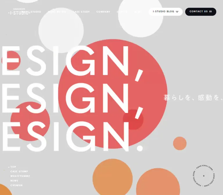
博報堂アイ・スタジオ — 大きな欧文見出しと円形グラフィックの企業サイト
白い余白、大きな欧文見出し、円形グラフィックを組み合わせた企業サイト。実績・サービス・ニュースの構成、モバイルでの再配置、重なるポップアップまで測定値とともに整理。
Hakuhodo i-STUDIO — Style Reference
Monumental English typography and colorful circular media, organized by a precise white corporate framework.
Website: www.i-studio.co.jp Original URL: https://www.i-studio.co.jp/ Final URL: https://www.i-studio.co.jp/ Theme: predominantly white, with a dark footer and contextual reversed navigation over hero media; no selectable theme was observed. Inspected: September 24, 2026, Japan Standard Time. Supplied retrieval timestamp: September 23, 2026, at 20:47:54.382 UTC, equivalent to September 24 at 05:47:54.382 JST. Viewports: 1440 × 1000 desktop and 390 × 844 mobile, in CSS pixels. Scope: the current corporate homepage: header, hero, featured promotion, blog previews, case studies, service categories, news, recruitment, contact panel, footer, cookie notice, and visible newsletter panel. Evidence consists of three desktop captures, two mobile captures, and rendered DOM/computed-style records for both viewport sizes. Linked destination pages were not inspected.
The homepage combines the expressive scale of a creative portfolio with the information structure of a corporate website. Huge uppercase section headings establish the rhythm. Small tracked navigation, restrained Japanese descriptions, and generous whitespace organize a substantial amount of content. Color concentrates in media and oversized circles; ordinary interface text and navigation remain mostly neutral.
The defining desktop composition begins much of the content around 301px from the left edge of a 1440px viewport. This broad left reservation accommodates a small section index and separates the content from the persistent logo. Some content spans approximately 1054px, while the service grid uses a narrower, centered span of approximately 837px. Mobile replaces this composition with roughly 31px content margins, a compact white header, stacked case studies, and a two-column service grid.
The captured experience also contains two independent floating interfaces. A white cookie notice sits above a larger newsletter form. Their overlap is especially prominent on mobile and must be recorded separately from the core visual system.
閉じる
Hakuhodo i-STUDIO — Style Reference
Monumental English typography and colorful circular media, organized by a precise white corporate framework.
Website: www.i-studio.co.jp Original URL: https://www.i-studio.co.jp/ Final URL: https://www.i-studio.co.jp/ Theme: predominantly white, with a dark footer and contextual reversed navigation over hero media; no selectable theme was observed. Inspected: September 24, 2026, Japan Standard Time. Supplied retrieval timestamp: September 23, 2026, at 20:47:54.382 UTC, equivalent to September 24 at 05:47:54.382 JST. Viewports: 1440 × 1000 desktop and 390 × 844 mobile, in CSS pixels. Scope: the current corporate homepage: header, hero, featured promotion, blog previews, case studies, service categories, news, recruitment, contact panel, footer, cookie notice, and visible newsletter panel. Evidence consists of three desktop captures, two mobile captures, and rendered DOM/computed-style records for both viewport sizes. Linked destination pages were not inspected.
The homepage combines the expressive scale of a creative portfolio with the information structure of a corporate website. Huge uppercase section headings establish the rhythm. Small tracked navigation, restrained Japanese descriptions, and generous whitespace organize a substantial amount of content. Color concentrates in media and oversized circles; ordinary interface text and navigation remain mostly neutral.
The defining desktop composition begins much of the content around 301px from the left edge of a 1440px viewport. This broad left reservation accommodates a small section index and separates the content from the persistent logo. Some content spans approximately 1054px, while the service grid uses a narrower, centered span of approximately 837px. Mobile replaces this composition with roughly 31px content margins, a compact white header, stacked case studies, and a two-column service grid.
The captured experience also contains two independent floating interfaces. A white cookie notice sits above a larger newsletter form. Their overlap is especially prominent on mobile and must be recorded separately from the core visual system.
How to Read This Reference
- Measured means a value appears in the supplied rendered DOM or computed styles. Rectangles describe the captured state, not necessarily the original CSS declaration.
- Calculated means arithmetic derived from those measurements, such as a column gap or viewport percentage.
- Estimated means visual interpretation of the original-page screenshots. Estimated colors are working approximations, not sampled or recovered source values.
- Recommended means guidance for a new implementation. The CSS below includes explicitly identified adaptations and accessibility improvements.
- All custom-property names in this document are implementation aliases. The supplied custom-property collection was empty; this does not prove that the original stylesheet contains no variables.
- Computed font-family declarations establish the requested font stacks. They do not independently establish which font files successfully loaded for every glyph.
- Screenshots and DOM records can represent different moments. Do not force their vertical coordinates or media frames into a single synchronized timeline.
Tokens — Colors
Default Palette
| Name | Value | Suggested token | Role and evidence |
|---|---|---|---|
| White | #ffffff |
--color-white |
Measured on the desktop BLOG pill and service-description surface; visually the dominant page and tile color |
| Primary Ink | #0e0f17 |
--color-ink |
Measured body text, section headings, and dark CONTACT US fill |
| Secondary Text | #6b6b70 |
--color-muted |
Measured blog introduction and news subcategories |
| Media Neutral | #eceded |
--color-stage |
Measured contact-container and PAUSE-control background; a suitable approximation for the visually similar service stage |
| Promotion Neutral | #f5f5f5 |
--color-promo |
Measured blog-promotion background |
| Footer Main Text | #dadadb |
--color-footer-text |
Measured principal footer links and ACCOUNT label |
| Footer Secondary Text | #a2a3a6 |
--color-footer-muted |
Measured footer sublinks and policy links |
| Footer Charcoal | approximately #212128 |
--color-footer |
Estimated from the visible dark footer; its background-bearing descendant was not included in the style records |
| Consent Navy | #15295a |
--color-consent-ink |
Measured cookie text and privacy link |
| Consent Blue | #425b76 |
--color-consent-action |
Measured cookie-consent button fill |
| Circle Coral | approximately #e76560 |
--color-coral |
Estimated from the large left circle in the desktop service capture |
| Circle Orange | approximately #e57a52 |
--color-orange |
Estimated from the service-stage circles |
| Contact Orange | approximately #fa603b |
--color-contact-art |
Estimated from the contact artwork visible above the footer |
| Newsletter Header | approximately #48484f |
--color-newsletter-head |
Estimated from the floating panel |
| Newsletter Body | approximately #d9d9d9 |
--color-newsletter-body |
Estimated from the floating form surface |
The captured hero additionally contains blue and turquoise imagery on desktop and a prominent green circle on mobile. These belong to the captured media compositions; they are not evidence of a universal button or category-color system.
The HTML and BODY backgrounds were reported as transparent. The white rendered page should therefore be described as its visible appearance, without attributing an unobserved white declaration to those particular elements.
Theme Presets
No theme selector or selectable presets were evidenced. Three contextual treatments are visible:
| Context | Surface | Foreground |
|---|---|---|
| Desktop hero | Full-width media | White logo and ordinary navigation; contrasting BLOG and CONTACT US pills |
| Main content | White | Dark logo, headings, and navigation; light neutral BLOG pill in the screenshot |
| Footer | Dark charcoal | White brand artwork, light main links, and muted secondary links |
The mobile header remains white in both supplied mobile captures. Do not automatically transfer the desktop transparent-header treatment to mobile.
Tokens — Typography
Geometric Display and Navigation
Measured stack: quasimoda, 'Avenir Next', 'Arial Black', sans-serif.
The sampled English section headings, navigation, service labels, footer links, contact title, and PAUSE controls request this stack, generally at weight 600. The relationship between extremely large headings and tiny, widely tracked navigation is central to the design.
Quasimoda is a source-declared family, not a visual guess. Font files and licensing were not supplied. Load an authorized copy when available, or accept measurable changes in width and wrapping from the fallback stack.
Japanese Body Copy
Measured stack: YakuHanJP, -apple-system, 'system-ui', Roboto, 'Helvetica Neue', Helvetica, Arial, 'Hiragino Kaku Gothic ProN', 'Hiragino Sans', 'Yu Gothic', YuGothic, 'BIZ UDPGothic', Meiryo, sans-serif.
The body requests weight 500. Individual paragraphs use different sizes, leading, and tracking. Long descriptions generally have much more breathing room than the body element's default 16px / 19.2px.
The Times declaration on the HTML element is a root fallback, not the visual identity of the rendered page.
Cookie Interface
Measured stack: Lato, sans-serif.
Cookie paragraphs and controls use 13px, weight 400, and 22.75px line height. This utility interface has its own typography and navy/blue palette. The newsletter's exact family was not provided and should not be inferred from the cookie interface.
Hero Lettering
The desktop capture displays a large white UX DESIGN composition. The mobile capture displays three lines of DESIGN, DESIGN, DESIGN. and the Japanese slogan 暮らしを、感動を、実行を。.
These letters were not represented by corresponding measured text elements. Their exact family, size, and implementation as live text or embedded media remain unknown. Visually, the desktop lettering is approximately 120–140px and the mobile lettering approximately 70–76px, with tightly stacked lines. These are estimates only.
Type Scale
| Role | Desktop measured value | Mobile measured value | Tracking and notes |
|---|---|---|---|
| Main section heading | 80px / 80px, 600 |
46px / 50px, 600 |
4.8px desktop; 1.84px mobile |
| BLOG heading | 32px / 32px, 600 |
Same | 1.92px |
| Service tile label | 24px / 28.8px, 600 |
16px / 19.2px, 600 |
1.44px desktop; normal mobile |
| Desktop navigation | 10px / 20px, 600 |
Replaced by compact utilities | 2px |
| Mobile BLOG utility | — | 10px / 12px, 600 |
Normal tracking |
| Mobile floating contact | — | 12px / 20px, 600 |
2.4px |
| Blog introduction | 12px / 24px, 500 |
Same | 3.6px; deliberately open tracking |
| Blog and news summaries | 12px / 24px, 500 |
Same | 0.6px |
| Case-study summary | 16px / 25.6px, 500 |
15px / 24px, 500 |
0.8px desktop; 0.75px mobile |
| Service and career description | 14px / 28px, 500 |
15px / 30px, 500 |
1.4px desktop; 0.75px mobile |
| Category-link elements | 16px / 19.2px, 500 |
Same | Normal tracking in the sampled anchors |
| News subcategory | 10px / 10px, 500 |
Same | 0.5px |
| Contact-panel title | approximately 33.73px / 33.73px |
33.28px / 33.28px |
Approximately 0.04em |
| Contact-panel description | approximately 14.76px / 24.50px |
12.48px / 20.72px |
0.2em |
| Footer main link | 14px / 22.4px, 600 |
14px / 14px, 600 |
1.4px |
| Footer secondary link | 10px / 16px, 600 |
Usually 11px / 16px, 600 |
1px desktop; 1.1px mobile |
| Cookie text and action | 13px / 22.75px, 400 |
Same | Normal tracking |
| PAUSE label | 10px, 600 |
Same | Computed line height is normal |
Some sampled category anchors can contain differently styled descendants. Their recorded anchor font size is not sufficient to guarantee the appearance of every internal label.
Tokens — Spacing & Shapes
Composition: sparse at the section level, compact in navigation and metadata.
Underlying scale: no source spacing formula was supplied. The following values describe repeated geometry rather than a proven universal spacing system.
Spacing Scale
| Use | Value | Evidence |
|---|---|---|
| Desktop header horizontal inset | 40px at the logo |
Measured |
| Mobile header logo inset | 20px |
Measured |
| Mobile main-content inset | approximately 31.2px |
Measured; equivalent to about 8vw |
| Service-grid gap | approximately 16px |
Estimated from the desktop capture; consistent with mobile label geometry |
| Cookie inner horizontal inset | 26px |
Calculated from panel and text widths |
| Cookie viewport clearance | 32px left and bottom |
Screenshot geometry, consistent across both viewports |
| Newsletter viewport clearance | approximately 10px |
Estimated from screenshots |
| Desktop case-study column gap | 84.34px |
Calculated |
| Case-study row gap | approximately 95px |
Calculated on desktop and mobile |
| Heading-to-case-content gap | 140px desktop; 100px mobile |
Calculated after the heading line box |
| Repeated section separation | 200px |
Calculated between multiple preceding index links and subsequent headings |
| Career index link to contact panel | 160px |
Calculated on both viewports |
| Contact panel to footer | 200px |
Calculated on both viewports |
Border Radius
| Element | Radius | Evidence |
|---|---|---|
| Desktop BLOG and CONTACT US pills | 30px |
Measured |
| PAUSE control | 30px |
Measured |
| Cookie consent button | 39px |
Measured |
| Contact panel | 8px |
Measured |
| Desktop blog-promotion panel | 8px |
Measured |
| Mobile blog-promotion panel | 8px 0 0 8px |
Measured; panel reaches the right edge |
| Service tiles | approximately 8px |
Screenshot estimate |
| Cookie panel | approximately 12px |
Screenshot estimate |
| Newsletter panel | approximately 20px |
Screenshot estimate |
| Circular artwork | Circular | Visual evidence |
Keep the radius system differentiated. Compact pills, modestly rounded content panels, large circles, and softer floating forms have distinct roles.
Layout Measurements
| Element | Desktop, 1440 × 1000 | Mobile, 390 × 844 |
|---|---|---|
| Document height | 7539.30px |
9370.41px |
| Main content left edge | 301.48px |
31.19px |
| Wide content span | 1054.19px |
Usually 327.63px |
| Narrow centered span | 837.03px |
327.63px |
| Logo link box | 103 × 37.69px at (40, 37.16) |
63 × 24.67px at (20, 12.66) |
| BLOG header link | 77.5 × 38px |
74.5 × 30px |
| CONTACT US header/floating link | 124.81 × 38px |
150.38 × 40px, at (229.63, 784) |
| Featured promotion link | 837.03 × 168.66px |
327.63 × 312.02px |
| Blog article link region | 209.56 × 274.09px |
213.19 × 275.59px |
| Case-study link region | Approximately 484.92 × 380px |
Approximately 327.63 × 320–325px |
| Section index link | 279 × 64px |
315 × 70px |
| Contact panel | 945.61 × 310.97px |
327.63 × 327.59px |
| Footer | 549.78px high |
1627.91px high in the captured state |
| Cookie panel | Approximately 377 × 235px |
Approximately 326 × 257px |
| Newsletter panel | Approximately 500 × 379px |
Approximately 370 × 379px |
The HEADER element itself has a zero-height rectangle in the records. Its visible children clearly occupy space at the top of the viewport. That zero does not describe the visible header's height.
Components
Persistent Header
Role: brand identification, primary corporate navigation, and direct access to the blog and contact page.
On desktop, place the logo at a 40px left inset. Ordinary navigation starts around x = 405px and uses tiny uppercase labels with 2px tracking. The sequence includes WHY I-STUDIO, WHAT WE DO, SOLUTION, CASE STUDY, COMPANY, CAREER, and NEWS, followed by BLOG and CONTACT US pills.
The captured DOM distinguishes ordinary links from COMPANY, CAREER, and NEWS buttons. Their menu contents and opening behavior were not exercised. Preserve this distinction when implementing navigation; a dropdown trigger should not be treated as a verified direct link.
The hero capture uses white branding and ordinary navigation over media. Later desktop captures show a white header with dark branding and muted dark navigation. Persistent placement is visible across the scroll captures, but the exact fixed/sticky rule and color-change trigger were not supplied.
On mobile, the visible header is approximately 50px high. A smaller logo sits at x = 20px; BLOG occupies the right utility area; a fine vertical divider precedes a two-line menu icon. The icon's measured graphic is only 30 × 8px. Its expanded menu was not shown.
Hero Media Stage
Role: communicate creative range through an immersive opening composition.
The desktop capture fills the viewport with a muted visual showing graphic circles, documents, and a large white UX DESIGN title. The mobile capture shows white and green circles behind three tightly stacked DESIGN lines. These are two evidenced appearances; their temporal order and relationship to responsive asset selection are unknown.
The desktop PAUSE control is 75 × 25px, positioned 10px from the right and bottom of the captured viewport. On mobile, the control is measured near y = 563px, and the visible hero ends around y = 598px. The mobile hero therefore does not fill the entire 844px viewport in this state.
The hero looks gray or muted behind white lettering. The evidence does not isolate whether this results from media grading, a scrim, or another compositing layer. Treat the captured appearance as visual guidance without inventing a global page-dimming mechanism.
Desktop Section Index
Role: provide a compact overview of the homepage's major sections.
Five labels—TOP, CASE STUDY, WHAT WE DO, NEWS, and CAREER—form a small vertical list near the left edge. Measured labels use 10px display type, 2px tracking, and approximately 21px vertical pitch. The screenshot near the footer shows muted labels with a dark active CAREER label and a small dot.
The extracted links all point to the homepage URL. The evidence does not establish their JavaScript scrolling behavior, target identifiers, or history handling. A new implementation can use real fragment links, but that is a recommendation.
This index is absent from the supplied mobile presentation.
Featured Promotion and Blog Area
Role: surface a featured case-study promotion and current editorial content before the main portfolio.
A featured link to a case-study interview measures approximately 837 × 169px on desktop and 328 × 312px on mobile. This substantial aspect-ratio change demonstrates a responsive promotion region. Its artwork was not visible in the supplied screenshots, so the crop or asset-switching mechanism cannot be specified.
The BLOG section uses a smaller 32px heading and a widely tracked Japanese introduction. On desktop they share a line; on mobile the introduction sits beneath the heading.
Three article regions contain a linked visual area, hashtag links, and Japanese summaries. Their desktop widths are about 210px with calculated gaps of 40.89px. A separate light-gray blog-promotion panel sits to their right, approximately 40px higher than the article row.
On mobile, the article regions remain arranged horizontally. Their x positions are approximately 31px, 276px, and 520px, with widths of 213px. This establishes offscreen continuation, but does not prove a swipe gesture or a particular carousel library. The separate blog-promotion panel moves below and extends to the viewport's right edge.
Case-Study Collection
Role: present selected work with discipline tags and concise Japanese explanations.
The desktop collection uses two columns of approximately 485px, separated by 84px. Four projects are present in the supplied DOM. Each combines a project-link region, category links such as CREATIVE or UX DESIGN, and a description. The description uses 16px / 25.6px with subtle tracking.
Mobile uses one column at approximately 328px. The sequence remains vertically spacious, with about 95px between project regions. Text becomes 15px / 24px. The measured summary retains approximately 98.8px of right padding, leaving a narrower reading width inside the card. The purpose of this reserved space is not established by the supplied records.
The sampled link regions have transparent backgrounds and zero border radius. Image descendants were not measured, so this does not prove that every project image is square-cornered. Avoid inventing an all-purpose raised-card treatment around the collection.
Project-image content, crop ratios, and hover endpoints were not available. Keep project links and tag links separate in a new semantic implementation rather than nesting interactive elements.
Service Category Grid
Role: summarize six areas of expertise inside a colorful media field.
A huge WHAT WE DO heading precedes a full-width light-gray stage. Oversized coral and orange circles extend beyond its boundaries. Six white tiles float visually above the artwork without visible elevation shadows.
The desktop grid is centered and approximately 837px wide, with three columns and two rows. Screenshot estimates place each tile around 268 × 175px, with 16–17px gaps. Labels are centered in both directions and use 24px / 28.8px display type.
The order is:
- COMMUNICATION PLANNING
- UX DESIGN
- CONSULTING
- PROJECT MANAGEMENT
- CREATIVE
- TECHNOLOGY
Mobile retains this order in two columns and three rows. Label centers establish an approximately 166px row pitch. Assuming the visually consistent 16px gap gives a useful implementation estimate of roughly 156 × 150px per tile; the tile containers themselves were not measured.
A PAUSE control sits near the stage's lower-left edge. Below the artwork, a Japanese explanation and a separate service-index link return to the white content area. Individual tile destinations were not supplied, so their click behavior remains unverified.
News Collection
Role: provide a compact corporate update index.
Four desktop news regions form a row. Each is approximately 216px wide, with calculated gaps of 63px. The content includes a category, Japanese subcategory, date, and Japanese headline. Dates are present in the extracted text, but their individual computed typography was not supplied.
On mobile, the news regions become a vertical list. Category and subcategory share a line. Headline blocks remain 12px / 24px, and the measured separation between successive regions is approximately 60px. Longer titles grow naturally; the first two mobile regions are 58px and 130px high respectively.
The evidence supports a restrained editorial structure. Borders, decorative icons, and all hover treatments were not fully exposed.
Career Section
Role: connect the company's creative culture to recruitment information.
The section repeats the large-heading, media, description, and index-link rhythm. A PAUSE control establishes a playback affordance in the media region, but the supplied captures do not expose enough of the career artwork to describe its subjects.
The measured description changes from 14px / 28px on desktop to 15px / 30px on mobile. It expands from a two-line desktop block to five lines on mobile. The recruitment-index link measures 279 × 64px on desktop and 315 × 70px on mobile.
Contact Panel
Role: provide a visually distinct inquiry destination before the footer.
The entire contact panel is a link to /contact/. It has an 8px radius and a measured neutral-gray base. The visible artwork includes an oversized orange circle, white CONTACT US lettering, and a widely tracked Japanese description.
Its dimensions shift from a wide 945.61 × 310.97px desktop panel to an almost square 327.63 × 327.59px mobile panel. The title remains close to 33px at both sizes. The description changes from one desktop line to three mobile lines.
A PAUSE control sits near the lower-left corner. The exact media technology and control behavior were not tested.
Corporate Footer
Role: provide a comprehensive site directory, policy links, social access, and company identification.
The desktop footer is a dark field with an approximately 80px top inset. A large reversed logo sits on the left. Four navigation groups begin around x = 517px, 736px, 955px, and 1173px. Their measured column width is approximately 187px, with roughly 32px between columns.
Main links use light 14px display text. Smaller sublinks use muted 10px text and approximately 25px vertical pitch. A circular Facebook mark measures about 30px on desktop. The rendered footer includes the company's copyright, address, and related-company links; these links do not establish website production credits.
On mobile, the directory becomes a long vertical structure with 40px side insets. Main link rows measure 74px high, with thin separators visible in the screenshot. COMPANY, CAREER, and NEWS have disclosure-like headings; a plus marker is visible beside NEWS. Expanded behavior was not tested.
Some mobile submenu descendants have recorded rectangles that overlap following group headings. This is insufficient evidence that all submenu content is simultaneously visible. Do not reconstruct the footer by blindly stacking every extracted descendant rectangle.
Cookie Notice
Role: present cookie-use information and a consent action.
The notice is a white floating rectangle at the lower left. Desktop dimensions are approximately 377 × 235px, with 32px viewport clearance. Mobile uses approximately 326 × 257px while preserving the same 32px left, right, and bottom clearance.
Its anatomy is consistent:
- A small close mark near the upper-right corner.
- Two Japanese paragraphs, including an underlined privacy link.
- Approximately 26px horizontal inner padding.
- Navy
13px / 22.75pxtext. - A right-aligned blue consent button labeled
同意する, measuring143 × 42.89pxwith a 39px radius. - A soft, visible shadow and an estimated 12px panel radius.
The extra mobile height results from the second paragraph wrapping onto two lines. The close element's recorded box is only 13 × 22.75px; a larger invisible hit area is recommended for a new implementation.
The notice remains visible across the supplied scroll states. Closing, acceptance, persistence, and keyboard behavior were not exercised.
Newsletter Panel
Role: offer email-magazine registration.
The desktop screenshot shows a panel approximately 500 × 379px, positioned 10px from the bottom and right. Its dark header is about 60px high and contains MAIL MAGAZINE text and a circular white close button. The light-gray body contains a two-column form with surname, given name, email, and company fields, required markers, a privacy checkbox, and a compact submit action.
The mobile panel is approximately 370px wide with 10px side clearance. Its title is pushed toward the right and partly obstructed by the close control. Most of the form is covered by the cookie notice, so the mobile field arrangement cannot be established reliably.
The cookie notice visibly sits above this panel. The newsletter appears in a later desktop capture and in both mobile captures, but its delay, scroll trigger, or session logic is unknown. No form submission or validation behavior was tested.
Tokens — Motion & Interaction
Measured Transition Declarations
| Target | Supplied declaration | What it establishes |
|---|---|---|
| Desktop logo link | opacity 0.15s ease-out |
Short opacity transition is defined |
| Ordinary desktop navigation | color 0.3s ease-out |
Navigation color can transition over 300ms |
| BLOG pill | Background and border, 0.15s ease-out |
Short surface transition |
| CONTACT US pill | Color, background, and border, 0.15s ease-out |
Short contrast transition |
| Selected promotion links, tags, and summaries | opacity 0.4s cubic-bezier(0.34, 1.56, 0.64, 1) |
A 400ms opacity transition with this easing is defined |
| Service labels | color 0.15s ease-out |
Short label-color transition |
| Footer links | opacity 0.15s ease-out |
Short opacity transition |
| Desktop section-index labels | 0.5s named landing animation, forwards |
Duration and fill mode are supplied; keyframes are not |
| Section-index sequence | Delays from 1.1s through 1.5s |
Five labels have 100ms-staggered start delays |
An overshooting cubic-bezier curve attached to opacity is not evidence of a scale or spring animation. Likewise, the shorthand transition: all without a meaningful supplied duration is not proof that an element visibly animates.
Media and Interaction Limits
PAUSE buttons are evidenced in the hero, service stage, career region, and contact panel. The screenshots also establish multiple artwork appearances. They do not establish loop duration, frame rate, sequencing, autoplay rules, audio, or whether the media uses video, canvas, SVG, CSS, or another renderer.
No click outcomes were supplied for playback controls, dropdowns, the mobile menu, footer disclosures, cookie actions, or newsletter controls. Hover endpoints and keyboard focus states are also unverified.
The capture process waited for load, image decoding, and sampled stability, and temporarily paused perpetual animations during readiness checks before resuming them. That improves capture consistency but does not prove that every delayed element or motion state was observed.
For an adaptation, keep interaction feedback short and reserve conspicuous movement for the artwork. Provide working pause controls and reduced-motion handling before enabling continuous decorative motion.
Surfaces
| Layer | Appearance | Structural role |
|---|---|---|
| Main canvas | White | Gives large typography and compact content room to breathe |
| Editorial content | Mostly unboxed, neutral text | Blog, case studies, news, and descriptions |
| Service stage | Light neutral field with cropped circles | Separates the six-category overview from ordinary content |
| Service tiles | White, modest radius, no visible shadow | Makes labels readable above colorful artwork |
| Contact panel | Rounded media container | Creates a distinct final inquiry destination |
| Footer | Dark charcoal | Holds a dense directory and company information |
| Cookie notice | White with a soft shadow | Highest visible floating layer in the captures |
| Newsletter form | Dark header and light-gray body | Secondary floating registration interface |
Shadows are not the primary organizing device. The strongest shadow belongs to the cookie notice. Content hierarchy comes primarily from type size, alignment, whitespace, and the alternation of white content with media fields.
Imagery
The current captures show two complementary image modes: oversized flat circles and imagery associated with design work. The desktop hero includes angled documents, red graphic blocks, and blue/turquoise circular forms. The mobile hero uses large green and white circles under repeated white lettering. The service stage uses overlapping coral and orange circles, cropped aggressively at the frame boundaries.
Use circles at substantially different scales. Some should exceed the container dimensions; others should act as smaller counterweights. Keep their edges clean and their fills flat. The captured treatment does not call for glass effects, material shading, or decorative gradients.
Text must remain readable over the media. Preserve the visual separation between artwork, white service tiles, and white hero lettering without assuming an unverified global overlay implementation.
Observed Asset References
| Region | Available visual evidence | Limitation |
|---|---|---|
| Header and footer identity | Supplied brand artwork in light and dark contexts | Logo asset URL and format were not provided |
| Desktop hero | Documents, colored circles, UX DESIGN lettering | Source asset, duration, and text-rendering method unknown |
| Mobile hero | Green/white circles and repeated DESIGN lettering | Responsive asset selection and timeline unknown |
| Service artwork | Large coral/orange circles behind six tiles | Renderer and movement path unknown |
| Contact artwork | Large orange circular form | Only part of the desktop panel is visible in a screenshot |
| Blog, project, and career media | Regions and destination links are present in the DOM | Their artwork is not sufficiently visible in the supplied captures |
No media src, poster URLs, font-file URLs, or image manifests were supplied. Article and case-study destination URLs must not be converted into guessed asset paths. Use authorized assets when available; CSS circles provide a practical approximation of the abstract fields.
Layout & Responsive Behavior
Desktop Composition
The main content left edge at 301.48px corresponds to approximately 20.94% of the viewport. The wide content region ends around x = 1355.67px, leaving 84.33px on the right. A narrower 837.03px region is centered, so its left edge happens to align with the same 301.48px origin.
This produces two related widths, not one universal centered container. The service grid and featured promotion use the narrower alignment, while case studies and news occupy the wider region. The contact panel uses another measured width of approximately 946px.
Sections have unusually generous vertical breathing room. Several consecutive sections begin exactly 200px after the previous index-link box. Preserve that pacing rather than compressing the page into uniformly tight content bands.
Mobile Recomposition
| Area | Desktop | Mobile |
|---|---|---|
| Header | Full navigation and two pills | Logo, BLOG utility, and compact menu icon |
| Main content | Broad left reservation | Approximately 8vw side margins |
| Main headings | 80px / 80px |
46px / 50px |
| Featured promotion | Very wide and shallow | Taller, nearly square region |
| Blog introduction | Beside heading | Below heading |
| Blog articles | Three visible columns beside promotion | Horizontal offscreen continuation; promotion below |
| Case studies | Two columns | One column |
| Services | Three columns, two rows | Two columns, three rows |
| News | Four columns | Vertical list |
| Contact panel | Wide rectangle | Almost square |
| Footer | Logo plus four navigation columns | Stacked rows with disclosure affordances |
| Floating forms | Opposite lower corners | Overlap across most of the lower viewport |
Only the two supplied viewport sizes were inspected. The original breakpoint values, tablet layout, landscape behavior, and intermediate interpolation rules are unknown. Any breakpoint in the Quick Start is an implementation choice.
Overlay Occupancy
At 390px width, the newsletter occupies approximately x = 10–380px and y = 455–834px. The cookie notice occupies approximately x = 32–358px and y = 555–812px. The latter therefore covers a large central portion of the form.
A floating CONTACT US link is measured near the mobile bottom-right corner, but it is obscured in the supplied screenshots. Its presence in the DOM does not establish that it remains visually accessible while both panels are open.
Do’s and Don’ts
Do
- Preserve the strong contrast between 80px section headings and 10px tracked desktop navigation.
- Use the measured Quasimoda stack for English display roles and the separate Japanese body stack.
- Keep the broad desktop left reservation and the distinction between wide and narrow content regions.
- Use large circles as artwork, with deliberate cropping and varied scale.
- Keep the six service labels centered on plain white tiles.
- Preserve mobile structural changes: one-column projects, two-column services, and horizontal blog continuation.
- Keep Japanese body copy comfortably led, especially the
15px / 30pxmobile explanatory text. - Retain a complete corporate directory and policy area in the footer.
- Treat cookie and newsletter panels as separate interfaces with separate visual tokens.
- Label estimates and implementation improvements clearly when extending the reference.
Don’t
- Do not reduce the homepage to a single-purpose conversion layout; it serves editorial, portfolio, service, recruitment, and corporate-navigation needs.
- Do not make every section use the same centered width.
- Do not turn every project or news item into a rounded, shadowed card.
- Do not apply the cookie button's blue as the site's general action color.
- Do not invent exact hero durations, hover transformations, dropdown contents, or carousel behavior.
- Do not infer project-image subjects from article titles or destination slugs.
- Do not assume every DOM descendant in a mobile footer disclosure is visibly expanded.
- Do not reproduce the overlapping mobile forms as a recommended interaction pattern.
- Do not use the root Times fallback as the page's primary typeface.
- Do not substitute a generic three-column mobile service layout for the measured two-column arrangement.
Recommended Implementation Additions
These are recommendations for a new implementation, not verified features of the original site:
- Sequence floating panels so the cookie notice is resolved or dismissed before showing the newsletter. Keep a user-accessible route to reopen the newsletter later.
- Give menu, close, and media controls at least a 44px touch target while preserving their compact visible graphics.
- Implement menu and footer disclosure triggers as buttons with accurate expanded states and keyboard support.
- Use real fragment links for the section index, with scroll offsets that account for the persistent header.
- Keep playback controls functional for every animated media region. A CSS reduced-motion rule alone will not pause video or canvas rendering.
- Provide a static poster or still composition for reduced-motion users and for media-loading failures.
- Make the mobile blog continuation keyboard-accessible and horizontally scrollable if that interaction is adopted. Preserve its content when scripting is unavailable.
- Use explicit form labels, appropriate autocomplete attributes, understandable validation, and a newsletter layout that keeps the close control clear of the title.
- Add visible focus treatment on both white and dark surfaces.
- Confirm contrast over every hero frame and within the small muted footer labels.
- Reassess the large mobile case-summary right padding if it reduces reading comfort without serving a visible component.
Agent Prompt Guide
Quick Color Reference
- Main page and service tiles:
#ffffff. - Primary text and contact pill:
#0e0f17. - Muted text:
#6b6b70. - Contact/media neutral:
#eceded. - Blog-promotion neutral:
#f5f5f5. - Footer: approximately
#212128, with measured#dadadband#a2a3a6text. - Abstract circles: approximate coral
#e76560and orange#e57a52. - Cookie interface only:
#15295atext and#425b76action fill.
Overall Prompt
“Create a Japanese creative-company homepage using a spacious white corporate framework. Use near-black #0e0f17 text, a Quasimoda-style geometric display hierarchy, very small tracked uppercase navigation, and enormous section headings. At a 1440px viewport, begin the main content around x = 301px, with both a 1054px wide content region and an 837px centered region. Organize the page into hero media, editorial previews, case studies, six service categories, news, recruitment, a contact panel, and a dark corporate footer. Concentrate coral and orange color in oversized cropped circles behind white service tiles. On mobile, use a 50px white header, roughly 8vw content margins, 46px headings, one-column case studies, and a two-column service grid. Keep artwork timing and hidden interactions configurable because they are not established by the reference.”
Example Component Prompts
- Header: “Build a desktop corporate header with a small left-aligned logo, 10px uppercase navigation with 2px tracking, a pale BLOG pill, and a near-black CONTACT US pill. Support a white-on-media appearance and a dark-on-white appearance. On mobile, show a smaller logo, BLOG utility, and a two-line menu graphic inside an accessible button.”
- Services: “Create a full-width pale-gray artwork stage containing cropped coral and orange circles. Center an approximately 837px grid of six white tiles, three columns on desktop and two on mobile. Use centered geometric labels at 24px desktop and 16px mobile, modest 8px corners, and no elevation shadows.”
- Case studies: “Create a spacious portfolio collection with two approximately 485px columns and an 84px gap at 1440px width. Group project media, independent discipline links, and Japanese descriptions. Stack the collection into one approximately 328px column at 390px width, preserving generous vertical gaps.”
- Contact panel: “Create an 8px-rounded contact link with an oversized orange circle, white CONTACT US title around 33px, and widely tracked Japanese copy. Use a wide desktop rectangle and a square mobile composition. Add a playback control only when actual media behavior is implemented.”
- Footer: “Build a charcoal corporate footer with a large white logo, four compact navigation groups, 14px main links, 10px muted sublinks, and a small social icon. On mobile, use 40px side insets, tall divided navigation rows, and accessible disclosures for nested groups.”
- Floating interfaces: “Style a compact white cookie notice with navy 13px text, a blue 143px-wide consent pill, and 32px viewport clearance. Coordinate it with a separate newsletter panel so only one obstructive panel is shown at a time. This sequencing is an improvement, not a reproduction of the captured overlap.”
Quick Start
CSS Custom Properties
This is a reusable adaptation, not recovered source CSS. Exact measured colors and typography are combined with explicitly estimated artwork colors and panel radii. Percentage container rules reproduce the two inspected widths approximately; they are not claimed source formulas. The 1100px breakpoint is recommended to give the full desktop navigation adequate space.
:root {
  /* Measured interface colors */
  --color-white: #ffffff;
  --color-ink: #0e0f17;
  --color-muted: #6b6b70;
  --color-stage: #eceded;
  --color-promo: #f5f5f5;
  --color-footer-text: #dadadb;
  --color-footer-muted: #a2a3a6;
  --color-consent-ink: #15295a;
  --color-consent-action: #425b76;

  /* Visual approximations, not recovered source colors */
  --color-footer: #212128;
  --color-coral: #e76560;
  --color-orange: #e57a52;
  --color-newsletter-head: #48484f;
  --color-newsletter-body: #d9d9d9;

  --font-display: quasimoda, 'Avenir Next', 'Arial Black', sans-serif;
  --font-body: YakuHanJP, -apple-system, system-ui, Roboto,
    'Helvetica Neue', Helvetica, Arial, 'Hiragino Kaku Gothic ProN',
    'Hiragino Sans', 'Yu Gothic', YuGothic, 'BIZ UDPGothic',
    Meiryo, sans-serif;
  --font-consent: Lato, sans-serif;

  --size-section: 80px;
  --leading-section: 80px;
  --tracking-section: 0.06em;
  --content-left: 20.9364vw;
  --content-right: 5.8561vw;
  --content-narrow: 58.1272vw;
  --section-space: 200px;
  --radius-panel: 8px;
  --radius-pill: 30px;
  --motion-fast: 150ms ease-out;
  --motion-nav: 300ms ease-out;
  --motion-content: 400ms cubic-bezier(0.34, 1.56, 0.64, 1);
}

* { box-sizing: border-box; }
body {
  margin: 0;
  color: var(--color-ink);
  background: var(--color-white);
  font-family: var(--font-body);
  font-weight: 500;
}
button, input { font: inherit; }
button { cursor: pointer; }
a { color: inherit; }
img { display: block; max-width: 100%; }
[hidden] { display: none !important; }

.content-wide {
  margin-inline: var(--content-left) var(--content-right);
}
.content-narrow {
  width: var(--content-narrow);
  margin-inline: auto;
}
.section { margin-block-start: var(--section-space); }
.section-title {
  margin: 0 0 140px;
  font-family: var(--font-display);
  font-size: var(--size-section);
  font-weight: 600;
  line-height: var(--leading-section);
  letter-spacing: var(--tracking-section);
}
.section-copy {
  font-size: 14px;
  line-height: 28px;
  letter-spacing: 0.1em;
}

/* Fixed positioning and height are adaptation choices. */
.site-header {
  position: fixed;
  inset: 0 0 auto;
  z-index: 30;
  display: flex;
  align-items: center;
  gap: 24px;
  min-height: 112px;
  padding-inline: 40px;
  background: var(--color-white);
}
.site-header.is-over-media {
  color: var(--color-white);
  background: transparent;
}
.brand { flex: 0 0 103px; }
.site-nav {
  display: flex;
  align-items: center;
  gap: clamp(16px, 2.55vw, 37px);
  margin-inline-start: auto;
}
.site-nav a, .site-nav button, .header-pill {
  font-family: var(--font-display);
  font-size: 10px;
  font-weight: 600;
  line-height: 20px;
  letter-spacing: 2px;
  text-decoration: none;
}
.site-nav button {
  color: inherit;
  background: transparent;
  border: 0;
}
.header-pill {
  display: inline-flex;
  align-items: center;
  justify-content: center;
  min-height: 38px;
  padding: 8px 20px;
  border-radius: var(--radius-pill);
}
.header-pill--blog {
  color: var(--color-ink);
  background: var(--color-stage);
}
.is-over-media .header-pill--blog { background: white; }
.header-pill--contact { color: white; background: var(--color-ink); }
.mobile-tools { display: none; }

.blog-title {
  font: 600 32px/32px var(--font-display);
  letter-spacing: 0.06em;
}
.blog-layout {
  display: grid;
  grid-template-columns: minmax(0, 1fr) 28.6%;
  gap: 4%;
}
.blog-track {
  display: grid;
  grid-template-columns: repeat(3, minmax(0, 1fr));
  gap: 5.75%;
}
.blog-card { min-width: 0; }
.blog-copy, .news-copy {
  font-size: 12px;
  line-height: 24px;
  letter-spacing: 0.05em;
}
.blog-promo {
  min-height: 274px;
  border-radius: var(--radius-panel);
  background: var(--color-promo);
}

.case-grid {
  display: grid;
  grid-template-columns: repeat(2, minmax(0, 1fr));
  gap: 95px 8%;
}
.case-media { width: 100%; height: auto; }
.case-tags {
  display: flex;
  flex-wrap: wrap;
  gap: 8px 12px;
  margin-block-start: 20px;
}
.case-copy {
  margin-block-start: 15px;
  padding-inline-end: 45px;
  font-size: 16px;
  line-height: 25.6px;
  letter-spacing: 0.05em;
}
.case-link { transition: opacity var(--motion-content); }

.service-stage {
  position: relative;
  overflow: hidden;
  padding-block: 60px;
  background: var(--color-stage);
  isolation: isolate;
}
.orb-field { position: absolute; inset: 0; z-index: -1; }
.orb {
  position: absolute;
  display: block;
  width: 500px;
  aspect-ratio: 1;
  border-radius: 50%;
}
.orb--coral { left: -20px; top: -95px; background: var(--color-coral); }
.orb--orange {
  left: 26%;
  top: -20px;
  width: 530px;
  background: var(--color-orange);
}
.service-grid {
  display: grid;
  grid-template-columns: repeat(3, minmax(0, 1fr));
  gap: 16px;
}
.service-tile {
  display: grid;
  place-content: center;
  min-height: 175px;
  padding: 16px;
  border-radius: var(--radius-panel);
  background: white;
  text-align: center;
  font: 600 24px/28.8px var(--font-display);
  letter-spacing: 0.06em;
}
.media-toggle {
  position: absolute;
  left: 10px;
  bottom: 10px;
  min-width: 75px;
  min-height: 25px;
  border: 0;
  border-radius: var(--radius-pill);
  background: var(--color-stage);
  font: 600 10px var(--font-display);
}

.news-grid {
  display: grid;
  grid-template-columns: repeat(4, minmax(0, 1fr));
  gap: 6%;
}
.contact-panel {
  display: grid;
  place-content: center;
  min-height: 311px;
  overflow: hidden;
  border-radius: var(--radius-panel);
  background: var(--color-stage);
  text-align: center;
}
.contact-title {
  font: 600 33.73px/1 var(--font-display);
  letter-spacing: 0.04em;
}

.site-footer {
  margin-block-start: 200px;
  padding: 80px;
  color: var(--color-footer-text);
  background: var(--color-footer);
}
.footer-grid {
  display: grid;
  grid-template-columns: 2.17fr repeat(4, minmax(0, 1fr));
  gap: 32px;
}
.footer-main-link {
  display: block;
  margin-block-end: 30px;
  font: 600 14px/22.4px var(--font-display);
  letter-spacing: 0.1em;
  text-decoration: none;
}
.footer-sub-link {
  display: block;
  margin-block-end: 9px;
  color: var(--color-footer-muted);
  font: 600 10px/16px var(--font-display);
  letter-spacing: 0.1em;
}

/* Panel geometry approximates the supplied screenshots. */
.consent-card {
  position: fixed;
  z-index: 60;
  left: 32px;
  bottom: calc(32px + env(safe-area-inset-bottom, 0px));
  width: min(377px, calc(100vw - 64px));
  padding: 62px 26px 26px;
  border-radius: 12px;
  color: var(--color-consent-ink);
  background: white;
  box-shadow: 0 10px 30px rgb(0 0 0 / 24%);
  font: 400 13px/22.75px var(--font-consent);
}
.consent-card p { margin: 0; }
.consent-card a { text-decoration: underline; }
.consent-close {
  position: absolute;
  top: 15px;
  right: 15px;
  width: 44px;
  height: 44px;
  border: 0;
  color: inherit;
  background: transparent;
}
.consent-actions {
  display: flex;
  justify-content: flex-end;
  margin-block-start: 13px;
}
.consent-accept {
  width: 143px;
  min-height: 43px;
  padding: 0;
  border: 0;
  border-radius: 39px;
  color: white;
  background: var(--color-consent-action);
}
.newsletter-panel {
  position: fixed;
  z-index: 50;
  right: 10px;
  bottom: calc(10px + env(safe-area-inset-bottom, 0px));
  width: min(500px, calc(100vw - 20px));
  max-height: calc(100dvh - 70px);
  overflow: auto;
  border-radius: 20px;
  background: var(--color-newsletter-body);
}
.newsletter-heading {
  min-height: 60px;
  padding: 16px 60px 16px 24px;
  color: white;
  background: var(--color-newsletter-head);
  font-size: 24px;
}
.newsletter-fields {
  display: grid;
  grid-template-columns: repeat(2, minmax(0, 1fr));
  gap: 20px;
  padding: 36px 50px;
}

/* Recommended sequencing; application code manages this attribute. */
body[data-consent-pending] .newsletter-panel { display: none; }

:where(a, button, input, summary):focus-visible {
  outline: 2px solid currentColor;
  outline-offset: 4px;
}

@media (max-width: 1100px) {
  :root {
    --content-left: 8vw;
    --content-right: 8vw;
    --content-narrow: 84vw;
    --size-section: 46px;
    --leading-section: 50px;
    --tracking-section: 0.04em;
  }
  .site-header { min-height: 50px; padding-inline: 20px; }
  .site-header.is-over-media { color: var(--color-ink); background: white; }
  .brand { flex-basis: 63px; }
  .site-nav { display: none; }
  .mobile-tools { display: flex; align-items: center; margin-left: auto; }
  .section-title { margin-block-end: 100px; }
  .section-copy { font-size: 15px; line-height: 30px; letter-spacing: 0.05em; }
  .blog-layout { display: block; }
  .blog-track {
    display: flex;
    gap: 8vw;
    width: calc(100vw - 8vw);
    overflow-x: auto;
    padding-inline-end: 8vw;
  }
  .blog-card { flex: 0 0 54.6667vw; }
  .blog-promo {
    width: calc(100vw - 8vw);
    min-height: 168px;
    margin-top: 40px;
    border-radius: 8px 0 0 8px;
  }
  .case-grid { grid-template-columns: 1fr; }
  .case-tags { column-gap: 8px; }
  .case-copy { padding-right: 30.15%; font-size: 15px; line-height: 24px; }
  .service-grid { grid-template-columns: repeat(2, minmax(0, 1fr)); }
  .service-stage { padding-bottom: 100px; }
  .service-tile {
    min-height: 150px;
    padding: 6px;
    font-size: 16px;
    line-height: 19.2px;
    letter-spacing: normal;
  }
  .news-grid { grid-template-columns: 1fr; gap: 60px; }
  .contact-panel { min-height: 0; aspect-ratio: 1; }
  .contact-title { font-size: 33.28px; }
  .site-footer { padding: 80px 40px; }
  .footer-grid { grid-template-columns: 1fr; }
  .footer-main-link {
    margin: 0;
    padding-block: 30px;
    border-bottom: 1px solid rgb(255 255 255 / 30%);
    line-height: 14px;
  }
  .footer-sub-link { margin-bottom: 25px; font-size: 11px; }
  /* Recommended mobile form layout; the source form was obscured. */
  .newsletter-fields { grid-template-columns: 1fr; padding: 24px; }
}

@media (prefers-reduced-motion: reduce) {
  .motion-layer { animation: none !important; }
  .case-link, .site-nav a, .site-nav button { transition: none; }
  /* Pause video and canvas motion separately in application code. */
}
Service-Stage Markup
This static example uses informational tiles because individual service destinations were not established. Add real links when the destination structure is known. Wire actual media playback before exposing a PAUSE control.
<section class='section' aria-labelledby='services-title'>
  <div class='content-wide'>
    <h2 class='section-title' id='services-title'>WHAT WE DO</h2>
  </div>
  <div class='service-stage'>
    <div class='orb-field' aria-hidden='true'>
      <i class='orb orb--coral'></i>
      <i class='orb orb--orange'></i>
    </div>
    <div class='service-grid content-narrow'>
      <div class='service-tile'>COMMUNICATION<br>PLANNING</div>
      <div class='service-tile'>UX DESIGN</div>
      <div class='service-tile'>CONSULTING</div>
      <div class='service-tile'>PROJECT<br>MANAGEMENT</div>
      <div class='service-tile'>CREATIVE</div>
      <div class='service-tile'>TECHNOLOGY</div>
    </div>
  </div>
</section>
The CSS establishes the visual framework. Brand assets, hero compositions, menu state, footer disclosures, form submission, consent persistence, media playback, and panel sequencing require separate implementation. The recommended focus targets, safe-area handling, horizontal overflow, and newsletter sequencing are additions rather than verified source features.
Tailwind v4 Token Mapping
Optional aliases for a project already using Tailwind v4. This does not imply that the original website uses Tailwind. Define the preceding custom properties first.
@theme inline {
  --color-ink: #0e0f17;
  --color-stage: #eceded;
  --color-muted: #6b6b70;
  --color-coral: #e76560;
  --color-orange: #e57a52;
  --color-footer: #212128;
  --font-display: quasimoda, 'Avenir Next', 'Arial Black', sans-serif;
  --font-consent: Lato, sans-serif;
  --text-section: var(--size-section);
  --text-section--line-height: var(--leading-section);
  --text-section--letter-spacing: var(--tracking-section);
  --text-editorial: 12px;
  --text-editorial--line-height: 24px;
  --radius-panel: 8px;
  --radius-pill: 30px;
  --spacing-section: 200px;
}
Sources & Evidence
- Inspected original page: Hakuhodo i-STUDIO homepage. Original and final URLs are identical; supplied HTTP status is 200.
- Capture timestamp: September 23, 2026, 20:47:54.382 UTC; September 24, 2026, 05:47:54.382 JST.
- Desktop evidence: three supplied 1440 × 1000 screenshots showing the hero, service stage, and footer/contact area; rendered DOM measurements across the homepage.
- Mobile evidence: two supplied 390 × 844 screenshots showing the hero and footer with floating panels; rendered DOM measurements across the homepage.
- Measured evidence: element rectangles, text, destination links, computed font stacks, sizes, line heights, tracking, selected colors, radii, transitions, and section-index animation declarations.
- Observed states: multiple scroll positions, contextual desktop header appearances, responsive content arrangements, persistent cookie notice, and a newsletter panel visible in selected captures.
- Inspection limitations: only two viewport sizes; no independently exercised clicks, hover states, menu expansion, form submission, consent persistence, or playback outcomes. Media files, keyframes, exact breakpoints, and complete asset styles were not supplied. SharedWorkers and service workers were disabled during collection, and delayed content may remain unobserved.
This reference describes the current homepage represented by the supplied original-page evidence. Exact source measurements, screenshot estimates, calculated relationships, and recommended implementation behavior are distinguished throughout.
# Hakuhodo i-STUDIO — Style Reference

> Monumental English typography and colorful circular media, organized by a precise white corporate framework.

**Website:** [www.i-studio.co.jp](https://www.i-studio.co.jp/)
**Original URL:** https://www.i-studio.co.jp/
**Final URL:** https://www.i-studio.co.jp/
**Theme:** predominantly white, with a dark footer and contextual reversed navigation over hero media; no selectable theme was observed.
**Inspected:** September 24, 2026, Japan Standard Time. Supplied retrieval timestamp: September 23, 2026, at 20:47:54.382 UTC, equivalent to September 24 at 05:47:54.382 JST.
**Viewports:** 1440 × 1000 desktop and 390 × 844 mobile, in CSS pixels.
**Scope:** the current corporate homepage: header, hero, featured promotion, blog previews, case studies, service categories, news, recruitment, contact panel, footer, cookie notice, and visible newsletter panel. Evidence consists of three desktop captures, two mobile captures, and rendered DOM/computed-style records for both viewport sizes. Linked destination pages were not inspected.

The homepage combines the expressive scale of a creative portfolio with the information structure of a corporate website. Huge uppercase section headings establish the rhythm. Small tracked navigation, restrained Japanese descriptions, and generous whitespace organize a substantial amount of content. Color concentrates in media and oversized circles; ordinary interface text and navigation remain mostly neutral.

The defining desktop composition begins much of the content around 301px from the left edge of a 1440px viewport. This broad left reservation accommodates a small section index and separates the content from the persistent logo. Some content spans approximately 1054px, while the service grid uses a narrower, centered span of approximately 837px. Mobile replaces this composition with roughly 31px content margins, a compact white header, stacked case studies, and a two-column service grid.

The captured experience also contains two independent floating interfaces. A white cookie notice sits above a larger newsletter form. Their overlap is especially prominent on mobile and must be recorded separately from the core visual system.
閉じる
# Hakuhodo i-STUDIO — Style Reference

> Monumental English typography and colorful circular media, organized by a precise white corporate framework.

**Website:** [www.i-studio.co.jp](https://www.i-studio.co.jp/)
**Original URL:** https://www.i-studio.co.jp/
**Final URL:** https://www.i-studio.co.jp/
**Theme:** predominantly white, with a dark footer and contextual reversed navigation over hero media; no selectable theme was observed.
**Inspected:** September 24, 2026, Japan Standard Time. Supplied retrieval timestamp: September 23, 2026, at 20:47:54.382 UTC, equivalent to September 24 at 05:47:54.382 JST.
**Viewports:** 1440 × 1000 desktop and 390 × 844 mobile, in CSS pixels.
**Scope:** the current corporate homepage: header, hero, featured promotion, blog previews, case studies, service categories, news, recruitment, contact panel, footer, cookie notice, and visible newsletter panel. Evidence consists of three desktop captures, two mobile captures, and rendered DOM/computed-style records for both viewport sizes. Linked destination pages were not inspected.

The homepage combines the expressive scale of a creative portfolio with the information structure of a corporate website. Huge uppercase section headings establish the rhythm. Small tracked navigation, restrained Japanese descriptions, and generous whitespace organize a substantial amount of content. Color concentrates in media and oversized circles; ordinary interface text and navigation remain mostly neutral.

The defining desktop composition begins much of the content around 301px from the left edge of a 1440px viewport. This broad left reservation accommodates a small section index and separates the content from the persistent logo. Some content spans approximately 1054px, while the service grid uses a narrower, centered span of approximately 837px. Mobile replaces this composition with roughly 31px content margins, a compact white header, stacked case studies, and a two-column service grid.

The captured experience also contains two independent floating interfaces. A white cookie notice sits above a larger newsletter form. Their overlap is especially prominent on mobile and must be recorded separately from the core visual system.

## How to Read This Reference

- **Measured** means a value appears in the supplied rendered DOM or computed styles. Rectangles describe the captured state, not necessarily the original CSS declaration.
- **Calculated** means arithmetic derived from those measurements, such as a column gap or viewport percentage.
- **Estimated** means visual interpretation of the original-page screenshots. Estimated colors are working approximations, not sampled or recovered source values.
- **Recommended** means guidance for a new implementation. The CSS below includes explicitly identified adaptations and accessibility improvements.
- All custom-property names in this document are implementation aliases. The supplied custom-property collection was empty; this does not prove that the original stylesheet contains no variables.
- Computed font-family declarations establish the requested font stacks. They do not independently establish which font files successfully loaded for every glyph.
- Screenshots and DOM records can represent different moments. Do not force their vertical coordinates or media frames into a single synchronized timeline.

## Tokens — Colors

### Default Palette

| Name | Value | Suggested token | Role and evidence |
| --- | --- | --- | --- |
| White | `#ffffff` | `--color-white` | Measured on the desktop BLOG pill and service-description surface; visually the dominant page and tile color |
| Primary Ink | `#0e0f17` | `--color-ink` | Measured body text, section headings, and dark CONTACT US fill |
| Secondary Text | `#6b6b70` | `--color-muted` | Measured blog introduction and news subcategories |
| Media Neutral | `#eceded` | `--color-stage` | Measured contact-container and PAUSE-control background; a suitable approximation for the visually similar service stage |
| Promotion Neutral | `#f5f5f5` | `--color-promo` | Measured blog-promotion background |
| Footer Main Text | `#dadadb` | `--color-footer-text` | Measured principal footer links and ACCOUNT label |
| Footer Secondary Text | `#a2a3a6` | `--color-footer-muted` | Measured footer sublinks and policy links |
| Footer Charcoal | approximately `#212128` | `--color-footer` | Estimated from the visible dark footer; its background-bearing descendant was not included in the style records |
| Consent Navy | `#15295a` | `--color-consent-ink` | Measured cookie text and privacy link |
| Consent Blue | `#425b76` | `--color-consent-action` | Measured cookie-consent button fill |
| Circle Coral | approximately `#e76560` | `--color-coral` | Estimated from the large left circle in the desktop service capture |
| Circle Orange | approximately `#e57a52` | `--color-orange` | Estimated from the service-stage circles |
| Contact Orange | approximately `#fa603b` | `--color-contact-art` | Estimated from the contact artwork visible above the footer |
| Newsletter Header | approximately `#48484f` | `--color-newsletter-head` | Estimated from the floating panel |
| Newsletter Body | approximately `#d9d9d9` | `--color-newsletter-body` | Estimated from the floating form surface |

The captured hero additionally contains blue and turquoise imagery on desktop and a prominent green circle on mobile. These belong to the captured media compositions; they are not evidence of a universal button or category-color system.

The HTML and BODY backgrounds were reported as transparent. The white rendered page should therefore be described as its visible appearance, without attributing an unobserved white declaration to those particular elements.

### Theme Presets

No theme selector or selectable presets were evidenced. Three contextual treatments are visible:

| Context | Surface | Foreground |
| --- | --- | --- |
| Desktop hero | Full-width media | White logo and ordinary navigation; contrasting BLOG and CONTACT US pills |
| Main content | White | Dark logo, headings, and navigation; light neutral BLOG pill in the screenshot |
| Footer | Dark charcoal | White brand artwork, light main links, and muted secondary links |

The mobile header remains white in both supplied mobile captures. Do not automatically transfer the desktop transparent-header treatment to mobile.

## Tokens — Typography

### Geometric Display and Navigation

**Measured stack:** `quasimoda, 'Avenir Next', 'Arial Black', sans-serif`.

The sampled English section headings, navigation, service labels, footer links, contact title, and PAUSE controls request this stack, generally at weight `600`. The relationship between extremely large headings and tiny, widely tracked navigation is central to the design.

Quasimoda is a source-declared family, not a visual guess. Font files and licensing were not supplied. Load an authorized copy when available, or accept measurable changes in width and wrapping from the fallback stack.

### Japanese Body Copy

**Measured stack:** `YakuHanJP, -apple-system, 'system-ui', Roboto, 'Helvetica Neue', Helvetica, Arial, 'Hiragino Kaku Gothic ProN', 'Hiragino Sans', 'Yu Gothic', YuGothic, 'BIZ UDPGothic', Meiryo, sans-serif`.

The body requests weight `500`. Individual paragraphs use different sizes, leading, and tracking. Long descriptions generally have much more breathing room than the body element's default `16px / 19.2px`.

The Times declaration on the HTML element is a root fallback, not the visual identity of the rendered page.

### Cookie Interface

**Measured stack:** `Lato, sans-serif`.

Cookie paragraphs and controls use `13px`, weight `400`, and `22.75px` line height. This utility interface has its own typography and navy/blue palette. The newsletter's exact family was not provided and should not be inferred from the cookie interface.

### Hero Lettering

The desktop capture displays a large white `UX DESIGN` composition. The mobile capture displays three lines of `DESIGN, DESIGN, DESIGN.` and the Japanese slogan `暮らしを、感動を、実行を。`.

These letters were not represented by corresponding measured text elements. Their exact family, size, and implementation as live text or embedded media remain unknown. Visually, the desktop lettering is approximately 120–140px and the mobile lettering approximately 70–76px, with tightly stacked lines. These are estimates only.

### Type Scale

| Role | Desktop measured value | Mobile measured value | Tracking and notes |
| --- | --- | --- | --- |
| Main section heading | `80px / 80px`, 600 | `46px / 50px`, 600 | `4.8px` desktop; `1.84px` mobile |
| BLOG heading | `32px / 32px`, 600 | Same | `1.92px` |
| Service tile label | `24px / 28.8px`, 600 | `16px / 19.2px`, 600 | `1.44px` desktop; normal mobile |
| Desktop navigation | `10px / 20px`, 600 | Replaced by compact utilities | `2px` |
| Mobile BLOG utility | — | `10px / 12px`, 600 | Normal tracking |
| Mobile floating contact | — | `12px / 20px`, 600 | `2.4px` |
| Blog introduction | `12px / 24px`, 500 | Same | `3.6px`; deliberately open tracking |
| Blog and news summaries | `12px / 24px`, 500 | Same | `0.6px` |
| Case-study summary | `16px / 25.6px`, 500 | `15px / 24px`, 500 | `0.8px` desktop; `0.75px` mobile |
| Service and career description | `14px / 28px`, 500 | `15px / 30px`, 500 | `1.4px` desktop; `0.75px` mobile |
| Category-link elements | `16px / 19.2px`, 500 | Same | Normal tracking in the sampled anchors |
| News subcategory | `10px / 10px`, 500 | Same | `0.5px` |
| Contact-panel title | approximately `33.73px / 33.73px` | `33.28px / 33.28px` | Approximately `0.04em` |
| Contact-panel description | approximately `14.76px / 24.50px` | `12.48px / 20.72px` | `0.2em` |
| Footer main link | `14px / 22.4px`, 600 | `14px / 14px`, 600 | `1.4px` |
| Footer secondary link | `10px / 16px`, 600 | Usually `11px / 16px`, 600 | `1px` desktop; `1.1px` mobile |
| Cookie text and action | `13px / 22.75px`, 400 | Same | Normal tracking |
| PAUSE label | `10px`, 600 | Same | Computed line height is normal |

Some sampled category anchors can contain differently styled descendants. Their recorded anchor font size is not sufficient to guarantee the appearance of every internal label.

## Tokens — Spacing & Shapes

**Composition:** sparse at the section level, compact in navigation and metadata.

**Underlying scale:** no source spacing formula was supplied. The following values describe repeated geometry rather than a proven universal spacing system.

### Spacing Scale

| Use | Value | Evidence |
| --- | --- | --- |
| Desktop header horizontal inset | `40px` at the logo | Measured |
| Mobile header logo inset | `20px` | Measured |
| Mobile main-content inset | approximately `31.2px` | Measured; equivalent to about `8vw` |
| Service-grid gap | approximately `16px` | Estimated from the desktop capture; consistent with mobile label geometry |
| Cookie inner horizontal inset | `26px` | Calculated from panel and text widths |
| Cookie viewport clearance | `32px` left and bottom | Screenshot geometry, consistent across both viewports |
| Newsletter viewport clearance | approximately `10px` | Estimated from screenshots |
| Desktop case-study column gap | `84.34px` | Calculated |
| Case-study row gap | approximately `95px` | Calculated on desktop and mobile |
| Heading-to-case-content gap | `140px` desktop; `100px` mobile | Calculated after the heading line box |
| Repeated section separation | `200px` | Calculated between multiple preceding index links and subsequent headings |
| Career index link to contact panel | `160px` | Calculated on both viewports |
| Contact panel to footer | `200px` | Calculated on both viewports |

### Border Radius

| Element | Radius | Evidence |
| --- | --- | --- |
| Desktop BLOG and CONTACT US pills | `30px` | Measured |
| PAUSE control | `30px` | Measured |
| Cookie consent button | `39px` | Measured |
| Contact panel | `8px` | Measured |
| Desktop blog-promotion panel | `8px` | Measured |
| Mobile blog-promotion panel | `8px 0 0 8px` | Measured; panel reaches the right edge |
| Service tiles | approximately `8px` | Screenshot estimate |
| Cookie panel | approximately `12px` | Screenshot estimate |
| Newsletter panel | approximately `20px` | Screenshot estimate |
| Circular artwork | Circular | Visual evidence |

Keep the radius system differentiated. Compact pills, modestly rounded content panels, large circles, and softer floating forms have distinct roles.

### Layout Measurements

| Element | Desktop, 1440 × 1000 | Mobile, 390 × 844 |
| --- | --- | --- |
| Document height | `7539.30px` | `9370.41px` |
| Main content left edge | `301.48px` | `31.19px` |
| Wide content span | `1054.19px` | Usually `327.63px` |
| Narrow centered span | `837.03px` | `327.63px` |
| Logo link box | `103 × 37.69px` at `(40, 37.16)` | `63 × 24.67px` at `(20, 12.66)` |
| BLOG header link | `77.5 × 38px` | `74.5 × 30px` |
| CONTACT US header/floating link | `124.81 × 38px` | `150.38 × 40px`, at `(229.63, 784)` |
| Featured promotion link | `837.03 × 168.66px` | `327.63 × 312.02px` |
| Blog article link region | `209.56 × 274.09px` | `213.19 × 275.59px` |
| Case-study link region | Approximately `484.92 × 380px` | Approximately `327.63 × 320–325px` |
| Section index link | `279 × 64px` | `315 × 70px` |
| Contact panel | `945.61 × 310.97px` | `327.63 × 327.59px` |
| Footer | `549.78px` high | `1627.91px` high in the captured state |
| Cookie panel | Approximately `377 × 235px` | Approximately `326 × 257px` |
| Newsletter panel | Approximately `500 × 379px` | Approximately `370 × 379px` |

The HEADER element itself has a zero-height rectangle in the records. Its visible children clearly occupy space at the top of the viewport. That zero does not describe the visible header's height.

## Components

### Persistent Header

**Role:** brand identification, primary corporate navigation, and direct access to the blog and contact page.

On desktop, place the logo at a 40px left inset. Ordinary navigation starts around x = 405px and uses tiny uppercase labels with 2px tracking. The sequence includes WHY I-STUDIO, WHAT WE DO, SOLUTION, CASE STUDY, COMPANY, CAREER, and NEWS, followed by BLOG and CONTACT US pills.

The captured DOM distinguishes ordinary links from COMPANY, CAREER, and NEWS buttons. Their menu contents and opening behavior were not exercised. Preserve this distinction when implementing navigation; a dropdown trigger should not be treated as a verified direct link.

The hero capture uses white branding and ordinary navigation over media. Later desktop captures show a white header with dark branding and muted dark navigation. Persistent placement is visible across the scroll captures, but the exact fixed/sticky rule and color-change trigger were not supplied.

On mobile, the visible header is approximately 50px high. A smaller logo sits at x = 20px; BLOG occupies the right utility area; a fine vertical divider precedes a two-line menu icon. The icon's measured graphic is only `30 × 8px`. Its expanded menu was not shown.

### Hero Media Stage

**Role:** communicate creative range through an immersive opening composition.

The desktop capture fills the viewport with a muted visual showing graphic circles, documents, and a large white UX DESIGN title. The mobile capture shows white and green circles behind three tightly stacked DESIGN lines. These are two evidenced appearances; their temporal order and relationship to responsive asset selection are unknown.

The desktop PAUSE control is `75 × 25px`, positioned 10px from the right and bottom of the captured viewport. On mobile, the control is measured near y = 563px, and the visible hero ends around y = 598px. The mobile hero therefore does not fill the entire 844px viewport in this state.

The hero looks gray or muted behind white lettering. The evidence does not isolate whether this results from media grading, a scrim, or another compositing layer. Treat the captured appearance as visual guidance without inventing a global page-dimming mechanism.

### Desktop Section Index

**Role:** provide a compact overview of the homepage's major sections.

Five labels—TOP, CASE STUDY, WHAT WE DO, NEWS, and CAREER—form a small vertical list near the left edge. Measured labels use `10px` display type, 2px tracking, and approximately 21px vertical pitch. The screenshot near the footer shows muted labels with a dark active CAREER label and a small dot.

The extracted links all point to the homepage URL. The evidence does not establish their JavaScript scrolling behavior, target identifiers, or history handling. A new implementation can use real fragment links, but that is a recommendation.

This index is absent from the supplied mobile presentation.

### Featured Promotion and Blog Area

**Role:** surface a featured case-study promotion and current editorial content before the main portfolio.

A featured link to a case-study interview measures approximately `837 × 169px` on desktop and `328 × 312px` on mobile. This substantial aspect-ratio change demonstrates a responsive promotion region. Its artwork was not visible in the supplied screenshots, so the crop or asset-switching mechanism cannot be specified.

The BLOG section uses a smaller 32px heading and a widely tracked Japanese introduction. On desktop they share a line; on mobile the introduction sits beneath the heading.

Three article regions contain a linked visual area, hashtag links, and Japanese summaries. Their desktop widths are about 210px with calculated gaps of 40.89px. A separate light-gray blog-promotion panel sits to their right, approximately 40px higher than the article row.

On mobile, the article regions remain arranged horizontally. Their x positions are approximately 31px, 276px, and 520px, with widths of 213px. This establishes offscreen continuation, but does not prove a swipe gesture or a particular carousel library. The separate blog-promotion panel moves below and extends to the viewport's right edge.

### Case-Study Collection

**Role:** present selected work with discipline tags and concise Japanese explanations.

The desktop collection uses two columns of approximately 485px, separated by 84px. Four projects are present in the supplied DOM. Each combines a project-link region, category links such as CREATIVE or UX DESIGN, and a description. The description uses `16px / 25.6px` with subtle tracking.

Mobile uses one column at approximately 328px. The sequence remains vertically spacious, with about 95px between project regions. Text becomes `15px / 24px`. The measured summary retains approximately 98.8px of right padding, leaving a narrower reading width inside the card. The purpose of this reserved space is not established by the supplied records.

The sampled link regions have transparent backgrounds and zero border radius. Image descendants were not measured, so this does not prove that every project image is square-cornered. Avoid inventing an all-purpose raised-card treatment around the collection.

Project-image content, crop ratios, and hover endpoints were not available. Keep project links and tag links separate in a new semantic implementation rather than nesting interactive elements.

### Service Category Grid

**Role:** summarize six areas of expertise inside a colorful media field.

A huge WHAT WE DO heading precedes a full-width light-gray stage. Oversized coral and orange circles extend beyond its boundaries. Six white tiles float visually above the artwork without visible elevation shadows.

The desktop grid is centered and approximately 837px wide, with three columns and two rows. Screenshot estimates place each tile around `268 × 175px`, with 16–17px gaps. Labels are centered in both directions and use `24px / 28.8px` display type.

The order is:

1. COMMUNICATION PLANNING
2. UX DESIGN
3. CONSULTING
4. PROJECT MANAGEMENT
5. CREATIVE
6. TECHNOLOGY

Mobile retains this order in two columns and three rows. Label centers establish an approximately 166px row pitch. Assuming the visually consistent 16px gap gives a useful implementation estimate of roughly `156 × 150px` per tile; the tile containers themselves were not measured.

A PAUSE control sits near the stage's lower-left edge. Below the artwork, a Japanese explanation and a separate service-index link return to the white content area. Individual tile destinations were not supplied, so their click behavior remains unverified.

### News Collection

**Role:** provide a compact corporate update index.

Four desktop news regions form a row. Each is approximately 216px wide, with calculated gaps of 63px. The content includes a category, Japanese subcategory, date, and Japanese headline. Dates are present in the extracted text, but their individual computed typography was not supplied.

On mobile, the news regions become a vertical list. Category and subcategory share a line. Headline blocks remain `12px / 24px`, and the measured separation between successive regions is approximately 60px. Longer titles grow naturally; the first two mobile regions are 58px and 130px high respectively.

The evidence supports a restrained editorial structure. Borders, decorative icons, and all hover treatments were not fully exposed.

### Career Section

**Role:** connect the company's creative culture to recruitment information.

The section repeats the large-heading, media, description, and index-link rhythm. A PAUSE control establishes a playback affordance in the media region, but the supplied captures do not expose enough of the career artwork to describe its subjects.

The measured description changes from `14px / 28px` on desktop to `15px / 30px` on mobile. It expands from a two-line desktop block to five lines on mobile. The recruitment-index link measures `279 × 64px` on desktop and `315 × 70px` on mobile.

### Contact Panel

**Role:** provide a visually distinct inquiry destination before the footer.

The entire contact panel is a link to `/contact/`. It has an 8px radius and a measured neutral-gray base. The visible artwork includes an oversized orange circle, white CONTACT US lettering, and a widely tracked Japanese description.

Its dimensions shift from a wide `945.61 × 310.97px` desktop panel to an almost square `327.63 × 327.59px` mobile panel. The title remains close to 33px at both sizes. The description changes from one desktop line to three mobile lines.

A PAUSE control sits near the lower-left corner. The exact media technology and control behavior were not tested.

### Corporate Footer

**Role:** provide a comprehensive site directory, policy links, social access, and company identification.

The desktop footer is a dark field with an approximately 80px top inset. A large reversed logo sits on the left. Four navigation groups begin around x = 517px, 736px, 955px, and 1173px. Their measured column width is approximately 187px, with roughly 32px between columns.

Main links use light 14px display text. Smaller sublinks use muted 10px text and approximately 25px vertical pitch. A circular Facebook mark measures about 30px on desktop. The rendered footer includes the company's copyright, address, and related-company links; these links do not establish website production credits.

On mobile, the directory becomes a long vertical structure with 40px side insets. Main link rows measure 74px high, with thin separators visible in the screenshot. COMPANY, CAREER, and NEWS have disclosure-like headings; a plus marker is visible beside NEWS. Expanded behavior was not tested.

Some mobile submenu descendants have recorded rectangles that overlap following group headings. This is insufficient evidence that all submenu content is simultaneously visible. Do not reconstruct the footer by blindly stacking every extracted descendant rectangle.

### Cookie Notice

**Role:** present cookie-use information and a consent action.

The notice is a white floating rectangle at the lower left. Desktop dimensions are approximately `377 × 235px`, with 32px viewport clearance. Mobile uses approximately `326 × 257px` while preserving the same 32px left, right, and bottom clearance.

Its anatomy is consistent:

- A small close mark near the upper-right corner.
- Two Japanese paragraphs, including an underlined privacy link.
- Approximately 26px horizontal inner padding.
- Navy `13px / 22.75px` text.
- A right-aligned blue consent button labeled `同意する`, measuring `143 × 42.89px` with a 39px radius.
- A soft, visible shadow and an estimated 12px panel radius.

The extra mobile height results from the second paragraph wrapping onto two lines. The close element's recorded box is only `13 × 22.75px`; a larger invisible hit area is recommended for a new implementation.

The notice remains visible across the supplied scroll states. Closing, acceptance, persistence, and keyboard behavior were not exercised.

### Newsletter Panel

**Role:** offer email-magazine registration.

The desktop screenshot shows a panel approximately `500 × 379px`, positioned 10px from the bottom and right. Its dark header is about 60px high and contains MAIL MAGAZINE text and a circular white close button. The light-gray body contains a two-column form with surname, given name, email, and company fields, required markers, a privacy checkbox, and a compact submit action.

The mobile panel is approximately 370px wide with 10px side clearance. Its title is pushed toward the right and partly obstructed by the close control. Most of the form is covered by the cookie notice, so the mobile field arrangement cannot be established reliably.

The cookie notice visibly sits above this panel. The newsletter appears in a later desktop capture and in both mobile captures, but its delay, scroll trigger, or session logic is unknown. No form submission or validation behavior was tested.

## Tokens — Motion & Interaction

### Measured Transition Declarations

| Target | Supplied declaration | What it establishes |
| --- | --- | --- |
| Desktop logo link | `opacity 0.15s ease-out` | Short opacity transition is defined |
| Ordinary desktop navigation | `color 0.3s ease-out` | Navigation color can transition over 300ms |
| BLOG pill | Background and border, `0.15s ease-out` | Short surface transition |
| CONTACT US pill | Color, background, and border, `0.15s ease-out` | Short contrast transition |
| Selected promotion links, tags, and summaries | `opacity 0.4s cubic-bezier(0.34, 1.56, 0.64, 1)` | A 400ms opacity transition with this easing is defined |
| Service labels | `color 0.15s ease-out` | Short label-color transition |
| Footer links | `opacity 0.15s ease-out` | Short opacity transition |
| Desktop section-index labels | `0.5s` named landing animation, `forwards` | Duration and fill mode are supplied; keyframes are not |
| Section-index sequence | Delays from `1.1s` through `1.5s` | Five labels have 100ms-staggered start delays |

An overshooting cubic-bezier curve attached to opacity is not evidence of a scale or spring animation. Likewise, the shorthand `transition: all` without a meaningful supplied duration is not proof that an element visibly animates.

### Media and Interaction Limits

PAUSE buttons are evidenced in the hero, service stage, career region, and contact panel. The screenshots also establish multiple artwork appearances. They do not establish loop duration, frame rate, sequencing, autoplay rules, audio, or whether the media uses video, canvas, SVG, CSS, or another renderer.

No click outcomes were supplied for playback controls, dropdowns, the mobile menu, footer disclosures, cookie actions, or newsletter controls. Hover endpoints and keyboard focus states are also unverified.

The capture process waited for load, image decoding, and sampled stability, and temporarily paused perpetual animations during readiness checks before resuming them. That improves capture consistency but does not prove that every delayed element or motion state was observed.

For an adaptation, keep interaction feedback short and reserve conspicuous movement for the artwork. Provide working pause controls and reduced-motion handling before enabling continuous decorative motion.

## Surfaces

| Layer | Appearance | Structural role |
| --- | --- | --- |
| Main canvas | White | Gives large typography and compact content room to breathe |
| Editorial content | Mostly unboxed, neutral text | Blog, case studies, news, and descriptions |
| Service stage | Light neutral field with cropped circles | Separates the six-category overview from ordinary content |
| Service tiles | White, modest radius, no visible shadow | Makes labels readable above colorful artwork |
| Contact panel | Rounded media container | Creates a distinct final inquiry destination |
| Footer | Dark charcoal | Holds a dense directory and company information |
| Cookie notice | White with a soft shadow | Highest visible floating layer in the captures |
| Newsletter form | Dark header and light-gray body | Secondary floating registration interface |

Shadows are not the primary organizing device. The strongest shadow belongs to the cookie notice. Content hierarchy comes primarily from type size, alignment, whitespace, and the alternation of white content with media fields.

## Imagery

The current captures show two complementary image modes: oversized flat circles and imagery associated with design work. The desktop hero includes angled documents, red graphic blocks, and blue/turquoise circular forms. The mobile hero uses large green and white circles under repeated white lettering. The service stage uses overlapping coral and orange circles, cropped aggressively at the frame boundaries.

Use circles at substantially different scales. Some should exceed the container dimensions; others should act as smaller counterweights. Keep their edges clean and their fills flat. The captured treatment does not call for glass effects, material shading, or decorative gradients.

Text must remain readable over the media. Preserve the visual separation between artwork, white service tiles, and white hero lettering without assuming an unverified global overlay implementation.

### Observed Asset References

| Region | Available visual evidence | Limitation |
| --- | --- | --- |
| Header and footer identity | Supplied brand artwork in light and dark contexts | Logo asset URL and format were not provided |
| Desktop hero | Documents, colored circles, UX DESIGN lettering | Source asset, duration, and text-rendering method unknown |
| Mobile hero | Green/white circles and repeated DESIGN lettering | Responsive asset selection and timeline unknown |
| Service artwork | Large coral/orange circles behind six tiles | Renderer and movement path unknown |
| Contact artwork | Large orange circular form | Only part of the desktop panel is visible in a screenshot |
| Blog, project, and career media | Regions and destination links are present in the DOM | Their artwork is not sufficiently visible in the supplied captures |

No media `src`, poster URLs, font-file URLs, or image manifests were supplied. Article and case-study destination URLs must not be converted into guessed asset paths. Use authorized assets when available; CSS circles provide a practical approximation of the abstract fields.

## Layout & Responsive Behavior

### Desktop Composition

The main content left edge at 301.48px corresponds to approximately 20.94% of the viewport. The wide content region ends around x = 1355.67px, leaving 84.33px on the right. A narrower 837.03px region is centered, so its left edge happens to align with the same 301.48px origin.

This produces two related widths, not one universal centered container. The service grid and featured promotion use the narrower alignment, while case studies and news occupy the wider region. The contact panel uses another measured width of approximately 946px.

Sections have unusually generous vertical breathing room. Several consecutive sections begin exactly 200px after the previous index-link box. Preserve that pacing rather than compressing the page into uniformly tight content bands.

### Mobile Recomposition

| Area | Desktop | Mobile |
| --- | --- | --- |
| Header | Full navigation and two pills | Logo, BLOG utility, and compact menu icon |
| Main content | Broad left reservation | Approximately 8vw side margins |
| Main headings | `80px / 80px` | `46px / 50px` |
| Featured promotion | Very wide and shallow | Taller, nearly square region |
| Blog introduction | Beside heading | Below heading |
| Blog articles | Three visible columns beside promotion | Horizontal offscreen continuation; promotion below |
| Case studies | Two columns | One column |
| Services | Three columns, two rows | Two columns, three rows |
| News | Four columns | Vertical list |
| Contact panel | Wide rectangle | Almost square |
| Footer | Logo plus four navigation columns | Stacked rows with disclosure affordances |
| Floating forms | Opposite lower corners | Overlap across most of the lower viewport |

Only the two supplied viewport sizes were inspected. The original breakpoint values, tablet layout, landscape behavior, and intermediate interpolation rules are unknown. Any breakpoint in the Quick Start is an implementation choice.

### Overlay Occupancy

At 390px width, the newsletter occupies approximately x = 10–380px and y = 455–834px. The cookie notice occupies approximately x = 32–358px and y = 555–812px. The latter therefore covers a large central portion of the form.

A floating CONTACT US link is measured near the mobile bottom-right corner, but it is obscured in the supplied screenshots. Its presence in the DOM does not establish that it remains visually accessible while both panels are open.

## Do’s and Don’ts

### Do

- Preserve the strong contrast between 80px section headings and 10px tracked desktop navigation.
- Use the measured Quasimoda stack for English display roles and the separate Japanese body stack.
- Keep the broad desktop left reservation and the distinction between wide and narrow content regions.
- Use large circles as artwork, with deliberate cropping and varied scale.
- Keep the six service labels centered on plain white tiles.
- Preserve mobile structural changes: one-column projects, two-column services, and horizontal blog continuation.
- Keep Japanese body copy comfortably led, especially the `15px / 30px` mobile explanatory text.
- Retain a complete corporate directory and policy area in the footer.
- Treat cookie and newsletter panels as separate interfaces with separate visual tokens.
- Label estimates and implementation improvements clearly when extending the reference.

### Don’t

- Do not reduce the homepage to a single-purpose conversion layout; it serves editorial, portfolio, service, recruitment, and corporate-navigation needs.
- Do not make every section use the same centered width.
- Do not turn every project or news item into a rounded, shadowed card.
- Do not apply the cookie button's blue as the site's general action color.
- Do not invent exact hero durations, hover transformations, dropdown contents, or carousel behavior.
- Do not infer project-image subjects from article titles or destination slugs.
- Do not assume every DOM descendant in a mobile footer disclosure is visibly expanded.
- Do not reproduce the overlapping mobile forms as a recommended interaction pattern.
- Do not use the root Times fallback as the page's primary typeface.
- Do not substitute a generic three-column mobile service layout for the measured two-column arrangement.

## Recommended Implementation Additions

These are recommendations for a new implementation, not verified features of the original site:

- Sequence floating panels so the cookie notice is resolved or dismissed before showing the newsletter. Keep a user-accessible route to reopen the newsletter later.
- Give menu, close, and media controls at least a 44px touch target while preserving their compact visible graphics.
- Implement menu and footer disclosure triggers as buttons with accurate expanded states and keyboard support.
- Use real fragment links for the section index, with scroll offsets that account for the persistent header.
- Keep playback controls functional for every animated media region. A CSS reduced-motion rule alone will not pause video or canvas rendering.
- Provide a static poster or still composition for reduced-motion users and for media-loading failures.
- Make the mobile blog continuation keyboard-accessible and horizontally scrollable if that interaction is adopted. Preserve its content when scripting is unavailable.
- Use explicit form labels, appropriate autocomplete attributes, understandable validation, and a newsletter layout that keeps the close control clear of the title.
- Add visible focus treatment on both white and dark surfaces.
- Confirm contrast over every hero frame and within the small muted footer labels.
- Reassess the large mobile case-summary right padding if it reduces reading comfort without serving a visible component.

## Agent Prompt Guide

### Quick Color Reference

- Main page and service tiles: `#ffffff`.
- Primary text and contact pill: `#0e0f17`.
- Muted text: `#6b6b70`.
- Contact/media neutral: `#eceded`.
- Blog-promotion neutral: `#f5f5f5`.
- Footer: approximately `#212128`, with measured `#dadadb` and `#a2a3a6` text.
- Abstract circles: approximate coral `#e76560` and orange `#e57a52`.
- Cookie interface only: `#15295a` text and `#425b76` action fill.

### Overall Prompt

“Create a Japanese creative-company homepage using a spacious white corporate framework. Use near-black `#0e0f17` text, a Quasimoda-style geometric display hierarchy, very small tracked uppercase navigation, and enormous section headings. At a 1440px viewport, begin the main content around x = 301px, with both a 1054px wide content region and an 837px centered region. Organize the page into hero media, editorial previews, case studies, six service categories, news, recruitment, a contact panel, and a dark corporate footer. Concentrate coral and orange color in oversized cropped circles behind white service tiles. On mobile, use a 50px white header, roughly 8vw content margins, 46px headings, one-column case studies, and a two-column service grid. Keep artwork timing and hidden interactions configurable because they are not established by the reference.”

### Example Component Prompts

1. **Header:** “Build a desktop corporate header with a small left-aligned logo, 10px uppercase navigation with 2px tracking, a pale BLOG pill, and a near-black CONTACT US pill. Support a white-on-media appearance and a dark-on-white appearance. On mobile, show a smaller logo, BLOG utility, and a two-line menu graphic inside an accessible button.”
2. **Services:** “Create a full-width pale-gray artwork stage containing cropped coral and orange circles. Center an approximately 837px grid of six white tiles, three columns on desktop and two on mobile. Use centered geometric labels at 24px desktop and 16px mobile, modest 8px corners, and no elevation shadows.”
3. **Case studies:** “Create a spacious portfolio collection with two approximately 485px columns and an 84px gap at 1440px width. Group project media, independent discipline links, and Japanese descriptions. Stack the collection into one approximately 328px column at 390px width, preserving generous vertical gaps.”
4. **Contact panel:** “Create an 8px-rounded contact link with an oversized orange circle, white CONTACT US title around 33px, and widely tracked Japanese copy. Use a wide desktop rectangle and a square mobile composition. Add a playback control only when actual media behavior is implemented.”
5. **Footer:** “Build a charcoal corporate footer with a large white logo, four compact navigation groups, 14px main links, 10px muted sublinks, and a small social icon. On mobile, use 40px side insets, tall divided navigation rows, and accessible disclosures for nested groups.”
6. **Floating interfaces:** “Style a compact white cookie notice with navy 13px text, a blue 143px-wide consent pill, and 32px viewport clearance. Coordinate it with a separate newsletter panel so only one obstructive panel is shown at a time. This sequencing is an improvement, not a reproduction of the captured overlap.”

## Quick Start

### CSS Custom Properties

This is a reusable adaptation, not recovered source CSS. Exact measured colors and typography are combined with explicitly estimated artwork colors and panel radii. Percentage container rules reproduce the two inspected widths approximately; they are not claimed source formulas. The 1100px breakpoint is recommended to give the full desktop navigation adequate space.

```css
:root {
  /* Measured interface colors */
  --color-white: #ffffff;
  --color-ink: #0e0f17;
  --color-muted: #6b6b70;
  --color-stage: #eceded;
  --color-promo: #f5f5f5;
  --color-footer-text: #dadadb;
  --color-footer-muted: #a2a3a6;
  --color-consent-ink: #15295a;
  --color-consent-action: #425b76;

  /* Visual approximations, not recovered source colors */
  --color-footer: #212128;
  --color-coral: #e76560;
  --color-orange: #e57a52;
  --color-newsletter-head: #48484f;
  --color-newsletter-body: #d9d9d9;

  --font-display: quasimoda, 'Avenir Next', 'Arial Black', sans-serif;
  --font-body: YakuHanJP, -apple-system, system-ui, Roboto,
    'Helvetica Neue', Helvetica, Arial, 'Hiragino Kaku Gothic ProN',
    'Hiragino Sans', 'Yu Gothic', YuGothic, 'BIZ UDPGothic',
    Meiryo, sans-serif;
  --font-consent: Lato, sans-serif;

  --size-section: 80px;
  --leading-section: 80px;
  --tracking-section: 0.06em;
  --content-left: 20.9364vw;
  --content-right: 5.8561vw;
  --content-narrow: 58.1272vw;
  --section-space: 200px;
  --radius-panel: 8px;
  --radius-pill: 30px;
  --motion-fast: 150ms ease-out;
  --motion-nav: 300ms ease-out;
  --motion-content: 400ms cubic-bezier(0.34, 1.56, 0.64, 1);
}

* { box-sizing: border-box; }
body {
  margin: 0;
  color: var(--color-ink);
  background: var(--color-white);
  font-family: var(--font-body);
  font-weight: 500;
}
button, input { font: inherit; }
button { cursor: pointer; }
a { color: inherit; }
img { display: block; max-width: 100%; }
[hidden] { display: none !important; }

.content-wide {
  margin-inline: var(--content-left) var(--content-right);
}
.content-narrow {
  width: var(--content-narrow);
  margin-inline: auto;
}
.section { margin-block-start: var(--section-space); }
.section-title {
  margin: 0 0 140px;
  font-family: var(--font-display);
  font-size: var(--size-section);
  font-weight: 600;
  line-height: var(--leading-section);
  letter-spacing: var(--tracking-section);
}
.section-copy {
  font-size: 14px;
  line-height: 28px;
  letter-spacing: 0.1em;
}

/* Fixed positioning and height are adaptation choices. */
.site-header {
  position: fixed;
  inset: 0 0 auto;
  z-index: 30;
  display: flex;
  align-items: center;
  gap: 24px;
  min-height: 112px;
  padding-inline: 40px;
  background: var(--color-white);
}
.site-header.is-over-media {
  color: var(--color-white);
  background: transparent;
}
.brand { flex: 0 0 103px; }
.site-nav {
  display: flex;
  align-items: center;
  gap: clamp(16px, 2.55vw, 37px);
  margin-inline-start: auto;
}
.site-nav a, .site-nav button, .header-pill {
  font-family: var(--font-display);
  font-size: 10px;
  font-weight: 600;
  line-height: 20px;
  letter-spacing: 2px;
  text-decoration: none;
}
.site-nav button {
  color: inherit;
  background: transparent;
  border: 0;
}
.header-pill {
  display: inline-flex;
  align-items: center;
  justify-content: center;
  min-height: 38px;
  padding: 8px 20px;
  border-radius: var(--radius-pill);
}
.header-pill--blog {
  color: var(--color-ink);
  background: var(--color-stage);
}
.is-over-media .header-pill--blog { background: white; }
.header-pill--contact { color: white; background: var(--color-ink); }
.mobile-tools { display: none; }

.blog-title {
  font: 600 32px/32px var(--font-display);
  letter-spacing: 0.06em;
}
.blog-layout {
  display: grid;
  grid-template-columns: minmax(0, 1fr) 28.6%;
  gap: 4%;
}
.blog-track {
  display: grid;
  grid-template-columns: repeat(3, minmax(0, 1fr));
  gap: 5.75%;
}
.blog-card { min-width: 0; }
.blog-copy, .news-copy {
  font-size: 12px;
  line-height: 24px;
  letter-spacing: 0.05em;
}
.blog-promo {
  min-height: 274px;
  border-radius: var(--radius-panel);
  background: var(--color-promo);
}

.case-grid {
  display: grid;
  grid-template-columns: repeat(2, minmax(0, 1fr));
  gap: 95px 8%;
}
.case-media { width: 100%; height: auto; }
.case-tags {
  display: flex;
  flex-wrap: wrap;
  gap: 8px 12px;
  margin-block-start: 20px;
}
.case-copy {
  margin-block-start: 15px;
  padding-inline-end: 45px;
  font-size: 16px;
  line-height: 25.6px;
  letter-spacing: 0.05em;
}
.case-link { transition: opacity var(--motion-content); }

.service-stage {
  position: relative;
  overflow: hidden;
  padding-block: 60px;
  background: var(--color-stage);
  isolation: isolate;
}
.orb-field { position: absolute; inset: 0; z-index: -1; }
.orb {
  position: absolute;
  display: block;
  width: 500px;
  aspect-ratio: 1;
  border-radius: 50%;
}
.orb--coral { left: -20px; top: -95px; background: var(--color-coral); }
.orb--orange {
  left: 26%;
  top: -20px;
  width: 530px;
  background: var(--color-orange);
}
.service-grid {
  display: grid;
  grid-template-columns: repeat(3, minmax(0, 1fr));
  gap: 16px;
}
.service-tile {
  display: grid;
  place-content: center;
  min-height: 175px;
  padding: 16px;
  border-radius: var(--radius-panel);
  background: white;
  text-align: center;
  font: 600 24px/28.8px var(--font-display);
  letter-spacing: 0.06em;
}
.media-toggle {
  position: absolute;
  left: 10px;
  bottom: 10px;
  min-width: 75px;
  min-height: 25px;
  border: 0;
  border-radius: var(--radius-pill);
  background: var(--color-stage);
  font: 600 10px var(--font-display);
}

.news-grid {
  display: grid;
  grid-template-columns: repeat(4, minmax(0, 1fr));
  gap: 6%;
}
.contact-panel {
  display: grid;
  place-content: center;
  min-height: 311px;
  overflow: hidden;
  border-radius: var(--radius-panel);
  background: var(--color-stage);
  text-align: center;
}
.contact-title {
  font: 600 33.73px/1 var(--font-display);
  letter-spacing: 0.04em;
}

.site-footer {
  margin-block-start: 200px;
  padding: 80px;
  color: var(--color-footer-text);
  background: var(--color-footer);
}
.footer-grid {
  display: grid;
  grid-template-columns: 2.17fr repeat(4, minmax(0, 1fr));
  gap: 32px;
}
.footer-main-link {
  display: block;
  margin-block-end: 30px;
  font: 600 14px/22.4px var(--font-display);
  letter-spacing: 0.1em;
  text-decoration: none;
}
.footer-sub-link {
  display: block;
  margin-block-end: 9px;
  color: var(--color-footer-muted);
  font: 600 10px/16px var(--font-display);
  letter-spacing: 0.1em;
}

/* Panel geometry approximates the supplied screenshots. */
.consent-card {
  position: fixed;
  z-index: 60;
  left: 32px;
  bottom: calc(32px + env(safe-area-inset-bottom, 0px));
  width: min(377px, calc(100vw - 64px));
  padding: 62px 26px 26px;
  border-radius: 12px;
  color: var(--color-consent-ink);
  background: white;
  box-shadow: 0 10px 30px rgb(0 0 0 / 24%);
  font: 400 13px/22.75px var(--font-consent);
}
.consent-card p { margin: 0; }
.consent-card a { text-decoration: underline; }
.consent-close {
  position: absolute;
  top: 15px;
  right: 15px;
  width: 44px;
  height: 44px;
  border: 0;
  color: inherit;
  background: transparent;
}
.consent-actions {
  display: flex;
  justify-content: flex-end;
  margin-block-start: 13px;
}
.consent-accept {
  width: 143px;
  min-height: 43px;
  padding: 0;
  border: 0;
  border-radius: 39px;
  color: white;
  background: var(--color-consent-action);
}
.newsletter-panel {
  position: fixed;
  z-index: 50;
  right: 10px;
  bottom: calc(10px + env(safe-area-inset-bottom, 0px));
  width: min(500px, calc(100vw - 20px));
  max-height: calc(100dvh - 70px);
  overflow: auto;
  border-radius: 20px;
  background: var(--color-newsletter-body);
}
.newsletter-heading {
  min-height: 60px;
  padding: 16px 60px 16px 24px;
  color: white;
  background: var(--color-newsletter-head);
  font-size: 24px;
}
.newsletter-fields {
  display: grid;
  grid-template-columns: repeat(2, minmax(0, 1fr));
  gap: 20px;
  padding: 36px 50px;
}

/* Recommended sequencing; application code manages this attribute. */
body[data-consent-pending] .newsletter-panel { display: none; }

:where(a, button, input, summary):focus-visible {
  outline: 2px solid currentColor;
  outline-offset: 4px;
}

@media (max-width: 1100px) {
  :root {
    --content-left: 8vw;
    --content-right: 8vw;
    --content-narrow: 84vw;
    --size-section: 46px;
    --leading-section: 50px;
    --tracking-section: 0.04em;
  }
  .site-header { min-height: 50px; padding-inline: 20px; }
  .site-header.is-over-media { color: var(--color-ink); background: white; }
  .brand { flex-basis: 63px; }
  .site-nav { display: none; }
  .mobile-tools { display: flex; align-items: center; margin-left: auto; }
  .section-title { margin-block-end: 100px; }
  .section-copy { font-size: 15px; line-height: 30px; letter-spacing: 0.05em; }
  .blog-layout { display: block; }
  .blog-track {
    display: flex;
    gap: 8vw;
    width: calc(100vw - 8vw);
    overflow-x: auto;
    padding-inline-end: 8vw;
  }
  .blog-card { flex: 0 0 54.6667vw; }
  .blog-promo {
    width: calc(100vw - 8vw);
    min-height: 168px;
    margin-top: 40px;
    border-radius: 8px 0 0 8px;
  }
  .case-grid { grid-template-columns: 1fr; }
  .case-tags { column-gap: 8px; }
  .case-copy { padding-right: 30.15%; font-size: 15px; line-height: 24px; }
  .service-grid { grid-template-columns: repeat(2, minmax(0, 1fr)); }
  .service-stage { padding-bottom: 100px; }
  .service-tile {
    min-height: 150px;
    padding: 6px;
    font-size: 16px;
    line-height: 19.2px;
    letter-spacing: normal;
  }
  .news-grid { grid-template-columns: 1fr; gap: 60px; }
  .contact-panel { min-height: 0; aspect-ratio: 1; }
  .contact-title { font-size: 33.28px; }
  .site-footer { padding: 80px 40px; }
  .footer-grid { grid-template-columns: 1fr; }
  .footer-main-link {
    margin: 0;
    padding-block: 30px;
    border-bottom: 1px solid rgb(255 255 255 / 30%);
    line-height: 14px;
  }
  .footer-sub-link { margin-bottom: 25px; font-size: 11px; }
  /* Recommended mobile form layout; the source form was obscured. */
  .newsletter-fields { grid-template-columns: 1fr; padding: 24px; }
}

@media (prefers-reduced-motion: reduce) {
  .motion-layer { animation: none !important; }
  .case-link, .site-nav a, .site-nav button { transition: none; }
  /* Pause video and canvas motion separately in application code. */
}
```

### Service-Stage Markup

This static example uses informational tiles because individual service destinations were not established. Add real links when the destination structure is known. Wire actual media playback before exposing a PAUSE control.

```html
<section class='section' aria-labelledby='services-title'>
  <div class='content-wide'>
    <h2 class='section-title' id='services-title'>WHAT WE DO</h2>
  </div>
  <div class='service-stage'>
    <div class='orb-field' aria-hidden='true'>
      <i class='orb orb--coral'></i>
      <i class='orb orb--orange'></i>
    </div>
    <div class='service-grid content-narrow'>
      <div class='service-tile'>COMMUNICATION<br>PLANNING</div>
      <div class='service-tile'>UX DESIGN</div>
      <div class='service-tile'>CONSULTING</div>
      <div class='service-tile'>PROJECT<br>MANAGEMENT</div>
      <div class='service-tile'>CREATIVE</div>
      <div class='service-tile'>TECHNOLOGY</div>
    </div>
  </div>
</section>
```

The CSS establishes the visual framework. Brand assets, hero compositions, menu state, footer disclosures, form submission, consent persistence, media playback, and panel sequencing require separate implementation. The recommended focus targets, safe-area handling, horizontal overflow, and newsletter sequencing are additions rather than verified source features.

### Tailwind v4 Token Mapping

Optional aliases for a project already using Tailwind v4. This does not imply that the original website uses Tailwind. Define the preceding custom properties first.

```css
@theme inline {
  --color-ink: #0e0f17;
  --color-stage: #eceded;
  --color-muted: #6b6b70;
  --color-coral: #e76560;
  --color-orange: #e57a52;
  --color-footer: #212128;
  --font-display: quasimoda, 'Avenir Next', 'Arial Black', sans-serif;
  --font-consent: Lato, sans-serif;
  --text-section: var(--size-section);
  --text-section--line-height: var(--leading-section);
  --text-section--letter-spacing: var(--tracking-section);
  --text-editorial: 12px;
  --text-editorial--line-height: 24px;
  --radius-panel: 8px;
  --radius-pill: 30px;
  --spacing-section: 200px;
}
```

## Sources & Evidence

- **Inspected original page:** [Hakuhodo i-STUDIO homepage](https://www.i-studio.co.jp/). Original and final URLs are identical; supplied HTTP status is 200.
- **Capture timestamp:** September 23, 2026, 20:47:54.382 UTC; September 24, 2026, 05:47:54.382 JST.
- **Desktop evidence:** three supplied 1440 × 1000 screenshots showing the hero, service stage, and footer/contact area; rendered DOM measurements across the homepage.
- **Mobile evidence:** two supplied 390 × 844 screenshots showing the hero and footer with floating panels; rendered DOM measurements across the homepage.
- **Measured evidence:** element rectangles, text, destination links, computed font stacks, sizes, line heights, tracking, selected colors, radii, transitions, and section-index animation declarations.
- **Observed states:** multiple scroll positions, contextual desktop header appearances, responsive content arrangements, persistent cookie notice, and a newsletter panel visible in selected captures.
- **Inspection limitations:** only two viewport sizes; no independently exercised clicks, hover states, menu expansion, form submission, consent persistence, or playback outcomes. Media files, keyframes, exact breakpoints, and complete asset styles were not supplied. SharedWorkers and service workers were disabled during collection, and delayed content may remain unobserved.

This reference describes the current homepage represented by the supplied original-page evidence. Exact source measurements, screenshot estimates, calculated relationships, and recommended implementation behavior are distinguished throughout.関連するデザイン
スタイルやページの種類、ジャンルが近いデザインを集めました。