プレビュー準備中デザインリファレンスを見る
日本のWebデザインを、AIの制作リファレンスに。
DESIGN REFERENCE
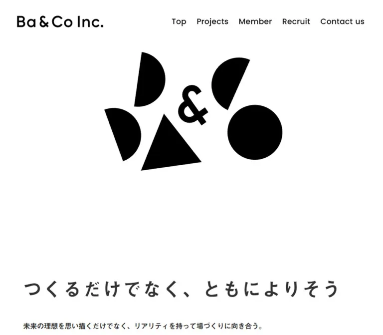
白と黒の幾何学図形、大きな欧文見出し、非対称の実績配置が特徴。自然な写真と丸みのあるセクション境界で、場づくりの事業を紹介する企業サイト。
オリジナルサイトを見るBlack geometric forms, generous white space, and photographs of people making places together.
Website: ba-and.co Original URL: https://ba-and.co/ Final URL: https://ba-and.co/ Theme: predominantly white, with cool gray section treatments and a near-black contact panel. Inspected: September 17, 2026, 05:34 JST. Supplied retrieval timestamp: September 16, 2026, 20:34:58.673 UTC. Viewports: 1440 × 1000 desktop and 390 × 844 mobile, in CSS pixels. Scope: the current corporate homepage: opening graphic, company message, selected projects, service descriptions, co-ba business entries, news, company-information link, contact banner, and footer. Linked pages and the open mobile menu were not inspected.
Ba & Co Inc.’s homepage presents its planning, design, and operation of places through an unusually spacious corporate composition. A small family of black circles, semicircles, and a triangle occupies the opening screen. The company message arrives near the lower edge of the first viewport. Large Poppins section titles then organize a long sequence of projects and business information.
The design combines three different kinds of geometry: sharply cut black artwork, broad section surfaces with rounded upper corners, and restrained outlined controls. Photography brings warmth through wood, daylight, pale interiors, and people working together. Most interface text remains charcoal. Color belongs primarily to the photographs.
The responsive design preserves its character through selective changes. The desktop navigation becomes a menu button, typography becomes smaller, service descriptions move below their labels, and the footer stacks vertically. Project metadata retains an alternating left/right rhythm even on mobile. Reproducing that asymmetry and the generous opening space matters more than adding decorative effects.
Black geometric forms, generous white space, and photographs of people making places together.
Website: ba-and.co Original URL: https://ba-and.co/ Final URL: https://ba-and.co/ Theme: predominantly white, with cool gray section treatments and a near-black contact panel. Inspected: September 17, 2026, 05:34 JST. Supplied retrieval timestamp: September 16, 2026, 20:34:58.673 UTC. Viewports: 1440 × 1000 desktop and 390 × 844 mobile, in CSS pixels. Scope: the current corporate homepage: opening graphic, company message, selected projects, service descriptions, co-ba business entries, news, company-information link, contact banner, and footer. Linked pages and the open mobile menu were not inspected.
Ba & Co Inc.’s homepage presents its planning, design, and operation of places through an unusually spacious corporate composition. A small family of black circles, semicircles, and a triangle occupies the opening screen. The company message arrives near the lower edge of the first viewport. Large Poppins section titles then organize a long sequence of projects and business information.
The design combines three different kinds of geometry: sharply cut black artwork, broad section surfaces with rounded upper corners, and restrained outlined controls. Photography brings warmth through wood, daylight, pale interiors, and people working together. Most interface text remains charcoal. Color belongs primarily to the photographs.
The responsive design preserves its character through selective changes. The desktop navigation becomes a menu button, typography becomes smaller, service descriptions move below their labels, and the footer stacks vertically. Project metadata retains an alternating left/right rhythm even on mobile. Reproducing that asymmetry and the generous opening space matters more than adding decorative effects.
| Name | Value | Suggested token | Role and evidence |
|---|---|---|---|
| White | #ffffff |
--color-paper |
Measured body, opening, service, and About surfaces; measured reversed contact and news text |
| Graphic Black | #000000 |
--color-black |
Measured project-date text; visually consistent with the opening shapes and wordmark |
| Near Black | #111111 |
--color-strong |
Measured navigation and large outline-link labels; the contact background visually approximates this value |
| Charcoal | #333333 |
--color-text |
Measured Japanese copy, main section titles, service labels, footer text, and menu icon |
| Cool Gray | approximately #e1e5e7 |
--color-field |
Estimated project-tail background in the middle desktop capture; exact backing-layer color was not supplied |
| Pale Blue Gray | approximately #e7eef1 |
--color-decoration |
Estimated large background geometry around the service introduction |
The source exposes --s-color-76b3de62: #333333ff, matching the measured charcoal text. The white canvas and black artwork are the dominant visual relationship; there is no observed bright action color.
The project section’s sampled element has a transparent background even though its scrolled screenshot shows a gray field. Its visible appearance therefore depends on another layer, a background treatment, or a different captured state. Do not interpret the transparent declaration as evidence that the section should appear white.
The source also declares --rebranding-loading-bg: #e5e5e5 and --rebranding-loading-bar: #222. These are loading-related variables, not evidence of a visible loading-screen composition. The settled screenshots do not show that screen.
Numerous --g-color-* values are transparent, with associated gradient-position variables. Their presence does not establish a visible multicolor gradient. Use the actual rendered surfaces as the visual authority.
No theme selector or user-controlled color mode was observed.
Measured family: Poppins, also declared through source variable --s-font-21a1aa6f.
Poppins supplies the rounded, geometric English navigation, large section headings, dates, external-link labels, contact action, and footer utilities. The predominant measured weight is 500. A few subgroup labels use 600.
Its large circular forms connect the typography to the opening graphic. Preserve the moderate weight: most English headings are medium rather than heavy bold.
Measured family: '見出ゴMB31 JIS2004', declared through source variable --s-font-66a247f5.
The family is applied to the main Japanese message, explanatory copy, service names, news links, and project titles, including Latin project names. Measured weights are generally 400, with 500 on the main message and project titles.
Several explanatory paragraphs use slightly negative tracking, while the main Japanese message uses positive tracking. This contrast gives the message a deliberate, spacious rhythm without spreading every paragraph apart.
The font name is directly evidenced. Font files, licensing, and a complete fallback stack were not supplied. A replacement Japanese sans-serif is an implementation fallback, not an exact reproduction.
The wordmark appears inside a home link whose extracted text is empty. Its appearance should be treated as brand artwork; the evidence does not identify a text font for the logo.
The mobile menu button explicitly uses Material Icons, with a measured 40px font size and line height. Arrow ligatures such as arrow_forward and arrow_upward appear elsewhere in the DOM. Render them as icons, never as literal interface words.
Lato is declared in a source custom property but has no demonstrated role among the sampled visible elements. The Times family on the document root is likewise not representative of the visible design.
All values in this table are measured. Sizes are written as font size / line height.
| Role | Desktop | Mobile | Family and weight |
|---|---|---|---|
| Primary navigation | 21 / 29.4px |
Replaced by menu button | Poppins, 500 |
| Japanese company message | 54 / 81px |
28 / 42px |
Japanese family, 500 |
| Opening explanatory copy | 20 / 40px |
16 / 32px |
Japanese family, 400 |
| Projects heading | 72 / 100.8px |
36 / 50.4px |
Poppins, 500 |
| What we do heading | 72 / 72px |
40 / 40px |
Poppins, 500 |
| Company division headings | 54 / 81px |
32 / 48px |
Poppins, 500 |
| News heading | 72 / 108px |
36 / 54px |
Poppins, 500 |
| About us heading | 72 / 108px |
40 / 60px |
Poppins, 500 |
| Project title | 28 / 50.4px |
20 / 26px |
Japanese family, 500 |
| Project date | 15 / 27px |
12 / 21.6px |
Poppins, 500 |
| Project category tag | 16 / 16px |
14 / 14px |
Japanese family, 400 |
| Project category navigation | 28 / 39.2px |
14 / 19.6px |
Japanese family, 400 |
| Section utility label | 16 / 22.4px |
16 / 22.4px |
Poppins, 500 |
| Service introduction copy | 20 / 36px |
14 / 25.2px |
Japanese family, 400 |
| Division introduction copy | 18 / 32.4px |
14 / 25.2px |
Japanese family, 400 |
| Numbered service title | 28 / 56px |
20 / 40px |
Japanese family, 400 |
| Service scope item | 16 / 16px |
14 / 14px |
Japanese family, 400 |
| Standard co-ba entry name | 28 / 50.4px |
20 / 36px |
Poppins, 500 |
| Go to site | 18 / 32.4px |
18 / 32.4px |
Poppins, 500 |
| News date and article link | 20 / 30px |
16 / 24px |
Poppins 500 for dates; Japanese family 400 for links |
| More Projects / View More | 30 / 30px |
18 / 18px |
Poppins, 500 |
| Contact us heading | 54 / 81px |
36 / 54px |
Poppins, 500 |
| Contact explanatory copy | 18 / 32.4px |
14 / 25.2px |
Japanese family, 400 |
| CONTACT label | 24 / 43.2px |
20 / 36px |
Poppins, 500 |
| Footer address | 16 / 28.8px |
14 / 25.2px |
Poppins, 500 |
| Privacy policy | 16 / 28.8px |
16 / 28.8px |
Poppins, 500 |
| Copyright | 12 / 21.6px |
12 / 21.6px |
Poppins, 500 |
The two-line co-ba yokohama kannai name has tighter measured leading: 35px on desktop and 25px on mobile.
| Treatment | Measured relationship | Use |
|---|---|---|
| Spacious message | 0.05em |
Main Japanese statement at both widths |
| Lightly tracked English | 0.02em |
Navigation, project dates, news dates, CONTACT |
| Project title and tags | 0.02em |
Consistent metadata rhythm |
| Compact Japanese paragraphs | commonly -0.05em |
Opening copy, service introduction, several service descriptions |
| Compact service scope | generally -0.02em |
Short service-list items |
| Footer utilities | 0.05em |
Address, privacy link, copyright |
One long mobile service item has -0.15em tracking. Treat that as a local fitting exception, not a general typography token. For an adaptation, allowing wrapping is preferable to applying that compression throughout the interface.
The site uses percentage-based horizontal alignment and individually chosen vertical spaces. A universal 8px spacing system is not demonstrated by the evidence.
| Element | Desktop measurement | Mobile measurement | Calculated relationship |
|---|---|---|---|
| Main content left edge | 86.41px |
23.41px |
Approximately 6vw |
| Main content width | 1267.19px |
343.19px |
Approximately 88vw |
| Header wordmark left edge | 64.80px |
23.41px |
Approximately 4.5vw desktop, 6vw mobile |
| Footer / About action left edge | 100.80px |
27.30px |
Approximately 7vw |
| Footer / About action width | 1238.39px |
335.39px |
Approximately 86vw |
| News content left edge | 181.30px |
49.09px |
Approximately 12.59vw |
| News content width | 1077.38px |
291.78px |
Approximately 74.82vw |
| Right-aligned project metadata start | 580.61px |
92.05px |
Main gutter plus approximately 39% / 20% of the main container |
| Right-aligned project metadata width | 772.98px |
274.55px |
Approximately 61% / 80% of the main container |
The news inset is substantially deeper than the general content gutter. The footer uses a third alignment, slightly inside the main gutter. Avoid collapsing all three into one generic container.
| Use | Desktop | Mobile | Evidence |
|---|---|---|---|
| Gap between desktop navigation links | 28px |
Not applicable | Calculated from adjacent link rectangles |
| Message-to-explanation gap | 44px |
44px |
Calculated from text bounds |
| Projects heading inset from section top | 115px |
80px |
Calculated from section and heading coordinates |
| What we do heading inset from section top | 193px |
80px |
Calculated from section and heading coordinates |
| What we do heading-to-copy gap | 41px |
24px |
Calculated from text bounds |
| About heading inset from section top | 160px |
108px |
Calculated from section and heading coordinates |
| About heading-to-copy gap | 24px |
24px |
Calculated |
| About copy-to-action gap | 24px |
24px |
Calculated |
| Contact heading-to-copy gap | 16px |
16px |
Calculated |
| Contact copy-to-action gap | 22px |
22px |
Calculated |
| External-link horizontal padding | 20px |
20px |
Measured |
| Wide outline-link horizontal padding | 40px |
10px |
Measured |
| Mobile footer logo-to-address gap | Not applicable | 30px |
Calculated |
| Mobile footer address-to-return gap | Not applicable | 18px |
Calculated |
| Mobile return-to-social gap | Not applicable | 60px |
Calculated |
| Element | Desktop | Mobile | Evidence |
|---|---|---|---|
| Projects, What we do, About upper corners | 60px 60px 0 0 |
30px 30px 0 0 |
Measured |
| More Projects / View More | 4px |
4px |
Measured |
| Go to site | 4px |
4px |
Measured |
| Sampled tag text elements | 2px |
2px |
Measured; enclosing tag border was not separately sampled |
| CONTACT | 60px |
60px |
Measured; produces a capsule at these heights |
| Return-to-top control | 32px on a 50px square |
Same | Measured; visibly circular |
| Visible team and contact photographs | Approximately 0 |
No contrary visible evidence | Screenshot observation |
Large radii belong to section boundaries. Small links remain almost square, while the contact action is a deliberate capsule. These are separate shape roles.
| Element | Desktop | Mobile | Status |
|---|---|---|---|
| Full document height | 9924.86px |
8327.17px |
Measured snapshot state |
| Opening viewport-sized section | 1440 × 1000px |
390 × 844px |
Measured |
| Header wordmark link | 236 × 32.02px |
180 × 24.42px |
Measured link bounds |
| Opening graphic footprint | Approximately 554 × 477px |
Approximately 238 × 160px |
Estimated visible artwork bounds |
| More Projects link | 1267.19 × 80px |
343.19 × 60px |
Measured |
| What we do photograph | Approximately 697 × 393px |
Not separately measured | Desktop screenshot estimate, approximately 16:9 |
| Go to site link | 220 × 48px |
274.55 × 48px |
Measured |
| CONTACT link | 444.39 × 67.19px |
304.19 × 58px |
Measured |
| Return-to-top link | 50 × 50px |
50 × 50px |
Measured |
| Footer wordmark link | 280 × 50px |
236 × 44.02px |
Measured link bounds |
Artwork bounds and link bounds describe different things. Do not derive a logo font size from its containing anchor.
Role: identity and access to the main corporate destinations.
The desktop header contains a home-linked wordmark on the left and seven text links on the right: Top, About, Projects, Members, Recruit, News, and Contact. Navigation uses Poppins 21px, weight 500, with 0.02em tracking and approximately 28px gaps.
The desktop logo link starts at x = 64.80px, y = 43px; navigation starts around y = 44.31px. Both share a visual center near 59px from the viewport top.
On mobile, the logo link is 180px wide and starts at x = 23.41px, y = 51px. A 40 × 40px menu button sits at x = 326.59px, y = 43px. The desktop navigation links are absent from the visible mobile link inventory.
The header remains at the top across the supplied scrolled screenshots. Its exact position declaration was not supplied, so fixed versus sticky implementation is unverified. It visibly overlays underlying content without a consistently opaque backing. In the mobile contact capture, the dark logo and menu overlap a dark region and lose contrast.
Destinations evidenced by hrefs: About and Projects lead to internal routes; Recruit leads to the company’s Wantedly projects page; News targets #news; Contact leads to /contact. The open-menu layout and transition are unknown.
Role: establishes the brand before the informational content begins.
The current desktop frame shows one full black circle, three semicircular forms, and one triangular wedge. The forms have sharp edges, no outlines, no visible texture, and no shadows. Their rotations and near-tangent contacts create an assembled, slightly precarious composition.
The visible desktop group occupies approximately x = 464–1018px, y = 138–615px. The mobile group occupies approximately x = 85–323px, y = 277–437px. The mobile composition is much smaller in absolute size but retains a substantial white surround.
The two captured arrangements differ in orientation and spacing. The evidence does not establish whether these differences come from responsive art direction, an animation phase, or both. Preserve the family of shapes; do not claim a specific rotation loop, duration, or scroll-linked sequence.
For an implementation, use authorized vector artwork or an explicitly labeled static interpretation. Keep it decorative and separate from the readable company message.
Role: introduces the company’s position after the opening visual pause.
The source message is “つくるだけでなく、ともによりそう”. Its measured desktop text box begins at y = 970px, so the first desktop screenshot reveals only the beginning of its lettering at the bottom edge. On mobile it begins at y = 773.33px, wrapping into two lines within a 343.19px column.
The message is left aligned to the main 6% gutter. It uses the Japanese family at 54px desktop and 28px mobile, with 1.5 leading and 0.05em tracking. The explanatory paragraph follows after a measured 44px gap and uses spacious 2.0 leading.
The desktop paragraph is approximately 665px wide. On mobile it expands to the available main-content width and occupies four measured lines. Preserve the separate typographic treatment of statement and explanation.
Role: introduces selected work and provides access to work by discipline.
The desktop Projects heading shares a horizontal band with the small Section: label and three category links: “企画”, “運営”, and “設計”. Each category combines a Japanese label with a forward arrow. These are route links to planning, operation, and design project pages; no in-place filtering interaction was demonstrated.
On mobile, the heading sits above the category row. Section: remains 16px, while category labels reduce from 28px to 14px. Each category anchor measures 72 × 36px, and the three links fit on one line beside the utility label at the inspected width.
Role: identifies a project, its date, and its service/category labels.
The repeated text anatomy is:
500.500.Observed entries include YAMAGIWA NAGOYA SHOWROOM, CINOVA YAMANASHI, SOCIAL INTERIOR, and a regional satellite-office program. Dates use a year/month format. Category labels combine Japanese service names with uppercase English categories such as OTHER, INCUBATION, and WORKPLACE.
The first and third titles align to the main left gutter. The second and fourth occupy a right-aligned column. On desktop that column is approximately 61% of the main container; on mobile it remains approximately 80%. This surviving mobile asymmetry is a defining detail.
Titles change from 28px / 1.8 on desktop to 20px / 1.3 on mobile. The tighter mobile leading limits the vertical cost of long names. Category text changes only from 16px to 14px, maintaining a useful size relative to the title.
The middle desktop screenshot shows thin rectangular tag borders with very small corner rounding. Individual project image dimensions and project-detail destinations were not supplied in the sampled elements. Do not assume the entire entry is a verified clickable card or that all images share one aspect ratio.
Role: offers a broad, quiet route to more content.
More Projects spans the main content width. View More in the About section uses the slightly narrower 86% container. Both are 80px high on desktop and 60px high on mobile, with a measured 4px radius.
The label is centered independently of a small right-edge arrow. The desktop More Projects screenshot shows a dark outline approximately 2px thick, no fill distinct from the section, and no shadow. Its label uses 30px Poppins; mobile uses 18px.
The extracted text includes both backward and forward arrow ligatures, but only a forward arrow is visible in the resting screenshot. This is not evidence of carousel controls. The complete link points to one destination.
Role: connects the company’s abstract identity to its people and work.
A white section with large rounded upper corners rises against the preceding gray field. Its desktop introduction is a two-column composition: title and explanatory copy on the left, a landscape photograph on the right.
The measured copy column is approximately 469px wide. The screenshot places the photograph around x = 657px, with a width near 697px. Within the main container, this approximates a 37% / 8% gap / 55% arrangement.
The heading is 72px with unusually compact 1.0 leading. A 41px gap separates it from the Japanese paragraph. Large pale geometric decorations are cropped by the page edges behind the content. Their low contrast keeps the photograph and text dominant.
At 390px, the heading is 40px / 1.0, and the copy spans the main container below it with a 24px gap. The supplied mobile DOM does not separately measure the photograph, so its exact crop and spacing remain unverified.
Role: explains the studios Company service structure.
The division begins with a 54px Poppins heading on desktop and 32px on mobile, followed by compact Japanese explanatory copy. Three numbered groups follow: planning/production, facility-operation planning, and spatial design.
Each group combines a small two-digit number, a Japanese service title, a short description, and five scope items. On desktop the title and description sit toward the left while scope items form three columns to the right. The first group’s scope text centers are approximately 681px, 921px, and 1161px, with a second row below.
On mobile, scope items move below the title/description and form two columns. Their measured row starts are 60px apart, compared with 68px on desktop. Service-group number positions are 187px apart on desktop and 305px apart on mobile, reflecting the additional wrapping and vertical stacking.
These items appear as ordinary text in the evidence. No accordion, disclosure, selection state, or interactive service filter was observed. Preserve the numbered information hierarchy without inventing those behaviors.
Role: presents operated workplaces and the wider co-ba business.
The co-ba Company heading and explanatory copy precede two direct-location entries and one broader business entry. Each includes a short descriptor, a place or business name, a service description, and a Go to site link.
Desktop identity text begins around x = 404.41px, descriptive text around 710.66px, and the external-link control around 1072.77px. This establishes a horizontal information row. The unsampled area to the left should not be assigned invented imagery or dimensions.
On mobile, the measured entry text and action share x = 57.72px, inside a column approximately 274.55px wide. The title, description, and action stack. Go to site remains 48px high and 18px in type size, while its width expands from 220px desktop to the mobile entry width.
The three observed destinations are the Ebisu location, Yokohama Kannai location, and main co-ba website. Their destination-page designs were not inspected.
Role: provides recent company updates with a compact editorial rhythm.
Five dated article links are present. Desktop dates occupy the left column, with article titles beginning approximately 194px to their right. The text region is narrower than the principal content container.
On mobile each date appears above its article title with a measured 5px gap. Entries have approximately 20px between the end of one title and the next date. Long article names wrap naturally into multiple 24px lines.
Both the heading and article content compute to white. The backing surface was not included in the supplied visual captures or sampled parent styles, so its exact color and decoration are unknown. A dark neutral backing in the Quick Start is a recommendation consistent with the measured white type.
Article links lead to the company’s note pages. Their article content and navigation behavior were not opened.
Role: provides a calm transition from updates to company information.
This is a centered text section on white with rounded upper corners. It contains the English heading, a short Japanese sentence, and a nearly full-width View More link.
The measured section height is 632px desktop and approximately 352.80px mobile. The heading starts 160px below the section top on desktop and 108px below it on mobile. Heading-to-copy and copy-to-action gaps are both 24px.
Use this as a spacious navigation section. No modal or expandable company profile was demonstrated; the link leads to /about-us.
Role: the homepage’s strongest invitation to start a conversation.
The desktop capture shows a full-width band divided into a photograph on the left and a near-black panel on the right. The photograph occupies approximately 38% of the width and depicts a person moving through a pale curtained interior. The panel occupies approximately 62%.
The panel centers a white Contact us heading, one line of Japanese explanatory copy, and a white outlined CONTACT capsule. The action measures 444.39 × 67.19px, with a 60px radius. Its child label has 10px vertical and 160px horizontal padding. The child-to-parent measurements are consistent with a 2px desktop outline.
On mobile, the photograph precedes the dark panel vertically. Only the photograph’s lower portion is visible in the supplied footer capture; this is a scrolled crop, not evidence that the full photograph is only that tall. The dark panel centers the heading and action, while the explanatory paragraph is left aligned and wraps onto two lines.
The mobile action measures 304.19 × 58px, about 78% of viewport width. Its child has 10px vertical padding and no fixed horizontal padding; the parent/child dimensions are consistent with a 1px outline. The action leads to /contact; the contact form itself was not inspected.
Role: company identity, address, social destinations, legal information, and return navigation.
The desktop footer is spacious and white. The wordmark sits on the left; the three-line address/contact block sits toward the right; a 50px circular upward-arrow link sits farther right. A lower row places Privacy policy on the left and four monochrome social marks on the right. Copyright is centered near the bottom.
The visible social order is Facebook, Instagram, note, and Wantedly. Measured artwork-link boxes are approximately 28 × 28px, 27 × 27px, 55 × 12px, and 34 × 24px. Their differing proportions should remain intact.
The mobile footer changes to a left-aligned sequence: wordmark, address, return-to-top circle, social marks, privacy link, and copyright. The larger footer wordmark remains noticeably more prominent than the header logo. Address type reduces to 14px, but the privacy link remains 16px and copyright remains 12px.
The return link targets #header. Its position belongs to the footer content; it is not shown as a floating corner control. The displayed email appears in a paragraph in the supplied evidence, so a mailto interaction is not verified.
| Target | Supplied declaration | What can be concluded |
|---|---|---|
| Most links and text elements | 0.3s cubic-bezier(0.4, 0.4, 0, 1) |
A common 300ms transition vocabulary is declared; specific hover endpoints are unknown |
| Body background | background 0.5s cubic-bezier(0.4, 0.4, 0, 1) |
Background changes can transition over 500ms; the triggering logic was not supplied |
| Message wrapper and Projects section | 0.2s cubic-bezier(0.4, 0.4, 0, 1) |
Shorter section-level transition declaration |
| Desktop What we do section | 0.8s |
An 800ms transition is declared; its visual property changes are unverified |
| Desktop About section | 0.8s ease-in-out |
Slower section-level transition declaration |
| Mobile What we do and About sections | 0.3s cubic-bezier(0.4, 0.4, 0, 1) |
The supplied mobile declarations differ from their desktop counterparts |
Sampled elements report animation: none. This does not prove that the graphic, pseudo-elements, scripts, or unsampled descendants are static.
Recommended adaptation: use the measured 300ms easing for restrained color or opacity feedback. Keep any decorative geometry optional under reduced motion. Do not add parallax, spring effects, scroll snapping, or a loading sequence and describe them as original behavior.
| Surface | Appearance | Design function |
|---|---|---|
| Opening canvas | Pure white with solid black forms | Establishes identity through shape and empty space |
| Project-tail field | Cool gray in the supplied scrolled capture | Separates the selected-work area from the next white section |
| Service section | White, rounded upper corners, pale cropped geometry | Gives a broad container to explanatory content |
| Metadata labels | Small dark outlined rectangles | Communicates categories without introducing accent colors |
| Wide route links | Transparent fill, dark outline, slight corner rounding | Creates large interactive targets without visual heaviness |
| News content | Measured white typography; backing not fully evidenced | A reversed text treatment within the page sequence |
| Contact panel | Visually near black with white text and outline | Concentrates contrast around the contact route |
| Footer | White, unboxed, widely spaced | Ends the page with clear identity and utilities |
No visible shadow-based elevation system is needed for the observed components. Hierarchy comes from scale, whitespace, alignment, outlined boundaries, and large changes in surface tone.
The opening graphic is abstract and entirely monochrome. Photography is natural in color and grounded in actual activity. The visible service photograph shows four people gathered around laptops in a bright interior, with warm wood and cool window light. The contact photograph shows a person entering or moving through an interior with pale curtains.
Keep photographs rectangular and let their content provide warmth. Avoid applying a blanket grayscale filter merely because the interface is monochrome. The combination of black graphic forms and ordinary human activity is central to the page’s tone.
Large pale geometric decorations echo the hero vocabulary around the service content. They sit behind the reading layer and can be cropped by viewport edges. They should not become additional foreground illustrations competing with the photographs.
| Asset role | Evidence | Reuse guidance |
|---|---|---|
| Header and footer wordmark | Current desktop and mobile screenshots; home-link bounds | Supply authorized brand artwork; no original font or complete asset URL is established |
| Opening black geometry | Both current opening screenshots | Preserve circle, semicircle, and triangle vocabulary; animation source is unknown |
| Team photograph | Middle desktop screenshot | Landscape image, approximately 16:9 in this rendering |
| Contact photograph | Desktop and mobile closing screenshots | Preserve the person and curtained setting when selecting a crop |
| Pale background forms | Middle desktop screenshot | Decorative, low contrast, cropped outside the content area |
| Social marks | Footer screenshots and linked elements | Retain individual brand proportions and monochrome presentation |
The DOM excerpt contains truncated image-URL references, but no complete usable image paths for these assets. Do not reconstruct filenames from those fragments. The Quick Start therefore supplies layout styling without inventing downloadable asset URLs.
The homepage is a long scrolling document, measured at approximately 9925px in the supplied desktop state. Its content order is opening graphic → company message → selected projects → What we do → studios Company services → co-ba Company entries → News → About us → Contact us → footer.
Main content generally occupies 88% of viewport width. Selected project metadata alternates between the left edge and a narrower column aligned to the right edge. The service introduction pairs text with a larger photograph. Service scopes and business entries use horizontal arrangements. News places dates beside titles. The closing contact banner splits photograph and text side by side.
At 390px, the measured document is approximately 8327px high. It is shorter overall even though some sections become taller: project spacing and image-related areas contract, while services gain height through stacking.
| Component | Observed mobile change |
|---|---|
| Header | Seven navigation links replaced by one menu button |
| Opening | Smaller geometric group with extensive space above and below |
| Company message | Two lines at 28px; paragraph becomes four lines at 16px |
| Project navigation | Moves below the Projects heading |
| Project metadata | Alternating alignment remains; right column becomes 80% of the main container |
| Large section corners | Reduce from 60px to 30px |
| Service scope lists | Three columns beside the title become two columns below it |
| co-ba entries | Text fields and external action stack within a narrower inset column |
| News | Dates move above titles; reading width remains deeply inset |
| About | Retains centered alignment and a wide outline link |
| Contact | Photograph precedes the dark content panel |
| Footer | Identity, address, return control, social links, legal link, and copyright stack left aligned |
The excerpt contains a max-width: 1080px media query for responsive line-break rules. It does not establish that every layout change happens at that breakpoint. Only the two stated viewports were supplied; tablet and landscape behavior remain unverified.
The opening artwork and message have overlapping section bounds in the sampled DOM. Later rounded sections also overlap preceding section rectangles. Preserve the rendered composition when adapting the design, but do not convert those sampled overlaps into arbitrary negative margins throughout the page.
Recommended implementation approach: use normal document flow for meaningful content, explicit layering for decorative surfaces, and a small set of component-specific responsive rules. Keep content readable at intermediate widths and at text zoom levels beyond the inspected conditions.
500.These are improvements for an adaptation, not verified original features:
44 × 44px while retaining the visual icon dimensions where practical.#ffffff, measured.#333333, measured.#111111, measured.#e1e5e7, visual estimate.#e7eef1, visual estimate.#111111, with white text and an outlined action.“Create a Japanese corporate homepage for a company working in spatial planning, design, and operations. Use a white canvas, solid black circle/semicircle/triangle artwork, charcoal text, medium-weight Poppins English headings, and a substantial Japanese sans-serif for body copy. Begin with a spacious geometric composition and place the company message near the lower edge of the first viewport. Organize projects with alternating metadata alignment, then introduce the team through a two-column text-and-photograph section. Use numbered service groups, co-ba business entries, an editorial news list, a centered company-information section, a dark contact banner, and a spacious white footer. Keep large radii on section tops, small radii on outlined route links, and a capsule only for the contact action. On mobile preserve the project asymmetry while stacking services, news dates, contact content, and footer information. Treat unverified motion and menu behavior as implementation choices.”
This is an implementation adaptation, not extracted source CSS. It preserves the principal measured sizes and alignment relationships. The gray colors, news backing, intermediate breakpoints, and normal-flow section spacing are recommendations. Supply authorized wordmark, geometry, photography, and font assets separately.
The example does not implement menu behavior or an inferred hero animation. The header’s optional dark tone must be set by the application when needed. The CSS has not been browser-tested in this analysis.
:root {
  /* Measured interface colors */
  --color-paper: #ffffff;
  --color-black: #000000;
  --color-strong: #111111;
  --color-text: #333333;

  /* Visual approximations */
  --color-field: #e1e5e7;
  --color-decoration: #e7eef1;

  /* Observed families with recommended fallbacks */
  --font-latin: 'Poppins', sans-serif;
  --font-japanese: '見出ゴMB31 JIS2004', sans-serif;
  --weight-regular: 400;
  --weight-medium: 500;

  /* Calculated horizontal relationships */
  --gutter-main: 6%;
  --gutter-footer: 7%;
  --gutter-header: 4.5%;
  --width-news: 74.8%;

  /* Desktop measurements */
  --text-message: 54px;
  --text-section: 72px;
  --text-company: 54px;
  --text-project: 28px;
  --text-project-date: 15px;
  --text-tag: 16px;
  --text-wide-link: 30px;
  --radius-section: 60px;
  --radius-link: 4px;
  --radius-contact: 60px;
  --height-wide-link: 80px;
  --project-offset-width: 61%;

  /* Measured timing; state changes below are recommendations */
  --ease-site: cubic-bezier(0.4, 0.4, 0, 1);
  --duration-ui: 300ms;
}

* { box-sizing: border-box; }

body {
  margin: 0;
  color: var(--color-text);
  background: var(--color-paper);
  font-family: var(--font-japanese);
  font-weight: var(--weight-regular);
}

img, svg { display: block; max-width: 100%; }
a { color: inherit; }
button { font: inherit; }
h1, h2, h3, p { margin: 0; }

.container {
  width: 88%;
  margin-inline: auto;
}

/* Fixed positioning is an adaptation of the persistent appearance. */
.site-header {
  position: fixed;
  inset: 43px 0 auto;
  z-index: 20;
  display: flex;
  align-items: center;
  justify-content: space-between;
  padding-inline: var(--gutter-header);
  color: var(--color-black);
}

.site-brand { display: block; width: 236px; }
.site-brand img, .site-brand svg { width: 100%; height: auto; }

.site-nav {
  display: flex;
  align-items: center;
  gap: 28px;
  color: var(--color-strong);
  font: 500 21px / 1.4 var(--font-latin);
  letter-spacing: 0.02em;
}

.site-nav a { text-decoration: none; }
.menu-toggle { display: none; }

/* Recommended inverse treatment; supply a compatible logo asset. */
.site-header[data-tone='dark'],
.site-header[data-tone='dark'] .site-nav {
  color: var(--color-paper);
}

/* Approximate staging; use a picture element for responsive artwork. */
.hero-stage {
  position: relative;
  min-height: 81svh;
  background: var(--color-paper);
}

.hero-mark {
  position: absolute;
  top: 14svh;
  left: 50%;
  width: min(61vw, 560px);
  transform: translateX(-50%);
  pointer-events: none;
}

.hero-mark img, .hero-mark svg { width: 100%; height: auto; }

.mission { padding-block: 160px 80px; }
.mission-title {
  font: 500 var(--text-message) / 1.5 var(--font-japanese);
  letter-spacing: 0.05em;
}
.mission-copy {
  max-width: 665px;
  margin-top: 44px;
  font-size: 20px;
  line-height: 2;
  letter-spacing: -0.05em;
}

.rounded-section {
  border-radius: var(--radius-section) var(--radius-section) 0 0;
}

.section-title {
  font: 500 var(--text-section) / 1.5 var(--font-latin);
}

.projects {
  margin-top: 80px;
  padding-block: 115px 120px;
  background: var(--color-field);
}

.projects-heading {
  display: flex;
  flex-wrap: wrap;
  align-items: center;
  gap: 24px 42px;
}
.projects-heading .section-title { line-height: 1.4; }

.project-categories {
  display: flex;
  flex-wrap: wrap;
  align-items: center;
  gap: 15px 30px;
}
.project-categories > span {
  font: 500 16px / 1.4 var(--font-latin);
}
.project-categories a {
  display: inline-flex;
  align-items: center;
  gap: 16px;
  text-decoration: none;
  font-size: 28px;
  line-height: 1.4;
}

/* Apply the evidenced stagger to metadata, not unmeasured media. */
.project-meta--offset {
  width: var(--project-offset-width);
  margin-inline-start: auto;
}
.project-title {
  font: 500 var(--text-project) / 1.8 var(--font-japanese);
  letter-spacing: 0.02em;
}
.project-date {
  color: var(--color-black);
  font: 500 var(--text-project-date) / 1.8 var(--font-latin);
  letter-spacing: 0.02em;
}
.project-tags {
  display: flex;
  flex-wrap: wrap;
  gap: 8px;
  margin-top: 12px;
}
.project-tag {
  padding: 3px 6px;
  border: 1px solid currentColor;
  border-radius: 2px;
  font-size: var(--text-tag);
  line-height: 1;
  letter-spacing: 0.02em;
}

.outline-link {
  position: relative;
  display: flex;
  align-items: center;
  justify-content: center;
  min-height: var(--height-wide-link);
  padding-inline: 40px;
  border: 2px solid currentColor;
  border-radius: var(--radius-link);
  color: var(--color-strong);
  text-decoration: none;
  font: 500 var(--text-wide-link) / 1 var(--font-latin);
}
.outline-link .arrow {
  position: absolute;
  right: 40px;
  font-size: 24px;
}

.what-section {
  position: relative;
  padding-block: 193px 120px;
  background: var(--color-paper);
}
.what-intro {
  display: grid;
  grid-template-columns: 37% 55%;
  gap: 8%;
  align-items: start;
}
.what-title { line-height: 1; }
.what-copy {
  margin-top: 41px;
  font-size: 20px;
  line-height: 1.8;
  letter-spacing: -0.05em;
}
.what-photo {
  width: 100%;
  aspect-ratio: 16 / 9;
  object-fit: cover;
}
.company-title {
  font: 500 var(--text-company) / 1.5 var(--font-latin);
}

/* Grid implementation is recommended; text-column counts are observed. */
.service-row {
  display: grid;
  grid-template-columns: 37% minmax(0, 1fr);
  gap: 4%;
  padding-block: 40px;
}
.service-heading {
  display: grid;
  grid-template-columns: auto minmax(0, 1fr);
  align-content: start;
  gap: 10px;
}
.service-number { font: 500 16px / 1 var(--font-latin); }
.service-title { font-size: 28px; font-weight: 400; line-height: 2; }
.service-scope {
  display: grid;
  grid-template-columns: repeat(3, minmax(0, 1fr));
  gap: 52px 12px;
  margin: 0;
  padding: 0;
  list-style: none;
  font-size: 16px;
  line-height: 1;
  letter-spacing: -0.02em;
}

.external-link {
  display: inline-flex;
  align-items: center;
  justify-content: center;
  gap: 20px;
  width: 220px;
  min-height: 48px;
  padding-inline: 20px;
  border: 1px solid currentColor;
  border-radius: 4px;
  text-decoration: none;
  font: 500 18px / 1.8 var(--font-latin);
}

/* Dark news backing is recommended; original backing is unmeasured. */
.news-section {
  padding-block: 100px;
  color: var(--color-paper);
  background: var(--color-strong);
}
.news-inner { width: var(--width-news); margin-inline: auto; }
.news-list { display: grid; gap: 20px; margin-top: 45px; }
.news-item {
  display: grid;
  grid-template-columns: 18% minmax(0, 1fr);
  font-size: 20px;
  line-height: 1.5;
}
.news-item time {
  font-family: var(--font-latin);
  font-weight: 500;
  letter-spacing: 0.02em;
}
.news-item a { text-decoration: none; }

.about-section {
  padding: 160px var(--gutter-footer) 200px;
  background: var(--color-paper);
  text-align: center;
}
.about-copy { margin-block: 24px; font-size: 20px; line-height: 1.8; }

.contact-band {
  display: grid;
  grid-template-columns: 38% minmax(0, 1fr);
  background: var(--color-strong);
  color: var(--color-paper);
}
.contact-photo { width: 100%; height: 100%; object-fit: cover; }
.contact-content { padding: 60px 24px 80px; text-align: center; }
.contact-title { font: 500 54px / 1.5 var(--font-latin); }
.contact-copy {
  margin: 16px auto 22px;
  font-size: 18px;
  line-height: 1.8;
  letter-spacing: -0.02em;
}
.contact-link {
  display: flex;
  align-items: center;
  justify-content: center;
  width: min(444.4px, 100%);
  min-height: 67.2px;
  margin-inline: auto;
  padding: 10px 24px;
  border: 2px solid currentColor;
  border-radius: var(--radius-contact);
  color: inherit;
  text-decoration: none;
  font: 500 24px / 1.8 var(--font-latin);
  letter-spacing: 0.02em;
}

.site-footer {
  padding: 160px var(--gutter-footer) 30px;
  background: var(--color-paper);
  font-family: var(--font-latin);
  font-weight: 500;
}
.footer-main {
  display: grid;
  grid-template-columns: minmax(0, 1fr) 305.34px 50px;
  gap: 75px;
  align-items: start;
}
.footer-brand { width: 280px; min-height: 50px; }
.footer-address { font-size: 16px; line-height: 1.8; letter-spacing: 0.05em; }
.return-top {
  display: grid;
  place-items: center;
  width: 50px;
  height: 50px;
  border: 2px solid currentColor;
  border-radius: 32px;
  text-decoration: none;
  font-size: 26px;
}
.footer-secondary {
  display: flex;
  align-items: center;
  justify-content: space-between;
  margin-top: 87px;
}
.social-links { display: flex; align-items: center; gap: 20px; order: 2; }
.privacy-link { order: 1; font-size: 16px; line-height: 1.8; letter-spacing: 0.05em; text-decoration: none; }
.copyright { margin-top: 49px; text-align: center; font-size: 12px; line-height: 1.8; letter-spacing: 0.05em; }

/* Recommended interaction feedback, not verified source hover states. */
a, button {
  transition: opacity var(--duration-ui) var(--ease-site);
}
@media (hover: hover) {
  .site-nav a:hover, .news-item a:hover { opacity: 0.65; }
}
:where(a, button):focus-visible {
  outline: 2px solid currentColor;
  outline-offset: 5px;
}
:where(#news, #header) { scroll-margin-top: 110px; }

/* Chosen header breakpoint; only source line-break rules confirm 1080px. */
@media (max-width: 67.5rem) {
  .site-header { padding-inline: 6%; }
  .site-brand { width: 180px; }
  .site-nav { display: none; }
  .menu-toggle {
    display: grid;
    place-items: center;
    width: 40px;
    height: 40px;
    padding: 0;
    border: 0;
    color: inherit;
    background: transparent;
  }
}

/* Chosen content breakpoint; endpoint values follow mobile evidence. */
@media (max-width: 48rem) {
  :root {
    --text-message: 28px;
    --text-section: 36px;
    --text-company: 32px;
    --text-project: 20px;
    --text-project-date: 12px;
    --text-tag: 14px;
    --text-wide-link: 18px;
    --radius-section: 30px;
    --height-wide-link: 60px;
    --project-offset-width: 80%;
  }
  .hero-stage { min-height: 82svh; }
  .hero-mark { top: 33svh; }
  .mission { padding-block: 80px 40px; }
  .mission-copy { font-size: 16px; }
  .projects { margin-top: 40px; padding-block: 80px 110px; }
  .projects-heading { display: block; }
  .project-categories { margin-top: 15px; gap: 13px 15px; }
  .project-categories a { min-height: 36px; font-size: 14px; }
  .project-title { line-height: 1.3; }
  .outline-link { padding-inline: 34px; }
  .outline-link .arrow { right: 10px; }
  .what-section { padding-block: 80px; }
  .what-intro { grid-template-columns: 1fr; gap: 32px; }
  .what-title { font-size: 40px; }
  .what-copy { margin-top: 24px; font-size: 14px; }
  .service-row { grid-template-columns: 1fr; gap: 32px; }
  .service-title { font-size: 20px; }
  .service-scope { grid-template-columns: repeat(2, minmax(0, 1fr)); gap: 46px 12px; font-size: 14px; }
  .external-link { width: 100%; }
  .news-list { margin-top: 35px; }
  .news-item { grid-template-columns: 1fr; gap: 5px; font-size: 16px; }
  .about-section { padding-block: 108px 48px; }
  .about-section .section-title { font-size: 40px; }
  .about-copy { font-size: 16px; }
  .contact-band { grid-template-columns: 1fr; }
  .contact-photo { height: auto; }
  .contact-content { padding: 40px 6% 48px; }
  .contact-title { font-size: 36px; }
  .contact-copy { font-size: 14px; text-align: left; }
  .contact-link { width: min(78vw, 100%); min-height: 58px; border-width: 1px; font-size: 20px; }
  .site-footer { padding-top: 60px; }
  .footer-main { display: flex; flex-direction: column; gap: 0; }
  .footer-brand { width: 236px; min-height: 44px; }
  .footer-address { margin-top: 30px; font-size: 14px; }
  .return-top { margin-top: 18px; }
  .footer-secondary { flex-direction: column; align-items: flex-start; gap: 40px; margin-top: 60px; }
  .social-links { order: 1; }
  .privacy-link { order: 2; }
  .copyright { margin-top: 8px; text-align: left; }
}

@media (prefers-reduced-motion: reduce) {
  a, button { transition: none; }
  .hero-mark { animation: none; }
}
Use decorative arrow spans with aria-hidden="true". For example, the wide route link can remain a single semantic anchor:
<a class="outline-link" href="https://ba-and.co/projects-featured">
  <span>More Projects</span>
  <span class="arrow" aria-hidden="true">→</span>
</a>
Optional aliases for a project already using Tailwind v4. This does not imply that the original site uses Tailwind. Define the custom properties above first.
@theme inline {
  --color-paper: var(--color-paper);
  --color-ink: var(--color-text);
  --color-strong-ink: var(--color-strong);
  --color-cool-field: var(--color-field);
  --color-pale-geometry: var(--color-decoration);

  --font-display: var(--font-latin);
  --font-copy: var(--font-japanese);

  --text-message: var(--text-message);
  --text-section-heading: var(--text-section);
  --text-company-heading: var(--text-company);
  --text-project-heading: var(--text-project);
  --text-project-caption: var(--text-project-date);
  --text-category-label: var(--text-tag);

  --radius-section-top: var(--radius-section);
  --radius-route-link: var(--radius-link);
  --radius-contact-action: var(--radius-contact);
}
When using the optional mapping, avoid redeclaring a custom property as a reference to itself. Replace the two same-name entries with literal values or different aliases in the consuming project, such as --color-page: var(--color-paper) and --text-brand-message: var(--text-message).
200 and no URL change.2026-09-16T20:34:58.673Z, corresponding to September 17, 2026, 05:34:58.673 JST.This document describes the current homepage at the inspected URL. It does not establish the design of linked pages, the complete motion system, or production authorship for the current implementation.
# Ba & Co Inc. — Style Reference

> Black geometric forms, generous white space, and photographs of people making places together.

**Website:** [ba-and.co](https://ba-and.co/)
**Original URL:** https://ba-and.co/
**Final URL:** https://ba-and.co/
**Theme:** predominantly white, with cool gray section treatments and a near-black contact panel.
**Inspected:** September 17, 2026, 05:34 JST. Supplied retrieval timestamp: September 16, 2026, 20:34:58.673 UTC.
**Viewports:** 1440 × 1000 desktop and 390 × 844 mobile, in CSS pixels.
**Scope:** the current corporate homepage: opening graphic, company message, selected projects, service descriptions, co-ba business entries, news, company-information link, contact banner, and footer. Linked pages and the open mobile menu were not inspected.

Ba & Co Inc.’s homepage presents its planning, design, and operation of places through an unusually spacious corporate composition. A small family of black circles, semicircles, and a triangle occupies the opening screen. The company message arrives near the lower edge of the first viewport. Large Poppins section titles then organize a long sequence of projects and business information.

The design combines three different kinds of geometry: sharply cut black artwork, broad section surfaces with rounded upper corners, and restrained outlined controls. Photography brings warmth through wood, daylight, pale interiors, and people working together. Most interface text remains charcoal. Color belongs primarily to the photographs.

The responsive design preserves its character through selective changes. The desktop navigation becomes a menu button, typography becomes smaller, service descriptions move below their labels, and the footer stacks vertically. Project metadata retains an alternating left/right rhythm even on mobile. Reproducing that asymmetry and the generous opening space matters more than adding decorative effects.
# Ba & Co Inc. — Style Reference

> Black geometric forms, generous white space, and photographs of people making places together.

**Website:** [ba-and.co](https://ba-and.co/)
**Original URL:** https://ba-and.co/
**Final URL:** https://ba-and.co/
**Theme:** predominantly white, with cool gray section treatments and a near-black contact panel.
**Inspected:** September 17, 2026, 05:34 JST. Supplied retrieval timestamp: September 16, 2026, 20:34:58.673 UTC.
**Viewports:** 1440 × 1000 desktop and 390 × 844 mobile, in CSS pixels.
**Scope:** the current corporate homepage: opening graphic, company message, selected projects, service descriptions, co-ba business entries, news, company-information link, contact banner, and footer. Linked pages and the open mobile menu were not inspected.

Ba & Co Inc.’s homepage presents its planning, design, and operation of places through an unusually spacious corporate composition. A small family of black circles, semicircles, and a triangle occupies the opening screen. The company message arrives near the lower edge of the first viewport. Large Poppins section titles then organize a long sequence of projects and business information.

The design combines three different kinds of geometry: sharply cut black artwork, broad section surfaces with rounded upper corners, and restrained outlined controls. Photography brings warmth through wood, daylight, pale interiors, and people working together. Most interface text remains charcoal. Color belongs primarily to the photographs.

The responsive design preserves its character through selective changes. The desktop navigation becomes a menu button, typography becomes smaller, service descriptions move below their labels, and the footer stacks vertically. Project metadata retains an alternating left/right rhythm even on mobile. Reproducing that asymmetry and the generous opening space matters more than adding decorative effects.

## How to Read This Reference

- **Measured** means a value appears in the supplied rendered DOM or computed-style evidence. Dimensions refer to CSS pixels unless stated otherwise.
- **Calculated** means a relationship is derived from measured coordinates, such as a 6% page gutter or an 80% metadata width.
- **Estimated** means a value is visually approximated from a supplied current-page screenshot. Estimated colors were not sampled with a pixel tool.
- **Recommended** means implementation guidance for a new build. It does not describe a verified original feature.
- Custom property names in this document are implementation aliases unless explicitly identified as source variables.
- Three desktop screenshots and two mobile screenshots provide visual evidence for selected page positions. The DOM provides measurements for additional sections without equivalent close visual coverage.
- Section rectangles overlap in the supplied DOM, and some scrolled screenshot positions differ from the initial measurements. Treat those coordinates as sampled states, not a complete specification of document flow or scroll animation.

## Tokens — Colors

### Default Palette

| Name | Value | Suggested token | Role and evidence |
| --- | --- | --- | --- |
| White | `#ffffff` | `--color-paper` | Measured body, opening, service, and About surfaces; measured reversed contact and news text |
| Graphic Black | `#000000` | `--color-black` | Measured project-date text; visually consistent with the opening shapes and wordmark |
| Near Black | `#111111` | `--color-strong` | Measured navigation and large outline-link labels; the contact background visually approximates this value |
| Charcoal | `#333333` | `--color-text` | Measured Japanese copy, main section titles, service labels, footer text, and menu icon |
| Cool Gray | approximately `#e1e5e7` | `--color-field` | Estimated project-tail background in the middle desktop capture; exact backing-layer color was not supplied |
| Pale Blue Gray | approximately `#e7eef1` | `--color-decoration` | Estimated large background geometry around the service introduction |

The source exposes `--s-color-76b3de62: #333333ff`, matching the measured charcoal text. The white canvas and black artwork are the dominant visual relationship; there is no observed bright action color.

The project section’s sampled element has a transparent background even though its scrolled screenshot shows a gray field. Its visible appearance therefore depends on another layer, a background treatment, or a different captured state. Do not interpret the transparent declaration as evidence that the section should appear white.

### Supporting Declarations

The source also declares `--rebranding-loading-bg: #e5e5e5` and `--rebranding-loading-bar: #222`. These are loading-related variables, not evidence of a visible loading-screen composition. The settled screenshots do not show that screen.

Numerous `--g-color-*` values are transparent, with associated gradient-position variables. Their presence does not establish a visible multicolor gradient. Use the actual rendered surfaces as the visual authority.

No theme selector or user-controlled color mode was observed.

## Tokens — Typography

### Poppins — English Navigation and Section Titles

**Measured family:** `Poppins`, also declared through source variable `--s-font-21a1aa6f`.

Poppins supplies the rounded, geometric English navigation, large section headings, dates, external-link labels, contact action, and footer utilities. The predominant measured weight is `500`. A few subgroup labels use `600`.

Its large circular forms connect the typography to the opening graphic. Preserve the moderate weight: most English headings are medium rather than heavy bold.

### Japanese Copy and Project Titles

**Measured family:** `'見出ゴMB31 JIS2004'`, declared through source variable `--s-font-66a247f5`.

The family is applied to the main Japanese message, explanatory copy, service names, news links, and project titles, including Latin project names. Measured weights are generally `400`, with `500` on the main message and project titles.

Several explanatory paragraphs use slightly negative tracking, while the main Japanese message uses positive tracking. This contrast gives the message a deliberate, spacious rhythm without spreading every paragraph apart.

The font name is directly evidenced. Font files, licensing, and a complete fallback stack were not supplied. A replacement Japanese sans-serif is an implementation fallback, not an exact reproduction.

### Wordmark and Icons

The wordmark appears inside a home link whose extracted text is empty. Its appearance should be treated as brand artwork; the evidence does not identify a text font for the logo.

The mobile menu button explicitly uses `Material Icons`, with a measured `40px` font size and line height. Arrow ligatures such as `arrow_forward` and `arrow_upward` appear elsewhere in the DOM. Render them as icons, never as literal interface words.

`Lato` is declared in a source custom property but has no demonstrated role among the sampled visible elements. The `Times` family on the document root is likewise not representative of the visible design.

### Type Scale

All values in this table are measured. Sizes are written as **font size / line height**.

| Role | Desktop | Mobile | Family and weight |
| --- | --- | --- | --- |
| Primary navigation | `21 / 29.4px` | Replaced by menu button | Poppins, `500` |
| Japanese company message | `54 / 81px` | `28 / 42px` | Japanese family, `500` |
| Opening explanatory copy | `20 / 40px` | `16 / 32px` | Japanese family, `400` |
| Projects heading | `72 / 100.8px` | `36 / 50.4px` | Poppins, `500` |
| What we do heading | `72 / 72px` | `40 / 40px` | Poppins, `500` |
| Company division headings | `54 / 81px` | `32 / 48px` | Poppins, `500` |
| News heading | `72 / 108px` | `36 / 54px` | Poppins, `500` |
| About us heading | `72 / 108px` | `40 / 60px` | Poppins, `500` |
| Project title | `28 / 50.4px` | `20 / 26px` | Japanese family, `500` |
| Project date | `15 / 27px` | `12 / 21.6px` | Poppins, `500` |
| Project category tag | `16 / 16px` | `14 / 14px` | Japanese family, `400` |
| Project category navigation | `28 / 39.2px` | `14 / 19.6px` | Japanese family, `400` |
| Section utility label | `16 / 22.4px` | `16 / 22.4px` | Poppins, `500` |
| Service introduction copy | `20 / 36px` | `14 / 25.2px` | Japanese family, `400` |
| Division introduction copy | `18 / 32.4px` | `14 / 25.2px` | Japanese family, `400` |
| Numbered service title | `28 / 56px` | `20 / 40px` | Japanese family, `400` |
| Service scope item | `16 / 16px` | `14 / 14px` | Japanese family, `400` |
| Standard co-ba entry name | `28 / 50.4px` | `20 / 36px` | Poppins, `500` |
| Go to site | `18 / 32.4px` | `18 / 32.4px` | Poppins, `500` |
| News date and article link | `20 / 30px` | `16 / 24px` | Poppins `500` for dates; Japanese family `400` for links |
| More Projects / View More | `30 / 30px` | `18 / 18px` | Poppins, `500` |
| Contact us heading | `54 / 81px` | `36 / 54px` | Poppins, `500` |
| Contact explanatory copy | `18 / 32.4px` | `14 / 25.2px` | Japanese family, `400` |
| CONTACT label | `24 / 43.2px` | `20 / 36px` | Poppins, `500` |
| Footer address | `16 / 28.8px` | `14 / 25.2px` | Poppins, `500` |
| Privacy policy | `16 / 28.8px` | `16 / 28.8px` | Poppins, `500` |
| Copyright | `12 / 21.6px` | `12 / 21.6px` | Poppins, `500` |

The two-line `co-ba yokohama kannai` name has tighter measured leading: `35px` on desktop and `25px` on mobile.

### Tracking

| Treatment | Measured relationship | Use |
| --- | --- | --- |
| Spacious message | `0.05em` | Main Japanese statement at both widths |
| Lightly tracked English | `0.02em` | Navigation, project dates, news dates, CONTACT |
| Project title and tags | `0.02em` | Consistent metadata rhythm |
| Compact Japanese paragraphs | commonly `-0.05em` | Opening copy, service introduction, several service descriptions |
| Compact service scope | generally `-0.02em` | Short service-list items |
| Footer utilities | `0.05em` | Address, privacy link, copyright |

One long mobile service item has `-0.15em` tracking. Treat that as a local fitting exception, not a general typography token. For an adaptation, allowing wrapping is preferable to applying that compression throughout the interface.

## Tokens — Spacing & Shapes

The site uses percentage-based horizontal alignment and individually chosen vertical spaces. A universal 8px spacing system is not demonstrated by the evidence.

### Horizontal Alignment

| Element | Desktop measurement | Mobile measurement | Calculated relationship |
| --- | --- | --- | --- |
| Main content left edge | `86.41px` | `23.41px` | Approximately `6vw` |
| Main content width | `1267.19px` | `343.19px` | Approximately `88vw` |
| Header wordmark left edge | `64.80px` | `23.41px` | Approximately `4.5vw` desktop, `6vw` mobile |
| Footer / About action left edge | `100.80px` | `27.30px` | Approximately `7vw` |
| Footer / About action width | `1238.39px` | `335.39px` | Approximately `86vw` |
| News content left edge | `181.30px` | `49.09px` | Approximately `12.59vw` |
| News content width | `1077.38px` | `291.78px` | Approximately `74.82vw` |
| Right-aligned project metadata start | `580.61px` | `92.05px` | Main gutter plus approximately `39%` / `20%` of the main container |
| Right-aligned project metadata width | `772.98px` | `274.55px` | Approximately `61%` / `80%` of the main container |

The news inset is substantially deeper than the general content gutter. The footer uses a third alignment, slightly inside the main gutter. Avoid collapsing all three into one generic container.

### Spacing Scale

| Use | Desktop | Mobile | Evidence |
| --- | --- | --- | --- |
| Gap between desktop navigation links | `28px` | Not applicable | Calculated from adjacent link rectangles |
| Message-to-explanation gap | `44px` | `44px` | Calculated from text bounds |
| Projects heading inset from section top | `115px` | `80px` | Calculated from section and heading coordinates |
| What we do heading inset from section top | `193px` | `80px` | Calculated from section and heading coordinates |
| What we do heading-to-copy gap | `41px` | `24px` | Calculated from text bounds |
| About heading inset from section top | `160px` | `108px` | Calculated from section and heading coordinates |
| About heading-to-copy gap | `24px` | `24px` | Calculated |
| About copy-to-action gap | `24px` | `24px` | Calculated |
| Contact heading-to-copy gap | `16px` | `16px` | Calculated |
| Contact copy-to-action gap | `22px` | `22px` | Calculated |
| External-link horizontal padding | `20px` | `20px` | Measured |
| Wide outline-link horizontal padding | `40px` | `10px` | Measured |
| Mobile footer logo-to-address gap | Not applicable | `30px` | Calculated |
| Mobile footer address-to-return gap | Not applicable | `18px` | Calculated |
| Mobile return-to-social gap | Not applicable | `60px` | Calculated |

### Border Radius

| Element | Desktop | Mobile | Evidence |
| --- | --- | --- | --- |
| Projects, What we do, About upper corners | `60px 60px 0 0` | `30px 30px 0 0` | Measured |
| More Projects / View More | `4px` | `4px` | Measured |
| Go to site | `4px` | `4px` | Measured |
| Sampled tag text elements | `2px` | `2px` | Measured; enclosing tag border was not separately sampled |
| CONTACT | `60px` | `60px` | Measured; produces a capsule at these heights |
| Return-to-top control | `32px` on a `50px` square | Same | Measured; visibly circular |
| Visible team and contact photographs | Approximately `0` | No contrary visible evidence | Screenshot observation |

Large radii belong to section boundaries. Small links remain almost square, while the contact action is a deliberate capsule. These are separate shape roles.

### Layout Measurements

| Element | Desktop | Mobile | Status |
| --- | --- | --- | --- |
| Full document height | `9924.86px` | `8327.17px` | Measured snapshot state |
| Opening viewport-sized section | `1440 × 1000px` | `390 × 844px` | Measured |
| Header wordmark link | `236 × 32.02px` | `180 × 24.42px` | Measured link bounds |
| Opening graphic footprint | Approximately `554 × 477px` | Approximately `238 × 160px` | Estimated visible artwork bounds |
| More Projects link | `1267.19 × 80px` | `343.19 × 60px` | Measured |
| What we do photograph | Approximately `697 × 393px` | Not separately measured | Desktop screenshot estimate, approximately `16:9` |
| Go to site link | `220 × 48px` | `274.55 × 48px` | Measured |
| CONTACT link | `444.39 × 67.19px` | `304.19 × 58px` | Measured |
| Return-to-top link | `50 × 50px` | `50 × 50px` | Measured |
| Footer wordmark link | `280 × 50px` | `236 × 44.02px` | Measured link bounds |

Artwork bounds and link bounds describe different things. Do not derive a logo font size from its containing anchor.

## Components

### Persistent Header

**Role:** identity and access to the main corporate destinations.

The desktop header contains a home-linked wordmark on the left and seven text links on the right: Top, About, Projects, Members, Recruit, News, and Contact. Navigation uses Poppins `21px`, weight `500`, with `0.02em` tracking and approximately `28px` gaps.

The desktop logo link starts at `x = 64.80px`, `y = 43px`; navigation starts around `y = 44.31px`. Both share a visual center near `59px` from the viewport top.

On mobile, the logo link is `180px` wide and starts at `x = 23.41px`, `y = 51px`. A `40 × 40px` menu button sits at `x = 326.59px`, `y = 43px`. The desktop navigation links are absent from the visible mobile link inventory.

The header remains at the top across the supplied scrolled screenshots. Its exact `position` declaration was not supplied, so fixed versus sticky implementation is unverified. It visibly overlays underlying content without a consistently opaque backing. In the mobile contact capture, the dark logo and menu overlap a dark region and lose contrast.

**Destinations evidenced by hrefs:** About and Projects lead to internal routes; Recruit leads to the company’s Wantedly projects page; News targets `#news`; Contact leads to `/contact`. The open-menu layout and transition are unknown.

### Opening Geometric Composition

**Role:** establishes the brand before the informational content begins.

The current desktop frame shows one full black circle, three semicircular forms, and one triangular wedge. The forms have sharp edges, no outlines, no visible texture, and no shadows. Their rotations and near-tangent contacts create an assembled, slightly precarious composition.

The visible desktop group occupies approximately `x = 464–1018px`, `y = 138–615px`. The mobile group occupies approximately `x = 85–323px`, `y = 277–437px`. The mobile composition is much smaller in absolute size but retains a substantial white surround.

The two captured arrangements differ in orientation and spacing. The evidence does not establish whether these differences come from responsive art direction, an animation phase, or both. Preserve the family of shapes; do not claim a specific rotation loop, duration, or scroll-linked sequence.

For an implementation, use authorized vector artwork or an explicitly labeled static interpretation. Keep it decorative and separate from the readable company message.

### Company Message

**Role:** introduces the company’s position after the opening visual pause.

The source message is “つくるだけでなく、ともによりそう”. Its measured desktop text box begins at `y = 970px`, so the first desktop screenshot reveals only the beginning of its lettering at the bottom edge. On mobile it begins at `y = 773.33px`, wrapping into two lines within a `343.19px` column.

The message is left aligned to the main 6% gutter. It uses the Japanese family at `54px` desktop and `28px` mobile, with `1.5` leading and `0.05em` tracking. The explanatory paragraph follows after a measured `44px` gap and uses spacious `2.0` leading.

The desktop paragraph is approximately `665px` wide. On mobile it expands to the available main-content width and occupies four measured lines. Preserve the separate typographic treatment of statement and explanation.

### Projects Heading and Category Navigation

**Role:** introduces selected work and provides access to work by discipline.

The desktop Projects heading shares a horizontal band with the small Section: label and three category links: “企画”, “運営”, and “設計”. Each category combines a Japanese label with a forward arrow. These are route links to planning, operation, and design project pages; no in-place filtering interaction was demonstrated.

On mobile, the heading sits above the category row. Section: remains `16px`, while category labels reduce from `28px` to `14px`. Each category anchor measures `72 × 36px`, and the three links fit on one line beside the utility label at the inspected width.

### Selected Project Metadata

**Role:** identifies a project, its date, and its service/category labels.

The repeated text anatomy is:

1. Project title in the Japanese family, weight `500`.
2. Date in Poppins, weight `500`.
3. A compact row of outlined category labels.

Observed entries include YAMAGIWA NAGOYA SHOWROOM, CINOVA YAMANASHI, SOCIAL INTERIOR, and a regional satellite-office program. Dates use a year/month format. Category labels combine Japanese service names with uppercase English categories such as OTHER, INCUBATION, and WORKPLACE.

The first and third titles align to the main left gutter. The second and fourth occupy a right-aligned column. On desktop that column is approximately 61% of the main container; on mobile it remains approximately 80%. This surviving mobile asymmetry is a defining detail.

Titles change from `28px / 1.8` on desktop to `20px / 1.3` on mobile. The tighter mobile leading limits the vertical cost of long names. Category text changes only from `16px` to `14px`, maintaining a useful size relative to the title.

The middle desktop screenshot shows thin rectangular tag borders with very small corner rounding. Individual project image dimensions and project-detail destinations were not supplied in the sampled elements. Do not assume the entire entry is a verified clickable card or that all images share one aspect ratio.

### Wide Outline Link

**Role:** offers a broad, quiet route to more content.

More Projects spans the main content width. View More in the About section uses the slightly narrower 86% container. Both are `80px` high on desktop and `60px` high on mobile, with a measured `4px` radius.

The label is centered independently of a small right-edge arrow. The desktop More Projects screenshot shows a dark outline approximately `2px` thick, no fill distinct from the section, and no shadow. Its label uses `30px` Poppins; mobile uses `18px`.

The extracted text includes both backward and forward arrow ligatures, but only a forward arrow is visible in the resting screenshot. This is not evidence of carousel controls. The complete link points to one destination.

### What we do Introduction

**Role:** connects the company’s abstract identity to its people and work.

A white section with large rounded upper corners rises against the preceding gray field. Its desktop introduction is a two-column composition: title and explanatory copy on the left, a landscape photograph on the right.

The measured copy column is approximately `469px` wide. The screenshot places the photograph around `x = 657px`, with a width near `697px`. Within the main container, this approximates a `37% / 8% gap / 55%` arrangement.

The heading is `72px` with unusually compact `1.0` leading. A `41px` gap separates it from the Japanese paragraph. Large pale geometric decorations are cropped by the page edges behind the content. Their low contrast keeps the photograph and text dominant.

At 390px, the heading is `40px / 1.0`, and the copy spans the main container below it with a `24px` gap. The supplied mobile DOM does not separately measure the photograph, so its exact crop and spacing remain unverified.

### Numbered Service Rows

**Role:** explains the studios Company service structure.

The division begins with a `54px` Poppins heading on desktop and `32px` on mobile, followed by compact Japanese explanatory copy. Three numbered groups follow: planning/production, facility-operation planning, and spatial design.

Each group combines a small two-digit number, a Japanese service title, a short description, and five scope items. On desktop the title and description sit toward the left while scope items form three columns to the right. The first group’s scope text centers are approximately `681px`, `921px`, and `1161px`, with a second row below.

On mobile, scope items move below the title/description and form two columns. Their measured row starts are `60px` apart, compared with `68px` on desktop. Service-group number positions are `187px` apart on desktop and `305px` apart on mobile, reflecting the additional wrapping and vertical stacking.

These items appear as ordinary text in the evidence. No accordion, disclosure, selection state, or interactive service filter was observed. Preserve the numbered information hierarchy without inventing those behaviors.

### co-ba Business Entries

**Role:** presents operated workplaces and the wider co-ba business.

The co-ba Company heading and explanatory copy precede two direct-location entries and one broader business entry. Each includes a short descriptor, a place or business name, a service description, and a Go to site link.

Desktop identity text begins around `x = 404.41px`, descriptive text around `710.66px`, and the external-link control around `1072.77px`. This establishes a horizontal information row. The unsampled area to the left should not be assigned invented imagery or dimensions.

On mobile, the measured entry text and action share `x = 57.72px`, inside a column approximately `274.55px` wide. The title, description, and action stack. Go to site remains `48px` high and `18px` in type size, while its width expands from `220px` desktop to the mobile entry width.

The three observed destinations are the Ebisu location, Yokohama Kannai location, and main co-ba website. Their destination-page designs were not inspected.

### News List

**Role:** provides recent company updates with a compact editorial rhythm.

Five dated article links are present. Desktop dates occupy the left column, with article titles beginning approximately `194px` to their right. The text region is narrower than the principal content container.

On mobile each date appears above its article title with a measured `5px` gap. Entries have approximately `20px` between the end of one title and the next date. Long article names wrap naturally into multiple `24px` lines.

Both the heading and article content compute to white. The backing surface was not included in the supplied visual captures or sampled parent styles, so its exact color and decoration are unknown. A dark neutral backing in the Quick Start is a recommendation consistent with the measured white type.

Article links lead to the company’s note pages. Their article content and navigation behavior were not opened.

### About us Link Section

**Role:** provides a calm transition from updates to company information.

This is a centered text section on white with rounded upper corners. It contains the English heading, a short Japanese sentence, and a nearly full-width View More link.

The measured section height is `632px` desktop and approximately `352.80px` mobile. The heading starts `160px` below the section top on desktop and `108px` below it on mobile. Heading-to-copy and copy-to-action gaps are both `24px`.

Use this as a spacious navigation section. No modal or expandable company profile was demonstrated; the link leads to `/about-us`.

### Contact Banner

**Role:** the homepage’s strongest invitation to start a conversation.

The desktop capture shows a full-width band divided into a photograph on the left and a near-black panel on the right. The photograph occupies approximately 38% of the width and depicts a person moving through a pale curtained interior. The panel occupies approximately 62%.

The panel centers a white Contact us heading, one line of Japanese explanatory copy, and a white outlined CONTACT capsule. The action measures `444.39 × 67.19px`, with a `60px` radius. Its child label has `10px` vertical and `160px` horizontal padding. The child-to-parent measurements are consistent with a `2px` desktop outline.

On mobile, the photograph precedes the dark panel vertically. Only the photograph’s lower portion is visible in the supplied footer capture; this is a scrolled crop, not evidence that the full photograph is only that tall. The dark panel centers the heading and action, while the explanatory paragraph is left aligned and wraps onto two lines.

The mobile action measures `304.19 × 58px`, about 78% of viewport width. Its child has `10px` vertical padding and no fixed horizontal padding; the parent/child dimensions are consistent with a `1px` outline. The action leads to `/contact`; the contact form itself was not inspected.

### Footer

**Role:** company identity, address, social destinations, legal information, and return navigation.

The desktop footer is spacious and white. The wordmark sits on the left; the three-line address/contact block sits toward the right; a `50px` circular upward-arrow link sits farther right. A lower row places Privacy policy on the left and four monochrome social marks on the right. Copyright is centered near the bottom.

The visible social order is Facebook, Instagram, note, and Wantedly. Measured artwork-link boxes are approximately `28 × 28px`, `27 × 27px`, `55 × 12px`, and `34 × 24px`. Their differing proportions should remain intact.

The mobile footer changes to a left-aligned sequence: wordmark, address, return-to-top circle, social marks, privacy link, and copyright. The larger footer wordmark remains noticeably more prominent than the header logo. Address type reduces to `14px`, but the privacy link remains `16px` and copyright remains `12px`.

The return link targets `#header`. Its position belongs to the footer content; it is not shown as a floating corner control. The displayed email appears in a paragraph in the supplied evidence, so a mailto interaction is not verified.

## Tokens — Motion & Interaction

### Measured Transition Declarations

| Target | Supplied declaration | What can be concluded |
| --- | --- | --- |
| Most links and text elements | `0.3s cubic-bezier(0.4, 0.4, 0, 1)` | A common 300ms transition vocabulary is declared; specific hover endpoints are unknown |
| Body background | `background 0.5s cubic-bezier(0.4, 0.4, 0, 1)` | Background changes can transition over 500ms; the triggering logic was not supplied |
| Message wrapper and Projects section | `0.2s cubic-bezier(0.4, 0.4, 0, 1)` | Shorter section-level transition declaration |
| Desktop What we do section | `0.8s` | An 800ms transition is declared; its visual property changes are unverified |
| Desktop About section | `0.8s ease-in-out` | Slower section-level transition declaration |
| Mobile What we do and About sections | `0.3s cubic-bezier(0.4, 0.4, 0, 1)` | The supplied mobile declarations differ from their desktop counterparts |

Sampled elements report `animation: none`. This does not prove that the graphic, pseudo-elements, scripts, or unsampled descendants are static.

### Observed Behavior and Limits

- Scrolling reveals successive homepage sections, with the header remaining visually present at the top.
- Internal routes, external routes, and the two in-page anchors are evidenced by hrefs.
- No supplied interaction record shows an opened menu, hovered button, clicked project, submitted form, or completed anchor scroll.
- Graphic orientations differ between the two opening captures, but motion type, direction, timing, and repetition are unresolved.
- The collection process waited for finite animation and layout readiness, temporarily pausing perpetual animation during checks. This is capture methodology, not a specification of the site’s motion.

**Recommended adaptation:** use the measured 300ms easing for restrained color or opacity feedback. Keep any decorative geometry optional under reduced motion. Do not add parallax, spring effects, scroll snapping, or a loading sequence and describe them as original behavior.

## Surfaces

| Surface | Appearance | Design function |
| --- | --- | --- |
| Opening canvas | Pure white with solid black forms | Establishes identity through shape and empty space |
| Project-tail field | Cool gray in the supplied scrolled capture | Separates the selected-work area from the next white section |
| Service section | White, rounded upper corners, pale cropped geometry | Gives a broad container to explanatory content |
| Metadata labels | Small dark outlined rectangles | Communicates categories without introducing accent colors |
| Wide route links | Transparent fill, dark outline, slight corner rounding | Creates large interactive targets without visual heaviness |
| News content | Measured white typography; backing not fully evidenced | A reversed text treatment within the page sequence |
| Contact panel | Visually near black with white text and outline | Concentrates contrast around the contact route |
| Footer | White, unboxed, widely spaced | Ends the page with clear identity and utilities |

No visible shadow-based elevation system is needed for the observed components. Hierarchy comes from scale, whitespace, alignment, outlined boundaries, and large changes in surface tone.

## Imagery

The opening graphic is abstract and entirely monochrome. Photography is natural in color and grounded in actual activity. The visible service photograph shows four people gathered around laptops in a bright interior, with warm wood and cool window light. The contact photograph shows a person entering or moving through an interior with pale curtains.

Keep photographs rectangular and let their content provide warmth. Avoid applying a blanket grayscale filter merely because the interface is monochrome. The combination of black graphic forms and ordinary human activity is central to the page’s tone.

Large pale geometric decorations echo the hero vocabulary around the service content. They sit behind the reading layer and can be cropped by viewport edges. They should not become additional foreground illustrations competing with the photographs.

### Observed Asset References

| Asset role | Evidence | Reuse guidance |
| --- | --- | --- |
| Header and footer wordmark | Current desktop and mobile screenshots; home-link bounds | Supply authorized brand artwork; no original font or complete asset URL is established |
| Opening black geometry | Both current opening screenshots | Preserve circle, semicircle, and triangle vocabulary; animation source is unknown |
| Team photograph | Middle desktop screenshot | Landscape image, approximately `16:9` in this rendering |
| Contact photograph | Desktop and mobile closing screenshots | Preserve the person and curtained setting when selecting a crop |
| Pale background forms | Middle desktop screenshot | Decorative, low contrast, cropped outside the content area |
| Social marks | Footer screenshots and linked elements | Retain individual brand proportions and monochrome presentation |

The DOM excerpt contains truncated image-URL references, but no complete usable image paths for these assets. Do not reconstruct filenames from those fragments. The Quick Start therefore supplies layout styling without inventing downloadable asset URLs.

## Layout & Responsive Behavior

### Desktop Structure

The homepage is a long scrolling document, measured at approximately `9925px` in the supplied desktop state. Its content order is opening graphic → company message → selected projects → What we do → studios Company services → co-ba Company entries → News → About us → Contact us → footer.

Main content generally occupies 88% of viewport width. Selected project metadata alternates between the left edge and a narrower column aligned to the right edge. The service introduction pairs text with a larger photograph. Service scopes and business entries use horizontal arrangements. News places dates beside titles. The closing contact banner splits photograph and text side by side.

### Mobile Structure

At 390px, the measured document is approximately `8327px` high. It is shorter overall even though some sections become taller: project spacing and image-related areas contract, while services gain height through stacking.

| Component | Observed mobile change |
| --- | --- |
| Header | Seven navigation links replaced by one menu button |
| Opening | Smaller geometric group with extensive space above and below |
| Company message | Two lines at `28px`; paragraph becomes four lines at `16px` |
| Project navigation | Moves below the Projects heading |
| Project metadata | Alternating alignment remains; right column becomes 80% of the main container |
| Large section corners | Reduce from `60px` to `30px` |
| Service scope lists | Three columns beside the title become two columns below it |
| co-ba entries | Text fields and external action stack within a narrower inset column |
| News | Dates move above titles; reading width remains deeply inset |
| About | Retains centered alignment and a wide outline link |
| Contact | Photograph precedes the dark content panel |
| Footer | Identity, address, return control, social links, legal link, and copyright stack left aligned |

### Breakpoint and Coordinate Limits

The excerpt contains a `max-width: 1080px` media query for responsive line-break rules. It does not establish that every layout change happens at that breakpoint. Only the two stated viewports were supplied; tablet and landscape behavior remain unverified.

The opening artwork and message have overlapping section bounds in the sampled DOM. Later rounded sections also overlap preceding section rectangles. Preserve the rendered composition when adapting the design, but do not convert those sampled overlaps into arbitrary negative margins throughout the page.

**Recommended implementation approach:** use normal document flow for meaningful content, explicit layering for decorative surfaces, and a small set of component-specific responsive rules. Keep content readable at intermediate widths and at text zoom levels beyond the inspected conditions.

## Do’s and Don’ts

### Do

- Preserve the strong white/black relationship and use charcoal for most reading text.
- Pair Poppins medium English headings with the evidenced Japanese family when available.
- Give the opening graphic enough room for the company statement to arrive near the fold.
- Maintain the three distinct horizontal systems: main content, footer/About action, and deeper news inset.
- Retain alternating project metadata alignment on mobile.
- Use rounded upper section corners as large structural gestures.
- Keep category tags compact, outlined, and almost square.
- Distinguish wide rectangular route links from the capsule-shaped contact action.
- Use natural color photography of people and interiors.
- Preserve the mobile footer’s left-aligned sequence and substantial gaps.
- Keep declared motion values separate from verified interaction behavior.

### Don’t

- Don’t turn all projects into a uniform grid of rounded cards.
- Don’t fill the opening white space with extra marketing copy or multiple actions.
- Don’t use heavy bold for every English heading; the sampled weight is usually `500`.
- Don’t apply the large section radius to photographs and all controls.
- Don’t introduce bright category colors, glossy gradients, blur, or a general shadow system.
- Don’t flatten every mobile section into identical full-width blocks.
- Don’t assume the category route links perform client-side filtering.
- Don’t interpret backward/forward arrow ligatures as proof of a carousel.
- Don’t invent an open-menu design, project hover effect, hero animation sequence, or contact form.
- Don’t repeat the observed low-contrast header overlap in a new implementation without addressing readability.

## Recommended Implementation Additions

These are improvements for an adaptation, not verified original features:

- Use semantic headings for the message, sections, and service groups. Many visually prominent source elements are paragraphs.
- Give the home-linked wordmark, menu button, social links, and return-to-top link clear accessible names.
- Implement the mobile menu as a real disclosure with an expanded state, keyboard access, and appropriate focus handling.
- Preserve header contrast as it crosses dark or photographic regions, using an inverse wordmark or an opaque backing where necessary.
- Increase small interactive hit areas to at least `44 × 44px` while retaining the visual icon dimensions where practical.
- Use a visible monochrome focus indicator on both light and dark surfaces.
- Mark decorative geometry as hidden from assistive technology and keep its layer out of pointer interaction.
- Provide reduced-motion behavior and a static graphic fallback. Essential text should remain visible if motion scripts fail.
- Let long Japanese service labels wrap before resorting to extreme negative tracking.
- Give repeated Go to site links accessible names that identify the associated location.
- Reserve image dimensions and provide responsive image sources after the authorized assets are available.

## Agent Prompt Guide

### Quick Color Reference

- Main canvas and white sections: `#ffffff`, measured.
- Primary reading text: `#333333`, measured.
- Navigation and stronger control labels: `#111111`, measured.
- Opening graphic and wordmark appearance: black.
- Project-tail field: approximately `#e1e5e7`, visual estimate.
- Pale decorative geometry: approximately `#e7eef1`, visual estimate.
- Contact panel: near black, visually approximated by `#111111`, with white text and an outlined action.
- Photography: natural color; no global grayscale treatment.

### Overall Prompt

“Create a Japanese corporate homepage for a company working in spatial planning, design, and operations. Use a white canvas, solid black circle/semicircle/triangle artwork, charcoal text, medium-weight Poppins English headings, and a substantial Japanese sans-serif for body copy. Begin with a spacious geometric composition and place the company message near the lower edge of the first viewport. Organize projects with alternating metadata alignment, then introduce the team through a two-column text-and-photograph section. Use numbered service groups, co-ba business entries, an editorial news list, a centered company-information section, a dark contact banner, and a spacious white footer. Keep large radii on section tops, small radii on outlined route links, and a capsule only for the contact action. On mobile preserve the project asymmetry while stacking services, news dates, contact content, and footer information. Treat unverified motion and menu behavior as implementation choices.”

### Example Component Prompts

1. **Opening:** “Place a linked black wordmark at the upper left and a restrained navigation row at the upper right. Center a loose assembly of one circle, three semicircles, and a triangle in a broad white field. Keep the shapes crisp and flat. Introduce the Japanese company message near the bottom of the first viewport, aligned to a 6% gutter. Do not infer an animation sequence from a static frame.”
2. **Project metadata:** “Create an unboxed title/date/category group. Use a Japanese display sans-serif at 28px desktop and 20px mobile, a smaller Poppins date, and thin outlined category labels. Alternate the groups between the main left edge and a right-aligned column that remains 80% of the content width on mobile.”
3. **Service introduction:** “Use a white section with 60px rounded upper corners, a 72px medium Poppins heading, compact Japanese explanation, and a natural landscape photograph of a team working around laptops. Place very pale cropped geometric forms behind the content. Reduce the upper corners to 30px on mobile.”
4. **Wide route link:** “Create a full-container transparent outline link, 80px high on desktop and 60px on mobile, with 4px corners. Center a Poppins label independently of a small forward arrow at the right. Use no shadow.”
5. **Contact banner:** “Split the desktop band approximately 38/62 between an interior photograph and a near-black panel. Center a white 54px heading and outlined CONTACT capsule. On mobile place the photo above the panel, use a 36px heading, left-align the Japanese explanation, and keep the capsule about 304px wide at a 390px viewport.”
6. **Footer:** “Build a white footer with a large wordmark, a compact three-line address, a circular upward-arrow link, and four monochrome social marks. On mobile stack these at a 7% gutter, leaving 60px between the return control and social row, then place privacy and copyright below.”

## Quick Start

### CSS Custom Properties

This is an implementation adaptation, not extracted source CSS. It preserves the principal measured sizes and alignment relationships. The gray colors, news backing, intermediate breakpoints, and normal-flow section spacing are recommendations. Supply authorized wordmark, geometry, photography, and font assets separately.

The example does not implement menu behavior or an inferred hero animation. The header’s optional dark tone must be set by the application when needed. The CSS has not been browser-tested in this analysis.

```css
:root {
  /* Measured interface colors */
  --color-paper: #ffffff;
  --color-black: #000000;
  --color-strong: #111111;
  --color-text: #333333;

  /* Visual approximations */
  --color-field: #e1e5e7;
  --color-decoration: #e7eef1;

  /* Observed families with recommended fallbacks */
  --font-latin: 'Poppins', sans-serif;
  --font-japanese: '見出ゴMB31 JIS2004', sans-serif;
  --weight-regular: 400;
  --weight-medium: 500;

  /* Calculated horizontal relationships */
  --gutter-main: 6%;
  --gutter-footer: 7%;
  --gutter-header: 4.5%;
  --width-news: 74.8%;

  /* Desktop measurements */
  --text-message: 54px;
  --text-section: 72px;
  --text-company: 54px;
  --text-project: 28px;
  --text-project-date: 15px;
  --text-tag: 16px;
  --text-wide-link: 30px;
  --radius-section: 60px;
  --radius-link: 4px;
  --radius-contact: 60px;
  --height-wide-link: 80px;
  --project-offset-width: 61%;

  /* Measured timing; state changes below are recommendations */
  --ease-site: cubic-bezier(0.4, 0.4, 0, 1);
  --duration-ui: 300ms;
}

* { box-sizing: border-box; }

body {
  margin: 0;
  color: var(--color-text);
  background: var(--color-paper);
  font-family: var(--font-japanese);
  font-weight: var(--weight-regular);
}

img, svg { display: block; max-width: 100%; }
a { color: inherit; }
button { font: inherit; }
h1, h2, h3, p { margin: 0; }

.container {
  width: 88%;
  margin-inline: auto;
}

/* Fixed positioning is an adaptation of the persistent appearance. */
.site-header {
  position: fixed;
  inset: 43px 0 auto;
  z-index: 20;
  display: flex;
  align-items: center;
  justify-content: space-between;
  padding-inline: var(--gutter-header);
  color: var(--color-black);
}

.site-brand { display: block; width: 236px; }
.site-brand img, .site-brand svg { width: 100%; height: auto; }

.site-nav {
  display: flex;
  align-items: center;
  gap: 28px;
  color: var(--color-strong);
  font: 500 21px / 1.4 var(--font-latin);
  letter-spacing: 0.02em;
}

.site-nav a { text-decoration: none; }
.menu-toggle { display: none; }

/* Recommended inverse treatment; supply a compatible logo asset. */
.site-header[data-tone='dark'],
.site-header[data-tone='dark'] .site-nav {
  color: var(--color-paper);
}

/* Approximate staging; use a picture element for responsive artwork. */
.hero-stage {
  position: relative;
  min-height: 81svh;
  background: var(--color-paper);
}

.hero-mark {
  position: absolute;
  top: 14svh;
  left: 50%;
  width: min(61vw, 560px);
  transform: translateX(-50%);
  pointer-events: none;
}

.hero-mark img, .hero-mark svg { width: 100%; height: auto; }

.mission { padding-block: 160px 80px; }
.mission-title {
  font: 500 var(--text-message) / 1.5 var(--font-japanese);
  letter-spacing: 0.05em;
}
.mission-copy {
  max-width: 665px;
  margin-top: 44px;
  font-size: 20px;
  line-height: 2;
  letter-spacing: -0.05em;
}

.rounded-section {
  border-radius: var(--radius-section) var(--radius-section) 0 0;
}

.section-title {
  font: 500 var(--text-section) / 1.5 var(--font-latin);
}

.projects {
  margin-top: 80px;
  padding-block: 115px 120px;
  background: var(--color-field);
}

.projects-heading {
  display: flex;
  flex-wrap: wrap;
  align-items: center;
  gap: 24px 42px;
}
.projects-heading .section-title { line-height: 1.4; }

.project-categories {
  display: flex;
  flex-wrap: wrap;
  align-items: center;
  gap: 15px 30px;
}
.project-categories > span {
  font: 500 16px / 1.4 var(--font-latin);
}
.project-categories a {
  display: inline-flex;
  align-items: center;
  gap: 16px;
  text-decoration: none;
  font-size: 28px;
  line-height: 1.4;
}

/* Apply the evidenced stagger to metadata, not unmeasured media. */
.project-meta--offset {
  width: var(--project-offset-width);
  margin-inline-start: auto;
}
.project-title {
  font: 500 var(--text-project) / 1.8 var(--font-japanese);
  letter-spacing: 0.02em;
}
.project-date {
  color: var(--color-black);
  font: 500 var(--text-project-date) / 1.8 var(--font-latin);
  letter-spacing: 0.02em;
}
.project-tags {
  display: flex;
  flex-wrap: wrap;
  gap: 8px;
  margin-top: 12px;
}
.project-tag {
  padding: 3px 6px;
  border: 1px solid currentColor;
  border-radius: 2px;
  font-size: var(--text-tag);
  line-height: 1;
  letter-spacing: 0.02em;
}

.outline-link {
  position: relative;
  display: flex;
  align-items: center;
  justify-content: center;
  min-height: var(--height-wide-link);
  padding-inline: 40px;
  border: 2px solid currentColor;
  border-radius: var(--radius-link);
  color: var(--color-strong);
  text-decoration: none;
  font: 500 var(--text-wide-link) / 1 var(--font-latin);
}
.outline-link .arrow {
  position: absolute;
  right: 40px;
  font-size: 24px;
}

.what-section {
  position: relative;
  padding-block: 193px 120px;
  background: var(--color-paper);
}
.what-intro {
  display: grid;
  grid-template-columns: 37% 55%;
  gap: 8%;
  align-items: start;
}
.what-title { line-height: 1; }
.what-copy {
  margin-top: 41px;
  font-size: 20px;
  line-height: 1.8;
  letter-spacing: -0.05em;
}
.what-photo {
  width: 100%;
  aspect-ratio: 16 / 9;
  object-fit: cover;
}
.company-title {
  font: 500 var(--text-company) / 1.5 var(--font-latin);
}

/* Grid implementation is recommended; text-column counts are observed. */
.service-row {
  display: grid;
  grid-template-columns: 37% minmax(0, 1fr);
  gap: 4%;
  padding-block: 40px;
}
.service-heading {
  display: grid;
  grid-template-columns: auto minmax(0, 1fr);
  align-content: start;
  gap: 10px;
}
.service-number { font: 500 16px / 1 var(--font-latin); }
.service-title { font-size: 28px; font-weight: 400; line-height: 2; }
.service-scope {
  display: grid;
  grid-template-columns: repeat(3, minmax(0, 1fr));
  gap: 52px 12px;
  margin: 0;
  padding: 0;
  list-style: none;
  font-size: 16px;
  line-height: 1;
  letter-spacing: -0.02em;
}

.external-link {
  display: inline-flex;
  align-items: center;
  justify-content: center;
  gap: 20px;
  width: 220px;
  min-height: 48px;
  padding-inline: 20px;
  border: 1px solid currentColor;
  border-radius: 4px;
  text-decoration: none;
  font: 500 18px / 1.8 var(--font-latin);
}

/* Dark news backing is recommended; original backing is unmeasured. */
.news-section {
  padding-block: 100px;
  color: var(--color-paper);
  background: var(--color-strong);
}
.news-inner { width: var(--width-news); margin-inline: auto; }
.news-list { display: grid; gap: 20px; margin-top: 45px; }
.news-item {
  display: grid;
  grid-template-columns: 18% minmax(0, 1fr);
  font-size: 20px;
  line-height: 1.5;
}
.news-item time {
  font-family: var(--font-latin);
  font-weight: 500;
  letter-spacing: 0.02em;
}
.news-item a { text-decoration: none; }

.about-section {
  padding: 160px var(--gutter-footer) 200px;
  background: var(--color-paper);
  text-align: center;
}
.about-copy { margin-block: 24px; font-size: 20px; line-height: 1.8; }

.contact-band {
  display: grid;
  grid-template-columns: 38% minmax(0, 1fr);
  background: var(--color-strong);
  color: var(--color-paper);
}
.contact-photo { width: 100%; height: 100%; object-fit: cover; }
.contact-content { padding: 60px 24px 80px; text-align: center; }
.contact-title { font: 500 54px / 1.5 var(--font-latin); }
.contact-copy {
  margin: 16px auto 22px;
  font-size: 18px;
  line-height: 1.8;
  letter-spacing: -0.02em;
}
.contact-link {
  display: flex;
  align-items: center;
  justify-content: center;
  width: min(444.4px, 100%);
  min-height: 67.2px;
  margin-inline: auto;
  padding: 10px 24px;
  border: 2px solid currentColor;
  border-radius: var(--radius-contact);
  color: inherit;
  text-decoration: none;
  font: 500 24px / 1.8 var(--font-latin);
  letter-spacing: 0.02em;
}

.site-footer {
  padding: 160px var(--gutter-footer) 30px;
  background: var(--color-paper);
  font-family: var(--font-latin);
  font-weight: 500;
}
.footer-main {
  display: grid;
  grid-template-columns: minmax(0, 1fr) 305.34px 50px;
  gap: 75px;
  align-items: start;
}
.footer-brand { width: 280px; min-height: 50px; }
.footer-address { font-size: 16px; line-height: 1.8; letter-spacing: 0.05em; }
.return-top {
  display: grid;
  place-items: center;
  width: 50px;
  height: 50px;
  border: 2px solid currentColor;
  border-radius: 32px;
  text-decoration: none;
  font-size: 26px;
}
.footer-secondary {
  display: flex;
  align-items: center;
  justify-content: space-between;
  margin-top: 87px;
}
.social-links { display: flex; align-items: center; gap: 20px; order: 2; }
.privacy-link { order: 1; font-size: 16px; line-height: 1.8; letter-spacing: 0.05em; text-decoration: none; }
.copyright { margin-top: 49px; text-align: center; font-size: 12px; line-height: 1.8; letter-spacing: 0.05em; }

/* Recommended interaction feedback, not verified source hover states. */
a, button {
  transition: opacity var(--duration-ui) var(--ease-site);
}
@media (hover: hover) {
  .site-nav a:hover, .news-item a:hover { opacity: 0.65; }
}
:where(a, button):focus-visible {
  outline: 2px solid currentColor;
  outline-offset: 5px;
}
:where(#news, #header) { scroll-margin-top: 110px; }

/* Chosen header breakpoint; only source line-break rules confirm 1080px. */
@media (max-width: 67.5rem) {
  .site-header { padding-inline: 6%; }
  .site-brand { width: 180px; }
  .site-nav { display: none; }
  .menu-toggle {
    display: grid;
    place-items: center;
    width: 40px;
    height: 40px;
    padding: 0;
    border: 0;
    color: inherit;
    background: transparent;
  }
}

/* Chosen content breakpoint; endpoint values follow mobile evidence. */
@media (max-width: 48rem) {
  :root {
    --text-message: 28px;
    --text-section: 36px;
    --text-company: 32px;
    --text-project: 20px;
    --text-project-date: 12px;
    --text-tag: 14px;
    --text-wide-link: 18px;
    --radius-section: 30px;
    --height-wide-link: 60px;
    --project-offset-width: 80%;
  }
  .hero-stage { min-height: 82svh; }
  .hero-mark { top: 33svh; }
  .mission { padding-block: 80px 40px; }
  .mission-copy { font-size: 16px; }
  .projects { margin-top: 40px; padding-block: 80px 110px; }
  .projects-heading { display: block; }
  .project-categories { margin-top: 15px; gap: 13px 15px; }
  .project-categories a { min-height: 36px; font-size: 14px; }
  .project-title { line-height: 1.3; }
  .outline-link { padding-inline: 34px; }
  .outline-link .arrow { right: 10px; }
  .what-section { padding-block: 80px; }
  .what-intro { grid-template-columns: 1fr; gap: 32px; }
  .what-title { font-size: 40px; }
  .what-copy { margin-top: 24px; font-size: 14px; }
  .service-row { grid-template-columns: 1fr; gap: 32px; }
  .service-title { font-size: 20px; }
  .service-scope { grid-template-columns: repeat(2, minmax(0, 1fr)); gap: 46px 12px; font-size: 14px; }
  .external-link { width: 100%; }
  .news-list { margin-top: 35px; }
  .news-item { grid-template-columns: 1fr; gap: 5px; font-size: 16px; }
  .about-section { padding-block: 108px 48px; }
  .about-section .section-title { font-size: 40px; }
  .about-copy { font-size: 16px; }
  .contact-band { grid-template-columns: 1fr; }
  .contact-photo { height: auto; }
  .contact-content { padding: 40px 6% 48px; }
  .contact-title { font-size: 36px; }
  .contact-copy { font-size: 14px; text-align: left; }
  .contact-link { width: min(78vw, 100%); min-height: 58px; border-width: 1px; font-size: 20px; }
  .site-footer { padding-top: 60px; }
  .footer-main { display: flex; flex-direction: column; gap: 0; }
  .footer-brand { width: 236px; min-height: 44px; }
  .footer-address { margin-top: 30px; font-size: 14px; }
  .return-top { margin-top: 18px; }
  .footer-secondary { flex-direction: column; align-items: flex-start; gap: 40px; margin-top: 60px; }
  .social-links { order: 1; }
  .privacy-link { order: 2; }
  .copyright { margin-top: 8px; text-align: left; }
}

@media (prefers-reduced-motion: reduce) {
  a, button { transition: none; }
  .hero-mark { animation: none; }
}
```

Use decorative arrow spans with `aria-hidden="true"`. For example, the wide route link can remain a single semantic anchor:

```html
<a class="outline-link" href="https://ba-and.co/projects-featured">
  <span>More Projects</span>
  <span class="arrow" aria-hidden="true">→</span>
</a>
```

### Tailwind v4 Token Mapping

Optional aliases for a project already using Tailwind v4. This does not imply that the original site uses Tailwind. Define the custom properties above first.

```css
@theme inline {
  --color-paper: var(--color-paper);
  --color-ink: var(--color-text);
  --color-strong-ink: var(--color-strong);
  --color-cool-field: var(--color-field);
  --color-pale-geometry: var(--color-decoration);

  --font-display: var(--font-latin);
  --font-copy: var(--font-japanese);

  --text-message: var(--text-message);
  --text-section-heading: var(--text-section);
  --text-company-heading: var(--text-company);
  --text-project-heading: var(--text-project);
  --text-project-caption: var(--text-project-date);
  --text-category-label: var(--text-tag);

  --radius-section-top: var(--radius-section);
  --radius-route-link: var(--radius-link);
  --radius-contact-action: var(--radius-contact);
}
```

When using the optional mapping, avoid redeclaring a custom property as a reference to itself. Replace the two same-name entries with literal values or different aliases in the consuming project, such as `--color-page: var(--color-paper)` and `--text-brand-message: var(--text-message)`.

## Sources & Evidence

- **Inspected original and final website:** [Ba & Co Inc.](https://ba-and.co/). The supplied retrieval records HTTP `200` and no URL change.
- **Capture time:** `2026-09-16T20:34:58.673Z`, corresponding to September 17, 2026, 05:34:58.673 JST.
- **Desktop evidence:** 1440 × 1000 CSS-pixel viewport; opening, project-to-service transition, and contact/footer screenshots; rendered text, links, custom properties, and element measurements across the homepage.
- **Mobile evidence:** 390 × 844 CSS-pixel viewport; opening and contact/footer screenshots; rendered text, links, custom properties, and element measurements across the homepage.
- **Measured source scope:** computed font families, sizes, weights, leading, tracking, foreground/background declarations, dimensions, padding, radii, transitions, and hrefs for the supplied elements. This is not a complete stylesheet or accessibility tree.
- **Observed interaction scope:** initial rendering and scrolling through intermediate positions. No supplied record demonstrates menu opening, hover endpoints, project activation, form behavior, or completed link navigation.
- **Capture limitations:** the collection process allowed at least five seconds for initial observation and used bounded readiness waits for document load, finite animation, layout/text stability, and visible image decoding. Perpetual animations were paused during checks and resumed. SharedWorkers and service workers were disabled. Delayed content and unexercised behavior remain unverified.
- **Analysis limitations:** this reference uses the supplied evidence only. No additional browsing, command execution, asset retrieval, or implementation testing was performed. Visual estimates and recommended implementation choices are labeled throughout.

This document describes the current homepage at the inspected URL. It does not establish the design of linked pages, the complete motion system, or production authorship for the current implementation.スタイルやページの種類、ジャンルが近いデザインを集めました。