プレビュー準備中デザインリファレンスを見る
日本のWebデザインを、AIの制作リファレンスに。
DESIGN REFERENCE
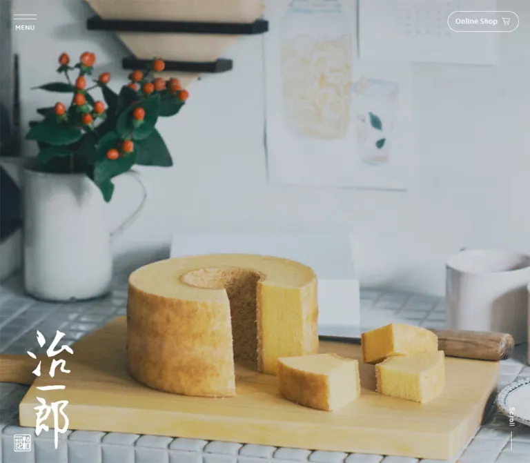
暮らしの写真を大きく見せ、白と淡いクリーム、明朝体の見出し、縦組みロゴで構成した洋菓子ブランドサイト。横並びの商品紹介と店舗導線を備え、スマートフォンでは円形の追従メニューに切り替わります。
オリジナルサイトを見るEveryday cake and tea, framed by quiet typography, generous white space, and a brush-written signature.
Website / Original URL: jiichiro.com
Final URL: https://jiichiro.com/
Theme: light; white content sections, a warm cream footer, and white controls over the opening imagery.
Inspected: September 13, 2026. Supplied browser retrieval timestamp: 2026-09-13T08:23:40.738Z, equivalent to 17:23:40.738 JST.
Viewports: desktop 1440 × 1000 and mobile 390 × 844 CSS pixels.
Scope: the current brand homepage: opening imagery, persistent navigation controls, news, product strip, brand introduction, store links, and footer. Five current-page captures and the supplied rendered DOM/computed-style records form the evidence. Menu contents are documented from the DOM; the open menu was not visually tested.
Jiichiro presents confectionery through ordinary domestic rituals. The desktop opening shows an adult setting a tall ring cake on a wooden table beside two children. The mobile opening shows a woman preparing tea in a softly lit kitchen. Cream ceramics, muted clothing, natural wood, and window light carry much of the visual identity. The interface stays small around these images: a vertical calligraphic logo, a compact shopping link, and sparse navigation cues.
The homepage connects news, products, brand context, stores, and a separate online shop. Its desktop composition moves through broad, viewport-scale scenes. Text sections use restrained Japanese serif headings with lighter Gothic body copy. A horizontal product strip adds visual variety; an asymmetrical image-and-text section introduces the brand; the footer resolves into a large, nearly empty cream field. Mobile reorganizes these relationships into a shorter vertical document while preserving generous margins and a prominent photographic opening.
Everyday cake and tea, framed by quiet typography, generous white space, and a brush-written signature.
Website / Original URL: jiichiro.com
Final URL: https://jiichiro.com/
Theme: light; white content sections, a warm cream footer, and white controls over the opening imagery.
Inspected: September 13, 2026. Supplied browser retrieval timestamp: 2026-09-13T08:23:40.738Z, equivalent to 17:23:40.738 JST.
Viewports: desktop 1440 × 1000 and mobile 390 × 844 CSS pixels.
Scope: the current brand homepage: opening imagery, persistent navigation controls, news, product strip, brand introduction, store links, and footer. Five current-page captures and the supplied rendered DOM/computed-style records form the evidence. Menu contents are documented from the DOM; the open menu was not visually tested.
Jiichiro presents confectionery through ordinary domestic rituals. The desktop opening shows an adult setting a tall ring cake on a wooden table beside two children. The mobile opening shows a woman preparing tea in a softly lit kitchen. Cream ceramics, muted clothing, natural wood, and window light carry much of the visual identity. The interface stays small around these images: a vertical calligraphic logo, a compact shopping link, and sparse navigation cues.
The homepage connects news, products, brand context, stores, and a separate online shop. Its desktop composition moves through broad, viewport-scale scenes. Text sections use restrained Japanese serif headings with lighter Gothic body copy. A horizontal product strip adds visual variety; an asymmetrical image-and-text section introduces the brand; the footer resolves into a large, nearly empty cream field. Mobile reorganizes these relationships into a shorter vertical document while preserving generous margins and a prominent photographic opening.
| Name | Value | Reference token | Role | Evidence |
|---|---|---|---|---|
| Content White | #ffffff |
--color-white |
Desktop content-section backgrounds; mobile menu surface; reversed hero details | Measured |
| Footer Cream | #f8f6e7 |
--color-cream |
Full footer background at both viewports | Measured: rgb(248, 246, 231) |
| Editorial Ink | #231815 |
--color-editorial |
Section headings; a warm dark tone within the otherwise black interface | Measured: rgb(35, 24, 21) |
| Utility Black | #000000 |
--color-ink |
Body text, footer links, and light-surface navigation | Measured |
| Muted Date | rgba(0, 0, 0, 0.6) |
--color-muted |
News dates | Measured; equivalent to #666666 over white |
| Shop Straw | approximately #eee9c6 |
--color-shop |
Filled shopping pill on scrolled, light-background captures | Visual estimate; exact fill was not supplied |
| Fine Outline | approximately #d8d8d8 |
--color-rule |
Thin store-link outlines | Visual estimate; recommended starting value |
| Signature Red | Asset-owned red; numeric value unmeasured | No general UI token | Small seal attached to the dark brand artwork | Visually observed |
The core relationship is white, warm cream, black, and slightly warmer heading ink. The shopping pill introduces a quiet straw tint. The red seal belongs to the identity artwork and occupies very little area.
Wood brown, cake yellow, soft gray, and muted green appear within the photography. They should remain photographic colors rather than becoming a collection of interface fills.
| Context | Shopping link | Menu | Brand mark |
|---|---|---|---|
| Desktop opening | Transparent, white outline and white text | Initial computed color is white; the trigger is not clearly visible in the first capture | Large white vertical mark at lower left |
| Desktop scrolled content | Pale straw fill with black details | Black lines and caption at upper left | Smaller dark mark visible at lower left in the middle capture |
| Mobile opening | Transparent, white outline and white text | Black details inside a white circular button at lower right | White vertical mark at upper left |
| Footer | Pale straw shopping pill remains at upper right | Desktop upper-left trigger or mobile lower-right circle | Dark vertical artwork with red seal within the footer |
The supplied WordPress palette, gradient, and shadow presets are not evidence that those styles appear on this page. Likewise, the recorded Swiper blue variable does not make blue a visible brand accent.
Computed stack: ryo-gothic-plusn, 'Hiragino Kaku Gothic ProN', 'Hiragino Sans', Meiryo, sans-serif.
The body uses 14px, weight 400, and approximately 24.08px line height. The same stack appears on product captions, article titles, footer links, and the fixed shopping pill. Its light, open texture lets relatively small text sit comfortably inside large white areas.
The shopping pill uses this Gothic stack even though its label is English. Do not automatically assign every Latin label to the secondary Latin family.
Computed stack: ryo-text-plusn, serif.
Section headings use weight 400, warm editorial ink, and deliberate tracking. Desktop headings are 32px / 42px; mobile headings are approximately 26px / 38px. Menu links use the same family at 17px, weight 500.
The brand logo is separate artwork. Its irregular brush strokes, vertical proportions, and seal cannot be recreated by setting the brand name in the section-heading font.
Computed stack: Figtree, ryo-gothic-plusn, 'Hiragino Kaku Gothic ProN', 'Hiragino Sans', Meiryo, sans-serif.
Figtree is recorded for news dates, Scroll, PAGETOP, and the shopping link inside the navigation subtree. These labels are small, regular-weight, and tracked.
| Role | Desktop | Mobile | Tracking | Evidence and use |
|---|---|---|---|---|
| Base body | 14px / 24.08px |
Same | Normal | Measured; weight 400 |
| Section heading | 32px / 42px |
26px / 38.01px |
Desktop 0.06em; mobile varies below |
Measured; serif, weight 400 |
| Main news title | 15px / 22.01px |
14px / 22.01px |
0.05em |
Measured |
| News date | 12px / 12px |
Same | 0.05em |
Measured; Figtree-first stack |
| Product caption | 14px / 23px |
Same | 0.03em |
Measured |
| Brand-introduction body | 14px / 27.01px |
14px / 26px |
Desktop 0.03em; mobile 0.05em |
Measured |
| Store introduction | 14px / 30px |
14px / 26px |
0.05em |
Measured |
| Fixed shopping label | 13px / 13px |
Same | 0.08em |
Measured; Gothic stack |
| Menu primary link | 17px / 25.01px |
Same | 0.03em |
Measured in navigation subtree; weight 500 |
| Footer primary link | 14px / 21px |
15px / 15px |
0.08em |
Measured; mobile text becomes slightly larger |
| Footer secondary link | 12px / 18px |
13px / 19px |
0.08em |
Measured |
| Footer shopping label | 14px / 14px |
Same | 0.08em |
Measured |
| Copyright | 10px / 10px |
Same | 0.08em |
Measured |
PAGETOP |
12px / 12px |
13px / 13px |
0.08em |
Measured |
Desktop Scroll |
13px / 13px |
Not visibly present | 0.08em |
Measured desktop label |
Mobile heading tracking is not uniform: news uses 1.56px, products and stores use 2.6px, and the brand introduction uses 1.3px. These correspond to approximately 0.06em, 0.1em, and 0.05em.
The menu button itself reports browser-default Arial at 13.3333px. That parent record does not establish the typography of every nested caption or line. The visible MENU caption looks approximately 10–12px; its own style was not sampled.
The store-link labels look serif in the mobile crop, but their child styles were not recorded. The anchors inherit the 14px Gothic body style. A 17px serif child label is a reasonable visual approximation, explicitly used as a recommendation in the Quick Start.
The original root reports 10px. The reusable CSS below keeps sizes explicit in pixels, so it does not depend on reproducing that root convention. Recorded family names identify the computed stacks; font licensing and actual fallback resolution must be handled separately.
Density: sparse at section scale, compact within controls.
Spacing model: measured repeats suggest practical aliases, but no global spacing formula was supplied. Preserve the relationships between small utilities, medium reading blocks, and very large scene spacing.
| Use | Desktop | Mobile | Status |
|---|---|---|---|
| Fixed shop top / right inset | 22px / 22px |
13px / 10px |
Measured |
| Menu origin | Left 27px, top 29px |
Right 13px, bottom 13px |
Measured/calculated |
| Shop label-to-icon gap | 7px |
7px |
Measured |
| Product link gap | 30px |
20px |
Calculated from adjacent rectangles |
| Carousel-control gap | 11px |
9px |
Calculated |
| Store-link gap | 15px |
10px |
Calculated |
| Main mobile text inset | — | 30px each side |
Measured; leaves 330px at the inspected width |
| Footer horizontal inset | 80px |
Main text 30px |
Measured |
| Standard news-row vertical padding | 26px top, 31px bottom |
19px top, 23px bottom |
Measured; first row omits top padding |
| Brand heading-to-body gap | 44px |
25px |
Calculated between text rectangles |
| Brand body-to-link gap | 41px |
32px |
Calculated |
| Product strip-to-controls gap | 48px |
35px |
Calculated |
| Store cards-to-footer gap | Part of a larger desktop stage | 100px |
Calculated |
| Footer primary-link spacing | 33px horizontal gap |
42px top-to-top cadence |
Calculated |
| Element | Value | Evidence |
|---|---|---|
| Product links and main text actions | 0 |
Measured |
| News links | 0 |
Measured |
| Store links | 8px |
Measured at both viewports |
| Fixed and menu shopping pills | 100px |
Measured CSS radius |
| Mobile menu | 50% on a 60 × 60px box |
Measured |
| Photography | Square visible edges | Screenshot observation |
Roundness is concentrated in the shopping pill, mobile menu, and store links. Most content has no enclosing card shape.
| Element | Desktop | Mobile |
|---|---|---|
| Fixed shopping pill | 141.22 × 41px at (1276.78, 22) |
Same size at (238.78, 13) |
| Menu button | 46 × 32px at (27, 29) |
60 × 60px at (317, 771) |
| Opening logo | 119 × 241.92px, left 27px, bottom 23px |
87 × 176.86px, left 15px, top 21px |
| Compact desktop logo | 60 × 121.97px, left 16px, bottom 24px |
No equivalent recorded |
| Main news list | 672.5px wide, beginning at x 535px |
330px wide, beginning at x 30px |
| Product link | 357 × 498px |
227 × 324.48px |
| Product controls | Two 50 × 50px buttons |
Two 47 × 47px buttons |
| Standard short text action | Approximately 145.5 × 50px |
Approximately 140.5 × 47px |
| All-products action | 204.31 × 50px |
199.31 × 47px |
| Store link | 460 × 104px |
160 × 118px |
| Footer logo | 91 × 185px |
77 × 156.53px |
| Footer | 1440 × 1000px |
390 × 646px |
Role: establish the brand through a recognizable moment of sharing food.
The opening capture is filled edge to edge by domestic imagery. There is no visible marketing headline over the scene. The desktop composition keeps the cake, tableware, and people in a wide shared setting; the mobile composition concentrates on the woman, tea preparation, and kitchen counter.
Place the identity and controls near the frame edges. On desktop, the large white brand mark sits at lower left and a vertical Scroll label with a fine line sits at lower right. On mobile, the white mark moves to upper left, the shopping link stays at upper right, and the circular menu occupies lower right.
Evidence limit: the desktop and mobile captures show different scenes. The supplied records do not identify the hero media element or establish whether this difference comes from playback time, responsive asset selection, or another state. Treat video playback, autoplay, sound, looping, and slide timing as unverified.
Implementation recommendation: use media with a deliberate focal point at each viewport. Keep hands, food, and the central action in frame. Prepare a still-image fallback before adding any moving-media behavior.
Role: maintain access to the separate online store throughout browsing.
The anchor points to https://www.jiichiro-shop.com/. Its visible anatomy is a short Online Shop label followed by a cart symbol. The fixed anchor uses flex layout, a 7px gap, 13px text, 0.08em tracking, and a 100px radius.
Measured padding is 9px 14px 10px 15px. Its 141.22 × 41px footprint is unchanged between desktop and mobile. On the photographic opening it has white text and a thin white outline. In scrolled captures it has black details on a pale straw fill.
The scrolled color state is visually established; its exact trigger and fill value are not. Keep this as a small utility control with consistent dimensions across states.
Role: provide site navigation without a full-width header band.
On desktop, two thin horizontal lines and a small MENU caption occupy the upper-left corner. On mobile, the trigger becomes a white 60px circle with black lines and caption, inset 13px from the lower and right edges. The mobile screenshots show it in the same corner at both the opening and footer.
A smaller dark brand mark is visible at the lower-left edge of the desktop middle capture. Its measured width is 60px, compared with the opening mark's 119px. The supplied H1 record has opacity and visibility transitions, but the precise appearance threshold was not tested.
The mobile menu has a faint visual halo in the captures. No shadow property was supplied, so there is no measured shadow token to reproduce.
Role: expose the site's main information routes and secondary utilities.
The navigation subtree contains home, brand introduction, products, stores, te to te, news-related links, quality information, company information, a policy link, and online shopping.
Desktop menu-link rectangles are approximately 267px wide at x 43px. The desktop subtree also includes two compact white news-link blocks with date/category information and a headline. Mobile primary-link rectangles are approximately 197px wide at x 160px; the mobile navigation inventory includes a direct news link.
These records establish content and typography, not the appearance of an opened panel. Panel background, reveal direction, backdrop, close control, focus management, and scrolling behavior remain unverified. Do not use the extracted coordinates as proof of a permanently visible sidebar.
Role: present editorial updates in a compact, readable list.
Desktop places a small heading/action group to the left of a substantially wider list. The heading begins around x 237px; the list begins at x 535px and spans 672.5px. Each article link groups date and category information above a one-line headline in the recorded layout. Dates are small and muted, while titles use regular black Gothic text.
Mobile changes the order to heading, full-width list, then a centered 一覽を見る link. The reading width becomes 330px inside 30px margins. Main article titles reduce from 15px to 14px, and standard row padding reduces from 26px / 31px to 19px / 23px.
Five main articles are present. The 2024.11.15 brand-movie announcement precedes the 2026 entries in the supplied ordering. Preserve that editorial order when representing this snapshot; the evidence does not establish whether the first entry is pinned.
Category text is present, but its detailed visual styling was not sampled. Colored category badges should not be introduced as an observed feature.
Role: let visitors browse recognizable products through large images and brief captions.
Each product is a block-level link with an image region above a single caption. Seven unique destinations are repeated three times in the DOM. This is consistent with a looping carousel structure, but the repeated entries are not twenty-one distinct products.
Desktop links measure 357px wide and are separated by 30px. Three full links and parts of neighboring links fit across the recorded strip position. Mobile links measure 227px with 20px gaps, exposing one full item and part of the next. Captions remain 14px / 23px at both sizes.
The desktop link has 475px between its top and the caption's top; mobile has approximately 301.48px. Those measurements include both the image region and any caption gap. Individual image bounds and native aspect ratios were not supplied.
Recommended reconstruction: a 4:5 image with a roughly 29px desktop caption gap and 18px mobile gap closely approximates the measured link footprints. This is a practical inference, not a measured image ratio.
Two square button rectangles precede the all-products action in a separate controls row. They measure 50px on desktop and 47px on mobile. Their intended previous/next role follows the surrounding carousel structure, but activation and accessible names were not tested.
The middle desktop capture shows a defocused product strip above a sharp brand-introduction image. Record this as a visible state. The evidence does not establish the blur mechanism or its timing, and it should not become a permanent filter on every product image.
Role: offer a restrained route into deeper content.
Examples include 一覽を見る, 詳しく見る, and すべての商品を見る. Their anchors use regular 14px Gothic text, a transparent background, square corners, and a separate trailing visual affordance whose detailed artwork was not extracted.
Desktop padding is 13px 15px 14px 19px with a 15px internal gap. Mobile padding becomes 12px 15px 12px 17px with a 12px gap. Measured heights are 50px and 47px respectively.
Keep the action visually lighter than the surrounding product or lifestyle imagery. Its hierarchy comes from placement and spacing.
Role: connect the products with the brand's values and origin story.
The desktop capture divides the scene asymmetrically: lifestyle imagery occupies approximately the left 59.5%, while a white text area fills the right. The visible image boundary is around x 857px; the heading begins at x 955.36px, leaving approximately 98px between image and text.
The text group contains the serif heading 治一郎について, three recorded lines of body copy, and a short detail link. The heading-to-body gap is 44px, followed by a 41px body-to-link gap. The body region is approximately 424px wide.
Mobile places the text group after the image region, with a 330px reading width. The heading-to-body gap reduces to 25px, and the body-to-link gap becomes 32px. The body retains a relaxed 26px line height.
The mobile heading begins approximately 436px after the section starts. A square, full-width image followed by about 46px of spacing is a useful reconstruction, although the image element itself was not measured.
Role: direct visitors to permanent stores and temporary events.
Desktop centers the section heading and introduction above two equal links. Each link is 460 × 104px, with 15px between them, a thin outline, and an 8px radius. The recorded desktop layout uses an 11px horizontal internal gap.
At 390px, the pair stays side by side. Each link becomes 160 × 118px, with a 10px gap inside the 330px content width. Content changes to an icon-over-label arrangement with a 12px vertical gap. The storefront symbol is visible in the mobile crop; the other icon's detailed shape is not established.
The first anchor points to /shop/; the second points to /shop/#shop-event. These are navigation links. The captured homepage does not show an embedded store-search form.
After the mobile cards, 100px of white space separates them from the cream footer. This deliberate pause is part of the page rhythm.
Role: provide a calm final navigation area and a large brand signature.
Desktop uses an entire 1000px-high cream region. Its primary link row begins at x 80px, approximately 337.5px below the footer top. The main links run horizontally with 33px gaps. A short fine rule separates them from an unboxed shopping link; another separates shopping from smaller quality, company, and policy links.
The large dark logo occupies the right side, measuring 91 × 185px. The PAGETOP link sits above it near the right edge. Copyright appears at the lower left of the content group. This arrangement leaves broad empty areas above and below the links.
Mobile reduces the footer to 646px and begins the main links approximately 59px below its top. Links stack vertically at a 42px cadence and become 15px. Secondary links use 13px, and the long policy label wraps onto two lines in a 239px region.
The mobile logo is 77px wide near the lower-right part of the footer. PAGETOP becomes vertical near the upper-right edge. The fixed menu remains below this content at the viewport corner, independently of the footer's own logo.
The page-top anchor targets #wrapper. Its scroll speed, easing, and focus behavior were not exercised.
| Treatment | Recorded value or observation | What is established | Limitation |
|---|---|---|---|
| Link state transitions | 0.4s cubic-bezier(0.215, 0.61, 0.355, 1) for border, background, color, and opacity |
A shared transition vocabulary on sampled anchors | Actual hover endpoint styles were not captured |
| Compact H1 identity | Same 0.4s curve for opacity and visibility |
Identity visibility can transition | Trigger and complete state sequence unverified |
| Menu trigger | Same 0.4s curve for color and inset |
Color/position transitions are declared | Open-menu movement was not tested |
| Shopping link context | White outline over imagery; pale fill on scrolled captures | At least two visible color states | Switching threshold and exact filled color unmeasured |
| Product strip | Three copies of seven links, offscreen horizontal positions, two controls | Carousel-like structure and overflow presentation | Autoplay, swipe, drag, loop behavior, and timing unverified |
| Product defocus | Blurred products in the middle desktop capture | A defocused state is visible | Filter value, scroll relationship, and duration unverified |
| Hero imagery | Different domestic scenes at the two viewports | The captured image states differ | Media type, playback, audio, and responsive source selection unverified |
| Page-top action | Anchor target #wrapper |
Destination exists in the extracted link | Animated scrolling unverified |
Use --motion-duration: 400ms and --motion-ease: cubic-bezier(0.215, 0.61, 0.355, 1) as evidence-based aliases for the sampled transitions.
Many elements report animation: none. That does not exclude JavaScript animation or media playback. Likewise, a computed transition: all without a duration is not evidence of a visible animation.
For an adaptation, begin with readable static content and explicit navigation. Add desktop scene transitions only when their timing, focus behavior, and reduced-motion alternative are defined. Keep the product strip sharp and operable in its resting state.
| Layer | Appearance | Purpose |
|---|---|---|
| Opening scene | Full-bleed domestic imagery | Main emotional and visual introduction |
| Main content | White, broad spacing, dark text | News, product presentation, brand copy, and store access |
| Shopping utility | Transparent white outline or pale straw fill | Persistent commercial route |
| Store links | White/transparent surface, fine outline, 8px radius |
Two clearly separated destinations |
| Mobile navigation trigger | White circular surface with black detail | Reachable navigation over varied backgrounds |
| Footer | Solid #f8f6e7 with dark typography |
Quiet navigation and identity closure |
There is no visually established general-purpose elevation system. Product links and news entries rely on typography, spacing, and image boundaries. The open navigation surface and any backdrop remain outside the visual evidence.
The current photographic language is warm, domestic, and understated. Natural light falls across wood, pale walls, ceramics, and muted clothing. The people are engaged in serving cake or preparing tea, which makes the food feel part of a shared routine.
Preserve the relationship between people, hands, food, and tableware. Wide desktop framing can show several participants and a large table; a narrow mobile crop needs a clear vertical action. The two supplied hero scenes should not be treated as proof that a single desktop asset can simply be center-cropped for mobile.
The brand-introduction image uses a similar woman-and-window composition, visually connecting editorial content with the opening scene. Product imagery uses much lighter backgrounds and more isolated food subjects. The product crop is visibly blurred in the supplied middle capture, so fine product texture and its final sharp-state treatment cannot be assessed from that image alone.
No original image, video, logo, or icon file URLs were included in the supplied extract. The following inventory describes visible asset roles, not downloadable paths.
| Asset role | Current evidence | Reuse guidance |
|---|---|---|
| Desktop opening media | Adult and two children around a table with ring cake | Preserve wide social context and the cake-serving action |
| Mobile opening media | Woman preparing tea at a kitchen counter | Preserve hands, tea tools, and vertical composition |
| Brand-introduction media | Woman beside a softly lit window | Pair with a restrained text area and generous separation |
| Product imagery | Large portrait-oriented food presentations on pale backgrounds | Keep product identity clear; use consistent image framing |
| Light brand mark | White brush lettering and seal treatment | Use an authorized light artwork variant |
| Dark brand mark | Dark brush lettering with red seal | Preserve original proportions and the seal's position |
| Utility graphics | Cart, menu lines, directional marks, storefront symbol | Use crisp, modest monochrome graphics; no icon library was established |
CSS can reproduce the frame, proportions, and typography. The photographs and calligraphic artwork carry identity that generic replacement graphics will not reproduce.
The desktop document reports 6000px total height. Its main section rectangles overlap: each begins 1000px after the previous one but reports 2000px height.
| Region | Recorded start y | Recorded height |
|---|---|---|
| Opening | 0px |
2000px |
| News | 1000px |
2000px |
| Products | 2000px |
2000px |
| Brand introduction | 3000px |
2000px |
| Stores | 4000px |
2000px |
| Footer | 5000px |
1000px |
This geometry is consistent with overlapping, viewport-scale presentation regions. It does not independently establish a particular sticky, pinned, transformed, or scroll-snap implementation. Summing these heights as normal-flow sections would produce an incorrect document length.
The middle desktop screenshot also contains portions of two regions: products above and the brand introduction below. Preserve the distinction between a captured transition/composite state and a complete section layout.
At 390 × 844, the main sections follow consecutively and the document is approximately 3884.45px tall.
| Region | Recorded start y | Recorded height |
|---|---|---|
| Opening | 0px |
844px |
| News | 844px |
620px |
| Products | 1464px |
666.48px |
| Brand introduction | 2130.48px |
715.97px |
| Stores | 2846.45px |
392px |
| Footer | 3238.45px |
646px |
The mobile page is therefore a structural adaptation, not a scaled desktop scene stack. Its opening remains viewport-height, while subsequent sections follow their content.
| Feature | Desktop behavior | Mobile behavior |
|---|---|---|
| Main menu | Small upper-left trigger | Fixed lower-right 60px circle |
| Opening identity | Large lower-left mark | Smaller upper-left mark |
| Shopping pill | 141.22 × 41px, 22px edge insets |
Same size, reduced edge insets |
| News | Heading/action beside list | Heading, list, centered action |
| Product strip | 357px links with 30px gaps |
227px links with 20px gaps |
| Brand introduction | Approximately 59.5% / 40.5% image/text split |
Image region followed by inset text |
| Store links | Two wide horizontal links | Two narrower links with vertically arranged contents |
| Section headings | 32px, several centered compositions |
26px, aligned with the 30px content inset |
| Footer navigation | Horizontal primary row | Vertical primary list with slightly larger type |
| Page-top label | Horizontal | Vertical |
Only these two viewports were inspected. The original breakpoint and intermediate tablet layouts are unknown. A 767px breakpoint in the Quick Start is a recommendation for reproducing the two observed modes, not a source-derived threshold.
The mobile footer capture shows the fixed shopping pill overlapping part of the preceding store-link area at that scroll position. For a new implementation, verify that fixed controls do not prevent activation or reading of important content. Safe-area handling was not established by the supplied styles.
14px captions.These are recommendations for a new implementation, not verified features of the inspected page:
aria-expanded and aria-controls; define keyboard entry, closing, and focus return for its eventual panel.60px target and consider enlarging the shopping link's effective target beyond its measured 41px visual height.#ffffff.#f8f6e7.#231815.#000000.rgba(0, 0, 0, 0.6).#eee9c6, an estimated adaptation value.“Create a Japanese confectionery brand homepage inspired by Jiichiro's current visual structure. Open with full-viewport domestic photography showing cake or tea as part of an everyday shared moment. Place an authorized vertical brush logo near the lower-left desktop edge, a small outlined Online Shop pill at upper right, and a minimal menu trigger at upper left. Use white content sections, regular Japanese serif headings at 32px, light 14px Gothic body text, and a warm cream footer in #f8f6e7. Include a compact news list, a horizontal product strip with large images and small captions, an asymmetrical lifestyle-image and brand-copy section, and two outlined store links. On mobile, move the menu into a 60px white circle at lower right, move the opening logo to upper left, use 30px content margins and 26px headings, stack the brand image and copy, and retain the paired store links. Keep media playback and desktop scene choreography optional until separately specified.”
This is an implementation baseline using the measured typography and component dimensions. It uses normal document flow and a manually scrollable product strip. The desktop overlapping stage system, carousel-button behavior, menu panel, and any hero playback require separate implementation.
Use .site-tools for the fixed menu and shopping link, .hero for the opening, .news-layout for heading/list/action, .product-track for product links, .story for image/copy, and .site-footer > .footer-inner for footer contents. Supply authorized imagery, logo variants, and appropriate SVG icons. The selectors and data-surface attribute below are new implementation names.
The serif store labels, 4:5 product-image ratio, estimated colors, and 767px breakpoint are recommendations. Fixed-control state can be represented by data-surface='photo'; connecting that state to scrolling is a separate behavior.
:root {
  /* Measured colors */
  --color-white: #ffffff;
  --color-cream: #f8f6e7;
  --color-editorial: #231815;
  --color-ink: #000000;
  --color-muted: rgb(0 0 0 / 60%);

  /* Estimated adaptation colors */
  --color-shop: #eee9c6;
  --color-rule: #d8d8d8;

  /* Recorded computed family stacks; load fonts only when licensed */
  --font-body: 'ryo-gothic-plusn', 'Hiragino Kaku Gothic ProN',
    'Hiragino Sans', Meiryo, sans-serif;
  --font-editorial: 'ryo-text-plusn', serif;
  --font-latin: 'Figtree', var(--font-body);

  --text-body: 14px;
  --text-section: 32px;
  --leading-section: 42px;
  --text-caption: 12px;
  --tracking-utility: 0.08em;
  --gutter: 80px;
  --product-width: 357px;
  --product-gap: 30px;
  --radius-store: 8px;
  --radius-pill: 100px;
  --motion-duration: 400ms;
  --motion-ease: cubic-bezier(0.215, 0.61, 0.355, 1);
}

* { box-sizing: border-box; }

body.jiichiro-reference {
  margin: 0;
  color: var(--color-ink);
  background: var(--color-white);
  font: 400 var(--text-body) / 1.72 var(--font-body);
}

.jiichiro-reference img { display: block; max-width: 100%; }
.jiichiro-reference a {
  color: inherit;
  text-decoration: none;
  transition:
    color var(--motion-duration) var(--motion-ease),
    background-color var(--motion-duration) var(--motion-ease),
    border-color var(--motion-duration) var(--motion-ease),
    opacity var(--motion-duration) var(--motion-ease);
}
.jiichiro-reference button { font: inherit; cursor: pointer; }
.jiichiro-reference :focus-visible {
  outline: 2px solid currentColor;
  outline-offset: 4px;
}

.section-title {
  margin: 0;
  color: var(--color-editorial);
  font: 400 var(--text-section) / var(--leading-section)
    var(--font-editorial);
  letter-spacing: 0.06em;
}

.shop-link {
  position: fixed;
  z-index: 30;
  top: 22px;
  right: 22px;
  display: flex;
  align-items: center;
  justify-content: center;
  gap: 7px;
  min-width: 141.22px;
  height: 41px;
  padding: 9px 14px 10px 15px;
  border: 1px solid transparent;
  border-radius: var(--radius-pill);
  background: var(--color-shop);
  font: 400 13px / 13px var(--font-body);
  letter-spacing: var(--tracking-utility);
}
.shop-link .icon { width: 20px; height: 20px; }
.site-tools[data-surface='photo'] .shop-link {
  color: var(--color-white);
  background: transparent;
  border-color: currentColor;
}

.menu-button {
  position: fixed;
  z-index: 40;
  top: 29px;
  left: 27px;
  width: 46px;
  height: 32px;
  padding: 0;
  border: 0;
  color: var(--color-ink);
  background: transparent;
  transition:
    color var(--motion-duration) var(--motion-ease),
    inset var(--motion-duration) var(--motion-ease);
}
.site-tools[data-surface='photo'] .menu-button { color: white; }
.menu-lines {
  display: block;
  width: 46px;
  height: 9px;
  margin-inline: auto;
  border-block: 1px solid currentColor;
}
.menu-caption {
  display: block;
  margin-top: 8px;
  font: 400 11px / 1 var(--font-latin);
  letter-spacing: 0.08em;
}

.hero { position: relative; height: 100vh; height: 100svh; }
.hero-media { width: 100%; height: 100%; object-fit: cover; }
.hero-logo { position: absolute; left: 27px; bottom: 23px; width: 119px; }
.hero-logo img, .footer-logo img { width: 100%; height: auto; }
.hero-scroll {
  position: absolute;
  right: 29px;
  bottom: 25px;
  display: flex;
  align-items: center;
  gap: 9px;
  color: white;
  writing-mode: vertical-rl;
  font: 400 13px / 13px var(--font-latin);
  letter-spacing: 0.08em;
}
.hero-scroll::after { content: ''; width: 1px; height: 38px; background: currentColor; }

.text-action {
  display: inline-flex;
  align-items: center;
  justify-content: center;
  gap: 15px;
  min-height: 50px;
  padding: 13px 15px 14px 19px;
  border-radius: 0;
  background: transparent;
  font: 400 14px / 24.08px var(--font-body);
}

.news-section {
  display: grid;
  align-items: center;
  min-height: 100svh;
  padding-block: 100px;
}
.news-layout {
  display: grid;
  grid-template-areas: 'heading list' 'more list';
  grid-template-columns: 145.5px minmax(0, 1fr);
  gap: 32px 157px;
  width: min(calc(100% - 160px), 975px);
  margin-inline: auto;
}
.news-heading { grid-area: heading; align-self: end; text-align: center; }
.news-list { grid-area: list; min-width: 0; }
.news-more { grid-area: more; align-self: start; justify-self: center; }
.news-item { display: block; padding: 26px 0 31px; }
.news-item:first-child { padding-top: 0; }
.news-meta { display: flex; align-items: center; gap: 12px; margin-bottom: 10px; }
.news-date {
  color: var(--color-muted);
  font: 400 12px / 12px var(--font-latin);
  letter-spacing: 0.05em;
}
.news-entry-title { margin: 0; font-size: 15px; line-height: 22px; letter-spacing: 0.05em; }

.products-section { padding: 103px 0 100px; }
.products-section > .section-title { margin-bottom: 47px; text-align: center; }
.product-track {
  display: flex;
  gap: var(--product-gap);
  overflow-x: auto;
  padding-inline: 30px;
  scroll-padding-inline: 30px;
  scroll-snap-type: x proximity;
}
.product-card { flex: 0 0 var(--product-width); min-width: 0; scroll-snap-align: start; }
/* Recommended image ratio; individual image bounds were not supplied. */
.product-media { width: 100%; aspect-ratio: 4 / 5; object-fit: cover; }
.product-caption { margin: 29px 0 0; font-size: 14px; line-height: 23px; letter-spacing: 0.03em; }
.product-controls {
  display: flex;
  align-items: center;
  gap: 11px;
  width: min(calc(100% - 60px), 1080px);
  margin: 48px auto 0;
}
.product-step {
  display: grid;
  place-items: center;
  flex: 0 0 50px;
  height: 50px;
  padding: 0;
  border: 0;
  border-radius: 0;
  color: inherit;
  background: transparent;
}
.product-all { margin-left: auto; }

.story { display: grid; grid-template-columns: 59.5% 40.5%; min-height: 100svh; }
.story-visual { min-width: 0; }
.story-visual img { width: 100%; height: 100%; object-fit: cover; }
.story-copy { align-self: center; padding: 60px 60px 60px 98px; }
.story-copy .section-title { margin-bottom: 44px; }
.story-copy p { margin: 0 0 41px; font-size: 14px; line-height: 27px; letter-spacing: 0.03em; }

.store-section {
  display: grid;
  align-content: center;
  min-height: 100svh;
  padding: 80px 30px;
  text-align: center;
}
.store-section .section-title { margin-bottom: 43px; }
.store-description { margin: 0; line-height: 30px; letter-spacing: 0.05em; }
.store-links {
  display: grid;
  grid-template-columns: repeat(2, minmax(0, 1fr));
  gap: 15px;
  width: min(100%, 935px);
  margin: 50px auto 0;
}
.store-link {
  display: flex;
  align-items: center;
  justify-content: center;
  gap: 11px;
  min-height: 104px;
  padding: 34px;
  border: 1px solid var(--color-rule);
  border-radius: var(--radius-store);
}
.store-link .icon { width: 24px; height: 20px; }
/* Visual approximation for the unsampled child labels. */
.store-link-label { font: 400 17px / 21px var(--font-editorial); }

.site-footer {
  display: grid;
  align-content: center;
  min-height: 100svh;
  padding: var(--gutter);
  background: var(--color-cream);
}
.footer-inner { position: relative; }
.footer-primary { display: flex; flex-wrap: wrap; gap: 20px 33px; }
.footer-primary a { font-size: 14px; line-height: 21px; letter-spacing: 0.08em; }
.footer-rule { width: 17px; height: 1px; margin: 26px 0 29px; background: rgb(0 0 0 / 30%); }
.footer-rule--secondary { margin: 31px 0 24px; }
.footer-shop { display: inline-flex; align-items: center; gap: 6px; height: 20px; letter-spacing: 0.08em; }
.footer-secondary { display: grid; justify-items: start; gap: 10px; }
.footer-secondary a { font-size: 12px; line-height: 18px; letter-spacing: 0.08em; }
.footer-copyright { margin: 84px 0 0; font-size: 10px; line-height: 10px; letter-spacing: 0.08em; }
.footer-logo { position: absolute; right: -1px; bottom: 1px; width: 91px; }
.page-top {
  position: absolute;
  top: 2px;
  right: 0;
  display: flex;
  align-items: center;
  gap: 8px;
  font: 400 12px / 12px var(--font-latin);
  letter-spacing: 0.08em;
}

/* Recommended breakpoint; only the two supplied viewports were inspected. */
@media (max-width: 767px) {
  :root {
    --gutter: 30px;
    --text-section: 26px;
    --leading-section: 38px;
    --product-width: 227px;
    --product-gap: 20px;
  }
  .shop-link { top: max(13px, env(safe-area-inset-top, 0px)); right: 10px; }
  .menu-button {
    inset: auto 13px max(13px, env(safe-area-inset-bottom, 0px)) auto;
    width: 60px;
    height: 60px;
    border-radius: 50%;
    background: white;
  }
  .site-tools[data-surface='photo'] .menu-button { color: black; }
  .menu-lines { width: 30px; height: 8px; }
  .menu-caption { font-size: 10px; }
  .hero-logo { top: 21px; left: 15px; bottom: auto; width: 87px; }
  .hero-scroll { display: none; }
  .text-action { min-height: 47px; padding: 12px 15px 12px 17px; gap: 12px; }

  .news-section { display: block; min-height: 0; padding: 73px 0 0; }
  .news-layout {
    grid-template-areas: 'heading' 'list' 'more';
    grid-template-columns: minmax(0, 1fr);
    gap: 31px;
    width: calc(100% - 60px);
  }
  .news-heading { text-align: left; }
  .news-item { padding: 19px 0 23px; }
  .news-entry-title { font-size: 14px; line-height: 22px; }

  .products-section { padding-top: 90px; }
  .products-section > .section-title { margin: 0 30px 32px; text-align: left; letter-spacing: 0.1em; }
  .product-caption { margin-top: 18px; }
  .product-controls { gap: 9px; margin-top: 35px; flex-wrap: wrap; }
  .product-step { flex-basis: 47px; height: 47px; }

  .story { display: block; min-height: 0; }
  .story-visual { aspect-ratio: 1; }
  .story-copy { padding: 46px 30px 60px; }
  .story-copy .section-title { margin-bottom: 25px; letter-spacing: 0.05em; }
  .story-copy p { margin-bottom: 32px; line-height: 26px; letter-spacing: 0.05em; }

  .store-section { min-height: 0; padding: 53px 30px 100px; text-align: left; }
  .store-section .section-title { margin-bottom: 25px; letter-spacing: 0.1em; }
  .store-description { line-height: 26px; }
  .store-links { gap: 10px; margin-top: 32px; }
  .store-link { flex-direction: column; gap: 12px; min-height: 118px; padding: 28px 0 35px 1px; text-align: center; }

  .site-footer { display: block; min-height: 646px; padding: 59px 30px 100px; }
  .footer-primary { flex-direction: column; align-items: flex-start; gap: 27px; }
  .footer-primary a { font-size: 15px; line-height: 15px; }
  .footer-rule { margin: 29px 0 30px; }
  .footer-rule--secondary { margin: 31px 0 24px; }
  .footer-secondary { max-width: calc(100% - 91px); gap: 16px; }
  .footer-secondary a { font-size: 13px; line-height: 19px; }
  .footer-copyright { margin-top: 50px; }
  .footer-logo { right: -6px; width: 77px; }
  .page-top { top: 1px; right: 1px; writing-mode: vertical-rl; gap: 11px; font-size: 13px; line-height: 13px; }
}

/* Recommended accessibility behavior for this adaptation. */
@media (prefers-reduced-motion: reduce) {
  .jiichiro-reference *,
  .jiichiro-reference *::before,
  .jiichiro-reference *::after {
    animation: none !important;
    transition: none !important;
    scroll-behavior: auto !important;
  }
}
The product strip deliberately uses a stable inset rather than copying sampled negative x coordinates. Those coordinates represent carousel position, not a permanent page margin. Arrow buttons need working handlers if included. CSS reduced-motion rules also do not pause video or JavaScript motion; those behaviors require explicit handling.
Optional aliases for a project already using Tailwind v4. This does not imply that the original website uses Tailwind. Define the custom properties above first.
@theme inline {
  --color-content: var(--color-white);
  --color-footer: var(--color-cream);
  --color-heading: var(--color-editorial);
  --color-body-ink: var(--color-ink);
  --color-shop-fill: var(--color-shop);
  --color-fine-rule: var(--color-rule);

  --font-japanese-body: var(--font-body);
  --font-japanese-heading: var(--font-editorial);
  --font-latin-utility: var(--font-latin);

  --text-section: var(--text-section-size, 32px);
  --text-body-copy: 14px;
  --text-small-caption: 12px;
  --spacing-page-inset: var(--gutter);
  --spacing-product-item: var(--product-width);
  --radius-store-link: var(--radius-store);
  --radius-shopping-pill: var(--radius-pill);
}
If using the optional section-size utility, set --text-section-size: 26px in the mobile mode. The plain CSS .section-title already handles its own responsive size.
200 and no URL change.2026-09-13T08:23:40.738Z. The timestamp identifies the supplied inspection batch; separate per-image timestamps were not provided.1440 × 1000: opening scene, partial product/brand-introduction view, and footer. The rendered document reports 6000px height.390 × 844: opening scene and lower store/footer view. Rendered document height is approximately 3884.45px.This reference describes the supplied current homepage. The Quick Start is a reusable visual adaptation; estimates and recommendations are identified separately from measured original-page evidence.
# Jiichiro / 治一郎 — Style Reference

> Everyday cake and tea, framed by quiet typography, generous white space, and a brush-written signature.

**Website / Original URL:** [jiichiro.com](https://jiichiro.com/)
**Final URL:** [https://jiichiro.com/](https://jiichiro.com/)
**Theme:** light; white content sections, a warm cream footer, and white controls over the opening imagery.
**Inspected:** September 13, 2026. Supplied browser retrieval timestamp: `2026-09-13T08:23:40.738Z`, equivalent to 17:23:40.738 JST.
**Viewports:** desktop `1440 × 1000` and mobile `390 × 844` CSS pixels.
**Scope:** the current brand homepage: opening imagery, persistent navigation controls, news, product strip, brand introduction, store links, and footer. Five current-page captures and the supplied rendered DOM/computed-style records form the evidence. Menu contents are documented from the DOM; the open menu was not visually tested.

Jiichiro presents confectionery through ordinary domestic rituals. The desktop opening shows an adult setting a tall ring cake on a wooden table beside two children. The mobile opening shows a woman preparing tea in a softly lit kitchen. Cream ceramics, muted clothing, natural wood, and window light carry much of the visual identity. The interface stays small around these images: a vertical calligraphic logo, a compact shopping link, and sparse navigation cues.

The homepage connects news, products, brand context, stores, and a separate online shop. Its desktop composition moves through broad, viewport-scale scenes. Text sections use restrained Japanese serif headings with lighter Gothic body copy. A horizontal product strip adds visual variety; an asymmetrical image-and-text section introduces the brand; the footer resolves into a large, nearly empty cream field. Mobile reorganizes these relationships into a shorter vertical document while preserving generous margins and a prominent photographic opening.
# Jiichiro / 治一郎 — Style Reference

> Everyday cake and tea, framed by quiet typography, generous white space, and a brush-written signature.

**Website / Original URL:** [jiichiro.com](https://jiichiro.com/)
**Final URL:** [https://jiichiro.com/](https://jiichiro.com/)
**Theme:** light; white content sections, a warm cream footer, and white controls over the opening imagery.
**Inspected:** September 13, 2026. Supplied browser retrieval timestamp: `2026-09-13T08:23:40.738Z`, equivalent to 17:23:40.738 JST.
**Viewports:** desktop `1440 × 1000` and mobile `390 × 844` CSS pixels.
**Scope:** the current brand homepage: opening imagery, persistent navigation controls, news, product strip, brand introduction, store links, and footer. Five current-page captures and the supplied rendered DOM/computed-style records form the evidence. Menu contents are documented from the DOM; the open menu was not visually tested.

Jiichiro presents confectionery through ordinary domestic rituals. The desktop opening shows an adult setting a tall ring cake on a wooden table beside two children. The mobile opening shows a woman preparing tea in a softly lit kitchen. Cream ceramics, muted clothing, natural wood, and window light carry much of the visual identity. The interface stays small around these images: a vertical calligraphic logo, a compact shopping link, and sparse navigation cues.

The homepage connects news, products, brand context, stores, and a separate online shop. Its desktop composition moves through broad, viewport-scale scenes. Text sections use restrained Japanese serif headings with lighter Gothic body copy. A horizontal product strip adds visual variety; an asymmetrical image-and-text section introduces the brand; the footer resolves into a large, nearly empty cream field. Mobile reorganizes these relationships into a shorter vertical document while preserving generous margins and a prominent photographic opening.

## How to Read This Reference

- **Measured** values come from the supplied element rectangles and computed styles. Small floating-point differences are rounded for readability.
- **Calculated** values are arithmetic derived from those measurements, such as the gap between adjacent product links.
- **Visual estimates** describe the supplied screenshots where the relevant computed property was not recorded. Estimated colors are not sampled source values.
- **Recommendations** describe a reusable implementation. They do not establish the original breakpoint, markup, media behavior, or interaction logic.
- **Named tokens** are reference aliases. The supplied custom-property inventory does not expose a complete branded token system.
- **DOM presence is not visibility proof.** Navigation descendants have measurable rectangles even though an open-menu screenshot was not supplied.
- **Motion evidence is limited.** Static captures, transition declarations, and repeated carousel links do not establish playback, autoplay, dragging, or scroll choreography.

## Tokens — Colors

### Default Palette

| Name | Value | Reference token | Role | Evidence |
| --- | --- | --- | --- | --- |
| Content White | `#ffffff` | `--color-white` | Desktop content-section backgrounds; mobile menu surface; reversed hero details | Measured |
| Footer Cream | `#f8f6e7` | `--color-cream` | Full footer background at both viewports | Measured: `rgb(248, 246, 231)` |
| Editorial Ink | `#231815` | `--color-editorial` | Section headings; a warm dark tone within the otherwise black interface | Measured: `rgb(35, 24, 21)` |
| Utility Black | `#000000` | `--color-ink` | Body text, footer links, and light-surface navigation | Measured |
| Muted Date | `rgba(0, 0, 0, 0.6)` | `--color-muted` | News dates | Measured; equivalent to `#666666` over white |
| Shop Straw | approximately `#eee9c6` | `--color-shop` | Filled shopping pill on scrolled, light-background captures | Visual estimate; exact fill was not supplied |
| Fine Outline | approximately `#d8d8d8` | `--color-rule` | Thin store-link outlines | Visual estimate; recommended starting value |
| Signature Red | Asset-owned red; numeric value unmeasured | No general UI token | Small seal attached to the dark brand artwork | Visually observed |

The core relationship is white, warm cream, black, and slightly warmer heading ink. The shopping pill introduces a quiet straw tint. The red seal belongs to the identity artwork and occupies very little area.

Wood brown, cake yellow, soft gray, and muted green appear within the photography. They should remain photographic colors rather than becoming a collection of interface fills.

### Contextual Color States

| Context | Shopping link | Menu | Brand mark |
| --- | --- | --- | --- |
| Desktop opening | Transparent, white outline and white text | Initial computed color is white; the trigger is not clearly visible in the first capture | Large white vertical mark at lower left |
| Desktop scrolled content | Pale straw fill with black details | Black lines and caption at upper left | Smaller dark mark visible at lower left in the middle capture |
| Mobile opening | Transparent, white outline and white text | Black details inside a white circular button at lower right | White vertical mark at upper left |
| Footer | Pale straw shopping pill remains at upper right | Desktop upper-left trigger or mobile lower-right circle | Dark vertical artwork with red seal within the footer |

The supplied WordPress palette, gradient, and shadow presets are not evidence that those styles appear on this page. Likewise, the recorded Swiper blue variable does not make blue a visible brand accent.

## Tokens — Typography

### Japanese Gothic — Body and Navigation Utilities

**Computed stack:** `ryo-gothic-plusn, 'Hiragino Kaku Gothic ProN', 'Hiragino Sans', Meiryo, sans-serif`.

The body uses `14px`, weight `400`, and approximately `24.08px` line height. The same stack appears on product captions, article titles, footer links, and the fixed shopping pill. Its light, open texture lets relatively small text sit comfortably inside large white areas.

The shopping pill uses this Gothic stack even though its label is English. Do not automatically assign every Latin label to the secondary Latin family.

### Japanese Serif — Section Headings and Menu Links

**Computed stack:** `ryo-text-plusn, serif`.

Section headings use weight `400`, warm editorial ink, and deliberate tracking. Desktop headings are `32px / 42px`; mobile headings are approximately `26px / 38px`. Menu links use the same family at `17px`, weight `500`.

The brand logo is separate artwork. Its irregular brush strokes, vertical proportions, and seal cannot be recreated by setting the brand name in the section-heading font.

### Latin Utilities — Dates and Directional Labels

**Computed stack:** `Figtree, ryo-gothic-plusn, 'Hiragino Kaku Gothic ProN', 'Hiragino Sans', Meiryo, sans-serif`.

Figtree is recorded for news dates, `Scroll`, `PAGETOP`, and the shopping link inside the navigation subtree. These labels are small, regular-weight, and tracked.

### Type Scale

| Role | Desktop | Mobile | Tracking | Evidence and use |
| --- | --- | --- | --- | --- |
| Base body | `14px / 24.08px` | Same | Normal | Measured; weight `400` |
| Section heading | `32px / 42px` | `26px / 38.01px` | Desktop `0.06em`; mobile varies below | Measured; serif, weight `400` |
| Main news title | `15px / 22.01px` | `14px / 22.01px` | `0.05em` | Measured |
| News date | `12px / 12px` | Same | `0.05em` | Measured; Figtree-first stack |
| Product caption | `14px / 23px` | Same | `0.03em` | Measured |
| Brand-introduction body | `14px / 27.01px` | `14px / 26px` | Desktop `0.03em`; mobile `0.05em` | Measured |
| Store introduction | `14px / 30px` | `14px / 26px` | `0.05em` | Measured |
| Fixed shopping label | `13px / 13px` | Same | `0.08em` | Measured; Gothic stack |
| Menu primary link | `17px / 25.01px` | Same | `0.03em` | Measured in navigation subtree; weight `500` |
| Footer primary link | `14px / 21px` | `15px / 15px` | `0.08em` | Measured; mobile text becomes slightly larger |
| Footer secondary link | `12px / 18px` | `13px / 19px` | `0.08em` | Measured |
| Footer shopping label | `14px / 14px` | Same | `0.08em` | Measured |
| Copyright | `10px / 10px` | Same | `0.08em` | Measured |
| `PAGETOP` | `12px / 12px` | `13px / 13px` | `0.08em` | Measured |
| Desktop `Scroll` | `13px / 13px` | Not visibly present | `0.08em` | Measured desktop label |

Mobile heading tracking is not uniform: news uses `1.56px`, products and stores use `2.6px`, and the brand introduction uses `1.3px`. These correspond to approximately `0.06em`, `0.1em`, and `0.05em`.

The menu button itself reports browser-default Arial at `13.3333px`. That parent record does not establish the typography of every nested caption or line. The visible `MENU` caption looks approximately `10–12px`; its own style was not sampled.

The store-link labels look serif in the mobile crop, but their child styles were not recorded. The anchors inherit the `14px` Gothic body style. A `17px` serif child label is a reasonable visual approximation, explicitly used as a recommendation in the Quick Start.

The original root reports `10px`. The reusable CSS below keeps sizes explicit in pixels, so it does not depend on reproducing that root convention. Recorded family names identify the computed stacks; font licensing and actual fallback resolution must be handled separately.

## Tokens — Spacing & Shapes

**Density:** sparse at section scale, compact within controls.

**Spacing model:** measured repeats suggest practical aliases, but no global spacing formula was supplied. Preserve the relationships between small utilities, medium reading blocks, and very large scene spacing.

### Spacing Scale

| Use | Desktop | Mobile | Status |
| --- | --- | --- | --- |
| Fixed shop top / right inset | `22px / 22px` | `13px / 10px` | Measured |
| Menu origin | Left `27px`, top `29px` | Right `13px`, bottom `13px` | Measured/calculated |
| Shop label-to-icon gap | `7px` | `7px` | Measured |
| Product link gap | `30px` | `20px` | Calculated from adjacent rectangles |
| Carousel-control gap | `11px` | `9px` | Calculated |
| Store-link gap | `15px` | `10px` | Calculated |
| Main mobile text inset | — | `30px` each side | Measured; leaves `330px` at the inspected width |
| Footer horizontal inset | `80px` | Main text `30px` | Measured |
| Standard news-row vertical padding | `26px` top, `31px` bottom | `19px` top, `23px` bottom | Measured; first row omits top padding |
| Brand heading-to-body gap | `44px` | `25px` | Calculated between text rectangles |
| Brand body-to-link gap | `41px` | `32px` | Calculated |
| Product strip-to-controls gap | `48px` | `35px` | Calculated |
| Store cards-to-footer gap | Part of a larger desktop stage | `100px` | Calculated |
| Footer primary-link spacing | `33px` horizontal gap | `42px` top-to-top cadence | Calculated |

### Border Radius

| Element | Value | Evidence |
| --- | --- | --- |
| Product links and main text actions | `0` | Measured |
| News links | `0` | Measured |
| Store links | `8px` | Measured at both viewports |
| Fixed and menu shopping pills | `100px` | Measured CSS radius |
| Mobile menu | `50%` on a `60 × 60px` box | Measured |
| Photography | Square visible edges | Screenshot observation |

Roundness is concentrated in the shopping pill, mobile menu, and store links. Most content has no enclosing card shape.

### Layout Measurements

| Element | Desktop | Mobile |
| --- | --- | --- |
| Fixed shopping pill | `141.22 × 41px` at `(1276.78, 22)` | Same size at `(238.78, 13)` |
| Menu button | `46 × 32px` at `(27, 29)` | `60 × 60px` at `(317, 771)` |
| Opening logo | `119 × 241.92px`, left `27px`, bottom `23px` | `87 × 176.86px`, left `15px`, top `21px` |
| Compact desktop logo | `60 × 121.97px`, left `16px`, bottom `24px` | No equivalent recorded |
| Main news list | `672.5px` wide, beginning at x `535px` | `330px` wide, beginning at x `30px` |
| Product link | `357 × 498px` | `227 × 324.48px` |
| Product controls | Two `50 × 50px` buttons | Two `47 × 47px` buttons |
| Standard short text action | Approximately `145.5 × 50px` | Approximately `140.5 × 47px` |
| All-products action | `204.31 × 50px` | `199.31 × 47px` |
| Store link | `460 × 104px` | `160 × 118px` |
| Footer logo | `91 × 185px` | `77 × 156.53px` |
| Footer | `1440 × 1000px` | `390 × 646px` |

## Components

### Opening Image Scene

**Role:** establish the brand through a recognizable moment of sharing food.

The opening capture is filled edge to edge by domestic imagery. There is no visible marketing headline over the scene. The desktop composition keeps the cake, tableware, and people in a wide shared setting; the mobile composition concentrates on the woman, tea preparation, and kitchen counter.

Place the identity and controls near the frame edges. On desktop, the large white brand mark sits at lower left and a vertical `Scroll` label with a fine line sits at lower right. On mobile, the white mark moves to upper left, the shopping link stays at upper right, and the circular menu occupies lower right.

**Evidence limit:** the desktop and mobile captures show different scenes. The supplied records do not identify the hero media element or establish whether this difference comes from playback time, responsive asset selection, or another state. Treat video playback, autoplay, sound, looping, and slide timing as unverified.

**Implementation recommendation:** use media with a deliberate focal point at each viewport. Keep hands, food, and the central action in frame. Prepare a still-image fallback before adding any moving-media behavior.

### Persistent Shopping Link

**Role:** maintain access to the separate online store throughout browsing.

The anchor points to `https://www.jiichiro-shop.com/`. Its visible anatomy is a short `Online Shop` label followed by a cart symbol. The fixed anchor uses flex layout, a `7px` gap, `13px` text, `0.08em` tracking, and a `100px` radius.

Measured padding is `9px 14px 10px 15px`. Its `141.22 × 41px` footprint is unchanged between desktop and mobile. On the photographic opening it has white text and a thin white outline. In scrolled captures it has black details on a pale straw fill.

The scrolled color state is visually established; its exact trigger and fill value are not. Keep this as a small utility control with consistent dimensions across states.

### Menu Trigger and Compact Brand Mark

**Role:** provide site navigation without a full-width header band.

On desktop, two thin horizontal lines and a small `MENU` caption occupy the upper-left corner. On mobile, the trigger becomes a white `60px` circle with black lines and caption, inset `13px` from the lower and right edges. The mobile screenshots show it in the same corner at both the opening and footer.

A smaller dark brand mark is visible at the lower-left edge of the desktop middle capture. Its measured width is `60px`, compared with the opening mark's `119px`. The supplied H1 record has opacity and visibility transitions, but the precise appearance threshold was not tested.

The mobile menu has a faint visual halo in the captures. No shadow property was supplied, so there is no measured shadow token to reproduce.

### Navigation Content

**Role:** expose the site's main information routes and secondary utilities.

The navigation subtree contains home, brand introduction, products, stores, `te to te`, news-related links, quality information, company information, a policy link, and online shopping.

Desktop menu-link rectangles are approximately `267px` wide at x `43px`. The desktop subtree also includes two compact white news-link blocks with date/category information and a headline. Mobile primary-link rectangles are approximately `197px` wide at x `160px`; the mobile navigation inventory includes a direct news link.

These records establish content and typography, not the appearance of an opened panel. Panel background, reveal direction, backdrop, close control, focus management, and scrolling behavior remain unverified. Do not use the extracted coordinates as proof of a permanently visible sidebar.

### News Section

**Role:** present editorial updates in a compact, readable list.

Desktop places a small heading/action group to the left of a substantially wider list. The heading begins around x `237px`; the list begins at x `535px` and spans `672.5px`. Each article link groups date and category information above a one-line headline in the recorded layout. Dates are small and muted, while titles use regular black Gothic text.

Mobile changes the order to heading, full-width list, then a centered `一覽を見る` link. The reading width becomes `330px` inside `30px` margins. Main article titles reduce from `15px` to `14px`, and standard row padding reduces from `26px / 31px` to `19px / 23px`.

Five main articles are present. The `2024.11.15` brand-movie announcement precedes the 2026 entries in the supplied ordering. Preserve that editorial order when representing this snapshot; the evidence does not establish whether the first entry is pinned.

Category text is present, but its detailed visual styling was not sampled. Colored category badges should not be introduced as an observed feature.

### Product Strip

**Role:** let visitors browse recognizable products through large images and brief captions.

Each product is a block-level link with an image region above a single caption. Seven unique destinations are repeated three times in the DOM. This is consistent with a looping carousel structure, but the repeated entries are not twenty-one distinct products.

Desktop links measure `357px` wide and are separated by `30px`. Three full links and parts of neighboring links fit across the recorded strip position. Mobile links measure `227px` with `20px` gaps, exposing one full item and part of the next. Captions remain `14px / 23px` at both sizes.

The desktop link has `475px` between its top and the caption's top; mobile has approximately `301.48px`. Those measurements include both the image region and any caption gap. Individual image bounds and native aspect ratios were not supplied.

**Recommended reconstruction:** a `4:5` image with a roughly `29px` desktop caption gap and `18px` mobile gap closely approximates the measured link footprints. This is a practical inference, not a measured image ratio.

Two square button rectangles precede the all-products action in a separate controls row. They measure `50px` on desktop and `47px` on mobile. Their intended previous/next role follows the surrounding carousel structure, but activation and accessible names were not tested.

The middle desktop capture shows a defocused product strip above a sharp brand-introduction image. Record this as a visible state. The evidence does not establish the blur mechanism or its timing, and it should not become a permanent filter on every product image.

### Standard Text Action

**Role:** offer a restrained route into deeper content.

Examples include `一覽を見る`, `詳しく見る`, and `すべての商品を見る`. Their anchors use regular `14px` Gothic text, a transparent background, square corners, and a separate trailing visual affordance whose detailed artwork was not extracted.

Desktop padding is `13px 15px 14px 19px` with a `15px` internal gap. Mobile padding becomes `12px 15px 12px 17px` with a `12px` gap. Measured heights are `50px` and `47px` respectively.

Keep the action visually lighter than the surrounding product or lifestyle imagery. Its hierarchy comes from placement and spacing.

### Brand Introduction

**Role:** connect the products with the brand's values and origin story.

The desktop capture divides the scene asymmetrically: lifestyle imagery occupies approximately the left `59.5%`, while a white text area fills the right. The visible image boundary is around x `857px`; the heading begins at x `955.36px`, leaving approximately `98px` between image and text.

The text group contains the serif heading `治一郎について`, three recorded lines of body copy, and a short detail link. The heading-to-body gap is `44px`, followed by a `41px` body-to-link gap. The body region is approximately `424px` wide.

Mobile places the text group after the image region, with a `330px` reading width. The heading-to-body gap reduces to `25px`, and the body-to-link gap becomes `32px`. The body retains a relaxed `26px` line height.

The mobile heading begins approximately `436px` after the section starts. A square, full-width image followed by about `46px` of spacing is a useful reconstruction, although the image element itself was not measured.

### Store Information and Paired Links

**Role:** direct visitors to permanent stores and temporary events.

Desktop centers the section heading and introduction above two equal links. Each link is `460 × 104px`, with `15px` between them, a thin outline, and an `8px` radius. The recorded desktop layout uses an `11px` horizontal internal gap.

At `390px`, the pair stays side by side. Each link becomes `160 × 118px`, with a `10px` gap inside the `330px` content width. Content changes to an icon-over-label arrangement with a `12px` vertical gap. The storefront symbol is visible in the mobile crop; the other icon's detailed shape is not established.

The first anchor points to `/shop/`; the second points to `/shop/#shop-event`. These are navigation links. The captured homepage does not show an embedded store-search form.

After the mobile cards, `100px` of white space separates them from the cream footer. This deliberate pause is part of the page rhythm.

### Footer and Page-Top Link

**Role:** provide a calm final navigation area and a large brand signature.

Desktop uses an entire `1000px`-high cream region. Its primary link row begins at x `80px`, approximately `337.5px` below the footer top. The main links run horizontally with `33px` gaps. A short fine rule separates them from an unboxed shopping link; another separates shopping from smaller quality, company, and policy links.

The large dark logo occupies the right side, measuring `91 × 185px`. The `PAGETOP` link sits above it near the right edge. Copyright appears at the lower left of the content group. This arrangement leaves broad empty areas above and below the links.

Mobile reduces the footer to `646px` and begins the main links approximately `59px` below its top. Links stack vertically at a `42px` cadence and become `15px`. Secondary links use `13px`, and the long policy label wraps onto two lines in a `239px` region.

The mobile logo is `77px` wide near the lower-right part of the footer. `PAGETOP` becomes vertical near the upper-right edge. The fixed menu remains below this content at the viewport corner, independently of the footer's own logo.

The page-top anchor targets `#wrapper`. Its scroll speed, easing, and focus behavior were not exercised.

## Tokens — Motion & Interaction

| Treatment | Recorded value or observation | What is established | Limitation |
| --- | --- | --- | --- |
| Link state transitions | `0.4s cubic-bezier(0.215, 0.61, 0.355, 1)` for border, background, color, and opacity | A shared transition vocabulary on sampled anchors | Actual hover endpoint styles were not captured |
| Compact H1 identity | Same `0.4s` curve for opacity and visibility | Identity visibility can transition | Trigger and complete state sequence unverified |
| Menu trigger | Same `0.4s` curve for color and inset | Color/position transitions are declared | Open-menu movement was not tested |
| Shopping link context | White outline over imagery; pale fill on scrolled captures | At least two visible color states | Switching threshold and exact filled color unmeasured |
| Product strip | Three copies of seven links, offscreen horizontal positions, two controls | Carousel-like structure and overflow presentation | Autoplay, swipe, drag, loop behavior, and timing unverified |
| Product defocus | Blurred products in the middle desktop capture | A defocused state is visible | Filter value, scroll relationship, and duration unverified |
| Hero imagery | Different domestic scenes at the two viewports | The captured image states differ | Media type, playback, audio, and responsive source selection unverified |
| Page-top action | Anchor target `#wrapper` | Destination exists in the extracted link | Animated scrolling unverified |

Use `--motion-duration: 400ms` and `--motion-ease: cubic-bezier(0.215, 0.61, 0.355, 1)` as evidence-based aliases for the sampled transitions.

Many elements report `animation: none`. That does not exclude JavaScript animation or media playback. Likewise, a computed `transition: all` without a duration is not evidence of a visible animation.

For an adaptation, begin with readable static content and explicit navigation. Add desktop scene transitions only when their timing, focus behavior, and reduced-motion alternative are defined. Keep the product strip sharp and operable in its resting state.

## Surfaces

| Layer | Appearance | Purpose |
| --- | --- | --- |
| Opening scene | Full-bleed domestic imagery | Main emotional and visual introduction |
| Main content | White, broad spacing, dark text | News, product presentation, brand copy, and store access |
| Shopping utility | Transparent white outline or pale straw fill | Persistent commercial route |
| Store links | White/transparent surface, fine outline, `8px` radius | Two clearly separated destinations |
| Mobile navigation trigger | White circular surface with black detail | Reachable navigation over varied backgrounds |
| Footer | Solid `#f8f6e7` with dark typography | Quiet navigation and identity closure |

There is no visually established general-purpose elevation system. Product links and news entries rely on typography, spacing, and image boundaries. The open navigation surface and any backdrop remain outside the visual evidence.

## Imagery

The current photographic language is warm, domestic, and understated. Natural light falls across wood, pale walls, ceramics, and muted clothing. The people are engaged in serving cake or preparing tea, which makes the food feel part of a shared routine.

Preserve the relationship between people, hands, food, and tableware. Wide desktop framing can show several participants and a large table; a narrow mobile crop needs a clear vertical action. The two supplied hero scenes should not be treated as proof that a single desktop asset can simply be center-cropped for mobile.

The brand-introduction image uses a similar woman-and-window composition, visually connecting editorial content with the opening scene. Product imagery uses much lighter backgrounds and more isolated food subjects. The product crop is visibly blurred in the supplied middle capture, so fine product texture and its final sharp-state treatment cannot be assessed from that image alone.

### Observed Asset References

No original image, video, logo, or icon file URLs were included in the supplied extract. The following inventory describes visible asset roles, not downloadable paths.

| Asset role | Current evidence | Reuse guidance |
| --- | --- | --- |
| Desktop opening media | Adult and two children around a table with ring cake | Preserve wide social context and the cake-serving action |
| Mobile opening media | Woman preparing tea at a kitchen counter | Preserve hands, tea tools, and vertical composition |
| Brand-introduction media | Woman beside a softly lit window | Pair with a restrained text area and generous separation |
| Product imagery | Large portrait-oriented food presentations on pale backgrounds | Keep product identity clear; use consistent image framing |
| Light brand mark | White brush lettering and seal treatment | Use an authorized light artwork variant |
| Dark brand mark | Dark brush lettering with red seal | Preserve original proportions and the seal's position |
| Utility graphics | Cart, menu lines, directional marks, storefront symbol | Use crisp, modest monochrome graphics; no icon library was established |

CSS can reproduce the frame, proportions, and typography. The photographs and calligraphic artwork carry identity that generic replacement graphics will not reproduce.

## Layout & Responsive Behavior

### Desktop Stage Geometry

The desktop document reports `6000px` total height. Its main section rectangles overlap: each begins `1000px` after the previous one but reports `2000px` height.

| Region | Recorded start y | Recorded height |
| --- | --- | --- |
| Opening | `0px` | `2000px` |
| News | `1000px` | `2000px` |
| Products | `2000px` | `2000px` |
| Brand introduction | `3000px` | `2000px` |
| Stores | `4000px` | `2000px` |
| Footer | `5000px` | `1000px` |

This geometry is consistent with overlapping, viewport-scale presentation regions. It does not independently establish a particular sticky, pinned, transformed, or scroll-snap implementation. Summing these heights as normal-flow sections would produce an incorrect document length.

The middle desktop screenshot also contains portions of two regions: products above and the brand introduction below. Preserve the distinction between a captured transition/composite state and a complete section layout.

### Mobile Document Geometry

At `390 × 844`, the main sections follow consecutively and the document is approximately `3884.45px` tall.

| Region | Recorded start y | Recorded height |
| --- | --- | --- |
| Opening | `0px` | `844px` |
| News | `844px` | `620px` |
| Products | `1464px` | `666.48px` |
| Brand introduction | `2130.48px` | `715.97px` |
| Stores | `2846.45px` | `392px` |
| Footer | `3238.45px` | `646px` |

The mobile page is therefore a structural adaptation, not a scaled desktop scene stack. Its opening remains viewport-height, while subsequent sections follow their content.

### Responsive Changes to Preserve

| Feature | Desktop behavior | Mobile behavior |
| --- | --- | --- |
| Main menu | Small upper-left trigger | Fixed lower-right `60px` circle |
| Opening identity | Large lower-left mark | Smaller upper-left mark |
| Shopping pill | `141.22 × 41px`, `22px` edge insets | Same size, reduced edge insets |
| News | Heading/action beside list | Heading, list, centered action |
| Product strip | `357px` links with `30px` gaps | `227px` links with `20px` gaps |
| Brand introduction | Approximately `59.5% / 40.5%` image/text split | Image region followed by inset text |
| Store links | Two wide horizontal links | Two narrower links with vertically arranged contents |
| Section headings | `32px`, several centered compositions | `26px`, aligned with the `30px` content inset |
| Footer navigation | Horizontal primary row | Vertical primary list with slightly larger type |
| Page-top label | Horizontal | Vertical |

Only these two viewports were inspected. The original breakpoint and intermediate tablet layouts are unknown. A `767px` breakpoint in the Quick Start is a recommendation for reproducing the two observed modes, not a source-derived threshold.

The mobile footer capture shows the fixed shopping pill overlapping part of the preceding store-link area at that scroll position. For a new implementation, verify that fixed controls do not prevent activation or reading of important content. Safe-area handling was not established by the supplied styles.

## Do’s and Don’ts

### Do

- Build the visual hierarchy around domestic imagery, the vertical signature, and generous white space.
- Use exact measured colors for the main white surface, cream footer, and warm editorial headings.
- Pair regular Japanese serif headings with light Gothic body text.
- Keep the shopping pill compact and consistent in size across desktop and mobile.
- Preserve the mobile menu's lower-right circular form.
- Retain the product strip's partial next-item visibility and unchanged `14px` captions.
- Keep the desktop brand introduction asymmetrical, with substantial space between the image edge and text.
- Preserve the two-column store-link pair at the inspected mobile width.
- Allow footer typography to become slightly larger on mobile.
- Treat the brush logo and seal as supplied artwork with fixed proportions.
- Separate measured styles from inferred media, blur, and carousel behavior.

### Don't

- Don't add an oversized headline over the opening imagery when reproducing the observed composition.
- Don't turn every content block into a rounded, elevated card.
- Don't use the logo's red seal as a broad action color.
- Don't import unused CMS gradients, shadow presets, or slider blue into the visible palette.
- Don't replace the calligraphic mark with ordinary vertical text.
- Don't make the blurred product capture the permanent resting state of the catalog.
- Don't treat carousel duplicates as additional products or expose unnecessary duplicate keyboard targets.
- Don't sum the overlapping desktop section heights into a normal-flow page.
- Don't assume the hero is an autoplaying video or invent audio controls.
- Don't infer an open-menu animation or backdrop from hidden navigation coordinates.
- Don't shrink all mobile typography proportionally; several footer labels are larger on mobile.

## Recommended Implementation Additions

These are recommendations for a new implementation, not verified features of the inspected page:

- Give the logo link an accessible name and preserve a meaningful page heading even when the visible identity is artwork.
- Give the menu button `aria-expanded` and `aria-controls`; define keyboard entry, closing, and focus return for its eventual panel.
- Provide visible focus styling for shopping, product, news, store, and page-top links.
- Verify contrast for every photographic state. The white mobile logo and shopping outline overlap bright window areas in the supplied opening capture.
- Keep the mobile menu's `60px` target and consider enlarging the shopping link's effective target beyond its measured `41px` visual height.
- Give carousel controls explicit accessible names. If using cloned slides, keep redundant copies out of the keyboard and accessibility order.
- Prefer readable wrapping for long news headlines and policy links; do not hardcode row heights that assume one line of text.
- Provide a reduced-motion route through all content. If moving hero media is introduced, include an appropriate still fallback and pause behavior.
- Add safe-area offsets and test the fixed menu and shopping control against content at several scroll positions.
- Supply responsive image sizes and reserve media dimensions to reduce layout shifts.

## Agent Prompt Guide

### Quick Color Reference

- Main content: `#ffffff`.
- Footer: `#f8f6e7`.
- Section headings: `#231815`.
- Body, navigation, and icons: `#000000`.
- Dates: `rgba(0, 0, 0, 0.6)`.
- Scrolled shopping fill: approximately `#eee9c6`, an estimated adaptation value.
- Opening controls: white details over photography.
- Red: confined to the supplied identity seal.

### Overall Prompt

“Create a Japanese confectionery brand homepage inspired by Jiichiro's current visual structure. Open with full-viewport domestic photography showing cake or tea as part of an everyday shared moment. Place an authorized vertical brush logo near the lower-left desktop edge, a small outlined Online Shop pill at upper right, and a minimal menu trigger at upper left. Use white content sections, regular Japanese serif headings at 32px, light 14px Gothic body text, and a warm cream footer in #f8f6e7. Include a compact news list, a horizontal product strip with large images and small captions, an asymmetrical lifestyle-image and brand-copy section, and two outlined store links. On mobile, move the menu into a 60px white circle at lower right, move the opening logo to upper left, use 30px content margins and 26px headings, stack the brand image and copy, and retain the paired store links. Keep media playback and desktop scene choreography optional until separately specified.”

### Example Component Prompts

1. **Opening scene:** “A full-bleed photograph of a quiet cake-and-tea ritual, with natural window light, pale ceramics, wood, and muted clothing. Keep the people, hands, and food central to the composition. Add a vertical white brush logo at the edge and a 141 × 41px outlined shopping pill; leave the image free of large text.”
2. **News:** “A white news section with a narrow serif heading/action group beside a 672.5px article list on desktop. Each link has a muted 12px date and a regular 15px headline. At 390px, use a 330px single column and move the view-all action below the list.”
3. **Products:** “A horizontal product strip with square-edged portrait imagery, 357px-wide links, 30px gaps, and 14px captions. Show portions of neighboring items. On mobile use 227px links and 20px gaps. Place two compact navigation controls below and an all-products link at the opposite side. Keep resting images sharp.”
4. **Brand introduction:** “A desktop composition with lifestyle photography occupying about 59.5% of the width and a white text field at right. Start the text roughly 98px after the image edge. Use a regular 32px Japanese serif heading, relaxed 14px body text, and a quiet detail link. Stack image and text on mobile.”
5. **Footer:** “A spacious #f8f6e7 footer with dark tracked links, two short divider strokes, an unboxed shopping link, small legal links, and a vertical brush logo with its red seal on the right. Use a horizontal primary link row on desktop and a vertical list on mobile. Add a small page-top link, horizontal on desktop and vertical on mobile.”

## Quick Start

### CSS Custom Properties

This is an implementation baseline using the measured typography and component dimensions. It uses normal document flow and a manually scrollable product strip. The desktop overlapping stage system, carousel-button behavior, menu panel, and any hero playback require separate implementation.

Use `.site-tools` for the fixed menu and shopping link, `.hero` for the opening, `.news-layout` for heading/list/action, `.product-track` for product links, `.story` for image/copy, and `.site-footer > .footer-inner` for footer contents. Supply authorized imagery, logo variants, and appropriate SVG icons. The selectors and `data-surface` attribute below are new implementation names.

The serif store labels, `4:5` product-image ratio, estimated colors, and `767px` breakpoint are recommendations. Fixed-control state can be represented by `data-surface='photo'`; connecting that state to scrolling is a separate behavior.

```css
:root {
  /* Measured colors */
  --color-white: #ffffff;
  --color-cream: #f8f6e7;
  --color-editorial: #231815;
  --color-ink: #000000;
  --color-muted: rgb(0 0 0 / 60%);

  /* Estimated adaptation colors */
  --color-shop: #eee9c6;
  --color-rule: #d8d8d8;

  /* Recorded computed family stacks; load fonts only when licensed */
  --font-body: 'ryo-gothic-plusn', 'Hiragino Kaku Gothic ProN',
    'Hiragino Sans', Meiryo, sans-serif;
  --font-editorial: 'ryo-text-plusn', serif;
  --font-latin: 'Figtree', var(--font-body);

  --text-body: 14px;
  --text-section: 32px;
  --leading-section: 42px;
  --text-caption: 12px;
  --tracking-utility: 0.08em;
  --gutter: 80px;
  --product-width: 357px;
  --product-gap: 30px;
  --radius-store: 8px;
  --radius-pill: 100px;
  --motion-duration: 400ms;
  --motion-ease: cubic-bezier(0.215, 0.61, 0.355, 1);
}

* { box-sizing: border-box; }

body.jiichiro-reference {
  margin: 0;
  color: var(--color-ink);
  background: var(--color-white);
  font: 400 var(--text-body) / 1.72 var(--font-body);
}

.jiichiro-reference img { display: block; max-width: 100%; }
.jiichiro-reference a {
  color: inherit;
  text-decoration: none;
  transition:
    color var(--motion-duration) var(--motion-ease),
    background-color var(--motion-duration) var(--motion-ease),
    border-color var(--motion-duration) var(--motion-ease),
    opacity var(--motion-duration) var(--motion-ease);
}
.jiichiro-reference button { font: inherit; cursor: pointer; }
.jiichiro-reference :focus-visible {
  outline: 2px solid currentColor;
  outline-offset: 4px;
}

.section-title {
  margin: 0;
  color: var(--color-editorial);
  font: 400 var(--text-section) / var(--leading-section)
    var(--font-editorial);
  letter-spacing: 0.06em;
}

.shop-link {
  position: fixed;
  z-index: 30;
  top: 22px;
  right: 22px;
  display: flex;
  align-items: center;
  justify-content: center;
  gap: 7px;
  min-width: 141.22px;
  height: 41px;
  padding: 9px 14px 10px 15px;
  border: 1px solid transparent;
  border-radius: var(--radius-pill);
  background: var(--color-shop);
  font: 400 13px / 13px var(--font-body);
  letter-spacing: var(--tracking-utility);
}
.shop-link .icon { width: 20px; height: 20px; }
.site-tools[data-surface='photo'] .shop-link {
  color: var(--color-white);
  background: transparent;
  border-color: currentColor;
}

.menu-button {
  position: fixed;
  z-index: 40;
  top: 29px;
  left: 27px;
  width: 46px;
  height: 32px;
  padding: 0;
  border: 0;
  color: var(--color-ink);
  background: transparent;
  transition:
    color var(--motion-duration) var(--motion-ease),
    inset var(--motion-duration) var(--motion-ease);
}
.site-tools[data-surface='photo'] .menu-button { color: white; }
.menu-lines {
  display: block;
  width: 46px;
  height: 9px;
  margin-inline: auto;
  border-block: 1px solid currentColor;
}
.menu-caption {
  display: block;
  margin-top: 8px;
  font: 400 11px / 1 var(--font-latin);
  letter-spacing: 0.08em;
}

.hero { position: relative; height: 100vh; height: 100svh; }
.hero-media { width: 100%; height: 100%; object-fit: cover; }
.hero-logo { position: absolute; left: 27px; bottom: 23px; width: 119px; }
.hero-logo img, .footer-logo img { width: 100%; height: auto; }
.hero-scroll {
  position: absolute;
  right: 29px;
  bottom: 25px;
  display: flex;
  align-items: center;
  gap: 9px;
  color: white;
  writing-mode: vertical-rl;
  font: 400 13px / 13px var(--font-latin);
  letter-spacing: 0.08em;
}
.hero-scroll::after { content: ''; width: 1px; height: 38px; background: currentColor; }

.text-action {
  display: inline-flex;
  align-items: center;
  justify-content: center;
  gap: 15px;
  min-height: 50px;
  padding: 13px 15px 14px 19px;
  border-radius: 0;
  background: transparent;
  font: 400 14px / 24.08px var(--font-body);
}

.news-section {
  display: grid;
  align-items: center;
  min-height: 100svh;
  padding-block: 100px;
}
.news-layout {
  display: grid;
  grid-template-areas: 'heading list' 'more list';
  grid-template-columns: 145.5px minmax(0, 1fr);
  gap: 32px 157px;
  width: min(calc(100% - 160px), 975px);
  margin-inline: auto;
}
.news-heading { grid-area: heading; align-self: end; text-align: center; }
.news-list { grid-area: list; min-width: 0; }
.news-more { grid-area: more; align-self: start; justify-self: center; }
.news-item { display: block; padding: 26px 0 31px; }
.news-item:first-child { padding-top: 0; }
.news-meta { display: flex; align-items: center; gap: 12px; margin-bottom: 10px; }
.news-date {
  color: var(--color-muted);
  font: 400 12px / 12px var(--font-latin);
  letter-spacing: 0.05em;
}
.news-entry-title { margin: 0; font-size: 15px; line-height: 22px; letter-spacing: 0.05em; }

.products-section { padding: 103px 0 100px; }
.products-section > .section-title { margin-bottom: 47px; text-align: center; }
.product-track {
  display: flex;
  gap: var(--product-gap);
  overflow-x: auto;
  padding-inline: 30px;
  scroll-padding-inline: 30px;
  scroll-snap-type: x proximity;
}
.product-card { flex: 0 0 var(--product-width); min-width: 0; scroll-snap-align: start; }
/* Recommended image ratio; individual image bounds were not supplied. */
.product-media { width: 100%; aspect-ratio: 4 / 5; object-fit: cover; }
.product-caption { margin: 29px 0 0; font-size: 14px; line-height: 23px; letter-spacing: 0.03em; }
.product-controls {
  display: flex;
  align-items: center;
  gap: 11px;
  width: min(calc(100% - 60px), 1080px);
  margin: 48px auto 0;
}
.product-step {
  display: grid;
  place-items: center;
  flex: 0 0 50px;
  height: 50px;
  padding: 0;
  border: 0;
  border-radius: 0;
  color: inherit;
  background: transparent;
}
.product-all { margin-left: auto; }

.story { display: grid; grid-template-columns: 59.5% 40.5%; min-height: 100svh; }
.story-visual { min-width: 0; }
.story-visual img { width: 100%; height: 100%; object-fit: cover; }
.story-copy { align-self: center; padding: 60px 60px 60px 98px; }
.story-copy .section-title { margin-bottom: 44px; }
.story-copy p { margin: 0 0 41px; font-size: 14px; line-height: 27px; letter-spacing: 0.03em; }

.store-section {
  display: grid;
  align-content: center;
  min-height: 100svh;
  padding: 80px 30px;
  text-align: center;
}
.store-section .section-title { margin-bottom: 43px; }
.store-description { margin: 0; line-height: 30px; letter-spacing: 0.05em; }
.store-links {
  display: grid;
  grid-template-columns: repeat(2, minmax(0, 1fr));
  gap: 15px;
  width: min(100%, 935px);
  margin: 50px auto 0;
}
.store-link {
  display: flex;
  align-items: center;
  justify-content: center;
  gap: 11px;
  min-height: 104px;
  padding: 34px;
  border: 1px solid var(--color-rule);
  border-radius: var(--radius-store);
}
.store-link .icon { width: 24px; height: 20px; }
/* Visual approximation for the unsampled child labels. */
.store-link-label { font: 400 17px / 21px var(--font-editorial); }

.site-footer {
  display: grid;
  align-content: center;
  min-height: 100svh;
  padding: var(--gutter);
  background: var(--color-cream);
}
.footer-inner { position: relative; }
.footer-primary { display: flex; flex-wrap: wrap; gap: 20px 33px; }
.footer-primary a { font-size: 14px; line-height: 21px; letter-spacing: 0.08em; }
.footer-rule { width: 17px; height: 1px; margin: 26px 0 29px; background: rgb(0 0 0 / 30%); }
.footer-rule--secondary { margin: 31px 0 24px; }
.footer-shop { display: inline-flex; align-items: center; gap: 6px; height: 20px; letter-spacing: 0.08em; }
.footer-secondary { display: grid; justify-items: start; gap: 10px; }
.footer-secondary a { font-size: 12px; line-height: 18px; letter-spacing: 0.08em; }
.footer-copyright { margin: 84px 0 0; font-size: 10px; line-height: 10px; letter-spacing: 0.08em; }
.footer-logo { position: absolute; right: -1px; bottom: 1px; width: 91px; }
.page-top {
  position: absolute;
  top: 2px;
  right: 0;
  display: flex;
  align-items: center;
  gap: 8px;
  font: 400 12px / 12px var(--font-latin);
  letter-spacing: 0.08em;
}

/* Recommended breakpoint; only the two supplied viewports were inspected. */
@media (max-width: 767px) {
  :root {
    --gutter: 30px;
    --text-section: 26px;
    --leading-section: 38px;
    --product-width: 227px;
    --product-gap: 20px;
  }
  .shop-link { top: max(13px, env(safe-area-inset-top, 0px)); right: 10px; }
  .menu-button {
    inset: auto 13px max(13px, env(safe-area-inset-bottom, 0px)) auto;
    width: 60px;
    height: 60px;
    border-radius: 50%;
    background: white;
  }
  .site-tools[data-surface='photo'] .menu-button { color: black; }
  .menu-lines { width: 30px; height: 8px; }
  .menu-caption { font-size: 10px; }
  .hero-logo { top: 21px; left: 15px; bottom: auto; width: 87px; }
  .hero-scroll { display: none; }
  .text-action { min-height: 47px; padding: 12px 15px 12px 17px; gap: 12px; }

  .news-section { display: block; min-height: 0; padding: 73px 0 0; }
  .news-layout {
    grid-template-areas: 'heading' 'list' 'more';
    grid-template-columns: minmax(0, 1fr);
    gap: 31px;
    width: calc(100% - 60px);
  }
  .news-heading { text-align: left; }
  .news-item { padding: 19px 0 23px; }
  .news-entry-title { font-size: 14px; line-height: 22px; }

  .products-section { padding-top: 90px; }
  .products-section > .section-title { margin: 0 30px 32px; text-align: left; letter-spacing: 0.1em; }
  .product-caption { margin-top: 18px; }
  .product-controls { gap: 9px; margin-top: 35px; flex-wrap: wrap; }
  .product-step { flex-basis: 47px; height: 47px; }

  .story { display: block; min-height: 0; }
  .story-visual { aspect-ratio: 1; }
  .story-copy { padding: 46px 30px 60px; }
  .story-copy .section-title { margin-bottom: 25px; letter-spacing: 0.05em; }
  .story-copy p { margin-bottom: 32px; line-height: 26px; letter-spacing: 0.05em; }

  .store-section { min-height: 0; padding: 53px 30px 100px; text-align: left; }
  .store-section .section-title { margin-bottom: 25px; letter-spacing: 0.1em; }
  .store-description { line-height: 26px; }
  .store-links { gap: 10px; margin-top: 32px; }
  .store-link { flex-direction: column; gap: 12px; min-height: 118px; padding: 28px 0 35px 1px; text-align: center; }

  .site-footer { display: block; min-height: 646px; padding: 59px 30px 100px; }
  .footer-primary { flex-direction: column; align-items: flex-start; gap: 27px; }
  .footer-primary a { font-size: 15px; line-height: 15px; }
  .footer-rule { margin: 29px 0 30px; }
  .footer-rule--secondary { margin: 31px 0 24px; }
  .footer-secondary { max-width: calc(100% - 91px); gap: 16px; }
  .footer-secondary a { font-size: 13px; line-height: 19px; }
  .footer-copyright { margin-top: 50px; }
  .footer-logo { right: -6px; width: 77px; }
  .page-top { top: 1px; right: 1px; writing-mode: vertical-rl; gap: 11px; font-size: 13px; line-height: 13px; }
}

/* Recommended accessibility behavior for this adaptation. */
@media (prefers-reduced-motion: reduce) {
  .jiichiro-reference *,
  .jiichiro-reference *::before,
  .jiichiro-reference *::after {
    animation: none !important;
    transition: none !important;
    scroll-behavior: auto !important;
  }
}
```

The product strip deliberately uses a stable inset rather than copying sampled negative x coordinates. Those coordinates represent carousel position, not a permanent page margin. Arrow buttons need working handlers if included. CSS reduced-motion rules also do not pause video or JavaScript motion; those behaviors require explicit handling.

### Tailwind v4 Token Mapping

Optional aliases for a project already using Tailwind v4. This does not imply that the original website uses Tailwind. Define the custom properties above first.

```css
@theme inline {
  --color-content: var(--color-white);
  --color-footer: var(--color-cream);
  --color-heading: var(--color-editorial);
  --color-body-ink: var(--color-ink);
  --color-shop-fill: var(--color-shop);
  --color-fine-rule: var(--color-rule);

  --font-japanese-body: var(--font-body);
  --font-japanese-heading: var(--font-editorial);
  --font-latin-utility: var(--font-latin);

  --text-section: var(--text-section-size, 32px);
  --text-body-copy: 14px;
  --text-small-caption: 12px;
  --spacing-page-inset: var(--gutter);
  --spacing-product-item: var(--product-width);
  --radius-store-link: var(--radius-store);
  --radius-shopping-pill: var(--radius-pill);
}
```

If using the optional section-size utility, set `--text-section-size: 26px` in the mobile mode. The plain CSS `.section-title` already handles its own responsive size.

## Sources & Evidence

- **Original and final page:** [Jiichiro official brand homepage](https://jiichiro.com/). The supplied browser record reports HTTP `200` and no URL change.
- **Capture date:** September 13, 2026, with retrieval timestamp `2026-09-13T08:23:40.738Z`. The timestamp identifies the supplied inspection batch; separate per-image timestamps were not provided.
- **Desktop evidence:** three current-page captures at `1440 × 1000`: opening scene, partial product/brand-introduction view, and footer. The rendered document reports `6000px` height.
- **Mobile evidence:** two current-page captures at `390 × 844`: opening scene and lower store/footer view. Rendered document height is approximately `3884.45px`.
- **Rendered DOM and computed styles:** element bounds, family stacks, font metrics, colors, padding, radii, transition strings, repeated product links, navigation inventories, and destination URLs. News and several component details are supported primarily by these records rather than complete section screenshots.
- **Recorded destinations:** the original page links to its brand, product, news, store, quality, company, and policy routes, plus [the separate online shop](https://www.jiichiro-shop.com/). Destinations were not independently visited for this reference.
- **Capture procedure:** the supplied browser process observed the initial page for at least five seconds and waited for document load, visible-image decoding, and sampled layout/text stability within finite limits. Perpetual animations were paused during readiness checks and then resumed. These checks do not establish complete media playback or every delayed state.
- **Inspection limitations:** no fresh browsing or click tests were performed for this analysis. The open menu, hover endpoints, carousel activation, hero media type, sound, blur timing, page-top scrolling, tablet breakpoints, font-file loading, and original asset URLs remain unverified.

This reference describes the supplied current homepage. The Quick Start is a reusable visual adaptation; estimates and recommendations are identified separately from measured original-page evidence.スタイルやページの種類、ジャンルが近いデザインを集めました。