プレビュー準備中デザインリファレンスを見る
日本のWebデザインを、AIの制作リファレンスに。
DESIGN REFERENCE
シルバーグレーと深い青黒の背景に、明朝体と欧文セリフ、余白を生かした写真を組み合わせた洋菓子店サイト。菓子づくりから三角包み、店舗、予約案内までを6章で紹介します。
オリジナルサイトを見るA French pastry house expressed through silver-gray paper, blue-black chapters, fine serif lettering, and carefully spaced photographs.
Original URL: paquetmonte.suzu-pr.com Final URL: paquetmonte.suzu-pr.com — unchanged; supplied response status: HTTP 200. Inspected: September 22, 2026, at 17:32:12.968 UTC / September 23, 2026, at 02:32:12.968 JST. Viewports: 1440 × 1000 desktop and 390 × 844 mobile, in CSS pixels. Theme: silver-gray main canvas, blue-black editorial sections, and a white footer. Scope: the current homepage, including the opening identity state, mobile hero, six numbered chapters, desktop craft and packaging composition, access information, and desktop/mobile footers. All six chapters have supplied DOM measurements; only the attached portions have direct screenshot coverage. The separate menu page, reservation destination, and opened mobile navigation were not inspected.
PAQUET MONTÉ presents its products and physical shop through a long editorial sequence: ABOUT, MENU, CONCEPT, SHOP, RESERVE, and ACCESS. Japanese explanations sit alongside smaller French translations. Tall pastry photographs, workshop scenes, and triangular paper packaging carry the identity, while compact navigation and simple text links provide practical routes to menus, reservations, and location information.
The main contrast is structural. Pale gray gives way to deep blue-black for the craft and reservation chapters, then returns before a white footer. Photography introduces caramel, chocolate, green, and cool window light without turning those colors into interface accents. Text remains restrained: a 24px Japanese heading, a narrow paragraph column, and generous vertical separation do more work than oversized headlines or decorative cards.
A French pastry house expressed through silver-gray paper, blue-black chapters, fine serif lettering, and carefully spaced photographs.
Original URL: paquetmonte.suzu-pr.com Final URL: paquetmonte.suzu-pr.com — unchanged; supplied response status: HTTP 200. Inspected: September 22, 2026, at 17:32:12.968 UTC / September 23, 2026, at 02:32:12.968 JST. Viewports: 1440 × 1000 desktop and 390 × 844 mobile, in CSS pixels. Theme: silver-gray main canvas, blue-black editorial sections, and a white footer. Scope: the current homepage, including the opening identity state, mobile hero, six numbered chapters, desktop craft and packaging composition, access information, and desktop/mobile footers. All six chapters have supplied DOM measurements; only the attached portions have direct screenshot coverage. The separate menu page, reservation destination, and opened mobile navigation were not inspected.
PAQUET MONTÉ presents its products and physical shop through a long editorial sequence: ABOUT, MENU, CONCEPT, SHOP, RESERVE, and ACCESS. Japanese explanations sit alongside smaller French translations. Tall pastry photographs, workshop scenes, and triangular paper packaging carry the identity, while compact navigation and simple text links provide practical routes to menus, reservations, and location information.
The main contrast is structural. Pale gray gives way to deep blue-black for the craft and reservation chapters, then returns before a white footer. Photography introduces caramel, chocolate, green, and cool window light without turning those colors into interface accents. Text remains restrained: a 24px Japanese heading, a narrow paragraph column, and generous vertical separation do more work than oversized headlines or decorative cards.
The aliases below are proposed implementation names, not original CSS variables.
| Name | Value | Suggested token | Evidence and role |
|---|---|---|---|
| Silver Gray | #d2d2d2 |
--pm-paper |
Measured body background; inherited by the pale editorial chapters and access area |
| Blue Black | #151f25 |
--pm-night |
Measured CONCEPT and RESERVE backgrounds; visually similar to the opening identity field |
| Charcoal | #333333 |
--pm-ink |
Measured main text, navigation, and headings on light surfaces |
| Cool Gray | #72797c |
--pm-muted |
Measured French translations; also the mobile footer company and copyright text |
| White | #ffffff |
--pm-white |
Measured footer background, dark-section text, and hero caption text |
| Navigation Off White | #f7f7f7 |
--pm-menu-ink |
Measured mobile navigation link color; the opened navigation surface was not visually inspected |
| Fine Rule | Approximately translucent gray | --pm-rule |
Hairlines are visible; their exact CSS color was not supplied. rgb(51 51 51 / 35%) is a recommended approximation on light surfaces |
The opening screen's exact background declaration was not supplied. Reusing the measured #151f25 section color is a reasonable implementation choice, not an independent measurement of that screen.
The mobile header has a fine, uneven pale texture. This is a visual observation; neither a texture asset nor its compositing method was identified. Keep the solid base color distinct from that texture treatment.
No selectable themes were demonstrated. The light and dark treatments belong to different chapters of the same page. Preserve this sequence rather than implementing a theme switch on the strength of these captures.
The supplied CSS custom properties also include administrative and editor palette values. Those do not establish additional visible brand colors.
Measured stack: "Shippori Mincho", 游明朝, "Yu Mincho", YuMincho, "Hiragino Mincho Pro", serif.
The body, Japanese headings, explanatory paragraphs, chapter translations, and many utility links use this stack. The usual weight is 500. Japanese headings are moderately sized and closely tracked; body paragraphs use unusually generous leading.
French chapter translations also inherit this Mincho stack. Do not automatically assign every Latin-language element to the display serif.
Measured family: "Cormorant Garamond".
Uppercase chapter titles use weight 600; numbered navigation uses 700. The top desktop ALL MENU link uses 400. The hero caption container uses 700.
The narrow, high-contrast serif forms let relatively small navigation remain distinctive. Chapter labels have 0.05em tracking rather than extreme letter spacing.
The triangle, internal looping line, wordmark, and small pastry descriptor form a supplied brand lockup. Treat this as artwork. Ordinary text in either observed font should not be presented as an exact reconstruction of the logo.
Mobile values below are rounded where the source reports small fractional differences.
| Role | Desktop | Mobile | Weight | Leading / tracking |
|---|---|---|---|---|
| Chapter title | 42px |
32.019px |
600 |
1; tracking 2.1px desktop, 1.601px mobile |
| Japanese heading | 24px |
23.985px |
500 |
1.7; tracking approximately -0.05em |
| Main paragraph | 14px |
14.001px |
500 |
Approximately 29.96px, or 2.14 |
| French chapter translation | 12px |
12.012px |
500 |
Approximately 18px, or 1.5; tracking 0.05em |
| Numbered navigation label | 14px |
14.001px |
700 |
Approximately 14px; tracking 0.05em |
| Main text action | 16px |
15.99px |
500 |
Approximately 16px |
| Reservation body | 14px |
15.99px |
500 |
Desktop 29.96px; mobile 25.584px, or 1.6 |
| Access information | 14px |
14.001px |
500 |
Approximately 29.4px, or 2.1 |
| Access update link | 12px |
12.012px |
500 |
Approximately 25.2px |
| Mobile hero rail | Not present in the sampled desktop layout | 9.984px |
500 |
Approximately 10px; vertical presentation |
| Footer company | 14px |
12.012px |
500 |
1.7 |
| Footer copyright | 12px |
12.012px |
500 |
1 |
Navigation indices appear approximately 8px in the screenshots; their individual computed size was not included. The hero caption parent is measured at approximately 14px / 21px, but its individual title and ingredient-text children visibly vary in size and were not separately measured.
The source root font size is 10px at both viewports. The Quick Start uses explicit pixel-based tokens so it can coexist with a conventional application root without copying unknown source rem formulas.
Density: small controls and narrow text columns inside large, image-led chapter compositions.
There is no demonstrated universal spacing scale. The most reusable observed intervals are 20, 25, 30–31, 38, 40, 50, 60, 100, and 120px. Their roles matter more than forcing every value into a strict increment system.
| Use | Desktop | Mobile | Status |
|---|---|---|---|
| Header logo inset | 30px |
Approximately 20px |
Measured |
| Standard content gutter | 100px |
37.984px |
Measured |
| Japanese heading to translation | 25px |
Approximately 25px |
Calculated from rectangles |
| Translation bottom padding | 60px |
Approximately 50px |
Measured, except the compact reservation subtitle |
| Translation box to following body | 50px |
Approximately 50px |
Calculated |
| Body to MENU action | 50px |
Approximately 50px |
Calculated |
| Footer navigation row pitch | 31px |
34px |
Calculated |
| Footer navigation column gap | 56px |
Approximately 24px |
Calculated |
| Footer top padding | 115px |
Approximately 120px |
Measured |
| Footer bottom padding | 105px |
Approximately 40px |
Measured |
| Mobile footer logo to navigation | — | Approximately 100px |
Calculated |
The large translation-to-body separation is intentional. A two-line French translation occupies approximately 36px of text, followed by 60px of internal space and another 50px before the body on desktop. A short rule visually punctuates this interval in the packaging capture.
Sampled elements report 0px radius. Photographs have square corners, text groups sit directly on the page, and the footer uses rules rather than enclosed cards. No general rounded-card or shadow-elevation system appears in the supplied evidence.
The short prose divider is approximately 40px wide and 1px high by visual estimation. Navigation and access dividers are similarly fine.
| Element | Desktop at 1440 × 1000 | Mobile at 390 × 844 |
|---|---|---|
| Document height | 11692.86px |
13364.19px |
| Main content container | 1240px, starting at x = 100px |
314.03px, starting at x = 37.98px |
| Standard prose width | 360px |
314.03px |
| Header symbol | 47 × 41px |
40 × 34.89px |
| Hero section | 1440 × 1000px |
390 × 844px |
| Hero top padding | 205px |
84.981px |
| Main text action | 200 × 35px |
Approximately 314 × 35px |
| Access paragraph width | 424px per column |
293.03px after the left rule and inset |
| Footer logo link | 148 × 133px |
Approximately 148 × 133px |
| Footer height | 482px |
722.31px |
The mobile gutter occupies approximately 9.74% of the viewport width. This is a calculated proportion at 390px, not proof that the source uses a percentage-based gutter formula.
The desktop opening capture is a full dark field with a small white brand lockup close to the exact viewport center. Its visible footprint is approximately 166 × 148px, estimated from the screenshot. The fine triangle and looping internal drawing require plenty of uninterrupted surrounding space.
No progress percentage, loading bar, or explanatory message is visible. Treat this as a captured opening identity state. Its dismissal condition, duration, and relationship to image loading were not established, even though the underlying document contains the complete homepage.
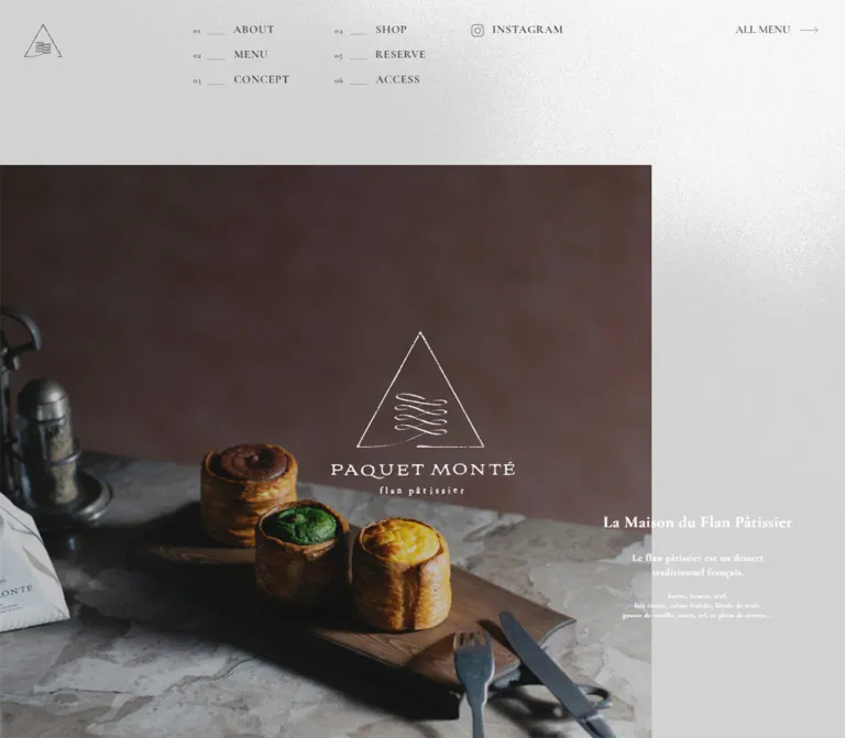
On desktop, a small standalone triangle sits at (30, 30). Navigation begins at x = 240px, arranged as two columns: ABOUT, MENU, CONCEPT on the left; SHOP, RESERVE, ACCESS on the right. The second column begins at approximately x = 415.59px; Instagram begins at approximately x = 584.97px. ALL MENU sits near the right edge at x = 1304px.
Each chapter link consists of a tiny two-digit index, a short horizontal line, and an uppercase serif label. The label supplies the readable target; the number and rule establish the editorial rhythm. The navigation is unboxed and shares the page surface.
On mobile, the visible header contains the 40px triangle at a 20px inset and a thin three-line menu control at the upper right. Its visible line width is approximately 32px. The control appears in both the hero and footer captures, consistent with a persistent control; its exact positioning rule was not included.
The mobile navigation has sampled link rectangles and off-white text, but it was not opened in the supplied screenshots. Do not claim a verified drawer animation, backdrop, close state, or focus behavior. The mobile header ABOUT link points to #aboutSP; the footer ABOUT link points to #about.
The mobile hero is directly visible. A tall photograph begins around y = 85px, extends from the left edge to approximately x = 353px, and ends around y = 754px. These screenshot estimates imply a 37px right rail and a visible photo area of approximately 353 × 669px.
Three cylindrical pastries sit on a dark wooden board over a pale stone surface. Their dark chocolate, green, and golden fillings form the main chromatic accents. A large area of warm brown background above them provides space for the white brand lockup, positioned close to the viewport's horizontal center.
ALL MENU and INSTAGRAM run vertically along the pale right rail. The French caption begins near the lower-left edge of the photograph and continues over the gray area below it. Its measured container begins at approximately (20, 738.17) and is 191.89px wide.
For desktop, the hero section and caption are measured, but the opening screenshot obscures the photograph. The caption container is approximately 235.27 × 137px at (1139.73, 717). Preserve the known full-viewport section and right-side caption relationship; treat any exact desktop image crop as unverified.
Each chapter begins with a small number and a centered uppercase title. The desktop title uses 42px Cormorant Garamond, weight 600, 2.1px tracking, and 40px top padding. Its resulting box is 82px tall.
On mobile, the title decreases to approximately 32px, but retains approximately 40px top padding. The chapter header additionally has approximately 52px top padding, producing a 124px measured header box.
The distinction is important: the large measured header height is spacing plus typography, not a 124px display headline. Keep the chapter title centered independently of the asymmetric photographs and prose beneath it.
The recurring anatomy is:
24px / 1.7, weight 500, with slightly negative tracking.25px.14px / 2.14.The desktop column is 360px wide. At the inspected mobile width it expands to the available 314px content column rather than shrinking the type substantially. This maintains the deliberate line-by-line reading pace.
The reservation subtitle is an exception: the short French word under its heading has no measured 50–60px bottom padding. Do not force the full prose template onto this compact heading group.
Both chapters place a 360px text column centrally on desktop, starting at x = 540px. Their Japanese headings, French translations, and body paragraphs share the same typographic system.
The content has distinct purposes: ABOUT introduces the pastry specialty and traditional wrapping; SHOP describes the house and its two different dining environments. These are narrative sections, not feature-card grids.
Both sections have substantial measured image-related or compositional space around their text. The supplied selected-element records do not include all media bounds, so the precise photographic arrangement in these chapters should not be reconstructed from the text rectangles alone.
The desktop MENU prose begins at x = 793px, contrasting with the centered ABOUT and SHOP text. On mobile it returns to the standard x = 37.98px column.
The source copy introduces the pastry range and baked goods, followed by an ALL MENU link to /menu/. Its measured link box is 200 × 35px on desktop and approximately 314 × 35px on mobile. The type remains approximately 16px.
This is a quiet typographic action rather than a prominent filled button. Arrow details are visible on some utility links, but the complete MENU action border and hover treatment were not directly captured. The Quick Start's consistent arrow treatment is an adaptation.
CONCEPT uses the measured #151f25 background and white Japanese text. Its first desktop prose column begins at x = 980px; the later packaging story begins at x = 100px. This shift creates a change in reading direction within one chapter.
The supplied desktop crop shows an intentionally irregular arrangement of workshop photography. Visible screenshot bounds include:
| Visible region | Approximate screenshot bounds | Reading |
|---|---|---|
| Left pastry photograph | x = 0–198px, y = 0–405px |
Cropped by the left/top capture boundaries |
| Wide workshop photograph | x = 228–888px, y = 0–277px |
A worker and baking tray; top is outside the crop |
| Smaller pastry photograph | x = 932–1239px, y = 130–433px |
Lower than the wide image, leaving dark space above |
| Packaging photograph | x = 640–1440px, starting near y = 591px |
Large right-side image extending beyond the capture bottom |
These are visible crop bounds, not complete asset dimensions or measured CSS placements.
The packaging block pairs a left text column with a much larger right photograph. Its subject is the triangular paper package and fine ribbon, shown against cool window light. The title and top of the large image align approximately across the spread. Broad negative space separates the upper workshop photographs from this second story.
Avoid equalizing these images into a tidy card grid. Unequal sizes, staggered vertical positions, and occasional edge cropping are central to this observed composition. No carousel or drag interaction was demonstrated.
The reservation chapter returns to the dark surface. On desktop, a left heading/action region begins at x = 296px, while a 450px explanatory column begins at approximately x = 726.56px. The RESERVE action remains in the left region near the bottom of the text composition.
Mobile changes both layout and typography. The heading, subtitle, explanatory groups, and action form a single column. Reservation paragraphs increase to approximately 16px / 1.6; this is a deliberate exception to the ordinary 14px / 2.14 body style. The RESERVE link follows the final paragraph.
The content distinguishes the private room, standing area, and takeout. Preserve these as readable text groups, not decorative pricing cards. The observed reservation href is http://bit.ly/3HwMf7h; its destination and booking flow were not opened or verified.
The desktop capture shows a pale, desaturated map area above the information. Only part of the map is visible, including a central labeled tile. This does not establish whether all map tiles loaded, which provider behavior is available, or whether the map can be manipulated.
Below it, two information groups sit behind fine left rules. The desktop address paragraph begins at x = 296px; opening hours and the Instagram update link begin at x = 751px. Both paragraph regions are 424px wide. The rules appear approximately 31px to the left of the text.
On mobile, these groups stack. The text starts at approximately x = 59px, leaving about 21px between the standard gutter and the content. Address and opening-hours text retain approximately 14px / 2.1 typography. The Instagram update line uses approximately 12px text and an outline icon.
The desktop footer is a white 482px closing panel. Numbered navigation sits at the upper left, the full 148 × 133px logo is centered, Instagram sits near the lower left, and company/copyright text sits near the lower right.
Mobile reorders the composition into a 722px panel:
120px top padding.100px of space before the two-column chapter navigation.The footer prints 株式会社FLAN and © FLAN, independently supporting the operator identification. No production credits are visible in the supplied original-page evidence.
| Treatment | Supplied evidence | What can be concluded |
|---|---|---|
| Main header entrance | transform, opacity, and filter: 1.4s, delay 1.8s |
A delayed transition is declared; transform endpoints and filter values are not supplied |
| Chapter heading reveal | Same properties: 1.4s, delay 0.2s |
The headings share a slower reveal vocabulary; the triggering mechanism is unverified |
| Navigation and several brand/utility links | Transition shorthand of 0.4s |
A duration is declared; the visual hover outcome is not documented |
| Opening identity state | Dark logo-only desktop capture | State is visible; lifetime and exit sequence are unknown |
| Mobile menu control | Visible in top and bottom mobile captures | A menu affordance exists; opening, closing, keyboard handling, and animation were not exercised |
| Chapter links | Six anchor destinations; mobile header ABOUT uses #aboutSP |
Destinations are known; scrolling speed, easing, and offset behavior are unverified |
| Menu and social links | Rendered hrefs are supplied | Link targets are known; destination experiences were not inspected |
| Sampled animation fields | animation: none on listed elements |
This does not rule out animation on images, pseudo-elements, other nodes, or through JavaScript |
The supplied capture process waited for visible finite motion and sampled layout stability, with an overall readiness limit. A settled capture does not establish that every delayed reveal completed or that all interaction states were exercised.
Do not infer parallax, scroll snapping, image zoom, smooth anchor scrolling, or a timed splash dismissal from the page's visual style. For an adaptation, restrained opacity and position transitions would fit; their exact endpoints remain implementation choices.
| Surface | Appearance | Purpose |
|---|---|---|
| Main page | Solid silver gray | Quiet field for narrative text and photographs |
| Mobile header / hero surround | Pale gray with visible fine texture | Material character around the opening image |
| Craft chapter | Deep blue-black with white text | Emphasizes process, ingredients, and packaging |
| Reservation chapter | Same deep blue-black | Gives practical reservation information a distinct chapter |
| Photography | Square edges; no visible card containers | Carries texture, color, and atmosphere |
| Access area | Gray surface and subdued map | Practical information within the editorial palette |
| Footer | Pure white with fine gray details | A clear ending and repeated navigation |
Separation comes from large color fields, image boundaries, spacing, and hairlines. The evidence does not support a general system of raised panels, glossy gradients, or floating rounded controls.
Photography is the principal expressive material. The mobile hero combines crisp laminated pastry edges, glossy fillings, dark wood, and pale stone. Its warm brown background gives the small white line-art logo room to remain legible.
The craft photographs alternate warm oven light with cool blue window reflections. People are shown through the activity of making and handling food. The packaging image shifts attention from edible texture to folded paper, printed marks, translucent ribbon, and daylight.
Keep tonal depth and material detail. Broadly brightening every image, replacing the settings with a seamless white product background, or saturating the food into a UI accent palette would change the observed character.
No image source URLs, logo filenames, font-file URLs, or texture asset paths were supplied. The following are identifiable visual roles, not downloadable asset references.
| Asset role | Directly observed use | Implementation guidance |
|---|---|---|
| Small triangle symbol | Desktop/mobile header | Use an authorized original mark; retain its delicate stroke |
| Full brand lockup | Opening state, mobile hero, both footers | Preserve the triangle, wordmark, and descriptor as one composition |
| Three-pastry still life | Mobile hero | Prepare a portrait crop that preserves the pastries and upper negative space |
| Workshop / oven photography | Desktop CONCEPT crop | Retain warm light, deep shadows, and human activity |
| Pastry tray detail | Desktop CONCEPT crop | Use as a smaller offset image, not an equal-sized card |
| Triangular paper packaging | Desktop packaging story | Give the paper and ribbon enough scale to read as material |
| Pale grain | Mobile header and hero surround | If recreated, use a subtle static texture; the original method is unknown |
| Instagram, arrow, menu lines | Navigation and footer | Preserve a restrained outline vocabulary; asset format is unknown |
Other chapters have content and layout records but incomplete visual media evidence. Do not invent their exact imagery or asset ordering.
The page remains a long scrolling shop website at both widths. Mobile is approximately 1671px taller in the supplied measurements, despite reduced horizontal space and smaller chapter titles.
| Region | Desktop height | Mobile height | Evidence-based change |
|---|---|---|---|
| Hero | 1000px |
844px |
Matches the inspected viewport height |
| ABOUT | 1672.20px |
2395.98px |
Prose becomes the standard mobile column; surrounding composition is substantially taller |
| MENU | 1084px |
1687.84px |
Right-positioned prose returns to the mobile content gutter |
| CONCEPT | 2396.81px |
2648.64px |
Two desktop prose alignments become one mobile column |
| SHOP | 1600.27px |
1819.17px |
Centered desktop prose becomes inset mobile prose |
| RESERVE | 1588.61px |
1680.28px |
Desktop text regions stack; body type increases; action follows the copy |
| ACCESS | 968.97px |
1066.02px |
Information groups stack |
| Footer | 482px |
722.31px |
Logo moves ahead of navigation; utilities and legal text stack |
These are section rectangles, not recommended fixed heights. They do not sum directly to document height because additional intervals occur between some measured sections. For example, approximately 450px separates the desktop ABOUT endpoint from MENU, compared with approximately 220px on mobile. The selected records do not identify every intervening media element.
Desktop compositions repeatedly alternate among three text positions: centered at x = 540px, right-positioned at x = 793px or 980px, and left-positioned at x = 100px. Mobile normalizes those positions to x = approximately 38px while retaining the overall chapter order.
The supplied --vh and --dvh properties are 10px on desktop and 8.44px on mobile, matching one hundredth of the respective viewport heights. Their complete source usage is unavailable. A new implementation can use modern viewport units, but should test browser chrome and orientation changes separately.
Only two viewport sizes were supplied. Exact breakpoints, tablet behavior, landscape crops, maximum-width rules, and mobile font-scaling formulas remain unknown. The Quick Start's 760px breakpoint is a recommendation.
#d2d2d2, #151f25, #333333, #72797c, and white as the main interface palette.These are recommendations for a new implementation, not verified features of the original:
44px menu-button target can still contain a 32px symbol.#d2d2d2.#151f25.#333333.#72797c.#ffffff.“Create an editorial website for a Japanese French-pastry shop, with six numbered chapters: ABOUT, MENU, CONCEPT, SHOP, RESERVE, and ACCESS. Use silver gray #d2d2d2, deep blue-black #151f25, charcoal text, and a white closing footer. Pair Shippori Mincho Japanese typography with Cormorant Garamond chapter titles and numbered navigation. Use narrow 360px desktop prose columns, 24px Japanese headings, small French translations, fine rules, and generous leading. Let square-cornered pastry, workshop, and paper-packaging photographs carry the color. Alternate centered and offset editorial compositions. On a 390px phone, use approximately 38px content gutters, a tall opening photograph with a narrow vertical utility rail, and a stacked footer with the logo first. Treat unobserved desktop image crops and menu behavior as explicit implementation decisions.”
This starter reproduces the measured color and type system, recurring prose anatomy, access columns, and footer relationships. It uses conventional root sizing. The 760px breakpoint, generic chapter padding, arrow treatment, and some grid behavior are recommended adaptations. It does not reconstruct unverified desktop hero media, navigation overlays, reveal endpoints, or an opening-screen dismissal sequence.
Load the authorized font files and brand/image assets separately. No asset URLs were included in the supplied evidence.
:root {
  /* Measured colors */
  --pm-paper: #d2d2d2;
  --pm-night: #151f25;
  --pm-ink: #333333;
  --pm-muted: #72797c;
  --pm-white: #ffffff;
  --pm-menu-ink: #f7f7f7;

  /* Recommended approximation for unmeasured rule color */
  --pm-rule: rgb(51 51 51 / 35%);

  /* Measured family declarations, with a recommended Latin fallback */
  --pm-font-jp: 'Shippori Mincho', 游明朝, 'Yu Mincho', YuMincho,
    'Hiragino Mincho Pro', serif;
  --pm-font-latin: 'Cormorant Garamond', serif;

  --pm-section-size: 42px;
  --pm-heading-size: 24px;
  --pm-body-size: 14px;
  --pm-caption-size: 12px;
  --pm-action-size: 16px;
  --pm-body-leading: 2.14;
  --pm-heading-leading: 1.7;
  --pm-tracking: 0.05em;

  --pm-gutter: 100px;
  --pm-prose-width: 360px;
  --pm-translation-space: 60px;
  --pm-link-duration: 400ms;
  --pm-reveal-duration: 1400ms;
  --pm-reveal-delay: 200ms;
}

.pm-page,
.pm-page * {
  box-sizing: border-box;
}

.pm-page {
  margin: 0;
  color: var(--pm-ink);
  background: var(--pm-paper);
  font-family: var(--pm-font-jp);
  font-size: var(--pm-body-size);
  font-weight: 500;
}

.pm-page a {
  color: inherit;
}

.pm-container {
  width: calc(100% - 2 * var(--pm-gutter));
  margin-inline: auto;
}

.pm-photo {
  display: block;
  width: 100%;
  height: auto;
  border-radius: 0;
}

/* Generic chapter spacing is an adaptation, not a fixed source formula. */
.pm-chapter {
  padding-block: 160px;
}

.pm-chapter--dark {
  color: var(--pm-white);
  background: var(--pm-night);
  --pm-rule: rgb(255 255 255 / 45%);
}

.pm-chapter-heading {
  position: relative;
  text-align: center;
}

.pm-chapter-number {
  position: absolute;
  inset: 0 0 auto;
  font-family: var(--pm-font-latin);
  font-size: 12px; /* Recommended; this individual size was not measured. */
}

.pm-chapter-title {
  margin: 0;
  padding-top: 40px;
  font-family: var(--pm-font-latin);
  font-size: var(--pm-section-size);
  font-weight: 600;
  line-height: 1;
  letter-spacing: var(--pm-tracking);
}

.pm-prose {
  width: min(100%, var(--pm-prose-width));
}

.pm-prose--center {
  margin-inline: auto;
}

.pm-prose-title {
  margin: 0;
  font-size: var(--pm-heading-size);
  font-weight: 500;
  line-height: var(--pm-heading-leading);
  letter-spacing: -0.05em;
}

.pm-french {
  position: relative;
  margin: 25px 0 50px;
  padding-bottom: var(--pm-translation-space);
  color: var(--pm-muted);
  font-size: var(--pm-caption-size);
  line-height: 1.5;
  letter-spacing: var(--pm-tracking);
}

.pm-french::after {
  content: '';
  position: absolute;
  bottom: 0;
  left: 0;
  width: 40px;
  height: 1px;
  background: currentColor;
}

.pm-french--compact {
  margin: 5px 0 0;
  padding: 0;
}

.pm-french--compact::after {
  content: none;
}

.pm-body-copy {
  margin: 0;
  line-height: var(--pm-body-leading);
}

.pm-action {
  display: flex;
  align-items: flex-start;
  justify-content: space-between;
  width: 200px;
  min-height: 35px;
  margin-top: 50px;
  font-size: var(--pm-action-size);
  line-height: 1;
  text-decoration: none;
}

/* Consistent arrow treatment is a recommended adaptation. */
.pm-action::after {
  content: '⟶';
  font-family: serif;
}

/* Use outside .pm-container for the observed edge-reaching composition. */
.pm-packaging-layout {
  display: grid;
  grid-template-columns: 360px minmax(0, 1fr);
  gap: 180px;
  align-items: start;
  padding-left: var(--pm-gutter);
}

.pm-reservation-copy {
  max-width: 450px;
  line-height: var(--pm-body-leading);
}

.pm-reservation-copy p {
  margin: 0 0 40px;
}

.pm-access-details {
  display: grid;
  grid-template-columns: repeat(2, minmax(0, 1fr));
  max-width: 910px;
  margin-inline: auto;
}

.pm-access-group {
  border-left: 1px solid var(--pm-rule);
  padding-left: 30px;
  line-height: 2.1;
}

.pm-access-group p {
  margin: 0;
}

.pm-nav-columns {
  display: grid;
  grid-template-columns: 120px 114px;
  column-gap: 56px;
}

.pm-nav-list {
  display: grid;
  gap: 17px;
  margin: 0;
  padding: 0;
  list-style: none;
}

.pm-nav-link {
  display: grid;
  grid-template-columns: 8px 22px 1fr;
  column-gap: 10px;
  align-items: center;
  font-family: var(--pm-font-latin);
  font-size: 14px;
  font-weight: 700;
  line-height: 1;
  letter-spacing: var(--pm-tracking);
  text-decoration: none;
}

.pm-nav-index {
  font-size: 8px; /* Visual estimate, not a computed source value. */
}

.pm-nav-rule {
  height: 1px;
  background: var(--pm-rule);
}

.pm-footer {
  padding: 115px var(--pm-gutter) 105px;
  background: var(--pm-white);
}

.pm-footer-layout {
  display: grid;
  grid-template-columns: minmax(0, 1fr) 148px minmax(0, 1fr);
  grid-template-rows: 1fr auto;
  min-height: 262px;
}

.pm-footer-nav {
  grid-area: 1 / 1;
}

.pm-footer-brand {
  grid-area: 1 / 2 / 3 / 3;
  align-self: center;
  width: 148px;
}

.pm-footer-brand img {
  display: block;
  width: 100%;
  height: auto;
}

.pm-footer-utilities {
  grid-area: 2 / 1;
  align-self: end;
  display: grid;
  gap: 24px;
}

.pm-footer-utilities a {
  display: flex;
  align-items: center;
  gap: 10px;
  font-size: 14px;
  line-height: 1;
  letter-spacing: var(--pm-tracking);
  text-decoration: none;
}

.pm-footer-utilities .pm-footer-all-menu {
  display: none;
}

.pm-footer-legal {
  grid-area: 2 / 3;
  justify-self: end;
  text-align: right;
}

.pm-footer-legal p {
  margin: 0;
  line-height: 1.7;
}

.pm-footer-legal .pm-copyright {
  font-size: 12px;
  line-height: 1;
}

/* Recommended accessible feedback; source hover appearance is unknown. */
.pm-page :focus-visible {
  outline: 2px solid currentColor;
  outline-offset: 5px;
}

@media (hover: hover) {
  .pm-nav-link:hover,
  .pm-action:hover {
    text-decoration: underline;
    text-underline-offset: 5px;
  }
}

/* Recommended breakpoint; only 1440px and 390px were inspected. */
@media (max-width: 760px) {
  :root {
    --pm-gutter: clamp(20px, 9.74vw, 38px);
    --pm-section-size: 32px;
    --pm-translation-space: 50px;
  }

  .pm-chapter {
    padding-block: 105px;
  }

  .pm-chapter-heading {
    padding-top: 52px;
  }

  .pm-chapter-number {
    top: 52px;
  }

  .pm-prose {
    width: 100%;
  }

  .pm-action {
    width: 100%;
  }

  .pm-packaging-layout {
    grid-template-columns: minmax(0, 1fr);
    gap: 50px;
    padding-inline: var(--pm-gutter);
  }

  .pm-reservation-copy {
    max-width: none;
    font-size: 16px;
    line-height: 1.6;
  }

  .pm-reservation-copy p {
    margin-bottom: 20px;
  }

  .pm-access-details {
    grid-template-columns: minmax(0, 1fr);
    gap: 85px;
  }

  .pm-access-group {
    padding-left: 20px;
  }

  .pm-footer {
    padding-block: 120px 40px;
  }

  .pm-footer-layout {
    display: flex;
    flex-direction: column;
    min-height: 0;
  }

  .pm-footer-brand {
    order: 0;
    align-self: center;
  }

  .pm-footer-nav {
    order: 1;
    margin-top: 100px;
  }

  .pm-nav-columns {
    column-gap: 24px;
  }

  .pm-nav-list {
    gap: 20px;
  }

  .pm-footer-utilities {
    order: 2;
    align-self: stretch;
    margin-top: 30px;
    padding-top: 30px;
    border-top: 1px solid var(--pm-rule);
  }

  .pm-footer-utilities .pm-footer-all-menu {
    display: flex;
  }

  .pm-footer-legal {
    order: 3;
    margin-top: 90px;
    color: var(--pm-muted);
    font-size: 12px;
    text-align: left;
  }

  .pm-footer-legal .pm-copyright {
    margin-top: 10px;
  }
}

/* No entrance state is hidden by default in this starter. */
@media (prefers-reduced-motion: reduce) {
  .pm-page *,
  .pm-page *::before,
  .pm-page *::after {
    animation: none !important;
    transition: none !important;
    scroll-behavior: auto !important;
  }
}
For a numbered navigation item, use three children inside .pm-nav-link: .pm-nav-index, an aria-hidden .pm-nav-rule, and the label. Group three items in each .pm-nav-list, with both lists inside .pm-nav-columns. Keep the numerical indices decorative if the accessible link label already names the destination.
For the footer grid, .pm-footer-layout contains .pm-footer-nav, .pm-footer-brand, .pm-footer-utilities, and .pm-footer-legal. The mobile order is explicitly defined by CSS. Supply the actual logo asset inside the brand link rather than replacing it with generated text.
The packaging grid reproduces the observed desktop relationship at 1440px: 100px left gutter, 360px prose, 180px gap, then an 800px image region. Its stacked mobile form is a recommendation because the mobile packaging photograph was not captured.
Optional aliases for a project already using Tailwind v4. This does not imply that the original site uses Tailwind. Define the custom properties above first.
@theme inline {
  --color-pm-paper: var(--pm-paper);
  --color-pm-night: var(--pm-night);
  --color-pm-ink: var(--pm-ink);
  --color-pm-muted: var(--pm-muted);
  --color-pm-white: var(--pm-white);

  --font-pm-jp: var(--pm-font-jp);
  --font-pm-latin: var(--pm-font-latin);

  --text-pm-section: var(--pm-section-size);
  --text-pm-heading: var(--pm-heading-size);
  --text-pm-body: var(--pm-body-size);
  --text-pm-caption: var(--pm-caption-size);
  --text-pm-action: var(--pm-action-size);

  --spacing-pm-gutter: var(--pm-gutter);
  --spacing-pm-prose: var(--pm-prose-width);
  --radius-pm-flat: 0px;
}
17:32:12.968 UTC, equivalent to September 23, 2026, 02:32:12.968 JST.This reference analyzes only the supplied current-page captures and rendered evidence. No additional pages, files, or assets were opened. Measured values describe the inspected states; recommendations and starter code are explicitly reusable adaptations.
# PAQUET MONTÉ — Style Reference

> A French pastry house expressed through silver-gray paper, blue-black chapters, fine serif lettering, and carefully spaced photographs.

**Original URL:** [paquetmonte.suzu-pr.com](https://paquetmonte.suzu-pr.com/)
**Final URL:** [paquetmonte.suzu-pr.com](https://paquetmonte.suzu-pr.com/) — unchanged; supplied response status: HTTP 200.
**Inspected:** September 22, 2026, at 17:32:12.968 UTC / September 23, 2026, at 02:32:12.968 JST.
**Viewports:** 1440 × 1000 desktop and 390 × 844 mobile, in CSS pixels.
**Theme:** silver-gray main canvas, blue-black editorial sections, and a white footer.
**Scope:** the current homepage, including the opening identity state, mobile hero, six numbered chapters, desktop craft and packaging composition, access information, and desktop/mobile footers. All six chapters have supplied DOM measurements; only the attached portions have direct screenshot coverage. The separate menu page, reservation destination, and opened mobile navigation were not inspected.

PAQUET MONTÉ presents its products and physical shop through a long editorial sequence: ABOUT, MENU, CONCEPT, SHOP, RESERVE, and ACCESS. Japanese explanations sit alongside smaller French translations. Tall pastry photographs, workshop scenes, and triangular paper packaging carry the identity, while compact navigation and simple text links provide practical routes to menus, reservations, and location information.

The main contrast is structural. Pale gray gives way to deep blue-black for the craft and reservation chapters, then returns before a white footer. Photography introduces caramel, chocolate, green, and cool window light without turning those colors into interface accents. Text remains restrained: a 24px Japanese heading, a narrow paragraph column, and generous vertical separation do more work than oversized headlines or decorative cards.
# PAQUET MONTÉ — Style Reference

> A French pastry house expressed through silver-gray paper, blue-black chapters, fine serif lettering, and carefully spaced photographs.

**Original URL:** [paquetmonte.suzu-pr.com](https://paquetmonte.suzu-pr.com/)
**Final URL:** [paquetmonte.suzu-pr.com](https://paquetmonte.suzu-pr.com/) — unchanged; supplied response status: HTTP 200.
**Inspected:** September 22, 2026, at 17:32:12.968 UTC / September 23, 2026, at 02:32:12.968 JST.
**Viewports:** 1440 × 1000 desktop and 390 × 844 mobile, in CSS pixels.
**Theme:** silver-gray main canvas, blue-black editorial sections, and a white footer.
**Scope:** the current homepage, including the opening identity state, mobile hero, six numbered chapters, desktop craft and packaging composition, access information, and desktop/mobile footers. All six chapters have supplied DOM measurements; only the attached portions have direct screenshot coverage. The separate menu page, reservation destination, and opened mobile navigation were not inspected.

PAQUET MONTÉ presents its products and physical shop through a long editorial sequence: ABOUT, MENU, CONCEPT, SHOP, RESERVE, and ACCESS. Japanese explanations sit alongside smaller French translations. Tall pastry photographs, workshop scenes, and triangular paper packaging carry the identity, while compact navigation and simple text links provide practical routes to menus, reservations, and location information.

The main contrast is structural. Pale gray gives way to deep blue-black for the craft and reservation chapters, then returns before a white footer. Photography introduces caramel, chocolate, green, and cool window light without turning those colors into interface accents. Text remains restrained: a 24px Japanese heading, a narrow paragraph column, and generous vertical separation do more work than oversized headlines or decorative cards.

## How to Read This Reference

- **Measured** values come from the supplied rendered DOM, computed styles, and element rectangles. They describe these two inspected viewports, not every possible screen size.
- **Visual estimates** describe screenshot geometry or details for which no corresponding element measurements were supplied.
- **Calculated** values are simple relationships between measured rectangles, such as gutters and distances between text blocks.
- **Recommendations** and the Quick Start are adaptations for implementation. Their class names, breakpoints, and layout formulas are not recovered source code.
- Font names below are supported by computed family declarations. Font-file URLs and successful resolution of every individual font face were not separately documented.
- The desktop opening capture shows a brand-only screen. Underlying hero measurements exist, but its fully revealed desktop photograph and final crop were not visually captured.

## Tokens — Colors

### Default Palette

The aliases below are proposed implementation names, not original CSS variables.

| Name | Value | Suggested token | Evidence and role |
| --- | --- | --- | --- |
| Silver Gray | `#d2d2d2` | `--pm-paper` | Measured body background; inherited by the pale editorial chapters and access area |
| Blue Black | `#151f25` | `--pm-night` | Measured CONCEPT and RESERVE backgrounds; visually similar to the opening identity field |
| Charcoal | `#333333` | `--pm-ink` | Measured main text, navigation, and headings on light surfaces |
| Cool Gray | `#72797c` | `--pm-muted` | Measured French translations; also the mobile footer company and copyright text |
| White | `#ffffff` | `--pm-white` | Measured footer background, dark-section text, and hero caption text |
| Navigation Off White | `#f7f7f7` | `--pm-menu-ink` | Measured mobile navigation link color; the opened navigation surface was not visually inspected |
| Fine Rule | Approximately translucent gray | `--pm-rule` | Hairlines are visible; their exact CSS color was not supplied. `rgb(51 51 51 / 35%)` is a recommended approximation on light surfaces |

The opening screen's exact background declaration was not supplied. Reusing the measured `#151f25` section color is a reasonable implementation choice, not an independent measurement of that screen.

The mobile header has a fine, uneven pale texture. This is a visual observation; neither a texture asset nor its compositing method was identified. Keep the solid base color distinct from that texture treatment.

### Theme Presets

No selectable themes were demonstrated. The light and dark treatments belong to different chapters of the same page. Preserve this sequence rather than implementing a theme switch on the strength of these captures.

The supplied CSS custom properties also include administrative and editor palette values. Those do not establish additional visible brand colors.

## Tokens — Typography

### Japanese Editorial Text

**Measured stack:** `"Shippori Mincho", 游明朝, "Yu Mincho", YuMincho, "Hiragino Mincho Pro", serif`.

The body, Japanese headings, explanatory paragraphs, chapter translations, and many utility links use this stack. The usual weight is `500`. Japanese headings are moderately sized and closely tracked; body paragraphs use unusually generous leading.

French chapter translations also inherit this Mincho stack. Do not automatically assign every Latin-language element to the display serif.

### Latin Chapter Titles and Navigation

**Measured family:** `"Cormorant Garamond"`.

Uppercase chapter titles use weight `600`; numbered navigation uses `700`. The top desktop ALL MENU link uses `400`. The hero caption container uses `700`.

The narrow, high-contrast serif forms let relatively small navigation remain distinctive. Chapter labels have `0.05em` tracking rather than extreme letter spacing.

### Brand Artwork

The triangle, internal looping line, wordmark, and small pastry descriptor form a supplied brand lockup. Treat this as artwork. Ordinary text in either observed font should not be presented as an exact reconstruction of the logo.

### Type Scale

Mobile values below are rounded where the source reports small fractional differences.

| Role | Desktop | Mobile | Weight | Leading / tracking |
| --- | --- | --- | --- | --- |
| Chapter title | `42px` | `32.019px` | `600` | `1`; tracking `2.1px` desktop, `1.601px` mobile |
| Japanese heading | `24px` | `23.985px` | `500` | `1.7`; tracking approximately `-0.05em` |
| Main paragraph | `14px` | `14.001px` | `500` | Approximately `29.96px`, or `2.14` |
| French chapter translation | `12px` | `12.012px` | `500` | Approximately `18px`, or `1.5`; tracking `0.05em` |
| Numbered navigation label | `14px` | `14.001px` | `700` | Approximately `14px`; tracking `0.05em` |
| Main text action | `16px` | `15.99px` | `500` | Approximately `16px` |
| Reservation body | `14px` | `15.99px` | `500` | Desktop `29.96px`; mobile `25.584px`, or `1.6` |
| Access information | `14px` | `14.001px` | `500` | Approximately `29.4px`, or `2.1` |
| Access update link | `12px` | `12.012px` | `500` | Approximately `25.2px` |
| Mobile hero rail | Not present in the sampled desktop layout | `9.984px` | `500` | Approximately `10px`; vertical presentation |
| Footer company | `14px` | `12.012px` | `500` | `1.7` |
| Footer copyright | `12px` | `12.012px` | `500` | `1` |

Navigation indices appear approximately 8px in the screenshots; their individual computed size was not included. The hero caption parent is measured at approximately `14px / 21px`, but its individual title and ingredient-text children visibly vary in size and were not separately measured.

The source root font size is `10px` at both viewports. The Quick Start uses explicit pixel-based tokens so it can coexist with a conventional application root without copying unknown source `rem` formulas.

## Tokens — Spacing & Shapes

**Density:** small controls and narrow text columns inside large, image-led chapter compositions.

There is no demonstrated universal spacing scale. The most reusable observed intervals are 20, 25, 30–31, 38, 40, 50, 60, 100, and 120px. Their roles matter more than forcing every value into a strict increment system.

### Spacing Scale

| Use | Desktop | Mobile | Status |
| --- | --- | --- | --- |
| Header logo inset | `30px` | Approximately `20px` | Measured |
| Standard content gutter | `100px` | `37.984px` | Measured |
| Japanese heading to translation | `25px` | Approximately `25px` | Calculated from rectangles |
| Translation bottom padding | `60px` | Approximately `50px` | Measured, except the compact reservation subtitle |
| Translation box to following body | `50px` | Approximately `50px` | Calculated |
| Body to MENU action | `50px` | Approximately `50px` | Calculated |
| Footer navigation row pitch | `31px` | `34px` | Calculated |
| Footer navigation column gap | `56px` | Approximately `24px` | Calculated |
| Footer top padding | `115px` | Approximately `120px` | Measured |
| Footer bottom padding | `105px` | Approximately `40px` | Measured |
| Mobile footer logo to navigation | — | Approximately `100px` | Calculated |

The large translation-to-body separation is intentional. A two-line French translation occupies approximately 36px of text, followed by 60px of internal space and another 50px before the body on desktop. A short rule visually punctuates this interval in the packaging capture.

### Border Radius

Sampled elements report `0px` radius. Photographs have square corners, text groups sit directly on the page, and the footer uses rules rather than enclosed cards. No general rounded-card or shadow-elevation system appears in the supplied evidence.

The short prose divider is approximately 40px wide and 1px high by visual estimation. Navigation and access dividers are similarly fine.

### Layout Measurements

| Element | Desktop at 1440 × 1000 | Mobile at 390 × 844 |
| --- | --- | --- |
| Document height | `11692.86px` | `13364.19px` |
| Main content container | `1240px`, starting at x = `100px` | `314.03px`, starting at x = `37.98px` |
| Standard prose width | `360px` | `314.03px` |
| Header symbol | `47 × 41px` | `40 × 34.89px` |
| Hero section | `1440 × 1000px` | `390 × 844px` |
| Hero top padding | `205px` | `84.981px` |
| Main text action | `200 × 35px` | Approximately `314 × 35px` |
| Access paragraph width | `424px` per column | `293.03px` after the left rule and inset |
| Footer logo link | `148 × 133px` | Approximately `148 × 133px` |
| Footer height | `482px` | `722.31px` |

The mobile gutter occupies approximately 9.74% of the viewport width. This is a calculated proportion at 390px, not proof that the source uses a percentage-based gutter formula.

## Components

### Opening Identity State

The desktop opening capture is a full dark field with a small white brand lockup close to the exact viewport center. Its visible footprint is approximately `166 × 148px`, estimated from the screenshot. The fine triangle and looping internal drawing require plenty of uninterrupted surrounding space.

No progress percentage, loading bar, or explanatory message is visible. Treat this as a captured opening identity state. Its dismissal condition, duration, and relationship to image loading were not established, even though the underlying document contains the complete homepage.

### Header and Numbered Navigation

On desktop, a small standalone triangle sits at `(30, 30)`. Navigation begins at x = `240px`, arranged as two columns: ABOUT, MENU, CONCEPT on the left; SHOP, RESERVE, ACCESS on the right. The second column begins at approximately x = `415.59px`; Instagram begins at approximately x = `584.97px`. ALL MENU sits near the right edge at x = `1304px`.

Each chapter link consists of a tiny two-digit index, a short horizontal line, and an uppercase serif label. The label supplies the readable target; the number and rule establish the editorial rhythm. The navigation is unboxed and shares the page surface.

On mobile, the visible header contains the `40px` triangle at a `20px` inset and a thin three-line menu control at the upper right. Its visible line width is approximately `32px`. The control appears in both the hero and footer captures, consistent with a persistent control; its exact positioning rule was not included.

The mobile navigation has sampled link rectangles and off-white text, but it was not opened in the supplied screenshots. Do not claim a verified drawer animation, backdrop, close state, or focus behavior. The mobile header ABOUT link points to `#aboutSP`; the footer ABOUT link points to `#about`.

### Hero Photograph and Brand Lockup

The mobile hero is directly visible. A tall photograph begins around y = `85px`, extends from the left edge to approximately x = `353px`, and ends around y = `754px`. These screenshot estimates imply a `37px` right rail and a visible photo area of approximately `353 × 669px`.

Three cylindrical pastries sit on a dark wooden board over a pale stone surface. Their dark chocolate, green, and golden fillings form the main chromatic accents. A large area of warm brown background above them provides space for the white brand lockup, positioned close to the viewport's horizontal center.

ALL MENU and INSTAGRAM run vertically along the pale right rail. The French caption begins near the lower-left edge of the photograph and continues over the gray area below it. Its measured container begins at approximately `(20, 738.17)` and is `191.89px` wide.

For desktop, the hero section and caption are measured, but the opening screenshot obscures the photograph. The caption container is approximately `235.27 × 137px` at `(1139.73, 717)`. Preserve the known full-viewport section and right-side caption relationship; treat any exact desktop image crop as unverified.

### Numbered Chapter Heading

Each chapter begins with a small number and a centered uppercase title. The desktop title uses `42px` Cormorant Garamond, weight `600`, `2.1px` tracking, and `40px` top padding. Its resulting box is `82px` tall.

On mobile, the title decreases to approximately `32px`, but retains approximately `40px` top padding. The chapter header additionally has approximately `52px` top padding, producing a `124px` measured header box.

The distinction is important: the large measured header height is spacing plus typography, not a 124px display headline. Keep the chapter title centered independently of the asymmetric photographs and prose beneath it.

### Bilingual Prose Block

The recurring anatomy is:

1. A Japanese heading at approximately `24px / 1.7`, weight `500`, with slightly negative tracking.
2. A smaller French translation, normally separated by `25px`.
3. A long quiet interval, punctuated by a short rule where visible.
4. Japanese body copy at approximately `14px / 2.14`.
5. An optional text action after another generous gap.

The desktop column is `360px` wide. At the inspected mobile width it expands to the available `314px` content column rather than shrinking the type substantially. This maintains the deliberate line-by-line reading pace.

The reservation subtitle is an exception: the short French word under its heading has no measured 50–60px bottom padding. Do not force the full prose template onto this compact heading group.

### ABOUT and SHOP Chapters

Both chapters place a `360px` text column centrally on desktop, starting at x = `540px`. Their Japanese headings, French translations, and body paragraphs share the same typographic system.

The content has distinct purposes: ABOUT introduces the pastry specialty and traditional wrapping; SHOP describes the house and its two different dining environments. These are narrative sections, not feature-card grids.

Both sections have substantial measured image-related or compositional space around their text. The supplied selected-element records do not include all media bounds, so the precise photographic arrangement in these chapters should not be reconstructed from the text rectangles alone.

### MENU Teaser and Text Action

The desktop MENU prose begins at x = `793px`, contrasting with the centered ABOUT and SHOP text. On mobile it returns to the standard x = `37.98px` column.

The source copy introduces the pastry range and baked goods, followed by an ALL MENU link to `/menu/`. Its measured link box is `200 × 35px` on desktop and approximately `314 × 35px` on mobile. The type remains approximately `16px`.

This is a quiet typographic action rather than a prominent filled button. Arrow details are visible on some utility links, but the complete MENU action border and hover treatment were not directly captured. The Quick Start's consistent arrow treatment is an adaptation.

### CONCEPT Photography and Packaging Story

CONCEPT uses the measured `#151f25` background and white Japanese text. Its first desktop prose column begins at x = `980px`; the later packaging story begins at x = `100px`. This shift creates a change in reading direction within one chapter.

The supplied desktop crop shows an intentionally irregular arrangement of workshop photography. Visible screenshot bounds include:

| Visible region | Approximate screenshot bounds | Reading |
| --- | --- | --- |
| Left pastry photograph | x = `0–198px`, y = `0–405px` | Cropped by the left/top capture boundaries |
| Wide workshop photograph | x = `228–888px`, y = `0–277px` | A worker and baking tray; top is outside the crop |
| Smaller pastry photograph | x = `932–1239px`, y = `130–433px` | Lower than the wide image, leaving dark space above |
| Packaging photograph | x = `640–1440px`, starting near y = `591px` | Large right-side image extending beyond the capture bottom |

These are visible crop bounds, not complete asset dimensions or measured CSS placements.

The packaging block pairs a left text column with a much larger right photograph. Its subject is the triangular paper package and fine ribbon, shown against cool window light. The title and top of the large image align approximately across the spread. Broad negative space separates the upper workshop photographs from this second story.

Avoid equalizing these images into a tidy card grid. Unequal sizes, staggered vertical positions, and occasional edge cropping are central to this observed composition. No carousel or drag interaction was demonstrated.

### RESERVE Chapter

The reservation chapter returns to the dark surface. On desktop, a left heading/action region begins at x = `296px`, while a `450px` explanatory column begins at approximately x = `726.56px`. The RESERVE action remains in the left region near the bottom of the text composition.

Mobile changes both layout and typography. The heading, subtitle, explanatory groups, and action form a single column. Reservation paragraphs increase to approximately `16px / 1.6`; this is a deliberate exception to the ordinary `14px / 2.14` body style. The RESERVE link follows the final paragraph.

The content distinguishes the private room, standing area, and takeout. Preserve these as readable text groups, not decorative pricing cards. The observed reservation href is `http://bit.ly/3HwMf7h`; its destination and booking flow were not opened or verified.

### ACCESS Map and Information

The desktop capture shows a pale, desaturated map area above the information. Only part of the map is visible, including a central labeled tile. This does not establish whether all map tiles loaded, which provider behavior is available, or whether the map can be manipulated.

Below it, two information groups sit behind fine left rules. The desktop address paragraph begins at x = `296px`; opening hours and the Instagram update link begin at x = `751px`. Both paragraph regions are `424px` wide. The rules appear approximately `31px` to the left of the text.

On mobile, these groups stack. The text starts at approximately x = `59px`, leaving about `21px` between the standard gutter and the content. Address and opening-hours text retain approximately `14px / 2.1` typography. The Instagram update line uses approximately `12px` text and an outline icon.

### Footer

The desktop footer is a white `482px` closing panel. Numbered navigation sits at the upper left, the full `148 × 133px` logo is centered, Instagram sits near the lower left, and company/copyright text sits near the lower right.

Mobile reorders the composition into a `722px` panel:

1. Centered full logo after approximately `120px` top padding.
2. Approximately `100px` of space before the two-column chapter navigation.
3. A fine horizontal divider.
4. ALL MENU with a slender arrow, then Instagram with an outline icon.
5. Company and copyright aligned left near the bottom.

The footer prints `株式会社FLAN` and `© FLAN`, independently supporting the operator identification. No production credits are visible in the supplied original-page evidence.

## Tokens — Motion & Interaction

| Treatment | Supplied evidence | What can be concluded |
| --- | --- | --- |
| Main header entrance | `transform`, `opacity`, and `filter`: `1.4s`, delay `1.8s` | A delayed transition is declared; transform endpoints and filter values are not supplied |
| Chapter heading reveal | Same properties: `1.4s`, delay `0.2s` | The headings share a slower reveal vocabulary; the triggering mechanism is unverified |
| Navigation and several brand/utility links | Transition shorthand of `0.4s` | A duration is declared; the visual hover outcome is not documented |
| Opening identity state | Dark logo-only desktop capture | State is visible; lifetime and exit sequence are unknown |
| Mobile menu control | Visible in top and bottom mobile captures | A menu affordance exists; opening, closing, keyboard handling, and animation were not exercised |
| Chapter links | Six anchor destinations; mobile header ABOUT uses `#aboutSP` | Destinations are known; scrolling speed, easing, and offset behavior are unverified |
| Menu and social links | Rendered hrefs are supplied | Link targets are known; destination experiences were not inspected |
| Sampled animation fields | `animation: none` on listed elements | This does not rule out animation on images, pseudo-elements, other nodes, or through JavaScript |

The supplied capture process waited for visible finite motion and sampled layout stability, with an overall readiness limit. A settled capture does not establish that every delayed reveal completed or that all interaction states were exercised.

Do not infer parallax, scroll snapping, image zoom, smooth anchor scrolling, or a timed splash dismissal from the page's visual style. For an adaptation, restrained opacity and position transitions would fit; their exact endpoints remain implementation choices.

## Surfaces

| Surface | Appearance | Purpose |
| --- | --- | --- |
| Main page | Solid silver gray | Quiet field for narrative text and photographs |
| Mobile header / hero surround | Pale gray with visible fine texture | Material character around the opening image |
| Craft chapter | Deep blue-black with white text | Emphasizes process, ingredients, and packaging |
| Reservation chapter | Same deep blue-black | Gives practical reservation information a distinct chapter |
| Photography | Square edges; no visible card containers | Carries texture, color, and atmosphere |
| Access area | Gray surface and subdued map | Practical information within the editorial palette |
| Footer | Pure white with fine gray details | A clear ending and repeated navigation |

Separation comes from large color fields, image boundaries, spacing, and hairlines. The evidence does not support a general system of raised panels, glossy gradients, or floating rounded controls.

## Imagery

Photography is the principal expressive material. The mobile hero combines crisp laminated pastry edges, glossy fillings, dark wood, and pale stone. Its warm brown background gives the small white line-art logo room to remain legible.

The craft photographs alternate warm oven light with cool blue window reflections. People are shown through the activity of making and handling food. The packaging image shifts attention from edible texture to folded paper, printed marks, translucent ribbon, and daylight.

Keep tonal depth and material detail. Broadly brightening every image, replacing the settings with a seamless white product background, or saturating the food into a UI accent palette would change the observed character.

### Observed Asset References

No image source URLs, logo filenames, font-file URLs, or texture asset paths were supplied. The following are identifiable visual roles, not downloadable asset references.

| Asset role | Directly observed use | Implementation guidance |
| --- | --- | --- |
| Small triangle symbol | Desktop/mobile header | Use an authorized original mark; retain its delicate stroke |
| Full brand lockup | Opening state, mobile hero, both footers | Preserve the triangle, wordmark, and descriptor as one composition |
| Three-pastry still life | Mobile hero | Prepare a portrait crop that preserves the pastries and upper negative space |
| Workshop / oven photography | Desktop CONCEPT crop | Retain warm light, deep shadows, and human activity |
| Pastry tray detail | Desktop CONCEPT crop | Use as a smaller offset image, not an equal-sized card |
| Triangular paper packaging | Desktop packaging story | Give the paper and ribbon enough scale to read as material |
| Pale grain | Mobile header and hero surround | If recreated, use a subtle static texture; the original method is unknown |
| Instagram, arrow, menu lines | Navigation and footer | Preserve a restrained outline vocabulary; asset format is unknown |

Other chapters have content and layout records but incomplete visual media evidence. Do not invent their exact imagery or asset ordering.

## Layout & Responsive Behavior

The page remains a long scrolling shop website at both widths. Mobile is approximately `1671px` taller in the supplied measurements, despite reduced horizontal space and smaller chapter titles.

| Region | Desktop height | Mobile height | Evidence-based change |
| --- | --- | --- | --- |
| Hero | `1000px` | `844px` | Matches the inspected viewport height |
| ABOUT | `1672.20px` | `2395.98px` | Prose becomes the standard mobile column; surrounding composition is substantially taller |
| MENU | `1084px` | `1687.84px` | Right-positioned prose returns to the mobile content gutter |
| CONCEPT | `2396.81px` | `2648.64px` | Two desktop prose alignments become one mobile column |
| SHOP | `1600.27px` | `1819.17px` | Centered desktop prose becomes inset mobile prose |
| RESERVE | `1588.61px` | `1680.28px` | Desktop text regions stack; body type increases; action follows the copy |
| ACCESS | `968.97px` | `1066.02px` | Information groups stack |
| Footer | `482px` | `722.31px` | Logo moves ahead of navigation; utilities and legal text stack |

These are section rectangles, not recommended fixed heights. They do not sum directly to document height because additional intervals occur between some measured sections. For example, approximately `450px` separates the desktop ABOUT endpoint from MENU, compared with approximately `220px` on mobile. The selected records do not identify every intervening media element.

Desktop compositions repeatedly alternate among three text positions: centered at x = `540px`, right-positioned at x = `793px` or `980px`, and left-positioned at x = `100px`. Mobile normalizes those positions to x = approximately `38px` while retaining the overall chapter order.

The supplied `--vh` and `--dvh` properties are `10px` on desktop and `8.44px` on mobile, matching one hundredth of the respective viewport heights. Their complete source usage is unavailable. A new implementation can use modern viewport units, but should test browser chrome and orientation changes separately.

Only two viewport sizes were supplied. Exact breakpoints, tablet behavior, landscape crops, maximum-width rules, and mobile font-scaling formulas remain unknown. The Quick Start's `760px` breakpoint is a recommendation.

## Do’s and Don’ts

### Do

- Preserve the sequence of six named chapters and their practical links.
- Use `#d2d2d2`, `#151f25`, `#333333`, `#72797c`, and white as the main interface palette.
- Pair Shippori Mincho with Cormorant Garamond according to the measured roles.
- Keep Japanese headings near 24px and body columns narrow, even on a large screen.
- Preserve the small French translation, long interval, short rule, and Japanese paragraph relationship.
- Make dark chapters full-width color changes, with photographs placed directly on the surface.
- Keep photographs rectangular, varied in scale, and deliberately offset.
- Preserve the mobile hero's narrow right utility rail and tall pastry crop.
- Reorder the footer for mobile instead of merely shrinking the desktop arrangement.
- Retain the larger mobile reservation text as a distinct practical reading treatment.

### Don’t

- Do not convert the homepage into a generic sales funnel with repeated oversized buttons.
- Do not replace the editorial photographs with identical rounded cards.
- Do not introduce bright green or caramel UI accents merely because those colors appear in the food.
- Do not render all French text in Cormorant Garamond; chapter translations use the Mincho stack in the measurements.
- Do not interpret an 82px or 124px heading box as the actual font size.
- Do not reproduce the 11,693px or 13,364px document heights with arbitrary empty spacers.
- Do not assume the opening identity screen is a permanent homepage or a proven timed loader.
- Do not invent a menu overlay, parallax effect, carousel, or hover response.
- Do not recreate the logo with approximate typed lettering and a generic triangle.
- Do not claim a fully observed desktop hero crop when its screenshot remains in the opening identity state.

## Recommended Implementation Additions

These are recommendations for a new implementation, not verified features of the original:

- Give the menu button an accessible name, expanded state, and controlled-panel relationship. If a modal navigation is implemented, support Escape, focus management, and restoration of focus.
- Increase interactive hit areas without increasing the visible linework. A `44px` menu-button target can still contain a `32px` symbol.
- Check the muted French captions against both gray and dark backgrounds. Increase their contrast where necessary while keeping them visually subordinate.
- Give anchor destinations sufficient scroll clearance and use a consistent heading hierarchy. The sampled source uses an H1 for each chapter; an adaptation can use one page H1 and chapter H2 elements.
- Keep content available when JavaScript or a reveal trigger fails. Treat any opening identity layer as optional enhancement and ensure it cannot trap the page.
- Respect reduced-motion preferences and remove entrance delays in that mode.
- Preserve readable text alternatives for product and process imagery; use empty alternatives for purely decorative texture.
- Supply responsive image crops and intrinsic dimensions. Do not lazy-load the initial hero; reserve lazy loading for below-fold media.
- Provide a readable address independently of an interactive map, and verify the reservation destination before publishing a new implementation.

## Agent Prompt Guide

### Quick Color Reference

- Main canvas: `#d2d2d2`.
- Dark chapters: `#151f25`.
- Main light-surface text: `#333333`.
- Secondary translation text: `#72797c`.
- Dark-section text and footer surface: `#ffffff`.
- Rules: thin, quiet gray; exact original rule color is unknown.
- Food colors belong to photography, not a new interface accent system.

### Overall Prompt

“Create an editorial website for a Japanese French-pastry shop, with six numbered chapters: ABOUT, MENU, CONCEPT, SHOP, RESERVE, and ACCESS. Use silver gray `#d2d2d2`, deep blue-black `#151f25`, charcoal text, and a white closing footer. Pair Shippori Mincho Japanese typography with Cormorant Garamond chapter titles and numbered navigation. Use narrow 360px desktop prose columns, 24px Japanese headings, small French translations, fine rules, and generous leading. Let square-cornered pastry, workshop, and paper-packaging photographs carry the color. Alternate centered and offset editorial compositions. On a 390px phone, use approximately 38px content gutters, a tall opening photograph with a narrow vertical utility rail, and a stacked footer with the logo first. Treat unobserved desktop image crops and menu behavior as explicit implementation decisions.”

### Example Component Prompts

1. **Bilingual prose:** “Build a 360px editorial text block on a blue-black background. Use a white 24px Shippori Mincho heading at 1.7 line height, a muted 12px French translation 25px below it, a 40px hairline divider after generous space, and white 14px body text at approximately 30px leading. Use a 314px column at a 390px viewport.”
2. **Craft composition:** “Arrange rectangular workshop photographs on a deep blue-black field with unequal widths and staggered top edges. Leave large areas of uninterrupted background. Follow the upper photographs with a left-aligned packaging explanation and a much larger right-side photograph of triangular paper wrapping and ribbon. Avoid card borders and shadows.”
3. **Mobile hero:** “At 390 × 844, place a tall pastry photograph approximately 85px below the top edge, spanning about 353px from the left. Reserve a pale right rail for vertical ALL MENU and INSTAGRAM links. Place the authorized white brand lockup over the upper-middle image and a small French caption near the lower left.”
4. **Footer:** “Create a white footer with fine serif navigation, tiny chapter numbers, short horizontal rules, and the original triangular brand lockup. On desktop, place navigation left, logo centrally, and company details lower right. On mobile, order logo, two-column navigation, divider, ALL MENU, Instagram, then muted company details.”
5. **Reservation information:** “Use a full-width blue-black chapter with white type. Put a compact heading and text action beside a 450px explanatory column on desktop. Stack the content on mobile and use approximately 16px text with 1.6 line height. Keep the reservation action after the final mobile paragraph.”

## Quick Start

### CSS Custom Properties

This starter reproduces the measured color and type system, recurring prose anatomy, access columns, and footer relationships. It uses conventional root sizing. The `760px` breakpoint, generic chapter padding, arrow treatment, and some grid behavior are recommended adaptations. It does not reconstruct unverified desktop hero media, navigation overlays, reveal endpoints, or an opening-screen dismissal sequence.

Load the authorized font files and brand/image assets separately. No asset URLs were included in the supplied evidence.

```css
:root {
  /* Measured colors */
  --pm-paper: #d2d2d2;
  --pm-night: #151f25;
  --pm-ink: #333333;
  --pm-muted: #72797c;
  --pm-white: #ffffff;
  --pm-menu-ink: #f7f7f7;

  /* Recommended approximation for unmeasured rule color */
  --pm-rule: rgb(51 51 51 / 35%);

  /* Measured family declarations, with a recommended Latin fallback */
  --pm-font-jp: 'Shippori Mincho', 游明朝, 'Yu Mincho', YuMincho,
    'Hiragino Mincho Pro', serif;
  --pm-font-latin: 'Cormorant Garamond', serif;

  --pm-section-size: 42px;
  --pm-heading-size: 24px;
  --pm-body-size: 14px;
  --pm-caption-size: 12px;
  --pm-action-size: 16px;
  --pm-body-leading: 2.14;
  --pm-heading-leading: 1.7;
  --pm-tracking: 0.05em;

  --pm-gutter: 100px;
  --pm-prose-width: 360px;
  --pm-translation-space: 60px;
  --pm-link-duration: 400ms;
  --pm-reveal-duration: 1400ms;
  --pm-reveal-delay: 200ms;
}

.pm-page,
.pm-page * {
  box-sizing: border-box;
}

.pm-page {
  margin: 0;
  color: var(--pm-ink);
  background: var(--pm-paper);
  font-family: var(--pm-font-jp);
  font-size: var(--pm-body-size);
  font-weight: 500;
}

.pm-page a {
  color: inherit;
}

.pm-container {
  width: calc(100% - 2 * var(--pm-gutter));
  margin-inline: auto;
}

.pm-photo {
  display: block;
  width: 100%;
  height: auto;
  border-radius: 0;
}

/* Generic chapter spacing is an adaptation, not a fixed source formula. */
.pm-chapter {
  padding-block: 160px;
}

.pm-chapter--dark {
  color: var(--pm-white);
  background: var(--pm-night);
  --pm-rule: rgb(255 255 255 / 45%);
}

.pm-chapter-heading {
  position: relative;
  text-align: center;
}

.pm-chapter-number {
  position: absolute;
  inset: 0 0 auto;
  font-family: var(--pm-font-latin);
  font-size: 12px; /* Recommended; this individual size was not measured. */
}

.pm-chapter-title {
  margin: 0;
  padding-top: 40px;
  font-family: var(--pm-font-latin);
  font-size: var(--pm-section-size);
  font-weight: 600;
  line-height: 1;
  letter-spacing: var(--pm-tracking);
}

.pm-prose {
  width: min(100%, var(--pm-prose-width));
}

.pm-prose--center {
  margin-inline: auto;
}

.pm-prose-title {
  margin: 0;
  font-size: var(--pm-heading-size);
  font-weight: 500;
  line-height: var(--pm-heading-leading);
  letter-spacing: -0.05em;
}

.pm-french {
  position: relative;
  margin: 25px 0 50px;
  padding-bottom: var(--pm-translation-space);
  color: var(--pm-muted);
  font-size: var(--pm-caption-size);
  line-height: 1.5;
  letter-spacing: var(--pm-tracking);
}

.pm-french::after {
  content: '';
  position: absolute;
  bottom: 0;
  left: 0;
  width: 40px;
  height: 1px;
  background: currentColor;
}

.pm-french--compact {
  margin: 5px 0 0;
  padding: 0;
}

.pm-french--compact::after {
  content: none;
}

.pm-body-copy {
  margin: 0;
  line-height: var(--pm-body-leading);
}

.pm-action {
  display: flex;
  align-items: flex-start;
  justify-content: space-between;
  width: 200px;
  min-height: 35px;
  margin-top: 50px;
  font-size: var(--pm-action-size);
  line-height: 1;
  text-decoration: none;
}

/* Consistent arrow treatment is a recommended adaptation. */
.pm-action::after {
  content: '⟶';
  font-family: serif;
}

/* Use outside .pm-container for the observed edge-reaching composition. */
.pm-packaging-layout {
  display: grid;
  grid-template-columns: 360px minmax(0, 1fr);
  gap: 180px;
  align-items: start;
  padding-left: var(--pm-gutter);
}

.pm-reservation-copy {
  max-width: 450px;
  line-height: var(--pm-body-leading);
}

.pm-reservation-copy p {
  margin: 0 0 40px;
}

.pm-access-details {
  display: grid;
  grid-template-columns: repeat(2, minmax(0, 1fr));
  max-width: 910px;
  margin-inline: auto;
}

.pm-access-group {
  border-left: 1px solid var(--pm-rule);
  padding-left: 30px;
  line-height: 2.1;
}

.pm-access-group p {
  margin: 0;
}

.pm-nav-columns {
  display: grid;
  grid-template-columns: 120px 114px;
  column-gap: 56px;
}

.pm-nav-list {
  display: grid;
  gap: 17px;
  margin: 0;
  padding: 0;
  list-style: none;
}

.pm-nav-link {
  display: grid;
  grid-template-columns: 8px 22px 1fr;
  column-gap: 10px;
  align-items: center;
  font-family: var(--pm-font-latin);
  font-size: 14px;
  font-weight: 700;
  line-height: 1;
  letter-spacing: var(--pm-tracking);
  text-decoration: none;
}

.pm-nav-index {
  font-size: 8px; /* Visual estimate, not a computed source value. */
}

.pm-nav-rule {
  height: 1px;
  background: var(--pm-rule);
}

.pm-footer {
  padding: 115px var(--pm-gutter) 105px;
  background: var(--pm-white);
}

.pm-footer-layout {
  display: grid;
  grid-template-columns: minmax(0, 1fr) 148px minmax(0, 1fr);
  grid-template-rows: 1fr auto;
  min-height: 262px;
}

.pm-footer-nav {
  grid-area: 1 / 1;
}

.pm-footer-brand {
  grid-area: 1 / 2 / 3 / 3;
  align-self: center;
  width: 148px;
}

.pm-footer-brand img {
  display: block;
  width: 100%;
  height: auto;
}

.pm-footer-utilities {
  grid-area: 2 / 1;
  align-self: end;
  display: grid;
  gap: 24px;
}

.pm-footer-utilities a {
  display: flex;
  align-items: center;
  gap: 10px;
  font-size: 14px;
  line-height: 1;
  letter-spacing: var(--pm-tracking);
  text-decoration: none;
}

.pm-footer-utilities .pm-footer-all-menu {
  display: none;
}

.pm-footer-legal {
  grid-area: 2 / 3;
  justify-self: end;
  text-align: right;
}

.pm-footer-legal p {
  margin: 0;
  line-height: 1.7;
}

.pm-footer-legal .pm-copyright {
  font-size: 12px;
  line-height: 1;
}

/* Recommended accessible feedback; source hover appearance is unknown. */
.pm-page :focus-visible {
  outline: 2px solid currentColor;
  outline-offset: 5px;
}

@media (hover: hover) {
  .pm-nav-link:hover,
  .pm-action:hover {
    text-decoration: underline;
    text-underline-offset: 5px;
  }
}

/* Recommended breakpoint; only 1440px and 390px were inspected. */
@media (max-width: 760px) {
  :root {
    --pm-gutter: clamp(20px, 9.74vw, 38px);
    --pm-section-size: 32px;
    --pm-translation-space: 50px;
  }

  .pm-chapter {
    padding-block: 105px;
  }

  .pm-chapter-heading {
    padding-top: 52px;
  }

  .pm-chapter-number {
    top: 52px;
  }

  .pm-prose {
    width: 100%;
  }

  .pm-action {
    width: 100%;
  }

  .pm-packaging-layout {
    grid-template-columns: minmax(0, 1fr);
    gap: 50px;
    padding-inline: var(--pm-gutter);
  }

  .pm-reservation-copy {
    max-width: none;
    font-size: 16px;
    line-height: 1.6;
  }

  .pm-reservation-copy p {
    margin-bottom: 20px;
  }

  .pm-access-details {
    grid-template-columns: minmax(0, 1fr);
    gap: 85px;
  }

  .pm-access-group {
    padding-left: 20px;
  }

  .pm-footer {
    padding-block: 120px 40px;
  }

  .pm-footer-layout {
    display: flex;
    flex-direction: column;
    min-height: 0;
  }

  .pm-footer-brand {
    order: 0;
    align-self: center;
  }

  .pm-footer-nav {
    order: 1;
    margin-top: 100px;
  }

  .pm-nav-columns {
    column-gap: 24px;
  }

  .pm-nav-list {
    gap: 20px;
  }

  .pm-footer-utilities {
    order: 2;
    align-self: stretch;
    margin-top: 30px;
    padding-top: 30px;
    border-top: 1px solid var(--pm-rule);
  }

  .pm-footer-utilities .pm-footer-all-menu {
    display: flex;
  }

  .pm-footer-legal {
    order: 3;
    margin-top: 90px;
    color: var(--pm-muted);
    font-size: 12px;
    text-align: left;
  }

  .pm-footer-legal .pm-copyright {
    margin-top: 10px;
  }
}

/* No entrance state is hidden by default in this starter. */
@media (prefers-reduced-motion: reduce) {
  .pm-page *,
  .pm-page *::before,
  .pm-page *::after {
    animation: none !important;
    transition: none !important;
    scroll-behavior: auto !important;
  }
}
```

For a numbered navigation item, use three children inside `.pm-nav-link`: `.pm-nav-index`, an `aria-hidden` `.pm-nav-rule`, and the label. Group three items in each `.pm-nav-list`, with both lists inside `.pm-nav-columns`. Keep the numerical indices decorative if the accessible link label already names the destination.

For the footer grid, `.pm-footer-layout` contains `.pm-footer-nav`, `.pm-footer-brand`, `.pm-footer-utilities`, and `.pm-footer-legal`. The mobile order is explicitly defined by CSS. Supply the actual logo asset inside the brand link rather than replacing it with generated text.

The packaging grid reproduces the observed desktop relationship at 1440px: 100px left gutter, 360px prose, 180px gap, then an 800px image region. Its stacked mobile form is a recommendation because the mobile packaging photograph was not captured.

### Tailwind v4 Token Mapping

Optional aliases for a project already using Tailwind v4. This does not imply that the original site uses Tailwind. Define the custom properties above first.

```css
@theme inline {
  --color-pm-paper: var(--pm-paper);
  --color-pm-night: var(--pm-night);
  --color-pm-ink: var(--pm-ink);
  --color-pm-muted: var(--pm-muted);
  --color-pm-white: var(--pm-white);

  --font-pm-jp: var(--pm-font-jp);
  --font-pm-latin: var(--pm-font-latin);

  --text-pm-section: var(--pm-section-size);
  --text-pm-heading: var(--pm-heading-size);
  --text-pm-body: var(--pm-body-size);
  --text-pm-caption: var(--pm-caption-size);
  --text-pm-action: var(--pm-action-size);

  --spacing-pm-gutter: var(--pm-gutter);
  --spacing-pm-prose: var(--pm-prose-width);
  --radius-pm-flat: 0px;
}
```

## Sources & Evidence

- **Inspected original and final website:** [PAQUET MONTÉ](https://paquetmonte.suzu-pr.com/). Both URLs are identical in the supplied browser record; HTTP status is 200.
- **Capture timestamp:** September 22, 2026, `17:32:12.968 UTC`, equivalent to September 23, 2026, `02:32:12.968 JST`.
- **Desktop evidence:** 1440 × 1000 CSS-pixel viewport; opening identity capture, craft/packaging capture, and access/footer capture. Supplied DOM measurements cover the hero, six chapters, links, and footer.
- **Mobile evidence:** 390 × 844 CSS-pixel viewport; hero and footer captures, with corresponding rendered text, element rectangles, computed typography, and section measurements.
- **Observed link destinations:** six homepage anchors, the mobile-specific ABOUT anchor, [ALL MENU](https://paquetmonte.suzu-pr.com/menu/), [Instagram](https://www.instagram.com/paquetmonte_tokyo/), and the rendered reservation short link. Destination contents and click outcomes were not inspected.
- **Inspection limits:** captures are selected views rather than a video or complete visual record of every chapter. The browser process included load, image, motion, and layout-readiness checks with finite limits; these do not prove semantic completeness. SharedWorkers and service workers were disabled during inspection. Exact breakpoints, opened navigation, hover appearances, map interaction, reveal endpoints, image asset paths, and the settled desktop hero crop remain unverified.

This reference analyzes only the supplied current-page captures and rendered evidence. No additional pages, files, or assets were opened. Measured values describe the inspected states; recommendations and starter code are explicitly reusable adaptations.スタイルやページの種類、ジャンルが近いデザインを集めました。