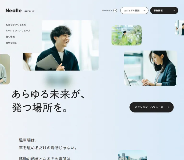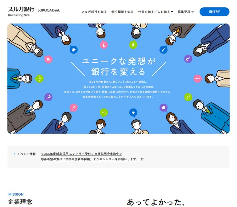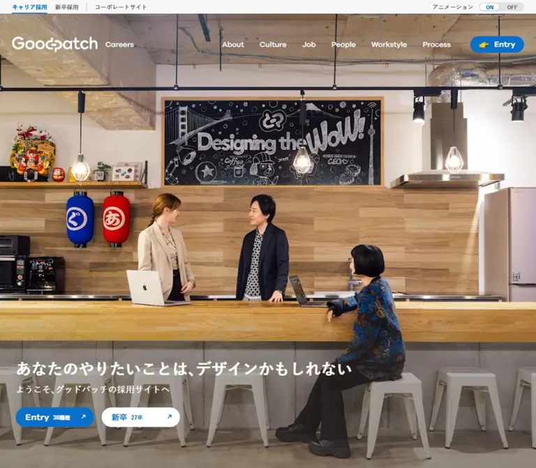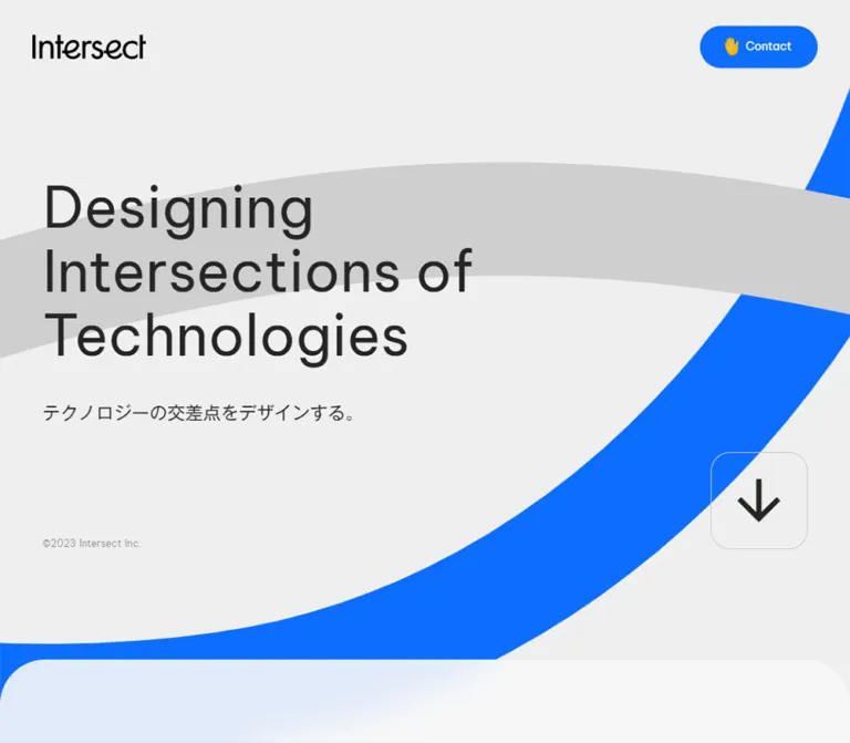
プレビュー準備中デザインリファレンスを見る
DESIGN REFERENCE
freee株式会社 採用サイト
白と鮮やかなブルーを基調に、ツバメのモチーフと社員写真を組み合わせた採用サイト。余白のある構成、職種別の導線、固定のカジュアル面談バナーが特徴。
freee Recruitment — Style Reference
Clear blue wayfinding, generous white space, and photographs of the people behind the products.
Website: jobs.freee.co.jp
Original URL: https://jobs.freee.co.jp/
Final URL: https://jobs.freee.co.jp/
Theme: light in the supplied captures; no alternate theme was inspected.
Inspected: September 23, 2026, 06:44 JST. The supplied retrieval timestamp is 2026-09-22T21:44:13.976Z.
Viewports: desktop 1440 × 1000 and mobile 390 × 844 CSS pixels.
Scope: the current recruitment homepage, including its opening composition, job directory, engineering feature, persistent interview callout, and footer in screenshots; the remaining homepage sections are supported by rendered DOM text, links, geometry, and computed styles. Linked pages and open navigation states were not inspected.
This is a substantial recruitment website homepage. It introduces the company’s mission, provides information about teams and working conditions, publishes recruitment articles, and directs several applicant groups toward relevant entry routes. The original footer identifies the company as freee株式会社.
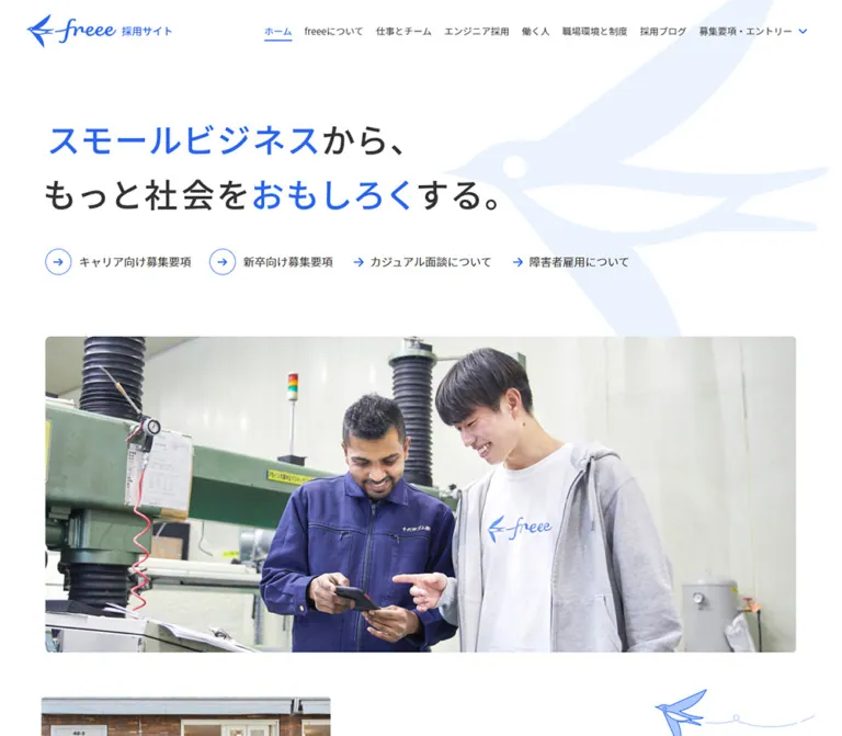
The visual system combines white space, charcoal Japanese typography, a bright blue action color, and natural workplace photography. A large pale swallow stretches behind the opening statement. Thin blue arrows recur in navigation, circular links, job rows, and footer headings. Photography supplies warmth through people, wood, plants, and everyday work settings.
The page alternates broad photographic regions with more deeply inset text and directories. Most navigation remains visually light. A solid blue interview callout provides the strongest persistent action surface, while an extensive footer supports continued exploration.
閉じる
freee Recruitment — Style Reference
Clear blue wayfinding, generous white space, and photographs of the people behind the products.
Website: jobs.freee.co.jp
Original URL: https://jobs.freee.co.jp/
Final URL: https://jobs.freee.co.jp/
Theme: light in the supplied captures; no alternate theme was inspected.
Inspected: September 23, 2026, 06:44 JST. The supplied retrieval timestamp is 2026-09-22T21:44:13.976Z.
Viewports: desktop 1440 × 1000 and mobile 390 × 844 CSS pixels.
Scope: the current recruitment homepage, including its opening composition, job directory, engineering feature, persistent interview callout, and footer in screenshots; the remaining homepage sections are supported by rendered DOM text, links, geometry, and computed styles. Linked pages and open navigation states were not inspected.
This is a substantial recruitment website homepage. It introduces the company’s mission, provides information about teams and working conditions, publishes recruitment articles, and directs several applicant groups toward relevant entry routes. The original footer identifies the company as freee株式会社.
The visual system combines white space, charcoal Japanese typography, a bright blue action color, and natural workplace photography. A large pale swallow stretches behind the opening statement. Thin blue arrows recur in navigation, circular links, job rows, and footer headings. Photography supplies warmth through people, wood, plants, and everyday work settings.
The page alternates broad photographic regions with more deeply inset text and directories. Most navigation remains visually light. A solid blue interview callout provides the strongest persistent action surface, while an extensive footer supports continued exploration.
How to Read This Reference
- Measured values come from the supplied rendered DOM and computed-style records. They are exact for the inspected viewport, subject to normal browser subpixel rounding.
- Calculated values are arithmetic derived from those measurements, such as gaps between neighboring elements.
- Estimated values come from visual inspection of the screenshots. They are not sampled CSS declarations or exact color measurements.
- Recommendations describe a reusable implementation. They do not establish existing behavior on the original website.
- All custom-property names below are implementation aliases. The supplied custom-property inventory was empty.
- Typography measurements describe the sampled element. Descendant graphics or differently styled spans may render differently. In particular, the extracted hero heading repeats its wording, while the screenshots show one statement; do not reproduce that duplicate text.
- Coordinates in the DOM describe the captured document layout. Coordinates used to discuss an image composition are explicitly identified as screenshot estimates.
Tokens — Colors
Default Palette
| Name | Value | Suggested token | Evidence and role |
|---|---|---|---|
| Action Blue | #2864f0 |
--color-action |
Measured active Home text, mobile entry text, interview callout background, and footer recruitment notice. Blue iconography visually belongs to this same family. |
| White | #ffffff |
--color-canvas |
Measured mobile header background and reversed callout text; the screenshots show a white main canvas. Root and body backgrounds themselves were transparent in the supplied styles. |
| Main Charcoal | #323232 |
--color-ink |
Measured primary headings, paragraphs, and ordinary navigation links. |
| Article Charcoal | #333333 |
--color-article-ink |
Measured article titles. Preserve this distinction when closely matching the inspected cards. |
| Secondary Gray | #5a5a5a |
--color-muted |
Measured footer company information and subordinate navigation. |
| Date Gray | #6e6b6b |
--color-date |
Measured article publication dates. |
| Pale Blue | #ebf3ff |
--color-action-soft |
Measured mobile entry-pill and callout-close backgrounds. The swallow has a visually similar pale blue, but its own fill was not measured. |
| Warm Footer | #f7f5f5 |
--color-footer |
Measured full-width footer background at both viewports. |
| Fine Divider | approximately #dedada |
--color-rule |
Screenshot estimate for job-row, footer-row, and scrolled-header rules. |
Blue is concentrated in identity, directional symbols, selected navigation, highlighted headline wording, and the fixed callout. Body copy stays charcoal. The footer changes the surface temperature slightly without introducing a second strong brand color.
Several sampled anchor wrappers report browser blue #0000ee. Their visible children include logos, images, and separately styled text. This wrapper value should not become an additional design-system action color.
Color Relationships
The hero highlights the source phrases スモールビジネス and おもしろく in blue while retaining the connecting words in charcoal. The pale swallow occupies a large area but has low visual contrast, allowing the statement and links to remain dominant.
The interview callout reverses this relationship: a compact, saturated blue rectangle carries white copy. Preserve that difference in emphasis when extending the site.
Tokens — Typography
Primary Japanese Sans Serif
- Measured family:
"Noto Sans JP", sans-serif. - Measured root size:
10pxat both inspected widths. - Common weights:
400for navigation and body copy;500for most section and article headings. - Mission heading: regular
400, despite its large size. - Character: open, composed, and readable, with considerable line spacing in explanatory Japanese paragraphs.
- Implementation alias:
--font-body: 'Noto Sans JP', sans-serif.
The font-family declaration is confirmed; the supplied evidence does not include font-file URLs or a complete font-loading report. Use the actual wordmark asset for the freee identity rather than approximating its script lettering with a font.
Type Scale
Sizes and line heights below are measured unless marked as estimates.
| Role | Desktop | Mobile | Weight | Tracking |
|---|---|---|---|---|
| Hero H1 container | 56px / 78.4px |
30px / 42px |
500 |
0.1em |
| Mission heading | 50px / 70px |
30px / 42px |
400 |
0.1em |
| General section heading | 38px / 60.8px |
25px / 40px for company and jobs |
500 |
Normal |
| Engineering and environment heading | 38px / 60.8px |
26px / 41.6px |
500 |
Normal |
| Recruitment blog heading | 38px / 38px |
38px / 38px |
500 |
Normal |
| Closing invitation heading | 38px / 53.2px |
28px / 39.2px |
500 |
Normal |
| Movement Deck heading | 36px / 54px |
28px / 42px |
500 |
Desktop 0.72px; mobile normal |
| Mission paragraphs | 18px / 39.6px |
16px / 32px |
400 |
0.1em |
| General descriptive paragraphs | 16px / 32px |
16px / 32px |
400 |
Normal |
| Closing invitation introduction | 19px / 30.4px |
19px / 30.4px |
400 |
Normal |
| Standard arrow link | 18px / 18px |
16px / 16px |
400 |
Normal |
| Job-category label | 20px / 20px |
20px / 20px |
400 |
Normal |
| Article title | 18px / 25.2px |
18px / 25.2px |
500 |
Normal |
| Article date | 16px / 16px |
16px / 16px |
400 |
Normal |
| Desktop navigation | 15px / 15px |
Replaced by mobile controls | 400 |
Normal |
| Mobile entry control | — | 12px, normal line height |
400 |
Normal |
| Mobile menu caption | — | 10px, normal line height |
400 |
Normal |
| Footer group heading | 18px / 28.8px |
16px / 16px |
400 |
0.6px |
| Footer secondary link | 15px / 17px |
Hidden within collapsed groups in the captured state | 400 |
0.6px |
| Footer nested job link | 14px / 17px |
Not expanded in the capture | 400 |
0.6px |
| Privacy link | 12px / 12px |
12px / 12px |
400 |
0.6px |
Do not apply one global mobile reduction ratio. Job labels remain 20px, article titles remain 18px, and the blog heading remains 38px. The hero and introductory section headings reduce much more substantially.
Heading Rendering Caveat
The hero H1 measures 1208 × 139px on desktop and 310 × 125px on mobile. Its computed font metrics alone do not fully explain the desktop box and visible line lengths. The supplied extract does not resolve the typography of every descendant.
Use the screenshots as the authority for line grouping: two broad lines on desktop and three shorter lines on mobile. The CSS Quick Start includes a clearly labeled text-only approximation; it is not a claim that the source headline is implemented with that exact markup.
Copy Rhythm
Mission paragraphs have unusually generous leading: 2.2 on desktop and 2 on mobile, with 0.1em tracking. General explanatory copy uses 16px / 32px. This sustained openness is a defining part of the page, especially alongside the relatively compact navigation and article metadata.
Tokens — Spacing & Shapes
Observed rhythm: frequent 10, 20, 30, 40, 60, 80, and 100px intervals, with larger offsets for editorial composition. This is a descriptive scale, not a recovered source spacing system.
Spacing Scale
| Use | Value | Evidence |
|---|---|---|
| Header link inset | 10px |
Measured padding |
| Job-row internal inset | 10px |
Measured padding |
| Mobile general-section gutter | 20px |
Measured company and job-section padding |
| Mobile narrative and hero gutter | 40px |
Measured text and hero positions |
| Circle-link text offset | 54px |
Measured left padding at both widths |
| Plain-arrow text offset | 30px |
Measured left padding |
| Desktop hero-link gap | 30px |
Calculated from neighboring link rectangles |
| Mobile hero-link gap | 30px |
Calculated between 34px rows starting 64px apart |
| Job-grid row gap | 20px |
Calculated at both widths |
| Desktop job-grid column gap | 17px |
Calculated |
| Environment-card gap | Desktop 26px; mobile 22px horizontally and 26px vertically |
Calculated |
| Blog-card gap | Desktop 30px; mobile approximately 41px vertically |
Calculated |
| Repeated section separation | Frequently 80px |
Calculated between several measured sections |
| Main-to-footer separation | 100px |
Calculated at both widths |
| Footer vertical padding | Desktop 100px 0; mobile 50px 0 40px |
Measured |
Border Radius
| Element | Value | Evidence |
|---|---|---|
| Job links and ordinary text links | 0 |
Measured |
| Environment-card anchor | 8px |
Measured |
| Blog-card anchor | 10px |
Measured |
| Interview callout | 8px |
Measured |
| Mobile entry pill | 50px |
Measured |
| Callout close control | 50% on a 26px square |
Measured |
| Hero and engineering photographs | Approximately 8px |
Screenshot estimate |
| Engineering copy-panel upper-right corner | Approximately 16px |
Screenshot estimate |
The page uses modestly rounded photographs and cards, circular directional controls, and one capsule-shaped mobile entry control. Ordinary navigation and job-directory rows retain straight edges.
Layout Measurements
| Element | Desktop 1440 × 1000 |
Mobile 390 × 844 |
|---|---|---|
| Document height | 8950.95px |
11717.77px |
| Main wrapper | x=76, width 1288px |
Full width 390px |
| Initial header height | 100px |
70px |
| Header brand-link box | 256.33 × 70px, x=30 |
206.33 × 70px, x=0 |
| Hero heading | x=116, y=200, width 1208px |
x=40, y=120, width 310px |
| Hero photograph | Approximately 1208 × 508px |
Approximately 310 × 130px |
| Job-row box | 351.08 × 71px |
350 × 71px |
| Environment card | 227 × 262px |
Usually 166 × 201px; DEI card 213px tall |
| Blog-card anchor | 342 × 377.38px |
310 × 362.38px |
| Interview callout | 267.09 × 119.05px; right/bottom 40px |
370 × 97px; left/right/bottom 10px |
| Footer height | 815px |
912.73px in the captured collapsed state |
Photograph dimensions are screenshot estimates. The other dimensions are from rendered element rectangles.
Components
Global Header
Role: persistent identity, primary navigation, and access to application routes.
At the desktop page opening, the header is 100px high with a transparent computed background over the white canvas. The brand link starts at x=30, includes 10px padding, and occupies approximately 256 × 70px. The visible logo and recruitment-site descriptor sit inside that target.
The navigation appears as one horizontal line: Home, company information, work and teams, engineering recruitment, workplace information, the recruitment blog, and the entry control. Links use 15px regular text and 10px padding. Home is blue with a short blue underline. The final entry item is a button with a downward chevron, rather than an ordinary link in the supplied element record.
The middle and footer screenshots show a persistent white header approximately 70px high with a fine bottom rule. Its exact positioning property and scroll threshold were not supplied. The measured transition declaration supports a change in height and background color.
On mobile, the header is 70px high. Its anatomy is:
- A left brand-link target approximately
206 × 70px. - A pale-blue
エントリーpill atx=224, measuring114 × 50px, with50pxradius and16px 20pxpadding. - A right menu button measuring
46 × 53px, containing blue horizontal lines and the small captionメニュー.
Open menus were not captured. Do not invent their panel geometry, animation, or dismissal behavior from the closed controls.
Hero Statement and Swallow Motif
Role: communicate the recruitment proposition while maintaining strong brand recognition.
The visible statement is スモールビジネスから、もっと社会をおもしろくする。. Its desktop presentation occupies two lines; the mobile presentation uses three. Selected phrases are blue, and the rest is charcoal. The statement is left aligned in a narrower region inside the main wrapper.
A very large pale swallow extends behind the heading and entry links. On desktop it is concentrated toward the upper right and cropped by the viewport. On mobile it moves into the central-right region behind the stacked content, with its wing and tail extending across several vertical levels.
The motif supplies scale without competing with the text. Its precise dimensions, asset format, and fill declaration were not supplied. There is no evidence here of parallax, bird animation, or pointer-driven movement.
Applicant Route Links
Role: provide immediate paths for different applicant groups.
Four links follow the statement:
キャリア向け募集要項新卒向け募集要項アルバイト向け募集要項障害者雇用について
The first three use a thin blue circular outline containing a right arrow. The fourth uses a bare blue arrow. Their text remains charcoal.
Desktop links are inline-flex boxes 40px high, with 18px text and 30px gaps between targets. Circle links reserve 54px before the label; the plain-arrow variant reserves 30px. The visible circle outline is approximately 40–42px across.
Mobile links form a vertical list. Each measured link box is 34px high with 16px text, while consecutive starts are 64px apart. The circle appears approximately 34–36px across. Preserve the text offsets even though the circles become smaller: this produces the generous gap visible before each label.
These are evidenced anchor destinations. No navigation click was exercised in the supplied record.
Wide Team Photograph
Role: put people immediately beneath the opening proposition and application routes.
The current photograph shows five people standing together in a bright office with wood surfaces, glass, and plants. Casual clothing includes branded shirts, with yellow and light blue providing warmth and variation against the restrained UI palette.
The desktop image begins around x=116, y=483 and spans approximately 1208 × 508px. The mobile image begins around x=40, y=581 and spans approximately 310 × 130px. Both retain a wide ratio close to 2.38:1 and show the same group composition.
Maintain this panoramic shape on mobile. Turning it into a tall portrait crop would remove people and change the relationship between text, routes, and photograph. No image rotation or slideshow behavior was established.
Mission Narrative
Role: explain the company’s challenge and invite identification with its mission.
The desktop section is a flex layout. Its text begins around x=745.77, with a body-copy width of approximately 575px. The heading uses 50px / 70px, regular weight, and wide tracking. Paragraphs use 18px / 39.6px; several consecutive paragraphs are separated by 54px after their measured text boxes.
Two bare-arrow links conclude the text: mission and vision, followed by company culture.
On mobile, the heading and paragraphs use 40px side gutters. Heading typography becomes 30px / 42px; paragraphs become 16px / 32px. The DOM positions contain substantial intervening regions between some paragraphs. Their contents are not represented by the sampled text elements, so do not recreate these intervals as arbitrary blank spacers.
The narrative’s complete content and geometry are evidenced, but its full surrounding imagery is outside the supplied screenshots.
Movement Deck Introduction
Role: introduce a company-information brochure.
The rendered content includes the title freee Movement Deck, a short explanation, and the labels Mission & Vision, Business & Product, Culture & People, and an organizational-numbers topic.
The title measures 36px / 54px on desktop and 28px / 42px on mobile. Its supporting sentence changes from 16px / 24px to 14px / 21px, both at weight 500.
These labels do not prove the presence of tabs, a carousel, or an interactive slide deck. The supplied evidence does not expose the complete visual or interaction model for this module.
Company Overview Links
Role: connect the mission narrative to deeper company information.
A large heading introduces business growth and the platform ambition. Desktop typography is 38px / 60.8px; the heading occupies a half-width region with an additional 110px left inset. Related links lead to a message for future colleagues, official information and events, and company information.
On mobile, this section uses 20px side padding and 25px / 40px heading typography. The links regroup into the available width. Do not force every link onto a separate full-width button: two of the shorter links share a row in the measured mobile layout.
Job Directory
Role: offer a direct overview of six professional categories.
The six categories are sales, marketing, customer success, product management, engineering, and back office. Each row combines:
- A blue outline illustration, approximately
50pxsquare in the desktop screenshot. - A charcoal
20pxlabel. - A small blue right arrow near the trailing edge.
- A fine gray bottom rule.
The illustrations depict a person, a chart, conversation bubbles, a small group, a window with a gear, and upright files. Their line weights are visually light; an exact stroke width was not supplied.
Desktop uses three columns and two rows. Each link is approximately 351 × 71px, with 10px internal padding, 17px column gaps, and 20px row gaps. The first column begins at x=186.
Mobile uses one column of six 350 × 71px rows, starting at x=20. The 20px label size and 71px row height are retained. The organization-overview link moves below the list, whereas desktop places it near the section heading.
The rows are a compact directory, with separation provided by linework and spacing. No visible raised-card treatment is needed.
Engineering Editorial Feature
Role: make the engineering environment tangible through a large photographic composition and a focused text panel.
The desktop screenshot shows a wide photograph of hands at a keyboard on the left, a narrower photograph of a developer’s screens on the right, and another photograph partially visible below. The upper images begin near screenshot y=407; their approximate widths are 849px and 408px, separated by 32px.
A white copy panel overlaps the lower-left part of the wide photograph. Its upper-right corner is visibly rounded. The white panel continues into the page background, so its silhouette comes from the overlap rather than a border or shadow.
Inside the panel, a small blue category label precedes the heading 開発に熱中できる 文化と仕組みがあります. The measured heading and paragraph column begins at document x=206 and is approximately 463px wide. The heading is 38px / 60.8px; the paragraph is 16px / 32px; a circular-arrow link follows.
On mobile, the measured text column is 310px wide at x=40, and the heading becomes 26px / 41.6px. The section starts before the text, leaving a region for its visual composition. The exact mobile photo arrangement is not shown in the supplied screenshots and should not be treated as verified.
Workplace and Benefits Cards
Role: organize growth support, evaluation, workstyle, benefits, diversity, and internal terminology.
Desktop separates the introductory text from six links arranged as three columns and two rows. Each measured card anchor is 227 × 262px, with 2px padding and 8px radius. The cards are separated by 26px gaps.
Mobile places the introduction above a two-column, three-row card group. Cards are 166px wide, with 22px horizontal gaps. Most are 201px tall; the DEI card is 213px tall, accommodating its longer content.
The supplied DOM supports this card structure and its dimensions. It does not provide enough visual information to specify each card’s picture, illustration, or internal caption styling. Do not invent distinct category colors or asset subjects.
Recruitment Blog Cards
Role: provide current interviews, announcements, and event reports.
Six article links are present. The measured desktop layout uses three columns and two rows: each anchor is 342 × 377.38px, with 30px gaps and 10px corner radius. Mobile places all six in one column at x=40, each 310 × 362.38px, with approximately 41px between cards.
The content hierarchy is a media region, article title, publication date, and hashtag topics. Titles use 18px / 25.2px, weight 500, in #333333. The measured title boxes are approximately two lines tall; the extract does not identify the clipping or truncation mechanism. Dates use 16px text in #6e6b6b.
The blog section heading stays 38px on mobile. The article-list link appears near the section introduction on desktop and after the six cards on mobile. Preserve this relocation when implementing responsive reading order.
The article imagery itself is not visible in the supplied current-page screenshots. Its subjects, crops, and asset paths remain unspecified.
Closing Recruitment Routes
Role: consolidate application and information paths after the editorial content.
A two-line desktop invitation uses 38px / 53.2px; mobile uses 28px / 39.2px across a 350px region with 20px side gutters. The introductory paragraph stays 19px / 30.4px at both widths.
The content progresses through casual interviews, career recruitment, new-graduate recruitment, part-time recruitment, and diversity information. Career and graduate groups each expose a company message, process information, and frequently asked questions.
Desktop career and graduate groups occupy separate horizontal regions. Mobile stacks them and allows shorter secondary links to share a line where space permits. This is a grouped navigation area with meaningful subordinate links, not one undifferentiated application button.
Persistent Interview Callout
Role: keep a low-commitment recruitment route available while reading.
The callout links to /entry/casual-interview/. It contains a right arrow, a small career-recruitment label, the stronger line カジュアル面談実施中, and a compact two-line invitation.
| Property | Desktop | Mobile |
|---|---|---|
| Position in viewport | Right 40px, bottom 40px |
Left/right 10px, bottom 10px |
| Anchor dimensions | 267.09 × 119.05px |
370 × 97px |
| Padding | 11px 20px |
9px 14px |
| Background | #2864f0 |
#2864f0 |
| Text color | White | White |
| Radius | 8px |
8px |
| Close control | 26 × 26px circle |
26 × 26px circle |
The close control overlaps the upper-left corner by 10px horizontally and vertically. Its pale-blue background and blue cross separate it from the main callout.
The card remains visible at the same viewport position in the opening and later screenshots. On mobile it becomes almost full width and obscures part of the underlying page. The visible control suggests dismissal, but its actual behavior, persistence, and reappearance rules were not tested.
The callout’s text descendants were not individually sampled. Visual estimates are approximately 14–18px on desktop and 12–14px on mobile; the 10px anchor-container value should not be mistaken for the size of every visible line.
Footer Sitemap and Company Identity
Role: provide comprehensive site navigation and a clear company endpoint.
The desktop footer is a full-width #f7f5f5 region with 100px vertical padding. Company identity occupies the left side, beginning around x=116. Three sitemap columns begin around x=610, 868, and 1126.
The sitemap combines blue arrow-led group headings, gray secondary links, and slightly smaller indented job and interview links. Group headings use 18px type; secondary links use 15px; nested links use 14px. Much of the footer uses 0.6px tracking.
The company block includes the blue wordmark, company name, address, a blue recruitment-information notice, Facebook and X links, privacy information, and copyright. Social links use approximately 30px icons with a measured 8px gap before their labels.
On mobile, the sitemap moves before the company block. Category rows span the 350px region between 20px side gutters and are separated by fine rules. Four groups have separate 32 × 32px plus buttons, while engineering and blog remain direct rows. Subordinate links are not visible in the captured collapsed state.
The company block follows with content beginning around x=30. Keep the category link and its expansion button as separate controls. Opening these groups was not demonstrated, and their expanded spacing and motion remain unverified.
Tokens — Motion & Interaction
| Treatment | Evidence | What can be concluded |
|---|---|---|
| Header height and background | Computed background-color 0.4s, height 0.4s |
These two properties have a measured 400ms transition. Easing and trigger threshold were not separately supplied. |
| Compact scrolled header | Opening and scrolled screenshots | A persistent, shorter white header appears after scrolling. The transition trajectory was not recorded. |
| Active Home navigation | Screenshot and blue computed text | Current-page indication is blue with an underline. Other active states were not inspected. |
| Entry and menu controls | Button semantics, labels, chevrons, and menu icon | They are navigation affordances; open-state behavior is unverified. |
| Footer groups | Separate plus buttons and hidden subordinate links in the visible mobile state | A collapsed presentation is evidenced; expansion interaction is not. |
| Interview callout | Repeated viewport placement and close button | The callout persists across the supplied scroll positions. Dismissal was not tested. |
| Other transitions | Many sampled nodes report transition: all without a useful duration |
This does not establish an animated hover or state change. |
| Animation | Sampled elements report animation: none at capture time |
No specific animation sequence can be documented from these records. This is not proof that the whole site has no animation. |
The capture process waited for document loading, visible-image decoding, and sampled layout stability. Its initial observation lasted at least five seconds, with bounded readiness checks. Those checks improve the reliability of the settled screenshots but do not establish delayed behavior, image cycling, hover feedback, or all interaction states.
Recommended adaptation: retain the measured 400ms header transition where useful, add simple color feedback for links, and disable nonessential transitions under reduced-motion preferences. Do not introduce scroll parallax, autoplay photography, or elaborate entrance sequences as if they were observed source features.
Surfaces
| Layer | Appearance | Purpose |
|---|---|---|
| Main canvas | White | Keeps long-form recruitment content open and readable |
| Hero decoration | Very pale blue swallow | Adds identity and large-scale movement to an otherwise quiet composition |
| Photographic regions | Natural color with modest rounded corners | Introduces people, workplaces, and practical activity |
| Engineering copy panel | White overlapping a photograph | Creates editorial depth without a visible shadow |
| Directory rows | White with fine gray bottom rules | Organizes job categories efficiently |
| Mobile entry control | Pale-blue pill | Keeps entry access visible without competing with the primary callout |
| Persistent callout | Solid blue with white text | Provides a strong, continuously available recruitment action |
| Footer | Warm near-white | Separates the sitemap and company information from the main story |
No prominent drop-shadow, gradient, or glass effect is visible in the supplied screenshots. A complete computed shadow inventory was not supplied, so this is a description of the captured appearance rather than a claim about every component on the site.
Imagery
The current visual language is photographic and human. The hero uses a friendly group portrait in an actual office setting. The engineering feature shifts to close views of keyboards, code screens, and collaboration. These images make the work concrete while the interface remains restrained.
Use natural skin tones, bright ambient light, and environmental context. Wood, plants, clothing, and equipment provide most of the palette variation. Avoid introducing a global blue tint that would flatten these natural colors.
The swallow appears in two distinct roles: a crisp blue brand mark and a very large pale background silhouette. Its recognizable geometry matters. Use an appropriate supplied or authorized asset; an arbitrary generic bird will not reproduce the identity.
Observed Asset References
No image src, SVG path, or downloadable asset URL was included in the supplied DOM evidence. The references below identify visible material without inventing filenames.
| Asset | Current evidence | Implementation guidance |
|---|---|---|
| freee wordmark and swallow | Desktop/mobile headers and footers | Preserve the original proportions and blue treatment when an authorized asset is available |
| Pale hero swallow | Both opening screenshots | Keep behind content, low contrast, and cropped at the viewport edge |
| Five-person team portrait | Both opening screenshots | Preserve the approximately 2.38:1 composition across widths |
| Keyboard and workstation photographs | Desktop engineering capture | Use large crops and an asymmetric arrangement |
| Collaboration photograph | Partially visible below the engineering feature | Its complete crop and dimensions are not established |
| Six job-category illustrations | Desktop job-directory capture | Use consistent blue outline drawings at approximately 50px visual scale |
| Directional arrows and circles | Hero, directory, callout, footer | Keep light strokes and consistent arrow proportions |
| Facebook and X symbols | Footer captures | Preserve recognizable platform identities and compact alignment |
For a new implementation, provide meaningful text alternatives for content photographs and use empty alternatives for purely decorative imagery. This is a recommendation, not a report of the original accessibility attributes.
Layout & Responsive Behavior
Desktop Structure
The main wrapper is 1288px wide at the inspected 1440px viewport, leaving 76px outer margins. Content does not share one universal left edge:
- Hero text and photography begin at
x=116. - Job-directory content begins at
x=186. - Engineering panel text begins at
x=206. - Mission copy occupies a right-hand column near
x=746. - Footer company content returns to approximately
x=116.
These nested alignments create an editorial rhythm. Broad images reach farther outward, while text and lists often sit deeper inside the page.
Mobile Transformations
| Region | Observed transformation |
|---|---|
| Header | Horizontal navigation becomes an entry pill and menu control |
| Hero statement | Two desktop lines become three mobile lines |
| Hero routes | One horizontal sequence becomes four vertically spaced links |
| Hero photograph | Retains its panoramic ratio within 40px gutters |
| Mission copy | Moves to a single 310px text column |
| Job directory | Three columns become one; row height and label size remain unchanged |
| Organization-overview link | Moves below the job list |
| Benefits | Three columns become two, below the introduction |
| Blog cards | Three columns become one, with all six articles retained |
| Article-list link | Moves from the introduction area to after the cards |
| Recruitment groups | Career and graduate routes stack vertically |
| Interview callout | Small bottom-right card becomes a nearly full-width bottom card |
| Footer | Desktop sitemap becomes collapsed rows placed before company identity |
The phone layout deliberately uses different gutters: 40px for narrative text, hero material, and article cards; 20px for directories and several section headings; approximately 30px for footer identity; and 10px around the fixed callout.
Breakpoint Limitations
Only 390px and 1440px widths were supplied. Exact media-query thresholds, tablet layouts, intermediate header wrapping, and landscape-phone behavior are unknown. Any breakpoint values in the Quick Start are recommendations chosen to make a reusable implementation behave sensibly.
The source root is 10px, but the Quick Start keeps explicit pixel tokens and does not require changing the host application’s root size.
Do’s and Don’ts
Do
- Use
#2864f0consistently for the primary action system. - Retain charcoal body text and a white main canvas.
- Keep the swallow pale enough to sit behind readable content.
- Preserve generous paragraph leading and the difference between narrative and navigation density.
- Use the current wide group-photo composition at both inspected widths.
- Maintain circle-arrow and plain-arrow link variants.
- Preserve the three-column desktop job directory and its single-column mobile form.
- Keep benefits in two mobile columns while article cards use one.
- Use a white overlapping panel for the engineering feature.
- Retain the compact blue interview callout and its distinct mobile sizing.
- Keep footer category links separate from expansion controls.
- Treat the homepage as a connected information hub with several valid recruitment routes.
Don’t
- Don’t reduce the entire page to one generic application funnel.
- Don’t replace arrow links with large filled buttons throughout the page.
- Don’t give every section the same gutter or alignment.
- Don’t shrink all mobile headings and labels by one universal ratio.
- Don’t add shadows to every directory row or article card.
- Don’t crop the mobile hero into a portrait that removes team members.
- Don’t approximate the freee wordmark with an unrelated script font.
- Don’t reproduce duplicated text from the DOM extraction as visible copy.
- Don’t infer hover states, menu overlays, autoplay, or parallax from static controls.
- Don’t assign asset paths or exact illustration colors that were not supplied.
- Don’t treat a card wrapper’s inherited
10pxfont size as the size of its visible children.
Recommended Implementation Additions
These are recommendations for a new implementation, not verified original-site features:
- Give the menu, entry, close, and footer-expansion buttons explicit accessible names. An empty extracted text value alone does not establish whether the source already has such a name.
- Expose expanded state and controlled-panel relationships for navigation and footer disclosures.
- Provide a visible blue keyboard-focus ring and preserve logical focus order after responsive rearrangement.
- Increase the close button’s effective hit area to at least
44 × 44pxwhile retaining its small visible circle. - Ensure the fixed callout does not permanently conceal the last links, focused controls, or page content. Account for device safe areas and provide reliable dismissal.
- Keep the swallow decorative for assistive technology and prevent it from intercepting pointer input.
- Use responsive image sources and explicit dimensions. Load the first-view team photograph promptly and defer appropriate below-fold imagery.
- Preserve complete accessible article names if visible titles are shortened to two lines.
- Verify header navigation at intermediate widths, longer translated labels, and increased text size before selecting production breakpoints.
- Respect reduced-motion preferences and avoid adding motion that is unnecessary to understand the content.
Agent Prompt Guide
Quick Color Reference
- Canvas:
#ffffff. - Main text:
#323232. - Action blue:
#2864f0. - Soft control background:
#ebf3ff. - Footer surface:
#f7f5f5. - Footer secondary text:
#5a5a5a. - Article dates:
#6e6b6b. - Dividers: a fine warm gray;
#dedadais an estimated implementation value.
Overall Prompt
“Create a Japanese recruitment homepage with the visual restraint of the current freee recruitment site. Use Noto Sans JP, a white canvas, charcoal text, and action blue #2864f0. Combine a large statement with selected blue phrases, a very pale swallow-shaped brand motif, four arrow-led applicant routes, and a wide team photograph. Build a long editorial page with spacious mission copy, a compact job directory, an asymmetric engineering photo feature with an overlapping white text panel, workplace cards, recruitment articles, grouped entry routes, and a warm near-white sitemap footer. Keep a compact blue casual-interview callout at the bottom right on desktop and almost full width on mobile. Use distinct responsive layouts for jobs, benefits, and articles. Treat unverified menu states and animation as implementation decisions.”
Example Component Prompts
- Hero: “A left-aligned Japanese recruitment statement on white, with selected phrases in vivid blue and the remaining words in charcoal. Place a huge pale swallow behind the upper-right region. Follow with three circular-arrow links and one plain-arrow link, then a panoramic team photo with small rounded corners. At 390px, stack the links and retain 40px photo gutters.”
- Job directory: “Six recruitment categories arranged in a three-column, two-row desktop directory. Each 71px row contains a roughly 50px blue outline illustration, a regular 20px charcoal label, a small trailing blue arrow, and a thin gray bottom rule. Collapse to one column on mobile while preserving row and text size.”
- Engineering feature: “Compose workplace photography with one wide image and one narrower image separated by about 32px. Overlap the lower-left photograph with a white text panel featuring a rounded upper-right corner, a small blue category label, a medium-weight multiline heading, generous body leading, and a circle-arrow link. Use the overlap as the source of depth.”
- Interview callout: “A fixed blue card with 8px corners, white career-recruitment copy, a small right arrow, and a pale-blue close circle overlapping the upper-left corner. Desktop dimensions are approximately 267 by 119px with 40px right and bottom offsets. Mobile uses 10px outer margins and about 97px height. Keep dismissal keyboard accessible.”
- Footer: “A warm near-white recruitment sitemap. Desktop has company identity on the left and three columns of arrow-led group headings and smaller gray links on the right. Mobile places ruled category rows before the company block, with separate plus controls for expandable groups and direct links for standalone categories.”
Quick Start
CSS Custom Properties
This is a reusable CSS adaptation, not recovered source CSS. Measured colors and typography are retained where applicable. Breakpoints, grid implementation, focus behavior, intermediate widths, and control-state hooks are recommendations. Photograph crops and icon shapes require appropriate assets.
The text-only hero modifier deliberately uses tighter mobile tracking and a slightly smaller fluid size to approximate the screenshot’s line groups. The measured source H1 values remain documented above. Menu opening, disclosure toggling, callout dismissal, and header state changes require application logic; CSS alone does not implement those behaviors.
:root {
  /* Measured colors, except the estimated divider. */
  --color-canvas: #fff;
  --color-action: #2864f0;
  --color-action-soft: #ebf3ff;
  --color-ink: #323232;
  --color-article-ink: #333;
  --color-muted: #5a5a5a;
  --color-date: #6e6b6b;
  --color-footer: #f7f5f5;
  --color-rule: #dedada;

  --font-body: 'Noto Sans JP', sans-serif;
  --weight-regular: 400;
  --weight-heading: 500;
  --text-hero: 56px;
  --text-section: 38px;
  --text-body: 16px;
  --text-link: 18px;
  --text-job: 20px;
  --leading-body: 2;

  --space-10: 10px;
  --space-20: 20px;
  --space-30: 30px;
  --space-40: 40px;
  --space-60: 60px;
  --space-80: 80px;
  --space-100: 100px;
  --page-max: 1288px;
  --radius-media: 8px;
  --radius-article: 10px;
  --header-height: 100px;
  --header-compact: 70px;
  --motion-header: 400ms;
  --safe-bottom: env(safe-area-inset-bottom, 0px);
}

* { box-sizing: border-box; }

.recruit-page {
  margin: 0;
  color: var(--color-ink);
  background: var(--color-canvas);
  font: 400 var(--text-body)/var(--leading-body) var(--font-body);
}

.recruit-page a { color: inherit; text-decoration: none; }
.recruit-page button { font-family: inherit; cursor: pointer; }
.recruit-page img { display: block; max-width: 100%; }
.recruit-page [hidden] { display: none !important; }

/* This width formula is an adaptation of the measured desktop wrapper. */
.page-shell {
  width: min(var(--page-max), calc(100% - 40px));
  margin-inline: auto;
}

.site-header {
  position: fixed;
  inset: 0 0 auto;
  z-index: 40;
  display: flex;
  align-items: center;
  justify-content: space-between;
  gap: 16px;
  height: var(--header-height);
  padding-inline: 30px 40px;
  border-bottom: 1px solid transparent;
  background: transparent;
  transition: background-color var(--motion-header),
              height var(--motion-header);
}

.site-header.is-scrolled {
  height: var(--header-compact);
  background: var(--color-canvas);
  border-bottom-color: var(--color-rule);
}

.brand { display: flex; align-items: center; padding: 10px; }
.brand img { width: 236px; height: 50px; object-fit: contain; }
.desktop-nav { display: flex; align-items: center; }
.desktop-nav a,
.desktop-nav button {
  padding: 10px;
  border: 0;
  background: transparent;
  font-size: 15px;
  line-height: 1;
  white-space: nowrap;
}
.desktop-nav [aria-current='page'] {
  color: var(--color-action);
  text-decoration: underline;
  text-decoration-thickness: 2px;
  text-underline-offset: 9px;
}
.mobile-header-controls { display: none; }

.page-main { padding-top: 200px; }
.hero { position: relative; margin-inline: 40px; isolation: isolate; }
.hero-title {
  position: relative;
  margin: 0;
  font-size: var(--text-hero);
  font-weight: var(--weight-heading);
  line-height: 1.4;
  letter-spacing: .1em;
}
.hero-title em { color: var(--color-action); font-style: normal; }
.hero-title__line { display: block; }

/* Supply a suitable decorative asset; placement below is estimated. */
.hero-motif {
  position: absolute;
  z-index: -1;
  top: -200px;
  right: -40px;
  width: min(680px, 60vw);
  pointer-events: none;
}
.hero-actions {
  display: flex;
  flex-wrap: wrap;
  gap: 30px;
  margin-block: 62px 42px;
}
.arrow-link {
  position: relative;
  display: inline-flex;
  align-items: center;
  min-height: 40px;
  padding-inline-start: 54px;
  font-size: var(--text-link);
  line-height: 1.4;
}
/* A Unicode arrow is a fallback for the source's precise icon artwork. */
.arrow-link::before {
  content: '→';
  position: absolute;
  inset-inline-start: 0;
  display: grid;
  place-items: center;
  width: 40px;
  height: 40px;
  border: 1px solid var(--color-action);
  border-radius: 50%;
  color: var(--color-action);
  font-size: 24px;
  line-height: 1;
}
.arrow-link--plain { padding-inline-start: 30px; }
.arrow-link--plain::before { width: 20px; border: 0; }
.hero-photo {
  width: 100%;
  aspect-ratio: 1208 / 508;
  object-fit: cover;
  border-radius: var(--radius-media);
}

.section-title {
  margin: 0;
  font-size: var(--text-section);
  font-weight: var(--weight-heading);
  line-height: 1.6;
}
.section-label { color: var(--color-action); font-size: 16px; }
.section-copy { font-size: 16px; line-height: 2; }
.mission-copy { font-size: 18px; line-height: 2.2; letter-spacing: .1em; }

.role-grid {
  display: grid;
  grid-template-columns: repeat(3, minmax(0, 1fr));
  gap: 20px 17px;
  margin: 30px 90px 80px 110px;
  padding: 0;
  list-style: none;
}
.role-link {
  display: flex;
  align-items: center;
  gap: 16px;
  min-height: 71px;
  padding: 10px;
  border-bottom: 1px solid var(--color-rule);
  font-size: 20px;
  line-height: 1.25;
}
.role-icon { flex: 0 0 50px; width: 50px; height: 50px; }
.role-arrow { margin-inline-start: auto; color: var(--color-action); }

/* Simplified first row of the observed desktop photo composition. */
.engineering-media {
  display: grid;
  grid-template-columns: 2.08fr 1fr;
  gap: 32px;
}
.engineering-media img {
  width: 100%;
  height: 362px;
  object-fit: cover;
  border-radius: var(--radius-media);
}
.engineering-copy {
  position: relative;
  width: 55.4%;
  margin-top: -132px;
  padding: 80px 120px 60px 130px;
  border-radius: 0 16px 0 0;
  background: var(--color-canvas);
}

.environment-grid {
  display: grid;
  grid-template-columns: repeat(3, minmax(0, 1fr));
  gap: 26px;
}
.environment-card { min-width: 0; min-height: 262px; padding: 2px; border-radius: 8px; }
.article-grid {
  display: grid;
  grid-template-columns: repeat(3, minmax(0, 1fr));
  gap: 30px;
  margin-inline: 100px;
}
.article-card { min-width: 0; padding: 2px; border-radius: 10px; }
.article-title {
  color: var(--color-article-ink);
  font-size: 18px;
  font-weight: 500;
  line-height: 1.4;
}
.article-date { color: var(--color-date); font-size: 16px; line-height: 1; }
.blog-title { font-size: 38px; line-height: 1; }

.recruit-callout {
  position: fixed;
  z-index: 60;
  right: 40px;
  bottom: 40px;
  width: 267.1px;
}
.recruit-callout__link {
  display: block;
  min-height: 119px;
  padding: 11px 20px;
  border-radius: 8px;
  color: #fff !important;
  background: var(--color-action);
  line-height: 1.5;
}
/* Descendant sizes are visual approximations. */
.recruit-callout__eyebrow { font-size: 14px; font-weight: 700; }
.recruit-callout__title { font-size: 18px; font-weight: 700; }
.recruit-callout__copy { margin: 6px 0 0; font-size: 14px; }
.recruit-callout__close {
  position: absolute;
  top: -10px;
  left: -10px;
  display: grid;
  place-items: center;
  width: 26px;
  height: 26px;
  padding: 0;
  border: 0;
  border-radius: 50%;
  color: var(--color-action);
  background: var(--color-action-soft);
}
/* Recommended larger hit area without enlarging the visible circle. */
.recruit-callout__close::after { content: ''; position: absolute; inset: -9px; }

.site-footer { margin-top: 100px; padding: 100px 0; background: var(--color-footer); }
.footer-layout { display: grid; grid-template-columns: 40% 60%; padding-left: 40px; }
.footer-identity { grid-column: 1; grid-row: 1; color: var(--color-muted); }
.footer-nav {
  grid-column: 2;
  grid-row: 1;
  display: grid;
  grid-template-columns: repeat(3, minmax(0, 1fr));
  gap: 40px 30px;
}
.footer-heading { display: flex; align-items: center; justify-content: space-between; }
.footer-heading a { font-size: 18px; letter-spacing: .6px; }
.footer-links { margin: 16px 0 0; padding: 0; list-style: none; }
.footer-links li + li { margin-top: 16px; }
.footer-links a { color: var(--color-muted); font-size: 15px; line-height: 17px; letter-spacing: .6px; }
.footer-toggle { display: none; }

/* Recommended header breakpoint; the original threshold is unknown. */
@media (max-width: 1100px) {
  .site-header { height: 70px; padding-inline: 0; background: #fff; }
  .brand img { width: 186px; }
  .desktop-nav { display: none; }
  .mobile-header-controls { display: flex; align-items: center; gap: 6px; }
  .entry-pill {
    min-width: 114px;
    min-height: 50px;
    padding: 16px 20px;
    border: 0;
    border-radius: 50px;
    color: var(--color-action);
    background: var(--color-action-soft);
    font-size: 12px;
  }
  .menu-control { width: 46px; min-height: 53px; border: 0; color: var(--color-action); background: transparent; }
  .role-grid { margin-inline: 40px; }
  .engineering-copy { padding: 50px 40px; }
}

/* Recommended content breakpoint, matched to the supplied phone endpoint. */
@media (max-width: 767px) {
  .page-shell { width: 100%; }
  .page-main { padding-top: 120px; }
  .hero { margin-inline: 40px; }
  .hero-title { font-size: 30px; line-height: 42px; }
  .hero-title--text { font-size: clamp(22px, 6.9vw, 30px); letter-spacing: .02em; }
  .hero-motif { top: -20px; right: -40px; width: 295px; max-width: none; }
  .hero-actions { flex-direction: column; align-items: flex-start; gap: 30px; margin-block: 70px 40px; }
  .arrow-link { min-height: 34px; font-size: 16px; }
  .arrow-link::before { width: 34px; height: 34px; }
  .arrow-link--plain::before { width: 20px; }
  .section-title { font-size: 25px; line-height: 1.6; }
  .mission-copy { font-size: 16px; line-height: 2; }
  .role-grid { grid-template-columns: 1fr; margin-inline: 20px; }

  /* Proposed mobile photo treatment; its source arrangement was not shown. */
  .engineering-media { grid-template-columns: 1fr 1fr; gap: 16px; }
  .engineering-media img { height: 220px; }
  .engineering-copy { width: calc(100% - 40px); margin: -32px 20px 0; padding: 40px 20px; }
  .engineering-copy .section-title,
  .environment-heading { font-size: 26px; }
  .environment-grid { grid-template-columns: repeat(2, minmax(0, 1fr)); gap: 26px 22px; margin-inline: 20px; }
  .environment-card { min-height: 201px; }
  .article-grid { grid-template-columns: 1fr; gap: 41px; margin-inline: 40px; }
  .blog-title { font-size: 38px; }
  .closing-title { font-size: 28px; line-height: 1.4; }

  .recruit-callout { left: 10px; right: 10px; bottom: calc(10px + var(--safe-bottom)); width: auto; }
  .recruit-callout__link { min-height: 97px; padding: 9px 14px; }
  .recruit-callout__eyebrow,
  .recruit-callout__copy { font-size: 12px; }
  .recruit-callout__title { font-size: 14px; }

  .site-footer { padding: 50px 0 40px; }
  .footer-layout { display: flex; flex-direction: column; gap: 40px; padding: 0; }
  .footer-nav { order: 0; grid-template-columns: 1fr; gap: 0; margin-inline: 20px; }
  .footer-identity { order: 1; margin-inline: 30px; }
  .footer-group { border-bottom: 1px solid var(--color-rule); }
  .footer-heading { min-height: 53px; }
  .footer-heading a { font-size: 16px; }
  .footer-toggle { display: grid; place-items: center; width: 32px; height: 32px; border: 0; color: var(--color-action); background: transparent; }
  /* Add is-enhanced only after disclosure behavior is initialized. */
  .is-enhanced .footer-group[data-open='false'] .footer-links { display: none; }
}

/* Recommended feedback and accessibility additions. */
.recruit-page :focus-visible { outline: 3px solid var(--color-action); outline-offset: 4px; }
@media (hover: hover) {
  .arrow-link:hover,
  .role-link:hover { color: var(--color-action); }
}
@media (prefers-reduced-motion: reduce) {
  .site-header { transition: none; }
}
Use actual links for destinations and buttons for disclosure or dismissal. The .is-scrolled, .is-enhanced, and data-open hooks are proposed implementation conventions. The footer’s child links should remain available if enhancement fails.
Tailwind v4 Token Mapping
Optional mapping for an implementation that already uses Tailwind v4. This does not imply that the inspected site uses Tailwind. Define the custom properties above first.
@theme inline {
  --color-action: #2864f0;
  --color-action-soft: #ebf3ff;
  --color-canvas: #ffffff;
  --color-ink: #323232;
  --color-muted: #5a5a5a;
  --color-date: #6e6b6b;
  --color-footer: #f7f5f5;
  --color-rule: #dedada;

  --font-body: 'Noto Sans JP', sans-serif;
  --text-hero: 56px;
  --text-section: 38px;
  --text-job: 20px;
  --text-link: 18px;
  --text-body: 16px;
  --text-caption: 14px;

  --spacing-page-gutter: 40px;
  --spacing-directory-gutter: 20px;
  --spacing-section: 80px;
  --radius-media: 8px;
  --radius-article: 10px;
}
Sources & Evidence
- Inspected original and final website: https://jobs.freee.co.jp/. The supplied browser result reports HTTP
200and the title採用情報 | freee株式会社; original and final URLs are identical. - Retrieval timestamp:
2026-09-22T21:44:13.976Z, equivalent to September 23, 2026, 06:44 JST. - Desktop evidence:
1440 × 1000CSS-pixel viewport; current opening, job-directory/engineering, and footer screenshots; rendered page text, destination links, element rectangles, and sampled computed styles. Measured document height: approximately8950.95px. - Mobile evidence:
390 × 844CSS-pixel viewport; current opening and footer screenshots, with equivalent rendered DOM evidence. Measured document height: approximately11717.77px. - Interaction evidence: scroll-position captures demonstrate persistent header and interview-callout placement. Navigation destinations and button semantics are present in the supplied DOM. No menu opening, footer expansion, hover, or callout dismissal was exercised in the supplied record.
- Inspection limits: the source stylesheet, image URLs, SVG geometry, font files, complete descendant styles, and intermediate viewport behavior were not supplied. Computed styles establish only the recorded elements and states. Capture readiness checks were bounded and do not prove the absence of delayed or unexercised behavior.
This reference analyzes the supplied current homepage evidence. All implementation aliases, breakpoint choices, accessibility additions, and unverified responsive photo arrangements are explicitly recommendations.
# freee Recruitment — Style Reference

> Clear blue wayfinding, generous white space, and photographs of the people behind the products.

**Website:** [jobs.freee.co.jp](https://jobs.freee.co.jp/)
**Original URL:** https://jobs.freee.co.jp/
**Final URL:** https://jobs.freee.co.jp/
**Theme:** light in the supplied captures; no alternate theme was inspected.
**Inspected:** September 23, 2026, 06:44 JST. The supplied retrieval timestamp is `2026-09-22T21:44:13.976Z`.
**Viewports:** desktop `1440 × 1000` and mobile `390 × 844` CSS pixels.
**Scope:** the current recruitment homepage, including its opening composition, job directory, engineering feature, persistent interview callout, and footer in screenshots; the remaining homepage sections are supported by rendered DOM text, links, geometry, and computed styles. Linked pages and open navigation states were not inspected.

This is a substantial recruitment website homepage. It introduces the company’s mission, provides information about teams and working conditions, publishes recruitment articles, and directs several applicant groups toward relevant entry routes. The original footer identifies the company as freee株式会社.

The visual system combines white space, charcoal Japanese typography, a bright blue action color, and natural workplace photography. A large pale swallow stretches behind the opening statement. Thin blue arrows recur in navigation, circular links, job rows, and footer headings. Photography supplies warmth through people, wood, plants, and everyday work settings.

The page alternates broad photographic regions with more deeply inset text and directories. Most navigation remains visually light. A solid blue interview callout provides the strongest persistent action surface, while an extensive footer supports continued exploration.
閉じる
# freee Recruitment — Style Reference

> Clear blue wayfinding, generous white space, and photographs of the people behind the products.

**Website:** [jobs.freee.co.jp](https://jobs.freee.co.jp/)
**Original URL:** https://jobs.freee.co.jp/
**Final URL:** https://jobs.freee.co.jp/
**Theme:** light in the supplied captures; no alternate theme was inspected.
**Inspected:** September 23, 2026, 06:44 JST. The supplied retrieval timestamp is `2026-09-22T21:44:13.976Z`.
**Viewports:** desktop `1440 × 1000` and mobile `390 × 844` CSS pixels.
**Scope:** the current recruitment homepage, including its opening composition, job directory, engineering feature, persistent interview callout, and footer in screenshots; the remaining homepage sections are supported by rendered DOM text, links, geometry, and computed styles. Linked pages and open navigation states were not inspected.

This is a substantial recruitment website homepage. It introduces the company’s mission, provides information about teams and working conditions, publishes recruitment articles, and directs several applicant groups toward relevant entry routes. The original footer identifies the company as freee株式会社.

The visual system combines white space, charcoal Japanese typography, a bright blue action color, and natural workplace photography. A large pale swallow stretches behind the opening statement. Thin blue arrows recur in navigation, circular links, job rows, and footer headings. Photography supplies warmth through people, wood, plants, and everyday work settings.

The page alternates broad photographic regions with more deeply inset text and directories. Most navigation remains visually light. A solid blue interview callout provides the strongest persistent action surface, while an extensive footer supports continued exploration.

## How to Read This Reference

- **Measured** values come from the supplied rendered DOM and computed-style records. They are exact for the inspected viewport, subject to normal browser subpixel rounding.
- **Calculated** values are arithmetic derived from those measurements, such as gaps between neighboring elements.
- **Estimated** values come from visual inspection of the screenshots. They are not sampled CSS declarations or exact color measurements.
- **Recommendations** describe a reusable implementation. They do not establish existing behavior on the original website.
- All custom-property names below are implementation aliases. The supplied custom-property inventory was empty.
- Typography measurements describe the sampled element. Descendant graphics or differently styled spans may render differently. In particular, the extracted hero heading repeats its wording, while the screenshots show one statement; do not reproduce that duplicate text.
- Coordinates in the DOM describe the captured document layout. Coordinates used to discuss an image composition are explicitly identified as screenshot estimates.

## Tokens — Colors

### Default Palette

| Name | Value | Suggested token | Evidence and role |
| --- | --- | --- | --- |
| Action Blue | `#2864f0` | `--color-action` | Measured active Home text, mobile entry text, interview callout background, and footer recruitment notice. Blue iconography visually belongs to this same family. |
| White | `#ffffff` | `--color-canvas` | Measured mobile header background and reversed callout text; the screenshots show a white main canvas. Root and body backgrounds themselves were transparent in the supplied styles. |
| Main Charcoal | `#323232` | `--color-ink` | Measured primary headings, paragraphs, and ordinary navigation links. |
| Article Charcoal | `#333333` | `--color-article-ink` | Measured article titles. Preserve this distinction when closely matching the inspected cards. |
| Secondary Gray | `#5a5a5a` | `--color-muted` | Measured footer company information and subordinate navigation. |
| Date Gray | `#6e6b6b` | `--color-date` | Measured article publication dates. |
| Pale Blue | `#ebf3ff` | `--color-action-soft` | Measured mobile entry-pill and callout-close backgrounds. The swallow has a visually similar pale blue, but its own fill was not measured. |
| Warm Footer | `#f7f5f5` | `--color-footer` | Measured full-width footer background at both viewports. |
| Fine Divider | approximately `#dedada` | `--color-rule` | Screenshot estimate for job-row, footer-row, and scrolled-header rules. |

Blue is concentrated in identity, directional symbols, selected navigation, highlighted headline wording, and the fixed callout. Body copy stays charcoal. The footer changes the surface temperature slightly without introducing a second strong brand color.

Several sampled anchor wrappers report browser blue `#0000ee`. Their visible children include logos, images, and separately styled text. This wrapper value should not become an additional design-system action color.

### Color Relationships

The hero highlights the source phrases `スモールビジネス` and `おもしろく` in blue while retaining the connecting words in charcoal. The pale swallow occupies a large area but has low visual contrast, allowing the statement and links to remain dominant.

The interview callout reverses this relationship: a compact, saturated blue rectangle carries white copy. Preserve that difference in emphasis when extending the site.

## Tokens — Typography

### Primary Japanese Sans Serif

- **Measured family:** `"Noto Sans JP", sans-serif`.
- **Measured root size:** `10px` at both inspected widths.
- **Common weights:** `400` for navigation and body copy; `500` for most section and article headings.
- **Mission heading:** regular `400`, despite its large size.
- **Character:** open, composed, and readable, with considerable line spacing in explanatory Japanese paragraphs.
- **Implementation alias:** `--font-body: 'Noto Sans JP', sans-serif`.

The font-family declaration is confirmed; the supplied evidence does not include font-file URLs or a complete font-loading report. Use the actual wordmark asset for the freee identity rather than approximating its script lettering with a font.

### Type Scale

Sizes and line heights below are measured unless marked as estimates.

| Role | Desktop | Mobile | Weight | Tracking |
| --- | --- | --- | --- | --- |
| Hero H1 container | `56px / 78.4px` | `30px / 42px` | `500` | `0.1em` |
| Mission heading | `50px / 70px` | `30px / 42px` | `400` | `0.1em` |
| General section heading | `38px / 60.8px` | `25px / 40px` for company and jobs | `500` | Normal |
| Engineering and environment heading | `38px / 60.8px` | `26px / 41.6px` | `500` | Normal |
| Recruitment blog heading | `38px / 38px` | `38px / 38px` | `500` | Normal |
| Closing invitation heading | `38px / 53.2px` | `28px / 39.2px` | `500` | Normal |
| Movement Deck heading | `36px / 54px` | `28px / 42px` | `500` | Desktop `0.72px`; mobile normal |
| Mission paragraphs | `18px / 39.6px` | `16px / 32px` | `400` | `0.1em` |
| General descriptive paragraphs | `16px / 32px` | `16px / 32px` | `400` | Normal |
| Closing invitation introduction | `19px / 30.4px` | `19px / 30.4px` | `400` | Normal |
| Standard arrow link | `18px / 18px` | `16px / 16px` | `400` | Normal |
| Job-category label | `20px / 20px` | `20px / 20px` | `400` | Normal |
| Article title | `18px / 25.2px` | `18px / 25.2px` | `500` | Normal |
| Article date | `16px / 16px` | `16px / 16px` | `400` | Normal |
| Desktop navigation | `15px / 15px` | Replaced by mobile controls | `400` | Normal |
| Mobile entry control | — | `12px`, normal line height | `400` | Normal |
| Mobile menu caption | — | `10px`, normal line height | `400` | Normal |
| Footer group heading | `18px / 28.8px` | `16px / 16px` | `400` | `0.6px` |
| Footer secondary link | `15px / 17px` | Hidden within collapsed groups in the captured state | `400` | `0.6px` |
| Footer nested job link | `14px / 17px` | Not expanded in the capture | `400` | `0.6px` |
| Privacy link | `12px / 12px` | `12px / 12px` | `400` | `0.6px` |

Do not apply one global mobile reduction ratio. Job labels remain `20px`, article titles remain `18px`, and the blog heading remains `38px`. The hero and introductory section headings reduce much more substantially.

### Heading Rendering Caveat

The hero H1 measures `1208 × 139px` on desktop and `310 × 125px` on mobile. Its computed font metrics alone do not fully explain the desktop box and visible line lengths. The supplied extract does not resolve the typography of every descendant.

Use the screenshots as the authority for line grouping: two broad lines on desktop and three shorter lines on mobile. The CSS Quick Start includes a clearly labeled text-only approximation; it is not a claim that the source headline is implemented with that exact markup.

### Copy Rhythm

Mission paragraphs have unusually generous leading: `2.2` on desktop and `2` on mobile, with `0.1em` tracking. General explanatory copy uses `16px / 32px`. This sustained openness is a defining part of the page, especially alongside the relatively compact navigation and article metadata.

## Tokens — Spacing & Shapes

**Observed rhythm:** frequent `10`, `20`, `30`, `40`, `60`, `80`, and `100px` intervals, with larger offsets for editorial composition. This is a descriptive scale, not a recovered source spacing system.

### Spacing Scale

| Use | Value | Evidence |
| --- | --- | --- |
| Header link inset | `10px` | Measured padding |
| Job-row internal inset | `10px` | Measured padding |
| Mobile general-section gutter | `20px` | Measured company and job-section padding |
| Mobile narrative and hero gutter | `40px` | Measured text and hero positions |
| Circle-link text offset | `54px` | Measured left padding at both widths |
| Plain-arrow text offset | `30px` | Measured left padding |
| Desktop hero-link gap | `30px` | Calculated from neighboring link rectangles |
| Mobile hero-link gap | `30px` | Calculated between `34px` rows starting `64px` apart |
| Job-grid row gap | `20px` | Calculated at both widths |
| Desktop job-grid column gap | `17px` | Calculated |
| Environment-card gap | Desktop `26px`; mobile `22px` horizontally and `26px` vertically | Calculated |
| Blog-card gap | Desktop `30px`; mobile approximately `41px` vertically | Calculated |
| Repeated section separation | Frequently `80px` | Calculated between several measured sections |
| Main-to-footer separation | `100px` | Calculated at both widths |
| Footer vertical padding | Desktop `100px 0`; mobile `50px 0 40px` | Measured |

### Border Radius

| Element | Value | Evidence |
| --- | --- | --- |
| Job links and ordinary text links | `0` | Measured |
| Environment-card anchor | `8px` | Measured |
| Blog-card anchor | `10px` | Measured |
| Interview callout | `8px` | Measured |
| Mobile entry pill | `50px` | Measured |
| Callout close control | `50%` on a `26px` square | Measured |
| Hero and engineering photographs | Approximately `8px` | Screenshot estimate |
| Engineering copy-panel upper-right corner | Approximately `16px` | Screenshot estimate |

The page uses modestly rounded photographs and cards, circular directional controls, and one capsule-shaped mobile entry control. Ordinary navigation and job-directory rows retain straight edges.

### Layout Measurements

| Element | Desktop `1440 × 1000` | Mobile `390 × 844` |
| --- | --- | --- |
| Document height | `8950.95px` | `11717.77px` |
| Main wrapper | `x=76`, width `1288px` | Full width `390px` |
| Initial header height | `100px` | `70px` |
| Header brand-link box | `256.33 × 70px`, `x=30` | `206.33 × 70px`, `x=0` |
| Hero heading | `x=116`, `y=200`, width `1208px` | `x=40`, `y=120`, width `310px` |
| Hero photograph | Approximately `1208 × 508px` | Approximately `310 × 130px` |
| Job-row box | `351.08 × 71px` | `350 × 71px` |
| Environment card | `227 × 262px` | Usually `166 × 201px`; DEI card `213px` tall |
| Blog-card anchor | `342 × 377.38px` | `310 × 362.38px` |
| Interview callout | `267.09 × 119.05px`; right/bottom `40px` | `370 × 97px`; left/right/bottom `10px` |
| Footer height | `815px` | `912.73px` in the captured collapsed state |

Photograph dimensions are screenshot estimates. The other dimensions are from rendered element rectangles.

## Components

### Global Header

**Role:** persistent identity, primary navigation, and access to application routes.

At the desktop page opening, the header is `100px` high with a transparent computed background over the white canvas. The brand link starts at `x=30`, includes `10px` padding, and occupies approximately `256 × 70px`. The visible logo and recruitment-site descriptor sit inside that target.

The navigation appears as one horizontal line: Home, company information, work and teams, engineering recruitment, workplace information, the recruitment blog, and the entry control. Links use `15px` regular text and `10px` padding. Home is blue with a short blue underline. The final entry item is a button with a downward chevron, rather than an ordinary link in the supplied element record.

The middle and footer screenshots show a persistent white header approximately `70px` high with a fine bottom rule. Its exact positioning property and scroll threshold were not supplied. The measured transition declaration supports a change in height and background color.

On mobile, the header is `70px` high. Its anatomy is:

- A left brand-link target approximately `206 × 70px`.
- A pale-blue `エントリー` pill at `x=224`, measuring `114 × 50px`, with `50px` radius and `16px 20px` padding.
- A right menu button measuring `46 × 53px`, containing blue horizontal lines and the small caption `メニュー`.

Open menus were not captured. Do not invent their panel geometry, animation, or dismissal behavior from the closed controls.

### Hero Statement and Swallow Motif

**Role:** communicate the recruitment proposition while maintaining strong brand recognition.

The visible statement is `スモールビジネスから、もっと社会をおもしろくする。`. Its desktop presentation occupies two lines; the mobile presentation uses three. Selected phrases are blue, and the rest is charcoal. The statement is left aligned in a narrower region inside the main wrapper.

A very large pale swallow extends behind the heading and entry links. On desktop it is concentrated toward the upper right and cropped by the viewport. On mobile it moves into the central-right region behind the stacked content, with its wing and tail extending across several vertical levels.

The motif supplies scale without competing with the text. Its precise dimensions, asset format, and fill declaration were not supplied. There is no evidence here of parallax, bird animation, or pointer-driven movement.

### Applicant Route Links

**Role:** provide immediate paths for different applicant groups.

Four links follow the statement:

1. `キャリア向け募集要項`
2. `新卒向け募集要項`
3. `アルバイト向け募集要項`
4. `障害者雇用について`

The first three use a thin blue circular outline containing a right arrow. The fourth uses a bare blue arrow. Their text remains charcoal.

Desktop links are inline-flex boxes `40px` high, with `18px` text and `30px` gaps between targets. Circle links reserve `54px` before the label; the plain-arrow variant reserves `30px`. The visible circle outline is approximately `40–42px` across.

Mobile links form a vertical list. Each measured link box is `34px` high with `16px` text, while consecutive starts are `64px` apart. The circle appears approximately `34–36px` across. Preserve the text offsets even though the circles become smaller: this produces the generous gap visible before each label.

These are evidenced anchor destinations. No navigation click was exercised in the supplied record.

### Wide Team Photograph

**Role:** put people immediately beneath the opening proposition and application routes.

The current photograph shows five people standing together in a bright office with wood surfaces, glass, and plants. Casual clothing includes branded shirts, with yellow and light blue providing warmth and variation against the restrained UI palette.

The desktop image begins around `x=116`, `y=483` and spans approximately `1208 × 508px`. The mobile image begins around `x=40`, `y=581` and spans approximately `310 × 130px`. Both retain a wide ratio close to `2.38:1` and show the same group composition.

Maintain this panoramic shape on mobile. Turning it into a tall portrait crop would remove people and change the relationship between text, routes, and photograph. No image rotation or slideshow behavior was established.

### Mission Narrative

**Role:** explain the company’s challenge and invite identification with its mission.

The desktop section is a flex layout. Its text begins around `x=745.77`, with a body-copy width of approximately `575px`. The heading uses `50px / 70px`, regular weight, and wide tracking. Paragraphs use `18px / 39.6px`; several consecutive paragraphs are separated by `54px` after their measured text boxes.

Two bare-arrow links conclude the text: mission and vision, followed by company culture.

On mobile, the heading and paragraphs use `40px` side gutters. Heading typography becomes `30px / 42px`; paragraphs become `16px / 32px`. The DOM positions contain substantial intervening regions between some paragraphs. Their contents are not represented by the sampled text elements, so do not recreate these intervals as arbitrary blank spacers.

The narrative’s complete content and geometry are evidenced, but its full surrounding imagery is outside the supplied screenshots.

### Movement Deck Introduction

**Role:** introduce a company-information brochure.

The rendered content includes the title `freee Movement Deck`, a short explanation, and the labels `Mission & Vision`, `Business & Product`, `Culture & People`, and an organizational-numbers topic.

The title measures `36px / 54px` on desktop and `28px / 42px` on mobile. Its supporting sentence changes from `16px / 24px` to `14px / 21px`, both at weight `500`.

These labels do not prove the presence of tabs, a carousel, or an interactive slide deck. The supplied evidence does not expose the complete visual or interaction model for this module.

### Company Overview Links

**Role:** connect the mission narrative to deeper company information.

A large heading introduces business growth and the platform ambition. Desktop typography is `38px / 60.8px`; the heading occupies a half-width region with an additional `110px` left inset. Related links lead to a message for future colleagues, official information and events, and company information.

On mobile, this section uses `20px` side padding and `25px / 40px` heading typography. The links regroup into the available width. Do not force every link onto a separate full-width button: two of the shorter links share a row in the measured mobile layout.

### Job Directory

**Role:** offer a direct overview of six professional categories.

The six categories are sales, marketing, customer success, product management, engineering, and back office. Each row combines:

- A blue outline illustration, approximately `50px` square in the desktop screenshot.
- A charcoal `20px` label.
- A small blue right arrow near the trailing edge.
- A fine gray bottom rule.

The illustrations depict a person, a chart, conversation bubbles, a small group, a window with a gear, and upright files. Their line weights are visually light; an exact stroke width was not supplied.

Desktop uses three columns and two rows. Each link is approximately `351 × 71px`, with `10px` internal padding, `17px` column gaps, and `20px` row gaps. The first column begins at `x=186`.

Mobile uses one column of six `350 × 71px` rows, starting at `x=20`. The `20px` label size and `71px` row height are retained. The organization-overview link moves below the list, whereas desktop places it near the section heading.

The rows are a compact directory, with separation provided by linework and spacing. No visible raised-card treatment is needed.

### Engineering Editorial Feature

**Role:** make the engineering environment tangible through a large photographic composition and a focused text panel.

The desktop screenshot shows a wide photograph of hands at a keyboard on the left, a narrower photograph of a developer’s screens on the right, and another photograph partially visible below. The upper images begin near screenshot `y=407`; their approximate widths are `849px` and `408px`, separated by `32px`.

A white copy panel overlaps the lower-left part of the wide photograph. Its upper-right corner is visibly rounded. The white panel continues into the page background, so its silhouette comes from the overlap rather than a border or shadow.

Inside the panel, a small blue category label precedes the heading `開発に熱中できる 文化と仕組みがあります`. The measured heading and paragraph column begins at document `x=206` and is approximately `463px` wide. The heading is `38px / 60.8px`; the paragraph is `16px / 32px`; a circular-arrow link follows.

On mobile, the measured text column is `310px` wide at `x=40`, and the heading becomes `26px / 41.6px`. The section starts before the text, leaving a region for its visual composition. The exact mobile photo arrangement is not shown in the supplied screenshots and should not be treated as verified.

### Workplace and Benefits Cards

**Role:** organize growth support, evaluation, workstyle, benefits, diversity, and internal terminology.

Desktop separates the introductory text from six links arranged as three columns and two rows. Each measured card anchor is `227 × 262px`, with `2px` padding and `8px` radius. The cards are separated by `26px` gaps.

Mobile places the introduction above a two-column, three-row card group. Cards are `166px` wide, with `22px` horizontal gaps. Most are `201px` tall; the DEI card is `213px` tall, accommodating its longer content.

The supplied DOM supports this card structure and its dimensions. It does not provide enough visual information to specify each card’s picture, illustration, or internal caption styling. Do not invent distinct category colors or asset subjects.

### Recruitment Blog Cards

**Role:** provide current interviews, announcements, and event reports.

Six article links are present. The measured desktop layout uses three columns and two rows: each anchor is `342 × 377.38px`, with `30px` gaps and `10px` corner radius. Mobile places all six in one column at `x=40`, each `310 × 362.38px`, with approximately `41px` between cards.

The content hierarchy is a media region, article title, publication date, and hashtag topics. Titles use `18px / 25.2px`, weight `500`, in `#333333`. The measured title boxes are approximately two lines tall; the extract does not identify the clipping or truncation mechanism. Dates use `16px` text in `#6e6b6b`.

The blog section heading stays `38px` on mobile. The article-list link appears near the section introduction on desktop and after the six cards on mobile. Preserve this relocation when implementing responsive reading order.

The article imagery itself is not visible in the supplied current-page screenshots. Its subjects, crops, and asset paths remain unspecified.

### Closing Recruitment Routes

**Role:** consolidate application and information paths after the editorial content.

A two-line desktop invitation uses `38px / 53.2px`; mobile uses `28px / 39.2px` across a `350px` region with `20px` side gutters. The introductory paragraph stays `19px / 30.4px` at both widths.

The content progresses through casual interviews, career recruitment, new-graduate recruitment, part-time recruitment, and diversity information. Career and graduate groups each expose a company message, process information, and frequently asked questions.

Desktop career and graduate groups occupy separate horizontal regions. Mobile stacks them and allows shorter secondary links to share a line where space permits. This is a grouped navigation area with meaningful subordinate links, not one undifferentiated application button.

### Persistent Interview Callout

**Role:** keep a low-commitment recruitment route available while reading.

The callout links to `/entry/casual-interview/`. It contains a right arrow, a small career-recruitment label, the stronger line `カジュアル面談実施中`, and a compact two-line invitation.

| Property | Desktop | Mobile |
| --- | --- | --- |
| Position in viewport | Right `40px`, bottom `40px` | Left/right `10px`, bottom `10px` |
| Anchor dimensions | `267.09 × 119.05px` | `370 × 97px` |
| Padding | `11px 20px` | `9px 14px` |
| Background | `#2864f0` | `#2864f0` |
| Text color | White | White |
| Radius | `8px` | `8px` |
| Close control | `26 × 26px` circle | `26 × 26px` circle |

The close control overlaps the upper-left corner by `10px` horizontally and vertically. Its pale-blue background and blue cross separate it from the main callout.

The card remains visible at the same viewport position in the opening and later screenshots. On mobile it becomes almost full width and obscures part of the underlying page. The visible control suggests dismissal, but its actual behavior, persistence, and reappearance rules were not tested.

The callout’s text descendants were not individually sampled. Visual estimates are approximately `14–18px` on desktop and `12–14px` on mobile; the `10px` anchor-container value should not be mistaken for the size of every visible line.

### Footer Sitemap and Company Identity

**Role:** provide comprehensive site navigation and a clear company endpoint.

The desktop footer is a full-width `#f7f5f5` region with `100px` vertical padding. Company identity occupies the left side, beginning around `x=116`. Three sitemap columns begin around `x=610`, `868`, and `1126`.

The sitemap combines blue arrow-led group headings, gray secondary links, and slightly smaller indented job and interview links. Group headings use `18px` type; secondary links use `15px`; nested links use `14px`. Much of the footer uses `0.6px` tracking.

The company block includes the blue wordmark, company name, address, a blue recruitment-information notice, Facebook and X links, privacy information, and copyright. Social links use approximately `30px` icons with a measured `8px` gap before their labels.

On mobile, the sitemap moves before the company block. Category rows span the `350px` region between `20px` side gutters and are separated by fine rules. Four groups have separate `32 × 32px` plus buttons, while engineering and blog remain direct rows. Subordinate links are not visible in the captured collapsed state.

The company block follows with content beginning around `x=30`. Keep the category link and its expansion button as separate controls. Opening these groups was not demonstrated, and their expanded spacing and motion remain unverified.

## Tokens — Motion & Interaction

| Treatment | Evidence | What can be concluded |
| --- | --- | --- |
| Header height and background | Computed `background-color 0.4s, height 0.4s` | These two properties have a measured `400ms` transition. Easing and trigger threshold were not separately supplied. |
| Compact scrolled header | Opening and scrolled screenshots | A persistent, shorter white header appears after scrolling. The transition trajectory was not recorded. |
| Active Home navigation | Screenshot and blue computed text | Current-page indication is blue with an underline. Other active states were not inspected. |
| Entry and menu controls | Button semantics, labels, chevrons, and menu icon | They are navigation affordances; open-state behavior is unverified. |
| Footer groups | Separate plus buttons and hidden subordinate links in the visible mobile state | A collapsed presentation is evidenced; expansion interaction is not. |
| Interview callout | Repeated viewport placement and close button | The callout persists across the supplied scroll positions. Dismissal was not tested. |
| Other transitions | Many sampled nodes report `transition: all` without a useful duration | This does not establish an animated hover or state change. |
| Animation | Sampled elements report `animation: none` at capture time | No specific animation sequence can be documented from these records. This is not proof that the whole site has no animation. |

The capture process waited for document loading, visible-image decoding, and sampled layout stability. Its initial observation lasted at least five seconds, with bounded readiness checks. Those checks improve the reliability of the settled screenshots but do not establish delayed behavior, image cycling, hover feedback, or all interaction states.

**Recommended adaptation:** retain the measured `400ms` header transition where useful, add simple color feedback for links, and disable nonessential transitions under reduced-motion preferences. Do not introduce scroll parallax, autoplay photography, or elaborate entrance sequences as if they were observed source features.

## Surfaces

| Layer | Appearance | Purpose |
| --- | --- | --- |
| Main canvas | White | Keeps long-form recruitment content open and readable |
| Hero decoration | Very pale blue swallow | Adds identity and large-scale movement to an otherwise quiet composition |
| Photographic regions | Natural color with modest rounded corners | Introduces people, workplaces, and practical activity |
| Engineering copy panel | White overlapping a photograph | Creates editorial depth without a visible shadow |
| Directory rows | White with fine gray bottom rules | Organizes job categories efficiently |
| Mobile entry control | Pale-blue pill | Keeps entry access visible without competing with the primary callout |
| Persistent callout | Solid blue with white text | Provides a strong, continuously available recruitment action |
| Footer | Warm near-white | Separates the sitemap and company information from the main story |

No prominent drop-shadow, gradient, or glass effect is visible in the supplied screenshots. A complete computed shadow inventory was not supplied, so this is a description of the captured appearance rather than a claim about every component on the site.

## Imagery

The current visual language is photographic and human. The hero uses a friendly group portrait in an actual office setting. The engineering feature shifts to close views of keyboards, code screens, and collaboration. These images make the work concrete while the interface remains restrained.

Use natural skin tones, bright ambient light, and environmental context. Wood, plants, clothing, and equipment provide most of the palette variation. Avoid introducing a global blue tint that would flatten these natural colors.

The swallow appears in two distinct roles: a crisp blue brand mark and a very large pale background silhouette. Its recognizable geometry matters. Use an appropriate supplied or authorized asset; an arbitrary generic bird will not reproduce the identity.

### Observed Asset References

No image `src`, SVG path, or downloadable asset URL was included in the supplied DOM evidence. The references below identify visible material without inventing filenames.

| Asset | Current evidence | Implementation guidance |
| --- | --- | --- |
| freee wordmark and swallow | Desktop/mobile headers and footers | Preserve the original proportions and blue treatment when an authorized asset is available |
| Pale hero swallow | Both opening screenshots | Keep behind content, low contrast, and cropped at the viewport edge |
| Five-person team portrait | Both opening screenshots | Preserve the approximately `2.38:1` composition across widths |
| Keyboard and workstation photographs | Desktop engineering capture | Use large crops and an asymmetric arrangement |
| Collaboration photograph | Partially visible below the engineering feature | Its complete crop and dimensions are not established |
| Six job-category illustrations | Desktop job-directory capture | Use consistent blue outline drawings at approximately `50px` visual scale |
| Directional arrows and circles | Hero, directory, callout, footer | Keep light strokes and consistent arrow proportions |
| Facebook and X symbols | Footer captures | Preserve recognizable platform identities and compact alignment |

For a new implementation, provide meaningful text alternatives for content photographs and use empty alternatives for purely decorative imagery. This is a recommendation, not a report of the original accessibility attributes.

## Layout & Responsive Behavior

### Desktop Structure

The main wrapper is `1288px` wide at the inspected `1440px` viewport, leaving `76px` outer margins. Content does not share one universal left edge:

- Hero text and photography begin at `x=116`.
- Job-directory content begins at `x=186`.
- Engineering panel text begins at `x=206`.
- Mission copy occupies a right-hand column near `x=746`.
- Footer company content returns to approximately `x=116`.

These nested alignments create an editorial rhythm. Broad images reach farther outward, while text and lists often sit deeper inside the page.

### Mobile Transformations

| Region | Observed transformation |
| --- | --- |
| Header | Horizontal navigation becomes an entry pill and menu control |
| Hero statement | Two desktop lines become three mobile lines |
| Hero routes | One horizontal sequence becomes four vertically spaced links |
| Hero photograph | Retains its panoramic ratio within `40px` gutters |
| Mission copy | Moves to a single `310px` text column |
| Job directory | Three columns become one; row height and label size remain unchanged |
| Organization-overview link | Moves below the job list |
| Benefits | Three columns become two, below the introduction |
| Blog cards | Three columns become one, with all six articles retained |
| Article-list link | Moves from the introduction area to after the cards |
| Recruitment groups | Career and graduate routes stack vertically |
| Interview callout | Small bottom-right card becomes a nearly full-width bottom card |
| Footer | Desktop sitemap becomes collapsed rows placed before company identity |

The phone layout deliberately uses different gutters: `40px` for narrative text, hero material, and article cards; `20px` for directories and several section headings; approximately `30px` for footer identity; and `10px` around the fixed callout.

### Breakpoint Limitations

Only `390px` and `1440px` widths were supplied. Exact media-query thresholds, tablet layouts, intermediate header wrapping, and landscape-phone behavior are unknown. Any breakpoint values in the Quick Start are recommendations chosen to make a reusable implementation behave sensibly.

The source root is `10px`, but the Quick Start keeps explicit pixel tokens and does not require changing the host application’s root size.

## Do’s and Don’ts

### Do

- Use `#2864f0` consistently for the primary action system.
- Retain charcoal body text and a white main canvas.
- Keep the swallow pale enough to sit behind readable content.
- Preserve generous paragraph leading and the difference between narrative and navigation density.
- Use the current wide group-photo composition at both inspected widths.
- Maintain circle-arrow and plain-arrow link variants.
- Preserve the three-column desktop job directory and its single-column mobile form.
- Keep benefits in two mobile columns while article cards use one.
- Use a white overlapping panel for the engineering feature.
- Retain the compact blue interview callout and its distinct mobile sizing.
- Keep footer category links separate from expansion controls.
- Treat the homepage as a connected information hub with several valid recruitment routes.

### Don’t

- Don’t reduce the entire page to one generic application funnel.
- Don’t replace arrow links with large filled buttons throughout the page.
- Don’t give every section the same gutter or alignment.
- Don’t shrink all mobile headings and labels by one universal ratio.
- Don’t add shadows to every directory row or article card.
- Don’t crop the mobile hero into a portrait that removes team members.
- Don’t approximate the freee wordmark with an unrelated script font.
- Don’t reproduce duplicated text from the DOM extraction as visible copy.
- Don’t infer hover states, menu overlays, autoplay, or parallax from static controls.
- Don’t assign asset paths or exact illustration colors that were not supplied.
- Don’t treat a card wrapper’s inherited `10px` font size as the size of its visible children.

## Recommended Implementation Additions

These are recommendations for a new implementation, not verified original-site features:

- Give the menu, entry, close, and footer-expansion buttons explicit accessible names. An empty extracted text value alone does not establish whether the source already has such a name.
- Expose expanded state and controlled-panel relationships for navigation and footer disclosures.
- Provide a visible blue keyboard-focus ring and preserve logical focus order after responsive rearrangement.
- Increase the close button’s effective hit area to at least `44 × 44px` while retaining its small visible circle.
- Ensure the fixed callout does not permanently conceal the last links, focused controls, or page content. Account for device safe areas and provide reliable dismissal.
- Keep the swallow decorative for assistive technology and prevent it from intercepting pointer input.
- Use responsive image sources and explicit dimensions. Load the first-view team photograph promptly and defer appropriate below-fold imagery.
- Preserve complete accessible article names if visible titles are shortened to two lines.
- Verify header navigation at intermediate widths, longer translated labels, and increased text size before selecting production breakpoints.
- Respect reduced-motion preferences and avoid adding motion that is unnecessary to understand the content.

## Agent Prompt Guide

### Quick Color Reference

- Canvas: `#ffffff`.
- Main text: `#323232`.
- Action blue: `#2864f0`.
- Soft control background: `#ebf3ff`.
- Footer surface: `#f7f5f5`.
- Footer secondary text: `#5a5a5a`.
- Article dates: `#6e6b6b`.
- Dividers: a fine warm gray; `#dedada` is an estimated implementation value.

### Overall Prompt

“Create a Japanese recruitment homepage with the visual restraint of the current freee recruitment site. Use Noto Sans JP, a white canvas, charcoal text, and action blue `#2864f0`. Combine a large statement with selected blue phrases, a very pale swallow-shaped brand motif, four arrow-led applicant routes, and a wide team photograph. Build a long editorial page with spacious mission copy, a compact job directory, an asymmetric engineering photo feature with an overlapping white text panel, workplace cards, recruitment articles, grouped entry routes, and a warm near-white sitemap footer. Keep a compact blue casual-interview callout at the bottom right on desktop and almost full width on mobile. Use distinct responsive layouts for jobs, benefits, and articles. Treat unverified menu states and animation as implementation decisions.”

### Example Component Prompts

1. **Hero:** “A left-aligned Japanese recruitment statement on white, with selected phrases in vivid blue and the remaining words in charcoal. Place a huge pale swallow behind the upper-right region. Follow with three circular-arrow links and one plain-arrow link, then a panoramic team photo with small rounded corners. At 390px, stack the links and retain 40px photo gutters.”
2. **Job directory:** “Six recruitment categories arranged in a three-column, two-row desktop directory. Each 71px row contains a roughly 50px blue outline illustration, a regular 20px charcoal label, a small trailing blue arrow, and a thin gray bottom rule. Collapse to one column on mobile while preserving row and text size.”
3. **Engineering feature:** “Compose workplace photography with one wide image and one narrower image separated by about 32px. Overlap the lower-left photograph with a white text panel featuring a rounded upper-right corner, a small blue category label, a medium-weight multiline heading, generous body leading, and a circle-arrow link. Use the overlap as the source of depth.”
4. **Interview callout:** “A fixed blue card with 8px corners, white career-recruitment copy, a small right arrow, and a pale-blue close circle overlapping the upper-left corner. Desktop dimensions are approximately 267 by 119px with 40px right and bottom offsets. Mobile uses 10px outer margins and about 97px height. Keep dismissal keyboard accessible.”
5. **Footer:** “A warm near-white recruitment sitemap. Desktop has company identity on the left and three columns of arrow-led group headings and smaller gray links on the right. Mobile places ruled category rows before the company block, with separate plus controls for expandable groups and direct links for standalone categories.”

## Quick Start

### CSS Custom Properties

This is a reusable CSS adaptation, not recovered source CSS. Measured colors and typography are retained where applicable. Breakpoints, grid implementation, focus behavior, intermediate widths, and control-state hooks are recommendations. Photograph crops and icon shapes require appropriate assets.

The text-only hero modifier deliberately uses tighter mobile tracking and a slightly smaller fluid size to approximate the screenshot’s line groups. The measured source H1 values remain documented above. Menu opening, disclosure toggling, callout dismissal, and header state changes require application logic; CSS alone does not implement those behaviors.

```css
:root {
  /* Measured colors, except the estimated divider. */
  --color-canvas: #fff;
  --color-action: #2864f0;
  --color-action-soft: #ebf3ff;
  --color-ink: #323232;
  --color-article-ink: #333;
  --color-muted: #5a5a5a;
  --color-date: #6e6b6b;
  --color-footer: #f7f5f5;
  --color-rule: #dedada;

  --font-body: 'Noto Sans JP', sans-serif;
  --weight-regular: 400;
  --weight-heading: 500;
  --text-hero: 56px;
  --text-section: 38px;
  --text-body: 16px;
  --text-link: 18px;
  --text-job: 20px;
  --leading-body: 2;

  --space-10: 10px;
  --space-20: 20px;
  --space-30: 30px;
  --space-40: 40px;
  --space-60: 60px;
  --space-80: 80px;
  --space-100: 100px;
  --page-max: 1288px;
  --radius-media: 8px;
  --radius-article: 10px;
  --header-height: 100px;
  --header-compact: 70px;
  --motion-header: 400ms;
  --safe-bottom: env(safe-area-inset-bottom, 0px);
}

* { box-sizing: border-box; }

.recruit-page {
  margin: 0;
  color: var(--color-ink);
  background: var(--color-canvas);
  font: 400 var(--text-body)/var(--leading-body) var(--font-body);
}

.recruit-page a { color: inherit; text-decoration: none; }
.recruit-page button { font-family: inherit; cursor: pointer; }
.recruit-page img { display: block; max-width: 100%; }
.recruit-page [hidden] { display: none !important; }

/* This width formula is an adaptation of the measured desktop wrapper. */
.page-shell {
  width: min(var(--page-max), calc(100% - 40px));
  margin-inline: auto;
}

.site-header {
  position: fixed;
  inset: 0 0 auto;
  z-index: 40;
  display: flex;
  align-items: center;
  justify-content: space-between;
  gap: 16px;
  height: var(--header-height);
  padding-inline: 30px 40px;
  border-bottom: 1px solid transparent;
  background: transparent;
  transition: background-color var(--motion-header),
              height var(--motion-header);
}

.site-header.is-scrolled {
  height: var(--header-compact);
  background: var(--color-canvas);
  border-bottom-color: var(--color-rule);
}

.brand { display: flex; align-items: center; padding: 10px; }
.brand img { width: 236px; height: 50px; object-fit: contain; }
.desktop-nav { display: flex; align-items: center; }
.desktop-nav a,
.desktop-nav button {
  padding: 10px;
  border: 0;
  background: transparent;
  font-size: 15px;
  line-height: 1;
  white-space: nowrap;
}
.desktop-nav [aria-current='page'] {
  color: var(--color-action);
  text-decoration: underline;
  text-decoration-thickness: 2px;
  text-underline-offset: 9px;
}
.mobile-header-controls { display: none; }

.page-main { padding-top: 200px; }
.hero { position: relative; margin-inline: 40px; isolation: isolate; }
.hero-title {
  position: relative;
  margin: 0;
  font-size: var(--text-hero);
  font-weight: var(--weight-heading);
  line-height: 1.4;
  letter-spacing: .1em;
}
.hero-title em { color: var(--color-action); font-style: normal; }
.hero-title__line { display: block; }

/* Supply a suitable decorative asset; placement below is estimated. */
.hero-motif {
  position: absolute;
  z-index: -1;
  top: -200px;
  right: -40px;
  width: min(680px, 60vw);
  pointer-events: none;
}
.hero-actions {
  display: flex;
  flex-wrap: wrap;
  gap: 30px;
  margin-block: 62px 42px;
}
.arrow-link {
  position: relative;
  display: inline-flex;
  align-items: center;
  min-height: 40px;
  padding-inline-start: 54px;
  font-size: var(--text-link);
  line-height: 1.4;
}
/* A Unicode arrow is a fallback for the source's precise icon artwork. */
.arrow-link::before {
  content: '→';
  position: absolute;
  inset-inline-start: 0;
  display: grid;
  place-items: center;
  width: 40px;
  height: 40px;
  border: 1px solid var(--color-action);
  border-radius: 50%;
  color: var(--color-action);
  font-size: 24px;
  line-height: 1;
}
.arrow-link--plain { padding-inline-start: 30px; }
.arrow-link--plain::before { width: 20px; border: 0; }
.hero-photo {
  width: 100%;
  aspect-ratio: 1208 / 508;
  object-fit: cover;
  border-radius: var(--radius-media);
}

.section-title {
  margin: 0;
  font-size: var(--text-section);
  font-weight: var(--weight-heading);
  line-height: 1.6;
}
.section-label { color: var(--color-action); font-size: 16px; }
.section-copy { font-size: 16px; line-height: 2; }
.mission-copy { font-size: 18px; line-height: 2.2; letter-spacing: .1em; }

.role-grid {
  display: grid;
  grid-template-columns: repeat(3, minmax(0, 1fr));
  gap: 20px 17px;
  margin: 30px 90px 80px 110px;
  padding: 0;
  list-style: none;
}
.role-link {
  display: flex;
  align-items: center;
  gap: 16px;
  min-height: 71px;
  padding: 10px;
  border-bottom: 1px solid var(--color-rule);
  font-size: 20px;
  line-height: 1.25;
}
.role-icon { flex: 0 0 50px; width: 50px; height: 50px; }
.role-arrow { margin-inline-start: auto; color: var(--color-action); }

/* Simplified first row of the observed desktop photo composition. */
.engineering-media {
  display: grid;
  grid-template-columns: 2.08fr 1fr;
  gap: 32px;
}
.engineering-media img {
  width: 100%;
  height: 362px;
  object-fit: cover;
  border-radius: var(--radius-media);
}
.engineering-copy {
  position: relative;
  width: 55.4%;
  margin-top: -132px;
  padding: 80px 120px 60px 130px;
  border-radius: 0 16px 0 0;
  background: var(--color-canvas);
}

.environment-grid {
  display: grid;
  grid-template-columns: repeat(3, minmax(0, 1fr));
  gap: 26px;
}
.environment-card { min-width: 0; min-height: 262px; padding: 2px; border-radius: 8px; }
.article-grid {
  display: grid;
  grid-template-columns: repeat(3, minmax(0, 1fr));
  gap: 30px;
  margin-inline: 100px;
}
.article-card { min-width: 0; padding: 2px; border-radius: 10px; }
.article-title {
  color: var(--color-article-ink);
  font-size: 18px;
  font-weight: 500;
  line-height: 1.4;
}
.article-date { color: var(--color-date); font-size: 16px; line-height: 1; }
.blog-title { font-size: 38px; line-height: 1; }

.recruit-callout {
  position: fixed;
  z-index: 60;
  right: 40px;
  bottom: 40px;
  width: 267.1px;
}
.recruit-callout__link {
  display: block;
  min-height: 119px;
  padding: 11px 20px;
  border-radius: 8px;
  color: #fff !important;
  background: var(--color-action);
  line-height: 1.5;
}
/* Descendant sizes are visual approximations. */
.recruit-callout__eyebrow { font-size: 14px; font-weight: 700; }
.recruit-callout__title { font-size: 18px; font-weight: 700; }
.recruit-callout__copy { margin: 6px 0 0; font-size: 14px; }
.recruit-callout__close {
  position: absolute;
  top: -10px;
  left: -10px;
  display: grid;
  place-items: center;
  width: 26px;
  height: 26px;
  padding: 0;
  border: 0;
  border-radius: 50%;
  color: var(--color-action);
  background: var(--color-action-soft);
}
/* Recommended larger hit area without enlarging the visible circle. */
.recruit-callout__close::after { content: ''; position: absolute; inset: -9px; }

.site-footer { margin-top: 100px; padding: 100px 0; background: var(--color-footer); }
.footer-layout { display: grid; grid-template-columns: 40% 60%; padding-left: 40px; }
.footer-identity { grid-column: 1; grid-row: 1; color: var(--color-muted); }
.footer-nav {
  grid-column: 2;
  grid-row: 1;
  display: grid;
  grid-template-columns: repeat(3, minmax(0, 1fr));
  gap: 40px 30px;
}
.footer-heading { display: flex; align-items: center; justify-content: space-between; }
.footer-heading a { font-size: 18px; letter-spacing: .6px; }
.footer-links { margin: 16px 0 0; padding: 0; list-style: none; }
.footer-links li + li { margin-top: 16px; }
.footer-links a { color: var(--color-muted); font-size: 15px; line-height: 17px; letter-spacing: .6px; }
.footer-toggle { display: none; }

/* Recommended header breakpoint; the original threshold is unknown. */
@media (max-width: 1100px) {
  .site-header { height: 70px; padding-inline: 0; background: #fff; }
  .brand img { width: 186px; }
  .desktop-nav { display: none; }
  .mobile-header-controls { display: flex; align-items: center; gap: 6px; }
  .entry-pill {
    min-width: 114px;
    min-height: 50px;
    padding: 16px 20px;
    border: 0;
    border-radius: 50px;
    color: var(--color-action);
    background: var(--color-action-soft);
    font-size: 12px;
  }
  .menu-control { width: 46px; min-height: 53px; border: 0; color: var(--color-action); background: transparent; }
  .role-grid { margin-inline: 40px; }
  .engineering-copy { padding: 50px 40px; }
}

/* Recommended content breakpoint, matched to the supplied phone endpoint. */
@media (max-width: 767px) {
  .page-shell { width: 100%; }
  .page-main { padding-top: 120px; }
  .hero { margin-inline: 40px; }
  .hero-title { font-size: 30px; line-height: 42px; }
  .hero-title--text { font-size: clamp(22px, 6.9vw, 30px); letter-spacing: .02em; }
  .hero-motif { top: -20px; right: -40px; width: 295px; max-width: none; }
  .hero-actions { flex-direction: column; align-items: flex-start; gap: 30px; margin-block: 70px 40px; }
  .arrow-link { min-height: 34px; font-size: 16px; }
  .arrow-link::before { width: 34px; height: 34px; }
  .arrow-link--plain::before { width: 20px; }
  .section-title { font-size: 25px; line-height: 1.6; }
  .mission-copy { font-size: 16px; line-height: 2; }
  .role-grid { grid-template-columns: 1fr; margin-inline: 20px; }

  /* Proposed mobile photo treatment; its source arrangement was not shown. */
  .engineering-media { grid-template-columns: 1fr 1fr; gap: 16px; }
  .engineering-media img { height: 220px; }
  .engineering-copy { width: calc(100% - 40px); margin: -32px 20px 0; padding: 40px 20px; }
  .engineering-copy .section-title,
  .environment-heading { font-size: 26px; }
  .environment-grid { grid-template-columns: repeat(2, minmax(0, 1fr)); gap: 26px 22px; margin-inline: 20px; }
  .environment-card { min-height: 201px; }
  .article-grid { grid-template-columns: 1fr; gap: 41px; margin-inline: 40px; }
  .blog-title { font-size: 38px; }
  .closing-title { font-size: 28px; line-height: 1.4; }

  .recruit-callout { left: 10px; right: 10px; bottom: calc(10px + var(--safe-bottom)); width: auto; }
  .recruit-callout__link { min-height: 97px; padding: 9px 14px; }
  .recruit-callout__eyebrow,
  .recruit-callout__copy { font-size: 12px; }
  .recruit-callout__title { font-size: 14px; }

  .site-footer { padding: 50px 0 40px; }
  .footer-layout { display: flex; flex-direction: column; gap: 40px; padding: 0; }
  .footer-nav { order: 0; grid-template-columns: 1fr; gap: 0; margin-inline: 20px; }
  .footer-identity { order: 1; margin-inline: 30px; }
  .footer-group { border-bottom: 1px solid var(--color-rule); }
  .footer-heading { min-height: 53px; }
  .footer-heading a { font-size: 16px; }
  .footer-toggle { display: grid; place-items: center; width: 32px; height: 32px; border: 0; color: var(--color-action); background: transparent; }
  /* Add is-enhanced only after disclosure behavior is initialized. */
  .is-enhanced .footer-group[data-open='false'] .footer-links { display: none; }
}

/* Recommended feedback and accessibility additions. */
.recruit-page :focus-visible { outline: 3px solid var(--color-action); outline-offset: 4px; }
@media (hover: hover) {
  .arrow-link:hover,
  .role-link:hover { color: var(--color-action); }
}
@media (prefers-reduced-motion: reduce) {
  .site-header { transition: none; }
}
```

Use actual links for destinations and buttons for disclosure or dismissal. The `.is-scrolled`, `.is-enhanced`, and `data-open` hooks are proposed implementation conventions. The footer’s child links should remain available if enhancement fails.

### Tailwind v4 Token Mapping

Optional mapping for an implementation that already uses Tailwind v4. This does not imply that the inspected site uses Tailwind. Define the custom properties above first.

```css
@theme inline {
  --color-action: #2864f0;
  --color-action-soft: #ebf3ff;
  --color-canvas: #ffffff;
  --color-ink: #323232;
  --color-muted: #5a5a5a;
  --color-date: #6e6b6b;
  --color-footer: #f7f5f5;
  --color-rule: #dedada;

  --font-body: 'Noto Sans JP', sans-serif;
  --text-hero: 56px;
  --text-section: 38px;
  --text-job: 20px;
  --text-link: 18px;
  --text-body: 16px;
  --text-caption: 14px;

  --spacing-page-gutter: 40px;
  --spacing-directory-gutter: 20px;
  --spacing-section: 80px;
  --radius-media: 8px;
  --radius-article: 10px;
}
```

## Sources & Evidence

- **Inspected original and final website:** [https://jobs.freee.co.jp/](https://jobs.freee.co.jp/). The supplied browser result reports HTTP `200` and the title `採用情報 | freee株式会社`; original and final URLs are identical.
- **Retrieval timestamp:** `2026-09-22T21:44:13.976Z`, equivalent to September 23, 2026, 06:44 JST.
- **Desktop evidence:** `1440 × 1000` CSS-pixel viewport; current opening, job-directory/engineering, and footer screenshots; rendered page text, destination links, element rectangles, and sampled computed styles. Measured document height: approximately `8950.95px`.
- **Mobile evidence:** `390 × 844` CSS-pixel viewport; current opening and footer screenshots, with equivalent rendered DOM evidence. Measured document height: approximately `11717.77px`.
- **Interaction evidence:** scroll-position captures demonstrate persistent header and interview-callout placement. Navigation destinations and button semantics are present in the supplied DOM. No menu opening, footer expansion, hover, or callout dismissal was exercised in the supplied record.
- **Inspection limits:** the source stylesheet, image URLs, SVG geometry, font files, complete descendant styles, and intermediate viewport behavior were not supplied. Computed styles establish only the recorded elements and states. Capture readiness checks were bounded and do not prove the absence of delayed or unexercised behavior.

This reference analyzes the supplied current homepage evidence. All implementation aliases, breakpoint choices, accessibility additions, and unverified responsive photo arrangements are explicitly recommendations.関連するデザイン
スタイルやページの種類、ジャンルが近いデザインを集めました。