プレビュー準備中デザインリファレンスを見る
日本のWebデザインを、AIの制作リファレンスに。
DESIGN REFERENCE
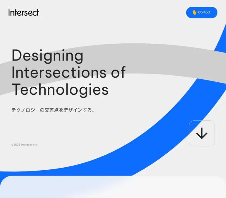
淡いグレーの余白に鮮やかな青を配したAI・DX企業のコーポレートサイト。大きな欧文見出し、丸みのあるサービスパネル、固定ヘッダー、ニュース一覧とブログカードが特徴。
オリジナルサイトを見るExpansive gray space, clear bilingual typography, and electric-blue invitations to connect.
Website / original URL: intersect.inc Final URL: https://intersect.inc/ Theme: light canvas with blue actions, a violet service panel, and a solid blue footer. Inspected: September 23, 2026, 02:31 JST; September 22, 2026, 17:31 UTC, according to the supplied capture batch. Viewports: 1440 × 1000 and 390 × 844 CSS pixels. Scope: the current corporate homepage: persistent navigation, hero, About introduction, two service links, five news entries, three blog previews, recruitment introduction, contact invitation, and footer. Visual evidence consists of three desktop crops and two mobile crops, supplemented by rendered text, links, element rectangles, and computed styles throughout the homepage. Linked pages and opened navigation states were not inspected.
Intersect presents its AI and digital-transformation business through a spacious corporate homepage. The opening message is left aligned and set in large, regular-weight English type. Japanese supporting copy sits beneath it, while most of the desktop canvas remains open. Pale gray surfaces, broad curved decorations, and restrained rules give the page structure without making it visually dense.
The content changes format as its purpose changes. Services occupy large blue and violet panels; news uses an unboxed vertical list; blog previews use white cards with compact metadata. Contact and recruitment links repeat as rounded pills, often accompanied by a hand or fire symbol. The page ends with a substantial blue footer whose mobile arrangement gives navigation, actions, and policies separate vertical space.
Expansive gray space, clear bilingual typography, and electric-blue invitations to connect.
Website / original URL: intersect.inc Final URL: https://intersect.inc/ Theme: light canvas with blue actions, a violet service panel, and a solid blue footer. Inspected: September 23, 2026, 02:31 JST; September 22, 2026, 17:31 UTC, according to the supplied capture batch. Viewports: 1440 × 1000 and 390 × 844 CSS pixels. Scope: the current corporate homepage: persistent navigation, hero, About introduction, two service links, five news entries, three blog previews, recruitment introduction, contact invitation, and footer. Visual evidence consists of three desktop crops and two mobile crops, supplemented by rendered text, links, element rectangles, and computed styles throughout the homepage. Linked pages and opened navigation states were not inspected.
Intersect presents its AI and digital-transformation business through a spacious corporate homepage. The opening message is left aligned and set in large, regular-weight English type. Japanese supporting copy sits beneath it, while most of the desktop canvas remains open. Pale gray surfaces, broad curved decorations, and restrained rules give the page structure without making it visually dense.
The content changes format as its purpose changes. Services occupy large blue and violet panels; news uses an unboxed vertical list; blog previews use white cards with compact metadata. Contact and recruitment links repeat as rounded pills, often accompanied by a hand or fire symbol. The page ends with a substantial blue footer whose mobile arrangement gives navigation, actions, and policies separate vertical space.
The reference describes a corporate homepage with several content types. Its architecture includes independent page destinations, editorial content, recruitment, and contact routes.
| Name | Value | Suggested token | Role and evidence |
|---|---|---|---|
| Main canvas | #efefef |
--ix-canvas |
M: body background at both viewports; visible behind the hero |
| Editorial gray | #eeeeee |
--ix-editorial |
M: shared News and Blog section background |
| Pale section surface | rgba(248, 248, 248, 0.9) |
--ix-surface |
M: About/Service outer section and recruitment section |
| White | #ffffff |
--ix-white |
M: blog cards, filled footer contact link, and primary reversed text |
| Main ink | #252525 |
--ix-ink |
M: hero, corporate copy, and section titles |
| UI ink | #333333 |
--ix-ui-ink |
M: desktop navigation and blog titles |
| Muted corporate text | rgba(37, 37, 37, 0.5) |
--ix-muted |
M: news dates and hero copyright |
| Intersect blue | #0c6dff |
--ix-blue |
M: primary pills, AI / DX Partners panel, and footer |
| Askhub violet | #3530f8 |
--ix-violet |
M: Askhub service panel |
| Service subtitle | rgba(255, 255, 255, 0.5) |
--ix-on-color-muted |
M: Japanese service subtitles |
| Empty news marker | #e1e1e1 |
--ix-news-marker |
M: small blank capsule beside each sampled news date |
| Blog category ink | #444b55 |
--ix-blog-category |
M: blog category labels |
| Blog metadata | #7b838e |
--ix-blog-muted |
M: blog dates, authors, and tag text |
| Blog tag surface | #e8edf4 |
--ix-tag |
M: compact article tags |
| Footer navigation text | rgba(248, 248, 248, 0.98) |
--ix-on-blue |
M: footer link foreground declarations; ancestor opacity was not supplied |
The pale section surface is translucent. Over the measured #efefef canvas, its calculated composite is approximately #f7f7f7. It can look different where a decoration lies beneath it. Preserve the alpha when reproducing that layering; use an opaque approximation only deliberately.
| Treatment | Reusable approximation | Status |
|---|---|---|
| Desktop navigation backing | White at roughly 80% opacity | E; the service color remains visible through the navigation area in the scrolled capture |
| Contact panel | Near #f8f8f8 |
E; the panel wrapper's background was not included in the supplied element subset |
| Fine neutral divider | rgba(37, 37, 37, 0.08) |
E/R; approximates the visible news rules |
| Outlined hero control | rgba(37, 37, 37, 0.2) |
E/R; thin border against the gray canvas |
| Gray decorative stroke | Approximately #d0d0d0 |
E; visible behind the contact area |
| Footer separator | White with low opacity | E; exact border alpha is unavailable |
Blue is both an action color and a large brand surface. Violet distinguishes the second service. Small emoji symbols supply localized warm color; they do not establish an additional interface palette. No selectable theme system is evidenced.
Measured family: Be Vietnam Pro, associated with source property --s-font-8a8bdb97.
The hero, English section titles, service names, header links, corporate dates, and copyright use this family. Most sampled elements request weight 400 and normal letter spacing. The large display text gains emphasis through scale and placement rather than heavy weight or tight tracking.
Preserve the hero's three-line composition:
Designing
Intersections of
Technologies
This line structure appears at both inspected widths.
Measured family: ゴシックMB101 R JIS2004, associated with source property --s-font-bfa22c6b.
This is the declared family for the Japanese hero subtitle, About statement, service explanations, recruitment copy, news titles, and Japanese action labels. Long corporate paragraphs generally use generous 2 line height.
Most text requests weight 400. News titles and ticker headlines request 900, despite the regular appearance of much of the interface. The supplied evidence does not establish which physical font weights were loaded or whether a weight was synthesized. Retain the measured request when documenting the source, but compare rendered results before applying a heavy substitute.
Measured family: Noto Sans JP, associated with source property --s-font-dbb4400e.
Blog card content forms a distinct typographic subsystem: weight 600 titles, weight 500 metadata, cool gray text, and small rectangular tags. This distinction should remain visible when extending the editorial area.
The root HTML and body report Times, but the sampled designed text overrides that inheritance. It is not the visible page's principal typeface. Other registered font variables do not establish additional visible roles.
All entries below are M values. Sizes are shown as font size / line height.
| Role | Desktop | Mobile | Weight / family |
|---|---|---|---|
| Hero English statement | 70 / 79.1px |
40 / 45.2px |
400, Be Vietnam Pro |
| Hero Japanese subtitle | 22 / 30.8px |
16 / 22.4px |
400, Gothic MB101 |
| Header Contact label | 14 / 19.6px |
14 / 19.6px |
400, Be Vietnam Pro |
| Desktop navigation | 14 / 19.6px |
Hidden in inspected mobile state | 400, Be Vietnam Pro |
| About / Recruit eyebrow | 18 / 20.34px |
14 / 15.82px |
400, Be Vietnam Pro |
| About Japanese statement | 52 / 72.8px |
28 / 39.2px |
400, Gothic MB101 |
| About / Recruit paragraphs | 20 / 40px |
15 / 30px |
400, Gothic MB101 |
| Service / News / Blog heading | 40 / 45.2px |
32 / 36.16px |
400, Be Vietnam Pro |
| Service introduction statement | 32 / 57.6px |
22 / 39.6px |
400, Gothic MB101 |
| Service introduction explanation | 18 / 36px |
15 / 30px |
400, Gothic MB101 |
| Service name | 50 / 56.5px |
30 / 33.9px |
400, Be Vietnam Pro |
| Service Japanese subtitle | 14 / 15.82px |
14 / 15.82px |
400, Gothic MB101 |
| Service description | 15 / 30px |
13 / 23.4px |
400, Gothic MB101 |
| News date | 14 / 14px |
12 / 12px |
400, Be Vietnam Pro |
| News title | 18 / 32.4px |
14 / 25.2px |
900 requested, Gothic MB101 |
| Blog title | 18 / 23.4px |
18 / 23.4px |
600, Noto Sans JP |
| Blog category / date | 14 / 14px |
12 / 12px |
500, Noto Sans JP |
| Blog tag | 12 / 16.8px |
12 / 16.8px |
500, Noto Sans JP |
| Blog author | 14 / 19.6px |
14 / 19.6px |
500, Noto Sans JP |
| Recruitment statement | 32 / 57.6px |
24 / 36px |
400, Gothic MB101 |
| Get in Touch heading | 50 / 56.5px |
34 / 38.42px |
400, Be Vietnam Pro |
| Contact explanatory copy | 15 / 30px |
13 / 26px |
400, Gothic MB101 |
| Main Japanese pill label | 14 / 19.6px |
12 / 16.8px |
400, Gothic MB101 |
| Footer pill label | 14 / 19.6px |
14 / 19.6px |
400, Gothic MB101 |
| Footer navigation | 16 / 22.4px |
15 / 21px |
400, Be Vietnam Pro |
| Footer policy links | 14 / 19.6px |
12 / 16.8px |
400, Gothic MB101 |
| Hero copyright | 12 / 13.56px |
12 / 13.56px |
400, Be Vietnam Pro |
| Footer copyright | 13 / 18.2px |
13 / 18.2px |
400, Be Vietnam Pro |
The Intersect wordmark has distinctive joined and curved letterforms. Its appearance should be preserved as brand artwork rather than approximated by ordinary text in the display font. The measured home-link boxes are 140 × 30.89px on desktop and 100 × 22.06px on mobile. Footer logo links are 160 × 35.30px at both widths.
The text extraction includes arrow_downward and arrow_forward. The captures show these as solid directional arrows, not words. The icon font family was not supplied, so no specific icon library is asserted. Hand and fire symbols are visibly used with contact and recruitment actions; their asset format is unverified.
Density: generous section spacing, compact controls, and restrained metadata. Reusable base unit: 4px is a useful R grouping for the many observed 8, 12, 16, 24, 32, 40, 56, and 80px intervals. A universal source spacing variable was not provided.
| Relationship | Desktop | Mobile | Evidence |
|---|---|---|---|
| Header logo left edge | 56px | 16px | M |
| Hero / About copy left edge | 72px | 24px | M |
| News / Blog left edge | 72px | 32px | M |
| Footer left edge | 72px | 20px | M |
| Hero title to Japanese subtitle | 40px | 24px | C from text rectangles |
| Hero bottom copyright clearance | 56px | 32px | C from section and text bounds |
| Hero end to About surface | 120px | 0px | C |
| About surface top to eyebrow | 200px | 80px | C |
| About eyebrow to statement | 40px | 16px | C |
| About statement to paragraph | 40px | 24px | C |
| About paragraph to pill | 56px | 24px | C |
| Gap between service panels | 56px | 56px | C |
| Service panel copy left inset | 56px | 24px | C |
| News row top / bottom inset | Approximately 32px each | Approximately 24px each | C; matches row heights and rules |
| News metadata to title | 16px | 10px | C |
| Blog card gap | 24px horizontally | 24px vertically | C |
| Blog text side inset | 16px | 16px | C |
| News action to Blog heading | 160px | 100px | C |
| Main pill padding | 18px 24px |
14px 18px |
M |
| Main pill icon / label gap | 8px | 8px | M |
| Footer action gap | 16px horizontally | 8px vertically | C |
Mobile uses several intentional inset levels. Header utilities sit at 16px, the footer at 20px, hero/About text at 24px, and News/Blog at 32px. Service panels extend further outward, to approximately 12px from the viewport edge. A single mobile gutter would erase this hierarchy.
| Element | Value | Evidence |
|---|---|---|
| About/Service outer top corners | 56px desktop; 32px mobile | M |
| Service panels | 16px at both widths | M |
| Blog cards | 16px at both widths | M |
| Blog tags | 4px | M |
| Individual desktop navigation links | 8px | M |
| Desktop navigation backing | Approximately 12px | E |
| Pills and mobile menu control | 9999px |
M |
| Empty news marker | 128px on a 24 × 12px box |
M |
| Hero arrow frame | Approximately 24px desktop; 8px mobile | E |
| Contact invitation panel | Approximately 32px | E |
| Element | Desktop | Mobile | Evidence |
|---|---|---|---|
| Document height | 7759.28px | 6815.72px | M; content-specific |
| Hero | 1440 × 1000px |
390 × 675.19px |
M |
| Hero headline box | 544.56 × 237.28px at (72, 275.95) |
304.53 × 135.56px at (24, 226.61) |
M |
| Header Contact link | 143.11 × 52px |
124.86 × 44px |
M |
| Mobile menu button | Not visible | 52 × 52px at (322, 12) |
M |
| About paragraph width | 683.91px | 342px | M |
| Service intro columns | Two 508.02px columns | One 334.19px column | M |
| Service panels | 1270.06 × 520px each |
366.89px wide; 492.67px and 530.56px tall | M |
| News row | 1296 × 127.39px |
326 × 96.19px |
M for sampled entries |
| Blog card | 415.95 × 483.48px |
326px wide; heights 377.28, 380, and 428.91px | M |
| Contact panel | Approximately 1152 × 352px |
Approximately 350px wide | E; mobile top is outside the supplied footer crop |
| Contact action | 214 × 60px |
180 × 48px |
M |
| Footer | 1440 × 436.59px |
390 × 612.48px |
M |
| Footer contact action | 214 × 60px |
350 × 60px |
M |
| Footer recruitment action | 188 × 62px |
350 × 62px |
M |
Role: retain company identity, navigation, and contact access while the homepage scrolls.
Desktop separates three groups: a black wordmark at left, a centered translucent light navigation container, and a blue Contact pill at right. The center contains seven links: Home, About, Service, News, Company, Recruit, and Blog. Each measured link has 12px padding, 14px English text, and an 8px radius. The backing is approximately 494px wide in the capture.
The header remains at the same screen position in the hero, service/news, and footer captures. This supports a persistent header treatment, although its exact position declaration was not supplied. There is no full-width opaque toolbar behind all three groups.
At 390px, the central navigation is absent. A 100px wordmark, a 44px-high Contact pill, and a 52px circular menu button share one row. The menu has a fine blue outline and two thin horizontal blue strokes of unequal length. Contact and menu are separated by 8px.
The recorded navigation links lead to separate page URLs. Preserve those destinations when reproducing the information architecture. The mobile menu's open state, focus behavior, and animation are unverified.
Role: introduce the company's technology-and-design positioning.
Use a pale gray field with the three-line English statement, then the source subtitle, テクノロジーの交差点をデザインする。. The heading is regular weight, dark gray, and left aligned. Its desktop top is about 276px; the mobile top is about 227px. These are observed positions, not evidence of a hardcoded top offset.
On desktop, the headline occupies only about 545px of a 1440px viewport. Keep the right side largely empty. A cropped white curved stroke passes behind the left portion of the text in the supplied current hero capture. On mobile, a blue rounded stroke enters near the lower-left edge, leaving the headline area clear.
The hero is 1000px tall on desktop. On mobile it is approximately 675px, allowing the rounded About section and its opening statement to appear in the first 844px viewport. The measured mobile height is consistent with 80% of viewport height; the original height formula is not supplied.
Role: balance the open hero with a low visual baseline and a continuation cue.
The copyright sits at lower left in muted 12px English text. Desktop also includes a shallow rounded news strip centered near the bottom: approximately 778px wide and 42px high in the screenshot. Its contents combine a muted date and a Japanese news headline.
Repeated links extend horizontally beyond the viewport in the rendered data. Together with the clipped text in the strip, this supports a ticker construction. Its exact movement, speed, direction, and pause behavior were not recorded. The strip is absent from the mobile visible text and screenshot, even though repeated content remains in the section's underlying extraction.
A thin outlined square with a large down arrow anchors the lower right. Its estimated size changes from 180px to 80px. The mobile box is approximately 24px from the right edge and 32px above the hero's bottom. The down arrow is an observed affordance; its actual click target and scrolling behavior were not exercised.
Role: explain the corporate mission before introducing services.
A pale translucent section begins with large rounded upper corners. A small blue dot precedes the English About us eyebrow. Below it, the Japanese statement AIで日本をDX先進国に。 introduces a generously spaced paragraph block and a blue pill linking to /about.
Desktop uses a roughly 684px paragraph column, 20px copy, and 40px line height. The mobile paragraph expands across the 342px content width and changes to 15px type with 30px line height. The statement changes from 52px to 28px; the section's opening inset contracts from 200px to 80px.
Keep the body text calm and readable. The action follows the explanatory copy; it does not share the heading row or interrupt the paragraph.
Role: bridge the mission statement and the two business offerings.
The English Service heading is followed by a Japanese statement and a supporting explanation. Desktop places these in two separate 508px columns within an approximately 1270px content region, with a broad gap between them. The statement uses 32px type; the explanatory column uses 18px type with double leading.
On mobile, the columns stack at the same approximately 28px left inset. The statement is 22px with 39.6px line height; the explanation is 15px with 30px line height. The measured gap between the two text blocks is 20px.
The supplied service/news screenshot also shows a white rounded inner frame around the colored panels. Its exact wrapper styles were not included, so its padding and radius should be treated as visual estimates.
Role: provide two large, distinct routes into the business.
Each panel is a single anchor containing a number, English service name, Japanese subtitle, explanatory copy, visual region, and directional arrow. The first links to /dxpartners; the second links to https://askhub.jp/. The external product destination is present in the homepage evidence but was not inspected.
| Panel | Fill | Display label | Supporting label |
|---|---|---|---|
| 01 | #0c6dff |
AI / DX Partners | AI / DXパートナー事業 |
| 02 | #3530f8 |
Askhub | AI SaaS事業 |
Desktop panels are 520px tall, with 16px corners and a 56px gap between panels. English names are 50px. The main text is white, while the small Japanese subtitle is white at 50% opacity. Copy begins 56px inside the left edge.
The visible portion of Askhub shows violet copy space on the left and a cropped white application interface on the right. The interface contains a sidebar and many assistant tiles. A large white right arrow sits inside a thin outlined rounded square below the copy; the square is approximately 140px across in the desktop crop. The first panel's image subject is not established by the supplied screenshots.
On mobile, panel width grows beyond the introductory text width to approximately 367px. Titles become 30px, descriptions become 13px, and copy begins 24px inside the left edge. The number begins approximately 217px below the first panel's top and 255px below the second panel's top. This is consistent with substantial visual space above the copy, but the corresponding media rectangles were not supplied. A media-first mobile arrangement is a reasonable R implementation, not a fully verified image-layout rule.
The two mobile panels have different measured heights. Avoid forcing them to equal heights or inventing a uniform image ratio. Keep the arrow decorative within the whole-card link rather than adding a nested interactive control.
Role: present recent company announcements with clear chronological scanning.
News sits directly on the editorial gray surface. Each full-width anchor contains a metadata row, a Japanese title below it, and a fine horizontal divider. There is no separate white card around each entry.
Desktop row anatomy closely matches 32px top space, a 14px date line, a 16px gap, a 32.4px title line, 32px bottom space, and a 1px divider. Mobile contracts to 24px top/bottom space, a 12px date line, a 10px gap, and a 25.2px title line. The resulting sampled row heights are approximately 127.4px and 96.2px.
A 24 × 12px gray capsule follows each date after a 16px gap. The supplied rendered text for these capsules is empty. Its intended category or status is unknown; do not invent a label or interpret it as a loading indicator.
Five announcements are followed by the pill ニュース一覧を見る, linking to /news. The dates in the hero strip and the list use different formats and values in the supplied evidence. Treat these as separate content records, not as interchangeable placeholders.
Role: preview longer articles with subject, date, title, tags, and author information.
Desktop shows three equally wide white cards in one row, separated by 24px. Each is a complete article link with 16px corners. The supplied rectangles establish the sequence of upper media space, category/date row, title, tags, and author row. The images themselves are outside the supplied visual crops, so their subjects and exact crop treatments remain unverified.
Metadata combines a small emoji and category at left with a date at right. Titles use Noto Sans JP at 18px/23.4px, weight 600. Tags use 12px text, 4px 8px padding, 4px corners, and a pale blue-gray fill. Tag spacing is 4px. Author names sit near the bottom in muted 14px text.
The three desktop card boxes share a height of approximately 483px, but their metadata begins at different vertical positions. Do not assume all upper images use one ratio. On mobile, the cards stack at 326px wide with 24px gaps and varying heights. Titles retain their 18px size and occupy two measured lines. The desktop title boxes record one line; the original overflow or clamping declaration was not supplied.
The bylines identify article authors. They are not website production credits.
Role: direct potential colleagues to the recruitment page.
A pale section contains an English Recruit eyebrow, a Japanese invitation, a paragraph, and a blue recruitment pill. Measured positions place the eyebrow above the statement, even though the extracted plain-text order lists it later.
Desktop content is inset 108px, with a 32px invitation and a roughly 734px-wide paragraph. Mobile uses 32px side insets, a two-line 24px invitation, and 15px/30px body copy. The action links to /recruit.
The section is approximately 1005px tall on desktop and 598px tall on mobile. The material above its text is not visible in the supplied crops, so no photography, illustration subject, or reveal sequence is asserted.
Role: offer a clear next step after the corporate and editorial content.
A large near-white rounded panel is centered on the gray canvas. It contains the small Japanese label お問い合わせ, the English heading Get in Touch, a centered explanatory sentence, and a blue hand-symbol pill linking to /contact.
The desktop panel is approximately 1152px wide, or 80% of the inspected viewport. The heading uses 50px/56.5px type; the action measures 214 × 60px. A gray rounded decorative stroke is visible behind the panel's lower-left surroundings.
Mobile reduces the panel to approximately 350px wide. The DOM records a 34px heading, 13px explanatory copy over two lines, and a centered 180 × 48px action. The heading itself is outside the supplied mobile footer crop.
Two copies of Get in Touch appear in the element extraction, but only one appears in the desktop screenshot. Preserve a single visible semantic heading. The duplicate may support clipping or a transition; its trigger and motion are unverified. This block is a link invitation, not an observed embedded contact form.
Role: close the homepage with identity, key navigation, repeated actions, and policies.
Desktop uses a solid #0c6dff field with 72px horizontal insets. A faint horizontal rule sits above the main row. The white wordmark is followed by Home, About, Service, News, and Company. Recruitment and contact actions align to the right: recruitment is transparent with a white outline and fire symbol; contact is white with dark text and a hand symbol.
A lower row places copyright at left and four policy links at right. The policies cover privacy, information security, AI ethics, and business continuity. The evidence does not show a footer Blog link; preserve the actual reduced footer navigation set.
Mobile retains the large 160px logo instead of shrinking it to the header's 100px size. Navigation wraps onto two lines, with Company on the second line at 390px. Both action pills become 350px wide and stack with an 8px gap. A second faint rule introduces the policies, which stack as underlined links. Copyright moves to the lower right beside the bottom of the policy group.
The persistent header remains visible over the mobile contact/footer capture. Its black wordmark is separate from the white footer wordmark.
| Treatment | Supplied evidence | What can be concluded |
|---|---|---|
| General element transitions | 0.3s cubic-bezier(0.4, 0.4, 0, 1) on many links and text elements |
M: transition timing is declared; individual changed properties and triggers were not exercised |
| Body background transition | background 0.5s cubic-bezier(0.4, 0.4, 0, 1) |
M: background changes can transition; no theme toggle is established |
| Contact heading copies | 0.8s transitions on desktop; 0.3s on mobile | M: responsive timing difference; no verified rolling or sliding sequence |
| Hero ticker | Repeated, horizontally offset anchors and clipped text | A ticker structure is supported; speed, direction, pause, and loop behavior remain unverified |
| Decorative strokes | Cropped white, blue, and gray forms in current-page captures | Their appearance is observed; a timeline or scroll relationship cannot be recovered from stills |
| Persistent header | Same screen placement across scrolled captures | Persistence is visually supported; fixed versus sticky source CSS is unavailable |
| Mobile menu | Button and closed-state strokes visible | Opening, closing, keyboard handling, and overlay design are unverified |
| Down arrow | Visible outlined continuation control | Destination and scrolling behavior are unverified |
| Service and content navigation | Anchor destinations supplied | Link structure is verified; destination-page behavior is outside scope |
Many sampled elements report animation: none. This does not prove that the entire page is static: decorative descendants, pseudo-elements, media, or script-driven transformations may be outside the sampled subset.
The capture procedure waited for document load, finite geometric motion, layout/text stability, and visible image decoding within bounded time limits. Perpetual animations were temporarily paused during readiness checks and then resumed. These procedures improve capture stability but do not document complete animation sequences or delayed content.
R: reuse the measured 300ms easing for restrained color or opacity feedback. Keep the initial implementation static where motion is unknown. If adding a ticker or moving decoration, provide reduced-motion behavior and a pause mechanism for continuously moving readable content. Do not present invented animation durations as recovered source values.
| Layer | Appearance | Purpose |
|---|---|---|
| Main canvas | #efefef, broad empty regions |
Gives the hero and contact area room |
| Persistent navigation backing | Small translucent light rounded rectangle | Separates desktop navigation locally |
| About/Service outer section | Pale translucent fill, large upper corners | Marks the first major content transition |
| Service inner frame | White rounded region visible in the scrolled crop | Groups the service presentation |
| Service panels | Solid blue or violet, white text, 16px corners | Distinguishes the two offerings |
| News area | Unboxed rows on #eeeeee with fine dividers |
Supports chronological scanning |
| Blog cards | White with 16px corners and cool metadata | Separates editorial previews |
| Contact invitation | Large near-white rounded panel | Concentrates the final contact action |
| Footer | Solid blue with reversed text and thin rules | Provides a strong visual ending |
The supplied captures do not show a pronounced shadow-based elevation system. Separation primarily comes from background changes, spacing, corners, and fine borders. Subtle contact-panel edge shading is visible, but no exact shadow declaration was supplied. A blur filter is also unverified; translucency alone does not establish blur.
The current opening composition relies on typography and abstract geometry. Decorations resemble very thick, smooth strokes with rounded ends, cropped by the viewport or surrounding sections. In the desktop hero, the visible stroke is white and sits behind the left-side statement. In the mobile hero, a blue rounded end enters from the lower left. Near contact, a gray stroke appears behind the panel's surroundings.
Keep these shapes subordinate to the message. A reusable adaptation can use large SVG paths with round caps and a clipped decorative layer. This is an implementation recommendation; the original rendering method, path data, and motion are not provided.
Product imagery has a different role. The visible Askhub media presents a real application interface with a white background, sidebar, and assistant tiles. It gives the service panel a concrete product reference. Do not replace that evidence with unrelated technology stock imagery.
| Visual | Current evidence | Reuse guidance |
|---|---|---|
| Black Intersect wordmark | Desktop/mobile header captures | Use authorized brand artwork; retain its proportions |
| White Intersect wordmark | Desktop/mobile footer captures | Use the reversed brand asset at the measured 160px width |
| Askhub interface | Desktop service/news capture | Retain legible interface structure and an intentional crop |
| Hero/contact strokes | Current hero and contact captures | Use smooth, thick, rounded geometry; exact paths are unavailable |
| Hand and fire symbols | Contact and recruitment actions | Preserve their small supporting scale; format is unverified |
| Blog media and author imagery | Content regions are implied by DOM layout | Subjects, full URLs, and crops are not sufficiently documented |
No complete asset manifest was supplied. Do not invent image filenames, reconstruct truncated asset URLs, or claim that unseen recruitment/blog imagery has a particular subject. Smooth normal image rendering suits the visible product interface; pixelated rendering is not part of the observed design.
The page follows this sequence: hero → About → Service → News → Blog → Recruit → contact invitation → footer. The desktop document is approximately 7759px tall; the mobile document is approximately 6816px tall. These are measurements of this content at these viewports, not fixed page-height requirements.
| Area | 1440px viewport | 390px viewport |
|---|---|---|
| Header | Wordmark, seven-link center navigation, Contact | Smaller wordmark, Contact, circular menu |
| Hero | Full inspected viewport height; 70px headline | About begins within first viewport; 40px headline |
| Hero news strip | Visible near bottom center | Not visible |
| Hero arrow | Approximately 180px square | Approximately 80px square |
| About surface | 56px top corners; 200px opening inset | 32px top corners; 80px opening inset |
| Service introduction | Two text columns | Stacked text blocks |
| Service panels | Wide 520px-tall panels | Narrow panels with different content-driven heights |
| News | 1296px-wide ruled rows | 326px-wide ruled rows with smaller text |
| Blog | Three cards across | Three cards stacked |
| Main pills | 60px high | 48px high |
| Footer pills | Compact and adjacent | Full content width and stacked; 60/62px high |
| Footer policies | Horizontal row | Vertical underlined links |
| Footer copyright | Lower left | Lower right |
Desktop News/Blog width is exactly 90% of the inspected viewport: 1296px with 72px side margins. This is consistent with a percentage-based container, but two viewport samples cannot establish the full source formula or maximum width.
The supplied page text includes a 1280px media-query fragment for responsive line-break visibility. It does not establish the breakpoint for navigation collapse or every component change. Intermediate widths, landscape phones, browser zoom, and safe-area behavior were not inspected.
R: use content-driven wrapping, collapse the header before its three groups collide, and select explicit breakpoints for the adaptation. Preserve the measured endpoints without assuming that all dimensions scale by one ratio. Blog titles and footer buttons notably keep much of their desktop size on mobile.
#0c6dff and service violet #3530f8 distinct.Get in Touch as ordinary headings.arrow_forward as visible text.These recommendations are for a new implementation and are not verified features of the original page:
h1 for the hero and a logical h2/h3 hierarchy. Many sampled visual headings are paragraph elements in the source evidence.#efefef.#eeeeee.rgba(248, 248, 248, 0.9).#252525; navigation/blog title ink: #333333.#0c6dff.#3530f8.#ffffff.#7b838e; tags: #e8edf4.“Create a corporate homepage inspired by the current Intersect website. Use a pale gray canvas, dark regular-weight typography, vivid blue #0c6dff actions, and a violet #3530f8 second service panel. Place a distinctive wordmark at left, a compact translucent navigation group at desktop center, and a Contact pill at right. Set a three-line English hero at 70px/1.13 on desktop and 40px/1.13 on a 390px phone, with Japanese supporting copy underneath and generous empty space. Follow with a rounded pale About section, two broad service links, ruled news rows, three white blog cards, recruitment copy, a centered contact panel, and a blue footer. Use Be Vietnam Pro for English corporate headings, Gothic MB101 for Japanese corporate copy, and Noto Sans JP inside blog cards. Match the observed desktop/mobile structures. Keep unknown motion static and label any added behavior as an implementation choice.”
#efefef field with a dark, regular-weight, three-line English statement aligned to a 72px desktop inset or 24px mobile inset. Add a Japanese subtitle after 40px desktop or 24px mobile space. Place muted copyright below and a thin outlined square down-arrow at lower right. Use only sparse cropped rounded decoration behind the content.”This is a recommended, unexecuted adaptation, not recovered production CSS. It reproduces the principal measured endpoints while allowing content to grow. The 1024px navigation breakpoint, 768px content breakpoint, container cap, estimated borders, and static decorative treatment are R choices.
Load the named fonts separately using appropriate licenses. The declarations below do not download them. Supply authorized wordmark and image assets; no asset paths are fabricated. Use semantic header, navigation, section, article, and footer markup. Service/blog/news wrappers should be anchors; arrow frames inside those links should be noninteractive spans.
:root {
  /* Measured colors */
  --ix-canvas: #efefef;
  --ix-editorial: #eeeeee;
  --ix-surface: rgba(248, 248, 248, 0.9);
  --ix-white: #fff;
  --ix-ink: #252525;
  --ix-ui-ink: #333;
  --ix-muted: rgba(37, 37, 37, 0.5);
  --ix-blue: #0c6dff;
  --ix-violet: #3530f8;
  --ix-blog-muted: #7b838e;
  --ix-tag: #e8edf4;

  /* Estimated surface details */
  --ix-rule: rgba(37, 37, 37, 0.08);
  --ix-outline: rgba(37, 37, 37, 0.2);
  --ix-nav-surface: rgba(255, 255, 255, 0.8);

  /* Measured family roles; generic fallbacks are recommendations */
  --ix-font-latin: 'Be Vietnam Pro', sans-serif;
  --ix-font-jp: 'ゴシックMB101 R JIS2004', sans-serif;
  --ix-font-blog: 'Noto Sans JP', sans-serif;

  --ix-hero-size: 70px;
  --ix-section-size: 40px;
  --ix-body-size: 20px;
  --ix-gutter: 5vw;
  --ix-section-radius: 56px;
  --ix-card-radius: 16px;
  --ix-pill-radius: 9999px;
  --ix-ease: cubic-bezier(0.4, 0.4, 0, 1);
  --ix-duration: 300ms;
}

* { box-sizing: border-box; }
body {
  margin: 0;
  color: var(--ix-ink);
  background: var(--ix-canvas);
  font-family: var(--ix-font-jp);
}
a { color: inherit; }
button { font: inherit; }
h1, h2, h3, p { margin: 0; }
img { display: block; max-width: 100%; }
section { scroll-margin-top: 112px; }

.container {
  width: calc(100% - 2 * var(--ix-gutter));
  max-width: 1296px; /* Recommended cap */
  margin-inline: auto;
}
.english { font-family: var(--ix-font-latin); }
.section-title {
  font: 400 var(--ix-section-size)/1.13 var(--ix-font-latin);
}

.site-header {
  position: fixed;
  inset: 32px clamp(24px, 3.889vw, 56px) auto;
  z-index: 20;
  display: grid;
  grid-template-columns: minmax(0, 1fr) auto minmax(0, 1fr);
  align-items: center;
}
.header-logo { width: 140px; }
.desktop-nav {
  display: flex;
  padding: 4px;
  border: 1px solid rgba(255, 255, 255, 0.8);
  border-radius: 12px;
  background: var(--ix-nav-surface);
}
.desktop-nav a {
  padding: 12px;
  border-radius: 8px;
  color: var(--ix-ui-ink);
  font: 400 14px/1.4 var(--ix-font-latin);
  text-decoration: none;
}
.header-actions {
  display: flex;
  justify-content: flex-end;
  align-items: center;
  gap: 8px;
}
.menu-button { display: none; }

.pill {
  display: inline-flex;
  justify-content: center;
  align-items: center;
  gap: 8px;
  width: fit-content;
  padding: 18px 24px;
  border: 0;
  border-radius: var(--ix-pill-radius);
  color: var(--ix-white);
  background: var(--ix-blue);
  font-size: 14px;
  line-height: 1.4;
  text-decoration: none;
}
.pill-icon {
  display: grid;
  place-items: center;
  width: 24px;
  height: 24px;
  flex: none;
  font-size: 20px;
  line-height: 1;
}
.pill-label { padding-inline-end: 8px; }
.site-header .pill {
  padding-block: 14px;
  font-family: var(--ix-font-latin);
}
.pill--outline {
  border: 1px solid currentColor;
  background: transparent;
}
.pill--white {
  color: var(--ix-ink);
  background: var(--ix-white);
}

.hero {
  position: relative;
  isolation: isolate;
  display: grid;
  align-items: center;
  min-height: 100svh;
  padding: 120px var(--ix-gutter) 260px;
  overflow: clip;
}
.hero h1 {
  font: 400 var(--ix-hero-size)/1.13 var(--ix-font-latin);
  letter-spacing: normal;
}
.hero-subtitle {
  margin-top: 40px;
  font-size: 22px;
  line-height: 1.4;
}
.hero-copyright {
  position: absolute;
  left: var(--ix-gutter);
  bottom: 56px;
  color: var(--ix-muted);
  font: 400 12px/1.13 var(--ix-font-latin);
}
.hero-ticker {
  position: absolute;
  left: 23%;
  bottom: 56px;
  display: flex;
  align-items: center;
  width: 54%;
  min-height: 42px;
  padding: 12px 20px;
  overflow: hidden;
  border-radius: var(--ix-pill-radius);
  background: rgba(37, 37, 37, 0.035);
  font-size: 14px;
  white-space: nowrap;
  /* Static by default; no unverified animation is invented. */
}
.hero-ticker a {
  overflow: hidden;
  text-overflow: ellipsis;
  text-decoration: none;
}
.arrow-box {
  display: grid;
  place-items: center;
  width: 180px;
  height: 180px;
  border: 1px solid var(--ix-outline);
  border-radius: 24px;
  color: var(--ix-ink);
  background: transparent;
  text-decoration: none;
}
.arrow-box svg { width: 100px; height: 100px; }
.hero-scroll {
  position: absolute;
  right: var(--ix-gutter);
  bottom: 56px;
}
.brand-decoration {
  position: absolute;
  z-index: -1;
  pointer-events: none;
}
.brand-decoration path {
  fill: none;
  stroke-linecap: round;
}

.about-service {
  margin-top: 120px;
  padding-block: 200px 120px;
  border-radius: var(--ix-section-radius) var(--ix-section-radius) 0 0;
  background: var(--ix-surface);
}
.eyebrow {
  display: flex;
  align-items: center;
  gap: 12px;
  font: 400 18px/1.13 var(--ix-font-latin);
}
.eyebrow::before {
  content: '';
  width: 8px;
  height: 8px;
  flex: none;
  border-radius: 50%;
  background: var(--ix-blue);
}
.about-title {
  margin-top: 40px;
  font-size: 52px;
  font-weight: 400;
  line-height: 1.4;
}
.about-copy {
  max-width: 684px;
  margin-top: 40px;
  font-size: var(--ix-body-size);
  line-height: 2;
}
.about-action { margin-top: 56px; }

/* Recommended frame geometry based on the visible white surround. */
.service-frame {
  width: 98%;
  margin: 160px auto 0;
  padding-block: 80px;
  border-radius: 16px;
  background: var(--ix-white);
}
.service-inner { width: 90%; margin-inline: auto; }
.service-heading {
  padding-bottom: 32px;
  border-bottom: 1px solid var(--ix-rule);
}
.service-intro {
  display: grid;
  grid-template-columns: 40% 40%;
  justify-content: space-between;
  margin-top: 64px;
}
.service-intro-lead { font-size: 32px; line-height: 1.8; }
.service-intro-copy { font-size: 18px; line-height: 2; }
.service-list { display: grid; gap: 56px; margin-top: 72px; }
.service-card {
  display: grid;
  grid-template-columns: 54% 46%; /* Approximation of visible split */
  min-height: 520px;
  overflow: hidden;
  border-radius: var(--ix-card-radius);
  color: var(--ix-white);
  background: var(--ix-blue);
  text-decoration: none;
}
.service-card--violet { background: var(--ix-violet); }
.service-copy {
  grid-area: 1 / 1;
  display: flex;
  flex-direction: column;
  align-items: flex-start;
  padding: 56px 40px 40px 56px;
}
.service-number {
  margin-bottom: 12px;
  font: 400 14px/1.4 var(--ix-font-latin);
}
.service-name { font: 400 50px/1.13 var(--ix-font-latin); }
.service-subtitle {
  margin-top: 8px;
  color: rgba(255, 255, 255, 0.5);
  font-size: 14px;
  line-height: 1.13;
}
.service-description {
  max-width: 516px;
  margin-block: 24px 32px;
  font-size: 15px;
  line-height: 2;
}
.service-copy .arrow-box {
  width: 140px;
  height: 140px;
  margin-top: auto;
  color: var(--ix-white);
  border-color: rgba(255, 255, 255, 0.5);
}
.service-copy .arrow-box svg { width: 80px; height: 80px; }
.service-media { grid-area: 1 / 2; min-width: 0; }
.service-media img { width: 100%; height: 100%; object-fit: cover; }

.editorial { padding-block: 120px 160px; background: var(--ix-editorial); }
.news-list { margin-top: 16px; }
.news-row {
  display: block;
  padding-block: 32px;
  border-bottom: 1px solid var(--ix-rule);
  text-decoration: none;
}
.news-meta {
  display: flex;
  align-items: center;
  gap: 16px;
  color: var(--ix-muted);
  font: 400 14px/1 var(--ix-font-latin);
}
.news-title { margin-top: 16px; font-size: 18px; font-weight: 900; line-height: 1.8; }
.section-action { margin-top: 48px; }
.blog-section { margin-top: 160px; }
.blog-grid {
  display: grid;
  grid-template-columns: repeat(3, minmax(0, 1fr));
  gap: 24px;
  margin-top: 32px;
}
.blog-card {
  display: flex;
  flex-direction: column;
  min-width: 0;
  overflow: hidden;
  border-radius: var(--ix-card-radius);
  background: var(--ix-white);
  font-family: var(--ix-font-blog);
  text-decoration: none;
}
.blog-media { width: 100%; height: auto; }
.blog-content { display: flex; flex: 1; flex-direction: column; gap: 16px; padding: 16px; }
.blog-meta {
  display: flex;
  justify-content: space-between;
  gap: 12px;
  color: var(--ix-blog-muted);
  font-size: 14px;
  font-weight: 500;
  line-height: 1;
}
.blog-title { color: var(--ix-ui-ink); font-size: 18px; font-weight: 600; line-height: 1.3; }
.blog-tags { display: flex; flex-wrap: wrap; gap: 4px; }
.blog-tag {
  padding: 4px 8px;
  border-radius: 4px;
  color: var(--ix-blog-muted);
  background: var(--ix-tag);
  font-size: 12px;
  font-weight: 500;
  line-height: 1.4;
}
.blog-author { margin-top: auto; padding-top: 16px; color: var(--ix-blog-muted); font-size: 14px; }

.contact-area { padding-block: 96px; }
.contact-panel {
  width: 80%;
  margin-inline: auto;
  padding: 56px 40px;
  border-radius: 32px;
  background: #f8f8f8; /* Visual approximation */
  text-align: center;
}
.contact-label { font-size: 14px; line-height: 1.4; }
.contact-title { margin-top: 3px; font: 400 50px/1.13 var(--ix-font-latin); }
.contact-copy { max-width: 805px; margin: 32px auto; font-size: 15px; line-height: 2; }

.site-footer { padding: 80px var(--ix-gutter); color: #fff; background: var(--ix-blue); }
.footer-main {
  display: flex;
  flex-wrap: wrap;
  align-items: flex-start;
  gap: 80px;
  padding-top: 48px;
  border-top: 1px solid rgba(255, 255, 255, 0.2);
}
.footer-logo { width: 160px; flex: none; }
.footer-nav { display: flex; flex-wrap: wrap; }
.footer-nav a {
  padding-right: 24px;
  font: 400 16px/1.4 var(--ix-font-latin);
  text-decoration: none;
}
.footer-actions { display: flex; gap: 16px; margin-left: auto; }
.footer-bottom { display: flex; justify-content: space-between; align-items: center; gap: 24px; margin-top: 144px; }
.footer-copyright { font: 400 13px/1.4 var(--ix-font-latin); }
.footer-policies { display: flex; flex-wrap: wrap; gap: 32px; }
.footer-policies a { font-size: 14px; line-height: 1.4; text-decoration: none; }

/* Recommended interaction feedback; source hover states are unverified. */
a, button { transition: color var(--ix-duration) var(--ix-ease), background-color var(--ix-duration) var(--ix-ease); }
:focus-visible { outline: 3px solid var(--ix-ink); outline-offset: 4px; }
.site-footer :focus-visible { outline-color: #fff; }
@media (hover: hover) {
  .desktop-nav a:hover { background: rgba(37, 37, 37, 0.05); }
  .news-row:hover .news-title, .blog-card:hover .blog-title { text-decoration: underline; }
}

@media (max-width: 64rem) {
  .site-header { grid-template-columns: minmax(0, 1fr) auto; }
  .desktop-nav { display: none; }
  .menu-button {
    display: flex;
    flex-direction: column;
    align-items: flex-end;
    justify-content: center;
    gap: 6px;
    width: 52px;
    height: 52px;
    padding: 11px;
    border: 1px solid var(--ix-blue);
    border-radius: 50%;
    color: var(--ix-blue);
    background: rgba(238, 238, 238, 0.3);
    cursor: pointer;
  }
  .menu-button::before, .menu-button::after { content: ''; height: 1px; background: currentColor; }
  .menu-button::before { width: 100%; }
  .menu-button::after { width: 65%; }
}

@media (max-width: 48rem) {
  :root { --ix-gutter: 24px; --ix-hero-size: 40px; --ix-section-size: 32px; --ix-body-size: 15px; --ix-section-radius: 32px; }
  section { scroll-margin-top: 88px; }
  .site-header { inset: 12px 16px auto; }
  .header-logo { width: 100px; }
  .pill { padding: 14px 18px; font-size: 12px; }
  .pill-icon { width: 20px; height: 20px; font-size: 18px; }
  .site-header .pill { padding: 12px 16px; font-size: 14px; }
  .hero { min-height: 80svh; padding: 100px 24px 140px; }
  .hero-subtitle { margin-top: 24px; font-size: 16px; }
  .hero-copyright { left: 24px; bottom: 32px; }
  .hero-ticker { display: none; }
  .hero-scroll { right: 24px; bottom: 32px; width: 80px; height: 80px; border-radius: 8px; }
  .hero-scroll svg { width: 40px; height: 40px; }
  .about-service { margin-top: 0; padding-block: 80px; }
  .eyebrow { gap: 8px; font-size: 14px; }
  .about-title { margin-top: 16px; font-size: 28px; }
  .about-copy, .about-action { margin-top: 24px; }
  .service-frame { margin-top: 32px; padding-block: 80px 40px; }
  .service-inner { width: calc(100% - 48px); }
  .service-heading { padding-bottom: 16px; }
  .service-intro { grid-template-columns: 1fr; gap: 20px; margin-top: 24px; }
  .service-intro-lead { font-size: 22px; }
  .service-intro-copy { font-size: 15px; }
  .service-list { position: relative; left: 50%; width: calc(100vw - 24px); margin-top: 32px; transform: translateX(-50%); }
  .service-card { grid-template-columns: minmax(0, 1fr); min-height: 0; }
  .service-media { grid-area: 1 / 1; }
  .service-media img { height: auto; }
  .service-copy { grid-area: 2 / 1; padding: 24px; }
  .service-number { font-size: 12px; }
  .service-name { font-size: 30px; }
  .service-subtitle { margin-top: 4px; }
  .service-description { margin-block: 16px 24px; font-size: 13px; line-height: 1.8; }
  .service-copy .arrow-box { width: 56px; height: 56px; border-radius: 12px; }
  .service-copy .arrow-box svg { width: 32px; height: 32px; }
  .editorial { padding-block: 72px; }
  .editorial > .container { width: calc(100% - 64px); }
  .news-list { margin-top: 0; }
  .news-row { padding-block: 24px; }
  .news-meta { font-size: 12px; }
  .news-title { margin-top: 10px; font-size: 14px; }
  .section-action { margin-top: 24px; }
  .blog-section { margin-top: 100px; }
  .blog-grid { grid-template-columns: 1fr; margin-top: 16px; }
  .blog-meta { font-size: 12px; }
  .contact-area { padding-block: 56px; }
  .contact-panel { width: calc(100% - 40px); padding: 40px; }
  .contact-title { font-size: 34px; }
  .contact-copy { margin-block: 16px; font-size: 13px; }
  .site-footer { padding: 56px 20px; }
  .footer-main { display: block; padding-top: 32px; }
  .footer-nav { margin-top: 24px; }
  .footer-nav a { padding: 8px 24px 8px 0; font-size: 15px; }
  .footer-actions { flex-direction: column; gap: 8px; margin-top: 24px; }
  .footer-actions .pill { width: 100%; padding: 18px 24px; font-size: 14px; }
  .footer-actions .pill-icon { width: 24px; height: 24px; font-size: 20px; }
  .footer-bottom { display: grid; grid-template-columns: 1fr auto; align-items: end; margin-top: 32px; padding-top: 16px; border-top: 1px solid rgba(255, 255, 255, 0.2); }
  .footer-policies { grid-area: 1 / 1; flex-direction: column; gap: 0; }
  .footer-policies a { padding-block: 8px; font-size: 12px; text-decoration: underline; }
  .footer-copyright { grid-area: 1 / 2; }
}

/* Recommended reduced-motion baseline for this adaptation. */
@media (prefers-reduced-motion: reduce) {
  a, button { transition: none; }
  .brand-decoration, .hero-ticker { animation: none; }
}
The hero headline should use explicit line breaks at the two evidenced boundaries. Use an accessible name on its continuation link and a decorative SVG inside the arrow frame. This example draws a usable approximation without assuming an icon-font dependency:
<a class='arrow-box hero-scroll' href='#about' aria-label='Continue to About'>
  <svg viewBox='0 0 100 100' aria-hidden='true' focusable='false'>
    <path d='M50 12V86 M16 52L50 86L84 52'
      fill='none' stroke='currentColor' stroke-width='8'
      stroke-linecap='square' stroke-linejoin='miter' />
  </svg>
</a>
The #about destination is an R choice and requires a matching section ID. The source arrow destination was not supplied. Mobile menu logic, complete recruitment layout, asset-specific cropping, and any continuous motion require separate implementation and validation.
Optional mapping for a project already using Tailwind v4. Define the custom properties above first. This mapping does not imply that the original website uses Tailwind.
@theme inline {
  --color-canvas: var(--ix-canvas);
  --color-editorial: var(--ix-editorial);
  --color-section: var(--ix-surface);
  --color-ink: var(--ix-ink);
  --color-brand: var(--ix-blue);
  --color-product: var(--ix-violet);
  --color-metadata: var(--ix-blog-muted);
  --color-tag: var(--ix-tag);

  --font-display: var(--ix-font-latin);
  --font-corporate: var(--ix-font-jp);
  --font-editorial: var(--ix-font-blog);

  --text-hero: var(--ix-hero-size);
  --text-section: var(--ix-section-size);
  --text-corporate: var(--ix-body-size);

  --radius-panel: var(--ix-card-radius);
  --radius-section: var(--ix-section-radius);
  --radius-pill: var(--ix-pill-radius);
  --spacing-page: var(--ix-gutter);
}
インターセクト株式会社.2026-09-22T17:31:29.162Z, equivalent to September 23, 2026, 02:31:29.162 JST. Separate timestamps for each image were not supplied.This reference is based on the supplied current homepage evidence. No additional browsing or file inspection was performed. The CSS and prompts are reusable recommendations, with measured source values distinguished from estimates and implementation choices.
# Intersect — Corporate Website Style Reference

> Expansive gray space, clear bilingual typography, and electric-blue invitations to connect.

**Website / original URL:** [intersect.inc](https://intersect.inc/)
**Final URL:** [https://intersect.inc/](https://intersect.inc/)
**Theme:** light canvas with blue actions, a violet service panel, and a solid blue footer.
**Inspected:** September 23, 2026, 02:31 JST; September 22, 2026, 17:31 UTC, according to the supplied capture batch.
**Viewports:** 1440 × 1000 and 390 × 844 CSS pixels.
**Scope:** the current corporate homepage: persistent navigation, hero, About introduction, two service links, five news entries, three blog previews, recruitment introduction, contact invitation, and footer. Visual evidence consists of three desktop crops and two mobile crops, supplemented by rendered text, links, element rectangles, and computed styles throughout the homepage. Linked pages and opened navigation states were not inspected.

Intersect presents its AI and digital-transformation business through a spacious corporate homepage. The opening message is left aligned and set in large, regular-weight English type. Japanese supporting copy sits beneath it, while most of the desktop canvas remains open. Pale gray surfaces, broad curved decorations, and restrained rules give the page structure without making it visually dense.

The content changes format as its purpose changes. Services occupy large blue and violet panels; news uses an unboxed vertical list; blog previews use white cards with compact metadata. Contact and recruitment links repeat as rounded pills, often accompanied by a hand or fire symbol. The page ends with a substantial blue footer whose mobile arrangement gives navigation, actions, and policies separate vertical space.
# Intersect — Corporate Website Style Reference

> Expansive gray space, clear bilingual typography, and electric-blue invitations to connect.

**Website / original URL:** [intersect.inc](https://intersect.inc/)
**Final URL:** [https://intersect.inc/](https://intersect.inc/)
**Theme:** light canvas with blue actions, a violet service panel, and a solid blue footer.
**Inspected:** September 23, 2026, 02:31 JST; September 22, 2026, 17:31 UTC, according to the supplied capture batch.
**Viewports:** 1440 × 1000 and 390 × 844 CSS pixels.
**Scope:** the current corporate homepage: persistent navigation, hero, About introduction, two service links, five news entries, three blog previews, recruitment introduction, contact invitation, and footer. Visual evidence consists of three desktop crops and two mobile crops, supplemented by rendered text, links, element rectangles, and computed styles throughout the homepage. Linked pages and opened navigation states were not inspected.

Intersect presents its AI and digital-transformation business through a spacious corporate homepage. The opening message is left aligned and set in large, regular-weight English type. Japanese supporting copy sits beneath it, while most of the desktop canvas remains open. Pale gray surfaces, broad curved decorations, and restrained rules give the page structure without making it visually dense.

The content changes format as its purpose changes. Services occupy large blue and violet panels; news uses an unboxed vertical list; blog previews use white cards with compact metadata. Contact and recruitment links repeat as rounded pills, often accompanied by a hand or fire symbol. The page ends with a substantial blue footer whose mobile arrangement gives navigation, actions, and policies separate vertical space.

## How to Read This Reference

- **Measured / M:** values supplied by rendered element rectangles or computed styles. These are CSS pixels unless stated otherwise. Some rectangles are rounded to two decimals here.
- **Estimated / E:** visual readings from the current-page screenshots where the corresponding element style was not supplied. These are not pixel samples or recovered CSS declarations.
- **Calculated / C:** relationships derived from measured values, such as gaps between adjacent rectangles.
- **Recommended / R:** implementation choices for a reusable adaptation. Breakpoints, fallback behavior, accessibility improvements, and unverified interaction treatments belong to this category.
- **Named tokens:** descriptive aliases created for this reference. Only explicitly identified source properties are original variable names.
- **Evidence boundaries:** a computed transition does not prove that a hover or entrance effect was exercised. Extracted text can include clipped duplicates, hidden ticker content, and icon ligatures that are not simultaneously visible.

The reference describes a corporate homepage with several content types. Its architecture includes independent page destinations, editorial content, recruitment, and contact routes.

## Tokens — Colors

### Default Palette

| Name | Value | Suggested token | Role and evidence |
| --- | --- | --- | --- |
| Main canvas | `#efefef` | `--ix-canvas` | M: body background at both viewports; visible behind the hero |
| Editorial gray | `#eeeeee` | `--ix-editorial` | M: shared News and Blog section background |
| Pale section surface | `rgba(248, 248, 248, 0.9)` | `--ix-surface` | M: About/Service outer section and recruitment section |
| White | `#ffffff` | `--ix-white` | M: blog cards, filled footer contact link, and primary reversed text |
| Main ink | `#252525` | `--ix-ink` | M: hero, corporate copy, and section titles |
| UI ink | `#333333` | `--ix-ui-ink` | M: desktop navigation and blog titles |
| Muted corporate text | `rgba(37, 37, 37, 0.5)` | `--ix-muted` | M: news dates and hero copyright |
| Intersect blue | `#0c6dff` | `--ix-blue` | M: primary pills, AI / DX Partners panel, and footer |
| Askhub violet | `#3530f8` | `--ix-violet` | M: Askhub service panel |
| Service subtitle | `rgba(255, 255, 255, 0.5)` | `--ix-on-color-muted` | M: Japanese service subtitles |
| Empty news marker | `#e1e1e1` | `--ix-news-marker` | M: small blank capsule beside each sampled news date |
| Blog category ink | `#444b55` | `--ix-blog-category` | M: blog category labels |
| Blog metadata | `#7b838e` | `--ix-blog-muted` | M: blog dates, authors, and tag text |
| Blog tag surface | `#e8edf4` | `--ix-tag` | M: compact article tags |
| Footer navigation text | `rgba(248, 248, 248, 0.98)` | `--ix-on-blue` | M: footer link foreground declarations; ancestor opacity was not supplied |

The pale section surface is translucent. Over the measured `#efefef` canvas, its calculated composite is approximately `#f7f7f7`. It can look different where a decoration lies beneath it. Preserve the alpha when reproducing that layering; use an opaque approximation only deliberately.

### Secondary Surface Estimates

| Treatment | Reusable approximation | Status |
| --- | --- | --- |
| Desktop navigation backing | White at roughly 80% opacity | E; the service color remains visible through the navigation area in the scrolled capture |
| Contact panel | Near `#f8f8f8` | E; the panel wrapper's background was not included in the supplied element subset |
| Fine neutral divider | `rgba(37, 37, 37, 0.08)` | E/R; approximates the visible news rules |
| Outlined hero control | `rgba(37, 37, 37, 0.2)` | E/R; thin border against the gray canvas |
| Gray decorative stroke | Approximately `#d0d0d0` | E; visible behind the contact area |
| Footer separator | White with low opacity | E; exact border alpha is unavailable |

Blue is both an action color and a large brand surface. Violet distinguishes the second service. Small emoji symbols supply localized warm color; they do not establish an additional interface palette. No selectable theme system is evidenced.

## Tokens — Typography

### Be Vietnam Pro — English Display and Navigation

**Measured family:** `Be Vietnam Pro`, associated with source property `--s-font-8a8bdb97`.

The hero, English section titles, service names, header links, corporate dates, and copyright use this family. Most sampled elements request weight `400` and normal letter spacing. The large display text gains emphasis through scale and placement rather than heavy weight or tight tracking.

Preserve the hero's three-line composition:

> Designing
> Intersections of
> Technologies

This line structure appears at both inspected widths.

### Gothic MB101 R JIS2004 — Corporate Japanese Copy

**Measured family:** `ゴシックMB101 R JIS2004`, associated with source property `--s-font-bfa22c6b`.

This is the declared family for the Japanese hero subtitle, About statement, service explanations, recruitment copy, news titles, and Japanese action labels. Long corporate paragraphs generally use generous `2` line height.

Most text requests weight `400`. News titles and ticker headlines request `900`, despite the regular appearance of much of the interface. The supplied evidence does not establish which physical font weights were loaded or whether a weight was synthesized. Retain the measured request when documenting the source, but compare rendered results before applying a heavy substitute.

### Noto Sans JP — Blog Card Content

**Measured family:** `Noto Sans JP`, associated with source property `--s-font-dbb4400e`.

Blog card content forms a distinct typographic subsystem: weight `600` titles, weight `500` metadata, cool gray text, and small rectangular tags. This distinction should remain visible when extending the editorial area.

The root HTML and body report `Times`, but the sampled designed text overrides that inheritance. It is not the visible page's principal typeface. Other registered font variables do not establish additional visible roles.

### Type Scale

All entries below are M values. Sizes are shown as **font size / line height**.

| Role | Desktop | Mobile | Weight / family |
| --- | --- | --- | --- |
| Hero English statement | `70 / 79.1px` | `40 / 45.2px` | 400, Be Vietnam Pro |
| Hero Japanese subtitle | `22 / 30.8px` | `16 / 22.4px` | 400, Gothic MB101 |
| Header Contact label | `14 / 19.6px` | `14 / 19.6px` | 400, Be Vietnam Pro |
| Desktop navigation | `14 / 19.6px` | Hidden in inspected mobile state | 400, Be Vietnam Pro |
| About / Recruit eyebrow | `18 / 20.34px` | `14 / 15.82px` | 400, Be Vietnam Pro |
| About Japanese statement | `52 / 72.8px` | `28 / 39.2px` | 400, Gothic MB101 |
| About / Recruit paragraphs | `20 / 40px` | `15 / 30px` | 400, Gothic MB101 |
| Service / News / Blog heading | `40 / 45.2px` | `32 / 36.16px` | 400, Be Vietnam Pro |
| Service introduction statement | `32 / 57.6px` | `22 / 39.6px` | 400, Gothic MB101 |
| Service introduction explanation | `18 / 36px` | `15 / 30px` | 400, Gothic MB101 |
| Service name | `50 / 56.5px` | `30 / 33.9px` | 400, Be Vietnam Pro |
| Service Japanese subtitle | `14 / 15.82px` | `14 / 15.82px` | 400, Gothic MB101 |
| Service description | `15 / 30px` | `13 / 23.4px` | 400, Gothic MB101 |
| News date | `14 / 14px` | `12 / 12px` | 400, Be Vietnam Pro |
| News title | `18 / 32.4px` | `14 / 25.2px` | 900 requested, Gothic MB101 |
| Blog title | `18 / 23.4px` | `18 / 23.4px` | 600, Noto Sans JP |
| Blog category / date | `14 / 14px` | `12 / 12px` | 500, Noto Sans JP |
| Blog tag | `12 / 16.8px` | `12 / 16.8px` | 500, Noto Sans JP |
| Blog author | `14 / 19.6px` | `14 / 19.6px` | 500, Noto Sans JP |
| Recruitment statement | `32 / 57.6px` | `24 / 36px` | 400, Gothic MB101 |
| Get in Touch heading | `50 / 56.5px` | `34 / 38.42px` | 400, Be Vietnam Pro |
| Contact explanatory copy | `15 / 30px` | `13 / 26px` | 400, Gothic MB101 |
| Main Japanese pill label | `14 / 19.6px` | `12 / 16.8px` | 400, Gothic MB101 |
| Footer pill label | `14 / 19.6px` | `14 / 19.6px` | 400, Gothic MB101 |
| Footer navigation | `16 / 22.4px` | `15 / 21px` | 400, Be Vietnam Pro |
| Footer policy links | `14 / 19.6px` | `12 / 16.8px` | 400, Gothic MB101 |
| Hero copyright | `12 / 13.56px` | `12 / 13.56px` | 400, Be Vietnam Pro |
| Footer copyright | `13 / 18.2px` | `13 / 18.2px` | 400, Be Vietnam Pro |

### Wordmark and Icons

The Intersect wordmark has distinctive joined and curved letterforms. Its appearance should be preserved as brand artwork rather than approximated by ordinary text in the display font. The measured home-link boxes are `140 × 30.89px` on desktop and `100 × 22.06px` on mobile. Footer logo links are `160 × 35.30px` at both widths.

The text extraction includes `arrow_downward` and `arrow_forward`. The captures show these as solid directional arrows, not words. The icon font family was not supplied, so no specific icon library is asserted. Hand and fire symbols are visibly used with contact and recruitment actions; their asset format is unverified.

## Tokens — Spacing & Shapes

**Density:** generous section spacing, compact controls, and restrained metadata.
**Reusable base unit:** 4px is a useful R grouping for the many observed 8, 12, 16, 24, 32, 40, 56, and 80px intervals. A universal source spacing variable was not provided.

### Spacing Scale

| Relationship | Desktop | Mobile | Evidence |
| --- | --- | --- | --- |
| Header logo left edge | 56px | 16px | M |
| Hero / About copy left edge | 72px | 24px | M |
| News / Blog left edge | 72px | 32px | M |
| Footer left edge | 72px | 20px | M |
| Hero title to Japanese subtitle | 40px | 24px | C from text rectangles |
| Hero bottom copyright clearance | 56px | 32px | C from section and text bounds |
| Hero end to About surface | 120px | 0px | C |
| About surface top to eyebrow | 200px | 80px | C |
| About eyebrow to statement | 40px | 16px | C |
| About statement to paragraph | 40px | 24px | C |
| About paragraph to pill | 56px | 24px | C |
| Gap between service panels | 56px | 56px | C |
| Service panel copy left inset | 56px | 24px | C |
| News row top / bottom inset | Approximately 32px each | Approximately 24px each | C; matches row heights and rules |
| News metadata to title | 16px | 10px | C |
| Blog card gap | 24px horizontally | 24px vertically | C |
| Blog text side inset | 16px | 16px | C |
| News action to Blog heading | 160px | 100px | C |
| Main pill padding | `18px 24px` | `14px 18px` | M |
| Main pill icon / label gap | 8px | 8px | M |
| Footer action gap | 16px horizontally | 8px vertically | C |

Mobile uses several intentional inset levels. Header utilities sit at 16px, the footer at 20px, hero/About text at 24px, and News/Blog at 32px. Service panels extend further outward, to approximately 12px from the viewport edge. A single mobile gutter would erase this hierarchy.

### Border Radius

| Element | Value | Evidence |
| --- | --- | --- |
| About/Service outer top corners | 56px desktop; 32px mobile | M |
| Service panels | 16px at both widths | M |
| Blog cards | 16px at both widths | M |
| Blog tags | 4px | M |
| Individual desktop navigation links | 8px | M |
| Desktop navigation backing | Approximately 12px | E |
| Pills and mobile menu control | `9999px` | M |
| Empty news marker | 128px on a `24 × 12px` box | M |
| Hero arrow frame | Approximately 24px desktop; 8px mobile | E |
| Contact invitation panel | Approximately 32px | E |

### Layout Measurements

| Element | Desktop | Mobile | Evidence |
| --- | --- | --- | --- |
| Document height | 7759.28px | 6815.72px | M; content-specific |
| Hero | `1440 × 1000px` | `390 × 675.19px` | M |
| Hero headline box | `544.56 × 237.28px` at `(72, 275.95)` | `304.53 × 135.56px` at `(24, 226.61)` | M |
| Header Contact link | `143.11 × 52px` | `124.86 × 44px` | M |
| Mobile menu button | Not visible | `52 × 52px` at `(322, 12)` | M |
| About paragraph width | 683.91px | 342px | M |
| Service intro columns | Two 508.02px columns | One 334.19px column | M |
| Service panels | `1270.06 × 520px` each | 366.89px wide; 492.67px and 530.56px tall | M |
| News row | `1296 × 127.39px` | `326 × 96.19px` | M for sampled entries |
| Blog card | `415.95 × 483.48px` | 326px wide; heights 377.28, 380, and 428.91px | M |
| Contact panel | Approximately `1152 × 352px` | Approximately 350px wide | E; mobile top is outside the supplied footer crop |
| Contact action | `214 × 60px` | `180 × 48px` | M |
| Footer | `1440 × 436.59px` | `390 × 612.48px` | M |
| Footer contact action | `214 × 60px` | `350 × 60px` | M |
| Footer recruitment action | `188 × 62px` | `350 × 62px` | M |

## Components

### Persistent Header

**Role:** retain company identity, navigation, and contact access while the homepage scrolls.

Desktop separates three groups: a black wordmark at left, a centered translucent light navigation container, and a blue Contact pill at right. The center contains seven links: Home, About, Service, News, Company, Recruit, and Blog. Each measured link has 12px padding, 14px English text, and an 8px radius. The backing is approximately 494px wide in the capture.

The header remains at the same screen position in the hero, service/news, and footer captures. This supports a persistent header treatment, although its exact `position` declaration was not supplied. There is no full-width opaque toolbar behind all three groups.

At 390px, the central navigation is absent. A 100px wordmark, a 44px-high Contact pill, and a 52px circular menu button share one row. The menu has a fine blue outline and two thin horizontal blue strokes of unequal length. Contact and menu are separated by 8px.

The recorded navigation links lead to separate page URLs. Preserve those destinations when reproducing the information architecture. The mobile menu's open state, focus behavior, and animation are unverified.

### Hero Statement

**Role:** introduce the company's technology-and-design positioning.

Use a pale gray field with the three-line English statement, then the source subtitle, `テクノロジーの交差点をデザインする。`. The heading is regular weight, dark gray, and left aligned. Its desktop top is about 276px; the mobile top is about 227px. These are observed positions, not evidence of a hardcoded top offset.

On desktop, the headline occupies only about 545px of a 1440px viewport. Keep the right side largely empty. A cropped white curved stroke passes behind the left portion of the text in the supplied current hero capture. On mobile, a blue rounded stroke enters near the lower-left edge, leaving the headline area clear.

The hero is 1000px tall on desktop. On mobile it is approximately 675px, allowing the rounded About section and its opening statement to appear in the first 844px viewport. The measured mobile height is consistent with 80% of viewport height; the original height formula is not supplied.

### Hero Utilities: Copyright, Ticker, and Down Arrow

**Role:** balance the open hero with a low visual baseline and a continuation cue.

The copyright sits at lower left in muted 12px English text. Desktop also includes a shallow rounded news strip centered near the bottom: approximately 778px wide and 42px high in the screenshot. Its contents combine a muted date and a Japanese news headline.

Repeated links extend horizontally beyond the viewport in the rendered data. Together with the clipped text in the strip, this supports a ticker construction. Its exact movement, speed, direction, and pause behavior were not recorded. The strip is absent from the mobile visible text and screenshot, even though repeated content remains in the section's underlying extraction.

A thin outlined square with a large down arrow anchors the lower right. Its estimated size changes from 180px to 80px. The mobile box is approximately 24px from the right edge and 32px above the hero's bottom. The down arrow is an observed affordance; its actual click target and scrolling behavior were not exercised.

### About Introduction

**Role:** explain the corporate mission before introducing services.

A pale translucent section begins with large rounded upper corners. A small blue dot precedes the English `About us` eyebrow. Below it, the Japanese statement `AIで日本をDX先進国に。` introduces a generously spaced paragraph block and a blue pill linking to `/about`.

Desktop uses a roughly 684px paragraph column, 20px copy, and 40px line height. The mobile paragraph expands across the 342px content width and changes to 15px type with 30px line height. The statement changes from 52px to 28px; the section's opening inset contracts from 200px to 80px.

Keep the body text calm and readable. The action follows the explanatory copy; it does not share the heading row or interrupt the paragraph.

### Service Introduction

**Role:** bridge the mission statement and the two business offerings.

The English `Service` heading is followed by a Japanese statement and a supporting explanation. Desktop places these in two separate 508px columns within an approximately 1270px content region, with a broad gap between them. The statement uses 32px type; the explanatory column uses 18px type with double leading.

On mobile, the columns stack at the same approximately 28px left inset. The statement is 22px with 39.6px line height; the explanation is 15px with 30px line height. The measured gap between the two text blocks is 20px.

The supplied service/news screenshot also shows a white rounded inner frame around the colored panels. Its exact wrapper styles were not included, so its padding and radius should be treated as visual estimates.

### Service Panels

**Role:** provide two large, distinct routes into the business.

Each panel is a single anchor containing a number, English service name, Japanese subtitle, explanatory copy, visual region, and directional arrow. The first links to `/dxpartners`; the second links to `https://askhub.jp/`. The external product destination is present in the homepage evidence but was not inspected.

| Panel | Fill | Display label | Supporting label |
| --- | --- | --- | --- |
| 01 | `#0c6dff` | AI / DX Partners | `AI / DXパートナー事業` |
| 02 | `#3530f8` | Askhub | `AI SaaS事業` |

Desktop panels are 520px tall, with 16px corners and a 56px gap between panels. English names are 50px. The main text is white, while the small Japanese subtitle is white at 50% opacity. Copy begins 56px inside the left edge.

The visible portion of Askhub shows violet copy space on the left and a cropped white application interface on the right. The interface contains a sidebar and many assistant tiles. A large white right arrow sits inside a thin outlined rounded square below the copy; the square is approximately 140px across in the desktop crop. The first panel's image subject is not established by the supplied screenshots.

On mobile, panel width grows beyond the introductory text width to approximately 367px. Titles become 30px, descriptions become 13px, and copy begins 24px inside the left edge. The number begins approximately 217px below the first panel's top and 255px below the second panel's top. This is consistent with substantial visual space above the copy, but the corresponding media rectangles were not supplied. A media-first mobile arrangement is a reasonable R implementation, not a fully verified image-layout rule.

The two mobile panels have different measured heights. Avoid forcing them to equal heights or inventing a uniform image ratio. Keep the arrow decorative within the whole-card link rather than adding a nested interactive control.

### News List

**Role:** present recent company announcements with clear chronological scanning.

News sits directly on the editorial gray surface. Each full-width anchor contains a metadata row, a Japanese title below it, and a fine horizontal divider. There is no separate white card around each entry.

Desktop row anatomy closely matches 32px top space, a 14px date line, a 16px gap, a 32.4px title line, 32px bottom space, and a 1px divider. Mobile contracts to 24px top/bottom space, a 12px date line, a 10px gap, and a 25.2px title line. The resulting sampled row heights are approximately 127.4px and 96.2px.

A `24 × 12px` gray capsule follows each date after a 16px gap. The supplied rendered text for these capsules is empty. Its intended category or status is unknown; do not invent a label or interpret it as a loading indicator.

Five announcements are followed by the pill `ニュース一覧を見る`, linking to `/news`. The dates in the hero strip and the list use different formats and values in the supplied evidence. Treat these as separate content records, not as interchangeable placeholders.

### Blog Cards

**Role:** preview longer articles with subject, date, title, tags, and author information.

Desktop shows three equally wide white cards in one row, separated by 24px. Each is a complete article link with 16px corners. The supplied rectangles establish the sequence of upper media space, category/date row, title, tags, and author row. The images themselves are outside the supplied visual crops, so their subjects and exact crop treatments remain unverified.

Metadata combines a small emoji and category at left with a date at right. Titles use Noto Sans JP at 18px/23.4px, weight 600. Tags use 12px text, `4px 8px` padding, 4px corners, and a pale blue-gray fill. Tag spacing is 4px. Author names sit near the bottom in muted 14px text.

The three desktop card boxes share a height of approximately 483px, but their metadata begins at different vertical positions. Do not assume all upper images use one ratio. On mobile, the cards stack at 326px wide with 24px gaps and varying heights. Titles retain their 18px size and occupy two measured lines. The desktop title boxes record one line; the original overflow or clamping declaration was not supplied.

The bylines identify article authors. They are not website production credits.

### Recruitment Introduction

**Role:** direct potential colleagues to the recruitment page.

A pale section contains an English `Recruit` eyebrow, a Japanese invitation, a paragraph, and a blue recruitment pill. Measured positions place the eyebrow above the statement, even though the extracted plain-text order lists it later.

Desktop content is inset 108px, with a 32px invitation and a roughly 734px-wide paragraph. Mobile uses 32px side insets, a two-line 24px invitation, and 15px/30px body copy. The action links to `/recruit`.

The section is approximately 1005px tall on desktop and 598px tall on mobile. The material above its text is not visible in the supplied crops, so no photography, illustration subject, or reveal sequence is asserted.

### Contact Invitation

**Role:** offer a clear next step after the corporate and editorial content.

A large near-white rounded panel is centered on the gray canvas. It contains the small Japanese label `お問い合わせ`, the English heading `Get in Touch`, a centered explanatory sentence, and a blue hand-symbol pill linking to `/contact`.

The desktop panel is approximately 1152px wide, or 80% of the inspected viewport. The heading uses 50px/56.5px type; the action measures `214 × 60px`. A gray rounded decorative stroke is visible behind the panel's lower-left surroundings.

Mobile reduces the panel to approximately 350px wide. The DOM records a 34px heading, 13px explanatory copy over two lines, and a centered `180 × 48px` action. The heading itself is outside the supplied mobile footer crop.

Two copies of `Get in Touch` appear in the element extraction, but only one appears in the desktop screenshot. Preserve a single visible semantic heading. The duplicate may support clipping or a transition; its trigger and motion are unverified. This block is a link invitation, not an observed embedded contact form.

### Blue Footer

**Role:** close the homepage with identity, key navigation, repeated actions, and policies.

Desktop uses a solid `#0c6dff` field with 72px horizontal insets. A faint horizontal rule sits above the main row. The white wordmark is followed by Home, About, Service, News, and Company. Recruitment and contact actions align to the right: recruitment is transparent with a white outline and fire symbol; contact is white with dark text and a hand symbol.

A lower row places copyright at left and four policy links at right. The policies cover privacy, information security, AI ethics, and business continuity. The evidence does not show a footer Blog link; preserve the actual reduced footer navigation set.

Mobile retains the large 160px logo instead of shrinking it to the header's 100px size. Navigation wraps onto two lines, with Company on the second line at 390px. Both action pills become 350px wide and stack with an 8px gap. A second faint rule introduces the policies, which stack as underlined links. Copyright moves to the lower right beside the bottom of the policy group.

The persistent header remains visible over the mobile contact/footer capture. Its black wordmark is separate from the white footer wordmark.

## Tokens — Motion & Interaction

### Evidence and Limits

| Treatment | Supplied evidence | What can be concluded |
| --- | --- | --- |
| General element transitions | `0.3s cubic-bezier(0.4, 0.4, 0, 1)` on many links and text elements | M: transition timing is declared; individual changed properties and triggers were not exercised |
| Body background transition | `background 0.5s cubic-bezier(0.4, 0.4, 0, 1)` | M: background changes can transition; no theme toggle is established |
| Contact heading copies | 0.8s transitions on desktop; 0.3s on mobile | M: responsive timing difference; no verified rolling or sliding sequence |
| Hero ticker | Repeated, horizontally offset anchors and clipped text | A ticker structure is supported; speed, direction, pause, and loop behavior remain unverified |
| Decorative strokes | Cropped white, blue, and gray forms in current-page captures | Their appearance is observed; a timeline or scroll relationship cannot be recovered from stills |
| Persistent header | Same screen placement across scrolled captures | Persistence is visually supported; fixed versus sticky source CSS is unavailable |
| Mobile menu | Button and closed-state strokes visible | Opening, closing, keyboard handling, and overlay design are unverified |
| Down arrow | Visible outlined continuation control | Destination and scrolling behavior are unverified |
| Service and content navigation | Anchor destinations supplied | Link structure is verified; destination-page behavior is outside scope |

Many sampled elements report `animation: none`. This does not prove that the entire page is static: decorative descendants, pseudo-elements, media, or script-driven transformations may be outside the sampled subset.

The capture procedure waited for document load, finite geometric motion, layout/text stability, and visible image decoding within bounded time limits. Perpetual animations were temporarily paused during readiness checks and then resumed. These procedures improve capture stability but do not document complete animation sequences or delayed content.

**R:** reuse the measured 300ms easing for restrained color or opacity feedback. Keep the initial implementation static where motion is unknown. If adding a ticker or moving decoration, provide reduced-motion behavior and a pause mechanism for continuously moving readable content. Do not present invented animation durations as recovered source values.

## Surfaces

| Layer | Appearance | Purpose |
| --- | --- | --- |
| Main canvas | `#efefef`, broad empty regions | Gives the hero and contact area room |
| Persistent navigation backing | Small translucent light rounded rectangle | Separates desktop navigation locally |
| About/Service outer section | Pale translucent fill, large upper corners | Marks the first major content transition |
| Service inner frame | White rounded region visible in the scrolled crop | Groups the service presentation |
| Service panels | Solid blue or violet, white text, 16px corners | Distinguishes the two offerings |
| News area | Unboxed rows on `#eeeeee` with fine dividers | Supports chronological scanning |
| Blog cards | White with 16px corners and cool metadata | Separates editorial previews |
| Contact invitation | Large near-white rounded panel | Concentrates the final contact action |
| Footer | Solid blue with reversed text and thin rules | Provides a strong visual ending |

The supplied captures do not show a pronounced shadow-based elevation system. Separation primarily comes from background changes, spacing, corners, and fine borders. Subtle contact-panel edge shading is visible, but no exact shadow declaration was supplied. A blur filter is also unverified; translucency alone does not establish blur.

## Imagery

The current opening composition relies on typography and abstract geometry. Decorations resemble very thick, smooth strokes with rounded ends, cropped by the viewport or surrounding sections. In the desktop hero, the visible stroke is white and sits behind the left-side statement. In the mobile hero, a blue rounded end enters from the lower left. Near contact, a gray stroke appears behind the panel's surroundings.

Keep these shapes subordinate to the message. A reusable adaptation can use large SVG paths with round caps and a clipped decorative layer. This is an implementation recommendation; the original rendering method, path data, and motion are not provided.

Product imagery has a different role. The visible Askhub media presents a real application interface with a white background, sidebar, and assistant tiles. It gives the service panel a concrete product reference. Do not replace that evidence with unrelated technology stock imagery.

### Observed Asset References

| Visual | Current evidence | Reuse guidance |
| --- | --- | --- |
| Black Intersect wordmark | Desktop/mobile header captures | Use authorized brand artwork; retain its proportions |
| White Intersect wordmark | Desktop/mobile footer captures | Use the reversed brand asset at the measured 160px width |
| Askhub interface | Desktop service/news capture | Retain legible interface structure and an intentional crop |
| Hero/contact strokes | Current hero and contact captures | Use smooth, thick, rounded geometry; exact paths are unavailable |
| Hand and fire symbols | Contact and recruitment actions | Preserve their small supporting scale; format is unverified |
| Blog media and author imagery | Content regions are implied by DOM layout | Subjects, full URLs, and crops are not sufficiently documented |

No complete asset manifest was supplied. Do not invent image filenames, reconstruct truncated asset URLs, or claim that unseen recruitment/blog imagery has a particular subject. Smooth normal image rendering suits the visible product interface; pixelated rendering is not part of the observed design.

## Layout & Responsive Behavior

The page follows this sequence: hero → About → Service → News → Blog → Recruit → contact invitation → footer. The desktop document is approximately 7759px tall; the mobile document is approximately 6816px tall. These are measurements of this content at these viewports, not fixed page-height requirements.

### Confirmed Changes

| Area | 1440px viewport | 390px viewport |
| --- | --- | --- |
| Header | Wordmark, seven-link center navigation, Contact | Smaller wordmark, Contact, circular menu |
| Hero | Full inspected viewport height; 70px headline | About begins within first viewport; 40px headline |
| Hero news strip | Visible near bottom center | Not visible |
| Hero arrow | Approximately 180px square | Approximately 80px square |
| About surface | 56px top corners; 200px opening inset | 32px top corners; 80px opening inset |
| Service introduction | Two text columns | Stacked text blocks |
| Service panels | Wide 520px-tall panels | Narrow panels with different content-driven heights |
| News | 1296px-wide ruled rows | 326px-wide ruled rows with smaller text |
| Blog | Three cards across | Three cards stacked |
| Main pills | 60px high | 48px high |
| Footer pills | Compact and adjacent | Full content width and stacked; 60/62px high |
| Footer policies | Horizontal row | Vertical underlined links |
| Footer copyright | Lower left | Lower right |

Desktop News/Blog width is exactly 90% of the inspected viewport: 1296px with 72px side margins. This is consistent with a percentage-based container, but two viewport samples cannot establish the full source formula or maximum width.

The supplied page text includes a 1280px media-query fragment for responsive line-break visibility. It does not establish the breakpoint for navigation collapse or every component change. Intermediate widths, landscape phones, browser zoom, and safe-area behavior were not inspected.

**R:** use content-driven wrapping, collapse the header before its three groups collide, and select explicit breakpoints for the adaptation. Preserve the measured endpoints without assuming that all dimensions scale by one ratio. Blog titles and footer buttons notably keep much of their desktop size on mobile.

## Do’s and Don’ts

### Do

- Preserve the large regular-weight three-line hero and its left alignment.
- Keep the measured brand blue `#0c6dff` and service violet `#3530f8` distinct.
- Use Be Vietnam Pro, Gothic MB101, and Noto Sans JP according to their evidenced roles.
- Retain the open desktop space and generous Japanese paragraph leading.
- Distinguish broad service panels, ruled news rows, and compact editorial cards.
- Keep Contact directly available in the mobile header beside the menu control.
- Preserve the separate mobile inset levels and the wider service panels.
- Stack blog cards and full-width footer actions on mobile.
- Use the original brand artwork and verified product imagery when authorized.
- Treat duplicate headings, arrows, and ticker entries as implementation evidence requiring interpretation.

### Don’t

- Don’t make every title bold or tightly tracked.
- Don’t turn all content into the same rounded-card component.
- Don’t replace page-route navigation with section anchors indiscriminately.
- Don’t infer a menu overlay, parallax effect, hover translation, or ticker speed from still captures.
- Don’t display both extracted copies of `Get in Touch` as ordinary headings.
- Don’t show icon ligature names such as `arrow_forward` as visible text.
- Don’t assign invented categories to the blank news capsules.
- Don’t force all mobile service panels or blog images to share one height or ratio.
- Don’t infer website production credits from article bylines.
- Don’t fill the quiet hero with generic AI imagery, gradients, or heavy shadows.

## Recommended Implementation Additions

These recommendations are for a new implementation and are not verified features of the original page:

- Use one semantic `h1` for the hero and a logical `h2`/`h3` hierarchy. Many sampled visual headings are paragraph elements in the source evidence.
- Give logo links, the mobile menu, and the down-arrow control accessible names. Hide decorative icons and any animation clones from assistive technology.
- Implement mobile navigation with an explicit expanded state, keyboard access, Escape handling, and appropriate focus management for the chosen disclosure pattern.
- Keep complete service, news, and blog entries keyboard-operable without nesting links or buttons inside them.
- Check the actual composite contrast of 50%-opacity dates and service subtitles. Increase their opacity in an accessibility-focused adaptation if needed.
- Provide visible focus indicators and scroll offsets so the persistent header does not obscure focused or anchored content.
- If introducing continuous movement, offer reduced motion and a way to pause readable ticker content. The static content should remain available independently of animation.
- Preserve the current header's visual lightness while testing its readability over product imagery and text during scrolling.
- Load licensed fonts and authorized images explicitly; use stable image dimensions and deliberate fallback fonts to control layout shifts.

## Agent Prompt Guide

### Quick Color Reference

- Main canvas: `#efefef`.
- News/Blog background: `#eeeeee`.
- Pale outer sections: `rgba(248, 248, 248, 0.9)`.
- Main text: `#252525`; navigation/blog title ink: `#333333`.
- Primary actions, first service, and footer: `#0c6dff`.
- Second service: `#3530f8`.
- Blog cards and reversed text: `#ffffff`.
- Blog metadata: `#7b838e`; tags: `#e8edf4`.
- Decoration: cropped white, blue, and gray rounded strokes.

### Overall Prompt

“Create a corporate homepage inspired by the current Intersect website. Use a pale gray canvas, dark regular-weight typography, vivid blue `#0c6dff` actions, and a violet `#3530f8` second service panel. Place a distinctive wordmark at left, a compact translucent navigation group at desktop center, and a Contact pill at right. Set a three-line English hero at 70px/1.13 on desktop and 40px/1.13 on a 390px phone, with Japanese supporting copy underneath and generous empty space. Follow with a rounded pale About section, two broad service links, ruled news rows, three white blog cards, recruitment copy, a centered contact panel, and a blue footer. Use Be Vietnam Pro for English corporate headings, Gothic MB101 for Japanese corporate copy, and Noto Sans JP inside blog cards. Match the observed desktop/mobile structures. Keep unknown motion static and label any added behavior as an implementation choice.”

### Example Component Prompts

1. **Header:** “Build a persistent corporate header with a 140px black wordmark, seven 14px English navigation links in a small translucent white rounded backing, and a 52px-high blue Contact pill. At phone width use a 100px logo, a 44px Contact pill, and a 52px outlined circular menu button. Implement an accessible disclosure separately; its open visual design is not established by the reference.”
2. **Hero:** “Use a `#efefef` field with a dark, regular-weight, three-line English statement aligned to a 72px desktop inset or 24px mobile inset. Add a Japanese subtitle after 40px desktop or 24px mobile space. Place muted copyright below and a thin outlined square down-arrow at lower right. Use only sparse cropped rounded decoration behind the content.”
3. **Service panel:** “Create a whole-panel service link with a blue or violet fill, 16px corners, small number, large white English name, muted Japanese subtitle, and a short explanation. Use a verified product visual beside the desktop copy and a large outlined arrow frame. On mobile use a wider panel than the introductory text, 30px names, and content-driven height; media-first ordering is an adaptation recommendation.”
4. **News list:** “Create five unboxed announcement links on pale gray. Put a muted date above each Japanese title, with generous vertical padding and a thin divider. Use 18px titles on desktop and 14px on mobile. Do not invent content for the reference's empty metadata capsules.”
5. **Blog cards:** “Create three white 16px-radius article cards with individual media proportions, category and date metadata, 18px Noto Sans JP titles, pale blue-gray tags, and author rows. Use 24px gaps. Stack the cards at 326px wide in a 390px viewport and allow title wrapping.”
6. **Footer:** “Create a solid blue corporate footer with a 160px white wordmark, five navigation links, outlined recruitment and white contact pills, and four policy links. Desktop arranges these horizontally with a separate lower legal row. Mobile wraps navigation, stacks 350px-wide actions, then places underlined policies at left and copyright at lower right.”

## Quick Start

### CSS Custom Properties

This is a recommended, unexecuted adaptation, not recovered production CSS. It reproduces the principal measured endpoints while allowing content to grow. The 1024px navigation breakpoint, 768px content breakpoint, container cap, estimated borders, and static decorative treatment are R choices.

Load the named fonts separately using appropriate licenses. The declarations below do not download them. Supply authorized wordmark and image assets; no asset paths are fabricated. Use semantic header, navigation, section, article, and footer markup. Service/blog/news wrappers should be anchors; arrow frames inside those links should be noninteractive spans.

```css
:root {
  /* Measured colors */
  --ix-canvas: #efefef;
  --ix-editorial: #eeeeee;
  --ix-surface: rgba(248, 248, 248, 0.9);
  --ix-white: #fff;
  --ix-ink: #252525;
  --ix-ui-ink: #333;
  --ix-muted: rgba(37, 37, 37, 0.5);
  --ix-blue: #0c6dff;
  --ix-violet: #3530f8;
  --ix-blog-muted: #7b838e;
  --ix-tag: #e8edf4;

  /* Estimated surface details */
  --ix-rule: rgba(37, 37, 37, 0.08);
  --ix-outline: rgba(37, 37, 37, 0.2);
  --ix-nav-surface: rgba(255, 255, 255, 0.8);

  /* Measured family roles; generic fallbacks are recommendations */
  --ix-font-latin: 'Be Vietnam Pro', sans-serif;
  --ix-font-jp: 'ゴシックMB101 R JIS2004', sans-serif;
  --ix-font-blog: 'Noto Sans JP', sans-serif;

  --ix-hero-size: 70px;
  --ix-section-size: 40px;
  --ix-body-size: 20px;
  --ix-gutter: 5vw;
  --ix-section-radius: 56px;
  --ix-card-radius: 16px;
  --ix-pill-radius: 9999px;
  --ix-ease: cubic-bezier(0.4, 0.4, 0, 1);
  --ix-duration: 300ms;
}

* { box-sizing: border-box; }
body {
  margin: 0;
  color: var(--ix-ink);
  background: var(--ix-canvas);
  font-family: var(--ix-font-jp);
}
a { color: inherit; }
button { font: inherit; }
h1, h2, h3, p { margin: 0; }
img { display: block; max-width: 100%; }
section { scroll-margin-top: 112px; }

.container {
  width: calc(100% - 2 * var(--ix-gutter));
  max-width: 1296px; /* Recommended cap */
  margin-inline: auto;
}
.english { font-family: var(--ix-font-latin); }
.section-title {
  font: 400 var(--ix-section-size)/1.13 var(--ix-font-latin);
}

.site-header {
  position: fixed;
  inset: 32px clamp(24px, 3.889vw, 56px) auto;
  z-index: 20;
  display: grid;
  grid-template-columns: minmax(0, 1fr) auto minmax(0, 1fr);
  align-items: center;
}
.header-logo { width: 140px; }
.desktop-nav {
  display: flex;
  padding: 4px;
  border: 1px solid rgba(255, 255, 255, 0.8);
  border-radius: 12px;
  background: var(--ix-nav-surface);
}
.desktop-nav a {
  padding: 12px;
  border-radius: 8px;
  color: var(--ix-ui-ink);
  font: 400 14px/1.4 var(--ix-font-latin);
  text-decoration: none;
}
.header-actions {
  display: flex;
  justify-content: flex-end;
  align-items: center;
  gap: 8px;
}
.menu-button { display: none; }

.pill {
  display: inline-flex;
  justify-content: center;
  align-items: center;
  gap: 8px;
  width: fit-content;
  padding: 18px 24px;
  border: 0;
  border-radius: var(--ix-pill-radius);
  color: var(--ix-white);
  background: var(--ix-blue);
  font-size: 14px;
  line-height: 1.4;
  text-decoration: none;
}
.pill-icon {
  display: grid;
  place-items: center;
  width: 24px;
  height: 24px;
  flex: none;
  font-size: 20px;
  line-height: 1;
}
.pill-label { padding-inline-end: 8px; }
.site-header .pill {
  padding-block: 14px;
  font-family: var(--ix-font-latin);
}
.pill--outline {
  border: 1px solid currentColor;
  background: transparent;
}
.pill--white {
  color: var(--ix-ink);
  background: var(--ix-white);
}

.hero {
  position: relative;
  isolation: isolate;
  display: grid;
  align-items: center;
  min-height: 100svh;
  padding: 120px var(--ix-gutter) 260px;
  overflow: clip;
}
.hero h1 {
  font: 400 var(--ix-hero-size)/1.13 var(--ix-font-latin);
  letter-spacing: normal;
}
.hero-subtitle {
  margin-top: 40px;
  font-size: 22px;
  line-height: 1.4;
}
.hero-copyright {
  position: absolute;
  left: var(--ix-gutter);
  bottom: 56px;
  color: var(--ix-muted);
  font: 400 12px/1.13 var(--ix-font-latin);
}
.hero-ticker {
  position: absolute;
  left: 23%;
  bottom: 56px;
  display: flex;
  align-items: center;
  width: 54%;
  min-height: 42px;
  padding: 12px 20px;
  overflow: hidden;
  border-radius: var(--ix-pill-radius);
  background: rgba(37, 37, 37, 0.035);
  font-size: 14px;
  white-space: nowrap;
  /* Static by default; no unverified animation is invented. */
}
.hero-ticker a {
  overflow: hidden;
  text-overflow: ellipsis;
  text-decoration: none;
}
.arrow-box {
  display: grid;
  place-items: center;
  width: 180px;
  height: 180px;
  border: 1px solid var(--ix-outline);
  border-radius: 24px;
  color: var(--ix-ink);
  background: transparent;
  text-decoration: none;
}
.arrow-box svg { width: 100px; height: 100px; }
.hero-scroll {
  position: absolute;
  right: var(--ix-gutter);
  bottom: 56px;
}
.brand-decoration {
  position: absolute;
  z-index: -1;
  pointer-events: none;
}
.brand-decoration path {
  fill: none;
  stroke-linecap: round;
}

.about-service {
  margin-top: 120px;
  padding-block: 200px 120px;
  border-radius: var(--ix-section-radius) var(--ix-section-radius) 0 0;
  background: var(--ix-surface);
}
.eyebrow {
  display: flex;
  align-items: center;
  gap: 12px;
  font: 400 18px/1.13 var(--ix-font-latin);
}
.eyebrow::before {
  content: '';
  width: 8px;
  height: 8px;
  flex: none;
  border-radius: 50%;
  background: var(--ix-blue);
}
.about-title {
  margin-top: 40px;
  font-size: 52px;
  font-weight: 400;
  line-height: 1.4;
}
.about-copy {
  max-width: 684px;
  margin-top: 40px;
  font-size: var(--ix-body-size);
  line-height: 2;
}
.about-action { margin-top: 56px; }

/* Recommended frame geometry based on the visible white surround. */
.service-frame {
  width: 98%;
  margin: 160px auto 0;
  padding-block: 80px;
  border-radius: 16px;
  background: var(--ix-white);
}
.service-inner { width: 90%; margin-inline: auto; }
.service-heading {
  padding-bottom: 32px;
  border-bottom: 1px solid var(--ix-rule);
}
.service-intro {
  display: grid;
  grid-template-columns: 40% 40%;
  justify-content: space-between;
  margin-top: 64px;
}
.service-intro-lead { font-size: 32px; line-height: 1.8; }
.service-intro-copy { font-size: 18px; line-height: 2; }
.service-list { display: grid; gap: 56px; margin-top: 72px; }
.service-card {
  display: grid;
  grid-template-columns: 54% 46%; /* Approximation of visible split */
  min-height: 520px;
  overflow: hidden;
  border-radius: var(--ix-card-radius);
  color: var(--ix-white);
  background: var(--ix-blue);
  text-decoration: none;
}
.service-card--violet { background: var(--ix-violet); }
.service-copy {
  grid-area: 1 / 1;
  display: flex;
  flex-direction: column;
  align-items: flex-start;
  padding: 56px 40px 40px 56px;
}
.service-number {
  margin-bottom: 12px;
  font: 400 14px/1.4 var(--ix-font-latin);
}
.service-name { font: 400 50px/1.13 var(--ix-font-latin); }
.service-subtitle {
  margin-top: 8px;
  color: rgba(255, 255, 255, 0.5);
  font-size: 14px;
  line-height: 1.13;
}
.service-description {
  max-width: 516px;
  margin-block: 24px 32px;
  font-size: 15px;
  line-height: 2;
}
.service-copy .arrow-box {
  width: 140px;
  height: 140px;
  margin-top: auto;
  color: var(--ix-white);
  border-color: rgba(255, 255, 255, 0.5);
}
.service-copy .arrow-box svg { width: 80px; height: 80px; }
.service-media { grid-area: 1 / 2; min-width: 0; }
.service-media img { width: 100%; height: 100%; object-fit: cover; }

.editorial { padding-block: 120px 160px; background: var(--ix-editorial); }
.news-list { margin-top: 16px; }
.news-row {
  display: block;
  padding-block: 32px;
  border-bottom: 1px solid var(--ix-rule);
  text-decoration: none;
}
.news-meta {
  display: flex;
  align-items: center;
  gap: 16px;
  color: var(--ix-muted);
  font: 400 14px/1 var(--ix-font-latin);
}
.news-title { margin-top: 16px; font-size: 18px; font-weight: 900; line-height: 1.8; }
.section-action { margin-top: 48px; }
.blog-section { margin-top: 160px; }
.blog-grid {
  display: grid;
  grid-template-columns: repeat(3, minmax(0, 1fr));
  gap: 24px;
  margin-top: 32px;
}
.blog-card {
  display: flex;
  flex-direction: column;
  min-width: 0;
  overflow: hidden;
  border-radius: var(--ix-card-radius);
  background: var(--ix-white);
  font-family: var(--ix-font-blog);
  text-decoration: none;
}
.blog-media { width: 100%; height: auto; }
.blog-content { display: flex; flex: 1; flex-direction: column; gap: 16px; padding: 16px; }
.blog-meta {
  display: flex;
  justify-content: space-between;
  gap: 12px;
  color: var(--ix-blog-muted);
  font-size: 14px;
  font-weight: 500;
  line-height: 1;
}
.blog-title { color: var(--ix-ui-ink); font-size: 18px; font-weight: 600; line-height: 1.3; }
.blog-tags { display: flex; flex-wrap: wrap; gap: 4px; }
.blog-tag {
  padding: 4px 8px;
  border-radius: 4px;
  color: var(--ix-blog-muted);
  background: var(--ix-tag);
  font-size: 12px;
  font-weight: 500;
  line-height: 1.4;
}
.blog-author { margin-top: auto; padding-top: 16px; color: var(--ix-blog-muted); font-size: 14px; }

.contact-area { padding-block: 96px; }
.contact-panel {
  width: 80%;
  margin-inline: auto;
  padding: 56px 40px;
  border-radius: 32px;
  background: #f8f8f8; /* Visual approximation */
  text-align: center;
}
.contact-label { font-size: 14px; line-height: 1.4; }
.contact-title { margin-top: 3px; font: 400 50px/1.13 var(--ix-font-latin); }
.contact-copy { max-width: 805px; margin: 32px auto; font-size: 15px; line-height: 2; }

.site-footer { padding: 80px var(--ix-gutter); color: #fff; background: var(--ix-blue); }
.footer-main {
  display: flex;
  flex-wrap: wrap;
  align-items: flex-start;
  gap: 80px;
  padding-top: 48px;
  border-top: 1px solid rgba(255, 255, 255, 0.2);
}
.footer-logo { width: 160px; flex: none; }
.footer-nav { display: flex; flex-wrap: wrap; }
.footer-nav a {
  padding-right: 24px;
  font: 400 16px/1.4 var(--ix-font-latin);
  text-decoration: none;
}
.footer-actions { display: flex; gap: 16px; margin-left: auto; }
.footer-bottom { display: flex; justify-content: space-between; align-items: center; gap: 24px; margin-top: 144px; }
.footer-copyright { font: 400 13px/1.4 var(--ix-font-latin); }
.footer-policies { display: flex; flex-wrap: wrap; gap: 32px; }
.footer-policies a { font-size: 14px; line-height: 1.4; text-decoration: none; }

/* Recommended interaction feedback; source hover states are unverified. */
a, button { transition: color var(--ix-duration) var(--ix-ease), background-color var(--ix-duration) var(--ix-ease); }
:focus-visible { outline: 3px solid var(--ix-ink); outline-offset: 4px; }
.site-footer :focus-visible { outline-color: #fff; }
@media (hover: hover) {
  .desktop-nav a:hover { background: rgba(37, 37, 37, 0.05); }
  .news-row:hover .news-title, .blog-card:hover .blog-title { text-decoration: underline; }
}

@media (max-width: 64rem) {
  .site-header { grid-template-columns: minmax(0, 1fr) auto; }
  .desktop-nav { display: none; }
  .menu-button {
    display: flex;
    flex-direction: column;
    align-items: flex-end;
    justify-content: center;
    gap: 6px;
    width: 52px;
    height: 52px;
    padding: 11px;
    border: 1px solid var(--ix-blue);
    border-radius: 50%;
    color: var(--ix-blue);
    background: rgba(238, 238, 238, 0.3);
    cursor: pointer;
  }
  .menu-button::before, .menu-button::after { content: ''; height: 1px; background: currentColor; }
  .menu-button::before { width: 100%; }
  .menu-button::after { width: 65%; }
}

@media (max-width: 48rem) {
  :root { --ix-gutter: 24px; --ix-hero-size: 40px; --ix-section-size: 32px; --ix-body-size: 15px; --ix-section-radius: 32px; }
  section { scroll-margin-top: 88px; }
  .site-header { inset: 12px 16px auto; }
  .header-logo { width: 100px; }
  .pill { padding: 14px 18px; font-size: 12px; }
  .pill-icon { width: 20px; height: 20px; font-size: 18px; }
  .site-header .pill { padding: 12px 16px; font-size: 14px; }
  .hero { min-height: 80svh; padding: 100px 24px 140px; }
  .hero-subtitle { margin-top: 24px; font-size: 16px; }
  .hero-copyright { left: 24px; bottom: 32px; }
  .hero-ticker { display: none; }
  .hero-scroll { right: 24px; bottom: 32px; width: 80px; height: 80px; border-radius: 8px; }
  .hero-scroll svg { width: 40px; height: 40px; }
  .about-service { margin-top: 0; padding-block: 80px; }
  .eyebrow { gap: 8px; font-size: 14px; }
  .about-title { margin-top: 16px; font-size: 28px; }
  .about-copy, .about-action { margin-top: 24px; }
  .service-frame { margin-top: 32px; padding-block: 80px 40px; }
  .service-inner { width: calc(100% - 48px); }
  .service-heading { padding-bottom: 16px; }
  .service-intro { grid-template-columns: 1fr; gap: 20px; margin-top: 24px; }
  .service-intro-lead { font-size: 22px; }
  .service-intro-copy { font-size: 15px; }
  .service-list { position: relative; left: 50%; width: calc(100vw - 24px); margin-top: 32px; transform: translateX(-50%); }
  .service-card { grid-template-columns: minmax(0, 1fr); min-height: 0; }
  .service-media { grid-area: 1 / 1; }
  .service-media img { height: auto; }
  .service-copy { grid-area: 2 / 1; padding: 24px; }
  .service-number { font-size: 12px; }
  .service-name { font-size: 30px; }
  .service-subtitle { margin-top: 4px; }
  .service-description { margin-block: 16px 24px; font-size: 13px; line-height: 1.8; }
  .service-copy .arrow-box { width: 56px; height: 56px; border-radius: 12px; }
  .service-copy .arrow-box svg { width: 32px; height: 32px; }
  .editorial { padding-block: 72px; }
  .editorial > .container { width: calc(100% - 64px); }
  .news-list { margin-top: 0; }
  .news-row { padding-block: 24px; }
  .news-meta { font-size: 12px; }
  .news-title { margin-top: 10px; font-size: 14px; }
  .section-action { margin-top: 24px; }
  .blog-section { margin-top: 100px; }
  .blog-grid { grid-template-columns: 1fr; margin-top: 16px; }
  .blog-meta { font-size: 12px; }
  .contact-area { padding-block: 56px; }
  .contact-panel { width: calc(100% - 40px); padding: 40px; }
  .contact-title { font-size: 34px; }
  .contact-copy { margin-block: 16px; font-size: 13px; }
  .site-footer { padding: 56px 20px; }
  .footer-main { display: block; padding-top: 32px; }
  .footer-nav { margin-top: 24px; }
  .footer-nav a { padding: 8px 24px 8px 0; font-size: 15px; }
  .footer-actions { flex-direction: column; gap: 8px; margin-top: 24px; }
  .footer-actions .pill { width: 100%; padding: 18px 24px; font-size: 14px; }
  .footer-actions .pill-icon { width: 24px; height: 24px; font-size: 20px; }
  .footer-bottom { display: grid; grid-template-columns: 1fr auto; align-items: end; margin-top: 32px; padding-top: 16px; border-top: 1px solid rgba(255, 255, 255, 0.2); }
  .footer-policies { grid-area: 1 / 1; flex-direction: column; gap: 0; }
  .footer-policies a { padding-block: 8px; font-size: 12px; text-decoration: underline; }
  .footer-copyright { grid-area: 1 / 2; }
}

/* Recommended reduced-motion baseline for this adaptation. */
@media (prefers-reduced-motion: reduce) {
  a, button { transition: none; }
  .brand-decoration, .hero-ticker { animation: none; }
}
```

The hero headline should use explicit line breaks at the two evidenced boundaries. Use an accessible name on its continuation link and a decorative SVG inside the arrow frame. This example draws a usable approximation without assuming an icon-font dependency:

```html
<a class='arrow-box hero-scroll' href='#about' aria-label='Continue to About'>
  <svg viewBox='0 0 100 100' aria-hidden='true' focusable='false'>
    <path d='M50 12V86 M16 52L50 86L84 52'
      fill='none' stroke='currentColor' stroke-width='8'
      stroke-linecap='square' stroke-linejoin='miter' />
  </svg>
</a>
```

The `#about` destination is an R choice and requires a matching section ID. The source arrow destination was not supplied. Mobile menu logic, complete recruitment layout, asset-specific cropping, and any continuous motion require separate implementation and validation.

### Tailwind v4 Token Mapping

Optional mapping for a project already using Tailwind v4. Define the custom properties above first. This mapping does not imply that the original website uses Tailwind.

```css
@theme inline {
  --color-canvas: var(--ix-canvas);
  --color-editorial: var(--ix-editorial);
  --color-section: var(--ix-surface);
  --color-ink: var(--ix-ink);
  --color-brand: var(--ix-blue);
  --color-product: var(--ix-violet);
  --color-metadata: var(--ix-blog-muted);
  --color-tag: var(--ix-tag);

  --font-display: var(--ix-font-latin);
  --font-corporate: var(--ix-font-jp);
  --font-editorial: var(--ix-font-blog);

  --text-hero: var(--ix-hero-size);
  --text-section: var(--ix-section-size);
  --text-corporate: var(--ix-body-size);

  --radius-panel: var(--ix-card-radius);
  --radius-section: var(--ix-section-radius);
  --radius-pill: var(--ix-pill-radius);
  --spacing-page: var(--ix-gutter);
}
```

## Sources & Evidence

- **Inspected original and final page:** [https://intersect.inc/](https://intersect.inc/). The supplied browser observation records HTTP 200 with the same original and final URL and the page title `インターセクト株式会社`.
- **Capture batch timestamp:** `2026-09-22T17:31:29.162Z`, equivalent to September 23, 2026, 02:31:29.162 JST. Separate timestamps for each image were not supplied.
- **Desktop evidence:** 1440 × 1000 CSS pixels; hero, service/news boundary, and contact/footer captures; rendered document height approximately 7759.28px.
- **Mobile evidence:** 390 × 844 CSS pixels; hero/About opening and contact/footer captures; rendered document height approximately 6815.72px.
- **Measurements:** supplied element rectangles, computed foreground/background colors, font families, sizes, weights, line heights, padding, gaps, radii, transitions, rendered text, and anchor destinations. These provide measurements for sections outside the visual crops without establishing their unseen imagery.
- **Interaction evidence:** the page was scrolled for capture, and the header remains visually persistent. Link targets were recorded. No supplied results establish menu opening, hover activation, down-arrow navigation, form behavior, or complete motion sequences.
- **Inspection limits:** bounded readiness checks do not guarantee semantic completeness. SharedWorkers and service workers were disabled during collection. Only the two stated viewport sizes were inspected; asset URLs, complete stylesheets, ancestor opacity, and most decorative-element styles are unavailable.

This reference is based on the supplied current homepage evidence. No additional browsing or file inspection was performed. The CSS and prompts are reusable recommendations, with measured source values distinguished from estimates and implementation choices.スタイルやページの種類、ジャンルが近いデザインを集めました。