プレビュー準備中デザインリファレンスを見る
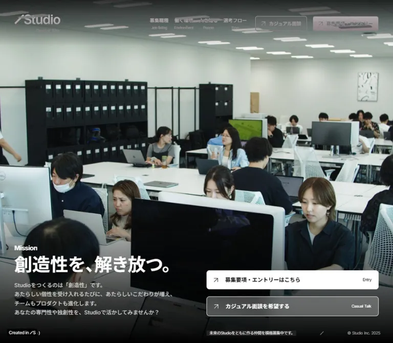
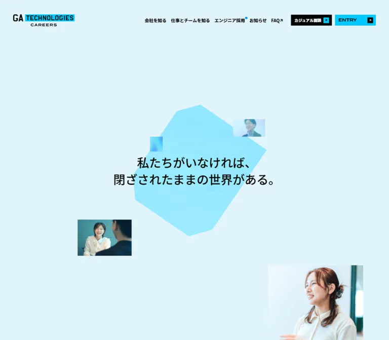
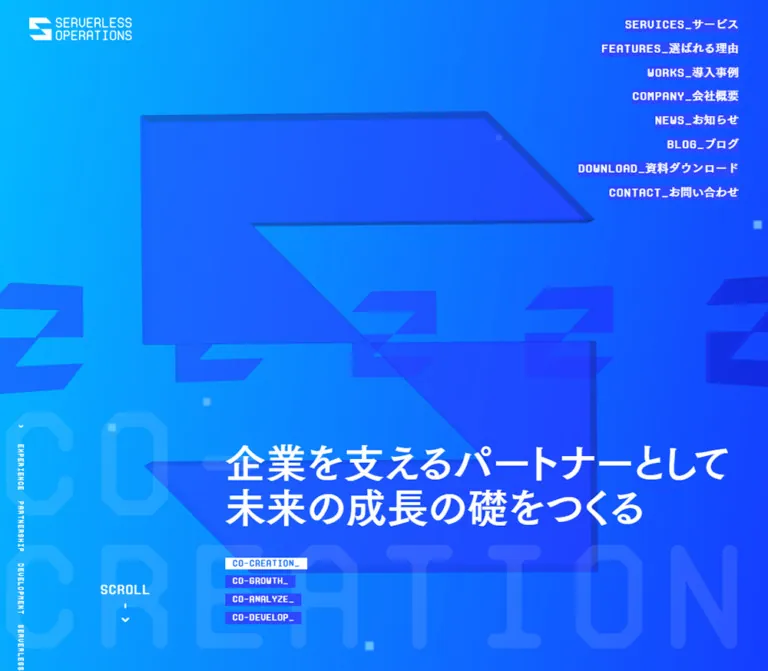
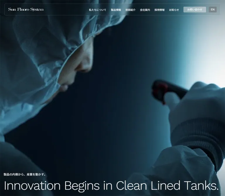
日本のWebデザインを、AIの制作リファレンスに。
DESIGN REFERENCE
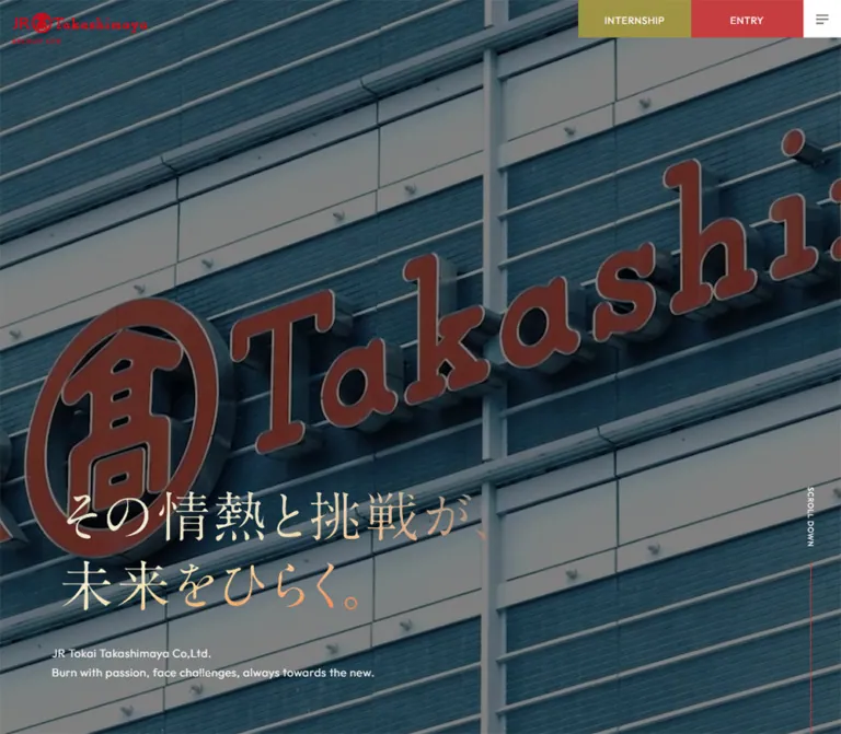
暖色のグラデーション、大きな明朝調コピー、社員や職場の写真で情熱を伝える採用サイト。固定ヘッダー、英日併記の見出し、円とドットの導線、余白を活かした構成が特徴。
オリジナルサイトを見るCinematic workplace imagery, warm atmospheric color, and generous editorial space for a recruitment story.
Website: JR Tokai Takashimaya — Graduate Recruitment
Original URL: https://www.jr-takashimaya.co.jp/new_grad/
Final URL: https://www.jr-takashimaya.co.jp/new_grad/
Inspected: September 17, 2026, 05:12 JST. The supplied capture package was retrieved at 2026-09-16T20:12:08.032Z.
Viewports: 1440 × 1000 desktop and 390 × 844 mobile, in CSS pixels.
Theme: white interface text over darkened photographic media and broad cream, amber, orange-red, and slate color fields.
Scope: the current recruitment homepage: desktop and mobile opening views, a desktop WORK section, closing recruitment navigation, and desktop/mobile footers. Rendered DOM evidence additionally covers the concept, PERSON, STORY, TOPICS, MISSION, and VISION sections. Their complete visual presentations were not supplied.
This is the home of a recruitment website with multiple information routes. Its long homepage introduces the organization through an opening statement, workplace imagery, people, stories, and institutional themes before presenting practical recruitment links. The design balances the recognizable red Takashimaya identity with a warmer, more expansive recruitment atmosphere.
Three visual systems work together. The opening pairs a darkened, full-screen photographic scene with large Japanese serif-style lettering that shifts from pale cream to orange. Subsequent content uses white bilingual headings and uncased, square photographs over soft fields of warm color. Navigation remains crisp: rectangular header actions, a white menu square, fine dividing rules, and small red dots inside outlined circles.
The page relies on scale, image composition, and empty space rather than card containers. Desktop layouts spread text and imagery across a broad canvas; mobile preserves the strong identity while reflowing the headline, stacking content, and centering the closing brand block.
Cinematic workplace imagery, warm atmospheric color, and generous editorial space for a recruitment story.
Website: JR Tokai Takashimaya — Graduate Recruitment
Original URL: https://www.jr-takashimaya.co.jp/new_grad/
Final URL: https://www.jr-takashimaya.co.jp/new_grad/
Inspected: September 17, 2026, 05:12 JST. The supplied capture package was retrieved at 2026-09-16T20:12:08.032Z.
Viewports: 1440 × 1000 desktop and 390 × 844 mobile, in CSS pixels.
Theme: white interface text over darkened photographic media and broad cream, amber, orange-red, and slate color fields.
Scope: the current recruitment homepage: desktop and mobile opening views, a desktop WORK section, closing recruitment navigation, and desktop/mobile footers. Rendered DOM evidence additionally covers the concept, PERSON, STORY, TOPICS, MISSION, and VISION sections. Their complete visual presentations were not supplied.
This is the home of a recruitment website with multiple information routes. Its long homepage introduces the organization through an opening statement, workplace imagery, people, stories, and institutional themes before presenting practical recruitment links. The design balances the recognizable red Takashimaya identity with a warmer, more expansive recruitment atmosphere.
Three visual systems work together. The opening pairs a darkened, full-screen photographic scene with large Japanese serif-style lettering that shifts from pale cream to orange. Subsequent content uses white bilingual headings and uncased, square photographs over soft fields of warm color. Navigation remains crisp: rectangular header actions, a white menu square, fine dividing rules, and small red dots inside outlined circles.
The page relies on scale, image composition, and empty space rather than card containers. Desktop layouts spread text and imagery across a broad canvas; mobile preserves the strong identity while reflowing the headline, stacking content, and centering the closing brand block.
--vh, measured as 10px on desktop and 8.44px on mobile.| Name | Value | Suggested token | Evidence and role |
|---|---|---|---|
| Interface White | #ffffff |
--color-text |
Measured on body text and utility controls; also the menu-button background |
| Underlying Black | #000000 |
--color-underlay |
Measured body background; photographic and color layers cover it in the captures |
| Internship Olive | #9f9444 |
--color-internship |
Measured desktop internship link and mobile navigation internship link |
| Entry Red | #c63d40 |
--color-entry |
Measured mobile navigation ENTRY links; visually consistent with the desktop entry block |
| Entry Deep Red | #9b3739 |
--color-entry-deep |
Measured graduation-year link backgrounds in the desktop DOM; expanded visibility was not captured |
| Brand Red | approximately #e60020 |
--color-brand |
Visual estimate of the header wordmark; use the approved logo asset for fidelity |
| Warm Cream | approximately #e5ddbd |
--color-cream |
Visual estimate of the pale upper-left content background |
| Amber | approximately #ffb547 |
--color-amber |
Visual estimate of the broad golden field at the left and lower portions of desktop content |
| Flame Red | approximately #dd2d12 |
--color-fire |
Visual estimate of the saturated lower-right desktop background |
| Deep Slate | approximately #243a43 |
--color-slate |
Visual estimate of dark blue-gray areas in the photographic treatment and upper-right color field |
| Muted Sage | approximately #9baa8d |
--color-sage |
Visual estimate of the muted green-gray area near the upper-right mobile closing section |
| Headline Cream | approximately #e8e1bd |
--color-headline-start |
Visual estimate of the pale end of the hero lettering |
| Headline Orange | approximately #ef8352 |
--color-headline-end |
Visual estimate of the orange end of the hero lettering |
The background is an atmospheric field rather than a simple two-stop gradient. In the desktop WORK capture, cream occupies the upper left, amber fills much of the left and lower area, orange-red concentrates at the lower right, and slate darkens the upper right. The footer continues this language without introducing a separate boxed surface.
The mobile closing capture has a different arrangement: muted green-gray near the top right, a strong orange region toward the left, and a coral-orange lower field. This supports adapting the composition to the viewport. It does not establish whether the original uses CSS gradients, images, canvas, fixed positioning, or animated color layers.
The red circle-and-dot markers appear related to the entry accent. Their exact color was not included in the computed-style sample; reusing --color-entry is a practical recommendation.
Recommended gradient construction: combine several large, overlapping radial gradients over a cream base. Keep transitions broad and soft. Apply any blur to a separate decorative layer, never to the text or photographs.
Do not interpret the measured black body background as the visible color of every section. Most inspected section elements are transparent and inherit their appearance from other layers.
The measured body stack is:
YakuHanJP, 'Noto Sans JP', 'Yu Gothic Medium', '游ゴシック Medium',
YuGothic, 'Yu Gothic', 游ゴシック体, 'Hiragino Sans',
'Hiragino Kaku Gothic ProN', Arial, Meiryo, sans-serif
The sampled body and prose elements use weight 400. The computed family list establishes the declared stack, not which font supplied every rendered glyph.
Japanese paragraphs use generous leading. Standard section copy is measured at 16px / 28px on desktop and 14.56px / 29.12px on mobile. The introductory statement is more ceremonial, with line height equal to three times its font size.
Outfit, 'Noto Sans JP', sans-serif is explicitly measured on the desktop scroll cue, footer utilities, and mobile navigation action links.
Its role is compact and geometric: uppercase labels, clear letterforms, and modest tracking. The large English section titles have a compatible geometric appearance, but their own child-level font declarations were not supplied. Using Outfit for those headings in a new implementation is a recommendation rather than a recovered source rule.
The Japanese slogan reads:
その情熱と挑戦が、未来をひらく。
It uses high-contrast, serif-style Japanese lettering with a cream-to-orange treatment. Desktop presents two lines; mobile presents three. The hero H2 has no extracted text, so the evidence does not establish its font family or whether the lettering is implemented as an image, outlined vector, or another non-text representation.
Preserve the approved lettering artwork when available. For a live-text prototype, a Japanese serif fallback can approximate the contrast, but it will require manual adjustment of spacing and line breaks. Do not label that fallback as the original font.
The red header logo and white footer logo are branded artwork. Their symbol, letter shapes, and spacing should remain intact. Do not rebuild them by typing the company name in a generic serif face.
| Role | Desktop | Mobile | Evidence |
|---|---|---|---|
| Base body declaration | 16px / 18.4px, weight 400 |
14px / 16.1px, weight 400 |
Measured; this is not the preferred prose leading |
| Section paragraph | 16px / 28px, tracking 0.64px |
14.56px / 29.12px, tracking 0.5824px |
Measured; both tracking values equal 0.04em |
| Introductory statement | 20px / 60px, tracking 1.6px |
16.64px / 49.92px, tracking 1.3312px |
Measured; tracking equals 0.08em |
| Desktop internship action | 16px, 60px line height |
Hidden from the closed mobile header | Measured desktop anchor |
| Mobile menu action | Not applicable | 18.72px / 52px, weight 500, tracking 0.7488px |
Measured navigation DOM; menu-open appearance unverified |
| Scroll cue | 12px / 12px, tracking 0.96px |
Text not visible in the supplied mobile opening | Measured desktop; mobile visual observation |
| Footer utilities | 14px / 14px, tracking 1.12px |
14.56px / 14.56px, tracking 1.1648px |
Measured; tracking equals 0.08em |
| WORK display heading | Approximately 76–80px |
Not visually sampled | Visual estimate |
| Closing English link heading | Approximately 40–42px |
Approximately 32–34px |
Visual estimate |
| Hero Japanese lettering | Approximately 88–96px visual scale |
Approximately 56–62px visual scale |
Visual estimate, not a CSS font-size measurement |
The contrast between a delicate Japanese hero statement and firm English navigation headings is central. Avoid using one heavy sans-serif treatment for every level.
Density: sparse editorial sections, compact persistent navigation, and ample space around photographs.
Geometry: square photographs and rectangular header controls; circles are reserved for navigation markers. No general rounded-card or shadow-elevation system is visible.
| Element | Desktop measurement | Mobile measurement |
|---|---|---|
| Document height | Approximately 11927.48px |
Approximately 9150.11px |
| Opening section | 1440 × 1000px |
390 × 844px |
| Header bounding height | 70.03px |
62.39px |
| Header logo link | 216 × 50.03px, at (20, 20) |
197.59 × 45.77px, at approximately (11.44, 13.52) |
| Menu button | 60 × 60px |
62.39 × 62.39px |
| Menu-button padding | 24px 20px |
24.96px 20.8px |
| Desktop action blocks | Each 180 × 60px |
Not displayed in the closed header |
| Main section heading wrapper | 1200px wide, starting at x = 120px |
343.19px wide, starting at x = 23.41px |
| Introductory text wrapper | 1100px wide, starting at x = 170px |
343.19px wide, starting at x = 23.41px |
| Hero supporting-copy wrapper | 1200px wide, starting at x = 83px |
343.19px wide, starting at x = 23.41px |
| VIEW MORE link box | 186 × 54px |
Approximately 171.59 × 47.83px |
| Closing navigation row | 533 × 174px |
Approximately 343.19 × 121.67px |
| Footer bounding height | Approximately 355.48px |
Approximately 394.59px |
| Footer bottom padding | 90px |
72.8px |
These are captured-state dimensions, not universal constants. The page contains transformed or staged sections, so a wrapper rectangle may not enclose every visible child.
| Use | Value | Evidence |
|---|---|---|
| Desktop main-content side inset | 120px at 1440px width |
Measured; produces a centered 1200px region |
| Mobile main-content side inset | Approximately 23.4px, or 6vw |
Measured; leaves approximately 88vw for content |
| Desktop outer hero/footer inset | Approximately 83px |
Measured hero copy and footer text; footer rule visually aligns |
| Mobile outer header/footer inset | Approximately 11.44px |
Measured; distinct from the larger main-content inset |
| Desktop WORK copy-to-link spacing | 50px between sampled boxes |
Derived from measured paragraph bottom and link top |
| Mobile WORK copy-to-link spacing | Approximately 31.19px |
Derived from measured boxes |
| Later desktop section gaps | 200px between PERSON, STORY, TOPICS, and the following section |
Derived from section rectangles |
| Corresponding mobile section gaps | 156px |
Derived from section rectangles |
| Main-to-footer gap | 240px desktop; 156px mobile |
Derived from measured main and footer rectangles |
| Navigation separator | Approximately 1px |
Visual estimate |
| VIEW MORE circle | Approximately 54px desktop |
Visual estimate, consistent with measured link height |
| Closing-row circle | Approximately 58px desktop; 48px mobile |
Visual estimate |
| Circle center dot | Approximately 10–11px |
Visual estimate |
border-radius: 0px.Role: keep brand identity and application access available throughout the long page.
The header overlays the page with no visible full-width background strip. A red logo and small RECRUIT SITE caption sit at the upper left. At desktop, the upper-right group consists of a 180px olive INTERNSHIP block, a 180px red ENTRY block, and a 60px white menu square. The group starts at x = 1020px in the 1440px capture.
The logo extends to roughly 70px from the top, while the action blocks are 60px tall. Do not force both into a single centered 60px bar; their unequal vertical extents are part of the observed composition.
The same corner controls remain in place in the scrolled captures. Persistent placement is visually supported, although the positioning declaration itself is not included in the style sample.
On mobile, the visible header retains only the red logo and white menu square. The logo is still almost 198px wide, so the brand does not shrink to a tiny mark. The menu square is approximately 62.4px wide and flush with the top-right edge.
The menu icon consists of thin dark horizontal strokes with unequal lengths. Preserve its small scale within the large white target.
Role: connect the homepage to the wider recruitment website.
The rendered navigation contains eight bilingual destinations:
| English label | Japanese label | Observed route |
|---|---|---|
| MISSION | 私たちの使命 | /new_grad/mission/ |
| VISION | 私たちの未来 | /new_grad/vision/ |
| WORK | 仕事を知る | /new_grad/work/ |
| PERSON | 多様な社員を知る | /new_grad/person/ |
| STORY | 物語を知る | /new_grad/story/ |
| TOPICS | 挑戦を知る | /new_grad/topics/ |
| ENVIRONMENT | 働く環境 | /new_grad/environment/ |
| RECRUITMENT | 採用情報 | /new_grad/recruitment/ |
Separate internship and entry destinations also exist. The graduation-year labels are 2027年卒業の方 and 2028年卒業の方, pointing to separate external application portals.
The desktop DOM places the year-specific links in 180 × 40px rows below ENTRY. The mobile navigation contains a roughly 307 × 52px internship link and two similarly sized entry links beneath the primary navigation.
These measurements establish available links and their sampled geometry. They do not establish the menu backdrop, opening animation, hover trigger, dismissal behavior, or actual appearance of an expanded entry menu. Those states were not captured.
Role: establish place, identity, and emotional tone before detailed recruitment content.
The opening section fills exactly one inspected viewport. Desktop shows large buildings viewed from below, with foliage at the left, under a subdued gray-blue treatment. Mobile shows a dark, close view of legs and pavement. These are different captured scenes; the evidence does not establish their temporal relationship.
The desktop slogan sits in the lower-left part of the viewport, with visible lettering beginning around the lower three-fifths of the screen. Its measured H2 wrapper begins at (83, 576.25) and is 1200 × 248.78px. The visible lettering occupies only part of that broad wrapper.
The desktop line arrangement is:
その情熱と挑戦が、
未来をひらく。
The mobile arrangement is:
その情熱と
挑戦が、
未来をひらく。
Mobile moves the slogan into a more central vertical position. The H2 wrapper spans the full 390px width, while the supporting copy uses the 23.4px content inset.
Below the slogan, small white English copy identifies the company and states the recruitment message. It forms two lines on desktop and three on mobile. The measured paragraph boxes are about 62px and 81px high respectively; their nested text metrics were not separately supplied.
At desktop, a vertical SCROLL DOWN label sits near the right edge, above a fine descending line. The label is measured at 12px with 0.08em tracking. Mobile retains a fine line near the right edge, but the label is not visible in the supplied opening capture.
Role: give the recruitment concept room to develop before the content categories.
The introductory Japanese statement is measured at 20px / 60px on desktop and 16.64px / 49.92px on mobile. Its generous leading makes each line read as a distinct phrase. The mobile version introduces additional line breaks while preserving the sequence of ideas.
The containing section has substantial measured bottom padding: 2800px on desktop and 1560px on mobile. A CONCEPT MESSAGE group and a VIEW MORE link to /new_grad/concept/ also occur in the DOM.
These values indicate a spacer-heavy narrative passage. They do not prove a particular pinning, parallax, or scroll-scrubbing implementation. When adapting the page, attach such large spacers to an intentional, tested timeline; otherwise use normal-flow spacing so users do not encounter unexplained empty screens.
An unlabeled central button is present in the sampled DOM. Its function is unverified, so this reference does not identify it as a play button or prescribe a modal.
Role: introduce jobs and working environments through real workplace imagery.
This is the most completely evidenced content section. It combines a left text column with a right photographic collage, directly on the warm background.
The left group contains:
仕事を知る.16px / 28px typography and 0.04em tracking.The composition is asymmetrical. In the desktop capture, the main portrait begins around (742, 271) and is approximately 455 × 590px. A smaller keyboard detail begins around (1072, 634) and is approximately 248 × 336px. The detail overlaps the main image and extends farther down and right. The overall collage spans approximately 578 × 700px.
The main photo shows a suited employee using a phone in a bright retail environment. A yellow interior band gives the portrait its own warm accent. The secondary image crops tightly around hands and a keyboard, adding a quieter work detail.
Keep both images square-cornered, with no border or shadow. Their overlap creates depth without introducing an elevation system.
The mobile DOM places the heading above the paragraph with a substantial intervening region, consistent with a stacked visual section. A mobile WORK screenshot was not supplied, so the exact mobile image sizes and overlap are unverified.
Role: provide a recurring, recognizable navigation signature.
The VIEW MORE treatment places a thin red circle at the left, a small red dot at its center, and white uppercase text to the right. The measured desktop link box is 186 × 54px. Its mobile counterpart is approximately 171.6 × 47.8px.
In the closing navigation rows, the motif moves to the right of a bilingual label group and becomes slightly larger on desktop. It remains visually lightweight: there is no filled circular button face and no surrounding card.
Make the entire link group operable. The center dot is decorative and should not become the only click target. Hover transformations were not supplied; any expansion or arrow substitution would be a new design choice.
Role: extend the recruitment narrative beyond job descriptions.
The DOM establishes the following content structure:
多様な社員を知る, a paragraph about employees' motivations and work episodes, and a link to the employee section.物語を知る, copy referencing the wish to be loved like a rose across generations, and a story link.挑戦を知る, and a centered VIEW MORE link.The desktop STORY heading and paragraph occupy separate horizontal regions: the heading begins at x = 120px, while the paragraph begins around x = 930.88px with a width of approximately 389.13px. On mobile, both use the 343.19px content width.
The supplied evidence supports these relationships and typography, but not a complete image inventory or any carousel behavior. Preserve the editorial hierarchy without inventing sliders or repeated card grids.
Role: present two institutional themes as substantial editorial destinations.
Each linked group begins with its Japanese phrase above the English title, reversing the English-first order used by WORK and the closing utility links.
Desktop measurements show two 500 × 759px linked regions. MISSION begins at x = 170px; VISION begins at x = 770px, 187px lower. This creates a 100px horizontal gap and a deliberate vertical stagger.
Mobile converts them to sequential regions approximately 263.11 × 448.70px. MISSION aligns with the left content inset at 23.41px. VISION aligns with the right content edge, starting at 103.48px. The second region begins about 78px below the end of the first.
The important responsive behavior is alternating alignment, not simply stretching both links to full width. Their imagery was not visually supplied, so no image treatment beyond the measured arrangement is asserted.
Role: turn the editorial journey into practical next steps.
Desktop places an entrance photograph at the left and three large rows at the right: ENVIRONMENT, RECRUITMENT, and INTERNSHIP. In the supplied closing capture, the photograph is 600px wide; its top is cropped by the viewport, so its full image ratio cannot be recovered.
The link column starts at x = 787px and is 533px wide. Each measured row is 174px high with 47px top padding and 20px right padding. A large English label sits above the Japanese label, with the red circle-and-dot marker at the right. Fine white rules separate rows.
Mobile uses almost the full main-content width: 343.19px, with rows approximately 121.67px high and 31.2px top padding. The English labels remain visually large at approximately 32–34px. Keep sufficient horizontal room for the circle so long labels do not collide with it.
The mobile closing capture begins partway through this group. It does not establish whether the entrance photograph is omitted or simply above the captured area.
Role: close the page with brand identity, a corporate-site route, and a return-to-top control.
The footer continues the atmospheric background. A right-aligned PAGE TOP control sits above a long thin rule. Below it, the white brand artwork and RECRUIT SITE caption provide a strong but restrained closing signature.
Desktop keeps the logo at the left, the copyright near the bottom left, and CORPORATE SITE at the bottom right. The brand appears approximately 264px wide. The outer alignment is around 83px from each side, wider than the main 1200px content region.
Mobile centers the white brand, approximately 275px wide, then places CORPORATE SITE below it and the copyright near the bottom. PAGE TOP remains right aligned. The divider uses the smaller outer inset of approximately 11.4px, rather than the 23.4px inset used by the recruitment rows.
The corporate link includes a small external-link symbol. PAGE TOP includes a small upward arrow. Their exact icon assets were not supplied.
The original footer identifies the company as JR Tokai Takashimaya Co,Ltd.. Its copyright wording is source content, not a production credit.
| Element | Supplied declaration | Interpretation and limit |
|---|---|---|
| Desktop hero support copy | Transform and opacity: 0.5s linear, delay 1.2s |
A delayed reveal is defined; starting transform was not supplied |
| Mobile hero support copy | Transform and opacity: 0.5s linear, delay 1.4s |
Mobile uses a slightly later delay |
| WORK paragraph | Transform and opacity: 0.5s linear, delay 0.8s |
Staged copy reveal |
| WORK VIEW MORE | Transform and opacity: 0.5s linear, delay 1s |
Action follows the paragraph |
| PERSON and STORY paragraphs | Transform and opacity: 0.5s linear, delay 0.4s |
Earlier reveal stage |
| PERSON and STORY links | Transform and opacity: 0.5s linear, delay 0.6s |
Links follow their copy |
| TOPICS link | Transform and opacity: 0.5s linear, delay 0.6s |
Defined delayed reveal |
| WORK, PERSON, STORY, TOPICS sections | opacity 0.4s, visibility 0.4s |
Section visibility transitions are defined |
| Desktop PAGE TOP and CORPORATE SITE | opacity 0.4s |
Opacity transition exists; its trigger and destination opacity are unverified |
Entries reporting only transition: all do not supply a useful animation duration and should not be treated as evidence of a visible effect.
The capture process scrolled through the page and recorded settled positions. The repeated corner header placement is visible across those captures. Link destinations and the PAGE TOP button are present in the rendered DOM.
The supplied stills do not establish media playback, looping, audio, a scene sequence, hover behavior, menu opening, entry-menu activation, or the easing of return-to-top scrolling. Differences between desktop and mobile photographic scenes are not sufficient to determine how the media works.
The evidence also includes initial loading rules that temporarily fix the body and hide a container. The loaded page is a long scrolling document. Do not copy the startup body lock as a permanent layout rule.
Recommended adaptation: retain modest, staggered transform-and-opacity reveals around 500ms. Keep content visible by default, add enhancement only after initialization succeeds, and remove reveal delays when reduced motion is requested. A static hero poster should remain usable without playback.
| Layer | Appearance | Purpose |
|---|---|---|
| Underlay | Measured black body background | Fallback beneath media and decorative layers |
| Opening media | Full-bleed photographic scene with subdued dark treatment | Establish location and support the headline |
| Main atmospheric field | Broad cream, amber, orange-red, slate, and occasional sage regions | Connect editorial sections without boxed containers |
| Header action | Solid olive or red rectangle | Distinguish internship and entry routes |
| Menu control | Solid white square with thin dark strokes | Persistent utility affordance |
| Photography | Unframed, square-cornered rectangles | Show people, work details, and the physical store |
| Navigation group | Transparent background, fine light rules | Organize practical destinations |
| Navigation marker | Thin red circle with a red dot | Repeated action signature |
| Footer | Transparent continuation of the color field | Close the narrative without a visual hard stop |
Softness belongs to the background transitions. The foreground remains sharp: clear type, crisp photographs, thin rules, and hard-edged header controls.
The original-page captures use location and workplace photography rather than generic recruitment illustrations. Visible subjects include upward views of large buildings, a pavement-level scene, an employee on the phone, hands at a keyboard, and the department-store entrance.
The WORK portrait feels documentary and approachable. The employee is engaged in an activity rather than posed against an isolated studio background. The keyboard crop supports that larger scene with a specific detail. The entrance photograph connects recruitment messaging to a recognizable physical environment and includes motion-blurred passersby.
Preserve natural photographic color within the content images. The background can be highly atmospheric without applying the same heavy color treatment to every portrait.
Exact asset URLs and filenames were not included in the evidence. The following is a visual inventory, not a list of recoverable files.
| Asset | Observed use | Implementation guidance |
|---|---|---|
| Red brand lockup | Upper-left header | Use approved artwork with its symbol and recruitment caption |
| White brand lockup | Footer | Preserve proportions; center it on mobile |
| Hero slogan lettering | Two desktop lines and three mobile lines | Prefer approved responsive artwork when available |
| Full-screen photographic background | Desktop and mobile opening | Maintain subject-aware crops and sufficient text contrast |
| Employee portrait | Main WORK image | Preserve the tall crop and bright workplace context |
| Keyboard detail | Overlapping WORK image | Keep it smaller and offset toward the lower right |
| Entrance photograph | Desktop closing navigation | Use a broad crop; do not infer its full aspect ratio from the clipped capture |
| Thin menu, external-link, and upward-arrow symbols | Header and footer | Reproduce the simple stroke weight; exact assets are unknown |
A replacement asset set should depict the actual organization, its people, and its spaces. Avoid unrelated stock imagery that merely matches the colors. Asset permissions and original high-resolution files are separate from the visual evidence supplied here.
The page uses several horizontal systems rather than one universal container:
x = 120px.x = 170px.The WORK section uses asymmetric text and image columns. The closing navigation uses a roughly 600px image, a 67px gap, and a 533px link column. MISSION and VISION use staggered linked regions. These differences prevent the long page from feeling like a repeated row template.
| System | Observed change at 390 × 844 |
|---|---|
| Header | Desktop internship and entry blocks disappear from the closed header; logo and menu remain |
| Hero | Still fills the viewport; slogan changes from two lines to three |
| Main margins | Approximately 6vw on each side |
| Outer footer margins | Approximately 2.93vw on each side |
| Body copy | Smaller type with proportionally more leading |
| WORK and PERSON | DOM structure places substantial visual space between heading and explanatory copy |
| STORY | Heading and paragraph move into the same full-width content column |
| MISSION / VISION | Become sequential, narrower regions with alternating left/right alignment |
| Closing links | Become full main-content-width rows, with smaller circle markers |
| Footer | Brand, corporate link, and copyright become a centered vertical sequence |
The source --vh equals one percent of each inspected viewport height. This is consistent with viewport-height handling, but the assignment code was not supplied.
The exact responsive breakpoint is unknown. The CSS below uses 64rem as a recommendation and must be checked at intermediate widths. Mobile WORK imagery is also a proposed adaptation because that section was not visually captured on mobile.
Do not target the observed total document heights as fixed design requirements. They depend on content, viewport geometry, and the page's staged scroll sequence.
These are recommendations for a new implementation, not verified features of the original page:
#ffffff, measured.#9f9444, measured.#c63d40, measured on mobile navigation.#9b3739, measured in the desktop DOM.#e60020; use the real artwork.#e5ddbd, amber #ffb547, flame #dd2d12, slate #243a43, and muted sage #9baa8d.#e8e1bd to orange #ef8352.“Design the homepage of a Japanese department-store recruitment website. Use a full-viewport photographic opening with subdued dark contrast, large Japanese serif-style slogan artwork in cream-to-orange tones, and small white English supporting copy. Keep a red brand lockup at the upper left and rectangular olive internship, red entry, and white menu controls at the upper right on desktop. Follow with spacious editorial sections over a soft cream, amber, orange-red, and slate background. Pair large white English headings with smaller Japanese labels, documentary workplace photographs, and thin red circle-and-dot links. Use an overlapping portrait/detail composition for work, staggered institutional links, and large ruled recruitment rows near the end. On mobile, show logo plus menu, reflow the slogan into three lines, stack the main content, preserve alternating alignments, and center the footer branding. Use square image corners and generous space.”
This is an implementation scaffold, not recovered source CSS. It combines measured colors and dimensions with explicitly approximate background colors and recommended layout rules. It requires approved brand and photography assets; no original asset URLs were supplied.
The expected anatomy is: a .site-header with .brand-link and .header-actions; a .hero with .hero-media, .hero-title, and .hero-support; a .work-section with .feature-heading, .work-visual, .feature-copy, and .more-link; and an .access-grid followed by .site-footer. The work visual contains .primary-image and .detail-image.
The hero title may contain approved responsive lettering artwork. The serif token below is only a prototype fallback. Font-family declarations do not load font files.
:root {
  /* Measured interface colors */
  --color-text: #ffffff;
  --color-underlay: #000000;
  --color-internship: #9f9444;
  --color-entry: #c63d40;
  --color-entry-deep: #9b3739;

  /* Visual estimates for a static adaptation */
  --color-brand: #e60020;
  --color-cream: #e5ddbd;
  --color-amber: #ffb547;
  --color-fire: #dd2d12;
  --color-slate: #243a43;
  --color-sage: #9baa8d;
  --color-headline-start: #e8e1bd;
  --color-headline-end: #ef8352;
  --color-rule: rgb(255 255 255 / 0.4);

  /* Source-observed stacks */
  --font-body: YakuHanJP, 'Noto Sans JP', 'Yu Gothic Medium',
    '游ゴシック Medium', YuGothic, 'Yu Gothic', 游ゴシック体,
    'Hiragino Sans', 'Hiragino Kaku Gothic ProN', Arial, Meiryo,
    sans-serif;
  --font-english: Outfit, 'Noto Sans JP', sans-serif;

  /* Recommended fallback, not the identified hero font */
  --font-display: 'Yu Mincho', 'Hiragino Mincho ProN', serif;

  --text-body: 16px;
  --leading-body: 1.75;
  --tracking-body: 0.04em;
  --text-feature: 80px;
  --text-row: 42px;
  --text-utility: 14px;

  --content-max: 1200px;
  --narrative-max: 1100px;
  --content-gutter: 6vw;
  --outer-gutter: 5.764vw;
  --header-control: 60px;
  --ring-size: 54px;
  --section-space: 200px;
  --rule-width: 1px;
  --reveal-duration: 500ms;
}

* { box-sizing: border-box; }

.recruit-site {
  margin: 0;
  color: var(--color-text);
  background: var(--color-underlay);
  font-family: var(--font-body);
  font-size: var(--text-body);
}

.recruit-site img { display: block; max-width: 100%; }
.recruit-site button { font: inherit; }
.recruit-site a { color: inherit; }

.content {
  width: min(var(--content-max), calc(100% - 2 * var(--content-gutter)));
  margin-inline: auto;
}

.narrative {
  width: min(var(--narrative-max), calc(100% - 2 * var(--content-gutter)));
  margin-inline: auto;
  font-size: 20px;
  line-height: 3;
  letter-spacing: 0.08em;
}

/* Static approximation; the original background mechanism is unknown. */
.warm-field {
  background:
    radial-gradient(ellipse at 8% 85%, var(--color-amber), transparent 62%),
    radial-gradient(ellipse at 85% 95%, var(--color-fire), transparent 58%),
    radial-gradient(ellipse at 98% 0%, var(--color-slate), transparent 52%),
    var(--color-cream);
}

.site-header {
  position: fixed;
  inset: 0 0 auto;
  z-index: 30;
  display: flex;
  align-items: flex-start;
  justify-content: space-between;
  pointer-events: none;
}

.site-header :is(a, button) { pointer-events: auto; }
.brand-link { display: block; width: 216px; margin: 20px; }
.header-actions { display: flex; align-items: flex-start; }

.header-cta {
  display: grid;
  place-items: center;
  width: 180px;
  height: var(--header-control);
  padding: 0;
  border: 0;
  color: white;
  text-decoration: none;
  font-size: 16px;
}

.header-cta--internship { background: var(--color-internship); }
.header-cta--entry { background: var(--color-entry); }

.menu-button {
  display: grid;
  place-content: center;
  gap: 5px;
  width: var(--header-control);
  height: var(--header-control);
  padding: 0;
  border: 0;
  background: white;
  cursor: pointer;
}

.menu-button span { width: 20px; height: 1px; background: #111; }
.menu-button span:last-child { width: 12px; }

.hero {
  position: relative;
  isolation: isolate;
  display: flex;
  align-items: flex-end;
  min-height: 100vh;
  min-height: 100svh;
  padding: 120px var(--outer-gutter) 83px;
  overflow: hidden;
}

.hero-media,
.hero::before {
  position: absolute;
  inset: 0;
  width: 100%;
  height: 100%;
}

.hero-media { z-index: -2; object-fit: cover; }
.hero::before {
  content: '';
  z-index: -1;
  background: rgb(9 25 34 / 0.48);
}

.hero-title { max-width: 800px; margin: 0 0 30px; }
.hero-title img { width: 100%; height: auto; }
.hero-support {
  margin: 0;
  font-family: var(--font-english);
  font-size: 18px;
  line-height: 1.75;
}

/* Apply only to a live-text prototype, not to logo artwork. */
.hero-title--text {
  font-family: var(--font-display);
  font-size: clamp(48px, 6.25vw, 90px);
  font-weight: 400;
  line-height: 1.35;
  color: var(--color-headline-start);
}

@supports (background-clip: text) {
  .hero-title--text {
    background: linear-gradient(120deg,
      var(--color-headline-start), var(--color-headline-end));
    background-clip: text;
    color: transparent;
  }
}

.work-section {
  display: grid;
  grid-template-columns: minmax(0, 1fr) minmax(0, 578px);
  grid-template-areas: 'heading visual' 'copy visual' 'action visual';
  grid-template-rows: auto auto 1fr;
  column-gap: 44px;
}

.feature-heading { grid-area: heading; margin: 144px 0 0; }
.feature-heading .en {
  display: block;
  font-family: var(--font-english);
  font-size: var(--text-feature);
  font-weight: 500;
  line-height: 1;
}
.feature-heading .jp {
  display: block;
  margin-top: 12px;
  font-size: 20px;
  line-height: 1.4;
}

.feature-copy {
  grid-area: copy;
  margin: 58px 0 50px;
  font-size: var(--text-body);
  line-height: var(--leading-body);
  letter-spacing: var(--tracking-body);
}

.work-visual {
  grid-area: visual;
  position: relative;
  aspect-ratio: 578 / 700;
}
.primary-image {
  width: 78.72%;
  aspect-ratio: 455 / 590;
  object-fit: cover;
}
.detail-image {
  position: absolute;
  right: 0;
  bottom: 0;
  width: 42.91%;
  aspect-ratio: 248 / 336;
  object-fit: cover;
}

.more-link {
  grid-area: action;
  display: inline-flex;
  align-items: center;
  align-self: start;
  justify-self: start;
  gap: 10px;
  min-height: var(--ring-size);
  font-family: var(--font-english);
  font-size: 20px;
  text-decoration: none;
}

.ring {
  display: grid;
  place-items: center;
  flex: 0 0 auto;
  width: var(--ring-size);
  aspect-ratio: 1;
  border: 1px solid var(--color-entry);
  border-radius: 50%;
}
.ring::after {
  content: '';
  width: 10px;
  aspect-ratio: 1;
  border-radius: 50%;
  background: var(--color-entry);
}

.access-grid {
  display: grid;
  grid-template-columns: 1.126fr 1fr;
  gap: clamp(32px, 4.65vw, 67px);
  margin-top: var(--section-space);
}
.access-image { width: 100%; height: auto; }
.access-row {
  display: flex;
  align-items: center;
  justify-content: space-between;
  gap: 20px;
  min-height: 174px;
  padding: 47px 20px 47px 0;
  border-bottom: var(--rule-width) solid var(--color-rule);
  text-decoration: none;
}
.access-label { min-width: 0; }
.access-label .en {
  display: block;
  font: 500 var(--text-row) / 1 var(--font-english);
}
.access-label .jp { display: block; margin-top: 14px; font-size: 18px; line-height: 24px; }
.access-row .ring { --ring-size: 58px; }

.site-footer { margin-top: 240px; padding: 0 var(--outer-gutter) 90px; }
.page-top {
  display: block;
  min-height: 44px;
  margin-left: auto;
  padding: 0 25px 0 0;
  border: 0;
  color: inherit;
  background: none;
  font-family: var(--font-english);
  font-size: var(--text-utility);
  letter-spacing: 0.08em;
  cursor: pointer;
}
.footer-body {
  display: grid;
  grid-template-columns: 1fr auto;
  gap: 80px 32px;
  padding-top: 60px;
  border-top: var(--rule-width) solid var(--color-rule);
}
.footer-brand { grid-column: 1 / -1; width: 264px; }
.footer-caption { margin: 14px 0 0; }
.corporate-link { grid-column: 2; grid-row: 2; text-decoration: none; }
.copyright { grid-column: 1; grid-row: 2; margin: 0; font-size: 12px; }
.footer-caption,
.corporate-link {
  font-family: var(--font-english);
  font-size: var(--text-utility);
  letter-spacing: 0.08em;
}

/* Recommended focus and anchor behavior. */
.recruit-site :is(a, button):focus-visible {
  outline: 2px solid white;
  outline-offset: 4px;
  box-shadow: 0 0 0 6px var(--color-slate);
}
.recruit-site section[id] { scroll-margin-top: 90px; }

/* Content remains visible unless an enhancement explicitly changes state. */
.reveal {
  transition:
    transform var(--reveal-duration) linear var(--reveal-delay, 0s),
    opacity var(--reveal-duration) linear var(--reveal-delay, 0s);
}

/* Recommended breakpoint; the source breakpoint was not supplied. */
@media (max-width: 64rem) {
  :root {
    --text-body: 14.56px;
    --leading-body: 2;
    --text-feature: 56px;
    --text-row: 33px;
    --text-utility: 14.56px;
    --outer-gutter: 2.933vw;
    --header-control: clamp(56px, 16vw, 64px);
    --ring-size: 47.83px;
    --section-space: 156px;
  }

  .brand-link { width: min(50.667vw, 216px); margin: 13.52px 2.933vw; }
  .header-cta { display: none; }
  .narrative { font-size: 16.64px; }
  .hero { padding: 120px var(--content-gutter) 22svh; }
  .hero-title { margin-bottom: 26px; }
  .hero-title--text { font-size: clamp(40px, 13.6vw, 60px); line-height: 1.55; }
  .hero-support { font-size: 14px; line-height: 1.93; }

  .work-section {
    grid-template-columns: minmax(0, 1fr);
    grid-template-areas: 'heading' 'visual' 'copy' 'action';
    grid-template-rows: auto;
  }
  .feature-heading { margin: 0; }
  .feature-heading .jp { font-size: 16px; }
  .work-visual { margin-block: 32px; }
  .feature-copy { margin: 0 0 31.2px; }
  .more-link { font-size: 18px; }

  .access-grid { grid-template-columns: minmax(0, 1fr); gap: 32px; }
  .access-row { min-height: 121.67px; padding: 31.2px 0; gap: 16px; }
  .access-row .ring { --ring-size: 48px; }
  .access-label .jp { margin-top: 5px; font-size: 14.56px; line-height: 20px; }

  .site-footer { margin-top: 156px; padding-bottom: 72.8px; }
  .footer-body {
    display: flex;
    flex-direction: column;
    align-items: center;
    gap: 60px;
    padding-top: 64px;
    text-align: center;
  }
  .footer-brand { width: min(274.55px, 100%); }
  .copyright { max-width: 100%; line-height: 1.6; }
}

@media (prefers-reduced-motion: reduce) {
  .recruit-site *,
  .recruit-site *::before,
  .recruit-site *::after {
    animation: none !important;
    transition: none !important;
    scroll-behavior: auto !important;
  }
  .reveal { opacity: 1; transform: none; }
}
A minimal semantic link for the repeated motif:
<a class="more-link" href="/new_grad/work/" aria-label="Learn about work">
  <span class="ring" aria-hidden="true"></span>
  <span>VIEW MORE</span>
</a>
The scaffold does not implement menu state, entry selection, media playback, or a scroll timeline. Add those behaviors only with explicit requirements and testing. The mobile collage, hero scrim opacity, display-heading sizes, focus treatment, and breakpoint are recommendations. Use responsive slogan artwork or tested line breaks to preserve the original desktop/mobile composition.
Optional aliases for a project already using Tailwind v4. This does not indicate that the original website uses Tailwind. Define the custom properties above first.
@theme inline {
  --color-recruit-text: var(--color-text);
  --color-recruit-entry: var(--color-entry);
  --color-recruit-internship: var(--color-internship);
  --color-recruit-cream: var(--color-cream);
  --color-recruit-amber: var(--color-amber);
  --color-recruit-fire: var(--color-fire);
  --color-recruit-slate: var(--color-slate);

  --font-recruit-body: var(--font-body);
  --font-recruit-english: var(--font-english);
  --font-recruit-display: var(--font-display);

  --text-recruit-body: var(--text-body);
  --text-recruit-feature: var(--text-feature);
  --text-recruit-row: var(--text-row);
  --spacing-recruit-ring: var(--ring-size);
  --spacing-recruit-section: var(--section-space);
  --radius-recruit-square: 0px;
}
2026-09-16T20:12:08.032Z, equivalent to September 17, 2026, 05:12:08 JST. Separate timestamps for individual screenshots were not supplied.This reference describes the current page represented by that evidence. Measurements, visual estimates, and implementation recommendations are intentionally distinguished throughout.
# JR Tokai Takashimaya — Graduate Recruitment Style Reference

> Cinematic workplace imagery, warm atmospheric color, and generous editorial space for a recruitment story.

**Website:** [JR Tokai Takashimaya — Graduate Recruitment](https://www.jr-takashimaya.co.jp/new_grad/)
**Original URL:** https://www.jr-takashimaya.co.jp/new_grad/
**Final URL:** https://www.jr-takashimaya.co.jp/new_grad/
**Inspected:** September 17, 2026, 05:12 JST. The supplied capture package was retrieved at `2026-09-16T20:12:08.032Z`.
**Viewports:** 1440 × 1000 desktop and 390 × 844 mobile, in CSS pixels.
**Theme:** white interface text over darkened photographic media and broad cream, amber, orange-red, and slate color fields.
**Scope:** the current recruitment homepage: desktop and mobile opening views, a desktop WORK section, closing recruitment navigation, and desktop/mobile footers. Rendered DOM evidence additionally covers the concept, PERSON, STORY, TOPICS, MISSION, and VISION sections. Their complete visual presentations were not supplied.

This is the home of a recruitment website with multiple information routes. Its long homepage introduces the organization through an opening statement, workplace imagery, people, stories, and institutional themes before presenting practical recruitment links. The design balances the recognizable red Takashimaya identity with a warmer, more expansive recruitment atmosphere.

Three visual systems work together. The opening pairs a darkened, full-screen photographic scene with large Japanese serif-style lettering that shifts from pale cream to orange. Subsequent content uses white bilingual headings and uncased, square photographs over soft fields of warm color. Navigation remains crisp: rectangular header actions, a white menu square, fine dividing rules, and small red dots inside outlined circles.

The page relies on scale, image composition, and empty space rather than card containers. Desktop layouts spread text and imagery across a broad canvas; mobile preserves the strong identity while reflowing the headline, stacking content, and centering the closing brand block.
# JR Tokai Takashimaya — Graduate Recruitment Style Reference

> Cinematic workplace imagery, warm atmospheric color, and generous editorial space for a recruitment story.

**Website:** [JR Tokai Takashimaya — Graduate Recruitment](https://www.jr-takashimaya.co.jp/new_grad/)
**Original URL:** https://www.jr-takashimaya.co.jp/new_grad/
**Final URL:** https://www.jr-takashimaya.co.jp/new_grad/
**Inspected:** September 17, 2026, 05:12 JST. The supplied capture package was retrieved at `2026-09-16T20:12:08.032Z`.
**Viewports:** 1440 × 1000 desktop and 390 × 844 mobile, in CSS pixels.
**Theme:** white interface text over darkened photographic media and broad cream, amber, orange-red, and slate color fields.
**Scope:** the current recruitment homepage: desktop and mobile opening views, a desktop WORK section, closing recruitment navigation, and desktop/mobile footers. Rendered DOM evidence additionally covers the concept, PERSON, STORY, TOPICS, MISSION, and VISION sections. Their complete visual presentations were not supplied.

This is the home of a recruitment website with multiple information routes. Its long homepage introduces the organization through an opening statement, workplace imagery, people, stories, and institutional themes before presenting practical recruitment links. The design balances the recognizable red Takashimaya identity with a warmer, more expansive recruitment atmosphere.

Three visual systems work together. The opening pairs a darkened, full-screen photographic scene with large Japanese serif-style lettering that shifts from pale cream to orange. Subsequent content uses white bilingual headings and uncased, square photographs over soft fields of warm color. Navigation remains crisp: rectangular header actions, a white menu square, fine dividing rules, and small red dots inside outlined circles.

The page relies on scale, image composition, and empty space rather than card containers. Desktop layouts spread text and imagery across a broad canvas; mobile preserves the strong identity while reflowing the headline, stacking content, and centering the closing brand block.

## How to Read This Reference

- **Measured** means a value is directly present in the supplied rendered DOM, computed styles, or element rectangles. It does not imply access to the full stylesheet.
- **Visual estimate** means an approximate reading of the original-page captures. Estimated colors were not programmatically sampled, and estimated lettering sizes are not recovered font declarations.
- **Recommendation** means an implementation choice for a new site. Breakpoints, gradient recipes, accessibility improvements, and example CSS are recommendations unless explicitly identified otherwise.
- **Named tokens** are descriptive aliases. The only supplied source custom property is `--vh`, measured as `10px` on desktop and `8.44px` on mobile.
- **DOM presence does not prove visibility.** Menu links and graduation-year destinations occur in the DOM, but the supplied captures show the menu closed.
- **Wrapper measurements are not glyph measurements.** Several large headings have small inherited font declarations because their visible content is nested or non-textual. Do not style the visible hero lettering at the inherited 14–16px size.
- The reference was prepared from the supplied evidence. No additional pages, assets, or interactions were independently opened.

## Tokens — Colors

### Core Palette

| Name | Value | Suggested token | Evidence and role |
| --- | --- | --- | --- |
| Interface White | `#ffffff` | `--color-text` | Measured on body text and utility controls; also the menu-button background |
| Underlying Black | `#000000` | `--color-underlay` | Measured body background; photographic and color layers cover it in the captures |
| Internship Olive | `#9f9444` | `--color-internship` | Measured desktop internship link and mobile navigation internship link |
| Entry Red | `#c63d40` | `--color-entry` | Measured mobile navigation ENTRY links; visually consistent with the desktop entry block |
| Entry Deep Red | `#9b3739` | `--color-entry-deep` | Measured graduation-year link backgrounds in the desktop DOM; expanded visibility was not captured |
| Brand Red | approximately `#e60020` | `--color-brand` | Visual estimate of the header wordmark; use the approved logo asset for fidelity |
| Warm Cream | approximately `#e5ddbd` | `--color-cream` | Visual estimate of the pale upper-left content background |
| Amber | approximately `#ffb547` | `--color-amber` | Visual estimate of the broad golden field at the left and lower portions of desktop content |
| Flame Red | approximately `#dd2d12` | `--color-fire` | Visual estimate of the saturated lower-right desktop background |
| Deep Slate | approximately `#243a43` | `--color-slate` | Visual estimate of dark blue-gray areas in the photographic treatment and upper-right color field |
| Muted Sage | approximately `#9baa8d` | `--color-sage` | Visual estimate of the muted green-gray area near the upper-right mobile closing section |
| Headline Cream | approximately `#e8e1bd` | `--color-headline-start` | Visual estimate of the pale end of the hero lettering |
| Headline Orange | approximately `#ef8352` | `--color-headline-end` | Visual estimate of the orange end of the hero lettering |

### Color Behavior

The background is an atmospheric field rather than a simple two-stop gradient. In the desktop WORK capture, cream occupies the upper left, amber fills much of the left and lower area, orange-red concentrates at the lower right, and slate darkens the upper right. The footer continues this language without introducing a separate boxed surface.

The mobile closing capture has a different arrangement: muted green-gray near the top right, a strong orange region toward the left, and a coral-orange lower field. This supports adapting the composition to the viewport. It does not establish whether the original uses CSS gradients, images, canvas, fixed positioning, or animated color layers.

The red circle-and-dot markers appear related to the entry accent. Their exact color was not included in the computed-style sample; reusing `--color-entry` is a practical recommendation.

**Recommended gradient construction:** combine several large, overlapping radial gradients over a cream base. Keep transitions broad and soft. Apply any blur to a separate decorative layer, never to the text or photographs.

**Do not interpret the measured black body background as the visible color of every section.** Most inspected section elements are transparent and inherit their appearance from other layers.

## Tokens — Typography

### Japanese Body Text

The measured body stack is:

```css
YakuHanJP, 'Noto Sans JP', 'Yu Gothic Medium', '游ゴシック Medium',
YuGothic, 'Yu Gothic', 游ゴシック体, 'Hiragino Sans',
'Hiragino Kaku Gothic ProN', Arial, Meiryo, sans-serif
```

The sampled body and prose elements use weight `400`. The computed family list establishes the declared stack, not which font supplied every rendered glyph.

Japanese paragraphs use generous leading. Standard section copy is measured at `16px / 28px` on desktop and `14.56px / 29.12px` on mobile. The introductory statement is more ceremonial, with line height equal to three times its font size.

### English Utility Typography

`Outfit, 'Noto Sans JP', sans-serif` is explicitly measured on the desktop scroll cue, footer utilities, and mobile navigation action links.

Its role is compact and geometric: uppercase labels, clear letterforms, and modest tracking. The large English section titles have a compatible geometric appearance, but their own child-level font declarations were not supplied. Using Outfit for those headings in a new implementation is a recommendation rather than a recovered source rule.

### Hero Lettering

The Japanese slogan reads:

> その情熱と挑戦が、未来をひらく。

It uses high-contrast, serif-style Japanese lettering with a cream-to-orange treatment. Desktop presents two lines; mobile presents three. The hero H2 has no extracted text, so the evidence does not establish its font family or whether the lettering is implemented as an image, outlined vector, or another non-text representation.

Preserve the approved lettering artwork when available. For a live-text prototype, a Japanese serif fallback can approximate the contrast, but it will require manual adjustment of spacing and line breaks. Do not label that fallback as the original font.

### Wordmark

The red header logo and white footer logo are branded artwork. Their symbol, letter shapes, and spacing should remain intact. Do not rebuild them by typing the company name in a generic serif face.

### Type Scale

| Role | Desktop | Mobile | Evidence |
| --- | --- | --- | --- |
| Base body declaration | `16px / 18.4px`, weight 400 | `14px / 16.1px`, weight 400 | Measured; this is not the preferred prose leading |
| Section paragraph | `16px / 28px`, tracking `0.64px` | `14.56px / 29.12px`, tracking `0.5824px` | Measured; both tracking values equal `0.04em` |
| Introductory statement | `20px / 60px`, tracking `1.6px` | `16.64px / 49.92px`, tracking `1.3312px` | Measured; tracking equals `0.08em` |
| Desktop internship action | `16px`, `60px` line height | Hidden from the closed mobile header | Measured desktop anchor |
| Mobile menu action | Not applicable | `18.72px / 52px`, weight 500, tracking `0.7488px` | Measured navigation DOM; menu-open appearance unverified |
| Scroll cue | `12px / 12px`, tracking `0.96px` | Text not visible in the supplied mobile opening | Measured desktop; mobile visual observation |
| Footer utilities | `14px / 14px`, tracking `1.12px` | `14.56px / 14.56px`, tracking `1.1648px` | Measured; tracking equals `0.08em` |
| WORK display heading | Approximately `76–80px` | Not visually sampled | Visual estimate |
| Closing English link heading | Approximately `40–42px` | Approximately `32–34px` | Visual estimate |
| Hero Japanese lettering | Approximately `88–96px` visual scale | Approximately `56–62px` visual scale | Visual estimate, not a CSS font-size measurement |

The contrast between a delicate Japanese hero statement and firm English navigation headings is central. Avoid using one heavy sans-serif treatment for every level.

## Tokens — Spacing & Shapes

**Density:** sparse editorial sections, compact persistent navigation, and ample space around photographs.

**Geometry:** square photographs and rectangular header controls; circles are reserved for navigation markers. No general rounded-card or shadow-elevation system is visible.

### Layout Measurements

| Element | Desktop measurement | Mobile measurement |
| --- | --- | --- |
| Document height | Approximately `11927.48px` | Approximately `9150.11px` |
| Opening section | `1440 × 1000px` | `390 × 844px` |
| Header bounding height | `70.03px` | `62.39px` |
| Header logo link | `216 × 50.03px`, at `(20, 20)` | `197.59 × 45.77px`, at approximately `(11.44, 13.52)` |
| Menu button | `60 × 60px` | `62.39 × 62.39px` |
| Menu-button padding | `24px 20px` | `24.96px 20.8px` |
| Desktop action blocks | Each `180 × 60px` | Not displayed in the closed header |
| Main section heading wrapper | `1200px` wide, starting at `x = 120px` | `343.19px` wide, starting at `x = 23.41px` |
| Introductory text wrapper | `1100px` wide, starting at `x = 170px` | `343.19px` wide, starting at `x = 23.41px` |
| Hero supporting-copy wrapper | `1200px` wide, starting at `x = 83px` | `343.19px` wide, starting at `x = 23.41px` |
| VIEW MORE link box | `186 × 54px` | Approximately `171.59 × 47.83px` |
| Closing navigation row | `533 × 174px` | Approximately `343.19 × 121.67px` |
| Footer bounding height | Approximately `355.48px` | Approximately `394.59px` |
| Footer bottom padding | `90px` | `72.8px` |

These are captured-state dimensions, not universal constants. The page contains transformed or staged sections, so a wrapper rectangle may not enclose every visible child.

### Spacing Relationships

| Use | Value | Evidence |
| --- | --- | --- |
| Desktop main-content side inset | `120px` at 1440px width | Measured; produces a centered 1200px region |
| Mobile main-content side inset | Approximately `23.4px`, or `6vw` | Measured; leaves approximately `88vw` for content |
| Desktop outer hero/footer inset | Approximately `83px` | Measured hero copy and footer text; footer rule visually aligns |
| Mobile outer header/footer inset | Approximately `11.44px` | Measured; distinct from the larger main-content inset |
| Desktop WORK copy-to-link spacing | `50px` between sampled boxes | Derived from measured paragraph bottom and link top |
| Mobile WORK copy-to-link spacing | Approximately `31.19px` | Derived from measured boxes |
| Later desktop section gaps | `200px` between PERSON, STORY, TOPICS, and the following section | Derived from section rectangles |
| Corresponding mobile section gaps | `156px` | Derived from section rectangles |
| Main-to-footer gap | `240px` desktop; `156px` mobile | Derived from measured main and footer rectangles |
| Navigation separator | Approximately `1px` | Visual estimate |
| VIEW MORE circle | Approximately `54px` desktop | Visual estimate, consistent with measured link height |
| Closing-row circle | Approximately `58px` desktop; `48px` mobile | Visual estimate |
| Circle center dot | Approximately `10–11px` | Visual estimate |

### Shape Rules

- Keep header buttons, images, and section regions square-cornered. Sampled controls and wrappers report `border-radius: 0px`.
- Use a thin outline and a small filled dot for the circular navigation motif.
- Use pale, low-opacity horizontal rules to organize closing links and the footer.
- Let empty space and photographic edges provide separation. Avoid placing every content group on its own panel.

## Components

### Persistent Corner Header

**Role:** keep brand identity and application access available throughout the long page.

The header overlays the page with no visible full-width background strip. A red logo and small RECRUIT SITE caption sit at the upper left. At desktop, the upper-right group consists of a 180px olive INTERNSHIP block, a 180px red ENTRY block, and a 60px white menu square. The group starts at `x = 1020px` in the 1440px capture.

The logo extends to roughly 70px from the top, while the action blocks are 60px tall. Do not force both into a single centered 60px bar; their unequal vertical extents are part of the observed composition.

The same corner controls remain in place in the scrolled captures. Persistent placement is visually supported, although the positioning declaration itself is not included in the style sample.

On mobile, the visible header retains only the red logo and white menu square. The logo is still almost 198px wide, so the brand does not shrink to a tiny mark. The menu square is approximately 62.4px wide and flush with the top-right edge.

The menu icon consists of thin dark horizontal strokes with unequal lengths. Preserve its small scale within the large white target.

### Navigation Inventory and Entry Destinations

**Role:** connect the homepage to the wider recruitment website.

The rendered navigation contains eight bilingual destinations:

| English label | Japanese label | Observed route |
| --- | --- | --- |
| MISSION | 私たちの使命 | `/new_grad/mission/` |
| VISION | 私たちの未来 | `/new_grad/vision/` |
| WORK | 仕事を知る | `/new_grad/work/` |
| PERSON | 多様な社員を知る | `/new_grad/person/` |
| STORY | 物語を知る | `/new_grad/story/` |
| TOPICS | 挑戦を知る | `/new_grad/topics/` |
| ENVIRONMENT | 働く環境 | `/new_grad/environment/` |
| RECRUITMENT | 採用情報 | `/new_grad/recruitment/` |

Separate internship and entry destinations also exist. The graduation-year labels are `2027年卒業の方` and `2028年卒業の方`, pointing to separate external application portals.

The desktop DOM places the year-specific links in 180 × 40px rows below ENTRY. The mobile navigation contains a roughly 307 × 52px internship link and two similarly sized entry links beneath the primary navigation.

These measurements establish available links and their sampled geometry. They do not establish the menu backdrop, opening animation, hover trigger, dismissal behavior, or actual appearance of an expanded entry menu. Those states were not captured.

### Full-Viewport Opening

**Role:** establish place, identity, and emotional tone before detailed recruitment content.

The opening section fills exactly one inspected viewport. Desktop shows large buildings viewed from below, with foliage at the left, under a subdued gray-blue treatment. Mobile shows a dark, close view of legs and pavement. These are different captured scenes; the evidence does not establish their temporal relationship.

The desktop slogan sits in the lower-left part of the viewport, with visible lettering beginning around the lower three-fifths of the screen. Its measured H2 wrapper begins at `(83, 576.25)` and is `1200 × 248.78px`. The visible lettering occupies only part of that broad wrapper.

The desktop line arrangement is:

```text
その情熱と挑戦が、
未来をひらく。
```

The mobile arrangement is:

```text
その情熱と
挑戦が、
未来をひらく。
```

Mobile moves the slogan into a more central vertical position. The H2 wrapper spans the full 390px width, while the supporting copy uses the 23.4px content inset.

Below the slogan, small white English copy identifies the company and states the recruitment message. It forms two lines on desktop and three on mobile. The measured paragraph boxes are about 62px and 81px high respectively; their nested text metrics were not separately supplied.

At desktop, a vertical SCROLL DOWN label sits near the right edge, above a fine descending line. The label is measured at `12px` with `0.08em` tracking. Mobile retains a fine line near the right edge, but the label is not visible in the supplied opening capture.

### Introductory Statement and Concept Passage

**Role:** give the recruitment concept room to develop before the content categories.

The introductory Japanese statement is measured at `20px / 60px` on desktop and `16.64px / 49.92px` on mobile. Its generous leading makes each line read as a distinct phrase. The mobile version introduces additional line breaks while preserving the sequence of ideas.

The containing section has substantial measured bottom padding: `2800px` on desktop and `1560px` on mobile. A CONCEPT MESSAGE group and a VIEW MORE link to `/new_grad/concept/` also occur in the DOM.

These values indicate a spacer-heavy narrative passage. They do not prove a particular pinning, parallax, or scroll-scrubbing implementation. When adapting the page, attach such large spacers to an intentional, tested timeline; otherwise use normal-flow spacing so users do not encounter unexplained empty screens.

An unlabeled central button is present in the sampled DOM. Its function is unverified, so this reference does not identify it as a play button or prescribe a modal.

### WORK Editorial Feature

**Role:** introduce jobs and working environments through real workplace imagery.

This is the most completely evidenced content section. It combines a left text column with a right photographic collage, directly on the warm background.

The left group contains:

1. A large white WORK heading.
2. The smaller Japanese label `仕事を知る`.
3. A short Japanese paragraph with measured `16px / 28px` typography and `0.04em` tracking.
4. A circle-and-dot VIEW MORE link.

The composition is asymmetrical. In the desktop capture, the main portrait begins around `(742, 271)` and is approximately `455 × 590px`. A smaller keyboard detail begins around `(1072, 634)` and is approximately `248 × 336px`. The detail overlaps the main image and extends farther down and right. The overall collage spans approximately 578 × 700px.

The main photo shows a suited employee using a phone in a bright retail environment. A yellow interior band gives the portrait its own warm accent. The secondary image crops tightly around hands and a keyboard, adding a quieter work detail.

Keep both images square-cornered, with no border or shadow. Their overlap creates depth without introducing an elevation system.

The mobile DOM places the heading above the paragraph with a substantial intervening region, consistent with a stacked visual section. A mobile WORK screenshot was not supplied, so the exact mobile image sizes and overlap are unverified.

### Circle-and-Dot Links

**Role:** provide a recurring, recognizable navigation signature.

The VIEW MORE treatment places a thin red circle at the left, a small red dot at its center, and white uppercase text to the right. The measured desktop link box is 186 × 54px. Its mobile counterpart is approximately 171.6 × 47.8px.

In the closing navigation rows, the motif moves to the right of a bilingual label group and becomes slightly larger on desktop. It remains visually lightweight: there is no filled circular button face and no surrounding card.

Make the entire link group operable. The center dot is decorative and should not become the only click target. Hover transformations were not supplied; any expansion or arrow substitution would be a new design choice.

### PERSON, STORY, and TOPICS Sections

**Role:** extend the recruitment narrative beyond job descriptions.

The DOM establishes the following content structure:

- PERSON combines `多様な社員を知る`, a paragraph about employees' motivations and work episodes, and a link to the employee section.
- STORY combines `物語を知る`, copy referencing the wish to be loved like a rose across generations, and a story link.
- TOPICS uses JRTT / TOPICS, `挑戦を知る`, and a centered VIEW MORE link.

The desktop STORY heading and paragraph occupy separate horizontal regions: the heading begins at `x = 120px`, while the paragraph begins around `x = 930.88px` with a width of approximately 389.13px. On mobile, both use the 343.19px content width.

The supplied evidence supports these relationships and typography, but not a complete image inventory or any carousel behavior. Preserve the editorial hierarchy without inventing sliders or repeated card grids.

### Staggered MISSION and VISION Links

**Role:** present two institutional themes as substantial editorial destinations.

Each linked group begins with its Japanese phrase above the English title, reversing the English-first order used by WORK and the closing utility links.

Desktop measurements show two 500 × 759px linked regions. MISSION begins at `x = 170px`; VISION begins at `x = 770px`, 187px lower. This creates a 100px horizontal gap and a deliberate vertical stagger.

Mobile converts them to sequential regions approximately 263.11 × 448.70px. MISSION aligns with the left content inset at 23.41px. VISION aligns with the right content edge, starting at 103.48px. The second region begins about 78px below the end of the first.

The important responsive behavior is alternating alignment, not simply stretching both links to full width. Their imagery was not visually supplied, so no image treatment beyond the measured arrangement is asserted.

### Closing Recruitment Navigation

**Role:** turn the editorial journey into practical next steps.

Desktop places an entrance photograph at the left and three large rows at the right: ENVIRONMENT, RECRUITMENT, and INTERNSHIP. In the supplied closing capture, the photograph is 600px wide; its top is cropped by the viewport, so its full image ratio cannot be recovered.

The link column starts at `x = 787px` and is 533px wide. Each measured row is 174px high with 47px top padding and 20px right padding. A large English label sits above the Japanese label, with the red circle-and-dot marker at the right. Fine white rules separate rows.

Mobile uses almost the full main-content width: 343.19px, with rows approximately 121.67px high and 31.2px top padding. The English labels remain visually large at approximately 32–34px. Keep sufficient horizontal room for the circle so long labels do not collide with it.

The mobile closing capture begins partway through this group. It does not establish whether the entrance photograph is omitted or simply above the captured area.

### Footer

**Role:** close the page with brand identity, a corporate-site route, and a return-to-top control.

The footer continues the atmospheric background. A right-aligned PAGE TOP control sits above a long thin rule. Below it, the white brand artwork and RECRUIT SITE caption provide a strong but restrained closing signature.

Desktop keeps the logo at the left, the copyright near the bottom left, and CORPORATE SITE at the bottom right. The brand appears approximately 264px wide. The outer alignment is around 83px from each side, wider than the main 1200px content region.

Mobile centers the white brand, approximately 275px wide, then places CORPORATE SITE below it and the copyright near the bottom. PAGE TOP remains right aligned. The divider uses the smaller outer inset of approximately 11.4px, rather than the 23.4px inset used by the recruitment rows.

The corporate link includes a small external-link symbol. PAGE TOP includes a small upward arrow. Their exact icon assets were not supplied.

The original footer identifies the company as `JR Tokai Takashimaya Co,Ltd.`. Its copyright wording is source content, not a production credit.

## Tokens — Motion & Interaction

### Measured Transition Declarations

| Element | Supplied declaration | Interpretation and limit |
| --- | --- | --- |
| Desktop hero support copy | Transform and opacity: `0.5s linear`, delay `1.2s` | A delayed reveal is defined; starting transform was not supplied |
| Mobile hero support copy | Transform and opacity: `0.5s linear`, delay `1.4s` | Mobile uses a slightly later delay |
| WORK paragraph | Transform and opacity: `0.5s linear`, delay `0.8s` | Staged copy reveal |
| WORK VIEW MORE | Transform and opacity: `0.5s linear`, delay `1s` | Action follows the paragraph |
| PERSON and STORY paragraphs | Transform and opacity: `0.5s linear`, delay `0.4s` | Earlier reveal stage |
| PERSON and STORY links | Transform and opacity: `0.5s linear`, delay `0.6s` | Links follow their copy |
| TOPICS link | Transform and opacity: `0.5s linear`, delay `0.6s` | Defined delayed reveal |
| WORK, PERSON, STORY, TOPICS sections | `opacity 0.4s, visibility 0.4s` | Section visibility transitions are defined |
| Desktop PAGE TOP and CORPORATE SITE | `opacity 0.4s` | Opacity transition exists; its trigger and destination opacity are unverified |

Entries reporting only `transition: all` do not supply a useful animation duration and should not be treated as evidence of a visible effect.

### Observed and Unverified Behavior

The capture process scrolled through the page and recorded settled positions. The repeated corner header placement is visible across those captures. Link destinations and the PAGE TOP button are present in the rendered DOM.

The supplied stills do not establish media playback, looping, audio, a scene sequence, hover behavior, menu opening, entry-menu activation, or the easing of return-to-top scrolling. Differences between desktop and mobile photographic scenes are not sufficient to determine how the media works.

The evidence also includes initial loading rules that temporarily fix the body and hide a container. The loaded page is a long scrolling document. Do not copy the startup body lock as a permanent layout rule.

**Recommended adaptation:** retain modest, staggered transform-and-opacity reveals around 500ms. Keep content visible by default, add enhancement only after initialization succeeds, and remove reveal delays when reduced motion is requested. A static hero poster should remain usable without playback.

## Surfaces

| Layer | Appearance | Purpose |
| --- | --- | --- |
| Underlay | Measured black body background | Fallback beneath media and decorative layers |
| Opening media | Full-bleed photographic scene with subdued dark treatment | Establish location and support the headline |
| Main atmospheric field | Broad cream, amber, orange-red, slate, and occasional sage regions | Connect editorial sections without boxed containers |
| Header action | Solid olive or red rectangle | Distinguish internship and entry routes |
| Menu control | Solid white square with thin dark strokes | Persistent utility affordance |
| Photography | Unframed, square-cornered rectangles | Show people, work details, and the physical store |
| Navigation group | Transparent background, fine light rules | Organize practical destinations |
| Navigation marker | Thin red circle with a red dot | Repeated action signature |
| Footer | Transparent continuation of the color field | Close the narrative without a visual hard stop |

Softness belongs to the background transitions. The foreground remains sharp: clear type, crisp photographs, thin rules, and hard-edged header controls.

## Imagery

The original-page captures use location and workplace photography rather than generic recruitment illustrations. Visible subjects include upward views of large buildings, a pavement-level scene, an employee on the phone, hands at a keyboard, and the department-store entrance.

The WORK portrait feels documentary and approachable. The employee is engaged in an activity rather than posed against an isolated studio background. The keyboard crop supports that larger scene with a specific detail. The entrance photograph connects recruitment messaging to a recognizable physical environment and includes motion-blurred passersby.

Preserve natural photographic color within the content images. The background can be highly atmospheric without applying the same heavy color treatment to every portrait.

### Observed Asset References

Exact asset URLs and filenames were not included in the evidence. The following is a visual inventory, not a list of recoverable files.

| Asset | Observed use | Implementation guidance |
| --- | --- | --- |
| Red brand lockup | Upper-left header | Use approved artwork with its symbol and recruitment caption |
| White brand lockup | Footer | Preserve proportions; center it on mobile |
| Hero slogan lettering | Two desktop lines and three mobile lines | Prefer approved responsive artwork when available |
| Full-screen photographic background | Desktop and mobile opening | Maintain subject-aware crops and sufficient text contrast |
| Employee portrait | Main WORK image | Preserve the tall crop and bright workplace context |
| Keyboard detail | Overlapping WORK image | Keep it smaller and offset toward the lower right |
| Entrance photograph | Desktop closing navigation | Use a broad crop; do not infer its full aspect ratio from the clipped capture |
| Thin menu, external-link, and upward-arrow symbols | Header and footer | Reproduce the simple stroke weight; exact assets are unknown |

A replacement asset set should depict the actual organization, its people, and its spaces. Avoid unrelated stock imagery that merely matches the colors. Asset permissions and original high-resolution files are separate from the visual evidence supplied here.

## Layout & Responsive Behavior

### Desktop Composition

The page uses several horizontal systems rather than one universal container:

- A centered 1200px main content region at `x = 120px`.
- A centered 1100px narrative region at `x = 170px`.
- A wider outer alignment around 83px for the hero copy and footer.
- Header branding at 20px from the left, with utility controls flush to the right edge.

The WORK section uses asymmetric text and image columns. The closing navigation uses a roughly 600px image, a 67px gap, and a 533px link column. MISSION and VISION use staggered linked regions. These differences prevent the long page from feeling like a repeated row template.

### Mobile Changes

| System | Observed change at 390 × 844 |
| --- | --- |
| Header | Desktop internship and entry blocks disappear from the closed header; logo and menu remain |
| Hero | Still fills the viewport; slogan changes from two lines to three |
| Main margins | Approximately 6vw on each side |
| Outer footer margins | Approximately 2.93vw on each side |
| Body copy | Smaller type with proportionally more leading |
| WORK and PERSON | DOM structure places substantial visual space between heading and explanatory copy |
| STORY | Heading and paragraph move into the same full-width content column |
| MISSION / VISION | Become sequential, narrower regions with alternating left/right alignment |
| Closing links | Become full main-content-width rows, with smaller circle markers |
| Footer | Brand, corporate link, and copyright become a centered vertical sequence |

The source `--vh` equals one percent of each inspected viewport height. This is consistent with viewport-height handling, but the assignment code was not supplied.

The exact responsive breakpoint is unknown. The CSS below uses `64rem` as a recommendation and must be checked at intermediate widths. Mobile WORK imagery is also a proposed adaptation because that section was not visually captured on mobile.

Do not target the observed total document heights as fixed design requirements. They depend on content, viewport geometry, and the page's staged scroll sequence.

## Do’s and Don’ts

### Do

- Treat the page as the entrance to a recruitment website with several information routes.
- Keep the red corner identity visible against both photographic and gradient backgrounds.
- Preserve the contrast between expressive Japanese hero lettering and clear sans-serif section labels.
- Use white text and broad warm color fields to connect the editorial sequence.
- Keep workplace photographs crisp, square-cornered, and free of decorative frames.
- Reproduce the large portrait plus smaller overlapping detail in the WORK composition.
- Use the circle-and-dot motif consistently for section navigation.
- Preserve separate main-content and outer-footer margins.
- Maintain the desktop stagger and mobile alternating alignment of MISSION and VISION.
- Give the final recruitment links ample height and clear bilingual hierarchy.
- Keep the mobile logo substantial and center the closing brand block.
- Distinguish defined transitions from interactions that were not exercised.

### Don’t

- Don’t compress the homepage into a single conversion panel with no editorial sequence.
- Don’t replace the visual rhythm with a uniform grid of rounded cards.
- Don’t flatten the background into one diagonal orange gradient.
- Don’t blur text or photographs to create the atmospheric effect.
- Don’t assume that the hero uses a particular font, video format, or playback behavior.
- Don’t copy inherited 14–16px heading styles as the size of the visible display lettering.
- Don’t recreate the branded logo with ordinary text.
- Don’t add shadows, glossy controls, or pill-shaped navigation without a new design reason.
- Don’t make the small red dot the only interactive target.
- Don’t infer an open menu or dropdown state from DOM rectangles alone.
- Don’t carry large scroll spacers into an implementation without a corresponding narrative behavior.
- Don’t hardcode the captured document height or assume that a missing image in a cropped view is hidden by CSS.

## Recommended Implementation Additions

These are recommendations for a new implementation, not verified features of the original page:

- Give the menu button an accessible name and accurate expanded state. If navigation opens as a panel, implement keyboard access, Escape dismissal, and appropriate focus management.
- Keep the two graduation-year entry destinations individually labeled and reachable on all viewport sizes.
- Provide meaningful alternatives for the logo and slogan artwork. Preserve the complete slogan in accessible text if the visual is an image or outlined vector.
- Treat decorative background media as decorative; provide a useful still image if media cannot load or motion is reduced.
- Test white body text against the palest parts of the gradient. Adjust the local background behind copy when required instead of relying only on the overall palette.
- Provide clearly visible keyboard focus and at least 44px practical hit areas for small footer controls.
- Add scroll offsets so persistent header controls do not obscure focused anchors or section headings.
- Keep content readable if reveal initialization fails. Avoid leaving the page permanently transparent or the body permanently locked.
- Preserve layout space for photographs before they decode to reduce shifting.
- Verify intermediate widths, landscape phones, long translated labels, and enlarged text. These conditions were not inspected.

## Agent Prompt Guide

### Quick Color Reference

- Text and menu surface: `#ffffff`, measured.
- Internship block: `#9f9444`, measured.
- Entry block: `#c63d40`, measured on mobile navigation.
- Deeper entry-option surface: `#9b3739`, measured in the desktop DOM.
- Header logo: approximately `#e60020`; use the real artwork.
- Atmospheric background estimates: cream `#e5ddbd`, amber `#ffb547`, flame `#dd2d12`, slate `#243a43`, and muted sage `#9baa8d`.
- Hero lettering estimates: cream `#e8e1bd` to orange `#ef8352`.
- Foreground edges remain sharp; only the background color transitions are soft.

### Overall Prompt

“Design the homepage of a Japanese department-store recruitment website. Use a full-viewport photographic opening with subdued dark contrast, large Japanese serif-style slogan artwork in cream-to-orange tones, and small white English supporting copy. Keep a red brand lockup at the upper left and rectangular olive internship, red entry, and white menu controls at the upper right on desktop. Follow with spacious editorial sections over a soft cream, amber, orange-red, and slate background. Pair large white English headings with smaller Japanese labels, documentary workplace photographs, and thin red circle-and-dot links. Use an overlapping portrait/detail composition for work, staggered institutional links, and large ruled recruitment rows near the end. On mobile, show logo plus menu, reflow the slogan into three lines, stack the main content, preserve alternating alignments, and center the footer branding. Use square image corners and generous space.”

### Example Component Prompts

1. **Header:** “Create a transparent persistent header with a 216px red brand lockup inset 20px from the desktop top-left corner. Place two 180 × 60px rectangular actions and a 60px white menu square flush to the right. On mobile, retain a roughly 198px logo and a 62px menu square; move application destinations into accessible navigation.”
2. **WORK feature:** “Within a 1200px desktop region, place a large white WORK heading and Japanese explanatory copy at left. At right, compose a 455 × 590px workplace portrait with a 248 × 336px keyboard detail overlapping its lower-right corner. Use a broad warm gradient background, square corners, and a red outlined circle with a central dot beside VIEW MORE.”
3. **Closing links:** “Create three transparent navigation rows labeled ENVIRONMENT, RECRUITMENT, and INTERNSHIP, each with a smaller Japanese label below. Use thin white separators and a red circle-and-dot marker aligned right. Make desktop rows approximately 174px high and mobile rows approximately 122px high.”
4. **Footer:** “Continue the atmospheric warm background into a restrained footer. Place PAGE TOP above a fine white rule, use the approved white brand lockup, and separate corporate navigation from copyright. On desktop, distribute these across a wide outer container; on mobile, center the brand and corporate link in a generous vertical sequence.”
5. **Motion:** “Use restrained 500ms linear transform-and-opacity reveals, with copy preceding links. Keep content visible without JavaScript and remove delays under reduced motion. Treat media playback, menu animation, and scroll timelines as separate requirements rather than inventing them from still images.”

## Quick Start

### CSS Custom Properties

This is an implementation scaffold, not recovered source CSS. It combines measured colors and dimensions with explicitly approximate background colors and recommended layout rules. It requires approved brand and photography assets; no original asset URLs were supplied.

The expected anatomy is: a `.site-header` with `.brand-link` and `.header-actions`; a `.hero` with `.hero-media`, `.hero-title`, and `.hero-support`; a `.work-section` with `.feature-heading`, `.work-visual`, `.feature-copy`, and `.more-link`; and an `.access-grid` followed by `.site-footer`. The work visual contains `.primary-image` and `.detail-image`.

The hero title may contain approved responsive lettering artwork. The serif token below is only a prototype fallback. Font-family declarations do not load font files.

```css
:root {
  /* Measured interface colors */
  --color-text: #ffffff;
  --color-underlay: #000000;
  --color-internship: #9f9444;
  --color-entry: #c63d40;
  --color-entry-deep: #9b3739;

  /* Visual estimates for a static adaptation */
  --color-brand: #e60020;
  --color-cream: #e5ddbd;
  --color-amber: #ffb547;
  --color-fire: #dd2d12;
  --color-slate: #243a43;
  --color-sage: #9baa8d;
  --color-headline-start: #e8e1bd;
  --color-headline-end: #ef8352;
  --color-rule: rgb(255 255 255 / 0.4);

  /* Source-observed stacks */
  --font-body: YakuHanJP, 'Noto Sans JP', 'Yu Gothic Medium',
    '游ゴシック Medium', YuGothic, 'Yu Gothic', 游ゴシック体,
    'Hiragino Sans', 'Hiragino Kaku Gothic ProN', Arial, Meiryo,
    sans-serif;
  --font-english: Outfit, 'Noto Sans JP', sans-serif;

  /* Recommended fallback, not the identified hero font */
  --font-display: 'Yu Mincho', 'Hiragino Mincho ProN', serif;

  --text-body: 16px;
  --leading-body: 1.75;
  --tracking-body: 0.04em;
  --text-feature: 80px;
  --text-row: 42px;
  --text-utility: 14px;

  --content-max: 1200px;
  --narrative-max: 1100px;
  --content-gutter: 6vw;
  --outer-gutter: 5.764vw;
  --header-control: 60px;
  --ring-size: 54px;
  --section-space: 200px;
  --rule-width: 1px;
  --reveal-duration: 500ms;
}

* { box-sizing: border-box; }

.recruit-site {
  margin: 0;
  color: var(--color-text);
  background: var(--color-underlay);
  font-family: var(--font-body);
  font-size: var(--text-body);
}

.recruit-site img { display: block; max-width: 100%; }
.recruit-site button { font: inherit; }
.recruit-site a { color: inherit; }

.content {
  width: min(var(--content-max), calc(100% - 2 * var(--content-gutter)));
  margin-inline: auto;
}

.narrative {
  width: min(var(--narrative-max), calc(100% - 2 * var(--content-gutter)));
  margin-inline: auto;
  font-size: 20px;
  line-height: 3;
  letter-spacing: 0.08em;
}

/* Static approximation; the original background mechanism is unknown. */
.warm-field {
  background:
    radial-gradient(ellipse at 8% 85%, var(--color-amber), transparent 62%),
    radial-gradient(ellipse at 85% 95%, var(--color-fire), transparent 58%),
    radial-gradient(ellipse at 98% 0%, var(--color-slate), transparent 52%),
    var(--color-cream);
}

.site-header {
  position: fixed;
  inset: 0 0 auto;
  z-index: 30;
  display: flex;
  align-items: flex-start;
  justify-content: space-between;
  pointer-events: none;
}

.site-header :is(a, button) { pointer-events: auto; }
.brand-link { display: block; width: 216px; margin: 20px; }
.header-actions { display: flex; align-items: flex-start; }

.header-cta {
  display: grid;
  place-items: center;
  width: 180px;
  height: var(--header-control);
  padding: 0;
  border: 0;
  color: white;
  text-decoration: none;
  font-size: 16px;
}

.header-cta--internship { background: var(--color-internship); }
.header-cta--entry { background: var(--color-entry); }

.menu-button {
  display: grid;
  place-content: center;
  gap: 5px;
  width: var(--header-control);
  height: var(--header-control);
  padding: 0;
  border: 0;
  background: white;
  cursor: pointer;
}

.menu-button span { width: 20px; height: 1px; background: #111; }
.menu-button span:last-child { width: 12px; }

.hero {
  position: relative;
  isolation: isolate;
  display: flex;
  align-items: flex-end;
  min-height: 100vh;
  min-height: 100svh;
  padding: 120px var(--outer-gutter) 83px;
  overflow: hidden;
}

.hero-media,
.hero::before {
  position: absolute;
  inset: 0;
  width: 100%;
  height: 100%;
}

.hero-media { z-index: -2; object-fit: cover; }
.hero::before {
  content: '';
  z-index: -1;
  background: rgb(9 25 34 / 0.48);
}

.hero-title { max-width: 800px; margin: 0 0 30px; }
.hero-title img { width: 100%; height: auto; }
.hero-support {
  margin: 0;
  font-family: var(--font-english);
  font-size: 18px;
  line-height: 1.75;
}

/* Apply only to a live-text prototype, not to logo artwork. */
.hero-title--text {
  font-family: var(--font-display);
  font-size: clamp(48px, 6.25vw, 90px);
  font-weight: 400;
  line-height: 1.35;
  color: var(--color-headline-start);
}

@supports (background-clip: text) {
  .hero-title--text {
    background: linear-gradient(120deg,
      var(--color-headline-start), var(--color-headline-end));
    background-clip: text;
    color: transparent;
  }
}

.work-section {
  display: grid;
  grid-template-columns: minmax(0, 1fr) minmax(0, 578px);
  grid-template-areas: 'heading visual' 'copy visual' 'action visual';
  grid-template-rows: auto auto 1fr;
  column-gap: 44px;
}

.feature-heading { grid-area: heading; margin: 144px 0 0; }
.feature-heading .en {
  display: block;
  font-family: var(--font-english);
  font-size: var(--text-feature);
  font-weight: 500;
  line-height: 1;
}
.feature-heading .jp {
  display: block;
  margin-top: 12px;
  font-size: 20px;
  line-height: 1.4;
}

.feature-copy {
  grid-area: copy;
  margin: 58px 0 50px;
  font-size: var(--text-body);
  line-height: var(--leading-body);
  letter-spacing: var(--tracking-body);
}

.work-visual {
  grid-area: visual;
  position: relative;
  aspect-ratio: 578 / 700;
}
.primary-image {
  width: 78.72%;
  aspect-ratio: 455 / 590;
  object-fit: cover;
}
.detail-image {
  position: absolute;
  right: 0;
  bottom: 0;
  width: 42.91%;
  aspect-ratio: 248 / 336;
  object-fit: cover;
}

.more-link {
  grid-area: action;
  display: inline-flex;
  align-items: center;
  align-self: start;
  justify-self: start;
  gap: 10px;
  min-height: var(--ring-size);
  font-family: var(--font-english);
  font-size: 20px;
  text-decoration: none;
}

.ring {
  display: grid;
  place-items: center;
  flex: 0 0 auto;
  width: var(--ring-size);
  aspect-ratio: 1;
  border: 1px solid var(--color-entry);
  border-radius: 50%;
}
.ring::after {
  content: '';
  width: 10px;
  aspect-ratio: 1;
  border-radius: 50%;
  background: var(--color-entry);
}

.access-grid {
  display: grid;
  grid-template-columns: 1.126fr 1fr;
  gap: clamp(32px, 4.65vw, 67px);
  margin-top: var(--section-space);
}
.access-image { width: 100%; height: auto; }
.access-row {
  display: flex;
  align-items: center;
  justify-content: space-between;
  gap: 20px;
  min-height: 174px;
  padding: 47px 20px 47px 0;
  border-bottom: var(--rule-width) solid var(--color-rule);
  text-decoration: none;
}
.access-label { min-width: 0; }
.access-label .en {
  display: block;
  font: 500 var(--text-row) / 1 var(--font-english);
}
.access-label .jp { display: block; margin-top: 14px; font-size: 18px; line-height: 24px; }
.access-row .ring { --ring-size: 58px; }

.site-footer { margin-top: 240px; padding: 0 var(--outer-gutter) 90px; }
.page-top {
  display: block;
  min-height: 44px;
  margin-left: auto;
  padding: 0 25px 0 0;
  border: 0;
  color: inherit;
  background: none;
  font-family: var(--font-english);
  font-size: var(--text-utility);
  letter-spacing: 0.08em;
  cursor: pointer;
}
.footer-body {
  display: grid;
  grid-template-columns: 1fr auto;
  gap: 80px 32px;
  padding-top: 60px;
  border-top: var(--rule-width) solid var(--color-rule);
}
.footer-brand { grid-column: 1 / -1; width: 264px; }
.footer-caption { margin: 14px 0 0; }
.corporate-link { grid-column: 2; grid-row: 2; text-decoration: none; }
.copyright { grid-column: 1; grid-row: 2; margin: 0; font-size: 12px; }
.footer-caption,
.corporate-link {
  font-family: var(--font-english);
  font-size: var(--text-utility);
  letter-spacing: 0.08em;
}

/* Recommended focus and anchor behavior. */
.recruit-site :is(a, button):focus-visible {
  outline: 2px solid white;
  outline-offset: 4px;
  box-shadow: 0 0 0 6px var(--color-slate);
}
.recruit-site section[id] { scroll-margin-top: 90px; }

/* Content remains visible unless an enhancement explicitly changes state. */
.reveal {
  transition:
    transform var(--reveal-duration) linear var(--reveal-delay, 0s),
    opacity var(--reveal-duration) linear var(--reveal-delay, 0s);
}

/* Recommended breakpoint; the source breakpoint was not supplied. */
@media (max-width: 64rem) {
  :root {
    --text-body: 14.56px;
    --leading-body: 2;
    --text-feature: 56px;
    --text-row: 33px;
    --text-utility: 14.56px;
    --outer-gutter: 2.933vw;
    --header-control: clamp(56px, 16vw, 64px);
    --ring-size: 47.83px;
    --section-space: 156px;
  }

  .brand-link { width: min(50.667vw, 216px); margin: 13.52px 2.933vw; }
  .header-cta { display: none; }
  .narrative { font-size: 16.64px; }
  .hero { padding: 120px var(--content-gutter) 22svh; }
  .hero-title { margin-bottom: 26px; }
  .hero-title--text { font-size: clamp(40px, 13.6vw, 60px); line-height: 1.55; }
  .hero-support { font-size: 14px; line-height: 1.93; }

  .work-section {
    grid-template-columns: minmax(0, 1fr);
    grid-template-areas: 'heading' 'visual' 'copy' 'action';
    grid-template-rows: auto;
  }
  .feature-heading { margin: 0; }
  .feature-heading .jp { font-size: 16px; }
  .work-visual { margin-block: 32px; }
  .feature-copy { margin: 0 0 31.2px; }
  .more-link { font-size: 18px; }

  .access-grid { grid-template-columns: minmax(0, 1fr); gap: 32px; }
  .access-row { min-height: 121.67px; padding: 31.2px 0; gap: 16px; }
  .access-row .ring { --ring-size: 48px; }
  .access-label .jp { margin-top: 5px; font-size: 14.56px; line-height: 20px; }

  .site-footer { margin-top: 156px; padding-bottom: 72.8px; }
  .footer-body {
    display: flex;
    flex-direction: column;
    align-items: center;
    gap: 60px;
    padding-top: 64px;
    text-align: center;
  }
  .footer-brand { width: min(274.55px, 100%); }
  .copyright { max-width: 100%; line-height: 1.6; }
}

@media (prefers-reduced-motion: reduce) {
  .recruit-site *,
  .recruit-site *::before,
  .recruit-site *::after {
    animation: none !important;
    transition: none !important;
    scroll-behavior: auto !important;
  }
  .reveal { opacity: 1; transform: none; }
}
```

A minimal semantic link for the repeated motif:

```html
<a class="more-link" href="/new_grad/work/" aria-label="Learn about work">
  <span class="ring" aria-hidden="true"></span>
  <span>VIEW MORE</span>
</a>
```

The scaffold does not implement menu state, entry selection, media playback, or a scroll timeline. Add those behaviors only with explicit requirements and testing. The mobile collage, hero scrim opacity, display-heading sizes, focus treatment, and breakpoint are recommendations. Use responsive slogan artwork or tested line breaks to preserve the original desktop/mobile composition.

### Tailwind v4 Token Mapping

Optional aliases for a project already using Tailwind v4. This does not indicate that the original website uses Tailwind. Define the custom properties above first.

```css
@theme inline {
  --color-recruit-text: var(--color-text);
  --color-recruit-entry: var(--color-entry);
  --color-recruit-internship: var(--color-internship);
  --color-recruit-cream: var(--color-cream);
  --color-recruit-amber: var(--color-amber);
  --color-recruit-fire: var(--color-fire);
  --color-recruit-slate: var(--color-slate);

  --font-recruit-body: var(--font-body);
  --font-recruit-english: var(--font-english);
  --font-recruit-display: var(--font-display);

  --text-recruit-body: var(--text-body);
  --text-recruit-feature: var(--text-feature);
  --text-recruit-row: var(--text-row);
  --spacing-recruit-ring: var(--ring-size);
  --spacing-recruit-section: var(--section-space);
  --radius-recruit-square: 0px;
}
```

## Sources & Evidence

- **Inspected original and final page:** [JR Tokai Takashimaya — Graduate Recruitment](https://www.jr-takashimaya.co.jp/new_grad/). The supplied response status is 200 and the final URL equals the original URL.
- **Capture time:** package retrieval at `2026-09-16T20:12:08.032Z`, equivalent to September 17, 2026, 05:12:08 JST. Separate timestamps for individual screenshots were not supplied.
- **Desktop evidence:** three 1440 × 1000 captures covering the opening, WORK composition, and closing navigation/footer; rendered text, links, element rectangles, font declarations, colors, transitions, and document height.
- **Mobile evidence:** two 390 × 844 captures covering the opening and closing navigation/footer; a separate mobile DOM/computed-style snapshot covering the homepage structure.
- **Original-page identity evidence:** the visible brand, page title, English company line, and footer copyright. The rendered CORPORATE SITE link points to [jr-takashimaya.co.jp](https://www.jr-takashimaya.co.jp/); its destination was not separately inspected.
- **Capture method:** initial observation lasted at least five seconds. The supplied process waited for document load, relevant finite animation settlement, sampled layout/text stability, and visible image decoding within bounded time limits. It traversed intermediate scroll positions and captured settled views.
- **Limits:** still captures and selected computed properties do not establish complete animation sequences, loaded glyph provenance, exact gradient construction, media playback, expanded navigation, hover states, focus behavior, or content delayed beyond the capture window. Original asset URLs and the complete stylesheet were not supplied.

This reference describes the current page represented by that evidence. Measurements, visual estimates, and implementation recommendations are intentionally distinguished throughout.スタイルやページの種類、ジャンルが近いデザインを集めました。