プレビュー準備中デザインリファレンスを見る
DESIGN REFERENCE
INTLOOP 中途採用|淡いブルーと明朝体の採用サイト
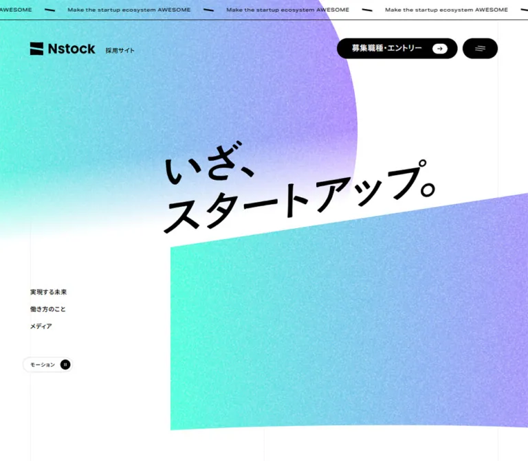
粒状感のあるシアンとグリーンの抽象背景、大きな白い明朝体、紺色の情報設計が特徴。職種紹介と募集一覧を分け、オレンジの採用導線を添えた中途採用サイト。
INTLOOP Career Recruitment — Style Reference
Airy blue space, grainy fields of color, and expansive Japanese serif lettering around a detailed recruitment directory.
Website: INTLOOP Career Recruitment Original URL: https://www.intloop.com/recruit/career/ Final URL: https://www.intloop.com/recruit/career/ Theme: light, with a pale blue canvas, navy text, and orange recruitment actions. No selectable theme was verified. Inspected: supplied evidence recorded October 2, 2026, at 02:19:25 JST; the recorded retrieval timestamp is October 1, 2026, at 17:19:25.359 UTC. Viewports: desktop 1440 × 1000 CSS pixels; mobile 390 × 844 CSS pixels. Scope: the current career recruitment homepage. Visual captures cover the desktop hero, business section, desktop footer, mobile hero, and mobile footer. Rendered DOM and computed-style evidence additionally cover the recruitment narrative, philosophy, role descriptions, career interview feature, vacancies, work environment, news, and entry section. Linked pages and unopened navigation states were not independently inspected.
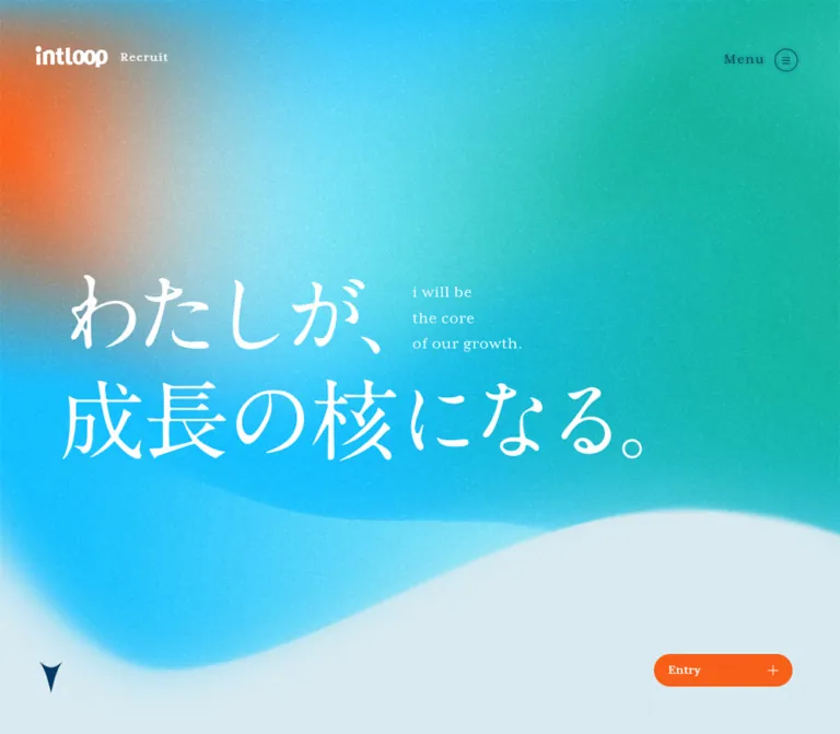
INTLOOP's career homepage balances expressive brand imagery with a substantial recruitment information architecture. The first screen uses an oversized white Japanese statement over cyan and teal color fields, with a warm orange glow at the upper left and a soft wave opening onto pale blue below. Fine grain makes the color feel tactile. Small bilingual navigation and a restrained wordmark leave most of the opening screen available to the statement.
Below the hero, the same pale blue canvas supports long narrative passages, broad role descriptions, a translucent business diagram, numbered vacancy links, and a substantial directory footer. Navy supplies continuity across text and icons. Orange is concentrated in the two recruitment shortcuts. This is a recruitment website with multiple content destinations, not simply a standalone conversion page.
閉じる
INTLOOP Career Recruitment — Style Reference
Airy blue space, grainy fields of color, and expansive Japanese serif lettering around a detailed recruitment directory.
Website: INTLOOP Career Recruitment Original URL: https://www.intloop.com/recruit/career/ Final URL: https://www.intloop.com/recruit/career/ Theme: light, with a pale blue canvas, navy text, and orange recruitment actions. No selectable theme was verified. Inspected: supplied evidence recorded October 2, 2026, at 02:19:25 JST; the recorded retrieval timestamp is October 1, 2026, at 17:19:25.359 UTC. Viewports: desktop 1440 × 1000 CSS pixels; mobile 390 × 844 CSS pixels. Scope: the current career recruitment homepage. Visual captures cover the desktop hero, business section, desktop footer, mobile hero, and mobile footer. Rendered DOM and computed-style evidence additionally cover the recruitment narrative, philosophy, role descriptions, career interview feature, vacancies, work environment, news, and entry section. Linked pages and unopened navigation states were not independently inspected.
INTLOOP's career homepage balances expressive brand imagery with a substantial recruitment information architecture. The first screen uses an oversized white Japanese statement over cyan and teal color fields, with a warm orange glow at the upper left and a soft wave opening onto pale blue below. Fine grain makes the color feel tactile. Small bilingual navigation and a restrained wordmark leave most of the opening screen available to the statement.
Below the hero, the same pale blue canvas supports long narrative passages, broad role descriptions, a translucent business diagram, numbered vacancy links, and a substantial directory footer. Navy supplies continuity across text and icons. Orange is concentrated in the two recruitment shortcuts. This is a recruitment website with multiple content destinations, not simply a standalone conversion page.
How to Read This Reference
- Measured means a value appears in the supplied computed styles or element rectangles. Measurements apply to the two recorded viewports; they do not establish the original CSS formula.
- Calculated means a value is derived from those measurements, such as gaps between adjacent elements.
- Estimated means a visual approximation from the supplied screenshots. Hero lettering, gradient colors, navigation-bar height, and some decorative geometry fall into this category.
- Recommended means implementation guidance for a new site. The Quick Start uses recommended selectors, responsive thresholds, and decorative approximations.
- Token names in this document are descriptive aliases. The exposed source custom properties contain generic font-size and slider presets, not a complete brand token system.
- The DOM includes duplicate navigation and menu content that is absent from the visible screenshots. A nonzero rectangle alone does not prove that an element was visible or that its interaction was exercised.
- The recorded
HEADERmeasuring 1000px on desktop and 844px on mobile is the full-height opening region. It must not be confused with the much shorter persistent navigation bar.
Tokens — Colors
Default Palette
| Name | Value | Suggested token | Evidence and role |
|---|---|---|---|
| Pale Blue Canvas | #d9eaf1 |
--color-canvas |
Measured rgb(217, 234, 241) on the body and major sections; also visible behind the scrolled header |
| Navy Ink | #003965 |
--color-ink |
Measured rgb(0, 57, 101); main text, navigation, icons, and detail links |
| Recruitment Orange | #f86019 |
--color-action |
Measured rgb(248, 96, 25) on both recruitment shortcuts |
| Vacancy Surface | #edf3f5 |
--color-vacancy |
Measured rgb(237, 243, 245) on numbered vacancy links |
| White | #ffffff |
--color-white |
Measured on recruitment shortcut labels and the opening logo link; also visibly used for hero lettering and external-channel panels |
Decorative Palette
These are visual approximations, not sampled pixels or recovered source declarations.
| Name | Approximation | Suggested token | Use |
|---|---|---|---|
| Luminous Cyan | #12c7ee |
--color-cyan-estimate |
Large lower-left and central hero field |
| Teal Green | #14bfa9 |
--color-teal-estimate |
Broad right side of the opening artwork |
| Warm Glow | #ff762e |
--color-glow-estimate |
Diffuse upper-left hero accent |
| Mint Light | #dcfff8 |
--color-mint-estimate |
Bright areas of the textured footer |
| Blue Disc | #c5dde6 |
--color-disc-estimate |
Approximation of the filled circular detail-link surface |
The flat canvas and navy text are stable structural colors. The hero and footer are textured compositions with many intermediate colors; a list of hex values cannot reproduce their appearance by itself. Keep cyan and teal broad and blended, and confine the warm glow to a small part of the opening composition.
There is no verified dark-mode palette. Pale or white text in the unopened navigation subtree does not establish a user-selectable dark theme. Likewise, the exposed slider preset #007aff is not evidence for an additional visible brand color.
Tokens — Typography
Japanese Editorial Serif
- Measured family:
"A1 Mincho", serif. - Verified uses: Japanese desktop navigation labels and role-description headings.
- Measured weight:
400. - Character: fine strokes, pronounced contrast, and an editorial rather than heavy promotional tone.
- Implementation alias:
--font-ja-editorial.
The oversized hero lettering has a related Mincho appearance, but its font family, text element, and rendering method were not included in the supplied measurements. Treat a live-text A1 Mincho hero as a recommended approximation, not a recovered implementation.
English Serif
- Measured family:
mrs-eaves-xl-serif, serif. - Verified uses: the Recruit label, English navigation captions, the Entry heading, and footer utility links.
- Measured weight:
400. - Character: small, carefully spaced English labels provide a second typographic register without competing with the Japanese text.
- Implementation alias:
--font-en-editorial.
Japanese Body and Functional Text
- Measured family:
"Gothic MB101 Regular", sans-serif. - Verified uses: body copy, role descriptions, business explanations, news, and most controls.
- Measured family for vacancy titles:
"Gothic MB101 Medium", sans-serif. - Weights: regular text reports
400; several emphasized headings report505, including vacancy titles. - Implementation aliases:
--font-bodyand--font-body-medium.
Preserve the reported 505 value when working with the actual licensed font setup. Its presence alone does not prove a particular variable-font implementation. Font files, licensing arrangements, and glyph-level fallback behavior were not supplied.
Measured Type Scale
Values are desktop / mobile unless only one viewport is identified.
| Role | Family | Size and line height | Tracking | Weight |
|---|---|---|---|---|
| Body default | Gothic MB101 Regular | 16 / 24px → 14 / 21px |
Normal | 400 |
| Recruit label in active header | English serif | 16 / 16px → 14 / 14px |
1.6px → 1.4px |
400 |
| Desktop navigation, Japanese | A1 Mincho | 16 / 16px |
Normal | 400 |
| Desktop navigation, English | English serif | 10 / 10px |
1.5px |
400 |
| Recruitment narrative | Gothic MB101 Regular | 20 / 64px → 18 / 43.2px |
2px → 1.8px |
400 |
| Role-description heading | A1 Mincho | 36 / 54px → 25 / 37.5px |
Normal | 400 |
| Role-description paragraph | Gothic MB101 Regular | 16 / 28.8px → 14 / 25.2px |
1.6px → 0.64px |
400 |
| Business subheading | Gothic MB101 Regular | 25.3001 / 45.5403px → 18 / 32.4px |
0.64px → 0.56px |
505 |
| Business paragraph | Gothic MB101 Regular | 16.8668 / 35.4202px → 16 / 33.6px |
0.64px → 0.56px |
400 |
| Interview headline | Gothic MB101 Regular | 22 / 33px → 18 / 27px |
0.88px at both |
505 |
| Vacancy title | Gothic MB101 Medium | 16 / 24px at both |
1px |
505 |
| News headline | Gothic MB101 Regular | 14 / 25.2px at both |
0.48px → 0.42px |
505 |
| Recruitment shortcut | Gothic MB101 Regular | 12 / 18px at both |
0.48px |
400 |
| Entry heading | English serif | 85 / 85px → 40 / 40px |
1.7px → 0.8px |
400 |
| Mobile footer utility link | English serif | 13 / 18.2px |
0.56px |
400 |
Some role-description headings report transparent text color in the extracted styles. Their associated compositing, descendants, or decorative rendering were not captured. Do not copy color: transparent into a new implementation without the complete rendering treatment; the Quick Start supplies readable navy text.
Visually Estimated Display Scale
| Element | Desktop estimate | Mobile estimate | Composition |
|---|---|---|---|
| Hero Japanese statement | Approximately 128–144px |
Approximately 64–72px |
Two principal lines on desktop; three on mobile |
| Hero English statement | Approximately 20–22px |
Approximately 12–13px |
Three short lines beside the Japanese statement |
| Large business introduction statement | Approximately 44–50px |
Not visually captured | Editorial serif heading above the diagram and explanation |
The narrative's unusually generous leading is a defining feature. Keep it distinct from functional copy: 20px text with 64px leading creates a slow reading rhythm, while vacancy labels remain compact and practical.
Tokens — Spacing & Shapes
Density: spacious editorial sections surrounding compact navigation and vacancy controls. Geometry: mostly open rectangular regions, lightly rounded vacancy links, circular directional controls, and organic background edges.
Spacing Scale
These are recurring measurements and useful aliases, not evidence of a single original spacing system.
| Use | Value | Status |
|---|---|---|
| Gap between recruitment shortcuts | 4px |
Calculated at both viewports |
| Gap between vacancy links | 16px horizontally and vertically |
Calculated on desktop; vertical gap also confirmed on mobile |
| Desktop news-column gap | 20px |
Calculated |
| Standard mobile content gutter | 24px |
Measured throughout most content |
| Desktop role-row horizontal padding | 32px |
Measured |
| Desktop environment-column gap | 32px |
Calculated |
| Desktop navigation-item gap | 40px |
Calculated between measured link boxes |
| Desktop interview feature gap | 40px |
Measured |
| Desktop role-row vertical padding | 48px |
Measured |
| Gap between mobile role-description rows | 65px |
Calculated from successive row rectangles |
| Gap between mobile environment items | 56px |
Calculated |
| Large desktop section bottom padding | Examples: 176, 200, 226, 286px |
Measured; varies by section |
| Large mobile section bottom padding | Examples: 56, 106, 134, 136, 140px |
Measured; varies by section |
Border Radius
| Element | Value | Evidence |
|---|---|---|
| General page sections | 0 |
Measured |
| Role-description links | 4px |
Measured; does not imply a visible filled card |
| Vacancy links | 4px |
Measured |
| External-channel panels | 4px |
Measured on mobile footer links |
| Desktop recruitment shortcuts | 57px |
Measured; produces a pill at 41px height |
| Mobile recruitment shortcuts | 8px 8px 0 0 |
Measured; rounded only at the top |
| Menu, detail disc, return-to-top outline | Circular appearance | Visually observed; not necessarily the button element's own border radius |
Layout Measurements
| Element | Desktop 1440 × 1000 | Mobile 390 × 844 |
|---|---|---|
| Total document height | 13845.78px |
13460.84px |
| Opening region | 1440 × 1000px |
390 × 844px |
| Typical main content region | Left 126.5px, width 1186.98px |
Left 24px, width 342px |
| Wider role-description region | Left 91.72px, width 1256.56px |
Left 24px, width 342px |
| Active header logo-link box | 174.38 × 38.36px, including 3px padding |
74.22 × 44px, including 3px padding |
| Menu button box | 30 × 36px |
40 × 46px |
| Circular detail-link overall height | 98px |
78px |
| Vacancy link | 327 × 52px |
342 × 52px |
| Business text column | Left 822.25px, width 472.5px |
Left 24px, width 342px |
| Interview feature link | 1106.98 × 316.23px |
342 × 390.89px |
| Environment item width | 272.73px |
342px |
| News item width | 281.73px |
278.81px |
| Recruitment shortcut | 175 × 41px |
188 × 39px |
| Footer external-channel panel | Approximately 216 × 80px, visually estimated |
269 × 99.83px, measured |
| Return-to-top control | Approximately 74px diameter, visually estimated | 43 × 43px, measured |
The desktop vacancy layout has three 327px columns with 16px gaps, occupying 1013px inside the wider content region. It is left aligned and does not stretch to fill the entire 1187px container.
Components
Persistent Bilingual Header
Role: maintain identity and access to the recruitment site's main destinations.
The desktop header places the wordmark and Recruit label at the left, five bilingual navigation groups toward the right, and a small outlined circular menu control at the far right. The visible groups are Message, Business, Job introduction, Interview, and Environment. Japanese labels sit above tiny tracked English captions, with approximately 4px between the measured line boxes.
The opening logo appears white over the colored artwork. In the business and footer captures, the logo uses blue and navy over an opaque pale blue header surface. The bar remains at the top across these scrolled screenshots. Its apparent height is about 110px on desktop and 88px on mobile; these are visual estimates, not extracted bar-height declarations.
On mobile, the desktop link row disappears. The wordmark and Recruit label form a compact vertical identity block at the upper left, while the outlined menu circle grows from roughly 30px to 40px. The measured mobile button box is 40 × 46px.
The DOM contains additional navigation groups, office links, social links, and category buttons associated with an unopened navigation structure. Its open appearance, focus behavior, submenu transitions, and dismissal behavior were not exercised. Do not describe the supplied footer screenshot as an open menu.
Full-Height Abstract Hero
Role: introduce growth as the recruitment theme before the detailed content begins.
The opening region matches the viewport height at both inspected sizes. Its hierarchy is artwork, a large white Japanese statement, a small English statement, and restrained directional/navigation controls.
The visible Japanese copy is:
わたしが、成長の核になる。
On desktop, the first line reads わたしが、; the second reads 成長の核になる。. The English copy, i will be / the core / of our growth., sits beside the first line rather than beneath the entire heading. The statement begins around 100px from the left and occupies the middle-to-lower portion of the screen, leaving a large open field above.
On mobile, the statement becomes three lines: わたしが、, 成長の, and 核になる。. The English copy moves into the space to the right of the middle line, approximately x=250px in the supplied capture. This is a deliberate recomposition, not a uniformly scaled desktop block.
The artwork combines a diffuse orange region at the upper left, cyan toward the center and lower left, and teal across the right. Its lower boundary is a broad, soft wave that exposes the pale blue canvas. Fine grain covers the colored field. Avoid a hard SVG edge or a glossy, perfectly smooth gradient when approximating it.
A small navy directional mark appears near the desktop hero's lower-left corner. Its click behavior was not tested. Hero animation, asset format, and the exact lettering implementation remain unverified.
Recruitment Shortcut Pair
Role: keep two distinct next steps available: an introductory conversation and the vacancy directory.
The source destinations are:
面談・説明会ご希望の方へ→/recruit/career/session/.募集中の職種一覧→/recruit/career/#jobs.
Both use white 12px text on measured orange #f86019, with a 4px gap between controls.
In the desktop business screenshot, the pair sits near the bottom-right corner, approximately 40px from the right and bottom edges. Each link measures 175 × 41px and has a pill shape. In the initial desktop measurements, the links sit just below the viewport at y=1001px, consistent with their absence from that hero capture; the exact reveal threshold is unknown.
On mobile, both links are already visible along the bottom of the hero. They start at x=5px and x=197px, measure 188 × 39px, and have only their upper corners rounded. Neither footer screenshot shows the shortcut pair, so its behavior near the footer should not be assumed from the opening state.
Do not merge these into one generic Entry action. Their different destinations are part of the current navigation model.
Recruitment Narrative and Philosophy Link
Role: explain the relationship between personal growth, contribution, and company growth.
Two substantial narrative passages precede the more functional sections. Desktop copy uses 20px Gothic MB101 Regular, 64px leading, and 2px tracking. Mobile uses 18px, 43.2px leading, and 1.8px tracking. Both remain left aligned.
The desktop passages occupy relatively narrow text regions, approximately 484px and 462px wide, within a much broader page. Their recorded positions and generous section extent establish a slow introductory rhythm. The evidence does not establish whether the surrounding space participates in a scroll animation.
A circular-arrow link leads to the recruitment message. The following philosophy section has a bilingual label and another circular-arrow link to the corporate philosophy page. Its complete visual artwork was not supplied, so preserve the known typography and spacing without inventing an illustration style.
Circular Detail Link
Role: provide a repeated, recognizable path into a content destination.
The desktop business capture shows a muted blue disc approximately 98px across, a small navy directional mark in its center, and a text label outside the disc on the right. The complete 詳しくみる link measures about 235.2 × 98px. Other link widths vary with their labels.
On mobile, measured detail links are 78px high. The 詳しくみる link is about 191.2px wide. The visible desktop mark resembles a small tapered pointer rather than a long line-arrow.
Use the circle and label as one clickable element. Keep the disc quiet and the label navy; this component has a different role from the orange recruitment shortcuts. The supplied link styles declare a 300ms color transition, but the hover endpoint was not captured.
Role-Description Row
Role: explain six professional fields before presenting individual vacancies.
The six links cover strategy consulting; BX/IT/DX/SAP consulting; project management consulting; engineering and technical PM; consulting sales; and sales/agency work.
Each desktop link occupies a broad row about 1256.56px wide and 210.8px high. Measured padding is 48px vertically and 32px horizontally. A 36px editorial serif heading sits above a 16px explanatory paragraph. The row's content gap reports 32px, and the paragraph uses 28.8px leading with 1.6px tracking.
Mobile rows occupy the 342px content width and drop the outer padding. Headings become 25px with 37.5px leading and reserve 64px at the right through padding. Paragraphs become 14px with 25.2px leading. Their height grows naturally with wrapping, and successive rows have approximately 65px of separation.
These are full-width descriptions, not compact vacancy tiles. Their measured background is transparent. A 4px radius on the link does not establish a white card surface or a shadow.
Business Relationship Diagram
Role: show consulting at the center of six connected service areas.
The desktop composition pairs a large diagram on the left with a 472.5px text column beginning at x=822.25px. The diagram is visible in the supplied business capture; its labels and ring geometry are part of the visual evidence.
A central Consulting label is surrounded by five translucent circular forms: PMO Solution above, Technology Solution to the right, Professional HR Solution at the lower right, Professional Recruit Support at the lower left, and Web Service to the left. Together with the center, these represent six areas. Faint radial dotted lines and broad circular traces reinforce their relationship.
The spheres are pale, grainy, and softly shaded. Labels carry the meaning while the material treatment stays close to the page background. This is not evidence of an interactive 3D scene or a rotating diagram.
The explanation uses a two-line subheading, a spacious paragraph, and the circular detail link. On mobile, these text elements span 342px at x=24px. The mobile diagram itself was not visually captured, so its exact scale and cropping remain unknown.
Career Interview Feature
Role: connect the growth theme to an individual career story.
The supplied DOM contains one feature linking to /recruit/career/our-growth-04/, with an introductory label, a headline, and a business-consultant role label. Its desktop anchor is a flex layout, approximately 1107 × 316px with a measured 40px gap. The headline begins in the right-hand portion of the feature and uses 22px type with 33px leading.
On mobile, the anchor changes to block layout, measures 342 × 390.89px, and uses an 18px headline with 27px leading. The headline region is 278px wide, leaving additional space within the wider link.
The feature's media content was not visible in the supplied screenshots. Do not infer a portrait treatment, crop, color grade, or carousel behavior solely from the interview content.
Numbered Vacancy Link
Role: provide direct access to specific job requirements.
The main Jobs section groups links under Consultant, Engineer, Sales, and Other. The supplied content contains five consultant roles, eight engineering roles, and four sales roles. Other is present as a category without a populated vacancy link in the evidence.
Each link is a pale rectangular tile with a small corner radius, a two-digit number, and a navy role title. Desktop tiles measure 327 × 52px; mobile tiles measure 342 × 52px. Desktop padding is 0 10px 0 26px; mobile padding is 0 20px.
Titles remain 16px with 24px leading and 1px tracking at both sizes, even though the mobile body default drops to 14px. The longest project-management title wraps onto two lines. Preserve this functional size rather than shrinking every mobile label proportionally.
The desktop layout uses three left-aligned columns with 16px gaps. Mobile uses one column with the same 16px vertical gap. The main mobile vacancy section is expanded in the supplied DOM; it should not be confused with the collapsed-looking categories in the footer.
Work Environment Collection
Role: organize seven practical employment topics.
The topics cover evaluation and compensation, career paths, remote work, growth and culture, internal communication, onboarding, and benefits. Each destination combines an English label with Japanese explanatory text.
Measured desktop links form four columns, each about 272.73px wide, separated by 32px. Their bounding heights vary with content. Mobile links become a single 342px-wide sequence; each measured item is 236px high with 56px between items.
The supplied screenshots do not show this collection's media. Its link hierarchy, dimensions, and responsive arrangement are established, but exact image crops, illustration details, and hover effects are not.
News Collection
Role: connect recruitment content to current corporate activity.
The desktop DOM contains four dated news destinations arranged at about 281.73px per column with 20px gaps. Headlines use 14px Gothic text with 25.2px leading and wrap to different heights.
On mobile, the item rectangles form a horizontal track. Each is about 278.81px wide, with 30px between items. One measured item begins at x≈55.57px, placing it near the center of the 390px viewport while neighboring items extend beyond the viewport. Repeated links occur in the mobile DOM, consistent with duplicated track items.
This establishes the horizontal layout, not a verified autoplay or looping interaction. No swipe, arrow-button, or pagination behavior was exercised. The mobile 一覧をみる link follows the collection and uses the 78px-high circular-link format.
Entry Section
Role: repeat the two recruitment routes before the site directory.
The Entry heading is centered in the measured layout and uses the English serif at 85px on desktop and 40px on mobile. The surrounding footer starts with substantial top padding: 334px on desktop and 168px on mobile.
Desktop action-link boxes are 370 × 98px and 290 × 98px, with 20px emphasized navy text. On mobile, both links are approximately 248.47 × 38px and appear in a vertical sequence, using 16px text with 28.8px leading.
These measured links have transparent backgrounds and navy text. Do not apply the orange shortcut styling automatically to this separate entry treatment.
Footer Directory and External Channels
Role: expose the recruitment site's structure and official external channels at the end of the page.
The desktop footer uses a pale mint-and-cyan textured field rather than a dark closing band. Five upper directory groups are followed by a Jobs area with four category columns. Small navy links, Japanese labels, and spaced English captions form a dense but orderly directory. The visible content begins around x=157px, a slightly narrower inset than the main body region.
On mobile, the footer becomes a vertical sequence. The four job categories appear as compact bilingual rows with plus marks at the right, while their individual vacancy links are absent from the visible footer. This is an accordion-like closed presentation; expansion behavior was not tested.
YouTube and LinkedIn destinations appear as white panels containing the platform logo, a short Japanese description, and a small external-link glyph. Desktop panels are approximately 216 × 80px and sit side by side. Mobile panels measure 269 × 99.83px, sit at x=24px, and stack with a 16px gap. They deliberately occupy less than the full 342px content width.
Instagram and Facebook icons follow. Corporate Site and Privacy Policy links include small external-link marks. On mobile, the utility links stack, the return-to-top control sits near the horizontal center, and the copyright line is centered near the bottom. Desktop uses a larger return-to-top circle at the right and left-aligned copyright.
The visible copyright is © INTLOOP Inc.. The page title and Corporate Site link independently support INTLOOP's identity. No production credit was visible in the inspected original-page evidence.
Tokens — Motion & Interaction
Declared Transition Evidence
These are reported computed-style declarations, not recordings of completed interactions.
| Target | Reported declaration | What can be concluded |
|---|---|---|
| Desktop bilingual navigation labels | color 0.3s, font-size 0.5s, transform 0.5s |
Color, size, and transform changes are supported; trigger and displacement are unverified |
| Navigation entries in the unopened menu subtree | transform 0.6s |
A transform transition exists; the open-menu sequence was not observed |
| Recruitment shortcuts | opacity 0.3s |
Opacity can change over 300ms; the exact hover or reveal state is unknown |
| Recruitment narrative | color 0.4s |
A color transition exists; no scroll mapping was established |
| Business heading and paragraph | transform 0.6s, opacity 0.5s |
Transform and opacity transitions are defined; reveal direction and distance are unknown |
| Circular detail-link anchors | color 0.3s |
Short color feedback is declared |
| Vacancy links | transform 0.3s |
Link transforms are declared; scale or translation endpoints were not supplied |
| Vacancy titles | color 0.3s |
Title-color feedback is declared |
| Role-description links and interview headline | 0.3s |
A duration is reported; do not infer a specific effect from the abbreviated value |
| Mobile footer text links | color 0.3s |
Short color feedback is declared |
Most sampled elements report animation: none. That does not rule out motion in unsampled descendants, pseudo-elements, media, canvas, or JavaScript-controlled transforms.
Observed States and Limitations
- The header remains visible at the top in the supplied scrolled captures and changes from the opening artwork treatment to an opaque pale blue surface.
- Recruitment shortcuts differ between the initial desktop and mobile views and are absent from the supplied footer captures. The exact visibility rules were not recovered.
- The mobile news layout has an offset horizontal track with repeated destinations. Autoplay, looping, and swipe behavior remain unverified.
- The mobile footer shows plus indicators and no expanded job lists. No expansion or collapse interaction was performed.
- The business diagram and hero are captured as still states. No duration, easing, rotation, parallax strength, or background animation speed can be assigned from them.
Recommended motion approach: use the verified 300–600ms range for restrained state changes, leave all essential content visible without animation, and provide a static version of the decorative artwork. Any new drift, parallax, or hover displacement should be explicitly treated as an addition.
Surfaces
| Layer | Appearance | Purpose |
|---|---|---|
| Main canvas | Solid #d9eaf1 |
Continuity across the long recruitment page |
| Opening artwork | Grainy cyan/teal field, warm glow, soft lower wave | Brand expression and contrast for white lettering |
| Scrolled header | Opaque pale blue, navy navigation, blue wordmark | Stable navigation over changing content |
| Role descriptions | Open rows on the shared canvas | Editorial explanation without excessive boxes |
| Vacancy links | #edf3f5, 4px corners |
Quiet but clear clickable targets |
| Business diagram | Translucent pale blue spherical forms | Show relationships without dominating nearby text |
| Circular detail control | Muted blue disc with navy pointer | Repeated section-level navigation |
| Recruitment shortcuts | Flat orange with white labels | Strong, compact action emphasis |
| Footer | Soft mint/cyan texture with light translucent-looking planes | A visual return to the opening artwork |
| External-channel panels | White, 4px corners, platform logos | Recognizable outbound destinations |
No prominent shadow-based elevation system is visible in the supplied screenshots. Depth comes from the artwork and diagram, while navigation and content remain largely flat. The translucent diagram is not a reason to turn every component into a glass panel.
Imagery
The most distinctive imagery is abstract. It uses broad fields of saturated cyan and teal, a diffuse warm accent, fine grain, and soft wave boundaries. The footer repeats the cool texture in a much lighter register, with broad translucent-looking planes crossing the background.
The business diagram adapts the same material language to information design: pale spherical rings, granular shading, restrained labels, and faint radial guides. Its geometry should remain understandable even when the texture is reduced.
The logo and directional marks are crisp against the soft artwork. Preserve that contrast. Grain should live in decorative imagery rather than over navigation labels or body text.
No people photography is visible in the supplied screenshots. The interview and news links establish content destinations but do not establish the appearance of their media. Do not invent portrait crops, office imagery, or photographic color treatments as observed features.
Observed Asset References
No image-source URLs or downloadable font paths were included in the evidence. The references below identify visible material, not recoverable asset filenames.
| Visual material | Evidence | Implementation implication |
|---|---|---|
| White and blue INTLOOP wordmark treatments | Opening and scrolled captures | Use authorized brand assets; do not recreate the logo by typing a similar font |
| Hero color field and soft wave | Desktop and mobile opening captures | Requires separate composition tuning at narrow widths |
| Hero statement | Both opening captures | Preserve the observed line breaks and inset English statement; rendering method is unknown |
| Six-area business diagram | Desktop business capture | Prefer an authorized asset or a carefully authored semantic diagram |
| Mint textured footer | Desktop and mobile footer captures | Keep texture light enough for small navy links |
| YouTube and LinkedIn panels | Both footer captures | Use recognizable platform marks and clear destination labels |
| Directional pointer and external-link marks | Hero, business, and footer captures | Maintain small, restrained navy iconography |
CSS can establish the palette, spacing, and responsive shell. The exact grain, lettering outlines, business illustration, and logo require appropriate assets or deliberate visual recreation. Do not use pixelated image rendering: the observed texture is fine grain, not enlarged low-resolution pixels.
Layout & Responsive Behavior
The page retains its content sequence across the two inspected sizes, but its components change arrangement. The long desktop narrative contracts while vacancies and environment links become taller single-column sequences. Consequently, the total mobile document remains almost as long as the desktop document.
| Region | Desktop evidence | Mobile evidence |
|---|---|---|
| Header | Horizontal wordmark lockup, five bilingual groups, small menu circle | Stacked lockup, menu circle, no visible desktop link row |
| Hero | Two principal Japanese lines, English beside the first | Three Japanese lines, English beside the middle |
| Recruitment shortcuts | Small pills at lower right in the scrolled business view | Two bottom-edge tabs visible on the opening screen |
| Main content | Typical width about 1187px with 126.5px side insets | Most content uses 24px side insets and 342px width |
| Role descriptions | Wide rows with 48px × 32px padding | Unpadded content rows with wrapped headings and larger separation |
| Business explanation | Right-hand 472.5px text column beside diagram | Text spans 342px; exact diagram crop is unavailable |
| Interview feature | Flex composition | Block composition |
| Vacancies | Three 327px columns | One 342px column |
| Environment | Four columns with 32px gaps | Seven vertically stacked items with 56px gaps |
| News | Four-column arrangement | Horizontal track with approximately 279px-wide items |
| Entry | Large 85px English heading and side-by-side action regions | 40px heading and vertically arranged actions |
| Footer directory | Multiple visible columns and individual links | Compact category rows; job groups appear closed |
| External-channel panels | Side by side | Stacked, 269px wide |
Only two viewport sizes were inspected. The original breakpoints, tablet layout, landscape behavior, and scaling formulas were not provided. The 64rem and 48rem thresholds in the Quick Start are recommendations.
Several narrative rectangles on mobile extend beyond the usual 342px content column, reaching close to the right viewport edge. That measurement should not become a general overflow rule. A new implementation should allow Japanese text to wrap safely and verify zoom and smaller screens.
The page uses normal long-form document scrolling. Do not turn the whole experience into a fixed-height application shell with a separate internal scroller.
Do’s and Don’ts
Do
- Preserve the measured pale blue
#d9eaf1, navy#003965, and orange#f86019relationship. - Use broad, grainy cyan/teal artwork with one localized warm region.
- Keep Japanese editorial serif, English serif captions, and Gothic body text as distinct roles.
- Recompose the hero into three lines on mobile and retain the inset English statement.
- Give narrative copy unusually generous leading and meaningful open space.
- Keep role descriptions separate from numbered vacancy links.
- Preserve the vacancy titles at 16px on mobile.
- Use circular detail links for section navigation and the orange pair for recruitment shortcuts.
- Keep the footer's directory structure, social panels, utility links, and return-to-top control recognizable.
- Treat screenshot estimates and untested interactions as such when extending the reference.
Don't
- Don't replace the opening artwork with a generic office photograph or a perfectly smooth stock gradient.
- Don't use the same bold sans-serif for every heading and label.
- Don't center all hero content or move the English statement into a conventional subtitle below the Japanese text.
- Don't flatten every recruitment destination into an identical card grid.
- Don't stretch the desktop vacancy columns merely to eliminate the measured empty space at the right.
- Don't put grain over small text or make the business diagram substantially darker than the surrounding page.
- Don't introduce heavy shadows, glossy buttons, or a dark footer without a separate design reason.
- Don't copy transparent heading text without its complete rendering mechanism.
- Don't assume the menu opens a particular way, the news autoplays, or the diagram rotates.
- Don't remove content because it was outside the supplied screenshots; use the DOM to preserve the known information architecture.
Recommended Implementation Additions
These are recommendations for a new implementation, not verified features of the original site.
- Provide a real accessible heading for the hero statement even if the visible lettering is an image or SVG. Mark the English statement with
lang="en"and keep decorative artwork out of the accessibility tree. - Give the menu control an accessible name, expanded state, and controlled-region reference. If implemented as a modal navigation panel, manage focus and restore it on dismissal.
- Implement footer expansion controls as buttons with
aria-expandedandaria-controls, or use native disclosure elements. Do not use a plus glyph as the only accessible label. - Preserve a minimum 44px activation area for small icons and recruitment shortcuts. The measured mobile shortcut height is 39px, so a larger target would be an intentional improvement.
- Check the orange shortcut contrast. White on the measured
#f86019is approximately 3.1:1, calculated from the supplied colors, below the usual 4.5:1 target for small text. A darker action orange such as#bd4300is a possible accessible adaptation; keep this distinct from the recorded palette. - Add visible keyboard focus, a skip link, and scroll offsets so the persistent header does not obscure anchored content.
- Provide a text equivalent for the business diagram that explains all six service areas and their relationship.
- If news uses a carousel, provide keyboard navigation and avoid exposing cloned items as duplicate focus targets. Add pause controls if automatic movement is introduced.
- Keep essential content visible when scripts or animations fail, and respect reduced-motion preferences.
- Load the named fonts only when available and authorized. Test Japanese line breaks with fallback fonts instead of assuming identical metrics.
- Reserve bottom space for the mobile action rail and safe-area inset. Test its footer handoff rather than inferring the original visibility threshold.
Agent Prompt Guide
Quick Color Reference
- Main canvas: measured
#d9eaf1. - Text, icons, and linework: measured
#003965. - Vacancy links: measured
#edf3f5. - Recruitment shortcuts: measured
#f86019with white labels. - Hero: estimated cyan
#12c7ee, teal#14bfa9, and a small warm glow near#ff762e. - Footer: pale mint/cyan texture with white external-channel panels.
- Detail links: muted blue circular disc, navy pointer, navy text outside the circle.
Overall Prompt
“Create a Japanese career recruitment homepage inspired by the supplied INTLOOP reference. Use a pale blue canvas #d9eaf1, navy text #003965, and two compact orange recruitment shortcuts #f86019. Build a viewport-height opening with grainy cyan and teal color fields, a diffuse warm glow at the upper left, and a soft lower wave. Place a very large, light Japanese Mincho-style statement toward the left, with a small three-line English statement inset beside it. Use distinct Japanese editorial serif, English serif captions, and Gothic body copy. Continue into spacious recruitment narrative, six full-width role descriptions, a pale six-area business diagram, an interview feature, grouped numbered vacancies, work environment links, news, and a textured directory footer. On mobile, recompose the hero into three lines, stack the vacancies, and use two bottom-edge recruitment tabs. Treat exact artwork and unverified interactions as implementation decisions rather than recovered source behavior.”
Example Component Prompts
- Header: “A restrained recruitment header with a logo and Recruit label at left, five Japanese navigation labels above tiny tracked English captions, and a thin navy circular menu control at right. Use 16px Japanese serif labels and 10px English captions. On mobile, stack the identity lockup and show only the menu control.”
- Hero: “A grainy cyan-to-teal abstract field with a diffuse orange glow at the upper left and a soft pale-blue wave beneath. Set
わたしが、成長の核になる。in oversized white Japanese editorial lettering. Desktop uses two lines; mobile uses three, with the small English statement beside the middle line.” - Business section: “A large pale diagram with Consulting in the center and five softly shaded circular service forms around it. Use faint radial dotted guides and small navy labels. Place a spacious explanatory heading, paragraph, and circular detail link to the right on desktop.”
- Vacancy link: “A 327 × 52px pale
#edf3f5rectangle with 4px corners, a two-digit number, and a 16px navy Japanese job title. Arrange three left-aligned columns with 16px gaps; use a single 342px column at a 390px viewport.” - Footer: “A light mint-and-cyan textured recruitment footer with small navy directory links, bilingual category headings, white YouTube and LinkedIn panels, social icons, utility links, and an outlined circular return-to-top control. Mobile stacks the channel panels and presents job categories as compact disclosure rows.”
Quick Start
CSS Custom Properties
This is an implementation starter, not extracted source CSS. Exact palette values and common component measurements come from the evidence. Hero size, gradient geometry, grain generation, container interpolation, and breakpoints are recommended approximations. Font files and original artwork are not bundled.
:root {
  /* Measured flat colors */
  --color-canvas: #d9eaf1;
  --color-ink: #003965;
  --color-action: #f86019;
  --color-vacancy: #edf3f5;
  --color-white: #fff;

  /* Visual estimates for decorative reconstruction */
  --color-cyan-estimate: #12c7ee;
  --color-teal-estimate: #14bfa9;
  --color-glow-estimate: #ff762e;
  --color-mint-estimate: #dcfff8;
  --color-disc-estimate: #c5dde6;

  /* Observed family names; provide licensed fonts separately */
  --font-ja-editorial: 'A1 Mincho', serif;
  --font-en-editorial: mrs-eaves-xl-serif, serif;
  --font-body: 'Gothic MB101 Regular', sans-serif;
  --font-body-medium: 'Gothic MB101 Medium', sans-serif;
  --weight-regular: 400;
  --weight-medium: 505;

  --text-body: 16px;
  --text-role: 36px;
  --text-vacancy: 16px;
  --text-action: 12px;
  --text-entry: 85px;
  --leading-body: 1.5;
  --leading-description: 1.8;
  --tracking-caption: 0.15em;

  /* Recommended fluid shell matching the measured desktop width */
  --content-max: 1187px;
  --gutter: clamp(24px, 8.785vw, 126.5px);
  --header-height: 110px;
  --detail-size: 98px;
  --radius-small: 4px;
  --space-grid: 16px;
  --safe-bottom: env(safe-area-inset-bottom, 0px);

  /* Durations supported by the supplied declarations */
  --duration-feedback: 300ms;
  --duration-opacity: 500ms;
  --duration-transform: 600ms;

  /* Generated decorative approximation, not an original asset */
  --grain-image: url("data:image/svg+xml,%3Csvg xmlns='http://www.w3.org/2000/svg' width='160' height='160'%3E%3Cfilter id='n'%3E%3CfeTurbulence type='fractalNoise' baseFrequency='.8' numOctaves='3' stitchTiles='stitch'/%3E%3C/filter%3E%3Crect width='100%25' height='100%25' filter='url(%23n)' opacity='.7'/%3E%3C/svg%3E");
}

html {
  scroll-padding-top: calc(var(--header-height) + 24px);
}

body {
  margin: 0;
  background: var(--color-canvas);
}

.career-site,
.career-site *,
.career-site *::before,
.career-site *::after {
  box-sizing: border-box;
}

.career-site {
  color: var(--color-ink);
  background: var(--color-canvas);
  font: var(--weight-regular) var(--text-body) /
    var(--leading-body) var(--font-body);
}

.career-site a {
  color: inherit;
  text-decoration: none;
}

.career-site button {
  color: inherit;
  font: inherit;
}

.career-site img {
  display: block;
  max-width: 100%;
  height: auto;
}

.content {
  width: min(
    var(--content-max),
    calc(100% - var(--gutter) - var(--gutter))
  );
  margin-inline: auto;
}

/* Fixed positioning is a recommended implementation of the observed bar. */
.career-header {
  position: fixed;
  inset: 0 0 auto;
  z-index: 30;
  display: flex;
  align-items: center;
  gap: 56px;
  min-height: var(--header-height);
  padding-inline: 48px 42px;
  background: transparent;
}

.career-header[data-scrolled='true'] {
  background: var(--color-canvas);
}

.career-brand {
  display: flex;
  align-items: center;
  gap: 14px;
  font: 400 16px / 1 var(--font-en-editorial);
  letter-spacing: 0.1em;
}

.career-nav {
  display: flex;
  align-items: center;
  gap: 40px;
  margin-left: auto;
}

.career-nav a {
  display: grid;
  gap: 4px;
  text-align: center;
}

.nav-ja {
  font: 400 16px / 1 var(--font-ja-editorial);
}

.nav-en {
  font: 400 10px / 1 var(--font-en-editorial);
  letter-spacing: var(--tracking-caption);
}

/* Recommended larger hit area around the smaller visible circle. */
.menu-button {
  display: grid;
  place-items: center;
  width: 44px;
  height: 44px;
  padding: 0;
  border: 0;
  background: transparent;
  cursor: pointer;
}

.menu-button__circle {
  display: grid;
  place-items: center;
  width: 30px;
  height: 30px;
  border: 1px solid currentColor;
  border-radius: 50%;
}

.career-hero {
  --hero-type: clamp(76px, 9.45vw, 136px);
  position: relative;
  isolation: isolate;
  min-height: 100vh;
  min-height: 100svh;
  overflow: hidden;
}

.hero-art {
  position: absolute;
  inset: 0;
  z-index: -1;
  pointer-events: none;
  background:
    radial-gradient(
      ellipse at 5% 17%,
      var(--color-glow-estimate) 0%,
      rgb(255 118 46 / 0.7) 8%,
      transparent 31%
    ),
    radial-gradient(
      ellipse at 23% 67%,
      var(--color-cyan-estimate) 0%,
      transparent 61%
    ),
    linear-gradient(
      110deg,
      #81dced,
      var(--color-cyan-estimate) 38%,
      var(--color-teal-estimate) 82%
    );
}

.hero-art::before,
.career-footer::before {
  content: '';
  position: absolute;
  inset: 0;
  background-image: var(--grain-image);
  opacity: 0.16;
  mix-blend-mode: soft-light;
  pointer-events: none;
}

/* Approximate lower wave; replace with authorized artwork for fidelity. */
.hero-art::after {
  content: '';
  position: absolute;
  inset: auto -1% -2px;
  height: 40%;
  background: url("data:image/svg+xml,%3Csvg xmlns='http://www.w3.org/2000/svg' viewBox='0 0 1440 400' preserveAspectRatio='none'%3E%3Cpath fill='%23d9eaf1' d='M0 0C130 90 130 285 350 312C550 345 815 85 1040 95C1230 65 1360 150 1440 210V400H0Z'/%3E%3C/svg%3E") center / 100% 100% no-repeat;
  filter: blur(8px);
}

.hero-copy {
  position: absolute;
  top: 34.5%;
  inset-inline: 7.2%;
  color: var(--color-white);
}

.hero-title {
  margin: 0;
  font: 400 var(--hero-type) / 1.27 var(--font-ja-editorial);
  letter-spacing: -0.02em;
}

.hero-line-one,
.hero-line-two {
  display: block;
  white-space: nowrap;
}

.hero-translation {
  position: absolute;
  top: 0.65em;
  left: calc(var(--hero-type) * 4.2);
  margin: 0;
  font: 400 22px / 1.75 var(--font-en-editorial);
  letter-spacing: 0.02em;
}

.recruitment-narrative {
  max-width: 26em;
  font-size: 20px;
  line-height: 3.2;
  letter-spacing: 0.1em;
}

.section-label {
  display: grid;
  gap: 4px;
  font-family: var(--font-ja-editorial);
}

.section-label small {
  font-family: var(--font-en-editorial);
  letter-spacing: var(--tracking-caption);
}

.detail-link {
  display: inline-flex;
  align-items: center;
  gap: 32px;
  min-height: var(--detail-size);
  transition: color var(--duration-feedback);
}

.detail-link__disc {
  display: grid;
  flex: 0 0 var(--detail-size);
  place-items: center;
  width: var(--detail-size);
  height: var(--detail-size);
  border-radius: 50%;
  background: var(--color-disc-estimate);
}

/* Approximate pointer silhouette, not the original icon asset. */
.direction-mark {
  display: block;
  width: 18px;
  height: 14px;
  background: currentColor;
  clip-path: polygon(0 0, 100% 50%, 0 100%, 25% 50%);
}

.role-list {
  width: min(1256.56px, calc(100% - 48px));
  margin-inline: auto;
}

.role-row {
  display: block;
  padding: 48px 32px;
  border-radius: var(--radius-small);
}

.role-row h3 {
  margin: 0 0 32px;
  color: var(--color-ink);
  font: 400 var(--text-role) / 1.5 var(--font-ja-editorial);
}

.role-row p {
  margin: 0;
  line-height: var(--leading-description);
  letter-spacing: 0.1em;
}

.business-layout {
  display: grid;
  grid-template-columns: minmax(0, 1fr) minmax(0, 472.5px);
  align-items: center;
  gap: 48px;
}

.business-copy h3 {
  margin: 0 0 18px;
  font-size: 25.3px;
  font-weight: var(--weight-medium);
  line-height: 1.8;
  letter-spacing: 0.64px;
}

.business-copy p {
  margin: 0 0 30px;
  font-size: 16.867px;
  line-height: 2.1;
  letter-spacing: 0.64px;
}

.vacancy-grid {
  display: grid;
  grid-template-columns: repeat(3, minmax(0, 327px));
  gap: var(--space-grid);
  padding: 0;
  list-style: none;
}

.vacancy-link {
  display: flex;
  align-items: center;
  gap: 16px;
  min-height: 52px;
  padding: 2px 10px 2px 26px;
  border-radius: var(--radius-small);
  background: var(--color-vacancy);
  transition: transform var(--duration-feedback);
}

.vacancy-link__number {
  flex: 0 0 auto;
  font-variant-numeric: tabular-nums;
}

.vacancy-link__title {
  min-width: 0;
  font: var(--weight-medium) 16px / 24px var(--font-body-medium);
  letter-spacing: 1px;
  overflow-wrap: anywhere;
}

.environment-grid {
  display: grid;
  grid-template-columns: repeat(4, minmax(0, 1fr));
  gap: 64px 32px;
}

.news-grid {
  display: grid;
  grid-template-columns: repeat(4, minmax(0, 1fr));
  gap: 20px;
}

.news-card h3 {
  font-size: 14px;
  font-weight: var(--weight-medium);
  line-height: 1.8;
  letter-spacing: 0.48px;
}

.recruit-rail {
  position: fixed;
  right: 40px;
  bottom: 40px;
  z-index: 40;
  display: flex;
  gap: 4px;
}

.recruit-rail a {
  display: grid;
  place-items: center;
  width: 175px;
  min-height: 41px;
  padding: 6px;
  border-radius: 57px;
  color: var(--color-white);
  background: var(--color-action);
  font-size: var(--text-action);
  line-height: 18px;
  letter-spacing: 0.48px;
  text-align: center;
  transition: opacity var(--duration-feedback);
}

/* Optional accessible color adaptation, distinct from the source token. */
.recruit-rail[data-high-contrast='true'] {
  --color-action: #bd4300;
}

.career-footer {
  position: relative;
  isolation: isolate;
  padding-block: 168px 25px;
  background:
    radial-gradient(ellipse at 75% 25%, #f2fffc, transparent 60%),
    linear-gradient(130deg, #a9efef, var(--color-mint-estimate), #c1eeee);
}

.career-footer > * {
  position: relative;
}

.entry-title {
  margin: 0 0 64px;
  text-align: center;
  font: 400 var(--text-entry) / 1 var(--font-en-editorial);
  letter-spacing: 0.02em;
}

.footer-directory {
  display: grid;
  grid-template-columns: 1fr 0.8fr 1.8fr 1.25fr 1.3fr;
  gap: 32px;
}

.channel-links {
  display: flex;
  gap: 24px;
  margin-top: 56px;
}

.channel-panel {
  display: flex;
  align-items: center;
  justify-content: space-between;
  gap: 16px;
  width: 216px;
  min-height: 80px;
  padding: 20px;
  border-radius: var(--radius-small);
  background: var(--color-white);
}

.career-site [hidden] {
  display: none !important;
}

.career-site :focus-visible {
  outline: 2px solid var(--color-ink);
  outline-offset: 5px;
}

@media (max-width: 64rem) {
  /* Recommended intermediate layout; original breakpoint is unknown. */
  .career-nav { display: none; }
  .menu-button { margin-left: auto; }
  .business-layout { grid-template-columns: 1fr; }
  .vacancy-grid { grid-template-columns: repeat(2, minmax(0, 1fr)); }
  .environment-grid,
  .news-grid { grid-template-columns: repeat(2, minmax(0, 1fr)); }
  .footer-directory { grid-template-columns: repeat(2, minmax(0, 1fr)); }
}

@media (max-width: 48rem) {
  :root {
    --gutter: 24px;
    --header-height: 88px;
    --detail-size: 78px;
    --text-body: 14px;
    --text-role: 25px;
    --text-entry: 40px;
  }

  .career-header {
    padding-inline: 23px 17px;
    gap: 24px;
  }

  .career-brand {
    flex-direction: column;
    align-items: flex-start;
    gap: 0;
    font-size: 14px;
  }

  .menu-button__circle { width: 40px; height: 40px; }
  .career-hero { --hero-type: clamp(48px, 17vw, 72px); }
  .hero-copy { top: 33%; inset-inline: 24px; }
  .hero-line-two > span { display: block; }

  .hero-translation {
    top: calc(var(--hero-type) * 1.36);
    left: 66%;
    font-size: 13px;
    line-height: 1.65;
  }

  .hero-art::after {
    height: 43%;
    background-image: url("data:image/svg+xml,%3Csvg xmlns='http://www.w3.org/2000/svg' viewBox='0 0 390 360' preserveAspectRatio='none'%3E%3Cpath fill='%23d9eaf1' d='M0 0C65 70 55 230 125 245C195 260 270 95 340 120C360 118 380 122 390 131V360H0Z'/%3E%3C/svg%3E");
  }

  .recruitment-narrative {
    max-width: 100%;
    font-size: 18px;
    line-height: 2.4;
  }

  .detail-link { gap: 24px; }
  .role-row { padding: 0; }
  .role-row + .role-row { margin-top: 65px; }
  .role-row h3 { margin-bottom: 16px; padding-right: 64px; }
  .role-row p { letter-spacing: 0.64px; }
  .business-copy h3 { font-size: 18px; letter-spacing: 0.56px; }
  .business-copy p { font-size: 16px; letter-spacing: 0.56px; }
  .vacancy-grid { grid-template-columns: minmax(0, 1fr); }
  .vacancy-link { padding-inline: 20px; }
  .environment-grid { grid-template-columns: 1fr; gap: 56px; }

  /* Recommended native scrolling alternative to an unverified carousel. */
  .news-grid {
    display: flex;
    gap: 30px;
    overflow-x: auto;
    scroll-snap-type: x proximity;
  }

  .news-card {
    flex: 0 0 min(278.81px, 85vw);
    scroll-snap-align: center;
  }

  .recruit-rail {
    inset: auto 5px 0;
    padding-bottom: var(--safe-bottom);
    background: var(--color-canvas);
  }

  .recruit-rail a {
    flex: 1 1 0;
    width: auto;
    min-width: 0;
    min-height: 44px;
    border-radius: 8px 8px 0 0;
  }

  .career-site {
    padding-bottom: calc(44px + var(--safe-bottom));
  }

  .career-footer { padding-block: 168px 15px; }
  .footer-directory { grid-template-columns: 1fr; gap: 24px; }
  .channel-links { flex-direction: column; gap: 16px; }
  .channel-panel { width: min(269px, 100%); min-height: 99.83px; }
}

@media (prefers-reduced-motion: reduce) {
  .career-site *,
  .career-site *::before,
  .career-site *::after {
    animation: none !important;
    transition: none !important;
    scroll-behavior: auto !important;
  }
}
The following markup demonstrates the hero's line structure, a semantic vacancy link, and the two recruitment routes. It does not include the authorized logo, diagram, full directory, or application logic.
<div class="career-site">
  <section class="career-hero" aria-labelledby="career-headline">
    <div class="hero-art" aria-hidden="true"></div>
    <div class="hero-copy">
      <h1 class="hero-title" id="career-headline" lang="ja">
        <span class="hero-line-one">わたしが、</span>
        <span class="hero-line-two"><span>成長の</span><span>核になる。</span></span>
      </h1>
      <p class="hero-translation" lang="en">
        i will be<br>the core<br>of our growth.
      </p>
    </div>
  </section>

  <main id="main" class="content">
    <section id="jobs" aria-labelledby="jobs-heading">
      <h2 class="section-label" id="jobs-heading">
        <span lang="ja">募集職種</span>
        <small lang="en">Jobs</small>
      </h2>
      <ul class="vacancy-grid">
        <li>
          <a class="vacancy-link"
             href="/recruit/career/requirements/consulting-01/">
            <span class="vacancy-link__number" aria-hidden="true">01</span>
            <span class="vacancy-link__title" lang="ja">戦略コンサルタント</span>
          </a>
        </li>
      </ul>
    </section>
  </main>

  <nav class="recruit-rail" aria-label="Recruitment actions">
    <a href="/recruit/career/session/" lang="ja">面談・説明会ご希望の方へ</a>
    <a href="#jobs" lang="ja">募集中の職種一覧</a>
  </nav>
</div>
The starter keeps the rail visible by default. A production implementation needs an explicit, tested visibility policy for the desktop opening and footer. Likewise, the data-scrolled header state requires application logic. No original scroll threshold or menu behavior is claimed here.
Tailwind v4 Token Mapping
Optional mapping for a project already using Tailwind v4. This is not evidence that the original website uses Tailwind. Define the custom properties above first.
@theme inline {
  --color-canvas: #d9eaf1;
  --color-ink: #003965;
  --color-action: #f86019;
  --color-vacancy: #edf3f5;
  --color-disc: #c5dde6;

  --font-editorial-ja: 'A1 Mincho', serif;
  --font-editorial-en: mrs-eaves-xl-serif, serif;
  --font-body: 'Gothic MB101 Regular', sans-serif;
  --font-body-medium: 'Gothic MB101 Medium', sans-serif;

  --text-caption: 10px;
  --text-action: 12px;
  --text-vacancy: 16px;
  --text-role-title: var(--text-role);
  --text-entry-title: var(--text-entry);

  --spacing-gutter: var(--gutter);
  --spacing-detail: var(--detail-size);
  --spacing-vacancy-gap: 16px;
  --spacing-vacancy-height: 52px;
  --radius-panel: 4px;
}
Sources & Evidence
- Inspected original and final page: https://www.intloop.com/recruit/career/. The supplied record reports HTTP 200 and no URL change. Its rendered title is
中途採用 | INTLOOP株式会社. - Recorded capture context: October 1, 2026, at 17:19:25.359 UTC, equivalent to October 2, 2026, at 02:19:25.359 JST. Individual screenshot timestamps were not separately supplied.
- Desktop evidence: 1440 × 1000 viewport; opening hero, scrolled business section, and footer screenshots; rendered text, link destinations, computed styles, and element rectangles. Recorded document height is approximately 13845.78px.
- Mobile evidence: 390 × 844 viewport; opening hero and footer screenshots; rendered text, link destinations, computed styles, and element rectangles. Recorded document height is approximately 13460.84px.
- Original-page identity evidence: page title, visible
© INTLOOP Inc.copyright, and the rendered Corporate Site link. The corporate destination was not separately inspected. - Capture procedure supplied with the evidence: the initial observation lasted at least five seconds. Readiness checks considered document load, finite animation completion, sampled layout and text stability, and visible image decoding, with bounded waits. Perpetual animations were paused during readiness checks and resumed. Scrolling traversed intermediate positions. SharedWorkers and service workers were disabled.
- Inspection limits: no independent browsing or linked-page inspection was performed for this reference. Menu opening, hover endpoints, footer expansion, carousel controls, keyboard behavior, and continuous decorative motion were not recorded. Asset URLs, complete stylesheets, pseudo-element details, and font files were unavailable. Delayed content and unexercised interactions remain unverified.
This reference describes the current page represented by the supplied captures and rendered evidence. Exact computed values, visual estimates, and recommended implementation choices are identified separately throughout.
# INTLOOP Career Recruitment — Style Reference

> Airy blue space, grainy fields of color, and expansive Japanese serif lettering around a detailed recruitment directory.

**Website:** [INTLOOP Career Recruitment](https://www.intloop.com/recruit/career/)
**Original URL:** https://www.intloop.com/recruit/career/
**Final URL:** https://www.intloop.com/recruit/career/
**Theme:** light, with a pale blue canvas, navy text, and orange recruitment actions. No selectable theme was verified.
**Inspected:** supplied evidence recorded October 2, 2026, at 02:19:25 JST; the recorded retrieval timestamp is October 1, 2026, at 17:19:25.359 UTC.
**Viewports:** desktop 1440 × 1000 CSS pixels; mobile 390 × 844 CSS pixels.
**Scope:** the current career recruitment homepage. Visual captures cover the desktop hero, business section, desktop footer, mobile hero, and mobile footer. Rendered DOM and computed-style evidence additionally cover the recruitment narrative, philosophy, role descriptions, career interview feature, vacancies, work environment, news, and entry section. Linked pages and unopened navigation states were not independently inspected.

INTLOOP's career homepage balances expressive brand imagery with a substantial recruitment information architecture. The first screen uses an oversized white Japanese statement over cyan and teal color fields, with a warm orange glow at the upper left and a soft wave opening onto pale blue below. Fine grain makes the color feel tactile. Small bilingual navigation and a restrained wordmark leave most of the opening screen available to the statement.

Below the hero, the same pale blue canvas supports long narrative passages, broad role descriptions, a translucent business diagram, numbered vacancy links, and a substantial directory footer. Navy supplies continuity across text and icons. Orange is concentrated in the two recruitment shortcuts. This is a recruitment website with multiple content destinations, not simply a standalone conversion page.
閉じる
# INTLOOP Career Recruitment — Style Reference

> Airy blue space, grainy fields of color, and expansive Japanese serif lettering around a detailed recruitment directory.

**Website:** [INTLOOP Career Recruitment](https://www.intloop.com/recruit/career/)
**Original URL:** https://www.intloop.com/recruit/career/
**Final URL:** https://www.intloop.com/recruit/career/
**Theme:** light, with a pale blue canvas, navy text, and orange recruitment actions. No selectable theme was verified.
**Inspected:** supplied evidence recorded October 2, 2026, at 02:19:25 JST; the recorded retrieval timestamp is October 1, 2026, at 17:19:25.359 UTC.
**Viewports:** desktop 1440 × 1000 CSS pixels; mobile 390 × 844 CSS pixels.
**Scope:** the current career recruitment homepage. Visual captures cover the desktop hero, business section, desktop footer, mobile hero, and mobile footer. Rendered DOM and computed-style evidence additionally cover the recruitment narrative, philosophy, role descriptions, career interview feature, vacancies, work environment, news, and entry section. Linked pages and unopened navigation states were not independently inspected.

INTLOOP's career homepage balances expressive brand imagery with a substantial recruitment information architecture. The first screen uses an oversized white Japanese statement over cyan and teal color fields, with a warm orange glow at the upper left and a soft wave opening onto pale blue below. Fine grain makes the color feel tactile. Small bilingual navigation and a restrained wordmark leave most of the opening screen available to the statement.

Below the hero, the same pale blue canvas supports long narrative passages, broad role descriptions, a translucent business diagram, numbered vacancy links, and a substantial directory footer. Navy supplies continuity across text and icons. Orange is concentrated in the two recruitment shortcuts. This is a recruitment website with multiple content destinations, not simply a standalone conversion page.

## How to Read This Reference

- **Measured** means a value appears in the supplied computed styles or element rectangles. Measurements apply to the two recorded viewports; they do not establish the original CSS formula.
- **Calculated** means a value is derived from those measurements, such as gaps between adjacent elements.
- **Estimated** means a visual approximation from the supplied screenshots. Hero lettering, gradient colors, navigation-bar height, and some decorative geometry fall into this category.
- **Recommended** means implementation guidance for a new site. The Quick Start uses recommended selectors, responsive thresholds, and decorative approximations.
- Token names in this document are descriptive aliases. The exposed source custom properties contain generic font-size and slider presets, not a complete brand token system.
- The DOM includes duplicate navigation and menu content that is absent from the visible screenshots. A nonzero rectangle alone does not prove that an element was visible or that its interaction was exercised.
- The recorded `HEADER` measuring 1000px on desktop and 844px on mobile is the full-height opening region. It must not be confused with the much shorter persistent navigation bar.

## Tokens — Colors

### Default Palette

| Name | Value | Suggested token | Evidence and role |
| --- | --- | --- | --- |
| Pale Blue Canvas | `#d9eaf1` | `--color-canvas` | Measured `rgb(217, 234, 241)` on the body and major sections; also visible behind the scrolled header |
| Navy Ink | `#003965` | `--color-ink` | Measured `rgb(0, 57, 101)`; main text, navigation, icons, and detail links |
| Recruitment Orange | `#f86019` | `--color-action` | Measured `rgb(248, 96, 25)` on both recruitment shortcuts |
| Vacancy Surface | `#edf3f5` | `--color-vacancy` | Measured `rgb(237, 243, 245)` on numbered vacancy links |
| White | `#ffffff` | `--color-white` | Measured on recruitment shortcut labels and the opening logo link; also visibly used for hero lettering and external-channel panels |

### Decorative Palette

These are visual approximations, not sampled pixels or recovered source declarations.

| Name | Approximation | Suggested token | Use |
| --- | --- | --- | --- |
| Luminous Cyan | `#12c7ee` | `--color-cyan-estimate` | Large lower-left and central hero field |
| Teal Green | `#14bfa9` | `--color-teal-estimate` | Broad right side of the opening artwork |
| Warm Glow | `#ff762e` | `--color-glow-estimate` | Diffuse upper-left hero accent |
| Mint Light | `#dcfff8` | `--color-mint-estimate` | Bright areas of the textured footer |
| Blue Disc | `#c5dde6` | `--color-disc-estimate` | Approximation of the filled circular detail-link surface |

The flat canvas and navy text are stable structural colors. The hero and footer are textured compositions with many intermediate colors; a list of hex values cannot reproduce their appearance by itself. Keep cyan and teal broad and blended, and confine the warm glow to a small part of the opening composition.

There is no verified dark-mode palette. Pale or white text in the unopened navigation subtree does not establish a user-selectable dark theme. Likewise, the exposed slider preset `#007aff` is not evidence for an additional visible brand color.

## Tokens — Typography

### Japanese Editorial Serif

- **Measured family:** `"A1 Mincho", serif`.
- **Verified uses:** Japanese desktop navigation labels and role-description headings.
- **Measured weight:** `400`.
- **Character:** fine strokes, pronounced contrast, and an editorial rather than heavy promotional tone.
- **Implementation alias:** `--font-ja-editorial`.

The oversized hero lettering has a related Mincho appearance, but its font family, text element, and rendering method were not included in the supplied measurements. Treat a live-text A1 Mincho hero as a recommended approximation, not a recovered implementation.

### English Serif

- **Measured family:** `mrs-eaves-xl-serif, serif`.
- **Verified uses:** the Recruit label, English navigation captions, the Entry heading, and footer utility links.
- **Measured weight:** `400`.
- **Character:** small, carefully spaced English labels provide a second typographic register without competing with the Japanese text.
- **Implementation alias:** `--font-en-editorial`.

### Japanese Body and Functional Text

- **Measured family:** `"Gothic MB101 Regular", sans-serif`.
- **Verified uses:** body copy, role descriptions, business explanations, news, and most controls.
- **Measured family for vacancy titles:** `"Gothic MB101 Medium", sans-serif`.
- **Weights:** regular text reports `400`; several emphasized headings report `505`, including vacancy titles.
- **Implementation aliases:** `--font-body` and `--font-body-medium`.

Preserve the reported `505` value when working with the actual licensed font setup. Its presence alone does not prove a particular variable-font implementation. Font files, licensing arrangements, and glyph-level fallback behavior were not supplied.

### Measured Type Scale

Values are desktop / mobile unless only one viewport is identified.

| Role | Family | Size and line height | Tracking | Weight |
| --- | --- | --- | --- | --- |
| Body default | Gothic MB101 Regular | `16 / 24px` → `14 / 21px` | Normal | 400 |
| Recruit label in active header | English serif | `16 / 16px` → `14 / 14px` | `1.6px` → `1.4px` | 400 |
| Desktop navigation, Japanese | A1 Mincho | `16 / 16px` | Normal | 400 |
| Desktop navigation, English | English serif | `10 / 10px` | `1.5px` | 400 |
| Recruitment narrative | Gothic MB101 Regular | `20 / 64px` → `18 / 43.2px` | `2px` → `1.8px` | 400 |
| Role-description heading | A1 Mincho | `36 / 54px` → `25 / 37.5px` | Normal | 400 |
| Role-description paragraph | Gothic MB101 Regular | `16 / 28.8px` → `14 / 25.2px` | `1.6px` → `0.64px` | 400 |
| Business subheading | Gothic MB101 Regular | `25.3001 / 45.5403px` → `18 / 32.4px` | `0.64px` → `0.56px` | 505 |
| Business paragraph | Gothic MB101 Regular | `16.8668 / 35.4202px` → `16 / 33.6px` | `0.64px` → `0.56px` | 400 |
| Interview headline | Gothic MB101 Regular | `22 / 33px` → `18 / 27px` | `0.88px` at both | 505 |
| Vacancy title | Gothic MB101 Medium | `16 / 24px` at both | `1px` | 505 |
| News headline | Gothic MB101 Regular | `14 / 25.2px` at both | `0.48px` → `0.42px` | 505 |
| Recruitment shortcut | Gothic MB101 Regular | `12 / 18px` at both | `0.48px` | 400 |
| Entry heading | English serif | `85 / 85px` → `40 / 40px` | `1.7px` → `0.8px` | 400 |
| Mobile footer utility link | English serif | `13 / 18.2px` | `0.56px` | 400 |

Some role-description headings report transparent text color in the extracted styles. Their associated compositing, descendants, or decorative rendering were not captured. Do not copy `color: transparent` into a new implementation without the complete rendering treatment; the Quick Start supplies readable navy text.

### Visually Estimated Display Scale

| Element | Desktop estimate | Mobile estimate | Composition |
| --- | --- | --- | --- |
| Hero Japanese statement | Approximately `128–144px` | Approximately `64–72px` | Two principal lines on desktop; three on mobile |
| Hero English statement | Approximately `20–22px` | Approximately `12–13px` | Three short lines beside the Japanese statement |
| Large business introduction statement | Approximately `44–50px` | Not visually captured | Editorial serif heading above the diagram and explanation |

The narrative's unusually generous leading is a defining feature. Keep it distinct from functional copy: `20px` text with `64px` leading creates a slow reading rhythm, while vacancy labels remain compact and practical.

## Tokens — Spacing & Shapes

**Density:** spacious editorial sections surrounding compact navigation and vacancy controls.
**Geometry:** mostly open rectangular regions, lightly rounded vacancy links, circular directional controls, and organic background edges.

### Spacing Scale

These are recurring measurements and useful aliases, not evidence of a single original spacing system.

| Use | Value | Status |
| --- | --- | --- |
| Gap between recruitment shortcuts | `4px` | Calculated at both viewports |
| Gap between vacancy links | `16px` horizontally and vertically | Calculated on desktop; vertical gap also confirmed on mobile |
| Desktop news-column gap | `20px` | Calculated |
| Standard mobile content gutter | `24px` | Measured throughout most content |
| Desktop role-row horizontal padding | `32px` | Measured |
| Desktop environment-column gap | `32px` | Calculated |
| Desktop navigation-item gap | `40px` | Calculated between measured link boxes |
| Desktop interview feature gap | `40px` | Measured |
| Desktop role-row vertical padding | `48px` | Measured |
| Gap between mobile role-description rows | `65px` | Calculated from successive row rectangles |
| Gap between mobile environment items | `56px` | Calculated |
| Large desktop section bottom padding | Examples: `176`, `200`, `226`, `286px` | Measured; varies by section |
| Large mobile section bottom padding | Examples: `56`, `106`, `134`, `136`, `140px` | Measured; varies by section |

### Border Radius

| Element | Value | Evidence |
| --- | --- | --- |
| General page sections | `0` | Measured |
| Role-description links | `4px` | Measured; does not imply a visible filled card |
| Vacancy links | `4px` | Measured |
| External-channel panels | `4px` | Measured on mobile footer links |
| Desktop recruitment shortcuts | `57px` | Measured; produces a pill at 41px height |
| Mobile recruitment shortcuts | `8px 8px 0 0` | Measured; rounded only at the top |
| Menu, detail disc, return-to-top outline | Circular appearance | Visually observed; not necessarily the button element's own border radius |

### Layout Measurements

| Element | Desktop 1440 × 1000 | Mobile 390 × 844 |
| --- | --- | --- |
| Total document height | `13845.78px` | `13460.84px` |
| Opening region | `1440 × 1000px` | `390 × 844px` |
| Typical main content region | Left `126.5px`, width `1186.98px` | Left `24px`, width `342px` |
| Wider role-description region | Left `91.72px`, width `1256.56px` | Left `24px`, width `342px` |
| Active header logo-link box | `174.38 × 38.36px`, including 3px padding | `74.22 × 44px`, including 3px padding |
| Menu button box | `30 × 36px` | `40 × 46px` |
| Circular detail-link overall height | `98px` | `78px` |
| Vacancy link | `327 × 52px` | `342 × 52px` |
| Business text column | Left `822.25px`, width `472.5px` | Left `24px`, width `342px` |
| Interview feature link | `1106.98 × 316.23px` | `342 × 390.89px` |
| Environment item width | `272.73px` | `342px` |
| News item width | `281.73px` | `278.81px` |
| Recruitment shortcut | `175 × 41px` | `188 × 39px` |
| Footer external-channel panel | Approximately `216 × 80px`, visually estimated | `269 × 99.83px`, measured |
| Return-to-top control | Approximately 74px diameter, visually estimated | `43 × 43px`, measured |

The desktop vacancy layout has three 327px columns with 16px gaps, occupying 1013px inside the wider content region. It is left aligned and does not stretch to fill the entire 1187px container.

## Components

### Persistent Bilingual Header

**Role:** maintain identity and access to the recruitment site's main destinations.

The desktop header places the wordmark and Recruit label at the left, five bilingual navigation groups toward the right, and a small outlined circular menu control at the far right. The visible groups are Message, Business, Job introduction, Interview, and Environment. Japanese labels sit above tiny tracked English captions, with approximately 4px between the measured line boxes.

The opening logo appears white over the colored artwork. In the business and footer captures, the logo uses blue and navy over an opaque pale blue header surface. The bar remains at the top across these scrolled screenshots. Its apparent height is about 110px on desktop and 88px on mobile; these are visual estimates, not extracted bar-height declarations.

On mobile, the desktop link row disappears. The wordmark and Recruit label form a compact vertical identity block at the upper left, while the outlined menu circle grows from roughly 30px to 40px. The measured mobile button box is 40 × 46px.

The DOM contains additional navigation groups, office links, social links, and category buttons associated with an unopened navigation structure. Its open appearance, focus behavior, submenu transitions, and dismissal behavior were not exercised. Do not describe the supplied footer screenshot as an open menu.

### Full-Height Abstract Hero

**Role:** introduce growth as the recruitment theme before the detailed content begins.

The opening region matches the viewport height at both inspected sizes. Its hierarchy is artwork, a large white Japanese statement, a small English statement, and restrained directional/navigation controls.

The visible Japanese copy is:

> わたしが、成長の核になる。

On desktop, the first line reads `わたしが、`; the second reads `成長の核になる。`. The English copy, `i will be / the core / of our growth.`, sits beside the first line rather than beneath the entire heading. The statement begins around 100px from the left and occupies the middle-to-lower portion of the screen, leaving a large open field above.

On mobile, the statement becomes three lines: `わたしが、`, `成長の`, and `核になる。`. The English copy moves into the space to the right of the middle line, approximately x=250px in the supplied capture. This is a deliberate recomposition, not a uniformly scaled desktop block.

The artwork combines a diffuse orange region at the upper left, cyan toward the center and lower left, and teal across the right. Its lower boundary is a broad, soft wave that exposes the pale blue canvas. Fine grain covers the colored field. Avoid a hard SVG edge or a glossy, perfectly smooth gradient when approximating it.

A small navy directional mark appears near the desktop hero's lower-left corner. Its click behavior was not tested. Hero animation, asset format, and the exact lettering implementation remain unverified.

### Recruitment Shortcut Pair

**Role:** keep two distinct next steps available: an introductory conversation and the vacancy directory.

The source destinations are:

- `面談・説明会ご希望の方へ` → `/recruit/career/session/`.
- `募集中の職種一覧` → `/recruit/career/#jobs`.

Both use white 12px text on measured orange `#f86019`, with a 4px gap between controls.

In the desktop business screenshot, the pair sits near the bottom-right corner, approximately 40px from the right and bottom edges. Each link measures 175 × 41px and has a pill shape. In the initial desktop measurements, the links sit just below the viewport at y=1001px, consistent with their absence from that hero capture; the exact reveal threshold is unknown.

On mobile, both links are already visible along the bottom of the hero. They start at x=5px and x=197px, measure 188 × 39px, and have only their upper corners rounded. Neither footer screenshot shows the shortcut pair, so its behavior near the footer should not be assumed from the opening state.

Do not merge these into one generic Entry action. Their different destinations are part of the current navigation model.

### Recruitment Narrative and Philosophy Link

**Role:** explain the relationship between personal growth, contribution, and company growth.

Two substantial narrative passages precede the more functional sections. Desktop copy uses 20px Gothic MB101 Regular, 64px leading, and 2px tracking. Mobile uses 18px, 43.2px leading, and 1.8px tracking. Both remain left aligned.

The desktop passages occupy relatively narrow text regions, approximately 484px and 462px wide, within a much broader page. Their recorded positions and generous section extent establish a slow introductory rhythm. The evidence does not establish whether the surrounding space participates in a scroll animation.

A circular-arrow link leads to the recruitment message. The following philosophy section has a bilingual label and another circular-arrow link to the corporate philosophy page. Its complete visual artwork was not supplied, so preserve the known typography and spacing without inventing an illustration style.

### Circular Detail Link

**Role:** provide a repeated, recognizable path into a content destination.

The desktop business capture shows a muted blue disc approximately 98px across, a small navy directional mark in its center, and a text label outside the disc on the right. The complete `詳しくみる` link measures about 235.2 × 98px. Other link widths vary with their labels.

On mobile, measured detail links are 78px high. The `詳しくみる` link is about 191.2px wide. The visible desktop mark resembles a small tapered pointer rather than a long line-arrow.

Use the circle and label as one clickable element. Keep the disc quiet and the label navy; this component has a different role from the orange recruitment shortcuts. The supplied link styles declare a 300ms color transition, but the hover endpoint was not captured.

### Role-Description Row

**Role:** explain six professional fields before presenting individual vacancies.

The six links cover strategy consulting; BX/IT/DX/SAP consulting; project management consulting; engineering and technical PM; consulting sales; and sales/agency work.

Each desktop link occupies a broad row about 1256.56px wide and 210.8px high. Measured padding is 48px vertically and 32px horizontally. A 36px editorial serif heading sits above a 16px explanatory paragraph. The row's content gap reports 32px, and the paragraph uses 28.8px leading with 1.6px tracking.

Mobile rows occupy the 342px content width and drop the outer padding. Headings become 25px with 37.5px leading and reserve 64px at the right through padding. Paragraphs become 14px with 25.2px leading. Their height grows naturally with wrapping, and successive rows have approximately 65px of separation.

These are full-width descriptions, not compact vacancy tiles. Their measured background is transparent. A 4px radius on the link does not establish a white card surface or a shadow.

### Business Relationship Diagram

**Role:** show consulting at the center of six connected service areas.

The desktop composition pairs a large diagram on the left with a 472.5px text column beginning at x=822.25px. The diagram is visible in the supplied business capture; its labels and ring geometry are part of the visual evidence.

A central Consulting label is surrounded by five translucent circular forms: PMO Solution above, Technology Solution to the right, Professional HR Solution at the lower right, Professional Recruit Support at the lower left, and Web Service to the left. Together with the center, these represent six areas. Faint radial dotted lines and broad circular traces reinforce their relationship.

The spheres are pale, grainy, and softly shaded. Labels carry the meaning while the material treatment stays close to the page background. This is not evidence of an interactive 3D scene or a rotating diagram.

The explanation uses a two-line subheading, a spacious paragraph, and the circular detail link. On mobile, these text elements span 342px at x=24px. The mobile diagram itself was not visually captured, so its exact scale and cropping remain unknown.

### Career Interview Feature

**Role:** connect the growth theme to an individual career story.

The supplied DOM contains one feature linking to `/recruit/career/our-growth-04/`, with an introductory label, a headline, and a business-consultant role label. Its desktop anchor is a flex layout, approximately 1107 × 316px with a measured 40px gap. The headline begins in the right-hand portion of the feature and uses 22px type with 33px leading.

On mobile, the anchor changes to block layout, measures 342 × 390.89px, and uses an 18px headline with 27px leading. The headline region is 278px wide, leaving additional space within the wider link.

The feature's media content was not visible in the supplied screenshots. Do not infer a portrait treatment, crop, color grade, or carousel behavior solely from the interview content.

### Numbered Vacancy Link

**Role:** provide direct access to specific job requirements.

The main Jobs section groups links under Consultant, Engineer, Sales, and Other. The supplied content contains five consultant roles, eight engineering roles, and four sales roles. Other is present as a category without a populated vacancy link in the evidence.

Each link is a pale rectangular tile with a small corner radius, a two-digit number, and a navy role title. Desktop tiles measure 327 × 52px; mobile tiles measure 342 × 52px. Desktop padding is `0 10px 0 26px`; mobile padding is `0 20px`.

Titles remain 16px with 24px leading and 1px tracking at both sizes, even though the mobile body default drops to 14px. The longest project-management title wraps onto two lines. Preserve this functional size rather than shrinking every mobile label proportionally.

The desktop layout uses three left-aligned columns with 16px gaps. Mobile uses one column with the same 16px vertical gap. The main mobile vacancy section is expanded in the supplied DOM; it should not be confused with the collapsed-looking categories in the footer.

### Work Environment Collection

**Role:** organize seven practical employment topics.

The topics cover evaluation and compensation, career paths, remote work, growth and culture, internal communication, onboarding, and benefits. Each destination combines an English label with Japanese explanatory text.

Measured desktop links form four columns, each about 272.73px wide, separated by 32px. Their bounding heights vary with content. Mobile links become a single 342px-wide sequence; each measured item is 236px high with 56px between items.

The supplied screenshots do not show this collection's media. Its link hierarchy, dimensions, and responsive arrangement are established, but exact image crops, illustration details, and hover effects are not.

### News Collection

**Role:** connect recruitment content to current corporate activity.

The desktop DOM contains four dated news destinations arranged at about 281.73px per column with 20px gaps. Headlines use 14px Gothic text with 25.2px leading and wrap to different heights.

On mobile, the item rectangles form a horizontal track. Each is about 278.81px wide, with 30px between items. One measured item begins at x≈55.57px, placing it near the center of the 390px viewport while neighboring items extend beyond the viewport. Repeated links occur in the mobile DOM, consistent with duplicated track items.

This establishes the horizontal layout, not a verified autoplay or looping interaction. No swipe, arrow-button, or pagination behavior was exercised. The mobile `一覧をみる` link follows the collection and uses the 78px-high circular-link format.

### Entry Section

**Role:** repeat the two recruitment routes before the site directory.

The Entry heading is centered in the measured layout and uses the English serif at 85px on desktop and 40px on mobile. The surrounding footer starts with substantial top padding: 334px on desktop and 168px on mobile.

Desktop action-link boxes are 370 × 98px and 290 × 98px, with 20px emphasized navy text. On mobile, both links are approximately 248.47 × 38px and appear in a vertical sequence, using 16px text with 28.8px leading.

These measured links have transparent backgrounds and navy text. Do not apply the orange shortcut styling automatically to this separate entry treatment.

### Footer Directory and External Channels

**Role:** expose the recruitment site's structure and official external channels at the end of the page.

The desktop footer uses a pale mint-and-cyan textured field rather than a dark closing band. Five upper directory groups are followed by a Jobs area with four category columns. Small navy links, Japanese labels, and spaced English captions form a dense but orderly directory. The visible content begins around x=157px, a slightly narrower inset than the main body region.

On mobile, the footer becomes a vertical sequence. The four job categories appear as compact bilingual rows with plus marks at the right, while their individual vacancy links are absent from the visible footer. This is an accordion-like closed presentation; expansion behavior was not tested.

YouTube and LinkedIn destinations appear as white panels containing the platform logo, a short Japanese description, and a small external-link glyph. Desktop panels are approximately 216 × 80px and sit side by side. Mobile panels measure 269 × 99.83px, sit at x=24px, and stack with a 16px gap. They deliberately occupy less than the full 342px content width.

Instagram and Facebook icons follow. Corporate Site and Privacy Policy links include small external-link marks. On mobile, the utility links stack, the return-to-top control sits near the horizontal center, and the copyright line is centered near the bottom. Desktop uses a larger return-to-top circle at the right and left-aligned copyright.

The visible copyright is `© INTLOOP Inc.`. The page title and Corporate Site link independently support INTLOOP's identity. No production credit was visible in the inspected original-page evidence.

## Tokens — Motion & Interaction

### Declared Transition Evidence

These are reported computed-style declarations, not recordings of completed interactions.

| Target | Reported declaration | What can be concluded |
| --- | --- | --- |
| Desktop bilingual navigation labels | `color 0.3s, font-size 0.5s, transform 0.5s` | Color, size, and transform changes are supported; trigger and displacement are unverified |
| Navigation entries in the unopened menu subtree | `transform 0.6s` | A transform transition exists; the open-menu sequence was not observed |
| Recruitment shortcuts | `opacity 0.3s` | Opacity can change over 300ms; the exact hover or reveal state is unknown |
| Recruitment narrative | `color 0.4s` | A color transition exists; no scroll mapping was established |
| Business heading and paragraph | `transform 0.6s, opacity 0.5s` | Transform and opacity transitions are defined; reveal direction and distance are unknown |
| Circular detail-link anchors | `color 0.3s` | Short color feedback is declared |
| Vacancy links | `transform 0.3s` | Link transforms are declared; scale or translation endpoints were not supplied |
| Vacancy titles | `color 0.3s` | Title-color feedback is declared |
| Role-description links and interview headline | `0.3s` | A duration is reported; do not infer a specific effect from the abbreviated value |
| Mobile footer text links | `color 0.3s` | Short color feedback is declared |

Most sampled elements report `animation: none`. That does not rule out motion in unsampled descendants, pseudo-elements, media, canvas, or JavaScript-controlled transforms.

### Observed States and Limitations

- The header remains visible at the top in the supplied scrolled captures and changes from the opening artwork treatment to an opaque pale blue surface.
- Recruitment shortcuts differ between the initial desktop and mobile views and are absent from the supplied footer captures. The exact visibility rules were not recovered.
- The mobile news layout has an offset horizontal track with repeated destinations. Autoplay, looping, and swipe behavior remain unverified.
- The mobile footer shows plus indicators and no expanded job lists. No expansion or collapse interaction was performed.
- The business diagram and hero are captured as still states. No duration, easing, rotation, parallax strength, or background animation speed can be assigned from them.

**Recommended motion approach:** use the verified 300–600ms range for restrained state changes, leave all essential content visible without animation, and provide a static version of the decorative artwork. Any new drift, parallax, or hover displacement should be explicitly treated as an addition.

## Surfaces

| Layer | Appearance | Purpose |
| --- | --- | --- |
| Main canvas | Solid `#d9eaf1` | Continuity across the long recruitment page |
| Opening artwork | Grainy cyan/teal field, warm glow, soft lower wave | Brand expression and contrast for white lettering |
| Scrolled header | Opaque pale blue, navy navigation, blue wordmark | Stable navigation over changing content |
| Role descriptions | Open rows on the shared canvas | Editorial explanation without excessive boxes |
| Vacancy links | `#edf3f5`, 4px corners | Quiet but clear clickable targets |
| Business diagram | Translucent pale blue spherical forms | Show relationships without dominating nearby text |
| Circular detail control | Muted blue disc with navy pointer | Repeated section-level navigation |
| Recruitment shortcuts | Flat orange with white labels | Strong, compact action emphasis |
| Footer | Soft mint/cyan texture with light translucent-looking planes | A visual return to the opening artwork |
| External-channel panels | White, 4px corners, platform logos | Recognizable outbound destinations |

No prominent shadow-based elevation system is visible in the supplied screenshots. Depth comes from the artwork and diagram, while navigation and content remain largely flat. The translucent diagram is not a reason to turn every component into a glass panel.

## Imagery

The most distinctive imagery is abstract. It uses broad fields of saturated cyan and teal, a diffuse warm accent, fine grain, and soft wave boundaries. The footer repeats the cool texture in a much lighter register, with broad translucent-looking planes crossing the background.

The business diagram adapts the same material language to information design: pale spherical rings, granular shading, restrained labels, and faint radial guides. Its geometry should remain understandable even when the texture is reduced.

The logo and directional marks are crisp against the soft artwork. Preserve that contrast. Grain should live in decorative imagery rather than over navigation labels or body text.

No people photography is visible in the supplied screenshots. The interview and news links establish content destinations but do not establish the appearance of their media. Do not invent portrait crops, office imagery, or photographic color treatments as observed features.

### Observed Asset References

No image-source URLs or downloadable font paths were included in the evidence. The references below identify visible material, not recoverable asset filenames.

| Visual material | Evidence | Implementation implication |
| --- | --- | --- |
| White and blue INTLOOP wordmark treatments | Opening and scrolled captures | Use authorized brand assets; do not recreate the logo by typing a similar font |
| Hero color field and soft wave | Desktop and mobile opening captures | Requires separate composition tuning at narrow widths |
| Hero statement | Both opening captures | Preserve the observed line breaks and inset English statement; rendering method is unknown |
| Six-area business diagram | Desktop business capture | Prefer an authorized asset or a carefully authored semantic diagram |
| Mint textured footer | Desktop and mobile footer captures | Keep texture light enough for small navy links |
| YouTube and LinkedIn panels | Both footer captures | Use recognizable platform marks and clear destination labels |
| Directional pointer and external-link marks | Hero, business, and footer captures | Maintain small, restrained navy iconography |

CSS can establish the palette, spacing, and responsive shell. The exact grain, lettering outlines, business illustration, and logo require appropriate assets or deliberate visual recreation. Do not use pixelated image rendering: the observed texture is fine grain, not enlarged low-resolution pixels.

## Layout & Responsive Behavior

The page retains its content sequence across the two inspected sizes, but its components change arrangement. The long desktop narrative contracts while vacancies and environment links become taller single-column sequences. Consequently, the total mobile document remains almost as long as the desktop document.

| Region | Desktop evidence | Mobile evidence |
| --- | --- | --- |
| Header | Horizontal wordmark lockup, five bilingual groups, small menu circle | Stacked lockup, menu circle, no visible desktop link row |
| Hero | Two principal Japanese lines, English beside the first | Three Japanese lines, English beside the middle |
| Recruitment shortcuts | Small pills at lower right in the scrolled business view | Two bottom-edge tabs visible on the opening screen |
| Main content | Typical width about 1187px with 126.5px side insets | Most content uses 24px side insets and 342px width |
| Role descriptions | Wide rows with 48px × 32px padding | Unpadded content rows with wrapped headings and larger separation |
| Business explanation | Right-hand 472.5px text column beside diagram | Text spans 342px; exact diagram crop is unavailable |
| Interview feature | Flex composition | Block composition |
| Vacancies | Three 327px columns | One 342px column |
| Environment | Four columns with 32px gaps | Seven vertically stacked items with 56px gaps |
| News | Four-column arrangement | Horizontal track with approximately 279px-wide items |
| Entry | Large 85px English heading and side-by-side action regions | 40px heading and vertically arranged actions |
| Footer directory | Multiple visible columns and individual links | Compact category rows; job groups appear closed |
| External-channel panels | Side by side | Stacked, 269px wide |

Only two viewport sizes were inspected. The original breakpoints, tablet layout, landscape behavior, and scaling formulas were not provided. The 64rem and 48rem thresholds in the Quick Start are recommendations.

Several narrative rectangles on mobile extend beyond the usual 342px content column, reaching close to the right viewport edge. That measurement should not become a general overflow rule. A new implementation should allow Japanese text to wrap safely and verify zoom and smaller screens.

The page uses normal long-form document scrolling. Do not turn the whole experience into a fixed-height application shell with a separate internal scroller.

## Do’s and Don’ts

### Do

- Preserve the measured pale blue `#d9eaf1`, navy `#003965`, and orange `#f86019` relationship.
- Use broad, grainy cyan/teal artwork with one localized warm region.
- Keep Japanese editorial serif, English serif captions, and Gothic body text as distinct roles.
- Recompose the hero into three lines on mobile and retain the inset English statement.
- Give narrative copy unusually generous leading and meaningful open space.
- Keep role descriptions separate from numbered vacancy links.
- Preserve the vacancy titles at 16px on mobile.
- Use circular detail links for section navigation and the orange pair for recruitment shortcuts.
- Keep the footer's directory structure, social panels, utility links, and return-to-top control recognizable.
- Treat screenshot estimates and untested interactions as such when extending the reference.

### Don't

- Don't replace the opening artwork with a generic office photograph or a perfectly smooth stock gradient.
- Don't use the same bold sans-serif for every heading and label.
- Don't center all hero content or move the English statement into a conventional subtitle below the Japanese text.
- Don't flatten every recruitment destination into an identical card grid.
- Don't stretch the desktop vacancy columns merely to eliminate the measured empty space at the right.
- Don't put grain over small text or make the business diagram substantially darker than the surrounding page.
- Don't introduce heavy shadows, glossy buttons, or a dark footer without a separate design reason.
- Don't copy transparent heading text without its complete rendering mechanism.
- Don't assume the menu opens a particular way, the news autoplays, or the diagram rotates.
- Don't remove content because it was outside the supplied screenshots; use the DOM to preserve the known information architecture.

## Recommended Implementation Additions

These are recommendations for a new implementation, not verified features of the original site.

- Provide a real accessible heading for the hero statement even if the visible lettering is an image or SVG. Mark the English statement with `lang="en"` and keep decorative artwork out of the accessibility tree.
- Give the menu control an accessible name, expanded state, and controlled-region reference. If implemented as a modal navigation panel, manage focus and restore it on dismissal.
- Implement footer expansion controls as buttons with `aria-expanded` and `aria-controls`, or use native disclosure elements. Do not use a plus glyph as the only accessible label.
- Preserve a minimum 44px activation area for small icons and recruitment shortcuts. The measured mobile shortcut height is 39px, so a larger target would be an intentional improvement.
- Check the orange shortcut contrast. White on the measured `#f86019` is approximately 3.1:1, calculated from the supplied colors, below the usual 4.5:1 target for small text. A darker action orange such as `#bd4300` is a possible accessible adaptation; keep this distinct from the recorded palette.
- Add visible keyboard focus, a skip link, and scroll offsets so the persistent header does not obscure anchored content.
- Provide a text equivalent for the business diagram that explains all six service areas and their relationship.
- If news uses a carousel, provide keyboard navigation and avoid exposing cloned items as duplicate focus targets. Add pause controls if automatic movement is introduced.
- Keep essential content visible when scripts or animations fail, and respect reduced-motion preferences.
- Load the named fonts only when available and authorized. Test Japanese line breaks with fallback fonts instead of assuming identical metrics.
- Reserve bottom space for the mobile action rail and safe-area inset. Test its footer handoff rather than inferring the original visibility threshold.

## Agent Prompt Guide

### Quick Color Reference

- Main canvas: measured `#d9eaf1`.
- Text, icons, and linework: measured `#003965`.
- Vacancy links: measured `#edf3f5`.
- Recruitment shortcuts: measured `#f86019` with white labels.
- Hero: estimated cyan `#12c7ee`, teal `#14bfa9`, and a small warm glow near `#ff762e`.
- Footer: pale mint/cyan texture with white external-channel panels.
- Detail links: muted blue circular disc, navy pointer, navy text outside the circle.

### Overall Prompt

“Create a Japanese career recruitment homepage inspired by the supplied INTLOOP reference. Use a pale blue canvas `#d9eaf1`, navy text `#003965`, and two compact orange recruitment shortcuts `#f86019`. Build a viewport-height opening with grainy cyan and teal color fields, a diffuse warm glow at the upper left, and a soft lower wave. Place a very large, light Japanese Mincho-style statement toward the left, with a small three-line English statement inset beside it. Use distinct Japanese editorial serif, English serif captions, and Gothic body copy. Continue into spacious recruitment narrative, six full-width role descriptions, a pale six-area business diagram, an interview feature, grouped numbered vacancies, work environment links, news, and a textured directory footer. On mobile, recompose the hero into three lines, stack the vacancies, and use two bottom-edge recruitment tabs. Treat exact artwork and unverified interactions as implementation decisions rather than recovered source behavior.”

### Example Component Prompts

1. **Header:** “A restrained recruitment header with a logo and Recruit label at left, five Japanese navigation labels above tiny tracked English captions, and a thin navy circular menu control at right. Use 16px Japanese serif labels and 10px English captions. On mobile, stack the identity lockup and show only the menu control.”
2. **Hero:** “A grainy cyan-to-teal abstract field with a diffuse orange glow at the upper left and a soft pale-blue wave beneath. Set `わたしが、成長の核になる。` in oversized white Japanese editorial lettering. Desktop uses two lines; mobile uses three, with the small English statement beside the middle line.”
3. **Business section:** “A large pale diagram with Consulting in the center and five softly shaded circular service forms around it. Use faint radial dotted guides and small navy labels. Place a spacious explanatory heading, paragraph, and circular detail link to the right on desktop.”
4. **Vacancy link:** “A 327 × 52px pale `#edf3f5` rectangle with 4px corners, a two-digit number, and a 16px navy Japanese job title. Arrange three left-aligned columns with 16px gaps; use a single 342px column at a 390px viewport.”
5. **Footer:** “A light mint-and-cyan textured recruitment footer with small navy directory links, bilingual category headings, white YouTube and LinkedIn panels, social icons, utility links, and an outlined circular return-to-top control. Mobile stacks the channel panels and presents job categories as compact disclosure rows.”

## Quick Start

### CSS Custom Properties

This is an implementation starter, not extracted source CSS. Exact palette values and common component measurements come from the evidence. Hero size, gradient geometry, grain generation, container interpolation, and breakpoints are recommended approximations. Font files and original artwork are not bundled.

```css
:root {
  /* Measured flat colors */
  --color-canvas: #d9eaf1;
  --color-ink: #003965;
  --color-action: #f86019;
  --color-vacancy: #edf3f5;
  --color-white: #fff;

  /* Visual estimates for decorative reconstruction */
  --color-cyan-estimate: #12c7ee;
  --color-teal-estimate: #14bfa9;
  --color-glow-estimate: #ff762e;
  --color-mint-estimate: #dcfff8;
  --color-disc-estimate: #c5dde6;

  /* Observed family names; provide licensed fonts separately */
  --font-ja-editorial: 'A1 Mincho', serif;
  --font-en-editorial: mrs-eaves-xl-serif, serif;
  --font-body: 'Gothic MB101 Regular', sans-serif;
  --font-body-medium: 'Gothic MB101 Medium', sans-serif;
  --weight-regular: 400;
  --weight-medium: 505;

  --text-body: 16px;
  --text-role: 36px;
  --text-vacancy: 16px;
  --text-action: 12px;
  --text-entry: 85px;
  --leading-body: 1.5;
  --leading-description: 1.8;
  --tracking-caption: 0.15em;

  /* Recommended fluid shell matching the measured desktop width */
  --content-max: 1187px;
  --gutter: clamp(24px, 8.785vw, 126.5px);
  --header-height: 110px;
  --detail-size: 98px;
  --radius-small: 4px;
  --space-grid: 16px;
  --safe-bottom: env(safe-area-inset-bottom, 0px);

  /* Durations supported by the supplied declarations */
  --duration-feedback: 300ms;
  --duration-opacity: 500ms;
  --duration-transform: 600ms;

  /* Generated decorative approximation, not an original asset */
  --grain-image: url("data:image/svg+xml,%3Csvg xmlns='http://www.w3.org/2000/svg' width='160' height='160'%3E%3Cfilter id='n'%3E%3CfeTurbulence type='fractalNoise' baseFrequency='.8' numOctaves='3' stitchTiles='stitch'/%3E%3C/filter%3E%3Crect width='100%25' height='100%25' filter='url(%23n)' opacity='.7'/%3E%3C/svg%3E");
}

html {
  scroll-padding-top: calc(var(--header-height) + 24px);
}

body {
  margin: 0;
  background: var(--color-canvas);
}

.career-site,
.career-site *,
.career-site *::before,
.career-site *::after {
  box-sizing: border-box;
}

.career-site {
  color: var(--color-ink);
  background: var(--color-canvas);
  font: var(--weight-regular) var(--text-body) /
    var(--leading-body) var(--font-body);
}

.career-site a {
  color: inherit;
  text-decoration: none;
}

.career-site button {
  color: inherit;
  font: inherit;
}

.career-site img {
  display: block;
  max-width: 100%;
  height: auto;
}

.content {
  width: min(
    var(--content-max),
    calc(100% - var(--gutter) - var(--gutter))
  );
  margin-inline: auto;
}

/* Fixed positioning is a recommended implementation of the observed bar. */
.career-header {
  position: fixed;
  inset: 0 0 auto;
  z-index: 30;
  display: flex;
  align-items: center;
  gap: 56px;
  min-height: var(--header-height);
  padding-inline: 48px 42px;
  background: transparent;
}

.career-header[data-scrolled='true'] {
  background: var(--color-canvas);
}

.career-brand {
  display: flex;
  align-items: center;
  gap: 14px;
  font: 400 16px / 1 var(--font-en-editorial);
  letter-spacing: 0.1em;
}

.career-nav {
  display: flex;
  align-items: center;
  gap: 40px;
  margin-left: auto;
}

.career-nav a {
  display: grid;
  gap: 4px;
  text-align: center;
}

.nav-ja {
  font: 400 16px / 1 var(--font-ja-editorial);
}

.nav-en {
  font: 400 10px / 1 var(--font-en-editorial);
  letter-spacing: var(--tracking-caption);
}

/* Recommended larger hit area around the smaller visible circle. */
.menu-button {
  display: grid;
  place-items: center;
  width: 44px;
  height: 44px;
  padding: 0;
  border: 0;
  background: transparent;
  cursor: pointer;
}

.menu-button__circle {
  display: grid;
  place-items: center;
  width: 30px;
  height: 30px;
  border: 1px solid currentColor;
  border-radius: 50%;
}

.career-hero {
  --hero-type: clamp(76px, 9.45vw, 136px);
  position: relative;
  isolation: isolate;
  min-height: 100vh;
  min-height: 100svh;
  overflow: hidden;
}

.hero-art {
  position: absolute;
  inset: 0;
  z-index: -1;
  pointer-events: none;
  background:
    radial-gradient(
      ellipse at 5% 17%,
      var(--color-glow-estimate) 0%,
      rgb(255 118 46 / 0.7) 8%,
      transparent 31%
    ),
    radial-gradient(
      ellipse at 23% 67%,
      var(--color-cyan-estimate) 0%,
      transparent 61%
    ),
    linear-gradient(
      110deg,
      #81dced,
      var(--color-cyan-estimate) 38%,
      var(--color-teal-estimate) 82%
    );
}

.hero-art::before,
.career-footer::before {
  content: '';
  position: absolute;
  inset: 0;
  background-image: var(--grain-image);
  opacity: 0.16;
  mix-blend-mode: soft-light;
  pointer-events: none;
}

/* Approximate lower wave; replace with authorized artwork for fidelity. */
.hero-art::after {
  content: '';
  position: absolute;
  inset: auto -1% -2px;
  height: 40%;
  background: url("data:image/svg+xml,%3Csvg xmlns='http://www.w3.org/2000/svg' viewBox='0 0 1440 400' preserveAspectRatio='none'%3E%3Cpath fill='%23d9eaf1' d='M0 0C130 90 130 285 350 312C550 345 815 85 1040 95C1230 65 1360 150 1440 210V400H0Z'/%3E%3C/svg%3E") center / 100% 100% no-repeat;
  filter: blur(8px);
}

.hero-copy {
  position: absolute;
  top: 34.5%;
  inset-inline: 7.2%;
  color: var(--color-white);
}

.hero-title {
  margin: 0;
  font: 400 var(--hero-type) / 1.27 var(--font-ja-editorial);
  letter-spacing: -0.02em;
}

.hero-line-one,
.hero-line-two {
  display: block;
  white-space: nowrap;
}

.hero-translation {
  position: absolute;
  top: 0.65em;
  left: calc(var(--hero-type) * 4.2);
  margin: 0;
  font: 400 22px / 1.75 var(--font-en-editorial);
  letter-spacing: 0.02em;
}

.recruitment-narrative {
  max-width: 26em;
  font-size: 20px;
  line-height: 3.2;
  letter-spacing: 0.1em;
}

.section-label {
  display: grid;
  gap: 4px;
  font-family: var(--font-ja-editorial);
}

.section-label small {
  font-family: var(--font-en-editorial);
  letter-spacing: var(--tracking-caption);
}

.detail-link {
  display: inline-flex;
  align-items: center;
  gap: 32px;
  min-height: var(--detail-size);
  transition: color var(--duration-feedback);
}

.detail-link__disc {
  display: grid;
  flex: 0 0 var(--detail-size);
  place-items: center;
  width: var(--detail-size);
  height: var(--detail-size);
  border-radius: 50%;
  background: var(--color-disc-estimate);
}

/* Approximate pointer silhouette, not the original icon asset. */
.direction-mark {
  display: block;
  width: 18px;
  height: 14px;
  background: currentColor;
  clip-path: polygon(0 0, 100% 50%, 0 100%, 25% 50%);
}

.role-list {
  width: min(1256.56px, calc(100% - 48px));
  margin-inline: auto;
}

.role-row {
  display: block;
  padding: 48px 32px;
  border-radius: var(--radius-small);
}

.role-row h3 {
  margin: 0 0 32px;
  color: var(--color-ink);
  font: 400 var(--text-role) / 1.5 var(--font-ja-editorial);
}

.role-row p {
  margin: 0;
  line-height: var(--leading-description);
  letter-spacing: 0.1em;
}

.business-layout {
  display: grid;
  grid-template-columns: minmax(0, 1fr) minmax(0, 472.5px);
  align-items: center;
  gap: 48px;
}

.business-copy h3 {
  margin: 0 0 18px;
  font-size: 25.3px;
  font-weight: var(--weight-medium);
  line-height: 1.8;
  letter-spacing: 0.64px;
}

.business-copy p {
  margin: 0 0 30px;
  font-size: 16.867px;
  line-height: 2.1;
  letter-spacing: 0.64px;
}

.vacancy-grid {
  display: grid;
  grid-template-columns: repeat(3, minmax(0, 327px));
  gap: var(--space-grid);
  padding: 0;
  list-style: none;
}

.vacancy-link {
  display: flex;
  align-items: center;
  gap: 16px;
  min-height: 52px;
  padding: 2px 10px 2px 26px;
  border-radius: var(--radius-small);
  background: var(--color-vacancy);
  transition: transform var(--duration-feedback);
}

.vacancy-link__number {
  flex: 0 0 auto;
  font-variant-numeric: tabular-nums;
}

.vacancy-link__title {
  min-width: 0;
  font: var(--weight-medium) 16px / 24px var(--font-body-medium);
  letter-spacing: 1px;
  overflow-wrap: anywhere;
}

.environment-grid {
  display: grid;
  grid-template-columns: repeat(4, minmax(0, 1fr));
  gap: 64px 32px;
}

.news-grid {
  display: grid;
  grid-template-columns: repeat(4, minmax(0, 1fr));
  gap: 20px;
}

.news-card h3 {
  font-size: 14px;
  font-weight: var(--weight-medium);
  line-height: 1.8;
  letter-spacing: 0.48px;
}

.recruit-rail {
  position: fixed;
  right: 40px;
  bottom: 40px;
  z-index: 40;
  display: flex;
  gap: 4px;
}

.recruit-rail a {
  display: grid;
  place-items: center;
  width: 175px;
  min-height: 41px;
  padding: 6px;
  border-radius: 57px;
  color: var(--color-white);
  background: var(--color-action);
  font-size: var(--text-action);
  line-height: 18px;
  letter-spacing: 0.48px;
  text-align: center;
  transition: opacity var(--duration-feedback);
}

/* Optional accessible color adaptation, distinct from the source token. */
.recruit-rail[data-high-contrast='true'] {
  --color-action: #bd4300;
}

.career-footer {
  position: relative;
  isolation: isolate;
  padding-block: 168px 25px;
  background:
    radial-gradient(ellipse at 75% 25%, #f2fffc, transparent 60%),
    linear-gradient(130deg, #a9efef, var(--color-mint-estimate), #c1eeee);
}

.career-footer > * {
  position: relative;
}

.entry-title {
  margin: 0 0 64px;
  text-align: center;
  font: 400 var(--text-entry) / 1 var(--font-en-editorial);
  letter-spacing: 0.02em;
}

.footer-directory {
  display: grid;
  grid-template-columns: 1fr 0.8fr 1.8fr 1.25fr 1.3fr;
  gap: 32px;
}

.channel-links {
  display: flex;
  gap: 24px;
  margin-top: 56px;
}

.channel-panel {
  display: flex;
  align-items: center;
  justify-content: space-between;
  gap: 16px;
  width: 216px;
  min-height: 80px;
  padding: 20px;
  border-radius: var(--radius-small);
  background: var(--color-white);
}

.career-site [hidden] {
  display: none !important;
}

.career-site :focus-visible {
  outline: 2px solid var(--color-ink);
  outline-offset: 5px;
}

@media (max-width: 64rem) {
  /* Recommended intermediate layout; original breakpoint is unknown. */
  .career-nav { display: none; }
  .menu-button { margin-left: auto; }
  .business-layout { grid-template-columns: 1fr; }
  .vacancy-grid { grid-template-columns: repeat(2, minmax(0, 1fr)); }
  .environment-grid,
  .news-grid { grid-template-columns: repeat(2, minmax(0, 1fr)); }
  .footer-directory { grid-template-columns: repeat(2, minmax(0, 1fr)); }
}

@media (max-width: 48rem) {
  :root {
    --gutter: 24px;
    --header-height: 88px;
    --detail-size: 78px;
    --text-body: 14px;
    --text-role: 25px;
    --text-entry: 40px;
  }

  .career-header {
    padding-inline: 23px 17px;
    gap: 24px;
  }

  .career-brand {
    flex-direction: column;
    align-items: flex-start;
    gap: 0;
    font-size: 14px;
  }

  .menu-button__circle { width: 40px; height: 40px; }
  .career-hero { --hero-type: clamp(48px, 17vw, 72px); }
  .hero-copy { top: 33%; inset-inline: 24px; }
  .hero-line-two > span { display: block; }

  .hero-translation {
    top: calc(var(--hero-type) * 1.36);
    left: 66%;
    font-size: 13px;
    line-height: 1.65;
  }

  .hero-art::after {
    height: 43%;
    background-image: url("data:image/svg+xml,%3Csvg xmlns='http://www.w3.org/2000/svg' viewBox='0 0 390 360' preserveAspectRatio='none'%3E%3Cpath fill='%23d9eaf1' d='M0 0C65 70 55 230 125 245C195 260 270 95 340 120C360 118 380 122 390 131V360H0Z'/%3E%3C/svg%3E");
  }

  .recruitment-narrative {
    max-width: 100%;
    font-size: 18px;
    line-height: 2.4;
  }

  .detail-link { gap: 24px; }
  .role-row { padding: 0; }
  .role-row + .role-row { margin-top: 65px; }
  .role-row h3 { margin-bottom: 16px; padding-right: 64px; }
  .role-row p { letter-spacing: 0.64px; }
  .business-copy h3 { font-size: 18px; letter-spacing: 0.56px; }
  .business-copy p { font-size: 16px; letter-spacing: 0.56px; }
  .vacancy-grid { grid-template-columns: minmax(0, 1fr); }
  .vacancy-link { padding-inline: 20px; }
  .environment-grid { grid-template-columns: 1fr; gap: 56px; }

  /* Recommended native scrolling alternative to an unverified carousel. */
  .news-grid {
    display: flex;
    gap: 30px;
    overflow-x: auto;
    scroll-snap-type: x proximity;
  }

  .news-card {
    flex: 0 0 min(278.81px, 85vw);
    scroll-snap-align: center;
  }

  .recruit-rail {
    inset: auto 5px 0;
    padding-bottom: var(--safe-bottom);
    background: var(--color-canvas);
  }

  .recruit-rail a {
    flex: 1 1 0;
    width: auto;
    min-width: 0;
    min-height: 44px;
    border-radius: 8px 8px 0 0;
  }

  .career-site {
    padding-bottom: calc(44px + var(--safe-bottom));
  }

  .career-footer { padding-block: 168px 15px; }
  .footer-directory { grid-template-columns: 1fr; gap: 24px; }
  .channel-links { flex-direction: column; gap: 16px; }
  .channel-panel { width: min(269px, 100%); min-height: 99.83px; }
}

@media (prefers-reduced-motion: reduce) {
  .career-site *,
  .career-site *::before,
  .career-site *::after {
    animation: none !important;
    transition: none !important;
    scroll-behavior: auto !important;
  }
}
```

The following markup demonstrates the hero's line structure, a semantic vacancy link, and the two recruitment routes. It does not include the authorized logo, diagram, full directory, or application logic.

```html
<div class="career-site">
  <section class="career-hero" aria-labelledby="career-headline">
    <div class="hero-art" aria-hidden="true"></div>
    <div class="hero-copy">
      <h1 class="hero-title" id="career-headline" lang="ja">
        <span class="hero-line-one">わたしが、</span>
        <span class="hero-line-two"><span>成長の</span><span>核になる。</span></span>
      </h1>
      <p class="hero-translation" lang="en">
        i will be<br>the core<br>of our growth.
      </p>
    </div>
  </section>

  <main id="main" class="content">
    <section id="jobs" aria-labelledby="jobs-heading">
      <h2 class="section-label" id="jobs-heading">
        <span lang="ja">募集職種</span>
        <small lang="en">Jobs</small>
      </h2>
      <ul class="vacancy-grid">
        <li>
          <a class="vacancy-link"
             href="/recruit/career/requirements/consulting-01/">
            <span class="vacancy-link__number" aria-hidden="true">01</span>
            <span class="vacancy-link__title" lang="ja">戦略コンサルタント</span>
          </a>
        </li>
      </ul>
    </section>
  </main>

  <nav class="recruit-rail" aria-label="Recruitment actions">
    <a href="/recruit/career/session/" lang="ja">面談・説明会ご希望の方へ</a>
    <a href="#jobs" lang="ja">募集中の職種一覧</a>
  </nav>
</div>
```

The starter keeps the rail visible by default. A production implementation needs an explicit, tested visibility policy for the desktop opening and footer. Likewise, the `data-scrolled` header state requires application logic. No original scroll threshold or menu behavior is claimed here.

### Tailwind v4 Token Mapping

Optional mapping for a project already using Tailwind v4. This is not evidence that the original website uses Tailwind. Define the custom properties above first.

```css
@theme inline {
  --color-canvas: #d9eaf1;
  --color-ink: #003965;
  --color-action: #f86019;
  --color-vacancy: #edf3f5;
  --color-disc: #c5dde6;

  --font-editorial-ja: 'A1 Mincho', serif;
  --font-editorial-en: mrs-eaves-xl-serif, serif;
  --font-body: 'Gothic MB101 Regular', sans-serif;
  --font-body-medium: 'Gothic MB101 Medium', sans-serif;

  --text-caption: 10px;
  --text-action: 12px;
  --text-vacancy: 16px;
  --text-role-title: var(--text-role);
  --text-entry-title: var(--text-entry);

  --spacing-gutter: var(--gutter);
  --spacing-detail: var(--detail-size);
  --spacing-vacancy-gap: 16px;
  --spacing-vacancy-height: 52px;
  --radius-panel: 4px;
}
```

## Sources & Evidence

- **Inspected original and final page:** [https://www.intloop.com/recruit/career/](https://www.intloop.com/recruit/career/). The supplied record reports HTTP 200 and no URL change. Its rendered title is `中途採用 | INTLOOP株式会社`.
- **Recorded capture context:** October 1, 2026, at 17:19:25.359 UTC, equivalent to October 2, 2026, at 02:19:25.359 JST. Individual screenshot timestamps were not separately supplied.
- **Desktop evidence:** 1440 × 1000 viewport; opening hero, scrolled business section, and footer screenshots; rendered text, link destinations, computed styles, and element rectangles. Recorded document height is approximately 13845.78px.
- **Mobile evidence:** 390 × 844 viewport; opening hero and footer screenshots; rendered text, link destinations, computed styles, and element rectangles. Recorded document height is approximately 13460.84px.
- **Original-page identity evidence:** page title, visible `© INTLOOP Inc.` copyright, and the rendered [Corporate Site](https://www.intloop.com/) link. The corporate destination was not separately inspected.
- **Capture procedure supplied with the evidence:** the initial observation lasted at least five seconds. Readiness checks considered document load, finite animation completion, sampled layout and text stability, and visible image decoding, with bounded waits. Perpetual animations were paused during readiness checks and resumed. Scrolling traversed intermediate positions. SharedWorkers and service workers were disabled.
- **Inspection limits:** no independent browsing or linked-page inspection was performed for this reference. Menu opening, hover endpoints, footer expansion, carousel controls, keyboard behavior, and continuous decorative motion were not recorded. Asset URLs, complete stylesheets, pseudo-element details, and font files were unavailable. Delayed content and unexercised interactions remain unverified.

This reference describes the current page represented by the supplied captures and rendered evidence. Exact computed values, visual estimates, and recommended implementation choices are identified separately throughout.関連するデザイン
スタイルやページの種類、ジャンルが近いデザインを集めました。