プレビュー準備中デザインリファレンスを見る
DESIGN REFERENCE
まくらのキタムラ|青灰色とセリフ体で伝える静かな眠り
眠る親子の写真、霧のような青灰色、繊細な明朝体と欧文セリフ体を組み合わせた枕メーカーの企業サイト。大きな余白とCONTACTのタイポグラフィが特徴。
Makura no Kitamura — Style Reference
A pillow maker’s quiet brand world: misty blue-gray, intimate sleep photography, delicate serif type, and unusually generous space.
Original URL: https://www.kabu-kitamura.com/
Final URL: https://www.kabu-kitamura.com/
Theme: atmospheric blue-gray and white over the opening imagery; white with muted blue-gray lettering in the footer. No selectable theme was verified.
Inspected: October 2, 2026, 05:32 JST; supplied retrieval timestamp: October 1, 2026, 20:32:24.225 UTC.
Viewports: desktop 1440 × 1000 and mobile 390 × 844 CSS pixels.
Scope: the current corporate homepage, including brand storytelling, buying routes, manufacturing services, news, and the footer. Visual captures cover two desktop opening states, the desktop footer, the mobile photographic opening, and the mobile footer. Middle-page details come from supplied rendered DOM and computed styles. Linked pages, forms, and an expanded menu were not inspected.
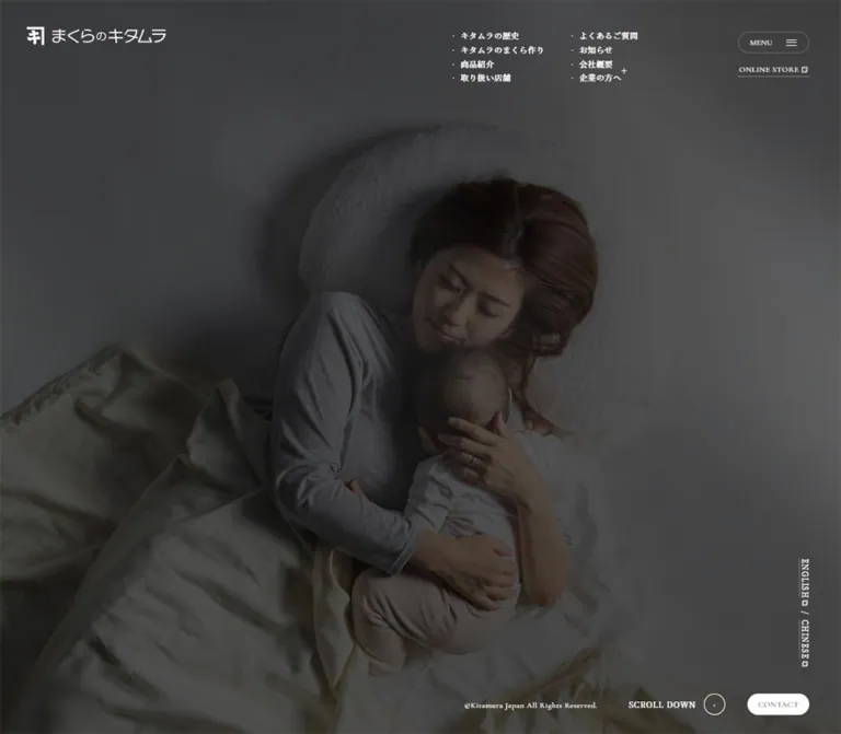
Kitamura communicates sleep through atmosphere before presenting products. In the current mobile capture, a mother rests with a child on pale bedding, beneath a dark, cool veil. White utilities sit around the image rather than inside a conventional navigation bar. One desktop capture shows only a faint centered greeting; another shows a softly mottled blue-gray field with the brand and corner controls. These are documented opening states, not proof that the completed desktop hero is intentionally empty.
The page is a substantial corporate homepage rather than a single-purpose sales page. Its content leads from a statement about sleep into company history and craft, product and store routes, OEM/ODM and filling-material services, news, and contact information. The footer resolves this long journey into a bright, spacious directory dominated by a large serif CONTACT link.
閉じる
Makura no Kitamura — Style Reference
A pillow maker’s quiet brand world: misty blue-gray, intimate sleep photography, delicate serif type, and unusually generous space.
Original URL: https://www.kabu-kitamura.com/
Final URL: https://www.kabu-kitamura.com/
Theme: atmospheric blue-gray and white over the opening imagery; white with muted blue-gray lettering in the footer. No selectable theme was verified.
Inspected: October 2, 2026, 05:32 JST; supplied retrieval timestamp: October 1, 2026, 20:32:24.225 UTC.
Viewports: desktop 1440 × 1000 and mobile 390 × 844 CSS pixels.
Scope: the current corporate homepage, including brand storytelling, buying routes, manufacturing services, news, and the footer. Visual captures cover two desktop opening states, the desktop footer, the mobile photographic opening, and the mobile footer. Middle-page details come from supplied rendered DOM and computed styles. Linked pages, forms, and an expanded menu were not inspected.
Kitamura communicates sleep through atmosphere before presenting products. In the current mobile capture, a mother rests with a child on pale bedding, beneath a dark, cool veil. White utilities sit around the image rather than inside a conventional navigation bar. One desktop capture shows only a faint centered greeting; another shows a softly mottled blue-gray field with the brand and corner controls. These are documented opening states, not proof that the completed desktop hero is intentionally empty.
The page is a substantial corporate homepage rather than a single-purpose sales page. Its content leads from a statement about sleep into company history and craft, product and store routes, OEM/ODM and filling-material services, news, and contact information. The footer resolves this long journey into a bright, spacious directory dominated by a large serif CONTACT link.
How to Read This Reference
- Measured means a supplied computed-style value, element rectangle, document dimension, or explicit DOM/link record. Measurements are CSS pixels unless stated otherwise.
- Estimated means a visual approximation from the current-page captures. Estimated colors were not sampled programmatically.
- Recommended means implementation guidance for a new build. It is not a claim about the original site.
- Token names in this document are descriptive aliases, except where explicitly identified as observed source properties.
- A computed font family records the declared stack; it does not independently establish which downloaded font file rendered every glyph.
- Offscreen rectangles can describe staged or unrevealed content. They do not prove that an element was visible, broken, pinned, or draggable.
- The opening captures differ, but their exact temporal relationship was not supplied. Motion duration, image sequencing, and completed desktop hero behavior remain unverified.
Tokens — Colors
Measured Palette
| Name | Value | Suggested token | Evidence and role |
|---|---|---|---|
| Footer Blue-Gray | #6a8d94 |
--color-footer-ink |
Computed footer text and link color: rgb(106, 141, 148) |
| White Surface | #ffffff |
--color-white |
Computed footer background; also the computed color of many opening utilities |
| Soft White Ink | #fffefe |
--color-light-ink |
Computed manifesto, chapter-caption, large link-title, and news text color |
| Contact Ink | #000000 |
--color-contact-ink |
Computed text color of the small corner CONTACT anchor |
The small contact control visibly has a white capsule behind its text. Its sampled anchor reports a transparent background and zero border radius. The visible surface therefore belongs to styling not isolated by the supplied element record. Reproduce the visible capsule, but do not describe a specific pseudo-element or child implementation as verified.
Estimated Atmospheric Tokens
| Name | Approximation | Suggested token | Use and limitation |
|---|---|---|---|
| Opening Slate | #4f5d60 |
--color-opening-slate |
Approximation of the dark, nearly uniform greeting capture |
| Mist Blue-Gray | #91a6a9 |
--color-mist |
Representative midpoint of the lighter atmospheric desktop capture; the field is not a flat fill |
| Fine Footer Rule | rgb(106 141 148 / 28%) |
--color-rule |
Implementation approximation of the pale blue-gray directory and contact dividers |
| Photographic Veil | Cool charcoal at variable opacity | --hero-veil |
The mobile photograph is visibly subdued; its source overlay color and opacity are unknown |
The restrained palette has no verified bright conversion accent. The observed source property --swiper-theme-color: #007aff is a library token; it is not evidence that saturated blue appears in the interface or that a particular slider interaction is active.
Recommended readability adjustment: use a darker related ink, such as #48676e, for small text where needed. Solid #6a8d94 on white has a calculated contrast ratio of approximately 3.6:1, before any additional compositing. Keep the softer original color for large display text and decorative rules when appropriate.
Tokens — Typography
Japanese Editorial Text
- Computed body stack:
'Noto Serif JP', -apple-system, 'system-ui', sans-serif. - Explicit paragraph family: several content paragraphs declare
'Noto Serif JP'directly. - Observed weight:
400throughout the sampled Japanese content. - Character: fine, open, and reflective. Wide tracking and generous leading create much of the calm tone.
- Suggested alias:
--font-japanese.
The Japanese wordmark is graphic content inside an anchor whose font size is 0px. Do not recreate it by typing the brand name in Noto Serif JP and assuming it is equivalent.
English Display and Utility Text
- Computed family:
'Cormorant Garamond', serif. - Observed weights:
400for editorial headings, dates, and the large footer contact link;500for the store utility and small corner contact label. - Character: high stroke contrast, narrow forms, and elegant uppercase lettering.
- Roles:
HISTORY,HOW TO MAKE,PRODUCT,SHOP,OEM ODM,PADDING, dates, andCONTACT. - Suggested alias:
--font-display.
Do not assign this family to every Latin label. The sampled language links and menu button root use Noto Serif JP; the footer map link also inherits the Japanese text stack.
Measured Type Scale
| Role | Desktop | Mobile | Line height and tracking |
|---|---|---|---|
| Manifesto greeting | 28.8px |
16.64px |
Leading 1; tracking 0.5184px / 1.664px |
| Standard story copy | 14.4px |
12.48px |
Leading 30.6px / 27.04px; tracking 2.88px / 1.4976px in history and buying introductions |
| Manufacturing copy | 14.4px |
12.48px |
Leading 30.6px / 27.04px; tracking 2.88px / 2.496px |
| Small chapter caption | 12.6px |
12.48px |
Multiline leading 25.2px / 20.8px; tracking 0.2em |
| History-panel English title | 63px |
36.4px |
Leading 1; tracking 0.05em |
| History-panel Japanese subtitle | 18px |
10.4px |
Leading 1; tracking 0.3em |
| Buying and manufacturing display title | 72px |
41.6px |
Leading 1; normal tracking |
| Buying-row Japanese label | 14.4px |
12.48px |
Leading 1; tracking 0.3em |
| News month/day | 37.8px |
21.84px |
Leading 1; normal tracking |
| News year | 21.6px |
12.48px |
Leading 1 |
| News category | 14.4px |
8.32px |
Leading 1; tracking 0.1em |
| News headline | 19.8px |
11.44px |
Leading 34.2px / 19.76px; tracking 0.05em |
| Footer directory link | 12.6px |
12.48px |
Leading 12.6px / 24.96px; normal tracking |
Large footer CONTACT |
162px |
52px |
Leading 1; weight 400; normal tracking |
| Footer phone number | 21.6px |
12.48px |
Leading 1; tracking 0.15em |
| Footer social abbreviations | 12.6px |
12.48px |
Leading 1; tracking 0.15em |
| Footer company/address | 10.8px |
12.48px |
Leading 23.4px / 24.96px; tracking 0.15em |
| Header store link | 13.5px |
11.44px |
Weight 500; desktop tracking 0.04em, mobile normal |
| Corner contact label | 13.5px |
12.48px |
Weight 500; tracking 0.05em |
| Language links | 12.15px |
12.48px |
Tracking 0.07em; visually arranged vertically |
The menu button root reports 13.3333px at both sizes. Its compact visible label may have nested styling not represented in the record; that number should not be treated as a complete measurement of the visible caption.
Visual Estimates and Important Distinctions
The centered greeting in the first desktop capture appears approximately 20px. This is a visual estimate for an opening state. The measured 28.8px greeting belongs to the manifesto section at document position y = 3500px; the two must not be conflated.
Footer category headings appear approximately 22–24px on desktop and 16–18px on mobile. Their exact computed font sizes were not supplied.
The root font size is measured at 16px. Do not introduce a tiny custom root unit or infer a universal scaling formula: small body text, display titles, and footer details scale differently between the two inspected viewports.
Tokens — Spacing & Shapes
Density: sparse at the page level, compact around utility navigation, and highly spacious around major editorial links.
Measured Spacing and Geometry
| Element or relationship | Desktop | Mobile |
|---|---|---|
| Logo position | x 45, y 45 |
x 26, y 28.08 |
| Logo dimensions | 234 × 30.95px |
142.47 × 18.84px |
| Menu control dimensions | 120.59 × 36px |
74.88 × 23.91px |
| Menu position | x 1265.47, y 54 |
x 289.13, y 27.03 |
| Corner contact dimensions | 104.39 × 36px |
86.83 × 26px |
| Corner contact right/bottom clearance | 53.09px / 31.5px |
26px / 26px |
| Footer side padding | 90px |
26px |
| Footer top/bottom padding | 63px / 72px |
36.4px / 67.6px |
| Footer inner width | 1260px |
338px |
| Directory row interval | 64px |
Approximately 102.92px for ordinary groups; longer when links wrap |
| History-panel dimensions | 900 × 720px |
520 × 416px |
| Gap between the two measured history panels | 270px |
156px |
| Buying-link row dimensions | 1260 × 185.39px |
329.67 × 107.11px |
| Manufacturing paragraph width | 432px |
312px |
| Footer contact padding | 144px 0 153px |
78px 0 83.2px |
| Footer contact rectangle | 1260 × 459px |
338 × 213.19px |
Desktop footer side padding is 6.25% of the viewport; mobile footer side padding is approximately 6.67%. These are calculated proportions of the observed measurements, not recovered source CSS formulas.
Shapes
| Shape | Evidence | Implementation guidance |
|---|---|---|
| Menu capsule | Thin, rounded outline visible in opening captures | Use a fully rounded outline, without elevation |
| Small contact capsule | White pill visible at the lower right | Keep it compact and visually secondary to the photograph |
| Scroll marker | Small outlined circle visible beside the mobile scroll label | Use a simple circle with a restrained central mark |
| Directory separators | Fine, pale horizontal rules visible in footer captures | Use approximately 1px; exact source border declarations are unavailable |
| Content panels | Rectangular DOM bounds; no general rounded-card system established | Preserve image/editorial geometry rather than adding rounded containers |
| Contact arrow | Small diagonal arrow near the lower-right edge of the large footer link | Keep the line thin and the scale subordinate to the word |
Components
Opening Greeting State
Role: establish a slow, quiet emotional register.
One desktop capture is almost entirely slate gray, with おはよう。いい朝。いい人生。 centered near the midpoint. The lettering is faint and the surrounding space is uninterrupted. No progress percentage, spinner, or completion message is visible.
Treat this as an observed introductory state, not a verified loading mechanism. Its duration, dismissal trigger, and relationship to the photograph are unknown. A new implementation should not require visitors to wait through a blocking splash merely to preserve this visual reference.
Photographic Opening and Atmospheric Field
Role: connect the manufacturer to the experience of restful sleep.
The mobile opening uses a full-width overhead photograph of a mother and child resting together. The pillow frames the upper part of the composition; the figures occupy the center and lower area. Bedding folds provide texture without additional decorative objects. A cool, dark treatment allows white utility text to remain visible.
The lighter desktop capture instead shows fine grain and broad, blurred blue-gray tonal changes. The material could be an image, composited layer, or another rendering technique; its implementation is not supplied.
The mobile capture has blue-gray bands approximately 27px high at the top and bottom. Their relationship to media cropping or the opening effect is unverified. Do not hardcode them as device safe areas.
Overlay Header
Role: brand identification and immediate access to navigation and shopping.
The logo sits at the upper left. Desktop menu and store controls stack at the upper right: the menu begins at y 54px; the store anchor begins at approximately y 110.69px. The header element itself has a measured height of zero, consistent with children positioned outside normal flow. The source positioning declarations were not included.
On mobile, the header becomes a single compact row: graphic logo, underlined ONLINE STORE, then the outlined MENU capsule. The store begins at x 187.44px, between the logo ending near x 168.47px and the menu beginning near x 289.13px.
The store link includes a small external-link symbol. Its observed destination is https://ohayo-kitamura.com/. This is an outbound shop route; no cart or checkout interface was inspected on the homepage.
Desktop Navigation Cluster
Role: expose corporate and product destinations directly on a wide screen.
The desktop DOM measures two compact groups beginning around x 826.78px and x 1010.36px, with their first links at y 54px. Main links use 11.7px Japanese serif text, 0.819px tracking, and approximately 21.86px vertical intervals.
The groups include history, pillow making, products, stores, FAQ, news, and company information. OEM/ODM and filling-material links are also present. Their submenu behavior was not tested.
This cluster is not visibly resolved in the supplied atmospheric desktop capture. Its existence and geometry are DOM-supported; its final reveal state is not. The mobile text and link evidence omits the desktop cluster while retaining the menu button.
Corner Contact, Language Rail, and Scroll Cue
Role: provide secondary actions without interrupting the opening image.
The white CONTACT capsule sits near the lower-right corner. Above it, ENGLISH and CHINESE form a vertical rail with fine rules and small external-link marks. On mobile, the English anchor begins near y 593.53px and the Chinese anchor near y 689.38px; the contact capsule begins at y 792px.
SCROLL DOWN sits at the mobile lower left beside an outlined circular marker. A click action for this cue was not verified.
Language links point to separate observed domains: https://www.kitamura1923.com/ and http://www.kitamura-makura.com/. They are not evidence of an in-page language switcher. The corner controls are absent from the supplied footer views, so do not assume they remain visible throughout the whole document.
Manifesto Section
Role: explain the company’s relationship to sleep, health, and everyday life.
The repeated greeting introduces a substantial Japanese statement. The measured section starts at y 3500px on desktop and y 2700.81px on mobile. These offsets establish a long opening sequence; they do not explain how that sequence moves.
Use a restrained heading rather than a large sales slogan. The wider text system is defined by regular Japanese serif type, generous leading, and open tracking. For a new implementation, keep the paragraph width comfortable and preserve real paragraph structure rather than inserting line breaks for one screen size.
Company History and Pillow-Making Panels
Role: direct visitors to brand heritage and manufacturing craft.
The KNOW ABOUT KITAMURA section contains a small multiline English caption, Japanese introduction, and two large anchors: HISTORY with キタムラの歴史, and HOW TO MAKE with キタムラの枕づくり.
Both anchors have a measured 5:4 rectangle: 900 × 720px on desktop and 520 × 416px on mobile. Their titles are centered within broad panel-width text boxes. The English title is dominant; the Japanese subtitle is smaller and much more widely tracked.
At the recorded state, desktop panels begin at x 1449px and x 2619px; mobile panels begin at x 837.19px and x 1513.19px. These are horizontally staged positions, not a conventional two-column mobile grid.
The section height is exactly five viewport heights in both records: 5000px and 4220px. Together, the section length and offscreen panel positions suggest a staged horizontal presentation. Scroll pinning, drag behavior, scrub progress, and panel imagery were not independently established.
Buying Routes
Role: separate product discovery, physical retailers, and the online store.
The BUY KITAMURA introduction leads to three full-width anchors:
商品紹介/PRODUCT取り扱い店舗/SHOPオンラインストア/ONLINE STORE
On desktop, the anchors span from x 90px to x 1350px. Japanese labels begin near x 96.30px; large English titles begin at x 346.5px. Each row is approximately 185.39px tall.
On mobile, the Japanese label sits above the English title within a roughly 330px-wide, 107px-high row. English type becomes 41.6px, retaining much more visual weight than the 12.48px Japanese label.
The entire destination is an anchor. Preserve the editorial hierarchy and broad clickable region instead of reducing each route to a small button. The actual middle-page surface and divider styling are not visible in the supplied captures; any added rules should be labeled as an adaptation.
Manufacturing Services
Role: introduce business collaboration and material production.
The MAKE PILLOWS WITH KITAMURA area contains OEM ODM and PADDING, each followed by Japanese explanatory copy and a linked service label.
Desktop text placement alternates: OEM text begins near x 796.5px, while the padding-material text begins near x 153px. Both paragraphs measure 432px wide. This establishes an asymmetric editorial rhythm, but the unsampled visual content alongside these blocks should not be invented.
On mobile, both text blocks align at x 39px with 312px widths. Titles use 41.6px Cormorant Garamond; paragraphs retain a spacious 27.04px line height. The sampled service-link rectangles are very shallow, so their complete interactive hit areas cannot be inferred from those rectangles alone.
News List
Role: show current company activity without changing the restrained visual language.
Three linked news entries are present, dated August 26, August 26, and June 12, 2026. Each entry separates the month/day, year, category, and Japanese headline. The date is a display element rather than a small inline timestamp.
Desktop entry rectangles are 945px wide, beginning at x 247.5px. Their text begins near x 801.89px and spans approximately 390.61px. This leaves a substantial leading area within each entry; the supplied element records do not identify its visual contents.
Mobile entries are approximately 306.8px wide and 331.67px tall, with text arranged below the upper portion of each entry. The ALL NEWS link appears above the entries in the desktop reading order and after them on mobile.
The measured mobile category size is only 8.32px, and headlines are 11.44px. Record these faithfully, but use larger readable minimums in a new implementation.
Secondary Destination Strip
Role: offer a final set of practical destinations before the footer.
Q & A, COMPANY, and CONTACT form three adjacent desktop anchors, each 477 × 81px. Their labels use 21.6px serif type with 0.1em tracking.
On mobile, they become three stacked 306.8 × 52px anchors with 16.64px labels. This is a verified layout reflow, unlike the unverified behavior of the history stage.
Footer Directory
Role: provide a complete, legible map of the company’s public information.
The footer switches to white with blue-gray text and pale horizontal separators. Five groups organize home, company knowledge, buying, manufacturing collaboration, and other information.
Desktop rows form three visual zones: a larger Japanese category label on the left, smaller destination links in the center, and an uppercase English category description aligned toward the right. Ordinary rows repeat on a 64px interval. The measured link column begins at x 513px.
On mobile, each category becomes a vertical group with its Japanese heading above a wrapping set of links. The English category descriptions are absent from the mobile text evidence and capture. Links have a 24.96px line height; the privacy-policy link wraps to a second line in the final group.
Monumental Contact Link
Role: make inquiry the unmistakable closing action.
A single large CONTACT anchor spans the footer’s inner width. Desktop typography is 162px, surrounded by 144px of top padding and 153px below. Mobile uses 52px type with 78px above and 83.2px below.
The word is centered, while a small diagonal arrow sits near the lower right. A fine rule closes the region. The result is a typographic destination with abundant breathing room, not a filled banner or large rounded button.
Company and Social Footer
Role: finish with verifiable company information and practical links.
Desktop places the phone link at left, company/address information in the center, and FB, TW, IN, and note at right. Mobile keeps phone and social links on one row, then places the company and address below in a centered stack. The map link moves onto its own line.
The current footer identifies the operator as 株式会社 Kitamura Japan, gives a Kita-Nagoya address, and displays ©Kitamura Japan All Rights Reserved. This operator identification is independently supported by the inspected homepage.
Tokens — Motion & Interaction
| Treatment | Evidence | What can safely be concluded |
|---|---|---|
| Logo visibility | Computed opacity 0.2s, visibility 0.2s |
A 200ms visibility transition is declared; its trigger was not exercised |
| Corner contact visibility | Computed opacity 0.2s, visibility 0.2s |
Same declared visibility treatment |
| Buying-row text | Computed opacity 0.25s |
A 250ms opacity transition is declared; its state values and trigger are unknown |
| Opening changes | Different greeting, atmospheric, and photographic captures | Multiple visual states exist; exact sequencing and duration are unverified |
| History staging | Five-viewport section plus horizontally offset panel bounds | Supports staged composition; does not prove a particular scroll implementation |
| Menu button | Button exists with MENU label |
Expanded appearance, keyboard behavior, focus management, and dismissal are unverified |
| Page-top control | Anchor targets the homepage fragment # |
A top destination exists; smooth scrolling is unverified |
| Other sampled nodes | Many report transition: all and animation: none |
No useful duration follows from all alone; sampled nodes do not cover every animation mechanism |
Recommended motion direction: use restrained opacity changes and slow atmospheric movement only where justified by the finished implementation. Keep utility feedback around the observed 200–250ms range. Do not assign invented durations to the opening sequence or introduce a mandatory scroll-scrub timeline based only on static bounds.
The capture procedure waited for finite visible/revealing animations and layout stability within time limits. Perpetual animations were temporarily paused for readiness checks and then resumed. This improves capture consistency but does not establish semantic completion of every animated scene.
Surfaces
| Layer | Appearance | Evidence status |
|---|---|---|
| Greeting field | Dark slate, nearly uniform, faint centered lettering | Visually observed; exact color estimated |
| Atmospheric opening | Misty blue-gray with fine grain and blurred tonal variation | Visually observed; rendering technology unknown |
| Mobile photographic opening | Sleep photograph under a cool dark treatment | Visually observed; asset URL and overlay parameters unavailable |
| Utility layer | White wordmark, thin outlines, small underlined links | Visually observed with supporting element measurements |
| Corner contact | White capsule with dark text | Visually observed; sampled anchor does not expose the capsule surface |
| Footer | White field, blue-gray lettering, pale rules, faint tonal variation | White background and ink color measured; secondary texture only visually observed |
No general elevation, shadow, or rounded-card system is established by the evidence. The visible hierarchy comes from image contrast, typography, whitespace, and fine rules.
Imagery
The verified photographic subject is domestic and intimate: a mother and child resting together, seen from above, surrounded by a shaped pillow and rumpled bedding. The image communicates comfort through posture, touch, and fabric texture. Keep the people and pillow legible when cropping for narrow screens.
The atmosphere is muted rather than brightly clinical. The cool veil reduces saturation and contrast in the photograph while allowing small white labels to remain present. Use licensed imagery with comparable emotional intent; do not assume a generic product cutout can carry the same role.
The desktop atmospheric field has a fine-grained, softly blurred quality. The footer also shows very faint tonal variation against its white surface. Neither observation identifies a particular shader, canvas, video, or CSS filter.
Observed Asset References
No original image, font-file, SVG, or video asset URLs were supplied. Do not invent an asset directory.
| Asset or visual | Verified evidence | Reuse guidance |
|---|---|---|
| Graphic brand mark | Current desktop and mobile captures; measured logo anchor | Use an authorized original asset; do not substitute ordinary text and call it exact |
| Sleep photograph | Current mobile opening capture | Preserve subject framing; provide responsive crops when implementing |
| Atmospheric texture | Current desktop opening capture | Match the soft grain and low-frequency tonal changes, not an assumed rendering technology |
| External-link symbols | Store, language, and map affordances visible in captures | Small outlined overlapping-square treatment is a suitable approximation |
| Footer diagonal arrow | Current footer captures | Thin, small, and aligned to the edge of the contact region |
| Middle-page imagery | Not exposed by the supplied image captures or asset records | Obtain separate evidence before specifying subjects, colors, or asset paths |
Layout & Responsive Behavior
The measured document height is 18,668px on desktop and 14,955px on mobile. These unusually long pages contain staged spacing as well as normal content; document height should not be copied as an arbitrary fixed-height requirement.
| Area | Desktop behavior | Mobile behavior |
|---|---|---|
| Header | Large logo; menu and store stacked at right; additional navigation measured in DOM | Smaller logo, store, and menu share one row |
| Opening utilities | Corner contact and vertical language rail have measured viewport-edge positions | Same hierarchy retained with 26px outer clearance |
| History panels | 900px panels arranged beyond the initial viewport |
520px panels remain wider than the 390px viewport; no ordinary card stacking established |
| Buying links | Small Japanese label beside large English title | Japanese label above English title |
| Manufacturing text | Alternating left/right placement | Both text blocks share a 312px column at x 39px |
| News | Broad entry with text in the right portion; archive link precedes list | Narrow vertical entries; archive link follows list |
| Secondary destinations | Three adjacent links | Three stacked links |
| Footer directory | Category, links, and English descriptor across a row | Japanese category above wrapping links; English descriptor omitted |
| Footer contact | 162px word within a 459px-high anchor |
52px word within a 213px-high anchor |
| Footer details | Phone, company, social links on a shared horizontal band | Phone/social row followed by centered company details |
The mobile design is not a uniform reduction. Body copy shrinks modestly, major titles shrink more, and company details become larger than their desktop equivalents. Some structures reflow while the history stage retains oversized panels.
Only two viewport sizes were supplied. The exact breakpoint, intermediate behavior, orientation rules, and safe-area handling are unknown. The Quick Start uses a recommended 48rem breakpoint and explicit fallbacks rather than claiming to recover the original responsive CSS.
Do’s and Don’ts
Do
- Pair Noto Serif JP with Cormorant Garamond, respecting their distinct Japanese and English roles.
- Keep
#6a8d94as the measured footer identity color. - Preserve the contrast between the dark atmospheric opening and bright, spacious footer.
- Let sleep photography carry the emotional message.
- Keep utility controls small in appearance and clearly separated from the image subject.
- Use widely tracked Japanese subtitles and small multiline English chapter captions.
- Preserve full-row buying links and the large footer contact destination.
- Reflow the mobile directory into category groups with wrapping links.
- Distinguish the opening greeting from the later manifesto heading.
- Treat offscreen stage measurements as state-dependent evidence.
Don’t
- Don’t turn the corporate homepage into a generic hero-and-feature-card sales page.
- Don’t replace the graphic wordmark with an unverified font treatment.
- Don’t add saturated blue merely because a slider library defines a blue token.
- Don’t describe the current desktop atmospheric capture as the definitive completed hero.
- Don’t invent video playback, parallax, WebGL, drag gestures, or menu transitions.
- Don’t assume the corner controls stay fixed over the footer.
- Don’t make all mobile typography a single scaled percentage of desktop.
- Don’t copy very small mobile news text without considering readability.
- Don’t introduce heavy shadows, glossy cards, or large filled action buttons throughout the page.
- Don’t recreate long blank scroll distances without implementing and validating the content they are meant to stage.
Recommended Implementation Additions
These are recommendations for a new implementation, not verified features of the original:
- Give the menu button an accessible name,
aria-expanded, and a relationship to its navigation region. If implemented as a modal overlay, manage focus and Escape dismissal explicitly. - Keep compact visual controls while providing touch areas of at least
44 × 44px. Prevent expanded targets from overlapping neighboring header controls. - Increase mobile news categories and headlines to readable sizes. Use at least
14–16pxfor substantial reading copy when the intended audience and layout permit. - Use a darker related ink for small footer text and verify contrast over every photographic state.
- Preserve plain anchors for history, shopping, service, language, telephone, and map destinations. Do not make navigation depend on an animation engine.
- Provide meaningful image alternatives where the photograph conveys content; avoid duplicating decorative descriptions unnecessarily.
- Offer a reduced-motion presentation with all sections reachable in normal document flow. Never leave content transparent because an animation was disabled.
- If a horizontal story stage is implemented, provide keyboard-accessible destinations and a linear or native-overflow fallback.
- Keep important mobile subjects visible with art-directed image crops. Do not rely on a single center crop for every screen ratio.
- Ensure that a font or media loading failure still leaves readable navigation and body content.
Agent Prompt Guide
Quick Color Reference
- Measured footer surface:
#ffffff. - Measured footer ink:
#6a8d94. - Measured light content text:
#fffefe. - Estimated opening slate:
#4f5d60. - Estimated atmospheric midpoint:
#91a6a9. - Recommended small-text ink:
#48676e. - Primary closing action: oversized blue-gray serif text on white, not a colored button.
Overall Prompt
“Create a Japanese pillow manufacturer’s corporate homepage with a quiet editorial atmosphere. Pair regular Noto Serif JP with Cormorant Garamond for English display labels. Use a cool, subdued sleep photograph, white overlay navigation, a compact graphic brand mark at the upper left, store and menu controls at the upper right, and a small contact capsule near the lower right. Organize the content around company history, pillow making, buying routes, manufacturing services, news, and practical company information. Finish with a white footer in #6a8d94, fine horizontal directory rules, generous whitespace, and a very large centered CONTACT link. Preserve mobile reflow and provide accessible alternatives to any staged scrolling. Do not invent unverified animation or middle-page imagery.”
Example Component Prompts
- Opening header: “Place a white graphic wordmark at the upper left over subdued sleep imagery. On desktop, stack a thin outlined menu capsule above a small underlined store link at the upper right. At 390px, place the smaller logo, store link, and menu capsule in one row with approximately 26px side margins. Keep the visible controls delicate while enlarging their accessible hit areas.”
- Buying route: “Build a broad editorial anchor with a small, widely tracked Japanese label and a much larger Cormorant Garamond destination title. Use
PRODUCT,SHOP, andONLINE STORE. At desktop, align the two labels horizontally; at mobile, put the Japanese label above a 41.6px English title. Avoid card shadows and decorative badges.” - Manufacturing block: “Use a 72px English service title, a narrow Japanese serif paragraph with approximately 30.6px leading, and a plain service link. Alternate text placement across desktop sections. On mobile, use a centered 312px content column and 41.6px titles. Treat accompanying imagery as a separately supplied asset requirement.”
- Footer directory: “Create a white footer with muted blue-gray text and pale one-pixel rules. Desktop rows have a large Japanese category at left, compact destination links in the middle, and a small English descriptor at right. Mobile rows stack the category over wrapping links and omit the English descriptor.”
- Contact region: “Create a full-width footer contact anchor with centered Cormorant Garamond
CONTACT, 162px on a 1440px desktop and 52px on a 390px phone. Surround it with substantial vertical whitespace, add a tiny diagonal arrow near the lower-right edge, and close the region with a pale rule. Keep it unboxed.”
Quick Start
CSS Custom Properties
This is an implementation adaptation, not recovered source code. It uses measured colors and endpoint sizes, estimated atmospheric fills, and a recommended breakpoint. It keeps a normal document flow and supplies native horizontal overflow for history links instead of inventing a scroll-pinning system.
Use semantic anchors and buttons with these classes. Supply authorized logo and photographic assets as actual image elements; no original asset paths were available. The menu still requires an accessible interaction implementation. The optional data-readable attribute enables recommended small-text adjustments.
:root {
  /* Measured colors */
  --color-white: #ffffff;
  --color-light-ink: #fffefe;
  --color-footer-ink: #6a8d94;
  --color-contact-ink: #000000;

  /* Estimated atmosphere and rules */
  --color-opening-slate: #4f5d60;
  --color-mist: #91a6a9;
  --color-rule: rgb(106 141 148 / 28%);
  --hero-veil: rgb(20 30 33 / 48%);

  /* Recommended accessible alternative */
  --color-readable-ink: #48676e;

  /* Computed font families; load licensed fonts separately */
  --font-japanese: 'Noto Serif JP', -apple-system, 'system-ui', sans-serif;
  --font-display: 'Cormorant Garamond', serif;

  /* Measured desktop values and adaptive approximations */
  --page-gutter: clamp(26px, 6.25vw, 90px);
  --text-body: 14.4px;
  --leading-body: 30.6px;
  --tracking-body: 0.2em;
  --text-display: clamp(41.6px, 5vw, 72px);
  --text-chapter: 12.6px;
  --text-contact: clamp(52px, 11.25vw, 162px);
  --history-width: 900px;
  --history-gap: 270px;
  --rule-width: 1px;
  --radius-pill: 999px;

  /* Durations observed on specific source elements */
  --duration-visibility: 200ms;
  --duration-link: 250ms;
}

*,
*::before,
*::after {
  box-sizing: border-box;
}

.kitamura-site {
  margin: 0;
  color: var(--color-light-ink);
  background: var(--color-opening-slate);
  font-family: var(--font-japanese);
  font-weight: 400;
}

.kitamura-site a {
  color: inherit;
}

.kitamura-site img {
  display: block;
  max-inline-size: 100%;
}

.sleep-hero {
  position: relative;
  isolation: isolate;
  min-block-size: 100vh;
  min-block-size: 100svh;
  overflow: clip;
  background:
    radial-gradient(ellipse at 25% 80%, #b2c1c2, transparent 65%),
    var(--color-mist);
}

.hero-media {
  position: absolute;
  inset: 0;
  inline-size: 100%;
  block-size: 100%;
  object-fit: cover;
  object-position: center;
}

.sleep-hero::after {
  content: '';
  position: absolute;
  inset: 0;
  z-index: 1;
  pointer-events: none;
  background: var(--hero-veil);
}

.site-header {
  position: absolute;
  z-index: 2;
  inset: 45px 54px auto 45px;
  display: flex;
  justify-content: space-between;
  align-items: flex-start;
  gap: 24px;
  color: var(--color-white);
}

.brand {
  display: block;
  flex: 0 0 auto;
  inline-size: 234px;
  transition:
    opacity var(--duration-visibility),
    visibility var(--duration-visibility);
}

.brand img {
  inline-size: 100%;
  block-size: auto;
}

.hero-utilities {
  display: grid;
  grid-template-areas: 'menu' 'store';
  justify-items: end;
  gap: 20.7px;
  padding-block-start: 9px;
}

.menu-control {
  grid-area: menu;
  display: inline-flex;
  align-items: center;
  justify-content: center;
  gap: 18px;
  inline-size: 120.6px;
  block-size: 36px;
  padding: 0 16px;
  border: 1px solid rgb(255 255 255 / 30%);
  border-radius: var(--radius-pill);
  color: inherit;
  background: transparent;
  font-family: var(--font-japanese);
  font-size: 12px; /* Approximation of the visible caption */
  font-weight: 400;
  cursor: pointer;
}

.menu-lines {
  inline-size: 18px;
  block-size: 10px;
  flex: 0 0 auto;
  background: linear-gradient(
    to bottom,
    currentColor 0 1px,
    transparent 1px 4.5px,
    currentColor 4.5px 5.5px,
    transparent 5.5px 9px,
    currentColor 9px 10px
  );
}

.store-link {
  grid-area: store;
  padding-block-end: 4.5px;
  border-block-end: 1px solid rgb(255 255 255 / 35%);
  font: 500 13.5px / 1 var(--font-display);
  letter-spacing: 0.04em;
  text-decoration: none;
  white-space: nowrap;
}

.corner-contact {
  position: absolute;
  z-index: 2;
  right: 53.1px;
  bottom: 31.5px;
  display: grid;
  place-items: center;
  inline-size: 104.4px;
  block-size: 36px;
  border-radius: var(--radius-pill);
  color: var(--color-contact-ink) !important;
  background: var(--color-white);
  font: 500 13.5px / 1 var(--font-display);
  letter-spacing: 0.05em;
  text-decoration: none;
  transition:
    opacity var(--duration-visibility),
    visibility var(--duration-visibility);
}

.language-rail {
  position: absolute;
  z-index: 2;
  right: 54px;
  bottom: 126px;
  display: flex;
  flex-direction: column;
  gap: 36px;
}

.language-rail a {
  writing-mode: vertical-rl;
  font-size: 12.15px;
  line-height: 1;
  letter-spacing: 0.07em;
  text-underline-offset: 5px;
}

.scroll-cue {
  position: absolute;
  z-index: 2;
  left: 45px;
  bottom: 31.5px;
  display: flex;
  align-items: center;
  gap: 8px;
  font: 400 12.48px / 1 var(--font-display);
  letter-spacing: 0.08em;
}

.scroll-cue::before {
  content: '';
  inline-size: 26px;
  block-size: 26px;
  border: 1px solid currentColor;
  border-radius: 50%;
}

.editorial-section {
  padding: clamp(80px, 12vw, 180px) var(--page-gutter);
}

.chapter-caption {
  margin: 0;
  font: 400 var(--text-chapter) / 2 var(--font-display);
  letter-spacing: 0.2em;
}

.body-copy {
  max-inline-size: 432px;
  font-size: var(--text-body);
  line-height: var(--leading-body);
  letter-spacing: var(--tracking-body);
}

.manifesto-title {
  margin: 0 0 48px;
  text-align: center;
  font-size: 28.8px;
  line-height: 1.3;
  letter-spacing: 0.018em;
}

/* Recommended native-overflow fallback, not verified source behavior */
.history-list {
  display: flex;
  gap: var(--history-gap);
  overflow-x: auto;
  padding: 32px var(--page-gutter);
  scroll-padding-inline: var(--page-gutter);
}

.history-link {
  position: relative;
  display: flex;
  flex: 0 0 var(--history-width);
  aspect-ratio: 5 / 4;
  align-items: center;
  justify-content: center;
  flex-direction: column;
  text-align: center;
  text-decoration: none;
}

.history-title {
  margin: 0;
  font: 400 63px / 1 var(--font-display);
  letter-spacing: 0.05em;
}

.history-subtitle {
  margin: 16.2px 0 0;
  font-size: 18px;
  line-height: 1;
  letter-spacing: 0.3em;
}

.buy-row {
  display: grid;
  grid-template-columns: 250px minmax(0, 1fr);
  align-items: center;
  min-block-size: 185.4px;
  text-decoration: none;
}

.buy-label {
  margin: 0;
  font-size: 14.4px;
  letter-spacing: 0.3em;
  transition: opacity var(--duration-link);
}

.buy-title,
.service-title {
  margin: 0;
  font: 400 var(--text-display) / 1 var(--font-display);
}

.buy-title {
  transition: opacity var(--duration-link);
}

.service-copy {
  inline-size: min(432px, 100%);
}

.service-copy--right {
  margin-inline-start: auto;
}

.news-list {
  inline-size: min(945px, calc(100% - 2 * var(--page-gutter)));
  margin-inline: auto;
}

/* The first slot is an adaptation for separately supplied content. */
.news-item {
  display: grid;
  grid-template-columns: minmax(0, 1.25fr) minmax(0, 1fr);
  gap: 64px;
  margin-block-end: 66.6px;
  text-decoration: none;
}

.news-date {
  margin: 0;
  font: 400 37.8px / 1 var(--font-display);
}

.news-year {
  margin-block: 12px 0;
  font: 400 21.6px / 1 var(--font-display);
}

.news-category {
  font-size: 14.4px;
  letter-spacing: 0.1em;
}

.news-title {
  font-size: 19.8px;
  font-weight: 400;
  line-height: 34.2px;
  letter-spacing: 0.05em;
}

.site-footer {
  padding: 63px var(--page-gutter) 72px;
  color: var(--color-footer-ink);
  background: var(--color-white);
}

.footer-row {
  display: grid;
  grid-template-columns: 33.6% minmax(0, 1fr) auto;
  align-items: center;
  min-block-size: 64px;
  padding-block: 18px;
  border-block-start: var(--rule-width) solid var(--color-rule);
}

.footer-row:last-child {
  border-block-end: var(--rule-width) solid var(--color-rule);
}

.footer-group-title {
  margin: 0 12px 0 27px;
  font-size: 23px; /* Visual estimate */
  font-weight: 400;
  line-height: 1.25;
  letter-spacing: 0.15em;
}

.footer-links {
  display: flex;
  flex-wrap: wrap;
  gap: 10px 27.6px;
  font-size: 12.6px;
  line-height: 1;
}

.footer-links a {
  text-decoration: none;
}

.footer-group-en {
  padding-inline: 20px 27px;
  font: 400 12.6px / 1.3 var(--font-display);
  text-align: right;
}

.footer-contact {
  position: relative;
  display: block;
  padding: 144px 0 153px;
  border-block-end: var(--rule-width) solid var(--color-rule);
  font: 400 var(--text-contact) / 1 var(--font-display);
  text-align: center;
  text-decoration: none;
}

.footer-contact-arrow {
  position: absolute;
  right: 8px;
  bottom: 26px;
  font-size: 24px;
}

.footer-meta {
  display: grid;
  grid-template-columns: 1fr auto 1fr;
  align-items: start;
  gap: 24px;
  padding-block-start: 28px;
}

.footer-phone {
  font: 400 21.6px / 1 var(--font-display);
  letter-spacing: 0.15em;
}

.footer-address {
  grid-column: 2;
  grid-row: 1;
  font-size: 10.8px;
  font-style: normal;
  line-height: 23.4px;
  letter-spacing: 0.15em;
  text-align: center;
}

.footer-social {
  grid-column: 3;
  grid-row: 1;
  display: flex;
  justify-self: end;
  gap: 13.5px;
  font: 400 12.6px / 1 var(--font-display);
  letter-spacing: 0.15em;
}

.footer-social a {
  text-decoration: none;
}

.footer-copyright {
  margin: 64px 0 0;
  font: 400 11px / 1.5 var(--font-display);
  text-align: center;
  letter-spacing: 0.04em;
}

/* Recommended keyboard focus treatment */
.kitamura-site :is(a, button):focus-visible {
  outline: 2px solid currentColor;
  outline-offset: 5px;
}

/* Recommended optional readable mode */
.kitamura-site[data-readable] .body-copy {
  font-size: 16px;
  line-height: 1.9;
  letter-spacing: 0.08em;
}

.kitamura-site[data-readable] :is(.footer-links, .footer-address) {
  color: var(--color-readable-ink);
  font-size: 14px;
  line-height: 1.8;
}

/* Recommended breakpoint; the original breakpoint was not supplied */
@media (max-width: 48rem) {
  :root {
    --page-gutter: 26px;
    --text-body: 12.48px;
    --leading-body: 27.04px;
    --tracking-body: 0.12em;
    --text-display: 41.6px;
    --text-chapter: 12.48px;
    --text-contact: 52px;
    --history-width: 520px;
    --history-gap: 156px;
  }

  .site-header {
    inset: 27px 26px auto;
    align-items: center;
    gap: 12px;
  }

  .brand {
    inline-size: 142.47px;
  }

  .hero-utilities {
    grid-template-areas: 'store menu';
    align-items: center;
    gap: 7.27px;
    padding: 0;
  }

  .menu-control {
    inline-size: 74.88px;
    block-size: 23.91px;
    padding-inline: 8px;
    gap: 7px;
    font-size: 10px; /* Visual approximation, not a measured child style */
  }

  .menu-lines {
    inline-size: 14px;
  }

  .store-link {
    font-size: 11.44px;
    letter-spacing: normal;
  }

  .corner-contact {
    right: 26px;
    bottom: 26px;
    inline-size: 86.83px;
    block-size: 26px;
    font-size: 12.48px;
  }

  .language-rail {
    right: 26px;
    bottom: 91px;
    gap: 32.24px;
  }

  .language-rail a {
    font-size: 12.48px;
  }

  .scroll-cue {
    left: 26px;
    bottom: 26px;
  }

  .manifesto-title {
    font-size: 16.64px;
    letter-spacing: 0.1em;
  }

  .history-title {
    font-size: 36.4px;
  }

  .history-subtitle {
    margin-block-start: 9.36px;
    font-size: 10.4px;
  }

  .buy-row {
    grid-template-columns: 1fr;
    align-content: center;
    gap: 10.4px;
    min-block-size: 107.11px;
  }

  .buy-label {
    font-size: 12.48px;
  }

  .service-copy,
  .service-copy--right {
    inline-size: min(312px, 100%);
    margin-inline: auto;
  }

  .service-copy .body-copy {
    letter-spacing: 0.2em;
  }

  .news-list {
    inline-size: min(306.8px, calc(100% - 52px));
  }

  .news-item {
    grid-template-columns: 1fr;
    gap: 26px;
    margin-block-end: 52px;
  }

  .news-date {
    font-size: 21.84px;
  }

  .news-year {
    font-size: 12.48px;
  }

  .news-category {
    font-size: 12px; /* Recommended floor; observed source size is 8.32px */
  }

  .news-title {
    font-size: 14px; /* Recommended floor; observed source size is 11.44px */
    line-height: 1.8;
  }

  .site-footer {
    padding: 36.4px 26px 67.6px;
  }

  .footer-row {
    grid-template-columns: 1fr;
    gap: 12px;
    min-block-size: 102.92px;
    padding: 26px 15.6px;
  }

  .footer-group-title {
    margin: 0;
    font-size: 17px; /* Visual estimate */
  }

  .footer-links {
    gap: 0 20.7px;
    font-size: 12.48px;
    line-height: 24.96px;
  }

  .footer-group-en {
    display: none;
  }

  .footer-contact {
    padding: 78px 0 83.2px;
  }

  .footer-contact-arrow {
    right: 4px;
    bottom: 12px;
    font-size: 16px;
  }

  .footer-meta {
    grid-template-columns: 1fr auto;
    gap: 64px 16px;
    padding-block-start: 26px;
  }

  .footer-phone {
    font-size: 12.48px;
  }

  .footer-social {
    grid-column: 2;
    gap: 10.4px;
    font-size: 12.48px;
  }

  .footer-address {
    grid-column: 1 / -1;
    grid-row: 2;
    font-size: 12.48px;
    line-height: 24.96px;
  }
}

/* Additional small-screen safeguard, not an observed source breakpoint */
@media (max-width: 23rem) {
  .site-header {
    flex-wrap: wrap;
  }

  .hero-utilities {
    margin-inline-start: auto;
  }

  .footer-meta {
    grid-template-columns: 1fr;
  }

  .footer-social,
  .footer-address {
    grid-column: 1;
    grid-row: auto;
    justify-self: start;
  }
}

@media (prefers-reduced-motion: reduce) {
  .kitamura-site *,
  .kitamura-site *::before,
  .kitamura-site *::after {
    animation: none !important;
    transition: none !important;
    scroll-behavior: auto !important;
  }
}
This CSS does not add a hidden-before-reveal state. If an animation system is introduced later, its reduced-motion and failure paths must explicitly restore content visibility and normal reachability. Photography, the graphic logo, full menu behavior, and any staged media sequence remain separate implementation work.
Tailwind v4 Token Mapping
Optional aliases for a project already using Tailwind v4. This is not evidence that the original website uses Tailwind. Define the custom properties above first.
@theme inline {
  --color-kit-white: var(--color-white);
  --color-kit-light-ink: var(--color-light-ink);
  --color-kit-footer: var(--color-footer-ink);
  --color-kit-slate: var(--color-opening-slate);
  --color-kit-mist: var(--color-mist);
  --color-kit-rule: var(--color-rule);
  --color-kit-readable: var(--color-readable-ink);

  --font-kit-japanese: var(--font-japanese);
  --font-kit-display: var(--font-display);

  --text-kit-body: var(--text-body);
  --text-kit-display: var(--text-display);
  --text-kit-chapter: var(--text-chapter);
  --text-kit-contact: var(--text-contact);

  --spacing-kit-gutter: var(--page-gutter);
  --radius-kit-pill: var(--radius-pill);
}
Sources & Evidence
- Inspected original and final homepage: https://www.kabu-kitamura.com/. Supplied response status:
200; original and final URLs are identical. - Capture timestamp:
2026-10-01T20:32:24.225Z, corresponding to October 2, 2026, 05:32 JST. - Desktop evidence:
1440 × 1000viewport;18,668pxdocument height; greeting-state, atmospheric-opening, and footer captures; rendered text, links, rectangles, and computed styles. - Mobile evidence:
390 × 844viewport;14,955pxdocument height; photographic-opening and footer captures; corresponding rendered DOM and computed styles. - Measured source properties:
--vhequals1000px/844px;--vwequals1440px/390px;--swiper-theme-colorequals#007aff. Their presence does not recover the site’s full layout or animation implementation. - Inspection procedure: the supplied browser process waited for document load, finite animations, sampled stability, and visible image decoding within bounded time limits, and traversed intermediate scroll positions. SharedWorkers and service workers were disabled during inspection.
- Limitations: no expanded-menu capture, interaction trace, source asset inventory, complete stylesheet, exact responsive breakpoint, hover-state comparison, or independently verified scroll animation was supplied. Middle-page visual treatments are described only where supported by DOM geometry or computed styles. No linked destination was independently inspected for this reference.
This document describes the current supplied homepage evidence. Measurements, visual estimates, and recommended implementation choices are intentionally distinguished throughout.
# Makura no Kitamura — Style Reference

> A pillow maker’s quiet brand world: misty blue-gray, intimate sleep photography, delicate serif type, and unusually generous space.

**Original URL:** [https://www.kabu-kitamura.com/](https://www.kabu-kitamura.com/)
**Final URL:** [https://www.kabu-kitamura.com/](https://www.kabu-kitamura.com/)
**Theme:** atmospheric blue-gray and white over the opening imagery; white with muted blue-gray lettering in the footer. No selectable theme was verified.
**Inspected:** October 2, 2026, 05:32 JST; supplied retrieval timestamp: October 1, 2026, `20:32:24.225 UTC`.
**Viewports:** desktop `1440 × 1000` and mobile `390 × 844` CSS pixels.
**Scope:** the current corporate homepage, including brand storytelling, buying routes, manufacturing services, news, and the footer. Visual captures cover two desktop opening states, the desktop footer, the mobile photographic opening, and the mobile footer. Middle-page details come from supplied rendered DOM and computed styles. Linked pages, forms, and an expanded menu were not inspected.

Kitamura communicates sleep through atmosphere before presenting products. In the current mobile capture, a mother rests with a child on pale bedding, beneath a dark, cool veil. White utilities sit around the image rather than inside a conventional navigation bar. One desktop capture shows only a faint centered greeting; another shows a softly mottled blue-gray field with the brand and corner controls. These are documented opening states, not proof that the completed desktop hero is intentionally empty.

The page is a substantial corporate homepage rather than a single-purpose sales page. Its content leads from a statement about sleep into company history and craft, product and store routes, OEM/ODM and filling-material services, news, and contact information. The footer resolves this long journey into a bright, spacious directory dominated by a large serif `CONTACT` link.
閉じる
# Makura no Kitamura — Style Reference

> A pillow maker’s quiet brand world: misty blue-gray, intimate sleep photography, delicate serif type, and unusually generous space.

**Original URL:** [https://www.kabu-kitamura.com/](https://www.kabu-kitamura.com/)
**Final URL:** [https://www.kabu-kitamura.com/](https://www.kabu-kitamura.com/)
**Theme:** atmospheric blue-gray and white over the opening imagery; white with muted blue-gray lettering in the footer. No selectable theme was verified.
**Inspected:** October 2, 2026, 05:32 JST; supplied retrieval timestamp: October 1, 2026, `20:32:24.225 UTC`.
**Viewports:** desktop `1440 × 1000` and mobile `390 × 844` CSS pixels.
**Scope:** the current corporate homepage, including brand storytelling, buying routes, manufacturing services, news, and the footer. Visual captures cover two desktop opening states, the desktop footer, the mobile photographic opening, and the mobile footer. Middle-page details come from supplied rendered DOM and computed styles. Linked pages, forms, and an expanded menu were not inspected.

Kitamura communicates sleep through atmosphere before presenting products. In the current mobile capture, a mother rests with a child on pale bedding, beneath a dark, cool veil. White utilities sit around the image rather than inside a conventional navigation bar. One desktop capture shows only a faint centered greeting; another shows a softly mottled blue-gray field with the brand and corner controls. These are documented opening states, not proof that the completed desktop hero is intentionally empty.

The page is a substantial corporate homepage rather than a single-purpose sales page. Its content leads from a statement about sleep into company history and craft, product and store routes, OEM/ODM and filling-material services, news, and contact information. The footer resolves this long journey into a bright, spacious directory dominated by a large serif `CONTACT` link.

## How to Read This Reference

- **Measured** means a supplied computed-style value, element rectangle, document dimension, or explicit DOM/link record. Measurements are CSS pixels unless stated otherwise.
- **Estimated** means a visual approximation from the current-page captures. Estimated colors were not sampled programmatically.
- **Recommended** means implementation guidance for a new build. It is not a claim about the original site.
- Token names in this document are descriptive aliases, except where explicitly identified as observed source properties.
- A computed font family records the declared stack; it does not independently establish which downloaded font file rendered every glyph.
- Offscreen rectangles can describe staged or unrevealed content. They do not prove that an element was visible, broken, pinned, or draggable.
- The opening captures differ, but their exact temporal relationship was not supplied. Motion duration, image sequencing, and completed desktop hero behavior remain unverified.

## Tokens — Colors

### Measured Palette

| Name | Value | Suggested token | Evidence and role |
| --- | --- | --- | --- |
| Footer Blue-Gray | `#6a8d94` | `--color-footer-ink` | Computed footer text and link color: `rgb(106, 141, 148)` |
| White Surface | `#ffffff` | `--color-white` | Computed footer background; also the computed color of many opening utilities |
| Soft White Ink | `#fffefe` | `--color-light-ink` | Computed manifesto, chapter-caption, large link-title, and news text color |
| Contact Ink | `#000000` | `--color-contact-ink` | Computed text color of the small corner `CONTACT` anchor |

The small contact control visibly has a white capsule behind its text. Its sampled anchor reports a transparent background and zero border radius. The visible surface therefore belongs to styling not isolated by the supplied element record. Reproduce the visible capsule, but do not describe a specific pseudo-element or child implementation as verified.

### Estimated Atmospheric Tokens

| Name | Approximation | Suggested token | Use and limitation |
| --- | --- | --- | --- |
| Opening Slate | `#4f5d60` | `--color-opening-slate` | Approximation of the dark, nearly uniform greeting capture |
| Mist Blue-Gray | `#91a6a9` | `--color-mist` | Representative midpoint of the lighter atmospheric desktop capture; the field is not a flat fill |
| Fine Footer Rule | `rgb(106 141 148 / 28%)` | `--color-rule` | Implementation approximation of the pale blue-gray directory and contact dividers |
| Photographic Veil | Cool charcoal at variable opacity | `--hero-veil` | The mobile photograph is visibly subdued; its source overlay color and opacity are unknown |

The restrained palette has no verified bright conversion accent. The observed source property `--swiper-theme-color: #007aff` is a library token; it is not evidence that saturated blue appears in the interface or that a particular slider interaction is active.

**Recommended readability adjustment:** use a darker related ink, such as `#48676e`, for small text where needed. Solid `#6a8d94` on white has a calculated contrast ratio of approximately `3.6:1`, before any additional compositing. Keep the softer original color for large display text and decorative rules when appropriate.

## Tokens — Typography

### Japanese Editorial Text

- **Computed body stack:** `'Noto Serif JP', -apple-system, 'system-ui', sans-serif`.
- **Explicit paragraph family:** several content paragraphs declare `'Noto Serif JP'` directly.
- **Observed weight:** `400` throughout the sampled Japanese content.
- **Character:** fine, open, and reflective. Wide tracking and generous leading create much of the calm tone.
- **Suggested alias:** `--font-japanese`.

The Japanese wordmark is graphic content inside an anchor whose font size is `0px`. Do not recreate it by typing the brand name in Noto Serif JP and assuming it is equivalent.

### English Display and Utility Text

- **Computed family:** `'Cormorant Garamond', serif`.
- **Observed weights:** `400` for editorial headings, dates, and the large footer contact link; `500` for the store utility and small corner contact label.
- **Character:** high stroke contrast, narrow forms, and elegant uppercase lettering.
- **Roles:** `HISTORY`, `HOW TO MAKE`, `PRODUCT`, `SHOP`, `OEM ODM`, `PADDING`, dates, and `CONTACT`.
- **Suggested alias:** `--font-display`.

Do not assign this family to every Latin label. The sampled language links and menu button root use Noto Serif JP; the footer map link also inherits the Japanese text stack.

### Measured Type Scale

| Role | Desktop | Mobile | Line height and tracking |
| --- | --- | --- | --- |
| Manifesto greeting | `28.8px` | `16.64px` | Leading `1`; tracking `0.5184px` / `1.664px` |
| Standard story copy | `14.4px` | `12.48px` | Leading `30.6px` / `27.04px`; tracking `2.88px` / `1.4976px` in history and buying introductions |
| Manufacturing copy | `14.4px` | `12.48px` | Leading `30.6px` / `27.04px`; tracking `2.88px` / `2.496px` |
| Small chapter caption | `12.6px` | `12.48px` | Multiline leading `25.2px` / `20.8px`; tracking `0.2em` |
| History-panel English title | `63px` | `36.4px` | Leading `1`; tracking `0.05em` |
| History-panel Japanese subtitle | `18px` | `10.4px` | Leading `1`; tracking `0.3em` |
| Buying and manufacturing display title | `72px` | `41.6px` | Leading `1`; normal tracking |
| Buying-row Japanese label | `14.4px` | `12.48px` | Leading `1`; tracking `0.3em` |
| News month/day | `37.8px` | `21.84px` | Leading `1`; normal tracking |
| News year | `21.6px` | `12.48px` | Leading `1` |
| News category | `14.4px` | `8.32px` | Leading `1`; tracking `0.1em` |
| News headline | `19.8px` | `11.44px` | Leading `34.2px` / `19.76px`; tracking `0.05em` |
| Footer directory link | `12.6px` | `12.48px` | Leading `12.6px` / `24.96px`; normal tracking |
| Large footer `CONTACT` | `162px` | `52px` | Leading `1`; weight `400`; normal tracking |
| Footer phone number | `21.6px` | `12.48px` | Leading `1`; tracking `0.15em` |
| Footer social abbreviations | `12.6px` | `12.48px` | Leading `1`; tracking `0.15em` |
| Footer company/address | `10.8px` | `12.48px` | Leading `23.4px` / `24.96px`; tracking `0.15em` |
| Header store link | `13.5px` | `11.44px` | Weight `500`; desktop tracking `0.04em`, mobile normal |
| Corner contact label | `13.5px` | `12.48px` | Weight `500`; tracking `0.05em` |
| Language links | `12.15px` | `12.48px` | Tracking `0.07em`; visually arranged vertically |

The menu button root reports `13.3333px` at both sizes. Its compact visible label may have nested styling not represented in the record; that number should not be treated as a complete measurement of the visible caption.

### Visual Estimates and Important Distinctions

The centered greeting in the first desktop capture appears approximately `20px`. This is a visual estimate for an opening state. The measured `28.8px` greeting belongs to the manifesto section at document position `y = 3500px`; the two must not be conflated.

Footer category headings appear approximately `22–24px` on desktop and `16–18px` on mobile. Their exact computed font sizes were not supplied.

The root font size is measured at `16px`. Do not introduce a tiny custom root unit or infer a universal scaling formula: small body text, display titles, and footer details scale differently between the two inspected viewports.

## Tokens — Spacing & Shapes

**Density:** sparse at the page level, compact around utility navigation, and highly spacious around major editorial links.

### Measured Spacing and Geometry

| Element or relationship | Desktop | Mobile |
| --- | --- | --- |
| Logo position | `x 45`, `y 45` | `x 26`, `y 28.08` |
| Logo dimensions | `234 × 30.95px` | `142.47 × 18.84px` |
| Menu control dimensions | `120.59 × 36px` | `74.88 × 23.91px` |
| Menu position | `x 1265.47`, `y 54` | `x 289.13`, `y 27.03` |
| Corner contact dimensions | `104.39 × 36px` | `86.83 × 26px` |
| Corner contact right/bottom clearance | `53.09px` / `31.5px` | `26px` / `26px` |
| Footer side padding | `90px` | `26px` |
| Footer top/bottom padding | `63px` / `72px` | `36.4px` / `67.6px` |
| Footer inner width | `1260px` | `338px` |
| Directory row interval | `64px` | Approximately `102.92px` for ordinary groups; longer when links wrap |
| History-panel dimensions | `900 × 720px` | `520 × 416px` |
| Gap between the two measured history panels | `270px` | `156px` |
| Buying-link row dimensions | `1260 × 185.39px` | `329.67 × 107.11px` |
| Manufacturing paragraph width | `432px` | `312px` |
| Footer contact padding | `144px 0 153px` | `78px 0 83.2px` |
| Footer contact rectangle | `1260 × 459px` | `338 × 213.19px` |

Desktop footer side padding is `6.25%` of the viewport; mobile footer side padding is approximately `6.67%`. These are calculated proportions of the observed measurements, not recovered source CSS formulas.

### Shapes

| Shape | Evidence | Implementation guidance |
| --- | --- | --- |
| Menu capsule | Thin, rounded outline visible in opening captures | Use a fully rounded outline, without elevation |
| Small contact capsule | White pill visible at the lower right | Keep it compact and visually secondary to the photograph |
| Scroll marker | Small outlined circle visible beside the mobile scroll label | Use a simple circle with a restrained central mark |
| Directory separators | Fine, pale horizontal rules visible in footer captures | Use approximately `1px`; exact source border declarations are unavailable |
| Content panels | Rectangular DOM bounds; no general rounded-card system established | Preserve image/editorial geometry rather than adding rounded containers |
| Contact arrow | Small diagonal arrow near the lower-right edge of the large footer link | Keep the line thin and the scale subordinate to the word |

## Components

### Opening Greeting State

**Role:** establish a slow, quiet emotional register.

One desktop capture is almost entirely slate gray, with `おはよう。いい朝。いい人生。` centered near the midpoint. The lettering is faint and the surrounding space is uninterrupted. No progress percentage, spinner, or completion message is visible.

Treat this as an observed introductory state, not a verified loading mechanism. Its duration, dismissal trigger, and relationship to the photograph are unknown. A new implementation should not require visitors to wait through a blocking splash merely to preserve this visual reference.

### Photographic Opening and Atmospheric Field

**Role:** connect the manufacturer to the experience of restful sleep.

The mobile opening uses a full-width overhead photograph of a mother and child resting together. The pillow frames the upper part of the composition; the figures occupy the center and lower area. Bedding folds provide texture without additional decorative objects. A cool, dark treatment allows white utility text to remain visible.

The lighter desktop capture instead shows fine grain and broad, blurred blue-gray tonal changes. The material could be an image, composited layer, or another rendering technique; its implementation is not supplied.

The mobile capture has blue-gray bands approximately `27px` high at the top and bottom. Their relationship to media cropping or the opening effect is unverified. Do not hardcode them as device safe areas.

### Overlay Header

**Role:** brand identification and immediate access to navigation and shopping.

The logo sits at the upper left. Desktop menu and store controls stack at the upper right: the menu begins at `y 54px`; the store anchor begins at approximately `y 110.69px`. The header element itself has a measured height of zero, consistent with children positioned outside normal flow. The source positioning declarations were not included.

On mobile, the header becomes a single compact row: graphic logo, underlined `ONLINE STORE`, then the outlined `MENU` capsule. The store begins at `x 187.44px`, between the logo ending near `x 168.47px` and the menu beginning near `x 289.13px`.

The store link includes a small external-link symbol. Its observed destination is `https://ohayo-kitamura.com/`. This is an outbound shop route; no cart or checkout interface was inspected on the homepage.

### Desktop Navigation Cluster

**Role:** expose corporate and product destinations directly on a wide screen.

The desktop DOM measures two compact groups beginning around `x 826.78px` and `x 1010.36px`, with their first links at `y 54px`. Main links use `11.7px` Japanese serif text, `0.819px` tracking, and approximately `21.86px` vertical intervals.

The groups include history, pillow making, products, stores, FAQ, news, and company information. OEM/ODM and filling-material links are also present. Their submenu behavior was not tested.

This cluster is not visibly resolved in the supplied atmospheric desktop capture. Its existence and geometry are DOM-supported; its final reveal state is not. The mobile text and link evidence omits the desktop cluster while retaining the menu button.

### Corner Contact, Language Rail, and Scroll Cue

**Role:** provide secondary actions without interrupting the opening image.

The white `CONTACT` capsule sits near the lower-right corner. Above it, `ENGLISH` and `CHINESE` form a vertical rail with fine rules and small external-link marks. On mobile, the English anchor begins near `y 593.53px` and the Chinese anchor near `y 689.38px`; the contact capsule begins at `y 792px`.

`SCROLL DOWN` sits at the mobile lower left beside an outlined circular marker. A click action for this cue was not verified.

Language links point to separate observed domains: `https://www.kitamura1923.com/` and `http://www.kitamura-makura.com/`. They are not evidence of an in-page language switcher. The corner controls are absent from the supplied footer views, so do not assume they remain visible throughout the whole document.

### Manifesto Section

**Role:** explain the company’s relationship to sleep, health, and everyday life.

The repeated greeting introduces a substantial Japanese statement. The measured section starts at `y 3500px` on desktop and `y 2700.81px` on mobile. These offsets establish a long opening sequence; they do not explain how that sequence moves.

Use a restrained heading rather than a large sales slogan. The wider text system is defined by regular Japanese serif type, generous leading, and open tracking. For a new implementation, keep the paragraph width comfortable and preserve real paragraph structure rather than inserting line breaks for one screen size.

### Company History and Pillow-Making Panels

**Role:** direct visitors to brand heritage and manufacturing craft.

The `KNOW ABOUT KITAMURA` section contains a small multiline English caption, Japanese introduction, and two large anchors: `HISTORY` with `キタムラの歴史`, and `HOW TO MAKE` with `キタムラの枕づくり`.

Both anchors have a measured `5:4` rectangle: `900 × 720px` on desktop and `520 × 416px` on mobile. Their titles are centered within broad panel-width text boxes. The English title is dominant; the Japanese subtitle is smaller and much more widely tracked.

At the recorded state, desktop panels begin at `x 1449px` and `x 2619px`; mobile panels begin at `x 837.19px` and `x 1513.19px`. These are horizontally staged positions, not a conventional two-column mobile grid.

The section height is exactly five viewport heights in both records: `5000px` and `4220px`. Together, the section length and offscreen panel positions suggest a staged horizontal presentation. Scroll pinning, drag behavior, scrub progress, and panel imagery were not independently established.

### Buying Routes

**Role:** separate product discovery, physical retailers, and the online store.

The `BUY KITAMURA` introduction leads to three full-width anchors:

- `商品紹介` / `PRODUCT`
- `取り扱い店舗` / `SHOP`
- `オンラインストア` / `ONLINE STORE`

On desktop, the anchors span from `x 90px` to `x 1350px`. Japanese labels begin near `x 96.30px`; large English titles begin at `x 346.5px`. Each row is approximately `185.39px` tall.

On mobile, the Japanese label sits above the English title within a roughly `330px`-wide, `107px`-high row. English type becomes `41.6px`, retaining much more visual weight than the `12.48px` Japanese label.

The entire destination is an anchor. Preserve the editorial hierarchy and broad clickable region instead of reducing each route to a small button. The actual middle-page surface and divider styling are not visible in the supplied captures; any added rules should be labeled as an adaptation.

### Manufacturing Services

**Role:** introduce business collaboration and material production.

The `MAKE PILLOWS WITH KITAMURA` area contains `OEM ODM` and `PADDING`, each followed by Japanese explanatory copy and a linked service label.

Desktop text placement alternates: OEM text begins near `x 796.5px`, while the padding-material text begins near `x 153px`. Both paragraphs measure `432px` wide. This establishes an asymmetric editorial rhythm, but the unsampled visual content alongside these blocks should not be invented.

On mobile, both text blocks align at `x 39px` with `312px` widths. Titles use `41.6px` Cormorant Garamond; paragraphs retain a spacious `27.04px` line height. The sampled service-link rectangles are very shallow, so their complete interactive hit areas cannot be inferred from those rectangles alone.

### News List

**Role:** show current company activity without changing the restrained visual language.

Three linked news entries are present, dated August 26, August 26, and June 12, 2026. Each entry separates the month/day, year, category, and Japanese headline. The date is a display element rather than a small inline timestamp.

Desktop entry rectangles are `945px` wide, beginning at `x 247.5px`. Their text begins near `x 801.89px` and spans approximately `390.61px`. This leaves a substantial leading area within each entry; the supplied element records do not identify its visual contents.

Mobile entries are approximately `306.8px` wide and `331.67px` tall, with text arranged below the upper portion of each entry. The `ALL NEWS` link appears above the entries in the desktop reading order and after them on mobile.

The measured mobile category size is only `8.32px`, and headlines are `11.44px`. Record these faithfully, but use larger readable minimums in a new implementation.

### Secondary Destination Strip

**Role:** offer a final set of practical destinations before the footer.

`Q & A`, `COMPANY`, and `CONTACT` form three adjacent desktop anchors, each `477 × 81px`. Their labels use `21.6px` serif type with `0.1em` tracking.

On mobile, they become three stacked `306.8 × 52px` anchors with `16.64px` labels. This is a verified layout reflow, unlike the unverified behavior of the history stage.

### Footer Directory

**Role:** provide a complete, legible map of the company’s public information.

The footer switches to white with blue-gray text and pale horizontal separators. Five groups organize home, company knowledge, buying, manufacturing collaboration, and other information.

Desktop rows form three visual zones: a larger Japanese category label on the left, smaller destination links in the center, and an uppercase English category description aligned toward the right. Ordinary rows repeat on a `64px` interval. The measured link column begins at `x 513px`.

On mobile, each category becomes a vertical group with its Japanese heading above a wrapping set of links. The English category descriptions are absent from the mobile text evidence and capture. Links have a `24.96px` line height; the privacy-policy link wraps to a second line in the final group.

### Monumental Contact Link

**Role:** make inquiry the unmistakable closing action.

A single large `CONTACT` anchor spans the footer’s inner width. Desktop typography is `162px`, surrounded by `144px` of top padding and `153px` below. Mobile uses `52px` type with `78px` above and `83.2px` below.

The word is centered, while a small diagonal arrow sits near the lower right. A fine rule closes the region. The result is a typographic destination with abundant breathing room, not a filled banner or large rounded button.

### Company and Social Footer

**Role:** finish with verifiable company information and practical links.

Desktop places the phone link at left, company/address information in the center, and `FB`, `TW`, `IN`, and `note` at right. Mobile keeps phone and social links on one row, then places the company and address below in a centered stack. The map link moves onto its own line.

The current footer identifies the operator as `株式会社 Kitamura Japan`, gives a Kita-Nagoya address, and displays `©Kitamura Japan All Rights Reserved.` This operator identification is independently supported by the inspected homepage.

## Tokens — Motion & Interaction

| Treatment | Evidence | What can safely be concluded |
| --- | --- | --- |
| Logo visibility | Computed `opacity 0.2s, visibility 0.2s` | A 200ms visibility transition is declared; its trigger was not exercised |
| Corner contact visibility | Computed `opacity 0.2s, visibility 0.2s` | Same declared visibility treatment |
| Buying-row text | Computed `opacity 0.25s` | A 250ms opacity transition is declared; its state values and trigger are unknown |
| Opening changes | Different greeting, atmospheric, and photographic captures | Multiple visual states exist; exact sequencing and duration are unverified |
| History staging | Five-viewport section plus horizontally offset panel bounds | Supports staged composition; does not prove a particular scroll implementation |
| Menu button | Button exists with `MENU` label | Expanded appearance, keyboard behavior, focus management, and dismissal are unverified |
| Page-top control | Anchor targets the homepage fragment `#` | A top destination exists; smooth scrolling is unverified |
| Other sampled nodes | Many report `transition: all` and `animation: none` | No useful duration follows from `all` alone; sampled nodes do not cover every animation mechanism |

**Recommended motion direction:** use restrained opacity changes and slow atmospheric movement only where justified by the finished implementation. Keep utility feedback around the observed `200–250ms` range. Do not assign invented durations to the opening sequence or introduce a mandatory scroll-scrub timeline based only on static bounds.

The capture procedure waited for finite visible/revealing animations and layout stability within time limits. Perpetual animations were temporarily paused for readiness checks and then resumed. This improves capture consistency but does not establish semantic completion of every animated scene.

## Surfaces

| Layer | Appearance | Evidence status |
| --- | --- | --- |
| Greeting field | Dark slate, nearly uniform, faint centered lettering | Visually observed; exact color estimated |
| Atmospheric opening | Misty blue-gray with fine grain and blurred tonal variation | Visually observed; rendering technology unknown |
| Mobile photographic opening | Sleep photograph under a cool dark treatment | Visually observed; asset URL and overlay parameters unavailable |
| Utility layer | White wordmark, thin outlines, small underlined links | Visually observed with supporting element measurements |
| Corner contact | White capsule with dark text | Visually observed; sampled anchor does not expose the capsule surface |
| Footer | White field, blue-gray lettering, pale rules, faint tonal variation | White background and ink color measured; secondary texture only visually observed |

No general elevation, shadow, or rounded-card system is established by the evidence. The visible hierarchy comes from image contrast, typography, whitespace, and fine rules.

## Imagery

The verified photographic subject is domestic and intimate: a mother and child resting together, seen from above, surrounded by a shaped pillow and rumpled bedding. The image communicates comfort through posture, touch, and fabric texture. Keep the people and pillow legible when cropping for narrow screens.

The atmosphere is muted rather than brightly clinical. The cool veil reduces saturation and contrast in the photograph while allowing small white labels to remain present. Use licensed imagery with comparable emotional intent; do not assume a generic product cutout can carry the same role.

The desktop atmospheric field has a fine-grained, softly blurred quality. The footer also shows very faint tonal variation against its white surface. Neither observation identifies a particular shader, canvas, video, or CSS filter.

### Observed Asset References

No original image, font-file, SVG, or video asset URLs were supplied. Do not invent an asset directory.

| Asset or visual | Verified evidence | Reuse guidance |
| --- | --- | --- |
| Graphic brand mark | Current desktop and mobile captures; measured logo anchor | Use an authorized original asset; do not substitute ordinary text and call it exact |
| Sleep photograph | Current mobile opening capture | Preserve subject framing; provide responsive crops when implementing |
| Atmospheric texture | Current desktop opening capture | Match the soft grain and low-frequency tonal changes, not an assumed rendering technology |
| External-link symbols | Store, language, and map affordances visible in captures | Small outlined overlapping-square treatment is a suitable approximation |
| Footer diagonal arrow | Current footer captures | Thin, small, and aligned to the edge of the contact region |
| Middle-page imagery | Not exposed by the supplied image captures or asset records | Obtain separate evidence before specifying subjects, colors, or asset paths |

## Layout & Responsive Behavior

The measured document height is `18,668px` on desktop and `14,955px` on mobile. These unusually long pages contain staged spacing as well as normal content; document height should not be copied as an arbitrary fixed-height requirement.

| Area | Desktop behavior | Mobile behavior |
| --- | --- | --- |
| Header | Large logo; menu and store stacked at right; additional navigation measured in DOM | Smaller logo, store, and menu share one row |
| Opening utilities | Corner contact and vertical language rail have measured viewport-edge positions | Same hierarchy retained with `26px` outer clearance |
| History panels | `900px` panels arranged beyond the initial viewport | `520px` panels remain wider than the `390px` viewport; no ordinary card stacking established |
| Buying links | Small Japanese label beside large English title | Japanese label above English title |
| Manufacturing text | Alternating left/right placement | Both text blocks share a `312px` column at `x 39px` |
| News | Broad entry with text in the right portion; archive link precedes list | Narrow vertical entries; archive link follows list |
| Secondary destinations | Three adjacent links | Three stacked links |
| Footer directory | Category, links, and English descriptor across a row | Japanese category above wrapping links; English descriptor omitted |
| Footer contact | `162px` word within a `459px`-high anchor | `52px` word within a `213px`-high anchor |
| Footer details | Phone, company, social links on a shared horizontal band | Phone/social row followed by centered company details |

The mobile design is not a uniform reduction. Body copy shrinks modestly, major titles shrink more, and company details become larger than their desktop equivalents. Some structures reflow while the history stage retains oversized panels.

Only two viewport sizes were supplied. The exact breakpoint, intermediate behavior, orientation rules, and safe-area handling are unknown. The Quick Start uses a recommended `48rem` breakpoint and explicit fallbacks rather than claiming to recover the original responsive CSS.

## Do’s and Don’ts

### Do

- Pair Noto Serif JP with Cormorant Garamond, respecting their distinct Japanese and English roles.
- Keep `#6a8d94` as the measured footer identity color.
- Preserve the contrast between the dark atmospheric opening and bright, spacious footer.
- Let sleep photography carry the emotional message.
- Keep utility controls small in appearance and clearly separated from the image subject.
- Use widely tracked Japanese subtitles and small multiline English chapter captions.
- Preserve full-row buying links and the large footer contact destination.
- Reflow the mobile directory into category groups with wrapping links.
- Distinguish the opening greeting from the later manifesto heading.
- Treat offscreen stage measurements as state-dependent evidence.

### Don’t

- Don’t turn the corporate homepage into a generic hero-and-feature-card sales page.
- Don’t replace the graphic wordmark with an unverified font treatment.
- Don’t add saturated blue merely because a slider library defines a blue token.
- Don’t describe the current desktop atmospheric capture as the definitive completed hero.
- Don’t invent video playback, parallax, WebGL, drag gestures, or menu transitions.
- Don’t assume the corner controls stay fixed over the footer.
- Don’t make all mobile typography a single scaled percentage of desktop.
- Don’t copy very small mobile news text without considering readability.
- Don’t introduce heavy shadows, glossy cards, or large filled action buttons throughout the page.
- Don’t recreate long blank scroll distances without implementing and validating the content they are meant to stage.

## Recommended Implementation Additions

These are recommendations for a new implementation, not verified features of the original:

- Give the menu button an accessible name, `aria-expanded`, and a relationship to its navigation region. If implemented as a modal overlay, manage focus and Escape dismissal explicitly.
- Keep compact visual controls while providing touch areas of at least `44 × 44px`. Prevent expanded targets from overlapping neighboring header controls.
- Increase mobile news categories and headlines to readable sizes. Use at least `14–16px` for substantial reading copy when the intended audience and layout permit.
- Use a darker related ink for small footer text and verify contrast over every photographic state.
- Preserve plain anchors for history, shopping, service, language, telephone, and map destinations. Do not make navigation depend on an animation engine.
- Provide meaningful image alternatives where the photograph conveys content; avoid duplicating decorative descriptions unnecessarily.
- Offer a reduced-motion presentation with all sections reachable in normal document flow. Never leave content transparent because an animation was disabled.
- If a horizontal story stage is implemented, provide keyboard-accessible destinations and a linear or native-overflow fallback.
- Keep important mobile subjects visible with art-directed image crops. Do not rely on a single center crop for every screen ratio.
- Ensure that a font or media loading failure still leaves readable navigation and body content.

## Agent Prompt Guide

### Quick Color Reference

- Measured footer surface: `#ffffff`.
- Measured footer ink: `#6a8d94`.
- Measured light content text: `#fffefe`.
- Estimated opening slate: `#4f5d60`.
- Estimated atmospheric midpoint: `#91a6a9`.
- Recommended small-text ink: `#48676e`.
- Primary closing action: oversized blue-gray serif text on white, not a colored button.

### Overall Prompt

“Create a Japanese pillow manufacturer’s corporate homepage with a quiet editorial atmosphere. Pair regular Noto Serif JP with Cormorant Garamond for English display labels. Use a cool, subdued sleep photograph, white overlay navigation, a compact graphic brand mark at the upper left, store and menu controls at the upper right, and a small contact capsule near the lower right. Organize the content around company history, pillow making, buying routes, manufacturing services, news, and practical company information. Finish with a white footer in `#6a8d94`, fine horizontal directory rules, generous whitespace, and a very large centered `CONTACT` link. Preserve mobile reflow and provide accessible alternatives to any staged scrolling. Do not invent unverified animation or middle-page imagery.”

### Example Component Prompts

1. **Opening header:** “Place a white graphic wordmark at the upper left over subdued sleep imagery. On desktop, stack a thin outlined menu capsule above a small underlined store link at the upper right. At 390px, place the smaller logo, store link, and menu capsule in one row with approximately 26px side margins. Keep the visible controls delicate while enlarging their accessible hit areas.”
2. **Buying route:** “Build a broad editorial anchor with a small, widely tracked Japanese label and a much larger Cormorant Garamond destination title. Use `PRODUCT`, `SHOP`, and `ONLINE STORE`. At desktop, align the two labels horizontally; at mobile, put the Japanese label above a 41.6px English title. Avoid card shadows and decorative badges.”
3. **Manufacturing block:** “Use a 72px English service title, a narrow Japanese serif paragraph with approximately 30.6px leading, and a plain service link. Alternate text placement across desktop sections. On mobile, use a centered 312px content column and 41.6px titles. Treat accompanying imagery as a separately supplied asset requirement.”
4. **Footer directory:** “Create a white footer with muted blue-gray text and pale one-pixel rules. Desktop rows have a large Japanese category at left, compact destination links in the middle, and a small English descriptor at right. Mobile rows stack the category over wrapping links and omit the English descriptor.”
5. **Contact region:** “Create a full-width footer contact anchor with centered Cormorant Garamond `CONTACT`, 162px on a 1440px desktop and 52px on a 390px phone. Surround it with substantial vertical whitespace, add a tiny diagonal arrow near the lower-right edge, and close the region with a pale rule. Keep it unboxed.”

## Quick Start

### CSS Custom Properties

This is an implementation adaptation, not recovered source code. It uses measured colors and endpoint sizes, estimated atmospheric fills, and a recommended breakpoint. It keeps a normal document flow and supplies native horizontal overflow for history links instead of inventing a scroll-pinning system.

Use semantic anchors and buttons with these classes. Supply authorized logo and photographic assets as actual image elements; no original asset paths were available. The menu still requires an accessible interaction implementation. The optional `data-readable` attribute enables recommended small-text adjustments.

```css
:root {
  /* Measured colors */
  --color-white: #ffffff;
  --color-light-ink: #fffefe;
  --color-footer-ink: #6a8d94;
  --color-contact-ink: #000000;

  /* Estimated atmosphere and rules */
  --color-opening-slate: #4f5d60;
  --color-mist: #91a6a9;
  --color-rule: rgb(106 141 148 / 28%);
  --hero-veil: rgb(20 30 33 / 48%);

  /* Recommended accessible alternative */
  --color-readable-ink: #48676e;

  /* Computed font families; load licensed fonts separately */
  --font-japanese: 'Noto Serif JP', -apple-system, 'system-ui', sans-serif;
  --font-display: 'Cormorant Garamond', serif;

  /* Measured desktop values and adaptive approximations */
  --page-gutter: clamp(26px, 6.25vw, 90px);
  --text-body: 14.4px;
  --leading-body: 30.6px;
  --tracking-body: 0.2em;
  --text-display: clamp(41.6px, 5vw, 72px);
  --text-chapter: 12.6px;
  --text-contact: clamp(52px, 11.25vw, 162px);
  --history-width: 900px;
  --history-gap: 270px;
  --rule-width: 1px;
  --radius-pill: 999px;

  /* Durations observed on specific source elements */
  --duration-visibility: 200ms;
  --duration-link: 250ms;
}

*,
*::before,
*::after {
  box-sizing: border-box;
}

.kitamura-site {
  margin: 0;
  color: var(--color-light-ink);
  background: var(--color-opening-slate);
  font-family: var(--font-japanese);
  font-weight: 400;
}

.kitamura-site a {
  color: inherit;
}

.kitamura-site img {
  display: block;
  max-inline-size: 100%;
}

.sleep-hero {
  position: relative;
  isolation: isolate;
  min-block-size: 100vh;
  min-block-size: 100svh;
  overflow: clip;
  background:
    radial-gradient(ellipse at 25% 80%, #b2c1c2, transparent 65%),
    var(--color-mist);
}

.hero-media {
  position: absolute;
  inset: 0;
  inline-size: 100%;
  block-size: 100%;
  object-fit: cover;
  object-position: center;
}

.sleep-hero::after {
  content: '';
  position: absolute;
  inset: 0;
  z-index: 1;
  pointer-events: none;
  background: var(--hero-veil);
}

.site-header {
  position: absolute;
  z-index: 2;
  inset: 45px 54px auto 45px;
  display: flex;
  justify-content: space-between;
  align-items: flex-start;
  gap: 24px;
  color: var(--color-white);
}

.brand {
  display: block;
  flex: 0 0 auto;
  inline-size: 234px;
  transition:
    opacity var(--duration-visibility),
    visibility var(--duration-visibility);
}

.brand img {
  inline-size: 100%;
  block-size: auto;
}

.hero-utilities {
  display: grid;
  grid-template-areas: 'menu' 'store';
  justify-items: end;
  gap: 20.7px;
  padding-block-start: 9px;
}

.menu-control {
  grid-area: menu;
  display: inline-flex;
  align-items: center;
  justify-content: center;
  gap: 18px;
  inline-size: 120.6px;
  block-size: 36px;
  padding: 0 16px;
  border: 1px solid rgb(255 255 255 / 30%);
  border-radius: var(--radius-pill);
  color: inherit;
  background: transparent;
  font-family: var(--font-japanese);
  font-size: 12px; /* Approximation of the visible caption */
  font-weight: 400;
  cursor: pointer;
}

.menu-lines {
  inline-size: 18px;
  block-size: 10px;
  flex: 0 0 auto;
  background: linear-gradient(
    to bottom,
    currentColor 0 1px,
    transparent 1px 4.5px,
    currentColor 4.5px 5.5px,
    transparent 5.5px 9px,
    currentColor 9px 10px
  );
}

.store-link {
  grid-area: store;
  padding-block-end: 4.5px;
  border-block-end: 1px solid rgb(255 255 255 / 35%);
  font: 500 13.5px / 1 var(--font-display);
  letter-spacing: 0.04em;
  text-decoration: none;
  white-space: nowrap;
}

.corner-contact {
  position: absolute;
  z-index: 2;
  right: 53.1px;
  bottom: 31.5px;
  display: grid;
  place-items: center;
  inline-size: 104.4px;
  block-size: 36px;
  border-radius: var(--radius-pill);
  color: var(--color-contact-ink) !important;
  background: var(--color-white);
  font: 500 13.5px / 1 var(--font-display);
  letter-spacing: 0.05em;
  text-decoration: none;
  transition:
    opacity var(--duration-visibility),
    visibility var(--duration-visibility);
}

.language-rail {
  position: absolute;
  z-index: 2;
  right: 54px;
  bottom: 126px;
  display: flex;
  flex-direction: column;
  gap: 36px;
}

.language-rail a {
  writing-mode: vertical-rl;
  font-size: 12.15px;
  line-height: 1;
  letter-spacing: 0.07em;
  text-underline-offset: 5px;
}

.scroll-cue {
  position: absolute;
  z-index: 2;
  left: 45px;
  bottom: 31.5px;
  display: flex;
  align-items: center;
  gap: 8px;
  font: 400 12.48px / 1 var(--font-display);
  letter-spacing: 0.08em;
}

.scroll-cue::before {
  content: '';
  inline-size: 26px;
  block-size: 26px;
  border: 1px solid currentColor;
  border-radius: 50%;
}

.editorial-section {
  padding: clamp(80px, 12vw, 180px) var(--page-gutter);
}

.chapter-caption {
  margin: 0;
  font: 400 var(--text-chapter) / 2 var(--font-display);
  letter-spacing: 0.2em;
}

.body-copy {
  max-inline-size: 432px;
  font-size: var(--text-body);
  line-height: var(--leading-body);
  letter-spacing: var(--tracking-body);
}

.manifesto-title {
  margin: 0 0 48px;
  text-align: center;
  font-size: 28.8px;
  line-height: 1.3;
  letter-spacing: 0.018em;
}

/* Recommended native-overflow fallback, not verified source behavior */
.history-list {
  display: flex;
  gap: var(--history-gap);
  overflow-x: auto;
  padding: 32px var(--page-gutter);
  scroll-padding-inline: var(--page-gutter);
}

.history-link {
  position: relative;
  display: flex;
  flex: 0 0 var(--history-width);
  aspect-ratio: 5 / 4;
  align-items: center;
  justify-content: center;
  flex-direction: column;
  text-align: center;
  text-decoration: none;
}

.history-title {
  margin: 0;
  font: 400 63px / 1 var(--font-display);
  letter-spacing: 0.05em;
}

.history-subtitle {
  margin: 16.2px 0 0;
  font-size: 18px;
  line-height: 1;
  letter-spacing: 0.3em;
}

.buy-row {
  display: grid;
  grid-template-columns: 250px minmax(0, 1fr);
  align-items: center;
  min-block-size: 185.4px;
  text-decoration: none;
}

.buy-label {
  margin: 0;
  font-size: 14.4px;
  letter-spacing: 0.3em;
  transition: opacity var(--duration-link);
}

.buy-title,
.service-title {
  margin: 0;
  font: 400 var(--text-display) / 1 var(--font-display);
}

.buy-title {
  transition: opacity var(--duration-link);
}

.service-copy {
  inline-size: min(432px, 100%);
}

.service-copy--right {
  margin-inline-start: auto;
}

.news-list {
  inline-size: min(945px, calc(100% - 2 * var(--page-gutter)));
  margin-inline: auto;
}

/* The first slot is an adaptation for separately supplied content. */
.news-item {
  display: grid;
  grid-template-columns: minmax(0, 1.25fr) minmax(0, 1fr);
  gap: 64px;
  margin-block-end: 66.6px;
  text-decoration: none;
}

.news-date {
  margin: 0;
  font: 400 37.8px / 1 var(--font-display);
}

.news-year {
  margin-block: 12px 0;
  font: 400 21.6px / 1 var(--font-display);
}

.news-category {
  font-size: 14.4px;
  letter-spacing: 0.1em;
}

.news-title {
  font-size: 19.8px;
  font-weight: 400;
  line-height: 34.2px;
  letter-spacing: 0.05em;
}

.site-footer {
  padding: 63px var(--page-gutter) 72px;
  color: var(--color-footer-ink);
  background: var(--color-white);
}

.footer-row {
  display: grid;
  grid-template-columns: 33.6% minmax(0, 1fr) auto;
  align-items: center;
  min-block-size: 64px;
  padding-block: 18px;
  border-block-start: var(--rule-width) solid var(--color-rule);
}

.footer-row:last-child {
  border-block-end: var(--rule-width) solid var(--color-rule);
}

.footer-group-title {
  margin: 0 12px 0 27px;
  font-size: 23px; /* Visual estimate */
  font-weight: 400;
  line-height: 1.25;
  letter-spacing: 0.15em;
}

.footer-links {
  display: flex;
  flex-wrap: wrap;
  gap: 10px 27.6px;
  font-size: 12.6px;
  line-height: 1;
}

.footer-links a {
  text-decoration: none;
}

.footer-group-en {
  padding-inline: 20px 27px;
  font: 400 12.6px / 1.3 var(--font-display);
  text-align: right;
}

.footer-contact {
  position: relative;
  display: block;
  padding: 144px 0 153px;
  border-block-end: var(--rule-width) solid var(--color-rule);
  font: 400 var(--text-contact) / 1 var(--font-display);
  text-align: center;
  text-decoration: none;
}

.footer-contact-arrow {
  position: absolute;
  right: 8px;
  bottom: 26px;
  font-size: 24px;
}

.footer-meta {
  display: grid;
  grid-template-columns: 1fr auto 1fr;
  align-items: start;
  gap: 24px;
  padding-block-start: 28px;
}

.footer-phone {
  font: 400 21.6px / 1 var(--font-display);
  letter-spacing: 0.15em;
}

.footer-address {
  grid-column: 2;
  grid-row: 1;
  font-size: 10.8px;
  font-style: normal;
  line-height: 23.4px;
  letter-spacing: 0.15em;
  text-align: center;
}

.footer-social {
  grid-column: 3;
  grid-row: 1;
  display: flex;
  justify-self: end;
  gap: 13.5px;
  font: 400 12.6px / 1 var(--font-display);
  letter-spacing: 0.15em;
}

.footer-social a {
  text-decoration: none;
}

.footer-copyright {
  margin: 64px 0 0;
  font: 400 11px / 1.5 var(--font-display);
  text-align: center;
  letter-spacing: 0.04em;
}

/* Recommended keyboard focus treatment */
.kitamura-site :is(a, button):focus-visible {
  outline: 2px solid currentColor;
  outline-offset: 5px;
}

/* Recommended optional readable mode */
.kitamura-site[data-readable] .body-copy {
  font-size: 16px;
  line-height: 1.9;
  letter-spacing: 0.08em;
}

.kitamura-site[data-readable] :is(.footer-links, .footer-address) {
  color: var(--color-readable-ink);
  font-size: 14px;
  line-height: 1.8;
}

/* Recommended breakpoint; the original breakpoint was not supplied */
@media (max-width: 48rem) {
  :root {
    --page-gutter: 26px;
    --text-body: 12.48px;
    --leading-body: 27.04px;
    --tracking-body: 0.12em;
    --text-display: 41.6px;
    --text-chapter: 12.48px;
    --text-contact: 52px;
    --history-width: 520px;
    --history-gap: 156px;
  }

  .site-header {
    inset: 27px 26px auto;
    align-items: center;
    gap: 12px;
  }

  .brand {
    inline-size: 142.47px;
  }

  .hero-utilities {
    grid-template-areas: 'store menu';
    align-items: center;
    gap: 7.27px;
    padding: 0;
  }

  .menu-control {
    inline-size: 74.88px;
    block-size: 23.91px;
    padding-inline: 8px;
    gap: 7px;
    font-size: 10px; /* Visual approximation, not a measured child style */
  }

  .menu-lines {
    inline-size: 14px;
  }

  .store-link {
    font-size: 11.44px;
    letter-spacing: normal;
  }

  .corner-contact {
    right: 26px;
    bottom: 26px;
    inline-size: 86.83px;
    block-size: 26px;
    font-size: 12.48px;
  }

  .language-rail {
    right: 26px;
    bottom: 91px;
    gap: 32.24px;
  }

  .language-rail a {
    font-size: 12.48px;
  }

  .scroll-cue {
    left: 26px;
    bottom: 26px;
  }

  .manifesto-title {
    font-size: 16.64px;
    letter-spacing: 0.1em;
  }

  .history-title {
    font-size: 36.4px;
  }

  .history-subtitle {
    margin-block-start: 9.36px;
    font-size: 10.4px;
  }

  .buy-row {
    grid-template-columns: 1fr;
    align-content: center;
    gap: 10.4px;
    min-block-size: 107.11px;
  }

  .buy-label {
    font-size: 12.48px;
  }

  .service-copy,
  .service-copy--right {
    inline-size: min(312px, 100%);
    margin-inline: auto;
  }

  .service-copy .body-copy {
    letter-spacing: 0.2em;
  }

  .news-list {
    inline-size: min(306.8px, calc(100% - 52px));
  }

  .news-item {
    grid-template-columns: 1fr;
    gap: 26px;
    margin-block-end: 52px;
  }

  .news-date {
    font-size: 21.84px;
  }

  .news-year {
    font-size: 12.48px;
  }

  .news-category {
    font-size: 12px; /* Recommended floor; observed source size is 8.32px */
  }

  .news-title {
    font-size: 14px; /* Recommended floor; observed source size is 11.44px */
    line-height: 1.8;
  }

  .site-footer {
    padding: 36.4px 26px 67.6px;
  }

  .footer-row {
    grid-template-columns: 1fr;
    gap: 12px;
    min-block-size: 102.92px;
    padding: 26px 15.6px;
  }

  .footer-group-title {
    margin: 0;
    font-size: 17px; /* Visual estimate */
  }

  .footer-links {
    gap: 0 20.7px;
    font-size: 12.48px;
    line-height: 24.96px;
  }

  .footer-group-en {
    display: none;
  }

  .footer-contact {
    padding: 78px 0 83.2px;
  }

  .footer-contact-arrow {
    right: 4px;
    bottom: 12px;
    font-size: 16px;
  }

  .footer-meta {
    grid-template-columns: 1fr auto;
    gap: 64px 16px;
    padding-block-start: 26px;
  }

  .footer-phone {
    font-size: 12.48px;
  }

  .footer-social {
    grid-column: 2;
    gap: 10.4px;
    font-size: 12.48px;
  }

  .footer-address {
    grid-column: 1 / -1;
    grid-row: 2;
    font-size: 12.48px;
    line-height: 24.96px;
  }
}

/* Additional small-screen safeguard, not an observed source breakpoint */
@media (max-width: 23rem) {
  .site-header {
    flex-wrap: wrap;
  }

  .hero-utilities {
    margin-inline-start: auto;
  }

  .footer-meta {
    grid-template-columns: 1fr;
  }

  .footer-social,
  .footer-address {
    grid-column: 1;
    grid-row: auto;
    justify-self: start;
  }
}

@media (prefers-reduced-motion: reduce) {
  .kitamura-site *,
  .kitamura-site *::before,
  .kitamura-site *::after {
    animation: none !important;
    transition: none !important;
    scroll-behavior: auto !important;
  }
}
```

This CSS does not add a hidden-before-reveal state. If an animation system is introduced later, its reduced-motion and failure paths must explicitly restore content visibility and normal reachability. Photography, the graphic logo, full menu behavior, and any staged media sequence remain separate implementation work.

### Tailwind v4 Token Mapping

Optional aliases for a project already using Tailwind v4. This is not evidence that the original website uses Tailwind. Define the custom properties above first.

```css
@theme inline {
  --color-kit-white: var(--color-white);
  --color-kit-light-ink: var(--color-light-ink);
  --color-kit-footer: var(--color-footer-ink);
  --color-kit-slate: var(--color-opening-slate);
  --color-kit-mist: var(--color-mist);
  --color-kit-rule: var(--color-rule);
  --color-kit-readable: var(--color-readable-ink);

  --font-kit-japanese: var(--font-japanese);
  --font-kit-display: var(--font-display);

  --text-kit-body: var(--text-body);
  --text-kit-display: var(--text-display);
  --text-kit-chapter: var(--text-chapter);
  --text-kit-contact: var(--text-contact);

  --spacing-kit-gutter: var(--page-gutter);
  --radius-kit-pill: var(--radius-pill);
}
```

## Sources & Evidence

- **Inspected original and final homepage:** [https://www.kabu-kitamura.com/](https://www.kabu-kitamura.com/). Supplied response status: `200`; original and final URLs are identical.
- **Capture timestamp:** `2026-10-01T20:32:24.225Z`, corresponding to October 2, 2026, 05:32 JST.
- **Desktop evidence:** `1440 × 1000` viewport; `18,668px` document height; greeting-state, atmospheric-opening, and footer captures; rendered text, links, rectangles, and computed styles.
- **Mobile evidence:** `390 × 844` viewport; `14,955px` document height; photographic-opening and footer captures; corresponding rendered DOM and computed styles.
- **Measured source properties:** `--vh` equals `1000px` / `844px`; `--vw` equals `1440px` / `390px`; `--swiper-theme-color` equals `#007aff`. Their presence does not recover the site’s full layout or animation implementation.
- **Inspection procedure:** the supplied browser process waited for document load, finite animations, sampled stability, and visible image decoding within bounded time limits, and traversed intermediate scroll positions. SharedWorkers and service workers were disabled during inspection.
- **Limitations:** no expanded-menu capture, interaction trace, source asset inventory, complete stylesheet, exact responsive breakpoint, hover-state comparison, or independently verified scroll animation was supplied. Middle-page visual treatments are described only where supported by DOM geometry or computed styles. No linked destination was independently inspected for this reference.

This document describes the current supplied homepage evidence. Measurements, visual estimates, and recommended implementation choices are intentionally distinguished throughout.関連するデザイン
スタイルやページの種類、ジャンルが近いデザインを集めました。