プレビュー準備中デザインリファレンスを見る
Mizuo / Tanakaya Sake Brewery — Style Reference
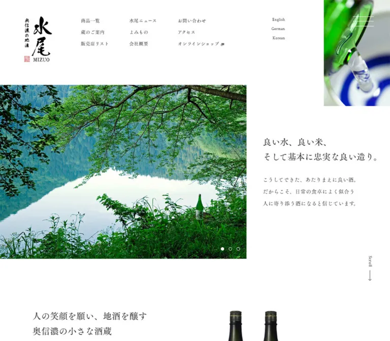
White space, old-style Mincho lettering, and a close view of sake being poured.
Original URL: https://www.mizuo.co.jp/ Final URL: https://www.mizuo.co.jp/ Theme: white canvas, charcoal typography, a dark footer, and color supplied primarily by imagery. Inspected: October 5, 2026, Japan time. The supplied retrieval timestamp is October 4, 2026, 20:24:17.622 UTC, equivalent to October 5 at 05:24:17.622 JST. Viewports: 1440 × 1000 desktop and 390 × 844 mobile, in CSS pixels. Scope: the current homepage: header, closed navigation controls, opening statement and campaign carousel, brewery introduction, news, reading previews, and footer. Visual captures cover the desktop opening, news area, and footer, plus the mobile opening and footer. Rendered DOM measurements cover additional sections at both widths. Linked pages, opened menus, language selection, and commerce flows were not inspected.
Mizuo is a brewery brand and corporate homepage with product, retailer, tourism, news, editorial, and shopping pathways. Its identity comes from restrained typography and deliberate empty space. Black calligraphy supplies the strongest graphic mark; Mincho text gives the everyday interface a quieter, literary quality. Photographs and promotional artwork carry almost all saturated color.
The desktop composition has several overlapping spatial systems. The campaign image occupies the left edge, the introductory copy extends farther right, and a narrow photograph of pouring sake remains visible at the upper right across the supplied scroll captures. Lower content occupies a narrower left-hand field. On mobile, the statement precedes the campaign image, while the footer expands to the full screen width. Preserve these relationships rather than reducing the page to one centered container.
閉じる
Mizuo / Tanakaya Sake Brewery — Style Reference
White space, old-style Mincho lettering, and a close view of sake being poured.
Original URL: https://www.mizuo.co.jp/ Final URL: https://www.mizuo.co.jp/ Theme: white canvas, charcoal typography, a dark footer, and color supplied primarily by imagery. Inspected: October 5, 2026, Japan time. The supplied retrieval timestamp is October 4, 2026, 20:24:17.622 UTC, equivalent to October 5 at 05:24:17.622 JST. Viewports: 1440 × 1000 desktop and 390 × 844 mobile, in CSS pixels. Scope: the current homepage: header, closed navigation controls, opening statement and campaign carousel, brewery introduction, news, reading previews, and footer. Visual captures cover the desktop opening, news area, and footer, plus the mobile opening and footer. Rendered DOM measurements cover additional sections at both widths. Linked pages, opened menus, language selection, and commerce flows were not inspected.
Mizuo is a brewery brand and corporate homepage with product, retailer, tourism, news, editorial, and shopping pathways. Its identity comes from restrained typography and deliberate empty space. Black calligraphy supplies the strongest graphic mark; Mincho text gives the everyday interface a quieter, literary quality. Photographs and promotional artwork carry almost all saturated color.
The desktop composition has several overlapping spatial systems. The campaign image occupies the left edge, the introductory copy extends farther right, and a narrow photograph of pouring sake remains visible at the upper right across the supplied scroll captures. Lower content occupies a narrower left-hand field. On mobile, the statement precedes the campaign image, while the footer expands to the full screen width. Preserve these relationships rather than reducing the page to one centered container.
How to Read This Reference
- Measured values come directly from the supplied rendered element rectangles or computed styles. Values are rounded where additional decimals do not help implementation.
- Calculated values are arithmetic derived from those measurements, such as spacing between news rows.
- Estimated values describe screenshot geometry or colors for which no matching computed style was supplied. They are not pixel samples.
- Recommendations describe a new implementation. They do not establish behavior of the original website.
- Custom property names in this document are implementation aliases, not recovered source tokens.
- The supplied computed font families establish declared stacks. They do not independently identify the font file used for every rendered glyph.
- DOM entries include offscreen carousel copies and navigation links that are not visible in the closed-menu screenshots. Their presence does not mean they are simultaneously visible.
Tokens — Colors
Default Palette
| Name | Value | Suggested token | Role and evidence |
|---|---|---|---|
| Page White | #ffffff |
--color-page |
Measured body background; also measured footer link and text color |
| Charcoal | #333333 |
--color-ink |
Measured primary text and footer background |
| Secondary Gray | #666666 |
--color-secondary |
Measured news archive label for すべて |
| Quiet Gray | #999999 |
--color-quiet |
Measured remaining news category links |
| Fine Rule | approximately #cccccc |
--color-rule |
Estimated outline of circular arrow links |
| Reading Field | approximately #e3e3e3 |
--color-reading |
Estimated pale gray beneath the white fleck texture near the footer |
| Category Label | approximately #e7e7e7 |
--color-label |
Estimated small rectangular news category backgrounds |
The page does not establish one saturated interface accent. Green glass, cobalt cup markings, icy blue snow, and red bottle labels belong to photographic or promotional assets. The red purchase treatment visible inside the desktop campaign should not become the default fill for navigation links throughout the site.
The exported --wp--preset--* variables include many colors, gradients, and shadows. Their availability is not evidence that those treatments appear in this homepage. The visible system is much narrower: white, charcoal, subdued gray, and image color.
No selectable color theme was evidenced.
Tokens — Typography
Japanese Body and Navigation
Measured source stack:
'FOT-筑紫Aオールド明朝 Pr6 R', 游明朝体, 'Yu Mincho', YuMincho,
'ヒラギノ明朝 Pro', 'Hiragino Mincho Pro', 'MS P明朝', 'MS PMincho', serif
The body, navigation, paragraph copy, and ordinary links declare this stack. Computed weight is 500, with 0.5px letter spacing in most sampled elements. The character is delicate but not faint: rounded details and expressive stroke contrast soften the large white areas.
Japanese Headings
Measured source stack:
'FOT-筑紫Aオールド明朝 Pr6 M', 游明朝体, 'Yu Mincho', YuMincho,
'ヒラギノ明朝 Pro', 'Hiragino Mincho Pro', 'MS P明朝', 'MS PMincho', serif
Sampled headings use the M family variant, still at computed weight 500. Preserve the separate family declaration rather than substituting a generic 700 weight everywhere.
Latin Utility Text
Desktop language links and the Scroll and Pagetop labels declare 'Crimson Text', serif, weight 500, with 0.5px tracking. This maintains the serif character even in small English utilities.
The logo and large lettering inside campaign graphics are artwork. Their appearance is not evidence of an additional HTML display-font family.
Type Scale
| Role | Desktop | Mobile | Evidence |
|---|---|---|---|
| Root font size | 10px |
10px |
Measured; a source sizing convention, not the size of ordinary reading copy |
| Base body declaration | 10px / 18.5px, weight 500 |
Same | Measured; components override it |
| Main statement | Approximately 30–32px, around 54px leading |
Approximately 22px, around 38–40px leading |
Screenshot estimates; its heading style was not included in the extraction |
| Opening paragraph | 16px / 36px |
14px / 31.5px |
Measured |
| Brewery paragraph | 16px / 32px |
14px / 25.9px |
Measured |
| Desktop header navigation | 14px / 25.9px |
Hidden in the captured opening | Measured desktop styles and visual mobile state |
| Desktop language links | 12px / 18px |
Replaced visually by Language and a caret |
Desktop measured; mobile control typography not extracted |
| News heading | 25.92px / 45.36px |
20px / 35px |
Measured |
| News categories | 12px / 22.2px |
12px / 22.2px |
Measured |
| News titles | 20px / 30px |
14px / 21px |
Measured |
| Reading heading | 25.92px / 25.92px, tracking 2.592px |
24px / 24px, tracking 2.4px |
Measured |
| Reading preview titles | 18px / 27px |
14px / 21px |
Measured |
| Circular-arrow text links | 14px / 25.9px |
Same | Measured |
| Footer navigation | 16px / 29.6px |
14px / 25.9px |
Measured |
| Footer company heading | 14px / 25.9px |
11px / 24.75px |
Measured |
| Footer operational notes | 10px / 26px |
10px / 20px |
Measured |
| Desktop vertical utilities | 14px / 21px |
Not visible in supplied mobile captures | Measured desktop |
Most text uses 0.5px tracking. The news heading has normal tracking; the reading heading deliberately increases it to 0.1em.
The reading heading's measured outer rectangle is much taller than its text line. Do not interpret the approximately 117px desktop rectangle as a font size or a single-line leading value.
Tokens — Spacing & Shapes
The layout combines fixed vertical spacing with viewport-related horizontal placement. There is no evidence of a universal eight-pixel spacing system.
Spacing Scale
| Use | Value | Status |
|---|---|---|
| Arrow-link vertical padding | 10px above and below |
Measured |
| Arrow-link reserved right area | 50px |
Measured |
| Header navigation row pitch | About 35.89px |
Calculated from link positions |
| Desktop carousel dot pitch | 24px |
Calculated from button positions |
| Mobile carousel dot pitch | 18px |
Calculated from button positions |
| Paragraph-to-action spacing in the brewery introduction | 30px |
Calculated |
| Desktop news row separation | 50px |
Calculated |
| Mobile news row separation | 30px |
Calculated |
| Mobile reading row separation | 50px |
Calculated |
| Desktop header-to-hero separation | 70px |
Calculated |
| Mobile opening paragraph-to-campaign separation | 58.5px |
Calculated |
| Major section top padding | Desktop 150px; mobile 100px |
Measured for introduction and news |
| Footer vertical padding | Desktop 150px; mobile 50px |
Measured |
Border Radius
| Element | Treatment | Evidence |
|---|---|---|
| Main image and content regions | Square corners | Screenshots and sampled zero-radius boxes |
| News and reading previews | Unboxed, without rounded card shells | Screenshots; measured link containers have zero radius |
| Category chips | Small rectangles | Desktop screenshot |
| Arrow enclosure | Circle, approximately 40px diameter |
Screenshot estimate |
| Carousel markers | Approximately 10px circles |
Visible shape; button width measured at 10px |
| Red campaign purchase artwork | Rounded leading end inside the graphic | Screenshot; not a general UI radius token |
Layout Measurements
Coordinates below are document coordinates unless explicitly described as screenshot estimates.
| Element | Desktop at 1440 × 1000 | Mobile at 390 × 844 |
|---|---|---|
| Document height | 3873.36px |
3866.66px |
| Header height | 215.22px |
101.95px |
| Logo wrapper | At (88.13, 50), 100.80 × 165.22px |
At (23.86, 20), 50 × 81.95px |
| Hero section | Starts at y=285.22; height 642.61px |
Starts at y=218.95; height 516.75px |
| Captured campaign frame | At (0, 285.22), 911 × 642.61px |
At (0, 478.95), 364 × 256.75px |
| Opening paragraph | At (970, 620.88), width 440.63px |
At (36.39, 325.95), width 353.61px |
| Introduction/news content width | 940.59px, left edge 117.50px |
317.22px, left edge 36.39px |
| Introduction section | Height 593.17px, including top padding |
Height 923.64px, including top padding |
| News heading | Begins at y=1671 |
Begins at y=1759.34 |
| News row | 654.28 × 187.73px |
317.22 × 99.52px |
| News title column | Left edge 716.77px, width 341.33px |
Left edge 202.81px, width 150.80px |
| Reading panel | Width 1145.66px, height 579.22px |
Width 390px, height 642.05px |
| Reading preview link | 234.48 × 226.34px |
317.22 × 99.52px |
| Footer | Starts at y=3063.42; 1145.66 × 809.94px |
Starts at y=3095.20; 390 × 771.45px |
| Pouring-sake image | Approximately (1195, 0), 245 × 392px |
Approximately (224, 82), 166 × 196px |
The pouring-image measurements are screenshot estimates. Its element styles were not supplied.
At the desktop sample, the campaign occupies about 63.26% of viewport width, the lower reading/footer field about 79.56%, and the ordinary introduction/news content about 65.32%. These are calculated ratios from one desktop width, not verified source formulas.
Components
Brand Header
Role: establishes identity and exposes the site's main destinations without a boxed navigation bar.
The desktop header places a tall brush-lettered logo at the left, three groups of Japanese links across the middle, and three small English-language links farther right. It has no visible bottom rule, shadow, or filled navigation capsule. Its measured padding is 50px 381.89px 0 88.13px at the inspected width.
The Japanese link groups start near x=293.75, 528.75, and 705px. The groups contain product and brewery destinations, news and editorial destinations, and contact/access/shop destinations. The online shop includes a small external-link mark and points to https://e-mizuo.com/.
The logo combines black calligraphy, small vertical text, a red seal, and the Latin wordmark. Use an authorized logo asset; do not rebuild it by applying a brush font to ordinary text.
On mobile, the logo becomes 50px wide. The multi-column navigation is absent from the visible header, and the upper-right utilities become Language with a downward caret and a compact three-line menu icon.
Pouring-Sake Image and Menu Control
Role: gives the otherwise quiet page a persistent sensory focal point.
On desktop, a narrow image box touches the top and right edges of the viewport. Green bottle glass, a clear stream, and the blue-and-white cup fill its crop. The same box remains in the same upper-right position in the supplied opening, news, and footer captures. This supports a persistent placement, but the precise fixed/sticky implementation is not established by the supplied styles.
Three thin white horizontal menu strokes appear over the image, approximately 64px wide. On mobile, the image moves below the top utilities, while the menu icon is approximately 30px wide and charcoal on white. The mobile footer capture still shows the menu icon at the upper right, but no pouring-image panel.
The DOM contains an alternative white-text navigation set: 16px / 29.6px on desktop and 18px / 33.3px on mobile. These links are not visibly open in the screenshots. Menu backdrop, opening transition, focus behavior, and dismissal were not tested.
Opening Statement
Role: states the brewery's values in a calm, readable block.
The source heading reads 良い水、良い米、 followed by そして基本に忠実な良い造り。. A three-line paragraph follows, describing sake that suits everyday meals and accompanies people's lives.
On desktop, this copy sits to the right of the large campaign image, approximately centered against its height. The paragraph uses generous 36px leading at a 16px size. There is no separate large filled CTA within this statement.
On mobile, the statement comes first. Its left edge is approximately 36.4px from the screen edge, and its heading overlaps the lower-left area of the pouring-image composition against white. Keep the line-level white backing visible in the capture; a white box spanning the entire photograph would erase this relationship.
The mobile paragraph retains three comfortably separated lines at 14px / 31.5px, followed by a substantial gap before the campaign.
Campaign Carousel
Role: surfaces current products, announcements, and tourism content.
The desktop capture shows a bottle in snow with red promotional lettering for 破龍. The mobile capture shows a green-bottle campaign for 然 against a landscape. Each image has square edges and is aligned with the viewport's left edge.
Five small circular pagination markers appear near the lower-right corner. The selected marker is filled white, while the others are white outlines. Measured button boxes are 10 × 18.5px; their horizontal pitch changes from 24px on desktop to 18px on mobile.
Repeated linked slides occur at negative and positive horizontal positions in the DOM. This supports a carousel structure with offscreen copies; it does not justify identifying a particular carousel library. Some links lead directly to the external shop, while others lead to news or tourism pages.
Not every slide has the same measured height: the desktop tourism link is approximately 911 × 607.13px, compared with 911 × 642.61px for sampled product links. A stable reserved frame is a useful implementation recommendation, but its exact handling must accommodate asset proportions.
The mobile campaign appears pale and visually layered. A single frame cannot establish whether this is permanent artwork treatment or a transition state. Do not assign a global low-opacity filter to every image based on it.
Brewery Introduction
Role: connects the product to its location, ingredients, and brewing practice.
The introduction follows immediately after the campaign section in document flow, with 150px desktop or 100px mobile top padding. The desktop section is a flex layout within a 940.59px-wide region. Its paragraph is indented farther than the section's left edge: x=176.25px, with a measured width of 529.11px.
The text explains the brewery's commitment to local water, local rice, and the climate of northern Nagano. Two actions follow: 蔵のご案内 and 商品を見る, each using the same outlined-circle arrow treatment.
The bottom portions of two bottles are visible above the news area in the desktop middle capture. The complete introduction image composition is not supplied. On mobile, the section becomes block layout and grows to 923.64px tall. The paragraph begins at y=1324.55px; the precise arrangement of the preceding heading and media cannot be reconstructed from the provided mobile screenshots alone.
Text Link with Circular Arrow
Role: provides a light, repeatable navigation action.
Use ordinary serif text with a thin outlined circle to its right. The circle contains a small right arrow and remains visually separate from the text. Examples include the brewery actions and 一覧を見る links.
The measured anchor is approximately 122.5 × 45.89px for the sampled labels. Its padding is 10px 50px 10px 0, with 14px / 25.9px text. The approximately 40px ring is a screenshot estimate; the corresponding pseudo-element styles were not supplied.
This component should feel like a continuation of a sentence, not a prominent filled purchase button.
News Section
Role: presents current brewery activity through a category index and three recent entries.
Desktop anatomy:
- A left column, approximately 286.31px wide, holds the heading, five category links, and the archive link.
- A right column, 654.28px wide, holds three horizontal article links.
- Each article pairs a landscape image area of approximately
282 × 188pxwith a date/category line and title. The image size is inferred from the screenshot and row geometry; no image-element rectangle was supplied. - The title column is measured at 341.33px wide. Titles use
20px / 30pxand may wrap onto two lines. - Rows are separated by 50px, without visible divider rules or card borders.
The visible entries include a hoodie announcement, a tasting event, and an illustrated event notice. Their artwork ranges from monochrome photography to colorful poster graphics. Preserve the quiet surrounding interface so these different assets can coexist.
The category controls are anchors to news archive URLs. Their presence does not establish client-side filtering. The darker すべて label is #666666; the other sampled labels are #999999.
On mobile, the section heading sits above a horizontal group of category links. The extracted bounds indicate that labels wrap within the narrow available widths. News items retain image-left/text-right anatomy rather than becoming full-width images above titles. Rows are 317.22px wide, title columns are 150.80px wide, and titles reduce to 14px / 21px. The archive link moves below the list.
Reading Previews
Role: offers longer-form sake and brewing content.
The よみもの region introduces a pale gray surface with irregular white flecks visible near its lower edge. The texture evokes falling snow, but its actual asset and implementation were not supplied.
Desktop measurements show three preview links across the panel. Each is 234.48px wide, with left positions at approximately 117.50, 455.56, and 793.63px. Their structure includes a series/category label, an episode number, and an 18px / 27px title. The preview imagery itself was not included in a clear supplied screenshot, so its subjects should remain unspecified.
On mobile, each preview becomes a horizontal flex row, 317.22px wide and 99.52px tall. The right text column shares the news section's measured 150.80px width. Rows have 50px separation. The archive link sits beneath the list at the left; on desktop it is positioned at the panel's lower right.
Footer
Role: repeats the site map and presents company, contact, operational, and legal information.
The desktop footer is a charcoal rectangle, 1145.66px wide, aligned to the left edge. The remaining right-hand area stays white. This is essential to the page's asymmetric composition: the footer does not fill the desktop viewport.
Inside it, three navigation columns sit near x=88.13, 317.50, and 493.75px. Links are white Mincho at 16px / 29.6px, with approximately 39.59px row pitch. Below, the company/contact block sits left and the smaller operational notes sit beside it. Facebook and Instagram symbols appear below the contact information. The copyright is placed substantially lower, leaving generous empty space.
The original-page footer names 株式会社田中屋酒造店 and supplies an address in Iiyama, Nagano. This is the independently observed operator identification.
On mobile, the footer spans all 390px. Its horizontal inset is 36.40px and its vertical padding is 50px. Navigation becomes two columns of five links, with 14px / 25.9px text. Company information, social links, operational notes, and copyright then stack vertically. The footer keeps its generous rhythm even though the notes remain small.
Scroll and Page-Top Links
Role: provides a quiet orientation cue in the desktop right margin.
Scroll is vertically oriented near the lower-right of the opening viewport and links to #about. Pagetop appears near the lower-right of the footer region and links to #. Both use Crimson Text at 14px / 21px, with a thin directional arrow.
Their destinations are verified from link evidence. Smooth scrolling, acceleration, visibility thresholds, and keyboard behavior were not exercised. Neither utility is visible in the supplied mobile captures.
Tokens — Motion & Interaction
| Treatment | Evidence | What can be carried forward |
|---|---|---|
| Desktop navigation and language links | Measured opacity 0.8s cubic-bezier(0.19, 1, 0.22, 1) transition |
Preserve a restrained opacity transition; the hover endpoint was not sampled |
| Desktop footer links | Same measured opacity transition | Maintain consistency with header navigation |
| Desktop news categories | Measured color 0.8s cubic-bezier(0.19, 1, 0.22, 1) |
A color transition is declared; exact hover colors remain unverified |
| Campaign presentation | Five dots, different campaign states, repeated offscreen links | Carousel anatomy is established; autoplay interval, transition style, swipe, and pause behavior are not |
| Pouring-sake media | Persistent desktop frame with different visible content across captures | Preserve framing; a video, image sequence, or exact playback behavior cannot be confirmed |
| Menu icon | Visible in desktop and mobile captures; alternate link set exists in DOM | Closed-state appearance is established; opening behavior is not |
| Language control | Three desktop language links; mobile Language control |
Preserve available destinations; dropdown mechanics are unverified |
| Scroll/page-top links | Anchor destinations supplied | Navigation targets are known; scrolling animation is not |
Many sampled elements report animation: none and a transition description of all without a useful duration. These snapshots do not establish that the page has no JavaScript motion, media playback, or pseudo-element animation.
A suitable new implementation can begin with static imagery and ordinary links. Add carousel or menu behavior deliberately, and label any chosen timings as implementation decisions rather than recovered source values.
Surfaces
| Surface | Appearance | Structural role |
|---|---|---|
| Main canvas | Solid white | Connects header, introduction, and news through open space |
| Hero copy backing | White, including line-level backing where it overlaps the mobile image composition | Keeps the statement readable without a large panel |
| Campaign image | Full-color rectangular artwork | Supplies seasonal and promotional emphasis |
| News entry | Transparent container on white | Groups image and metadata without a card shell |
| Category chip | Small pale gray rectangle | Adds low-key metadata hierarchy |
| Reading region | Pale gray with irregular white flecks | Separates editorial content from the surrounding white field |
| Footer | Solid #333333, white text |
Creates a strong closing block |
| Arrow control | Transparent fill, fine gray circular outline | Indicates navigation without visual heaviness |
There is no visible general-purpose elevation system. Avoid adding shadows simply to distinguish content groups; this design uses spacing, typography, media boundaries, and the footer's color change.
Imagery
Use natural product and place imagery with enough detail to feel specific to the brewery. The current captures include snow around a bottle, a green landscape behind another product, and a close crop of sake entering a blue-and-white cup. These images establish atmosphere through recognizable material: glass, liquid, ceramic, snow, and foliage.
The campaign graphics have their own typography and purchase messaging. Preserve that authored composition when using the authorized artwork. Do not apply an additional heading over lettering already embedded in an image.
News artwork is intentionally varied. The hoodie photograph, tasting-event graphic, and colorful event illustration should remain distinct. For flyers containing text, preserve the full composition where possible rather than using aggressive object-fit: cover cropping.
Observed Asset References
Exact image URLs were not included in the evidence. The entries below identify visible roles, not downloadable paths.
| Asset role | Observed content | Evidence limitation |
|---|---|---|
| Brand mark | Black vertical calligraphy, red seal, small Latin wordmark | Asset URL and format unavailable |
| Pouring-sake image | Green glass, clear pour, blue-and-white cup | Media type and playback settings unavailable |
| Desktop campaign | Bottle in snow, red label, 破龍 promotion |
Image URL unavailable |
| Mobile campaign | Green bottle, landscape, 然 promotion |
Image URL and transition state unavailable |
| Brewery imagery | Lower portions of two bottles above the news section | Full framing not supplied |
| News images | Hoodie announcement, tasting graphic, illustrated event notice | URLs unavailable; current artwork visible in desktop capture |
| Reading texture | White flecks over a light gray field | Asset versus CSS implementation unknown |
| Reading preview media | Preview areas are implied by layout | Subjects not visually established |
| Social symbols | Facebook and Instagram marks | Icon asset family not identified |
Use authorized assets or clearly designated replacements. The CSS shell cannot reproduce the identity contained in the calligraphy, bottle labels, and original campaign art.
Layout & Responsive Behavior
Desktop Composition
The header spans the page, but its visible navigation stops before the pouring-sake image. The hero then breaks into a 911px image on the left and a copy region beginning at x=970px. This gives the image a 59px separation from the copy at the measured viewport.
The introduction and news use a narrower content region beginning at x=117.50px. The reading panel and footer widen to 1145.66px and return to the viewport's left edge. The pouring-image frame begins around x=1195px, leaving an approximately 49px white strip beside the lower panels.
Do not apply the lower panel's width to the entire main element: doing so would incorrectly compress the hero copy.
Mobile Composition
At 390px, the visible sequence is logo/utilities, opening statement, supporting paragraph, then campaign image. The statement begins around y=219px, and the campaign begins at y=478.95px. The campaign is 364px wide, leaving a 26px white strip at the right.
Ordinary content sections use approximately 36.4px side insets, giving a 317.22px text/list region. The hero paragraph is an exception: its measured box extends from the left inset to the right screen edge. The logo has a separate, smaller left inset of 23.86px.
News and reading entries remain horizontal image/text rows. Footer navigation becomes two columns, while company information and small notes stack. The desktop right-hand white rail no longer reduces the footer width.
What Is Not Established
Only two viewport widths were measured. The original breakpoint, intermediate tablet behavior, maximum container widths, and landscape-phone layout are unknown. Percentages derived from 1440px should therefore be treated as reconstruction aids, not source CSS.
The CSS below uses a recommended 64rem layout breakpoint and reproduces the main relationships at the supplied sizes. Test intermediate widths and longer content before using it in production.
Do’s and Don’ts
Do
- Keep the primary interface white and charcoal, with color concentrated in imagery.
- Preserve the separate Japanese body and heading font declarations when licensed fonts are available.
- Maintain the tall calligraphic logo and its generous surrounding space.
- Use different horizontal alignments for the hero, ordinary content, and lower panels.
- Keep the desktop pouring-sake frame visually separate from the larger campaign image.
- Place the brand statement before the campaign on mobile.
- Preserve compact image-left/text-right news rows at phone width.
- Use ordinary archive links for the observed news categories.
- Retain circular outlined arrows for secondary navigation.
- Keep campaign lettering and purchase artwork within their original visual context.
- Make the mobile footer full width while retaining its two-column navigation.
- Distinguish confirmed transitions from untested media and menu behavior.
Don’t
- Don't convert the homepage into a single-purpose sales funnel.
- Don't turn every content entry into a rounded, elevated card.
- Don't make the desktop footer span the full viewport.
- Don't replace the quiet Mincho hierarchy with oversized bold sans-serif headings.
- Don't treat the red campaign artwork or green bottle glass as a universal CTA color.
- Don't infer visible gradients or shadows from unused CMS preset variables.
- Don't show hidden navigation links simply because they have DOM rectangles.
- Don't count repeated carousel copies as separate editorial items.
- Don't assume a particular autoplay interval, video asset, or menu animation.
- Don't crop event flyers so tightly that dates or embedded labels disappear.
- Don't copy the source's 10px root convention without accounting for its explicit component sizes.
Recommended Implementation Additions
These are recommendations for a new build, not verified features of the original:
- Give the logo link, menu button, language control, social links, and carousel markers meaningful accessible names. Empty extracted link text does not reveal whether the original has accessible image labels.
- Preserve the small visible dots but provide larger non-overlapping pointer targets and clear selected states. If autoplay is implemented, provide pause behavior.
- Keep essential promotional information available as text or accessible image alternatives, especially where purchase messages are embedded in graphics.
- Implement menu focus handling, Escape dismissal, and an accurate
aria-expandedstate. Test language navigation with a keyboard. - Offer reduced-motion behavior for any chosen carousel transitions or moving media.
- Improve muted small-text contrast where needed. In particular,
#999999on white should not be assumed suitable for all small functional labels. - Consider increasing footer-note size and short category-label space on small screens while preserving the measured hierarchy.
- Reserve media dimensions to prevent layout shifts and load the opening campaign with appropriate priority. Defer lower-page imagery as appropriate.
- Load the declared commercial fonts only through an authorized integration. Without them, test the provided Mincho fallbacks for wrapping differences.
Agent Prompt Guide
Quick Color Reference
- Canvas and reversed footer text:
#ffffff. - Main text and footer surface:
#333333. - Secondary category label:
#666666. - Quiet categories:
#999999, with contrast improvements recommended for a new build. - Arrow outlines: approximately
#cccccc. - Reading background: approximately
#e3e3e3with white flecks. - Saturated colors belong primarily to photographs, labels, and promotional artwork.
Overall Prompt
“Create a Japanese sake brewery homepage inspired by the current Mizuo composition. Use a white canvas, charcoal Mincho typography, a tall calligraphic brand asset, and generous vertical space. On desktop, place grouped navigation above a large left-aligned campaign image, with the brewery statement to its right. Keep a narrow pouring-sake image at the upper right. Use a narrower left-hand content region for the brewery introduction and horizontal news rows, followed by three reading previews on a pale textured field and a charcoal footer that occupies about four fifths of the desktop width. On mobile, put the statement before the campaign, retain horizontal news rows, and make the footer full width with two navigation columns. Use square image edges and small outlined-circle arrows. Treat menu behavior and carousel timing as separately specified implementation decisions.”
Example Component Prompts
- Header: “Build a white desktop header with a tall black calligraphic logo, three small Mincho navigation groups, and stacked serif language links. Leave room for an independent portrait image at the upper right. On mobile, use a 50px-wide logo, Language control, and three thin menu strokes.”
- Hero: “Arrange a square-edged campaign image approximately 911 × 643px at the left of a 1440px page. Put a modest two-line Mincho statement and a three-line paragraph on the right. On a 390px phone, show the statement first and a 364px-wide campaign below it. Preserve substantial white space.”
- News row: “Create an unboxed linked news row with a landscape flyer on the left and a small date/category line above a Mincho title on the right. Use 20px/30px titles on desktop and 14px/21px on mobile. Keep image and text side by side at both sizes.”
- Arrow link: “Use a 14px serif label followed by a thin 40px circular outline containing a small right arrow. Keep the background transparent and reserve 50px to the label's right.”
- Reading region: “Place three restrained editorial previews across a light gray field with an authorized white-fleck texture. Include series label, episode number, and title. Convert to horizontal preview rows on mobile; keep the archive link below.”
- Footer: “Build a left-aligned charcoal footer with white Mincho text and no shadow. Use three navigation groups above side-by-side company and operational information on desktop. On mobile, use two columns of five links, then stacked company details, social marks, notes, and copyright with generous spacing.”
Quick Start
CSS Custom Properties
This is an implementation scaffold, not the original stylesheet. It keeps a conventional root font size and uses explicit sizes for the observed text roles. The desktop percentages approximate the measured 1440px layout; the 64rem breakpoint is recommended rather than recovered. Estimated surface colors and heading sizes are identified in the comments.
Apply the classes to semantic header, navigation, section, link, and footer elements. The news section expects direct children named .news-heading, .news-filters, .news-list, and .news-more, allowing its archive link to move below the list on mobile. Footer navigation uses three .footer-nav-group containers in the observed link order.
The media rules assume authorized images are supplied. --reading-texture defaults to no image because the original texture URL is unknown. CSS alone does not load fonts, operate a carousel, or implement a menu.
:root {
  /* Measured interface colors */
  --color-page: #ffffff;
  --color-ink: #333333;
  --color-secondary: #666666;
  --color-quiet: #999999;

  /* Screenshot estimates */
  --color-rule: #cccccc;
  --color-reading: #e3e3e3;
  --color-label: #e7e7e7;
  --reading-texture: none;

  /* Observed declarations; font files require separate setup */
  --font-jp-body: 'FOT-筑紫Aオールド明朝 Pr6 R', 游明朝体,
    'Yu Mincho', YuMincho, 'ヒラギノ明朝 Pro',
    'Hiragino Mincho Pro', 'MS P明朝', 'MS PMincho', serif;
  --font-jp-heading: 'FOT-筑紫Aオールド明朝 Pr6 M', 游明朝体,
    'Yu Mincho', YuMincho, 'ヒラギノ明朝 Pro',
    'Hiragino Mincho Pro', 'MS P明朝', 'MS PMincho', serif;
  --font-latin: 'Crimson Text', serif;
  --weight-text: 500;
  --tracking-text: 0.5px;

  --text-body: 16px;
  --text-section: 25.92px;
  --text-news: 20px;
  --text-reading: 18px;

  /* Ratios calculated from the desktop sample */
  --content-left: 8.16vw;
  --content-width: 65.319vw;
  --panel-width: 79.559vw;
  --section-space: 150px;
  --arrow-size: 40px;

  /* Measured desktop link transition */
  --link-duration: 800ms;
  --link-ease: cubic-bezier(0.19, 1, 0.22, 1);
}

* { box-sizing: border-box; }

body {
  margin: 0;
  color: var(--color-ink);
  background: var(--color-page);
  font-family: var(--font-jp-body);
  font-size: var(--text-body);
  font-weight: var(--weight-text);
  line-height: 1.85;
  letter-spacing: var(--tracking-text);
}

img { display: block; max-width: 100%; }
a { color: inherit; text-decoration: none; }
button { font: inherit; }
h1, h2, h3 { font-family: var(--font-jp-heading); font-weight: 500; }

.site-header {
  display: grid;
  grid-template-columns: 7vw minmax(0, 1fr) auto;
  column-gap: 7.28vw;
  align-items: start;
  padding: 50px 26.52vw 0 6.12vw;
}

.brand img { width: 100%; height: auto; }

.desktop-nav {
  display: grid;
  grid-template-columns: 16.32vw 12.24vw minmax(0, 1fr);
}

.nav-group, .language-links {
  display: grid;
  gap: 10px;
  align-content: start;
}

.desktop-nav a { font-size: 14px; line-height: 25.9px; }
.language-links { text-align: right; }
.language-links a { font: 500 12px/18px var(--font-latin); }
.mobile-language { display: none; }

.soft-link {
  transition: opacity var(--link-duration) var(--link-ease);
}

/* Recommended fixed placement matching the desktop captures */
.pour-media {
  position: fixed;
  z-index: 2;
  top: 0;
  right: 0;
  width: 17vw;
  aspect-ratio: 5 / 8;
  overflow: hidden;
}

.pour-media img, .pour-media video {
  width: 100%;
  height: 100%;
  object-fit: cover;
}

.menu-toggle {
  position: fixed;
  z-index: 10;
  top: 43px;
  right: 4.1vw;
  display: grid;
  place-items: center;
  width: 64px;
  min-height: 44px;
  padding: 0;
  border: 0;
  color: white;
  background: transparent;
  cursor: pointer;
}

.menu-icon { display: grid; width: 64px; gap: 13px; }
.menu-icon span { display: block; height: 1px; background: currentColor; }

.hero {
  display: grid;
  grid-template-columns: 63.264vw minmax(0, 1fr);
  column-gap: 4.097vw;
  align-items: center;
  margin-top: 70px;
  padding-right: 2.04vw;
}

.hero-copy { position: relative; z-index: 3; grid-area: 1 / 2; }
.hero-copy h2 {
  margin: 0;
  font-size: 32px; /* Screenshot-based approximation */
  line-height: 1.75;
}

.hero-copy h2 span {
  display: table;
  background: var(--color-page);
}

.hero-copy p { margin: 30px 0 0; font-size: 16px; line-height: 36px; }

.campaign {
  position: relative;
  grid-area: 1 / 1;
  width: 100%;
  aspect-ratio: 911 / 642.61;
  overflow: hidden;
}

/* Stable frame is recommended; preserve full campaign artwork */
.campaign-slide { display: block; width: 100%; height: 100%; }
.campaign-slide img { width: 100%; height: 100%; object-fit: contain; }
.campaign-slide[hidden] { display: none; }

.campaign-dots {
  position: absolute;
  right: 20px;
  bottom: 20px;
  display: flex;
  gap: 14px;
}

.campaign-dot {
  display: grid;
  place-items: center;
  width: 10px;
  height: 18.5px;
  padding: 0;
  border: 0;
  color: white;
  background: transparent;
  cursor: pointer;
}

.campaign-dot::before {
  content: '';
  width: 10px;
  height: 10px;
  border: 1px solid currentColor;
  border-radius: 50%;
}

.campaign-dot[aria-current='true']::before { background: currentColor; }

.content-section {
  width: var(--content-width);
  margin-left: var(--content-left);
  padding-top: var(--section-space);
}

.story-copy { font-size: var(--text-body); line-height: 2; }

.text-link {
  position: relative;
  display: inline-block;
  padding: 10px 50px 10px 0;
  font-size: 14px;
  line-height: 25.9px;
}

.text-link::after {
  content: '→';
  position: absolute;
  top: 50%;
  right: 0;
  display: grid;
  place-items: center;
  width: var(--arrow-size);
  height: var(--arrow-size);
  border: 1px solid var(--color-rule);
  border-radius: 50%;
  transform: translateY(-50%);
}

.news-section {
  display: grid;
  grid-template-columns: 30.439% minmax(0, 1fr);
  grid-template-rows: auto auto auto 1fr;
  grid-template-areas:
    'heading list'
    'filters list'
    'more list'
    '. list';
}

.news-heading {
  grid-area: heading;
  margin: 0;
  font-size: var(--text-section);
  line-height: 1.75;
  letter-spacing: normal;
}

.news-filters {
  grid-area: filters;
  display: grid;
  gap: 10px;
  margin: 30px 0 30px 4.08vw;
  font-size: 12px;
  line-height: 22.2px;
}

.news-filters a {
  color: var(--color-quiet);
  transition: color var(--link-duration) var(--link-ease);
}
.news-filters a[aria-current='page'] { color: var(--color-secondary); }
.news-more { grid-area: more; justify-self: start; margin-left: 4.08vw; }
.news-list { grid-area: list; display: grid; gap: 50px; }

.news-card {
  display: grid;
  grid-template-columns: 43% minmax(0, 1fr);
  column-gap: 4.83%;
  align-items: start;
}

.news-card img, .reading-card img {
  width: 100%;
  aspect-ratio: 3 / 2; /* Recommended approximation for preview media */
  object-fit: contain;
}

.news-meta {
  display: flex;
  flex-wrap: wrap;
  align-items: center;
  gap: 10px;
  font-size: 14px; /* Metadata size approximated from the screenshot */
  line-height: 25.9px;
}

.news-label {
  padding: 0 5px;
  background: var(--color-label);
  font-size: 10px;
  line-height: 20px;
}

.news-title { margin: 10px 0 0; font-size: var(--text-news); line-height: 1.5; }

.reading-section {
  width: var(--panel-width);
  margin-top: var(--section-space);
  padding: 0 var(--content-left) 90px;
  background-color: var(--color-reading);
  background-image: var(--reading-texture);
}

.reading-heading {
  position: relative;
  top: -1em;
  margin: 0 0 46px;
  font-size: 25.92px;
  line-height: 1;
  letter-spacing: 0.1em;
}

.reading-grid {
  display: grid;
  grid-template-columns: repeat(3, minmax(0, 1fr));
  column-gap: 7.194vw;
}

.reading-card { display: block; }
.reading-title { margin: 0; font-size: var(--text-reading); line-height: 1.5; }
.reading-more { display: flex; justify-content: flex-end; margin-top: 80px; }

.site-footer {
  width: var(--panel-width);
  padding: 150px 6.12vw;
  color: white;
  background: var(--color-ink);
}

.footer-nav {
  display: grid;
  grid-template-columns: 15.928vw 12.24vw minmax(0, 1fr);
}

.footer-nav-group { display: grid; gap: 10px; align-content: start; }
.footer-nav a { font-size: 16px; line-height: 29.6px; }

.footer-details {
  display: grid;
  grid-template-columns: 22.439vw minmax(0, 29.70vw);
  gap: 2.04vw;
  margin-top: 110px;
}

.company { font-size: 14px; line-height: 25.9px; }
.company h2, .company p { margin: 0; font-size: inherit; line-height: inherit; }
.footer-socials { display: flex; gap: 20px; margin-top: 30px; }
.footer-notes { margin: 0; font-size: 10px; line-height: 26px; }
.footer-copyright { margin: 100px 0 0; font-size: 11px; line-height: 18.5px; }

/* Recommended interaction endpoints and focus visibility */
@media (hover: hover) {
  .soft-link:hover { opacity: 0.65; }
  .news-filters a:hover { color: var(--color-ink); }
}

:where(a, button):focus-visible {
  outline: 2px solid currentColor;
  outline-offset: 4px;
}

/* Recommended breakpoint; original media query was not supplied */
@media (max-width: 64rem) {
  :root {
    --text-body: 14px;
    --text-section: 20px;
    --text-news: 14px;
    --text-reading: 14px;
    --content-left: 9.333vw;
    --content-width: 81.334vw;
    --panel-width: 100%;
    --section-space: 100px;
  }

  .site-header {
    display: block;
    padding: 20px 6.12vw 0;
  }
  .brand { display: block; width: 50px; }
  .desktop-nav, .language-links { display: none; }
  .mobile-language {
    position: absolute;
    top: 29px;
    right: 76px;
    display: block;
    font-family: var(--font-latin);
    font-size: 14px;
  }

  .pour-media {
    position: absolute;
    top: 82px;
    width: 42.56vw;
    height: 50.26vw;
    aspect-ratio: auto;
  }
  .menu-toggle { top: 20px; right: 9px; width: 44px; color: var(--color-ink); }
  .menu-icon { width: 30px; gap: 6px; }

  .hero {
    display: flex;
    flex-direction: column;
    align-items: stretch;
    gap: 58.5px;
    margin-top: 117px;
    padding: 0;
  }
  .hero-copy { margin-left: var(--content-left); }
  .hero-copy h2 { font-size: 22px; line-height: 1.75; }
  .hero-copy p { font-size: 14px; line-height: 31.5px; }
  .campaign { width: 93.333vw; }
  .campaign-dots { gap: 8px; }
  .story-copy { line-height: 1.85; }

  .news-section {
    grid-template-columns: minmax(0, 1fr);
    grid-template-rows: repeat(4, auto);
    grid-template-areas: 'heading' 'filters' 'list' 'more';
  }
  .news-filters {
    display: flex;
    justify-content: space-between;
    gap: 20px;
    margin: 30px 0 50px;
  }
  .news-filters a { min-width: 0; }
  .news-list { gap: 30px; }
  .news-card, .reading-card {
    display: grid;
    grid-template-columns: 47.06% minmax(0, 1fr);
    column-gap: 5.40%;
  }
  .news-meta { gap: 6px; font-size: 11px; line-height: 20px; }
  .news-more { margin: 30px 0 0; }

  .reading-section { padding-bottom: 40px; }
  .reading-heading { font-size: 24px; }
  .reading-grid { grid-template-columns: minmax(0, 1fr); gap: 50px; }
  .reading-more { justify-content: flex-start; margin-top: 50px; }

  .site-footer { padding: 50px var(--content-left); }
  .footer-nav {
    grid-template-columns: repeat(2, minmax(0, 1fr));
    grid-template-rows: repeat(5, auto);
    grid-auto-flow: column;
    gap: 15px 17px;
  }
  .footer-nav-group { display: contents; }
  .footer-nav a { font-size: 14px; line-height: 25.9px; }
  .footer-details { display: block; margin-top: 55px; }
  .company { font-size: 11px; line-height: 24.75px; }
  .footer-notes { margin-top: 70px; line-height: 20px; }
  .footer-copyright { margin-top: 50px; }
}

@media (prefers-reduced-motion: reduce) {
  .soft-link, .news-filters a { transition: none; }
  html { scroll-behavior: auto; }
  /* Separately disable autoplay in any carousel or media controller. */
}
The compact pagination rules above reproduce the observed visual spacing. Enlarge their interactive areas thoughtfully in a production implementation; do not simply overlay overlapping 44px targets on an 18px pitch.
Tailwind v4 Token Mapping
Optional aliases for a project already using Tailwind v4. This is not evidence that the original website uses Tailwind. Define the properties above first.
@theme inline {
  --color-mizuo-page: var(--color-page);
  --color-mizuo-ink: var(--color-ink);
  --color-mizuo-secondary: var(--color-secondary);
  --color-mizuo-quiet: var(--color-quiet);
  --color-mizuo-rule: var(--color-rule);
  --color-mizuo-reading: var(--color-reading);

  --font-mizuo-body: var(--font-jp-body);
  --font-mizuo-heading: var(--font-jp-heading);
  --font-mizuo-latin: var(--font-latin);

  --text-mizuo-body: var(--text-body);
  --text-mizuo-section: var(--text-section);
  --text-mizuo-news: var(--text-news);
  --text-mizuo-reading: var(--text-reading);

  --spacing-mizuo-section: var(--section-space);
  --spacing-mizuo-arrow: var(--arrow-size);
}
Sources & Evidence
- Original and final website: Mizuo homepage. The supplied observation reports HTTP 200 and identical original/final URLs. The page title is
【水尾】奥信濃の地酒 飯山 醸造元 田中屋酒造店. - Capture time: supplied retrieval timestamp
2026-10-04T20:24:17.622Z, equivalent to October 5, 2026, 05:24 JST. This is the evidence retrieval timestamp, not a claim that every frame was captured at the same instant. - Desktop evidence: 1440 × 1000 CSS-pixel viewport; opening, news-area, and footer captures; rendered text, links, element rectangles, and computed styles. Document height measured at approximately 3873.36px.
- Mobile evidence: 390 × 844 CSS-pixel viewport; opening and footer captures; rendered text, links, element rectangles, and computed styles throughout the homepage. Document height measured at approximately 3866.66px.
- Link evidence: homepage navigation exposes product, guide, retailer, tourism, news, reading, company, contact, language, and external-shop destinations. These destinations were recorded as links; their pages were not independently inspected for this reference.
- Readiness limits: the supplied procedure waited for document load, visible image decoding, finite motion, and sampled layout/text stability within bounded waits. Perpetual animations were paused during readiness checks and then resumed. Intermediate scroll positions were traversed. These checks do not establish complete delayed content or all interaction states.
- Inspection limitations: no additional browsing or commands were used. No opened menu, language dropdown, hover endpoint, carousel click, touch swipe, keyboard sequence, or commerce flow was supplied. SharedWorkers and service workers were disabled during the recorded inspection. Original stylesheet rules, image URLs, media playback settings, and source breakpoints were not available beyond the supplied computed observations.
This reference describes the current homepage supported by those captures and measurements. The quick-start CSS, accessibility additions, breakpoint choice, and unsampled interaction endpoints are implementation recommendations.
# Mizuo / Tanakaya Sake Brewery — Style Reference

> White space, old-style Mincho lettering, and a close view of sake being poured.

**Original URL:** [https://www.mizuo.co.jp/](https://www.mizuo.co.jp/)
**Final URL:** [https://www.mizuo.co.jp/](https://www.mizuo.co.jp/)
**Theme:** white canvas, charcoal typography, a dark footer, and color supplied primarily by imagery.
**Inspected:** October 5, 2026, Japan time. The supplied retrieval timestamp is October 4, 2026, 20:24:17.622 UTC, equivalent to October 5 at 05:24:17.622 JST.
**Viewports:** 1440 × 1000 desktop and 390 × 844 mobile, in CSS pixels.
**Scope:** the current homepage: header, closed navigation controls, opening statement and campaign carousel, brewery introduction, news, reading previews, and footer. Visual captures cover the desktop opening, news area, and footer, plus the mobile opening and footer. Rendered DOM measurements cover additional sections at both widths. Linked pages, opened menus, language selection, and commerce flows were not inspected.

Mizuo is a brewery brand and corporate homepage with product, retailer, tourism, news, editorial, and shopping pathways. Its identity comes from restrained typography and deliberate empty space. Black calligraphy supplies the strongest graphic mark; Mincho text gives the everyday interface a quieter, literary quality. Photographs and promotional artwork carry almost all saturated color.

The desktop composition has several overlapping spatial systems. The campaign image occupies the left edge, the introductory copy extends farther right, and a narrow photograph of pouring sake remains visible at the upper right across the supplied scroll captures. Lower content occupies a narrower left-hand field. On mobile, the statement precedes the campaign image, while the footer expands to the full screen width. Preserve these relationships rather than reducing the page to one centered container.
閉じる
# Mizuo / Tanakaya Sake Brewery — Style Reference

> White space, old-style Mincho lettering, and a close view of sake being poured.

**Original URL:** [https://www.mizuo.co.jp/](https://www.mizuo.co.jp/)
**Final URL:** [https://www.mizuo.co.jp/](https://www.mizuo.co.jp/)
**Theme:** white canvas, charcoal typography, a dark footer, and color supplied primarily by imagery.
**Inspected:** October 5, 2026, Japan time. The supplied retrieval timestamp is October 4, 2026, 20:24:17.622 UTC, equivalent to October 5 at 05:24:17.622 JST.
**Viewports:** 1440 × 1000 desktop and 390 × 844 mobile, in CSS pixels.
**Scope:** the current homepage: header, closed navigation controls, opening statement and campaign carousel, brewery introduction, news, reading previews, and footer. Visual captures cover the desktop opening, news area, and footer, plus the mobile opening and footer. Rendered DOM measurements cover additional sections at both widths. Linked pages, opened menus, language selection, and commerce flows were not inspected.

Mizuo is a brewery brand and corporate homepage with product, retailer, tourism, news, editorial, and shopping pathways. Its identity comes from restrained typography and deliberate empty space. Black calligraphy supplies the strongest graphic mark; Mincho text gives the everyday interface a quieter, literary quality. Photographs and promotional artwork carry almost all saturated color.

The desktop composition has several overlapping spatial systems. The campaign image occupies the left edge, the introductory copy extends farther right, and a narrow photograph of pouring sake remains visible at the upper right across the supplied scroll captures. Lower content occupies a narrower left-hand field. On mobile, the statement precedes the campaign image, while the footer expands to the full screen width. Preserve these relationships rather than reducing the page to one centered container.

## How to Read This Reference

- **Measured** values come directly from the supplied rendered element rectangles or computed styles. Values are rounded where additional decimals do not help implementation.
- **Calculated** values are arithmetic derived from those measurements, such as spacing between news rows.
- **Estimated** values describe screenshot geometry or colors for which no matching computed style was supplied. They are not pixel samples.
- **Recommendations** describe a new implementation. They do not establish behavior of the original website.
- Custom property names in this document are implementation aliases, not recovered source tokens.
- The supplied computed font families establish declared stacks. They do not independently identify the font file used for every rendered glyph.
- DOM entries include offscreen carousel copies and navigation links that are not visible in the closed-menu screenshots. Their presence does not mean they are simultaneously visible.

## Tokens — Colors

### Default Palette

| Name | Value | Suggested token | Role and evidence |
| --- | --- | --- | --- |
| Page White | `#ffffff` | `--color-page` | Measured body background; also measured footer link and text color |
| Charcoal | `#333333` | `--color-ink` | Measured primary text and footer background |
| Secondary Gray | `#666666` | `--color-secondary` | Measured news archive label for `すべて` |
| Quiet Gray | `#999999` | `--color-quiet` | Measured remaining news category links |
| Fine Rule | approximately `#cccccc` | `--color-rule` | Estimated outline of circular arrow links |
| Reading Field | approximately `#e3e3e3` | `--color-reading` | Estimated pale gray beneath the white fleck texture near the footer |
| Category Label | approximately `#e7e7e7` | `--color-label` | Estimated small rectangular news category backgrounds |

The page does not establish one saturated interface accent. Green glass, cobalt cup markings, icy blue snow, and red bottle labels belong to photographic or promotional assets. The red purchase treatment visible inside the desktop campaign should not become the default fill for navigation links throughout the site.

The exported `--wp--preset--*` variables include many colors, gradients, and shadows. Their availability is not evidence that those treatments appear in this homepage. The visible system is much narrower: white, charcoal, subdued gray, and image color.

No selectable color theme was evidenced.

## Tokens — Typography

### Japanese Body and Navigation

**Measured source stack:**

```css
'FOT-筑紫Aオールド明朝 Pr6 R', 游明朝体, 'Yu Mincho', YuMincho,
'ヒラギノ明朝 Pro', 'Hiragino Mincho Pro', 'MS P明朝', 'MS PMincho', serif
```

The body, navigation, paragraph copy, and ordinary links declare this stack. Computed weight is `500`, with `0.5px` letter spacing in most sampled elements. The character is delicate but not faint: rounded details and expressive stroke contrast soften the large white areas.

### Japanese Headings

**Measured source stack:**

```css
'FOT-筑紫Aオールド明朝 Pr6 M', 游明朝体, 'Yu Mincho', YuMincho,
'ヒラギノ明朝 Pro', 'Hiragino Mincho Pro', 'MS P明朝', 'MS PMincho', serif
```

Sampled headings use the `M` family variant, still at computed weight `500`. Preserve the separate family declaration rather than substituting a generic `700` weight everywhere.

### Latin Utility Text

Desktop language links and the `Scroll` and `Pagetop` labels declare `'Crimson Text', serif`, weight `500`, with `0.5px` tracking. This maintains the serif character even in small English utilities.

The logo and large lettering inside campaign graphics are artwork. Their appearance is not evidence of an additional HTML display-font family.

### Type Scale

| Role | Desktop | Mobile | Evidence |
| --- | --- | --- | --- |
| Root font size | `10px` | `10px` | Measured; a source sizing convention, not the size of ordinary reading copy |
| Base body declaration | `10px / 18.5px`, weight `500` | Same | Measured; components override it |
| Main statement | Approximately `30–32px`, around `54px` leading | Approximately `22px`, around `38–40px` leading | Screenshot estimates; its heading style was not included in the extraction |
| Opening paragraph | `16px / 36px` | `14px / 31.5px` | Measured |
| Brewery paragraph | `16px / 32px` | `14px / 25.9px` | Measured |
| Desktop header navigation | `14px / 25.9px` | Hidden in the captured opening | Measured desktop styles and visual mobile state |
| Desktop language links | `12px / 18px` | Replaced visually by `Language` and a caret | Desktop measured; mobile control typography not extracted |
| News heading | `25.92px / 45.36px` | `20px / 35px` | Measured |
| News categories | `12px / 22.2px` | `12px / 22.2px` | Measured |
| News titles | `20px / 30px` | `14px / 21px` | Measured |
| Reading heading | `25.92px / 25.92px`, tracking `2.592px` | `24px / 24px`, tracking `2.4px` | Measured |
| Reading preview titles | `18px / 27px` | `14px / 21px` | Measured |
| Circular-arrow text links | `14px / 25.9px` | Same | Measured |
| Footer navigation | `16px / 29.6px` | `14px / 25.9px` | Measured |
| Footer company heading | `14px / 25.9px` | `11px / 24.75px` | Measured |
| Footer operational notes | `10px / 26px` | `10px / 20px` | Measured |
| Desktop vertical utilities | `14px / 21px` | Not visible in supplied mobile captures | Measured desktop |

Most text uses `0.5px` tracking. The news heading has normal tracking; the reading heading deliberately increases it to `0.1em`.

The reading heading's measured outer rectangle is much taller than its text line. Do not interpret the approximately 117px desktop rectangle as a font size or a single-line leading value.

## Tokens — Spacing & Shapes

The layout combines fixed vertical spacing with viewport-related horizontal placement. There is no evidence of a universal eight-pixel spacing system.

### Spacing Scale

| Use | Value | Status |
| --- | --- | --- |
| Arrow-link vertical padding | `10px` above and below | Measured |
| Arrow-link reserved right area | `50px` | Measured |
| Header navigation row pitch | About `35.89px` | Calculated from link positions |
| Desktop carousel dot pitch | `24px` | Calculated from button positions |
| Mobile carousel dot pitch | `18px` | Calculated from button positions |
| Paragraph-to-action spacing in the brewery introduction | `30px` | Calculated |
| Desktop news row separation | `50px` | Calculated |
| Mobile news row separation | `30px` | Calculated |
| Mobile reading row separation | `50px` | Calculated |
| Desktop header-to-hero separation | `70px` | Calculated |
| Mobile opening paragraph-to-campaign separation | `58.5px` | Calculated |
| Major section top padding | Desktop `150px`; mobile `100px` | Measured for introduction and news |
| Footer vertical padding | Desktop `150px`; mobile `50px` | Measured |

### Border Radius

| Element | Treatment | Evidence |
| --- | --- | --- |
| Main image and content regions | Square corners | Screenshots and sampled zero-radius boxes |
| News and reading previews | Unboxed, without rounded card shells | Screenshots; measured link containers have zero radius |
| Category chips | Small rectangles | Desktop screenshot |
| Arrow enclosure | Circle, approximately `40px` diameter | Screenshot estimate |
| Carousel markers | Approximately `10px` circles | Visible shape; button width measured at `10px` |
| Red campaign purchase artwork | Rounded leading end inside the graphic | Screenshot; not a general UI radius token |

### Layout Measurements

Coordinates below are document coordinates unless explicitly described as screenshot estimates.

| Element | Desktop at 1440 × 1000 | Mobile at 390 × 844 |
| --- | --- | --- |
| Document height | `3873.36px` | `3866.66px` |
| Header height | `215.22px` | `101.95px` |
| Logo wrapper | At `(88.13, 50)`, `100.80 × 165.22px` | At `(23.86, 20)`, `50 × 81.95px` |
| Hero section | Starts at `y=285.22`; height `642.61px` | Starts at `y=218.95`; height `516.75px` |
| Captured campaign frame | At `(0, 285.22)`, `911 × 642.61px` | At `(0, 478.95)`, `364 × 256.75px` |
| Opening paragraph | At `(970, 620.88)`, width `440.63px` | At `(36.39, 325.95)`, width `353.61px` |
| Introduction/news content width | `940.59px`, left edge `117.50px` | `317.22px`, left edge `36.39px` |
| Introduction section | Height `593.17px`, including top padding | Height `923.64px`, including top padding |
| News heading | Begins at `y=1671` | Begins at `y=1759.34` |
| News row | `654.28 × 187.73px` | `317.22 × 99.52px` |
| News title column | Left edge `716.77px`, width `341.33px` | Left edge `202.81px`, width `150.80px` |
| Reading panel | Width `1145.66px`, height `579.22px` | Width `390px`, height `642.05px` |
| Reading preview link | `234.48 × 226.34px` | `317.22 × 99.52px` |
| Footer | Starts at `y=3063.42`; `1145.66 × 809.94px` | Starts at `y=3095.20`; `390 × 771.45px` |
| Pouring-sake image | Approximately `(1195, 0)`, `245 × 392px` | Approximately `(224, 82)`, `166 × 196px` |

The pouring-image measurements are screenshot estimates. Its element styles were not supplied.

At the desktop sample, the campaign occupies about `63.26%` of viewport width, the lower reading/footer field about `79.56%`, and the ordinary introduction/news content about `65.32%`. These are calculated ratios from one desktop width, not verified source formulas.

## Components

### Brand Header

**Role:** establishes identity and exposes the site's main destinations without a boxed navigation bar.

The desktop header places a tall brush-lettered logo at the left, three groups of Japanese links across the middle, and three small English-language links farther right. It has no visible bottom rule, shadow, or filled navigation capsule. Its measured padding is `50px 381.89px 0 88.13px` at the inspected width.

The Japanese link groups start near `x=293.75`, `528.75`, and `705px`. The groups contain product and brewery destinations, news and editorial destinations, and contact/access/shop destinations. The online shop includes a small external-link mark and points to `https://e-mizuo.com/`.

The logo combines black calligraphy, small vertical text, a red seal, and the Latin wordmark. Use an authorized logo asset; do not rebuild it by applying a brush font to ordinary text.

On mobile, the logo becomes 50px wide. The multi-column navigation is absent from the visible header, and the upper-right utilities become `Language` with a downward caret and a compact three-line menu icon.

### Pouring-Sake Image and Menu Control

**Role:** gives the otherwise quiet page a persistent sensory focal point.

On desktop, a narrow image box touches the top and right edges of the viewport. Green bottle glass, a clear stream, and the blue-and-white cup fill its crop. The same box remains in the same upper-right position in the supplied opening, news, and footer captures. This supports a persistent placement, but the precise fixed/sticky implementation is not established by the supplied styles.

Three thin white horizontal menu strokes appear over the image, approximately 64px wide. On mobile, the image moves below the top utilities, while the menu icon is approximately 30px wide and charcoal on white. The mobile footer capture still shows the menu icon at the upper right, but no pouring-image panel.

The DOM contains an alternative white-text navigation set: `16px / 29.6px` on desktop and `18px / 33.3px` on mobile. These links are not visibly open in the screenshots. Menu backdrop, opening transition, focus behavior, and dismissal were not tested.

### Opening Statement

**Role:** states the brewery's values in a calm, readable block.

The source heading reads `良い水、良い米、` followed by `そして基本に忠実な良い造り。`. A three-line paragraph follows, describing sake that suits everyday meals and accompanies people's lives.

On desktop, this copy sits to the right of the large campaign image, approximately centered against its height. The paragraph uses generous `36px` leading at a `16px` size. There is no separate large filled CTA within this statement.

On mobile, the statement comes first. Its left edge is approximately 36.4px from the screen edge, and its heading overlaps the lower-left area of the pouring-image composition against white. Keep the line-level white backing visible in the capture; a white box spanning the entire photograph would erase this relationship.

The mobile paragraph retains three comfortably separated lines at `14px / 31.5px`, followed by a substantial gap before the campaign.

### Campaign Carousel

**Role:** surfaces current products, announcements, and tourism content.

The desktop capture shows a bottle in snow with red promotional lettering for `破龍`. The mobile capture shows a green-bottle campaign for `然` against a landscape. Each image has square edges and is aligned with the viewport's left edge.

Five small circular pagination markers appear near the lower-right corner. The selected marker is filled white, while the others are white outlines. Measured button boxes are `10 × 18.5px`; their horizontal pitch changes from 24px on desktop to 18px on mobile.

Repeated linked slides occur at negative and positive horizontal positions in the DOM. This supports a carousel structure with offscreen copies; it does not justify identifying a particular carousel library. Some links lead directly to the external shop, while others lead to news or tourism pages.

Not every slide has the same measured height: the desktop tourism link is approximately `911 × 607.13px`, compared with `911 × 642.61px` for sampled product links. A stable reserved frame is a useful implementation recommendation, but its exact handling must accommodate asset proportions.

The mobile campaign appears pale and visually layered. A single frame cannot establish whether this is permanent artwork treatment or a transition state. Do not assign a global low-opacity filter to every image based on it.

### Brewery Introduction

**Role:** connects the product to its location, ingredients, and brewing practice.

The introduction follows immediately after the campaign section in document flow, with `150px` desktop or `100px` mobile top padding. The desktop section is a flex layout within a 940.59px-wide region. Its paragraph is indented farther than the section's left edge: `x=176.25px`, with a measured width of `529.11px`.

The text explains the brewery's commitment to local water, local rice, and the climate of northern Nagano. Two actions follow: `蔵のご案内` and `商品を見る`, each using the same outlined-circle arrow treatment.

The bottom portions of two bottles are visible above the news area in the desktop middle capture. The complete introduction image composition is not supplied. On mobile, the section becomes block layout and grows to 923.64px tall. The paragraph begins at `y=1324.55px`; the precise arrangement of the preceding heading and media cannot be reconstructed from the provided mobile screenshots alone.

### Text Link with Circular Arrow

**Role:** provides a light, repeatable navigation action.

Use ordinary serif text with a thin outlined circle to its right. The circle contains a small right arrow and remains visually separate from the text. Examples include the brewery actions and `一覧を見る` links.

The measured anchor is approximately `122.5 × 45.89px` for the sampled labels. Its padding is `10px 50px 10px 0`, with `14px / 25.9px` text. The approximately 40px ring is a screenshot estimate; the corresponding pseudo-element styles were not supplied.

This component should feel like a continuation of a sentence, not a prominent filled purchase button.

### News Section

**Role:** presents current brewery activity through a category index and three recent entries.

Desktop anatomy:

1. A left column, approximately 286.31px wide, holds the heading, five category links, and the archive link.
2. A right column, 654.28px wide, holds three horizontal article links.
3. Each article pairs a landscape image area of approximately `282 × 188px` with a date/category line and title. The image size is inferred from the screenshot and row geometry; no image-element rectangle was supplied.
4. The title column is measured at 341.33px wide. Titles use `20px / 30px` and may wrap onto two lines.
5. Rows are separated by 50px, without visible divider rules or card borders.

The visible entries include a hoodie announcement, a tasting event, and an illustrated event notice. Their artwork ranges from monochrome photography to colorful poster graphics. Preserve the quiet surrounding interface so these different assets can coexist.

The category controls are anchors to news archive URLs. Their presence does not establish client-side filtering. The darker `すべて` label is `#666666`; the other sampled labels are `#999999`.

On mobile, the section heading sits above a horizontal group of category links. The extracted bounds indicate that labels wrap within the narrow available widths. News items retain image-left/text-right anatomy rather than becoming full-width images above titles. Rows are 317.22px wide, title columns are 150.80px wide, and titles reduce to `14px / 21px`. The archive link moves below the list.

### Reading Previews

**Role:** offers longer-form sake and brewing content.

The `よみもの` region introduces a pale gray surface with irregular white flecks visible near its lower edge. The texture evokes falling snow, but its actual asset and implementation were not supplied.

Desktop measurements show three preview links across the panel. Each is 234.48px wide, with left positions at approximately 117.50, 455.56, and 793.63px. Their structure includes a series/category label, an episode number, and an `18px / 27px` title. The preview imagery itself was not included in a clear supplied screenshot, so its subjects should remain unspecified.

On mobile, each preview becomes a horizontal flex row, 317.22px wide and 99.52px tall. The right text column shares the news section's measured 150.80px width. Rows have 50px separation. The archive link sits beneath the list at the left; on desktop it is positioned at the panel's lower right.

### Footer

**Role:** repeats the site map and presents company, contact, operational, and legal information.

The desktop footer is a charcoal rectangle, 1145.66px wide, aligned to the left edge. The remaining right-hand area stays white. This is essential to the page's asymmetric composition: the footer does not fill the desktop viewport.

Inside it, three navigation columns sit near `x=88.13`, `317.50`, and `493.75px`. Links are white Mincho at `16px / 29.6px`, with approximately 39.59px row pitch. Below, the company/contact block sits left and the smaller operational notes sit beside it. Facebook and Instagram symbols appear below the contact information. The copyright is placed substantially lower, leaving generous empty space.

The original-page footer names `株式会社田中屋酒造店` and supplies an address in Iiyama, Nagano. This is the independently observed operator identification.

On mobile, the footer spans all 390px. Its horizontal inset is 36.40px and its vertical padding is 50px. Navigation becomes two columns of five links, with `14px / 25.9px` text. Company information, social links, operational notes, and copyright then stack vertically. The footer keeps its generous rhythm even though the notes remain small.

### Scroll and Page-Top Links

**Role:** provides a quiet orientation cue in the desktop right margin.

`Scroll` is vertically oriented near the lower-right of the opening viewport and links to `#about`. `Pagetop` appears near the lower-right of the footer region and links to `#`. Both use Crimson Text at `14px / 21px`, with a thin directional arrow.

Their destinations are verified from link evidence. Smooth scrolling, acceleration, visibility thresholds, and keyboard behavior were not exercised. Neither utility is visible in the supplied mobile captures.

## Tokens — Motion & Interaction

| Treatment | Evidence | What can be carried forward |
| --- | --- | --- |
| Desktop navigation and language links | Measured `opacity 0.8s cubic-bezier(0.19, 1, 0.22, 1)` transition | Preserve a restrained opacity transition; the hover endpoint was not sampled |
| Desktop footer links | Same measured opacity transition | Maintain consistency with header navigation |
| Desktop news categories | Measured `color 0.8s cubic-bezier(0.19, 1, 0.22, 1)` | A color transition is declared; exact hover colors remain unverified |
| Campaign presentation | Five dots, different campaign states, repeated offscreen links | Carousel anatomy is established; autoplay interval, transition style, swipe, and pause behavior are not |
| Pouring-sake media | Persistent desktop frame with different visible content across captures | Preserve framing; a video, image sequence, or exact playback behavior cannot be confirmed |
| Menu icon | Visible in desktop and mobile captures; alternate link set exists in DOM | Closed-state appearance is established; opening behavior is not |
| Language control | Three desktop language links; mobile `Language` control | Preserve available destinations; dropdown mechanics are unverified |
| Scroll/page-top links | Anchor destinations supplied | Navigation targets are known; scrolling animation is not |

Many sampled elements report `animation: none` and a transition description of `all` without a useful duration. These snapshots do not establish that the page has no JavaScript motion, media playback, or pseudo-element animation.

A suitable new implementation can begin with static imagery and ordinary links. Add carousel or menu behavior deliberately, and label any chosen timings as implementation decisions rather than recovered source values.

## Surfaces

| Surface | Appearance | Structural role |
| --- | --- | --- |
| Main canvas | Solid white | Connects header, introduction, and news through open space |
| Hero copy backing | White, including line-level backing where it overlaps the mobile image composition | Keeps the statement readable without a large panel |
| Campaign image | Full-color rectangular artwork | Supplies seasonal and promotional emphasis |
| News entry | Transparent container on white | Groups image and metadata without a card shell |
| Category chip | Small pale gray rectangle | Adds low-key metadata hierarchy |
| Reading region | Pale gray with irregular white flecks | Separates editorial content from the surrounding white field |
| Footer | Solid `#333333`, white text | Creates a strong closing block |
| Arrow control | Transparent fill, fine gray circular outline | Indicates navigation without visual heaviness |

There is no visible general-purpose elevation system. Avoid adding shadows simply to distinguish content groups; this design uses spacing, typography, media boundaries, and the footer's color change.

## Imagery

Use natural product and place imagery with enough detail to feel specific to the brewery. The current captures include snow around a bottle, a green landscape behind another product, and a close crop of sake entering a blue-and-white cup. These images establish atmosphere through recognizable material: glass, liquid, ceramic, snow, and foliage.

The campaign graphics have their own typography and purchase messaging. Preserve that authored composition when using the authorized artwork. Do not apply an additional heading over lettering already embedded in an image.

News artwork is intentionally varied. The hoodie photograph, tasting-event graphic, and colorful event illustration should remain distinct. For flyers containing text, preserve the full composition where possible rather than using aggressive `object-fit: cover` cropping.

### Observed Asset References

Exact image URLs were not included in the evidence. The entries below identify visible roles, not downloadable paths.

| Asset role | Observed content | Evidence limitation |
| --- | --- | --- |
| Brand mark | Black vertical calligraphy, red seal, small Latin wordmark | Asset URL and format unavailable |
| Pouring-sake image | Green glass, clear pour, blue-and-white cup | Media type and playback settings unavailable |
| Desktop campaign | Bottle in snow, red label, `破龍` promotion | Image URL unavailable |
| Mobile campaign | Green bottle, landscape, `然` promotion | Image URL and transition state unavailable |
| Brewery imagery | Lower portions of two bottles above the news section | Full framing not supplied |
| News images | Hoodie announcement, tasting graphic, illustrated event notice | URLs unavailable; current artwork visible in desktop capture |
| Reading texture | White flecks over a light gray field | Asset versus CSS implementation unknown |
| Reading preview media | Preview areas are implied by layout | Subjects not visually established |
| Social symbols | Facebook and Instagram marks | Icon asset family not identified |

Use authorized assets or clearly designated replacements. The CSS shell cannot reproduce the identity contained in the calligraphy, bottle labels, and original campaign art.

## Layout & Responsive Behavior

### Desktop Composition

The header spans the page, but its visible navigation stops before the pouring-sake image. The hero then breaks into a 911px image on the left and a copy region beginning at `x=970px`. This gives the image a 59px separation from the copy at the measured viewport.

The introduction and news use a narrower content region beginning at `x=117.50px`. The reading panel and footer widen to 1145.66px and return to the viewport's left edge. The pouring-image frame begins around `x=1195px`, leaving an approximately 49px white strip beside the lower panels.

Do not apply the lower panel's width to the entire main element: doing so would incorrectly compress the hero copy.

### Mobile Composition

At 390px, the visible sequence is logo/utilities, opening statement, supporting paragraph, then campaign image. The statement begins around `y=219px`, and the campaign begins at `y=478.95px`. The campaign is 364px wide, leaving a 26px white strip at the right.

Ordinary content sections use approximately 36.4px side insets, giving a 317.22px text/list region. The hero paragraph is an exception: its measured box extends from the left inset to the right screen edge. The logo has a separate, smaller left inset of 23.86px.

News and reading entries remain horizontal image/text rows. Footer navigation becomes two columns, while company information and small notes stack. The desktop right-hand white rail no longer reduces the footer width.

### What Is Not Established

Only two viewport widths were measured. The original breakpoint, intermediate tablet behavior, maximum container widths, and landscape-phone layout are unknown. Percentages derived from 1440px should therefore be treated as reconstruction aids, not source CSS.

The CSS below uses a recommended `64rem` layout breakpoint and reproduces the main relationships at the supplied sizes. Test intermediate widths and longer content before using it in production.

## Do’s and Don’ts

### Do

- Keep the primary interface white and charcoal, with color concentrated in imagery.
- Preserve the separate Japanese body and heading font declarations when licensed fonts are available.
- Maintain the tall calligraphic logo and its generous surrounding space.
- Use different horizontal alignments for the hero, ordinary content, and lower panels.
- Keep the desktop pouring-sake frame visually separate from the larger campaign image.
- Place the brand statement before the campaign on mobile.
- Preserve compact image-left/text-right news rows at phone width.
- Use ordinary archive links for the observed news categories.
- Retain circular outlined arrows for secondary navigation.
- Keep campaign lettering and purchase artwork within their original visual context.
- Make the mobile footer full width while retaining its two-column navigation.
- Distinguish confirmed transitions from untested media and menu behavior.

### Don’t

- Don't convert the homepage into a single-purpose sales funnel.
- Don't turn every content entry into a rounded, elevated card.
- Don't make the desktop footer span the full viewport.
- Don't replace the quiet Mincho hierarchy with oversized bold sans-serif headings.
- Don't treat the red campaign artwork or green bottle glass as a universal CTA color.
- Don't infer visible gradients or shadows from unused CMS preset variables.
- Don't show hidden navigation links simply because they have DOM rectangles.
- Don't count repeated carousel copies as separate editorial items.
- Don't assume a particular autoplay interval, video asset, or menu animation.
- Don't crop event flyers so tightly that dates or embedded labels disappear.
- Don't copy the source's 10px root convention without accounting for its explicit component sizes.

## Recommended Implementation Additions

These are recommendations for a new build, not verified features of the original:

- Give the logo link, menu button, language control, social links, and carousel markers meaningful accessible names. Empty extracted link text does not reveal whether the original has accessible image labels.
- Preserve the small visible dots but provide larger non-overlapping pointer targets and clear selected states. If autoplay is implemented, provide pause behavior.
- Keep essential promotional information available as text or accessible image alternatives, especially where purchase messages are embedded in graphics.
- Implement menu focus handling, Escape dismissal, and an accurate `aria-expanded` state. Test language navigation with a keyboard.
- Offer reduced-motion behavior for any chosen carousel transitions or moving media.
- Improve muted small-text contrast where needed. In particular, `#999999` on white should not be assumed suitable for all small functional labels.
- Consider increasing footer-note size and short category-label space on small screens while preserving the measured hierarchy.
- Reserve media dimensions to prevent layout shifts and load the opening campaign with appropriate priority. Defer lower-page imagery as appropriate.
- Load the declared commercial fonts only through an authorized integration. Without them, test the provided Mincho fallbacks for wrapping differences.

## Agent Prompt Guide

### Quick Color Reference

- Canvas and reversed footer text: `#ffffff`.
- Main text and footer surface: `#333333`.
- Secondary category label: `#666666`.
- Quiet categories: `#999999`, with contrast improvements recommended for a new build.
- Arrow outlines: approximately `#cccccc`.
- Reading background: approximately `#e3e3e3` with white flecks.
- Saturated colors belong primarily to photographs, labels, and promotional artwork.

### Overall Prompt

“Create a Japanese sake brewery homepage inspired by the current Mizuo composition. Use a white canvas, charcoal Mincho typography, a tall calligraphic brand asset, and generous vertical space. On desktop, place grouped navigation above a large left-aligned campaign image, with the brewery statement to its right. Keep a narrow pouring-sake image at the upper right. Use a narrower left-hand content region for the brewery introduction and horizontal news rows, followed by three reading previews on a pale textured field and a charcoal footer that occupies about four fifths of the desktop width. On mobile, put the statement before the campaign, retain horizontal news rows, and make the footer full width with two navigation columns. Use square image edges and small outlined-circle arrows. Treat menu behavior and carousel timing as separately specified implementation decisions.”

### Example Component Prompts

1. **Header:** “Build a white desktop header with a tall black calligraphic logo, three small Mincho navigation groups, and stacked serif language links. Leave room for an independent portrait image at the upper right. On mobile, use a 50px-wide logo, Language control, and three thin menu strokes.”
2. **Hero:** “Arrange a square-edged campaign image approximately 911 × 643px at the left of a 1440px page. Put a modest two-line Mincho statement and a three-line paragraph on the right. On a 390px phone, show the statement first and a 364px-wide campaign below it. Preserve substantial white space.”
3. **News row:** “Create an unboxed linked news row with a landscape flyer on the left and a small date/category line above a Mincho title on the right. Use 20px/30px titles on desktop and 14px/21px on mobile. Keep image and text side by side at both sizes.”
4. **Arrow link:** “Use a 14px serif label followed by a thin 40px circular outline containing a small right arrow. Keep the background transparent and reserve 50px to the label's right.”
5. **Reading region:** “Place three restrained editorial previews across a light gray field with an authorized white-fleck texture. Include series label, episode number, and title. Convert to horizontal preview rows on mobile; keep the archive link below.”
6. **Footer:** “Build a left-aligned charcoal footer with white Mincho text and no shadow. Use three navigation groups above side-by-side company and operational information on desktop. On mobile, use two columns of five links, then stacked company details, social marks, notes, and copyright with generous spacing.”

## Quick Start

### CSS Custom Properties

This is an implementation scaffold, not the original stylesheet. It keeps a conventional root font size and uses explicit sizes for the observed text roles. The desktop percentages approximate the measured 1440px layout; the `64rem` breakpoint is recommended rather than recovered. Estimated surface colors and heading sizes are identified in the comments.

Apply the classes to semantic header, navigation, section, link, and footer elements. The news section expects direct children named `.news-heading`, `.news-filters`, `.news-list`, and `.news-more`, allowing its archive link to move below the list on mobile. Footer navigation uses three `.footer-nav-group` containers in the observed link order.

The media rules assume authorized images are supplied. `--reading-texture` defaults to no image because the original texture URL is unknown. CSS alone does not load fonts, operate a carousel, or implement a menu.

```css
:root {
  /* Measured interface colors */
  --color-page: #ffffff;
  --color-ink: #333333;
  --color-secondary: #666666;
  --color-quiet: #999999;

  /* Screenshot estimates */
  --color-rule: #cccccc;
  --color-reading: #e3e3e3;
  --color-label: #e7e7e7;
  --reading-texture: none;

  /* Observed declarations; font files require separate setup */
  --font-jp-body: 'FOT-筑紫Aオールド明朝 Pr6 R', 游明朝体,
    'Yu Mincho', YuMincho, 'ヒラギノ明朝 Pro',
    'Hiragino Mincho Pro', 'MS P明朝', 'MS PMincho', serif;
  --font-jp-heading: 'FOT-筑紫Aオールド明朝 Pr6 M', 游明朝体,
    'Yu Mincho', YuMincho, 'ヒラギノ明朝 Pro',
    'Hiragino Mincho Pro', 'MS P明朝', 'MS PMincho', serif;
  --font-latin: 'Crimson Text', serif;
  --weight-text: 500;
  --tracking-text: 0.5px;

  --text-body: 16px;
  --text-section: 25.92px;
  --text-news: 20px;
  --text-reading: 18px;

  /* Ratios calculated from the desktop sample */
  --content-left: 8.16vw;
  --content-width: 65.319vw;
  --panel-width: 79.559vw;
  --section-space: 150px;
  --arrow-size: 40px;

  /* Measured desktop link transition */
  --link-duration: 800ms;
  --link-ease: cubic-bezier(0.19, 1, 0.22, 1);
}

* { box-sizing: border-box; }

body {
  margin: 0;
  color: var(--color-ink);
  background: var(--color-page);
  font-family: var(--font-jp-body);
  font-size: var(--text-body);
  font-weight: var(--weight-text);
  line-height: 1.85;
  letter-spacing: var(--tracking-text);
}

img { display: block; max-width: 100%; }
a { color: inherit; text-decoration: none; }
button { font: inherit; }
h1, h2, h3 { font-family: var(--font-jp-heading); font-weight: 500; }

.site-header {
  display: grid;
  grid-template-columns: 7vw minmax(0, 1fr) auto;
  column-gap: 7.28vw;
  align-items: start;
  padding: 50px 26.52vw 0 6.12vw;
}

.brand img { width: 100%; height: auto; }

.desktop-nav {
  display: grid;
  grid-template-columns: 16.32vw 12.24vw minmax(0, 1fr);
}

.nav-group, .language-links {
  display: grid;
  gap: 10px;
  align-content: start;
}

.desktop-nav a { font-size: 14px; line-height: 25.9px; }
.language-links { text-align: right; }
.language-links a { font: 500 12px/18px var(--font-latin); }
.mobile-language { display: none; }

.soft-link {
  transition: opacity var(--link-duration) var(--link-ease);
}

/* Recommended fixed placement matching the desktop captures */
.pour-media {
  position: fixed;
  z-index: 2;
  top: 0;
  right: 0;
  width: 17vw;
  aspect-ratio: 5 / 8;
  overflow: hidden;
}

.pour-media img, .pour-media video {
  width: 100%;
  height: 100%;
  object-fit: cover;
}

.menu-toggle {
  position: fixed;
  z-index: 10;
  top: 43px;
  right: 4.1vw;
  display: grid;
  place-items: center;
  width: 64px;
  min-height: 44px;
  padding: 0;
  border: 0;
  color: white;
  background: transparent;
  cursor: pointer;
}

.menu-icon { display: grid; width: 64px; gap: 13px; }
.menu-icon span { display: block; height: 1px; background: currentColor; }

.hero {
  display: grid;
  grid-template-columns: 63.264vw minmax(0, 1fr);
  column-gap: 4.097vw;
  align-items: center;
  margin-top: 70px;
  padding-right: 2.04vw;
}

.hero-copy { position: relative; z-index: 3; grid-area: 1 / 2; }
.hero-copy h2 {
  margin: 0;
  font-size: 32px; /* Screenshot-based approximation */
  line-height: 1.75;
}

.hero-copy h2 span {
  display: table;
  background: var(--color-page);
}

.hero-copy p { margin: 30px 0 0; font-size: 16px; line-height: 36px; }

.campaign {
  position: relative;
  grid-area: 1 / 1;
  width: 100%;
  aspect-ratio: 911 / 642.61;
  overflow: hidden;
}

/* Stable frame is recommended; preserve full campaign artwork */
.campaign-slide { display: block; width: 100%; height: 100%; }
.campaign-slide img { width: 100%; height: 100%; object-fit: contain; }
.campaign-slide[hidden] { display: none; }

.campaign-dots {
  position: absolute;
  right: 20px;
  bottom: 20px;
  display: flex;
  gap: 14px;
}

.campaign-dot {
  display: grid;
  place-items: center;
  width: 10px;
  height: 18.5px;
  padding: 0;
  border: 0;
  color: white;
  background: transparent;
  cursor: pointer;
}

.campaign-dot::before {
  content: '';
  width: 10px;
  height: 10px;
  border: 1px solid currentColor;
  border-radius: 50%;
}

.campaign-dot[aria-current='true']::before { background: currentColor; }

.content-section {
  width: var(--content-width);
  margin-left: var(--content-left);
  padding-top: var(--section-space);
}

.story-copy { font-size: var(--text-body); line-height: 2; }

.text-link {
  position: relative;
  display: inline-block;
  padding: 10px 50px 10px 0;
  font-size: 14px;
  line-height: 25.9px;
}

.text-link::after {
  content: '→';
  position: absolute;
  top: 50%;
  right: 0;
  display: grid;
  place-items: center;
  width: var(--arrow-size);
  height: var(--arrow-size);
  border: 1px solid var(--color-rule);
  border-radius: 50%;
  transform: translateY(-50%);
}

.news-section {
  display: grid;
  grid-template-columns: 30.439% minmax(0, 1fr);
  grid-template-rows: auto auto auto 1fr;
  grid-template-areas:
    'heading list'
    'filters list'
    'more list'
    '. list';
}

.news-heading {
  grid-area: heading;
  margin: 0;
  font-size: var(--text-section);
  line-height: 1.75;
  letter-spacing: normal;
}

.news-filters {
  grid-area: filters;
  display: grid;
  gap: 10px;
  margin: 30px 0 30px 4.08vw;
  font-size: 12px;
  line-height: 22.2px;
}

.news-filters a {
  color: var(--color-quiet);
  transition: color var(--link-duration) var(--link-ease);
}
.news-filters a[aria-current='page'] { color: var(--color-secondary); }
.news-more { grid-area: more; justify-self: start; margin-left: 4.08vw; }
.news-list { grid-area: list; display: grid; gap: 50px; }

.news-card {
  display: grid;
  grid-template-columns: 43% minmax(0, 1fr);
  column-gap: 4.83%;
  align-items: start;
}

.news-card img, .reading-card img {
  width: 100%;
  aspect-ratio: 3 / 2; /* Recommended approximation for preview media */
  object-fit: contain;
}

.news-meta {
  display: flex;
  flex-wrap: wrap;
  align-items: center;
  gap: 10px;
  font-size: 14px; /* Metadata size approximated from the screenshot */
  line-height: 25.9px;
}

.news-label {
  padding: 0 5px;
  background: var(--color-label);
  font-size: 10px;
  line-height: 20px;
}

.news-title { margin: 10px 0 0; font-size: var(--text-news); line-height: 1.5; }

.reading-section {
  width: var(--panel-width);
  margin-top: var(--section-space);
  padding: 0 var(--content-left) 90px;
  background-color: var(--color-reading);
  background-image: var(--reading-texture);
}

.reading-heading {
  position: relative;
  top: -1em;
  margin: 0 0 46px;
  font-size: 25.92px;
  line-height: 1;
  letter-spacing: 0.1em;
}

.reading-grid {
  display: grid;
  grid-template-columns: repeat(3, minmax(0, 1fr));
  column-gap: 7.194vw;
}

.reading-card { display: block; }
.reading-title { margin: 0; font-size: var(--text-reading); line-height: 1.5; }
.reading-more { display: flex; justify-content: flex-end; margin-top: 80px; }

.site-footer {
  width: var(--panel-width);
  padding: 150px 6.12vw;
  color: white;
  background: var(--color-ink);
}

.footer-nav {
  display: grid;
  grid-template-columns: 15.928vw 12.24vw minmax(0, 1fr);
}

.footer-nav-group { display: grid; gap: 10px; align-content: start; }
.footer-nav a { font-size: 16px; line-height: 29.6px; }

.footer-details {
  display: grid;
  grid-template-columns: 22.439vw minmax(0, 29.70vw);
  gap: 2.04vw;
  margin-top: 110px;
}

.company { font-size: 14px; line-height: 25.9px; }
.company h2, .company p { margin: 0; font-size: inherit; line-height: inherit; }
.footer-socials { display: flex; gap: 20px; margin-top: 30px; }
.footer-notes { margin: 0; font-size: 10px; line-height: 26px; }
.footer-copyright { margin: 100px 0 0; font-size: 11px; line-height: 18.5px; }

/* Recommended interaction endpoints and focus visibility */
@media (hover: hover) {
  .soft-link:hover { opacity: 0.65; }
  .news-filters a:hover { color: var(--color-ink); }
}

:where(a, button):focus-visible {
  outline: 2px solid currentColor;
  outline-offset: 4px;
}

/* Recommended breakpoint; original media query was not supplied */
@media (max-width: 64rem) {
  :root {
    --text-body: 14px;
    --text-section: 20px;
    --text-news: 14px;
    --text-reading: 14px;
    --content-left: 9.333vw;
    --content-width: 81.334vw;
    --panel-width: 100%;
    --section-space: 100px;
  }

  .site-header {
    display: block;
    padding: 20px 6.12vw 0;
  }
  .brand { display: block; width: 50px; }
  .desktop-nav, .language-links { display: none; }
  .mobile-language {
    position: absolute;
    top: 29px;
    right: 76px;
    display: block;
    font-family: var(--font-latin);
    font-size: 14px;
  }

  .pour-media {
    position: absolute;
    top: 82px;
    width: 42.56vw;
    height: 50.26vw;
    aspect-ratio: auto;
  }
  .menu-toggle { top: 20px; right: 9px; width: 44px; color: var(--color-ink); }
  .menu-icon { width: 30px; gap: 6px; }

  .hero {
    display: flex;
    flex-direction: column;
    align-items: stretch;
    gap: 58.5px;
    margin-top: 117px;
    padding: 0;
  }
  .hero-copy { margin-left: var(--content-left); }
  .hero-copy h2 { font-size: 22px; line-height: 1.75; }
  .hero-copy p { font-size: 14px; line-height: 31.5px; }
  .campaign { width: 93.333vw; }
  .campaign-dots { gap: 8px; }
  .story-copy { line-height: 1.85; }

  .news-section {
    grid-template-columns: minmax(0, 1fr);
    grid-template-rows: repeat(4, auto);
    grid-template-areas: 'heading' 'filters' 'list' 'more';
  }
  .news-filters {
    display: flex;
    justify-content: space-between;
    gap: 20px;
    margin: 30px 0 50px;
  }
  .news-filters a { min-width: 0; }
  .news-list { gap: 30px; }
  .news-card, .reading-card {
    display: grid;
    grid-template-columns: 47.06% minmax(0, 1fr);
    column-gap: 5.40%;
  }
  .news-meta { gap: 6px; font-size: 11px; line-height: 20px; }
  .news-more { margin: 30px 0 0; }

  .reading-section { padding-bottom: 40px; }
  .reading-heading { font-size: 24px; }
  .reading-grid { grid-template-columns: minmax(0, 1fr); gap: 50px; }
  .reading-more { justify-content: flex-start; margin-top: 50px; }

  .site-footer { padding: 50px var(--content-left); }
  .footer-nav {
    grid-template-columns: repeat(2, minmax(0, 1fr));
    grid-template-rows: repeat(5, auto);
    grid-auto-flow: column;
    gap: 15px 17px;
  }
  .footer-nav-group { display: contents; }
  .footer-nav a { font-size: 14px; line-height: 25.9px; }
  .footer-details { display: block; margin-top: 55px; }
  .company { font-size: 11px; line-height: 24.75px; }
  .footer-notes { margin-top: 70px; line-height: 20px; }
  .footer-copyright { margin-top: 50px; }
}

@media (prefers-reduced-motion: reduce) {
  .soft-link, .news-filters a { transition: none; }
  html { scroll-behavior: auto; }
  /* Separately disable autoplay in any carousel or media controller. */
}
```

The compact pagination rules above reproduce the observed visual spacing. Enlarge their interactive areas thoughtfully in a production implementation; do not simply overlay overlapping 44px targets on an 18px pitch.

### Tailwind v4 Token Mapping

Optional aliases for a project already using Tailwind v4. This is not evidence that the original website uses Tailwind. Define the properties above first.

```css
@theme inline {
  --color-mizuo-page: var(--color-page);
  --color-mizuo-ink: var(--color-ink);
  --color-mizuo-secondary: var(--color-secondary);
  --color-mizuo-quiet: var(--color-quiet);
  --color-mizuo-rule: var(--color-rule);
  --color-mizuo-reading: var(--color-reading);

  --font-mizuo-body: var(--font-jp-body);
  --font-mizuo-heading: var(--font-jp-heading);
  --font-mizuo-latin: var(--font-latin);

  --text-mizuo-body: var(--text-body);
  --text-mizuo-section: var(--text-section);
  --text-mizuo-news: var(--text-news);
  --text-mizuo-reading: var(--text-reading);

  --spacing-mizuo-section: var(--section-space);
  --spacing-mizuo-arrow: var(--arrow-size);
}
```

## Sources & Evidence

- **Original and final website:** [Mizuo homepage](https://www.mizuo.co.jp/). The supplied observation reports HTTP 200 and identical original/final URLs. The page title is `【水尾】奥信濃の地酒 飯山 醸造元 田中屋酒造店`.
- **Capture time:** supplied retrieval timestamp `2026-10-04T20:24:17.622Z`, equivalent to October 5, 2026, 05:24 JST. This is the evidence retrieval timestamp, not a claim that every frame was captured at the same instant.
- **Desktop evidence:** 1440 × 1000 CSS-pixel viewport; opening, news-area, and footer captures; rendered text, links, element rectangles, and computed styles. Document height measured at approximately 3873.36px.
- **Mobile evidence:** 390 × 844 CSS-pixel viewport; opening and footer captures; rendered text, links, element rectangles, and computed styles throughout the homepage. Document height measured at approximately 3866.66px.
- **Link evidence:** homepage navigation exposes product, guide, retailer, tourism, news, reading, company, contact, language, and external-shop destinations. These destinations were recorded as links; their pages were not independently inspected for this reference.
- **Readiness limits:** the supplied procedure waited for document load, visible image decoding, finite motion, and sampled layout/text stability within bounded waits. Perpetual animations were paused during readiness checks and then resumed. Intermediate scroll positions were traversed. These checks do not establish complete delayed content or all interaction states.
- **Inspection limitations:** no additional browsing or commands were used. No opened menu, language dropdown, hover endpoint, carousel click, touch swipe, keyboard sequence, or commerce flow was supplied. SharedWorkers and service workers were disabled during the recorded inspection. Original stylesheet rules, image URLs, media playback settings, and source breakpoints were not available beyond the supplied computed observations.

This reference describes the current homepage supported by those captures and measurements. The quick-start CSS, accessibility additions, breakpoint choice, and unsampled interaction endpoints are implementation recommendations.関連するデザイン
スタイルやページの種類、ジャンルが近いデザインを集めました。