プレビュー準備中デザインリファレンスを見る
DESIGN REFERENCE
けたくま公式サイト
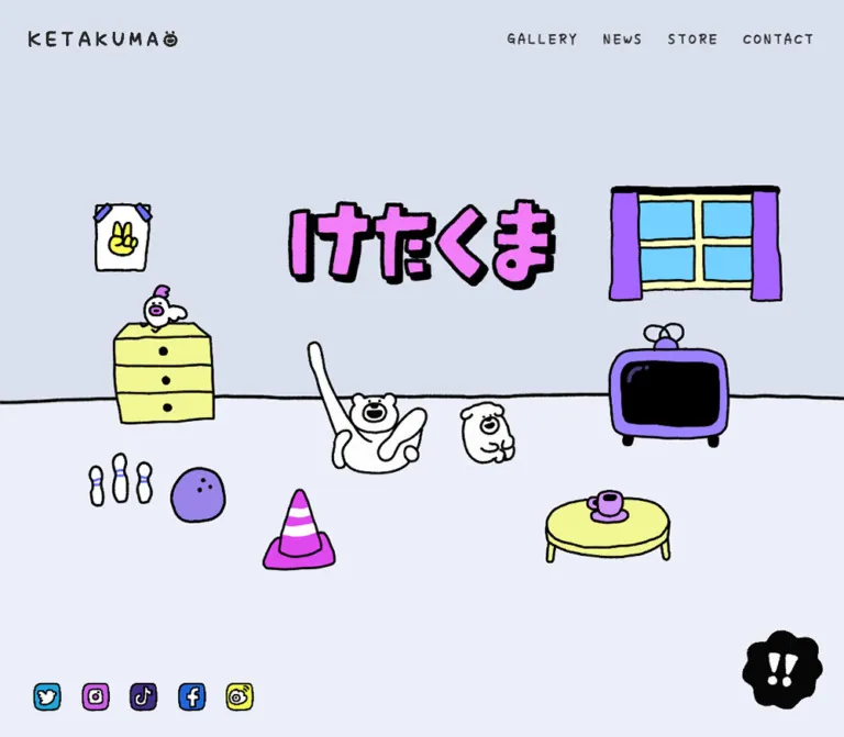
淡い青紫の背景に、太い手描き線のキャラクターや家具を配置した公式サイト。ニュース、プロフィール、ショップ、問い合わせをイラストの世界観でつなぎ、スマートフォンでは構図を組み替えています。
KETAKUMA Official / けたくま公式 — Style Reference
A hand-drawn character world arranged like a toy room, with everyday objects doing the work of interface furniture.
Website: KETAKUMA Official Original URL: https://ketakuma.com/ Final URL: https://ketakuma.com/ Status: HTTP 200; no redirect reported. Theme: a light blue-lavender environment with black illustration outlines, purple lettering, and bright magenta actions. Inspected: October 5, 2026, 06:34:35 JST — supplied retrieval timestamp: October 4, 2026, 21:34:35.171 UTC. Viewports: desktop 1440 × 1000 CSS px; mobile 390 × 844 CSS px. Scope: the current homepage, including its opening room, two character introductions, gallery region, news collection, bilingual creator profile, illustrated store/contact footer, and persistent navigation. Five supplied original-page captures and two rendered DOM/style samples form the evidence. Linked pages and interactive states were not separately inspected.
KETAKUMA is an official character website with a gallery, updates, a creator profile, and routes to a shop and contact forms. Its opening screen establishes a setting rather than presenting a conventional promotional headline: the Japanese character logo floats above a room containing a window, television, chest of drawers, bowling equipment, traffic cone, low table, and two white characters. Thick, uneven black lines give these objects a shared material quality.
The rest of the page keeps that world intact. News images resemble sheets of stickers pinned into irregular frames. Section labels are illustrated lettering. A storefront represents shopping, and two mailboxes distinguish contact destinations. Pale backgrounds and unusually generous empty space prevent the bright objects from becoming visually crowded.
The mobile version is a separate composition of the same visual vocabulary. It rearranges the room, retains a compact two-column news collection, and places the store above the contact area. Preserve these relationships when reusing the design; a uniformly scaled desktop scene would lose much of its character.
閉じる
KETAKUMA Official / けたくま公式 — Style Reference
A hand-drawn character world arranged like a toy room, with everyday objects doing the work of interface furniture.
Website: KETAKUMA Official Original URL: https://ketakuma.com/ Final URL: https://ketakuma.com/ Status: HTTP 200; no redirect reported. Theme: a light blue-lavender environment with black illustration outlines, purple lettering, and bright magenta actions. Inspected: October 5, 2026, 06:34:35 JST — supplied retrieval timestamp: October 4, 2026, 21:34:35.171 UTC. Viewports: desktop 1440 × 1000 CSS px; mobile 390 × 844 CSS px. Scope: the current homepage, including its opening room, two character introductions, gallery region, news collection, bilingual creator profile, illustrated store/contact footer, and persistent navigation. Five supplied original-page captures and two rendered DOM/style samples form the evidence. Linked pages and interactive states were not separately inspected.
KETAKUMA is an official character website with a gallery, updates, a creator profile, and routes to a shop and contact forms. Its opening screen establishes a setting rather than presenting a conventional promotional headline: the Japanese character logo floats above a room containing a window, television, chest of drawers, bowling equipment, traffic cone, low table, and two white characters. Thick, uneven black lines give these objects a shared material quality.
The rest of the page keeps that world intact. News images resemble sheets of stickers pinned into irregular frames. Section labels are illustrated lettering. A storefront represents shopping, and two mailboxes distinguish contact destinations. Pale backgrounds and unusually generous empty space prevent the bright objects from becoming visually crowded.
The mobile version is a separate composition of the same visual vocabulary. It rearranges the room, retains a compact two-column news collection, and places the store above the contact area. Preserve these relationships when reusing the design; a uniformly scaled desktop scene would lose much of its character.
How to Read This Reference
- Measured values come from the supplied rendered DOM and computed styles. Values are CSS pixels unless stated otherwise; tables round long fractional measurements for readability.
- Calculated values are arithmetic relationships between supplied measurements, such as column gaps or width ratios. They do not establish the original CSS formula.
- Visual estimates describe the original-page captures. Estimated illustration colors are implementation approximations, not sampled or source-declared values.
- Recommendations describe a new implementation. Breakpoints, accessibility additions, and starter CSS are not claims about the original code.
- Named tokens are reference aliases unless explicitly described as source properties.
- Empty text in the sampled heading and link elements often corresponds to visible graphic content. A computed
14pxon an empty heading does not measure the lettering inside its artwork. - Only two viewport sizes were supplied. Intermediate layouts, exact media queries, hover states, menu opening, and gallery transitions remain unverified.
Tokens — Colors
Default Palette
| Name | Value | Suggested token | Evidence and role |
|---|---|---|---|
| Room Wall | #dae0ee |
--color-wall |
Measured: body background, rgb(218, 224, 238). Visually corresponds to the opening wall and darker lower ground areas. |
| Pale Floor | #ebeff7 |
--color-floor |
Measured: profile and footer backgrounds, rgb(235, 239, 247). A similar pale field appears behind the room floor and middle content. |
| Text Ink | #272727 |
--color-text |
Measured: body text and desktop navigation, rgb(39, 39, 39). |
| Label White | #ffffff |
--color-white |
Measured: category text and news-image link backgrounds. White also appears inside character artwork. |
| Category Blue | #96aee6 |
--color-category |
Measured: STICKER and LIAR capsule backgrounds, rgb(150, 174, 230). |
| Lettering Purple | #9984e8 |
--color-purple |
Measured: the mobile navigation's PRIVACY entry. Visually related to the illustrated section headings, whose exact artwork fills were not supplied. |
| Action Magenta | approximately #dd3be8 |
--color-action |
Visual estimate: shop/contact labels, gallery arrows, and the cone. |
| Logo Pink | approximately #e982ed |
--color-logo |
Visual estimate: the large Japanese wordmark. It is softer than the action magenta. |
| Furniture Lemon | approximately #f3f68d |
--color-lemon |
Visual estimate: drawers, table, and the yellow mailbox. |
| Window Blue | approximately #75ccef |
--color-sky |
Visual estimate: the window panes. |
| Curtain Violet | approximately #a15aff |
--color-violet |
Visual estimate: the saturated curtains; not interchangeable with every purple in the scene. |
| Tree Mint | approximately #b0dfd2 |
--color-mint |
Visual estimate: trees around the storefront. |
| Illustration Black | approximately #000000 |
--color-outline |
Visual estimate: heavy outlines, television screen, wordmark shadow, and the black corner mark. |
The dominant area is pale, while the saturated colors are confined to individual objects and labels. This is not a system of colored section backgrounds. The white characters remain easy to recognize because their outlines are strong and their surroundings are quiet.
Layering matters: some sampled sections have transparent backgrounds even though the captures show a pale scene behind them. Conversely, the footer element has a pale computed background while its lower illustrated ground looks darker. Container background declarations alone do not describe the final composition; artwork and internal layers also contribute.
The only exposed custom property in the supplied sample is --swiper-theme-color: #007aff. Its presence does not make that blue a visible brand token or establish the gallery's behavior. Do not add it to the visual palette without further evidence.
Theme Presets
Only the light treatment is evidenced. No theme selector or alternate color mode was verified.
Tokens — Typography
Handwritten Interface and Body Text
- Measured source family:
ap, sans-serif. - Measured body default:
14px, weight400, line height21px. - Measured document root:
16px, line height24px. - Appearance: informal handwritten letters with irregular strokes and compact Japanese glyphs.
- Identity limitation:
apis the family name exposed by computed styles. The evidence does not identify its font file, foundry, or commercial name. - Implementation alias:
--font-hand: ap, sans-serif.
Use the supplied or authorized font if available. A generic sans-serif fallback keeps the page functional but will not reproduce the handwritten texture.
Category and Selected Menu Lettering
- Measured source family:
"Londrina Solid", cursive. - Category labels: weight
300, uppercase, with0.2emtracking. - Mobile
PRIVACYentry: weight900,37px, line height33.3px, tracking3.7px. - Visibility limitation: the menu entry has a computed layout in the evidence, but the supplied mobile captures show the closed menu. Its style is not proof that an open-menu state was visually inspected.
Illustrated Headings and Labels
The large Japanese wordmark, NEWS, ONLINE STORE, and CONTACT are visibly graphic lettering. Their outlined edges, imperfect spacing, and integrated decorative figures should be treated as artwork.
The sampled h1 and many h2 elements have empty text and inherited 14px styling. Reproducing those headings as ordinary 14px text would be incorrect. Use their rendered graphic dimensions and preserve a semantic heading or equivalent accessible text.
Type Scale
| Role | Desktop measured size / line height | Mobile measured size / line height | Weight and tracking |
|---|---|---|---|
| Body default | 14 / 21px |
14 / 21px |
400; normal tracking |
| Desktop navigation | 20 / 30px |
Replaced by menu control | 700; 2.8px, equivalent to 0.14em |
| Mobile menu label | Not visible in desktop capture | 16 / 24px |
700; 3.2px, equivalent to 0.2em |
| Character introduction | 22.464 / 44.928px |
16.614 / 31.5666px |
400; line-height ratios 2 and 1.9 |
| News title | 18 / 29.25px |
14.547 / 21.8205px |
400; mobile tracking 0.29094px, or 0.02em |
| Category label | 15.696 / 23.544px |
12.48 / 18.72px |
Londrina Solid 300; 0.2em tracking |
| Creator name | 33.696 / 50.544px |
27.027 / 40.5405px |
400; 0.3em tracking |
| Creator biography | 20.16 / 38.08px |
15.6 / 29.4667px |
400; approximately 1.889 line height |
Dates appear above news titles as small handwritten metadata. Their individual computed font values were not included, so they should not be assigned a supposedly measured size.
Graphic Type Dimensions
| Graphic | Desktop measured box | Mobile measured box |
|---|---|---|
| Header wordmark link | 187 × 20px |
131 × 14px |
| Main Japanese wordmark | 451 × 154.63px |
218.39 × 74.88px |
| Gallery heading | 543.30 × 135.08px |
293.27 × 72.91px |
| News heading | 373.39 × 134.94px |
201.73 × 72.89px |
| Profile heading | 555.69 × 136.5px |
296.39 × 72.80px |
| Store heading | 461.22 × 58.58px |
306.77 × 38.95px |
| Contact heading | 292.45 × 58.84px |
193.44 × 38.92px |
These are element boxes, not guaranteed bounds of every associated decorative character. Artwork may extend beyond the heading box.
Tokens — Spacing & Shapes
Density: sparse scenic composition with compact navigation and metadata. Shape language: irregular black outlines, soft hand-drawn capsules, rectangular artwork frames, and scalloped emphasis marks. Base unit: no single source spacing unit was exposed.
Responsive Unit
The fractional measurements show that parts of the layout resize between viewports, but the underlying formulas were not supplied. Keep the ordinary 16px root when adapting this design; there is no evidence of a miniature root-unit system.
At desktop, the main content span is 1080px, starting at x = 180px: exactly 75% of the viewport width. At mobile, the recurring span is approximately 306.77px, starting at x = 41.61px: about 78.66% of the viewport width. These are observed endpoints, not proof of a universal percentage rule or a maximum-width cap.
Spacing Scale
| Use | Desktop | Mobile | Evidence |
|---|---|---|---|
| Header top | 34px |
17px |
Measured header position |
| Brand left inset | 36px |
23.91px |
Measured link position |
| Desktop navigation gaps | 30px |
Not applicable | Calculated from adjacent link boxes |
| Main content side margin | 180px |
41.61px |
Measured recurring content alignment |
| News column gap | approximately 75.30px |
approximately 19.72px |
Calculated from title boxes |
| Social icon gap | 22.5px |
approximately 16.61px in menu-related DOM |
Calculated; mobile row is not visible in the closed-menu captures |
| Category horizontal padding | 15.696px |
14.547px |
Measured |
| Category vertical padding | 2.16px |
2.067px |
Measured |
| Profile bottom padding | 170.928px |
99.84px |
Measured |
| Profile top padding | 0px |
51.987px |
Measured |
Do not force these values into a conventional 8px spacing scale and then treat the result as an exact reconstruction. The broad gaps and irregular offsets are part of the composition.
Border Radius
| Element | Evidence | Reuse guidance |
|---|---|---|
| Category pill | Measured radius 26.928px desktop; 24.96px mobile |
A fully rounded capsule reproduces the visible shape at these heights. |
| News link/image box | Measured CSS radius 0px |
Retain rectangular artwork; its visible frame can still have wobbly edges. |
| Shop/contact labels | Visually irregular rounded capsules | Prefer supplied artwork or a deliberately uneven outline. |
| Gallery arrows | Visually rounded triangular shapes | Do not replace them with circular chevrons without accepting a style change. |
Black !! mark |
Visually scalloped silhouette | Use the actual silhouette; a normal circle loses the distinctive shape. |
Layout Measurements
| Element | Desktop at 1440 × 1000 | Mobile at 390 × 844 |
|---|---|---|
| Document height | 7574.08px |
5609.05px |
| Opening section | 1440 × 1000px |
390 × 844px |
| Main wordmark position | x 494.5, y 214.22px |
x 85.80, y 186.44px |
| News title column width | 309.30px |
143.47px |
| News linked image box | 306.20 × 175.39px |
142.03 × 80.06px |
STICKER pill |
102.53 × 27.86px |
85.69 × 22.84px |
| Social link boxes | 38 × 38px |
Approximately 33.27 × 33.27px in menu-related DOM |
| Store illustrated link | 529.77 × 368.94px |
342.14 × 237.22px |
| First contact illustrated link | 147.30 × 332.08px |
106.08 × 216.19px |
| Second contact illustrated link | 145 × 330.48px |
103.97 × 214.72px |
| Footer height | 636.61px |
727.97px |
Components
Persistent Header
Role: identity and navigation while the character world scrolls underneath.
The desktop header is transparent and spans the viewport. Its sampled box begins 34px from the top, has a 30px height, and uses 36px horizontal padding. The black handwritten wordmark sits at the left; five text links sit at the right with calculated 30px gaps.
Observed destinations are:
GALLERY→https://ketakuma.com/#gallery.NEWS→https://ketakuma.com/news/.STORE→https://shop.ketakuma.com/.PRIVACY→https://chocolate-inc.com/privacy/.CONTACT→https://ketakuma.com/#contact.
The header remains at the same viewport location in the supplied scrolled captures. This supports persistent overlay behavior, although the CSS position property was not included in the sample. There is no visible opaque navigation bar or bottom divider.
On mobile, the brand shrinks to 131 × 14px. A tracked MENU label and a two-line mark replace the desktop link row. The DOM contains MENU and CLOSE, as well as navigation and social-link layout boxes, but the open state and its transition were not captured.
Recommended anatomy: a home link, a desktop navigation landmark, and a real mobile toggle button with an expanded state. Keep the transparent presentation while reserving enough clearance for headings and focused content.
Opening Room
Role: introduces the character world through a single viewport-sized scene.
The opening section exactly matches each inspected viewport. Its main wordmark is horizontally centered and sits around the upper fifth of the screen. A thin, wavy black horizon separates the darker wall from the paler floor at approximately 54% of the screen height in both captures.
The desktop composition spreads objects across the full width:
- A taped peace-sign picture and yellow drawers occupy the left side.
- The Japanese wordmark occupies the upper center.
- A purple-curtained window and purple television balance the right side.
- The white bear and smaller companion sit near the center of the floor.
- Bowling equipment, a magenta cone, and a yellow table fill the foreground without forming a grid.
The main wordmark occupies a calculated 31.32% of desktop width but 56% of mobile width. This difference is essential: mobile increases its relative prominence.
Visual placement estimates for implementation:
| Object/group | Desktop placement | Mobile placement |
|---|---|---|
| Window | Right upper area, approximately x 1035, y 193, width 291px |
Approximately x 210, y 284, width 153px |
| Drawers | Approximately x 201, y 423, width 170px |
Approximately x 28, y 403, width 83px |
| Television | Approximately x 1033, y 423, width 204px |
Approximately x 264, y 392, width 100px |
| Table and cup | Lower right, approximately 215px wide |
Lower right, approximately 110px wide |
| Bowling group | Lower left | Lower center, beneath the cone/character/table grouping |
These estimates guide composition, not collision boxes or original asset boundaries. Keep the room as layered artwork with explicit desktop and mobile positions.
Character Introduction Sections
Role: introduces the bear and its dog companion through short, playful biographies and large artwork.
Two spacious sections follow the opening room. Each has an illustrated heading, a character scene, an additional graphic label, and three short lines of text. Desktop text placement alternates: the first introduction is aligned to the content area's left edge; the second is positioned at the right, with its paragraph beginning at x = 990px.
On mobile, both text blocks align to the recurring 41.61px left inset and use approximately 306.77px of width. Type falls from 22.464px to 16.614px, while line spacing stays generous.
The supplied images do not show these sections in full. Their text, heading boxes, and section geometry are evidenced by the rendered DOM; exact illustration arrangements inside them should not be invented.
Gallery Region
Role: presents character work inside the site's illustrated environment.
The desktop middle capture shows part of a filmstrip-like sequence and a large purple television frame above two magenta triangular controls. Their visible labels are まえ and つぎ. Small characters decorate the gallery region.
Keep the content framed as part of the toy world rather than placing it inside a generic white media card. The controls use thick black outlines and white hand-lettered text.
The presence of previous/next controls supports a navigable gallery affordance. It does not establish autoplay, swipe support, wrapping, transition timing, media playback, or which items appear after activation. None of those actions was exercised in the supplied evidence.
News Collection
Role: presents current sticker releases and collaborations while maintaining a loose illustrated rhythm.
The NEWS heading sits toward the right of the content span, accompanied by a speech bubble and character artwork. News entries form three desktop columns. Their image tops are staggered: the first three measured image positions differ by approximately 58.45px and then 51.70px.
On mobile, the collection uses two columns, not a single full-width stack. Each title column is approximately 143.47px wide, with a calculated gap of 19.72px. The second column's first image begins 31.19px below the first column's image.
There is no filled card shell around an entire entry. Each entry consists of:
- A wide sticker-sheet image with a visibly uneven dark frame.
- A date.
- A handwritten title, wrapping naturally.
- A small blue category capsule.
The image link has a white computed background and no CSS corner radius. The surrounding date, title, and category remain directly on the page field. Avoid card shadows, large internal padding, and uniform white panels.
The supplied link evidence directly confirms thumbnail links and STICKER category links. It does not establish that every title or the entire card is clickable. Keep independent category links outside any larger article anchor.
Category Capsule and Novelty Entry
Role: provides a small, visually distinct content classification.
The category capsule uses white Londrina Solid lettering on #96aee6. Desktop padding is 2.16px 15.696px, with a measured height of approximately 27.86px. Mobile reduces the type to 12.48px, producing a capsule approximately 22.84px high.
The DOM also contains a novelty news item dated 20XX.04.01, labeled LIAR. It shares the category styling but should not be treated as an ordinary verified calendar date.
In the mobile sample, this item's title is reported far outside the viewport at approximately x = -1335px, with an unusual narrow/tall bounding rectangle. The cause is not established. Do not copy that rectangle as a card size or intentionally hide the item in a new implementation; verify its intended behavior first.
Creator Profile
Role: introduces the person behind the characters and their work.
The section uses the measured pale background #ebeff7, illustrated framing, and separate Japanese and English biography blocks. The original page names たかだべあ / TAKADABEAR, describes work in LINE stickers, animation, and illustration, and states an affiliation with CHOCOLATE Inc.
Names are widely tracked at 0.3em. The desktop name size is 33.696px; mobile uses 27.027px. Biography text uses a relaxed line height of approximately 1.889, helping the handwritten face remain readable.
At desktop, the text column is approximately 555.69px wide. On mobile it returns to the shared 306.77px content width. The supplied bottom desktop capture includes profile text and framed character imagery above the footer, but it does not show the entire profile composition.
This is evidenced profile content, not a website-production credit.
Illustrated Store Link
Role: turns an external shopping destination into a recognizable place within the scene.
The anatomy is an outlined purple ONLINE STORE heading, a magenta capsule labeled オンラインショップ, a small black downward arrow, and a white storefront with a lavender-and-white striped awning. Mint trees and white characters sit around the building.
The sampled store anchor is substantially larger than its magenta label: 529.77 × 368.94px on desktop and 342.14 × 237.22px on mobile. Treat the illustration sequence as a coherent linked region rather than assuming only the capsule is interactive.
The mobile shop artwork extends beyond the normal text container: its left edge is approximately 22.89px, compared with 41.61px for standard content. This controlled widening gives the storefront enough presence on a narrow screen.
The observed destination is https://shop.ketakuma.com/; the shop itself was not inspected.
Contact Mailboxes
Role: separates two contact routes through a concrete visual metaphor.
An outlined purple CONTACT heading sits above two magenta labels. Each label points downward to a mailbox:
ライセンスについて: yellow mailbox; observed link targethttps://chocolate-inc.com/form/contact_1/.けたくまについて: pink mailbox; observed link targethttps://chocolate-inc.com/form/contact_4/.
Desktop contact link regions are approximately 145–147px wide and 330–332px tall. Mobile retains the pair side by side at approximately 104–106px wide and 215–216px tall.
The labels, arrows, and mailboxes are parts of tall illustrated link targets. They are not a form embedded in the homepage. No form fields, validation behavior, or submission states were inspected.
Persistent Social Links
Role: keeps creator channels available on desktop.
Five hand-drawn colored icon tiles sit at the bottom left in the desktop captures. The measured links begin at x = 40px, y = 930px, each with a 38px square box and 22.5px gaps. They remain in the same screen location across the supplied desktop scroll positions.
The observed targets are Twitter, Instagram, TikTok, Facebook, and Weibo profiles. Preserve the artwork's actual marks when authorized; automatically replacing the Twitter bird with another current brand symbol would change the captured visual design.
These links are not visible along the bottom of the closed mobile captures. The mobile DOM positions them with the navigation content, but menu visibility and opening behavior remain unverified.
Black Corner Mark
Role: visually prominent persistent affordance; functional purpose unverified.
A black scalloped shape containing white !! appears near the bottom right in all original-page captures. Its visual bounds are approximately 100–105px on desktop and 70px on mobile. It maintains roughly 20–35px clearance from the screen edges.
Do not label it as sound, help, a menu, or a back-to-top control without additional evidence. Its silhouette and placement can be documented independently of its unknown action.
Tokens — Motion & Interaction
| Element or behavior | Supplied evidence | What remains unverified |
|---|---|---|
| Persistent header | Same screen placement across desktop and mobile scroll captures | Exact positioning rule and scroll thresholds |
| Desktop social row | Same bottom-left placement across desktop captures | Hover, focus, and click presentation |
Black !! mark |
Persistent corner placement | Action, state changes, sound, or modal behavior |
| Mobile menu | Visible MENU; DOM also contains CLOSE and menu links |
Open appearance, animation, focus management, and dismissal |
| Gallery controls | Visible まえ / つぎ arrows |
Transition type, duration, swipe, autoplay, and wrapping |
| Opening room | Expressive poses; a TAP callout appears in the mobile capture |
Tap target, resulting action, loop timing, and animation trigger |
| Character artwork | Different compositions/poses between captures | Whether differences result from time, responsive artwork, or another state |
| Sampled CSS motion | Listed elements report animation: none; transition field reports all |
Descendant, pseudo-element, asset, or script-driven motion |
| Novelty news item | Offscreen mobile geometry in the DOM sample | Cause, intended movement, and settled state |
No animation duration or easing curve can be responsibly extracted from this evidence. The reported transition value all alone does not prove a nonzero transition.
The inspection protocol waited at least five seconds initially, checked visible image decoding and layout/text stability, and temporarily paused perpetual animations during readiness checks before resuming them. Those checks improve capture reliability but do not amount to a recording of the site's interaction behavior.
Recommended adaptation: keep navigation and reading usable with static artwork. If animation is added or authorized assets contain loops, provide reduced-motion handling and explicit controls where needed. Any proposed timing is an implementation choice, not a measured source token.
Surfaces
| Layer | Appearance | Purpose |
|---|---|---|
| Room wall | Solid muted blue-lavender | Establishes the indoor setting |
| Floor and content field | Slightly lighter blue-white | Gives white characters and colorful props room to breathe |
| Header | Transparent | Keeps navigation inside the illustrated world |
| News artwork | White sheets with rough dark frames | Separates dense sticker imagery from the pale page |
| Category capsule | Smooth blue pill with white text | Provides compact metadata |
| Illustrated actions | Magenta fill, black outline, white lettering | Draws attention without leaving the drawing style |
| Footer ground | Darker field separated by a wavy horizon | Connects shop, characters, and mailboxes into one environment |
| Corner affordance | Black scalloped silhouette | Provides strong contrast at the screen edge |
There is no visible general elevation system. The wordmark's heavy offset black edge belongs to its artwork; it is not evidence for adding drop shadows to cards and controls.
Imagery
The imagery uses flat fills, thick uneven outlines, white character bodies, expressive open mouths, and deliberately awkward poses. Domestic objects are simplified enough to read immediately: a television, window, chest of drawers, table, and mailboxes. Their imperfections are consistent, so the scene feels authored rather than assembled from unrelated clip art.
The large empty areas are as important as the objects. Keep room around the characters' limbs, between the logo and furniture, and around the news heading. Do not add decorative confetti merely to fill the pale canvas.
Typography and illustration frequently merge. The news heading has a speech bubble and figures; action labels are drawn capsules; the shop's physical location becomes a link. Replacing these with ordinary text above generic icons would weaken the central design idea.
The original captures show smooth rendered artwork with deliberately rough contours. This is not evidence for pixel-art rendering. Avoid applying image-rendering: pixelated to the site as a whole.
Observed Asset References
No downloadable image URLs, font URLs, or asset file extensions were supplied. The following inventory identifies visible assets without inventing paths.
| Asset/group | Evidence | Implementation use |
|---|---|---|
| Small KETAKUMA wordmark | Header graphic link at both viewport sizes | Persistent home identity |
| Large Japanese wordmark | Measured graphic h1 |
Main room identity; retain aspect ratio |
| Room props and characters | Original desktop/mobile opening captures | Separate responsive placement groups |
| Illustrated section headings | Heading boxes and supplied middle/bottom captures | Preserve lettering and attached ornament |
| Sticker-sheet thumbnails | News image link boxes and desktop capture | Wide, uncropped content imagery |
| Storefront sequence | Large store anchor and both footer captures | One coherent illustrated shopping destination |
| Two mailbox sequences | Two tall contact anchors and footer captures | Distinct contact destinations |
| Social icon tiles | Desktop captures and profile links | Small custom channel marks |
Black scalloped !! mark |
All original captures | Persistent graphic; action still unknown |
The body sample also contains identifiers such as index_frame_news, index_frame_profile, and index_frame_4koma. They are not verified download paths or proof of a particular file format.
A white hand-pointer graphic appears near the upper-left corner of the captures. Its origin is not established; do not infer a site-wide custom cursor implementation from that alone.
Use authorized original artwork when available. CSS can reproduce the layout, palette, and text hierarchy, but not the identity of these drawings.
Layout & Responsive Behavior
Page Sequence
The supplied DOM gives the following section geometry. Positions belong to the sampled render state, not immutable layout constants.
| Region | Desktop start / height | Mobile start / height |
|---|---|---|
| Opening room | 0 / 1000px |
0 / 844px |
| First character introduction | 1000 / 1060.44px |
844 / 894.22px |
| Second character introduction | 2060.44 / 816.52px |
1738.22 / 731.39px |
| Gallery | 2876.95 / 818.88px |
2469.61 / 447.61px |
| News | 3695.83 / 1435.78px |
2917.22 / 1047.09px |
| Profile | 5131.61 / 1805.86px |
3964.31 / 916.77px |
| Footer | 6937.47 / 636.61px |
4881.08 / 727.97px |
The document remains a normally scrolling long page. Only the opening scene is measured at one viewport high; the evidence does not support making every section a full-screen slide.
Desktop Composition
The main content sits within the measured 1080px span, while the room and ground lines use the full viewport. The header and social controls sit outside the narrower content rhythm.
News uses three columns with unequal vertical starting positions. The footer places the storefront on the left and the contact pair on the right, with a broad gap between them. Its headings are also offset vertically: the contact heading starts approximately 44.92px lower than the store heading.
Mobile Composition
At 390px wide:
- The main wordmark becomes relatively larger.
- The room's objects are repositioned rather than uniformly scaled.
- The picture moves inward, the window occupies much of the upper-right area, and bowling equipment moves below the central scene.
- Desktop navigation becomes a menu affordance.
- The bottom-left social row is absent from the closed state.
- Character descriptions become left-aligned single-column blocks.
- News retains two columns and a smaller stagger.
- The store occupies its own full row, followed by the contact heading and two side-by-side mailboxes.
- The store graphic extends outside the narrower text container.
- The black corner mark remains visible but shrinks.
The exact breakpoint between these arrangements is not supplied. The Quick Start uses 767px as a recommended implementation breakpoint, not a recovered source value.
Some content-element positions, especially within the desktop profile, do not map directly onto the separate scrolled capture using a single inferred scroll offset. Capture state or nested positioning may contribute, but the cause is unverified. Use the samples to understand alignment and scale rather than hardcoding every reported document coordinate.
Do’s and Don’ts
Do
- Keep the pale wall/floor pair and black outlines as the visual foundation.
- Give bright magenta, lemon, violet, and blue to specific illustrated objects.
- Preserve the distinction between handwritten live text and artwork-based headings.
- Keep the opening scene one viewport high at the inspected proportions.
- Recompose room props for mobile and enlarge the wordmark relative to screen width.
- Use three desktop news columns and two mobile columns with a restrained stagger.
- Keep news metadata on the page background, outside the white image sheet.
- Preserve the shop and mailbox metaphors, including labels and downward arrows.
- Let the mobile storefront extend slightly beyond the normal text column.
- Keep large areas of calm background around expressive artwork.
- Separate confirmed link destinations from unverified interactive behavior.
Don’t
- Don’t convert the homepage into a generic promotional layout with feature cards and repeated conversion banners.
- Don’t shrink the complete desktop room into a tiny mobile panorama.
- Don’t replace illustrated headings with an invented font name or a standard heavy sans-serif.
- Don’t infer a visible heading's size from its empty element's inherited
14pxfont declaration. - Don’t add gradients, glass panels, soft card shadows, or uniformly polished vector icons.
- Don’t crop sticker sheets into square product thumbnails.
- Don’t turn the mobile news collection into one column when reproducing the supplied layout.
- Don’t use the exposed default slider blue as an additional brand color.
- Don’t invent a sound function, menu action, or other meaning for the
!!mark. - Don’t claim autoplay, parallax, custom-cursor behavior, or specific animation timing without further evidence.
- Don’t reproduce the offscreen novelty-entry bounds as an intentional layout rule.
Recommended Implementation Additions
These are recommendations for a new implementation, not verified features of the original:
- Give image-based headings meaningful text equivalents. Preserve actual semantic
h1andh2hierarchy even when lettering is drawn. - Give each illustrated link a destination-specific accessible name. Keep decorative arrows and characters out of redundant announcements.
- Use a real menu button with
aria-expandedandaria-controls; provide keyboard access, dismissal, and sensible focus handling for the implemented menu pattern. - Keep mobile social links reachable when the desktop row is hidden.
- Expand small visible controls with unobtrusive hit areas. The measured 38px desktop social icons and small category pills need not define the whole interactive target.
- Add a visible dark focus outline that does not depend on animation.
- Check white lettering on the pale category blue and magenta fills. If contrast needs adjustment, document the darker accessible variant rather than presenting it as the measured palette.
- Preserve whole-image proportions for sticker sheets, logos, and illustrated destinations. Use responsive image sizes and avoid loading every lower-page asset at opening-screen priority.
- Use normal document flow for text and reserve absolute positioning for bounded scenes. This reduces collisions when copy wraps or fonts fall back.
- Provide reduced-motion behavior for any animated assets or scripted effects that are actually implemented.
- Ensure anchor navigation and focused content clear the persistent header and corner affordance.
Agent Prompt Guide
Quick Color Reference
- Measured wall/body background:
#dae0ee. - Measured pale profile/footer surface:
#ebeff7. - Measured text ink:
#272727. - Measured category fill:
#96aee6, with white text. - Measured mobile menu purple:
#9984e8. - Approximate illustrated actions: magenta
#dd3be8. - Approximate furniture fill: lemon
#f3f68d. - Approximate illustration outline: black.
- Use flat color and irregular drawing edges; do not introduce general-purpose shadows.
Overall Prompt
“Create an official character homepage inspired by the current KETAKUMA site. Use a pale blue-lavender room with a lighter floor, thick uneven black illustration outlines, white expressive characters, and scattered lemon, violet, sky-blue, and magenta objects. Place an illustrated Japanese wordmark above the room's center. Use a transparent persistent header with small handwritten navigation. Continue into character introductions, an illustrated gallery, a staggered three-column news collection, a bilingual creator profile, and a storefront/mailbox footer. At 390px, rearrange the room, retain two news columns, and stack the store above two contact mailboxes. Preserve artwork-based headings and keep generous empty space. Treat menu transitions, gallery motion, and the black corner mark's action as unspecified until behavior is provided.”
Example Component Prompts
- Opening room: “Compose a viewport-height cartoon room with a large pink Japanese wordmark, purple-curtained window, yellow drawers, purple television, white characters, a magenta cone, and a yellow low table. Use a slightly wavy horizon and broad pale empty areas. Supply independent desktop and mobile positions instead of scaling one complete scene.”
- News entry: “Create a transparent news entry with a wide sticker-sheet image in a rough black rectangular frame, a small handwritten date, a naturally wrapping title, and a pale-blue STICKER capsule. Use no card shadow or surrounding white panel. Arrange three columns on desktop and two on mobile with staggered top positions.”
- Store destination: “Build an illustrated shopping link from a purple outlined ONLINE STORE heading, magenta Japanese label, downward black arrow, striped-awning shop, mint trees, and white character figures. Keep the storefront wider than the mobile text column.”
- Contact pair: “Place two magenta hand-drawn labels below an outlined CONTACT heading. Connect each label with a downward arrow to a mailbox, one yellow and one pink. Make each label-arrow-mailbox sequence a single clearly named link. Keep the pair side by side on mobile.”
- Navigation: “Use a small black handwritten wordmark at the upper left and widely tracked handwritten links at the upper right, directly on the page background. On mobile show a MENU label and two-line icon. Implement accessible menu behavior separately; no opening animation is specified by the reference.”
Quick Start
CSS Custom Properties
This is a recommended implementation scaffold, not recovered source CSS. It reproduces measured colors and text values, plus the broad geometry at the two supplied viewport sizes. The 1080px cap and 767px breakpoint are adaptation choices. Prop positions and the room horizon are visual estimates.
Load authorized font files and illustration assets separately; none of their file URLs was supplied. The room assumes individual prop images, or deliberately grouped images, rather than a single desktop screenshot. Illustrated headings retain their original aspect ratios.
Suggested structure: .site-header contains .brand, .desktop-nav, and .menu-toggle; .room contains .room-title and .room-prop images; .news-grid contains .news-card articles; .footer-layout contains .store-group and .contact-group. Menu and gallery behavior require separate implementation.
:root {
  /* Measured colors */
  --color-wall: #dae0ee;
  --color-floor: #ebeff7;
  --color-text: #272727;
  --color-white: #ffffff;
  --color-category: #96aee6;
  --color-purple: #9984e8;

  /* Visual approximations for new artwork */
  --color-action: #dd3be8;
  --color-lemon: #f3f68d;
  --color-outline: #000000;

  /* Load authorized fonts separately. */
  --font-hand: ap, sans-serif;
  --font-label: 'Londrina Solid', cursive;
  --text-body: 14px;
  --text-nav: 20px;
  --text-intro: 22.464px;
  --text-news: 18px;
  --text-category: 15.696px;
  --text-name: 33.696px;
  --text-bio: 20.16px;
  --leading-intro: 2;
  --leading-news: 1.625;
  --leading-bio: 1.888889;

  /* Recommended container cap; source cap unknown. */
  --content-size: min(75vw, 1080px);
  --news-gap: 75.3px;
  --news-stagger: 56px;
  --header-top: 34px;
  --header-inset: 36px;
}

* {
  box-sizing: border-box;
}

html {
  font-size: 16px;
  scroll-padding-top: 90px;
}

body {
  margin: 0;
  color: var(--color-text);
  background: var(--color-wall);
  font: 400 var(--text-body) / 1.5 var(--font-hand);
}

img {
  display: block;
  max-width: 100%;
  height: auto;
}

a {
  color: inherit;
}

.content {
  width: var(--content-size);
  margin-inline: auto;
}

.site-header {
  position: fixed;
  z-index: 30;
  inset: var(--header-top) 0 auto;
  display: flex;
  align-items: center;
  justify-content: space-between;
  min-height: 30px;
  padding-inline: var(--header-inset);
  background: transparent;
}

.brand {
  display: block;
  width: 187px;
  flex: none;
}

.brand img {
  width: 100%;
}

.desktop-nav {
  display: flex;
  align-items: center;
  gap: 30px;
}

.desktop-nav a {
  font-size: var(--text-nav);
  font-weight: 700;
  line-height: 1.5;
  letter-spacing: 0.14em;
  text-decoration: none;
}

.menu-toggle {
  display: none;
  border: 0;
  color: inherit;
  background: transparent;
  font-family: var(--font-hand);
}

.room {
  position: relative;
  isolation: isolate;
  height: 100vh;
  height: 100svh;
  overflow: hidden;
  background: linear-gradient(
    to bottom,
    var(--color-wall) 0 54%,
    var(--color-floor) 54% 100%
  );
}

.room-title {
  position: absolute;
  z-index: 2;
  top: 21.42%;
  left: 50%;
  width: 31.32%;
  margin: 0;
  transform: translateX(-50%);
}

.room-title img {
  width: 100%;
}

.room-prop {
  position: absolute;
  z-index: 1;
  left: var(--x);
  top: var(--y);
  width: var(--w);
  height: auto;
}

/* Approximate positions; match each asset's actual bounds. */
.prop-window { --x: 71.9%; --y: 19.3%; --w: 20.2%; }
.prop-drawers { --x: 14%; --y: 42.3%; --w: 11.8%; }
.prop-tv { --x: 71.7%; --y: 42.3%; --w: 14.2%; }
.prop-cone { --x: 31.3%; --y: 70.3%; --w: 8.7%; }
.prop-table { --x: 64.3%; --y: 70.4%; --w: 14.9%; }

/* Supply a full-width irregular line graphic. */
.room-horizon {
  position: absolute;
  z-index: 0;
  top: calc(54% - 6px);
  left: 0;
  width: 100%;
  height: 12px;
  object-fit: fill;
}

.intro-copy {
  font-size: var(--text-intro);
  line-height: var(--leading-intro);
}

.news-region,
.profile-region {
  background: var(--color-floor);
}

.news-heading {
  width: 34.57%;
  margin: 0 0 0 auto;
}

.news-grid {
  display: grid;
  grid-template-columns: repeat(3, minmax(0, 1fr));
  column-gap: var(--news-gap);
  row-gap: 54px;
  padding-block: 24px 120px;
}

/* Recommended regularized stagger, not the original formula. */
.news-card:nth-child(3n + 2) {
  transform: translateY(var(--news-stagger));
}

.news-card:nth-child(3n) {
  transform: translateY(calc(2 * var(--news-stagger)));
}

.news-thumb {
  display: block;
  aspect-ratio: 16 / 9;
  background: var(--color-white);
}

.news-thumb img {
  width: 100%;
  height: 100%;
  object-fit: contain;
}

/* Keep an existing artwork frame; avoid adding a duplicate. */
.news-date {
  display: block;
  margin-top: 28px;
}

.news-title {
  margin: 8px 0 0;
  font-size: var(--text-news);
  font-weight: 400;
  line-height: var(--leading-news);
  overflow-wrap: anywhere;
}

.category {
  display: inline-block;
  margin-top: 15.696px;
  padding: 2.16px 15.696px;
  border-radius: 26.928px;
  color: var(--color-white);
  background: var(--color-category);
  font: 300 var(--text-category) / 1.5 var(--font-label);
  letter-spacing: 0.2em;
  text-decoration: none;
}

.category a {
  color: inherit;
  text-decoration: none;
}

.profile-name {
  margin: 0;
  font-size: var(--text-name);
  font-weight: 400;
  line-height: 1.5;
  letter-spacing: 0.3em;
}

.profile-copy {
  font-size: var(--text-bio);
  line-height: var(--leading-bio);
}

.footer-scene {
  position: relative;
  padding-bottom: 44px;
  background: var(--color-floor);
}

.footer-layout {
  display: grid;
  grid-template-columns: minmax(0, 1.565fr) minmax(0, 1fr);
  column-gap: 19.6%;
}

.store-title {
  width: 87%;
  margin: 0 auto;
}

.store-link {
  display: block;
  margin-top: 54px;
}

.contact-group {
  padding-top: 45px;
}

.contact-title {
  width: 86.4%;
  margin: 0 auto;
}

.contact-options {
  display: grid;
  grid-template-columns: repeat(2, minmax(0, 1fr));
  gap: 13.65%;
  margin-top: 49px;
}

.store-link img,
.contact-options img {
  width: 100%;
}

.copyright-art {
  width: 105.25px;
  margin: 96px auto 0;
}

.desktop-social {
  position: fixed;
  z-index: 25;
  left: 40px;
  bottom: max(32px, env(safe-area-inset-bottom));
  display: flex;
  gap: 22.5px;
}

.desktop-social a {
  display: block;
  width: 38px;
  height: 38px;
}

/* Recommended focus treatment. */
:where(a, button):focus-visible {
  outline: 3px solid var(--color-text);
  outline-offset: 5px;
}

.visually-hidden {
  position: absolute;
  width: 1px;
  height: 1px;
  padding: 0;
  margin: -1px;
  overflow: hidden;
  clip-path: inset(50%);
  white-space: nowrap;
  border: 0;
}

/* Recommended breakpoint; only endpoint layouts were observed. */
@media (max-width: 767px) {
  :root {
    --content-size: 78.6667vw;
    --header-top: 17px;
    --header-inset: 6.13vw;
    --text-intro: 16.614px;
    --text-news: 14.547px;
    --text-category: 12.48px;
    --text-name: 27.027px;
    --text-bio: 15.6px;
    --leading-intro: 1.9;
    --leading-news: 1.5;
    --news-gap: 19.72px;
    --news-stagger: 31.19px;
  }

  .site-header {
    min-height: 24px;
  }

  .brand {
    width: 131px;
  }

  .desktop-nav,
  .desktop-social {
    display: none;
  }

  .menu-toggle {
    display: inline-flex;
    align-items: center;
    gap: 10px;
    padding: 10px 0;
    margin-block: -10px;
    font-size: 16px;
    font-weight: 700;
    line-height: 24px;
    letter-spacing: 0.2em;
  }

  .room-title {
    top: 22.09%;
    width: 56%;
  }

  .prop-window { --x: 53.8%; --y: 33.65%; --w: 39.2%; }
  .prop-drawers { --x: 7.2%; --y: 47.7%; --w: 21.3%; }
  .prop-tv { --x: 67.7%; --y: 46.4%; --w: 25.6%; }
  .prop-cone { --x: 7.7%; --y: 61.6%; --w: 18.2%; }
  .prop-table { --x: 65.1%; --y: 63%; --w: 28.2%; }

  .news-heading {
    width: 65.76%;
  }

  .news-grid {
    grid-template-columns: repeat(2, minmax(0, 1fr));
    row-gap: 42px;
    padding-bottom: 70px;
  }

  .news-card:nth-child(n) {
    transform: none;
  }

  .news-card:nth-child(2n) {
    transform: translateY(var(--news-stagger));
  }

  .news-date {
    margin-top: 16px;
  }

  .news-title {
    letter-spacing: 0.02em;
  }

  .category {
    margin-top: 12.48px;
    padding: 2.067px 14.547px;
    border-radius: 24.96px;
  }

  .footer-scene {
    padding-bottom: 32px;
  }

  .footer-layout {
    grid-template-columns: minmax(0, 1fr);
    gap: 48px;
  }

  .store-title {
    width: 100%;
  }

  .store-link {
    width: 111.54%;
    margin-top: 32px;
    margin-inline: -6.1%;
  }

  .contact-group {
    padding-top: 0;
  }

  .contact-title {
    width: 63.06%;
  }

  .contact-options {
    width: 82.7%;
    gap: 17.2%;
    margin: 34px auto 0;
  }

  .copyright-art {
    width: 81.11px;
    margin-top: 40px;
  }
}
The footer's wavy ground line, illustrated lettering, and surrounding characters must be supplied as artwork or dedicated scene layers. The CSS does not substitute smooth geometric shapes for those assets. It also does not implement an action for the black corner mark.
Keep the decorative news stagger separate from interaction animation: it is a static layout offset in this scaffold. Test long titles, font fallback, and keyboard focus at narrow widths before adopting fixed spacing across additional breakpoints.
Tailwind v4 Token Mapping
Optional mapping for a project already using Tailwind v4. This does not imply that the original website uses Tailwind. Define the custom properties above first.
@theme inline {
  --color-scene-wall: var(--color-wall);
  --color-scene-floor: var(--color-floor);
  --color-scene-ink: var(--color-text);
  --color-sticker-label: var(--color-category);
  --color-scene-purple: var(--color-purple);
  --color-scene-action: var(--color-action);
  --color-scene-lemon: var(--color-lemon);

  --font-scene: var(--font-hand);
  --font-category: var(--font-label);

  --text-scene-body: var(--text-body);
  --text-scene-nav: var(--text-nav);
  --text-scene-intro: var(--text-intro);
  --text-scene-news: var(--text-news);
  --text-scene-category: var(--text-category);
  --text-scene-name: var(--text-name);
  --text-scene-bio: var(--text-bio);

  --spacing-scene-content: var(--content-size);
  --spacing-scene-news-gap: var(--news-gap);
  --radius-category-pill: 999px;
}
Sources & Evidence
- Inspected original/final page: https://ketakuma.com/, reported HTTP 200, retrieved October 4, 2026 at 21:34:35.171 UTC / October 5 at 06:34:35.171 JST.
- Desktop evidence: supplied 1440 × 1000 captures of the opening room, gallery/news area, and profile/footer area; rendered DOM and computed-style sample with a document height of approximately
7574.08px. - Mobile evidence: supplied 390 × 844 captures of the opening room and store/contact footer; rendered DOM and computed-style sample with a document height of approximately
5609.05px. - Direct style evidence: computed families, sizes, weights, line heights, tracking, backgrounds, padding, radii, element rectangles, link targets, and the exposed custom property reported in the supplied observations.
- Interaction evidence: scroll-separated captures and visible control affordances. No supplied click-through results, menu-open capture, hover capture, gallery transition recording, or verified response to the
TAPand!!marks. - Inspection limitations: capture readiness checks do not prove semantic completeness or eliminate delayed behavior. SharedWorkers and service workers were disabled during inspection. Asset URLs, complete stylesheets, exact breakpoints, and font files were not supplied. No additional browsing, commands, or linked-page inspection was performed for this reference.
This reference describes the current homepage evidenced by the supplied captures and DOM. Estimated artwork values and recommended implementation choices are explicitly separated from measured source values.
# KETAKUMA Official / けたくま公式 — Style Reference

> A hand-drawn character world arranged like a toy room, with everyday objects doing the work of interface furniture.

**Website:** [KETAKUMA Official](https://ketakuma.com/)
**Original URL:** https://ketakuma.com/
**Final URL:** https://ketakuma.com/
**Status:** HTTP 200; no redirect reported.
**Theme:** a light blue-lavender environment with black illustration outlines, purple lettering, and bright magenta actions.
**Inspected:** October 5, 2026, 06:34:35 JST — supplied retrieval timestamp: October 4, 2026, 21:34:35.171 UTC.
**Viewports:** desktop 1440 × 1000 CSS px; mobile 390 × 844 CSS px.
**Scope:** the current homepage, including its opening room, two character introductions, gallery region, news collection, bilingual creator profile, illustrated store/contact footer, and persistent navigation. Five supplied original-page captures and two rendered DOM/style samples form the evidence. Linked pages and interactive states were not separately inspected.

KETAKUMA is an official character website with a gallery, updates, a creator profile, and routes to a shop and contact forms. Its opening screen establishes a setting rather than presenting a conventional promotional headline: the Japanese character logo floats above a room containing a window, television, chest of drawers, bowling equipment, traffic cone, low table, and two white characters. Thick, uneven black lines give these objects a shared material quality.

The rest of the page keeps that world intact. News images resemble sheets of stickers pinned into irregular frames. Section labels are illustrated lettering. A storefront represents shopping, and two mailboxes distinguish contact destinations. Pale backgrounds and unusually generous empty space prevent the bright objects from becoming visually crowded.

The mobile version is a separate composition of the same visual vocabulary. It rearranges the room, retains a compact two-column news collection, and places the store above the contact area. Preserve these relationships when reusing the design; a uniformly scaled desktop scene would lose much of its character.
閉じる
# KETAKUMA Official / けたくま公式 — Style Reference

> A hand-drawn character world arranged like a toy room, with everyday objects doing the work of interface furniture.

**Website:** [KETAKUMA Official](https://ketakuma.com/)
**Original URL:** https://ketakuma.com/
**Final URL:** https://ketakuma.com/
**Status:** HTTP 200; no redirect reported.
**Theme:** a light blue-lavender environment with black illustration outlines, purple lettering, and bright magenta actions.
**Inspected:** October 5, 2026, 06:34:35 JST — supplied retrieval timestamp: October 4, 2026, 21:34:35.171 UTC.
**Viewports:** desktop 1440 × 1000 CSS px; mobile 390 × 844 CSS px.
**Scope:** the current homepage, including its opening room, two character introductions, gallery region, news collection, bilingual creator profile, illustrated store/contact footer, and persistent navigation. Five supplied original-page captures and two rendered DOM/style samples form the evidence. Linked pages and interactive states were not separately inspected.

KETAKUMA is an official character website with a gallery, updates, a creator profile, and routes to a shop and contact forms. Its opening screen establishes a setting rather than presenting a conventional promotional headline: the Japanese character logo floats above a room containing a window, television, chest of drawers, bowling equipment, traffic cone, low table, and two white characters. Thick, uneven black lines give these objects a shared material quality.

The rest of the page keeps that world intact. News images resemble sheets of stickers pinned into irregular frames. Section labels are illustrated lettering. A storefront represents shopping, and two mailboxes distinguish contact destinations. Pale backgrounds and unusually generous empty space prevent the bright objects from becoming visually crowded.

The mobile version is a separate composition of the same visual vocabulary. It rearranges the room, retains a compact two-column news collection, and places the store above the contact area. Preserve these relationships when reusing the design; a uniformly scaled desktop scene would lose much of its character.

## How to Read This Reference

- **Measured** values come from the supplied rendered DOM and computed styles. Values are CSS pixels unless stated otherwise; tables round long fractional measurements for readability.
- **Calculated** values are arithmetic relationships between supplied measurements, such as column gaps or width ratios. They do not establish the original CSS formula.
- **Visual estimates** describe the original-page captures. Estimated illustration colors are implementation approximations, not sampled or source-declared values.
- **Recommendations** describe a new implementation. Breakpoints, accessibility additions, and starter CSS are not claims about the original code.
- **Named tokens** are reference aliases unless explicitly described as source properties.
- Empty text in the sampled heading and link elements often corresponds to visible graphic content. A computed `14px` on an empty heading does not measure the lettering inside its artwork.
- Only two viewport sizes were supplied. Intermediate layouts, exact media queries, hover states, menu opening, and gallery transitions remain unverified.

## Tokens — Colors

### Default Palette

| Name | Value | Suggested token | Evidence and role |
| --- | --- | --- | --- |
| Room Wall | `#dae0ee` | `--color-wall` | **Measured:** body background, `rgb(218, 224, 238)`. Visually corresponds to the opening wall and darker lower ground areas. |
| Pale Floor | `#ebeff7` | `--color-floor` | **Measured:** profile and footer backgrounds, `rgb(235, 239, 247)`. A similar pale field appears behind the room floor and middle content. |
| Text Ink | `#272727` | `--color-text` | **Measured:** body text and desktop navigation, `rgb(39, 39, 39)`. |
| Label White | `#ffffff` | `--color-white` | **Measured:** category text and news-image link backgrounds. White also appears inside character artwork. |
| Category Blue | `#96aee6` | `--color-category` | **Measured:** `STICKER` and `LIAR` capsule backgrounds, `rgb(150, 174, 230)`. |
| Lettering Purple | `#9984e8` | `--color-purple` | **Measured:** the mobile navigation's `PRIVACY` entry. Visually related to the illustrated section headings, whose exact artwork fills were not supplied. |
| Action Magenta | approximately `#dd3be8` | `--color-action` | **Visual estimate:** shop/contact labels, gallery arrows, and the cone. |
| Logo Pink | approximately `#e982ed` | `--color-logo` | **Visual estimate:** the large Japanese wordmark. It is softer than the action magenta. |
| Furniture Lemon | approximately `#f3f68d` | `--color-lemon` | **Visual estimate:** drawers, table, and the yellow mailbox. |
| Window Blue | approximately `#75ccef` | `--color-sky` | **Visual estimate:** the window panes. |
| Curtain Violet | approximately `#a15aff` | `--color-violet` | **Visual estimate:** the saturated curtains; not interchangeable with every purple in the scene. |
| Tree Mint | approximately `#b0dfd2` | `--color-mint` | **Visual estimate:** trees around the storefront. |
| Illustration Black | approximately `#000000` | `--color-outline` | **Visual estimate:** heavy outlines, television screen, wordmark shadow, and the black corner mark. |

The dominant area is pale, while the saturated colors are confined to individual objects and labels. This is not a system of colored section backgrounds. The white characters remain easy to recognize because their outlines are strong and their surroundings are quiet.

**Layering matters:** some sampled sections have transparent backgrounds even though the captures show a pale scene behind them. Conversely, the footer element has a pale computed background while its lower illustrated ground looks darker. Container background declarations alone do not describe the final composition; artwork and internal layers also contribute.

The only exposed custom property in the supplied sample is `--swiper-theme-color: #007aff`. Its presence does not make that blue a visible brand token or establish the gallery's behavior. Do not add it to the visual palette without further evidence.

### Theme Presets

Only the light treatment is evidenced. No theme selector or alternate color mode was verified.

## Tokens — Typography

### Handwritten Interface and Body Text

- **Measured source family:** `ap, sans-serif`.
- **Measured body default:** `14px`, weight `400`, line height `21px`.
- **Measured document root:** `16px`, line height `24px`.
- **Appearance:** informal handwritten letters with irregular strokes and compact Japanese glyphs.
- **Identity limitation:** `ap` is the family name exposed by computed styles. The evidence does not identify its font file, foundry, or commercial name.
- **Implementation alias:** `--font-hand: ap, sans-serif`.

Use the supplied or authorized font if available. A generic sans-serif fallback keeps the page functional but will not reproduce the handwritten texture.

### Category and Selected Menu Lettering

- **Measured source family:** `"Londrina Solid", cursive`.
- **Category labels:** weight `300`, uppercase, with `0.2em` tracking.
- **Mobile `PRIVACY` entry:** weight `900`, `37px`, line height `33.3px`, tracking `3.7px`.
- **Visibility limitation:** the menu entry has a computed layout in the evidence, but the supplied mobile captures show the closed menu. Its style is not proof that an open-menu state was visually inspected.

### Illustrated Headings and Labels

The large Japanese wordmark, `NEWS`, `ONLINE STORE`, and `CONTACT` are visibly graphic lettering. Their outlined edges, imperfect spacing, and integrated decorative figures should be treated as artwork.

The sampled `h1` and many `h2` elements have empty text and inherited `14px` styling. Reproducing those headings as ordinary 14px text would be incorrect. Use their rendered graphic dimensions and preserve a semantic heading or equivalent accessible text.

### Type Scale

| Role | Desktop measured size / line height | Mobile measured size / line height | Weight and tracking |
| --- | --- | --- | --- |
| Body default | `14 / 21px` | `14 / 21px` | `400`; normal tracking |
| Desktop navigation | `20 / 30px` | Replaced by menu control | `700`; `2.8px`, equivalent to `0.14em` |
| Mobile menu label | Not visible in desktop capture | `16 / 24px` | `700`; `3.2px`, equivalent to `0.2em` |
| Character introduction | `22.464 / 44.928px` | `16.614 / 31.5666px` | `400`; line-height ratios `2` and `1.9` |
| News title | `18 / 29.25px` | `14.547 / 21.8205px` | `400`; mobile tracking `0.29094px`, or `0.02em` |
| Category label | `15.696 / 23.544px` | `12.48 / 18.72px` | Londrina Solid `300`; `0.2em` tracking |
| Creator name | `33.696 / 50.544px` | `27.027 / 40.5405px` | `400`; `0.3em` tracking |
| Creator biography | `20.16 / 38.08px` | `15.6 / 29.4667px` | `400`; approximately `1.889` line height |

Dates appear above news titles as small handwritten metadata. Their individual computed font values were not included, so they should not be assigned a supposedly measured size.

### Graphic Type Dimensions

| Graphic | Desktop measured box | Mobile measured box |
| --- | --- | --- |
| Header wordmark link | `187 × 20px` | `131 × 14px` |
| Main Japanese wordmark | `451 × 154.63px` | `218.39 × 74.88px` |
| Gallery heading | `543.30 × 135.08px` | `293.27 × 72.91px` |
| News heading | `373.39 × 134.94px` | `201.73 × 72.89px` |
| Profile heading | `555.69 × 136.5px` | `296.39 × 72.80px` |
| Store heading | `461.22 × 58.58px` | `306.77 × 38.95px` |
| Contact heading | `292.45 × 58.84px` | `193.44 × 38.92px` |

These are element boxes, not guaranteed bounds of every associated decorative character. Artwork may extend beyond the heading box.

## Tokens — Spacing & Shapes

**Density:** sparse scenic composition with compact navigation and metadata.
**Shape language:** irregular black outlines, soft hand-drawn capsules, rectangular artwork frames, and scalloped emphasis marks.
**Base unit:** no single source spacing unit was exposed.

### Responsive Unit

The fractional measurements show that parts of the layout resize between viewports, but the underlying formulas were not supplied. Keep the ordinary `16px` root when adapting this design; there is no evidence of a miniature root-unit system.

At desktop, the main content span is `1080px`, starting at `x = 180px`: exactly `75%` of the viewport width. At mobile, the recurring span is approximately `306.77px`, starting at `x = 41.61px`: about `78.66%` of the viewport width. These are observed endpoints, not proof of a universal percentage rule or a maximum-width cap.

### Spacing Scale

| Use | Desktop | Mobile | Evidence |
| --- | --- | --- | --- |
| Header top | `34px` | `17px` | Measured header position |
| Brand left inset | `36px` | `23.91px` | Measured link position |
| Desktop navigation gaps | `30px` | Not applicable | Calculated from adjacent link boxes |
| Main content side margin | `180px` | `41.61px` | Measured recurring content alignment |
| News column gap | approximately `75.30px` | approximately `19.72px` | Calculated from title boxes |
| Social icon gap | `22.5px` | approximately `16.61px` in menu-related DOM | Calculated; mobile row is not visible in the closed-menu captures |
| Category horizontal padding | `15.696px` | `14.547px` | Measured |
| Category vertical padding | `2.16px` | `2.067px` | Measured |
| Profile bottom padding | `170.928px` | `99.84px` | Measured |
| Profile top padding | `0px` | `51.987px` | Measured |

Do not force these values into a conventional 8px spacing scale and then treat the result as an exact reconstruction. The broad gaps and irregular offsets are part of the composition.

### Border Radius

| Element | Evidence | Reuse guidance |
| --- | --- | --- |
| Category pill | Measured radius `26.928px` desktop; `24.96px` mobile | A fully rounded capsule reproduces the visible shape at these heights. |
| News link/image box | Measured CSS radius `0px` | Retain rectangular artwork; its visible frame can still have wobbly edges. |
| Shop/contact labels | Visually irregular rounded capsules | Prefer supplied artwork or a deliberately uneven outline. |
| Gallery arrows | Visually rounded triangular shapes | Do not replace them with circular chevrons without accepting a style change. |
| Black `!!` mark | Visually scalloped silhouette | Use the actual silhouette; a normal circle loses the distinctive shape. |

### Layout Measurements

| Element | Desktop at 1440 × 1000 | Mobile at 390 × 844 |
| --- | --- | --- |
| Document height | `7574.08px` | `5609.05px` |
| Opening section | `1440 × 1000px` | `390 × 844px` |
| Main wordmark position | `x 494.5`, `y 214.22px` | `x 85.80`, `y 186.44px` |
| News title column width | `309.30px` | `143.47px` |
| News linked image box | `306.20 × 175.39px` | `142.03 × 80.06px` |
| `STICKER` pill | `102.53 × 27.86px` | `85.69 × 22.84px` |
| Social link boxes | `38 × 38px` | Approximately `33.27 × 33.27px` in menu-related DOM |
| Store illustrated link | `529.77 × 368.94px` | `342.14 × 237.22px` |
| First contact illustrated link | `147.30 × 332.08px` | `106.08 × 216.19px` |
| Second contact illustrated link | `145 × 330.48px` | `103.97 × 214.72px` |
| Footer height | `636.61px` | `727.97px` |

## Components

### Persistent Header

**Role:** identity and navigation while the character world scrolls underneath.

The desktop header is transparent and spans the viewport. Its sampled box begins `34px` from the top, has a `30px` height, and uses `36px` horizontal padding. The black handwritten wordmark sits at the left; five text links sit at the right with calculated `30px` gaps.

Observed destinations are:

- `GALLERY` → `https://ketakuma.com/#gallery`.
- `NEWS` → `https://ketakuma.com/news/`.
- `STORE` → `https://shop.ketakuma.com/`.
- `PRIVACY` → `https://chocolate-inc.com/privacy/`.
- `CONTACT` → `https://ketakuma.com/#contact`.

The header remains at the same viewport location in the supplied scrolled captures. This supports persistent overlay behavior, although the CSS `position` property was not included in the sample. There is no visible opaque navigation bar or bottom divider.

On mobile, the brand shrinks to `131 × 14px`. A tracked `MENU` label and a two-line mark replace the desktop link row. The DOM contains `MENU` and `CLOSE`, as well as navigation and social-link layout boxes, but the open state and its transition were not captured.

**Recommended anatomy:** a home link, a desktop navigation landmark, and a real mobile toggle button with an expanded state. Keep the transparent presentation while reserving enough clearance for headings and focused content.

### Opening Room

**Role:** introduces the character world through a single viewport-sized scene.

The opening section exactly matches each inspected viewport. Its main wordmark is horizontally centered and sits around the upper fifth of the screen. A thin, wavy black horizon separates the darker wall from the paler floor at approximately `54%` of the screen height in both captures.

The desktop composition spreads objects across the full width:

- A taped peace-sign picture and yellow drawers occupy the left side.
- The Japanese wordmark occupies the upper center.
- A purple-curtained window and purple television balance the right side.
- The white bear and smaller companion sit near the center of the floor.
- Bowling equipment, a magenta cone, and a yellow table fill the foreground without forming a grid.

The main wordmark occupies a calculated `31.32%` of desktop width but `56%` of mobile width. This difference is essential: mobile increases its relative prominence.

**Visual placement estimates for implementation:**

| Object/group | Desktop placement | Mobile placement |
| --- | --- | --- |
| Window | Right upper area, approximately `x 1035`, `y 193`, width `291px` | Approximately `x 210`, `y 284`, width `153px` |
| Drawers | Approximately `x 201`, `y 423`, width `170px` | Approximately `x 28`, `y 403`, width `83px` |
| Television | Approximately `x 1033`, `y 423`, width `204px` | Approximately `x 264`, `y 392`, width `100px` |
| Table and cup | Lower right, approximately `215px` wide | Lower right, approximately `110px` wide |
| Bowling group | Lower left | Lower center, beneath the cone/character/table grouping |

These estimates guide composition, not collision boxes or original asset boundaries. Keep the room as layered artwork with explicit desktop and mobile positions.

### Character Introduction Sections

**Role:** introduces the bear and its dog companion through short, playful biographies and large artwork.

Two spacious sections follow the opening room. Each has an illustrated heading, a character scene, an additional graphic label, and three short lines of text. Desktop text placement alternates: the first introduction is aligned to the content area's left edge; the second is positioned at the right, with its paragraph beginning at `x = 990px`.

On mobile, both text blocks align to the recurring `41.61px` left inset and use approximately `306.77px` of width. Type falls from `22.464px` to `16.614px`, while line spacing stays generous.

The supplied images do not show these sections in full. Their text, heading boxes, and section geometry are evidenced by the rendered DOM; exact illustration arrangements inside them should not be invented.

### Gallery Region

**Role:** presents character work inside the site's illustrated environment.

The desktop middle capture shows part of a filmstrip-like sequence and a large purple television frame above two magenta triangular controls. Their visible labels are `まえ` and `つぎ`. Small characters decorate the gallery region.

Keep the content framed as part of the toy world rather than placing it inside a generic white media card. The controls use thick black outlines and white hand-lettered text.

The presence of previous/next controls supports a navigable gallery affordance. It does not establish autoplay, swipe support, wrapping, transition timing, media playback, or which items appear after activation. None of those actions was exercised in the supplied evidence.

### News Collection

**Role:** presents current sticker releases and collaborations while maintaining a loose illustrated rhythm.

The `NEWS` heading sits toward the right of the content span, accompanied by a speech bubble and character artwork. News entries form three desktop columns. Their image tops are staggered: the first three measured image positions differ by approximately `58.45px` and then `51.70px`.

On mobile, the collection uses two columns, not a single full-width stack. Each title column is approximately `143.47px` wide, with a calculated gap of `19.72px`. The second column's first image begins `31.19px` below the first column's image.

There is no filled card shell around an entire entry. Each entry consists of:

1. A wide sticker-sheet image with a visibly uneven dark frame.
2. A date.
3. A handwritten title, wrapping naturally.
4. A small blue category capsule.

The image link has a white computed background and no CSS corner radius. The surrounding date, title, and category remain directly on the page field. Avoid card shadows, large internal padding, and uniform white panels.

The supplied link evidence directly confirms thumbnail links and `STICKER` category links. It does not establish that every title or the entire card is clickable. Keep independent category links outside any larger article anchor.

### Category Capsule and Novelty Entry

**Role:** provides a small, visually distinct content classification.

The category capsule uses white Londrina Solid lettering on `#96aee6`. Desktop padding is `2.16px 15.696px`, with a measured height of approximately `27.86px`. Mobile reduces the type to `12.48px`, producing a capsule approximately `22.84px` high.

The DOM also contains a novelty news item dated `20XX.04.01`, labeled `LIAR`. It shares the category styling but should not be treated as an ordinary verified calendar date.

In the mobile sample, this item's title is reported far outside the viewport at approximately `x = -1335px`, with an unusual narrow/tall bounding rectangle. The cause is not established. Do not copy that rectangle as a card size or intentionally hide the item in a new implementation; verify its intended behavior first.

### Creator Profile

**Role:** introduces the person behind the characters and their work.

The section uses the measured pale background `#ebeff7`, illustrated framing, and separate Japanese and English biography blocks. The original page names `たかだべあ` / `TAKADABEAR`, describes work in LINE stickers, animation, and illustration, and states an affiliation with CHOCOLATE Inc.

Names are widely tracked at `0.3em`. The desktop name size is `33.696px`; mobile uses `27.027px`. Biography text uses a relaxed line height of approximately `1.889`, helping the handwritten face remain readable.

At desktop, the text column is approximately `555.69px` wide. On mobile it returns to the shared `306.77px` content width. The supplied bottom desktop capture includes profile text and framed character imagery above the footer, but it does not show the entire profile composition.

This is evidenced profile content, not a website-production credit.

### Illustrated Store Link

**Role:** turns an external shopping destination into a recognizable place within the scene.

The anatomy is an outlined purple `ONLINE STORE` heading, a magenta capsule labeled `オンラインショップ`, a small black downward arrow, and a white storefront with a lavender-and-white striped awning. Mint trees and white characters sit around the building.

The sampled store anchor is substantially larger than its magenta label: `529.77 × 368.94px` on desktop and `342.14 × 237.22px` on mobile. Treat the illustration sequence as a coherent linked region rather than assuming only the capsule is interactive.

The mobile shop artwork extends beyond the normal text container: its left edge is approximately `22.89px`, compared with `41.61px` for standard content. This controlled widening gives the storefront enough presence on a narrow screen.

The observed destination is `https://shop.ketakuma.com/`; the shop itself was not inspected.

### Contact Mailboxes

**Role:** separates two contact routes through a concrete visual metaphor.

An outlined purple `CONTACT` heading sits above two magenta labels. Each label points downward to a mailbox:

- `ライセンスについて`: yellow mailbox; observed link target `https://chocolate-inc.com/form/contact_1/`.
- `けたくまについて`: pink mailbox; observed link target `https://chocolate-inc.com/form/contact_4/`.

Desktop contact link regions are approximately `145–147px` wide and `330–332px` tall. Mobile retains the pair side by side at approximately `104–106px` wide and `215–216px` tall.

The labels, arrows, and mailboxes are parts of tall illustrated link targets. They are not a form embedded in the homepage. No form fields, validation behavior, or submission states were inspected.

### Persistent Social Links

**Role:** keeps creator channels available on desktop.

Five hand-drawn colored icon tiles sit at the bottom left in the desktop captures. The measured links begin at `x = 40px`, `y = 930px`, each with a `38px` square box and `22.5px` gaps. They remain in the same screen location across the supplied desktop scroll positions.

The observed targets are Twitter, Instagram, TikTok, Facebook, and Weibo profiles. Preserve the artwork's actual marks when authorized; automatically replacing the Twitter bird with another current brand symbol would change the captured visual design.

These links are not visible along the bottom of the closed mobile captures. The mobile DOM positions them with the navigation content, but menu visibility and opening behavior remain unverified.

### Black Corner Mark

**Role:** visually prominent persistent affordance; functional purpose unverified.

A black scalloped shape containing white `!!` appears near the bottom right in all original-page captures. Its visual bounds are approximately `100–105px` on desktop and `70px` on mobile. It maintains roughly `20–35px` clearance from the screen edges.

Do not label it as sound, help, a menu, or a back-to-top control without additional evidence. Its silhouette and placement can be documented independently of its unknown action.

## Tokens — Motion & Interaction

| Element or behavior | Supplied evidence | What remains unverified |
| --- | --- | --- |
| Persistent header | Same screen placement across desktop and mobile scroll captures | Exact positioning rule and scroll thresholds |
| Desktop social row | Same bottom-left placement across desktop captures | Hover, focus, and click presentation |
| Black `!!` mark | Persistent corner placement | Action, state changes, sound, or modal behavior |
| Mobile menu | Visible `MENU`; DOM also contains `CLOSE` and menu links | Open appearance, animation, focus management, and dismissal |
| Gallery controls | Visible `まえ` / `つぎ` arrows | Transition type, duration, swipe, autoplay, and wrapping |
| Opening room | Expressive poses; a `TAP` callout appears in the mobile capture | Tap target, resulting action, loop timing, and animation trigger |
| Character artwork | Different compositions/poses between captures | Whether differences result from time, responsive artwork, or another state |
| Sampled CSS motion | Listed elements report `animation: none`; transition field reports `all` | Descendant, pseudo-element, asset, or script-driven motion |
| Novelty news item | Offscreen mobile geometry in the DOM sample | Cause, intended movement, and settled state |

No animation duration or easing curve can be responsibly extracted from this evidence. The reported transition value `all` alone does not prove a nonzero transition.

The inspection protocol waited at least five seconds initially, checked visible image decoding and layout/text stability, and temporarily paused perpetual animations during readiness checks before resuming them. Those checks improve capture reliability but do not amount to a recording of the site's interaction behavior.

**Recommended adaptation:** keep navigation and reading usable with static artwork. If animation is added or authorized assets contain loops, provide reduced-motion handling and explicit controls where needed. Any proposed timing is an implementation choice, not a measured source token.

## Surfaces

| Layer | Appearance | Purpose |
| --- | --- | --- |
| Room wall | Solid muted blue-lavender | Establishes the indoor setting |
| Floor and content field | Slightly lighter blue-white | Gives white characters and colorful props room to breathe |
| Header | Transparent | Keeps navigation inside the illustrated world |
| News artwork | White sheets with rough dark frames | Separates dense sticker imagery from the pale page |
| Category capsule | Smooth blue pill with white text | Provides compact metadata |
| Illustrated actions | Magenta fill, black outline, white lettering | Draws attention without leaving the drawing style |
| Footer ground | Darker field separated by a wavy horizon | Connects shop, characters, and mailboxes into one environment |
| Corner affordance | Black scalloped silhouette | Provides strong contrast at the screen edge |

There is no visible general elevation system. The wordmark's heavy offset black edge belongs to its artwork; it is not evidence for adding drop shadows to cards and controls.

## Imagery

The imagery uses flat fills, thick uneven outlines, white character bodies, expressive open mouths, and deliberately awkward poses. Domestic objects are simplified enough to read immediately: a television, window, chest of drawers, table, and mailboxes. Their imperfections are consistent, so the scene feels authored rather than assembled from unrelated clip art.

The large empty areas are as important as the objects. Keep room around the characters' limbs, between the logo and furniture, and around the news heading. Do not add decorative confetti merely to fill the pale canvas.

Typography and illustration frequently merge. The news heading has a speech bubble and figures; action labels are drawn capsules; the shop's physical location becomes a link. Replacing these with ordinary text above generic icons would weaken the central design idea.

The original captures show smooth rendered artwork with deliberately rough contours. This is not evidence for pixel-art rendering. Avoid applying `image-rendering: pixelated` to the site as a whole.

### Observed Asset References

No downloadable image URLs, font URLs, or asset file extensions were supplied. The following inventory identifies visible assets without inventing paths.

| Asset/group | Evidence | Implementation use |
| --- | --- | --- |
| Small KETAKUMA wordmark | Header graphic link at both viewport sizes | Persistent home identity |
| Large Japanese wordmark | Measured graphic `h1` | Main room identity; retain aspect ratio |
| Room props and characters | Original desktop/mobile opening captures | Separate responsive placement groups |
| Illustrated section headings | Heading boxes and supplied middle/bottom captures | Preserve lettering and attached ornament |
| Sticker-sheet thumbnails | News image link boxes and desktop capture | Wide, uncropped content imagery |
| Storefront sequence | Large store anchor and both footer captures | One coherent illustrated shopping destination |
| Two mailbox sequences | Two tall contact anchors and footer captures | Distinct contact destinations |
| Social icon tiles | Desktop captures and profile links | Small custom channel marks |
| Black scalloped `!!` mark | All original captures | Persistent graphic; action still unknown |

The body sample also contains identifiers such as `index_frame_news`, `index_frame_profile`, and `index_frame_4koma`. They are not verified download paths or proof of a particular file format.

A white hand-pointer graphic appears near the upper-left corner of the captures. Its origin is not established; do not infer a site-wide custom cursor implementation from that alone.

Use authorized original artwork when available. CSS can reproduce the layout, palette, and text hierarchy, but not the identity of these drawings.

## Layout & Responsive Behavior

### Page Sequence

The supplied DOM gives the following section geometry. Positions belong to the sampled render state, not immutable layout constants.

| Region | Desktop start / height | Mobile start / height |
| --- | --- | --- |
| Opening room | `0 / 1000px` | `0 / 844px` |
| First character introduction | `1000 / 1060.44px` | `844 / 894.22px` |
| Second character introduction | `2060.44 / 816.52px` | `1738.22 / 731.39px` |
| Gallery | `2876.95 / 818.88px` | `2469.61 / 447.61px` |
| News | `3695.83 / 1435.78px` | `2917.22 / 1047.09px` |
| Profile | `5131.61 / 1805.86px` | `3964.31 / 916.77px` |
| Footer | `6937.47 / 636.61px` | `4881.08 / 727.97px` |

The document remains a normally scrolling long page. Only the opening scene is measured at one viewport high; the evidence does not support making every section a full-screen slide.

### Desktop Composition

The main content sits within the measured `1080px` span, while the room and ground lines use the full viewport. The header and social controls sit outside the narrower content rhythm.

News uses three columns with unequal vertical starting positions. The footer places the storefront on the left and the contact pair on the right, with a broad gap between them. Its headings are also offset vertically: the contact heading starts approximately `44.92px` lower than the store heading.

### Mobile Composition

At `390px` wide:

- The main wordmark becomes relatively larger.
- The room's objects are repositioned rather than uniformly scaled.
- The picture moves inward, the window occupies much of the upper-right area, and bowling equipment moves below the central scene.
- Desktop navigation becomes a menu affordance.
- The bottom-left social row is absent from the closed state.
- Character descriptions become left-aligned single-column blocks.
- News retains two columns and a smaller stagger.
- The store occupies its own full row, followed by the contact heading and two side-by-side mailboxes.
- The store graphic extends outside the narrower text container.
- The black corner mark remains visible but shrinks.

The exact breakpoint between these arrangements is not supplied. The Quick Start uses `767px` as a recommended implementation breakpoint, not a recovered source value.

Some content-element positions, especially within the desktop profile, do not map directly onto the separate scrolled capture using a single inferred scroll offset. Capture state or nested positioning may contribute, but the cause is unverified. Use the samples to understand alignment and scale rather than hardcoding every reported document coordinate.

## Do’s and Don’ts

### Do

- Keep the pale wall/floor pair and black outlines as the visual foundation.
- Give bright magenta, lemon, violet, and blue to specific illustrated objects.
- Preserve the distinction between handwritten live text and artwork-based headings.
- Keep the opening scene one viewport high at the inspected proportions.
- Recompose room props for mobile and enlarge the wordmark relative to screen width.
- Use three desktop news columns and two mobile columns with a restrained stagger.
- Keep news metadata on the page background, outside the white image sheet.
- Preserve the shop and mailbox metaphors, including labels and downward arrows.
- Let the mobile storefront extend slightly beyond the normal text column.
- Keep large areas of calm background around expressive artwork.
- Separate confirmed link destinations from unverified interactive behavior.

### Don’t

- Don’t convert the homepage into a generic promotional layout with feature cards and repeated conversion banners.
- Don’t shrink the complete desktop room into a tiny mobile panorama.
- Don’t replace illustrated headings with an invented font name or a standard heavy sans-serif.
- Don’t infer a visible heading's size from its empty element's inherited `14px` font declaration.
- Don’t add gradients, glass panels, soft card shadows, or uniformly polished vector icons.
- Don’t crop sticker sheets into square product thumbnails.
- Don’t turn the mobile news collection into one column when reproducing the supplied layout.
- Don’t use the exposed default slider blue as an additional brand color.
- Don’t invent a sound function, menu action, or other meaning for the `!!` mark.
- Don’t claim autoplay, parallax, custom-cursor behavior, or specific animation timing without further evidence.
- Don’t reproduce the offscreen novelty-entry bounds as an intentional layout rule.

## Recommended Implementation Additions

These are recommendations for a new implementation, not verified features of the original:

- Give image-based headings meaningful text equivalents. Preserve actual semantic `h1` and `h2` hierarchy even when lettering is drawn.
- Give each illustrated link a destination-specific accessible name. Keep decorative arrows and characters out of redundant announcements.
- Use a real menu button with `aria-expanded` and `aria-controls`; provide keyboard access, dismissal, and sensible focus handling for the implemented menu pattern.
- Keep mobile social links reachable when the desktop row is hidden.
- Expand small visible controls with unobtrusive hit areas. The measured 38px desktop social icons and small category pills need not define the whole interactive target.
- Add a visible dark focus outline that does not depend on animation.
- Check white lettering on the pale category blue and magenta fills. If contrast needs adjustment, document the darker accessible variant rather than presenting it as the measured palette.
- Preserve whole-image proportions for sticker sheets, logos, and illustrated destinations. Use responsive image sizes and avoid loading every lower-page asset at opening-screen priority.
- Use normal document flow for text and reserve absolute positioning for bounded scenes. This reduces collisions when copy wraps or fonts fall back.
- Provide reduced-motion behavior for any animated assets or scripted effects that are actually implemented.
- Ensure anchor navigation and focused content clear the persistent header and corner affordance.

## Agent Prompt Guide

### Quick Color Reference

- Measured wall/body background: `#dae0ee`.
- Measured pale profile/footer surface: `#ebeff7`.
- Measured text ink: `#272727`.
- Measured category fill: `#96aee6`, with white text.
- Measured mobile menu purple: `#9984e8`.
- Approximate illustrated actions: magenta `#dd3be8`.
- Approximate furniture fill: lemon `#f3f68d`.
- Approximate illustration outline: black.
- Use flat color and irregular drawing edges; do not introduce general-purpose shadows.

### Overall Prompt

“Create an official character homepage inspired by the current KETAKUMA site. Use a pale blue-lavender room with a lighter floor, thick uneven black illustration outlines, white expressive characters, and scattered lemon, violet, sky-blue, and magenta objects. Place an illustrated Japanese wordmark above the room's center. Use a transparent persistent header with small handwritten navigation. Continue into character introductions, an illustrated gallery, a staggered three-column news collection, a bilingual creator profile, and a storefront/mailbox footer. At 390px, rearrange the room, retain two news columns, and stack the store above two contact mailboxes. Preserve artwork-based headings and keep generous empty space. Treat menu transitions, gallery motion, and the black corner mark's action as unspecified until behavior is provided.”

### Example Component Prompts

1. **Opening room:** “Compose a viewport-height cartoon room with a large pink Japanese wordmark, purple-curtained window, yellow drawers, purple television, white characters, a magenta cone, and a yellow low table. Use a slightly wavy horizon and broad pale empty areas. Supply independent desktop and mobile positions instead of scaling one complete scene.”
2. **News entry:** “Create a transparent news entry with a wide sticker-sheet image in a rough black rectangular frame, a small handwritten date, a naturally wrapping title, and a pale-blue STICKER capsule. Use no card shadow or surrounding white panel. Arrange three columns on desktop and two on mobile with staggered top positions.”
3. **Store destination:** “Build an illustrated shopping link from a purple outlined ONLINE STORE heading, magenta Japanese label, downward black arrow, striped-awning shop, mint trees, and white character figures. Keep the storefront wider than the mobile text column.”
4. **Contact pair:** “Place two magenta hand-drawn labels below an outlined CONTACT heading. Connect each label with a downward arrow to a mailbox, one yellow and one pink. Make each label-arrow-mailbox sequence a single clearly named link. Keep the pair side by side on mobile.”
5. **Navigation:** “Use a small black handwritten wordmark at the upper left and widely tracked handwritten links at the upper right, directly on the page background. On mobile show a MENU label and two-line icon. Implement accessible menu behavior separately; no opening animation is specified by the reference.”

## Quick Start

### CSS Custom Properties

This is a recommended implementation scaffold, not recovered source CSS. It reproduces measured colors and text values, plus the broad geometry at the two supplied viewport sizes. The `1080px` cap and `767px` breakpoint are adaptation choices. Prop positions and the room horizon are visual estimates.

Load authorized font files and illustration assets separately; none of their file URLs was supplied. The room assumes individual prop images, or deliberately grouped images, rather than a single desktop screenshot. Illustrated headings retain their original aspect ratios.

Suggested structure: `.site-header` contains `.brand`, `.desktop-nav`, and `.menu-toggle`; `.room` contains `.room-title` and `.room-prop` images; `.news-grid` contains `.news-card` articles; `.footer-layout` contains `.store-group` and `.contact-group`. Menu and gallery behavior require separate implementation.

```css
:root {
  /* Measured colors */
  --color-wall: #dae0ee;
  --color-floor: #ebeff7;
  --color-text: #272727;
  --color-white: #ffffff;
  --color-category: #96aee6;
  --color-purple: #9984e8;

  /* Visual approximations for new artwork */
  --color-action: #dd3be8;
  --color-lemon: #f3f68d;
  --color-outline: #000000;

  /* Load authorized fonts separately. */
  --font-hand: ap, sans-serif;
  --font-label: 'Londrina Solid', cursive;
  --text-body: 14px;
  --text-nav: 20px;
  --text-intro: 22.464px;
  --text-news: 18px;
  --text-category: 15.696px;
  --text-name: 33.696px;
  --text-bio: 20.16px;
  --leading-intro: 2;
  --leading-news: 1.625;
  --leading-bio: 1.888889;

  /* Recommended container cap; source cap unknown. */
  --content-size: min(75vw, 1080px);
  --news-gap: 75.3px;
  --news-stagger: 56px;
  --header-top: 34px;
  --header-inset: 36px;
}

* {
  box-sizing: border-box;
}

html {
  font-size: 16px;
  scroll-padding-top: 90px;
}

body {
  margin: 0;
  color: var(--color-text);
  background: var(--color-wall);
  font: 400 var(--text-body) / 1.5 var(--font-hand);
}

img {
  display: block;
  max-width: 100%;
  height: auto;
}

a {
  color: inherit;
}

.content {
  width: var(--content-size);
  margin-inline: auto;
}

.site-header {
  position: fixed;
  z-index: 30;
  inset: var(--header-top) 0 auto;
  display: flex;
  align-items: center;
  justify-content: space-between;
  min-height: 30px;
  padding-inline: var(--header-inset);
  background: transparent;
}

.brand {
  display: block;
  width: 187px;
  flex: none;
}

.brand img {
  width: 100%;
}

.desktop-nav {
  display: flex;
  align-items: center;
  gap: 30px;
}

.desktop-nav a {
  font-size: var(--text-nav);
  font-weight: 700;
  line-height: 1.5;
  letter-spacing: 0.14em;
  text-decoration: none;
}

.menu-toggle {
  display: none;
  border: 0;
  color: inherit;
  background: transparent;
  font-family: var(--font-hand);
}

.room {
  position: relative;
  isolation: isolate;
  height: 100vh;
  height: 100svh;
  overflow: hidden;
  background: linear-gradient(
    to bottom,
    var(--color-wall) 0 54%,
    var(--color-floor) 54% 100%
  );
}

.room-title {
  position: absolute;
  z-index: 2;
  top: 21.42%;
  left: 50%;
  width: 31.32%;
  margin: 0;
  transform: translateX(-50%);
}

.room-title img {
  width: 100%;
}

.room-prop {
  position: absolute;
  z-index: 1;
  left: var(--x);
  top: var(--y);
  width: var(--w);
  height: auto;
}

/* Approximate positions; match each asset's actual bounds. */
.prop-window { --x: 71.9%; --y: 19.3%; --w: 20.2%; }
.prop-drawers { --x: 14%; --y: 42.3%; --w: 11.8%; }
.prop-tv { --x: 71.7%; --y: 42.3%; --w: 14.2%; }
.prop-cone { --x: 31.3%; --y: 70.3%; --w: 8.7%; }
.prop-table { --x: 64.3%; --y: 70.4%; --w: 14.9%; }

/* Supply a full-width irregular line graphic. */
.room-horizon {
  position: absolute;
  z-index: 0;
  top: calc(54% - 6px);
  left: 0;
  width: 100%;
  height: 12px;
  object-fit: fill;
}

.intro-copy {
  font-size: var(--text-intro);
  line-height: var(--leading-intro);
}

.news-region,
.profile-region {
  background: var(--color-floor);
}

.news-heading {
  width: 34.57%;
  margin: 0 0 0 auto;
}

.news-grid {
  display: grid;
  grid-template-columns: repeat(3, minmax(0, 1fr));
  column-gap: var(--news-gap);
  row-gap: 54px;
  padding-block: 24px 120px;
}

/* Recommended regularized stagger, not the original formula. */
.news-card:nth-child(3n + 2) {
  transform: translateY(var(--news-stagger));
}

.news-card:nth-child(3n) {
  transform: translateY(calc(2 * var(--news-stagger)));
}

.news-thumb {
  display: block;
  aspect-ratio: 16 / 9;
  background: var(--color-white);
}

.news-thumb img {
  width: 100%;
  height: 100%;
  object-fit: contain;
}

/* Keep an existing artwork frame; avoid adding a duplicate. */
.news-date {
  display: block;
  margin-top: 28px;
}

.news-title {
  margin: 8px 0 0;
  font-size: var(--text-news);
  font-weight: 400;
  line-height: var(--leading-news);
  overflow-wrap: anywhere;
}

.category {
  display: inline-block;
  margin-top: 15.696px;
  padding: 2.16px 15.696px;
  border-radius: 26.928px;
  color: var(--color-white);
  background: var(--color-category);
  font: 300 var(--text-category) / 1.5 var(--font-label);
  letter-spacing: 0.2em;
  text-decoration: none;
}

.category a {
  color: inherit;
  text-decoration: none;
}

.profile-name {
  margin: 0;
  font-size: var(--text-name);
  font-weight: 400;
  line-height: 1.5;
  letter-spacing: 0.3em;
}

.profile-copy {
  font-size: var(--text-bio);
  line-height: var(--leading-bio);
}

.footer-scene {
  position: relative;
  padding-bottom: 44px;
  background: var(--color-floor);
}

.footer-layout {
  display: grid;
  grid-template-columns: minmax(0, 1.565fr) minmax(0, 1fr);
  column-gap: 19.6%;
}

.store-title {
  width: 87%;
  margin: 0 auto;
}

.store-link {
  display: block;
  margin-top: 54px;
}

.contact-group {
  padding-top: 45px;
}

.contact-title {
  width: 86.4%;
  margin: 0 auto;
}

.contact-options {
  display: grid;
  grid-template-columns: repeat(2, minmax(0, 1fr));
  gap: 13.65%;
  margin-top: 49px;
}

.store-link img,
.contact-options img {
  width: 100%;
}

.copyright-art {
  width: 105.25px;
  margin: 96px auto 0;
}

.desktop-social {
  position: fixed;
  z-index: 25;
  left: 40px;
  bottom: max(32px, env(safe-area-inset-bottom));
  display: flex;
  gap: 22.5px;
}

.desktop-social a {
  display: block;
  width: 38px;
  height: 38px;
}

/* Recommended focus treatment. */
:where(a, button):focus-visible {
  outline: 3px solid var(--color-text);
  outline-offset: 5px;
}

.visually-hidden {
  position: absolute;
  width: 1px;
  height: 1px;
  padding: 0;
  margin: -1px;
  overflow: hidden;
  clip-path: inset(50%);
  white-space: nowrap;
  border: 0;
}

/* Recommended breakpoint; only endpoint layouts were observed. */
@media (max-width: 767px) {
  :root {
    --content-size: 78.6667vw;
    --header-top: 17px;
    --header-inset: 6.13vw;
    --text-intro: 16.614px;
    --text-news: 14.547px;
    --text-category: 12.48px;
    --text-name: 27.027px;
    --text-bio: 15.6px;
    --leading-intro: 1.9;
    --leading-news: 1.5;
    --news-gap: 19.72px;
    --news-stagger: 31.19px;
  }

  .site-header {
    min-height: 24px;
  }

  .brand {
    width: 131px;
  }

  .desktop-nav,
  .desktop-social {
    display: none;
  }

  .menu-toggle {
    display: inline-flex;
    align-items: center;
    gap: 10px;
    padding: 10px 0;
    margin-block: -10px;
    font-size: 16px;
    font-weight: 700;
    line-height: 24px;
    letter-spacing: 0.2em;
  }

  .room-title {
    top: 22.09%;
    width: 56%;
  }

  .prop-window { --x: 53.8%; --y: 33.65%; --w: 39.2%; }
  .prop-drawers { --x: 7.2%; --y: 47.7%; --w: 21.3%; }
  .prop-tv { --x: 67.7%; --y: 46.4%; --w: 25.6%; }
  .prop-cone { --x: 7.7%; --y: 61.6%; --w: 18.2%; }
  .prop-table { --x: 65.1%; --y: 63%; --w: 28.2%; }

  .news-heading {
    width: 65.76%;
  }

  .news-grid {
    grid-template-columns: repeat(2, minmax(0, 1fr));
    row-gap: 42px;
    padding-bottom: 70px;
  }

  .news-card:nth-child(n) {
    transform: none;
  }

  .news-card:nth-child(2n) {
    transform: translateY(var(--news-stagger));
  }

  .news-date {
    margin-top: 16px;
  }

  .news-title {
    letter-spacing: 0.02em;
  }

  .category {
    margin-top: 12.48px;
    padding: 2.067px 14.547px;
    border-radius: 24.96px;
  }

  .footer-scene {
    padding-bottom: 32px;
  }

  .footer-layout {
    grid-template-columns: minmax(0, 1fr);
    gap: 48px;
  }

  .store-title {
    width: 100%;
  }

  .store-link {
    width: 111.54%;
    margin-top: 32px;
    margin-inline: -6.1%;
  }

  .contact-group {
    padding-top: 0;
  }

  .contact-title {
    width: 63.06%;
  }

  .contact-options {
    width: 82.7%;
    gap: 17.2%;
    margin: 34px auto 0;
  }

  .copyright-art {
    width: 81.11px;
    margin-top: 40px;
  }
}
```

The footer's wavy ground line, illustrated lettering, and surrounding characters must be supplied as artwork or dedicated scene layers. The CSS does not substitute smooth geometric shapes for those assets. It also does not implement an action for the black corner mark.

Keep the decorative news stagger separate from interaction animation: it is a static layout offset in this scaffold. Test long titles, font fallback, and keyboard focus at narrow widths before adopting fixed spacing across additional breakpoints.

### Tailwind v4 Token Mapping

Optional mapping for a project already using Tailwind v4. This does not imply that the original website uses Tailwind. Define the custom properties above first.

```css
@theme inline {
  --color-scene-wall: var(--color-wall);
  --color-scene-floor: var(--color-floor);
  --color-scene-ink: var(--color-text);
  --color-sticker-label: var(--color-category);
  --color-scene-purple: var(--color-purple);
  --color-scene-action: var(--color-action);
  --color-scene-lemon: var(--color-lemon);

  --font-scene: var(--font-hand);
  --font-category: var(--font-label);

  --text-scene-body: var(--text-body);
  --text-scene-nav: var(--text-nav);
  --text-scene-intro: var(--text-intro);
  --text-scene-news: var(--text-news);
  --text-scene-category: var(--text-category);
  --text-scene-name: var(--text-name);
  --text-scene-bio: var(--text-bio);

  --spacing-scene-content: var(--content-size);
  --spacing-scene-news-gap: var(--news-gap);
  --radius-category-pill: 999px;
}
```

## Sources & Evidence

- **Inspected original/final page:** [https://ketakuma.com/](https://ketakuma.com/), reported HTTP 200, retrieved October 4, 2026 at 21:34:35.171 UTC / October 5 at 06:34:35.171 JST.
- **Desktop evidence:** supplied 1440 × 1000 captures of the opening room, gallery/news area, and profile/footer area; rendered DOM and computed-style sample with a document height of approximately `7574.08px`.
- **Mobile evidence:** supplied 390 × 844 captures of the opening room and store/contact footer; rendered DOM and computed-style sample with a document height of approximately `5609.05px`.
- **Direct style evidence:** computed families, sizes, weights, line heights, tracking, backgrounds, padding, radii, element rectangles, link targets, and the exposed custom property reported in the supplied observations.
- **Interaction evidence:** scroll-separated captures and visible control affordances. No supplied click-through results, menu-open capture, hover capture, gallery transition recording, or verified response to the `TAP` and `!!` marks.
- **Inspection limitations:** capture readiness checks do not prove semantic completeness or eliminate delayed behavior. SharedWorkers and service workers were disabled during inspection. Asset URLs, complete stylesheets, exact breakpoints, and font files were not supplied. No additional browsing, commands, or linked-page inspection was performed for this reference.

This reference describes the current homepage evidenced by the supplied captures and DOM. Estimated artwork values and recommended implementation choices are explicitly separated from measured source values.関連するデザイン
スタイルやページの種類、ジャンルが近いデザインを集めました。