プレビュー準備中デザインリファレンスを見る
DESIGN REFERENCE
COLOR Again|感性を育むアートと淡いグラデーション
感性を再発見するプロジェクトサイト。柔らかなピンクと青の背景、色彩豊かな人物画、大判の白いセリフ体、横方向の事例一覧が特徴。
COLOR Again — Style Reference
A vivid illustrated imagination floating over a soft pink, lavender, and blue atmosphere.
Website: color-again.com Original URL: https://color-again.com/ Final URL: https://color-again.com/ Theme: a light pastel field with white typography and richly colored artwork; no theme selector was evidenced. Inspected: supplied browser capture dated October 2, 2026, at 01:19:08 JST / October 1, 2026, at 16:19:08.848 UTC. Viewports: desktop 1440 × 1000 CSS pixels; mobile 390 × 844 CSS pixels. Scope: the current project homepage: opening artwork, mission statement, Services, Actions, an illustrated montage, Project Story, Media, News, Contact, and footer. Linked pages and open navigation states were not inspected.
COLOR Again presents a project about rediscovering personal sensitivity and imagination. Its homepage combines service information, examples of past activity, editorial coverage, news, and contact routes. The design supports that broader project identity through a continuous atmospheric background rather than a sequence of boxed promotional panels.
The dominant relationship is between soft surroundings and intense artwork. Pink, lavender, and blue blend behind white type, while the opening illustration introduces saturated yellow, red, turquoise, and intricate painted marks. Large English serif headings supply structure. Japanese serif statements carry the expressive messages; Japanese sans-serif paragraphs make longer explanations practical to read.
Desktop composition is deliberately uneven: the mission text occupies the right side, content rails extend horizontally, and the News heading sits beside its list. Mobile retains the large artwork and cropped English lettering while bringing explanatory content into a consistent narrow column. The footer changes from a compact horizontal strip to a tall sequence of contact, social links, operator marks, and credits.
閉じる
COLOR Again — Style Reference
A vivid illustrated imagination floating over a soft pink, lavender, and blue atmosphere.
Website: color-again.com Original URL: https://color-again.com/ Final URL: https://color-again.com/ Theme: a light pastel field with white typography and richly colored artwork; no theme selector was evidenced. Inspected: supplied browser capture dated October 2, 2026, at 01:19:08 JST / October 1, 2026, at 16:19:08.848 UTC. Viewports: desktop 1440 × 1000 CSS pixels; mobile 390 × 844 CSS pixels. Scope: the current project homepage: opening artwork, mission statement, Services, Actions, an illustrated montage, Project Story, Media, News, Contact, and footer. Linked pages and open navigation states were not inspected.
COLOR Again presents a project about rediscovering personal sensitivity and imagination. Its homepage combines service information, examples of past activity, editorial coverage, news, and contact routes. The design supports that broader project identity through a continuous atmospheric background rather than a sequence of boxed promotional panels.
The dominant relationship is between soft surroundings and intense artwork. Pink, lavender, and blue blend behind white type, while the opening illustration introduces saturated yellow, red, turquoise, and intricate painted marks. Large English serif headings supply structure. Japanese serif statements carry the expressive messages; Japanese sans-serif paragraphs make longer explanations practical to read.
Desktop composition is deliberately uneven: the mission text occupies the right side, content rails extend horizontally, and the News heading sits beside its list. Mobile retains the large artwork and cropped English lettering while bringing explanatory content into a consistent narrow column. The footer changes from a compact horizontal strip to a tall sequence of contact, social links, operator marks, and credits.
How to Read This Reference
- Measured values come from the supplied rendered DOM, computed styles, and element rectangles. They describe the sampled viewport and state.
- Visual estimates describe the attached current-page screenshots. Estimated colors are approximations, not extracted source declarations or exact pixel samples.
- Calculated values are arithmetic derived from the supplied measurements, such as spacing between adjacent card rectangles.
- Recommended values describe an implementation adaptation. They are not claims about the original stylesheet.
- Custom-property names introduced here are reusable aliases. Only properties explicitly identified as source properties were present in the supplied evidence.
- The evidence contains selected element measurements, not a complete DOM tree, stylesheet, image manifest, or event log. Parent computed styles do not necessarily describe their visible descendants.
- Some sampled offscreen headings are displaced relative to their parent boxes, consistent with reveal states. Treat those coordinates as state-dependent measurements, not universal padding rules.
The supplied document heights were approximately 7937px on desktop and 6603px on mobile. These are capture-specific results, not fixed heights to reproduce.
Tokens — Colors
Default Palette
| Name | Value | Suggested token | Evidence and role |
|---|---|---|---|
| Rose foundation | #ce93bf |
--color-rose |
Measured body background: rgb(206, 147, 191) at both viewports |
| White foreground | #ffffff |
--color-white |
Measured headings, body-copy elements, category controls, and social links |
| Lavender field | Approximately #b6a3d3 |
--color-lavender |
Visual estimate of the broad purple regions in current captures |
| Sky-blue field | Approximately #8cbfe9 |
--color-sky |
Visual estimate of the blue areas, especially around the desktop lower page |
| Pale pink field | Approximately #d9b7d5 |
--color-pale-pink |
Visual estimate of lighter pink areas between the stronger rose and lavender |
| Soft white surface | Approximately #faf7fc |
--color-pill |
Visual estimate of the Contact pill; other archive pills appear closer to white |
| Fine white rule | Recommended rgb(255 255 255 / 0.22) |
--color-rule |
Approximates the faint dividers; original opacity was not supplied |
| Inherited dark text | #473f3f |
--color-inherited-ink |
Measured body color; most prominent visible text overrides it with white |
The body background declaration supplies only the rose foundation. It does not explain the entire rendered background, which visibly includes large blue, lavender, and pale pink regions. The gradient layers, coordinates, blending method, and possible animation are not exposed in the evidence.
For an adaptation, use several broad radial gradients over the measured rose. Keep transitions diffuse enough that individual circles are not obvious. Maintain continuity behind sections instead of assigning each section a separate gradient panel.
The saturated colors inside the illustration belong to the artwork. They are not evidence for red, yellow, or turquoise interface buttons.
Source Properties That Are Not Brand Tokens
The rendered page exposes many WordPress preset colors, gradients, shadows, and spacing variables. It also exposes --swiper-theme-color: #007aff. Their presence does not establish that those colors or shadow styles appear in this design.
Several anchor wrappers compute to browser blue, rgb(0, 0, 238), while their visible children are white or graphic assets. Do not reproduce blue links throughout the page based on those wrapper measurements.
Tokens — Typography
English Display — Vollkorn
Measured family: Vollkorn, serif.
Use this family for large English section headings, the enormous repeated English line, and Project Story. Observed display headings use weight 400. Their broad serif shapes make the page feel editorial without competing with the detailed illustration.
The MENU button also declares Vollkorn, but the visible label is a descendant whose own computed size was not supplied. Its parent size should not be copied as the final label size.
Japanese Statements — Noto Serif JP
Measured stack: YakuHanMP_Noto, "Noto Serif JP", serif.
This stack appears on the opening Japanese statement, mission heading, service title, and Actions and Media titles. Preserve the punctuation-support family when available; do not assume that its presence proves which font supplied every rendered glyph.
The opening statement uses weight 700, the mission heading 600, and service/card titles generally 500.
Japanese Body and Metadata — Noto Sans JP
Measured family: "Noto Sans JP", sans-serif.
Longer explanations use sans-serif text with generous leading. Mission paragraphs use weight 500; service paragraphs and many card titles or metadata labels use 400. News titles are sans-serif, unlike the serif titles in Actions and Media.
Wordmark
The screenshot shows a custom white COLOR Again mark with unusual letter shapes. The corresponding H1 has no extracted text. The evidence does not identify its asset format or a font that would recreate it.
Use an authorized wordmark asset when available. A typed Vollkorn approximation will not reproduce the logo.
Type Scale
Values below are measured CSS pixels unless marked as estimates. Size and line height are shown together.
| Role | Desktop size / line height | Mobile size / line height | Weight |
|---|---|---|---|
| Repeated English display line | 200 / 200px |
83.2 / 83.2px |
400 |
| Opening Japanese statement | 40 / 40px |
16.64 / 16.64px |
700 |
| Mission heading | 36 / 46.8px |
22.88 / 29.744px |
600 |
| Mission paragraphs | 18 / 36px |
14.56 / 29.12px |
500 |
| English section headings | 72 / 79.2px |
45.76 / 45.76px |
400 |
| Japanese section captions | 16 / 24px |
11.44 / 14.96px |
500 |
| Service title | 36 / 46.8px |
20.8 / 37.44px |
500 |
| Service paragraph | 18 / 32.4px |
14.56 / 26.208px |
400 |
| Actions title | 24 / 31.2px |
16.64 / 19.968px |
500 |
| Actions organization | 13 / 26px |
11.44 / 22.88px |
400 |
| Project Story heading | 58 / 58px |
30.16 / 30.16px |
400 |
| Media title | 18 / 23.4px |
16.64 / 23.296px |
500 |
| Media publication label | 11 / 11px |
11.44 / 13.728px |
400 |
| News title | 15 / 22px |
14.56 / 21.84px |
400 |
| Category pill | 11 / 19.8px |
10.4 / 18.72px |
400 |
| Contact paragraph | 15 / 26.25px |
14.56 / 25.48px |
500 |
| MENU visible lettering | Approximately 14px |
Approximately 10px |
Visual estimate |
Tracking: many desktop elements inherit 0.9px; many mobile elements inherit 0.364px. The opening Japanese statement has normal tracking. Category controls use 0.55px on desktop and 0.52px on mobile. The mobile service paragraph uses 0.728px.
Root-size caution: HTML computes to 10px on desktop and 5.2px on mobile. The mobile body inherits a 7.28px font size, but actual content elements explicitly compute to substantially larger sizes. Do not treat that body value as the mobile reading size or multiply every desktop dimension by 0.52.
Tokens — Spacing & Shapes
The page combines substantial vertical breathing room with small utility details. Image and text regions generally have square corners. Rounded geometry is reserved for pill links, category outlines, and the circular MENU decoration.
Layout Measurements
| Element | Desktop | Mobile | Evidence |
|---|---|---|---|
| Main section container | 1074px wide at x: 183px |
327.59px wide at x: 31.20px |
Measured Services, Actions, and Media sections |
| Main side margins | 183px |
31.20px, approximately 8vw |
Measured / calculated |
| Wordmark box | 380 × 65.08px, at 50, 53 |
230.36 × 35.86px, at 15.59, 31.19 |
Measured H1 box, not visible glyph bounds |
| MENU control | 100 × 100px, top/right 30px |
66.55 × 66.55px, top/right approximately 15.59px |
Measured |
| Mission text column | 500px, starting at x: 760px |
327.59px, starting at x: 31.20px |
Measured |
| Actions card | 503px wide |
261.55px wide |
Measured |
| Media card | 315px wide |
261.55px wide |
Measured |
| Horizontal card gap | 60px |
60px |
Calculated from successive card positions |
| Desktop rail controls | 54 × 56px each, with 20px between boxes |
Not included in the supplied mobile element sample | Measured desktop geometry |
| News row | 609px wide |
327.59px wide |
Measured |
| Contact region | 1060px wide at x: 190px |
327.59px wide at x: 31.20px |
Measured |
| Footer | 1340px wide at x: 50px |
327.59px wide at x: 31.20px |
Measured |
Spacing Scale
These are observed relationships rather than proof of a single source spacing system.
| Use | Desktop | Mobile |
|---|---|---|
| Mission heading to first paragraph | 40px |
Approximately 20.8px |
| Service title to paragraph | 30px |
13px |
| Section header box to service content | 45px |
26px |
| Services end to Actions start | 160px |
Approximately 83.19px |
| News row start-to-start interval | Approximately 229.38px |
Approximately 218.28px |
| Contact vertical padding | 140px top and bottom |
0px on the sampled link wrapper; spacing is distributed around its children |
| Footer vertical padding | 58px top, 63px bottom |
62.4px top, 23.4px bottom |
The mobile mission section is not simply three uninterrupted paragraphs. The first and second measured paragraphs have roughly 369px between their boxes. The selected evidence does not identify every intervening element, so retain room for the actual composition rather than interpreting this as a standard paragraph margin.
Border Radius and Rules
| Element | Observed treatment | Implementation guidance |
|---|---|---|
| Content cards | No rounded wrapper surface evidenced | Use square image corners and transparent card backgrounds |
| Category control | Radius 27.5px desktop, 26px mobile |
A pill radius such as 999px reproduces the geometry |
| Archive/contact link | White or near-white capsule in screenshots | Use fully rounded ends |
| MENU decoration | Thin incomplete circle | Keep the square button hit area separate from its circular decoration |
| Section/footer dividers | Faint white hairlines | Start with a 1px translucent white rule; opacity is an adaptation |
The MENU button itself computes to border-radius: 0. Its visible ring is therefore not explained by the button radius. Do not mistake the decoration for the measured control box.
Components
Opening Header
Anatomy: wordmark at upper left; MENU button at upper right; transparent surrounding surface.
At desktop width, the wordmark begins 50px from the left and 53px from the top. On mobile it begins around 15.6px from the left and 31.2px from the top. The mobile wordmark remains large relative to the viewport rather than shrinking in direct proportion to desktop width.
MENU is centered within a fine, incomplete circular outline. Its square control measures 100px on desktop and approximately 66.55px on mobile. The control remains in the same upper-right screen region in the supplied lower-page captures. This supports a visually persistent control; the exact CSS positioning mechanism was not provided.
The wordmark is absent from the supplied lower-page views. Do not make the entire opening header permanently visible by default.
Navigation Inventory
The DOM contains six primary destinations: TOP, SERVICES, MEDIA, NEWS, ACTIONS, and CONTACT, each paired with a Japanese label.
Sampled desktop link boxes form two columns: TOP / SERVICES / MEDIA on the left, NEWS / ACTIONS / CONTACT on the right. The mobile boxes form one vertical sequence. These boxes establish the navigation inventory and responsive geometry, but the supplied screenshots do not show the menu opened.
Panel color, open/close transition, focus management, dismissal behavior, and scroll locking remain unverified.
Illustrated Hero
Anatomy: large central artwork, overlapping Japanese statement, then a separate oversized English text band.
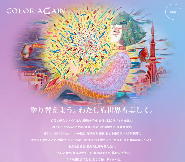
The illustration shows a seated figure in profile with closed eyes, patterned clothing, a textured pink sleeve, and dark green hair. A luminous yellow burst filled with small colored marks radiates near the face and hands. Butterflies, architectural fragments, and a tall red brush-like tower expand the scene.
On desktop, the illustration fills much of the upper center while its outer edges dissolve into the pastel background. On mobile, the artwork occupies nearly the full width and is cropped more tightly around the central figure and burst. Preserve their relationship when choosing a focal point.
The current Japanese statement is 「感性を磨き、想像力を養う」. Its measured desktop box begins at approximately 932, 592; on mobile it begins at approximately 166, 420. It sits toward the lower right of the artwork, not in a centered text block above it.
The exact image bounds, transparency, masking, and asset format were not supplied. Use authorized artwork with its existing edge treatment where possible; CSS gradients alone cannot recreate this illustration.
Oversized English Band
The rendered line reads “POLISH YOUR SENSES NURTURE YOUR IMAGINATION” and appears three times in the extracted content.
Use regular Vollkorn at 200px on desktop and 83.2px on the measured phone. The line is intentionally much wider than the viewport: the measured paragraph is approximately 15118px wide on desktop and 6288px on mobile. Its negative horizontal position exposes a cropped fragment of the phrase.
This band acts as a typographic image. Do not wrap it into a conventional multiline heading or shrink it until the whole sentence fits. Clip its overflow locally so it does not create accidental page-wide horizontal scrolling.
The repeated content and geometry suggest a marquee arrangement, but the capture does not establish movement direction, speed, duration, or looping behavior. A static clipped version is an honest baseline implementation.
Mission Statement
On desktop, a 500px text column begins at x: 760px, leaving substantial space to its left. The heading uses three deliberate lines of Japanese serif text. Below it, white sans-serif paragraphs use a generous 2 line-height ratio.
On mobile, the same mission heading occupies the 327.59px content column. It appears within the first screen below the oversized English band, at approximately y: 576px. The first paragraph follows at approximately y: 686px.
Preserve the distinction between the expressive serif statement and explanatory sans-serif copy. Keep the Japanese line breaks purposeful instead of forcing identical breaks in translated text.
Section Heading Pair
Anatomy: large uppercase English heading plus a small Japanese caption.
Examples include SERVICES / 「サービス内容」, ACTIONS / 「過去の取り組み」, MEDIA / 「メディア情報」, and NEWS / 「最新情報」.
English headings use regular Vollkorn, 72px on desktop and 45.76px on mobile. Japanese captions use Noto Sans JP, 16px and 11.44px respectively. Some captions begin approximately 5px to the right of the English heading edge.
Archive links sit near headings on desktop and move below content on mobile. NEWS has a distinct desktop arrangement with its heading beside the list rather than above it.
Services Feature
The Services block links to /services/ as a substantial content region. Its text includes the title 「感性ワークショップ」, a short explanation, and 「詳しくはこちら」.
Desktop text occupies approximately 374.78px on the left of a 1074px region. The mobile feature spans the content column, with its title approximately 242px below the link's top edge. This supports a stacked media-and-text composition on mobile, although the selected DOM records do not expose the media element itself.
Use an image region and a concise text region without enclosing them in a white rounded card. Let the page background remain visible around the feature. The exact media crop and hover treatment are unverified.
Actions Rail
Anatomy: image region, Japanese serif title, optional organization name, and outlined category pill.
Seven linked entries are present in the supplied DOM. Desktop card widths are 503px, with a calculated 60px gap. The first three begin at x: 183, 746, and 1309, proving that the sequence extends horizontally beyond the central content region.
On mobile, cards become approximately 261.55px wide while the calculated gap remains 60px. The second card begins at x: 352.75, near the right viewport edge. The exact clipping boundary is not recorded.
Titles use 24px serif text on desktop and 16.64px on mobile. Organization names are smaller sans-serif text. Categories such as 「社内研修」 and 「イベント」 appear in transparent white-outline pills.
Desktop arrow controls are recorded beneath the rail. Their activation, slide distance, keyboard behavior, touch dragging, and autoplay were not tested. Do not assume those behaviors merely from the rail geometry.
Category Pill
The category control has transparent fill, white lettering, a fully rounded outline, and compact padding.
Measured desktop values are 11px text, 19.8px line height, 1px 10px padding, and 27.5px radius. Mobile uses 10.4px text, 18.72px line height, 1.04px 10.4px padding, and 26px radius.
The extracted elements are buttons and declare color/background transitions, but their click semantics were not established. In an adaptation, use a noninteractive label if it only describes content; use a separate accessible button if it actually filters results.
Artwork Montage
The middle desktop capture contains a broad, tightly cropped montage of pale rectangular sheets. Some sheets contain Japanese writing, while others show fluid line figures, hearts, watercolor-like washes, and expressive pigment marks.
The sheet grid is tilted approximately 15 degrees clockwise, a visual estimate. Gray gutters and soft shadows give the arrangement a physical paper quality. The image extends across the viewport, interrupting the narrower editorial content.
Treat the tilt and shadows as part of this specific image composition. The evidence does not establish individual interactive cards, DOM transforms, or a general shadow system. Its exact DOM attachment and asset URL were not supplied.
Project Story Feature
The Project Story region links to an external WORK MILL article. On desktop the link is a flex region approximately 1066 × 409px, with the heading in a right-side column of approximately 372px.
The heading wraps as PROJECT / STORY at 58px with matching line height. On mobile, PROJECT STORY appears on one line at 30.16px, following a substantial media-sized area in the stacked layout.
Include a short explanatory paragraph and the detail-link treatment. The external destination was not inspected, so this reference describes only its homepage entry point.
Media Rail
Media uses the same open, horizontal presentation as Actions but with smaller desktop cards: 315px wide, separated by 60px. Three cards begin within the desktop content area at x: 183, 558, and 933; later cards continue beyond it.
Nine media entries are present. Each combines an image region, a Japanese serif title, and a small sans-serif publication name. Desktop titles are 18px, smaller than Actions titles. On mobile, Media and Actions share the same measured card width of approximately 261.55px and title size of 16.64px, but their line heights differ.
The rendered text includes server diagnostic fragments in two media entries. These are content defects, not intentional visual language. Do not reproduce them in a design adaptation.
News List
Anatomy: rectangular thumbnail at left; date, title, and category at right; a small MORE cue at the far right on desktop.
The desktop list is 609px wide. In the supplied lower-page screenshot, thumbnails are approximately 218 × 145px, a visual estimate. Text begins at x: 445px, while each row begins at x: 183px. Titles occupy a measured 258px column and use 15px / 22px Noto Sans JP.
A faint horizontal rule separates entries. The sampled row height is approximately 149px, with starts around 229px apart. The NEWS heading and archive pill sit in a separate area to the right of the list.
On mobile, the heading moves above the list. Rows remain split between thumbnail and text rather than becoming full-width image cards. Text starts at approximately x: 193.45px and is 165.34px wide. Titles retain a readable measured size of 14.56px / 21.84px. MORE is absent from the mobile extracted text.
The archive pill follows the list on mobile.
Archive and Contact Pills
The screenshots show clean, white or near-white capsules with lavender text and a fine right arrow. Archive links read VIEW ALL; the contact pill reads 「お問い合わせはこちら」.
Desktop archive anchor boxes measure 153 × 58.39px, while the visible filled pill appears approximately 50px high. On mobile, archive anchor boxes span 327.59px and measure approximately 65.44px high; the visible capsule is approximately 61px high. Distinguish the painted surface from its enclosing inline box.
Keep labels compact and leave generous space before the arrow. Do not add a second accent color or a strong drop shadow.
Contact Region
On desktop, Contact is a broad linked region with a faint top rule, 140px vertical padding, a heading and paragraph at left, and a small capsule at right. The region measures 1060px wide. The paragraph is approximately 330px wide and wraps into three lines in the supplied view.
Mobile Contact is a vertical sequence: heading, paragraph, then a full-column pill. In the screenshot, the heading appears around y: 132px, the paragraph around y: 198px, and the pill around y: 308px. These are coordinates within the supplied scrolled capture, not document positions.
The spacious separation is part of the composition. Avoid compressing Contact into a narrow colored banner.
Footer
Desktop uses a wide horizontal footer separated by a fine white rule. Operator marks sit at the left, photography information and copyright occupy the middle/right, and social marks finish the row.
Mobile reorganizes this into a tall centered stack:
- A social row between faint rules.
- Operator label and two logos.
- Photography and cooperation credits.
- Copyright near the bottom.
Measured social glyph sizes increase from approximately 18px on desktop to 28.08px on mobile. The note mark increases from 72px to approximately 93.59px wide. Use the observed white Twitter bird, Instagram outline, and note mark when reproducing this capture; substituting unrelated icon shapes changes its appearance.
The original footer identifies MÅNGATA and FICC under 「運営」. It separately names Shun Nakayama for photography and 「ソーシャルアパートメント恵比寿」 for photography cooperation. These statements do not establish who designed or developed the website or created the hero illustration.
Tokens — Motion & Interaction
The evidence supports several transition declarations, but it does not include a complete interaction recording.
| Element | Recorded declaration or evidence | What can be concluded |
|---|---|---|
| Opening wordmark | opacity 1.4s cubic-bezier(0.165, 0.84, 0.44, 1) 0.8s |
A delayed opacity transition is defined; the complete loading sequence was not captured |
| Mobile section headings | Opacity and transform, 0.55s, same easing |
Reveal-capable transitions are defined; exact trigger and travel distance are unverified |
| Mobile section captions | Opacity and transform, 0.55s, 0.15s delay |
Captions can follow their heading with a short stagger |
| Mobile Actions footer | Opacity and transform, 0.55s |
The archive area has a reveal-capable transition |
| Category controls | Background color and color, 0.25s, same easing |
Color feedback is defined; endpoint colors and triggering states were not supplied |
| Desktop rail controls | Opacity, 0.7s, same easing |
Opacity feedback is defined; disabled/hover behavior was not exercised |
| Repeated English band | Three copies and a very wide, offset text box | Marquee-style structure is evidenced; timing and movement are not |
| MENU | Persistent position across scroll captures | A persistent affordance is visible; opening behavior is unverified |
| Pastel background | Different visible color regions across captures | The field is spatially varied; temporal animation cannot be established |
A computed transition: all without a recorded nonzero duration is not evidence of a visible animation. Similarly, animation: none on sampled elements does not rule out script-driven transforms, descendant animation, or pseudo-element effects.
For a new implementation, use the measured easing for restrained fades and small translations. Keep content visible by default and add reveal behavior progressively. Do not invent a marquee speed, automatic carousel, rotating menu ring, or animated gradient and describe it as observed.
Surfaces
| Layer | Appearance | Purpose |
|---|---|---|
| Page atmosphere | Continuous rose, lavender, pink, and blue field | Unifies the long homepage |
| Hero artwork | Saturated painted illustration with soft outer edges | Primary visual identity |
| Editorial content | White text on transparent surroundings | Keeps the atmosphere visible |
| Rail cards | Image followed by unboxed text | Organizes activity and press coverage |
| Physical-paper montage | Pale sheets, gray gaps, soft photographic shadows | Adds tactile contrast within one image composition |
| Category labels | Fine white outline and transparent fill | Secondary classification |
| Main link pills | White or near-white capsule with lavender detail | Clear navigation affordance |
| Dividers | Low-opacity white hairlines | Separates content without heavy containers |
There is no evidenced general elevation system. Avoid applying the montage's paper shadows to every card or adding blurred glass panels behind ordinary text.
Imagery
The opening artwork should remain materially different from the surrounding interface. Its dense, hand-rendered texture includes many small strokes and contrasting hues; the interface stays sparse and predominantly white.
Maintain three image roles:
- Expressive illustration: large, intricate, emotionally suggestive, with edges that merge into the background.
- Participant artwork: visible marks on paper, line figures, pigment washes, and imperfect physical surfaces.
- Documentary photography: people participating in discussions or workshops, as seen in the News thumbnails.
Use normal image rendering. The artwork is detailed painting and photography, not pixel art. Avoid vectorizing away its texture, artificially sharpening it, or replacing it with generic pastel abstract shapes.
For mobile crops, prioritize the relationship between the figure's face, hands, and radiating burst. A mechanically centered crop of an arbitrary replacement image may miss that relationship.
Observed Asset References
The supplied evidence does not expose image src values or a downloadable asset manifest. The following references identify visual roles only.
| Asset | Evidence | Treatment | Source path |
|---|---|---|---|
| COLOR Again wordmark | Opening desktop and mobile screenshots | White custom lettering | Not supplied |
| Main figure illustration | Opening desktop and mobile screenshots | Large central composition, tighter mobile crop, soft edges | Not supplied |
| Tilted paper montage | Middle desktop screenshot | Full-width crop of an angled sheet arrangement | Not supplied |
| News thumbnails | Lower desktop screenshot | Rectangular documentary images, square corners | Not supplied |
| Operator logos | Desktop and mobile footer screenshots | White marks aligned with the operator label | Not supplied |
| Social marks | Footer screenshots and link destinations | White Twitter, Instagram, and note symbols | Not supplied |
Use original assets only when authorized and available. Asset filenames, illustration authorship, and the exact masking technique cannot be recovered from the supplied evidence.
Layout & Responsive Behavior
Desktop: 1440 × 1000
The opening composition is broad and image-led. The English band begins near y: 666px; the mission heading begins near y: 1022px, below the first viewport. The hero therefore has room to establish the artwork before sustained explanatory copy appears.
Most sections use a centered 1074px container, while the footer expands to 1340px. Contact uses a slightly narrower 1060px region. Keep these width differences intentional rather than forcing every element onto one universal column.
Actions shows two large card starts within the central area; Media shows three smaller ones. Both continue horizontally. News uses a list-left, heading-right arrangement. Contact uses text-left, pill-right alignment.
Mobile: 390 × 844
The main column measures approximately 84vw, with 8vw margins. Header identity uses smaller outer margins of approximately 4vw.
The oversized English line starts near y: 452px, and the mission heading is visible within the opening screen. The mobile composition is therefore not simply a scaled desktop hero.
Services and Project Story become vertical compositions. Actions and Media remain horizontal rails, with matching mobile card widths. Archive links move below their respective content areas and span the main column.
News retains its thumbnail/text pairing, but the section heading moves above the rows. Contact stacks its content and enlarges the link to full width. The footer becomes taller, centers its groups, and enlarges social marks.
Responsive Limits
Only the two stated viewports were supplied. The exact breakpoint, tablet behavior, landscape layout, browser zoom behavior, safe-area handling, and intermediate font formulas are unverified.
A 48rem breakpoint and a min(1074px, 84vw) main container are useful implementation starting points, not recovered source rules. The Quick Start uses the measured endpoints with this explicitly recommended breakpoint.
Do’s and Don’ts
Do
- Build a continuous pastel atmosphere around the measured rose foundation
#ce93bf. - Keep white as the dominant visible foreground.
- Preserve the contrast between intricate saturated artwork and restrained interface elements.
- Use Vollkorn for English display text, Noto Serif JP for Japanese statements, and Noto Sans JP for explanations and utility text.
- Keep the repeated English line oversized and locally clipped.
- Preserve the desktop mission column's right-side placement.
- Retain horizontal content rails on mobile instead of assuming every collection becomes a vertical grid.
- Keep images square-cornered and content cards transparent.
- Move archive links below content and expand them on mobile.
- Reorganize the footer into distinct centered mobile groups.
- Distinguish computed parent values from visible child typography and graphics.
Don't
- Don't replace the painted hero with generic gradient blobs or an unrelated stock portrait.
- Don't introduce a saturated interface accent simply because that color appears in the illustration.
- Don't wrap every section in a white rounded card.
- Don't make all text serif or all text sans-serif.
- Don't shrink the English band until the full phrase fits across the screen.
- Don't use the mobile body's inherited
7.28pxsize for reading text. - Don't treat WordPress presets or default blue anchor wrappers as the visible brand palette.
- Don't infer autoplay, swipe support, menu behavior, or continuous background motion from still captures.
- Don't reproduce server diagnostic text as editorial content.
- Don't attribute the website or illustration to organizations whose only verified role is operation or photography cooperation.
Recommended Implementation Additions
These are recommendations for a new implementation, not verified features of the original page.
- Contrast: test white text against the lightest gradient positions. A subtle darker local wash, or selective use of the measured dark inherited color for essential small text, can improve readability while retaining the pastel field.
- Text sizing: consider a
16pxminimum for important mobile paragraphs and larger footer credits. The observed smaller sizes are reference measurements, not accessibility targets. - Navigation: give MENU an accessible name,
aria-expanded, and an associated navigation region. Implement keyboard dismissal and focus return if it opens a modal panel. - Rails: provide keyboard-operable previous/next controls or a native horizontally scrollable list. Preserve reading order and avoid moving keyboard focus when advancing slides.
- Touch targets: expand the interactive area around small social glyphs and category controls to at least approximately
44pxwhere they are actionable. - Semantics: avoid nesting an independent category button inside a card link. Use a descriptive span for static classification.
- Motion: respect
prefers-reduced-motion; keep all content available without entrance effects and use a static version of any optional marquee. - Repeated text: expose the repeated English phrase once to assistive technology, or treat the entire decorative band as hidden when an equivalent meaningful heading already exists.
- Images: provide meaningful text alternatives for editorial images and appropriate empty alternatives for purely decorative artwork. Set image dimensions to reduce layout movement.
- Content quality: remove diagnostic fragments from media entries and validate those entries' markup.
Agent Prompt Guide
Quick Color Reference
- Measured foundation: rose
#ce93bf. - Measured primary foreground: white
#ffffff. - Estimated atmospheric companions: lavender
#b6a3d3, sky blue#8cbfe9, pale pink#d9b7d5. - Link surfaces: white or near-white with lavender text and a fine arrow.
- Dividers: faint white hairlines.
- Saturated yellow, red, and turquoise: confined primarily to supplied artwork.
Overall Prompt
“Create a responsive project homepage for an arts and sensitivity workshop initiative. Use a continuous soft rose, lavender, and sky-blue background, white typography, and a large authorized painted illustration whose edges blend into the surrounding color. Pair regular Vollkorn English headings with Noto Serif JP statements and Noto Sans JP body copy. Place a custom white wordmark at upper left and a persistent MENU control inside a thin incomplete circle at upper right. Below the artwork, show a deliberately oversized, cropped English text band. Use an asymmetric desktop mission column, transparent horizontal activity and media rails, documentary news rows, and white capsule links. At 390px, use approximately 31px content margins, retain horizontal rails, move archive links below content, stack Contact, and center the footer groups. Keep motion optional and clearly separate inferred behavior from measured styling.”
Example Component Prompts
- Hero: “A richly textured painted figure and radiating yellow burst over a diffuse pastel field. Add the Japanese statement 「感性を磨き、想像力を養う」 near the artwork's lower right. Follow it with a white Vollkorn English line at 200px on desktop and about 83px on a 390px phone, clipped rather than wrapped.”
- Actions rail: “Transparent editorial cards, 503px wide on desktop and about 262px on mobile, separated by 60px. Each card has a square-cornered image, white Japanese serif title, small sans-serif organization name, and a fine outlined category pill. Keep the sequence horizontal.”
- News: “A restrained list with documentary thumbnails at left, date/title/category at right, faint white separators, and a small desktop MORE cue. Place the large NEWS heading beside the desktop list and above it on mobile.”
- Contact: “A spacious contact area on the continuous pastel background. Use a 72px regular serif CONTACT heading on desktop, a narrow white Japanese paragraph, and a small white capsule at right. On mobile use a roughly 46px heading and a full-column capsule below the paragraph.”
- Footer: “A fine white divider followed by white operator logos, small photography credits, copyright, and social marks. Use one compact desktop row; on mobile show a social band between rules, then operator marks, credits, and copyright with generous vertical spacing.”
Quick Start
CSS Custom Properties
This is an implementation scaffold, not the original stylesheet. It uses a conventional root size and explicit measured component sizes. Gradient construction, the 48rem breakpoint, image slots, focus styling, and unmeasured button details are recommended approximations.
Supply authorized image and logo assets and load the observed fonts separately. The CSS does not invent original asset URLs. It provides a static English band and native horizontal rails; menu behavior and optional reveal logic require separate implementation.
:root {
  /* Measured colors */
  --color-rose: #ce93bf;
  --color-white: #ffffff;
  --color-inherited-ink: #473f3f;

  /* Visual approximations */
  --color-lavender: #b6a3d3;
  --color-sky: #8cbfe9;
  --color-pale-pink: #d9b7d5;
  --color-pill: #faf7fc;
  --color-rule: rgb(255 255 255 / 0.22);

  /* Observed font stacks */
  --font-display: 'Vollkorn', serif;
  --font-statement: YakuHanMP_Noto, 'Noto Serif JP', serif;
  --font-body: 'Noto Sans JP', sans-serif;

  /* Desktop measurements */
  --text-section: 72px;
  --leading-section: 1.1;
  --text-band: 200px;
  --text-statement: 36px;
  --text-body: 18px;
  --text-caption: 16px;
  --text-action: 24px;
  --text-media: 18px;
  --tracking: 0.9px;
  --container-max: 1074px;
  --action-width: 503px;
  --media-width: 315px;
  --rail-gap: 60px;
  --section-gap: 160px;
  --radius-pill: 999px;

  /* Recorded transition values */
  --ease-reveal: cubic-bezier(0.165, 0.84, 0.44, 1);
  --duration-reveal: 550ms;
  --duration-category: 250ms;
}

* {
  box-sizing: border-box;
}

body {
  margin: 0;
  color: var(--color-white);
  background: var(--color-rose);
  font-family: var(--font-body);
  font-size: var(--text-body);
  line-height: 1.8;
  letter-spacing: var(--tracking);
}

.color-again-page {
  position: relative;
  isolation: isolate;
  min-height: 100vh;
}

/* Recommended static approximation of the atmospheric field */
.color-again-page::before {
  content: '';
  position: fixed;
  inset: 0;
  z-index: -1;
  pointer-events: none;
  background:
    radial-gradient(ellipse at 62% 90%,
      var(--color-sky), transparent 57%),
    radial-gradient(ellipse at 76% 10%,
      var(--color-pale-pink), transparent 62%),
    radial-gradient(ellipse at 20% 48%,
      var(--color-lavender), transparent 63%),
    var(--color-rose);
}

img {
  display: block;
  max-width: 100%;
}

a {
  color: inherit;
}

.container {
  width: min(var(--container-max), 84vw);
  margin-inline: auto;
}

.section + .section {
  margin-top: var(--section-gap);
}

.brand {
  position: absolute;
  z-index: 10;
  top: 53px;
  left: 50px;
  width: 380px;
}

.brand img {
  width: 100%;
  height: auto;
}

.menu-toggle {
  position: fixed;
  z-index: 30;
  top: 30px;
  right: 30px;
  display: grid;
  place-items: center;
  width: 100px;
  height: 100px;
  padding: 0;
  border: 0;
  background: transparent;
  color: var(--color-white);
  font: 400 14px/1 var(--font-display);
  cursor: pointer;
}

/* Approximation of the incomplete circular decoration */
.menu-toggle::before {
  content: '';
  position: absolute;
  inset: 0;
  border: 1px solid var(--color-rule);
  border-right-color: transparent;
  border-radius: 50%;
  transform: rotate(-35deg);
  pointer-events: none;
}

/* Image dimensions are composition slots, not recovered asset bounds */
.hero-visual {
  position: relative;
  height: 666px;
}

.hero-art {
  position: absolute;
  top: 0;
  left: 50%;
  width: min(1180px, 100%);
  height: 720px;
  object-fit: contain;
  object-position: center top;
  transform: translateX(-50%);
}

.hero-caption {
  position: absolute;
  right: 47px;
  bottom: 34px;
  margin: 0;
  font: 700 40px/1 var(--font-statement);
  letter-spacing: normal;
}

.marquee {
  position: relative;
  overflow: hidden;
}

.marquee-track {
  width: max-content;
  margin: 0;
  font: 400 var(--text-band)/1 var(--font-display);
  white-space: nowrap;
  text-transform: uppercase;
  transform: translateX(-28%);
}

.mission {
  width: 500px;
  margin: 156px max(8vw, calc((100vw - 1080px) / 2)) 0 auto;
}

.mission h2 {
  margin: 0 0 40px;
  font: 600 var(--text-statement)/1.3 var(--font-statement);
}

.mission p {
  margin: 0 0 36px;
  font-size: var(--text-body);
  font-weight: 500;
  line-height: 2;
}

.section-head {
  margin-bottom: 45px;
}

.section-title {
  margin: 0;
  font: 400 var(--text-section)/var(--leading-section)
    var(--font-display);
}

.section-caption {
  margin: 0;
  font-size: var(--text-caption);
  font-weight: 500;
  line-height: 1.5;
}

.section-layout {
  display: grid;
  grid-template-columns: minmax(0, 1fr) auto;
  align-items: center;
}

.section-layout .rail {
  grid-column: 1 / -1;
}

/* Native scrolling is an adaptation, not verified source behavior */
.rail {
  display: flex;
  gap: var(--rail-gap);
  min-width: 0;
  overflow-x: auto;
  padding-bottom: 24px;
  scroll-snap-type: x proximity;
}

.card {
  flex: 0 0 var(--action-width);
  min-width: 0;
  scroll-snap-align: start;
}

.media-rail .card {
  flex-basis: var(--media-width);
}

.card-link {
  display: block;
  text-decoration: none;
}

/* Recommended image ratio; original image rectangles were not supplied */
.card-image {
  width: 100%;
  aspect-ratio: 3 / 2;
  object-fit: cover;
  border-radius: 0;
}

.card-title {
  margin: 24px 0 16px;
  font: 500 var(--text-action)/1.3 var(--font-statement);
}

.media-rail .card-title {
  font-size: var(--text-media);
}

.card-meta {
  margin: 0 0 22px;
  font-size: 13px;
  line-height: 2;
}

.media-rail .card-meta {
  font-size: 11px;
  line-height: 1.2;
}

.category {
  display: inline-block;
  padding: 1px 10px;
  border: 1px solid rgb(255 255 255 / 0.45);
  border-radius: var(--radius-pill);
  color: var(--color-white);
  background: transparent;
  font: 400 11px/1.8 var(--font-body);
  letter-spacing: 0.55px;
  transition:
    color var(--duration-category) var(--ease-reveal),
    background-color var(--duration-category) var(--ease-reveal);
}

.pill {
  display: inline-flex;
  align-items: center;
  justify-content: space-between;
  gap: 24px;
  min-width: 153px;
  min-height: 50px;
  padding: 12px 22px;
  border-radius: var(--radius-pill);
  color: var(--color-lavender);
  background: var(--color-pill);
  font-size: 11px;
  line-height: 1.4;
  text-decoration: none;
}

.pill-arrow {
  flex: none;
  width: 20px;
  height: 1px;
  position: relative;
  background: currentColor;
}

.pill-arrow::after {
  content: '';
  position: absolute;
  top: -2px;
  right: 0;
  width: 4px;
  height: 4px;
  border-top: 1px solid currentColor;
  border-right: 1px solid currentColor;
  transform: rotate(45deg);
}

.news-layout {
  display: grid;
  grid-template-columns: 609px 197px;
  justify-content: space-between;
  align-items: center;
}

.news-list {
  grid-column: 1;
  grid-row: 1;
}

.news-aside {
  grid-column: 2;
  grid-row: 1;
}

.news-row {
  display: grid;
  grid-template-columns: 218px minmax(0, 1fr) 35px;
  gap: 44px;
  padding-block: 40px;
  text-decoration: none;
}

.news-row + .news-row {
  border-top: 1px solid var(--color-rule);
}

.news-row img {
  width: 100%;
  aspect-ratio: 3 / 2;
  object-fit: cover;
}

.news-title {
  margin: 12px 0 20px;
  font: 400 15px/22px var(--font-body);
}

.news-date,
.news-more {
  font-size: 11px;
}

.news-more {
  align-self: center;
}

.contact {
  display: grid;
  grid-template-columns: 335px auto;
  align-items: center;
  justify-content: space-between;
  width: min(1060px, 84vw);
  margin: 140px auto 0;
  padding-block: 140px;
  border-top: 1px solid var(--color-rule);
}

.contact-copy {
  margin: 5px 0 0 5px;
  font-size: 15px;
  font-weight: 500;
  line-height: 1.75;
}

.site-footer {
  display: flex;
  align-items: center;
  gap: 24px;
  width: calc(100% - 100px);
  margin-inline: auto;
  padding-block: 58px 63px;
  border-top: 1px solid var(--color-rule);
}

.footer-operators,
.footer-social {
  display: flex;
  align-items: center;
  gap: 20px;
}

.footer-credits {
  margin-left: auto;
}

.footer-credits,
.footer-copyright {
  font-size: 10px;
}

/* Recommended keyboard focus treatment */
.color-again-page :focus-visible {
  outline: 2px solid var(--color-white);
  outline-offset: 5px;
  box-shadow: 0 0 0 7px rgb(71 63 63 / 0.5);
}

/* Recommended breakpoint; mobile values match the 390px sample */
@media (max-width: 48rem) {
  :root {
    --text-section: 45.76px;
    --leading-section: 1;
    --text-band: 83.2px;
    --text-statement: 22.88px;
    --text-body: 14.56px;
    --text-caption: 11.44px;
    --text-action: 16.64px;
    --text-media: 16.64px;
    --tracking: 0.364px;
    --action-width: 67.064vw;
    --media-width: 67.064vw;
    --section-gap: 83.2px;
  }

  .brand {
    top: 8vw;
    left: 4vw;
    width: 59.067vw;
  }

  .menu-toggle {
    top: 4vw;
    right: 4vw;
    width: 17.064vw;
    height: 17.064vw;
    min-width: 44px;
    min-height: 44px;
    font-size: 10px;
  }

  .hero-visual {
    height: 452.48px;
  }

  .hero-art {
    top: 75px;
    width: 100%;
    height: 370px;
    object-fit: cover;
    object-position: center;
  }

  .hero-caption {
    right: 8.27vw;
    bottom: 15.6px;
    font-size: 16.64px;
  }

  .mission {
    width: 84vw;
    margin: 40.56px auto 0;
  }

  .mission h2 {
    margin-bottom: 20.8px;
  }

  .mission p {
    margin-bottom: 21.84px;
  }

  .section-head {
    margin-bottom: 26px;
  }

  .section-caption {
    line-height: 14.96px;
  }

  .section-layout {
    display: flex;
    flex-direction: column;
    align-items: stretch;
  }

  .section-layout .section-head {
    order: 0;
  }

  .section-layout .rail {
    order: 1;
  }

  .section-layout .archive-link {
    order: 2;
    margin-top: 48px;
  }

  .card-title {
    margin-top: 20px;
    line-height: 1.2;
  }

  .media-rail .card-title {
    line-height: 1.4;
  }

  .card-meta,
  .media-rail .card-meta {
    font-size: 11.44px;
  }

  .category {
    padding: 1.04px 10.4px;
    font-size: 10.4px;
    letter-spacing: 0.52px;
  }

  .pill {
    width: 100%;
    min-height: 61px;
    padding-inline: 28px;
    font-size: 14px;
  }

  .news-layout {
    display: flex;
    flex-direction: column;
    align-items: stretch;
  }

  .news-aside {
    display: contents;
  }

  .news-aside .section-head {
    order: 0;
  }

  .news-list {
    order: 1;
  }

  .news-aside .archive-link {
    order: 2;
    margin-top: 48px;
  }

  .news-row {
    grid-template-columns: minmax(0, 1fr) 50.47%;
    gap: 20.8px;
    padding-block: 31.2px;
  }

  .news-title {
    font-size: 14.56px;
    line-height: 21.84px;
  }

  .news-more {
    display: none;
  }

  .contact {
    display: block;
    margin-top: 62.4px;
    padding: 0 0 62.4px;
    border-top: 0;
  }

  .contact-copy {
    margin: 13px 0 0 5.2px;
    font-size: 14.56px;
    line-height: 25.48px;
  }

  .contact .pill {
    margin-top: 48px;
  }

  .site-footer {
    display: flex;
    flex-direction: column;
    width: 84vw;
    padding-block: 0 23.4px;
    text-align: center;
    border-top: 0;
  }

  .footer-social {
    order: 0;
    justify-content: center;
    width: 100%;
    padding-block: 40px;
    border-block: 1px solid var(--color-rule);
  }

  .footer-operators {
    order: 1;
    justify-content: center;
    margin-top: 20px;
  }

  .footer-credits {
    order: 2;
    margin: 54px 0 0;
  }

  .footer-copyright {
    order: 3;
    margin-top: 54px;
  }
}

/* Content remains visible without scripts or entrance effects */
@media (prefers-reduced-motion: reduce) {
  .color-again-page *,
  .color-again-page *::before,
  .color-again-page *::after {
    animation: none !important;
    transition: none !important;
    scroll-behavior: auto !important;
  }
}
Markup expectations: .card contains a .card-link with image, title, metadata, and a noninteractive category span. .section-layout contains its heading, archive link, and rail. .news-aside contains the News heading and archive link, allowing the mobile ordering above. Put any decorative arrow in an aria-hidden="true" element. Do not duplicate interactive controls solely to change their visual position.
The scaffold intentionally leaves the mission's unmeasured intermediate media composition, service imagery, and paper montage asset to the actual content. It does not claim to recreate those elements from CSS.
Tailwind v4 Token Mapping
Optional aliases for a project that already uses Tailwind v4. This does not imply that the original site uses Tailwind. Define the preceding variables first.
@theme inline {
  --color-atmosphere-rose: var(--color-rose);
  --color-atmosphere-lavender: var(--color-lavender);
  --color-atmosphere-sky: var(--color-sky);
  --color-atmosphere-pink: var(--color-pale-pink);
  --color-interface-white: var(--color-white);
  --color-interface-rule: var(--color-rule);

  --font-editorial: var(--font-display);
  --font-japanese-statement: var(--font-statement);
  --font-japanese-body: var(--font-body);

  --text-section-heading: var(--text-section);
  --text-decorative-band: var(--text-band);
  --text-mission-heading: var(--text-statement);
  --text-reading: var(--text-body);
  --text-section-caption: var(--text-caption);

  --spacing-rail-gap: var(--rail-gap);
  --spacing-section-gap: var(--section-gap);
  --radius-capsule: var(--radius-pill);
}
Sources & Evidence
- Original and final page: https://color-again.com/. The supplied inspection reports HTTP 200 and no URL change.
- Capture timestamp: October 1, 2026,
16:19:08.848Z, equivalent to October 2, 2026,01:19:08.848 JST. - Desktop evidence: three current-page screenshots at
1440 × 1000, showing the opening composition, a middle artwork montage, and the lower News/Contact/footer area; rendered text, links, element rectangles, custom properties, and selected computed styles at that viewport. - Mobile evidence: two current-page screenshots at
390 × 844, showing the opening composition and Contact/footer; corresponding rendered text, links, element rectangles, custom properties, and selected computed styles. - Observation process: the supplied browser inspection allowed at least five seconds of initial observation and used bounded waits for loading, visible image decoding, finite motion, and sampled layout/text stability. It traversed intermediate scroll positions. These checks do not establish semantic completeness or every possible delayed state.
- Interaction limits: menu opening, hover endpoints, carousel activation, touch gestures, form behavior, and linked destinations were not exercised in the supplied evidence. Perpetual animations were paused during readiness checks and resumed; still images do not establish their timing. SharedWorkers and service workers were disabled during inspection.
- Source limits: no complete stylesheet, image manifest, font-file verification, gradient implementation, or production-credit record was supplied. The report distinguishes measured declarations from visible estimates and implementation recommendations.
This reference describes the current homepage represented by the supplied original-page captures. All reusable CSS and prompts are adaptations of that evidence, with unverified behavior explicitly identified.
# COLOR Again — Style Reference

> A vivid illustrated imagination floating over a soft pink, lavender, and blue atmosphere.

**Website:** [color-again.com](https://color-again.com/)
**Original URL:** https://color-again.com/
**Final URL:** https://color-again.com/
**Theme:** a light pastel field with white typography and richly colored artwork; no theme selector was evidenced.
**Inspected:** supplied browser capture dated October 2, 2026, at 01:19:08 JST / October 1, 2026, at 16:19:08.848 UTC.
**Viewports:** desktop 1440 × 1000 CSS pixels; mobile 390 × 844 CSS pixels.
**Scope:** the current project homepage: opening artwork, mission statement, Services, Actions, an illustrated montage, Project Story, Media, News, Contact, and footer. Linked pages and open navigation states were not inspected.

COLOR Again presents a project about rediscovering personal sensitivity and imagination. Its homepage combines service information, examples of past activity, editorial coverage, news, and contact routes. The design supports that broader project identity through a continuous atmospheric background rather than a sequence of boxed promotional panels.

The dominant relationship is between soft surroundings and intense artwork. Pink, lavender, and blue blend behind white type, while the opening illustration introduces saturated yellow, red, turquoise, and intricate painted marks. Large English serif headings supply structure. Japanese serif statements carry the expressive messages; Japanese sans-serif paragraphs make longer explanations practical to read.

Desktop composition is deliberately uneven: the mission text occupies the right side, content rails extend horizontally, and the News heading sits beside its list. Mobile retains the large artwork and cropped English lettering while bringing explanatory content into a consistent narrow column. The footer changes from a compact horizontal strip to a tall sequence of contact, social links, operator marks, and credits.
閉じる
# COLOR Again — Style Reference

> A vivid illustrated imagination floating over a soft pink, lavender, and blue atmosphere.

**Website:** [color-again.com](https://color-again.com/)
**Original URL:** https://color-again.com/
**Final URL:** https://color-again.com/
**Theme:** a light pastel field with white typography and richly colored artwork; no theme selector was evidenced.
**Inspected:** supplied browser capture dated October 2, 2026, at 01:19:08 JST / October 1, 2026, at 16:19:08.848 UTC.
**Viewports:** desktop 1440 × 1000 CSS pixels; mobile 390 × 844 CSS pixels.
**Scope:** the current project homepage: opening artwork, mission statement, Services, Actions, an illustrated montage, Project Story, Media, News, Contact, and footer. Linked pages and open navigation states were not inspected.

COLOR Again presents a project about rediscovering personal sensitivity and imagination. Its homepage combines service information, examples of past activity, editorial coverage, news, and contact routes. The design supports that broader project identity through a continuous atmospheric background rather than a sequence of boxed promotional panels.

The dominant relationship is between soft surroundings and intense artwork. Pink, lavender, and blue blend behind white type, while the opening illustration introduces saturated yellow, red, turquoise, and intricate painted marks. Large English serif headings supply structure. Japanese serif statements carry the expressive messages; Japanese sans-serif paragraphs make longer explanations practical to read.

Desktop composition is deliberately uneven: the mission text occupies the right side, content rails extend horizontally, and the News heading sits beside its list. Mobile retains the large artwork and cropped English lettering while bringing explanatory content into a consistent narrow column. The footer changes from a compact horizontal strip to a tall sequence of contact, social links, operator marks, and credits.

## How to Read This Reference

- **Measured** values come from the supplied rendered DOM, computed styles, and element rectangles. They describe the sampled viewport and state.
- **Visual estimates** describe the attached current-page screenshots. Estimated colors are approximations, not extracted source declarations or exact pixel samples.
- **Calculated** values are arithmetic derived from the supplied measurements, such as spacing between adjacent card rectangles.
- **Recommended** values describe an implementation adaptation. They are not claims about the original stylesheet.
- Custom-property names introduced here are reusable aliases. Only properties explicitly identified as source properties were present in the supplied evidence.
- The evidence contains selected element measurements, not a complete DOM tree, stylesheet, image manifest, or event log. Parent computed styles do not necessarily describe their visible descendants.
- Some sampled offscreen headings are displaced relative to their parent boxes, consistent with reveal states. Treat those coordinates as state-dependent measurements, not universal padding rules.

The supplied document heights were approximately **7937px on desktop** and **6603px on mobile**. These are capture-specific results, not fixed heights to reproduce.

## Tokens — Colors

### Default Palette

| Name | Value | Suggested token | Evidence and role |
| --- | --- | --- | --- |
| Rose foundation | `#ce93bf` | `--color-rose` | Measured body background: `rgb(206, 147, 191)` at both viewports |
| White foreground | `#ffffff` | `--color-white` | Measured headings, body-copy elements, category controls, and social links |
| Lavender field | Approximately `#b6a3d3` | `--color-lavender` | Visual estimate of the broad purple regions in current captures |
| Sky-blue field | Approximately `#8cbfe9` | `--color-sky` | Visual estimate of the blue areas, especially around the desktop lower page |
| Pale pink field | Approximately `#d9b7d5` | `--color-pale-pink` | Visual estimate of lighter pink areas between the stronger rose and lavender |
| Soft white surface | Approximately `#faf7fc` | `--color-pill` | Visual estimate of the Contact pill; other archive pills appear closer to white |
| Fine white rule | Recommended `rgb(255 255 255 / 0.22)` | `--color-rule` | Approximates the faint dividers; original opacity was not supplied |
| Inherited dark text | `#473f3f` | `--color-inherited-ink` | Measured body color; most prominent visible text overrides it with white |

The body background declaration supplies only the rose foundation. It does not explain the entire rendered background, which visibly includes large blue, lavender, and pale pink regions. The gradient layers, coordinates, blending method, and possible animation are not exposed in the evidence.

For an adaptation, use several broad radial gradients over the measured rose. Keep transitions diffuse enough that individual circles are not obvious. Maintain continuity behind sections instead of assigning each section a separate gradient panel.

The saturated colors inside the illustration belong to the artwork. They are not evidence for red, yellow, or turquoise interface buttons.

### Source Properties That Are Not Brand Tokens

The rendered page exposes many WordPress preset colors, gradients, shadows, and spacing variables. It also exposes `--swiper-theme-color: #007aff`. Their presence does not establish that those colors or shadow styles appear in this design.

Several anchor wrappers compute to browser blue, `rgb(0, 0, 238)`, while their visible children are white or graphic assets. Do not reproduce blue links throughout the page based on those wrapper measurements.

## Tokens — Typography

### English Display — Vollkorn

**Measured family:** `Vollkorn, serif`.

Use this family for large English section headings, the enormous repeated English line, and Project Story. Observed display headings use weight `400`. Their broad serif shapes make the page feel editorial without competing with the detailed illustration.

The MENU button also declares Vollkorn, but the visible label is a descendant whose own computed size was not supplied. Its parent size should not be copied as the final label size.

### Japanese Statements — Noto Serif JP

**Measured stack:** `YakuHanMP_Noto, "Noto Serif JP", serif`.

This stack appears on the opening Japanese statement, mission heading, service title, and Actions and Media titles. Preserve the punctuation-support family when available; do not assume that its presence proves which font supplied every rendered glyph.

The opening statement uses weight `700`, the mission heading `600`, and service/card titles generally `500`.

### Japanese Body and Metadata — Noto Sans JP

**Measured family:** `"Noto Sans JP", sans-serif`.

Longer explanations use sans-serif text with generous leading. Mission paragraphs use weight `500`; service paragraphs and many card titles or metadata labels use `400`. News titles are sans-serif, unlike the serif titles in Actions and Media.

### Wordmark

The screenshot shows a custom white COLOR Again mark with unusual letter shapes. The corresponding H1 has no extracted text. The evidence does not identify its asset format or a font that would recreate it.

Use an authorized wordmark asset when available. A typed Vollkorn approximation will not reproduce the logo.

### Type Scale

Values below are measured CSS pixels unless marked as estimates. Size and line height are shown together.

| Role | Desktop size / line height | Mobile size / line height | Weight |
| --- | --- | --- | --- |
| Repeated English display line | `200 / 200px` | `83.2 / 83.2px` | 400 |
| Opening Japanese statement | `40 / 40px` | `16.64 / 16.64px` | 700 |
| Mission heading | `36 / 46.8px` | `22.88 / 29.744px` | 600 |
| Mission paragraphs | `18 / 36px` | `14.56 / 29.12px` | 500 |
| English section headings | `72 / 79.2px` | `45.76 / 45.76px` | 400 |
| Japanese section captions | `16 / 24px` | `11.44 / 14.96px` | 500 |
| Service title | `36 / 46.8px` | `20.8 / 37.44px` | 500 |
| Service paragraph | `18 / 32.4px` | `14.56 / 26.208px` | 400 |
| Actions title | `24 / 31.2px` | `16.64 / 19.968px` | 500 |
| Actions organization | `13 / 26px` | `11.44 / 22.88px` | 400 |
| Project Story heading | `58 / 58px` | `30.16 / 30.16px` | 400 |
| Media title | `18 / 23.4px` | `16.64 / 23.296px` | 500 |
| Media publication label | `11 / 11px` | `11.44 / 13.728px` | 400 |
| News title | `15 / 22px` | `14.56 / 21.84px` | 400 |
| Category pill | `11 / 19.8px` | `10.4 / 18.72px` | 400 |
| Contact paragraph | `15 / 26.25px` | `14.56 / 25.48px` | 500 |
| MENU visible lettering | Approximately `14px` | Approximately `10px` | Visual estimate |

**Tracking:** many desktop elements inherit `0.9px`; many mobile elements inherit `0.364px`. The opening Japanese statement has normal tracking. Category controls use `0.55px` on desktop and `0.52px` on mobile. The mobile service paragraph uses `0.728px`.

**Root-size caution:** HTML computes to `10px` on desktop and `5.2px` on mobile. The mobile body inherits a `7.28px` font size, but actual content elements explicitly compute to substantially larger sizes. Do not treat that body value as the mobile reading size or multiply every desktop dimension by `0.52`.

## Tokens — Spacing & Shapes

The page combines substantial vertical breathing room with small utility details. Image and text regions generally have square corners. Rounded geometry is reserved for pill links, category outlines, and the circular MENU decoration.

### Layout Measurements

| Element | Desktop | Mobile | Evidence |
| --- | --- | --- | --- |
| Main section container | `1074px` wide at `x: 183px` | `327.59px` wide at `x: 31.20px` | Measured Services, Actions, and Media sections |
| Main side margins | `183px` | `31.20px`, approximately `8vw` | Measured / calculated |
| Wordmark box | `380 × 65.08px`, at `50, 53` | `230.36 × 35.86px`, at `15.59, 31.19` | Measured H1 box, not visible glyph bounds |
| MENU control | `100 × 100px`, top/right `30px` | `66.55 × 66.55px`, top/right approximately `15.59px` | Measured |
| Mission text column | `500px`, starting at `x: 760px` | `327.59px`, starting at `x: 31.20px` | Measured |
| Actions card | `503px` wide | `261.55px` wide | Measured |
| Media card | `315px` wide | `261.55px` wide | Measured |
| Horizontal card gap | `60px` | `60px` | Calculated from successive card positions |
| Desktop rail controls | `54 × 56px` each, with `20px` between boxes | Not included in the supplied mobile element sample | Measured desktop geometry |
| News row | `609px` wide | `327.59px` wide | Measured |
| Contact region | `1060px` wide at `x: 190px` | `327.59px` wide at `x: 31.20px` | Measured |
| Footer | `1340px` wide at `x: 50px` | `327.59px` wide at `x: 31.20px` | Measured |

### Spacing Scale

These are observed relationships rather than proof of a single source spacing system.

| Use | Desktop | Mobile |
| --- | --- | --- |
| Mission heading to first paragraph | `40px` | Approximately `20.8px` |
| Service title to paragraph | `30px` | `13px` |
| Section header box to service content | `45px` | `26px` |
| Services end to Actions start | `160px` | Approximately `83.19px` |
| News row start-to-start interval | Approximately `229.38px` | Approximately `218.28px` |
| Contact vertical padding | `140px` top and bottom | `0px` on the sampled link wrapper; spacing is distributed around its children |
| Footer vertical padding | `58px` top, `63px` bottom | `62.4px` top, `23.4px` bottom |

The mobile mission section is not simply three uninterrupted paragraphs. The first and second measured paragraphs have roughly `369px` between their boxes. The selected evidence does not identify every intervening element, so retain room for the actual composition rather than interpreting this as a standard paragraph margin.

### Border Radius and Rules

| Element | Observed treatment | Implementation guidance |
| --- | --- | --- |
| Content cards | No rounded wrapper surface evidenced | Use square image corners and transparent card backgrounds |
| Category control | Radius `27.5px` desktop, `26px` mobile | A pill radius such as `999px` reproduces the geometry |
| Archive/contact link | White or near-white capsule in screenshots | Use fully rounded ends |
| MENU decoration | Thin incomplete circle | Keep the square button hit area separate from its circular decoration |
| Section/footer dividers | Faint white hairlines | Start with a `1px` translucent white rule; opacity is an adaptation |

The MENU button itself computes to `border-radius: 0`. Its visible ring is therefore not explained by the button radius. Do not mistake the decoration for the measured control box.

## Components

### Opening Header

**Anatomy:** wordmark at upper left; MENU button at upper right; transparent surrounding surface.

At desktop width, the wordmark begins `50px` from the left and `53px` from the top. On mobile it begins around `15.6px` from the left and `31.2px` from the top. The mobile wordmark remains large relative to the viewport rather than shrinking in direct proportion to desktop width.

MENU is centered within a fine, incomplete circular outline. Its square control measures `100px` on desktop and approximately `66.55px` on mobile. The control remains in the same upper-right screen region in the supplied lower-page captures. This supports a visually persistent control; the exact CSS positioning mechanism was not provided.

The wordmark is absent from the supplied lower-page views. Do not make the entire opening header permanently visible by default.

### Navigation Inventory

The DOM contains six primary destinations: TOP, SERVICES, MEDIA, NEWS, ACTIONS, and CONTACT, each paired with a Japanese label.

Sampled desktop link boxes form two columns: TOP / SERVICES / MEDIA on the left, NEWS / ACTIONS / CONTACT on the right. The mobile boxes form one vertical sequence. These boxes establish the navigation inventory and responsive geometry, but the supplied screenshots do not show the menu opened.

Panel color, open/close transition, focus management, dismissal behavior, and scroll locking remain unverified.

### Illustrated Hero

**Anatomy:** large central artwork, overlapping Japanese statement, then a separate oversized English text band.

The illustration shows a seated figure in profile with closed eyes, patterned clothing, a textured pink sleeve, and dark green hair. A luminous yellow burst filled with small colored marks radiates near the face and hands. Butterflies, architectural fragments, and a tall red brush-like tower expand the scene.

On desktop, the illustration fills much of the upper center while its outer edges dissolve into the pastel background. On mobile, the artwork occupies nearly the full width and is cropped more tightly around the central figure and burst. Preserve their relationship when choosing a focal point.

The current Japanese statement is 「感性を磨き、想像力を養う」. Its measured desktop box begins at approximately `932, 592`; on mobile it begins at approximately `166, 420`. It sits toward the lower right of the artwork, not in a centered text block above it.

The exact image bounds, transparency, masking, and asset format were not supplied. Use authorized artwork with its existing edge treatment where possible; CSS gradients alone cannot recreate this illustration.

### Oversized English Band

The rendered line reads “POLISH YOUR SENSES NURTURE YOUR IMAGINATION” and appears three times in the extracted content.

Use regular Vollkorn at `200px` on desktop and `83.2px` on the measured phone. The line is intentionally much wider than the viewport: the measured paragraph is approximately `15118px` wide on desktop and `6288px` on mobile. Its negative horizontal position exposes a cropped fragment of the phrase.

This band acts as a typographic image. Do not wrap it into a conventional multiline heading or shrink it until the whole sentence fits. Clip its overflow locally so it does not create accidental page-wide horizontal scrolling.

The repeated content and geometry suggest a marquee arrangement, but the capture does not establish movement direction, speed, duration, or looping behavior. A static clipped version is an honest baseline implementation.

### Mission Statement

On desktop, a `500px` text column begins at `x: 760px`, leaving substantial space to its left. The heading uses three deliberate lines of Japanese serif text. Below it, white sans-serif paragraphs use a generous `2` line-height ratio.

On mobile, the same mission heading occupies the `327.59px` content column. It appears within the first screen below the oversized English band, at approximately `y: 576px`. The first paragraph follows at approximately `y: 686px`.

Preserve the distinction between the expressive serif statement and explanatory sans-serif copy. Keep the Japanese line breaks purposeful instead of forcing identical breaks in translated text.

### Section Heading Pair

**Anatomy:** large uppercase English heading plus a small Japanese caption.

Examples include SERVICES / 「サービス内容」, ACTIONS / 「過去の取り組み」, MEDIA / 「メディア情報」, and NEWS / 「最新情報」.

English headings use regular Vollkorn, `72px` on desktop and `45.76px` on mobile. Japanese captions use Noto Sans JP, `16px` and `11.44px` respectively. Some captions begin approximately `5px` to the right of the English heading edge.

Archive links sit near headings on desktop and move below content on mobile. NEWS has a distinct desktop arrangement with its heading beside the list rather than above it.

### Services Feature

The Services block links to `/services/` as a substantial content region. Its text includes the title 「感性ワークショップ」, a short explanation, and 「詳しくはこちら」.

Desktop text occupies approximately `374.78px` on the left of a `1074px` region. The mobile feature spans the content column, with its title approximately `242px` below the link's top edge. This supports a stacked media-and-text composition on mobile, although the selected DOM records do not expose the media element itself.

Use an image region and a concise text region without enclosing them in a white rounded card. Let the page background remain visible around the feature. The exact media crop and hover treatment are unverified.

### Actions Rail

**Anatomy:** image region, Japanese serif title, optional organization name, and outlined category pill.

Seven linked entries are present in the supplied DOM. Desktop card widths are `503px`, with a calculated `60px` gap. The first three begin at `x: 183`, `746`, and `1309`, proving that the sequence extends horizontally beyond the central content region.

On mobile, cards become approximately `261.55px` wide while the calculated gap remains `60px`. The second card begins at `x: 352.75`, near the right viewport edge. The exact clipping boundary is not recorded.

Titles use `24px` serif text on desktop and `16.64px` on mobile. Organization names are smaller sans-serif text. Categories such as 「社内研修」 and 「イベント」 appear in transparent white-outline pills.

Desktop arrow controls are recorded beneath the rail. Their activation, slide distance, keyboard behavior, touch dragging, and autoplay were not tested. Do not assume those behaviors merely from the rail geometry.

### Category Pill

The category control has transparent fill, white lettering, a fully rounded outline, and compact padding.

Measured desktop values are `11px` text, `19.8px` line height, `1px 10px` padding, and `27.5px` radius. Mobile uses `10.4px` text, `18.72px` line height, `1.04px 10.4px` padding, and `26px` radius.

The extracted elements are buttons and declare color/background transitions, but their click semantics were not established. In an adaptation, use a noninteractive label if it only describes content; use a separate accessible button if it actually filters results.

### Artwork Montage

The middle desktop capture contains a broad, tightly cropped montage of pale rectangular sheets. Some sheets contain Japanese writing, while others show fluid line figures, hearts, watercolor-like washes, and expressive pigment marks.

The sheet grid is tilted approximately **15 degrees clockwise**, a visual estimate. Gray gutters and soft shadows give the arrangement a physical paper quality. The image extends across the viewport, interrupting the narrower editorial content.

Treat the tilt and shadows as part of this specific image composition. The evidence does not establish individual interactive cards, DOM transforms, or a general shadow system. Its exact DOM attachment and asset URL were not supplied.

### Project Story Feature

The Project Story region links to an external WORK MILL article. On desktop the link is a flex region approximately `1066 × 409px`, with the heading in a right-side column of approximately `372px`.

The heading wraps as PROJECT / STORY at `58px` with matching line height. On mobile, PROJECT STORY appears on one line at `30.16px`, following a substantial media-sized area in the stacked layout.

Include a short explanatory paragraph and the detail-link treatment. The external destination was not inspected, so this reference describes only its homepage entry point.

### Media Rail

Media uses the same open, horizontal presentation as Actions but with smaller desktop cards: `315px` wide, separated by `60px`. Three cards begin within the desktop content area at `x: 183`, `558`, and `933`; later cards continue beyond it.

Nine media entries are present. Each combines an image region, a Japanese serif title, and a small sans-serif publication name. Desktop titles are `18px`, smaller than Actions titles. On mobile, Media and Actions share the same measured card width of approximately `261.55px` and title size of `16.64px`, but their line heights differ.

The rendered text includes server diagnostic fragments in two media entries. These are content defects, not intentional visual language. Do not reproduce them in a design adaptation.

### News List

**Anatomy:** rectangular thumbnail at left; date, title, and category at right; a small MORE cue at the far right on desktop.

The desktop list is `609px` wide. In the supplied lower-page screenshot, thumbnails are approximately `218 × 145px`, a visual estimate. Text begins at `x: 445px`, while each row begins at `x: 183px`. Titles occupy a measured `258px` column and use `15px / 22px` Noto Sans JP.

A faint horizontal rule separates entries. The sampled row height is approximately `149px`, with starts around `229px` apart. The NEWS heading and archive pill sit in a separate area to the right of the list.

On mobile, the heading moves above the list. Rows remain split between thumbnail and text rather than becoming full-width image cards. Text starts at approximately `x: 193.45px` and is `165.34px` wide. Titles retain a readable measured size of `14.56px / 21.84px`. MORE is absent from the mobile extracted text.

The archive pill follows the list on mobile.

### Archive and Contact Pills

The screenshots show clean, white or near-white capsules with lavender text and a fine right arrow. Archive links read VIEW ALL; the contact pill reads 「お問い合わせはこちら」.

Desktop archive anchor boxes measure `153 × 58.39px`, while the visible filled pill appears approximately `50px` high. On mobile, archive anchor boxes span `327.59px` and measure approximately `65.44px` high; the visible capsule is approximately `61px` high. Distinguish the painted surface from its enclosing inline box.

Keep labels compact and leave generous space before the arrow. Do not add a second accent color or a strong drop shadow.

### Contact Region

On desktop, Contact is a broad linked region with a faint top rule, `140px` vertical padding, a heading and paragraph at left, and a small capsule at right. The region measures `1060px` wide. The paragraph is approximately `330px` wide and wraps into three lines in the supplied view.

Mobile Contact is a vertical sequence: heading, paragraph, then a full-column pill. In the screenshot, the heading appears around `y: 132px`, the paragraph around `y: 198px`, and the pill around `y: 308px`. These are coordinates within the supplied scrolled capture, not document positions.

The spacious separation is part of the composition. Avoid compressing Contact into a narrow colored banner.

### Footer

Desktop uses a wide horizontal footer separated by a fine white rule. Operator marks sit at the left, photography information and copyright occupy the middle/right, and social marks finish the row.

Mobile reorganizes this into a tall centered stack:

1. A social row between faint rules.
2. Operator label and two logos.
3. Photography and cooperation credits.
4. Copyright near the bottom.

Measured social glyph sizes increase from approximately `18px` on desktop to `28.08px` on mobile. The note mark increases from `72px` to approximately `93.59px` wide. Use the observed white Twitter bird, Instagram outline, and note mark when reproducing this capture; substituting unrelated icon shapes changes its appearance.

The original footer identifies [MÅNGATA](https://man-gata.com/) and [FICC](https://www.ficc.jp/) under 「運営」. It separately names Shun Nakayama for photography and 「ソーシャルアパートメント恵比寿」 for photography cooperation. These statements do not establish who designed or developed the website or created the hero illustration.

## Tokens — Motion & Interaction

The evidence supports several transition declarations, but it does not include a complete interaction recording.

| Element | Recorded declaration or evidence | What can be concluded |
| --- | --- | --- |
| Opening wordmark | `opacity 1.4s cubic-bezier(0.165, 0.84, 0.44, 1) 0.8s` | A delayed opacity transition is defined; the complete loading sequence was not captured |
| Mobile section headings | Opacity and transform, `0.55s`, same easing | Reveal-capable transitions are defined; exact trigger and travel distance are unverified |
| Mobile section captions | Opacity and transform, `0.55s`, `0.15s` delay | Captions can follow their heading with a short stagger |
| Mobile Actions footer | Opacity and transform, `0.55s` | The archive area has a reveal-capable transition |
| Category controls | Background color and color, `0.25s`, same easing | Color feedback is defined; endpoint colors and triggering states were not supplied |
| Desktop rail controls | Opacity, `0.7s`, same easing | Opacity feedback is defined; disabled/hover behavior was not exercised |
| Repeated English band | Three copies and a very wide, offset text box | Marquee-style structure is evidenced; timing and movement are not |
| MENU | Persistent position across scroll captures | A persistent affordance is visible; opening behavior is unverified |
| Pastel background | Different visible color regions across captures | The field is spatially varied; temporal animation cannot be established |

A computed `transition: all` without a recorded nonzero duration is not evidence of a visible animation. Similarly, `animation: none` on sampled elements does not rule out script-driven transforms, descendant animation, or pseudo-element effects.

For a new implementation, use the measured easing for restrained fades and small translations. Keep content visible by default and add reveal behavior progressively. Do not invent a marquee speed, automatic carousel, rotating menu ring, or animated gradient and describe it as observed.

## Surfaces

| Layer | Appearance | Purpose |
| --- | --- | --- |
| Page atmosphere | Continuous rose, lavender, pink, and blue field | Unifies the long homepage |
| Hero artwork | Saturated painted illustration with soft outer edges | Primary visual identity |
| Editorial content | White text on transparent surroundings | Keeps the atmosphere visible |
| Rail cards | Image followed by unboxed text | Organizes activity and press coverage |
| Physical-paper montage | Pale sheets, gray gaps, soft photographic shadows | Adds tactile contrast within one image composition |
| Category labels | Fine white outline and transparent fill | Secondary classification |
| Main link pills | White or near-white capsule with lavender detail | Clear navigation affordance |
| Dividers | Low-opacity white hairlines | Separates content without heavy containers |

There is no evidenced general elevation system. Avoid applying the montage's paper shadows to every card or adding blurred glass panels behind ordinary text.

## Imagery

The opening artwork should remain materially different from the surrounding interface. Its dense, hand-rendered texture includes many small strokes and contrasting hues; the interface stays sparse and predominantly white.

Maintain three image roles:

- **Expressive illustration:** large, intricate, emotionally suggestive, with edges that merge into the background.
- **Participant artwork:** visible marks on paper, line figures, pigment washes, and imperfect physical surfaces.
- **Documentary photography:** people participating in discussions or workshops, as seen in the News thumbnails.

Use normal image rendering. The artwork is detailed painting and photography, not pixel art. Avoid vectorizing away its texture, artificially sharpening it, or replacing it with generic pastel abstract shapes.

For mobile crops, prioritize the relationship between the figure's face, hands, and radiating burst. A mechanically centered crop of an arbitrary replacement image may miss that relationship.

### Observed Asset References

The supplied evidence does not expose image `src` values or a downloadable asset manifest. The following references identify visual roles only.

| Asset | Evidence | Treatment | Source path |
| --- | --- | --- | --- |
| COLOR Again wordmark | Opening desktop and mobile screenshots | White custom lettering | Not supplied |
| Main figure illustration | Opening desktop and mobile screenshots | Large central composition, tighter mobile crop, soft edges | Not supplied |
| Tilted paper montage | Middle desktop screenshot | Full-width crop of an angled sheet arrangement | Not supplied |
| News thumbnails | Lower desktop screenshot | Rectangular documentary images, square corners | Not supplied |
| Operator logos | Desktop and mobile footer screenshots | White marks aligned with the operator label | Not supplied |
| Social marks | Footer screenshots and link destinations | White Twitter, Instagram, and note symbols | Not supplied |

Use original assets only when authorized and available. Asset filenames, illustration authorship, and the exact masking technique cannot be recovered from the supplied evidence.

## Layout & Responsive Behavior

### Desktop: 1440 × 1000

The opening composition is broad and image-led. The English band begins near `y: 666px`; the mission heading begins near `y: 1022px`, below the first viewport. The hero therefore has room to establish the artwork before sustained explanatory copy appears.

Most sections use a centered `1074px` container, while the footer expands to `1340px`. Contact uses a slightly narrower `1060px` region. Keep these width differences intentional rather than forcing every element onto one universal column.

Actions shows two large card starts within the central area; Media shows three smaller ones. Both continue horizontally. News uses a list-left, heading-right arrangement. Contact uses text-left, pill-right alignment.

### Mobile: 390 × 844

The main column measures approximately `84vw`, with `8vw` margins. Header identity uses smaller outer margins of approximately `4vw`.

The oversized English line starts near `y: 452px`, and the mission heading is visible within the opening screen. The mobile composition is therefore not simply a scaled desktop hero.

Services and Project Story become vertical compositions. Actions and Media remain horizontal rails, with matching mobile card widths. Archive links move below their respective content areas and span the main column.

News retains its thumbnail/text pairing, but the section heading moves above the rows. Contact stacks its content and enlarges the link to full width. The footer becomes taller, centers its groups, and enlarges social marks.

### Responsive Limits

Only the two stated viewports were supplied. The exact breakpoint, tablet behavior, landscape layout, browser zoom behavior, safe-area handling, and intermediate font formulas are unverified.

A `48rem` breakpoint and a `min(1074px, 84vw)` main container are useful implementation starting points, not recovered source rules. The Quick Start uses the measured endpoints with this explicitly recommended breakpoint.

## Do’s and Don’ts

### Do

- Build a continuous pastel atmosphere around the measured rose foundation `#ce93bf`.
- Keep white as the dominant visible foreground.
- Preserve the contrast between intricate saturated artwork and restrained interface elements.
- Use Vollkorn for English display text, Noto Serif JP for Japanese statements, and Noto Sans JP for explanations and utility text.
- Keep the repeated English line oversized and locally clipped.
- Preserve the desktop mission column's right-side placement.
- Retain horizontal content rails on mobile instead of assuming every collection becomes a vertical grid.
- Keep images square-cornered and content cards transparent.
- Move archive links below content and expand them on mobile.
- Reorganize the footer into distinct centered mobile groups.
- Distinguish computed parent values from visible child typography and graphics.

### Don't

- Don't replace the painted hero with generic gradient blobs or an unrelated stock portrait.
- Don't introduce a saturated interface accent simply because that color appears in the illustration.
- Don't wrap every section in a white rounded card.
- Don't make all text serif or all text sans-serif.
- Don't shrink the English band until the full phrase fits across the screen.
- Don't use the mobile body's inherited `7.28px` size for reading text.
- Don't treat WordPress presets or default blue anchor wrappers as the visible brand palette.
- Don't infer autoplay, swipe support, menu behavior, or continuous background motion from still captures.
- Don't reproduce server diagnostic text as editorial content.
- Don't attribute the website or illustration to organizations whose only verified role is operation or photography cooperation.

## Recommended Implementation Additions

These are recommendations for a new implementation, not verified features of the original page.

- **Contrast:** test white text against the lightest gradient positions. A subtle darker local wash, or selective use of the measured dark inherited color for essential small text, can improve readability while retaining the pastel field.
- **Text sizing:** consider a `16px` minimum for important mobile paragraphs and larger footer credits. The observed smaller sizes are reference measurements, not accessibility targets.
- **Navigation:** give MENU an accessible name, `aria-expanded`, and an associated navigation region. Implement keyboard dismissal and focus return if it opens a modal panel.
- **Rails:** provide keyboard-operable previous/next controls or a native horizontally scrollable list. Preserve reading order and avoid moving keyboard focus when advancing slides.
- **Touch targets:** expand the interactive area around small social glyphs and category controls to at least approximately `44px` where they are actionable.
- **Semantics:** avoid nesting an independent category button inside a card link. Use a descriptive span for static classification.
- **Motion:** respect `prefers-reduced-motion`; keep all content available without entrance effects and use a static version of any optional marquee.
- **Repeated text:** expose the repeated English phrase once to assistive technology, or treat the entire decorative band as hidden when an equivalent meaningful heading already exists.
- **Images:** provide meaningful text alternatives for editorial images and appropriate empty alternatives for purely decorative artwork. Set image dimensions to reduce layout movement.
- **Content quality:** remove diagnostic fragments from media entries and validate those entries' markup.

## Agent Prompt Guide

### Quick Color Reference

- Measured foundation: rose `#ce93bf`.
- Measured primary foreground: white `#ffffff`.
- Estimated atmospheric companions: lavender `#b6a3d3`, sky blue `#8cbfe9`, pale pink `#d9b7d5`.
- Link surfaces: white or near-white with lavender text and a fine arrow.
- Dividers: faint white hairlines.
- Saturated yellow, red, and turquoise: confined primarily to supplied artwork.

### Overall Prompt

“Create a responsive project homepage for an arts and sensitivity workshop initiative. Use a continuous soft rose, lavender, and sky-blue background, white typography, and a large authorized painted illustration whose edges blend into the surrounding color. Pair regular Vollkorn English headings with Noto Serif JP statements and Noto Sans JP body copy. Place a custom white wordmark at upper left and a persistent MENU control inside a thin incomplete circle at upper right. Below the artwork, show a deliberately oversized, cropped English text band. Use an asymmetric desktop mission column, transparent horizontal activity and media rails, documentary news rows, and white capsule links. At 390px, use approximately 31px content margins, retain horizontal rails, move archive links below content, stack Contact, and center the footer groups. Keep motion optional and clearly separate inferred behavior from measured styling.”

### Example Component Prompts

1. **Hero:** “A richly textured painted figure and radiating yellow burst over a diffuse pastel field. Add the Japanese statement 「感性を磨き、想像力を養う」 near the artwork's lower right. Follow it with a white Vollkorn English line at 200px on desktop and about 83px on a 390px phone, clipped rather than wrapped.”
2. **Actions rail:** “Transparent editorial cards, 503px wide on desktop and about 262px on mobile, separated by 60px. Each card has a square-cornered image, white Japanese serif title, small sans-serif organization name, and a fine outlined category pill. Keep the sequence horizontal.”
3. **News:** “A restrained list with documentary thumbnails at left, date/title/category at right, faint white separators, and a small desktop MORE cue. Place the large NEWS heading beside the desktop list and above it on mobile.”
4. **Contact:** “A spacious contact area on the continuous pastel background. Use a 72px regular serif CONTACT heading on desktop, a narrow white Japanese paragraph, and a small white capsule at right. On mobile use a roughly 46px heading and a full-column capsule below the paragraph.”
5. **Footer:** “A fine white divider followed by white operator logos, small photography credits, copyright, and social marks. Use one compact desktop row; on mobile show a social band between rules, then operator marks, credits, and copyright with generous vertical spacing.”

## Quick Start

### CSS Custom Properties

This is an implementation scaffold, not the original stylesheet. It uses a conventional root size and explicit measured component sizes. Gradient construction, the `48rem` breakpoint, image slots, focus styling, and unmeasured button details are recommended approximations.

Supply authorized image and logo assets and load the observed fonts separately. The CSS does not invent original asset URLs. It provides a static English band and native horizontal rails; menu behavior and optional reveal logic require separate implementation.

```css
:root {
  /* Measured colors */
  --color-rose: #ce93bf;
  --color-white: #ffffff;
  --color-inherited-ink: #473f3f;

  /* Visual approximations */
  --color-lavender: #b6a3d3;
  --color-sky: #8cbfe9;
  --color-pale-pink: #d9b7d5;
  --color-pill: #faf7fc;
  --color-rule: rgb(255 255 255 / 0.22);

  /* Observed font stacks */
  --font-display: 'Vollkorn', serif;
  --font-statement: YakuHanMP_Noto, 'Noto Serif JP', serif;
  --font-body: 'Noto Sans JP', sans-serif;

  /* Desktop measurements */
  --text-section: 72px;
  --leading-section: 1.1;
  --text-band: 200px;
  --text-statement: 36px;
  --text-body: 18px;
  --text-caption: 16px;
  --text-action: 24px;
  --text-media: 18px;
  --tracking: 0.9px;
  --container-max: 1074px;
  --action-width: 503px;
  --media-width: 315px;
  --rail-gap: 60px;
  --section-gap: 160px;
  --radius-pill: 999px;

  /* Recorded transition values */
  --ease-reveal: cubic-bezier(0.165, 0.84, 0.44, 1);
  --duration-reveal: 550ms;
  --duration-category: 250ms;
}

* {
  box-sizing: border-box;
}

body {
  margin: 0;
  color: var(--color-white);
  background: var(--color-rose);
  font-family: var(--font-body);
  font-size: var(--text-body);
  line-height: 1.8;
  letter-spacing: var(--tracking);
}

.color-again-page {
  position: relative;
  isolation: isolate;
  min-height: 100vh;
}

/* Recommended static approximation of the atmospheric field */
.color-again-page::before {
  content: '';
  position: fixed;
  inset: 0;
  z-index: -1;
  pointer-events: none;
  background:
    radial-gradient(ellipse at 62% 90%,
      var(--color-sky), transparent 57%),
    radial-gradient(ellipse at 76% 10%,
      var(--color-pale-pink), transparent 62%),
    radial-gradient(ellipse at 20% 48%,
      var(--color-lavender), transparent 63%),
    var(--color-rose);
}

img {
  display: block;
  max-width: 100%;
}

a {
  color: inherit;
}

.container {
  width: min(var(--container-max), 84vw);
  margin-inline: auto;
}

.section + .section {
  margin-top: var(--section-gap);
}

.brand {
  position: absolute;
  z-index: 10;
  top: 53px;
  left: 50px;
  width: 380px;
}

.brand img {
  width: 100%;
  height: auto;
}

.menu-toggle {
  position: fixed;
  z-index: 30;
  top: 30px;
  right: 30px;
  display: grid;
  place-items: center;
  width: 100px;
  height: 100px;
  padding: 0;
  border: 0;
  background: transparent;
  color: var(--color-white);
  font: 400 14px/1 var(--font-display);
  cursor: pointer;
}

/* Approximation of the incomplete circular decoration */
.menu-toggle::before {
  content: '';
  position: absolute;
  inset: 0;
  border: 1px solid var(--color-rule);
  border-right-color: transparent;
  border-radius: 50%;
  transform: rotate(-35deg);
  pointer-events: none;
}

/* Image dimensions are composition slots, not recovered asset bounds */
.hero-visual {
  position: relative;
  height: 666px;
}

.hero-art {
  position: absolute;
  top: 0;
  left: 50%;
  width: min(1180px, 100%);
  height: 720px;
  object-fit: contain;
  object-position: center top;
  transform: translateX(-50%);
}

.hero-caption {
  position: absolute;
  right: 47px;
  bottom: 34px;
  margin: 0;
  font: 700 40px/1 var(--font-statement);
  letter-spacing: normal;
}

.marquee {
  position: relative;
  overflow: hidden;
}

.marquee-track {
  width: max-content;
  margin: 0;
  font: 400 var(--text-band)/1 var(--font-display);
  white-space: nowrap;
  text-transform: uppercase;
  transform: translateX(-28%);
}

.mission {
  width: 500px;
  margin: 156px max(8vw, calc((100vw - 1080px) / 2)) 0 auto;
}

.mission h2 {
  margin: 0 0 40px;
  font: 600 var(--text-statement)/1.3 var(--font-statement);
}

.mission p {
  margin: 0 0 36px;
  font-size: var(--text-body);
  font-weight: 500;
  line-height: 2;
}

.section-head {
  margin-bottom: 45px;
}

.section-title {
  margin: 0;
  font: 400 var(--text-section)/var(--leading-section)
    var(--font-display);
}

.section-caption {
  margin: 0;
  font-size: var(--text-caption);
  font-weight: 500;
  line-height: 1.5;
}

.section-layout {
  display: grid;
  grid-template-columns: minmax(0, 1fr) auto;
  align-items: center;
}

.section-layout .rail {
  grid-column: 1 / -1;
}

/* Native scrolling is an adaptation, not verified source behavior */
.rail {
  display: flex;
  gap: var(--rail-gap);
  min-width: 0;
  overflow-x: auto;
  padding-bottom: 24px;
  scroll-snap-type: x proximity;
}

.card {
  flex: 0 0 var(--action-width);
  min-width: 0;
  scroll-snap-align: start;
}

.media-rail .card {
  flex-basis: var(--media-width);
}

.card-link {
  display: block;
  text-decoration: none;
}

/* Recommended image ratio; original image rectangles were not supplied */
.card-image {
  width: 100%;
  aspect-ratio: 3 / 2;
  object-fit: cover;
  border-radius: 0;
}

.card-title {
  margin: 24px 0 16px;
  font: 500 var(--text-action)/1.3 var(--font-statement);
}

.media-rail .card-title {
  font-size: var(--text-media);
}

.card-meta {
  margin: 0 0 22px;
  font-size: 13px;
  line-height: 2;
}

.media-rail .card-meta {
  font-size: 11px;
  line-height: 1.2;
}

.category {
  display: inline-block;
  padding: 1px 10px;
  border: 1px solid rgb(255 255 255 / 0.45);
  border-radius: var(--radius-pill);
  color: var(--color-white);
  background: transparent;
  font: 400 11px/1.8 var(--font-body);
  letter-spacing: 0.55px;
  transition:
    color var(--duration-category) var(--ease-reveal),
    background-color var(--duration-category) var(--ease-reveal);
}

.pill {
  display: inline-flex;
  align-items: center;
  justify-content: space-between;
  gap: 24px;
  min-width: 153px;
  min-height: 50px;
  padding: 12px 22px;
  border-radius: var(--radius-pill);
  color: var(--color-lavender);
  background: var(--color-pill);
  font-size: 11px;
  line-height: 1.4;
  text-decoration: none;
}

.pill-arrow {
  flex: none;
  width: 20px;
  height: 1px;
  position: relative;
  background: currentColor;
}

.pill-arrow::after {
  content: '';
  position: absolute;
  top: -2px;
  right: 0;
  width: 4px;
  height: 4px;
  border-top: 1px solid currentColor;
  border-right: 1px solid currentColor;
  transform: rotate(45deg);
}

.news-layout {
  display: grid;
  grid-template-columns: 609px 197px;
  justify-content: space-between;
  align-items: center;
}

.news-list {
  grid-column: 1;
  grid-row: 1;
}

.news-aside {
  grid-column: 2;
  grid-row: 1;
}

.news-row {
  display: grid;
  grid-template-columns: 218px minmax(0, 1fr) 35px;
  gap: 44px;
  padding-block: 40px;
  text-decoration: none;
}

.news-row + .news-row {
  border-top: 1px solid var(--color-rule);
}

.news-row img {
  width: 100%;
  aspect-ratio: 3 / 2;
  object-fit: cover;
}

.news-title {
  margin: 12px 0 20px;
  font: 400 15px/22px var(--font-body);
}

.news-date,
.news-more {
  font-size: 11px;
}

.news-more {
  align-self: center;
}

.contact {
  display: grid;
  grid-template-columns: 335px auto;
  align-items: center;
  justify-content: space-between;
  width: min(1060px, 84vw);
  margin: 140px auto 0;
  padding-block: 140px;
  border-top: 1px solid var(--color-rule);
}

.contact-copy {
  margin: 5px 0 0 5px;
  font-size: 15px;
  font-weight: 500;
  line-height: 1.75;
}

.site-footer {
  display: flex;
  align-items: center;
  gap: 24px;
  width: calc(100% - 100px);
  margin-inline: auto;
  padding-block: 58px 63px;
  border-top: 1px solid var(--color-rule);
}

.footer-operators,
.footer-social {
  display: flex;
  align-items: center;
  gap: 20px;
}

.footer-credits {
  margin-left: auto;
}

.footer-credits,
.footer-copyright {
  font-size: 10px;
}

/* Recommended keyboard focus treatment */
.color-again-page :focus-visible {
  outline: 2px solid var(--color-white);
  outline-offset: 5px;
  box-shadow: 0 0 0 7px rgb(71 63 63 / 0.5);
}

/* Recommended breakpoint; mobile values match the 390px sample */
@media (max-width: 48rem) {
  :root {
    --text-section: 45.76px;
    --leading-section: 1;
    --text-band: 83.2px;
    --text-statement: 22.88px;
    --text-body: 14.56px;
    --text-caption: 11.44px;
    --text-action: 16.64px;
    --text-media: 16.64px;
    --tracking: 0.364px;
    --action-width: 67.064vw;
    --media-width: 67.064vw;
    --section-gap: 83.2px;
  }

  .brand {
    top: 8vw;
    left: 4vw;
    width: 59.067vw;
  }

  .menu-toggle {
    top: 4vw;
    right: 4vw;
    width: 17.064vw;
    height: 17.064vw;
    min-width: 44px;
    min-height: 44px;
    font-size: 10px;
  }

  .hero-visual {
    height: 452.48px;
  }

  .hero-art {
    top: 75px;
    width: 100%;
    height: 370px;
    object-fit: cover;
    object-position: center;
  }

  .hero-caption {
    right: 8.27vw;
    bottom: 15.6px;
    font-size: 16.64px;
  }

  .mission {
    width: 84vw;
    margin: 40.56px auto 0;
  }

  .mission h2 {
    margin-bottom: 20.8px;
  }

  .mission p {
    margin-bottom: 21.84px;
  }

  .section-head {
    margin-bottom: 26px;
  }

  .section-caption {
    line-height: 14.96px;
  }

  .section-layout {
    display: flex;
    flex-direction: column;
    align-items: stretch;
  }

  .section-layout .section-head {
    order: 0;
  }

  .section-layout .rail {
    order: 1;
  }

  .section-layout .archive-link {
    order: 2;
    margin-top: 48px;
  }

  .card-title {
    margin-top: 20px;
    line-height: 1.2;
  }

  .media-rail .card-title {
    line-height: 1.4;
  }

  .card-meta,
  .media-rail .card-meta {
    font-size: 11.44px;
  }

  .category {
    padding: 1.04px 10.4px;
    font-size: 10.4px;
    letter-spacing: 0.52px;
  }

  .pill {
    width: 100%;
    min-height: 61px;
    padding-inline: 28px;
    font-size: 14px;
  }

  .news-layout {
    display: flex;
    flex-direction: column;
    align-items: stretch;
  }

  .news-aside {
    display: contents;
  }

  .news-aside .section-head {
    order: 0;
  }

  .news-list {
    order: 1;
  }

  .news-aside .archive-link {
    order: 2;
    margin-top: 48px;
  }

  .news-row {
    grid-template-columns: minmax(0, 1fr) 50.47%;
    gap: 20.8px;
    padding-block: 31.2px;
  }

  .news-title {
    font-size: 14.56px;
    line-height: 21.84px;
  }

  .news-more {
    display: none;
  }

  .contact {
    display: block;
    margin-top: 62.4px;
    padding: 0 0 62.4px;
    border-top: 0;
  }

  .contact-copy {
    margin: 13px 0 0 5.2px;
    font-size: 14.56px;
    line-height: 25.48px;
  }

  .contact .pill {
    margin-top: 48px;
  }

  .site-footer {
    display: flex;
    flex-direction: column;
    width: 84vw;
    padding-block: 0 23.4px;
    text-align: center;
    border-top: 0;
  }

  .footer-social {
    order: 0;
    justify-content: center;
    width: 100%;
    padding-block: 40px;
    border-block: 1px solid var(--color-rule);
  }

  .footer-operators {
    order: 1;
    justify-content: center;
    margin-top: 20px;
  }

  .footer-credits {
    order: 2;
    margin: 54px 0 0;
  }

  .footer-copyright {
    order: 3;
    margin-top: 54px;
  }
}

/* Content remains visible without scripts or entrance effects */
@media (prefers-reduced-motion: reduce) {
  .color-again-page *,
  .color-again-page *::before,
  .color-again-page *::after {
    animation: none !important;
    transition: none !important;
    scroll-behavior: auto !important;
  }
}
```

**Markup expectations:** `.card` contains a `.card-link` with image, title, metadata, and a noninteractive category span. `.section-layout` contains its heading, archive link, and rail. `.news-aside` contains the News heading and archive link, allowing the mobile ordering above. Put any decorative arrow in an `aria-hidden="true"` element. Do not duplicate interactive controls solely to change their visual position.

The scaffold intentionally leaves the mission's unmeasured intermediate media composition, service imagery, and paper montage asset to the actual content. It does not claim to recreate those elements from CSS.

### Tailwind v4 Token Mapping

Optional aliases for a project that already uses Tailwind v4. This does not imply that the original site uses Tailwind. Define the preceding variables first.

```css
@theme inline {
  --color-atmosphere-rose: var(--color-rose);
  --color-atmosphere-lavender: var(--color-lavender);
  --color-atmosphere-sky: var(--color-sky);
  --color-atmosphere-pink: var(--color-pale-pink);
  --color-interface-white: var(--color-white);
  --color-interface-rule: var(--color-rule);

  --font-editorial: var(--font-display);
  --font-japanese-statement: var(--font-statement);
  --font-japanese-body: var(--font-body);

  --text-section-heading: var(--text-section);
  --text-decorative-band: var(--text-band);
  --text-mission-heading: var(--text-statement);
  --text-reading: var(--text-body);
  --text-section-caption: var(--text-caption);

  --spacing-rail-gap: var(--rail-gap);
  --spacing-section-gap: var(--section-gap);
  --radius-capsule: var(--radius-pill);
}
```

## Sources & Evidence

- **Original and final page:** [https://color-again.com/](https://color-again.com/). The supplied inspection reports HTTP 200 and no URL change.
- **Capture timestamp:** October 1, 2026, `16:19:08.848Z`, equivalent to October 2, 2026, `01:19:08.848 JST`.
- **Desktop evidence:** three current-page screenshots at `1440 × 1000`, showing the opening composition, a middle artwork montage, and the lower News/Contact/footer area; rendered text, links, element rectangles, custom properties, and selected computed styles at that viewport.
- **Mobile evidence:** two current-page screenshots at `390 × 844`, showing the opening composition and Contact/footer; corresponding rendered text, links, element rectangles, custom properties, and selected computed styles.
- **Observation process:** the supplied browser inspection allowed at least five seconds of initial observation and used bounded waits for loading, visible image decoding, finite motion, and sampled layout/text stability. It traversed intermediate scroll positions. These checks do not establish semantic completeness or every possible delayed state.
- **Interaction limits:** menu opening, hover endpoints, carousel activation, touch gestures, form behavior, and linked destinations were not exercised in the supplied evidence. Perpetual animations were paused during readiness checks and resumed; still images do not establish their timing. SharedWorkers and service workers were disabled during inspection.
- **Source limits:** no complete stylesheet, image manifest, font-file verification, gradient implementation, or production-credit record was supplied. The report distinguishes measured declarations from visible estimates and implementation recommendations.

This reference describes the current homepage represented by the supplied original-page captures. All reusable CSS and prompts are adaptations of that evidence, with unverified behavior explicitly identified.関連するデザイン
スタイルやページの種類、ジャンルが近いデザインを集めました。