プレビュー準備中デザインリファレンスを見る
Kansai Editorial Safety Inspection Association — Style Reference
An editorial association presented as a working print proof: black type, documentary photographs, generous white space, and red corrections.
Original URL: https://khhk.info/
Final URL: https://khhk.info/
Observed response: HTTP 200, with the original identity retained.
Theme: white canvas, black typography and graphics, restrained gray details, and red proofreading annotations.
Inspected: September 24, 2026, Japan Standard Time. Supplied retrieval timestamp: 2026-09-23T21:15:55.286Z, equivalent to September 24 at 06:15:55 JST.
Viewports: 1440 × 1000 and 390 × 844 CSS pixels.
Scope: the current association homepage: opening statement, News, editor directory, internship introduction, About/actions, membership information, and footer. Original screenshots show the desktop opening, directory, and lower About/footer, plus the mobile opening and lower About/footer. Other regions are documented through the supplied rendered DOM measurements.
The site introduces 関西編集保安協会 and connects visitors to editorial news, people, internships, and membership information. Its structure is an association website and editorial gateway. The long opening statement establishes a position; the directory supplies the human evidence; the remaining sections explain participation and organizational purpose.
The distinctive visual system borrows from printed editorial work. Registration marks occupy the viewport edges, a heavy Japanese wordmark behaves like artwork, photographs overlap without frames, and the About section contains red handwritten corrections around rough black graphics. Large areas of white remain deliberately empty. On mobile, the composition is rebuilt around a narrow identity rail at the left, rather than reduced uniformly from desktop.
閉じる
Kansai Editorial Safety Inspection Association — Style Reference
An editorial association presented as a working print proof: black type, documentary photographs, generous white space, and red corrections.
Original URL: https://khhk.info/
Final URL: https://khhk.info/
Observed response: HTTP 200, with the original identity retained.
Theme: white canvas, black typography and graphics, restrained gray details, and red proofreading annotations.
Inspected: September 24, 2026, Japan Standard Time. Supplied retrieval timestamp: 2026-09-23T21:15:55.286Z, equivalent to September 24 at 06:15:55 JST.
Viewports: 1440 × 1000 and 390 × 844 CSS pixels.
Scope: the current association homepage: opening statement, News, editor directory, internship introduction, About/actions, membership information, and footer. Original screenshots show the desktop opening, directory, and lower About/footer, plus the mobile opening and lower About/footer. Other regions are documented through the supplied rendered DOM measurements.
The site introduces 関西編集保安協会 and connects visitors to editorial news, people, internships, and membership information. Its structure is an association website and editorial gateway. The long opening statement establishes a position; the directory supplies the human evidence; the remaining sections explain participation and organizational purpose.
The distinctive visual system borrows from printed editorial work. Registration marks occupy the viewport edges, a heavy Japanese wordmark behaves like artwork, photographs overlap without frames, and the About section contains red handwritten corrections around rough black graphics. Large areas of white remain deliberately empty. On mobile, the composition is rebuilt around a narrow identity rail at the left, rather than reduced uniformly from desktop.
How to Read This Reference
- Measured means a value appears in the supplied rendered DOM or computed-style evidence. Coordinates refer to the individual DOM snapshot, not necessarily every subsequent scroll capture.
- Visual estimate means a dimension, color, or relationship is judged from an original screenshot. It is not a sampled color or recovered stylesheet declaration.
- Recommendation means guidance for a new implementation. The CSS Quick Start, breakpoint, accessibility additions, and descriptive token names are recommendations unless explicitly identified otherwise.
- Evidence boundary: no additional browsing, source-code inspection, asset retrieval, link activation, or interaction testing was performed for this reference.
- Source variables: the supplied custom-property collection is empty. All named tokens below are implementation aliases, not recovered source variables.
- Source root size: the measured HTML font size is
10pxat both viewports. The Quick Start uses explicit pixel values and a conventional root, so source numericremvalues should not be copied into it. - Graphic versus text: computed styles on heading containers do not necessarily identify the lettering inside an image, SVG, or separately styled descendant.
Tokens — Colors
Default Palette
| Name | Value | Suggested token | Evidence and role |
|---|---|---|---|
| Paper | #ffffff |
--color-paper |
Measured on News links and the mobile vertical slogan background; also the visible page canvas. HTML and BODY themselves report transparent backgrounds. |
| Ink | #000000 |
--color-ink |
Measured text color throughout the sampled DOM. Visually used for the wordmark, emblem, icons, and outlines. |
| Proof Red | Approximately #ff0000 |
--color-proof |
Visual estimate from the About corrections, arrows, and large enclosing line. No computed accent color was supplied. |
| Registration Gray | Approximately #a0a0a0 |
--color-registration |
Visual estimate for the fine crop and registration marks around the viewport. |
| Secondary Gray | Approximately #777777 |
--color-muted |
Visual estimate for affiliations and other subordinate details in the directory. |
The interface palette is almost entirely paper and ink. Red belongs to the editorial annotations, not to general buttons or navigation. Deep green, weathered brown, skin tones, and lantern red enter through photography; they are not established interface tokens.
Theme Presets
Only the light appearance is evidenced. No theme selector, dark version, or alternate palette was supplied.
Tokens — Typography
Japanese Body and Interface Text
Measured source stack: 游ゴシック体, "Yu Gothic", YuGothic, メイリオ, sans-serif.
The opening manifesto is bold and compact in width, with generous line spacing. General explanatory paragraphs are smaller and regular weight. This makes the opening read like an editorial statement while later descriptions remain quiet supporting material.
The resolved installed font was not independently identified. Preserve the source stack when matching this environment, but do not describe a specific fallback as the verified rendered face.
Wordmark and Emblem
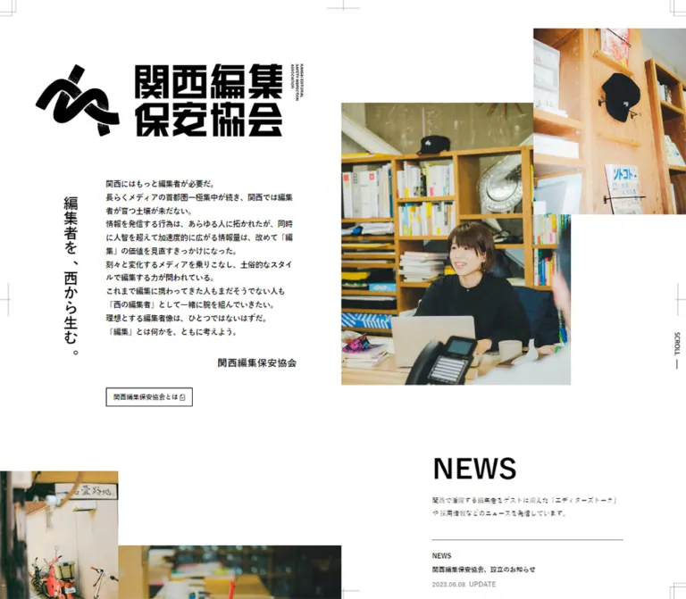
The desktop identity combines a textured black looping emblem, extremely heavy squared Japanese lettering in two lines, and a narrow English descriptor at the right. The mobile opening separates the emblem from a vertically arranged wordmark.
The H1 has no extracted text, while the artwork is visible in the screenshots. Its measured 18px desktop or 16px mobile font size therefore does not describe the large visible logo lettering. Use appropriate logo artwork when authorized; a bold text heading is not an equivalent substitute. The asset format and path are not supplied.
Latin Section Titles
The sampled H2 containers compute to the Japanese source stack at weight 700. The visible desktop NEWS lettering is substantially lighter than the Japanese wordmark and body statement. Child-level styles and image references are absent, so the actual Latin display face cannot be established from these measurements.
Treat the heading scale and placement as measured. Treat a generic sans-serif display face in a new implementation as an approximation. Do not assign the entire heading system to Open Sans merely because that family appears on the desktop scroll label.
Utility Labels
The desktop SCROLL label specifically computes to "Open Sans", sans-serif, weight 700. At the mobile viewport, the same label uses the Japanese body stack. This is the only supplied direct evidence for Open Sans.
Type Scale
Values below are computed CSS sizes and line heights, rounded where helpful.
| Role | Desktop size / line height | Mobile size / line height | Weight | Evidence notes |
|---|---|---|---|---|
| Body default | 18 / 31.5px |
16 / 28px |
400 | Inherited default, not the size of every paragraph. |
| Opening manifesto | 15.4286 / 27.7714px |
16 / 28.8px |
700 | Mobile copy stays substantial instead of shrinking. |
| Vertical slogan | 30.8571 / 54px |
21 / 36.75px |
700 | The line height determines the breadth of the vertical text strip. |
| Association signature | 20.5714 / 41.1429px |
18 / 36px |
700 | Right aligned in the opening text column. |
| Major section heading container | 58.7755px |
50px |
700 | Desktop line height is 41.1429px for News/directory and approximately 58.7755px for Internship/About. |
| Mobile major heading line height | — | 35px for News; 50px for other sampled headings |
700 | These are container measurements; avoid clipping lettering to the line box. |
| Section introduction | 11.7551 / 23.5102px |
14 / 28px |
400 | Mobile About uses 25.9px line height. |
OUR ACTION |
23.5102 / 23.5102px |
28 / 28px |
700 | The mobile subheading is larger than its desktop counterpart. |
| Standard outlined resource link | 13.2245 / 13.2245px |
18 / 18px |
700 | Introduction, directory, internship, and membership links. |
| Secondary News link | 11.0204 / 11.0204px |
15 / 15px |
700 | Smaller than the other resource links. |
SCROLL |
7.3469 / 14.6939px |
10 / 20px |
700 | Font family also changes between the samples. |
| Copyright container | 7.3469 / 14.6939px |
10 / 20px |
400 | Final visible glyph size may be affected by unreported descendants or transforms. |
Directory typography, visual estimates: names are approximately 20px bold on desktop, locations approximately 15px bold, and affiliations approximately 10px in gray. These descendants were not separately measured. Mobile directory caption sizes are unverified.
Most sampled text has normal letter spacing. Do not introduce broad tracking into Japanese paragraphs. Hierarchy comes primarily from weight, size, vertical orientation, and placement.
Tokens — Spacing & Shapes
Density: sparse composition with compact text and small outlined links. Geometry: square photographs, square controls, fine rules, no visible card elevation.
Spacing Scale
The desktop measurements contain many related fractional values. Their numerical relationship suggests shared scaling, but the original formula and breakpoint rules were not supplied.
| Use | Desktop measurement | Mobile measurement | Suggested alias |
|---|---|---|---|
| Resource-link vertical padding | 11.0204px |
15px |
--action-pad-block |
| Resource-link horizontal padding | 14.6939px |
20px |
--action-pad-inline |
| News row vertical padding | 22.0408px |
30px |
--news-pad-block |
| Standard desktop outer inset | 73.4694px |
Sections span the viewport | --page-inset |
| Repeated section top padding | 73.4694px on directory/internship |
70px |
--section-pad |
| Hero copy left coordinate | 218.5625px |
100px |
Layout-specific, not universal padding |
| Mobile section-copy left coordinate | — | Usually 100px |
--mobile-rail |
| Mobile directory image gutter | — | 15px |
--directory-gap |
| Mobile directory vertical stagger | — | 60px |
--directory-stagger |
| Footer top padding | 146.939px |
0px |
Footer-specific |
| Footer bottom padding | 58.7755px |
0px on the sampled footer |
Footer-specific |
Border Radius
All sampled elements report 0px radius. The screenshots agree: resource links, photographs, and social icon boxes have hard corners.
Visible resource outlines and registration marks are approximately 1px. Red annotation strokes appear closer to 2–3px. These stroke widths are visual estimates, not computed border measurements.
Layout Measurements
| Element | At 1440 × 1000 | At 390 × 844 |
|---|---|---|
| Document height | Approximately 5078.11px |
Approximately 7270.73px |
| Sampled HEADER box | 1440 × 0px |
390 × 0px |
| Main section width | Usually 1293.06px, starting at x=73.47 |
390px |
| Opening H1 box | 553.22 × 149.45px, at 73.47, 132.23 |
40 × 454px, at 20, 72 |
| Opening manifesto column | 395.25px wide, at 218.56, 367.33 |
250px wide, at 100, 578 |
| Vertical slogan box | 54 × 471.61px, at 119.02, 367.33 |
36.75 × 251px, at 333.25, 324 |
| News copy/list column | 395.25px wide, starting at x=892.67 |
260px wide, starting at x=100 |
| Directory image link | 236.56 × 304.14px |
140 × 180px |
| Directory image columns | x=206.45, 601.70, 996.95 |
x=75, 230 |
| Directory horizontal image gap | Approximately 158.69px |
15px |
| Directory same-column row pitch | 554.625px |
386px |
| About heading/content span | 947.75px, starting at x=246.125 |
Heading 260px wide at x=100; action heading box 290px wide |
| Introduction resource link | 177.53 × 37.25px |
241 × 50px |
| Membership resource link | 110.31 × 37.25px |
149.47 × 50px |
The zero-height HEADER and separately positioned identity do not form a conventional horizontal navigation bar. No hamburger menu or navigation drawer is evidenced.
Components
Print Registration Frame
Role: makes the browser viewport resemble a sheet prepared for printing.
Fine gray marks appear at all four corners and around the horizontal and vertical midpoints. Corner marks are doubled, while midpoint marks resemble small registration crosses. They remain aligned with the viewport edges in the supplied scrolled captures.
Visual estimates: desktop corner marks occupy approximately 34px; mobile corner marks approximately 24–34px. Long midpoint strokes are approximately 70px. Their light gray weight keeps them peripheral even when they overlap an image or text region.
The screenshots support a persistent viewport-relative appearance. They do not expose whether the implementation uses fixed elements, pseudo-elements, or another technique. For reuse, make the decoration fixed, noninteractive, and hidden from assistive technology. It must not intercept links.
Identity and Mobile Rail
Role: primary identity without a conventional menu strip.
The desktop opening uses a large horizontal lockup near the upper left. Its black emblem precedes two dense rows of Japanese lettering, with a tiny vertical English descriptor at the far right. The combination occupies about 553 × 149px.
On the mobile opening, the Japanese name forms a tall left rail at x=20px, while the emblem appears separately above the photographs. The vertical English descriptor continues beneath the Japanese lettering. This creates a recognizable identity even though most of the main content begins at x=100px.
The lower mobile screenshot shows a smaller emblem and compact vertical lockup still visible at the left. A changed identity state is therefore visible, but its scroll threshold, positioning mechanism, and transition are not supplied. A new implementation may use a compact rail state; it should not claim to reproduce an observed trigger.
Opening Statement and Photograph Composition
Role: communicate the association's position and establish a human, local context.
The desktop opening has four interacting parts:
- The large identity at upper left.
- The vertical slogan,
編集者を、西から生む。, beside the manifesto. - Bold Japanese paragraphs, a right-aligned association signature, and a small outlined introduction link.
- Two offset rectangular photographs on the right.
The large photograph shows a person in a narrow outdoor passage; the upper-right crop features a red lantern and a storefront. In the desktop screenshot, the larger frame is approximately 474 × 584px, starting around 705, 211. The visible upper-right frame starts around 1102, 59 and reaches the right viewport edge. These image measurements are visual estimates.
The images overlap spatially without a border, shadow, caption panel, or gradient. The white page remains the only surrounding surface.
On mobile, the large photograph begins around x=100, y=176, while the lantern crop enters from the right around y=68. The vertical slogan sits on a white strip over the lower-right edge of the image composition. The manifesto begins below at the measured y=578px, keeping its 16px bold text and 28.8px line height.
The first mobile viewport intentionally shows only the start of the manifesto. The complete opening section is approximately 1340px tall. Do not force it into one screen by reducing type or removing the editorial statement.
A small vertical SCROLL label and long thin rule sit at the right. The supplied evidence does not establish that this cue is clickable or animated.
Outlined Resource Link
Role: send visitors to an explanatory document, editorial collection, or participation information.
Anatomy: square 1px-looking black outline, white or transparent fill over paper, bold Japanese label, compact padding, and no shadow. The introductory link also displays a tiny document indicator in the screenshot.
Measured desktop standard sizing is 13.2245px type with 11.0204px 14.6939px padding. Mobile uses 18px type, 15px 20px padding, and a 50px total height. Width follows the label.
Observed examples include 関西編集保安協会とは, 関西エディターズリスト, インターンシップについて, and 入会について.
The introductory resource points to a PDF on the original domain. Other examples point to articles or a collection on the association's Note account. Destinations are evidenced by href values; document contents, new-tab behavior, and loading states were not tested.
News List
Role: expose current editorial reports and internship information.
The desktop text/list column is positioned on the right at x=892.67px, with a width of 395.25px. A large NEWS heading precedes a small explanatory paragraph and four vertically stacked article links. Each link contains a category, Japanese title, and date with UPDATE.
The measured rows have 22.04px top and bottom padding. Their heights range from approximately 103.89px to 120.41px, depending on content wrapping. Consecutive row bounds are separated by approximately 1px, consistent with a fine divider, although the supplied style sample does not expose the border property.
On mobile, the column is 260px wide at x=100px, with 30px vertical row padding. Rows become approximately 136–183px tall. The section is much taller overall, and the heading begins well below the section's top. The intervening visual arrangement is not established by the supplied original screenshots.
The newest supplied News entry is dated 2024.06.18. This is content present during the 2026 inspection, not the inspection date.
Editor Directory
Role: present editors as individual people, with region and affiliation as supporting context.
Each entry consists of:
- A portrait photograph linked to an external profile article.
- A small black location-pin symbol followed by a prefecture.
- A bold Japanese name.
- A smaller gray affiliation, where supplied.
The photographs are unboxed portrait rectangles. The measured link ratio is 7:9 at both sizes: approximately 236.56 × 304.14px desktop and exactly 140 × 180px mobile.
Desktop uses three widely separated columns. The provided directory screenshot shows the middle column approximately 44px lower than the outer columns. However, the sampled desktop anchor rectangles share the same row coordinates. The visible offset may occur inside those anchors or in a later state; its mechanism is unverified. Preserve the visible stagger as a visual approximation, not as evidence of masonry or scroll-driven movement.
Mobile geometry is more explicit: two columns begin at x=75 and x=230, separated by 15px. Every right-column image starts 60px below its left-column counterpart. Same-column rows start 386px apart.
The supplied entries include 光川貴浩, トミモトリエ, 亀口美穂, 礒見愛香, 大塚啓志郎, and 竹内厚. Their images vary substantially in setting, distance, pose, and color. The fixed frame creates consistency without erasing individuality.
The image anchors have empty extracted text, but image alternative text and accessible-name computation were not supplied. This is not enough evidence to conclude that the links are unnamed. It does justify checking accessible names in a new implementation.
Internship Introduction
Role: direct prospective student editors to a joint internship program.
The measured desktop text block is on the right, with a 395.25px width, a large INTERNSHIP PROGRAM heading, a short explanatory paragraph, and an outlined article link.
On mobile, the heading occupies a 290 × 150px box at x=100px. Rendered text extraction shows the stacked treatment INTERN, SHIP, PROGRAM. The supporting paragraph occupies three lines, and the resource link is centered across the page below.
The section's image or illustration treatment is not visible in the supplied original crops. Do not invent an asset, animation, or exact image placement for this region from the text measurements alone.
About, Actions, and Organizational Information
Role: explain the association's work, structure, and participation.
The desktop About content is organized around a 947.75px span starting at x=246.125px. The left side contains OUR ACTION, a numbered statement list, organizational details, and the membership link. The right side contains a large irregular black graphic with dense distressed texture, surrounded by a red hand-drawn enclosure.
The visible action list uses editorial corrections as a design device: red arrows connect numbered points, words are struck through or annotated, and handwritten marks interrupt the otherwise precise typography. The red work reads like a proofreader's intervention, not a polished infographic.
The organizational details use compact label/value groups. The page identifies the organization as 関西編集保安協会(任意団体) and lists secretariat members and regional members. These are organizational roles, not website production credits.
On mobile, the regional member list is presented vertically in the narrow content area beginning around x=100px. A larger centered 入会について link concludes the section. The DOM places OUR ACTION substantially below the About introduction, but the intervening mobile artwork is not directly shown in the supplied crops.
Text extraction includes alternate/corrected words and differences in the action order between desktop and mobile. A new implementation should maintain one coherent semantic reading order and treat purely decorative correction layers separately.
Footer
Role: close the page with identity and three simple contact/publication destinations.
The footer returns to a centered horizontal Japanese lockup, followed by three outlined square symbols and a very small copyright line. It remains on the same white surface as the rest of the page.
The symbols are the captured Twitter bird, Note mark, and an envelope. The mobile href evidence points respectively to the association's Twitter URL, Note account, and a Google Form. The envelope therefore represents a form destination in this evidence, not a verified mailto: action.
Visual estimates: the desktop lockup is approximately 430px wide and the icon boxes approximately 36px square. Mobile uses a lockup around 310px wide and approximately 48px square icon boxes, with 20px gaps. The mobile anchors measure 48px in width, but their reported inline height is only 16px; this should not be mistaken for the complete visible box or a verified hit area.
The desktop footer has 146.939px top padding and 58.7755px bottom padding. Mobile removes that footer padding and relies on the spacing between its contents. The copyright remains visually very small; a readable minimum is recommended for reuse.
Tokens — Motion & Interaction
| Element or behavior | Supplied evidence | What can be concluded |
|---|---|---|
| Desktop H1 | transition: width 0.75s 0.1s |
A width transition is declared with a 750ms duration and 100ms delay. Trigger and end widths are unverified. |
| Desktop outlined resource links | background-color 0.45s, color 0.45s |
Color changes are prepared to transition over 450ms. Hover/focus destination colors were not captured. |
| Desktop News links | color 0.45s, background-color 0.45s |
A similar color transition is declared for article rows. |
| Most sampled mobile elements | transition: all |
The supplied shorthand does not establish a nonzero duration or a visible transition. |
| Sampled element animations | animation: none |
No CSS animation is reported on those sampled elements. This does not rule out child, pseudo-element, or script-driven motion. |
| Mobile identity | Different large and compact appearances in opening and lower-page screenshots | Two visual states are evidenced; scroll threshold and transition mechanics are not. |
| Registration frame | Consistent viewport-edge placement across captures | Persistent framing is visually supported; exact positioning CSS is not supplied. |
| Resource and profile links | Rendered href values | Navigation destinations are known, but activation outcomes were not tested. |
No supplied evidence establishes an automatic photo carousel, animated red drawing, parallax timing, smooth-scroll duration, or a particular hover inversion. Do not add these as descriptions of the original.
Recommended interaction model: retain native links, use restrained color feedback, preserve a visible keyboard focus outline, and disable optional transitions under reduced motion. A black/white hover inversion is a suitable new-design choice, but remains a recommendation.
Surfaces
| Layer | Appearance | Purpose |
|---|---|---|
| Page canvas | Continuous white | Provides the large editorial negative space. |
| Text and identity | Black directly on white | Creates the primary hierarchy without cards or colored panels. |
| Photography | Rectangular color images without visible frames | Supplies people, local environments, and visual warmth. |
| Mobile slogan backing | Measured white rectangle | Keeps vertical black text readable over the photo edge. |
| Resource links | Fine black outline, white/transparent interior | Distinguishes destinations without making them dominant. |
| Proof graphic | Distressed black artwork plus red annotation | Connects organizational content to the practice of editing. |
| Registration marks | Thin light-gray strokes | Frames the viewport as a printed sheet. |
There is no evidenced general shadow, glass, gradient, rounded-card, or modal elevation system. Separation comes from position, whitespace, image boundaries, and fine rules.
Imagery
The current opening combines a street-side portrait with a close crop of a red lantern. The directory mixes shoreline portraits, an exuberant food portrait, an indoor portrait with a newspaper, and a distant full-body figure against a pale wall. These are documentary, individual images rather than a uniform set of studio headshots.
The photographs retain natural color. Several have soft contrast, subdued light, or a film-like appearance, but no CSS filter or photographic processing pipeline is evidenced. Do not apply a uniform grayscale, duotone, or heavy grain treatment merely to make the images consistent.
Use subject-aware cropping. The directory establishes a 7:9 frame, but the person need not occupy the same percentage of every frame. The variation in camera distance is part of the observed composition.
The logo and About graphic carry their own distressed black texture. Keep that texture inside the artwork rather than applying a global noise overlay to white space, photographs, or live text.
Observed Asset References
Image URLs, intrinsic image sizes, SVG source, and font-file URLs were not included in the evidence.
| Asset or resource | Evidence | Reuse guidance |
|---|---|---|
| Desktop identity lockup | Original opening and footer screenshots | Use supplied authorized artwork; exact asset path is unknown. |
| Vertical mobile identity and separate emblem | Original mobile screenshots | Provide distinct compositions rather than rotating the full desktop lockup. |
| Opening photographs | Original desktop/mobile opening screenshots | Match overlap and crop relationships; exact files are unknown. |
| Six directory portraits | Original desktop directory screenshot and measured links | Preserve 7:9 frames and varied subject composition. |
| Distressed About artwork and red corrections | Original lower desktop screenshot | Use separate artwork or carefully authored decorative layers. |
| Introduction document | /assets/img/KANSAI_kikaku.pdf |
An observed linked document, not an inspected image asset. |
CSS can reproduce the shell and its proportions. It cannot recover the identity artwork, documentary photographs, or handwritten marks from the DOM measurements alone.
Layout & Responsive Behavior
The desktop page is an asymmetric sequence rather than one repeated centered grid. The opening puts prose on the left and overlapping photography on the right. News uses a narrow right-side text column. The directory expands into three columns. About contracts into an inset two-part composition. The footer recenters the identity.
The mobile design reserves a substantial left rail. Most paragraphs and section headings begin at x=100px, leaving only 250–290px for content. The directory deliberately breaks that rule: its left edge moves to 75px to accommodate two 140px images with a 15px gutter. Centered resource links and the footer also span the broader page composition.
| Region | Desktop section height | Mobile section height | Responsive observation |
|---|---|---|---|
| Opening | Approximately 780.17px, after its top offset |
1339.94px |
Photography moves above the manifesto; the name becomes a vertical rail. |
| News | 743.91px |
1512.5px |
Right-side desktop list becomes a narrow rail-aligned mobile list. |
| Editor directory | 1355.13px |
1509px |
Three columns become two staggered columns. |
| Internship | 487.09px |
704.13px |
Heading becomes a three-line composition. |
| About | 867.92px |
1591.77px |
Organizational information stacks vertically. |
| Footer | 382.55px |
248.41px |
Horizontal identity remains, while icon boxes appear larger. |
The exact breakpoint is unknown. Only the two supplied viewport sizes were measured; there is no verified tablet, landscape-phone, or intermediate-width behavior. The 768px breakpoint in the Quick Start is a recommended implementation boundary.
The mobile text is not a proportional reduction of desktop. The manifesto increases from about 15.43px to 16px; supporting copy increases from about 11.76px to 14px; standard links increase from about 13.22px to 18px. Preserve this readability-first change alongside the tighter geometry.
Do’s and Don’ts
Do
- Keep white, black, and editorial red in distinct roles.
- Preserve the fine registration frame and its relationship to the viewport.
- Treat the logo as artwork with separate horizontal and vertical arrangements.
- Retain the bold, narrow manifesto and its vertical Japanese companion line.
- Overlap rectangular photographs without borders, shadows, or rounded corners.
- Keep the directory at three columns on the measured desktop and two on the measured phone.
- Preserve the mobile
60pxportrait stagger and the generous desktop column spacing. - Use region, name, and affiliation as a clear hierarchy beneath portraits.
- Keep resource links modest, square, and outlined.
- Use distressed black artwork and red handwritten corrections selectively in About.
Don’t
- Don’t convert the association into a generic hero-and-feature-card sales page.
- Don’t replace the mobile identity rail with an unsupported hamburger header.
- Don’t shrink desktop typography uniformly to make the mobile opening fit one screen.
- Don’t turn the portrait directory into identical boxed staff cards or a single phone column by default.
- Don’t use red as a general CTA fill or scatter it across badges.
- Don’t infer slideshow behavior from photographs alone.
- Don’t claim that the heading container font identifies the logo or all Latin lettering.
- Don’t reproduce duplicated extraction strings such as
NEWSNEWSas visible headings without visual verification. - Don’t label secretariat members or association members as website designers.
- Don’t wire the envelope to email when the supplied destination is a form.
Recommended Implementation Additions
These are recommendations for a new implementation, not verified original features:
- Give every logo arrangement one meaningful accessible name; hide duplicate decorative copies from assistive technology.
- Give profile-image links names tied to the person's name, even if the visible caption remains outside the link.
- Keep registration marks and purely decorative proof annotations noninteractive and
aria-hidden. - Preserve a coherent DOM reading order even where photographs overlap or proof marks suggest rearrangement.
- Provide clear keyboard focus on resource links, portraits, and social destinations.
- Make icon hit areas at least
44 × 44px; the visible outline can remain smaller where necessary. - Use a readable floor for tiny affiliations and copyright, such as
12px, when strict visual matching is not required. - Reserve image dimensions before loading, and select crop positions individually for portraits.
- Test narrow screens below
390px, enlarged text, and long names without letting the identity rail cover content. - Clip intentional image overflow inside the image composition, rather than hiding overflow on the entire document.
- If a compact identity state is added, derive it from a documented implementation rule and ensure content remains reachable without JavaScript.
- Provide reduced-motion behavior for any optional color or logo transitions.
Agent Prompt Guide
Quick Color Reference
- Paper: measured
#ffffff. - Text and primary graphic ink: measured
#000000. - Red correction marks: visual approximation
#ff0000. - Registration marks: visual approximation
#a0a0a0. - Supporting affiliations: visual approximation
#777777. - Buttons: white interior, black label, thin black rectangular outline.
- Photography: natural color, without an assumed global filter.
Overall Prompt
“Create an editorial association homepage inspired by the current Kansai Editorial Safety Inspection Association site. Use a white canvas, black Japanese sans-serif text, an extremely heavy supplied wordmark, fine gray registration marks at viewport edges, and generous uneven whitespace. Pair a bold manifesto with a vertical Japanese slogan and overlapping documentary photographs. Follow it with a compact News list, a three-column portrait directory, internship information, and an About area with distressed black artwork and sparse red proofreading annotations. On a 390px phone, use a vertical identity rail at the left, start most copy around 100px from the left edge, and retain a two-column 7:9 portrait directory with a 60px stagger. Use small square outlined resource links and a centered identity footer. Treat unverified motion and unseen imagery as implementation decisions, not source facts.”
Example Component Prompts
- Opening composition: “Create a white editorial opening with a supplied black Japanese logo at upper left, a vertical slogan next to a 395px-wide bold manifesto, and two offset rectangular documentary photographs on the right. Use no photo border or shadow. On mobile, move the photos above the copy, retain a left identity rail, and place the vertical slogan on a white strip at the photo's right edge.”
- Editor directory: “Build a borderless directory of portrait images, location pins, bold Japanese names, and small gray affiliations. Use 7:9 image frames. At 1440px, arrange three 237px-wide columns with broad whitespace; at 390px, arrange two 140px-wide columns with a 15px gap and shift the right column down 60px. Keep each person's photographic setting distinct.”
- About proof composition: “Place numbered organizational actions and compact label/value details beside an irregular distressed black graphic. Add a small number of vivid red hand-drawn arrows, corrections, and a loose enclosing stroke. Keep the underlying text semantically coherent and the decorative annotations hidden from screen readers.”
- Resource link: “Create a square-cornered white link with a fine black border and bold Japanese text. Use compact desktop padding and a 50px mobile height. Add a visible keyboard focus outline. Treat any black/white hover inversion as a new implementation choice.”
- Footer: “Center a horizontal black identity lockup above three outlined square destinations: Twitter, Note, and a contact form. Use generous white separation and a quiet copyright line. On mobile, make the visible icon boxes approximately 48px square.”
Quick Start
CSS Custom Properties
This is a reusable adaptation, not recovered source CSS. Desktop values target the supplied 1440px sample; the mobile rules target 390px. The breakpoint, generic Latin heading face, hover inversion, fixed rail implementation, and readable copyright size are recommendations. Gray/red colors and photograph dimensions remain visual approximations.
Suggested structure: a .hero containing .site-brand, .hero-art, .hero-slogan, .hero-copy, and .hero-action; regular sections containing .rail-copy; a list of .editor-card elements inside .editor-grid; and an .about-layout with text and artwork children. Supply separate authorized horizontal and vertical logo assets through a picture element or equivalent. No source asset filenames are implied by these classes.
:root {
  /* Measured interface colors */
  --color-paper: #ffffff;
  --color-ink: #000000;

  /* Visual approximations */
  --color-proof: #ff0000;
  --color-registration: #a0a0a0;
  --color-muted: #777777;

  /* Source stack; display fallback is an adaptation */
  --font-body: '游ゴシック体', 'Yu Gothic', YuGothic, 'メイリオ', sans-serif;
  --font-display: sans-serif;
  --weight-regular: 400;
  --weight-bold: 700;

  /* Measured desktop type targets */
  --text-body: 18px;
  --text-manifesto: 15.4286px;
  --text-intro: 11.7551px;
  --text-heading: 58.7755px;
  --text-action: 13.2245px;
  --leading-body: 1.75;
  --leading-manifesto: 1.8;

  /* Recommended interpolation between observed layouts */
  --page-inset: clamp(32px, 5.10204vw, 73.4694px);
  --section-space: 73.4694px;
  --copy-width: 395.25px;
  --portrait-width: 236.5625px;
  --portrait-ratio: 7 / 9;
  --action-pad-block: 11.0204px;
  --action-pad-inline: 14.6939px;
  --news-pad-block: 22.0408px;
  --rule-width: 1px;
  --radius: 0;

  /* Duration observed on desktop color transitions */
  --motion-color: 450ms;
}

* { box-sizing: border-box; }

html { font-size: 16px; }

body {
  margin: 0;
  color: var(--color-ink);
  background: var(--color-paper);
  font-family: var(--font-body);
  font-size: var(--text-body);
  line-height: var(--leading-body);
}

img { display: block; max-width: 100%; }
a { color: inherit; }

/* The logo requires an appropriate asset, not display-font text. */
.hero {
  position: relative;
  max-width: 1440px;
  min-height: 839px;
  margin-inline: auto;
}

.site-brand {
  position: absolute;
  z-index: 3;
  top: 132.2344px;
  left: 5.10204%;
  width: 38.418%;
  margin: 0;
}

.site-brand img { width: 100%; height: auto; }
.hero-emblem { display: none; }

/* Clip photographs locally; leave live content outside this layer. */
.hero-art {
  position: absolute;
  inset: 0;
  overflow: clip;
  pointer-events: none;
}

.hero-photo {
  position: absolute;
  object-fit: cover;
}

.hero-photo--main {
  top: 211px;
  left: 48.9583%;
  width: 32.9167%;
  height: 584px;
}

.hero-photo--detail {
  top: 58.7656px;
  right: 0;
  width: 23.4722%;
  height: 385px;
}

.hero-slogan {
  position: absolute;
  z-index: 2;
  top: 367.3281px;
  left: 8.265%;
  margin: 0;
  padding-block: 36.9231px;
  writing-mode: vertical-rl;
  font-size: 30.8571px;
  font-weight: 700;
  line-height: 1.75;
}

.hero-copy {
  position: relative;
  width: 27.4479%;
  max-width: var(--copy-width);
  margin-left: 15.17795%;
  padding-top: 367.3281px;
}

.manifesto {
  margin: 0;
  font-size: var(--text-manifesto);
  font-weight: 700;
  line-height: var(--leading-manifesto);
}

.hero-signature {
  margin: 30.84px 0 29.38px;
  font-size: 20.5714px;
  font-weight: 700;
  line-height: 2;
  text-align: right;
}

.action {
  display: inline-flex;
  align-items: center;
  justify-content: center;
  gap: 0.25em;
  max-width: 100%;
  padding: var(--action-pad-block) var(--action-pad-inline);
  border: var(--rule-width) solid currentColor;
  border-radius: var(--radius);
  color: var(--color-ink);
  background: var(--color-paper);
  font-size: var(--text-action);
  font-weight: 700;
  line-height: 1;
  text-align: center;
  text-decoration: none;
  transition: color var(--motion-color), background-color var(--motion-color);
}

.hero-action { margin-left: 15.17795%; }

.section {
  width: calc(100% - 2 * var(--page-inset));
  max-width: 1293.0625px;
  margin: var(--section-space) auto 0;
  padding-top: var(--section-space);
}

.rail-copy {
  width: min(100%, var(--copy-width));
  margin-left: auto;
  margin-right: 78.6122px;
}

.section-title {
  margin: 0;
  font-family: var(--font-display);
  font-size: var(--text-heading);
  font-weight: 700;
  line-height: 1;
}

.section-intro {
  margin: 30px 0 40px;
  font-size: var(--text-intro);
  line-height: 2;
}

.news-item {
  display: block;
  padding-block: var(--news-pad-block);
  border-top: 1px solid var(--color-registration);
  background: var(--color-paper);
  text-decoration: none;
  transition: color var(--motion-color), background-color var(--motion-color);
}

.news-item:last-child { border-bottom: 1px solid var(--color-registration); }

/* Child type sizes below are recommended, not measured descendants. */
.news-category, .news-date { font-size: 11px; }
.news-title { margin: 4px 0; font-size: 14px; line-height: 1.6; }

.editor-grid {
  display: grid;
  grid-template-columns: repeat(3, minmax(0, 1fr));
  column-gap: 15.451%;
  grid-auto-rows: minmax(554.625px, auto);
  width: min(100%, 1027.0625px);
  margin: 88px auto 0;
  padding: 0;
  list-style: none;
}

.editor-card { min-width: 0; }

/* Desktop stagger follows the screenshot, not the sampled anchor y-values. */
.editor-card:nth-child(3n + 2) { transform: translateY(44px); }

.editor-photo-link { display: block; }

.editor-photo {
  width: 100%;
  aspect-ratio: var(--portrait-ratio);
  object-fit: cover;
  object-position: var(--portrait-position, center);
}

.editor-location {
  display: flex;
  align-items: center;
  gap: 4px;
  margin: 28px 0 10px;
  font-size: 15px;
  font-weight: 700;
}

.editor-name { margin: 0; font-size: 20px; font-weight: 700; }
.editor-affiliation { margin-top: 8px; color: var(--color-muted); font-size: 12px; }

.about-layout {
  display: grid;
  grid-template-columns: repeat(2, minmax(0, 1fr));
  max-width: 947.75px;
  margin: 88px auto 0;
}

.about-actions h3 { margin-top: 0; font-size: 23.5102px; line-height: 1; }
.about-actions ol { padding-left: 1.5em; font-weight: 700; }
.about-actions li + li { margin-top: 24px; }

.about-records {
  display: grid;
  grid-template-columns: repeat(2, minmax(0, 1fr));
  gap: 24px;
  margin-top: 48px;
  font-size: 12px;
}

.about-art img { width: 100%; height: auto; }
.proof-mark { color: var(--color-proof); }

.site-footer {
  padding: 146.939px 20px 58.7755px;
  text-align: center;
}

.footer-brand { width: min(100%, 430px); margin-inline: auto; }
.social-links { display: flex; justify-content: center; gap: 14px; margin-top: 30px; }

/* Larger hit areas are an accessibility addition. */
.social-link {
  display: grid;
  place-items: center;
  min-width: 44px;
  min-height: 44px;
  text-decoration: none;
}

.social-icon {
  display: grid;
  place-items: center;
  width: 36px;
  height: 36px;
  border: 1px solid currentColor;
}

.copyright { margin-top: 60px; font-size: 12px; line-height: 1.6; }

/* Recommended hover end state; only transition properties were observed. */
@media (hover: hover) {
  .action:hover, .news-item:hover {
    color: var(--color-paper);
    background: var(--color-ink);
  }
}

a:focus-visible {
  outline: 2px solid currentColor;
  outline-offset: 4px;
}

/* Recommended breakpoint; the source threshold was not supplied. */
@media (max-width: 767px) {
  :root {
    --text-body: 16px;
    --text-manifesto: 16px;
    --text-intro: 14px;
    --text-heading: 50px;
    --text-action: 18px;
    --section-space: 70px;
    --action-pad-block: 15px;
    --action-pad-inline: 20px;
    --news-pad-block: 30px;
    --mobile-rail: clamp(76px, 25.641vw, 100px);
  }

  .hero { min-height: 1340px; }

  .site-brand {
    position: fixed;
    top: 72px;
    left: 20px;
    width: 40px;
  }

  /* Apply this state using a separately documented application rule. */
  .site-brand.is-compact { left: 24px; width: 25px; }

  .hero-emblem {
    display: block;
    position: absolute;
    top: 56px;
    left: calc(var(--mobile-rail) + 34px);
    width: 121px;
  }

  .hero-photo--main {
    top: 176px;
    left: var(--mobile-rail);
    width: calc(100% - var(--mobile-rail) - 34px);
    height: 373px;
  }

  .hero-photo--detail {
    top: 68px;
    left: calc(100% - 76px);
    right: auto;
    width: 188px;
    max-width: none;
    height: 214px;
  }

  .hero-slogan {
    top: 324px;
    right: 20px;
    left: auto;
    padding-block: 10px;
    background: var(--color-paper);
    font-size: 21px;
  }

  .hero-copy {
    width: calc(100% - var(--mobile-rail) - 40px);
    max-width: none;
    margin-left: var(--mobile-rail);
    padding-top: 578px;
  }

  .hero-signature { margin: 40px 0 60px; font-size: 18px; }
  .hero-action { display: table; margin-inline: auto; }
  .section { width: 100%; }

  .rail-copy {
    width: auto;
    margin-left: var(--mobile-rail);
    margin-right: 30px;
  }

  .section-intro { margin-top: 36px; }

  .editor-grid {
    width: auto;
    margin: 21px 20px 0 calc(var(--mobile-rail) - 25px);
    grid-template-columns: repeat(2, minmax(0, 1fr));
    column-gap: 15px;
    grid-auto-rows: minmax(386px, auto);
  }

  .editor-card:nth-child(3n + 2) { transform: none; }
  .editor-card:nth-child(even) { transform: translateY(60px); }
  .editor-name { font-size: 18px; }
  .editor-location { font-size: 14px; }

  .about-layout {
    display: flex;
    flex-direction: column;
    margin: 48px 30px 0 var(--mobile-rail);
  }

  .about-art { order: -1; margin-bottom: 48px; }
  .about-actions h3 { font-size: 28px; }
  .about-records { grid-template-columns: 1fr; font-size: 14px; }
  .site-footer { padding: 70px 20px 24px; }
  .footer-brand { width: min(100%, 310px); }
  .social-links { gap: 20px; margin-top: 48px; }
  .social-link, .social-icon { width: 48px; height: 48px; }
}

@media (prefers-reduced-motion: reduce) {
  .action, .news-item, .site-brand { transition: none; }
}
The generic heading face, caption sizes, footer spacing on mobile, and readable small-text floor deliberately remain adaptation choices. Replacing them with the precise original appearance requires additional asset and descendant-style evidence.
Registration Frame Addition
This optional decoration approximates the visible frame. Use four corner elements and four cross elements inside a .print-frame element with aria-hidden='true'. The class suffixes below identify their positions. Stroke lengths are estimates.
.print-frame {
  position: fixed;
  inset: 0;
  z-index: 50;
  overflow: hidden;
  pointer-events: none;
}

.print-corner {
  position: absolute;
  width: 34px;
  height: 34px;
  border-right: 1px solid var(--color-registration);
  border-bottom: 1px solid var(--color-registration);
}

.print-corner::after {
  content: '';
  position: absolute;
  inset: -8px 8px 8px -8px;
  border: inherit;
}

.print-corner--tl { top: 0; left: 0; }
.print-corner--tr { top: 0; right: 0; transform: rotate(90deg); }
.print-corner--br { bottom: 0; right: 0; transform: rotate(180deg); }
.print-corner--bl { bottom: 0; left: 0; transform: rotate(270deg); }

.print-cross {
  position: absolute;
  width: 70px;
  height: 70px;
  transform: translate(-50%, -50%);
  background:
    linear-gradient(var(--color-registration), var(--color-registration))
      center / 70px 1px no-repeat,
    linear-gradient(var(--color-registration), var(--color-registration))
      center / 1px 70px no-repeat;
}

.print-cross--top { top: 17px; left: 50%; }
.print-cross--bottom { top: calc(100% - 17px); left: 50%; }
.print-cross--left { top: 50%; left: 17px; }
.print-cross--right { top: 50%; left: calc(100% - 17px); }

@media (max-width: 767px) {
  .print-corner { width: 26px; height: 26px; }
  .print-cross--left { left: 8px; }
  .print-cross--right { left: calc(100% - 8px); }
}
Tailwind v4 Token Mapping
Optional aliases for a project already using Tailwind v4. This does not imply that the original site uses Tailwind. Define the custom properties above first.
@theme inline {
  --color-paper: #ffffff;
  --color-ink: #000000;
  --color-proof: #ff0000;
  --color-registration: #a0a0a0;
  --color-muted: #777777;

  --font-editorial: var(--font-body);
  --font-heading: var(--font-display);

  --text-copy: var(--text-manifesto);
  --text-supporting: var(--text-intro);
  --text-section: var(--text-heading);
  --text-resource: var(--text-action);

  --spacing-page: var(--page-inset);
  --spacing-section: var(--section-space);
  --spacing-action-x: var(--action-pad-inline);
  --spacing-action-y: var(--action-pad-block);

  --radius-editorial: 0px;
}
Sources & Evidence
- Original and final homepage — 関西編集保安協会: the supplied current rendered page, HTTP status, page title, visible content, href values, element rectangles, and computed-style samples.
- Capture session: supplied retrieval timestamp
2026-09-23T21:15:55.286Z; September 24, 2026 in Japan Standard Time. Viewports were1440 × 1000and390 × 844CSS pixels. - Original visual evidence: three desktop crops covering the opening, directory, and lower About/footer; two mobile crops covering the opening and lower About/footer.
- Rendered DOM evidence: section order and dimensions, two responsive layouts, source font stacks, text sizes, link padding, portrait-link geometry, transition declarations, and organizational text.
- Observed destinations: the original-domain introduction document, the association's Note articles and collection, its Twitter URL, and a Google Form. Those destinations were not opened for this reference.
- Inspection limitations: the supplied capture process waited for document readiness, layout stability, and visible image decoding, and traversed intermediate scroll positions. It does not verify delayed content, every animation, hover/focus end states, click outcomes, or semantic completeness. SharedWorkers and service workers were disabled during that inspection.
- Unresolved details: exact image files, logo formats, Latin heading face, original responsive formulas and breakpoint, compact-logo trigger, intermediate-width behavior, and visual details of sections absent from the original screenshot crops.
This reference describes the current homepage represented by the supplied original-page evidence. Measured values, screenshot estimates, and implementation recommendations are kept distinct throughout.
# Kansai Editorial Safety Inspection Association — Style Reference

> An editorial association presented as a working print proof: black type, documentary photographs, generous white space, and red corrections.

**Original URL:** [https://khhk.info/](https://khhk.info/)
**Final URL:** [https://khhk.info/](https://khhk.info/)
**Observed response:** HTTP 200, with the original identity retained.
**Theme:** white canvas, black typography and graphics, restrained gray details, and red proofreading annotations.
**Inspected:** September 24, 2026, Japan Standard Time. Supplied retrieval timestamp: `2026-09-23T21:15:55.286Z`, equivalent to September 24 at 06:15:55 JST.
**Viewports:** 1440 × 1000 and 390 × 844 CSS pixels.
**Scope:** the current association homepage: opening statement, News, editor directory, internship introduction, About/actions, membership information, and footer. Original screenshots show the desktop opening, directory, and lower About/footer, plus the mobile opening and lower About/footer. Other regions are documented through the supplied rendered DOM measurements.

The site introduces 関西編集保安協会 and connects visitors to editorial news, people, internships, and membership information. Its structure is an association website and editorial gateway. The long opening statement establishes a position; the directory supplies the human evidence; the remaining sections explain participation and organizational purpose.

The distinctive visual system borrows from printed editorial work. Registration marks occupy the viewport edges, a heavy Japanese wordmark behaves like artwork, photographs overlap without frames, and the About section contains red handwritten corrections around rough black graphics. Large areas of white remain deliberately empty. On mobile, the composition is rebuilt around a narrow identity rail at the left, rather than reduced uniformly from desktop.
閉じる
# Kansai Editorial Safety Inspection Association — Style Reference

> An editorial association presented as a working print proof: black type, documentary photographs, generous white space, and red corrections.

**Original URL:** [https://khhk.info/](https://khhk.info/)
**Final URL:** [https://khhk.info/](https://khhk.info/)
**Observed response:** HTTP 200, with the original identity retained.
**Theme:** white canvas, black typography and graphics, restrained gray details, and red proofreading annotations.
**Inspected:** September 24, 2026, Japan Standard Time. Supplied retrieval timestamp: `2026-09-23T21:15:55.286Z`, equivalent to September 24 at 06:15:55 JST.
**Viewports:** 1440 × 1000 and 390 × 844 CSS pixels.
**Scope:** the current association homepage: opening statement, News, editor directory, internship introduction, About/actions, membership information, and footer. Original screenshots show the desktop opening, directory, and lower About/footer, plus the mobile opening and lower About/footer. Other regions are documented through the supplied rendered DOM measurements.

The site introduces 関西編集保安協会 and connects visitors to editorial news, people, internships, and membership information. Its structure is an association website and editorial gateway. The long opening statement establishes a position; the directory supplies the human evidence; the remaining sections explain participation and organizational purpose.

The distinctive visual system borrows from printed editorial work. Registration marks occupy the viewport edges, a heavy Japanese wordmark behaves like artwork, photographs overlap without frames, and the About section contains red handwritten corrections around rough black graphics. Large areas of white remain deliberately empty. On mobile, the composition is rebuilt around a narrow identity rail at the left, rather than reduced uniformly from desktop.

## How to Read This Reference

- **Measured** means a value appears in the supplied rendered DOM or computed-style evidence. Coordinates refer to the individual DOM snapshot, not necessarily every subsequent scroll capture.
- **Visual estimate** means a dimension, color, or relationship is judged from an original screenshot. It is not a sampled color or recovered stylesheet declaration.
- **Recommendation** means guidance for a new implementation. The CSS Quick Start, breakpoint, accessibility additions, and descriptive token names are recommendations unless explicitly identified otherwise.
- **Evidence boundary:** no additional browsing, source-code inspection, asset retrieval, link activation, or interaction testing was performed for this reference.
- **Source variables:** the supplied custom-property collection is empty. All named tokens below are implementation aliases, not recovered source variables.
- **Source root size:** the measured HTML font size is `10px` at both viewports. The Quick Start uses explicit pixel values and a conventional root, so source numeric `rem` values should not be copied into it.
- **Graphic versus text:** computed styles on heading containers do not necessarily identify the lettering inside an image, SVG, or separately styled descendant.

## Tokens — Colors

### Default Palette

| Name | Value | Suggested token | Evidence and role |
| --- | --- | --- | --- |
| Paper | `#ffffff` | `--color-paper` | Measured on News links and the mobile vertical slogan background; also the visible page canvas. HTML and BODY themselves report transparent backgrounds. |
| Ink | `#000000` | `--color-ink` | Measured text color throughout the sampled DOM. Visually used for the wordmark, emblem, icons, and outlines. |
| Proof Red | Approximately `#ff0000` | `--color-proof` | Visual estimate from the About corrections, arrows, and large enclosing line. No computed accent color was supplied. |
| Registration Gray | Approximately `#a0a0a0` | `--color-registration` | Visual estimate for the fine crop and registration marks around the viewport. |
| Secondary Gray | Approximately `#777777` | `--color-muted` | Visual estimate for affiliations and other subordinate details in the directory. |

The interface palette is almost entirely paper and ink. Red belongs to the editorial annotations, not to general buttons or navigation. Deep green, weathered brown, skin tones, and lantern red enter through photography; they are not established interface tokens.

### Theme Presets

Only the light appearance is evidenced. No theme selector, dark version, or alternate palette was supplied.

## Tokens — Typography

### Japanese Body and Interface Text

**Measured source stack:** `游ゴシック体, "Yu Gothic", YuGothic, メイリオ, sans-serif`.

The opening manifesto is bold and compact in width, with generous line spacing. General explanatory paragraphs are smaller and regular weight. This makes the opening read like an editorial statement while later descriptions remain quiet supporting material.

The resolved installed font was not independently identified. Preserve the source stack when matching this environment, but do not describe a specific fallback as the verified rendered face.

### Wordmark and Emblem

The desktop identity combines a textured black looping emblem, extremely heavy squared Japanese lettering in two lines, and a narrow English descriptor at the right. The mobile opening separates the emblem from a vertically arranged wordmark.

The H1 has no extracted text, while the artwork is visible in the screenshots. Its measured `18px` desktop or `16px` mobile font size therefore does **not** describe the large visible logo lettering. Use appropriate logo artwork when authorized; a bold text heading is not an equivalent substitute. The asset format and path are not supplied.

### Latin Section Titles

The sampled H2 containers compute to the Japanese source stack at weight `700`. The visible desktop `NEWS` lettering is substantially lighter than the Japanese wordmark and body statement. Child-level styles and image references are absent, so the actual Latin display face cannot be established from these measurements.

Treat the heading scale and placement as measured. Treat a generic sans-serif display face in a new implementation as an approximation. Do not assign the entire heading system to Open Sans merely because that family appears on the desktop scroll label.

### Utility Labels

The desktop `SCROLL` label specifically computes to `"Open Sans", sans-serif`, weight `700`. At the mobile viewport, the same label uses the Japanese body stack. This is the only supplied direct evidence for Open Sans.

### Type Scale

Values below are computed CSS sizes and line heights, rounded where helpful.

| Role | Desktop size / line height | Mobile size / line height | Weight | Evidence notes |
| --- | --- | --- | --- | --- |
| Body default | `18 / 31.5px` | `16 / 28px` | 400 | Inherited default, not the size of every paragraph. |
| Opening manifesto | `15.4286 / 27.7714px` | `16 / 28.8px` | 700 | Mobile copy stays substantial instead of shrinking. |
| Vertical slogan | `30.8571 / 54px` | `21 / 36.75px` | 700 | The line height determines the breadth of the vertical text strip. |
| Association signature | `20.5714 / 41.1429px` | `18 / 36px` | 700 | Right aligned in the opening text column. |
| Major section heading container | `58.7755px` | `50px` | 700 | Desktop line height is `41.1429px` for News/directory and approximately `58.7755px` for Internship/About. |
| Mobile major heading line height | — | `35px` for News; `50px` for other sampled headings | 700 | These are container measurements; avoid clipping lettering to the line box. |
| Section introduction | `11.7551 / 23.5102px` | `14 / 28px` | 400 | Mobile About uses `25.9px` line height. |
| `OUR ACTION` | `23.5102 / 23.5102px` | `28 / 28px` | 700 | The mobile subheading is larger than its desktop counterpart. |
| Standard outlined resource link | `13.2245 / 13.2245px` | `18 / 18px` | 700 | Introduction, directory, internship, and membership links. |
| Secondary News link | `11.0204 / 11.0204px` | `15 / 15px` | 700 | Smaller than the other resource links. |
| `SCROLL` | `7.3469 / 14.6939px` | `10 / 20px` | 700 | Font family also changes between the samples. |
| Copyright container | `7.3469 / 14.6939px` | `10 / 20px` | 400 | Final visible glyph size may be affected by unreported descendants or transforms. |

**Directory typography, visual estimates:** names are approximately `20px` bold on desktop, locations approximately `15px` bold, and affiliations approximately `10px` in gray. These descendants were not separately measured. Mobile directory caption sizes are unverified.

Most sampled text has normal letter spacing. Do not introduce broad tracking into Japanese paragraphs. Hierarchy comes primarily from weight, size, vertical orientation, and placement.

## Tokens — Spacing & Shapes

**Density:** sparse composition with compact text and small outlined links.
**Geometry:** square photographs, square controls, fine rules, no visible card elevation.

### Spacing Scale

The desktop measurements contain many related fractional values. Their numerical relationship suggests shared scaling, but the original formula and breakpoint rules were not supplied.

| Use | Desktop measurement | Mobile measurement | Suggested alias |
| --- | --- | --- | --- |
| Resource-link vertical padding | `11.0204px` | `15px` | `--action-pad-block` |
| Resource-link horizontal padding | `14.6939px` | `20px` | `--action-pad-inline` |
| News row vertical padding | `22.0408px` | `30px` | `--news-pad-block` |
| Standard desktop outer inset | `73.4694px` | Sections span the viewport | `--page-inset` |
| Repeated section top padding | `73.4694px` on directory/internship | `70px` | `--section-pad` |
| Hero copy left coordinate | `218.5625px` | `100px` | Layout-specific, not universal padding |
| Mobile section-copy left coordinate | — | Usually `100px` | `--mobile-rail` |
| Mobile directory image gutter | — | `15px` | `--directory-gap` |
| Mobile directory vertical stagger | — | `60px` | `--directory-stagger` |
| Footer top padding | `146.939px` | `0px` | Footer-specific |
| Footer bottom padding | `58.7755px` | `0px` on the sampled footer | Footer-specific |

### Border Radius

All sampled elements report `0px` radius. The screenshots agree: resource links, photographs, and social icon boxes have hard corners.

Visible resource outlines and registration marks are approximately `1px`. Red annotation strokes appear closer to `2–3px`. These stroke widths are visual estimates, not computed border measurements.

### Layout Measurements

| Element | At 1440 × 1000 | At 390 × 844 |
| --- | --- | --- |
| Document height | Approximately `5078.11px` | Approximately `7270.73px` |
| Sampled HEADER box | `1440 × 0px` | `390 × 0px` |
| Main section width | Usually `1293.06px`, starting at `x=73.47` | `390px` |
| Opening H1 box | `553.22 × 149.45px`, at `73.47, 132.23` | `40 × 454px`, at `20, 72` |
| Opening manifesto column | `395.25px` wide, at `218.56, 367.33` | `250px` wide, at `100, 578` |
| Vertical slogan box | `54 × 471.61px`, at `119.02, 367.33` | `36.75 × 251px`, at `333.25, 324` |
| News copy/list column | `395.25px` wide, starting at `x=892.67` | `260px` wide, starting at `x=100` |
| Directory image link | `236.56 × 304.14px` | `140 × 180px` |
| Directory image columns | `x=206.45, 601.70, 996.95` | `x=75, 230` |
| Directory horizontal image gap | Approximately `158.69px` | `15px` |
| Directory same-column row pitch | `554.625px` | `386px` |
| About heading/content span | `947.75px`, starting at `x=246.125` | Heading `260px` wide at `x=100`; action heading box `290px` wide |
| Introduction resource link | `177.53 × 37.25px` | `241 × 50px` |
| Membership resource link | `110.31 × 37.25px` | `149.47 × 50px` |

The zero-height HEADER and separately positioned identity do not form a conventional horizontal navigation bar. No hamburger menu or navigation drawer is evidenced.

## Components

### Print Registration Frame

**Role:** makes the browser viewport resemble a sheet prepared for printing.

Fine gray marks appear at all four corners and around the horizontal and vertical midpoints. Corner marks are doubled, while midpoint marks resemble small registration crosses. They remain aligned with the viewport edges in the supplied scrolled captures.

**Visual estimates:** desktop corner marks occupy approximately `34px`; mobile corner marks approximately `24–34px`. Long midpoint strokes are approximately `70px`. Their light gray weight keeps them peripheral even when they overlap an image or text region.

The screenshots support a persistent viewport-relative appearance. They do not expose whether the implementation uses fixed elements, pseudo-elements, or another technique. For reuse, make the decoration fixed, noninteractive, and hidden from assistive technology. It must not intercept links.

### Identity and Mobile Rail

**Role:** primary identity without a conventional menu strip.

The desktop opening uses a large horizontal lockup near the upper left. Its black emblem precedes two dense rows of Japanese lettering, with a tiny vertical English descriptor at the far right. The combination occupies about `553 × 149px`.

On the mobile opening, the Japanese name forms a tall left rail at `x=20px`, while the emblem appears separately above the photographs. The vertical English descriptor continues beneath the Japanese lettering. This creates a recognizable identity even though most of the main content begins at `x=100px`.

The lower mobile screenshot shows a smaller emblem and compact vertical lockup still visible at the left. A changed identity state is therefore visible, but its scroll threshold, positioning mechanism, and transition are not supplied. A new implementation may use a compact rail state; it should not claim to reproduce an observed trigger.

### Opening Statement and Photograph Composition

**Role:** communicate the association's position and establish a human, local context.

The desktop opening has four interacting parts:

1. The large identity at upper left.
2. The vertical slogan, `編集者を、西から生む。`, beside the manifesto.
3. Bold Japanese paragraphs, a right-aligned association signature, and a small outlined introduction link.
4. Two offset rectangular photographs on the right.

The large photograph shows a person in a narrow outdoor passage; the upper-right crop features a red lantern and a storefront. In the desktop screenshot, the larger frame is approximately `474 × 584px`, starting around `705, 211`. The visible upper-right frame starts around `1102, 59` and reaches the right viewport edge. These image measurements are visual estimates.

The images overlap spatially without a border, shadow, caption panel, or gradient. The white page remains the only surrounding surface.

On mobile, the large photograph begins around `x=100, y=176`, while the lantern crop enters from the right around `y=68`. The vertical slogan sits on a white strip over the lower-right edge of the image composition. The manifesto begins below at the measured `y=578px`, keeping its `16px` bold text and `28.8px` line height.

The first mobile viewport intentionally shows only the start of the manifesto. The complete opening section is approximately `1340px` tall. Do not force it into one screen by reducing type or removing the editorial statement.

A small vertical `SCROLL` label and long thin rule sit at the right. The supplied evidence does not establish that this cue is clickable or animated.

### Outlined Resource Link

**Role:** send visitors to an explanatory document, editorial collection, or participation information.

Anatomy: square `1px`-looking black outline, white or transparent fill over paper, bold Japanese label, compact padding, and no shadow. The introductory link also displays a tiny document indicator in the screenshot.

Measured desktop standard sizing is `13.2245px` type with `11.0204px 14.6939px` padding. Mobile uses `18px` type, `15px 20px` padding, and a `50px` total height. Width follows the label.

Observed examples include `関西編集保安協会とは`, `関西エディターズリスト`, `インターンシップについて`, and `入会について`.

The introductory resource points to a PDF on the original domain. Other examples point to articles or a collection on the association's Note account. Destinations are evidenced by href values; document contents, new-tab behavior, and loading states were not tested.

### News List

**Role:** expose current editorial reports and internship information.

The desktop text/list column is positioned on the right at `x=892.67px`, with a width of `395.25px`. A large `NEWS` heading precedes a small explanatory paragraph and four vertically stacked article links. Each link contains a category, Japanese title, and date with `UPDATE`.

The measured rows have `22.04px` top and bottom padding. Their heights range from approximately `103.89px` to `120.41px`, depending on content wrapping. Consecutive row bounds are separated by approximately `1px`, consistent with a fine divider, although the supplied style sample does not expose the border property.

On mobile, the column is `260px` wide at `x=100px`, with `30px` vertical row padding. Rows become approximately `136–183px` tall. The section is much taller overall, and the heading begins well below the section's top. The intervening visual arrangement is not established by the supplied original screenshots.

The newest supplied News entry is dated `2024.06.18`. This is content present during the 2026 inspection, not the inspection date.

### Editor Directory

**Role:** present editors as individual people, with region and affiliation as supporting context.

Each entry consists of:

1. A portrait photograph linked to an external profile article.
2. A small black location-pin symbol followed by a prefecture.
3. A bold Japanese name.
4. A smaller gray affiliation, where supplied.

The photographs are unboxed portrait rectangles. The measured link ratio is `7:9` at both sizes: approximately `236.56 × 304.14px` desktop and exactly `140 × 180px` mobile.

Desktop uses three widely separated columns. The provided directory screenshot shows the middle column approximately `44px` lower than the outer columns. However, the sampled desktop anchor rectangles share the same row coordinates. The visible offset may occur inside those anchors or in a later state; its mechanism is unverified. Preserve the visible stagger as a visual approximation, not as evidence of masonry or scroll-driven movement.

Mobile geometry is more explicit: two columns begin at `x=75` and `x=230`, separated by `15px`. Every right-column image starts `60px` below its left-column counterpart. Same-column rows start `386px` apart.

The supplied entries include 光川貴浩, トミモトリエ, 亀口美穂, 礒見愛香, 大塚啓志郎, and 竹内厚. Their images vary substantially in setting, distance, pose, and color. The fixed frame creates consistency without erasing individuality.

The image anchors have empty extracted text, but image alternative text and accessible-name computation were not supplied. This is not enough evidence to conclude that the links are unnamed. It does justify checking accessible names in a new implementation.

### Internship Introduction

**Role:** direct prospective student editors to a joint internship program.

The measured desktop text block is on the right, with a `395.25px` width, a large `INTERNSHIP PROGRAM` heading, a short explanatory paragraph, and an outlined article link.

On mobile, the heading occupies a `290 × 150px` box at `x=100px`. Rendered text extraction shows the stacked treatment `INTERN`, `SHIP`, `PROGRAM`. The supporting paragraph occupies three lines, and the resource link is centered across the page below.

The section's image or illustration treatment is not visible in the supplied original crops. Do not invent an asset, animation, or exact image placement for this region from the text measurements alone.

### About, Actions, and Organizational Information

**Role:** explain the association's work, structure, and participation.

The desktop About content is organized around a `947.75px` span starting at `x=246.125px`. The left side contains `OUR ACTION`, a numbered statement list, organizational details, and the membership link. The right side contains a large irregular black graphic with dense distressed texture, surrounded by a red hand-drawn enclosure.

The visible action list uses editorial corrections as a design device: red arrows connect numbered points, words are struck through or annotated, and handwritten marks interrupt the otherwise precise typography. The red work reads like a proofreader's intervention, not a polished infographic.

The organizational details use compact label/value groups. The page identifies the organization as `関西編集保安協会(任意団体)` and lists secretariat members and regional members. These are organizational roles, not website production credits.

On mobile, the regional member list is presented vertically in the narrow content area beginning around `x=100px`. A larger centered `入会について` link concludes the section. The DOM places `OUR ACTION` substantially below the About introduction, but the intervening mobile artwork is not directly shown in the supplied crops.

Text extraction includes alternate/corrected words and differences in the action order between desktop and mobile. A new implementation should maintain one coherent semantic reading order and treat purely decorative correction layers separately.

### Footer

**Role:** close the page with identity and three simple contact/publication destinations.

The footer returns to a centered horizontal Japanese lockup, followed by three outlined square symbols and a very small copyright line. It remains on the same white surface as the rest of the page.

The symbols are the captured Twitter bird, Note mark, and an envelope. The mobile href evidence points respectively to the association's Twitter URL, Note account, and a Google Form. The envelope therefore represents a form destination in this evidence, not a verified `mailto:` action.

**Visual estimates:** the desktop lockup is approximately `430px` wide and the icon boxes approximately `36px` square. Mobile uses a lockup around `310px` wide and approximately `48px` square icon boxes, with `20px` gaps. The mobile anchors measure `48px` in width, but their reported inline height is only `16px`; this should not be mistaken for the complete visible box or a verified hit area.

The desktop footer has `146.939px` top padding and `58.7755px` bottom padding. Mobile removes that footer padding and relies on the spacing between its contents. The copyright remains visually very small; a readable minimum is recommended for reuse.

## Tokens — Motion & Interaction

| Element or behavior | Supplied evidence | What can be concluded |
| --- | --- | --- |
| Desktop H1 | `transition: width 0.75s 0.1s` | A width transition is declared with a 750ms duration and 100ms delay. Trigger and end widths are unverified. |
| Desktop outlined resource links | `background-color 0.45s, color 0.45s` | Color changes are prepared to transition over 450ms. Hover/focus destination colors were not captured. |
| Desktop News links | `color 0.45s, background-color 0.45s` | A similar color transition is declared for article rows. |
| Most sampled mobile elements | `transition: all` | The supplied shorthand does not establish a nonzero duration or a visible transition. |
| Sampled element animations | `animation: none` | No CSS animation is reported on those sampled elements. This does not rule out child, pseudo-element, or script-driven motion. |
| Mobile identity | Different large and compact appearances in opening and lower-page screenshots | Two visual states are evidenced; scroll threshold and transition mechanics are not. |
| Registration frame | Consistent viewport-edge placement across captures | Persistent framing is visually supported; exact positioning CSS is not supplied. |
| Resource and profile links | Rendered href values | Navigation destinations are known, but activation outcomes were not tested. |

No supplied evidence establishes an automatic photo carousel, animated red drawing, parallax timing, smooth-scroll duration, or a particular hover inversion. Do not add these as descriptions of the original.

**Recommended interaction model:** retain native links, use restrained color feedback, preserve a visible keyboard focus outline, and disable optional transitions under reduced motion. A black/white hover inversion is a suitable new-design choice, but remains a recommendation.

## Surfaces

| Layer | Appearance | Purpose |
| --- | --- | --- |
| Page canvas | Continuous white | Provides the large editorial negative space. |
| Text and identity | Black directly on white | Creates the primary hierarchy without cards or colored panels. |
| Photography | Rectangular color images without visible frames | Supplies people, local environments, and visual warmth. |
| Mobile slogan backing | Measured white rectangle | Keeps vertical black text readable over the photo edge. |
| Resource links | Fine black outline, white/transparent interior | Distinguishes destinations without making them dominant. |
| Proof graphic | Distressed black artwork plus red annotation | Connects organizational content to the practice of editing. |
| Registration marks | Thin light-gray strokes | Frames the viewport as a printed sheet. |

There is no evidenced general shadow, glass, gradient, rounded-card, or modal elevation system. Separation comes from position, whitespace, image boundaries, and fine rules.

## Imagery

The current opening combines a street-side portrait with a close crop of a red lantern. The directory mixes shoreline portraits, an exuberant food portrait, an indoor portrait with a newspaper, and a distant full-body figure against a pale wall. These are documentary, individual images rather than a uniform set of studio headshots.

The photographs retain natural color. Several have soft contrast, subdued light, or a film-like appearance, but no CSS filter or photographic processing pipeline is evidenced. Do not apply a uniform grayscale, duotone, or heavy grain treatment merely to make the images consistent.

Use subject-aware cropping. The directory establishes a `7:9` frame, but the person need not occupy the same percentage of every frame. The variation in camera distance is part of the observed composition.

The logo and About graphic carry their own distressed black texture. Keep that texture inside the artwork rather than applying a global noise overlay to white space, photographs, or live text.

### Observed Asset References

Image URLs, intrinsic image sizes, SVG source, and font-file URLs were not included in the evidence.

| Asset or resource | Evidence | Reuse guidance |
| --- | --- | --- |
| Desktop identity lockup | Original opening and footer screenshots | Use supplied authorized artwork; exact asset path is unknown. |
| Vertical mobile identity and separate emblem | Original mobile screenshots | Provide distinct compositions rather than rotating the full desktop lockup. |
| Opening photographs | Original desktop/mobile opening screenshots | Match overlap and crop relationships; exact files are unknown. |
| Six directory portraits | Original desktop directory screenshot and measured links | Preserve `7:9` frames and varied subject composition. |
| Distressed About artwork and red corrections | Original lower desktop screenshot | Use separate artwork or carefully authored decorative layers. |
| Introduction document | `/assets/img/KANSAI_kikaku.pdf` | An observed linked document, not an inspected image asset. |

CSS can reproduce the shell and its proportions. It cannot recover the identity artwork, documentary photographs, or handwritten marks from the DOM measurements alone.

## Layout & Responsive Behavior

The desktop page is an asymmetric sequence rather than one repeated centered grid. The opening puts prose on the left and overlapping photography on the right. News uses a narrow right-side text column. The directory expands into three columns. About contracts into an inset two-part composition. The footer recenters the identity.

The mobile design reserves a substantial left rail. Most paragraphs and section headings begin at `x=100px`, leaving only `250–290px` for content. The directory deliberately breaks that rule: its left edge moves to `75px` to accommodate two `140px` images with a `15px` gutter. Centered resource links and the footer also span the broader page composition.

| Region | Desktop section height | Mobile section height | Responsive observation |
| --- | --- | --- | --- |
| Opening | Approximately `780.17px`, after its top offset | `1339.94px` | Photography moves above the manifesto; the name becomes a vertical rail. |
| News | `743.91px` | `1512.5px` | Right-side desktop list becomes a narrow rail-aligned mobile list. |
| Editor directory | `1355.13px` | `1509px` | Three columns become two staggered columns. |
| Internship | `487.09px` | `704.13px` | Heading becomes a three-line composition. |
| About | `867.92px` | `1591.77px` | Organizational information stacks vertically. |
| Footer | `382.55px` | `248.41px` | Horizontal identity remains, while icon boxes appear larger. |

The exact breakpoint is unknown. Only the two supplied viewport sizes were measured; there is no verified tablet, landscape-phone, or intermediate-width behavior. The `768px` breakpoint in the Quick Start is a recommended implementation boundary.

The mobile text is not a proportional reduction of desktop. The manifesto increases from about `15.43px` to `16px`; supporting copy increases from about `11.76px` to `14px`; standard links increase from about `13.22px` to `18px`. Preserve this readability-first change alongside the tighter geometry.

## Do’s and Don’ts

### Do

- Keep white, black, and editorial red in distinct roles.
- Preserve the fine registration frame and its relationship to the viewport.
- Treat the logo as artwork with separate horizontal and vertical arrangements.
- Retain the bold, narrow manifesto and its vertical Japanese companion line.
- Overlap rectangular photographs without borders, shadows, or rounded corners.
- Keep the directory at three columns on the measured desktop and two on the measured phone.
- Preserve the mobile `60px` portrait stagger and the generous desktop column spacing.
- Use region, name, and affiliation as a clear hierarchy beneath portraits.
- Keep resource links modest, square, and outlined.
- Use distressed black artwork and red handwritten corrections selectively in About.

### Don’t

- Don’t convert the association into a generic hero-and-feature-card sales page.
- Don’t replace the mobile identity rail with an unsupported hamburger header.
- Don’t shrink desktop typography uniformly to make the mobile opening fit one screen.
- Don’t turn the portrait directory into identical boxed staff cards or a single phone column by default.
- Don’t use red as a general CTA fill or scatter it across badges.
- Don’t infer slideshow behavior from photographs alone.
- Don’t claim that the heading container font identifies the logo or all Latin lettering.
- Don’t reproduce duplicated extraction strings such as `NEWSNEWS` as visible headings without visual verification.
- Don’t label secretariat members or association members as website designers.
- Don’t wire the envelope to email when the supplied destination is a form.

## Recommended Implementation Additions

These are recommendations for a new implementation, not verified original features:

- Give every logo arrangement one meaningful accessible name; hide duplicate decorative copies from assistive technology.
- Give profile-image links names tied to the person's name, even if the visible caption remains outside the link.
- Keep registration marks and purely decorative proof annotations noninteractive and `aria-hidden`.
- Preserve a coherent DOM reading order even where photographs overlap or proof marks suggest rearrangement.
- Provide clear keyboard focus on resource links, portraits, and social destinations.
- Make icon hit areas at least `44 × 44px`; the visible outline can remain smaller where necessary.
- Use a readable floor for tiny affiliations and copyright, such as `12px`, when strict visual matching is not required.
- Reserve image dimensions before loading, and select crop positions individually for portraits.
- Test narrow screens below `390px`, enlarged text, and long names without letting the identity rail cover content.
- Clip intentional image overflow inside the image composition, rather than hiding overflow on the entire document.
- If a compact identity state is added, derive it from a documented implementation rule and ensure content remains reachable without JavaScript.
- Provide reduced-motion behavior for any optional color or logo transitions.

## Agent Prompt Guide

### Quick Color Reference

- Paper: measured `#ffffff`.
- Text and primary graphic ink: measured `#000000`.
- Red correction marks: visual approximation `#ff0000`.
- Registration marks: visual approximation `#a0a0a0`.
- Supporting affiliations: visual approximation `#777777`.
- Buttons: white interior, black label, thin black rectangular outline.
- Photography: natural color, without an assumed global filter.

### Overall Prompt

“Create an editorial association homepage inspired by the current Kansai Editorial Safety Inspection Association site. Use a white canvas, black Japanese sans-serif text, an extremely heavy supplied wordmark, fine gray registration marks at viewport edges, and generous uneven whitespace. Pair a bold manifesto with a vertical Japanese slogan and overlapping documentary photographs. Follow it with a compact News list, a three-column portrait directory, internship information, and an About area with distressed black artwork and sparse red proofreading annotations. On a 390px phone, use a vertical identity rail at the left, start most copy around 100px from the left edge, and retain a two-column 7:9 portrait directory with a 60px stagger. Use small square outlined resource links and a centered identity footer. Treat unverified motion and unseen imagery as implementation decisions, not source facts.”

### Example Component Prompts

1. **Opening composition:** “Create a white editorial opening with a supplied black Japanese logo at upper left, a vertical slogan next to a 395px-wide bold manifesto, and two offset rectangular documentary photographs on the right. Use no photo border or shadow. On mobile, move the photos above the copy, retain a left identity rail, and place the vertical slogan on a white strip at the photo's right edge.”
2. **Editor directory:** “Build a borderless directory of portrait images, location pins, bold Japanese names, and small gray affiliations. Use 7:9 image frames. At 1440px, arrange three 237px-wide columns with broad whitespace; at 390px, arrange two 140px-wide columns with a 15px gap and shift the right column down 60px. Keep each person's photographic setting distinct.”
3. **About proof composition:** “Place numbered organizational actions and compact label/value details beside an irregular distressed black graphic. Add a small number of vivid red hand-drawn arrows, corrections, and a loose enclosing stroke. Keep the underlying text semantically coherent and the decorative annotations hidden from screen readers.”
4. **Resource link:** “Create a square-cornered white link with a fine black border and bold Japanese text. Use compact desktop padding and a 50px mobile height. Add a visible keyboard focus outline. Treat any black/white hover inversion as a new implementation choice.”
5. **Footer:** “Center a horizontal black identity lockup above three outlined square destinations: Twitter, Note, and a contact form. Use generous white separation and a quiet copyright line. On mobile, make the visible icon boxes approximately 48px square.”

## Quick Start

### CSS Custom Properties

This is a reusable adaptation, not recovered source CSS. Desktop values target the supplied 1440px sample; the mobile rules target 390px. The breakpoint, generic Latin heading face, hover inversion, fixed rail implementation, and readable copyright size are recommendations. Gray/red colors and photograph dimensions remain visual approximations.

Suggested structure: a `.hero` containing `.site-brand`, `.hero-art`, `.hero-slogan`, `.hero-copy`, and `.hero-action`; regular sections containing `.rail-copy`; a list of `.editor-card` elements inside `.editor-grid`; and an `.about-layout` with text and artwork children. Supply separate authorized horizontal and vertical logo assets through a `picture` element or equivalent. No source asset filenames are implied by these classes.

```css
:root {
  /* Measured interface colors */
  --color-paper: #ffffff;
  --color-ink: #000000;

  /* Visual approximations */
  --color-proof: #ff0000;
  --color-registration: #a0a0a0;
  --color-muted: #777777;

  /* Source stack; display fallback is an adaptation */
  --font-body: '游ゴシック体', 'Yu Gothic', YuGothic, 'メイリオ', sans-serif;
  --font-display: sans-serif;
  --weight-regular: 400;
  --weight-bold: 700;

  /* Measured desktop type targets */
  --text-body: 18px;
  --text-manifesto: 15.4286px;
  --text-intro: 11.7551px;
  --text-heading: 58.7755px;
  --text-action: 13.2245px;
  --leading-body: 1.75;
  --leading-manifesto: 1.8;

  /* Recommended interpolation between observed layouts */
  --page-inset: clamp(32px, 5.10204vw, 73.4694px);
  --section-space: 73.4694px;
  --copy-width: 395.25px;
  --portrait-width: 236.5625px;
  --portrait-ratio: 7 / 9;
  --action-pad-block: 11.0204px;
  --action-pad-inline: 14.6939px;
  --news-pad-block: 22.0408px;
  --rule-width: 1px;
  --radius: 0;

  /* Duration observed on desktop color transitions */
  --motion-color: 450ms;
}

* { box-sizing: border-box; }

html { font-size: 16px; }

body {
  margin: 0;
  color: var(--color-ink);
  background: var(--color-paper);
  font-family: var(--font-body);
  font-size: var(--text-body);
  line-height: var(--leading-body);
}

img { display: block; max-width: 100%; }
a { color: inherit; }

/* The logo requires an appropriate asset, not display-font text. */
.hero {
  position: relative;
  max-width: 1440px;
  min-height: 839px;
  margin-inline: auto;
}

.site-brand {
  position: absolute;
  z-index: 3;
  top: 132.2344px;
  left: 5.10204%;
  width: 38.418%;
  margin: 0;
}

.site-brand img { width: 100%; height: auto; }
.hero-emblem { display: none; }

/* Clip photographs locally; leave live content outside this layer. */
.hero-art {
  position: absolute;
  inset: 0;
  overflow: clip;
  pointer-events: none;
}

.hero-photo {
  position: absolute;
  object-fit: cover;
}

.hero-photo--main {
  top: 211px;
  left: 48.9583%;
  width: 32.9167%;
  height: 584px;
}

.hero-photo--detail {
  top: 58.7656px;
  right: 0;
  width: 23.4722%;
  height: 385px;
}

.hero-slogan {
  position: absolute;
  z-index: 2;
  top: 367.3281px;
  left: 8.265%;
  margin: 0;
  padding-block: 36.9231px;
  writing-mode: vertical-rl;
  font-size: 30.8571px;
  font-weight: 700;
  line-height: 1.75;
}

.hero-copy {
  position: relative;
  width: 27.4479%;
  max-width: var(--copy-width);
  margin-left: 15.17795%;
  padding-top: 367.3281px;
}

.manifesto {
  margin: 0;
  font-size: var(--text-manifesto);
  font-weight: 700;
  line-height: var(--leading-manifesto);
}

.hero-signature {
  margin: 30.84px 0 29.38px;
  font-size: 20.5714px;
  font-weight: 700;
  line-height: 2;
  text-align: right;
}

.action {
  display: inline-flex;
  align-items: center;
  justify-content: center;
  gap: 0.25em;
  max-width: 100%;
  padding: var(--action-pad-block) var(--action-pad-inline);
  border: var(--rule-width) solid currentColor;
  border-radius: var(--radius);
  color: var(--color-ink);
  background: var(--color-paper);
  font-size: var(--text-action);
  font-weight: 700;
  line-height: 1;
  text-align: center;
  text-decoration: none;
  transition: color var(--motion-color), background-color var(--motion-color);
}

.hero-action { margin-left: 15.17795%; }

.section {
  width: calc(100% - 2 * var(--page-inset));
  max-width: 1293.0625px;
  margin: var(--section-space) auto 0;
  padding-top: var(--section-space);
}

.rail-copy {
  width: min(100%, var(--copy-width));
  margin-left: auto;
  margin-right: 78.6122px;
}

.section-title {
  margin: 0;
  font-family: var(--font-display);
  font-size: var(--text-heading);
  font-weight: 700;
  line-height: 1;
}

.section-intro {
  margin: 30px 0 40px;
  font-size: var(--text-intro);
  line-height: 2;
}

.news-item {
  display: block;
  padding-block: var(--news-pad-block);
  border-top: 1px solid var(--color-registration);
  background: var(--color-paper);
  text-decoration: none;
  transition: color var(--motion-color), background-color var(--motion-color);
}

.news-item:last-child { border-bottom: 1px solid var(--color-registration); }

/* Child type sizes below are recommended, not measured descendants. */
.news-category, .news-date { font-size: 11px; }
.news-title { margin: 4px 0; font-size: 14px; line-height: 1.6; }

.editor-grid {
  display: grid;
  grid-template-columns: repeat(3, minmax(0, 1fr));
  column-gap: 15.451%;
  grid-auto-rows: minmax(554.625px, auto);
  width: min(100%, 1027.0625px);
  margin: 88px auto 0;
  padding: 0;
  list-style: none;
}

.editor-card { min-width: 0; }

/* Desktop stagger follows the screenshot, not the sampled anchor y-values. */
.editor-card:nth-child(3n + 2) { transform: translateY(44px); }

.editor-photo-link { display: block; }

.editor-photo {
  width: 100%;
  aspect-ratio: var(--portrait-ratio);
  object-fit: cover;
  object-position: var(--portrait-position, center);
}

.editor-location {
  display: flex;
  align-items: center;
  gap: 4px;
  margin: 28px 0 10px;
  font-size: 15px;
  font-weight: 700;
}

.editor-name { margin: 0; font-size: 20px; font-weight: 700; }
.editor-affiliation { margin-top: 8px; color: var(--color-muted); font-size: 12px; }

.about-layout {
  display: grid;
  grid-template-columns: repeat(2, minmax(0, 1fr));
  max-width: 947.75px;
  margin: 88px auto 0;
}

.about-actions h3 { margin-top: 0; font-size: 23.5102px; line-height: 1; }
.about-actions ol { padding-left: 1.5em; font-weight: 700; }
.about-actions li + li { margin-top: 24px; }

.about-records {
  display: grid;
  grid-template-columns: repeat(2, minmax(0, 1fr));
  gap: 24px;
  margin-top: 48px;
  font-size: 12px;
}

.about-art img { width: 100%; height: auto; }
.proof-mark { color: var(--color-proof); }

.site-footer {
  padding: 146.939px 20px 58.7755px;
  text-align: center;
}

.footer-brand { width: min(100%, 430px); margin-inline: auto; }
.social-links { display: flex; justify-content: center; gap: 14px; margin-top: 30px; }

/* Larger hit areas are an accessibility addition. */
.social-link {
  display: grid;
  place-items: center;
  min-width: 44px;
  min-height: 44px;
  text-decoration: none;
}

.social-icon {
  display: grid;
  place-items: center;
  width: 36px;
  height: 36px;
  border: 1px solid currentColor;
}

.copyright { margin-top: 60px; font-size: 12px; line-height: 1.6; }

/* Recommended hover end state; only transition properties were observed. */
@media (hover: hover) {
  .action:hover, .news-item:hover {
    color: var(--color-paper);
    background: var(--color-ink);
  }
}

a:focus-visible {
  outline: 2px solid currentColor;
  outline-offset: 4px;
}

/* Recommended breakpoint; the source threshold was not supplied. */
@media (max-width: 767px) {
  :root {
    --text-body: 16px;
    --text-manifesto: 16px;
    --text-intro: 14px;
    --text-heading: 50px;
    --text-action: 18px;
    --section-space: 70px;
    --action-pad-block: 15px;
    --action-pad-inline: 20px;
    --news-pad-block: 30px;
    --mobile-rail: clamp(76px, 25.641vw, 100px);
  }

  .hero { min-height: 1340px; }

  .site-brand {
    position: fixed;
    top: 72px;
    left: 20px;
    width: 40px;
  }

  /* Apply this state using a separately documented application rule. */
  .site-brand.is-compact { left: 24px; width: 25px; }

  .hero-emblem {
    display: block;
    position: absolute;
    top: 56px;
    left: calc(var(--mobile-rail) + 34px);
    width: 121px;
  }

  .hero-photo--main {
    top: 176px;
    left: var(--mobile-rail);
    width: calc(100% - var(--mobile-rail) - 34px);
    height: 373px;
  }

  .hero-photo--detail {
    top: 68px;
    left: calc(100% - 76px);
    right: auto;
    width: 188px;
    max-width: none;
    height: 214px;
  }

  .hero-slogan {
    top: 324px;
    right: 20px;
    left: auto;
    padding-block: 10px;
    background: var(--color-paper);
    font-size: 21px;
  }

  .hero-copy {
    width: calc(100% - var(--mobile-rail) - 40px);
    max-width: none;
    margin-left: var(--mobile-rail);
    padding-top: 578px;
  }

  .hero-signature { margin: 40px 0 60px; font-size: 18px; }
  .hero-action { display: table; margin-inline: auto; }
  .section { width: 100%; }

  .rail-copy {
    width: auto;
    margin-left: var(--mobile-rail);
    margin-right: 30px;
  }

  .section-intro { margin-top: 36px; }

  .editor-grid {
    width: auto;
    margin: 21px 20px 0 calc(var(--mobile-rail) - 25px);
    grid-template-columns: repeat(2, minmax(0, 1fr));
    column-gap: 15px;
    grid-auto-rows: minmax(386px, auto);
  }

  .editor-card:nth-child(3n + 2) { transform: none; }
  .editor-card:nth-child(even) { transform: translateY(60px); }
  .editor-name { font-size: 18px; }
  .editor-location { font-size: 14px; }

  .about-layout {
    display: flex;
    flex-direction: column;
    margin: 48px 30px 0 var(--mobile-rail);
  }

  .about-art { order: -1; margin-bottom: 48px; }
  .about-actions h3 { font-size: 28px; }
  .about-records { grid-template-columns: 1fr; font-size: 14px; }
  .site-footer { padding: 70px 20px 24px; }
  .footer-brand { width: min(100%, 310px); }
  .social-links { gap: 20px; margin-top: 48px; }
  .social-link, .social-icon { width: 48px; height: 48px; }
}

@media (prefers-reduced-motion: reduce) {
  .action, .news-item, .site-brand { transition: none; }
}
```

The generic heading face, caption sizes, footer spacing on mobile, and readable small-text floor deliberately remain adaptation choices. Replacing them with the precise original appearance requires additional asset and descendant-style evidence.

### Registration Frame Addition

This optional decoration approximates the visible frame. Use four corner elements and four cross elements inside a `.print-frame` element with `aria-hidden='true'`. The class suffixes below identify their positions. Stroke lengths are estimates.

```css
.print-frame {
  position: fixed;
  inset: 0;
  z-index: 50;
  overflow: hidden;
  pointer-events: none;
}

.print-corner {
  position: absolute;
  width: 34px;
  height: 34px;
  border-right: 1px solid var(--color-registration);
  border-bottom: 1px solid var(--color-registration);
}

.print-corner::after {
  content: '';
  position: absolute;
  inset: -8px 8px 8px -8px;
  border: inherit;
}

.print-corner--tl { top: 0; left: 0; }
.print-corner--tr { top: 0; right: 0; transform: rotate(90deg); }
.print-corner--br { bottom: 0; right: 0; transform: rotate(180deg); }
.print-corner--bl { bottom: 0; left: 0; transform: rotate(270deg); }

.print-cross {
  position: absolute;
  width: 70px;
  height: 70px;
  transform: translate(-50%, -50%);
  background:
    linear-gradient(var(--color-registration), var(--color-registration))
      center / 70px 1px no-repeat,
    linear-gradient(var(--color-registration), var(--color-registration))
      center / 1px 70px no-repeat;
}

.print-cross--top { top: 17px; left: 50%; }
.print-cross--bottom { top: calc(100% - 17px); left: 50%; }
.print-cross--left { top: 50%; left: 17px; }
.print-cross--right { top: 50%; left: calc(100% - 17px); }

@media (max-width: 767px) {
  .print-corner { width: 26px; height: 26px; }
  .print-cross--left { left: 8px; }
  .print-cross--right { left: calc(100% - 8px); }
}
```

### Tailwind v4 Token Mapping

Optional aliases for a project already using Tailwind v4. This does not imply that the original site uses Tailwind. Define the custom properties above first.

```css
@theme inline {
  --color-paper: #ffffff;
  --color-ink: #000000;
  --color-proof: #ff0000;
  --color-registration: #a0a0a0;
  --color-muted: #777777;

  --font-editorial: var(--font-body);
  --font-heading: var(--font-display);

  --text-copy: var(--text-manifesto);
  --text-supporting: var(--text-intro);
  --text-section: var(--text-heading);
  --text-resource: var(--text-action);

  --spacing-page: var(--page-inset);
  --spacing-section: var(--section-space);
  --spacing-action-x: var(--action-pad-inline);
  --spacing-action-y: var(--action-pad-block);

  --radius-editorial: 0px;
}
```

## Sources & Evidence

- [Original and final homepage — 関西編集保安協会](https://khhk.info/): the supplied current rendered page, HTTP status, page title, visible content, href values, element rectangles, and computed-style samples.
- **Capture session:** supplied retrieval timestamp `2026-09-23T21:15:55.286Z`; September 24, 2026 in Japan Standard Time. Viewports were `1440 × 1000` and `390 × 844` CSS pixels.
- **Original visual evidence:** three desktop crops covering the opening, directory, and lower About/footer; two mobile crops covering the opening and lower About/footer.
- **Rendered DOM evidence:** section order and dimensions, two responsive layouts, source font stacks, text sizes, link padding, portrait-link geometry, transition declarations, and organizational text.
- **Observed destinations:** the original-domain introduction document, the association's Note articles and collection, its Twitter URL, and a Google Form. Those destinations were not opened for this reference.
- **Inspection limitations:** the supplied capture process waited for document readiness, layout stability, and visible image decoding, and traversed intermediate scroll positions. It does not verify delayed content, every animation, hover/focus end states, click outcomes, or semantic completeness. SharedWorkers and service workers were disabled during that inspection.
- **Unresolved details:** exact image files, logo formats, Latin heading face, original responsive formulas and breakpoint, compact-logo trigger, intermediate-width behavior, and visual details of sections absent from the original screenshot crops.

This reference describes the current homepage represented by the supplied original-page evidence. Measured values, screenshot estimates, and implementation recommendations are kept distinct throughout.関連するデザイン
スタイルやページの種類、ジャンルが近いデザインを集めました。