プレビュー準備中デザインリファレンスを見る
DESIGN REFERENCE
きぼう不動産グループ|街と人の写真が主役の不動産サイト
明るい街並みと人物写真、白い余白、オレンジの見出しが特徴の不動産企業サイト。売却査定・LINE相談・購入問い合わせを色分けし、スマートフォンでは画面下部に集約しています。
KIBOU Real Estate Group — Style Reference
An expansive city view, approachable people, and warm orange accents frame a practical real estate website.
Website: きぼう不動産グループ Original URL: https://kiboufudousan.jp/ Final URL: https://kiboufudousan.jp/ — HTTP 200 Theme: light appearance in the supplied captures Inspected: October 2, 2026, 02:18 JST; evidence retrieved October 1, 2026, at 17:18:23.503 UTC Viewports: desktop 1440 × 1000 CSS px; mobile 390 × 844 CSS px Scope: the current corporate homepage. Visual captures cover the desktop opening, a selling-service section, the desktop footer, the mobile opening, and the mobile footer. Rendered text, links, element rectangles, and computed styles provide additional evidence for the intervening sections. Linked pages and opened navigation states were not inspected.
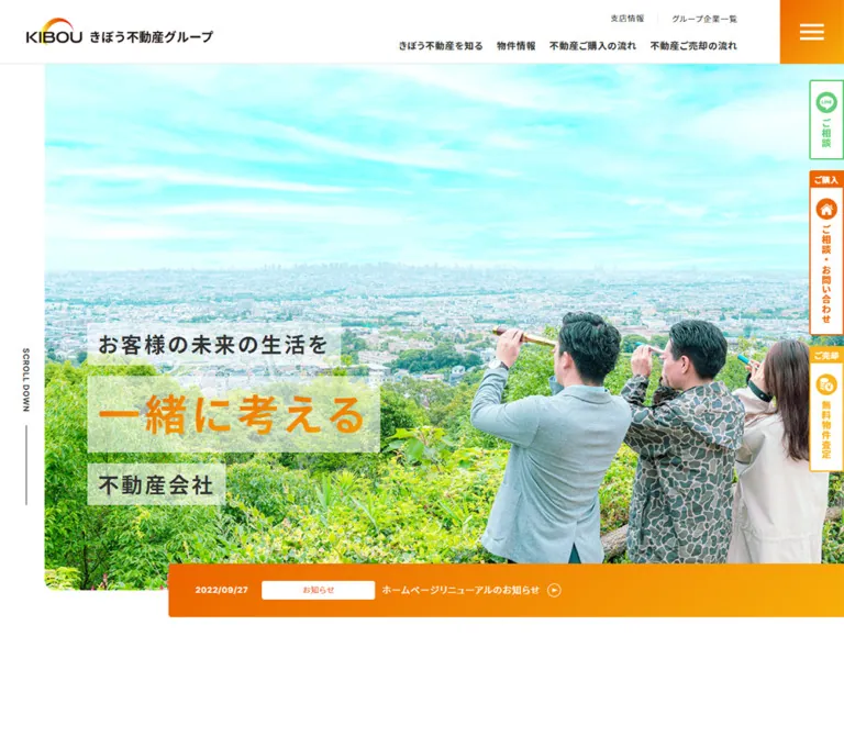
KIBOU combines a reassuring company introduction with operational routes for buying, selling, property discovery, and local consultation. Its opening photograph shows three people looking across a broad urban landscape through small handheld telescopes. Bright cyan sky and green vegetation supply most of the image color; white space, charcoal text, and orange interface accents keep the surrounding design clear.
The defining desktop composition is asymmetric. A narrow white rail remains at the left of a nearly full-width photograph, the headline sits in separate translucent bands near its lower-left corner, and an orange news strip overlaps the photograph’s bottom edge. The header and three contact tabs remain visible in the supplied scrolled captures. On mobile, the headline moves above the photograph, and the contact tabs become three horizontal controls in a bottom dock.
The page continues through company history, three commitments, buying and selling services, property listings, category and area browsing, group information, news, Instagram content, and branch contacts. Preserve this combination of storytelling and useful navigation when adapting the design.
閉じる
KIBOU Real Estate Group — Style Reference
An expansive city view, approachable people, and warm orange accents frame a practical real estate website.
Website: きぼう不動産グループ Original URL: https://kiboufudousan.jp/ Final URL: https://kiboufudousan.jp/ — HTTP 200 Theme: light appearance in the supplied captures Inspected: October 2, 2026, 02:18 JST; evidence retrieved October 1, 2026, at 17:18:23.503 UTC Viewports: desktop 1440 × 1000 CSS px; mobile 390 × 844 CSS px Scope: the current corporate homepage. Visual captures cover the desktop opening, a selling-service section, the desktop footer, the mobile opening, and the mobile footer. Rendered text, links, element rectangles, and computed styles provide additional evidence for the intervening sections. Linked pages and opened navigation states were not inspected.
KIBOU combines a reassuring company introduction with operational routes for buying, selling, property discovery, and local consultation. Its opening photograph shows three people looking across a broad urban landscape through small handheld telescopes. Bright cyan sky and green vegetation supply most of the image color; white space, charcoal text, and orange interface accents keep the surrounding design clear.
The defining desktop composition is asymmetric. A narrow white rail remains at the left of a nearly full-width photograph, the headline sits in separate translucent bands near its lower-left corner, and an orange news strip overlaps the photograph’s bottom edge. The header and three contact tabs remain visible in the supplied scrolled captures. On mobile, the headline moves above the photograph, and the contact tabs become three horizontal controls in a bottom dock.
The page continues through company history, three commitments, buying and selling services, property listings, category and area browsing, group information, news, Instagram content, and branch contacts. Preserve this combination of storytelling and useful navigation when adapting the design.
How to Read This Reference
- Measured means a value is explicitly present in the supplied computed styles, custom properties, or element rectangles. These are CSS-pixel measurements at the stated viewport.
- Calculated means a value follows directly from measured coordinates, such as the gap between property cards.
- Estimated means the appearance or dimension was judged from a current-page screenshot. Estimated hexadecimal colors are implementation approximations, not sampled source declarations.
- Recommended means a proposed implementation choice. Breakpoints, accessibility additions, and some CSS details below belong to this category.
- Named tokens are descriptive aliases unless explicitly identified as source custom properties.
- A computed font-family list establishes the declared stack, not the particular font file that rendered every character.
- Several heading wrappers report
16pxwhile their visible lettering is substantially larger. Their child spans were not included in the style sample. Do not treat wrapper typography as the visible headline size. - Some navigation nodes have rectangles near the opening content although they are absent from the closed-menu screenshot. Their existence does not establish an opened menu or a second visible navigation panel.
- The browser collection waited for initial readiness and traversed the document. It did not verify menu activation, hover outcomes, form submission, slider gestures, or every delayed image.
Tokens — Colors
Default Palette
| Name | Value | Suggested token | Evidence and role |
|---|---|---|---|
| White | #ffffff |
--color-page |
Measured on news labels and search-link surfaces; visually the main canvas and header surface |
| Charcoal | #333333 |
--color-ink |
Measured body, navigation, headings, and primary informational text |
| Secondary Gray | #7d7d7d |
--color-muted |
Measured subordinate navigation and area descriptions; similar gray appears in branch contact details |
| Deep Orange | #ec6400 |
--color-accent-ink |
Measured news-category and property-category text |
| Valuation Blue | #1da1f3 |
--color-assessment |
Measured background of the header’s quick-valuation link; visibly associated with the valuation controls |
| Brand Orange | approximately #f58200 |
--color-brand |
Estimated prominent hero lettering and menu accent |
| Service Amber | approximately #ffb51b |
--color-service |
Estimated selling-service heading, circular arrows, and underlined service links |
| Consultation Green | approximately #44c764 |
--color-consultation |
Estimated LINE consultation icons and control outlines |
| Light Rule | approximately #e3e3e3 |
--color-rule |
Estimated thin header and footer separators |
| Decorative Pale Gray | #e8eced |
--color-decoration |
Measured on the sampled ORIGIN and START UP labels; those nodes were outside the initial viewport |
Warm Gradient and Overlays
The news strip visibly moves from a deeper orange at the left to a yellow-orange at the right. A useful estimated adaptation is:
linear-gradient(90deg, #f56b00, #f5aa00)
The exact gradient stops and angle were not exposed in the supplied computed-style fields. The menu button also appears as a warm orange block; its sampled button background is transparent, so the visible fill may belong to another layer.
Desktop headline bands are translucent white over the photograph. Start with rgba(255, 255, 255, 0.7) as an estimated adaptation, then compare against the intended image. They are flat rectangular bands without a visible frosted-glass blur.
The mobile contact dock appears medium gray over a white footer and allows underlying content to remain perceptible in the opening capture. A black overlay near 40% opacity is a reasonable estimated implementation, not a measured source value.
Color Roles
Orange supports identity, editorial emphasis, and general onward navigation. Blue distinguishes quick valuation, green identifies LINE consultation, and orange identifies purchase inquiries. Retain these roles consistently between the desktop side tabs and mobile bottom dock.
The cyan sky and bright green foliage belong to the photography. They are not evidence of additional general-purpose interface colors.
The supplied custom properties include many WordPress and plugin presets. Their presence does not establish their use in the visible design. In particular, do not substitute a generic WordPress orange or the declared Swiper blue for the measured page colors.
Tokens — Typography
Source Font Stack
The measured body and sampled interface elements declare:
Inter, 'Noto Sans JP', Avenir, 'Helvetica Neue', Helvetica, Arial,
'ヒラギノ角ゴ Pro W3', 'Hiragino Kaku Gothic Pro',
'メイリオ', Meiryo, '游ゴシック', 'Yu Gothic',
'MS Pゴシック', sans-serif
Use this as evidence of a clean sans-serif system with Japanese fallbacks. Inter and Noto Sans JP are declared, but individual font loading and glyph selection were not verified.
The HTML root is measured at 10px; the body explicitly uses 16px. The root’s Times declaration does not describe the visible body typography. The Quick Start keeps a conventional root and reproduces component dimensions separately.
Weight, Tracking, and Reading Rhythm
Body copy generally uses weight 400; navigation, property titles, feature headings, and history paragraphs use 700. The common measured tracking is a fixed 0.8px, equivalent to 0.05em at a 16px size. It is not universally proportional: many smaller sampled labels also retain 0.8px tracking.
Long explanatory sections use unusually open leading. Service paragraphs use 32px line height at a 16px font size. History paragraphs reach 39.6px at 18px on desktop. This spacious rhythm contributes as much to the reassuring tone as the color palette.
Type Scale
| Role | Desktop | Mobile | Weight / tracking | Evidence |
|---|---|---|---|---|
| Base body | 16px / 25.6px |
Same | 400, 0.8px |
Measured |
| Header utilities | 12px / 19.2px; one link has a 12px line box |
Not visible in the mobile header | 400, 0.8px |
Measured desktop |
| Primary header navigation | 14px / 22.4px |
Not visible in the mobile header | 700, 0.8px |
Measured desktop |
| Hero supporting lines | Approximately 32px |
Approximately 20px |
Visually bold | Screenshot estimate; child styles unavailable |
| Hero emphasized line | Approximately 64px |
Approximately 40px |
Visually bold, orange | Screenshot estimate |
| History paragraphs | 18px / 39.6px |
16px / 35.2px |
700, 0.8px |
Measured |
| History concluding statement | 27px / 59.4px |
20px / 44px |
700, 0.8px |
Measured |
| Feature headings | 24px / 36px |
Same | 700, 0.8px |
Measured wrapper typography |
| Feature paragraphs | 16px / 35.2px |
16px / 28px |
400, 0.8px |
Measured |
| Service paragraphs | 16px / 32px |
Same | 400, 0.8px |
Measured |
| Selling-service display heading | Approximately 28–30px |
Child size unavailable | Visually bold and amber on desktop | Screenshot estimate |
| Property titles | 18px / 27px |
Same; several titles wrap to two lines | 700, 0.8px |
Measured |
| Property-category labels | 12px / 12px |
Same | 700, 0.8px |
Measured |
| Search section heading | 30px / 45px |
24px / 36px |
700; 3px / 2.4px tracking |
Measured |
| Search-option titles | 16px / 25.6px |
14px / 22.4px |
700, 0.8px |
Measured |
| Area descriptions | 11px / 17.6px |
Same | 700, 0.8px |
Measured |
| Image-link titles | 24px / 38.4px |
20px / 32px |
700; 2.4px / 2px tracking |
Measured |
| News-category label | 12px / 19.2px |
Same | 400, 0.8px |
Measured |
| Mobile dock captions | Approximately 9–11px |
Same mobile observation | Visually bold | Screenshot estimate |
Composite section headings such as HISTORY, FEATURES, and PROPERTY have measured overall heights of 118px on desktop and usually 73.5px on mobile. Their English and Japanese child sizes were not supplied; those overall heights are not font sizes.
Tokens — Spacing & Shapes
Density: compact navigation and labels surround broad photographs and generously separated narrative content.
Shape language: mostly rectangular surfaces, small label corners, circular arrow icons, and a limited number of pill-shaped major links. Large floating cards and deep shadows do not define the supplied captures.
Spacing Scale
| Use | Desktop | Mobile | Evidence |
|---|---|---|---|
| Header height | 96px |
64px |
Measured source --header-height and header rectangle |
| Header logo left offset | 40px |
15px |
Measured |
| Main content left edge | Commonly 165px |
Commonly 30px |
Measured element coordinates |
| Intro-banner top clearance | 50px |
30px |
Calculated from main and banner rectangles |
| History paragraph separation | 36px |
32px |
Calculated between consecutive paragraphs |
| Feature heading-to-paragraph gap | 48px |
20px |
Calculated from sampled rectangles |
| Service paragraph-to-link gap | 48px |
32px |
Calculated |
| Service-link pair | 30px horizontal gap |
24px vertical gap |
Calculated |
| Circular-link layout height | 36px |
32px |
Measured anchor rectangles |
| Property-rail gap | 40px |
20px |
Calculated from consecutive cards |
| Category-search gaps | 20px horizontal, 15px vertical |
8px in both directions |
Calculated |
| Desktop contact-tab separation | Approximately 16px |
Replaced by dock | Screenshot estimate |
| Mobile dock inset | — | Approximately 17px sides and 8px vertically |
Screenshot estimate |
These values are a mixed spacing system. Do not force every measurement onto a single 8px grid.
Border Radius
| Element | Value | Evidence |
|---|---|---|
| Header valuation link | 4px |
Measured |
| News and property-category labels | 4px |
Measured |
| Category and area search links | 4px |
Measured |
| Main property-list link | 40px desktop; 28px mobile |
Measured, matching half of its height |
| Desktop hero lower-left corner | Approximately 16–20px |
Screenshot estimate |
| Service photograph lower-left corner | Approximately 8px |
Screenshot estimate |
| Circular arrow and contact icons | Circle | Visually observed |
| Main text blocks and menu square | Square | Visible treatment |
Layout Measurements
| Element | Desktop 1440 × 1000 | Mobile 390 × 844 | Evidence |
|---|---|---|---|
| Nominal container variable | --container-width: 1140px |
--container-width: 720px |
Measured source variables |
| Common inner content width | 1110px |
330px |
Measured; the mobile variable is a cap, not a 720px rendered column |
| Logo heading box | 280 × 40.11px |
200 × 28.64px |
Measured |
| Menu button | 96 × 96px |
64 × 64px |
Measured |
| Header quick-valuation link | 204.52 × 44.39px |
Not visible | Measured desktop |
| Hero photograph | Approximately x:75, y:96, 1365 × 864px |
Approximately x:0, y:260, 390 × 390px |
Screenshot estimates |
| Hero headline wrapper | x:138.89, y:558.44, 440.56 × 273.56px |
x:0, y:64, 390 × 196px |
Measured |
| Opening news strip | Approximately x:288, y:920, 1152 × 80px |
Approximately x:30, y:618, 360 × 96px |
Screenshot estimates |
| Opening news-category label | 170 × 27.19px |
114 × 27.19px |
Measured |
| Main content begins | y:1000px |
y:714px |
Measured |
| Intro valuation banner | 800 × 200px |
330 × 82.5px |
Measured; both are 4:1 |
| Service text column | 525px |
330px |
Measured |
| First property card link | 471.11 × 454.30px |
284.34 × 356.20px |
Measured; other cards vary in height |
| Category search link | 305 × 75.59px |
161 × 64.39px |
Measured |
| Area search link | 305 × 99.19px |
330 × 85.98px |
Measured |
| Main property-list link | 560 × 80px |
330 × 56px |
Measured |
| Full document height | Approximately 15567px |
Approximately 14458px |
Measured, content-dependent |
A centered 1140px outer container with 15px internal gutters explains many desktop positions: (1440 − 1140) / 2 + 15 = 165px. This is a useful calculated model, not a recovered source selector. Several editorial sections deliberately use different offsets.
Components
Persistent Header
Role: preserve identity and expose the main routes through the company website.
The desktop header is a white 96px-high band. The SVG logo occupies a 280px-wide box at a 40px left inset. The right side contains two navigation levels: small branch and group utilities above, then bold primary links below. A blue quick-valuation control sits beside the utilities. It contains a small white 匿名! badge followed by 簡単10秒売却査定.
A 96px orange menu square occupies the far-right edge. Three white horizontal strokes form its visible icon; its sampled button text is Menu. The desktop header therefore exposes both conventional navigation and a menu trigger.
At 390px, the header becomes 64px high, the logo becomes 200px wide with a 15px inset, and the menu becomes a 64px square. The desktop utility links, primary navigation, and blue header valuation control are not visible.
The header stays at the top in the supplied scrolled screenshots. Its open-menu layout, focus handling, and toggle animation remain unverified.
Hero Photograph and Headline
Role: express the company’s emphasis on considering the customer’s future life together.
On desktop, the photograph begins about 75px from the left edge and reaches the right edge of the viewport. A broad sky occupies the upper portion; vegetation and the three people occupy the lower area. People cluster on the right, leaving an appropriate area for the headline on the left.
The message uses three separately sized bands:
お客様の未来の生活を一緒に考える不動産会社
The central line is much larger and orange. The surrounding lines are charcoal. Each desktop line has its own translucent white rectangle, so the treatment reads as a stack of individual statements rather than a single text card.
On mobile, the entire headline occupies a white region between the header and the photograph. Its left edge is about 30px from the viewport. The photograph begins at approximately y:260px and forms a square crop. Preserve the people on the right when choosing the mobile crop; do not merely shrink the complete desktop composition.
Scroll Cue
Role: signal that the opening continues into a long document.
A narrow vertical SCROLL DOWN label and thin vertical rule sit in the desktop hero’s left white rail. The measured anchor is approximately 12 × 236px, with 12px bold text and 0.6px tracking. Its destination is /#contents.
The cue is absent from the mobile opening. An anchor destination is confirmed, but smooth scrolling, line animation, and scrolling duration were not tested.
Overlapping News Strip
Role: place a current operational update inside the visual opening.
The orange gradient strip starts about one fifth of the way across the desktop viewport and extends to the right edge. It overlaps the photograph near its bottom and brings the opening composition to the 1000px viewport boundary.
Its anatomy is a date, a white category label, the article title, and a small outlined circular arrow. The captured article is dated 2026/09/28 and titled オープンハウス情報!!. The category label is a separate link to the news category.
On mobile, the strip begins at a 30px left inset and still reaches the right edge. The date and category share the first row; the article title occupies a second row, with the arrow near the right. The strip overlaps approximately 32px of the square photograph and extends beneath it.
This is an announcement link, not evidence of an automatically rotating ticker.
Persistent Contact Controls
Role: keep three distinct service routes within reach throughout a long page.
The desktop right rail contains three approximately 50px-wide tabs:
| Route | Current visible treatment | Confirmed destination |
|---|---|---|
| Quick valuation | Blue outline and icon, ご売却 cap, vertical 10秒査定 label |
/form/ |
| LINE consultation | Green outline and LINE icon, vertical ご相談 label |
https://page.line.me/397mjamh |
| Purchase inquiry | Orange outline and house icon, ご購入 cap, vertical お問い合わせ label |
/contact/ |
In the desktop captures, the first tab begins near y:120px, the second near y:296px, and the third near y:435px. Their differing heights follow their content rather than a uniform tile grid.
At mobile width, these routes become three white, lightly rounded rectangles inside a gray bottom dock. Each contains a colored circular icon above a short horizontal caption. The dock occupies approximately the bottom 74px of the viewport. The captured buttons are about 113–114px wide and 58px high.
The visible control order is valuation, consultation, purchase inquiry in both layouts. Keep /form/ distinct from the separate /assessment/ route used by the free-property-assessment links.
Intro Valuation Banner
Role: provide a larger entry to quick valuation immediately after the opening.
The linked raster banner is centered at 800 × 200px on desktop and 330 × 82.5px on mobile. Both measurements preserve a 4:1 ratio. Its destination is /form/, and its alternative text describes free, simple valuation input.
The mobile opening shows only the upper part unobscured because the fixed dock overlays the lower viewport. This is an observed overlap at that scroll position. For a new implementation, ensure all content can be scrolled clear of persistent controls.
History Narrative
Role: establish the company’s motivation before presenting services and listings.
The rendered content contains two substantial narrative passages, introduced by a bilingual section heading and interrupted by prominent statements. Paragraphs are bold, widely led, and deliberately broken into short lines. The desktop history section measures over 2300px high; the mobile section still exceeds 2000px.
Mobile text uses different line breaks rather than uniformly scaling the desktop typography. History paragraph size changes from 18px to 16px, while its 2.2 line-height ratio remains consistent. Paragraph gaps reduce from 36px to 32px.
A circular-arrow link leads to /about/#history. Preserve the narrative pacing, but allow section height to follow the actual copy. The sampled document heights should not become fixed component heights.
Three Commitments
Role: turn the company story into concrete service qualities.
The section contains numbered entries 01, 02, and 03, each with a title and explanatory paragraph. Their topics are property selection, consistent company-wide support, and ease of consultation.
Desktop text blocks alternate between approximately x:851.5px and x:350px, with a measured width around 423.5px. This supports an alternating editorial arrangement. The supplied screenshots do not show the complete section, so the appearance of accompanying media cannot be specified confidently.
On mobile, all sampled text blocks align at x:30px with 330px width. Headings retain their 24px base size; paragraph leading reduces to 28px. The こだわりを知る link moves from the desktop heading area to after the three entries in the mobile measurements.
Buying and Selling Service Sections
Role: separate the needs of prospective buyers and property sellers.
The desktop selling capture shows a broad two-part composition: text on the left and a large consultation photograph occupying the right half. The photograph features a smiling staff member at a desk, with office materials and a laptop visible. It reaches the right viewport edge and has a subtly rounded lower-left corner.
The measured text column is 525px wide, starting at x:165px. A prominent amber statement is followed by 16px body copy at 32px line height. Below it are two underlined amber links, each preceded by a filled amber circle containing a white right-pointing triangle.
The buying route pairs /buy/ with /property/. The selling route pairs /sell/ with /assessment/.
On mobile, text columns become 330px wide. Link pairs stack vertically, with 32px-high icon-link boxes and 24px between them. Body text keeps its 16px size and 32px leading. The exact mobile service-image crop and ordering are not visually established by the supplied captures.
Wide Image Links
Role: provide larger transitions from service explanation to property browsing and assessment.
Two linked blocks follow the service content. At desktop width, their measured boxes are 705 × 234.98px, separated by 30px. Their white titles sit toward the lower area and use 24px bold text with 2.4px tracking.
At mobile width, they stack as 330 × 189.75px blocks with a 16px gap. Titles reduce to 20px with 2px tracking. Their changed proportions show that mobile treatment is not a simple proportional reduction of the desktop blocks.
Their destinations and text geometry are confirmed. The full underlying imagery is not visible in the supplied screenshots.
Property Rail
Role: preview current exclusive listings and lead into the property catalogue.
Six property entries are present in the rendered content. Each combines a region label, a property-category label, a property title, price information, and location details. Applicable entries also show a floor-plan notation such as 3LDK.
Measured cards form one horizontal sequence. On desktop, the first begins at x:165px, is about 471.11px wide, and is followed by a 40px gap. The third extends beyond the viewport. On mobile, the first begins at x:30px, is about 284.34px wide, and is followed by a 20px gap; the next entry begins at x:334.34px.
Keep the partial-next-item geometry when adapting the rail. A generic three-column desktop grid would change its observed structure.
Property-category labels measure 114px wide and 26px high, with 4px corners and deep-orange text. Property titles are 18px bold with 27px leading at both widths. The mobile cards accommodate wrapped titles, while price content causes some card heights to vary.
The card’s main destination and its category and region links are separate targets. An adaptation should avoid nesting links. Horizontal layout is confirmed; dragging, autoplay, looping, arrow controls, and pagination behavior are unverified.
Category and Area Search
Role: provide direct, understandable routes into listing groups.
The section is introduced by 条件から物件を探す. Desktop layout places a category label on the left and search links in two columns on the right. Four property-category links form a two-by-two group. Five area links follow, each with a bold area name and smaller gray municipality description.
Category links measure 305 × 75.59px, use 24px padding, and have 4px corners. Area links share that width but grow to approximately 99.19px high to accommodate a second line.
Mobile category links remain two columns: 161px + 8px + 161px = 330px. Area links become one full-width column of 330px. Padding becomes 20px 12px; titles reduce from 16px to 14px. The 11px gray municipality descriptions remain small.
A large pill-shaped 物件一覧を見る link closes the section: 560 × 80px on desktop and 330 × 56px on mobile. Its measured text is white; the sampled background-color field alone does not reveal the complete fill layer.
Group, News, and Instagram Content
Role: establish regional presence and show that the business is active.
The Group content names three companies and describes their regional branch network. Its markup references a map image and contains links to group and branch information. The footer identity is きぼう不動産グループ; the page does not require assigning the entire website to one of the three companies individually.
The news section contains three dated entries in the supplied text. The mobile section heading is 24px bold with 2.4px tracking, and the news-index link follows the entries.
The Instagram section includes introductory copy, ten post or reel links, and a profile link. Some image references in the evidence point to plugin placeholders. The full social grid and its loaded image state are not visually verified. Preserve the content role without inventing masonry, autoplay video, or an interaction model.
Contact Bands and Footer
Role: finish with practical service access, local contact information, and broader site navigation.
The rendered content contains a further trio of contact routes with explanatory copy: quick valuation, LINE consultation, and purchase inquiry. Repeated navigation-associated instances measure about 370px wide on desktop and 390px wide on mobile. Because those nodes are not all visible in the supplied screenshots, their coordinates should not be reused as the final footer layout specification.
The desktop footer capture is a spacious white sitemap. A fine rule separates it from preceding contact details. Bold primary links sit in four broad columns, while subordinate links use smaller gray text with short dash markers. A second row provides additional service links. Utility links are separated by thin vertical rules; TikTok and Instagram icons sit below. Copyright is aligned toward the lower right.
The mobile footer capture prioritizes six branch entries in a single column. Each entry has a bold company or branch name followed by a gray address and telephone link. The extensive desktop sitemap is absent from this captured mobile footer, and copyright is centered above the fixed contact dock.
Tokens — Motion & Interaction
The evidence provides transition declarations, not a complete recording of the corresponding state changes.
| Element or treatment | Measured declaration | What is established |
|---|---|---|
| Many navigation links, header, and menu button | 0.3s cubic-bezier(0.33, 1, 0.68, 1) |
A short eased transition is declared; individual endpoints are not supplied |
| Header valuation link | Background and border color, 0.3s ease-in-out |
Color-transition properties are explicit; hover colors were not captured |
| Intro valuation banner | Opacity, 0.6s ease-in-out |
Opacity can transition; the activation event is unverified |
| Composite section headings | Opacity, 0.6s cubic-bezier(0.19, 1, 0.22, 1) |
A reveal-capable declaration is present; scroll trigger is not proven |
| Group statement and paragraph | Opacity and transform, 0.8s cubic-bezier(0.19, 1, 0.22, 1) |
Both properties can transition; movement direction and distance are unknown |
| Property titles | Color, 0.3s cubic-bezier(0.33, 1, 0.68, 1) |
Color feedback is supported by the declaration |
| Search links | Border color and box shadow, 0.3s cubic-bezier(0.19, 1, 0.22, 1) |
Potential hover feedback includes these properties; actual shadow values are unavailable |
| Social icons | Opacity, 0.3s cubic-bezier(0.33, 1, 0.68, 1) |
Opacity-transition declaration is present |
The sampled elements report animation: none, but that does not establish that the complete page has no animation. Child nodes, pseudo-elements, JavaScript behavior, and uncaptured states can differ. Likewise, a serialized transition: all without an explicit duration is not evidence of a visible timed effect.
The captured scroll positions establish persistent header and contact-control placement. The collection temporarily paused perpetual animations during readiness checks and resumed them afterward. Static captures therefore cannot establish whether every decorative element is permanently static.
Recommended adaptation: use restrained color and opacity feedback in the measured timing range. Keep content visible by default, and add any optional reveal behavior progressively. Avoid inventing parallax, a rotating hero, automatic property advancement, or a particular menu transition.
Surfaces
| Layer | Appearance | Purpose and evidence |
|---|---|---|
| Page canvas | White, visually continuous | Gives photographs and editorial spacing prominence |
| Header | White band with a fine lower rule | Persistent identity and navigation; screenshot appearance |
| Hero headline bands | Translucent white rectangles | Maintain legibility over vegetation and city detail |
| Opening news strip | Warm orange gradient | Strong announcement accent across the hero boundary |
| Search links | White with small corners | Measured fill and radius; border/shadow transitions declared |
| Service links | Colored text and circles on white | Lightweight onward navigation without large enclosing cards |
| Desktop contact tabs | White with colored outlines and icons | Distinguish three service destinations |
| Mobile dock | Gray overlay containing white controls | Persistent mobile access; exact overlay opacity estimated |
| Footer | White with fine rules and gray subordinate text | Broad navigation and branch directory |
The visible captures are predominantly flat. Search controls may have state-dependent shadows, but there is no evidence for applying a general elevated-card system throughout the page.
Imagery
The strongest visual asset is the opening photograph. Its composition links the company’s future-oriented message with people looking outward across a city. The image is bright and airy, with a large sky, dense urban detail, saturated foliage, and people viewed mainly from behind. Preserve those compositional relationships when selecting an alternative.
The desktop service photograph changes from the expansive outdoor scene to direct human reassurance: a smiling staff member, an ordinary working desk, a laptop, and visible office storage. This combination makes the company feel local and approachable rather than luxurious or abstract.
Photography supplies texture and atmosphere; interface elements remain clean and relatively simple. Do not apply the cyan sky color as a wash across all page surfaces, and do not add a dark cinematic overlay to the hero.
The mobile crop must be authored deliberately. The current capture retains the people along the right side while moving the headline onto a separate white surface. A right-aligned crop is a useful starting recommendation, but the exact object-position declaration was not supplied.
Observed Asset References
These paths are relative to https://kiboufudousan.jp/ and were present in the original-page evidence. They are references, not bundled files.
| Asset | Observed path | Confirmed use |
|---|---|---|
| Group logo | /app/wp-content/themes/kiboufudousan/img/common/logo.svg |
Header and footer identity |
| Quick-valuation banner | /app/wp-content/themes/kiboufudousan/img/index/bnr-intro_L.jpg |
Linked 4:1 banner after the opening |
| Group map | /app/wp-content/themes/kiboufudousan/img/index/map-group.png |
Image referenced in the Group section; detailed appearance not captured |
| TikTok icon | /app/wp-content/themes/kiboufudousan/img/common/icon-tictok.png |
Social link icon; filename spelling preserved |
| Instagram icon | /app/wp-content/themes/kiboufudousan/img/common/icon-instagram.png |
Social link icon |
The hero and consultation photographs are visible in the current screenshots, but their asset URLs were not exposed in the supplied sampled nodes. Do not invent filenames for them. The property text and geometry are available; individual listing-image assets were not supplied here.
Use original imagery only when authorized. A new implementation needs suitable licensed images in addition to the CSS shell.
Layout & Responsive Behavior
Desktop: 1440 × 1000
The 96px header, tall hero photograph, overlaid headline, and overlapping news strip together occupy the opening viewport. Main content starts at y:1000px. The hero uses a narrow left rail, while the ordinary content generally aligns to an inner 1110px column centered within a 1140px container.
The service capture uses a half-width photograph reaching the right edge and a left text column aligned to the main content. The feature measurements show additional alternating offsets. This is an editorial composition with multiple alignments, not one identical grid repeated throughout.
The property previews extend horizontally beyond the viewport. Search groups use a left label region and a two-column option region. The footer expands into a broad sitemap with substantial white space.
Mobile: 390 × 844
The header contracts to 64px and exposes only identity and the menu square. The hero headline occupies a separate 196px-high white region, followed by a square photograph and a two-row overlapping news panel. Main content begins at y:714px, before the first viewport ends.
Most content aligns to a 330px column with 30px side margins. Paragraph type generally remains 16px; responsive changes rely on line breaks, column stacking, reduced spacing, and selective size changes rather than shrinking all text.
Specific measured adaptations include:
- Feature text becomes a single aligned column, and the section’s onward link moves below the entries.
- Service-link pairs stack vertically.
- Wide image links stack and change aspect ratio.
- Property previews stay in a horizontal sequence with narrower cards and a partial next item.
- Property categories retain two columns, while geographic areas become one column.
- The large property-list link reduces to 56px high.
- The captured footer emphasizes branch contacts instead of the desktop sitemap.
- The three contact routes move into a persistent bottom dock.
Breakpoints and Unverified Sizes
Only the two stated viewports were supplied. The exact breakpoint thresholds, tablet layout, landscape-phone layout, browser zoom behavior, and safe-area treatment were not established.
The Quick Start uses a recommended 1200px transition between the full desktop header and compact layout. This is an implementation choice that leaves room for the long Japanese navigation labels. Test intermediate widths rather than treating it as recovered source CSS.
The document is slightly shorter on mobile despite narrower text columns. The measurements show that reduced desktop spacing and omitted desktop navigation can outweigh extra text wrapping. Do not derive mobile page height from the desktop height with a simple scale factor.
Do’s and Don’ts
Do
- Build the opening around the city panorama and the people looking outward.
- Keep the desktop headline in three separate white translucent bands, with the central line emphasized in orange.
- Move the mobile headline above the photograph and preserve a deliberate crop of the people.
- Retain the offset, overlapping orange news strip and its two-row mobile layout.
- Use the measured charcoal, gray, deep-orange label color, and valuation blue where applicable.
- Keep valuation, LINE consultation, and purchase inquiry visually distinct and consistently ordered.
- Preserve generous paragraph leading and the history section’s bold narrative voice.
- Maintain the property rail’s partial-next-card geometry.
- Keep category and area browsing as explicit, understandable links.
- Preserve local branch information and telephone links as practical footer content.
- Distinguish source measurements from estimated headline sizes and accent colors.
Don’t
- Don’t collapse the full corporate homepage into a short conversion-only page.
- Don’t replace the landscape photograph with a generic house rendering or abstract decorative graphic.
- Don’t put the mobile headline over the busy photograph when following this reference.
- Don’t turn every text section into a rounded, elevated card.
- Don’t use the page’s incidental plugin presets as the brand palette.
- Don’t interpret a 16px heading-wrapper style as the actual large headline lettering.
- Don’t treat the nominal 720px mobile container variable as the visible content width.
- Don’t invent hero autoplay, property autoplay, parallax, or menu transitions.
- Don’t merge the quick-valuation and free-assessment destinations.
- Don’t copy the sampled absolute document coordinates as permanent section positions.
- Don’t leave the final content or keyboard focus hidden beneath persistent controls.
Recommended Implementation Additions
These are recommendations for a new implementation, not verified behavior of the original:
- Give the menu a clear accessible name,
aria-expanded, and an explicit relationship to its panel. If the panel behaves as a modal, implement the corresponding focus management and dismissal behavior. - Ensure links styled as full cards have meaningful accessible names. The extraction contains several empty-text anchors; inspect their actual accessibility before reproducing that pattern.
- Give the property rail keyboard-accessible navigation and an obvious way to reach all entries. A native horizontal scroller is a reasonable baseline; autoplay is unnecessary.
- Preserve distinct category links without nesting them inside another anchor.
- Add top scroll clearance for the persistent header and bottom clearance for the mobile dock, including device safe areas.
- Check contrast for small orange, green, and blue captions. Darker text shades can preserve the action colors while improving readability.
- Consider increasing the mobile dock captions and 11px area descriptions where practical. Preserve generous target sizes even when the icon or label is small.
- Use semantic headings for the text hierarchy; the sampled page has both a logo heading and a hero heading marked as
H1. - Provide reduced-motion behavior and keep essential content visible when optional reveal scripting is unavailable.
- Supply useful image alternatives, reserve image dimensions, and avoid making social-plugin image loading a prerequisite for understanding the section.
Agent Prompt Guide
Quick Color Reference
- Main page and control surfaces: measured
#ffffff. - Main text: measured
#333333. - Secondary text: measured
#7d7d7d. - Category-label orange: measured
#ec6400. - Quick-valuation blue: measured
#1da1f3. - Hero brand orange: estimated
#f58200. - Selling-service amber: estimated
#ffb51b. - LINE consultation green: estimated
#44c764. - News gradient: estimated
#f56b00to#f5aa00. - Hero text bands: translucent white; approximately 70% opacity as a starting point.
Overall Prompt
“Create a Japanese regional real estate corporate homepage inspired by the current KIBOU composition. Use a white canvas, charcoal sans-serif text, generous reading space, and warm orange accents. Build a 96px desktop header with a left SVG identity, two levels of right-aligned navigation, a blue quick-valuation link, and an orange menu square. Place a bright city panorama below it, with three people looking outward on the right and three separate translucent headline bands near the lower left. Emphasize 一緒に考える in orange. Overlap an offset orange-gradient news strip across the photograph’s lower edge. Continue with company history, three commitments, buying and selling services, a horizontal property rail, category and geographic browsing, company information, updates, social content, and branch contacts. On a 390px mobile layout, use a 64px header, move the headline above a square photograph, stack editorial content, and move the three contact routes into a bottom dock. Keep unverified interactions simple and label any implementation assumptions.”
Example Component Prompts
- Hero: “At 1440px, leave about 75px of white space to the left of a broad city photograph. Keep people on the right. Position three separate translucent white headline bands near the lower left, using a much larger orange middle line. At 390px, move all headline text onto a white block above the square image and use a 30px text inset.”
- News strip: “Create an orange-to-yellow-orange announcement strip that overlaps the photograph. On desktop, begin it around 20% of the viewport width and place the date, white category label, title, and circular arrow in one row. On mobile, begin at 30px, run to the right edge, and move the title to a second row.”
- Service section: “Use a spacious desktop split with a 525px text column and an edge-reaching consultation photograph. Set body text at 16px with 32px leading. Use an amber heading and two underlined links preceded by 36px amber circles with white arrow triangles. Stack the links on mobile.”
- Contact controls: “Create three color-coded contact routes: blue valuation, green LINE consultation, and orange purchase inquiry. Use narrow vertical tabs on the desktop right edge and three white icon-over-label buttons in a gray mobile bottom dock. Keep their destinations and order consistent.”
- Property browsing: “Build a horizontal property sequence with approximately 471px desktop cards and 40px gaps, changing to approximately 284px cards and 20px gaps at 390px. Use 18px bold titles, small category labels, and independent area links. Follow it with a two-column mobile property-category grid and full-width geographic links. Do not assume autoplay.”
- Footer: “Use a broad white desktop sitemap with bold category titles, smaller gray dash-prefixed links, fine separators, and modest social icons. On mobile, prioritize a single column of branch names, addresses, and telephone links, with centered copyright above the persistent contact dock.”
Quick Start
CSS Custom Properties
This is a reusable adaptation, not an extraction of the original stylesheet. Exact measured tokens are identified separately from estimates. The desktop/mobile breakpoint, image fit rules, native property scrolling, and focus treatment are recommendations.
Use .hero-copy with three direct children: a supporting span, the emphasized strong, and a final span. Use .hero-photo as an image wrapper. .hero-news contains .news-date, .news-tag, .news-title, and .news-arrow. Contact links use .tool plus one of the three route modifier classes and contain .tool-icon and .tool-label.
Supply licensed photograph URLs through image elements. The starter does not invent missing asset paths or implement an unobserved menu panel.
:root {
  /* Measured colors */
  --color-page: #ffffff;
  --color-ink: #333333;
  --color-muted: #7d7d7d;
  --color-accent-ink: #ec6400;
  --color-assessment: #1da1f3;
  --color-decoration: #e8eced;

  /* Visual estimates: calibrate against the chosen imagery */
  --color-brand: #f58200;
  --color-service: #ffb51b;
  --color-consultation: #44c764;
  --color-rule: #e3e3e3;
  --warm-gradient: linear-gradient(90deg, #f56b00, #f5aa00);
  --headline-band: rgb(255 255 255 / 70%);
  --dock-overlay: rgb(0 0 0 / 40%);

  /* Declared source stack; font files must be supplied separately */
  --font-body: Inter, 'Noto Sans JP', Avenir, 'Helvetica Neue',
    Helvetica, Arial, 'ヒラギノ角ゴ Pro W3',
    'Hiragino Kaku Gothic Pro', 'メイリオ', Meiryo,
    '游ゴシック', 'Yu Gothic', 'MS Pゴシック', sans-serif;
  --text-body: 1rem;
  --text-small: 0.875rem;
  --text-caption: 0.75rem;
  --tracking-base: 0.8px;

  /* Measured desktop dimensions and derived container model */
  --header-height: 96px;
  --container-width: 1140px;
  --container-padding: 15px;
  --radius-small: 4px;
  --property-width: 471.11px;
  --property-gap: 40px;

  /* Measured transition timing */
  --ease-ui: cubic-bezier(0.33, 1, 0.68, 1);
  --ease-reveal: cubic-bezier(0.19, 1, 0.22, 1);
  --duration-ui: 300ms;
  --duration-heading: 600ms;
  --duration-group: 800ms;

  /* Recommended device clearance */
  --safe-bottom: env(safe-area-inset-bottom, 0px);
}

* { box-sizing: border-box; }

html {
  font-size: 100%;
  scroll-padding-top: calc(var(--header-height) + 24px);
}

body {
  margin: 0;
  padding-top: var(--header-height);
  color: var(--color-ink);
  background: var(--color-page);
  font-family: var(--font-body);
  font-size: var(--text-body);
  line-height: 1.6;
  letter-spacing: var(--tracking-base);
}

img { display: block; max-width: 100%; }
a { color: inherit; }
button { font: inherit; }

.container {
  width: min(calc(100% - 30px), var(--container-width));
  margin-inline: auto;
  padding-inline: var(--container-padding);
}

.site-header {
  position: fixed;
  z-index: 40;
  inset: 0 0 auto;
  display: grid;
  grid-template-columns: auto minmax(0, 1fr) var(--header-height);
  align-items: center;
  height: var(--header-height);
  background: var(--color-page);
  border-bottom: 1px solid var(--color-rule);
}

.site-logo { width: 280px; margin-left: 40px; }
.site-logo img { width: 100%; height: auto; }

.header-links {
  display: grid;
  justify-items: end;
  gap: 14px;
  padding: 4px 64px 6px 24px;
}

.header-utilities,
.header-primary {
  display: flex;
  align-items: center;
  gap: 20px;
}

.header-utilities { font-size: 12px; }
.header-primary { font-size: 14px; font-weight: 700; }
.header-links a { text-decoration: none; }

.header-assessment {
  display: flex;
  align-items: center;
  gap: 10px;
  padding: 6px 16px 6px 6px;
  border-radius: var(--radius-small);
  color: white;
  background: var(--color-assessment);
  font-size: 14px;
  font-weight: 700;
  transition: background-color 300ms ease-in-out;
}

.header-assessment .badge {
  padding: 4px 6px;
  color: var(--color-assessment);
  background: white;
}

.menu-button {
  display: grid;
  place-items: center;
  width: var(--header-height);
  height: var(--header-height);
  padding: 0;
  border: 0;
  background: var(--warm-gradient);
  cursor: pointer;
}

.menu-lines { display: grid; gap: 8px; width: 36px; }
.menu-lines span { height: 2px; background: white; }

/* Hero geometry is adapted from the two supplied captures. */
.hero {
  position: relative;
  height: calc(100svh - var(--header-height));
  min-height: 650px;
}

.hero-photo {
  position: absolute;
  inset: 0 0 40px 75px;
  overflow: hidden;
  border-radius: 0 0 0 18px;
}

.hero-photo img {
  width: 100%;
  height: 100%;
  object-fit: cover;
}

.hero-copy {
  position: absolute;
  z-index: 1;
  left: 9.645vw;
  bottom: 168px;
  display: grid;
  justify-items: start;
  gap: 16px;
  margin: 0;
  font-size: 32px;
  font-weight: 700;
  line-height: 1.5;
}

.hero-copy > * {
  display: block;
  padding: 8px 16px;
  background: var(--headline-band);
}

.hero-copy strong {
  color: var(--color-brand);
  font-size: 64px;
  letter-spacing: 0.05em;
}

.hero-news {
  position: absolute;
  z-index: 2;
  right: 0;
  bottom: 0;
  left: 20%;
  display: flex;
  align-items: center;
  gap: 10px;
  min-height: 80px;
  padding: 20px 40px;
  color: white;
  background: var(--warm-gradient);
  border-radius: 4px 0 0 4px;
}

.news-date { flex: 0 0 90px; font-size: 12px; font-weight: 700; }
.news-title { margin: 0; font-size: 16px; font-weight: 400; }
.news-title a { text-decoration: none; }

.news-tag {
  flex: 0 0 170px;
  padding: 3px 12px;
  border-radius: var(--radius-small);
  color: var(--color-accent-ink);
  background: white;
  font-size: 12px;
  line-height: 19.2px;
  text-align: center;
  text-decoration: none;
}

.news-arrow {
  display: grid;
  place-items: center;
  flex: 0 0 20px;
  width: 20px;
  height: 20px;
  border: 1px solid currentColor;
  border-radius: 50%;
}

.news-arrow::after {
  content: '';
  margin-left: 2px;
  border-top: 3px solid transparent;
  border-bottom: 3px solid transparent;
  border-left: 5px solid currentColor;
}

.intro-banner {
  display: block;
  width: min(800px, calc(100% - 60px));
  margin: 50px auto 0;
  transition: opacity 600ms ease-in-out;
}

.intro-banner img { width: 100%; height: auto; aspect-ratio: 4 / 1; }

.history-copy { font-size: 18px; font-weight: 700; line-height: 2.2; }
.history-copy p { margin: 0 0 36px; }
.feature-copy { font-size: 16px; line-height: 2.2; }
.feature-title { font-size: 24px; line-height: 1.5; }

.service-row {
  display: grid;
  grid-template-columns: repeat(2, minmax(0, 1fr));
  align-items: stretch;
}

.service-copy {
  margin-inline-start: max(30px, calc((100vw - 1110px) / 2));
  padding: 96px 30px 96px 0;
}

.service-title {
  margin: 0 0 36px;
  color: var(--color-service);
  font-size: 30px;
  line-height: 1.5;
}

.service-copy p { margin: 0; line-height: 2; }
.service-actions { display: flex; flex-wrap: wrap; gap: 24px 30px; margin-top: 48px; }

.service-image {
  width: 100%;
  height: 100%;
  min-height: 640px;
  object-fit: cover;
  border-radius: 0 0 0 8px;
}

.arrow-link {
  display: inline-flex;
  align-items: center;
  gap: 8px;
  min-height: 36px;
  color: var(--color-service);
  font-weight: 700;
  text-underline-offset: 5px;
}

.arrow-link::before {
  content: '▶';
  display: grid;
  place-items: center;
  flex: 0 0 36px;
  height: 36px;
  border-radius: 50%;
  color: white;
  background: var(--color-service);
  font-size: 12px;
}

/* Native scrolling is a recommended baseline, not verified source behavior. */
.property-rail {
  display: grid;
  grid-auto-flow: column;
  grid-auto-columns: var(--property-width);
  gap: var(--property-gap);
  overflow-x: auto;
  margin-left: max(30px, calc((100vw - 1110px) / 2));
  padding: 4px 30px 20px 4px;
  scroll-snap-type: x proximity;
}

.property-card { min-width: 0; scroll-snap-align: start; }
.property-card img { width: 100%; aspect-ratio: 16 / 9; object-fit: cover; }
.property-title { margin: 12px 0; font-size: 18px; line-height: 1.5; }
.property-title a { text-decoration: none; }

.property-category {
  display: inline-block;
  min-width: 114px;
  margin-top: 16px;
  padding: 6px 12px;
  border: 1px solid currentColor;
  border-radius: var(--radius-small);
  color: var(--color-accent-ink);
  font-size: 12px;
  font-weight: 700;
  line-height: 12px;
  text-align: center;
  text-decoration: none;
}

/* The image ratio and label border above are adaptation choices. */
.filter-row {
  display: grid;
  grid-template-columns: 450px minmax(0, 1fr);
  gap: 30px;
  align-items: center;
  margin-block: 36px;
}

.filter-options {
  display: grid;
  grid-template-columns: repeat(2, minmax(0, 1fr));
  gap: 15px 20px;
}

.filter-link {
  display: block;
  min-width: 0;
  padding: 24px;
  border: 1px solid var(--color-rule);
  border-radius: var(--radius-small);
  color: var(--color-ink);
  background: white;
  text-decoration: none;
  transition: border-color 300ms var(--ease-reveal);
}

.filter-link strong { display: block; font-size: 16px; line-height: 1.6; }
.filter-link small {
  display: block;
  margin-top: 6px;
  color: var(--color-muted);
  font-size: 11px;
  font-weight: 700;
  line-height: 1.6;
}

.property-index-link {
  display: flex;
  align-items: center;
  justify-content: center;
  width: min(560px, 100%);
  min-height: 80px;
  margin: 48px auto 0;
  border-radius: 40px;
  color: white;
  background: var(--warm-gradient);
  font-weight: 700;
  text-decoration: none;
}

/* The major-link gradient is a recommended visual adaptation. */
.contact-tools {
  position: fixed;
  z-index: 50;
  top: calc(var(--header-height) + 24px);
  right: 0;
  display: grid;
  gap: 16px;
  width: 50px;
}

.tool--assessment { --tool-color: var(--color-assessment); }
.tool--consultation { --tool-color: var(--color-consultation); }
.tool--purchase { --tool-color: var(--color-accent-ink); }

.tool {
  position: relative;
  display: flex;
  flex-direction: column;
  align-items: center;
  justify-content: center;
  gap: 12px;
  padding: 38px 6px 18px;
  border: 2px solid var(--tool-color);
  border-right: 0;
  border-radius: 4px 0 0 4px;
  color: var(--tool-color);
  background: white;
  text-decoration: none;
}

.tool--assessment { min-height: 160px; }
.tool--consultation { min-height: 123px; padding-top: 18px; }
.tool--purchase { min-height: 191px; }

.tool-kicker {
  position: absolute;
  inset: 0 0 auto;
  color: white;
  background: var(--tool-color);
  font-size: 12px;
  font-weight: 700;
  line-height: 24px;
  text-align: center;
}

.tool-icon {
  display: grid;
  place-items: center;
  width: 32px;
  height: 32px;
  flex-shrink: 0;
  border-radius: 50%;
  color: white;
  background: var(--tool-color);
}

.tool-icon svg { width: 60%; height: 60%; }
.tool-label { writing-mode: vertical-rl; font-size: 14px; font-weight: 700; line-height: 1; }
.tool-label .tcy { text-combine-upright: all; }

.site-footer { padding-block: 96px 120px; }
.footer-sitemap {
  display: grid;
  grid-template-columns: repeat(4, minmax(0, 1fr));
  gap: 64px 30px;
  padding-top: 64px;
  border-top: 1px solid var(--color-rule);
}

.branch-list { display: grid; grid-template-columns: repeat(3, minmax(0, 1fr)); gap: 30px; }
.branch-name { margin: 0 0 8px; font-size: 14px; font-weight: 700; }
.branch-details { margin: 0; color: var(--color-muted); font-size: 14px; line-height: 1.9; }
.copyright { margin: 96px 0 0; font-size: 10px; text-align: right; }

/* Recommended feedback; original hover endpoints were not captured. */
@media (hover: hover) {
  .intro-banner:hover { opacity: 0.85; }
  .filter-link:hover { border-color: var(--color-brand); }
  .property-title a:hover { color: var(--color-accent-ink); }
}

:focus-visible { outline: 3px solid var(--color-ink); outline-offset: 4px; }

/* Recommended breakpoint; only 1440px and 390px were inspected. */
@media (max-width: 1199px) {
  :root {
    --header-height: 64px;
    --container-width: 720px;
    --property-width: min(72.91vw, 420px);
    --property-gap: 20px;
  }

  body { padding-bottom: calc(74px + var(--safe-bottom)); }
  html { scroll-padding-bottom: calc(90px + var(--safe-bottom)); }
  .site-logo { width: 200px; margin-left: 15px; }
  .header-links { display: none; }
  .menu-button { grid-column: 3; }
  .menu-lines { width: 28px; }

  .hero { height: auto; min-height: 0; }
  .hero-copy {
    position: static;
    gap: 0;
    padding: 48px 30px 32px;
    font-size: 20px;
    line-height: 1.6;
  }
  .hero-copy > * { padding: 0; background: transparent; }
  .hero-copy strong { font-size: 40px; line-height: 1.3; }
  .hero-photo { position: static; width: 100%; aspect-ratio: 1; border-radius: 0; }
  .hero-photo img { object-position: right center; }

  .hero-news {
    position: relative;
    inset: auto;
    display: grid;
    grid-template-columns: 80px 114px minmax(0, 1fr);
    gap: 4px 10px;
    width: calc(100% - 30px);
    min-height: 96px;
    margin: -32px 0 0 30px;
    padding: 20px 15px;
  }
  .news-date { font-size: 12px; }
  .news-tag { padding-inline: 6px; }
  .news-title { grid-column: 1 / -1; padding-right: 30px; }
  .news-arrow { position: absolute; right: 30px; bottom: 22px; width: 16px; height: 16px; }
  .intro-banner { margin-top: 30px; }

  .history-copy { font-size: 16px; }
  .history-copy p { margin-bottom: 32px; }
  .feature-copy { line-height: 1.75; }
  .service-row { grid-template-columns: minmax(0, 1fr); }
  .service-copy { margin: 0; padding: 48px 30px; }
  .service-title { font-size: 26px; margin-bottom: 32px; }
  .service-actions { flex-direction: column; align-items: flex-start; margin-top: 32px; }
  .arrow-link { min-height: 32px; }
  .arrow-link::before { flex-basis: 32px; height: 32px; }

  /* Mobile service-image placement is recommended, not visually verified. */
  .service-image { order: -1; min-height: 0; height: auto; aspect-ratio: 4 / 3; }
  .property-rail { margin-left: 30px; }
  .filter-row { grid-template-columns: minmax(0, 1fr); gap: 32px; }
  .filter-options { gap: 8px; }
  .filter-options--areas { grid-template-columns: minmax(0, 1fr); }
  .filter-link { padding: 20px 12px; }
  .filter-link strong { font-size: 14px; }
  .filter-link small { margin-top: 4px; }
  .property-index-link { min-height: 56px; margin-top: 32px; border-radius: 28px; }

  .contact-tools {
    inset: auto 0 0;
    grid-template-columns: repeat(3, minmax(0, 1fr));
    gap: 8px;
    width: auto;
    padding: 8px 17px calc(8px + var(--safe-bottom));
    background: var(--dock-overlay);
  }
  .tool {
    min-height: 58px;
    gap: 4px;
    padding: 8px 4px;
    border: 1px solid var(--tool-color);
    border-radius: 4px;
  }
  .tool-kicker { display: none; }
  .tool-icon { width: 22px; height: 22px; }
  .tool-label { writing-mode: horizontal-tb; font-size: 11px; line-height: 1.2; text-align: center; }
  .tool-label .tcy { text-combine-upright: none; }
  .site-footer { padding-block: 64px 36px; }
  .footer-sitemap { display: none; }
  .branch-list { grid-template-columns: minmax(0, 1fr); gap: 28px; }
  .copyright { margin-top: 96px; text-align: center; }
}

/* Recommended reduced-motion behavior for the adaptation. */
@media (prefers-reduced-motion: reduce) {
  html { scroll-behavior: auto; }
  .header-assessment,
  .intro-banner,
  .filter-link { transition: none; }
}
The branch-list desktop column count, service-image sizing, property-image ratio, focus style, and hover endpoints in this starter are recommendations. The CSS does not reproduce unobserved section decoration or claim that the current property rail uses native scrolling. If the mobile footer sitemap is omitted, retain equivalent navigation through an accessible menu.
Tailwind v4 Token Mapping
Optional aliases for a project that already uses Tailwind v4. This is not evidence that the original site uses Tailwind. Define the preceding custom properties first.
@theme inline {
  --color-page: #ffffff;
  --color-ink: #333333;
  --color-muted: #7d7d7d;
  --color-accent-ink: #ec6400;
  --color-assessment: #1da1f3;

  /* Estimated appearance tokens */
  --color-brand: #f58200;
  --color-service: #ffb51b;
  --color-consultation: #44c764;
  --color-rule: #e3e3e3;

  --font-site: var(--font-body);
  --text-caption: 0.75rem;
  --text-small: 0.875rem;
  --text-body: 1rem;
  --text-property: 1.125rem;
  --text-feature: 1.5rem;

  --spacing-header: var(--header-height);
  --spacing-page-inset: 30px;
  --spacing-property: var(--property-width);
  --radius-control: 4px;
  --ease-site: cubic-bezier(0.33, 1, 0.68, 1);
}
Sources & Evidence
- Inspected original and final page: https://kiboufudousan.jp/. The supplied browser evidence reports HTTP 200, no URL change, and the title
関西の不動産売買|きぼう不動産グループ. - Capture session: evidence retrieved at
2026-10-01T17:18:23.503Z, corresponding to October 2, 2026, 02:18:23.503 JST. This reference analyzes that supplied inspection; it does not claim a later independent visit. - Desktop evidence: three current-page captures at 1440 × 1000, showing the opening, selling-service content, and footer. Rendered DOM measurements report a document height of approximately 15567px.
- Mobile evidence: two current-page captures at 390 × 844, showing the opening and branch-contact footer. Rendered DOM measurements report a document height of approximately 14458px.
- Computed evidence: declared font stacks, sizes, weights, leading, tracking, color values, padding, radius, transition strings, link destinations, element rectangles, and the source variables
--header-heightand--container-width. - Observed navigation destinations: company information, property listings and categories, buying and selling guidance, quick valuation, assessment, branch information, news, contact, and social links are present in the homepage evidence. Destination pages were not inspected.
- Interaction limits: persistent positioning is visible across supplied scroll captures. Menu opening, hover results, form behavior, slider operation, and social-media playback were not exercised. Transition declarations establish available styling, not complete interaction behavior.
- Collection limits: the inspection waited for document readiness, finite motion, layout stability, and visible image decoding within bounded time limits. Perpetual animations were temporarily paused during checks; SharedWorkers and service workers were disabled. Delayed content and unexercised states may differ from the captures.
Measured values in this reference describe the current supplied page at the two inspected viewports. Screenshot estimates, calculated relationships, and recommended implementation choices are labeled separately.
# KIBOU Real Estate Group — Style Reference

> An expansive city view, approachable people, and warm orange accents frame a practical real estate website.

**Website:** [きぼう不動産グループ](https://kiboufudousan.jp/)
**Original URL:** https://kiboufudousan.jp/
**Final URL:** https://kiboufudousan.jp/ — HTTP 200
**Theme:** light appearance in the supplied captures
**Inspected:** October 2, 2026, 02:18 JST; evidence retrieved October 1, 2026, at 17:18:23.503 UTC
**Viewports:** desktop 1440 × 1000 CSS px; mobile 390 × 844 CSS px
**Scope:** the current corporate homepage. Visual captures cover the desktop opening, a selling-service section, the desktop footer, the mobile opening, and the mobile footer. Rendered text, links, element rectangles, and computed styles provide additional evidence for the intervening sections. Linked pages and opened navigation states were not inspected.

KIBOU combines a reassuring company introduction with operational routes for buying, selling, property discovery, and local consultation. Its opening photograph shows three people looking across a broad urban landscape through small handheld telescopes. Bright cyan sky and green vegetation supply most of the image color; white space, charcoal text, and orange interface accents keep the surrounding design clear.

The defining desktop composition is asymmetric. A narrow white rail remains at the left of a nearly full-width photograph, the headline sits in separate translucent bands near its lower-left corner, and an orange news strip overlaps the photograph’s bottom edge. The header and three contact tabs remain visible in the supplied scrolled captures. On mobile, the headline moves above the photograph, and the contact tabs become three horizontal controls in a bottom dock.

The page continues through company history, three commitments, buying and selling services, property listings, category and area browsing, group information, news, Instagram content, and branch contacts. Preserve this combination of storytelling and useful navigation when adapting the design.
閉じる
# KIBOU Real Estate Group — Style Reference

> An expansive city view, approachable people, and warm orange accents frame a practical real estate website.

**Website:** [きぼう不動産グループ](https://kiboufudousan.jp/)
**Original URL:** https://kiboufudousan.jp/
**Final URL:** https://kiboufudousan.jp/ — HTTP 200
**Theme:** light appearance in the supplied captures
**Inspected:** October 2, 2026, 02:18 JST; evidence retrieved October 1, 2026, at 17:18:23.503 UTC
**Viewports:** desktop 1440 × 1000 CSS px; mobile 390 × 844 CSS px
**Scope:** the current corporate homepage. Visual captures cover the desktop opening, a selling-service section, the desktop footer, the mobile opening, and the mobile footer. Rendered text, links, element rectangles, and computed styles provide additional evidence for the intervening sections. Linked pages and opened navigation states were not inspected.

KIBOU combines a reassuring company introduction with operational routes for buying, selling, property discovery, and local consultation. Its opening photograph shows three people looking across a broad urban landscape through small handheld telescopes. Bright cyan sky and green vegetation supply most of the image color; white space, charcoal text, and orange interface accents keep the surrounding design clear.

The defining desktop composition is asymmetric. A narrow white rail remains at the left of a nearly full-width photograph, the headline sits in separate translucent bands near its lower-left corner, and an orange news strip overlaps the photograph’s bottom edge. The header and three contact tabs remain visible in the supplied scrolled captures. On mobile, the headline moves above the photograph, and the contact tabs become three horizontal controls in a bottom dock.

The page continues through company history, three commitments, buying and selling services, property listings, category and area browsing, group information, news, Instagram content, and branch contacts. Preserve this combination of storytelling and useful navigation when adapting the design.

## How to Read This Reference

- **Measured** means a value is explicitly present in the supplied computed styles, custom properties, or element rectangles. These are CSS-pixel measurements at the stated viewport.
- **Calculated** means a value follows directly from measured coordinates, such as the gap between property cards.
- **Estimated** means the appearance or dimension was judged from a current-page screenshot. Estimated hexadecimal colors are implementation approximations, not sampled source declarations.
- **Recommended** means a proposed implementation choice. Breakpoints, accessibility additions, and some CSS details below belong to this category.
- **Named tokens** are descriptive aliases unless explicitly identified as source custom properties.
- A computed font-family list establishes the declared stack, not the particular font file that rendered every character.
- Several heading wrappers report `16px` while their visible lettering is substantially larger. Their child spans were not included in the style sample. Do not treat wrapper typography as the visible headline size.
- Some navigation nodes have rectangles near the opening content although they are absent from the closed-menu screenshot. Their existence does not establish an opened menu or a second visible navigation panel.
- The browser collection waited for initial readiness and traversed the document. It did not verify menu activation, hover outcomes, form submission, slider gestures, or every delayed image.

## Tokens — Colors

### Default Palette

| Name | Value | Suggested token | Evidence and role |
| --- | --- | --- | --- |
| White | `#ffffff` | `--color-page` | Measured on news labels and search-link surfaces; visually the main canvas and header surface |
| Charcoal | `#333333` | `--color-ink` | Measured body, navigation, headings, and primary informational text |
| Secondary Gray | `#7d7d7d` | `--color-muted` | Measured subordinate navigation and area descriptions; similar gray appears in branch contact details |
| Deep Orange | `#ec6400` | `--color-accent-ink` | Measured news-category and property-category text |
| Valuation Blue | `#1da1f3` | `--color-assessment` | Measured background of the header’s quick-valuation link; visibly associated with the valuation controls |
| Brand Orange | approximately `#f58200` | `--color-brand` | Estimated prominent hero lettering and menu accent |
| Service Amber | approximately `#ffb51b` | `--color-service` | Estimated selling-service heading, circular arrows, and underlined service links |
| Consultation Green | approximately `#44c764` | `--color-consultation` | Estimated LINE consultation icons and control outlines |
| Light Rule | approximately `#e3e3e3` | `--color-rule` | Estimated thin header and footer separators |
| Decorative Pale Gray | `#e8eced` | `--color-decoration` | Measured on the sampled `ORIGIN` and `START UP` labels; those nodes were outside the initial viewport |

### Warm Gradient and Overlays

The news strip visibly moves from a deeper orange at the left to a yellow-orange at the right. A useful **estimated adaptation** is:

```css
linear-gradient(90deg, #f56b00, #f5aa00)
```

The exact gradient stops and angle were not exposed in the supplied computed-style fields. The menu button also appears as a warm orange block; its sampled button background is transparent, so the visible fill may belong to another layer.

Desktop headline bands are translucent white over the photograph. Start with `rgba(255, 255, 255, 0.7)` as an **estimated adaptation**, then compare against the intended image. They are flat rectangular bands without a visible frosted-glass blur.

The mobile contact dock appears medium gray over a white footer and allows underlying content to remain perceptible in the opening capture. A black overlay near `40%` opacity is a reasonable **estimated implementation**, not a measured source value.

### Color Roles

Orange supports identity, editorial emphasis, and general onward navigation. Blue distinguishes quick valuation, green identifies LINE consultation, and orange identifies purchase inquiries. Retain these roles consistently between the desktop side tabs and mobile bottom dock.

The cyan sky and bright green foliage belong to the photography. They are not evidence of additional general-purpose interface colors.

The supplied custom properties include many WordPress and plugin presets. Their presence does not establish their use in the visible design. In particular, do not substitute a generic WordPress orange or the declared Swiper blue for the measured page colors.

## Tokens — Typography

### Source Font Stack

The measured body and sampled interface elements declare:

```css
Inter, 'Noto Sans JP', Avenir, 'Helvetica Neue', Helvetica, Arial,
'ヒラギノ角ゴ Pro W3', 'Hiragino Kaku Gothic Pro',
'メイリオ', Meiryo, '游ゴシック', 'Yu Gothic',
'MS Pゴシック', sans-serif
```

Use this as evidence of a clean sans-serif system with Japanese fallbacks. Inter and Noto Sans JP are declared, but individual font loading and glyph selection were not verified.

The HTML root is measured at `10px`; the body explicitly uses `16px`. The root’s `Times` declaration does not describe the visible body typography. The Quick Start keeps a conventional root and reproduces component dimensions separately.

### Weight, Tracking, and Reading Rhythm

Body copy generally uses weight `400`; navigation, property titles, feature headings, and history paragraphs use `700`. The common measured tracking is a fixed `0.8px`, equivalent to `0.05em` at a 16px size. It is not universally proportional: many smaller sampled labels also retain `0.8px` tracking.

Long explanatory sections use unusually open leading. Service paragraphs use `32px` line height at a `16px` font size. History paragraphs reach `39.6px` at `18px` on desktop. This spacious rhythm contributes as much to the reassuring tone as the color palette.

### Type Scale

| Role | Desktop | Mobile | Weight / tracking | Evidence |
| --- | --- | --- | --- | --- |
| Base body | `16px / 25.6px` | Same | `400`, `0.8px` | Measured |
| Header utilities | `12px / 19.2px`; one link has a `12px` line box | Not visible in the mobile header | `400`, `0.8px` | Measured desktop |
| Primary header navigation | `14px / 22.4px` | Not visible in the mobile header | `700`, `0.8px` | Measured desktop |
| Hero supporting lines | Approximately `32px` | Approximately `20px` | Visually bold | Screenshot estimate; child styles unavailable |
| Hero emphasized line | Approximately `64px` | Approximately `40px` | Visually bold, orange | Screenshot estimate |
| History paragraphs | `18px / 39.6px` | `16px / 35.2px` | `700`, `0.8px` | Measured |
| History concluding statement | `27px / 59.4px` | `20px / 44px` | `700`, `0.8px` | Measured |
| Feature headings | `24px / 36px` | Same | `700`, `0.8px` | Measured wrapper typography |
| Feature paragraphs | `16px / 35.2px` | `16px / 28px` | `400`, `0.8px` | Measured |
| Service paragraphs | `16px / 32px` | Same | `400`, `0.8px` | Measured |
| Selling-service display heading | Approximately `28–30px` | Child size unavailable | Visually bold and amber on desktop | Screenshot estimate |
| Property titles | `18px / 27px` | Same; several titles wrap to two lines | `700`, `0.8px` | Measured |
| Property-category labels | `12px / 12px` | Same | `700`, `0.8px` | Measured |
| Search section heading | `30px / 45px` | `24px / 36px` | `700`; `3px` / `2.4px` tracking | Measured |
| Search-option titles | `16px / 25.6px` | `14px / 22.4px` | `700`, `0.8px` | Measured |
| Area descriptions | `11px / 17.6px` | Same | `700`, `0.8px` | Measured |
| Image-link titles | `24px / 38.4px` | `20px / 32px` | `700`; `2.4px` / `2px` tracking | Measured |
| News-category label | `12px / 19.2px` | Same | `400`, `0.8px` | Measured |
| Mobile dock captions | Approximately `9–11px` | Same mobile observation | Visually bold | Screenshot estimate |

Composite section headings such as `HISTORY`, `FEATURES`, and `PROPERTY` have measured overall heights of `118px` on desktop and usually `73.5px` on mobile. Their English and Japanese child sizes were not supplied; those overall heights are not font sizes.

## Tokens — Spacing & Shapes

**Density:** compact navigation and labels surround broad photographs and generously separated narrative content.

**Shape language:** mostly rectangular surfaces, small label corners, circular arrow icons, and a limited number of pill-shaped major links. Large floating cards and deep shadows do not define the supplied captures.

### Spacing Scale

| Use | Desktop | Mobile | Evidence |
| --- | --- | --- | --- |
| Header height | `96px` | `64px` | Measured source `--header-height` and header rectangle |
| Header logo left offset | `40px` | `15px` | Measured |
| Main content left edge | Commonly `165px` | Commonly `30px` | Measured element coordinates |
| Intro-banner top clearance | `50px` | `30px` | Calculated from main and banner rectangles |
| History paragraph separation | `36px` | `32px` | Calculated between consecutive paragraphs |
| Feature heading-to-paragraph gap | `48px` | `20px` | Calculated from sampled rectangles |
| Service paragraph-to-link gap | `48px` | `32px` | Calculated |
| Service-link pair | `30px` horizontal gap | `24px` vertical gap | Calculated |
| Circular-link layout height | `36px` | `32px` | Measured anchor rectangles |
| Property-rail gap | `40px` | `20px` | Calculated from consecutive cards |
| Category-search gaps | `20px` horizontal, `15px` vertical | `8px` in both directions | Calculated |
| Desktop contact-tab separation | Approximately `16px` | Replaced by dock | Screenshot estimate |
| Mobile dock inset | — | Approximately `17px` sides and `8px` vertically | Screenshot estimate |

These values are a mixed spacing system. Do not force every measurement onto a single 8px grid.

### Border Radius

| Element | Value | Evidence |
| --- | --- | --- |
| Header valuation link | `4px` | Measured |
| News and property-category labels | `4px` | Measured |
| Category and area search links | `4px` | Measured |
| Main property-list link | `40px` desktop; `28px` mobile | Measured, matching half of its height |
| Desktop hero lower-left corner | Approximately `16–20px` | Screenshot estimate |
| Service photograph lower-left corner | Approximately `8px` | Screenshot estimate |
| Circular arrow and contact icons | Circle | Visually observed |
| Main text blocks and menu square | Square | Visible treatment |

### Layout Measurements

| Element | Desktop 1440 × 1000 | Mobile 390 × 844 | Evidence |
| --- | --- | --- | --- |
| Nominal container variable | `--container-width: 1140px` | `--container-width: 720px` | Measured source variables |
| Common inner content width | `1110px` | `330px` | Measured; the mobile variable is a cap, not a 720px rendered column |
| Logo heading box | `280 × 40.11px` | `200 × 28.64px` | Measured |
| Menu button | `96 × 96px` | `64 × 64px` | Measured |
| Header quick-valuation link | `204.52 × 44.39px` | Not visible | Measured desktop |
| Hero photograph | Approximately `x:75`, `y:96`, `1365 × 864px` | Approximately `x:0`, `y:260`, `390 × 390px` | Screenshot estimates |
| Hero headline wrapper | `x:138.89`, `y:558.44`, `440.56 × 273.56px` | `x:0`, `y:64`, `390 × 196px` | Measured |
| Opening news strip | Approximately `x:288`, `y:920`, `1152 × 80px` | Approximately `x:30`, `y:618`, `360 × 96px` | Screenshot estimates |
| Opening news-category label | `170 × 27.19px` | `114 × 27.19px` | Measured |
| Main content begins | `y:1000px` | `y:714px` | Measured |
| Intro valuation banner | `800 × 200px` | `330 × 82.5px` | Measured; both are 4:1 |
| Service text column | `525px` | `330px` | Measured |
| First property card link | `471.11 × 454.30px` | `284.34 × 356.20px` | Measured; other cards vary in height |
| Category search link | `305 × 75.59px` | `161 × 64.39px` | Measured |
| Area search link | `305 × 99.19px` | `330 × 85.98px` | Measured |
| Main property-list link | `560 × 80px` | `330 × 56px` | Measured |
| Full document height | Approximately `15567px` | Approximately `14458px` | Measured, content-dependent |

A centered 1140px outer container with 15px internal gutters explains many desktop positions: `(1440 − 1140) / 2 + 15 = 165px`. This is a useful **calculated model**, not a recovered source selector. Several editorial sections deliberately use different offsets.

## Components

### Persistent Header

**Role:** preserve identity and expose the main routes through the company website.

The desktop header is a white 96px-high band. The SVG logo occupies a 280px-wide box at a 40px left inset. The right side contains two navigation levels: small branch and group utilities above, then bold primary links below. A blue quick-valuation control sits beside the utilities. It contains a small white `匿名!` badge followed by `簡単10秒売却査定`.

A 96px orange menu square occupies the far-right edge. Three white horizontal strokes form its visible icon; its sampled button text is `Menu`. The desktop header therefore exposes both conventional navigation and a menu trigger.

At 390px, the header becomes 64px high, the logo becomes 200px wide with a 15px inset, and the menu becomes a 64px square. The desktop utility links, primary navigation, and blue header valuation control are not visible.

The header stays at the top in the supplied scrolled screenshots. Its open-menu layout, focus handling, and toggle animation remain unverified.

### Hero Photograph and Headline

**Role:** express the company’s emphasis on considering the customer’s future life together.

On desktop, the photograph begins about 75px from the left edge and reaches the right edge of the viewport. A broad sky occupies the upper portion; vegetation and the three people occupy the lower area. People cluster on the right, leaving an appropriate area for the headline on the left.

The message uses three separately sized bands:

- `お客様の未来の生活を`
- `一緒に考える`
- `不動産会社`

The central line is much larger and orange. The surrounding lines are charcoal. Each desktop line has its own translucent white rectangle, so the treatment reads as a stack of individual statements rather than a single text card.

On mobile, the entire headline occupies a white region between the header and the photograph. Its left edge is about 30px from the viewport. The photograph begins at approximately `y:260px` and forms a square crop. Preserve the people on the right when choosing the mobile crop; do not merely shrink the complete desktop composition.

### Scroll Cue

**Role:** signal that the opening continues into a long document.

A narrow vertical `SCROLL DOWN` label and thin vertical rule sit in the desktop hero’s left white rail. The measured anchor is approximately `12 × 236px`, with 12px bold text and `0.6px` tracking. Its destination is `/#contents`.

The cue is absent from the mobile opening. An anchor destination is confirmed, but smooth scrolling, line animation, and scrolling duration were not tested.

### Overlapping News Strip

**Role:** place a current operational update inside the visual opening.

The orange gradient strip starts about one fifth of the way across the desktop viewport and extends to the right edge. It overlaps the photograph near its bottom and brings the opening composition to the 1000px viewport boundary.

Its anatomy is a date, a white category label, the article title, and a small outlined circular arrow. The captured article is dated `2026/09/28` and titled `オープンハウス情報!!`. The category label is a separate link to the news category.

On mobile, the strip begins at a 30px left inset and still reaches the right edge. The date and category share the first row; the article title occupies a second row, with the arrow near the right. The strip overlaps approximately 32px of the square photograph and extends beneath it.

This is an announcement link, not evidence of an automatically rotating ticker.

### Persistent Contact Controls

**Role:** keep three distinct service routes within reach throughout a long page.

The desktop right rail contains three approximately 50px-wide tabs:

| Route | Current visible treatment | Confirmed destination |
| --- | --- | --- |
| Quick valuation | Blue outline and icon, `ご売却` cap, vertical `10秒査定` label | `/form/` |
| LINE consultation | Green outline and LINE icon, vertical `ご相談` label | `https://page.line.me/397mjamh` |
| Purchase inquiry | Orange outline and house icon, `ご購入` cap, vertical `お問い合わせ` label | `/contact/` |

In the desktop captures, the first tab begins near `y:120px`, the second near `y:296px`, and the third near `y:435px`. Their differing heights follow their content rather than a uniform tile grid.

At mobile width, these routes become three white, lightly rounded rectangles inside a gray bottom dock. Each contains a colored circular icon above a short horizontal caption. The dock occupies approximately the bottom 74px of the viewport. The captured buttons are about 113–114px wide and 58px high.

The visible control order is valuation, consultation, purchase inquiry in both layouts. Keep `/form/` distinct from the separate `/assessment/` route used by the free-property-assessment links.

### Intro Valuation Banner

**Role:** provide a larger entry to quick valuation immediately after the opening.

The linked raster banner is centered at `800 × 200px` on desktop and `330 × 82.5px` on mobile. Both measurements preserve a 4:1 ratio. Its destination is `/form/`, and its alternative text describes free, simple valuation input.

The mobile opening shows only the upper part unobscured because the fixed dock overlays the lower viewport. This is an observed overlap at that scroll position. For a new implementation, ensure all content can be scrolled clear of persistent controls.

### History Narrative

**Role:** establish the company’s motivation before presenting services and listings.

The rendered content contains two substantial narrative passages, introduced by a bilingual section heading and interrupted by prominent statements. Paragraphs are bold, widely led, and deliberately broken into short lines. The desktop history section measures over 2300px high; the mobile section still exceeds 2000px.

Mobile text uses different line breaks rather than uniformly scaling the desktop typography. History paragraph size changes from 18px to 16px, while its 2.2 line-height ratio remains consistent. Paragraph gaps reduce from 36px to 32px.

A circular-arrow link leads to `/about/#history`. Preserve the narrative pacing, but allow section height to follow the actual copy. The sampled document heights should not become fixed component heights.

### Three Commitments

**Role:** turn the company story into concrete service qualities.

The section contains numbered entries `01`, `02`, and `03`, each with a title and explanatory paragraph. Their topics are property selection, consistent company-wide support, and ease of consultation.

Desktop text blocks alternate between approximately `x:851.5px` and `x:350px`, with a measured width around 423.5px. This supports an alternating editorial arrangement. The supplied screenshots do not show the complete section, so the appearance of accompanying media cannot be specified confidently.

On mobile, all sampled text blocks align at `x:30px` with 330px width. Headings retain their 24px base size; paragraph leading reduces to 28px. The `こだわりを知る` link moves from the desktop heading area to after the three entries in the mobile measurements.

### Buying and Selling Service Sections

**Role:** separate the needs of prospective buyers and property sellers.

The desktop selling capture shows a broad two-part composition: text on the left and a large consultation photograph occupying the right half. The photograph features a smiling staff member at a desk, with office materials and a laptop visible. It reaches the right viewport edge and has a subtly rounded lower-left corner.

The measured text column is 525px wide, starting at `x:165px`. A prominent amber statement is followed by 16px body copy at 32px line height. Below it are two underlined amber links, each preceded by a filled amber circle containing a white right-pointing triangle.

The buying route pairs `/buy/` with `/property/`. The selling route pairs `/sell/` with `/assessment/`.

On mobile, text columns become 330px wide. Link pairs stack vertically, with 32px-high icon-link boxes and 24px between them. Body text keeps its 16px size and 32px leading. The exact mobile service-image crop and ordering are not visually established by the supplied captures.

### Wide Image Links

**Role:** provide larger transitions from service explanation to property browsing and assessment.

Two linked blocks follow the service content. At desktop width, their measured boxes are `705 × 234.98px`, separated by 30px. Their white titles sit toward the lower area and use 24px bold text with `2.4px` tracking.

At mobile width, they stack as `330 × 189.75px` blocks with a 16px gap. Titles reduce to 20px with `2px` tracking. Their changed proportions show that mobile treatment is not a simple proportional reduction of the desktop blocks.

Their destinations and text geometry are confirmed. The full underlying imagery is not visible in the supplied screenshots.

### Property Rail

**Role:** preview current exclusive listings and lead into the property catalogue.

Six property entries are present in the rendered content. Each combines a region label, a property-category label, a property title, price information, and location details. Applicable entries also show a floor-plan notation such as `3LDK`.

Measured cards form one horizontal sequence. On desktop, the first begins at `x:165px`, is about 471.11px wide, and is followed by a 40px gap. The third extends beyond the viewport. On mobile, the first begins at `x:30px`, is about 284.34px wide, and is followed by a 20px gap; the next entry begins at `x:334.34px`.

Keep the partial-next-item geometry when adapting the rail. A generic three-column desktop grid would change its observed structure.

Property-category labels measure 114px wide and 26px high, with 4px corners and deep-orange text. Property titles are 18px bold with 27px leading at both widths. The mobile cards accommodate wrapped titles, while price content causes some card heights to vary.

The card’s main destination and its category and region links are separate targets. An adaptation should avoid nesting links. Horizontal layout is confirmed; dragging, autoplay, looping, arrow controls, and pagination behavior are unverified.

### Category and Area Search

**Role:** provide direct, understandable routes into listing groups.

The section is introduced by `条件から物件を探す`. Desktop layout places a category label on the left and search links in two columns on the right. Four property-category links form a two-by-two group. Five area links follow, each with a bold area name and smaller gray municipality description.

Category links measure `305 × 75.59px`, use 24px padding, and have 4px corners. Area links share that width but grow to approximately 99.19px high to accommodate a second line.

Mobile category links remain two columns: `161px + 8px + 161px = 330px`. Area links become one full-width column of 330px. Padding becomes `20px 12px`; titles reduce from 16px to 14px. The 11px gray municipality descriptions remain small.

A large pill-shaped `物件一覧を見る` link closes the section: 560 × 80px on desktop and 330 × 56px on mobile. Its measured text is white; the sampled background-color field alone does not reveal the complete fill layer.

### Group, News, and Instagram Content

**Role:** establish regional presence and show that the business is active.

The Group content names three companies and describes their regional branch network. Its markup references a map image and contains links to group and branch information. The footer identity is `きぼう不動産グループ`; the page does not require assigning the entire website to one of the three companies individually.

The news section contains three dated entries in the supplied text. The mobile section heading is 24px bold with `2.4px` tracking, and the news-index link follows the entries.

The Instagram section includes introductory copy, ten post or reel links, and a profile link. Some image references in the evidence point to plugin placeholders. The full social grid and its loaded image state are not visually verified. Preserve the content role without inventing masonry, autoplay video, or an interaction model.

### Contact Bands and Footer

**Role:** finish with practical service access, local contact information, and broader site navigation.

The rendered content contains a further trio of contact routes with explanatory copy: quick valuation, LINE consultation, and purchase inquiry. Repeated navigation-associated instances measure about 370px wide on desktop and 390px wide on mobile. Because those nodes are not all visible in the supplied screenshots, their coordinates should not be reused as the final footer layout specification.

The desktop footer capture is a spacious white sitemap. A fine rule separates it from preceding contact details. Bold primary links sit in four broad columns, while subordinate links use smaller gray text with short dash markers. A second row provides additional service links. Utility links are separated by thin vertical rules; TikTok and Instagram icons sit below. Copyright is aligned toward the lower right.

The mobile footer capture prioritizes six branch entries in a single column. Each entry has a bold company or branch name followed by a gray address and telephone link. The extensive desktop sitemap is absent from this captured mobile footer, and copyright is centered above the fixed contact dock.

## Tokens — Motion & Interaction

The evidence provides transition declarations, not a complete recording of the corresponding state changes.

| Element or treatment | Measured declaration | What is established |
| --- | --- | --- |
| Many navigation links, header, and menu button | `0.3s cubic-bezier(0.33, 1, 0.68, 1)` | A short eased transition is declared; individual endpoints are not supplied |
| Header valuation link | Background and border color, `0.3s ease-in-out` | Color-transition properties are explicit; hover colors were not captured |
| Intro valuation banner | Opacity, `0.6s ease-in-out` | Opacity can transition; the activation event is unverified |
| Composite section headings | Opacity, `0.6s cubic-bezier(0.19, 1, 0.22, 1)` | A reveal-capable declaration is present; scroll trigger is not proven |
| Group statement and paragraph | Opacity and transform, `0.8s cubic-bezier(0.19, 1, 0.22, 1)` | Both properties can transition; movement direction and distance are unknown |
| Property titles | Color, `0.3s cubic-bezier(0.33, 1, 0.68, 1)` | Color feedback is supported by the declaration |
| Search links | Border color and box shadow, `0.3s cubic-bezier(0.19, 1, 0.22, 1)` | Potential hover feedback includes these properties; actual shadow values are unavailable |
| Social icons | Opacity, `0.3s cubic-bezier(0.33, 1, 0.68, 1)` | Opacity-transition declaration is present |

The sampled elements report `animation: none`, but that does not establish that the complete page has no animation. Child nodes, pseudo-elements, JavaScript behavior, and uncaptured states can differ. Likewise, a serialized `transition: all` without an explicit duration is not evidence of a visible timed effect.

The captured scroll positions establish persistent header and contact-control placement. The collection temporarily paused perpetual animations during readiness checks and resumed them afterward. Static captures therefore cannot establish whether every decorative element is permanently static.

**Recommended adaptation:** use restrained color and opacity feedback in the measured timing range. Keep content visible by default, and add any optional reveal behavior progressively. Avoid inventing parallax, a rotating hero, automatic property advancement, or a particular menu transition.

## Surfaces

| Layer | Appearance | Purpose and evidence |
| --- | --- | --- |
| Page canvas | White, visually continuous | Gives photographs and editorial spacing prominence |
| Header | White band with a fine lower rule | Persistent identity and navigation; screenshot appearance |
| Hero headline bands | Translucent white rectangles | Maintain legibility over vegetation and city detail |
| Opening news strip | Warm orange gradient | Strong announcement accent across the hero boundary |
| Search links | White with small corners | Measured fill and radius; border/shadow transitions declared |
| Service links | Colored text and circles on white | Lightweight onward navigation without large enclosing cards |
| Desktop contact tabs | White with colored outlines and icons | Distinguish three service destinations |
| Mobile dock | Gray overlay containing white controls | Persistent mobile access; exact overlay opacity estimated |
| Footer | White with fine rules and gray subordinate text | Broad navigation and branch directory |

The visible captures are predominantly flat. Search controls may have state-dependent shadows, but there is no evidence for applying a general elevated-card system throughout the page.

## Imagery

The strongest visual asset is the opening photograph. Its composition links the company’s future-oriented message with people looking outward across a city. The image is bright and airy, with a large sky, dense urban detail, saturated foliage, and people viewed mainly from behind. Preserve those compositional relationships when selecting an alternative.

The desktop service photograph changes from the expansive outdoor scene to direct human reassurance: a smiling staff member, an ordinary working desk, a laptop, and visible office storage. This combination makes the company feel local and approachable rather than luxurious or abstract.

Photography supplies texture and atmosphere; interface elements remain clean and relatively simple. Do not apply the cyan sky color as a wash across all page surfaces, and do not add a dark cinematic overlay to the hero.

The mobile crop must be authored deliberately. The current capture retains the people along the right side while moving the headline onto a separate white surface. A right-aligned crop is a useful starting recommendation, but the exact object-position declaration was not supplied.

### Observed Asset References

These paths are relative to `https://kiboufudousan.jp/` and were present in the original-page evidence. They are references, not bundled files.

| Asset | Observed path | Confirmed use |
| --- | --- | --- |
| Group logo | `/app/wp-content/themes/kiboufudousan/img/common/logo.svg` | Header and footer identity |
| Quick-valuation banner | `/app/wp-content/themes/kiboufudousan/img/index/bnr-intro_L.jpg` | Linked 4:1 banner after the opening |
| Group map | `/app/wp-content/themes/kiboufudousan/img/index/map-group.png` | Image referenced in the Group section; detailed appearance not captured |
| TikTok icon | `/app/wp-content/themes/kiboufudousan/img/common/icon-tictok.png` | Social link icon; filename spelling preserved |
| Instagram icon | `/app/wp-content/themes/kiboufudousan/img/common/icon-instagram.png` | Social link icon |

The hero and consultation photographs are visible in the current screenshots, but their asset URLs were not exposed in the supplied sampled nodes. Do not invent filenames for them. The property text and geometry are available; individual listing-image assets were not supplied here.

Use original imagery only when authorized. A new implementation needs suitable licensed images in addition to the CSS shell.

## Layout & Responsive Behavior

### Desktop: 1440 × 1000

The 96px header, tall hero photograph, overlaid headline, and overlapping news strip together occupy the opening viewport. Main content starts at `y:1000px`. The hero uses a narrow left rail, while the ordinary content generally aligns to an inner 1110px column centered within a 1140px container.

The service capture uses a half-width photograph reaching the right edge and a left text column aligned to the main content. The feature measurements show additional alternating offsets. This is an editorial composition with multiple alignments, not one identical grid repeated throughout.

The property previews extend horizontally beyond the viewport. Search groups use a left label region and a two-column option region. The footer expands into a broad sitemap with substantial white space.

### Mobile: 390 × 844

The header contracts to 64px and exposes only identity and the menu square. The hero headline occupies a separate 196px-high white region, followed by a square photograph and a two-row overlapping news panel. Main content begins at `y:714px`, before the first viewport ends.

Most content aligns to a 330px column with 30px side margins. Paragraph type generally remains 16px; responsive changes rely on line breaks, column stacking, reduced spacing, and selective size changes rather than shrinking all text.

Specific measured adaptations include:

- Feature text becomes a single aligned column, and the section’s onward link moves below the entries.
- Service-link pairs stack vertically.
- Wide image links stack and change aspect ratio.
- Property previews stay in a horizontal sequence with narrower cards and a partial next item.
- Property categories retain two columns, while geographic areas become one column.
- The large property-list link reduces to 56px high.
- The captured footer emphasizes branch contacts instead of the desktop sitemap.
- The three contact routes move into a persistent bottom dock.

### Breakpoints and Unverified Sizes

Only the two stated viewports were supplied. The exact breakpoint thresholds, tablet layout, landscape-phone layout, browser zoom behavior, and safe-area treatment were not established.

The Quick Start uses a **recommended 1200px transition** between the full desktop header and compact layout. This is an implementation choice that leaves room for the long Japanese navigation labels. Test intermediate widths rather than treating it as recovered source CSS.

The document is slightly shorter on mobile despite narrower text columns. The measurements show that reduced desktop spacing and omitted desktop navigation can outweigh extra text wrapping. Do not derive mobile page height from the desktop height with a simple scale factor.

## Do’s and Don’ts

### Do

- Build the opening around the city panorama and the people looking outward.
- Keep the desktop headline in three separate white translucent bands, with the central line emphasized in orange.
- Move the mobile headline above the photograph and preserve a deliberate crop of the people.
- Retain the offset, overlapping orange news strip and its two-row mobile layout.
- Use the measured charcoal, gray, deep-orange label color, and valuation blue where applicable.
- Keep valuation, LINE consultation, and purchase inquiry visually distinct and consistently ordered.
- Preserve generous paragraph leading and the history section’s bold narrative voice.
- Maintain the property rail’s partial-next-card geometry.
- Keep category and area browsing as explicit, understandable links.
- Preserve local branch information and telephone links as practical footer content.
- Distinguish source measurements from estimated headline sizes and accent colors.

### Don’t

- Don’t collapse the full corporate homepage into a short conversion-only page.
- Don’t replace the landscape photograph with a generic house rendering or abstract decorative graphic.
- Don’t put the mobile headline over the busy photograph when following this reference.
- Don’t turn every text section into a rounded, elevated card.
- Don’t use the page’s incidental plugin presets as the brand palette.
- Don’t interpret a 16px heading-wrapper style as the actual large headline lettering.
- Don’t treat the nominal 720px mobile container variable as the visible content width.
- Don’t invent hero autoplay, property autoplay, parallax, or menu transitions.
- Don’t merge the quick-valuation and free-assessment destinations.
- Don’t copy the sampled absolute document coordinates as permanent section positions.
- Don’t leave the final content or keyboard focus hidden beneath persistent controls.

## Recommended Implementation Additions

These are recommendations for a new implementation, not verified behavior of the original:

- Give the menu a clear accessible name, `aria-expanded`, and an explicit relationship to its panel. If the panel behaves as a modal, implement the corresponding focus management and dismissal behavior.
- Ensure links styled as full cards have meaningful accessible names. The extraction contains several empty-text anchors; inspect their actual accessibility before reproducing that pattern.
- Give the property rail keyboard-accessible navigation and an obvious way to reach all entries. A native horizontal scroller is a reasonable baseline; autoplay is unnecessary.
- Preserve distinct category links without nesting them inside another anchor.
- Add top scroll clearance for the persistent header and bottom clearance for the mobile dock, including device safe areas.
- Check contrast for small orange, green, and blue captions. Darker text shades can preserve the action colors while improving readability.
- Consider increasing the mobile dock captions and 11px area descriptions where practical. Preserve generous target sizes even when the icon or label is small.
- Use semantic headings for the text hierarchy; the sampled page has both a logo heading and a hero heading marked as `H1`.
- Provide reduced-motion behavior and keep essential content visible when optional reveal scripting is unavailable.
- Supply useful image alternatives, reserve image dimensions, and avoid making social-plugin image loading a prerequisite for understanding the section.

## Agent Prompt Guide

### Quick Color Reference

- Main page and control surfaces: measured `#ffffff`.
- Main text: measured `#333333`.
- Secondary text: measured `#7d7d7d`.
- Category-label orange: measured `#ec6400`.
- Quick-valuation blue: measured `#1da1f3`.
- Hero brand orange: estimated `#f58200`.
- Selling-service amber: estimated `#ffb51b`.
- LINE consultation green: estimated `#44c764`.
- News gradient: estimated `#f56b00` to `#f5aa00`.
- Hero text bands: translucent white; approximately 70% opacity as a starting point.

### Overall Prompt

“Create a Japanese regional real estate corporate homepage inspired by the current KIBOU composition. Use a white canvas, charcoal sans-serif text, generous reading space, and warm orange accents. Build a 96px desktop header with a left SVG identity, two levels of right-aligned navigation, a blue quick-valuation link, and an orange menu square. Place a bright city panorama below it, with three people looking outward on the right and three separate translucent headline bands near the lower left. Emphasize `一緒に考える` in orange. Overlap an offset orange-gradient news strip across the photograph’s lower edge. Continue with company history, three commitments, buying and selling services, a horizontal property rail, category and geographic browsing, company information, updates, social content, and branch contacts. On a 390px mobile layout, use a 64px header, move the headline above a square photograph, stack editorial content, and move the three contact routes into a bottom dock. Keep unverified interactions simple and label any implementation assumptions.”

### Example Component Prompts

1. **Hero:** “At 1440px, leave about 75px of white space to the left of a broad city photograph. Keep people on the right. Position three separate translucent white headline bands near the lower left, using a much larger orange middle line. At 390px, move all headline text onto a white block above the square image and use a 30px text inset.”
2. **News strip:** “Create an orange-to-yellow-orange announcement strip that overlaps the photograph. On desktop, begin it around 20% of the viewport width and place the date, white category label, title, and circular arrow in one row. On mobile, begin at 30px, run to the right edge, and move the title to a second row.”
3. **Service section:** “Use a spacious desktop split with a 525px text column and an edge-reaching consultation photograph. Set body text at 16px with 32px leading. Use an amber heading and two underlined links preceded by 36px amber circles with white arrow triangles. Stack the links on mobile.”
4. **Contact controls:** “Create three color-coded contact routes: blue valuation, green LINE consultation, and orange purchase inquiry. Use narrow vertical tabs on the desktop right edge and three white icon-over-label buttons in a gray mobile bottom dock. Keep their destinations and order consistent.”
5. **Property browsing:** “Build a horizontal property sequence with approximately 471px desktop cards and 40px gaps, changing to approximately 284px cards and 20px gaps at 390px. Use 18px bold titles, small category labels, and independent area links. Follow it with a two-column mobile property-category grid and full-width geographic links. Do not assume autoplay.”
6. **Footer:** “Use a broad white desktop sitemap with bold category titles, smaller gray dash-prefixed links, fine separators, and modest social icons. On mobile, prioritize a single column of branch names, addresses, and telephone links, with centered copyright above the persistent contact dock.”

## Quick Start

### CSS Custom Properties

This is a reusable adaptation, not an extraction of the original stylesheet. Exact measured tokens are identified separately from estimates. The desktop/mobile breakpoint, image fit rules, native property scrolling, and focus treatment are recommendations.

Use `.hero-copy` with three direct children: a supporting `span`, the emphasized `strong`, and a final `span`. Use `.hero-photo` as an image wrapper. `.hero-news` contains `.news-date`, `.news-tag`, `.news-title`, and `.news-arrow`. Contact links use `.tool` plus one of the three route modifier classes and contain `.tool-icon` and `.tool-label`.

Supply licensed photograph URLs through image elements. The starter does not invent missing asset paths or implement an unobserved menu panel.

```css
:root {
  /* Measured colors */
  --color-page: #ffffff;
  --color-ink: #333333;
  --color-muted: #7d7d7d;
  --color-accent-ink: #ec6400;
  --color-assessment: #1da1f3;
  --color-decoration: #e8eced;

  /* Visual estimates: calibrate against the chosen imagery */
  --color-brand: #f58200;
  --color-service: #ffb51b;
  --color-consultation: #44c764;
  --color-rule: #e3e3e3;
  --warm-gradient: linear-gradient(90deg, #f56b00, #f5aa00);
  --headline-band: rgb(255 255 255 / 70%);
  --dock-overlay: rgb(0 0 0 / 40%);

  /* Declared source stack; font files must be supplied separately */
  --font-body: Inter, 'Noto Sans JP', Avenir, 'Helvetica Neue',
    Helvetica, Arial, 'ヒラギノ角ゴ Pro W3',
    'Hiragino Kaku Gothic Pro', 'メイリオ', Meiryo,
    '游ゴシック', 'Yu Gothic', 'MS Pゴシック', sans-serif;
  --text-body: 1rem;
  --text-small: 0.875rem;
  --text-caption: 0.75rem;
  --tracking-base: 0.8px;

  /* Measured desktop dimensions and derived container model */
  --header-height: 96px;
  --container-width: 1140px;
  --container-padding: 15px;
  --radius-small: 4px;
  --property-width: 471.11px;
  --property-gap: 40px;

  /* Measured transition timing */
  --ease-ui: cubic-bezier(0.33, 1, 0.68, 1);
  --ease-reveal: cubic-bezier(0.19, 1, 0.22, 1);
  --duration-ui: 300ms;
  --duration-heading: 600ms;
  --duration-group: 800ms;

  /* Recommended device clearance */
  --safe-bottom: env(safe-area-inset-bottom, 0px);
}

* { box-sizing: border-box; }

html {
  font-size: 100%;
  scroll-padding-top: calc(var(--header-height) + 24px);
}

body {
  margin: 0;
  padding-top: var(--header-height);
  color: var(--color-ink);
  background: var(--color-page);
  font-family: var(--font-body);
  font-size: var(--text-body);
  line-height: 1.6;
  letter-spacing: var(--tracking-base);
}

img { display: block; max-width: 100%; }
a { color: inherit; }
button { font: inherit; }

.container {
  width: min(calc(100% - 30px), var(--container-width));
  margin-inline: auto;
  padding-inline: var(--container-padding);
}

.site-header {
  position: fixed;
  z-index: 40;
  inset: 0 0 auto;
  display: grid;
  grid-template-columns: auto minmax(0, 1fr) var(--header-height);
  align-items: center;
  height: var(--header-height);
  background: var(--color-page);
  border-bottom: 1px solid var(--color-rule);
}

.site-logo { width: 280px; margin-left: 40px; }
.site-logo img { width: 100%; height: auto; }

.header-links {
  display: grid;
  justify-items: end;
  gap: 14px;
  padding: 4px 64px 6px 24px;
}

.header-utilities,
.header-primary {
  display: flex;
  align-items: center;
  gap: 20px;
}

.header-utilities { font-size: 12px; }
.header-primary { font-size: 14px; font-weight: 700; }
.header-links a { text-decoration: none; }

.header-assessment {
  display: flex;
  align-items: center;
  gap: 10px;
  padding: 6px 16px 6px 6px;
  border-radius: var(--radius-small);
  color: white;
  background: var(--color-assessment);
  font-size: 14px;
  font-weight: 700;
  transition: background-color 300ms ease-in-out;
}

.header-assessment .badge {
  padding: 4px 6px;
  color: var(--color-assessment);
  background: white;
}

.menu-button {
  display: grid;
  place-items: center;
  width: var(--header-height);
  height: var(--header-height);
  padding: 0;
  border: 0;
  background: var(--warm-gradient);
  cursor: pointer;
}

.menu-lines { display: grid; gap: 8px; width: 36px; }
.menu-lines span { height: 2px; background: white; }

/* Hero geometry is adapted from the two supplied captures. */
.hero {
  position: relative;
  height: calc(100svh - var(--header-height));
  min-height: 650px;
}

.hero-photo {
  position: absolute;
  inset: 0 0 40px 75px;
  overflow: hidden;
  border-radius: 0 0 0 18px;
}

.hero-photo img {
  width: 100%;
  height: 100%;
  object-fit: cover;
}

.hero-copy {
  position: absolute;
  z-index: 1;
  left: 9.645vw;
  bottom: 168px;
  display: grid;
  justify-items: start;
  gap: 16px;
  margin: 0;
  font-size: 32px;
  font-weight: 700;
  line-height: 1.5;
}

.hero-copy > * {
  display: block;
  padding: 8px 16px;
  background: var(--headline-band);
}

.hero-copy strong {
  color: var(--color-brand);
  font-size: 64px;
  letter-spacing: 0.05em;
}

.hero-news {
  position: absolute;
  z-index: 2;
  right: 0;
  bottom: 0;
  left: 20%;
  display: flex;
  align-items: center;
  gap: 10px;
  min-height: 80px;
  padding: 20px 40px;
  color: white;
  background: var(--warm-gradient);
  border-radius: 4px 0 0 4px;
}

.news-date { flex: 0 0 90px; font-size: 12px; font-weight: 700; }
.news-title { margin: 0; font-size: 16px; font-weight: 400; }
.news-title a { text-decoration: none; }

.news-tag {
  flex: 0 0 170px;
  padding: 3px 12px;
  border-radius: var(--radius-small);
  color: var(--color-accent-ink);
  background: white;
  font-size: 12px;
  line-height: 19.2px;
  text-align: center;
  text-decoration: none;
}

.news-arrow {
  display: grid;
  place-items: center;
  flex: 0 0 20px;
  width: 20px;
  height: 20px;
  border: 1px solid currentColor;
  border-radius: 50%;
}

.news-arrow::after {
  content: '';
  margin-left: 2px;
  border-top: 3px solid transparent;
  border-bottom: 3px solid transparent;
  border-left: 5px solid currentColor;
}

.intro-banner {
  display: block;
  width: min(800px, calc(100% - 60px));
  margin: 50px auto 0;
  transition: opacity 600ms ease-in-out;
}

.intro-banner img { width: 100%; height: auto; aspect-ratio: 4 / 1; }

.history-copy { font-size: 18px; font-weight: 700; line-height: 2.2; }
.history-copy p { margin: 0 0 36px; }
.feature-copy { font-size: 16px; line-height: 2.2; }
.feature-title { font-size: 24px; line-height: 1.5; }

.service-row {
  display: grid;
  grid-template-columns: repeat(2, minmax(0, 1fr));
  align-items: stretch;
}

.service-copy {
  margin-inline-start: max(30px, calc((100vw - 1110px) / 2));
  padding: 96px 30px 96px 0;
}

.service-title {
  margin: 0 0 36px;
  color: var(--color-service);
  font-size: 30px;
  line-height: 1.5;
}

.service-copy p { margin: 0; line-height: 2; }
.service-actions { display: flex; flex-wrap: wrap; gap: 24px 30px; margin-top: 48px; }

.service-image {
  width: 100%;
  height: 100%;
  min-height: 640px;
  object-fit: cover;
  border-radius: 0 0 0 8px;
}

.arrow-link {
  display: inline-flex;
  align-items: center;
  gap: 8px;
  min-height: 36px;
  color: var(--color-service);
  font-weight: 700;
  text-underline-offset: 5px;
}

.arrow-link::before {
  content: '▶';
  display: grid;
  place-items: center;
  flex: 0 0 36px;
  height: 36px;
  border-radius: 50%;
  color: white;
  background: var(--color-service);
  font-size: 12px;
}

/* Native scrolling is a recommended baseline, not verified source behavior. */
.property-rail {
  display: grid;
  grid-auto-flow: column;
  grid-auto-columns: var(--property-width);
  gap: var(--property-gap);
  overflow-x: auto;
  margin-left: max(30px, calc((100vw - 1110px) / 2));
  padding: 4px 30px 20px 4px;
  scroll-snap-type: x proximity;
}

.property-card { min-width: 0; scroll-snap-align: start; }
.property-card img { width: 100%; aspect-ratio: 16 / 9; object-fit: cover; }
.property-title { margin: 12px 0; font-size: 18px; line-height: 1.5; }
.property-title a { text-decoration: none; }

.property-category {
  display: inline-block;
  min-width: 114px;
  margin-top: 16px;
  padding: 6px 12px;
  border: 1px solid currentColor;
  border-radius: var(--radius-small);
  color: var(--color-accent-ink);
  font-size: 12px;
  font-weight: 700;
  line-height: 12px;
  text-align: center;
  text-decoration: none;
}

/* The image ratio and label border above are adaptation choices. */
.filter-row {
  display: grid;
  grid-template-columns: 450px minmax(0, 1fr);
  gap: 30px;
  align-items: center;
  margin-block: 36px;
}

.filter-options {
  display: grid;
  grid-template-columns: repeat(2, minmax(0, 1fr));
  gap: 15px 20px;
}

.filter-link {
  display: block;
  min-width: 0;
  padding: 24px;
  border: 1px solid var(--color-rule);
  border-radius: var(--radius-small);
  color: var(--color-ink);
  background: white;
  text-decoration: none;
  transition: border-color 300ms var(--ease-reveal);
}

.filter-link strong { display: block; font-size: 16px; line-height: 1.6; }
.filter-link small {
  display: block;
  margin-top: 6px;
  color: var(--color-muted);
  font-size: 11px;
  font-weight: 700;
  line-height: 1.6;
}

.property-index-link {
  display: flex;
  align-items: center;
  justify-content: center;
  width: min(560px, 100%);
  min-height: 80px;
  margin: 48px auto 0;
  border-radius: 40px;
  color: white;
  background: var(--warm-gradient);
  font-weight: 700;
  text-decoration: none;
}

/* The major-link gradient is a recommended visual adaptation. */
.contact-tools {
  position: fixed;
  z-index: 50;
  top: calc(var(--header-height) + 24px);
  right: 0;
  display: grid;
  gap: 16px;
  width: 50px;
}

.tool--assessment { --tool-color: var(--color-assessment); }
.tool--consultation { --tool-color: var(--color-consultation); }
.tool--purchase { --tool-color: var(--color-accent-ink); }

.tool {
  position: relative;
  display: flex;
  flex-direction: column;
  align-items: center;
  justify-content: center;
  gap: 12px;
  padding: 38px 6px 18px;
  border: 2px solid var(--tool-color);
  border-right: 0;
  border-radius: 4px 0 0 4px;
  color: var(--tool-color);
  background: white;
  text-decoration: none;
}

.tool--assessment { min-height: 160px; }
.tool--consultation { min-height: 123px; padding-top: 18px; }
.tool--purchase { min-height: 191px; }

.tool-kicker {
  position: absolute;
  inset: 0 0 auto;
  color: white;
  background: var(--tool-color);
  font-size: 12px;
  font-weight: 700;
  line-height: 24px;
  text-align: center;
}

.tool-icon {
  display: grid;
  place-items: center;
  width: 32px;
  height: 32px;
  flex-shrink: 0;
  border-radius: 50%;
  color: white;
  background: var(--tool-color);
}

.tool-icon svg { width: 60%; height: 60%; }
.tool-label { writing-mode: vertical-rl; font-size: 14px; font-weight: 700; line-height: 1; }
.tool-label .tcy { text-combine-upright: all; }

.site-footer { padding-block: 96px 120px; }
.footer-sitemap {
  display: grid;
  grid-template-columns: repeat(4, minmax(0, 1fr));
  gap: 64px 30px;
  padding-top: 64px;
  border-top: 1px solid var(--color-rule);
}

.branch-list { display: grid; grid-template-columns: repeat(3, minmax(0, 1fr)); gap: 30px; }
.branch-name { margin: 0 0 8px; font-size: 14px; font-weight: 700; }
.branch-details { margin: 0; color: var(--color-muted); font-size: 14px; line-height: 1.9; }
.copyright { margin: 96px 0 0; font-size: 10px; text-align: right; }

/* Recommended feedback; original hover endpoints were not captured. */
@media (hover: hover) {
  .intro-banner:hover { opacity: 0.85; }
  .filter-link:hover { border-color: var(--color-brand); }
  .property-title a:hover { color: var(--color-accent-ink); }
}

:focus-visible { outline: 3px solid var(--color-ink); outline-offset: 4px; }

/* Recommended breakpoint; only 1440px and 390px were inspected. */
@media (max-width: 1199px) {
  :root {
    --header-height: 64px;
    --container-width: 720px;
    --property-width: min(72.91vw, 420px);
    --property-gap: 20px;
  }

  body { padding-bottom: calc(74px + var(--safe-bottom)); }
  html { scroll-padding-bottom: calc(90px + var(--safe-bottom)); }
  .site-logo { width: 200px; margin-left: 15px; }
  .header-links { display: none; }
  .menu-button { grid-column: 3; }
  .menu-lines { width: 28px; }

  .hero { height: auto; min-height: 0; }
  .hero-copy {
    position: static;
    gap: 0;
    padding: 48px 30px 32px;
    font-size: 20px;
    line-height: 1.6;
  }
  .hero-copy > * { padding: 0; background: transparent; }
  .hero-copy strong { font-size: 40px; line-height: 1.3; }
  .hero-photo { position: static; width: 100%; aspect-ratio: 1; border-radius: 0; }
  .hero-photo img { object-position: right center; }

  .hero-news {
    position: relative;
    inset: auto;
    display: grid;
    grid-template-columns: 80px 114px minmax(0, 1fr);
    gap: 4px 10px;
    width: calc(100% - 30px);
    min-height: 96px;
    margin: -32px 0 0 30px;
    padding: 20px 15px;
  }
  .news-date { font-size: 12px; }
  .news-tag { padding-inline: 6px; }
  .news-title { grid-column: 1 / -1; padding-right: 30px; }
  .news-arrow { position: absolute; right: 30px; bottom: 22px; width: 16px; height: 16px; }
  .intro-banner { margin-top: 30px; }

  .history-copy { font-size: 16px; }
  .history-copy p { margin-bottom: 32px; }
  .feature-copy { line-height: 1.75; }
  .service-row { grid-template-columns: minmax(0, 1fr); }
  .service-copy { margin: 0; padding: 48px 30px; }
  .service-title { font-size: 26px; margin-bottom: 32px; }
  .service-actions { flex-direction: column; align-items: flex-start; margin-top: 32px; }
  .arrow-link { min-height: 32px; }
  .arrow-link::before { flex-basis: 32px; height: 32px; }

  /* Mobile service-image placement is recommended, not visually verified. */
  .service-image { order: -1; min-height: 0; height: auto; aspect-ratio: 4 / 3; }
  .property-rail { margin-left: 30px; }
  .filter-row { grid-template-columns: minmax(0, 1fr); gap: 32px; }
  .filter-options { gap: 8px; }
  .filter-options--areas { grid-template-columns: minmax(0, 1fr); }
  .filter-link { padding: 20px 12px; }
  .filter-link strong { font-size: 14px; }
  .filter-link small { margin-top: 4px; }
  .property-index-link { min-height: 56px; margin-top: 32px; border-radius: 28px; }

  .contact-tools {
    inset: auto 0 0;
    grid-template-columns: repeat(3, minmax(0, 1fr));
    gap: 8px;
    width: auto;
    padding: 8px 17px calc(8px + var(--safe-bottom));
    background: var(--dock-overlay);
  }
  .tool {
    min-height: 58px;
    gap: 4px;
    padding: 8px 4px;
    border: 1px solid var(--tool-color);
    border-radius: 4px;
  }
  .tool-kicker { display: none; }
  .tool-icon { width: 22px; height: 22px; }
  .tool-label { writing-mode: horizontal-tb; font-size: 11px; line-height: 1.2; text-align: center; }
  .tool-label .tcy { text-combine-upright: none; }
  .site-footer { padding-block: 64px 36px; }
  .footer-sitemap { display: none; }
  .branch-list { grid-template-columns: minmax(0, 1fr); gap: 28px; }
  .copyright { margin-top: 96px; text-align: center; }
}

/* Recommended reduced-motion behavior for the adaptation. */
@media (prefers-reduced-motion: reduce) {
  html { scroll-behavior: auto; }
  .header-assessment,
  .intro-banner,
  .filter-link { transition: none; }
}
```

The branch-list desktop column count, service-image sizing, property-image ratio, focus style, and hover endpoints in this starter are recommendations. The CSS does not reproduce unobserved section decoration or claim that the current property rail uses native scrolling. If the mobile footer sitemap is omitted, retain equivalent navigation through an accessible menu.

### Tailwind v4 Token Mapping

Optional aliases for a project that already uses Tailwind v4. This is not evidence that the original site uses Tailwind. Define the preceding custom properties first.

```css
@theme inline {
  --color-page: #ffffff;
  --color-ink: #333333;
  --color-muted: #7d7d7d;
  --color-accent-ink: #ec6400;
  --color-assessment: #1da1f3;

  /* Estimated appearance tokens */
  --color-brand: #f58200;
  --color-service: #ffb51b;
  --color-consultation: #44c764;
  --color-rule: #e3e3e3;

  --font-site: var(--font-body);
  --text-caption: 0.75rem;
  --text-small: 0.875rem;
  --text-body: 1rem;
  --text-property: 1.125rem;
  --text-feature: 1.5rem;

  --spacing-header: var(--header-height);
  --spacing-page-inset: 30px;
  --spacing-property: var(--property-width);
  --radius-control: 4px;
  --ease-site: cubic-bezier(0.33, 1, 0.68, 1);
}
```

## Sources & Evidence

- **Inspected original and final page:** [https://kiboufudousan.jp/](https://kiboufudousan.jp/). The supplied browser evidence reports HTTP 200, no URL change, and the title `関西の不動産売買|きぼう不動産グループ`.
- **Capture session:** evidence retrieved at `2026-10-01T17:18:23.503Z`, corresponding to October 2, 2026, 02:18:23.503 JST. This reference analyzes that supplied inspection; it does not claim a later independent visit.
- **Desktop evidence:** three current-page captures at 1440 × 1000, showing the opening, selling-service content, and footer. Rendered DOM measurements report a document height of approximately 15567px.
- **Mobile evidence:** two current-page captures at 390 × 844, showing the opening and branch-contact footer. Rendered DOM measurements report a document height of approximately 14458px.
- **Computed evidence:** declared font stacks, sizes, weights, leading, tracking, color values, padding, radius, transition strings, link destinations, element rectangles, and the source variables `--header-height` and `--container-width`.
- **Observed navigation destinations:** company information, property listings and categories, buying and selling guidance, quick valuation, assessment, branch information, news, contact, and social links are present in the homepage evidence. Destination pages were not inspected.
- **Interaction limits:** persistent positioning is visible across supplied scroll captures. Menu opening, hover results, form behavior, slider operation, and social-media playback were not exercised. Transition declarations establish available styling, not complete interaction behavior.
- **Collection limits:** the inspection waited for document readiness, finite motion, layout stability, and visible image decoding within bounded time limits. Perpetual animations were temporarily paused during checks; SharedWorkers and service workers were disabled. Delayed content and unexercised states may differ from the captures.

Measured values in this reference describe the current supplied page at the two inspected viewports. Screenshot estimates, calculated relationships, and recommended implementation choices are labeled separately.
関連するデザイン
スタイルやページの種類、ジャンルが近いデザインを集めました。