プレビュー準備中デザインリファレンスを見る
日本のWebデザインを、AIの制作リファレンスに。
DESIGN REFERENCE
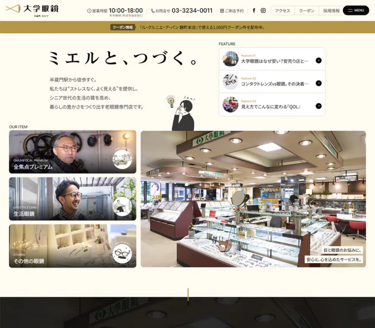
アイボリーと落ち着いたゴールドを基調に、人物・店舗写真と手描きイラストを組み合わせた眼鏡専門店サイト。大小の写真、端正な文字組み、モバイルの予約・電話導線が特徴。
オリジナルサイトを見るWarm paper, muted gold, and everyday photographs give a specialist eyewear shop a calm, personal presence.
Original URL: https://daigakumegane.com/
Final URL: https://daigakumegane.com/
Theme: a light cream canvas, with a dark About section and a broad gold product section; no theme selector was verified.
Inspected: September 22, 2026. Supplied collection timestamp: 2026-09-22T14:15:31.159Z, equivalent to 23:15:31 JST.
Viewports: desktop 1440 × 1000 and mobile 390 × 844 CSS pixels.
Scope: the current homepage, using three desktop captures, two mobile captures, and rendered DOM/computed-style evidence. Visual captures cover the opening, a product-detail panel, and the footer. DOM evidence additionally covers About, Promise, the product sequence, Column, News, and closing destination links. Linked pages and expanded controls were not inspected.
Daigakumegane presents eyewear through the people who wear it and the store that supplies it. Cream backgrounds, near-black text, and restrained gold details establish continuity across photographs, navigation, editorial content, and contact information. A small illustrated person adjusting their glasses adds warmth without competing with the photographic subjects. Display lettering has expressive, high-contrast Japanese strokes; ordinary descriptions remain quiet and regular in weight.
The homepage serves several purposes: introducing specialist lenses, explaining the shop's approach, publishing eye-care articles, announcing updates, and directing visitors to reservations and store information. Its distinctive opening is an asymmetric composition of an introductory statement, a compact feature list, three product shortcuts, and a larger photograph. Mobile reorganizes these elements and adds a persistent reservation/telephone bar.
Warm paper, muted gold, and everyday photographs give a specialist eyewear shop a calm, personal presence.
Original URL: https://daigakumegane.com/
Final URL: https://daigakumegane.com/
Theme: a light cream canvas, with a dark About section and a broad gold product section; no theme selector was verified.
Inspected: September 22, 2026. Supplied collection timestamp: 2026-09-22T14:15:31.159Z, equivalent to 23:15:31 JST.
Viewports: desktop 1440 × 1000 and mobile 390 × 844 CSS pixels.
Scope: the current homepage, using three desktop captures, two mobile captures, and rendered DOM/computed-style evidence. Visual captures cover the opening, a product-detail panel, and the footer. DOM evidence additionally covers About, Promise, the product sequence, Column, News, and closing destination links. Linked pages and expanded controls were not inspected.
Daigakumegane presents eyewear through the people who wear it and the store that supplies it. Cream backgrounds, near-black text, and restrained gold details establish continuity across photographs, navigation, editorial content, and contact information. A small illustrated person adjusting their glasses adds warmth without competing with the photographic subjects. Display lettering has expressive, high-contrast Japanese strokes; ordinary descriptions remain quiet and regular in weight.
The homepage serves several purposes: introducing specialist lenses, explaining the shop's approach, publishing eye-care articles, announcing updates, and directing visitors to reservations and store information. Its distinctive opening is an asymmetric composition of an introductory statement, a compact feature list, three product shortcuts, and a larger photograph. Mobile reorganizes these elements and adds a persistent reservation/telephone bar.
--dg-* tokens are reference aliases. They are not recovered source variables.| Name | Value | Reference token | Evidence and role |
|---|---|---|---|
| Warm Paper | #fffaf1 |
--dg-paper |
Measured HTML, body, and header background; visually repeated in product information panels and the footer |
| Near-black Ink | #080808 |
--dg-ink |
Measured primary text, feature arrow circles, and About section base |
| Muted Gold | #b49646 |
--dg-gold |
Measured product-section background, feature numbers, section labels, and article tags |
| Body Charcoal | #464543 |
--dg-text |
Measured introductory copy, product descriptions, and desktop utility labels |
| Metadata Gray | #979797 |
--dg-muted |
Measured product category labels and article dates |
| Coupon Brown | #5c4d26 |
--dg-brown |
Measured fill behind the announcement badge |
| Arrow Gray | #474545 |
--dg-arrow |
Measured circular arrow fill inside black product-detail buttons |
| Soft Light Gray | #d0d0d0 |
--dg-on-dark |
Measured About paragraph color |
| White | #ffffff |
--dg-white |
Measured reversed labels; the feature-list surface also appears white in the captures |
| Pale Sand Rule | Approximately #e3d5ba |
--dg-rule |
Visual estimate for feature separators, outlined utility groups, and footer rules; exact border color was not supplied |
The principal relationship is cream plus near-black, with gold providing structure. Gold fills an entire product chapter but becomes much smaller in editorial labels, numbers, and links. It is not confined to conversion buttons: the main detail buttons are black.
The desktop product capture shows faint enlarged imagery beneath or within the gold field. Its opacity, blend mode, and asset are unknown. Start with the measured solid gold, then add an approved background image only when its treatment can be controlled independently.
A supplied custom property contains the library default --swiper-theme-color: #007aff. No corresponding blue interface accent appears in the current captures. Exclude that value from the visible brand palette.
Measured primary declaration: 'Noto Sans JP', sans-serif, followed by additional Japanese system-family fallbacks in the supplied stack.
Most sampled Japanese text uses weight 400. Hierarchy comes from size, spacing, placement, and graphic headings rather than frequent bold text. Introductory paragraphs use charcoal; navigation and article titles use near-black.
The declared family is evidence of CSS intent. Successful loading of a particular font file was not independently verified.
Measured declaration: Inter, sans-serif.
Inter appears on FEATURE, OUR ITEM, section kickers, feature numbers, product category labels, article dates, LANGUAGE, and MENU. These are generally regular weight. The desktop telephone number is an exception: 20px, weight 500, with a 20px line height.
English labels are small and mostly untracked. Avoid adding large letter spacing to every uppercase label: the sampled values report normal tracking.
The visible headline, ミエルと、つづく。, has broad spacing and expressive Japanese strokes. Its H1 wrapper reports 14px Noto Sans JP, yet occupies approximately 500 × 50.95px on desktop and 330 × 34.31px on mobile. Several section and product headings show the same mismatch between wrapper styles and visible lettering.
Treat these as graphic-title slots when reproducing the design. The exact lettering font and rendering format cannot be identified from the supplied evidence. Preserve approved original artwork where available. A generic Japanese serif is a recommended approximation for new text, not an identified source font.
| Role | Desktop measurement | Mobile measurement | Notes |
|---|---|---|---|
| Body default | 14px / 14px, weight 400 |
Same | Individual components override this tight default |
| Introductory lines | 16px / 16px |
13px / 13px |
Separate paragraphs create the apparent leading |
| Intro line-to-line advance | 31px calculated |
21px calculated |
Includes paragraph separation, not just line height |
| Feature section label | 13px / 13px Inter |
Same | Normal tracking |
| Feature number | 10px / 10px Inter |
Same | Gold |
| Feature title | 15px / 19.5px |
14px / 18.2px |
One visible truncated line |
| Product shortcut title | 18px / 18px |
14px / 14px |
White over photography |
| Product shortcut category | 10px / 10px Inter |
Same | White, above the Japanese title |
| Hero photo caption | 14px, 26px wrapper height |
12px, 20px wrapper height |
Separate light strips behind each line |
| About paragraph | 17px / 32.3px |
13px / 20.8px |
Tracking changes from 1.19px to 0.26px |
| Promise heading | 17px / 23.8px |
13px / 18.2px |
Regular weight |
| Main section kicker | 15px / 15px Inter |
11px / 11px Inter |
Examples: About, Item, Column |
| Product lead | 14px / 18.2px |
13px / 19.5px |
Mobile introduces additional line breaks |
| Product description | 14px / 24.5px |
12px / 18px |
Centered within the information panel |
| Article title | 17px / 22.1px |
13px / 18.2px |
Mobile title boxes are constrained |
| Article date | 11px / 11px Inter |
10px / 10px Inter |
Gray |
| Article tag | 12px / 12px |
10px / 10px |
Gold text links |
| Detail-button label | 15px |
13px / 13px |
Some desktop product wrappers report zero line height |
Do not copy the zero line-height values into a general button component. They reflect the inspected wrappers, while the visible control remains a complete pill. The Quick Start uses conventional line boxes.
Measured root size: 10px at both inspected widths.
Spacing character: compact utilities and lists, surrounded by much larger photographic and sectional intervals.
The evidence does not establish a universal spacing formula. Use component-specific dimensions rather than assuming every value belongs to an 8px grid.
| Use | Desktop | Mobile | Evidence |
|---|---|---|---|
| Feature label-to-title gap | 4px |
4px |
Calculated from text bounds |
| Intro paragraph separation | 15px |
8px |
Calculated between individual paragraph boxes |
| Feature-row vertical padding | 12px |
12px |
Measured |
| Feature-row left padding | 12px |
10px |
Measured |
| Feature-row reserved right padding | 50px |
40px |
Measured |
| Main mobile content inset | — | 20px |
Measured headline, photo, and feature alignment |
| Headline-to-intro gap | 40px |
20px |
Calculated from headline and paragraph bounds |
| Desktop intro-to-feature column gap | 80px |
Reordered vertically | Calculated from the two upper columns |
| Product shortcut gap | Approximately 13.64px |
10px |
Calculated from card positions |
| Opening-to-About clearance | 100px |
45px after the item track |
Calculated from section bounds |
| About top inset to English kicker | 160px |
70px |
Calculated |
| Item-section top inset to English kicker | 135px |
55px |
Calculated |
| Large product-card separation | Approximately 105px |
Not visually measured | Desktop screenshot estimate |
| Element | Value | Evidence |
|---|---|---|
| Feature arrow circle | 50%, 20 × 20px |
Measured |
| Detail-button arrow | 50%, 18px desktop and 16px mobile |
Measured |
| Announcement badge | 4px desktop, 2px mobile |
Measured |
| Desktop photos and large split cards | Approximately 10–12px |
Visual estimate |
| Mobile feature enclosure and main photo | Approximately 4–6px |
Visual estimate |
| Utility controls and detail buttons | Fully rounded pills | Visible; exact radius not supplied |
| Footer information labels | Nearly square, subtly rounded at most | Visual estimate |
Rounded clipping can belong to a parent or image wrapper. A sampled anchor with border-radius: 0 is not proof that the visible photographic tile has square corners.
| Element | Desktop 1440 × 1000 |
Mobile 390 × 844 |
|---|---|---|
| Header | 72px high |
52px high |
| Header logo link | 180 × 45.30px, at x 70px |
120 × 30.86px, at x 10px |
| Announcement strip | 42px high, calculated |
28px high, calculated |
| Main content start | y 114px |
y 80px |
| Upper intro column | 500px wide, x 247.5px |
Body column 350px wide, x 20px |
| Feature enclosure | 365px wide |
350px wide |
| Feature row | 363 × 78px inside border |
348 × 64px inside border |
| Opening product tile | 455 × 154.69px |
275.70 × 173.69px |
| Large opening photo | Approximately 807 × 488px |
Approximately 350 × 212px |
| Mascot wrapper | 100 × 127.84px |
54 × 69.95px |
| Large product panel | Approximately 1060 × 583px |
Full panel bounds not supplied; text column 310px wide |
| Desktop product split | Photo approximately 583px; text 477px |
Information centered at x 40px |
| Article column width | 381.59px |
183.30px |
| Mobile contact links | Not visible as a fixed dock in supplied desktop captures | Two links, each 185 × 51.33px |
| Document height | 7936px |
7205px |
The different document heights describe these captured renders. They are not fixed-height implementation targets.
Role: identity, contact access, and site utilities.
The header is a full-width cream strip that remains visible in the scrolled captures. Its logo combines a thin gold emblem, bold black Japanese lettering, and a small line containing 1977. Use the actual brand artwork when available; its geometry is more distinctive than a substitute text logo.
At desktop, the logo sits within approximately 70px outer margins. The right side contains telephone contact, reservation access, two social icons, an outlined segmented group for access/coupons/recruitment, a language capsule, and a black menu pill. Thin vertical separators organize the denser utility area.
The phone number receives more emphasis than its introductory label: 20px Inter at weight 500 versus 13px regular Japanese text. The menu pill is approximately 90 × 33px in the screenshot, with a small two-line symbol and an 11px label.
Mobile retains the logo, language control, 営業案内, and MENU. The full desktop utility row is absent from the visible header. The smaller logo and narrow gaps allow the controls to remain on one line at 390px.
Unverified: menu contents, language options, the business-information panel, keyboard behavior, and whether persistence is implemented with fixed or sticky positioning.
Role: promotes a current store update without dominating the opening.
A gold band sits directly below the header at the top of the page. Inside it, the dark brown クーポン情報 badge precedes a single linked announcement. The desktop group is centered; mobile uses a 10px left inset and truncates the announcement to the available line.
The badge measures 85 × 22px on desktop and 70 × 18px on mobile. Badge-to-link spacing changes from 16px to 7px. The announcement remains a compact text link, not a large button.
The strip is not visible beneath the persistent header in the supplied lower-page captures. Its exact scroll-positioning rule was not supplied.
Role: establishes the store's promise before visitors browse products.
The headline graphic sits above four short charcoal lines. Desktop positions this group inward from the outer photographic grid: the text begins at x 247.5px, while the product shortcuts begin around x 81.7px. Preserve this offset; it gives the composition its editorial character.
The illustrated person sits at the lower-right edge of the introduction. A lightbulb and small handwritten marks accompany the glasses-adjusting pose. The figure overlaps slightly into the photographic region in both supplied opening captures. It functions as a small bridge between text and imagery.
On mobile, the headline artwork is 330px wide within a 350px content column. The mascot shrinks to 54px wide and remains near the right edge. Keep its reserved space clear of text at narrower widths.
Role: makes the shop and its customers tangible.
The desktop capture shows an older man wearing glasses and a scarf against leafy surroundings. The mobile capture shows the store interior. The DOM includes three caption pairs sharing the same placement region, indicating multiple hero content states. The available evidence does not establish how those states advance.
The panel is a wide, rounded rectangle with approximately a 1.65:1 aspect ratio. Two short caption lines sit at its lower-right edge. Each line has its own light rectangular backing, so the backgrounds follow the text lengths rather than forming one large translucent box.
Maintain subject-aware cropping. In the portrait, the face and spectacles remain legible while greenery provides breathing room. In the interior, display cases and the shop sign communicate the setting.
Role: provides three compact editorial entry points.
The component contains a small FEATURE heading above one white enclosure. Three full-row links are separated by fine sand-colored rules.
Each row contains:
Feature 01-style label.Desktop row padding is 12px 50px 12px 12px. The thumbnail is approximately 54px in diameter, supported by the row height and screenshot. The text starts 10px after it. Mobile uses 12px 40px 12px 10px, an approximately 40px thumbnail, and a 5px thumbnail-to-text gap.
Titles remain on one visible line with ellipsis. The full titles are present in the rendered text evidence. Treat the whole row as the link target; the small arrow is a visual cue within it.
Role: exposes the three principal product destinations early.
Desktop uses three stacked photographic links below OUR ITEM. Each tile is about 455 × 154.69px, with a darkened lower edge, a small English category, an 18px Japanese title, and a circular illustrated badge at the right.
The subjects distinguish the categories: a mature wearer with cycling equipment in the background, a smiling wearer outdoors, and a softly lit eyewear display. Preserve these content differences when selecting replacement photography.
Mobile changes the cards to approximately 275.70 × 173.69px and places them in a horizontal track. At the sampled position, the centered tile begins at x 57.11px, with parts of neighboring cards visible at both edges. The DOM repeats the three destinations three times, consistent with a looped track. These are three unique categories, not nine products.
Swipe behavior, looping mechanics, and automatic movement were not exercised.
Role: explains the service philosophy and the relationship with customers.
This region is supported primarily by DOM measurements. Its section base is near-black, with gold English labeling and light gray prose. Desktop paragraphs use 17px / 32.3px and 0.07em tracking. Mobile reduces them to 13px / 20.8px with 0.02em tracking.
The Promise content contains four numbered statements. Desktop text boxes sit in one row at approximately 244.5px wide. Mobile uses two columns of 164px and two rows. Keep the statements compact and consistently numbered.
The supplied screenshots do not establish the final Promise panel fills, supporting artwork, or full About background treatment. Graphic-heading wrapper colors also cannot be used to infer the visible lettering fill. Reuse the measured hierarchy and arrangement without inventing those details.
Role: explains each lens category through a photograph and a focused information stack.
The inspected desktop panel for その他の眼鏡 is approximately 1060px wide. A square store-display photograph occupies the left 55%; a cream information panel occupies the right 45%. The outer corners are rounded, while the internal seam is flush.
The information stack is centered and contains a small gray English category, a graphic Japanese title, a brief lead, a hand-drawn glasses illustration, a longer description, and a compact black 詳しく見る pill. The illustration uses charcoal, cream, and restrained gold strokes, including small sparkle marks.
The product sequence alternates sides on desktop: measured information columns occupy the right side for the first and third categories and the left side for the middle category. The middle card's cream panel is also partially visible at the top of the product capture.
Product descriptions use 14px / 24.5px. The visible desktop product button measures approximately 130.69 × 32px, with a small 18px gray arrow circle inside. Mobile text bounds show a centered 310px information column, smaller lettering, additional line breaks, and approximately 113.66 × 39px detail links. Full mobile product imagery was not included in the screenshots.
Role: gives the homepage an ongoing editorial layer.
The DOM identifies four articles with a lead visual region, date metadata, Japanese title, and separate gold tag links. Article typography is restrained: 17px titles and 11px dates on desktop, reducing to 13px and 10px on mobile.
Desktop has two article columns at x 190px and x 868.41px, each approximately 381.59px wide. Between them, the section-heading wrapper is a narrow 38 × 339.25px, indicating a vertical title treatment. Mobile changes that heading wrapper to a horizontal 240 × 31.83px and retains two article columns, each approximately 183.30px wide.
This is an important responsive exception: the mobile article collection does not simply become one full-width column. The supplied evidence establishes its bounds and text styles, but not the article images' subjects or exact corner treatment.
Keep tag links separate from the article's primary link to avoid nested interactive elements.
Role: surfaces store notices and dated announcements.
Three notices appear in the supplied text evidence. Each link combines a category, date, and title. The measured first desktop row spans 1200px, has approximately 118.09px height, and uses 80px horizontal padding.
The heading group aligns toward the left; すべて見る provides a smaller route to the complete news list. Treat news as readable rows with clear chronology. The mobile row geometry and final separator styling were not included in the sampled elements.
Role: routes visitors to employment information and practical store details.
The homepage contains distinct RECRUIT and SHOP INFO links with short Japanese supporting copy. Their presence and destinations are verified by the rendered homepage evidence. Their precise visual layout, backgrounds, and mobile rearrangement are not established by the supplied screenshots.
In an adaptation, retain these as separate navigation destinations and use the surrounding cream, gold, photographic, and graphic-title vocabulary. Any new card composition should be labeled as an implementation choice.
Role: closes the page with identity, practical information, and a complete site directory.
Desktop centers a larger vertical logo composition above a broad information row. Store details sit at the left; the numbered directory occupies two middle columns; privacy information and the recurring mascot sit at the right. Small gold numbers 00 through 08 precede the navigation labels.
Address, telephone, and opening hours use label/value pairs. The labels have thin sand outlines, while values remain unboxed. The map link is gold and underlined. Generous spacing between information groups keeps this dense footer calm.
Mobile narrows the information region to approximately 270px with 60px side margins. A horizontal sand rule separates store details from the two-column directory. The directory retains its numbered structure, with roughly 43px vertical steps between entries. Privacy text and the mascot share the lower portion.
A separate gallery shows three store photographs side by side. Desktop images are approximately 394 × 293px within a 1200px-wide row. Mobile retains all three across the viewport at about 125 × 105px, with approximately 8px gaps. The changing aspect ratio implies a tighter crop on phones. A centered qualification statement sits beneath the photographs and wraps to two lines in the mobile capture.
Role: keeps the two most immediate contact actions available throughout scrolling.
Two illustrated banners sit together near the bottom of the viewport, with 10px outer side and bottom margins. Each measured link is 185 × 51.33px. The left banner uses a pale photographic/illustrated surface for reservations; the right uses gold and gives the telephone number strong visual emphasis.
The same dock appears in the opening and footer mobile captures. It overlays part of the product track in the opening. A pale fade is visible around the lower edge, but its implementation is unknown.
The links target the reservation URL and a tel: URL. They have no text in the supplied link extraction, so their accessible names must be checked independently. The reference implementation adds explicit names and enough bottom clearance for content.
The evidence contains computed transition declarations, not a recording of their triggered states. Use these values to understand timing intent while keeping behavior claims narrow.
| Element | Supplied declaration | Supported interpretation |
|---|---|---|
| Header | 0.1s linear |
A short transition is declared; affected state not established |
| Ordinary navigation links | 0.5s |
General link transition duration; final hover appearance unknown |
| Menu symbol link | 0.4s |
A transition is declared on the small menu element |
| Announcement text | background-size 0.3s cubic-bezier(0.65, 0.4, 0.003, 1) |
Background-size feedback is defined; before/after styling not supplied |
| Intro paragraphs | transform 1.5s, opacity 1.5s |
Transform and opacity can participate in reveals |
| Mascot wrapper | transform 0.5s, opacity 0.5s linear |
A separate prefixed transform declaration also reports 1s; exact browser behavior was not tested |
| Feature and product shortcut links | 1s |
Longer link transitions are declared; image zoom or other effects cannot be assumed |
| Desktop product lead | transform 1s, opacity 1s |
Reveal-capable text treatment |
| Mobile product lead | transform 1s 0.4s, opacity 1s 0.4s |
Same properties with a measured 400ms delay |
Sampled elements report animation: none. That does not prove the whole page is static: transitions, scripts, unsampled descendants, and slider tracks may still change the interface.
The captures show a persistent header and mobile contact dock at different scroll positions. Multiple hero caption groups and repeated mobile product entries support the existence of multiple content states. Autoplay timing, slide easing, swipe support, menu opening, hover endpoints, and reduced-motion handling remain unverified.
Recommended motion direction: modest opacity and short-distance reveals, restrained link feedback, and a stable reading layout. Keep the page usable without running entrance animations. Do not invent parallax, spring effects, or continuous mascot animation from these still captures.
| Surface | Appearance | Function |
|---|---|---|
| Page canvas | Flat warm cream | Connects the opening, editorial content, and footer |
| Feature enclosure | White with a fine sand outline and internal rules | Separates three compact article links |
| Product chapter | Broad muted-gold field with faint visible background imagery | Groups the three product explanations |
| Product information panel | Cream, joined flush to photography | Provides a quiet reading surface |
| About base | Near-black in computed styles | Marks a change into service philosophy |
| Shortcut photograph | Full photograph with lower darkening | Supports white category and product labels |
| Photo caption | Separate light rectangular strips | Keeps short copy readable without covering much of the image |
| Detail control | Black pill containing a gray arrow disc | Signals a focused onward action |
| Mobile dock | Illustrated pale and gold halves | Keeps reservation and telephone access prominent |
The visible interface relies on boundaries, photography, and color changes. A general drop-shadow elevation system is not apparent in the supplied captures.
Photography supplies credibility and specificity: mature wearers, everyday clothing, greenery, eyewear displays, and recognizably occupied retail interiors. The pictures are bright and natural without being uniformly desaturated. Greens in the portrait, pale wood and cream display fixtures, and occasional red shop chairs enrich the palette through imagery.
Illustrations are smaller and more restrained. Loose charcoal outlines, uneven strokes, a glasses-adjusting person, and simple eyewear drawings make the interface approachable. Gold appears within these drawings as a secondary stroke or detail. Preserve their hand-drawn irregularity when commissioning replacements.
Use regular photographic rendering. There is no evidence for pixelated image treatment or a global image-recoloring filter.
No original image URLs or asset filenames were supplied. The following are observed visual slots, not invented downloadable paths.
| Slot | Current visual evidence | Reuse guidance |
|---|---|---|
| Header identity | Gold emblem, black Japanese wordmark, tiny year line | Preserve the approved logo proportions |
| Opening title | Wide, expressive Japanese lettering | Use approved artwork with an accessible text equivalent |
| Recurring mascot | Person adjusting spectacles, lightbulb, small handwritten marks | Retain as a small secondary accent |
| Main portrait | Older wearer in glasses and scarf with leafy surroundings | Keep the face and frames clear when cropping |
| Main store image | Wide view of display cases and shop interior | Preserve recognizable spatial detail |
| Shortcut photographs | Two wearer portraits and one eyewear display | Maintain three distinct subjects |
| Product display photograph | Warm, pale shelving with glasses on stands | Suitable for the square desktop photo half |
| Product illustration | Loose drawing of glasses with gold details and sparkle marks | Keep its small centered scale |
| Footer gallery | Three different views of the store and consultation area | Retain three side-by-side images on mobile |
| Contact banners | Illustrated reservation and telephone graphics | Pair imagery with semantic link names and readable live text where possible |
CSS can recreate the geometry and surfaces. It cannot reproduce the identity carried by the logo, display lettering, photography, and illustrations.
The opening uses two alignment systems. The upper statement and feature list occupy a centered span of approximately 945px: 500px of introduction, an 80px gap, and a 365px feature list. Below, the photographic composition expands to approximately 1277px, combining a 455px shortcut column, about 15px of separation, and the larger image.
This widening is essential. Aligning every element to the same left edge would remove the stepped rhythm visible in the current desktop capture.
Below the opening, the page moves through a dark About region, a gold product region, and cream editorial/footer regions. Product details use an approximately 1060px centered span; news and footer imagery use a wider 1200px span.
The visible mobile order is:
Reservation and telephone access remain overlaid near the bottom of the viewport.
Only the two stated viewport sizes were inspected. Intermediate breakpoints, landscape behavior, zoom reflow, and safe-area handling were not supplied. The Quick Start uses proposed breakpoints and should be checked at intermediate widths.
#fffaf1, gold #b49646, and near-black #080808 relationship.These are recommendations for a new implementation, not verified features of the original page.
tel: link./others from product content and /other from one footer entry. No linked-page response was inspected.#fffaf1.#080808.#b49646.#464543.#979797.#5c4d26 with white text.#e3d5ba; this is an estimate.#474545 inside a black pill.“Create a Japanese specialist-eyewear homepage with a warm cream canvas, muted gold chapter backgrounds, regular Japanese sans-serif body copy, small Inter utility labels, and expressive Japanese graphic headings. On desktop, center an inward-set introduction and three-row feature list above a wider composition of three stacked product photographs and one large wearer or store photograph. Use circular feature thumbnails, tiny gold numbers, black arrow discs, modest rounded corners, and short captions on separate light strips. Continue with service philosophy, alternating photograph-and-cream product panels, editorial articles, notices, and a numbered store directory. On mobile, place the main photograph before the feature list, make product shortcuts a horizontal track, retain the compact footer grids, and provide a persistent illustrated reservation/telephone bar. Use approved artwork and natural store photography. Label any unverified interaction behavior as an implementation choice.”
This is a reusable CSS adaptation, not recovered source CSS. It keeps a conventional document root size and uses measured pixel values where appropriate. Font declarations require your own approved font-loading setup; no external font or image URLs are assumed.
The 1100px composition breakpoint and 1280px desktop-utility breakpoint below are recommendations. The source breakpoints were not supplied. Other intentional additions include mobile actions with a 44px minimum height, visible focus, reduced-motion handling, and dock clearance.
:root {
  /* Measured palette, except the estimated border color. */
  --dg-paper: #fffaf1;
  --dg-ink: #080808;
  --dg-gold: #b49646;
  --dg-text: #464543;
  --dg-muted: #979797;
  --dg-brown: #5c4d26;
  --dg-arrow: #474545;
  --dg-on-dark: #d0d0d0;
  --dg-white: #ffffff;
  --dg-rule: #e3d5ba;

  --dg-font-body: 'Noto Sans JP', sans-serif;
  --dg-font-utility: Inter, sans-serif;

  --dg-space-xs: 4px;
  --dg-space-sm: 8px;
  --dg-space-row: 12px;
  --dg-space-inset: 20px;
  --dg-space-block: 40px;
  --dg-space-section: 80px;

  /* Reusable caps inferred from observed desktop geometry. */
  --dg-opening-width: 1277px;
  --dg-upper-width: 945px;
  --dg-detail-width: 1060px;
  --dg-gallery-width: 1200px;

  --dg-header-height: 52px;
  --dg-radius-photo: 6px;
  --dg-radius-panel: 10px;
  --dg-radius-pill: 999px;

  --dg-link-duration: 500ms;
  --dg-reveal-duration: 1000ms;
  --dg-safe-bottom: env(safe-area-inset-bottom, 0px);
}

* {
  box-sizing: border-box;
}

html {
  scroll-padding-top: calc(var(--dg-header-height) + 16px);
}

body.daigaku-site {
  margin: 0;
  padding-bottom: calc(76px + var(--dg-safe-bottom));
  color: var(--dg-ink);
  background: var(--dg-paper);
  font: 400 14px / 1.75 var(--dg-font-body);
}

.daigaku-site img {
  display: block;
  max-width: 100%;
}

.daigaku-site a {
  color: inherit;
}

.daigaku-site :focus-visible {
  outline: 2px solid currentColor;
  outline-offset: 4px;
}

.utility-label {
  margin: 0;
  font: 400 13px / 1 var(--dg-font-utility);
}

.section-kicker {
  margin: 0 0 14px;
  color: var(--dg-gold);
  font: 400 11px / 1 var(--dg-font-utility);
  text-align: center;
}

/* Persistent header; expanded panels require separate behavior. */
.site-header {
  position: sticky;
  top: 0;
  z-index: 40;
  height: var(--dg-header-height);
  background: var(--dg-paper);
}

.header-inner {
  width: min(calc(100% - 20px), 1300px);
  height: 100%;
  margin-inline: auto;
  display: flex;
  align-items: center;
  justify-content: space-between;
  gap: 12px;
}

.brand {
  flex: 0 0 120px;
  width: 120px;
}

.header-actions,
.desktop-utilities {
  display: flex;
  align-items: center;
  gap: 4px;
}

.desktop-utilities {
  display: none;
}

.utility-pill {
  display: inline-flex;
  align-items: center;
  justify-content: center;
  gap: 4px;
  min-height: 28px;
  padding: 6px 8px;
  border: 1px solid var(--dg-rule);
  border-radius: var(--dg-radius-pill);
  background: transparent;
  color: var(--dg-ink);
  font: 400 11px / 1 var(--dg-font-utility);
  text-decoration: none;
  white-space: nowrap;
}

.utility-pill--menu {
  padding-inline: 12px;
  border-color: var(--dg-ink);
  background: var(--dg-ink);
  color: var(--dg-white);
}

.announcement {
  min-height: 28px;
  padding: 5px 10px;
  display: flex;
  align-items: center;
  gap: 7px;
  background: var(--dg-gold);
}

.announcement-badge {
  flex: 0 0 70px;
  padding: 4px 0;
  border-radius: 2px;
  background: var(--dg-brown);
  color: var(--dg-white);
  font-size: 10px;
  line-height: 1;
  text-align: center;
}

.announcement-link {
  min-width: 0;
  overflow: hidden;
  font-size: 11px;
  line-height: 1;
  text-overflow: ellipsis;
  white-space: nowrap;
  text-decoration: none;
}

/* Child order: copy, photo, feature list, product shortcuts. */
.opening {
  width: min(calc(100% - 40px), var(--dg-opening-width));
  margin-inline: auto;
  padding-block: 29px 45px;
  display: grid;
  grid-template-columns: minmax(0, 1fr);
  row-gap: 24px;
}

.opening-copy {
  position: relative;
  min-width: 0;
  grid-row: 1;
}

.hero-title {
  margin: 0;
}

.hero-title img {
  width: 330px;
  height: auto;
}

.intro-lines {
  margin-top: 20px;
  color: var(--dg-text);
}

.intro-lines p {
  margin: 0;
  font-size: 13px;
  line-height: 1;
}

.intro-lines p + p {
  margin-top: 8px;
}

.opening-mascot {
  position: absolute;
  z-index: 2;
  right: 14px;
  bottom: -25px;
  width: 54px;
  pointer-events: none;
}

.opening-photo {
  position: relative;
  grid-row: 2;
  margin: -4px 0 0;
  overflow: hidden;
  aspect-ratio: 1.65;
  border-radius: var(--dg-radius-photo);
}

.opening-photo > img {
  width: 100%;
  height: 100%;
  object-fit: cover;
  object-position: var(--photo-position, center);
}

.photo-caption {
  position: absolute;
  right: 7px;
  bottom: 10px;
  left: 7px;
  display: flex;
  flex-direction: column;
  align-items: flex-end;
  gap: 4px;
  font-size: 12px;
  line-height: 1;
}

.photo-caption span {
  max-width: 100%;
  padding: 4px 6px;
  background: var(--dg-paper);
}

.opening-feature {
  grid-row: 3;
  min-width: 0;
}

.opening-feature > .utility-label,
.opening-items > .utility-label {
  margin-bottom: 5px;
}

.feature-list {
  overflow: hidden;
  border: 1px solid var(--dg-rule);
  border-radius: 5px;
  background: var(--dg-white);
}

.feature-row {
  position: relative;
  display: grid;
  grid-template-columns: 40px minmax(0, 1fr);
  align-items: center;
  column-gap: 5px;
  min-height: 64px;
  padding: 12px 40px 12px 10px;
  text-decoration: none;
}

/* An inset rule preserves the measured row height. */
.feature-row + .feature-row::before {
  content: '';
  position: absolute;
  inset: 0 0 auto;
  border-top: 1px solid var(--dg-rule);
}

.feature-avatar {
  width: 40px;
  height: 40px;
  border-radius: 50%;
  object-fit: cover;
}

.feature-copy {
  min-width: 0;
}

.feature-number {
  margin: 0 0 4px;
  color: var(--dg-gold);
  font: 400 10px / 1 var(--dg-font-utility);
}

.feature-title {
  margin: 0;
  overflow: hidden;
  font-size: 14px;
  font-weight: 400;
  line-height: 1.3;
  text-overflow: ellipsis;
  white-space: nowrap;
}

.feature-arrow {
  position: absolute;
  top: 50%;
  right: 10px;
  width: 20px;
  height: 20px;
  display: grid;
  place-items: center;
  transform: translateY(-50%);
  border-radius: 50%;
  background: var(--dg-ink);
  color: var(--dg-white);
  font-size: 9px;
  line-height: 1;
}

.opening-items {
  grid-row: 4;
  min-width: 0;
  margin-inline: -20px;
}

.opening-items > .utility-label {
  padding-left: 20px;
}

/* Native scrolling baseline; looping requires separate logic. */
.item-track {
  display: flex;
  gap: 10px;
  overflow-x: auto;
  padding-inline: 14.65vw;
  scroll-padding-inline: 14.65vw;
  scroll-snap-type: x mandatory;
}

.item-card {
  position: relative;
  flex: 0 0 70.7vw;
  overflow: hidden;
  aspect-ratio: 275.7 / 173.69;
  border-radius: var(--dg-radius-photo);
  scroll-snap-align: center;
  text-decoration: none;
}

.item-card > img {
  width: 100%;
  height: 100%;
  object-fit: cover;
}

.item-card::after {
  content: '';
  position: absolute;
  inset: 35% 0 0;
  background: linear-gradient(transparent, rgb(0 0 0 / 70%));
}

.item-label {
  position: absolute;
  z-index: 1;
  left: 8px;
  bottom: 11px;
  color: var(--dg-white);
}

.item-label small {
  display: block;
  margin-bottom: 5px;
  font: 400 10px / 1 var(--dg-font-utility);
}

.item-label strong {
  font-size: 14px;
  font-weight: 400;
  line-height: 1;
}

.item-badge {
  position: absolute;
  z-index: 1;
  right: 10px;
  bottom: 12px;
  width: 46px;
}

/* Product panels use supplied photography and title artwork. */
.product-section {
  padding-block: 55px 80px;
  background: var(--dg-gold);
}

.product-section .section-kicker {
  color: var(--dg-text);
}

.product-list {
  width: min(calc(100% - 40px), var(--dg-detail-width));
  margin: 40px auto 0;
  display: grid;
  gap: 60px;
}

.product-card {
  display: grid;
  overflow: hidden;
  border-radius: var(--dg-radius-panel);
  background: var(--dg-paper);
}

.product-media {
  margin: 0;
}

.product-media img {
  width: 100%;
  height: 100%;
  object-fit: cover;
}

.product-copy {
  padding: 30px 20px 40px;
  text-align: center;
}

.product-category {
  margin: 0;
  color: var(--dg-muted);
  font: 400 10px / 1 var(--dg-font-utility);
}

.product-title-art {
  width: var(--title-width, 170px);
  height: auto;
  margin: 10px auto;
}

.product-lead {
  margin: 0;
  color: var(--dg-text);
  font-size: 13px;
  line-height: 1.5;
}

.product-illustration {
  width: 140px;
  height: auto;
  margin: 30px auto;
}

.product-description {
  margin: 0 0 20px;
  color: var(--dg-text);
  font-size: 12px;
  line-height: 1.5;
}

.pill-link {
  display: inline-flex;
  align-items: center;
  justify-content: center;
  gap: 9px;
  min-height: 44px;
  padding: 8px 12px 8px 22px;
  border-radius: var(--dg-radius-pill);
  background: var(--dg-ink);
  color: var(--dg-white);
  font-size: 13px;
  line-height: 1;
  text-decoration: none;
}

.pill-arrow {
  display: grid;
  place-items: center;
  width: 16px;
  height: 16px;
  border-radius: 50%;
  background: var(--dg-arrow);
  font-size: 9px;
}

/* Footer proportions are screenshot-based approximations. */
.footer-layout {
  width: min(calc(100% - 120px), var(--dg-detail-width));
  margin: 60px auto;
  display: grid;
  gap: 40px;
}

.footer-directory {
  display: grid;
  grid-template-columns: repeat(2, minmax(0, 1fr));
  gap: 24px;
  padding-top: 35px;
  border-top: 1px solid var(--dg-rule);
}

.footer-directory ul {
  margin: 0;
  padding: 0;
  list-style: none;
}

.footer-directory li + li {
  margin-top: 24px;
}

.footer-directory a {
  display: flex;
  align-items: baseline;
  gap: 10px;
  font-size: 13px;
  text-decoration: none;
}

.footer-number {
  color: var(--dg-gold);
  font: 400 10px / 1 var(--dg-font-utility);
}

.store-gallery {
  width: min(100%, var(--dg-gallery-width));
  margin-inline: auto;
  display: grid;
  grid-template-columns: repeat(3, minmax(0, 1fr));
  gap: 8px;
}

.store-gallery img {
  width: 100%;
  aspect-ratio: 125 / 105;
  border-radius: 5px;
  object-fit: cover;
}

.contact-dock {
  position: fixed;
  z-index: 50;
  right: 10px;
  bottom: calc(10px + var(--dg-safe-bottom));
  left: 10px;
  display: grid;
  grid-template-columns: 1fr 1fr;
  overflow: hidden;
  border-radius: 5px;
}

.contact-dock a {
  display: flex;
  align-items: center;
  justify-content: center;
  min-height: 52px;
  background: var(--dg-white);
  text-decoration: none;
}

.contact-dock a:last-child {
  background: var(--dg-gold);
}

.contact-dock img {
  width: 100%;
  height: auto;
}

@media (min-width: 1100px) {
  :root {
    --dg-header-height: 72px;
    --dg-radius-photo: 10px;
  }

  body.daigaku-site {
    padding-bottom: 0;
  }

  .header-inner {
    width: min(calc(100% - 40px), 1300px);
  }

  .brand {
    flex-basis: 180px;
    width: 180px;
  }

  .announcement {
    min-height: 42px;
    justify-content: center;
    gap: 16px;
    padding-block: 10px;
  }

  .announcement-badge {
    flex-basis: 85px;
    padding: 5px 8px;
    border-radius: 4px;
    font-size: 12px;
  }

  .announcement-link {
    font-size: 14px;
  }

  .opening {
    grid-template-columns: minmax(0, 455fr) minmax(0, 807fr);
    column-gap: 15px;
    row-gap: 30px;
    padding-block: 30px 100px;
  }

  .opening-copy,
  .opening-feature {
    grid-column: 1 / -1;
    grid-row: 1;
  }

  .opening-copy {
    width: 500px;
    margin-left: calc((100% - var(--dg-upper-width)) / 2);
    padding-top: 30px;
  }

  .hero-title img {
    width: 500px;
  }

  .intro-lines {
    margin-top: 40px;
  }

  .intro-lines p {
    font-size: 16px;
  }

  .intro-lines p + p {
    margin-top: 15px;
  }

  .opening-mascot {
    right: 5px;
    bottom: -54px;
    width: 100px;
  }

  .opening-feature {
    justify-self: end;
    width: 365px;
    margin-right: calc((100% - var(--dg-upper-width)) / 2);
  }

  .feature-list {
    border-radius: 10px;
  }

  .feature-row {
    grid-template-columns: 54px minmax(0, 1fr);
    column-gap: 10px;
    min-height: 78px;
    padding: 12px 50px 12px 12px;
  }

  .feature-avatar {
    width: 54px;
    height: 54px;
  }

  .feature-title {
    font-size: 15px;
  }

  .feature-arrow {
    right: 12px;
  }

  .opening-items {
    grid-column: 1;
    grid-row: 2;
    margin: 0;
  }

  .opening-items > .utility-label {
    padding-left: 0;
  }

  .item-track {
    display: grid;
    gap: 13.64px;
    overflow: visible;
    padding: 0;
  }

  .item-card {
    aspect-ratio: 455 / 154.69;
  }

  .item-label {
    left: 15px;
    bottom: 15px;
  }

  .item-label small {
    margin-bottom: 7px;
  }

  .item-label strong {
    font-size: 18px;
  }

  .item-badge {
    right: 15px;
    bottom: 15px;
    width: 66px;
  }

  .opening-photo {
    grid-column: 2;
    grid-row: 2;
    align-self: start;
    margin-top: 20px;
    aspect-ratio: 807 / 488;
  }

  .photo-caption {
    right: 10px;
    bottom: 15px;
    gap: 6px;
    font-size: 14px;
  }

  .photo-caption span {
    padding-block: 6px;
  }

  .section-kicker {
    font-size: 15px;
  }

  .product-section {
    padding-block: 135px;
  }

  .product-list {
    gap: 105px;
    margin-top: 60px;
  }

  .product-card {
    grid-template-columns: 55% 45%;
  }

  .product-media {
    aspect-ratio: 1;
  }

  .product-copy {
    align-self: center;
    padding: 50px 40px;
  }

  .product-card--reverse {
    grid-template-columns: 45% 55%;
  }

  .product-card--reverse .product-media {
    grid-column: 2;
    grid-row: 1;
  }

  .product-card--reverse .product-copy {
    grid-column: 1;
    grid-row: 1;
  }

  .product-title-art {
    width: var(--title-width, 189px);
    margin-block: 15px 20px;
  }

  .product-lead {
    font-size: 14px;
    line-height: 1.3;
  }

  .product-description {
    font-size: 14px;
    line-height: 1.75;
  }

  .pill-link {
    min-height: 32px;
    padding-block: 7px;
    font-size: 15px;
  }

  .pill-arrow {
    width: 18px;
    height: 18px;
  }

  .footer-layout {
    grid-template-columns: 32% 42% 12%;
    justify-content: space-between;
    gap: 0;
  }

  .footer-directory {
    padding-top: 0;
    border-top: 0;
  }

  .footer-directory a {
    font-size: 18px;
  }

  .store-gallery {
    gap: 9px;
  }

  .store-gallery img {
    aspect-ratio: 394 / 293;
    border-radius: 10px;
  }

  .contact-dock {
    display: none;
  }
}

@media (min-width: 1280px) {
  .desktop-utilities {
    display: flex;
    gap: 15px;
    margin-left: auto;
    font-size: 13px;
  }

  .desktop-phone {
    font: 500 20px / 1 var(--dg-font-utility);
  }

  .business-control {
    display: none;
  }
}

/* Recommended motion reduction; JS sliders need matching logic. */
@media (prefers-reduced-motion: reduce) {
  .daigaku-site *,
  .daigaku-site *::before,
  .daigaku-site *::after {
    animation: none !important;
    transition: none !important;
    scroll-behavior: auto !important;
  }
}
Use semantic links for destination rows and buttons for controls that expand panels. Supply the opening children in the documented order, use approved images with meaningful alternatives, and keep decorative arrows out of the accessible name. The CSS supplies the principal visual structures; menu logic, hero state changes, content loading, and complete article/news markup require separate implementation.
Optional aliases for a project that already uses Tailwind v4. This does not identify the original site's framework. Define the custom properties above first.
@theme inline {
  --color-paper: var(--dg-paper);
  --color-ink: var(--dg-ink);
  --color-gold: var(--dg-gold);
  --color-body: var(--dg-text);
  --color-muted: var(--dg-muted);
  --color-sand-rule: var(--dg-rule);
  --color-coupon: var(--dg-brown);

  --font-body: var(--dg-font-body);
  --font-utility: var(--dg-font-utility);

  --text-micro: 10px;
  --text-label: 13px;
  --text-copy: 14px;
  --text-feature: 15px;
  --text-article: 17px;

  --spacing-page-inset: 20px;
  --spacing-feature-inset: 12px;
  --radius-photo: var(--dg-radius-photo);
  --radius-panel: var(--dg-radius-panel);
  --radius-pill: var(--dg-radius-pill);
}
14:15:31.159 UTC / 23:15:31.159 JST.1440 × 1000 CSS-pixel viewport; current opening, product-detail, and footer captures; rendered document height 7936px.390 × 844 CSS-pixel viewport; current opening and footer captures; rendered document height 7205px.This reference describes the current homepage evidenced by the supplied inspection. Measurements, screenshot estimates, and recommended adaptations are identified separately throughout.
# 大学眼鏡 / Daigakumegane — Style Reference

> Warm paper, muted gold, and everyday photographs give a specialist eyewear shop a calm, personal presence.

**Original URL:** [https://daigakumegane.com/](https://daigakumegane.com/)
**Final URL:** [https://daigakumegane.com/](https://daigakumegane.com/)
**Theme:** a light cream canvas, with a dark About section and a broad gold product section; no theme selector was verified.
**Inspected:** September 22, 2026. Supplied collection timestamp: `2026-09-22T14:15:31.159Z`, equivalent to 23:15:31 JST.
**Viewports:** desktop `1440 × 1000` and mobile `390 × 844` CSS pixels.
**Scope:** the current homepage, using three desktop captures, two mobile captures, and rendered DOM/computed-style evidence. Visual captures cover the opening, a product-detail panel, and the footer. DOM evidence additionally covers About, Promise, the product sequence, Column, News, and closing destination links. Linked pages and expanded controls were not inspected.

Daigakumegane presents eyewear through the people who wear it and the store that supplies it. Cream backgrounds, near-black text, and restrained gold details establish continuity across photographs, navigation, editorial content, and contact information. A small illustrated person adjusting their glasses adds warmth without competing with the photographic subjects. Display lettering has expressive, high-contrast Japanese strokes; ordinary descriptions remain quiet and regular in weight.

The homepage serves several purposes: introducing specialist lenses, explaining the shop's approach, publishing eye-care articles, announcing updates, and directing visitors to reservations and store information. Its distinctive opening is an asymmetric composition of an introductory statement, a compact feature list, three product shortcuts, and a larger photograph. Mobile reorganizes these elements and adds a persistent reservation/telephone bar.
# 大学眼鏡 / Daigakumegane — Style Reference

> Warm paper, muted gold, and everyday photographs give a specialist eyewear shop a calm, personal presence.

**Original URL:** [https://daigakumegane.com/](https://daigakumegane.com/)
**Final URL:** [https://daigakumegane.com/](https://daigakumegane.com/)
**Theme:** a light cream canvas, with a dark About section and a broad gold product section; no theme selector was verified.
**Inspected:** September 22, 2026. Supplied collection timestamp: `2026-09-22T14:15:31.159Z`, equivalent to 23:15:31 JST.
**Viewports:** desktop `1440 × 1000` and mobile `390 × 844` CSS pixels.
**Scope:** the current homepage, using three desktop captures, two mobile captures, and rendered DOM/computed-style evidence. Visual captures cover the opening, a product-detail panel, and the footer. DOM evidence additionally covers About, Promise, the product sequence, Column, News, and closing destination links. Linked pages and expanded controls were not inspected.

Daigakumegane presents eyewear through the people who wear it and the store that supplies it. Cream backgrounds, near-black text, and restrained gold details establish continuity across photographs, navigation, editorial content, and contact information. A small illustrated person adjusting their glasses adds warmth without competing with the photographic subjects. Display lettering has expressive, high-contrast Japanese strokes; ordinary descriptions remain quiet and regular in weight.

The homepage serves several purposes: introducing specialist lenses, explaining the shop's approach, publishing eye-care articles, announcing updates, and directing visitors to reservations and store information. Its distinctive opening is an asymmetric composition of an introductory statement, a compact feature list, three product shortcuts, and a larger photograph. Mobile reorganizes these elements and adds a persistent reservation/telephone bar.

## How to Read This Reference

- **Measured** means a value was supplied in the rendered DOM or computed styles. Decimal bounds are rounded for readability where appropriate.
- **Calculated** means a relationship was derived from those measurements, such as a gap or width ratio.
- **Visual estimate** means a feature was judged from the current screenshots without a corresponding computed value.
- **Recommended** means an implementation choice for reuse. Proposed breakpoints, accessibility changes, and the Quick Start are not claims about the source implementation.
- All named `--dg-*` tokens are reference aliases. They are not recovered source variables.
- Several headings appear to use graphic lettering. Their wrapper font sizes do not describe the visible glyphs. Image paths, SVG markup, and loaded font files were not supplied.

## Tokens — Colors

### Default Palette

| Name | Value | Reference token | Evidence and role |
| --- | --- | --- | --- |
| Warm Paper | `#fffaf1` | `--dg-paper` | Measured HTML, body, and header background; visually repeated in product information panels and the footer |
| Near-black Ink | `#080808` | `--dg-ink` | Measured primary text, feature arrow circles, and About section base |
| Muted Gold | `#b49646` | `--dg-gold` | Measured product-section background, feature numbers, section labels, and article tags |
| Body Charcoal | `#464543` | `--dg-text` | Measured introductory copy, product descriptions, and desktop utility labels |
| Metadata Gray | `#979797` | `--dg-muted` | Measured product category labels and article dates |
| Coupon Brown | `#5c4d26` | `--dg-brown` | Measured fill behind the announcement badge |
| Arrow Gray | `#474545` | `--dg-arrow` | Measured circular arrow fill inside black product-detail buttons |
| Soft Light Gray | `#d0d0d0` | `--dg-on-dark` | Measured About paragraph color |
| White | `#ffffff` | `--dg-white` | Measured reversed labels; the feature-list surface also appears white in the captures |
| Pale Sand Rule | Approximately `#e3d5ba` | `--dg-rule` | Visual estimate for feature separators, outlined utility groups, and footer rules; exact border color was not supplied |

The principal relationship is cream plus near-black, with gold providing structure. Gold fills an entire product chapter but becomes much smaller in editorial labels, numbers, and links. It is not confined to conversion buttons: the main detail buttons are black.

### Color Application

The desktop product capture shows faint enlarged imagery beneath or within the gold field. Its opacity, blend mode, and asset are unknown. Start with the measured solid gold, then add an approved background image only when its treatment can be controlled independently.

A supplied custom property contains the library default `--swiper-theme-color: #007aff`. No corresponding blue interface accent appears in the current captures. Exclude that value from the visible brand palette.

## Tokens — Typography

### Japanese Body Copy

**Measured primary declaration:** `'Noto Sans JP', sans-serif`, followed by additional Japanese system-family fallbacks in the supplied stack.

Most sampled Japanese text uses weight `400`. Hierarchy comes from size, spacing, placement, and graphic headings rather than frequent bold text. Introductory paragraphs use charcoal; navigation and article titles use near-black.

The declared family is evidence of CSS intent. Successful loading of a particular font file was not independently verified.

### English Utilities and Numerals

**Measured declaration:** `Inter, sans-serif`.

Inter appears on `FEATURE`, `OUR ITEM`, section kickers, feature numbers, product category labels, article dates, `LANGUAGE`, and `MENU`. These are generally regular weight. The desktop telephone number is an exception: `20px`, weight `500`, with a `20px` line height.

English labels are small and mostly untracked. Avoid adding large letter spacing to every uppercase label: the sampled values report normal tracking.

### Graphic Display Lettering

The visible headline, `ミエルと、つづく。`, has broad spacing and expressive Japanese strokes. Its H1 wrapper reports `14px` Noto Sans JP, yet occupies approximately `500 × 50.95px` on desktop and `330 × 34.31px` on mobile. Several section and product headings show the same mismatch between wrapper styles and visible lettering.

Treat these as graphic-title slots when reproducing the design. The exact lettering font and rendering format cannot be identified from the supplied evidence. Preserve approved original artwork where available. A generic Japanese serif is a recommended approximation for new text, not an identified source font.

### Type Scale

| Role | Desktop measurement | Mobile measurement | Notes |
| --- | --- | --- | --- |
| Body default | `14px / 14px`, weight 400 | Same | Individual components override this tight default |
| Introductory lines | `16px / 16px` | `13px / 13px` | Separate paragraphs create the apparent leading |
| Intro line-to-line advance | `31px` calculated | `21px` calculated | Includes paragraph separation, not just line height |
| Feature section label | `13px / 13px` Inter | Same | Normal tracking |
| Feature number | `10px / 10px` Inter | Same | Gold |
| Feature title | `15px / 19.5px` | `14px / 18.2px` | One visible truncated line |
| Product shortcut title | `18px / 18px` | `14px / 14px` | White over photography |
| Product shortcut category | `10px / 10px` Inter | Same | White, above the Japanese title |
| Hero photo caption | `14px`, `26px` wrapper height | `12px`, `20px` wrapper height | Separate light strips behind each line |
| About paragraph | `17px / 32.3px` | `13px / 20.8px` | Tracking changes from `1.19px` to `0.26px` |
| Promise heading | `17px / 23.8px` | `13px / 18.2px` | Regular weight |
| Main section kicker | `15px / 15px` Inter | `11px / 11px` Inter | Examples: About, Item, Column |
| Product lead | `14px / 18.2px` | `13px / 19.5px` | Mobile introduces additional line breaks |
| Product description | `14px / 24.5px` | `12px / 18px` | Centered within the information panel |
| Article title | `17px / 22.1px` | `13px / 18.2px` | Mobile title boxes are constrained |
| Article date | `11px / 11px` Inter | `10px / 10px` Inter | Gray |
| Article tag | `12px / 12px` | `10px / 10px` | Gold text links |
| Detail-button label | `15px` | `13px / 13px` | Some desktop product wrappers report zero line height |

Do not copy the zero line-height values into a general button component. They reflect the inspected wrappers, while the visible control remains a complete pill. The Quick Start uses conventional line boxes.

## Tokens — Spacing & Shapes

**Measured root size:** `10px` at both inspected widths.
**Spacing character:** compact utilities and lists, surrounded by much larger photographic and sectional intervals.

The evidence does not establish a universal spacing formula. Use component-specific dimensions rather than assuming every value belongs to an 8px grid.

### Spacing Scale

| Use | Desktop | Mobile | Evidence |
| --- | --- | --- | --- |
| Feature label-to-title gap | `4px` | `4px` | Calculated from text bounds |
| Intro paragraph separation | `15px` | `8px` | Calculated between individual paragraph boxes |
| Feature-row vertical padding | `12px` | `12px` | Measured |
| Feature-row left padding | `12px` | `10px` | Measured |
| Feature-row reserved right padding | `50px` | `40px` | Measured |
| Main mobile content inset | — | `20px` | Measured headline, photo, and feature alignment |
| Headline-to-intro gap | `40px` | `20px` | Calculated from headline and paragraph bounds |
| Desktop intro-to-feature column gap | `80px` | Reordered vertically | Calculated from the two upper columns |
| Product shortcut gap | Approximately `13.64px` | `10px` | Calculated from card positions |
| Opening-to-About clearance | `100px` | `45px` after the item track | Calculated from section bounds |
| About top inset to English kicker | `160px` | `70px` | Calculated |
| Item-section top inset to English kicker | `135px` | `55px` | Calculated |
| Large product-card separation | Approximately `105px` | Not visually measured | Desktop screenshot estimate |

### Border Radius

| Element | Value | Evidence |
| --- | --- | --- |
| Feature arrow circle | `50%`, `20 × 20px` | Measured |
| Detail-button arrow | `50%`, `18px` desktop and `16px` mobile | Measured |
| Announcement badge | `4px` desktop, `2px` mobile | Measured |
| Desktop photos and large split cards | Approximately `10–12px` | Visual estimate |
| Mobile feature enclosure and main photo | Approximately `4–6px` | Visual estimate |
| Utility controls and detail buttons | Fully rounded pills | Visible; exact radius not supplied |
| Footer information labels | Nearly square, subtly rounded at most | Visual estimate |

Rounded clipping can belong to a parent or image wrapper. A sampled anchor with `border-radius: 0` is not proof that the visible photographic tile has square corners.

### Layout Measurements

| Element | Desktop `1440 × 1000` | Mobile `390 × 844` |
| --- | --- | --- |
| Header | `72px` high | `52px` high |
| Header logo link | `180 × 45.30px`, at x `70px` | `120 × 30.86px`, at x `10px` |
| Announcement strip | `42px` high, calculated | `28px` high, calculated |
| Main content start | y `114px` | y `80px` |
| Upper intro column | `500px` wide, x `247.5px` | Body column `350px` wide, x `20px` |
| Feature enclosure | `365px` wide | `350px` wide |
| Feature row | `363 × 78px` inside border | `348 × 64px` inside border |
| Opening product tile | `455 × 154.69px` | `275.70 × 173.69px` |
| Large opening photo | Approximately `807 × 488px` | Approximately `350 × 212px` |
| Mascot wrapper | `100 × 127.84px` | `54 × 69.95px` |
| Large product panel | Approximately `1060 × 583px` | Full panel bounds not supplied; text column `310px` wide |
| Desktop product split | Photo approximately `583px`; text `477px` | Information centered at x `40px` |
| Article column width | `381.59px` | `183.30px` |
| Mobile contact links | Not visible as a fixed dock in supplied desktop captures | Two links, each `185 × 51.33px` |
| Document height | `7936px` | `7205px` |

The different document heights describe these captured renders. They are not fixed-height implementation targets.

## Components

### Persistent Header

**Role:** identity, contact access, and site utilities.

The header is a full-width cream strip that remains visible in the scrolled captures. Its logo combines a thin gold emblem, bold black Japanese lettering, and a small line containing `1977`. Use the actual brand artwork when available; its geometry is more distinctive than a substitute text logo.

At desktop, the logo sits within approximately 70px outer margins. The right side contains telephone contact, reservation access, two social icons, an outlined segmented group for access/coupons/recruitment, a language capsule, and a black menu pill. Thin vertical separators organize the denser utility area.

The phone number receives more emphasis than its introductory label: `20px` Inter at weight 500 versus `13px` regular Japanese text. The menu pill is approximately `90 × 33px` in the screenshot, with a small two-line symbol and an 11px label.

Mobile retains the logo, language control, `営業案内`, and `MENU`. The full desktop utility row is absent from the visible header. The smaller logo and narrow gaps allow the controls to remain on one line at 390px.

**Unverified:** menu contents, language options, the business-information panel, keyboard behavior, and whether persistence is implemented with fixed or sticky positioning.

### Announcement Strip

**Role:** promotes a current store update without dominating the opening.

A gold band sits directly below the header at the top of the page. Inside it, the dark brown `クーポン情報` badge precedes a single linked announcement. The desktop group is centered; mobile uses a 10px left inset and truncates the announcement to the available line.

The badge measures `85 × 22px` on desktop and `70 × 18px` on mobile. Badge-to-link spacing changes from 16px to 7px. The announcement remains a compact text link, not a large button.

The strip is not visible beneath the persistent header in the supplied lower-page captures. Its exact scroll-positioning rule was not supplied.

### Opening Statement and Mascot

**Role:** establishes the store's promise before visitors browse products.

The headline graphic sits above four short charcoal lines. Desktop positions this group inward from the outer photographic grid: the text begins at x 247.5px, while the product shortcuts begin around x 81.7px. Preserve this offset; it gives the composition its editorial character.

The illustrated person sits at the lower-right edge of the introduction. A lightbulb and small handwritten marks accompany the glasses-adjusting pose. The figure overlaps slightly into the photographic region in both supplied opening captures. It functions as a small bridge between text and imagery.

On mobile, the headline artwork is 330px wide within a 350px content column. The mascot shrinks to 54px wide and remains near the right edge. Keep its reserved space clear of text at narrower widths.

### Main Photographic Panel

**Role:** makes the shop and its customers tangible.

The desktop capture shows an older man wearing glasses and a scarf against leafy surroundings. The mobile capture shows the store interior. The DOM includes three caption pairs sharing the same placement region, indicating multiple hero content states. The available evidence does not establish how those states advance.

The panel is a wide, rounded rectangle with approximately a 1.65:1 aspect ratio. Two short caption lines sit at its lower-right edge. Each line has its own light rectangular backing, so the backgrounds follow the text lengths rather than forming one large translucent box.

Maintain subject-aware cropping. In the portrait, the face and spectacles remain legible while greenery provides breathing room. In the interior, display cases and the shop sign communicate the setting.

### Feature List

**Role:** provides three compact editorial entry points.

The component contains a small `FEATURE` heading above one white enclosure. Three full-row links are separated by fine sand-colored rules.

Each row contains:

1. A circular photographic thumbnail at the left.
2. A tiny gold `Feature 01`-style label.
3. A regular-weight Japanese article title beneath it.
4. A 20px black circular arrow at the trailing edge.

Desktop row padding is `12px 50px 12px 12px`. The thumbnail is approximately 54px in diameter, supported by the row height and screenshot. The text starts 10px after it. Mobile uses `12px 40px 12px 10px`, an approximately 40px thumbnail, and a 5px thumbnail-to-text gap.

Titles remain on one visible line with ellipsis. The full titles are present in the rendered text evidence. Treat the whole row as the link target; the small arrow is a visual cue within it.

### Product Shortcut Tiles

**Role:** exposes the three principal product destinations early.

Desktop uses three stacked photographic links below `OUR ITEM`. Each tile is about `455 × 154.69px`, with a darkened lower edge, a small English category, an 18px Japanese title, and a circular illustrated badge at the right.

The subjects distinguish the categories: a mature wearer with cycling equipment in the background, a smiling wearer outdoors, and a softly lit eyewear display. Preserve these content differences when selecting replacement photography.

Mobile changes the cards to approximately `275.70 × 173.69px` and places them in a horizontal track. At the sampled position, the centered tile begins at x 57.11px, with parts of neighboring cards visible at both edges. The DOM repeats the three destinations three times, consistent with a looped track. These are three unique categories, not nine products.

Swipe behavior, looping mechanics, and automatic movement were not exercised.

### About and Promise

**Role:** explains the service philosophy and the relationship with customers.

This region is supported primarily by DOM measurements. Its section base is near-black, with gold English labeling and light gray prose. Desktop paragraphs use `17px / 32.3px` and `0.07em` tracking. Mobile reduces them to `13px / 20.8px` with `0.02em` tracking.

The Promise content contains four numbered statements. Desktop text boxes sit in one row at approximately 244.5px wide. Mobile uses two columns of 164px and two rows. Keep the statements compact and consistently numbered.

The supplied screenshots do not establish the final Promise panel fills, supporting artwork, or full About background treatment. Graphic-heading wrapper colors also cannot be used to infer the visible lettering fill. Reuse the measured hierarchy and arrangement without inventing those details.

### Large Product-Detail Panel

**Role:** explains each lens category through a photograph and a focused information stack.

The inspected desktop panel for `その他の眼鏡` is approximately 1060px wide. A square store-display photograph occupies the left 55%; a cream information panel occupies the right 45%. The outer corners are rounded, while the internal seam is flush.

The information stack is centered and contains a small gray English category, a graphic Japanese title, a brief lead, a hand-drawn glasses illustration, a longer description, and a compact black `詳しく見る` pill. The illustration uses charcoal, cream, and restrained gold strokes, including small sparkle marks.

The product sequence alternates sides on desktop: measured information columns occupy the right side for the first and third categories and the left side for the middle category. The middle card's cream panel is also partially visible at the top of the product capture.

Product descriptions use `14px / 24.5px`. The visible desktop product button measures approximately `130.69 × 32px`, with a small 18px gray arrow circle inside. Mobile text bounds show a centered 310px information column, smaller lettering, additional line breaks, and approximately `113.66 × 39px` detail links. Full mobile product imagery was not included in the screenshots.

### Column Articles

**Role:** gives the homepage an ongoing editorial layer.

The DOM identifies four articles with a lead visual region, date metadata, Japanese title, and separate gold tag links. Article typography is restrained: 17px titles and 11px dates on desktop, reducing to 13px and 10px on mobile.

Desktop has two article columns at x 190px and x 868.41px, each approximately 381.59px wide. Between them, the section-heading wrapper is a narrow `38 × 339.25px`, indicating a vertical title treatment. Mobile changes that heading wrapper to a horizontal `240 × 31.83px` and retains two article columns, each approximately 183.30px wide.

This is an important responsive exception: the mobile article collection does not simply become one full-width column. The supplied evidence establishes its bounds and text styles, but not the article images' subjects or exact corner treatment.

Keep tag links separate from the article's primary link to avoid nested interactive elements.

### News List

**Role:** surfaces store notices and dated announcements.

Three notices appear in the supplied text evidence. Each link combines a category, date, and title. The measured first desktop row spans 1200px, has approximately 118.09px height, and uses 80px horizontal padding.

The heading group aligns toward the left; `すべて見る` provides a smaller route to the complete news list. Treat news as readable rows with clear chronology. The mobile row geometry and final separator styling were not included in the sampled elements.

### Recruitment and Shop Destinations

**Role:** routes visitors to employment information and practical store details.

The homepage contains distinct `RECRUIT` and `SHOP INFO` links with short Japanese supporting copy. Their presence and destinations are verified by the rendered homepage evidence. Their precise visual layout, backgrounds, and mobile rearrangement are not established by the supplied screenshots.

In an adaptation, retain these as separate navigation destinations and use the surrounding cream, gold, photographic, and graphic-title vocabulary. Any new card composition should be labeled as an implementation choice.

### Footer Directory and Store Gallery

**Role:** closes the page with identity, practical information, and a complete site directory.

Desktop centers a larger vertical logo composition above a broad information row. Store details sit at the left; the numbered directory occupies two middle columns; privacy information and the recurring mascot sit at the right. Small gold numbers `00` through `08` precede the navigation labels.

Address, telephone, and opening hours use label/value pairs. The labels have thin sand outlines, while values remain unboxed. The map link is gold and underlined. Generous spacing between information groups keeps this dense footer calm.

Mobile narrows the information region to approximately 270px with 60px side margins. A horizontal sand rule separates store details from the two-column directory. The directory retains its numbered structure, with roughly 43px vertical steps between entries. Privacy text and the mascot share the lower portion.

A separate gallery shows three store photographs side by side. Desktop images are approximately `394 × 293px` within a 1200px-wide row. Mobile retains all three across the viewport at about `125 × 105px`, with approximately 8px gaps. The changing aspect ratio implies a tighter crop on phones. A centered qualification statement sits beneath the photographs and wraps to two lines in the mobile capture.

### Mobile Reservation and Telephone Dock

**Role:** keeps the two most immediate contact actions available throughout scrolling.

Two illustrated banners sit together near the bottom of the viewport, with 10px outer side and bottom margins. Each measured link is `185 × 51.33px`. The left banner uses a pale photographic/illustrated surface for reservations; the right uses gold and gives the telephone number strong visual emphasis.

The same dock appears in the opening and footer mobile captures. It overlays part of the product track in the opening. A pale fade is visible around the lower edge, but its implementation is unknown.

The links target the reservation URL and a `tel:` URL. They have no text in the supplied link extraction, so their accessible names must be checked independently. The reference implementation adds explicit names and enough bottom clearance for content.

## Tokens — Motion & Interaction

The evidence contains computed transition declarations, not a recording of their triggered states. Use these values to understand timing intent while keeping behavior claims narrow.

| Element | Supplied declaration | Supported interpretation |
| --- | --- | --- |
| Header | `0.1s linear` | A short transition is declared; affected state not established |
| Ordinary navigation links | `0.5s` | General link transition duration; final hover appearance unknown |
| Menu symbol link | `0.4s` | A transition is declared on the small menu element |
| Announcement text | `background-size 0.3s cubic-bezier(0.65, 0.4, 0.003, 1)` | Background-size feedback is defined; before/after styling not supplied |
| Intro paragraphs | `transform 1.5s, opacity 1.5s` | Transform and opacity can participate in reveals |
| Mascot wrapper | `transform 0.5s, opacity 0.5s linear` | A separate prefixed transform declaration also reports 1s; exact browser behavior was not tested |
| Feature and product shortcut links | `1s` | Longer link transitions are declared; image zoom or other effects cannot be assumed |
| Desktop product lead | `transform 1s, opacity 1s` | Reveal-capable text treatment |
| Mobile product lead | `transform 1s 0.4s, opacity 1s 0.4s` | Same properties with a measured 400ms delay |

Sampled elements report `animation: none`. That does not prove the whole page is static: transitions, scripts, unsampled descendants, and slider tracks may still change the interface.

The captures show a persistent header and mobile contact dock at different scroll positions. Multiple hero caption groups and repeated mobile product entries support the existence of multiple content states. Autoplay timing, slide easing, swipe support, menu opening, hover endpoints, and reduced-motion handling remain unverified.

**Recommended motion direction:** modest opacity and short-distance reveals, restrained link feedback, and a stable reading layout. Keep the page usable without running entrance animations. Do not invent parallax, spring effects, or continuous mascot animation from these still captures.

## Surfaces

| Surface | Appearance | Function |
| --- | --- | --- |
| Page canvas | Flat warm cream | Connects the opening, editorial content, and footer |
| Feature enclosure | White with a fine sand outline and internal rules | Separates three compact article links |
| Product chapter | Broad muted-gold field with faint visible background imagery | Groups the three product explanations |
| Product information panel | Cream, joined flush to photography | Provides a quiet reading surface |
| About base | Near-black in computed styles | Marks a change into service philosophy |
| Shortcut photograph | Full photograph with lower darkening | Supports white category and product labels |
| Photo caption | Separate light rectangular strips | Keeps short copy readable without covering much of the image |
| Detail control | Black pill containing a gray arrow disc | Signals a focused onward action |
| Mobile dock | Illustrated pale and gold halves | Keeps reservation and telephone access prominent |

The visible interface relies on boundaries, photography, and color changes. A general drop-shadow elevation system is not apparent in the supplied captures.

## Imagery

Photography supplies credibility and specificity: mature wearers, everyday clothing, greenery, eyewear displays, and recognizably occupied retail interiors. The pictures are bright and natural without being uniformly desaturated. Greens in the portrait, pale wood and cream display fixtures, and occasional red shop chairs enrich the palette through imagery.

Illustrations are smaller and more restrained. Loose charcoal outlines, uneven strokes, a glasses-adjusting person, and simple eyewear drawings make the interface approachable. Gold appears within these drawings as a secondary stroke or detail. Preserve their hand-drawn irregularity when commissioning replacements.

Use regular photographic rendering. There is no evidence for pixelated image treatment or a global image-recoloring filter.

### Observed Asset References

No original image URLs or asset filenames were supplied. The following are observed visual slots, not invented downloadable paths.

| Slot | Current visual evidence | Reuse guidance |
| --- | --- | --- |
| Header identity | Gold emblem, black Japanese wordmark, tiny year line | Preserve the approved logo proportions |
| Opening title | Wide, expressive Japanese lettering | Use approved artwork with an accessible text equivalent |
| Recurring mascot | Person adjusting spectacles, lightbulb, small handwritten marks | Retain as a small secondary accent |
| Main portrait | Older wearer in glasses and scarf with leafy surroundings | Keep the face and frames clear when cropping |
| Main store image | Wide view of display cases and shop interior | Preserve recognizable spatial detail |
| Shortcut photographs | Two wearer portraits and one eyewear display | Maintain three distinct subjects |
| Product display photograph | Warm, pale shelving with glasses on stands | Suitable for the square desktop photo half |
| Product illustration | Loose drawing of glasses with gold details and sparkle marks | Keep its small centered scale |
| Footer gallery | Three different views of the store and consultation area | Retain three side-by-side images on mobile |
| Contact banners | Illustrated reservation and telephone graphics | Pair imagery with semantic link names and readable live text where possible |

CSS can recreate the geometry and surfaces. It cannot reproduce the identity carried by the logo, display lettering, photography, and illustrations.

## Layout & Responsive Behavior

### Desktop Composition

The opening uses two alignment systems. The upper statement and feature list occupy a centered span of approximately 945px: 500px of introduction, an 80px gap, and a 365px feature list. Below, the photographic composition expands to approximately 1277px, combining a 455px shortcut column, about 15px of separation, and the larger image.

This widening is essential. Aligning every element to the same left edge would remove the stepped rhythm visible in the current desktop capture.

Below the opening, the page moves through a dark About region, a gold product region, and cream editorial/footer regions. Product details use an approximately 1060px centered span; news and footer imagery use a wider 1200px span.

### Mobile Reordering

The visible mobile order is:

1. Compact header and announcement.
2. Headline, introductory copy, and mascot.
3. Large photograph with caption strips.
4. Three-row feature list.
5. Horizontal product shortcut track.
6. About/Promise, product explanations, articles, notices, and closing content.
7. Store directory and three-image footer gallery.

Reservation and telephone access remain overlaid near the bottom of the viewport.

### Responsive Exceptions

- The opening feature list keeps three rows and almost its desktop width: 350px versus 365px.
- Product shortcuts change both arrangement and aspect ratio.
- Promise changes from four across to a two-by-two arrangement.
- Column retains two article columns on mobile; its central vertical title becomes a horizontal heading above them.
- The footer directory remains two columns on mobile.
- The footer gallery remains three images across, with tighter crops.
- Product descriptions gain additional line breaks rather than simply scaling down as one unbroken desktop block.

Only the two stated viewport sizes were inspected. Intermediate breakpoints, landscape behavior, zoom reflow, and safe-area handling were not supplied. The Quick Start uses proposed breakpoints and should be checked at intermediate widths.

## Do’s and Don’ts

### Do

- Keep the measured cream `#fffaf1`, gold `#b49646`, and near-black `#080808` relationship.
- Preserve the inward alignment of the desktop introduction above the wider photographic composition.
- Use regular Japanese body text and small Inter utility labels.
- Treat expressive headings as artwork unless their actual type construction is available.
- Keep feature links compact, with circular thumbnails, gold numbers, and small black arrow discs.
- Use distinct wearer and store photographs to communicate the business.
- Repeat the small illustrated mascot sparingly across the page.
- Preserve desktop product alternation and the centered information stacks.
- Retain the mobile footer's two-column directory and three-image gallery.
- Make reservation and telephone actions easy to find throughout a long page.

### Don’t

- Don’t treat a graphic heading's inherited 14px font size as its visible display size.
- Don’t derive a blue brand accent from an unused slider-library variable.
- Don’t add heavy shadows or oversized rounding to every section.
- Don’t give every English label wide tracking or bold weight.
- Don’t convert repeated carousel entries into additional product categories.
- Don’t assume every mobile collection becomes a single column.
- Don’t obscure faces or eyewear with large caption overlays.
- Don’t infer autoplay speed, image zoom, or menu animation from transition duration alone.
- Don’t hardcode offscreen reveal positions or zero line-height wrappers as general layout rules.
- Don’t allow the fixed contact dock to make the final links or page content unreachable.

## Recommended Implementation Additions

These are recommendations for a new implementation, not verified features of the original page.

- Give image-based reservation and telephone links explicit accessible names. Keep the telephone destination as a real `tel:` link.
- Provide text equivalents for graphic headings, and mark decorative mascot/arrow imagery appropriately.
- Retain full feature titles in the accessible name when the visual title is truncated.
- Use visible keyboard focus indicators and make the entire feature row interactive. The 20px arrow is decoration within that larger target.
- Increase small mobile reading text where practical for the site's senior audience. The observed 10–13px sizes should not automatically become accessibility targets.
- Check gold and gray small text against their actual backgrounds; the sampled colors alone do not establish adequate contrast for every placement.
- Add bottom padding and scroll margins for the persistent contact dock, including device safe-area insets.
- Offer a reduced-motion mode. If a slider advances automatically, provide appropriate pause and navigation controls.
- Keep carousel duplicates out of the keyboard and accessibility sequence when implementing a loop.
- Verify destination paths before reuse: the homepage links to `/others` from product content and `/other` from one footer entry. No linked-page response was inspected.

## Agent Prompt Guide

### Quick Color Reference

- Canvas and information panels: `#fffaf1`.
- Primary text and black controls: `#080808`.
- Product-section field and small editorial accents: `#b49646`.
- Paragraph text: `#464543`.
- Quiet metadata: `#979797`.
- Announcement badge: `#5c4d26` with white text.
- Fine sand rules: approximately `#e3d5ba`; this is an estimate.
- Detail-button arrow disc: `#474545` inside a black pill.

### Overall Prompt

“Create a Japanese specialist-eyewear homepage with a warm cream canvas, muted gold chapter backgrounds, regular Japanese sans-serif body copy, small Inter utility labels, and expressive Japanese graphic headings. On desktop, center an inward-set introduction and three-row feature list above a wider composition of three stacked product photographs and one large wearer or store photograph. Use circular feature thumbnails, tiny gold numbers, black arrow discs, modest rounded corners, and short captions on separate light strips. Continue with service philosophy, alternating photograph-and-cream product panels, editorial articles, notices, and a numbered store directory. On mobile, place the main photograph before the feature list, make product shortcuts a horizontal track, retain the compact footer grids, and provide a persistent illustrated reservation/telephone bar. Use approved artwork and natural store photography. Label any unverified interaction behavior as an implementation choice.”

### Example Component Prompts

1. **Feature list:** “Build a white, finely outlined list of three article links on a cream page. Each desktop row is approximately 78px high, with a 54px circular thumbnail, a 10px gold feature number, a single truncated 15px Japanese title, and a 20px black arrow circle. At 390px, use 64px rows and 40px thumbnails.”
2. **Opening composition:** “Use a 945px upper group containing a 500px statement, an 80px gap, and a 365px feature list. Below it, expand to approximately 1277px with a 455px column of three photographic shortcuts and a larger image. Place a small illustrated glasses wearer between the statement and photography.”
3. **Product panel:** “Create a 1060px desktop card with a square photograph taking 55% of the width and a cream information half taking 45%. Center a small gray English category, a Japanese graphic title, short lead, loose glasses illustration, three lines of body copy, and a small black pill link. Alternate the photograph side for the next category.”
4. **Footer:** “Create a spacious cream footer with a centered vertical logo, outlined contact-field labels, a two-column directory numbered in gold from 00 to 08, and a small recurring mascot. Keep three store photographs in one row on desktop and mobile, using tighter image crops on the phone.”
5. **Mobile contact dock:** “Place two adjacent illustrated contact links 10px from the viewport edges and bottom. Use a pale reservation half and a muted-gold telephone half, each about 185 by 51px at a 390px viewport. Add semantic link names, device-safe-area clearance, and enough page padding to keep content reachable.”

## Quick Start

### CSS Custom Properties

This is a reusable CSS adaptation, not recovered source CSS. It keeps a conventional document root size and uses measured pixel values where appropriate. Font declarations require your own approved font-loading setup; no external font or image URLs are assumed.

The `1100px` composition breakpoint and `1280px` desktop-utility breakpoint below are recommendations. The source breakpoints were not supplied. Other intentional additions include mobile actions with a 44px minimum height, visible focus, reduced-motion handling, and dock clearance.

```css
:root {
  /* Measured palette, except the estimated border color. */
  --dg-paper: #fffaf1;
  --dg-ink: #080808;
  --dg-gold: #b49646;
  --dg-text: #464543;
  --dg-muted: #979797;
  --dg-brown: #5c4d26;
  --dg-arrow: #474545;
  --dg-on-dark: #d0d0d0;
  --dg-white: #ffffff;
  --dg-rule: #e3d5ba;

  --dg-font-body: 'Noto Sans JP', sans-serif;
  --dg-font-utility: Inter, sans-serif;

  --dg-space-xs: 4px;
  --dg-space-sm: 8px;
  --dg-space-row: 12px;
  --dg-space-inset: 20px;
  --dg-space-block: 40px;
  --dg-space-section: 80px;

  /* Reusable caps inferred from observed desktop geometry. */
  --dg-opening-width: 1277px;
  --dg-upper-width: 945px;
  --dg-detail-width: 1060px;
  --dg-gallery-width: 1200px;

  --dg-header-height: 52px;
  --dg-radius-photo: 6px;
  --dg-radius-panel: 10px;
  --dg-radius-pill: 999px;

  --dg-link-duration: 500ms;
  --dg-reveal-duration: 1000ms;
  --dg-safe-bottom: env(safe-area-inset-bottom, 0px);
}

* {
  box-sizing: border-box;
}

html {
  scroll-padding-top: calc(var(--dg-header-height) + 16px);
}

body.daigaku-site {
  margin: 0;
  padding-bottom: calc(76px + var(--dg-safe-bottom));
  color: var(--dg-ink);
  background: var(--dg-paper);
  font: 400 14px / 1.75 var(--dg-font-body);
}

.daigaku-site img {
  display: block;
  max-width: 100%;
}

.daigaku-site a {
  color: inherit;
}

.daigaku-site :focus-visible {
  outline: 2px solid currentColor;
  outline-offset: 4px;
}

.utility-label {
  margin: 0;
  font: 400 13px / 1 var(--dg-font-utility);
}

.section-kicker {
  margin: 0 0 14px;
  color: var(--dg-gold);
  font: 400 11px / 1 var(--dg-font-utility);
  text-align: center;
}

/* Persistent header; expanded panels require separate behavior. */
.site-header {
  position: sticky;
  top: 0;
  z-index: 40;
  height: var(--dg-header-height);
  background: var(--dg-paper);
}

.header-inner {
  width: min(calc(100% - 20px), 1300px);
  height: 100%;
  margin-inline: auto;
  display: flex;
  align-items: center;
  justify-content: space-between;
  gap: 12px;
}

.brand {
  flex: 0 0 120px;
  width: 120px;
}

.header-actions,
.desktop-utilities {
  display: flex;
  align-items: center;
  gap: 4px;
}

.desktop-utilities {
  display: none;
}

.utility-pill {
  display: inline-flex;
  align-items: center;
  justify-content: center;
  gap: 4px;
  min-height: 28px;
  padding: 6px 8px;
  border: 1px solid var(--dg-rule);
  border-radius: var(--dg-radius-pill);
  background: transparent;
  color: var(--dg-ink);
  font: 400 11px / 1 var(--dg-font-utility);
  text-decoration: none;
  white-space: nowrap;
}

.utility-pill--menu {
  padding-inline: 12px;
  border-color: var(--dg-ink);
  background: var(--dg-ink);
  color: var(--dg-white);
}

.announcement {
  min-height: 28px;
  padding: 5px 10px;
  display: flex;
  align-items: center;
  gap: 7px;
  background: var(--dg-gold);
}

.announcement-badge {
  flex: 0 0 70px;
  padding: 4px 0;
  border-radius: 2px;
  background: var(--dg-brown);
  color: var(--dg-white);
  font-size: 10px;
  line-height: 1;
  text-align: center;
}

.announcement-link {
  min-width: 0;
  overflow: hidden;
  font-size: 11px;
  line-height: 1;
  text-overflow: ellipsis;
  white-space: nowrap;
  text-decoration: none;
}

/* Child order: copy, photo, feature list, product shortcuts. */
.opening {
  width: min(calc(100% - 40px), var(--dg-opening-width));
  margin-inline: auto;
  padding-block: 29px 45px;
  display: grid;
  grid-template-columns: minmax(0, 1fr);
  row-gap: 24px;
}

.opening-copy {
  position: relative;
  min-width: 0;
  grid-row: 1;
}

.hero-title {
  margin: 0;
}

.hero-title img {
  width: 330px;
  height: auto;
}

.intro-lines {
  margin-top: 20px;
  color: var(--dg-text);
}

.intro-lines p {
  margin: 0;
  font-size: 13px;
  line-height: 1;
}

.intro-lines p + p {
  margin-top: 8px;
}

.opening-mascot {
  position: absolute;
  z-index: 2;
  right: 14px;
  bottom: -25px;
  width: 54px;
  pointer-events: none;
}

.opening-photo {
  position: relative;
  grid-row: 2;
  margin: -4px 0 0;
  overflow: hidden;
  aspect-ratio: 1.65;
  border-radius: var(--dg-radius-photo);
}

.opening-photo > img {
  width: 100%;
  height: 100%;
  object-fit: cover;
  object-position: var(--photo-position, center);
}

.photo-caption {
  position: absolute;
  right: 7px;
  bottom: 10px;
  left: 7px;
  display: flex;
  flex-direction: column;
  align-items: flex-end;
  gap: 4px;
  font-size: 12px;
  line-height: 1;
}

.photo-caption span {
  max-width: 100%;
  padding: 4px 6px;
  background: var(--dg-paper);
}

.opening-feature {
  grid-row: 3;
  min-width: 0;
}

.opening-feature > .utility-label,
.opening-items > .utility-label {
  margin-bottom: 5px;
}

.feature-list {
  overflow: hidden;
  border: 1px solid var(--dg-rule);
  border-radius: 5px;
  background: var(--dg-white);
}

.feature-row {
  position: relative;
  display: grid;
  grid-template-columns: 40px minmax(0, 1fr);
  align-items: center;
  column-gap: 5px;
  min-height: 64px;
  padding: 12px 40px 12px 10px;
  text-decoration: none;
}

/* An inset rule preserves the measured row height. */
.feature-row + .feature-row::before {
  content: '';
  position: absolute;
  inset: 0 0 auto;
  border-top: 1px solid var(--dg-rule);
}

.feature-avatar {
  width: 40px;
  height: 40px;
  border-radius: 50%;
  object-fit: cover;
}

.feature-copy {
  min-width: 0;
}

.feature-number {
  margin: 0 0 4px;
  color: var(--dg-gold);
  font: 400 10px / 1 var(--dg-font-utility);
}

.feature-title {
  margin: 0;
  overflow: hidden;
  font-size: 14px;
  font-weight: 400;
  line-height: 1.3;
  text-overflow: ellipsis;
  white-space: nowrap;
}

.feature-arrow {
  position: absolute;
  top: 50%;
  right: 10px;
  width: 20px;
  height: 20px;
  display: grid;
  place-items: center;
  transform: translateY(-50%);
  border-radius: 50%;
  background: var(--dg-ink);
  color: var(--dg-white);
  font-size: 9px;
  line-height: 1;
}

.opening-items {
  grid-row: 4;
  min-width: 0;
  margin-inline: -20px;
}

.opening-items > .utility-label {
  padding-left: 20px;
}

/* Native scrolling baseline; looping requires separate logic. */
.item-track {
  display: flex;
  gap: 10px;
  overflow-x: auto;
  padding-inline: 14.65vw;
  scroll-padding-inline: 14.65vw;
  scroll-snap-type: x mandatory;
}

.item-card {
  position: relative;
  flex: 0 0 70.7vw;
  overflow: hidden;
  aspect-ratio: 275.7 / 173.69;
  border-radius: var(--dg-radius-photo);
  scroll-snap-align: center;
  text-decoration: none;
}

.item-card > img {
  width: 100%;
  height: 100%;
  object-fit: cover;
}

.item-card::after {
  content: '';
  position: absolute;
  inset: 35% 0 0;
  background: linear-gradient(transparent, rgb(0 0 0 / 70%));
}

.item-label {
  position: absolute;
  z-index: 1;
  left: 8px;
  bottom: 11px;
  color: var(--dg-white);
}

.item-label small {
  display: block;
  margin-bottom: 5px;
  font: 400 10px / 1 var(--dg-font-utility);
}

.item-label strong {
  font-size: 14px;
  font-weight: 400;
  line-height: 1;
}

.item-badge {
  position: absolute;
  z-index: 1;
  right: 10px;
  bottom: 12px;
  width: 46px;
}

/* Product panels use supplied photography and title artwork. */
.product-section {
  padding-block: 55px 80px;
  background: var(--dg-gold);
}

.product-section .section-kicker {
  color: var(--dg-text);
}

.product-list {
  width: min(calc(100% - 40px), var(--dg-detail-width));
  margin: 40px auto 0;
  display: grid;
  gap: 60px;
}

.product-card {
  display: grid;
  overflow: hidden;
  border-radius: var(--dg-radius-panel);
  background: var(--dg-paper);
}

.product-media {
  margin: 0;
}

.product-media img {
  width: 100%;
  height: 100%;
  object-fit: cover;
}

.product-copy {
  padding: 30px 20px 40px;
  text-align: center;
}

.product-category {
  margin: 0;
  color: var(--dg-muted);
  font: 400 10px / 1 var(--dg-font-utility);
}

.product-title-art {
  width: var(--title-width, 170px);
  height: auto;
  margin: 10px auto;
}

.product-lead {
  margin: 0;
  color: var(--dg-text);
  font-size: 13px;
  line-height: 1.5;
}

.product-illustration {
  width: 140px;
  height: auto;
  margin: 30px auto;
}

.product-description {
  margin: 0 0 20px;
  color: var(--dg-text);
  font-size: 12px;
  line-height: 1.5;
}

.pill-link {
  display: inline-flex;
  align-items: center;
  justify-content: center;
  gap: 9px;
  min-height: 44px;
  padding: 8px 12px 8px 22px;
  border-radius: var(--dg-radius-pill);
  background: var(--dg-ink);
  color: var(--dg-white);
  font-size: 13px;
  line-height: 1;
  text-decoration: none;
}

.pill-arrow {
  display: grid;
  place-items: center;
  width: 16px;
  height: 16px;
  border-radius: 50%;
  background: var(--dg-arrow);
  font-size: 9px;
}

/* Footer proportions are screenshot-based approximations. */
.footer-layout {
  width: min(calc(100% - 120px), var(--dg-detail-width));
  margin: 60px auto;
  display: grid;
  gap: 40px;
}

.footer-directory {
  display: grid;
  grid-template-columns: repeat(2, minmax(0, 1fr));
  gap: 24px;
  padding-top: 35px;
  border-top: 1px solid var(--dg-rule);
}

.footer-directory ul {
  margin: 0;
  padding: 0;
  list-style: none;
}

.footer-directory li + li {
  margin-top: 24px;
}

.footer-directory a {
  display: flex;
  align-items: baseline;
  gap: 10px;
  font-size: 13px;
  text-decoration: none;
}

.footer-number {
  color: var(--dg-gold);
  font: 400 10px / 1 var(--dg-font-utility);
}

.store-gallery {
  width: min(100%, var(--dg-gallery-width));
  margin-inline: auto;
  display: grid;
  grid-template-columns: repeat(3, minmax(0, 1fr));
  gap: 8px;
}

.store-gallery img {
  width: 100%;
  aspect-ratio: 125 / 105;
  border-radius: 5px;
  object-fit: cover;
}

.contact-dock {
  position: fixed;
  z-index: 50;
  right: 10px;
  bottom: calc(10px + var(--dg-safe-bottom));
  left: 10px;
  display: grid;
  grid-template-columns: 1fr 1fr;
  overflow: hidden;
  border-radius: 5px;
}

.contact-dock a {
  display: flex;
  align-items: center;
  justify-content: center;
  min-height: 52px;
  background: var(--dg-white);
  text-decoration: none;
}

.contact-dock a:last-child {
  background: var(--dg-gold);
}

.contact-dock img {
  width: 100%;
  height: auto;
}

@media (min-width: 1100px) {
  :root {
    --dg-header-height: 72px;
    --dg-radius-photo: 10px;
  }

  body.daigaku-site {
    padding-bottom: 0;
  }

  .header-inner {
    width: min(calc(100% - 40px), 1300px);
  }

  .brand {
    flex-basis: 180px;
    width: 180px;
  }

  .announcement {
    min-height: 42px;
    justify-content: center;
    gap: 16px;
    padding-block: 10px;
  }

  .announcement-badge {
    flex-basis: 85px;
    padding: 5px 8px;
    border-radius: 4px;
    font-size: 12px;
  }

  .announcement-link {
    font-size: 14px;
  }

  .opening {
    grid-template-columns: minmax(0, 455fr) minmax(0, 807fr);
    column-gap: 15px;
    row-gap: 30px;
    padding-block: 30px 100px;
  }

  .opening-copy,
  .opening-feature {
    grid-column: 1 / -1;
    grid-row: 1;
  }

  .opening-copy {
    width: 500px;
    margin-left: calc((100% - var(--dg-upper-width)) / 2);
    padding-top: 30px;
  }

  .hero-title img {
    width: 500px;
  }

  .intro-lines {
    margin-top: 40px;
  }

  .intro-lines p {
    font-size: 16px;
  }

  .intro-lines p + p {
    margin-top: 15px;
  }

  .opening-mascot {
    right: 5px;
    bottom: -54px;
    width: 100px;
  }

  .opening-feature {
    justify-self: end;
    width: 365px;
    margin-right: calc((100% - var(--dg-upper-width)) / 2);
  }

  .feature-list {
    border-radius: 10px;
  }

  .feature-row {
    grid-template-columns: 54px minmax(0, 1fr);
    column-gap: 10px;
    min-height: 78px;
    padding: 12px 50px 12px 12px;
  }

  .feature-avatar {
    width: 54px;
    height: 54px;
  }

  .feature-title {
    font-size: 15px;
  }

  .feature-arrow {
    right: 12px;
  }

  .opening-items {
    grid-column: 1;
    grid-row: 2;
    margin: 0;
  }

  .opening-items > .utility-label {
    padding-left: 0;
  }

  .item-track {
    display: grid;
    gap: 13.64px;
    overflow: visible;
    padding: 0;
  }

  .item-card {
    aspect-ratio: 455 / 154.69;
  }

  .item-label {
    left: 15px;
    bottom: 15px;
  }

  .item-label small {
    margin-bottom: 7px;
  }

  .item-label strong {
    font-size: 18px;
  }

  .item-badge {
    right: 15px;
    bottom: 15px;
    width: 66px;
  }

  .opening-photo {
    grid-column: 2;
    grid-row: 2;
    align-self: start;
    margin-top: 20px;
    aspect-ratio: 807 / 488;
  }

  .photo-caption {
    right: 10px;
    bottom: 15px;
    gap: 6px;
    font-size: 14px;
  }

  .photo-caption span {
    padding-block: 6px;
  }

  .section-kicker {
    font-size: 15px;
  }

  .product-section {
    padding-block: 135px;
  }

  .product-list {
    gap: 105px;
    margin-top: 60px;
  }

  .product-card {
    grid-template-columns: 55% 45%;
  }

  .product-media {
    aspect-ratio: 1;
  }

  .product-copy {
    align-self: center;
    padding: 50px 40px;
  }

  .product-card--reverse {
    grid-template-columns: 45% 55%;
  }

  .product-card--reverse .product-media {
    grid-column: 2;
    grid-row: 1;
  }

  .product-card--reverse .product-copy {
    grid-column: 1;
    grid-row: 1;
  }

  .product-title-art {
    width: var(--title-width, 189px);
    margin-block: 15px 20px;
  }

  .product-lead {
    font-size: 14px;
    line-height: 1.3;
  }

  .product-description {
    font-size: 14px;
    line-height: 1.75;
  }

  .pill-link {
    min-height: 32px;
    padding-block: 7px;
    font-size: 15px;
  }

  .pill-arrow {
    width: 18px;
    height: 18px;
  }

  .footer-layout {
    grid-template-columns: 32% 42% 12%;
    justify-content: space-between;
    gap: 0;
  }

  .footer-directory {
    padding-top: 0;
    border-top: 0;
  }

  .footer-directory a {
    font-size: 18px;
  }

  .store-gallery {
    gap: 9px;
  }

  .store-gallery img {
    aspect-ratio: 394 / 293;
    border-radius: 10px;
  }

  .contact-dock {
    display: none;
  }
}

@media (min-width: 1280px) {
  .desktop-utilities {
    display: flex;
    gap: 15px;
    margin-left: auto;
    font-size: 13px;
  }

  .desktop-phone {
    font: 500 20px / 1 var(--dg-font-utility);
  }

  .business-control {
    display: none;
  }
}

/* Recommended motion reduction; JS sliders need matching logic. */
@media (prefers-reduced-motion: reduce) {
  .daigaku-site *,
  .daigaku-site *::before,
  .daigaku-site *::after {
    animation: none !important;
    transition: none !important;
    scroll-behavior: auto !important;
  }
}
```

Use semantic links for destination rows and buttons for controls that expand panels. Supply the opening children in the documented order, use approved images with meaningful alternatives, and keep decorative arrows out of the accessible name. The CSS supplies the principal visual structures; menu logic, hero state changes, content loading, and complete article/news markup require separate implementation.

### Tailwind v4 Token Mapping

Optional aliases for a project that already uses Tailwind v4. This does not identify the original site's framework. Define the custom properties above first.

```css
@theme inline {
  --color-paper: var(--dg-paper);
  --color-ink: var(--dg-ink);
  --color-gold: var(--dg-gold);
  --color-body: var(--dg-text);
  --color-muted: var(--dg-muted);
  --color-sand-rule: var(--dg-rule);
  --color-coupon: var(--dg-brown);

  --font-body: var(--dg-font-body);
  --font-utility: var(--dg-font-utility);

  --text-micro: 10px;
  --text-label: 13px;
  --text-copy: 14px;
  --text-feature: 15px;
  --text-article: 17px;

  --spacing-page-inset: 20px;
  --spacing-feature-inset: 12px;
  --radius-photo: var(--dg-radius-photo);
  --radius-panel: var(--dg-radius-panel);
  --radius-pill: var(--dg-radius-pill);
}
```

## Sources & Evidence

- **Inspected original and final page:** [https://daigakumegane.com/](https://daigakumegane.com/). The supplied collection reports HTTP 200 with no URL change.
- **Collection timestamp:** September 22, 2026, at `14:15:31.159 UTC` / `23:15:31.159 JST`.
- **Desktop evidence:** `1440 × 1000` CSS-pixel viewport; current opening, product-detail, and footer captures; rendered document height `7936px`.
- **Mobile evidence:** `390 × 844` CSS-pixel viewport; current opening and footer captures; rendered document height `7205px`.
- **Rendered evidence used:** element bounds, text, link destinations, computed colors, font declarations, font sizes, line heights, spacing, radii, and transition declarations supplied with those viewports.
- **Observed scroll results:** the header persists in lower-page captures, the mobile contact dock remains present, and the footer's directory/gallery rearrangement is visible. No click, hover, swipe, menu-expansion, or language-selection result was supplied.
- **Capture limitations:** the collection waited for initial observation, document/image readiness, and sampled layout stability. Those checks do not establish delayed-content completeness or verify every animation. Some lower-page measurements include transform-capable elements, so their initial offscreen coordinates are not a reliable specification of final reveal offsets.
- **Inspection limits:** no independent browsing or file access was performed for this reference. Asset paths, full stylesheet rules, exact responsive breakpoints, loaded font files, focus states, and linked-page behavior remain unverified.

This reference describes the current homepage evidenced by the supplied inspection. Measurements, screenshot estimates, and recommended adaptations are identified separately throughout.スタイルやページの種類、ジャンルが近いデザインを集めました。