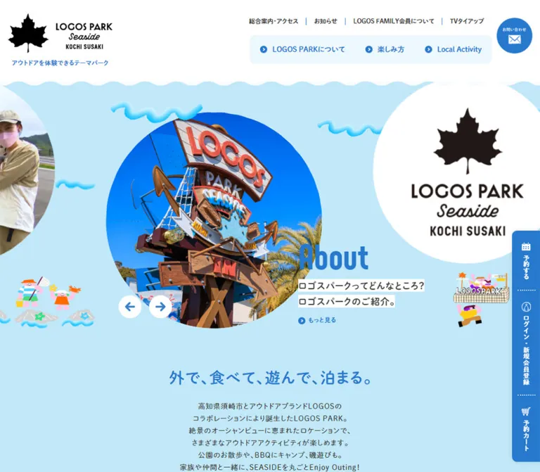
プレビュー準備中デザインリファレンスを見る
DESIGN REFERENCE
ロゴスパーク高知須崎|水色と波形でつくるアウトドア施設サイト
大きな円形ビジュアル、波形の境界、丸みのある書体、鮮やかな人物イラストが特徴。施設案内から宿泊・BBQ予約までをつなぐ、開放的で親しみやすいデザイン。
LOGOS PARK SEASIDE KOCHI SUSAKI — Style Reference
A seaside visitor guide built from blue water, floating circles, and cheerful outdoor characters.
Website: kochisusaki.logospark.jp Original URL: https://kochisusaki.logospark.jp/ Final URL: https://kochisusaki.logospark.jp/ Theme: light; white and pale blue surfaces with saturated blue navigation and headings. Inspected: supplied capture session dated October 2, 2026, 04:54:43 JST — October 1, 2026, 19:54:43 UTC. Viewports: desktop 1440 × 1000 CSS pixels; mobile 390 × 844 CSS pixels. Scope: the current public homepage, including its promotional carousel, facility introduction, news, local activities, video index, group-use information, access information, membership, recruitment, social links, booking entry points, and footer. Visual captures show the desktop opening, group-use section, and footer, plus the mobile opening and lower footer. Supplied DOM measurements add detail for the facility, news, and local-activity sections. Linked pages and opened interaction states were not inspected.
LOGOS PARK presents a working recreation facility through a playful seaside environment. The homepage combines visitor information, current announcements, regional experiences, and access to reservations. Its structure supports several visitor tasks rather than following a single conversion sequence.
The strongest visual relationship is between a pale blue field and large circular imagery. Photographs and promotional badges float among small illustrated people and dimensional cyan waves. Saturated blue connects headings, arrows, navigation, social icons, and booking controls. Rounded Japanese lettering and condensed Latin display lettering keep the information friendly without making the interface visually loose.
The composition changes substantially on a phone. A compact logo, reservation entry, and circular Menu control replace the desktop navigation. The hero image remains oversized, but the title moves below its lower-left edge and the carousel arrows move to the right. Deeper content becomes a vertical sequence, while related links retain a compact two-column arrangement.
閉じる
LOGOS PARK SEASIDE KOCHI SUSAKI — Style Reference
A seaside visitor guide built from blue water, floating circles, and cheerful outdoor characters.
Website: kochisusaki.logospark.jp Original URL: https://kochisusaki.logospark.jp/ Final URL: https://kochisusaki.logospark.jp/ Theme: light; white and pale blue surfaces with saturated blue navigation and headings. Inspected: supplied capture session dated October 2, 2026, 04:54:43 JST — October 1, 2026, 19:54:43 UTC. Viewports: desktop 1440 × 1000 CSS pixels; mobile 390 × 844 CSS pixels. Scope: the current public homepage, including its promotional carousel, facility introduction, news, local activities, video index, group-use information, access information, membership, recruitment, social links, booking entry points, and footer. Visual captures show the desktop opening, group-use section, and footer, plus the mobile opening and lower footer. Supplied DOM measurements add detail for the facility, news, and local-activity sections. Linked pages and opened interaction states were not inspected.
LOGOS PARK presents a working recreation facility through a playful seaside environment. The homepage combines visitor information, current announcements, regional experiences, and access to reservations. Its structure supports several visitor tasks rather than following a single conversion sequence.
The strongest visual relationship is between a pale blue field and large circular imagery. Photographs and promotional badges float among small illustrated people and dimensional cyan waves. Saturated blue connects headings, arrows, navigation, social icons, and booking controls. Rounded Japanese lettering and condensed Latin display lettering keep the information friendly without making the interface visually loose.
The composition changes substantially on a phone. A compact logo, reservation entry, and circular Menu control replace the desktop navigation. The hero image remains oversized, but the title moves below its lower-left edge and the carousel arrows move to the right. Deeper content becomes a vertical sequence, while related links retain a compact two-column arrangement.
How to Read This Reference
- Measured means a value is explicitly present in the supplied rendered DOM or computed-style evidence. Coordinates describe the captured state, including carousel offsets; they are not automatically permanent layout rules.
- Visual estimate means a dimension, color, or relationship is estimated from one of the five current-page screenshots. Image bounds, footer geometry, and decorative wave dimensions mostly fall into this category.
- Recommendation means an implementation choice for a new site. Suggested breakpoints, accessibility behavior, generated wave geometry, and the Quick Start are adaptations rather than recovered source code.
- Named tokens are descriptive aliases introduced here. The supplied custom-property exports are empty; no original token names were established.
- Evidence coverage varies. The full page text was supplied, but detailed element measurements stop within Local Activity. Do not treat later sections as fully measured components.
- Font evidence identifies declared stacks. It does not independently verify font files, licensing, or the exact face used for every individual glyph.
Tokens — Colors
Default Palette
| Name | Value | Suggested token | Role and evidence |
|---|---|---|---|
| Park Blue | #2679cd |
--color-blue |
Measured: headings, navigation links, small arrows, and filled pill links |
| Sea Blue | #c1e8f8 |
--color-sea |
Measured main-element background; visibly dominates the opening composition |
| Mist Blue | #ecf8fd |
--color-mist |
Measured desktop primary-navigation background; visually consistent with the related-sites panel |
| White | #ffffff |
--color-white |
Measured header and news-card fill; also visible in the group-use section, footer, photo frame, and reversed icons |
| Body Charcoal | #333333 |
--color-text |
Measured body and descriptive text |
| Brand Black | approximately #000000 |
--color-brand |
Visual estimate for the maple-leaf logo and wordmark artwork; the HTML element also reports black as its default color |
| Lodging Mint | approximately #a0d7dc |
--color-art-mint |
Visual estimate from the lodging badge; an artwork color, not a verified interface token |
Use Park Blue as the recurring functional color. It links navigation to content and reservations without introducing a separate conversion color. Sea Blue covers large areas, while Mist Blue groups small navigation and link collections with gentler contrast.
The illustrations contain pink, yellow, orange, green, and cyan. These accents belong primarily to the artwork. Their presence does not imply a multicolor button or category-badge system.
Color Distribution
The opening is a broad sea-blue environment under a white header. The group-use capture is predominantly white, separated by a dotted blue wave. The footer is also white, preceded by a broad sea-blue band with a larger wave edge.
The computed main background should not be interpreted as proof that every section is visibly blue. Nested surfaces, decorative layers, and image backgrounds can cover it. Where a section has only DOM evidence, its visible background composition remains less certain.
Tokens — Typography
Rounded Japanese Body and Interface Text
- Measured stack:
dnp-shuei-mgothic-std, sans-serif. - Measured weights:
400for body copy,600for many headings and navigation labels, and700for selected links and emphasis. - Character: soft, rounded Japanese lettering with a compact but readable rhythm.
- Role: body copy, Japanese promotional headings, facility titles, navigation, and controls.
- Suggested alias:
--font-body.
Condensed Latin Display Text
- Measured stack:
Phenomena, dnp-shuei-mgothic-std, sans-serif. - Measured weight: predominantly
600in sampled display labels and dates. - Role: carousel headings, English section labels such as About LOGOS PARK and News, and news dates.
- Character: narrow, rounded display lettering that can be large without occupying excessive horizontal space.
- Suggested alias:
--font-display.
Japanese glyphs in this stack can fall through to the Japanese family. Do not assume that Phenomena supplies the Japanese letterforms.
Logo and Artwork Lettering
The maple leaf and LOGOS PARK wordmark are visual assets. The script-like Seaside lettering belongs to that identity artwork; no separate logo font was established. The large lodging badge also contains lettering inside the image. Preserve these as approved assets instead of approximating them with an unrelated font.
Type Scale
All values below are measured unless identified otherwise.
| Role | Desktop | Mobile | Weight | Tracking and notes |
|---|---|---|---|---|
| Body default | 16px / 27.424px |
14px / 23.996px |
400 | Desktop 0.64px; mobile normal |
| Hero title | 70px / 70px |
50px / 50px |
600 | 0.8px desktop; 0.7px mobile |
| Hero description | 18px / 30.852px |
14px / 28px |
600 | 1.08px desktop; 0.84px mobile |
| Hero detail link | 12px / 20.568px |
12px / 20.568px |
700 | 0.8px desktop; 0.7px mobile |
| Intro statement | 30px / 51.42px |
24px / 31.992px |
600 | 1.8px desktop; 1.44px mobile |
| Intro paragraph | 14px / 23.996px |
14px / 23.996px |
400 | 0.8px desktop; 0.7px mobile |
| English section label | 60px / 60px |
40px / 40px |
600 | Mobile Local Activity specifically uses 38px / 38px |
| Japanese section subtitle | 16px / 27.424px |
12px / 20.568px |
600 | About and News samples |
| Facility title | 21px / 31.5px |
21px / 31.5px |
600 | Remains the same size across both viewports |
| Facility and news copy | 14px / 21px |
14px / 21px |
400 | Compact information paragraphs |
| News date | 14px / 14px |
14px / 14px |
600 | Phenomena stack; 0.56px tracking |
| Small pill link | 12px / 20.568px |
12px / 20.568px |
600 | 0.6px tracking |
| Desktop utility navigation | 12px / 14.4px |
Replaced by mobile controls | 600 | Normal tracking |
| Desktop primary navigation | 14px / 23.996px |
Replaced by mobile controls | 600 | Normal tracking |
| Local-activity action title | Not supplied | 27px / 32.7272px |
700 | White; 1.08px tracking |
Source root size: the HTML element reports 10px at both viewports. This is not the visible body size. The Quick Start uses explicit pixel values so these measurements can be reused without adopting the original root convention.
Tokens — Spacing & Shapes
Spacing Scale
There is no established source spacing variable set. The following recurring values are useful implementation aliases.
| Use | Measured value | Suggested interpretation |
|---|---|---|
| News-card interior | 10px desktop; 10px 20px 10px 10px mobile |
Compact media-and-copy padding |
| Hero title to description | 10px in sampled active slides |
Tight association between headline and explanation |
| Small pill padding | 10px 40px |
Wide horizontal breathing room around a small label |
| Desktop primary-navigation padding | 16px 20px |
Approximately 56px-high navigation strip |
| Intro statement to paragraph | 20px |
Consistent at both inspected sizes |
| English label to Japanese subtitle | 12px desktop; 6px mobile |
Responsive bilingual heading rhythm |
| Section subtitle to introduction | 30px desktop; 15px mobile |
Measured in About and News |
| Desktop facility-row gap | 65px |
Calculated from measured row positions |
| About section padding | 90px 0 70px desktop; 80px 0 60px mobile |
Broad section breathing room |
| News section padding | 50px 0 80px desktop; 70px 0 60px mobile |
The mobile top inset grows despite the narrower layout |
| Local Activity section padding | 70px 0 90px desktop; 80px 0 mobile |
Large separation around a decorative content group |
Avoid imposing one uniform spacing scale on every region. The page uses compact controls inside generous illustrated sections.
Border Radius
| Element | Value | Evidence |
|---|---|---|
| News cards | 10px |
Measured |
| Desktop navigation group ends | 10px outer corners |
Measured; inner joins are square |
| Small pill links | 50px |
Measured |
| Related-sites panel | Approximately 10–12px |
Visual estimate |
| Contact and Menu controls | Circular | Visible; mobile Menu box is measured at 60 × 60px |
| Hero photo and badges | Circular silhouettes | Visible; exact image-mask implementation not supplied |
| Carousel arrows | Circular white artwork | Visible; button element itself reports a zero radius and transparent background |
The distinction between artwork and element geometry matters. A circular arrow can be drawn by an image or pseudo-element even when the sampled button is a square transparent box.
Layout Measurements
| Region | Desktop at 1440px | Mobile at 390px | Evidence |
|---|---|---|---|
| Header box | 1440 × 160px |
390 × 75px |
Measured |
| Header logo/link width | 240px |
126.96875px |
Measured inline-link width; height is not the complete graphic height |
| Logo left position | 82.5px |
15.59375px |
Measured |
| Primary-navigation strip | Approximately 475.17 × 55.98px |
Not visible | Sum of measured link boxes |
| Mobile reservation entry | Not applicable | 109 × 23.984px |
Measured |
| Mobile Menu control | Not applicable | 60 × 60px |
Measured |
| Active hero text box | 380px wide |
373.75px wide |
Measured; mobile box extends slightly beyond the viewport |
| Carousel arrows | 45 × 45px, 15px gap |
37 × 37px, 10px gap |
Measured |
| About heading container | 1197px wide, x = 121.5px |
348.4375px wide, x = 20.78125px |
Measured |
| News container | 980px wide, x = 230px |
348.4375px wide |
Measured |
| News card | Approximately 319.97 × 125px |
348.4375px wide, 120–125px high |
Measured sampled cards |
| Facility item | 479.25 × 202px |
390 × 384.640625px |
Measured |
| Local Activity heading container | 1110px wide |
348.4375px wide |
Measured |
| Related-sites panel | Approximately 1120 × 212px |
Approximately 348 × 342px |
Visual estimate |
| Reservation rail | Approximately 55 × 454px |
Absent from supplied mobile captures | Visual estimate |
| Document height | 11475.75px |
13161.09375px |
Measured captured state |
The homepage uses several content widths. A single global max-width would lose the distinction between the wide facility introduction, narrower news row, and broad footer.
Components
Persistent Site Header
Role: identity, broad site navigation, and immediate access to contact or reservations.
On desktop, a white 160px-high header places the black horizontal logo at the left. Its small blue tagline sits beneath the logo. The right side has two navigation tiers:
- A compact utility row for access, news, membership, and television content. Thin blue vertical separators divide the links.
- A pale-blue primary-navigation group for
LOGOS PARKについて,楽しみ方, and Local Activity. Each link includes a small blue circular arrow.
A separate blue contact circle, visually about 90px in diameter, occupies the far right. It contains a small white label and envelope graphic. Its sampled inline anchor height is not a reliable measurement of the complete circle.
A shallow white wave finishes the bottom edge. The same header remains at the top in the supplied desktop scroll captures, demonstrating persistent behavior. The evidence does not distinguish the exact fixed-versus-sticky implementation.
Mobile Header
The mobile header is measured at 75px high. It contains three visible groups:
- A roughly 127px-wide logo at x ≈ 15.6px.
- A compact reservation entry, visibly labeled
ご予約について, with a calendar symbol and blue underline. - A 60px blue Menu circle at x ≈ 314.4px, containing three white wave lines above the word Menu.
The logo tagline and desktop navigation tiers are not visible. The lower white wave is retained, making the compact header feel like the same design rather than a separate mobile skin.
The supplied mobile screenshot shows the closed state. An opened menu, its content arrangement, focus behavior, and reservation-entry response were not exercised.
Circular Promotional Carousel
Role: surface multiple current visitor tasks and announcements near the top of the homepage.
The desktop active slide combines a large circular image at the center-left with a text block overlapping its lower-right area. Neighboring circles are deliberately clipped at the viewport edges. The active BBQ photograph has a thick white circular frame. A mint lodging badge appears as the next large circular object.
The active desktop photo is visually about 566px across, beginning near x = 286px and y = 221px. This is an image estimate, not a measured DOM image box. The measured title begins at x = 790.734px and y = 538.578px, with a 380px-wide text column.
The caption anatomy is:
- A blue display heading, often two lines.
- Two short explanatory lines with white backing immediately behind the text.
- A small blue circle-arrow link labeled
もっと見る.
The desktop active heading is BBQ団体予約 受付中!. The mobile capture instead shows 宿泊の ご案内. These are different carousel states; their difference does not establish a device-specific content policy.
On mobile, the lodging circle is visually about 350px across, offset to the right. Its left edge is near x = 54px, while a slice of the preceding photograph remains visible at the left edge. The title starts at x = 28.297px and y = 418.484px, overlapping the lower-left region of the circular composition.
The repeated offscreen titles and regularly spaced DOM positions are consistent with carousel cloning. They should not become repeated visible sections in a new implementation. No carousel library, interval, easing, or swipe behavior was established.
Carousel Arrow Pair
Two white circular controls contain blue left and right arrows. Desktop boxes measure 45px square and sit near the lower-left portion of the active photograph. The mobile boxes measure 37px square and move to the right, near the lower edge of the circular image.
The underlying elements are buttons with Previous and Next text, visually suppressed using zero-sized type. The evidence therefore supports button semantics, but keyboard behavior and activation results were not tested.
Keep the direction pair close enough to read as one control group. For a new mobile implementation, retain the 37px visible circles while enlarging their invisible hit areas to at least 44px.
Introductory Statement
The hero leads into a centered blue statement, 外で、食べて、遊んで、泊まる。, followed by a narrow centered description of the park and its seaside setting.
On desktop, the statement occupies one line at 30px. On mobile, it becomes two lines at 24px with a tighter 31.992px line height. The paragraph remains 14px at both widths and adds another line in the mobile layout.
The statement is surrounded by open blue space rather than a panel. Its visual role is to connect the changing promotional carousel to the permanent identity of the facility.
Bilingual Section Heading
Role: establish a repeatable section rhythm across a long page.
The measured About and News groups place a large blue English display label above a smaller Japanese subtitle, followed by centered explanatory text. Desktop uses a 60px English label and a 16px subtitle. Mobile reduces these to 40px and 12px; Local Activity uses a slightly smaller 38px English label.
The sampled English labels are paragraphs, while the Japanese subtitles are H2 elements. Preserve a coherent semantic heading structure when adapting the design; the largest visible text does not have to dictate document hierarchy.
Facility Overview and Point Items
The About section includes an overview with small interactive-looking markers, followed by four numbered facility descriptions: camp space, BBQ stadium, play area, and shop/cafe.
Measured desktop point items form two columns and two rows. Each item is a 479.25 × 202px flex region with a media/number area on the left and approximately 243.7px of descriptive text on the right. The linked blue title uses 21px type and reserves 25px at its left for an arrow treatment. Paragraphs use 14px type with a 21px line height.
On mobile, each point becomes a full-width block. The title and paragraph move below the preceding media area. Titles retain their 21px size; text occupies a 374px inner width with 8px side padding in the sampled items.
The overview markers measure 20 × 20px. Several mobile marker positions extend beyond the 390px viewport, and the mobile DOM contains an area-switching control labeled キャンプエリアへ / 無料プレイエリアへ. This supports an overview with a wider internal coordinate system, but panning, switching, and marker responses were not verified.
The section ends with two small blue pills. They sit side by side on desktop and stack with a 10px gap on mobile.
News Card
Role: expose a few current updates without turning the page into a dense feed.
Three measured desktop cards sit in a 980px-wide row. Each card is approximately 320 × 125px, white, with a 10px radius and 10px interior padding. The card is a single flex link with a left media region and a right date-and-title region.
Dates use the Phenomena stack at 14px, weight 600, in blue. Titles use 14px charcoal text at a 21px line height. A small blue marker appears beside the date area in the measurements; no category wording is supplied for it.
Mobile keeps the horizontal composition inside each card while stacking the three cards vertically. Width becomes 348.4375px, with a 10px vertical gap and slightly larger right padding. The sampled cards vary between 120px and 125px in height, so treat height as content-dependent.
The source does not provide news-image bounds or asset paths. Do not invent a specific thumbnail crop or image ratio as an observed property.
Local Activity Links
The section presents three linked activity categories: 体験する, 利用する, and 食べる.
The first desktop action region measures approximately 370 × 370px. Mobile action regions measure approximately 325 × 325px. White headings and descriptive text sit inside these media-sized regions; the first mobile title is 27px bold, and its body copy uses 14px / 22px.
The first two mobile links alternate horizontally: the first starts at x ≈ −19.2px, while the second starts at x ≈ 84.2px. Their edges extend beyond opposite viewport sides, creating a staggered composition.
Their exact image contents, masks, and background colors are not available in the supplied screenshots or sampled image styles. Reuse the measured scale and alternating placement only after selecting appropriate imagery; do not assert a circular mask from square bounding boxes alone.
Movie Index and Later Information Sections
The rendered text establishes a Movie section with Previous and Next controls and repeated video titles. It also establishes access information, membership promotion, recruitment, and social content farther down the page.
These are genuine parts of the current information architecture. Their detailed visual layouts are not sufficiently captured to define exact card dimensions, thumbnail ratios, embed styles, or playback overlays.
Keep them in the page architecture when adapting this kind of facility website. Validate their individual design and interaction requirements separately rather than filling the gaps with invented source behavior.
Group-Use Information
The desktop group-use capture shows a white section with a centered introduction above a two-part information row. The left side has two blue bullet headings for overnight and day use, each followed by concise charcoal copy. The right side contains a colorful illustration of people seated around an outdoor table on an irregular green patch.
A blue contact pill sits centered beneath the row. Its visual size is approximately 300 × 60px. White text sits in the middle, with a white circular arrow inset at the right.
A blue dotted wave spans the page below the content. It acts as a playful section separator without placing the content inside a bordered box. The top of the section is partly hidden under the persistent header in this capture, so the full section height and title placement are not measured.
Reservation Rail
The desktop screenshots show a narrow blue rail attached to the right edge, approximately 55px wide. It stays near the bottom-right across opening, middle, and footer captures, with about 20px of bottom clearance.
Three vertically arranged entries combine white icons with vertical Japanese labels:
予約するlinks to/order/.ログイン・新規会員登録links to/login/.予約カートlinks to/cart/.
Dotted white separators divide the entries. The left corners are rounded, and a subtle shadow is visible around the rail. Exact shadow values were not supplied.
Additional reservation text and destinations exist in the desktop DOM, including BBQ and lodging reservations. An expanded booking panel was not captured, so its trigger and presentation remain unverified.
The rail is absent in the supplied mobile captures; the compact header provides a reservation entry instead.
Small Pill and Inline Arrow Links
Two action scales recur:
- Inline detail link: a small blue circular arrow followed by a 12px bold label, with a measured 20px left reservation for the icon.
- Filled pill: blue background, white 12px semibold text, 10px vertical and 40px horizontal padding, and a 50px radius.
A typical small desktop pill measures 160 × 40.5625px. The sampled mobile pills measure 187.1875 × 40.5625px. The larger group-contact pill is a distinct visual size and includes a white arrow disc.
Preserve this action hierarchy. Turning every inline link into a large button would make the long homepage much heavier.
Footer
The desktop footer begins below a broad blue band with a white wave boundary. Its upper region has three groups:
- A vertically arranged black logo and postal address.
- Primary and utility links, followed by a blue recruitment pill.
- Five blue social icons and app-platform links, separated from the middle group by a dotted blue vertical rule.
The Related Site panel spans approximately 1120px. It has a pale-blue fill, rounded corners, a condensed English label at the left, and four columns of compact links. Each link begins with a small blue circular arrow.
The mobile lower-footer capture stacks the social icons, app links, and related-sites panel. The panel has about 21px of outer margin and retains two link columns. Long labels wrap within their own columns. Legal links wrap into two centered rows, with a very small centered copyright line farther below.
The 2021 copyright text is page content, not evidence of the inspection date or the date of the current design.
Tokens — Motion & Interaction
| Treatment | Evidence | What is established | What remains unknown |
|---|---|---|---|
| Desktop utility-link feedback | color 0.3s |
A color transition is declared | Destination color and exercised hover appearance |
| Desktop detail links, pills, and carousel buttons | opacity 0.3s |
A short opacity transition is declared | Target opacity and exact trigger |
| Mobile About and News introductions | 1s both fadeup |
Named animation, one-second duration, and both fill mode | Keyframes, movement distance, easing, and trigger |
| Mobile Local Activity introduction | 1.2s both gumi |
Named animation and 1.2-second duration | Shape of the animation; its name alone does not prove a bounce or squash |
| Mobile activity groups | 1s both fadeup |
Animation declaration on sampled sections | Whether every visit or only first reveal triggers it |
| Hero carousel | Buttons, offscreen copies, different captured active slides | A carousel interface and multiple states | Autoplay, interval, drag, swipe, easing, pause behavior |
| Header and reservation rail | Stable viewport placement across scroll captures | Persistent visible access | Exact CSS positioning implementation |
| Decorative waves and characters | Static captured appearances | Their shapes and locations | Whether they animate, and how |
Many sampled elements report only transition: all. Without a duration, that does not establish an animated transition. Likewise, animation: none on an individual text node does not rule out motion on its wrapper, artwork, or pseudo-elements.
The capture process waited for visible finite motion and layout stability, temporarily paused perpetual animations during readiness checks, and then resumed them. This is useful capture context, but it does not supply a frame-by-frame record of those animations.
Recommended adaptation: retain short opacity/color feedback for controls. Use restrained optional section reveals, keep content visible by default, and provide a static reduced-motion presentation. Carousel timers and video behavior require explicit JavaScript handling; CSS alone cannot disable an autoplay scheduler.
Surfaces
| Surface | Appearance | Purpose |
|---|---|---|
| Header | White with a shallow wave edge | Keeps identity and navigation distinct from the illustrated opening |
| Opening environment | Solid sea blue | Creates continuity around circles, text, and decorative artwork |
| Hero caption backing | Narrow white areas behind individual text lines | Protects readability without creating a large card |
| News card | White, 10px corners | Groups one compact update |
| Primary-navigation group | Mist blue, rounded outer ends | Collects three high-level destinations |
| Group-use section | Open white space | Gives the illustration and explanatory text room |
| Filled action | Park blue with white label | Repeated booking, contact, and detail affordance |
| Related-sites panel | Pale blue, softly rounded | Contains a dense collection of secondary destinations |
| Footer | White with blue icons and charcoal labels | Closes the page with practical information |
There is no broad elevation system in the visible design. The reservation rail has a subtle apparent shadow, but ordinary content is organized through color fields, spacing, circles, and wave boundaries.
Imagery
The imagery mixes real facility life with exuberant illustration. The visible BBQ photograph shows a group gathered at a covered outdoor cooking area. The lodging promotion is a mint circular stamp with concentric white rules, curved lettering, and a central black logo.
Small characters sit at the edges of the opening composition. Their bodies use broad, uneven shapes and saturated pink, orange, yellow, and green. The group-use illustration repeats this vocabulary at a larger scale: smiling people, colorful outdoor chairs, a table, and an irregular green ground shape.
The cyan wave decorations have highlights and shaded volume. This dimensional treatment belongs to the decorative artwork; the surrounding interface remains mostly flat. Avoid replacing these distinctive waves with generic thin line icons or applying their glossy treatment to every button.
Observed Asset References
No image source paths, font-file URLs, or downloadable asset manifest were included in the evidence. The references below identify visible assets without inventing filenames.
| Asset | Evidence location | Role |
|---|---|---|
| Horizontal maple-leaf logo | Desktop and mobile headers | Persistent identity |
| Vertical logo | Desktop footer | Footer identity and address grouping |
| Group BBQ photograph | Desktop opening capture | Active promotional image in a white circular frame |
| Mint lodging badge | Desktop neighboring slide and mobile active slide | Lodging promotion |
| Small outdoor characters | Opening captures | Decorative framing around hero content |
| Cyan dimensional waves | Opening captures | Seaside motif and visual movement |
| Outdoor table illustration | Desktop group-use capture | Explains shared group activity through imagery |
| Social symbols | Desktop and mobile footer captures | Five blue social destinations with white glyphs |
Use approved assets when reproducing the identity. Keep photographs naturally rendered rather than pixelated. Use cover cropping for a photo inside a circular aperture, but preserve the full composition of text-bearing badges and logos with contain-style fitting.
Layout & Responsive Behavior
| Relationship | Desktop observation | Mobile observation |
|---|---|---|
| Navigation | Two rows plus contact circle | Logo, reservation entry, Menu circle |
| Header height | 160px | 75px |
| Hero title | 70px, to the lower right of the active image | 50px, below/overlapping the image at the left |
| Carousel controls | Lower-left area of active photo | Right side near the image's lower edge |
| Intro statement | One centered line | Two centered lines |
| English section labels | 60px | Usually 40px; Local Activity 38px |
| Facility points | Two columns with horizontal media/copy | One vertical sequence with media above copy |
| News | Three cards in one row | Three stacked cards; internal horizontal layout retained |
| Small About actions | Side by side | Stacked |
| Local activities | Large approximately 370px action regions | Approximately 325px regions, alternately offset beyond the viewport edges |
| Booking access | Fixed-looking right rail | Header reservation entry; rail absent |
| Related sites | Four link columns beside a heading | Heading above two link columns |
Most measured mobile section headings and news cards use a 348.4375px container, leaving approximately 20.78px on each side. Facility descriptions are an exception, with only 8px of sampled internal padding. This variation is part of the current layout and should not be silently converted into a universal gutter.
The mobile hero text box extends slightly past the viewport even though the visible short title fits. For an adaptation, cap long replacement copy to the available width instead of copying that overflow literally. Preserve decorative clipping on the image track while preventing page-wide horizontal scrolling.
The mobile overview contains offscreen marker coordinates; the first activity links also deliberately exceed viewport bounds. These are local composition facts, not proof that the entire document should scroll horizontally.
Only two widths were inspected. Exact media-query thresholds, tablet layouts, orientation changes, and maximum desktop scaling are unknown. The Quick Start uses recommended thresholds and endpoint proportions, not recovered responsive formulas.
Do’s and Don’ts
Do
- Preserve the measured blue family:
#2679cd,#c1e8f8, and#ecf8fd. - Keep the black logo distinct from the blue interface.
- Build the opening around large circular imagery, clipped neighboring content, and overlapping captions.
- Use the measured Japanese and Latin font stacks when licensed and available.
- Keep body copy compact and reserve the largest type for short promotional or section labels.
- Repeat the circle-arrow motif across navigation, detail links, pills, and footer links.
- Use white and blue wave edges to connect sections to the seaside identity.
- Retain the different desktop content widths and the substantial mobile reflow.
- Give illustrations room to extend beyond ordinary text alignment without covering essential controls.
- Keep booking access available while visitors move through the long homepage.
Don’t
- Don’t replace the facility homepage with a single-purpose sales sequence that removes news, access, and visitor information.
- Don’t turn every section into an identical rounded card grid.
- Don’t introduce an unrelated primary CTA color simply because the artwork contains bright accents.
- Don’t replace the branded illustrations with generic stock icons and expect the same character.
- Don’t remove all depth from the cyan wave artwork or spread glossy effects across ordinary surfaces.
- Don’t treat carousel copies in the DOM as distinct visible page sections.
- Don’t infer autoplay, swipe, menu overlays, map responses, or video dialogs from labels alone.
- Don’t crop lettering out of the lodging badge or distort the logo to fill a photo aperture.
- Don’t copy the very small footer copyright size as a general body-text standard.
- Don’t hardcode captured document heights; content and delayed embeds can change them.
Recommended Implementation Additions
These are recommendations for a new implementation, not verified features of the original site.
- Provide accessible names for the Menu, contact, social, and directional controls. Use buttons for state changes and links for navigation.
- Keep carousel clones and inactive slide controls out of the keyboard sequence. Provide a pause mechanism if autoplay is introduced.
- Expand the 37px mobile arrows and 20px overview markers to comfortable hit areas without enlarging their visible artwork unnecessarily.
- Give the mobile menu an explicit expanded state, predictable focus handling, and a keyboard-operable close control.
- Add a clearly visible focus treatment that works on both white and blue surfaces.
- Check blue text on sea-blue backgrounds and small reversed labels against the intended contrast standard. Adjust supporting surfaces or functional text colors when necessary.
- Reserve image dimensions to prevent shifts. Load the initially visible hero image promptly and defer distant photos, videos, and social embeds where appropriate.
- Supply semantic text alongside text-bearing promotional images, and empty alternative text for purely decorative characters and waves.
- Ensure anchor targets are not hidden under the persistent header.
- Respect reduced motion for section reveals, decorative animation, and carousel scheduling. Keep the page usable when motion or third-party embeds are unavailable.
Agent Prompt Guide
Quick Color Reference
- Main action and heading blue:
#2679cd. - Broad opening background:
#c1e8f8. - Soft navigation and link grouping:
#ecf8fd. - Header, footer, information surfaces, and reversed icons:
#ffffff. - Reading text:
#333333. - Logo: approved black artwork.
- Pink, orange, yellow, green, and dimensional cyan: primarily illustration colors.
Overall Prompt
“Create a Japanese seaside recreation-facility homepage inspired by the observed LOGOS PARK composition. Use pale sea blue #c1e8f8, functional blue #2679cd, white surfaces, rounded Japanese typography, and narrow rounded Latin display labels. Build a persistent white header with a wave edge. On desktop, place a large circular promotional photograph beside an overlapping blue title, white-backed explanatory lines, and a small circle-arrow detail link. Let neighboring carousel circles peek into the viewport and add cheerful outdoor characters and dimensional cyan wave assets. Continue with facility information, compact news cards, local activities, group-use information, access, membership, and a practical footer. On mobile, replace desktop navigation with a small logo, reservation entry, and circular Menu control; stack the content while retaining the oversized circular hero and two-column related links. Treat motion and unobserved interaction states as separately specified implementation work.”
Example Component Prompts
- Desktop header: “A 160px white header with a black horizontal outdoor-park logo at the left, compact utility links at the upper right, a 56px-high pale-blue primary-navigation strip below, and a separate blue circular contact control. Finish the bottom with a shallow repeating white wave. Use blue circle-arrow markers and restrained separators.”
- Mobile hero: “At a 390px viewport, place an approximately 350px circular lodging graphic slightly right of center over pale blue. Show a sliver of the previous image at the left. Set a two-line blue heading at 50px near the lower-left edge, then two 14px explanatory lines with white backing and a small detail link. Put paired white circular arrows at the right.”
- News card: “A compact white card with 10px corners, a left media slot, and right-aligned content grouping: a small blue date above a charcoal 14px title. Use approximately 320px width on desktop and 348px on a 390px phone. Keep the card's internal horizontal layout when the collection stacks.”
- Group-use section: “A spacious white section with short introductory copy, two blue bullet headings and descriptions at the left, and a bright hand-painted outdoor-table illustration at the right. Center a blue contact pill with a white arrow disc below. End with a thin dotted blue wave.”
- Reservation rail: “A narrow blue rail attached to the desktop right edge, with three white icon-and-vertical-label entries for booking, account access, and cart. Separate entries with white dotted rules, round the left corners, and keep the shadow subtle. Provide a compact header entry on mobile.”
- Related-sites panel: “A pale-blue rounded footer panel with a condensed English heading and small charcoal links preceded by blue circular arrows. Use four link columns on desktop and two on mobile. Preserve generous panel padding and allow long Japanese labels to wrap within their columns.”
Quick Start
CSS Custom Properties
This is an adaptation of measured endpoint proportions, not the original stylesheet. The two breakpoint values are recommendations. The wave is newly authored geometry, the hover opacity is a recommended target, and the reveal keyframes are illustrative because original keyframes were not supplied.
Use the font stacks only when the corresponding fonts are licensed and loaded. No font files or original artwork paths are bundled here. The hero rules describe one active slide; neighboring slides, approved decorations, carousel state, menu behavior, and overview interactions require separate implementation.
:root {
  /* Measured interface colors */
  --color-blue: #2679cd;
  --color-sea: #c1e8f8;
  --color-mist: #ecf8fd;
  --color-white: #ffffff;
  --color-text: #333333;

  /* Observed declared font stacks */
  --font-body: dnp-shuei-mgothic-std, sans-serif;
  --font-display: Phenomena, dnp-shuei-mgothic-std, sans-serif;

  --text-body: 16px;
  --text-hero: 70px;
  --text-section: 60px;
  --text-detail: 14px;
  --text-small: 12px;
  --header-height: 160px;
  --content-wide: 1197px;
  --content-news: 980px;
  --radius-panel: 10px;
  --radius-pill: 50px;
  --motion-link: 300ms;

  /* Newly authored approximation of the shallow white wave */
  --wave-white: url('data:image/svg+xml,%3Csvg xmlns=%22http://www.w3.org/2000/svg%22 width=%2262%22 height=%228%22 viewBox=%220 0 62 8%22%3E%3Cpath fill=%22white%22 d=%22M0 0H62V4Q46.5 12 31 4T0 4Z%22/%3E%3C/svg%3E');
}

* { box-sizing: border-box; }
body { margin: 0; }

.park-site {
  color: var(--color-text);
  background: var(--color-white);
  font-family: var(--font-body);
  font-size: var(--text-body);
  line-height: 1.714;
  letter-spacing: 0.04em;
}

.park-site img { display: block; max-width: 100%; }
.park-site button { font: inherit; cursor: pointer; }
.park-site a { color: inherit; }
.park-site [id] { scroll-margin-top: calc(var(--header-height) + 24px); }

.site-header {
  position: fixed;
  inset: 0 0 auto;
  z-index: 50;
  height: var(--header-height);
  background: var(--color-white);
}

.site-header::after {
  content: '';
  position: absolute;
  inset: 100% 0 auto;
  height: 8px;
  background: var(--wave-white) repeat-x;
  background-size: 62px 8px;
  pointer-events: none;
}

.header-inner {
  width: min(1275px, 92%);
  height: 100%;
  margin-inline: auto;
  display: flex;
  align-items: center;
  justify-content: space-between;
  gap: 20px;
}

.brand { width: 240px; flex: none; }
.desktop-navigation { display: grid; justify-items: end; gap: 20px; }
.utility-links { display: flex; font-size: 12px; line-height: 1.2; }
.utility-links a { padding-inline: 20px; text-decoration: none; }
.utility-links a + a { border-left: 1px solid var(--color-blue); }

.primary-links {
  display: flex;
  overflow: hidden;
  border-radius: var(--radius-panel);
  background: var(--color-mist);
}

.primary-links a {
  padding: 16px 20px;
  color: var(--color-blue);
  font-size: 14px;
  font-weight: 600;
  text-decoration: none;
}

.contact-circle,
.menu-circle {
  display: grid;
  place-items: center;
  flex: none;
  border: 0;
  border-radius: 50%;
  color: var(--color-white);
  background: var(--color-blue);
  text-decoration: none;
}

.contact-circle { width: 90px; height: 90px; }
.menu-circle { width: 60px; height: 60px; }
.mobile-tools { display: none; }

.park-main { padding-top: var(--header-height); }
.hero { background: var(--color-sea); }

.hero-stage {
  position: relative;
  max-width: 1440px;
  height: 660px;
  margin-inline: auto;
  overflow: hidden;
}

.hero-media {
  position: absolute;
  top: 60px;
  left: calc(50% - 434px);
  width: 566px;
  aspect-ratio: 1;
  overflow: hidden;
  border-radius: 50%;
}

.hero-media img { width: 100%; height: 100%; object-fit: contain; }
.hero-media--photo { border: 26px solid var(--color-white); }
.hero-media--photo img { object-fit: cover; }

.hero-copy {
  position: absolute;
  left: calc(50% + 71px);
  bottom: 40px;
  width: 380px;
}

.hero-title {
  margin: 0 0 10px;
  color: var(--color-blue);
  font-family: var(--font-display);
  font-size: var(--text-hero);
  font-weight: 600;
  line-height: 1;
  letter-spacing: 0.8px;
}

.hero-description {
  margin: 0;
  font-size: 18px;
  font-weight: 600;
  line-height: 1.714;
  letter-spacing: 0.06em;
}

/* Wrap each intended caption line in a span. */
.hero-description span {
  background: var(--color-white);
  box-decoration-break: clone;
  -webkit-box-decoration-break: clone;
}

.detail-link {
  display: inline-flex;
  align-items: center;
  gap: 6px;
  margin-top: 9px;
  color: var(--color-blue);
  font-size: 12px;
  font-weight: 700;
  text-decoration: none;
  transition: opacity var(--motion-link);
}

/* Decorative arrow; retain a real text label in the link. */
.detail-link::before {
  content: '›';
  display: grid;
  place-items: center;
  width: 14px;
  height: 14px;
  border-radius: 50%;
  color: var(--color-white);
  background: var(--color-blue);
  line-height: 1;
}

.hero-controls {
  position: absolute;
  left: calc(50% - 403px);
  bottom: 58px;
  display: flex;
  gap: 15px;
}

.circle-control {
  display: grid;
  place-items: center;
  width: 45px;
  height: 45px;
  padding: 0;
  border: 0;
  border-radius: 50%;
  color: var(--color-blue);
  background: var(--color-white);
  font-size: 26px;
  transition: opacity var(--motion-link);
}

.hero-intro { padding: 38px 20px 95px; text-align: center; }
.hero-intro h2 {
  margin: 0;
  color: var(--color-blue);
  font-size: 30px;
  font-weight: 600;
  line-height: 1.714;
  letter-spacing: 0.06em;
}
.hero-intro p {
  max-width: 600px;
  margin: 20px auto 0;
  font-size: 14px;
  line-height: 1.714;
  letter-spacing: 0.8px;
}

.content-wrap {
  width: min(var(--content-wide), 89.333333%);
  margin-inline: auto;
}
.content-wrap--news { max-width: var(--content-news); }
.park-section { padding-block: 80px; }
.park-section--sea { background: var(--color-sea); }
.park-section--white { background: var(--color-white); }

.section-heading { text-align: center; }
.section-heading .display-label {
  margin: 0 0 12px;
  color: var(--color-blue);
  font-family: var(--font-display);
  font-size: var(--text-section);
  font-weight: 600;
  line-height: 1;
}
.section-heading h2 { margin: 0; font-size: 16px; font-weight: 600; }
.section-heading .intro { margin-top: 30px; font-size: 14px; }

.point-grid {
  display: grid;
  grid-template-columns: repeat(2, minmax(0, 1fr));
  gap: 65px 10%;
  max-width: 1065px;
  margin-inline: auto;
}
.point-item {
  display: grid;
  grid-template-columns: 202px minmax(0, 1fr);
  align-items: center;
  gap: 33.5px;
}
.point-item h3 { margin: 0 0 10px; color: var(--color-blue); font-size: 21px; line-height: 1.5; }
.point-item p { margin: 0; font-size: 14px; line-height: 1.5; }

.news-grid {
  display: grid;
  grid-template-columns: repeat(3, minmax(0, 1fr));
  gap: 10px;
}
.news-card {
  display: flex;
  align-items: center;
  gap: 20px;
  min-height: 125px;
  padding: 10px;
  border-radius: var(--radius-panel);
  background: var(--color-white);
  text-decoration: none;
  transition: opacity var(--motion-link);
}
/* Media width is an adaptation; original image bounds were not supplied. */
.news-card .media { flex: 0 0 100px; }
.news-card .copy { min-width: 0; }
.news-card time { color: var(--color-blue); font-family: var(--font-display); font-size: 14px; font-weight: 600; }
.news-card p { margin: 7px 0 0; font-size: 14px; line-height: 1.5; }

.pill {
  display: inline-flex;
  justify-content: center;
  align-items: center;
  min-width: 160px;
  padding: 10px 40px;
  border-radius: var(--radius-pill);
  color: var(--color-white);
  background: var(--color-blue);
  font-size: 12px;
  font-weight: 600;
  letter-spacing: 0.6px;
  text-decoration: none;
  transition: opacity var(--motion-link);
}
.pill--contact { min-width: 300px; min-height: 60px; font-size: 14px; }

.booking-rail {
  position: fixed;
  right: 0;
  bottom: 20px;
  z-index: 40;
  width: 55px;
  max-height: calc(100dvh - var(--header-height) - 32px);
  overflow-y: auto;
  border-radius: 10px 0 0 10px;
  color: var(--color-white);
  background: var(--color-blue);
}
.booking-rail a {
  display: flex;
  flex-direction: column;
  align-items: center;
  gap: 8px;
  margin-inline: 11px;
  padding-block: 22px;
  font-size: 12px;
  font-weight: 600;
  text-decoration: none;
}
.booking-rail a + a { border-top: 2px dotted currentColor; }
.booking-rail .label { writing-mode: vertical-rl; text-orientation: upright; }

.site-footer { position: relative; padding: 50px 0; background: var(--color-white); }
.site-footer::before {
  content: '';
  position: absolute;
  inset: -16px 0 auto;
  height: 16px;
  background: var(--wave-white) repeat-x;
  background-size: 124px 16px;
  transform: rotate(180deg);
}
.footer-wrap { width: min(1120px, 89.333333%); margin-inline: auto; }
.related-sites {
  display: grid;
  grid-template-columns: 170px minmax(0, 1fr);
  gap: 24px;
  padding: 60px;
  border-radius: var(--radius-panel);
  background: var(--color-mist);
}
.related-sites h2 { margin: 0; font-family: var(--font-display); font-size: 18px; }
.related-sites ul {
  display: grid;
  grid-template-columns: repeat(4, minmax(0, 1fr));
  gap: 14px 24px;
  margin: 0;
  padding: 0;
  list-style: none;
}
.related-sites a { font-size: 12px; text-decoration: none; }

/* Recommended shell breakpoint; not recovered from source CSS. */
@media (max-width: 1100px) {
  :root { --header-height: 75px; }
  .brand { width: 127px; }
  .desktop-navigation, .contact-circle, .booking-rail { display: none; }
  .mobile-tools { display: flex; align-items: center; gap: 15px; }
  .mobile-reservation { color: var(--color-blue); font-size: 12px; font-weight: 600; }
  .point-item { grid-template-columns: minmax(0, 1fr); gap: 20px; }
}

/* Recommended content breakpoint. */
@media (max-width: 767px) {
  :root { --text-body: 14px; --text-hero: 50px; --text-section: 40px; }
  .park-site { letter-spacing: normal; }
  .header-inner { gap: 10px; }
  .hero-stage { height: 570px; }
  .hero-media { top: 50px; left: calc(50% - 141px); width: min(350px, 90vw); }
  .hero-media--photo { border-width: 14px; }
  .hero-copy { top: 343px; bottom: auto; left: 28px; width: calc(100% - 56px); }
  .hero-title { letter-spacing: 0.7px; }
  .hero-description { font-size: 14px; line-height: 2; }
  .hero-controls { top: 352px; right: 10px; bottom: auto; left: auto; gap: 10px; }
  .circle-control { width: 37px; height: 37px; font-size: 22px; }
  .hero-intro { padding: 39px 16px 65px; }
  .hero-intro h2 { font-size: 24px; line-height: 1.333; }
  .hero-intro p { letter-spacing: 0.7px; }
  .section-heading .display-label { margin-bottom: 6px; }
  .section-heading h2 { font-size: 12px; }
  .section-heading .intro { margin-top: 15px; }
  .point-grid, .news-grid { grid-template-columns: minmax(0, 1fr); }
  .point-grid { gap: 35px; }
  .point-item h3 { text-align: center; }
  .news-card { padding: 10px 20px 10px 10px; }
  .pill { min-width: 187px; }
  .pill--contact { min-width: min(300px, 100%); }
  .related-sites { grid-template-columns: minmax(0, 1fr); padding: 30px; }
  .related-sites ul { grid-template-columns: repeat(2, minmax(0, 1fr)); gap: 20px 18px; }
}

@media (hover: hover) {
  .detail-link:hover, .pill:hover, .news-card:hover, .circle-control:hover { opacity: 0.75; }
}

/* Recommended dual-color focus ring for white and blue surfaces. */
.park-site :focus-visible {
  outline: 3px solid var(--color-blue);
  outline-offset: 3px;
  box-shadow: 0 0 0 3px var(--color-white);
}

/* Optional adaptation; original fadeup keyframes are unknown. */
@keyframes reference-reveal {
  from { opacity: 0; transform: translateY(16px); }
  to { opacity: 1; transform: translateY(0); }
}
.is-revealing { animation: reference-reveal 1s both; }

@media (prefers-reduced-motion: reduce) {
  .park-site .is-revealing { animation: none; }
  .park-site a, .park-site button { transition: none; }
}
The desktop hero coordinates approximate the supplied active-slide composition closely. For variable-length content and additional device widths, prefer per-slide layout constraints over treating these coordinates as a complete carousel engine. The starter also uses a safer mobile caption width than the slightly overflowing measured source box.
Tailwind v4 Token Mapping
Optional mapping for a project already using Tailwind v4. This does not imply that the original website uses Tailwind. Define the custom properties above first.
@theme inline {
  --color-park-blue: var(--color-blue);
  --color-park-sea: var(--color-sea);
  --color-park-mist: var(--color-mist);
  --color-park-text: var(--color-text);
  --font-park-body: var(--font-body);
  --font-park-display: var(--font-display);
  --text-park-hero: var(--text-hero);
  --text-park-section: var(--text-section);
  --text-park-detail: var(--text-detail);
  --text-park-small: var(--text-small);
  --radius-park-panel: var(--radius-panel);
  --radius-park-pill: var(--radius-pill);
  --spacing-park-header: var(--header-height);
}
Sources & Evidence
- Original and final website: LOGOS PARK SEASIDE KOCHI SUSAKI. The supplied observation reports HTTP 200 and the same original/final URL.
- Capture timestamp:
2026-10-01T19:54:43.048Z, equivalent to October 2, 2026, 04:54:43.048 JST. This is the provided browser session timestamp; no separate live revisit was performed for this reference. - Current-page visual evidence: three desktop captures at 1440 × 1000 and two mobile captures at 390 × 844. They establish the opening compositions, persistent header treatment, desktop group-use section and booking rail, desktop footer, and mobile lower footer.
- Rendered DOM and computed styles: supplied page text, link destinations, element rectangles, colors, typography, padding, radii, transition declarations, and animation names. Detailed samples cover the header, carousel, introduction, About, News, and part of Local Activity.
- Observed navigation destinations: the homepage exposes facility, access, news, activity, membership, contact, reservation, account, and cart links. These destinations establish link roles only; their pages and transaction flows were not inspected.
- Interaction limitations: scrolling is represented by the captures. No direct click, hover, keyboard, swipe, menu-opening, marker activation, video playback, or booking-flow results were supplied. Different carousel slides establish captured states, not a verified transition mechanism.
- Capture limitations: the collection waited for document load, finite animation completion, sampled layout/text stability, and visible image decoding within bounded time limits. SharedWorkers and service workers were disabled. These conditions do not establish completeness of delayed embeds or unexercised states.
This reference describes the current homepage evidenced by the supplied session. Values marked as estimates or recommendations should remain distinguishable from measured source properties when reused.
# LOGOS PARK SEASIDE KOCHI SUSAKI — Style Reference

> A seaside visitor guide built from blue water, floating circles, and cheerful outdoor characters.

**Website:** [kochisusaki.logospark.jp](https://kochisusaki.logospark.jp/)
**Original URL:** https://kochisusaki.logospark.jp/
**Final URL:** https://kochisusaki.logospark.jp/
**Theme:** light; white and pale blue surfaces with saturated blue navigation and headings.
**Inspected:** supplied capture session dated October 2, 2026, 04:54:43 JST — October 1, 2026, 19:54:43 UTC.
**Viewports:** desktop 1440 × 1000 CSS pixels; mobile 390 × 844 CSS pixels.
**Scope:** the current public homepage, including its promotional carousel, facility introduction, news, local activities, video index, group-use information, access information, membership, recruitment, social links, booking entry points, and footer. Visual captures show the desktop opening, group-use section, and footer, plus the mobile opening and lower footer. Supplied DOM measurements add detail for the facility, news, and local-activity sections. Linked pages and opened interaction states were not inspected.

LOGOS PARK presents a working recreation facility through a playful seaside environment. The homepage combines visitor information, current announcements, regional experiences, and access to reservations. Its structure supports several visitor tasks rather than following a single conversion sequence.

The strongest visual relationship is between a pale blue field and large circular imagery. Photographs and promotional badges float among small illustrated people and dimensional cyan waves. Saturated blue connects headings, arrows, navigation, social icons, and booking controls. Rounded Japanese lettering and condensed Latin display lettering keep the information friendly without making the interface visually loose.

The composition changes substantially on a phone. A compact logo, reservation entry, and circular Menu control replace the desktop navigation. The hero image remains oversized, but the title moves below its lower-left edge and the carousel arrows move to the right. Deeper content becomes a vertical sequence, while related links retain a compact two-column arrangement.
閉じる
# LOGOS PARK SEASIDE KOCHI SUSAKI — Style Reference

> A seaside visitor guide built from blue water, floating circles, and cheerful outdoor characters.

**Website:** [kochisusaki.logospark.jp](https://kochisusaki.logospark.jp/)
**Original URL:** https://kochisusaki.logospark.jp/
**Final URL:** https://kochisusaki.logospark.jp/
**Theme:** light; white and pale blue surfaces with saturated blue navigation and headings.
**Inspected:** supplied capture session dated October 2, 2026, 04:54:43 JST — October 1, 2026, 19:54:43 UTC.
**Viewports:** desktop 1440 × 1000 CSS pixels; mobile 390 × 844 CSS pixels.
**Scope:** the current public homepage, including its promotional carousel, facility introduction, news, local activities, video index, group-use information, access information, membership, recruitment, social links, booking entry points, and footer. Visual captures show the desktop opening, group-use section, and footer, plus the mobile opening and lower footer. Supplied DOM measurements add detail for the facility, news, and local-activity sections. Linked pages and opened interaction states were not inspected.

LOGOS PARK presents a working recreation facility through a playful seaside environment. The homepage combines visitor information, current announcements, regional experiences, and access to reservations. Its structure supports several visitor tasks rather than following a single conversion sequence.

The strongest visual relationship is between a pale blue field and large circular imagery. Photographs and promotional badges float among small illustrated people and dimensional cyan waves. Saturated blue connects headings, arrows, navigation, social icons, and booking controls. Rounded Japanese lettering and condensed Latin display lettering keep the information friendly without making the interface visually loose.

The composition changes substantially on a phone. A compact logo, reservation entry, and circular Menu control replace the desktop navigation. The hero image remains oversized, but the title moves below its lower-left edge and the carousel arrows move to the right. Deeper content becomes a vertical sequence, while related links retain a compact two-column arrangement.

## How to Read This Reference

- **Measured** means a value is explicitly present in the supplied rendered DOM or computed-style evidence. Coordinates describe the captured state, including carousel offsets; they are not automatically permanent layout rules.
- **Visual estimate** means a dimension, color, or relationship is estimated from one of the five current-page screenshots. Image bounds, footer geometry, and decorative wave dimensions mostly fall into this category.
- **Recommendation** means an implementation choice for a new site. Suggested breakpoints, accessibility behavior, generated wave geometry, and the Quick Start are adaptations rather than recovered source code.
- **Named tokens** are descriptive aliases introduced here. The supplied custom-property exports are empty; no original token names were established.
- **Evidence coverage varies.** The full page text was supplied, but detailed element measurements stop within Local Activity. Do not treat later sections as fully measured components.
- **Font evidence identifies declared stacks.** It does not independently verify font files, licensing, or the exact face used for every individual glyph.

## Tokens — Colors

### Default Palette

| Name | Value | Suggested token | Role and evidence |
| --- | --- | --- | --- |
| Park Blue | `#2679cd` | `--color-blue` | Measured: headings, navigation links, small arrows, and filled pill links |
| Sea Blue | `#c1e8f8` | `--color-sea` | Measured main-element background; visibly dominates the opening composition |
| Mist Blue | `#ecf8fd` | `--color-mist` | Measured desktop primary-navigation background; visually consistent with the related-sites panel |
| White | `#ffffff` | `--color-white` | Measured header and news-card fill; also visible in the group-use section, footer, photo frame, and reversed icons |
| Body Charcoal | `#333333` | `--color-text` | Measured body and descriptive text |
| Brand Black | approximately `#000000` | `--color-brand` | Visual estimate for the maple-leaf logo and wordmark artwork; the HTML element also reports black as its default color |
| Lodging Mint | approximately `#a0d7dc` | `--color-art-mint` | Visual estimate from the lodging badge; an artwork color, not a verified interface token |

Use Park Blue as the recurring functional color. It links navigation to content and reservations without introducing a separate conversion color. Sea Blue covers large areas, while Mist Blue groups small navigation and link collections with gentler contrast.

The illustrations contain pink, yellow, orange, green, and cyan. These accents belong primarily to the artwork. Their presence does not imply a multicolor button or category-badge system.

### Color Distribution

The opening is a broad sea-blue environment under a white header. The group-use capture is predominantly white, separated by a dotted blue wave. The footer is also white, preceded by a broad sea-blue band with a larger wave edge.

The computed main background should not be interpreted as proof that every section is visibly blue. Nested surfaces, decorative layers, and image backgrounds can cover it. Where a section has only DOM evidence, its visible background composition remains less certain.

## Tokens — Typography

### Rounded Japanese Body and Interface Text

- **Measured stack:** `dnp-shuei-mgothic-std, sans-serif`.
- **Measured weights:** `400` for body copy, `600` for many headings and navigation labels, and `700` for selected links and emphasis.
- **Character:** soft, rounded Japanese lettering with a compact but readable rhythm.
- **Role:** body copy, Japanese promotional headings, facility titles, navigation, and controls.
- **Suggested alias:** `--font-body`.

### Condensed Latin Display Text

- **Measured stack:** `Phenomena, dnp-shuei-mgothic-std, sans-serif`.
- **Measured weight:** predominantly `600` in sampled display labels and dates.
- **Role:** carousel headings, English section labels such as About LOGOS PARK and News, and news dates.
- **Character:** narrow, rounded display lettering that can be large without occupying excessive horizontal space.
- **Suggested alias:** `--font-display`.

Japanese glyphs in this stack can fall through to the Japanese family. Do not assume that Phenomena supplies the Japanese letterforms.

### Logo and Artwork Lettering

The maple leaf and LOGOS PARK wordmark are visual assets. The script-like Seaside lettering belongs to that identity artwork; no separate logo font was established. The large lodging badge also contains lettering inside the image. Preserve these as approved assets instead of approximating them with an unrelated font.

### Type Scale

All values below are measured unless identified otherwise.

| Role | Desktop | Mobile | Weight | Tracking and notes |
| --- | --- | --- | --- | --- |
| Body default | `16px / 27.424px` | `14px / 23.996px` | 400 | Desktop `0.64px`; mobile normal |
| Hero title | `70px / 70px` | `50px / 50px` | 600 | `0.8px` desktop; `0.7px` mobile |
| Hero description | `18px / 30.852px` | `14px / 28px` | 600 | `1.08px` desktop; `0.84px` mobile |
| Hero detail link | `12px / 20.568px` | `12px / 20.568px` | 700 | `0.8px` desktop; `0.7px` mobile |
| Intro statement | `30px / 51.42px` | `24px / 31.992px` | 600 | `1.8px` desktop; `1.44px` mobile |
| Intro paragraph | `14px / 23.996px` | `14px / 23.996px` | 400 | `0.8px` desktop; `0.7px` mobile |
| English section label | `60px / 60px` | `40px / 40px` | 600 | Mobile Local Activity specifically uses `38px / 38px` |
| Japanese section subtitle | `16px / 27.424px` | `12px / 20.568px` | 600 | About and News samples |
| Facility title | `21px / 31.5px` | `21px / 31.5px` | 600 | Remains the same size across both viewports |
| Facility and news copy | `14px / 21px` | `14px / 21px` | 400 | Compact information paragraphs |
| News date | `14px / 14px` | `14px / 14px` | 600 | Phenomena stack; `0.56px` tracking |
| Small pill link | `12px / 20.568px` | `12px / 20.568px` | 600 | `0.6px` tracking |
| Desktop utility navigation | `12px / 14.4px` | Replaced by mobile controls | 600 | Normal tracking |
| Desktop primary navigation | `14px / 23.996px` | Replaced by mobile controls | 600 | Normal tracking |
| Local-activity action title | Not supplied | `27px / 32.7272px` | 700 | White; `1.08px` tracking |

**Source root size:** the HTML element reports `10px` at both viewports. This is not the visible body size. The Quick Start uses explicit pixel values so these measurements can be reused without adopting the original root convention.

## Tokens — Spacing & Shapes

### Spacing Scale

There is no established source spacing variable set. The following recurring values are useful implementation aliases.

| Use | Measured value | Suggested interpretation |
| --- | --- | --- |
| News-card interior | `10px` desktop; `10px 20px 10px 10px` mobile | Compact media-and-copy padding |
| Hero title to description | `10px` in sampled active slides | Tight association between headline and explanation |
| Small pill padding | `10px 40px` | Wide horizontal breathing room around a small label |
| Desktop primary-navigation padding | `16px 20px` | Approximately 56px-high navigation strip |
| Intro statement to paragraph | `20px` | Consistent at both inspected sizes |
| English label to Japanese subtitle | `12px` desktop; `6px` mobile | Responsive bilingual heading rhythm |
| Section subtitle to introduction | `30px` desktop; `15px` mobile | Measured in About and News |
| Desktop facility-row gap | `65px` | Calculated from measured row positions |
| About section padding | `90px 0 70px` desktop; `80px 0 60px` mobile | Broad section breathing room |
| News section padding | `50px 0 80px` desktop; `70px 0 60px` mobile | The mobile top inset grows despite the narrower layout |
| Local Activity section padding | `70px 0 90px` desktop; `80px 0` mobile | Large separation around a decorative content group |

Avoid imposing one uniform spacing scale on every region. The page uses compact controls inside generous illustrated sections.

### Border Radius

| Element | Value | Evidence |
| --- | --- | --- |
| News cards | `10px` | Measured |
| Desktop navigation group ends | `10px` outer corners | Measured; inner joins are square |
| Small pill links | `50px` | Measured |
| Related-sites panel | Approximately `10–12px` | Visual estimate |
| Contact and Menu controls | Circular | Visible; mobile Menu box is measured at 60 × 60px |
| Hero photo and badges | Circular silhouettes | Visible; exact image-mask implementation not supplied |
| Carousel arrows | Circular white artwork | Visible; button element itself reports a zero radius and transparent background |

The distinction between artwork and element geometry matters. A circular arrow can be drawn by an image or pseudo-element even when the sampled button is a square transparent box.

### Layout Measurements

| Region | Desktop at 1440px | Mobile at 390px | Evidence |
| --- | --- | --- | --- |
| Header box | `1440 × 160px` | `390 × 75px` | Measured |
| Header logo/link width | `240px` | `126.96875px` | Measured inline-link width; height is not the complete graphic height |
| Logo left position | `82.5px` | `15.59375px` | Measured |
| Primary-navigation strip | Approximately `475.17 × 55.98px` | Not visible | Sum of measured link boxes |
| Mobile reservation entry | Not applicable | `109 × 23.984px` | Measured |
| Mobile Menu control | Not applicable | `60 × 60px` | Measured |
| Active hero text box | `380px` wide | `373.75px` wide | Measured; mobile box extends slightly beyond the viewport |
| Carousel arrows | `45 × 45px`, 15px gap | `37 × 37px`, 10px gap | Measured |
| About heading container | `1197px` wide, x = `121.5px` | `348.4375px` wide, x = `20.78125px` | Measured |
| News container | `980px` wide, x = `230px` | `348.4375px` wide | Measured |
| News card | Approximately `319.97 × 125px` | `348.4375px` wide, 120–125px high | Measured sampled cards |
| Facility item | `479.25 × 202px` | `390 × 384.640625px` | Measured |
| Local Activity heading container | `1110px` wide | `348.4375px` wide | Measured |
| Related-sites panel | Approximately `1120 × 212px` | Approximately `348 × 342px` | Visual estimate |
| Reservation rail | Approximately `55 × 454px` | Absent from supplied mobile captures | Visual estimate |
| Document height | `11475.75px` | `13161.09375px` | Measured captured state |

The homepage uses several content widths. A single global max-width would lose the distinction between the wide facility introduction, narrower news row, and broad footer.

## Components

### Persistent Site Header

**Role:** identity, broad site navigation, and immediate access to contact or reservations.

On desktop, a white 160px-high header places the black horizontal logo at the left. Its small blue tagline sits beneath the logo. The right side has two navigation tiers:

1. A compact utility row for access, news, membership, and television content. Thin blue vertical separators divide the links.
2. A pale-blue primary-navigation group for `LOGOS PARKについて`, `楽しみ方`, and Local Activity. Each link includes a small blue circular arrow.

A separate blue contact circle, visually about 90px in diameter, occupies the far right. It contains a small white label and envelope graphic. Its sampled inline anchor height is not a reliable measurement of the complete circle.

A shallow white wave finishes the bottom edge. The same header remains at the top in the supplied desktop scroll captures, demonstrating persistent behavior. The evidence does not distinguish the exact fixed-versus-sticky implementation.

### Mobile Header

The mobile header is measured at 75px high. It contains three visible groups:

- A roughly 127px-wide logo at x ≈ 15.6px.
- A compact reservation entry, visibly labeled `ご予約について`, with a calendar symbol and blue underline.
- A 60px blue Menu circle at x ≈ 314.4px, containing three white wave lines above the word Menu.

The logo tagline and desktop navigation tiers are not visible. The lower white wave is retained, making the compact header feel like the same design rather than a separate mobile skin.

The supplied mobile screenshot shows the closed state. An opened menu, its content arrangement, focus behavior, and reservation-entry response were not exercised.

### Circular Promotional Carousel

**Role:** surface multiple current visitor tasks and announcements near the top of the homepage.

The desktop active slide combines a large circular image at the center-left with a text block overlapping its lower-right area. Neighboring circles are deliberately clipped at the viewport edges. The active BBQ photograph has a thick white circular frame. A mint lodging badge appears as the next large circular object.

The active desktop photo is visually about 566px across, beginning near x = 286px and y = 221px. This is an image estimate, not a measured DOM image box. The measured title begins at x = 790.734px and y = 538.578px, with a 380px-wide text column.

The caption anatomy is:

1. A blue display heading, often two lines.
2. Two short explanatory lines with white backing immediately behind the text.
3. A small blue circle-arrow link labeled `もっと見る`.

The desktop active heading is `BBQ団体予約 受付中!`. The mobile capture instead shows `宿泊の ご案内`. These are different carousel states; their difference does not establish a device-specific content policy.

On mobile, the lodging circle is visually about 350px across, offset to the right. Its left edge is near x = 54px, while a slice of the preceding photograph remains visible at the left edge. The title starts at x = 28.297px and y = 418.484px, overlapping the lower-left region of the circular composition.

The repeated offscreen titles and regularly spaced DOM positions are consistent with carousel cloning. They should not become repeated visible sections in a new implementation. No carousel library, interval, easing, or swipe behavior was established.

### Carousel Arrow Pair

Two white circular controls contain blue left and right arrows. Desktop boxes measure 45px square and sit near the lower-left portion of the active photograph. The mobile boxes measure 37px square and move to the right, near the lower edge of the circular image.

The underlying elements are buttons with Previous and Next text, visually suppressed using zero-sized type. The evidence therefore supports button semantics, but keyboard behavior and activation results were not tested.

Keep the direction pair close enough to read as one control group. For a new mobile implementation, retain the 37px visible circles while enlarging their invisible hit areas to at least 44px.

### Introductory Statement

The hero leads into a centered blue statement, `外で、食べて、遊んで、泊まる。`, followed by a narrow centered description of the park and its seaside setting.

On desktop, the statement occupies one line at 30px. On mobile, it becomes two lines at 24px with a tighter 31.992px line height. The paragraph remains 14px at both widths and adds another line in the mobile layout.

The statement is surrounded by open blue space rather than a panel. Its visual role is to connect the changing promotional carousel to the permanent identity of the facility.

### Bilingual Section Heading

**Role:** establish a repeatable section rhythm across a long page.

The measured About and News groups place a large blue English display label above a smaller Japanese subtitle, followed by centered explanatory text. Desktop uses a 60px English label and a 16px subtitle. Mobile reduces these to 40px and 12px; Local Activity uses a slightly smaller 38px English label.

The sampled English labels are paragraphs, while the Japanese subtitles are H2 elements. Preserve a coherent semantic heading structure when adapting the design; the largest visible text does not have to dictate document hierarchy.

### Facility Overview and Point Items

The About section includes an overview with small interactive-looking markers, followed by four numbered facility descriptions: camp space, BBQ stadium, play area, and shop/cafe.

Measured desktop point items form two columns and two rows. Each item is a 479.25 × 202px flex region with a media/number area on the left and approximately 243.7px of descriptive text on the right. The linked blue title uses 21px type and reserves 25px at its left for an arrow treatment. Paragraphs use 14px type with a 21px line height.

On mobile, each point becomes a full-width block. The title and paragraph move below the preceding media area. Titles retain their 21px size; text occupies a 374px inner width with 8px side padding in the sampled items.

The overview markers measure 20 × 20px. Several mobile marker positions extend beyond the 390px viewport, and the mobile DOM contains an area-switching control labeled `キャンプエリアへ` / `無料プレイエリアへ`. This supports an overview with a wider internal coordinate system, but panning, switching, and marker responses were not verified.

The section ends with two small blue pills. They sit side by side on desktop and stack with a 10px gap on mobile.

### News Card

**Role:** expose a few current updates without turning the page into a dense feed.

Three measured desktop cards sit in a 980px-wide row. Each card is approximately 320 × 125px, white, with a 10px radius and 10px interior padding. The card is a single flex link with a left media region and a right date-and-title region.

Dates use the Phenomena stack at 14px, weight 600, in blue. Titles use 14px charcoal text at a 21px line height. A small blue marker appears beside the date area in the measurements; no category wording is supplied for it.

Mobile keeps the horizontal composition inside each card while stacking the three cards vertically. Width becomes 348.4375px, with a 10px vertical gap and slightly larger right padding. The sampled cards vary between 120px and 125px in height, so treat height as content-dependent.

The source does not provide news-image bounds or asset paths. Do not invent a specific thumbnail crop or image ratio as an observed property.

### Local Activity Links

The section presents three linked activity categories: `体験する`, `利用する`, and `食べる`.

The first desktop action region measures approximately 370 × 370px. Mobile action regions measure approximately 325 × 325px. White headings and descriptive text sit inside these media-sized regions; the first mobile title is 27px bold, and its body copy uses 14px / 22px.

The first two mobile links alternate horizontally: the first starts at x ≈ −19.2px, while the second starts at x ≈ 84.2px. Their edges extend beyond opposite viewport sides, creating a staggered composition.

Their exact image contents, masks, and background colors are not available in the supplied screenshots or sampled image styles. Reuse the measured scale and alternating placement only after selecting appropriate imagery; do not assert a circular mask from square bounding boxes alone.

### Movie Index and Later Information Sections

The rendered text establishes a Movie section with Previous and Next controls and repeated video titles. It also establishes access information, membership promotion, recruitment, and social content farther down the page.

These are genuine parts of the current information architecture. Their detailed visual layouts are not sufficiently captured to define exact card dimensions, thumbnail ratios, embed styles, or playback overlays.

Keep them in the page architecture when adapting this kind of facility website. Validate their individual design and interaction requirements separately rather than filling the gaps with invented source behavior.

### Group-Use Information

The desktop group-use capture shows a white section with a centered introduction above a two-part information row. The left side has two blue bullet headings for overnight and day use, each followed by concise charcoal copy. The right side contains a colorful illustration of people seated around an outdoor table on an irregular green patch.

A blue contact pill sits centered beneath the row. Its visual size is approximately 300 × 60px. White text sits in the middle, with a white circular arrow inset at the right.

A blue dotted wave spans the page below the content. It acts as a playful section separator without placing the content inside a bordered box. The top of the section is partly hidden under the persistent header in this capture, so the full section height and title placement are not measured.

### Reservation Rail

The desktop screenshots show a narrow blue rail attached to the right edge, approximately 55px wide. It stays near the bottom-right across opening, middle, and footer captures, with about 20px of bottom clearance.

Three vertically arranged entries combine white icons with vertical Japanese labels:

- `予約する` links to `/order/`.
- `ログイン・新規会員登録` links to `/login/`.
- `予約カート` links to `/cart/`.

Dotted white separators divide the entries. The left corners are rounded, and a subtle shadow is visible around the rail. Exact shadow values were not supplied.

Additional reservation text and destinations exist in the desktop DOM, including BBQ and lodging reservations. An expanded booking panel was not captured, so its trigger and presentation remain unverified.

The rail is absent in the supplied mobile captures; the compact header provides a reservation entry instead.

### Small Pill and Inline Arrow Links

Two action scales recur:

- **Inline detail link:** a small blue circular arrow followed by a 12px bold label, with a measured 20px left reservation for the icon.
- **Filled pill:** blue background, white 12px semibold text, 10px vertical and 40px horizontal padding, and a 50px radius.

A typical small desktop pill measures 160 × 40.5625px. The sampled mobile pills measure 187.1875 × 40.5625px. The larger group-contact pill is a distinct visual size and includes a white arrow disc.

Preserve this action hierarchy. Turning every inline link into a large button would make the long homepage much heavier.

### Footer

The desktop footer begins below a broad blue band with a white wave boundary. Its upper region has three groups:

1. A vertically arranged black logo and postal address.
2. Primary and utility links, followed by a blue recruitment pill.
3. Five blue social icons and app-platform links, separated from the middle group by a dotted blue vertical rule.

The Related Site panel spans approximately 1120px. It has a pale-blue fill, rounded corners, a condensed English label at the left, and four columns of compact links. Each link begins with a small blue circular arrow.

The mobile lower-footer capture stacks the social icons, app links, and related-sites panel. The panel has about 21px of outer margin and retains two link columns. Long labels wrap within their own columns. Legal links wrap into two centered rows, with a very small centered copyright line farther below.

The 2021 copyright text is page content, not evidence of the inspection date or the date of the current design.

## Tokens — Motion & Interaction

| Treatment | Evidence | What is established | What remains unknown |
| --- | --- | --- | --- |
| Desktop utility-link feedback | `color 0.3s` | A color transition is declared | Destination color and exercised hover appearance |
| Desktop detail links, pills, and carousel buttons | `opacity 0.3s` | A short opacity transition is declared | Target opacity and exact trigger |
| Mobile About and News introductions | `1s both fadeup` | Named animation, one-second duration, and both fill mode | Keyframes, movement distance, easing, and trigger |
| Mobile Local Activity introduction | `1.2s both gumi` | Named animation and 1.2-second duration | Shape of the animation; its name alone does not prove a bounce or squash |
| Mobile activity groups | `1s both fadeup` | Animation declaration on sampled sections | Whether every visit or only first reveal triggers it |
| Hero carousel | Buttons, offscreen copies, different captured active slides | A carousel interface and multiple states | Autoplay, interval, drag, swipe, easing, pause behavior |
| Header and reservation rail | Stable viewport placement across scroll captures | Persistent visible access | Exact CSS positioning implementation |
| Decorative waves and characters | Static captured appearances | Their shapes and locations | Whether they animate, and how |

Many sampled elements report only `transition: all`. Without a duration, that does not establish an animated transition. Likewise, `animation: none` on an individual text node does not rule out motion on its wrapper, artwork, or pseudo-elements.

The capture process waited for visible finite motion and layout stability, temporarily paused perpetual animations during readiness checks, and then resumed them. This is useful capture context, but it does not supply a frame-by-frame record of those animations.

**Recommended adaptation:** retain short opacity/color feedback for controls. Use restrained optional section reveals, keep content visible by default, and provide a static reduced-motion presentation. Carousel timers and video behavior require explicit JavaScript handling; CSS alone cannot disable an autoplay scheduler.

## Surfaces

| Surface | Appearance | Purpose |
| --- | --- | --- |
| Header | White with a shallow wave edge | Keeps identity and navigation distinct from the illustrated opening |
| Opening environment | Solid sea blue | Creates continuity around circles, text, and decorative artwork |
| Hero caption backing | Narrow white areas behind individual text lines | Protects readability without creating a large card |
| News card | White, 10px corners | Groups one compact update |
| Primary-navigation group | Mist blue, rounded outer ends | Collects three high-level destinations |
| Group-use section | Open white space | Gives the illustration and explanatory text room |
| Filled action | Park blue with white label | Repeated booking, contact, and detail affordance |
| Related-sites panel | Pale blue, softly rounded | Contains a dense collection of secondary destinations |
| Footer | White with blue icons and charcoal labels | Closes the page with practical information |

There is no broad elevation system in the visible design. The reservation rail has a subtle apparent shadow, but ordinary content is organized through color fields, spacing, circles, and wave boundaries.

## Imagery

The imagery mixes real facility life with exuberant illustration. The visible BBQ photograph shows a group gathered at a covered outdoor cooking area. The lodging promotion is a mint circular stamp with concentric white rules, curved lettering, and a central black logo.

Small characters sit at the edges of the opening composition. Their bodies use broad, uneven shapes and saturated pink, orange, yellow, and green. The group-use illustration repeats this vocabulary at a larger scale: smiling people, colorful outdoor chairs, a table, and an irregular green ground shape.

The cyan wave decorations have highlights and shaded volume. This dimensional treatment belongs to the decorative artwork; the surrounding interface remains mostly flat. Avoid replacing these distinctive waves with generic thin line icons or applying their glossy treatment to every button.

### Observed Asset References

No image source paths, font-file URLs, or downloadable asset manifest were included in the evidence. The references below identify visible assets without inventing filenames.

| Asset | Evidence location | Role |
| --- | --- | --- |
| Horizontal maple-leaf logo | Desktop and mobile headers | Persistent identity |
| Vertical logo | Desktop footer | Footer identity and address grouping |
| Group BBQ photograph | Desktop opening capture | Active promotional image in a white circular frame |
| Mint lodging badge | Desktop neighboring slide and mobile active slide | Lodging promotion |
| Small outdoor characters | Opening captures | Decorative framing around hero content |
| Cyan dimensional waves | Opening captures | Seaside motif and visual movement |
| Outdoor table illustration | Desktop group-use capture | Explains shared group activity through imagery |
| Social symbols | Desktop and mobile footer captures | Five blue social destinations with white glyphs |

Use approved assets when reproducing the identity. Keep photographs naturally rendered rather than pixelated. Use cover cropping for a photo inside a circular aperture, but preserve the full composition of text-bearing badges and logos with contain-style fitting.

## Layout & Responsive Behavior

| Relationship | Desktop observation | Mobile observation |
| --- | --- | --- |
| Navigation | Two rows plus contact circle | Logo, reservation entry, Menu circle |
| Header height | 160px | 75px |
| Hero title | 70px, to the lower right of the active image | 50px, below/overlapping the image at the left |
| Carousel controls | Lower-left area of active photo | Right side near the image's lower edge |
| Intro statement | One centered line | Two centered lines |
| English section labels | 60px | Usually 40px; Local Activity 38px |
| Facility points | Two columns with horizontal media/copy | One vertical sequence with media above copy |
| News | Three cards in one row | Three stacked cards; internal horizontal layout retained |
| Small About actions | Side by side | Stacked |
| Local activities | Large approximately 370px action regions | Approximately 325px regions, alternately offset beyond the viewport edges |
| Booking access | Fixed-looking right rail | Header reservation entry; rail absent |
| Related sites | Four link columns beside a heading | Heading above two link columns |

Most measured mobile section headings and news cards use a 348.4375px container, leaving approximately 20.78px on each side. Facility descriptions are an exception, with only 8px of sampled internal padding. This variation is part of the current layout and should not be silently converted into a universal gutter.

The mobile hero text box extends slightly past the viewport even though the visible short title fits. For an adaptation, cap long replacement copy to the available width instead of copying that overflow literally. Preserve decorative clipping on the image track while preventing page-wide horizontal scrolling.

The mobile overview contains offscreen marker coordinates; the first activity links also deliberately exceed viewport bounds. These are local composition facts, not proof that the entire document should scroll horizontally.

Only two widths were inspected. Exact media-query thresholds, tablet layouts, orientation changes, and maximum desktop scaling are unknown. The Quick Start uses recommended thresholds and endpoint proportions, not recovered responsive formulas.

## Do’s and Don’ts

### Do

- Preserve the measured blue family: `#2679cd`, `#c1e8f8`, and `#ecf8fd`.
- Keep the black logo distinct from the blue interface.
- Build the opening around large circular imagery, clipped neighboring content, and overlapping captions.
- Use the measured Japanese and Latin font stacks when licensed and available.
- Keep body copy compact and reserve the largest type for short promotional or section labels.
- Repeat the circle-arrow motif across navigation, detail links, pills, and footer links.
- Use white and blue wave edges to connect sections to the seaside identity.
- Retain the different desktop content widths and the substantial mobile reflow.
- Give illustrations room to extend beyond ordinary text alignment without covering essential controls.
- Keep booking access available while visitors move through the long homepage.

### Don’t

- Don’t replace the facility homepage with a single-purpose sales sequence that removes news, access, and visitor information.
- Don’t turn every section into an identical rounded card grid.
- Don’t introduce an unrelated primary CTA color simply because the artwork contains bright accents.
- Don’t replace the branded illustrations with generic stock icons and expect the same character.
- Don’t remove all depth from the cyan wave artwork or spread glossy effects across ordinary surfaces.
- Don’t treat carousel copies in the DOM as distinct visible page sections.
- Don’t infer autoplay, swipe, menu overlays, map responses, or video dialogs from labels alone.
- Don’t crop lettering out of the lodging badge or distort the logo to fill a photo aperture.
- Don’t copy the very small footer copyright size as a general body-text standard.
- Don’t hardcode captured document heights; content and delayed embeds can change them.

## Recommended Implementation Additions

These are recommendations for a new implementation, not verified features of the original site.

- Provide accessible names for the Menu, contact, social, and directional controls. Use buttons for state changes and links for navigation.
- Keep carousel clones and inactive slide controls out of the keyboard sequence. Provide a pause mechanism if autoplay is introduced.
- Expand the 37px mobile arrows and 20px overview markers to comfortable hit areas without enlarging their visible artwork unnecessarily.
- Give the mobile menu an explicit expanded state, predictable focus handling, and a keyboard-operable close control.
- Add a clearly visible focus treatment that works on both white and blue surfaces.
- Check blue text on sea-blue backgrounds and small reversed labels against the intended contrast standard. Adjust supporting surfaces or functional text colors when necessary.
- Reserve image dimensions to prevent shifts. Load the initially visible hero image promptly and defer distant photos, videos, and social embeds where appropriate.
- Supply semantic text alongside text-bearing promotional images, and empty alternative text for purely decorative characters and waves.
- Ensure anchor targets are not hidden under the persistent header.
- Respect reduced motion for section reveals, decorative animation, and carousel scheduling. Keep the page usable when motion or third-party embeds are unavailable.

## Agent Prompt Guide

### Quick Color Reference

- Main action and heading blue: `#2679cd`.
- Broad opening background: `#c1e8f8`.
- Soft navigation and link grouping: `#ecf8fd`.
- Header, footer, information surfaces, and reversed icons: `#ffffff`.
- Reading text: `#333333`.
- Logo: approved black artwork.
- Pink, orange, yellow, green, and dimensional cyan: primarily illustration colors.

### Overall Prompt

“Create a Japanese seaside recreation-facility homepage inspired by the observed LOGOS PARK composition. Use pale sea blue `#c1e8f8`, functional blue `#2679cd`, white surfaces, rounded Japanese typography, and narrow rounded Latin display labels. Build a persistent white header with a wave edge. On desktop, place a large circular promotional photograph beside an overlapping blue title, white-backed explanatory lines, and a small circle-arrow detail link. Let neighboring carousel circles peek into the viewport and add cheerful outdoor characters and dimensional cyan wave assets. Continue with facility information, compact news cards, local activities, group-use information, access, membership, and a practical footer. On mobile, replace desktop navigation with a small logo, reservation entry, and circular Menu control; stack the content while retaining the oversized circular hero and two-column related links. Treat motion and unobserved interaction states as separately specified implementation work.”

### Example Component Prompts

1. **Desktop header:** “A 160px white header with a black horizontal outdoor-park logo at the left, compact utility links at the upper right, a 56px-high pale-blue primary-navigation strip below, and a separate blue circular contact control. Finish the bottom with a shallow repeating white wave. Use blue circle-arrow markers and restrained separators.”
2. **Mobile hero:** “At a 390px viewport, place an approximately 350px circular lodging graphic slightly right of center over pale blue. Show a sliver of the previous image at the left. Set a two-line blue heading at 50px near the lower-left edge, then two 14px explanatory lines with white backing and a small detail link. Put paired white circular arrows at the right.”
3. **News card:** “A compact white card with 10px corners, a left media slot, and right-aligned content grouping: a small blue date above a charcoal 14px title. Use approximately 320px width on desktop and 348px on a 390px phone. Keep the card's internal horizontal layout when the collection stacks.”
4. **Group-use section:** “A spacious white section with short introductory copy, two blue bullet headings and descriptions at the left, and a bright hand-painted outdoor-table illustration at the right. Center a blue contact pill with a white arrow disc below. End with a thin dotted blue wave.”
5. **Reservation rail:** “A narrow blue rail attached to the desktop right edge, with three white icon-and-vertical-label entries for booking, account access, and cart. Separate entries with white dotted rules, round the left corners, and keep the shadow subtle. Provide a compact header entry on mobile.”
6. **Related-sites panel:** “A pale-blue rounded footer panel with a condensed English heading and small charcoal links preceded by blue circular arrows. Use four link columns on desktop and two on mobile. Preserve generous panel padding and allow long Japanese labels to wrap within their columns.”

## Quick Start

### CSS Custom Properties

This is an adaptation of measured endpoint proportions, not the original stylesheet. The two breakpoint values are recommendations. The wave is newly authored geometry, the hover opacity is a recommended target, and the reveal keyframes are illustrative because original keyframes were not supplied.

Use the font stacks only when the corresponding fonts are licensed and loaded. No font files or original artwork paths are bundled here. The hero rules describe one active slide; neighboring slides, approved decorations, carousel state, menu behavior, and overview interactions require separate implementation.

```css
:root {
  /* Measured interface colors */
  --color-blue: #2679cd;
  --color-sea: #c1e8f8;
  --color-mist: #ecf8fd;
  --color-white: #ffffff;
  --color-text: #333333;

  /* Observed declared font stacks */
  --font-body: dnp-shuei-mgothic-std, sans-serif;
  --font-display: Phenomena, dnp-shuei-mgothic-std, sans-serif;

  --text-body: 16px;
  --text-hero: 70px;
  --text-section: 60px;
  --text-detail: 14px;
  --text-small: 12px;
  --header-height: 160px;
  --content-wide: 1197px;
  --content-news: 980px;
  --radius-panel: 10px;
  --radius-pill: 50px;
  --motion-link: 300ms;

  /* Newly authored approximation of the shallow white wave */
  --wave-white: url('data:image/svg+xml,%3Csvg xmlns=%22http://www.w3.org/2000/svg%22 width=%2262%22 height=%228%22 viewBox=%220 0 62 8%22%3E%3Cpath fill=%22white%22 d=%22M0 0H62V4Q46.5 12 31 4T0 4Z%22/%3E%3C/svg%3E');
}

* { box-sizing: border-box; }
body { margin: 0; }

.park-site {
  color: var(--color-text);
  background: var(--color-white);
  font-family: var(--font-body);
  font-size: var(--text-body);
  line-height: 1.714;
  letter-spacing: 0.04em;
}

.park-site img { display: block; max-width: 100%; }
.park-site button { font: inherit; cursor: pointer; }
.park-site a { color: inherit; }
.park-site [id] { scroll-margin-top: calc(var(--header-height) + 24px); }

.site-header {
  position: fixed;
  inset: 0 0 auto;
  z-index: 50;
  height: var(--header-height);
  background: var(--color-white);
}

.site-header::after {
  content: '';
  position: absolute;
  inset: 100% 0 auto;
  height: 8px;
  background: var(--wave-white) repeat-x;
  background-size: 62px 8px;
  pointer-events: none;
}

.header-inner {
  width: min(1275px, 92%);
  height: 100%;
  margin-inline: auto;
  display: flex;
  align-items: center;
  justify-content: space-between;
  gap: 20px;
}

.brand { width: 240px; flex: none; }
.desktop-navigation { display: grid; justify-items: end; gap: 20px; }
.utility-links { display: flex; font-size: 12px; line-height: 1.2; }
.utility-links a { padding-inline: 20px; text-decoration: none; }
.utility-links a + a { border-left: 1px solid var(--color-blue); }

.primary-links {
  display: flex;
  overflow: hidden;
  border-radius: var(--radius-panel);
  background: var(--color-mist);
}

.primary-links a {
  padding: 16px 20px;
  color: var(--color-blue);
  font-size: 14px;
  font-weight: 600;
  text-decoration: none;
}

.contact-circle,
.menu-circle {
  display: grid;
  place-items: center;
  flex: none;
  border: 0;
  border-radius: 50%;
  color: var(--color-white);
  background: var(--color-blue);
  text-decoration: none;
}

.contact-circle { width: 90px; height: 90px; }
.menu-circle { width: 60px; height: 60px; }
.mobile-tools { display: none; }

.park-main { padding-top: var(--header-height); }
.hero { background: var(--color-sea); }

.hero-stage {
  position: relative;
  max-width: 1440px;
  height: 660px;
  margin-inline: auto;
  overflow: hidden;
}

.hero-media {
  position: absolute;
  top: 60px;
  left: calc(50% - 434px);
  width: 566px;
  aspect-ratio: 1;
  overflow: hidden;
  border-radius: 50%;
}

.hero-media img { width: 100%; height: 100%; object-fit: contain; }
.hero-media--photo { border: 26px solid var(--color-white); }
.hero-media--photo img { object-fit: cover; }

.hero-copy {
  position: absolute;
  left: calc(50% + 71px);
  bottom: 40px;
  width: 380px;
}

.hero-title {
  margin: 0 0 10px;
  color: var(--color-blue);
  font-family: var(--font-display);
  font-size: var(--text-hero);
  font-weight: 600;
  line-height: 1;
  letter-spacing: 0.8px;
}

.hero-description {
  margin: 0;
  font-size: 18px;
  font-weight: 600;
  line-height: 1.714;
  letter-spacing: 0.06em;
}

/* Wrap each intended caption line in a span. */
.hero-description span {
  background: var(--color-white);
  box-decoration-break: clone;
  -webkit-box-decoration-break: clone;
}

.detail-link {
  display: inline-flex;
  align-items: center;
  gap: 6px;
  margin-top: 9px;
  color: var(--color-blue);
  font-size: 12px;
  font-weight: 700;
  text-decoration: none;
  transition: opacity var(--motion-link);
}

/* Decorative arrow; retain a real text label in the link. */
.detail-link::before {
  content: '›';
  display: grid;
  place-items: center;
  width: 14px;
  height: 14px;
  border-radius: 50%;
  color: var(--color-white);
  background: var(--color-blue);
  line-height: 1;
}

.hero-controls {
  position: absolute;
  left: calc(50% - 403px);
  bottom: 58px;
  display: flex;
  gap: 15px;
}

.circle-control {
  display: grid;
  place-items: center;
  width: 45px;
  height: 45px;
  padding: 0;
  border: 0;
  border-radius: 50%;
  color: var(--color-blue);
  background: var(--color-white);
  font-size: 26px;
  transition: opacity var(--motion-link);
}

.hero-intro { padding: 38px 20px 95px; text-align: center; }
.hero-intro h2 {
  margin: 0;
  color: var(--color-blue);
  font-size: 30px;
  font-weight: 600;
  line-height: 1.714;
  letter-spacing: 0.06em;
}
.hero-intro p {
  max-width: 600px;
  margin: 20px auto 0;
  font-size: 14px;
  line-height: 1.714;
  letter-spacing: 0.8px;
}

.content-wrap {
  width: min(var(--content-wide), 89.333333%);
  margin-inline: auto;
}
.content-wrap--news { max-width: var(--content-news); }
.park-section { padding-block: 80px; }
.park-section--sea { background: var(--color-sea); }
.park-section--white { background: var(--color-white); }

.section-heading { text-align: center; }
.section-heading .display-label {
  margin: 0 0 12px;
  color: var(--color-blue);
  font-family: var(--font-display);
  font-size: var(--text-section);
  font-weight: 600;
  line-height: 1;
}
.section-heading h2 { margin: 0; font-size: 16px; font-weight: 600; }
.section-heading .intro { margin-top: 30px; font-size: 14px; }

.point-grid {
  display: grid;
  grid-template-columns: repeat(2, minmax(0, 1fr));
  gap: 65px 10%;
  max-width: 1065px;
  margin-inline: auto;
}
.point-item {
  display: grid;
  grid-template-columns: 202px minmax(0, 1fr);
  align-items: center;
  gap: 33.5px;
}
.point-item h3 { margin: 0 0 10px; color: var(--color-blue); font-size: 21px; line-height: 1.5; }
.point-item p { margin: 0; font-size: 14px; line-height: 1.5; }

.news-grid {
  display: grid;
  grid-template-columns: repeat(3, minmax(0, 1fr));
  gap: 10px;
}
.news-card {
  display: flex;
  align-items: center;
  gap: 20px;
  min-height: 125px;
  padding: 10px;
  border-radius: var(--radius-panel);
  background: var(--color-white);
  text-decoration: none;
  transition: opacity var(--motion-link);
}
/* Media width is an adaptation; original image bounds were not supplied. */
.news-card .media { flex: 0 0 100px; }
.news-card .copy { min-width: 0; }
.news-card time { color: var(--color-blue); font-family: var(--font-display); font-size: 14px; font-weight: 600; }
.news-card p { margin: 7px 0 0; font-size: 14px; line-height: 1.5; }

.pill {
  display: inline-flex;
  justify-content: center;
  align-items: center;
  min-width: 160px;
  padding: 10px 40px;
  border-radius: var(--radius-pill);
  color: var(--color-white);
  background: var(--color-blue);
  font-size: 12px;
  font-weight: 600;
  letter-spacing: 0.6px;
  text-decoration: none;
  transition: opacity var(--motion-link);
}
.pill--contact { min-width: 300px; min-height: 60px; font-size: 14px; }

.booking-rail {
  position: fixed;
  right: 0;
  bottom: 20px;
  z-index: 40;
  width: 55px;
  max-height: calc(100dvh - var(--header-height) - 32px);
  overflow-y: auto;
  border-radius: 10px 0 0 10px;
  color: var(--color-white);
  background: var(--color-blue);
}
.booking-rail a {
  display: flex;
  flex-direction: column;
  align-items: center;
  gap: 8px;
  margin-inline: 11px;
  padding-block: 22px;
  font-size: 12px;
  font-weight: 600;
  text-decoration: none;
}
.booking-rail a + a { border-top: 2px dotted currentColor; }
.booking-rail .label { writing-mode: vertical-rl; text-orientation: upright; }

.site-footer { position: relative; padding: 50px 0; background: var(--color-white); }
.site-footer::before {
  content: '';
  position: absolute;
  inset: -16px 0 auto;
  height: 16px;
  background: var(--wave-white) repeat-x;
  background-size: 124px 16px;
  transform: rotate(180deg);
}
.footer-wrap { width: min(1120px, 89.333333%); margin-inline: auto; }
.related-sites {
  display: grid;
  grid-template-columns: 170px minmax(0, 1fr);
  gap: 24px;
  padding: 60px;
  border-radius: var(--radius-panel);
  background: var(--color-mist);
}
.related-sites h2 { margin: 0; font-family: var(--font-display); font-size: 18px; }
.related-sites ul {
  display: grid;
  grid-template-columns: repeat(4, minmax(0, 1fr));
  gap: 14px 24px;
  margin: 0;
  padding: 0;
  list-style: none;
}
.related-sites a { font-size: 12px; text-decoration: none; }

/* Recommended shell breakpoint; not recovered from source CSS. */
@media (max-width: 1100px) {
  :root { --header-height: 75px; }
  .brand { width: 127px; }
  .desktop-navigation, .contact-circle, .booking-rail { display: none; }
  .mobile-tools { display: flex; align-items: center; gap: 15px; }
  .mobile-reservation { color: var(--color-blue); font-size: 12px; font-weight: 600; }
  .point-item { grid-template-columns: minmax(0, 1fr); gap: 20px; }
}

/* Recommended content breakpoint. */
@media (max-width: 767px) {
  :root { --text-body: 14px; --text-hero: 50px; --text-section: 40px; }
  .park-site { letter-spacing: normal; }
  .header-inner { gap: 10px; }
  .hero-stage { height: 570px; }
  .hero-media { top: 50px; left: calc(50% - 141px); width: min(350px, 90vw); }
  .hero-media--photo { border-width: 14px; }
  .hero-copy { top: 343px; bottom: auto; left: 28px; width: calc(100% - 56px); }
  .hero-title { letter-spacing: 0.7px; }
  .hero-description { font-size: 14px; line-height: 2; }
  .hero-controls { top: 352px; right: 10px; bottom: auto; left: auto; gap: 10px; }
  .circle-control { width: 37px; height: 37px; font-size: 22px; }
  .hero-intro { padding: 39px 16px 65px; }
  .hero-intro h2 { font-size: 24px; line-height: 1.333; }
  .hero-intro p { letter-spacing: 0.7px; }
  .section-heading .display-label { margin-bottom: 6px; }
  .section-heading h2 { font-size: 12px; }
  .section-heading .intro { margin-top: 15px; }
  .point-grid, .news-grid { grid-template-columns: minmax(0, 1fr); }
  .point-grid { gap: 35px; }
  .point-item h3 { text-align: center; }
  .news-card { padding: 10px 20px 10px 10px; }
  .pill { min-width: 187px; }
  .pill--contact { min-width: min(300px, 100%); }
  .related-sites { grid-template-columns: minmax(0, 1fr); padding: 30px; }
  .related-sites ul { grid-template-columns: repeat(2, minmax(0, 1fr)); gap: 20px 18px; }
}

@media (hover: hover) {
  .detail-link:hover, .pill:hover, .news-card:hover, .circle-control:hover { opacity: 0.75; }
}

/* Recommended dual-color focus ring for white and blue surfaces. */
.park-site :focus-visible {
  outline: 3px solid var(--color-blue);
  outline-offset: 3px;
  box-shadow: 0 0 0 3px var(--color-white);
}

/* Optional adaptation; original fadeup keyframes are unknown. */
@keyframes reference-reveal {
  from { opacity: 0; transform: translateY(16px); }
  to { opacity: 1; transform: translateY(0); }
}
.is-revealing { animation: reference-reveal 1s both; }

@media (prefers-reduced-motion: reduce) {
  .park-site .is-revealing { animation: none; }
  .park-site a, .park-site button { transition: none; }
}
```

The desktop hero coordinates approximate the supplied active-slide composition closely. For variable-length content and additional device widths, prefer per-slide layout constraints over treating these coordinates as a complete carousel engine. The starter also uses a safer mobile caption width than the slightly overflowing measured source box.

### Tailwind v4 Token Mapping

Optional mapping for a project already using Tailwind v4. This does not imply that the original website uses Tailwind. Define the custom properties above first.

```css
@theme inline {
  --color-park-blue: var(--color-blue);
  --color-park-sea: var(--color-sea);
  --color-park-mist: var(--color-mist);
  --color-park-text: var(--color-text);
  --font-park-body: var(--font-body);
  --font-park-display: var(--font-display);
  --text-park-hero: var(--text-hero);
  --text-park-section: var(--text-section);
  --text-park-detail: var(--text-detail);
  --text-park-small: var(--text-small);
  --radius-park-panel: var(--radius-panel);
  --radius-park-pill: var(--radius-pill);
  --spacing-park-header: var(--header-height);
}
```

## Sources & Evidence

- **Original and final website:** [LOGOS PARK SEASIDE KOCHI SUSAKI](https://kochisusaki.logospark.jp/). The supplied observation reports HTTP 200 and the same original/final URL.
- **Capture timestamp:** `2026-10-01T19:54:43.048Z`, equivalent to October 2, 2026, 04:54:43.048 JST. This is the provided browser session timestamp; no separate live revisit was performed for this reference.
- **Current-page visual evidence:** three desktop captures at 1440 × 1000 and two mobile captures at 390 × 844. They establish the opening compositions, persistent header treatment, desktop group-use section and booking rail, desktop footer, and mobile lower footer.
- **Rendered DOM and computed styles:** supplied page text, link destinations, element rectangles, colors, typography, padding, radii, transition declarations, and animation names. Detailed samples cover the header, carousel, introduction, About, News, and part of Local Activity.
- **Observed navigation destinations:** the homepage exposes facility, access, news, activity, membership, contact, reservation, account, and cart links. These destinations establish link roles only; their pages and transaction flows were not inspected.
- **Interaction limitations:** scrolling is represented by the captures. No direct click, hover, keyboard, swipe, menu-opening, marker activation, video playback, or booking-flow results were supplied. Different carousel slides establish captured states, not a verified transition mechanism.
- **Capture limitations:** the collection waited for document load, finite animation completion, sampled layout/text stability, and visible image decoding within bounded time limits. SharedWorkers and service workers were disabled. These conditions do not establish completeness of delayed embeds or unexercised states.

This reference describes the current homepage evidenced by the supplied session. Values marked as estimates or recommendations should remain distinguishable from measured source properties when reused.関連するデザイン
スタイルやページの種類、ジャンルが近いデザインを集めました。