プレビュー準備中デザインリファレンスを見る
DESIGN REFERENCE
仙台で暮らす、湖山で働く。|湖山医療福祉グループ
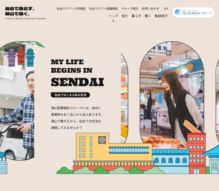
仙台での住まい・暮らし・仕事と介護施設を紹介する地域情報・採用サイト。太い欧文書体、縁取り写真、街並みのイラスト、淡い配色が特徴。
Koyama Sendai — Style Reference
Everyday life in Sendai, framed by outlined photographs and a brightly illustrated city.
Website: koyama-sendai.org Original URL: https://www.koyama-sendai.org/ Final URL: https://www.koyama-sendai.org/ Page title: “仙台で暮らす、湖山で働く。” Theme: light, with warm beige, pale blue, and turquoise section backgrounds. Inspected: supplied browser evidence dated September 24, 2026, 05:47 JST; retrieval timestamp September 23, 2026, 20:47:02.549 UTC. Viewports: desktop 1440 × 1000 CSS pixels; mobile 390 × 844 CSS pixels. Scope: the current homepage. Screenshots show the opening composition, desktop facilities section, and desktop/mobile footer. Rendered DOM evidence additionally covers news, housing, staff stories, work, consultation support, and group information. Linked pages, open menus, and completed control interactions were not inspected.
The homepage introduces the Sendai presence of 湖山医療福祉グループ through several connected subjects: finding housing, enjoying the city, working in care, choosing facilities, and contacting advisers. It is a regional information and recruitment gateway with multiple destinations.
Its strongest visual relationship is between exceptionally heavy English slab-serif lettering and approachable Japanese sans-serif text. Photographs show people shopping, attending local activities, and enjoying ordinary life. Narrow black outlines connect these photographs to flat illustrations of buildings, trees, a monument, and festival decorations. Warm beige gives the opening room to breathe; pale blue and turquoise distinguish later sections.
The desktop design is panoramic. Photographs continue beyond the viewport, while a solid beige text panel interrupts the opening strip. On mobile, the introduction moves above the photographs, the brand becomes a compact horizontal mark, and persistent navigation moves to the bottom edge. Preserve this change in composition rather than shrinking the desktop layout uniformly.
閉じる
Koyama Sendai — Style Reference
Everyday life in Sendai, framed by outlined photographs and a brightly illustrated city.
Website: koyama-sendai.org Original URL: https://www.koyama-sendai.org/ Final URL: https://www.koyama-sendai.org/ Page title: “仙台で暮らす、湖山で働く。” Theme: light, with warm beige, pale blue, and turquoise section backgrounds. Inspected: supplied browser evidence dated September 24, 2026, 05:47 JST; retrieval timestamp September 23, 2026, 20:47:02.549 UTC. Viewports: desktop 1440 × 1000 CSS pixels; mobile 390 × 844 CSS pixels. Scope: the current homepage. Screenshots show the opening composition, desktop facilities section, and desktop/mobile footer. Rendered DOM evidence additionally covers news, housing, staff stories, work, consultation support, and group information. Linked pages, open menus, and completed control interactions were not inspected.
The homepage introduces the Sendai presence of 湖山医療福祉グループ through several connected subjects: finding housing, enjoying the city, working in care, choosing facilities, and contacting advisers. It is a regional information and recruitment gateway with multiple destinations.
Its strongest visual relationship is between exceptionally heavy English slab-serif lettering and approachable Japanese sans-serif text. Photographs show people shopping, attending local activities, and enjoying ordinary life. Narrow black outlines connect these photographs to flat illustrations of buildings, trees, a monument, and festival decorations. Warm beige gives the opening room to breathe; pale blue and turquoise distinguish later sections.
The desktop design is panoramic. Photographs continue beyond the viewport, while a solid beige text panel interrupts the opening strip. On mobile, the introduction moves above the photographs, the brand becomes a compact horizontal mark, and persistent navigation moves to the bottom edge. Preserve this change in composition rather than shrinking the desktop layout uniformly.
How to Read This Reference
- Measured means a value is present in the supplied computed styles or element rectangles. Measurements describe the captured state, not an inferred stylesheet rule.
- Derived means a value is calculated from those rectangles, such as the gap between two cards.
- Visual estimate means a color, outline, crop, or dimension is judged from the current-page screenshots. Estimated hex values are practical approximations, not sampled source declarations.
- Recommendation means implementation guidance for a new build. Breakpoints, accessibility additions, and the Quick Start are recommendations unless explicitly identified otherwise.
- Token names in this document are new implementation aliases. The supplied custom-property collections are empty; no original CSS variable names were established.
- Nested text, image lettering, and pseudo-elements were not comprehensively sampled. A wrapper’s computed font size does not always describe the visible label inside it.
- No additional browsing or asset retrieval was performed for this reference.
Tokens — Colors
Default Palette
| Name | Value | Suggested token | Evidence and role |
|---|---|---|---|
| Warm beige | #EDE3DA |
--ks-paper |
Measured: body background rgb(237, 227, 218) at both viewports. Main opening canvas and visible header surface. |
| Soft black | #171717 |
--ks-ink |
Measured: body and display-heading color; also the sampled circular carousel-button background. |
| Link black | #000000 |
--ks-link |
Measured: many navigation and content anchors. Keep its distinction from the slightly softer body ink subtle. |
| White | #FFFFFF |
--ks-white |
Measured: desktop group-logo capsule background. Also visibly used for badges, partner banners, and reversed details. |
| Pale sky | Approximately #C4E9F8 |
--ks-sky |
Visual estimate: facilities background and the visible end of the preceding work section. |
| Turquoise | Approximately #7ECAC3 |
--ks-teal |
Visual estimate: footer field; a similar hue marks the active mobile navigation item. |
| Building yellow | Approximately #FFD479 |
--ks-yellow |
Visual estimate: prominent station-like building in the city illustration. |
| Building coral | Approximately #FF6C58 |
--ks-coral |
Visual estimate: illustrated building and one facility-photo backplate. |
| Architectural cyan | Approximately #2DBFE5 |
--ks-cyan |
Visual estimate: roofs, windows, and other city details. |
| Leaf green | Approximately #A7D3A5 |
--ks-green |
Visual estimate: foliage and a facility-photo backplate. |
The estimated illustration colors belong primarily to artwork and occasional photo backplates. They are not an interchangeable set of primary button colors.
Section Color Behavior
The page uses broad, flat color fields rather than a separate white panel behind every piece of content. The facilities cards sit directly on pale blue. Footer captions and legal links appear in white on turquoise. Photographs retain their natural colors, while black outlines hold the mixed visual materials together.
There is no evidence of a user-selectable theme or dark mode. The visible palette changes are section treatments.
Tokens — Typography
Ultra — English Display Lettering
- Measured family:
Ultra. - Measured computed weight:
500on sampled English display paragraphs. - Character: very heavy slab serifs, broad feet, compact counters, and an almost sign-painted presence.
- Roles: the opening English headline, major English section labels, and visually similar footer copyright lettering.
- Implementation alias:
--ks-font-display: 'Ultra', Georgia, serif; Georgia and serif are recommended fallbacks, not observed source fallbacks.
The computed weight does not establish which font-file weights were loaded. The family itself supplies the distinctive heaviness; do not automatically add an extra-black synthetic weight.
Zen Kaku Gothic New — Japanese Interface and Copy
- Measured family:
"Zen Kaku Gothic New", sans-serif. - Default:
14px, weight500, line height25.2px. - Roles: navigation, descriptions, card metadata, names, and Japanese headings.
- Measured emphasis: housing and facility names use weight
700; sampled staff names use weight500. - Implementation alias:
--ks-font-body.
Japanese copy is relatively compact but generously led. The introductory paragraph uses a particularly open 2 line-height ratio and slightly negative tracking.
Type Scale
| Role | Desktop | Mobile | Evidence |
|---|---|---|---|
| Default body | 14px / 25.2px, weight 500 |
Same | Measured |
| Utility navigation | 14px / 25.2px, weight 500 |
Desktop row not visible | Measured desktop |
| Primary desktop navigation | 16px / 28.8px, weight 500 |
Replaced by bottom navigation | Measured desktop |
| Hero preface, “MY LIFE BEGINS IN” | 32px / 40.992px; wraps to two lines |
16px / 20.496px; one line |
Measured |
| Hero place name, “SENDAI” | 56px / 71.008px |
40px / 50.72px |
Measured |
| Hero description | 16px / 32px, tracking -0.8px |
14px / 28px, tracking -0.7px |
Measured |
| Main English section lettering | 56px / 67.2px |
40px / 48px |
Measured parent elements |
| Japanese section-heading wrapper | 21px / 31.5px, weight 700 |
Same | Measured wrapper; visible nested badge can be smaller |
| News headline | 16px / 24px, weight 500 |
Same | Measured |
| Housing name | 20px / 32px, weight 700 |
18px / 28.8px, weight 700 |
Measured |
| Staff name | 24px / 31.92px, weight 500 |
20px / 26.6px, weight 500 |
Measured |
| Facility name | 18px / 27px, weight 700 |
Same in sampled cards | Measured |
| Section destination link | 16px / 28.8px, weight 500 |
Same | Measured |
| Facility service badge | Approximately 12px |
Not visually inspected | Desktop visual estimate |
| Mobile bottom-navigation caption | Not present | Approximately 10–11px |
Visual estimate |
Nested-label caveat: the hero’s Japanese H1 wrapper reports 28px / 42px on desktop and 0px / 0px on mobile, while the Japanese label remains visible inside a black badge. Its inner rendering was not included in the sampled styles. Reproduce the visible badge with readable text; do not copy font-size: 0 onto the actual label.
Similarly, the visible “IN SENDAI” suffix in the desktop facilities heading is much smaller than “FACILITIES,” approximately 24–26px. Its parent reports 56px; the suffix’s own computed style was not supplied.
Heading Composition
Use English as a strong visual signpost and Japanese as the immediate explanation. On desktop, the hero preface breaks into “MY LIFE” and “BEGINS IN,” followed by the substantially larger place name. On mobile, the preface becomes one compact line.
Several section titles omit the visible “IN SENDAI” suffix on mobile: the rendered text presents “LIVE,” “LIFESTYLE,” “WORKSTYLE,” and “FACILITIES.” The element text can still contain the longer phrase, so distinguish visible responsive content from raw text extraction.
The source root font size is 10px. The Quick Start uses explicit pixel values and does not require changing a project’s conventional root size.
Tokens — Spacing & Shapes
Spacing Scale
| Use | Value | Status |
|---|---|---|
| Mobile content gutter | 16px |
Measured |
| Desktop header side inset | 40px |
Measured |
| Desktop navigation-link gap | 24px |
Derived from adjacent anchor rectangles |
| Desktop main container | 1100px, centered |
Measured: x = 170 at 1440px |
| Desktop news column | 800px, centered |
Measured: x = 320 |
| Housing column gap | 40px |
Derived from two 530px cards |
| Housing vertical stagger | 40px |
Derived desktop offset |
| Mobile housing-card gap | 24px |
Derived |
| Repeated desktop section trailing space | 120px |
Derived for hero, news, housing, and lifestyle wrappers |
| Mobile section trailing space | 40px in sampled news, housing, and lifestyle sections |
Derived |
| Mobile hero trailing space | 60px |
Derived |
| Facility image-to-title space | Approximately 24px |
Derived from square-image extent and title position |
| Facility rail gap | 88px desktop |
Derived: 396px stride minus 308px card |
| Staff rail gap | 135px desktop |
Derived: 669px stride minus 534px card |
Border Radius and Outlines
| Element | Treatment | Evidence |
|---|---|---|
| Group-logo capsule | 9999px radius; 10px padding |
Measured |
| Carousel previous/next buttons | 100% radius; 48 × 48px |
Measured |
| Section destination arrow | Black circle, approximately 64px diameter |
Visual estimate supported by 64px-high link rectangles |
| Hero photographs | Tall capsule-shaped windows with thin black outlines | Screenshot; approximately 2px stroke |
| Facility photographs | Alternating rounded square, asymmetric curved shape, and circle | Screenshot |
| Facility backplates | Same silhouette, shifted roughly 8px right/down |
Visual estimate |
| Service badges | White fill, thin black outline, fully rounded ends | Screenshot |
| Japanese section labels | Compact white outlined tabs with rounded lower corners | Screenshot |
| Hero Japanese label | Black badge with rounded ends and a relatively square upper-left corner | Screenshot |
The photo silhouettes are a repeatable design system. They should vary deliberately within a rail while retaining a common image size, outline weight, and crop quality.
Layout Measurements
| Element | Desktop: 1440 × 1000 | Mobile: 390 × 844 |
|---|---|---|
| Header | 120px high |
76px high |
| Brand wrapper | 253 × 89px, x = 40 |
Approximately 190 × 27.9px, x = 100 |
| Main starts | y = 200px |
y = 76px |
| Hero scene wrapper | 644px high |
Approximately 518.2px high |
| Hero including trailing space | 764px high |
Approximately 578.2px high |
| Introductory text width | 260px, x ≈ 302.3 |
358px, x = 16 |
| First news section starts | y = 964px |
y ≈ 654.2px |
| Housing cards | 530px wide |
358px wide |
| Staff-story card | 534px wide |
314px wide |
| Facility card | 308px wide |
314px wide |
| Sampled document height | Approximately 8534.4px |
Approximately 8201.6px |
Document heights are capture-specific. Text changes, font loading, and carousel layout can alter them; do not make them fixed implementation targets.
Components
Persistent Header
Role: maintain identity while exposing the site’s two navigation levels.
The desktop header has three main regions: a black Japanese brand graphic at left, two right-aligned navigation rows in the middle, and a white group-logo capsule at right. The upper row contains admission advice, employment advice, group information, contact, and “EN.” The lower row contains “トップ,” “住む,” “暮らす,” “働く,” and “施設紹介.” A small dark dot appears beneath the current home item.
The group capsule measures 245 × 56px and links to the group website. The “EN” anchor points to Google Translate; the evidence does not establish a separate native English site.
The header remains at the top in the scrolled screenshots. A thin dark bottom boundary is visible in those views. Its sampled header background is transparent, so the screenshot’s beige bar may be supplied by another layer or state. Fixed versus sticky positioning was not recorded.
On mobile, only the centered horizontal brand graphic is visible in the header. This is a different brand arrangement, not merely the desktop two-line graphic scaled down.
Panoramic Hero
Role: introduce the connection between city life and care work through real people.
The desktop scene begins at y = 200, leaving 80px between the measured header height and the scene. Tall photographic capsules continue horizontally across the screen. A beige foreground panel interrupts this strip, creating a quiet reading island without a visible border or shadow.
The text column is only 260px wide. It contains the two-line English preface, large “SENDAI,” the Japanese black badge, and a four-line introductory paragraph. The solid panel appears approximately 420px wide, with roughly 80px between its left edge and the text; those panel dimensions are visual estimates.
A festival decoration enters from the upper-left edge. The city illustration crosses the bottom of the photographs and panel. Treat these as separate compositional layers: photographs behind, copy panel in front of photographs, city artwork along the lower foreground.
On mobile, the copy is full-width within 16px gutters and precedes the photo strip. The paragraph ends around y = 280; photographs begin around y = 304. The visible capsules are approximately 156 × 290px, with narrow gaps. The city overlaps their lower edge and ends near y = 594. The opening remains an editorial introduction; no large primary conversion button appears inside it.
Illustrated Cityscape
Role: connect the page to place and visually close major compositions.
The artwork combines a yellow station-like building, blue architectural details, a coral tower, a blue-roofed pavilion, an equestrian monument, and scalloped green shrubs. Thin dark strokes unify the buildings and vegetation. Colors are flat, with little or no modeled shading.
The skyline appears at the bottom of both the hero and footer. Desktop artwork occupies approximately 200px vertically. Mobile uses a smaller, horizontally cropped composition, approximately 80–100px high in the supplied views. Preserve meaningful building proportions and let the crop change; do not compress the full panorama into an illegible miniature.
The original file format, asset boundaries, and whether the scene is assembled from multiple files are unknown.
Section Heading and Destination Link
Role: make the long homepage easy to scan while providing a route into each subject.
The heading combines an oversized Ultra English label and a much smaller Japanese outlined tab. On desktop, a destination link sits toward the right edge of the content container. Its anatomy is plain Japanese text, generous horizontal separation, and a black circular arrow.
Measured destination links are 64px high. Their widths vary with the label: the facilities link is 200px, housing and work links are 216px, news is 232px, and lifestyle is 264px. This is a content-sized link, not a fixed-width pill.
On mobile, section headings are centered and destination links move below their content. The circular-arrow scale is retained.
News List
Role: offer recent updates without competing with the image-led sections.
The desktop list occupies an 800px column within the 1100px container. It contains three linked rows with a headline, category, and date. Sampled rows are 128px high and use padding 24px 56px 24px 16px. A fine divider separates rows.
Mobile rows occupy 358px, use 16px 24px 16px 0, and grow from 92px to approximately 113px when the headline wraps. The list-wide destination link moves below the rows.
The first sampled row has a category and date but no extracted headline. Do not invent a missing headline when reconstructing supplied content. Exact thumbnail and trailing-icon details were not independently visible in these screenshots.
Housing Cards
Role: introduce available staff accommodation and its associated organization.
The DOM establishes two large linked cards, each combining imagery with a title, description, and organization label. Desktop cards measure approximately 530 × 458.9px, with a 40px horizontal gap. The second starts 40px lower, producing a deliberate stagger.
The title and description occupy an inset text region. The measured desktop left inset is 34px; mobile is 18px. Titles use 20px desktop and 18px mobile. Descriptions remain 14px / 25.2px, with 16px of top padding.
On mobile, the cards stack at 358px wide with a 24px gap. Their heights differ with copy length. The supplied screenshots do not show their complete surfaces, so specific image masks, background colors, and decorative edges should not be treated as verified.
Lifestyle Story Carousel
Role: connect staff identities with their lives in Sendai.
Each story link contains a facility name, person’s name, joining year, job role, and “詳しく見る.” Seven distinct profiles are present. Repeated entries and offscreen positions establish a carousel structure; repeated DOM entries are not additional staff profiles.
Desktop cards are 534px wide with a 669px stride. The centered sampled card begins at x = 453. Its information block is 280px wide and aligned to the card’s right edge. Mobile cards are 314px wide, centered at x = 38; their information block is approximately 219.8px wide, or 70% of the card.
Previous and next buttons are black 48px circles. Mobile adds seven numbered button nodes with 10px layout boxes and zero-size text. These support pagination markers; the numerals should not be assumed to appear visibly as text.
The provided screenshots do not show the full story-card composition. The measurements establish its layout and information hierarchy, but not the complete image mask or overlap treatment.
Work Introduction
Role: explain the breadth of local employment opportunities before the facilities directory.
The desktop text is centered. The descriptive paragraph measures 530px wide and uses 16px / 32px. Its mobile counterpart is 358px wide and retains that same type size and line height.
The section has substantially more vertical breathing room on desktop: its English heading begins 240px below the section’s top, compared with 72px on mobile. These offsets are measured positions, not a proven padding declaration.
The visible area immediately above the facilities section includes an outlined white cloud and a cloud-shaped photograph of a staff member. Use that as evidence of the local illustration vocabulary, not as a complete map of the unseen work section.
Facilities Carousel
Role: help visitors compare care facilities and follow links to detailed entries.
This is the most fully evidenced content-card system. A pale-blue background supports a horizontal rail extending beyond both viewport edges. At desktop width, three complete cards fit between the clipped neighbors.
Each card contains:
- A roughly square architectural photograph with a thin black outline.
- An offset colored backplate that follows the photograph’s silhouette.
- An
18px / 27px, weight-700 facility name. - One or more small white service-category pills.
- A fine dashed divider.
- A muted district hashtag at left and “詳しく見る” with an external-link symbol at right.
Desktop cards are 308px wide with an 88px gap. The image is approximately 308px square; titles begin 332px below the card top, supporting a 24px image-to-title gap. Visible masks alternate between a softly rounded square, a shape with two large opposing curves, and a circle. Backplates use different pastel or coral fills without changing the text treatment.
Card heights vary with title wrapping and badge count, approximately 475–514px in the sampled desktop entries. The divider and metadata follow each card’s own content; they are not all aligned to one forced baseline.
The mobile DOM shows 314px-wide cards, previous/next controls, six pagination controls, and a destination link after the rail. The full mobile facility section was not pictured, so its image silhouette and exact control appearance are not independently confirmed.
Facility anchors point to an external group catalog. The external-link symbol reflects a real destination change; opening in a new tab was not verified.
Consultation Support
Role: distinguish admission assistance from employment assistance.
The “CONCIERGE” section contains two separate linked routes. One helps people find a care facility; the other helps people find a workplace. Each includes named representatives from four organizations.
This content separation is directly supported by the DOM. The supplied screenshots and sampled element list do not establish the complete panel geometry, portrait arrangement, or backgrounds. For an extension, retain two clearly labeled paths and reuse the established heading, outline, and arrow vocabulary. Do not invent an embedded form or chat interaction.
Group Introduction and Organization Directory
Role: provide institutional context after the city and staff stories.
The DOM includes “ABOUT KOYAMA,” a Japanese mission statement, a short group introduction, a group-page link, and four organization entries with descriptions and external links. This provides a distinct informational layer beyond recruitment.
The original page names 湖山医療福祉グループ and links to its website. Production authorship is not established by the inspected homepage evidence. The unseen group section’s exact card styling should remain unspecified.
Partner Links and Footer
Role: connect visitors to related information, institutional resources, and legal navigation.
The desktop footer uses a broad turquoise field. Five resource links form a four-column grid with the fifth item beginning a second row. Visible white banner rectangles are approximately 245 × 90px; the horizontal gap is approximately 40px. Each banner has a small dark external-link marker at its lower-right corner and a white descriptive caption beneath.
The resources include the group website, a healthcare publication, a welfare information service, and two YouTube channels. Preserve their supplied brand graphics rather than recreating them as generic text buttons.
Below the grid, copyright is left-aligned and four utility links sit in a horizontal row toward the right. The skyline closes the bottom of the footer.
Mobile uses two columns: approximately 171px each with a 16px gap and 16px outer gutters. Legal navigation becomes a centered vertical list. Copyright follows it, also centered, before the cropped skyline. The supplied mobile capture begins partway through the resource grid; earlier items remain present in the DOM.
Mobile Bottom Navigation
Role: keep the principal sections within reach while scrolling.
A white bar occupies approximately the bottom 70px of the 390 × 844 captures. It has five equal-width cells: home, housing, lifestyle, work, and menu. Each uses an icon above a small label. Fine vertical separators divide the white cells. The active home item uses turquoise and a thin turquoise top edge; the menu cell is black with white details.
The DOM includes additional menu links for facilities, consultation routes, group information, contact, privacy, and sitemap. Their presence does not establish what the opened menu looks like. Menu opening, focus handling, and animation were not exercised.
Floating Recruitment Promotion
Role: present a separate recruitment campaign without occupying normal document flow.
A photographic recruitment banner appears near the lower-right corner of the desktop hero and facilities captures. It is approximately 300 × 197px, with a fine tan border, a slight shadow, and a blue circular close glyph overlapping its upper-right edge.
On mobile it becomes approximately 200 × 132px, sits about 24px from the right edge, and clears the bottom navigation. In the opening capture it partly covers the news heading. The DOM links the banner to a group event page.
The banner is absent from the supplied footer screenshots. Its dismissal behavior, persistence, and possible scroll rules are unverified. Do not infer that a close click occurred or that it automatically hides near the footer.
Tokens — Motion & Interaction
| Treatment | Evidence | What can be concluded |
|---|---|---|
| General anchor transition | Sampled anchors report 0.3s |
A transition is declared; the changed properties and hover endpoints are not established. |
| Carousel arrow transition | opacity 0.2s ease-in-out |
Opacity feedback is defined for these buttons; its exact state values are unknown. |
| Mobile pagination transition | opacity 0.2s ease-in-out |
Pagination has the same reported transition. |
| Lifestyle and facility rails | Offscreen cards, duplicate entries, navigation controls | Carousel structure is supported; autoplay, speed, dragging, and looping behavior were not directly exercised. |
| Persistent header and mobile navigation | Consistent positions across scrolled captures | Their persistent presentation is visible; source positioning rules were not included. |
| Hero photo strip | Different portions and subjects visible across viewport captures | Responsive cropping is evident; these stills do not establish a motion direction or interval. |
| Promotion close control | Visible close glyph | An affordance is present; dismissal and persistence are unverified. |
| Mobile menu | Menu control and additional navigation nodes | A menu route exists; open-state visuals and behavior are unverified. |
Many sampled elements report animation: none. This does not prove the page is motionless: a track can move through an ancestor, a transform, or JavaScript outside the sampled nodes.
The capture process waited for visible layout and image stability and temporarily paused perpetual animations during readiness checks. The supplied evidence is therefore suitable for settled layout analysis, not for reconstructing an animation timeline.
Recommended adaptation: use restrained opacity feedback around 200–300ms. If continuous photo movement or autoplay is introduced, provide a pause mechanism and a reduced-motion alternative. Those additions are not verified original features.
Surfaces
| Layer | Appearance | Purpose |
|---|---|---|
| Opening canvas | Flat warm beige | Supports dense black typography and natural photography. |
| Hero reading panel | Same beige as the canvas | Interrupts the photo panorama without introducing a conventional card. |
| Facilities field | Flat pale blue | Separates the directory and connects it to the visible cloud imagery. |
| Footer field | Flat turquoise | Provides a strong closing section behind resources and legal links. |
| Image boundary | Thin black outline | Connects photographic and illustrated material. |
| Image backplate | Flat offset color with outline | Creates playful depth without a blurred elevation shadow. |
| Small labels | White or black, thin outline or reversed text | Adds hierarchy without large colored buttons. |
| Navigation arrow | Black circle with white arrow | Supplies a consistent directional action. |
| Campaign banner | White photographic rectangle with subtle shadow | A separate promotional layer; an exception to the otherwise flat surface system. |
Avoid interpreting the warm background as a visible paper texture. The inspected surfaces are predominantly solid colors.
Imagery
The photography is local and documentary in feeling: people at shops, a baseball outing, a festival activity, and recognizable care-facility buildings. Faces remain large enough to read inside narrow masks. Buildings are shown with useful architectural context, including entrances, façades, surrounding planting, and sky.
The hero emphasizes life outside work. That choice is central to the page’s premise. A replacement set consisting entirely of medical equipment or posed clinical staff would lose the connection between employment and daily life in the city.
Illustrations use crisp dark outlines, flat fills, simplified windows, broad roofs, and rounded foliage. The same visual grammar appears in festival decorations, clouds, and the cityscape. Photograph masks are similarly outlined, making the mixed media feel coherent.
Observed Asset References
No original image src values, asset filenames, or font-file URLs were supplied. The following are asset roles observed in the current captures, not downloadable paths.
| Asset role | Location | Treatment |
|---|---|---|
| Desktop site mark | Header | Black Japanese graphic with a small English subtitle; two-line Japanese arrangement. |
| Mobile site mark | Header | Compact horizontal Japanese graphic and English subtitle. |
| Group logo | Desktop header and footer resource grid | Original blue logo on white. |
| Lifestyle photographs | Hero | Natural color, tall outlined capsule crops. |
| Festival decoration | Desktop hero upper-left | Flat illustrated hanging ornaments and a green branch. |
| City panorama | Hero and footer | Multicolor architectural illustration with thin dark linework. |
| Facility photographs | Facilities rail | Square source area adapted to multiple outlined silhouettes. |
| Cloud imagery | Visible work/facilities transition | Outlined cloud forms, including one photographic window. |
| Partner banners | Footer | White rectangular brand panels with external-link markers. |
| Recruitment campaign | Floating promotion | Photographic banner containing campaign lettering and flags. |
Use authorized photography and original brand assets where available. Keep faces and important architectural details away from aggressively curved crop boundaries. Decorative city art can use empty alternative text; meaningful photographs and image links need useful text alternatives in a new implementation.
Layout & Responsive Behavior
| Pattern | Desktop observation | Mobile observation |
|---|---|---|
| Global navigation | Brand, two navigation rows, group capsule | Compact centered brand plus five-cell bottom bar |
| Hero copy | Narrow panel embedded in a panoramic image scene | Full-width introduction above a separate image strip |
| Hero English headline | 32px preface and 56px place name | 16px preface and 40px place name |
| Section headings | Generally left-aligned, with destination link at right | Centered, shortened English labels |
| Destination links | Adjacent to section heading | Below section content |
| Housing | Two staggered 530px cards | One column of 358px cards |
| Lifestyle | Centered 534px card with neighboring content visible | Centered 314px card and pagination controls |
| Facilities | Several 308px cards across a wide rail | One centered 314px card in the sampled DOM |
| Footer resource grid | Four columns | Two columns |
| Footer utilities | Horizontal row beside copyright | Centered vertical links above copyright |
| Promotion | Approximately 300px wide | Approximately 200px wide, above bottom navigation |
The desktop content width is restrained even though photographic rails and illustrations span the viewport. At 1440px, the standard container leaves 170px margins; the narrower news content leaves 320px margins. These margins are part of the calm visual rhythm.
The mobile layout preserves the oversized display character while reducing the amount of English text. It does not solve every width problem by reducing all type. Body text remains 14px in most sections, and the work paragraph remains 16px.
Only two viewport widths were supplied. Original breakpoints, tablet behavior, landscape layouts, zoom behavior, and safe-area handling are unknown. The Quick Start’s breakpoints are practical recommendations. Reserve space for persistent mobile navigation so the final links and skyline remain reachable.
Do’s and Don’ts
Do
- Preserve the measured beige
#EDE3DAand ink#171717as the opening foundation. - Use Ultra for the heavy English signposts and Zen Kaku Gothic New for Japanese text.
- Keep the introduction focused on people and everyday city life.
- Combine natural-color photographs with crisp outlined masks.
- Alternate facility-photo silhouettes while keeping their dimensions consistent.
- Use flat colored backplates with hard edges and modest offsets.
- Keep large section color fields and generous desktop spacing.
- Retain separate admission and employment consultation paths.
- Recompose the hero and navigation for mobile.
- Let card heights respond to long Japanese names and multiple service badges.
- Reuse the city illustration as an opening and closing visual motif.
Don’t
- Don’t reduce the homepage to a single conversion funnel; its directory and editorial destinations are essential.
- Don’t replace every content grouping with a white rounded card and soft shadow.
- Don’t use Ultra for long Japanese paragraphs or routine metadata.
- Don’t turn all illustration colors into competing CTA colors.
- Don’t shrink the full city panorama until its details become unreadable on mobile.
- Don’t force every photograph into the same generic rounded rectangle.
- Don’t mistake duplicate carousel nodes for additional content.
- Don’t reproduce zero-size wrapper text as an accessibility technique without understanding the inner content.
- Don’t invent autoplay timing, hover transformations, menu transitions, or banner-dismissal persistence.
- Don’t use estimated colors or inferred geometry as if they were measured stylesheet values.
Recommended Implementation Additions
These recommendations describe a new implementation, not verified behavior of the inspected site.
- Give the mobile menu button an accessible name,
aria-expanded, and an explicit relationship to its controlled panel. Support Escape and sensible focus restoration. - Keep carousel controls keyboard-operable and prevent inactive duplicate slides from adding repeated focus stops.
- Expand small pagination dots and the promotion’s close glyph to at least a 44px interaction target while retaining their smaller visible shapes.
- Provide pause and reduced-motion behavior if automatic carousel movement is used.
- Test the white footer text and turquoise active-navigation color for sufficient contrast. Darker text or a darker supporting color can preserve the palette while improving readability.
- Make the recruitment promotion dismissible and ensure it does not obscure essential navigation or focused content.
- Preserve a logical heading hierarchy even when English and Japanese text are visually reordered.
- Give images explicit dimensions and responsive sources. Prioritize the opening photographs and defer below-the-fold imagery without shifting card geometry.
- Make external destinations understandable from link text or accessible naming; do not rely only on a tiny external-link icon.
- Test long staff names, facility names, translation output, text zoom, and narrow screens before fixing card heights.
Agent Prompt Guide
Quick Color Reference
- Opening canvas: measured
#EDE3DA. - Main ink and circular controls: measured
#171717. - Anchor text: measured
#000000where sampled. - White labels and logo surfaces:
#FFFFFF. - Facilities field: approximate
#C4E9F8. - Footer field: approximate
#7ECAC3. - Illustration accents: approximate yellow
#FFD479, coral#FF6C58, cyan#2DBFE5, and green#A7D3A5. - Depth: outlined, offset color shapes; soft shadows are limited to the separate campaign banner.
Overall Prompt
“Create a regional healthcare and recruitment homepage connecting housing, everyday city life, staff stories, facilities, and consultation support. Use warm beige #EDE3DA, near-black #171717, Ultra English display lettering, and Zen Kaku Gothic New Japanese text. On desktop, place a narrow introduction inside a beige panel interrupting a full-width strip of tall outlined lifestyle photographs. Overlap their lower edge with a flat, black-outlined city illustration. Use broad pale-blue and turquoise section fields, varied facility-photo silhouettes, white service pills, dashed metadata dividers, and plain text links paired with black circular arrows. Recompose mobile into stacked introductory copy, a cropped photo strip, centered section headings, and persistent five-cell bottom navigation. Keep admission and employment advice as separate routes.”
Example Component Prompts
- Hero: “Create a beige panoramic opening with approximately 310px-wide capsule photographs on desktop. Place a 260px text column inside a wider solid beige interruption. Set ‘MY LIFE BEGINS IN’ in 32px Ultra and ‘SENDAI’ in 56px Ultra, followed by a black Japanese badge and 16px text with 32px leading. Add a flat illustrated city along the bottom. On mobile, place the text above approximately 156 × 290px photo windows.”
- Facility card: “Create a 308px-wide facility link on pale blue. Use a square architectural photo clipped into a rounded square, opposing-corner curve, or circle, with a 2px dark outline and an approximately 8px colored backplate offset. Add an 18px bold Japanese name, white outlined service pills, a dashed divider, a district hashtag, and a detail label with an external-link symbol.”
- Section heading: “Pair a heavy 56px Ultra English title with a small white outlined Japanese tab beneath. Put a content-sized Japanese destination link at the opposite side, ending in a 64px black arrow circle. At mobile width, use 40px display text, center the heading, and move the destination link below the content.”
- Footer: “Use a flat turquoise field with four desktop columns of white partner banners and white captions; use two columns on mobile. Place legal navigation and copyright beneath, then close the page with the same outlined city panorama used in the hero. Keep the mobile skyline cropped and readable above the bottom navigation.”
- Mobile navigation: “Create a persistent 70px bottom bar with five equal cells. Use small icons above Japanese labels, white backgrounds, fine separators, turquoise home selection, and a black menu cell. Keep the interaction targets large despite the compact visible captions.”
Quick Start
CSS Custom Properties
This is an implementation scaffold, not extracted source CSS. It uses measured colors, fonts, type sizes, and endpoint dimensions, plus explicitly approximate illustration colors and masks. The 1216px navigation breakpoint and 768px content breakpoint are recommendations; the original breakpoints are unknown.
Supply the two font families and authorized artwork through the project’s own asset pipeline. Declaring their names below does not load them. Hero imagery, brand variants, city artwork, menu state, and carousel controls require real assets or application behavior.
Expected hero anatomy: .hero-scene contains .hero-track, .hero-copy, and a decorative .cityscape image. A facility link contains .facility-frame, its title, service badges, and metadata. The CSS rail is a usable horizontal-scroll fallback; it does not recreate an unverified autoplay system.
:root {
  /* Measured foundation */
  --ks-paper: #ede3da;
  --ks-ink: #171717;
  --ks-link: #000;
  --ks-white: #fff;
  --ks-font-body: 'Zen Kaku Gothic New', sans-serif;
  --ks-font-display: 'Ultra', Georgia, serif;

  /* Approximate screenshot colors */
  --ks-sky: #c4e9f8;
  --ks-teal: #7ecac3;
  --ks-yellow: #ffd479;
  --ks-coral: #ff6c58;
  --ks-cyan: #2dbfe5;
  --ks-green: #a7d3a5;

  /* Measured endpoint dimensions */
  --ks-content: 1100px;
  --ks-news: 800px;
  --ks-header: 120px;
  --ks-display-size: 56px;
  --ks-section-space: 120px;
  --ks-mobile-bar: 70px;
  --ks-safe-bottom: env(safe-area-inset-bottom, 0px);
}

* { box-sizing: border-box; }
body {
  margin: 0;
  color: var(--ks-ink);
  background: var(--ks-paper);
  font: 500 14px/1.8 var(--ks-font-body);
}
h1, h2, h3, p, figure { margin: 0; }
img { display: block; max-width: 100%; }
a { color: var(--ks-link); text-decoration: none; }
button { font: inherit; cursor: pointer; }
[hidden] { display: none !important; }

.container {
  width: min(var(--ks-content), calc(100% - 32px));
  margin-inline: auto;
}
.news-container {
  width: min(var(--ks-news), calc(100% - 32px));
  margin-inline: auto;
}
.page-main { padding-top: 200px; }
.section { padding-bottom: var(--ks-section-space); }

/* Persistent header: recommended positioning implementation. */
.site-header {
  position: fixed;
  inset: 0 0 auto;
  z-index: 50;
  height: var(--ks-header);
  display: grid;
  grid-template-columns: 253px minmax(0, 1fr) 245px;
  align-items: center;
  gap: 32px;
  padding-inline: 40px;
  background: var(--ks-paper);
}
.brand-desktop { width: 253px; }
.brand-mobile { display: none; }
.header-nav { display: grid; gap: 8px; justify-items: end; }
.utility-nav, .primary-nav {
  display: flex;
  align-items: center;
  gap: 24px;
  white-space: nowrap;
}
.utility-nav { font-size: 14px; }
.primary-nav { font-size: 16px; }
.primary-nav a { position: relative; }
.primary-nav [aria-current='page']::after {
  content: '';
  position: absolute;
  left: calc(50% - 3px);
  bottom: -12px;
  width: 6px;
  height: 6px;
  border-radius: 50%;
  background: var(--ks-ink);
}
.group-logo {
  display: block;
  width: 245px;
  padding: 10px;
  border-radius: 9999px;
  background: var(--ks-white);
}

/* Approximate reconstruction of the photographed hero layers. */
.hero { padding-bottom: 120px; }
.hero-scene {
  position: relative;
  height: 644px;
  isolation: isolate;
  overflow: clip;
}
.hero-track {
  position: absolute;
  top: 0;
  left: 34px;
  display: flex;
  gap: 58px;
  width: max-content;
}
.hero-photo {
  flex: 0 0 310px;
  width: 310px;
  height: 580px;
  overflow: hidden;
  border: 2px solid var(--ks-ink);
  border-radius: 999px;
}
.hero-photo img { width: 100%; height: 100%; object-fit: cover; }
.hero-copy {
  position: absolute;
  z-index: 2;
  top: 0;
  left: max(16px, calc(50% - 498px));
  width: 420px;
  height: 100%;
  padding: 80px;
  background: var(--ks-paper);
}
.hero-prefix, .hero-place, .display-heading {
  font-family: var(--ks-font-display);
  font-weight: 500;
}
.hero-prefix { font-size: 32px; line-height: 1.281; }
.hero-place { font-size: 56px; line-height: 1.268; }
.hero-badge {
  display: table;
  margin-top: 15px;
  padding-inline: 18px;
  border-radius: 0 999px 999px 999px;
  color: var(--ks-white);
  background: var(--ks-ink);
  font-size: 14px;
  line-height: 25px;
}
.hero-description {
  margin-top: 32px;
  font-size: 16px;
  line-height: 2;
  letter-spacing: -0.05em;
}
.cityscape {
  position: absolute;
  z-index: 3;
  bottom: 0;
  left: 50%;
  width: max(100%, 1440px);
  max-width: none;
  transform: translateX(-50%);
  pointer-events: none;
}

.section-heading {
  display: flex;
  align-items: center;
  justify-content: space-between;
  gap: 32px;
  margin-bottom: 64px;
}
.display-heading {
  font-size: var(--ks-display-size);
  line-height: 1.2;
}
.heading-suffix { font-size: 0.45em; }
.section-label {
  display: table;
  padding-inline: 16px;
  border: 2px solid var(--ks-ink);
  border-radius: 0 0 14px 14px;
  background: var(--ks-white);
  font-size: 14px;
  line-height: 1.5;
}
.section-link {
  display: inline-flex;
  align-items: center;
  gap: 24px;
  font-size: 16px;
  line-height: 1.8;
  white-space: nowrap;
}
.section-link::after {
  content: '→';
  display: grid;
  place-items: center;
  flex: 0 0 64px;
  width: 64px;
  height: 64px;
  border-radius: 50%;
  color: var(--ks-white);
  background: var(--ks-ink);
  font-size: 24px;
}
.news-row {
  display: flex;
  gap: 24px;
  min-height: 128px;
  padding: 24px 56px 24px 16px;
  border-top: 1px dashed var(--ks-ink);
}
.news-title { font-size: 16px; font-weight: 500; line-height: 1.5; }
.housing-grid {
  display: grid;
  grid-template-columns: repeat(2, minmax(0, 1fr));
  gap: 40px;
}
.housing-card:nth-child(2) { margin-top: 40px; }
.housing-title { font-size: 20px; line-height: 1.6; }

.facilities { background: var(--ks-sky); }
.facility-track {
  display: flex;
  gap: 88px;
  overflow-x: auto;
  padding: 0 max(16px, calc((100vw - 1100px) / 2)) 16px;
  scroll-snap-type: x proximity;
}
.facility-card {
  flex: 0 0 308px;
  min-width: 0;
  scroll-snap-align: center;
}
.facility-frame {
  --backplate: var(--ks-green);
  position: relative;
  display: block;
  aspect-ratio: 1;
  border-radius: 16px;
}
.facility-frame::before {
  content: '';
  position: absolute;
  inset: 0;
  border: 2px solid var(--ks-ink);
  border-radius: inherit;
  background: var(--backplate);
  transform: translate(8px, 8px);
}
.facility-frame img {
  position: relative;
  width: 100%;
  height: 100%;
  object-fit: cover;
  border: 2px solid var(--ks-ink);
  border-radius: inherit;
}
.facility-frame.is-curved { border-radius: 16px 50% 16px 50%; }
.facility-frame.is-round {
  --backplate: var(--ks-coral);
  border-radius: 50%;
}
.facility-title {
  margin-top: 24px;
  font-size: 18px;
  font-weight: 700;
  line-height: 1.5;
  overflow-wrap: anywhere;
}
.service-tags { display: flex; flex-wrap: wrap; gap: 8px; margin-top: 8px; }
.service-tag {
  padding: 4px 8px;
  border: 1px solid var(--ks-ink);
  border-radius: 999px;
  background: var(--ks-white);
  font-size: 12px;
  line-height: 1.8;
}
.facility-meta {
  display: flex;
  justify-content: space-between;
  gap: 16px;
  margin-top: 24px;
  padding-top: 24px;
  border-top: 1px dashed var(--ks-ink);
}

.site-footer {
  position: relative;
  overflow: clip;
  padding: 80px 0 340px;
  color: var(--ks-white);
  background: var(--ks-teal);
}
.site-footer a { color: inherit; }
.partner-grid {
  display: grid;
  grid-template-columns: repeat(4, minmax(0, 1fr));
  gap: 40px;
}
.partner-logo {
  width: 100%;
  aspect-ratio: 49 / 18;
  object-fit: contain;
  background: var(--ks-white);
}
.partner-caption { margin-top: 16px; }
.footer-meta {
  display: flex;
  align-items: center;
  justify-content: space-between;
  gap: 32px;
  margin-top: 80px;
}
.legal-links { display: flex; gap: 32px; }
.copyright { font-family: var(--ks-font-display); }
.mobile-nav { display: none; }

/* Optional campaign layer; dismissal requires application state. */
.promo {
  position: fixed;
  z-index: 60;
  right: 24px;
  bottom: 24px;
  width: 300px;
  border: 1px solid #bd9d73;
  background: var(--ks-white);
  box-shadow: 0 4px 10px rgb(0 0 0 / 12%);
}
.promo-close {
  position: absolute;
  top: -22px;
  right: -22px;
  display: grid;
  place-items: center;
  width: 44px;
  height: 44px;
  padding: 0;
  border: 0;
  background: transparent;
}
.promo-close::before {
  content: '×';
  display: grid;
  place-items: center;
  width: 22px;
  height: 22px;
  border: 1px solid white;
  border-radius: 50%;
  color: white;
  background: #5ca6bd;
  font: 20px/1 sans-serif;
}

/* Recommended feedback; original hover endpoints are unknown. */
a, button { transition: opacity 300ms ease; }
:focus-visible { outline: 3px solid var(--ks-ink); outline-offset: 5px; }
@media (hover: hover) {
  .section-link:hover, .partner-link:hover { opacity: 0.75; }
}

/* Recommended navigation breakpoint. */
@media (max-width: 76rem) {
  :root { --ks-header: 76px; }
  body { padding-bottom: calc(var(--ks-mobile-bar) + var(--ks-safe-bottom)); }
  .site-header {
    display: flex;
    justify-content: center;
    padding-inline: 16px;
  }
  .brand-desktop, .header-nav, .group-logo { display: none; }
  .brand-mobile { display: block; width: 190px; }
  .mobile-nav {
    position: fixed;
    z-index: 70;
    inset: auto 0 0;
    display: grid;
    grid-template-columns: repeat(5, minmax(0, 1fr));
    min-height: calc(var(--ks-mobile-bar) + var(--ks-safe-bottom));
    padding-bottom: var(--ks-safe-bottom);
    background: var(--ks-white);
  }
  .mobile-nav > * {
    display: grid;
    place-content: center;
    justify-items: center;
    gap: 6px;
    min-height: 70px;
    padding: 8px 2px;
    border: 0;
    color: #777;
    background: var(--ks-white);
    font-size: 10px;
  }
  .mobile-nav [aria-current='page'] {
    color: var(--ks-teal);
    box-shadow: inset 0 1px var(--ks-teal);
  }
  .mobile-nav .menu-trigger { color: white; background: var(--ks-ink); }
  .promo { bottom: calc(86px + var(--ks-safe-bottom)); }
}

/* Recommended content breakpoint; values match the 390px endpoint. */
@media (max-width: 48rem) {
  :root { --ks-display-size: 40px; --ks-section-space: 40px; }
  .page-main { padding-top: 76px; }
  .hero { padding-bottom: 60px; }
  .hero-scene { display: flex; flex-direction: column; height: auto; }
  .hero-copy {
    position: relative;
    top: auto;
    left: auto;
    order: 0;
    width: auto;
    height: auto;
    margin-inline: 16px;
    padding: 0;
  }
  .hero-prefix { font-size: 16px; }
  .hero-place { font-size: 40px; }
  .hero-badge { margin-top: 8px; }
  .hero-description { margin-top: 16px; font-size: 14px; }
  .hero-track {
    position: relative;
    top: auto;
    left: 10px;
    order: 1;
    gap: 6px;
    margin-top: 24px;
  }
  .hero-photo { flex-basis: 156px; width: 156px; height: 290px; }
  .cityscape { width: 720px; }
  .section-heading {
    display: block;
    margin-bottom: 24px;
    text-align: center;
  }
  .section-label { margin-inline: auto; }
  .heading-suffix { display: none; }
  .section-link-row { margin-top: 24px; text-align: center; }
  .news-row { min-height: 92px; padding: 16px 24px 16px 0; gap: 16px; }
  .housing-grid { grid-template-columns: 1fr; gap: 24px; }
  .housing-card:nth-child(2) { margin-top: 0; }
  .housing-title { font-size: 18px; }
  .facility-track { gap: 76px; padding-inline: 38px; }
  .facility-card { flex-basis: calc(100vw - 76px); }
  .partner-grid { grid-template-columns: repeat(2, minmax(0, 1fr)); gap: 24px 16px; }
  .site-footer { padding-bottom: 148px; }
  .footer-meta { flex-direction: column-reverse; text-align: center; }
  .legal-links { flex-direction: column; gap: 12px; }
  .promo { width: 200px; }
}

@media (prefers-reduced-motion: reduce) {
  *, *::before, *::after {
    animation: none !important;
    transition: none !important;
    scroll-behavior: auto !important;
  }
}
For mobile destination-link placement, place the link after its content in a .section-link-row, or use a parent grid to reposition one semantic link between desktop and mobile layouts. Avoid creating duplicate focusable links solely for layout convenience.
The close button needs an accessible label in markup. Carousel pause behavior and stopping JavaScript autoplay under reduced motion also require application logic; CSS alone cannot provide them.
Tailwind v4 Token Mapping
Optional aliases for a project already using Tailwind v4. This does not imply the original site uses Tailwind. Define the custom properties above first.
@theme inline {
  --color-paper: var(--ks-paper);
  --color-ink: var(--ks-ink);
  --color-sky: var(--ks-sky);
  --color-teal: var(--ks-teal);
  --color-city-yellow: var(--ks-yellow);
  --color-city-coral: var(--ks-coral);
  --color-city-cyan: var(--ks-cyan);
  --font-body: var(--ks-font-body);
  --font-display: var(--ks-font-display);
  --text-section: var(--ks-display-size);
  --spacing-section: var(--ks-section-space);
  --spacing-content: var(--ks-content);
  --radius-photo: 16px;
}
Sources & Evidence
- Inspected original and final page: https://www.koyama-sendai.org/. Both URLs are identical in the supplied evidence; the reported response status is 200.
- Evidence date:
2026-09-23T20:47:02.549Z, corresponding to September 24, 2026, 05:47 JST. This is the supplied evidence-batch timestamp, not a new inspection performed while writing this document. - Desktop evidence: 1440 × 1000 viewport; current-page screenshots of the opening, facilities section, and footer; rendered text, links, computed styles, and element rectangles. Reported document height is approximately 8534.4px.
- Mobile evidence: 390 × 844 viewport; current-page opening and footer screenshots; rendered text, links, computed styles, and element rectangles. Reported document height is approximately 8201.6px.
- Capture conditions: the initial observation lasted at least five seconds. Readiness checks considered document loading, image decoding, visible layout/text stability, and finite animations. Perpetual animations were temporarily paused during readiness checks and resumed afterward. Intermediate scroll positions were traversed before settled captures.
- Interaction scope: scrolling and settled presentation are evidenced. Navigation clicks, carousel control results, hover endpoints, menu opening, banner dismissal, and destination-page behavior were not supplied.
- Measurement limits: sampled computed styles do not include all image elements, nested labels, pseudo-elements, ancestor transforms, or lower-page components. Exact asset paths, original breakpoints, complete animation timing, and original accessibility behavior remain unverified.
This reference describes the current homepage supported by the supplied captures and rendered evidence. Approximate colors, reconstructed masks, responsive breakpoints, and the implementation scaffold are explicitly identified as estimates or recommendations.
# Koyama Sendai — Style Reference

> Everyday life in Sendai, framed by outlined photographs and a brightly illustrated city.

**Website:** [koyama-sendai.org](https://www.koyama-sendai.org/)
**Original URL:** https://www.koyama-sendai.org/
**Final URL:** https://www.koyama-sendai.org/
**Page title:** “仙台で暮らす、湖山で働く。”
**Theme:** light, with warm beige, pale blue, and turquoise section backgrounds.
**Inspected:** supplied browser evidence dated September 24, 2026, 05:47 JST; retrieval timestamp September 23, 2026, 20:47:02.549 UTC.
**Viewports:** desktop 1440 × 1000 CSS pixels; mobile 390 × 844 CSS pixels.
**Scope:** the current homepage. Screenshots show the opening composition, desktop facilities section, and desktop/mobile footer. Rendered DOM evidence additionally covers news, housing, staff stories, work, consultation support, and group information. Linked pages, open menus, and completed control interactions were not inspected.

The homepage introduces the Sendai presence of 湖山医療福祉グループ through several connected subjects: finding housing, enjoying the city, working in care, choosing facilities, and contacting advisers. It is a regional information and recruitment gateway with multiple destinations.

Its strongest visual relationship is between exceptionally heavy English slab-serif lettering and approachable Japanese sans-serif text. Photographs show people shopping, attending local activities, and enjoying ordinary life. Narrow black outlines connect these photographs to flat illustrations of buildings, trees, a monument, and festival decorations. Warm beige gives the opening room to breathe; pale blue and turquoise distinguish later sections.

The desktop design is panoramic. Photographs continue beyond the viewport, while a solid beige text panel interrupts the opening strip. On mobile, the introduction moves above the photographs, the brand becomes a compact horizontal mark, and persistent navigation moves to the bottom edge. Preserve this change in composition rather than shrinking the desktop layout uniformly.
閉じる
# Koyama Sendai — Style Reference

> Everyday life in Sendai, framed by outlined photographs and a brightly illustrated city.

**Website:** [koyama-sendai.org](https://www.koyama-sendai.org/)
**Original URL:** https://www.koyama-sendai.org/
**Final URL:** https://www.koyama-sendai.org/
**Page title:** “仙台で暮らす、湖山で働く。”
**Theme:** light, with warm beige, pale blue, and turquoise section backgrounds.
**Inspected:** supplied browser evidence dated September 24, 2026, 05:47 JST; retrieval timestamp September 23, 2026, 20:47:02.549 UTC.
**Viewports:** desktop 1440 × 1000 CSS pixels; mobile 390 × 844 CSS pixels.
**Scope:** the current homepage. Screenshots show the opening composition, desktop facilities section, and desktop/mobile footer. Rendered DOM evidence additionally covers news, housing, staff stories, work, consultation support, and group information. Linked pages, open menus, and completed control interactions were not inspected.

The homepage introduces the Sendai presence of 湖山医療福祉グループ through several connected subjects: finding housing, enjoying the city, working in care, choosing facilities, and contacting advisers. It is a regional information and recruitment gateway with multiple destinations.

Its strongest visual relationship is between exceptionally heavy English slab-serif lettering and approachable Japanese sans-serif text. Photographs show people shopping, attending local activities, and enjoying ordinary life. Narrow black outlines connect these photographs to flat illustrations of buildings, trees, a monument, and festival decorations. Warm beige gives the opening room to breathe; pale blue and turquoise distinguish later sections.

The desktop design is panoramic. Photographs continue beyond the viewport, while a solid beige text panel interrupts the opening strip. On mobile, the introduction moves above the photographs, the brand becomes a compact horizontal mark, and persistent navigation moves to the bottom edge. Preserve this change in composition rather than shrinking the desktop layout uniformly.

## How to Read This Reference

- **Measured** means a value is present in the supplied computed styles or element rectangles. Measurements describe the captured state, not an inferred stylesheet rule.
- **Derived** means a value is calculated from those rectangles, such as the gap between two cards.
- **Visual estimate** means a color, outline, crop, or dimension is judged from the current-page screenshots. Estimated hex values are practical approximations, not sampled source declarations.
- **Recommendation** means implementation guidance for a new build. Breakpoints, accessibility additions, and the Quick Start are recommendations unless explicitly identified otherwise.
- Token names in this document are new implementation aliases. The supplied custom-property collections are empty; no original CSS variable names were established.
- Nested text, image lettering, and pseudo-elements were not comprehensively sampled. A wrapper’s computed font size does not always describe the visible label inside it.
- No additional browsing or asset retrieval was performed for this reference.

## Tokens — Colors

### Default Palette

| Name | Value | Suggested token | Evidence and role |
| --- | --- | --- | --- |
| Warm beige | `#EDE3DA` | `--ks-paper` | **Measured:** body background `rgb(237, 227, 218)` at both viewports. Main opening canvas and visible header surface. |
| Soft black | `#171717` | `--ks-ink` | **Measured:** body and display-heading color; also the sampled circular carousel-button background. |
| Link black | `#000000` | `--ks-link` | **Measured:** many navigation and content anchors. Keep its distinction from the slightly softer body ink subtle. |
| White | `#FFFFFF` | `--ks-white` | **Measured:** desktop group-logo capsule background. Also visibly used for badges, partner banners, and reversed details. |
| Pale sky | Approximately `#C4E9F8` | `--ks-sky` | **Visual estimate:** facilities background and the visible end of the preceding work section. |
| Turquoise | Approximately `#7ECAC3` | `--ks-teal` | **Visual estimate:** footer field; a similar hue marks the active mobile navigation item. |
| Building yellow | Approximately `#FFD479` | `--ks-yellow` | **Visual estimate:** prominent station-like building in the city illustration. |
| Building coral | Approximately `#FF6C58` | `--ks-coral` | **Visual estimate:** illustrated building and one facility-photo backplate. |
| Architectural cyan | Approximately `#2DBFE5` | `--ks-cyan` | **Visual estimate:** roofs, windows, and other city details. |
| Leaf green | Approximately `#A7D3A5` | `--ks-green` | **Visual estimate:** foliage and a facility-photo backplate. |

The estimated illustration colors belong primarily to artwork and occasional photo backplates. They are not an interchangeable set of primary button colors.

### Section Color Behavior

The page uses broad, flat color fields rather than a separate white panel behind every piece of content. The facilities cards sit directly on pale blue. Footer captions and legal links appear in white on turquoise. Photographs retain their natural colors, while black outlines hold the mixed visual materials together.

There is no evidence of a user-selectable theme or dark mode. The visible palette changes are section treatments.

## Tokens — Typography

### Ultra — English Display Lettering

- **Measured family:** `Ultra`.
- **Measured computed weight:** `500` on sampled English display paragraphs.
- **Character:** very heavy slab serifs, broad feet, compact counters, and an almost sign-painted presence.
- **Roles:** the opening English headline, major English section labels, and visually similar footer copyright lettering.
- **Implementation alias:** `--ks-font-display: 'Ultra', Georgia, serif`; Georgia and serif are recommended fallbacks, not observed source fallbacks.

The computed weight does not establish which font-file weights were loaded. The family itself supplies the distinctive heaviness; do not automatically add an extra-black synthetic weight.

### Zen Kaku Gothic New — Japanese Interface and Copy

- **Measured family:** `"Zen Kaku Gothic New", sans-serif`.
- **Default:** `14px`, weight `500`, line height `25.2px`.
- **Roles:** navigation, descriptions, card metadata, names, and Japanese headings.
- **Measured emphasis:** housing and facility names use weight `700`; sampled staff names use weight `500`.
- **Implementation alias:** `--ks-font-body`.

Japanese copy is relatively compact but generously led. The introductory paragraph uses a particularly open `2` line-height ratio and slightly negative tracking.

### Type Scale

| Role | Desktop | Mobile | Evidence |
| --- | --- | --- | --- |
| Default body | `14px / 25.2px`, weight `500` | Same | Measured |
| Utility navigation | `14px / 25.2px`, weight `500` | Desktop row not visible | Measured desktop |
| Primary desktop navigation | `16px / 28.8px`, weight `500` | Replaced by bottom navigation | Measured desktop |
| Hero preface, “MY LIFE BEGINS IN” | `32px / 40.992px`; wraps to two lines | `16px / 20.496px`; one line | Measured |
| Hero place name, “SENDAI” | `56px / 71.008px` | `40px / 50.72px` | Measured |
| Hero description | `16px / 32px`, tracking `-0.8px` | `14px / 28px`, tracking `-0.7px` | Measured |
| Main English section lettering | `56px / 67.2px` | `40px / 48px` | Measured parent elements |
| Japanese section-heading wrapper | `21px / 31.5px`, weight `700` | Same | Measured wrapper; visible nested badge can be smaller |
| News headline | `16px / 24px`, weight `500` | Same | Measured |
| Housing name | `20px / 32px`, weight `700` | `18px / 28.8px`, weight `700` | Measured |
| Staff name | `24px / 31.92px`, weight `500` | `20px / 26.6px`, weight `500` | Measured |
| Facility name | `18px / 27px`, weight `700` | Same in sampled cards | Measured |
| Section destination link | `16px / 28.8px`, weight `500` | Same | Measured |
| Facility service badge | Approximately `12px` | Not visually inspected | Desktop visual estimate |
| Mobile bottom-navigation caption | Not present | Approximately `10–11px` | Visual estimate |

**Nested-label caveat:** the hero’s Japanese H1 wrapper reports `28px / 42px` on desktop and `0px / 0px` on mobile, while the Japanese label remains visible inside a black badge. Its inner rendering was not included in the sampled styles. Reproduce the visible badge with readable text; do not copy `font-size: 0` onto the actual label.

Similarly, the visible “IN SENDAI” suffix in the desktop facilities heading is much smaller than “FACILITIES,” approximately `24–26px`. Its parent reports `56px`; the suffix’s own computed style was not supplied.

### Heading Composition

Use English as a strong visual signpost and Japanese as the immediate explanation. On desktop, the hero preface breaks into “MY LIFE” and “BEGINS IN,” followed by the substantially larger place name. On mobile, the preface becomes one compact line.

Several section titles omit the visible “IN SENDAI” suffix on mobile: the rendered text presents “LIVE,” “LIFESTYLE,” “WORKSTYLE,” and “FACILITIES.” The element text can still contain the longer phrase, so distinguish visible responsive content from raw text extraction.

The source root font size is `10px`. The Quick Start uses explicit pixel values and does not require changing a project’s conventional root size.

## Tokens — Spacing & Shapes

### Spacing Scale

| Use | Value | Status |
| --- | --- | --- |
| Mobile content gutter | `16px` | Measured |
| Desktop header side inset | `40px` | Measured |
| Desktop navigation-link gap | `24px` | Derived from adjacent anchor rectangles |
| Desktop main container | `1100px`, centered | Measured: x = 170 at 1440px |
| Desktop news column | `800px`, centered | Measured: x = 320 |
| Housing column gap | `40px` | Derived from two 530px cards |
| Housing vertical stagger | `40px` | Derived desktop offset |
| Mobile housing-card gap | `24px` | Derived |
| Repeated desktop section trailing space | `120px` | Derived for hero, news, housing, and lifestyle wrappers |
| Mobile section trailing space | `40px` in sampled news, housing, and lifestyle sections | Derived |
| Mobile hero trailing space | `60px` | Derived |
| Facility image-to-title space | Approximately `24px` | Derived from square-image extent and title position |
| Facility rail gap | `88px` desktop | Derived: 396px stride minus 308px card |
| Staff rail gap | `135px` desktop | Derived: 669px stride minus 534px card |

### Border Radius and Outlines

| Element | Treatment | Evidence |
| --- | --- | --- |
| Group-logo capsule | `9999px` radius; `10px` padding | Measured |
| Carousel previous/next buttons | `100%` radius; `48 × 48px` | Measured |
| Section destination arrow | Black circle, approximately `64px` diameter | Visual estimate supported by 64px-high link rectangles |
| Hero photographs | Tall capsule-shaped windows with thin black outlines | Screenshot; approximately 2px stroke |
| Facility photographs | Alternating rounded square, asymmetric curved shape, and circle | Screenshot |
| Facility backplates | Same silhouette, shifted roughly `8px` right/down | Visual estimate |
| Service badges | White fill, thin black outline, fully rounded ends | Screenshot |
| Japanese section labels | Compact white outlined tabs with rounded lower corners | Screenshot |
| Hero Japanese label | Black badge with rounded ends and a relatively square upper-left corner | Screenshot |

The photo silhouettes are a repeatable design system. They should vary deliberately within a rail while retaining a common image size, outline weight, and crop quality.

### Layout Measurements

| Element | Desktop: 1440 × 1000 | Mobile: 390 × 844 |
| --- | --- | --- |
| Header | `120px` high | `76px` high |
| Brand wrapper | `253 × 89px`, x = 40 | Approximately `190 × 27.9px`, x = 100 |
| Main starts | y = `200px` | y = `76px` |
| Hero scene wrapper | `644px` high | Approximately `518.2px` high |
| Hero including trailing space | `764px` high | Approximately `578.2px` high |
| Introductory text width | `260px`, x ≈ 302.3 | `358px`, x = 16 |
| First news section starts | y = `964px` | y ≈ `654.2px` |
| Housing cards | `530px` wide | `358px` wide |
| Staff-story card | `534px` wide | `314px` wide |
| Facility card | `308px` wide | `314px` wide |
| Sampled document height | Approximately `8534.4px` | Approximately `8201.6px` |

Document heights are capture-specific. Text changes, font loading, and carousel layout can alter them; do not make them fixed implementation targets.

## Components

### Persistent Header

**Role:** maintain identity while exposing the site’s two navigation levels.

The desktop header has three main regions: a black Japanese brand graphic at left, two right-aligned navigation rows in the middle, and a white group-logo capsule at right. The upper row contains admission advice, employment advice, group information, contact, and “EN.” The lower row contains “トップ,” “住む,” “暮らす,” “働く,” and “施設紹介.” A small dark dot appears beneath the current home item.

The group capsule measures `245 × 56px` and links to the group website. The “EN” anchor points to Google Translate; the evidence does not establish a separate native English site.

The header remains at the top in the scrolled screenshots. A thin dark bottom boundary is visible in those views. Its sampled header background is transparent, so the screenshot’s beige bar may be supplied by another layer or state. Fixed versus sticky positioning was not recorded.

On mobile, only the centered horizontal brand graphic is visible in the header. This is a different brand arrangement, not merely the desktop two-line graphic scaled down.

### Panoramic Hero

**Role:** introduce the connection between city life and care work through real people.

The desktop scene begins at y = 200, leaving 80px between the measured header height and the scene. Tall photographic capsules continue horizontally across the screen. A beige foreground panel interrupts this strip, creating a quiet reading island without a visible border or shadow.

The text column is only `260px` wide. It contains the two-line English preface, large “SENDAI,” the Japanese black badge, and a four-line introductory paragraph. The solid panel appears approximately 420px wide, with roughly 80px between its left edge and the text; those panel dimensions are visual estimates.

A festival decoration enters from the upper-left edge. The city illustration crosses the bottom of the photographs and panel. Treat these as separate compositional layers: photographs behind, copy panel in front of photographs, city artwork along the lower foreground.

On mobile, the copy is full-width within 16px gutters and precedes the photo strip. The paragraph ends around y = 280; photographs begin around y = 304. The visible capsules are approximately `156 × 290px`, with narrow gaps. The city overlaps their lower edge and ends near y = 594. The opening remains an editorial introduction; no large primary conversion button appears inside it.

### Illustrated Cityscape

**Role:** connect the page to place and visually close major compositions.

The artwork combines a yellow station-like building, blue architectural details, a coral tower, a blue-roofed pavilion, an equestrian monument, and scalloped green shrubs. Thin dark strokes unify the buildings and vegetation. Colors are flat, with little or no modeled shading.

The skyline appears at the bottom of both the hero and footer. Desktop artwork occupies approximately 200px vertically. Mobile uses a smaller, horizontally cropped composition, approximately 80–100px high in the supplied views. Preserve meaningful building proportions and let the crop change; do not compress the full panorama into an illegible miniature.

The original file format, asset boundaries, and whether the scene is assembled from multiple files are unknown.

### Section Heading and Destination Link

**Role:** make the long homepage easy to scan while providing a route into each subject.

The heading combines an oversized Ultra English label and a much smaller Japanese outlined tab. On desktop, a destination link sits toward the right edge of the content container. Its anatomy is plain Japanese text, generous horizontal separation, and a black circular arrow.

Measured destination links are 64px high. Their widths vary with the label: the facilities link is 200px, housing and work links are 216px, news is 232px, and lifestyle is 264px. This is a content-sized link, not a fixed-width pill.

On mobile, section headings are centered and destination links move below their content. The circular-arrow scale is retained.

### News List

**Role:** offer recent updates without competing with the image-led sections.

The desktop list occupies an 800px column within the 1100px container. It contains three linked rows with a headline, category, and date. Sampled rows are 128px high and use padding `24px 56px 24px 16px`. A fine divider separates rows.

Mobile rows occupy 358px, use `16px 24px 16px 0`, and grow from 92px to approximately 113px when the headline wraps. The list-wide destination link moves below the rows.

The first sampled row has a category and date but no extracted headline. Do not invent a missing headline when reconstructing supplied content. Exact thumbnail and trailing-icon details were not independently visible in these screenshots.

### Housing Cards

**Role:** introduce available staff accommodation and its associated organization.

The DOM establishes two large linked cards, each combining imagery with a title, description, and organization label. Desktop cards measure approximately `530 × 458.9px`, with a 40px horizontal gap. The second starts 40px lower, producing a deliberate stagger.

The title and description occupy an inset text region. The measured desktop left inset is 34px; mobile is 18px. Titles use `20px` desktop and `18px` mobile. Descriptions remain `14px / 25.2px`, with 16px of top padding.

On mobile, the cards stack at 358px wide with a 24px gap. Their heights differ with copy length. The supplied screenshots do not show their complete surfaces, so specific image masks, background colors, and decorative edges should not be treated as verified.

### Lifestyle Story Carousel

**Role:** connect staff identities with their lives in Sendai.

Each story link contains a facility name, person’s name, joining year, job role, and “詳しく見る.” Seven distinct profiles are present. Repeated entries and offscreen positions establish a carousel structure; repeated DOM entries are not additional staff profiles.

Desktop cards are 534px wide with a 669px stride. The centered sampled card begins at x = 453. Its information block is 280px wide and aligned to the card’s right edge. Mobile cards are 314px wide, centered at x = 38; their information block is approximately 219.8px wide, or 70% of the card.

Previous and next buttons are black 48px circles. Mobile adds seven numbered button nodes with 10px layout boxes and zero-size text. These support pagination markers; the numerals should not be assumed to appear visibly as text.

The provided screenshots do not show the full story-card composition. The measurements establish its layout and information hierarchy, but not the complete image mask or overlap treatment.

### Work Introduction

**Role:** explain the breadth of local employment opportunities before the facilities directory.

The desktop text is centered. The descriptive paragraph measures 530px wide and uses `16px / 32px`. Its mobile counterpart is 358px wide and retains that same type size and line height.

The section has substantially more vertical breathing room on desktop: its English heading begins 240px below the section’s top, compared with 72px on mobile. These offsets are measured positions, not a proven padding declaration.

The visible area immediately above the facilities section includes an outlined white cloud and a cloud-shaped photograph of a staff member. Use that as evidence of the local illustration vocabulary, not as a complete map of the unseen work section.

### Facilities Carousel

**Role:** help visitors compare care facilities and follow links to detailed entries.

This is the most fully evidenced content-card system. A pale-blue background supports a horizontal rail extending beyond both viewport edges. At desktop width, three complete cards fit between the clipped neighbors.

Each card contains:

1. A roughly square architectural photograph with a thin black outline.
2. An offset colored backplate that follows the photograph’s silhouette.
3. An `18px / 27px`, weight-700 facility name.
4. One or more small white service-category pills.
5. A fine dashed divider.
6. A muted district hashtag at left and “詳しく見る” with an external-link symbol at right.

Desktop cards are 308px wide with an 88px gap. The image is approximately 308px square; titles begin 332px below the card top, supporting a 24px image-to-title gap. Visible masks alternate between a softly rounded square, a shape with two large opposing curves, and a circle. Backplates use different pastel or coral fills without changing the text treatment.

Card heights vary with title wrapping and badge count, approximately 475–514px in the sampled desktop entries. The divider and metadata follow each card’s own content; they are not all aligned to one forced baseline.

The mobile DOM shows 314px-wide cards, previous/next controls, six pagination controls, and a destination link after the rail. The full mobile facility section was not pictured, so its image silhouette and exact control appearance are not independently confirmed.

Facility anchors point to an external group catalog. The external-link symbol reflects a real destination change; opening in a new tab was not verified.

### Consultation Support

**Role:** distinguish admission assistance from employment assistance.

The “CONCIERGE” section contains two separate linked routes. One helps people find a care facility; the other helps people find a workplace. Each includes named representatives from four organizations.

This content separation is directly supported by the DOM. The supplied screenshots and sampled element list do not establish the complete panel geometry, portrait arrangement, or backgrounds. For an extension, retain two clearly labeled paths and reuse the established heading, outline, and arrow vocabulary. Do not invent an embedded form or chat interaction.

### Group Introduction and Organization Directory

**Role:** provide institutional context after the city and staff stories.

The DOM includes “ABOUT KOYAMA,” a Japanese mission statement, a short group introduction, a group-page link, and four organization entries with descriptions and external links. This provides a distinct informational layer beyond recruitment.

The original page names 湖山医療福祉グループ and links to its website. Production authorship is not established by the inspected homepage evidence. The unseen group section’s exact card styling should remain unspecified.

### Partner Links and Footer

**Role:** connect visitors to related information, institutional resources, and legal navigation.

The desktop footer uses a broad turquoise field. Five resource links form a four-column grid with the fifth item beginning a second row. Visible white banner rectangles are approximately `245 × 90px`; the horizontal gap is approximately 40px. Each banner has a small dark external-link marker at its lower-right corner and a white descriptive caption beneath.

The resources include the group website, a healthcare publication, a welfare information service, and two YouTube channels. Preserve their supplied brand graphics rather than recreating them as generic text buttons.

Below the grid, copyright is left-aligned and four utility links sit in a horizontal row toward the right. The skyline closes the bottom of the footer.

Mobile uses two columns: approximately 171px each with a 16px gap and 16px outer gutters. Legal navigation becomes a centered vertical list. Copyright follows it, also centered, before the cropped skyline. The supplied mobile capture begins partway through the resource grid; earlier items remain present in the DOM.

### Mobile Bottom Navigation

**Role:** keep the principal sections within reach while scrolling.

A white bar occupies approximately the bottom 70px of the 390 × 844 captures. It has five equal-width cells: home, housing, lifestyle, work, and menu. Each uses an icon above a small label. Fine vertical separators divide the white cells. The active home item uses turquoise and a thin turquoise top edge; the menu cell is black with white details.

The DOM includes additional menu links for facilities, consultation routes, group information, contact, privacy, and sitemap. Their presence does not establish what the opened menu looks like. Menu opening, focus handling, and animation were not exercised.

### Floating Recruitment Promotion

**Role:** present a separate recruitment campaign without occupying normal document flow.

A photographic recruitment banner appears near the lower-right corner of the desktop hero and facilities captures. It is approximately `300 × 197px`, with a fine tan border, a slight shadow, and a blue circular close glyph overlapping its upper-right edge.

On mobile it becomes approximately `200 × 132px`, sits about 24px from the right edge, and clears the bottom navigation. In the opening capture it partly covers the news heading. The DOM links the banner to a group event page.

The banner is absent from the supplied footer screenshots. Its dismissal behavior, persistence, and possible scroll rules are unverified. Do not infer that a close click occurred or that it automatically hides near the footer.

## Tokens — Motion & Interaction

| Treatment | Evidence | What can be concluded |
| --- | --- | --- |
| General anchor transition | Sampled anchors report `0.3s` | A transition is declared; the changed properties and hover endpoints are not established. |
| Carousel arrow transition | `opacity 0.2s ease-in-out` | Opacity feedback is defined for these buttons; its exact state values are unknown. |
| Mobile pagination transition | `opacity 0.2s ease-in-out` | Pagination has the same reported transition. |
| Lifestyle and facility rails | Offscreen cards, duplicate entries, navigation controls | Carousel structure is supported; autoplay, speed, dragging, and looping behavior were not directly exercised. |
| Persistent header and mobile navigation | Consistent positions across scrolled captures | Their persistent presentation is visible; source positioning rules were not included. |
| Hero photo strip | Different portions and subjects visible across viewport captures | Responsive cropping is evident; these stills do not establish a motion direction or interval. |
| Promotion close control | Visible close glyph | An affordance is present; dismissal and persistence are unverified. |
| Mobile menu | Menu control and additional navigation nodes | A menu route exists; open-state visuals and behavior are unverified. |

Many sampled elements report `animation: none`. This does not prove the page is motionless: a track can move through an ancestor, a transform, or JavaScript outside the sampled nodes.

The capture process waited for visible layout and image stability and temporarily paused perpetual animations during readiness checks. The supplied evidence is therefore suitable for settled layout analysis, not for reconstructing an animation timeline.

**Recommended adaptation:** use restrained opacity feedback around 200–300ms. If continuous photo movement or autoplay is introduced, provide a pause mechanism and a reduced-motion alternative. Those additions are not verified original features.

## Surfaces

| Layer | Appearance | Purpose |
| --- | --- | --- |
| Opening canvas | Flat warm beige | Supports dense black typography and natural photography. |
| Hero reading panel | Same beige as the canvas | Interrupts the photo panorama without introducing a conventional card. |
| Facilities field | Flat pale blue | Separates the directory and connects it to the visible cloud imagery. |
| Footer field | Flat turquoise | Provides a strong closing section behind resources and legal links. |
| Image boundary | Thin black outline | Connects photographic and illustrated material. |
| Image backplate | Flat offset color with outline | Creates playful depth without a blurred elevation shadow. |
| Small labels | White or black, thin outline or reversed text | Adds hierarchy without large colored buttons. |
| Navigation arrow | Black circle with white arrow | Supplies a consistent directional action. |
| Campaign banner | White photographic rectangle with subtle shadow | A separate promotional layer; an exception to the otherwise flat surface system. |

Avoid interpreting the warm background as a visible paper texture. The inspected surfaces are predominantly solid colors.

## Imagery

The photography is local and documentary in feeling: people at shops, a baseball outing, a festival activity, and recognizable care-facility buildings. Faces remain large enough to read inside narrow masks. Buildings are shown with useful architectural context, including entrances, façades, surrounding planting, and sky.

The hero emphasizes life outside work. That choice is central to the page’s premise. A replacement set consisting entirely of medical equipment or posed clinical staff would lose the connection between employment and daily life in the city.

Illustrations use crisp dark outlines, flat fills, simplified windows, broad roofs, and rounded foliage. The same visual grammar appears in festival decorations, clouds, and the cityscape. Photograph masks are similarly outlined, making the mixed media feel coherent.

### Observed Asset References

No original image `src` values, asset filenames, or font-file URLs were supplied. The following are asset roles observed in the current captures, not downloadable paths.

| Asset role | Location | Treatment |
| --- | --- | --- |
| Desktop site mark | Header | Black Japanese graphic with a small English subtitle; two-line Japanese arrangement. |
| Mobile site mark | Header | Compact horizontal Japanese graphic and English subtitle. |
| Group logo | Desktop header and footer resource grid | Original blue logo on white. |
| Lifestyle photographs | Hero | Natural color, tall outlined capsule crops. |
| Festival decoration | Desktop hero upper-left | Flat illustrated hanging ornaments and a green branch. |
| City panorama | Hero and footer | Multicolor architectural illustration with thin dark linework. |
| Facility photographs | Facilities rail | Square source area adapted to multiple outlined silhouettes. |
| Cloud imagery | Visible work/facilities transition | Outlined cloud forms, including one photographic window. |
| Partner banners | Footer | White rectangular brand panels with external-link markers. |
| Recruitment campaign | Floating promotion | Photographic banner containing campaign lettering and flags. |

Use authorized photography and original brand assets where available. Keep faces and important architectural details away from aggressively curved crop boundaries. Decorative city art can use empty alternative text; meaningful photographs and image links need useful text alternatives in a new implementation.

## Layout & Responsive Behavior

| Pattern | Desktop observation | Mobile observation |
| --- | --- | --- |
| Global navigation | Brand, two navigation rows, group capsule | Compact centered brand plus five-cell bottom bar |
| Hero copy | Narrow panel embedded in a panoramic image scene | Full-width introduction above a separate image strip |
| Hero English headline | 32px preface and 56px place name | 16px preface and 40px place name |
| Section headings | Generally left-aligned, with destination link at right | Centered, shortened English labels |
| Destination links | Adjacent to section heading | Below section content |
| Housing | Two staggered 530px cards | One column of 358px cards |
| Lifestyle | Centered 534px card with neighboring content visible | Centered 314px card and pagination controls |
| Facilities | Several 308px cards across a wide rail | One centered 314px card in the sampled DOM |
| Footer resource grid | Four columns | Two columns |
| Footer utilities | Horizontal row beside copyright | Centered vertical links above copyright |
| Promotion | Approximately 300px wide | Approximately 200px wide, above bottom navigation |

The desktop content width is restrained even though photographic rails and illustrations span the viewport. At 1440px, the standard container leaves 170px margins; the narrower news content leaves 320px margins. These margins are part of the calm visual rhythm.

The mobile layout preserves the oversized display character while reducing the amount of English text. It does not solve every width problem by reducing all type. Body text remains 14px in most sections, and the work paragraph remains 16px.

Only two viewport widths were supplied. Original breakpoints, tablet behavior, landscape layouts, zoom behavior, and safe-area handling are unknown. The Quick Start’s breakpoints are practical recommendations. Reserve space for persistent mobile navigation so the final links and skyline remain reachable.

## Do’s and Don’ts

### Do

- Preserve the measured beige `#EDE3DA` and ink `#171717` as the opening foundation.
- Use Ultra for the heavy English signposts and Zen Kaku Gothic New for Japanese text.
- Keep the introduction focused on people and everyday city life.
- Combine natural-color photographs with crisp outlined masks.
- Alternate facility-photo silhouettes while keeping their dimensions consistent.
- Use flat colored backplates with hard edges and modest offsets.
- Keep large section color fields and generous desktop spacing.
- Retain separate admission and employment consultation paths.
- Recompose the hero and navigation for mobile.
- Let card heights respond to long Japanese names and multiple service badges.
- Reuse the city illustration as an opening and closing visual motif.

### Don’t

- Don’t reduce the homepage to a single conversion funnel; its directory and editorial destinations are essential.
- Don’t replace every content grouping with a white rounded card and soft shadow.
- Don’t use Ultra for long Japanese paragraphs or routine metadata.
- Don’t turn all illustration colors into competing CTA colors.
- Don’t shrink the full city panorama until its details become unreadable on mobile.
- Don’t force every photograph into the same generic rounded rectangle.
- Don’t mistake duplicate carousel nodes for additional content.
- Don’t reproduce zero-size wrapper text as an accessibility technique without understanding the inner content.
- Don’t invent autoplay timing, hover transformations, menu transitions, or banner-dismissal persistence.
- Don’t use estimated colors or inferred geometry as if they were measured stylesheet values.

## Recommended Implementation Additions

These recommendations describe a new implementation, not verified behavior of the inspected site.

- Give the mobile menu button an accessible name, `aria-expanded`, and an explicit relationship to its controlled panel. Support Escape and sensible focus restoration.
- Keep carousel controls keyboard-operable and prevent inactive duplicate slides from adding repeated focus stops.
- Expand small pagination dots and the promotion’s close glyph to at least a 44px interaction target while retaining their smaller visible shapes.
- Provide pause and reduced-motion behavior if automatic carousel movement is used.
- Test the white footer text and turquoise active-navigation color for sufficient contrast. Darker text or a darker supporting color can preserve the palette while improving readability.
- Make the recruitment promotion dismissible and ensure it does not obscure essential navigation or focused content.
- Preserve a logical heading hierarchy even when English and Japanese text are visually reordered.
- Give images explicit dimensions and responsive sources. Prioritize the opening photographs and defer below-the-fold imagery without shifting card geometry.
- Make external destinations understandable from link text or accessible naming; do not rely only on a tiny external-link icon.
- Test long staff names, facility names, translation output, text zoom, and narrow screens before fixing card heights.

## Agent Prompt Guide

### Quick Color Reference

- Opening canvas: measured `#EDE3DA`.
- Main ink and circular controls: measured `#171717`.
- Anchor text: measured `#000000` where sampled.
- White labels and logo surfaces: `#FFFFFF`.
- Facilities field: approximate `#C4E9F8`.
- Footer field: approximate `#7ECAC3`.
- Illustration accents: approximate yellow `#FFD479`, coral `#FF6C58`, cyan `#2DBFE5`, and green `#A7D3A5`.
- Depth: outlined, offset color shapes; soft shadows are limited to the separate campaign banner.

### Overall Prompt

“Create a regional healthcare and recruitment homepage connecting housing, everyday city life, staff stories, facilities, and consultation support. Use warm beige #EDE3DA, near-black #171717, Ultra English display lettering, and Zen Kaku Gothic New Japanese text. On desktop, place a narrow introduction inside a beige panel interrupting a full-width strip of tall outlined lifestyle photographs. Overlap their lower edge with a flat, black-outlined city illustration. Use broad pale-blue and turquoise section fields, varied facility-photo silhouettes, white service pills, dashed metadata dividers, and plain text links paired with black circular arrows. Recompose mobile into stacked introductory copy, a cropped photo strip, centered section headings, and persistent five-cell bottom navigation. Keep admission and employment advice as separate routes.”

### Example Component Prompts

1. **Hero:** “Create a beige panoramic opening with approximately 310px-wide capsule photographs on desktop. Place a 260px text column inside a wider solid beige interruption. Set ‘MY LIFE BEGINS IN’ in 32px Ultra and ‘SENDAI’ in 56px Ultra, followed by a black Japanese badge and 16px text with 32px leading. Add a flat illustrated city along the bottom. On mobile, place the text above approximately 156 × 290px photo windows.”
2. **Facility card:** “Create a 308px-wide facility link on pale blue. Use a square architectural photo clipped into a rounded square, opposing-corner curve, or circle, with a 2px dark outline and an approximately 8px colored backplate offset. Add an 18px bold Japanese name, white outlined service pills, a dashed divider, a district hashtag, and a detail label with an external-link symbol.”
3. **Section heading:** “Pair a heavy 56px Ultra English title with a small white outlined Japanese tab beneath. Put a content-sized Japanese destination link at the opposite side, ending in a 64px black arrow circle. At mobile width, use 40px display text, center the heading, and move the destination link below the content.”
4. **Footer:** “Use a flat turquoise field with four desktop columns of white partner banners and white captions; use two columns on mobile. Place legal navigation and copyright beneath, then close the page with the same outlined city panorama used in the hero. Keep the mobile skyline cropped and readable above the bottom navigation.”
5. **Mobile navigation:** “Create a persistent 70px bottom bar with five equal cells. Use small icons above Japanese labels, white backgrounds, fine separators, turquoise home selection, and a black menu cell. Keep the interaction targets large despite the compact visible captions.”

## Quick Start

### CSS Custom Properties

This is an implementation scaffold, not extracted source CSS. It uses measured colors, fonts, type sizes, and endpoint dimensions, plus explicitly approximate illustration colors and masks. The 1216px navigation breakpoint and 768px content breakpoint are recommendations; the original breakpoints are unknown.

Supply the two font families and authorized artwork through the project’s own asset pipeline. Declaring their names below does not load them. Hero imagery, brand variants, city artwork, menu state, and carousel controls require real assets or application behavior.

Expected hero anatomy: `.hero-scene` contains `.hero-track`, `.hero-copy`, and a decorative `.cityscape` image. A facility link contains `.facility-frame`, its title, service badges, and metadata. The CSS rail is a usable horizontal-scroll fallback; it does not recreate an unverified autoplay system.

```css
:root {
  /* Measured foundation */
  --ks-paper: #ede3da;
  --ks-ink: #171717;
  --ks-link: #000;
  --ks-white: #fff;
  --ks-font-body: 'Zen Kaku Gothic New', sans-serif;
  --ks-font-display: 'Ultra', Georgia, serif;

  /* Approximate screenshot colors */
  --ks-sky: #c4e9f8;
  --ks-teal: #7ecac3;
  --ks-yellow: #ffd479;
  --ks-coral: #ff6c58;
  --ks-cyan: #2dbfe5;
  --ks-green: #a7d3a5;

  /* Measured endpoint dimensions */
  --ks-content: 1100px;
  --ks-news: 800px;
  --ks-header: 120px;
  --ks-display-size: 56px;
  --ks-section-space: 120px;
  --ks-mobile-bar: 70px;
  --ks-safe-bottom: env(safe-area-inset-bottom, 0px);
}

* { box-sizing: border-box; }
body {
  margin: 0;
  color: var(--ks-ink);
  background: var(--ks-paper);
  font: 500 14px/1.8 var(--ks-font-body);
}
h1, h2, h3, p, figure { margin: 0; }
img { display: block; max-width: 100%; }
a { color: var(--ks-link); text-decoration: none; }
button { font: inherit; cursor: pointer; }
[hidden] { display: none !important; }

.container {
  width: min(var(--ks-content), calc(100% - 32px));
  margin-inline: auto;
}
.news-container {
  width: min(var(--ks-news), calc(100% - 32px));
  margin-inline: auto;
}
.page-main { padding-top: 200px; }
.section { padding-bottom: var(--ks-section-space); }

/* Persistent header: recommended positioning implementation. */
.site-header {
  position: fixed;
  inset: 0 0 auto;
  z-index: 50;
  height: var(--ks-header);
  display: grid;
  grid-template-columns: 253px minmax(0, 1fr) 245px;
  align-items: center;
  gap: 32px;
  padding-inline: 40px;
  background: var(--ks-paper);
}
.brand-desktop { width: 253px; }
.brand-mobile { display: none; }
.header-nav { display: grid; gap: 8px; justify-items: end; }
.utility-nav, .primary-nav {
  display: flex;
  align-items: center;
  gap: 24px;
  white-space: nowrap;
}
.utility-nav { font-size: 14px; }
.primary-nav { font-size: 16px; }
.primary-nav a { position: relative; }
.primary-nav [aria-current='page']::after {
  content: '';
  position: absolute;
  left: calc(50% - 3px);
  bottom: -12px;
  width: 6px;
  height: 6px;
  border-radius: 50%;
  background: var(--ks-ink);
}
.group-logo {
  display: block;
  width: 245px;
  padding: 10px;
  border-radius: 9999px;
  background: var(--ks-white);
}

/* Approximate reconstruction of the photographed hero layers. */
.hero { padding-bottom: 120px; }
.hero-scene {
  position: relative;
  height: 644px;
  isolation: isolate;
  overflow: clip;
}
.hero-track {
  position: absolute;
  top: 0;
  left: 34px;
  display: flex;
  gap: 58px;
  width: max-content;
}
.hero-photo {
  flex: 0 0 310px;
  width: 310px;
  height: 580px;
  overflow: hidden;
  border: 2px solid var(--ks-ink);
  border-radius: 999px;
}
.hero-photo img { width: 100%; height: 100%; object-fit: cover; }
.hero-copy {
  position: absolute;
  z-index: 2;
  top: 0;
  left: max(16px, calc(50% - 498px));
  width: 420px;
  height: 100%;
  padding: 80px;
  background: var(--ks-paper);
}
.hero-prefix, .hero-place, .display-heading {
  font-family: var(--ks-font-display);
  font-weight: 500;
}
.hero-prefix { font-size: 32px; line-height: 1.281; }
.hero-place { font-size: 56px; line-height: 1.268; }
.hero-badge {
  display: table;
  margin-top: 15px;
  padding-inline: 18px;
  border-radius: 0 999px 999px 999px;
  color: var(--ks-white);
  background: var(--ks-ink);
  font-size: 14px;
  line-height: 25px;
}
.hero-description {
  margin-top: 32px;
  font-size: 16px;
  line-height: 2;
  letter-spacing: -0.05em;
}
.cityscape {
  position: absolute;
  z-index: 3;
  bottom: 0;
  left: 50%;
  width: max(100%, 1440px);
  max-width: none;
  transform: translateX(-50%);
  pointer-events: none;
}

.section-heading {
  display: flex;
  align-items: center;
  justify-content: space-between;
  gap: 32px;
  margin-bottom: 64px;
}
.display-heading {
  font-size: var(--ks-display-size);
  line-height: 1.2;
}
.heading-suffix { font-size: 0.45em; }
.section-label {
  display: table;
  padding-inline: 16px;
  border: 2px solid var(--ks-ink);
  border-radius: 0 0 14px 14px;
  background: var(--ks-white);
  font-size: 14px;
  line-height: 1.5;
}
.section-link {
  display: inline-flex;
  align-items: center;
  gap: 24px;
  font-size: 16px;
  line-height: 1.8;
  white-space: nowrap;
}
.section-link::after {
  content: '→';
  display: grid;
  place-items: center;
  flex: 0 0 64px;
  width: 64px;
  height: 64px;
  border-radius: 50%;
  color: var(--ks-white);
  background: var(--ks-ink);
  font-size: 24px;
}
.news-row {
  display: flex;
  gap: 24px;
  min-height: 128px;
  padding: 24px 56px 24px 16px;
  border-top: 1px dashed var(--ks-ink);
}
.news-title { font-size: 16px; font-weight: 500; line-height: 1.5; }
.housing-grid {
  display: grid;
  grid-template-columns: repeat(2, minmax(0, 1fr));
  gap: 40px;
}
.housing-card:nth-child(2) { margin-top: 40px; }
.housing-title { font-size: 20px; line-height: 1.6; }

.facilities { background: var(--ks-sky); }
.facility-track {
  display: flex;
  gap: 88px;
  overflow-x: auto;
  padding: 0 max(16px, calc((100vw - 1100px) / 2)) 16px;
  scroll-snap-type: x proximity;
}
.facility-card {
  flex: 0 0 308px;
  min-width: 0;
  scroll-snap-align: center;
}
.facility-frame {
  --backplate: var(--ks-green);
  position: relative;
  display: block;
  aspect-ratio: 1;
  border-radius: 16px;
}
.facility-frame::before {
  content: '';
  position: absolute;
  inset: 0;
  border: 2px solid var(--ks-ink);
  border-radius: inherit;
  background: var(--backplate);
  transform: translate(8px, 8px);
}
.facility-frame img {
  position: relative;
  width: 100%;
  height: 100%;
  object-fit: cover;
  border: 2px solid var(--ks-ink);
  border-radius: inherit;
}
.facility-frame.is-curved { border-radius: 16px 50% 16px 50%; }
.facility-frame.is-round {
  --backplate: var(--ks-coral);
  border-radius: 50%;
}
.facility-title {
  margin-top: 24px;
  font-size: 18px;
  font-weight: 700;
  line-height: 1.5;
  overflow-wrap: anywhere;
}
.service-tags { display: flex; flex-wrap: wrap; gap: 8px; margin-top: 8px; }
.service-tag {
  padding: 4px 8px;
  border: 1px solid var(--ks-ink);
  border-radius: 999px;
  background: var(--ks-white);
  font-size: 12px;
  line-height: 1.8;
}
.facility-meta {
  display: flex;
  justify-content: space-between;
  gap: 16px;
  margin-top: 24px;
  padding-top: 24px;
  border-top: 1px dashed var(--ks-ink);
}

.site-footer {
  position: relative;
  overflow: clip;
  padding: 80px 0 340px;
  color: var(--ks-white);
  background: var(--ks-teal);
}
.site-footer a { color: inherit; }
.partner-grid {
  display: grid;
  grid-template-columns: repeat(4, minmax(0, 1fr));
  gap: 40px;
}
.partner-logo {
  width: 100%;
  aspect-ratio: 49 / 18;
  object-fit: contain;
  background: var(--ks-white);
}
.partner-caption { margin-top: 16px; }
.footer-meta {
  display: flex;
  align-items: center;
  justify-content: space-between;
  gap: 32px;
  margin-top: 80px;
}
.legal-links { display: flex; gap: 32px; }
.copyright { font-family: var(--ks-font-display); }
.mobile-nav { display: none; }

/* Optional campaign layer; dismissal requires application state. */
.promo {
  position: fixed;
  z-index: 60;
  right: 24px;
  bottom: 24px;
  width: 300px;
  border: 1px solid #bd9d73;
  background: var(--ks-white);
  box-shadow: 0 4px 10px rgb(0 0 0 / 12%);
}
.promo-close {
  position: absolute;
  top: -22px;
  right: -22px;
  display: grid;
  place-items: center;
  width: 44px;
  height: 44px;
  padding: 0;
  border: 0;
  background: transparent;
}
.promo-close::before {
  content: '×';
  display: grid;
  place-items: center;
  width: 22px;
  height: 22px;
  border: 1px solid white;
  border-radius: 50%;
  color: white;
  background: #5ca6bd;
  font: 20px/1 sans-serif;
}

/* Recommended feedback; original hover endpoints are unknown. */
a, button { transition: opacity 300ms ease; }
:focus-visible { outline: 3px solid var(--ks-ink); outline-offset: 5px; }
@media (hover: hover) {
  .section-link:hover, .partner-link:hover { opacity: 0.75; }
}

/* Recommended navigation breakpoint. */
@media (max-width: 76rem) {
  :root { --ks-header: 76px; }
  body { padding-bottom: calc(var(--ks-mobile-bar) + var(--ks-safe-bottom)); }
  .site-header {
    display: flex;
    justify-content: center;
    padding-inline: 16px;
  }
  .brand-desktop, .header-nav, .group-logo { display: none; }
  .brand-mobile { display: block; width: 190px; }
  .mobile-nav {
    position: fixed;
    z-index: 70;
    inset: auto 0 0;
    display: grid;
    grid-template-columns: repeat(5, minmax(0, 1fr));
    min-height: calc(var(--ks-mobile-bar) + var(--ks-safe-bottom));
    padding-bottom: var(--ks-safe-bottom);
    background: var(--ks-white);
  }
  .mobile-nav > * {
    display: grid;
    place-content: center;
    justify-items: center;
    gap: 6px;
    min-height: 70px;
    padding: 8px 2px;
    border: 0;
    color: #777;
    background: var(--ks-white);
    font-size: 10px;
  }
  .mobile-nav [aria-current='page'] {
    color: var(--ks-teal);
    box-shadow: inset 0 1px var(--ks-teal);
  }
  .mobile-nav .menu-trigger { color: white; background: var(--ks-ink); }
  .promo { bottom: calc(86px + var(--ks-safe-bottom)); }
}

/* Recommended content breakpoint; values match the 390px endpoint. */
@media (max-width: 48rem) {
  :root { --ks-display-size: 40px; --ks-section-space: 40px; }
  .page-main { padding-top: 76px; }
  .hero { padding-bottom: 60px; }
  .hero-scene { display: flex; flex-direction: column; height: auto; }
  .hero-copy {
    position: relative;
    top: auto;
    left: auto;
    order: 0;
    width: auto;
    height: auto;
    margin-inline: 16px;
    padding: 0;
  }
  .hero-prefix { font-size: 16px; }
  .hero-place { font-size: 40px; }
  .hero-badge { margin-top: 8px; }
  .hero-description { margin-top: 16px; font-size: 14px; }
  .hero-track {
    position: relative;
    top: auto;
    left: 10px;
    order: 1;
    gap: 6px;
    margin-top: 24px;
  }
  .hero-photo { flex-basis: 156px; width: 156px; height: 290px; }
  .cityscape { width: 720px; }
  .section-heading {
    display: block;
    margin-bottom: 24px;
    text-align: center;
  }
  .section-label { margin-inline: auto; }
  .heading-suffix { display: none; }
  .section-link-row { margin-top: 24px; text-align: center; }
  .news-row { min-height: 92px; padding: 16px 24px 16px 0; gap: 16px; }
  .housing-grid { grid-template-columns: 1fr; gap: 24px; }
  .housing-card:nth-child(2) { margin-top: 0; }
  .housing-title { font-size: 18px; }
  .facility-track { gap: 76px; padding-inline: 38px; }
  .facility-card { flex-basis: calc(100vw - 76px); }
  .partner-grid { grid-template-columns: repeat(2, minmax(0, 1fr)); gap: 24px 16px; }
  .site-footer { padding-bottom: 148px; }
  .footer-meta { flex-direction: column-reverse; text-align: center; }
  .legal-links { flex-direction: column; gap: 12px; }
  .promo { width: 200px; }
}

@media (prefers-reduced-motion: reduce) {
  *, *::before, *::after {
    animation: none !important;
    transition: none !important;
    scroll-behavior: auto !important;
  }
}
```

For mobile destination-link placement, place the link after its content in a `.section-link-row`, or use a parent grid to reposition one semantic link between desktop and mobile layouts. Avoid creating duplicate focusable links solely for layout convenience.

The close button needs an accessible label in markup. Carousel pause behavior and stopping JavaScript autoplay under reduced motion also require application logic; CSS alone cannot provide them.

### Tailwind v4 Token Mapping

Optional aliases for a project already using Tailwind v4. This does not imply the original site uses Tailwind. Define the custom properties above first.

```css
@theme inline {
  --color-paper: var(--ks-paper);
  --color-ink: var(--ks-ink);
  --color-sky: var(--ks-sky);
  --color-teal: var(--ks-teal);
  --color-city-yellow: var(--ks-yellow);
  --color-city-coral: var(--ks-coral);
  --color-city-cyan: var(--ks-cyan);
  --font-body: var(--ks-font-body);
  --font-display: var(--ks-font-display);
  --text-section: var(--ks-display-size);
  --spacing-section: var(--ks-section-space);
  --spacing-content: var(--ks-content);
  --radius-photo: 16px;
}
```

## Sources & Evidence

- **Inspected original and final page:** [https://www.koyama-sendai.org/](https://www.koyama-sendai.org/). Both URLs are identical in the supplied evidence; the reported response status is 200.
- **Evidence date:** `2026-09-23T20:47:02.549Z`, corresponding to September 24, 2026, 05:47 JST. This is the supplied evidence-batch timestamp, not a new inspection performed while writing this document.
- **Desktop evidence:** 1440 × 1000 viewport; current-page screenshots of the opening, facilities section, and footer; rendered text, links, computed styles, and element rectangles. Reported document height is approximately 8534.4px.
- **Mobile evidence:** 390 × 844 viewport; current-page opening and footer screenshots; rendered text, links, computed styles, and element rectangles. Reported document height is approximately 8201.6px.
- **Capture conditions:** the initial observation lasted at least five seconds. Readiness checks considered document loading, image decoding, visible layout/text stability, and finite animations. Perpetual animations were temporarily paused during readiness checks and resumed afterward. Intermediate scroll positions were traversed before settled captures.
- **Interaction scope:** scrolling and settled presentation are evidenced. Navigation clicks, carousel control results, hover endpoints, menu opening, banner dismissal, and destination-page behavior were not supplied.
- **Measurement limits:** sampled computed styles do not include all image elements, nested labels, pseudo-elements, ancestor transforms, or lower-page components. Exact asset paths, original breakpoints, complete animation timing, and original accessibility behavior remain unverified.

This reference describes the current homepage supported by the supplied captures and rendered evidence. Approximate colors, reconstructed masks, responsive breakpoints, and the implementation scaffold are explicitly identified as estimates or recommendations.関連するデザイン
スタイルやページの種類、ジャンルが近いデザインを集めました。