プレビュー準備中デザインリファレンスを見る
DESIGN REFERENCE
社会福祉法人 明照園|熊本県天草市の特別養護老人ホーム
リング綴じカレンダーを思わせる画面に、利用者とスタッフのイラスト、自然な介護風景の写真、天草の海辺の風景を組み合わせた、温かみのある福祉施設サイト。
Meishoen — Style Reference
A daily calendar filled with familiar faces, framed by warm paper and the sea.
Website: meishoen.com Original URL: https://meishoen.com/ Final URL: https://meishoen.com/ Theme: a light, warm-neutral interface with orange, turquoise, and apricot accents. Inspected: September 23, 2026, at 06:13:51 JST; supplied retrieval timestamp: September 22, 2026, at 21:13:51.574 UTC. Viewports: desktop 1440 × 1000 CSS pixels; mobile 390 × 844 CSS pixels. Scope: the current homepage of 社会福祉法人 明照園. Visual evidence covers the desktop opening, service cards, and footer, plus the mobile opening and footer. Rendered DOM and computed styles additionally cover the message, daily feature, people, news, Instagram, and several practical-information components. Linked pages and control activation were not inspected.
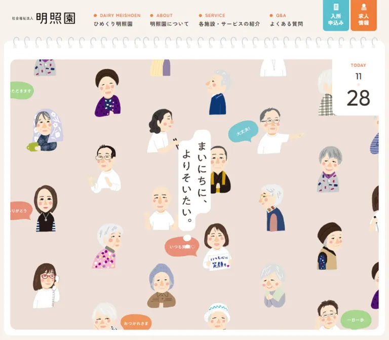
Meishoen presents elder care through everyday relationships. Illustrated residents and staff fill a ring-bound calendar opening; the central handwritten statement, “まいにちに、よりそいたい。”, sits inside a white thought-bubble shape. Warm off-white, dark brown text, generous spacing, and rounded controls continue through the homepage. Photographs introduce real care environments, while the footer returns to illustration with a boat, shells, coastal scenery, local figures, and a crab holding the return-to-top control.
This is a substantial organizational homepage with service discovery, admission information, recruitment, news, availability, downloads, and contact routes. Its distinctive structure combines persistent navigation with a long editorial document. On desktop, the navigation occupies a left rail; on mobile, the identity and two priority actions remain in a compact top header. Preserve the calendar framing, humane imagery, and practical navigation together.
閉じる
Meishoen — Style Reference
A daily calendar filled with familiar faces, framed by warm paper and the sea.
Website: meishoen.com Original URL: https://meishoen.com/ Final URL: https://meishoen.com/ Theme: a light, warm-neutral interface with orange, turquoise, and apricot accents. Inspected: September 23, 2026, at 06:13:51 JST; supplied retrieval timestamp: September 22, 2026, at 21:13:51.574 UTC. Viewports: desktop 1440 × 1000 CSS pixels; mobile 390 × 844 CSS pixels. Scope: the current homepage of 社会福祉法人 明照園. Visual evidence covers the desktop opening, service cards, and footer, plus the mobile opening and footer. Rendered DOM and computed styles additionally cover the message, daily feature, people, news, Instagram, and several practical-information components. Linked pages and control activation were not inspected.
Meishoen presents elder care through everyday relationships. Illustrated residents and staff fill a ring-bound calendar opening; the central handwritten statement, “まいにちに、よりそいたい。”, sits inside a white thought-bubble shape. Warm off-white, dark brown text, generous spacing, and rounded controls continue through the homepage. Photographs introduce real care environments, while the footer returns to illustration with a boat, shells, coastal scenery, local figures, and a crab holding the return-to-top control.
This is a substantial organizational homepage with service discovery, admission information, recruitment, news, availability, downloads, and contact routes. Its distinctive structure combines persistent navigation with a long editorial document. On desktop, the navigation occupies a left rail; on mobile, the identity and two priority actions remain in a compact top header. Preserve the calendar framing, humane imagery, and practical navigation together.
How to Read This Reference
- Measured means a value is present in the supplied rendered DOM, computed styles, or custom properties. Measurements below are rounded where insignificant subpixel differences occur.
- Visually estimated means a dimension, color, or arrangement is read from the supplied current-page screenshots. These values are not sampled stylesheet declarations.
- Calculated means a value follows directly from a supplied formula or element coordinates.
- Recommended identifies implementation choices for a new build. The CSS Quick Start is an adaptation, not recovered source code.
- Both inspected viewports use a 10px root font size. Consequently, the recorded source
2remequals 20px at these viewports. The body's inherited 10px size is a structural default; actual paragraphs have larger explicit sizes. - Empty text values on the logo, slogan, and several headings do not identify their artwork format or prove that accessible alternatives are missing. Their visible lettering cannot be inferred from the parent's font size.
- DOM records can include offscreen carousel items and inactive menu descendants. Presence in the record does not establish that an element was visible or interactable.
Tokens — Colors
Default Palette
| Name | Value | Source or implementation token | Role and evidence |
|---|---|---|---|
| Warm canvas | #f8f2ee |
Source --color-bg |
Measured body background and message-section background; visible around the desktop rail and mobile header |
| White paper | #ffffff |
Source --color-bg2, --color-back |
Measured section, card, and button surfaces; visually forms the calendar frame and footer |
| Brown ink | #3f342d |
Source --color-txt |
Measured body text and mobile menu-button fill |
| Main orange | #f0813b |
Alias --color-orange |
Measured rgb(240,129,59) on the daily section, small labels, and outlined-button text; the corresponding source variable name was not included |
| Turquoise | #56bdcb |
Source --color-accent |
Source token; visually corresponds to the admission action and return-to-top treatment |
| Apricot gradient | linear-gradient(90deg,#f2cb95,#f1c78f) |
Source --color-gradation3 |
Exact declared gradient; the desktop contact action has a visually corresponding pale-apricot treatment, but its paint layer was not directly measured |
| News-card gray | #f7f7f7 |
Alias --color-news-surface |
Measured news-link background |
| Fine divider | #eeeeee |
Source --color-line |
Declared separator token |
| Blue-gray line | #c9d5da |
Source --color-line2, --color-disabled |
Declared line and disabled colors; measured on the mobile service previous-arrow state; visually consistent with the binding loops |
| Pale peach | #f4e6dc |
Source --color-txt3 |
Declared supporting color; do not substitute it automatically for the illustrated hero background |
| Daily-feature yellow | #fff361 |
Alias --color-daily-label |
Measured label color within the orange daily section |
| Brown overlay | rgba(63,52,45,.5) |
Source --color-overlay |
Declared overlay token; an active overlay was not visually captured |
The color system distinguishes practical actions without making the entire interface colorful. Turquoise marks admission, orange marks recruitment and navigation accents, and pale apricot marks desktop contact. Most reading areas remain white or warm neutral. The large orange daily-feature section is a stronger color interval within the page.
Supporting Illustration and Category Colors
| Color | Recorded value | Evidence boundary |
|---|---|---|
| Coral | #e87c63 |
Several numbered day tokens, including --color-day-6 and --color-day-11 |
| Leaf green | #88d56a |
--color-day-4 and --color-term-news |
| Light turquoise | #5cc2cf |
--color-day-15 |
| Soft orange | #f6a253 |
--color-day-19 |
| Deeper orange | #f0823d |
--color-day-17 and --color-day-27; distinct from the measured main orange |
| Event yellow | #ecca56 |
--color-term-event |
| FAQ coral | #e9866f |
--color-term-faq |
| Hero blush-beige | Approximately #eee1d9 |
Visual estimate from the current opening captures |
| Footer sea blue | Approximately #dcebf0 |
Visual estimate from the current footer captures |
The numbered day tokens show that the stylesheet contains a broader calendar-related palette. The supplied evidence does not establish which token controls each visible speech bubble or how the colors change over time.
Theme Presets
Only the light appearance is evidenced. No user-selectable theme interface was captured. Numbered day colors are not evidence of selectable page themes.
Tokens — Typography
Japanese Reading and Interface Text
- Measured family:
"Zen Kaku Gothic New", sans-serif. - Common weight:
500for interface text and narrative paragraphs;400for service descriptions and practical-information descriptions. - Character: open, friendly Japanese sans-serif typography with generous line spacing and modest tracking.
- Role: navigation, service names, explanatory copy, news titles, and buttons.
- Implementation alias:
--font-body.
Rounded Calendar Label
- Measured family:
"Zen Maru Gothic", sans-serifonTODAY. - Desktop: 14px, weight 500, 14px line height, 1.12px tracking.
- Mobile: 10px, weight 500, 10px line height, 0.8px tracking.
- The date's parent element has a 10px computed size, but that does not describe the visibly enlarged date digits. Their exact descendant styles were not supplied.
English Utility Labels
- Declared source family:
'Outfit', sans-serifthrough--font-sans-serif. - Directly measured use: practical-information overlines such as
SHORT STAYandMEISHOEN LETTER, at 14px, weight 900, 14px line height, and 1.4px tracking. - Other section labels have Japanese-font parent styles in the record. Do not assume that every English label uses Outfit without inspecting its actual text-bearing descendant.
Wordmark and Handwritten Lettering
The identity is a graphic wordmark with a small organizational descriptor. It changes from a vertically stacked lockup in the desktop rail to a horizontal lockup in the mobile header.
The hero statement is visibly handwritten and vertical, with white organic backing and trailing thought dots. Treat it as lettering artwork when matching the source. No font family was established for it. A generic handwritten font would not reproduce its shapes or spacing.
Several section headings also have empty text fields and measurable graphic-sized bounds. Their parent heading styles are not a reliable display-font specification.
Type Scale
| Role | Desktop measured style | Mobile measured style | Notes |
|---|---|---|---|
| Narrative message | 16px / 40px, weight 500, tracking 1.28px | 16px / 35px, weight 500, tracking 0.64px | The mobile design retains reading size while reducing spacing |
| Daily and people introduction | 16px / 32px, weight 500, tracking 1.28px | 16px / 30px, weight 500, tracking 0.64px | Broad, calm paragraph rhythm |
| Service heading parent | 24px / 24px, weight 500 | 20px / 20px, weight 500 | Wrapped titles occupy taller descendant layouts; see component guidance |
| Service description | 16px / 30px, weight 400, tracking 1.28px | 15px / 27px, weight 400, tracking 0.6px | Approximately 1.88 and 1.8 line-height ratios |
| Large section link | 16px / 16px, usually weight 500, tracking 1.28px | 14px / 14px, usually weight 500, tracking 1.12px | White daily-feature links use weight 700 |
| Service detail link | 14px / 14px, weight 700, tracking 1.12px | 13px / 13px, weight 700, tracking 1.04px | Compact outlined pill |
| News title | 16px / 32px, weight 500, tracking 1.28px | 15px / 25px, weight 500, tracking 1.2px | Inside the news cards |
| Practical-information heading | 25px / 32.8125px, weight 500, tracking 2px | Not supplied | Measured on the first two desktop information cards |
| Practical-information description | 13px / 20.8px, weight 400, tracking 1.04px | Not supplied | Smaller supporting copy |
| Practical-information overline | Outfit, 14px / 14px, weight 900, tracking 1.4px | Not supplied | Uppercase English |
| Calendar overline | Zen Maru Gothic, 14px / 14px | Zen Maru Gothic, 10px / 10px | Rounded companion to the illustrated scene |
Recommended wrapping rule: use about 1.35–1.4 line height for newly authored multiline service titles. This is an implementation accommodation for the visible multiline rhythm, not the measured parent line height.
Tokens — Spacing & Shapes
Source unit: 1rem = 10px at both captured widths. Density: generous section spacing, compact navigation details, and large touchable pills.
Spacing Scale
| Source token or use | Desktop | Mobile | Evidence |
|---|---|---|---|
--space-rg |
100px | 40px | Source custom property |
--space-md3 |
120px | 60px | Source custom property |
--space-xl |
140px | 50px | Source custom property |
--space-rg5 |
100px | 68px | Source custom property |
--space-sm3 |
85px | 44px | Source custom property |
--wave-height |
40px | 17px | Declared decorative dimension; exact application not supplied |
--ring-md-space |
12px | 6px | Declared ring-spacing parameter; not the full visual loop pitch |
| Desktop service-column gap | Approximately 60px | — | Calculated from card bounds |
| Desktop service-row gap | Approximately 70px | — | Calculated between recorded card boxes |
| Mobile service-item gap | — | 20px | Calculated from 280px cards starting 300px apart |
| News-item gap | 20px | 15px | Calculated from card bounds |
| Instagram grid gap | Approximately 6px | Approximately 6px | Calculated from image-link bounds |
Source spacing tokens do not imply that every component uses the same scale. The detailed layouts include local values such as 26px, 35px, 47px, and 70px.
Border Radius
| Element | Desktop | Mobile | Status |
|---|---|---|---|
| Large pill links | 100px | 100px | Measured |
| Desktop rail actions | 0 100px 100px 0 |
— | Measured; flat against the left screen edge |
| Admission and recruitment header tabs | — | 0 0 10px 10px |
Measured |
| Mobile menu tab | — | 0 0 0 10px |
Measured; meets the right screen edge |
| News cards | 20px | 15px | Measured |
| First two information cards | 20px | Not supplied | Measured |
| Service photographs | Approximately 20px | Not visually captured | Desktop visual estimate |
| White page frame | Approximately 20–24px | Approximately 20px | Visual estimate |
| Hero inner field | Approximately 20px | Approximately 10px | Visual estimate |
Layout Measurements
| Element | Desktop 1440 × 1000 | Mobile 390 × 844 |
|---|---|---|
| Header | Left rail, 261.8 × 1000px | Top bar, 390 × 77px |
| Main origin | x = 261.8px, y = 20px | x = 7px, y = 77px |
| Main width | 1158.2px | 376px |
| Outer right gutter | 20px | 7px |
| Main document height | Approximately 11,560px overall | Approximately 9,866px overall |
| Logo link box | 160.8 × 78.7px at x = 53.3px, y = 96px | 165 × 30.6px at x = 18.2px, y = 23.2px |
| Rail action | 233.75 × 70px | Replaced by header tabs |
| Mobile action tabs | — | 56 × 65px, with 3px gaps |
| Typical narrative content width | 952.7px | 312px |
| Wider content width | Approximately 1008.7px for news and Instagram | 322.4px for service, news, and Instagram |
| Service card | Approximately 446.35px wide | 280px wide |
| Hero slogan artwork box | 105 × 384px | 75 × 274.3px |
| Large narrative button | 300 × 70px | 300 × 60px |
| Service detail button | 185 × 54px | 280 × 50px |
| News card | 350 × 434px | 245 × 310px |
| Instagram tile | Approximately 247.7px square | Approximately 158.2px square |
Screenshot estimates for the opening: the illustrated inner field runs approximately from (282,94) to (1400,960) on desktop, and from (22,120) to (368,822) on mobile. These dimensions distinguish the colored illustration field from the outer white notebook and from the DOM's main element.
Components
Desktop Identity and Navigation Rail
Role: persistent orientation and direct access to practical tasks.
The left rail remains in the same screen position across the supplied desktop opening, service, and footer captures. Its warm-canvas background merges with the outer page gutter. A stacked identity lockup sits near the upper left; the first navigation item begins around y = 276px.
Each navigation item has a small orange circular marker and an uppercase English label above a larger Japanese label. The visible source wording includes DAIRY MEISHOEN, ABOUT, SERVICE, and Q&A; the daily feature elsewhere uses DAILY MEISHOEN. Preserve source wording when documenting it, and make an explicit editorial decision if normalizing copy in a new site.
The service label wraps to two Japanese lines, creating a taller item. The rail is not a uniform stack of equal-height boxed buttons. At the bottom, three colored actions begin at y = 680, 760, and 840px in the captured viewport. Their anatomy is icon, label, and right-pointing arrow, with a flat left edge and fully rounded right end.
Observed destinations include admission information, a recruitment article, and the homepage contact anchor. Do not replace these distinct tasks with one generic contact action.
Mobile Header
Role: retain identity and priority actions while releasing horizontal space.
A 77px header spans the screen and remains visible in both supplied mobile captures. The horizontal logo occupies 165px at the left. Admission, recruitment, and menu controls occupy three 56 × 65px tabs at the right.
The first two tabs stack a small icon over a two-line Japanese label. The menu tab uses brown fill, a white line icon, and MENU. Its lower-right corner meets the edge of the viewport, while its lower-left corner is rounded.
The desktop contact tab is absent from the visible mobile header. A telephone route remains present elsewhere in the mobile DOM. Both MENU and CLOSE occur in the DOM, but the captures show the closed MENU appearance. Opening, closing, focus handling, and scroll locking were not tested.
Calendar Opening
Role: establish the site's everyday, personal character before the informational sections.
Build the composition in layers:
- A white rounded notebook surface inside the page gutters.
- Repeated pale blue-gray binding loops crossing its upper edge, with small pale attachment blocks.
- An inset blush-beige illustration field with rounded corners.
- A scattered pattern of illustrated residents and staff, cropped naturally at its boundaries.
- A centered vertical handwritten statement in an irregular white thought bubble.
- A white calendar tab attached to the upper-right corner.
The portrait pattern carries the visual density. Individual people have different clothes, hairstyles, glasses, gestures, and expressions. Small speech bubbles punctuate the pattern without becoming conventional UI cards.
The mobile opening is a tall composition with a narrower crop and repeating people. It is not simply the desktop hero reduced to fit. The slogan stays legible at a measured width of 75px, versus 105px on desktop. Preserve the separation between background illustration and foreground slogan when adapting it.
The first following section begins at document y = 1000px on desktop and y = 844px on mobile. The opening therefore fills the initial viewport after accounting for the respective header arrangement.
Today Tab
Role: reinforce the daily-calendar metaphor.
The tab contains TODAY, a small month number, a tiny pale dot, and a much larger day number. It sits flush with the right boundary of the illustrated field and has a rounded lower-left corner.
Its visible white area is approximately 150 × 181px on desktop and 75 × 100px on mobile. These are screenshot estimates. The measured label boxes are 129px and 70px wide respectively.
The captured value is September 23, matching the local inspection date. Automatic updates, timezone selection, and midnight rollover were not observed. For a new implementation, supply the date as real text inside a semantic time element rather than embedding it permanently in artwork.
Message Section
Role: explain the organization's care philosophy at a reflective pace.
The section uses warm canvas and a broad inset content column. An orange English overline precedes a large graphic heading, followed by generously spaced Japanese paragraphs and a rounded About link.
Measured message copy is 16px with 40px line height on desktop. On mobile it remains 16px, uses 35px line height, and reduces tracking from 0.08em to 0.04em. This is a useful responsive principle: preserve readable character size and adjust the surrounding rhythm.
The supplied geometry records a tall section—about 1219px on desktop and 1512px on mobile. Its entire visual composition was not included in the screenshots, so do not interpret the unpictured space as an empty spacer or invent additional imagery for it.
Daily Feature and People Sections
Role: connect the calendar concept to recurring content and the people providing care.
The daily feature has a measured orange background, white introductory copy, a yellow English label, and a white pill link with orange text. Its desktop top and bottom padding are unusually generous: 340px and 298px. Mobile top padding is 162px, with a different overall arrangement.
The people section returns to white and uses the same overline, heading-artwork, and introductory-copy hierarchy. Its measured top padding changes from 130px to 70px.
Only DOM and style evidence are supplied for these sections. Their content, colors, and hierarchy are established; the arrangement of any unpictured decorative assets is not.
Service Card
Role: distinguish six care services through photographs and concise explanations.
The desktop service section uses a two-column arrangement. Each card contains:
- A wide photograph with rounded corners and a delicate inset white line decoration.
- A white, orange-outlined
詳しくはこちらpill positioned over the lower-right part of the photograph and protruding approximately 22px beyond its right edge. - A service name preceded by a small orange dot.
- A short, lightly tracked description below the name.
The photograph is approximately 446 × 298px in the desktop capture, close to a 3:2 ratio. Text is inset approximately 20px from the photo's left and right edges. The heading begins about 40px below the image; the description follows with generous separation.
The photographs show residents and staff in ordinary activities: outdoor interaction, shared time around tables, personal assistance, and group exercise. These images demonstrate care through relationships and settings.
Six services are present in the rendered content: residential support, conventional special nursing care, unit-style special nursing care, day service, short stay, and care planning. Detail links target specific anchors on /service/.
Mobile transformation: the six cards become a horizontal track of 280px items separated by 20px. The detail link moves below the description and becomes a full-width 280 × 50px pill. A 1 / 6 counter and previous/next controls appear. This is supported by DOM positions and controls, although advancing the carousel was not tested.
Section Navigation Pills
Role: provide clear transitions to more detailed information.
Large links are generally 70px tall on desktop and 60px on mobile, with a 100px radius. A common desktop example is 300px wide with padding 26px 35px 28px 47px; its mobile counterpart uses 22px 30px 24px padding.
White pills on the daily orange section reverse the color relationship. Service detail pills are smaller, outlined, and more compact. Small dots and arrows provide directional emphasis without introducing a heavy icon system.
Several links have a transparent computed background while appearing filled in the screenshots. This means the supplied anchor style alone does not describe their complete paint treatment; a child or pseudo-element may provide it. The Quick Start uses direct fills as a simpler adaptation.
News Carousel
Role: expose recent updates without making the homepage a long article index.
The DOM records a horizontal sequence of ten dated entries. On desktop, cards are 350 × 434px, spaced 20px apart, with a 20px radius and #f7f7f7 background. Mobile cards become 245 × 310px with 15px spacing and a 15px radius.
Dates sit in separate elements near the cards' upper-right area, beginning approximately 12px above the desktop card top and 10px above the mobile card top. Titles and category labels occupy the lower region. Desktop card padding is 70px 25px 40px; mobile padding is 45px 15px 25px.
The measured x positions extend beyond the viewport, and two navigation buttons are present. This establishes the horizontal structure, not an autoplay policy. The mobile もっと見る link follows the carousel; the desktop equivalent is alongside the section heading.
The supplied screenshots do not show the news artwork itself. Do not invent thumbnail subjects or carousel animation behavior.
Instagram Image Grid
Role: show everyday meals and link to the organization's social content.
The accompanying copy explains that meals are prepared by staff in the facility kitchen. Eight post links are recorded. Desktop positions establish four columns of approximately 247.7px square tiles with 6px gutters. The mobile positions establish two columns of approximately 158.2px square tiles with the same narrow gutter.
An official-account link appears beside the desktop introduction and after the image content in the mobile reading order. The food-related context is supported by the copy; the actual post imagery was not included in the supplied visual captures.
Practical-Information Cards and Contact
Role: surface operational information after the editorial sections.
The page includes short-stay availability, newsletters, admission-document downloads, recruitment, and contact. The first two measured desktop information cards use white fill, 20px corners, and approximately 327 × 432px boxes. Their padding is approximately 118px 28px 50px.
Within those cards, an orange Outfit overline introduces a 25px Japanese heading, a compact 13px description, and a 60px-high pill link. The high top padding reserves substantial space above the text, but the unpictured contents of that area should not be guessed.
Contact content includes a real telephone link, 0969-73-3245, and reception hours of 8:00–17:00. A mobile menu-related contact block also exists in the DOM; its presence does not prove that the menu was opened during capture.
Footer Sitemap
Role: provide a complete navigation summary before the coastal illustration.
The desktop footer divides navigation into three principal groups: general pages at left, six service links in the middle, and blog categories at right. The blog categories form two narrower columns. Orange dots and small English overlines repeat the primary-navigation vocabulary; Japanese names carry the hierarchy.
On mobile, the general links form a left column and service/blog headings occupy the right. Service and blog have visible orange circular plus controls, and their subordinate lists are not visible in the screenshot. The DOM contains those lists. Expansion behavior was not exercised.
Below the mobile links, a faint dotted divider separates the navigation from the organization lockup, address, and underlined GoogleMap link. The desktop identity and address sit in the large white area above the sea illustration.
Coastal Footer and Return to Top
Role: give the organization a recognizable local setting and a warm closing moment.
The landscape combines pale gray clouds, peach land, layered blue water, a small boat, shells, green islands, and a curving gray bridge entering from the right. Two illustrated local figures stand above the shoreline, with an orange speech bubble. The copyright remains small and widely tracked.
A coral crab rises from the bottom edge and holds a turquoise TOP control. Its link targets #document-top. The desktop button is visually about 100 × 52px; the mobile version is about 56 × 32px. These sizes are estimates, and smooth-scroll behavior was not verified.
The mobile footer preserves selected landmarks through a narrower composition rather than fitting the entire desktop panorama into the phone width. Keep the logo, address, map link, and return-to-top control independent of decorative artwork so they remain readable and operable.
Tokens — Motion & Interaction
The evidence establishes transition declarations and available controls. It does not include recorded before/after results from hover, menu activation, accordion expansion, or carousel navigation.
| Treatment | Recorded value | Evidence and limitation |
|---|---|---|
| Standard links | 240ms cubic-bezier(0.25,0.46,0.45,0.94) |
Measured on many links; destination properties and visible hover result were not supplied |
| Service carousel arrow color | 200ms cubic-bezier(0.25,0.46,0.45,0.94) |
Directly measured color transition on mobile controls |
| Content reveal containers | 1100ms cubic-bezier(0.165,0.84,0.44,1) |
Measured opacity and transform transitions; recorded delays include 150ms, 310ms, and 470ms |
| Slow fade | 1500ms cubic-bezier(0.25,0.46,0.45,0.94) |
Source --transition-fade-slow; specific application unverified |
| Scale transition | 1500ms cubic-bezier(0.25,0.46,0.45,0.94) |
Source --transition-scale-fast; despite its name, the supplied duration is 1500ms |
| Accordion | 600ms cubic-bezier(0.77,0,0.175,1) |
Source token; expansion not observed |
| Sitemap | 700ms cubic-bezier(0.165,0.84,0.44,1) |
Source token; menu opening not observed |
| Modal | 600ms cubic-bezier(0.165,0.84,0.44,1) |
Source token; no active modal capture |
| Balloon | 500ms cubic-bezier(0.175,0.885,0.32,1.275) |
Source token with overshooting easing; target and trigger unverified |
| Floating animation | 3000ms linear infinite |
Source --animation-floating; keyframes and moving element not supplied |
| Calendar-related animation names | 1700ms linear forwards |
--animation-mecuru-front and --animation-mecuru-back; actual sequence not demonstrated |
| Hover modifiers | scale(1.15) and opacity 0.5 |
Available custom properties; no confirmed selector association |
The capture process waited for finite animations and layout stability and temporarily paused perpetual animation during readiness checks. Static captures therefore cannot establish whether the portrait field, footer figures, or calendar pages move continuously.
Recommended motion direction: retain short, gentle control feedback and restrained staged reveals. Use the measured timings only where the intended interaction is clear. Keep decorative floating optional, and ensure all information is available when motion is reduced.
Surfaces
| Layer | Appearance | Purpose |
|---|---|---|
| Outer canvas | Warm off-white #f8f2ee |
Unifies the rail, header, and outer gutters |
| Notebook and frame | White, broad edges, soft corners | Creates the calendar object and separates the page from its surroundings |
| Hero field | Flat blush-beige with portraits | Gives the foreground slogan a quiet but populated setting |
| Message | Warm canvas with brown text | Supports extended reading |
| Daily feature | Solid measured orange with white copy | Creates a prominent recurring-content interval |
| People and footer | White | Gives photography, lettering, and illustrations breathing room |
| Service region | Visually very pale gray in the supplied desktop capture | Separates service photography; exact paint-bearing element was not provided |
| News cards | Measured #f7f7f7, rounded |
Groups updates within the horizontal track |
| Information cards | White, 20px corners | Collects practical tasks |
| Actions | Turquoise, orange, apricot, or white with orange edge | Communicates task type and hierarchy |
Depth is shallow. Rounded clipping, white outlines, inset lines, and overlapping illustration provide separation. A general shadow-based elevation system is not visible in the supplied captures, even though a shadow-color variable exists in the stylesheet.
Imagery
Illustrated People
The opening uses friendly, individually recognizable portraits with blush cheeks, soft facial features, simplified clothing, and varied ages. Staff and residents belong to the same illustrated world. Speech bubbles contain short everyday expressions, reinforcing the feeling of a place inhabited by familiar people.
Preserve variation in pose and dress. Repeating one generic elderly-person icon would lose the sense of community. Keep the pattern's scale large enough to read individual faces, including in the narrow mobile crop.
Care Photography
The desktop service images use bright, natural-looking indoor and outdoor light. People are engaged with each other or participating in activities. The palette is subdued: white clothing, warm wood, pale curtains, greenery, and skin tones.
Use eye-level, respectful compositions that show connection and daily life. Crop for faces and gestures before applying rounded clipping. The thin inset white line is a secondary frame; it should not compete with the people in the photograph.
Local Landscape
The footer uses flat, softly irregular illustration, with layered water and land shapes. Maritime details create specificity. The scene accommodates real navigation and address text without turning the entire footer into a single flattened image.
Observed Asset References
No image src, SVG file path, or background-image URL was included in the supplied evidence. The inventory below identifies visible roles rather than inventing filenames.
| Asset role | Evidence | Reuse guidance |
|---|---|---|
| Desktop and mobile wordmark lockups | Current opening and footer captures | Preserve the two arrangements and original proportions |
| Ring binding and attachment blocks | Current opening captures | Keep separate from essential content and mark decorative recreations appropriately |
| Portrait-pattern artwork | Current desktop and mobile openings | Use authorized art with deliberate mobile cropping or tiling |
| Vertical slogan and thought bubble | Screenshots plus measured 105 × 384px and 75 × 274.3px boxes | Preserve lettering; provide equivalent accessible text |
| Service photography | Current desktop service capture | Use real care imagery with comparable framing and light |
| Coastal footer scene | Current desktop and mobile footers | Retain responsive composition and legible foreground information |
| Crab and top control | Current footer captures and anchor destination | Keep the interactive control separate from the decorative character |
| News and Instagram images | DOM structure only | Subjects and files are not visually verified |
The CSS shell can reproduce the spacing and structure. The portraits, lettering, photographs, and local landscape carry much of the identity and require suitable authorized assets.
Layout & Responsive Behavior
Desktop Structure
At 1440px, the rail occupies approximately 18.18% of the viewport. The main content starts immediately to its right and leaves a 20px outer right margin. A white rounded frame remains visually consistent across the supplied scrolled captures.
The narrative column is approximately 952.7px wide inside the 1158.2px main region. News and Instagram use a wider column of approximately 1008.7px. This creates two related content widths rather than one universal container.
The service listing occupies two columns and three rows. News continues horizontally beyond the visible region. Instagram uses a compact four-column grid. The footer expands into a broad sitemap and landscape.
Mobile Structure
At 390px, the 77px top header replaces the rail. The page uses 7px outer gutters and a 376px main width. The hero's white notebook inset adds another 15px per side before the illustrated field.
Three mobile content-width properties are supplied:
/* Source formulas evaluated at the inspected 390px viewport. */
--contents: calc(620 / 750 * 390px);     /* 322.4px */
--contents-sm: calc(600 / 750 * 390px);  /* 312px */
--contents-md: calc(640 / 750 * 390px);  /* 332.8px */
These are viewport-relative proportions, while the measured root remains 10px. Do not shrink all typography in proportion to the viewport.
| Area | Desktop | Mobile |
|---|---|---|
| Global navigation | Persistent left rail | Persistent top identity, two action tabs, and menu |
| Calendar opening | Broad portrait field | Tall, narrower portrait composition |
| Narrative copy | 16px with 32–40px leading | 16px with 30–35px leading |
| Services | Two-column, three-row arrangement | Horizontal 280px cards, counter, and arrows |
| Service CTA | Overlapping photograph | Full-width link below copy |
| News | 350px cards with 20px gaps | 245px cards with 15px gaps |
| Four columns | Two columns | |
| Footer | Expanded sitemap groups | Two-column top-level groups with visible plus controls |
| Outer gutter | 20px at right | 7px at both sides |
Breakpoints and Unverified Widths
Source properties include boundaries at 561, 768, 1024, 1281, and 1401px, among others. The supplied data does not show which media query performs every layout switch. Only 1440px and 390px were visually inspected.
The Quick Start chooses a 1023px maximum width for its compact layout. That is a recommended implementation boundary informed by the available breakpoint vocabulary, not a verified source switch. Test intermediate widths, enlarged text, and short landscape viewports before production.
Do’s and Don’ts
Do
- Build the opening as a notebook with separate binding, illustration, slogan, and date layers.
- Keep warm canvas, white paper, and brown ink dominant.
- Preserve the distinct admission, recruitment, and contact treatments.
- Retain readable Japanese paragraph sizes on mobile.
- Use generous line height and modest tracking for explanatory text.
- Show residents and staff through varied portraits and respectful everyday photography.
- Preserve the desktop service grid and the evidenced mobile horizontal arrangement.
- Move mobile service links below the copy instead of compressing the desktop overlap.
- Use orange dots, small English overlines, and Japanese labels consistently.
- Preserve the footer's local maritime character and playful return-to-top control.
- Keep practical content—availability, downloads, recruitment, and telephone contact—easy to find.
Don’t
- Don’t reduce the homepage to a single conversion section; it serves multiple organizational tasks.
- Don’t replace the illustrated community with generic medical icons.
- Don’t assign a font name to the handwritten slogan or graphic wordmark without evidence.
- Don’t interpret inherited 10px wrapper styles as the visible reading-text size.
- Don’t flatten the date, navigation, address, or buttons into illustration assets.
- Don’t force all mobile service cards into a vertical stack when matching the observed layout.
- Don’t introduce heavy shadows, glass surfaces, or saturated gradients across the reading areas.
- Don’t treat every declared animation token as a demonstrated interaction.
- Don’t hardcode the captured date as permanent content.
- Don’t infer asset filenames, production roles, or missing page designs from the available screenshots.
Recommended Implementation Additions
These are recommendations for a new implementation, not verified features of the inspected site:
- Give the graphic identity and slogan meaningful accessible equivalents. Keep decorative portraits, clouds, shells, and binding out of the accessibility tree where they add no content.
- Use real buttons for the menu and disclosure controls, with
aria-expandedandaria-controls. Keep links and expansion controls separate when they have different actions. - Make carousel navigation keyboard-operable, expose the current service position, and expand small arrow hit areas to at least 44 × 44px without enlarging the drawn arrow.
- Provide visible brown focus outlines and ensure the fixed header does not cover focused elements or anchor destinations.
- Test white labels on the orange, turquoise, and especially pale-apricot fills for contrast. Adjust text or fill colors where necessary while retaining the task-color associations.
- Keep body copy at the observed 15–16px range or larger, and allow longer service names to wrap without clipping.
- Supply reduced-motion alternatives for floating, page-turning, and reveal effects. Content should remain visible without an animation trigger.
- Render dates as text with an explicit timezone policy and provide a stable initial value during page rendering.
- Reserve image dimensions to avoid layout shifts. Load the first visible illustration promptly and defer below-the-fold photographs appropriately.
- Keep a usable service list and footer navigation available if carousel or menu JavaScript fails.
Agent Prompt Guide
Quick Color Reference
- Outer canvas:
#f8f2ee. - Paper and main white surfaces:
#ffffff. - Text and mobile menu:
#3f342d. - Main orange:
#f0813b. - Admission accent:
#56bdcb. - Pale contact gradient:
#f2cb95to#f1c78f. - News cards:
#f7f7f7. - Pale binding and disabled control color:
#c9d5da. - Hero blush-beige: approximately
#eee1d9, a visual estimate. - Footer water blue: approximately
#dcebf0, a visual estimate.
Overall Prompt
“Create a responsive homepage for a Japanese elder-care organization using the visual principles of Meishoen. Use warm off-white canvas, white rounded page framing, dark brown Japanese sans-serif text, orange navigation details, turquoise admission actions, and pale-apricot contact accents. Make the opening a ring-bound daily calendar: individually drawn residents and staff on a blush-beige field, a separate vertical handwritten message in a white thought bubble, and a live date tab at the upper right. On desktop, place identity and navigation in a persistent left rail. On mobile, use a 77px top header with a horizontal identity, two compact action tabs, and a menu button. Continue with spacious narrative sections, an orange daily feature, care photography, service discovery, news, meals, practical information, and a coastal illustrated footer. Keep the page useful as an organizational website with several distinct visitor tasks.”
Example Component Prompts
- Desktop rail: “Create a warm off-white left navigation rail approximately 262px wide at a 1440px viewport. Place a stacked graphic identity near the top, followed by small orange overlines, orange dots, and larger Japanese link labels. Anchor three 70px-high task links near the bottom, flat against the left edge with rounded right ends. Use turquoise, orange, and pale apricot for their distinct roles.”
- Calendar opening: “Create a white notebook frame with pale blue-gray binding loops and an inset blush-beige portrait pattern. Center a separate vertical handwritten statement in an organic white thought bubble. Attach a white date tab to the upper-right corner. Art-direct the mobile crop so the portraits and 75px-wide slogan remain legible in a tall field.”
- Service card: “Create a roughly 446px-wide desktop care-service card with a 3:2 photograph, 20px image corners, a thin inset white line, an orange-dot heading, and 16px copy with 30px leading. Overlap a 185 × 54px white outlined link at the photograph's lower right. On mobile, use 280px-wide horizontal cards and move a 50px-high full-width link below the description.”
- News track: “Create a horizontal news track with pale-gray 350 × 434px rounded cards on desktop and 245 × 310px cards on mobile. Position the date near each card's upper-right edge and place the title and category in the lower region. Keep next and previous controls explicit; do not add autoplay without a separate requirement.”
- Footer: “Create a spacious white sitemap above a soft coastal illustration containing layered water, a small boat, shells, green islands, a curving bridge, and local figures. Place identity, address, and map access as live foreground content. Finish with a crab holding a turquoise return-to-top button. Recompose the artwork for mobile and use expandable service and blog groups.”
Quick Start
CSS Custom Properties
This adaptation uses ordinary pixel-based tokens and leaves the application's root font size unchanged. The desktop rail percentage, compact-layout breakpoint, illustrative color approximations, and simplified decorative lines are recommendations. The measured component sizes and typography provide the starting proportions.
Expected structure: .site-header contains .brand, .primary-nav, and .utility-links; .site-page contains the homepage and footer. A .service-card contains .service-media, .service-info, and .service-link as siblings. Supply authorized logo, portrait, slogan, photo, and footer assets separately. No original asset URLs are assumed.
:root {
  /* Measured colors and source-token values. */
  --color-canvas: #f8f2ee;
  --color-paper: #ffffff;
  --color-ink: #3f342d;
  --color-orange: #f0813b;
  --color-accent: #56bdcb;
  --color-news-surface: #f7f7f7;
  --color-line: #eeeeee;
  --color-ring: #c9d5da;
  --contact-fill: linear-gradient(90deg, #f2cb95, #f1c78f);

  /* Visual approximations for asset-adjacent surfaces. */
  --color-hero: #eee1d9;
  --color-sea: #dcebf0;

  /* These families were declared in the supplied evidence. */
  --font-body: 'Zen Kaku Gothic New', sans-serif;
  --font-rounded: 'Zen Maru Gothic', sans-serif;
  --font-utility: 'Outfit', sans-serif;
  --text-body: 16px;
  --text-service-title: 24px;
  --text-service-copy: 16px;
  --text-button: 16px;
  --leading-body: 32px;
  --tracking-body: 0.08em;

  /* Responsive shell approximation, matching the desktop sample. */
  --rail-width: clamp(240px, 18.182vw, 300px);
  --outer-gap: 20px;
  --header-height: 77px;
  --radius-card: 20px;
  --radius-pill: 100px;
  --section-gap: 120px;
  --service-gap: 60px;

  /* Observed timing values; application is intentionally limited. */
  --ease-control: cubic-bezier(0.25, 0.46, 0.45, 0.94);
  --motion-control: 240ms var(--ease-control);
  --motion-carousel: 200ms var(--ease-control);
}

* { box-sizing: border-box; }

body {
  margin: 0;
  color: var(--color-ink);
  background: var(--color-canvas);
  font-family: var(--font-body);
  font-size: var(--text-body);
  font-weight: 500;
  line-height: 1.8;
}

button, input, select, textarea { font: inherit; }
a { color: inherit; }
img { display: block; max-inline-size: 100%; }

.site-header {
  position: fixed;
  inset: 0 auto 0 0;
  z-index: 50;
  inline-size: var(--rail-width);
  block-size: 100dvh;
  background: var(--color-canvas);
}

.brand {
  display: block;
  inline-size: 160.8px;
  margin-block-start: 96px;
  margin-inline-start: 20.36%;
}

.brand img { inline-size: 100%; block-size: auto; }

.primary-nav {
  display: grid;
  gap: 36px;
  margin-block-start: 100px;
  margin-inline: 27.14% 20px;
}

.nav-item { display: block; text-decoration: none; }

.eyebrow {
  display: flex;
  align-items: center;
  gap: 11px;
  color: var(--color-orange);
  font-size: 11px;
  line-height: 1.3;
  letter-spacing: 0.08em;
  text-transform: uppercase;
}

.eyebrow::before {
  content: '';
  flex: 0 0 10px;
  block-size: 10px;
  border-radius: 50%;
  background: currentColor;
}

.nav-label {
  display: block;
  margin-block-start: 10px;
  font-size: 17px;
  line-height: 1.4;
  letter-spacing: 0.06em;
}

.utility-links {
  position: absolute;
  inset: auto 28px 90px 0;
  display: grid;
  gap: 10px;
}

.utility-link {
  display: flex;
  align-items: center;
  justify-content: space-between;
  gap: 16px;
  min-block-size: 70px;
  padding-inline: 33px 28px;
  border: 0;
  border-radius: 0 100px 100px 0;
  color: var(--color-paper);
  font-size: 16px;
  text-decoration: none;
}

.utility-link--entry { background: var(--color-accent); }
.utility-link--recruit { background: var(--color-orange); }
.utility-link--contact { background: var(--contact-fill); }
.menu-toggle { display: none; }

.site-page {
  margin: 20px var(--outer-gap) 0 var(--rail-width);
  min-inline-size: 0;
}

.content {
  inline-size: 82.257%;
  margin-inline: auto;
}

.content--wide { inline-size: 87.096%; }
.section { padding-block: var(--section-gap); }
.section--paper { background: var(--color-paper); }

.section-copy {
  font-size: var(--text-body);
  line-height: var(--leading-body);
  letter-spacing: var(--tracking-body);
}

.message-copy { line-height: 40px; }

.daily-section {
  color: var(--color-paper);
  background: var(--color-orange);
}

/* The layered opening matches the captured viewport proportions. */
.hero {
  position: relative;
  min-block-size: calc(100svh - 20px);
}

.hero-notebook {
  position: absolute;
  inset: 14px 0 20px;
  display: grid;
  padding: 60px 20px 20px;
  border-radius: 22px;
  background: var(--color-paper);
}

.hero-scene {
  position: relative;
  min-block-size: 0;
  overflow: hidden;
  border-radius: 20px;
  background-color: var(--color-hero);
  background-image: var(--hero-art, none);
  background-position: center;
  background-repeat: repeat;
  background-size: var(--hero-art-size, auto);
}

.hero-slogan {
  position: absolute;
  inset: 48% auto auto 50%;
  inline-size: 105px;
  block-size: auto;
  aspect-ratio: 105 / 384;
  object-fit: contain;
  transform: translate(-50%, -50%);
}

/* Decorative approximation; mark the binding container aria-hidden. */
.notebook-binding {
  position: absolute;
  inset: -13px 26px auto;
  display: flex;
  justify-content: space-between;
  pointer-events: none;
}

.notebook-binding > span {
  position: relative;
  inline-size: 18px;
  block-size: 30px;
  border: 2px solid var(--color-ring);
  border-block-end: 0;
  border-radius: 50% 50% 0 0;
  transform: rotate(-10deg);
}

.notebook-binding > span::after {
  content: '';
  position: absolute;
  inset: auto -2px -6px auto;
  inline-size: 12px;
  block-size: 12px;
  border-radius: 4px;
  background: #f4f1ef;
}

.calendar-tab {
  position: absolute;
  inset: 0 0 auto auto;
  inline-size: 150px;
  min-block-size: 181px;
  padding: 14px 0 20px 21px;
  border-end-start-radius: 20px;
  background: var(--color-paper);
  text-align: center;
}

.calendar-label {
  display: block;
  color: var(--color-orange);
  font-family: var(--font-rounded);
  font-size: 14px;
  line-height: 1;
  letter-spacing: 0.08em;
}

/* Digit sizes are visual approximations, not measured descendants. */
.calendar-month { display: block; margin-block-start: 12px; font-size: 28px; line-height: 1; }
.calendar-day { display: block; font-size: 70px; line-height: 1; }
.calendar-dot { display: block; inline-size: 8px; block-size: 8px; margin: 12px auto 6px; border-radius: 50%; background: #f4e6dc; }

.pill {
  display: inline-flex;
  align-items: center;
  justify-content: space-between;
  gap: 20px;
  inline-size: min(300px, 100%);
  min-block-size: 70px;
  padding: 20px 35px 20px 47px;
  border: 2px solid transparent;
  border-radius: var(--radius-pill);
  color: var(--color-paper);
  background: var(--color-orange);
  font-size: var(--text-button);
  font-weight: 500;
  line-height: 1.3;
  letter-spacing: 0.08em;
  text-decoration: none;
  transition: color var(--motion-control), background-color var(--motion-control);
}

.pill--outline {
  border-color: var(--color-orange);
  color: var(--color-orange);
  background: var(--color-paper);
  font-weight: 700;
}

.service-grid {
  display: grid;
  grid-template-columns: repeat(2, minmax(0, 1fr));
  gap: 70px var(--service-gap);
}

.service-card {
  display: grid;
  grid-template-columns: minmax(0, 1fr);
  align-content: start;
  min-inline-size: 0;
}

.service-media {
  position: relative;
  grid-area: 1 / 1;
  overflow: hidden;
  border-radius: var(--radius-card);
}

.service-image {
  inline-size: 100%;
  aspect-ratio: 3 / 2;
  object-fit: cover;
}

.service-media::after {
  content: '';
  position: absolute;
  inset: 12px;
  border: 1px solid rgb(255 255 255 / 75%);
  border-radius: 12px;
  pointer-events: none;
}

.service-info { grid-area: 2 / 1; padding: 34px 20px 0; }

.service-title {
  display: flex;
  align-items: baseline;
  gap: 13px;
  margin: 0;
  font-size: var(--text-service-title);
  font-weight: 500;
  line-height: 1.4;
}

.service-title::before {
  content: '';
  flex: 0 0 10px;
  block-size: 10px;
  border-radius: 50%;
  background: var(--color-orange);
}

.service-description {
  margin-block: 24px 0;
  font-size: var(--text-service-copy);
  font-weight: 400;
  line-height: 30px;
  letter-spacing: 0.08em;
}

.service-link {
  grid-area: 1 / 1;
  z-index: 1;
  align-self: end;
  justify-self: end;
  inline-size: 185px;
  min-block-size: 54px;
  padding: 14px 23px 14px 26px;
  font-size: 14px;
  transform: translate(22px, -33px);
}

/* Native overflow is a recommended fallback, not a source-library claim. */
.news-track {
  display: flex;
  gap: 20px;
  overflow-x: auto;
  padding-block: 14px;
  scroll-snap-type: x proximity;
}

.news-card {
  flex: 0 0 350px;
  min-block-size: 434px;
  padding: 70px 25px 40px;
  border-radius: 20px;
  background: var(--color-news-surface);
  scroll-snap-align: start;
  text-decoration: none;
}

.news-title { font-size: 16px; font-weight: 500; line-height: 32px; letter-spacing: 0.08em; }

.instagram-grid {
  display: grid;
  grid-template-columns: repeat(4, minmax(0, 1fr));
  gap: 6px;
}

.instagram-grid img { inline-size: 100%; aspect-ratio: 1; object-fit: cover; }

.site-footer {
  position: relative;
  overflow: hidden;
  padding-block-start: 60px;
  border-radius: 0 0 22px 22px;
  background: var(--color-paper);
}

.footer-nav {
  display: grid;
  grid-template-columns: 0.7fr 1.2fr 1.4fr;
  gap: 45px;
}

.footer-address { margin-block: 110px 45px; font-style: normal; }
.footer-map { text-underline-offset: 3px; }
.footer-art { inline-size: 100%; block-size: auto; }

.page-top {
  position: absolute;
  inset: auto auto 36px 50%;
  display: grid;
  place-items: center;
  inline-size: 100px;
  min-block-size: 52px;
  border-radius: 16px;
  color: var(--color-paper);
  background: var(--color-accent);
  font-size: 14px;
  letter-spacing: 0.08em;
  text-decoration: none;
  transform: translateX(-50%);
}

/* Recommended keyboard treatment. */
:where(a, button, summary):focus-visible {
  outline: 3px solid var(--color-ink);
  outline-offset: 4px;
}

[id] { scroll-margin-block-start: 30px; }

@media (max-width: 1023px) {
  :root {
    --outer-gap: 7px;
    --text-service-title: 20px;
    --text-service-copy: 15px;
    --text-button: 14px;
    --leading-body: 30px;
    --tracking-body: 0.04em;
    --section-gap: 70px;
  }

  .site-header { inset: 0 0 auto; inline-size: 100%; block-size: var(--header-height); }
  .brand { inline-size: 165px; margin: 23px 0 0 18px; }
  .primary-nav { display: none; }
  .utility-links { inset: 0 0 auto auto; display: flex; gap: 3px; }

  .utility-link,
  .menu-toggle {
    display: flex;
    flex-direction: column;
    align-items: center;
    justify-content: center;
    gap: 4px;
    inline-size: 56px;
    min-block-size: 65px;
    padding: 8px 3px 10px;
    border: 0;
    border-radius: 0 0 10px 10px;
    font-size: 11px;
    line-height: 1.2;
  }

  .utility-link--contact { display: none; }
  .utility-arrow { display: none; }
  .menu-toggle { border-end-end-radius: 0; color: white; background: var(--color-ink); }
  .site-page { margin: var(--header-height) 7px 0; }
  .content { inline-size: 80vw; max-inline-size: 100%; }
  .content--wide { inline-size: 82.666667vw; }
  .message-copy { line-height: 35px; }

  .hero { min-block-size: calc(100svh - var(--header-height)); }
  .hero-notebook { inset: 17px 0 7px; padding: 26px 15px 15px; }
  .hero-scene { border-radius: 10px; background-image: var(--hero-art-mobile, var(--hero-art, none)); background-size: var(--hero-art-size-mobile, auto); }
  .hero-slogan { inset-block-start: 53%; inline-size: 75px; }
  .notebook-binding { inset: -16px 17px auto; }
  .notebook-binding > span { inline-size: 12px; block-size: 20px; }
  .notebook-binding > span::after { inline-size: 8px; block-size: 8px; }
  .calendar-tab { inline-size: 75px; min-block-size: 100px; padding: 8px 0 10px 5px; border-end-start-radius: 12px; }
  .calendar-label { font-size: 10px; }
  .calendar-month { margin-block-start: 8px; font-size: 16px; }
  .calendar-day { font-size: 36px; }
  .calendar-dot { inline-size: 5px; block-size: 5px; margin: 7px auto 4px; }

  .pill { min-block-size: 60px; padding: 17px 30px; }

  .service-grid {
    display: flex;
    gap: 20px;
    overflow-x: auto;
    padding-block-end: 12px;
    scroll-snap-type: x proximity;
  }

  .service-card { display: flex; flex: 0 0 280px; flex-direction: column; scroll-snap-align: start; }
  .service-info { padding: 24px 0 0; }
  .service-description { line-height: 27px; letter-spacing: 0.04em; }
  .service-link { inline-size: 100%; min-block-size: 50px; margin-block-start: 26px; padding: 14px 28px; font-size: 13px; transform: none; }
  .news-track { gap: 15px; }
  .news-card { flex-basis: 245px; min-block-size: 310px; padding: 45px 15px 25px; border-radius: 15px; }
  .news-title { font-size: 15px; line-height: 25px; }
  .instagram-grid { grid-template-columns: repeat(2, minmax(0, 1fr)); }
  .footer-nav { grid-template-columns: 1fr 1.4fr; gap: 24px; }
  .footer-address { margin-block: 45px; padding-block-start: 40px; border-block-start: 3px dotted var(--color-line); }
  .page-top { inset-block-end: 20px; inline-size: 56px; min-block-size: 32px; border-radius: 10px; font-size: 10px; }
  [id] { scroll-margin-block-start: calc(var(--header-height) + 20px); }
}

/* Recommended reduced-motion policy for this adaptation. */
@media (prefers-reduced-motion: reduce) {
  .site-header *,
  .site-page * {
    animation: none !important;
    transition: none !important;
    scroll-behavior: auto !important;
  }
}
The shell above intentionally leaves menu state, disclosure state, carousel counters, date updates, and custom illustration animation to application logic. Keep those features independently operable. Load the declared fonts through your project's chosen authorized font-delivery method; the CSS family names alone do not load font files.
Tailwind v4 Token Mapping
Optional aliases for a project already using Tailwind v4. This is an implementation mapping and does not identify the original site's framework.
@theme inline {
  --color-canvas: #f8f2ee;
  --color-paper: #ffffff;
  --color-ink: #3f342d;
  --color-orange: #f0813b;
  --color-accent: #56bdcb;
  --color-news-surface: #f7f7f7;
  --color-ring: #c9d5da;

  --font-body: 'Zen Kaku Gothic New', sans-serif;
  --font-rounded: 'Zen Maru Gothic', sans-serif;
  --font-utility: 'Outfit', sans-serif;

  --text-body: 16px;
  --text-service: 24px;
  --text-service-mobile: 20px;
  --text-button: 16px;
  --text-button-mobile: 14px;

  --radius-card: 20px;
  --radius-card-mobile: 15px;
  --radius-pill: 100px;

  --spacing-header: 77px;
  --spacing-service-mobile: 280px;
  --spacing-news: 350px;
  --spacing-news-mobile: 245px;
}
Sources & Evidence
- Original and final website: https://meishoen.com/. The supplied capture reports HTTP 200 and the same original and final URL. The homepage title and visible wordmark establish the organization identity.
- Capture timestamp:
2026-09-22T21:13:51.574Z, corresponding to September 23, 2026, at 06:13:51.574 JST. - Desktop evidence: 1440 × 1000 CSS-pixel viewport; opening, service-card, and footer screenshots; rendered homepage text, link destinations, element rectangles, computed typography, backgrounds, transitions, and custom properties. Recorded document height is approximately 11,560px.
- Mobile evidence: 390 × 844 CSS-pixel viewport; opening and footer screenshots; corresponding rendered DOM and computed styles. Recorded document height is approximately 9,866px.
- Observed navigation affordances: admission, recruitment, contact anchor, service anchors, news links, social links, telephone link, map link, menu button, disclosure controls, carousel controls, and return-to-top anchor. Their presence and destinations are evidenced; activation outcomes are not.
- Inspection method limits: the supplied browser process waited for document loading, visible image decoding, finite animation settlement, and sampled layout stability within stated time limits. Perpetual animation was paused during readiness checks and resumed afterward. Scrolling traversed intermediate positions. These checks do not prove completeness of delayed content or unexercised states. SharedWorkers and service workers were disabled.
- Analysis boundary: this reference was produced from the supplied captures and rendered evidence. No additional browsing, file inspection, asset retrieval, or interaction testing was performed. Unpictured sections are identified as DOM-supported, and estimated values and implementation recommendations are labeled throughout.
# Meishoen — Style Reference

> A daily calendar filled with familiar faces, framed by warm paper and the sea.

**Website:** [meishoen.com](https://meishoen.com/)
**Original URL:** https://meishoen.com/
**Final URL:** https://meishoen.com/
**Theme:** a light, warm-neutral interface with orange, turquoise, and apricot accents.
**Inspected:** September 23, 2026, at 06:13:51 JST; supplied retrieval timestamp: September 22, 2026, at 21:13:51.574 UTC.
**Viewports:** desktop 1440 × 1000 CSS pixels; mobile 390 × 844 CSS pixels.
**Scope:** the current homepage of 社会福祉法人 明照園. Visual evidence covers the desktop opening, service cards, and footer, plus the mobile opening and footer. Rendered DOM and computed styles additionally cover the message, daily feature, people, news, Instagram, and several practical-information components. Linked pages and control activation were not inspected.

Meishoen presents elder care through everyday relationships. Illustrated residents and staff fill a ring-bound calendar opening; the central handwritten statement, “まいにちに、よりそいたい。”, sits inside a white thought-bubble shape. Warm off-white, dark brown text, generous spacing, and rounded controls continue through the homepage. Photographs introduce real care environments, while the footer returns to illustration with a boat, shells, coastal scenery, local figures, and a crab holding the return-to-top control.

This is a substantial organizational homepage with service discovery, admission information, recruitment, news, availability, downloads, and contact routes. Its distinctive structure combines persistent navigation with a long editorial document. On desktop, the navigation occupies a left rail; on mobile, the identity and two priority actions remain in a compact top header. Preserve the calendar framing, humane imagery, and practical navigation together.
閉じる
# Meishoen — Style Reference

> A daily calendar filled with familiar faces, framed by warm paper and the sea.

**Website:** [meishoen.com](https://meishoen.com/)
**Original URL:** https://meishoen.com/
**Final URL:** https://meishoen.com/
**Theme:** a light, warm-neutral interface with orange, turquoise, and apricot accents.
**Inspected:** September 23, 2026, at 06:13:51 JST; supplied retrieval timestamp: September 22, 2026, at 21:13:51.574 UTC.
**Viewports:** desktop 1440 × 1000 CSS pixels; mobile 390 × 844 CSS pixels.
**Scope:** the current homepage of 社会福祉法人 明照園. Visual evidence covers the desktop opening, service cards, and footer, plus the mobile opening and footer. Rendered DOM and computed styles additionally cover the message, daily feature, people, news, Instagram, and several practical-information components. Linked pages and control activation were not inspected.

Meishoen presents elder care through everyday relationships. Illustrated residents and staff fill a ring-bound calendar opening; the central handwritten statement, “まいにちに、よりそいたい。”, sits inside a white thought-bubble shape. Warm off-white, dark brown text, generous spacing, and rounded controls continue through the homepage. Photographs introduce real care environments, while the footer returns to illustration with a boat, shells, coastal scenery, local figures, and a crab holding the return-to-top control.

This is a substantial organizational homepage with service discovery, admission information, recruitment, news, availability, downloads, and contact routes. Its distinctive structure combines persistent navigation with a long editorial document. On desktop, the navigation occupies a left rail; on mobile, the identity and two priority actions remain in a compact top header. Preserve the calendar framing, humane imagery, and practical navigation together.

## How to Read This Reference

- **Measured** means a value is present in the supplied rendered DOM, computed styles, or custom properties. Measurements below are rounded where insignificant subpixel differences occur.
- **Visually estimated** means a dimension, color, or arrangement is read from the supplied current-page screenshots. These values are not sampled stylesheet declarations.
- **Calculated** means a value follows directly from a supplied formula or element coordinates.
- **Recommended** identifies implementation choices for a new build. The CSS Quick Start is an adaptation, not recovered source code.
- Both inspected viewports use a **10px root font size**. Consequently, the recorded source `2rem` equals 20px at these viewports. The body's inherited 10px size is a structural default; actual paragraphs have larger explicit sizes.
- Empty text values on the logo, slogan, and several headings do not identify their artwork format or prove that accessible alternatives are missing. Their visible lettering cannot be inferred from the parent's font size.
- DOM records can include offscreen carousel items and inactive menu descendants. Presence in the record does not establish that an element was visible or interactable.

## Tokens — Colors

### Default Palette

| Name | Value | Source or implementation token | Role and evidence |
| --- | --- | --- | --- |
| Warm canvas | `#f8f2ee` | Source `--color-bg` | Measured body background and message-section background; visible around the desktop rail and mobile header |
| White paper | `#ffffff` | Source `--color-bg2`, `--color-back` | Measured section, card, and button surfaces; visually forms the calendar frame and footer |
| Brown ink | `#3f342d` | Source `--color-txt` | Measured body text and mobile menu-button fill |
| Main orange | `#f0813b` | Alias `--color-orange` | Measured `rgb(240,129,59)` on the daily section, small labels, and outlined-button text; the corresponding source variable name was not included |
| Turquoise | `#56bdcb` | Source `--color-accent` | Source token; visually corresponds to the admission action and return-to-top treatment |
| Apricot gradient | `linear-gradient(90deg,#f2cb95,#f1c78f)` | Source `--color-gradation3` | Exact declared gradient; the desktop contact action has a visually corresponding pale-apricot treatment, but its paint layer was not directly measured |
| News-card gray | `#f7f7f7` | Alias `--color-news-surface` | Measured news-link background |
| Fine divider | `#eeeeee` | Source `--color-line` | Declared separator token |
| Blue-gray line | `#c9d5da` | Source `--color-line2`, `--color-disabled` | Declared line and disabled colors; measured on the mobile service previous-arrow state; visually consistent with the binding loops |
| Pale peach | `#f4e6dc` | Source `--color-txt3` | Declared supporting color; do not substitute it automatically for the illustrated hero background |
| Daily-feature yellow | `#fff361` | Alias `--color-daily-label` | Measured label color within the orange daily section |
| Brown overlay | `rgba(63,52,45,.5)` | Source `--color-overlay` | Declared overlay token; an active overlay was not visually captured |

The color system distinguishes practical actions without making the entire interface colorful. Turquoise marks admission, orange marks recruitment and navigation accents, and pale apricot marks desktop contact. Most reading areas remain white or warm neutral. The large orange daily-feature section is a stronger color interval within the page.

### Supporting Illustration and Category Colors

| Color | Recorded value | Evidence boundary |
| --- | --- | --- |
| Coral | `#e87c63` | Several numbered day tokens, including `--color-day-6` and `--color-day-11` |
| Leaf green | `#88d56a` | `--color-day-4` and `--color-term-news` |
| Light turquoise | `#5cc2cf` | `--color-day-15` |
| Soft orange | `#f6a253` | `--color-day-19` |
| Deeper orange | `#f0823d` | `--color-day-17` and `--color-day-27`; distinct from the measured main orange |
| Event yellow | `#ecca56` | `--color-term-event` |
| FAQ coral | `#e9866f` | `--color-term-faq` |
| Hero blush-beige | Approximately `#eee1d9` | Visual estimate from the current opening captures |
| Footer sea blue | Approximately `#dcebf0` | Visual estimate from the current footer captures |

The numbered day tokens show that the stylesheet contains a broader calendar-related palette. The supplied evidence does not establish which token controls each visible speech bubble or how the colors change over time.

### Theme Presets

Only the light appearance is evidenced. No user-selectable theme interface was captured. Numbered day colors are not evidence of selectable page themes.

## Tokens — Typography

### Japanese Reading and Interface Text

- **Measured family:** `"Zen Kaku Gothic New", sans-serif`.
- **Common weight:** `500` for interface text and narrative paragraphs; `400` for service descriptions and practical-information descriptions.
- **Character:** open, friendly Japanese sans-serif typography with generous line spacing and modest tracking.
- **Role:** navigation, service names, explanatory copy, news titles, and buttons.
- **Implementation alias:** `--font-body`.

### Rounded Calendar Label

- **Measured family:** `"Zen Maru Gothic", sans-serif` on `TODAY`.
- **Desktop:** 14px, weight 500, 14px line height, 1.12px tracking.
- **Mobile:** 10px, weight 500, 10px line height, 0.8px tracking.
- The date's parent element has a 10px computed size, but that does not describe the visibly enlarged date digits. Their exact descendant styles were not supplied.

### English Utility Labels

- **Declared source family:** `'Outfit', sans-serif` through `--font-sans-serif`.
- **Directly measured use:** practical-information overlines such as `SHORT STAY` and `MEISHOEN LETTER`, at 14px, weight 900, 14px line height, and 1.4px tracking.
- Other section labels have Japanese-font parent styles in the record. Do not assume that every English label uses Outfit without inspecting its actual text-bearing descendant.

### Wordmark and Handwritten Lettering

The identity is a graphic wordmark with a small organizational descriptor. It changes from a vertically stacked lockup in the desktop rail to a horizontal lockup in the mobile header.

The hero statement is visibly handwritten and vertical, with white organic backing and trailing thought dots. Treat it as lettering artwork when matching the source. No font family was established for it. A generic handwritten font would not reproduce its shapes or spacing.

Several section headings also have empty text fields and measurable graphic-sized bounds. Their parent heading styles are not a reliable display-font specification.

### Type Scale

| Role | Desktop measured style | Mobile measured style | Notes |
| --- | --- | --- | --- |
| Narrative message | 16px / 40px, weight 500, tracking 1.28px | 16px / 35px, weight 500, tracking 0.64px | The mobile design retains reading size while reducing spacing |
| Daily and people introduction | 16px / 32px, weight 500, tracking 1.28px | 16px / 30px, weight 500, tracking 0.64px | Broad, calm paragraph rhythm |
| Service heading parent | 24px / 24px, weight 500 | 20px / 20px, weight 500 | Wrapped titles occupy taller descendant layouts; see component guidance |
| Service description | 16px / 30px, weight 400, tracking 1.28px | 15px / 27px, weight 400, tracking 0.6px | Approximately 1.88 and 1.8 line-height ratios |
| Large section link | 16px / 16px, usually weight 500, tracking 1.28px | 14px / 14px, usually weight 500, tracking 1.12px | White daily-feature links use weight 700 |
| Service detail link | 14px / 14px, weight 700, tracking 1.12px | 13px / 13px, weight 700, tracking 1.04px | Compact outlined pill |
| News title | 16px / 32px, weight 500, tracking 1.28px | 15px / 25px, weight 500, tracking 1.2px | Inside the news cards |
| Practical-information heading | 25px / 32.8125px, weight 500, tracking 2px | Not supplied | Measured on the first two desktop information cards |
| Practical-information description | 13px / 20.8px, weight 400, tracking 1.04px | Not supplied | Smaller supporting copy |
| Practical-information overline | Outfit, 14px / 14px, weight 900, tracking 1.4px | Not supplied | Uppercase English |
| Calendar overline | Zen Maru Gothic, 14px / 14px | Zen Maru Gothic, 10px / 10px | Rounded companion to the illustrated scene |

**Recommended wrapping rule:** use about `1.35–1.4` line height for newly authored multiline service titles. This is an implementation accommodation for the visible multiline rhythm, not the measured parent line height.

## Tokens — Spacing & Shapes

**Source unit:** 1rem = 10px at both captured widths.
**Density:** generous section spacing, compact navigation details, and large touchable pills.

### Spacing Scale

| Source token or use | Desktop | Mobile | Evidence |
| --- | --- | --- | --- |
| `--space-rg` | 100px | 40px | Source custom property |
| `--space-md3` | 120px | 60px | Source custom property |
| `--space-xl` | 140px | 50px | Source custom property |
| `--space-rg5` | 100px | 68px | Source custom property |
| `--space-sm3` | 85px | 44px | Source custom property |
| `--wave-height` | 40px | 17px | Declared decorative dimension; exact application not supplied |
| `--ring-md-space` | 12px | 6px | Declared ring-spacing parameter; not the full visual loop pitch |
| Desktop service-column gap | Approximately 60px | — | Calculated from card bounds |
| Desktop service-row gap | Approximately 70px | — | Calculated between recorded card boxes |
| Mobile service-item gap | — | 20px | Calculated from 280px cards starting 300px apart |
| News-item gap | 20px | 15px | Calculated from card bounds |
| Instagram grid gap | Approximately 6px | Approximately 6px | Calculated from image-link bounds |

Source spacing tokens do not imply that every component uses the same scale. The detailed layouts include local values such as 26px, 35px, 47px, and 70px.

### Border Radius

| Element | Desktop | Mobile | Status |
| --- | --- | --- | --- |
| Large pill links | 100px | 100px | Measured |
| Desktop rail actions | `0 100px 100px 0` | — | Measured; flat against the left screen edge |
| Admission and recruitment header tabs | — | `0 0 10px 10px` | Measured |
| Mobile menu tab | — | `0 0 0 10px` | Measured; meets the right screen edge |
| News cards | 20px | 15px | Measured |
| First two information cards | 20px | Not supplied | Measured |
| Service photographs | Approximately 20px | Not visually captured | Desktop visual estimate |
| White page frame | Approximately 20–24px | Approximately 20px | Visual estimate |
| Hero inner field | Approximately 20px | Approximately 10px | Visual estimate |

### Layout Measurements

| Element | Desktop 1440 × 1000 | Mobile 390 × 844 |
| --- | --- | --- |
| Header | Left rail, 261.8 × 1000px | Top bar, 390 × 77px |
| Main origin | x = 261.8px, y = 20px | x = 7px, y = 77px |
| Main width | 1158.2px | 376px |
| Outer right gutter | 20px | 7px |
| Main document height | Approximately 11,560px overall | Approximately 9,866px overall |
| Logo link box | 160.8 × 78.7px at x = 53.3px, y = 96px | 165 × 30.6px at x = 18.2px, y = 23.2px |
| Rail action | 233.75 × 70px | Replaced by header tabs |
| Mobile action tabs | — | 56 × 65px, with 3px gaps |
| Typical narrative content width | 952.7px | 312px |
| Wider content width | Approximately 1008.7px for news and Instagram | 322.4px for service, news, and Instagram |
| Service card | Approximately 446.35px wide | 280px wide |
| Hero slogan artwork box | 105 × 384px | 75 × 274.3px |
| Large narrative button | 300 × 70px | 300 × 60px |
| Service detail button | 185 × 54px | 280 × 50px |
| News card | 350 × 434px | 245 × 310px |
| Instagram tile | Approximately 247.7px square | Approximately 158.2px square |

**Screenshot estimates for the opening:** the illustrated inner field runs approximately from `(282,94)` to `(1400,960)` on desktop, and from `(22,120)` to `(368,822)` on mobile. These dimensions distinguish the colored illustration field from the outer white notebook and from the DOM's main element.

## Components

### Desktop Identity and Navigation Rail

**Role:** persistent orientation and direct access to practical tasks.

The left rail remains in the same screen position across the supplied desktop opening, service, and footer captures. Its warm-canvas background merges with the outer page gutter. A stacked identity lockup sits near the upper left; the first navigation item begins around y = 276px.

Each navigation item has a small orange circular marker and an uppercase English label above a larger Japanese label. The visible source wording includes `DAIRY MEISHOEN`, `ABOUT`, `SERVICE`, and `Q&A`; the daily feature elsewhere uses `DAILY MEISHOEN`. Preserve source wording when documenting it, and make an explicit editorial decision if normalizing copy in a new site.

The service label wraps to two Japanese lines, creating a taller item. The rail is not a uniform stack of equal-height boxed buttons. At the bottom, three colored actions begin at y = 680, 760, and 840px in the captured viewport. Their anatomy is icon, label, and right-pointing arrow, with a flat left edge and fully rounded right end.

Observed destinations include admission information, a recruitment article, and the homepage contact anchor. Do not replace these distinct tasks with one generic contact action.

### Mobile Header

**Role:** retain identity and priority actions while releasing horizontal space.

A 77px header spans the screen and remains visible in both supplied mobile captures. The horizontal logo occupies 165px at the left. Admission, recruitment, and menu controls occupy three 56 × 65px tabs at the right.

The first two tabs stack a small icon over a two-line Japanese label. The menu tab uses brown fill, a white line icon, and `MENU`. Its lower-right corner meets the edge of the viewport, while its lower-left corner is rounded.

The desktop contact tab is absent from the visible mobile header. A telephone route remains present elsewhere in the mobile DOM. Both `MENU` and `CLOSE` occur in the DOM, but the captures show the closed `MENU` appearance. Opening, closing, focus handling, and scroll locking were not tested.

### Calendar Opening

**Role:** establish the site's everyday, personal character before the informational sections.

Build the composition in layers:

1. A white rounded notebook surface inside the page gutters.
2. Repeated pale blue-gray binding loops crossing its upper edge, with small pale attachment blocks.
3. An inset blush-beige illustration field with rounded corners.
4. A scattered pattern of illustrated residents and staff, cropped naturally at its boundaries.
5. A centered vertical handwritten statement in an irregular white thought bubble.
6. A white calendar tab attached to the upper-right corner.

The portrait pattern carries the visual density. Individual people have different clothes, hairstyles, glasses, gestures, and expressions. Small speech bubbles punctuate the pattern without becoming conventional UI cards.

The mobile opening is a tall composition with a narrower crop and repeating people. It is not simply the desktop hero reduced to fit. The slogan stays legible at a measured width of 75px, versus 105px on desktop. Preserve the separation between background illustration and foreground slogan when adapting it.

The first following section begins at document y = 1000px on desktop and y = 844px on mobile. The opening therefore fills the initial viewport after accounting for the respective header arrangement.

### Today Tab

**Role:** reinforce the daily-calendar metaphor.

The tab contains `TODAY`, a small month number, a tiny pale dot, and a much larger day number. It sits flush with the right boundary of the illustrated field and has a rounded lower-left corner.

Its visible white area is approximately 150 × 181px on desktop and 75 × 100px on mobile. These are screenshot estimates. The measured label boxes are 129px and 70px wide respectively.

The captured value is September 23, matching the local inspection date. Automatic updates, timezone selection, and midnight rollover were not observed. For a new implementation, supply the date as real text inside a semantic `time` element rather than embedding it permanently in artwork.

### Message Section

**Role:** explain the organization's care philosophy at a reflective pace.

The section uses warm canvas and a broad inset content column. An orange English overline precedes a large graphic heading, followed by generously spaced Japanese paragraphs and a rounded About link.

Measured message copy is 16px with 40px line height on desktop. On mobile it remains 16px, uses 35px line height, and reduces tracking from 0.08em to 0.04em. This is a useful responsive principle: preserve readable character size and adjust the surrounding rhythm.

The supplied geometry records a tall section—about 1219px on desktop and 1512px on mobile. Its entire visual composition was not included in the screenshots, so do not interpret the unpictured space as an empty spacer or invent additional imagery for it.

### Daily Feature and People Sections

**Role:** connect the calendar concept to recurring content and the people providing care.

The daily feature has a measured orange background, white introductory copy, a yellow English label, and a white pill link with orange text. Its desktop top and bottom padding are unusually generous: 340px and 298px. Mobile top padding is 162px, with a different overall arrangement.

The people section returns to white and uses the same overline, heading-artwork, and introductory-copy hierarchy. Its measured top padding changes from 130px to 70px.

Only DOM and style evidence are supplied for these sections. Their content, colors, and hierarchy are established; the arrangement of any unpictured decorative assets is not.

### Service Card

**Role:** distinguish six care services through photographs and concise explanations.

The desktop service section uses a two-column arrangement. Each card contains:

- A wide photograph with rounded corners and a delicate inset white line decoration.
- A white, orange-outlined `詳しくはこちら` pill positioned over the lower-right part of the photograph and protruding approximately 22px beyond its right edge.
- A service name preceded by a small orange dot.
- A short, lightly tracked description below the name.

The photograph is approximately 446 × 298px in the desktop capture, close to a 3:2 ratio. Text is inset approximately 20px from the photo's left and right edges. The heading begins about 40px below the image; the description follows with generous separation.

The photographs show residents and staff in ordinary activities: outdoor interaction, shared time around tables, personal assistance, and group exercise. These images demonstrate care through relationships and settings.

Six services are present in the rendered content: residential support, conventional special nursing care, unit-style special nursing care, day service, short stay, and care planning. Detail links target specific anchors on `/service/`.

**Mobile transformation:** the six cards become a horizontal track of 280px items separated by 20px. The detail link moves below the description and becomes a full-width 280 × 50px pill. A `1 / 6` counter and previous/next controls appear. This is supported by DOM positions and controls, although advancing the carousel was not tested.

### Section Navigation Pills

**Role:** provide clear transitions to more detailed information.

Large links are generally 70px tall on desktop and 60px on mobile, with a 100px radius. A common desktop example is 300px wide with padding `26px 35px 28px 47px`; its mobile counterpart uses `22px 30px 24px` padding.

White pills on the daily orange section reverse the color relationship. Service detail pills are smaller, outlined, and more compact. Small dots and arrows provide directional emphasis without introducing a heavy icon system.

Several links have a transparent computed background while appearing filled in the screenshots. This means the supplied anchor style alone does not describe their complete paint treatment; a child or pseudo-element may provide it. The Quick Start uses direct fills as a simpler adaptation.

### News Carousel

**Role:** expose recent updates without making the homepage a long article index.

The DOM records a horizontal sequence of ten dated entries. On desktop, cards are 350 × 434px, spaced 20px apart, with a 20px radius and `#f7f7f7` background. Mobile cards become 245 × 310px with 15px spacing and a 15px radius.

Dates sit in separate elements near the cards' upper-right area, beginning approximately 12px above the desktop card top and 10px above the mobile card top. Titles and category labels occupy the lower region. Desktop card padding is `70px 25px 40px`; mobile padding is `45px 15px 25px`.

The measured x positions extend beyond the viewport, and two navigation buttons are present. This establishes the horizontal structure, not an autoplay policy. The mobile `もっと見る` link follows the carousel; the desktop equivalent is alongside the section heading.

The supplied screenshots do not show the news artwork itself. Do not invent thumbnail subjects or carousel animation behavior.

### Instagram Image Grid

**Role:** show everyday meals and link to the organization's social content.

The accompanying copy explains that meals are prepared by staff in the facility kitchen. Eight post links are recorded. Desktop positions establish four columns of approximately 247.7px square tiles with 6px gutters. The mobile positions establish two columns of approximately 158.2px square tiles with the same narrow gutter.

An official-account link appears beside the desktop introduction and after the image content in the mobile reading order. The food-related context is supported by the copy; the actual post imagery was not included in the supplied visual captures.

### Practical-Information Cards and Contact

**Role:** surface operational information after the editorial sections.

The page includes short-stay availability, newsletters, admission-document downloads, recruitment, and contact. The first two measured desktop information cards use white fill, 20px corners, and approximately 327 × 432px boxes. Their padding is approximately `118px 28px 50px`.

Within those cards, an orange Outfit overline introduces a 25px Japanese heading, a compact 13px description, and a 60px-high pill link. The high top padding reserves substantial space above the text, but the unpictured contents of that area should not be guessed.

Contact content includes a real telephone link, `0969-73-3245`, and reception hours of `8:00–17:00`. A mobile menu-related contact block also exists in the DOM; its presence does not prove that the menu was opened during capture.

### Footer Sitemap

**Role:** provide a complete navigation summary before the coastal illustration.

The desktop footer divides navigation into three principal groups: general pages at left, six service links in the middle, and blog categories at right. The blog categories form two narrower columns. Orange dots and small English overlines repeat the primary-navigation vocabulary; Japanese names carry the hierarchy.

On mobile, the general links form a left column and service/blog headings occupy the right. Service and blog have visible orange circular plus controls, and their subordinate lists are not visible in the screenshot. The DOM contains those lists. Expansion behavior was not exercised.

Below the mobile links, a faint dotted divider separates the navigation from the organization lockup, address, and underlined `GoogleMap` link. The desktop identity and address sit in the large white area above the sea illustration.

### Coastal Footer and Return to Top

**Role:** give the organization a recognizable local setting and a warm closing moment.

The landscape combines pale gray clouds, peach land, layered blue water, a small boat, shells, green islands, and a curving gray bridge entering from the right. Two illustrated local figures stand above the shoreline, with an orange speech bubble. The copyright remains small and widely tracked.

A coral crab rises from the bottom edge and holds a turquoise `TOP` control. Its link targets `#document-top`. The desktop button is visually about 100 × 52px; the mobile version is about 56 × 32px. These sizes are estimates, and smooth-scroll behavior was not verified.

The mobile footer preserves selected landmarks through a narrower composition rather than fitting the entire desktop panorama into the phone width. Keep the logo, address, map link, and return-to-top control independent of decorative artwork so they remain readable and operable.

## Tokens — Motion & Interaction

The evidence establishes transition declarations and available controls. It does not include recorded before/after results from hover, menu activation, accordion expansion, or carousel navigation.

| Treatment | Recorded value | Evidence and limitation |
| --- | --- | --- |
| Standard links | `240ms cubic-bezier(0.25,0.46,0.45,0.94)` | Measured on many links; destination properties and visible hover result were not supplied |
| Service carousel arrow color | `200ms cubic-bezier(0.25,0.46,0.45,0.94)` | Directly measured `color` transition on mobile controls |
| Content reveal containers | `1100ms cubic-bezier(0.165,0.84,0.44,1)` | Measured opacity and transform transitions; recorded delays include 150ms, 310ms, and 470ms |
| Slow fade | `1500ms cubic-bezier(0.25,0.46,0.45,0.94)` | Source `--transition-fade-slow`; specific application unverified |
| Scale transition | `1500ms cubic-bezier(0.25,0.46,0.45,0.94)` | Source `--transition-scale-fast`; despite its name, the supplied duration is 1500ms |
| Accordion | `600ms cubic-bezier(0.77,0,0.175,1)` | Source token; expansion not observed |
| Sitemap | `700ms cubic-bezier(0.165,0.84,0.44,1)` | Source token; menu opening not observed |
| Modal | `600ms cubic-bezier(0.165,0.84,0.44,1)` | Source token; no active modal capture |
| Balloon | `500ms cubic-bezier(0.175,0.885,0.32,1.275)` | Source token with overshooting easing; target and trigger unverified |
| Floating animation | `3000ms linear infinite` | Source `--animation-floating`; keyframes and moving element not supplied |
| Calendar-related animation names | `1700ms linear forwards` | `--animation-mecuru-front` and `--animation-mecuru-back`; actual sequence not demonstrated |
| Hover modifiers | `scale(1.15)` and opacity `0.5` | Available custom properties; no confirmed selector association |

The capture process waited for finite animations and layout stability and temporarily paused perpetual animation during readiness checks. Static captures therefore cannot establish whether the portrait field, footer figures, or calendar pages move continuously.

**Recommended motion direction:** retain short, gentle control feedback and restrained staged reveals. Use the measured timings only where the intended interaction is clear. Keep decorative floating optional, and ensure all information is available when motion is reduced.

## Surfaces

| Layer | Appearance | Purpose |
| --- | --- | --- |
| Outer canvas | Warm off-white `#f8f2ee` | Unifies the rail, header, and outer gutters |
| Notebook and frame | White, broad edges, soft corners | Creates the calendar object and separates the page from its surroundings |
| Hero field | Flat blush-beige with portraits | Gives the foreground slogan a quiet but populated setting |
| Message | Warm canvas with brown text | Supports extended reading |
| Daily feature | Solid measured orange with white copy | Creates a prominent recurring-content interval |
| People and footer | White | Gives photography, lettering, and illustrations breathing room |
| Service region | Visually very pale gray in the supplied desktop capture | Separates service photography; exact paint-bearing element was not provided |
| News cards | Measured `#f7f7f7`, rounded | Groups updates within the horizontal track |
| Information cards | White, 20px corners | Collects practical tasks |
| Actions | Turquoise, orange, apricot, or white with orange edge | Communicates task type and hierarchy |

Depth is shallow. Rounded clipping, white outlines, inset lines, and overlapping illustration provide separation. A general shadow-based elevation system is not visible in the supplied captures, even though a shadow-color variable exists in the stylesheet.

## Imagery

### Illustrated People

The opening uses friendly, individually recognizable portraits with blush cheeks, soft facial features, simplified clothing, and varied ages. Staff and residents belong to the same illustrated world. Speech bubbles contain short everyday expressions, reinforcing the feeling of a place inhabited by familiar people.

Preserve variation in pose and dress. Repeating one generic elderly-person icon would lose the sense of community. Keep the pattern's scale large enough to read individual faces, including in the narrow mobile crop.

### Care Photography

The desktop service images use bright, natural-looking indoor and outdoor light. People are engaged with each other or participating in activities. The palette is subdued: white clothing, warm wood, pale curtains, greenery, and skin tones.

Use eye-level, respectful compositions that show connection and daily life. Crop for faces and gestures before applying rounded clipping. The thin inset white line is a secondary frame; it should not compete with the people in the photograph.

### Local Landscape

The footer uses flat, softly irregular illustration, with layered water and land shapes. Maritime details create specificity. The scene accommodates real navigation and address text without turning the entire footer into a single flattened image.

### Observed Asset References

No image `src`, SVG file path, or background-image URL was included in the supplied evidence. The inventory below identifies visible roles rather than inventing filenames.

| Asset role | Evidence | Reuse guidance |
| --- | --- | --- |
| Desktop and mobile wordmark lockups | Current opening and footer captures | Preserve the two arrangements and original proportions |
| Ring binding and attachment blocks | Current opening captures | Keep separate from essential content and mark decorative recreations appropriately |
| Portrait-pattern artwork | Current desktop and mobile openings | Use authorized art with deliberate mobile cropping or tiling |
| Vertical slogan and thought bubble | Screenshots plus measured 105 × 384px and 75 × 274.3px boxes | Preserve lettering; provide equivalent accessible text |
| Service photography | Current desktop service capture | Use real care imagery with comparable framing and light |
| Coastal footer scene | Current desktop and mobile footers | Retain responsive composition and legible foreground information |
| Crab and top control | Current footer captures and anchor destination | Keep the interactive control separate from the decorative character |
| News and Instagram images | DOM structure only | Subjects and files are not visually verified |

The CSS shell can reproduce the spacing and structure. The portraits, lettering, photographs, and local landscape carry much of the identity and require suitable authorized assets.

## Layout & Responsive Behavior

### Desktop Structure

At 1440px, the rail occupies approximately 18.18% of the viewport. The main content starts immediately to its right and leaves a 20px outer right margin. A white rounded frame remains visually consistent across the supplied scrolled captures.

The narrative column is approximately 952.7px wide inside the 1158.2px main region. News and Instagram use a wider column of approximately 1008.7px. This creates two related content widths rather than one universal container.

The service listing occupies two columns and three rows. News continues horizontally beyond the visible region. Instagram uses a compact four-column grid. The footer expands into a broad sitemap and landscape.

### Mobile Structure

At 390px, the 77px top header replaces the rail. The page uses 7px outer gutters and a 376px main width. The hero's white notebook inset adds another 15px per side before the illustrated field.

Three mobile content-width properties are supplied:

```css
/* Source formulas evaluated at the inspected 390px viewport. */
--contents: calc(620 / 750 * 390px);     /* 322.4px */
--contents-sm: calc(600 / 750 * 390px);  /* 312px */
--contents-md: calc(640 / 750 * 390px);  /* 332.8px */
```

These are viewport-relative proportions, while the measured root remains 10px. Do not shrink all typography in proportion to the viewport.

| Area | Desktop | Mobile |
| --- | --- | --- |
| Global navigation | Persistent left rail | Persistent top identity, two action tabs, and menu |
| Calendar opening | Broad portrait field | Tall, narrower portrait composition |
| Narrative copy | 16px with 32–40px leading | 16px with 30–35px leading |
| Services | Two-column, three-row arrangement | Horizontal 280px cards, counter, and arrows |
| Service CTA | Overlapping photograph | Full-width link below copy |
| News | 350px cards with 20px gaps | 245px cards with 15px gaps |
| Instagram | Four columns | Two columns |
| Footer | Expanded sitemap groups | Two-column top-level groups with visible plus controls |
| Outer gutter | 20px at right | 7px at both sides |

### Breakpoints and Unverified Widths

Source properties include boundaries at 561, 768, 1024, 1281, and 1401px, among others. The supplied data does not show which media query performs every layout switch. Only 1440px and 390px were visually inspected.

The Quick Start chooses a 1023px maximum width for its compact layout. That is a recommended implementation boundary informed by the available breakpoint vocabulary, not a verified source switch. Test intermediate widths, enlarged text, and short landscape viewports before production.

## Do’s and Don’ts

### Do

- Build the opening as a notebook with separate binding, illustration, slogan, and date layers.
- Keep warm canvas, white paper, and brown ink dominant.
- Preserve the distinct admission, recruitment, and contact treatments.
- Retain readable Japanese paragraph sizes on mobile.
- Use generous line height and modest tracking for explanatory text.
- Show residents and staff through varied portraits and respectful everyday photography.
- Preserve the desktop service grid and the evidenced mobile horizontal arrangement.
- Move mobile service links below the copy instead of compressing the desktop overlap.
- Use orange dots, small English overlines, and Japanese labels consistently.
- Preserve the footer's local maritime character and playful return-to-top control.
- Keep practical content—availability, downloads, recruitment, and telephone contact—easy to find.

### Don’t

- Don’t reduce the homepage to a single conversion section; it serves multiple organizational tasks.
- Don’t replace the illustrated community with generic medical icons.
- Don’t assign a font name to the handwritten slogan or graphic wordmark without evidence.
- Don’t interpret inherited 10px wrapper styles as the visible reading-text size.
- Don’t flatten the date, navigation, address, or buttons into illustration assets.
- Don’t force all mobile service cards into a vertical stack when matching the observed layout.
- Don’t introduce heavy shadows, glass surfaces, or saturated gradients across the reading areas.
- Don’t treat every declared animation token as a demonstrated interaction.
- Don’t hardcode the captured date as permanent content.
- Don’t infer asset filenames, production roles, or missing page designs from the available screenshots.

## Recommended Implementation Additions

These are recommendations for a new implementation, not verified features of the inspected site:

- Give the graphic identity and slogan meaningful accessible equivalents. Keep decorative portraits, clouds, shells, and binding out of the accessibility tree where they add no content.
- Use real buttons for the menu and disclosure controls, with `aria-expanded` and `aria-controls`. Keep links and expansion controls separate when they have different actions.
- Make carousel navigation keyboard-operable, expose the current service position, and expand small arrow hit areas to at least 44 × 44px without enlarging the drawn arrow.
- Provide visible brown focus outlines and ensure the fixed header does not cover focused elements or anchor destinations.
- Test white labels on the orange, turquoise, and especially pale-apricot fills for contrast. Adjust text or fill colors where necessary while retaining the task-color associations.
- Keep body copy at the observed 15–16px range or larger, and allow longer service names to wrap without clipping.
- Supply reduced-motion alternatives for floating, page-turning, and reveal effects. Content should remain visible without an animation trigger.
- Render dates as text with an explicit timezone policy and provide a stable initial value during page rendering.
- Reserve image dimensions to avoid layout shifts. Load the first visible illustration promptly and defer below-the-fold photographs appropriately.
- Keep a usable service list and footer navigation available if carousel or menu JavaScript fails.

## Agent Prompt Guide

### Quick Color Reference

- Outer canvas: `#f8f2ee`.
- Paper and main white surfaces: `#ffffff`.
- Text and mobile menu: `#3f342d`.
- Main orange: `#f0813b`.
- Admission accent: `#56bdcb`.
- Pale contact gradient: `#f2cb95` to `#f1c78f`.
- News cards: `#f7f7f7`.
- Pale binding and disabled control color: `#c9d5da`.
- Hero blush-beige: approximately `#eee1d9`, a visual estimate.
- Footer water blue: approximately `#dcebf0`, a visual estimate.

### Overall Prompt

“Create a responsive homepage for a Japanese elder-care organization using the visual principles of Meishoen. Use warm off-white canvas, white rounded page framing, dark brown Japanese sans-serif text, orange navigation details, turquoise admission actions, and pale-apricot contact accents. Make the opening a ring-bound daily calendar: individually drawn residents and staff on a blush-beige field, a separate vertical handwritten message in a white thought bubble, and a live date tab at the upper right. On desktop, place identity and navigation in a persistent left rail. On mobile, use a 77px top header with a horizontal identity, two compact action tabs, and a menu button. Continue with spacious narrative sections, an orange daily feature, care photography, service discovery, news, meals, practical information, and a coastal illustrated footer. Keep the page useful as an organizational website with several distinct visitor tasks.”

### Example Component Prompts

1. **Desktop rail:** “Create a warm off-white left navigation rail approximately 262px wide at a 1440px viewport. Place a stacked graphic identity near the top, followed by small orange overlines, orange dots, and larger Japanese link labels. Anchor three 70px-high task links near the bottom, flat against the left edge with rounded right ends. Use turquoise, orange, and pale apricot for their distinct roles.”
2. **Calendar opening:** “Create a white notebook frame with pale blue-gray binding loops and an inset blush-beige portrait pattern. Center a separate vertical handwritten statement in an organic white thought bubble. Attach a white date tab to the upper-right corner. Art-direct the mobile crop so the portraits and 75px-wide slogan remain legible in a tall field.”
3. **Service card:** “Create a roughly 446px-wide desktop care-service card with a 3:2 photograph, 20px image corners, a thin inset white line, an orange-dot heading, and 16px copy with 30px leading. Overlap a 185 × 54px white outlined link at the photograph's lower right. On mobile, use 280px-wide horizontal cards and move a 50px-high full-width link below the description.”
4. **News track:** “Create a horizontal news track with pale-gray 350 × 434px rounded cards on desktop and 245 × 310px cards on mobile. Position the date near each card's upper-right edge and place the title and category in the lower region. Keep next and previous controls explicit; do not add autoplay without a separate requirement.”
5. **Footer:** “Create a spacious white sitemap above a soft coastal illustration containing layered water, a small boat, shells, green islands, a curving bridge, and local figures. Place identity, address, and map access as live foreground content. Finish with a crab holding a turquoise return-to-top button. Recompose the artwork for mobile and use expandable service and blog groups.”

## Quick Start

### CSS Custom Properties

This adaptation uses ordinary pixel-based tokens and leaves the application's root font size unchanged. The desktop rail percentage, compact-layout breakpoint, illustrative color approximations, and simplified decorative lines are recommendations. The measured component sizes and typography provide the starting proportions.

Expected structure: `.site-header` contains `.brand`, `.primary-nav`, and `.utility-links`; `.site-page` contains the homepage and footer. A `.service-card` contains `.service-media`, `.service-info`, and `.service-link` as siblings. Supply authorized logo, portrait, slogan, photo, and footer assets separately. No original asset URLs are assumed.

```css
:root {
  /* Measured colors and source-token values. */
  --color-canvas: #f8f2ee;
  --color-paper: #ffffff;
  --color-ink: #3f342d;
  --color-orange: #f0813b;
  --color-accent: #56bdcb;
  --color-news-surface: #f7f7f7;
  --color-line: #eeeeee;
  --color-ring: #c9d5da;
  --contact-fill: linear-gradient(90deg, #f2cb95, #f1c78f);

  /* Visual approximations for asset-adjacent surfaces. */
  --color-hero: #eee1d9;
  --color-sea: #dcebf0;

  /* These families were declared in the supplied evidence. */
  --font-body: 'Zen Kaku Gothic New', sans-serif;
  --font-rounded: 'Zen Maru Gothic', sans-serif;
  --font-utility: 'Outfit', sans-serif;
  --text-body: 16px;
  --text-service-title: 24px;
  --text-service-copy: 16px;
  --text-button: 16px;
  --leading-body: 32px;
  --tracking-body: 0.08em;

  /* Responsive shell approximation, matching the desktop sample. */
  --rail-width: clamp(240px, 18.182vw, 300px);
  --outer-gap: 20px;
  --header-height: 77px;
  --radius-card: 20px;
  --radius-pill: 100px;
  --section-gap: 120px;
  --service-gap: 60px;

  /* Observed timing values; application is intentionally limited. */
  --ease-control: cubic-bezier(0.25, 0.46, 0.45, 0.94);
  --motion-control: 240ms var(--ease-control);
  --motion-carousel: 200ms var(--ease-control);
}

* { box-sizing: border-box; }

body {
  margin: 0;
  color: var(--color-ink);
  background: var(--color-canvas);
  font-family: var(--font-body);
  font-size: var(--text-body);
  font-weight: 500;
  line-height: 1.8;
}

button, input, select, textarea { font: inherit; }
a { color: inherit; }
img { display: block; max-inline-size: 100%; }

.site-header {
  position: fixed;
  inset: 0 auto 0 0;
  z-index: 50;
  inline-size: var(--rail-width);
  block-size: 100dvh;
  background: var(--color-canvas);
}

.brand {
  display: block;
  inline-size: 160.8px;
  margin-block-start: 96px;
  margin-inline-start: 20.36%;
}

.brand img { inline-size: 100%; block-size: auto; }

.primary-nav {
  display: grid;
  gap: 36px;
  margin-block-start: 100px;
  margin-inline: 27.14% 20px;
}

.nav-item { display: block; text-decoration: none; }

.eyebrow {
  display: flex;
  align-items: center;
  gap: 11px;
  color: var(--color-orange);
  font-size: 11px;
  line-height: 1.3;
  letter-spacing: 0.08em;
  text-transform: uppercase;
}

.eyebrow::before {
  content: '';
  flex: 0 0 10px;
  block-size: 10px;
  border-radius: 50%;
  background: currentColor;
}

.nav-label {
  display: block;
  margin-block-start: 10px;
  font-size: 17px;
  line-height: 1.4;
  letter-spacing: 0.06em;
}

.utility-links {
  position: absolute;
  inset: auto 28px 90px 0;
  display: grid;
  gap: 10px;
}

.utility-link {
  display: flex;
  align-items: center;
  justify-content: space-between;
  gap: 16px;
  min-block-size: 70px;
  padding-inline: 33px 28px;
  border: 0;
  border-radius: 0 100px 100px 0;
  color: var(--color-paper);
  font-size: 16px;
  text-decoration: none;
}

.utility-link--entry { background: var(--color-accent); }
.utility-link--recruit { background: var(--color-orange); }
.utility-link--contact { background: var(--contact-fill); }
.menu-toggle { display: none; }

.site-page {
  margin: 20px var(--outer-gap) 0 var(--rail-width);
  min-inline-size: 0;
}

.content {
  inline-size: 82.257%;
  margin-inline: auto;
}

.content--wide { inline-size: 87.096%; }
.section { padding-block: var(--section-gap); }
.section--paper { background: var(--color-paper); }

.section-copy {
  font-size: var(--text-body);
  line-height: var(--leading-body);
  letter-spacing: var(--tracking-body);
}

.message-copy { line-height: 40px; }

.daily-section {
  color: var(--color-paper);
  background: var(--color-orange);
}

/* The layered opening matches the captured viewport proportions. */
.hero {
  position: relative;
  min-block-size: calc(100svh - 20px);
}

.hero-notebook {
  position: absolute;
  inset: 14px 0 20px;
  display: grid;
  padding: 60px 20px 20px;
  border-radius: 22px;
  background: var(--color-paper);
}

.hero-scene {
  position: relative;
  min-block-size: 0;
  overflow: hidden;
  border-radius: 20px;
  background-color: var(--color-hero);
  background-image: var(--hero-art, none);
  background-position: center;
  background-repeat: repeat;
  background-size: var(--hero-art-size, auto);
}

.hero-slogan {
  position: absolute;
  inset: 48% auto auto 50%;
  inline-size: 105px;
  block-size: auto;
  aspect-ratio: 105 / 384;
  object-fit: contain;
  transform: translate(-50%, -50%);
}

/* Decorative approximation; mark the binding container aria-hidden. */
.notebook-binding {
  position: absolute;
  inset: -13px 26px auto;
  display: flex;
  justify-content: space-between;
  pointer-events: none;
}

.notebook-binding > span {
  position: relative;
  inline-size: 18px;
  block-size: 30px;
  border: 2px solid var(--color-ring);
  border-block-end: 0;
  border-radius: 50% 50% 0 0;
  transform: rotate(-10deg);
}

.notebook-binding > span::after {
  content: '';
  position: absolute;
  inset: auto -2px -6px auto;
  inline-size: 12px;
  block-size: 12px;
  border-radius: 4px;
  background: #f4f1ef;
}

.calendar-tab {
  position: absolute;
  inset: 0 0 auto auto;
  inline-size: 150px;
  min-block-size: 181px;
  padding: 14px 0 20px 21px;
  border-end-start-radius: 20px;
  background: var(--color-paper);
  text-align: center;
}

.calendar-label {
  display: block;
  color: var(--color-orange);
  font-family: var(--font-rounded);
  font-size: 14px;
  line-height: 1;
  letter-spacing: 0.08em;
}

/* Digit sizes are visual approximations, not measured descendants. */
.calendar-month { display: block; margin-block-start: 12px; font-size: 28px; line-height: 1; }
.calendar-day { display: block; font-size: 70px; line-height: 1; }
.calendar-dot { display: block; inline-size: 8px; block-size: 8px; margin: 12px auto 6px; border-radius: 50%; background: #f4e6dc; }

.pill {
  display: inline-flex;
  align-items: center;
  justify-content: space-between;
  gap: 20px;
  inline-size: min(300px, 100%);
  min-block-size: 70px;
  padding: 20px 35px 20px 47px;
  border: 2px solid transparent;
  border-radius: var(--radius-pill);
  color: var(--color-paper);
  background: var(--color-orange);
  font-size: var(--text-button);
  font-weight: 500;
  line-height: 1.3;
  letter-spacing: 0.08em;
  text-decoration: none;
  transition: color var(--motion-control), background-color var(--motion-control);
}

.pill--outline {
  border-color: var(--color-orange);
  color: var(--color-orange);
  background: var(--color-paper);
  font-weight: 700;
}

.service-grid {
  display: grid;
  grid-template-columns: repeat(2, minmax(0, 1fr));
  gap: 70px var(--service-gap);
}

.service-card {
  display: grid;
  grid-template-columns: minmax(0, 1fr);
  align-content: start;
  min-inline-size: 0;
}

.service-media {
  position: relative;
  grid-area: 1 / 1;
  overflow: hidden;
  border-radius: var(--radius-card);
}

.service-image {
  inline-size: 100%;
  aspect-ratio: 3 / 2;
  object-fit: cover;
}

.service-media::after {
  content: '';
  position: absolute;
  inset: 12px;
  border: 1px solid rgb(255 255 255 / 75%);
  border-radius: 12px;
  pointer-events: none;
}

.service-info { grid-area: 2 / 1; padding: 34px 20px 0; }

.service-title {
  display: flex;
  align-items: baseline;
  gap: 13px;
  margin: 0;
  font-size: var(--text-service-title);
  font-weight: 500;
  line-height: 1.4;
}

.service-title::before {
  content: '';
  flex: 0 0 10px;
  block-size: 10px;
  border-radius: 50%;
  background: var(--color-orange);
}

.service-description {
  margin-block: 24px 0;
  font-size: var(--text-service-copy);
  font-weight: 400;
  line-height: 30px;
  letter-spacing: 0.08em;
}

.service-link {
  grid-area: 1 / 1;
  z-index: 1;
  align-self: end;
  justify-self: end;
  inline-size: 185px;
  min-block-size: 54px;
  padding: 14px 23px 14px 26px;
  font-size: 14px;
  transform: translate(22px, -33px);
}

/* Native overflow is a recommended fallback, not a source-library claim. */
.news-track {
  display: flex;
  gap: 20px;
  overflow-x: auto;
  padding-block: 14px;
  scroll-snap-type: x proximity;
}

.news-card {
  flex: 0 0 350px;
  min-block-size: 434px;
  padding: 70px 25px 40px;
  border-radius: 20px;
  background: var(--color-news-surface);
  scroll-snap-align: start;
  text-decoration: none;
}

.news-title { font-size: 16px; font-weight: 500; line-height: 32px; letter-spacing: 0.08em; }

.instagram-grid {
  display: grid;
  grid-template-columns: repeat(4, minmax(0, 1fr));
  gap: 6px;
}

.instagram-grid img { inline-size: 100%; aspect-ratio: 1; object-fit: cover; }

.site-footer {
  position: relative;
  overflow: hidden;
  padding-block-start: 60px;
  border-radius: 0 0 22px 22px;
  background: var(--color-paper);
}

.footer-nav {
  display: grid;
  grid-template-columns: 0.7fr 1.2fr 1.4fr;
  gap: 45px;
}

.footer-address { margin-block: 110px 45px; font-style: normal; }
.footer-map { text-underline-offset: 3px; }
.footer-art { inline-size: 100%; block-size: auto; }

.page-top {
  position: absolute;
  inset: auto auto 36px 50%;
  display: grid;
  place-items: center;
  inline-size: 100px;
  min-block-size: 52px;
  border-radius: 16px;
  color: var(--color-paper);
  background: var(--color-accent);
  font-size: 14px;
  letter-spacing: 0.08em;
  text-decoration: none;
  transform: translateX(-50%);
}

/* Recommended keyboard treatment. */
:where(a, button, summary):focus-visible {
  outline: 3px solid var(--color-ink);
  outline-offset: 4px;
}

[id] { scroll-margin-block-start: 30px; }

@media (max-width: 1023px) {
  :root {
    --outer-gap: 7px;
    --text-service-title: 20px;
    --text-service-copy: 15px;
    --text-button: 14px;
    --leading-body: 30px;
    --tracking-body: 0.04em;
    --section-gap: 70px;
  }

  .site-header { inset: 0 0 auto; inline-size: 100%; block-size: var(--header-height); }
  .brand { inline-size: 165px; margin: 23px 0 0 18px; }
  .primary-nav { display: none; }
  .utility-links { inset: 0 0 auto auto; display: flex; gap: 3px; }

  .utility-link,
  .menu-toggle {
    display: flex;
    flex-direction: column;
    align-items: center;
    justify-content: center;
    gap: 4px;
    inline-size: 56px;
    min-block-size: 65px;
    padding: 8px 3px 10px;
    border: 0;
    border-radius: 0 0 10px 10px;
    font-size: 11px;
    line-height: 1.2;
  }

  .utility-link--contact { display: none; }
  .utility-arrow { display: none; }
  .menu-toggle { border-end-end-radius: 0; color: white; background: var(--color-ink); }
  .site-page { margin: var(--header-height) 7px 0; }
  .content { inline-size: 80vw; max-inline-size: 100%; }
  .content--wide { inline-size: 82.666667vw; }
  .message-copy { line-height: 35px; }

  .hero { min-block-size: calc(100svh - var(--header-height)); }
  .hero-notebook { inset: 17px 0 7px; padding: 26px 15px 15px; }
  .hero-scene { border-radius: 10px; background-image: var(--hero-art-mobile, var(--hero-art, none)); background-size: var(--hero-art-size-mobile, auto); }
  .hero-slogan { inset-block-start: 53%; inline-size: 75px; }
  .notebook-binding { inset: -16px 17px auto; }
  .notebook-binding > span { inline-size: 12px; block-size: 20px; }
  .notebook-binding > span::after { inline-size: 8px; block-size: 8px; }
  .calendar-tab { inline-size: 75px; min-block-size: 100px; padding: 8px 0 10px 5px; border-end-start-radius: 12px; }
  .calendar-label { font-size: 10px; }
  .calendar-month { margin-block-start: 8px; font-size: 16px; }
  .calendar-day { font-size: 36px; }
  .calendar-dot { inline-size: 5px; block-size: 5px; margin: 7px auto 4px; }

  .pill { min-block-size: 60px; padding: 17px 30px; }

  .service-grid {
    display: flex;
    gap: 20px;
    overflow-x: auto;
    padding-block-end: 12px;
    scroll-snap-type: x proximity;
  }

  .service-card { display: flex; flex: 0 0 280px; flex-direction: column; scroll-snap-align: start; }
  .service-info { padding: 24px 0 0; }
  .service-description { line-height: 27px; letter-spacing: 0.04em; }
  .service-link { inline-size: 100%; min-block-size: 50px; margin-block-start: 26px; padding: 14px 28px; font-size: 13px; transform: none; }
  .news-track { gap: 15px; }
  .news-card { flex-basis: 245px; min-block-size: 310px; padding: 45px 15px 25px; border-radius: 15px; }
  .news-title { font-size: 15px; line-height: 25px; }
  .instagram-grid { grid-template-columns: repeat(2, minmax(0, 1fr)); }
  .footer-nav { grid-template-columns: 1fr 1.4fr; gap: 24px; }
  .footer-address { margin-block: 45px; padding-block-start: 40px; border-block-start: 3px dotted var(--color-line); }
  .page-top { inset-block-end: 20px; inline-size: 56px; min-block-size: 32px; border-radius: 10px; font-size: 10px; }
  [id] { scroll-margin-block-start: calc(var(--header-height) + 20px); }
}

/* Recommended reduced-motion policy for this adaptation. */
@media (prefers-reduced-motion: reduce) {
  .site-header *,
  .site-page * {
    animation: none !important;
    transition: none !important;
    scroll-behavior: auto !important;
  }
}
```

The shell above intentionally leaves menu state, disclosure state, carousel counters, date updates, and custom illustration animation to application logic. Keep those features independently operable. Load the declared fonts through your project's chosen authorized font-delivery method; the CSS family names alone do not load font files.

### Tailwind v4 Token Mapping

Optional aliases for a project already using Tailwind v4. This is an implementation mapping and does not identify the original site's framework.

```css
@theme inline {
  --color-canvas: #f8f2ee;
  --color-paper: #ffffff;
  --color-ink: #3f342d;
  --color-orange: #f0813b;
  --color-accent: #56bdcb;
  --color-news-surface: #f7f7f7;
  --color-ring: #c9d5da;

  --font-body: 'Zen Kaku Gothic New', sans-serif;
  --font-rounded: 'Zen Maru Gothic', sans-serif;
  --font-utility: 'Outfit', sans-serif;

  --text-body: 16px;
  --text-service: 24px;
  --text-service-mobile: 20px;
  --text-button: 16px;
  --text-button-mobile: 14px;

  --radius-card: 20px;
  --radius-card-mobile: 15px;
  --radius-pill: 100px;

  --spacing-header: 77px;
  --spacing-service-mobile: 280px;
  --spacing-news: 350px;
  --spacing-news-mobile: 245px;
}
```

## Sources & Evidence

- **Original and final website:** [https://meishoen.com/](https://meishoen.com/). The supplied capture reports HTTP 200 and the same original and final URL. The homepage title and visible wordmark establish the organization identity.
- **Capture timestamp:** `2026-09-22T21:13:51.574Z`, corresponding to September 23, 2026, at 06:13:51.574 JST.
- **Desktop evidence:** 1440 × 1000 CSS-pixel viewport; opening, service-card, and footer screenshots; rendered homepage text, link destinations, element rectangles, computed typography, backgrounds, transitions, and custom properties. Recorded document height is approximately 11,560px.
- **Mobile evidence:** 390 × 844 CSS-pixel viewport; opening and footer screenshots; corresponding rendered DOM and computed styles. Recorded document height is approximately 9,866px.
- **Observed navigation affordances:** admission, recruitment, contact anchor, service anchors, news links, social links, telephone link, map link, menu button, disclosure controls, carousel controls, and return-to-top anchor. Their presence and destinations are evidenced; activation outcomes are not.
- **Inspection method limits:** the supplied browser process waited for document loading, visible image decoding, finite animation settlement, and sampled layout stability within stated time limits. Perpetual animation was paused during readiness checks and resumed afterward. Scrolling traversed intermediate positions. These checks do not prove completeness of delayed content or unexercised states. SharedWorkers and service workers were disabled.
- **Analysis boundary:** this reference was produced from the supplied captures and rendered evidence. No additional browsing, file inspection, asset retrieval, or interaction testing was performed. Unpictured sections are identified as DOM-supported, and estimated values and implementation recommendations are labeled throughout.
関連するデザイン
スタイルやページの種類、ジャンルが近いデザインを集めました。