プレビュー準備中デザインリファレンスを見る
DESIGN REFERENCE
国栖Core|水彩イラストと芽のモチーフでつなぐ地域拠点
奈良・吉野の宿泊・交流拠点。緑と黄色、水彩の建物や人物、縦書きコピー、写真を組み合わせた親しみやすいデザイン。
Kuzu Core — Style Reference
A watercolor neighborhood on white paper, connected by green lettering, yellow highlights, and small growing shoots.
Website: Kuzu Core
Original URL: https://kuzu-core.com/
Final URL: https://kuzu-core.com/
Theme: light; white canvas, green identity, bright yellow accents, and pale watercolor washes.
Inspected: October 2, 2026, 06:01 JST; supplied retrieval timestamp: 2026-10-01T21:01:12.578Z.
Viewports: desktop 1440 × 1000 CSS pixels; mobile 390 × 844 CSS pixels.
Scope: the current homepage, including its illustrated opening, introductory statement, three service entry points, news, service descriptions, regional story, representative greeting, and footer. Visual evidence comprises three desktop and two mobile captures. Rendered DOM and computed-style extracts cover additional sections. Destination pages and an opened navigation menu were not visually inspected.
Kuzu Core presents a guesthouse, shared kitchen, and community connection project in Yoshino. Its homepage works as a place introduction and service directory, with several routes into accommodation, social accounts, local information, and contact. The design gives the building and its people more prominence than a single conversion action.
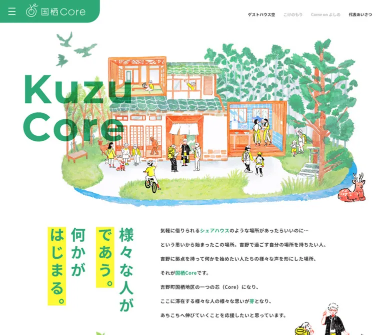
The defining combination is unusually specific: an orange-and-green watercolor building, oversized green Latin lettering, vertical Japanese copy with yellow marker strips, small illustrated visitors, and photographs of everyday activity. A persistent green identity tab touches the upper-left browser edge. Farther down, photographs and white information panels alternate sides over pale yellow washes. Rounded corners appear selectively; illustrated figures cross the boundaries between photography, panels, and background.
On mobile, the page is recomposed. The wordmark sits above the enlarged building, the vertical statement becomes a centered feature, service entries stack, and footer navigation becomes substantially larger. Preserve these changes in hierarchy rather than reducing every desktop measurement by the same percentage.
閉じる
Kuzu Core — Style Reference
A watercolor neighborhood on white paper, connected by green lettering, yellow highlights, and small growing shoots.
Website: Kuzu Core
Original URL: https://kuzu-core.com/
Final URL: https://kuzu-core.com/
Theme: light; white canvas, green identity, bright yellow accents, and pale watercolor washes.
Inspected: October 2, 2026, 06:01 JST; supplied retrieval timestamp: 2026-10-01T21:01:12.578Z.
Viewports: desktop 1440 × 1000 CSS pixels; mobile 390 × 844 CSS pixels.
Scope: the current homepage, including its illustrated opening, introductory statement, three service entry points, news, service descriptions, regional story, representative greeting, and footer. Visual evidence comprises three desktop and two mobile captures. Rendered DOM and computed-style extracts cover additional sections. Destination pages and an opened navigation menu were not visually inspected.
Kuzu Core presents a guesthouse, shared kitchen, and community connection project in Yoshino. Its homepage works as a place introduction and service directory, with several routes into accommodation, social accounts, local information, and contact. The design gives the building and its people more prominence than a single conversion action.
The defining combination is unusually specific: an orange-and-green watercolor building, oversized green Latin lettering, vertical Japanese copy with yellow marker strips, small illustrated visitors, and photographs of everyday activity. A persistent green identity tab touches the upper-left browser edge. Farther down, photographs and white information panels alternate sides over pale yellow washes. Rounded corners appear selectively; illustrated figures cross the boundaries between photography, panels, and background.
On mobile, the page is recomposed. The wordmark sits above the enlarged building, the vertical statement becomes a centered feature, service entries stack, and footer navigation becomes substantially larger. Preserve these changes in hierarchy rather than reducing every desktop measurement by the same percentage.
How to Read This Reference
- Measured values come from the supplied rendered DOM and computed styles. Coordinates describe the captured layout, not necessarily the underlying CSS positioning rules.
- Visual estimates come from the supplied current-page screenshots. Approximate artwork bounds, background colors, and unreported corner radii are labeled accordingly.
- Calculated values are simple relationships between supplied measurements, such as column gaps or relative widths.
- Recommendations describe a reusable implementation. They are not claims about untested source behavior.
- Token names in this document are implementation aliases. The supplied custom-property inventory contains WordPress presets, but does not establish a dedicated brand-token system.
- The desktop opening screenshot does not visibly show the vertical slogan that the desktop DOM measures below the hero. The mobile screenshot does show it. The reason for this capture-state difference is unverified.
- DOM presence alone does not prove visibility. A second navigation group appears in the extracted elements, but its open state was not captured.
Tokens — Colors
Default Palette
| Name | Value | Evidence | Role / suggested token |
|---|---|---|---|
| Core Green | #2ea875 |
Measured: rgb(46, 168, 117) |
Headings, links, vertical statement, active gallery controls; --color-brand |
| Marker Yellow | #fff836 |
Measured: rgb(255, 248, 54) |
News category pills, service-entry numbers and links, regional heading; --color-marker |
| White | #ffffff |
Measured on service-entry heading surfaces; visually dominant canvas | Page and information panels; --color-paper |
| Main Ink | #333333 |
Measured: rgb(51, 51, 51) |
Navigation, body copy, service names; --color-ink |
| Biography Gray | #818181 |
Measured: rgb(129, 129, 129) |
Representative biography; --color-muted |
| Date Gray | #898989 |
Measured: rgb(137, 137, 137) |
News dates; --color-date |
| Subtitle Gray | #c4c4c4 |
Measured: rgb(196, 196, 196) |
English service subtitles; --color-subtitle |
| Inactive Gray | #d9d9d9 |
Measured: rgb(217, 217, 217) |
Inactive desktop gallery selectors; --color-inactive |
| Copyright Gray | #909090 |
Measured: rgb(144, 144, 144) |
Small copyright line; --color-copyright |
| Pale Wash | Approximately #ffffe4 |
Visual approximation only | Fallback beneath a mottled yellow watercolor texture; --color-wash |
The green identity tab visually belongs to the same green family, but its exact background declaration is not included in the extract. Reusing Core Green for that surface is a practical approximation.
The pale service and footer backgrounds are textured, with nearly white areas and irregular yellow patches. A single cream fill cannot reproduce them. Marker Yellow is a separate, much stronger color used for emphasis.
Orange timber, blue water, teal kitchen branding, pink tree trunks, and yellow clothing belong primarily to the artwork and photography. Do not turn every illustrated hue into a competing interface accent.
Palette Boundaries
There is no evidence of a selectable theme or dark-mode control. WordPress preset colors, gradients, and shadows appear in the property inventory, but their availability does not establish visible use on this homepage.
White regional body text and yellow regional headings are measured. Their surrounding container background is not included in the screenshots or sampled element backgrounds. The Quick Start proposes a green field for this treatment and labels it as an adaptation.
Tokens — Typography
Japanese Text — Noto Sans JP
- Measured family:
"Noto Sans JP", with asans-seriffallback on the body. - Weights: predominantly
700for navigation, introductory copy, and headings;400for explanatory paragraphs. - Character: clear and substantial, with generous leading in narrative passages.
- Role: connects expressive illustration to practical, readable information.
The introduction uses bold text with unusually open line spacing. Service descriptions use a much tighter regular-weight setting. Keep that distinction: the opening reads like a statement about the place, while the service copy reads like useful information.
Latin Labels and Numerals — Montserrat
- Measured family:
Montserraton news headings, service subtitles, numbered controls, dates, and several links. - Weights:
400,600, and700, depending on role. - Role: supplies geometric numerals and a clean Latin counterpoint to Japanese copy.
Some Japanese-containing links report Montserrat as their computed family. That does not prove Montserrat supplies their Japanese glyphs; fallback rendering is not resolved by this evidence.
Supporting Families
- Representative credential line:
"Hiragino Kaku Gothic ProN",15px / 26px, weight400. - Copyright:
"Didact Gothic",11px / 11px, weight400,0.44pxtracking in the footer. - The root element’s default Times family is not representative of the visible page typography.
Graphic Wordmarks
The hero H1 has no extracted text and contains the visible two-line Kuzu Core graphic. Its measured box is approximately 388.3 × 239.2px on desktop and 246 × 151.5px on mobile. The H1’s computed 32px font size does not explain the visible lettering.
Use an authorized wordmark asset, or label a text recreation as an approximation. Do not claim the large hero letters are ordinary Montserrat text merely because Montserrat appears elsewhere on the page.
Type Scale
All values below are measured unless otherwise noted. Sizes and line heights are in CSS pixels.
| Role | Desktop | Mobile | Weight / tracking |
|---|---|---|---|
| Top navigation | 14 / 19 |
Not visible | 700 |
| Vertical statement | 54 / 76 |
30 / 36 |
700; 10px → 5.5px tracking |
| Introductory paragraph | 17 / 51 |
15 / 39 |
700; 0.85px tracking |
| Service-entry introduction | 25 / 43 |
22 / 37 |
700 |
| Service-entry heading | 31 / 47 |
24 / 36 |
700; 1.55px → 1.2px tracking |
| Service-entry number | 30 / 70 |
28 / 64 |
Montserrat; 700 → 600 |
| Service-entry link | 18 / 22 |
18 / 22 |
700 |
| NEWS heading | 45 / 55 |
36 / 44 |
Montserrat; 700 → 600 |
| News category | 12 / 26 |
12 / 26 |
700 |
| News title | 14 / 21 |
14 / 21 |
700 |
| News date | 12 / 25 |
12 / 25 |
Montserrat 400 |
| Gallery selector | 21 / 33 |
Not established | Montserrat 600; 1.05px tracking |
| Service name | 30 / 41 |
24 / 33 |
700 |
| English service subtitle | 15 / 19 |
12 / 15 |
Montserrat 600 |
| Service description | 14 / 23 |
14 / 23 |
400 |
| Service detail link | 16 / 22 |
16 / 22 |
Computed Montserrat 700 |
| Regional heading | 32 / 47 |
24 / 39 |
700; 1.6px → 1.2px tracking |
| Regional narrative | 14 / 28 |
14 / 28 |
400 |
| Representative section heading | 27 / 47 |
22 / 47 |
700; 1.35px → 1.1px tracking |
| Representative name | 29 / 39 |
29 / 39 |
700; overall mobile name block wraps |
| Representative letter | 14 / 28 |
14 / 28 |
400 |
| Biography | 13 / 24 |
13 / 24 |
400 |
| Footer primary navigation | 14 / 19 |
18 / 24 |
700 |
| Footer nested navigation | 10 / 14 |
15 / 20 |
700 |
| Address | 14 / 25 |
14 / 25 |
400; 1.54px tracking |
| Copyright | 11 / 11 |
11 / 11 |
Didact Gothic 400; 0.44px tracking |
For the vertical statement, line height controls spacing between vertical columns. It should not be interpreted as conventional horizontal paragraph leading.
Tokens — Spacing & Shapes
The page does not reveal a single universal spacing unit. Its geometry is composed around specific artwork, restrained text measures, and large intervals between sections.
Layout Measurements
| Element | Desktop evidence | Mobile evidence |
|---|---|---|
| Document height | 6531px |
Approximately 9412px |
| Identity tab | Approximately 360 × 82px, visual |
Approximately 225 × 51px, visual |
| Hamburger button box | 26 × 26px at 30, 28 |
18 × 18px at 19, 16.5 |
| Hero wordmark box | 388.3 × 239.2px at approximately 112, 271.4 |
246 × 151.5px at approximately 67, 85.4 |
| Vertical statement paragraph | Two boxes, each 152 × 329px |
Two boxes, each 72 × 177.5px |
| Introductory copy | Approximately 606.4px wide |
315px wide, 37.5px side margins |
| Service-entry heading surface | 300px wide |
330px wide |
| Service panel group | Approximately 1120px wide, visual |
Stacked; individual text measures below |
| Kitchen photograph | Approximately 694 × 540px, visual |
Image bounds not supplied |
| Desktop service information side | Approximately 426px wide, visual |
Not retained as a side column |
| Service title measure | 293px |
293px |
| Service paragraph measure | 293px |
285px |
| Representative letter | Approximately 528.8px |
315px |
| Representative biography | 300px |
315px |
| Footer height | 259px |
805px |
| Gap from main content end to footer | 143px |
143px |
| Back-to-top circle | 131 × 131px |
131 × 131px |
The mobile service-entry heading begins at x = 37.5px but extends to 367.5px. Its measured margins are therefore asymmetric. This differs from the centered 315px reading column used by news and narrative text.
Useful Spacing Relationships
| Relationship | Value | Status |
|---|---|---|
| Desktop top-navigation gap | 30px |
Calculated from adjacent link bounds |
| Desktop service-entry column gap | 52px |
Calculated: 352px pitch minus 300px width |
| Desktop news column gap | 60px |
Calculated: 263px pitch minus 203px width |
| Gallery-control gap | 12px |
Calculated: 56px pitch minus 44px button width |
| Service-panel horizontal text inset | Approximately 66.5px |
Calculated from the visual panel and measured text bounds |
| Desktop statement paragraph gap | 22px |
Calculated from two 152px boxes |
| Mobile statement paragraph gap | 32px |
Calculated from two 72px boxes |
| Mobile news item pitch | 116px |
Measured difference between category positions |
| Desktop footer sublink pitch | 22px |
Measured |
| Mobile footer sublink pitch | 42px |
Measured |
Border Radius and Rules
| Element | Treatment | Evidence |
|---|---|---|
| Service-entry heading cap | 40px 40px 0 0 |
Measured |
| News category pill | 13px radius, 26px high |
Measured |
| Number badges | 50% radius |
Measured |
| Mobile service-detail badge | 109 × 109px |
Measured |
| Desktop kitchen detail badge | Approximately 130px diameter |
Visual estimate |
| Identity tab | Large lower-right corner only | Visual; approximately 48px desktop and 30px mobile |
| Kitchen photo/information assembly | Selected outer corners around 40px |
Visual estimate |
| Representative portrait | Rounded corners around 40px |
Visual estimate |
| Detail links | Thin underline plus right arrow | Visual; measured bottom padding 5px |
Avoid a universal rounded-card treatment. The identity tab has one rounded corner, the entry caps have two upper rounded corners, news categories are pills, and photographs use selective larger rounding.
Components
Persistent Identity Tab
Role: compact branding and access to broader navigation.
A green tab attaches directly to the top and left edges. It contains a white three-line menu icon, a delicate white emblem, and the Japanese/Latin brand lockup. The lower-right corner is deeply rounded; the other outer corners remain square.
The tab remains visible in the supplied scrolled desktop and mobile captures, supporting persistent positioning. Its desktop footprint is approximately 360 × 82px; mobile reduces it to 225 × 51px.
The measured icon button is only 26px square on desktop and 18px square on mobile. For a new implementation, retain the visible icon size while expanding its interactive area to at least 44px. This is an accessibility recommendation, not a measured feature.
Desktop Section Navigation
Role: direct access to the homepage’s main destinations.
Four bold 14px links sit near the upper-right edge with approximately 30px between them. The first begins around x = 903px; the last ends at x = 1397px, leaving a 43px right margin.
The source labels are ゲストハウス空, 国栖Coreキッチン, Come on よしの, and 代表あいさつ. Their recorded destinations are homepage section anchors. This navigation is absent from the mobile opening capture.
Unlike the persistent identity tab, the four-link row is not visible in the supplied lower-page captures. Do not make both elements sticky by assumption.
Illustrated Opening
Role: introduces the place through a recognizable building and a small community of people.
The desktop scene occupies most of the upper page. Orange timber frames and green roof tiles identify the building, trees establish the rural setting, and a blue stream forms an irregular lower edge. Visitors gather at the entrance, walk, cycle, or work inside the building. Birds occupy the upper white space, and a reclining deer anchors the lower-right side.
The large two-line Kuzu Core graphic overlaps the scene from the left. The overall canvas stays white, with no enclosing border, photographic background, or boxed CTA.
On mobile, the title moves to the upper center-left, beginning near y = 85px. The building fills the width beneath it; peripheral scenery is cropped or repositioned. Birds appear near the upper-right, while the deer remains near the lower-right of the illustrated scene. These changes require deliberate artwork framing or separate layers.
The wordmark-to-scene overlap is a composition, not a conventional headline-and-banner stack.
Vertical Statement and Introduction
Role: expresses the purpose of the place before visitors choose a service.
The statement reads 様々な人が であう。何かが はじまる。 in vertical Japanese columns. Green bold lettering sits on white; the shorter phrases receive rectangular yellow highlights. The marker strips follow the vertical text rather than becoming horizontal label pills.
Desktop DOM positions place the two statement blocks to the left of the opening paragraph. The paragraph begins around x = 606px, uses 17px bold text, and has 51px line height. The statement itself is not visibly present in the supplied desktop opening image, so its exact reveal state remains uncertain.
Mobile confirms the full treatment. The two statement groups begin at x = 107px and 211px, both at y = 610px. The introductory paragraph follows at approximately y = 810.5px, inside a centered 315px column. Saplings and tiny shoots decorate the surrounding white space.
Use real vertical text with intentional phrase breaks where possible. Keep decorative trees out of the reading order.
Three Service Entry Points
Role: translates a visitor’s intention into a destination.
The three entries are numbered 01, 02, and 03, with the headings 泊まりたい!, 借りたい!, and つながりたい!. Their links lead respectively to the guesthouse page and the two service Instagram accounts.
The DOM establishes white heading caps with green bold text, yellow numbered circles, and yellow links. Desktop headings are 300px wide and aligned in three columns. Mobile headings become 330px wide and stack vertically. The number badge overlaps the upper-left area of each entry rather than sitting inside a conventional card header.
The full visual treatment of these entries is not shown in the supplied screenshots. Their middle artwork, exact surrounding background, and hover behavior cannot be reconstructed from the text rectangles alone.
News Summary
Role: presents brief updates without overwhelming the place introduction.
A Montserrat NEWS heading introduces four compact entries. Each entry contains a yellow category pill, a bold Japanese title, and a small gray date with a NEW label in the extracted text. Some titles contain inline links to Instagram posts; the evidence does not establish that the whole entry is clickable.
Desktop uses four 203px text columns with 60px gaps. The archive link sits beside the heading. Mobile uses a single 315px column, a centered 36px heading, and an archive link below the entries toward the right.
The category pills measure 124 × 26px with a 13px radius and 16px horizontal padding. The titles are 14px / 21px; dates are Montserrat 12px / 25px.
The visible dates belong to 2022–2023. They establish the captured content, not an automatic feed, current publication schedule, or time-based rule for the NEW label.
Alternating Service Detail Panels
Role: gives each offering a recognizable identity and practical explanation.
The desktop kitchen capture clearly shows the main anatomy:
- A large photograph on the left, approximately
694 × 540px. - A white information region on the right, approximately
426pxwide. - A centered service logo near the top of the information region.
- A bold Japanese service name, followed by a pale gray English subtitle.
- A regular-weight description within a
293pxtext measure. - A green underlined link ending in a right arrow.
- A large outlined
02circle overlapping the upper-right edge. - Illustrated kitchen workers crossing the lower-left photograph boundary.
The guesthouse and community-connection descriptions sit on the left in the desktop DOM; the kitchen description sits on the right. This establishes the alternating orientation.
The kitchen image shows a hand preparing vegetables beside cookware. The preceding guesthouse photograph shows warm timber, a corridor, and a wash area. Both use ordinary, tactile details rather than anonymous stock imagery.
Mobile puts the service titles and descriptions into centered columns. The title measure remains 293px, while the paragraph narrows to 285px. The link appears much farther below the paragraph than on desktop, consistent with media occupying the intervening area; the exact mobile media geometry is not included in the captures.
Numbered Gallery Selectors
Role: indicates selectable photographs within service and regional media groups.
Desktop controls use numbers above small sprout shapes. Each measured button box is 44 × 51px, with a 12px gap. Active controls are green; inactive controls are pale gray. The kitchen capture shows three selectors. The extracted desktop controls also include five-button groups for other media regions.
The kitchen screenshot highlights 01, while the supplied DOM snapshot colors the third kitchen selector green. This establishes different captured states, but does not establish whether the cause was autoplay, interaction, or capture timing.
Button operation, slide-transition direction, interval, swipe support, and keyboard behavior were not exercised. No gallery library can be identified from this evidence.
Regional Story
Role: connects the services to the history, landscape, and craft traditions of the surrounding area.
The heading uses yellow Japanese text, with a geographic introduction above the main place name. Desktop content reserves approximately 558px of left space inside a 1120px section; the prose occupies the right side. A five-button media-control group appears elsewhere in the same regional portion of the desktop DOM.
The body is white, regular-weight 14px / 28px. Mobile removes the large left inset and uses the centered 315px reading column. The heading reduces from 32px / 47px to 24px / 39px.
The regional images and exact background treatment are not visible in the supplied screenshots. Preserve the measured hierarchy, but do not invent a map, landscape image, or decorative section outline as an observed feature.
Representative Greeting
Role: gives the place a personal voice and explains the building’s reuse.
Desktop uses an editorial two-column composition. The main letter begins at approximately x = 228px and measures 529px wide. The right column begins around x = 874px and is 300px wide.
A green section heading precedes the representative’s name, Romanized name, credential line, and long-form letter. The right column holds a rounded portrait above a smaller gray biography. A watercolor deer overlaps the portrait’s lower-right edge.
The portrait is approximately 300 × 285px in the screenshot, with large rounded corners. The layout has no enclosing card, outline, or shadow. White space provides the separation.
The original page names Kumiko Sawaki as the representative and shows a matching copyright line. Her architectural credential is content about the representative; it is not evidence of website design or development authorship.
On mobile, the Romanized name moves beneath the Japanese name. The narrative and biography use a 315px measure, and the right-column material moves below the main letter.
Footer and Back-to-Top Link
Role: gathers practical destinations, room links, contact details, and social accounts.
Desktop places a smaller illustrated building on the left, two navigation groups in the center, and contact information on the right. A yellow watercolor wash spans the footer. The building protrudes above the section boundary.
Primary navigation items have black sprout icons. Nested guesthouse links are indented and marked with small green bullets. The right side contains the guesthouse name, postal address, Facebook/Instagram/LINE icons, a LINE QR code, and a small copyright line.
Mobile turns navigation into a spacious vertical list. Primary labels increase from 14px to 18px; nested links increase from 10px to 15px. Illustrated saplings decorate the right edge. The contact area below is white, with the social icons centered in a separate row. The desktop QR code is not shown in the mobile footer capture.
The TOPへ link is a 131px circular wash-colored shape that overlaps the footer’s upper-right edge. Its top sits 65px above the footer in both measured layouts. It belongs to the footer composition; the evidence does not show a globally fixed back-to-top widget.
Navigation Menu Evidence
The DOM contains another navigation group with the same main destinations, room links, contact link, and social accounts. Its desktop typography is larger than the footer’s; mobile primary links measure 18px / 24px.
This supports the presence of menu content, but no supplied screenshot shows the menu opened. Its backdrop, entrance direction, close icon, focus management, scroll locking, and dismissal behavior remain unverified.
Tokens — Motion & Interaction
| Treatment | Evidence | What can be concluded |
|---|---|---|
| Hero H1 transition | transform 1.5s cubic-bezier(0.165, 0.84, 0.44, 1), opacity 1.5s cubic-bezier(0.165, 0.84, 0.44, 1) |
A long eased transform/opacity transition is declared; starting transform and trigger are not supplied |
| Mobile service-entry introduction | Transform and opacity transitions, 1s, same easing |
A shorter reveal treatment is declared on this element |
| Mobile service-detail number badges | 1.2s linear both bounce-appear |
A named finite animation is applied; keyframe geometry is unavailable |
| Initial cover | Extracted inline text includes fade-out, opacity 1 to 0, and a fixed cover |
A fade-cover mechanism exists in source text; duration and visible sequence are unverified |
| Gallery selected state | Green active selector versus gray inactive selectors | A visible state distinction is established |
| Gallery state changes | Screenshot and DOM show different kitchen selections | Multiple captured states exist; autoplay and input behavior are not established |
| Persistent identity tab | Same upper-left placement in scrolled captures | Persistence is visually supported; its exact positioning declaration is not supplied |
| Section navigation | Recorded fragment links | Destination structure is known; smooth scrolling is not verified |
| Detail and social links | Recorded internal, Instagram, Facebook, LINE, and contact-form URLs | Link destinations are known; opening mode and destination behavior were not tested |
Do not interpret a computed transition value of all alone as a meaningful animation duration. Likewise, animation: none on a sampled element does not prove its children, ancestors, or scripts never animate.
The inspection waited for load, image decoding, finite animation settling, and sampled layout stability, and traversed intermediate scroll positions. These checks improve capture reliability but do not prove that every delayed reveal or interaction was exercised.
For a new implementation, favor restrained opacity/translation reveals and limited playful emphasis on number badges. Reduced-motion support and a visible default state are recommended. Do not invent continuous floating, parallax, cursor effects, or a specific carousel interval.
Surfaces
| Layer | Appearance | Evidence / purpose |
|---|---|---|
| Main canvas | White, largely unboxed | Visible in opening and greeting captures |
| Identity tab | Solid green, white linework, one rounded corner | Persistent visual anchor |
| Service and footer surroundings | Pale mottled yellow watercolor | Visible texture; exact asset and color distribution unavailable |
| Service information | White, no visible shadow | Supports readable text beside photography |
| Entry heading caps | White with green text and rounded upper corners | Computed style evidence |
| News categories | Bright yellow pills with green text | Computed style evidence |
| Regional text treatment | White body and yellow heading | Measured text colors; background container unverified |
| Portrait | Full-color photo with rounded corners and overlapping deer | Personal, editorial presentation |
There is no visible general elevation system. Separation comes from white space, photography, watercolor boundaries, selective corner rounding, and foreground illustrations. Avoid importing the unused WordPress shadow presets into the visual language.
Imagery
The illustrations resemble watercolor and colored-pencil work on white paper. Preserve irregular pigment, broken edges, lightly uneven architectural lines, and areas where the paper remains visible. The building is detailed enough to feel like a particular place, but its surrounding people and animals keep the composition approachable.
Human figures use expressive dark outlines, small areas of yellow clothing, and simplified faces. They are placed at meaningful activity points: arriving with backpacks, preparing food, talking, cycling, or spending time inside. The deer, birds, trees, and shoots connect separate sections without becoming a repeated icon grid.
Photography remains natural and full color. Warm wood, stainless-steel cookware, vegetables, and an informal portrait introduce real materials and people. Images are not globally recolored to green or yellow.
Observed Asset References
No image URLs, filenames, intrinsic dimensions, or complete image-element inventory were supplied. The references below identify visible assets rather than inventing paths.
| Asset | Current-page evidence | Reuse guidance |
|---|---|---|
| Main building and woodland scene | Desktop opening and mobile opening | Preserve orange structure, green roof, surrounding vegetation, people, and blue stream |
| Kuzu Core hero graphic | Desktop and mobile opening | Preserve its two-line proportion; use the graphic rather than the H1’s computed font size |
| White header identity | All current captures | Keep the fine emblem and lettering legible at both tab sizes |
| Birds and reclining deer | Opening captures | Use as peripheral compositional anchors |
| Kitchen-worker pair | Kitchen service capture | Overlap the photograph edge; retain hand-drawn outlines and yellow accents |
| Backpacking visitors | Guesthouse area in the desktop service capture | Connect the photograph with the illustration language |
| Kitchen photograph | Desktop service capture | Everyday preparation detail, broad crop, natural color |
| Guesthouse interior photograph | Upper part of desktop service capture | Warm timber, corridor, and wash-area detail |
| Kitchen service logo | Desktop service capture | Distinct teal house-and-utensil identity; not the global brand color |
| Representative portrait | Desktop greeting capture | Rounded photo with deer overlap |
| Simplified building illustration | Desktop footer and mobile footer edge | Reintroduce the place at the end of the page |
| Saplings and shoots | Mobile opening and footer | Decorate transitions without occupying text columns |
| Yellow wash | Desktop service/footer and mobile footer | Use an actual texture when available; a flat tint is only a fallback |
| Sprout navigation markers | Desktop and mobile footer | Preserve the simple two-leaf silhouette |
Use smooth, normal image rendering. The original is not pixel art. Obtain authorized assets for close reproduction; CSS can reproduce the layout but cannot replace the site’s distinctive illustration work.
Layout & Responsive Behavior
Desktop — 1440 × 1000
The opening is a wide illustrated composition with a graphic title overlapping from the left. The fixed identity tab occupies only the upper-left portion of the viewport, leaving room for right-aligned section links.
The introductory statement and paragraph sit side by side in the DOM. Service entry points form three columns; news forms four. The detailed service sections use an approximately 62% / 38% photo/information split and alternate orientation. The representative section uses a separate, narrower editorial arrangement rather than reusing the service grid.
Large white intervals are structural. For example, the footer starts 143px after the measured main-content end. Avoid filling these pauses with extra cards or calls to action.
Mobile — 390 × 844
The hero wordmark becomes 246px wide, but the building still occupies nearly the full viewport. This is an enlarged, reframed scene rather than a miniature desktop illustration.
The vertical statement remains vertical at 30px, centered above the introductory paragraph. Most narrative text uses 315px width and 37.5px side margins. Service title and description columns are narrower, at 293px and 285px respectively.
Three service entries and four news entries stack. The news archive link moves below the list. Service names reduce to 24px; service descriptions retain 14px / 23px. The representative name keeps its 29px size while the Romanized name moves to another line.
The footer becomes taller and more navigable, increasing from 259px to 805px. Its links become larger rather than smaller. The back-to-top circle keeps its 131px diameter.
Responsive Limits
Only two viewport widths were supplied. The original breakpoint, tablet layout, landscape behavior, and minimum supported width are unknown. A breakpoint near 900px is used below as an implementation recommendation, not a recovered source rule.
Do not preserve desktop paragraph breaks mechanically on narrow screens. The supplied mobile text has different wrapping and paragraph grouping. Maintain meaningful Japanese phrase breaks while allowing the content to adapt to font loading and text enlargement.
Do’s and Don’ts
Do
- Build the identity around green
#2ea875, yellow#fff836, and white space. - Keep the watercolor building and its people as the primary visual introduction.
- Preserve the upper-left tab’s attachment to the viewport edges and its single rounded corner.
- Treat the hero title as a graphic with measured dimensions.
- Retain vertical Japanese copy and rectangular yellow phrase highlights.
- Use bold, generously spaced opening copy and quieter service paragraphs.
- Alternate desktop photo/information sections and allow illustrated figures to overlap their edges.
- Use numbered circles, sprout selectors, and sprout navigation markers consistently.
- Recompose the mobile hero and enlarge mobile footer navigation.
- Keep photography natural and materially specific.
- Separate measured source behavior from optional implementation improvements.
Don’t
- Don’t replace the illustrated opening with a generic full-width stock photograph.
- Don’t force the homepage into a single-CTA landing-page pattern.
- Don’t turn every content group into a rounded, shadowed card.
- Don’t replace the watercolor wash with a glossy gradient.
- Don’t infer a hero font from the H1’s computed
32pxvalue. - Don’t assume every WordPress preset is part of the visible palette.
- Don’t use the tiny desktop footer sublink size on mobile.
- Don’t crop out all the people, animals, and landscape cues when adapting the hero.
- Don’t treat menu DOM bounds as proof of an observed open menu.
- Don’t invent gallery autoplay timing, swipe behavior, or animation trajectories.
- Don’t leave essential text hidden while waiting for an animation script.
Recommended Implementation Additions
These are recommendations for a new implementation, not verified features of the original page:
- Expand menu and social controls to at least
44 × 44pxinteractive areas while keeping the visible artwork compact. - Give the menu button an accessible name,
aria-expanded, and an associated navigation region. Manage focus appropriately if that region becomes modal. - Give gallery buttons meaningful labels and a programmatic selected state. If autoplay is added, provide pause behavior and respect reduced-motion preferences.
- Provide an accessible name for the graphic H1. Decorative birds, trees, sprouts, and figures should have empty alternative text or be hidden from assistive technology.
- Keep functional links underlined or otherwise identifiable independently of green color.
- Review small-text contrast. Calculated contrast is approximately
3.0:1for Core Green on white and2.7:1on Marker Yellow. A darker green such as#18714eis a recommended small-text alternative; it is not an observed source color. - Make the faint English subtitles and small desktop footer links more legible where they carry essential information.
- Apply an anchor offset so the persistent identity tab does not obscure destination headings.
- Supply image dimensions and responsive sources. Prioritize the opening artwork, and defer lower-page photos where appropriate.
- Keep all content visible when JavaScript or motion effects are unavailable.
Agent Prompt Guide
Quick Color Reference
- Main canvas and information panels:
#ffffff. - Brand lettering, large accents, and numbered outlines:
#2ea875. - Marker strips and category pills:
#fff836. - Body text:
#333333. - English service subtitles: observed
#c4c4c4; improve contrast if functionally necessary. - Surrounding texture: pale yellow watercolor with white gaps;
#ffffe4is only an approximate fallback. - Optional accessible small-link color:
#18714e, explicitly an adaptation.
Overall Prompt
“Create a Japanese homepage for a rural guesthouse, shared kitchen, and community meeting place. Use a white canvas, green #2ea875, and yellow #fff836. Anchor the upper-left edge with a persistent green brand tab containing white linework and one large rounded lower-right corner. Introduce the place with an orange-and-green watercolor building, woodland, visitors, birds, a deer, and an oversized two-line graphic wordmark. Follow with vertical Japanese copy using yellow marker strips and a generously spaced introductory paragraph. Present three visitor intentions, compact news, alternating photograph-and-information sections, a personal representative letter, and a watercolor footer. Use Noto Sans JP for Japanese text and Montserrat for Latin labels and numerals. Recompose the mobile hero, stack the content, and enlarge mobile footer links. Keep surfaces flat and let illustration, photography, and white space provide the hierarchy.”
Example Component Prompts
- Identity tab: “A green tab touching the top and left viewport edges, approximately 360 × 82px on desktop and 225 × 51px on mobile. White three-line menu icon and delicate identity artwork; only the lower-right corner is deeply rounded. Preserve a generous invisible hit area around the menu icon.”
- Vertical introduction: “Two groups of vertical Japanese text in bold green Noto Sans JP. Highlight the phrases
であう。andはじまる。with straight yellow marker strips. Place them beside a spacious bold paragraph on desktop and above a centered 315px reading column on a 390px phone.” - Kitchen detail: “An approximately 1120px desktop section with a 694px-wide food-preparation photograph at left and a 426px white information region at right. Stack a teal service logo, 30px Japanese title, small gray English subtitle, 14px body copy, and a green underlined arrow link. Overlap the upper-right edge with an outlined 02 circle and the lower-left photo edge with hand-drawn kitchen workers.”
- News summary: “Four restrained desktop columns containing a yellow category pill, a bold 14px Japanese update, and a gray 12px date. Use a 45px Montserrat NEWS heading. On mobile, stack the updates in a 315px column, reduce the heading to 36px, and move the archive link below the list.”
- Representative greeting: “A white editorial section with a green heading and a 529px letter column beside a 300px portrait-and-biography column. Round the portrait corners and overlap one corner with a watercolor deer. Avoid a card border or shadow; stack the columns on mobile.”
- Footer: “A pale yellow watercolor footer with a small illustrated building, black sprout markers for primary links, indented green-bullet room links, and practical guesthouse contact information. Overlap the upper-right edge with a 131px circular back-to-top link. On mobile, use 18px primary links and 15px nested links, then place the address and centered social icons on white.”
Quick Start
CSS Custom Properties
This is a reusable adaptation, not extracted production CSS. Measured colors and type sizes are preserved where practical. Artwork positions, the 900px breakpoint, accessible hit areas, and background fallbacks are recommendations.
Load the named fonts through your project’s normal font pipeline. Supply authorized artwork through image elements. Set --wash-image only when an appropriate texture is available; no original asset path was supplied.
Expected anatomy: .brand-tab contains a menu button and logo; .hero contains scene and title images; .intro contains .intro__slogan and .intro__copy. A .service-detail contains .service-copy, .service-media, and .service-action as siblings so mobile can place the image between description and link. Number badges and decorative figures are additional positioned children.
:root {
  /* Measured colors */
  --color-brand: #2ea875;
  --color-marker: #fff836;
  --color-paper: #ffffff;
  --color-ink: #333333;
  --color-muted: #818181;
  --color-date: #898989;
  --color-subtitle: #c4c4c4;
  --color-inactive: #d9d9d9;
  --color-copyright: #909090;

  /* Recommended fallbacks and accessibility adaptation */
  --color-wash: #ffffe4;
  --color-link-readable: #18714e;
  --wash-image: none;

  /* Measured families, with explicit implementation fallbacks */
  --font-body: 'Noto Sans JP', sans-serif;
  --font-latin: 'Montserrat', 'Noto Sans JP', sans-serif;
  --font-copyright: 'Didact Gothic', sans-serif;
  --font-credential: 'Hiragino Kaku Gothic ProN', sans-serif;

  --text-body: 14px;
  --leading-body: 23px;
  --text-service: 30px;
  --leading-service: 41px;
  --text-service-subtitle: 15px;
  --leading-service-subtitle: 19px;
  --text-intro: 17px;
  --leading-intro: 51px;

  /* Layout aliases: measured proportions with fluid gutters */
  --content-max: 1120px;
  --gutter: clamp(24px, 9.6154vw, 37.5px);
  --radius-panel: 40px;
  --radius-pill: 13px;
  --tab-width: 360px;
  --tab-height: 82px;
  --tab-radius: 48px;
  --top-circle: 131px;

  /* Declared source reveal timing */
  --ease-reveal: cubic-bezier(0.165, 0.84, 0.44, 1);
  --motion-hero: 1.5s var(--ease-reveal);
  --motion-section: 1s var(--ease-reveal);
}

* {
  box-sizing: border-box;
}

body {
  margin: 0;
  color: var(--color-ink);
  background: var(--color-paper);
  font-family: var(--font-body);
}

img {
  display: block;
  max-width: 100%;
}

button,
a {
  -webkit-tap-highlight-color: transparent;
}

button {
  font: inherit;
}

.container {
  width: min(calc(100% - 2 * var(--gutter)), var(--content-max));
  margin-inline: auto;
}

[id] {
  scroll-margin-top: calc(var(--tab-height) + 24px);
}

.brand-tab {
  position: fixed;
  z-index: 50;
  inset: 0 auto auto 0;
  display: flex;
  align-items: center;
  gap: 21px;
  width: var(--tab-width);
  height: var(--tab-height);
  padding-inline: 21px;
  border-bottom-right-radius: var(--tab-radius);
  background: var(--color-brand);
  color: white;
}

.menu-toggle {
  display: grid;
  place-items: center;
  flex: 0 0 44px;
  width: 44px;
  height: 44px;
  padding: 0;
  border: 0;
  background: transparent;
  color: inherit;
  cursor: pointer;
}

.menu-toggle__lines {
  width: 26px;
  height: 2px;
  border-radius: 2px;
  background: currentColor;
  box-shadow: 0 -11px currentColor, 0 11px currentColor;
}

.brand-tab__logo {
  width: 213px;
  height: auto;
}

.top-nav {
  position: absolute;
  z-index: 5;
  top: 41.5px;
  right: 43px;
  display: flex;
  gap: 30px;
  font-size: 14px;
  font-weight: 700;
  line-height: 19px;
}

.top-nav a {
  color: var(--color-ink);
  text-decoration: none;
}

/* Artwork framing is an approximation; tune to supplied assets. */
.hero {
  position: relative;
  height: clamp(620px, 56vw, 806px);
  max-width: 1440px;
  margin-inline: auto;
  overflow: clip;
}

.hero__scene {
  position: absolute;
  right: 6.5%;
  bottom: 60px;
  width: 78%;
  height: auto;
}

.hero__title {
  position: absolute;
  top: 33.7%;
  left: 7.78%;
  width: min(26.97vw, 388.3px);
  margin: 0;
}

.hero__title img {
  width: 100%;
  height: auto;
}

.intro {
  display: grid;
  grid-template-columns: 326px minmax(0, 606px);
  column-gap: 85px;
  width: min(calc(100% - 2 * var(--gutter)), 1050px);
  margin-inline: auto;
}

.intro__slogan {
  display: flex;
  flex-direction: row-reverse;
  gap: 22px;
  padding-top: 14px;
}

.intro__slogan p {
  width: 152px;
  height: 329px;
  margin: 0;
  writing-mode: vertical-rl;
  text-orientation: upright;
  color: var(--color-brand);
  font-size: 54px;
  font-weight: 700;
  line-height: 76px;
  letter-spacing: 10px;
}

.intro__slogan mark {
  padding: 0;
  color: inherit;
  background: var(--color-marker);
}

.intro__copy {
  margin: 0;
  font-size: var(--text-intro);
  font-weight: 700;
  line-height: var(--leading-intro);
  letter-spacing: 0.85px;
}

.wash {
  background-color: var(--color-wash);
  background-image: var(--wash-image);
  background-position: center;
  background-size: cover;
}

.intent-grid {
  display: grid;
  grid-template-columns: repeat(3, minmax(0, 300px));
  justify-content: center;
  gap: 52px;
}

.intent-card__heading {
  margin: 0;
  padding: 31px 20px 22px;
  border-radius: 40px 40px 0 0;
  color: var(--color-brand);
  background: white;
  font-size: 31px;
  font-weight: 700;
  line-height: 47px;
  letter-spacing: 1.55px;
}

.news-grid {
  display: grid;
  grid-template-columns: repeat(4, minmax(0, 203px));
  justify-content: center;
  gap: 60px;
}

.news-title {
  margin: 0;
  font: 700 45px/55px var(--font-latin);
}

.news-category {
  display: inline-block;
  min-width: 124px;
  padding-inline: 16px;
  border-radius: var(--radius-pill);
  color: var(--color-brand);
  background: var(--color-marker);
  font-size: 12px;
  font-weight: 700;
  line-height: 26px;
}

.news-item__title {
  margin: 11px 0 6px;
  font-size: 14px;
  font-weight: 700;
  line-height: 21px;
}

.news-date {
  color: var(--color-date);
  font: 400 12px/25px var(--font-latin);
}

.service-detail {
  position: relative;
  display: grid;
  grid-template-columns: 426fr 694fr;
  grid-template-areas: 'copy media' 'action media';
  grid-template-rows: 1fr auto;
  margin-block: 140px;
  border-radius: 40px 0;
  background: white;
}

.service-detail--reverse {
  grid-template-columns: 694fr 426fr;
  grid-template-areas: 'media copy' 'media action';
}

.service-copy {
  grid-area: copy;
  min-width: 0;
  padding: 52px 66.5px 24px;
}

.service-logo {
  width: 176px;
  max-height: 176px;
  margin: 0 auto 24px;
  object-fit: contain;
}

.service-title {
  margin: 0;
  font-size: var(--text-service);
  font-weight: 700;
  line-height: var(--leading-service);
}

.service-subtitle {
  margin: 2px 0 19px;
  color: var(--color-subtitle);
  font-family: var(--font-latin);
  font-size: var(--text-service-subtitle);
  font-weight: 600;
  line-height: var(--leading-service-subtitle);
}

.service-description {
  margin: 0;
  font-size: var(--text-body);
  line-height: var(--leading-body);
}

.service-media {
  position: relative;
  grid-area: media;
  min-width: 0;
  min-height: 540px;
  margin: 0;
  border-bottom-right-radius: 40px;
}

.service-detail--reverse .service-media {
  border-radius: 40px 0 0;
}

.service-media > img {
  position: absolute;
  inset: 0;
  width: 100%;
  height: 100%;
  border-radius: inherit;
  object-fit: cover;
}

.service-action {
  grid-area: action;
  padding: 0 66.5px 70px;
}

.text-link {
  display: inline-flex;
  align-items: center;
  gap: 12px;
  padding-bottom: 5px;
  border-bottom: 1px solid currentColor;
  color: var(--color-brand);
  font: 700 16px/22px var(--font-latin);
  text-decoration: none;
}

/* Optional contrast improvement; not the observed source color. */
.text-link--readable {
  color: var(--color-link-readable);
}

.service-number {
  position: absolute;
  z-index: 2;
  top: -50px;
  left: -60px;
  display: grid;
  place-items: center;
  width: 130px;
  height: 130px;
  border: 5px solid currentColor;
  border-radius: 50%;
  color: var(--color-brand);
  font: 600 52px/1 var(--font-latin);
}

.service-detail--reverse .service-number {
  right: -60px;
  left: auto;
}

.gallery-controls {
  display: flex;
  gap: 12px;
}

.gallery-controls button {
  width: 44px;
  min-height: 51px;
  padding: 0;
  border: 0;
  color: var(--color-inactive);
  background: transparent;
  font: 600 21px/33px var(--font-latin);
  letter-spacing: 1.05px;
  cursor: pointer;
}

.gallery-controls button[aria-current='true'] {
  color: var(--color-brand);
}

/* Supply sprout artwork inside each control; it is not a font glyph. */
.gallery-controls svg {
  display: block;
  width: 34px;
  margin-inline: auto;
  fill: currentColor;
}

/* Green field is a recommendation; its source fill was not measured. */
.region {
  padding-block: 96px;
  color: white;
  background: var(--color-brand);
}

.region h2 {
  color: var(--color-marker);
  font-size: 32px;
  line-height: 47px;
  letter-spacing: 1.6px;
}

.region p {
  font-size: 14px;
  line-height: 28px;
}

.greeting {
  display: grid;
  grid-template-columns: minmax(0, 529px) 300px;
  gap: 117px;
  width: min(calc(100% - 2 * var(--gutter)), 946px);
  margin-inline: auto;
}

.greeting h2 {
  color: var(--color-brand);
  font-size: 27px;
  line-height: 47px;
  letter-spacing: 1.35px;
}

.greeting__letter {
  font-size: 14px;
  line-height: 28px;
}

.greeting__portrait {
  width: 300px;
  border-radius: 40px;
}

.greeting__bio {
  color: var(--color-muted);
  font-size: 13px;
  line-height: 24px;
}

.site-footer {
  position: relative;
  margin-top: 143px;
}

.footer-inner {
  display: grid;
  grid-template-columns: minmax(0, 1fr) 166px 166px 251px;
  gap: 45px;
  padding-block: 32px;
}

.footer-house {
  width: 355px;
  margin-top: -85px;
  margin-left: -23px;
}

.footer-nav {
  font-size: 14px;
  font-weight: 700;
  line-height: 19px;
}

.footer-nav a {
  color: var(--color-ink);
  text-decoration: none;
}

.footer-nav__children {
  display: grid;
  gap: 8px;
  padding-left: 65px;
  font-size: 10px;
  line-height: 14px;
}

.footer-address {
  font-size: 14px;
  font-style: normal;
  line-height: 25px;
  letter-spacing: 1.54px;
}

.copyright {
  color: var(--color-copyright);
  font: 400 11px/11px var(--font-copyright);
  letter-spacing: 0.44px;
}

.back-to-top {
  position: absolute;
  top: -65px;
  right: 29px;
  display: flex;
  flex-direction: column;
  align-items: center;
  gap: 8px;
  width: var(--top-circle);
  height: var(--top-circle);
  padding-top: 12px;
  border-radius: 50%;
  color: var(--color-brand);
  background-color: var(--color-wash);
  background-image: var(--wash-image);
  font-weight: 700;
  text-decoration: none;
}

/* No hidden default state: scripts may opt into a reveal. */
.reveal {
  transition: transform var(--motion-section), opacity var(--motion-section);
}

:where(a, button):focus-visible {
  outline: 3px solid var(--color-ink);
  outline-offset: 4px;
}

@media (max-width: 900px) {
  :root {
    --tab-width: 225px;
    --tab-height: 51px;
    --tab-radius: 30px;
    --text-intro: 15px;
    --leading-intro: 39px;
    --text-service: 24px;
    --leading-service: 33px;
    --text-service-subtitle: 12px;
    --leading-service-subtitle: 15px;
  }

  .brand-tab {
    gap: 2px;
    padding-inline: 10px;
  }

  .brand-tab__logo {
    width: 134px;
  }

  .menu-toggle__lines {
    width: 18px;
    box-shadow: 0 -8px currentColor, 0 8px currentColor;
  }

  .top-nav {
    display: none;
  }

  .hero {
    height: 610px;
  }

  .hero__title {
    top: 85.4px;
    left: 50%;
    width: min(246px, 68vw);
    transform: translateX(-50%);
  }

  .hero__scene {
    right: auto;
    bottom: 32px;
    left: 50%;
    width: 560px;
    max-width: none;
    transform: translateX(-50%);
  }

  .intro {
    grid-template-columns: minmax(0, 1fr);
    gap: 23px;
    max-width: 420px;
  }

  .intro__slogan {
    justify-content: center;
    gap: 32px;
    padding-top: 0;
  }

  .intro__slogan p {
    width: 72px;
    height: 177.5px;
    font-size: 30px;
    line-height: 36px;
    letter-spacing: 5.5px;
  }

  .intent-grid,
  .news-grid {
    grid-template-columns: minmax(0, 1fr);
    gap: 26px;
  }

  .intent-card__heading {
    padding: 18px 12px;
    font-size: 24px;
    line-height: 36px;
    letter-spacing: 1.2px;
  }

  .news-title {
    text-align: center;
    font-size: 36px;
    font-weight: 600;
    line-height: 44px;
  }

  .service-detail,
  .service-detail--reverse {
    grid-template-columns: minmax(0, 1fr);
    grid-template-areas: 'copy' 'media' 'action';
    grid-template-rows: auto;
    margin-block: 120px;
  }

  .service-copy {
    padding: 60px 11px 24px;
  }

  .service-description {
    margin-inline: 4px;
  }

  .service-media {
    min-height: 240px;
  }

  .service-action {
    padding: 24px 0 32px;
    text-align: center;
  }

  .service-number {
    top: -54px;
    left: -9px;
    width: 109px;
    height: 109px;
    border-width: 4px;
    font-size: 39px;
  }

  .service-detail--reverse .service-number {
    right: -9px;
  }

  .region h2 {
    font-size: 24px;
    line-height: 39px;
    letter-spacing: 1.2px;
  }

  .greeting {
    grid-template-columns: minmax(0, 1fr);
    gap: 36px;
    max-width: 420px;
  }

  .greeting h2 {
    font-size: 22px;
    letter-spacing: 1.1px;
  }

  .greeting__portrait {
    margin-inline: auto;
  }

  .footer-inner {
    grid-template-columns: minmax(0, 1fr);
    gap: 22px;
    padding-top: 60px;
  }

  .footer-house {
    position: absolute;
    top: -75px;
    left: 22px;
    width: 214px;
    margin: 0;
  }

  .footer-nav {
    font-size: 18px;
    line-height: 24px;
  }

  .footer-nav__children {
    gap: 22px;
    padding-left: 59px;
    font-size: 15px;
    line-height: 20px;
  }

  .footer-contact {
    margin-inline: calc(-1 * var(--gutter));
    padding: 40px var(--gutter) 0;
    background: white;
  }

  .back-to-top {
    right: 10px;
  }
}

/* Recommended behavior; not verified on the original page. */
@media (prefers-reduced-motion: reduce) {
  *,
  *::before,
  *::after {
    animation: none !important;
    transition: none !important;
    scroll-behavior: auto !important;
  }
}
The hero crop must be tuned to the actual artwork supplied to a project. A dedicated mobile composition may reproduce the observed arrangement more faithfully than cropping a single desktop composite. The CSS does not implement menu state, gallery operation, reveal triggers, or artwork animation.
Tailwind v4 Token Mapping
Optional aliases for a project already using Tailwind v4. This is not evidence that the original website uses Tailwind.
@theme inline {
  --color-core: var(--color-brand);
  --color-marker: #fff836;
  --color-paper: #ffffff;
  --color-ink: #333333;
  --color-wash: #ffffe4;
  --color-readable-green: #18714e;

  --font-sans: 'Noto Sans JP', sans-serif;
  --font-latin: 'Montserrat', 'Noto Sans JP', sans-serif;
  --font-caption: 'Didact Gothic', sans-serif;

  --text-service: var(--text-service);
  --text-introduction: var(--text-intro);
  --text-body-copy: 14px;

  --radius-panel: 40px;
  --radius-category: 13px;
  --spacing-page-gutter: var(--gutter);
  --spacing-top-circle: 131px;
}
Use a differently named application variable for the service size if your build treats the --text-service alias as self-referential; for example, rename the root variable to --site-service-size and map Tailwind’s --text-service to it.
Sources & Evidence
- Original and final website: https://kuzu-core.com/. The supplied inspection reports HTTP
200with no URL change. - Capture timestamp:
2026-10-01T21:01:12.578Z, equivalent to October 2, 2026, 06:01:12 JST. - Desktop evidence:
1440 × 1000viewport; supplied opening, service-section, and greeting/footer captures; rendered document height6531px. - Mobile evidence:
390 × 844viewport; supplied opening and footer captures; rendered document height approximately9412px. - Rendered evidence: page text, link destinations, element rectangles, computed font declarations, colors, line heights, letter spacing, selected radii, transitions, animation declarations, and a custom-property inventory.
- Observed page structure: homepage sections and their links, including the greeting anchor, the guesthouse section, and the kitchen section. Destination pages were not separately inspected.
- Inspection limits: no opened-menu capture, verified gallery interaction, hover/focus test, destination-page test, full asset inventory, complete animation keyframes, original breakpoint rules, or additional viewport sizes. Some screenshot and DOM states differ.
This reference describes the current homepage from the supplied original-page evidence. Visual estimates, responsive implementation choices, and accessibility additions are identified separately from measured source values. The Quick Start is an implementation reference and has not been browser-tested as a complete page.
# Kuzu Core — Style Reference

> A watercolor neighborhood on white paper, connected by green lettering, yellow highlights, and small growing shoots.

**Website:** [Kuzu Core](https://kuzu-core.com/)
**Original URL:** https://kuzu-core.com/
**Final URL:** https://kuzu-core.com/
**Theme:** light; white canvas, green identity, bright yellow accents, and pale watercolor washes.
**Inspected:** October 2, 2026, 06:01 JST; supplied retrieval timestamp: `2026-10-01T21:01:12.578Z`.
**Viewports:** desktop `1440 × 1000` CSS pixels; mobile `390 × 844` CSS pixels.
**Scope:** the current homepage, including its illustrated opening, introductory statement, three service entry points, news, service descriptions, regional story, representative greeting, and footer. Visual evidence comprises three desktop and two mobile captures. Rendered DOM and computed-style extracts cover additional sections. Destination pages and an opened navigation menu were not visually inspected.

Kuzu Core presents a guesthouse, shared kitchen, and community connection project in Yoshino. Its homepage works as a place introduction and service directory, with several routes into accommodation, social accounts, local information, and contact. The design gives the building and its people more prominence than a single conversion action.

The defining combination is unusually specific: an orange-and-green watercolor building, oversized green Latin lettering, vertical Japanese copy with yellow marker strips, small illustrated visitors, and photographs of everyday activity. A persistent green identity tab touches the upper-left browser edge. Farther down, photographs and white information panels alternate sides over pale yellow washes. Rounded corners appear selectively; illustrated figures cross the boundaries between photography, panels, and background.

On mobile, the page is recomposed. The wordmark sits above the enlarged building, the vertical statement becomes a centered feature, service entries stack, and footer navigation becomes substantially larger. Preserve these changes in hierarchy rather than reducing every desktop measurement by the same percentage.
閉じる
# Kuzu Core — Style Reference

> A watercolor neighborhood on white paper, connected by green lettering, yellow highlights, and small growing shoots.

**Website:** [Kuzu Core](https://kuzu-core.com/)
**Original URL:** https://kuzu-core.com/
**Final URL:** https://kuzu-core.com/
**Theme:** light; white canvas, green identity, bright yellow accents, and pale watercolor washes.
**Inspected:** October 2, 2026, 06:01 JST; supplied retrieval timestamp: `2026-10-01T21:01:12.578Z`.
**Viewports:** desktop `1440 × 1000` CSS pixels; mobile `390 × 844` CSS pixels.
**Scope:** the current homepage, including its illustrated opening, introductory statement, three service entry points, news, service descriptions, regional story, representative greeting, and footer. Visual evidence comprises three desktop and two mobile captures. Rendered DOM and computed-style extracts cover additional sections. Destination pages and an opened navigation menu were not visually inspected.

Kuzu Core presents a guesthouse, shared kitchen, and community connection project in Yoshino. Its homepage works as a place introduction and service directory, with several routes into accommodation, social accounts, local information, and contact. The design gives the building and its people more prominence than a single conversion action.

The defining combination is unusually specific: an orange-and-green watercolor building, oversized green Latin lettering, vertical Japanese copy with yellow marker strips, small illustrated visitors, and photographs of everyday activity. A persistent green identity tab touches the upper-left browser edge. Farther down, photographs and white information panels alternate sides over pale yellow washes. Rounded corners appear selectively; illustrated figures cross the boundaries between photography, panels, and background.

On mobile, the page is recomposed. The wordmark sits above the enlarged building, the vertical statement becomes a centered feature, service entries stack, and footer navigation becomes substantially larger. Preserve these changes in hierarchy rather than reducing every desktop measurement by the same percentage.

## How to Read This Reference

- **Measured** values come from the supplied rendered DOM and computed styles. Coordinates describe the captured layout, not necessarily the underlying CSS positioning rules.
- **Visual estimates** come from the supplied current-page screenshots. Approximate artwork bounds, background colors, and unreported corner radii are labeled accordingly.
- **Calculated** values are simple relationships between supplied measurements, such as column gaps or relative widths.
- **Recommendations** describe a reusable implementation. They are not claims about untested source behavior.
- Token names in this document are implementation aliases. The supplied custom-property inventory contains WordPress presets, but does not establish a dedicated brand-token system.
- The desktop opening screenshot does not visibly show the vertical slogan that the desktop DOM measures below the hero. The mobile screenshot does show it. The reason for this capture-state difference is unverified.
- DOM presence alone does not prove visibility. A second navigation group appears in the extracted elements, but its open state was not captured.

## Tokens — Colors

### Default Palette

| Name | Value | Evidence | Role / suggested token |
| --- | --- | --- | --- |
| Core Green | `#2ea875` | Measured: `rgb(46, 168, 117)` | Headings, links, vertical statement, active gallery controls; `--color-brand` |
| Marker Yellow | `#fff836` | Measured: `rgb(255, 248, 54)` | News category pills, service-entry numbers and links, regional heading; `--color-marker` |
| White | `#ffffff` | Measured on service-entry heading surfaces; visually dominant canvas | Page and information panels; `--color-paper` |
| Main Ink | `#333333` | Measured: `rgb(51, 51, 51)` | Navigation, body copy, service names; `--color-ink` |
| Biography Gray | `#818181` | Measured: `rgb(129, 129, 129)` | Representative biography; `--color-muted` |
| Date Gray | `#898989` | Measured: `rgb(137, 137, 137)` | News dates; `--color-date` |
| Subtitle Gray | `#c4c4c4` | Measured: `rgb(196, 196, 196)` | English service subtitles; `--color-subtitle` |
| Inactive Gray | `#d9d9d9` | Measured: `rgb(217, 217, 217)` | Inactive desktop gallery selectors; `--color-inactive` |
| Copyright Gray | `#909090` | Measured: `rgb(144, 144, 144)` | Small copyright line; `--color-copyright` |
| Pale Wash | Approximately `#ffffe4` | Visual approximation only | Fallback beneath a mottled yellow watercolor texture; `--color-wash` |

The green identity tab visually belongs to the same green family, but its exact background declaration is not included in the extract. Reusing Core Green for that surface is a practical approximation.

The pale service and footer backgrounds are textured, with nearly white areas and irregular yellow patches. A single cream fill cannot reproduce them. Marker Yellow is a separate, much stronger color used for emphasis.

Orange timber, blue water, teal kitchen branding, pink tree trunks, and yellow clothing belong primarily to the artwork and photography. Do not turn every illustrated hue into a competing interface accent.

### Palette Boundaries

There is no evidence of a selectable theme or dark-mode control. WordPress preset colors, gradients, and shadows appear in the property inventory, but their availability does not establish visible use on this homepage.

White regional body text and yellow regional headings are measured. Their surrounding container background is not included in the screenshots or sampled element backgrounds. The Quick Start proposes a green field for this treatment and labels it as an adaptation.

## Tokens — Typography

### Japanese Text — Noto Sans JP

- **Measured family:** `"Noto Sans JP"`, with a `sans-serif` fallback on the body.
- **Weights:** predominantly `700` for navigation, introductory copy, and headings; `400` for explanatory paragraphs.
- **Character:** clear and substantial, with generous leading in narrative passages.
- **Role:** connects expressive illustration to practical, readable information.

The introduction uses bold text with unusually open line spacing. Service descriptions use a much tighter regular-weight setting. Keep that distinction: the opening reads like a statement about the place, while the service copy reads like useful information.

### Latin Labels and Numerals — Montserrat

- **Measured family:** `Montserrat` on news headings, service subtitles, numbered controls, dates, and several links.
- **Weights:** `400`, `600`, and `700`, depending on role.
- **Role:** supplies geometric numerals and a clean Latin counterpoint to Japanese copy.

Some Japanese-containing links report Montserrat as their computed family. That does not prove Montserrat supplies their Japanese glyphs; fallback rendering is not resolved by this evidence.

### Supporting Families

- **Representative credential line:** `"Hiragino Kaku Gothic ProN"`, `15px / 26px`, weight `400`.
- **Copyright:** `"Didact Gothic"`, `11px / 11px`, weight `400`, `0.44px` tracking in the footer.
- The root element’s default Times family is not representative of the visible page typography.

### Graphic Wordmarks

The hero H1 has no extracted text and contains the visible two-line Kuzu Core graphic. Its measured box is approximately `388.3 × 239.2px` on desktop and `246 × 151.5px` on mobile. The H1’s computed `32px` font size does not explain the visible lettering.

Use an authorized wordmark asset, or label a text recreation as an approximation. Do not claim the large hero letters are ordinary Montserrat text merely because Montserrat appears elsewhere on the page.

### Type Scale

All values below are measured unless otherwise noted. Sizes and line heights are in CSS pixels.

| Role | Desktop | Mobile | Weight / tracking |
| --- | --- | --- | --- |
| Top navigation | `14 / 19` | Not visible | `700` |
| Vertical statement | `54 / 76` | `30 / 36` | `700`; `10px` → `5.5px` tracking |
| Introductory paragraph | `17 / 51` | `15 / 39` | `700`; `0.85px` tracking |
| Service-entry introduction | `25 / 43` | `22 / 37` | `700` |
| Service-entry heading | `31 / 47` | `24 / 36` | `700`; `1.55px` → `1.2px` tracking |
| Service-entry number | `30 / 70` | `28 / 64` | Montserrat; `700` → `600` |
| Service-entry link | `18 / 22` | `18 / 22` | `700` |
| NEWS heading | `45 / 55` | `36 / 44` | Montserrat; `700` → `600` |
| News category | `12 / 26` | `12 / 26` | `700` |
| News title | `14 / 21` | `14 / 21` | `700` |
| News date | `12 / 25` | `12 / 25` | Montserrat `400` |
| Gallery selector | `21 / 33` | Not established | Montserrat `600`; `1.05px` tracking |
| Service name | `30 / 41` | `24 / 33` | `700` |
| English service subtitle | `15 / 19` | `12 / 15` | Montserrat `600` |
| Service description | `14 / 23` | `14 / 23` | `400` |
| Service detail link | `16 / 22` | `16 / 22` | Computed Montserrat `700` |
| Regional heading | `32 / 47` | `24 / 39` | `700`; `1.6px` → `1.2px` tracking |
| Regional narrative | `14 / 28` | `14 / 28` | `400` |
| Representative section heading | `27 / 47` | `22 / 47` | `700`; `1.35px` → `1.1px` tracking |
| Representative name | `29 / 39` | `29 / 39` | `700`; overall mobile name block wraps |
| Representative letter | `14 / 28` | `14 / 28` | `400` |
| Biography | `13 / 24` | `13 / 24` | `400` |
| Footer primary navigation | `14 / 19` | `18 / 24` | `700` |
| Footer nested navigation | `10 / 14` | `15 / 20` | `700` |
| Address | `14 / 25` | `14 / 25` | `400`; `1.54px` tracking |
| Copyright | `11 / 11` | `11 / 11` | Didact Gothic `400`; `0.44px` tracking |

For the vertical statement, line height controls spacing between vertical columns. It should not be interpreted as conventional horizontal paragraph leading.

## Tokens — Spacing & Shapes

The page does not reveal a single universal spacing unit. Its geometry is composed around specific artwork, restrained text measures, and large intervals between sections.

### Layout Measurements

| Element | Desktop evidence | Mobile evidence |
| --- | --- | --- |
| Document height | `6531px` | Approximately `9412px` |
| Identity tab | Approximately `360 × 82px`, visual | Approximately `225 × 51px`, visual |
| Hamburger button box | `26 × 26px` at `30, 28` | `18 × 18px` at `19, 16.5` |
| Hero wordmark box | `388.3 × 239.2px` at approximately `112, 271.4` | `246 × 151.5px` at approximately `67, 85.4` |
| Vertical statement paragraph | Two boxes, each `152 × 329px` | Two boxes, each `72 × 177.5px` |
| Introductory copy | Approximately `606.4px` wide | `315px` wide, `37.5px` side margins |
| Service-entry heading surface | `300px` wide | `330px` wide |
| Service panel group | Approximately `1120px` wide, visual | Stacked; individual text measures below |
| Kitchen photograph | Approximately `694 × 540px`, visual | Image bounds not supplied |
| Desktop service information side | Approximately `426px` wide, visual | Not retained as a side column |
| Service title measure | `293px` | `293px` |
| Service paragraph measure | `293px` | `285px` |
| Representative letter | Approximately `528.8px` | `315px` |
| Representative biography | `300px` | `315px` |
| Footer height | `259px` | `805px` |
| Gap from main content end to footer | `143px` | `143px` |
| Back-to-top circle | `131 × 131px` | `131 × 131px` |

The mobile service-entry heading begins at `x = 37.5px` but extends to `367.5px`. Its measured margins are therefore asymmetric. This differs from the centered `315px` reading column used by news and narrative text.

### Useful Spacing Relationships

| Relationship | Value | Status |
| --- | --- | --- |
| Desktop top-navigation gap | `30px` | Calculated from adjacent link bounds |
| Desktop service-entry column gap | `52px` | Calculated: `352px` pitch minus `300px` width |
| Desktop news column gap | `60px` | Calculated: `263px` pitch minus `203px` width |
| Gallery-control gap | `12px` | Calculated: `56px` pitch minus `44px` button width |
| Service-panel horizontal text inset | Approximately `66.5px` | Calculated from the visual panel and measured text bounds |
| Desktop statement paragraph gap | `22px` | Calculated from two `152px` boxes |
| Mobile statement paragraph gap | `32px` | Calculated from two `72px` boxes |
| Mobile news item pitch | `116px` | Measured difference between category positions |
| Desktop footer sublink pitch | `22px` | Measured |
| Mobile footer sublink pitch | `42px` | Measured |

### Border Radius and Rules

| Element | Treatment | Evidence |
| --- | --- | --- |
| Service-entry heading cap | `40px 40px 0 0` | Measured |
| News category pill | `13px` radius, `26px` high | Measured |
| Number badges | `50%` radius | Measured |
| Mobile service-detail badge | `109 × 109px` | Measured |
| Desktop kitchen detail badge | Approximately `130px` diameter | Visual estimate |
| Identity tab | Large lower-right corner only | Visual; approximately `48px` desktop and `30px` mobile |
| Kitchen photo/information assembly | Selected outer corners around `40px` | Visual estimate |
| Representative portrait | Rounded corners around `40px` | Visual estimate |
| Detail links | Thin underline plus right arrow | Visual; measured bottom padding `5px` |

Avoid a universal rounded-card treatment. The identity tab has one rounded corner, the entry caps have two upper rounded corners, news categories are pills, and photographs use selective larger rounding.

## Components

### Persistent Identity Tab

**Role:** compact branding and access to broader navigation.

A green tab attaches directly to the top and left edges. It contains a white three-line menu icon, a delicate white emblem, and the Japanese/Latin brand lockup. The lower-right corner is deeply rounded; the other outer corners remain square.

The tab remains visible in the supplied scrolled desktop and mobile captures, supporting persistent positioning. Its desktop footprint is approximately `360 × 82px`; mobile reduces it to `225 × 51px`.

The measured icon button is only `26px` square on desktop and `18px` square on mobile. For a new implementation, retain the visible icon size while expanding its interactive area to at least `44px`. This is an accessibility recommendation, not a measured feature.

### Desktop Section Navigation

**Role:** direct access to the homepage’s main destinations.

Four bold `14px` links sit near the upper-right edge with approximately `30px` between them. The first begins around `x = 903px`; the last ends at `x = 1397px`, leaving a `43px` right margin.

The source labels are `ゲストハウス空`, `国栖Coreキッチン`, `Come on よしの`, and `代表あいさつ`. Their recorded destinations are homepage section anchors. This navigation is absent from the mobile opening capture.

Unlike the persistent identity tab, the four-link row is not visible in the supplied lower-page captures. Do not make both elements sticky by assumption.

### Illustrated Opening

**Role:** introduces the place through a recognizable building and a small community of people.

The desktop scene occupies most of the upper page. Orange timber frames and green roof tiles identify the building, trees establish the rural setting, and a blue stream forms an irregular lower edge. Visitors gather at the entrance, walk, cycle, or work inside the building. Birds occupy the upper white space, and a reclining deer anchors the lower-right side.

The large two-line Kuzu Core graphic overlaps the scene from the left. The overall canvas stays white, with no enclosing border, photographic background, or boxed CTA.

On mobile, the title moves to the upper center-left, beginning near `y = 85px`. The building fills the width beneath it; peripheral scenery is cropped or repositioned. Birds appear near the upper-right, while the deer remains near the lower-right of the illustrated scene. These changes require deliberate artwork framing or separate layers.

The wordmark-to-scene overlap is a composition, not a conventional headline-and-banner stack.

### Vertical Statement and Introduction

**Role:** expresses the purpose of the place before visitors choose a service.

The statement reads `様々な人が であう。何かが はじまる。` in vertical Japanese columns. Green bold lettering sits on white; the shorter phrases receive rectangular yellow highlights. The marker strips follow the vertical text rather than becoming horizontal label pills.

Desktop DOM positions place the two statement blocks to the left of the opening paragraph. The paragraph begins around `x = 606px`, uses `17px` bold text, and has `51px` line height. The statement itself is not visibly present in the supplied desktop opening image, so its exact reveal state remains uncertain.

Mobile confirms the full treatment. The two statement groups begin at `x = 107px` and `211px`, both at `y = 610px`. The introductory paragraph follows at approximately `y = 810.5px`, inside a centered `315px` column. Saplings and tiny shoots decorate the surrounding white space.

Use real vertical text with intentional phrase breaks where possible. Keep decorative trees out of the reading order.

### Three Service Entry Points

**Role:** translates a visitor’s intention into a destination.

The three entries are numbered `01`, `02`, and `03`, with the headings `泊まりたい!`, `借りたい!`, and `つながりたい!`. Their links lead respectively to the guesthouse page and the two service Instagram accounts.

The DOM establishes white heading caps with green bold text, yellow numbered circles, and yellow links. Desktop headings are `300px` wide and aligned in three columns. Mobile headings become `330px` wide and stack vertically. The number badge overlaps the upper-left area of each entry rather than sitting inside a conventional card header.

The full visual treatment of these entries is not shown in the supplied screenshots. Their middle artwork, exact surrounding background, and hover behavior cannot be reconstructed from the text rectangles alone.

### News Summary

**Role:** presents brief updates without overwhelming the place introduction.

A Montserrat `NEWS` heading introduces four compact entries. Each entry contains a yellow category pill, a bold Japanese title, and a small gray date with a `NEW` label in the extracted text. Some titles contain inline links to Instagram posts; the evidence does not establish that the whole entry is clickable.

Desktop uses four `203px` text columns with `60px` gaps. The archive link sits beside the heading. Mobile uses a single `315px` column, a centered `36px` heading, and an archive link below the entries toward the right.

The category pills measure `124 × 26px` with a `13px` radius and `16px` horizontal padding. The titles are `14px / 21px`; dates are Montserrat `12px / 25px`.

The visible dates belong to 2022–2023. They establish the captured content, not an automatic feed, current publication schedule, or time-based rule for the `NEW` label.

### Alternating Service Detail Panels

**Role:** gives each offering a recognizable identity and practical explanation.

The desktop kitchen capture clearly shows the main anatomy:

1. A large photograph on the left, approximately `694 × 540px`.
2. A white information region on the right, approximately `426px` wide.
3. A centered service logo near the top of the information region.
4. A bold Japanese service name, followed by a pale gray English subtitle.
5. A regular-weight description within a `293px` text measure.
6. A green underlined link ending in a right arrow.
7. A large outlined `02` circle overlapping the upper-right edge.
8. Illustrated kitchen workers crossing the lower-left photograph boundary.

The guesthouse and community-connection descriptions sit on the left in the desktop DOM; the kitchen description sits on the right. This establishes the alternating orientation.

The kitchen image shows a hand preparing vegetables beside cookware. The preceding guesthouse photograph shows warm timber, a corridor, and a wash area. Both use ordinary, tactile details rather than anonymous stock imagery.

Mobile puts the service titles and descriptions into centered columns. The title measure remains `293px`, while the paragraph narrows to `285px`. The link appears much farther below the paragraph than on desktop, consistent with media occupying the intervening area; the exact mobile media geometry is not included in the captures.

### Numbered Gallery Selectors

**Role:** indicates selectable photographs within service and regional media groups.

Desktop controls use numbers above small sprout shapes. Each measured button box is `44 × 51px`, with a `12px` gap. Active controls are green; inactive controls are pale gray. The kitchen capture shows three selectors. The extracted desktop controls also include five-button groups for other media regions.

The kitchen screenshot highlights `01`, while the supplied DOM snapshot colors the third kitchen selector green. This establishes different captured states, but does not establish whether the cause was autoplay, interaction, or capture timing.

Button operation, slide-transition direction, interval, swipe support, and keyboard behavior were not exercised. No gallery library can be identified from this evidence.

### Regional Story

**Role:** connects the services to the history, landscape, and craft traditions of the surrounding area.

The heading uses yellow Japanese text, with a geographic introduction above the main place name. Desktop content reserves approximately `558px` of left space inside a `1120px` section; the prose occupies the right side. A five-button media-control group appears elsewhere in the same regional portion of the desktop DOM.

The body is white, regular-weight `14px / 28px`. Mobile removes the large left inset and uses the centered `315px` reading column. The heading reduces from `32px / 47px` to `24px / 39px`.

The regional images and exact background treatment are not visible in the supplied screenshots. Preserve the measured hierarchy, but do not invent a map, landscape image, or decorative section outline as an observed feature.

### Representative Greeting

**Role:** gives the place a personal voice and explains the building’s reuse.

Desktop uses an editorial two-column composition. The main letter begins at approximately `x = 228px` and measures `529px` wide. The right column begins around `x = 874px` and is `300px` wide.

A green section heading precedes the representative’s name, Romanized name, credential line, and long-form letter. The right column holds a rounded portrait above a smaller gray biography. A watercolor deer overlaps the portrait’s lower-right edge.

The portrait is approximately `300 × 285px` in the screenshot, with large rounded corners. The layout has no enclosing card, outline, or shadow. White space provides the separation.

The original page names Kumiko Sawaki as the representative and shows a matching copyright line. Her architectural credential is content about the representative; it is not evidence of website design or development authorship.

On mobile, the Romanized name moves beneath the Japanese name. The narrative and biography use a `315px` measure, and the right-column material moves below the main letter.

### Footer and Back-to-Top Link

**Role:** gathers practical destinations, room links, contact details, and social accounts.

Desktop places a smaller illustrated building on the left, two navigation groups in the center, and contact information on the right. A yellow watercolor wash spans the footer. The building protrudes above the section boundary.

Primary navigation items have black sprout icons. Nested guesthouse links are indented and marked with small green bullets. The right side contains the guesthouse name, postal address, Facebook/Instagram/LINE icons, a LINE QR code, and a small copyright line.

Mobile turns navigation into a spacious vertical list. Primary labels increase from `14px` to `18px`; nested links increase from `10px` to `15px`. Illustrated saplings decorate the right edge. The contact area below is white, with the social icons centered in a separate row. The desktop QR code is not shown in the mobile footer capture.

The `TOPへ` link is a `131px` circular wash-colored shape that overlaps the footer’s upper-right edge. Its top sits `65px` above the footer in both measured layouts. It belongs to the footer composition; the evidence does not show a globally fixed back-to-top widget.

### Navigation Menu Evidence

The DOM contains another navigation group with the same main destinations, room links, contact link, and social accounts. Its desktop typography is larger than the footer’s; mobile primary links measure `18px / 24px`.

This supports the presence of menu content, but no supplied screenshot shows the menu opened. Its backdrop, entrance direction, close icon, focus management, scroll locking, and dismissal behavior remain unverified.

## Tokens — Motion & Interaction

| Treatment | Evidence | What can be concluded |
| --- | --- | --- |
| Hero H1 transition | `transform 1.5s cubic-bezier(0.165, 0.84, 0.44, 1), opacity 1.5s cubic-bezier(0.165, 0.84, 0.44, 1)` | A long eased transform/opacity transition is declared; starting transform and trigger are not supplied |
| Mobile service-entry introduction | Transform and opacity transitions, `1s`, same easing | A shorter reveal treatment is declared on this element |
| Mobile service-detail number badges | `1.2s linear both bounce-appear` | A named finite animation is applied; keyframe geometry is unavailable |
| Initial cover | Extracted inline text includes `fade-out`, opacity `1` to `0`, and a fixed cover | A fade-cover mechanism exists in source text; duration and visible sequence are unverified |
| Gallery selected state | Green active selector versus gray inactive selectors | A visible state distinction is established |
| Gallery state changes | Screenshot and DOM show different kitchen selections | Multiple captured states exist; autoplay and input behavior are not established |
| Persistent identity tab | Same upper-left placement in scrolled captures | Persistence is visually supported; its exact positioning declaration is not supplied |
| Section navigation | Recorded fragment links | Destination structure is known; smooth scrolling is not verified |
| Detail and social links | Recorded internal, Instagram, Facebook, LINE, and contact-form URLs | Link destinations are known; opening mode and destination behavior were not tested |

Do not interpret a computed transition value of `all` alone as a meaningful animation duration. Likewise, `animation: none` on a sampled element does not prove its children, ancestors, or scripts never animate.

The inspection waited for load, image decoding, finite animation settling, and sampled layout stability, and traversed intermediate scroll positions. These checks improve capture reliability but do not prove that every delayed reveal or interaction was exercised.

For a new implementation, favor restrained opacity/translation reveals and limited playful emphasis on number badges. Reduced-motion support and a visible default state are recommended. Do not invent continuous floating, parallax, cursor effects, or a specific carousel interval.

## Surfaces

| Layer | Appearance | Evidence / purpose |
| --- | --- | --- |
| Main canvas | White, largely unboxed | Visible in opening and greeting captures |
| Identity tab | Solid green, white linework, one rounded corner | Persistent visual anchor |
| Service and footer surroundings | Pale mottled yellow watercolor | Visible texture; exact asset and color distribution unavailable |
| Service information | White, no visible shadow | Supports readable text beside photography |
| Entry heading caps | White with green text and rounded upper corners | Computed style evidence |
| News categories | Bright yellow pills with green text | Computed style evidence |
| Regional text treatment | White body and yellow heading | Measured text colors; background container unverified |
| Portrait | Full-color photo with rounded corners and overlapping deer | Personal, editorial presentation |

There is no visible general elevation system. Separation comes from white space, photography, watercolor boundaries, selective corner rounding, and foreground illustrations. Avoid importing the unused WordPress shadow presets into the visual language.

## Imagery

The illustrations resemble watercolor and colored-pencil work on white paper. Preserve irregular pigment, broken edges, lightly uneven architectural lines, and areas where the paper remains visible. The building is detailed enough to feel like a particular place, but its surrounding people and animals keep the composition approachable.

Human figures use expressive dark outlines, small areas of yellow clothing, and simplified faces. They are placed at meaningful activity points: arriving with backpacks, preparing food, talking, cycling, or spending time inside. The deer, birds, trees, and shoots connect separate sections without becoming a repeated icon grid.

Photography remains natural and full color. Warm wood, stainless-steel cookware, vegetables, and an informal portrait introduce real materials and people. Images are not globally recolored to green or yellow.

### Observed Asset References

No image URLs, filenames, intrinsic dimensions, or complete image-element inventory were supplied. The references below identify visible assets rather than inventing paths.

| Asset | Current-page evidence | Reuse guidance |
| --- | --- | --- |
| Main building and woodland scene | Desktop opening and mobile opening | Preserve orange structure, green roof, surrounding vegetation, people, and blue stream |
| Kuzu Core hero graphic | Desktop and mobile opening | Preserve its two-line proportion; use the graphic rather than the H1’s computed font size |
| White header identity | All current captures | Keep the fine emblem and lettering legible at both tab sizes |
| Birds and reclining deer | Opening captures | Use as peripheral compositional anchors |
| Kitchen-worker pair | Kitchen service capture | Overlap the photograph edge; retain hand-drawn outlines and yellow accents |
| Backpacking visitors | Guesthouse area in the desktop service capture | Connect the photograph with the illustration language |
| Kitchen photograph | Desktop service capture | Everyday preparation detail, broad crop, natural color |
| Guesthouse interior photograph | Upper part of desktop service capture | Warm timber, corridor, and wash-area detail |
| Kitchen service logo | Desktop service capture | Distinct teal house-and-utensil identity; not the global brand color |
| Representative portrait | Desktop greeting capture | Rounded photo with deer overlap |
| Simplified building illustration | Desktop footer and mobile footer edge | Reintroduce the place at the end of the page |
| Saplings and shoots | Mobile opening and footer | Decorate transitions without occupying text columns |
| Yellow wash | Desktop service/footer and mobile footer | Use an actual texture when available; a flat tint is only a fallback |
| Sprout navigation markers | Desktop and mobile footer | Preserve the simple two-leaf silhouette |

Use smooth, normal image rendering. The original is not pixel art. Obtain authorized assets for close reproduction; CSS can reproduce the layout but cannot replace the site’s distinctive illustration work.

## Layout & Responsive Behavior

### Desktop — 1440 × 1000

The opening is a wide illustrated composition with a graphic title overlapping from the left. The fixed identity tab occupies only the upper-left portion of the viewport, leaving room for right-aligned section links.

The introductory statement and paragraph sit side by side in the DOM. Service entry points form three columns; news forms four. The detailed service sections use an approximately `62% / 38%` photo/information split and alternate orientation. The representative section uses a separate, narrower editorial arrangement rather than reusing the service grid.

Large white intervals are structural. For example, the footer starts `143px` after the measured main-content end. Avoid filling these pauses with extra cards or calls to action.

### Mobile — 390 × 844

The hero wordmark becomes `246px` wide, but the building still occupies nearly the full viewport. This is an enlarged, reframed scene rather than a miniature desktop illustration.

The vertical statement remains vertical at `30px`, centered above the introductory paragraph. Most narrative text uses `315px` width and `37.5px` side margins. Service title and description columns are narrower, at `293px` and `285px` respectively.

Three service entries and four news entries stack. The news archive link moves below the list. Service names reduce to `24px`; service descriptions retain `14px / 23px`. The representative name keeps its `29px` size while the Romanized name moves to another line.

The footer becomes taller and more navigable, increasing from `259px` to `805px`. Its links become larger rather than smaller. The back-to-top circle keeps its `131px` diameter.

### Responsive Limits

Only two viewport widths were supplied. The original breakpoint, tablet layout, landscape behavior, and minimum supported width are unknown. A breakpoint near `900px` is used below as an implementation recommendation, not a recovered source rule.

Do not preserve desktop paragraph breaks mechanically on narrow screens. The supplied mobile text has different wrapping and paragraph grouping. Maintain meaningful Japanese phrase breaks while allowing the content to adapt to font loading and text enlargement.

## Do’s and Don’ts

### Do

- Build the identity around green `#2ea875`, yellow `#fff836`, and white space.
- Keep the watercolor building and its people as the primary visual introduction.
- Preserve the upper-left tab’s attachment to the viewport edges and its single rounded corner.
- Treat the hero title as a graphic with measured dimensions.
- Retain vertical Japanese copy and rectangular yellow phrase highlights.
- Use bold, generously spaced opening copy and quieter service paragraphs.
- Alternate desktop photo/information sections and allow illustrated figures to overlap their edges.
- Use numbered circles, sprout selectors, and sprout navigation markers consistently.
- Recompose the mobile hero and enlarge mobile footer navigation.
- Keep photography natural and materially specific.
- Separate measured source behavior from optional implementation improvements.

### Don’t

- Don’t replace the illustrated opening with a generic full-width stock photograph.
- Don’t force the homepage into a single-CTA landing-page pattern.
- Don’t turn every content group into a rounded, shadowed card.
- Don’t replace the watercolor wash with a glossy gradient.
- Don’t infer a hero font from the H1’s computed `32px` value.
- Don’t assume every WordPress preset is part of the visible palette.
- Don’t use the tiny desktop footer sublink size on mobile.
- Don’t crop out all the people, animals, and landscape cues when adapting the hero.
- Don’t treat menu DOM bounds as proof of an observed open menu.
- Don’t invent gallery autoplay timing, swipe behavior, or animation trajectories.
- Don’t leave essential text hidden while waiting for an animation script.

## Recommended Implementation Additions

These are recommendations for a new implementation, not verified features of the original page:

- Expand menu and social controls to at least `44 × 44px` interactive areas while keeping the visible artwork compact.
- Give the menu button an accessible name, `aria-expanded`, and an associated navigation region. Manage focus appropriately if that region becomes modal.
- Give gallery buttons meaningful labels and a programmatic selected state. If autoplay is added, provide pause behavior and respect reduced-motion preferences.
- Provide an accessible name for the graphic H1. Decorative birds, trees, sprouts, and figures should have empty alternative text or be hidden from assistive technology.
- Keep functional links underlined or otherwise identifiable independently of green color.
- Review small-text contrast. Calculated contrast is approximately `3.0:1` for Core Green on white and `2.7:1` on Marker Yellow. A darker green such as `#18714e` is a recommended small-text alternative; it is not an observed source color.
- Make the faint English subtitles and small desktop footer links more legible where they carry essential information.
- Apply an anchor offset so the persistent identity tab does not obscure destination headings.
- Supply image dimensions and responsive sources. Prioritize the opening artwork, and defer lower-page photos where appropriate.
- Keep all content visible when JavaScript or motion effects are unavailable.

## Agent Prompt Guide

### Quick Color Reference

- Main canvas and information panels: `#ffffff`.
- Brand lettering, large accents, and numbered outlines: `#2ea875`.
- Marker strips and category pills: `#fff836`.
- Body text: `#333333`.
- English service subtitles: observed `#c4c4c4`; improve contrast if functionally necessary.
- Surrounding texture: pale yellow watercolor with white gaps; `#ffffe4` is only an approximate fallback.
- Optional accessible small-link color: `#18714e`, explicitly an adaptation.

### Overall Prompt

“Create a Japanese homepage for a rural guesthouse, shared kitchen, and community meeting place. Use a white canvas, green `#2ea875`, and yellow `#fff836`. Anchor the upper-left edge with a persistent green brand tab containing white linework and one large rounded lower-right corner. Introduce the place with an orange-and-green watercolor building, woodland, visitors, birds, a deer, and an oversized two-line graphic wordmark. Follow with vertical Japanese copy using yellow marker strips and a generously spaced introductory paragraph. Present three visitor intentions, compact news, alternating photograph-and-information sections, a personal representative letter, and a watercolor footer. Use Noto Sans JP for Japanese text and Montserrat for Latin labels and numerals. Recompose the mobile hero, stack the content, and enlarge mobile footer links. Keep surfaces flat and let illustration, photography, and white space provide the hierarchy.”

### Example Component Prompts

1. **Identity tab:** “A green tab touching the top and left viewport edges, approximately 360 × 82px on desktop and 225 × 51px on mobile. White three-line menu icon and delicate identity artwork; only the lower-right corner is deeply rounded. Preserve a generous invisible hit area around the menu icon.”
2. **Vertical introduction:** “Two groups of vertical Japanese text in bold green Noto Sans JP. Highlight the phrases `であう。` and `はじまる。` with straight yellow marker strips. Place them beside a spacious bold paragraph on desktop and above a centered 315px reading column on a 390px phone.”
3. **Kitchen detail:** “An approximately 1120px desktop section with a 694px-wide food-preparation photograph at left and a 426px white information region at right. Stack a teal service logo, 30px Japanese title, small gray English subtitle, 14px body copy, and a green underlined arrow link. Overlap the upper-right edge with an outlined 02 circle and the lower-left photo edge with hand-drawn kitchen workers.”
4. **News summary:** “Four restrained desktop columns containing a yellow category pill, a bold 14px Japanese update, and a gray 12px date. Use a 45px Montserrat NEWS heading. On mobile, stack the updates in a 315px column, reduce the heading to 36px, and move the archive link below the list.”
5. **Representative greeting:** “A white editorial section with a green heading and a 529px letter column beside a 300px portrait-and-biography column. Round the portrait corners and overlap one corner with a watercolor deer. Avoid a card border or shadow; stack the columns on mobile.”
6. **Footer:** “A pale yellow watercolor footer with a small illustrated building, black sprout markers for primary links, indented green-bullet room links, and practical guesthouse contact information. Overlap the upper-right edge with a 131px circular back-to-top link. On mobile, use 18px primary links and 15px nested links, then place the address and centered social icons on white.”

## Quick Start

### CSS Custom Properties

This is a reusable adaptation, not extracted production CSS. Measured colors and type sizes are preserved where practical. Artwork positions, the `900px` breakpoint, accessible hit areas, and background fallbacks are recommendations.

Load the named fonts through your project’s normal font pipeline. Supply authorized artwork through image elements. Set `--wash-image` only when an appropriate texture is available; no original asset path was supplied.

Expected anatomy: `.brand-tab` contains a menu button and logo; `.hero` contains scene and title images; `.intro` contains `.intro__slogan` and `.intro__copy`. A `.service-detail` contains `.service-copy`, `.service-media`, and `.service-action` as siblings so mobile can place the image between description and link. Number badges and decorative figures are additional positioned children.

```css
:root {
  /* Measured colors */
  --color-brand: #2ea875;
  --color-marker: #fff836;
  --color-paper: #ffffff;
  --color-ink: #333333;
  --color-muted: #818181;
  --color-date: #898989;
  --color-subtitle: #c4c4c4;
  --color-inactive: #d9d9d9;
  --color-copyright: #909090;

  /* Recommended fallbacks and accessibility adaptation */
  --color-wash: #ffffe4;
  --color-link-readable: #18714e;
  --wash-image: none;

  /* Measured families, with explicit implementation fallbacks */
  --font-body: 'Noto Sans JP', sans-serif;
  --font-latin: 'Montserrat', 'Noto Sans JP', sans-serif;
  --font-copyright: 'Didact Gothic', sans-serif;
  --font-credential: 'Hiragino Kaku Gothic ProN', sans-serif;

  --text-body: 14px;
  --leading-body: 23px;
  --text-service: 30px;
  --leading-service: 41px;
  --text-service-subtitle: 15px;
  --leading-service-subtitle: 19px;
  --text-intro: 17px;
  --leading-intro: 51px;

  /* Layout aliases: measured proportions with fluid gutters */
  --content-max: 1120px;
  --gutter: clamp(24px, 9.6154vw, 37.5px);
  --radius-panel: 40px;
  --radius-pill: 13px;
  --tab-width: 360px;
  --tab-height: 82px;
  --tab-radius: 48px;
  --top-circle: 131px;

  /* Declared source reveal timing */
  --ease-reveal: cubic-bezier(0.165, 0.84, 0.44, 1);
  --motion-hero: 1.5s var(--ease-reveal);
  --motion-section: 1s var(--ease-reveal);
}

* {
  box-sizing: border-box;
}

body {
  margin: 0;
  color: var(--color-ink);
  background: var(--color-paper);
  font-family: var(--font-body);
}

img {
  display: block;
  max-width: 100%;
}

button,
a {
  -webkit-tap-highlight-color: transparent;
}

button {
  font: inherit;
}

.container {
  width: min(calc(100% - 2 * var(--gutter)), var(--content-max));
  margin-inline: auto;
}

[id] {
  scroll-margin-top: calc(var(--tab-height) + 24px);
}

.brand-tab {
  position: fixed;
  z-index: 50;
  inset: 0 auto auto 0;
  display: flex;
  align-items: center;
  gap: 21px;
  width: var(--tab-width);
  height: var(--tab-height);
  padding-inline: 21px;
  border-bottom-right-radius: var(--tab-radius);
  background: var(--color-brand);
  color: white;
}

.menu-toggle {
  display: grid;
  place-items: center;
  flex: 0 0 44px;
  width: 44px;
  height: 44px;
  padding: 0;
  border: 0;
  background: transparent;
  color: inherit;
  cursor: pointer;
}

.menu-toggle__lines {
  width: 26px;
  height: 2px;
  border-radius: 2px;
  background: currentColor;
  box-shadow: 0 -11px currentColor, 0 11px currentColor;
}

.brand-tab__logo {
  width: 213px;
  height: auto;
}

.top-nav {
  position: absolute;
  z-index: 5;
  top: 41.5px;
  right: 43px;
  display: flex;
  gap: 30px;
  font-size: 14px;
  font-weight: 700;
  line-height: 19px;
}

.top-nav a {
  color: var(--color-ink);
  text-decoration: none;
}

/* Artwork framing is an approximation; tune to supplied assets. */
.hero {
  position: relative;
  height: clamp(620px, 56vw, 806px);
  max-width: 1440px;
  margin-inline: auto;
  overflow: clip;
}

.hero__scene {
  position: absolute;
  right: 6.5%;
  bottom: 60px;
  width: 78%;
  height: auto;
}

.hero__title {
  position: absolute;
  top: 33.7%;
  left: 7.78%;
  width: min(26.97vw, 388.3px);
  margin: 0;
}

.hero__title img {
  width: 100%;
  height: auto;
}

.intro {
  display: grid;
  grid-template-columns: 326px minmax(0, 606px);
  column-gap: 85px;
  width: min(calc(100% - 2 * var(--gutter)), 1050px);
  margin-inline: auto;
}

.intro__slogan {
  display: flex;
  flex-direction: row-reverse;
  gap: 22px;
  padding-top: 14px;
}

.intro__slogan p {
  width: 152px;
  height: 329px;
  margin: 0;
  writing-mode: vertical-rl;
  text-orientation: upright;
  color: var(--color-brand);
  font-size: 54px;
  font-weight: 700;
  line-height: 76px;
  letter-spacing: 10px;
}

.intro__slogan mark {
  padding: 0;
  color: inherit;
  background: var(--color-marker);
}

.intro__copy {
  margin: 0;
  font-size: var(--text-intro);
  font-weight: 700;
  line-height: var(--leading-intro);
  letter-spacing: 0.85px;
}

.wash {
  background-color: var(--color-wash);
  background-image: var(--wash-image);
  background-position: center;
  background-size: cover;
}

.intent-grid {
  display: grid;
  grid-template-columns: repeat(3, minmax(0, 300px));
  justify-content: center;
  gap: 52px;
}

.intent-card__heading {
  margin: 0;
  padding: 31px 20px 22px;
  border-radius: 40px 40px 0 0;
  color: var(--color-brand);
  background: white;
  font-size: 31px;
  font-weight: 700;
  line-height: 47px;
  letter-spacing: 1.55px;
}

.news-grid {
  display: grid;
  grid-template-columns: repeat(4, minmax(0, 203px));
  justify-content: center;
  gap: 60px;
}

.news-title {
  margin: 0;
  font: 700 45px/55px var(--font-latin);
}

.news-category {
  display: inline-block;
  min-width: 124px;
  padding-inline: 16px;
  border-radius: var(--radius-pill);
  color: var(--color-brand);
  background: var(--color-marker);
  font-size: 12px;
  font-weight: 700;
  line-height: 26px;
}

.news-item__title {
  margin: 11px 0 6px;
  font-size: 14px;
  font-weight: 700;
  line-height: 21px;
}

.news-date {
  color: var(--color-date);
  font: 400 12px/25px var(--font-latin);
}

.service-detail {
  position: relative;
  display: grid;
  grid-template-columns: 426fr 694fr;
  grid-template-areas: 'copy media' 'action media';
  grid-template-rows: 1fr auto;
  margin-block: 140px;
  border-radius: 40px 0;
  background: white;
}

.service-detail--reverse {
  grid-template-columns: 694fr 426fr;
  grid-template-areas: 'media copy' 'media action';
}

.service-copy {
  grid-area: copy;
  min-width: 0;
  padding: 52px 66.5px 24px;
}

.service-logo {
  width: 176px;
  max-height: 176px;
  margin: 0 auto 24px;
  object-fit: contain;
}

.service-title {
  margin: 0;
  font-size: var(--text-service);
  font-weight: 700;
  line-height: var(--leading-service);
}

.service-subtitle {
  margin: 2px 0 19px;
  color: var(--color-subtitle);
  font-family: var(--font-latin);
  font-size: var(--text-service-subtitle);
  font-weight: 600;
  line-height: var(--leading-service-subtitle);
}

.service-description {
  margin: 0;
  font-size: var(--text-body);
  line-height: var(--leading-body);
}

.service-media {
  position: relative;
  grid-area: media;
  min-width: 0;
  min-height: 540px;
  margin: 0;
  border-bottom-right-radius: 40px;
}

.service-detail--reverse .service-media {
  border-radius: 40px 0 0;
}

.service-media > img {
  position: absolute;
  inset: 0;
  width: 100%;
  height: 100%;
  border-radius: inherit;
  object-fit: cover;
}

.service-action {
  grid-area: action;
  padding: 0 66.5px 70px;
}

.text-link {
  display: inline-flex;
  align-items: center;
  gap: 12px;
  padding-bottom: 5px;
  border-bottom: 1px solid currentColor;
  color: var(--color-brand);
  font: 700 16px/22px var(--font-latin);
  text-decoration: none;
}

/* Optional contrast improvement; not the observed source color. */
.text-link--readable {
  color: var(--color-link-readable);
}

.service-number {
  position: absolute;
  z-index: 2;
  top: -50px;
  left: -60px;
  display: grid;
  place-items: center;
  width: 130px;
  height: 130px;
  border: 5px solid currentColor;
  border-radius: 50%;
  color: var(--color-brand);
  font: 600 52px/1 var(--font-latin);
}

.service-detail--reverse .service-number {
  right: -60px;
  left: auto;
}

.gallery-controls {
  display: flex;
  gap: 12px;
}

.gallery-controls button {
  width: 44px;
  min-height: 51px;
  padding: 0;
  border: 0;
  color: var(--color-inactive);
  background: transparent;
  font: 600 21px/33px var(--font-latin);
  letter-spacing: 1.05px;
  cursor: pointer;
}

.gallery-controls button[aria-current='true'] {
  color: var(--color-brand);
}

/* Supply sprout artwork inside each control; it is not a font glyph. */
.gallery-controls svg {
  display: block;
  width: 34px;
  margin-inline: auto;
  fill: currentColor;
}

/* Green field is a recommendation; its source fill was not measured. */
.region {
  padding-block: 96px;
  color: white;
  background: var(--color-brand);
}

.region h2 {
  color: var(--color-marker);
  font-size: 32px;
  line-height: 47px;
  letter-spacing: 1.6px;
}

.region p {
  font-size: 14px;
  line-height: 28px;
}

.greeting {
  display: grid;
  grid-template-columns: minmax(0, 529px) 300px;
  gap: 117px;
  width: min(calc(100% - 2 * var(--gutter)), 946px);
  margin-inline: auto;
}

.greeting h2 {
  color: var(--color-brand);
  font-size: 27px;
  line-height: 47px;
  letter-spacing: 1.35px;
}

.greeting__letter {
  font-size: 14px;
  line-height: 28px;
}

.greeting__portrait {
  width: 300px;
  border-radius: 40px;
}

.greeting__bio {
  color: var(--color-muted);
  font-size: 13px;
  line-height: 24px;
}

.site-footer {
  position: relative;
  margin-top: 143px;
}

.footer-inner {
  display: grid;
  grid-template-columns: minmax(0, 1fr) 166px 166px 251px;
  gap: 45px;
  padding-block: 32px;
}

.footer-house {
  width: 355px;
  margin-top: -85px;
  margin-left: -23px;
}

.footer-nav {
  font-size: 14px;
  font-weight: 700;
  line-height: 19px;
}

.footer-nav a {
  color: var(--color-ink);
  text-decoration: none;
}

.footer-nav__children {
  display: grid;
  gap: 8px;
  padding-left: 65px;
  font-size: 10px;
  line-height: 14px;
}

.footer-address {
  font-size: 14px;
  font-style: normal;
  line-height: 25px;
  letter-spacing: 1.54px;
}

.copyright {
  color: var(--color-copyright);
  font: 400 11px/11px var(--font-copyright);
  letter-spacing: 0.44px;
}

.back-to-top {
  position: absolute;
  top: -65px;
  right: 29px;
  display: flex;
  flex-direction: column;
  align-items: center;
  gap: 8px;
  width: var(--top-circle);
  height: var(--top-circle);
  padding-top: 12px;
  border-radius: 50%;
  color: var(--color-brand);
  background-color: var(--color-wash);
  background-image: var(--wash-image);
  font-weight: 700;
  text-decoration: none;
}

/* No hidden default state: scripts may opt into a reveal. */
.reveal {
  transition: transform var(--motion-section), opacity var(--motion-section);
}

:where(a, button):focus-visible {
  outline: 3px solid var(--color-ink);
  outline-offset: 4px;
}

@media (max-width: 900px) {
  :root {
    --tab-width: 225px;
    --tab-height: 51px;
    --tab-radius: 30px;
    --text-intro: 15px;
    --leading-intro: 39px;
    --text-service: 24px;
    --leading-service: 33px;
    --text-service-subtitle: 12px;
    --leading-service-subtitle: 15px;
  }

  .brand-tab {
    gap: 2px;
    padding-inline: 10px;
  }

  .brand-tab__logo {
    width: 134px;
  }

  .menu-toggle__lines {
    width: 18px;
    box-shadow: 0 -8px currentColor, 0 8px currentColor;
  }

  .top-nav {
    display: none;
  }

  .hero {
    height: 610px;
  }

  .hero__title {
    top: 85.4px;
    left: 50%;
    width: min(246px, 68vw);
    transform: translateX(-50%);
  }

  .hero__scene {
    right: auto;
    bottom: 32px;
    left: 50%;
    width: 560px;
    max-width: none;
    transform: translateX(-50%);
  }

  .intro {
    grid-template-columns: minmax(0, 1fr);
    gap: 23px;
    max-width: 420px;
  }

  .intro__slogan {
    justify-content: center;
    gap: 32px;
    padding-top: 0;
  }

  .intro__slogan p {
    width: 72px;
    height: 177.5px;
    font-size: 30px;
    line-height: 36px;
    letter-spacing: 5.5px;
  }

  .intent-grid,
  .news-grid {
    grid-template-columns: minmax(0, 1fr);
    gap: 26px;
  }

  .intent-card__heading {
    padding: 18px 12px;
    font-size: 24px;
    line-height: 36px;
    letter-spacing: 1.2px;
  }

  .news-title {
    text-align: center;
    font-size: 36px;
    font-weight: 600;
    line-height: 44px;
  }

  .service-detail,
  .service-detail--reverse {
    grid-template-columns: minmax(0, 1fr);
    grid-template-areas: 'copy' 'media' 'action';
    grid-template-rows: auto;
    margin-block: 120px;
  }

  .service-copy {
    padding: 60px 11px 24px;
  }

  .service-description {
    margin-inline: 4px;
  }

  .service-media {
    min-height: 240px;
  }

  .service-action {
    padding: 24px 0 32px;
    text-align: center;
  }

  .service-number {
    top: -54px;
    left: -9px;
    width: 109px;
    height: 109px;
    border-width: 4px;
    font-size: 39px;
  }

  .service-detail--reverse .service-number {
    right: -9px;
  }

  .region h2 {
    font-size: 24px;
    line-height: 39px;
    letter-spacing: 1.2px;
  }

  .greeting {
    grid-template-columns: minmax(0, 1fr);
    gap: 36px;
    max-width: 420px;
  }

  .greeting h2 {
    font-size: 22px;
    letter-spacing: 1.1px;
  }

  .greeting__portrait {
    margin-inline: auto;
  }

  .footer-inner {
    grid-template-columns: minmax(0, 1fr);
    gap: 22px;
    padding-top: 60px;
  }

  .footer-house {
    position: absolute;
    top: -75px;
    left: 22px;
    width: 214px;
    margin: 0;
  }

  .footer-nav {
    font-size: 18px;
    line-height: 24px;
  }

  .footer-nav__children {
    gap: 22px;
    padding-left: 59px;
    font-size: 15px;
    line-height: 20px;
  }

  .footer-contact {
    margin-inline: calc(-1 * var(--gutter));
    padding: 40px var(--gutter) 0;
    background: white;
  }

  .back-to-top {
    right: 10px;
  }
}

/* Recommended behavior; not verified on the original page. */
@media (prefers-reduced-motion: reduce) {
  *,
  *::before,
  *::after {
    animation: none !important;
    transition: none !important;
    scroll-behavior: auto !important;
  }
}
```

The hero crop must be tuned to the actual artwork supplied to a project. A dedicated mobile composition may reproduce the observed arrangement more faithfully than cropping a single desktop composite. The CSS does not implement menu state, gallery operation, reveal triggers, or artwork animation.

### Tailwind v4 Token Mapping

Optional aliases for a project already using Tailwind v4. This is not evidence that the original website uses Tailwind.

```css
@theme inline {
  --color-core: var(--color-brand);
  --color-marker: #fff836;
  --color-paper: #ffffff;
  --color-ink: #333333;
  --color-wash: #ffffe4;
  --color-readable-green: #18714e;

  --font-sans: 'Noto Sans JP', sans-serif;
  --font-latin: 'Montserrat', 'Noto Sans JP', sans-serif;
  --font-caption: 'Didact Gothic', sans-serif;

  --text-service: var(--text-service);
  --text-introduction: var(--text-intro);
  --text-body-copy: 14px;

  --radius-panel: 40px;
  --radius-category: 13px;
  --spacing-page-gutter: var(--gutter);
  --spacing-top-circle: 131px;
}
```

Use a differently named application variable for the service size if your build treats the `--text-service` alias as self-referential; for example, rename the root variable to `--site-service-size` and map Tailwind’s `--text-service` to it.

## Sources & Evidence

- **Original and final website:** [https://kuzu-core.com/](https://kuzu-core.com/). The supplied inspection reports HTTP `200` with no URL change.
- **Capture timestamp:** `2026-10-01T21:01:12.578Z`, equivalent to October 2, 2026, 06:01:12 JST.
- **Desktop evidence:** `1440 × 1000` viewport; supplied opening, service-section, and greeting/footer captures; rendered document height `6531px`.
- **Mobile evidence:** `390 × 844` viewport; supplied opening and footer captures; rendered document height approximately `9412px`.
- **Rendered evidence:** page text, link destinations, element rectangles, computed font declarations, colors, line heights, letter spacing, selected radii, transitions, animation declarations, and a custom-property inventory.
- **Observed page structure:** homepage sections and their links, including [the greeting anchor](https://kuzu-core.com/#greeting), [the guesthouse section](https://kuzu-core.com/#services_kuu), and [the kitchen section](https://kuzu-core.com/#services_kokenomori). Destination pages were not separately inspected.
- **Inspection limits:** no opened-menu capture, verified gallery interaction, hover/focus test, destination-page test, full asset inventory, complete animation keyframes, original breakpoint rules, or additional viewport sizes. Some screenshot and DOM states differ.

This reference describes the current homepage from the supplied original-page evidence. Visual estimates, responsive implementation choices, and accessibility additions are identified separately from measured source values. The Quick Start is an implementation reference and has not been browser-tested as a complete page.関連するデザイン
スタイルやページの種類、ジャンルが近いデザインを集めました。