プレビュー準備中デザインリファレンスを見る
DESIGN REFERENCE
LETS|文字を主役にしたフォントサービスサイト
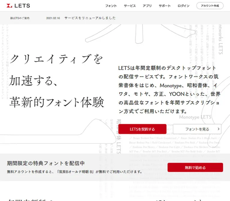
明朝体の大きな見出しと力強いゴシック体、淡い文字の背景、白と薄灰の面に赤いCTAを組み合わせたフォントサービスサイト。
LETS — Style Reference
A spacious type specimen catalog, with expressive Japanese letterforms and precise red actions.
Website: LETS Original URL: https://lets.fontworks.co.jp/ Final URL: https://lets.fontworks.co.jp/ Theme: white and pale gray, with red actions and one dark closing section; no theme switch was verified. Inspected: October 6, 2026, at 00:40 JST. The supplied capture record is timestamped October 5, 2026, at 15:40:18.339 UTC. Viewports: desktop 1440 × 1000 CSS pixels; mobile 390 × 844 CSS pixels. Scope: the current public homepage: persistent navigation, announcement, introductory hero, repeated free-font offer, service overview captions, six feature explanations, eleven service/license cards, closing statement, and footer. Screenshots directly show the desktop opening, service directory, and closing/footer, plus the mobile opening and footer. Rendered DOM measurements cover additional sections at both widths. Linked pages and expanded navigation were not inspected.
LETS presents its font subscription service through typography itself. A large Mincho headline sits beside a dense, expressive Gothic introduction. Extremely pale font names and enormous cropped glyph outlines occupy the background. Red geometric logos and red action buttons provide the strongest color, while white and light-gray surfaces organize the long page.
This is a service homepage with substantial navigation and a product directory. Its composition moves from an editorial introduction into feature explanations, a specimen-led service catalog, and account-registration actions. Preserve the distinction between reading, browsing font collections, and starting an account.
閉じる
LETS — Style Reference
A spacious type specimen catalog, with expressive Japanese letterforms and precise red actions.
Website: LETS Original URL: https://lets.fontworks.co.jp/ Final URL: https://lets.fontworks.co.jp/ Theme: white and pale gray, with red actions and one dark closing section; no theme switch was verified. Inspected: October 6, 2026, at 00:40 JST. The supplied capture record is timestamped October 5, 2026, at 15:40:18.339 UTC. Viewports: desktop 1440 × 1000 CSS pixels; mobile 390 × 844 CSS pixels. Scope: the current public homepage: persistent navigation, announcement, introductory hero, repeated free-font offer, service overview captions, six feature explanations, eleven service/license cards, closing statement, and footer. Screenshots directly show the desktop opening, service directory, and closing/footer, plus the mobile opening and footer. Rendered DOM measurements cover additional sections at both widths. Linked pages and expanded navigation were not inspected.
LETS presents its font subscription service through typography itself. A large Mincho headline sits beside a dense, expressive Gothic introduction. Extremely pale font names and enormous cropped glyph outlines occupy the background. Red geometric logos and red action buttons provide the strongest color, while white and light-gray surfaces organize the long page.
This is a service homepage with substantial navigation and a product directory. Its composition moves from an editorial introduction into feature explanations, a specimen-led service catalog, and account-registration actions. Preserve the distinction between reading, browsing font collections, and starting an account.
How to Read This Reference
- Measured means a value appears in the supplied rendered DOM or computed-style evidence. Dimensions are CSS pixels; fractional values are rounded for readability.
- Derived means a value is calculated from measured rectangles, such as a column gap or the distance between two elements.
- Visual estimate means a detail is visible in a capture but lacks a corresponding computed value. This applies particularly to decorative artwork colors and thin rules.
- Declared only identifies a source custom property whose use in an interaction state was not demonstrated.
- Recommended identifies implementation choices for a new site. The CSS classes, breakpoint thresholds, accessibility additions, and fallback-font behavior below are recommendations.
- Font-family names are reported exactly as declared. Computed family stacks do not independently prove which font file supplied every glyph.
- This document describes the supplied current-page evidence. It does not claim a fresh browser visit or inspection of linked destinations.
Tokens — Colors
Default Palette
| Name | Value | Source or implementation alias | Role and evidence |
|---|---|---|---|
| White | #ffffff |
Source --color-bg-primary |
Measured body, header, service-card, and secondary-button surfaces |
| Pale Gray | #f5f5f5 |
Source --color-bg-secondary |
Measured service-directory background; similar light-gray announcement and offer surfaces are visible |
| Text Ink | #1a1a1a |
Source --color-text-primary, --base-font-color |
Measured general text, hero headline, and introduction |
| Strong Black | #000000 |
Alias --lets-black |
Measured feature text and card destination labels; black specimens are visible |
| Content Action Red | #c30014 |
Source --key-color |
Measured hero registration button, offer buttons, and closing action |
| Brand Red | #d70c19 |
Source --color-brand-primary |
Measured header signup button and inline font links |
| Closing Charcoal | #191919 |
Alias --lets-charcoal |
Measured closing statement background |
| Reversed Text | #ffffff |
Alias --lets-on-dark |
Measured text on red buttons and the closing charcoal section |
The two reds are a real distinction. The compact header action uses #d70c19; the larger content actions use #c30014. Inline font links use the brighter brand red and remain visibly underlined. Do not collapse every red element into one token when reproducing the measured appearance.
Additional Declared Tokens
| Source token | Value | Interpretation |
|---|---|---|
--color-brand-secondary |
#b1000f |
Available darker brand color; an actual hover endpoint was not supplied |
--color-text-secondary |
#757575 |
Available secondary text color; do not assume it is the exact decorative glyph fill |
--color-text-small |
#484848 |
Available small-text color |
--color-text-disabled |
#adadad |
Available disabled-text color; no disabled control was inspected |
--color-outline |
rgba(0,0,0,.32) |
Available outline color; button borders are visible, but their computed border color was not extracted |
--color-divider |
rgba(0,0,0,.12) |
Available divider color, consistent with the restrained visible rules |
--color-bg-hover |
rgba(0,0,0,.04) |
Available hover surface; its application was not exercised |
--color-focus-ring |
rgba(66,126,255,.8) |
Available blue focus color; keyboard focus was not tested |
Decorative Contrast
Background font names appear approximately light gray, while enormous outlined glyphs use very thin gray contours. Their exact colors and opacity were not supplied. The closing section includes a much stronger gray glyph fragment behind and to the right of the white message.
Recommended approximation: begin with #cccccc for pale lettering and a slightly darker thin contour, then adjust against the actual artwork. These are visual approximations, not measured source tokens. Decorative text should remain less prominent than the smallest functional copy.
Tokens — Typography
Editorial Mincho — Hero and Feature Titles
- Measured family:
TsukuOldMinPro-R. - Relevant source variable:
--font-tea-main. - Measured CSS weight:
700on the hero and feature headings. - Role: the expressive, high-contrast Japanese headline and the six feature explanations.
- Character: sweeping strokes, visible thick/thin contrast, and a literary tone that demonstrates the product rather than describing it through generic interface graphics.
The main headline is live heading text in the extracted DOM. Its visible three-part composition quotes the source copy: クリエイティブを / 加速する、 / 革新的フォント体験.
Expressive Gothic — Introductory Copy and Catalog Heading
- Measured family:
TsukuOldGothicStd-B. - Source variable:
--font-heading. - Measured CSS weight:
700. - Roles: hero description, service-directory heading, service-card destination labels, and closing statement.
The introduction is unusually prominent for body copy: 24px on desktop, with 40px line height and 2.4px tracking. Its weight balances the large Mincho title across the two-column composition.
General Text and Service Descriptions
- Body family:
TsukuGoPr5-R, followed byHelvetica Neue, Arial,Hiragino Kaku Gothic ProN,Hiragino Sans, Meiryo, and sans-serif. - Description family:
TsukuGoPr5-D, also declared as--font-subheadingand within--font-family-body-bold. - Measured description weight:
300on feature, offer, and service-card paragraphs. - Primary reading sizes: 16px, with 28px or 32px line height depending on the component.
The named font face and the numeric CSS weight must be recorded separately. A face ending in -D is used with computed weight 300 in several places; replacing this with an arbitrary conventional light or bold font would not necessarily preserve its appearance.
Compact Interface Text
- Regular UI:
UDKakugo_SmallPr6-R. - Bold UI:
UDKakugo_SmallPr6-DB. - Roles: action buttons, header account controls, and footer links.
- Header account controls: 12px / 18px, weight 700.
- Content actions: 16px, weight 400.
The page also declares other Mincho and Gothic families. A declaration alone is not evidence that a particular visible component uses them. Likewise, names such as Helvetica, Frutiger, and Optima appear in the service description as products offered, not as proof of interface typography.
Type Scale
| Role | Desktop measurement | Mobile measurement | Tracking and notes |
|---|---|---|---|
| Hero heading | 64px / 100px, weight 700 | 42.2904px / 67.6647px, weight 700 | Normal desktop tracking; -7.8px measured on mobile |
| Hero introduction | 24px / 40px, weight 700 | 16px / 32px, weight 700 | 2.4px desktop and 1.6px mobile; both equal 0.1em |
| Directory heading | 42px / 32px, weight 700 | 28px / 32px, weight 700 | Desktop line height is smaller than the font size; preserve clearance around the glyphs |
| Feature heading | 36px / 41.4px, weight 700 | 36px / 41.4px, weight 700 | Size is retained on mobile; line count changes |
| Offer heading | 24px / 27.6px, weight 600 | Same | Uses TsukuGoPr5-D |
| Feature/card description | 16px / 32px, weight 300 | Same | Generous double-size leading |
| Offer paragraph | 16px / 28px, weight 300 | Same | Dense linked font names wrap naturally |
| Overview captions | 18px / 24.012px | 16px / 24px | Two measured introductory captions |
| Card destination label | 16px / 18.4px, weight 700 | Same | Expressive Gothic, aligned toward the lower right |
| Closing statement | 24px / 44px, weight 700 | 18px / 32.4px, weight 700 | White on charcoal |
| Primary hero action | 16px / 24px | Same | Regular UI face |
| Header signup/login | 12px / 18px, weight 700 | Signup retains the same values | Bold UI face |
| Announcement label/date | 12px / 13.8px | Same | Label weight 600; date weight 400 |
| Announcement link | 16px / 18.4px, weight 600 | Same | One desktop line becomes three mobile lines |
| Footer legal links | 12px / 13.8px | Same | Regular UI face |
Mobile tracking caution: -7.8px is an observed value at 390px, not a verified responsive formula. It is approximately -0.1844em at the measured heading size. Apply that compression only after validating the exact font and source copy. Generic fallback fonts may require normal spacing and different line breaks.
Tokens — Spacing & Shapes
The spacing system mixes compact utility controls with broad editorial intervals. It is not consistently an eight-pixel scale.
Spacing Scale
| Value | Observed or derived use |
|---|---|
| 8px | Header logo-link horizontal padding; desktop navigation-link horizontal padding |
| 12px | Desktop offer-heading-to-paragraph gap; offer-button vertical padding |
| 15px | Mobile general content gutter; announcement-cell padding; primary hero-button vertical padding |
| 16px | Mobile header right inset; minimum card-description-to-label spacing derived from rectangles |
| 20px | Mobile hero gutter; mobile card side padding; gap between stacked hero actions |
| 24px | Desktop card top padding; mobile hero heading-to-introduction gap; mobile offer content/action gap |
| 30px | Desktop column gaps, service-card gaps, card side padding, and offer vertical inset |
| 32px | Desktop service-card bottom padding; standard descriptive line height |
| 40px | Mobile feature-section vertical padding; desktop introduction-to-action gap; feature-row gap |
| 70px | Derived desktop introduction offset below the headline top; mobile hero clearance after the announcement |
| 82px | Measured desktop feature-section top and bottom padding |
| 90px | Derived desktop gap from the hero primary-action bottom to the first offer surface |
| 100px | Measured desktop directory bottom padding |
Border Radius
| Element | Measured radius | Shape |
|---|---|---|
| Service cards | 0 | Square white sheets |
| Header signup and login | 16px | Pills with a 32px total height |
| Primary content actions | 6px | Modestly rounded rectangles |
| Secondary content actions | 4px | Thin outlined rectangles |
| Back-to-top anchor | 4px | Small control box; no prominent filled surface in the capture |
Rules and secondary-button outlines appear approximately 1px thick. Their widths are visual estimates because border-width values were not included in the extraction. There is no visible card-shadow system.
Layout Measurements
| Element | Desktop: 1440 × 1000 | Mobile: 390 × 844 |
|---|---|---|
| Document height | 5961.02px | 10399.23px |
| Persistent header | 52px high | 52px high |
| Header padding | 0 30px 0 22px |
0 16px 0 8px |
| Header home-link box | 124 × 52px | 124 × 52px |
| Header signup | 114 × 32px | 114 × 32px |
| Mobile menu button | Not visible | 40 × 52px |
| General content span | 1136px, beginning at x = 152 | 360px, beginning at x = 15 |
| Hero content span | 1120px, beginning at x = 160 | 350px, beginning at x = 20 |
| Hero columns | 545px + 30px gap + 545px | One column |
| Hero title rectangle | x = 160, y = 222, 545 × 300px | x = 20, y = 226.97, 350 × 203.02px |
| Hero introduction rectangle | 545 × 240px | 350 × 192px |
| Hero primary action | 257.5 × 54px | 350 × 54px |
| Hero secondary action | 257.5 × 46px | 350 × 46px |
| Offer text/action columns | 856px + 24px gap + 256px | One column, 360px wide |
| Service-card width | 358.66px | 360px |
| Service-card text width | 298.66px | 320px |
| First vendor-card height | 551.39px | 459.39px |
| Vendor-card visual header | 301px high | 285px high |
| Closing charcoal section | 402px high | 277.56px high |
| Footer element | 151.81px high | 411.77px high |
The general desktop track is derived from the observed 1136px content width. A reusable max-width: 1136px is appropriate, but the original container formula was not supplied. The hero uses a slightly narrower track and must not be assumed to share exactly the same horizontal origin as the catalog.
Components
Persistent Header
Role: identity, service navigation, and account access throughout the long page.
The header is a white 52px strip with a fine lower rule. The LETS symbol and horizontal wordmark sit at the left. Desktop navigation sits toward the right and includes the source labels フォント, サービス, アプリ, ニュース, and ヘルプ, followed by an outlined ログイン pill and a red 無料で始める pill.
The logo anchor is 124px wide, including 8px padding on each side. Main navigation anchors span the full 52px header height. Login measures approximately 88.33 × 32px; signup measures 114 × 32px. The account controls use the compact bold UI font rather than the general body face.
At 390px, the full navigation and login are absent from the visible header. The horizontal LETS identity, signup pill, and menu button remain. Signup begins at x = 212; the 40px-wide menu button begins at x = 334. A small three-line menu glyph is visible inside it.
The header remains at the viewport top in the supplied scrolled captures, and the main element reserves 52px above its content. This establishes persistence; the extraction does not include the exact position declaration. A fixed header is used in the recommended implementation below.
The help destination is an external support URL, accompanied visually by an outward arrow. The menu's expanded appearance, focus behavior, and animation were not observed.
Announcement Strip
Role: a current news item without displacing the main service introduction.
A pale-gray strip immediately follows the header. Desktop places a small announcement label, date, and linked title on one line. Their measured column widths are approximately 189.33px, 94.66px, and 852px within the 1136px track. Each has 15px horizontal padding. The visible strip is approximately 60px tall.
On mobile, the label occupies a full-width first row. A 90px date column and 270px title column share the second row, inside a 360px container. The linked title wraps into three lines. The strip grows to approximately 105px high instead of reducing the font size.
The announcement links to a Monotype news page. The destination is evidenced by the homepage anchor only; its content was not inspected.
Editorial Hero
Role: explain the service while showing the expressive potential of its fonts.
The desktop hero contains two 545px columns separated by 30px. The three-line Mincho title starts at y = 222. The right-hand introduction begins 70px lower, at y = 292. This deliberate asymmetry gives the headline room while placing the explanatory paragraph close to the action row beneath it.
The paragraph occupies six 40px lines and describes an annual font subscription for individuals and small businesses. Its 24px expressive Gothic face and 0.1em tracking make it a major compositional element.
Pale vertical font names and oversized glyph contours extend behind and outside the content. They function as typography-themed scenery. The readable headline and paragraph remain the foreground.
On mobile, the title, introduction, and actions form one vertical sequence. The title retains three visual lines. Its measured box ends near y = 430, followed by a 24px gap before the introduction. The introduction occupies six 32px lines. Both the Mincho/Gothic contrast and the generous leading survive the responsive change.
Hero Action Pair
Role: distinguish starting an account from exploring available fonts.
The primary LETSを契約する anchor points to /signup. It has a #c30014 fill, white 16px UI text, 6px radius, and 54px total height. The secondary フォントを見る anchor points to /fonts; it has a white surface, fine gray outline, 4px radius, and a right-facing chevron.
On desktop, both buttons begin at y = 572, with a 30px gap. Their heights differ: 54px primary versus 46px secondary. They align at the top, not through an invented equal-height button system.
On mobile, each is 350px wide. The primary begins at y = 665.98; the secondary begins at y = 739.98, leaving 20px between them. Their heights remain unchanged.
Repeated Free-Font Offer
Role: provide a lower-commitment account incentive near the opening and again near the footer.
The component contains a 24px heading, a paragraph listing nineteen linked font entries, and a red signup action. Preserve the font names as ordinary underlined inline links; they are not badges, chips, or a separate card grid.
On desktop, the copy occupies 856px and the button occupies 256px, separated by 24px. The paragraph is 16px / 28px and occupies four lines in the measured layout. The action is approximately 44.39px high and vertically centered against the complete heading-and-copy group.
The opening offer appears within a broad inset gray panel, approximately x = 80 to x = 1360 in the desktop capture. The closing offer spans the viewport. Their inner text aligns with the same general content track.
On mobile, copy and action stack. The paragraph grows to ten lines at the same 16px size. The button spans the 360px content width, with a 24px gap after the text. The mobile screenshot shows that long Latin font names may break across lines; no pill treatment prevents wrapping.
Service Overview Pair
Role: introduce service information and usage guidance before the feature explanations.
The rendered evidence includes the captions サービスについて and LETSの使い方. On desktop, they occupy two 553px columns with a 30px gap. On mobile, each caption spans the 360px track and appears at a different vertical position, establishing a stacked arrangement.
The supplied screenshots do not show this region, and the extracted elements do not identify the associated media assets or controls. Preserve the two-topic structure when planning the page, but do not claim these are videos, carousels, or particular illustrations. Do not reproduce the large vertical interval around them as unexplained empty spacer elements.
Six-Item Feature Explanation
Role: explain subscription access, permissions, search, font organization, activation synchronization, and group license management.
Desktop arranges the six items in three columns and two rows. Each track is approximately 358.66px wide, separated horizontally by 30px. Heading positions establish a 40px gap between the first row's tallest content and the second row.
Each item combines a 36px Mincho heading with 16px / 32px Gothic description text. The measured desktop heading boxes are 82px high, aligning descriptions even where one heading contains fewer visible lines. One search-related description includes a red inline link to the impression-search feature.
The section has a measured rgba(255,255,255,.7) background and 82px vertical padding. Its total desktop height is 654px. A centered outlined サービスをもっと知る action links to /services.
At 390px, the items form one column and the section padding reduces to 40px. The 36px title size remains. Heading heights follow their content: approximately 41.39px, 82.78px, or 124.17px. Descriptions start 15px below their headings, and successive items are separated by 40px. The concluding action spans 360px.
Service Directory
Role: make font collections and licensing routes directly browsable.
The directory uses a full-width #f5f5f5 background, a large expressive Gothic heading, and white square cards. The observed source heading is LETSサービスラインナップ.
Desktop has three columns with 30px horizontal and vertical gaps. The first two rows contain six font-service families in this order: Fontworks, Monotype, Iwata, Motoya, YOON, and HOUSEI. The following cards cover student access, academic licensing, server licensing, and two embedding/distribution options. Eleven cards therefore produce an incomplete final desktop row containing two left-aligned cards.
Each card is a single anchor. Its anatomy is:
- A visual header containing the service identity and a large specimen or service graphic.
- A readable description paragraph.
- A bottom destination label with a small right-facing chevron, aligned toward the right.
For the six vendor cards, desktop padding is 24px 30px 32px. The visual header is 301px high, including a measured 29px heading region. The visible specimens demonstrate different scripts, styles, stroke weights, and letter shapes. In the first row, the three-by-three character arrangements act as the central imagery.
Descriptions use 16px / 32px text. Cards in the first two desktop rows share a 551.39px height despite different description lengths. The destination label remains aligned at the bottom, so the gap above it varies. A flex column with a bottom-pushed label is an appropriate implementation.
The licensing cards use related geometry but different visual-header dimensions. The education/server row measures 483.39px high on desktop; the final option row measures 515.39px. Do not force every card in the entire directory to one fixed height.
At 390px, cards become one column, 360px wide, with 20px 20px 24px padding and 30px gaps. Vendor visual headers reduce to 285px. The first Fontworks card measures 459.39px high, while several following vendor cards measure 491.39px. Each mobile card follows its own content height.
Centered Directory Action
Role: offer a broad font-browsing route after the service-specific cards.
The outlined LETSのフォント一覧を見る link leads to /fonts. It is 358.66 × 46px on desktop and 360 × 46px on mobile. It sits 30px below the final desktop card row. The measured mobile gap is 54px.
Directory bottom padding is 100px on desktop and 24px on mobile. These differing intervals help explain the much tighter transition into the closing statement on the narrow layout.
Closing Statement
Role: close the service introduction with confidence in font quality and a clear account action.
A full-width #191919 section creates the strongest surface contrast on the page. The desktop message is centered white text in TsukuOldGothicStd-B, at 24px / 44px. It occupies four lines. A large gray glyph fragment appears to the right as background artwork.
The red LETSを使う anchor links to /signup and measures 261.5 × 50px. It begins 24px below the message. The section is 402px high, with computed 56px vertical padding; the measured rectangles also leave additional space below the button beyond that padding.
On mobile, the section measures 277.56px high with 40px vertical padding. The statement changes to 18px / 32.4px and the action spans the 360px track, separated from the message by 18px. The mobile layout is DOM-supported; the supplied mobile screenshots do not directly show its artwork crop.
Footer and Back-to-Top Control
Role: provide legal/support navigation and corporate identity after the repeated offer.
Approximately 104px of white separation precedes the footer at both measured widths. A small upward chevron links to #top; on mobile its anchor is 40 × 40px near the right edge above the footer rule. Its scroll animation and focus result were not tested.
Desktop places a horizontal LETS identity beside a compact row of seven links. A fine rule separates this from the lower corporate row, which displays the Monotype wordmark, copyright, and X/Instagram icons. The footer visibly contains © 2026 Monotype KK. Its corporate anchor points to https://fontworks.co.jp/.
Mobile changes the upper identity to a stacked symbol-and-wordmark treatment. The seven links form a vertical list to its right, using 12px UI text and approximately 33.8px-tall padded anchors. In the lower region, the Monotype wordmark sits left, social icons sit right, and the copyright occupies a centered row beneath them.
The measured footer height grows from 151.81px to 411.77px. This change is structural, not merely text scaling. No production agency or individual creator credit is established by the supplied original-page evidence.
Tokens — Motion & Interaction
Measured Transition Declarations
| Element | Computed transition | What is established |
|---|---|---|
| Header surface | background-color 0.25s cubic-bezier(0.86,0,0.07,1) |
A 250ms background transition is defined; its trigger/result was not observed |
| Header home link | opacity 0.25s cubic-bezier(0.86,0,0.07,1) |
Opacity can transition over 250ms |
| Desktop navigation links | box-shadow 0.25s cubic-bezier(0.86,0,0.07,1) |
A box-shadow transition is defined; it does not prove an elevated hover surface |
| Header account pills | Color and background color, 250ms with the same curve | Both properties have defined transition timing |
| Hero, offer, and closing actions | background-color 0.1s |
A short 100ms background transition is defined |
| Secondary content actions | background-color 0.1s |
The outlined actions also define a 100ms background transition |
Sampled elements report animation: none. Several other elements report only a generic transition: all; without a nonzero duration or observed state change, this does not establish visible motion.
Observed Navigation and Limits
- The captures establish vertical document scrolling and a persistent header.
- Signup-related actions point to
/signup; font-browsing actions point to/fonts. - Service cards are individual destination anchors, not controls that visibly filter the homepage.
- The mobile menu button is visible, but its open state was not supplied.
- Hover, active, keyboard-focus, and post-navigation results were not exercised in the supplied record.
- Pale glyphs have different visible crops across page regions and viewports. No time-series evidence establishes parallax, rotation, continuous drift, or scroll-linked motion.
The capture process waited for document load, sampled stability, visible image decoding, and relevant finite animation settling, with an initial observation lasting at least five seconds. Perpetual animations were paused during readiness checks and then resumed. This process does not prove that the page has no delayed or continuous motion.
Recommended interaction approach: use brief color feedback for links and buttons, keep the decorative composition static until motion is independently specified, and preserve reduced-motion support. Do not add staggered card entrances or scroll effects as though they were observed features.
Surfaces
| Surface | Appearance | Function |
|---|---|---|
| Page canvas | White with very pale typographic artwork | Spacious editorial introduction and transitions |
| Persistent navigation | Solid white with a fine lower rule | Stable navigation over scrolling content |
| Announcement | Pale gray | Separates a compact news item from the hero |
| Offer band | Pale gray with black text and red underlined links | Groups the free-account incentive |
| Feature explanation | Measured 70%-opaque white | Softens whatever decorative background lies beneath it |
| Directory field | #f5f5f5 |
Makes white service cards legible without heavy borders |
| Service card | Square white surface | Frames a brand, specimen, description, and destination |
| Secondary action | White with a thin gray outline | Supports browsing routes without competing with signup |
| Closing statement | #191919 with white text and gray artwork |
Creates a clear final emphasis |
| Footer | White, divided by thin gray rules | Quiet legal and corporate navigation |
Hierarchy comes from typography, spacing, surface changes, and red actions. The visible cards have neither rounded containers nor shadow elevation. The dark closing section is a content treatment, not evidence of a second application theme.
Imagery
The defining imagery is typography: enlarged outlines, columns of font names, mixed-script specimens, and geometric service marks. The page demonstrates variety through letterforms while keeping its interface palette restricted.
The desktop hero combines several scales simultaneously: huge cropped contours, tiny pale background names, a 64px foreground heading, and a 24px explanatory paragraph. The directory then turns the letters into carefully framed specimen compositions. Bold and fine strokes appear side by side, with Japanese, Latin, Korean, and Chinese characters across the visible family cards.
No photography is visible in the supplied screenshot regions. The unpictured overview area prevents a claim that the entire page contains none.
Observed Asset References
Asset URLs, filenames, intrinsic dimensions, and delivery formats were not included in the supplied evidence. The table therefore identifies visual roles rather than inventing downloadable paths.
| Visual | Evidence | Implementation guidance |
|---|---|---|
| LETS symbol and horizontal wordmark | Desktop and mobile headers; desktop footer | Use an authorized identity asset; do not redraw it with a generic text font |
| Stacked LETS footer identity | Mobile footer capture | Supply a dedicated compact lockup or an equivalent authorized arrangement |
| Vendor marks | Desktop directory capture | Preserve the different red geometric symbols and their black labels |
| Vendor type specimens | First directory row and visible part of the second | Preserve mixed glyph styles and scripts; ordinary interface text cannot reproduce the specimen composition automatically |
| Pale font-name columns | Hero and directory background | Treat as decorative; retain low contrast and intentional cropping |
| Oversized glyph contours | Hero and directory captures | Use accurate supplied outlines where available; keep them subordinate to content |
| Gray closing glyph | Desktop closing capture | Preserve its placement behind and to the right of the message |
| Monotype wordmark | Desktop and mobile footer | Use the corporate artwork rather than approximating it with bold text |
| Chevrons, external arrow, menu glyph, social icons | Navigation, actions, cards, footer | Keep small, simple, and visually quiet; the source icon library is unknown |
Recommended asset handling: render logos and specimens without cropping, preserve their aspect ratios, and reserve clipping for background artwork. Hide purely decorative lettering from assistive technology. Keep descriptions, navigation labels, and headings as live text.
Layout & Responsive Behavior
Overall Page Flow
The observed content sequence is:
- Persistent header and announcement.
- Typographic hero with registration and font-browsing actions.
- First free-font offer.
- Two service/usage overview topics.
- Six feature explanations and a service-details link.
- Eleven service/license cards and a font-directory link.
- Dark closing statement.
- Repeated free-font offer.
- White separation, back-to-top control, and footer.
This is ordinary long-page scrolling. The evidence does not establish a full-screen application shell, carousel, or section-snapping interaction.
Desktop-to-Mobile Changes
| Area | Desktop observation | Mobile observation |
|---|---|---|
| Header | Full navigation, login, signup | Logo, signup, menu button; height stays 52px |
| Announcement | One horizontal row | Full-width label above date/title row |
| Hero | Two columns with vertically offset introduction | Single sequence: title, introduction, primary action, secondary action |
| Hero type | 64px title and 24px introduction | About 42.29px title and 16px introduction |
| Offer | Copy and signup side by side | Copy above a full-width signup action |
| Overview topics | Two equal-width caption regions | Stacked caption regions |
| Features | Three columns, two rows | One column; 36px title size retained |
| Directory | Three columns; last row has two cards | Eleven individually sized cards in one column |
| Card padding | 30px at each side | 20px at each side |
| Closing action | 261.5px wide | 360px wide |
| Footer | Horizontal identity/navigation and compact corporate row | Stacked identity, vertical links, rearranged corporate row |
A mobile service card is slightly wider than a desktop grid track: 360px versus 358.66px. Reduced side padding increases its text width from 298.66px to 320px. Consequently, the first vendor description uses fewer lines on mobile, and its card becomes shorter even though the overall page grows substantially longer.
The offer behaves differently: its desktop text column is 856px wide, so narrowing it to 360px increases the paragraph from four to ten lines. Responsive adaptation therefore depends on component anatomy, not a universal scale factor.
Only 1440px and 390px were measured. The original media-query thresholds, tablet arrangement, landscape behavior, and typography formulas between those widths remain unverified. The Quick Start uses explicitly recommended thresholds and must be tested with the final fonts and content.
Do’s and Don’ts
Do
- Make typography the primary visual material: Mincho headlines, expressive Gothic supporting text, and actual font specimens.
- Preserve the measured distinction between
#d70c19header/link red and#c30014content-action red. - Keep the general desktop track near 1136px and the hero slightly narrower.
- Retain the 70px desktop offset between the title and the introductory paragraph.
- Use white square service cards on pale gray, with 30px gaps.
- Keep each service card a coherent link with its destination label at the bottom.
- Preserve the generous 28–32px leading of 16px descriptive text.
- Let mobile cards, offers, and footer sections reflow according to their own structures.
- Keep background glyphs pale and oversized, with deliberate edge cropping.
- Retain the repeated free-font offer and its underlined inline links.
- Distinguish measured transition declarations from interactions that were actually observed.
Don’t
- Don’t replace every font with one generic sans-serif and expect the identity to survive.
- Don’t apply the mobile headline's negative tracking to paragraphs, buttons, or untested fallback fonts.
- Don’t turn specimen cards into rounded, shadowed dashboard tiles.
- Don’t infer an interface font from a product name mentioned in service copy.
- Don’t turn the nineteen linked font entries into colorful badges.
- Don’t make every desktop card the same global fixed height.
- Don’t shrink the entire interface proportionally on mobile; feature headings remain 36px.
- Don’t add photography or invented media to fill the unpictured overview region.
- Don’t claim parallax, animated glyphs, menu behavior, or hover endpoints without evidence.
- Don’t hardcode the total document height or large blank spacers to imitate screenshot positions.
- Don’t treat the charcoal closing section as a dark-mode setting.
Recommended Implementation Additions
These are recommendations for a new implementation, not verified features of the original:
- Give the mobile menu button an accessible name,
aria-expanded, and a relationship to its controlled navigation. The extraction omits accessibility attributes, so it does not establish whether these are already present. - Add a visible focus ring using the declared blue focus color, and ensure the persistent header does not obscure focused elements or anchor targets.
- Preserve semantic links for navigation and buttons for in-page state changes. Avoid nesting a second interactive control inside a linked service card.
- Give service cards concise accessible names identifying their destination. Provide useful alternatives for specimen graphics where the graphic communicates information.
- Mark purely decorative glyph outlines and font-name textures as hidden from assistive technology and disable their pointer events.
- Provide at least 44px effective touch targets for small header, footer, and social controls where space allows. This can enlarge the hit area while preserving the compact visible artwork.
- Keep exact display fonts optional until their authorized loading configuration is available. Test line breaks after font loading and at increased text zoom.
- Allow long Japanese and Latin service names to wrap. Avoid fixed card heights that clip translated text or larger system fonts.
- Use intrinsic image dimensions to reserve the specimen region and reduce layout shifts.
- Honor reduced-motion preferences for any added interaction feedback or navigation animation.
Agent Prompt Guide
Quick Color Reference
- Canvas and cards:
#ffffff. - Directory and supporting bands:
#f5f5f5. - General text:
#1a1a1a; some feature text and labels use#000000. - Main content actions:
#c30014with white labels. - Header signup and inline font links:
#d70c19. - Closing statement:
#191919with white text. - Decorative lettering: very pale gray; exact source values are unavailable.
- Focus enhancement: declared
rgba(66,126,255,.8), with actual focus behavior unverified.
Overall Prompt
“Create a Japanese font-service homepage inspired by the measured LETS composition. Use white and pale-gray surfaces, near-black text, #c30014 content actions, and #d70c19 compact header actions and inline links. Build a persistent 52px header and a restrained announcement strip. Set a three-line Mincho hero heading opposite a bold, tracked Gothic introduction; offset the introduction 70px downward on desktop. Add very pale oversized glyph outlines and columns of font names behind the content. Continue with a repeated free-font offer, six editorial feature explanations, and a three-column service directory of square white cards. Each card contains a service mark, a generous specimen area, descriptive text, and a bottom-right destination label. Finish with a charcoal statement and a quiet legal/corporate footer. At 390px, preserve font character and readable leading while stacking the hero, actions, cards, and footer. Use the documented source fonts only when available and authorized; do not invent asset URLs or unverified motion.”
Example Component Prompts
- Header: “A white 52px persistent navigation bar with a red geometric LETS mark and black wordmark at left. Desktop navigation sits to the right, followed by a 32px outlined login pill and a 114px-wide red signup pill. On mobile, retain the logo, signup pill, and a simple menu button.”
- Hero: “Within a 1120px desktop track, use two 545px columns with a 30px gap. The left contains a 64px Mincho heading at 100px leading. The right starts 70px lower with 24px expressive Gothic copy at 40px leading and
0.1emtracking. Place a red registration action and a white outlined browse action below it.” - Service card: “A square white specimen card on
#f5f5f5, approximately 359px wide on desktop, with 24px top, 30px side, and 32px bottom padding. Place a red/black service identity above mixed-style glyph artwork, then a 16px paragraph at 32px leading. Push the destination label and chevron to the lower right. Use no shadow.” - Offer band: “A pale-gray account incentive with a 24px heading, 16px copy at 28px leading, and underlined red inline font names. On desktop, reserve 856px for copy and 256px for a red signup action, separated by 24px. Stack naturally on mobile.”
- Closing statement: “A charcoal full-width section with centered white expressive Gothic copy, a large muted glyph fragment to the right, and one restrained red signup action. Keep the treatment typographic and spacious.”
- Mobile adaptation: “At 390px, keep the header at 52px, give the hero 20px side gutters, and use 15px gutters for the catalog. Stack the 54px primary and 46px secondary hero actions with a 20px gap. Make cards 360px wide with 20px side padding and variable content height. Reorganize footer navigation vertically.”
Quick Start
CSS Custom Properties
This is a new implementation scaffold, not recovered source CSS. It preserves the main measured values at the supplied viewports. The 900px and 1200px breakpoints are recommendations; the source thresholds were not provided. Color endpoints for hover, focus styling, and reduced-motion rules are also recommended additions.
Apply lets-page to the body. Use lets-main for the main element, lets-container for the general content track, and hero-layout for the narrower hero track. Each service card should be one anchor containing its visual header, description, and destination label. The two overview topics require verified content or assets before they can be faithfully implemented.
No @font-face URLs or image paths are invented here. Load authorized fonts and artwork separately. Add lets-fonts-ready to the body only after the intended hero face is available and its mobile spacing has been checked.
:root {
  /* Measured palette */
  --lets-white: #ffffff;
  --lets-gray: #f5f5f5;
  --lets-ink: #1a1a1a;
  --lets-black: #000000;
  --lets-brand: #d70c19;
  --lets-action: #c30014;
  --lets-charcoal: #191919;

  /* Declared source colors; state usage below is recommended */
  --lets-brand-dark: #b1000f;
  --lets-outline: rgba(0, 0, 0, .32);
  --lets-divider: rgba(0, 0, 0, .12);
  --lets-focus: rgba(66, 126, 255, .8);

  /* Declared families with practical fallback stacks */
  --lets-font-body: 'TsukuGoPr5-R', 'Helvetica Neue', Arial,
    'Hiragino Kaku Gothic ProN', 'Hiragino Sans', Meiryo, sans-serif;
  --lets-font-copy: 'TsukuGoPr5-D', sans-serif;
  --lets-font-editorial: 'TsukuOldMinPro-R', serif;
  --lets-font-heading: 'TsukuOldGothicStd-B', sans-serif;
  --lets-font-ui: 'UDKakugo_SmallPr6-R', sans-serif;
  --lets-font-ui-bold: 'UDKakugo_SmallPr6-DB', sans-serif;

  /* Dimensions derived from the measured tracks */
  --lets-content: 1136px;
  --lets-hero-content: 1120px;
  --lets-header-height: 52px;
  --lets-gap: 30px;
  --lets-radius-action: 6px;
  --lets-radius-outline: 4px;
  --lets-radius-pill: 16px;

  /* Measured transition timings */
  --lets-ease-header: cubic-bezier(.86, 0, .07, 1);
  --lets-motion-header: 250ms var(--lets-ease-header);
  --lets-motion-action: 100ms ease;
}

* { box-sizing: border-box; }
html { scroll-padding-top: 60px; }

.lets-page {
  margin: 0;
  color: var(--lets-ink);
  background: var(--lets-white);
  font: 400 16px/1.15 var(--lets-font-body);
}

.lets-page img { max-width: 100%; }
.lets-main { padding-top: var(--lets-header-height); }

.lets-container {
  width: min(var(--lets-content), calc(100% - 30px));
  margin-inline: auto;
}

/* Fixed positioning is an implementation choice for the observed persistence. */
.lets-header {
  position: fixed;
  inset: 0 0 auto;
  z-index: 100;
  display: flex;
  align-items: center;
  gap: 4px;
  height: var(--lets-header-height);
  padding: 0 30px 0 22px;
  border-bottom: 1px solid var(--lets-divider);
  background: var(--lets-white);
  transition: background-color var(--lets-motion-header);
}

.lets-home {
  display: flex;
  align-items: center;
  flex: 0 0 124px;
  height: 52px;
  margin-right: auto;
  padding-inline: 8px;
  transition: opacity var(--lets-motion-header);
}

.lets-nav, .lets-account {
  display: flex;
  align-items: center;
  gap: 16px;
}

.lets-nav { margin-right: 20px; }

.lets-nav a {
  display: flex;
  align-items: center;
  height: 52px;
  padding-inline: 8px;
  color: inherit;
  text-decoration: none;
  transition: box-shadow var(--lets-motion-header);
}

.lets-pill {
  display: inline-flex;
  align-items: center;
  justify-content: center;
  height: 32px;
  padding-inline: 20px;
  border: 1px solid var(--lets-outline);
  border-radius: var(--lets-radius-pill);
  color: var(--lets-ink);
  background: var(--lets-white);
  font: 700 12px/18px var(--lets-font-ui-bold);
  text-decoration: none;
  white-space: nowrap;
  transition: color var(--lets-motion-header),
    background-color var(--lets-motion-header);
}

.lets-pill--signup {
  width: 114px;
  border-color: transparent;
  color: var(--lets-white);
  background: var(--lets-brand);
}

.lets-menu-button {
  display: none;
  width: 40px;
  height: 52px;
  padding: 0;
  border: 0;
  background: transparent;
  color: inherit;
}

.announcement { background: var(--lets-gray); }

.announcement__inner {
  display: grid;
  grid-template-columns: 2fr 1fr 9fr;
  align-items: center;
  min-height: 60px;
}

.announcement__inner > * {
  min-width: 0;
  margin: 0;
  padding-inline: 15px;
}

.announcement__label,
.announcement__date { font-size: 12px; line-height: 13.8px; }
.announcement__label { font-weight: 600; }

.announcement__link {
  color: inherit;
  font-size: 16px;
  font-weight: 600;
  line-height: 18.4px;
  text-decoration: none;
}

.hero { position: relative; isolation: isolate; }

.hero-layout {
  position: relative;
  z-index: 1;
  display: grid;
  grid-template-columns: repeat(2, minmax(0, 1fr));
  gap: 30px;
  width: min(var(--lets-hero-content), calc(100% - 40px));
  margin-inline: auto;
  padding-block: 110px 90px;
}

.hero-title {
  margin: 0;
  font: 700 64px/100px var(--lets-font-editorial);
  letter-spacing: normal;
}

.hero-title > span { display: block; }
.hero-copy { min-width: 0; padding-top: 70px; }

.hero-lead {
  margin: 0;
  font: 700 24px/40px var(--lets-font-heading);
  letter-spacing: .1em;
}

.hero-actions {
  display: grid;
  grid-template-columns: repeat(2, minmax(0, 1fr));
  align-items: start;
  gap: 30px;
  margin-top: 40px;
}

.action {
  position: relative;
  display: flex;
  align-items: center;
  justify-content: center;
  min-width: 0;
  padding: 15px 20px;
  border: 0;
  border-radius: var(--lets-radius-action);
  color: var(--lets-white);
  background: var(--lets-action);
  font: 400 16px/24px var(--lets-font-ui);
  text-align: center;
  text-decoration: none;
  transition: background-color var(--lets-motion-action);
}

.action--outline {
  min-height: 46px;
  padding: 16px 28px;
  border: 1px solid var(--lets-outline);
  border-radius: var(--lets-radius-outline);
  color: var(--lets-ink);
  background: var(--lets-white);
  line-height: 12px;
}

.action--outline::after,
.service-card__label::after {
  content: '';
  flex: 0 0 auto;
  width: 7px;
  height: 7px;
  border-top: 1px solid currentColor;
  border-right: 1px solid currentColor;
  transform: rotate(45deg);
}

.action--outline::after { position: absolute; right: 12px; }

/* Use supplied artwork inside this noninteractive layer. */
.decorative-layer {
  position: absolute;
  inset: 0;
  z-index: 0;
  overflow: clip;
  pointer-events: none;
}

.offer-band {
  padding-block: 30px;
  background: var(--lets-gray);
}

.offer-band--intro {
  width: min(1280px, 100%);
  margin-inline: auto;
}

.offer-grid {
  display: grid;
  grid-template-columns: minmax(0, 1fr) 256px;
  align-items: center;
  gap: 24px;
}

.offer-title {
  margin: 0 0 12px;
  color: var(--lets-black);
  font: 600 24px/27.6px var(--lets-font-copy);
}

.offer-copy {
  margin: 0;
  font: 300 16px/28px var(--lets-font-copy);
  overflow-wrap: anywhere;
}

.offer-copy a {
  color: var(--lets-brand);
  text-decoration: underline;
}

.offer-action { padding: 12px 20px; line-height: 20.4px; }

.overview-grid {
  display: grid;
  grid-template-columns: repeat(2, minmax(0, 1fr));
  gap: 30px;
}

.overview-caption {
  font: 400 18px/24px var(--lets-font-copy);
}

.features {
  padding-block: 82px;
  background: rgba(255, 255, 255, .7);
}

.feature-grid, .service-grid {
  display: grid;
  grid-template-columns: repeat(3, minmax(0, 1fr));
  gap: 40px 30px;
}

.feature-title {
  min-height: 82px;
  margin: 0 0 20px;
  color: var(--lets-black);
  font: 700 36px/41.4px var(--lets-font-editorial);
}

.feature-copy, .service-card__description {
  margin: 0;
  font: 300 16px/32px var(--lets-font-copy);
}

.feature-copy a { color: var(--lets-brand); }

.section-action {
  width: min(100%, 358.66px);
  margin: 40px auto 0;
}

.lineup { padding-bottom: 100px; background: var(--lets-gray); }

.lineup-title {
  margin: 0;
  padding-block: 55px;
  font: 700 42px/32px var(--lets-font-heading);
}

.service-grid { gap: 30px; }

.service-card {
  display: flex;
  flex-direction: column;
  min-width: 0;
  padding: 24px 30px 32px;
  border-radius: 0;
  color: var(--lets-ink);
  background: var(--lets-white);
  text-decoration: none;
}

.service-card__visual {
  display: grid;
  grid-template-rows: 29px minmax(0, 1fr);
  height: 301px;
}

.service-card__logo {
  display: block;
  width: auto;
  height: 29px;
  object-fit: contain;
  object-position: left center;
}

.service-card__specimen {
  display: block;
  width: 100%;
  height: 100%;
  min-height: 0;
  object-fit: contain;
}

.service-card--license .service-card__visual {
  height: 297px;
  grid-template-rows: 25px minmax(0, 1fr);
}

.service-card--license .service-card__logo { height: 25px; }

.service-card--option .service-card__visual {
  height: 297px;
  grid-template-rows: 33px minmax(0, 1fr);
}

.service-card--option .service-card__logo { height: 33px; }
.service-card__description { margin-bottom: 16px; }

.service-card__label {
  display: flex;
  align-items: center;
  justify-content: flex-end;
  gap: 12px;
  margin-top: auto;
  color: var(--lets-black);
  font: 700 16px/18.4px var(--lets-font-heading);
}

.lineup .section-action { margin-top: 30px; }

.statement {
  position: relative;
  isolation: isolate;
  min-height: 402px;
  padding-block: 56px;
  color: var(--lets-white);
  background: var(--lets-charcoal);
  text-align: center;
}

.statement > .lets-container { position: relative; z-index: 1; }

.statement-copy {
  margin: 0;
  font: 700 24px/44px var(--lets-font-heading);
}

.statement-action {
  width: min(100%, 261.5px);
  margin: 24px auto 0;
  padding: 12px 28px 14px;
}

.lets-footer { position: relative; margin-top: 104px; }

.footer-top {
  display: flex;
  align-items: center;
  gap: 10px;
  padding: 0 25px 12px;
  border-bottom: 1px solid var(--lets-divider);
}

.footer-brand { flex: 0 0 175px; }
.footer-brand--stacked { display: none; }
.footer-links { display: flex; flex-wrap: wrap; }

.footer-links a {
  display: inline-block;
  padding: 10px 6px;
  color: inherit;
  font: 400 12px/13.8px var(--lets-font-ui);
  text-decoration: none;
}

.footer-bottom {
  display: grid;
  grid-template-columns: repeat(3, minmax(0, 1fr));
  align-items: center;
  gap: 20px;
  padding: 30px;
}

.footer-corporate-logo { width: 200px; max-width: 100%; }
.footer-copyright { margin: 0; font-size: 14px; line-height: 20px; }
.footer-social { display: flex; justify-content: flex-end; }

.footer-social a {
  display: grid;
  place-items: center;
  width: 37px;
  min-height: 45px;
  color: inherit;
}

.back-to-top {
  position: absolute;
  top: -40px;
  right: 0;
  display: grid;
  place-items: center;
  width: 40px;
  height: 40px;
  color: inherit;
}

/* Recommended intermediate layout; not a verified source breakpoint. */
@media (min-width: 901px) and (max-width: 1199px) {
  .feature-grid, .service-grid {
    grid-template-columns: repeat(2, minmax(0, 1fr));
  }
  .footer-top { align-items: flex-start; }
}

/* Recommended narrow-layout threshold. */
@media (max-width: 900px) {
  .lets-header { gap: 8px; padding: 0 16px 0 8px; }
  .lets-nav, .lets-login { display: none; }
  .lets-menu-button { display: grid; place-items: center; }

  .announcement__inner {
    grid-template-columns: 90px minmax(0, 1fr);
    row-gap: 8px;
    padding-block: 14px;
  }
  .announcement__label { grid-column: 1 / -1; }

  .hero-layout {
    grid-template-columns: minmax(0, 1fr);
    gap: 24px;
    padding-block: 70px 40px;
  }
  .hero-title {
    font-size: clamp(30px, 10.844vw, 42.2904px);
    line-height: 1.6;
    letter-spacing: normal;
  }
  .lets-fonts-ready .hero-title { letter-spacing: -.18444em; }
  .hero-copy { padding-top: 0; }
  .hero-lead { font-size: 16px; line-height: 32px; }
  .hero-actions {
    grid-template-columns: minmax(0, 1fr);
    gap: 20px;
    margin-top: 20px;
  }

  .offer-grid { grid-template-columns: minmax(0, 1fr); }
  .offer-title { margin-bottom: 24px; }
  .overview-grid { grid-template-columns: minmax(0, 1fr); }
  .overview-caption { font-size: 16px; }

  .features { padding-block: 40px; }
  .feature-grid, .service-grid {
    grid-template-columns: minmax(0, 1fr);
  }
  .feature-title { min-height: 0; margin-bottom: 15px; }
  .section-action { width: 100%; }

  .lineup { padding-bottom: 24px; }
  .lineup-title { padding: 43px 20px; font-size: 28px; }
  .service-card { padding: 20px 20px 24px; }
  .service-card__visual { height: 285px; }
  .service-card--license .service-card__visual,
  .service-card--option .service-card__visual { height: 281px; }
  .lineup .section-action { margin-top: 54px; }

  .statement { min-height: 0; padding-block: 40px; }
  .statement-copy { font-size: 18px; line-height: 32.4px; }
  .statement-action { width: 100%; margin-top: 18px; }

  .footer-top {
    display: grid;
    grid-template-columns: 76px minmax(0, 1fr);
    align-items: start;
    gap: 11.5px;
    padding: 20px 15px 30px;
    border-top: 1px solid var(--lets-divider);
  }
  .footer-brand { margin-top: 10px; }
  .footer-brand--wide { display: none; }
  .footer-brand--stacked { display: block; }
  .footer-links { flex-direction: column; align-items: flex-start; }
  .footer-bottom {
    grid-template-columns: minmax(0, 1fr) auto;
    padding: 20px 15px 30px;
  }
  .footer-copyright {
    grid-column: 1 / -1;
    grid-row: 2;
    text-align: center;
  }
}

/* Recommended state treatments; original endpoints were not observed. */
@media (hover: hover) {
  .action:not(.action--outline):hover,
  .lets-pill--signup:hover { background: var(--lets-brand-dark); }
  .action--outline:hover { background: var(--lets-gray); }
  .service-card:hover .service-card__label { text-decoration: underline; }
}

.lets-page :focus-visible {
  outline: 3px solid var(--lets-focus);
  outline-offset: 3px;
}

@media (prefers-reduced-motion: reduce) {
  .lets-page *, .lets-page *::before, .lets-page *::after {
    transition: none;
    animation: none;
    scroll-behavior: auto;
  }
}
The scaffold intentionally leaves content height to the actual text and artwork. Exact headline wrapping, row heights, footer logo proportions, and decorative crops require the authorized assets and final copy. The mobile font-size interpolation is a recommended approximation through the measured 390px value, not a recovered source formula.
Tailwind v4 Token Mapping
Optional aliases for a project already using Tailwind v4. Define the custom properties above first. This does not imply that the original site uses Tailwind.
@theme inline {
  --color-lets-paper: var(--lets-white);
  --color-lets-muted: var(--lets-gray);
  --color-lets-ink: var(--lets-ink);
  --color-lets-brand: var(--lets-brand);
  --color-lets-action: var(--lets-action);
  --color-lets-charcoal: var(--lets-charcoal);

  --font-lets-body: var(--lets-font-body);
  --font-lets-copy: var(--lets-font-copy);
  --font-lets-editorial: var(--lets-font-editorial);
  --font-lets-heading: var(--lets-font-heading);
  --font-lets-ui: var(--lets-font-ui);

  --text-lets-caption: 12px;
  --text-lets-body: 16px;
  --text-lets-intro: 24px;
  --text-lets-feature: 36px;
  --text-lets-directory: 42px;
  --text-lets-hero: 64px;

  --spacing-lets-gutter: 15px;
  --spacing-lets-gap: 30px;
  --spacing-lets-header: 52px;
  --radius-lets-action: 6px;
  --radius-lets-outline: 4px;
  --radius-lets-pill: 16px;
}
Use component-specific line heights and responsive rules alongside these aliases. A font-size utility alone does not reproduce the measured typography.
Sources & Evidence
- Inspected original and final page: https://lets.fontworks.co.jp/. The supplied record reports HTTP 200 and the same original/final URL.
- Capture timestamp:
2026-10-05T15:40:18.339Z, equivalent to October 6, 2026, 00:40:18.339 JST. - Desktop evidence: 1440 × 1000 screenshots of the opening, service directory, and closing/footer; rendered document height approximately 5961.02px.
- Mobile evidence: 390 × 844 screenshots of the opening and footer; rendered document height approximately 10399.23px.
- Rendered DOM and computed styles: element rectangles, font-family declarations, font sizes, weights, leading, tracking, padding, radii, backgrounds, transition declarations, source custom properties, and anchor destinations for both viewports.
- Verified visual behavior: a header remaining visible across supplied scroll positions, desktop-to-mobile reflow, and the visible closed mobile-navigation control. Link destinations are recorded; click outcomes were not tested.
- Inspection limitations: no expanded menu, hover/focus capture, motion recording, asset URL inventory, font-file audit, tablet viewport, or destination-page inspection was supplied. Intermediate overview media is not visible in the attached screenshots. SharedWorkers and service workers were disabled during the supplied inspection, and delayed content beyond its readiness limits remains unverified.
All design observations above come from the inspected homepage captures and rendered evidence. Approximate artwork values, inferred layout relationships, and recommended implementation behavior are labeled separately.
# LETS — Style Reference

> A spacious type specimen catalog, with expressive Japanese letterforms and precise red actions.

**Website:** [LETS](https://lets.fontworks.co.jp/)
**Original URL:** https://lets.fontworks.co.jp/
**Final URL:** https://lets.fontworks.co.jp/
**Theme:** white and pale gray, with red actions and one dark closing section; no theme switch was verified.
**Inspected:** October 6, 2026, at 00:40 JST. The supplied capture record is timestamped October 5, 2026, at 15:40:18.339 UTC.
**Viewports:** desktop 1440 × 1000 CSS pixels; mobile 390 × 844 CSS pixels.
**Scope:** the current public homepage: persistent navigation, announcement, introductory hero, repeated free-font offer, service overview captions, six feature explanations, eleven service/license cards, closing statement, and footer. Screenshots directly show the desktop opening, service directory, and closing/footer, plus the mobile opening and footer. Rendered DOM measurements cover additional sections at both widths. Linked pages and expanded navigation were not inspected.

LETS presents its font subscription service through typography itself. A large Mincho headline sits beside a dense, expressive Gothic introduction. Extremely pale font names and enormous cropped glyph outlines occupy the background. Red geometric logos and red action buttons provide the strongest color, while white and light-gray surfaces organize the long page.

This is a service homepage with substantial navigation and a product directory. Its composition moves from an editorial introduction into feature explanations, a specimen-led service catalog, and account-registration actions. Preserve the distinction between reading, browsing font collections, and starting an account.
閉じる
# LETS — Style Reference

> A spacious type specimen catalog, with expressive Japanese letterforms and precise red actions.

**Website:** [LETS](https://lets.fontworks.co.jp/)
**Original URL:** https://lets.fontworks.co.jp/
**Final URL:** https://lets.fontworks.co.jp/
**Theme:** white and pale gray, with red actions and one dark closing section; no theme switch was verified.
**Inspected:** October 6, 2026, at 00:40 JST. The supplied capture record is timestamped October 5, 2026, at 15:40:18.339 UTC.
**Viewports:** desktop 1440 × 1000 CSS pixels; mobile 390 × 844 CSS pixels.
**Scope:** the current public homepage: persistent navigation, announcement, introductory hero, repeated free-font offer, service overview captions, six feature explanations, eleven service/license cards, closing statement, and footer. Screenshots directly show the desktop opening, service directory, and closing/footer, plus the mobile opening and footer. Rendered DOM measurements cover additional sections at both widths. Linked pages and expanded navigation were not inspected.

LETS presents its font subscription service through typography itself. A large Mincho headline sits beside a dense, expressive Gothic introduction. Extremely pale font names and enormous cropped glyph outlines occupy the background. Red geometric logos and red action buttons provide the strongest color, while white and light-gray surfaces organize the long page.

This is a service homepage with substantial navigation and a product directory. Its composition moves from an editorial introduction into feature explanations, a specimen-led service catalog, and account-registration actions. Preserve the distinction between reading, browsing font collections, and starting an account.

## How to Read This Reference

- **Measured** means a value appears in the supplied rendered DOM or computed-style evidence. Dimensions are CSS pixels; fractional values are rounded for readability.
- **Derived** means a value is calculated from measured rectangles, such as a column gap or the distance between two elements.
- **Visual estimate** means a detail is visible in a capture but lacks a corresponding computed value. This applies particularly to decorative artwork colors and thin rules.
- **Declared only** identifies a source custom property whose use in an interaction state was not demonstrated.
- **Recommended** identifies implementation choices for a new site. The CSS classes, breakpoint thresholds, accessibility additions, and fallback-font behavior below are recommendations.
- Font-family names are reported exactly as declared. Computed family stacks do not independently prove which font file supplied every glyph.
- This document describes the supplied current-page evidence. It does not claim a fresh browser visit or inspection of linked destinations.

## Tokens — Colors

### Default Palette

| Name | Value | Source or implementation alias | Role and evidence |
| --- | --- | --- | --- |
| White | `#ffffff` | Source `--color-bg-primary` | Measured body, header, service-card, and secondary-button surfaces |
| Pale Gray | `#f5f5f5` | Source `--color-bg-secondary` | Measured service-directory background; similar light-gray announcement and offer surfaces are visible |
| Text Ink | `#1a1a1a` | Source `--color-text-primary`, `--base-font-color` | Measured general text, hero headline, and introduction |
| Strong Black | `#000000` | Alias `--lets-black` | Measured feature text and card destination labels; black specimens are visible |
| Content Action Red | `#c30014` | Source `--key-color` | Measured hero registration button, offer buttons, and closing action |
| Brand Red | `#d70c19` | Source `--color-brand-primary` | Measured header signup button and inline font links |
| Closing Charcoal | `#191919` | Alias `--lets-charcoal` | Measured closing statement background |
| Reversed Text | `#ffffff` | Alias `--lets-on-dark` | Measured text on red buttons and the closing charcoal section |

The two reds are a real distinction. The compact header action uses `#d70c19`; the larger content actions use `#c30014`. Inline font links use the brighter brand red and remain visibly underlined. Do not collapse every red element into one token when reproducing the measured appearance.

### Additional Declared Tokens

| Source token | Value | Interpretation |
| --- | --- | --- |
| `--color-brand-secondary` | `#b1000f` | Available darker brand color; an actual hover endpoint was not supplied |
| `--color-text-secondary` | `#757575` | Available secondary text color; do not assume it is the exact decorative glyph fill |
| `--color-text-small` | `#484848` | Available small-text color |
| `--color-text-disabled` | `#adadad` | Available disabled-text color; no disabled control was inspected |
| `--color-outline` | `rgba(0,0,0,.32)` | Available outline color; button borders are visible, but their computed border color was not extracted |
| `--color-divider` | `rgba(0,0,0,.12)` | Available divider color, consistent with the restrained visible rules |
| `--color-bg-hover` | `rgba(0,0,0,.04)` | Available hover surface; its application was not exercised |
| `--color-focus-ring` | `rgba(66,126,255,.8)` | Available blue focus color; keyboard focus was not tested |

### Decorative Contrast

Background font names appear approximately light gray, while enormous outlined glyphs use very thin gray contours. Their exact colors and opacity were not supplied. The closing section includes a much stronger gray glyph fragment behind and to the right of the white message.

**Recommended approximation:** begin with `#cccccc` for pale lettering and a slightly darker thin contour, then adjust against the actual artwork. These are visual approximations, not measured source tokens. Decorative text should remain less prominent than the smallest functional copy.

## Tokens — Typography

### Editorial Mincho — Hero and Feature Titles

- **Measured family:** `TsukuOldMinPro-R`.
- **Relevant source variable:** `--font-tea-main`.
- **Measured CSS weight:** `700` on the hero and feature headings.
- **Role:** the expressive, high-contrast Japanese headline and the six feature explanations.
- **Character:** sweeping strokes, visible thick/thin contrast, and a literary tone that demonstrates the product rather than describing it through generic interface graphics.

The main headline is live heading text in the extracted DOM. Its visible three-part composition quotes the source copy: `クリエイティブを` / `加速する、` / `革新的フォント体験`.

### Expressive Gothic — Introductory Copy and Catalog Heading

- **Measured family:** `TsukuOldGothicStd-B`.
- **Source variable:** `--font-heading`.
- **Measured CSS weight:** `700`.
- **Roles:** hero description, service-directory heading, service-card destination labels, and closing statement.

The introduction is unusually prominent for body copy: 24px on desktop, with 40px line height and 2.4px tracking. Its weight balances the large Mincho title across the two-column composition.

### General Text and Service Descriptions

- **Body family:** `TsukuGoPr5-R`, followed by `Helvetica Neue`, Arial, `Hiragino Kaku Gothic ProN`, `Hiragino Sans`, Meiryo, and sans-serif.
- **Description family:** `TsukuGoPr5-D`, also declared as `--font-subheading` and within `--font-family-body-bold`.
- **Measured description weight:** `300` on feature, offer, and service-card paragraphs.
- **Primary reading sizes:** 16px, with 28px or 32px line height depending on the component.

The named font face and the numeric CSS weight must be recorded separately. A face ending in `-D` is used with computed weight `300` in several places; replacing this with an arbitrary conventional light or bold font would not necessarily preserve its appearance.

### Compact Interface Text

- **Regular UI:** `UDKakugo_SmallPr6-R`.
- **Bold UI:** `UDKakugo_SmallPr6-DB`.
- **Roles:** action buttons, header account controls, and footer links.
- **Header account controls:** 12px / 18px, weight 700.
- **Content actions:** 16px, weight 400.

The page also declares other Mincho and Gothic families. A declaration alone is not evidence that a particular visible component uses them. Likewise, names such as Helvetica, Frutiger, and Optima appear in the service description as products offered, not as proof of interface typography.

### Type Scale

| Role | Desktop measurement | Mobile measurement | Tracking and notes |
| --- | --- | --- | --- |
| Hero heading | 64px / 100px, weight 700 | 42.2904px / 67.6647px, weight 700 | Normal desktop tracking; `-7.8px` measured on mobile |
| Hero introduction | 24px / 40px, weight 700 | 16px / 32px, weight 700 | `2.4px` desktop and `1.6px` mobile; both equal `0.1em` |
| Directory heading | 42px / 32px, weight 700 | 28px / 32px, weight 700 | Desktop line height is smaller than the font size; preserve clearance around the glyphs |
| Feature heading | 36px / 41.4px, weight 700 | 36px / 41.4px, weight 700 | Size is retained on mobile; line count changes |
| Offer heading | 24px / 27.6px, weight 600 | Same | Uses `TsukuGoPr5-D` |
| Feature/card description | 16px / 32px, weight 300 | Same | Generous double-size leading |
| Offer paragraph | 16px / 28px, weight 300 | Same | Dense linked font names wrap naturally |
| Overview captions | 18px / 24.012px | 16px / 24px | Two measured introductory captions |
| Card destination label | 16px / 18.4px, weight 700 | Same | Expressive Gothic, aligned toward the lower right |
| Closing statement | 24px / 44px, weight 700 | 18px / 32.4px, weight 700 | White on charcoal |
| Primary hero action | 16px / 24px | Same | Regular UI face |
| Header signup/login | 12px / 18px, weight 700 | Signup retains the same values | Bold UI face |
| Announcement label/date | 12px / 13.8px | Same | Label weight 600; date weight 400 |
| Announcement link | 16px / 18.4px, weight 600 | Same | One desktop line becomes three mobile lines |
| Footer legal links | 12px / 13.8px | Same | Regular UI face |

**Mobile tracking caution:** `-7.8px` is an observed value at 390px, not a verified responsive formula. It is approximately `-0.1844em` at the measured heading size. Apply that compression only after validating the exact font and source copy. Generic fallback fonts may require normal spacing and different line breaks.

## Tokens — Spacing & Shapes

The spacing system mixes compact utility controls with broad editorial intervals. It is not consistently an eight-pixel scale.

### Spacing Scale

| Value | Observed or derived use |
| --- | --- |
| 8px | Header logo-link horizontal padding; desktop navigation-link horizontal padding |
| 12px | Desktop offer-heading-to-paragraph gap; offer-button vertical padding |
| 15px | Mobile general content gutter; announcement-cell padding; primary hero-button vertical padding |
| 16px | Mobile header right inset; minimum card-description-to-label spacing derived from rectangles |
| 20px | Mobile hero gutter; mobile card side padding; gap between stacked hero actions |
| 24px | Desktop card top padding; mobile hero heading-to-introduction gap; mobile offer content/action gap |
| 30px | Desktop column gaps, service-card gaps, card side padding, and offer vertical inset |
| 32px | Desktop service-card bottom padding; standard descriptive line height |
| 40px | Mobile feature-section vertical padding; desktop introduction-to-action gap; feature-row gap |
| 70px | Derived desktop introduction offset below the headline top; mobile hero clearance after the announcement |
| 82px | Measured desktop feature-section top and bottom padding |
| 90px | Derived desktop gap from the hero primary-action bottom to the first offer surface |
| 100px | Measured desktop directory bottom padding |

### Border Radius

| Element | Measured radius | Shape |
| --- | --- | --- |
| Service cards | 0 | Square white sheets |
| Header signup and login | 16px | Pills with a 32px total height |
| Primary content actions | 6px | Modestly rounded rectangles |
| Secondary content actions | 4px | Thin outlined rectangles |
| Back-to-top anchor | 4px | Small control box; no prominent filled surface in the capture |

Rules and secondary-button outlines appear approximately 1px thick. Their widths are visual estimates because border-width values were not included in the extraction. There is no visible card-shadow system.

### Layout Measurements

| Element | Desktop: 1440 × 1000 | Mobile: 390 × 844 |
| --- | --- | --- |
| Document height | 5961.02px | 10399.23px |
| Persistent header | 52px high | 52px high |
| Header padding | `0 30px 0 22px` | `0 16px 0 8px` |
| Header home-link box | 124 × 52px | 124 × 52px |
| Header signup | 114 × 32px | 114 × 32px |
| Mobile menu button | Not visible | 40 × 52px |
| General content span | 1136px, beginning at x = 152 | 360px, beginning at x = 15 |
| Hero content span | 1120px, beginning at x = 160 | 350px, beginning at x = 20 |
| Hero columns | 545px + 30px gap + 545px | One column |
| Hero title rectangle | x = 160, y = 222, 545 × 300px | x = 20, y = 226.97, 350 × 203.02px |
| Hero introduction rectangle | 545 × 240px | 350 × 192px |
| Hero primary action | 257.5 × 54px | 350 × 54px |
| Hero secondary action | 257.5 × 46px | 350 × 46px |
| Offer text/action columns | 856px + 24px gap + 256px | One column, 360px wide |
| Service-card width | 358.66px | 360px |
| Service-card text width | 298.66px | 320px |
| First vendor-card height | 551.39px | 459.39px |
| Vendor-card visual header | 301px high | 285px high |
| Closing charcoal section | 402px high | 277.56px high |
| Footer element | 151.81px high | 411.77px high |

The general desktop track is derived from the observed 1136px content width. A reusable `max-width: 1136px` is appropriate, but the original container formula was not supplied. The hero uses a slightly narrower track and must not be assumed to share exactly the same horizontal origin as the catalog.

## Components

### Persistent Header

**Role:** identity, service navigation, and account access throughout the long page.

The header is a white 52px strip with a fine lower rule. The LETS symbol and horizontal wordmark sit at the left. Desktop navigation sits toward the right and includes the source labels `フォント`, `サービス`, `アプリ`, `ニュース`, and `ヘルプ`, followed by an outlined `ログイン` pill and a red `無料で始める` pill.

The logo anchor is 124px wide, including 8px padding on each side. Main navigation anchors span the full 52px header height. Login measures approximately 88.33 × 32px; signup measures 114 × 32px. The account controls use the compact bold UI font rather than the general body face.

At 390px, the full navigation and login are absent from the visible header. The horizontal LETS identity, signup pill, and menu button remain. Signup begins at x = 212; the 40px-wide menu button begins at x = 334. A small three-line menu glyph is visible inside it.

The header remains at the viewport top in the supplied scrolled captures, and the main element reserves 52px above its content. This establishes persistence; the extraction does not include the exact `position` declaration. A fixed header is used in the recommended implementation below.

The help destination is an external support URL, accompanied visually by an outward arrow. The menu's expanded appearance, focus behavior, and animation were not observed.

### Announcement Strip

**Role:** a current news item without displacing the main service introduction.

A pale-gray strip immediately follows the header. Desktop places a small announcement label, date, and linked title on one line. Their measured column widths are approximately 189.33px, 94.66px, and 852px within the 1136px track. Each has 15px horizontal padding. The visible strip is approximately 60px tall.

On mobile, the label occupies a full-width first row. A 90px date column and 270px title column share the second row, inside a 360px container. The linked title wraps into three lines. The strip grows to approximately 105px high instead of reducing the font size.

The announcement links to a Monotype news page. The destination is evidenced by the homepage anchor only; its content was not inspected.

### Editorial Hero

**Role:** explain the service while showing the expressive potential of its fonts.

The desktop hero contains two 545px columns separated by 30px. The three-line Mincho title starts at y = 222. The right-hand introduction begins 70px lower, at y = 292. This deliberate asymmetry gives the headline room while placing the explanatory paragraph close to the action row beneath it.

The paragraph occupies six 40px lines and describes an annual font subscription for individuals and small businesses. Its 24px expressive Gothic face and `0.1em` tracking make it a major compositional element.

Pale vertical font names and oversized glyph contours extend behind and outside the content. They function as typography-themed scenery. The readable headline and paragraph remain the foreground.

On mobile, the title, introduction, and actions form one vertical sequence. The title retains three visual lines. Its measured box ends near y = 430, followed by a 24px gap before the introduction. The introduction occupies six 32px lines. Both the Mincho/Gothic contrast and the generous leading survive the responsive change.

### Hero Action Pair

**Role:** distinguish starting an account from exploring available fonts.

The primary `LETSを契約する` anchor points to `/signup`. It has a `#c30014` fill, white 16px UI text, 6px radius, and 54px total height. The secondary `フォントを見る` anchor points to `/fonts`; it has a white surface, fine gray outline, 4px radius, and a right-facing chevron.

On desktop, both buttons begin at y = 572, with a 30px gap. Their heights differ: 54px primary versus 46px secondary. They align at the top, not through an invented equal-height button system.

On mobile, each is 350px wide. The primary begins at y = 665.98; the secondary begins at y = 739.98, leaving 20px between them. Their heights remain unchanged.

### Repeated Free-Font Offer

**Role:** provide a lower-commitment account incentive near the opening and again near the footer.

The component contains a 24px heading, a paragraph listing nineteen linked font entries, and a red signup action. Preserve the font names as ordinary underlined inline links; they are not badges, chips, or a separate card grid.

On desktop, the copy occupies 856px and the button occupies 256px, separated by 24px. The paragraph is 16px / 28px and occupies four lines in the measured layout. The action is approximately 44.39px high and vertically centered against the complete heading-and-copy group.

The opening offer appears within a broad inset gray panel, approximately x = 80 to x = 1360 in the desktop capture. The closing offer spans the viewport. Their inner text aligns with the same general content track.

On mobile, copy and action stack. The paragraph grows to ten lines at the same 16px size. The button spans the 360px content width, with a 24px gap after the text. The mobile screenshot shows that long Latin font names may break across lines; no pill treatment prevents wrapping.

### Service Overview Pair

**Role:** introduce service information and usage guidance before the feature explanations.

The rendered evidence includes the captions `サービスについて` and `LETSの使い方`. On desktop, they occupy two 553px columns with a 30px gap. On mobile, each caption spans the 360px track and appears at a different vertical position, establishing a stacked arrangement.

The supplied screenshots do not show this region, and the extracted elements do not identify the associated media assets or controls. Preserve the two-topic structure when planning the page, but do not claim these are videos, carousels, or particular illustrations. Do not reproduce the large vertical interval around them as unexplained empty spacer elements.

### Six-Item Feature Explanation

**Role:** explain subscription access, permissions, search, font organization, activation synchronization, and group license management.

Desktop arranges the six items in three columns and two rows. Each track is approximately 358.66px wide, separated horizontally by 30px. Heading positions establish a 40px gap between the first row's tallest content and the second row.

Each item combines a 36px Mincho heading with 16px / 32px Gothic description text. The measured desktop heading boxes are 82px high, aligning descriptions even where one heading contains fewer visible lines. One search-related description includes a red inline link to the impression-search feature.

The section has a measured `rgba(255,255,255,.7)` background and 82px vertical padding. Its total desktop height is 654px. A centered outlined `サービスをもっと知る` action links to `/services`.

At 390px, the items form one column and the section padding reduces to 40px. The 36px title size remains. Heading heights follow their content: approximately 41.39px, 82.78px, or 124.17px. Descriptions start 15px below their headings, and successive items are separated by 40px. The concluding action spans 360px.

### Service Directory

**Role:** make font collections and licensing routes directly browsable.

The directory uses a full-width `#f5f5f5` background, a large expressive Gothic heading, and white square cards. The observed source heading is `LETSサービスラインナップ`.

Desktop has three columns with 30px horizontal and vertical gaps. The first two rows contain six font-service families in this order: Fontworks, Monotype, Iwata, Motoya, YOON, and HOUSEI. The following cards cover student access, academic licensing, server licensing, and two embedding/distribution options. Eleven cards therefore produce an incomplete final desktop row containing two left-aligned cards.

Each card is a single anchor. Its anatomy is:

1. A visual header containing the service identity and a large specimen or service graphic.
2. A readable description paragraph.
3. A bottom destination label with a small right-facing chevron, aligned toward the right.

For the six vendor cards, desktop padding is `24px 30px 32px`. The visual header is 301px high, including a measured 29px heading region. The visible specimens demonstrate different scripts, styles, stroke weights, and letter shapes. In the first row, the three-by-three character arrangements act as the central imagery.

Descriptions use 16px / 32px text. Cards in the first two desktop rows share a 551.39px height despite different description lengths. The destination label remains aligned at the bottom, so the gap above it varies. A flex column with a bottom-pushed label is an appropriate implementation.

The licensing cards use related geometry but different visual-header dimensions. The education/server row measures 483.39px high on desktop; the final option row measures 515.39px. Do not force every card in the entire directory to one fixed height.

At 390px, cards become one column, 360px wide, with `20px 20px 24px` padding and 30px gaps. Vendor visual headers reduce to 285px. The first Fontworks card measures 459.39px high, while several following vendor cards measure 491.39px. Each mobile card follows its own content height.

### Centered Directory Action

**Role:** offer a broad font-browsing route after the service-specific cards.

The outlined `LETSのフォント一覧を見る` link leads to `/fonts`. It is 358.66 × 46px on desktop and 360 × 46px on mobile. It sits 30px below the final desktop card row. The measured mobile gap is 54px.

Directory bottom padding is 100px on desktop and 24px on mobile. These differing intervals help explain the much tighter transition into the closing statement on the narrow layout.

### Closing Statement

**Role:** close the service introduction with confidence in font quality and a clear account action.

A full-width `#191919` section creates the strongest surface contrast on the page. The desktop message is centered white text in `TsukuOldGothicStd-B`, at 24px / 44px. It occupies four lines. A large gray glyph fragment appears to the right as background artwork.

The red `LETSを使う` anchor links to `/signup` and measures 261.5 × 50px. It begins 24px below the message. The section is 402px high, with computed 56px vertical padding; the measured rectangles also leave additional space below the button beyond that padding.

On mobile, the section measures 277.56px high with 40px vertical padding. The statement changes to 18px / 32.4px and the action spans the 360px track, separated from the message by 18px. The mobile layout is DOM-supported; the supplied mobile screenshots do not directly show its artwork crop.

### Footer and Back-to-Top Control

**Role:** provide legal/support navigation and corporate identity after the repeated offer.

Approximately 104px of white separation precedes the footer at both measured widths. A small upward chevron links to `#top`; on mobile its anchor is 40 × 40px near the right edge above the footer rule. Its scroll animation and focus result were not tested.

Desktop places a horizontal LETS identity beside a compact row of seven links. A fine rule separates this from the lower corporate row, which displays the Monotype wordmark, copyright, and X/Instagram icons. The footer visibly contains `© 2026 Monotype KK`. Its corporate anchor points to `https://fontworks.co.jp/`.

Mobile changes the upper identity to a stacked symbol-and-wordmark treatment. The seven links form a vertical list to its right, using 12px UI text and approximately 33.8px-tall padded anchors. In the lower region, the Monotype wordmark sits left, social icons sit right, and the copyright occupies a centered row beneath them.

The measured footer height grows from 151.81px to 411.77px. This change is structural, not merely text scaling. No production agency or individual creator credit is established by the supplied original-page evidence.

## Tokens — Motion & Interaction

### Measured Transition Declarations

| Element | Computed transition | What is established |
| --- | --- | --- |
| Header surface | `background-color 0.25s cubic-bezier(0.86,0,0.07,1)` | A 250ms background transition is defined; its trigger/result was not observed |
| Header home link | `opacity 0.25s cubic-bezier(0.86,0,0.07,1)` | Opacity can transition over 250ms |
| Desktop navigation links | `box-shadow 0.25s cubic-bezier(0.86,0,0.07,1)` | A box-shadow transition is defined; it does not prove an elevated hover surface |
| Header account pills | Color and background color, 250ms with the same curve | Both properties have defined transition timing |
| Hero, offer, and closing actions | `background-color 0.1s` | A short 100ms background transition is defined |
| Secondary content actions | `background-color 0.1s` | The outlined actions also define a 100ms background transition |

Sampled elements report `animation: none`. Several other elements report only a generic `transition: all`; without a nonzero duration or observed state change, this does not establish visible motion.

### Observed Navigation and Limits

- The captures establish vertical document scrolling and a persistent header.
- Signup-related actions point to `/signup`; font-browsing actions point to `/fonts`.
- Service cards are individual destination anchors, not controls that visibly filter the homepage.
- The mobile menu button is visible, but its open state was not supplied.
- Hover, active, keyboard-focus, and post-navigation results were not exercised in the supplied record.
- Pale glyphs have different visible crops across page regions and viewports. No time-series evidence establishes parallax, rotation, continuous drift, or scroll-linked motion.

The capture process waited for document load, sampled stability, visible image decoding, and relevant finite animation settling, with an initial observation lasting at least five seconds. Perpetual animations were paused during readiness checks and then resumed. This process does not prove that the page has no delayed or continuous motion.

**Recommended interaction approach:** use brief color feedback for links and buttons, keep the decorative composition static until motion is independently specified, and preserve reduced-motion support. Do not add staggered card entrances or scroll effects as though they were observed features.

## Surfaces

| Surface | Appearance | Function |
| --- | --- | --- |
| Page canvas | White with very pale typographic artwork | Spacious editorial introduction and transitions |
| Persistent navigation | Solid white with a fine lower rule | Stable navigation over scrolling content |
| Announcement | Pale gray | Separates a compact news item from the hero |
| Offer band | Pale gray with black text and red underlined links | Groups the free-account incentive |
| Feature explanation | Measured 70%-opaque white | Softens whatever decorative background lies beneath it |
| Directory field | `#f5f5f5` | Makes white service cards legible without heavy borders |
| Service card | Square white surface | Frames a brand, specimen, description, and destination |
| Secondary action | White with a thin gray outline | Supports browsing routes without competing with signup |
| Closing statement | `#191919` with white text and gray artwork | Creates a clear final emphasis |
| Footer | White, divided by thin gray rules | Quiet legal and corporate navigation |

Hierarchy comes from typography, spacing, surface changes, and red actions. The visible cards have neither rounded containers nor shadow elevation. The dark closing section is a content treatment, not evidence of a second application theme.

## Imagery

The defining imagery is typography: enlarged outlines, columns of font names, mixed-script specimens, and geometric service marks. The page demonstrates variety through letterforms while keeping its interface palette restricted.

The desktop hero combines several scales simultaneously: huge cropped contours, tiny pale background names, a 64px foreground heading, and a 24px explanatory paragraph. The directory then turns the letters into carefully framed specimen compositions. Bold and fine strokes appear side by side, with Japanese, Latin, Korean, and Chinese characters across the visible family cards.

No photography is visible in the supplied screenshot regions. The unpictured overview area prevents a claim that the entire page contains none.

### Observed Asset References

Asset URLs, filenames, intrinsic dimensions, and delivery formats were not included in the supplied evidence. The table therefore identifies visual roles rather than inventing downloadable paths.

| Visual | Evidence | Implementation guidance |
| --- | --- | --- |
| LETS symbol and horizontal wordmark | Desktop and mobile headers; desktop footer | Use an authorized identity asset; do not redraw it with a generic text font |
| Stacked LETS footer identity | Mobile footer capture | Supply a dedicated compact lockup or an equivalent authorized arrangement |
| Vendor marks | Desktop directory capture | Preserve the different red geometric symbols and their black labels |
| Vendor type specimens | First directory row and visible part of the second | Preserve mixed glyph styles and scripts; ordinary interface text cannot reproduce the specimen composition automatically |
| Pale font-name columns | Hero and directory background | Treat as decorative; retain low contrast and intentional cropping |
| Oversized glyph contours | Hero and directory captures | Use accurate supplied outlines where available; keep them subordinate to content |
| Gray closing glyph | Desktop closing capture | Preserve its placement behind and to the right of the message |
| Monotype wordmark | Desktop and mobile footer | Use the corporate artwork rather than approximating it with bold text |
| Chevrons, external arrow, menu glyph, social icons | Navigation, actions, cards, footer | Keep small, simple, and visually quiet; the source icon library is unknown |

**Recommended asset handling:** render logos and specimens without cropping, preserve their aspect ratios, and reserve clipping for background artwork. Hide purely decorative lettering from assistive technology. Keep descriptions, navigation labels, and headings as live text.

## Layout & Responsive Behavior

### Overall Page Flow

The observed content sequence is:

1. Persistent header and announcement.
2. Typographic hero with registration and font-browsing actions.
3. First free-font offer.
4. Two service/usage overview topics.
5. Six feature explanations and a service-details link.
6. Eleven service/license cards and a font-directory link.
7. Dark closing statement.
8. Repeated free-font offer.
9. White separation, back-to-top control, and footer.

This is ordinary long-page scrolling. The evidence does not establish a full-screen application shell, carousel, or section-snapping interaction.

### Desktop-to-Mobile Changes

| Area | Desktop observation | Mobile observation |
| --- | --- | --- |
| Header | Full navigation, login, signup | Logo, signup, menu button; height stays 52px |
| Announcement | One horizontal row | Full-width label above date/title row |
| Hero | Two columns with vertically offset introduction | Single sequence: title, introduction, primary action, secondary action |
| Hero type | 64px title and 24px introduction | About 42.29px title and 16px introduction |
| Offer | Copy and signup side by side | Copy above a full-width signup action |
| Overview topics | Two equal-width caption regions | Stacked caption regions |
| Features | Three columns, two rows | One column; 36px title size retained |
| Directory | Three columns; last row has two cards | Eleven individually sized cards in one column |
| Card padding | 30px at each side | 20px at each side |
| Closing action | 261.5px wide | 360px wide |
| Footer | Horizontal identity/navigation and compact corporate row | Stacked identity, vertical links, rearranged corporate row |

A mobile service card is slightly wider than a desktop grid track: 360px versus 358.66px. Reduced side padding increases its text width from 298.66px to 320px. Consequently, the first vendor description uses fewer lines on mobile, and its card becomes shorter even though the overall page grows substantially longer.

The offer behaves differently: its desktop text column is 856px wide, so narrowing it to 360px increases the paragraph from four to ten lines. Responsive adaptation therefore depends on component anatomy, not a universal scale factor.

Only 1440px and 390px were measured. The original media-query thresholds, tablet arrangement, landscape behavior, and typography formulas between those widths remain unverified. The Quick Start uses explicitly recommended thresholds and must be tested with the final fonts and content.

## Do’s and Don’ts

### Do

- Make typography the primary visual material: Mincho headlines, expressive Gothic supporting text, and actual font specimens.
- Preserve the measured distinction between `#d70c19` header/link red and `#c30014` content-action red.
- Keep the general desktop track near 1136px and the hero slightly narrower.
- Retain the 70px desktop offset between the title and the introductory paragraph.
- Use white square service cards on pale gray, with 30px gaps.
- Keep each service card a coherent link with its destination label at the bottom.
- Preserve the generous 28–32px leading of 16px descriptive text.
- Let mobile cards, offers, and footer sections reflow according to their own structures.
- Keep background glyphs pale and oversized, with deliberate edge cropping.
- Retain the repeated free-font offer and its underlined inline links.
- Distinguish measured transition declarations from interactions that were actually observed.

### Don’t

- Don’t replace every font with one generic sans-serif and expect the identity to survive.
- Don’t apply the mobile headline's negative tracking to paragraphs, buttons, or untested fallback fonts.
- Don’t turn specimen cards into rounded, shadowed dashboard tiles.
- Don’t infer an interface font from a product name mentioned in service copy.
- Don’t turn the nineteen linked font entries into colorful badges.
- Don’t make every desktop card the same global fixed height.
- Don’t shrink the entire interface proportionally on mobile; feature headings remain 36px.
- Don’t add photography or invented media to fill the unpictured overview region.
- Don’t claim parallax, animated glyphs, menu behavior, or hover endpoints without evidence.
- Don’t hardcode the total document height or large blank spacers to imitate screenshot positions.
- Don’t treat the charcoal closing section as a dark-mode setting.

## Recommended Implementation Additions

These are recommendations for a new implementation, not verified features of the original:

- Give the mobile menu button an accessible name, `aria-expanded`, and a relationship to its controlled navigation. The extraction omits accessibility attributes, so it does not establish whether these are already present.
- Add a visible focus ring using the declared blue focus color, and ensure the persistent header does not obscure focused elements or anchor targets.
- Preserve semantic links for navigation and buttons for in-page state changes. Avoid nesting a second interactive control inside a linked service card.
- Give service cards concise accessible names identifying their destination. Provide useful alternatives for specimen graphics where the graphic communicates information.
- Mark purely decorative glyph outlines and font-name textures as hidden from assistive technology and disable their pointer events.
- Provide at least 44px effective touch targets for small header, footer, and social controls where space allows. This can enlarge the hit area while preserving the compact visible artwork.
- Keep exact display fonts optional until their authorized loading configuration is available. Test line breaks after font loading and at increased text zoom.
- Allow long Japanese and Latin service names to wrap. Avoid fixed card heights that clip translated text or larger system fonts.
- Use intrinsic image dimensions to reserve the specimen region and reduce layout shifts.
- Honor reduced-motion preferences for any added interaction feedback or navigation animation.

## Agent Prompt Guide

### Quick Color Reference

- Canvas and cards: `#ffffff`.
- Directory and supporting bands: `#f5f5f5`.
- General text: `#1a1a1a`; some feature text and labels use `#000000`.
- Main content actions: `#c30014` with white labels.
- Header signup and inline font links: `#d70c19`.
- Closing statement: `#191919` with white text.
- Decorative lettering: very pale gray; exact source values are unavailable.
- Focus enhancement: declared `rgba(66,126,255,.8)`, with actual focus behavior unverified.

### Overall Prompt

“Create a Japanese font-service homepage inspired by the measured LETS composition. Use white and pale-gray surfaces, near-black text, `#c30014` content actions, and `#d70c19` compact header actions and inline links. Build a persistent 52px header and a restrained announcement strip. Set a three-line Mincho hero heading opposite a bold, tracked Gothic introduction; offset the introduction 70px downward on desktop. Add very pale oversized glyph outlines and columns of font names behind the content. Continue with a repeated free-font offer, six editorial feature explanations, and a three-column service directory of square white cards. Each card contains a service mark, a generous specimen area, descriptive text, and a bottom-right destination label. Finish with a charcoal statement and a quiet legal/corporate footer. At 390px, preserve font character and readable leading while stacking the hero, actions, cards, and footer. Use the documented source fonts only when available and authorized; do not invent asset URLs or unverified motion.”

### Example Component Prompts

1. **Header:** “A white 52px persistent navigation bar with a red geometric LETS mark and black wordmark at left. Desktop navigation sits to the right, followed by a 32px outlined login pill and a 114px-wide red signup pill. On mobile, retain the logo, signup pill, and a simple menu button.”
2. **Hero:** “Within a 1120px desktop track, use two 545px columns with a 30px gap. The left contains a 64px Mincho heading at 100px leading. The right starts 70px lower with 24px expressive Gothic copy at 40px leading and `0.1em` tracking. Place a red registration action and a white outlined browse action below it.”
3. **Service card:** “A square white specimen card on `#f5f5f5`, approximately 359px wide on desktop, with 24px top, 30px side, and 32px bottom padding. Place a red/black service identity above mixed-style glyph artwork, then a 16px paragraph at 32px leading. Push the destination label and chevron to the lower right. Use no shadow.”
4. **Offer band:** “A pale-gray account incentive with a 24px heading, 16px copy at 28px leading, and underlined red inline font names. On desktop, reserve 856px for copy and 256px for a red signup action, separated by 24px. Stack naturally on mobile.”
5. **Closing statement:** “A charcoal full-width section with centered white expressive Gothic copy, a large muted glyph fragment to the right, and one restrained red signup action. Keep the treatment typographic and spacious.”
6. **Mobile adaptation:** “At 390px, keep the header at 52px, give the hero 20px side gutters, and use 15px gutters for the catalog. Stack the 54px primary and 46px secondary hero actions with a 20px gap. Make cards 360px wide with 20px side padding and variable content height. Reorganize footer navigation vertically.”

## Quick Start

### CSS Custom Properties

This is a new implementation scaffold, not recovered source CSS. It preserves the main measured values at the supplied viewports. The 900px and 1200px breakpoints are recommendations; the source thresholds were not provided. Color endpoints for hover, focus styling, and reduced-motion rules are also recommended additions.

Apply `lets-page` to the body. Use `lets-main` for the main element, `lets-container` for the general content track, and `hero-layout` for the narrower hero track. Each service card should be one anchor containing its visual header, description, and destination label. The two overview topics require verified content or assets before they can be faithfully implemented.

No `@font-face` URLs or image paths are invented here. Load authorized fonts and artwork separately. Add `lets-fonts-ready` to the body only after the intended hero face is available and its mobile spacing has been checked.

```css
:root {
  /* Measured palette */
  --lets-white: #ffffff;
  --lets-gray: #f5f5f5;
  --lets-ink: #1a1a1a;
  --lets-black: #000000;
  --lets-brand: #d70c19;
  --lets-action: #c30014;
  --lets-charcoal: #191919;

  /* Declared source colors; state usage below is recommended */
  --lets-brand-dark: #b1000f;
  --lets-outline: rgba(0, 0, 0, .32);
  --lets-divider: rgba(0, 0, 0, .12);
  --lets-focus: rgba(66, 126, 255, .8);

  /* Declared families with practical fallback stacks */
  --lets-font-body: 'TsukuGoPr5-R', 'Helvetica Neue', Arial,
    'Hiragino Kaku Gothic ProN', 'Hiragino Sans', Meiryo, sans-serif;
  --lets-font-copy: 'TsukuGoPr5-D', sans-serif;
  --lets-font-editorial: 'TsukuOldMinPro-R', serif;
  --lets-font-heading: 'TsukuOldGothicStd-B', sans-serif;
  --lets-font-ui: 'UDKakugo_SmallPr6-R', sans-serif;
  --lets-font-ui-bold: 'UDKakugo_SmallPr6-DB', sans-serif;

  /* Dimensions derived from the measured tracks */
  --lets-content: 1136px;
  --lets-hero-content: 1120px;
  --lets-header-height: 52px;
  --lets-gap: 30px;
  --lets-radius-action: 6px;
  --lets-radius-outline: 4px;
  --lets-radius-pill: 16px;

  /* Measured transition timings */
  --lets-ease-header: cubic-bezier(.86, 0, .07, 1);
  --lets-motion-header: 250ms var(--lets-ease-header);
  --lets-motion-action: 100ms ease;
}

* { box-sizing: border-box; }
html { scroll-padding-top: 60px; }

.lets-page {
  margin: 0;
  color: var(--lets-ink);
  background: var(--lets-white);
  font: 400 16px/1.15 var(--lets-font-body);
}

.lets-page img { max-width: 100%; }
.lets-main { padding-top: var(--lets-header-height); }

.lets-container {
  width: min(var(--lets-content), calc(100% - 30px));
  margin-inline: auto;
}

/* Fixed positioning is an implementation choice for the observed persistence. */
.lets-header {
  position: fixed;
  inset: 0 0 auto;
  z-index: 100;
  display: flex;
  align-items: center;
  gap: 4px;
  height: var(--lets-header-height);
  padding: 0 30px 0 22px;
  border-bottom: 1px solid var(--lets-divider);
  background: var(--lets-white);
  transition: background-color var(--lets-motion-header);
}

.lets-home {
  display: flex;
  align-items: center;
  flex: 0 0 124px;
  height: 52px;
  margin-right: auto;
  padding-inline: 8px;
  transition: opacity var(--lets-motion-header);
}

.lets-nav, .lets-account {
  display: flex;
  align-items: center;
  gap: 16px;
}

.lets-nav { margin-right: 20px; }

.lets-nav a {
  display: flex;
  align-items: center;
  height: 52px;
  padding-inline: 8px;
  color: inherit;
  text-decoration: none;
  transition: box-shadow var(--lets-motion-header);
}

.lets-pill {
  display: inline-flex;
  align-items: center;
  justify-content: center;
  height: 32px;
  padding-inline: 20px;
  border: 1px solid var(--lets-outline);
  border-radius: var(--lets-radius-pill);
  color: var(--lets-ink);
  background: var(--lets-white);
  font: 700 12px/18px var(--lets-font-ui-bold);
  text-decoration: none;
  white-space: nowrap;
  transition: color var(--lets-motion-header),
    background-color var(--lets-motion-header);
}

.lets-pill--signup {
  width: 114px;
  border-color: transparent;
  color: var(--lets-white);
  background: var(--lets-brand);
}

.lets-menu-button {
  display: none;
  width: 40px;
  height: 52px;
  padding: 0;
  border: 0;
  background: transparent;
  color: inherit;
}

.announcement { background: var(--lets-gray); }

.announcement__inner {
  display: grid;
  grid-template-columns: 2fr 1fr 9fr;
  align-items: center;
  min-height: 60px;
}

.announcement__inner > * {
  min-width: 0;
  margin: 0;
  padding-inline: 15px;
}

.announcement__label,
.announcement__date { font-size: 12px; line-height: 13.8px; }
.announcement__label { font-weight: 600; }

.announcement__link {
  color: inherit;
  font-size: 16px;
  font-weight: 600;
  line-height: 18.4px;
  text-decoration: none;
}

.hero { position: relative; isolation: isolate; }

.hero-layout {
  position: relative;
  z-index: 1;
  display: grid;
  grid-template-columns: repeat(2, minmax(0, 1fr));
  gap: 30px;
  width: min(var(--lets-hero-content), calc(100% - 40px));
  margin-inline: auto;
  padding-block: 110px 90px;
}

.hero-title {
  margin: 0;
  font: 700 64px/100px var(--lets-font-editorial);
  letter-spacing: normal;
}

.hero-title > span { display: block; }
.hero-copy { min-width: 0; padding-top: 70px; }

.hero-lead {
  margin: 0;
  font: 700 24px/40px var(--lets-font-heading);
  letter-spacing: .1em;
}

.hero-actions {
  display: grid;
  grid-template-columns: repeat(2, minmax(0, 1fr));
  align-items: start;
  gap: 30px;
  margin-top: 40px;
}

.action {
  position: relative;
  display: flex;
  align-items: center;
  justify-content: center;
  min-width: 0;
  padding: 15px 20px;
  border: 0;
  border-radius: var(--lets-radius-action);
  color: var(--lets-white);
  background: var(--lets-action);
  font: 400 16px/24px var(--lets-font-ui);
  text-align: center;
  text-decoration: none;
  transition: background-color var(--lets-motion-action);
}

.action--outline {
  min-height: 46px;
  padding: 16px 28px;
  border: 1px solid var(--lets-outline);
  border-radius: var(--lets-radius-outline);
  color: var(--lets-ink);
  background: var(--lets-white);
  line-height: 12px;
}

.action--outline::after,
.service-card__label::after {
  content: '';
  flex: 0 0 auto;
  width: 7px;
  height: 7px;
  border-top: 1px solid currentColor;
  border-right: 1px solid currentColor;
  transform: rotate(45deg);
}

.action--outline::after { position: absolute; right: 12px; }

/* Use supplied artwork inside this noninteractive layer. */
.decorative-layer {
  position: absolute;
  inset: 0;
  z-index: 0;
  overflow: clip;
  pointer-events: none;
}

.offer-band {
  padding-block: 30px;
  background: var(--lets-gray);
}

.offer-band--intro {
  width: min(1280px, 100%);
  margin-inline: auto;
}

.offer-grid {
  display: grid;
  grid-template-columns: minmax(0, 1fr) 256px;
  align-items: center;
  gap: 24px;
}

.offer-title {
  margin: 0 0 12px;
  color: var(--lets-black);
  font: 600 24px/27.6px var(--lets-font-copy);
}

.offer-copy {
  margin: 0;
  font: 300 16px/28px var(--lets-font-copy);
  overflow-wrap: anywhere;
}

.offer-copy a {
  color: var(--lets-brand);
  text-decoration: underline;
}

.offer-action { padding: 12px 20px; line-height: 20.4px; }

.overview-grid {
  display: grid;
  grid-template-columns: repeat(2, minmax(0, 1fr));
  gap: 30px;
}

.overview-caption {
  font: 400 18px/24px var(--lets-font-copy);
}

.features {
  padding-block: 82px;
  background: rgba(255, 255, 255, .7);
}

.feature-grid, .service-grid {
  display: grid;
  grid-template-columns: repeat(3, minmax(0, 1fr));
  gap: 40px 30px;
}

.feature-title {
  min-height: 82px;
  margin: 0 0 20px;
  color: var(--lets-black);
  font: 700 36px/41.4px var(--lets-font-editorial);
}

.feature-copy, .service-card__description {
  margin: 0;
  font: 300 16px/32px var(--lets-font-copy);
}

.feature-copy a { color: var(--lets-brand); }

.section-action {
  width: min(100%, 358.66px);
  margin: 40px auto 0;
}

.lineup { padding-bottom: 100px; background: var(--lets-gray); }

.lineup-title {
  margin: 0;
  padding-block: 55px;
  font: 700 42px/32px var(--lets-font-heading);
}

.service-grid { gap: 30px; }

.service-card {
  display: flex;
  flex-direction: column;
  min-width: 0;
  padding: 24px 30px 32px;
  border-radius: 0;
  color: var(--lets-ink);
  background: var(--lets-white);
  text-decoration: none;
}

.service-card__visual {
  display: grid;
  grid-template-rows: 29px minmax(0, 1fr);
  height: 301px;
}

.service-card__logo {
  display: block;
  width: auto;
  height: 29px;
  object-fit: contain;
  object-position: left center;
}

.service-card__specimen {
  display: block;
  width: 100%;
  height: 100%;
  min-height: 0;
  object-fit: contain;
}

.service-card--license .service-card__visual {
  height: 297px;
  grid-template-rows: 25px minmax(0, 1fr);
}

.service-card--license .service-card__logo { height: 25px; }

.service-card--option .service-card__visual {
  height: 297px;
  grid-template-rows: 33px minmax(0, 1fr);
}

.service-card--option .service-card__logo { height: 33px; }
.service-card__description { margin-bottom: 16px; }

.service-card__label {
  display: flex;
  align-items: center;
  justify-content: flex-end;
  gap: 12px;
  margin-top: auto;
  color: var(--lets-black);
  font: 700 16px/18.4px var(--lets-font-heading);
}

.lineup .section-action { margin-top: 30px; }

.statement {
  position: relative;
  isolation: isolate;
  min-height: 402px;
  padding-block: 56px;
  color: var(--lets-white);
  background: var(--lets-charcoal);
  text-align: center;
}

.statement > .lets-container { position: relative; z-index: 1; }

.statement-copy {
  margin: 0;
  font: 700 24px/44px var(--lets-font-heading);
}

.statement-action {
  width: min(100%, 261.5px);
  margin: 24px auto 0;
  padding: 12px 28px 14px;
}

.lets-footer { position: relative; margin-top: 104px; }

.footer-top {
  display: flex;
  align-items: center;
  gap: 10px;
  padding: 0 25px 12px;
  border-bottom: 1px solid var(--lets-divider);
}

.footer-brand { flex: 0 0 175px; }
.footer-brand--stacked { display: none; }
.footer-links { display: flex; flex-wrap: wrap; }

.footer-links a {
  display: inline-block;
  padding: 10px 6px;
  color: inherit;
  font: 400 12px/13.8px var(--lets-font-ui);
  text-decoration: none;
}

.footer-bottom {
  display: grid;
  grid-template-columns: repeat(3, minmax(0, 1fr));
  align-items: center;
  gap: 20px;
  padding: 30px;
}

.footer-corporate-logo { width: 200px; max-width: 100%; }
.footer-copyright { margin: 0; font-size: 14px; line-height: 20px; }
.footer-social { display: flex; justify-content: flex-end; }

.footer-social a {
  display: grid;
  place-items: center;
  width: 37px;
  min-height: 45px;
  color: inherit;
}

.back-to-top {
  position: absolute;
  top: -40px;
  right: 0;
  display: grid;
  place-items: center;
  width: 40px;
  height: 40px;
  color: inherit;
}

/* Recommended intermediate layout; not a verified source breakpoint. */
@media (min-width: 901px) and (max-width: 1199px) {
  .feature-grid, .service-grid {
    grid-template-columns: repeat(2, minmax(0, 1fr));
  }
  .footer-top { align-items: flex-start; }
}

/* Recommended narrow-layout threshold. */
@media (max-width: 900px) {
  .lets-header { gap: 8px; padding: 0 16px 0 8px; }
  .lets-nav, .lets-login { display: none; }
  .lets-menu-button { display: grid; place-items: center; }

  .announcement__inner {
    grid-template-columns: 90px minmax(0, 1fr);
    row-gap: 8px;
    padding-block: 14px;
  }
  .announcement__label { grid-column: 1 / -1; }

  .hero-layout {
    grid-template-columns: minmax(0, 1fr);
    gap: 24px;
    padding-block: 70px 40px;
  }
  .hero-title {
    font-size: clamp(30px, 10.844vw, 42.2904px);
    line-height: 1.6;
    letter-spacing: normal;
  }
  .lets-fonts-ready .hero-title { letter-spacing: -.18444em; }
  .hero-copy { padding-top: 0; }
  .hero-lead { font-size: 16px; line-height: 32px; }
  .hero-actions {
    grid-template-columns: minmax(0, 1fr);
    gap: 20px;
    margin-top: 20px;
  }

  .offer-grid { grid-template-columns: minmax(0, 1fr); }
  .offer-title { margin-bottom: 24px; }
  .overview-grid { grid-template-columns: minmax(0, 1fr); }
  .overview-caption { font-size: 16px; }

  .features { padding-block: 40px; }
  .feature-grid, .service-grid {
    grid-template-columns: minmax(0, 1fr);
  }
  .feature-title { min-height: 0; margin-bottom: 15px; }
  .section-action { width: 100%; }

  .lineup { padding-bottom: 24px; }
  .lineup-title { padding: 43px 20px; font-size: 28px; }
  .service-card { padding: 20px 20px 24px; }
  .service-card__visual { height: 285px; }
  .service-card--license .service-card__visual,
  .service-card--option .service-card__visual { height: 281px; }
  .lineup .section-action { margin-top: 54px; }

  .statement { min-height: 0; padding-block: 40px; }
  .statement-copy { font-size: 18px; line-height: 32.4px; }
  .statement-action { width: 100%; margin-top: 18px; }

  .footer-top {
    display: grid;
    grid-template-columns: 76px minmax(0, 1fr);
    align-items: start;
    gap: 11.5px;
    padding: 20px 15px 30px;
    border-top: 1px solid var(--lets-divider);
  }
  .footer-brand { margin-top: 10px; }
  .footer-brand--wide { display: none; }
  .footer-brand--stacked { display: block; }
  .footer-links { flex-direction: column; align-items: flex-start; }
  .footer-bottom {
    grid-template-columns: minmax(0, 1fr) auto;
    padding: 20px 15px 30px;
  }
  .footer-copyright {
    grid-column: 1 / -1;
    grid-row: 2;
    text-align: center;
  }
}

/* Recommended state treatments; original endpoints were not observed. */
@media (hover: hover) {
  .action:not(.action--outline):hover,
  .lets-pill--signup:hover { background: var(--lets-brand-dark); }
  .action--outline:hover { background: var(--lets-gray); }
  .service-card:hover .service-card__label { text-decoration: underline; }
}

.lets-page :focus-visible {
  outline: 3px solid var(--lets-focus);
  outline-offset: 3px;
}

@media (prefers-reduced-motion: reduce) {
  .lets-page *, .lets-page *::before, .lets-page *::after {
    transition: none;
    animation: none;
    scroll-behavior: auto;
  }
}
```

The scaffold intentionally leaves content height to the actual text and artwork. Exact headline wrapping, row heights, footer logo proportions, and decorative crops require the authorized assets and final copy. The mobile font-size interpolation is a recommended approximation through the measured 390px value, not a recovered source formula.

### Tailwind v4 Token Mapping

Optional aliases for a project already using Tailwind v4. Define the custom properties above first. This does not imply that the original site uses Tailwind.

```css
@theme inline {
  --color-lets-paper: var(--lets-white);
  --color-lets-muted: var(--lets-gray);
  --color-lets-ink: var(--lets-ink);
  --color-lets-brand: var(--lets-brand);
  --color-lets-action: var(--lets-action);
  --color-lets-charcoal: var(--lets-charcoal);

  --font-lets-body: var(--lets-font-body);
  --font-lets-copy: var(--lets-font-copy);
  --font-lets-editorial: var(--lets-font-editorial);
  --font-lets-heading: var(--lets-font-heading);
  --font-lets-ui: var(--lets-font-ui);

  --text-lets-caption: 12px;
  --text-lets-body: 16px;
  --text-lets-intro: 24px;
  --text-lets-feature: 36px;
  --text-lets-directory: 42px;
  --text-lets-hero: 64px;

  --spacing-lets-gutter: 15px;
  --spacing-lets-gap: 30px;
  --spacing-lets-header: 52px;
  --radius-lets-action: 6px;
  --radius-lets-outline: 4px;
  --radius-lets-pill: 16px;
}
```

Use component-specific line heights and responsive rules alongside these aliases. A font-size utility alone does not reproduce the measured typography.

## Sources & Evidence

- **Inspected original and final page:** [https://lets.fontworks.co.jp/](https://lets.fontworks.co.jp/). The supplied record reports HTTP 200 and the same original/final URL.
- **Capture timestamp:** `2026-10-05T15:40:18.339Z`, equivalent to October 6, 2026, 00:40:18.339 JST.
- **Desktop evidence:** 1440 × 1000 screenshots of the opening, service directory, and closing/footer; rendered document height approximately 5961.02px.
- **Mobile evidence:** 390 × 844 screenshots of the opening and footer; rendered document height approximately 10399.23px.
- **Rendered DOM and computed styles:** element rectangles, font-family declarations, font sizes, weights, leading, tracking, padding, radii, backgrounds, transition declarations, source custom properties, and anchor destinations for both viewports.
- **Verified visual behavior:** a header remaining visible across supplied scroll positions, desktop-to-mobile reflow, and the visible closed mobile-navigation control. Link destinations are recorded; click outcomes were not tested.
- **Inspection limitations:** no expanded menu, hover/focus capture, motion recording, asset URL inventory, font-file audit, tablet viewport, or destination-page inspection was supplied. Intermediate overview media is not visible in the attached screenshots. SharedWorkers and service workers were disabled during the supplied inspection, and delayed content beyond its readiness limits remains unverified.

All design observations above come from the inspected homepage captures and rendered evidence. Approximate artwork values, inferred layout relationships, and recommended implementation behavior are labeled separately.関連するデザイン
スタイルやページの種類、ジャンルが近いデザインを集めました。