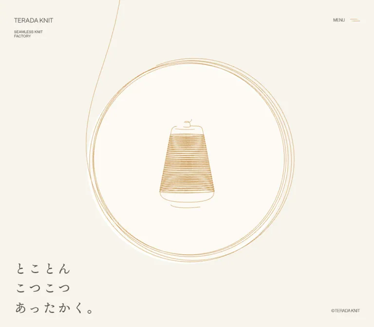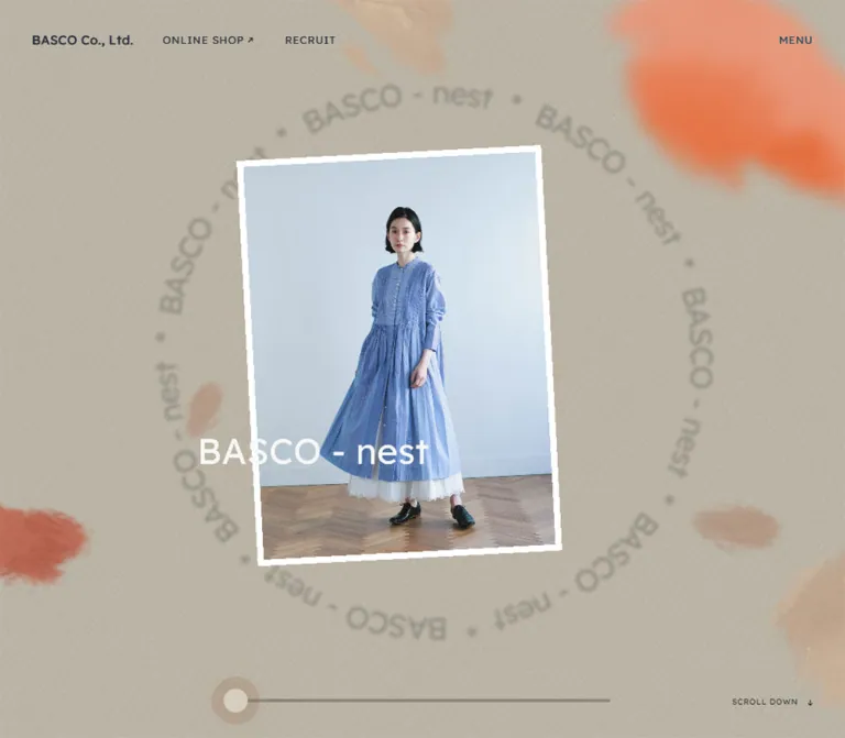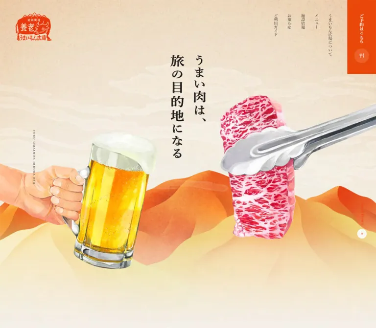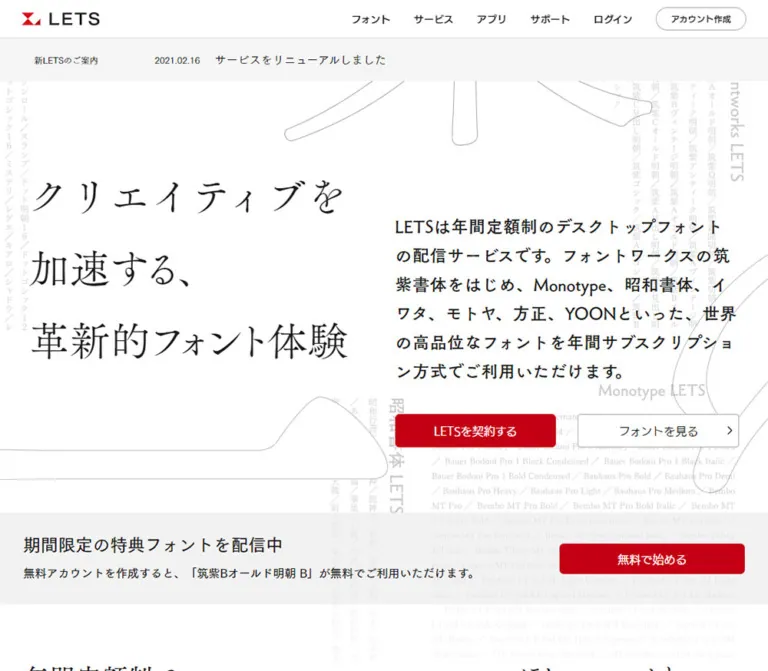
プレビュー準備中デザインリファレンスを見る
DESIGN REFERENCE
sakata|坂田織物の絣ブランドサイト
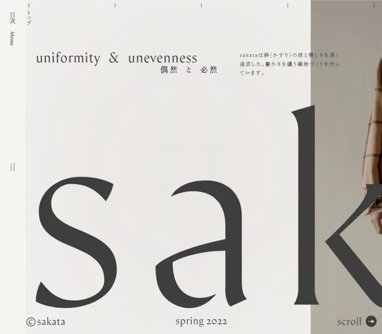
巨大なロゴ、明朝体、生成りの余白で絣の世界観を伝えるブランドサイト。PCでは横に連なる誌面構成、スマートフォンではロゴと見出しの方向を変えた縦長の構成が特徴です。
sakata — Style Reference
An oversized typographic scroll for kasuri textiles, set in charcoal ink on pale, warm surfaces.
Website: brand.sakata-kasuri.jp Original URL: https://brand.sakata-kasuri.jp/ Final URL: https://brand.sakata-kasuri.jp/ Theme: light; no alternative theme was evidenced. Inspected evidence: October 2, 2026, 06:00:10 JST / October 1, 2026, 21:00:10.102 UTC. Viewports: desktop 1440 × 1000 CSS px; mobile 390 × 844 CSS px. Scope: three desktop opening captures, a mobile opening capture, a mobile lower-contact capture, and supplied rendered DOM/computed-style measurements covering introduction, About, Products, Company, Contact, and the closed navigation index. Open-menu appearance and activated link behavior were not captured.
sakata is a textile brand and company presentation with product information, a catalog link, business contact details, and a separate online-shop destination. Its design resembles an extended editorial spread: enormous lettering, small bilingual captions, widely tracked Japanese text, carefully separated columns, and photography with substantial empty space.
The defining behavior is the change of reading axis. Desktop content occupies a horizontal strip approximately 14,449px wide within a 1000px-high document. On mobile, the same narrative becomes a roughly 7413px-tall document. The opening wordmark turns through 90°, chapter headings occupy narrow vertical margins, and the desktop navigation rail becomes a top bar. This is a compositional rearrangement, not simply a smaller desktop layout.
閉じる
sakata — Style Reference
An oversized typographic scroll for kasuri textiles, set in charcoal ink on pale, warm surfaces.
Website: brand.sakata-kasuri.jp Original URL: https://brand.sakata-kasuri.jp/ Final URL: https://brand.sakata-kasuri.jp/ Theme: light; no alternative theme was evidenced. Inspected evidence: October 2, 2026, 06:00:10 JST / October 1, 2026, 21:00:10.102 UTC. Viewports: desktop 1440 × 1000 CSS px; mobile 390 × 844 CSS px. Scope: three desktop opening captures, a mobile opening capture, a mobile lower-contact capture, and supplied rendered DOM/computed-style measurements covering introduction, About, Products, Company, Contact, and the closed navigation index. Open-menu appearance and activated link behavior were not captured.
sakata is a textile brand and company presentation with product information, a catalog link, business contact details, and a separate online-shop destination. Its design resembles an extended editorial spread: enormous lettering, small bilingual captions, widely tracked Japanese text, carefully separated columns, and photography with substantial empty space.
The defining behavior is the change of reading axis. Desktop content occupies a horizontal strip approximately 14,449px wide within a 1000px-high document. On mobile, the same narrative becomes a roughly 7413px-tall document. The opening wordmark turns through 90°, chapter headings occupy narrow vertical margins, and the desktop navigation rail becomes a top bar. This is a compositional rearrangement, not simply a smaller desktop layout.
How to Read This Reference
- Measured values come from the supplied rendered element rectangles and computed styles. They are CSS pixels unless otherwise stated.
- Visual estimates describe the supplied original-page captures. Approximate colors, icon diameters, photographic boundaries, and unmeasured footer typography are labeled accordingly.
- Derived values are calculations from measurements, such as aspect ratios and gaps. They do not establish the original CSS formula.
- Recommendations describe implementation choices for a new project, including the breakpoint, accessible text sizing, focus styling, and native scrolling in the Quick Start.
- Offscreen measurements establish content structure and geometry, but do not provide a complete visual inspection of every spread.
- No custom properties were returned in the evidence. All token names below are reference aliases, not recovered source variables.
The page's visible June. 2024 label is content, not the inspection date. The measurements document the page served at the evidence timestamp.
Tokens — Colors
Default Palette
| Name | Value | Reference token | Evidence and role |
|---|---|---|---|
| Paper | #f5f5f3 |
--color-paper |
Measured: body background. Matches the pale navigation chrome and general page surround. |
| Charcoal | #3e3e3e |
--color-ink |
Measured: body text, sampled headings, navigation, and links. Visually also the dominant wordmark and icon color. |
| Warm Field | approximately #e8e4dd |
--color-field |
Visual estimate: an approximation of the warmer opening and contact backgrounds. Not a sampled CSS declaration. |
| Reverse White | #ffffff |
--color-reverse |
Measured: the large Products slogan's text color in the rendered DOM. Its complete visual backdrop was not captured. |
| Transparent | rgba(0, 0, 0, 0) |
No separate surface token | Measured: many sections and text containers have transparent backgrounds. Transparency is not an additional visible palette color. |
The exact body background does not explain every visible surface. The opening canvas looks warmer and shows gentle tonal variation, while sampled section backgrounds are transparent. Image layers or other unreported styling may contribute. Treat Warm Field as an adaptation color rather than claiming that the original hero uses a flat #e8e4dd fill.
There is no evidenced system of colorful buttons, category badges, or accent states. Color comes primarily from textiles and photography. Keep interface contrast within the paper/charcoal relationship.
Color Application
- Use Charcoal for typography, fine marks, navigation symbols, and circular directional indicators.
- Use Paper for navigation chrome and the mobile footer's pale separation treatment.
- Use Warm Field sparingly to approximate the visible canvas when the original background asset is unavailable.
- Preserve photographic variation instead of flattening every image into the interface palette.
- Do not promote the Products slogan's white text into a general button or background color without checking its context.
Tokens — Typography
Arida-Regular — Latin Editorial Text
Measured family: Arida-Regular.
This family is declared on the opening English heading, English About caption, product category titles, large Products slogan, email address, and Instagram link. Its shaped serifs and unevenly expansive letterforms connect small editorial labels to large display typography.
The sampled computed weight is 500, despite the family name containing Regular. Preserve that distinction when documenting the source; it does not establish the available font files or their actual weight mapping.
Reference alias: --font-latin: 'Arida-Regular', serif.
Shuei Mincho — Japanese Body Text
Measured primary stack: dnp-shuei-mincho-pr6n, '秀英明朝 M', 'Shuei Mincho M', serif, followed by additional sans-serif/system fallbacks in the supplied body style.
Body text uses computed weight 500, generous 1.75 line height, and usually 0.16em tracking. The visual result is quiet but deliberately spaced: paragraphs behave like small editorial blocks rather than dense application text.
The presence of a font family in computed styles documents the declaration. The supplied evidence does not independently verify which fallback rendered every glyph.
Shuei Mincho — Japanese Headings
Measured stack: dnp-shuei-mincho-pr6n, '秀英明朝 B', 'Shuei Mincho B', serif.
Japanese section headings and subheadings use computed weight 600. Main chapter headings generally use 0.12em tracking. The opening subtitle, 偶然と必然, is more widely tracked at 0.22em.
Wordmark Artwork
The opening H1 has no extracted text, yet its rectangle corresponds to the enormous visible sakata wordmark. Its measured desktop box is 2173.20 × 610px; the mobile box is 255.84 × 911.52px.
The desktop width-to-height ratio and mobile height-to-width ratio are both approximately 3.5626. This supports the observed rotation of the same-shaped mark on mobile.
Do not interpret the H1 container's inherited body font size as the wordmark's font size. The underlying asset format and lettering source were not supplied. Reuse authorized wordmark artwork when available; setting plain text in Arida is not a verified replacement.
Type Scale
Values below are measured. Sizes are shown as font size / line height.
| Role | Desktop | Mobile | Tracking | Weight |
|---|---|---|---|---|
| Root font size | 12.7 / 12.7px |
10.53 / 10.53px |
Normal | 400 |
| Japanese body paragraphs | 16.51 / 28.8925px |
11.583 / 20.2703px |
Usually 0.16em |
500 |
| Opening Japanese introduction | 15.24 / 26.67px |
11.583 / 20.2703px |
0.16em |
500 |
| Opening English heading | 44.45 / 44.45px |
21.06 / 21.06px |
0.03em |
500 |
| Opening Japanese subtitle | 22.86 / 22.86px |
15.795 / 15.795px |
0.22em |
600 |
| Japanese chapter heading | 33.02 / 33.02px |
21.06 / 21.06px |
0.12em |
600 |
| About subheading | 22.86 / 40.005px |
16.848 / 16.848px |
0.12em |
600 |
| Contact subheading | 22.86 / 40.005px |
18.954 / 33.1695px |
0.12em |
600 |
| About English caption | 16.51 / 20.6375px |
11.583 / 14.4788px |
0.06em |
500 |
| Product category title | 33.02 / 33.02px |
27.378 / 27.378px |
0.06em |
500 |
| Large Products slogan | 121.92 / 109.728px |
63.18 / 63.18px |
Normal | 500 |
| Email link | 33.02 / 33.02px |
27.378 / 27.378px |
Normal | 500 |
| Persistent Contact link | 19.05 / 19.05px |
15.795 / 15.795px |
Normal | 500 |
The mobile About chapter heading is a measured exception: its line height is 23.166px, or approximately 1.1.
The root is much smaller than a conventional 16px root. Many values can be expressed as multiples of its measured size, but the responsive formula that produced those root sizes was not supplied. Do not copy numeric source-like rem values into a 16px-root project and expect matching proportions.
Tokens — Spacing & Shapes
Character: very large compositional gaps surrounding modest text blocks; square photographic edges; almost no boxed interface treatment.
Spacing Scale
These are measured or derived endpoint values, not a recovered global spacing system.
| Use | Desktop | Mobile | Evidence |
|---|---|---|---|
| Navigation rail / bar | About 76.19px wide |
About 63px high |
Desktop main offset; mobile screenshot boundary |
| Opening text left inset after rail | 30.47px |
Not retained | Derived from main and heading rectangles |
| Standard mobile body left edge | — | 16.84px |
Repeated About, Products, and Contact coordinates |
| About paragraph column | 406.39px |
288.59px |
Measured paragraph widths |
| Gap between desktop About columns | 107.97px |
Columns stack | Derived from adjacent rectangles |
| About subheading-to-paragraph gap | 60.95px |
25.27px |
Derived from heading bottom and paragraph top |
| Gap after an early mobile About paragraph to the next subheading | — | 117.92px |
Derived from the first two groups |
| Product description block | 647.69px |
288.59px |
Measured |
| Contact detail-group gap | 30.47px |
16.84px |
Derived from consecutive address/phone/fax blocks |
| Mobile gaps before selected chapters | — | 28.42px |
Between introduction/About, Products/Company, and Company/Contact |
At 390px, the repeated 288.59px body width is approximately 74% of the viewport. This is a useful reconstruction ratio, not proof of a 74vw source declaration.
Border Radius and Rules
| Element | Appearance | Evidence |
|---|---|---|
| Text blocks and sampled containers | 0px radius |
Measured |
| Visible photographic crops | Square corners | Captures |
| Directional arrow disc | Circular | Captures; approximately 33px desktop and 27px mobile |
| Mobile header separator | Fine horizontal rule | Visual estimate, approximately 1px |
| Desktop top markers | Short vertical hairlines | Visual estimate, approximately 1px thick |
| Cards and elevated panels | No general system evidenced | Supplied captures and sampled elements |
The tiny circles belong to directional controls. They are not evidence of a broader rounded-component system.
Layout Measurements
| Element | Desktop 1440 × 1000 | Mobile 390 × 844 |
|---|---|---|
| Main container | x = 76.19px, width 14449.16px, height 1000px; flex |
Width 390px, height 7413.17px; block |
| Opening section | Width 2400.77px, height 1000px |
Width 390px, height 1311.97px |
| Opening English heading | x 106.66, y 150, box 485.39 × 44.45px |
x 352.11, y 91.59, box 21.06 × 231.19px |
| Opening Japanese subtitle | Box 548.89 × 22.86px below English heading |
x 336.33, y 276.45, box 15.80 × 117.36px |
| Opening introduction | x 1013.25, y 150, box 304.80 × 79.97px |
x 292.16, y 721.98, box 81 × 164.17px |
| Wordmark H1 | x 106.66, y 313.81, box 2173.20 × 610px |
x 23.98, y 106.70, box 255.84 × 911.52px |
| Linked product-image region | 520.69 × 292.88px |
288.59 × 162.33px |
The product-image region has a derived 16:9 ratio at both sizes. Its dimensions describe the linked rectangle, not a verified intrinsic image size.
Components
Persistent Navigation Rail / Mobile Header
Role: keeps the table of contents and Contact destination available while the narrative moves.
On desktop, a pale strip approximately 76px wide occupies the left edge. The 目次 and Menu labels sit near the top in a vertical arrangement. A pair of thin vertical marks appears around mid-height. The bullet-prefixed Contact link occupies the lower part of the rail and is also vertically oriented.
On mobile, this becomes a full-width top bar approximately 63px high. Two short horizontal strokes sit near x = 17px, followed by 目次. Contact sits at the right, with its sampled link beginning around x = 307.95px. The English Menu label is not visible in the supplied mobile capture.
The header wrapper itself has a measured height of zero in the DOM sample. This does not mean that the visible chrome is absent; its descendants occupy the rail/bar geometry. Preserve the visible navigation independently of normal content flow.
Table of Contents
Role: direct navigation through the five-part narrative, plus access to shopping and Instagram.
The rendered index contains:
| Destination | Primary label | Secondary label |
|---|---|---|
#top |
ページトップ |
(top) and introduction |
#about |
私たちのこと |
(about) and section I |
#products |
製品紹介 |
(products) and section II |
#company |
運営会社 |
(company) and section III |
#contact |
お問い合わせ |
(contact) and section IV |
| Separate shop URL | オンラインショップ |
(shopping) |
A separate Instagram link and a (閉じる) button are also present.
In the sampled closed state, desktop index links sit at negative x coordinates; mobile links sit above the viewport at negative y coordinates. This supports an off-canvas index with a different closed-state direction at each layout. The actual opening sequence was not exercised.
Measured link-row rectangles are approximately 383.56 × 63.5px on desktop and 358.41 × 44.22px on mobile. These are closed-state element measurements, not confirmation of the complete open panel's dimensions, surface, or focus behavior.
Opening Typographic Spread
Role: establishes the brand through scale, empty space, and directional reading.
The desktop opening is wider than the viewport. A compact English heading, uniformity & unevenness, appears at the upper left of the content area. The Japanese subtitle sits underneath and is aligned toward the right side of its wider box. A short Japanese brand introduction sits much farther right, beginning at x = 1013.25px.
The huge wordmark occupies the lower portion of the spread. Its right side continues beyond the viewport; this cropping is fundamental to the composition. Do not reduce the whole wordmark until it fits neatly within the first screen.
A photographic or image-backed field begins at approximately x = 1143px in the desktop captures. Only part of that region is visible, so its complete subject and source framing cannot be established from the opening screenshots.
On mobile, the wordmark rotates clockwise and runs down the left portion of the page. The English heading and Japanese subtitle move into narrow vertical tracks along the upper-right edge. The introductory Japanese paragraph appears farther down in several vertical columns. The opening section extends beyond the first viewport, so the initial screenshot is intentionally only part of the composition.
Top Markers and Section Labels
Role: reinforces the sense of a measured, extended page surface.
The desktop opening has short vertical ticks along the top, with トップ beneath the first visible marker. The supplied text also contains labels for the other sections. Several evenly spaced ticks are visible across the opening capture, but their clickability and progress semantics were not tested.
Treat these as an observed visual navigation motif. Do not automatically implement a progress meter or draggable timeline from the ticks alone.
Persistent Bottom Information
Role: maintains brand ownership, release information, and a directional cue.
The visible arrangement has three zones: ©sakata at the left, release-related text near the middle, and a directional arrow at the right. Desktop also shows the word scroll. The arrow points right on desktop and down on mobile.
Footer text is approximately 30px on desktop and 16px on mobile by visual estimate; these particular font sizes were not included in the computed-style sample. The circular arrow is approximately 33px and 27px respectively.
The DOM contains both June. 2024 and new product release. The supplied captures show differences in which caption is readable and how it is clipped. They do not establish a timed carousel, a loop duration, or a user-controlled switch.
Both mobile captures show a pale fade behind the bottom information. Its appearance is visible; the original gradient or compositing implementation is unknown. The arrow's activation behavior is also unverified.
About Editorial Columns
Role: explains the brand, its philosophy, and the kasuri technique.
The desktop spread contains a Japanese chapter heading, a short English statement, and three substantial Japanese text groups. Each body column is approximately 406.39px wide. Column starts are separated by approximately 514.36px, leaving gaps of about 107.97px.
Subheadings begin around y = 348.75px; paragraphs begin around y = 449.70px. This creates a noticeable pause between heading and text. The paragraph style is Mincho at 16.51px, 1.75 line height, and 0.16em tracking.
On mobile, the body groups stack in a 288.59px column beginning at x = 16.84px. Chapter identity and its English statement occupy the right margin in tall, narrow boxes. The section therefore combines horizontal reading paragraphs with vertical marginal text.
Do not turn the three topics into rounded feature cards. Their relationship is editorial: shared alignment, measured spacing, and continuous background.
Products Presentation
Role: introduces apparel products, textiles, and developing interior fabrics.
The desktop DOM includes a Japanese heading, the English category line, made with kasuri, and the large white slogan Local but sophisticated. Luxury but casual. The slogan is measured at 121.92px with a 109.728px line height. On mobile it is 63.18px with a tall, narrow rectangle, consistent with the changed reading orientation.
The three product groups are labeled products, textile, and fabric. Desktop category-heading rectangles are narrow and tall, consistent with vertical labels; mobile category headings are horizontal and approximately 27.38px high.
The first product group's desktop anatomy is especially clear from the geometry:
- A narrow category-title column begins at
x = 6438.05px. - A linked 16:9 image region begins at
x = 6565.05px, measuring about 520.69 × 292.88px. - A description spans a wider 647.69px block beneath the heading/image region.
- A small
view detaillink follows the description.
On mobile, this becomes a vertical sequence: category heading, 288.59 × 162.33px linked image region, paragraph, and detail link. The image ends about 12.63px above the paragraph.
Both the image link and view detail target the same product-catalog PDF. This is a document destination, not evidence of an inline product modal, cart, or checkout flow.
Company Spread
Role: connects the brand to its manufacturing company and history.
The original page identifies the operator as 有限会社 坂田織物 in its Company section. Its information includes establishment date, location, and representative, presented as compact label/value facts following a longer company narrative.
Desktop narrative text occupies a 406.39px column. The mobile narrative is wider than the repeated About/Product column, measuring 336.95px, so the site does not use a single universal text width.
The DOM also contains a large region associated with Kasuri culture to the world. Its sampled paragraph color is transparent and its inherited font size is ordinary body size. Those container styles do not establish the appearance of the rendered lettering or any image treatment inside it. Do not infer a mask, outline, video fill, or animation from that evidence alone.
Contact Spread
Role: gives business and press visitors direct contact information.
Desktop uses separate prose and company-detail columns, each approximately 406.39px wide. The email address is an unboxed Arida link at 33.02px. Address, phone, and fax appear as short stacked label/value groups with roughly 30.47px between groups.
Mobile stacks the business introduction, the 27.378px email link, the company heading, and the address/phone/fax groups. The lower-contact capture shows the company heading near the upper left, a narrow vertical location caption near the right edge, and a partial photograph beginning around y = 408px at the left edge.
The photograph occupies approximately 180px, or 46% of the viewport width, in that capture. A small portion of a blue-and-cream garment appears along its left edge; pale surroundings and a strong diagonal shadow occupy much of the crop.
The email uses a mailto: destination and the telephone number uses tel:. No contact form is evidenced.
Tokens — Motion & Interaction
Measured Transition Declarations
| Element | Supplied computed transition | What this establishes |
|---|---|---|
| Menu label container | 0.4s ease-in-out 1s |
A 400ms transition with a 1s delay is declared; the changed property and trigger were not demonstrated. |
| Persistent Contact link | 0.4s ease-in-out 1s |
Same timing declaration; activated behavior was not captured. |
| Close button | 0.4s cubic-bezier(0.4, 0.1, 0.2, 1) |
A 400ms custom-eased transition is declared. |
| Instagram link | 0.2s cubic-bezier(0.4, 0.1, 0.2, 1) |
A shorter 200ms transition is declared. |
| Most sampled content | transition: all, animation: none in the supplied serialization |
Insufficient to assign a meaningful animation duration or rule out motion on parents, descendants, or JavaScript-controlled elements. |
Observed Behavior and Limits
- The desktop geometry establishes a horizontal content arrangement; mobile establishes a vertical document. It does not reveal whether desktop wheel input is remapped, eased, or driven by another controller.
- The closed index is displaced left on desktop and upward on mobile. Open-state animation and final placement remain unverified.
- The directional cue changes from right to down with the layout.
- Release-caption visibility and clipping vary between captures. A specific rotation schedule or animation sequence cannot be reconstructed.
- Hash, shop, Instagram, catalog, email, and telephone destinations are present in the rendered links. Their successful activation was not separately tested.
- There is no supplied evidence establishing parallax, magnetic cursors, hover image swaps, inertia, or mandatory scroll snapping.
Recommended motion direction: preserve the calm pace and limited movement implied by the declared 200–400ms transitions. Any additional movement should support navigation or reveal content, with a reduced-motion alternative. Do not add continuous floating or bouncing merely to make the page feel animated.
Surfaces
| Layer | Appearance | Structural role |
|---|---|---|
| Navigation chrome | Pale Paper with Charcoal type and fine marks | Stable frame for a moving narrative |
| Main visual field | Warm, low-contrast tonal variation | Continuous editorial canvas |
| Text groups | Transparent, without card boundaries | Separated by alignment and empty space |
| Photography | Square crops with natural tonal depth | Supplies material, clothing, and light |
| Oversized wordmark | Dense Charcoal silhouette | Dominant foreground graphic |
| Mobile footer backing | Pale fade visible behind captions | Separates fixed information from underlying content |
| Directional indicator | Small filled Charcoal disc with pale arrow | Compact visual cue |
Depth comes from photography, scale, overlap, and empty space. No general elevation-shadow or glass-panel system is visible.
Imagery
The original captures support a quiet studio-photography direction: pale surroundings, subdued textile color, strong but natural-looking shadows, and deliberate cropping. The lower-contact image leaves substantial space around a garment fragment. Its usefulness comes from the relationship between cloth, light, and negative space rather than a fully centered product shot.
Only a narrow portion of the opening photo is visible in the desktop captures. Avoid deriving a complete campaign image, model pose, garment silhouette, or photographic sequence from that fragment.
The enormous wordmark is a graphic asset in its own right. Its sharply shaped serifs and proportions carry more identity than generic photographic decoration. Preserve its aspect ratio, clipping, and mobile rotation.
Do not add a linen texture, film grain, or a woven background merely because the business concerns textiles. Such overlays are not established by the supplied evidence.
Observed Asset References
Paths below refer to the original website. They are not files supplied with this reference.
| Asset or destination | Observed reference | Evidence boundary |
|---|---|---|
| Opening wordmark | No asset URL supplied | Visible mark and H1 bounds only; asset type and font source unknown |
| Opening photographic field | No asset URL supplied | Partial desktop crop only |
| Lower-contact photograph | No asset URL supplied | Visible mobile crop; intrinsic dimensions unknown |
| Linked product image | No image URL supplied | Anchor bounds establish a 16:9 display region |
| Product catalog | assets/image/sakata_product_catalog_240831.pdf |
Rendered destination of the image link and view detail; document contents were not inspected |
Use authorized original artwork when available. CSS can approximate the surrounding composition, but it cannot reproduce the distinctive wordmark from its container font declaration.
Layout & Responsive Behavior
Desktop: A Continuous Horizontal Sequence
The desktop main element is flex-based, beginning after the left rail. Every sampled section is 1000px high at the 1440 × 1000 viewport. The complete section widths add up to the measured main width.
| Section | Desktop starting x | Desktop width | Mobile starting y | Mobile height |
|---|---|---|---|---|
| Introduction | 76.19px |
2400.77px |
0px |
1311.97px |
| About | 2476.95px |
2970.50px |
1340.39px |
1473.56px |
| Products | 5447.45px |
3441.67px |
2813.95px |
1383.92px |
| Company | 8889.13px |
3326.11px |
4226.30px |
1991.69px |
| Contact | 12215.23px |
2310.11px |
6246.41px |
1166.77px |
Desktop x coordinates are the initial rendered rectangles, including the rail offset. Mobile y coordinates are document positions. These are measurement landmarks, not recommended hardcoded section sizes.
The first viewport is a crop into a larger opening spread. Later sections likewise span more than one viewport. A reconstruction built as one screen per chapter would compress the original editorial rhythm.
Mobile: Vertical Narrative with Marginal Type
At 390 × 844, the main element changes to block layout and the document grows to approximately 7413px. Important changes include:
- The left rail becomes a horizontal top bar.
- The wordmark rotates through 90° and extends below the initial viewport.
- The opening heading and introduction become vertically arranged.
- About and Products body content stacks on the left, leaving a right-side title track.
- Product category labels become horizontal above their images.
- The Company narrative uses a wider text block than the repeated 288.59px column.
- Contact information follows normal vertical reading order, while a location caption retains vertical orientation.
- The footer arrow points down, and the word
scrollis absent from the mobile capture.
This combination of horizontal paragraphs, vertical side labels, and rotated artwork should be preserved deliberately. Applying vertical writing mode to the entire mobile page would destroy the actual reading structure.
Unverified Responsive Details
Only two viewport sizes were supplied. The exact breakpoint, tablet layout, landscape-phone behavior, dynamic-browser-bar handling, safe-area rules, zoom behavior, and original scaling formula remain unknown.
For a new implementation, select a breakpoint based on when the editorial columns become unusable. The Quick Start uses 900px as a recommendation, not a recovered source value. Allow content height to expand when increasing text size or changing copy.
Do’s and Don’ts
Do
- Build the desktop narrative as a broad horizontal sequence with a persistent left rail.
- Transform the composition for mobile, including the wordmark and marginal headings.
- Keep measured Paper
#f5f5f3and Charcoal#3e3e3eas the interface foundation. - Pair the evidenced Latin serif and Japanese Mincho families when properly licensed and available.
- Preserve the enormous wordmark's proportions and deliberate viewport cropping.
- Give small text groups generous surrounding space instead of filling every available area.
- Keep paragraph tracking, heading tracking, and line height distinct.
- Use square photographic crops and allow empty photographic space to remain visible.
- Preserve the small, unboxed catalog and email links.
- Keep measured facts, visual estimates, and implementation recommendations separate.
Don’t
- Don't fit the whole desktop wordmark into a conventional centered hero container.
- Don't turn the narrative into a generic grid of feature cards.
- Don't replace all text with a modern sans-serif or use pure black as the measured body color.
- Don't rotate entire mobile paragraphs when only the opening copy and marginal labels require vertical treatment.
- Don't infer the wordmark's lettering from the H1's inherited body styles.
- Don't assume the large transparent Company container reveals its final lettering technique.
- Don't invent parallax, autoplay timing, scroll snapping, or menu behavior.
- Don't use the catalog destination as evidence of an embedded shopping experience.
- Don't add paper grain, fabric textures, glass blur, or elevated cards without a separate design reason.
- Don't hardcode the measured mobile section heights after increasing font sizes or changing copy.
Recommended Implementation Additions
These are recommendations for a new implementation, not verified features of the original:
- Use a real button for the menu trigger, with an accessible name, expanded state, and controlled-panel relationship. If the index acts as a modal, implement focus management, Escape handling, and focus return.
- Give the wordmark an accessible brand name without duplicating it in screen-reader output. An empty extracted H1 does not prove the original lacks an accessible alternative, so audit the actual asset markup.
- Keep hash destinations operable through native links and ensure targets clear the fixed mobile header.
- Make the horizontal content area keyboard-scrollable and visibly navigable. Avoid requiring a wheel gesture that keyboard and touch users cannot reproduce.
- Increase mobile body copy from the measured 11.583px to at least 14px where practical, then allow all editorial blocks to reflow.
- Use touch targets of roughly 44 × 44px around the visually smaller arrow and menu marks.
- Reserve space around fixed footer information so text and links can be read without permanent overlap or fading.
- Provide visible focus indicators and reduced-motion behavior.
- Identify the catalog link as a PDF for assistive technology; do not invent a download size.
- Supply meaningful image alternatives according to content, and keep decorative shadows or duplicated artwork out of the accessibility tree.
Agent Prompt Guide
Quick Color Reference
- Navigation and base paper: measured
#f5f5f3. - Main ink and interface marks: measured
#3e3e3e. - Warm visual-field approximation: estimated
#e8e4dd. - Large Products slogan: measured
#ffffff, with its full backdrop unverified. - Interface accents: no additional chromatic accent system evidenced.
- Photography: preserve restrained textile colors and pale studio surroundings.
Overall Prompt
“Create an editorial textile-brand website inspired by the current sakata composition. Use pale paper #f5f5f3, charcoal #3e3e3e, an optional warm field approximating #e8e4dd, expressive Latin serif headings, and widely tracked Japanese Mincho paragraphs. On desktop, arrange introduction, About, Products, Company, and Contact as a continuous horizontal sequence beside a narrow persistent left navigation rail. Make an authorized brand wordmark much wider than the first viewport. On mobile, switch to a vertical document, rotate the wordmark clockwise, move navigation into a top bar, and place chapter headings in a narrow right margin while keeping most paragraphs horizontal. Use square photographic crops, large empty intervals, small unboxed links, and a persistent three-part footer. Do not invent unverified parallax or autoplay behavior.”
Example Component Prompts
- Opening spread: “Place a 44px Latin serif heading near the upper-left of a desktop editorial canvas, with a smaller tracked Japanese subtitle aligned toward its right edge. Position a compact Japanese introduction far to the right. Let a roughly 3.56:1 wordmark dominate the lower canvas and extend outside the viewport. Use charcoal on warm pale surfaces.”
- Mobile opening: “At 390px wide, use a 63px pale top navigation bar, a clockwise-rotated wordmark approximately 256px wide and 912px tall, a narrow vertical English heading at the right, and a separate vertical Japanese subtitle. Let the introduction continue below the first viewport.”
- About columns: “Create three unboxed desktop text groups with approximately 406px body widths and 108px gaps. Use Mincho subheadings, 1.75 body line height, and 0.16em body tracking. Stack the groups on mobile while retaining a separate right-side chapter-title track.”
- Product group: “Use a narrow vertical serif category label beside a square-cornered 16:9 image on desktop, followed by a wider text block and a small ‘view detail’ document link. On mobile, place the horizontal category label above the image and paragraph. Keep the background continuous.”
- Contact ending: “Set direct email and telephone links in a quiet editorial contact section. Stack address, phone, and fax with compact labels. Add an asymmetric garment photograph with pale negative space and a diagonal shadow. Preserve a small copyright/release footer and a downward circular arrow on mobile.”
Quick Start
CSS Custom Properties
This is a recommended adaptation, not recovered source CSS. It uses the two measured root sizes as independent layout units while leaving the document root conventional. The 900px breakpoint is recommended. Warm Field is estimated. Mobile body text is intentionally increased to 14px, so exact mobile heights will differ from the captures.
The class contract is a persistent .site-rail, a horizontally scrollable .spreads containing .intro and .chapter sections, and a fixed .page-footer. Place authorized wordmark artwork inside .brand-mark; its image should have approximately the measured 3.5626:1 aspect ratio. No artwork paths or font files are invented here.
:root {
  /* Measured colors; the warm field is a visual approximation. */
  --color-paper: #f5f5f3;
  --color-ink: #3e3e3e;
  --color-field: #e8e4dd;
  --color-reverse: #fff;

  /* Named families are evidenced; font delivery is not included. */
  --font-latin: 'Arida-Regular', serif;
  --font-jp: dnp-shuei-mincho-pr6n, 'Shuei Mincho M', serif;
  --font-jp-strong: dnp-shuei-mincho-pr6n, 'Shuei Mincho B', serif;

  /* Endpoint unit, not a reconstructed responsive formula. */
  --u: 12.7px;
  --rail-width: calc(6 * var(--u));
  --inset: calc(2.4 * var(--u));
  --column-width: calc(32 * var(--u));
  --column-gap: calc(8.5 * var(--u));
  --text-body: calc(1.3 * var(--u));
  --text-chapter: calc(2.6 * var(--u));
  --text-subheading: calc(1.8 * var(--u));
  --tracking-body: 0.16em;
  --tracking-heading: 0.12em;
  --leading-body: 1.75;
  --radius-image: 0;

  /* Timing aliases from measured control declarations. */
  --motion-panel: 400ms cubic-bezier(0.4, 0.1, 0.2, 1);
  --motion-link: 200ms cubic-bezier(0.4, 0.1, 0.2, 1);
}

* {
  box-sizing: border-box;
}

body {
  margin: 0;
  color: var(--color-ink);
  background: var(--color-paper);
  font-family: var(--font-jp);
  font-weight: 500;
}

button,
a {
  color: inherit;
}

button {
  font: inherit;
}

.site-rail {
  position: fixed;
  z-index: 30;
  inset: 0 auto 0 0;
  width: var(--rail-width);
  display: flex;
  flex-direction: column;
  align-items: center;
  justify-content: space-between;
  padding: 34px 0 29px;
  background: var(--color-paper);
}

.menu-label,
.site-rail .contact-link {
  writing-mode: vertical-rl;
}

.site-rail .contact-link {
  font-size: calc(1.5 * var(--u));
  line-height: 1;
  text-decoration: none;
}

.spreads {
  display: flex;
  height: 100svh;
  margin-left: var(--rail-width);
  overflow: auto;
  background: var(--color-field);
  scroll-padding-inline: var(--inset);
}

.spreads > section {
  position: relative;
  flex: 0 0 auto;
  min-height: 100%;
}

.intro {
  width: calc(189.04 * var(--u));
  overflow: hidden;
}

.hero-heading {
  position: absolute;
  top: 15vh;
  left: var(--inset);
}

.hero-heading h2 {
  margin: 0;
  font: 500 calc(3.5 * var(--u)) / 1 var(--font-latin);
  letter-spacing: 0.03em;
  white-space: nowrap;
}

.hero-heading .subtitle {
  width: calc(43.22 * var(--u));
  margin: 0;
  text-align: right;
  font: 600 calc(1.8 * var(--u)) / 1 var(--font-jp-strong);
  letter-spacing: 0.22em;
}

.hero-introduction {
  position: absolute;
  top: 15vh;
  left: calc(73.784 * var(--u));
  width: calc(24 * var(--u));
  margin: 0;
  font-size: calc(1.2 * var(--u));
  line-height: var(--leading-body);
  letter-spacing: var(--tracking-body);
}

.brand-mark {
  position: absolute;
  top: 31.381vh;
  left: var(--inset);
  width: 217.32vh;
  margin: 0;
  line-height: 0;
}

.brand-mark img {
  display: block;
  width: 100%;
  height: auto;
}

.chapter {
  width: max-content;
  min-width: 100%;
  padding: 15vh calc(16.9 * var(--u)) 110px;
}

.chapter-title {
  margin: 0 0 calc(12.4 * var(--u));
  font: 600 var(--text-chapter) / 1 var(--font-jp-strong);
  letter-spacing: var(--tracking-heading);
}

.editorial-columns {
  display: grid;
  grid-template-columns: repeat(3, var(--column-width));
  gap: var(--column-gap);
}

.editorial-columns h3,
.contact-panel h3 {
  margin: 0 0 calc(4.8 * var(--u));
  font: 600 var(--text-subheading) / 1.75 var(--font-jp-strong);
  letter-spacing: var(--tracking-heading);
}

.editorial-copy {
  margin: 0;
  font-size: var(--text-body);
  line-height: var(--leading-body);
  letter-spacing: var(--tracking-body);
}

.product-groups {
  display: grid;
  grid-template-columns: repeat(3, calc(51 * var(--u)));
  gap: calc(12 * var(--u));
}

.product-item {
  display: grid;
  grid-template-columns: calc(2.6 * var(--u)) 1fr;
  align-content: start;
  column-gap: calc(7.4 * var(--u));
  row-gap: calc(1.2 * var(--u));
}

.product-item h3 {
  margin: 0;
  writing-mode: vertical-rl;
  font: 500 calc(2.6 * var(--u)) / 1 var(--font-latin);
  letter-spacing: 0.06em;
}

.product-image {
  display: block;
  width: 100%;
  aspect-ratio: 16 / 9;
  object-fit: cover;
  border-radius: var(--radius-image);
}

.product-item .editorial-copy,
.product-item .detail-link {
  grid-column: 1 / -1;
}

.detail-link {
  justify-self: start;
  font-size: var(--text-body);
  letter-spacing: var(--tracking-body);
  text-underline-offset: 0.25em;
}

.email-link {
  display: inline-block;
  font: 500 calc(2.6 * var(--u)) / 1 var(--font-latin);
  overflow-wrap: anywhere;
}

.contact-details p {
  margin: 0 0 var(--inset);
}

.page-footer {
  position: fixed;
  z-index: 20;
  right: 20px;
  bottom: max(16px, env(safe-area-inset-bottom, 0px));
  left: calc(var(--rail-width) + 24px);
  display: grid;
  grid-template-columns: 1fr auto 1fr;
  align-items: center;
  gap: 12px;
  font: 500 30px / 1.2 var(--font-latin);
  pointer-events: none;
}

.page-footer a,
.page-footer button {
  pointer-events: auto;
}

.scroll-cue {
  justify-self: end;
  display: flex;
  align-items: center;
  justify-content: center;
  gap: 12px;
  min-width: 44px;
  min-height: 44px;
}

.arrow-disc {
  display: grid;
  place-items: center;
  width: 33px;
  height: 33px;
  border-radius: 50%;
  color: var(--color-paper);
  background: var(--color-ink);
  font: 22px / 1 serif;
}

.sakata-shell :focus-visible {
  outline: 2px solid currentColor;
  outline-offset: 4px;
}

/* Recommended breakpoint; not recovered from the original stylesheet. */
@media (max-width: 900px) {
  :root {
    --u: 10.53px;
    --header-height: calc(6 * var(--u));
    --rail-width: 0px;
    --inset: calc(1.6 * var(--u));
    --column-width: 74vw;
    --text-body: 14px;
    --text-chapter: calc(2 * var(--u));
    --text-subheading: calc(1.6 * var(--u));
    --mark-short: 65.6vw;
  }

  .site-rail {
    inset: 0 0 auto;
    width: auto;
    height: var(--header-height);
    flex-direction: row;
    padding: 0 var(--inset);
    border-bottom: 1px solid rgb(62 62 62 / 20%);
  }

  .menu-label,
  .site-rail .contact-link {
    writing-mode: horizontal-tb;
  }

  .menu-english {
    display: none;
  }

  .spreads {
    display: block;
    height: auto;
    margin: 0;
    overflow: visible;
  }

  .spreads > section {
    min-height: 0;
    scroll-margin-top: calc(var(--header-height) + 16px);
  }

  .intro {
    width: 100%;
    height: max(1312px, calc(124.6 * var(--u)));
  }

  .hero-heading {
    top: calc(var(--header-height) + 2.7 * var(--u));
    right: var(--inset);
    left: auto;
    writing-mode: vertical-rl;
  }

  .hero-heading h2 {
    font-size: calc(2 * var(--u));
  }

  .hero-heading .subtitle {
    width: auto;
    margin-inline-start: calc(17.55 * var(--u));
    text-align: start;
    font-size: calc(1.5 * var(--u));
  }

  .hero-introduction {
    top: calc(68.56 * var(--u));
    right: var(--inset);
    left: auto;
    width: auto;
    height: calc(16 * var(--u));
    writing-mode: vertical-rl;
    font-size: var(--text-body);
  }

  .brand-mark {
    top: calc(var(--header-height) + 4.132 * var(--u));
    left: calc(6.15vw + var(--mark-short));
    width: calc(var(--mark-short) * 3.5626);
    transform: rotate(90deg);
    transform-origin: 0 0;
  }

  .chapter {
    width: 100%;
    min-width: 0;
    padding: 120px var(--inset) 96px;
  }

  .chapter-title {
    position: absolute;
    top: 120px;
    right: var(--inset);
    margin: 0;
    writing-mode: vertical-rl;
  }

  .editorial-columns,
  .product-groups {
    width: var(--column-width);
    grid-template-columns: minmax(0, 1fr);
    gap: calc(11.2 * var(--u));
  }

  .editorial-columns h3 {
    margin-bottom: calc(2.4 * var(--u));
    line-height: 1;
  }

  .product-item {
    grid-template-columns: minmax(0, 1fr);
    gap: calc(1.2 * var(--u));
  }

  .product-item h3 {
    margin-bottom: calc(1.5 * var(--u));
    writing-mode: horizontal-tb;
  }

  .contact-panel {
    width: var(--column-width);
  }

  .contact-panel h3 {
    margin-bottom: calc(3.5 * var(--u));
    font-size: calc(1.8 * var(--u));
  }

  .page-footer {
    right: var(--inset);
    left: var(--inset);
    gap: 6px;
    font-size: 16px;
  }

  /* Approximation of the visible mobile footer fade. */
  .page-footer::before {
    position: absolute;
    z-index: -1;
    inset: -80px -17px -24px;
    content: '';
    background: linear-gradient(
      to top,
      var(--color-paper),
      rgb(245 245 243 / 0)
    );
    pointer-events: none;
  }

  .scroll-cue .label {
    display: none;
  }

  .arrow-disc {
    width: 27px;
    height: 27px;
    transform: rotate(90deg);
  }
}

@media (prefers-reduced-motion: reduce) {
  .spreads {
    scroll-behavior: auto;
  }

  .sakata-shell a,
  .sakata-shell button {
    transition: none;
  }
}
Use a right-pointing arrow inside .arrow-disc; the mobile rule rotates it downward. Place the copyright, release caption, and cue in that order inside .page-footer.
This shell intentionally leaves the index controller, font loading, photographic placement, and release-caption behavior to separate implementation. Native overflow provides the desktop horizontal mechanism; it does not claim to reproduce an unverified original scroll controller. Give the scrolling region a meaningful accessible label and keyboard focus, and use real section IDs for navigation.
Tailwind v4 Token Mapping
Optional aliases for a project already using Tailwind v4. Define the custom properties above first. This is not evidence that the original uses Tailwind.
@theme inline {
  --color-sakata-paper: var(--color-paper);
  --color-sakata-ink: var(--color-ink);
  --color-sakata-field: var(--color-field);
  --color-sakata-reverse: var(--color-reverse);

  --font-editorial: var(--font-latin);
  --font-mincho: var(--font-jp);
  --font-mincho-heading: var(--font-jp-strong);

  --text-editorial-body: var(--text-body);
  --text-editorial-chapter: var(--text-chapter);
  --text-editorial-subheading: var(--text-subheading);

  --spacing-editorial-inset: var(--inset);
  --spacing-editorial-column: var(--column-width);
  --spacing-editorial-gap: var(--column-gap);
  --spacing-navigation-rail: var(--rail-width);

  --radius-editorial-image: 0px;
}
Sources & Evidence
- sakata — original and final page: supplied HTTP 200 observation, rendered page text, links, element rectangles, computed styles, and original-page captures. Original and final URLs are identical.
- Evidence timestamp:
2026-10-01T21:00:10.102Z, equivalent to October 2, 2026, 06:00:10.102 JST. No separate timestamp was supplied for each individual capture. - Desktop evidence: 1440 × 1000 CSS px; three opening captures; document height 1000px; rendered main width approximately 14,449.16px.
- Mobile evidence: 390 × 844 CSS px; opening and lower-contact captures; reported document height 7413px and measured body height approximately 7413.17px.
- Company section: original-page identification of the operating company and its business facts.
- Products section: rendered category content and catalog-link destination. The linked document was not opened.
- Contact section: rendered business-contact content, email and telephone links, and the supplied lower-mobile view.
The supplied capture process waited for document readiness, sampled layout/text stability, visible image decoding, and finite animation settling within stated time limits. Perpetual animations were temporarily paused during readiness checks and then resumed. Those procedures improve capture stability but do not establish complete interaction coverage or reveal every delayed state.
No additional browsing, commands, or file access were used for this reference. The menu's open state, hover/focus states, link activation, exact responsive breakpoint, original asset URLs, font-file delivery, and full motion implementation remain unverified. All Quick Start code and accessibility additions are explicitly adaptations of the supplied evidence.
# sakata — Style Reference

> An oversized typographic scroll for kasuri textiles, set in charcoal ink on pale, warm surfaces.

**Website:** [brand.sakata-kasuri.jp](https://brand.sakata-kasuri.jp/)
**Original URL:** https://brand.sakata-kasuri.jp/
**Final URL:** https://brand.sakata-kasuri.jp/
**Theme:** light; no alternative theme was evidenced.
**Inspected evidence:** October 2, 2026, 06:00:10 JST / October 1, 2026, 21:00:10.102 UTC.
**Viewports:** desktop 1440 × 1000 CSS px; mobile 390 × 844 CSS px.
**Scope:** three desktop opening captures, a mobile opening capture, a mobile lower-contact capture, and supplied rendered DOM/computed-style measurements covering introduction, About, Products, Company, Contact, and the closed navigation index. Open-menu appearance and activated link behavior were not captured.

sakata is a textile brand and company presentation with product information, a catalog link, business contact details, and a separate online-shop destination. Its design resembles an extended editorial spread: enormous lettering, small bilingual captions, widely tracked Japanese text, carefully separated columns, and photography with substantial empty space.

The defining behavior is the change of reading axis. Desktop content occupies a horizontal strip approximately 14,449px wide within a 1000px-high document. On mobile, the same narrative becomes a roughly 7413px-tall document. The opening wordmark turns through 90°, chapter headings occupy narrow vertical margins, and the desktop navigation rail becomes a top bar. This is a compositional rearrangement, not simply a smaller desktop layout.
閉じる
# sakata — Style Reference

> An oversized typographic scroll for kasuri textiles, set in charcoal ink on pale, warm surfaces.

**Website:** [brand.sakata-kasuri.jp](https://brand.sakata-kasuri.jp/)
**Original URL:** https://brand.sakata-kasuri.jp/
**Final URL:** https://brand.sakata-kasuri.jp/
**Theme:** light; no alternative theme was evidenced.
**Inspected evidence:** October 2, 2026, 06:00:10 JST / October 1, 2026, 21:00:10.102 UTC.
**Viewports:** desktop 1440 × 1000 CSS px; mobile 390 × 844 CSS px.
**Scope:** three desktop opening captures, a mobile opening capture, a mobile lower-contact capture, and supplied rendered DOM/computed-style measurements covering introduction, About, Products, Company, Contact, and the closed navigation index. Open-menu appearance and activated link behavior were not captured.

sakata is a textile brand and company presentation with product information, a catalog link, business contact details, and a separate online-shop destination. Its design resembles an extended editorial spread: enormous lettering, small bilingual captions, widely tracked Japanese text, carefully separated columns, and photography with substantial empty space.

The defining behavior is the change of reading axis. Desktop content occupies a horizontal strip approximately 14,449px wide within a 1000px-high document. On mobile, the same narrative becomes a roughly 7413px-tall document. The opening wordmark turns through 90°, chapter headings occupy narrow vertical margins, and the desktop navigation rail becomes a top bar. This is a compositional rearrangement, not simply a smaller desktop layout.

## How to Read This Reference

- **Measured** values come from the supplied rendered element rectangles and computed styles. They are CSS pixels unless otherwise stated.
- **Visual estimates** describe the supplied original-page captures. Approximate colors, icon diameters, photographic boundaries, and unmeasured footer typography are labeled accordingly.
- **Derived** values are calculations from measurements, such as aspect ratios and gaps. They do not establish the original CSS formula.
- **Recommendations** describe implementation choices for a new project, including the breakpoint, accessible text sizing, focus styling, and native scrolling in the Quick Start.
- **Offscreen measurements** establish content structure and geometry, but do not provide a complete visual inspection of every spread.
- No custom properties were returned in the evidence. All token names below are reference aliases, not recovered source variables.

The page's visible `June. 2024` label is content, not the inspection date. The measurements document the page served at the evidence timestamp.

## Tokens — Colors

### Default Palette

| Name | Value | Reference token | Evidence and role |
| --- | --- | --- | --- |
| Paper | `#f5f5f3` | `--color-paper` | **Measured:** body background. Matches the pale navigation chrome and general page surround. |
| Charcoal | `#3e3e3e` | `--color-ink` | **Measured:** body text, sampled headings, navigation, and links. Visually also the dominant wordmark and icon color. |
| Warm Field | approximately `#e8e4dd` | `--color-field` | **Visual estimate:** an approximation of the warmer opening and contact backgrounds. Not a sampled CSS declaration. |
| Reverse White | `#ffffff` | `--color-reverse` | **Measured:** the large Products slogan's text color in the rendered DOM. Its complete visual backdrop was not captured. |
| Transparent | `rgba(0, 0, 0, 0)` | No separate surface token | **Measured:** many sections and text containers have transparent backgrounds. Transparency is not an additional visible palette color. |

The exact body background does not explain every visible surface. The opening canvas looks warmer and shows gentle tonal variation, while sampled section backgrounds are transparent. Image layers or other unreported styling may contribute. Treat Warm Field as an adaptation color rather than claiming that the original hero uses a flat `#e8e4dd` fill.

There is no evidenced system of colorful buttons, category badges, or accent states. Color comes primarily from textiles and photography. Keep interface contrast within the paper/charcoal relationship.

### Color Application

- Use Charcoal for typography, fine marks, navigation symbols, and circular directional indicators.
- Use Paper for navigation chrome and the mobile footer's pale separation treatment.
- Use Warm Field sparingly to approximate the visible canvas when the original background asset is unavailable.
- Preserve photographic variation instead of flattening every image into the interface palette.
- Do not promote the Products slogan's white text into a general button or background color without checking its context.

## Tokens — Typography

### Arida-Regular — Latin Editorial Text

**Measured family:** `Arida-Regular`.

This family is declared on the opening English heading, English About caption, product category titles, large Products slogan, email address, and Instagram link. Its shaped serifs and unevenly expansive letterforms connect small editorial labels to large display typography.

The sampled computed weight is `500`, despite the family name containing Regular. Preserve that distinction when documenting the source; it does not establish the available font files or their actual weight mapping.

**Reference alias:** `--font-latin: 'Arida-Regular', serif`.

### Shuei Mincho — Japanese Body Text

**Measured primary stack:** `dnp-shuei-mincho-pr6n, '秀英明朝 M', 'Shuei Mincho M', serif`, followed by additional sans-serif/system fallbacks in the supplied body style.

Body text uses computed weight `500`, generous `1.75` line height, and usually `0.16em` tracking. The visual result is quiet but deliberately spaced: paragraphs behave like small editorial blocks rather than dense application text.

The presence of a font family in computed styles documents the declaration. The supplied evidence does not independently verify which fallback rendered every glyph.

### Shuei Mincho — Japanese Headings

**Measured stack:** `dnp-shuei-mincho-pr6n, '秀英明朝 B', 'Shuei Mincho B', serif`.

Japanese section headings and subheadings use computed weight `600`. Main chapter headings generally use `0.12em` tracking. The opening subtitle, `偶然と必然`, is more widely tracked at `0.22em`.

### Wordmark Artwork

The opening H1 has no extracted text, yet its rectangle corresponds to the enormous visible sakata wordmark. Its measured desktop box is **2173.20 × 610px**; the mobile box is **255.84 × 911.52px**.

The desktop width-to-height ratio and mobile height-to-width ratio are both approximately **3.5626**. This supports the observed rotation of the same-shaped mark on mobile.

Do not interpret the H1 container's inherited body font size as the wordmark's font size. The underlying asset format and lettering source were not supplied. Reuse authorized wordmark artwork when available; setting plain text in Arida is not a verified replacement.

### Type Scale

Values below are measured. Sizes are shown as `font size / line height`.

| Role | Desktop | Mobile | Tracking | Weight |
| --- | --- | --- | --- | --- |
| Root font size | `12.7 / 12.7px` | `10.53 / 10.53px` | Normal | 400 |
| Japanese body paragraphs | `16.51 / 28.8925px` | `11.583 / 20.2703px` | Usually `0.16em` | 500 |
| Opening Japanese introduction | `15.24 / 26.67px` | `11.583 / 20.2703px` | `0.16em` | 500 |
| Opening English heading | `44.45 / 44.45px` | `21.06 / 21.06px` | `0.03em` | 500 |
| Opening Japanese subtitle | `22.86 / 22.86px` | `15.795 / 15.795px` | `0.22em` | 600 |
| Japanese chapter heading | `33.02 / 33.02px` | `21.06 / 21.06px` | `0.12em` | 600 |
| About subheading | `22.86 / 40.005px` | `16.848 / 16.848px` | `0.12em` | 600 |
| Contact subheading | `22.86 / 40.005px` | `18.954 / 33.1695px` | `0.12em` | 600 |
| About English caption | `16.51 / 20.6375px` | `11.583 / 14.4788px` | `0.06em` | 500 |
| Product category title | `33.02 / 33.02px` | `27.378 / 27.378px` | `0.06em` | 500 |
| Large Products slogan | `121.92 / 109.728px` | `63.18 / 63.18px` | Normal | 500 |
| Email link | `33.02 / 33.02px` | `27.378 / 27.378px` | Normal | 500 |
| Persistent Contact link | `19.05 / 19.05px` | `15.795 / 15.795px` | Normal | 500 |

The mobile About chapter heading is a measured exception: its line height is `23.166px`, or approximately `1.1`.

The root is much smaller than a conventional 16px root. Many values can be expressed as multiples of its measured size, but the responsive formula that produced those root sizes was not supplied. Do not copy numeric source-like rem values into a 16px-root project and expect matching proportions.

## Tokens — Spacing & Shapes

**Character:** very large compositional gaps surrounding modest text blocks; square photographic edges; almost no boxed interface treatment.

### Spacing Scale

These are measured or derived endpoint values, not a recovered global spacing system.

| Use | Desktop | Mobile | Evidence |
| --- | --- | --- | --- |
| Navigation rail / bar | About `76.19px` wide | About `63px` high | Desktop main offset; mobile screenshot boundary |
| Opening text left inset after rail | `30.47px` | Not retained | Derived from main and heading rectangles |
| Standard mobile body left edge | — | `16.84px` | Repeated About, Products, and Contact coordinates |
| About paragraph column | `406.39px` | `288.59px` | Measured paragraph widths |
| Gap between desktop About columns | `107.97px` | Columns stack | Derived from adjacent rectangles |
| About subheading-to-paragraph gap | `60.95px` | `25.27px` | Derived from heading bottom and paragraph top |
| Gap after an early mobile About paragraph to the next subheading | — | `117.92px` | Derived from the first two groups |
| Product description block | `647.69px` | `288.59px` | Measured |
| Contact detail-group gap | `30.47px` | `16.84px` | Derived from consecutive address/phone/fax blocks |
| Mobile gaps before selected chapters | — | `28.42px` | Between introduction/About, Products/Company, and Company/Contact |

At 390px, the repeated `288.59px` body width is approximately **74% of the viewport**. This is a useful reconstruction ratio, not proof of a `74vw` source declaration.

### Border Radius and Rules

| Element | Appearance | Evidence |
| --- | --- | --- |
| Text blocks and sampled containers | `0px` radius | Measured |
| Visible photographic crops | Square corners | Captures |
| Directional arrow disc | Circular | Captures; approximately 33px desktop and 27px mobile |
| Mobile header separator | Fine horizontal rule | Visual estimate, approximately 1px |
| Desktop top markers | Short vertical hairlines | Visual estimate, approximately 1px thick |
| Cards and elevated panels | No general system evidenced | Supplied captures and sampled elements |

The tiny circles belong to directional controls. They are not evidence of a broader rounded-component system.

### Layout Measurements

| Element | Desktop 1440 × 1000 | Mobile 390 × 844 |
| --- | --- | --- |
| Main container | `x = 76.19px`, width `14449.16px`, height `1000px`; flex | Width `390px`, height `7413.17px`; block |
| Opening section | Width `2400.77px`, height `1000px` | Width `390px`, height `1311.97px` |
| Opening English heading | `x 106.66`, `y 150`, box `485.39 × 44.45px` | `x 352.11`, `y 91.59`, box `21.06 × 231.19px` |
| Opening Japanese subtitle | Box `548.89 × 22.86px` below English heading | `x 336.33`, `y 276.45`, box `15.80 × 117.36px` |
| Opening introduction | `x 1013.25`, `y 150`, box `304.80 × 79.97px` | `x 292.16`, `y 721.98`, box `81 × 164.17px` |
| Wordmark H1 | `x 106.66`, `y 313.81`, box `2173.20 × 610px` | `x 23.98`, `y 106.70`, box `255.84 × 911.52px` |
| Linked product-image region | `520.69 × 292.88px` | `288.59 × 162.33px` |

The product-image region has a derived **16:9** ratio at both sizes. Its dimensions describe the linked rectangle, not a verified intrinsic image size.

## Components

### Persistent Navigation Rail / Mobile Header

**Role:** keeps the table of contents and Contact destination available while the narrative moves.

On desktop, a pale strip approximately 76px wide occupies the left edge. The `目次` and `Menu` labels sit near the top in a vertical arrangement. A pair of thin vertical marks appears around mid-height. The bullet-prefixed Contact link occupies the lower part of the rail and is also vertically oriented.

On mobile, this becomes a full-width top bar approximately 63px high. Two short horizontal strokes sit near `x = 17px`, followed by `目次`. Contact sits at the right, with its sampled link beginning around `x = 307.95px`. The English Menu label is not visible in the supplied mobile capture.

The header wrapper itself has a measured height of zero in the DOM sample. This does not mean that the visible chrome is absent; its descendants occupy the rail/bar geometry. Preserve the visible navigation independently of normal content flow.

### Table of Contents

**Role:** direct navigation through the five-part narrative, plus access to shopping and Instagram.

The rendered index contains:

| Destination | Primary label | Secondary label |
| --- | --- | --- |
| `#top` | `ページトップ` | `(top)` and `introduction` |
| `#about` | `私たちのこと` | `(about)` and `section I` |
| `#products` | `製品紹介` | `(products)` and `section II` |
| `#company` | `運営会社` | `(company)` and `section III` |
| `#contact` | `お問い合わせ` | `(contact)` and `section IV` |
| Separate shop URL | `オンラインショップ` | `(shopping)` |

A separate Instagram link and a `(閉じる)` button are also present.

In the sampled closed state, desktop index links sit at negative x coordinates; mobile links sit above the viewport at negative y coordinates. This supports an off-canvas index with a different closed-state direction at each layout. The actual opening sequence was not exercised.

Measured link-row rectangles are approximately **383.56 × 63.5px** on desktop and **358.41 × 44.22px** on mobile. These are closed-state element measurements, not confirmation of the complete open panel's dimensions, surface, or focus behavior.

### Opening Typographic Spread

**Role:** establishes the brand through scale, empty space, and directional reading.

The desktop opening is wider than the viewport. A compact English heading, `uniformity & unevenness`, appears at the upper left of the content area. The Japanese subtitle sits underneath and is aligned toward the right side of its wider box. A short Japanese brand introduction sits much farther right, beginning at `x = 1013.25px`.

The huge wordmark occupies the lower portion of the spread. Its right side continues beyond the viewport; this cropping is fundamental to the composition. Do not reduce the whole wordmark until it fits neatly within the first screen.

A photographic or image-backed field begins at approximately `x = 1143px` in the desktop captures. Only part of that region is visible, so its complete subject and source framing cannot be established from the opening screenshots.

On mobile, the wordmark rotates clockwise and runs down the left portion of the page. The English heading and Japanese subtitle move into narrow vertical tracks along the upper-right edge. The introductory Japanese paragraph appears farther down in several vertical columns. The opening section extends beyond the first viewport, so the initial screenshot is intentionally only part of the composition.

### Top Markers and Section Labels

**Role:** reinforces the sense of a measured, extended page surface.

The desktop opening has short vertical ticks along the top, with `トップ` beneath the first visible marker. The supplied text also contains labels for the other sections. Several evenly spaced ticks are visible across the opening capture, but their clickability and progress semantics were not tested.

Treat these as an observed visual navigation motif. Do not automatically implement a progress meter or draggable timeline from the ticks alone.

### Persistent Bottom Information

**Role:** maintains brand ownership, release information, and a directional cue.

The visible arrangement has three zones: `©sakata` at the left, release-related text near the middle, and a directional arrow at the right. Desktop also shows the word `scroll`. The arrow points right on desktop and down on mobile.

Footer text is approximately 30px on desktop and 16px on mobile by visual estimate; these particular font sizes were not included in the computed-style sample. The circular arrow is approximately 33px and 27px respectively.

The DOM contains both `June. 2024` and `new product release`. The supplied captures show differences in which caption is readable and how it is clipped. They do not establish a timed carousel, a loop duration, or a user-controlled switch.

Both mobile captures show a pale fade behind the bottom information. Its appearance is visible; the original gradient or compositing implementation is unknown. The arrow's activation behavior is also unverified.

### About Editorial Columns

**Role:** explains the brand, its philosophy, and the kasuri technique.

The desktop spread contains a Japanese chapter heading, a short English statement, and three substantial Japanese text groups. Each body column is approximately **406.39px** wide. Column starts are separated by approximately **514.36px**, leaving gaps of about **107.97px**.

Subheadings begin around `y = 348.75px`; paragraphs begin around `y = 449.70px`. This creates a noticeable pause between heading and text. The paragraph style is Mincho at `16.51px`, `1.75` line height, and `0.16em` tracking.

On mobile, the body groups stack in a **288.59px** column beginning at `x = 16.84px`. Chapter identity and its English statement occupy the right margin in tall, narrow boxes. The section therefore combines horizontal reading paragraphs with vertical marginal text.

Do not turn the three topics into rounded feature cards. Their relationship is editorial: shared alignment, measured spacing, and continuous background.

### Products Presentation

**Role:** introduces apparel products, textiles, and developing interior fabrics.

The desktop DOM includes a Japanese heading, the English category line, `made with kasuri`, and the large white slogan `Local but sophisticated. Luxury but casual.` The slogan is measured at **121.92px** with a **109.728px** line height. On mobile it is **63.18px** with a tall, narrow rectangle, consistent with the changed reading orientation.

The three product groups are labeled `products`, `textile`, and `fabric`. Desktop category-heading rectangles are narrow and tall, consistent with vertical labels; mobile category headings are horizontal and approximately **27.38px** high.

The first product group's desktop anatomy is especially clear from the geometry:

1. A narrow category-title column begins at `x = 6438.05px`.
2. A linked 16:9 image region begins at `x = 6565.05px`, measuring about **520.69 × 292.88px**.
3. A description spans a wider **647.69px** block beneath the heading/image region.
4. A small `view detail` link follows the description.

On mobile, this becomes a vertical sequence: category heading, **288.59 × 162.33px** linked image region, paragraph, and detail link. The image ends about **12.63px** above the paragraph.

Both the image link and `view detail` target the same product-catalog PDF. This is a document destination, not evidence of an inline product modal, cart, or checkout flow.

### Company Spread

**Role:** connects the brand to its manufacturing company and history.

The original page identifies the operator as `有限会社 坂田織物` in its Company section. Its information includes establishment date, location, and representative, presented as compact label/value facts following a longer company narrative.

Desktop narrative text occupies a **406.39px** column. The mobile narrative is wider than the repeated About/Product column, measuring **336.95px**, so the site does not use a single universal text width.

The DOM also contains a large region associated with `Kasuri culture to the world`. Its sampled paragraph color is transparent and its inherited font size is ordinary body size. Those container styles do not establish the appearance of the rendered lettering or any image treatment inside it. Do not infer a mask, outline, video fill, or animation from that evidence alone.

### Contact Spread

**Role:** gives business and press visitors direct contact information.

Desktop uses separate prose and company-detail columns, each approximately **406.39px** wide. The email address is an unboxed Arida link at **33.02px**. Address, phone, and fax appear as short stacked label/value groups with roughly **30.47px** between groups.

Mobile stacks the business introduction, the **27.378px** email link, the company heading, and the address/phone/fax groups. The lower-contact capture shows the company heading near the upper left, a narrow vertical location caption near the right edge, and a partial photograph beginning around `y = 408px` at the left edge.

The photograph occupies approximately **180px**, or **46% of the viewport width**, in that capture. A small portion of a blue-and-cream garment appears along its left edge; pale surroundings and a strong diagonal shadow occupy much of the crop.

The email uses a `mailto:` destination and the telephone number uses `tel:`. No contact form is evidenced.

## Tokens — Motion & Interaction

### Measured Transition Declarations

| Element | Supplied computed transition | What this establishes |
| --- | --- | --- |
| Menu label container | `0.4s ease-in-out 1s` | A 400ms transition with a 1s delay is declared; the changed property and trigger were not demonstrated. |
| Persistent Contact link | `0.4s ease-in-out 1s` | Same timing declaration; activated behavior was not captured. |
| Close button | `0.4s cubic-bezier(0.4, 0.1, 0.2, 1)` | A 400ms custom-eased transition is declared. |
| Instagram link | `0.2s cubic-bezier(0.4, 0.1, 0.2, 1)` | A shorter 200ms transition is declared. |
| Most sampled content | `transition: all`, `animation: none` in the supplied serialization | Insufficient to assign a meaningful animation duration or rule out motion on parents, descendants, or JavaScript-controlled elements. |

### Observed Behavior and Limits

- The desktop geometry establishes a horizontal content arrangement; mobile establishes a vertical document. It does not reveal whether desktop wheel input is remapped, eased, or driven by another controller.
- The closed index is displaced left on desktop and upward on mobile. Open-state animation and final placement remain unverified.
- The directional cue changes from right to down with the layout.
- Release-caption visibility and clipping vary between captures. A specific rotation schedule or animation sequence cannot be reconstructed.
- Hash, shop, Instagram, catalog, email, and telephone destinations are present in the rendered links. Their successful activation was not separately tested.
- There is no supplied evidence establishing parallax, magnetic cursors, hover image swaps, inertia, or mandatory scroll snapping.

**Recommended motion direction:** preserve the calm pace and limited movement implied by the declared 200–400ms transitions. Any additional movement should support navigation or reveal content, with a reduced-motion alternative. Do not add continuous floating or bouncing merely to make the page feel animated.

## Surfaces

| Layer | Appearance | Structural role |
| --- | --- | --- |
| Navigation chrome | Pale Paper with Charcoal type and fine marks | Stable frame for a moving narrative |
| Main visual field | Warm, low-contrast tonal variation | Continuous editorial canvas |
| Text groups | Transparent, without card boundaries | Separated by alignment and empty space |
| Photography | Square crops with natural tonal depth | Supplies material, clothing, and light |
| Oversized wordmark | Dense Charcoal silhouette | Dominant foreground graphic |
| Mobile footer backing | Pale fade visible behind captions | Separates fixed information from underlying content |
| Directional indicator | Small filled Charcoal disc with pale arrow | Compact visual cue |

Depth comes from photography, scale, overlap, and empty space. No general elevation-shadow or glass-panel system is visible.

## Imagery

The original captures support a quiet studio-photography direction: pale surroundings, subdued textile color, strong but natural-looking shadows, and deliberate cropping. The lower-contact image leaves substantial space around a garment fragment. Its usefulness comes from the relationship between cloth, light, and negative space rather than a fully centered product shot.

Only a narrow portion of the opening photo is visible in the desktop captures. Avoid deriving a complete campaign image, model pose, garment silhouette, or photographic sequence from that fragment.

The enormous wordmark is a graphic asset in its own right. Its sharply shaped serifs and proportions carry more identity than generic photographic decoration. Preserve its aspect ratio, clipping, and mobile rotation.

Do not add a linen texture, film grain, or a woven background merely because the business concerns textiles. Such overlays are not established by the supplied evidence.

### Observed Asset References

Paths below refer to the original website. They are not files supplied with this reference.

| Asset or destination | Observed reference | Evidence boundary |
| --- | --- | --- |
| Opening wordmark | No asset URL supplied | Visible mark and H1 bounds only; asset type and font source unknown |
| Opening photographic field | No asset URL supplied | Partial desktop crop only |
| Lower-contact photograph | No asset URL supplied | Visible mobile crop; intrinsic dimensions unknown |
| Linked product image | No image URL supplied | Anchor bounds establish a 16:9 display region |
| Product catalog | `assets/image/sakata_product_catalog_240831.pdf` | Rendered destination of the image link and `view detail`; document contents were not inspected |

Use authorized original artwork when available. CSS can approximate the surrounding composition, but it cannot reproduce the distinctive wordmark from its container font declaration.

## Layout & Responsive Behavior

### Desktop: A Continuous Horizontal Sequence

The desktop main element is flex-based, beginning after the left rail. Every sampled section is 1000px high at the 1440 × 1000 viewport. The complete section widths add up to the measured main width.

| Section | Desktop starting x | Desktop width | Mobile starting y | Mobile height |
| --- | --- | --- | --- | --- |
| Introduction | `76.19px` | `2400.77px` | `0px` | `1311.97px` |
| About | `2476.95px` | `2970.50px` | `1340.39px` | `1473.56px` |
| Products | `5447.45px` | `3441.67px` | `2813.95px` | `1383.92px` |
| Company | `8889.13px` | `3326.11px` | `4226.30px` | `1991.69px` |
| Contact | `12215.23px` | `2310.11px` | `6246.41px` | `1166.77px` |

Desktop x coordinates are the initial rendered rectangles, including the rail offset. Mobile y coordinates are document positions. These are measurement landmarks, not recommended hardcoded section sizes.

The first viewport is a crop into a larger opening spread. Later sections likewise span more than one viewport. A reconstruction built as one screen per chapter would compress the original editorial rhythm.

### Mobile: Vertical Narrative with Marginal Type

At 390 × 844, the main element changes to block layout and the document grows to approximately 7413px. Important changes include:

- The left rail becomes a horizontal top bar.
- The wordmark rotates through 90° and extends below the initial viewport.
- The opening heading and introduction become vertically arranged.
- About and Products body content stacks on the left, leaving a right-side title track.
- Product category labels become horizontal above their images.
- The Company narrative uses a wider text block than the repeated 288.59px column.
- Contact information follows normal vertical reading order, while a location caption retains vertical orientation.
- The footer arrow points down, and the word `scroll` is absent from the mobile capture.

This combination of horizontal paragraphs, vertical side labels, and rotated artwork should be preserved deliberately. Applying vertical writing mode to the entire mobile page would destroy the actual reading structure.

### Unverified Responsive Details

Only two viewport sizes were supplied. The exact breakpoint, tablet layout, landscape-phone behavior, dynamic-browser-bar handling, safe-area rules, zoom behavior, and original scaling formula remain unknown.

For a new implementation, select a breakpoint based on when the editorial columns become unusable. The Quick Start uses **900px as a recommendation**, not a recovered source value. Allow content height to expand when increasing text size or changing copy.

## Do’s and Don’ts

### Do

- Build the desktop narrative as a broad horizontal sequence with a persistent left rail.
- Transform the composition for mobile, including the wordmark and marginal headings.
- Keep measured Paper `#f5f5f3` and Charcoal `#3e3e3e` as the interface foundation.
- Pair the evidenced Latin serif and Japanese Mincho families when properly licensed and available.
- Preserve the enormous wordmark's proportions and deliberate viewport cropping.
- Give small text groups generous surrounding space instead of filling every available area.
- Keep paragraph tracking, heading tracking, and line height distinct.
- Use square photographic crops and allow empty photographic space to remain visible.
- Preserve the small, unboxed catalog and email links.
- Keep measured facts, visual estimates, and implementation recommendations separate.

### Don’t

- Don't fit the whole desktop wordmark into a conventional centered hero container.
- Don't turn the narrative into a generic grid of feature cards.
- Don't replace all text with a modern sans-serif or use pure black as the measured body color.
- Don't rotate entire mobile paragraphs when only the opening copy and marginal labels require vertical treatment.
- Don't infer the wordmark's lettering from the H1's inherited body styles.
- Don't assume the large transparent Company container reveals its final lettering technique.
- Don't invent parallax, autoplay timing, scroll snapping, or menu behavior.
- Don't use the catalog destination as evidence of an embedded shopping experience.
- Don't add paper grain, fabric textures, glass blur, or elevated cards without a separate design reason.
- Don't hardcode the measured mobile section heights after increasing font sizes or changing copy.

## Recommended Implementation Additions

These are recommendations for a new implementation, not verified features of the original:

- Use a real button for the menu trigger, with an accessible name, expanded state, and controlled-panel relationship. If the index acts as a modal, implement focus management, Escape handling, and focus return.
- Give the wordmark an accessible brand name without duplicating it in screen-reader output. An empty extracted H1 does not prove the original lacks an accessible alternative, so audit the actual asset markup.
- Keep hash destinations operable through native links and ensure targets clear the fixed mobile header.
- Make the horizontal content area keyboard-scrollable and visibly navigable. Avoid requiring a wheel gesture that keyboard and touch users cannot reproduce.
- Increase mobile body copy from the measured 11.583px to at least 14px where practical, then allow all editorial blocks to reflow.
- Use touch targets of roughly 44 × 44px around the visually smaller arrow and menu marks.
- Reserve space around fixed footer information so text and links can be read without permanent overlap or fading.
- Provide visible focus indicators and reduced-motion behavior.
- Identify the catalog link as a PDF for assistive technology; do not invent a download size.
- Supply meaningful image alternatives according to content, and keep decorative shadows or duplicated artwork out of the accessibility tree.

## Agent Prompt Guide

### Quick Color Reference

- Navigation and base paper: measured `#f5f5f3`.
- Main ink and interface marks: measured `#3e3e3e`.
- Warm visual-field approximation: estimated `#e8e4dd`.
- Large Products slogan: measured `#ffffff`, with its full backdrop unverified.
- Interface accents: no additional chromatic accent system evidenced.
- Photography: preserve restrained textile colors and pale studio surroundings.

### Overall Prompt

“Create an editorial textile-brand website inspired by the current sakata composition. Use pale paper `#f5f5f3`, charcoal `#3e3e3e`, an optional warm field approximating `#e8e4dd`, expressive Latin serif headings, and widely tracked Japanese Mincho paragraphs. On desktop, arrange introduction, About, Products, Company, and Contact as a continuous horizontal sequence beside a narrow persistent left navigation rail. Make an authorized brand wordmark much wider than the first viewport. On mobile, switch to a vertical document, rotate the wordmark clockwise, move navigation into a top bar, and place chapter headings in a narrow right margin while keeping most paragraphs horizontal. Use square photographic crops, large empty intervals, small unboxed links, and a persistent three-part footer. Do not invent unverified parallax or autoplay behavior.”

### Example Component Prompts

1. **Opening spread:** “Place a 44px Latin serif heading near the upper-left of a desktop editorial canvas, with a smaller tracked Japanese subtitle aligned toward its right edge. Position a compact Japanese introduction far to the right. Let a roughly 3.56:1 wordmark dominate the lower canvas and extend outside the viewport. Use charcoal on warm pale surfaces.”
2. **Mobile opening:** “At 390px wide, use a 63px pale top navigation bar, a clockwise-rotated wordmark approximately 256px wide and 912px tall, a narrow vertical English heading at the right, and a separate vertical Japanese subtitle. Let the introduction continue below the first viewport.”
3. **About columns:** “Create three unboxed desktop text groups with approximately 406px body widths and 108px gaps. Use Mincho subheadings, 1.75 body line height, and 0.16em body tracking. Stack the groups on mobile while retaining a separate right-side chapter-title track.”
4. **Product group:** “Use a narrow vertical serif category label beside a square-cornered 16:9 image on desktop, followed by a wider text block and a small ‘view detail’ document link. On mobile, place the horizontal category label above the image and paragraph. Keep the background continuous.”
5. **Contact ending:** “Set direct email and telephone links in a quiet editorial contact section. Stack address, phone, and fax with compact labels. Add an asymmetric garment photograph with pale negative space and a diagonal shadow. Preserve a small copyright/release footer and a downward circular arrow on mobile.”

## Quick Start

### CSS Custom Properties

This is a recommended adaptation, not recovered source CSS. It uses the two measured root sizes as independent layout units while leaving the document root conventional. The 900px breakpoint is recommended. Warm Field is estimated. Mobile body text is intentionally increased to 14px, so exact mobile heights will differ from the captures.

The class contract is a persistent `.site-rail`, a horizontally scrollable `.spreads` containing `.intro` and `.chapter` sections, and a fixed `.page-footer`. Place authorized wordmark artwork inside `.brand-mark`; its image should have approximately the measured 3.5626:1 aspect ratio. No artwork paths or font files are invented here.

```css
:root {
  /* Measured colors; the warm field is a visual approximation. */
  --color-paper: #f5f5f3;
  --color-ink: #3e3e3e;
  --color-field: #e8e4dd;
  --color-reverse: #fff;

  /* Named families are evidenced; font delivery is not included. */
  --font-latin: 'Arida-Regular', serif;
  --font-jp: dnp-shuei-mincho-pr6n, 'Shuei Mincho M', serif;
  --font-jp-strong: dnp-shuei-mincho-pr6n, 'Shuei Mincho B', serif;

  /* Endpoint unit, not a reconstructed responsive formula. */
  --u: 12.7px;
  --rail-width: calc(6 * var(--u));
  --inset: calc(2.4 * var(--u));
  --column-width: calc(32 * var(--u));
  --column-gap: calc(8.5 * var(--u));
  --text-body: calc(1.3 * var(--u));
  --text-chapter: calc(2.6 * var(--u));
  --text-subheading: calc(1.8 * var(--u));
  --tracking-body: 0.16em;
  --tracking-heading: 0.12em;
  --leading-body: 1.75;
  --radius-image: 0;

  /* Timing aliases from measured control declarations. */
  --motion-panel: 400ms cubic-bezier(0.4, 0.1, 0.2, 1);
  --motion-link: 200ms cubic-bezier(0.4, 0.1, 0.2, 1);
}

* {
  box-sizing: border-box;
}

body {
  margin: 0;
  color: var(--color-ink);
  background: var(--color-paper);
  font-family: var(--font-jp);
  font-weight: 500;
}

button,
a {
  color: inherit;
}

button {
  font: inherit;
}

.site-rail {
  position: fixed;
  z-index: 30;
  inset: 0 auto 0 0;
  width: var(--rail-width);
  display: flex;
  flex-direction: column;
  align-items: center;
  justify-content: space-between;
  padding: 34px 0 29px;
  background: var(--color-paper);
}

.menu-label,
.site-rail .contact-link {
  writing-mode: vertical-rl;
}

.site-rail .contact-link {
  font-size: calc(1.5 * var(--u));
  line-height: 1;
  text-decoration: none;
}

.spreads {
  display: flex;
  height: 100svh;
  margin-left: var(--rail-width);
  overflow: auto;
  background: var(--color-field);
  scroll-padding-inline: var(--inset);
}

.spreads > section {
  position: relative;
  flex: 0 0 auto;
  min-height: 100%;
}

.intro {
  width: calc(189.04 * var(--u));
  overflow: hidden;
}

.hero-heading {
  position: absolute;
  top: 15vh;
  left: var(--inset);
}

.hero-heading h2 {
  margin: 0;
  font: 500 calc(3.5 * var(--u)) / 1 var(--font-latin);
  letter-spacing: 0.03em;
  white-space: nowrap;
}

.hero-heading .subtitle {
  width: calc(43.22 * var(--u));
  margin: 0;
  text-align: right;
  font: 600 calc(1.8 * var(--u)) / 1 var(--font-jp-strong);
  letter-spacing: 0.22em;
}

.hero-introduction {
  position: absolute;
  top: 15vh;
  left: calc(73.784 * var(--u));
  width: calc(24 * var(--u));
  margin: 0;
  font-size: calc(1.2 * var(--u));
  line-height: var(--leading-body);
  letter-spacing: var(--tracking-body);
}

.brand-mark {
  position: absolute;
  top: 31.381vh;
  left: var(--inset);
  width: 217.32vh;
  margin: 0;
  line-height: 0;
}

.brand-mark img {
  display: block;
  width: 100%;
  height: auto;
}

.chapter {
  width: max-content;
  min-width: 100%;
  padding: 15vh calc(16.9 * var(--u)) 110px;
}

.chapter-title {
  margin: 0 0 calc(12.4 * var(--u));
  font: 600 var(--text-chapter) / 1 var(--font-jp-strong);
  letter-spacing: var(--tracking-heading);
}

.editorial-columns {
  display: grid;
  grid-template-columns: repeat(3, var(--column-width));
  gap: var(--column-gap);
}

.editorial-columns h3,
.contact-panel h3 {
  margin: 0 0 calc(4.8 * var(--u));
  font: 600 var(--text-subheading) / 1.75 var(--font-jp-strong);
  letter-spacing: var(--tracking-heading);
}

.editorial-copy {
  margin: 0;
  font-size: var(--text-body);
  line-height: var(--leading-body);
  letter-spacing: var(--tracking-body);
}

.product-groups {
  display: grid;
  grid-template-columns: repeat(3, calc(51 * var(--u)));
  gap: calc(12 * var(--u));
}

.product-item {
  display: grid;
  grid-template-columns: calc(2.6 * var(--u)) 1fr;
  align-content: start;
  column-gap: calc(7.4 * var(--u));
  row-gap: calc(1.2 * var(--u));
}

.product-item h3 {
  margin: 0;
  writing-mode: vertical-rl;
  font: 500 calc(2.6 * var(--u)) / 1 var(--font-latin);
  letter-spacing: 0.06em;
}

.product-image {
  display: block;
  width: 100%;
  aspect-ratio: 16 / 9;
  object-fit: cover;
  border-radius: var(--radius-image);
}

.product-item .editorial-copy,
.product-item .detail-link {
  grid-column: 1 / -1;
}

.detail-link {
  justify-self: start;
  font-size: var(--text-body);
  letter-spacing: var(--tracking-body);
  text-underline-offset: 0.25em;
}

.email-link {
  display: inline-block;
  font: 500 calc(2.6 * var(--u)) / 1 var(--font-latin);
  overflow-wrap: anywhere;
}

.contact-details p {
  margin: 0 0 var(--inset);
}

.page-footer {
  position: fixed;
  z-index: 20;
  right: 20px;
  bottom: max(16px, env(safe-area-inset-bottom, 0px));
  left: calc(var(--rail-width) + 24px);
  display: grid;
  grid-template-columns: 1fr auto 1fr;
  align-items: center;
  gap: 12px;
  font: 500 30px / 1.2 var(--font-latin);
  pointer-events: none;
}

.page-footer a,
.page-footer button {
  pointer-events: auto;
}

.scroll-cue {
  justify-self: end;
  display: flex;
  align-items: center;
  justify-content: center;
  gap: 12px;
  min-width: 44px;
  min-height: 44px;
}

.arrow-disc {
  display: grid;
  place-items: center;
  width: 33px;
  height: 33px;
  border-radius: 50%;
  color: var(--color-paper);
  background: var(--color-ink);
  font: 22px / 1 serif;
}

.sakata-shell :focus-visible {
  outline: 2px solid currentColor;
  outline-offset: 4px;
}

/* Recommended breakpoint; not recovered from the original stylesheet. */
@media (max-width: 900px) {
  :root {
    --u: 10.53px;
    --header-height: calc(6 * var(--u));
    --rail-width: 0px;
    --inset: calc(1.6 * var(--u));
    --column-width: 74vw;
    --text-body: 14px;
    --text-chapter: calc(2 * var(--u));
    --text-subheading: calc(1.6 * var(--u));
    --mark-short: 65.6vw;
  }

  .site-rail {
    inset: 0 0 auto;
    width: auto;
    height: var(--header-height);
    flex-direction: row;
    padding: 0 var(--inset);
    border-bottom: 1px solid rgb(62 62 62 / 20%);
  }

  .menu-label,
  .site-rail .contact-link {
    writing-mode: horizontal-tb;
  }

  .menu-english {
    display: none;
  }

  .spreads {
    display: block;
    height: auto;
    margin: 0;
    overflow: visible;
  }

  .spreads > section {
    min-height: 0;
    scroll-margin-top: calc(var(--header-height) + 16px);
  }

  .intro {
    width: 100%;
    height: max(1312px, calc(124.6 * var(--u)));
  }

  .hero-heading {
    top: calc(var(--header-height) + 2.7 * var(--u));
    right: var(--inset);
    left: auto;
    writing-mode: vertical-rl;
  }

  .hero-heading h2 {
    font-size: calc(2 * var(--u));
  }

  .hero-heading .subtitle {
    width: auto;
    margin-inline-start: calc(17.55 * var(--u));
    text-align: start;
    font-size: calc(1.5 * var(--u));
  }

  .hero-introduction {
    top: calc(68.56 * var(--u));
    right: var(--inset);
    left: auto;
    width: auto;
    height: calc(16 * var(--u));
    writing-mode: vertical-rl;
    font-size: var(--text-body);
  }

  .brand-mark {
    top: calc(var(--header-height) + 4.132 * var(--u));
    left: calc(6.15vw + var(--mark-short));
    width: calc(var(--mark-short) * 3.5626);
    transform: rotate(90deg);
    transform-origin: 0 0;
  }

  .chapter {
    width: 100%;
    min-width: 0;
    padding: 120px var(--inset) 96px;
  }

  .chapter-title {
    position: absolute;
    top: 120px;
    right: var(--inset);
    margin: 0;
    writing-mode: vertical-rl;
  }

  .editorial-columns,
  .product-groups {
    width: var(--column-width);
    grid-template-columns: minmax(0, 1fr);
    gap: calc(11.2 * var(--u));
  }

  .editorial-columns h3 {
    margin-bottom: calc(2.4 * var(--u));
    line-height: 1;
  }

  .product-item {
    grid-template-columns: minmax(0, 1fr);
    gap: calc(1.2 * var(--u));
  }

  .product-item h3 {
    margin-bottom: calc(1.5 * var(--u));
    writing-mode: horizontal-tb;
  }

  .contact-panel {
    width: var(--column-width);
  }

  .contact-panel h3 {
    margin-bottom: calc(3.5 * var(--u));
    font-size: calc(1.8 * var(--u));
  }

  .page-footer {
    right: var(--inset);
    left: var(--inset);
    gap: 6px;
    font-size: 16px;
  }

  /* Approximation of the visible mobile footer fade. */
  .page-footer::before {
    position: absolute;
    z-index: -1;
    inset: -80px -17px -24px;
    content: '';
    background: linear-gradient(
      to top,
      var(--color-paper),
      rgb(245 245 243 / 0)
    );
    pointer-events: none;
  }

  .scroll-cue .label {
    display: none;
  }

  .arrow-disc {
    width: 27px;
    height: 27px;
    transform: rotate(90deg);
  }
}

@media (prefers-reduced-motion: reduce) {
  .spreads {
    scroll-behavior: auto;
  }

  .sakata-shell a,
  .sakata-shell button {
    transition: none;
  }
}
```

Use a right-pointing arrow inside `.arrow-disc`; the mobile rule rotates it downward. Place the copyright, release caption, and cue in that order inside `.page-footer`.

This shell intentionally leaves the index controller, font loading, photographic placement, and release-caption behavior to separate implementation. Native overflow provides the desktop horizontal mechanism; it does not claim to reproduce an unverified original scroll controller. Give the scrolling region a meaningful accessible label and keyboard focus, and use real section IDs for navigation.

### Tailwind v4 Token Mapping

Optional aliases for a project already using Tailwind v4. Define the custom properties above first. This is not evidence that the original uses Tailwind.

```css
@theme inline {
  --color-sakata-paper: var(--color-paper);
  --color-sakata-ink: var(--color-ink);
  --color-sakata-field: var(--color-field);
  --color-sakata-reverse: var(--color-reverse);

  --font-editorial: var(--font-latin);
  --font-mincho: var(--font-jp);
  --font-mincho-heading: var(--font-jp-strong);

  --text-editorial-body: var(--text-body);
  --text-editorial-chapter: var(--text-chapter);
  --text-editorial-subheading: var(--text-subheading);

  --spacing-editorial-inset: var(--inset);
  --spacing-editorial-column: var(--column-width);
  --spacing-editorial-gap: var(--column-gap);
  --spacing-navigation-rail: var(--rail-width);

  --radius-editorial-image: 0px;
}
```

## Sources & Evidence

- [sakata — original and final page](https://brand.sakata-kasuri.jp/): supplied HTTP 200 observation, rendered page text, links, element rectangles, computed styles, and original-page captures. Original and final URLs are identical.
- **Evidence timestamp:** `2026-10-01T21:00:10.102Z`, equivalent to October 2, 2026, 06:00:10.102 JST. No separate timestamp was supplied for each individual capture.
- **Desktop evidence:** 1440 × 1000 CSS px; three opening captures; document height 1000px; rendered main width approximately 14,449.16px.
- **Mobile evidence:** 390 × 844 CSS px; opening and lower-contact captures; reported document height 7413px and measured body height approximately 7413.17px.
- [Company section](https://brand.sakata-kasuri.jp/#company): original-page identification of the operating company and its business facts.
- [Products section](https://brand.sakata-kasuri.jp/#products): rendered category content and catalog-link destination. The linked document was not opened.
- [Contact section](https://brand.sakata-kasuri.jp/#contact): rendered business-contact content, email and telephone links, and the supplied lower-mobile view.

The supplied capture process waited for document readiness, sampled layout/text stability, visible image decoding, and finite animation settling within stated time limits. Perpetual animations were temporarily paused during readiness checks and then resumed. Those procedures improve capture stability but do not establish complete interaction coverage or reveal every delayed state.

No additional browsing, commands, or file access were used for this reference. The menu's open state, hover/focus states, link activation, exact responsive breakpoint, original asset URLs, font-file delivery, and full motion implementation remain unverified. All Quick Start code and accessibility additions are explicitly adaptations of the supplied evidence.関連するデザイン
スタイルやページの種類、ジャンルが近いデザインを集めました。