プレビュー準備中デザインリファレンスを見る
DESIGN REFERENCE
MEGLY&CO(メグリーアンドコー)|炭酸と暮らしのウェブメディア
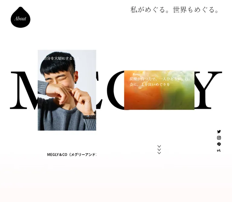
大きなロゴと重なり合う記事画像、淡いグラデーション、明朝体と太いゴシック体の対比が特徴のオウンドメディア。デスクトップの非対称な記事配置を、モバイルでは読みやすい一列構成に展開しています。
MEGLY&CO — Style Reference
A spacious editorial magazine with monumental black lettering, floating stories, and softly tinted backgrounds.
Original URL: https://media.megly-jp.com/ Final URL: https://media.megly-jp.com/ Inspected: October 2, 2026, 05:02 JST; supplied retrieval timestamp October 1, 2026, 20:02:06.283 UTC. Viewports: 1440 × 1000 desktop and 390 × 844 mobile, in CSS pixels. Theme: a predominantly light interface with black typography, white opening space, and pastel background fields farther down the page. Scope: the current homepage, using three desktop captures, two mobile captures, and rendered DOM/computed-style observations covering the page. Article pages, destination pages, an opened mobile menu, and category-switch results were not inspected.
MEGLY&CO is a Japanese editorial web magazine. The homepage identifies the carbonated-skincare brand MEGLY as its operator. Its content connects personal care, everyday wellbeing, culture, and carbonated water through the idea of circulation. The design expresses this with unusually open space, images distributed at different sizes and heights, and a restrained interface that lets photography and illustration carry much of the personality.
The opening composition places two editorial links over a huge black wordmark. Below it, horizontal article rails alternate with a long category section: large Mincho category labels occupy the left side while stories form an irregular composition on the right. Pale cream, green, blue-gray, and lavender fields soften the otherwise crisp black-and-white system. The page ends with compact utility links and a metallic, ribbon-like lowercase mark beneath the footer.
Mobile changes the composition substantially. A small white header replaces the expansive opening navigation; the two featured links stack vertically; category labels switch from large regular Mincho to small bold sans-serif; and the main story gallery becomes a single column. Horizontal article rails remain wider than the viewport.
閉じる
MEGLY&CO — Style Reference
A spacious editorial magazine with monumental black lettering, floating stories, and softly tinted backgrounds.
Original URL: https://media.megly-jp.com/ Final URL: https://media.megly-jp.com/ Inspected: October 2, 2026, 05:02 JST; supplied retrieval timestamp October 1, 2026, 20:02:06.283 UTC. Viewports: 1440 × 1000 desktop and 390 × 844 mobile, in CSS pixels. Theme: a predominantly light interface with black typography, white opening space, and pastel background fields farther down the page. Scope: the current homepage, using three desktop captures, two mobile captures, and rendered DOM/computed-style observations covering the page. Article pages, destination pages, an opened mobile menu, and category-switch results were not inspected.
MEGLY&CO is a Japanese editorial web magazine. The homepage identifies the carbonated-skincare brand MEGLY as its operator. Its content connects personal care, everyday wellbeing, culture, and carbonated water through the idea of circulation. The design expresses this with unusually open space, images distributed at different sizes and heights, and a restrained interface that lets photography and illustration carry much of the personality.
The opening composition places two editorial links over a huge black wordmark. Below it, horizontal article rails alternate with a long category section: large Mincho category labels occupy the left side while stories form an irregular composition on the right. Pale cream, green, blue-gray, and lavender fields soften the otherwise crisp black-and-white system. The page ends with compact utility links and a metallic, ribbon-like lowercase mark beneath the footer.
Mobile changes the composition substantially. A small white header replaces the expansive opening navigation; the two featured links stack vertically; category labels switch from large regular Mincho to small bold sans-serif; and the main story gallery becomes a single column. Horizontal article rails remain wider than the viewport.
How to Read This Reference
- Measured: values supplied by rendered element rectangles or computed styles. Decimal measurements are rounded for readability unless their precision is useful.
- Derived: arithmetic relationships calculated from those measurements, such as gaps, proportions, and a possible layout grid. These do not identify the original CSS implementation.
- Estimated: visual judgments from the supplied current-page screenshots, including pastel color approximations and some graphic dimensions. No screenshot pixel sampling was performed.
- Recommended: implementation choices for a new build. Breakpoints, accessibility additions, CSS gradients, and layout reconstruction code below belong to this category unless explicitly marked otherwise.
- Token names: custom properties introduced in this document are descriptive aliases, not recovered source variables.
- Evidence limits: a computed font stack establishes declared families, not which font file successfully rendered every character. Empty extracted heading text does not establish an absent accessible name; the heading may contain artwork.
The supplied document heights are approximately 7396px on desktop and 7105px on mobile. Most recorded content coordinates are document positions. Fixed-looking navigation and social controls also appear at viewport-relative positions, so do not subtract every recorded coordinate as though all elements shared one positioning context.
Tokens — Colors
Core Palette
| Name | Value | Suggested token | Evidence and role |
|---|---|---|---|
| Black Ink | #000000 |
--color-ink |
Measured text color on article titles, category controls, footer links, and desktop social links; visually also used for graphic marks |
| White | #ffffff |
--color-white |
Measured featured-link text color; visually the opening canvas and mobile header are white |
| Warm Cream | Approx. #f4ead2 |
--color-cream |
Estimated upper color of the desktop category-area background |
| Pale Lime | Approx. #dce7c6 |
--color-lime |
Estimated lower color in the same category capture |
| Mist Green | Approx. #b1c8c3 |
--color-mist |
Estimated cool green field near the desktop closing article rail |
| Lavender Gray | Approx. #b5aec3 |
--color-lavender |
Estimated mobile footer field, particularly toward its lower portion |
| Sage Base | Approx. #adb8ab |
--color-sage |
Estimated background beneath the footer, behind the metallic mark |
The root and body report transparent computed backgrounds. The visible pastel fields therefore cannot be attributed to those two declarations. Their generating elements, gradient stops, and possible time-dependent behavior were not supplied.
Treat the pastel hex values as useful starting points, not exact brand specifications. The desktop footer appears cooler and greener than the mobile footer. Those captures alone do not establish whether the difference comes from viewport rules, page position, animation phase, or another rendering layer.
Measured Channel Accents
These colors appear in the mobile inline social/store links. The corresponding desktop links are measured as black.
| Link | Mobile value | Suggested token |
|---|---|---|
#1da1f2 |
--color-twitter |
|
#cf2e92 |
--color-instagram |
|
| LINE | #06c755 |
--color-line |
| MEGLY ONLINE STORE | #ff4438 |
--color-store |
The orange and green in the opening carbonated-water tile belong to its photographic imagery. They should not become general button colors. Similarly, the exposed slider variable --swiper-theme-color: #007aff is not evidence of a visible blue brand accent.
Active and Inactive Text
The desktop category screenshot shows the selected category in black and the remaining labels in a faint gray-green appearance. The sampled buttons all report black text, so ancestor opacity or another compositing treatment may account for that difference. The actual mechanism and opacity are unknown. A reduced-opacity treatment is a reasonable reconstruction, but its numeric value must be treated as a recommendation.
Tokens — Typography
Japanese Sans-Serif — Editorial Information
Measured stack: 'Noto Sans JP', 'Helvetica Neue', Arial, 'Hiragino Kaku Gothic ProN', Meiryo, sans-serif.
Use this stack for article captions, navigation utilities, footer links, and mobile category controls. Article titles use weight 700, with generous line height relative to their small size. The result feels readable and matter-of-fact beneath expressive imagery.
The measured root is 16px, weight 400, with an 18.4px line height. There is no evidence of a miniature or globally viewport-scaled root unit.
Japanese Mincho — Statements and Desktop Categories
Measured stack: 'YuMincho Pr6N', 'Times New Roman', YuMincho, 'Hiragino Mincho ProN', 'Yu Mincho', 'MS PMincho', serif.
This stack appears in the featured-image copy, large desktop category buttons, and the carbonated-water explanatory feature. These samples use weight 400. Preserve its fine strokes and open line spacing; making these passages bold would erase the contrast with the article captions.
Latin Editorial Links
Measured stack: kepler-std-semicondensed, 'Times New Roman', YuMincho, 'Hiragino Mincho ProN', 'Yu Mincho', 'MS PMincho', serif.
See More and Learn More use this stack at regular weight. Their visual treatment is slanted and editorial, accompanied by a simple arrow in the supplied category screenshot. The mobile off-canvas About entry declares the same family at 26px. The evidence does not independently establish loaded font files or font licensing.
Wordmarks and Graphic Headings
The enormous opening wordmark has high-contrast serif letterforms, but its containing h1 reports an ordinary 16px sans-serif style and no extracted text. That measurement belongs to the container, not the visible lettering. Do not identify the logo font from that declaration or recreate the mark as 16px text.
Use authorized wordmark artwork where available. No exact asset path or typeface for the main logo was supplied. Several other headings also have empty extracted text and explicit layout boxes, suggesting graphic content whose readable labels were not established by the DOM excerpt.
Type Scale
All values in this table are measured unless marked otherwise.
| Role | Desktop size / line height | Mobile size / line height | Weight and treatment |
|---|---|---|---|
| Root text | 16 / 18.4px |
16 / 18.4px |
Sans-serif, 400 |
| Featured-image copy | 22.5 / 33.75px |
18 / 27px |
Mincho, 400, white |
| Category buttons | 36 / 41.4px |
15 / 17.25px |
Desktop Mincho 400; mobile sans-serif 700 |
| Main gallery captions | 15 / 26px |
15 / 26px |
Sans-serif, 700 |
| Horizontal-rail titles | 12 / 20.4px |
12 / 20.4px |
Sans-serif, 700 |
| Rail series labels | 12 / 20.4px |
12 / 20.4px |
Sans-serif, 700 |
See More / Learn More |
24 / 27.6px |
20 / 23px |
Latin editorial stack, 400 |
| Carbonated-water explanatory copy | 24 / 52px |
20 / 34px |
Mincho, 400, white |
| Inline social/store links | 16 / 18.4px |
15 / 17.25px |
Sans-serif, 700 |
| Footer utility links | 18 / 20.7px |
15 / 17.25px |
Sans-serif, 700 |
| Copyright | 10 / 11.5px |
10 / 11.5px |
Sans-serif, 400 |
| Off-canvas category links | Not measured | 15 / 27px |
Sans-serif, 700; off-screen in the captured state |
Letter spacing is reported as normal for these samples. Avoid adding fashionable wide tracking throughout the interface. The visual separation comes primarily from placement, font contrast, and whitespace.
Tokens — Spacing & Shapes
Density: sparse at the page level, compact within captions and utility navigation. Geometry: square image corners, simple outlined markers, one organic droplet, and a sculptural footer mark. Spacing system: several recurring measurements are visible, but a single source spacing scale was not recovered.
Recurring Spacing
| Use | Desktop | Mobile | Evidence |
|---|---|---|---|
| Main outer gutter | Commonly 50px |
Commonly 20px |
Measured logo-stage and content bounds |
| Category text left position | 70px |
20px button edge |
Measured; selected mobile heading has an additional 35px inner inset |
| Featured-copy horizontal padding | 33.75px |
20px |
Measured |
| Featured-copy top offset | 38.5px |
21px |
Derived from paragraph and link rectangles |
| Rail caption top padding | 20px |
20px |
Measured |
| Gallery caption top padding | 25px |
Paragraph padding is 0 |
Measured; the mobile media-to-text gap is not independently isolated |
| Rail inter-card gap | 150px |
35px |
Derived from consecutive link bounds |
| Main mobile gallery item gap | Not uniform | 80px |
Derived from consecutive link bottoms and tops |
| Desktop footer link gap | 20px |
Vertical arrangement | Derived |
| Mobile footer text-row step | — | 37.25px |
Derived; 17.25px text box plus 20px separation |
Shapes and Edges
| Element | Observed treatment |
|---|---|
| Article links and sampled text containers | 0px border radius |
| Gallery images | Square corners in the desktop capture |
| Closing rail image frames | Thin black outlines with a hard, lower-right black offset; approximately 2px line and 10px offset by visual estimate |
| Header/footer markers | Approximately 22px outlined squares; a circle is used for the carbonated-water navigation item |
Opening About |
Black droplet silhouette, not a rounded rectangle or ordinary circle |
| Social symbols | Small black glyphs inside measured 32 × 32px desktop link boxes |
| Footer mark | Metallic shaded ribbon form; neither its shading nor silhouette should be replaced by a standard text glyph |
There is no general rounded-card or soft card-shadow system. The hard rail offsets and the shaded footer artwork are specific exceptions, not a reusable elevation scale.
Key Layout Measurements
| Element | Desktop, 1440 × 1000 | Mobile, 390 × 844 |
|---|---|---|
Opening About link |
x 50, y 30, 129.59 × 141.23px |
Not visible in the opening capture |
Opening wordmark h1 container |
x 50, y 180, 1340 × 600px |
x 20, y 398.39, 350 × 67.42px; no legible large wordmark in the captured state |
| Featured article link | x 232.66, y 231.5, 360 × 497px |
x 97.5, y 123.39, 195 × 275px |
| Carbonated-water tile link | x 775.33, y 358.06, 432 × 243.88px |
x 48.75, y 465.81, 292.5 × 165.41px |
| First upper-rail link | x 0, y 1270, width 347.05px |
x 20, y 914.61, width 276.53px |
| Main gallery horizontal extent | Approximately x 519–1390, width 871px |
x 20–370, width 350px |
| Social rail | x 1358, four 32 × 32px links starting at y 700 |
No equivalent fixed rail visible |
| Footer utility group | Approximately 1093.84px wide, starting at x 173.08 |
228.66px wide, starting at x 80.67 |
| Region beneath body content | 300px document/body height difference |
250px document/body height difference |
The featured article occupies 25% of viewport width on desktop and 50% on mobile. The carbonated-water tile occupies 30% on desktop and 75% on mobile. These percentages are derived from the two measured states; they do not prove the exact source formulas at other widths.
Components
Opening Brand Composition
Role: introduce the publication through identity and two editorial destinations.
The desktop arrangement has four principal layers:
- A small black droplet
Aboutlink at the upper left. - The Japanese statement
私がめぐる。世界もめぐる。at the upper right. - An enormous black wordmark centered across a
1340 × 600pxstage. - A tall article feature and a landscape carbonated-water feature overlapping the wordmark.
The two linked images share an approximate vertical center at y 480px. Their dimensions differ dramatically, so the opening feels composed rather than evenly divided. Preserve the wordmark's interruption by the foreground images and the generous unused space around them.
The screenshot also shows a stack of three downward chevrons below the right-hand tile. Its visual role is a continuation cue; click behavior and animation were not established.
Featured Article Link
Role: promote the currently selected editorial story.
The inspected feature links to /article/tansan025/, with the source title 炭酸水で手浴&足浴|ほっと一息、かんたんに「めぐり」を促す方法. Its artwork depicts hand and foot bathing, using pale yellow, warm cream, orange-red, dark green, and drawn lettering.
The overall link is portrait-shaped, but the illustration itself has an irregular cutout-like silhouette and substantial pale space. Measure the link box separately from the visible painted area. Do not stretch the illustration merely to fill the outer rectangle.
White Mincho copy is placed near the top. It measures 22.5px / 33.75px on desktop and 18px / 27px on mobile. In the supplied captures, white lettering crosses pale parts of the artwork and becomes difficult to read. That is an observed limitation, not a desirable contrast target for a new implementation.
On mobile, the link is centered at half the viewport width and begins approximately 70px below the bottom of the white header.
Carbonated-Water Feature Tile
Role: lead into the publication's explanation of carbonated water and its purpose.
The tile links to /power-of-co2/. Its landscape image combines warm orange liquid on the left with green on the right, with bubbles or translucent forms near the top. White Mincho text is inset over the image:
炭酸が持つ力で、一人ひとりに、社会に、よりよいめぐりをもたらしたい。
The link is approximately 16:9, with small differences attributable to the measured outer box. Use a rectangular image without rounded corners, a filled CTA button, or a surrounding card surface.
On desktop it overlaps the wordmark at the right. On mobile it becomes a centered 75vw tile below the portrait feature and the intervening heading space. Its three lines of copy use 18px / 27px with 20px horizontal padding.
Persistent Navigation
Role: retain publication identity and access to the content categories while browsing.
The scrolled desktop captures show an upper navigation row with italic About, a compact MEGLY&CO wordmark, and category/brand links. Outlined geometric markers precede the Japanese labels. The row overlays the changing background and, in the supplied middle capture, can overlap imagery near the top edge.
It occupies a similar top position in different scrolled captures, supporting a persistent-header interpretation. The precise positioning declaration and the scroll threshold that changes the opening state were not supplied.
Mobile shows a white bar approximately 53px high, a small hamburger symbol at the left, and a centered logo-link box measuring 173.95 × 23.39px at y 15px. The same bar remains visible in the bottom capture.
The mobile DOM contains category, About, explanatory, social, and store links positioned off-screen to the left. Their presence supports an off-canvas navigation structure. The menu was not opened, so its visible panel width, backdrop, motion, and focus behavior remain unverified.
Publication Introduction Strip
Role: explain the magazine and its publishing rhythm.
The homepage contains a long introduction identifying MEGLY&CO and its relationship to MEGLY, followed by a stated update cadence. In both opening screenshots, the text appears as a clipped horizontal line rather than a conventional wrapping paragraph.
The captured fragments do not establish ticker speed, direction, or even whether a particular frame was moving. Preserve the complete source sentence in the content model. For an accessible adaptation, provide a readable static equivalent instead of relying on the clipped fragment alone.
Horizontal Article Rail
Role: expose a sequence of stories without turning the entire homepage into a uniform grid.
An upper rail and a closing rail share a repeated structure: linked media, a bold title below it, and an optional series label. Seven article links are present in each supplied sequence. Their horizontal positions extend beyond the viewport.
On desktop, each measured link is approximately 347.05px wide, separated by 150px. The title width is approximately 242.92px, or 70% of the card, centered beneath the media. Titles use 12px / 20.4px, weight 700, with 20px top padding. Series labels use the same small bold treatment and another 20px top padding.
On mobile, cards are 276.53px wide, with a 35px gap and 20px leading inset. The next card is deliberately partially visible. Caption width becomes the full card width.
The closing rail visibly uses grayscale bathhouse photographs, black outlines, and hard black offsets. This treatment is directly visible for that rail; it should not automatically be imposed on every image elsewhere on the page. The measured media-to-caption geometry is consistent with square rail media, but individual image element bounds were not supplied.
Horizontal navigation method, autoplay, drag behavior, and arrow controls were not exercised. A horizontally scrollable list is a suitable implementation recommendation, not a verified description of its original interaction code.
Category Selector and Introduction
Role: organize editorial discovery around four themes.
The source labels are:
からだが、めぐるこころが、おどるせかいを、めくる炭酸のちから
On desktop, these are large, regular Mincho buttons at 36px / 41.4px. Consecutive label tops are approximately 61.39px apart, giving about 20px of separation after each line box. The first label is dark in the supplied state, while the other three appear subdued.
A short explanatory passage and a See More link with an arrow follow. The inspected link points to /category/karada/. The category introduction remains visually beside much later stories in the middle screenshot, suggesting a pinned reading position within the long section; the exact sticky or scroll-linked implementation is not available.
On mobile, the selector moves above the gallery and changes to 15px bold sans-serif. The measured rows are approximately 42.25px apart. The selected heading includes a 35px left inset within the full-width button. Its marker anatomy is not established by the available mobile screenshot.
Category-switch results were not recorded. Do not claim that a click changes the background, filters in place, or animates the gallery without additional evidence.
Staggered Editorial Gallery
Role: create a leisurely browsing rhythm through varied images, offsets, and whitespace.
The desktop gallery occupies an approximately 871px-wide region to the right of the category introduction. Its seven stories alternate among narrow portraits, medium images, and wide landscapes. Captions are centered under the images but remain left-aligned internally. Their width is 70% of the link, with 25px top padding and 15px / 26px bold sans-serif text.
A useful reconstruction divides the 871px gallery into 14 units of approximately 62.214px. The measured widths align with spans of 4, 5, 7, and 10 units. This is a derived layout model, not proof that the source uses a 14-column CSS grid.
| Story position | Derived column placement | Measured width | Top offset from first story | Link-top to caption-box start |
|---|---|---|---|---|
| 1 | Column 1, span 4 | 248.84px |
0px |
400px |
| 2 | Column 8, span 7 | 435.50px |
60px |
250px |
| 3 | Column 3, span 10 | 622.14px |
600px |
250px |
| 4 | Column 10, span 4 | 248.86px |
1080px |
370px |
| 5 | Column 2, span 5 | 311.08px |
1260px |
350px |
| 6 | Column 7, span 7 | 435.50px |
1800px |
250px |
| 7 | Column 1, span 4 | 248.84px |
1920px |
400px |
The last column describes a layout region, not independently measured intrinsic image dimensions. It is useful for desktop reconstruction but should not be used to infer native asset ratios.
On mobile, all seven links use the same 350px width and 80px inter-item spacing. The captions use the full width. Image treatments retain different heights rather than becoming identical thumbnails. The supplied mobile captions are paragraph elements, while their desktop counterparts are headings; preserve appropriate document semantics in a new build rather than copying this distinction mechanically.
Carbonated-Water Learning Feature
Role: introduce a deeper content category after the editorial gallery.
The DOM records white Mincho explanatory copy followed by Learn More, linking to /category/tansan/. Desktop copy uses 24px / 52px; mobile uses 20px / 34px with 58.5px horizontal padding at the 390px viewport. The mobile CTA starts 20px below the paragraph box.
This section is present in the page-wide evidence but is not shown in the supplied screenshot crops. Its exact background image, graphic heading, and any media playback remain unverified. The opening carbonated-water tile should not be assumed to be its background asset.
Follow Band and Social Links
Role: direct readers to continuing updates and the store.
The DOM includes repeated English and Japanese follow messages around four links: Twitter, Instagram, LINE, and MEGLY ONLINE STORE. Repetition suggests a ticker-style composition, but no motion path or timing was captured.
Desktop links form four approximately 325px-wide columns across the page, with black bold labels. Mobile links become full-width 350px rows, using their measured channel colors. Their top positions are 78px apart; each recorded box is 38px high, leaving 40px between boxes.
Keep these channel colors local to the social section. They do not define four competing primary action colors for the rest of the site.
Desktop Social Rail
Role: provide compact access to the three social channels and the brand store.
Four black symbols sit along the right edge: Twitter, Instagram, LINE, and a small brand mark. Their link boxes are 32 × 32px, stacked without additional measured gaps. At the desktop viewport they begin at x 1358, y 700 and end at y 828.
The rail stays in the same apparent screen position across the desktop captures. This supports an anchored overlay interpretation, though the underlying CSS position was not included. It is not visible in the mobile captures.
The glyphs are much smaller than their link boxes. Preserve that distinction when enlarging touch or keyboard targets: a larger hit area need not make the symbols visually heavy.
Footer and Metallic Mark
Role: close the reading experience with utilities and a final brand image.
The footer has five links: MEGLY ONLINE STORE, サイトご利用について, ソーシャルメディアポリシー, プライバシーポリシー, and 運営元. Each has an outlined square marker. Desktop uses one centered horizontal row with 18px bold labels; mobile uses a centered, left-aligned vertical group with 15px labels.
The copyright is centered below at 10px / 11.5px. Large blank space separates the closing article rail from the utility group, especially on desktop.
Below the footer, a silver, ribbon-like lowercase mark appears against sage. A dark soft band at the top creates a sense of depth. The supplied document/body height difference is 300px on desktop and 250px on mobile, consistent with the visible under-footer region. The mark is partially cut off at the region's top edge in the supplied captures.
Its rendering technology, motion, and any scroll reveal are unknown. Do not infer WebGL, a rotating model, or a parallax effect from one shaded image.
Tokens — Motion & Interaction
| Feature | Evidence | Safe interpretation |
|---|---|---|
| Mobile graphic headings | Computed transition: opacity 0.5s on the h1 and several h2 elements |
A 500ms opacity transition is declared; triggers and endpoint opacity are unknown |
| Other sampled links/buttons | Mostly report transition: all and animation: none |
No useful transition duration or running keyframe behavior is established for these samples |
| Desktop navigation | Different opening and scrolled visual presentations | A persistent browsing header is supported; reveal threshold and interpolation are unknown |
| Category introduction | Appears alongside later gallery content | A pinned presentation is plausible; exact scroll behavior is unverified |
| Article rails | Repeated cards extend off-screen horizontally | Horizontal sequence is verified; dragging, autoplay, and snapping are unverified |
| Introduction/follow strips | Clipped copy and repeated message nodes | Ticker-like structure is supported; speed, direction, and playback are unverified |
| Pastel fields | Different colors across capture positions and devices | Color variation is visible; animated interpolation is not established |
| Downward chevrons | Three stacked marks in desktop opening | Continuation cue is visible; click and animation behavior are unverified |
| Mobile menu | Hamburger visible; navigation links positioned off-screen | Closed-state structure is supported; opening interaction was not tested |
The browser collection traversed the page and waited for layout, text, and image readiness within finite limits. Perpetual animations were temporarily paused during readiness checks and resumed afterward. This procedure does not identify all JavaScript motion, guarantee delayed content appeared, or establish hover behavior.
Recommended motion approach: start with stable layouts and fully visible content. Add restrained opacity transitions only when needed, honor reduced motion, and keep article navigation usable without animation. Do not add continuous image drift, automatic carousel playback, or a spinning footer logo merely to make the page feel animated.
Surfaces
| Surface | Appearance | Function |
|---|---|---|
| Opening canvas | White with oversized black graphic lettering | Establish identity and space around the two featured links |
| Featured links | Unrounded image areas with white Mincho copy | Editorial destinations within the opening composition |
| Category/gallery field | Pale cream-to-green appearance in the desktop capture | Unite widely separated stories without enclosing each one |
| Story cards | Images and captions directly on the page background | Keep the gallery open and editorial |
| Closing rail | Grayscale images, fine black frames, hard offsets | Give the repeated story sequence a more graphic finish |
| Footer | Cool muted pastel field with black utility links | Quiet closure after the content |
| Under-footer region | Sage field, soft dark top band, metallic artwork | A final sculptural brand moment |
| Mobile header | Solid white strip | Maintain readable identity and navigation over every section |
Avoid treating every pale field as a separate boxed panel. The screenshots show broad environmental color, not a stack of rounded containers.
Imagery
The current page mixes three complementary image languages:
- Human editorial photography: portraits, conversations, and everyday care. Preserve natural settings and varied crops rather than applying one beauty-advertising treatment to every image.
- Textured illustration: the bathing feature, a woman eating beside plants, and colorful frames around interview imagery. Visible texture, hand lettering, and irregular shapes contribute warmth.
- Atmospheric brand imagery: orange-green carbonated liquid and a silver ribbon-like mark. These are specific visual anchors, not generic decorative gradients.
The closing bathhouse rail is visibly grayscale. The main gallery includes full-color imagery. Keep this distinction local; a global desaturation filter would lose the contrast between sections.
The most important compositional property is variation: a narrow portrait may be followed by a wide interview image, then a small illustrated scene. Use image-specific crops and preserve faces, illustrated labels, and meaningful content. The article caption provides context, so images need not carry additional UI badges.
Observed Asset References
The following paths are decoded from image URLs present in the rendered homepage evidence. They were not separately fetched. Storage paths below share the base https://storage.googleapis.com/megly-wp-stateless/. Delivery through /_next/image/ is visible in the DOM.
| Asset | Observed path | Evidence-supported use |
|---|---|---|
| About droplet | /images/drop.png, relative to the homepage origin |
Opening About link graphic |
| Hand/foot-bath article image | 2025/05/6ed8f155-kv02-1024x592.jpg |
Thumbnail for /article/tansan025/; exact relationship to the hero treatment is not established |
| Nagayu bathhouse photograph | 2025/07/2feb7dc3-img_6538-1024x768.jpg |
Article image appearing in both rail sequences |
| Tokiwayu bathhouse photograph | 2025/03/84947621-20250205_36748-1024x683.jpg |
Bathhouse story in the article rails |
| Myohoyu bathhouse photograph | 2024/08/f76ea45c-20240709_18907-1024x683.jpg |
Bathhouse story in the article rails |
| Illustrated food/wellbeing scene | 2023/07/5eaf3ba3-54b0bd6b69e248f100d7b1ba8e33d665.jpeg |
Main gallery story /article/karada011/ |
| Skin-assessment interview image | 2023/09/5e67fc02-0411megly_979px1080px-1-929x1024.png |
Main gallery story /article/karada012/ |
| Men's skincare interview image | 2023/06/5912afba-c4aee6763f0ae050393319608619a04b.jpg |
Main gallery story /article/karada010/ |
| Portrait in a plant-filled setting | 2023/05/ff80104c-0407_megry_1195_selected-1024x683.jpg |
Main gallery story /article/karada009/ |
No exact asset URL was supplied for the main wordmark, the carbonated-liquid hero image, or the metallic footer mark. Do not invent filenames for them. Use authorized supplied artwork when implementing the design; the CSS shell alone cannot reproduce these identity-bearing images.
Layout & Responsive Behavior
Desktop
The homepage uses several different layout systems in sequence. The opening is a layered composition. The first article group is a horizontal rail. The category section combines a left introduction with a staggered right gallery. A learning feature and follow section lead into another rail, a utility footer, and the separate brand region below it.
The category composition is strongly weighted to the right. Its first story starts at x 519px, while the category labels start at x 70px. Large vertical offsets allow images to sit independently rather than forming equal-height rows. The gallery's text stays small, making the image sizes and negative space responsible for hierarchy.
Mobile
At 390px wide:
- The persistent white header is approximately
53pxhigh, with a left hamburger and centered logo-link box. - The opening article and carbonated-water feature stack at
50vwand75vwrespectively. - The giant desktop wordmark is not legible in the captured mobile state, although an
h1layout box remains between the features. - Main content usually has
20pxside gutters, producing a350pxreading width. - Category labels switch family, weight, and size, becoming compact bold sans-serif controls.
- Gallery articles become a single column with
80pxgaps and full-width captions. - The horizontal rails preserve partial next-card visibility instead of collapsing to vertical lists.
- Inline social links stack and adopt their individual colors.
- Footer links stack in a narrower centered group; the copyright remains centered.
- The under-footer brand region is approximately
250pxtall.
Breakpoint and Capture Limits
Only the two supplied viewport widths were tested. There is no evidence for the exact breakpoint, tablet behavior, landscape phones, or intermediate gallery arrangements. A breakpoint near 900–1000px is a practical starting recommendation for switching away from the desktop composition, but it must be validated against the actual navigation and captions.
Do not solve a narrow viewport by scaling the entire desktop page down. The observed mobile design changes structure and typography. Keep horizontal overflow confined to deliberate rails, and reserve readable space below a fixed header.
Do’s and Don’ts
Do
- Treat the homepage as an editorial discovery experience with several complementary content layouts.
- Preserve the relationship between huge black wordmark artwork and much smaller foreground feature links.
- Keep the opening predominantly white and use pastel color as broad environmental background.
- Pair regular Mincho statements with compact, bold sans-serif article captions.
- Maintain varied desktop image widths, heights, and vertical offsets.
- Center desktop captions beneath images at roughly 70% of their width while keeping the caption text left-aligned.
- Preserve full-width captions and generous item spacing in the mobile gallery.
- Keep square image corners and simple outlined navigation markers.
- Retain the grayscale, hard-offset frame treatment specifically where it is observed.
- Use actual artwork for the droplet, wordmark, illustrations, and metallic mark when available and authorized.
- Distinguish source measurements from reconstruction choices when extending the design.
Don’t
- Don't replace the article composition with identical rounded cards.
- Don't turn the opening editorial links into oversized filled conversion buttons.
- Don't promote the liquid photograph's orange/green colors or the slider's default blue variable into universal UI accents.
- Don't identify the logo typeface from its container's computed sans-serif font.
- Don't force desktop category typography onto mobile; the observed family and weight change is substantial.
- Don't crop every image to the same aspect ratio or desaturate the entire site.
- Don't make desktop captions as wide as the image when matching the observed composition.
- Don't reproduce low-contrast white lettering over pale artwork without considering legibility.
- Don't mistake off-screen mobile menu text for an observed open-menu design.
- Don't claim autoplay, parallax, hover reveals, animated color cycling, or 3D rendering without additional evidence.
- Don't use the copyright year as the page inspection date.
Recommended Implementation Additions
These are recommendations for a new implementation, not verified features of the original:
- Give the logo and image-based headings meaningful accessible names. Keep decorative duplicates out of the accessibility tree.
- Provide a visible keyboard focus indicator for every story, category button, social link, and footer utility.
- Make the mobile menu trigger a button with an accessible name and expanded state. Keep a closed panel out of keyboard navigation, and restore focus after closing it.
- Use selected-state semantics appropriate to the category behavior once that behavior is defined. Visual dimming alone should not communicate selection.
- Improve featured-copy contrast through crop selection, a restrained image scrim, or a separate text treatment while retaining the Mincho hierarchy.
- Preserve the introduction and follow copy as readable content even if a decorative repeating strip is added. Hide duplicate copies from assistive technology.
- Provide keyboard-accessible access to every rail item and avoid a permanently automatic carousel without pause control.
- Enlarge small control hit areas without enlarging their visible symbols unnecessarily.
- Honor reduced motion and avoid making content visibility depend on an animation callback.
- Reserve image dimensions to reduce layout shifts. Load the opening imagery promptly and defer lower gallery media appropriately.
- Treat the pastel field and metallic footer image as replaceable static layers until their actual motion is established.
Agent Prompt Guide
Quick Color Reference
- Main ink and structural details: measured
#000000. - Opening canvas and mobile header: visually white; overlay copy is measured
#ffffff. - Category background starting approximation: cream
#f4ead2toward pale lime#dce7c6. - Closing background approximations: mist
#b1c8c3, lavender gray#b5aec3, and sage#adb8abbeneath the footer. - Mobile social link colors: Twitter
#1da1f2, Instagram#cf2e92, LINE#06c755, store#ff4438. - Keep photographic orange/green and metallic silver inside their imagery.
- Pastel values are visual estimates; exact gradient stops were not supplied.
Overall Prompt
“Create a Japanese editorial magazine homepage inspired by the current MEGLY&CO composition. Start with a white canvas, a very large black wordmark as background artwork, a black droplet About link, and two differently sized editorial images overlapping the wordmark. Use regular Japanese Mincho for statements and desktop category labels, and bold Noto Sans JP-style captions for stories. Place the category introduction on the left of a spacious, irregular gallery with narrow portraits, medium illustrations, and wide photographs. Use pale cream-to-green background fields, square image corners, restrained geometric markers, horizontal story rails, and a quiet utility footer above a sage region containing authorized metallic brand artwork. On mobile, use a small white header, stack the opening features, change categories to compact bold sans-serif, and make the main gallery a single column. Keep motion unspecified until behavior is defined.”
Example Component Prompts
- Opening composition: “At 1440px width, place a 360 × 497px portrait article link and an approximately 432 × 244px liquid-image link over oversized black wordmark artwork. Align their vertical centers near the middle of the hero. Add white Mincho copy at 22.5px with 1.5 line height, an organic black About droplet at the upper left, and generous white space.”
- Category/gallery section: “Build a left category introduction using four regular 36px Mincho labels, one dark and three subdued, followed by a short description and an italic See More link. To its right, arrange seven image-led stories with different widths and deliberate vertical offsets. Use 15px bold sans-serif captions at 26px line height, centered below each image at 70% width.”
- Closing article rail: “Create a horizontal sequence of square grayscale bathhouse images with thin black outlines and hard lower-right black offsets. Use approximately 347px desktop cards with 150px gaps; on a 390px phone, use approximately 277px cards, 35px gaps, and 20px leading space. Put small bold titles below; retain a visible portion of the next card.”
- Mobile adaptation: “Use a roughly 53px white header with a small menu symbol at left and centered publication artwork. Center the opening portrait feature at 50vw and the landscape feature at 75vw. Use 20px content gutters, 15px bold category labels, a 350px-wide article column at a 390px viewport, and 80px between story links.”
- Footer: “Arrange five bold utility links with approximately 22px outlined square markers. Keep them horizontal on desktop and in a centered vertical group on mobile. Place tiny centered copyright text below, followed by a sage-colored region with a shaded metallic ribbon mark supplied as artwork. Avoid generic card shadows.”
Quick Start
CSS Custom Properties
This is a recommended reconstruction, not recovered source CSS. It preserves the measured typography and useful desktop proportions, uses estimated static gradients, and reconstructs the gallery with a derived 14-column grid. The 960px breakpoint is a recommendation.
Expected structure: a .site-header, a .hero containing .hero-stage, an .editorial-section containing .category-panel and .editorial-grid, separate .article-rail elements, and .site-footer followed by .brand-tail. Gallery items use .story, .story__media, and .story__title. Supply authorized images and font files separately.
The .is-scrolled class is an implementation hook for showing the compact desktop header; no original reveal threshold is implied. The decorative .hero-wordmark should be accompanied by a separate accessible page heading. The code intentionally does not invent menu logic, ticker playback, category filtering, or footer animation.
:root {
  /* Exact measured interface colors */
  --color-ink: #000;
  --color-white: #fff;
  --color-twitter: #1da1f2;
  --color-instagram: #cf2e92;
  --color-line: #06c755;
  --color-store: #ff4438;

  /* Visual estimates for static background reconstruction */
  --color-cream: #f4ead2;
  --color-lime: #dce7c6;
  --color-mist: #b1c8c3;
  --color-lavender: #b5aec3;
  --color-sage: #adb8ab;

  /* Declared source stacks; font files are not bundled */
  --font-sans: 'Noto Sans JP', 'Helvetica Neue', Arial,
    'Hiragino Kaku Gothic ProN', Meiryo, sans-serif;
  --font-mincho: 'YuMincho Pr6N', 'Times New Roman', YuMincho,
    'Hiragino Mincho ProN', 'Yu Mincho', 'MS PMincho', serif;
  --font-editorial: kepler-std-semicondensed, 'Times New Roman',
    YuMincho, 'Hiragino Mincho ProN', 'Yu Mincho', 'MS PMincho', serif;

  --text-feature: 22.5px;
  --text-category: 36px;
  --text-story: 15px;
  --text-rail: 12px;
  --text-footer: 18px;
  --page-gutter: 50px;
  --rail-width: 24.1005vw;
  --rail-gap: 150px;
  --radius-media: 0;
  --rule: 2px;
  --fade-duration: 500ms;
}

* { box-sizing: border-box; }
body {
  margin: 0;
  color: var(--color-ink);
  background: var(--color-white);
  font-family: var(--font-sans);
}
a { color: inherit; text-decoration: none; }
button { color: inherit; font: inherit; }
img { display: block; max-width: 100%; }
button { cursor: pointer; }
:where(a, button):focus-visible {
  outline: 2px solid currentColor;
  outline-offset: 5px;
}
.sr-only {
  position: absolute;
  width: 1px;
  height: 1px;
  padding: 0;
  margin: -1px;
  overflow: hidden;
  clip-path: inset(50%);
  white-space: nowrap;
  border: 0;
}

/* Compact browsing header; state is controlled by the application. */
.site-header {
  position: fixed;
  inset: 0 0 auto;
  z-index: 30;
  display: none;
  align-items: center;
  gap: 30px;
  padding: 30px var(--page-gutter);
}
.is-scrolled .site-header { display: flex; }
.site-header__brand { width: 265px; flex-shrink: 0; }
.site-header__nav {
  display: flex;
  align-items: center;
  gap: 24px;
  margin-left: auto;
  font-size: 14px; /* Recommended header approximation */
  font-weight: 700;
}
.menu-trigger { display: none; }

/* Opening positions reconstructed for the supplied desktop viewport. */
.hero {
  position: relative;
  min-height: 100svh;
  padding: 180px var(--page-gutter) 120px;
  background: var(--color-white);
}
.about-drop {
  position: absolute;
  top: 30px;
  left: var(--page-gutter);
  width: 129.6px;
}
.hero-tagline {
  position: absolute;
  top: 30px;
  right: var(--page-gutter);
  margin: 0;
  font-family: var(--font-mincho);
  font-size: 42px; /* Visual approximation, not a measured font size */
}
.hero-stage { position: relative; height: 600px; }
.hero-wordmark { position: absolute; inset: 0; margin: 0; }
.hero-wordmark img { width: 100%; height: 100%; object-fit: contain; }
.feature {
  position: absolute;
  top: 50%;
  display: block;
  transform: translateY(-50%);
  border-radius: var(--radius-media);
}
.feature > img { width: 100%; height: 100%; object-fit: cover; }
.feature--article {
  left: calc(16.157vw - var(--page-gutter));
  width: 25vw;
  aspect-ratio: 360 / 497;
}
.feature--article > img {
  object-fit: contain;
  background: var(--color-white);
}
.feature--co2 {
  left: calc(53.842vw - var(--page-gutter));
  width: 30vw;
  aspect-ratio: 432 / 243.875;
}
.feature__copy {
  position: absolute;
  inset: 38.5px 1px auto;
  margin: 0;
  padding-inline: 33.75px;
  color: var(--color-white);
  font: 400 var(--text-feature)/1.5 var(--font-mincho);
}

/* Static color field and derived desktop gallery. */
.editorial-section {
  display: grid;
  grid-template-columns: 35% 65%;
  padding: 120px var(--page-gutter);
  background: linear-gradient(var(--color-cream), var(--color-lime));
}
.category-panel {
  position: sticky; /* Recommended reconstruction */
  top: 32vh;
  align-self: start;
  width: min(348.2px, calc(100% - 20px));
  margin-left: 20px;
}
.category-button {
  display: block;
  padding: 0;
  margin: 0 0 20px;
  border: 0;
  background: transparent;
  text-align: left;
  font: 400 var(--text-category)/1.15 var(--font-mincho);
  opacity: .25; /* Estimated inactive appearance */
}
.category-button[aria-pressed='true'] { opacity: 1; }
.editorial-link {
  display: inline-flex;
  align-items: center;
  gap: 16px;
  font: italic 400 24px/1.15 var(--font-editorial);
}
.editorial-grid {
  display: grid;
  grid-template-columns: repeat(14, minmax(0, 1fr));
  grid-auto-rows: 60px;
  align-items: start;
  margin-top: 178px;
}
.story {
  min-width: 0;
  grid-column: var(--column) / span var(--span);
  grid-row: var(--row) / span var(--rows);
}
.story:nth-child(1) { --column: 1; --span: 4; --row: 1; --rows: 9; --media-height: 400px; }
.story:nth-child(2) { --column: 8; --span: 7; --row: 2; --rows: 6; --media-height: 250px; }
.story:nth-child(3) { --column: 3; --span: 10; --row: 11; --rows: 6; --media-height: 250px; }
.story:nth-child(4) { --column: 10; --span: 4; --row: 19; --rows: 8; --media-height: 370px; }
.story:nth-child(5) { --column: 2; --span: 5; --row: 22; --rows: 8; --media-height: 350px; }
.story:nth-child(6) { --column: 7; --span: 7; --row: 31; --rows: 6; --media-height: 250px; }
.story:nth-child(7) { --column: 1; --span: 4; --row: 33; --rows: 9; --media-height: 400px; }
.story__media { height: var(--media-height); }
.story__media img { width: 100%; height: 100%; object-fit: cover; }
.story__title {
  width: 70%;
  margin: 0 auto;
  padding-top: 25px;
  font-size: var(--text-story);
  font-weight: 700;
  line-height: 26px;
}

/* Native horizontal scrolling is an adaptation, not a verified source behavior. */
.article-rail {
  display: flex;
  gap: var(--rail-gap);
  overflow-x: auto;
  padding: 22px 12px 12px 0;
  scroll-snap-type: x proximity;
}
.rail-card { flex: 0 0 var(--rail-width); scroll-snap-align: start; }
.rail-card__media { aspect-ratio: 1; }
.rail-card__media img { width: 100%; height: 100%; object-fit: cover; }
.article-rail--closing .rail-card__media {
  border: var(--rule) solid var(--color-ink);
  box-shadow: 10px 10px 0 var(--color-ink);
}
.article-rail--closing img { filter: grayscale(1); }
.rail-card__title {
  width: 70%;
  margin: 0 auto;
  padding-top: 20px;
  font-size: var(--text-rail);
  font-weight: 700;
  line-height: 20.4px;
}

.social-rail {
  position: fixed;
  z-index: 20;
  top: 70vh;
  right: 50px;
  display: grid;
}
.social-rail a {
  display: grid;
  place-items: center;
  width: 32px;
  height: 32px;
}
.social-rail svg { width: 18px; height: 18px; }

.site-footer {
  padding: 300px var(--page-gutter) 30px;
  background: linear-gradient(var(--color-mist), #abb8bc);
}
.footer-links {
  display: flex;
  justify-content: center;
  flex-wrap: wrap;
  gap: 20px;
  margin: 0;
  padding: 0;
  list-style: none;
}
.footer-links a {
  display: flex;
  align-items: center;
  gap: 14px;
  font-size: var(--text-footer);
  font-weight: 700;
  line-height: 1.15;
}
.footer-links a::before {
  content: '';
  flex: 0 0 22px;
  width: 22px;
  height: 22px;
  border: var(--rule) solid currentColor;
}
.copyright {
  margin: 30px 0 0;
  text-align: center;
  font-size: 10px;
  line-height: 11.5px;
}
.brand-tail {
  height: 300px;
  overflow: hidden;
  background: linear-gradient(#596056, var(--color-sage) 80px);
}
.brand-tail img { width: min(27vw, 400px); margin-inline: auto; }

@media (max-width: 960px) {
  :root {
    --page-gutter: 20px;
    --text-feature: 18px;
    --text-category: 15px;
    --text-footer: 15px;
    --rail-width: 70.905vw;
    --rail-gap: 35px;
  }
  body { padding-top: 53.39px; }
  .site-header,
  .is-scrolled .site-header {
    display: flex;
    justify-content: center;
    height: 53.39px;
    padding: 15px 20px;
    background: var(--color-white);
  }
  .site-header__brand { width: 173.95px; }
  .site-header__nav { display: none; }
  .menu-trigger {
    position: absolute;
    left: 10px;
    display: grid;
    place-items: center;
    width: 44px;
    height: 44px;
    border: 0;
    background: transparent;
  }
  .about-drop, .hero-tagline, .hero-wordmark, .social-rail { display: none; }
  .hero { min-height: auto; padding: 70px 0 120px; }
  .hero-stage { height: auto; display: flex; flex-direction: column; }
  .feature { position: relative; inset: auto; transform: none; margin-inline: auto; }
  .feature--article { width: 50vw; aspect-ratio: 195 / 275; }
  .feature--co2 { width: 75vw; margin-top: 67.42px; }
  .feature__copy { top: 21px; padding-inline: 20px; }
  .editorial-section { display: block; padding: 70px 20px; }
  .category-panel { position: static; width: auto; margin: 0 0 70px; }
  .category-button {
    width: 100%;
    margin-bottom: 25px;
    padding-left: 35px;
    font-family: var(--font-sans);
    font-weight: 700;
  }
  .editorial-link { font-size: 20px; }
  .editorial-grid { display: grid; grid-template-columns: 1fr; grid-auto-rows: auto; gap: 80px; margin: 0; }
  .story { grid-column: auto; grid-row: auto; }
  .story__media { height: auto; }
  .story__media img { height: auto; }
  .story__title { width: 100%; padding-top: 20px; }
  .article-rail { padding-left: 20px; scroll-padding-left: 20px; }
  .rail-card__title { width: 100%; }
  .follow-links [data-channel='twitter'] { color: var(--color-twitter); }
  .follow-links [data-channel='instagram'] { color: var(--color-instagram); }
  .follow-links [data-channel='line'] { color: var(--color-line); }
  .follow-links [data-channel='store'] { color: var(--color-store); }
  .site-footer { padding: 180px 20px 20px; background: linear-gradient(#a8adb9, var(--color-lavender)); }
  .footer-links { flex-direction: column; align-items: flex-start; width: max-content; max-width: 100%; margin-inline: auto; gap: 15.25px; }
  .copyright { margin-top: 70px; }
  .brand-tail { height: 250px; }
  .brand-tail img { width: 230px; }
}

@media (prefers-reduced-motion: reduce) {
  .site-header, .hero-wordmark, .category-button, .reveal {
    transition: none;
    animation: none;
  }
  .article-rail { scroll-behavior: auto; }
}
The gallery row assignments model the inspected seven-story composition. For changing content, validate caption heights and provide a normal-flow fallback rather than allowing longer titles to overlap later stories. The mobile CSS uses natural image proportions as a safe starting point; exact mobile crops and media-to-caption spacing require image-level measurements that were not supplied.
Tailwind v4 Token Mapping
Optional aliases for a project already using Tailwind v4. This is not evidence that the original site uses Tailwind. Define the custom properties above first.
@theme inline {
  --color-ink: #000000;
  --color-paper: #ffffff;
  --color-cream: #f4ead2;
  --color-lime: #dce7c6;
  --color-mist: #b1c8c3;
  --color-lavender: #b5aec3;
  --color-sage: #adb8ab;

  --font-body: var(--font-sans);
  --font-statement: var(--font-mincho);
  --font-link: var(--font-editorial);

  --text-caption: 12px;
  --text-caption--line-height: 20.4px;
  --text-article: 15px;
  --text-article--line-height: 26px;
  --text-feature-copy: var(--text-feature);
  --text-category-label: var(--text-category);

  --spacing-page: var(--page-gutter);
  --spacing-story-gap: 80px;
  --radius-image: 0px;
}
Sources & Evidence
- Inspected original and final page: MEGLY&CO homepage. Both supplied URL fields are identical, and the recorded HTTP status is 200.
- Capture timestamp:
2026-10-01T20:02:06.283Z, equivalent to October 2, 2026, 05:02:06.283 JST. Analysis uses this actual retrieval time rather than the copyright year. - Desktop evidence: three supplied 1440 × 1000 captures showing the opening composition, the category/gallery region, and the footer; a rendered DOM/computed-style snapshot covering the homepage; document height approximately 7396px.
- Mobile evidence: two supplied 390 × 844 captures showing the opening and footer; a rendered DOM/computed-style snapshot including the single-column gallery and off-screen navigation entries; document height approximately 7105px.
- Measured source information: element rectangles, declared font stacks, font sizes, weights, line heights, padding, text colors, border radii, link destinations, image URLs, and limited transition declarations.
- Exposed custom properties:
--x-coordinate: 0px,--swiper-theme-color: #007aff, and--swiper-navigation-size: 44px. These do not establish a complete design-token system or visible slider controls. - Observed browsing scope: page loading and scrolling through intermediate positions. No supplied record verifies menu opening, category switching, rail dragging, hover states, link-destination rendering, or a complete animation cycle.
- Inspection limitations: the capture process used finite readiness limits and temporarily paused perpetual animation during checks. SharedWorkers and service workers were disabled. Delayed content, unrecorded rendering layers, actual font-file selection, gradient definitions, exact breakpoint rules, and image-level mobile crops remain uncertain.
This reference describes the current homepage represented by the supplied captures and rendered evidence. No additional pages, files, or network resources were accessed. Visual color estimates and implementation recommendations are explicitly separated from measured original-page values.
# MEGLY&CO — Style Reference

> A spacious editorial magazine with monumental black lettering, floating stories, and softly tinted backgrounds.

**Original URL:** [https://media.megly-jp.com/](https://media.megly-jp.com/)
**Final URL:** [https://media.megly-jp.com/](https://media.megly-jp.com/)
**Inspected:** October 2, 2026, 05:02 JST; supplied retrieval timestamp October 1, 2026, 20:02:06.283 UTC.
**Viewports:** 1440 × 1000 desktop and 390 × 844 mobile, in CSS pixels.
**Theme:** a predominantly light interface with black typography, white opening space, and pastel background fields farther down the page.
**Scope:** the current homepage, using three desktop captures, two mobile captures, and rendered DOM/computed-style observations covering the page. Article pages, destination pages, an opened mobile menu, and category-switch results were not inspected.

MEGLY&CO is a Japanese editorial web magazine. The homepage identifies the carbonated-skincare brand MEGLY as its operator. Its content connects personal care, everyday wellbeing, culture, and carbonated water through the idea of circulation. The design expresses this with unusually open space, images distributed at different sizes and heights, and a restrained interface that lets photography and illustration carry much of the personality.

The opening composition places two editorial links over a huge black wordmark. Below it, horizontal article rails alternate with a long category section: large Mincho category labels occupy the left side while stories form an irregular composition on the right. Pale cream, green, blue-gray, and lavender fields soften the otherwise crisp black-and-white system. The page ends with compact utility links and a metallic, ribbon-like lowercase mark beneath the footer.

Mobile changes the composition substantially. A small white header replaces the expansive opening navigation; the two featured links stack vertically; category labels switch from large regular Mincho to small bold sans-serif; and the main story gallery becomes a single column. Horizontal article rails remain wider than the viewport.
閉じる
# MEGLY&CO — Style Reference

> A spacious editorial magazine with monumental black lettering, floating stories, and softly tinted backgrounds.

**Original URL:** [https://media.megly-jp.com/](https://media.megly-jp.com/)
**Final URL:** [https://media.megly-jp.com/](https://media.megly-jp.com/)
**Inspected:** October 2, 2026, 05:02 JST; supplied retrieval timestamp October 1, 2026, 20:02:06.283 UTC.
**Viewports:** 1440 × 1000 desktop and 390 × 844 mobile, in CSS pixels.
**Theme:** a predominantly light interface with black typography, white opening space, and pastel background fields farther down the page.
**Scope:** the current homepage, using three desktop captures, two mobile captures, and rendered DOM/computed-style observations covering the page. Article pages, destination pages, an opened mobile menu, and category-switch results were not inspected.

MEGLY&CO is a Japanese editorial web magazine. The homepage identifies the carbonated-skincare brand MEGLY as its operator. Its content connects personal care, everyday wellbeing, culture, and carbonated water through the idea of circulation. The design expresses this with unusually open space, images distributed at different sizes and heights, and a restrained interface that lets photography and illustration carry much of the personality.

The opening composition places two editorial links over a huge black wordmark. Below it, horizontal article rails alternate with a long category section: large Mincho category labels occupy the left side while stories form an irregular composition on the right. Pale cream, green, blue-gray, and lavender fields soften the otherwise crisp black-and-white system. The page ends with compact utility links and a metallic, ribbon-like lowercase mark beneath the footer.

Mobile changes the composition substantially. A small white header replaces the expansive opening navigation; the two featured links stack vertically; category labels switch from large regular Mincho to small bold sans-serif; and the main story gallery becomes a single column. Horizontal article rails remain wider than the viewport.

## How to Read This Reference

- **Measured:** values supplied by rendered element rectangles or computed styles. Decimal measurements are rounded for readability unless their precision is useful.
- **Derived:** arithmetic relationships calculated from those measurements, such as gaps, proportions, and a possible layout grid. These do not identify the original CSS implementation.
- **Estimated:** visual judgments from the supplied current-page screenshots, including pastel color approximations and some graphic dimensions. No screenshot pixel sampling was performed.
- **Recommended:** implementation choices for a new build. Breakpoints, accessibility additions, CSS gradients, and layout reconstruction code below belong to this category unless explicitly marked otherwise.
- **Token names:** custom properties introduced in this document are descriptive aliases, not recovered source variables.
- **Evidence limits:** a computed font stack establishes declared families, not which font file successfully rendered every character. Empty extracted heading text does not establish an absent accessible name; the heading may contain artwork.

The supplied document heights are approximately **7396px on desktop** and **7105px on mobile**. Most recorded content coordinates are document positions. Fixed-looking navigation and social controls also appear at viewport-relative positions, so do not subtract every recorded coordinate as though all elements shared one positioning context.

## Tokens — Colors

### Core Palette

| Name | Value | Suggested token | Evidence and role |
| --- | --- | --- | --- |
| Black Ink | `#000000` | `--color-ink` | Measured text color on article titles, category controls, footer links, and desktop social links; visually also used for graphic marks |
| White | `#ffffff` | `--color-white` | Measured featured-link text color; visually the opening canvas and mobile header are white |
| Warm Cream | Approx. `#f4ead2` | `--color-cream` | Estimated upper color of the desktop category-area background |
| Pale Lime | Approx. `#dce7c6` | `--color-lime` | Estimated lower color in the same category capture |
| Mist Green | Approx. `#b1c8c3` | `--color-mist` | Estimated cool green field near the desktop closing article rail |
| Lavender Gray | Approx. `#b5aec3` | `--color-lavender` | Estimated mobile footer field, particularly toward its lower portion |
| Sage Base | Approx. `#adb8ab` | `--color-sage` | Estimated background beneath the footer, behind the metallic mark |

The root and body report transparent computed backgrounds. The visible pastel fields therefore cannot be attributed to those two declarations. Their generating elements, gradient stops, and possible time-dependent behavior were not supplied.

Treat the pastel hex values as useful starting points, not exact brand specifications. The desktop footer appears cooler and greener than the mobile footer. Those captures alone do not establish whether the difference comes from viewport rules, page position, animation phase, or another rendering layer.

### Measured Channel Accents

These colors appear in the mobile inline social/store links. The corresponding desktop links are measured as black.

| Link | Mobile value | Suggested token |
| --- | --- | --- |
| Twitter | `#1da1f2` | `--color-twitter` |
| Instagram | `#cf2e92` | `--color-instagram` |
| LINE | `#06c755` | `--color-line` |
| MEGLY ONLINE STORE | `#ff4438` | `--color-store` |

The orange and green in the opening carbonated-water tile belong to its photographic imagery. They should not become general button colors. Similarly, the exposed slider variable `--swiper-theme-color: #007aff` is not evidence of a visible blue brand accent.

### Active and Inactive Text

The desktop category screenshot shows the selected category in black and the remaining labels in a faint gray-green appearance. The sampled buttons all report black text, so ancestor opacity or another compositing treatment may account for that difference. The actual mechanism and opacity are unknown. A reduced-opacity treatment is a reasonable reconstruction, but its numeric value must be treated as a recommendation.

## Tokens — Typography

### Japanese Sans-Serif — Editorial Information

**Measured stack:** `'Noto Sans JP', 'Helvetica Neue', Arial, 'Hiragino Kaku Gothic ProN', Meiryo, sans-serif`.

Use this stack for article captions, navigation utilities, footer links, and mobile category controls. Article titles use weight **700**, with generous line height relative to their small size. The result feels readable and matter-of-fact beneath expressive imagery.

The measured root is **16px**, weight **400**, with an **18.4px** line height. There is no evidence of a miniature or globally viewport-scaled root unit.

### Japanese Mincho — Statements and Desktop Categories

**Measured stack:** `'YuMincho Pr6N', 'Times New Roman', YuMincho, 'Hiragino Mincho ProN', 'Yu Mincho', 'MS PMincho', serif`.

This stack appears in the featured-image copy, large desktop category buttons, and the carbonated-water explanatory feature. These samples use weight **400**. Preserve its fine strokes and open line spacing; making these passages bold would erase the contrast with the article captions.

### Latin Editorial Links

**Measured stack:** `kepler-std-semicondensed, 'Times New Roman', YuMincho, 'Hiragino Mincho ProN', 'Yu Mincho', 'MS PMincho', serif`.

`See More` and `Learn More` use this stack at regular weight. Their visual treatment is slanted and editorial, accompanied by a simple arrow in the supplied category screenshot. The mobile off-canvas `About` entry declares the same family at 26px. The evidence does not independently establish loaded font files or font licensing.

### Wordmarks and Graphic Headings

The enormous opening wordmark has high-contrast serif letterforms, but its containing `h1` reports an ordinary 16px sans-serif style and no extracted text. That measurement belongs to the container, not the visible lettering. Do not identify the logo font from that declaration or recreate the mark as 16px text.

Use authorized wordmark artwork where available. No exact asset path or typeface for the main logo was supplied. Several other headings also have empty extracted text and explicit layout boxes, suggesting graphic content whose readable labels were not established by the DOM excerpt.

### Type Scale

All values in this table are measured unless marked otherwise.

| Role | Desktop size / line height | Mobile size / line height | Weight and treatment |
| --- | --- | --- | --- |
| Root text | `16 / 18.4px` | `16 / 18.4px` | Sans-serif, 400 |
| Featured-image copy | `22.5 / 33.75px` | `18 / 27px` | Mincho, 400, white |
| Category buttons | `36 / 41.4px` | `15 / 17.25px` | Desktop Mincho 400; mobile sans-serif 700 |
| Main gallery captions | `15 / 26px` | `15 / 26px` | Sans-serif, 700 |
| Horizontal-rail titles | `12 / 20.4px` | `12 / 20.4px` | Sans-serif, 700 |
| Rail series labels | `12 / 20.4px` | `12 / 20.4px` | Sans-serif, 700 |
| `See More` / `Learn More` | `24 / 27.6px` | `20 / 23px` | Latin editorial stack, 400 |
| Carbonated-water explanatory copy | `24 / 52px` | `20 / 34px` | Mincho, 400, white |
| Inline social/store links | `16 / 18.4px` | `15 / 17.25px` | Sans-serif, 700 |
| Footer utility links | `18 / 20.7px` | `15 / 17.25px` | Sans-serif, 700 |
| Copyright | `10 / 11.5px` | `10 / 11.5px` | Sans-serif, 400 |
| Off-canvas category links | Not measured | `15 / 27px` | Sans-serif, 700; off-screen in the captured state |

Letter spacing is reported as `normal` for these samples. Avoid adding fashionable wide tracking throughout the interface. The visual separation comes primarily from placement, font contrast, and whitespace.

## Tokens — Spacing & Shapes

**Density:** sparse at the page level, compact within captions and utility navigation.
**Geometry:** square image corners, simple outlined markers, one organic droplet, and a sculptural footer mark.
**Spacing system:** several recurring measurements are visible, but a single source spacing scale was not recovered.

### Recurring Spacing

| Use | Desktop | Mobile | Evidence |
| --- | --- | --- | --- |
| Main outer gutter | Commonly `50px` | Commonly `20px` | Measured logo-stage and content bounds |
| Category text left position | `70px` | `20px` button edge | Measured; selected mobile heading has an additional `35px` inner inset |
| Featured-copy horizontal padding | `33.75px` | `20px` | Measured |
| Featured-copy top offset | `38.5px` | `21px` | Derived from paragraph and link rectangles |
| Rail caption top padding | `20px` | `20px` | Measured |
| Gallery caption top padding | `25px` | Paragraph padding is `0` | Measured; the mobile media-to-text gap is not independently isolated |
| Rail inter-card gap | `150px` | `35px` | Derived from consecutive link bounds |
| Main mobile gallery item gap | Not uniform | `80px` | Derived from consecutive link bottoms and tops |
| Desktop footer link gap | `20px` | Vertical arrangement | Derived |
| Mobile footer text-row step | — | `37.25px` | Derived; `17.25px` text box plus `20px` separation |

### Shapes and Edges

| Element | Observed treatment |
| --- | --- |
| Article links and sampled text containers | `0px` border radius |
| Gallery images | Square corners in the desktop capture |
| Closing rail image frames | Thin black outlines with a hard, lower-right black offset; approximately `2px` line and `10px` offset by visual estimate |
| Header/footer markers | Approximately `22px` outlined squares; a circle is used for the carbonated-water navigation item |
| Opening `About` | Black droplet silhouette, not a rounded rectangle or ordinary circle |
| Social symbols | Small black glyphs inside measured `32 × 32px` desktop link boxes |
| Footer mark | Metallic shaded ribbon form; neither its shading nor silhouette should be replaced by a standard text glyph |

There is no general rounded-card or soft card-shadow system. The hard rail offsets and the shaded footer artwork are specific exceptions, not a reusable elevation scale.

### Key Layout Measurements

| Element | Desktop, 1440 × 1000 | Mobile, 390 × 844 |
| --- | --- | --- |
| Opening `About` link | `x 50, y 30`, `129.59 × 141.23px` | Not visible in the opening capture |
| Opening wordmark `h1` container | `x 50, y 180`, `1340 × 600px` | `x 20, y 398.39`, `350 × 67.42px`; no legible large wordmark in the captured state |
| Featured article link | `x 232.66, y 231.5`, `360 × 497px` | `x 97.5, y 123.39`, `195 × 275px` |
| Carbonated-water tile link | `x 775.33, y 358.06`, `432 × 243.88px` | `x 48.75, y 465.81`, `292.5 × 165.41px` |
| First upper-rail link | `x 0, y 1270`, width `347.05px` | `x 20, y 914.61`, width `276.53px` |
| Main gallery horizontal extent | Approximately `x 519–1390`, width `871px` | `x 20–370`, width `350px` |
| Social rail | `x 1358`, four `32 × 32px` links starting at `y 700` | No equivalent fixed rail visible |
| Footer utility group | Approximately `1093.84px` wide, starting at `x 173.08` | `228.66px` wide, starting at `x 80.67` |
| Region beneath body content | `300px` document/body height difference | `250px` document/body height difference |

The featured article occupies **25% of viewport width on desktop** and **50% on mobile**. The carbonated-water tile occupies **30% on desktop** and **75% on mobile**. These percentages are derived from the two measured states; they do not prove the exact source formulas at other widths.

## Components

### Opening Brand Composition

**Role:** introduce the publication through identity and two editorial destinations.

The desktop arrangement has four principal layers:

1. A small black droplet `About` link at the upper left.
2. The Japanese statement `私がめぐる。世界もめぐる。` at the upper right.
3. An enormous black wordmark centered across a `1340 × 600px` stage.
4. A tall article feature and a landscape carbonated-water feature overlapping the wordmark.

The two linked images share an approximate vertical center at `y 480px`. Their dimensions differ dramatically, so the opening feels composed rather than evenly divided. Preserve the wordmark's interruption by the foreground images and the generous unused space around them.

The screenshot also shows a stack of three downward chevrons below the right-hand tile. Its visual role is a continuation cue; click behavior and animation were not established.

### Featured Article Link

**Role:** promote the currently selected editorial story.

The inspected feature links to `/article/tansan025/`, with the source title `炭酸水で手浴&足浴|ほっと一息、かんたんに「めぐり」を促す方法`. Its artwork depicts hand and foot bathing, using pale yellow, warm cream, orange-red, dark green, and drawn lettering.

The overall link is portrait-shaped, but the illustration itself has an irregular cutout-like silhouette and substantial pale space. Measure the link box separately from the visible painted area. Do not stretch the illustration merely to fill the outer rectangle.

White Mincho copy is placed near the top. It measures `22.5px / 33.75px` on desktop and `18px / 27px` on mobile. In the supplied captures, white lettering crosses pale parts of the artwork and becomes difficult to read. That is an observed limitation, not a desirable contrast target for a new implementation.

On mobile, the link is centered at half the viewport width and begins approximately `70px` below the bottom of the white header.

### Carbonated-Water Feature Tile

**Role:** lead into the publication's explanation of carbonated water and its purpose.

The tile links to `/power-of-co2/`. Its landscape image combines warm orange liquid on the left with green on the right, with bubbles or translucent forms near the top. White Mincho text is inset over the image:

`炭酸が持つ力で、一人ひとりに、社会に、よりよいめぐりをもたらしたい。`

The link is approximately **16:9**, with small differences attributable to the measured outer box. Use a rectangular image without rounded corners, a filled CTA button, or a surrounding card surface.

On desktop it overlaps the wordmark at the right. On mobile it becomes a centered `75vw` tile below the portrait feature and the intervening heading space. Its three lines of copy use `18px / 27px` with `20px` horizontal padding.

### Persistent Navigation

**Role:** retain publication identity and access to the content categories while browsing.

The scrolled desktop captures show an upper navigation row with italic `About`, a compact MEGLY&CO wordmark, and category/brand links. Outlined geometric markers precede the Japanese labels. The row overlays the changing background and, in the supplied middle capture, can overlap imagery near the top edge.

It occupies a similar top position in different scrolled captures, supporting a persistent-header interpretation. The precise positioning declaration and the scroll threshold that changes the opening state were not supplied.

Mobile shows a white bar approximately **53px** high, a small hamburger symbol at the left, and a centered logo-link box measuring **173.95 × 23.39px** at `y 15px`. The same bar remains visible in the bottom capture.

The mobile DOM contains category, About, explanatory, social, and store links positioned off-screen to the left. Their presence supports an off-canvas navigation structure. The menu was not opened, so its visible panel width, backdrop, motion, and focus behavior remain unverified.

### Publication Introduction Strip

**Role:** explain the magazine and its publishing rhythm.

The homepage contains a long introduction identifying MEGLY&CO and its relationship to MEGLY, followed by a stated update cadence. In both opening screenshots, the text appears as a clipped horizontal line rather than a conventional wrapping paragraph.

The captured fragments do not establish ticker speed, direction, or even whether a particular frame was moving. Preserve the complete source sentence in the content model. For an accessible adaptation, provide a readable static equivalent instead of relying on the clipped fragment alone.

### Horizontal Article Rail

**Role:** expose a sequence of stories without turning the entire homepage into a uniform grid.

An upper rail and a closing rail share a repeated structure: linked media, a bold title below it, and an optional series label. Seven article links are present in each supplied sequence. Their horizontal positions extend beyond the viewport.

On desktop, each measured link is approximately **347.05px wide**, separated by **150px**. The title width is approximately **242.92px**, or **70%** of the card, centered beneath the media. Titles use `12px / 20.4px`, weight 700, with `20px` top padding. Series labels use the same small bold treatment and another `20px` top padding.

On mobile, cards are **276.53px wide**, with a **35px** gap and **20px** leading inset. The next card is deliberately partially visible. Caption width becomes the full card width.

The closing rail visibly uses grayscale bathhouse photographs, black outlines, and hard black offsets. This treatment is directly visible for that rail; it should not automatically be imposed on every image elsewhere on the page. The measured media-to-caption geometry is consistent with square rail media, but individual image element bounds were not supplied.

Horizontal navigation method, autoplay, drag behavior, and arrow controls were not exercised. A horizontally scrollable list is a suitable implementation recommendation, not a verified description of its original interaction code.

### Category Selector and Introduction

**Role:** organize editorial discovery around four themes.

The source labels are:

- `からだが、めぐる`
- `こころが、おどる`
- `せかいを、めくる`
- `炭酸のちから`

On desktop, these are large, regular Mincho buttons at `36px / 41.4px`. Consecutive label tops are approximately `61.39px` apart, giving about `20px` of separation after each line box. The first label is dark in the supplied state, while the other three appear subdued.

A short explanatory passage and a `See More` link with an arrow follow. The inspected link points to `/category/karada/`. The category introduction remains visually beside much later stories in the middle screenshot, suggesting a pinned reading position within the long section; the exact sticky or scroll-linked implementation is not available.

On mobile, the selector moves above the gallery and changes to **15px bold sans-serif**. The measured rows are approximately `42.25px` apart. The selected heading includes a `35px` left inset within the full-width button. Its marker anatomy is not established by the available mobile screenshot.

Category-switch results were not recorded. Do not claim that a click changes the background, filters in place, or animates the gallery without additional evidence.

### Staggered Editorial Gallery

**Role:** create a leisurely browsing rhythm through varied images, offsets, and whitespace.

The desktop gallery occupies an approximately `871px`-wide region to the right of the category introduction. Its seven stories alternate among narrow portraits, medium images, and wide landscapes. Captions are centered under the images but remain left-aligned internally. Their width is **70% of the link**, with `25px` top padding and `15px / 26px` bold sans-serif text.

A useful reconstruction divides the `871px` gallery into **14 units of approximately 62.214px**. The measured widths align with spans of 4, 5, 7, and 10 units. This is a derived layout model, not proof that the source uses a 14-column CSS grid.

| Story position | Derived column placement | Measured width | Top offset from first story | Link-top to caption-box start |
| --- | --- | --- | --- | --- |
| 1 | Column 1, span 4 | `248.84px` | `0px` | `400px` |
| 2 | Column 8, span 7 | `435.50px` | `60px` | `250px` |
| 3 | Column 3, span 10 | `622.14px` | `600px` | `250px` |
| 4 | Column 10, span 4 | `248.86px` | `1080px` | `370px` |
| 5 | Column 2, span 5 | `311.08px` | `1260px` | `350px` |
| 6 | Column 7, span 7 | `435.50px` | `1800px` | `250px` |
| 7 | Column 1, span 4 | `248.84px` | `1920px` | `400px` |

The last column describes a layout region, not independently measured intrinsic image dimensions. It is useful for desktop reconstruction but should not be used to infer native asset ratios.

On mobile, all seven links use the same **350px** width and **80px** inter-item spacing. The captions use the full width. Image treatments retain different heights rather than becoming identical thumbnails. The supplied mobile captions are paragraph elements, while their desktop counterparts are headings; preserve appropriate document semantics in a new build rather than copying this distinction mechanically.

### Carbonated-Water Learning Feature

**Role:** introduce a deeper content category after the editorial gallery.

The DOM records white Mincho explanatory copy followed by `Learn More`, linking to `/category/tansan/`. Desktop copy uses `24px / 52px`; mobile uses `20px / 34px` with `58.5px` horizontal padding at the 390px viewport. The mobile CTA starts `20px` below the paragraph box.

This section is present in the page-wide evidence but is not shown in the supplied screenshot crops. Its exact background image, graphic heading, and any media playback remain unverified. The opening carbonated-water tile should not be assumed to be its background asset.

### Follow Band and Social Links

**Role:** direct readers to continuing updates and the store.

The DOM includes repeated English and Japanese follow messages around four links: Twitter, Instagram, LINE, and MEGLY ONLINE STORE. Repetition suggests a ticker-style composition, but no motion path or timing was captured.

Desktop links form four approximately **325px-wide** columns across the page, with black bold labels. Mobile links become full-width **350px** rows, using their measured channel colors. Their top positions are `78px` apart; each recorded box is `38px` high, leaving `40px` between boxes.

Keep these channel colors local to the social section. They do not define four competing primary action colors for the rest of the site.

### Desktop Social Rail

**Role:** provide compact access to the three social channels and the brand store.

Four black symbols sit along the right edge: Twitter, Instagram, LINE, and a small brand mark. Their link boxes are **32 × 32px**, stacked without additional measured gaps. At the desktop viewport they begin at **x 1358, y 700** and end at **y 828**.

The rail stays in the same apparent screen position across the desktop captures. This supports an anchored overlay interpretation, though the underlying CSS position was not included. It is not visible in the mobile captures.

The glyphs are much smaller than their link boxes. Preserve that distinction when enlarging touch or keyboard targets: a larger hit area need not make the symbols visually heavy.

### Footer and Metallic Mark

**Role:** close the reading experience with utilities and a final brand image.

The footer has five links: MEGLY ONLINE STORE, `サイトご利用について`, `ソーシャルメディアポリシー`, `プライバシーポリシー`, and `運営元`. Each has an outlined square marker. Desktop uses one centered horizontal row with `18px` bold labels; mobile uses a centered, left-aligned vertical group with `15px` labels.

The copyright is centered below at `10px / 11.5px`. Large blank space separates the closing article rail from the utility group, especially on desktop.

Below the footer, a silver, ribbon-like lowercase mark appears against sage. A dark soft band at the top creates a sense of depth. The supplied document/body height difference is **300px on desktop** and **250px on mobile**, consistent with the visible under-footer region. The mark is partially cut off at the region's top edge in the supplied captures.

Its rendering technology, motion, and any scroll reveal are unknown. Do not infer WebGL, a rotating model, or a parallax effect from one shaded image.

## Tokens — Motion & Interaction

| Feature | Evidence | Safe interpretation |
| --- | --- | --- |
| Mobile graphic headings | Computed `transition: opacity 0.5s` on the `h1` and several `h2` elements | A 500ms opacity transition is declared; triggers and endpoint opacity are unknown |
| Other sampled links/buttons | Mostly report `transition: all` and `animation: none` | No useful transition duration or running keyframe behavior is established for these samples |
| Desktop navigation | Different opening and scrolled visual presentations | A persistent browsing header is supported; reveal threshold and interpolation are unknown |
| Category introduction | Appears alongside later gallery content | A pinned presentation is plausible; exact scroll behavior is unverified |
| Article rails | Repeated cards extend off-screen horizontally | Horizontal sequence is verified; dragging, autoplay, and snapping are unverified |
| Introduction/follow strips | Clipped copy and repeated message nodes | Ticker-like structure is supported; speed, direction, and playback are unverified |
| Pastel fields | Different colors across capture positions and devices | Color variation is visible; animated interpolation is not established |
| Downward chevrons | Three stacked marks in desktop opening | Continuation cue is visible; click and animation behavior are unverified |
| Mobile menu | Hamburger visible; navigation links positioned off-screen | Closed-state structure is supported; opening interaction was not tested |

The browser collection traversed the page and waited for layout, text, and image readiness within finite limits. Perpetual animations were temporarily paused during readiness checks and resumed afterward. This procedure does not identify all JavaScript motion, guarantee delayed content appeared, or establish hover behavior.

**Recommended motion approach:** start with stable layouts and fully visible content. Add restrained opacity transitions only when needed, honor reduced motion, and keep article navigation usable without animation. Do not add continuous image drift, automatic carousel playback, or a spinning footer logo merely to make the page feel animated.

## Surfaces

| Surface | Appearance | Function |
| --- | --- | --- |
| Opening canvas | White with oversized black graphic lettering | Establish identity and space around the two featured links |
| Featured links | Unrounded image areas with white Mincho copy | Editorial destinations within the opening composition |
| Category/gallery field | Pale cream-to-green appearance in the desktop capture | Unite widely separated stories without enclosing each one |
| Story cards | Images and captions directly on the page background | Keep the gallery open and editorial |
| Closing rail | Grayscale images, fine black frames, hard offsets | Give the repeated story sequence a more graphic finish |
| Footer | Cool muted pastel field with black utility links | Quiet closure after the content |
| Under-footer region | Sage field, soft dark top band, metallic artwork | A final sculptural brand moment |
| Mobile header | Solid white strip | Maintain readable identity and navigation over every section |

Avoid treating every pale field as a separate boxed panel. The screenshots show broad environmental color, not a stack of rounded containers.

## Imagery

The current page mixes three complementary image languages:

- **Human editorial photography:** portraits, conversations, and everyday care. Preserve natural settings and varied crops rather than applying one beauty-advertising treatment to every image.
- **Textured illustration:** the bathing feature, a woman eating beside plants, and colorful frames around interview imagery. Visible texture, hand lettering, and irregular shapes contribute warmth.
- **Atmospheric brand imagery:** orange-green carbonated liquid and a silver ribbon-like mark. These are specific visual anchors, not generic decorative gradients.

The closing bathhouse rail is visibly grayscale. The main gallery includes full-color imagery. Keep this distinction local; a global desaturation filter would lose the contrast between sections.

The most important compositional property is variation: a narrow portrait may be followed by a wide interview image, then a small illustrated scene. Use image-specific crops and preserve faces, illustrated labels, and meaningful content. The article caption provides context, so images need not carry additional UI badges.

### Observed Asset References

The following paths are decoded from image URLs present in the rendered homepage evidence. They were not separately fetched. Storage paths below share the base `https://storage.googleapis.com/megly-wp-stateless/`. Delivery through `/_next/image/` is visible in the DOM.

| Asset | Observed path | Evidence-supported use |
| --- | --- | --- |
| About droplet | `/images/drop.png`, relative to the homepage origin | Opening About link graphic |
| Hand/foot-bath article image | `2025/05/6ed8f155-kv02-1024x592.jpg` | Thumbnail for `/article/tansan025/`; exact relationship to the hero treatment is not established |
| Nagayu bathhouse photograph | `2025/07/2feb7dc3-img_6538-1024x768.jpg` | Article image appearing in both rail sequences |
| Tokiwayu bathhouse photograph | `2025/03/84947621-20250205_36748-1024x683.jpg` | Bathhouse story in the article rails |
| Myohoyu bathhouse photograph | `2024/08/f76ea45c-20240709_18907-1024x683.jpg` | Bathhouse story in the article rails |
| Illustrated food/wellbeing scene | `2023/07/5eaf3ba3-54b0bd6b69e248f100d7b1ba8e33d665.jpeg` | Main gallery story `/article/karada011/` |
| Skin-assessment interview image | `2023/09/5e67fc02-0411megly_979px1080px-1-929x1024.png` | Main gallery story `/article/karada012/` |
| Men's skincare interview image | `2023/06/5912afba-c4aee6763f0ae050393319608619a04b.jpg` | Main gallery story `/article/karada010/` |
| Portrait in a plant-filled setting | `2023/05/ff80104c-0407_megry_1195_selected-1024x683.jpg` | Main gallery story `/article/karada009/` |

No exact asset URL was supplied for the main wordmark, the carbonated-liquid hero image, or the metallic footer mark. Do not invent filenames for them. Use authorized supplied artwork when implementing the design; the CSS shell alone cannot reproduce these identity-bearing images.

## Layout & Responsive Behavior

### Desktop

The homepage uses several different layout systems in sequence. The opening is a layered composition. The first article group is a horizontal rail. The category section combines a left introduction with a staggered right gallery. A learning feature and follow section lead into another rail, a utility footer, and the separate brand region below it.

The category composition is strongly weighted to the right. Its first story starts at `x 519px`, while the category labels start at `x 70px`. Large vertical offsets allow images to sit independently rather than forming equal-height rows. The gallery's text stays small, making the image sizes and negative space responsible for hierarchy.

### Mobile

At 390px wide:

- The persistent white header is approximately `53px` high, with a left hamburger and centered logo-link box.
- The opening article and carbonated-water feature stack at `50vw` and `75vw` respectively.
- The giant desktop wordmark is not legible in the captured mobile state, although an `h1` layout box remains between the features.
- Main content usually has `20px` side gutters, producing a `350px` reading width.
- Category labels switch family, weight, and size, becoming compact bold sans-serif controls.
- Gallery articles become a single column with `80px` gaps and full-width captions.
- The horizontal rails preserve partial next-card visibility instead of collapsing to vertical lists.
- Inline social links stack and adopt their individual colors.
- Footer links stack in a narrower centered group; the copyright remains centered.
- The under-footer brand region is approximately `250px` tall.

### Breakpoint and Capture Limits

Only the two supplied viewport widths were tested. There is no evidence for the exact breakpoint, tablet behavior, landscape phones, or intermediate gallery arrangements. A breakpoint near **900–1000px** is a practical starting recommendation for switching away from the desktop composition, but it must be validated against the actual navigation and captions.

Do not solve a narrow viewport by scaling the entire desktop page down. The observed mobile design changes structure and typography. Keep horizontal overflow confined to deliberate rails, and reserve readable space below a fixed header.

## Do’s and Don’ts

### Do

- Treat the homepage as an editorial discovery experience with several complementary content layouts.
- Preserve the relationship between huge black wordmark artwork and much smaller foreground feature links.
- Keep the opening predominantly white and use pastel color as broad environmental background.
- Pair regular Mincho statements with compact, bold sans-serif article captions.
- Maintain varied desktop image widths, heights, and vertical offsets.
- Center desktop captions beneath images at roughly 70% of their width while keeping the caption text left-aligned.
- Preserve full-width captions and generous item spacing in the mobile gallery.
- Keep square image corners and simple outlined navigation markers.
- Retain the grayscale, hard-offset frame treatment specifically where it is observed.
- Use actual artwork for the droplet, wordmark, illustrations, and metallic mark when available and authorized.
- Distinguish source measurements from reconstruction choices when extending the design.

### Don’t

- Don't replace the article composition with identical rounded cards.
- Don't turn the opening editorial links into oversized filled conversion buttons.
- Don't promote the liquid photograph's orange/green colors or the slider's default blue variable into universal UI accents.
- Don't identify the logo typeface from its container's computed sans-serif font.
- Don't force desktop category typography onto mobile; the observed family and weight change is substantial.
- Don't crop every image to the same aspect ratio or desaturate the entire site.
- Don't make desktop captions as wide as the image when matching the observed composition.
- Don't reproduce low-contrast white lettering over pale artwork without considering legibility.
- Don't mistake off-screen mobile menu text for an observed open-menu design.
- Don't claim autoplay, parallax, hover reveals, animated color cycling, or 3D rendering without additional evidence.
- Don't use the copyright year as the page inspection date.

## Recommended Implementation Additions

These are recommendations for a new implementation, not verified features of the original:

- Give the logo and image-based headings meaningful accessible names. Keep decorative duplicates out of the accessibility tree.
- Provide a visible keyboard focus indicator for every story, category button, social link, and footer utility.
- Make the mobile menu trigger a button with an accessible name and expanded state. Keep a closed panel out of keyboard navigation, and restore focus after closing it.
- Use selected-state semantics appropriate to the category behavior once that behavior is defined. Visual dimming alone should not communicate selection.
- Improve featured-copy contrast through crop selection, a restrained image scrim, or a separate text treatment while retaining the Mincho hierarchy.
- Preserve the introduction and follow copy as readable content even if a decorative repeating strip is added. Hide duplicate copies from assistive technology.
- Provide keyboard-accessible access to every rail item and avoid a permanently automatic carousel without pause control.
- Enlarge small control hit areas without enlarging their visible symbols unnecessarily.
- Honor reduced motion and avoid making content visibility depend on an animation callback.
- Reserve image dimensions to reduce layout shifts. Load the opening imagery promptly and defer lower gallery media appropriately.
- Treat the pastel field and metallic footer image as replaceable static layers until their actual motion is established.

## Agent Prompt Guide

### Quick Color Reference

- Main ink and structural details: measured `#000000`.
- Opening canvas and mobile header: visually white; overlay copy is measured `#ffffff`.
- Category background starting approximation: cream `#f4ead2` toward pale lime `#dce7c6`.
- Closing background approximations: mist `#b1c8c3`, lavender gray `#b5aec3`, and sage `#adb8ab` beneath the footer.
- Mobile social link colors: Twitter `#1da1f2`, Instagram `#cf2e92`, LINE `#06c755`, store `#ff4438`.
- Keep photographic orange/green and metallic silver inside their imagery.
- Pastel values are visual estimates; exact gradient stops were not supplied.

### Overall Prompt

“Create a Japanese editorial magazine homepage inspired by the current MEGLY&CO composition. Start with a white canvas, a very large black wordmark as background artwork, a black droplet About link, and two differently sized editorial images overlapping the wordmark. Use regular Japanese Mincho for statements and desktop category labels, and bold Noto Sans JP-style captions for stories. Place the category introduction on the left of a spacious, irregular gallery with narrow portraits, medium illustrations, and wide photographs. Use pale cream-to-green background fields, square image corners, restrained geometric markers, horizontal story rails, and a quiet utility footer above a sage region containing authorized metallic brand artwork. On mobile, use a small white header, stack the opening features, change categories to compact bold sans-serif, and make the main gallery a single column. Keep motion unspecified until behavior is defined.”

### Example Component Prompts

1. **Opening composition:** “At 1440px width, place a 360 × 497px portrait article link and an approximately 432 × 244px liquid-image link over oversized black wordmark artwork. Align their vertical centers near the middle of the hero. Add white Mincho copy at 22.5px with 1.5 line height, an organic black About droplet at the upper left, and generous white space.”
2. **Category/gallery section:** “Build a left category introduction using four regular 36px Mincho labels, one dark and three subdued, followed by a short description and an italic See More link. To its right, arrange seven image-led stories with different widths and deliberate vertical offsets. Use 15px bold sans-serif captions at 26px line height, centered below each image at 70% width.”
3. **Closing article rail:** “Create a horizontal sequence of square grayscale bathhouse images with thin black outlines and hard lower-right black offsets. Use approximately 347px desktop cards with 150px gaps; on a 390px phone, use approximately 277px cards, 35px gaps, and 20px leading space. Put small bold titles below; retain a visible portion of the next card.”
4. **Mobile adaptation:** “Use a roughly 53px white header with a small menu symbol at left and centered publication artwork. Center the opening portrait feature at 50vw and the landscape feature at 75vw. Use 20px content gutters, 15px bold category labels, a 350px-wide article column at a 390px viewport, and 80px between story links.”
5. **Footer:** “Arrange five bold utility links with approximately 22px outlined square markers. Keep them horizontal on desktop and in a centered vertical group on mobile. Place tiny centered copyright text below, followed by a sage-colored region with a shaded metallic ribbon mark supplied as artwork. Avoid generic card shadows.”

## Quick Start

### CSS Custom Properties

This is a **recommended reconstruction**, not recovered source CSS. It preserves the measured typography and useful desktop proportions, uses estimated static gradients, and reconstructs the gallery with a derived 14-column grid. The 960px breakpoint is a recommendation.

Expected structure: a `.site-header`, a `.hero` containing `.hero-stage`, an `.editorial-section` containing `.category-panel` and `.editorial-grid`, separate `.article-rail` elements, and `.site-footer` followed by `.brand-tail`. Gallery items use `.story`, `.story__media`, and `.story__title`. Supply authorized images and font files separately.

The `.is-scrolled` class is an implementation hook for showing the compact desktop header; no original reveal threshold is implied. The decorative `.hero-wordmark` should be accompanied by a separate accessible page heading. The code intentionally does not invent menu logic, ticker playback, category filtering, or footer animation.

```css
:root {
  /* Exact measured interface colors */
  --color-ink: #000;
  --color-white: #fff;
  --color-twitter: #1da1f2;
  --color-instagram: #cf2e92;
  --color-line: #06c755;
  --color-store: #ff4438;

  /* Visual estimates for static background reconstruction */
  --color-cream: #f4ead2;
  --color-lime: #dce7c6;
  --color-mist: #b1c8c3;
  --color-lavender: #b5aec3;
  --color-sage: #adb8ab;

  /* Declared source stacks; font files are not bundled */
  --font-sans: 'Noto Sans JP', 'Helvetica Neue', Arial,
    'Hiragino Kaku Gothic ProN', Meiryo, sans-serif;
  --font-mincho: 'YuMincho Pr6N', 'Times New Roman', YuMincho,
    'Hiragino Mincho ProN', 'Yu Mincho', 'MS PMincho', serif;
  --font-editorial: kepler-std-semicondensed, 'Times New Roman',
    YuMincho, 'Hiragino Mincho ProN', 'Yu Mincho', 'MS PMincho', serif;

  --text-feature: 22.5px;
  --text-category: 36px;
  --text-story: 15px;
  --text-rail: 12px;
  --text-footer: 18px;
  --page-gutter: 50px;
  --rail-width: 24.1005vw;
  --rail-gap: 150px;
  --radius-media: 0;
  --rule: 2px;
  --fade-duration: 500ms;
}

* { box-sizing: border-box; }
body {
  margin: 0;
  color: var(--color-ink);
  background: var(--color-white);
  font-family: var(--font-sans);
}
a { color: inherit; text-decoration: none; }
button { color: inherit; font: inherit; }
img { display: block; max-width: 100%; }
button { cursor: pointer; }
:where(a, button):focus-visible {
  outline: 2px solid currentColor;
  outline-offset: 5px;
}
.sr-only {
  position: absolute;
  width: 1px;
  height: 1px;
  padding: 0;
  margin: -1px;
  overflow: hidden;
  clip-path: inset(50%);
  white-space: nowrap;
  border: 0;
}

/* Compact browsing header; state is controlled by the application. */
.site-header {
  position: fixed;
  inset: 0 0 auto;
  z-index: 30;
  display: none;
  align-items: center;
  gap: 30px;
  padding: 30px var(--page-gutter);
}
.is-scrolled .site-header { display: flex; }
.site-header__brand { width: 265px; flex-shrink: 0; }
.site-header__nav {
  display: flex;
  align-items: center;
  gap: 24px;
  margin-left: auto;
  font-size: 14px; /* Recommended header approximation */
  font-weight: 700;
}
.menu-trigger { display: none; }

/* Opening positions reconstructed for the supplied desktop viewport. */
.hero {
  position: relative;
  min-height: 100svh;
  padding: 180px var(--page-gutter) 120px;
  background: var(--color-white);
}
.about-drop {
  position: absolute;
  top: 30px;
  left: var(--page-gutter);
  width: 129.6px;
}
.hero-tagline {
  position: absolute;
  top: 30px;
  right: var(--page-gutter);
  margin: 0;
  font-family: var(--font-mincho);
  font-size: 42px; /* Visual approximation, not a measured font size */
}
.hero-stage { position: relative; height: 600px; }
.hero-wordmark { position: absolute; inset: 0; margin: 0; }
.hero-wordmark img { width: 100%; height: 100%; object-fit: contain; }
.feature {
  position: absolute;
  top: 50%;
  display: block;
  transform: translateY(-50%);
  border-radius: var(--radius-media);
}
.feature > img { width: 100%; height: 100%; object-fit: cover; }
.feature--article {
  left: calc(16.157vw - var(--page-gutter));
  width: 25vw;
  aspect-ratio: 360 / 497;
}
.feature--article > img {
  object-fit: contain;
  background: var(--color-white);
}
.feature--co2 {
  left: calc(53.842vw - var(--page-gutter));
  width: 30vw;
  aspect-ratio: 432 / 243.875;
}
.feature__copy {
  position: absolute;
  inset: 38.5px 1px auto;
  margin: 0;
  padding-inline: 33.75px;
  color: var(--color-white);
  font: 400 var(--text-feature)/1.5 var(--font-mincho);
}

/* Static color field and derived desktop gallery. */
.editorial-section {
  display: grid;
  grid-template-columns: 35% 65%;
  padding: 120px var(--page-gutter);
  background: linear-gradient(var(--color-cream), var(--color-lime));
}
.category-panel {
  position: sticky; /* Recommended reconstruction */
  top: 32vh;
  align-self: start;
  width: min(348.2px, calc(100% - 20px));
  margin-left: 20px;
}
.category-button {
  display: block;
  padding: 0;
  margin: 0 0 20px;
  border: 0;
  background: transparent;
  text-align: left;
  font: 400 var(--text-category)/1.15 var(--font-mincho);
  opacity: .25; /* Estimated inactive appearance */
}
.category-button[aria-pressed='true'] { opacity: 1; }
.editorial-link {
  display: inline-flex;
  align-items: center;
  gap: 16px;
  font: italic 400 24px/1.15 var(--font-editorial);
}
.editorial-grid {
  display: grid;
  grid-template-columns: repeat(14, minmax(0, 1fr));
  grid-auto-rows: 60px;
  align-items: start;
  margin-top: 178px;
}
.story {
  min-width: 0;
  grid-column: var(--column) / span var(--span);
  grid-row: var(--row) / span var(--rows);
}
.story:nth-child(1) { --column: 1; --span: 4; --row: 1; --rows: 9; --media-height: 400px; }
.story:nth-child(2) { --column: 8; --span: 7; --row: 2; --rows: 6; --media-height: 250px; }
.story:nth-child(3) { --column: 3; --span: 10; --row: 11; --rows: 6; --media-height: 250px; }
.story:nth-child(4) { --column: 10; --span: 4; --row: 19; --rows: 8; --media-height: 370px; }
.story:nth-child(5) { --column: 2; --span: 5; --row: 22; --rows: 8; --media-height: 350px; }
.story:nth-child(6) { --column: 7; --span: 7; --row: 31; --rows: 6; --media-height: 250px; }
.story:nth-child(7) { --column: 1; --span: 4; --row: 33; --rows: 9; --media-height: 400px; }
.story__media { height: var(--media-height); }
.story__media img { width: 100%; height: 100%; object-fit: cover; }
.story__title {
  width: 70%;
  margin: 0 auto;
  padding-top: 25px;
  font-size: var(--text-story);
  font-weight: 700;
  line-height: 26px;
}

/* Native horizontal scrolling is an adaptation, not a verified source behavior. */
.article-rail {
  display: flex;
  gap: var(--rail-gap);
  overflow-x: auto;
  padding: 22px 12px 12px 0;
  scroll-snap-type: x proximity;
}
.rail-card { flex: 0 0 var(--rail-width); scroll-snap-align: start; }
.rail-card__media { aspect-ratio: 1; }
.rail-card__media img { width: 100%; height: 100%; object-fit: cover; }
.article-rail--closing .rail-card__media {
  border: var(--rule) solid var(--color-ink);
  box-shadow: 10px 10px 0 var(--color-ink);
}
.article-rail--closing img { filter: grayscale(1); }
.rail-card__title {
  width: 70%;
  margin: 0 auto;
  padding-top: 20px;
  font-size: var(--text-rail);
  font-weight: 700;
  line-height: 20.4px;
}

.social-rail {
  position: fixed;
  z-index: 20;
  top: 70vh;
  right: 50px;
  display: grid;
}
.social-rail a {
  display: grid;
  place-items: center;
  width: 32px;
  height: 32px;
}
.social-rail svg { width: 18px; height: 18px; }

.site-footer {
  padding: 300px var(--page-gutter) 30px;
  background: linear-gradient(var(--color-mist), #abb8bc);
}
.footer-links {
  display: flex;
  justify-content: center;
  flex-wrap: wrap;
  gap: 20px;
  margin: 0;
  padding: 0;
  list-style: none;
}
.footer-links a {
  display: flex;
  align-items: center;
  gap: 14px;
  font-size: var(--text-footer);
  font-weight: 700;
  line-height: 1.15;
}
.footer-links a::before {
  content: '';
  flex: 0 0 22px;
  width: 22px;
  height: 22px;
  border: var(--rule) solid currentColor;
}
.copyright {
  margin: 30px 0 0;
  text-align: center;
  font-size: 10px;
  line-height: 11.5px;
}
.brand-tail {
  height: 300px;
  overflow: hidden;
  background: linear-gradient(#596056, var(--color-sage) 80px);
}
.brand-tail img { width: min(27vw, 400px); margin-inline: auto; }

@media (max-width: 960px) {
  :root {
    --page-gutter: 20px;
    --text-feature: 18px;
    --text-category: 15px;
    --text-footer: 15px;
    --rail-width: 70.905vw;
    --rail-gap: 35px;
  }
  body { padding-top: 53.39px; }
  .site-header,
  .is-scrolled .site-header {
    display: flex;
    justify-content: center;
    height: 53.39px;
    padding: 15px 20px;
    background: var(--color-white);
  }
  .site-header__brand { width: 173.95px; }
  .site-header__nav { display: none; }
  .menu-trigger {
    position: absolute;
    left: 10px;
    display: grid;
    place-items: center;
    width: 44px;
    height: 44px;
    border: 0;
    background: transparent;
  }
  .about-drop, .hero-tagline, .hero-wordmark, .social-rail { display: none; }
  .hero { min-height: auto; padding: 70px 0 120px; }
  .hero-stage { height: auto; display: flex; flex-direction: column; }
  .feature { position: relative; inset: auto; transform: none; margin-inline: auto; }
  .feature--article { width: 50vw; aspect-ratio: 195 / 275; }
  .feature--co2 { width: 75vw; margin-top: 67.42px; }
  .feature__copy { top: 21px; padding-inline: 20px; }
  .editorial-section { display: block; padding: 70px 20px; }
  .category-panel { position: static; width: auto; margin: 0 0 70px; }
  .category-button {
    width: 100%;
    margin-bottom: 25px;
    padding-left: 35px;
    font-family: var(--font-sans);
    font-weight: 700;
  }
  .editorial-link { font-size: 20px; }
  .editorial-grid { display: grid; grid-template-columns: 1fr; grid-auto-rows: auto; gap: 80px; margin: 0; }
  .story { grid-column: auto; grid-row: auto; }
  .story__media { height: auto; }
  .story__media img { height: auto; }
  .story__title { width: 100%; padding-top: 20px; }
  .article-rail { padding-left: 20px; scroll-padding-left: 20px; }
  .rail-card__title { width: 100%; }
  .follow-links [data-channel='twitter'] { color: var(--color-twitter); }
  .follow-links [data-channel='instagram'] { color: var(--color-instagram); }
  .follow-links [data-channel='line'] { color: var(--color-line); }
  .follow-links [data-channel='store'] { color: var(--color-store); }
  .site-footer { padding: 180px 20px 20px; background: linear-gradient(#a8adb9, var(--color-lavender)); }
  .footer-links { flex-direction: column; align-items: flex-start; width: max-content; max-width: 100%; margin-inline: auto; gap: 15.25px; }
  .copyright { margin-top: 70px; }
  .brand-tail { height: 250px; }
  .brand-tail img { width: 230px; }
}

@media (prefers-reduced-motion: reduce) {
  .site-header, .hero-wordmark, .category-button, .reveal {
    transition: none;
    animation: none;
  }
  .article-rail { scroll-behavior: auto; }
}
```

The gallery row assignments model the inspected seven-story composition. For changing content, validate caption heights and provide a normal-flow fallback rather than allowing longer titles to overlap later stories. The mobile CSS uses natural image proportions as a safe starting point; exact mobile crops and media-to-caption spacing require image-level measurements that were not supplied.

### Tailwind v4 Token Mapping

Optional aliases for a project already using Tailwind v4. This is not evidence that the original site uses Tailwind. Define the custom properties above first.

```css
@theme inline {
  --color-ink: #000000;
  --color-paper: #ffffff;
  --color-cream: #f4ead2;
  --color-lime: #dce7c6;
  --color-mist: #b1c8c3;
  --color-lavender: #b5aec3;
  --color-sage: #adb8ab;

  --font-body: var(--font-sans);
  --font-statement: var(--font-mincho);
  --font-link: var(--font-editorial);

  --text-caption: 12px;
  --text-caption--line-height: 20.4px;
  --text-article: 15px;
  --text-article--line-height: 26px;
  --text-feature-copy: var(--text-feature);
  --text-category-label: var(--text-category);

  --spacing-page: var(--page-gutter);
  --spacing-story-gap: 80px;
  --radius-image: 0px;
}
```

## Sources & Evidence

- **Inspected original and final page:** [MEGLY&CO homepage](https://media.megly-jp.com/). Both supplied URL fields are identical, and the recorded HTTP status is 200.
- **Capture timestamp:** `2026-10-01T20:02:06.283Z`, equivalent to October 2, 2026, 05:02:06.283 JST. Analysis uses this actual retrieval time rather than the copyright year.
- **Desktop evidence:** three supplied 1440 × 1000 captures showing the opening composition, the category/gallery region, and the footer; a rendered DOM/computed-style snapshot covering the homepage; document height approximately 7396px.
- **Mobile evidence:** two supplied 390 × 844 captures showing the opening and footer; a rendered DOM/computed-style snapshot including the single-column gallery and off-screen navigation entries; document height approximately 7105px.
- **Measured source information:** element rectangles, declared font stacks, font sizes, weights, line heights, padding, text colors, border radii, link destinations, image URLs, and limited transition declarations.
- **Exposed custom properties:** `--x-coordinate: 0px`, `--swiper-theme-color: #007aff`, and `--swiper-navigation-size: 44px`. These do not establish a complete design-token system or visible slider controls.
- **Observed browsing scope:** page loading and scrolling through intermediate positions. No supplied record verifies menu opening, category switching, rail dragging, hover states, link-destination rendering, or a complete animation cycle.
- **Inspection limitations:** the capture process used finite readiness limits and temporarily paused perpetual animation during checks. SharedWorkers and service workers were disabled. Delayed content, unrecorded rendering layers, actual font-file selection, gradient definitions, exact breakpoint rules, and image-level mobile crops remain uncertain.

This reference describes the current homepage represented by the supplied captures and rendered evidence. No additional pages, files, or network resources were accessed. Visual color estimates and implementation recommendations are explicitly separated from measured original-page values.関連するデザイン
スタイルやページの種類、ジャンルが近いデザインを集めました。