プレビュー準備中デザインリファレンスを見る
DESIGN REFERENCE
soyogo|書を読んで、まちへ出よう
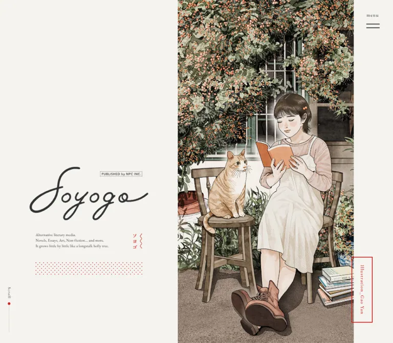
生成りの背景に明朝体と手書きロゴを配し、読書する人物と猫のイラストを大きく見せる文芸メディア。赤い点描の罫線と広い余白が、小説・エッセイ・書籍紹介を穏やかにつなぎます。
soyogo — Style Reference
A literary journal on warm paper, with a garden reading scene beside an airy table of contents.
Original URL: soyogobooks.jp
Final URL: soyogobooks.jp
Theme: the observed light appearance: warm off-white, charcoal type, restrained red details, and muted illustration colors.
Inspected: supplied inspection batch dated October 2, 2026, 00:45 JST; recorded timestamp 2026-10-01T15:45:26.341Z.
Viewports: desktop 1440 × 1000 and mobile 390 × 844 CSS pixels. Recorded document heights were 7275px and 5151px, respectively.
Scope: the current homepage: opening masthead, an intermediate desktop catalog position, desktop and mobile footer positions, and rendered DOM/computed-style evidence for the homepage sections. Article pages, category destinations, and an opened menu were not inspected.
soyogo is a Japanese literary publication with sections for novels, essays, books, an editorial introduction, and publication news. Its homepage behaves visually like a generous contents page. Large, lightly weighted Japanese titles, small dates, author names, and understated navigation sit directly on the paper-colored canvas. Red category outlines and bands of tiny dots supply structure without making the page feel boxed in.
The opening composition establishes two complementary voices: a loose handwritten wordmark and a detailed illustration of a person reading beside a cat. On desktop, the masthead sits unusually low in a broad empty left field. The illustration fills most of the remaining height. In the supplied scrolled desktop view, the text occupies a wider left column while the illustration remains at the right. Mobile rearranges the opening into a centered masthead above a full-width crop of the artwork.
閉じる
soyogo — Style Reference
A literary journal on warm paper, with a garden reading scene beside an airy table of contents.
Original URL: soyogobooks.jp
Final URL: soyogobooks.jp
Theme: the observed light appearance: warm off-white, charcoal type, restrained red details, and muted illustration colors.
Inspected: supplied inspection batch dated October 2, 2026, 00:45 JST; recorded timestamp 2026-10-01T15:45:26.341Z.
Viewports: desktop 1440 × 1000 and mobile 390 × 844 CSS pixels. Recorded document heights were 7275px and 5151px, respectively.
Scope: the current homepage: opening masthead, an intermediate desktop catalog position, desktop and mobile footer positions, and rendered DOM/computed-style evidence for the homepage sections. Article pages, category destinations, and an opened menu were not inspected.
soyogo is a Japanese literary publication with sections for novels, essays, books, an editorial introduction, and publication news. Its homepage behaves visually like a generous contents page. Large, lightly weighted Japanese titles, small dates, author names, and understated navigation sit directly on the paper-colored canvas. Red category outlines and bands of tiny dots supply structure without making the page feel boxed in.
The opening composition establishes two complementary voices: a loose handwritten wordmark and a detailed illustration of a person reading beside a cat. On desktop, the masthead sits unusually low in a broad empty left field. The illustration fills most of the remaining height. In the supplied scrolled desktop view, the text occupies a wider left column while the illustration remains at the right. Mobile rearranges the opening into a centered masthead above a full-width crop of the artwork.
How to Read This Reference
- Measured means a value appears in the supplied rendered DOM or computed styles. Decimal coordinates are rounded in tables where precision is not useful.
- Visually estimated means a dimension or treatment is read from the original-page screenshots, without pixel sampling or its defining CSS declaration.
- Calculated means arithmetic derived from measured dimensions, such as the percentage occupied by a column.
- Recommended means guidance for a new implementation. The CSS and prompts are adaptations, not recovered source code.
- Font names below are recorded computed-family declarations. Individual font-file delivery and the face used for every glyph were not independently verified.
- The evidence contains two viewport sizes, not the original media queries. Intermediate widths, landscape behavior, and exact breakpoints remain unverified.
- DOM presence does not establish visual visibility. In particular, navigation links are present in the DOM while the screenshots show the closed menu control.
Tokens — Colors
Default Palette
| Name | Value | Suggested token | Evidence and role |
|---|---|---|---|
| Warm Paper | #f4f3ef |
--color-paper |
Measured body and footer background: rgb(244, 243, 239) |
| Charcoal Ink | #333333 |
--color-ink |
Measured main text, headings, and links: rgb(51, 51, 51) |
| Editorial Red | #cf2520 |
--color-accent |
Measured category-heading text: rgb(207, 37, 32) |
| Quiet Band | #ebeae5 |
--color-band |
Measured background of the full-width category-index links: rgb(235, 234, 229) |
| Reversed Credit | Visually white | --color-on-art: #fff |
White lettering and frame visible over the mobile illustration; the hex value is a recommended approximation |
The category outlines, dotted separators, opening kana mark, desktop illustration credit, and scroll marker are visibly red. Their individual computed colors were not supplied. Reusing --color-accent for them is a coherent implementation choice, not proof that all use the same source declaration.
The illustration adds subdued olive foliage, warm brown furniture and shoes, pale clothing, orange berries, and an orange book. These are artwork colors rather than additional interface-state tokens.
Palette Discipline
The observed hierarchy comes from paper, ink, a slightly darker paper band, and small red marks. There is no visible gradient surface, filled primary CTA, or shadow-based elevation system in the supplied captures.
The DOM includes many generic WordPress color, gradient, and shadow presets. Their presence does not demonstrate use on this page. Do not promote those presets into the visual palette.
No alternate color theme or theme selector was demonstrated.
Tokens — Typography
Editorial Serif
Measured body stack: 'EB Garamond', 'Zen Old Mincho', serif.
The combination gives Latin labels a bookish serif character and Japanese content a delicate Mincho appearance. Body text is regular weight 400; content headings generally use 500. Broad tracking and generous leading contribute more to the hierarchy than heavy weight.
Desktop body styling is 20px / 35px with 1.6px letter spacing. Mobile body styling is 14px / 24.5px with 1.12px spacing. Both correspond to approximately 1.75 line height and 0.08em tracking.
Heading and Caption Stack
Measured stack: YakuHanMP, 'EB Garamond', 'Zen Old Mincho', serif.
This appears on the sampled headings, menu caption, and opening descriptive paragraph. Preserve the recorded stack when its fonts are available; do not treat YakuHanMP as a replacement for the full Japanese text family.
Most headings use 0.1em tracking. The visible result is open and deliberate, especially in the large Japanese story titles.
Wordmark
The handwritten soyogo wordmark is a graphic identity element. Its sweeping initial letter and connected strokes are not the result of applying the body serif stack to an H1.
The surrounding H1 has ordinary computed text styles, but those values do not describe the visible script lettering. Use an approved wordmark asset. Neither the asset format nor a script font name was established by the evidence.
Fine Print
Measured legal-notice stack: 'Zen Kaku Gothic New', sans-serif.
The reproduction notice is a quiet exception to the serif system. It uses 12px / 24px on desktop and 10px / 15px on mobile, with 0.02em tracking. Contact information and copyright remain serif.
Type Scale
Values below are measured computed styles. Dimensions are in CSS pixels.
| Role | Desktop size / leading | Mobile size / leading | Weight | Tracking, desktop → mobile |
|---|---|---|---|---|
| General body | 20 / 35 |
14 / 24.5 |
400 |
1.6 → 1.12px |
| Story and book title | 40 / 60 |
24 / 36 |
500 |
4 → 2.4px |
| About statement and Information heading | 32 / 48 |
20 / 30 |
500 |
3.2 → 2px |
| Contributor-directory heading | 24 / 36 |
16 / 24 |
500 |
2.4 → 1.6px |
| Contributor names | 20 / 40 |
14 / 28 |
400 |
1.6 → 1.12px |
| About prose | 20 / 40 |
16 / 32 |
400 |
0.4 → 0.32px |
| Category outline label | 14 / 14 |
12 / 12 |
500 |
1.4 → 1.2px |
| Latest-episode link | 14 / 24.5 |
12 / 21 |
400 |
1.6 → 1.12px |
| Category-index anchor | 14 / 24.5 |
14 / 24.5 |
400 |
1.6 → 1.12px |
| Menu caption | 14 / 21 |
10 / 15 |
500 |
1.4 → 0.2px |
| Opening English description | 11 / 16.5 |
10 / 15 |
400 |
0.22 → 0.2px |
| English publication note near About | 12 / 21 |
12 / 21 |
400 |
0.24px |
| Publisher/contact text | 16 / 32 |
12 / 24 |
400 |
0.32 → 0.24px |
| Legal notice | 12 / 24 |
10 / 15 |
400 |
0.24 → 0.2px |
| Copyright | 14 / 14 |
10 / 10 |
400 |
0.28 → 0.2px |
The opening mobile paragraph has a measured rendered height of 31.5px, despite containing three lines with a computed 15px line height. This suggests scaling somewhere in its rendering chain. The exact transform was not supplied; do not assume that its apparent size equals its nominal 10px font size.
The category-index anchor also contains text whose full rendered line box exceeds the anchor's nominal text leading. Its measured outer height is more reliable than rebuilding it from the anchor's font size alone.
Tokens — Spacing & Shapes
The page alternates expansive empty space with fine typographic details. It does not show a universal eight-pixel spacing grid. Use component-specific measurements rather than forcing every distance into a single scale.
The measured root font size is 10px at both viewports. The Quick Start deliberately retains a conventional 16px root and uses explicit dimensions instead of copying unknown source rem rules.
Spacing Scale
| Use | Desktop | Mobile | Status |
|---|---|---|---|
| Category-label padding | 7px 14px |
5px 8px |
Measured |
| Category-label outer height | 32px |
26px |
Measured |
| Category-index padding | 80px 40px |
60px 23.4px |
Measured |
| Category-index outer height | 191.38px |
151.38px |
Measured |
| First category label below opening | About 103px |
About 46.8px |
Derived from recorded section positions and visible opening extent |
| Category-label left edge | 87.97px |
23.39px |
Measured |
| About/Information/footer main inset | About 180–190px |
31.19px |
Measured, varies by section |
| Footer top padding | 180px |
70.2px |
Measured |
| Footer dot-band height | About 32px |
About 32px |
Screenshot estimate |
| Footer band-to-directory gap | About 200px |
About 47px |
Screenshot/DOM comparison |
The category-label dimensions are consistent with a 2px border: 14 + 7 + 7 + 4 = 32px on desktop and 12 + 5 + 5 + 4 = 26px on mobile. This is an inference from box dimensions and the visible outline; a border-width declaration was not included.
Border Radius
Sampled elements report 0px radius. Visible labels, illustration-credit frames, index bands, and content regions have square edges.
The tiny dots and scroll indicator are circular. Their circular shape is decorative and does not imply a rounded-card system.
Layout Measurements
| Element | Desktop 1440 × 1000 |
Mobile 390 × 844 |
Evidence |
|---|---|---|---|
| Opening masthead region | Left field approximately 480px wide |
Full-width top region approximately 229.6px high |
Screenshot; mobile H1 height measured |
| H1 lockup box | x: 80, y: 497.33, 320 × 302.67px |
x: 85, y: 0, 220 × 229.59px |
Measured |
| Mobile H1 padding | — | 40px 0 |
Measured |
| Opening illustration | Approximately x: 480–1334, full viewport height |
Starts near y: 230, spans viewport width |
Screenshot estimate |
| Opening right utility rail | Approximately 106px wide |
No separate rail | Screenshot estimate |
| Catalog text region | 879.83px, approximately 61.1% of viewport |
390px, full width |
Measured index-band width |
| Catalog title/link width | 643.89px |
307.22px |
Measured |
| Initial DOM title left edge | 187.97px |
59.39px |
Measured |
| Settled middle-capture title edge | Approximately 148px |
No equivalent middle screenshot supplied | Screenshot estimate |
| About prose width | 491.11px |
327.63px |
Measured |
| Information heading width | 1080px |
327.63px |
Measured |
| Footer directory heading width | 854.27px |
327.63px |
Measured |
| Social-link boxes | 24 × 28px |
20 × 20px |
Measured |
| Publisher-logo link width | 124px |
80px |
Measured link width; not the full image height |
The desktop catalog's initial DOM title position and its later screenshot position differ by approximately 40px. A reveal transform could explain this, but its mechanism was not provided. Keep the two states distinct. The Quick Start uses the settled screenshot's approximate 60px date-to-title indentation rather than claiming the initial 100px offset is the final layout rule.
Components
Persistent Menu Trigger
Role: compact access to the site's five main sections.
A lowercase menu caption sits above two thin horizontal strokes. There is no visible full-width navigation bar or filled button container. The sampled header has zero layout height, and the control remains at the upper right across the supplied top and footer captures.
On desktop, the caption begins around x: 1366, y: 32; the strokes are visually about 36px long. On mobile, the caption begins at x: 345.5, y: 16, and the strokes are about 24px long. Stroke dimensions are estimates.
The DOM contains links labeled Novels, Essays and more, soyogo books, About, and Information. Those links are not visibly exposed in the supplied screenshots. Their recorded boxes do not establish the appearance of an opened menu.
Implementation recommendation: retain the small visible mark but provide a larger invisible hit area. Use a real button, an accessible name, and an expanded state. Panel appearance, focus management, and opening motion require a separately designed and tested implementation.
Opening Masthead
Role: establishes identity before the contents begin.
The lockup contains the handwritten soyogo mark, a tiny outlined publisher stamp, three lines of English description, a small red vertical kana treatment, and a red dotted band on desktop.
The desktop H1 box ends at approximately y: 800, leaving about 200px below it in the 1000px viewport. Most of the left field above the logo is intentionally empty. This low placement is a defining part of the opening composition.
The mobile lockup is centered in a 220px-wide box with 40px vertical padding. It moves above the illustration instead of becoming a miniature side column. The desktop red dotted band is not visible in the mobile opening capture.
Keep the publisher stamp as a small graphic detail. It should not become a prominent badge competing with the wordmark.
Illustration Panel and Credit
Role: provides the page's narrative, texture, and emotional center.
The artwork shows a seated reader holding an orange book, a cat on an adjacent chair, dense branches and berries, a building window, planters, and stacked books. It reaches the image boundary without a rounded container, shadow, or caption card.
In the desktop opening, the image sits between the masthead field and the narrow menu rail. In the middle desktop capture, it occupies the rightmost approximately 560px and remains nearly viewport-height while the catalog is visible on the left. The captured states support a persistent illustration composition, but not an exact claim about sticky positioning, masking, or scroll-linked transforms.
The visible credit reads Illustration_Gao Yan. It uses a narrow vertical outlined frame: red on the desktop paper edge and white over the mobile artwork. Its desktop frame is approximately 56 × 190px; the mobile frame is approximately 25 × 123px. These are visual estimates.
The homepage independently identifies the illustrator as 高 妍(Gao Yan/ガオ イェン) in its contributor directory. This supports an illustration attribution, not a website-design attribution.
Scroll Cue
Role: a quiet indication that more content follows.
At the lower left of the desktop captures, a tiny vertical Scroll label sits above a small red dot and a thin pale vertical line. The line sits approximately 24px from the left edge. On the mobile opening, the label appears in white over the illustration near the lower-left corner.
The screenshots show the cue at captured positions, but do not prove a progress calculation, animation, or click action. Treat it as decorative unless interaction is explicitly implemented.
Category Outline Label
Role: identifies each group of editorial entries.
Labels such as Novels, Essays and more, and soyogo books appear as small red outlined rectangles aligned to the section's outer inset. They use medium-weight serif type, 0.1em tracking, and square corners.
The label is substantially smaller than the story titles beneath it. Keep that hierarchy: a section marker introduces the content rather than becoming a large banner heading.
Editorial Entry
Role: provides access to a serial, essay collection, or book detail.
The desktop anatomy is a narrow date rail, a large Japanese title, optional author/byline information, and small right-aligned links. The middle capture shows dates running vertically. A fine horizontal lead-in line precedes the action text, and a small vertical separator distinguishes adjacent actions.
Novel and essay entries provide 一覧へ and 最新話へ. The rendered link evidence groups title, byline, and list access in a main anchor, with latest-episode access as a separate anchor. Book entries use 詳細へ and omit a latest-episode action.
Titles use 40px / 60px on desktop and 24px / 36px on mobile. Long titles wrap naturally: the inspected book title 『猫にご用心 知られざる猫文学の世界』 occupies two title lines in both measured layouts.
Red dotted rules separate the airy entries. They are narrow bands containing multiple staggered rows of tiny dots, not a single heavy dashed border. The visible entry-divider band is approximately 12px high; its exact tile dimensions were not supplied.
The inspected catalog is typographic. The visible book entry does not use a cover-card layout. Do not add a cover grid simply because a section concerns books.
Implementation recommendation: use a structured article/list item and sibling links, avoiding nested anchors. Keep title wrapping, byline height, and action placement independent so longer names do not overlap the controls. Mobile date orientation was not visually established by a middle-page capture.
Category Index Band
Role: closes a group and leads to its complete index.
A slightly darker paper strip spans the full catalog column. Its centered label combines the English category name with 一覧へ. There is no raised button, capsule, or contrasting fill behind the words.
The measured desktop strip is approximately 880 × 191px, with 80px vertical padding. Mobile retains the full-width strip but reduces its height to approximately 151px and its vertical padding to 60px.
The band is a large link region whose visual emphasis remains soft. Preserve its scale as a pause between groups.
About Section
Role: explains the publication and its publisher.
The DOM records a prominent statement, 書を読んで、まちへ出よう, followed by prose identifying soyogo as an owned medium operated by 日本印刷株式会社. A 続きを読む link leads to the About page.
Desktop prose measures approximately 491px wide at 20px / 40px. Mobile prose uses a wider proportion of the viewport—approximately 328px within 31px side margins—and 16px / 32px type. This is intentionally larger than the mobile catalog's general body text.
An English publication note appears elsewhere in this region. Its desktop box is positioned toward the right; mobile places it in the main content width. An unlabeled graphic-sized H2 box also precedes the statement, but its actual contents were not visually established in the supplied captures.
The About section is documented primarily by DOM evidence. Its full visual composition should not be reconstructed from whitespace alone.
Information List
Role: provides dated publication updates.
The heading follows the 32px desktop / 20px mobile secondary-heading scale. The supplied DOM contains two news items, including an update for the book-cover essay series and an announcement introducing soyogo books.
On desktop, date and title occupy a compact horizontal reading sequence. On mobile, the date sits on its own line with a short horizontal rule, followed by the title. The mobile footer capture shows this arrangement directly.
Keep the news treatment as text links rather than adding thumbnail cards or status chips.
Contributor Directory
Role: makes authors and illustrators part of the publication's identity and navigation.
The footer contains separate headings, 著者一覧 and イラストレーター一覧, followed by inline names separated by middle dots. The supplied content lists twelve authors and nine illustrators. These counts are content-specific, not fixed layout requirements.
Desktop contributor names use 20px / 40px; mobile uses 14px / 28px. The names wrap into multiple lines rather than becoming a grid of profile cards. Keep the generous leading and avoid justified spacing that stretches individual names.
These are editorial contributors. Do not relabel the entire directory as website production credits.
Publisher Footer and Back to Top
Role: provides publisher identity, contact details, policy access, and return navigation.
A dark dotted band marks the transition into the footer. The paper background continues unchanged. Beneath the contributor lists are the operator name, postal address, email address, privacy link, a small legal notice, social icons, the NPC logo, and copyright.
The current homepage names 日本印刷株式会社 as operator and links it to https://www.npc-tyo.co.jp/. Contact and privacy links are visibly underlined. X and Instagram appear as simple dark icons.
On desktop, social links sit at the lower left while the publisher logo and copyright occupy the lower right. Mobile preserves this final horizontal relationship in a compressed row, with the contact material stacked above it. The privacy link moves to its own line.
An outlined upward chevron near the bottom right links to #pagetop. Its target is confirmed by the DOM; smooth scrolling, speed, and easing were not tested.
Tokens — Motion & Interaction
The evidence supplies transition declarations and settled screenshots, not a recorded interaction sequence. Do not equate a transition duration with proof of a particular hover or reveal effect.
| Element | Measured declaration or observation | What can safely be concluded |
|---|---|---|
| Story, latest-episode, contact, and many footer links | 0.2s ease-in-out |
A short transition is declared; changed properties and endpoint styles were not supplied |
| Main navigation links | 0.6s ease-in-out |
Slower navigation-link transitions are declared; opened-menu behavior is unverified |
| Category-index bands | 0.6s cubic-bezier(0.12, 0, 0.39, 0) |
The bands have a distinct declared easing; the visual effect is unverified |
| Sampled Essays and books category headings | 0.8s ease-in-out |
A longer heading transition is declared; trigger and transform are unknown |
| Many static sampled elements | transition: all, animation: none |
No active keyframe animation is evidenced on those sampled elements; all alone does not establish a nonzero duration |
| Menu position across captures | Upper-right placement persists | Consistent with viewport-attached chrome; its exact positioning rule was not supplied |
| Illustration across desktop scroll positions | Opening composition changes into a narrower right-side view | Persistent visual presence is observed; the mechanism and transition timing are not |
| Back-to-top link | https://soyogobooks.jp/#pagetop |
Anchor destination is known; scrolling behavior is not |
The capture process waited for document loading, image decoding, and sampled layout/text stability, with limits. It also handled finite and perpetual animations during readiness checks. This improves confidence in the captured states but does not prove that all delayed content or motion was exercised.
Recommended adaptation: use restrained opacity or underline feedback for links, preserve the recorded timing hierarchy where useful, and keep all content readable without animation. If a scroll-driven illustration transition is added, treat it as a new implementation decision and provide a reduced-motion alternative.
Surfaces
| Surface | Appearance | Structural purpose |
|---|---|---|
| Main canvas | Solid #f4f3ef |
Continuous reading surface through masthead, entries, About, and footer |
| Catalog rows | Same paper, separated by red dot bands | Establishes entries without card containers |
| Category index | Solid #ebeae5 |
Creates a quiet full-column navigation pause |
| Category label | Paper interior, thin red rectangular outline | Small section marker |
| Illustration | Full-color artwork, flush edges | Main visual density and storytelling |
| Illustration credit | Narrow outlined vertical frame | Attribution at the artwork boundary |
| Footer boundary | Dark staggered dots on paper | Changes section without changing the page surface |
| Utility controls | Ink strokes and small text | Keeps navigation visually secondary |
No visible component requires a general-purpose shadow, blur, or rounded elevation system.
Imagery
The illustration is the strongest identity asset. Its linework, soft shading, subdued foliage, and everyday objects create a quiet literary atmosphere. The orange book and berries punctuate a mostly green, brown, and cream scene. The reader and cat provide a clear focal relationship without looking like a promotional product shot.
Preserve the illustration's texture. Use normal high-quality image rendering, not pixelated scaling. Avoid applying a global duotone filter: the restrained full-color palette is part of its character.
Cropping is responsive and significant. The desktop opening shows a broad garden/window context. The narrower desktop sidebar and mobile image concentrate attention on the reader, cat, and book. A generic center crop may cut important objects; test focal positioning at both supplied aspect ratios.
The page's other graphic elements are much simpler: the script wordmark, tiny publisher stamp, NPC identity, social symbols, hairline controls, and dot patterns. This contrast allows the artwork to remain visually rich without making the interface busy.
Observed Asset References
The supplied evidence does not include image src values, background-image URLs, or a font-file inventory. The following are visual asset roles, not invented source paths.
| Asset | Original-page evidence | Reuse guidance |
|---|---|---|
| Reading scene | Desktop opening, desktop middle capture, mobile opening; visible Illustration_Gao Yan credit |
Supply approved high-resolution artwork and verify each crop |
| soyogo wordmark and publisher stamp | Desktop and mobile opening captures | Use a graphic asset; do not substitute an arbitrary script font |
| Red kana detail | Opening masthead captures | Preserve its small vertical placement and accent role |
| NPC logo | Desktop and mobile footer captures | Keep its proportions; do not recreate it as ordinary text |
| X and Instagram marks | Footer captures and corresponding outbound links | Use accurate, accessible icon assets |
| Red and charcoal dot bands | Masthead, entry divider, and footer captures | A CSS staggered-dot approximation is practical; original tile geometry is unknown |
Layout & Responsive Behavior
Desktop Opening and Catalog
At 1440 × 1000, the opening divides visually into a 480px masthead field, an approximately 854px illustration, and an approximately 106px right rail. These are screenshot-derived proportions, not recovered source grid rules.
The opening is deliberately asymmetric. The wordmark begins near the vertical midpoint and its supporting text stays small. The illustration occupies the full height and provides most of the information above the fold.
The middle desktop capture uses a different balance: the catalog fills approximately 880px, and the remaining approximately 560px shows the illustration. The content region contains a complete category-index band and the start of the books section. Preserve this wider reading column rather than reusing the opening's narrow masthead width for every section.
The footer returns to a full-width paper layout. Its primary inner region runs from approximately x: 180 to x: 1260.
Mobile Composition
At 390 × 844, the masthead is centered above the artwork. Its measured height is approximately 230px, leaving about 614px of the opening viewport for the illustration. The image remains large and immersive; the two desktop columns are not merely scaled down.
The catalog occupies the full viewport width. Category labels start around 23.4px from the edge, while title content begins around 59.4px, leaving a narrower date/metadata rail. Category titles shrink from 40px to 24px, but remain clearly larger than surrounding text.
About, Information, and footer content use approximately 31.2px side margins, equivalent to 8% of this viewport. These insets differ from the catalog's approximately 6% outer margin.
The footer compresses its large desktop pauses, changes the contributor heading scale to 16px, and retains multiline name lists. The legal notice uses an explicit two-line presentation in the mobile evidence.
Responsive Comparison
| Behavior | Desktop | Mobile |
|---|---|---|
| Masthead and illustration | Side by side | Masthead above artwork |
| Main illustration during catalog | Visible as a right-side panel in the supplied middle capture | Opening artwork confirmed; a mid-catalog mobile state was not visually supplied |
| Story-title size | 40px |
24px |
| Catalog width | Approximately 61.1vw |
Full viewport |
| Category-index height | Approximately 191px |
Approximately 151px |
| About prose size | 20px |
16px |
| Contributor list | Broad lines at 20px |
More wrapping at 14px |
| Contact/privacy arrangement | Longer horizontal lines | Stacked, with privacy on its own line |
| Menu | Upper-right rail | Upper-right corner of page |
No tablet breakpoint was inspected. A breakpoint near 60rem in the Quick Start is a recommendation, not a source finding. Test intermediate widths, enlarged text, and short landscape screens before adopting it.
Do’s and Don’ts
Do
- Keep the measured paper, ink, band, and category-red colors as the core palette.
- Let the illustration carry visual richness while the interface remains sparse.
- Preserve the low desktop masthead placement and the stacked mobile opening.
- Pair the recorded Latin serif and Japanese Mincho stacks when available.
- Use medium-weight, widely tracked story titles with generous leading.
- Keep entry content directly on the paper surface.
- Separate entries with delicate red dot bands and categories with broad pale index links.
- Retain distinct list and latest-episode destinations for serial content.
- Treat dates, bylines, contributor names, and illustration attribution as part of the editorial composition.
- Maintain the footer's continuous paper background and restrained publisher identity.
Don’t
- Don’t recast this literary homepage as a sales funnel with feature cards and oversized conversion buttons.
- Don’t replace the handwritten wordmark with body text or an invented font attribution.
- Don’t add rounded cover cards to the observed text-led catalog.
- Don’t use the generic WordPress preset palette as evidence of visible theme colors.
- Don’t replace small red outlines and dot rules with large solid red surfaces.
- Don’t apply heavy shadows, glossy gradients, or glass blur to the page shell.
- Don’t stretch or arbitrarily crop the reading scene.
- Don’t assume the illustration is parallax, the menu is a drawer, or links fade on hover without interaction evidence.
- Don’t treat editorial contributors as website designers or developers.
- Don’t shrink essential mobile reading text to the opening microcopy's apparent size.
Recommended Implementation Additions
These are improvements for a new implementation, not verified original-site features:
- Give the menu, social icons, and back-to-top control accessible names and at least approximately
44pxinteractive targets while keeping their visible marks small. - Provide a visible keyboard focus outline. Preserve underlining for contact and policy links.
- Use semantic section headings, article/list structures,
<time>elements, and sibling anchors for separate destinations. - Keep essential mobile reading copy at a comfortable size. The measured About paragraph already provides a useful
16px / 32pxreference. - Supply meaningful alt text for the main scene when it conveys identity; mark any duplicated sticky copy of the same artwork as decorative to avoid repeated announcements.
- Reserve image dimensions and load the opening artwork predictably to reduce layout movement.
- Ensure content remains visible if scroll-reveal code does not run, and respect reduced-motion preferences.
- Check and normalize contributor URLs before reuse. Several supplied href values contain a repeated site origin or duplicated slash; destination behavior was not tested.
- Test title wrapping with long Japanese work names, translated-author credits, and larger user text settings.
Agent Prompt Guide
Quick Color Reference
- Canvas and ordinary content:
#f4f3ef. - Main type and linework:
#333333. - Category text: measured
#cf2520; reuse for other red details as an approximation. - Full-column index bands:
#ebeae5. - Mobile illustration credit: visually white.
- Artwork: muted full color; preserve foliage greens, warm browns, pale clothing, and orange focal details.
Overall Prompt
“Build an editorial homepage for a Japanese literary publication using warm paper #f4f3ef, charcoal #333333, small red outlined labels, and fine staggered-dot dividers. Use EB Garamond with Zen Old Mincho for the reading interface, medium-weight Japanese titles, generous line height, and open tracking. The desktop opening has a low-positioned graphic wordmark in a broad empty left field and a large garden reading illustration beside it. Below, show an airy single-column contents list with dates, authors, list links, and latest-episode links, accompanied by a right-side illustration panel. On mobile, center the masthead above the artwork and make the catalog full width. Finish with inline contributor names and a quiet publisher footer. Treat menu opening and scroll animation as separate implementation decisions.”
Example Component Prompts
- Editorial entry: “Create a paper-colored literary contents row with a narrow date rail, a
40px / 60pxmedium-weight Mincho title, a serif byline, and small right-aligned一覧へand最新話へlinks. Use a fine lead-in rule and a red staggered-dot separator. At mobile width, use a24px / 36pxtitle and narrower insets. Keep links semantically separate.” - Category index: “Create a full-column pale-gray-paper link band using
#ebeae5, approximately191pxhigh on desktop and151pxon mobile. Center a serif category name followed by一覧へ. Keep square edges and omit shadows.” - Opening composition: “Place an approved handwritten wordmark near the lower half of a paper masthead column, with tiny English publication copy and a red dotted ornament. Put approved reading-scene artwork beside it at viewport height. On a
390pxphone, move the wordmark into a centered top panel and crop the illustration full width beneath it.” - Contributor footer: “Create a continuous warm-paper footer introduced by a dark dotted band. Show author and illustrator headings above inline names separated by middle dots. Use
20px / 40pxnames on desktop and14px / 28pxon mobile. Stack contact details below, then place social icons left and publisher identity right.” - Accessible menu control: “Create a small lowercase
menucaption above two charcoal hairlines at the top right. Keep the visible mark restrained but provide a44pxminimum button target, an accessible name, expanded state, and visible focus. Do not assume a particular panel animation from the closed control.”
Quick Start
CSS Custom Properties
This is a usable starting shell, not the original stylesheet. Measured colors and type sizes are preserved. Layout formulas, the 60rem breakpoint, hover feedback, and sticky catalog artwork are recommended approximations.
The opening and catalog use separate placements of the same approved illustration. This reproduces the two captured desktop compositions without claiming to reproduce the original transition between them. The example keeps mobile introductory text unscaled for readability, so its exact lockup spacing may differ slightly from the capture.
:root {
  /* Measured interface colors */
  --color-paper: #f4f3ef;
  --color-ink: #333333;
  --color-accent: #cf2520;
  --color-band: #ebeae5;

  /* Recommended approximation for reversed artwork credit */
  --color-on-art: #fff;

  /* Recorded computed font stacks; supply fonts separately */
  --font-editorial: 'EB Garamond', 'Zen Old Mincho', serif;
  --font-heading: YakuHanMP, 'EB Garamond', 'Zen Old Mincho', serif;
  --font-fine: 'Zen Kaku Gothic New', sans-serif;

  /* Mobile values from the supplied computed styles */
  --text-body: 14px;
  --text-title: 24px;
  --text-section: 20px;
  --text-directory: 16px;
  --text-label: 12px;
  --text-action: 12px;
  --text-contact: 12px;
  --leading-body: 1.75;
  --leading-title: 1.5;
  --tracking-body: 0.08em;
  --tracking-heading: 0.1em;

  /* Recommended formulas matching the sampled mobile insets */
  --catalog-inset: 6vw;
  --page-inset: 8vw;
  --date-rail: 36px;
  --section-space: 12vw;
  --label-gap: 8vw;

  /* Measured transition timing references */
  --motion-link: 200ms ease-in-out;
  --motion-nav: 600ms ease-in-out;
  --motion-band: 600ms cubic-bezier(0.12, 0, 0.39, 0);

  /* Pattern geometry is an approximation */
  --dot-step: 10px;
  --dot-size: 0.8px;
}

* { box-sizing: border-box; }

html { font-size: 16px; }

body {
  margin: 0;
  color: var(--color-ink);
  background: var(--color-paper);
  font: 400 var(--text-body)/var(--leading-body) var(--font-editorial);
  letter-spacing: var(--tracking-body);
}

img { display: block; max-inline-size: 100%; }

a { color: inherit; text-underline-offset: 0.2em; }

button { font: inherit; color: inherit; }

:where(a, button):focus-visible {
  outline: 2px solid var(--color-ink);
  outline-offset: 5px;
}

/* Reusable staggered dots, not a recovered image tile */
.dot-band {
  --dot-color: var(--color-accent);
  block-size: 12px;
  background-image:
    radial-gradient(circle, var(--dot-color) var(--dot-size), transparent 1px),
    radial-gradient(circle, var(--dot-color) var(--dot-size), transparent 1px);
  background-size: var(--dot-step) var(--dot-step);
  background-position: 0 0, 5px 5px;
}

.opening {
  display: grid;
  grid-template-rows: 230px minmax(0, 1fr);
  block-size: 100svh;
  min-block-size: 640px;
}

.brand-area {
  display: grid;
  place-items: center;
  position: relative;
}

.brand-lockup { inline-size: 220px; }

.brand-mark { inline-size: 100%; block-size: auto; }

.brand-description {
  display: flex;
  align-items: center;
  justify-content: space-between;
  gap: 16px;
  margin: 20px 5% 0;
}

.brand-description p {
  margin: 0;
  font: 400 10px/1.5 var(--font-heading);
  letter-spacing: 0.02em;
}

.brand-kana {
  flex: none;
  color: var(--color-accent);
  font-size: 10px;
  writing-mode: vertical-rl;
  letter-spacing: 0.15em;
}

.brand-lockup > .dot-band { display: none; }

.opening-art {
  position: relative;
  min-block-size: 0;
  margin: 0;
}

.opening-art > img,
.catalog-art > img {
  inline-size: 100%;
  block-size: 100%;
  object-fit: cover;
  object-position: center;
}

/* Tune crop positions against the approved image */
.art-credit {
  position: absolute;
  inset-inline-end: 16px;
  inset-block-end: 16px;
  padding: 10px 5px;
  border: 1px solid currentColor;
  color: var(--color-on-art);
  font-size: 10px;
  line-height: 1.2;
  letter-spacing: 0.12em;
  writing-mode: vertical-rl;
}

.menu-toggle {
  position: fixed;
  z-index: 20;
  inset-block-start: 10px;
  inset-inline-end: 11px;
  display: flex;
  flex-direction: column;
  align-items: center;
  justify-content: center;
  gap: 5px;
  inline-size: 44px;
  min-block-size: 44px;
  padding: 4px;
  border: 0;
  background: transparent;
  cursor: pointer;
}

.menu-toggle > span {
  font: 500 10px/15px var(--font-heading);
  letter-spacing: 0.02em;
}

.menu-lines {
  display: block;
  inline-size: 24px;
  block-size: 9px;
  border-block: 1px solid currentColor;
}

.catalog-art { display: none; }

.catalog-section {
  padding: var(--section-space) var(--catalog-inset);
}

.section-label {
  display: inline-block;
  margin: 0 0 var(--label-gap);
  padding: 5px 8px;
  border: 2px solid var(--color-accent);
  color: var(--color-accent);
  font: 500 var(--text-label)/1 var(--font-heading);
  letter-spacing: var(--tracking-heading);
}

.entry {
  display: grid;
  grid-template-columns: var(--date-rail) minmax(0, 1fr);
  gap: 12px 0;
  position: relative;
  margin-block-end: 28px;
  padding-block-end: 24px;
}

/* Vertical mobile dates are an adaptation, not a verified state */
.entry-date {
  grid-column: 1;
  grid-row: 1 / 3;
  justify-self: start;
  font-size: 12px;
  line-height: 1.4;
  letter-spacing: 0.12em;
  writing-mode: vertical-rl;
}

.entry-main {
  grid-column: 2;
  text-decoration: none;
  min-inline-size: 0;
}

.entry-title {
  margin: 0;
  font: 500 var(--text-title)/var(--leading-title) var(--font-heading);
  letter-spacing: var(--tracking-heading);
  overflow-wrap: anywhere;
}

.entry-byline { margin: 6px 0 0; }

.entry-actions {
  grid-column: 2;
  display: flex;
  align-items: center;
  justify-content: flex-end;
  flex-wrap: wrap;
  gap: 12px;
  font-size: var(--text-action);
}

.entry-actions::before {
  content: '';
  inline-size: 40px;
  border-block-start: 1px solid currentColor;
}

.entry-actions a { text-decoration: none; }

.entry-actions a + a {
  padding-inline-start: 12px;
  border-inline-start: 1px solid currentColor;
}

.entry > .dot-band {
  position: absolute;
  inset-inline-start: var(--date-rail);
  inset-inline-end: 0;
  inset-block-end: 0;
}

.index-band {
  display: flex;
  align-items: center;
  justify-content: center;
  gap: 6px;
  min-block-size: 151.375px;
  padding: 60px 6vw;
  background: var(--color-band);
  font-size: 14px;
  text-decoration: none;
  transition: color var(--motion-band);
}

.index-band strong { font-size: 18px; font-weight: 500; }

.page-inner {
  inline-size: min(1080px, calc(100% - 2 * var(--page-inset)));
  margin-inline: auto;
}

.section-heading {
  margin: 0 0 1em;
  font: 500 var(--text-section)/1.5 var(--font-heading);
  letter-spacing: 0.1em;
}

.about-copy {
  max-inline-size: 491px;
  font-size: 16px;
  line-height: 2;
  letter-spacing: 0.02em;
}

.news-item {
  display: block;
  margin-block: 24px;
  font-size: 14px;
  text-decoration: none;
}

.news-item time { display: block; margin-block-end: 8px; }

.site-footer { padding-block: 18vw 46px; }

.site-footer > .dot-band {
  --dot-color: var(--color-ink);
  block-size: 32px;
  margin-block-end: 12vw;
}

.directory { max-inline-size: 854px; margin-block-end: 28px; }

.directory h2 {
  margin: 0 0 16px;
  font: 500 var(--text-directory)/1.5 var(--font-heading);
  letter-spacing: 0.1em;
}

.directory-list {
  margin: 0;
  padding: 0;
  list-style: none;
  line-height: 2;
}

.directory-list li { display: inline; }

.directory-list li:not(:last-child)::after {
  content: '・';
  margin-inline: 0.25em;
}

.directory-list a { text-decoration: none; }

.publisher-contact {
  font-size: var(--text-contact);
  line-height: 2;
  letter-spacing: 0.02em;
}

.legal-note {
  font: 400 10px/1.5 var(--font-fine);
  letter-spacing: 0.02em;
}

.footer-bottom {
  display: flex;
  align-items: flex-end;
  justify-content: space-between;
  flex-wrap: wrap;
  gap: 20px;
  margin-block-start: 36px;
}

.social-links { display: flex; gap: 18px; }

.publisher-identity { display: flex; align-items: flex-end; gap: 10px; }

.publisher-identity img { inline-size: 80px; block-size: auto; }

.publisher-identity small { font-size: 10px; letter-spacing: 0.02em; }

/* Recommended hover feedback; original endpoints were not supplied */
@media (hover: hover) {
  .entry-main:hover .entry-title,
  .entry-actions a:hover,
  .directory-list a:hover { text-decoration: underline; }
  .index-band:hover { color: var(--color-accent); }
}

/* Recommended breakpoint; only the two supplied widths were inspected */
@media (min-width: 60rem) {
  :root {
    --text-body: 20px;
    --text-title: 40px;
    --text-section: 32px;
    --text-directory: 24px;
    --text-label: 14px;
    --text-action: 14px;
    --text-contact: 16px;
    --catalog-inset: 10%;
    --date-rail: 60px;
    --section-space: 103px;
    --label-gap: 50px;
  }

  .opening {
    grid-template-columns: 33.3333% minmax(0, 1fr) 7.3611%;
    grid-template-rows: minmax(0, 1fr);
  }

  .brand-lockup {
    position: absolute;
    inset-inline-start: 50%;
    inset-block-end: 20svh;
    inline-size: min(320px, calc(100% - 64px));
    transform: translateX(-50%);
  }

  .brand-description { margin-block-start: 40px; }
  .brand-description p { font-size: 11px; }

  .brand-lockup > .dot-band {
    display: block;
    block-size: 32px;
    margin: 37px 5% 0;
  }

  .opening-art { grid-column: 2; }

  .art-credit {
    inset-inline-end: -50px;
    inset-block-end: 55px;
    padding: 20px 16px;
    color: var(--color-accent);
    font-size: 14px;
  }

  .menu-toggle {
    inset-block-start: 27px;
    inset-inline-end: 32px;
    gap: 10px;
  }

  .menu-toggle > span { font-size: 14px; line-height: 21px; letter-spacing: 0.1em; }
  .menu-lines { inline-size: 36px; block-size: 11px; }

  .catalog-layout {
    display: grid;
    grid-template-columns: 61.1% minmax(0, 1fr);
    align-items: start;
  }

  .catalog-art {
    display: block;
    position: sticky;
    inset-block-start: 0;
    block-size: 100svh;
    margin: 0;
  }

  .section-label { padding: 7px 14px; }
  .entry { row-gap: 20px; margin-block-end: 64px; padding-block-end: 52px; }
  .entry-byline { margin-block-start: 8px; }
  .entry-actions::before { inline-size: 52px; }
  .index-band { min-block-size: 191.375px; padding: 80px 40px; }
  .about-copy { font-size: 20px; }
  .news-item time { display: inline; margin-inline-end: 28px; }
  .site-footer { padding-block: 180px 200px; }
  .site-footer > .dot-band { margin-block-end: 200px; }
  .legal-note { font-size: 12px; line-height: 2; }
  .publisher-identity { gap: 20px; }
  .publisher-identity img { inline-size: 124px; }
  .publisher-identity small { font-size: 14px; }
}

@media (prefers-reduced-motion: reduce) {
  .index-band, .menu-toggle, .entry a { transition: none; }
}
Minimal Component Markup
The uppercase image values below are replacement placeholders, not observed asset URLs. Supply approved artwork and the real wordmark before rendering. Menu state management is separate from this example.
<section class='opening' aria-label='Publication introduction'>
  <div class='brand-area'>
    <div class='brand-lockup'>
      <h1 style='margin:0'>
        <img class='brand-mark' src='APPROVED_WORDMARK_URL' alt='soyogo'>
      </h1>
      <div class='brand-description'>
        <p>Alternative literary media.<br>
          Novels, Essays, Art, Non-fiction... and more.<br>
          It grows little by little like a longstalk holly tree.</p>
        <span class='brand-kana' lang='ja'>ソヨゴ</span>
      </div>
      <div class='dot-band' aria-hidden='true'></div>
    </div>
  </div>
  <figure class='opening-art'>
    <img src='APPROVED_ILLUSTRATION_URL'
      alt='A person reading an orange book beside a cat among garden plants.'>
    <figcaption class='art-credit'>Illustration_Gao Yan</figcaption>
  </figure>
</section>

<div class='catalog-layout'>
  <div class='catalog-content'>
    <section class='catalog-section' aria-labelledby='novels-heading'>
      <h2 class='section-label' id='novels-heading'>Novels</h2>
      <article class='entry'>
        <time class='entry-date' datetime='2026-01-05'>2026.01.05</time>
        <a class='entry-main' href='https://soyogobooks.jp/novel/renaishi'>
          <h3 class='entry-title' lang='ja'>辺境恋愛詩</h3>
          <p class='entry-byline' lang='ja'>雪舟えま</p>
        </a>
        <div class='entry-actions' lang='ja'>
          <a href='https://soyogobooks.jp/novel/renaishi'>一覧へ</a>
          <a href='https://soyogobooks.jp/novel/1813/'>最新話へ</a>
        </div>
        <div class='dot-band' aria-hidden='true'></div>
      </article>
    </section>
    <a class='index-band' href='https://soyogobooks.jp/novel/'>
      <strong>Novels</strong><span lang='ja'>一覧へ</span>
    </a>
  </div>
  <div class='catalog-art' aria-hidden='true'>
    <img src='APPROVED_ILLUSTRATION_URL' alt=''>
  </div>
</div>
Tailwind v4 Token Mapping
Optional aliases for a project already using Tailwind v4. This does not imply that the original site uses Tailwind. The declarations below assume the custom properties above are available.
@theme inline {
  --color-paper: #f4f3ef;
  --color-ink: #333333;
  --color-editorial-red: #cf2520;
  --color-index-paper: #ebeae5;

  --font-editorial: 'EB Garamond', 'Zen Old Mincho', serif;
  --font-heading: YakuHanMP, 'EB Garamond', 'Zen Old Mincho', serif;
  --font-fine: 'Zen Kaku Gothic New', sans-serif;

  --text-story: var(--text-title);
  --text-section-title: var(--text-section);
  --text-directory-title: var(--text-directory);
  --text-category: var(--text-label);

  --spacing-page-edge: var(--page-inset);
  --spacing-date-rail: var(--date-rail);
  --radius-editorial: 0px;
}
Sources & Evidence
- Original and final homepage: https://soyogobooks.jp/. The supplied inspection reports HTTP
200, identical original/final URLs, and the titlesoyogo | 書を読んで、まちへ出よう. - Inspection timestamp:
2026-10-01T15:45:26.341Z, equivalent to October 2, 2026, 00:45 JST. This is the supplied batch timestamp; independent timestamps for each screenshot were not provided. - Desktop evidence: three original-page screenshots at
1440 × 1000, covering the opening, an intermediate catalog/books position, and the footer; accompanying rendered DOM and computed-style measurements. Recorded document height:7275px. - Mobile evidence: two original-page screenshots at
390 × 844, covering the opening and footer; accompanying rendered DOM and computed-style measurements. Recorded document height:5151px. - Interaction evidence: settled views after scrolling, visible persistent controls, anchor destinations, and computed transition declarations. Menu opening, hover endpoints, keyboard behavior, link destinations, and back-to-top animation were not exercised in the supplied evidence.
- Attribution on the inspected page: visible
Illustration_Gao Yancredit, the illustrator directory, and the operator statement/footer link. These support the limited attribution statements in this document. - Inspection limitations: no raw stylesheet rules, image-source inventory, font-network verification, exact breakpoint definitions, or animation timeline was supplied. SharedWorkers and service workers were disabled during the recorded inspection. Readiness checks reduce transient capture artifacts but do not establish semantic completeness.
This reference describes the current homepage represented by the supplied original-page evidence. The CSS, accessibility additions, and unverified interaction choices are explicitly presented as implementation recommendations.
# soyogo — Style Reference

> A literary journal on warm paper, with a garden reading scene beside an airy table of contents.

**Original URL:** [soyogobooks.jp](https://soyogobooks.jp/)
**Final URL:** [soyogobooks.jp](https://soyogobooks.jp/)
**Theme:** the observed light appearance: warm off-white, charcoal type, restrained red details, and muted illustration colors.
**Inspected:** supplied inspection batch dated October 2, 2026, 00:45 JST; recorded timestamp `2026-10-01T15:45:26.341Z`.
**Viewports:** desktop `1440 × 1000` and mobile `390 × 844` CSS pixels. Recorded document heights were `7275px` and `5151px`, respectively.
**Scope:** the current homepage: opening masthead, an intermediate desktop catalog position, desktop and mobile footer positions, and rendered DOM/computed-style evidence for the homepage sections. Article pages, category destinations, and an opened menu were not inspected.

soyogo is a Japanese literary publication with sections for novels, essays, books, an editorial introduction, and publication news. Its homepage behaves visually like a generous contents page. Large, lightly weighted Japanese titles, small dates, author names, and understated navigation sit directly on the paper-colored canvas. Red category outlines and bands of tiny dots supply structure without making the page feel boxed in.

The opening composition establishes two complementary voices: a loose handwritten wordmark and a detailed illustration of a person reading beside a cat. On desktop, the masthead sits unusually low in a broad empty left field. The illustration fills most of the remaining height. In the supplied scrolled desktop view, the text occupies a wider left column while the illustration remains at the right. Mobile rearranges the opening into a centered masthead above a full-width crop of the artwork.
閉じる
# soyogo — Style Reference

> A literary journal on warm paper, with a garden reading scene beside an airy table of contents.

**Original URL:** [soyogobooks.jp](https://soyogobooks.jp/)
**Final URL:** [soyogobooks.jp](https://soyogobooks.jp/)
**Theme:** the observed light appearance: warm off-white, charcoal type, restrained red details, and muted illustration colors.
**Inspected:** supplied inspection batch dated October 2, 2026, 00:45 JST; recorded timestamp `2026-10-01T15:45:26.341Z`.
**Viewports:** desktop `1440 × 1000` and mobile `390 × 844` CSS pixels. Recorded document heights were `7275px` and `5151px`, respectively.
**Scope:** the current homepage: opening masthead, an intermediate desktop catalog position, desktop and mobile footer positions, and rendered DOM/computed-style evidence for the homepage sections. Article pages, category destinations, and an opened menu were not inspected.

soyogo is a Japanese literary publication with sections for novels, essays, books, an editorial introduction, and publication news. Its homepage behaves visually like a generous contents page. Large, lightly weighted Japanese titles, small dates, author names, and understated navigation sit directly on the paper-colored canvas. Red category outlines and bands of tiny dots supply structure without making the page feel boxed in.

The opening composition establishes two complementary voices: a loose handwritten wordmark and a detailed illustration of a person reading beside a cat. On desktop, the masthead sits unusually low in a broad empty left field. The illustration fills most of the remaining height. In the supplied scrolled desktop view, the text occupies a wider left column while the illustration remains at the right. Mobile rearranges the opening into a centered masthead above a full-width crop of the artwork.

## How to Read This Reference

- **Measured** means a value appears in the supplied rendered DOM or computed styles. Decimal coordinates are rounded in tables where precision is not useful.
- **Visually estimated** means a dimension or treatment is read from the original-page screenshots, without pixel sampling or its defining CSS declaration.
- **Calculated** means arithmetic derived from measured dimensions, such as the percentage occupied by a column.
- **Recommended** means guidance for a new implementation. The CSS and prompts are adaptations, not recovered source code.
- Font names below are recorded computed-family declarations. Individual font-file delivery and the face used for every glyph were not independently verified.
- The evidence contains two viewport sizes, not the original media queries. Intermediate widths, landscape behavior, and exact breakpoints remain unverified.
- DOM presence does not establish visual visibility. In particular, navigation links are present in the DOM while the screenshots show the closed menu control.

## Tokens — Colors

### Default Palette

| Name | Value | Suggested token | Evidence and role |
| --- | --- | --- | --- |
| Warm Paper | `#f4f3ef` | `--color-paper` | Measured body and footer background: `rgb(244, 243, 239)` |
| Charcoal Ink | `#333333` | `--color-ink` | Measured main text, headings, and links: `rgb(51, 51, 51)` |
| Editorial Red | `#cf2520` | `--color-accent` | Measured category-heading text: `rgb(207, 37, 32)` |
| Quiet Band | `#ebeae5` | `--color-band` | Measured background of the full-width category-index links: `rgb(235, 234, 229)` |
| Reversed Credit | Visually white | `--color-on-art: #fff` | White lettering and frame visible over the mobile illustration; the hex value is a recommended approximation |

The category outlines, dotted separators, opening kana mark, desktop illustration credit, and scroll marker are visibly red. Their individual computed colors were not supplied. Reusing `--color-accent` for them is a coherent implementation choice, not proof that all use the same source declaration.

The illustration adds subdued olive foliage, warm brown furniture and shoes, pale clothing, orange berries, and an orange book. These are artwork colors rather than additional interface-state tokens.

### Palette Discipline

The observed hierarchy comes from paper, ink, a slightly darker paper band, and small red marks. There is no visible gradient surface, filled primary CTA, or shadow-based elevation system in the supplied captures.

The DOM includes many generic WordPress color, gradient, and shadow presets. Their presence does not demonstrate use on this page. Do not promote those presets into the visual palette.

No alternate color theme or theme selector was demonstrated.

## Tokens — Typography

### Editorial Serif

**Measured body stack:** `'EB Garamond', 'Zen Old Mincho', serif`.

The combination gives Latin labels a bookish serif character and Japanese content a delicate Mincho appearance. Body text is regular weight `400`; content headings generally use `500`. Broad tracking and generous leading contribute more to the hierarchy than heavy weight.

Desktop body styling is `20px / 35px` with `1.6px` letter spacing. Mobile body styling is `14px / 24.5px` with `1.12px` spacing. Both correspond to approximately `1.75` line height and `0.08em` tracking.

### Heading and Caption Stack

**Measured stack:** `YakuHanMP, 'EB Garamond', 'Zen Old Mincho', serif`.

This appears on the sampled headings, menu caption, and opening descriptive paragraph. Preserve the recorded stack when its fonts are available; do not treat YakuHanMP as a replacement for the full Japanese text family.

Most headings use `0.1em` tracking. The visible result is open and deliberate, especially in the large Japanese story titles.

### Wordmark

The handwritten soyogo wordmark is a graphic identity element. Its sweeping initial letter and connected strokes are not the result of applying the body serif stack to an H1.

The surrounding H1 has ordinary computed text styles, but those values do not describe the visible script lettering. Use an approved wordmark asset. Neither the asset format nor a script font name was established by the evidence.

### Fine Print

**Measured legal-notice stack:** `'Zen Kaku Gothic New', sans-serif`.

The reproduction notice is a quiet exception to the serif system. It uses `12px / 24px` on desktop and `10px / 15px` on mobile, with `0.02em` tracking. Contact information and copyright remain serif.

### Type Scale

Values below are measured computed styles. Dimensions are in CSS pixels.

| Role | Desktop size / leading | Mobile size / leading | Weight | Tracking, desktop → mobile |
| --- | --- | --- | --- | --- |
| General body | `20 / 35` | `14 / 24.5` | `400` | `1.6 → 1.12px` |
| Story and book title | `40 / 60` | `24 / 36` | `500` | `4 → 2.4px` |
| About statement and Information heading | `32 / 48` | `20 / 30` | `500` | `3.2 → 2px` |
| Contributor-directory heading | `24 / 36` | `16 / 24` | `500` | `2.4 → 1.6px` |
| Contributor names | `20 / 40` | `14 / 28` | `400` | `1.6 → 1.12px` |
| About prose | `20 / 40` | `16 / 32` | `400` | `0.4 → 0.32px` |
| Category outline label | `14 / 14` | `12 / 12` | `500` | `1.4 → 1.2px` |
| Latest-episode link | `14 / 24.5` | `12 / 21` | `400` | `1.6 → 1.12px` |
| Category-index anchor | `14 / 24.5` | `14 / 24.5` | `400` | `1.6 → 1.12px` |
| Menu caption | `14 / 21` | `10 / 15` | `500` | `1.4 → 0.2px` |
| Opening English description | `11 / 16.5` | `10 / 15` | `400` | `0.22 → 0.2px` |
| English publication note near About | `12 / 21` | `12 / 21` | `400` | `0.24px` |
| Publisher/contact text | `16 / 32` | `12 / 24` | `400` | `0.32 → 0.24px` |
| Legal notice | `12 / 24` | `10 / 15` | `400` | `0.24 → 0.2px` |
| Copyright | `14 / 14` | `10 / 10` | `400` | `0.28 → 0.2px` |

The opening mobile paragraph has a measured rendered height of `31.5px`, despite containing three lines with a computed `15px` line height. This suggests scaling somewhere in its rendering chain. The exact transform was not supplied; do not assume that its apparent size equals its nominal `10px` font size.

The category-index anchor also contains text whose full rendered line box exceeds the anchor's nominal text leading. Its measured outer height is more reliable than rebuilding it from the anchor's font size alone.

## Tokens — Spacing & Shapes

The page alternates expansive empty space with fine typographic details. It does not show a universal eight-pixel spacing grid. Use component-specific measurements rather than forcing every distance into a single scale.

The measured root font size is `10px` at both viewports. The Quick Start deliberately retains a conventional `16px` root and uses explicit dimensions instead of copying unknown source `rem` rules.

### Spacing Scale

| Use | Desktop | Mobile | Status |
| --- | --- | --- | --- |
| Category-label padding | `7px 14px` | `5px 8px` | Measured |
| Category-label outer height | `32px` | `26px` | Measured |
| Category-index padding | `80px 40px` | `60px 23.4px` | Measured |
| Category-index outer height | `191.38px` | `151.38px` | Measured |
| First category label below opening | About `103px` | About `46.8px` | Derived from recorded section positions and visible opening extent |
| Category-label left edge | `87.97px` | `23.39px` | Measured |
| About/Information/footer main inset | About `180–190px` | `31.19px` | Measured, varies by section |
| Footer top padding | `180px` | `70.2px` | Measured |
| Footer dot-band height | About `32px` | About `32px` | Screenshot estimate |
| Footer band-to-directory gap | About `200px` | About `47px` | Screenshot/DOM comparison |

The category-label dimensions are consistent with a `2px` border: `14 + 7 + 7 + 4 = 32px` on desktop and `12 + 5 + 5 + 4 = 26px` on mobile. This is an inference from box dimensions and the visible outline; a border-width declaration was not included.

### Border Radius

Sampled elements report `0px` radius. Visible labels, illustration-credit frames, index bands, and content regions have square edges.

The tiny dots and scroll indicator are circular. Their circular shape is decorative and does not imply a rounded-card system.

### Layout Measurements

| Element | Desktop `1440 × 1000` | Mobile `390 × 844` | Evidence |
| --- | --- | --- | --- |
| Opening masthead region | Left field approximately `480px` wide | Full-width top region approximately `229.6px` high | Screenshot; mobile H1 height measured |
| H1 lockup box | `x: 80`, `y: 497.33`, `320 × 302.67px` | `x: 85`, `y: 0`, `220 × 229.59px` | Measured |
| Mobile H1 padding | — | `40px 0` | Measured |
| Opening illustration | Approximately `x: 480–1334`, full viewport height | Starts near `y: 230`, spans viewport width | Screenshot estimate |
| Opening right utility rail | Approximately `106px` wide | No separate rail | Screenshot estimate |
| Catalog text region | `879.83px`, approximately `61.1%` of viewport | `390px`, full width | Measured index-band width |
| Catalog title/link width | `643.89px` | `307.22px` | Measured |
| Initial DOM title left edge | `187.97px` | `59.39px` | Measured |
| Settled middle-capture title edge | Approximately `148px` | No equivalent middle screenshot supplied | Screenshot estimate |
| About prose width | `491.11px` | `327.63px` | Measured |
| Information heading width | `1080px` | `327.63px` | Measured |
| Footer directory heading width | `854.27px` | `327.63px` | Measured |
| Social-link boxes | `24 × 28px` | `20 × 20px` | Measured |
| Publisher-logo link width | `124px` | `80px` | Measured link width; not the full image height |

The desktop catalog's initial DOM title position and its later screenshot position differ by approximately `40px`. A reveal transform could explain this, but its mechanism was not provided. Keep the two states distinct. The Quick Start uses the settled screenshot's approximate `60px` date-to-title indentation rather than claiming the initial `100px` offset is the final layout rule.

## Components

### Persistent Menu Trigger

**Role:** compact access to the site's five main sections.

A lowercase `menu` caption sits above two thin horizontal strokes. There is no visible full-width navigation bar or filled button container. The sampled header has zero layout height, and the control remains at the upper right across the supplied top and footer captures.

On desktop, the caption begins around `x: 1366`, `y: 32`; the strokes are visually about `36px` long. On mobile, the caption begins at `x: 345.5`, `y: 16`, and the strokes are about `24px` long. Stroke dimensions are estimates.

The DOM contains links labeled `Novels`, `Essays and more`, `soyogo books`, `About`, and `Information`. Those links are not visibly exposed in the supplied screenshots. Their recorded boxes do not establish the appearance of an opened menu.

**Implementation recommendation:** retain the small visible mark but provide a larger invisible hit area. Use a real button, an accessible name, and an expanded state. Panel appearance, focus management, and opening motion require a separately designed and tested implementation.

### Opening Masthead

**Role:** establishes identity before the contents begin.

The lockup contains the handwritten soyogo mark, a tiny outlined publisher stamp, three lines of English description, a small red vertical kana treatment, and a red dotted band on desktop.

The desktop H1 box ends at approximately `y: 800`, leaving about `200px` below it in the `1000px` viewport. Most of the left field above the logo is intentionally empty. This low placement is a defining part of the opening composition.

The mobile lockup is centered in a `220px`-wide box with `40px` vertical padding. It moves above the illustration instead of becoming a miniature side column. The desktop red dotted band is not visible in the mobile opening capture.

Keep the publisher stamp as a small graphic detail. It should not become a prominent badge competing with the wordmark.

### Illustration Panel and Credit

**Role:** provides the page's narrative, texture, and emotional center.

The artwork shows a seated reader holding an orange book, a cat on an adjacent chair, dense branches and berries, a building window, planters, and stacked books. It reaches the image boundary without a rounded container, shadow, or caption card.

In the desktop opening, the image sits between the masthead field and the narrow menu rail. In the middle desktop capture, it occupies the rightmost approximately `560px` and remains nearly viewport-height while the catalog is visible on the left. The captured states support a persistent illustration composition, but not an exact claim about sticky positioning, masking, or scroll-linked transforms.

The visible credit reads `Illustration_Gao Yan`. It uses a narrow vertical outlined frame: red on the desktop paper edge and white over the mobile artwork. Its desktop frame is approximately `56 × 190px`; the mobile frame is approximately `25 × 123px`. These are visual estimates.

The homepage independently identifies the illustrator as 高 妍(Gao Yan/ガオ イェン) in its contributor directory. This supports an illustration attribution, not a website-design attribution.

### Scroll Cue

**Role:** a quiet indication that more content follows.

At the lower left of the desktop captures, a tiny vertical `Scroll` label sits above a small red dot and a thin pale vertical line. The line sits approximately `24px` from the left edge. On the mobile opening, the label appears in white over the illustration near the lower-left corner.

The screenshots show the cue at captured positions, but do not prove a progress calculation, animation, or click action. Treat it as decorative unless interaction is explicitly implemented.

### Category Outline Label

**Role:** identifies each group of editorial entries.

Labels such as `Novels`, `Essays and more`, and `soyogo books` appear as small red outlined rectangles aligned to the section's outer inset. They use medium-weight serif type, `0.1em` tracking, and square corners.

The label is substantially smaller than the story titles beneath it. Keep that hierarchy: a section marker introduces the content rather than becoming a large banner heading.

### Editorial Entry

**Role:** provides access to a serial, essay collection, or book detail.

The desktop anatomy is a narrow date rail, a large Japanese title, optional author/byline information, and small right-aligned links. The middle capture shows dates running vertically. A fine horizontal lead-in line precedes the action text, and a small vertical separator distinguishes adjacent actions.

Novel and essay entries provide `一覧へ` and `最新話へ`. The rendered link evidence groups title, byline, and list access in a main anchor, with latest-episode access as a separate anchor. Book entries use `詳細へ` and omit a latest-episode action.

Titles use `40px / 60px` on desktop and `24px / 36px` on mobile. Long titles wrap naturally: the inspected book title `『猫にご用心 知られざる猫文学の世界』` occupies two title lines in both measured layouts.

Red dotted rules separate the airy entries. They are narrow bands containing multiple staggered rows of tiny dots, not a single heavy dashed border. The visible entry-divider band is approximately `12px` high; its exact tile dimensions were not supplied.

The inspected catalog is typographic. The visible book entry does not use a cover-card layout. Do not add a cover grid simply because a section concerns books.

**Implementation recommendation:** use a structured article/list item and sibling links, avoiding nested anchors. Keep title wrapping, byline height, and action placement independent so longer names do not overlap the controls. Mobile date orientation was not visually established by a middle-page capture.

### Category Index Band

**Role:** closes a group and leads to its complete index.

A slightly darker paper strip spans the full catalog column. Its centered label combines the English category name with `一覧へ`. There is no raised button, capsule, or contrasting fill behind the words.

The measured desktop strip is approximately `880 × 191px`, with `80px` vertical padding. Mobile retains the full-width strip but reduces its height to approximately `151px` and its vertical padding to `60px`.

The band is a large link region whose visual emphasis remains soft. Preserve its scale as a pause between groups.

### About Section

**Role:** explains the publication and its publisher.

The DOM records a prominent statement, `書を読んで、まちへ出よう`, followed by prose identifying soyogo as an owned medium operated by 日本印刷株式会社. A `続きを読む` link leads to the About page.

Desktop prose measures approximately `491px` wide at `20px / 40px`. Mobile prose uses a wider proportion of the viewport—approximately `328px` within `31px` side margins—and `16px / 32px` type. This is intentionally larger than the mobile catalog's general body text.

An English publication note appears elsewhere in this region. Its desktop box is positioned toward the right; mobile places it in the main content width. An unlabeled graphic-sized H2 box also precedes the statement, but its actual contents were not visually established in the supplied captures.

The About section is documented primarily by DOM evidence. Its full visual composition should not be reconstructed from whitespace alone.

### Information List

**Role:** provides dated publication updates.

The heading follows the `32px` desktop / `20px` mobile secondary-heading scale. The supplied DOM contains two news items, including an update for the book-cover essay series and an announcement introducing soyogo books.

On desktop, date and title occupy a compact horizontal reading sequence. On mobile, the date sits on its own line with a short horizontal rule, followed by the title. The mobile footer capture shows this arrangement directly.

Keep the news treatment as text links rather than adding thumbnail cards or status chips.

### Contributor Directory

**Role:** makes authors and illustrators part of the publication's identity and navigation.

The footer contains separate headings, `著者一覧` and `イラストレーター一覧`, followed by inline names separated by middle dots. The supplied content lists twelve authors and nine illustrators. These counts are content-specific, not fixed layout requirements.

Desktop contributor names use `20px / 40px`; mobile uses `14px / 28px`. The names wrap into multiple lines rather than becoming a grid of profile cards. Keep the generous leading and avoid justified spacing that stretches individual names.

These are editorial contributors. Do not relabel the entire directory as website production credits.

### Publisher Footer and Back to Top

**Role:** provides publisher identity, contact details, policy access, and return navigation.

A dark dotted band marks the transition into the footer. The paper background continues unchanged. Beneath the contributor lists are the operator name, postal address, email address, privacy link, a small legal notice, social icons, the NPC logo, and copyright.

The current homepage names 日本印刷株式会社 as operator and links it to `https://www.npc-tyo.co.jp/`. Contact and privacy links are visibly underlined. X and Instagram appear as simple dark icons.

On desktop, social links sit at the lower left while the publisher logo and copyright occupy the lower right. Mobile preserves this final horizontal relationship in a compressed row, with the contact material stacked above it. The privacy link moves to its own line.

An outlined upward chevron near the bottom right links to `#pagetop`. Its target is confirmed by the DOM; smooth scrolling, speed, and easing were not tested.

## Tokens — Motion & Interaction

The evidence supplies transition declarations and settled screenshots, not a recorded interaction sequence. Do not equate a transition duration with proof of a particular hover or reveal effect.

| Element | Measured declaration or observation | What can safely be concluded |
| --- | --- | --- |
| Story, latest-episode, contact, and many footer links | `0.2s ease-in-out` | A short transition is declared; changed properties and endpoint styles were not supplied |
| Main navigation links | `0.6s ease-in-out` | Slower navigation-link transitions are declared; opened-menu behavior is unverified |
| Category-index bands | `0.6s cubic-bezier(0.12, 0, 0.39, 0)` | The bands have a distinct declared easing; the visual effect is unverified |
| Sampled Essays and books category headings | `0.8s ease-in-out` | A longer heading transition is declared; trigger and transform are unknown |
| Many static sampled elements | `transition: all`, `animation: none` | No active keyframe animation is evidenced on those sampled elements; `all` alone does not establish a nonzero duration |
| Menu position across captures | Upper-right placement persists | Consistent with viewport-attached chrome; its exact positioning rule was not supplied |
| Illustration across desktop scroll positions | Opening composition changes into a narrower right-side view | Persistent visual presence is observed; the mechanism and transition timing are not |
| Back-to-top link | `https://soyogobooks.jp/#pagetop` | Anchor destination is known; scrolling behavior is not |

The capture process waited for document loading, image decoding, and sampled layout/text stability, with limits. It also handled finite and perpetual animations during readiness checks. This improves confidence in the captured states but does not prove that all delayed content or motion was exercised.

**Recommended adaptation:** use restrained opacity or underline feedback for links, preserve the recorded timing hierarchy where useful, and keep all content readable without animation. If a scroll-driven illustration transition is added, treat it as a new implementation decision and provide a reduced-motion alternative.

## Surfaces

| Surface | Appearance | Structural purpose |
| --- | --- | --- |
| Main canvas | Solid `#f4f3ef` | Continuous reading surface through masthead, entries, About, and footer |
| Catalog rows | Same paper, separated by red dot bands | Establishes entries without card containers |
| Category index | Solid `#ebeae5` | Creates a quiet full-column navigation pause |
| Category label | Paper interior, thin red rectangular outline | Small section marker |
| Illustration | Full-color artwork, flush edges | Main visual density and storytelling |
| Illustration credit | Narrow outlined vertical frame | Attribution at the artwork boundary |
| Footer boundary | Dark staggered dots on paper | Changes section without changing the page surface |
| Utility controls | Ink strokes and small text | Keeps navigation visually secondary |

No visible component requires a general-purpose shadow, blur, or rounded elevation system.

## Imagery

The illustration is the strongest identity asset. Its linework, soft shading, subdued foliage, and everyday objects create a quiet literary atmosphere. The orange book and berries punctuate a mostly green, brown, and cream scene. The reader and cat provide a clear focal relationship without looking like a promotional product shot.

Preserve the illustration's texture. Use normal high-quality image rendering, not pixelated scaling. Avoid applying a global duotone filter: the restrained full-color palette is part of its character.

Cropping is responsive and significant. The desktop opening shows a broad garden/window context. The narrower desktop sidebar and mobile image concentrate attention on the reader, cat, and book. A generic center crop may cut important objects; test focal positioning at both supplied aspect ratios.

The page's other graphic elements are much simpler: the script wordmark, tiny publisher stamp, NPC identity, social symbols, hairline controls, and dot patterns. This contrast allows the artwork to remain visually rich without making the interface busy.

### Observed Asset References

The supplied evidence does not include image `src` values, background-image URLs, or a font-file inventory. The following are visual asset roles, not invented source paths.

| Asset | Original-page evidence | Reuse guidance |
| --- | --- | --- |
| Reading scene | Desktop opening, desktop middle capture, mobile opening; visible `Illustration_Gao Yan` credit | Supply approved high-resolution artwork and verify each crop |
| soyogo wordmark and publisher stamp | Desktop and mobile opening captures | Use a graphic asset; do not substitute an arbitrary script font |
| Red kana detail | Opening masthead captures | Preserve its small vertical placement and accent role |
| NPC logo | Desktop and mobile footer captures | Keep its proportions; do not recreate it as ordinary text |
| X and Instagram marks | Footer captures and corresponding outbound links | Use accurate, accessible icon assets |
| Red and charcoal dot bands | Masthead, entry divider, and footer captures | A CSS staggered-dot approximation is practical; original tile geometry is unknown |

## Layout & Responsive Behavior

### Desktop Opening and Catalog

At `1440 × 1000`, the opening divides visually into a `480px` masthead field, an approximately `854px` illustration, and an approximately `106px` right rail. These are screenshot-derived proportions, not recovered source grid rules.

The opening is deliberately asymmetric. The wordmark begins near the vertical midpoint and its supporting text stays small. The illustration occupies the full height and provides most of the information above the fold.

The middle desktop capture uses a different balance: the catalog fills approximately `880px`, and the remaining approximately `560px` shows the illustration. The content region contains a complete category-index band and the start of the books section. Preserve this wider reading column rather than reusing the opening's narrow masthead width for every section.

The footer returns to a full-width paper layout. Its primary inner region runs from approximately `x: 180` to `x: 1260`.

### Mobile Composition

At `390 × 844`, the masthead is centered above the artwork. Its measured height is approximately `230px`, leaving about `614px` of the opening viewport for the illustration. The image remains large and immersive; the two desktop columns are not merely scaled down.

The catalog occupies the full viewport width. Category labels start around `23.4px` from the edge, while title content begins around `59.4px`, leaving a narrower date/metadata rail. Category titles shrink from `40px` to `24px`, but remain clearly larger than surrounding text.

About, Information, and footer content use approximately `31.2px` side margins, equivalent to `8%` of this viewport. These insets differ from the catalog's approximately `6%` outer margin.

The footer compresses its large desktop pauses, changes the contributor heading scale to `16px`, and retains multiline name lists. The legal notice uses an explicit two-line presentation in the mobile evidence.

### Responsive Comparison

| Behavior | Desktop | Mobile |
| --- | --- | --- |
| Masthead and illustration | Side by side | Masthead above artwork |
| Main illustration during catalog | Visible as a right-side panel in the supplied middle capture | Opening artwork confirmed; a mid-catalog mobile state was not visually supplied |
| Story-title size | `40px` | `24px` |
| Catalog width | Approximately `61.1vw` | Full viewport |
| Category-index height | Approximately `191px` | Approximately `151px` |
| About prose size | `20px` | `16px` |
| Contributor list | Broad lines at `20px` | More wrapping at `14px` |
| Contact/privacy arrangement | Longer horizontal lines | Stacked, with privacy on its own line |
| Menu | Upper-right rail | Upper-right corner of page |

No tablet breakpoint was inspected. A breakpoint near `60rem` in the Quick Start is a recommendation, not a source finding. Test intermediate widths, enlarged text, and short landscape screens before adopting it.

## Do’s and Don’ts

### Do

- Keep the measured paper, ink, band, and category-red colors as the core palette.
- Let the illustration carry visual richness while the interface remains sparse.
- Preserve the low desktop masthead placement and the stacked mobile opening.
- Pair the recorded Latin serif and Japanese Mincho stacks when available.
- Use medium-weight, widely tracked story titles with generous leading.
- Keep entry content directly on the paper surface.
- Separate entries with delicate red dot bands and categories with broad pale index links.
- Retain distinct list and latest-episode destinations for serial content.
- Treat dates, bylines, contributor names, and illustration attribution as part of the editorial composition.
- Maintain the footer's continuous paper background and restrained publisher identity.

### Don’t

- Don’t recast this literary homepage as a sales funnel with feature cards and oversized conversion buttons.
- Don’t replace the handwritten wordmark with body text or an invented font attribution.
- Don’t add rounded cover cards to the observed text-led catalog.
- Don’t use the generic WordPress preset palette as evidence of visible theme colors.
- Don’t replace small red outlines and dot rules with large solid red surfaces.
- Don’t apply heavy shadows, glossy gradients, or glass blur to the page shell.
- Don’t stretch or arbitrarily crop the reading scene.
- Don’t assume the illustration is parallax, the menu is a drawer, or links fade on hover without interaction evidence.
- Don’t treat editorial contributors as website designers or developers.
- Don’t shrink essential mobile reading text to the opening microcopy's apparent size.

## Recommended Implementation Additions

These are improvements for a new implementation, not verified original-site features:

- Give the menu, social icons, and back-to-top control accessible names and at least approximately `44px` interactive targets while keeping their visible marks small.
- Provide a visible keyboard focus outline. Preserve underlining for contact and policy links.
- Use semantic section headings, article/list structures, `<time>` elements, and sibling anchors for separate destinations.
- Keep essential mobile reading copy at a comfortable size. The measured About paragraph already provides a useful `16px / 32px` reference.
- Supply meaningful alt text for the main scene when it conveys identity; mark any duplicated sticky copy of the same artwork as decorative to avoid repeated announcements.
- Reserve image dimensions and load the opening artwork predictably to reduce layout movement.
- Ensure content remains visible if scroll-reveal code does not run, and respect reduced-motion preferences.
- Check and normalize contributor URLs before reuse. Several supplied href values contain a repeated site origin or duplicated slash; destination behavior was not tested.
- Test title wrapping with long Japanese work names, translated-author credits, and larger user text settings.

## Agent Prompt Guide

### Quick Color Reference

- Canvas and ordinary content: `#f4f3ef`.
- Main type and linework: `#333333`.
- Category text: measured `#cf2520`; reuse for other red details as an approximation.
- Full-column index bands: `#ebeae5`.
- Mobile illustration credit: visually white.
- Artwork: muted full color; preserve foliage greens, warm browns, pale clothing, and orange focal details.

### Overall Prompt

“Build an editorial homepage for a Japanese literary publication using warm paper `#f4f3ef`, charcoal `#333333`, small red outlined labels, and fine staggered-dot dividers. Use EB Garamond with Zen Old Mincho for the reading interface, medium-weight Japanese titles, generous line height, and open tracking. The desktop opening has a low-positioned graphic wordmark in a broad empty left field and a large garden reading illustration beside it. Below, show an airy single-column contents list with dates, authors, list links, and latest-episode links, accompanied by a right-side illustration panel. On mobile, center the masthead above the artwork and make the catalog full width. Finish with inline contributor names and a quiet publisher footer. Treat menu opening and scroll animation as separate implementation decisions.”

### Example Component Prompts

1. **Editorial entry:** “Create a paper-colored literary contents row with a narrow date rail, a `40px / 60px` medium-weight Mincho title, a serif byline, and small right-aligned `一覧へ` and `最新話へ` links. Use a fine lead-in rule and a red staggered-dot separator. At mobile width, use a `24px / 36px` title and narrower insets. Keep links semantically separate.”
2. **Category index:** “Create a full-column pale-gray-paper link band using `#ebeae5`, approximately `191px` high on desktop and `151px` on mobile. Center a serif category name followed by `一覧へ`. Keep square edges and omit shadows.”
3. **Opening composition:** “Place an approved handwritten wordmark near the lower half of a paper masthead column, with tiny English publication copy and a red dotted ornament. Put approved reading-scene artwork beside it at viewport height. On a `390px` phone, move the wordmark into a centered top panel and crop the illustration full width beneath it.”
4. **Contributor footer:** “Create a continuous warm-paper footer introduced by a dark dotted band. Show author and illustrator headings above inline names separated by middle dots. Use `20px / 40px` names on desktop and `14px / 28px` on mobile. Stack contact details below, then place social icons left and publisher identity right.”
5. **Accessible menu control:** “Create a small lowercase `menu` caption above two charcoal hairlines at the top right. Keep the visible mark restrained but provide a `44px` minimum button target, an accessible name, expanded state, and visible focus. Do not assume a particular panel animation from the closed control.”

## Quick Start

### CSS Custom Properties

This is a usable starting shell, not the original stylesheet. Measured colors and type sizes are preserved. Layout formulas, the `60rem` breakpoint, hover feedback, and sticky catalog artwork are recommended approximations.

The opening and catalog use separate placements of the same approved illustration. This reproduces the two captured desktop compositions without claiming to reproduce the original transition between them. The example keeps mobile introductory text unscaled for readability, so its exact lockup spacing may differ slightly from the capture.

```css
:root {
  /* Measured interface colors */
  --color-paper: #f4f3ef;
  --color-ink: #333333;
  --color-accent: #cf2520;
  --color-band: #ebeae5;

  /* Recommended approximation for reversed artwork credit */
  --color-on-art: #fff;

  /* Recorded computed font stacks; supply fonts separately */
  --font-editorial: 'EB Garamond', 'Zen Old Mincho', serif;
  --font-heading: YakuHanMP, 'EB Garamond', 'Zen Old Mincho', serif;
  --font-fine: 'Zen Kaku Gothic New', sans-serif;

  /* Mobile values from the supplied computed styles */
  --text-body: 14px;
  --text-title: 24px;
  --text-section: 20px;
  --text-directory: 16px;
  --text-label: 12px;
  --text-action: 12px;
  --text-contact: 12px;
  --leading-body: 1.75;
  --leading-title: 1.5;
  --tracking-body: 0.08em;
  --tracking-heading: 0.1em;

  /* Recommended formulas matching the sampled mobile insets */
  --catalog-inset: 6vw;
  --page-inset: 8vw;
  --date-rail: 36px;
  --section-space: 12vw;
  --label-gap: 8vw;

  /* Measured transition timing references */
  --motion-link: 200ms ease-in-out;
  --motion-nav: 600ms ease-in-out;
  --motion-band: 600ms cubic-bezier(0.12, 0, 0.39, 0);

  /* Pattern geometry is an approximation */
  --dot-step: 10px;
  --dot-size: 0.8px;
}

* { box-sizing: border-box; }

html { font-size: 16px; }

body {
  margin: 0;
  color: var(--color-ink);
  background: var(--color-paper);
  font: 400 var(--text-body)/var(--leading-body) var(--font-editorial);
  letter-spacing: var(--tracking-body);
}

img { display: block; max-inline-size: 100%; }

a { color: inherit; text-underline-offset: 0.2em; }

button { font: inherit; color: inherit; }

:where(a, button):focus-visible {
  outline: 2px solid var(--color-ink);
  outline-offset: 5px;
}

/* Reusable staggered dots, not a recovered image tile */
.dot-band {
  --dot-color: var(--color-accent);
  block-size: 12px;
  background-image:
    radial-gradient(circle, var(--dot-color) var(--dot-size), transparent 1px),
    radial-gradient(circle, var(--dot-color) var(--dot-size), transparent 1px);
  background-size: var(--dot-step) var(--dot-step);
  background-position: 0 0, 5px 5px;
}

.opening {
  display: grid;
  grid-template-rows: 230px minmax(0, 1fr);
  block-size: 100svh;
  min-block-size: 640px;
}

.brand-area {
  display: grid;
  place-items: center;
  position: relative;
}

.brand-lockup { inline-size: 220px; }

.brand-mark { inline-size: 100%; block-size: auto; }

.brand-description {
  display: flex;
  align-items: center;
  justify-content: space-between;
  gap: 16px;
  margin: 20px 5% 0;
}

.brand-description p {
  margin: 0;
  font: 400 10px/1.5 var(--font-heading);
  letter-spacing: 0.02em;
}

.brand-kana {
  flex: none;
  color: var(--color-accent);
  font-size: 10px;
  writing-mode: vertical-rl;
  letter-spacing: 0.15em;
}

.brand-lockup > .dot-band { display: none; }

.opening-art {
  position: relative;
  min-block-size: 0;
  margin: 0;
}

.opening-art > img,
.catalog-art > img {
  inline-size: 100%;
  block-size: 100%;
  object-fit: cover;
  object-position: center;
}

/* Tune crop positions against the approved image */
.art-credit {
  position: absolute;
  inset-inline-end: 16px;
  inset-block-end: 16px;
  padding: 10px 5px;
  border: 1px solid currentColor;
  color: var(--color-on-art);
  font-size: 10px;
  line-height: 1.2;
  letter-spacing: 0.12em;
  writing-mode: vertical-rl;
}

.menu-toggle {
  position: fixed;
  z-index: 20;
  inset-block-start: 10px;
  inset-inline-end: 11px;
  display: flex;
  flex-direction: column;
  align-items: center;
  justify-content: center;
  gap: 5px;
  inline-size: 44px;
  min-block-size: 44px;
  padding: 4px;
  border: 0;
  background: transparent;
  cursor: pointer;
}

.menu-toggle > span {
  font: 500 10px/15px var(--font-heading);
  letter-spacing: 0.02em;
}

.menu-lines {
  display: block;
  inline-size: 24px;
  block-size: 9px;
  border-block: 1px solid currentColor;
}

.catalog-art { display: none; }

.catalog-section {
  padding: var(--section-space) var(--catalog-inset);
}

.section-label {
  display: inline-block;
  margin: 0 0 var(--label-gap);
  padding: 5px 8px;
  border: 2px solid var(--color-accent);
  color: var(--color-accent);
  font: 500 var(--text-label)/1 var(--font-heading);
  letter-spacing: var(--tracking-heading);
}

.entry {
  display: grid;
  grid-template-columns: var(--date-rail) minmax(0, 1fr);
  gap: 12px 0;
  position: relative;
  margin-block-end: 28px;
  padding-block-end: 24px;
}

/* Vertical mobile dates are an adaptation, not a verified state */
.entry-date {
  grid-column: 1;
  grid-row: 1 / 3;
  justify-self: start;
  font-size: 12px;
  line-height: 1.4;
  letter-spacing: 0.12em;
  writing-mode: vertical-rl;
}

.entry-main {
  grid-column: 2;
  text-decoration: none;
  min-inline-size: 0;
}

.entry-title {
  margin: 0;
  font: 500 var(--text-title)/var(--leading-title) var(--font-heading);
  letter-spacing: var(--tracking-heading);
  overflow-wrap: anywhere;
}

.entry-byline { margin: 6px 0 0; }

.entry-actions {
  grid-column: 2;
  display: flex;
  align-items: center;
  justify-content: flex-end;
  flex-wrap: wrap;
  gap: 12px;
  font-size: var(--text-action);
}

.entry-actions::before {
  content: '';
  inline-size: 40px;
  border-block-start: 1px solid currentColor;
}

.entry-actions a { text-decoration: none; }

.entry-actions a + a {
  padding-inline-start: 12px;
  border-inline-start: 1px solid currentColor;
}

.entry > .dot-band {
  position: absolute;
  inset-inline-start: var(--date-rail);
  inset-inline-end: 0;
  inset-block-end: 0;
}

.index-band {
  display: flex;
  align-items: center;
  justify-content: center;
  gap: 6px;
  min-block-size: 151.375px;
  padding: 60px 6vw;
  background: var(--color-band);
  font-size: 14px;
  text-decoration: none;
  transition: color var(--motion-band);
}

.index-band strong { font-size: 18px; font-weight: 500; }

.page-inner {
  inline-size: min(1080px, calc(100% - 2 * var(--page-inset)));
  margin-inline: auto;
}

.section-heading {
  margin: 0 0 1em;
  font: 500 var(--text-section)/1.5 var(--font-heading);
  letter-spacing: 0.1em;
}

.about-copy {
  max-inline-size: 491px;
  font-size: 16px;
  line-height: 2;
  letter-spacing: 0.02em;
}

.news-item {
  display: block;
  margin-block: 24px;
  font-size: 14px;
  text-decoration: none;
}

.news-item time { display: block; margin-block-end: 8px; }

.site-footer { padding-block: 18vw 46px; }

.site-footer > .dot-band {
  --dot-color: var(--color-ink);
  block-size: 32px;
  margin-block-end: 12vw;
}

.directory { max-inline-size: 854px; margin-block-end: 28px; }

.directory h2 {
  margin: 0 0 16px;
  font: 500 var(--text-directory)/1.5 var(--font-heading);
  letter-spacing: 0.1em;
}

.directory-list {
  margin: 0;
  padding: 0;
  list-style: none;
  line-height: 2;
}

.directory-list li { display: inline; }

.directory-list li:not(:last-child)::after {
  content: '・';
  margin-inline: 0.25em;
}

.directory-list a { text-decoration: none; }

.publisher-contact {
  font-size: var(--text-contact);
  line-height: 2;
  letter-spacing: 0.02em;
}

.legal-note {
  font: 400 10px/1.5 var(--font-fine);
  letter-spacing: 0.02em;
}

.footer-bottom {
  display: flex;
  align-items: flex-end;
  justify-content: space-between;
  flex-wrap: wrap;
  gap: 20px;
  margin-block-start: 36px;
}

.social-links { display: flex; gap: 18px; }

.publisher-identity { display: flex; align-items: flex-end; gap: 10px; }

.publisher-identity img { inline-size: 80px; block-size: auto; }

.publisher-identity small { font-size: 10px; letter-spacing: 0.02em; }

/* Recommended hover feedback; original endpoints were not supplied */
@media (hover: hover) {
  .entry-main:hover .entry-title,
  .entry-actions a:hover,
  .directory-list a:hover { text-decoration: underline; }
  .index-band:hover { color: var(--color-accent); }
}

/* Recommended breakpoint; only the two supplied widths were inspected */
@media (min-width: 60rem) {
  :root {
    --text-body: 20px;
    --text-title: 40px;
    --text-section: 32px;
    --text-directory: 24px;
    --text-label: 14px;
    --text-action: 14px;
    --text-contact: 16px;
    --catalog-inset: 10%;
    --date-rail: 60px;
    --section-space: 103px;
    --label-gap: 50px;
  }

  .opening {
    grid-template-columns: 33.3333% minmax(0, 1fr) 7.3611%;
    grid-template-rows: minmax(0, 1fr);
  }

  .brand-lockup {
    position: absolute;
    inset-inline-start: 50%;
    inset-block-end: 20svh;
    inline-size: min(320px, calc(100% - 64px));
    transform: translateX(-50%);
  }

  .brand-description { margin-block-start: 40px; }
  .brand-description p { font-size: 11px; }

  .brand-lockup > .dot-band {
    display: block;
    block-size: 32px;
    margin: 37px 5% 0;
  }

  .opening-art { grid-column: 2; }

  .art-credit {
    inset-inline-end: -50px;
    inset-block-end: 55px;
    padding: 20px 16px;
    color: var(--color-accent);
    font-size: 14px;
  }

  .menu-toggle {
    inset-block-start: 27px;
    inset-inline-end: 32px;
    gap: 10px;
  }

  .menu-toggle > span { font-size: 14px; line-height: 21px; letter-spacing: 0.1em; }
  .menu-lines { inline-size: 36px; block-size: 11px; }

  .catalog-layout {
    display: grid;
    grid-template-columns: 61.1% minmax(0, 1fr);
    align-items: start;
  }

  .catalog-art {
    display: block;
    position: sticky;
    inset-block-start: 0;
    block-size: 100svh;
    margin: 0;
  }

  .section-label { padding: 7px 14px; }
  .entry { row-gap: 20px; margin-block-end: 64px; padding-block-end: 52px; }
  .entry-byline { margin-block-start: 8px; }
  .entry-actions::before { inline-size: 52px; }
  .index-band { min-block-size: 191.375px; padding: 80px 40px; }
  .about-copy { font-size: 20px; }
  .news-item time { display: inline; margin-inline-end: 28px; }
  .site-footer { padding-block: 180px 200px; }
  .site-footer > .dot-band { margin-block-end: 200px; }
  .legal-note { font-size: 12px; line-height: 2; }
  .publisher-identity { gap: 20px; }
  .publisher-identity img { inline-size: 124px; }
  .publisher-identity small { font-size: 14px; }
}

@media (prefers-reduced-motion: reduce) {
  .index-band, .menu-toggle, .entry a { transition: none; }
}
```

### Minimal Component Markup

The uppercase image values below are replacement placeholders, not observed asset URLs. Supply approved artwork and the real wordmark before rendering. Menu state management is separate from this example.

```html
<section class='opening' aria-label='Publication introduction'>
  <div class='brand-area'>
    <div class='brand-lockup'>
      <h1 style='margin:0'>
        <img class='brand-mark' src='APPROVED_WORDMARK_URL' alt='soyogo'>
      </h1>
      <div class='brand-description'>
        <p>Alternative literary media.<br>
          Novels, Essays, Art, Non-fiction... and more.<br>
          It grows little by little like a longstalk holly tree.</p>
        <span class='brand-kana' lang='ja'>ソヨゴ</span>
      </div>
      <div class='dot-band' aria-hidden='true'></div>
    </div>
  </div>
  <figure class='opening-art'>
    <img src='APPROVED_ILLUSTRATION_URL'
      alt='A person reading an orange book beside a cat among garden plants.'>
    <figcaption class='art-credit'>Illustration_Gao Yan</figcaption>
  </figure>
</section>

<div class='catalog-layout'>
  <div class='catalog-content'>
    <section class='catalog-section' aria-labelledby='novels-heading'>
      <h2 class='section-label' id='novels-heading'>Novels</h2>
      <article class='entry'>
        <time class='entry-date' datetime='2026-01-05'>2026.01.05</time>
        <a class='entry-main' href='https://soyogobooks.jp/novel/renaishi'>
          <h3 class='entry-title' lang='ja'>辺境恋愛詩</h3>
          <p class='entry-byline' lang='ja'>雪舟えま</p>
        </a>
        <div class='entry-actions' lang='ja'>
          <a href='https://soyogobooks.jp/novel/renaishi'>一覧へ</a>
          <a href='https://soyogobooks.jp/novel/1813/'>最新話へ</a>
        </div>
        <div class='dot-band' aria-hidden='true'></div>
      </article>
    </section>
    <a class='index-band' href='https://soyogobooks.jp/novel/'>
      <strong>Novels</strong><span lang='ja'>一覧へ</span>
    </a>
  </div>
  <div class='catalog-art' aria-hidden='true'>
    <img src='APPROVED_ILLUSTRATION_URL' alt=''>
  </div>
</div>
```

### Tailwind v4 Token Mapping

Optional aliases for a project already using Tailwind v4. This does not imply that the original site uses Tailwind. The declarations below assume the custom properties above are available.

```css
@theme inline {
  --color-paper: #f4f3ef;
  --color-ink: #333333;
  --color-editorial-red: #cf2520;
  --color-index-paper: #ebeae5;

  --font-editorial: 'EB Garamond', 'Zen Old Mincho', serif;
  --font-heading: YakuHanMP, 'EB Garamond', 'Zen Old Mincho', serif;
  --font-fine: 'Zen Kaku Gothic New', sans-serif;

  --text-story: var(--text-title);
  --text-section-title: var(--text-section);
  --text-directory-title: var(--text-directory);
  --text-category: var(--text-label);

  --spacing-page-edge: var(--page-inset);
  --spacing-date-rail: var(--date-rail);
  --radius-editorial: 0px;
}
```

## Sources & Evidence

- **Original and final homepage:** [https://soyogobooks.jp/](https://soyogobooks.jp/). The supplied inspection reports HTTP `200`, identical original/final URLs, and the title `soyogo | 書を読んで、まちへ出よう`.
- **Inspection timestamp:** `2026-10-01T15:45:26.341Z`, equivalent to October 2, 2026, 00:45 JST. This is the supplied batch timestamp; independent timestamps for each screenshot were not provided.
- **Desktop evidence:** three original-page screenshots at `1440 × 1000`, covering the opening, an intermediate catalog/books position, and the footer; accompanying rendered DOM and computed-style measurements. Recorded document height: `7275px`.
- **Mobile evidence:** two original-page screenshots at `390 × 844`, covering the opening and footer; accompanying rendered DOM and computed-style measurements. Recorded document height: `5151px`.
- **Interaction evidence:** settled views after scrolling, visible persistent controls, anchor destinations, and computed transition declarations. Menu opening, hover endpoints, keyboard behavior, link destinations, and back-to-top animation were not exercised in the supplied evidence.
- **Attribution on the inspected page:** visible `Illustration_Gao Yan` credit, the illustrator directory, and the operator statement/footer link. These support the limited attribution statements in this document.
- **Inspection limitations:** no raw stylesheet rules, image-source inventory, font-network verification, exact breakpoint definitions, or animation timeline was supplied. SharedWorkers and service workers were disabled during the recorded inspection. Readiness checks reduce transient capture artifacts but do not establish semantic completeness.

This reference describes the current homepage represented by the supplied original-page evidence. The CSS, accessibility additions, and unverified interaction choices are explicitly presented as implementation recommendations.関連するデザイン
スタイルやページの種類、ジャンルが近いデザインを集めました。