プレビュー準備中デザインリファレンスを見る
mitone design. — Style Reference
A quiet studio portfolio suspended between diffuse daylight, carefully spaced text, and mist-covered mountains.
Website: www.mitonedesign.jp Original URL: https://www.mitonedesign.jp/ Final URL: https://www.mitonedesign.jp/ Theme: light, with neutral interface colors and color photography Inspected: October 2, 2026, 01:20:55 JST; supplied retrieval timestamp: October 1, 2026, 16:20:55.745 UTC Viewports: desktop 1440 × 1000; mobile 390 × 844 CSS pixels Scope: the current studio homepage, using three desktop captures, two mobile captures, and rendered DOM/computed-style evidence for both viewport sizes. Linked pages, the expanded menu, and hover outcomes were not inspected.
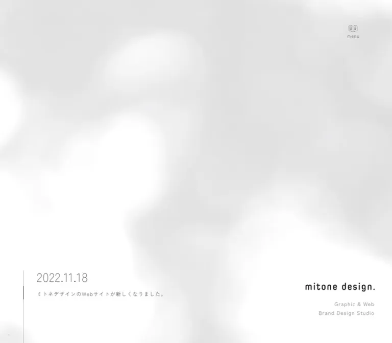
mitone design. presents a branding and design practice through unusually generous space. A nearly white canvas carries broad, blurred gray shadows. Small navigation, a compact lowercase wordmark, and a dated project update occupy the edges of the opening screen. The studio statement appears below that first viewport rather than as an oversized opening headline.
The main content uses light Japanese sans-serif headings, regular gray body text, and deliberate letter spacing. A narrow descriptive column sits beside a much wider vertical project list. Photography supplies the color: dark reflective garden water, pale blue printed material, and a closing landscape of green mountains disappearing into mist. Fine circular links and thin vertical rules provide navigation without introducing a heavy button system.
This is a studio homepage with routes into its work, services, guidance, news, and contact pages. Its strongest reusable qualities are the relationship between whitespace and photography, the asymmetric work section, and the change in identity placement between desktop and mobile.
閉じる
mitone design. — Style Reference
A quiet studio portfolio suspended between diffuse daylight, carefully spaced text, and mist-covered mountains.
Website: www.mitonedesign.jp Original URL: https://www.mitonedesign.jp/ Final URL: https://www.mitonedesign.jp/ Theme: light, with neutral interface colors and color photography Inspected: October 2, 2026, 01:20:55 JST; supplied retrieval timestamp: October 1, 2026, 16:20:55.745 UTC Viewports: desktop 1440 × 1000; mobile 390 × 844 CSS pixels Scope: the current studio homepage, using three desktop captures, two mobile captures, and rendered DOM/computed-style evidence for both viewport sizes. Linked pages, the expanded menu, and hover outcomes were not inspected.
mitone design. presents a branding and design practice through unusually generous space. A nearly white canvas carries broad, blurred gray shadows. Small navigation, a compact lowercase wordmark, and a dated project update occupy the edges of the opening screen. The studio statement appears below that first viewport rather than as an oversized opening headline.
The main content uses light Japanese sans-serif headings, regular gray body text, and deliberate letter spacing. A narrow descriptive column sits beside a much wider vertical project list. Photography supplies the color: dark reflective garden water, pale blue printed material, and a closing landscape of green mountains disappearing into mist. Fine circular links and thin vertical rules provide navigation without introducing a heavy button system.
This is a studio homepage with routes into its work, services, guidance, news, and contact pages. Its strongest reusable qualities are the relationship between whitespace and photography, the asymmetric work section, and the change in identity placement between desktop and mobile.
How to Read This Reference
- Measured values come from the supplied rendered DOM and computed styles. Coordinates are CSS pixels. Tables round fractional measurements where appropriate.
- Calculated values are arithmetic derived from those measurements, such as column gaps and distances between project links.
- Estimated values describe visible screenshot geometry or representative colors without pixel sampling. They are explicitly identified.
- Recommended values and implementation techniques belong to a new adaptation. They are not recovered source code.
- Custom-property names are implementation aliases unless a table explicitly identifies an original source variable.
- DOM presence does not prove visibility. Expanded navigation links and a loading label exist in the evidence but are not visible in the settled opening captures.
- Repeated characters in extracted link text reflect the source's text-layer construction. Use the normal readable label; do not reproduce doubled letters as content.
- Two viewport samples establish real responsive changes, but do not reveal the original breakpoint values or complete fluid-sizing formulas.
Tokens — Colors
Default Palette
| Name | Value | Token | Evidence and role |
|---|---|---|---|
| White canvas | #ffffff |
--color-paper; source --color-white |
Measured body background and original custom property |
| Warm dark heading | #312d2b |
--color-heading; source --color-font |
Measured headings, address, and copyright text |
| Body gray | #555555 |
--color-text |
Measured main text, navigation, and project titles |
| Secondary gray | #8b8b8b |
--color-muted |
Measured descriptor, service descriptions, and footer credit link |
| Haze gray | approximately #e6e6e6 |
--color-haze |
Estimated representative shade within the blurred background; not a uniform measured fill |
| Hairline gray | approximately #bcbcbc |
--color-rule |
Estimated starting point for thin rules; exact stroke colors were not supplied |
| Source accent | #ff4422 |
--color-accent-source; source --color-accent: #f42 |
Declared source token; no prominent use is visible in the supplied current-page captures |
The visible interface is principally white and gray. Do not promote the declared orange-red accent into a primary CTA color without additional evidence. The greens and blue-grays belong to photographs, not a demonstrated category-color system.
The atmosphere depends on a large range of near-white tones rather than one flat gray background. Preserve white openings within the hazy texture so the canvas retains a sense of light.
Theme Presets
Only the light presentation is evidenced. No theme selector, alternate palette, or dark-mode behavior was inspected.
Tokens — Typography
Main Japanese Interface
The computed family on the header, main content, and footer is:
__Zen_Kaku_Gothic_New_dd77e2,
__Zen_Kaku_Gothic_New_Fallback_dd77e2
This identifies Zen Kaku Gothic New through generated family names. The observed hierarchy uses weight 300 for major headings and 400 for body text and ordinary links.
A portable implementation can explicitly load Zen Kaku Gothic New and use 'Zen Kaku Gothic New', sans-serif. That portable stack is a recommendation, not the literal original declaration. Do not copy the generated family names into an unrelated project.
The root and body samples include Times, but the visible site regions explicitly use the Japanese sans-serif family. Those root defaults are not evidence for a serif visual direction.
Wordmark and Date
The wordmark is compact, dark, lowercase, and softly rounded. Its measured home-link box is 190 × 23.89px on desktop and 173.84 × 21.86px on mobile. The measured heading contains no extractable wordmark text, and no asset URL or logo font was supplied. Treat it as a distinct brand graphic; do not identify its typeface by appearance alone.
The date uses visibly narrow, light numerals. Its apparent size is approximately 34px on desktop and 30–32px on mobile, estimated from the captures. The date element's own computed font was not included. Its precise family and weight remain unknown.
Type Scale
Values below are measured unless marked otherwise. The paired values are font size / line height.
| Role | Desktop | Mobile | Weight | Tracking |
|---|---|---|---|---|
| Studio promise | 38 / 59.66px |
32.77 / 51.45px |
300 |
0.2em |
| Section heading | 32 / 52px |
28.77 / 46.75px |
300 |
0.1em |
| Service-link heading | 32 / 50.24px |
28.77 / 45.17px |
300 |
0.1em |
| Studio introduction paragraph | 16 / 42px |
14.69 / 38.57px |
400 |
0.1em |
| Standard descriptive copy | 16 / 32px |
14.69 / 29.38px |
400 |
0.1em |
| Project title | 16 / 28px |
14.69 / 25.71px |
400 |
0.1em |
| News title | 18 / 31.5px |
16.19 / 28.34px |
400 |
0.1em |
| Navigation, small links, footer text | 14 / 24.5px |
13.19 / 23.09px |
400 |
0.1em |
| Opening update description | 14 / 28px |
13.19 / 26.38px |
400 |
0.1em |
| Project categories | 12 / 21px |
11.69 / 20.46px |
400 |
0.1em |
| Menu caption | 12 / 12px |
12 / 12px |
400 |
Computed as normal on button |
| Brand descriptor | 14 / 24.5px |
13.19 / 23.09px |
400 |
0.1em |
The introduction's 2.625 line-height ratio is notably more spacious than the standard body ratio of 2. Keep this distinction: the studio statement reads as a calm manifesto, while project and service information is more compact.
The source HTML root is 10px at both inspected sizes. The Quick Start uses explicit pixel-based tokens so it can coexist with a conventional application root size.
Tokens — Spacing & Shapes
Density: sparse overall, with compact utility text. Geometry: open text blocks, fine circular controls, softly rounded photographs, and thin linear markers. Scaling: component-specific; the evidence does not support a single global multiplier.
Layout Measurements
| Element | Desktop 1440 × 1000 | Mobile 390 × 844 | Basis |
|---|---|---|---|
| Opening section | 1440 × 1000px |
390 × 844px |
Measured; exactly one captured viewport |
| Main content frame | 1000px wide, left 220px |
308.47px wide, left 40.77px |
Measured |
| Opening update | Left 125.33px, top 830px, width 386.48px |
Left 40.77px, top 629.11px, width 308.47px |
Measured link bounds |
| Desktop work overview | 275px paragraph width |
Full content width | Measured |
| Work-image column | 595px wide, left 625px |
308.47px wide, left 40.77px |
Measured link width |
| Desktop work-column gap | 130px |
Columns stack | Calculated: 625 − 220 − 275 |
| Project photograph | Approximately 595 × 357px |
Approximately 308.47 × 185.08px |
Desktop image estimate; mobile height calculated at the same 5:3 ratio |
| Standard work link, including caption | 595 × 409px |
Height varies from 232.81 to 288.41px |
Measured; mobile category wrapping changes height |
| Round-link layout height | 60px |
60px |
Measured anchor height |
| News columns | Two 470px columns, 60px gap |
One 308.47px column |
Measured and calculated |
| Contact link region | 1000 × 600px |
308.47 × 552.5px |
Measured |
| Footer | 1440 × 1000px |
390 × 844px |
Measured |
Spacing Scale
| Use | Desktop | Mobile | Status |
|---|---|---|---|
| Work photograph to title | Approximately 24px |
Approximately 22px |
Derived using the estimated 5:3 image ratio |
| Between work entries | 100px |
Approximately 79.48px |
Calculated from link rectangles |
| Project-category horizontal gap | 12px |
11.69px |
Measured computed gap |
| Introduction paragraph to round link | 70px |
Approximately 52.05px |
Calculated |
| Last mobile work to work-index link | Not applicable to desktop placement | Approximately 59.48px |
Calculated |
| Opening section to introduction | 230px |
Approximately 158.23px |
Calculated section gap |
| Footer navigation-link vertical padding | 14px |
13.19px |
Measured |
| Footer navigation horizontal gap | Approximately 28px |
Vertical stack | Calculated desktop gap |
Large section gaps frequently exceed 150px. Avoid replacing them with a uniform compact spacing scale: the long pauses are part of the reading rhythm.
Border Radius
| Element | Treatment | Evidence |
|---|---|---|
| Work photographs | Approximately 12px radius |
Screenshot estimate; image-element styles were not supplied |
| Round navigation ornament | Approximately 60px diameter, circular |
Screenshot estimate supported by the 60px link height |
| Text links and content sections | No visible enclosing rounded surface | Captures; sampled anchors have zero radius |
| Footer landscape | Full bleed | Captures |
A zero radius on the sampled project anchor does not establish square image corners. The nested photograph visibly has rounded corners.
Components
Opening Viewport
Role: introduces the studio through atmosphere and restrained edge content.
The opening view is predominantly a pale field of diffuse shadows. It contains a book-shaped menu control, a brand signature, and a dated project link. The studio promise is below the fold.
On desktop, the update starts at x = 125.33px, y = 830px. A fine vertical line appears approximately 41px to its left and continues toward the viewport bottom. The date sits above a small tracked description linking to the current project.
On mobile, the update moves to the main 40.77px inset and starts at y = 629.11px. Its description wraps, including a visible split within the English word at the end. The vertical line moves below the text near the same left edge. The date and description remain a single project link.
The near-empty opening is present in the settled captures. It should not be replaced with an invented headline, large CTA, or assumed unfinished loading screen.
Book Menu Trigger
Role: gives access to the site's primary navigation.
The visible control is a small open-book outline with the lowercase caption menu below it. On desktop it sits near the upper-right corner; on mobile it moves to the upper-left corner.
The measured button boxes are much larger than the visible symbol: 250 × 115px on desktop and 121.53 × 72.28px on mobile. Do not use the small icon's visual dimensions as its touch target.
The DOM contains links for 私たちのこと, サービス案内, デザイン事例, 初めての方へ, お知らせ, and お問い合わせ, plus social links. Their presence does not reveal the expanded menu's final composition. Menu activation, dismissal, focus behavior, and background treatment were not exercised.
Brand Signature
Role: maintains identity at the viewport edge and anchors the footer.
The signature contains the lowercase wordmark and a right-aligned two-line descriptor: Graphic & Web and Brand Design Studio. The descriptor is muted gray, with 0.1em tracking and generous space above it.
In the desktop opening capture, the wordmark starts at x = 1186.75px, y = 836.11px. The descriptor region ends at y = 930px, leaving 70px below it. The signature remains in the lower-right area in the scrolled work capture, where it overlaps the photographic column visually.
On mobile, it moves to the upper right: x = 195.78px, y = 36.92px, with approximately 20.38px right clearance. The footer captures place the signature near the top right of the closing composition. The exact mechanism that switches between floating and footer placement was not supplied.
Studio Introduction
Role: states the studio's approach before presenting its work.
The heading 愛着実る、根付くものを。 uses weight 300, a 0.2em letter spacing, and two lines. It is followed by a highly open paragraph and the circular 私たちのこと link.
The desktop paragraph occupies the 1000px frame with a measured 210px height. On mobile the same content uses a 308.47px frame and approximately 346.92px height. The change is primarily wrapping and modest type reduction, not a complete change in typographic hierarchy.
Keep the heading light and the paragraph unboxed. The emotional weight comes from pacing and line spacing.
Work Overview and Number Rail
Role: introduces the portfolio while the adjacent work list supplies visual detail.
Desktop places a narrow summary on the left and the project list on the right. The heading これまでデザインしたもの extends beyond the paragraph's 275px width; it should not be constrained to that narrow text measure.
In the supplied scrolled capture, the overview remains near the top while the fourth and fifth projects are visible. This is consistent with a sticky or pinned overview, but its exact scroll thresholds and implementation are unverified.
A fine vertical rail separates overview and projects. The visible labels are 01 and 05. Do not infer a working carousel or automatically updating active index: no change in the marker was recorded.
On mobile, the overview precedes the projects, the rail is absent from the visible text evidence, and the work-index link follows the fifth item.
Project Entry
Role: links a photographed project to its detail page.
An entry consists of a wide photograph with softly rounded corners and a caption below. The entire sampled entry is an anchor. There is no visible enclosing card background, border, or elevation shadow.
Desktop captions place the project title at the left and small category labels at the right. Titles use 16px / 28px; categories use 12px / 21px. Visible categories include a light hash mark in the capture, such as #写真・動画.
The desktop list contains five entries in this order:
知っちゅう?中芸MAP月海製塩四国銘館 空と海モネの庭 25周年ムービーsoso hair.
Only the fourth and fifth project photographs are visible in the supplied work screenshot. The earlier project names and geometry are supported by the DOM; their artwork should not be invented.
Mobile captions wrap according to their actual content. The first two entries put categories below the title, while shorter title/category combinations remain on one row. Preserve this content-sensitive wrapping rather than forcing every mobile caption into the same height.
Circular Text Link
Role: provides a quiet directional action.
The visible anatomy is a thin circular outline, a small dark center dot, and a tracked text label to its right. The circle is approximately 60px across. In the desktop work capture, its left edge aligns with the overview at x = 220px; the label starts approximately 80px farther right.
Measured ordinary links reserve 80px left padding and 90px right padding, with a 60px height. This produces a broader interaction region than the visible label alone. The control remains transparent and uses no filled pill background.
The source declares a 0.4s eased transition, but the specific hover transformation was not captured. Keep any newly designed hover effect modest and label it as an adaptation.
Service and Guidance Links
Role: directs visitors into practical information.
Three linked groups present サービス案内, 料金表, and ご依頼前に知っていただきたいこと. Each combines a light 32px heading with a muted 16px / 32px explanation on desktop.
On mobile, headings reduce to approximately 28.77px and explanations to 14.69px / 29.38px. The longest heading wraps onto two lines. The source declares width transitions on anchors and transform transitions on heading text.
These groups are evidenced by DOM measurements rather than a dedicated screenshot. Exact decorative details and hover endpoints remain unknown. Some text rectangles overlap in the sample; do not reproduce those overlaps as an intended static composition without verifying the animation state.
News Section
Role: gives the homepage an editorial update layer.
The heading ミトネデザインからのお知らせ precedes two linked articles. Desktop uses two 470px columns with a calculated 60px gap. Mobile stacks the articles at the full content width.
Headlines use a slightly larger and denser text style than project captions: 18px / 31.5px on desktop, approximately 16.19px / 28.34px on mobile. A smaller date/category line follows. The longer headline produces a taller entry; the design does not equalize all text blocks to the shortest item.
A circular すべてのお知らせを見る link follows the articles. Its mobile measured width is approximately 329.61px, wider than the 308.47px content frame but still inside the viewport at this size. For a new implementation, allow the label and trailing space to adapt at narrower widths.
Article image assets and their exact crops were not supplied.
Contact Invitation
Role: ends the main content with a generous inquiry link.
The complete contact region is an anchor to /contact/, combining the two-line heading デザインのご相談はどうぞお気軽に。 with explanatory copy. It is not an embedded form in the supplied homepage evidence.
The desktop region is 600px tall with 180px top and bottom padding. Mobile measures 552.5px tall with approximately 131.54px vertical padding. The heading retains the light section-title style, and the paragraph uses the standard spacious body style.
Preserve the scale of the invitation without turning it into a saturated banner or a large filled button.
Forest Footer
Role: combines navigation, location, identity, and a memorable landscape ending.
The footer occupies one captured viewport at both sizes. Its upper portion is pale and text-led; a misty mountain photograph fills the lower area. The image has enough pale sky and fog to transition gently into the surrounding white.
Desktop navigation runs horizontally from approximately x = 84.33px, with link boxes beginning 126px below the footer top. The address appears at approximately 304.5px, and copyright at 350px. The brand signature sits at the upper right, with Instagram and Twitter bird symbols below it.
Mobile navigation becomes a six-row vertical list at x = 40.77px. The address begins approximately 437.56px below the footer top and wraps to two lines. Copyright begins at approximately 503.5px. The mountain image is concentrated near the bottom of the tall composition.
The visible footer reads © mitone design. by UNIONNET Inc. with the latter phrase underlined. This establishes the displayed credit wording; it does not specify individual production responsibilities or a corporate ownership relationship.
Loading Label
Role: source-supported transient status.
A centered Loading paragraph exists in both DOM samples and declares an animation named figure with a duration of 0.8s. It is not visible in the settled supplied screenshots. Its surrounding illustration, exact sequence, and disappearance trigger cannot be established from the available evidence.
Do not include it as permanent page content or invent an opening animation around the keyframe name alone.
Tokens — Motion & Interaction
The following are measured animation or transition declarations, not recordings of every completed interaction.
| Target | Declared value | What is established |
|---|---|---|
| Opening update description | 2.4s cubic-bezier(0.645, 0.045, 0.355, 1) 2.2s forwards kv-mask |
A delayed opening animation; nominal delay plus duration is 4.6s. Keyframe contents were not supplied. |
| Main text and project masks | Desktop mask-position 1.4s linear; mobile 1.2s linear |
Mask-position transitions exist; exact reveal direction and mask artwork are unknown. |
| Introduction paragraph | Same mask transition with 0.6s delay |
A delayed text reveal is declared. |
| Contact paragraph | Same mask transition with 0.8s delay |
A later reveal is declared. |
| Header | Transform 0.4s; opacity and visibility 0.4s with 0.2s delay |
Header state changes have transition support. |
| Menu button | Min-width and transform 0.4s cubic-bezier(0.645, 0.045, 0.355, 1) |
The trigger has geometric transition support; expanded geometry is unverified. |
| Circular links and service headings | 0.4s cubic-bezier(0.77, 0, 0.175, 1) |
A distinct, strongly eased interaction timing is declared. |
| Social links and brand descriptor | opacity 0.4s |
Opacity transitions are defined; final hover opacity is unknown. |
| News titles | opacity 1s 0.4s |
Delayed opacity changes are defined. |
| Loading label | 0.8s forwards figure |
A finite loading animation is present in the DOM. |
Motion limitations: the soft background could be static imagery, animated media, or another effect; the supplied frames do not establish its implementation or continuous movement. Parallax, smooth-scroll libraries, pointer following, autoplay media, and slider behavior were not verified.
The supplied capture process waited for finite motion and layout stability, temporarily paused perpetual animations during readiness checks, and resumed them afterward. That process does not constitute a frame-by-frame motion inspection. It also does not establish that every delayed interaction state was reached.
For an adaptation, separate slow content reveals from faster control feedback. Keep content readable before animation enhancement is initialized, and disable reveal masking when reduced motion is requested.
Surfaces
| Layer | Appearance | Function |
|---|---|---|
| Base page | Measured white background | Stable foundation beneath decorative imagery |
| Atmospheric field | Very soft gray patches over white | Provides depth without visible panels or strong boundaries |
| Text regions | Transparent, unboxed | Makes spacing and typography carry hierarchy |
| Project media | Full-color landscape photographs, softly rounded corners | Concentrates color and visual detail |
| Link ornament | Transparent circle with fine outline and center dot | Gives actions a recognizable but restrained form |
| Footer | Pale upper field merging visually into forest photography | Creates a location-specific closing scene |
No card-shadow elevation system is visible in the supplied captures. Do not confuse the diffuse page background with a drop shadow applied to individual components.
Imagery
The current screenshots show three distinct image roles.
Atmosphere: the opening and work backgrounds resemble strongly defocused light and shadow. Edges are broad, gray, and low contrast. Their physical source is not identifiable from the captures. Preserve their softness rather than turning them into clearly defined leaf silhouettes or a colorful decorative gradient.
Project documentation: the visible garden image shows lily pads and dark green water, with the project's white identity embedded in the picture. The soso hair. image is a close photograph of hands holding a pale blue business card. Natural texture, restrained color, and real materials make the work feel tangible.
Place: the footer is a wide view of forested mountain slopes under mist. Dense dark trees anchor the bottom while pale fog opens the upper image. This light-to-dark composition is as important as the green hue itself.
Observed Asset References
No image source URLs or filenames were included in the evidence. The following URLs identify project destinations, not downloadable image assets.
| Visual | Observed location | Verified information |
|---|---|---|
| Diffuse grayscale background | Opening and desktop work captures | Appearance only; source format and motion unknown |
| Garden and water-lily photograph | Garden film project | Project association and visible composition |
| Hands holding a blue business card | soso hair. project | Project association and visible composition |
| Misty forest landscape | Homepage footer | Desktop and mobile appearance; original asset and crop rules unknown |
| Wordmark and book symbol | Homepage identity and menu | Visual form; no verified font, icon package, or asset path |
Use authorized project photography and brand artwork when available. A CSS approximation can establish the pale background, but it cannot replace the particular material detail of the portfolio photographs or the footer landscape.
Layout & Responsive Behavior
Desktop Structure
The core content is centered in a measured 1000px frame, leaving 220px on each side at a 1440px viewport. Edge elements use different anchors: the opening update starts at 125.33px, footer navigation at 84.33px, and the wordmark ends approximately 63.25px from the right edge. Do not force all these elements onto one universal gutter.
The work section uses 275px of overview text, 130px of intervening space, and a 595px media column. The vertical portfolio is the primary image sequence; it does not become a multi-column project grid on desktop. News, by contrast, uses two columns.
The floating signature remains visible at the lower right in the supplied work view. The footer changes the overall composition to a horizontal navigation band above a full-width landscape.
Mobile Structure
At 390px, the main frame is 308.47px, leaving approximately 40.77px on each side. This is roughly a 10.45% inset at that viewport, not proof of a source vw formula.
The menu moves left and the signature moves to the top right. The opening section still occupies a full viewport, and the update remains low on the screen. The work section becomes a single column, with its index link moved below the projects. Categories wrap only when necessary. News stacks vertically. Footer navigation becomes a vertical list while the brand stays right aligned.
Type reduction is modest: a 32px desktop section heading becomes 28.77px, not a proportionally scaled 8.67px. The 60px round-link height and 12px menu caption remain unchanged. Preserve this selective resizing.
Measured Page Rhythm
These are document positions from the supplied DOM, rounded to the nearest pixel. They describe the inspected content rather than fixed values to hardcode.
| Region | Desktop top / height | Mobile top / height |
|---|---|---|
| Opening | 0 / 1000px |
0 / 844px |
| Introduction | 1230 / 516px |
1002 / 611px |
| First text-empty section | 1996 / 520px |
1771 / 618px |
| Work section | 2696 / 2577px |
2537 / 2050px |
| Second text-empty section | 5555 / 585px |
4788 / 405px |
| Service and guidance links | 6342 / 493px |
5372 / 565px |
| News | 7075 / 655px |
6116 / 927px |
| Contact invitation | 7989 / 600px |
7206 / 553px |
| Footer | 8589 / 1000px |
7759 / 844px |
Measured total document heights are approximately 9589.27px and 8602.92px. The two text-empty sections may contain non-text visual content; their subject matter was not visible in the supplied screenshots. Do not reconstruct them as empty spacer blocks or invent photographs for them.
Only the two listed viewport sizes were inspected. Tablet layout, landscape-phone behavior, exact breakpoints, zoom behavior, and safe-area handling remain unverified.
Do’s and Don’ts
Do
- Preserve the nearly empty, full-height opening composition.
- Use light Japanese headings with
0.1emtracking and reserve0.2emfor the studio promise. - Keep body text gray and spacious, with a more open line height for the introduction.
- Separate the main content frame from the looser edge alignment of menu, update, and identity.
- Use a single vertical project list with a narrow desktop overview beside it.
- Keep project images large, softly rounded, and free of enclosing card surfaces.
- Let mobile caption layout respond to actual title and category lengths.
- Retain the circle-and-dot vocabulary for quiet text actions.
- Finish with a landscape whose pale fog naturally supports the text above it.
- Treat motion declarations as evidence of timing, without inventing their missing endpoints.
Don’t
- Don't turn the opening into a conventional large-headline sales banner.
- Don't add saturated orange buttons merely because an accent variable exists.
- Don't use bold headings throughout or remove the deliberate letter spacing.
- Don't make every section a bordered, shadowed card.
- Don't turn the desktop portfolio into a thumbnail grid.
- Don't label the
01–05rail as a verified carousel control. - Don't assume background parallax or continuous animation from a still frame.
- Don't reproduce duplicated DOM characters as visible or accessible text.
- Don't identify the logo or date font without direct evidence.
- Don't invent image paths or the content of sections absent from the captures.
Recommended Implementation Additions
These are recommendations for a new implementation, not verified features of the original site.
- Give the book trigger an accessible name, an expanded state, and a relationship to its controlled navigation. Implement keyboard opening and dismissal when the menu is built.
- Keep decorative text copies hidden from assistive technology. Preserve one coherent accessible label for each project and news link.
- Make reveal content visible by default. Apply masks only after enhancement is ready, and remove them for reduced motion or script failure.
- Check muted small text over every photographic or hazy background. Use the darker body token for essential information where needed.
- Constrain mobile news-link padding so longer labels remain usable below the inspected
390pxwidth. - Avoid overlapping interactive regions in the mobile footer. Its measured navigation rows extend across the content width while brand and social elements occupy the upper-right area; their actual stacking and hit behavior were not tested.
- Reserve image dimensions to prevent layout shifts. Load below-fold project photography responsively, and keep decorative background images out of the accessibility tree.
- Preserve a visible focus indicator and meaningful text alternatives for project images. Treat the footer landscape as decorative when its meaning is already conveyed by nearby text.
Agent Prompt Guide
Quick Color Reference
- Canvas: measured
#ffffff. - Main text: measured
#555555. - Headings: measured
#312d2b. - Secondary descriptor: measured
#8b8b8b. - Hazy background: broad near-white and pale-gray variation;
#e6e6e6is an estimated approximation. - Rules: fine neutral gray;
#bcbcbcis a recommended approximation. - Color emphasis: supplied project photography and the forest landscape.
- Source accent:
#ff4422exists, but is not established as a visible primary-action color.
Overall Prompt
“Create a Japanese branding-studio homepage inspired by mitone design. Use a white canvas with very soft gray light-and-shadow texture, light Zen Kaku Gothic New headings, regular gray body text, and generous letter spacing. Begin with a full-height atmospheric view containing a small book-shaped menu, a compact lowercase brand signature, and a dated project update near the bottom. Below it, introduce the studio with widely spaced text. Build a desktop portfolio with a narrow overview on the left and a large single-column photographic list on the right. Use thin circle-and-dot text links, restrained service and news sections, and a tall footer ending in misty forest photography. On mobile, move the menu to the upper left, place the identity at the upper right, stack the projects, and move the portfolio-index link below them. Keep unknown animations and assets explicit rather than inventing source behavior.”
Example Component Prompts
- Opening view: “A nearly white full-screen canvas with diffuse gray shadows, a small open-book menu at the upper right, a dated project update low on the left, and a compact wordmark with two muted descriptor lines low on the right. No oversized opening headline. For mobile, move identity to the top right and menu to the top left.”
- Work section: “Within a 1000px desktop frame, use a 275px descriptive column, 130px gap, and 595px vertical project column. Use approximately 5:3 photographs with subtle rounded corners, a small title below, and right-aligned gray category labels. Leave about 100px between entries. Stack the layout on mobile.”
- Quiet action: “A transparent text link with a thin 60px outlined circle at the left, a tiny center dot, and a tracked 14px label beginning 80px from the link's left edge. No filled pill, drop shadow, or bright action color.”
- News: “Two unboxed editorial links across the desktop frame, each 470px wide with a 60px gap. Use regular 18px titles and smaller date/category metadata. Allow different content heights and stack the items on mobile.”
- Footer: “A full-height pale footer with six quiet navigation links, a small address and copyright line, and a compact brand signature with social icons at the upper right. Let green mountain slopes emerge from white mist toward the bottom. On mobile, arrange navigation vertically and keep the landscape concentrated at the lower edge.”
Quick Start
CSS Custom Properties
This is a usable adaptation of the measured typography and major layout relationships, not recovered source CSS. The 1000px breakpoint is a recommendation. Mobile values reproduce the supplied 390px sample; the original interpolation formulas are unknown.
Load Zen Kaku Gothic New separately if available. Supply authorized images through --light-image and --forest-image; both default to none. The gradient background is an approximation. Supply the wordmark and book icon as actual markup/assets rather than choosing an unverified font or icon package.
Expected work anatomy: .works-layout contains .works-overview, .work-list, and .works-link-mobile. The overview contains its heading, summary, and desktop action. Each .work-card is a link containing .work-media and .work-caption. Hide the unused action variant from both layout and accessibility with display: none.
The floating and footer signature variants use a data-footer-visible='true' hook on .mitone-site to switch visibility. Application logic must set that hook; this is a recommended strategy, not the verified original mechanism. Menu opening and scroll-triggered reveals are intentionally outside this CSS.
:root {
  /* Measured interface colors */
  --color-paper: #ffffff;
  --color-heading: #312d2b;
  --color-text: #555555;
  --color-muted: #8b8b8b;
  --color-accent-source: #ff4422;

  /* Estimated decorative colors */
  --color-haze: #e6e6e6;
  --color-rule: #bcbcbc;

  /* Load the named family separately */
  --font-body: 'Zen Kaku Gothic New', sans-serif;
  --text-body: 16px;
  --text-small: 14px;
  --text-caption: 12px;
  --text-heading: 32px;
  --text-promise: 38px;
  --text-news: 18px;
  --tracking-body: 0.1em;
  --tracking-promise: 0.2em;

  /* Measured dimensions and derived gaps */
  --content-width: 1000px;
  --page-inset: 40px;
  --project-gap: 100px;
  --media-caption-gap: 24px;
  --control-size: 60px;
  --brand-width: 190px;
  --brand-right: 63.25px;

  /* Estimated image corner geometry */
  --radius-media: 12px;

  /* Source-supported timing values */
  --duration-ui: 400ms;
  --duration-reveal: 1400ms;
  --ease-link: cubic-bezier(0.77, 0, 0.175, 1);
  --ease-menu: cubic-bezier(0.645, 0.045, 0.355, 1);

  /* Set these to authorized image URLs */
  --light-image: none;
  --forest-image: none;
}

.mitone-site,
.mitone-site * {
  box-sizing: border-box;
}

.mitone-site {
  position: relative;
  isolation: isolate;
  color: var(--color-text);
  background: var(--color-paper);
  font-family: var(--font-body);
  font-size: var(--text-body);
  font-weight: 400;
  line-height: 2;
  letter-spacing: var(--tracking-body);
}

/* Approximation only: replace with the verified background asset. */
.mitone-site::before {
  content: '';
  position: fixed;
  inset: 0;
  z-index: -1;
  pointer-events: none;
  background-color: var(--color-paper);
  background-image:
    var(--light-image),
    radial-gradient(ellipse at 68% 18%, #e4e4e4 0, transparent 57%),
    radial-gradient(ellipse at 40% 68%, #e9e9e9 0, transparent 44%);
  background-size: cover;
  background-position: center;
}

.mitone-site a {
  color: inherit;
  text-decoration: none;
}

.mitone-site p,
.mitone-site h2,
.mitone-site h3,
.mitone-site figure {
  margin: 0;
}

.frame {
  width: min(
    var(--content-width),
    calc(100% - 2 * var(--page-inset))
  );
  margin-inline: auto;
}

.section-title,
.studio-promise {
  color: var(--color-heading);
  font-weight: 300;
}

.section-title {
  font-size: var(--text-heading);
  line-height: 1.625;
  letter-spacing: 0.1em;
}

.studio-promise {
  font-size: var(--text-promise);
  line-height: 1.57;
  letter-spacing: var(--tracking-promise);
}

.opening {
  position: relative;
  min-height: 100vh;
  min-height: 100svh;
  overflow: hidden;
}

.latest-update {
  position: absolute;
  left: clamp(40px, 8.704vw, 125.33px);
  bottom: 0;
  min-height: 170px;
  max-width: calc(100% - 80px);
}

.latest-update::before {
  content: '';
  position: absolute;
  top: 0;
  left: -41px;
  width: 1px;
  height: 170px;
  background: var(--color-rule);
}

/* Body-family fallback: the original date face is unverified. */
.latest-update time {
  display: block;
  margin-bottom: 10px;
  color: var(--color-heading);
  font-size: 34px;
  font-weight: 300;
  line-height: 1.2;
  letter-spacing: 0;
}

.latest-update p {
  font-size: var(--text-small);
  line-height: 2;
  overflow-wrap: anywhere;
}

/* Visual placement approximation; source button boxes are larger. */
.menu-trigger {
  position: fixed;
  top: 72px;
  right: 103px;
  z-index: 30;
  display: grid;
  justify-items: center;
  align-content: center;
  gap: 5px;
  min-width: 44px;
  min-height: 48px;
  padding: 5px;
  border: 0;
  color: var(--color-text);
  background: transparent;
  font: inherit;
  font-size: 12px;
  line-height: 1;
  cursor: pointer;
}

.menu-trigger svg,
.menu-trigger img {
  display: block;
  width: 22px;
  height: 20px;
}

.brand-signature {
  width: var(--brand-width);
  text-align: right;
}

.brand-signature--floating {
  position: fixed;
  right: var(--brand-right);
  bottom: 70px;
  z-index: 20;
}

.brand-wordmark {
  display: block;
  width: 100%;
  height: auto;
  aspect-ratio: 190 / 23.89;
  object-fit: contain;
}

.brand-descriptor {
  padding-top: 21px;
  color: var(--color-muted);
  font-size: var(--text-small);
  line-height: 1.75;
}

.studio-intro {
  padding-block: 230px 250px;
}

.studio-intro .intro-copy {
  margin-top: 57px;
  line-height: 2.625;
}

.studio-intro .round-link {
  margin-top: 70px;
}

.round-link {
  position: relative;
  display: inline-flex;
  align-items: center;
  min-height: var(--control-size);
  max-width: 100%;
  padding: 8px 90px 8px 80px;
  font-size: var(--text-small);
  line-height: 1.75;
}

.round-link::before,
.round-link::after {
  content: '';
  position: absolute;
  top: 50%;
  border-radius: 50%;
  transform: translateY(-50%);
  pointer-events: none;
}

.round-link::before {
  left: 0;
  width: var(--control-size);
  height: var(--control-size);
  border: 1px solid var(--color-muted);
}

.round-link::after {
  left: 28px;
  width: 4px;
  height: 4px;
  background: var(--color-heading);
}

.works-layout {
  display: grid;
  grid-template-columns: minmax(0, 275fr) minmax(0, 595fr);
  column-gap: 13%;
  align-items: start;
}

/* Recommended approximation of the observed pinned relationship. */
.works-overview {
  position: sticky;
  top: 120px;
}

.works-overview .section-title {
  width: max-content;
  max-width: 1000px;
}

.works-summary {
  margin-top: 80px !important;
}

.works-overview .round-link {
  margin-top: 70px;
}

.work-list {
  display: grid;
  gap: var(--project-gap);
  min-width: 0;
  padding-top: 132px;
}

.work-card {
  display: block;
  min-width: 0;
}

.work-media {
  display: block;
  width: 100%;
  aspect-ratio: 5 / 3;
  object-fit: cover;
  border-radius: var(--radius-media);
}

.work-caption {
  display: flex;
  flex-wrap: wrap;
  justify-content: space-between;
  align-items: baseline;
  gap: 14px 20px;
  margin-top: var(--media-caption-gap);
}

.work-title {
  font-size: var(--text-body);
  line-height: 1.75;
}

.work-categories {
  display: flex;
  flex-wrap: wrap;
  gap: 0 var(--text-caption);
  font-size: var(--text-caption);
  line-height: 1.75;
}

.works-link-mobile {
  display: none;
}

.news-grid {
  display: grid;
  grid-template-columns: repeat(2, minmax(0, 1fr));
  gap: 60px;
  margin-top: 64px;
}

.news-title {
  font-size: var(--text-news);
  line-height: 1.75;
}

.news-meta {
  margin-top: 7px !important;
  font-size: var(--text-small);
  line-height: 1.75;
}

.contact-link {
  display: block;
  margin-top: 260px;
  padding-block: 180px;
}

.contact-link p {
  margin-top: 40px;
}

.site-footer {
  position: relative;
  isolation: isolate;
  min-height: 100vh;
  min-height: 100svh;
  background: var(--color-paper);
}

/* Image sizing and fade are adaptation choices. */
.site-footer::before {
  content: '';
  position: absolute;
  inset: 40% 0 0;
  z-index: -1;
  pointer-events: none;
  background-image: var(--forest-image);
  background-position: center bottom;
  background-size: cover;
  background-repeat: no-repeat;
  -webkit-mask-image: linear-gradient(transparent, #000 25%);
  mask-image: linear-gradient(transparent, #000 25%);
}

.footer-content {
  padding: 126px 84.33px 80px;
  font-size: var(--text-small);
  line-height: 1.75;
}

.footer-nav {
  display: flex;
  flex-wrap: wrap;
  gap: 0 28px;
}

.footer-nav a {
  display: block;
  padding-block: 14px;
}

.footer-address {
  margin-top: 126px !important;
  color: var(--color-heading);
}

.footer-credit {
  margin-top: 21px !important;
  color: var(--color-heading);
}

.footer-credit a {
  color: var(--color-muted);
  text-decoration: underline;
  text-underline-offset: 4px;
}

.brand-signature--footer {
  position: absolute;
  top: 140px;
  right: var(--brand-right);
}

.mitone-site[data-footer-visible='true'] .brand-signature--floating,
.mitone-site[data-footer-visible='true'] .menu-trigger {
  visibility: hidden;
}

/* Recommended focus treatment. */
.mitone-site :focus-visible {
  outline: 2px solid var(--color-heading);
  outline-offset: 5px;
}

/* Recommended breakpoint; exact source breakpoint is unknown. */
@media (max-width: 1000px) {
  .mitone-site {
    --page-inset: clamp(24px, 10.4527vw, 48px);
    --text-body: 14.6923px;
    --text-small: 13.1923px;
    --text-caption: 11.6923px;
    --text-heading: 28.7692px;
    --text-promise: 32.7692px;
    --text-news: 16.1923px;
    --project-gap: 79.48px;
    --media-caption-gap: 22.03px;
    --brand-width: 173.84px;
    --brand-right: 20.38px;
    --duration-reveal: 1200ms;
  }

  .menu-trigger {
    top: 30px;
    right: auto;
    left: 18px;
  }

  .brand-signature--floating {
    top: 36.92px;
    bottom: auto;
  }

  .brand-descriptor {
    padding-top: 19.79px;
  }

  .latest-update {
    left: var(--page-inset);
    bottom: 11.55%;
    width: calc(100% - 2 * var(--page-inset));
    max-width: none;
    min-height: 117.42px;
  }

  .latest-update time {
    font-size: 31px;
  }

  .latest-update::before {
    top: calc(100% + 30px);
    left: 0;
    height: 100px;
  }

  .studio-intro {
    padding-block: 158px;
  }

  .studio-intro .intro-copy {
    margin-top: 49px;
  }

  .studio-intro .round-link {
    margin-top: 52px;
  }

  .works-layout {
    display: block;
  }

  .works-overview {
    position: static;
  }

  .works-overview .section-title {
    width: auto;
    max-width: 100%;
  }

  .works-summary {
    margin-top: 59.5px !important;
  }

  .works-overview .round-link {
    display: none;
  }

  .work-list {
    margin-top: 87.7px;
    padding-top: 0;
  }

  .work-caption {
    gap: 14.69px 12px;
  }

  .works-link-mobile {
    display: inline-flex;
    margin-top: 59.48px;
  }

  /* Reduced trailing padding prevents long-link overflow. */
  .round-link {
    padding-right: 20px;
  }

  .news-grid {
    grid-template-columns: minmax(0, 1fr);
    gap: 59.5px;
    margin-top: 57.5px;
  }

  .contact-link {
    margin-top: 162.6px;
    padding-block: 131.54px;
  }

  .contact-link p {
    margin-top: 78.47px;
  }

  .footer-content {
    padding: 85.8px var(--page-inset) 240px;
  }

  .footer-nav {
    flex-direction: column;
    align-items: flex-start;
    gap: 0;
  }

  .footer-nav a {
    width: max-content;
    max-width: 100%;
    padding-block: 13.1923px;
  }

  .footer-address {
    margin-top: 55.05px !important;
  }

  .footer-credit {
    margin-top: 19.79px !important;
  }

  .brand-signature--footer {
    top: 36.92px;
  }

  .site-footer::before {
    inset-block-start: 76%;
  }
}

/* Optional reveal classes must remain readable without enhancement. */
.reveal {
  opacity: 1;
}

@media (prefers-reduced-motion: reduce) {
  .mitone-site .reveal {
    animation: none !important;
    transition: none !important;
    -webkit-mask-image: none !important;
    mask-image: none !important;
    opacity: 1 !important;
    transform: none !important;
  }
}
The CSS omits unverified interlude imagery, the number-rail behavior, and the original mask artwork. It also uses safer mobile link padding than the measured source. Its date font is deliberately a fallback, so exact numeral shape requires further asset evidence.
Tailwind v4 Token Mapping
Optional aliases for a project already using Tailwind v4. This does not imply that the original website uses Tailwind. Define the custom properties above first.
@theme inline {
  --color-paper: #ffffff;
  --color-heading: #312d2b;
  --color-body-ink: #555555;
  --color-secondary-ink: #8b8b8b;
  --color-haze: #e6e6e6;

  --font-studio: var(--font-body);
  --text-copy: var(--text-body);
  --text-utility: var(--text-small);
  --text-category: var(--text-caption);
  --text-section: var(--text-heading);
  --text-manifesto: var(--text-promise);
  --text-editorial: var(--text-news);

  --spacing-content: var(--content-width);
  --spacing-gutter: var(--page-inset);
  --spacing-work-gap: var(--project-gap);
  --spacing-circle: var(--control-size);
  --radius-photo: var(--radius-media);
}
Sources & Evidence
- Current original homepage: supplied HTTP
200response and unchanged final URL. The page identifies the studio and provides the current homepage content, links, and footer wording. - Capture timestamp:
2026-10-01T16:20:55.745Z, equivalent to October 2, 2026, 01:20:55.745 JST. Desktop viewport:1440 × 1000; mobile viewport:390 × 844CSS pixels. - Visual evidence: desktop opening, scrolled work section, and footer; mobile opening and footer. These support the visible composition, imagery, identity placement, and responsive footer arrangement.
- Rendered evidence: element rectangles, text, anchor destinations, three original color custom properties, computed typography, transitions, and animation declarations at both viewport sizes. Measurements for sections outside the supplied screenshot views are identified as DOM evidence.
- Inspection limits: no additional browsing or file inspection was performed. The expanded menu, hover endpoints, linked pages, image source files, complete animation keyframes, background motion, and exact responsive formulas remain unverified. SharedWorkers and service workers were disabled during the supplied inspection.
This reference describes the current homepage represented by the supplied evidence. Its implementation examples preserve measured relationships while explicitly marking approximations and recommended additions.
# mitone design. — Style Reference

> A quiet studio portfolio suspended between diffuse daylight, carefully spaced text, and mist-covered mountains.

**Website:** [www.mitonedesign.jp](https://www.mitonedesign.jp/)
**Original URL:** https://www.mitonedesign.jp/
**Final URL:** https://www.mitonedesign.jp/
**Theme:** light, with neutral interface colors and color photography
**Inspected:** October 2, 2026, 01:20:55 JST; supplied retrieval timestamp: October 1, 2026, 16:20:55.745 UTC
**Viewports:** desktop 1440 × 1000; mobile 390 × 844 CSS pixels
**Scope:** the current studio homepage, using three desktop captures, two mobile captures, and rendered DOM/computed-style evidence for both viewport sizes. Linked pages, the expanded menu, and hover outcomes were not inspected.

mitone design. presents a branding and design practice through unusually generous space. A nearly white canvas carries broad, blurred gray shadows. Small navigation, a compact lowercase wordmark, and a dated project update occupy the edges of the opening screen. The studio statement appears below that first viewport rather than as an oversized opening headline.

The main content uses light Japanese sans-serif headings, regular gray body text, and deliberate letter spacing. A narrow descriptive column sits beside a much wider vertical project list. Photography supplies the color: dark reflective garden water, pale blue printed material, and a closing landscape of green mountains disappearing into mist. Fine circular links and thin vertical rules provide navigation without introducing a heavy button system.

This is a studio homepage with routes into its work, services, guidance, news, and contact pages. Its strongest reusable qualities are the relationship between whitespace and photography, the asymmetric work section, and the change in identity placement between desktop and mobile.
閉じる
# mitone design. — Style Reference

> A quiet studio portfolio suspended between diffuse daylight, carefully spaced text, and mist-covered mountains.

**Website:** [www.mitonedesign.jp](https://www.mitonedesign.jp/)
**Original URL:** https://www.mitonedesign.jp/
**Final URL:** https://www.mitonedesign.jp/
**Theme:** light, with neutral interface colors and color photography
**Inspected:** October 2, 2026, 01:20:55 JST; supplied retrieval timestamp: October 1, 2026, 16:20:55.745 UTC
**Viewports:** desktop 1440 × 1000; mobile 390 × 844 CSS pixels
**Scope:** the current studio homepage, using three desktop captures, two mobile captures, and rendered DOM/computed-style evidence for both viewport sizes. Linked pages, the expanded menu, and hover outcomes were not inspected.

mitone design. presents a branding and design practice through unusually generous space. A nearly white canvas carries broad, blurred gray shadows. Small navigation, a compact lowercase wordmark, and a dated project update occupy the edges of the opening screen. The studio statement appears below that first viewport rather than as an oversized opening headline.

The main content uses light Japanese sans-serif headings, regular gray body text, and deliberate letter spacing. A narrow descriptive column sits beside a much wider vertical project list. Photography supplies the color: dark reflective garden water, pale blue printed material, and a closing landscape of green mountains disappearing into mist. Fine circular links and thin vertical rules provide navigation without introducing a heavy button system.

This is a studio homepage with routes into its work, services, guidance, news, and contact pages. Its strongest reusable qualities are the relationship between whitespace and photography, the asymmetric work section, and the change in identity placement between desktop and mobile.

## How to Read This Reference

- **Measured** values come from the supplied rendered DOM and computed styles. Coordinates are CSS pixels. Tables round fractional measurements where appropriate.
- **Calculated** values are arithmetic derived from those measurements, such as column gaps and distances between project links.
- **Estimated** values describe visible screenshot geometry or representative colors without pixel sampling. They are explicitly identified.
- **Recommended** values and implementation techniques belong to a new adaptation. They are not recovered source code.
- Custom-property names are implementation aliases unless a table explicitly identifies an original source variable.
- DOM presence does not prove visibility. Expanded navigation links and a loading label exist in the evidence but are not visible in the settled opening captures.
- Repeated characters in extracted link text reflect the source's text-layer construction. Use the normal readable label; do not reproduce doubled letters as content.
- Two viewport samples establish real responsive changes, but do not reveal the original breakpoint values or complete fluid-sizing formulas.

## Tokens — Colors

### Default Palette

| Name | Value | Token | Evidence and role |
| --- | --- | --- | --- |
| White canvas | `#ffffff` | `--color-paper`; source `--color-white` | Measured body background and original custom property |
| Warm dark heading | `#312d2b` | `--color-heading`; source `--color-font` | Measured headings, address, and copyright text |
| Body gray | `#555555` | `--color-text` | Measured main text, navigation, and project titles |
| Secondary gray | `#8b8b8b` | `--color-muted` | Measured descriptor, service descriptions, and footer credit link |
| Haze gray | approximately `#e6e6e6` | `--color-haze` | Estimated representative shade within the blurred background; not a uniform measured fill |
| Hairline gray | approximately `#bcbcbc` | `--color-rule` | Estimated starting point for thin rules; exact stroke colors were not supplied |
| Source accent | `#ff4422` | `--color-accent-source`; source `--color-accent: #f42` | Declared source token; no prominent use is visible in the supplied current-page captures |

The visible interface is principally white and gray. Do not promote the declared orange-red accent into a primary CTA color without additional evidence. The greens and blue-grays belong to photographs, not a demonstrated category-color system.

The atmosphere depends on a large range of near-white tones rather than one flat gray background. Preserve white openings within the hazy texture so the canvas retains a sense of light.

### Theme Presets

Only the light presentation is evidenced. No theme selector, alternate palette, or dark-mode behavior was inspected.

## Tokens — Typography

### Main Japanese Interface

The computed family on the header, main content, and footer is:

```css
__Zen_Kaku_Gothic_New_dd77e2,
__Zen_Kaku_Gothic_New_Fallback_dd77e2
```

This identifies **Zen Kaku Gothic New** through generated family names. The observed hierarchy uses weight `300` for major headings and `400` for body text and ordinary links.

A portable implementation can explicitly load Zen Kaku Gothic New and use `'Zen Kaku Gothic New', sans-serif`. That portable stack is a recommendation, not the literal original declaration. Do not copy the generated family names into an unrelated project.

The root and body samples include `Times`, but the visible site regions explicitly use the Japanese sans-serif family. Those root defaults are not evidence for a serif visual direction.

### Wordmark and Date

The wordmark is compact, dark, lowercase, and softly rounded. Its measured home-link box is `190 × 23.89px` on desktop and `173.84 × 21.86px` on mobile. The measured heading contains no extractable wordmark text, and no asset URL or logo font was supplied. Treat it as a distinct brand graphic; do not identify its typeface by appearance alone.

The date uses visibly narrow, light numerals. Its apparent size is approximately `34px` on desktop and `30–32px` on mobile, estimated from the captures. The date element's own computed font was not included. Its precise family and weight remain unknown.

### Type Scale

Values below are measured unless marked otherwise. The paired values are font size / line height.

| Role | Desktop | Mobile | Weight | Tracking |
| --- | --- | --- | --- | --- |
| Studio promise | `38 / 59.66px` | `32.77 / 51.45px` | `300` | `0.2em` |
| Section heading | `32 / 52px` | `28.77 / 46.75px` | `300` | `0.1em` |
| Service-link heading | `32 / 50.24px` | `28.77 / 45.17px` | `300` | `0.1em` |
| Studio introduction paragraph | `16 / 42px` | `14.69 / 38.57px` | `400` | `0.1em` |
| Standard descriptive copy | `16 / 32px` | `14.69 / 29.38px` | `400` | `0.1em` |
| Project title | `16 / 28px` | `14.69 / 25.71px` | `400` | `0.1em` |
| News title | `18 / 31.5px` | `16.19 / 28.34px` | `400` | `0.1em` |
| Navigation, small links, footer text | `14 / 24.5px` | `13.19 / 23.09px` | `400` | `0.1em` |
| Opening update description | `14 / 28px` | `13.19 / 26.38px` | `400` | `0.1em` |
| Project categories | `12 / 21px` | `11.69 / 20.46px` | `400` | `0.1em` |
| Menu caption | `12 / 12px` | `12 / 12px` | `400` | Computed as normal on button |
| Brand descriptor | `14 / 24.5px` | `13.19 / 23.09px` | `400` | `0.1em` |

The introduction's `2.625` line-height ratio is notably more spacious than the standard body ratio of `2`. Keep this distinction: the studio statement reads as a calm manifesto, while project and service information is more compact.

The source HTML root is `10px` at both inspected sizes. The Quick Start uses explicit pixel-based tokens so it can coexist with a conventional application root size.

## Tokens — Spacing & Shapes

**Density:** sparse overall, with compact utility text.
**Geometry:** open text blocks, fine circular controls, softly rounded photographs, and thin linear markers.
**Scaling:** component-specific; the evidence does not support a single global multiplier.

### Layout Measurements

| Element | Desktop 1440 × 1000 | Mobile 390 × 844 | Basis |
| --- | --- | --- | --- |
| Opening section | `1440 × 1000px` | `390 × 844px` | Measured; exactly one captured viewport |
| Main content frame | `1000px` wide, left `220px` | `308.47px` wide, left `40.77px` | Measured |
| Opening update | Left `125.33px`, top `830px`, width `386.48px` | Left `40.77px`, top `629.11px`, width `308.47px` | Measured link bounds |
| Desktop work overview | `275px` paragraph width | Full content width | Measured |
| Work-image column | `595px` wide, left `625px` | `308.47px` wide, left `40.77px` | Measured link width |
| Desktop work-column gap | `130px` | Columns stack | Calculated: `625 − 220 − 275` |
| Project photograph | Approximately `595 × 357px` | Approximately `308.47 × 185.08px` | Desktop image estimate; mobile height calculated at the same `5:3` ratio |
| Standard work link, including caption | `595 × 409px` | Height varies from `232.81` to `288.41px` | Measured; mobile category wrapping changes height |
| Round-link layout height | `60px` | `60px` | Measured anchor height |
| News columns | Two `470px` columns, `60px` gap | One `308.47px` column | Measured and calculated |
| Contact link region | `1000 × 600px` | `308.47 × 552.5px` | Measured |
| Footer | `1440 × 1000px` | `390 × 844px` | Measured |

### Spacing Scale

| Use | Desktop | Mobile | Status |
| --- | --- | --- | --- |
| Work photograph to title | Approximately `24px` | Approximately `22px` | Derived using the estimated `5:3` image ratio |
| Between work entries | `100px` | Approximately `79.48px` | Calculated from link rectangles |
| Project-category horizontal gap | `12px` | `11.69px` | Measured computed gap |
| Introduction paragraph to round link | `70px` | Approximately `52.05px` | Calculated |
| Last mobile work to work-index link | Not applicable to desktop placement | Approximately `59.48px` | Calculated |
| Opening section to introduction | `230px` | Approximately `158.23px` | Calculated section gap |
| Footer navigation-link vertical padding | `14px` | `13.19px` | Measured |
| Footer navigation horizontal gap | Approximately `28px` | Vertical stack | Calculated desktop gap |

Large section gaps frequently exceed `150px`. Avoid replacing them with a uniform compact spacing scale: the long pauses are part of the reading rhythm.

### Border Radius

| Element | Treatment | Evidence |
| --- | --- | --- |
| Work photographs | Approximately `12px` radius | Screenshot estimate; image-element styles were not supplied |
| Round navigation ornament | Approximately `60px` diameter, circular | Screenshot estimate supported by the `60px` link height |
| Text links and content sections | No visible enclosing rounded surface | Captures; sampled anchors have zero radius |
| Footer landscape | Full bleed | Captures |

A zero radius on the sampled project anchor does not establish square image corners. The nested photograph visibly has rounded corners.

## Components

### Opening Viewport

**Role:** introduces the studio through atmosphere and restrained edge content.

The opening view is predominantly a pale field of diffuse shadows. It contains a book-shaped menu control, a brand signature, and a dated project link. The studio promise is below the fold.

On desktop, the update starts at `x = 125.33px`, `y = 830px`. A fine vertical line appears approximately `41px` to its left and continues toward the viewport bottom. The date sits above a small tracked description linking to the current project.

On mobile, the update moves to the main `40.77px` inset and starts at `y = 629.11px`. Its description wraps, including a visible split within the English word at the end. The vertical line moves below the text near the same left edge. The date and description remain a single project link.

The near-empty opening is present in the settled captures. It should not be replaced with an invented headline, large CTA, or assumed unfinished loading screen.

### Book Menu Trigger

**Role:** gives access to the site's primary navigation.

The visible control is a small open-book outline with the lowercase caption `menu` below it. On desktop it sits near the upper-right corner; on mobile it moves to the upper-left corner.

The measured button boxes are much larger than the visible symbol: `250 × 115px` on desktop and `121.53 × 72.28px` on mobile. Do not use the small icon's visual dimensions as its touch target.

The DOM contains links for `私たちのこと`, `サービス案内`, `デザイン事例`, `初めての方へ`, `お知らせ`, and `お問い合わせ`, plus social links. Their presence does not reveal the expanded menu's final composition. Menu activation, dismissal, focus behavior, and background treatment were not exercised.

### Brand Signature

**Role:** maintains identity at the viewport edge and anchors the footer.

The signature contains the lowercase wordmark and a right-aligned two-line descriptor: `Graphic & Web` and `Brand Design Studio`. The descriptor is muted gray, with `0.1em` tracking and generous space above it.

In the desktop opening capture, the wordmark starts at `x = 1186.75px`, `y = 836.11px`. The descriptor region ends at `y = 930px`, leaving `70px` below it. The signature remains in the lower-right area in the scrolled work capture, where it overlaps the photographic column visually.

On mobile, it moves to the upper right: `x = 195.78px`, `y = 36.92px`, with approximately `20.38px` right clearance. The footer captures place the signature near the top right of the closing composition. The exact mechanism that switches between floating and footer placement was not supplied.

### Studio Introduction

**Role:** states the studio's approach before presenting its work.

The heading `愛着実る、根付くものを。` uses weight `300`, a `0.2em` letter spacing, and two lines. It is followed by a highly open paragraph and the circular `私たちのこと` link.

The desktop paragraph occupies the `1000px` frame with a measured `210px` height. On mobile the same content uses a `308.47px` frame and approximately `346.92px` height. The change is primarily wrapping and modest type reduction, not a complete change in typographic hierarchy.

Keep the heading light and the paragraph unboxed. The emotional weight comes from pacing and line spacing.

### Work Overview and Number Rail

**Role:** introduces the portfolio while the adjacent work list supplies visual detail.

Desktop places a narrow summary on the left and the project list on the right. The heading `これまでデザインしたもの` extends beyond the paragraph's `275px` width; it should not be constrained to that narrow text measure.

In the supplied scrolled capture, the overview remains near the top while the fourth and fifth projects are visible. This is consistent with a sticky or pinned overview, but its exact scroll thresholds and implementation are unverified.

A fine vertical rail separates overview and projects. The visible labels are `01` and `05`. Do not infer a working carousel or automatically updating active index: no change in the marker was recorded.

On mobile, the overview precedes the projects, the rail is absent from the visible text evidence, and the work-index link follows the fifth item.

### Project Entry

**Role:** links a photographed project to its detail page.

An entry consists of a wide photograph with softly rounded corners and a caption below. The entire sampled entry is an anchor. There is no visible enclosing card background, border, or elevation shadow.

Desktop captions place the project title at the left and small category labels at the right. Titles use `16px / 28px`; categories use `12px / 21px`. Visible categories include a light hash mark in the capture, such as `#写真・動画`.

The desktop list contains five entries in this order:

1. `知っちゅう?中芸MAP`
2. `月海製塩`
3. `四国銘館 空と海`
4. `モネの庭 25周年ムービー`
5. `soso hair.`

Only the fourth and fifth project photographs are visible in the supplied work screenshot. The earlier project names and geometry are supported by the DOM; their artwork should not be invented.

Mobile captions wrap according to their actual content. The first two entries put categories below the title, while shorter title/category combinations remain on one row. Preserve this content-sensitive wrapping rather than forcing every mobile caption into the same height.

### Circular Text Link

**Role:** provides a quiet directional action.

The visible anatomy is a thin circular outline, a small dark center dot, and a tracked text label to its right. The circle is approximately `60px` across. In the desktop work capture, its left edge aligns with the overview at `x = 220px`; the label starts approximately `80px` farther right.

Measured ordinary links reserve `80px` left padding and `90px` right padding, with a `60px` height. This produces a broader interaction region than the visible label alone. The control remains transparent and uses no filled pill background.

The source declares a `0.4s` eased transition, but the specific hover transformation was not captured. Keep any newly designed hover effect modest and label it as an adaptation.

### Service and Guidance Links

**Role:** directs visitors into practical information.

Three linked groups present `サービス案内`, `料金表`, and `ご依頼前に知っていただきたいこと`. Each combines a light `32px` heading with a muted `16px / 32px` explanation on desktop.

On mobile, headings reduce to approximately `28.77px` and explanations to `14.69px / 29.38px`. The longest heading wraps onto two lines. The source declares width transitions on anchors and transform transitions on heading text.

These groups are evidenced by DOM measurements rather than a dedicated screenshot. Exact decorative details and hover endpoints remain unknown. Some text rectangles overlap in the sample; do not reproduce those overlaps as an intended static composition without verifying the animation state.

### News Section

**Role:** gives the homepage an editorial update layer.

The heading `ミトネデザインからのお知らせ` precedes two linked articles. Desktop uses two `470px` columns with a calculated `60px` gap. Mobile stacks the articles at the full content width.

Headlines use a slightly larger and denser text style than project captions: `18px / 31.5px` on desktop, approximately `16.19px / 28.34px` on mobile. A smaller date/category line follows. The longer headline produces a taller entry; the design does not equalize all text blocks to the shortest item.

A circular `すべてのお知らせを見る` link follows the articles. Its mobile measured width is approximately `329.61px`, wider than the `308.47px` content frame but still inside the viewport at this size. For a new implementation, allow the label and trailing space to adapt at narrower widths.

Article image assets and their exact crops were not supplied.

### Contact Invitation

**Role:** ends the main content with a generous inquiry link.

The complete contact region is an anchor to `/contact/`, combining the two-line heading `デザインのご相談はどうぞお気軽に。` with explanatory copy. It is not an embedded form in the supplied homepage evidence.

The desktop region is `600px` tall with `180px` top and bottom padding. Mobile measures `552.5px` tall with approximately `131.54px` vertical padding. The heading retains the light section-title style, and the paragraph uses the standard spacious body style.

Preserve the scale of the invitation without turning it into a saturated banner or a large filled button.

### Forest Footer

**Role:** combines navigation, location, identity, and a memorable landscape ending.

The footer occupies one captured viewport at both sizes. Its upper portion is pale and text-led; a misty mountain photograph fills the lower area. The image has enough pale sky and fog to transition gently into the surrounding white.

Desktop navigation runs horizontally from approximately `x = 84.33px`, with link boxes beginning `126px` below the footer top. The address appears at approximately `304.5px`, and copyright at `350px`. The brand signature sits at the upper right, with Instagram and Twitter bird symbols below it.

Mobile navigation becomes a six-row vertical list at `x = 40.77px`. The address begins approximately `437.56px` below the footer top and wraps to two lines. Copyright begins at approximately `503.5px`. The mountain image is concentrated near the bottom of the tall composition.

The visible footer reads `© mitone design. by UNIONNET Inc.` with the latter phrase underlined. This establishes the displayed credit wording; it does not specify individual production responsibilities or a corporate ownership relationship.

### Loading Label

**Role:** source-supported transient status.

A centered `Loading` paragraph exists in both DOM samples and declares an animation named `figure` with a duration of `0.8s`. It is not visible in the settled supplied screenshots. Its surrounding illustration, exact sequence, and disappearance trigger cannot be established from the available evidence.

Do not include it as permanent page content or invent an opening animation around the keyframe name alone.

## Tokens — Motion & Interaction

The following are measured animation or transition declarations, not recordings of every completed interaction.

| Target | Declared value | What is established |
| --- | --- | --- |
| Opening update description | `2.4s cubic-bezier(0.645, 0.045, 0.355, 1) 2.2s forwards kv-mask` | A delayed opening animation; nominal delay plus duration is `4.6s`. Keyframe contents were not supplied. |
| Main text and project masks | Desktop `mask-position 1.4s linear`; mobile `1.2s linear` | Mask-position transitions exist; exact reveal direction and mask artwork are unknown. |
| Introduction paragraph | Same mask transition with `0.6s` delay | A delayed text reveal is declared. |
| Contact paragraph | Same mask transition with `0.8s` delay | A later reveal is declared. |
| Header | Transform `0.4s`; opacity and visibility `0.4s` with `0.2s` delay | Header state changes have transition support. |
| Menu button | Min-width and transform `0.4s cubic-bezier(0.645, 0.045, 0.355, 1)` | The trigger has geometric transition support; expanded geometry is unverified. |
| Circular links and service headings | `0.4s cubic-bezier(0.77, 0, 0.175, 1)` | A distinct, strongly eased interaction timing is declared. |
| Social links and brand descriptor | `opacity 0.4s` | Opacity transitions are defined; final hover opacity is unknown. |
| News titles | `opacity 1s 0.4s` | Delayed opacity changes are defined. |
| Loading label | `0.8s forwards figure` | A finite loading animation is present in the DOM. |

**Motion limitations:** the soft background could be static imagery, animated media, or another effect; the supplied frames do not establish its implementation or continuous movement. Parallax, smooth-scroll libraries, pointer following, autoplay media, and slider behavior were not verified.

The supplied capture process waited for finite motion and layout stability, temporarily paused perpetual animations during readiness checks, and resumed them afterward. That process does not constitute a frame-by-frame motion inspection. It also does not establish that every delayed interaction state was reached.

For an adaptation, separate slow content reveals from faster control feedback. Keep content readable before animation enhancement is initialized, and disable reveal masking when reduced motion is requested.

## Surfaces

| Layer | Appearance | Function |
| --- | --- | --- |
| Base page | Measured white background | Stable foundation beneath decorative imagery |
| Atmospheric field | Very soft gray patches over white | Provides depth without visible panels or strong boundaries |
| Text regions | Transparent, unboxed | Makes spacing and typography carry hierarchy |
| Project media | Full-color landscape photographs, softly rounded corners | Concentrates color and visual detail |
| Link ornament | Transparent circle with fine outline and center dot | Gives actions a recognizable but restrained form |
| Footer | Pale upper field merging visually into forest photography | Creates a location-specific closing scene |

No card-shadow elevation system is visible in the supplied captures. Do not confuse the diffuse page background with a drop shadow applied to individual components.

## Imagery

The current screenshots show three distinct image roles.

**Atmosphere:** the opening and work backgrounds resemble strongly defocused light and shadow. Edges are broad, gray, and low contrast. Their physical source is not identifiable from the captures. Preserve their softness rather than turning them into clearly defined leaf silhouettes or a colorful decorative gradient.

**Project documentation:** the visible garden image shows lily pads and dark green water, with the project's white identity embedded in the picture. The `soso hair.` image is a close photograph of hands holding a pale blue business card. Natural texture, restrained color, and real materials make the work feel tangible.

**Place:** the footer is a wide view of forested mountain slopes under mist. Dense dark trees anchor the bottom while pale fog opens the upper image. This light-to-dark composition is as important as the green hue itself.

### Observed Asset References

No image source URLs or filenames were included in the evidence. The following URLs identify project destinations, not downloadable image assets.

| Visual | Observed location | Verified information |
| --- | --- | --- |
| Diffuse grayscale background | Opening and desktop work captures | Appearance only; source format and motion unknown |
| Garden and water-lily photograph | [Garden film project](https://www.mitonedesign.jp/works/monet25th-movie/) | Project association and visible composition |
| Hands holding a blue business card | [soso hair. project](https://www.mitonedesign.jp/works/soso-hair/) | Project association and visible composition |
| Misty forest landscape | Homepage footer | Desktop and mobile appearance; original asset and crop rules unknown |
| Wordmark and book symbol | Homepage identity and menu | Visual form; no verified font, icon package, or asset path |

Use authorized project photography and brand artwork when available. A CSS approximation can establish the pale background, but it cannot replace the particular material detail of the portfolio photographs or the footer landscape.

## Layout & Responsive Behavior

### Desktop Structure

The core content is centered in a measured `1000px` frame, leaving `220px` on each side at a `1440px` viewport. Edge elements use different anchors: the opening update starts at `125.33px`, footer navigation at `84.33px`, and the wordmark ends approximately `63.25px` from the right edge. Do not force all these elements onto one universal gutter.

The work section uses `275px` of overview text, `130px` of intervening space, and a `595px` media column. The vertical portfolio is the primary image sequence; it does not become a multi-column project grid on desktop. News, by contrast, uses two columns.

The floating signature remains visible at the lower right in the supplied work view. The footer changes the overall composition to a horizontal navigation band above a full-width landscape.

### Mobile Structure

At `390px`, the main frame is `308.47px`, leaving approximately `40.77px` on each side. This is roughly a `10.45%` inset at that viewport, not proof of a source `vw` formula.

The menu moves left and the signature moves to the top right. The opening section still occupies a full viewport, and the update remains low on the screen. The work section becomes a single column, with its index link moved below the projects. Categories wrap only when necessary. News stacks vertically. Footer navigation becomes a vertical list while the brand stays right aligned.

Type reduction is modest: a `32px` desktop section heading becomes `28.77px`, not a proportionally scaled `8.67px`. The `60px` round-link height and `12px` menu caption remain unchanged. Preserve this selective resizing.

### Measured Page Rhythm

These are document positions from the supplied DOM, rounded to the nearest pixel. They describe the inspected content rather than fixed values to hardcode.

| Region | Desktop top / height | Mobile top / height |
| --- | --- | --- |
| Opening | `0 / 1000px` | `0 / 844px` |
| Introduction | `1230 / 516px` | `1002 / 611px` |
| First text-empty section | `1996 / 520px` | `1771 / 618px` |
| Work section | `2696 / 2577px` | `2537 / 2050px` |
| Second text-empty section | `5555 / 585px` | `4788 / 405px` |
| Service and guidance links | `6342 / 493px` | `5372 / 565px` |
| News | `7075 / 655px` | `6116 / 927px` |
| Contact invitation | `7989 / 600px` | `7206 / 553px` |
| Footer | `8589 / 1000px` | `7759 / 844px` |

Measured total document heights are approximately `9589.27px` and `8602.92px`. The two text-empty sections may contain non-text visual content; their subject matter was not visible in the supplied screenshots. Do not reconstruct them as empty spacer blocks or invent photographs for them.

Only the two listed viewport sizes were inspected. Tablet layout, landscape-phone behavior, exact breakpoints, zoom behavior, and safe-area handling remain unverified.

## Do’s and Don’ts

### Do

- Preserve the nearly empty, full-height opening composition.
- Use light Japanese headings with `0.1em` tracking and reserve `0.2em` for the studio promise.
- Keep body text gray and spacious, with a more open line height for the introduction.
- Separate the main content frame from the looser edge alignment of menu, update, and identity.
- Use a single vertical project list with a narrow desktop overview beside it.
- Keep project images large, softly rounded, and free of enclosing card surfaces.
- Let mobile caption layout respond to actual title and category lengths.
- Retain the circle-and-dot vocabulary for quiet text actions.
- Finish with a landscape whose pale fog naturally supports the text above it.
- Treat motion declarations as evidence of timing, without inventing their missing endpoints.

### Don’t

- Don't turn the opening into a conventional large-headline sales banner.
- Don't add saturated orange buttons merely because an accent variable exists.
- Don't use bold headings throughout or remove the deliberate letter spacing.
- Don't make every section a bordered, shadowed card.
- Don't turn the desktop portfolio into a thumbnail grid.
- Don't label the `01`–`05` rail as a verified carousel control.
- Don't assume background parallax or continuous animation from a still frame.
- Don't reproduce duplicated DOM characters as visible or accessible text.
- Don't identify the logo or date font without direct evidence.
- Don't invent image paths or the content of sections absent from the captures.

## Recommended Implementation Additions

These are recommendations for a new implementation, not verified features of the original site.

- Give the book trigger an accessible name, an expanded state, and a relationship to its controlled navigation. Implement keyboard opening and dismissal when the menu is built.
- Keep decorative text copies hidden from assistive technology. Preserve one coherent accessible label for each project and news link.
- Make reveal content visible by default. Apply masks only after enhancement is ready, and remove them for reduced motion or script failure.
- Check muted small text over every photographic or hazy background. Use the darker body token for essential information where needed.
- Constrain mobile news-link padding so longer labels remain usable below the inspected `390px` width.
- Avoid overlapping interactive regions in the mobile footer. Its measured navigation rows extend across the content width while brand and social elements occupy the upper-right area; their actual stacking and hit behavior were not tested.
- Reserve image dimensions to prevent layout shifts. Load below-fold project photography responsively, and keep decorative background images out of the accessibility tree.
- Preserve a visible focus indicator and meaningful text alternatives for project images. Treat the footer landscape as decorative when its meaning is already conveyed by nearby text.

## Agent Prompt Guide

### Quick Color Reference

- Canvas: measured `#ffffff`.
- Main text: measured `#555555`.
- Headings: measured `#312d2b`.
- Secondary descriptor: measured `#8b8b8b`.
- Hazy background: broad near-white and pale-gray variation; `#e6e6e6` is an estimated approximation.
- Rules: fine neutral gray; `#bcbcbc` is a recommended approximation.
- Color emphasis: supplied project photography and the forest landscape.
- Source accent: `#ff4422` exists, but is not established as a visible primary-action color.

### Overall Prompt

“Create a Japanese branding-studio homepage inspired by mitone design. Use a white canvas with very soft gray light-and-shadow texture, light Zen Kaku Gothic New headings, regular gray body text, and generous letter spacing. Begin with a full-height atmospheric view containing a small book-shaped menu, a compact lowercase brand signature, and a dated project update near the bottom. Below it, introduce the studio with widely spaced text. Build a desktop portfolio with a narrow overview on the left and a large single-column photographic list on the right. Use thin circle-and-dot text links, restrained service and news sections, and a tall footer ending in misty forest photography. On mobile, move the menu to the upper left, place the identity at the upper right, stack the projects, and move the portfolio-index link below them. Keep unknown animations and assets explicit rather than inventing source behavior.”

### Example Component Prompts

1. **Opening view:** “A nearly white full-screen canvas with diffuse gray shadows, a small open-book menu at the upper right, a dated project update low on the left, and a compact wordmark with two muted descriptor lines low on the right. No oversized opening headline. For mobile, move identity to the top right and menu to the top left.”
2. **Work section:** “Within a 1000px desktop frame, use a 275px descriptive column, 130px gap, and 595px vertical project column. Use approximately 5:3 photographs with subtle rounded corners, a small title below, and right-aligned gray category labels. Leave about 100px between entries. Stack the layout on mobile.”
3. **Quiet action:** “A transparent text link with a thin 60px outlined circle at the left, a tiny center dot, and a tracked 14px label beginning 80px from the link's left edge. No filled pill, drop shadow, or bright action color.”
4. **News:** “Two unboxed editorial links across the desktop frame, each 470px wide with a 60px gap. Use regular 18px titles and smaller date/category metadata. Allow different content heights and stack the items on mobile.”
5. **Footer:** “A full-height pale footer with six quiet navigation links, a small address and copyright line, and a compact brand signature with social icons at the upper right. Let green mountain slopes emerge from white mist toward the bottom. On mobile, arrange navigation vertically and keep the landscape concentrated at the lower edge.”

## Quick Start

### CSS Custom Properties

This is a usable adaptation of the measured typography and major layout relationships, not recovered source CSS. The `1000px` breakpoint is a recommendation. Mobile values reproduce the supplied `390px` sample; the original interpolation formulas are unknown.

Load Zen Kaku Gothic New separately if available. Supply authorized images through `--light-image` and `--forest-image`; both default to `none`. The gradient background is an approximation. Supply the wordmark and book icon as actual markup/assets rather than choosing an unverified font or icon package.

Expected work anatomy: `.works-layout` contains `.works-overview`, `.work-list`, and `.works-link-mobile`. The overview contains its heading, summary, and desktop action. Each `.work-card` is a link containing `.work-media` and `.work-caption`. Hide the unused action variant from both layout and accessibility with `display: none`.

The floating and footer signature variants use a `data-footer-visible='true'` hook on `.mitone-site` to switch visibility. Application logic must set that hook; this is a recommended strategy, not the verified original mechanism. Menu opening and scroll-triggered reveals are intentionally outside this CSS.

```css
:root {
  /* Measured interface colors */
  --color-paper: #ffffff;
  --color-heading: #312d2b;
  --color-text: #555555;
  --color-muted: #8b8b8b;
  --color-accent-source: #ff4422;

  /* Estimated decorative colors */
  --color-haze: #e6e6e6;
  --color-rule: #bcbcbc;

  /* Load the named family separately */
  --font-body: 'Zen Kaku Gothic New', sans-serif;
  --text-body: 16px;
  --text-small: 14px;
  --text-caption: 12px;
  --text-heading: 32px;
  --text-promise: 38px;
  --text-news: 18px;
  --tracking-body: 0.1em;
  --tracking-promise: 0.2em;

  /* Measured dimensions and derived gaps */
  --content-width: 1000px;
  --page-inset: 40px;
  --project-gap: 100px;
  --media-caption-gap: 24px;
  --control-size: 60px;
  --brand-width: 190px;
  --brand-right: 63.25px;

  /* Estimated image corner geometry */
  --radius-media: 12px;

  /* Source-supported timing values */
  --duration-ui: 400ms;
  --duration-reveal: 1400ms;
  --ease-link: cubic-bezier(0.77, 0, 0.175, 1);
  --ease-menu: cubic-bezier(0.645, 0.045, 0.355, 1);

  /* Set these to authorized image URLs */
  --light-image: none;
  --forest-image: none;
}

.mitone-site,
.mitone-site * {
  box-sizing: border-box;
}

.mitone-site {
  position: relative;
  isolation: isolate;
  color: var(--color-text);
  background: var(--color-paper);
  font-family: var(--font-body);
  font-size: var(--text-body);
  font-weight: 400;
  line-height: 2;
  letter-spacing: var(--tracking-body);
}

/* Approximation only: replace with the verified background asset. */
.mitone-site::before {
  content: '';
  position: fixed;
  inset: 0;
  z-index: -1;
  pointer-events: none;
  background-color: var(--color-paper);
  background-image:
    var(--light-image),
    radial-gradient(ellipse at 68% 18%, #e4e4e4 0, transparent 57%),
    radial-gradient(ellipse at 40% 68%, #e9e9e9 0, transparent 44%);
  background-size: cover;
  background-position: center;
}

.mitone-site a {
  color: inherit;
  text-decoration: none;
}

.mitone-site p,
.mitone-site h2,
.mitone-site h3,
.mitone-site figure {
  margin: 0;
}

.frame {
  width: min(
    var(--content-width),
    calc(100% - 2 * var(--page-inset))
  );
  margin-inline: auto;
}

.section-title,
.studio-promise {
  color: var(--color-heading);
  font-weight: 300;
}

.section-title {
  font-size: var(--text-heading);
  line-height: 1.625;
  letter-spacing: 0.1em;
}

.studio-promise {
  font-size: var(--text-promise);
  line-height: 1.57;
  letter-spacing: var(--tracking-promise);
}

.opening {
  position: relative;
  min-height: 100vh;
  min-height: 100svh;
  overflow: hidden;
}

.latest-update {
  position: absolute;
  left: clamp(40px, 8.704vw, 125.33px);
  bottom: 0;
  min-height: 170px;
  max-width: calc(100% - 80px);
}

.latest-update::before {
  content: '';
  position: absolute;
  top: 0;
  left: -41px;
  width: 1px;
  height: 170px;
  background: var(--color-rule);
}

/* Body-family fallback: the original date face is unverified. */
.latest-update time {
  display: block;
  margin-bottom: 10px;
  color: var(--color-heading);
  font-size: 34px;
  font-weight: 300;
  line-height: 1.2;
  letter-spacing: 0;
}

.latest-update p {
  font-size: var(--text-small);
  line-height: 2;
  overflow-wrap: anywhere;
}

/* Visual placement approximation; source button boxes are larger. */
.menu-trigger {
  position: fixed;
  top: 72px;
  right: 103px;
  z-index: 30;
  display: grid;
  justify-items: center;
  align-content: center;
  gap: 5px;
  min-width: 44px;
  min-height: 48px;
  padding: 5px;
  border: 0;
  color: var(--color-text);
  background: transparent;
  font: inherit;
  font-size: 12px;
  line-height: 1;
  cursor: pointer;
}

.menu-trigger svg,
.menu-trigger img {
  display: block;
  width: 22px;
  height: 20px;
}

.brand-signature {
  width: var(--brand-width);
  text-align: right;
}

.brand-signature--floating {
  position: fixed;
  right: var(--brand-right);
  bottom: 70px;
  z-index: 20;
}

.brand-wordmark {
  display: block;
  width: 100%;
  height: auto;
  aspect-ratio: 190 / 23.89;
  object-fit: contain;
}

.brand-descriptor {
  padding-top: 21px;
  color: var(--color-muted);
  font-size: var(--text-small);
  line-height: 1.75;
}

.studio-intro {
  padding-block: 230px 250px;
}

.studio-intro .intro-copy {
  margin-top: 57px;
  line-height: 2.625;
}

.studio-intro .round-link {
  margin-top: 70px;
}

.round-link {
  position: relative;
  display: inline-flex;
  align-items: center;
  min-height: var(--control-size);
  max-width: 100%;
  padding: 8px 90px 8px 80px;
  font-size: var(--text-small);
  line-height: 1.75;
}

.round-link::before,
.round-link::after {
  content: '';
  position: absolute;
  top: 50%;
  border-radius: 50%;
  transform: translateY(-50%);
  pointer-events: none;
}

.round-link::before {
  left: 0;
  width: var(--control-size);
  height: var(--control-size);
  border: 1px solid var(--color-muted);
}

.round-link::after {
  left: 28px;
  width: 4px;
  height: 4px;
  background: var(--color-heading);
}

.works-layout {
  display: grid;
  grid-template-columns: minmax(0, 275fr) minmax(0, 595fr);
  column-gap: 13%;
  align-items: start;
}

/* Recommended approximation of the observed pinned relationship. */
.works-overview {
  position: sticky;
  top: 120px;
}

.works-overview .section-title {
  width: max-content;
  max-width: 1000px;
}

.works-summary {
  margin-top: 80px !important;
}

.works-overview .round-link {
  margin-top: 70px;
}

.work-list {
  display: grid;
  gap: var(--project-gap);
  min-width: 0;
  padding-top: 132px;
}

.work-card {
  display: block;
  min-width: 0;
}

.work-media {
  display: block;
  width: 100%;
  aspect-ratio: 5 / 3;
  object-fit: cover;
  border-radius: var(--radius-media);
}

.work-caption {
  display: flex;
  flex-wrap: wrap;
  justify-content: space-between;
  align-items: baseline;
  gap: 14px 20px;
  margin-top: var(--media-caption-gap);
}

.work-title {
  font-size: var(--text-body);
  line-height: 1.75;
}

.work-categories {
  display: flex;
  flex-wrap: wrap;
  gap: 0 var(--text-caption);
  font-size: var(--text-caption);
  line-height: 1.75;
}

.works-link-mobile {
  display: none;
}

.news-grid {
  display: grid;
  grid-template-columns: repeat(2, minmax(0, 1fr));
  gap: 60px;
  margin-top: 64px;
}

.news-title {
  font-size: var(--text-news);
  line-height: 1.75;
}

.news-meta {
  margin-top: 7px !important;
  font-size: var(--text-small);
  line-height: 1.75;
}

.contact-link {
  display: block;
  margin-top: 260px;
  padding-block: 180px;
}

.contact-link p {
  margin-top: 40px;
}

.site-footer {
  position: relative;
  isolation: isolate;
  min-height: 100vh;
  min-height: 100svh;
  background: var(--color-paper);
}

/* Image sizing and fade are adaptation choices. */
.site-footer::before {
  content: '';
  position: absolute;
  inset: 40% 0 0;
  z-index: -1;
  pointer-events: none;
  background-image: var(--forest-image);
  background-position: center bottom;
  background-size: cover;
  background-repeat: no-repeat;
  -webkit-mask-image: linear-gradient(transparent, #000 25%);
  mask-image: linear-gradient(transparent, #000 25%);
}

.footer-content {
  padding: 126px 84.33px 80px;
  font-size: var(--text-small);
  line-height: 1.75;
}

.footer-nav {
  display: flex;
  flex-wrap: wrap;
  gap: 0 28px;
}

.footer-nav a {
  display: block;
  padding-block: 14px;
}

.footer-address {
  margin-top: 126px !important;
  color: var(--color-heading);
}

.footer-credit {
  margin-top: 21px !important;
  color: var(--color-heading);
}

.footer-credit a {
  color: var(--color-muted);
  text-decoration: underline;
  text-underline-offset: 4px;
}

.brand-signature--footer {
  position: absolute;
  top: 140px;
  right: var(--brand-right);
}

.mitone-site[data-footer-visible='true'] .brand-signature--floating,
.mitone-site[data-footer-visible='true'] .menu-trigger {
  visibility: hidden;
}

/* Recommended focus treatment. */
.mitone-site :focus-visible {
  outline: 2px solid var(--color-heading);
  outline-offset: 5px;
}

/* Recommended breakpoint; exact source breakpoint is unknown. */
@media (max-width: 1000px) {
  .mitone-site {
    --page-inset: clamp(24px, 10.4527vw, 48px);
    --text-body: 14.6923px;
    --text-small: 13.1923px;
    --text-caption: 11.6923px;
    --text-heading: 28.7692px;
    --text-promise: 32.7692px;
    --text-news: 16.1923px;
    --project-gap: 79.48px;
    --media-caption-gap: 22.03px;
    --brand-width: 173.84px;
    --brand-right: 20.38px;
    --duration-reveal: 1200ms;
  }

  .menu-trigger {
    top: 30px;
    right: auto;
    left: 18px;
  }

  .brand-signature--floating {
    top: 36.92px;
    bottom: auto;
  }

  .brand-descriptor {
    padding-top: 19.79px;
  }

  .latest-update {
    left: var(--page-inset);
    bottom: 11.55%;
    width: calc(100% - 2 * var(--page-inset));
    max-width: none;
    min-height: 117.42px;
  }

  .latest-update time {
    font-size: 31px;
  }

  .latest-update::before {
    top: calc(100% + 30px);
    left: 0;
    height: 100px;
  }

  .studio-intro {
    padding-block: 158px;
  }

  .studio-intro .intro-copy {
    margin-top: 49px;
  }

  .studio-intro .round-link {
    margin-top: 52px;
  }

  .works-layout {
    display: block;
  }

  .works-overview {
    position: static;
  }

  .works-overview .section-title {
    width: auto;
    max-width: 100%;
  }

  .works-summary {
    margin-top: 59.5px !important;
  }

  .works-overview .round-link {
    display: none;
  }

  .work-list {
    margin-top: 87.7px;
    padding-top: 0;
  }

  .work-caption {
    gap: 14.69px 12px;
  }

  .works-link-mobile {
    display: inline-flex;
    margin-top: 59.48px;
  }

  /* Reduced trailing padding prevents long-link overflow. */
  .round-link {
    padding-right: 20px;
  }

  .news-grid {
    grid-template-columns: minmax(0, 1fr);
    gap: 59.5px;
    margin-top: 57.5px;
  }

  .contact-link {
    margin-top: 162.6px;
    padding-block: 131.54px;
  }

  .contact-link p {
    margin-top: 78.47px;
  }

  .footer-content {
    padding: 85.8px var(--page-inset) 240px;
  }

  .footer-nav {
    flex-direction: column;
    align-items: flex-start;
    gap: 0;
  }

  .footer-nav a {
    width: max-content;
    max-width: 100%;
    padding-block: 13.1923px;
  }

  .footer-address {
    margin-top: 55.05px !important;
  }

  .footer-credit {
    margin-top: 19.79px !important;
  }

  .brand-signature--footer {
    top: 36.92px;
  }

  .site-footer::before {
    inset-block-start: 76%;
  }
}

/* Optional reveal classes must remain readable without enhancement. */
.reveal {
  opacity: 1;
}

@media (prefers-reduced-motion: reduce) {
  .mitone-site .reveal {
    animation: none !important;
    transition: none !important;
    -webkit-mask-image: none !important;
    mask-image: none !important;
    opacity: 1 !important;
    transform: none !important;
  }
}
```

The CSS omits unverified interlude imagery, the number-rail behavior, and the original mask artwork. It also uses safer mobile link padding than the measured source. Its date font is deliberately a fallback, so exact numeral shape requires further asset evidence.

### Tailwind v4 Token Mapping

Optional aliases for a project already using Tailwind v4. This does not imply that the original website uses Tailwind. Define the custom properties above first.

```css
@theme inline {
  --color-paper: #ffffff;
  --color-heading: #312d2b;
  --color-body-ink: #555555;
  --color-secondary-ink: #8b8b8b;
  --color-haze: #e6e6e6;

  --font-studio: var(--font-body);
  --text-copy: var(--text-body);
  --text-utility: var(--text-small);
  --text-category: var(--text-caption);
  --text-section: var(--text-heading);
  --text-manifesto: var(--text-promise);
  --text-editorial: var(--text-news);

  --spacing-content: var(--content-width);
  --spacing-gutter: var(--page-inset);
  --spacing-work-gap: var(--project-gap);
  --spacing-circle: var(--control-size);
  --radius-photo: var(--radius-media);
}
```

## Sources & Evidence

- [Current original homepage](https://www.mitonedesign.jp/): supplied HTTP `200` response and unchanged final URL. The page identifies the studio and provides the current homepage content, links, and footer wording.
- **Capture timestamp:** `2026-10-01T16:20:55.745Z`, equivalent to October 2, 2026, 01:20:55.745 JST. Desktop viewport: `1440 × 1000`; mobile viewport: `390 × 844` CSS pixels.
- **Visual evidence:** desktop opening, scrolled work section, and footer; mobile opening and footer. These support the visible composition, imagery, identity placement, and responsive footer arrangement.
- **Rendered evidence:** element rectangles, text, anchor destinations, three original color custom properties, computed typography, transitions, and animation declarations at both viewport sizes. Measurements for sections outside the supplied screenshot views are identified as DOM evidence.
- **Inspection limits:** no additional browsing or file inspection was performed. The expanded menu, hover endpoints, linked pages, image source files, complete animation keyframes, background motion, and exact responsive formulas remain unverified. SharedWorkers and service workers were disabled during the supplied inspection.

This reference describes the current homepage represented by the supplied evidence. Its implementation examples preserve measured relationships while explicitly marking approximations and recommended additions.関連するデザイン
スタイルやページの種類、ジャンルが近いデザインを集めました。