プレビュー準備中デザインリファレンスを見る
DESIGN REFERENCE
tacto Inc.|余白と大型タイポグラフィのコーポレートサイト
温かみのあるグレーに黒い文字と鮮やかな青いリンクを配置。大胆な余白、非対称の整列、大きなニュース本文と連絡先が特徴のデザインファームのサイト。
tacto Inc. — Style Reference
A quiet typographic directory: warm gray, oversized information, electric-blue links, and generous empty space.
Original URL: tacto-inc.com/index.html
Final URL: tacto-inc.com/index.html — unchanged, HTTP 200
Theme: light in the supplied captures; no alternate theme was verified
Inspected: supplied capture set retrieved October 2, 2026, at 01:24 JST / October 1, 2026, at 16:24 UTC (2026-10-01T16:24:12.687Z)
Viewports: 1440 × 1000 desktop and 390 × 844 mobile, in CSS pixels
Scope: the current corporate homepage: opening section, section-navigation links, news archive, contact footer, and the menu content present in the rendered DOM. Visual captures cover the desktop opening, a desktop news position, the desktop footer, the mobile opening, and the mobile footer. No open-menu capture or destination-page inspection was supplied.
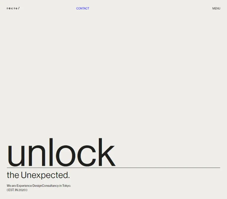
The homepage presents tacto as a design firm through typography and spatial organization. A small wordmark and two utility controls occupy the top edge. Most of the first screen remains empty, while the introductory statement sits near the bottom. Below it, three large section links lead into an unusually substantial news archive. The address, telephone number, social links, and copyright then receive the scale normally reserved for headlines.
The composition relies on a consistent warm-gray canvas, nearly black text, and saturated blue links. Desktop information is pushed toward the right: dates and contact labels occupy a narrow intermediate column, while long text begins around one third of the viewport width. Mobile rearranges these relationships instead of merely shrinking the desktop layout. There are no visible rounded cards, filled CTA buttons, shadows, or decorative photography in the supplied current-page captures.
閉じる
tacto Inc. — Style Reference
A quiet typographic directory: warm gray, oversized information, electric-blue links, and generous empty space.
Original URL: tacto-inc.com/index.html
Final URL: tacto-inc.com/index.html — unchanged, HTTP 200
Theme: light in the supplied captures; no alternate theme was verified
Inspected: supplied capture set retrieved October 2, 2026, at 01:24 JST / October 1, 2026, at 16:24 UTC (2026-10-01T16:24:12.687Z)
Viewports: 1440 × 1000 desktop and 390 × 844 mobile, in CSS pixels
Scope: the current corporate homepage: opening section, section-navigation links, news archive, contact footer, and the menu content present in the rendered DOM. Visual captures cover the desktop opening, a desktop news position, the desktop footer, the mobile opening, and the mobile footer. No open-menu capture or destination-page inspection was supplied.
The homepage presents tacto as a design firm through typography and spatial organization. A small wordmark and two utility controls occupy the top edge. Most of the first screen remains empty, while the introductory statement sits near the bottom. Below it, three large section links lead into an unusually substantial news archive. The address, telephone number, social links, and copyright then receive the scale normally reserved for headlines.
The composition relies on a consistent warm-gray canvas, nearly black text, and saturated blue links. Desktop information is pushed toward the right: dates and contact labels occupy a narrow intermediate column, while long text begins around one third of the viewport width. Mobile rearranges these relationships instead of merely shrinking the desktop layout. There are no visible rounded cards, filled CTA buttons, shadows, or decorative photography in the supplied current-page captures.
How to Read This Reference
- Measured means a value appears in the supplied rendered DOM or computed-style evidence. Values are rounded for readability where appropriate.
- Calculated means a value is derived from supplied element bounds, such as the gap between two recorded elements.
- Estimated means a visual approximation from a current-page screenshot. These values are not recovered CSS declarations.
- Recommended means implementation guidance for a new build. Breakpoints, fallback behavior, accessibility additions, and the Quick Start interpolation are recommendations unless stated otherwise.
- All custom-property names in this document are implementation aliases. The supplied custom-property collections were empty; no original token naming system was established.
- A computed
font-familyidentifies the declared stack. It does not independently prove which font file supplied every rendered glyph. - DOM-present menu content is documented separately from visually verified components. Its presence and bounds do not establish that the menu was open.
Tokens — Colors
Default Palette
| Name | Value | Suggested token | Evidence and role |
|---|---|---|---|
| Warm Gray | #efeeea / rgb(239, 238, 234) |
--color-page |
Measured on the root, main, and footer; the continuous page canvas |
| Soft Black | #1f1f1d / rgb(31, 31, 29) |
--color-ink |
Measured text color; primary typography and recommended rule color |
| Electric Blue | #0000ff / rgb(0, 0, 255) |
--color-link |
Measured on CONTACT, news resource links, map, and footer social links |
| Transparent | rgba(0, 0, 0, 0) |
No separate surface token needed | Measured on the header and many content wrappers; reveals the underlying canvas |
Blue functions as a text-link color rather than a filled-button color. Large footer links give it considerable visual presence without introducing colored panels. The three main section links are dark, so color alone does not identify every navigation target.
Thin rules and the logo appear black or nearly black in the captures. Their precise asset or border colors were not supplied. Reusing --color-ink for rules is a recommendation, not a separate measured declaration.
The empty logo anchor reports a browser-like blue color in computed styles, but the visible wordmark is dark. Do not interpret the anchor's inherited color as evidence of a second visible blue accent.
Theme Behavior
Only the light presentation is evidenced. No theme selector, dark palette, gradient system, or alternate surface treatment was verified. Preserve the relationship between warm gray, dark typography, and blue links when adapting the design.
Tokens — Typography
Latin Display and Utility Text
Measured declared family: neue-haas-grotesk-display, sans-serif.
This stack is recorded on CONTACT, News, footer address text, footer links, and menu text. Most sampled elements in these roles have computed weight 500. The resulting typography is direct and compact: large letters remain plain rather than decorative, while utility text uses the same visual vocabulary at a much smaller scale.
Mixed English and Japanese Text
Measured body stack: neue-haas-grotesk-display, 'Gothic Medium BBB', sans-serif.
The body has a computed weight of 300, a 10px font size, 15px line height, and 0.3px letter spacing. These are inherited defaults, not the visible size of every child. In particular, the large section-link wrappers report the small inherited size; their nested lettering was not separately measured.
The supplied page evidence also contains a font-face declaration naming Gothic Medium BBB. It does not establish the complete font-file inventory, the availability of every weight, or the exact font used for each Japanese glyph.
Root Size and Tracking
The root font size is measured at 10px in both viewports. The root's Times family is overridden by the body and should not be treated as a visible serif design feature.
A 0.3px letter-spacing value appears across the sampled body, utility, heading, and footer elements. Use this subtle spacing as a starting point; the widely spaced wordmark is a separate brand treatment and should use its approved artwork.
Measured Type Scale
Values below are font-size / line-height in CSS pixels.
| Role | Desktop, 1440 × 1000 | Mobile, 390 × 844 | Weight | Notes |
|---|---|---|---|---|
| Body inheritance | 10 / 15 |
10 / 15 |
300 |
Not a recommended general reading size |
| CONTACT | 16.8667 / 19.2912 |
13.52 / 15.6 |
500 |
Compact uppercase utility link |
| News heading | 54.8167 / 54.8167 |
37.44 / 55.1201 |
500 |
Mobile changes both size and leading |
| News resource link | 21.0833 / 14.7583 |
16.64 / 23.92 |
500 |
Desktop inline-flex line box is unusually tight |
| Footer address | 54.8167 / 66.4125 |
24.96 / 37.44 |
500 |
Three desktop lines, five mobile lines |
| Map and footer social links | 54.8167 / 66.4125 |
24.96 / 37.44 |
500 |
Same scale as the address |
| Menu title, DOM only | 210.833 / 199.237 |
79.0401 / 70.7201 |
500 |
Open state not visually verified |
| Menu primary links, DOM only | 54.8167 / 68.5208 |
31.2 / 31.2 |
500 |
Different from the homepage section-link wrappers |
| Menu social links, DOM only | 37.95 / 27.4083 |
26 / 31.2 |
500 |
Recorded line height is not the same as glyph bounds |
The desktop news resource line height is smaller than its font size. This is a measured layout detail, not a broadly reusable text rule. For a new implementation, approximately 1.2–1.4 leading is safer unless exact reproduction requires the original inline alignment.
Screenshot Estimates
| Role | Desktop estimate | Mobile estimate | Limitation |
|---|---|---|---|
| Main opening word | Not visible | Approximately 100–104px |
Mobile reads “unlock”; desktop word size cannot be established |
| Opening subtitle | Approximately 55px |
Approximately 25px |
Text is “the another angle.” |
| English introduction | Approximately 20px |
Approximately 16–17px |
Dedicated text node styles were not supplied |
| Japanese introduction | Approximately 20px |
Approximately 14–15px |
Two lines in the mobile capture |
| News announcement text | Approximately 38px, with 48px leading |
Not visually verified | Desktop estimate from the news capture |
| News date | Approximately 20px |
Not visually verified | Date-specific computed styles were not supplied |
| Footer labels and copyright | Approximately 55px |
Approximately 25px |
Visually consistent with measured footer text |
Do not substitute a heavy geometric headline font or a bold Japanese face throughout. The design depends on restrained weight, large scale, and precise alignment more than on typographic ornament.
Tokens — Spacing & Shapes
Density: sparse at the opening, substantial within long news entries, and oversized but orderly in the footer.
Geometry: flat surfaces, square boundaries, fine straight rules, and simple directional marks.
Source scaling formula: not supplied. Two measured viewport endpoints do not prove a particular fluid formula or breakpoint.
Measured Spacing and Geometry
| Use | Desktop | Mobile | Evidence |
|---|---|---|---|
| Header top and side inset | 42.1667px |
20.8px |
Computed padding |
| Logo anchor bounds | 79.05 × 14.75px |
66.55 × 12.47px |
Rendered bounds |
| Header total height | 61.45px |
36.39px |
Rendered bounds; not a separate solid bar |
| News heading bottom padding | 73.7916px |
52.0001px |
Computed padding |
| Section-index top clearance | 252.98px |
156px |
Calculated from section and first-link bounds |
| Section-index bottom clearance | 252.98px |
156px |
Calculated from last-link and section bounds |
| Mobile index row/column gap | Not a uniform measured gap | Approximately 46.80px |
Calculated from link bounds |
| Footer top padding | 183.425px |
114.4px |
Computed padding |
| Footer right padding | 42.1667px |
20.8px |
Computed padding |
| Footer bottom padding | 137.042px |
36.4px |
Computed padding |
| Footer left padding | 268.812px |
20.8px |
Computed padding |
| Footer label-to-value origin distance | 227.67px |
90.47px |
Calculated from footer padding and address bounds |
| Gap between mobile social links | — | Approximately 6.23px |
Calculated from consecutive link boxes |
| Visible rule thickness | Approximately 1px |
Approximately 1px |
Screenshot estimate |
Alignment Rails
The site does not use one universal centered content container.
| Rail | Desktop x-coordinate | Mobile x-coordinate | Function |
|---|---|---|---|
| Outer inset | 42.16px |
20.80px |
Logo, opening copy, News heading |
| Header CONTACT | 500.03px |
224.08px |
Close to the desktop copy rail; independently positioned on mobile |
| First section-index link | 497.56px |
72.80px |
Beginning of the navigation group |
| News resource links | 497.55px |
73.83px |
Main news content alignment |
| Footer label origin | Approximately 268.81px |
Approximately 20.80px |
A, T, and S column |
| Footer value origin | 496.48px |
111.27px |
Address, telephone, social links, copyright |
Desktop news links and footer values nearly align, but differ by about one pixel in the supplied measurements. Treat them as a shared visual rail rather than claiming identical underlying declarations. Mobile deliberately separates the news-content rail from the footer-value rail.
Border Radius and Elevation
Sampled wrappers have border-radius: 0. No rounded card treatment or shadow elevation is visible. The curved return arrow is an icon shape, not evidence of rounded component containers.
Components
Persistent Header
Role: identity and two high-priority utilities.
The header contains a small tacto/ wordmark link at the left, a blue CONTACT link, and a dark MENU control at the right. The logo points to the homepage; CONTACT points to /contact.html.
At desktop width, CONTACT starts at approximately x=500px, near the main information rail rather than the center of the screen. At mobile width, it moves to x=224px, with MENU remaining near the right inset. The wordmark scales only modestly, from about 79px to 67px wide.
The controls remain at the top edge across the supplied scrolled captures. This supports persistent-header behavior, although the original position declaration was not included. The measured header background is transparent, and the news capture shows header controls sharing space with large article text underneath.
For an adaptation, retain the compact, unboxed appearance while providing sufficient hit areas and preventing focused content from being hidden behind the header. Do not add a tall navigation bar that consumes the opening's empty space.
Full-Height Opening
Role: establish identity through scale, silence, and a short bilingual statement.
The first section measures exactly 1000px high on desktop and 844px on mobile: one viewport in both supplied states. Its content sits toward the bottom, beneath a large empty field.
The visible anatomy is:
- A reserved headline region.
- A fine horizontal rule.
- The subtitle “the another angle.”
- An English description of the firm.
- The corresponding Japanese description.
In the mobile capture, “unlock” occupies the headline region in very large dark text. The rule runs approximately from x=21px to x=369px at y=646px. The subtitle follows directly below; the descriptive copy has a larger separating gap.
In the desktop capture, the large word is absent. A thin vertical stroke appears approximately at x=83px, from y=601px to y=789px, above a horizontal rule at about y=800px. The subtitle and bilingual description remain visible. The evidence does not establish whether this is a motion phase, a responsive difference, or another runtime state.
Preserve the observed uncertainty: do not describe a confirmed typing loop, word rotation, reveal sequence, or cursor animation. The vertical stroke resembles a caret, but its behavior is unverified.
Bilingual Introduction
Role: explain the firm without competing with the opening word.
The English sentence reads “tacto is a design firm that creates experiences with stories.” The Japanese text is “tactoはストーリーのある体験をつくるエクスペリエンスデザインファームです。”
Desktop presents each language as one line. Mobile breaks each into two lines, retaining the English block above the Japanese block. Both align with the outer page inset, not the later news or footer content rails.
Keep these as real text with separate language blocks. Avoid treating the Japanese line as a tiny caption or hiding it behind a language switch; both are visible together in the current captures.
Section Index
Role: direct visitors to the company's identity, services, and work.
Three dark text links follow the opening:
- Who We Are →
/whoweare.html - What We Do →
/whatwedo.html - Our Works, with the observed count
(17)→/our_works.html
The words are arranged as short stacked lines. Their wrapper bounds, rather than their child font declarations, are available in the evidence.
On desktop, all three links occupy one horizontal band. Their left coordinates are approximately 497.56px, 806.92px, and 1144.31px, with a shared top of 1252.98px. Each wrapper is about 160.23px tall.
On mobile, Who We Are and What We Do share the first row at document y=1000px; Our Works begins a second row at y=1136.25px. The first column starts at x=72.80px, and the second at x=219.06px. Wrappers are about 89.45px tall.
These are typographic navigation blocks with generous surrounding space. No card surface, image thumbnail, border box, or hover transformation was established. The work count is content, not a permanent decorative number.
News Heading and Archive
Role: make company activity a substantial part of the homepage.
The News heading returns to the outer left inset. Beneath it is a long chronological list rather than a short teaser grid. The supplied text contains eleven dated entries, spanning August 2022 through May 2026, including two entries marked *new*.
The desktop news section measures approximately 3990.64px high, compared with 4876.84px on mobile. Its length is central to the page's character: this is a company homepage with an extensive information archive, not a compact conversion page.
Do not assume every entry has the same height. Some contain a brief update and one link; others include multiple award categories, project names, and separated text groups.
News Entry
Role: present a date, a substantial announcement, and related links.
The desktop screenshot shows a narrow date column around x=270px and a much wider text column beginning around x=497px. Thin horizontal separators span the viewport, unlike the inset rule in the opening.
Announcements use large mixed English/Japanese text, estimated at approximately 38px with 48px leading. Dates are much smaller, around 20px. Resource links use measured 21.0833px blue text and a small outlined external-link-like marker.
The visible 2025 award entry occupies roughly 275px between separators. Its date and announcement begin near the top of the row, with approximately 40–45px of top clearance. The following 2024 entry is much taller because it contains additional project and award lines.
Treat the date as metadata, the announcement as primary reading content, and the blue links as separate actions. The evidence does not show that an entire news row is clickable.
On mobile, resource links begin at x=73.83px and use 16.64px / 23.92px typography. A mobile news screenshot and date-specific bounds were not supplied, so the exact mobile date/body arrangement and announcement type size remain unverified.
Contact Footer
Role: turn practical contact information into a major typographic section.
The footer continues the same canvas color. It uses single-letter labels A, T, and S for address, telephone, and social information. A definition-list structure is a suitable implementation recommendation.
On desktop, labels begin near x=269px and values near x=496px. On mobile, labels move to the outer inset near x=21px, while values begin around x=111px. This maintains a clear two-column relationship even at phone width.
The measured address text is 54.8167px / 66.4125px on desktop and 24.96px / 37.44px on mobile. Desktop address lines are:
- 8F Noda-Building 2-12-1
- Kami-Osaki Shinagawa-ku Tokyo
- 141-0021 Japan
Mobile presents five lines, separating the building, street number, neighborhood, city district, and postal/country line. This is an observed wrapping outcome; the evidence does not establish which breaks are manual.
A blue Google map link follows the address. The telephone number is dark. No telephone anchor appears in the supplied link inventory, so click-to-call behavior should not be claimed as an existing feature.
Footer Social Links
Role: provide a large, readable directory of external channels.
Every visible footer destination is introduced by a blue down-right arrow-like mark. The destinations are X, Instagram, Facebook, note, Podcast 体験採集, and Podcast アメリカのデザイン.
Desktop groups X and Instagram on one line, Facebook and note on the next, and each podcast on its own subsequent line. The measured horizontal gap between the paired links is about 65.34px.
Mobile makes the social list a single vertical sequence. Consecutive one-line links have 37.44px line boxes separated by approximately 6.23px. Each podcast occupies two lines, with its Japanese name below “Podcast”; the continuation aligns with the link text rather than the arrow.
The copyright, “©2026 tacto Inc.”, aligns with the value column. It remains large rather than becoming fine print.
Return Arrow
Role: visually indicate a return toward the page top.
A thin curved upward arrow appears near the lower-right corner of the desktop news capture and near the upper-right area of the mobile footer capture. The rendered DOM includes an empty-text anchor targeting /index.html#.
The recorded anchor bounds are approximately 66.39 × 77.98px on desktop and 44.70 × 51.98px on mobile. Its precise positioning logic, accessible name, click handler, and scrolling behavior were not supplied. Do not infer smooth scrolling or a particular visibility threshold.
The mobile footer capture places this mark close to MENU. A new implementation should preserve the light stroke and compact footprint while ensuring the two controls do not overlap.
Menu Content — DOM Evidence Only
Role: provide a broader navigation directory.
The DOM contains a Menu heading; links for Top, Who We Are, What We Do, Our Works, News, Contact, and Recruit; and the same six social destinations as the footer.
Desktop measurements place the Menu heading near x=42px, with primary links beginning near x=833px. The title is very large at 210.833px. Mobile places the title and links at the outer inset near x=21px, using a 79.04px title and 31.2px primary links.
These bounds suggest a spacious two-part desktop layout and a single-column mobile layout. However, no open-menu screenshot or opening interaction was provided. Its visible background, entry animation, closing behavior, scroll locking, and focus handling remain unverified. The Top link uses a JavaScript placeholder URL in the evidence; its handler was not inspected.
Tokens — Motion & Interaction
Evidence and Limits
| Feature | Available evidence | What remains unverified |
|---|---|---|
| Opening headline | Mobile shows “unlock”; desktop shows a thin vertical stroke and no large word | Sequence, trigger, timing, easing, repetition, and whether the difference is animated |
| Persistent header | Controls appear at the same top-edge positions across supplied scroll captures | Exact positioning declaration and any visibility logic |
| Standard navigation | Destination URLs are present for CONTACT and section links | Hover appearance, click transitions, and destination-page behavior |
| News resource links | Blue text and destination URLs are supplied | Hover, visited, focus, and new-tab behavior |
| Return arrow | Visible curved mark and a homepage hash anchor | Smooth scrolling, animation, threshold, and exact positioning logic |
| Menu | Menu text, link URLs, and computed bounds are present | Open/close interaction, overlay appearance, keyboard behavior, and animation |
| Sampled CSS animation | Listed elements report animation: none |
Unsampled descendants, pseudo-elements, and JavaScript-driven effects |
| Sampled transition field | Evidence records transition: all |
Duration and easing; this alone does not establish a visible transition |
The capture process waited for load, layout/text stability, finite animations, and image decoding within stated time limits. It temporarily paused perpetual animations during readiness checks and then resumed them. Those checks do not prove that every delayed state or interaction was captured.
Recommended Motion Direction
For a new implementation, begin with stable readable content and ordinary navigation. Any added headline reveal should keep the final message available without motion and should be explicitly treated as a new design choice. Avoid inventing an elaborate animation system from the single vertical stroke.
No source duration or easing token can be responsibly recovered from the supplied evidence.
Surfaces
| Layer | Appearance | Structural purpose |
|---|---|---|
| Page canvas | Solid warm gray #efeeea |
Unifies opening, navigation, news, and footer |
| Header | Transparent, compact text and logo | Persistent utilities without a large enclosing bar |
| Opening | Same canvas, large empty field, inset fine rule | Establishes pacing and typographic hierarchy |
| Section index | Unboxed dark text links | Navigation through scale and grouping |
| News | Same canvas, full-width separators | Organizes variable-length chronological entries |
| Footer | Same canvas, oversized label/value typography | Makes contact information a primary visual section |
| Menu | DOM text and geometry available | Visible surface treatment not established |
There is no evidenced card-elevation system. Separation comes from whitespace, alignment, rules, size changes, and blue text.
Imagery
No photography, project imagery, or illustration is visible in the supplied current-page screenshots. The visible graphic elements are the wordmark, the opening stroke and rule, small news-link markers, directional footer arrows, and the curved return arrow.
This absence is important to the observed composition. Do not fill the opening's empty space with a stock image, a device mockup, a decorative 3D object, or a background video. Other pages and any unrecorded assets remain outside the inspected scope.
Observed Asset References
No reliable asset filenames or image-source URLs were supplied. The references below identify visible elements without inventing paths or formats.
| Element | Observed use | Asset knowledge |
|---|---|---|
tacto/ wordmark |
Small home link in the header | Visible dimensions measured; source file and format unknown |
| “unlock” | Large mobile opening word | Present in rendered text; no image asset required for the word itself |
| Opening vertical stroke | Desktop headline region | Rendering mechanism unknown |
| News link marker | Small blue outlined mark before resource labels | Original icon path and format unknown |
| Down-right arrow marks | Map and footer social links | Visible form known; original implementation unknown |
| Curved upward arrow | Return control | Anchor dimensions known; original artwork source unknown |
Use approved brand artwork when available. A text fallback can support development, but increasing ordinary letter spacing does not reproduce the wordmark exactly. Unicode arrows in the Quick Start are practical approximations, not recovered original assets.
Layout & Responsive Behavior
Document Structure
| Region | Desktop top / height | Mobile top / height |
|---|---|---|
| Opening | 0 / 1000px |
0 / 844px |
| Section index | 1000 / 666.20px |
844 / 537.70px |
| News | 1666.20 / 3990.64px |
1381.70 / 4876.84px |
| Footer | 5656.84 / 1147.67px |
6258.55 / 867.22px |
| Whole document | Approximately 6804.52px |
Approximately 7125.77px |
These are captured content-dependent dimensions, not section heights to hardcode. The news archive grows substantially on mobile because of wrapping, while the footer becomes shorter overall as its typography and padding decrease.
Desktop Composition
The opening spans the viewport and places copy near its bottom edge. Subsequent content uses asymmetry: a substantial empty left area precedes the section index, news text, and footer values. The News heading remains at the outer left edge, giving it a different alignment role from the entries below.
The footer label rail and news date rail occupy roughly the first fifth of the viewport. Main information begins around 34.5% of the viewport width. These are descriptive proportions calculated from this capture, not confirmed source formulas.
Mobile Composition
Mobile uses approximately 20.8px outer insets, or 5.33% of the captured width. It retains large typography but changes the layout in several distinct ways:
- Header utilities regroup toward the right while the logo stays left.
- “unlock” is visible above the opening rule.
- English and Japanese introductory text each wrap into two lines.
- The section index changes from three links in one row to two links above one.
- News resource links begin around
74pxfrom the left. - Footer values begin around
111px, retaining room for A, T, and S labels. - Social links become one per line, and podcast names occupy separate continuation lines.
Do not reuse the desktop footer's large left offset on a phone. Likewise, do not force mobile news and footer content onto the same rail; the evidence shows different offsets.
Unverified Ranges
No tablet, intermediate desktop, landscape-phone, browser-zoom, or alternate text-size capture was provided. Exact media-query breakpoints and interpolation formulas are unknown. Any breakpoint used below is a practical recommendation rather than a recovered source rule.
Do’s and Don’ts
Do
- Keep the measured warm-gray, soft-black, and electric-blue palette.
- Let empty space carry the opening rather than filling it with decoration.
- Preserve the contrast between small header controls and large information text.
- Align desktop news text and footer values to nearly the same right-shifted rail.
- Retain distinct mobile rails for the section index, news links, and footer values.
- Present the news archive as variable-height editorial rows separated by fine rules.
- Keep dates smaller than announcements and resource links visibly blue.
- Preserve the footer's A/T/S label structure and oversized contact information.
- Group desktop social links deliberately, then stack them on mobile.
- Use the observed font stacks when licensed and available, with sensible sans-serif fallbacks.
- Treat the headline-state difference and menu appearance as unresolved evidence boundaries.
Don't
- Don't turn the homepage into a generic sequence of feature cards and filled conversion buttons.
- Don't replace the warm gray with pure white without understanding the tonal change.
- Don't introduce shadows, rounded containers, gradients, or decorative color categories.
- Don't center every section within one narrow container.
- Don't shrink the footer into conventional small-print contact details.
- Don't claim a typing animation or rotating headline from the supplied stills.
- Don't use the desktop's missing headline as a reason to remove the visible mobile word.
- Don't apply the body wrapper's
10pxfont size to actual reading content. - Don't assume a menu is visible merely because its text appears in the DOM.
- Don't invent icon asset paths, project imagery, production credits, or interaction timings.
- Don't hardcode the current work count or copyright year as timeless design tokens.
Recommended Implementation Additions
These are additions for a new implementation, not verified original features:
- Give the logo link and return arrow explicit accessible names. Hide purely decorative arrow marks from assistive technology where markup permits.
- Implement MENU as a real button with
aria-expandedand a controlled navigation region. Support Escape, appropriate focus restoration, and a clearly defined closed state. - Expand compact header hit areas without visually enlarging the text.
- Provide visible keyboard focus and a non-color-only interaction cue, such as an underline on hover and focus.
- Reserve sufficient clearance around the persistent header and return control. The supplied scrolled captures show potential visual crowding.
- Keep opening text available if animation fails or reduced motion is requested. A stable headline is a suitable fallback.
- Use
<time>elements for dates and semantic headings and lists for news content. - Consider a
tel:link for the telephone number. This would be an enhancement beyond the supplied link inventory. - Mark English and Japanese text blocks with appropriate language attributes.
- Test the mobile address, long podcast name, and menu at increased text sizes. Allow wrapping instead of clipping or hiding horizontal overflow.
- Confirm that long menu content remains scrollable on short screens; some desktop menu bounds extend beyond the captured viewport.
Agent Prompt Guide
Quick Color Reference
- Canvas and visible content surfaces:
#efeeea. - Primary text:
#1f1f1d. - CONTACT, resource links, map, and footer social links:
#0000ff. - Rules: thin near-black lines;
1px solid #1f1f1dis a recommended approximation. - No evidenced filled CTA color, card background hierarchy, or shadow system.
Overall Prompt
“Create a typography-led corporate homepage for a design firm, using the current tacto homepage as a spatial reference. Use warm gray #efeeea, nearly black #1f1f1d, and electric-blue #0000ff text links. Place a small wordmark at the upper left, CONTACT near the desktop information rail, and MENU at the upper right. Make the opening one viewport tall with extensive empty space and a bottom-aligned ruled statement plus English and Japanese descriptions. Follow it with three stacked-word navigation links, a long chronological news archive with small dates and large announcement text, and an oversized A/T/S contact footer. Use asymmetric desktop columns, fine rules, restrained sans-serif weights, and no cards or shadows. On mobile, use about 21px outer insets, a two-plus-one section index, and vertically stacked social links. Do not invent an opening animation or an unverified menu transition.”
Example Component Prompts
- Opening: “Build a full-height warm-gray opening with compact header utilities and bottom-aligned typography. The observed mobile state has a roughly 104px ‘unlock’, a fine rule, a roughly 25px subtitle, and two short bilingual text blocks. Preserve the desktop headline region as a separately configurable state; its large word was not visible in the supplied capture.”
- News entry: “Create a flat editorial row with a full-width 1px separator. On a 1440px desktop, place the date near x=270px and the announcement near x=498px. Use approximately 38px announcement text with 48px leading and smaller blue resource links. Allow entries to grow according to their content.”
- Contact footer: “Create a large definition-list-like footer on the same warm-gray canvas. Use A, T, and S labels in a narrow left column and 55px contact text in the right column. Blue map and social links have light down-right arrow marks. On a 390px phone, reduce contact text to about 25px, place labels near x=21px and values near x=111px, and stack every social destination.”
- Section index: “Arrange Who We Are, What We Do, and Our Works as unboxed dark typographic links with stacked words. Leave broad empty space around the group. Use one desktop row and a two-column mobile arrangement with the third item below the first. Keep the work count data-driven.”
- Menu implementation: “Use the supplied menu hierarchy and measured type sizes as content and scale references. Create an accessible toggleable navigation region with a large Menu title, primary links, and a separate social group. Treat background, transition, focus handling, and scroll behavior as explicit implementation decisions because the open state was not visually verified.”
Quick Start
CSS Custom Properties
This is an implementation adaptation, not extracted source CSS. It keeps a conventional root size and uses explicit pixel tokens for measured endpoint typography. The 767px breakpoint and fluid gutter/rail calculations are recommendations.
The example renders the observed mobile word “unlock” as a stable headline if that text is placed in .hero-word. Its suggested desktop headline size is not a measured current desktop value. This provides a readable fallback without pretending to reproduce an unknown animation.
Expected component structure:
.site-header: brand link, CONTACT link, and MENU button..hero:.hero-word,.hero-subtitle, and.hero-copycontaining separate English and Japanese paragraphs..section-index:.section-index__linkscontaining three anchors with deliberate line breaks..news-list:.news-rowelements containing.news-dateand.news-body..contact-footer:.contact-rowelements containing a label and value;.social-linkscontains explicit desktop.social-rowgroups..external-link: an arrow followed by a text span. For podcasts, place the program name in.podcast-nameinside that text span.
:root {
  /* Measured palette; descriptive aliases, not original variables. */
  --color-page: #efeeea;
  --color-ink: #1f1f1d;
  --color-link: #0000ff;

  /* Declared source families; supply licensed fonts separately. */
  --font-latin: 'neue-haas-grotesk-display', sans-serif;
  --font-mixed: 'neue-haas-grotesk-display',
    'Gothic Medium BBB', sans-serif;
  --weight-body: 300;
  --weight-display: 500;
  --tracking: 0.3px;

  /* Recommended interpolation through the desktop alignment rails. */
  --gutter: clamp(24px, 2.92824vw, 56px);
  --meta-x: 18.6675vw;
  --copy-x: 34.5519vw;
  --footer-copy-x: 34.4781vw;
  --header-contact-x: 34.7244vw;

  /* Measured desktop sizes unless marked as an estimate. */
  --size-utility: 16.8667px;
  --size-section: 54.8167px;
  --size-resource: 21.0833px;
  --size-contact: 54.8167px;
  --leading-contact: 66.4125px;
  --size-news: 38px; /* Screenshot estimate. */
  --leading-news: 48px; /* Screenshot estimate. */
  --size-intro: 20px; /* Screenshot estimate. */
  --size-hero: clamp(104px, 13vw, 190px); /* Adaptation. */

  --rule-width: 1px; /* Screenshot approximation. */
  --index-clearance: 252.98px;
  --footer-top: 183.425px;
  --footer-bottom: 137.042px;
}

* {
  box-sizing: border-box;
}

body {
  margin: 0;
  color: var(--color-ink);
  background: var(--color-page);
  font-family: var(--font-mixed);
  font-weight: var(--weight-body);
  letter-spacing: var(--tracking);
}

a {
  color: var(--color-link);
  text-decoration: none;
}

button {
  font: inherit;
  letter-spacing: inherit;
}

/* Recommended focus behavior; not an observed source state. */
:where(a, button):focus-visible {
  outline: 2px solid var(--color-link);
  outline-offset: 5px;
}

:where(section, footer, [id]) {
  scroll-margin-top: 100px;
}

.site-header {
  position: fixed;
  inset: 0 0 auto;
  z-index: 20;
  display: grid;
  grid-template-columns:
    calc(var(--header-contact-x) - var(--gutter)) 1fr auto;
  align-items: start;
  padding: var(--gutter) var(--gutter) 0;
  background: transparent;
  font-family: var(--font-latin);
  font-size: var(--size-utility);
  font-weight: var(--weight-display);
  line-height: 19.2912px;
  pointer-events: none;
}

.site-header > * {
  pointer-events: auto;
}

.site-brand {
  display: block;
  width: 79.05px;
  color: var(--color-ink);
}

.site-brand img,
.site-brand svg {
  display: block;
  width: 100%;
  height: auto;
}

.menu-trigger {
  justify-self: end;
  margin: 0;
  padding: 0;
  border: 0;
  color: var(--color-ink);
  background: none;
  cursor: pointer;
}

.hero {
  min-height: 100vh;
  min-height: 100svh;
  display: flex;
  flex-direction: column;
  justify-content: flex-end;
  padding: var(--gutter);
}

.hero-word {
  margin: 0;
  padding-bottom: 5px;
  border-bottom: var(--rule-width) solid var(--color-ink);
  font-family: var(--font-latin);
  font-size: var(--size-hero);
  font-weight: var(--weight-display);
  line-height: 0.95;
}

.hero-subtitle {
  margin: 12px 0 0;
  font-family: var(--font-latin);
  font-size: var(--size-section);
  font-weight: var(--weight-display);
  line-height: 1.1;
}

.hero-copy {
  margin-top: 26px;
  font-size: var(--size-intro);
  line-height: 1.6;
}

.hero-copy p {
  margin: 0;
}

.section-index {
  padding-block: var(--index-clearance);
}

.section-index__links {
  display: flex;
  justify-content: space-between;
  align-items: flex-start;
  margin-left: var(--copy-x);
  margin-right: calc(2 * var(--gutter));
  gap: 32px;
}

.section-index__links a {
  color: var(--color-ink);
  font-family: var(--font-latin);
  font-size: 54px; /* Approximation; child styles were not supplied. */
  font-weight: var(--weight-display);
  line-height: 0.99;
}

.work-count {
  font-size: 0.4em;
  vertical-align: top;
}

.news-title {
  margin: 0;
  padding: 0 var(--gutter) 73.7916px;
  font-family: var(--font-latin);
  font-size: var(--size-section);
  font-weight: var(--weight-display);
  line-height: 1;
}

.news-list {
  margin: 0;
  padding: 0;
  list-style: none;
}

.news-row {
  display: grid;
  grid-template-columns:
    calc(var(--copy-x) - var(--meta-x)) minmax(0, 1fr);
  padding: var(--gutter) var(--gutter)
    var(--gutter) var(--meta-x);
  border-top: var(--rule-width) solid var(--color-ink);
}

.news-date {
  font-family: var(--font-latin);
  font-size: 20px; /* Desktop screenshot estimate. */
  font-weight: var(--weight-display);
  line-height: 1.3;
}

.news-body {
  min-width: 0;
  font-size: var(--size-news);
  line-height: var(--leading-news);
  overflow-wrap: anywhere;
}

.news-body p {
  margin: 0;
}

.news-body p + p {
  margin-top: 1.25em;
}

.news-resource {
  display: inline-flex;
  align-items: baseline;
  gap: 0.25em;
  margin-top: 24px;
  font-family: var(--font-latin);
  font-size: var(--size-resource);
  font-weight: var(--weight-display);
  line-height: 1.3; /* Recommended readable adaptation. */
}

/* Approximation of the small outlined marker, not original artwork. */
.news-resource::before {
  content: '⧉';
  font-size: 0.7em;
}

.contact-footer {
  position: relative;
  padding: var(--footer-top) var(--gutter)
    var(--footer-bottom) var(--meta-x);
  background: var(--color-page);
  font-family: var(--font-latin);
  font-size: var(--size-contact);
  font-weight: var(--weight-display);
  line-height: var(--leading-contact);
}

.contact-row {
  display: grid;
  grid-template-columns:
    calc(var(--footer-copy-x) - var(--meta-x)) minmax(0, 1fr);
}

.contact-label,
.contact-value,
.contact-value p {
  margin: 0;
}

.contact-value {
  min-width: 0;
}

.contact-row--address {
  margin-bottom: 70px; /* Approximate separation from telephone. */
}

.map-link {
  margin-top: 23px;
}

.external-link {
  display: inline-flex;
  align-items: flex-start;
  max-width: 100%;
  gap: 0.15em;
}

.external-link > span {
  min-width: 0;
  overflow-wrap: anywhere;
}

/* Use approved arrow artwork for closer visual reproduction. */
.external-link::before {
  content: '↘';
  flex: none;
}

.social-links {
  display: flex;
  flex-direction: column;
}

.social-row {
  display: flex;
  flex-wrap: wrap;
  column-gap: 65.34px;
}

.social-row--podcast {
  margin-top: 5.27px;
}

.podcast-name {
  display: inline;
}

.copyright {
  margin: 66px 0 0;
  padding-left: calc(var(--footer-copy-x) - var(--meta-x));
}

/* Supply the curved arrow asset and accessible name in markup. */
.back-to-top {
  position: absolute;
  top: 69.5px;
  right: var(--gutter);
  display: grid;
  place-items: center;
  width: 66.39px;
  height: 77.98px;
  color: var(--color-ink);
}

.back-to-top svg {
  width: 100%;
  height: 100%;
}

@media (hover: hover) {
  a:hover {
    text-decoration: underline;
    text-underline-offset: 0.12em;
  }
}

/* Recommended breakpoint; original media queries were not supplied. */
@media (max-width: 767px) {
  :root {
    --gutter: clamp(16px, 5.33333vw, 28px);
    --meta-x: var(--gutter);
    --copy-x: 18.9303vw;
    --footer-copy-x: 28.5296vw;
    --size-utility: 13.52px;
    --size-section: 37.44px;
    --size-resource: 16.64px;
    --size-contact: 24.96px;
    --leading-contact: 37.44px;
    --size-news: 24px; /* Recommendation; not measured on mobile. */
    --leading-news: 1.45;
    --size-intro: 16.64px;
    --size-hero: clamp(80px, 26.6667vw, 120px);
    --index-clearance: 156px;
    --footer-top: 114.4px;
    --footer-bottom: 36.4px;
  }

  .site-header {
    grid-template-columns: 1fr auto auto;
    column-gap: clamp(24px, 10.6667vw, 48px);
    line-height: 15.6px;
  }

  .site-brand {
    width: 66.55px;
  }

  .hero-word {
    padding-bottom: 5px;
    line-height: 0.9;
  }

  .hero-subtitle {
    margin-top: 10px;
    font-size: 24.96px;
    line-height: 1.2;
  }

  .hero-copy {
    margin-top: 40px;
    line-height: 20.8px;
  }

  .hero-copy .intro-en {
    max-width: 29ch;
  }

  .hero-copy .intro-ja {
    max-width: 22em;
    margin-top: 12.48px;
    font-size: 14.56px;
  }

  .section-index__links {
    display: grid;
    grid-template-columns: repeat(2, minmax(0, 1fr));
    gap: 46.8px;
    margin-left: 18.6667vw;
    margin-right: var(--gutter);
  }

  .section-index__links a {
    font-size: 31.2px; /* Approximation of nested lettering. */
    line-height: 0.96;
  }

  .news-title {
    padding-bottom: 52px;
    line-height: 55.1201px;
  }

  /* Mobile date stacking is a recommendation, not a verified layout. */
  .news-row {
    grid-template-columns: minmax(0, 1fr);
    gap: 20px;
    padding: 32px var(--gutter) 32px var(--copy-x);
  }

  .news-date {
    font-size: 15px;
  }

  .news-resource {
    margin-top: 20px;
    line-height: 23.92px;
  }

  .contact-row--address {
    margin-bottom: 42px;
  }

  .contact-row--telephone {
    margin-bottom: 10.4px;
  }

  .map-link {
    margin-top: 6.24px;
  }

  .social-links {
    gap: 6.24px;
  }

  .social-row {
    display: contents;
  }

  .podcast-name {
    display: block;
  }

  .copyright {
    margin-top: 25px;
  }

  .back-to-top {
    top: 32.19px;
    width: 44.7px;
    height: 51.98px;
  }
}

/* Apply if motion is added; no source animation is reconstructed here. */
@media (prefers-reduced-motion: reduce) {
  .hero-word {
    animation: none !important;
    transition: none !important;
  }

  html {
    scroll-behavior: auto;
  }
}
The menu toggle, focus management, approved wordmark and arrow assets, exact address wrapping, and any headline state machine require separate implementation. The CSS does not establish those as original behaviors.
Tailwind v4 Token Mapping
Optional mapping for a project already using Tailwind v4. These are adaptation aliases, not evidence that the original site uses Tailwind. Define the custom properties above first.
@theme inline {
  --color-paper: var(--color-page);
  --color-ink: #1f1f1d;
  --color-action: var(--color-link);

  --font-display: var(--font-latin);
  --font-body: var(--font-mixed);

  --text-utility: var(--size-utility);
  --text-section: var(--size-section);
  --text-resource: var(--size-resource);
  --text-contact: var(--size-contact);

  --spacing-page: var(--gutter);
  --radius-flat: 0px;
}
Sources & Evidence
- Original and final page: tacto Inc. — Experience Design Consultancy. The supplied browser record reports HTTP 200 with no URL change.
- Capture timestamp:
2026-10-01T16:24:12.687Z, equivalent to October 2, 2026, 01:24:12.687 JST. This is the supplied retrieval timestamp; separate timestamps for each screenshot were not provided. - Desktop evidence: 1440 × 1000 opening, news, and footer captures; rendered document height approximately
6804.52px; element bounds, text, destinations, and selected computed styles. - Mobile evidence: 390 × 844 opening and footer captures; rendered document height approximately
7125.77px; corresponding DOM text, destinations, and selected computed styles. - Measured style authority: the supplied computed-style fields establish the palette, declared font stacks, sampled font sizes and line heights, header/footer padding, and selected geometry. The complete stylesheets and media queries were not supplied.
- Interaction evidence: scrolling was used during capture collection. No supplied evidence demonstrates menu activation, hover states, keyboard navigation, return-arrow activation, or navigation to linked pages.
- Capture conditions: the collection process used bounded load/stability/image checks, temporarily paused perpetual animations during readiness checks, and disabled SharedWorkers and service workers. These conditions do not guarantee semantic completeness or reveal every delayed state.
- Inspection limitations: the desktop headline word was absent, the open menu was not visually captured, mobile news rows were not visually supplied, and original icon/image paths were unavailable. No additional browsing, command execution, or file access was used for this reference.
This document describes the supplied current homepage evidence. Screenshot estimates, derived measurements, and recommended implementation choices are labeled separately from measured source values.
# tacto Inc. — Style Reference

> A quiet typographic directory: warm gray, oversized information, electric-blue links, and generous empty space.

**Original URL:** [tacto-inc.com/index.html](https://tacto-inc.com/index.html)
**Final URL:** [tacto-inc.com/index.html](https://tacto-inc.com/index.html) — unchanged, HTTP 200
**Theme:** light in the supplied captures; no alternate theme was verified
**Inspected:** supplied capture set retrieved October 2, 2026, at 01:24 JST / October 1, 2026, at 16:24 UTC (`2026-10-01T16:24:12.687Z`)
**Viewports:** 1440 × 1000 desktop and 390 × 844 mobile, in CSS pixels
**Scope:** the current corporate homepage: opening section, section-navigation links, news archive, contact footer, and the menu content present in the rendered DOM. Visual captures cover the desktop opening, a desktop news position, the desktop footer, the mobile opening, and the mobile footer. No open-menu capture or destination-page inspection was supplied.

The homepage presents tacto as a design firm through typography and spatial organization. A small wordmark and two utility controls occupy the top edge. Most of the first screen remains empty, while the introductory statement sits near the bottom. Below it, three large section links lead into an unusually substantial news archive. The address, telephone number, social links, and copyright then receive the scale normally reserved for headlines.

The composition relies on a consistent warm-gray canvas, nearly black text, and saturated blue links. Desktop information is pushed toward the right: dates and contact labels occupy a narrow intermediate column, while long text begins around one third of the viewport width. Mobile rearranges these relationships instead of merely shrinking the desktop layout. There are no visible rounded cards, filled CTA buttons, shadows, or decorative photography in the supplied current-page captures.
閉じる
# tacto Inc. — Style Reference

> A quiet typographic directory: warm gray, oversized information, electric-blue links, and generous empty space.

**Original URL:** [tacto-inc.com/index.html](https://tacto-inc.com/index.html)
**Final URL:** [tacto-inc.com/index.html](https://tacto-inc.com/index.html) — unchanged, HTTP 200
**Theme:** light in the supplied captures; no alternate theme was verified
**Inspected:** supplied capture set retrieved October 2, 2026, at 01:24 JST / October 1, 2026, at 16:24 UTC (`2026-10-01T16:24:12.687Z`)
**Viewports:** 1440 × 1000 desktop and 390 × 844 mobile, in CSS pixels
**Scope:** the current corporate homepage: opening section, section-navigation links, news archive, contact footer, and the menu content present in the rendered DOM. Visual captures cover the desktop opening, a desktop news position, the desktop footer, the mobile opening, and the mobile footer. No open-menu capture or destination-page inspection was supplied.

The homepage presents tacto as a design firm through typography and spatial organization. A small wordmark and two utility controls occupy the top edge. Most of the first screen remains empty, while the introductory statement sits near the bottom. Below it, three large section links lead into an unusually substantial news archive. The address, telephone number, social links, and copyright then receive the scale normally reserved for headlines.

The composition relies on a consistent warm-gray canvas, nearly black text, and saturated blue links. Desktop information is pushed toward the right: dates and contact labels occupy a narrow intermediate column, while long text begins around one third of the viewport width. Mobile rearranges these relationships instead of merely shrinking the desktop layout. There are no visible rounded cards, filled CTA buttons, shadows, or decorative photography in the supplied current-page captures.

## How to Read This Reference

- **Measured** means a value appears in the supplied rendered DOM or computed-style evidence. Values are rounded for readability where appropriate.
- **Calculated** means a value is derived from supplied element bounds, such as the gap between two recorded elements.
- **Estimated** means a visual approximation from a current-page screenshot. These values are not recovered CSS declarations.
- **Recommended** means implementation guidance for a new build. Breakpoints, fallback behavior, accessibility additions, and the Quick Start interpolation are recommendations unless stated otherwise.
- All custom-property names in this document are implementation aliases. The supplied custom-property collections were empty; no original token naming system was established.
- A computed `font-family` identifies the declared stack. It does not independently prove which font file supplied every rendered glyph.
- DOM-present menu content is documented separately from visually verified components. Its presence and bounds do not establish that the menu was open.

## Tokens — Colors

### Default Palette

| Name | Value | Suggested token | Evidence and role |
| --- | --- | --- | --- |
| Warm Gray | `#efeeea` / `rgb(239, 238, 234)` | `--color-page` | Measured on the root, main, and footer; the continuous page canvas |
| Soft Black | `#1f1f1d` / `rgb(31, 31, 29)` | `--color-ink` | Measured text color; primary typography and recommended rule color |
| Electric Blue | `#0000ff` / `rgb(0, 0, 255)` | `--color-link` | Measured on CONTACT, news resource links, map, and footer social links |
| Transparent | `rgba(0, 0, 0, 0)` | No separate surface token needed | Measured on the header and many content wrappers; reveals the underlying canvas |

Blue functions as a text-link color rather than a filled-button color. Large footer links give it considerable visual presence without introducing colored panels. The three main section links are dark, so color alone does not identify every navigation target.

Thin rules and the logo appear black or nearly black in the captures. Their precise asset or border colors were not supplied. Reusing `--color-ink` for rules is a recommendation, not a separate measured declaration.

The empty logo anchor reports a browser-like blue color in computed styles, but the visible wordmark is dark. Do not interpret the anchor's inherited color as evidence of a second visible blue accent.

### Theme Behavior

Only the light presentation is evidenced. No theme selector, dark palette, gradient system, or alternate surface treatment was verified. Preserve the relationship between warm gray, dark typography, and blue links when adapting the design.

## Tokens — Typography

### Latin Display and Utility Text

**Measured declared family:** `neue-haas-grotesk-display, sans-serif`.

This stack is recorded on CONTACT, News, footer address text, footer links, and menu text. Most sampled elements in these roles have computed weight `500`. The resulting typography is direct and compact: large letters remain plain rather than decorative, while utility text uses the same visual vocabulary at a much smaller scale.

### Mixed English and Japanese Text

**Measured body stack:** `neue-haas-grotesk-display, 'Gothic Medium BBB', sans-serif`.

The body has a computed weight of `300`, a `10px` font size, `15px` line height, and `0.3px` letter spacing. These are inherited defaults, not the visible size of every child. In particular, the large section-link wrappers report the small inherited size; their nested lettering was not separately measured.

The supplied page evidence also contains a font-face declaration naming `Gothic Medium BBB`. It does not establish the complete font-file inventory, the availability of every weight, or the exact font used for each Japanese glyph.

### Root Size and Tracking

The root font size is measured at `10px` in both viewports. The root's `Times` family is overridden by the body and should not be treated as a visible serif design feature.

A `0.3px` letter-spacing value appears across the sampled body, utility, heading, and footer elements. Use this subtle spacing as a starting point; the widely spaced wordmark is a separate brand treatment and should use its approved artwork.

### Measured Type Scale

Values below are `font-size / line-height` in CSS pixels.

| Role | Desktop, 1440 × 1000 | Mobile, 390 × 844 | Weight | Notes |
| --- | --- | --- | --- | --- |
| Body inheritance | `10 / 15` | `10 / 15` | `300` | Not a recommended general reading size |
| CONTACT | `16.8667 / 19.2912` | `13.52 / 15.6` | `500` | Compact uppercase utility link |
| News heading | `54.8167 / 54.8167` | `37.44 / 55.1201` | `500` | Mobile changes both size and leading |
| News resource link | `21.0833 / 14.7583` | `16.64 / 23.92` | `500` | Desktop inline-flex line box is unusually tight |
| Footer address | `54.8167 / 66.4125` | `24.96 / 37.44` | `500` | Three desktop lines, five mobile lines |
| Map and footer social links | `54.8167 / 66.4125` | `24.96 / 37.44` | `500` | Same scale as the address |
| Menu title, DOM only | `210.833 / 199.237` | `79.0401 / 70.7201` | `500` | Open state not visually verified |
| Menu primary links, DOM only | `54.8167 / 68.5208` | `31.2 / 31.2` | `500` | Different from the homepage section-link wrappers |
| Menu social links, DOM only | `37.95 / 27.4083` | `26 / 31.2` | `500` | Recorded line height is not the same as glyph bounds |

The desktop news resource line height is smaller than its font size. This is a measured layout detail, not a broadly reusable text rule. For a new implementation, approximately `1.2–1.4` leading is safer unless exact reproduction requires the original inline alignment.

### Screenshot Estimates

| Role | Desktop estimate | Mobile estimate | Limitation |
| --- | --- | --- | --- |
| Main opening word | Not visible | Approximately `100–104px` | Mobile reads “unlock”; desktop word size cannot be established |
| Opening subtitle | Approximately `55px` | Approximately `25px` | Text is “the another angle.” |
| English introduction | Approximately `20px` | Approximately `16–17px` | Dedicated text node styles were not supplied |
| Japanese introduction | Approximately `20px` | Approximately `14–15px` | Two lines in the mobile capture |
| News announcement text | Approximately `38px`, with `48px` leading | Not visually verified | Desktop estimate from the news capture |
| News date | Approximately `20px` | Not visually verified | Date-specific computed styles were not supplied |
| Footer labels and copyright | Approximately `55px` | Approximately `25px` | Visually consistent with measured footer text |

Do not substitute a heavy geometric headline font or a bold Japanese face throughout. The design depends on restrained weight, large scale, and precise alignment more than on typographic ornament.

## Tokens — Spacing & Shapes

**Density:** sparse at the opening, substantial within long news entries, and oversized but orderly in the footer.
**Geometry:** flat surfaces, square boundaries, fine straight rules, and simple directional marks.
**Source scaling formula:** not supplied. Two measured viewport endpoints do not prove a particular fluid formula or breakpoint.

### Measured Spacing and Geometry

| Use | Desktop | Mobile | Evidence |
| --- | --- | --- | --- |
| Header top and side inset | `42.1667px` | `20.8px` | Computed padding |
| Logo anchor bounds | `79.05 × 14.75px` | `66.55 × 12.47px` | Rendered bounds |
| Header total height | `61.45px` | `36.39px` | Rendered bounds; not a separate solid bar |
| News heading bottom padding | `73.7916px` | `52.0001px` | Computed padding |
| Section-index top clearance | `252.98px` | `156px` | Calculated from section and first-link bounds |
| Section-index bottom clearance | `252.98px` | `156px` | Calculated from last-link and section bounds |
| Mobile index row/column gap | Not a uniform measured gap | Approximately `46.80px` | Calculated from link bounds |
| Footer top padding | `183.425px` | `114.4px` | Computed padding |
| Footer right padding | `42.1667px` | `20.8px` | Computed padding |
| Footer bottom padding | `137.042px` | `36.4px` | Computed padding |
| Footer left padding | `268.812px` | `20.8px` | Computed padding |
| Footer label-to-value origin distance | `227.67px` | `90.47px` | Calculated from footer padding and address bounds |
| Gap between mobile social links | — | Approximately `6.23px` | Calculated from consecutive link boxes |
| Visible rule thickness | Approximately `1px` | Approximately `1px` | Screenshot estimate |

### Alignment Rails

The site does not use one universal centered content container.

| Rail | Desktop x-coordinate | Mobile x-coordinate | Function |
| --- | --- | --- | --- |
| Outer inset | `42.16px` | `20.80px` | Logo, opening copy, News heading |
| Header CONTACT | `500.03px` | `224.08px` | Close to the desktop copy rail; independently positioned on mobile |
| First section-index link | `497.56px` | `72.80px` | Beginning of the navigation group |
| News resource links | `497.55px` | `73.83px` | Main news content alignment |
| Footer label origin | Approximately `268.81px` | Approximately `20.80px` | A, T, and S column |
| Footer value origin | `496.48px` | `111.27px` | Address, telephone, social links, copyright |

Desktop news links and footer values nearly align, but differ by about one pixel in the supplied measurements. Treat them as a shared visual rail rather than claiming identical underlying declarations. Mobile deliberately separates the news-content rail from the footer-value rail.

### Border Radius and Elevation

Sampled wrappers have `border-radius: 0`. No rounded card treatment or shadow elevation is visible. The curved return arrow is an icon shape, not evidence of rounded component containers.

## Components

### Persistent Header

**Role:** identity and two high-priority utilities.

The header contains a small `tacto/` wordmark link at the left, a blue CONTACT link, and a dark MENU control at the right. The logo points to the homepage; CONTACT points to `/contact.html`.

At desktop width, CONTACT starts at approximately `x=500px`, near the main information rail rather than the center of the screen. At mobile width, it moves to `x=224px`, with MENU remaining near the right inset. The wordmark scales only modestly, from about `79px` to `67px` wide.

The controls remain at the top edge across the supplied scrolled captures. This supports persistent-header behavior, although the original `position` declaration was not included. The measured header background is transparent, and the news capture shows header controls sharing space with large article text underneath.

For an adaptation, retain the compact, unboxed appearance while providing sufficient hit areas and preventing focused content from being hidden behind the header. Do not add a tall navigation bar that consumes the opening's empty space.

### Full-Height Opening

**Role:** establish identity through scale, silence, and a short bilingual statement.

The first section measures exactly `1000px` high on desktop and `844px` on mobile: one viewport in both supplied states. Its content sits toward the bottom, beneath a large empty field.

The visible anatomy is:

1. A reserved headline region.
2. A fine horizontal rule.
3. The subtitle “the another angle.”
4. An English description of the firm.
5. The corresponding Japanese description.

In the mobile capture, “unlock” occupies the headline region in very large dark text. The rule runs approximately from `x=21px` to `x=369px` at `y=646px`. The subtitle follows directly below; the descriptive copy has a larger separating gap.

In the desktop capture, the large word is absent. A thin vertical stroke appears approximately at `x=83px`, from `y=601px` to `y=789px`, above a horizontal rule at about `y=800px`. The subtitle and bilingual description remain visible. The evidence does not establish whether this is a motion phase, a responsive difference, or another runtime state.

Preserve the observed uncertainty: do not describe a confirmed typing loop, word rotation, reveal sequence, or cursor animation. The vertical stroke resembles a caret, but its behavior is unverified.

### Bilingual Introduction

**Role:** explain the firm without competing with the opening word.

The English sentence reads “tacto is a design firm that creates experiences with stories.” The Japanese text is “tactoはストーリーのある体験をつくるエクスペリエンスデザインファームです。”

Desktop presents each language as one line. Mobile breaks each into two lines, retaining the English block above the Japanese block. Both align with the outer page inset, not the later news or footer content rails.

Keep these as real text with separate language blocks. Avoid treating the Japanese line as a tiny caption or hiding it behind a language switch; both are visible together in the current captures.

### Section Index

**Role:** direct visitors to the company's identity, services, and work.

Three dark text links follow the opening:

- Who We Are → `/whoweare.html`
- What We Do → `/whatwedo.html`
- Our Works, with the observed count `(17)` → `/our_works.html`

The words are arranged as short stacked lines. Their wrapper bounds, rather than their child font declarations, are available in the evidence.

On desktop, all three links occupy one horizontal band. Their left coordinates are approximately `497.56px`, `806.92px`, and `1144.31px`, with a shared top of `1252.98px`. Each wrapper is about `160.23px` tall.

On mobile, Who We Are and What We Do share the first row at document `y=1000px`; Our Works begins a second row at `y=1136.25px`. The first column starts at `x=72.80px`, and the second at `x=219.06px`. Wrappers are about `89.45px` tall.

These are typographic navigation blocks with generous surrounding space. No card surface, image thumbnail, border box, or hover transformation was established. The work count is content, not a permanent decorative number.

### News Heading and Archive

**Role:** make company activity a substantial part of the homepage.

The News heading returns to the outer left inset. Beneath it is a long chronological list rather than a short teaser grid. The supplied text contains eleven dated entries, spanning August 2022 through May 2026, including two entries marked `*new*`.

The desktop news section measures approximately `3990.64px` high, compared with `4876.84px` on mobile. Its length is central to the page's character: this is a company homepage with an extensive information archive, not a compact conversion page.

Do not assume every entry has the same height. Some contain a brief update and one link; others include multiple award categories, project names, and separated text groups.

### News Entry

**Role:** present a date, a substantial announcement, and related links.

The desktop screenshot shows a narrow date column around `x=270px` and a much wider text column beginning around `x=497px`. Thin horizontal separators span the viewport, unlike the inset rule in the opening.

Announcements use large mixed English/Japanese text, estimated at approximately `38px` with `48px` leading. Dates are much smaller, around `20px`. Resource links use measured `21.0833px` blue text and a small outlined external-link-like marker.

The visible 2025 award entry occupies roughly `275px` between separators. Its date and announcement begin near the top of the row, with approximately `40–45px` of top clearance. The following 2024 entry is much taller because it contains additional project and award lines.

Treat the date as metadata, the announcement as primary reading content, and the blue links as separate actions. The evidence does not show that an entire news row is clickable.

On mobile, resource links begin at `x=73.83px` and use `16.64px / 23.92px` typography. A mobile news screenshot and date-specific bounds were not supplied, so the exact mobile date/body arrangement and announcement type size remain unverified.

### Contact Footer

**Role:** turn practical contact information into a major typographic section.

The footer continues the same canvas color. It uses single-letter labels A, T, and S for address, telephone, and social information. A definition-list structure is a suitable implementation recommendation.

On desktop, labels begin near `x=269px` and values near `x=496px`. On mobile, labels move to the outer inset near `x=21px`, while values begin around `x=111px`. This maintains a clear two-column relationship even at phone width.

The measured address text is `54.8167px / 66.4125px` on desktop and `24.96px / 37.44px` on mobile. Desktop address lines are:

- 8F Noda-Building 2-12-1
- Kami-Osaki Shinagawa-ku Tokyo
- 141-0021 Japan

Mobile presents five lines, separating the building, street number, neighborhood, city district, and postal/country line. This is an observed wrapping outcome; the evidence does not establish which breaks are manual.

A blue Google map link follows the address. The telephone number is dark. No telephone anchor appears in the supplied link inventory, so click-to-call behavior should not be claimed as an existing feature.

### Footer Social Links

**Role:** provide a large, readable directory of external channels.

Every visible footer destination is introduced by a blue down-right arrow-like mark. The destinations are X, Instagram, Facebook, note, Podcast 体験採集, and Podcast アメリカのデザイン.

Desktop groups X and Instagram on one line, Facebook and note on the next, and each podcast on its own subsequent line. The measured horizontal gap between the paired links is about `65.34px`.

Mobile makes the social list a single vertical sequence. Consecutive one-line links have `37.44px` line boxes separated by approximately `6.23px`. Each podcast occupies two lines, with its Japanese name below “Podcast”; the continuation aligns with the link text rather than the arrow.

The copyright, “©2026 tacto Inc.”, aligns with the value column. It remains large rather than becoming fine print.

### Return Arrow

**Role:** visually indicate a return toward the page top.

A thin curved upward arrow appears near the lower-right corner of the desktop news capture and near the upper-right area of the mobile footer capture. The rendered DOM includes an empty-text anchor targeting `/index.html#`.

The recorded anchor bounds are approximately `66.39 × 77.98px` on desktop and `44.70 × 51.98px` on mobile. Its precise positioning logic, accessible name, click handler, and scrolling behavior were not supplied. Do not infer smooth scrolling or a particular visibility threshold.

The mobile footer capture places this mark close to MENU. A new implementation should preserve the light stroke and compact footprint while ensuring the two controls do not overlap.

### Menu Content — DOM Evidence Only

**Role:** provide a broader navigation directory.

The DOM contains a Menu heading; links for Top, Who We Are, What We Do, Our Works, News, Contact, and Recruit; and the same six social destinations as the footer.

Desktop measurements place the Menu heading near `x=42px`, with primary links beginning near `x=833px`. The title is very large at `210.833px`. Mobile places the title and links at the outer inset near `x=21px`, using a `79.04px` title and `31.2px` primary links.

These bounds suggest a spacious two-part desktop layout and a single-column mobile layout. However, no open-menu screenshot or opening interaction was provided. Its visible background, entry animation, closing behavior, scroll locking, and focus handling remain unverified. The Top link uses a JavaScript placeholder URL in the evidence; its handler was not inspected.

## Tokens — Motion & Interaction

### Evidence and Limits

| Feature | Available evidence | What remains unverified |
| --- | --- | --- |
| Opening headline | Mobile shows “unlock”; desktop shows a thin vertical stroke and no large word | Sequence, trigger, timing, easing, repetition, and whether the difference is animated |
| Persistent header | Controls appear at the same top-edge positions across supplied scroll captures | Exact positioning declaration and any visibility logic |
| Standard navigation | Destination URLs are present for CONTACT and section links | Hover appearance, click transitions, and destination-page behavior |
| News resource links | Blue text and destination URLs are supplied | Hover, visited, focus, and new-tab behavior |
| Return arrow | Visible curved mark and a homepage hash anchor | Smooth scrolling, animation, threshold, and exact positioning logic |
| Menu | Menu text, link URLs, and computed bounds are present | Open/close interaction, overlay appearance, keyboard behavior, and animation |
| Sampled CSS animation | Listed elements report `animation: none` | Unsampled descendants, pseudo-elements, and JavaScript-driven effects |
| Sampled transition field | Evidence records `transition: all` | Duration and easing; this alone does not establish a visible transition |

The capture process waited for load, layout/text stability, finite animations, and image decoding within stated time limits. It temporarily paused perpetual animations during readiness checks and then resumed them. Those checks do not prove that every delayed state or interaction was captured.

### Recommended Motion Direction

For a new implementation, begin with stable readable content and ordinary navigation. Any added headline reveal should keep the final message available without motion and should be explicitly treated as a new design choice. Avoid inventing an elaborate animation system from the single vertical stroke.

No source duration or easing token can be responsibly recovered from the supplied evidence.

## Surfaces

| Layer | Appearance | Structural purpose |
| --- | --- | --- |
| Page canvas | Solid warm gray `#efeeea` | Unifies opening, navigation, news, and footer |
| Header | Transparent, compact text and logo | Persistent utilities without a large enclosing bar |
| Opening | Same canvas, large empty field, inset fine rule | Establishes pacing and typographic hierarchy |
| Section index | Unboxed dark text links | Navigation through scale and grouping |
| News | Same canvas, full-width separators | Organizes variable-length chronological entries |
| Footer | Same canvas, oversized label/value typography | Makes contact information a primary visual section |
| Menu | DOM text and geometry available | Visible surface treatment not established |

There is no evidenced card-elevation system. Separation comes from whitespace, alignment, rules, size changes, and blue text.

## Imagery

No photography, project imagery, or illustration is visible in the supplied current-page screenshots. The visible graphic elements are the wordmark, the opening stroke and rule, small news-link markers, directional footer arrows, and the curved return arrow.

This absence is important to the observed composition. Do not fill the opening's empty space with a stock image, a device mockup, a decorative 3D object, or a background video. Other pages and any unrecorded assets remain outside the inspected scope.

### Observed Asset References

No reliable asset filenames or image-source URLs were supplied. The references below identify visible elements without inventing paths or formats.

| Element | Observed use | Asset knowledge |
| --- | --- | --- |
| `tacto/` wordmark | Small home link in the header | Visible dimensions measured; source file and format unknown |
| “unlock” | Large mobile opening word | Present in rendered text; no image asset required for the word itself |
| Opening vertical stroke | Desktop headline region | Rendering mechanism unknown |
| News link marker | Small blue outlined mark before resource labels | Original icon path and format unknown |
| Down-right arrow marks | Map and footer social links | Visible form known; original implementation unknown |
| Curved upward arrow | Return control | Anchor dimensions known; original artwork source unknown |

Use approved brand artwork when available. A text fallback can support development, but increasing ordinary letter spacing does not reproduce the wordmark exactly. Unicode arrows in the Quick Start are practical approximations, not recovered original assets.

## Layout & Responsive Behavior

### Document Structure

| Region | Desktop top / height | Mobile top / height |
| --- | --- | --- |
| Opening | `0 / 1000px` | `0 / 844px` |
| Section index | `1000 / 666.20px` | `844 / 537.70px` |
| News | `1666.20 / 3990.64px` | `1381.70 / 4876.84px` |
| Footer | `5656.84 / 1147.67px` | `6258.55 / 867.22px` |
| Whole document | Approximately `6804.52px` | Approximately `7125.77px` |

These are captured content-dependent dimensions, not section heights to hardcode. The news archive grows substantially on mobile because of wrapping, while the footer becomes shorter overall as its typography and padding decrease.

### Desktop Composition

The opening spans the viewport and places copy near its bottom edge. Subsequent content uses asymmetry: a substantial empty left area precedes the section index, news text, and footer values. The News heading remains at the outer left edge, giving it a different alignment role from the entries below.

The footer label rail and news date rail occupy roughly the first fifth of the viewport. Main information begins around `34.5%` of the viewport width. These are descriptive proportions calculated from this capture, not confirmed source formulas.

### Mobile Composition

Mobile uses approximately `20.8px` outer insets, or `5.33%` of the captured width. It retains large typography but changes the layout in several distinct ways:

- Header utilities regroup toward the right while the logo stays left.
- “unlock” is visible above the opening rule.
- English and Japanese introductory text each wrap into two lines.
- The section index changes from three links in one row to two links above one.
- News resource links begin around `74px` from the left.
- Footer values begin around `111px`, retaining room for A, T, and S labels.
- Social links become one per line, and podcast names occupy separate continuation lines.

Do not reuse the desktop footer's large left offset on a phone. Likewise, do not force mobile news and footer content onto the same rail; the evidence shows different offsets.

### Unverified Ranges

No tablet, intermediate desktop, landscape-phone, browser-zoom, or alternate text-size capture was provided. Exact media-query breakpoints and interpolation formulas are unknown. Any breakpoint used below is a practical recommendation rather than a recovered source rule.

## Do’s and Don’ts

### Do

- Keep the measured warm-gray, soft-black, and electric-blue palette.
- Let empty space carry the opening rather than filling it with decoration.
- Preserve the contrast between small header controls and large information text.
- Align desktop news text and footer values to nearly the same right-shifted rail.
- Retain distinct mobile rails for the section index, news links, and footer values.
- Present the news archive as variable-height editorial rows separated by fine rules.
- Keep dates smaller than announcements and resource links visibly blue.
- Preserve the footer's A/T/S label structure and oversized contact information.
- Group desktop social links deliberately, then stack them on mobile.
- Use the observed font stacks when licensed and available, with sensible sans-serif fallbacks.
- Treat the headline-state difference and menu appearance as unresolved evidence boundaries.

### Don't

- Don't turn the homepage into a generic sequence of feature cards and filled conversion buttons.
- Don't replace the warm gray with pure white without understanding the tonal change.
- Don't introduce shadows, rounded containers, gradients, or decorative color categories.
- Don't center every section within one narrow container.
- Don't shrink the footer into conventional small-print contact details.
- Don't claim a typing animation or rotating headline from the supplied stills.
- Don't use the desktop's missing headline as a reason to remove the visible mobile word.
- Don't apply the body wrapper's `10px` font size to actual reading content.
- Don't assume a menu is visible merely because its text appears in the DOM.
- Don't invent icon asset paths, project imagery, production credits, or interaction timings.
- Don't hardcode the current work count or copyright year as timeless design tokens.

## Recommended Implementation Additions

These are additions for a new implementation, not verified original features:

- Give the logo link and return arrow explicit accessible names. Hide purely decorative arrow marks from assistive technology where markup permits.
- Implement MENU as a real button with `aria-expanded` and a controlled navigation region. Support Escape, appropriate focus restoration, and a clearly defined closed state.
- Expand compact header hit areas without visually enlarging the text.
- Provide visible keyboard focus and a non-color-only interaction cue, such as an underline on hover and focus.
- Reserve sufficient clearance around the persistent header and return control. The supplied scrolled captures show potential visual crowding.
- Keep opening text available if animation fails or reduced motion is requested. A stable headline is a suitable fallback.
- Use `<time>` elements for dates and semantic headings and lists for news content.
- Consider a `tel:` link for the telephone number. This would be an enhancement beyond the supplied link inventory.
- Mark English and Japanese text blocks with appropriate language attributes.
- Test the mobile address, long podcast name, and menu at increased text sizes. Allow wrapping instead of clipping or hiding horizontal overflow.
- Confirm that long menu content remains scrollable on short screens; some desktop menu bounds extend beyond the captured viewport.

## Agent Prompt Guide

### Quick Color Reference

- Canvas and visible content surfaces: `#efeeea`.
- Primary text: `#1f1f1d`.
- CONTACT, resource links, map, and footer social links: `#0000ff`.
- Rules: thin near-black lines; `1px solid #1f1f1d` is a recommended approximation.
- No evidenced filled CTA color, card background hierarchy, or shadow system.

### Overall Prompt

“Create a typography-led corporate homepage for a design firm, using the current tacto homepage as a spatial reference. Use warm gray `#efeeea`, nearly black `#1f1f1d`, and electric-blue `#0000ff` text links. Place a small wordmark at the upper left, CONTACT near the desktop information rail, and MENU at the upper right. Make the opening one viewport tall with extensive empty space and a bottom-aligned ruled statement plus English and Japanese descriptions. Follow it with three stacked-word navigation links, a long chronological news archive with small dates and large announcement text, and an oversized A/T/S contact footer. Use asymmetric desktop columns, fine rules, restrained sans-serif weights, and no cards or shadows. On mobile, use about 21px outer insets, a two-plus-one section index, and vertically stacked social links. Do not invent an opening animation or an unverified menu transition.”

### Example Component Prompts

1. **Opening:** “Build a full-height warm-gray opening with compact header utilities and bottom-aligned typography. The observed mobile state has a roughly 104px ‘unlock’, a fine rule, a roughly 25px subtitle, and two short bilingual text blocks. Preserve the desktop headline region as a separately configurable state; its large word was not visible in the supplied capture.”
2. **News entry:** “Create a flat editorial row with a full-width 1px separator. On a 1440px desktop, place the date near x=270px and the announcement near x=498px. Use approximately 38px announcement text with 48px leading and smaller blue resource links. Allow entries to grow according to their content.”
3. **Contact footer:** “Create a large definition-list-like footer on the same warm-gray canvas. Use A, T, and S labels in a narrow left column and 55px contact text in the right column. Blue map and social links have light down-right arrow marks. On a 390px phone, reduce contact text to about 25px, place labels near x=21px and values near x=111px, and stack every social destination.”
4. **Section index:** “Arrange Who We Are, What We Do, and Our Works as unboxed dark typographic links with stacked words. Leave broad empty space around the group. Use one desktop row and a two-column mobile arrangement with the third item below the first. Keep the work count data-driven.”
5. **Menu implementation:** “Use the supplied menu hierarchy and measured type sizes as content and scale references. Create an accessible toggleable navigation region with a large Menu title, primary links, and a separate social group. Treat background, transition, focus handling, and scroll behavior as explicit implementation decisions because the open state was not visually verified.”

## Quick Start

### CSS Custom Properties

This is an implementation adaptation, not extracted source CSS. It keeps a conventional root size and uses explicit pixel tokens for measured endpoint typography. The `767px` breakpoint and fluid gutter/rail calculations are recommendations.

The example renders the observed mobile word “unlock” as a stable headline if that text is placed in `.hero-word`. Its suggested desktop headline size is not a measured current desktop value. This provides a readable fallback without pretending to reproduce an unknown animation.

Expected component structure:

- `.site-header`: brand link, CONTACT link, and MENU button.
- `.hero`: `.hero-word`, `.hero-subtitle`, and `.hero-copy` containing separate English and Japanese paragraphs.
- `.section-index`: `.section-index__links` containing three anchors with deliberate line breaks.
- `.news-list`: `.news-row` elements containing `.news-date` and `.news-body`.
- `.contact-footer`: `.contact-row` elements containing a label and value; `.social-links` contains explicit desktop `.social-row` groups.
- `.external-link`: an arrow followed by a text span. For podcasts, place the program name in `.podcast-name` inside that text span.

```css
:root {
  /* Measured palette; descriptive aliases, not original variables. */
  --color-page: #efeeea;
  --color-ink: #1f1f1d;
  --color-link: #0000ff;

  /* Declared source families; supply licensed fonts separately. */
  --font-latin: 'neue-haas-grotesk-display', sans-serif;
  --font-mixed: 'neue-haas-grotesk-display',
    'Gothic Medium BBB', sans-serif;
  --weight-body: 300;
  --weight-display: 500;
  --tracking: 0.3px;

  /* Recommended interpolation through the desktop alignment rails. */
  --gutter: clamp(24px, 2.92824vw, 56px);
  --meta-x: 18.6675vw;
  --copy-x: 34.5519vw;
  --footer-copy-x: 34.4781vw;
  --header-contact-x: 34.7244vw;

  /* Measured desktop sizes unless marked as an estimate. */
  --size-utility: 16.8667px;
  --size-section: 54.8167px;
  --size-resource: 21.0833px;
  --size-contact: 54.8167px;
  --leading-contact: 66.4125px;
  --size-news: 38px; /* Screenshot estimate. */
  --leading-news: 48px; /* Screenshot estimate. */
  --size-intro: 20px; /* Screenshot estimate. */
  --size-hero: clamp(104px, 13vw, 190px); /* Adaptation. */

  --rule-width: 1px; /* Screenshot approximation. */
  --index-clearance: 252.98px;
  --footer-top: 183.425px;
  --footer-bottom: 137.042px;
}

* {
  box-sizing: border-box;
}

body {
  margin: 0;
  color: var(--color-ink);
  background: var(--color-page);
  font-family: var(--font-mixed);
  font-weight: var(--weight-body);
  letter-spacing: var(--tracking);
}

a {
  color: var(--color-link);
  text-decoration: none;
}

button {
  font: inherit;
  letter-spacing: inherit;
}

/* Recommended focus behavior; not an observed source state. */
:where(a, button):focus-visible {
  outline: 2px solid var(--color-link);
  outline-offset: 5px;
}

:where(section, footer, [id]) {
  scroll-margin-top: 100px;
}

.site-header {
  position: fixed;
  inset: 0 0 auto;
  z-index: 20;
  display: grid;
  grid-template-columns:
    calc(var(--header-contact-x) - var(--gutter)) 1fr auto;
  align-items: start;
  padding: var(--gutter) var(--gutter) 0;
  background: transparent;
  font-family: var(--font-latin);
  font-size: var(--size-utility);
  font-weight: var(--weight-display);
  line-height: 19.2912px;
  pointer-events: none;
}

.site-header > * {
  pointer-events: auto;
}

.site-brand {
  display: block;
  width: 79.05px;
  color: var(--color-ink);
}

.site-brand img,
.site-brand svg {
  display: block;
  width: 100%;
  height: auto;
}

.menu-trigger {
  justify-self: end;
  margin: 0;
  padding: 0;
  border: 0;
  color: var(--color-ink);
  background: none;
  cursor: pointer;
}

.hero {
  min-height: 100vh;
  min-height: 100svh;
  display: flex;
  flex-direction: column;
  justify-content: flex-end;
  padding: var(--gutter);
}

.hero-word {
  margin: 0;
  padding-bottom: 5px;
  border-bottom: var(--rule-width) solid var(--color-ink);
  font-family: var(--font-latin);
  font-size: var(--size-hero);
  font-weight: var(--weight-display);
  line-height: 0.95;
}

.hero-subtitle {
  margin: 12px 0 0;
  font-family: var(--font-latin);
  font-size: var(--size-section);
  font-weight: var(--weight-display);
  line-height: 1.1;
}

.hero-copy {
  margin-top: 26px;
  font-size: var(--size-intro);
  line-height: 1.6;
}

.hero-copy p {
  margin: 0;
}

.section-index {
  padding-block: var(--index-clearance);
}

.section-index__links {
  display: flex;
  justify-content: space-between;
  align-items: flex-start;
  margin-left: var(--copy-x);
  margin-right: calc(2 * var(--gutter));
  gap: 32px;
}

.section-index__links a {
  color: var(--color-ink);
  font-family: var(--font-latin);
  font-size: 54px; /* Approximation; child styles were not supplied. */
  font-weight: var(--weight-display);
  line-height: 0.99;
}

.work-count {
  font-size: 0.4em;
  vertical-align: top;
}

.news-title {
  margin: 0;
  padding: 0 var(--gutter) 73.7916px;
  font-family: var(--font-latin);
  font-size: var(--size-section);
  font-weight: var(--weight-display);
  line-height: 1;
}

.news-list {
  margin: 0;
  padding: 0;
  list-style: none;
}

.news-row {
  display: grid;
  grid-template-columns:
    calc(var(--copy-x) - var(--meta-x)) minmax(0, 1fr);
  padding: var(--gutter) var(--gutter)
    var(--gutter) var(--meta-x);
  border-top: var(--rule-width) solid var(--color-ink);
}

.news-date {
  font-family: var(--font-latin);
  font-size: 20px; /* Desktop screenshot estimate. */
  font-weight: var(--weight-display);
  line-height: 1.3;
}

.news-body {
  min-width: 0;
  font-size: var(--size-news);
  line-height: var(--leading-news);
  overflow-wrap: anywhere;
}

.news-body p {
  margin: 0;
}

.news-body p + p {
  margin-top: 1.25em;
}

.news-resource {
  display: inline-flex;
  align-items: baseline;
  gap: 0.25em;
  margin-top: 24px;
  font-family: var(--font-latin);
  font-size: var(--size-resource);
  font-weight: var(--weight-display);
  line-height: 1.3; /* Recommended readable adaptation. */
}

/* Approximation of the small outlined marker, not original artwork. */
.news-resource::before {
  content: '⧉';
  font-size: 0.7em;
}

.contact-footer {
  position: relative;
  padding: var(--footer-top) var(--gutter)
    var(--footer-bottom) var(--meta-x);
  background: var(--color-page);
  font-family: var(--font-latin);
  font-size: var(--size-contact);
  font-weight: var(--weight-display);
  line-height: var(--leading-contact);
}

.contact-row {
  display: grid;
  grid-template-columns:
    calc(var(--footer-copy-x) - var(--meta-x)) minmax(0, 1fr);
}

.contact-label,
.contact-value,
.contact-value p {
  margin: 0;
}

.contact-value {
  min-width: 0;
}

.contact-row--address {
  margin-bottom: 70px; /* Approximate separation from telephone. */
}

.map-link {
  margin-top: 23px;
}

.external-link {
  display: inline-flex;
  align-items: flex-start;
  max-width: 100%;
  gap: 0.15em;
}

.external-link > span {
  min-width: 0;
  overflow-wrap: anywhere;
}

/* Use approved arrow artwork for closer visual reproduction. */
.external-link::before {
  content: '↘';
  flex: none;
}

.social-links {
  display: flex;
  flex-direction: column;
}

.social-row {
  display: flex;
  flex-wrap: wrap;
  column-gap: 65.34px;
}

.social-row--podcast {
  margin-top: 5.27px;
}

.podcast-name {
  display: inline;
}

.copyright {
  margin: 66px 0 0;
  padding-left: calc(var(--footer-copy-x) - var(--meta-x));
}

/* Supply the curved arrow asset and accessible name in markup. */
.back-to-top {
  position: absolute;
  top: 69.5px;
  right: var(--gutter);
  display: grid;
  place-items: center;
  width: 66.39px;
  height: 77.98px;
  color: var(--color-ink);
}

.back-to-top svg {
  width: 100%;
  height: 100%;
}

@media (hover: hover) {
  a:hover {
    text-decoration: underline;
    text-underline-offset: 0.12em;
  }
}

/* Recommended breakpoint; original media queries were not supplied. */
@media (max-width: 767px) {
  :root {
    --gutter: clamp(16px, 5.33333vw, 28px);
    --meta-x: var(--gutter);
    --copy-x: 18.9303vw;
    --footer-copy-x: 28.5296vw;
    --size-utility: 13.52px;
    --size-section: 37.44px;
    --size-resource: 16.64px;
    --size-contact: 24.96px;
    --leading-contact: 37.44px;
    --size-news: 24px; /* Recommendation; not measured on mobile. */
    --leading-news: 1.45;
    --size-intro: 16.64px;
    --size-hero: clamp(80px, 26.6667vw, 120px);
    --index-clearance: 156px;
    --footer-top: 114.4px;
    --footer-bottom: 36.4px;
  }

  .site-header {
    grid-template-columns: 1fr auto auto;
    column-gap: clamp(24px, 10.6667vw, 48px);
    line-height: 15.6px;
  }

  .site-brand {
    width: 66.55px;
  }

  .hero-word {
    padding-bottom: 5px;
    line-height: 0.9;
  }

  .hero-subtitle {
    margin-top: 10px;
    font-size: 24.96px;
    line-height: 1.2;
  }

  .hero-copy {
    margin-top: 40px;
    line-height: 20.8px;
  }

  .hero-copy .intro-en {
    max-width: 29ch;
  }

  .hero-copy .intro-ja {
    max-width: 22em;
    margin-top: 12.48px;
    font-size: 14.56px;
  }

  .section-index__links {
    display: grid;
    grid-template-columns: repeat(2, minmax(0, 1fr));
    gap: 46.8px;
    margin-left: 18.6667vw;
    margin-right: var(--gutter);
  }

  .section-index__links a {
    font-size: 31.2px; /* Approximation of nested lettering. */
    line-height: 0.96;
  }

  .news-title {
    padding-bottom: 52px;
    line-height: 55.1201px;
  }

  /* Mobile date stacking is a recommendation, not a verified layout. */
  .news-row {
    grid-template-columns: minmax(0, 1fr);
    gap: 20px;
    padding: 32px var(--gutter) 32px var(--copy-x);
  }

  .news-date {
    font-size: 15px;
  }

  .news-resource {
    margin-top: 20px;
    line-height: 23.92px;
  }

  .contact-row--address {
    margin-bottom: 42px;
  }

  .contact-row--telephone {
    margin-bottom: 10.4px;
  }

  .map-link {
    margin-top: 6.24px;
  }

  .social-links {
    gap: 6.24px;
  }

  .social-row {
    display: contents;
  }

  .podcast-name {
    display: block;
  }

  .copyright {
    margin-top: 25px;
  }

  .back-to-top {
    top: 32.19px;
    width: 44.7px;
    height: 51.98px;
  }
}

/* Apply if motion is added; no source animation is reconstructed here. */
@media (prefers-reduced-motion: reduce) {
  .hero-word {
    animation: none !important;
    transition: none !important;
  }

  html {
    scroll-behavior: auto;
  }
}
```

The menu toggle, focus management, approved wordmark and arrow assets, exact address wrapping, and any headline state machine require separate implementation. The CSS does not establish those as original behaviors.

### Tailwind v4 Token Mapping

Optional mapping for a project already using Tailwind v4. These are adaptation aliases, not evidence that the original site uses Tailwind. Define the custom properties above first.

```css
@theme inline {
  --color-paper: var(--color-page);
  --color-ink: #1f1f1d;
  --color-action: var(--color-link);

  --font-display: var(--font-latin);
  --font-body: var(--font-mixed);

  --text-utility: var(--size-utility);
  --text-section: var(--size-section);
  --text-resource: var(--size-resource);
  --text-contact: var(--size-contact);

  --spacing-page: var(--gutter);
  --radius-flat: 0px;
}
```

## Sources & Evidence

- **Original and final page:** [tacto Inc. — Experience Design Consultancy](https://tacto-inc.com/index.html). The supplied browser record reports HTTP 200 with no URL change.
- **Capture timestamp:** `2026-10-01T16:24:12.687Z`, equivalent to October 2, 2026, 01:24:12.687 JST. This is the supplied retrieval timestamp; separate timestamps for each screenshot were not provided.
- **Desktop evidence:** 1440 × 1000 opening, news, and footer captures; rendered document height approximately `6804.52px`; element bounds, text, destinations, and selected computed styles.
- **Mobile evidence:** 390 × 844 opening and footer captures; rendered document height approximately `7125.77px`; corresponding DOM text, destinations, and selected computed styles.
- **Measured style authority:** the supplied computed-style fields establish the palette, declared font stacks, sampled font sizes and line heights, header/footer padding, and selected geometry. The complete stylesheets and media queries were not supplied.
- **Interaction evidence:** scrolling was used during capture collection. No supplied evidence demonstrates menu activation, hover states, keyboard navigation, return-arrow activation, or navigation to linked pages.
- **Capture conditions:** the collection process used bounded load/stability/image checks, temporarily paused perpetual animations during readiness checks, and disabled SharedWorkers and service workers. These conditions do not guarantee semantic completeness or reveal every delayed state.
- **Inspection limitations:** the desktop headline word was absent, the open menu was not visually captured, mobile news rows were not visually supplied, and original icon/image paths were unavailable. No additional browsing, command execution, or file access was used for this reference.

This document describes the supplied current homepage evidence. Screenshot estimates, derived measurements, and recommended implementation choices are labeled separately from measured source values.関連するデザイン
スタイルやページの種類、ジャンルが近いデザインを集めました。