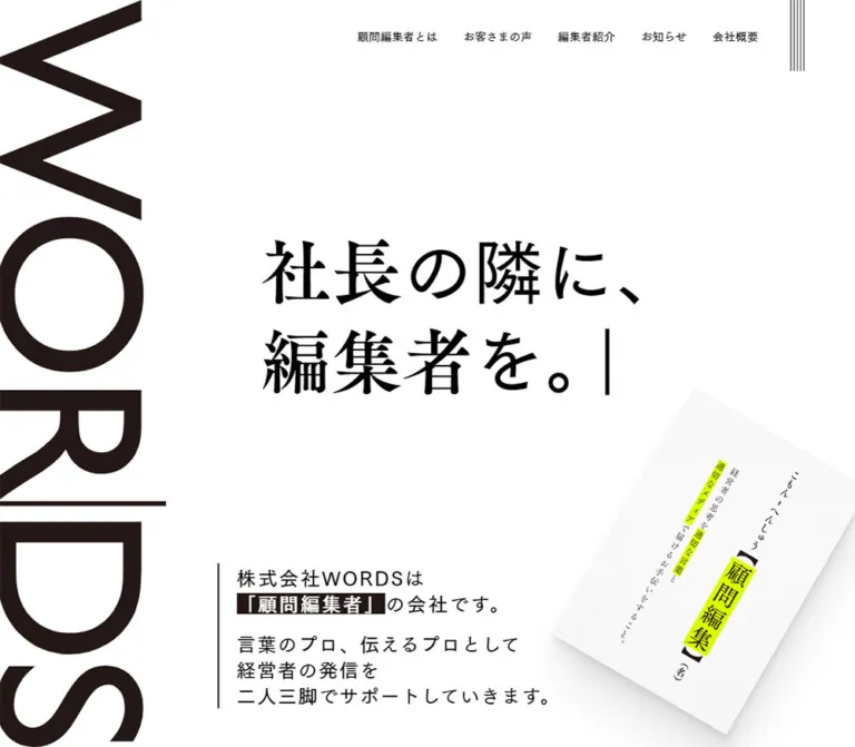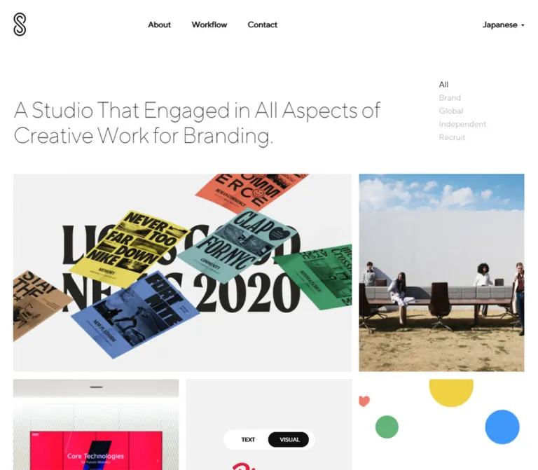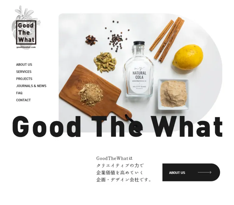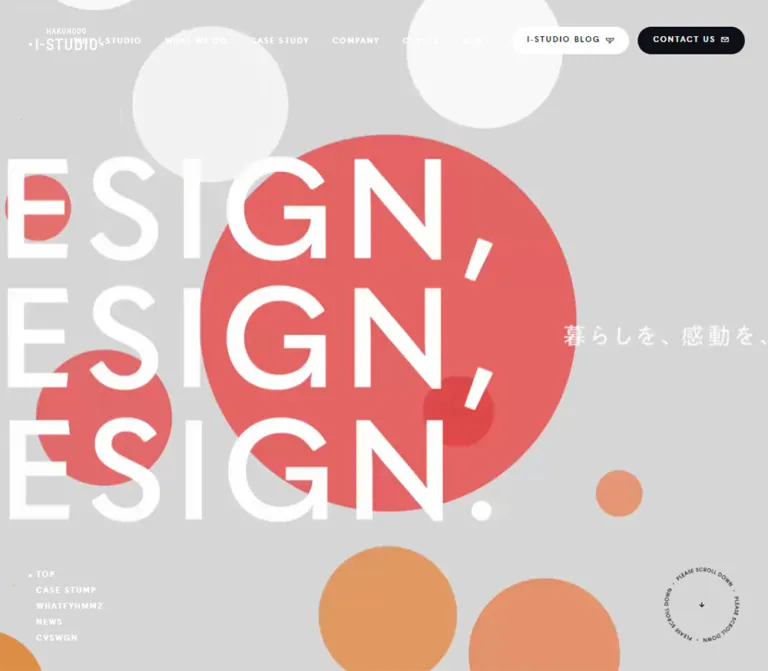
プレビュー準備中デザインリファレンスを見る
DESIGN REFERENCE
株式会社モンブラン|熊本のホームページ制作
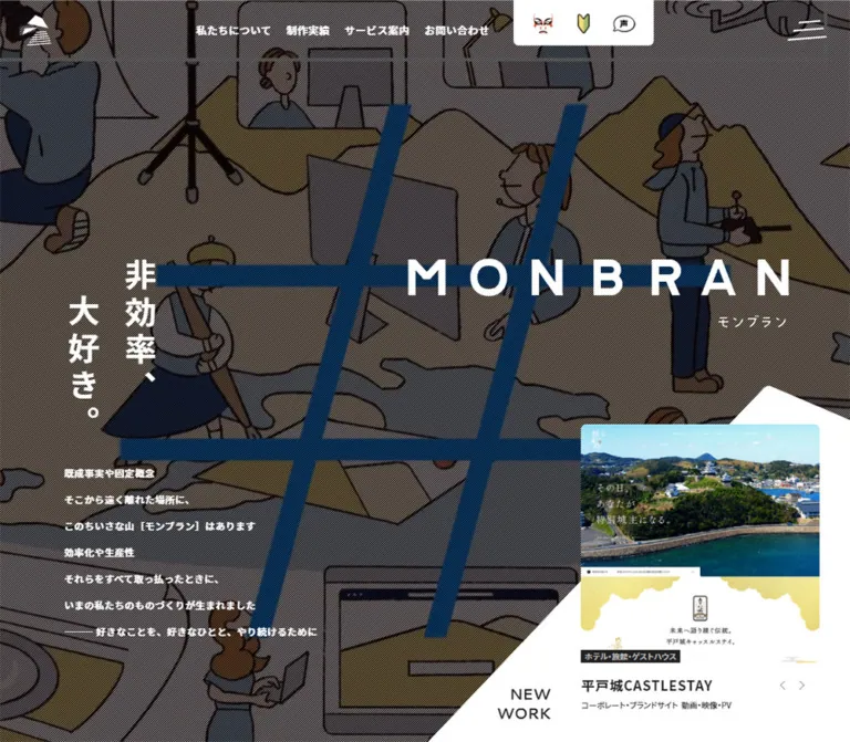
縦組みコピーと斜線を重ねた写真ヒーロー、山形の制作実績パネル、手描きキャラクターが特徴。白とグレーの大きな余白で会社の姿勢や活動を伝えるコーポレートサイト。
MONBRAN — Style Reference
A small mountain of bold typography, illustrated characters, and expansive white space.
Website: mont.jp Original URL: https://mont.jp/ Final URL: https://mont.jp/ Response: HTTP 200 Theme: white and pale-gray page surfaces, preceded by a dark photographic hero. Inspected: October 2, 2026, using the supplied browser session retrieved at 10:12:04 UTC / 19:12:04 JST. Viewports: 1440 × 1000 desktop and 390 × 844 mobile, in CSS pixels. Scope: the current corporate homepage and portfolio gateway. Visual evidence covers the opening composition, the desktop WHITE BASE section and guest gallery, and desktop/mobile footer states. Rendered text and computed-style excerpts establish additional homepage content and navigation structure. Linked pages were not inspected.
MONBRAN presents a web production and branding company through a mixture of confidence and deliberate eccentricity. Large geometric identity graphics, a vertical Japanese statement, sharply angled white surfaces, and a fine diagonal texture give the opening its structure. Illustrated people and a recurring theatrical character make the company feel conversational. Work examples provide concentrated color inside an otherwise restrained interface.
The page is a long corporate narrative with portfolio, community, editorial, service, and contact destinations. Its character depends on the relationship between compact bold labels and unusually generous surrounding space. The same mountain motif appears in the symbol, the irregular menu strokes, and the white plane carrying the featured project.
閉じる
MONBRAN — Style Reference
A small mountain of bold typography, illustrated characters, and expansive white space.
Website: mont.jp Original URL: https://mont.jp/ Final URL: https://mont.jp/ Response: HTTP 200 Theme: white and pale-gray page surfaces, preceded by a dark photographic hero. Inspected: October 2, 2026, using the supplied browser session retrieved at 10:12:04 UTC / 19:12:04 JST. Viewports: 1440 × 1000 desktop and 390 × 844 mobile, in CSS pixels. Scope: the current corporate homepage and portfolio gateway. Visual evidence covers the opening composition, the desktop WHITE BASE section and guest gallery, and desktop/mobile footer states. Rendered text and computed-style excerpts establish additional homepage content and navigation structure. Linked pages were not inspected.
MONBRAN presents a web production and branding company through a mixture of confidence and deliberate eccentricity. Large geometric identity graphics, a vertical Japanese statement, sharply angled white surfaces, and a fine diagonal texture give the opening its structure. Illustrated people and a recurring theatrical character make the company feel conversational. Work examples provide concentrated color inside an otherwise restrained interface.
The page is a long corporate narrative with portfolio, community, editorial, service, and contact destinations. Its character depends on the relationship between compact bold labels and unusually generous surrounding space. The same mountain motif appears in the symbol, the irregular menu strokes, and the white plane carrying the featured project.
How to Read This Reference
- Measured means supplied DOM rectangles, computed styles, or exact custom-property declarations. Measurements describe the inspected state, not every possible viewport or interaction state.
- Estimated means a visual approximation from the current screenshots. These values are useful reconstruction targets, not recovered CSS.
- Declared means a source custom property exists. Its presence alone does not establish which visible element uses it or whether an associated animation ran.
- Recommended means an implementation decision for a new project. The Quick Start uses this category wherever original behavior is unresolved.
- Token names introduced here are descriptive aliases unless explicitly identified as source variables.
- DOM text includes repeated carousel entries and menu content outside the visible state. Repetition does not indicate a long visible list, and a measured rectangle does not prove that an element was unobstructed.
- The current screenshots are the authority for visible composition. The desktop hero, desktop WHITE BASE section, desktop footer, mobile hero, and mobile footer are distinct captured states.
Tokens — Colors
Default Palette
| Name | Value | Evidence | Role and implementation alias |
|---|---|---|---|
| White | #ffffff |
Measured body background; source --color-white |
Main canvas, project surface, persistent header, footer; --paper |
| Primary Ink | #222222 |
Measured body text and project badge background | Main text, wordmark appearance, solid graphic forms; --ink |
| Utility Ink | #444444 |
Measured desktop utility-link color; source --color-black4 |
Dark utility details; --ink-muted |
| Badge Gray | #b7b7b7 |
Measured category text; source --color-gray6 |
Small reversed category labels; --badge-text |
| Scene Gray | #e8e8e8 |
Declared --color-gray14; visually consistent with the pale-gray narrative section |
Recommended scene background; --scene. The WHITE BASE section's own computed background was not supplied |
| Fine Rule | rgba(190,190,190,.5) |
Declared --color-hr |
Recommended separators and secondary rules; --rule |
| Orange Red | #e15036 |
Declared --color-orange and --color-ui-error |
Source accent candidate for small illustrated or utility details; --accent. Exact visible illustration colors were not sampled |
The interface is predominantly neutral. Bright blue, yellow, green, and orange appear mainly inside project images, photographs, small icons, and illustrations. Do not convert the work images' colors into a competing set of global button colors.
Supporting Palette
The source also declares #f5f5f5, #1c5784, #193c55, #45aa64, #f4da7d, and #cda17a, among many other colors. These establish a broader available palette, but their exact application is not demonstrated by the supplied element sample. They are not theme presets.
The dark hero is an image treatment rather than a separate dark interface theme. White identity graphics and copy sit above a darkened photographic field with closely spaced diagonal lines. Overlay opacity, line interval, and compositing method are unmeasured; the CSS below provides an explicitly approximate treatment.
Tokens — Typography
Japanese Body and Navigation
- Computed family:
'Noto Sans JP', sans-serif. - Measured body inheritance:
500, with a 10px root and body font size. - Measured navigation, introduction, and project-title weight:
700. - Character: dense, upright, and confident. Small labels remain bold enough to hold their position within large areas of empty space.
- Tracking: commonly
0.04emor0.05emin the sampled navigation and content roles.
The 10px body inheritance is not the general reading size. Actual sampled content overrides it with 11px, 14px, 16px, 18px, or 20px values. Do not reproduce the page by setting all paragraphs to 10px.
Latin Section Labels
NEW WORK has the computed family Cantarell, sans-serif, weight 700. It is stacked on desktop and appears on one line on mobile. The source declares a Cantarell/Noto Sans combination, but only the sampled roles should be treated as confirmed uses.
Manrope and Hiragino Gothic are also present in font-related custom properties. Their use on a specific visible component is not established. In particular, the MONBRAN wordmark must not be assigned a font merely because that font appears in a declaration.
Identity and Display Lettering
The MONBRAN wordmark has widely separated geometric letters and a distinctive triangular A. Its visible scale is carried by graphic lettering inside an H1 wrapper. The wrapper's computed 20px font size does not describe the large rendered logo.
The vertical statement 非効率、大好き。 is likewise much larger than its paragraph wrapper's inherited 10px size. Reproduce its visible proportions using the approved artwork or carefully typeset vertical text, not the wrapper font size.
The narrative heading system combines an oversized Japanese word, a smaller explanatory Japanese label, and a bracketed romanization such as [ Wakamono ]. This creates an editorial hierarchy with a playful dictionary-like rhythm.
Type Scale
| Role | Desktop | Mobile | Weight / tracking | Evidence |
|---|---|---|---|---|
| Root and body inheritance | 10px / 10px | 10px / 10px | 500 on body | Measured; not the reading scale |
| Primary header link | 14px / 14px | Hidden in opening capture | 700 / 0.56px | Measured; desktop target height is 36px |
| Menu primary link | 18px / 18px | 16px / 16px | 700 / 0.9px or 0.8px | Measured menu structure; open appearance not captured |
| Menu secondary link | 14px / 14px | 13px / 13px | 500 / 0.7px or 0.65px | Measured menu structure |
| Hero introduction | 14px / 39px | 14px / 33px | 700 / 0.7px | Measured; mobile paragraph visibility is unresolved |
| NEW WORK | 22px / 29.59px | 14px / 14px | Cantarell 700 | Measured |
| Featured project title | 20px / 36px | 20px / 36px | 700 / 1px | Measured |
| Secondary work title | 16px / 28.8px | 16px / 28.8px | 700 / 0.8px | Measured |
| Project category | 11px / 11px | 11px / 11px | 700 / normal | Measured |
| Menu contact details | 12px / 12px | 10px / 10px | 700 | Measured; belongs to menu structure, not a separate footer style measurement |
| Vertical hero glyphs | Approximately 46–50px | Approximately 30–34px | Visually bold | Screenshot estimate |
| WHITE BASE narrative body | Approximately 14px / 33px | Not visually captured | Visually bold | Desktop screenshot estimate |
| Oversized narrative word | Approximately 80–88px | Not visually captured | Visually bold | Desktop screenshot estimate; upper part is outside the scrolled capture |
| Underlined WHITE BASE link | Approximately 28px | Not visually captured | Bold Latin lettering | Desktop screenshot estimate |
Computed font-family names are available, but font downloads and actual fallback glyph selection were not independently audited.
Tokens — Spacing & Shapes
Density: sparse at section level, compact inside labels and navigation.
Source design references: --design-width-pc: 1400 and --design-width-sp: 375.
Observed root: 10px at both inspected viewports.
There is no evidence for a universal 8px spacing grid. The measured layout mixes fixed dimensions, percentage-based insets, image widths, and explicit carousel intervals.
Responsive Unit
The source exposes percentage inset tokens based on a 375px reference width:
| Source token | Formula | Calculated at 390px width |
|---|---|---|
--side-width-xsmall-percent |
20 / 375 × 100% |
20.8px |
--side-width-small-percent |
30 / 375 × 100% |
31.2px |
--side-width-large-percent |
37.5 / 375 × 100% |
39px |
--side-width-xxxlarge-percent |
60 / 375 × 100% |
62.4px |
--side-width-xxxxlarge-percent |
65 / 375 × 100% |
67.6px |
These are declared formulas, not proof that each visible mobile margin uses one of them. The actual mobile featured card has 52.5px outer margins at the captured width.
Spacing Scale
| Use | Value | Evidence |
|---|---|---|
| Category-label padding | 4px vertically, 5px horizontally | Measured |
| Desktop primary-navigation gap | 22px | Calculated from adjacent link rectangles |
| Desktop hero logo left offset | 33px | Measured |
| Mobile hero logo left offset | 14.55px | Measured |
| Featured work interval | 354px card + 90px separation on desktop; 285px + 90px on mobile | Derived from consecutive DOM origins; not a recovered CSS gap |
| Secondary work interval | 282px + 44px on desktop; 192px + 28px on mobile | Derived from consecutive DOM origins |
| Menu primary-link padding | Desktop 35px 32px; mobile 20px 34px | Measured |
| WHITE BASE body-column width | Approximately 430px | Screenshot estimate |
| Guest-image separation | Approximately 26px | Screenshot estimate |
| Large narrative clearance | Approximately 80–120px | Recommended range based on the visible rhythm |
Border Radius
| Element | Value or shape | Evidence |
|---|---|---|
| Project-link wrapper and category badge | 0px | Measured |
| Main page surfaces | Visually square | Screenshot observation |
| Mobile right-edge tabs | 3px 0 0 3px |
Measured |
| Menu header/footer surfaces | 5px | Measured menu structure |
| Desktop utility tray | Slightly rounded lower corners, approximately 5px | Screenshot estimate |
| Speech bubbles | Irregular ovals with tails | Visible artwork; not a generic UI radius |
| Hero work surface | Asymmetric mountain-like polygon | Visible; exact path unavailable |
Layout Measurements
| Element | Desktop: 1440 × 1000 | Mobile: 390 × 844 | Evidence |
|---|---|---|---|
| Document height | 14,026.81px | 15,757.48px | Measured |
| Opening logo symbol | 43 × 45px at x33, y22.5 | 27 × 28.25px at x14.55, y12.38 | Measured |
| Opening header alignment region | 90px high around logo | 53px high around logo | Measured child wrapper; header itself reports zero height |
| Menu button | 79 × 71px | 57 × 59px | Measured |
| Hero identity wrapper | x772.16, y223.20; 565 × 102px | x0, y92; 390 × 52px | Measured; mobile graphic has internal horizontal space |
| Vertical statement wrapper origin | x114.01, y223.19 | x57.19, y234 | Measured; wrapper widths include substantial empty area |
| Visible featured project | x1032.06, y510; width 354px | x52.5, y568.86; width 285px | Measured |
| Featured navigation buttons | 27 × 33px | 44 × 59px | Measured |
| Secondary work card width | 282px | 192px | Measured |
| Persistent white header | Approximately 65px high | Approximately 53px high | Screenshot estimate |
| WHITE BASE guest photographs | Approximately 296 × 178px each | Not visually captured | Screenshot estimate |
The desktop statement wrapper extends almost to the right edge, but the visible vertical lettering occupies only a small area at the left. Similarly, hidden menu rectangles must not be mistaken for an open menu visible over the hero.
Components
Header and Identity States
Role: maintain access to the company identity and major destinations throughout a long page.
The opening desktop header is transparent. A white mountain symbol sits at the upper left; four bold Japanese links occupy the upper middle; a white utility tray follows; and an irregular three-stroke menu symbol anchors the far right.
The primary links are 私たちについて, 制作実績, サービス案内, and お問い合わせ. Their measured type is 14px, weight 700, with 0.56px tracking and approximately 22px between links.
The utility tray contains a theatrical face, a beginner mark, and a speech bubble. The DOM supplies corresponding destinations for かぶきもの⁉︎, はじめての方へ, and お客様の声. Individual desktop link boxes are 36 × 68px. These symbols are part of the site's expressive identity rather than a uniform generic icon set.
At the photographed lower-page positions, the header is white with dark content. It displays the full horizontal identity at the left and keeps navigation near the right. Its persistence is visible across scrolled captures; the exact switching threshold and positioning implementation are not supplied.
On mobile, the opening header keeps the small symbol and menu control while removing the desktop navigation row. The lower-page header shows a compact full wordmark, the theatrical face, and the menu control.
Menu Structure
Role: provide comprehensive navigation beyond the four primary links.
The DOM contains a separate menu header with Close, primary destination groups, industry and service sublinks, and a contact footer. Desktop group headings use 18px bold type and broad 35px vertical padding. Mobile headings use 16px bold type with 20px vertical padding.
The source describes a wide, multi-column desktop structure and a stacked mobile structure. Menu surfaces are inset approximately 5px on desktop and 4px on mobile, with 5px corner rounding on sampled header/footer surfaces.
An open-menu screenshot and click sequence were not supplied. Do not treat the collected menu rectangles as proof of the final visible arrangement, focus behavior, accordion operation, or backdrop treatment. The footer sitemap is a separate visible component.
Photographic Hero
Role: state the company's attitude before explaining its services.
The desktop hero fills the first viewport. A dark photographic interior supplies depth, while a dense diagonal screen texture makes the image feel graphic. Large white MONBRAN lettering sits high on the right. The statement 非効率、大好き。 forms two vertical columns on the left, with the left column beginning lower than the right.
A compact manifesto occupies the lower-left area. Its 14px bold text has an unusually open 39px line height, allowing small copy to remain prominent against the image. The right half stays largely open until the featured work panel intersects it.
On mobile, the wordmark moves near the top center, around y92. The vertical statement begins around y234. A small character and speech bubble appear near the lower edge of the photographic area. Two white utility tabs attach to the right edge at x356: one links to the character-related page and the other to contact.
The mobile introductory paragraph exists in the DOM at approximately y590, but it is not readable in the supplied opening screenshot, where the white project plane occupies that area. Its reveal mechanism or effective visibility is unverified. A new implementation should preserve access to that copy rather than reproducing an unexplained overlap.
Mountain-Shaped Featured Work Surface
Role: connect the hero to the portfolio without a conventional rectangular section break.
A large white plane rises from the lower-right edge on desktop. Its peak is around x1315, y453, and its left edge descends toward x797 at the viewport bottom. These are screenshot estimates. The project image sits above the plane rather than being clipped to the mountain shape.
The visible desktop project is 音更電設. Its linked card begins at x1032.06, y510 and is 354px wide. NEW WORK sits separately to its lower left on two lines. Small previous/next arrows align near the project title.
On mobile, the white plane spans the viewport and peaks near the center-left at approximately y504. NEW WORK becomes a centered single-line label at y542.86. The project card is centered at x52.5, y568.86, and is 285px wide. The captured project is UGOKKO; large arrows flank the image.
Build the decorative polygon as its own layer. Keep the project link, title, controls, and focus outlines outside the polygon's clipping context.
Project Card and Work Rails
Role: make complete work examples visible with minimal surrounding chrome.
A featured card contains:
- A near-square website preview.
- A small dark category stamp overlapping the image's lower edge.
- A bold 20px project title with 1px tracking.
- Small service-type metadata beneath the title.
- Adjacent carousel controls, separate from the project link.
The inferred square image treatment follows the screenshot and the category stamp ending one card-width below the card's top. Image-element rectangles themselves were not included.
The category stamp uses #222222, #b7b7b7 text, 11px bold type, and 4px 5px padding. It remains rectangular. Desktop featured titles reserve 80px on the right in the sampled style, corresponding to the arrow area; mobile titles remove that reserved width and center their information.
The DOM also establishes a secondary horizontal work rail below the opening feature. Its card widths are 282px on desktop and 192px on mobile, with 16px titles. Repeated entries and offscreen coordinates support carousel-like structure, but do not establish autoplay timing, drag support, or looping behavior. Only one featured card is visibly exposed in each opening capture.
Narrative Chapters
Role: explain the company through people, values, and related activities.
Rendered content includes chapters organized around ほんもの, つわもの, ばかもの, and わかもの, followed by よみもの. The text connects the company profile, collaborator network, regional media activity, community events, and editorial updates.
The visible WHITE BASE chapter demonstrates the design grammar: a very large Japanese heading, a smaller Japanese definition, bracketed romanization, a compact bold paragraph, and an emphatic underlined link. An illustrated scene occupies the opposite column.
Use the verified WHITE BASE arrangement as the visual reference. The supplied screenshots do not establish that every other chapter uses precisely the same alignment, color, or image placement.
WHITE BASE Feature
Role: introduce the company's learning and exchange community.
The desktop section uses a pale-gray ground with two broad content areas. The left paragraph is approximately 430px wide and sits around x230. On the right, a lecturer points to a framed mark while three attendees watch. Black contours, white clothing, blue fabric, and warm brown hair keep the illustration simple and expressive.
Two white speech bubbles interrupt the scene with short Japanese remarks. The WHITE BASE identity sits above the illustration. The link beneath the paragraph uses large dark Latin lettering, a small external-link mark, a gray chevron, and a strong horizontal underline approximately 3px thick.
The visible link target is https://monstar.jp/whitebase/. That destination is established by the homepage DOM; its own page was not inspected.
The large heading is partially outside the top of the scrolled screenshot. Do not deliberately crop it in a new implementation to imitate the capture position.
Guest Gallery
Role: give the community section specific people and documentary evidence.
A large white panel follows the gray scene. In the desktop capture it extends to approximately x1392, leaving a gray strip at the right. A centered Japanese label introduces the guests, followed by three visible landscape photographs, each approximately 296 × 178px with around 26px gaps.
Captions sit directly beneath the images. Large, light-gray chevrons flank the row. Part of an oversized black graphic is visible at the panel's left edge, making the gallery feel embedded in a larger composition.
The photographs show actual presenters and events, contrasting with the illustrated introduction. No rounded card shells or elevated containers are visible. The source includes repeated guest links; the exact carousel controls and mobile presentation were not exercised.
Editorial, Awards, Services, and Contact Content
Role: extend the homepage beyond identity into current activity and practical destinations.
The rendered text establishes dated articles, category markers, a promotion-video label, awards with numbered items, ZOO TRAINING content, service introductions, first-time visitor information, pricing, telephone contact, and a form link.
These sections are not shown in the supplied current screenshots. Their presence and information hierarchy can be documented, but their exact backgrounds, grids, animation, and imagery cannot. Do not invent a news-card system or video-player design from text alone.
Footer Sitemap
Role: provide a second, comprehensive route through the site.
The desktop footer uses broad columns with larger bold primary destinations and smaller industry/service links. Short pale dashes precede secondary entries. The visible arrangement favors open spacing rather than boxed groups.
On mobile, the visible sitemap is reduced to two columns divided by a fine vertical rule near x194. Main links use compact bold type. The service and work entries show circular plus marks. These indicate expandable categories visually, but expansion behavior is not demonstrated.
The uppermost links are partially hidden behind the persistent header because of the captured scroll position. This is not evidence for intentionally truncated navigation.
Footer Identity and Return Link
Role: finish the page with a memorable identity rather than a dense legal strip.
A large mountain symbol, theatrical character, and dark speech bubble form the central illustration. The bubble reads ボクはロゴではない。 The widely tracked MONBRAN wordmark sits below, followed by the company name, postal address, an underlined Google Maps link, and telephone number.
The current original-page footer identifies 株式会社モンブラン and displays © MONT INC. This supports operator identity, not a separate production-credit claim.
Desktop places the copyright near the lower left and TO THE TOP with a chevron near the lower right. Mobile centers the brand block, copyright, and a lone upward chevron in a vertical sequence. Large white gaps remain between these groups.
The return link targets #document-top. Smooth scrolling, easing, and focus movement after activation are unverified.
Tokens — Motion & Interaction
Measured Element Transitions
| Element or treatment | Supplied computed value | What is established |
|---|---|---|
| Common links and buttons | 400ms cubic-bezier(.215,.61,.355,1) |
Transition timing is defined; the visual hover change was not exercised |
| Header height | 400ms cubic-bezier(.77,0,.175,1) |
Height has a transition; the switching threshold is unknown |
| Hero identity | Opacity and transform, 750ms cubic-bezier(.215,.61,.355,1), 240ms delay |
A staggered entrance treatment is defined |
| Hero statement | Opacity and transform, 750ms with the same easing, 480ms delay | A later entrance stage is defined |
| Desktop manifesto | Opacity and transform, 750ms, 480ms delay | Defined desktop entrance |
| Mobile manifesto | transition: none |
This sampled paragraph does not share the desktop transition |
| Mobile character speech bubble | Opacity and transform, 600ms cubic-bezier(.175,.885,.32,1.275) |
An overshooting transition is defined; its trigger was not tested |
Declared Motion Vocabulary
| Source token | Value | Evidence limit |
|---|---|---|
--transition-fade |
900ms cubic-bezier(.215,.61,.355,1) |
Application not established |
--transition-fade-mask |
900ms cubic-bezier(.77,0,.175,1) |
Mask behavior not captured |
--transition-fade-slider |
1200ms cubic-bezier(.215,.61,.355,1) |
Not an autoplay interval |
--transition-sitemap-open |
500ms cubic-bezier(.215,.61,.355,1) |
Opening sequence not exercised |
--transition-sitemap-close |
400ms with the same easing | Closing sequence not exercised |
--transition-fluffy |
2200ms linear | Name suggests decorative motion; target and keyframes unknown |
--transition-kite-middle |
5200ms cubic-bezier(.455,.03,.515,.955) |
Target and motion path unknown |
--transition-kite-slow-sp |
12000ms cubic-bezier(.77,0,.175,1) |
Mobile-specific token; active behavior unverified |
--transition-fade-slow |
8000ms linear | Do not interpret as a proven media cycle |
The source includes a layer variable named for a hero video, and the photographs differ between the desktop and mobile captures. Neither fact proves video playback, autoplay, audio behavior, or a specific background sequence. A still image may be used as the reference implementation until media behavior is independently established.
The mobile character is a button in the DOM with two speech-text states. Its action is unknown. The supplied evidence does not justify inventing a modal, game, or expanded manifesto interaction.
The browser session waited for initial readiness and traversed scroll positions. It did not provide a frame-by-frame motion record or verified results for menu, carousel, accordion, and character actions.
Surfaces
| Layer | Appearance | Purpose |
|---|---|---|
| Hero media | Dark photograph with dense diagonal lines | Establish atmosphere behind white identity graphics |
| Hero work plane | Large white asymmetric polygon | Bridge the opening and portfolio |
| Main canvas | Solid white | Give work and identity room to breathe |
| Narrative scene | Pale gray | Group explanation and illustration |
| Guest gallery | White inset against gray | Separate documentary photographs from the illustrated scene |
| Project category | Small dark rectangular stamp | Compact classification |
| Speech bubble | White or dark irregular oval | Give illustrated figures a conversational voice |
| Header and footer | Flat white with dark graphics | Stable navigation and identity |
No general shadow-based elevation system is visible. Hierarchy comes from geometry, contrast, scale, image boundaries, and spacing. The polygon belongs to the section background; ordinary cards remain visually simple.
Imagery
Three kinds of imagery coexist:
- Photographic atmosphere: closely cropped interior imagery under a dark screen texture in the opening.
- Work evidence: colorful website previews, preserved as complete visual compositions inside square frames.
- People and personality: outlined illustrations, a theatrical recurring character, and documentary guest photographs.
The WHITE BASE illustration uses slightly irregular black contours, flat fills, simple faces, and generous areas of white. Its speech bubbles are integrated into the scene. The footer character sits beside the mountain symbol and addresses the reader directly. These are specific identity assets, not interchangeable decorative stickers.
Keep project screenshots crisp and normally rendered. The diagonal texture belongs to the hero presentation; it should not be applied globally to project previews or guest photographs. There is no evidence for pixelated image scaling.
Observed Asset References
Underlying image, SVG, and video URLs are not present in the supplied excerpt. The following identifies visible asset roles without inventing filenames or formats.
| Asset role | Current evidence | Reuse guidance |
|---|---|---|
| Mountain symbol and MONBRAN wordmark | Desktop/mobile opening and footer captures | Use approved identity assets; preserve the triangular A and tracking |
| Dark photographic background | Desktop and mobile opening captures | Match crop and contrast; treat playback as unresolved |
| Theatrical face and character | Utility icons, mobile opening, footer | Preserve the bespoke drawing and speech-bubble relationship |
| Featured website previews | 音更電設 on desktop; UGOKKO on mobile |
Keep preview content intact within its square presentation |
| WHITE BASE wordmark and lecture illustration | Desktop middle capture | Preserve flat fills, black contour, and the two speech bubbles |
| Guest photographs | Desktop WHITE BASE gallery | Use landscape documentary crops with simple captions |
| Irregular menu strokes and chevrons | Header, featured work, gallery, footer | Keep their distinct scales; do not force every icon into one identical stroke treatment |
The current homepage links identify the featured works at /works/6058/ and /works/5644/. Those are project-page references, not image URLs or independently inspected pages.
Layout & Responsive Behavior
Desktop
The opening depends on deliberate separation: statement at the left, wordmark at the upper right, manifesto at the lower left, and work preview at the lower right. Broad negative space keeps these elements from becoming one conventional centered hero stack.
The WHITE BASE capture shows a two-column narrative scene followed by a three-image gallery. The footer expands navigation horizontally and then reserves a large central area for the brand illustration.
The total measured desktop document height is approximately 14,027px. This is a long scrolling website, not a fixed application shell.
Mobile
The opening is substantially recomposed. The brand moves to the top center; the vertical statement remains left aligned; small utility links attach to the right edge; and the featured project moves into a central white mountain shape below the character.
| Relationship | Desktop | Mobile |
|---|---|---|
| Main navigation | Four links plus utility tray | Text navigation absent from the opening header |
| Hero identity | Right side | Centered near top |
| Featured project | 354px wide, offset right | 285px wide, centered |
| NEW WORK label | 22px, two lines | 14px, one line |
| Featured arrows | Small pair beside title | Larger targets flanking image |
| Secondary project width | 282px | 192px |
| Footer sitemap | Broad columns | Two visible columns with a vertical separator |
| Footer closing row | Copyright left, return link right | Centered vertical sequence |
The 285px mobile card is about 73.1% of the viewport width. This leaves space for the 44px arrow targets without shrinking the image to a small thumbnail. The featured title remains 20px on mobile; the layout changes more than the typography.
The mobile document is approximately 15,757px tall, about 1,731px taller than desktop. Mobile WHITE BASE, news, and service-section geometry is not visually supplied. Their specific stacking and image sizes remain unverified.
Breakpoints and Content Safety
No media-query breakpoint values were supplied. The Quick Start uses 800px as a recommended adaptation breakpoint and must be checked against actual navigation fit. It is not a recovered source breakpoint.
Allow long Japanese project titles to wrap. Preserve vertical rhythm without fixed title heights. Clip carousel tracks locally instead of allowing offscreen slide coordinates to expand the page's horizontal scroll area. Avoid clipping keyboard focus rings with the decorative mountain surface.
Do’s and Don’ts
Do
- Preserve the asymmetry of the desktop hero and the deliberate mobile recomposition.
- Use white and dark ink as the main interface pair, with a quiet gray ground for illustrated narrative content.
- Keep Japanese navigation and body copy compact, bold, and generously spaced vertically where the evidence supports it.
- Retain the vertical statement and the stagger between its two columns.
- Keep the mountain-shaped project plane separate from the actual card and controls.
- Let project screenshots and photographs supply much of the color.
- Use the recurring character, speech bubbles, and bespoke symbols consistently.
- Preserve the large footer identity block and surrounding white space.
- Treat measured transition values as timing evidence, while labeling untested triggers and effects.
- Use real links for work, contact, map, telephone, and return destinations.
Don’t
- Do not replace the homepage narrative with a generic feature-card and conversion-button layout.
- Do not center every desktop hero element or remove the large open middle area.
- Do not turn the work cards into rounded, shadowed containers.
- Do not apply the hero's dark texture to all content images.
- Do not use the H1 wrapper's 20px value as the visible wordmark size.
- Do not infer visible font usage from every declared font variable.
- Do not treat repeated DOM entries as separate visible rows or a required content count.
- Do not claim autoplay, dragging, menu focus behavior, or mascot actions from static captures.
- Do not reproduce a captured scroll crop as intentional heading truncation.
- Do not hide the mobile introduction merely because the supplied opening capture does not expose it.
Recommended Implementation Additions
These are recommendations for a new implementation, not verified features of the original:
- Give the menu, arrows, character button, and icon-only utility links explicit accessible names. A blank extracted text value does not establish whether the original has an accessible name.
- Expand desktop carousel hit areas from the measured 27 × 33px to at least 44 × 44px while retaining small visible arrow artwork.
- Keep carousel controls outside the project anchor. Exclude inactive clones from sequential keyboard navigation.
- If a carousel advances automatically, provide pause behavior and pause it during keyboard interaction. Do not add autoplay solely because repeated slides exist.
- Implement menu focus management, Escape handling, and background inertness if the menu behaves as a modal overlay. Keep all menu content scrollable on short screens.
- Respect reduced-motion preferences in both CSS and any media or animation controller. A CSS rule alone does not pause a video.
- Test white hero copy against every media frame. Keep overlay contrast stable as imagery changes.
- Preserve the mobile manifesto in normal reading order if its original reveal cannot be established.
- Load approved identity and illustration assets with explicit intrinsic dimensions. Reserve media space before decoding to prevent layout shifts.
- Ensure that fixed header and side controls do not cover focused links, expanded text, or essential project information.
Agent Prompt Guide
Quick Color Reference
- Main page and work plane:
#ffffff. - Primary text, solid symbols, badge background:
#222222. - Secondary utility ink:
#444444. - Category text:
#b7b7b7. - Pale narrative ground: use declared
#e8e8e8as an approximation pending a direct section measurement. - Fine separator:
rgba(190,190,190,.5). - Small accent candidate: source orange red
#e15036. - Hero treatment: photograph plus dark overlay and fine diagonal lines; opacity and spacing require visual calibration.
Overall Prompt
“Create a Japanese creative-company homepage inspired by the current MONBRAN composition. Use a white and near-black interface, a dark photographic opening with fine diagonal lines, a large geometric identity on the upper right, and a bold vertical Japanese statement on the left. Bring a colorful square work preview into the lower-right corner on an asymmetric white mountain plane. Use Noto Sans JP for measured Japanese interface roles and Cantarell for small Latin section labels. Continue with spacious white and pale-gray narrative scenes, oversized Japanese chapter words, bracketed romanization, flat outlined illustrations, and documentary guest photographs. Finish with a large central identity illustration and a comprehensive sitemap. Recompose the hero for mobile with a centered wordmark, vertical statement, right-edge utility tabs, and a 285px centered project preview. Treat unverified animation and menu behavior as implementation choices.”
Example Component Prompts
- Hero: “At 1440 × 1000, place a 565px-wide graphic identity around x772, y223, two staggered vertical Japanese text columns around x114, y223, and a compact 14px manifesto at the lower left with 39px line height. Keep a dark photographic background under fine diagonal screening. Place a white mountain plane behind the right-hand portfolio feature.”
- Featured work: “Build a flat 354px desktop project card with a square screenshot, an 11px gray-on-dark category stamp overlapping its lower edge, a 20px bold title, and small service metadata. Keep arrows separate from the link. On a 390px phone use a centered 285px card and 44px-wide arrow targets outside its sides.”
- Narrative scene: “Create a pale-gray two-column section: oversized Japanese chapter word, smaller definition and romanization, a bold narrow paragraph, and a large underlined text link on the left; a flat black-contour lecture illustration with white speech bubbles on the right. Preserve generous empty space and avoid card borders.”
- Guest gallery: “Place three landscape documentary photographs in a broad white panel, around 296 × 178px each on desktop, with approximately 26px gaps, simple captions, a centered introductory label, and large gray chevrons.”
- Footer: “Create a spacious white footer with a multi-column sitemap, a large central mountain identity beside a theatrical illustrated character, a speech bubble, a widely tracked wordmark, company and map details, and copyright. On mobile use two sitemap columns, then center the identity, contact information, copyright, and upward return chevron.”
Quick Start
CSS Custom Properties
This is a reusable approximation, not extracted source code. It keeps a conventional document root, uses explicit pixel sizes for measured roles, and assumes approved assets are supplied separately. Load the named fonts if available; otherwise the stacks fall back to sans-serif.
Expected component classes are shown directly in the selectors. The hero uses separate media, graphic identity, vertical-text spans, decorative plane, featured-work, and manifesto elements. The mobile adaptation deliberately places the manifesto after the project feature because its original reveal is unresolved. Header state changes, carousel logic, and menu behavior require separate implementation.
:root {
  /* Measured colors and declared palette candidates */
  --paper: #ffffff;
  --ink: #222222;
  --ink-muted: #444444;
  --badge-text: #b7b7b7;
  --scene: #e8e8e8;
  --rule: rgba(190, 190, 190, 0.5);
  --accent: #e15036;

  /* Confirmed computed font roles */
  --font-body: 'Noto Sans JP', sans-serif;
  --font-latin: 'Cantarell', sans-serif;
  --text-body: 14px;
  --text-category: 11px;
  --text-work: 20px;
  --text-work-small: 16px;
  --tracking-body: 0.05em;

  /* Measured dimensions and recommended layout aliases */
  --feature-width: 354px;
  --rail-width: 282px;
  --rail-gap: 44px;
  --header-height: 65px;
  --page-inset: clamp(24px, 7.57vw, 109px);
  --section-space: clamp(64px, 8vw, 120px);

  /* Timings present in the supplied evidence */
  --ease-out: cubic-bezier(0.215, 0.61, 0.355, 1);
  --ease-toggle: cubic-bezier(0.77, 0, 0.175, 1);
  --motion-link: 400ms var(--ease-out);
  --motion-enter: 750ms var(--ease-out);
}

* { box-sizing: border-box; }
body {
  margin: 0;
  color: var(--ink);
  background: var(--paper);
  font-family: var(--font-body);
  font-size: var(--text-body);
  font-weight: 500;
  line-height: 1.8;
}
img { display: block; max-width: 100%; height: auto; }
button, a { -webkit-tap-highlight-color: transparent; }
button { font: inherit; color: inherit; cursor: pointer; }
a { color: inherit; }
:focus-visible {
  outline: 2px solid currentColor;
  outline-offset: 5px;
}
section, #document-top {
  scroll-margin-top: calc(var(--header-height) + 16px);
}

/* Apply the hero modifier only while this header overlays dark media. */
.site-header {
  position: fixed;
  inset: 0 0 auto;
  z-index: 30;
  display: flex;
  align-items: center;
  gap: 24px;
  height: var(--header-height);
  padding-inline: clamp(15px, 1.875vw, 27px);
  background: var(--paper);
  color: var(--ink);
  transition: height 400ms var(--ease-toggle);
}
.site-header--hero {
  height: 90px;
  background: transparent;
  color: var(--paper);
}
.brand-full { width: 250px; }
.brand-symbol { display: none; width: 43px; }
.site-header--hero .brand-full { display: none; }
.site-header--hero .brand-symbol { display: block; }
.primary-nav {
  display: flex;
  gap: 22px;
  margin-inline-start: auto;
}
.primary-nav a {
  display: flex;
  align-items: center;
  min-height: 36px;
  text-decoration: none;
  font-size: 14px;
  font-weight: 700;
  line-height: 1;
  letter-spacing: 0.04em;
}
.header-tools {
  display: flex;
  gap: 24px;
  padding-inline: 26px;
  background: var(--paper);
  color: var(--ink-muted);
  border-radius: 0 0 5px 5px;
}
.header-tools a {
  display: grid;
  place-items: center;
  width: 36px;
  min-height: 68px;
}
.menu-toggle {
  width: 79px;
  min-height: 71px;
  border: 0;
  padding: 20px 10px;
  background: transparent;
}

/* Separate image treatment, decorative geometry, and readable content. */
.hero {
  position: relative;
  isolation: isolate;
  min-height: 100svh;
  color: var(--paper);
}
.hero-media {
  position: absolute;
  inset: 0;
  z-index: -2;
  width: 100%;
  height: 100%;
  object-fit: cover;
}
.hero::before {
  content: '';
  position: absolute;
  inset: 0;
  z-index: -1;
  pointer-events: none;
  /* Recommended approximation; original opacity and pitch are unknown. */
  background:
    repeating-linear-gradient(
      135deg,
      rgba(255, 255, 255, 0.12) 0 1px,
      transparent 1px 3px
    ),
    rgba(0, 0, 0, 0.62);
}
.hero-brand {
  position: absolute;
  top: 22.32%;
  left: 53.62%;
  width: 39.24%;
  max-width: 565px;
  margin: 0;
}
.hero-brand img { width: 100%; }
.hero-slogan {
  position: absolute;
  top: 22.32%;
  left: 7.92%;
  display: flex;
  flex-direction: row-reverse;
  align-items: flex-start;
  gap: 32px;
  margin: 0;
  font-size: 48px;
  font-weight: 700;
  line-height: 1.15;
}
.hero-slogan span {
  writing-mode: vertical-rl;
  text-orientation: upright;
}
.hero-slogan span + span { transform: translateY(1.15em); }
.hero-manifesto {
  position: absolute;
  top: 58.15%;
  left: 7.57%;
  width: min(440px, 40vw);
  margin: 0;
  font-size: 14px;
  font-weight: 700;
  line-height: 39px;
  letter-spacing: 0.05em;
}
.hero-peak {
  position: absolute;
  right: 0;
  bottom: 0;
  z-index: 0;
  width: 44.7%;
  height: 54.7%;
  background: var(--paper);
  clip-path: polygon(80% 0, 100% 10%, 100% 100%, 0 100%);
  pointer-events: none;
}
.hero-feature {
  position: absolute;
  z-index: 1;
  top: 51%;
  right: 3.75%;
  width: var(--feature-width);
  color: var(--ink);
}
.hero-new-work {
  position: absolute;
  z-index: 1;
  right: 31.45%;
  bottom: 32px;
  width: 80px;
  margin: 0;
  color: var(--ink);
  font: 700 22px/1.345 var(--font-latin);
  text-align: right;
  text-transform: uppercase;
}
.hero-new-work span { display: block; }
.hero-tabs { display: none; }

.work-card { display: block; color: var(--ink); text-decoration: none; }
.work-media {
  width: 100%;
  aspect-ratio: 1;
  object-fit: cover;
  object-position: top;
}
.work-category {
  position: relative;
  display: table;
  margin-top: -19px;
  padding: 4px 5px;
  background: var(--ink);
  color: var(--badge-text);
  font-size: 11px;
  font-weight: 700;
  line-height: 11px;
}
.work-title {
  margin: 15px 0 0;
  padding-right: 80px;
  font-size: 20px;
  font-weight: 700;
  line-height: 1.8;
  letter-spacing: 0.05em;
  overflow-wrap: anywhere;
}
.work-meta { margin-top: 4px; font-size: 11px; line-height: 1.6; }
.work-controls {
  position: absolute;
  top: calc(var(--feature-width) + 16px);
  right: 0;
  display: flex;
}
.work-controls button {
  display: grid;
  place-items: center;
  width: 44px;
  min-height: 44px;
  border: 0;
  background: transparent;
}
.work-rail {
  display: grid;
  grid-auto-flow: column;
  grid-auto-columns: var(--rail-width);
  gap: var(--rail-gap);
  overflow-x: auto;
  padding: 16px var(--page-inset);
  scroll-snap-type: x proximity;
}
.work-rail .work-card { scroll-snap-align: start; }
.work-rail .work-title { padding-right: 0; font-size: 16px; }

.story-scene { background: var(--scene); padding-block: var(--section-space); }
.story-grid {
  display: grid;
  grid-template-columns: repeat(2, minmax(0, 1fr));
  align-items: center;
  gap: 80px;
  width: min(980px, calc(100% - 64px));
  margin-inline: auto;
}
.story-word {
  margin: 0;
  font-size: clamp(48px, 6vw, 88px);
  font-weight: 700;
  line-height: 1.1;
  text-align: center;
}
.story-reading { text-align: center; font-weight: 700; }
.story-copy { margin-top: 56px; font-weight: 700; line-height: 2.35; }
.text-link {
  display: flex;
  align-items: center;
  justify-content: space-between;
  gap: 32px;
  width: fit-content;
  max-width: 100%;
  margin: 40px auto 0;
  padding-bottom: 12px;
  border-bottom: 3px solid currentColor;
  text-decoration: none;
  font: 700 28px/1.2 var(--font-latin);
  transition: opacity var(--motion-link);
}
.text-link::after {
  content: '';
  flex: 0 0 14px;
  width: 14px;
  height: 14px;
  border-top: 2px solid #969696;
  border-right: 2px solid #969696;
  transform: rotate(45deg);
}
.guest-panel {
  margin-right: 48px;
  padding-block: 80px;
  background: var(--paper);
}
.guest-track {
  display: grid;
  grid-auto-flow: column;
  grid-auto-columns: calc((100% - 52px) / 3);
  gap: 26px;
  width: min(940px, calc(100% - 80px));
  margin-inline: auto;
  overflow-x: auto;
}
.guest-track img { width: 100%; aspect-ratio: 296 / 178; object-fit: cover; }

.site-footer { padding: 80px 0 32px; background: var(--paper); }
.footer-sitemap {
  display: grid;
  grid-template-columns: 1.3fr 1fr 1fr;
  gap: 48px;
  width: min(1184px, calc(100% - 64px));
  margin-inline: auto;
}
.footer-sitemap a { display: block; margin-bottom: 20px; text-decoration: none; }
.footer-identity { margin: 80px auto 0; text-align: center; }
.footer-art { width: min(420px, 80vw); margin-inline: auto; }
.footer-contact { margin-top: 32px; font-size: 12px; font-weight: 700; line-height: 2; }
.footer-bottom {
  display: flex;
  justify-content: space-between;
  align-items: center;
  margin-top: 56px;
  padding-inline: 48px;
  font: 700 24px/1.4 var(--font-latin);
}

@media (hover: hover) {
  /* Recommended feedback; the original hover appearance was not captured. */
  .text-link:hover, .primary-nav a:hover { opacity: 0.65; }
}

/* Recommended breakpoint, not a recovered source media query. */
@media (max-width: 800px) {
  :root {
    --feature-width: min(285px, calc(100vw - 105px)));
    --rail-width: 192px;
    --rail-gap: 28px;
    --header-height: 53px;
  }
  .site-header, .site-header--hero { height: 53px; padding-inline: 15px; }
  .brand-full { width: 164px; }
  .brand-symbol { width: 27px; }
  .primary-nav, .header-tools { display: none; }
  .menu-toggle { width: 57px; min-height: 59px; margin-left: auto; }
  .hero {
    min-height: 0;
    padding-top: 950px;
  }
  .hero-media, .hero::before { height: 628px; bottom: auto; }
  .hero-brand { top: 92px; left: 12%; width: 76%; max-width: none; }
  .hero-slogan { top: 234px; left: 14.66%; gap: 20px; font-size: 32px; line-height: 1.25; }
  .hero-slogan span + span { transform: translateY(1.25em); }
  .hero-peak {
    top: 504px;
    bottom: auto;
    width: 100%;
    height: 446px;
    clip-path: polygon(43% 0, 100% 13.5%, 100% 100%, 0 100%, 0 28%);
  }
  .hero-feature { top: 569px; right: auto; left: 50%; transform: translateX(-50%); }
  .hero-new-work {
    top: 543px;
    right: 0;
    bottom: auto;
    width: 100%;
    font-size: 14px;
    line-height: 14px;
    text-align: center;
  }
  .hero-new-work span { display: inline; }
  .hero-tabs { position: absolute; top: 253px; right: 0; display: grid; gap: 2px; }
  .hero-tabs a {
    display: grid;
    place-items: center;
    width: 34px;
    min-height: 42px;
    border-radius: 3px 0 0 3px;
    background: var(--paper);
    color: var(--ink);
  }
  .hero-manifesto {
    /* Recommended accessible placement after the featured work. */
    position: static;
    width: auto;
    padding: 32px 24px;
    background: var(--paper);
    color: var(--ink);
    line-height: 33px;
  }
  .hero-feature .work-title { padding-right: 0; text-align: center; }
  .hero-feature .work-category { margin-inline: auto; }
  .hero-feature .work-meta { text-align: center; }
  .work-controls {
    top: 125px;
    right: -44px;
    left: -44px;
    justify-content: space-between;
    pointer-events: none;
  }
  .work-controls button { min-height: 59px; pointer-events: auto; }
  .story-grid { grid-template-columns: 1fr; gap: 40px; width: calc(100% - 48px); }
  .story-copy { margin-top: 32px; }
  .guest-panel { margin-right: 0; padding-block: 48px; }
  .guest-track { width: calc(100% - 48px); grid-auto-columns: 85%; gap: 20px; }
  .footer-sitemap { grid-template-columns: 1fr 1fr; gap: 28px; width: calc(100% - 52px); }
  .footer-identity { margin-top: 64px; }
  .footer-art { width: min(260px, 80vw); }
  .footer-contact { font-size: 10px; }
  .footer-bottom { flex-direction: column; gap: 44px; font-size: 20px; }
}

@media (prefers-reduced-motion: reduce) {
  .site-header, .hero *, .text-link, .primary-nav a {
    transition: none;
    animation: none;
  }
  html { scroll-behavior: auto; }
}
For a production adaptation, use content-aware positioning when featured titles become longer or the viewport is shorter than the supplied examples. The fixed opening coordinates above intentionally make the captured composition easy to compare; they are not sufficient validation for every screen size. A character asset, full menu, and carousel state controller are outside this CSS scaffold.
Tailwind v4 Token Mapping
Optional aliases for a project already using Tailwind v4. This does not imply that the original website uses Tailwind. Define the custom properties above first.
@theme inline {
  --color-paper: var(--paper);
  --color-ink: var(--ink);
  --color-scene: var(--scene);
  --color-category: var(--badge-text);
  --color-accent: var(--accent);

  --font-body: 'Noto Sans JP', sans-serif;
  --font-latin: 'Cantarell', sans-serif;

  --text-copy: 14px;
  --text-category: 11px;
  --text-project: 20px;
  --text-project-small: 16px;

  --spacing-feature: var(--feature-width);
  --spacing-rail: var(--rail-width);
  --spacing-rail-gap: var(--rail-gap);
  --spacing-page: var(--page-inset);
  --spacing-section: var(--section-space);

  --radius-tab: 3px;
  --radius-menu: 5px;
}
Sources & Evidence
- Original and final website: https://mont.jp/, HTTP 200. The supplied original-page title is
株式会社モンブラン|熊本のホームページ制作. - Capture session: October 2, 2026, retrieved at
2026-10-02T10:12:04.131Z. Desktop viewport 1440 × 1000; mobile viewport 390 × 844. Individual screenshot timestamps and scrolled offsets were not supplied. - Current desktop visual evidence: opening hero and featured work; WHITE BASE narrative and guest gallery; footer sitemap and identity. These establish visible composition, illustration treatment, imagery, and the persistent white header state.
- Current mobile visual evidence: opening hero and featured work; footer and persistent header. These establish the major responsive changes, side tabs, project width, and footer stacking.
- Rendered DOM and computed styles: sampled rectangles, font stacks, font sizes, weights, line heights, tracking, colors, padding, radii, transition values, document dimensions, link destinations, and custom properties for both viewports.
- Content-only evidence: other narrative chapters, editorial updates, awards, training, service introductions, and contact destinations are present in rendered text. Their detailed visual layout is outside the supplied screenshot coverage.
- Inspection limits: the supplied process waited for document load, image decoding, sampled text/layout stability, and finite motion within bounded waits. Perpetual animations were paused for readiness checking and then resumed; shared workers and service workers were disabled. These checks do not establish all delayed content or interaction semantics.
- Unverified behavior: menu activation, hover appearance, carousel arrows, autoplay, dragging, mobile sitemap expansion, character action, media playback, audio, keyboard navigation, and reduced-motion handling were not demonstrated by an interaction trace. Asset source URLs and complete stylesheets were not supplied.
This reference describes the current homepage evidence. Exact measurements, screenshot estimates, declared tokens, and recommended implementation decisions remain separate throughout.
# MONBRAN — Style Reference

> A small mountain of bold typography, illustrated characters, and expansive white space.

**Website:** [mont.jp](https://mont.jp/)
**Original URL:** https://mont.jp/
**Final URL:** https://mont.jp/
**Response:** HTTP 200
**Theme:** white and pale-gray page surfaces, preceded by a dark photographic hero.
**Inspected:** October 2, 2026, using the supplied browser session retrieved at 10:12:04 UTC / 19:12:04 JST.
**Viewports:** 1440 × 1000 desktop and 390 × 844 mobile, in CSS pixels.
**Scope:** the current corporate homepage and portfolio gateway. Visual evidence covers the opening composition, the desktop WHITE BASE section and guest gallery, and desktop/mobile footer states. Rendered text and computed-style excerpts establish additional homepage content and navigation structure. Linked pages were not inspected.

MONBRAN presents a web production and branding company through a mixture of confidence and deliberate eccentricity. Large geometric identity graphics, a vertical Japanese statement, sharply angled white surfaces, and a fine diagonal texture give the opening its structure. Illustrated people and a recurring theatrical character make the company feel conversational. Work examples provide concentrated color inside an otherwise restrained interface.

The page is a long corporate narrative with portfolio, community, editorial, service, and contact destinations. Its character depends on the relationship between compact bold labels and unusually generous surrounding space. The same mountain motif appears in the symbol, the irregular menu strokes, and the white plane carrying the featured project.
閉じる
# MONBRAN — Style Reference

> A small mountain of bold typography, illustrated characters, and expansive white space.

**Website:** [mont.jp](https://mont.jp/)
**Original URL:** https://mont.jp/
**Final URL:** https://mont.jp/
**Response:** HTTP 200
**Theme:** white and pale-gray page surfaces, preceded by a dark photographic hero.
**Inspected:** October 2, 2026, using the supplied browser session retrieved at 10:12:04 UTC / 19:12:04 JST.
**Viewports:** 1440 × 1000 desktop and 390 × 844 mobile, in CSS pixels.
**Scope:** the current corporate homepage and portfolio gateway. Visual evidence covers the opening composition, the desktop WHITE BASE section and guest gallery, and desktop/mobile footer states. Rendered text and computed-style excerpts establish additional homepage content and navigation structure. Linked pages were not inspected.

MONBRAN presents a web production and branding company through a mixture of confidence and deliberate eccentricity. Large geometric identity graphics, a vertical Japanese statement, sharply angled white surfaces, and a fine diagonal texture give the opening its structure. Illustrated people and a recurring theatrical character make the company feel conversational. Work examples provide concentrated color inside an otherwise restrained interface.

The page is a long corporate narrative with portfolio, community, editorial, service, and contact destinations. Its character depends on the relationship between compact bold labels and unusually generous surrounding space. The same mountain motif appears in the symbol, the irregular menu strokes, and the white plane carrying the featured project.

## How to Read This Reference

- **Measured** means supplied DOM rectangles, computed styles, or exact custom-property declarations. Measurements describe the inspected state, not every possible viewport or interaction state.
- **Estimated** means a visual approximation from the current screenshots. These values are useful reconstruction targets, not recovered CSS.
- **Declared** means a source custom property exists. Its presence alone does not establish which visible element uses it or whether an associated animation ran.
- **Recommended** means an implementation decision for a new project. The Quick Start uses this category wherever original behavior is unresolved.
- Token names introduced here are descriptive aliases unless explicitly identified as source variables.
- DOM text includes repeated carousel entries and menu content outside the visible state. Repetition does not indicate a long visible list, and a measured rectangle does not prove that an element was unobstructed.
- The current screenshots are the authority for visible composition. The desktop hero, desktop WHITE BASE section, desktop footer, mobile hero, and mobile footer are distinct captured states.

## Tokens — Colors

### Default Palette

| Name | Value | Evidence | Role and implementation alias |
| --- | --- | --- | --- |
| White | `#ffffff` | Measured body background; source `--color-white` | Main canvas, project surface, persistent header, footer; `--paper` |
| Primary Ink | `#222222` | Measured body text and project badge background | Main text, wordmark appearance, solid graphic forms; `--ink` |
| Utility Ink | `#444444` | Measured desktop utility-link color; source `--color-black4` | Dark utility details; `--ink-muted` |
| Badge Gray | `#b7b7b7` | Measured category text; source `--color-gray6` | Small reversed category labels; `--badge-text` |
| Scene Gray | `#e8e8e8` | Declared `--color-gray14`; visually consistent with the pale-gray narrative section | Recommended scene background; `--scene`. The WHITE BASE section's own computed background was not supplied |
| Fine Rule | `rgba(190,190,190,.5)` | Declared `--color-hr` | Recommended separators and secondary rules; `--rule` |
| Orange Red | `#e15036` | Declared `--color-orange` and `--color-ui-error` | Source accent candidate for small illustrated or utility details; `--accent`. Exact visible illustration colors were not sampled |

The interface is predominantly neutral. Bright blue, yellow, green, and orange appear mainly inside project images, photographs, small icons, and illustrations. Do not convert the work images' colors into a competing set of global button colors.

### Supporting Palette

The source also declares `#f5f5f5`, `#1c5784`, `#193c55`, `#45aa64`, `#f4da7d`, and `#cda17a`, among many other colors. These establish a broader available palette, but their exact application is not demonstrated by the supplied element sample. They are not theme presets.

The dark hero is an image treatment rather than a separate dark interface theme. White identity graphics and copy sit above a darkened photographic field with closely spaced diagonal lines. Overlay opacity, line interval, and compositing method are unmeasured; the CSS below provides an explicitly approximate treatment.

## Tokens — Typography

### Japanese Body and Navigation

- **Computed family:** `'Noto Sans JP', sans-serif`.
- **Measured body inheritance:** `500`, with a 10px root and body font size.
- **Measured navigation, introduction, and project-title weight:** `700`.
- **Character:** dense, upright, and confident. Small labels remain bold enough to hold their position within large areas of empty space.
- **Tracking:** commonly `0.04em` or `0.05em` in the sampled navigation and content roles.

The 10px body inheritance is not the general reading size. Actual sampled content overrides it with 11px, 14px, 16px, 18px, or 20px values. Do not reproduce the page by setting all paragraphs to 10px.

### Latin Section Labels

`NEW WORK` has the computed family `Cantarell, sans-serif`, weight `700`. It is stacked on desktop and appears on one line on mobile. The source declares a Cantarell/Noto Sans combination, but only the sampled roles should be treated as confirmed uses.

`Manrope` and Hiragino Gothic are also present in font-related custom properties. Their use on a specific visible component is not established. In particular, the MONBRAN wordmark must not be assigned a font merely because that font appears in a declaration.

### Identity and Display Lettering

The MONBRAN wordmark has widely separated geometric letters and a distinctive triangular A. Its visible scale is carried by graphic lettering inside an H1 wrapper. The wrapper's computed 20px font size does not describe the large rendered logo.

The vertical statement `非効率、大好き。` is likewise much larger than its paragraph wrapper's inherited 10px size. Reproduce its visible proportions using the approved artwork or carefully typeset vertical text, not the wrapper font size.

The narrative heading system combines an oversized Japanese word, a smaller explanatory Japanese label, and a bracketed romanization such as `[ Wakamono ]`. This creates an editorial hierarchy with a playful dictionary-like rhythm.

### Type Scale

| Role | Desktop | Mobile | Weight / tracking | Evidence |
| --- | --- | --- | --- | --- |
| Root and body inheritance | 10px / 10px | 10px / 10px | 500 on body | Measured; not the reading scale |
| Primary header link | 14px / 14px | Hidden in opening capture | 700 / 0.56px | Measured; desktop target height is 36px |
| Menu primary link | 18px / 18px | 16px / 16px | 700 / 0.9px or 0.8px | Measured menu structure; open appearance not captured |
| Menu secondary link | 14px / 14px | 13px / 13px | 500 / 0.7px or 0.65px | Measured menu structure |
| Hero introduction | 14px / 39px | 14px / 33px | 700 / 0.7px | Measured; mobile paragraph visibility is unresolved |
| NEW WORK | 22px / 29.59px | 14px / 14px | Cantarell 700 | Measured |
| Featured project title | 20px / 36px | 20px / 36px | 700 / 1px | Measured |
| Secondary work title | 16px / 28.8px | 16px / 28.8px | 700 / 0.8px | Measured |
| Project category | 11px / 11px | 11px / 11px | 700 / normal | Measured |
| Menu contact details | 12px / 12px | 10px / 10px | 700 | Measured; belongs to menu structure, not a separate footer style measurement |
| Vertical hero glyphs | Approximately 46–50px | Approximately 30–34px | Visually bold | Screenshot estimate |
| WHITE BASE narrative body | Approximately 14px / 33px | Not visually captured | Visually bold | Desktop screenshot estimate |
| Oversized narrative word | Approximately 80–88px | Not visually captured | Visually bold | Desktop screenshot estimate; upper part is outside the scrolled capture |
| Underlined WHITE BASE link | Approximately 28px | Not visually captured | Bold Latin lettering | Desktop screenshot estimate |

Computed font-family names are available, but font downloads and actual fallback glyph selection were not independently audited.

## Tokens — Spacing & Shapes

**Density:** sparse at section level, compact inside labels and navigation.
**Source design references:** `--design-width-pc: 1400` and `--design-width-sp: 375`.
**Observed root:** 10px at both inspected viewports.

There is no evidence for a universal 8px spacing grid. The measured layout mixes fixed dimensions, percentage-based insets, image widths, and explicit carousel intervals.

### Responsive Unit

The source exposes percentage inset tokens based on a 375px reference width:

| Source token | Formula | Calculated at 390px width |
| --- | --- | --- |
| `--side-width-xsmall-percent` | `20 / 375 × 100%` | 20.8px |
| `--side-width-small-percent` | `30 / 375 × 100%` | 31.2px |
| `--side-width-large-percent` | `37.5 / 375 × 100%` | 39px |
| `--side-width-xxxlarge-percent` | `60 / 375 × 100%` | 62.4px |
| `--side-width-xxxxlarge-percent` | `65 / 375 × 100%` | 67.6px |

These are declared formulas, not proof that each visible mobile margin uses one of them. The actual mobile featured card has 52.5px outer margins at the captured width.

### Spacing Scale

| Use | Value | Evidence |
| --- | --- | --- |
| Category-label padding | 4px vertically, 5px horizontally | Measured |
| Desktop primary-navigation gap | 22px | Calculated from adjacent link rectangles |
| Desktop hero logo left offset | 33px | Measured |
| Mobile hero logo left offset | 14.55px | Measured |
| Featured work interval | 354px card + 90px separation on desktop; 285px + 90px on mobile | Derived from consecutive DOM origins; not a recovered CSS `gap` |
| Secondary work interval | 282px + 44px on desktop; 192px + 28px on mobile | Derived from consecutive DOM origins |
| Menu primary-link padding | Desktop 35px 32px; mobile 20px 34px | Measured |
| WHITE BASE body-column width | Approximately 430px | Screenshot estimate |
| Guest-image separation | Approximately 26px | Screenshot estimate |
| Large narrative clearance | Approximately 80–120px | Recommended range based on the visible rhythm |

### Border Radius

| Element | Value or shape | Evidence |
| --- | --- | --- |
| Project-link wrapper and category badge | 0px | Measured |
| Main page surfaces | Visually square | Screenshot observation |
| Mobile right-edge tabs | `3px 0 0 3px` | Measured |
| Menu header/footer surfaces | 5px | Measured menu structure |
| Desktop utility tray | Slightly rounded lower corners, approximately 5px | Screenshot estimate |
| Speech bubbles | Irregular ovals with tails | Visible artwork; not a generic UI radius |
| Hero work surface | Asymmetric mountain-like polygon | Visible; exact path unavailable |

### Layout Measurements

| Element | Desktop: 1440 × 1000 | Mobile: 390 × 844 | Evidence |
| --- | --- | --- | --- |
| Document height | 14,026.81px | 15,757.48px | Measured |
| Opening logo symbol | 43 × 45px at x33, y22.5 | 27 × 28.25px at x14.55, y12.38 | Measured |
| Opening header alignment region | 90px high around logo | 53px high around logo | Measured child wrapper; header itself reports zero height |
| Menu button | 79 × 71px | 57 × 59px | Measured |
| Hero identity wrapper | x772.16, y223.20; 565 × 102px | x0, y92; 390 × 52px | Measured; mobile graphic has internal horizontal space |
| Vertical statement wrapper origin | x114.01, y223.19 | x57.19, y234 | Measured; wrapper widths include substantial empty area |
| Visible featured project | x1032.06, y510; width 354px | x52.5, y568.86; width 285px | Measured |
| Featured navigation buttons | 27 × 33px | 44 × 59px | Measured |
| Secondary work card width | 282px | 192px | Measured |
| Persistent white header | Approximately 65px high | Approximately 53px high | Screenshot estimate |
| WHITE BASE guest photographs | Approximately 296 × 178px each | Not visually captured | Screenshot estimate |

The desktop statement wrapper extends almost to the right edge, but the visible vertical lettering occupies only a small area at the left. Similarly, hidden menu rectangles must not be mistaken for an open menu visible over the hero.

## Components

### Header and Identity States

**Role:** maintain access to the company identity and major destinations throughout a long page.

The opening desktop header is transparent. A white mountain symbol sits at the upper left; four bold Japanese links occupy the upper middle; a white utility tray follows; and an irregular three-stroke menu symbol anchors the far right.

The primary links are `私たちについて`, `制作実績`, `サービス案内`, and `お問い合わせ`. Their measured type is 14px, weight 700, with 0.56px tracking and approximately 22px between links.

The utility tray contains a theatrical face, a beginner mark, and a speech bubble. The DOM supplies corresponding destinations for `かぶきもの⁉︎`, `はじめての方へ`, and `お客様の声`. Individual desktop link boxes are 36 × 68px. These symbols are part of the site's expressive identity rather than a uniform generic icon set.

At the photographed lower-page positions, the header is white with dark content. It displays the full horizontal identity at the left and keeps navigation near the right. Its persistence is visible across scrolled captures; the exact switching threshold and positioning implementation are not supplied.

On mobile, the opening header keeps the small symbol and menu control while removing the desktop navigation row. The lower-page header shows a compact full wordmark, the theatrical face, and the menu control.

### Menu Structure

**Role:** provide comprehensive navigation beyond the four primary links.

The DOM contains a separate menu header with `Close`, primary destination groups, industry and service sublinks, and a contact footer. Desktop group headings use 18px bold type and broad 35px vertical padding. Mobile headings use 16px bold type with 20px vertical padding.

The source describes a wide, multi-column desktop structure and a stacked mobile structure. Menu surfaces are inset approximately 5px on desktop and 4px on mobile, with 5px corner rounding on sampled header/footer surfaces.

An open-menu screenshot and click sequence were not supplied. Do not treat the collected menu rectangles as proof of the final visible arrangement, focus behavior, accordion operation, or backdrop treatment. The footer sitemap is a separate visible component.

### Photographic Hero

**Role:** state the company's attitude before explaining its services.

The desktop hero fills the first viewport. A dark photographic interior supplies depth, while a dense diagonal screen texture makes the image feel graphic. Large white MONBRAN lettering sits high on the right. The statement `非効率、大好き。` forms two vertical columns on the left, with the left column beginning lower than the right.

A compact manifesto occupies the lower-left area. Its 14px bold text has an unusually open 39px line height, allowing small copy to remain prominent against the image. The right half stays largely open until the featured work panel intersects it.

On mobile, the wordmark moves near the top center, around y92. The vertical statement begins around y234. A small character and speech bubble appear near the lower edge of the photographic area. Two white utility tabs attach to the right edge at x356: one links to the character-related page and the other to contact.

The mobile introductory paragraph exists in the DOM at approximately y590, but it is not readable in the supplied opening screenshot, where the white project plane occupies that area. Its reveal mechanism or effective visibility is unverified. A new implementation should preserve access to that copy rather than reproducing an unexplained overlap.

### Mountain-Shaped Featured Work Surface

**Role:** connect the hero to the portfolio without a conventional rectangular section break.

A large white plane rises from the lower-right edge on desktop. Its peak is around x1315, y453, and its left edge descends toward x797 at the viewport bottom. These are screenshot estimates. The project image sits above the plane rather than being clipped to the mountain shape.

The visible desktop project is `音更電設`. Its linked card begins at x1032.06, y510 and is 354px wide. `NEW WORK` sits separately to its lower left on two lines. Small previous/next arrows align near the project title.

On mobile, the white plane spans the viewport and peaks near the center-left at approximately y504. `NEW WORK` becomes a centered single-line label at y542.86. The project card is centered at x52.5, y568.86, and is 285px wide. The captured project is `UGOKKO`; large arrows flank the image.

Build the decorative polygon as its own layer. Keep the project link, title, controls, and focus outlines outside the polygon's clipping context.

### Project Card and Work Rails

**Role:** make complete work examples visible with minimal surrounding chrome.

A featured card contains:

1. A near-square website preview.
2. A small dark category stamp overlapping the image's lower edge.
3. A bold 20px project title with 1px tracking.
4. Small service-type metadata beneath the title.
5. Adjacent carousel controls, separate from the project link.

The inferred square image treatment follows the screenshot and the category stamp ending one card-width below the card's top. Image-element rectangles themselves were not included.

The category stamp uses `#222222`, `#b7b7b7` text, 11px bold type, and 4px 5px padding. It remains rectangular. Desktop featured titles reserve 80px on the right in the sampled style, corresponding to the arrow area; mobile titles remove that reserved width and center their information.

The DOM also establishes a secondary horizontal work rail below the opening feature. Its card widths are 282px on desktop and 192px on mobile, with 16px titles. Repeated entries and offscreen coordinates support carousel-like structure, but do not establish autoplay timing, drag support, or looping behavior. Only one featured card is visibly exposed in each opening capture.

### Narrative Chapters

**Role:** explain the company through people, values, and related activities.

Rendered content includes chapters organized around `ほんもの`, `つわもの`, `ばかもの`, and `わかもの`, followed by `よみもの`. The text connects the company profile, collaborator network, regional media activity, community events, and editorial updates.

The visible WHITE BASE chapter demonstrates the design grammar: a very large Japanese heading, a smaller Japanese definition, bracketed romanization, a compact bold paragraph, and an emphatic underlined link. An illustrated scene occupies the opposite column.

Use the verified WHITE BASE arrangement as the visual reference. The supplied screenshots do not establish that every other chapter uses precisely the same alignment, color, or image placement.

### WHITE BASE Feature

**Role:** introduce the company's learning and exchange community.

The desktop section uses a pale-gray ground with two broad content areas. The left paragraph is approximately 430px wide and sits around x230. On the right, a lecturer points to a framed mark while three attendees watch. Black contours, white clothing, blue fabric, and warm brown hair keep the illustration simple and expressive.

Two white speech bubbles interrupt the scene with short Japanese remarks. The WHITE BASE identity sits above the illustration. The link beneath the paragraph uses large dark Latin lettering, a small external-link mark, a gray chevron, and a strong horizontal underline approximately 3px thick.

The visible link target is `https://monstar.jp/whitebase/`. That destination is established by the homepage DOM; its own page was not inspected.

The large heading is partially outside the top of the scrolled screenshot. Do not deliberately crop it in a new implementation to imitate the capture position.

### Guest Gallery

**Role:** give the community section specific people and documentary evidence.

A large white panel follows the gray scene. In the desktop capture it extends to approximately x1392, leaving a gray strip at the right. A centered Japanese label introduces the guests, followed by three visible landscape photographs, each approximately 296 × 178px with around 26px gaps.

Captions sit directly beneath the images. Large, light-gray chevrons flank the row. Part of an oversized black graphic is visible at the panel's left edge, making the gallery feel embedded in a larger composition.

The photographs show actual presenters and events, contrasting with the illustrated introduction. No rounded card shells or elevated containers are visible. The source includes repeated guest links; the exact carousel controls and mobile presentation were not exercised.

### Editorial, Awards, Services, and Contact Content

**Role:** extend the homepage beyond identity into current activity and practical destinations.

The rendered text establishes dated articles, category markers, a promotion-video label, awards with numbered items, ZOO TRAINING content, service introductions, first-time visitor information, pricing, telephone contact, and a form link.

These sections are not shown in the supplied current screenshots. Their presence and information hierarchy can be documented, but their exact backgrounds, grids, animation, and imagery cannot. Do not invent a news-card system or video-player design from text alone.

### Footer Sitemap

**Role:** provide a second, comprehensive route through the site.

The desktop footer uses broad columns with larger bold primary destinations and smaller industry/service links. Short pale dashes precede secondary entries. The visible arrangement favors open spacing rather than boxed groups.

On mobile, the visible sitemap is reduced to two columns divided by a fine vertical rule near x194. Main links use compact bold type. The service and work entries show circular plus marks. These indicate expandable categories visually, but expansion behavior is not demonstrated.

The uppermost links are partially hidden behind the persistent header because of the captured scroll position. This is not evidence for intentionally truncated navigation.

### Footer Identity and Return Link

**Role:** finish the page with a memorable identity rather than a dense legal strip.

A large mountain symbol, theatrical character, and dark speech bubble form the central illustration. The bubble reads `ボクはロゴではない。` The widely tracked MONBRAN wordmark sits below, followed by the company name, postal address, an underlined Google Maps link, and telephone number.

The current original-page footer identifies `株式会社モンブラン` and displays `© MONT INC.` This supports operator identity, not a separate production-credit claim.

Desktop places the copyright near the lower left and `TO THE TOP` with a chevron near the lower right. Mobile centers the brand block, copyright, and a lone upward chevron in a vertical sequence. Large white gaps remain between these groups.

The return link targets `#document-top`. Smooth scrolling, easing, and focus movement after activation are unverified.

## Tokens — Motion & Interaction

### Measured Element Transitions

| Element or treatment | Supplied computed value | What is established |
| --- | --- | --- |
| Common links and buttons | 400ms `cubic-bezier(.215,.61,.355,1)` | Transition timing is defined; the visual hover change was not exercised |
| Header height | 400ms `cubic-bezier(.77,0,.175,1)` | Height has a transition; the switching threshold is unknown |
| Hero identity | Opacity and transform, 750ms `cubic-bezier(.215,.61,.355,1)`, 240ms delay | A staggered entrance treatment is defined |
| Hero statement | Opacity and transform, 750ms with the same easing, 480ms delay | A later entrance stage is defined |
| Desktop manifesto | Opacity and transform, 750ms, 480ms delay | Defined desktop entrance |
| Mobile manifesto | `transition: none` | This sampled paragraph does not share the desktop transition |
| Mobile character speech bubble | Opacity and transform, 600ms `cubic-bezier(.175,.885,.32,1.275)` | An overshooting transition is defined; its trigger was not tested |

### Declared Motion Vocabulary

| Source token | Value | Evidence limit |
| --- | --- | --- |
| `--transition-fade` | 900ms `cubic-bezier(.215,.61,.355,1)` | Application not established |
| `--transition-fade-mask` | 900ms `cubic-bezier(.77,0,.175,1)` | Mask behavior not captured |
| `--transition-fade-slider` | 1200ms `cubic-bezier(.215,.61,.355,1)` | Not an autoplay interval |
| `--transition-sitemap-open` | 500ms `cubic-bezier(.215,.61,.355,1)` | Opening sequence not exercised |
| `--transition-sitemap-close` | 400ms with the same easing | Closing sequence not exercised |
| `--transition-fluffy` | 2200ms linear | Name suggests decorative motion; target and keyframes unknown |
| `--transition-kite-middle` | 5200ms `cubic-bezier(.455,.03,.515,.955)` | Target and motion path unknown |
| `--transition-kite-slow-sp` | 12000ms `cubic-bezier(.77,0,.175,1)` | Mobile-specific token; active behavior unverified |
| `--transition-fade-slow` | 8000ms linear | Do not interpret as a proven media cycle |

The source includes a layer variable named for a hero video, and the photographs differ between the desktop and mobile captures. Neither fact proves video playback, autoplay, audio behavior, or a specific background sequence. A still image may be used as the reference implementation until media behavior is independently established.

The mobile character is a button in the DOM with two speech-text states. Its action is unknown. The supplied evidence does not justify inventing a modal, game, or expanded manifesto interaction.

The browser session waited for initial readiness and traversed scroll positions. It did not provide a frame-by-frame motion record or verified results for menu, carousel, accordion, and character actions.

## Surfaces

| Layer | Appearance | Purpose |
| --- | --- | --- |
| Hero media | Dark photograph with dense diagonal lines | Establish atmosphere behind white identity graphics |
| Hero work plane | Large white asymmetric polygon | Bridge the opening and portfolio |
| Main canvas | Solid white | Give work and identity room to breathe |
| Narrative scene | Pale gray | Group explanation and illustration |
| Guest gallery | White inset against gray | Separate documentary photographs from the illustrated scene |
| Project category | Small dark rectangular stamp | Compact classification |
| Speech bubble | White or dark irregular oval | Give illustrated figures a conversational voice |
| Header and footer | Flat white with dark graphics | Stable navigation and identity |

No general shadow-based elevation system is visible. Hierarchy comes from geometry, contrast, scale, image boundaries, and spacing. The polygon belongs to the section background; ordinary cards remain visually simple.

## Imagery

Three kinds of imagery coexist:

- **Photographic atmosphere:** closely cropped interior imagery under a dark screen texture in the opening.
- **Work evidence:** colorful website previews, preserved as complete visual compositions inside square frames.
- **People and personality:** outlined illustrations, a theatrical recurring character, and documentary guest photographs.

The WHITE BASE illustration uses slightly irregular black contours, flat fills, simple faces, and generous areas of white. Its speech bubbles are integrated into the scene. The footer character sits beside the mountain symbol and addresses the reader directly. These are specific identity assets, not interchangeable decorative stickers.

Keep project screenshots crisp and normally rendered. The diagonal texture belongs to the hero presentation; it should not be applied globally to project previews or guest photographs. There is no evidence for pixelated image scaling.

### Observed Asset References

Underlying image, SVG, and video URLs are not present in the supplied excerpt. The following identifies visible asset roles without inventing filenames or formats.

| Asset role | Current evidence | Reuse guidance |
| --- | --- | --- |
| Mountain symbol and MONBRAN wordmark | Desktop/mobile opening and footer captures | Use approved identity assets; preserve the triangular A and tracking |
| Dark photographic background | Desktop and mobile opening captures | Match crop and contrast; treat playback as unresolved |
| Theatrical face and character | Utility icons, mobile opening, footer | Preserve the bespoke drawing and speech-bubble relationship |
| Featured website previews | `音更電設` on desktop; `UGOKKO` on mobile | Keep preview content intact within its square presentation |
| WHITE BASE wordmark and lecture illustration | Desktop middle capture | Preserve flat fills, black contour, and the two speech bubbles |
| Guest photographs | Desktop WHITE BASE gallery | Use landscape documentary crops with simple captions |
| Irregular menu strokes and chevrons | Header, featured work, gallery, footer | Keep their distinct scales; do not force every icon into one identical stroke treatment |

The current homepage links identify the featured works at `/works/6058/` and `/works/5644/`. Those are project-page references, not image URLs or independently inspected pages.

## Layout & Responsive Behavior

### Desktop

The opening depends on deliberate separation: statement at the left, wordmark at the upper right, manifesto at the lower left, and work preview at the lower right. Broad negative space keeps these elements from becoming one conventional centered hero stack.

The WHITE BASE capture shows a two-column narrative scene followed by a three-image gallery. The footer expands navigation horizontally and then reserves a large central area for the brand illustration.

The total measured desktop document height is approximately 14,027px. This is a long scrolling website, not a fixed application shell.

### Mobile

The opening is substantially recomposed. The brand moves to the top center; the vertical statement remains left aligned; small utility links attach to the right edge; and the featured project moves into a central white mountain shape below the character.

| Relationship | Desktop | Mobile |
| --- | --- | --- |
| Main navigation | Four links plus utility tray | Text navigation absent from the opening header |
| Hero identity | Right side | Centered near top |
| Featured project | 354px wide, offset right | 285px wide, centered |
| NEW WORK label | 22px, two lines | 14px, one line |
| Featured arrows | Small pair beside title | Larger targets flanking image |
| Secondary project width | 282px | 192px |
| Footer sitemap | Broad columns | Two visible columns with a vertical separator |
| Footer closing row | Copyright left, return link right | Centered vertical sequence |

The 285px mobile card is about 73.1% of the viewport width. This leaves space for the 44px arrow targets without shrinking the image to a small thumbnail. The featured title remains 20px on mobile; the layout changes more than the typography.

The mobile document is approximately 15,757px tall, about 1,731px taller than desktop. Mobile WHITE BASE, news, and service-section geometry is not visually supplied. Their specific stacking and image sizes remain unverified.

### Breakpoints and Content Safety

No media-query breakpoint values were supplied. The Quick Start uses 800px as a recommended adaptation breakpoint and must be checked against actual navigation fit. It is not a recovered source breakpoint.

Allow long Japanese project titles to wrap. Preserve vertical rhythm without fixed title heights. Clip carousel tracks locally instead of allowing offscreen slide coordinates to expand the page's horizontal scroll area. Avoid clipping keyboard focus rings with the decorative mountain surface.

## Do’s and Don’ts

### Do

- Preserve the asymmetry of the desktop hero and the deliberate mobile recomposition.
- Use white and dark ink as the main interface pair, with a quiet gray ground for illustrated narrative content.
- Keep Japanese navigation and body copy compact, bold, and generously spaced vertically where the evidence supports it.
- Retain the vertical statement and the stagger between its two columns.
- Keep the mountain-shaped project plane separate from the actual card and controls.
- Let project screenshots and photographs supply much of the color.
- Use the recurring character, speech bubbles, and bespoke symbols consistently.
- Preserve the large footer identity block and surrounding white space.
- Treat measured transition values as timing evidence, while labeling untested triggers and effects.
- Use real links for work, contact, map, telephone, and return destinations.

### Don’t

- Do not replace the homepage narrative with a generic feature-card and conversion-button layout.
- Do not center every desktop hero element or remove the large open middle area.
- Do not turn the work cards into rounded, shadowed containers.
- Do not apply the hero's dark texture to all content images.
- Do not use the H1 wrapper's 20px value as the visible wordmark size.
- Do not infer visible font usage from every declared font variable.
- Do not treat repeated DOM entries as separate visible rows or a required content count.
- Do not claim autoplay, dragging, menu focus behavior, or mascot actions from static captures.
- Do not reproduce a captured scroll crop as intentional heading truncation.
- Do not hide the mobile introduction merely because the supplied opening capture does not expose it.

## Recommended Implementation Additions

These are recommendations for a new implementation, not verified features of the original:

- Give the menu, arrows, character button, and icon-only utility links explicit accessible names. A blank extracted text value does not establish whether the original has an accessible name.
- Expand desktop carousel hit areas from the measured 27 × 33px to at least 44 × 44px while retaining small visible arrow artwork.
- Keep carousel controls outside the project anchor. Exclude inactive clones from sequential keyboard navigation.
- If a carousel advances automatically, provide pause behavior and pause it during keyboard interaction. Do not add autoplay solely because repeated slides exist.
- Implement menu focus management, Escape handling, and background inertness if the menu behaves as a modal overlay. Keep all menu content scrollable on short screens.
- Respect reduced-motion preferences in both CSS and any media or animation controller. A CSS rule alone does not pause a video.
- Test white hero copy against every media frame. Keep overlay contrast stable as imagery changes.
- Preserve the mobile manifesto in normal reading order if its original reveal cannot be established.
- Load approved identity and illustration assets with explicit intrinsic dimensions. Reserve media space before decoding to prevent layout shifts.
- Ensure that fixed header and side controls do not cover focused links, expanded text, or essential project information.

## Agent Prompt Guide

### Quick Color Reference

- Main page and work plane: `#ffffff`.
- Primary text, solid symbols, badge background: `#222222`.
- Secondary utility ink: `#444444`.
- Category text: `#b7b7b7`.
- Pale narrative ground: use declared `#e8e8e8` as an approximation pending a direct section measurement.
- Fine separator: `rgba(190,190,190,.5)`.
- Small accent candidate: source orange red `#e15036`.
- Hero treatment: photograph plus dark overlay and fine diagonal lines; opacity and spacing require visual calibration.

### Overall Prompt

“Create a Japanese creative-company homepage inspired by the current MONBRAN composition. Use a white and near-black interface, a dark photographic opening with fine diagonal lines, a large geometric identity on the upper right, and a bold vertical Japanese statement on the left. Bring a colorful square work preview into the lower-right corner on an asymmetric white mountain plane. Use Noto Sans JP for measured Japanese interface roles and Cantarell for small Latin section labels. Continue with spacious white and pale-gray narrative scenes, oversized Japanese chapter words, bracketed romanization, flat outlined illustrations, and documentary guest photographs. Finish with a large central identity illustration and a comprehensive sitemap. Recompose the hero for mobile with a centered wordmark, vertical statement, right-edge utility tabs, and a 285px centered project preview. Treat unverified animation and menu behavior as implementation choices.”

### Example Component Prompts

1. **Hero:** “At 1440 × 1000, place a 565px-wide graphic identity around x772, y223, two staggered vertical Japanese text columns around x114, y223, and a compact 14px manifesto at the lower left with 39px line height. Keep a dark photographic background under fine diagonal screening. Place a white mountain plane behind the right-hand portfolio feature.”
2. **Featured work:** “Build a flat 354px desktop project card with a square screenshot, an 11px gray-on-dark category stamp overlapping its lower edge, a 20px bold title, and small service metadata. Keep arrows separate from the link. On a 390px phone use a centered 285px card and 44px-wide arrow targets outside its sides.”
3. **Narrative scene:** “Create a pale-gray two-column section: oversized Japanese chapter word, smaller definition and romanization, a bold narrow paragraph, and a large underlined text link on the left; a flat black-contour lecture illustration with white speech bubbles on the right. Preserve generous empty space and avoid card borders.”
4. **Guest gallery:** “Place three landscape documentary photographs in a broad white panel, around 296 × 178px each on desktop, with approximately 26px gaps, simple captions, a centered introductory label, and large gray chevrons.”
5. **Footer:** “Create a spacious white footer with a multi-column sitemap, a large central mountain identity beside a theatrical illustrated character, a speech bubble, a widely tracked wordmark, company and map details, and copyright. On mobile use two sitemap columns, then center the identity, contact information, copyright, and upward return chevron.”

## Quick Start

### CSS Custom Properties

This is a reusable approximation, not extracted source code. It keeps a conventional document root, uses explicit pixel sizes for measured roles, and assumes approved assets are supplied separately. Load the named fonts if available; otherwise the stacks fall back to sans-serif.

Expected component classes are shown directly in the selectors. The hero uses separate media, graphic identity, vertical-text spans, decorative plane, featured-work, and manifesto elements. The mobile adaptation deliberately places the manifesto after the project feature because its original reveal is unresolved. Header state changes, carousel logic, and menu behavior require separate implementation.

```css
:root {
  /* Measured colors and declared palette candidates */
  --paper: #ffffff;
  --ink: #222222;
  --ink-muted: #444444;
  --badge-text: #b7b7b7;
  --scene: #e8e8e8;
  --rule: rgba(190, 190, 190, 0.5);
  --accent: #e15036;

  /* Confirmed computed font roles */
  --font-body: 'Noto Sans JP', sans-serif;
  --font-latin: 'Cantarell', sans-serif;
  --text-body: 14px;
  --text-category: 11px;
  --text-work: 20px;
  --text-work-small: 16px;
  --tracking-body: 0.05em;

  /* Measured dimensions and recommended layout aliases */
  --feature-width: 354px;
  --rail-width: 282px;
  --rail-gap: 44px;
  --header-height: 65px;
  --page-inset: clamp(24px, 7.57vw, 109px);
  --section-space: clamp(64px, 8vw, 120px);

  /* Timings present in the supplied evidence */
  --ease-out: cubic-bezier(0.215, 0.61, 0.355, 1);
  --ease-toggle: cubic-bezier(0.77, 0, 0.175, 1);
  --motion-link: 400ms var(--ease-out);
  --motion-enter: 750ms var(--ease-out);
}

* { box-sizing: border-box; }
body {
  margin: 0;
  color: var(--ink);
  background: var(--paper);
  font-family: var(--font-body);
  font-size: var(--text-body);
  font-weight: 500;
  line-height: 1.8;
}
img { display: block; max-width: 100%; height: auto; }
button, a { -webkit-tap-highlight-color: transparent; }
button { font: inherit; color: inherit; cursor: pointer; }
a { color: inherit; }
:focus-visible {
  outline: 2px solid currentColor;
  outline-offset: 5px;
}
section, #document-top {
  scroll-margin-top: calc(var(--header-height) + 16px);
}

/* Apply the hero modifier only while this header overlays dark media. */
.site-header {
  position: fixed;
  inset: 0 0 auto;
  z-index: 30;
  display: flex;
  align-items: center;
  gap: 24px;
  height: var(--header-height);
  padding-inline: clamp(15px, 1.875vw, 27px);
  background: var(--paper);
  color: var(--ink);
  transition: height 400ms var(--ease-toggle);
}
.site-header--hero {
  height: 90px;
  background: transparent;
  color: var(--paper);
}
.brand-full { width: 250px; }
.brand-symbol { display: none; width: 43px; }
.site-header--hero .brand-full { display: none; }
.site-header--hero .brand-symbol { display: block; }
.primary-nav {
  display: flex;
  gap: 22px;
  margin-inline-start: auto;
}
.primary-nav a {
  display: flex;
  align-items: center;
  min-height: 36px;
  text-decoration: none;
  font-size: 14px;
  font-weight: 700;
  line-height: 1;
  letter-spacing: 0.04em;
}
.header-tools {
  display: flex;
  gap: 24px;
  padding-inline: 26px;
  background: var(--paper);
  color: var(--ink-muted);
  border-radius: 0 0 5px 5px;
}
.header-tools a {
  display: grid;
  place-items: center;
  width: 36px;
  min-height: 68px;
}
.menu-toggle {
  width: 79px;
  min-height: 71px;
  border: 0;
  padding: 20px 10px;
  background: transparent;
}

/* Separate image treatment, decorative geometry, and readable content. */
.hero {
  position: relative;
  isolation: isolate;
  min-height: 100svh;
  color: var(--paper);
}
.hero-media {
  position: absolute;
  inset: 0;
  z-index: -2;
  width: 100%;
  height: 100%;
  object-fit: cover;
}
.hero::before {
  content: '';
  position: absolute;
  inset: 0;
  z-index: -1;
  pointer-events: none;
  /* Recommended approximation; original opacity and pitch are unknown. */
  background:
    repeating-linear-gradient(
      135deg,
      rgba(255, 255, 255, 0.12) 0 1px,
      transparent 1px 3px
    ),
    rgba(0, 0, 0, 0.62);
}
.hero-brand {
  position: absolute;
  top: 22.32%;
  left: 53.62%;
  width: 39.24%;
  max-width: 565px;
  margin: 0;
}
.hero-brand img { width: 100%; }
.hero-slogan {
  position: absolute;
  top: 22.32%;
  left: 7.92%;
  display: flex;
  flex-direction: row-reverse;
  align-items: flex-start;
  gap: 32px;
  margin: 0;
  font-size: 48px;
  font-weight: 700;
  line-height: 1.15;
}
.hero-slogan span {
  writing-mode: vertical-rl;
  text-orientation: upright;
}
.hero-slogan span + span { transform: translateY(1.15em); }
.hero-manifesto {
  position: absolute;
  top: 58.15%;
  left: 7.57%;
  width: min(440px, 40vw);
  margin: 0;
  font-size: 14px;
  font-weight: 700;
  line-height: 39px;
  letter-spacing: 0.05em;
}
.hero-peak {
  position: absolute;
  right: 0;
  bottom: 0;
  z-index: 0;
  width: 44.7%;
  height: 54.7%;
  background: var(--paper);
  clip-path: polygon(80% 0, 100% 10%, 100% 100%, 0 100%);
  pointer-events: none;
}
.hero-feature {
  position: absolute;
  z-index: 1;
  top: 51%;
  right: 3.75%;
  width: var(--feature-width);
  color: var(--ink);
}
.hero-new-work {
  position: absolute;
  z-index: 1;
  right: 31.45%;
  bottom: 32px;
  width: 80px;
  margin: 0;
  color: var(--ink);
  font: 700 22px/1.345 var(--font-latin);
  text-align: right;
  text-transform: uppercase;
}
.hero-new-work span { display: block; }
.hero-tabs { display: none; }

.work-card { display: block; color: var(--ink); text-decoration: none; }
.work-media {
  width: 100%;
  aspect-ratio: 1;
  object-fit: cover;
  object-position: top;
}
.work-category {
  position: relative;
  display: table;
  margin-top: -19px;
  padding: 4px 5px;
  background: var(--ink);
  color: var(--badge-text);
  font-size: 11px;
  font-weight: 700;
  line-height: 11px;
}
.work-title {
  margin: 15px 0 0;
  padding-right: 80px;
  font-size: 20px;
  font-weight: 700;
  line-height: 1.8;
  letter-spacing: 0.05em;
  overflow-wrap: anywhere;
}
.work-meta { margin-top: 4px; font-size: 11px; line-height: 1.6; }
.work-controls {
  position: absolute;
  top: calc(var(--feature-width) + 16px);
  right: 0;
  display: flex;
}
.work-controls button {
  display: grid;
  place-items: center;
  width: 44px;
  min-height: 44px;
  border: 0;
  background: transparent;
}
.work-rail {
  display: grid;
  grid-auto-flow: column;
  grid-auto-columns: var(--rail-width);
  gap: var(--rail-gap);
  overflow-x: auto;
  padding: 16px var(--page-inset);
  scroll-snap-type: x proximity;
}
.work-rail .work-card { scroll-snap-align: start; }
.work-rail .work-title { padding-right: 0; font-size: 16px; }

.story-scene { background: var(--scene); padding-block: var(--section-space); }
.story-grid {
  display: grid;
  grid-template-columns: repeat(2, minmax(0, 1fr));
  align-items: center;
  gap: 80px;
  width: min(980px, calc(100% - 64px));
  margin-inline: auto;
}
.story-word {
  margin: 0;
  font-size: clamp(48px, 6vw, 88px);
  font-weight: 700;
  line-height: 1.1;
  text-align: center;
}
.story-reading { text-align: center; font-weight: 700; }
.story-copy { margin-top: 56px; font-weight: 700; line-height: 2.35; }
.text-link {
  display: flex;
  align-items: center;
  justify-content: space-between;
  gap: 32px;
  width: fit-content;
  max-width: 100%;
  margin: 40px auto 0;
  padding-bottom: 12px;
  border-bottom: 3px solid currentColor;
  text-decoration: none;
  font: 700 28px/1.2 var(--font-latin);
  transition: opacity var(--motion-link);
}
.text-link::after {
  content: '';
  flex: 0 0 14px;
  width: 14px;
  height: 14px;
  border-top: 2px solid #969696;
  border-right: 2px solid #969696;
  transform: rotate(45deg);
}
.guest-panel {
  margin-right: 48px;
  padding-block: 80px;
  background: var(--paper);
}
.guest-track {
  display: grid;
  grid-auto-flow: column;
  grid-auto-columns: calc((100% - 52px) / 3);
  gap: 26px;
  width: min(940px, calc(100% - 80px));
  margin-inline: auto;
  overflow-x: auto;
}
.guest-track img { width: 100%; aspect-ratio: 296 / 178; object-fit: cover; }

.site-footer { padding: 80px 0 32px; background: var(--paper); }
.footer-sitemap {
  display: grid;
  grid-template-columns: 1.3fr 1fr 1fr;
  gap: 48px;
  width: min(1184px, calc(100% - 64px));
  margin-inline: auto;
}
.footer-sitemap a { display: block; margin-bottom: 20px; text-decoration: none; }
.footer-identity { margin: 80px auto 0; text-align: center; }
.footer-art { width: min(420px, 80vw); margin-inline: auto; }
.footer-contact { margin-top: 32px; font-size: 12px; font-weight: 700; line-height: 2; }
.footer-bottom {
  display: flex;
  justify-content: space-between;
  align-items: center;
  margin-top: 56px;
  padding-inline: 48px;
  font: 700 24px/1.4 var(--font-latin);
}

@media (hover: hover) {
  /* Recommended feedback; the original hover appearance was not captured. */
  .text-link:hover, .primary-nav a:hover { opacity: 0.65; }
}

/* Recommended breakpoint, not a recovered source media query. */
@media (max-width: 800px) {
  :root {
    --feature-width: min(285px, calc(100vw - 105px)));
    --rail-width: 192px;
    --rail-gap: 28px;
    --header-height: 53px;
  }
  .site-header, .site-header--hero { height: 53px; padding-inline: 15px; }
  .brand-full { width: 164px; }
  .brand-symbol { width: 27px; }
  .primary-nav, .header-tools { display: none; }
  .menu-toggle { width: 57px; min-height: 59px; margin-left: auto; }
  .hero {
    min-height: 0;
    padding-top: 950px;
  }
  .hero-media, .hero::before { height: 628px; bottom: auto; }
  .hero-brand { top: 92px; left: 12%; width: 76%; max-width: none; }
  .hero-slogan { top: 234px; left: 14.66%; gap: 20px; font-size: 32px; line-height: 1.25; }
  .hero-slogan span + span { transform: translateY(1.25em); }
  .hero-peak {
    top: 504px;
    bottom: auto;
    width: 100%;
    height: 446px;
    clip-path: polygon(43% 0, 100% 13.5%, 100% 100%, 0 100%, 0 28%);
  }
  .hero-feature { top: 569px; right: auto; left: 50%; transform: translateX(-50%); }
  .hero-new-work {
    top: 543px;
    right: 0;
    bottom: auto;
    width: 100%;
    font-size: 14px;
    line-height: 14px;
    text-align: center;
  }
  .hero-new-work span { display: inline; }
  .hero-tabs { position: absolute; top: 253px; right: 0; display: grid; gap: 2px; }
  .hero-tabs a {
    display: grid;
    place-items: center;
    width: 34px;
    min-height: 42px;
    border-radius: 3px 0 0 3px;
    background: var(--paper);
    color: var(--ink);
  }
  .hero-manifesto {
    /* Recommended accessible placement after the featured work. */
    position: static;
    width: auto;
    padding: 32px 24px;
    background: var(--paper);
    color: var(--ink);
    line-height: 33px;
  }
  .hero-feature .work-title { padding-right: 0; text-align: center; }
  .hero-feature .work-category { margin-inline: auto; }
  .hero-feature .work-meta { text-align: center; }
  .work-controls {
    top: 125px;
    right: -44px;
    left: -44px;
    justify-content: space-between;
    pointer-events: none;
  }
  .work-controls button { min-height: 59px; pointer-events: auto; }
  .story-grid { grid-template-columns: 1fr; gap: 40px; width: calc(100% - 48px); }
  .story-copy { margin-top: 32px; }
  .guest-panel { margin-right: 0; padding-block: 48px; }
  .guest-track { width: calc(100% - 48px); grid-auto-columns: 85%; gap: 20px; }
  .footer-sitemap { grid-template-columns: 1fr 1fr; gap: 28px; width: calc(100% - 52px); }
  .footer-identity { margin-top: 64px; }
  .footer-art { width: min(260px, 80vw); }
  .footer-contact { font-size: 10px; }
  .footer-bottom { flex-direction: column; gap: 44px; font-size: 20px; }
}

@media (prefers-reduced-motion: reduce) {
  .site-header, .hero *, .text-link, .primary-nav a {
    transition: none;
    animation: none;
  }
  html { scroll-behavior: auto; }
}
```

For a production adaptation, use content-aware positioning when featured titles become longer or the viewport is shorter than the supplied examples. The fixed opening coordinates above intentionally make the captured composition easy to compare; they are not sufficient validation for every screen size. A character asset, full menu, and carousel state controller are outside this CSS scaffold.

### Tailwind v4 Token Mapping

Optional aliases for a project already using Tailwind v4. This does not imply that the original website uses Tailwind. Define the custom properties above first.

```css
@theme inline {
  --color-paper: var(--paper);
  --color-ink: var(--ink);
  --color-scene: var(--scene);
  --color-category: var(--badge-text);
  --color-accent: var(--accent);

  --font-body: 'Noto Sans JP', sans-serif;
  --font-latin: 'Cantarell', sans-serif;

  --text-copy: 14px;
  --text-category: 11px;
  --text-project: 20px;
  --text-project-small: 16px;

  --spacing-feature: var(--feature-width);
  --spacing-rail: var(--rail-width);
  --spacing-rail-gap: var(--rail-gap);
  --spacing-page: var(--page-inset);
  --spacing-section: var(--section-space);

  --radius-tab: 3px;
  --radius-menu: 5px;
}
```

## Sources & Evidence

- **Original and final website:** [https://mont.jp/](https://mont.jp/), HTTP 200. The supplied original-page title is `株式会社モンブラン|熊本のホームページ制作`.
- **Capture session:** October 2, 2026, retrieved at `2026-10-02T10:12:04.131Z`. Desktop viewport 1440 × 1000; mobile viewport 390 × 844. Individual screenshot timestamps and scrolled offsets were not supplied.
- **Current desktop visual evidence:** opening hero and featured work; WHITE BASE narrative and guest gallery; footer sitemap and identity. These establish visible composition, illustration treatment, imagery, and the persistent white header state.
- **Current mobile visual evidence:** opening hero and featured work; footer and persistent header. These establish the major responsive changes, side tabs, project width, and footer stacking.
- **Rendered DOM and computed styles:** sampled rectangles, font stacks, font sizes, weights, line heights, tracking, colors, padding, radii, transition values, document dimensions, link destinations, and custom properties for both viewports.
- **Content-only evidence:** other narrative chapters, editorial updates, awards, training, service introductions, and contact destinations are present in rendered text. Their detailed visual layout is outside the supplied screenshot coverage.
- **Inspection limits:** the supplied process waited for document load, image decoding, sampled text/layout stability, and finite motion within bounded waits. Perpetual animations were paused for readiness checking and then resumed; shared workers and service workers were disabled. These checks do not establish all delayed content or interaction semantics.
- **Unverified behavior:** menu activation, hover appearance, carousel arrows, autoplay, dragging, mobile sitemap expansion, character action, media playback, audio, keyboard navigation, and reduced-motion handling were not demonstrated by an interaction trace. Asset source URLs and complete stylesheets were not supplied.

This reference describes the current homepage evidence. Exact measurements, screenshot estimates, declared tokens, and recommended implementation decisions remain separate throughout.関連するデザイン
スタイルやページの種類、ジャンルが近いデザインを集めました。