プレビュー準備中デザインリファレンスを見る
日本のWebデザインを、AIの制作リファレンスに。
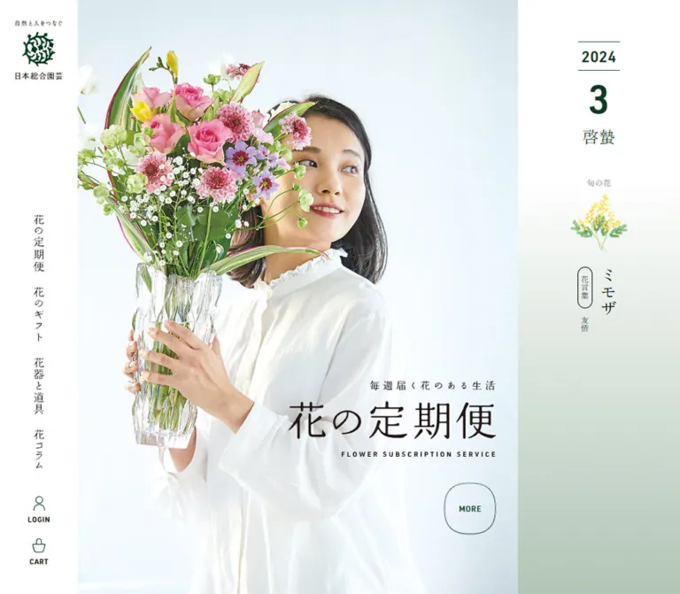
Seasonal flowers and fine Mincho lettering, given room to breathe between white space and botanical green.
Original URL: https://nihon-sogo-engei.com/ Final URL: https://nihon-sogo-engei.com/ Theme: light main content, muted promotional accents, and a deep-green footer. Inspected: September 23, 2026, at 00:57 JST; supplied retrieval timestamp: September 22, 2026, at 15:57:06.051 UTC. Viewports: desktop 1440 × 1000 CSS pixels; mobile 390 × 844 CSS pixels. Scope: the current homepage, using three desktop captures, two mobile captures, rendered page text, link destinations, root custom properties, and selected computed element measurements. Visual captures cover the opening composition, a desktop course-selection/FLOW section, and both footer layouts. Other sections are characterized from DOM evidence where screenshots are unavailable.
日本総合園芸 combines a flower shop, subscription introduction, practical delivery guidance, and editorial content within one long homepage. Its visual identity comes from precise relationships: a narrow white navigation rail beside a broad flower photograph; upright Japanese text beside horizontal editorial headings; delicate outlines beside substantial green actions; and colorful flowers surrounded by restrained interface colors.
The desktop opening feels like a seasonal publication. A flower arrangement, delivery box, glass vase, fabric, and scissors occupy a pale photographic field. Vertical introductory copy sits toward the upper left, while the subscription wordmark anchors the lower right. A separate calendar column introduces the season with a large month numeral and a small botanical illustration. Below, coral and sage promotional banners bring more direct commercial emphasis.
Mobile changes the composition materially. The logo overlays the photograph, the calendar disappears from the visible opening, and account/cart/menu controls move into a persistent bottom strip. The page retains its spacious rhythm, but three-column sections become vertical sequences and the footer directory becomes two columns.
Seasonal flowers and fine Mincho lettering, given room to breathe between white space and botanical green.
Original URL: https://nihon-sogo-engei.com/ Final URL: https://nihon-sogo-engei.com/ Theme: light main content, muted promotional accents, and a deep-green footer. Inspected: September 23, 2026, at 00:57 JST; supplied retrieval timestamp: September 22, 2026, at 15:57:06.051 UTC. Viewports: desktop 1440 × 1000 CSS pixels; mobile 390 × 844 CSS pixels. Scope: the current homepage, using three desktop captures, two mobile captures, rendered page text, link destinations, root custom properties, and selected computed element measurements. Visual captures cover the opening composition, a desktop course-selection/FLOW section, and both footer layouts. Other sections are characterized from DOM evidence where screenshots are unavailable.
日本総合園芸 combines a flower shop, subscription introduction, practical delivery guidance, and editorial content within one long homepage. Its visual identity comes from precise relationships: a narrow white navigation rail beside a broad flower photograph; upright Japanese text beside horizontal editorial headings; delicate outlines beside substantial green actions; and colorful flowers surrounded by restrained interface colors.
The desktop opening feels like a seasonal publication. A flower arrangement, delivery box, glass vase, fabric, and scissors occupy a pale photographic field. Vertical introductory copy sits toward the upper left, while the subscription wordmark anchors the lower right. A separate calendar column introduces the season with a large month numeral and a small botanical illustration. Below, coral and sage promotional banners bring more direct commercial emphasis.
Mobile changes the composition materially. The logo overlays the photograph, the calendar disappears from the visible opening, and account/cart/menu controls move into a persistent bottom strip. The page retains its spacious rhythm, but three-column sections become vertical sequences and the footer directory becomes two columns.
| Name | Value | Source / suggested alias | Evidence and role |
|---|---|---|---|
| White Canvas | #ffffff |
Source --body-color; alias --color-paper |
Measured body background, desktop rail, and reversed details inside promotions |
| Charcoal Text | #1a1a1a |
Source --font-color; alias --color-ink |
Measured body and heading text |
| Action Forest | #0f3a25 |
Source --button-color; alias --color-action |
Measured course-selection buttons and desktop calendar text |
| Brand Evergreen | #004729 |
Alias --color-brand |
Measured mobile MENU background; the footer visually corresponds to this green, but its own computed fill was not supplied |
| Link Green | #065830 |
Source --link-color |
Declared link token; individual sampled links can inherit charcoal or white instead |
| Theme Leaf | #3f7749 |
Source --theme-color |
Declared theme token; do not substitute it for the measured darker course buttons |
| Coupon Coral | #d87875 |
Alias --color-coupon |
Measured coupon banner background: rgb(216, 120, 117) |
| Diagnosis Sage | #5a8f7b |
Alias --color-diagnosis |
Measured diagnosis banner background: rgb(90, 143, 123) |
| Layer Gray | #f0f0f0 |
Source --layer-color |
Declared surface token; visually consistent with the broad course-selection band |
| Quiet Gray | #999999 |
Source --gray-color |
Declared muted text token; the small FLOW label appears in a similar gray |
| Action Hover | #005c2b |
Source --button-hover-color |
Declared hover color; hovered appearance was not captured |
| Link Hover | #1e9555 |
Source --hover-color |
Declared hover token; actual use on individual links is unverified |
| Name | Approximation | Intended use |
|---|---|---|
| Pale Sage Panel | #e2eae4 |
Approximation of the visible FLOW card backgrounds |
| Soft Leaf Linework | #87a78e |
Approximation of the FLOW icons, numbers, and connecting details |
| Cool Photo Ground | Very pale blue-gray | Part of the hero photography; not evidence of a page-wide CSS gradient |
The palette has a clear division of labor. White creates space, charcoal carries reading, dark green establishes identity and major actions, and coral/sage distinguish two promotional offers. Flowers and footer banner images supply most other saturated colors.
Numerous CMS preset gradients, bright colors, and shadows appear among the root properties. Their presence does not establish visible usage. The inspected design does not support treating those presets as an additional rainbow palette or elevation system.
Computed family: "Shippori Mincho", serif, also declared through --mincho.
Use this family for Japanese navigation, section headings, introductory statements, promotional banners, calendar text, article titles, and customer quotations. Its fine strokes and open counters connect the page to printed Japanese editorial design.
Observed weights are restrained: 400 for navigation and quotations, 500 for most headings, 600 for the large course-selection button, and 700 for promotional banners and calendar numerals.
Computed family: "Noto Sans JP", sans-serif, declared through --body-font.
Body explanations use regular sans serif with generous double leading. Utility labels, dates, testimonial attribution lines, form controls, and the smaller subscription button use this family. Navigation utilities have approximately 0.05em tracking.
The source input stack is -apple-system, BlinkMacSystemFont, "Hiragino Sans", "BIZ UDPGothic", Meiryo, sans-serif. The note stack starts with Hiragino Sans and includes Noto Sans JP. These are functional fallbacks, not additional display families.
All values below are measured CSS pixels. They are not proposed rem values.
| Role | Desktop size / line height | Mobile size / line height | Weight / family |
|---|---|---|---|
| Root and standard body | 15 / 30 |
13 / 26 |
400, sans serif |
| Main section heading | 33 / 52.8 |
20.8 / 33.28 |
500, Mincho |
| Section introductory line | 21 / 33.6 |
15.6 / 24.96 |
500, Mincho |
| Feature/story heading | 24 / 38.4 |
18.2 / 29.12 |
500, Mincho |
| Subscription section title | 52.5 / 84 |
45.5 / 72.8 |
500, Mincho |
| Subscription description | 17.25 / 34.5 |
14.95 / 29.9 |
400, sans serif |
| Promotional banner copy | 21 / 33.6 |
16.38 / 26.208 |
700, Mincho |
| Large course button | 24 / 38.4 |
16 / 25.6 |
600, Mincho |
| Subscription pill button | 18 / 28.8 |
14.5 / 23.2 |
600, sans serif |
| Customer quotation | 15 / 24 |
13 / 20.8 |
400, Mincho |
| Customer attribution | 12 / 24 |
12 / 24 |
400, sans serif |
| FLOW explanation | 13.125 / 26.25 |
11.375 / 22.75 |
500, sans serif |
| Article title | 18 / 23.4 |
15.6 / 20.28 |
400, Mincho |
| Article date/category | 11.25 / 18 |
11.375 / 18.2 |
400, sans serif |
| Account/cart caption | 10.3125 / 16.5 |
11.375 / 22.75 |
400, sans serif |
| Delivery comparison value | 20.25 / 32.4 |
15.6 / 24.96 |
600, sans serif |
| Hero qualification note | 11.25 / normal |
9.75 / normal |
400, note stack |
The desktop rail links use 16.5px Mincho. Their vertical Japanese labels occupy approximately 17px-wide glyph bounds, with five-character entries measuring 82.5px tall.
The calendar year uses 22.5px / 22.5px, weight 700. The month uses 56.25px / 90px, weight 700, and -5.625px letter spacing. The seasonal term uses 23.4375px / 37.5px, weight 400.
The H1 has an empty extracted text value, although the subscription wordmark is clearly visible. Its measured box is 384 × 143.34px on desktop and 240 × 89.59px on mobile. Treat this visible composition as artwork unless its underlying implementation is available.
The H1's computed font sizes, 45px and 31.2px, do not establish the actual size or font of the visible wordmark lettering. Preserve its small Japanese lead-in, large Japanese title, and tightly tracked English subtitle as a composed unit.
| Token / relationship | Desktop | Mobile | Evidence |
|---|---|---|---|
| Main section gap | 120px |
56px |
Source --section-gap, also reflected in section positions |
| Column gap | 40px |
20px |
Source --column-gap |
| Item gap | 32px |
16px |
Source --item-gap |
| Grid gap | 8px |
8px |
Source --grid-gap |
| Block spacer | 20px |
calc(1.6vw + 4px) |
Source --block-spacer; mobile calculation is 10.24px at 390px |
| Main content maximum | 1080px |
Same declared maximum | Source --container-width |
| Narrow content maximum | 800px |
Same declared maximum | Source --content-width; not the width of every paragraph |
| Main content side clearance | 105px inside the main region |
20px |
Calculated from measured container bounds |
| Promotion separation | 27px horizontally |
About 16.38px vertically |
Calculated from banner bounds |
| Large CTA heading-to-button gap | 40px |
20px |
Calculated from measured bounds |
| Element | Desktop | Mobile | Evidence |
|---|---|---|---|
| Base radius token | 0 |
0 |
Source --border-radius |
| Promotional banners | 0 |
0 |
Measured |
| Subscription panel | 15px |
13px |
Measured |
| Subscription pill button | 50px |
50px |
Measured |
| Large course button | 15.84px |
10.56px |
Measured |
| Postal check button | 0 4px 4px 0 |
0 3.625px 3.625px 0 |
Measured |
| Article category label | 50px |
50px |
Measured |
| Hero service seals | Circle | Circle | Visually observed |
| FLOW panel | Approximately 20px |
Not visually measured | Desktop screenshot estimate |
Square promotional frames and rectangular image banners coexist with rounded functional controls. A universal rounded-card treatment would lose this distinction.
| Element | Desktop 1440 × 1000 | Mobile 390 × 844 |
|---|---|---|
| Navigation rail | 150 × 1000px |
No visible side rail |
| Main region | Starts at x=150; width 1290px |
Starts at x=0; width 390px |
| Standard container | x=255; width 1080px |
x=20; width 350px |
| Hero section | 1290 × 640px |
390 × 590.80px |
| Hero photo region | Approximately 1040 × 640px |
Full-width portrait composition |
| Calendar region | Approximately 250px wide |
Absent from visible opening |
| Logo link | 67.5 × 85.03px |
127.09 × 146.61px, including 26px padding |
| First promotion | 526.5 × 121.80px |
350 × 119.33px |
| Large course button | 720 × 119.98px |
350 × 65.59px |
| Subscription pill button | 480 × 71.98px |
309 × 57.97px |
| Feature text column | About 333.33px |
350px |
| Story text column | 446px |
350px |
| Bottom utility cell | Not applicable | About 129.98 × 59.42px |
| Document height | About 12,145.80px |
About 11,636.06px |
Document height reflects captured content and layout. It should not become a fixed implementation target.
Role: persistent brand and shopping navigation throughout the long homepage.
A white 150px strip occupies the left edge. The body itself has padding-left: 150px, so the main content is genuinely offset. The rail remains visible in opening, middle, and footer captures.
The logo sits near the top at x=41.25, y=30. Four vertically written links form a lower stack: 花の定期便, 花のギフト, 花器と道具, and 花コラム. Their top positions are approximately 433, 538, 643, and 748px. Account and cart utilities sit below, with delicate green outline icons above small uppercase captions. The final control ends 30px above the viewport bottom.
Use real vertical Japanese layout for the category links. Rotating a horizontal line of text would produce a different reading direction and character treatment. Preserve the generous empty rail area between the logo and navigation.
Role: retain brand recognition and shopping access without consuming a side column.
At 390px, the logo appears over the upper-left hero area. Its link includes 26px padding, producing an approximately 75 × 95px inner logo area. It is not visible in the mobile footer capture.
The bottom dock has three equal cells labeled LOGIN, CART, and MENU. Unlike desktop's icon-over-caption utilities, mobile places each icon beside its caption. Login and cart use white surfaces with fine separators; MENU uses measured evergreen #004729 with white icon and text.
The dock begins at y=784.58 and is about 59.42px high. It remains visible in both mobile captures. The menu is a button, but no expanded menu view or opening behavior was supplied.
Role: communicate the product, seasonality, and delivery character before introducing detailed offers.
Desktop combines a large photo field with a narrow calendar column. The flower photograph includes a glass vase, long green stems, yellow/orange blooms, a cardboard delivery box, textured fabric, and scissors. These practical objects make the service tangible while the pale background leaves room for typography.
The opening copy is vertical, positioned near the upper-left portion of the photo. The H1 artwork sits 40px from the photo's right and bottom edges. Two outlined circular seals sit above it, communicating 送料無料 and 全国対応, with a small qualification marker. The qualification note sits just below the desktop hero field.
Mobile uses a different visible arrangement and composition. The vertical copy moves to the upper right; the photograph occupies the middle; the 240px-wide title artwork begins at x=130, y=374.19. The seals move beneath the wordmark, and the qualification remains inside the hero near the lower-right corner.
The supplied stills do not establish whether the different flower arrangements result from art-directed assets, different slider frames, or another selection mechanism. Reproduce the observed composition without inventing a carousel.
Role: provide a quiet, editorial expression of seasonality.
The desktop column has a centered 60px-wide date stack beginning at y=60. Thin horizontal rules frame the year. A much larger month numeral sits below, followed by the seasonal term.
The captured content is 2026, 9, and 白露. Farther down are the small label 旬の花, a red botanical illustration, and vertically arranged 彼岸花 with flower-language text. The flower group occupies approximately 96 × 287px.
This information is absent from the mobile visible-text extraction and screenshot, although it remains present in ancestor DOM text. No calendar interaction or update schedule was demonstrated. For reuse, manage it as seasonal content instead of permanently embedding the captured date.
Role: offer two distinct entry points beneath the hero and repeat them near the page's end.
Desktop places two equal-width banners in a 1080px container, separated by 27px. Each entire banner is linked. The structure is a colored rectangular field, inset white frame, white circular introductory badge, two-line Mincho message, and a large white pictogram at the right.
The coupon uses coral and a gift icon. The diagnosis uses sage and a vase/search motif. Copy is 21px, weight 700, with 33.6px leading. Padding is 21px, and the source reports a 10.5px internal gap. The inset frame appears approximately 8px from the edge; its exact CSS was not supplied.
On mobile, each banner becomes 350px wide and stacks vertically. The introductory circle becomes a short horizontal white pill centered near the top. The message sits below toward the left; the icon occupies the lower right. Copy becomes 16.38px / 26.208px, and padding becomes 16.38px. The first banner begins 56px after the hero.
The coupon link targets #modal-coupon. Coupon instructions and a copy label exist in the DOM, but modal geometry, focus behavior, and clipboard results were not inspected. The diagnosis link targets #; its question sequence and result view are unverified.
Role: establish a repeated, calm chapter rhythm across a long page.
The common anatomy is a small uppercase English label, a thin vertical divider beneath it, a Japanese introductory line, and a larger Japanese heading. FLOW is directly visible in the middle screenshot; related headings are supported by computed styles throughout the DOM.
Use gray sans serif for the English label and Mincho for both Japanese lines. Standard heading size changes from 33px desktop to 20.8px mobile; the introductory line changes from 21px to 15.6px. Keep alignment centered in these chapter headings. The FLOW divider appears about 30px tall; that dimension is a visual estimate.
Examples of observed chapter labels include ABOUT US, SUBSCRIPTION, FEATURES, KODAWARI, VOICE, FLOW, and DELIVERY.
Role: explain the subscription and provide an early course-selection route.
The panel spans the standard container and has measured rounding: 15px desktop and 13px mobile. Its inner padding is 22.5px and 19.5px respectively. The title is unusually prominent within the page: 52.5px desktop and 45.5px mobile.
The desktop description is constrained to 690px, centered within the panel. Mobile uses the measured 309px inner width. Below is a forest-green pill button, using sans serif rather than the Mincho of the later large CTA.
Desktop visible text includes a starting price of ¥1,298~. Mobile visible-text extraction omits this price even though ancestor DOM text still contains it. The exact hiding mechanism and media decoration of this panel are not established by the supplied screenshots.
Role: organize benefits and explain the brand's approach to flowers.
FEATURES has three desktop text columns, each approximately 333.33px wide, separated by 40px. Each groups a numbered POINT label, a Mincho heading, and sans-serif explanatory copy. On mobile, all three occupy the 350px content width and follow one another vertically.
KODAWARI contains three editorial stories. Measured text columns alternate right, left, right on desktop: the right-hand text begins at x=889, while the left-hand text begins at x=255. Each is 446px wide. Mobile brings every text block to x=20 with a 350px width.
Maintain this distinction between concise three-part benefits and slower editorial storytelling. The adjacent media in these sections is not visually characterized by the supplied screenshot crops; obtain the actual assets before specifying their subject, crop, or treatment.
Role: present lived experience in a more personal typographic register.
Quotations use regular Mincho, while customer initials, locations, and course names use smaller sans serif. Desktop quote text boxes are 280px wide, with successive boxes starting 340px apart. Mobile text boxes are 246px wide, with starts 298px apart.
The DOM contains repeated quotations and many offscreen horizontal positions. This supports a repeated horizontal track structure and suggests carousel cloning. It does not prove autoplay, swipe handling, navigation controls, duration, or easing.
For a new implementation, keep a single accessible source list and make any cloned visual entries non-focusable and hidden from assistive technology. Manual scrolling is a reasonable recommendation when original motion behavior cannot be verified.
Role: offer a strong course-selection action after substantial explanatory content.
The visible desktop band stretches across the 1290px main region, including beyond the standard content container. Its inner measured section is 1080px wide with 120px top and bottom padding. The gray field is approximately 438.38px tall.
A centered, single-line desktop statement sits above a 720 × 119.98px forest button. The button has a softly rounded rectangular outline, a fine inset white border, a centered Mincho label, and a white rounded arrow enclosure near the right edge. The text reads 花の定期便のコースを探す and links to /teikibin.
Mobile changes the statement to three measured lines and reduces band padding to 56px. The button fills the 350px container and becomes approximately 65.59px tall. Its type is 16px and its radius is 10.56px.
Keep this larger rectangular treatment distinct from the earlier 480px-wide pill button. Both are observed components with different emphasis.
Role: explain the three stages of starting the service.
The visible desktop section uses three pale-sage rounded panels with white circular icon fields, green line illustrations, and small step numbers near the upper right. The icon subjects are a selection interface, an entry form, and a flower bouquet. A pale dashed connector runs between panels.
The white circles appear approximately 120px in diameter. Panel rounding and supporting green tones are screenshot estimates. Explanatory text is measured at 13.125px / 26.25px desktop and 11.375px / 22.75px mobile.
Mobile DOM positions confirm a vertical sequence of the three explanations. The exact mobile connector treatment and icon sizes are not visible in the supplied mobile captures.
Role: make service availability and delivery differences understandable before purchase.
The DELIVERY chapter introduces two delivery methods and a postal-code check affordance. Its check button is measured at approximately 185.59 × 60px on desktop and 142.30 × 48px on mobile. It uses a dark green fill and rounding only on its right corners, suggesting a joined control group. The input element itself was not included in the selected measurements, so its placeholder, format rules, and validation states remain unknown.
The comparison presents service differences across five topics: additional charges, delivery region, scheduling, payment, and support. Desktop method headings are adjacent 455px-wide blocks. On mobile, each method becomes a separate 350px-wide section, retaining a narrower value column within its rows.
Use semantic headings and explicit row labels in an adaptation. Preserve the qualification text around delivery coverage; the headline service seals do not replace the detailed exceptions.
Role: extend the site beyond subscription conversion into ongoing editorial content.
Desktop has two 520px-wide editorial groups separated by 40px. Each group contains two article links approximately 245px wide, separated by 30px. The groups cover the president's journal and flower-related articles.
Within each item, the DOM places compact date/category metadata above a Mincho title. Category labels have a 50px radius and a subtle translucent white background. Titles use 18px / 23.4px, so long titles create taller items instead of enforcing identical text heights.
Mobile stacks the two editorial groups while keeping two articles per row. Each article is 162px wide, with a 26px gap. Date and category occupy separate lines at this width. Titles reduce to 15.6px / 20.28px.
An Instagram invitation follows. Its mobile action is a white, green-text pill approximately 350 × 59.97px.
Role: provide personal assistance alongside self-directed course selection.
Near the end of the main content, the page offers telephone information plus LINEで相談 and メールで相談. The mobile contact section occupies a measured 350px width and switches to a block layout.
The desktop middle capture also shows a sage diagnosis tab near the lower-right edge, approximately 165 × 147px, with a small close affordance and vase/search graphic. It is not visible in the supplied opening or footer captures, and its text is absent from the mobile visible-text extraction. Its appearance threshold, dismissal persistence, and diagnosis behavior were not verified.
Role: close the page with service navigation, contact information, corporate identity, and related destinations.
The footer is a large deep-green field with reversed text. Desktop preserves the white navigation rail beside it. Upper footer content includes guide/account/legal/contact links, social links, telephone details, and opening hours. A much larger horizontal brand signature sits below, followed by corporate-site and contact links with northeast arrows.
Seven linked banner images form the lower directory. Desktop uses four items in the first row and three centered beneath. The screenshot suggests images approximately 276 × 111px, a ratio close to 2.5:1. Each image has a centered Japanese label and a smaller, muted English line below it.
Mobile uses two columns with approximately 161px-wide images, 24px outside margins, and a 20px column gap. The seventh item is centered on its own final row. The brand signature stays horizontal and scales down substantially.
The directory visibly includes flower subscription, natural farming, natural-food retail, employment-related shopping, health food, sustainable craft, and regional produce destinations. These are linked brands shown by the original page; the layout alone does not establish their legal ownership relationships.
| Treatment | Evidence | Supported conclusion |
|---|---|---|
| Standard anchor transitions | Sampled anchors report 0.25s ease-in |
A short transition is declared; the properties visibly changing on hover were not tested |
| Button transitions | Sampled buttons report color/background/border/opacity-related transitions with 0.25s ease-in |
Styling transitions exist; no pressed, loading, or error state was captured |
| Desktop rail persistence | Same rail remains in opening, middle, and footer captures | Navigation stays at the viewport edge while the document changes position |
| Mobile dock persistence | Same three-cell dock appears in opening and footer captures | Bottom utility access persists during scrolling |
| Customer voice repetition | Duplicated text and offscreen horizontal bounds | Repeated track structure is supported; autoplay and gestures remain unverified |
| Coupon entry | Link targets #modal-coupon; related instructions exist in DOM |
Coupon-related content is present; opening, closing, and copying were not exercised |
| Diagnosis entry | Promotional link and desktop floating affordance | An entry point is present; questions and results were not inspected |
| Postal check | Visible button and explanatory text | Availability lookup is offered; request and result behavior are unverified |
| Hero image changes | Different arrangements in desktop/mobile stills | Different rendered imagery is established; the cause is unknown |
Most sampled elements report animation: none. This does not prove that descendants, pseudo-elements, scripts, or unrecorded states never animate. A computed transition value of all without a supplied nonzero duration is not evidence of visible motion.
The capture process waited for settling and image decoding, temporarily paused perpetual animations during readiness checks, and then resumed them. It did not provide a motion recording. Do not assign parallax, entrance choreography, slide intervals, or easing curves beyond the evidence above.
| Layer | Appearance | Purpose |
|---|---|---|
| Main canvas | White | Gives photographs and fine typography room |
| Desktop rail | White, visually continuous with the page | Persistent identity and utilities |
| Hero field | Pale photographic ground | Supports flowers, packaging, and overlaid copy |
| Promotional offer | Coral or sage with inset white frame | Separates coupon and diagnosis entry points |
| Course-selection band | Broad light-gray field | Creates a pause around the strongest repeated CTA |
| Primary action | Deep forest green with white text | Clearly identifies course selection |
| FLOW panel | Estimated pale sage with white icon circle | Groups sequential instructions |
| Footer | Deep evergreen with reversed identity | Marks the end of the document and groups linked destinations |
No general elevated-card system is visible. Boundaries come from white space, color fields, thin lines, photography edges, and selective rounding. The slight separation above the mobile dock should not become a page-wide shadow language.
The hero's strongest characteristic is its combination of flowers and delivery materials. The arrangement is loose and airy rather than a tightly packed spherical bouquet. Long stems and leaves create vertical movement; the box and fabric establish a low diagonal base. Glass transparency and soft shadows retain the feeling of a real tabletop scene.
Preserve the pale exposure and negative space. A tightly cropped flower close-up would remove the room required by the vertical copy, title artwork, and circular service seals. Mobile needs deliberate composition: the branding and vertical copy occupy the top, flowers sit through the middle, and the wordmark and seals fill the lower area.
The calendar illustration is small, delicate, and botanical. Utility icons are simple green outlines; promotional pictograms are bold white silhouettes; FLOW icons use softer green linework. These are distinct levels of detail serving different component sizes.
Footer banners retain their own photographic and graphic identities. Their consistency comes from shared dimensions, alignment, and caption hierarchy rather than recoloring them all green.
No original asset URLs or filenames were included in the supplied rendered evidence. The following is an asset inventory, not a list of recovered paths.
| Asset | Observed use | Reproduction requirement |
|---|---|---|
| Brand emblem and vertical signature | Desktop rail and mobile opening | Use an authorized original asset; do not approximate the emblem with a generic leaf icon |
| Horizontal reversed signature | Footer | Preserve the horizontal relationship between phrase, emblem, and name |
| Desktop flower still life | Hero | Retain packaging, vase, fabric, scissors, long stems, and ample pale space |
| Mobile flower composition | Hero | Supply a composition appropriate for the observed portrait layout |
| Subscription title artwork | Hero H1 region | Preserve its composed Japanese/English hierarchy and aspect ratio |
| Seasonal botanical illustration | Desktop calendar | Keep the small, delicate red-flower illustration subordinate to the date |
| Gift and vase/search pictograms | Promotional banners | Use white silhouettes with sufficient weight at small sizes |
| Three process illustrations | FLOW cards | Use soft-green linework inside white circular fields |
| Seven linked banner images | Footer directory | Maintain the approximately 2.5:1 image ratio and original individual identities |
Avoid applying filters to all photography or forcing the images into a duotone treatment. Natural flower color is an essential counterweight to the restrained UI.
The measured desktop body reserves 150px for navigation. Its source width token is --vw: calc(100vw - 150px). At mobile, body padding becomes zero and the token becomes 100vw.
At 1440px, the main region is 1290px wide. A centered 1080px container therefore leaves 105px on either side within that region. At 390px, the main container is 350px wide with 20px margins. Full-width hero and footer fields are separate from this standard container system.
| Pattern | Desktop observation | Mobile observation |
|---|---|---|
| Global navigation | Fixed white left rail | Logo over hero and fixed bottom dock |
| Hero | Wide photo plus separate calendar | Full-width portrait composition; calendar absent |
| Introductory copy | Vertical near photo's upper left | Vertical near upper right |
| Promotional offers | Two equal columns | Two stacked banners with pill labels |
| Main section gap | 120px | 56px |
| FEATURES | Three columns | One column |
| KODAWARI copy | Alternating right/left/right positions | All full-width and left-aligned within container |
| FLOW | Three panels across | Three explanations stacked |
| Delivery comparison | Adjacent method columns | Separate method sections |
| Editorial groups | Two groups side by side | Groups stacked; articles remain two across |
| Footer banners | Four, then three centered | Two columns, with final item centered |
The mobile document is slightly shorter despite several stacked sections. Reduced gaps, smaller type, different hero treatment, and other responsive changes all contribute; the evidence does not justify attributing the difference to one hidden section.
The original breakpoint is unknown. The Quick Start uses 980px as a recommended starting threshold and requires testing at intermediate widths. Safe-area padding and clearance above the bottom dock are recommended implementation additions, not verified source behavior.
#d87875 and #5a8f7b.#3f7749 in place of all measured greens.These are recommendations for a new implementation, not verified features of the inspected site:
#ffffff.#1a1a1a.#0f3a25.#004729; use this as a close footer approximation pending its exact source fill.#d87875 with white framing and pictogram.#5a8f7b with white framing and pictogram.#f0f0f0.“Create a Japanese flower-shop and subscription homepage using a white canvas, charcoal text, Shippori Mincho editorial headings, and Noto Sans JP body copy. At desktop, reserve a fixed 150px white navigation rail with a small brand signature, vertically written category links, and delicate account/cart utilities. Build a wide flower still-life hero with delivery packaging, glass, fabric, and long stems on a pale ground. Position vertical introductory copy at the upper left and composed subscription lettering at the lower right, with a separate seasonal calendar column. Follow with coral and sage inset-frame offers, spacious editorial sections, practical delivery guidance, two distinct green course-button styles, article groups, and a deep-green footer directory. On mobile, move utilities into an equal three-cell bottom dock, art-direct the portrait hero, stack major sections, and retain two-column article and footer grids.”
#d87875 and sage #5a8f7b. Give each a thin inset white frame, white circular label, two-line bold Mincho message, and white gift or vase/search pictogram. At 390px viewport width, stack 350px banners and turn each circle into a centered short pill.”This CSS is a reusable approximation of the observed shell and major components. It uses measured colors and dimensions where available, plus explicitly identified visual estimates. It does not implement the diagnosis flow, coupon dialog, postal lookup, or customer-track behavior.
The 980px breakpoint, focus treatment, safe-area support, and some icon geometry are recommendations. Use authorized original images in .hero-picture, .hero-title, the brand signatures, and footer directory. The hero image must be prepared for its composition; CSS cropping alone cannot reproduce both supplied arrangements.
Expected structure: .floral-site contains the desktop rail, mobile logo/dock, main content, and footer. A .hero contains .hero-stage and .season; the hero stage holds the picture and overlaid content. Place a .container inside full-width bands. Banner children use .promo-stamp, .promo-copy, and .promo-icon.
:root {
  /* Measured colors and source tokens */
  --color-paper: #ffffff;
  --color-ink: #1a1a1a;
  --color-action: #0f3a25;
  --color-brand: #004729;
  --color-link: #065830;
  --color-coupon: #d87875;
  --color-diagnosis: #5a8f7b;
  --color-layer: #f0f0f0;
  --color-muted: #999999;
  --color-action-hover: #005c2b;

  /* Visual estimates for the visible process panels */
  --color-process: #e2eae4;
  --color-process-line: #87a78e;

  /* Computed family names; load licensed fonts separately */
  --font-editorial: 'Shippori Mincho', serif;
  --font-body: 'Noto Sans JP', sans-serif;
  --font-input: -apple-system, BlinkMacSystemFont,
    'Hiragino Sans', 'BIZ UDPGothic', Meiryo, sans-serif;

  /* Desktop measurements */
  --rail-width: 150px;
  --container-width: 1080px;
  --section-gap: 120px;
  --column-gap: 40px;
  --item-gap: 32px;
  --body-size: 15px;
  --heading-size: 33px;
  --lead-size: 21px;
  --subheading-size: 24px;
  --dock-height: 59.422px;
  --safe-bottom: env(safe-area-inset-bottom, 0px);
  --transition-link: 250ms ease-in;
}

* { box-sizing: border-box; }

.floral-site {
  min-height: 100vh;
  padding-left: var(--rail-width);
  color: var(--color-ink);
  background: var(--color-paper);
  font-family: var(--font-body);
  font-size: var(--body-size);
  line-height: 2;
}

.floral-site img { display: block; max-width: 100%; }
.floral-site button { font: inherit; cursor: pointer; }
.floral-site a { color: inherit; }

.container {
  width: min(var(--container-width), calc(100% - 40px));
  margin-inline: auto;
}

.section { margin-top: var(--section-gap); }

.site-rail {
  position: fixed;
  inset: 0 auto 0 0;
  z-index: 40;
  display: flex;
  flex-direction: column;
  width: var(--rail-width);
  height: 100dvh;
  padding-block: 30px;
  background: var(--color-paper);
}

.rail-brand {
  display: block;
  width: 67.5px;
  margin-inline: auto;
}

.rail-group { margin-top: auto; }

.rail-links {
  display: flex;
  flex-direction: column;
  align-items: center;
  gap: 22.5px;
  margin: 0 0 30px;
  padding: 0;
  list-style: none;
}

.rail-links a {
  display: block;
  writing-mode: vertical-rl;
  text-orientation: mixed;
  font-family: var(--font-editorial);
  font-size: 16.5px;
  line-height: 1;
  text-decoration: none;
}

.rail-utility {
  display: flex;
  flex-direction: column;
  align-items: center;
  justify-content: center;
  min-height: 62.906px;
  padding-block: 10.3125px;
  font-size: 10.3125px;
  line-height: 16.5px;
  letter-spacing: .05em;
  text-decoration: none;
  text-transform: uppercase;
}

.rail-utility svg {
  width: 22px;
  height: 22px;
  margin-bottom: 4px;
  color: var(--color-brand);
}

.mobile-logo, .mobile-dock { display: none; }

.hero {
  display: grid;
  grid-template-columns: minmax(0, 1fr) 250px;
  min-height: 640px;
}

.hero-stage {
  position: relative;
  min-width: 0;
  min-height: 640px;
  background: #f3f7f8;
}

.hero-picture {
  position: absolute;
  inset: 0;
}

.hero-picture img {
  width: 100%;
  height: 100%;
  object-fit: cover;
}

.hero-copy {
  position: absolute;
  top: 64px;
  left: 60px;
  margin: 0;
  writing-mode: vertical-rl;
  font-family: var(--font-editorial);
  font-size: 18px;
  line-height: 2.05;
}

.hero-title {
  position: absolute;
  right: 40px;
  bottom: 40px;
  width: min(384px, calc(100% - 80px));
  margin: 0;
}

.hero-title img { width: 100%; height: auto; }

.hero-badges {
  position: absolute;
  right: 40px;
  bottom: 212px;
  display: flex;
  gap: 15px;
}

.shipping-badge {
  display: grid;
  place-content: center;
  width: 70px;
  aspect-ratio: 1;
  border: 1px solid currentColor;
  border-radius: 50%;
  font-family: var(--font-editorial);
  font-size: 18px;
  line-height: 1.2;
  text-align: center;
}

.hero-note {
  position: absolute;
  top: calc(100% + 5.5px);
  right: 0;
  margin: 0;
  font-size: 11.25px;
  line-height: 1.5;
}

.season {
  padding: 60px 20px 0;
  font-family: var(--font-editorial);
  text-align: center;
}

.calendar {
  width: 60px;
  margin-inline: auto;
  color: var(--color-action);
}

.calendar-year {
  margin: 0;
  padding-block: 9px;
  border-block: 1px solid currentColor;
  font-size: 22.5px;
  font-weight: 700;
  line-height: 22.5px;
}

.calendar-month {
  margin: 0;
  font-size: 56.25px;
  font-weight: 700;
  line-height: 90px;
  letter-spacing: -5.625px;
}

.calendar-term {
  margin: 0;
  font-size: 23.4375px;
  line-height: 37.5px;
}

.season-flower { width: 96px; margin: 45px auto 0; }

.promotions {
  display: grid;
  grid-template-columns: repeat(2, minmax(0, 1fr));
  column-gap: 2.5%;
  row-gap: 16.38px;
}

.promo {
  --offer-color: var(--color-coupon);
  position: relative;
  display: grid;
  grid-template-columns: 78px minmax(0, 1fr) 54px;
  align-items: center;
  gap: 10.5px;
  min-height: 121.8px;
  padding: 21px;
  color: white !important;
  background: var(--offer-color);
  font-family: var(--font-editorial);
  font-size: 21px;
  font-weight: 700;
  line-height: 1.6;
  text-decoration: none;
}

.promo--diagnosis { --offer-color: var(--color-diagnosis); }

.promo::after {
  content: '';
  position: absolute;
  inset: 8px;
  border: 2px solid white;
  pointer-events: none;
}

.promo-stamp {
  display: grid;
  place-content: center;
  width: 78px;
  height: 78px;
  border-radius: 50%;
  color: var(--offer-color);
  background: white;
  line-height: 1.15;
  text-align: center;
}

.promo-copy { margin: 0; }
.promo-icon { width: 54px; height: 54px; }

.section-heading { text-align: center; }

.eyebrow {
  margin: 0;
  color: var(--color-muted);
  font-size: 18px;
  line-height: 1.6;
  letter-spacing: .05em;
}

.eyebrow::after {
  content: '';
  display: block;
  width: 1px;
  height: 30px;
  margin: 8px auto 16px;
  background: currentColor;
}

.section-lead,
.section-heading h2,
.feature-title {
  margin: 0;
  font-family: var(--font-editorial);
  font-weight: 500;
  line-height: 1.6;
}

.section-lead { font-size: var(--lead-size); }
.section-heading h2 { font-size: var(--heading-size); }
.feature-title { font-size: var(--subheading-size); }

.feature-grid, .flow-grid {
  display: grid;
  grid-template-columns: repeat(3, minmax(0, 1fr));
  gap: var(--column-gap);
}

.flow-card {
  position: relative;
  padding: 15px;
  border-radius: 20px;
  background: var(--color-process);
  text-align: center;
}

.flow-icon {
  display: grid;
  place-items: center;
  width: 120px;
  height: 120px;
  margin-inline: auto;
  border-radius: 50%;
  color: var(--color-process-line);
  background: white;
}

.flow-icon svg { width: 60px; height: 60px; }

.flow-number {
  position: absolute;
  top: 15px;
  right: 16px;
  color: var(--color-process-line);
  font-family: var(--font-editorial);
}

.flow-card p {
  font-size: 13.125px;
  font-weight: 500;
  line-height: 2;
}

.course-band {
  margin-block: var(--section-gap);
  padding-block: var(--section-gap);
  background: var(--color-layer);
  text-align: center;
}

.course-band h3 {
  margin: 0;
  font-family: var(--font-editorial);
  font-size: 24px;
  font-weight: 500;
  line-height: 1.6;
}

.cta {
  position: relative;
  display: block;
  max-width: 100%;
  margin-inline: auto;
  color: white !important;
  background: var(--color-action);
  font-weight: 600;
  line-height: 1.6;
  text-align: center;
  text-decoration: none;
  transition: background-color var(--transition-link);
}

.cta--large {
  width: 720px;
  margin-top: 40px;
  padding: 40.8px 93.6px;
  border-radius: 15.84px;
  font-family: var(--font-editorial);
  font-size: 24px;
}

.cta--large::after {
  content: '';
  position: absolute;
  inset: 5px;
  border: 1px solid white;
  border-radius: 11px;
  pointer-events: none;
}

.cta-arrow {
  position: absolute;
  top: 50%;
  right: 21px;
  display: grid;
  place-items: center;
  width: 38px;
  height: 38px;
  border-radius: 14px;
  color: var(--color-action);
  background: white;
  transform: translateY(-50%);
}

.cta--pill {
  width: 480px;
  padding: 21.6px 52.2px;
  border-radius: 50px;
  font-family: var(--font-body);
  font-size: 18px;
}

.editorial-groups {
  display: grid;
  grid-template-columns: repeat(2, minmax(0, 1fr));
  gap: 40px;
}

.article-grid {
  display: grid;
  grid-template-columns: repeat(2, minmax(0, 1fr));
  gap: 30px;
}

.article-title {
  font-family: var(--font-editorial);
  font-size: 18px;
  font-weight: 400;
  line-height: 1.3;
}

.site-footer {
  padding: 80px 45px 120px;
  color: white;
  background: var(--color-brand);
}

.footer-brand {
  width: min(650px, 100%);
  margin: 0 auto 40px;
}

.footer-directory {
  display: grid;
  grid-template-columns: repeat(8, minmax(0, 1fr));
  gap: 32px;
}

.footer-directory > a {
  grid-column: span 2;
  min-width: 0;
  text-align: center;
  text-decoration: none;
}

.footer-directory > a:nth-child(5) { grid-column: 2 / span 2; }
.footer-directory > a:nth-child(6) { grid-column: 4 / span 2; }
.footer-directory > a:nth-child(7) { grid-column: 6 / span 2; }

.footer-directory img {
  width: 100%;
  aspect-ratio: 2.5;
  object-fit: cover;
}

.footer-label { display: block; margin-top: 6px; font-size: 14px; }
.footer-caption { display: block; font-size: 12px; opacity: .7; }

/* Recommended hover behavior using the declared source token. */
@media (hover: hover) {
  .cta:hover { background: var(--color-action-hover); }
}

/* Recommended focus treatment, separate from visual elevation. */
.floral-site :focus-visible {
  outline: 2px solid #1a1a1a;
  outline-offset: 4px;
  box-shadow: 0 0 0 4px white;
}

/* Recommended breakpoint; the original threshold was not supplied. */
@media (max-width: 980px) {
  :root {
    --rail-width: 0px;
    --section-gap: 56px;
    --column-gap: 20px;
    --item-gap: 16px;
    --body-size: 13px;
    --heading-size: 20.8px;
    --lead-size: 15.6px;
    --subheading-size: 18.2px;
  }

  .floral-site {
    padding-bottom: calc(var(--dock-height) + var(--safe-bottom));
  }

  .site-rail { display: none; }

  .mobile-logo {
    position: absolute;
    top: 0;
    left: 0;
    z-index: 10;
    display: block;
    width: 127.094px;
    padding: 26px;
  }

  .mobile-dock {
    position: fixed;
    inset: auto 0 0;
    z-index: 50;
    display: grid;
    grid-template-columns: repeat(3, minmax(0, 1fr));
    padding-bottom: var(--safe-bottom);
    border-top: 1px solid #eeeeee;
    background: white;
  }

  .mobile-dock > a,
  .mobile-dock > button {
    display: flex;
    align-items: center;
    justify-content: center;
    gap: 10px;
    min-width: 0;
    height: var(--dock-height);
    padding: 0;
    border: 0;
    border-right: 1px solid #e5e5e5;
    border-radius: 0;
    color: var(--color-ink);
    background: white;
    font-size: 11.375px;
    line-height: 1.6;
    letter-spacing: .05em;
    text-decoration: none;
    text-transform: uppercase;
  }

  .mobile-dock > .menu-control {
    border-right: 0;
    color: white;
    background: var(--color-brand);
  }

  .mobile-dock svg { width: 24px; height: 24px; }

  .hero { display: block; min-height: 0; }
  .season { display: none; }

  .hero-stage {
    min-height: 0;
    aspect-ratio: 390 / 590.8;
  }

  .hero-copy {
    top: 20px;
    right: 20px;
    left: auto;
    font-size: 16px;
    line-height: 2;
  }

  .hero-title {
    right: 20px;
    bottom: 127px;
    width: min(240px, calc(100% - 40px));
  }

  .hero-badges { right: 20px; bottom: 50px; }
  .shipping-badge { width: 60px; font-size: 16px; }

  .hero-note {
    top: auto;
    right: 20px;
    bottom: 20px;
    font-size: 9.75px;
  }

  .promotions { grid-template-columns: minmax(0, 1fr); }

  .promo {
    grid-template-columns: minmax(0, 1fr) 44px;
    grid-template-rows: auto 1fr;
    gap: 7px 8px;
    min-height: 119.328px;
    padding: 16.38px;
    font-size: 16.38px;
  }

  .promo::after { inset: 6px; border-width: 1px; }

  .promo-stamp {
    grid-column: 1 / -1;
    justify-self: center;
    display: flex;
    align-items: center;
    justify-content: center;
    width: 94px;
    height: 26px;
    border-radius: 999px;
    font-size: 15px;
  }

  .promo-icon {
    grid-column: 2;
    grid-row: 2;
    width: 44px;
    height: 44px;
  }

  .eyebrow { font-size: 15.6px; }
  .feature-grid, .flow-grid { grid-template-columns: minmax(0, 1fr); }
  .flow-card p { font-size: 11.375px; }

  .course-band h3 { font-size: 18.2px; }

  .cta--large {
    margin-top: 20px;
    padding: 20px 48px;
    border-radius: 10.56px;
    font-size: 16px;
  }

  .cta--large::after { border-radius: 6px; }
  .cta-arrow { right: 12px; width: 26px; height: 26px; border-radius: 9px; }

  .cta--pill {
    padding: 17.4px 42.05px;
    font-size: 14.5px;
  }

  .editorial-groups { grid-template-columns: minmax(0, 1fr); gap: 20px; }
  .article-grid { gap: 26px; }
  .article-title { font-size: 15.6px; }

  .site-footer { padding: 56px 24px; }
  .footer-brand { margin-bottom: 40px; }

  .footer-directory {
    grid-template-columns: repeat(4, minmax(0, 1fr));
    gap: 20px;
  }

  .footer-directory > a:nth-child(5),
  .footer-directory > a:nth-child(6) { grid-column: span 2; }

  .footer-directory > a:nth-child(7) { grid-column: 2 / span 2; }
  .footer-label { font-size: 11px; line-height: 1.5; }
  .footer-caption { font-size: 10px; line-height: 1.8; }
}

/* Recommended reduced-motion baseline for this adaptation. */
@media (prefers-reduced-motion: reduce) {
  .floral-site a,
  .floral-site button { transition: none; }
}
Hero offsets in this adaptation target the two supplied compositions. Test longer copy, font fallback, browser zoom, and widths around the chosen breakpoint. At intermediate mobile/tablet widths, an additional composition rule may be necessary; the original behavior at those widths was not inspected.
Optional aliases for a project already using Tailwind v4. This is not evidence that the original website uses Tailwind. Define the custom properties above first.
@theme inline {
  --color-paper: var(--color-paper);
  --color-ink: var(--color-ink);
  --color-forest: var(--color-action);
  --color-evergreen: var(--color-brand);
  --color-coral: var(--color-coupon);
  --color-sage: var(--color-diagnosis);
  --color-soft-layer: var(--color-layer);

  --font-mincho: var(--font-editorial);
  --font-sans-jp: var(--font-body);

  --text-body-copy: var(--body-size);
  --text-section-title: var(--heading-size);
  --text-section-lead: var(--lead-size);
  --text-feature-title: var(--subheading-size);

  --spacing-section: var(--section-gap);
  --spacing-column: var(--column-gap);
  --spacing-rail: var(--rail-width);
  --container-page: 1080px;
  --radius-offer: 0px;
  --radius-course: 15.84px;
}
For the paper and ink utilities, Tailwind can also use the existing root tokens directly; avoid redefining either property as a self-reference in a generated stylesheet. If your build emits these mappings literally, rename those two theme aliases to --color-page-paper and --color-page-ink while retaining the root tokens as their values.
2026-09-22T15:57:06.051Z, equivalent to September 23, 2026, at 00:57:06.051 JST.This reference documents the current supplied page. Measured facts, screenshot estimates, and recommended implementation choices remain distinct throughout.
# 日本総合園芸 / Flower Subscription — Style Reference

> Seasonal flowers and fine Mincho lettering, given room to breathe between white space and botanical green.

**Original URL:** [https://nihon-sogo-engei.com/](https://nihon-sogo-engei.com/)
**Final URL:** [https://nihon-sogo-engei.com/](https://nihon-sogo-engei.com/)
**Theme:** light main content, muted promotional accents, and a deep-green footer.
**Inspected:** September 23, 2026, at 00:57 JST; supplied retrieval timestamp: September 22, 2026, at 15:57:06.051 UTC.
**Viewports:** desktop 1440 × 1000 CSS pixels; mobile 390 × 844 CSS pixels.
**Scope:** the current homepage, using three desktop captures, two mobile captures, rendered page text, link destinations, root custom properties, and selected computed element measurements. Visual captures cover the opening composition, a desktop course-selection/FLOW section, and both footer layouts. Other sections are characterized from DOM evidence where screenshots are unavailable.

日本総合園芸 combines a flower shop, subscription introduction, practical delivery guidance, and editorial content within one long homepage. Its visual identity comes from precise relationships: a narrow white navigation rail beside a broad flower photograph; upright Japanese text beside horizontal editorial headings; delicate outlines beside substantial green actions; and colorful flowers surrounded by restrained interface colors.

The desktop opening feels like a seasonal publication. A flower arrangement, delivery box, glass vase, fabric, and scissors occupy a pale photographic field. Vertical introductory copy sits toward the upper left, while the subscription wordmark anchors the lower right. A separate calendar column introduces the season with a large month numeral and a small botanical illustration. Below, coral and sage promotional banners bring more direct commercial emphasis.

Mobile changes the composition materially. The logo overlays the photograph, the calendar disappears from the visible opening, and account/cart/menu controls move into a persistent bottom strip. The page retains its spacious rhythm, but three-column sections become vertical sequences and the footer directory becomes two columns.
# 日本総合園芸 / Flower Subscription — Style Reference

> Seasonal flowers and fine Mincho lettering, given room to breathe between white space and botanical green.

**Original URL:** [https://nihon-sogo-engei.com/](https://nihon-sogo-engei.com/)
**Final URL:** [https://nihon-sogo-engei.com/](https://nihon-sogo-engei.com/)
**Theme:** light main content, muted promotional accents, and a deep-green footer.
**Inspected:** September 23, 2026, at 00:57 JST; supplied retrieval timestamp: September 22, 2026, at 15:57:06.051 UTC.
**Viewports:** desktop 1440 × 1000 CSS pixels; mobile 390 × 844 CSS pixels.
**Scope:** the current homepage, using three desktop captures, two mobile captures, rendered page text, link destinations, root custom properties, and selected computed element measurements. Visual captures cover the opening composition, a desktop course-selection/FLOW section, and both footer layouts. Other sections are characterized from DOM evidence where screenshots are unavailable.

日本総合園芸 combines a flower shop, subscription introduction, practical delivery guidance, and editorial content within one long homepage. Its visual identity comes from precise relationships: a narrow white navigation rail beside a broad flower photograph; upright Japanese text beside horizontal editorial headings; delicate outlines beside substantial green actions; and colorful flowers surrounded by restrained interface colors.

The desktop opening feels like a seasonal publication. A flower arrangement, delivery box, glass vase, fabric, and scissors occupy a pale photographic field. Vertical introductory copy sits toward the upper left, while the subscription wordmark anchors the lower right. A separate calendar column introduces the season with a large month numeral and a small botanical illustration. Below, coral and sage promotional banners bring more direct commercial emphasis.

Mobile changes the composition materially. The logo overlays the photograph, the calendar disappears from the visible opening, and account/cart/menu controls move into a persistent bottom strip. The page retains its spacious rhythm, but three-column sections become vertical sequences and the footer directory becomes two columns.

## How to Read This Reference

- **Measured** means supplied computed CSS, DOM bounds, or explicit root custom properties. Displayed dimensions are sometimes rounded to two decimals.
- **Calculated** means arithmetic based on those measurements, such as container margins and column gaps.
- **Estimated** means visual interpretation of the supplied screenshots. Estimated colors and icon dimensions are not exact samples or recovered CSS declarations.
- **Recommended** means guidance for a new implementation. The CSS below is an adaptation, not recovered source code.
- Font families are named by the computed styles. Font files, network loading, and individual glyph fallback were not separately inspected.
- Measurements describe the two inspected viewports. The original breakpoint thresholds and interpolation rules were not supplied.
- Link destinations establish available routes, not successful completion of login, checkout, diagnosis, coupon copying, or postal-code checking.

## Tokens — Colors

### Default Palette

| Name | Value | Source / suggested alias | Evidence and role |
| --- | --- | --- | --- |
| White Canvas | `#ffffff` | Source `--body-color`; alias `--color-paper` | Measured body background, desktop rail, and reversed details inside promotions |
| Charcoal Text | `#1a1a1a` | Source `--font-color`; alias `--color-ink` | Measured body and heading text |
| Action Forest | `#0f3a25` | Source `--button-color`; alias `--color-action` | Measured course-selection buttons and desktop calendar text |
| Brand Evergreen | `#004729` | Alias `--color-brand` | Measured mobile MENU background; the footer visually corresponds to this green, but its own computed fill was not supplied |
| Link Green | `#065830` | Source `--link-color` | Declared link token; individual sampled links can inherit charcoal or white instead |
| Theme Leaf | `#3f7749` | Source `--theme-color` | Declared theme token; do not substitute it for the measured darker course buttons |
| Coupon Coral | `#d87875` | Alias `--color-coupon` | Measured coupon banner background: `rgb(216, 120, 117)` |
| Diagnosis Sage | `#5a8f7b` | Alias `--color-diagnosis` | Measured diagnosis banner background: `rgb(90, 143, 123)` |
| Layer Gray | `#f0f0f0` | Source `--layer-color` | Declared surface token; visually consistent with the broad course-selection band |
| Quiet Gray | `#999999` | Source `--gray-color` | Declared muted text token; the small FLOW label appears in a similar gray |
| Action Hover | `#005c2b` | Source `--button-hover-color` | Declared hover color; hovered appearance was not captured |
| Link Hover | `#1e9555` | Source `--hover-color` | Declared hover token; actual use on individual links is unverified |

### Supporting Visual Estimates

| Name | Approximation | Intended use |
| --- | --- | --- |
| Pale Sage Panel | `#e2eae4` | Approximation of the visible FLOW card backgrounds |
| Soft Leaf Linework | `#87a78e` | Approximation of the FLOW icons, numbers, and connecting details |
| Cool Photo Ground | Very pale blue-gray | Part of the hero photography; not evidence of a page-wide CSS gradient |

The palette has a clear division of labor. White creates space, charcoal carries reading, dark green establishes identity and major actions, and coral/sage distinguish two promotional offers. Flowers and footer banner images supply most other saturated colors.

Numerous CMS preset gradients, bright colors, and shadows appear among the root properties. Their presence does not establish visible usage. The inspected design does not support treating those presets as an additional rainbow palette or elevation system.

## Tokens — Typography

### Mincho — Editorial Identity

**Computed family:** `"Shippori Mincho", serif`, also declared through `--mincho`.

Use this family for Japanese navigation, section headings, introductory statements, promotional banners, calendar text, article titles, and customer quotations. Its fine strokes and open counters connect the page to printed Japanese editorial design.

Observed weights are restrained: `400` for navigation and quotations, `500` for most headings, `600` for the large course-selection button, and `700` for promotional banners and calendar numerals.

### Sans Serif — Reading and Utilities

**Computed family:** `"Noto Sans JP", sans-serif`, declared through `--body-font`.

Body explanations use regular sans serif with generous double leading. Utility labels, dates, testimonial attribution lines, form controls, and the smaller subscription button use this family. Navigation utilities have approximately `0.05em` tracking.

The source input stack is `-apple-system, BlinkMacSystemFont, "Hiragino Sans", "BIZ UDPGothic", Meiryo, sans-serif`. The note stack starts with Hiragino Sans and includes Noto Sans JP. These are functional fallbacks, not additional display families.

### Type Scale

All values below are measured CSS pixels. They are not proposed rem values.

| Role | Desktop size / line height | Mobile size / line height | Weight / family |
| --- | --- | --- | --- |
| Root and standard body | `15 / 30` | `13 / 26` | 400, sans serif |
| Main section heading | `33 / 52.8` | `20.8 / 33.28` | 500, Mincho |
| Section introductory line | `21 / 33.6` | `15.6 / 24.96` | 500, Mincho |
| Feature/story heading | `24 / 38.4` | `18.2 / 29.12` | 500, Mincho |
| Subscription section title | `52.5 / 84` | `45.5 / 72.8` | 500, Mincho |
| Subscription description | `17.25 / 34.5` | `14.95 / 29.9` | 400, sans serif |
| Promotional banner copy | `21 / 33.6` | `16.38 / 26.208` | 700, Mincho |
| Large course button | `24 / 38.4` | `16 / 25.6` | 600, Mincho |
| Subscription pill button | `18 / 28.8` | `14.5 / 23.2` | 600, sans serif |
| Customer quotation | `15 / 24` | `13 / 20.8` | 400, Mincho |
| Customer attribution | `12 / 24` | `12 / 24` | 400, sans serif |
| FLOW explanation | `13.125 / 26.25` | `11.375 / 22.75` | 500, sans serif |
| Article title | `18 / 23.4` | `15.6 / 20.28` | 400, Mincho |
| Article date/category | `11.25 / 18` | `11.375 / 18.2` | 400, sans serif |
| Account/cart caption | `10.3125 / 16.5` | `11.375 / 22.75` | 400, sans serif |
| Delivery comparison value | `20.25 / 32.4` | `15.6 / 24.96` | 600, sans serif |
| Hero qualification note | `11.25 / normal` | `9.75 / normal` | 400, note stack |

The desktop rail links use `16.5px` Mincho. Their vertical Japanese labels occupy approximately 17px-wide glyph bounds, with five-character entries measuring 82.5px tall.

The calendar year uses `22.5px / 22.5px`, weight 700. The month uses `56.25px / 90px`, weight 700, and `-5.625px` letter spacing. The seasonal term uses `23.4375px / 37.5px`, weight 400.

### Hero Lettering Is a Separate Asset Concern

The H1 has an empty extracted text value, although the subscription wordmark is clearly visible. Its measured box is `384 × 143.34px` on desktop and `240 × 89.59px` on mobile. Treat this visible composition as artwork unless its underlying implementation is available.

The H1's computed font sizes, `45px` and `31.2px`, do not establish the actual size or font of the visible wordmark lettering. Preserve its small Japanese lead-in, large Japanese title, and tightly tracked English subtitle as a composed unit.

## Tokens — Spacing & Shapes

### Spacing Scale

| Token / relationship | Desktop | Mobile | Evidence |
| --- | --- | --- | --- |
| Main section gap | `120px` | `56px` | Source `--section-gap`, also reflected in section positions |
| Column gap | `40px` | `20px` | Source `--column-gap` |
| Item gap | `32px` | `16px` | Source `--item-gap` |
| Grid gap | `8px` | `8px` | Source `--grid-gap` |
| Block spacer | `20px` | `calc(1.6vw + 4px)` | Source `--block-spacer`; mobile calculation is `10.24px` at 390px |
| Main content maximum | `1080px` | Same declared maximum | Source `--container-width` |
| Narrow content maximum | `800px` | Same declared maximum | Source `--content-width`; not the width of every paragraph |
| Main content side clearance | `105px` inside the main region | `20px` | Calculated from measured container bounds |
| Promotion separation | `27px` horizontally | About `16.38px` vertically | Calculated from banner bounds |
| Large CTA heading-to-button gap | `40px` | `20px` | Calculated from measured bounds |

### Border Radius

| Element | Desktop | Mobile | Evidence |
| --- | --- | --- | --- |
| Base radius token | `0` | `0` | Source `--border-radius` |
| Promotional banners | `0` | `0` | Measured |
| Subscription panel | `15px` | `13px` | Measured |
| Subscription pill button | `50px` | `50px` | Measured |
| Large course button | `15.84px` | `10.56px` | Measured |
| Postal check button | `0 4px 4px 0` | `0 3.625px 3.625px 0` | Measured |
| Article category label | `50px` | `50px` | Measured |
| Hero service seals | Circle | Circle | Visually observed |
| FLOW panel | Approximately `20px` | Not visually measured | Desktop screenshot estimate |

Square promotional frames and rectangular image banners coexist with rounded functional controls. A universal rounded-card treatment would lose this distinction.

### Layout Measurements

| Element | Desktop 1440 × 1000 | Mobile 390 × 844 |
| --- | --- | --- |
| Navigation rail | `150 × 1000px` | No visible side rail |
| Main region | Starts at `x=150`; width `1290px` | Starts at `x=0`; width `390px` |
| Standard container | `x=255`; width `1080px` | `x=20`; width `350px` |
| Hero section | `1290 × 640px` | `390 × 590.80px` |
| Hero photo region | Approximately `1040 × 640px` | Full-width portrait composition |
| Calendar region | Approximately `250px` wide | Absent from visible opening |
| Logo link | `67.5 × 85.03px` | `127.09 × 146.61px`, including 26px padding |
| First promotion | `526.5 × 121.80px` | `350 × 119.33px` |
| Large course button | `720 × 119.98px` | `350 × 65.59px` |
| Subscription pill button | `480 × 71.98px` | `309 × 57.97px` |
| Feature text column | About `333.33px` | `350px` |
| Story text column | `446px` | `350px` |
| Bottom utility cell | Not applicable | About `129.98 × 59.42px` |
| Document height | About `12,145.80px` | About `11,636.06px` |

Document height reflects captured content and layout. It should not become a fixed implementation target.

## Components

### Desktop Navigation Rail

**Role:** persistent brand and shopping navigation throughout the long homepage.

A white 150px strip occupies the left edge. The body itself has `padding-left: 150px`, so the main content is genuinely offset. The rail remains visible in opening, middle, and footer captures.

The logo sits near the top at `x=41.25`, `y=30`. Four vertically written links form a lower stack: `花の定期便`, `花のギフト`, `花器と道具`, and `花コラム`. Their top positions are approximately 433, 538, 643, and 748px. Account and cart utilities sit below, with delicate green outline icons above small uppercase captions. The final control ends 30px above the viewport bottom.

Use real vertical Japanese layout for the category links. Rotating a horizontal line of text would produce a different reading direction and character treatment. Preserve the generous empty rail area between the logo and navigation.

### Mobile Identity and Bottom Dock

**Role:** retain brand recognition and shopping access without consuming a side column.

At 390px, the logo appears over the upper-left hero area. Its link includes 26px padding, producing an approximately 75 × 95px inner logo area. It is not visible in the mobile footer capture.

The bottom dock has three equal cells labeled `LOGIN`, `CART`, and `MENU`. Unlike desktop's icon-over-caption utilities, mobile places each icon beside its caption. Login and cart use white surfaces with fine separators; MENU uses measured evergreen `#004729` with white icon and text.

The dock begins at `y=784.58` and is about 59.42px high. It remains visible in both mobile captures. The menu is a button, but no expanded menu view or opening behavior was supplied.

### Flower Subscription Hero

**Role:** communicate the product, seasonality, and delivery character before introducing detailed offers.

Desktop combines a large photo field with a narrow calendar column. The flower photograph includes a glass vase, long green stems, yellow/orange blooms, a cardboard delivery box, textured fabric, and scissors. These practical objects make the service tangible while the pale background leaves room for typography.

The opening copy is vertical, positioned near the upper-left portion of the photo. The H1 artwork sits 40px from the photo's right and bottom edges. Two outlined circular seals sit above it, communicating `送料無料` and `全国対応`, with a small qualification marker. The qualification note sits just below the desktop hero field.

Mobile uses a different visible arrangement and composition. The vertical copy moves to the upper right; the photograph occupies the middle; the 240px-wide title artwork begins at `x=130`, `y=374.19`. The seals move beneath the wordmark, and the qualification remains inside the hero near the lower-right corner.

The supplied stills do not establish whether the different flower arrangements result from art-directed assets, different slider frames, or another selection mechanism. Reproduce the observed composition without inventing a carousel.

### Seasonal Calendar

**Role:** provide a quiet, editorial expression of seasonality.

The desktop column has a centered 60px-wide date stack beginning at `y=60`. Thin horizontal rules frame the year. A much larger month numeral sits below, followed by the seasonal term.

The captured content is `2026`, `9`, and `白露`. Farther down are the small label `旬の花`, a red botanical illustration, and vertically arranged `彼岸花` with flower-language text. The flower group occupies approximately `96 × 287px`.

This information is absent from the mobile visible-text extraction and screenshot, although it remains present in ancestor DOM text. No calendar interaction or update schedule was demonstrated. For reuse, manage it as seasonal content instead of permanently embedding the captured date.

### Coupon and Diagnosis Banners

**Role:** offer two distinct entry points beneath the hero and repeat them near the page's end.

Desktop places two equal-width banners in a 1080px container, separated by 27px. Each entire banner is linked. The structure is a colored rectangular field, inset white frame, white circular introductory badge, two-line Mincho message, and a large white pictogram at the right.

The coupon uses coral and a gift icon. The diagnosis uses sage and a vase/search motif. Copy is `21px`, weight 700, with `33.6px` leading. Padding is 21px, and the source reports a 10.5px internal gap. The inset frame appears approximately 8px from the edge; its exact CSS was not supplied.

On mobile, each banner becomes 350px wide and stacks vertically. The introductory circle becomes a short horizontal white pill centered near the top. The message sits below toward the left; the icon occupies the lower right. Copy becomes `16.38px / 26.208px`, and padding becomes 16.38px. The first banner begins 56px after the hero.

The coupon link targets `#modal-coupon`. Coupon instructions and a copy label exist in the DOM, but modal geometry, focus behavior, and clipboard results were not inspected. The diagnosis link targets `#`; its question sequence and result view are unverified.

### Editorial Section Heading

**Role:** establish a repeated, calm chapter rhythm across a long page.

The common anatomy is a small uppercase English label, a thin vertical divider beneath it, a Japanese introductory line, and a larger Japanese heading. FLOW is directly visible in the middle screenshot; related headings are supported by computed styles throughout the DOM.

Use gray sans serif for the English label and Mincho for both Japanese lines. Standard heading size changes from 33px desktop to 20.8px mobile; the introductory line changes from 21px to 15.6px. Keep alignment centered in these chapter headings. The FLOW divider appears about 30px tall; that dimension is a visual estimate.

Examples of observed chapter labels include `ABOUT US`, `SUBSCRIPTION`, `FEATURES`, `KODAWARI`, `VOICE`, `FLOW`, and `DELIVERY`.

### Subscription Introduction Panel

**Role:** explain the subscription and provide an early course-selection route.

The panel spans the standard container and has measured rounding: 15px desktop and 13px mobile. Its inner padding is 22.5px and 19.5px respectively. The title is unusually prominent within the page: `52.5px` desktop and `45.5px` mobile.

The desktop description is constrained to 690px, centered within the panel. Mobile uses the measured 309px inner width. Below is a forest-green pill button, using sans serif rather than the Mincho of the later large CTA.

Desktop visible text includes a starting price of `¥1,298~`. Mobile visible-text extraction omits this price even though ancestor DOM text still contains it. The exact hiding mechanism and media decoration of this panel are not established by the supplied screenshots.

### Features and Sourcing Stories

**Role:** organize benefits and explain the brand's approach to flowers.

FEATURES has three desktop text columns, each approximately 333.33px wide, separated by 40px. Each groups a numbered POINT label, a Mincho heading, and sans-serif explanatory copy. On mobile, all three occupy the 350px content width and follow one another vertically.

KODAWARI contains three editorial stories. Measured text columns alternate right, left, right on desktop: the right-hand text begins at `x=889`, while the left-hand text begins at `x=255`. Each is 446px wide. Mobile brings every text block to `x=20` with a 350px width.

Maintain this distinction between concise three-part benefits and slower editorial storytelling. The adjacent media in these sections is not visually characterized by the supplied screenshot crops; obtain the actual assets before specifying their subject, crop, or treatment.

### Customer Voice Track

**Role:** present lived experience in a more personal typographic register.

Quotations use regular Mincho, while customer initials, locations, and course names use smaller sans serif. Desktop quote text boxes are 280px wide, with successive boxes starting 340px apart. Mobile text boxes are 246px wide, with starts 298px apart.

The DOM contains repeated quotations and many offscreen horizontal positions. This supports a repeated horizontal track structure and suggests carousel cloning. It does not prove autoplay, swipe handling, navigation controls, duration, or easing.

For a new implementation, keep a single accessible source list and make any cloned visual entries non-focusable and hidden from assistive technology. Manual scrolling is a reasonable recommendation when original motion behavior cannot be verified.

### Large Course-Selection Band

**Role:** offer a strong course-selection action after substantial explanatory content.

The visible desktop band stretches across the 1290px main region, including beyond the standard content container. Its inner measured section is 1080px wide with 120px top and bottom padding. The gray field is approximately 438.38px tall.

A centered, single-line desktop statement sits above a `720 × 119.98px` forest button. The button has a softly rounded rectangular outline, a fine inset white border, a centered Mincho label, and a white rounded arrow enclosure near the right edge. The text reads `花の定期便のコースを探す` and links to `/teikibin`.

Mobile changes the statement to three measured lines and reduces band padding to 56px. The button fills the 350px container and becomes approximately 65.59px tall. Its type is 16px and its radius is 10.56px.

Keep this larger rectangular treatment distinct from the earlier 480px-wide pill button. Both are observed components with different emphasis.

### FLOW Steps

**Role:** explain the three stages of starting the service.

The visible desktop section uses three pale-sage rounded panels with white circular icon fields, green line illustrations, and small step numbers near the upper right. The icon subjects are a selection interface, an entry form, and a flower bouquet. A pale dashed connector runs between panels.

The white circles appear approximately 120px in diameter. Panel rounding and supporting green tones are screenshot estimates. Explanatory text is measured at `13.125px / 26.25px` desktop and `11.375px / 22.75px` mobile.

Mobile DOM positions confirm a vertical sequence of the three explanations. The exact mobile connector treatment and icon sizes are not visible in the supplied mobile captures.

### Delivery Check and Comparison

**Role:** make service availability and delivery differences understandable before purchase.

The DELIVERY chapter introduces two delivery methods and a postal-code check affordance. Its check button is measured at approximately `185.59 × 60px` on desktop and `142.30 × 48px` on mobile. It uses a dark green fill and rounding only on its right corners, suggesting a joined control group. The input element itself was not included in the selected measurements, so its placeholder, format rules, and validation states remain unknown.

The comparison presents service differences across five topics: additional charges, delivery region, scheduling, payment, and support. Desktop method headings are adjacent 455px-wide blocks. On mobile, each method becomes a separate 350px-wide section, retaining a narrower value column within its rows.

Use semantic headings and explicit row labels in an adaptation. Preserve the qualification text around delivery coverage; the headline service seals do not replace the detailed exceptions.

### Journal and Flower Articles

**Role:** extend the site beyond subscription conversion into ongoing editorial content.

Desktop has two 520px-wide editorial groups separated by 40px. Each group contains two article links approximately 245px wide, separated by 30px. The groups cover the president's journal and flower-related articles.

Within each item, the DOM places compact date/category metadata above a Mincho title. Category labels have a 50px radius and a subtle translucent white background. Titles use `18px / 23.4px`, so long titles create taller items instead of enforcing identical text heights.

Mobile stacks the two editorial groups while keeping two articles per row. Each article is 162px wide, with a 26px gap. Date and category occupy separate lines at this width. Titles reduce to `15.6px / 20.28px`.

An Instagram invitation follows. Its mobile action is a white, green-text pill approximately `350 × 59.97px`.

### Concierge and Persistent Diagnosis Entry

**Role:** provide personal assistance alongside self-directed course selection.

Near the end of the main content, the page offers telephone information plus `LINEで相談` and `メールで相談`. The mobile contact section occupies a measured 350px width and switches to a block layout.

The desktop middle capture also shows a sage diagnosis tab near the lower-right edge, approximately 165 × 147px, with a small close affordance and vase/search graphic. It is not visible in the supplied opening or footer captures, and its text is absent from the mobile visible-text extraction. Its appearance threshold, dismissal persistence, and diagnosis behavior were not verified.

### Footer and Linked Brand Directory

**Role:** close the page with service navigation, contact information, corporate identity, and related destinations.

The footer is a large deep-green field with reversed text. Desktop preserves the white navigation rail beside it. Upper footer content includes guide/account/legal/contact links, social links, telephone details, and opening hours. A much larger horizontal brand signature sits below, followed by corporate-site and contact links with northeast arrows.

Seven linked banner images form the lower directory. Desktop uses four items in the first row and three centered beneath. The screenshot suggests images approximately `276 × 111px`, a ratio close to 2.5:1. Each image has a centered Japanese label and a smaller, muted English line below it.

Mobile uses two columns with approximately 161px-wide images, 24px outside margins, and a 20px column gap. The seventh item is centered on its own final row. The brand signature stays horizontal and scales down substantially.

The directory visibly includes flower subscription, natural farming, natural-food retail, employment-related shopping, health food, sustainable craft, and regional produce destinations. These are linked brands shown by the original page; the layout alone does not establish their legal ownership relationships.

## Tokens — Motion & Interaction

| Treatment | Evidence | Supported conclusion |
| --- | --- | --- |
| Standard anchor transitions | Sampled anchors report `0.25s ease-in` | A short transition is declared; the properties visibly changing on hover were not tested |
| Button transitions | Sampled buttons report color/background/border/opacity-related transitions with `0.25s ease-in` | Styling transitions exist; no pressed, loading, or error state was captured |
| Desktop rail persistence | Same rail remains in opening, middle, and footer captures | Navigation stays at the viewport edge while the document changes position |
| Mobile dock persistence | Same three-cell dock appears in opening and footer captures | Bottom utility access persists during scrolling |
| Customer voice repetition | Duplicated text and offscreen horizontal bounds | Repeated track structure is supported; autoplay and gestures remain unverified |
| Coupon entry | Link targets `#modal-coupon`; related instructions exist in DOM | Coupon-related content is present; opening, closing, and copying were not exercised |
| Diagnosis entry | Promotional link and desktop floating affordance | An entry point is present; questions and results were not inspected |
| Postal check | Visible button and explanatory text | Availability lookup is offered; request and result behavior are unverified |
| Hero image changes | Different arrangements in desktop/mobile stills | Different rendered imagery is established; the cause is unknown |

Most sampled elements report `animation: none`. This does not prove that descendants, pseudo-elements, scripts, or unrecorded states never animate. A computed transition value of `all` without a supplied nonzero duration is not evidence of visible motion.

The capture process waited for settling and image decoding, temporarily paused perpetual animations during readiness checks, and then resumed them. It did not provide a motion recording. Do not assign parallax, entrance choreography, slide intervals, or easing curves beyond the evidence above.

## Surfaces

| Layer | Appearance | Purpose |
| --- | --- | --- |
| Main canvas | White | Gives photographs and fine typography room |
| Desktop rail | White, visually continuous with the page | Persistent identity and utilities |
| Hero field | Pale photographic ground | Supports flowers, packaging, and overlaid copy |
| Promotional offer | Coral or sage with inset white frame | Separates coupon and diagnosis entry points |
| Course-selection band | Broad light-gray field | Creates a pause around the strongest repeated CTA |
| Primary action | Deep forest green with white text | Clearly identifies course selection |
| FLOW panel | Estimated pale sage with white icon circle | Groups sequential instructions |
| Footer | Deep evergreen with reversed identity | Marks the end of the document and groups linked destinations |

No general elevated-card system is visible. Boundaries come from white space, color fields, thin lines, photography edges, and selective rounding. The slight separation above the mobile dock should not become a page-wide shadow language.

## Imagery

The hero's strongest characteristic is its combination of flowers and delivery materials. The arrangement is loose and airy rather than a tightly packed spherical bouquet. Long stems and leaves create vertical movement; the box and fabric establish a low diagonal base. Glass transparency and soft shadows retain the feeling of a real tabletop scene.

Preserve the pale exposure and negative space. A tightly cropped flower close-up would remove the room required by the vertical copy, title artwork, and circular service seals. Mobile needs deliberate composition: the branding and vertical copy occupy the top, flowers sit through the middle, and the wordmark and seals fill the lower area.

The calendar illustration is small, delicate, and botanical. Utility icons are simple green outlines; promotional pictograms are bold white silhouettes; FLOW icons use softer green linework. These are distinct levels of detail serving different component sizes.

Footer banners retain their own photographic and graphic identities. Their consistency comes from shared dimensions, alignment, and caption hierarchy rather than recoloring them all green.

### Observed Asset References

No original asset URLs or filenames were included in the supplied rendered evidence. The following is an asset inventory, not a list of recovered paths.

| Asset | Observed use | Reproduction requirement |
| --- | --- | --- |
| Brand emblem and vertical signature | Desktop rail and mobile opening | Use an authorized original asset; do not approximate the emblem with a generic leaf icon |
| Horizontal reversed signature | Footer | Preserve the horizontal relationship between phrase, emblem, and name |
| Desktop flower still life | Hero | Retain packaging, vase, fabric, scissors, long stems, and ample pale space |
| Mobile flower composition | Hero | Supply a composition appropriate for the observed portrait layout |
| Subscription title artwork | Hero H1 region | Preserve its composed Japanese/English hierarchy and aspect ratio |
| Seasonal botanical illustration | Desktop calendar | Keep the small, delicate red-flower illustration subordinate to the date |
| Gift and vase/search pictograms | Promotional banners | Use white silhouettes with sufficient weight at small sizes |
| Three process illustrations | FLOW cards | Use soft-green linework inside white circular fields |
| Seven linked banner images | Footer directory | Maintain the approximately 2.5:1 image ratio and original individual identities |

Avoid applying filters to all photography or forcing the images into a duotone treatment. Natural flower color is an essential counterweight to the restrained UI.

## Layout & Responsive Behavior

The measured desktop body reserves 150px for navigation. Its source width token is `--vw: calc(100vw - 150px)`. At mobile, body padding becomes zero and the token becomes `100vw`.

At 1440px, the main region is 1290px wide. A centered 1080px container therefore leaves 105px on either side within that region. At 390px, the main container is 350px wide with 20px margins. Full-width hero and footer fields are separate from this standard container system.

| Pattern | Desktop observation | Mobile observation |
| --- | --- | --- |
| Global navigation | Fixed white left rail | Logo over hero and fixed bottom dock |
| Hero | Wide photo plus separate calendar | Full-width portrait composition; calendar absent |
| Introductory copy | Vertical near photo's upper left | Vertical near upper right |
| Promotional offers | Two equal columns | Two stacked banners with pill labels |
| Main section gap | 120px | 56px |
| FEATURES | Three columns | One column |
| KODAWARI copy | Alternating right/left/right positions | All full-width and left-aligned within container |
| FLOW | Three panels across | Three explanations stacked |
| Delivery comparison | Adjacent method columns | Separate method sections |
| Editorial groups | Two groups side by side | Groups stacked; articles remain two across |
| Footer banners | Four, then three centered | Two columns, with final item centered |

The mobile document is slightly shorter despite several stacked sections. Reduced gaps, smaller type, different hero treatment, and other responsive changes all contribute; the evidence does not justify attributing the difference to one hidden section.

The original breakpoint is unknown. The Quick Start uses 980px as a recommended starting threshold and requires testing at intermediate widths. Safe-area padding and clearance above the bottom dock are recommended implementation additions, not verified source behavior.

## Do’s and Don’ts

### Do

- Preserve the desktop relationship between the 150px rail, broad hero, and seasonal side column.
- Use Shippori Mincho for editorial Japanese and Noto Sans JP for explanatory reading and utilities.
- Keep dark green actions distinct from the lighter sage diagnosis offer.
- Reproduce the coral and sage banner fills accurately: `#d87875` and `#5a8f7b`.
- Leave generous room around thin stems, vertical copy, and title artwork.
- Reflow promotional anatomy on mobile, including the circle-to-pill label change.
- Maintain both observed course-button variants: a smaller sans-serif pill and a larger Mincho rectangle.
- Preserve two-column article and footer layouts on the inspected mobile width.
- Keep the delivery exceptions and practical service information readable.
- Label any recreated animation or intermediate breakpoint as an implementation choice.

### Don't

- Don't reduce the whole homepage to a generic subscription campaign template; shopping, guidance, articles, and linked brands are part of its structure.
- Don't replace vertical Japanese typesetting with rotated horizontal text.
- Don't infer the hero wordmark font from the empty H1's computed font declaration.
- Don't turn every section into a rounded, elevated card.
- Don't use the general theme token `#3f7749` in place of all measured greens.
- Don't crop away the delivery box and practical objects that make the service recognizable.
- Don't hardcode the captured month and seasonal illustration as permanent decoration.
- Don't invent quiz screens, modal styling, autoplay speed, or postal-check results.
- Don't duplicate carousel quotations in the accessible reading order.
- Don't copy unused CMS gradients and shadows into the visual system.

## Recommended Implementation Additions

These are recommendations for a new implementation, not verified features of the inspected site:

- Give the hero a meaningful accessible H1 even when its visible lettering is supplied as an image.
- Implement MENU and diagnosis actions as named buttons with explicit state where appropriate. Manage focus and keyboard dismissal if they open overlays.
- Give the floating close control an adequate hit area and an accessible label.
- Keep a visible keyboard focus treatment on coral, sage, green, and white surfaces.
- Consider increasing mobile explanatory text above the observed 13px and process captions above 11.375px. Check wrapping after any increase.
- Test promotional text contrast, especially smaller white text on coral and sage. Adjust text size or color treatment where necessary without losing the two-offer distinction.
- Reserve safe-area space and enough end-of-page clearance for the bottom dock.
- Provide a persistent label, suitable input mode, and announced results for postal-code lookup.
- If the customer track moves automatically, add pause behavior and honor reduced-motion preferences.
- Use real headings or definition lists for delivery comparisons so stacked mobile rows retain their meaning.

## Agent Prompt Guide

### Quick Color Reference

- Main canvas: `#ffffff`.
- Main reading text: `#1a1a1a`.
- Course buttons and calendar text: `#0f3a25`.
- Mobile MENU: `#004729`; use this as a close footer approximation pending its exact source fill.
- Coupon offer: `#d87875` with white framing and pictogram.
- Diagnosis offer: `#5a8f7b` with white framing and pictogram.
- Broad neutral band: source layer token `#f0f0f0`.
- FLOW support: pale sage and soft green, visually estimated rather than exact recovered tokens.

### Overall Prompt

“Create a Japanese flower-shop and subscription homepage using a white canvas, charcoal text, Shippori Mincho editorial headings, and Noto Sans JP body copy. At desktop, reserve a fixed 150px white navigation rail with a small brand signature, vertically written category links, and delicate account/cart utilities. Build a wide flower still-life hero with delivery packaging, glass, fabric, and long stems on a pale ground. Position vertical introductory copy at the upper left and composed subscription lettering at the lower right, with a separate seasonal calendar column. Follow with coral and sage inset-frame offers, spacious editorial sections, practical delivery guidance, two distinct green course-button styles, article groups, and a deep-green footer directory. On mobile, move utilities into an equal three-cell bottom dock, art-direct the portrait hero, stack major sections, and retain two-column article and footer grids.”

### Example Component Prompts

1. **Navigation rail:** “Design a 150px-wide white desktop rail with a small green emblem at the top, a large empty middle area, four vertically written Mincho category links near the bottom, and thin account/cart icons above small tracked English captions. Keep the rail present beside the footer.”
2. **Promotional pair:** “Create two 526.5px-wide promotional links in coral `#d87875` and sage `#5a8f7b`. Give each a thin inset white frame, white circular label, two-line bold Mincho message, and white gift or vase/search pictogram. At 390px viewport width, stack 350px banners and turn each circle into a centered short pill.”
3. **Course-selection band:** “Use a full-main-width light-gray band with generous vertical padding. Center a Japanese Mincho statement above a dark-forest 720 × 120px button with a fine inset white border, approximately 16px corners, and a small white arrow enclosure at the right. Reduce the button to the mobile container width and about 66px height.”
4. **FLOW section:** “Build three pale-sage process panels under a centered English/Japanese heading stack. Use white circular icon fields, soft-green process illustrations, small upper-right numbers, and a delicate dashed desktop connector. Keep the text compact and the surrounding white space generous. Mobile panels stack.”
5. **Footer directory:** “Create a deep-green footer with white service links, contact information, a horizontal reversed brand signature, and seven image-led destination links. Use four items then three centered on desktop; use two columns and a centered final item on mobile. Keep banner images near a 2.5:1 ratio and place Japanese and smaller muted English captions underneath.”

## Quick Start

### CSS Custom Properties

This CSS is a reusable approximation of the observed shell and major components. It uses measured colors and dimensions where available, plus explicitly identified visual estimates. It does not implement the diagnosis flow, coupon dialog, postal lookup, or customer-track behavior.

The 980px breakpoint, focus treatment, safe-area support, and some icon geometry are recommendations. Use authorized original images in `.hero-picture`, `.hero-title`, the brand signatures, and footer directory. The hero image must be prepared for its composition; CSS cropping alone cannot reproduce both supplied arrangements.

Expected structure: `.floral-site` contains the desktop rail, mobile logo/dock, main content, and footer. A `.hero` contains `.hero-stage` and `.season`; the hero stage holds the picture and overlaid content. Place a `.container` inside full-width bands. Banner children use `.promo-stamp`, `.promo-copy`, and `.promo-icon`.

```css
:root {
  /* Measured colors and source tokens */
  --color-paper: #ffffff;
  --color-ink: #1a1a1a;
  --color-action: #0f3a25;
  --color-brand: #004729;
  --color-link: #065830;
  --color-coupon: #d87875;
  --color-diagnosis: #5a8f7b;
  --color-layer: #f0f0f0;
  --color-muted: #999999;
  --color-action-hover: #005c2b;

  /* Visual estimates for the visible process panels */
  --color-process: #e2eae4;
  --color-process-line: #87a78e;

  /* Computed family names; load licensed fonts separately */
  --font-editorial: 'Shippori Mincho', serif;
  --font-body: 'Noto Sans JP', sans-serif;
  --font-input: -apple-system, BlinkMacSystemFont,
    'Hiragino Sans', 'BIZ UDPGothic', Meiryo, sans-serif;

  /* Desktop measurements */
  --rail-width: 150px;
  --container-width: 1080px;
  --section-gap: 120px;
  --column-gap: 40px;
  --item-gap: 32px;
  --body-size: 15px;
  --heading-size: 33px;
  --lead-size: 21px;
  --subheading-size: 24px;
  --dock-height: 59.422px;
  --safe-bottom: env(safe-area-inset-bottom, 0px);
  --transition-link: 250ms ease-in;
}

* { box-sizing: border-box; }

.floral-site {
  min-height: 100vh;
  padding-left: var(--rail-width);
  color: var(--color-ink);
  background: var(--color-paper);
  font-family: var(--font-body);
  font-size: var(--body-size);
  line-height: 2;
}

.floral-site img { display: block; max-width: 100%; }
.floral-site button { font: inherit; cursor: pointer; }
.floral-site a { color: inherit; }

.container {
  width: min(var(--container-width), calc(100% - 40px));
  margin-inline: auto;
}

.section { margin-top: var(--section-gap); }

.site-rail {
  position: fixed;
  inset: 0 auto 0 0;
  z-index: 40;
  display: flex;
  flex-direction: column;
  width: var(--rail-width);
  height: 100dvh;
  padding-block: 30px;
  background: var(--color-paper);
}

.rail-brand {
  display: block;
  width: 67.5px;
  margin-inline: auto;
}

.rail-group { margin-top: auto; }

.rail-links {
  display: flex;
  flex-direction: column;
  align-items: center;
  gap: 22.5px;
  margin: 0 0 30px;
  padding: 0;
  list-style: none;
}

.rail-links a {
  display: block;
  writing-mode: vertical-rl;
  text-orientation: mixed;
  font-family: var(--font-editorial);
  font-size: 16.5px;
  line-height: 1;
  text-decoration: none;
}

.rail-utility {
  display: flex;
  flex-direction: column;
  align-items: center;
  justify-content: center;
  min-height: 62.906px;
  padding-block: 10.3125px;
  font-size: 10.3125px;
  line-height: 16.5px;
  letter-spacing: .05em;
  text-decoration: none;
  text-transform: uppercase;
}

.rail-utility svg {
  width: 22px;
  height: 22px;
  margin-bottom: 4px;
  color: var(--color-brand);
}

.mobile-logo, .mobile-dock { display: none; }

.hero {
  display: grid;
  grid-template-columns: minmax(0, 1fr) 250px;
  min-height: 640px;
}

.hero-stage {
  position: relative;
  min-width: 0;
  min-height: 640px;
  background: #f3f7f8;
}

.hero-picture {
  position: absolute;
  inset: 0;
}

.hero-picture img {
  width: 100%;
  height: 100%;
  object-fit: cover;
}

.hero-copy {
  position: absolute;
  top: 64px;
  left: 60px;
  margin: 0;
  writing-mode: vertical-rl;
  font-family: var(--font-editorial);
  font-size: 18px;
  line-height: 2.05;
}

.hero-title {
  position: absolute;
  right: 40px;
  bottom: 40px;
  width: min(384px, calc(100% - 80px));
  margin: 0;
}

.hero-title img { width: 100%; height: auto; }

.hero-badges {
  position: absolute;
  right: 40px;
  bottom: 212px;
  display: flex;
  gap: 15px;
}

.shipping-badge {
  display: grid;
  place-content: center;
  width: 70px;
  aspect-ratio: 1;
  border: 1px solid currentColor;
  border-radius: 50%;
  font-family: var(--font-editorial);
  font-size: 18px;
  line-height: 1.2;
  text-align: center;
}

.hero-note {
  position: absolute;
  top: calc(100% + 5.5px);
  right: 0;
  margin: 0;
  font-size: 11.25px;
  line-height: 1.5;
}

.season {
  padding: 60px 20px 0;
  font-family: var(--font-editorial);
  text-align: center;
}

.calendar {
  width: 60px;
  margin-inline: auto;
  color: var(--color-action);
}

.calendar-year {
  margin: 0;
  padding-block: 9px;
  border-block: 1px solid currentColor;
  font-size: 22.5px;
  font-weight: 700;
  line-height: 22.5px;
}

.calendar-month {
  margin: 0;
  font-size: 56.25px;
  font-weight: 700;
  line-height: 90px;
  letter-spacing: -5.625px;
}

.calendar-term {
  margin: 0;
  font-size: 23.4375px;
  line-height: 37.5px;
}

.season-flower { width: 96px; margin: 45px auto 0; }

.promotions {
  display: grid;
  grid-template-columns: repeat(2, minmax(0, 1fr));
  column-gap: 2.5%;
  row-gap: 16.38px;
}

.promo {
  --offer-color: var(--color-coupon);
  position: relative;
  display: grid;
  grid-template-columns: 78px minmax(0, 1fr) 54px;
  align-items: center;
  gap: 10.5px;
  min-height: 121.8px;
  padding: 21px;
  color: white !important;
  background: var(--offer-color);
  font-family: var(--font-editorial);
  font-size: 21px;
  font-weight: 700;
  line-height: 1.6;
  text-decoration: none;
}

.promo--diagnosis { --offer-color: var(--color-diagnosis); }

.promo::after {
  content: '';
  position: absolute;
  inset: 8px;
  border: 2px solid white;
  pointer-events: none;
}

.promo-stamp {
  display: grid;
  place-content: center;
  width: 78px;
  height: 78px;
  border-radius: 50%;
  color: var(--offer-color);
  background: white;
  line-height: 1.15;
  text-align: center;
}

.promo-copy { margin: 0; }
.promo-icon { width: 54px; height: 54px; }

.section-heading { text-align: center; }

.eyebrow {
  margin: 0;
  color: var(--color-muted);
  font-size: 18px;
  line-height: 1.6;
  letter-spacing: .05em;
}

.eyebrow::after {
  content: '';
  display: block;
  width: 1px;
  height: 30px;
  margin: 8px auto 16px;
  background: currentColor;
}

.section-lead,
.section-heading h2,
.feature-title {
  margin: 0;
  font-family: var(--font-editorial);
  font-weight: 500;
  line-height: 1.6;
}

.section-lead { font-size: var(--lead-size); }
.section-heading h2 { font-size: var(--heading-size); }
.feature-title { font-size: var(--subheading-size); }

.feature-grid, .flow-grid {
  display: grid;
  grid-template-columns: repeat(3, minmax(0, 1fr));
  gap: var(--column-gap);
}

.flow-card {
  position: relative;
  padding: 15px;
  border-radius: 20px;
  background: var(--color-process);
  text-align: center;
}

.flow-icon {
  display: grid;
  place-items: center;
  width: 120px;
  height: 120px;
  margin-inline: auto;
  border-radius: 50%;
  color: var(--color-process-line);
  background: white;
}

.flow-icon svg { width: 60px; height: 60px; }

.flow-number {
  position: absolute;
  top: 15px;
  right: 16px;
  color: var(--color-process-line);
  font-family: var(--font-editorial);
}

.flow-card p {
  font-size: 13.125px;
  font-weight: 500;
  line-height: 2;
}

.course-band {
  margin-block: var(--section-gap);
  padding-block: var(--section-gap);
  background: var(--color-layer);
  text-align: center;
}

.course-band h3 {
  margin: 0;
  font-family: var(--font-editorial);
  font-size: 24px;
  font-weight: 500;
  line-height: 1.6;
}

.cta {
  position: relative;
  display: block;
  max-width: 100%;
  margin-inline: auto;
  color: white !important;
  background: var(--color-action);
  font-weight: 600;
  line-height: 1.6;
  text-align: center;
  text-decoration: none;
  transition: background-color var(--transition-link);
}

.cta--large {
  width: 720px;
  margin-top: 40px;
  padding: 40.8px 93.6px;
  border-radius: 15.84px;
  font-family: var(--font-editorial);
  font-size: 24px;
}

.cta--large::after {
  content: '';
  position: absolute;
  inset: 5px;
  border: 1px solid white;
  border-radius: 11px;
  pointer-events: none;
}

.cta-arrow {
  position: absolute;
  top: 50%;
  right: 21px;
  display: grid;
  place-items: center;
  width: 38px;
  height: 38px;
  border-radius: 14px;
  color: var(--color-action);
  background: white;
  transform: translateY(-50%);
}

.cta--pill {
  width: 480px;
  padding: 21.6px 52.2px;
  border-radius: 50px;
  font-family: var(--font-body);
  font-size: 18px;
}

.editorial-groups {
  display: grid;
  grid-template-columns: repeat(2, minmax(0, 1fr));
  gap: 40px;
}

.article-grid {
  display: grid;
  grid-template-columns: repeat(2, minmax(0, 1fr));
  gap: 30px;
}

.article-title {
  font-family: var(--font-editorial);
  font-size: 18px;
  font-weight: 400;
  line-height: 1.3;
}

.site-footer {
  padding: 80px 45px 120px;
  color: white;
  background: var(--color-brand);
}

.footer-brand {
  width: min(650px, 100%);
  margin: 0 auto 40px;
}

.footer-directory {
  display: grid;
  grid-template-columns: repeat(8, minmax(0, 1fr));
  gap: 32px;
}

.footer-directory > a {
  grid-column: span 2;
  min-width: 0;
  text-align: center;
  text-decoration: none;
}

.footer-directory > a:nth-child(5) { grid-column: 2 / span 2; }
.footer-directory > a:nth-child(6) { grid-column: 4 / span 2; }
.footer-directory > a:nth-child(7) { grid-column: 6 / span 2; }

.footer-directory img {
  width: 100%;
  aspect-ratio: 2.5;
  object-fit: cover;
}

.footer-label { display: block; margin-top: 6px; font-size: 14px; }
.footer-caption { display: block; font-size: 12px; opacity: .7; }

/* Recommended hover behavior using the declared source token. */
@media (hover: hover) {
  .cta:hover { background: var(--color-action-hover); }
}

/* Recommended focus treatment, separate from visual elevation. */
.floral-site :focus-visible {
  outline: 2px solid #1a1a1a;
  outline-offset: 4px;
  box-shadow: 0 0 0 4px white;
}

/* Recommended breakpoint; the original threshold was not supplied. */
@media (max-width: 980px) {
  :root {
    --rail-width: 0px;
    --section-gap: 56px;
    --column-gap: 20px;
    --item-gap: 16px;
    --body-size: 13px;
    --heading-size: 20.8px;
    --lead-size: 15.6px;
    --subheading-size: 18.2px;
  }

  .floral-site {
    padding-bottom: calc(var(--dock-height) + var(--safe-bottom));
  }

  .site-rail { display: none; }

  .mobile-logo {
    position: absolute;
    top: 0;
    left: 0;
    z-index: 10;
    display: block;
    width: 127.094px;
    padding: 26px;
  }

  .mobile-dock {
    position: fixed;
    inset: auto 0 0;
    z-index: 50;
    display: grid;
    grid-template-columns: repeat(3, minmax(0, 1fr));
    padding-bottom: var(--safe-bottom);
    border-top: 1px solid #eeeeee;
    background: white;
  }

  .mobile-dock > a,
  .mobile-dock > button {
    display: flex;
    align-items: center;
    justify-content: center;
    gap: 10px;
    min-width: 0;
    height: var(--dock-height);
    padding: 0;
    border: 0;
    border-right: 1px solid #e5e5e5;
    border-radius: 0;
    color: var(--color-ink);
    background: white;
    font-size: 11.375px;
    line-height: 1.6;
    letter-spacing: .05em;
    text-decoration: none;
    text-transform: uppercase;
  }

  .mobile-dock > .menu-control {
    border-right: 0;
    color: white;
    background: var(--color-brand);
  }

  .mobile-dock svg { width: 24px; height: 24px; }

  .hero { display: block; min-height: 0; }
  .season { display: none; }

  .hero-stage {
    min-height: 0;
    aspect-ratio: 390 / 590.8;
  }

  .hero-copy {
    top: 20px;
    right: 20px;
    left: auto;
    font-size: 16px;
    line-height: 2;
  }

  .hero-title {
    right: 20px;
    bottom: 127px;
    width: min(240px, calc(100% - 40px));
  }

  .hero-badges { right: 20px; bottom: 50px; }
  .shipping-badge { width: 60px; font-size: 16px; }

  .hero-note {
    top: auto;
    right: 20px;
    bottom: 20px;
    font-size: 9.75px;
  }

  .promotions { grid-template-columns: minmax(0, 1fr); }

  .promo {
    grid-template-columns: minmax(0, 1fr) 44px;
    grid-template-rows: auto 1fr;
    gap: 7px 8px;
    min-height: 119.328px;
    padding: 16.38px;
    font-size: 16.38px;
  }

  .promo::after { inset: 6px; border-width: 1px; }

  .promo-stamp {
    grid-column: 1 / -1;
    justify-self: center;
    display: flex;
    align-items: center;
    justify-content: center;
    width: 94px;
    height: 26px;
    border-radius: 999px;
    font-size: 15px;
  }

  .promo-icon {
    grid-column: 2;
    grid-row: 2;
    width: 44px;
    height: 44px;
  }

  .eyebrow { font-size: 15.6px; }
  .feature-grid, .flow-grid { grid-template-columns: minmax(0, 1fr); }
  .flow-card p { font-size: 11.375px; }

  .course-band h3 { font-size: 18.2px; }

  .cta--large {
    margin-top: 20px;
    padding: 20px 48px;
    border-radius: 10.56px;
    font-size: 16px;
  }

  .cta--large::after { border-radius: 6px; }
  .cta-arrow { right: 12px; width: 26px; height: 26px; border-radius: 9px; }

  .cta--pill {
    padding: 17.4px 42.05px;
    font-size: 14.5px;
  }

  .editorial-groups { grid-template-columns: minmax(0, 1fr); gap: 20px; }
  .article-grid { gap: 26px; }
  .article-title { font-size: 15.6px; }

  .site-footer { padding: 56px 24px; }
  .footer-brand { margin-bottom: 40px; }

  .footer-directory {
    grid-template-columns: repeat(4, minmax(0, 1fr));
    gap: 20px;
  }

  .footer-directory > a:nth-child(5),
  .footer-directory > a:nth-child(6) { grid-column: span 2; }

  .footer-directory > a:nth-child(7) { grid-column: 2 / span 2; }
  .footer-label { font-size: 11px; line-height: 1.5; }
  .footer-caption { font-size: 10px; line-height: 1.8; }
}

/* Recommended reduced-motion baseline for this adaptation. */
@media (prefers-reduced-motion: reduce) {
  .floral-site a,
  .floral-site button { transition: none; }
}
```

Hero offsets in this adaptation target the two supplied compositions. Test longer copy, font fallback, browser zoom, and widths around the chosen breakpoint. At intermediate mobile/tablet widths, an additional composition rule may be necessary; the original behavior at those widths was not inspected.

### Tailwind v4 Token Mapping

Optional aliases for a project already using Tailwind v4. This is not evidence that the original website uses Tailwind. Define the custom properties above first.

```css
@theme inline {
  --color-paper: var(--color-paper);
  --color-ink: var(--color-ink);
  --color-forest: var(--color-action);
  --color-evergreen: var(--color-brand);
  --color-coral: var(--color-coupon);
  --color-sage: var(--color-diagnosis);
  --color-soft-layer: var(--color-layer);

  --font-mincho: var(--font-editorial);
  --font-sans-jp: var(--font-body);

  --text-body-copy: var(--body-size);
  --text-section-title: var(--heading-size);
  --text-section-lead: var(--lead-size);
  --text-feature-title: var(--subheading-size);

  --spacing-section: var(--section-gap);
  --spacing-column: var(--column-gap);
  --spacing-rail: var(--rail-width);
  --container-page: 1080px;
  --radius-offer: 0px;
  --radius-course: 15.84px;
}
```

For the paper and ink utilities, Tailwind can also use the existing root tokens directly; avoid redefining either property as a self-reference in a generated stylesheet. If your build emits these mappings literally, rename those two theme aliases to `--color-page-paper` and `--color-page-ink` while retaining the root tokens as their values.

## Sources & Evidence

- **Inspected original and final page:** [https://nihon-sogo-engei.com/](https://nihon-sogo-engei.com/). Both supplied URLs are identical; reported HTTP status is 200.
- **Capture timestamp:** `2026-09-22T15:57:06.051Z`, equivalent to September 23, 2026, at 00:57:06.051 JST.
- **Desktop evidence:** 1440 × 1000 CSS-pixel opening, middle, and footer captures; rendered text; link destinations; root custom properties; selected computed typography, colors, dimensions, padding, radii, transitions, and element positions.
- **Mobile evidence:** 390 × 844 CSS-pixel opening and footer captures, with equivalent rendered DOM measurements across the homepage.
- **Observed navigation behavior:** captures at different document positions show the persistent desktop rail and mobile bottom dock. Link destinations were supplied, but destination pages and transaction results were not inspected.
- **Inspection limits:** no expanded menu, open coupon dialog, diagnosis sequence, lookup response, checkout flow, hover recording, keyboard interaction record, asset URL inventory, or original breakpoint stylesheet was supplied. Intermediate sections have stronger DOM coverage than visual coverage.
- **Capture readiness:** the supplied process waited for document load, relevant finite animation settling, sampled layout/text stability, and visible image decoding under bounded timeouts. Perpetual animations were temporarily paused during readiness checks and resumed. SharedWorkers and service workers were disabled. These procedures do not establish the completeness of delayed or unexercised states.

This reference documents the current supplied page. Measured facts, screenshot estimates, and recommended implementation choices remain distinct throughout.スタイルやページの種類、ジャンルが近いデザインを集めました。