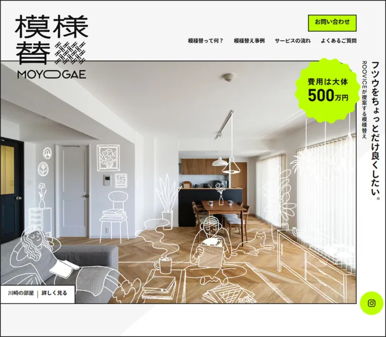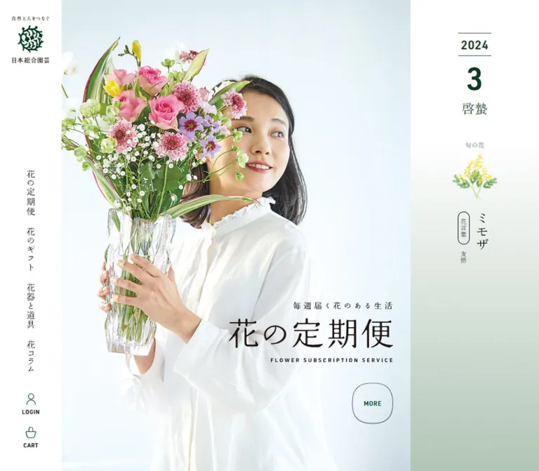
プレビュー準備中デザインリファレンスを見る
日本のWebデザインを、AIの制作リファレンスに。
DESIGN REFERENCE
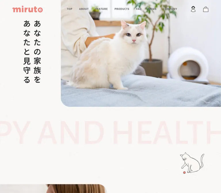
コーラルピンク、紙のような淡い背景、猫の写真と手描きイラストを組み合わせた公式ECサイト。縦書きのコピー、大きな余白、丸みのある写真と購入ボタンが特徴。
オリジナルサイトを見るQuiet domestic photography, coral accents, and playful cat drawings around a practical pet-care shop.
Website: miruto Original URL: https://www.miruto.shop/ Final URL: https://www.miruto.shop/ Theme: light in the supplied captures Inspected: September 17, 2026, 04:48 JST; supplied retrieval timestamp: September 16, 2026, 19:48:32.992 UTC Viewports: 1440 × 1000 desktop and 390 × 844 mobile, in CSS pixels Scope: the current homepage, combining brand storytelling, product discovery, purchase/rental links, customer voices, support navigation, news, and a substantial product directory footer. Visual captures cover the desktop opening, first product presentation, and footer, plus the mobile opening and footer tail. Rendered DOM evidence supplies additional typography, geometry, content, and animation declarations.
miruto presents connected cat-care appliances through the atmosphere of an ordinary, comfortable home. Bright photographs show cats, people, pale upholstery, wooden furniture, and unobtrusive white devices. Coral product headings and small hand-drawn characters introduce warmth without overwhelming the photography. The page alternates generous storytelling space with more compact shopping and support information.
The strongest structural signature is asymmetry. On desktop, a narrow column of vertical Japanese copy sits beside a large photograph that reaches the right edge. Product explanations repeat this relationship with benefit controls on the left and a large image on the right. Rounded lower-left image corners soften these arrangements. On mobile, the opening photograph becomes square and the slogan moves beneath it in two horizontal lines. The design remains spacious rather than compressing everything into small cards.
Quiet domestic photography, coral accents, and playful cat drawings around a practical pet-care shop.
Website: miruto Original URL: https://www.miruto.shop/ Final URL: https://www.miruto.shop/ Theme: light in the supplied captures Inspected: September 17, 2026, 04:48 JST; supplied retrieval timestamp: September 16, 2026, 19:48:32.992 UTC Viewports: 1440 × 1000 desktop and 390 × 844 mobile, in CSS pixels Scope: the current homepage, combining brand storytelling, product discovery, purchase/rental links, customer voices, support navigation, news, and a substantial product directory footer. Visual captures cover the desktop opening, first product presentation, and footer, plus the mobile opening and footer tail. Rendered DOM evidence supplies additional typography, geometry, content, and animation declarations.
miruto presents connected cat-care appliances through the atmosphere of an ordinary, comfortable home. Bright photographs show cats, people, pale upholstery, wooden furniture, and unobtrusive white devices. Coral product headings and small hand-drawn characters introduce warmth without overwhelming the photography. The page alternates generous storytelling space with more compact shopping and support information.
The strongest structural signature is asymmetry. On desktop, a narrow column of vertical Japanese copy sits beside a large photograph that reaches the right edge. Product explanations repeat this relationship with benefit controls on the left and a large image on the right. Rounded lower-left image corners soften these arrangements. On mobile, the opening photograph becomes square and the slogan moves beneath it in two horizontal lines. The design remains spacious rather than compressing everything into small cards.
--colorBg: #FAF7F4.| Name | Value | Suggested token | Evidence and role |
|---|---|---|---|
| Warm canvas | #FAF7F4 |
--color-canvas |
Measured body background and original --colorBg; also measured on the customer-voice section |
| White | #FFFFFF |
--color-white |
Measured on several underlying link surfaces; visually dominant in the footer |
| Main ink | #111111 |
--color-ink |
Measured body text, section headings, and selected product benefit text |
| Coral | #EF857D |
--color-coral |
Measured product headings and replacement-parts link; the visual accent family also appears in the wordmark, illustrations, arrows, and purchase buttons |
| Body gray | #6A676B |
--color-muted |
Measured navigation text, narrative paragraphs, feature copy, and product subtitles |
| Directory heading | #4F4D54 |
--color-directory-heading |
Measured headings and model names in the desktop product-menu subtree |
| Directory text | #5F5D63 |
--color-directory-text |
Measured secondary text in the desktop product-menu subtree |
| Inactive gray | #B7B7B7 |
--color-inactive |
Measured product numbers, unselected benefit controls, and the empty-cart checkout surface |
| Faint coral lettering | rgba(239, 133, 125, 0.12) |
--color-coral-faint |
Exact measured color of the oversized repeating English phrase |
| Banner blush | Approximately #FCE8E5 |
--color-blush |
Visual estimate for a reusable equivalent of the partner banner's pale pink field |
The canvas has a fine, paper-like grain in the opening and product screenshots. Its rendered appearance is lighter and more varied than a flat swatch alone suggests. The evidence does not identify the texture asset, its opacity, or the layer producing it. Preserve the measured base color, then add an authorized texture only after visual comparison.
Several CTA anchors report a white background even though their visible faces are black or coral. Their repeated DOM labels also suggest layered presentation. Use the screenshot for the final button appearance; do not treat the anchor's underlying white background as the visible fill of every CTA.
The offscreen mobile navigation contains white primary labels, #F9D3D0 secondary links, and an ALL PRODUCTS pill with a #F5BEB8 background. These values are measured, but the open menu's overall appearance was not captured. They should not be promoted into a verified full-screen menu design.
'Noto Sans JP', sans-serif.400 for ordinary feature text, 500 for spacious storytelling, 600 for product names and subtitles, and 700 for benefit controls and directory headings.--font-japanese.'Alegreya Sans', sans-serif.800 in the desktop navigation, 700 in section headings, and 500 in the large decorative phrase.0.05em for navigation and section headings.--font-latin.The English letters provide compact, distinctive rhythm against the Japanese copy. Retain this division of roles rather than applying one generic sans-serif to the entire page.
Oswald, sans-serif.01–04 product indices.14px, weight 500, 21px line height, and 0.7px tracking at both inspected widths.--font-index.The coral miruto wordmark is supplied artwork, not evidence of another text font. Keep it as a brand asset. The account symbol, shopping bag, cat drawings, and hanging TOP ornament likewise have their own drawn character.
The root HTML element reports Times, but the body overrides it. Times is not the visible editorial font system.
All values below are measured unless identified otherwise. Sizes and line heights are in CSS pixels.
| Role | Desktop size / line height | Mobile size / line height | Weight | Tracking |
|---|---|---|---|---|
| Base body | 16 / 24 |
16 / 24 |
400 |
Normal |
| Desktop navigation | 14 / 14 |
Hidden in the closed header | 800 |
0.7px |
| Mobile menu primary labels | Not applicable | 18 / 18, offscreen subtree |
800 |
0.9px |
| Opening Japanese slogan | 48 / 65.76 |
28 / 38.36 |
500 |
10.56px desktop; 0.84px mobile |
| Repeating English phrase | 168 / 252 |
88 / 132 |
500 |
Normal |
| Story heading | 40 / 60 |
20 / 30 |
600 |
0.03em |
| Story paragraphs | 20 / 50 |
16 / 35.2 |
500 |
0.1em |
| English section heading | 48 / 48 |
24 / 24 |
700 |
0.05em |
| Feature title | 24 / 36 |
20 / 30 |
500 |
0.03em |
| Feature paragraph | 16 / 28.8 |
14 / 25.2 |
400 |
0.03em |
| Product index | 14 / 21 |
14 / 21 |
500 |
0.7px |
| Product heading | 40 / 60 |
20 / 30 |
600 |
0.03em |
| Product subtitle | 16 / 24 |
12 / 18 |
600 |
0.03em |
| Product benefit button | 20 / 36 |
14 / 25.2 |
700 |
0.03em |
| Customer quotation | 14 / 25.2 |
14 / 25.2 |
400 |
0.03em |
The generous narrative line height is particularly important: 2.5 on desktop and 2.2 on mobile. Feature and testimonial paragraphs are denser at 1.8.
CTA inner-label typography was not separately measured. The anchor's inherited 16px should not be mistaken for a verified measurement of the visible uppercase label. An Alegreya Sans label around 18px on desktop is a reasonable visual adaptation.
Footer policy text appears approximately 12px on desktop and 10px on mobile. These are visual estimates. A new implementation should consider a larger readable minimum.
The evidence supports a collection of recurring distances, not one confirmed global spacing formula.
| Use | Desktop | Mobile | Status |
|---|---|---|---|
| Header height | 86px |
64px |
Measured |
| Header wordmark left position | 80px |
16.89px |
Measured |
| Gap between desktop navigation items | 32px |
Not applicable | Calculated from measured neighboring rectangles |
| Story text width | 572px |
306.81px |
Measured |
| Story text left positions | 88px or 780px |
41.59px |
Measured |
| Section start to FEATURE / PRODUCTS heading | 170px |
104px |
Calculated from measured section and heading positions |
| PRODUCTS heading bottom to first index | 80px |
80px |
Calculated from measured rectangles |
| Product title inset after number alignment | 30px |
24.96px |
Measured padding |
| Product title to subtitle | 4px |
4px |
Calculated from measured rectangles |
| Between consecutive benefit buttons | 40px |
16px |
Calculated vertical gaps, excluding button height |
| Standard CTA | 240 × 46px |
126 × 42px |
Measured |
| Paired CTA gap | 40px |
24px |
Calculated from measured rectangles |
| Testimonial track gap | 24px |
16px |
Calculated from measured card positions |
| Testimonial text side inset | 24px |
12px |
Calculated from measured rectangles |
| Footer side margin | Approximately 80px |
Approximately 30px in the visible tail |
Screenshot geometry |
A useful implementation spacing vocabulary is 8, 12, 16, 24, 30, 32, 40, 64, 80, 104, 130, 170px. This is a recommendation assembled from recurring measurements, not an extracted token list.
| Element | Value | Evidence |
|---|---|---|
| Main CTA and contact pill | 1000px |
Measured on anchor wrappers |
| Desktop testimonial card | 24px |
Measured |
| Mobile testimonial card | 6.24px |
Measured at 390px viewport width |
| Large desktop photograph, lower-left corner | Approximately 60–64px |
Visual estimate |
| Mobile hero, lower-left corner | Approximately 40px |
Visual estimate |
| Footer product thumbnails | Approximately 8px |
Visual estimate |
| Active benefit decoration | Circle, approximately 120px diameter on desktop |
Visual estimate |
The large photographs do not use uniform rounding on every corner. The visible lower-left cut is part of the composition. Preserve that asymmetry.
| Element | Desktop | Mobile |
|---|---|---|
| Header wordmark | 145 × 32px |
110 × 24.27px |
| Hero section | 1440 × 696px, measured |
390 × 502.72px, measured |
| Hero photograph | Approximately 1044 × 696px, starting at x = 396px |
Approximately 390 × 390px, starting at the top |
| Hero slogan rectangle | x = 144.5px, y = 138px, 131.5 × 558px |
x = 41.59px, y = 426px, 306.81 × 76.72px |
| Feature text columns | Three 346px columns; starting x positions 121, 547, 973px |
273.52px text regions, with starts at 58.24, 365.02, 671.80px |
| First product photograph | Approximately 750 × 500px, right aligned |
Exact image rectangle not supplied |
| Testimonial card | 400 × 523.59px |
240 × 430px |
| Partner banner | Approximately 236 × 102px |
Approximately 330 × 141px |
| Document height | 15,321px |
14,964px |
Document heights describe this capture, not a recommended fixed page length. The supplied DOM includes unnamed, text-free sections measuring 3000px and 2688px high respectively. Their content and behavior were not visually documented, so those dimensions should not be recreated as empty spacer blocks.
Role: brand recognition, primary navigation, account access, and shopping utilities.
The desktop header places the coral wordmark at 80px from the left and aligns the navigation and utilities along a shared horizontal center. Its measured height is 86px. Navigation uses compact uppercase Alegreya Sans labels with 32px gaps. PRODUCTS and FAQ are buttons accompanied by small coral downward chevrons. CONTACT is a 108 × 32px coral pill in the screenshot.
The account symbol is a small drawn person rather than a generic circular avatar. The shopping bag is a thin black outline. Their measured artwork/control rectangles are approximately 27 × 28px and 25.6 × 28px.
At 390px, the header is 64px high. It retains the 110px wordmark, account symbol, and bag, and adds a two-line menu icon. The menu button measures 40 × 38px. Desktop navigation and the contact pill are absent from this closed mobile header.
The header remains at the top in the scrolled screenshots. Its exact positioning rule was not included, so persistence is visually verified while fixed versus sticky is not. Its sampled background is transparent, and a 280ms background-color transition is declared. The trigger and final background state were not exercised.
Role: establish the relationship between the cat, household, and care brand before introducing products.
On desktop, the image occupies approximately the right 72.5% of the viewport and ends at 696px high. A softly rounded lower-left corner separates it from the textured canvas. The supplied desktop frame shows a brown cat resting on a wooden surface, with books and bright domestic details around it.
The Japanese slogan, あなたの家族を / あなたと見守る, appears in two vertical columns on the left. The letters are black in the settled screenshot, with unusually generous desktop tracking. The wordmark stays above this copy zone while the navigation overlays the broader upper composition.
On mobile, the image becomes a full-width square showing a room with cats and appliances. This is a different captured scene, so the evidence does not establish whether the difference comes from responsive asset selection or a changing image sequence. The slogan sits below the photo at y = 426px, in two horizontal lines at 28px.
There is no visible purchase CTA in the captured opening. Preserve its role as an introduction rather than inserting a large shopping button over the cat photograph.
Role: carry the brand promise across the page as a soft visual bridge.
KEEP YOUR FAMILY HAPPY AND HEALTHY repeats across two long text runs. The type is oversized, low contrast, and intentionally clipped by the viewport. It uses Alegreya Sans at 168px on desktop and 88px on mobile, with coral at 12% opacity.
The phrase begins immediately after the desktop hero. On mobile, it begins 24px after the slogan section. A small cat drawing occupies the open space near the transition into the first story image. Its irregular black outline, white body, and coral patches connect the photography to the illustrated parts of the site.
The repeated text has a declared infinite horizontal animation. The cat illustration's own animation, if any, is not established by the static captures.
Role: explain the brand's commitment to cats and their families.
The desktop DOM places narrative text in alternating left and right regions: a 572px text column at x = 780px, then one at x = 88px, then another on the right. The opening story heading uses 40px / 60px, followed by 20px / 50px paragraphs. This creates a slow editorial reading rhythm.
The mobile story uses a consistent 306.81px text width and approximately 41.59px side inset. Its heading falls to 20px, while paragraphs remain a comfortable 16px with 35.2px leading. The first mobile story image is partially visible below the opening and shows a person holding a white cat, with a rounded upper-right corner.
The content and alternating text positions are measured. The complete desktop arrangement of every story image was not supplied, so image-to-paragraph pairings beyond the visible capture should remain implementation choices.
Role: introduce three reasons to trust the products: health data, care support, and expert-informed development.
A centered FEATURE heading introduces three desktop content columns. Each combines a media region with a two-line Japanese title and explanatory paragraph. Text regions are 346px wide and separated by 80px between their measured edges. A centered READ MORE pill follows.
At 390px, the three text regions remain horizontally arranged instead of becoming three stacked text blocks. Their starting positions extend beyond the viewport, and previous/next button elements are present. This establishes a horizontal feature track with navigation affordances. Swipe behavior, snapping, autoplay, and click results were not tested.
Keep the feature title and paragraph hierarchy intact: 20px / 30px titles and 14px / 25.2px paragraphs on mobile.
Role: explain one device through three benefits, then offer the appropriate next action.
Four product modules appear vertically in the document:
Each module contains a small gray Oswald index, a coral Japanese product name, a short gray subtitle, a product-specific illustration, a large image region, three benefit buttons, previous/next controls, and purchase/detail links as applicable.
In the captured first module, the index begins at x = 246px, while the title and benefit text align around x = 276px. The right-side photograph begins near x = 690px, measures approximately 750 × 500px, and reaches the viewport edge. It shows the litter box in a home beside a person and cat. Coral directional arrows explain the device's movement within the image presentation.
A hand-drawn cat inside the litter box sits above the photograph. Its desktop footprint is approximately 225 × 220px. This illustration reinforces the product category without replacing the photographic explanation.
The modules are separate vertical product presentations. The benefit controls belong within each product; they are not evidence that all four product categories share one carousel slide.
Role: connect an individual product claim with its corresponding image or explanatory state.
The three benefit labels are actual button elements. Unselected labels use #B7B7B7; the selected label uses #111111. In the screenshot, the active first benefit has a pale coral circle extending left of the text. This circle is approximately 120px in diameter and remains decorative rather than enclosing the entire label.
Below the labels is a slim gray progress track with a coral segment, followed by two coral chevrons. The visible track is approximately 188px long. The measured desktop arrow button boxes are 46 × 56px, including 16px padding.
The screenshot selects the first benefit, while the sampled DOM selects the third. This establishes multiple states, but not how the change occurred. Autoplay timing, image transition style, and direct-selection behavior remain unverified.
On mobile, benefit text falls to 14px / 25.2px, its spacing becomes 16px, and the selectors occur well below the product heading. The exact mobile photograph geometry was not captured.
Role: distinguish learning about a product from acquiring it.
The desktop product capture shows a black VIEW DETAIL pill and a coral BUY / RENTAL pill, both with white uppercase lettering. They measure 240 × 46px, with 40px between them. The first pair is centered at x = 460px and x = 740px.
At 390px, paired links remain side by side: 126 × 42px at x = 57px and x = 207px, separated by 24px. The collar has a single centered RENTAL action. The feeder's commerce action is BUY.
Use the product-specific action language. Do not give every device an identical purchase/rental pair. Duplicate labels inside a link's DOM are not evidence of two separate buttons; only one label is visible in the screenshots.
Role: bring real household experiences into the product story.
The rendered structure includes links to customer posts on social platforms. The measured desktop cards are 400px wide with 24px corners and 24px gaps. Their quotation text has a 24px horizontal inset and uses 14px / 25.2px type.
On mobile, cards are 240px wide, separated by 16px, with 12px text insets and a measured 6.24px radius. Later cards extend beyond the viewport, establishing a horizontal sequence. The first three measured mobile cards have equal 430px heights.
These are geometry and content observations from the DOM. Complete card imagery, visible fills, and interaction behavior were not included in the supplied screenshots. Avoid inventing rating stars, review badges, or an automatic testimonial loop.
Role: provide support and current information after product discovery.
The homepage contains four product-category FAQ links and a READ MORE route to the main FAQ page. News contains three dated links in the supplied text, followed by another READ MORE route. Official social destinations include X, Instagram, YouTube, and TikTok.
Their presence and destinations are established by rendered links. The detailed visual layout of these sections was not captured. In particular, category links do not establish an inline question-and-answer accordion.
Role: provide a complete shopping and service index without requiring a return to the main product section.
The desktop footer is a broad white surface. A row of English site links sits above a fine dotted divider. Below it, four product columns and a related-products column form an open directory.
Each product column includes a Japanese category name, a wide photograph of a white device against a neutral wall, model information, and small text links with coral chevrons. The litter-box column contains separate Lala and Coco entries. The other model labels are Mona, Leo, and Milo. Dotted rules subdivide related entries without surrounding every item in a card.
Screenshot geometry suggests approximately 221px product columns, 40px gaps, and a slightly wider related-products column. The banner for PARTNER SHOP sits at the lower right; the coral wordmark sits at the lower left. A fine horizontal rule separates this area from copyright and policy links.
The mobile footer tail becomes a generous single-column composition. Its partner banner is approximately 330 × 141px, with 30px side margins. A centered wordmark follows after a large gap. Policy links wrap into several small rows, and copyright is centered near the bottom. The full mobile product-directory grid was not shown, so its precise rearrangement should not be inferred from the footer tail alone.
Role: provide a recognizable return-to-top affordance while preserving the cat theme.
A thin drawn rod enters from the right edge. A vertical string carries a small circular TOP label, a coral fish-shaped lure, and a tiny outlined tuft at its end. It appears beside scrolled desktop content and in the mobile footer tail at a smaller scale.
The visual affordance is observed. Its activation behavior, scrolling duration, and any movement of the lure were not tested. Reuse the drawing as a cohesive asset rather than replacing it with a large floating circular arrow.
PRODUCTS and FAQ are navigation buttons with associated content and close buttons in the desktop DOM. The product panel has four product groups plus accessories; the FAQ panel has four product-category groups. Their sampled geometry differs from the visible footer: the desktop product panel begins at a 40px side inset, for example. Do not mix these measurements with the footer's approximately 80px margins.
The mobile menu subtree contains taller primary navigation rows, product thumbnails, model links, and support destinations. It was not visually opened in the supplied captures.
A cart section includes MY CART, an empty total, checkout explanatory text, and a checkout link. Its inner content is positioned outside the viewport in the sampled state. Cart opening, item updates, focus handling, and checkout behavior are unverified.
| Treatment | Measured declaration or evidence | Interpretation and limit |
|---|---|---|
| Header surface | background-color 0.28s |
A background transition is defined; its trigger was not exercised |
| Desktop navigation | background-position 0.4s |
A background-position effect is available; the visible hover treatment is unknown |
| Desktop slogan | 1s cubic-bezier(0.61, 1, 0.88, 1) forwards textColorToBottomAnimate |
Named directional text reveal; full keyframes were not supplied |
| Mobile slogan | Same timing with textColorToRightAnimate |
A distinct direction is defined for the horizontal mobile slogan |
| Desktop English ticker | 90s linear infinite infiniteScroll |
Continuous repeated-text motion is explicitly declared |
| Mobile English ticker | 60s linear infinite infiniteScroll |
The mobile loop has a shorter duration |
| CTA wrappers | 0.3s transition |
Exact animated properties and end states were not isolated |
| Product benefit text | color 0.3s |
Selected versus inactive text colors are measured |
| Menu close button | color 0.3s |
Defined color feedback, untested |
| Cart section | visibility 0.3s |
Hidden/visible state timing is declared; panel movement is not established |
| Persistent header and TOP ornament | Present in scrolled captures | Persistence is visually supported; precise positioning logic is unknown |
The capture process waited for document loading, visible image decoding, and finite layout-affecting animation within bounded limits. Perpetual animations were paused during readiness checks and resumed afterward. This improves screenshot stability but does not demonstrate every transition or interaction.
A reusable implementation should keep most interface feedback short and restrained, with the oversized English phrase providing the main explicitly verified continuous motion. Do not add parallax, bouncing product cards, timed hero slides, or animated cat sprites and describe them as observed features.
| Layer | Appearance | Function |
|---|---|---|
| Main canvas | Warm light base with visible fine grain | Creates a quiet domestic atmosphere |
| Large photography | Bright natural images, selective rounded corners | Carries emotional and product information |
| Editorial content | Mostly unboxed text | Preserves spacious reading rhythm |
| Active benefit | Dark text with a pale coral circular accent | Marks the current explanatory state |
| Commerce action | Coral pill with white label in the capture | Distinguishes purchase or rental |
| Detail action | Black pill with white label in the capture | Routes to further explanation |
| Directory footer | White field, dotted separators, small image panels | Organizes many destinations compactly |
| Partner banner | Pale pink rectangle with coral text and illustration | Adds a secondary destination without changing the palette |
The visible homepage does not rely on a general shadow-elevation system. Separation comes from spacing, photographs, thin rules, typography, and selective color. Avoid turning open directory groups into raised cards.
The photography is bright and tactile: wooden floors, soft fabric, daylight, white appliance bodies, and cats at home. Devices appear in the context of household use. Human presence communicates care, especially through interaction with the cat rather than a formal product demonstration pose.
The illustrations use irregular black outlines, white interiors, and restrained coral areas. Cats, the litter-box sketch, the partner-shop person holding a cat, and the fishing-toy ornament belong to the same friendly visual family. They are small narrative accents around the photography rather than large cartoon backgrounds.
Maintain these relationships:
The supplied evidence does not include original image src URLs or font-file URLs. No asset paths can be verified from it.
| Asset role | Captured evidence | Implementation guidance |
|---|---|---|
| Coral wordmark | Desktop and mobile headers and footers | Use authorized brand artwork; do not imitate it with ordinary text |
| Opening photographs | Cat on a wooden surface at desktop; room scene on mobile | Preserve subject visibility and measured frame proportions |
| Story photograph | Partial mobile image of a person holding a white cat | Retain the intimate crop and asymmetric corner treatment |
| Product lifestyle image | Litter box, person, and cat in the desktop product module | Show the device in a believable home setting |
| Product explanation drawing | Cat sitting inside an illustrated litter box | Use thin black linework and limited coral fill |
| Device directory images | Four wide neutral product photographs in the footer | Keep backgrounds and framing consistent |
| Partner banner | Person holding a cat beside PARTNER SHOP |
Treat text and illustration as a coordinated banner |
| Decorative cat and TOP lure | Opening transition and scrolled page edge | Keep their small scale and light visual weight |
The opening image reaches the right edge, while the slogan occupies a narrow left region. This establishes an intentionally uneven composition. Main section headings are centered, but the content beneath them often returns to offset text and large right-aligned imagery.
The story paragraphs alternate between left and right columns. Features use three horizontal columns. Product categories form four successive large modules. Testimonials form a horizontal sequence, and the footer resolves the page into a compact five-column directory.
Measured section starts and text positions show that the generous gaps are structural. Avoid reducing all sections to the same small vertical padding.
At 390px, the header removes desktop text navigation while keeping shopping utilities. The hero image becomes square, and the slogan changes writing direction and placement. Its 28px type remains prominent without occupying most of the screen.
Narrative text uses approximately 41.6px side insets, while the header uses about 17px and the visible footer tail uses 30px. These are deliberately different content widths. One global mobile padding value would flatten the original hierarchy.
The feature overview remains a horizontal track. Product actions stay paired where two actions exist. Testimonial cards become narrower while leaving the next card partly outside the viewport. The footer tail centers the brand and banner while allowing policy links to wrap.
Only 1440px and 390px widths were inspected. The original breakpoint, tablet layout, landscape behavior, and intermediate scaling formulas are unknown. A breakpoint around 1024px is a practical starting recommendation for the adaptation below, not a recovered source value.
The text-free sections and very wide unnamed elements in the DOM may belong to media or scroll-related sequences, but their purpose is not established. Do not infer a pinned scene or create several thousand pixels of blank space to reproduce document height.
#EF857D coral, #111111 ink, and measured gray text.BUY, BUY / RENTAL, and RENTAL labels.These are recommendations for a new implementation, not verified features of the inspected site:
44 × 44px without enlarging the visible artwork.#FAF7F4.#FFFFFF.#111111.#EF857D.#6A676B.#B7B7B7.rgba(239, 133, 125, 0.12).#FCE8E5, an adaptation estimate.“Create a Japanese cat-care appliance brand and shop homepage inspired by miruto's observed visual system. Use a warm light canvas, fine understated grain, coral #EF857D, black #111111, and generous white space. Pair Noto Sans JP content with Alegreya Sans English navigation and section headings, plus small Oswald product indices. On desktop, place a two-column vertical Japanese slogan beside a large right-edge lifestyle photograph with a rounded lower-left corner. On mobile, use a square photograph followed by two horizontal slogan lines. Add a very pale oversized repeating English phrase, small black-and-coral cat drawings, spacious brand storytelling, a responsive feature track, four substantial product explanations, customer voices, and an open product-directory footer. Preserve distinct black detail pills and coral purchase/rental pills. Treat interactions not documented by the reference as explicit implementation decisions.”
This is a reusable adaptation, not recovered site CSS. It preserves measured colors, font roles, and endpoint sizes. The 1024px breakpoint, interpolated widths, photograph radii, banner blush, and layout mechanics are recommendations. Supply authorized images and font files separately; no verified asset URLs were provided.
The hero expects .hero-copy to contain two block-level text spans. The product stage expects .product-aside and .product-photo children. The ticker expects two identical .marquee-run children, with the duplicate hidden from assistive technology. Menu state and product-media switching require separate behavior.
:root {
  /* Measured colors; semantic aliases for this adaptation. */
  --color-canvas: #faf7f4;
  --color-white: #ffffff;
  --color-ink: #111111;
  --color-coral: #ef857d;
  --color-muted: #6a676b;
  --color-inactive: #b7b7b7;
  --color-directory-heading: #4f4d54;
  --color-directory-text: #5f5d63;
  --color-coral-faint: rgb(239 133 125 / 12%);

  /* Visual estimates for adaptation. */
  --color-blush: #fce8e5;
  --color-rule: #d2ccca;
  --radius-photo: 64px;
  --radius-thumbnail: 8px;

  --font-japanese: 'Noto Sans JP', sans-serif;
  --font-latin: 'Alegreya Sans', sans-serif;
  --font-index: 'Oswald', sans-serif;

  --header-height: 86px;
  --page-gutter: clamp(32px, 5.556vw, 80px);
  --section-top: 170px;
  --section-title-size: 48px;
  --product-title-size: 40px;
  --cta-width: 240px;
  --cta-height: 46px;
  --cta-gap: 40px;
  --ticker-size: 168px;
  --ticker-duration: 90s;
  --motion-ui: 300ms;
}

* { box-sizing: border-box; }

body {
  margin: 0;
  color: var(--color-ink);
  background: var(--color-canvas);
  font: 400 16px / 1.5 var(--font-japanese);
}

img { display: block; max-width: 100%; }
button, a { -webkit-tap-highlight-color: transparent; }
button { font: inherit; cursor: pointer; }
a { color: inherit; }

.site-header {
  position: fixed;
  inset: 0 0 auto;
  z-index: 20;
  height: var(--header-height);
  display: flex;
  align-items: center;
  padding-inline: var(--page-gutter);
  background: transparent;
  transition: background-color 280ms;
}

.brand { flex: none; }
.brand img { width: 145px; height: auto; }

.primary-nav {
  display: flex;
  align-items: center;
  gap: 32px;
  margin-left: auto;
  color: var(--color-muted);
  font: 800 14px / 1 var(--font-latin);
  letter-spacing: 0.05em;
}

.primary-nav a { text-decoration: none; }
.primary-nav button {
  display: inline-flex;
  align-items: center;
  gap: 8px;
  padding: 0;
  border: 0;
  background: none;
  color: inherit;
  font: inherit;
  letter-spacing: inherit;
}

.contact-pill {
  display: inline-grid;
  place-items: center;
  width: 108px;
  height: 32px;
  border-radius: 1000px;
  color: white;
  background: var(--color-coral);
}

.header-tools {
  display: flex;
  align-items: center;
  gap: 32px;
  margin-left: 64px;
}

.icon-button {
  position: relative;
  display: inline-grid;
  place-items: center;
  width: 27px;
  height: 28px;
  padding: 0;
  border: 0;
  color: var(--color-ink);
  background: none;
}

/* Recommended larger hit area without larger artwork. */
.icon-button::before {
  content: '';
  position: absolute;
  inset: -8px -9px;
}

.menu-toggle { display: none; }

.hero {
  position: relative;
  display: grid;
  grid-template-columns: 27.5% 72.5%;
}

.hero-media {
  grid-column: 2;
  width: 100%;
  aspect-ratio: 3 / 2;
  overflow: hidden;
  border-bottom-left-radius: var(--radius-photo);
}

.hero-media img,
.product-photo img {
  width: 100%;
  height: 100%;
  object-fit: cover;
}

.hero-copy {
  position: absolute;
  top: 9.5833vw;
  left: 10.035vw;
  margin: 0;
  writing-mode: vertical-rl;
  color: var(--color-ink);
  font-size: clamp(32px, 3.3333vw, 48px);
  font-weight: 500;
  line-height: 1.37;
  letter-spacing: 0.22em;
}

.hero-copy span { display: block; }

.marquee {
  overflow: hidden;
  color: var(--color-coral-faint);
  font: 500 var(--ticker-size) / 1.5 var(--font-latin);
}

.marquee-track {
  display: flex;
  width: max-content;
  animation: reference-marquee var(--ticker-duration) linear infinite;
}

.marquee-run {
  flex: none;
  margin: 0;
  padding-right: 0.2em;
  white-space: nowrap;
}

/* Recommended loop mechanics; original keyframes were unavailable. */
@keyframes reference-marquee {
  to { transform: translateX(-50%); }
}

.section {
  padding-block: var(--section-top) 80px;
  scroll-margin-top: calc(var(--header-height) + 24px);
}

.section-title {
  margin: 0;
  text-align: center;
  font: 700 var(--section-title-size) / 1 var(--font-latin);
  letter-spacing: 0.05em;
}

.story-copy { max-width: 572px; }
.story-copy h2 {
  margin: 0 0 40px;
  font-size: 40px;
  font-weight: 600;
  line-height: 1.5;
  letter-spacing: 0.03em;
}

.story-copy p {
  color: var(--color-muted);
  font-size: 20px;
  font-weight: 500;
  line-height: 2.5;
  letter-spacing: 0.1em;
}

.feature-track {
  display: grid;
  grid-template-columns: repeat(3, minmax(0, 1fr));
  gap: 80px;
  max-width: 1198px;
  margin-inline: auto;
}

.feature-title {
  margin: 24px 0;
  color: var(--color-muted);
  font-size: 24px;
  font-weight: 500;
  line-height: 1.5;
  letter-spacing: 0.03em;
}

.feature-copy {
  margin: 0;
  color: var(--color-muted);
  font-size: 16px;
  line-height: 1.8;
  letter-spacing: 0.03em;
}

.product {
  --product-offset: max(40px, calc(50% - 474px));
  margin-top: 80px;
  margin-bottom: 130px;
}

.product-heading { margin-left: var(--product-offset); }
.product-index {
  margin: 0;
  color: var(--color-inactive);
  font: 500 14px / 21px var(--font-index);
  letter-spacing: 0.05em;
}

.product-title {
  margin: 6px 0 0;
  padding-left: 30px;
  color: var(--color-coral);
  font-size: var(--product-title-size);
  font-weight: 600;
  line-height: 1.5;
  letter-spacing: 0.03em;
}

.product-subtitle {
  margin: 4px 0 0;
  padding-left: 30px;
  color: var(--color-muted);
  font-size: 16px;
  font-weight: 600;
  line-height: 1.5;
  letter-spacing: 0.03em;
}

.product-stage {
  display: grid;
  grid-template-columns: 314px minmax(0, 1fr);
  align-items: center;
  gap: 100px;
  margin-top: 46px;
  margin-left: calc(var(--product-offset) + 30px);
}

.product-photo {
  margin: 0;
  aspect-ratio: 3 / 2;
  overflow: hidden;
  border-bottom-left-radius: var(--radius-photo);
}

.benefit-list { display: grid; gap: 40px; }
.benefit {
  position: relative;
  isolation: isolate;
  padding: 0;
  border: 0;
  text-align: left;
  color: var(--color-inactive);
  background: none;
  font-size: 20px;
  font-weight: 700;
  line-height: 1.8;
  letter-spacing: 0.03em;
  transition: color var(--motion-ui);
}

.benefit[aria-pressed='true'] { color: var(--color-ink); }
.benefit[aria-pressed='true']::before {
  content: '';
  position: absolute;
  z-index: -1;
  top: 50%;
  left: -76px;
  width: 120px;
  aspect-ratio: 1;
  border-radius: 50%;
  background: var(--color-coral-faint);
  transform: translateY(-50%);
}

.product-actions {
  display: flex;
  justify-content: center;
  gap: var(--cta-gap);
  margin-top: 80px;
}

.pill {
  display: inline-flex;
  align-items: center;
  justify-content: center;
  width: var(--cta-width);
  min-height: var(--cta-height);
  padding: 8px 12px;
  border: 0;
  border-radius: 1000px;
  color: white;
  background: var(--color-ink);
  font: 700 18px / 1.2 var(--font-latin);
  text-decoration: none;
}

.pill--commerce { background: var(--color-coral); }

.voice-track {
  display: flex;
  gap: 24px;
  overflow-x: auto;
  padding-inline: max(40px, calc((100vw - 1200px) / 2));
}

.voice-card {
  flex: 0 0 400px;
  overflow: hidden;
  border-radius: 24px;
}

.voice-copy {
  padding: 24px;
  font-size: 14px;
  line-height: 1.8;
  letter-spacing: 0.03em;
}

.site-footer {
  padding: 64px var(--page-gutter) 40px;
  background: var(--color-white);
}

.footer-directory {
  display: grid;
  grid-template-columns: repeat(4, minmax(0, 1fr)) minmax(0, 1.066fr);
  gap: 40px;
}

.footer-directory img {
  width: 100%;
  aspect-ratio: 1.94;
  object-fit: cover;
  border-radius: var(--radius-thumbnail);
}

.footer-group + .footer-group {
  margin-top: 24px;
  padding-top: 24px;
  border-top: 1px dotted var(--color-rule);
}

.partner-banner {
  display: block;
  width: 236px;
  max-width: 100%;
  margin-left: auto;
}

.policy-links {
  display: flex;
  flex-wrap: wrap;
  gap: 16px 24px;
  font-size: 12px;
  color: var(--color-muted);
}

:where(a, button):focus-visible {
  outline: 3px solid var(--color-ink);
  outline-offset: 4px;
}

/* Recommended breakpoint; only endpoint viewports were inspected. */
@media (max-width: 1023px) {
  :root {
    --header-height: 64px;
    --page-gutter: 30px;
    --section-top: 104px;
    --section-title-size: 24px;
    --product-title-size: 20px;
    --radius-photo: 40px;
    --cta-width: 126px;
    --cta-height: 42px;
    --cta-gap: 24px;
    --ticker-size: 88px;
    --ticker-duration: 60s;
  }

  .site-header { padding-inline: 4.33vw 2.28vw; }
  .brand img { width: 110px; }
  .primary-nav { display: none; }
  .header-tools { margin-left: auto; }
  .menu-toggle { display: inline-grid; width: 40px; height: 38px; }
  .menu-toggle::before { inset: -3px; }

  .hero { display: block; }
  .hero-media { aspect-ratio: 1; }
  .hero-copy {
    position: static;
    margin: 36px 10.6667vw 0;
    writing-mode: horizontal-tb;
    font-size: 28px;
    line-height: 1.37;
    letter-spacing: 0.03em;
  }

  .marquee { margin-top: 24px; }
  .story-copy { max-width: none; margin-inline: 10.6667vw; }
  .story-copy h2 { margin-bottom: 24px; font-size: 20px; }
  .story-copy p { font-size: 16px; line-height: 2.2; }

  /* Scrollability is an adaptation; source gestures were not tested. */
  .feature-track {
    grid-template-columns: none;
    grid-auto-flow: column;
    grid-auto-columns: 70.1322vw;
    gap: 8.5298vw;
    overflow-x: auto;
    padding-inline: 14.934vw;
  }
  .feature-title { font-size: 20px; }
  .feature-copy { font-size: 14px; }

  .product { --product-offset: 10.6667vw; margin-bottom: 76px; }
  .product-title { padding-left: 6.4vw; }
  .product-subtitle { width: 216px; padding-left: 6.4vw; font-size: 12px; }
  .product-stage {
    display: flex;
    flex-direction: column;
    align-items: stretch;
    gap: 30px;
    margin-top: 32px;
    margin-left: var(--product-offset);
  }
  .product-photo { order: -1; }
  .product-aside { margin-inline: 9.6vw 6.4vw; }
  .benefit-list { gap: 16px; }
  .benefit { padding-left: 24px; font-size: 14px; }
  .benefit[aria-pressed='true']::before { left: 0; width: 56px; }
  .product-actions { margin-top: 52px; }
  .pill { font-size: 14px; }

  .voice-track { gap: 16px; padding-inline: 10.6667vw; }
  .voice-card { flex-basis: 240px; border-radius: 6.24px; }
  .voice-copy { padding: 12px; }

  /* Full mobile directory stacking is a recommended fallback. */
  .footer-directory { grid-template-columns: 1fr; }
  .partner-banner { width: 330px; margin-inline: auto; }
  .policy-links { gap: 14px 18px; }
}

@media (prefers-reduced-motion: reduce) {
  .marquee-track { animation: none; }
  .site-header, .benefit { transition: none; }
}
The CSS deliberately leaves asset-dependent illustrations and unverified panels to separate implementation. Product controls must update the selected state and associated media; CSS alone does not supply those behaviors. Verify coral-button contrast before production use.
Optional aliases for an implementation that already uses Tailwind v4. This does not identify the original site's framework. Define the preceding custom properties first.
@theme inline {
  --color-paper: var(--color-canvas);
  --color-brand: var(--color-coral);
  --color-text: var(--color-ink);
  --color-secondary: var(--color-muted);
  --color-quiet: var(--color-inactive);
  --font-sans: var(--font-japanese);
  --font-display: var(--font-latin);
  --font-numeric: var(--font-index);
  --text-section: var(--section-title-size);
  --text-product: var(--product-title-size);
  --radius-photo-cut: var(--radius-photo);
  --radius-pill: 1000px;
  --spacing-page: var(--page-gutter);
  --spacing-section-top: var(--section-top);
}
This document describes the current supplied homepage evidence. Measured tokens are separated from screenshot estimates, and the reusable CSS, prompts, and accessibility additions are explicitly implementation guidance.
# miruto — Style Reference

> Quiet domestic photography, coral accents, and playful cat drawings around a practical pet-care shop.

**Website:** [miruto](https://www.miruto.shop/)
**Original URL:** https://www.miruto.shop/
**Final URL:** https://www.miruto.shop/
**Theme:** light in the supplied captures
**Inspected:** September 17, 2026, 04:48 JST; supplied retrieval timestamp: September 16, 2026, 19:48:32.992 UTC
**Viewports:** 1440 × 1000 desktop and 390 × 844 mobile, in CSS pixels
**Scope:** the current homepage, combining brand storytelling, product discovery, purchase/rental links, customer voices, support navigation, news, and a substantial product directory footer. Visual captures cover the desktop opening, first product presentation, and footer, plus the mobile opening and footer tail. Rendered DOM evidence supplies additional typography, geometry, content, and animation declarations.

miruto presents connected cat-care appliances through the atmosphere of an ordinary, comfortable home. Bright photographs show cats, people, pale upholstery, wooden furniture, and unobtrusive white devices. Coral product headings and small hand-drawn characters introduce warmth without overwhelming the photography. The page alternates generous storytelling space with more compact shopping and support information.

The strongest structural signature is asymmetry. On desktop, a narrow column of vertical Japanese copy sits beside a large photograph that reaches the right edge. Product explanations repeat this relationship with benefit controls on the left and a large image on the right. Rounded lower-left image corners soften these arrangements. On mobile, the opening photograph becomes square and the slogan moves beneath it in two horizontal lines. The design remains spacious rather than compressing everything into small cards.
# miruto — Style Reference

> Quiet domestic photography, coral accents, and playful cat drawings around a practical pet-care shop.

**Website:** [miruto](https://www.miruto.shop/)
**Original URL:** https://www.miruto.shop/
**Final URL:** https://www.miruto.shop/
**Theme:** light in the supplied captures
**Inspected:** September 17, 2026, 04:48 JST; supplied retrieval timestamp: September 16, 2026, 19:48:32.992 UTC
**Viewports:** 1440 × 1000 desktop and 390 × 844 mobile, in CSS pixels
**Scope:** the current homepage, combining brand storytelling, product discovery, purchase/rental links, customer voices, support navigation, news, and a substantial product directory footer. Visual captures cover the desktop opening, first product presentation, and footer, plus the mobile opening and footer tail. Rendered DOM evidence supplies additional typography, geometry, content, and animation declarations.

miruto presents connected cat-care appliances through the atmosphere of an ordinary, comfortable home. Bright photographs show cats, people, pale upholstery, wooden furniture, and unobtrusive white devices. Coral product headings and small hand-drawn characters introduce warmth without overwhelming the photography. The page alternates generous storytelling space with more compact shopping and support information.

The strongest structural signature is asymmetry. On desktop, a narrow column of vertical Japanese copy sits beside a large photograph that reaches the right edge. Product explanations repeat this relationship with benefit controls on the left and a large image on the right. Rounded lower-left image corners soften these arrangements. On mobile, the opening photograph becomes square and the slogan moves beneath it in two horizontal lines. The design remains spacious rather than compressing everything into small cards.

## How to Read This Reference

- **Measured** values come from the supplied rendered element rectangles, computed styles, and custom properties. They describe the captured viewport and state, not necessarily a universal layout formula.
- **Visual estimates** describe screenshot geometry or appearance where a matching computed value was not supplied. Approximate radii, texture, and illustration dimensions are labeled accordingly.
- **Recommendations** describe a reusable implementation. Suggested breakpoints, accessibility improvements, CSS organization, and unverified interaction behavior are not claims about the original source.
- Token names are descriptive aliases. The confirmed original background variable is `--colorBg: #FAF7F4`.
- Hidden navigation and cart subtrees appear in the DOM extraction. Their existence and dimensions do not establish that those panels were open or visible.
- Screenshots and computed values can represent different animation states. The visible product selection differs between the product capture and the sampled DOM. The hero paragraph also has a pale computed color while its settled screenshot lettering is black.
- No additional browsing, command execution, or asset inspection was performed for this reference.

## Tokens — Colors

### Default Palette

| Name | Value | Suggested token | Evidence and role |
| --- | --- | --- | --- |
| Warm canvas | `#FAF7F4` | `--color-canvas` | Measured body background and original `--colorBg`; also measured on the customer-voice section |
| White | `#FFFFFF` | `--color-white` | Measured on several underlying link surfaces; visually dominant in the footer |
| Main ink | `#111111` | `--color-ink` | Measured body text, section headings, and selected product benefit text |
| Coral | `#EF857D` | `--color-coral` | Measured product headings and replacement-parts link; the visual accent family also appears in the wordmark, illustrations, arrows, and purchase buttons |
| Body gray | `#6A676B` | `--color-muted` | Measured navigation text, narrative paragraphs, feature copy, and product subtitles |
| Directory heading | `#4F4D54` | `--color-directory-heading` | Measured headings and model names in the desktop product-menu subtree |
| Directory text | `#5F5D63` | `--color-directory-text` | Measured secondary text in the desktop product-menu subtree |
| Inactive gray | `#B7B7B7` | `--color-inactive` | Measured product numbers, unselected benefit controls, and the empty-cart checkout surface |
| Faint coral lettering | `rgba(239, 133, 125, 0.12)` | `--color-coral-faint` | Exact measured color of the oversized repeating English phrase |
| Banner blush | Approximately `#FCE8E5` | `--color-blush` | Visual estimate for a reusable equivalent of the partner banner's pale pink field |

The canvas has a fine, paper-like grain in the opening and product screenshots. Its rendered appearance is lighter and more varied than a flat swatch alone suggests. The evidence does not identify the texture asset, its opacity, or the layer producing it. Preserve the measured base color, then add an authorized texture only after visual comparison.

Several CTA anchors report a white background even though their visible faces are black or coral. Their repeated DOM labels also suggest layered presentation. Use the screenshot for the final button appearance; do not treat the anchor's underlying white background as the visible fill of every CTA.

### Additional DOM-Only Colors

The offscreen mobile navigation contains white primary labels, `#F9D3D0` secondary links, and an `ALL PRODUCTS` pill with a `#F5BEB8` background. These values are measured, but the open menu's overall appearance was not captured. They should not be promoted into a verified full-screen menu design.

## Tokens — Typography

### Noto Sans JP — Japanese Content

- **Measured stack:** `'Noto Sans JP', sans-serif`.
- **Roles:** Japanese slogan, narrative copy, feature explanations, product names, benefit controls, and shopping information.
- **Weights:** `400` for ordinary feature text, `500` for spacious storytelling, `600` for product names and subtitles, and `700` for benefit controls and directory headings.
- **Character:** calm, clear, and moderately substantial. Japanese headlines gain presence through spacing and composition rather than exceptionally heavy weight.
- **Suggested alias:** `--font-japanese`.

### Alegreya Sans — English Navigation and Headings

- **Measured stack:** `'Alegreya Sans', sans-serif`.
- **Roles:** desktop navigation, English section headings, the repeating English phrase, and certain menu/cart labels.
- **Weights:** `800` in the desktop navigation, `700` in section headings, and `500` in the large decorative phrase.
- **Tracking:** generally `0.05em` for navigation and section headings.
- **Suggested alias:** `--font-latin`.

The English letters provide compact, distinctive rhythm against the Japanese copy. Retain this division of roles rather than applying one generic sans-serif to the entire page.

### Oswald — Product Numbers

- **Measured stack:** `Oswald, sans-serif`.
- **Role:** the small `01`–`04` product indices.
- **Measured style:** `14px`, weight `500`, `21px` line height, and `0.7px` tracking at both inspected widths.
- **Suggested alias:** `--font-index`.

### Wordmark and Utility Artwork

The coral miruto wordmark is supplied artwork, not evidence of another text font. Keep it as a brand asset. The account symbol, shopping bag, cat drawings, and hanging `TOP` ornament likewise have their own drawn character.

The root HTML element reports Times, but the body overrides it. Times is not the visible editorial font system.

### Type Scale

All values below are measured unless identified otherwise. Sizes and line heights are in CSS pixels.

| Role | Desktop size / line height | Mobile size / line height | Weight | Tracking |
| --- | --- | --- | --- | --- |
| Base body | `16 / 24` | `16 / 24` | `400` | Normal |
| Desktop navigation | `14 / 14` | Hidden in the closed header | `800` | `0.7px` |
| Mobile menu primary labels | Not applicable | `18 / 18`, offscreen subtree | `800` | `0.9px` |
| Opening Japanese slogan | `48 / 65.76` | `28 / 38.36` | `500` | `10.56px` desktop; `0.84px` mobile |
| Repeating English phrase | `168 / 252` | `88 / 132` | `500` | Normal |
| Story heading | `40 / 60` | `20 / 30` | `600` | `0.03em` |
| Story paragraphs | `20 / 50` | `16 / 35.2` | `500` | `0.1em` |
| English section heading | `48 / 48` | `24 / 24` | `700` | `0.05em` |
| Feature title | `24 / 36` | `20 / 30` | `500` | `0.03em` |
| Feature paragraph | `16 / 28.8` | `14 / 25.2` | `400` | `0.03em` |
| Product index | `14 / 21` | `14 / 21` | `500` | `0.7px` |
| Product heading | `40 / 60` | `20 / 30` | `600` | `0.03em` |
| Product subtitle | `16 / 24` | `12 / 18` | `600` | `0.03em` |
| Product benefit button | `20 / 36` | `14 / 25.2` | `700` | `0.03em` |
| Customer quotation | `14 / 25.2` | `14 / 25.2` | `400` | `0.03em` |

The generous narrative line height is particularly important: `2.5` on desktop and `2.2` on mobile. Feature and testimonial paragraphs are denser at `1.8`.

CTA inner-label typography was not separately measured. The anchor's inherited `16px` should not be mistaken for a verified measurement of the visible uppercase label. An Alegreya Sans label around `18px` on desktop is a reasonable visual adaptation.

Footer policy text appears approximately `12px` on desktop and `10px` on mobile. These are visual estimates. A new implementation should consider a larger readable minimum.

## Tokens — Spacing & Shapes

### Spacing Scale

The evidence supports a collection of recurring distances, not one confirmed global spacing formula.

| Use | Desktop | Mobile | Status |
| --- | --- | --- | --- |
| Header height | `86px` | `64px` | Measured |
| Header wordmark left position | `80px` | `16.89px` | Measured |
| Gap between desktop navigation items | `32px` | Not applicable | Calculated from measured neighboring rectangles |
| Story text width | `572px` | `306.81px` | Measured |
| Story text left positions | `88px` or `780px` | `41.59px` | Measured |
| Section start to FEATURE / PRODUCTS heading | `170px` | `104px` | Calculated from measured section and heading positions |
| PRODUCTS heading bottom to first index | `80px` | `80px` | Calculated from measured rectangles |
| Product title inset after number alignment | `30px` | `24.96px` | Measured padding |
| Product title to subtitle | `4px` | `4px` | Calculated from measured rectangles |
| Between consecutive benefit buttons | `40px` | `16px` | Calculated vertical gaps, excluding button height |
| Standard CTA | `240 × 46px` | `126 × 42px` | Measured |
| Paired CTA gap | `40px` | `24px` | Calculated from measured rectangles |
| Testimonial track gap | `24px` | `16px` | Calculated from measured card positions |
| Testimonial text side inset | `24px` | `12px` | Calculated from measured rectangles |
| Footer side margin | Approximately `80px` | Approximately `30px` in the visible tail | Screenshot geometry |

A useful implementation spacing vocabulary is `8, 12, 16, 24, 30, 32, 40, 64, 80, 104, 130, 170px`. This is a recommendation assembled from recurring measurements, not an extracted token list.

### Border Radius

| Element | Value | Evidence |
| --- | --- | --- |
| Main CTA and contact pill | `1000px` | Measured on anchor wrappers |
| Desktop testimonial card | `24px` | Measured |
| Mobile testimonial card | `6.24px` | Measured at 390px viewport width |
| Large desktop photograph, lower-left corner | Approximately `60–64px` | Visual estimate |
| Mobile hero, lower-left corner | Approximately `40px` | Visual estimate |
| Footer product thumbnails | Approximately `8px` | Visual estimate |
| Active benefit decoration | Circle, approximately `120px` diameter on desktop | Visual estimate |

The large photographs do not use uniform rounding on every corner. The visible lower-left cut is part of the composition. Preserve that asymmetry.

### Layout Measurements

| Element | Desktop | Mobile |
| --- | --- | --- |
| Header wordmark | `145 × 32px` | `110 × 24.27px` |
| Hero section | `1440 × 696px`, measured | `390 × 502.72px`, measured |
| Hero photograph | Approximately `1044 × 696px`, starting at `x = 396px` | Approximately `390 × 390px`, starting at the top |
| Hero slogan rectangle | `x = 144.5px`, `y = 138px`, `131.5 × 558px` | `x = 41.59px`, `y = 426px`, `306.81 × 76.72px` |
| Feature text columns | Three `346px` columns; starting x positions `121`, `547`, `973px` | `273.52px` text regions, with starts at `58.24`, `365.02`, `671.80px` |
| First product photograph | Approximately `750 × 500px`, right aligned | Exact image rectangle not supplied |
| Testimonial card | `400 × 523.59px` | `240 × 430px` |
| Partner banner | Approximately `236 × 102px` | Approximately `330 × 141px` |
| Document height | `15,321px` | `14,964px` |

Document heights describe this capture, not a recommended fixed page length. The supplied DOM includes unnamed, text-free sections measuring `3000px` and `2688px` high respectively. Their content and behavior were not visually documented, so those dimensions should not be recreated as empty spacer blocks.

## Components

### Persistent Header

**Role:** brand recognition, primary navigation, account access, and shopping utilities.

The desktop header places the coral wordmark at `80px` from the left and aligns the navigation and utilities along a shared horizontal center. Its measured height is `86px`. Navigation uses compact uppercase Alegreya Sans labels with `32px` gaps. `PRODUCTS` and `FAQ` are buttons accompanied by small coral downward chevrons. `CONTACT` is a `108 × 32px` coral pill in the screenshot.

The account symbol is a small drawn person rather than a generic circular avatar. The shopping bag is a thin black outline. Their measured artwork/control rectangles are approximately `27 × 28px` and `25.6 × 28px`.

At 390px, the header is `64px` high. It retains the `110px` wordmark, account symbol, and bag, and adds a two-line menu icon. The menu button measures `40 × 38px`. Desktop navigation and the contact pill are absent from this closed mobile header.

The header remains at the top in the scrolled screenshots. Its exact positioning rule was not included, so persistence is visually verified while `fixed` versus `sticky` is not. Its sampled background is transparent, and a `280ms` background-color transition is declared. The trigger and final background state were not exercised.

### Opening Hero

**Role:** establish the relationship between the cat, household, and care brand before introducing products.

On desktop, the image occupies approximately the right `72.5%` of the viewport and ends at `696px` high. A softly rounded lower-left corner separates it from the textured canvas. The supplied desktop frame shows a brown cat resting on a wooden surface, with books and bright domestic details around it.

The Japanese slogan, `あなたの家族を / あなたと見守る`, appears in two vertical columns on the left. The letters are black in the settled screenshot, with unusually generous desktop tracking. The wordmark stays above this copy zone while the navigation overlays the broader upper composition.

On mobile, the image becomes a full-width square showing a room with cats and appliances. This is a different captured scene, so the evidence does not establish whether the difference comes from responsive asset selection or a changing image sequence. The slogan sits below the photo at `y = 426px`, in two horizontal lines at `28px`.

There is no visible purchase CTA in the captured opening. Preserve its role as an introduction rather than inserting a large shopping button over the cat photograph.

### Repeating English Phrase and Cat Accent

**Role:** carry the brand promise across the page as a soft visual bridge.

`KEEP YOUR FAMILY HAPPY AND HEALTHY` repeats across two long text runs. The type is oversized, low contrast, and intentionally clipped by the viewport. It uses Alegreya Sans at `168px` on desktop and `88px` on mobile, with coral at `12%` opacity.

The phrase begins immediately after the desktop hero. On mobile, it begins `24px` after the slogan section. A small cat drawing occupies the open space near the transition into the first story image. Its irregular black outline, white body, and coral patches connect the photography to the illustrated parts of the site.

The repeated text has a declared infinite horizontal animation. The cat illustration's own animation, if any, is not established by the static captures.

### Brand Story Sequence

**Role:** explain the brand's commitment to cats and their families.

The desktop DOM places narrative text in alternating left and right regions: a `572px` text column at `x = 780px`, then one at `x = 88px`, then another on the right. The opening story heading uses `40px / 60px`, followed by `20px / 50px` paragraphs. This creates a slow editorial reading rhythm.

The mobile story uses a consistent `306.81px` text width and approximately `41.59px` side inset. Its heading falls to `20px`, while paragraphs remain a comfortable `16px` with `35.2px` leading. The first mobile story image is partially visible below the opening and shows a person holding a white cat, with a rounded upper-right corner.

The content and alternating text positions are measured. The complete desktop arrangement of every story image was not supplied, so image-to-paragraph pairings beyond the visible capture should remain implementation choices.

### Feature Overview

**Role:** introduce three reasons to trust the products: health data, care support, and expert-informed development.

A centered `FEATURE` heading introduces three desktop content columns. Each combines a media region with a two-line Japanese title and explanatory paragraph. Text regions are `346px` wide and separated by `80px` between their measured edges. A centered `READ MORE` pill follows.

At 390px, the three text regions remain horizontally arranged instead of becoming three stacked text blocks. Their starting positions extend beyond the viewport, and previous/next button elements are present. This establishes a horizontal feature track with navigation affordances. Swipe behavior, snapping, autoplay, and click results were not tested.

Keep the feature title and paragraph hierarchy intact: `20px / 30px` titles and `14px / 25.2px` paragraphs on mobile.

### Product Presentation

**Role:** explain one device through three benefits, then offer the appropriate next action.

Four product modules appear vertically in the document:

1. Automatic smart litter box.
2. Monitoring water dispenser.
3. Monitoring automatic feeder.
4. Health-check collar.

Each module contains a small gray Oswald index, a coral Japanese product name, a short gray subtitle, a product-specific illustration, a large image region, three benefit buttons, previous/next controls, and purchase/detail links as applicable.

In the captured first module, the index begins at `x = 246px`, while the title and benefit text align around `x = 276px`. The right-side photograph begins near `x = 690px`, measures approximately `750 × 500px`, and reaches the viewport edge. It shows the litter box in a home beside a person and cat. Coral directional arrows explain the device's movement within the image presentation.

A hand-drawn cat inside the litter box sits above the photograph. Its desktop footprint is approximately `225 × 220px`. This illustration reinforces the product category without replacing the photographic explanation.

The modules are separate vertical product presentations. The benefit controls belong within each product; they are not evidence that all four product categories share one carousel slide.

### Benefit Selector and Progress Controls

**Role:** connect an individual product claim with its corresponding image or explanatory state.

The three benefit labels are actual button elements. Unselected labels use `#B7B7B7`; the selected label uses `#111111`. In the screenshot, the active first benefit has a pale coral circle extending left of the text. This circle is approximately `120px` in diameter and remains decorative rather than enclosing the entire label.

Below the labels is a slim gray progress track with a coral segment, followed by two coral chevrons. The visible track is approximately `188px` long. The measured desktop arrow button boxes are `46 × 56px`, including `16px` padding.

The screenshot selects the first benefit, while the sampled DOM selects the third. This establishes multiple states, but not how the change occurred. Autoplay timing, image transition style, and direct-selection behavior remain unverified.

On mobile, benefit text falls to `14px / 25.2px`, its spacing becomes `16px`, and the selectors occur well below the product heading. The exact mobile photograph geometry was not captured.

### Detail and Commerce Pills

**Role:** distinguish learning about a product from acquiring it.

The desktop product capture shows a black `VIEW DETAIL` pill and a coral `BUY / RENTAL` pill, both with white uppercase lettering. They measure `240 × 46px`, with `40px` between them. The first pair is centered at `x = 460px` and `x = 740px`.

At 390px, paired links remain side by side: `126 × 42px` at `x = 57px` and `x = 207px`, separated by `24px`. The collar has a single centered `RENTAL` action. The feeder's commerce action is `BUY`.

Use the product-specific action language. Do not give every device an identical purchase/rental pair. Duplicate labels inside a link's DOM are not evidence of two separate buttons; only one label is visible in the screenshots.

### Customer Voices

**Role:** bring real household experiences into the product story.

The rendered structure includes links to customer posts on social platforms. The measured desktop cards are `400px` wide with `24px` corners and `24px` gaps. Their quotation text has a `24px` horizontal inset and uses `14px / 25.2px` type.

On mobile, cards are `240px` wide, separated by `16px`, with `12px` text insets and a measured `6.24px` radius. Later cards extend beyond the viewport, establishing a horizontal sequence. The first three measured mobile cards have equal `430px` heights.

These are geometry and content observations from the DOM. Complete card imagery, visible fills, and interaction behavior were not included in the supplied screenshots. Avoid inventing rating stars, review badges, or an automatic testimonial loop.

### FAQ, News, and Social Links

**Role:** provide support and current information after product discovery.

The homepage contains four product-category FAQ links and a `READ MORE` route to the main FAQ page. News contains three dated links in the supplied text, followed by another `READ MORE` route. Official social destinations include X, Instagram, YouTube, and TikTok.

Their presence and destinations are established by rendered links. The detailed visual layout of these sections was not captured. In particular, category links do not establish an inline question-and-answer accordion.

### Product Directory Footer

**Role:** provide a complete shopping and service index without requiring a return to the main product section.

The desktop footer is a broad white surface. A row of English site links sits above a fine dotted divider. Below it, four product columns and a related-products column form an open directory.

Each product column includes a Japanese category name, a wide photograph of a white device against a neutral wall, model information, and small text links with coral chevrons. The litter-box column contains separate Lala and Coco entries. The other model labels are Mona, Leo, and Milo. Dotted rules subdivide related entries without surrounding every item in a card.

Screenshot geometry suggests approximately `221px` product columns, `40px` gaps, and a slightly wider related-products column. The banner for `PARTNER SHOP` sits at the lower right; the coral wordmark sits at the lower left. A fine horizontal rule separates this area from copyright and policy links.

The mobile footer tail becomes a generous single-column composition. Its partner banner is approximately `330 × 141px`, with `30px` side margins. A centered wordmark follows after a large gap. Policy links wrap into several small rows, and copyright is centered near the bottom. The full mobile product-directory grid was not shown, so its precise rearrangement should not be inferred from the footer tail alone.

### Hanging TOP Ornament

**Role:** provide a recognizable return-to-top affordance while preserving the cat theme.

A thin drawn rod enters from the right edge. A vertical string carries a small circular `TOP` label, a coral fish-shaped lure, and a tiny outlined tuft at its end. It appears beside scrolled desktop content and in the mobile footer tail at a smaller scale.

The visual affordance is observed. Its activation behavior, scrolling duration, and any movement of the lure were not tested. Reuse the drawing as a cohesive asset rather than replacing it with a large floating circular arrow.

### Navigation Panels and Cart — DOM Evidence Only

`PRODUCTS` and `FAQ` are navigation buttons with associated content and close buttons in the desktop DOM. The product panel has four product groups plus accessories; the FAQ panel has four product-category groups. Their sampled geometry differs from the visible footer: the desktop product panel begins at a `40px` side inset, for example. Do not mix these measurements with the footer's approximately `80px` margins.

The mobile menu subtree contains taller primary navigation rows, product thumbnails, model links, and support destinations. It was not visually opened in the supplied captures.

A cart section includes `MY CART`, an empty total, checkout explanatory text, and a checkout link. Its inner content is positioned outside the viewport in the sampled state. Cart opening, item updates, focus handling, and checkout behavior are unverified.

## Tokens — Motion & Interaction

| Treatment | Measured declaration or evidence | Interpretation and limit |
| --- | --- | --- |
| Header surface | `background-color 0.28s` | A background transition is defined; its trigger was not exercised |
| Desktop navigation | `background-position 0.4s` | A background-position effect is available; the visible hover treatment is unknown |
| Desktop slogan | `1s cubic-bezier(0.61, 1, 0.88, 1) forwards textColorToBottomAnimate` | Named directional text reveal; full keyframes were not supplied |
| Mobile slogan | Same timing with `textColorToRightAnimate` | A distinct direction is defined for the horizontal mobile slogan |
| Desktop English ticker | `90s linear infinite infiniteScroll` | Continuous repeated-text motion is explicitly declared |
| Mobile English ticker | `60s linear infinite infiniteScroll` | The mobile loop has a shorter duration |
| CTA wrappers | `0.3s` transition | Exact animated properties and end states were not isolated |
| Product benefit text | `color 0.3s` | Selected versus inactive text colors are measured |
| Menu close button | `color 0.3s` | Defined color feedback, untested |
| Cart section | `visibility 0.3s` | Hidden/visible state timing is declared; panel movement is not established |
| Persistent header and TOP ornament | Present in scrolled captures | Persistence is visually supported; precise positioning logic is unknown |

The capture process waited for document loading, visible image decoding, and finite layout-affecting animation within bounded limits. Perpetual animations were paused during readiness checks and resumed afterward. This improves screenshot stability but does not demonstrate every transition or interaction.

A reusable implementation should keep most interface feedback short and restrained, with the oversized English phrase providing the main explicitly verified continuous motion. Do not add parallax, bouncing product cards, timed hero slides, or animated cat sprites and describe them as observed features.

## Surfaces

| Layer | Appearance | Function |
| --- | --- | --- |
| Main canvas | Warm light base with visible fine grain | Creates a quiet domestic atmosphere |
| Large photography | Bright natural images, selective rounded corners | Carries emotional and product information |
| Editorial content | Mostly unboxed text | Preserves spacious reading rhythm |
| Active benefit | Dark text with a pale coral circular accent | Marks the current explanatory state |
| Commerce action | Coral pill with white label in the capture | Distinguishes purchase or rental |
| Detail action | Black pill with white label in the capture | Routes to further explanation |
| Directory footer | White field, dotted separators, small image panels | Organizes many destinations compactly |
| Partner banner | Pale pink rectangle with coral text and illustration | Adds a secondary destination without changing the palette |

The visible homepage does not rely on a general shadow-elevation system. Separation comes from spacing, photographs, thin rules, typography, and selective color. Avoid turning open directory groups into raised cards.

## Imagery

The photography is bright and tactile: wooden floors, soft fabric, daylight, white appliance bodies, and cats at home. Devices appear in the context of household use. Human presence communicates care, especially through interaction with the cat rather than a formal product demonstration pose.

The illustrations use irregular black outlines, white interiors, and restrained coral areas. Cats, the litter-box sketch, the partner-shop person holding a cat, and the fishing-toy ornament belong to the same friendly visual family. They are small narrative accents around the photography rather than large cartoon backgrounds.

Maintain these relationships:

- Let photographs carry realistic detail and natural color.
- Keep interface colors restrained even when photographs contain warm wood, green plants, or colorful books.
- Preserve enough room around a cat's face and body when cropping.
- Use rounded corners selectively, including the prominent lower-left image cut.
- Keep line drawings slightly irregular; avoid glossy 3D replacements.
- Use neutral, consistent product photography in the footer so device categories remain easy to compare.

### Observed Asset References

The supplied evidence does not include original image `src` URLs or font-file URLs. No asset paths can be verified from it.

| Asset role | Captured evidence | Implementation guidance |
| --- | --- | --- |
| Coral wordmark | Desktop and mobile headers and footers | Use authorized brand artwork; do not imitate it with ordinary text |
| Opening photographs | Cat on a wooden surface at desktop; room scene on mobile | Preserve subject visibility and measured frame proportions |
| Story photograph | Partial mobile image of a person holding a white cat | Retain the intimate crop and asymmetric corner treatment |
| Product lifestyle image | Litter box, person, and cat in the desktop product module | Show the device in a believable home setting |
| Product explanation drawing | Cat sitting inside an illustrated litter box | Use thin black linework and limited coral fill |
| Device directory images | Four wide neutral product photographs in the footer | Keep backgrounds and framing consistent |
| Partner banner | Person holding a cat beside `PARTNER SHOP` | Treat text and illustration as a coordinated banner |
| Decorative cat and TOP lure | Opening transition and scrolled page edge | Keep their small scale and light visual weight |

## Layout & Responsive Behavior

### Desktop Composition

The opening image reaches the right edge, while the slogan occupies a narrow left region. This establishes an intentionally uneven composition. Main section headings are centered, but the content beneath them often returns to offset text and large right-aligned imagery.

The story paragraphs alternate between left and right columns. Features use three horizontal columns. Product categories form four successive large modules. Testimonials form a horizontal sequence, and the footer resolves the page into a compact five-column directory.

Measured section starts and text positions show that the generous gaps are structural. Avoid reducing all sections to the same small vertical padding.

### Mobile Recomposition

At 390px, the header removes desktop text navigation while keeping shopping utilities. The hero image becomes square, and the slogan changes writing direction and placement. Its `28px` type remains prominent without occupying most of the screen.

Narrative text uses approximately `41.6px` side insets, while the header uses about `17px` and the visible footer tail uses `30px`. These are deliberately different content widths. One global mobile padding value would flatten the original hierarchy.

The feature overview remains a horizontal track. Product actions stay paired where two actions exist. Testimonial cards become narrower while leaving the next card partly outside the viewport. The footer tail centers the brand and banner while allowing policy links to wrap.

### Limits and Recommended Interpolation

Only 1440px and 390px widths were inspected. The original breakpoint, tablet layout, landscape behavior, and intermediate scaling formulas are unknown. A breakpoint around `1024px` is a practical starting recommendation for the adaptation below, not a recovered source value.

The text-free sections and very wide unnamed elements in the DOM may belong to media or scroll-related sequences, but their purpose is not established. Do not infer a pinned scene or create several thousand pixels of blank space to reproduce document height.

## Do’s and Don’ts

### Do

- Build the interface around warm light surfaces, `#EF857D` coral, `#111111` ink, and measured gray text.
- Preserve the division between Noto Sans JP, Alegreya Sans, and Oswald.
- Keep desktop vertical slogan typography and the mobile horizontal alternative.
- Let major photographs reach an edge and use selectively rounded corners.
- Preserve generous narrative leading and larger-than-usual section spacing.
- Treat each product as its own substantial explanation with three benefit controls.
- Distinguish black detail actions from coral commerce actions.
- Keep product-specific `BUY`, `BUY / RENTAL`, and `RENTAL` labels.
- Use drawn cats and domestic details as small supporting elements.
- Maintain the footer's practical model, accessory, support, and policy links.

### Don’t

- Don't reduce the homepage to a single-product landing-page template.
- Don't place every section inside uniformly rounded, shadowed cards.
- Don't replace the photographic compositions with isolated product cutouts everywhere.
- Don't use the pale ticker color for essential body text.
- Don't interpret gray benefit labels as disabled controls.
- Don't reproduce hidden menu content as visible content in the initial viewport.
- Don't use menu-panel measurements as footer measurements.
- Don't expose duplicate CTA text simply because it appears twice in the DOM.
- Don't claim untested swipe, autoplay, hover, cart, or back-to-top behavior as verified.
- Don't manufacture asset URLs, font files, or animation keyframes.

## Recommended Implementation Additions

These are recommendations for a new implementation, not verified features of the inspected site:

- Give the account, bag, menu, previous/next, and TOP controls explicit accessible names.
- Expand small utility hit areas to at least `44 × 44px` without enlarging the visible artwork.
- Implement disclosure buttons with accurate expanded state, keyboard access, and focus return. Keep closed panels out of the focus sequence.
- Give benefit controls a programmatic selected state and an explicit relationship to the corresponding media. Do not rely on color alone.
- Mark purely decorative ticker duplicates and cat flourishes as hidden from assistive technology. Ensure any meaningful brand statement is available once as ordinary text.
- Respect reduced-motion preferences by stopping the ticker and showing the slogan in its readable final state.
- Check the contrast of white labels on coral, inactive gray controls, and small policy links. Use a tested darker action color or dark label where required.
- Increase the smallest mobile legal text while preserving the footer's spacing and understated hierarchy.
- Reserve image dimensions, prioritize the opening image, and load lower-page imagery progressively.
- Use a consistent content source for repeated desktop/mobile shopping links so their destinations do not diverge.

## Agent Prompt Guide

### Quick Color Reference

- Base canvas: `#FAF7F4`.
- White directory/footer surface: `#FFFFFF`.
- Main text and black detail pills: `#111111`.
- Coral product names and commerce accents: `#EF857D`.
- Narrative and navigation gray: `#6A676B`.
- Unselected benefit labels and indices: `#B7B7B7`.
- Decorative English ticker: `rgba(239, 133, 125, 0.12)`.
- Partner-banner blush: approximately `#FCE8E5`, an adaptation estimate.

### Overall Prompt

“Create a Japanese cat-care appliance brand and shop homepage inspired by miruto's observed visual system. Use a warm light canvas, fine understated grain, coral `#EF857D`, black `#111111`, and generous white space. Pair Noto Sans JP content with Alegreya Sans English navigation and section headings, plus small Oswald product indices. On desktop, place a two-column vertical Japanese slogan beside a large right-edge lifestyle photograph with a rounded lower-left corner. On mobile, use a square photograph followed by two horizontal slogan lines. Add a very pale oversized repeating English phrase, small black-and-coral cat drawings, spacious brand storytelling, a responsive feature track, four substantial product explanations, customer voices, and an open product-directory footer. Preserve distinct black detail pills and coral purchase/rental pills. Treat interactions not documented by the reference as explicit implementation decisions.”

### Example Component Prompts

1. **Header:** “Build a transparent persistent header with a coral supplied wordmark, compact tracked uppercase navigation, coral dropdown chevrons, a small contact pill, and thin illustrated account and bag icons. At phone width, retain the wordmark and utilities and replace text navigation with a two-line menu icon.”
2. **Hero:** “At 1440px, reserve roughly 27.5% of the width for vertical Japanese copy and place a 3:2 lifestyle photograph in the remaining width. Round only its lower-left corner by approximately 64px. At 390px, use a square photo and move the copy underneath at 28px with generous side insets.”
3. **Product module:** “Create a small gray numeric index, coral Japanese product name, short gray subtitle, three left-side benefit controls, and a 750-by-500-style photograph extending to the right edge. Add a small hand-drawn category illustration above the photo. Use dark active text, pale gray inactive text, a faint coral circle, a thin progress line, and coral chevrons.”
4. **Action pair:** “Place two equal pill links side by side: black VIEW DETAIL and coral BUY / RENTAL. Use 240 × 46px with a 40px gap on desktop and 126 × 42px with a 24px gap at 390px. Show one visible label per link.”
5. **Footer:** “Design a white directory with four product-image columns and one accessory column, dotted subgroup dividers, gray model labels, and small coral chevrons. Place a pale pink partner-shop illustration banner at the lower right and the coral wordmark at the lower left. Adapt the phone footer tail into a centered banner and wordmark with wrapping policy links.”

## Quick Start

### CSS Custom Properties

This is a reusable adaptation, not recovered site CSS. It preserves measured colors, font roles, and endpoint sizes. The `1024px` breakpoint, interpolated widths, photograph radii, banner blush, and layout mechanics are recommendations. Supply authorized images and font files separately; no verified asset URLs were provided.

The hero expects `.hero-copy` to contain two block-level text spans. The product stage expects `.product-aside` and `.product-photo` children. The ticker expects two identical `.marquee-run` children, with the duplicate hidden from assistive technology. Menu state and product-media switching require separate behavior.

```css
:root {
  /* Measured colors; semantic aliases for this adaptation. */
  --color-canvas: #faf7f4;
  --color-white: #ffffff;
  --color-ink: #111111;
  --color-coral: #ef857d;
  --color-muted: #6a676b;
  --color-inactive: #b7b7b7;
  --color-directory-heading: #4f4d54;
  --color-directory-text: #5f5d63;
  --color-coral-faint: rgb(239 133 125 / 12%);

  /* Visual estimates for adaptation. */
  --color-blush: #fce8e5;
  --color-rule: #d2ccca;
  --radius-photo: 64px;
  --radius-thumbnail: 8px;

  --font-japanese: 'Noto Sans JP', sans-serif;
  --font-latin: 'Alegreya Sans', sans-serif;
  --font-index: 'Oswald', sans-serif;

  --header-height: 86px;
  --page-gutter: clamp(32px, 5.556vw, 80px);
  --section-top: 170px;
  --section-title-size: 48px;
  --product-title-size: 40px;
  --cta-width: 240px;
  --cta-height: 46px;
  --cta-gap: 40px;
  --ticker-size: 168px;
  --ticker-duration: 90s;
  --motion-ui: 300ms;
}

* { box-sizing: border-box; }

body {
  margin: 0;
  color: var(--color-ink);
  background: var(--color-canvas);
  font: 400 16px / 1.5 var(--font-japanese);
}

img { display: block; max-width: 100%; }
button, a { -webkit-tap-highlight-color: transparent; }
button { font: inherit; cursor: pointer; }
a { color: inherit; }

.site-header {
  position: fixed;
  inset: 0 0 auto;
  z-index: 20;
  height: var(--header-height);
  display: flex;
  align-items: center;
  padding-inline: var(--page-gutter);
  background: transparent;
  transition: background-color 280ms;
}

.brand { flex: none; }
.brand img { width: 145px; height: auto; }

.primary-nav {
  display: flex;
  align-items: center;
  gap: 32px;
  margin-left: auto;
  color: var(--color-muted);
  font: 800 14px / 1 var(--font-latin);
  letter-spacing: 0.05em;
}

.primary-nav a { text-decoration: none; }
.primary-nav button {
  display: inline-flex;
  align-items: center;
  gap: 8px;
  padding: 0;
  border: 0;
  background: none;
  color: inherit;
  font: inherit;
  letter-spacing: inherit;
}

.contact-pill {
  display: inline-grid;
  place-items: center;
  width: 108px;
  height: 32px;
  border-radius: 1000px;
  color: white;
  background: var(--color-coral);
}

.header-tools {
  display: flex;
  align-items: center;
  gap: 32px;
  margin-left: 64px;
}

.icon-button {
  position: relative;
  display: inline-grid;
  place-items: center;
  width: 27px;
  height: 28px;
  padding: 0;
  border: 0;
  color: var(--color-ink);
  background: none;
}

/* Recommended larger hit area without larger artwork. */
.icon-button::before {
  content: '';
  position: absolute;
  inset: -8px -9px;
}

.menu-toggle { display: none; }

.hero {
  position: relative;
  display: grid;
  grid-template-columns: 27.5% 72.5%;
}

.hero-media {
  grid-column: 2;
  width: 100%;
  aspect-ratio: 3 / 2;
  overflow: hidden;
  border-bottom-left-radius: var(--radius-photo);
}

.hero-media img,
.product-photo img {
  width: 100%;
  height: 100%;
  object-fit: cover;
}

.hero-copy {
  position: absolute;
  top: 9.5833vw;
  left: 10.035vw;
  margin: 0;
  writing-mode: vertical-rl;
  color: var(--color-ink);
  font-size: clamp(32px, 3.3333vw, 48px);
  font-weight: 500;
  line-height: 1.37;
  letter-spacing: 0.22em;
}

.hero-copy span { display: block; }

.marquee {
  overflow: hidden;
  color: var(--color-coral-faint);
  font: 500 var(--ticker-size) / 1.5 var(--font-latin);
}

.marquee-track {
  display: flex;
  width: max-content;
  animation: reference-marquee var(--ticker-duration) linear infinite;
}

.marquee-run {
  flex: none;
  margin: 0;
  padding-right: 0.2em;
  white-space: nowrap;
}

/* Recommended loop mechanics; original keyframes were unavailable. */
@keyframes reference-marquee {
  to { transform: translateX(-50%); }
}

.section {
  padding-block: var(--section-top) 80px;
  scroll-margin-top: calc(var(--header-height) + 24px);
}

.section-title {
  margin: 0;
  text-align: center;
  font: 700 var(--section-title-size) / 1 var(--font-latin);
  letter-spacing: 0.05em;
}

.story-copy { max-width: 572px; }
.story-copy h2 {
  margin: 0 0 40px;
  font-size: 40px;
  font-weight: 600;
  line-height: 1.5;
  letter-spacing: 0.03em;
}

.story-copy p {
  color: var(--color-muted);
  font-size: 20px;
  font-weight: 500;
  line-height: 2.5;
  letter-spacing: 0.1em;
}

.feature-track {
  display: grid;
  grid-template-columns: repeat(3, minmax(0, 1fr));
  gap: 80px;
  max-width: 1198px;
  margin-inline: auto;
}

.feature-title {
  margin: 24px 0;
  color: var(--color-muted);
  font-size: 24px;
  font-weight: 500;
  line-height: 1.5;
  letter-spacing: 0.03em;
}

.feature-copy {
  margin: 0;
  color: var(--color-muted);
  font-size: 16px;
  line-height: 1.8;
  letter-spacing: 0.03em;
}

.product {
  --product-offset: max(40px, calc(50% - 474px));
  margin-top: 80px;
  margin-bottom: 130px;
}

.product-heading { margin-left: var(--product-offset); }
.product-index {
  margin: 0;
  color: var(--color-inactive);
  font: 500 14px / 21px var(--font-index);
  letter-spacing: 0.05em;
}

.product-title {
  margin: 6px 0 0;
  padding-left: 30px;
  color: var(--color-coral);
  font-size: var(--product-title-size);
  font-weight: 600;
  line-height: 1.5;
  letter-spacing: 0.03em;
}

.product-subtitle {
  margin: 4px 0 0;
  padding-left: 30px;
  color: var(--color-muted);
  font-size: 16px;
  font-weight: 600;
  line-height: 1.5;
  letter-spacing: 0.03em;
}

.product-stage {
  display: grid;
  grid-template-columns: 314px minmax(0, 1fr);
  align-items: center;
  gap: 100px;
  margin-top: 46px;
  margin-left: calc(var(--product-offset) + 30px);
}

.product-photo {
  margin: 0;
  aspect-ratio: 3 / 2;
  overflow: hidden;
  border-bottom-left-radius: var(--radius-photo);
}

.benefit-list { display: grid; gap: 40px; }
.benefit {
  position: relative;
  isolation: isolate;
  padding: 0;
  border: 0;
  text-align: left;
  color: var(--color-inactive);
  background: none;
  font-size: 20px;
  font-weight: 700;
  line-height: 1.8;
  letter-spacing: 0.03em;
  transition: color var(--motion-ui);
}

.benefit[aria-pressed='true'] { color: var(--color-ink); }
.benefit[aria-pressed='true']::before {
  content: '';
  position: absolute;
  z-index: -1;
  top: 50%;
  left: -76px;
  width: 120px;
  aspect-ratio: 1;
  border-radius: 50%;
  background: var(--color-coral-faint);
  transform: translateY(-50%);
}

.product-actions {
  display: flex;
  justify-content: center;
  gap: var(--cta-gap);
  margin-top: 80px;
}

.pill {
  display: inline-flex;
  align-items: center;
  justify-content: center;
  width: var(--cta-width);
  min-height: var(--cta-height);
  padding: 8px 12px;
  border: 0;
  border-radius: 1000px;
  color: white;
  background: var(--color-ink);
  font: 700 18px / 1.2 var(--font-latin);
  text-decoration: none;
}

.pill--commerce { background: var(--color-coral); }

.voice-track {
  display: flex;
  gap: 24px;
  overflow-x: auto;
  padding-inline: max(40px, calc((100vw - 1200px) / 2));
}

.voice-card {
  flex: 0 0 400px;
  overflow: hidden;
  border-radius: 24px;
}

.voice-copy {
  padding: 24px;
  font-size: 14px;
  line-height: 1.8;
  letter-spacing: 0.03em;
}

.site-footer {
  padding: 64px var(--page-gutter) 40px;
  background: var(--color-white);
}

.footer-directory {
  display: grid;
  grid-template-columns: repeat(4, minmax(0, 1fr)) minmax(0, 1.066fr);
  gap: 40px;
}

.footer-directory img {
  width: 100%;
  aspect-ratio: 1.94;
  object-fit: cover;
  border-radius: var(--radius-thumbnail);
}

.footer-group + .footer-group {
  margin-top: 24px;
  padding-top: 24px;
  border-top: 1px dotted var(--color-rule);
}

.partner-banner {
  display: block;
  width: 236px;
  max-width: 100%;
  margin-left: auto;
}

.policy-links {
  display: flex;
  flex-wrap: wrap;
  gap: 16px 24px;
  font-size: 12px;
  color: var(--color-muted);
}

:where(a, button):focus-visible {
  outline: 3px solid var(--color-ink);
  outline-offset: 4px;
}

/* Recommended breakpoint; only endpoint viewports were inspected. */
@media (max-width: 1023px) {
  :root {
    --header-height: 64px;
    --page-gutter: 30px;
    --section-top: 104px;
    --section-title-size: 24px;
    --product-title-size: 20px;
    --radius-photo: 40px;
    --cta-width: 126px;
    --cta-height: 42px;
    --cta-gap: 24px;
    --ticker-size: 88px;
    --ticker-duration: 60s;
  }

  .site-header { padding-inline: 4.33vw 2.28vw; }
  .brand img { width: 110px; }
  .primary-nav { display: none; }
  .header-tools { margin-left: auto; }
  .menu-toggle { display: inline-grid; width: 40px; height: 38px; }
  .menu-toggle::before { inset: -3px; }

  .hero { display: block; }
  .hero-media { aspect-ratio: 1; }
  .hero-copy {
    position: static;
    margin: 36px 10.6667vw 0;
    writing-mode: horizontal-tb;
    font-size: 28px;
    line-height: 1.37;
    letter-spacing: 0.03em;
  }

  .marquee { margin-top: 24px; }
  .story-copy { max-width: none; margin-inline: 10.6667vw; }
  .story-copy h2 { margin-bottom: 24px; font-size: 20px; }
  .story-copy p { font-size: 16px; line-height: 2.2; }

  /* Scrollability is an adaptation; source gestures were not tested. */
  .feature-track {
    grid-template-columns: none;
    grid-auto-flow: column;
    grid-auto-columns: 70.1322vw;
    gap: 8.5298vw;
    overflow-x: auto;
    padding-inline: 14.934vw;
  }
  .feature-title { font-size: 20px; }
  .feature-copy { font-size: 14px; }

  .product { --product-offset: 10.6667vw; margin-bottom: 76px; }
  .product-title { padding-left: 6.4vw; }
  .product-subtitle { width: 216px; padding-left: 6.4vw; font-size: 12px; }
  .product-stage {
    display: flex;
    flex-direction: column;
    align-items: stretch;
    gap: 30px;
    margin-top: 32px;
    margin-left: var(--product-offset);
  }
  .product-photo { order: -1; }
  .product-aside { margin-inline: 9.6vw 6.4vw; }
  .benefit-list { gap: 16px; }
  .benefit { padding-left: 24px; font-size: 14px; }
  .benefit[aria-pressed='true']::before { left: 0; width: 56px; }
  .product-actions { margin-top: 52px; }
  .pill { font-size: 14px; }

  .voice-track { gap: 16px; padding-inline: 10.6667vw; }
  .voice-card { flex-basis: 240px; border-radius: 6.24px; }
  .voice-copy { padding: 12px; }

  /* Full mobile directory stacking is a recommended fallback. */
  .footer-directory { grid-template-columns: 1fr; }
  .partner-banner { width: 330px; margin-inline: auto; }
  .policy-links { gap: 14px 18px; }
}

@media (prefers-reduced-motion: reduce) {
  .marquee-track { animation: none; }
  .site-header, .benefit { transition: none; }
}
```

The CSS deliberately leaves asset-dependent illustrations and unverified panels to separate implementation. Product controls must update the selected state and associated media; CSS alone does not supply those behaviors. Verify coral-button contrast before production use.

### Tailwind v4 Token Mapping

Optional aliases for an implementation that already uses Tailwind v4. This does not identify the original site's framework. Define the preceding custom properties first.

```css
@theme inline {
  --color-paper: var(--color-canvas);
  --color-brand: var(--color-coral);
  --color-text: var(--color-ink);
  --color-secondary: var(--color-muted);
  --color-quiet: var(--color-inactive);
  --font-sans: var(--font-japanese);
  --font-display: var(--font-latin);
  --font-numeric: var(--font-index);
  --text-section: var(--section-title-size);
  --text-product: var(--product-title-size);
  --radius-photo-cut: var(--radius-photo);
  --radius-pill: 1000px;
  --spacing-page: var(--page-gutter);
  --spacing-section-top: var(--section-top);
}
```

## Sources & Evidence

- [Original and final homepage — miruto](https://www.miruto.shop/): supplied HTTP 200 observation and rendered page evidence. Original and final URLs are identical.
- **Capture time:** September 16, 2026, 19:48:32.992 UTC, equivalent to September 17, 2026, 04:48:32.992 JST.
- **Desktop evidence:** 1440 × 1000 viewport; opening, first product module, and footer screenshots; rendered text, links, computed styles, and element rectangles. Reported document height: 15,321px.
- **Mobile evidence:** 390 × 844 viewport; opening and footer-tail screenshots; rendered text, links, computed styles, and element rectangles. Reported document height: 14,964px.
- **Observed navigation destinations:** product detail, purchase/rental, FAQ, news, company, contact, partner shop, account, checkout, policy, and social links are present in the homepage DOM. Destination-page designs were not inspected.
- **Inspection limits:** no original asset URLs, complete stylesheets, animation keyframes, intermediate viewport tests, or exercised menu/cart/slider interactions were supplied. Hidden and offscreen DOM content is distinguished from visible captured states throughout this reference.

This document describes the current supplied homepage evidence. Measured tokens are separated from screenshot estimates, and the reusable CSS, prompts, and accessibility additions are explicitly implementation guidance.スタイルやページの種類、ジャンルが近いデザインを集めました。