プレビュー準備中デザインリファレンスを見る
日本のWebデザインを、AIの制作リファレンスに。
DESIGN REFERENCE
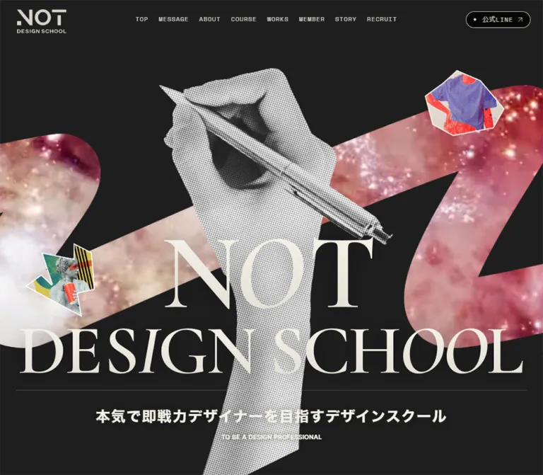
黒とアイボリーを基調に、巨大なセリフ体のブランド表現、ペンを持つ手のハーフトーン、鮮やかなコラージュを組み合わせたスクールサイト。講座一覧や受講生作品を豊富に掲載。
オリジナルサイトを見るA dark editorial canvas where monumental lettering meets photocopied hands and vivid cut-paper graphics.
Website: notdesignschool.jp Original URL: https://notdesignschool.jp/ Final URL: https://notdesignschool.jp/ Response: HTTP 200; the original and final URLs are identical. Theme: dark, with warm ivory typography, colorful artwork, and a contrasting white LINE promotion. Inspected: September 23, 2026, at 00:41:48.849 JST; supplied capture-batch timestamp: September 22, 2026, at 15:41:48.849 UTC. Viewports: desktop 1440 × 1000 and mobile 390 × 844 CSS pixels. Scope: the current school homepage, including its hero, persistent header, event listings, philosophy and About content, course catalog, student-work gallery, team and editorial content, LINE enrollment pathways, and footer. Visual captures cover the desktop hero, desktop works, desktop footer, mobile hero, and mobile footer. Other sections are supported by rendered text and selected computed-style measurements.
NOT DESIGN SCHOOL uses a restrained dark interface to frame deliberately expressive artwork. Its opening composition combines a large monochrome hand holding a pen, a broad colored zigzag, small irregular collage fragments, and enormous ivory serif branding. Thin navigation labels and a compact outlined LINE link sit above this composition without a solid header bar.
Below the hero, the site becomes an extensive school and community directory. Oversized English section titles introduce Japanese explanations, course collections, student work, mentors, articles, and social channels. The typography is more varied than the hero alone suggests: Inter for large editorial headings, Japanese Gothic families for practical information, Space Mono for utilities, and serif families for quotations and course-group headings.
The strongest reusable relationship is between expressive identity and orderly content. Preserve the dramatic collage at the entrance, the generous section spacing, and the comparatively quiet catalogs beneath it. The page is a broad school homepage with several destinations and purposes.
A dark editorial canvas where monumental lettering meets photocopied hands and vivid cut-paper graphics.
Website: notdesignschool.jp Original URL: https://notdesignschool.jp/ Final URL: https://notdesignschool.jp/ Response: HTTP 200; the original and final URLs are identical. Theme: dark, with warm ivory typography, colorful artwork, and a contrasting white LINE promotion. Inspected: September 23, 2026, at 00:41:48.849 JST; supplied capture-batch timestamp: September 22, 2026, at 15:41:48.849 UTC. Viewports: desktop 1440 × 1000 and mobile 390 × 844 CSS pixels. Scope: the current school homepage, including its hero, persistent header, event listings, philosophy and About content, course catalog, student-work gallery, team and editorial content, LINE enrollment pathways, and footer. Visual captures cover the desktop hero, desktop works, desktop footer, mobile hero, and mobile footer. Other sections are supported by rendered text and selected computed-style measurements.
NOT DESIGN SCHOOL uses a restrained dark interface to frame deliberately expressive artwork. Its opening composition combines a large monochrome hand holding a pen, a broad colored zigzag, small irregular collage fragments, and enormous ivory serif branding. Thin navigation labels and a compact outlined LINE link sit above this composition without a solid header bar.
Below the hero, the site becomes an extensive school and community directory. Oversized English section titles introduce Japanese explanations, course collections, student work, mentors, articles, and social channels. The typography is more varied than the hero alone suggests: Inter for large editorial headings, Japanese Gothic families for practical information, Space Mono for utilities, and serif families for quotations and course-group headings.
The strongest reusable relationship is between expressive identity and orderly content. Preserve the dramatic collage at the entrance, the generous section spacing, and the comparatively quiet catalogs beneath it. The page is a broad school homepage with several destinations and purposes.
MENU. Its appearance in the captures does not establish that the mobile navigation button was opened.| Name | Value | Suggested token / source evidence | Role and certainty |
|---|---|---|---|
| Stage Charcoal | #1e1e1e |
--color-stage; source --s-color-d3bdba70 |
Measured body background and event-card background; visible behind the hero |
| Section Dark | #171718 |
--color-section; source --s-color-fabb63c9 |
Measured quotation, About, and Courses section backgrounds; also the header LINE link fill |
| Course Card Black | #111111 |
--color-card |
Measured course-anchor background; distinct from the nearby source ink token |
| Dark Ink | #111112 |
--color-ink; source --s-color-a197ba08 |
Measured text color inside the personalized-course composition |
| Warm Ivory | #f3f1e7 |
--color-text |
Measured navigation, hero copy, section headings, and much of the body text |
| Soft White | #f4f3ef |
--color-text-soft; source --s-color-b8b3bf09 |
Measured mobile About paragraph color |
| Muted Date | #cccac2 |
--color-muted |
Measured event-date text |
| Secondary Gray | #bbbbbb |
--color-secondary |
Measured event-speaker role text |
| Rule Gray | #484848 |
--color-rule; source --s-color-809fdcfd |
Declared value; a practical approximation for the thin rules visible in the hero and footer |
| Signal Orange | #f44a01 |
--color-accent; source --s-color-25ad64cc |
Declared accent consistent with the visible footer starburst; exact starburst fill was not measured |
| White | #ffffff |
--color-white; source --s-color-759a5502 |
Measured event-title text; the promotion also appears white in the screenshots |
Warm Ivory is established by computed element colors, even though an opaque custom property with that exact value is not included in the supplied property list. Do not substitute the lighter #f4f3ef everywhere: the source uses both.
| Treatment | Approximation | Evidence |
|---|---|---|
| Footer canvas | Near-black, approximately #070706 |
Visual estimate; footer background styles were not supplied |
| LINE promotion button | Bright green, approximately #00c853 |
Visual estimate; this green is absent from the supplied custom-property list |
| Desktop hero ribbon | Pink, burgundy, pale gold, and white texture | Artwork appearance, not a single UI color |
| Mobile hero ribbon | Cyan, blue, violet, and pink gradient | Visible in the mobile capture; its relationship to the desktop texture is unverified |
Keep bright green associated with LINE conversion. Orange is a smaller graphic accent. The multicolor ribbon and student projects provide most of the remaining saturation.
The page declares a warm neutral #e7e3da, an ivory transparency rgba(243, 241, 231, 0.34), and this gradient:
linear-gradient(
  180deg,
  rgb(99, 235, 204) 0%,
  rgb(238, 220, 206) 61.54%,
  rgb(255, 146, 146) 100%
)
Their precise component assignments are not established by the supplied captures. In particular, this mint–peach–rose declaration does not reproduce the visible cyan–violet mobile ribbon. The numerous transparent --g-color-* properties are rendering scaffolding, not evidence of additional visible palette colors or selectable themes.
The header, hero, and footer display a distinctive serif wordmark with pronounced stroke contrast. The header stacks NOT, DESIGN, and SCHOOL into a compact mark. The desktop hero enlarges the identity into a central NOT above a wide DESIGN SCHOOL line.
Important limitation: the supplied computed-style sample does not identify the font or asset used to draw this wordmark. The empty H1 wrapper reports a generic sans-serif font, which does not describe the visible logo. Cormorant Garamond is confirmed elsewhere, but that does not establish it as the logo font. Use approved brand artwork when available.
Inter, 'ヒラギノ角ゴ W6 JIS2004'.500 for About and Courses display text; 600 for Webinar and course names.-0.04em for measured major section headings.| Family reported by the source | Confirmed use |
|---|---|
'ヒラギノ角ゴ W4 JIS2004' |
About paragraphs, compact course descriptions, ordinary Japanese button text |
'ヒラギノ角ゴ W5 JIS2004' |
Section explanations, feature headings, course subtitles, and prices |
'ヒラギノ角ゴ W6 JIS2004' |
Event titles, course labels, and other emphasized information |
'ヒラギノ角ゴ W7 JIS2004' |
Japanese hero headline, computed weight 800 |
The family suffix and CSS weight are separate pieces of evidence. For example, the source uses the W5 family with both 500 and 700 on feature headings.
'Space Mono'.0.08em.12px on desktop to 14px on mobile.Personalized Course title.'秀英明朝 M JIS2004': confirmed on Japanese course-group headings such as 動画で学ぶ and 短期道場クラス.All numeric entries below are measured computed values. A slash separates font size and line height.
| Role | Desktop | Mobile | Weight / tracking |
|---|---|---|---|
| Header navigation | 12 / 21.6px |
Hidden from the visible header | 400; 0.08em |
| Header LINE label | 12 / 21.6px |
14 / 25.2px |
400; 0.08em |
| Japanese hero headline | 28 / 50.4px |
22 / 33px |
800; 0.06em |
| Hero English supporting line | 12 / 16.8px |
14 / 19.6px |
700; normal |
| Section explanation | 12 / 24px |
12 / 24px |
500; 0.04em |
| Webinar title | 64 / 64px |
56 / 56px |
600; -0.04em |
| Bracketed section index | 12 / 16.8px |
12 / 16.8px |
400; normal |
| Event date | 12 / 16.8px |
14 / 19.6px |
400; normal |
| Event title | 16 / 22.4px |
16 / 22.4px |
700; normal |
| Event speaker name | 12 / 12px |
12 / 12px |
400; normal |
| Event speaker role | 10 / 10px |
10 / 10px |
400; normal |
| English quotation | 32 / 32px |
36 / 36px |
400; -1.28px |
| About display lines | 82 / 82px |
64 / 64px and 56 / 56px |
500; -0.04em |
| Feature number | 24 / 33.6px |
24 / 33.6px |
500; -0.03em |
| Feature heading | 26 / 36.4px |
26 / 36.4px |
700 or 500, depending on heading |
| About body | 14 / 23.8px |
15 / 27px |
400; normal |
| Courses display title | 112 / 112px |
72 / 72px |
500; -0.04em |
| Japanese course-group title | 48 / 48px |
36 / 28.8px or 40 / 32px |
400; heading-specific tracking |
| Personalized Course title | 56 / 56px |
48 / 38.4px |
500; -0.02em |
| Video-course name | 22–24 / 22–24px |
32 / 32px |
600; normal |
| Short-class course name | 22 / 22px |
22 / 22px in supplied examples |
600; normal |
| Compact course description | 12 / 14.4px |
12 / 14.4px |
400; normal |
| Course price numeral | 14 / 19.6px |
14 / 19.6px |
400; -0.05em |
| Tax annotation | 10 / 14px |
10 / 14px |
500; normal |
The unusually tight Japanese personalized-course heading has measured tracking of -5.12px at both widths. Treat that as a heading-specific adjustment, not a reusable body-text token.
Estimated from screenshots: work titles appear around 16px and bold, creator labels around 12px, footer navigation around 14–16px, and the MENU heading around 28px with open tracking. No corresponding computed rows were supplied for those elements.
Observed rhythm: compact metadata within cards; much larger space around editorial headings and between content groups.
Recommended spacing vocabulary: 4, 8, 12, 16, 24, 32, 48, 64, 80, 104, 160, 200px. These values collect useful measured intervals and adaptation choices; they are not a recovered global source scale.
| Element | Desktop 1440 × 1000 | Mobile 390 × 844 | Evidence |
|---|---|---|---|
| Hero section | 1440 × 1000px |
390 × 844px |
Measured; exactly one captured viewport |
| Header layout box | 1440 × 75px, y = -1px |
390 × 75px, y = -1px |
Measured |
| Header horizontal padding | 32px left, 24px right |
16px each side |
Measured |
| Brand home-link box | 97 × 80.03px |
97 × 80.03px |
Measured; extends below the header box |
| Brand home-link position | x = 32px, y ≈ 16.48px |
x = 16px, y ≈ 16.48px |
Measured |
| Header LINE link | 125 × 32px |
145 × 40px |
Measured |
| Mobile menu button | Not visible | 32 × 32px, x = 181px |
Measured |
| Desktop navigation gap | 20px between adjacent anchors |
Not applicable | Calculated from bounds |
| Event collection width | 1312px; 64px side margins |
326px; 32px side margins |
Calculated from card bounds |
| Event-card width | 310px, four columns |
326px, one column |
Measured |
| Event-card gap | 24px horizontally |
23px vertically in sampled rows |
Calculated |
| Courses content width | 1000px, x = 220px |
342px, x = 24px |
Measured |
| Personalized-course card | 1000 × 520px |
342 × 530px |
Measured |
| Video-course card | About 322.27 × 350.27px in first row |
342px wide; sampled heights 383–432px |
Measured |
| Course-card gap | 16px horizontally and between sampled rows |
8px between sampled cards |
Calculated |
| About paragraph column | About 432px |
308px, x = 41px |
Measured |
| Student-work columns | Four, approximately 304px each |
Not visually established | Desktop screenshot estimate |
| Student-work gap | Approximately 32px horizontally |
Not visually established | Desktop screenshot estimate |
| Footer menu width | Approximately 400px, centered |
Approximately 342px, with 24px side margins |
Screenshot estimate |
| LINE promotion | Approximately 480 × 222px |
Approximately 358 × 193px |
Screenshot estimate |
| Promotion edge clearance | Approximately 24px right and bottom |
Approximately 16px on both sides and bottom |
Screenshot estimate |
936px, leaving a measured 64px below it. On mobile it ends at approximately y = 844px, the viewport edge.8px on desktop and 16px on mobile.90px below the desktop hero boundary and 32px below the mobile boundary.21px inside the card's left edge. The same measured inset is retained on mobile.25px inside its card. The personalized-course description uses approximately 33px on desktop and 19px on mobile.200px into its desktop section and 104px into the mobile section. These are snapshot-derived relationships, not proof of literal padding declarations.45px high, separated by thin rules. The brand signature sits well below the menu rather than directly beneath the final link.| Element | Value | Certainty |
|---|---|---|
| Student-work artwork | Visually square | Screenshot observation |
| Ordinary course cards | 4px |
Measured |
| Personalized-course card | 4px desktop; 8px mobile |
Measured |
| Event cards | 8px |
Measured |
| Post-hero banner link | 10px desktop; 4px mobile |
Measured |
| Header and archive pills | 128px |
Measured |
| LINE promotion | Approximately 20–22px |
Screenshot estimate |
| Promotion action | Approximately 11–12px |
Screenshot estimate |
The page has several radius levels. Avoid making every component as rounded as the promotion.
Role: maintain school identity, section access, and a direct LINE route across a long page.
The transparent header has three visual zones: a compact stacked brand at left, a small horizontal navigation group near the center, and an outlined pill at right. The navigation contains TOP, MESSAGE, ABOUT, COURSE, WORKS, MEMBER, BLOG, and RECRUIT.
Most section labels link to homepage fragments. RECRUIT links to /recruit. BLOG links to /#story; preserve the distinction between the visible label and its actual destination.
The 公式LINE pill combines a small leading dot, the label, and a northeast arrow. Its source fill is #171718, with a thin light outline visible in the captures. It is visually restrained despite being the persistent conversion route.
The header remains at the top in the supplied desktop work and footer captures, supporting persistent behavior. The supplied computed rows omit position, so fixed versus sticky implementation is not directly established. The work capture also shows the header crossing bright artwork; any reproduction must account for contrast there without assuming an unverified blend-mode implementation.
The 97px brand width is retained. The desktop link row disappears from the visible header, and a 32px menu button appears between the logo and the LINE link. The button contains three thin horizontal strokes of unequal length. The LINE pill grows to 145 × 40px, with a 14px label.
Only the resting menu button is established. Its opening animation, resulting panel, focus behavior, and dismissal rules were not exercised in the evidence.
Role: introduce the school through graphic identity before detailed explanation.
Read the desktop composition as several overlapping layers:
The visible desktop brand spans approximately x = 233–1207px, or about 974px. The hand begins around y = 173px and continues to the viewport bottom. These are visual estimates, useful for composition rather than exact asset positioning.
The headline is actual text: 本気で即戦力デザイナーを目指すデザインスクール. Its measured desktop box is about 679 × 50px. The English supporting line is TO BE A DESIGN PROFESSIONAL.
On mobile, the hand becomes a close crop, and the pen exits the right edge. The ribbon appears as a steep cyan-to-violet diagonal. NOT and DESIGN occupy separate visible lines; the promotion conceals much of the remaining lower brand area. Do not infer hidden lettering placement from the obscured capture.
A promotional banner links to /#bootcamp before the webinar listing. Its link box changes from 846 × 222.06px on desktop to 326 × 217.19px on mobile. The mobile box therefore has a substantially different aspect ratio. The supplied evidence does not establish whether this comes from an alternate image, cropping, or additional internal structure.
The webinar introduction pairs a small Japanese explanation with a large Webinar title and a bracketed [ 01 ] index. Similar combinations of English title, Japanese description, and small index recur through the page, though their arrangement varies by section.
Role: present event information and link to an external event page.
The sampled anatomy is an image-led anchor followed by a compact information area containing a date, a Japanese event title, and speaker details where available. An 受付中 status appears on one event. The title uses 16px / 1.4 Japanese Gothic at weight 700; date text uses Space Mono and a muted warm gray.
Desktop displays four cards across a 1312px collection with 24px gaps. Mobile stacks them in one 326px column. Heights vary with content; the first desktop card is approximately 355px high, while the second is approximately 333px. Preserve this content-driven behavior instead of forcing every card to match the tallest entry.
An archive pill below the collection is 48px high. The whole measured event card is an anchor; no separate embedded purchase button is needed.
Role: create a slower editorial pause between events and the school explanation.
The source presents the English quotation “Design is so simple. That's why it is so complicated.” with a Japanese translation and a small Paul Rand attribution. Its section uses #171718.
The English line uses Cormorant Garamond at 32px on desktop. On mobile it increases to 36px, occupies a 310px column, and wraps into four measured lines. The entire quotation section grows from approximately 379px to 544px high. This is an example of preserving expressive scale while allowing more vertical space on a phone.
Role: state the school's position, then support it with readable detail.
The display text is split into What I am., About, NOT DESIGN, and SCHOOL.. These are large Inter lines rather than the serif brand mark. Their separate measured positions establish a staggered composition instead of a single centered paragraph.
Two feature blocks follow, each with a number, a 26px Japanese heading, and a body paragraph. On desktop the paragraphs form two columns of roughly 432px, offset to the right of the page. On mobile they stack into 308px columns with larger body type and more leading: 15px / 27px instead of 14px / 23.8px.
Use ordinary flow for the text blocks. Their measured widths and type hierarchy matter more than reproducing transformed offscreen coordinates.
Role: organize three distinct learning formats.
A centered Courses title is measured at 112px on desktop and 72px on mobile. Beneath the section introduction, the content narrows to a 1000px desktop column.
The three groups are personalized study, purchased video courses, and short live classes. Each group uses a Japanese serif title and a smaller Gothic explanation. Desktop places the explanation alongside the heading in the measured examples. Mobile puts the explanation above it, producing an actual change in visual order.
Keep the formats distinct in content and layout. Their shared card language does not make them interchangeable products.
Role: give the primary ongoing course a larger presentation than individual video products.
The measured anchor is 1000 × 520px on desktop and 342 × 530px on mobile. Its content includes an opening schedule, a Cormorant Garamond English title, a Japanese subtitle, several short subject labels, explanatory text, and a detail destination.
The subject labels fit across the desktop composition and wrap over several rows on mobile. Personalized Course changes from 56px / 56px to 48px / 38.4px, wrapping into two measured lines on mobile.
Surface limitation: this is a composite card. The anchor background is measured as #111111, while several child texts are #111112. The supplied screenshots do not show this section, and the sampled rows omit the backing artwork or intervening surface behind that text. Do not render those dark texts directly on the dark anchor background. The Quick Start gives the feature card a clearly labeled light-surface adaptation rather than claiming an exact reconstruction.
Role: provide a compact catalog of individual courses.
The source uses a three-column desktop arrangement with approximately 322px cards and 16px gaps. The mobile version is one 342px column with 8px vertical gaps.
The content sequence includes an artwork area, a prominent course name, a smaller Japanese course label or note, a concise description, and a price line. The price line distinguishes the numeral, 円, and (税込) through 14px, 12px, and 10px type respectively. Prices remain comparatively quiet; the course identity has greater visual emphasis.
Course names such as Figma, Studio, and Framer increase from 22px on desktop to 32px on mobile. Preserve the larger mobile title instead of applying a universal downscaling rule.
The raw link-text extraction contains duplicate labels and old COMINGSOON messages that are absent from the main rendered-text inventory. Those strings are not reliable evidence of currently visible badges. Do not reproduce them as part of the normal card state.
The short-class collection shares the ordinary course-card surface and radius. Its distinct metadata includes session count, instructor, and opening month, followed by a short description and price.
The sampled class title is 22px on both viewports. Metadata grows slightly from 11px / 15.4px to 12px / 16.8px on mobile. This is a separate type rule from the video-course names.
Role: demonstrate the range of outcomes through actual project images.
The desktop capture shows four columns on a dark background, with approximately 64px outer margins and 32px gutters. Each entry consists of a square-cornered project image, a bold Japanese title beneath it, and a smaller creator label with a social icon where present.
The artwork varies in aspect ratio and internal composition: logos, packaging mockups, business cards, banner designs, phone interfaces, posters, brand guidelines, apparel, and website screenshots. Several neighboring white image backgrounds visually merge, but separate titles establish distinct entries. Avoid mistaking those adjacent images for a single spanning card.
Preserve the supplied project compositions and their internal whitespace. Do not place an additional white card around every image or crop all work into a uniform square. The displayed second row begins on a shared horizontal line despite different heights in the preceding row; the capture does not require a masonry implementation.
The rendered category labels are actual links to /work/category/... destinations. They are not evidence of an in-place filtering interaction. A desktop View more string appears in the extracted content, but its hover or click behavior is not established. The mobile gallery's column count was not captured visually.
The source also states that assignment projects use fictional products and companies. Keep that contextual note near the gallery in a reproduction using the same content.
The rendered homepage continues with team members and mentor roles, recruitment information, a blog collection, student learning records, social accounts, and an official LINE section.
The blog exposes a さらに読み込む control, and several collections have archive links. Their activation results were not tested. Student learning records link to an external community site; social entries combine an account name with descriptive text.
These sections establish the page's breadth and information architecture. Their detailed card geometry, image treatment, and hover states are not shown in the supplied captures, so they should not inherit invented measurements from the better-documented course cards.
Role: provide a compact sitemap and a final, oversized brand impression.
The near-black footer contains a centered MENU heading and eight vertically stacked navigation rows. Each row has a left-aligned uppercase label, a northeast arrow at the far right, and a thin bottom rule. The menu is approximately 400px wide on desktop and 342px wide on mobile.
Below it, a very large ivory serif brand signature occupies much of the desktop width. A small orange starburst appears above and to the right of NOT. X, Instagram, and YouTube icons are visible near the lower left of the desktop capture. Legal and copyright text are present in the rendered document, although the promotion and crop limit their visibility.
The footer uses STORY, while the header uses BLOG for the same section destination. Preserve this as an observed source detail if reproducing the current page; unify it only as a deliberate content improvement.
The footer is part of the long document. Neither the desktop nor mobile MENU capture is sufficient evidence of a modal navigation panel.
Role: offer a downloadable resource in exchange for LINE registration.
The promotion is the strongest contrasting UI surface: a white rounded rectangle containing a green eyebrow, a bold dark Japanese headline with orange emphasis, a small explanatory line, a green registration action, and a book mockup at right. An orange shape and dotted decoration surround the book. A small close glyph appears at the upper right.
The visible copy includes LINE友だち限定特典 and 公式LINEに登録して特典ゲット. The promotion's link uses a different campaign parameter from the header LINE destination; preserve separate destinations when implementing the actual campaign.
On desktop the panel is approximately 480px wide and sits 24px from the lower-right edges. On mobile it becomes approximately 358px wide, leaving 16px side margins. The action expands across nearly the full panel width beneath the text and book.
The panel is absent from the first desktop hero capture but present in the later desktop captures and both mobile captures. This supports variable visibility, but not a specific timer, scroll threshold, session rule, or dismissal persistence. The close control is visible; its effect was not tested.
At 390 × 844, the panel extends approximately from y = 635px to 828px, covering the Japanese hero headline and much of the lower identity. Record this occlusion as current behavior rather than treating the hidden content as missing.
| Element or group | Reported declaration | What it establishes |
|---|---|---|
| Body background | 0.5s cubic-bezier(0.4, 0.4, 0, 1) |
A defined background transition; the trigger was not supplied |
| Many header, text, and card elements | 0.3s cubic-bezier(0.4, 0.4, 0, 1) |
A common transition timing, often accompanied by generated gradient-property transitions |
| Desktop Webinar heading | 1s, delay 0.6s, same easing |
A longer delayed transition; start/end geometry is not established |
| Desktop About display lines | 1s, delays 0.3s, 0.5s, 0.7s, 0.9s |
A declared stagger across successive text lines |
| Desktop Courses heading | 1s, delay 0.3s |
A delayed display-title transition |
| Desktop course anchors | 1s, delay 0.4s |
A delayed card transition |
| Desktop quotation translation and attribution | 1s, delay 1s |
Delayed supporting-text transitions |
| Corresponding sampled mobile display/card elements | Generally 0.3s with no reported delay |
A simpler mobile declaration in the supplied computed styles |
The sampled elements report animation: none. That does not rule out transitions, animation on unmeasured descendants, media playback, or script-driven transforms.
Recommended motion adaptation: use the measured easing for short color and opacity feedback. If adding editorial entrance motion, use a restrained translation and the documented desktop stagger as inspiration, with all content visible by default. A static hero is a valid evidence-based starting point until the original motion is separately inspected.
| Layer | Appearance | Function |
|---|---|---|
| Hero stage | Solid #1e1e1e |
Gives the collage and ivory identity clear contrast |
| Editorial sections | Primarily #171718 in measured sections |
Separates the long content body subtly from the opening stage |
| Course card | #111111, small radius |
Groups course content without a bright container |
| Event card | #1e1e1e, 8px radius |
Supports image, date, title, and speaker information |
| Work entry | Artwork directly on the dark gallery canvas | Lets varied project palettes remain independent |
| Utility action | Dark fill, fine light outline, pill shape | Keeps navigation and archive actions visually compact |
| Footer | Near-black with ivory type and fine rules | Produces a quiet sitemap and large closing brand signature |
| Promotion | White, large rounded corners, green action, orange artwork | Creates a conspicuous conversion layer above the page |
There is no broadly evidenced shadow-based elevation system. The book mockup contains photographic depth, but that is not a reason to add shadows to every catalog entry. No glass blur is visible in the documented surfaces.
The hand has dense black-and-white halftone texture and a sharply cut silhouette. Its physical gesture and diagonally held pen create the focal point. The pale dot pattern remains visible at large scale; smoothing it into a clean vector illustration would remove much of the character.
The ribbon is broad, irregular, and cropped by the viewport. It behaves compositionally as a background stroke, leaving dark negative space around the hand and type. The small collage fragments use different colors, patterns, and irregular edges to suggest assembled printed material.
Use transparent assets for cutouts and preserve their edge character. Do not automatically apply image-rendering: pixelated: this is print-style halftone, not an established pixel-art interface. The current evidence does not identify the rendering property used on these images.
Student projects remain in full color, frequently arranged on pale presentation boards. The range of subject matter is part of the school's proof of capability. Recoloring them all into orange and black would destroy useful differences between projects.
The LINE promotion uses a realistic angled book mockup with its own title and cover graphics. Preserve that as artwork rather than trying to reproduce the book's tiny typography as interface text.
The complete filenames below appear in original-page DOM evidence. They are hosted under:
https://storage.googleapis.com/studio-design-asset-files/projects/nBW2Q1mJav/
| Asset | Filename | Established use |
|---|---|---|
| Short-class banner | s-1440x378_v-fms_webp_482005d8-d005-4059-8ea6-98dc3d70cdd7_small.webp |
Image inside the link to /#bootcamp |
| First webinar image | s-660x371_v-fs_webp_7f100b58-e5bf-41a2-8e04-8d8e1b1c5427_small.webp |
First event-card image |
| Second webinar image | s-660x371_v-fs_webp_51660fc6-a290-44eb-83af-92f2f69f37fa_small.webp |
Second event-card image |
| Expo webinar image | s-659x346_v-fs_webp_517a40f5-7c81-4c3a-bc71-f22514c45b96_small.webp |
Expo event-card image |
| Fourth webinar image | s-1920x1080_v-frms_webp_cea815d9-7aa4-466e-9455-96c9395be14b_small.webp |
Fourth event-card image |
The supplied excerpts do not expose complete, confidently mapped URLs for the brand mark, hand, ribbon, collage fragments, project images, or promotional book. Do not guess their filenames. The CSS below expects approved artwork to be supplied separately.
The reported document height is approximately 15,888px on desktop and 26,142px on mobile. This is a long scrolling homepage, not a fixed application shell. Do not lock the whole document to the hero's viewport height.
The content alternates between broad collections and narrower editorial areas. Events occupy a 1312px desktop width; courses narrow to 1000px; feature paragraphs use approximately 432px columns; the footer menu contracts to about 400px. A single universal container would lose this hierarchy.
| Area | Desktop | Mobile |
|---|---|---|
| Header | Visible link row and compact LINE pill | Menu button and larger LINE pill; logo width retained |
| Hero | Wide collage and broad lower wordmark | Tighter hand crop, visible stacked lettering, diagonal gradient ribbon |
| Hero headline | One measured line at 28px |
Two measured lines at 22px |
| Hero supporting line | 12px, with 64px bottom clearance |
14px, reaching the viewport bottom |
| Webinar collection | Four columns | One column |
| Quotation | 32px, one measured line |
36px, four measured lines |
| About features | Two text columns | Stacked text; body increases to 15px / 27px |
| Courses heading | 112px |
72px |
| Course-group explanation | Alongside its serif heading | Above its serif heading |
| Video-course collection | Three columns | One column, smaller gaps |
| Video-course name | 22–24px |
32px |
| Footer menu | Narrow centered list | Nearly full-width list with 24px side margins |
| Promotion | Lower-right panel | Nearly full-width bottom panel; action spans beneath the upper content |
The exact media-query thresholds are not supplied. The Quick Start uses 1100px and 700px as recommended integration points, with an additional narrow-header adjustment. These are not source breakpoints.
The mobile work-grid arrangement, tablet layout, landscape behavior, browser zoom handling, and safe-area rules remain unverified. Do not infer a two-column phone gallery from its desktop layout.
MENU block as an opened mobile overlay.These are recommendations for a new implementation, not verified original features:
44 × 44px while preserving their visible stroke size.scroll-margin-top or scroll-padding-top.#00803a is a recommended accessible adaptation, not a measured source color.#1e1e1e.#171718.#111111.#f3f1e7.#f4f3ef.#cccac2.#f44a01.#00c853.#00803a.“Create a long Japanese design-school homepage inspired by the current NOT DESIGN SCHOOL page. Use a charcoal hero, near-black content sections, and warm ivory text. Build a full-viewport opening collage from an approved halftone hand holding a pen, a broad irregular colored ribbon, small cut-paper fragments, and oversized serif brand artwork. Use a transparent persistent header with a compact stacked brand, small tracked utility navigation, and an outlined LINE pill. Below the hero, introduce events, school philosophy, courses, student work, team information, and editorial content through large tightly tracked Inter headings and readable Japanese Gothic text. Give events four desktop columns, video courses three columns inside a narrower container, and student work four unboxed columns with varied image proportions. Use a narrow ruled footer sitemap above an enormous brand signature. Match documented mobile changes individually rather than shrinking the entire page.”
This is a usable CSS adaptation for a conventional scrolling document. It combines measured tokens with explicitly recommended layout rules. It does not reproduce missing artwork, untested menu behavior, or campaign timing.
Use approved image assets for .brand img, .hero-ribbon, .hero-hand, .hero-brand, .hero-sticker, and .promo-art. The hero brand image can sit inside a picture element for an authorized mobile composition. Course and event media should use real image dimensions rather than fixed-height placeholders.
:root {
  /* Measured source colors */
  --color-stage: #1e1e1e;
  --color-section: #171718;
  --color-card: #111111;
  --color-ink: #111112;
  --color-text: #f3f1e7;
  --color-text-soft: #f4f3ef;
  --color-muted: #cccac2;
  --color-secondary: #bbbbbb;
  --color-white: #ffffff;

  /* Declared source colors; component mapping is an adaptation */
  --color-rule: #484848;
  --color-accent: #f44a01;
  --color-paper: #e7e3da;

  /* Visual estimate and recommended contrast adjustment */
  --color-footer: #070706;
  --color-line-bright: #00c853;
  --color-line-action: #00803a;

  /* Reported families with recommended fallbacks */
  --font-display: Inter, 'ヒラギノ角ゴ W6 JIS2004', sans-serif;
  --font-body: 'ヒラギノ角ゴ W4 JIS2004', sans-serif;
  --font-medium: 'ヒラギノ角ゴ W5 JIS2004', sans-serif;
  --font-bold: 'ヒラギノ角ゴ W6 JIS2004', sans-serif;
  --font-heavy: 'ヒラギノ角ゴ W7 JIS2004', sans-serif;
  --font-utility: 'Space Mono', monospace;
  --font-serif: 'Cormorant Garamond', serif;
  --font-jp-serif: '秀英明朝 M JIS2004', serif;

  --space-1: 4px;
  --space-2: 8px;
  --space-3: 12px;
  --space-4: 16px;
  --space-6: 24px;
  --space-8: 32px;
  --space-12: 48px;
  --space-16: 64px;
  --header-height: 75px;
  --radius-card: 4px;
  --radius-event: 8px;
  --radius-pill: 128px;
  --radius-promo: 21px;
  --ease-site: cubic-bezier(0.4, 0.4, 0, 1);
  --motion-ui: 300ms;
}

* { box-sizing: border-box; }
html { scroll-padding-top: 108px; }
body {
  margin: 0;
  background: var(--color-stage);
  color: var(--color-text);
  font-family: var(--font-body);
  font-size: 14px;
  line-height: 1.7;
}
img { display: block; max-width: 100%; height: auto; }
a { color: inherit; }
button { font: inherit; cursor: pointer; }
[hidden] { display: none !important; }
:focus-visible {
  outline: 2px solid currentColor;
  outline-offset: 5px;
}

/* Fixed positioning is an adaptation of observed persistence. */
.site-header {
  position: fixed;
  z-index: 30;
  top: -1px;
  inset-inline: 0;
  height: var(--header-height);
  padding: 0 24px 0 32px;
  display: flex;
  align-items: center;
  gap: 16px;
}
.brand {
  flex: 0 0 97px;
  align-self: flex-start;
  width: 97px;
  margin-top: 17.5px;
  margin-right: auto;
}
.brand img { width: 97px; height: 80px; object-fit: contain; }
.primary-nav {
  position: absolute;
  left: 49.3%;
  top: 25.7px;
  transform: translateX(-50%);
  display: flex;
  align-items: center;
  gap: 20px;
}
.primary-nav a,
.line-pill {
  font-family: var(--font-utility);
  font-size: 12px;
  font-weight: 400;
  line-height: 1.8;
  letter-spacing: 0.08em;
  text-decoration: none;
  white-space: nowrap;
}
.line-pill {
  flex: 0 0 125px;
  height: 32px;
  display: inline-flex;
  align-items: center;
  justify-content: center;
  gap: 10px;
  background: var(--color-section);
  border: 1px solid var(--color-text);
  border-radius: var(--radius-pill);
}
.line-pill::before {
  content: '';
  width: 4px;
  height: 4px;
  border-radius: 50%;
  background: currentColor;
}
.menu-toggle {
  display: none;
  width: 32px;
  height: 32px;
  padding: 6px 4px;
  border: 0;
  background: transparent;
  color: var(--color-text);
}
.menu-toggle span {
  display: block;
  height: 1px;
  background: currentColor;
  margin-block: 5px;
}
.menu-toggle span:nth-child(2) { width: 75%; }
.menu-toggle span:nth-child(3) { width: 55%; }

/* Art placement is estimated from the current captures. */
.hero {
  position: relative;
  isolation: isolate;
  min-height: 100vh;
  min-height: 100svh;
  overflow: hidden;
  background: var(--color-stage);
}
.hero-ribbon {
  position: absolute;
  z-index: -2;
  inset: 0;
  width: 100%;
  height: 100%;
  object-fit: cover;
  pointer-events: none;
}
.hero-hand {
  position: absolute;
  z-index: -1;
  top: 17.3%;
  left: 50.5%;
  height: 83%;
  width: auto;
  max-width: none;
  transform: translateX(-50%);
  pointer-events: none;
}
.hero-brand {
  position: absolute;
  left: 50%;
  bottom: 19.6%;
  width: min(67.65vw, 1000px);
  transform: translateX(-50%);
}
.hero-sticker {
  position: absolute;
  width: 9.7%;
  pointer-events: none;
}
.hero-sticker--left { left: 5.1%; bottom: 20%; }
.hero-sticker--right { right: 5.8%; top: 14.8%; }
.hero-caption {
  position: absolute;
  left: 50%;
  bottom: 64px;
  width: min(67.65vw, 1000px);
  transform: translateX(-50%);
  text-align: center;
}
.hero-caption::before {
  content: '';
  position: absolute;
  top: -24px;
  inset-inline: 0;
  border-top: 1px solid var(--color-rule);
}
.hero-caption h2 {
  margin: 0;
  font-family: var(--font-heavy);
  font-size: 28px;
  font-weight: 800;
  line-height: 1.8;
  letter-spacing: 0.06em;
}
.hero-caption p {
  margin: 8px 0 0;
  font-family: var(--font-display);
  font-size: 12px;
  font-weight: 700;
  line-height: 1.4;
}

/* Separate collection widths preserve the observed hierarchy. */
.editorial-section { background: var(--color-section); }
.wide-container {
  width: min(1312px, calc(100% - 128px));
  margin-inline: auto;
}
.course-container {
  width: min(1000px, calc(100% - 48px));
  margin-inline: auto;
}
.section-heading {
  padding-block: 104px 64px;
  text-align: center;
}
.section-heading h2 {
  margin: 0;
  font: 500 clamp(72px, 7.78vw, 112px)/1 var(--font-display);
  letter-spacing: -0.04em;
}
.section-index {
  font: 400 12px/1.4 var(--font-utility);
}
.section-description {
  font: 500 12px/2 var(--font-medium);
  letter-spacing: 0.04em;
}
.webinar-heading {
  font: 600 64px/1 var(--font-display);
  letter-spacing: -0.04em;
}
.event-grid {
  display: grid;
  grid-template-columns: repeat(4, minmax(0, 1fr));
  align-items: start;
  gap: 24px;
}
.event-card {
  display: block;
  overflow: hidden;
  border-radius: var(--radius-event);
  background: var(--color-stage);
  text-decoration: none;
}
.event-card img { width: 100%; }
.event-info { padding: 16px 21px 24px; }
.event-date {
  margin: 0 0 5px;
  color: var(--color-muted);
  font: 400 12px/1.4 var(--font-utility);
}
.event-title {
  margin: 0;
  color: var(--color-white);
  font: 700 16px/1.4 var(--font-bold);
}
.event-speaker { margin-top: 20px; font-size: 12px; }
.event-role { color: var(--color-secondary); font-size: 10px; }
.archive-link {
  display: table;
  min-height: 48px;
  margin: 36px auto 0;
  padding: 12px 24px;
  border: 1px solid var(--color-text);
  border-radius: var(--radius-pill);
  background: var(--color-section);
  font-size: 12px;
  letter-spacing: 0.08em;
  text-decoration: none;
}

.course-group + .course-group { margin-top: 140px; }
.course-group-heading {
  display: flex;
  align-items: center;
  gap: 48px;
  margin-bottom: 20px;
}
.course-group-title {
  margin: 0;
  font: 400 48px/1 var(--font-jp-serif);
}
.course-group-description {
  margin: 0;
  font: 500 18px/1.4 var(--font-medium);
}
.course-grid {
  display: grid;
  grid-template-columns: repeat(3, minmax(0, 1fr));
  gap: 16px;
}
.course-card {
  display: flex;
  flex-direction: column;
  overflow: hidden;
  border-radius: var(--radius-card);
  background: var(--color-card);
  text-decoration: none;
}
.course-card > img { width: 100%; }
.course-info { padding: 24px 25px; }
.course-name {
  margin: 0 0 8px;
  font: 600 22px/1 var(--font-display);
}
.course-label { margin: 0 0 12px; font-size: 13px; font-weight: 600; }
.course-summary { margin: 0; font-size: 12px; line-height: 1.2; }
.course-price { margin-top: 12px; font: 400 14px/1.4 var(--font-medium); }
.course-price small { font-size: 10px; }

/* Recommended light surface for an incompletely documented composite. */
.course-feature {
  min-height: 520px;
  padding: 33px;
  border-radius: 4px;
  color: var(--color-ink);
  background: var(--color-paper);
}
.course-feature h3 {
  margin: 0;
  font: 500 56px/1 var(--font-serif);
  letter-spacing: -0.02em;
}
.course-subjects { display: flex; flex-wrap: wrap; gap: 12px 20px; }

/* Desktop work dimensions are screenshot-based estimates. */
.work-grid {
  display: grid;
  grid-template-columns: repeat(4, minmax(0, 1fr));
  gap: 40px 32px;
  align-items: start;
}
.work-item { min-width: 0; }
.work-item img { width: 100%; border-radius: 0; }
.work-title { margin: 16px 0 8px; font-size: 16px; line-height: 1.5; }
.work-creator { margin: 0; font-size: 12px; }

.site-footer {
  padding: 56px 24px 40px;
  overflow: hidden;
  background: var(--color-footer);
}
.footer-menu { width: min(400px, 100%); margin-inline: auto; }
.footer-menu h2 {
  margin: 0 0 20px;
  text-align: center;
  font: 600 28px/1.2 var(--font-display);
  letter-spacing: 0.1em;
}
.footer-menu a {
  display: flex;
  justify-content: space-between;
  align-items: center;
  min-height: 45px;
  padding: 8px;
  border-bottom: 1px solid var(--color-rule);
  font-size: 15px;
  text-decoration: none;
}
.footer-brand { width: 100%; margin: 72px auto 24px; }
.footer-socials { display: flex; gap: 20px; }

/* Optional panel: application code controls visibility and dismissal. */
.line-promo {
  position: fixed;
  z-index: 50;
  right: 24px;
  bottom: max(24px, env(safe-area-inset-bottom, 0px));
  width: min(480px, calc(100% - 32px));
  min-height: 222px;
  padding: 20px 24px 22px;
  overflow: hidden;
  border: 1px solid #dddddd;
  border-radius: var(--radius-promo);
  color: var(--color-ink);
  background: var(--color-white);
}
.promo-copy { position: relative; z-index: 1; width: 62%; }
.promo-eyebrow { margin: 0 0 6px; color: var(--color-line-action); font-size: 16px; }
.promo-title { margin: 0; font-size: 20px; line-height: 1.6; }
.promo-title em { color: var(--color-accent); font-style: normal; }
.promo-note { margin: 10px 0 16px; font-size: 12px; line-height: 1.5; }
.promo-art {
  position: absolute;
  inset: 0 0 0 auto;
  width: 40%;
  height: 100%;
  object-fit: contain;
  pointer-events: none;
}
.promo-action {
  position: relative;
  z-index: 1;
  display: flex;
  align-items: center;
  justify-content: center;
  min-height: 42px;
  width: 62%;
  padding: 8px;
  border-radius: 12px;
  color: white;
  background: var(--color-line-action);
  font-size: 14px;
  font-weight: 700;
  text-align: center;
  text-decoration: none;
}
.promo-close {
  position: absolute;
  z-index: 2;
  top: 0;
  right: 0;
  width: 44px;
  height: 44px;
  border: 0;
  background: transparent;
  color: var(--color-ink);
  font-size: 24px;
}

/* Recommended feedback; original hover results were not supplied. */
@media (hover: hover) {
  .primary-nav a:hover,
  .footer-menu a:hover { text-decoration: underline; text-underline-offset: 4px; }
  .line-pill:hover { background: var(--color-rule); }
}

/* Recommended breakpoints, not recovered source media queries. */
@media (max-width: 1100px) {
  .primary-nav { display: none; }
  .menu-toggle { display: block; }
  .wide-container { width: calc(100% - 64px); }
  .event-grid, .work-grid { grid-template-columns: repeat(2, minmax(0, 1fr)); }
}

@media (max-width: 700px) {
  body { font-size: 15px; line-height: 1.8; }
  .site-header { padding-inline: 16px; }
  .line-pill { flex-basis: 145px; height: 40px; font-size: 14px; }
  .hero-hand { top: 21%; left: 64%; height: 80%; }
  .hero-brand {
    top: 51%; bottom: auto; left: 16px;
    width: calc(100% - 32px); transform: none;
  }
  .hero-sticker { display: none; }
  .hero-caption { bottom: 0; width: calc(100% - 32px); }
  .hero-caption::before { display: none; }
  .hero-caption h2 { font-size: 22px; line-height: 1.5; }
  .hero-caption p { margin-top: 16px; font-size: 14px; }
  .webinar-heading { font-size: 56px; }
  .event-grid { grid-template-columns: 1fr; gap: 23px; }
  .event-date, .archive-link { font-size: 14px; }
  .course-group + .course-group { margin-top: 80px; }
  .course-group-heading {
    flex-direction: column-reverse;
    align-items: flex-start;
    gap: 8px;
  }
  .course-group-title { font-size: 40px; line-height: 1; }
  .course-group-description { font-size: 17px; }
  .course-grid { grid-template-columns: 1fr; gap: 8px; }
  .course-name { font-size: 32px; }
  .course-card--short .course-name { font-size: 22px; }
  .course-feature { min-height: 530px; padding: 19px; border-radius: 8px; }
  .course-feature h3 { font-size: 48px; line-height: 0.8; }
  .work-grid { grid-template-columns: 1fr; }
  .line-promo {
    right: 16px;
    bottom: max(16px, env(safe-area-inset-bottom, 0px));
    min-height: 193px;
    padding: 14px 18px 18px;
  }
  .promo-copy { width: 70%; }
  .promo-eyebrow { font-size: 14px; }
  .promo-title { font-size: 18px; line-height: 1.55; }
  .promo-note { margin: 10px 0 12px; }
  .promo-art { width: 34%; height: 134px; }
  .promo-action { width: 100%; min-height: 40px; }
}

/* Recommended narrow-screen safeguard for the retained header logo. */
@media (max-width: 360px) {
  .site-header { gap: 8px; }
  .line-pill { flex-basis: 125px; font-size: 12px; }
  .hero { min-height: max(100svh, 720px); }
}

@media (prefers-reduced-motion: reduce) {
  html { scroll-behavior: auto; }
  .site-header, .line-pill, .event-card, .course-card,
  .hero-ribbon, .hero-hand, .hero-sticker, .line-promo {
    animation: none !important;
    transition: none !important;
  }
}
The one-column mobile work gallery, hidden mobile stickers, narrow-screen safeguard, footer spacing, focus styling, and darker green promotion action are recommended choices. Their precise source behavior is not established. The illustration positions are estimates, and normal content should remain accessible if artwork is unavailable.
Use semantic anchors for real destinations and a button for dismissal. If implementing the mobile menu, supply its state management and keyboard behavior separately. CSS alone does not establish those interactions.
Optional aliases for a project already using Tailwind v4. This is not evidence that the original website uses Tailwind. Define the properties above before applying this mapping.
@theme inline {
  --color-stage: #1e1e1e;
  --color-section: #171718;
  --color-card: #111111;
  --color-ivory: #f3f1e7;
  --color-muted: #cccac2;
  --color-signal: #f44a01;
  --color-rule: #484848;
  --color-line-action: #00803a;

  --font-editorial: var(--font-display);
  --font-copy: var(--font-body);
  --font-mono-label: var(--font-utility);
  --font-latin-serif: var(--font-serif);
  --font-japanese-serif: var(--font-jp-serif);

  --text-utility: 12px;
  --text-body-copy: 14px;
  --text-event-title: 16px;
  --text-course-name: 22px;
  --text-feature-title: 26px;
  --text-webinar-display: 64px;
  --text-course-display: 112px;

  --spacing-course-gap: 16px;
  --spacing-event-gap: 24px;
  --spacing-work-gap: 32px;
  --radius-course: 4px;
  --radius-event: 8px;
  --radius-promotion: 21px;
  --radius-pill: 128px;
}
2026-09-22T15:41:48.849Z, equivalent to September 23, 2026, 00:41:48.849 JST. Desktop viewport: 1440 × 1000; mobile viewport: 390 × 844 CSS pixels.This reference describes the current homepage represented by the supplied evidence. Numerical source values, screenshot estimates, and implementation recommendations are distinguished throughout; linked destination pages and external resources were not independently inspected.
# NOT DESIGN SCHOOL — Style Reference

> A dark editorial canvas where monumental lettering meets photocopied hands and vivid cut-paper graphics.

**Website:** [notdesignschool.jp](https://notdesignschool.jp/)
**Original URL:** https://notdesignschool.jp/
**Final URL:** https://notdesignschool.jp/
**Response:** HTTP 200; the original and final URLs are identical.
**Theme:** dark, with warm ivory typography, colorful artwork, and a contrasting white LINE promotion.
**Inspected:** September 23, 2026, at 00:41:48.849 JST; supplied capture-batch timestamp: September 22, 2026, at 15:41:48.849 UTC.
**Viewports:** desktop 1440 × 1000 and mobile 390 × 844 CSS pixels.
**Scope:** the current school homepage, including its hero, persistent header, event listings, philosophy and About content, course catalog, student-work gallery, team and editorial content, LINE enrollment pathways, and footer. Visual captures cover the desktop hero, desktop works, desktop footer, mobile hero, and mobile footer. Other sections are supported by rendered text and selected computed-style measurements.

NOT DESIGN SCHOOL uses a restrained dark interface to frame deliberately expressive artwork. Its opening composition combines a large monochrome hand holding a pen, a broad colored zigzag, small irregular collage fragments, and enormous ivory serif branding. Thin navigation labels and a compact outlined LINE link sit above this composition without a solid header bar.

Below the hero, the site becomes an extensive school and community directory. Oversized English section titles introduce Japanese explanations, course collections, student work, mentors, articles, and social channels. The typography is more varied than the hero alone suggests: Inter for large editorial headings, Japanese Gothic families for practical information, Space Mono for utilities, and serif families for quotations and course-group headings.

The strongest reusable relationship is between expressive identity and orderly content. Preserve the dramatic collage at the entrance, the generous section spacing, and the comparatively quiet catalogs beneath it. The page is a broad school homepage with several destinations and purposes.
# NOT DESIGN SCHOOL — Style Reference

> A dark editorial canvas where monumental lettering meets photocopied hands and vivid cut-paper graphics.

**Website:** [notdesignschool.jp](https://notdesignschool.jp/)
**Original URL:** https://notdesignschool.jp/
**Final URL:** https://notdesignschool.jp/
**Response:** HTTP 200; the original and final URLs are identical.
**Theme:** dark, with warm ivory typography, colorful artwork, and a contrasting white LINE promotion.
**Inspected:** September 23, 2026, at 00:41:48.849 JST; supplied capture-batch timestamp: September 22, 2026, at 15:41:48.849 UTC.
**Viewports:** desktop 1440 × 1000 and mobile 390 × 844 CSS pixels.
**Scope:** the current school homepage, including its hero, persistent header, event listings, philosophy and About content, course catalog, student-work gallery, team and editorial content, LINE enrollment pathways, and footer. Visual captures cover the desktop hero, desktop works, desktop footer, mobile hero, and mobile footer. Other sections are supported by rendered text and selected computed-style measurements.

NOT DESIGN SCHOOL uses a restrained dark interface to frame deliberately expressive artwork. Its opening composition combines a large monochrome hand holding a pen, a broad colored zigzag, small irregular collage fragments, and enormous ivory serif branding. Thin navigation labels and a compact outlined LINE link sit above this composition without a solid header bar.

Below the hero, the site becomes an extensive school and community directory. Oversized English section titles introduce Japanese explanations, course collections, student work, mentors, articles, and social channels. The typography is more varied than the hero alone suggests: Inter for large editorial headings, Japanese Gothic families for practical information, Space Mono for utilities, and serif families for quotations and course-group headings.

The strongest reusable relationship is between expressive identity and orderly content. Preserve the dramatic collage at the entrance, the generous section spacing, and the comparatively quiet catalogs beneath it. The page is a broad school homepage with several destinations and purposes.

## How to Read This Reference

- **Measured** means reported in the supplied rendered DOM or computed styles. These values are CSS pixels unless otherwise stated.
- **Calculated** means arithmetic derived from reported element bounds, such as the gap between adjacent cards.
- **Estimated** means judged from the supplied current-page screenshots. These values are suitable starting points, not recovered CSS declarations.
- **Declared** means a source custom property exists, but its exact visible application is not necessarily established.
- **Recommended** means guidance for a new implementation. Breakpoints, accessibility additions, and the Quick Start are adaptations unless explicitly identified as measured.
- Font-family values report the computed CSS family. They do not independently verify which font file supplied every rendered glyph.
- Some offscreen elements carry delayed transitions and unusual overlapping snapshot bounds. Use their type and size measurements without turning every recorded vertical coordinate into a permanent layout rule.
- The footer contains a heading labeled `MENU`. Its appearance in the captures does not establish that the mobile navigation button was opened.

## Tokens — Colors

### Default Palette

| Name | Value | Suggested token / source evidence | Role and certainty |
| --- | --- | --- | --- |
| Stage Charcoal | `#1e1e1e` | `--color-stage`; source `--s-color-d3bdba70` | Measured body background and event-card background; visible behind the hero |
| Section Dark | `#171718` | `--color-section`; source `--s-color-fabb63c9` | Measured quotation, About, and Courses section backgrounds; also the header LINE link fill |
| Course Card Black | `#111111` | `--color-card` | Measured course-anchor background; distinct from the nearby source ink token |
| Dark Ink | `#111112` | `--color-ink`; source `--s-color-a197ba08` | Measured text color inside the personalized-course composition |
| Warm Ivory | `#f3f1e7` | `--color-text` | Measured navigation, hero copy, section headings, and much of the body text |
| Soft White | `#f4f3ef` | `--color-text-soft`; source `--s-color-b8b3bf09` | Measured mobile About paragraph color |
| Muted Date | `#cccac2` | `--color-muted` | Measured event-date text |
| Secondary Gray | `#bbbbbb` | `--color-secondary` | Measured event-speaker role text |
| Rule Gray | `#484848` | `--color-rule`; source `--s-color-809fdcfd` | Declared value; a practical approximation for the thin rules visible in the hero and footer |
| Signal Orange | `#f44a01` | `--color-accent`; source `--s-color-25ad64cc` | Declared accent consistent with the visible footer starburst; exact starburst fill was not measured |
| White | `#ffffff` | `--color-white`; source `--s-color-759a5502` | Measured event-title text; the promotion also appears white in the screenshots |

Warm Ivory is established by computed element colors, even though an opaque custom property with that exact value is not included in the supplied property list. Do not substitute the lighter `#f4f3ef` everywhere: the source uses both.

### Screenshot-Based Accents

| Treatment | Approximation | Evidence |
| --- | --- | --- |
| Footer canvas | Near-black, approximately `#070706` | Visual estimate; footer background styles were not supplied |
| LINE promotion button | Bright green, approximately `#00c853` | Visual estimate; this green is absent from the supplied custom-property list |
| Desktop hero ribbon | Pink, burgundy, pale gold, and white texture | Artwork appearance, not a single UI color |
| Mobile hero ribbon | Cyan, blue, violet, and pink gradient | Visible in the mobile capture; its relationship to the desktop texture is unverified |

Keep bright green associated with LINE conversion. Orange is a smaller graphic accent. The multicolor ribbon and student projects provide most of the remaining saturation.

### Additional Source Declarations

The page declares a warm neutral `#e7e3da`, an ivory transparency `rgba(243, 241, 231, 0.34)`, and this gradient:

```css
linear-gradient(
  180deg,
  rgb(99, 235, 204) 0%,
  rgb(238, 220, 206) 61.54%,
  rgb(255, 146, 146) 100%
)
```

Their precise component assignments are not established by the supplied captures. In particular, this mint–peach–rose declaration does not reproduce the visible cyan–violet mobile ribbon. The numerous transparent `--g-color-*` properties are rendering scaffolding, not evidence of additional visible palette colors or selectable themes.

## Tokens — Typography

### Brand Lettering

The header, hero, and footer display a distinctive serif wordmark with pronounced stroke contrast. The header stacks `NOT`, `DESIGN`, and `SCHOOL` into a compact mark. The desktop hero enlarges the identity into a central `NOT` above a wide `DESIGN SCHOOL` line.

**Important limitation:** the supplied computed-style sample does not identify the font or asset used to draw this wordmark. The empty H1 wrapper reports a generic sans-serif font, which does not describe the visible logo. Cormorant Garamond is confirmed elsewhere, but that does not establish it as the logo font. Use approved brand artwork when available.

### English Editorial Headings

- **Computed stack:** `Inter, 'ヒラギノ角ゴ W6 JIS2004'`.
- **Observed weights:** `500` for About and Courses display text; `600` for Webinar and course names.
- **Character:** large, closely tracked, and generally set with a line height equal to the font size.
- **Tracking:** `-0.04em` for measured major section headings.
- **Role:** gives the long page a clear editorial hierarchy distinct from the serif brand artwork.

### Japanese Information Text

| Family reported by the source | Confirmed use |
| --- | --- |
| `'ヒラギノ角ゴ W4 JIS2004'` | About paragraphs, compact course descriptions, ordinary Japanese button text |
| `'ヒラギノ角ゴ W5 JIS2004'` | Section explanations, feature headings, course subtitles, and prices |
| `'ヒラギノ角ゴ W6 JIS2004'` | Event titles, course labels, and other emphasized information |
| `'ヒラギノ角ゴ W7 JIS2004'` | Japanese hero headline, computed weight `800` |

The family suffix and CSS weight are separate pieces of evidence. For example, the source uses the W5 family with both `500` and `700` on feature headings.

### Utility Type

- **Computed family:** `'Space Mono'`.
- **Confirmed use:** desktop navigation, header LINE label, event dates, and bracketed section numbers.
- **Navigation tracking:** `0.08em`.
- **Section-number tracking:** normal in the measured examples.
- **Responsive behavior:** the LINE label and event dates increase from `12px` on desktop to `14px` on mobile.

### Serif Content Type

- **Cormorant Garamond:** confirmed on the English quotation and `Personalized Course` title.
- **`'秀英明朝 M JIS2004'`:** confirmed on Japanese course-group headings such as `動画で学ぶ` and `短期道場クラス`.
- Use these selectively. The current site does not use serif typography for every large section title.

### Type Scale

All numeric entries below are measured computed values. A slash separates font size and line height.

| Role | Desktop | Mobile | Weight / tracking |
| --- | --- | --- | --- |
| Header navigation | `12 / 21.6px` | Hidden from the visible header | `400`; `0.08em` |
| Header LINE label | `12 / 21.6px` | `14 / 25.2px` | `400`; `0.08em` |
| Japanese hero headline | `28 / 50.4px` | `22 / 33px` | `800`; `0.06em` |
| Hero English supporting line | `12 / 16.8px` | `14 / 19.6px` | `700`; normal |
| Section explanation | `12 / 24px` | `12 / 24px` | `500`; `0.04em` |
| Webinar title | `64 / 64px` | `56 / 56px` | `600`; `-0.04em` |
| Bracketed section index | `12 / 16.8px` | `12 / 16.8px` | `400`; normal |
| Event date | `12 / 16.8px` | `14 / 19.6px` | `400`; normal |
| Event title | `16 / 22.4px` | `16 / 22.4px` | `700`; normal |
| Event speaker name | `12 / 12px` | `12 / 12px` | `400`; normal |
| Event speaker role | `10 / 10px` | `10 / 10px` | `400`; normal |
| English quotation | `32 / 32px` | `36 / 36px` | `400`; `-1.28px` |
| About display lines | `82 / 82px` | `64 / 64px` and `56 / 56px` | `500`; `-0.04em` |
| Feature number | `24 / 33.6px` | `24 / 33.6px` | `500`; `-0.03em` |
| Feature heading | `26 / 36.4px` | `26 / 36.4px` | `700` or `500`, depending on heading |
| About body | `14 / 23.8px` | `15 / 27px` | `400`; normal |
| Courses display title | `112 / 112px` | `72 / 72px` | `500`; `-0.04em` |
| Japanese course-group title | `48 / 48px` | `36 / 28.8px` or `40 / 32px` | `400`; heading-specific tracking |
| Personalized Course title | `56 / 56px` | `48 / 38.4px` | `500`; `-0.02em` |
| Video-course name | `22–24 / 22–24px` | `32 / 32px` | `600`; normal |
| Short-class course name | `22 / 22px` | `22 / 22px` in supplied examples | `600`; normal |
| Compact course description | `12 / 14.4px` | `12 / 14.4px` | `400`; normal |
| Course price numeral | `14 / 19.6px` | `14 / 19.6px` | `400`; `-0.05em` |
| Tax annotation | `10 / 14px` | `10 / 14px` | `500`; normal |

The unusually tight Japanese personalized-course heading has measured tracking of `-5.12px` at both widths. Treat that as a heading-specific adjustment, not a reusable body-text token.

**Estimated from screenshots:** work titles appear around `16px` and bold, creator labels around `12px`, footer navigation around `14–16px`, and the `MENU` heading around `28px` with open tracking. No corresponding computed rows were supplied for those elements.

## Tokens — Spacing & Shapes

**Observed rhythm:** compact metadata within cards; much larger space around editorial headings and between content groups.

**Recommended spacing vocabulary:** `4, 8, 12, 16, 24, 32, 48, 64, 80, 104, 160, 200px`. These values collect useful measured intervals and adaptation choices; they are not a recovered global source scale.

### Layout Measurements

| Element | Desktop 1440 × 1000 | Mobile 390 × 844 | Evidence |
| --- | --- | --- | --- |
| Hero section | `1440 × 1000px` | `390 × 844px` | Measured; exactly one captured viewport |
| Header layout box | `1440 × 75px`, y = `-1px` | `390 × 75px`, y = `-1px` | Measured |
| Header horizontal padding | `32px` left, `24px` right | `16px` each side | Measured |
| Brand home-link box | `97 × 80.03px` | `97 × 80.03px` | Measured; extends below the header box |
| Brand home-link position | x = `32px`, y ≈ `16.48px` | x = `16px`, y ≈ `16.48px` | Measured |
| Header LINE link | `125 × 32px` | `145 × 40px` | Measured |
| Mobile menu button | Not visible | `32 × 32px`, x = `181px` | Measured |
| Desktop navigation gap | `20px` between adjacent anchors | Not applicable | Calculated from bounds |
| Event collection width | `1312px`; `64px` side margins | `326px`; `32px` side margins | Calculated from card bounds |
| Event-card width | `310px`, four columns | `326px`, one column | Measured |
| Event-card gap | `24px` horizontally | `23px` vertically in sampled rows | Calculated |
| Courses content width | `1000px`, x = `220px` | `342px`, x = `24px` | Measured |
| Personalized-course card | `1000 × 520px` | `342 × 530px` | Measured |
| Video-course card | About `322.27 × 350.27px` in first row | `342px` wide; sampled heights `383–432px` | Measured |
| Course-card gap | `16px` horizontally and between sampled rows | `8px` between sampled cards | Calculated |
| About paragraph column | About `432px` | `308px`, x = `41px` | Measured |
| Student-work columns | Four, approximately `304px` each | Not visually established | Desktop screenshot estimate |
| Student-work gap | Approximately `32px` horizontally | Not visually established | Desktop screenshot estimate |
| Footer menu width | Approximately `400px`, centered | Approximately `342px`, with `24px` side margins | Screenshot estimate |
| LINE promotion | Approximately `480 × 222px` | Approximately `358 × 193px` | Screenshot estimate |
| Promotion edge clearance | Approximately `24px` right and bottom | Approximately `16px` on both sides and bottom | Screenshot estimate |

### Spacing Relationships

- The desktop hero supporting line ends at y = `936px`, leaving a measured `64px` below it. On mobile it ends at approximately y = `844px`, the viewport edge.
- The gap between the Japanese hero headline box and its English supporting line is calculated as `8px` on desktop and `16px` on mobile.
- The banner immediately after the hero begins `90px` below the desktop hero boundary and `32px` below the mobile boundary.
- Event text begins `21px` inside the card's left edge. The same measured inset is retained on mobile.
- Standard course-description text begins `25px` inside its card. The personalized-course description uses approximately `33px` on desktop and `19px` on mobile.
- The Courses display title begins about `200px` into its desktop section and `104px` into the mobile section. These are snapshot-derived relationships, not proof of literal padding declarations.
- The footer menu rows are approximately `45px` high, separated by thin rules. The brand signature sits well below the menu rather than directly beneath the final link.

### Border Radius

| Element | Value | Certainty |
| --- | --- | --- |
| Student-work artwork | Visually square | Screenshot observation |
| Ordinary course cards | `4px` | Measured |
| Personalized-course card | `4px` desktop; `8px` mobile | Measured |
| Event cards | `8px` | Measured |
| Post-hero banner link | `10px` desktop; `4px` mobile | Measured |
| Header and archive pills | `128px` | Measured |
| LINE promotion | Approximately `20–22px` | Screenshot estimate |
| Promotion action | Approximately `11–12px` | Screenshot estimate |

The page has several radius levels. Avoid making every component as rounded as the promotion.

## Components

### Persistent Header

**Role:** maintain school identity, section access, and a direct LINE route across a long page.

The transparent header has three visual zones: a compact stacked brand at left, a small horizontal navigation group near the center, and an outlined pill at right. The navigation contains `TOP`, `MESSAGE`, `ABOUT`, `COURSE`, `WORKS`, `MEMBER`, `BLOG`, and `RECRUIT`.

Most section labels link to homepage fragments. `RECRUIT` links to `/recruit`. `BLOG` links to `/#story`; preserve the distinction between the visible label and its actual destination.

The `公式LINE` pill combines a small leading dot, the label, and a northeast arrow. Its source fill is `#171718`, with a thin light outline visible in the captures. It is visually restrained despite being the persistent conversion route.

The header remains at the top in the supplied desktop work and footer captures, supporting persistent behavior. The supplied computed rows omit `position`, so fixed versus sticky implementation is not directly established. The work capture also shows the header crossing bright artwork; any reproduction must account for contrast there without assuming an unverified blend-mode implementation.

### Mobile Header

The `97px` brand width is retained. The desktop link row disappears from the visible header, and a `32px` menu button appears between the logo and the LINE link. The button contains three thin horizontal strokes of unequal length. The LINE pill grows to `145 × 40px`, with a `14px` label.

Only the resting menu button is established. Its opening animation, resulting panel, focus behavior, and dismissal rules were not exercised in the evidence.

### Collage Hero

**Role:** introduce the school through graphic identity before detailed explanation.

Read the desktop composition as several overlapping layers:

1. A flat charcoal canvas with considerable empty space near the header.
2. An enormous irregular zigzag ribbon crossing and leaving the viewport. Its captured fill resembles a sparkling pink, cream, and burgundy texture.
3. A monochrome halftone cutout of a hand holding a pen, extending from the upper middle toward the bottom edge.
4. Small collage fragments near the lower left and upper right, with irregular pale cut edges.
5. Large ivory brand lettering across the lower middle.
6. A fine horizontal rule, a centered Japanese headline, and a much smaller English line.

The visible desktop brand spans approximately x = `233–1207px`, or about `974px`. The hand begins around y = `173px` and continues to the viewport bottom. These are visual estimates, useful for composition rather than exact asset positioning.

The headline is actual text: `本気で即戦力デザイナーを目指すデザインスクール`. Its measured desktop box is about `679 × 50px`. The English supporting line is `TO BE A DESIGN PROFESSIONAL`.

On mobile, the hand becomes a close crop, and the pen exits the right edge. The ribbon appears as a steep cyan-to-violet diagonal. `NOT` and `DESIGN` occupy separate visible lines; the promotion conceals much of the remaining lower brand area. Do not infer hidden lettering placement from the obscured capture.

### Post-Hero Banner and Section Introduction

A promotional banner links to `/#bootcamp` before the webinar listing. Its link box changes from `846 × 222.06px` on desktop to `326 × 217.19px` on mobile. The mobile box therefore has a substantially different aspect ratio. The supplied evidence does not establish whether this comes from an alternate image, cropping, or additional internal structure.

The webinar introduction pairs a small Japanese explanation with a large `Webinar` title and a bracketed `[ 01 ]` index. Similar combinations of English title, Japanese description, and small index recur through the page, though their arrangement varies by section.

### Webinar Card

**Role:** present event information and link to an external event page.

The sampled anatomy is an image-led anchor followed by a compact information area containing a date, a Japanese event title, and speaker details where available. An `受付中` status appears on one event. The title uses `16px / 1.4` Japanese Gothic at weight `700`; date text uses Space Mono and a muted warm gray.

Desktop displays four cards across a `1312px` collection with `24px` gaps. Mobile stacks them in one `326px` column. Heights vary with content; the first desktop card is approximately `355px` high, while the second is approximately `333px`. Preserve this content-driven behavior instead of forcing every card to match the tallest entry.

An archive pill below the collection is `48px` high. The whole measured event card is an anchor; no separate embedded purchase button is needed.

### Quotation Interlude

**Role:** create a slower editorial pause between events and the school explanation.

The source presents the English quotation “Design is so simple. That's why it is so complicated.” with a Japanese translation and a small Paul Rand attribution. Its section uses `#171718`.

The English line uses Cormorant Garamond at `32px` on desktop. On mobile it increases to `36px`, occupies a `310px` column, and wraps into four measured lines. The entire quotation section grows from approximately `379px` to `544px` high. This is an example of preserving expressive scale while allowing more vertical space on a phone.

### About Display and Feature Columns

**Role:** state the school's position, then support it with readable detail.

The display text is split into `What I am.`, `About`, `NOT DESIGN`, and `SCHOOL.`. These are large Inter lines rather than the serif brand mark. Their separate measured positions establish a staggered composition instead of a single centered paragraph.

Two feature blocks follow, each with a number, a `26px` Japanese heading, and a body paragraph. On desktop the paragraphs form two columns of roughly `432px`, offset to the right of the page. On mobile they stack into `308px` columns with larger body type and more leading: `15px / 27px` instead of `14px / 23.8px`.

Use ordinary flow for the text blocks. Their measured widths and type hierarchy matter more than reproducing transformed offscreen coordinates.

### Courses Section and Group Heading

**Role:** organize three distinct learning formats.

A centered `Courses` title is measured at `112px` on desktop and `72px` on mobile. Beneath the section introduction, the content narrows to a `1000px` desktop column.

The three groups are personalized study, purchased video courses, and short live classes. Each group uses a Japanese serif title and a smaller Gothic explanation. Desktop places the explanation alongside the heading in the measured examples. Mobile puts the explanation above it, producing an actual change in visual order.

Keep the formats distinct in content and layout. Their shared card language does not make them interchangeable products.

### Personalized-Course Feature Card

**Role:** give the primary ongoing course a larger presentation than individual video products.

The measured anchor is `1000 × 520px` on desktop and `342 × 530px` on mobile. Its content includes an opening schedule, a Cormorant Garamond English title, a Japanese subtitle, several short subject labels, explanatory text, and a detail destination.

The subject labels fit across the desktop composition and wrap over several rows on mobile. `Personalized Course` changes from `56px / 56px` to `48px / 38.4px`, wrapping into two measured lines on mobile.

**Surface limitation:** this is a composite card. The anchor background is measured as `#111111`, while several child texts are `#111112`. The supplied screenshots do not show this section, and the sampled rows omit the backing artwork or intervening surface behind that text. Do not render those dark texts directly on the dark anchor background. The Quick Start gives the feature card a clearly labeled light-surface adaptation rather than claiming an exact reconstruction.

### Video-Course Card

**Role:** provide a compact catalog of individual courses.

The source uses a three-column desktop arrangement with approximately `322px` cards and `16px` gaps. The mobile version is one `342px` column with `8px` vertical gaps.

The content sequence includes an artwork area, a prominent course name, a smaller Japanese course label or note, a concise description, and a price line. The price line distinguishes the numeral, `円`, and `(税込)` through `14px`, `12px`, and `10px` type respectively. Prices remain comparatively quiet; the course identity has greater visual emphasis.

Course names such as `Figma`, `Studio`, and `Framer` increase from `22px` on desktop to `32px` on mobile. Preserve the larger mobile title instead of applying a universal downscaling rule.

The raw link-text extraction contains duplicate labels and old `COMINGSOON` messages that are absent from the main rendered-text inventory. Those strings are not reliable evidence of currently visible badges. Do not reproduce them as part of the normal card state.

### Short-Class Card

The short-class collection shares the ordinary course-card surface and radius. Its distinct metadata includes session count, instructor, and opening month, followed by a short description and price.

The sampled class title is `22px` on both viewports. Metadata grows slightly from `11px / 15.4px` to `12px / 16.8px` on mobile. This is a separate type rule from the video-course names.

### Student-Work Gallery

**Role:** demonstrate the range of outcomes through actual project images.

The desktop capture shows four columns on a dark background, with approximately `64px` outer margins and `32px` gutters. Each entry consists of a square-cornered project image, a bold Japanese title beneath it, and a smaller creator label with a social icon where present.

The artwork varies in aspect ratio and internal composition: logos, packaging mockups, business cards, banner designs, phone interfaces, posters, brand guidelines, apparel, and website screenshots. Several neighboring white image backgrounds visually merge, but separate titles establish distinct entries. Avoid mistaking those adjacent images for a single spanning card.

Preserve the supplied project compositions and their internal whitespace. Do not place an additional white card around every image or crop all work into a uniform square. The displayed second row begins on a shared horizontal line despite different heights in the preceding row; the capture does not require a masonry implementation.

The rendered category labels are actual links to `/work/category/...` destinations. They are not evidence of an in-place filtering interaction. A desktop `View more` string appears in the extracted content, but its hover or click behavior is not established. The mobile gallery's column count was not captured visually.

The source also states that assignment projects use fictional products and companies. Keep that contextual note near the gallery in a reproduction using the same content.

### Team, Recruitment, Articles, and Community Links

The rendered homepage continues with team members and mentor roles, recruitment information, a blog collection, student learning records, social accounts, and an official LINE section.

The blog exposes a `さらに読み込む` control, and several collections have archive links. Their activation results were not tested. Student learning records link to an external community site; social entries combine an account name with descriptive text.

These sections establish the page's breadth and information architecture. Their detailed card geometry, image treatment, and hover states are not shown in the supplied captures, so they should not inherit invented measurements from the better-documented course cards.

### Footer Menu and Brand Signature

**Role:** provide a compact sitemap and a final, oversized brand impression.

The near-black footer contains a centered `MENU` heading and eight vertically stacked navigation rows. Each row has a left-aligned uppercase label, a northeast arrow at the far right, and a thin bottom rule. The menu is approximately `400px` wide on desktop and `342px` wide on mobile.

Below it, a very large ivory serif brand signature occupies much of the desktop width. A small orange starburst appears above and to the right of `NOT`. X, Instagram, and YouTube icons are visible near the lower left of the desktop capture. Legal and copyright text are present in the rendered document, although the promotion and crop limit their visibility.

The footer uses `STORY`, while the header uses `BLOG` for the same section destination. Preserve this as an observed source detail if reproducing the current page; unify it only as a deliberate content improvement.

The footer is part of the long document. Neither the desktop nor mobile `MENU` capture is sufficient evidence of a modal navigation panel.

### Floating LINE Promotion

**Role:** offer a downloadable resource in exchange for LINE registration.

The promotion is the strongest contrasting UI surface: a white rounded rectangle containing a green eyebrow, a bold dark Japanese headline with orange emphasis, a small explanatory line, a green registration action, and a book mockup at right. An orange shape and dotted decoration surround the book. A small close glyph appears at the upper right.

The visible copy includes `LINE友だち限定特典` and `公式LINEに登録して特典ゲット`. The promotion's link uses a different campaign parameter from the header LINE destination; preserve separate destinations when implementing the actual campaign.

On desktop the panel is approximately `480px` wide and sits `24px` from the lower-right edges. On mobile it becomes approximately `358px` wide, leaving `16px` side margins. The action expands across nearly the full panel width beneath the text and book.

The panel is absent from the first desktop hero capture but present in the later desktop captures and both mobile captures. This supports variable visibility, but not a specific timer, scroll threshold, session rule, or dismissal persistence. The close control is visible; its effect was not tested.

At 390 × 844, the panel extends approximately from y = `635px` to `828px`, covering the Japanese hero headline and much of the lower identity. Record this occlusion as current behavior rather than treating the hidden content as missing.

## Tokens — Motion & Interaction

### Measured Transition Declarations

| Element or group | Reported declaration | What it establishes |
| --- | --- | --- |
| Body background | `0.5s cubic-bezier(0.4, 0.4, 0, 1)` | A defined background transition; the trigger was not supplied |
| Many header, text, and card elements | `0.3s cubic-bezier(0.4, 0.4, 0, 1)` | A common transition timing, often accompanied by generated gradient-property transitions |
| Desktop Webinar heading | `1s`, delay `0.6s`, same easing | A longer delayed transition; start/end geometry is not established |
| Desktop About display lines | `1s`, delays `0.3s`, `0.5s`, `0.7s`, `0.9s` | A declared stagger across successive text lines |
| Desktop Courses heading | `1s`, delay `0.3s` | A delayed display-title transition |
| Desktop course anchors | `1s`, delay `0.4s` | A delayed card transition |
| Desktop quotation translation and attribution | `1s`, delay `1s` | Delayed supporting-text transitions |
| Corresponding sampled mobile display/card elements | Generally `0.3s` with no reported delay | A simpler mobile declaration in the supplied computed styles |

The sampled elements report `animation: none`. That does not rule out transitions, animation on unmeasured descendants, media playback, or script-driven transforms.

### Observed and Unverified Behavior

- Navigation destinations, course anchors, category links, and external event links are present in the rendered DOM.
- Header and promotion placement remain consistent across the supplied scroll captures, supporting persistent positioning.
- No click, hover, keyboard, menu-opening, load-more, or promotion-dismissal result was supplied.
- The two hero captures show different ribbon fills. Responsive asset selection and different captured motion frames are both possible; neither explanation is established.
- Continuous ribbon animation, hand movement, parallax, cursor-following effects, and rotating stickers are unverified.

**Recommended motion adaptation:** use the measured easing for short color and opacity feedback. If adding editorial entrance motion, use a restrained translation and the documented desktop stagger as inspiration, with all content visible by default. A static hero is a valid evidence-based starting point until the original motion is separately inspected.

## Surfaces

| Layer | Appearance | Function |
| --- | --- | --- |
| Hero stage | Solid `#1e1e1e` | Gives the collage and ivory identity clear contrast |
| Editorial sections | Primarily `#171718` in measured sections | Separates the long content body subtly from the opening stage |
| Course card | `#111111`, small radius | Groups course content without a bright container |
| Event card | `#1e1e1e`, `8px` radius | Supports image, date, title, and speaker information |
| Work entry | Artwork directly on the dark gallery canvas | Lets varied project palettes remain independent |
| Utility action | Dark fill, fine light outline, pill shape | Keeps navigation and archive actions visually compact |
| Footer | Near-black with ivory type and fine rules | Produces a quiet sitemap and large closing brand signature |
| Promotion | White, large rounded corners, green action, orange artwork | Creates a conspicuous conversion layer above the page |

There is no broadly evidenced shadow-based elevation system. The book mockup contains photographic depth, but that is not a reason to add shadows to every catalog entry. No glass blur is visible in the documented surfaces.

## Imagery

### Hero Art Direction

The hand has dense black-and-white halftone texture and a sharply cut silhouette. Its physical gesture and diagonally held pen create the focal point. The pale dot pattern remains visible at large scale; smoothing it into a clean vector illustration would remove much of the character.

The ribbon is broad, irregular, and cropped by the viewport. It behaves compositionally as a background stroke, leaving dark negative space around the hand and type. The small collage fragments use different colors, patterns, and irregular edges to suggest assembled printed material.

Use transparent assets for cutouts and preserve their edge character. Do not automatically apply `image-rendering: pixelated`: this is print-style halftone, not an established pixel-art interface. The current evidence does not identify the rendering property used on these images.

### Project and Promotion Images

Student projects remain in full color, frequently arranged on pale presentation boards. The range of subject matter is part of the school's proof of capability. Recoloring them all into orange and black would destroy useful differences between projects.

The LINE promotion uses a realistic angled book mockup with its own title and cover graphics. Preserve that as artwork rather than trying to reproduce the book's tiny typography as interface text.

### Observed Asset References

The complete filenames below appear in original-page DOM evidence. They are hosted under:

`https://storage.googleapis.com/studio-design-asset-files/projects/nBW2Q1mJav/`

| Asset | Filename | Established use |
| --- | --- | --- |
| Short-class banner | `s-1440x378_v-fms_webp_482005d8-d005-4059-8ea6-98dc3d70cdd7_small.webp` | Image inside the link to `/#bootcamp` |
| First webinar image | `s-660x371_v-fs_webp_7f100b58-e5bf-41a2-8e04-8d8e1b1c5427_small.webp` | First event-card image |
| Second webinar image | `s-660x371_v-fs_webp_51660fc6-a290-44eb-83af-92f2f69f37fa_small.webp` | Second event-card image |
| Expo webinar image | `s-659x346_v-fs_webp_517a40f5-7c81-4c3a-bc71-f22514c45b96_small.webp` | Expo event-card image |
| Fourth webinar image | `s-1920x1080_v-frms_webp_cea815d9-7aa4-466e-9455-96c9395be14b_small.webp` | Fourth event-card image |

The supplied excerpts do not expose complete, confidently mapped URLs for the brand mark, hand, ribbon, collage fragments, project images, or promotional book. Do not guess their filenames. The CSS below expects approved artwork to be supplied separately.

## Layout & Responsive Behavior

### Page Structure

The reported document height is approximately `15,888px` on desktop and `26,142px` on mobile. This is a long scrolling homepage, not a fixed application shell. Do not lock the whole document to the hero's viewport height.

The content alternates between broad collections and narrower editorial areas. Events occupy a `1312px` desktop width; courses narrow to `1000px`; feature paragraphs use approximately `432px` columns; the footer menu contracts to about `400px`. A single universal container would lose this hierarchy.

### Confirmed Responsive Changes

| Area | Desktop | Mobile |
| --- | --- | --- |
| Header | Visible link row and compact LINE pill | Menu button and larger LINE pill; logo width retained |
| Hero | Wide collage and broad lower wordmark | Tighter hand crop, visible stacked lettering, diagonal gradient ribbon |
| Hero headline | One measured line at `28px` | Two measured lines at `22px` |
| Hero supporting line | `12px`, with `64px` bottom clearance | `14px`, reaching the viewport bottom |
| Webinar collection | Four columns | One column |
| Quotation | `32px`, one measured line | `36px`, four measured lines |
| About features | Two text columns | Stacked text; body increases to `15px / 27px` |
| Courses heading | `112px` | `72px` |
| Course-group explanation | Alongside its serif heading | Above its serif heading |
| Video-course collection | Three columns | One column, smaller gaps |
| Video-course name | `22–24px` | `32px` |
| Footer menu | Narrow centered list | Nearly full-width list with `24px` side margins |
| Promotion | Lower-right panel | Nearly full-width bottom panel; action spans beneath the upper content |

The exact media-query thresholds are not supplied. The Quick Start uses `1100px` and `700px` as recommended integration points, with an additional narrow-header adjustment. These are not source breakpoints.

The mobile work-grid arrangement, tablet layout, landscape behavior, browser zoom handling, and safe-area rules remain unverified. Do not infer a two-column phone gallery from its desktop layout.

## Do’s and Don’ts

### Do

- Preserve the charcoal, near-black, and warm-ivory foundation.
- Use the hand, ribbon, and oversized brand as a layered composition with deliberate cropping.
- Keep the current stacked serif header mark intact.
- Distinguish serif identity artwork from the large Inter section headings.
- Use Space Mono selectively for navigation, dates, and section indices.
- Retain separate widths and gaps for events, courses, work, and the footer menu.
- Show student artwork with its own colors, proportions, and presentation whitespace.
- Increase selected mobile text sizes where the source does so.
- Keep course metadata concise and prices visually secondary to course identity.
- Treat the white LINE promotion as a separate surface with a distinct conversion purpose.

### Don’t

- Don't replace the expressive hero with a generic split-column education template.
- Don't assume every large heading uses the same serif font as the logo.
- Don't turn every project into a rounded white card.
- Don't flatten all dark surfaces into one black value.
- Don't spread LINE green across unrelated navigation and content.
- Don't identify the footer `MENU` block as an opened mobile overlay.
- Don't invent hover filters, animated cursors, parallax, or ribbon timings from static images.
- Don't put the personalized-course card's measured dark text directly on its measured dark outer background.
- Don't display duplicated or hidden launch labels simply because they occur in raw anchor text.
- Don't make essential course access depend on hovering over artwork.

## Recommended Implementation Additions

These are recommendations for a new implementation, not verified original features:

- Give the brand link, menu button, social icons, and promotion close button meaningful accessible names. The supplied text extraction is not a complete accessibility-tree audit.
- Use semantic headings for the large section titles, even where the original measured element is a paragraph. Keep the Japanese explanation associated with the corresponding English heading.
- Expand small icon hit areas toward `44 × 44px` while preserving their visible stroke size.
- Offset fragment navigation for the persistent header with `scroll-margin-top` or `scroll-padding-top`.
- Keep the promotion dismissible and make its resource offer available in the normal document as well. On small screens, consider a compact initial promotion that does not cover the hero headline.
- Verify white text contrast on the bright green promotion button. A darker green such as `#00803a` is a recommended accessible adaptation, not a measured source color.
- Provide a reduced-motion mode and avoid hiding content until entrance animations complete.
- Use responsive image sources and explicit image dimensions. Preserve aspect ratios for student work; use intentional art direction for the hero and banner.
- Keep separate analytics destinations for the ordinary LINE route and the resource campaign without exposing tracking details in visible UI.
- Validate wrapping with Japanese text and longer translated labels; do not depend on the source's unusually tight heading tracking for every language.

## Agent Prompt Guide

### Quick Color Reference

- Hero stage: `#1e1e1e`.
- Main measured section surface: `#171718`.
- Course-card container: `#111111`.
- Primary text: `#f3f1e7`.
- Mobile long-form text variant: `#f4f3ef`.
- Event dates: `#cccac2`.
- Small graphic accent: source `#f44a01`.
- LINE promotion: white panel and bright green action; approximate source appearance `#00c853`.
- Recommended darker LINE action for white text: `#00803a`.
- Hero pink texture and mobile cyan–violet color belong to artwork, not a universal UI gradient.

### Overall Prompt

“Create a long Japanese design-school homepage inspired by the current NOT DESIGN SCHOOL page. Use a charcoal hero, near-black content sections, and warm ivory text. Build a full-viewport opening collage from an approved halftone hand holding a pen, a broad irregular colored ribbon, small cut-paper fragments, and oversized serif brand artwork. Use a transparent persistent header with a compact stacked brand, small tracked utility navigation, and an outlined LINE pill. Below the hero, introduce events, school philosophy, courses, student work, team information, and editorial content through large tightly tracked Inter headings and readable Japanese Gothic text. Give events four desktop columns, video courses three columns inside a narrower container, and student work four unboxed columns with varied image proportions. Use a narrow ruled footer sitemap above an enormous brand signature. Match documented mobile changes individually rather than shrinking the entire page.”

### Example Component Prompts

1. **Hero:** “At 1440 × 1000, create a charcoal stage with a large monochrome halftone hand in the center, a pink textured zigzag extending beyond both edges, and two small irregular collage pieces. Place ivory serif brand artwork across the lower middle. Beneath a fine rule, set a centered 28px Japanese headline and a 12px English supporting line. Use separate artwork layers; do not invent continuous animation.”
2. **Course collection:** “Create a 1000px-wide course section on #171718. Use a 112px Inter section title with -0.04em tracking, Japanese serif group headings, and three columns of almost-black cards separated by 16px. Each card has artwork, a prominent course name, a small Japanese label, a compact description, and a restrained price line. At 390px, use 342px-wide cards, 8px gaps, and 32px video-course names.”
3. **Student-work entry:** “Present a full-color project composition with square corners directly on a dark background. Preserve the artwork's natural proportions and whitespace. Beneath it, place a bold Japanese project title and a smaller creator line with an optional social link. Use no additional white container or elevated shadow.”
4. **Footer:** “Create a near-black footer with a centered MENU heading, eight compact navigation rows, thin gray bottom rules, and right-aligned northeast arrows. Keep the desktop list near 400px wide. Leave generous space before a very large ivory serif brand signature and a small orange starburst. This is document content, not a modal.”
5. **LINE promotion:** “Build an optional white promotion panel with approximately 20px corners, a green eyebrow, a bold dark two-line Japanese headline with orange emphasis, small supporting copy, a book mockup on orange artwork, and a green registration link. Place it at the lower right on desktop; at 390px use 16px side clearances and a full-width lower action. Provide a clearly named close button and prevent essential content from becoming inaccessible.”

## Quick Start

### CSS Custom Properties

This is a usable CSS adaptation for a conventional scrolling document. It combines measured tokens with explicitly recommended layout rules. It does not reproduce missing artwork, untested menu behavior, or campaign timing.

Use approved image assets for `.brand img`, `.hero-ribbon`, `.hero-hand`, `.hero-brand`, `.hero-sticker`, and `.promo-art`. The hero brand image can sit inside a `picture` element for an authorized mobile composition. Course and event media should use real image dimensions rather than fixed-height placeholders.

```css
:root {
  /* Measured source colors */
  --color-stage: #1e1e1e;
  --color-section: #171718;
  --color-card: #111111;
  --color-ink: #111112;
  --color-text: #f3f1e7;
  --color-text-soft: #f4f3ef;
  --color-muted: #cccac2;
  --color-secondary: #bbbbbb;
  --color-white: #ffffff;

  /* Declared source colors; component mapping is an adaptation */
  --color-rule: #484848;
  --color-accent: #f44a01;
  --color-paper: #e7e3da;

  /* Visual estimate and recommended contrast adjustment */
  --color-footer: #070706;
  --color-line-bright: #00c853;
  --color-line-action: #00803a;

  /* Reported families with recommended fallbacks */
  --font-display: Inter, 'ヒラギノ角ゴ W6 JIS2004', sans-serif;
  --font-body: 'ヒラギノ角ゴ W4 JIS2004', sans-serif;
  --font-medium: 'ヒラギノ角ゴ W5 JIS2004', sans-serif;
  --font-bold: 'ヒラギノ角ゴ W6 JIS2004', sans-serif;
  --font-heavy: 'ヒラギノ角ゴ W7 JIS2004', sans-serif;
  --font-utility: 'Space Mono', monospace;
  --font-serif: 'Cormorant Garamond', serif;
  --font-jp-serif: '秀英明朝 M JIS2004', serif;

  --space-1: 4px;
  --space-2: 8px;
  --space-3: 12px;
  --space-4: 16px;
  --space-6: 24px;
  --space-8: 32px;
  --space-12: 48px;
  --space-16: 64px;
  --header-height: 75px;
  --radius-card: 4px;
  --radius-event: 8px;
  --radius-pill: 128px;
  --radius-promo: 21px;
  --ease-site: cubic-bezier(0.4, 0.4, 0, 1);
  --motion-ui: 300ms;
}

* { box-sizing: border-box; }
html { scroll-padding-top: 108px; }
body {
  margin: 0;
  background: var(--color-stage);
  color: var(--color-text);
  font-family: var(--font-body);
  font-size: 14px;
  line-height: 1.7;
}
img { display: block; max-width: 100%; height: auto; }
a { color: inherit; }
button { font: inherit; cursor: pointer; }
[hidden] { display: none !important; }
:focus-visible {
  outline: 2px solid currentColor;
  outline-offset: 5px;
}

/* Fixed positioning is an adaptation of observed persistence. */
.site-header {
  position: fixed;
  z-index: 30;
  top: -1px;
  inset-inline: 0;
  height: var(--header-height);
  padding: 0 24px 0 32px;
  display: flex;
  align-items: center;
  gap: 16px;
}
.brand {
  flex: 0 0 97px;
  align-self: flex-start;
  width: 97px;
  margin-top: 17.5px;
  margin-right: auto;
}
.brand img { width: 97px; height: 80px; object-fit: contain; }
.primary-nav {
  position: absolute;
  left: 49.3%;
  top: 25.7px;
  transform: translateX(-50%);
  display: flex;
  align-items: center;
  gap: 20px;
}
.primary-nav a,
.line-pill {
  font-family: var(--font-utility);
  font-size: 12px;
  font-weight: 400;
  line-height: 1.8;
  letter-spacing: 0.08em;
  text-decoration: none;
  white-space: nowrap;
}
.line-pill {
  flex: 0 0 125px;
  height: 32px;
  display: inline-flex;
  align-items: center;
  justify-content: center;
  gap: 10px;
  background: var(--color-section);
  border: 1px solid var(--color-text);
  border-radius: var(--radius-pill);
}
.line-pill::before {
  content: '';
  width: 4px;
  height: 4px;
  border-radius: 50%;
  background: currentColor;
}
.menu-toggle {
  display: none;
  width: 32px;
  height: 32px;
  padding: 6px 4px;
  border: 0;
  background: transparent;
  color: var(--color-text);
}
.menu-toggle span {
  display: block;
  height: 1px;
  background: currentColor;
  margin-block: 5px;
}
.menu-toggle span:nth-child(2) { width: 75%; }
.menu-toggle span:nth-child(3) { width: 55%; }

/* Art placement is estimated from the current captures. */
.hero {
  position: relative;
  isolation: isolate;
  min-height: 100vh;
  min-height: 100svh;
  overflow: hidden;
  background: var(--color-stage);
}
.hero-ribbon {
  position: absolute;
  z-index: -2;
  inset: 0;
  width: 100%;
  height: 100%;
  object-fit: cover;
  pointer-events: none;
}
.hero-hand {
  position: absolute;
  z-index: -1;
  top: 17.3%;
  left: 50.5%;
  height: 83%;
  width: auto;
  max-width: none;
  transform: translateX(-50%);
  pointer-events: none;
}
.hero-brand {
  position: absolute;
  left: 50%;
  bottom: 19.6%;
  width: min(67.65vw, 1000px);
  transform: translateX(-50%);
}
.hero-sticker {
  position: absolute;
  width: 9.7%;
  pointer-events: none;
}
.hero-sticker--left { left: 5.1%; bottom: 20%; }
.hero-sticker--right { right: 5.8%; top: 14.8%; }
.hero-caption {
  position: absolute;
  left: 50%;
  bottom: 64px;
  width: min(67.65vw, 1000px);
  transform: translateX(-50%);
  text-align: center;
}
.hero-caption::before {
  content: '';
  position: absolute;
  top: -24px;
  inset-inline: 0;
  border-top: 1px solid var(--color-rule);
}
.hero-caption h2 {
  margin: 0;
  font-family: var(--font-heavy);
  font-size: 28px;
  font-weight: 800;
  line-height: 1.8;
  letter-spacing: 0.06em;
}
.hero-caption p {
  margin: 8px 0 0;
  font-family: var(--font-display);
  font-size: 12px;
  font-weight: 700;
  line-height: 1.4;
}

/* Separate collection widths preserve the observed hierarchy. */
.editorial-section { background: var(--color-section); }
.wide-container {
  width: min(1312px, calc(100% - 128px));
  margin-inline: auto;
}
.course-container {
  width: min(1000px, calc(100% - 48px));
  margin-inline: auto;
}
.section-heading {
  padding-block: 104px 64px;
  text-align: center;
}
.section-heading h2 {
  margin: 0;
  font: 500 clamp(72px, 7.78vw, 112px)/1 var(--font-display);
  letter-spacing: -0.04em;
}
.section-index {
  font: 400 12px/1.4 var(--font-utility);
}
.section-description {
  font: 500 12px/2 var(--font-medium);
  letter-spacing: 0.04em;
}
.webinar-heading {
  font: 600 64px/1 var(--font-display);
  letter-spacing: -0.04em;
}
.event-grid {
  display: grid;
  grid-template-columns: repeat(4, minmax(0, 1fr));
  align-items: start;
  gap: 24px;
}
.event-card {
  display: block;
  overflow: hidden;
  border-radius: var(--radius-event);
  background: var(--color-stage);
  text-decoration: none;
}
.event-card img { width: 100%; }
.event-info { padding: 16px 21px 24px; }
.event-date {
  margin: 0 0 5px;
  color: var(--color-muted);
  font: 400 12px/1.4 var(--font-utility);
}
.event-title {
  margin: 0;
  color: var(--color-white);
  font: 700 16px/1.4 var(--font-bold);
}
.event-speaker { margin-top: 20px; font-size: 12px; }
.event-role { color: var(--color-secondary); font-size: 10px; }
.archive-link {
  display: table;
  min-height: 48px;
  margin: 36px auto 0;
  padding: 12px 24px;
  border: 1px solid var(--color-text);
  border-radius: var(--radius-pill);
  background: var(--color-section);
  font-size: 12px;
  letter-spacing: 0.08em;
  text-decoration: none;
}

.course-group + .course-group { margin-top: 140px; }
.course-group-heading {
  display: flex;
  align-items: center;
  gap: 48px;
  margin-bottom: 20px;
}
.course-group-title {
  margin: 0;
  font: 400 48px/1 var(--font-jp-serif);
}
.course-group-description {
  margin: 0;
  font: 500 18px/1.4 var(--font-medium);
}
.course-grid {
  display: grid;
  grid-template-columns: repeat(3, minmax(0, 1fr));
  gap: 16px;
}
.course-card {
  display: flex;
  flex-direction: column;
  overflow: hidden;
  border-radius: var(--radius-card);
  background: var(--color-card);
  text-decoration: none;
}
.course-card > img { width: 100%; }
.course-info { padding: 24px 25px; }
.course-name {
  margin: 0 0 8px;
  font: 600 22px/1 var(--font-display);
}
.course-label { margin: 0 0 12px; font-size: 13px; font-weight: 600; }
.course-summary { margin: 0; font-size: 12px; line-height: 1.2; }
.course-price { margin-top: 12px; font: 400 14px/1.4 var(--font-medium); }
.course-price small { font-size: 10px; }

/* Recommended light surface for an incompletely documented composite. */
.course-feature {
  min-height: 520px;
  padding: 33px;
  border-radius: 4px;
  color: var(--color-ink);
  background: var(--color-paper);
}
.course-feature h3 {
  margin: 0;
  font: 500 56px/1 var(--font-serif);
  letter-spacing: -0.02em;
}
.course-subjects { display: flex; flex-wrap: wrap; gap: 12px 20px; }

/* Desktop work dimensions are screenshot-based estimates. */
.work-grid {
  display: grid;
  grid-template-columns: repeat(4, minmax(0, 1fr));
  gap: 40px 32px;
  align-items: start;
}
.work-item { min-width: 0; }
.work-item img { width: 100%; border-radius: 0; }
.work-title { margin: 16px 0 8px; font-size: 16px; line-height: 1.5; }
.work-creator { margin: 0; font-size: 12px; }

.site-footer {
  padding: 56px 24px 40px;
  overflow: hidden;
  background: var(--color-footer);
}
.footer-menu { width: min(400px, 100%); margin-inline: auto; }
.footer-menu h2 {
  margin: 0 0 20px;
  text-align: center;
  font: 600 28px/1.2 var(--font-display);
  letter-spacing: 0.1em;
}
.footer-menu a {
  display: flex;
  justify-content: space-between;
  align-items: center;
  min-height: 45px;
  padding: 8px;
  border-bottom: 1px solid var(--color-rule);
  font-size: 15px;
  text-decoration: none;
}
.footer-brand { width: 100%; margin: 72px auto 24px; }
.footer-socials { display: flex; gap: 20px; }

/* Optional panel: application code controls visibility and dismissal. */
.line-promo {
  position: fixed;
  z-index: 50;
  right: 24px;
  bottom: max(24px, env(safe-area-inset-bottom, 0px));
  width: min(480px, calc(100% - 32px));
  min-height: 222px;
  padding: 20px 24px 22px;
  overflow: hidden;
  border: 1px solid #dddddd;
  border-radius: var(--radius-promo);
  color: var(--color-ink);
  background: var(--color-white);
}
.promo-copy { position: relative; z-index: 1; width: 62%; }
.promo-eyebrow { margin: 0 0 6px; color: var(--color-line-action); font-size: 16px; }
.promo-title { margin: 0; font-size: 20px; line-height: 1.6; }
.promo-title em { color: var(--color-accent); font-style: normal; }
.promo-note { margin: 10px 0 16px; font-size: 12px; line-height: 1.5; }
.promo-art {
  position: absolute;
  inset: 0 0 0 auto;
  width: 40%;
  height: 100%;
  object-fit: contain;
  pointer-events: none;
}
.promo-action {
  position: relative;
  z-index: 1;
  display: flex;
  align-items: center;
  justify-content: center;
  min-height: 42px;
  width: 62%;
  padding: 8px;
  border-radius: 12px;
  color: white;
  background: var(--color-line-action);
  font-size: 14px;
  font-weight: 700;
  text-align: center;
  text-decoration: none;
}
.promo-close {
  position: absolute;
  z-index: 2;
  top: 0;
  right: 0;
  width: 44px;
  height: 44px;
  border: 0;
  background: transparent;
  color: var(--color-ink);
  font-size: 24px;
}

/* Recommended feedback; original hover results were not supplied. */
@media (hover: hover) {
  .primary-nav a:hover,
  .footer-menu a:hover { text-decoration: underline; text-underline-offset: 4px; }
  .line-pill:hover { background: var(--color-rule); }
}

/* Recommended breakpoints, not recovered source media queries. */
@media (max-width: 1100px) {
  .primary-nav { display: none; }
  .menu-toggle { display: block; }
  .wide-container { width: calc(100% - 64px); }
  .event-grid, .work-grid { grid-template-columns: repeat(2, minmax(0, 1fr)); }
}

@media (max-width: 700px) {
  body { font-size: 15px; line-height: 1.8; }
  .site-header { padding-inline: 16px; }
  .line-pill { flex-basis: 145px; height: 40px; font-size: 14px; }
  .hero-hand { top: 21%; left: 64%; height: 80%; }
  .hero-brand {
    top: 51%; bottom: auto; left: 16px;
    width: calc(100% - 32px); transform: none;
  }
  .hero-sticker { display: none; }
  .hero-caption { bottom: 0; width: calc(100% - 32px); }
  .hero-caption::before { display: none; }
  .hero-caption h2 { font-size: 22px; line-height: 1.5; }
  .hero-caption p { margin-top: 16px; font-size: 14px; }
  .webinar-heading { font-size: 56px; }
  .event-grid { grid-template-columns: 1fr; gap: 23px; }
  .event-date, .archive-link { font-size: 14px; }
  .course-group + .course-group { margin-top: 80px; }
  .course-group-heading {
    flex-direction: column-reverse;
    align-items: flex-start;
    gap: 8px;
  }
  .course-group-title { font-size: 40px; line-height: 1; }
  .course-group-description { font-size: 17px; }
  .course-grid { grid-template-columns: 1fr; gap: 8px; }
  .course-name { font-size: 32px; }
  .course-card--short .course-name { font-size: 22px; }
  .course-feature { min-height: 530px; padding: 19px; border-radius: 8px; }
  .course-feature h3 { font-size: 48px; line-height: 0.8; }
  .work-grid { grid-template-columns: 1fr; }
  .line-promo {
    right: 16px;
    bottom: max(16px, env(safe-area-inset-bottom, 0px));
    min-height: 193px;
    padding: 14px 18px 18px;
  }
  .promo-copy { width: 70%; }
  .promo-eyebrow { font-size: 14px; }
  .promo-title { font-size: 18px; line-height: 1.55; }
  .promo-note { margin: 10px 0 12px; }
  .promo-art { width: 34%; height: 134px; }
  .promo-action { width: 100%; min-height: 40px; }
}

/* Recommended narrow-screen safeguard for the retained header logo. */
@media (max-width: 360px) {
  .site-header { gap: 8px; }
  .line-pill { flex-basis: 125px; font-size: 12px; }
  .hero { min-height: max(100svh, 720px); }
}

@media (prefers-reduced-motion: reduce) {
  html { scroll-behavior: auto; }
  .site-header, .line-pill, .event-card, .course-card,
  .hero-ribbon, .hero-hand, .hero-sticker, .line-promo {
    animation: none !important;
    transition: none !important;
  }
}
```

The one-column mobile work gallery, hidden mobile stickers, narrow-screen safeguard, footer spacing, focus styling, and darker green promotion action are recommended choices. Their precise source behavior is not established. The illustration positions are estimates, and normal content should remain accessible if artwork is unavailable.

Use semantic anchors for real destinations and a button for dismissal. If implementing the mobile menu, supply its state management and keyboard behavior separately. CSS alone does not establish those interactions.

### Tailwind v4 Token Mapping

Optional aliases for a project already using Tailwind v4. This is not evidence that the original website uses Tailwind. Define the properties above before applying this mapping.

```css
@theme inline {
  --color-stage: #1e1e1e;
  --color-section: #171718;
  --color-card: #111111;
  --color-ivory: #f3f1e7;
  --color-muted: #cccac2;
  --color-signal: #f44a01;
  --color-rule: #484848;
  --color-line-action: #00803a;

  --font-editorial: var(--font-display);
  --font-copy: var(--font-body);
  --font-mono-label: var(--font-utility);
  --font-latin-serif: var(--font-serif);
  --font-japanese-serif: var(--font-jp-serif);

  --text-utility: 12px;
  --text-body-copy: 14px;
  --text-event-title: 16px;
  --text-course-name: 22px;
  --text-feature-title: 26px;
  --text-webinar-display: 64px;
  --text-course-display: 112px;

  --spacing-course-gap: 16px;
  --spacing-event-gap: 24px;
  --spacing-work-gap: 32px;
  --radius-course: 4px;
  --radius-event: 8px;
  --radius-promotion: 21px;
  --radius-pill: 128px;
}
```

## Sources & Evidence

- **Inspected original and final page:** [NOT DESIGN SCHOOL](https://notdesignschool.jp/), reported HTTP 200 with no URL change.
- **Capture batch:** `2026-09-22T15:41:48.849Z`, equivalent to September 23, 2026, 00:41:48.849 JST. Desktop viewport: `1440 × 1000`; mobile viewport: `390 × 844` CSS pixels.
- **Current-page visual evidence:** three desktop captures showing the hero, student-work gallery, and footer; two mobile captures showing the hero and footer. Screenshot estimates in this document refer only to these current-page captures.
- **Rendered evidence:** page text, destination URLs, source custom properties, selected element rectangles, computed font families, sizes, weights, colors, radii, and transition declarations. Detailed element measurements are concentrated in the header, hero, events, quotation, About, and course catalog.
- **Observed state coverage:** initial rendering and scroll-position captures. No menu activation, hover, registration completion, promotion dismissal, load-more result, or keyboard interaction outcome was supplied.
- **Inspection limitations:** the capture process observed the initial page for at least five seconds and used bounded readiness checks for loading, finite animation, layout stability, and image decoding. Perpetual animations were paused during readiness checks and resumed afterward. These checks do not prove delayed-content completeness or establish a motion timeline. SharedWorkers and service workers were disabled during inspection.

This reference describes the current homepage represented by the supplied evidence. Numerical source values, screenshot estimates, and implementation recommendations are distinguished throughout; linked destination pages and external resources were not independently inspected.スタイルやページの種類、ジャンルが近いデザインを集めました。