プレビュー準備中デザインリファレンスを見る
日本のWebデザインを、AIの制作リファレンスに。
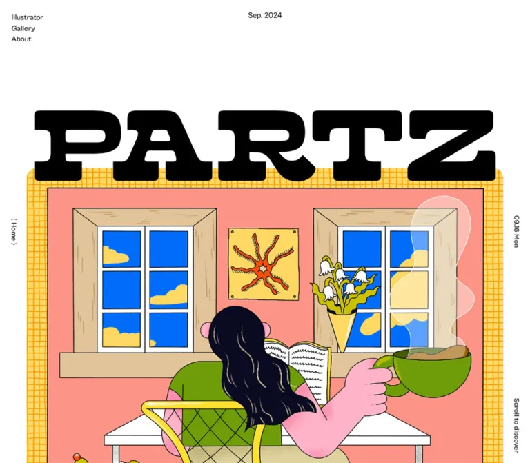
DESIGN REFERENCE
白地に極太ロゴを重ねた表紙、大小さまざまな作品が並ぶギャラリー、黒い大型フッターが特徴のイラストポータルサイト。
オリジナルサイトを見るA generous illustration showcase framed by monumental lettering and small editorial details.
Original URL: https://partz.fun/ Final URL: https://partz.fun/ Theme: white canvas, black typography, full-color artwork, and a dark footer. Inspected: September 17, 2026, Japan Standard Time. The supplied retrieval timestamp is September 16, 2026, at 19:56:17.206 UTC. Viewports: desktop at 1440 × 1000 CSS pixels; mobile at 390 × 844 CSS pixels. Scope: the current homepage: cover composition, persistent navigation, twenty gallery entries, four article previews, About introduction, and footer. Desktop screenshots show the opening, gallery, and footer; mobile screenshots show the opening and footer. The supplied rendered DOM provides additional measurements for the article and About sections. Linked pages and activated menu states were not inspected.
PARTZ is an illustration portal with portfolio browsing and editorial content. Its design gives individual artwork substantial space while keeping the surrounding interface almost entirely black and white. A very large, heavy slab-style wordmark overlaps the current cover illustration. Tiny navigation, date labels, and a short introduction create a deliberate contrast with that scale.
The page then becomes a catalog: four staggered columns of differently proportioned artwork on desktop, followed by article previews and a narrow About statement. A large dark footer repeats the current cover and reverses the oversized identity to white. On mobile, the cover becomes compact, gallery items become a single sequence, and the footer fills the screen width. Preserve these relationships between artwork, quiet metadata, large lettering, and open space.
A generous illustration showcase framed by monumental lettering and small editorial details.
Original URL: https://partz.fun/ Final URL: https://partz.fun/ Theme: white canvas, black typography, full-color artwork, and a dark footer. Inspected: September 17, 2026, Japan Standard Time. The supplied retrieval timestamp is September 16, 2026, at 19:56:17.206 UTC. Viewports: desktop at 1440 × 1000 CSS pixels; mobile at 390 × 844 CSS pixels. Scope: the current homepage: cover composition, persistent navigation, twenty gallery entries, four article previews, About introduction, and footer. Desktop screenshots show the opening, gallery, and footer; mobile screenshots show the opening and footer. The supplied rendered DOM provides additional measurements for the article and About sections. Linked pages and activated menu states were not inspected.
PARTZ is an illustration portal with portfolio browsing and editorial content. Its design gives individual artwork substantial space while keeping the surrounding interface almost entirely black and white. A very large, heavy slab-style wordmark overlaps the current cover illustration. Tiny navigation, date labels, and a short introduction create a deliberate contrast with that scale.
The page then becomes a catalog: four staggered columns of differently proportioned artwork on desktop, followed by article previews and a narrow About statement. A large dark footer repeats the current cover and reverses the oversized identity to white. On mobile, the cover becomes compact, gallery items become a single sequence, and the footer fills the screen width. Preserve these relationships between artwork, quiet metadata, large lettering, and open space.
--font-ja property is an actual source variable; most tokens proposed below are not.| Name | Value | Suggested token | Evidence and role |
|---|---|---|---|
| Canvas White | #ffffff |
--color-canvas |
Measured body background and client-label background; also measured footer text color |
| Interface Black | #000000 |
--color-ink |
Measured primary text; visually consistent with the black masthead |
| Footer Charcoal | Approximately #111111 |
--color-footer |
Screenshot estimate for the large footer panel; its background-bearing inner element was not included in the style sample |
| Footer Rule | Approximately #8c8c8c |
--color-footer-rule |
Screenshot estimate for thin separators below Index and Cover illustration |
White and black are the stable interface colors. The footer is a local dark surface, not evidence of a selectable dark theme. There is no observed general-purpose colored action system.
| Name | Approximation | Role |
|---|---|---|
| Lake Pink | #f7b8b9 |
Warm pink water and much of the cover's lower field |
| Foliage Gold | #ffca54 |
Yellow and orange trees around the lake |
| Pale Blush | #fff0f2 |
Light sky and highlights |
| Painted Brown | #806044 |
Roof, branches, boat details, and natural outlines |
These are visual approximations for discussing the illustration, not measured CSS tokens. Keep them inside artwork or explicitly art-directed accents. Do not recolor the navigation and gallery metadata to match every cover.
The custom-property dump includes many WordPress color, gradient, and shadow presets, plus Swiper variables. Their presence does not establish that those colors, gradients, shadows, or controls appear on this page. They are excluded from the interface palette.
CabinetGrotesk-Medium.Measured source stack: "游ゴシック体", YuGothic, "游ゴシック Medium", "Yu Gothic Medium", "游ゴシック", "Yu Gothic", sans-serif.
This stack is exposed as the source variable --font-ja. The body uses 14px, weight 500, and 21px line height. Project names, client names, article titles, and the About statement use this family with different sizes and weights.
The inherited Times value on the root element is not the visible body typeface.
tt-travels-next, sans-serif.The numeral is a prominent editorial marker inside the cover. It is not a general heading scale for the rest of the site.
CabinetGrotesk-Regular is measured on Index, Cover illustration, and the footer artist link. The two labels use 16px / 24px with 0.32px tracking. The artist link changes from 16px / 24px on desktop to 12px / 18px on mobile.
The large English footer navigation looks approximately 36px on desktop and 24px on mobile. These are visual estimates: the supplied anchor measurements report inherited styles rather than the specific large text child.
The PARTZ mark and visible GALLERY heading have very heavy slab-style letterforms, broad horizontal strokes, rounded corners, and tight spacing. The supplied evidence does not identify the font or asset format responsible for them.
Use an authorized wordmark asset and matching section-heading artwork where available. Do not describe the masthead as Cabinet Grotesk merely because its H1 wrapper inherits that family. Do not substitute a speculative named display font and present it as a source finding.
| Role | Desktop | Mobile | Evidence |
|---|---|---|---|
| Body | 14px / 21px, 500 | Same | Measured |
| Navigation links | 16px / 24px, 500 | Same in menu DOM | Measured |
| Cover introduction | 14px / 16.94px, 500 | 8px / 9.68px, 500 | Measured |
| Cover month number | 120px / 120px, 600 | 60px / 60px, 600 | Measured |
| Cover month caption | 13px / 18.2px, 600 | 8px / 11.2px, 500 | Measured |
| Project client label | 13px / 13px, 700 | 11px / 15.95px, 700 | Measured |
| Project title | 16px / 22.4px, 500 | 14px / 19.6px, 500 | Measured |
| Artist-link row | 14px / 21px inherited | Same | Measured; child styling may differ |
| Article title | 18px / 27px, 700 | 16px / 24px, 700 | Measured |
| About statement | 18px / 30.96px, 700 | 13.962px / 24.0146px, 700 | Measured |
| More-link label | 18px / 24.3px, 700 | 14px / 18.9px, 700 | Measured |
| Footer section labels | 16px / 24px | Same | Measured |
| Footer navigation display text | Approximately 36px | Approximately 24px | Screenshot estimate |
Project-title tracking is 0.02em at both widths. Mobile client labels also use 0.02em. Most other sampled text has normal tracking.
There is no verified universal spacing unit. The page mixes viewport-related section spacing with fixed-size metadata, buttons, and small rounded details.
| Use | Desktop | Mobile | Evidence |
|---|---|---|---|
| Main content side inset | 72px | Approximately 30.95px | Measured |
| Main content width | 1296px | Approximately 328.09px | Measured |
| Space above masthead | 296.208px | 117px | Measured main padding |
| Gallery and Column top padding | 115.2px | Approximately 79.99px | Measured |
| Gallery horizontal gap | 28px | Not applicable | Calculated from card positions |
| Gap after artist row to next card in the same column | Approximately 60px | Approximately 48px | Calculated, with subpixel rounding |
| Project title to artist row | 10px | 10px | Calculated |
| Client-label/image edge to project title | 16px | 10px | Calculated |
| Gallery heading bottom to first card | Approximately 87.42px | 50px | Calculated |
| Article horizontal gap | Approximately 28.8px | Approximately 11.97px | Calculated |
| Footer horizontal inner padding | Approximately 86.4px | Approximately 23.4px | Calculated; both equal about 6vw at the inspected widths |
| Footer social-link gap | 20px | 20px | Calculated from 53px link boxes |
The desktop main inset equals 5vw, and its section padding equals 8vw at 1440px. The mobile main inset equals approximately 7.94vw. These equivalences do not prove the underlying stylesheet uses those exact formulas.
| Element | Value | Evidence |
|---|---|---|
| Client-label upper-right corner | 6px | Measured 0 6px 0 0 |
| Article card | 10px | Measured |
| Desktop more link | 9999px | Measured capsule geometry |
| Mobile more link | 24px | Measured |
| Gallery thumbnail | Approximately 6px | Screenshot estimate |
| Main cover | Approximately 20px desktop; 10px mobile | Screenshot estimate |
| Footer panel | Approximately 20px | Screenshot estimate |
| Footer cover | Approximately 14px | Screenshot estimate |
| Artist avatar | Circular appearance, approximately 26px across | Screenshot estimate; the associated row is measured at about 26px high |
Avoid turning the whole gallery entry into a raised rounded card. Its image has a small radius; its text sits directly on the page.
| Element | Desktop at 1440 × 1000 | Mobile at 390 × 844 |
|---|---|---|
| Masthead wrapper | x 72, y 296.20; 1296 × 189.08px | x 30.95, y 117; 328.09 × 50.27px |
| Cover illustration | Approximately 1296px square, starting near y 449.28 | Approximately 328.09px square, starting near y 156.28 |
| Masthead overlap into cover | Approximately 36px | Approximately 11px |
| Gallery section start | y 1745.28 | y 484.38 |
| First gallery artwork start | y 2034.89 | y 672.36 |
| Gallery card width | 303px | 328.09px |
| More-link box | 260 × 70px | 200 × 50px |
| Article card | Approximately 302.4 × 452.23px | Approximately 273.97 × 375.94px |
| About text width | 429.11px | 179.98px |
| Footer outer element | y 5827.75; height 882.5px | y 10158.20; height 1108.70px |
| Document height | 6710.25px | 11266.91px |
The cover image geometry is inferred from screenshot boundaries and adjacent measured elements; its own image rectangle was not provided. The square cover relationship is strongly supported at both widths.
Role: quiet orientation around the artwork.
Desktop navigation is a four-line list at the upper left: Illustrators, Gallery, About, and Column. The first link starts at approximately x 30.81 and y 32.64. Subsequent links start 21.5px lower. A month label is centered near the top of the viewport.
The opening composition uses the large masthead in the content area. The scrolled gallery and footer screenshots show a small centered PARTZ mark near the top, approximately 148px wide. This establishes two visible identity states, but not their transition threshold or animation.
The labels ( Home ) and 09.17 Thu run vertically along the left and right edges around the viewport midpoint. Their repeated placement across screenshots supports persistent positioning. The initial desktop capture also includes Scroll to discover near the lower-right edge; it is absent from the supplied mobile opening.
At 390px, the four visible navigation lines are replaced by (Menu) near the upper left. The DOM includes Close, Top, the main destinations, Contact, and social links, but no supplied screenshot verifies the opened menu's appearance or behavior.
Role: establish identity and present the current featured illustration.
Build the composition in layers:
On desktop, the cover extends far below the initial viewport. Its lower metadata sits around y 1595–1720, so the opening screenshot does not show the complete composition. On mobile, the entire square cover fits between approximately y 156 and y 484, revealing the month number and credit immediately.
The introduction occupies a 253.75px-wide block on desktop and a 145px-wide block on mobile. Its observed text is only three short lines at each size. It describes the portfolio rather than acting as a large sales headline.
The current cover shows a pink lake, golden trees, a white house, boats, two prominent seated figures, and white swans. Both the main cover and the footer identify Naomi Satoh as the cover illustrator.
Role: mark the page's main content chapters.
Use large uppercase display lettering over a compact Japanese explanation. The supplied mobile screenshot shows GALLERY with (イラスト一覧 ) beneath it. The DOM also contains Column with ( コラム ) and About with ( PARTZについて ).
The combined H2 wrapper is 87px high on desktop and 58px high on mobile. The mobile GALLERY lettering visually echoes the masthead's heavy slab forms. Child-level display-font metrics are unavailable; retain the distinction between measured wrapper dimensions and estimated lettering size.
Role: expose the range of commissioned and personal illustration work.
The homepage contains twenty project entries. Desktop uses four 303px columns at x 72, 403, 734, and 1065, separated by 28px. The first four items share a top position; later entries sit at different heights within their columns.
The observed placement cycles entries across four columns: items 1, 5, 9, 13, and 17 occupy the first column. It is therefore more specific than an arbitrary shortest-column masonry layout. The original layout engine was not identified.
Artwork retains varied proportions: square illustrations, wide website presentations, portrait posters, and packaging photographs. This variation creates the gallery's rhythm. Equal-height image crops or aligned card bottoms would materially change it.
At 390px, every project becomes a 328.09px-wide item in one vertical sequence, preserving the supplied content order. The longer mobile document is a consequence of this layout, not evidence of additional projects.
Role: connect an example of work to both its project and illustrator.
The entry has two separate link regions:
Keep these as sibling anchors; do not nest the artist link inside the project link.
The white client label sits over the bottom-left portion of the artwork. It blends into the white page below, with only its upper-right corner rounded. Desktop padding is 12px 14px 2px 2px; mobile padding is 10px 10px 3px 0. The label says either a client name, generally followed by 様, or private work.
Place the title 16px below the image/label boundary on desktop and 10px below it on mobile. The artist row follows 10px later. Longer desktop titles visibly truncate with an ellipsis; keep the full text in the accessible link name.
The artwork is the primary visual target. Avoid an enclosing border, colored category badge, extra description, or shadow unless the content model requires it.
Role: continue browsing beyond the homepage selection.
The gallery and article sections each end with もっとみる. The About section uses PARTZについて. These are links to their respective pages, not verified in-place loading controls.
Their measured boxes are 260 × 70px on desktop and 200 × 50px on mobile. Text is bold, and the boxes have capsule geometry. The sampled backgrounds are transparent. Border and pseudo-element details were not included in the evidence, so a precise outline or arrow treatment cannot be claimed.
The asymmetric desktop padding, 0 73px 0 46px, should be treated as a measured spacing detail, not proof of a particular icon.
Role: introduce editorial material about illustration in business and digital design.
Four article links appear in one desktop row. Each is approximately 302.4px wide and 452.23px tall, with a 10px radius. Measured padding is approximately 27.65px 28.8px 115.2px. The article title is bold at 18px / 27px and can span several lines.
On mobile, the four cards retain a shared top coordinate and appear at x 30.95, 316.89, 602.83, and 888.77. Their width is approximately 273.97px, with a 12px gap. This establishes a horizontal row extending beyond the viewport. It does not establish whether movement is driven by native scrolling, dragging, buttons, or autoplay.
Mobile padding becomes approximately 17.98px 17.98px 91.96px; titles become 16px / 24px. Background-color transitions are declared on the cards. Their hover colors and complete image treatment were not captured visually.
Role: explain the portal after the visitor has seen its work.
The DOM describes PARTZ as a portal introducing illustrators who make work suited to digital products and services. A heading, a compact bold paragraph, and an About link form a narrow stack.
The paragraph is 429.11px wide on desktop and only 179.98px wide on mobile. The mobile text uses approximately 14px / 24px. This unusually narrow measure distinguishes the About statement from the full-width gallery.
The mobile 200px-wide About link starts at the same x position as the 180px text block, extending 20px farther to the right. A new implementation may center that link independently; doing so is a recommendation, not a claim about the measured page.
Role: provide a substantial closing navigation surface and repeat the featured artist.
On desktop, the dark panel is inset 72px from each side and leaves 72px of white below. Its visible width is 1296px, with an estimated 20px outer radius. The interior divides into a wide navigation area and a smaller cover area.
The left area is approximately 687px wide. Index sits above a thin horizontal rule. Below, five links form three columns over two rows: Illustrators, Gallery, About, then Column and Contact. Each pairs a large English label with a smaller Japanese explanation.
Three social links follow: X, Instagram, and Pinterest. Their measured clickable boxes are 53 × 53px with 20px gaps. The visible symbols occupy less than the full box.
On mobile, the panel reaches both viewport edges and uses approximately 23.4px inner side padding. Navigation stacks into one column. The social links remain a horizontal row.
Role: return attention to the artwork and finish with a strong identity impression.
The desktop cover column is approximately 349.66px wide. Cover illustration appears above a rule, followed by the square image and the illustrator caption. On mobile, the corresponding content width is approximately 343.22px, so the footer artwork remains almost as large as it is on desktop.
This is a useful responsive distinction: the main cover shrinks dramatically, while the footer's artist feature barely changes width.
An oversized white PARTZ mark runs across the panel's bottom and is visibly cropped by the panel boundary. It is a closing graphic, not a second navigation bar.
The mobile footer screenshot also shows black persistent header and side text over the dark surface. A new implementation should address that low contrast rather than assuming the original automatically inverts all fixed elements.
| Treatment | Evidence | What can be concluded |
|---|---|---|
| Navigation, project, artist, footer, and more links | Computed transition reported as 0.3s |
A 300ms transition is declared; changed properties and end states are not established for most links |
| Article-card background | background-color 0.3s |
Background changes have a 300ms transition; hover color is unverified |
| Desktop article-title color | color 0.3s |
A text-color transition is declared |
| Mobile article-title color | transition: none |
This sampled title has no transition at the mobile width |
| Large opening mark and small scrolled mark | Different states in supplied screenshots | Scrolling reveals a compact identity state; timing, threshold, and transformation are unknown |
| Duplicated navigation text | Two copies in rendered text evidence | Compatible with a layered text treatment, but insufficient to prove a rolling hover animation |
| Mobile menu | Menu, Close, and menu destinations in DOM | Menu structure exists; opening, closing, focus behavior, and animation were not tested |
| Mobile article row | Four horizontally displaced cards | Horizontal layout is measured; swipe, snapping, controls, and autoplay are unverified |
| Sampled element animations | animation: none |
No CSS animation was reported on those sampled elements at capture time; this does not exclude descendant or script-driven motion |
The capture process waited for load, visible image decoding, and sampled layout stability. It also handled finite and perpetual animations during readiness checks. Those safeguards improve screenshot reliability but do not establish all possible interactions.
Recommended motion direction: keep feedback brief and restrained. Use the observed 300ms duration where appropriate, and let image composition and scale supply the visual energy. A simple underline, opacity adjustment, or compact-logo state change is sufficient for an adaptation. Do not invent parallax, automatic cover rotation, animated gallery sorting, or carousel autoplay as source behavior.
| Surface | Appearance | Purpose |
|---|---|---|
| Page canvas | Measured pure white | Continuous space around work and text |
| Cover frame | Full-color square illustration with rounded corners | Featured editorial artwork |
| Gallery entry | Artwork plus text directly on white | Browsing without heavy card chrome |
| Client label | White tab over the artwork's lower-left edge | Keep client information legible and connected to its image |
| Article card | Transparent sampled background, 10px radius, generous inset | Group a preview and multiline title |
| More-link box | Transparent sampled background, capsule geometry | Quiet continuation action |
| Footer | Visually near-black, rounded, with white type | Strong closing contrast and secondary navigation |
No general shadow-based elevation system is visible in the supplied screenshots. Separation comes from whitespace, artwork edges, white label tabs, and the footer's tonal change.
The current cover is painterly and soft-edged. Its pink water, golden foliage, swans, boats, and seated figures establish a calm, warm mood. Preserve the full composition and texture; do not simulate it with gradients or generic decorative shapes.
The gallery intentionally mixes visual languages. The desktop capture includes pastel confectionery packaging, bright character illustrations, a monochrome café scene, a typographic retail poster, a tropical event poster, product packaging photography, and illustrations shown inside device mockups. Variety is part of the content model.
Use natural image proportions and a consistent display width. Keep square, wide, and portrait work recognizable. Do not pixelate painterly artwork, apply a global duotone, or force every project into the same crop.
Artist avatars are small identity cues beneath each project. They should remain secondary to the work and visible name.
No original image-file URLs, font-file URLs, or logo asset paths were supplied. The links below identify content associated with the visible artwork; they are not direct asset URLs, and their destination pages were not inspected.
| Visual | Available reference | Use |
|---|---|---|
| Current lake illustration | Naomi Satoh profile link | Main cover and repeated footer cover; credit observed on the homepage |
| Pastel confectionery packaging | Project link | Gallery example of square packaging presentation |
| Monochrome café illustration | Soul Drip Coffee project link | Gallery example of a wide illustration |
| Typographic retail artwork | Nagoya PARCO project link | Gallery example combining lettering and figures |
| Tropical event poster | Hawaiian Market project link | Gallery example of portrait work |
| PARTZ masthead and display headings | Asset path unavailable | Distinctive identity artwork; format and originating typeface unverified |
Supply authorized assets when implementing this style. CSS can reproduce the composition and spacing, but the illustration collection and masthead carry much of its identity.
The page opens with substantial white space: the masthead starts almost 300px below the top of a 1000px viewport. The cover then occupies a 1296px square. The opening is therefore a large editorial composition spanning more than one screen, not a viewport-height marketing block.
The gallery begins after the complete cover. Four staggered columns preserve artwork proportions and distribute twenty entries across a broad white field. The article section uses a more regular four-card row. About contracts to a narrow text measure before the footer expands again.
The small navigation and vertical edge labels remain visually separate from these large content blocks.
At 390px, the masthead starts at y 117 and the full cover ends near y 484. The Gallery heading begins around y 564, and the first artwork starts at y 672. These measured positions produce an opening screen containing the complete featured cover, a clear section transition, and the beginning of the catalog.
Main artwork and gallery content retain approximately 31px side margins. The gallery becomes one column, with project titles reduced to 14px and client labels to 11px. Artist rows remain approximately 26px high.
Article cards follow a different rule: approximately 274px-wide cards continue horizontally, leaving room for part of the next card within the viewport. About uses a narrow 180px text block. The footer switches to full width and stacks its content with approximately 23px inner margins.
Only the two supplied widths were inspected. Tablet columns, intermediate breakpoints, landscape behavior, safe-area handling, and browser-zoom behavior remain unverified. The Quick Start chooses explicit breakpoints as recommendations.
These are recommendations for a new implementation, not verified features of the inspected page:
aria-expanded and aria-controls. If it opens a modal navigation layer, manage focus, Escape, and focus return.#ffffff, measured.#000000, measured or visually corroborated.#111111, screenshot estimate.#ffffff, measured.#f7b8b9 pink and #ffca54 gold; artwork colors, not interface action colors.“Create an illustration portal inspired by the current PARTZ homepage. Use a white canvas with black text, a huge heavy slab-style wordmark overlapping a square illustrated cover, and very small navigation and date details around the viewport edges. Follow the cover with twenty varied-proportion project images in four staggered desktop columns. Each project has a white client tab overlapping the image's lower-left edge, a short title, and a separate avatar-and-artist link. Add four editorial previews, a narrow About statement, and a large near-black footer containing bilingual navigation, social links, the repeated cover with attribution, and an oversized white closing wordmark. At phone width, make the gallery a single column, keep the editorial previews in a horizontal row, and expand the footer to the screen edges. Preserve artwork variety and avoid decorative interface colors or card shadows.”
This is a reusable adaptation, not extracted source code. It uses measured endpoint dimensions and explicitly chosen responsive rules. It assumes authorized logo, heading, illustration, and font assets are supplied separately; no asset URLs or font-file declarations are invented here.
The font names below are observed computed families. If those fonts are unavailable, the declared fallbacks will change the result. The masthead and display headings should be supplied as artwork rather than approximated with an unidentified font.
:root {
  /* Measured interface colors; footer colors are visual estimates. */
  --color-canvas: #fff;
  --color-ink: #000;
  --color-footer: #111;
  --color-footer-rule: #8c8c8c;

  /* Observed family names; load authorized font files separately. */
  --font-ja: "游ゴシック体", YuGothic, "游ゴシック Medium",
    "Yu Gothic Medium", "游ゴシック", "Yu Gothic", sans-serif;
  --font-en: "CabinetGrotesk-Medium", Arial, sans-serif;
  --font-en-regular: "CabinetGrotesk-Regular", Arial, sans-serif;
  --font-date: "tt-travels-next", sans-serif;

  /* Adaptation formulas calibrated to the inspected desktop. */
  --page-gutter: 5vw;
  --hero-top: 20.57vw;
  --section-space: 8vw;
  --gallery-heading-gap: 6.07vw;
  --work-gap-x: 28px;
  --work-gap-y: 60px;
  --cover-overlap: 2.5vw;
  --cover-radius: 20px;
  --image-radius: 6px;
  --article-radius: 10px;
  --footer-radius: 20px;
  --motion-link: 300ms;
}

* { box-sizing: border-box; }

body {
  margin: 0;
  color: var(--color-ink);
  background: var(--color-canvas);
  font-family: var(--font-ja);
  font-size: 14px;
  font-weight: 500;
  line-height: 1.5;
}

a { color: inherit; }
img, svg { max-width: 100%; }

.page-main { padding-top: var(--hero-top); }

.content-width,
.cover-stage {
  width: calc(100% - 2 * var(--page-gutter));
  margin-inline: auto;
}

/* State changes and menu behavior require application code. */
.site-nav {
  position: fixed;
  z-index: 30;
  top: 32.64px;
  left: 2.14vw;
  display: grid;
  grid-auto-rows: 21.5px;
  font: 500 16px/24px var(--font-en);
}

.site-nav a { text-decoration: none; }

.menu-toggle { display: none; }

.top-month {
  position: fixed;
  z-index: 30;
  top: 30px;
  left: 50%;
  transform: translateX(-50%);
  font-family: var(--font-en);
}

.compact-brand {
  position: fixed;
  z-index: 30;
  top: 50px;
  left: 50%;
  width: 148px;
  transform: translateX(-50%);
}

.compact-brand[hidden] { display: none; }

.edge-label {
  position: fixed;
  z-index: 20;
  top: 50%;
  writing-mode: vertical-rl;
  transform: translateY(-50%);
  font: 500 13px/1 var(--font-en);
}

.edge-label--left { left: 30px; }
.edge-label--right { right: 30px; }

/* Apply this state when persistent chrome overlaps a dark surface. */
.chrome-on-dark { color: #fff; }

.masthead {
  position: relative;
  z-index: 1;
  margin: 0;
  aspect-ratio: 1296 / 189.08;
  line-height: 0;
}

.brand-art {
  display: block;
  width: 100%;
  height: 100%;
  object-fit: contain;
}

.cover-frame {
  position: relative;
  margin: calc(-1 * var(--cover-overlap)) 0 0;
  aspect-ratio: 1;
  overflow: hidden;
  border-radius: var(--cover-radius);
}

.cover-frame > img {
  display: block;
  width: 100%;
  height: 100%;
  object-fit: cover;
}

.cover-intro {
  position: absolute;
  top: 5.39%;
  left: 2.61%;
  width: 253.75px;
  margin: 0;
  text-align: center;
  font: 500 14px/1.21 var(--font-en);
}

.cover-date {
  position: absolute;
  left: 36px;
  bottom: 25.6px;
  font-family: var(--font-date);
}

.cover-date__number {
  display: block;
  font-size: 120px;
  font-weight: 600;
  line-height: 1;
}

.cover-date__caption {
  display: block;
  margin-top: -14px;
  font-size: 13px;
  font-weight: 600;
  line-height: 1.4;
}

.cover-credit {
  position: absolute;
  right: 34px;
  bottom: 28px;
  margin: 0;
  font: 500 14px/1.5 var(--font-en);
  letter-spacing: .04em;
}

.page-section {
  padding: var(--section-space) var(--page-gutter) 0;
}

.section-heading {
  margin: 0;
  text-align: center;
  font-size: 14px;
  line-height: 21px;
}

/* Artwork height is an adaptation to the measured heading wrapper. */
.section-heading__art {
  display: block;
  width: auto;
  height: 66px;
  margin-inline: auto;
}

.section-heading__caption { display: block; }

.gallery {
  display: grid;
  grid-template-columns: repeat(4, minmax(0, 1fr));
  gap: var(--work-gap-y) var(--work-gap-x);
  margin: var(--gallery-heading-gap) 0 0;
  padding: 0;
  list-style: none;
}

.work-card { min-width: 0; align-self: start; }
.work-link { display: block; text-decoration: none; }

.work-media {
  position: relative;
  margin: 0;
}

.work-media > img {
  display: block;
  width: 100%;
  height: auto;
  border-radius: var(--image-radius);
}

.client-label {
  position: absolute;
  bottom: 0;
  left: 0;
  max-width: 100%;
  margin: 0;
  padding: 12px 14px 2px 2px;
  border-radius: 0 6px 0 0;
  background: var(--color-canvas);
  font-size: 13px;
  font-weight: 700;
  line-height: 1;
}

.work-title {
  overflow: hidden;
  margin: 16px 0 0;
  font-size: 16px;
  font-weight: 500;
  line-height: 1.4;
  letter-spacing: .02em;
  white-space: nowrap;
  text-overflow: ellipsis;
}

.artist-link {
  display: flex;
  align-items: center;
  gap: 8px;
  min-height: 26px;
  margin-top: 10px;
  font-size: 14px;
  line-height: 21px;
  text-decoration: none;
}

.artist-avatar {
  flex: 0 0 26px;
  width: 26px;
  height: 26px;
  border-radius: 50%;
  object-fit: cover;
}

/* Enabled only after the optional layout enhancement measures cards. */
.gallery.is-masonry {
  grid-auto-rows: 1px;
  grid-auto-flow: dense;
  row-gap: 0;
}

.gallery.is-masonry > .work-card {
  grid-row-end: span var(--span);
}

.more-link {
  display: flex;
  align-items: center;
  justify-content: center;
  width: 260px;
  min-height: 70px;
  margin: 72px auto 0;
  border-radius: 9999px;
  font-size: 18px;
  font-weight: 700;
  line-height: 1.35;
  text-decoration: none;
}

.article-row {
  display: grid;
  grid-template-columns: repeat(4, minmax(0, 1fr));
  gap: 2vw;
  margin-top: 5vw;
}

.article-card {
  display: block;
  min-width: 0;
  min-height: 452px;
  padding: 1.92vw 2vw 8vw;
  border-radius: var(--article-radius);
  text-decoration: none;
  transition: background-color var(--motion-link);
}

.article-card img {
  display: block;
  width: 100%;
  height: auto;
}

.article-title {
  margin: 20px 0 0;
  font-size: 18px;
  font-weight: 700;
  line-height: 1.5;
}

.about-section { padding: 10vw var(--page-gutter) 8vw; }

.about-copy {
  max-width: 429px;
  margin: 43px auto 0;
  font-size: 18px;
  font-weight: 700;
  line-height: 1.72;
}

.about-section .more-link { margin-top: 41px; }

.site-footer { padding: 0 var(--page-gutter) 5vw; }

.footer-panel {
  display: grid;
  grid-template-columns: 1.965fr 1fr;
  column-gap: 6vw;
  overflow: hidden;
  padding: 7.35vw 6vw 0;
  border-radius: var(--footer-radius);
  color: #fff;
  background: var(--color-footer);
}

.footer-label {
  margin: 0;
  padding-bottom: 7px;
  border-bottom: 1px solid var(--color-footer-rule);
  font: 500 16px/24px var(--font-en-regular);
  letter-spacing: .02em;
}

.footer-links {
  display: grid;
  grid-template-columns: repeat(3, minmax(0, 1fr));
  row-gap: 54px;
  margin-top: 50px;
}

.footer-links a { text-decoration: none; }

.footer-link__en {
  display: block;
  font: 400 36px/1.15 var(--font-en-regular);
}

.footer-link__ja {
  display: block;
  font-size: 12px;
  line-height: 20px;
}

.social-links {
  display: flex;
  gap: 20px;
  margin-top: 72px;
}

.social-links a {
  display: grid;
  place-items: center;
  width: 53px;
  height: 53px;
}

.footer-cover figure { margin: 50px 0 0; }

.footer-cover img {
  display: block;
  width: 100%;
  aspect-ratio: 1;
  object-fit: cover;
  border-radius: 14px;
}

.footer-cover figcaption {
  margin-top: 8px;
  font: 500 16px/24px var(--font-en-regular);
}

.footer-brand {
  grid-column: 1 / -1;
  margin-top: 72px;
  margin-bottom: -8px;
}

.footer-brand > img,
.footer-brand > svg {
  display: block;
  width: 100%;
  height: auto;
}

/* Recommended focus treatment, not a measured source rule. */
a:focus-visible,
button:focus-visible {
  outline: 2px solid currentColor;
  outline-offset: 4px;
}

/* Chosen intermediate breakpoint; tablet behavior was not inspected. */
@media (min-width: 701px) and (max-width: 1000px) {
  .gallery { grid-template-columns: repeat(2, minmax(0, 1fr)); }
  .article-row { grid-template-columns: repeat(2, minmax(0, 1fr)); }
  .cover-intro { width: 190px; font-size: 11px; }
  .footer-link__en { font-size: 28px; }
}

/* Chosen mobile breakpoint, calibrated to the 390px capture. */
@media (max-width: 700px) {
  :root {
    --page-gutter: 7.94vw;
    --hero-top: 30vw;
    --section-space: 80px;
    --gallery-heading-gap: 50px;
    --work-gap-y: 48px;
    --cover-overlap: 11px;
    --cover-radius: 10px;
  }

  .site-nav { display: none; }

  .menu-toggle {
    position: fixed;
    z-index: 30;
    top: 28px;
    left: 16px;
    display: block;
    padding: 6px 0;
    border: 0;
    color: inherit;
    background: transparent;
    font: 500 12px/1 var(--font-en);
  }

  .top-month { top: 32px; font-size: 12px; }
  .edge-label--left { left: 10px; }
  .edge-label--right { right: 10px; }
  .edge-label { font-size: 12px; }

  .masthead { aspect-ratio: 328.09 / 50.27; }

  .cover-intro {
    top: 16px;
    left: 13px;
    width: 145px;
    font-size: 8px;
  }

  .cover-date { left: 13px; bottom: 10px; }
  .cover-date__number { font-size: 60px; }
  .cover-date__caption {
    margin-top: -9px;
    font-size: 8px;
    font-weight: 500;
  }

  .cover-credit { right: 10px; bottom: 10px; font-size: 8px; }
  .section-heading__art { height: 37px; }
  .gallery { grid-template-columns: minmax(0, 1fr); }

  .client-label {
    padding: 10px 10px 3px 0;
    font-size: 11px;
    line-height: 1.45;
    letter-spacing: .02em;
  }

  .work-title { margin-top: 10px; font-size: 14px; }

  .more-link {
    width: 200px;
    min-height: 50px;
    margin-top: 85px;
    border-radius: 24px;
    font-size: 14px;
  }

  /* Native horizontal scrolling is an implementation recommendation. */
  .article-row {
    grid-template-columns: none;
    grid-auto-flow: column;
    grid-auto-columns: 70.25vw;
    gap: 12px;
    margin-top: 50px;
    overflow-x: auto;
    overscroll-behavior-inline: contain;
    padding-bottom: 8px;
  }

  .article-card {
    min-height: 376px;
    padding: 18px 18px 92px;
  }

  .article-title { font-size: 16px; }
  .about-section { padding-block: 80px; }
  .about-copy { max-width: 180px; margin-top: 50px; font-size: 14px; }
  .about-section .more-link { margin-top: 40px; }
  .site-footer { padding: 0; }

  .footer-panel {
    grid-template-columns: minmax(0, 1fr);
    padding: 28.65px 6vw 0;
  }

  .footer-links {
    grid-template-columns: minmax(0, 1fr);
    gap: 32px;
    margin-top: 32px;
  }

  .footer-link__en { font-size: 24px; line-height: 1.2; }
  .footer-link__ja { font-size: 11px; line-height: 15px; }
  .social-links { margin-top: 21px; }
  .footer-cover { margin-top: 60px; }
  .footer-cover figure { margin-top: 32px; }
  .footer-cover figcaption { font-size: 12px; line-height: 18px; }
  .footer-brand { margin-top: 56px; }
}

@media (prefers-reduced-motion: reduce) {
  .article-card,
  .site-nav a,
  .compact-brand {
    transition: none;
  }
}
The mobile cover-caption values above reproduce the measured proportions. For production accessibility, increase them and reposition or move secondary information outside the image as necessary.
The CSS defaults to an ordinary grid. To reproduce the observed staggered columns while keeping one ordered list, place each card's content inside .work-card__body and apply this enhancement. Each .work-card should contain its project link and separate artist link inside that body wrapper.
This script is a recommended implementation, not evidence of the original site's library. It assigns successive items cyclically to columns and measures their full content height, including the artist row. On mobile it returns to normal document flow.
const gallery = document.querySelector('.gallery');

if (gallery && 'ResizeObserver' in window) {
  const cards = [...gallery.querySelectorAll('.work-card')];
  let frame;

  const layout = () => {
    cancelAnimationFrame(frame);
    frame = requestAnimationFrame(() => {
      const style = getComputedStyle(gallery);
      const columns = style.gridTemplateColumns.trim().split(/\s+/).length;
      const gap = parseFloat(style.getPropertyValue('--work-gap-y')) || 0;
      gallery.classList.toggle('is-masonry', columns > 1);

      cards.forEach((card, index) => {
        const body = card.querySelector('.work-card__body');
        if (!body) return;
        card.style.gridColumn = columns > 1 ? String(index % columns + 1) : '';
        const span = Math.ceil(body.getBoundingClientRect().height + gap);
        card.style.setProperty('--span', String(Math.max(1, span)));
      });
    });
  };

  const observer = new ResizeObserver(layout);
  cards.forEach(card => {
    const body = card.querySelector('.work-card__body');
    if (body) observer.observe(body);
  });
  window.addEventListener('resize', layout);
  layout();
}
Menu state, compact-logo visibility, dark-surface chrome contrast, and asset loading require separate application integration. The code does not claim to reproduce unobserved interactions.
Optional aliases for a project already using Tailwind v4. This does not imply that the original site uses Tailwind. Define the preceding custom properties first.
@theme inline {
  --color-canvas: #ffffff;
  --color-ink: #000000;
  --color-footer: #111111;
  --color-footer-rule: #8c8c8c;

  --font-content: var(--font-ja);
  --font-interface: var(--font-en);
  --font-editorial-date: var(--font-date);

  --text-project: 16px;
  --text-client: 13px;
  --text-article: 18px;

  --spacing-page: var(--page-gutter);
  --spacing-section: var(--section-space);
  --spacing-gallery-x: var(--work-gap-x);
  --spacing-gallery-y: var(--work-gap-y);

  --radius-thumbnail: 6px;
  --radius-article: 10px;
  --radius-footer: 20px;
}
This reference describes the current homepage represented by the supplied original-page evidence. It does not claim to document the linked site in full or to reproduce unobserved behavior.
# PARTZ — Style Reference

> A generous illustration showcase framed by monumental lettering and small editorial details.

**Original URL:** [https://partz.fun/](https://partz.fun/)
**Final URL:** [https://partz.fun/](https://partz.fun/)
**Theme:** white canvas, black typography, full-color artwork, and a dark footer.
**Inspected:** September 17, 2026, Japan Standard Time. The supplied retrieval timestamp is September 16, 2026, at 19:56:17.206 UTC.
**Viewports:** desktop at 1440 × 1000 CSS pixels; mobile at 390 × 844 CSS pixels.
**Scope:** the current homepage: cover composition, persistent navigation, twenty gallery entries, four article previews, About introduction, and footer. Desktop screenshots show the opening, gallery, and footer; mobile screenshots show the opening and footer. The supplied rendered DOM provides additional measurements for the article and About sections. Linked pages and activated menu states were not inspected.

PARTZ is an illustration portal with portfolio browsing and editorial content. Its design gives individual artwork substantial space while keeping the surrounding interface almost entirely black and white. A very large, heavy slab-style wordmark overlaps the current cover illustration. Tiny navigation, date labels, and a short introduction create a deliberate contrast with that scale.

The page then becomes a catalog: four staggered columns of differently proportioned artwork on desktop, followed by article previews and a narrow About statement. A large dark footer repeats the current cover and reverses the oversized identity to white. On mobile, the cover becomes compact, gallery items become a single sequence, and the footer fills the screen width. Preserve these relationships between artwork, quiet metadata, large lettering, and open space.
# PARTZ — Style Reference

> A generous illustration showcase framed by monumental lettering and small editorial details.

**Original URL:** [https://partz.fun/](https://partz.fun/)
**Final URL:** [https://partz.fun/](https://partz.fun/)
**Theme:** white canvas, black typography, full-color artwork, and a dark footer.
**Inspected:** September 17, 2026, Japan Standard Time. The supplied retrieval timestamp is September 16, 2026, at 19:56:17.206 UTC.
**Viewports:** desktop at 1440 × 1000 CSS pixels; mobile at 390 × 844 CSS pixels.
**Scope:** the current homepage: cover composition, persistent navigation, twenty gallery entries, four article previews, About introduction, and footer. Desktop screenshots show the opening, gallery, and footer; mobile screenshots show the opening and footer. The supplied rendered DOM provides additional measurements for the article and About sections. Linked pages and activated menu states were not inspected.

PARTZ is an illustration portal with portfolio browsing and editorial content. Its design gives individual artwork substantial space while keeping the surrounding interface almost entirely black and white. A very large, heavy slab-style wordmark overlaps the current cover illustration. Tiny navigation, date labels, and a short introduction create a deliberate contrast with that scale.

The page then becomes a catalog: four staggered columns of differently proportioned artwork on desktop, followed by article previews and a narrow About statement. A large dark footer repeats the current cover and reverses the oversized identity to white. On mobile, the cover becomes compact, gallery items become a single sequence, and the footer fills the screen width. Preserve these relationships between artwork, quiet metadata, large lettering, and open space.

## How to Read This Reference

- **Measured** means a value reported in the supplied rendered DOM or computed-style evidence. Measurements describe the two inspected viewports, not necessarily the original CSS formula.
- **Calculated** means arithmetic derived from those measurements, such as the 28px desktop gallery gutter.
- **Estimated** means a visual reading of the current screenshots. Estimated colors and radii are not sampled source declarations.
- **Recommended** means a practical implementation choice for a new project. Breakpoints, accessibility enhancements, and the Quick Start implementation belong to this category unless stated otherwise.
- **Named tokens** are descriptive aliases. The supplied `--font-ja` property is an actual source variable; most tokens proposed below are not.
- Element rectangles do not necessarily describe visible ink. In particular, the masthead's inherited 14px font size does not explain its large lettering, and an H2 wrapper's font size does not identify the display lettering inside it.
- No commands, additional browsing, or file inspection were used to extend the supplied evidence.

## Tokens — Colors

### Interface Palette

| Name | Value | Suggested token | Evidence and role |
| --- | --- | --- | --- |
| Canvas White | `#ffffff` | `--color-canvas` | Measured body background and client-label background; also measured footer text color |
| Interface Black | `#000000` | `--color-ink` | Measured primary text; visually consistent with the black masthead |
| Footer Charcoal | Approximately `#111111` | `--color-footer` | Screenshot estimate for the large footer panel; its background-bearing inner element was not included in the style sample |
| Footer Rule | Approximately `#8c8c8c` | `--color-footer-rule` | Screenshot estimate for thin separators below Index and Cover illustration |

White and black are the stable interface colors. The footer is a local dark surface, not evidence of a selectable dark theme. There is no observed general-purpose colored action system.

### Current Cover Colors

| Name | Approximation | Role |
| --- | --- | --- |
| Lake Pink | `#f7b8b9` | Warm pink water and much of the cover's lower field |
| Foliage Gold | `#ffca54` | Yellow and orange trees around the lake |
| Pale Blush | `#fff0f2` | Light sky and highlights |
| Painted Brown | `#806044` | Roof, branches, boat details, and natural outlines |

These are visual approximations for discussing the illustration, not measured CSS tokens. Keep them inside artwork or explicitly art-directed accents. Do not recolor the navigation and gallery metadata to match every cover.

The custom-property dump includes many WordPress color, gradient, and shadow presets, plus Swiper variables. Their presence does not establish that those colors, gradients, shadows, or controls appear on this page. They are excluded from the interface palette.

## Tokens — Typography

### English Navigation and Utility Text

- **Measured family:** `CabinetGrotesk-Medium`.
- **Observed uses:** primary navigation, cover introduction, and cover attribution link.
- **Navigation:** 16px, weight 500, 24px line height on both inspected widths. The mobile menu links are represented in the DOM, but the opened menu was not visually exercised.
- **Cover introduction:** 14px / 16.94px on desktop; 8px / 9.68px on mobile.
- **Cover attribution link:** 14px / 21px with 0.56px tracking on desktop; 8px / 12px with 0.32px tracking on mobile.

### Japanese Content

**Measured source stack:** `"游ゴシック体", YuGothic, "游ゴシック Medium", "Yu Gothic Medium", "游ゴシック", "Yu Gothic", sans-serif`.

This stack is exposed as the source variable `--font-ja`. The body uses 14px, weight 500, and 21px line height. Project names, client names, article titles, and the About statement use this family with different sizes and weights.

The inherited `Times` value on the root element is not the visible body typeface.

### Cover Month Number

- **Measured family:** `tt-travels-next, sans-serif`.
- **Number:** 120px / 120px, weight 600 on desktop; 60px / 60px, weight 600 on mobile.
- **Month caption:** 13px / 18.2px, weight 600 on desktop; 8px / 11.2px, weight 500 on mobile.

The numeral is a prominent editorial marker inside the cover. It is not a general heading scale for the rest of the site.

### Footer Utility Text

`CabinetGrotesk-Regular` is measured on Index, Cover illustration, and the footer artist link. The two labels use 16px / 24px with 0.32px tracking. The artist link changes from 16px / 24px on desktop to 12px / 18px on mobile.

The large English footer navigation looks approximately 36px on desktop and 24px on mobile. These are visual estimates: the supplied anchor measurements report inherited styles rather than the specific large text child.

### Masthead and Section Lettering

The PARTZ mark and visible GALLERY heading have very heavy slab-style letterforms, broad horizontal strokes, rounded corners, and tight spacing. The supplied evidence does not identify the font or asset format responsible for them.

Use an authorized wordmark asset and matching section-heading artwork where available. Do not describe the masthead as Cabinet Grotesk merely because its H1 wrapper inherits that family. Do not substitute a speculative named display font and present it as a source finding.

### Type Scale

| Role | Desktop | Mobile | Evidence |
| --- | --- | --- | --- |
| Body | 14px / 21px, 500 | Same | Measured |
| Navigation links | 16px / 24px, 500 | Same in menu DOM | Measured |
| Cover introduction | 14px / 16.94px, 500 | 8px / 9.68px, 500 | Measured |
| Cover month number | 120px / 120px, 600 | 60px / 60px, 600 | Measured |
| Cover month caption | 13px / 18.2px, 600 | 8px / 11.2px, 500 | Measured |
| Project client label | 13px / 13px, 700 | 11px / 15.95px, 700 | Measured |
| Project title | 16px / 22.4px, 500 | 14px / 19.6px, 500 | Measured |
| Artist-link row | 14px / 21px inherited | Same | Measured; child styling may differ |
| Article title | 18px / 27px, 700 | 16px / 24px, 700 | Measured |
| About statement | 18px / 30.96px, 700 | 13.962px / 24.0146px, 700 | Measured |
| More-link label | 18px / 24.3px, 700 | 14px / 18.9px, 700 | Measured |
| Footer section labels | 16px / 24px | Same | Measured |
| Footer navigation display text | Approximately 36px | Approximately 24px | Screenshot estimate |

Project-title tracking is 0.02em at both widths. Mobile client labels also use 0.02em. Most other sampled text has normal tracking.

## Tokens — Spacing & Shapes

There is no verified universal spacing unit. The page mixes viewport-related section spacing with fixed-size metadata, buttons, and small rounded details.

### Spacing Scale

| Use | Desktop | Mobile | Evidence |
| --- | --- | --- | --- |
| Main content side inset | 72px | Approximately 30.95px | Measured |
| Main content width | 1296px | Approximately 328.09px | Measured |
| Space above masthead | 296.208px | 117px | Measured main padding |
| Gallery and Column top padding | 115.2px | Approximately 79.99px | Measured |
| Gallery horizontal gap | 28px | Not applicable | Calculated from card positions |
| Gap after artist row to next card in the same column | Approximately 60px | Approximately 48px | Calculated, with subpixel rounding |
| Project title to artist row | 10px | 10px | Calculated |
| Client-label/image edge to project title | 16px | 10px | Calculated |
| Gallery heading bottom to first card | Approximately 87.42px | 50px | Calculated |
| Article horizontal gap | Approximately 28.8px | Approximately 11.97px | Calculated |
| Footer horizontal inner padding | Approximately 86.4px | Approximately 23.4px | Calculated; both equal about 6vw at the inspected widths |
| Footer social-link gap | 20px | 20px | Calculated from 53px link boxes |

The desktop main inset equals 5vw, and its section padding equals 8vw at 1440px. The mobile main inset equals approximately 7.94vw. These equivalences do not prove the underlying stylesheet uses those exact formulas.

### Border Radius

| Element | Value | Evidence |
| --- | --- | --- |
| Client-label upper-right corner | 6px | Measured `0 6px 0 0` |
| Article card | 10px | Measured |
| Desktop more link | 9999px | Measured capsule geometry |
| Mobile more link | 24px | Measured |
| Gallery thumbnail | Approximately 6px | Screenshot estimate |
| Main cover | Approximately 20px desktop; 10px mobile | Screenshot estimate |
| Footer panel | Approximately 20px | Screenshot estimate |
| Footer cover | Approximately 14px | Screenshot estimate |
| Artist avatar | Circular appearance, approximately 26px across | Screenshot estimate; the associated row is measured at about 26px high |

Avoid turning the whole gallery entry into a raised rounded card. Its image has a small radius; its text sits directly on the page.

### Layout Measurements

| Element | Desktop at 1440 × 1000 | Mobile at 390 × 844 |
| --- | --- | --- |
| Masthead wrapper | x 72, y 296.20; 1296 × 189.08px | x 30.95, y 117; 328.09 × 50.27px |
| Cover illustration | Approximately 1296px square, starting near y 449.28 | Approximately 328.09px square, starting near y 156.28 |
| Masthead overlap into cover | Approximately 36px | Approximately 11px |
| Gallery section start | y 1745.28 | y 484.38 |
| First gallery artwork start | y 2034.89 | y 672.36 |
| Gallery card width | 303px | 328.09px |
| More-link box | 260 × 70px | 200 × 50px |
| Article card | Approximately 302.4 × 452.23px | Approximately 273.97 × 375.94px |
| About text width | 429.11px | 179.98px |
| Footer outer element | y 5827.75; height 882.5px | y 10158.20; height 1108.70px |
| Document height | 6710.25px | 11266.91px |

The cover image geometry is inferred from screenshot boundaries and adjacent measured elements; its own image rectangle was not provided. The square cover relationship is strongly supported at both widths.

## Components

### Persistent Navigation and Edge Labels

**Role:** quiet orientation around the artwork.

Desktop navigation is a four-line list at the upper left: Illustrators, Gallery, About, and Column. The first link starts at approximately x 30.81 and y 32.64. Subsequent links start 21.5px lower. A month label is centered near the top of the viewport.

The opening composition uses the large masthead in the content area. The scrolled gallery and footer screenshots show a small centered PARTZ mark near the top, approximately 148px wide. This establishes two visible identity states, but not their transition threshold or animation.

The labels `( Home )` and `09.17 Thu` run vertically along the left and right edges around the viewport midpoint. Their repeated placement across screenshots supports persistent positioning. The initial desktop capture also includes Scroll to discover near the lower-right edge; it is absent from the supplied mobile opening.

At 390px, the four visible navigation lines are replaced by `(Menu)` near the upper left. The DOM includes Close, Top, the main destinations, Contact, and social links, but no supplied screenshot verifies the opened menu's appearance or behavior.

### Cover and Overlapping Masthead

**Role:** establish identity and present the current featured illustration.

Build the composition in layers:

1. A large masthead wrapper aligned with the main content width.
2. A square illustration directly underneath, overlapping the masthead's lower portion.
3. A short, centered English introduction positioned near the illustration's upper-left corner.
4. A large month numeral and smaller month/year caption at the lower left.
5. A small cover-illustration credit at the lower right.

On desktop, the cover extends far below the initial viewport. Its lower metadata sits around y 1595–1720, so the opening screenshot does not show the complete composition. On mobile, the entire square cover fits between approximately y 156 and y 484, revealing the month number and credit immediately.

The introduction occupies a 253.75px-wide block on desktop and a 145px-wide block on mobile. Its observed text is only three short lines at each size. It describes the portfolio rather than acting as a large sales headline.

The current cover shows a pink lake, golden trees, a white house, boats, two prominent seated figures, and white swans. Both the main cover and the footer identify Naomi Satoh as the cover illustrator.

### Section Heading

**Role:** mark the page's main content chapters.

Use large uppercase display lettering over a compact Japanese explanation. The supplied mobile screenshot shows GALLERY with `(イラスト一覧 )` beneath it. The DOM also contains Column with `( コラム )` and About with `( PARTZについて )`.

The combined H2 wrapper is 87px high on desktop and 58px high on mobile. The mobile GALLERY lettering visually echoes the masthead's heavy slab forms. Child-level display-font metrics are unavailable; retain the distinction between measured wrapper dimensions and estimated lettering size.

### Gallery Layout

**Role:** expose the range of commissioned and personal illustration work.

The homepage contains twenty project entries. Desktop uses four 303px columns at x 72, 403, 734, and 1065, separated by 28px. The first four items share a top position; later entries sit at different heights within their columns.

The observed placement cycles entries across four columns: items 1, 5, 9, 13, and 17 occupy the first column. It is therefore more specific than an arbitrary shortest-column masonry layout. The original layout engine was not identified.

Artwork retains varied proportions: square illustrations, wide website presentations, portrait posters, and packaging photographs. This variation creates the gallery's rhythm. Equal-height image crops or aligned card bottoms would materially change it.

At 390px, every project becomes a 328.09px-wide item in one vertical sequence, preserving the supplied content order. The longer mobile document is a consequence of this layout, not evidence of additional projects.

### Project Entry

**Role:** connect an example of work to both its project and illustrator.

The entry has two separate link regions:

- A project link containing the artwork, client label, and project title.
- A sibling artist link containing a small avatar and the artist's name.

Keep these as sibling anchors; do not nest the artist link inside the project link.

The white client label sits over the bottom-left portion of the artwork. It blends into the white page below, with only its upper-right corner rounded. Desktop padding is `12px 14px 2px 2px`; mobile padding is `10px 10px 3px 0`. The label says either a client name, generally followed by `様`, or private work.

Place the title 16px below the image/label boundary on desktop and 10px below it on mobile. The artist row follows 10px later. Longer desktop titles visibly truncate with an ellipsis; keep the full text in the accessible link name.

The artwork is the primary visual target. Avoid an enclosing border, colored category badge, extra description, or shadow unless the content model requires it.

### More Links

**Role:** continue browsing beyond the homepage selection.

The gallery and article sections each end with `もっとみる`. The About section uses `PARTZについて`. These are links to their respective pages, not verified in-place loading controls.

Their measured boxes are 260 × 70px on desktop and 200 × 50px on mobile. Text is bold, and the boxes have capsule geometry. The sampled backgrounds are transparent. Border and pseudo-element details were not included in the evidence, so a precise outline or arrow treatment cannot be claimed.

The asymmetric desktop padding, `0 73px 0 46px`, should be treated as a measured spacing detail, not proof of a particular icon.

### Column Article Previews

**Role:** introduce editorial material about illustration in business and digital design.

Four article links appear in one desktop row. Each is approximately 302.4px wide and 452.23px tall, with a 10px radius. Measured padding is approximately `27.65px 28.8px 115.2px`. The article title is bold at 18px / 27px and can span several lines.

On mobile, the four cards retain a shared top coordinate and appear at x 30.95, 316.89, 602.83, and 888.77. Their width is approximately 273.97px, with a 12px gap. This establishes a horizontal row extending beyond the viewport. It does not establish whether movement is driven by native scrolling, dragging, buttons, or autoplay.

Mobile padding becomes approximately `17.98px 17.98px 91.96px`; titles become 16px / 24px. Background-color transitions are declared on the cards. Their hover colors and complete image treatment were not captured visually.

### About Introduction

**Role:** explain the portal after the visitor has seen its work.

The DOM describes PARTZ as a portal introducing illustrators who make work suited to digital products and services. A heading, a compact bold paragraph, and an About link form a narrow stack.

The paragraph is 429.11px wide on desktop and only 179.98px wide on mobile. The mobile text uses approximately 14px / 24px. This unusually narrow measure distinguishes the About statement from the full-width gallery.

The mobile 200px-wide About link starts at the same x position as the 180px text block, extending 20px farther to the right. A new implementation may center that link independently; doing so is a recommendation, not a claim about the measured page.

### Dark Footer Index

**Role:** provide a substantial closing navigation surface and repeat the featured artist.

On desktop, the dark panel is inset 72px from each side and leaves 72px of white below. Its visible width is 1296px, with an estimated 20px outer radius. The interior divides into a wide navigation area and a smaller cover area.

The left area is approximately 687px wide. Index sits above a thin horizontal rule. Below, five links form three columns over two rows: Illustrators, Gallery, About, then Column and Contact. Each pairs a large English label with a smaller Japanese explanation.

Three social links follow: X, Instagram, and Pinterest. Their measured clickable boxes are 53 × 53px with 20px gaps. The visible symbols occupy less than the full box.

On mobile, the panel reaches both viewport edges and uses approximately 23.4px inner side padding. Navigation stacks into one column. The social links remain a horizontal row.

### Footer Cover and Closing Wordmark

**Role:** return attention to the artwork and finish with a strong identity impression.

The desktop cover column is approximately 349.66px wide. Cover illustration appears above a rule, followed by the square image and the illustrator caption. On mobile, the corresponding content width is approximately 343.22px, so the footer artwork remains almost as large as it is on desktop.

This is a useful responsive distinction: the main cover shrinks dramatically, while the footer's artist feature barely changes width.

An oversized white PARTZ mark runs across the panel's bottom and is visibly cropped by the panel boundary. It is a closing graphic, not a second navigation bar.

The mobile footer screenshot also shows black persistent header and side text over the dark surface. A new implementation should address that low contrast rather than assuming the original automatically inverts all fixed elements.

## Tokens — Motion & Interaction

| Treatment | Evidence | What can be concluded |
| --- | --- | --- |
| Navigation, project, artist, footer, and more links | Computed transition reported as `0.3s` | A 300ms transition is declared; changed properties and end states are not established for most links |
| Article-card background | `background-color 0.3s` | Background changes have a 300ms transition; hover color is unverified |
| Desktop article-title color | `color 0.3s` | A text-color transition is declared |
| Mobile article-title color | `transition: none` | This sampled title has no transition at the mobile width |
| Large opening mark and small scrolled mark | Different states in supplied screenshots | Scrolling reveals a compact identity state; timing, threshold, and transformation are unknown |
| Duplicated navigation text | Two copies in rendered text evidence | Compatible with a layered text treatment, but insufficient to prove a rolling hover animation |
| Mobile menu | Menu, Close, and menu destinations in DOM | Menu structure exists; opening, closing, focus behavior, and animation were not tested |
| Mobile article row | Four horizontally displaced cards | Horizontal layout is measured; swipe, snapping, controls, and autoplay are unverified |
| Sampled element animations | `animation: none` | No CSS animation was reported on those sampled elements at capture time; this does not exclude descendant or script-driven motion |

The capture process waited for load, visible image decoding, and sampled layout stability. It also handled finite and perpetual animations during readiness checks. Those safeguards improve screenshot reliability but do not establish all possible interactions.

**Recommended motion direction:** keep feedback brief and restrained. Use the observed 300ms duration where appropriate, and let image composition and scale supply the visual energy. A simple underline, opacity adjustment, or compact-logo state change is sufficient for an adaptation. Do not invent parallax, automatic cover rotation, animated gallery sorting, or carousel autoplay as source behavior.

## Surfaces

| Surface | Appearance | Purpose |
| --- | --- | --- |
| Page canvas | Measured pure white | Continuous space around work and text |
| Cover frame | Full-color square illustration with rounded corners | Featured editorial artwork |
| Gallery entry | Artwork plus text directly on white | Browsing without heavy card chrome |
| Client label | White tab over the artwork's lower-left edge | Keep client information legible and connected to its image |
| Article card | Transparent sampled background, 10px radius, generous inset | Group a preview and multiline title |
| More-link box | Transparent sampled background, capsule geometry | Quiet continuation action |
| Footer | Visually near-black, rounded, with white type | Strong closing contrast and secondary navigation |

No general shadow-based elevation system is visible in the supplied screenshots. Separation comes from whitespace, artwork edges, white label tabs, and the footer's tonal change.

## Imagery

The current cover is painterly and soft-edged. Its pink water, golden foliage, swans, boats, and seated figures establish a calm, warm mood. Preserve the full composition and texture; do not simulate it with gradients or generic decorative shapes.

The gallery intentionally mixes visual languages. The desktop capture includes pastel confectionery packaging, bright character illustrations, a monochrome café scene, a typographic retail poster, a tropical event poster, product packaging photography, and illustrations shown inside device mockups. Variety is part of the content model.

Use natural image proportions and a consistent display width. Keep square, wide, and portrait work recognizable. Do not pixelate painterly artwork, apply a global duotone, or force every project into the same crop.

Artist avatars are small identity cues beneath each project. They should remain secondary to the work and visible name.

### Observed Asset References

No original image-file URLs, font-file URLs, or logo asset paths were supplied. The links below identify content associated with the visible artwork; they are not direct asset URLs, and their destination pages were not inspected.

| Visual | Available reference | Use |
| --- | --- | --- |
| Current lake illustration | [Naomi Satoh profile link](https://partz.fun/artists/naomi-satoh/) | Main cover and repeated footer cover; credit observed on the homepage |
| Pastel confectionery packaging | [Project link](https://partz.fun/gallery/choclatedays/) | Gallery example of square packaging presentation |
| Monochrome café illustration | [Soul Drip Coffee project link](https://partz.fun/gallery/soul-drip-coffee/) | Gallery example of a wide illustration |
| Typographic retail artwork | [Nagoya PARCO project link](https://partz.fun/gallery/nagoya-parco/) | Gallery example combining lettering and figures |
| Tropical event poster | [Hawaiian Market project link](https://partz.fun/gallery/hawaiian-market/) | Gallery example of portrait work |
| PARTZ masthead and display headings | Asset path unavailable | Distinctive identity artwork; format and originating typeface unverified |

Supply authorized assets when implementing this style. CSS can reproduce the composition and spacing, but the illustration collection and masthead carry much of its identity.

## Layout & Responsive Behavior

### Desktop

The page opens with substantial white space: the masthead starts almost 300px below the top of a 1000px viewport. The cover then occupies a 1296px square. The opening is therefore a large editorial composition spanning more than one screen, not a viewport-height marketing block.

The gallery begins after the complete cover. Four staggered columns preserve artwork proportions and distribute twenty entries across a broad white field. The article section uses a more regular four-card row. About contracts to a narrow text measure before the footer expands again.

The small navigation and vertical edge labels remain visually separate from these large content blocks.

### Mobile

At 390px, the masthead starts at y 117 and the full cover ends near y 484. The Gallery heading begins around y 564, and the first artwork starts at y 672. These measured positions produce an opening screen containing the complete featured cover, a clear section transition, and the beginning of the catalog.

Main artwork and gallery content retain approximately 31px side margins. The gallery becomes one column, with project titles reduced to 14px and client labels to 11px. Artist rows remain approximately 26px high.

Article cards follow a different rule: approximately 274px-wide cards continue horizontally, leaving room for part of the next card within the viewport. About uses a narrow 180px text block. The footer switches to full width and stacks its content with approximately 23px inner margins.

### Responsive Rules Worth Preserving

- The mobile gallery image is slightly wider than one desktop gallery image: approximately 328px versus 303px.
- The main cover changes scale much more dramatically than gallery items.
- Footer cover widths remain similar across the two layouts: approximately 350px and 343px.
- The cover's tiny captions shrink more than the body text. This is observed behavior, but a new implementation should improve their readability.
- Desktop footer navigation uses a grid; mobile footer navigation is a single stack.
- The gallery and article section use different mobile browsing patterns.

Only the two supplied widths were inspected. Tablet columns, intermediate breakpoints, landscape behavior, safe-area handling, and browser-zoom behavior remain unverified. The Quick Start chooses explicit breakpoints as recommendations.

## Do’s and Don’ts

### Do

- Keep the interface white and black so that individual illustrations provide the color.
- Preserve the contrast between monumental identity lettering and small utility text.
- Overlap the masthead with the square cover instead of separating them into independent blocks.
- Keep the cover introduction short and secondary to the illustration.
- Preserve varied gallery image proportions and the staggered desktop composition.
- Retain the white client tab with its single rounded upper-right corner.
- Keep project and artist destinations distinct.
- Use one gallery column on mobile while retaining the horizontal article row.
- Repeat the featured illustration and its attribution in the footer.
- Finish with a large reversed wordmark inside the dark panel.
- Distinguish source measurements from adaptations when handing this reference to another agent.

### Don't

- Don't replace the portal structure with pricing, feature grids, or a large conversion banner.
- Don't treat the cover's pink and yellow as a permanent interface palette.
- Don't flatten every gallery image into a uniform square crop.
- Don't wrap every project in a padded, bordered, shadowed card.
- Don't infer the masthead's typeface from its H1 wrapper.
- Don't copy unused WordPress gradient or shadow presets into the design system.
- Don't display both copies of duplicated navigation text as separate visible labels.
- Don't assume a 300ms transition proves a particular hover animation.
- Don't describe the mobile article row as autoplaying or swipe-enabled without testing it.
- Don't reduce essential new content to the observed 8px cover-caption size merely to match the screenshot.
- Don't reproduce the low-contrast fixed text over the mobile footer without considering readability.

## Recommended Implementation Additions

These are recommendations for a new implementation, not verified features of the inspected page:

- Give the graphical masthead an accessible PARTZ name. Decorative repetitions of the same mark can use empty alternative text.
- Use semantic headings and a single accessible navigation label even if animated text layers duplicate the visible lettering.
- Implement Menu as a button with `aria-expanded` and `aria-controls`. If it opens a modal navigation layer, manage focus, Escape, and focus return.
- Provide visible keyboard focus for project links, artist links, social links, and continuation actions.
- Increase essential cover captions to a readable minimum or repeat their information in a readable location below the artwork.
- Keep client names and titles available in full to assistive technology when visually truncated.
- Preserve gallery DOM order through masonry placement. Use a usable ordinary-grid fallback if enhancement scripts fail.
- Give the article row a keyboard-accessible scrolling mechanism and avoid requiring a drag gesture.
- Adapt persistent chrome to dark surfaces or provide a small contrasting background where necessary.
- Respect reduced-motion preferences for any added logo or hover movement.
- Set intrinsic image dimensions, use responsive image sources, and defer below-the-fold images without delaying the primary cover.
- Validate menu and footer destination consistency. The supplied mobile-menu X URL includes an encoded trailing quotation mark, while the footer URL does not.

## Agent Prompt Guide

### Quick Color Reference

- Page and client tabs: `#ffffff`, measured.
- Text and primary identity: `#000000`, measured or visually corroborated.
- Footer panel: approximately `#111111`, screenshot estimate.
- Footer text: `#ffffff`, measured.
- Current illustration accents: approximately `#f7b8b9` pink and `#ffca54` gold; artwork colors, not interface action colors.
- Separation: whitespace, image boundaries, client tabs, and thin footer rules.

### Overall Prompt

“Create an illustration portal inspired by the current PARTZ homepage. Use a white canvas with black text, a huge heavy slab-style wordmark overlapping a square illustrated cover, and very small navigation and date details around the viewport edges. Follow the cover with twenty varied-proportion project images in four staggered desktop columns. Each project has a white client tab overlapping the image's lower-left edge, a short title, and a separate avatar-and-artist link. Add four editorial previews, a narrow About statement, and a large near-black footer containing bilingual navigation, social links, the repeated cover with attribution, and an oversized white closing wordmark. At phone width, make the gallery a single column, keep the editorial previews in a horizontal row, and expand the footer to the screen edges. Preserve artwork variety and avoid decorative interface colors or card shadows.”

### Example Component Prompts

1. **Cover:** “At 1440px width, use 72px side margins and place the masthead wrapper around y 296. Overlap it approximately 36px into a 1296px square cover. Add a three-line introduction near the cover's upper left, a large month number at the lower left, and a small artist credit at the lower right. At 390px, use approximately 31px side margins, a 328px square cover, and an 11px masthead overlap. Use supplied identity and illustration assets.”
2. **Project entry:** “Create a borderless gallery entry with a naturally proportioned image, an overlapping white client-name tab with only the upper-right corner rounded 6px, a single-line project title, and a separate artist link with a small circular avatar. Use 303px desktop width and approximately 328px phone width. Keep a 10px title-to-artist gap.”
3. **Article row:** “Create four equal desktop article previews with a 10px radius, generous internal spacing, and bold Japanese titles at 18px/27px. On mobile, use approximately 274px-wide horizontal cards with 12px gaps and 16px/24px titles. Implement native scrolling as an explicit adaptation; do not add autoplay.”
4. **Footer:** “Create a near-black rounded footer panel with white typography. On desktop, inset it 72px and divide its inner content into a wide three-column navigation index and a roughly 350px square cover feature. On mobile, make the panel full width, use about 23px inner margins, stack navigation, and retain a roughly 343px cover. Crop an oversized white wordmark at the bottom edge.”
5. **Navigation:** “Use a small four-line English navigation at the upper left, a centered month label, and vertical Home/date labels at the side edges. Show a compact centered wordmark in the scrolled state. Treat transition thresholds and mobile-menu behavior as implementation choices, with accessible controls and no invented source animation.”

## Quick Start

### CSS Custom Properties

This is a reusable adaptation, not extracted source code. It uses measured endpoint dimensions and explicitly chosen responsive rules. It assumes authorized logo, heading, illustration, and font assets are supplied separately; no asset URLs or font-file declarations are invented here.

The font names below are observed computed families. If those fonts are unavailable, the declared fallbacks will change the result. The masthead and display headings should be supplied as artwork rather than approximated with an unidentified font.

```css
:root {
  /* Measured interface colors; footer colors are visual estimates. */
  --color-canvas: #fff;
  --color-ink: #000;
  --color-footer: #111;
  --color-footer-rule: #8c8c8c;

  /* Observed family names; load authorized font files separately. */
  --font-ja: "游ゴシック体", YuGothic, "游ゴシック Medium",
    "Yu Gothic Medium", "游ゴシック", "Yu Gothic", sans-serif;
  --font-en: "CabinetGrotesk-Medium", Arial, sans-serif;
  --font-en-regular: "CabinetGrotesk-Regular", Arial, sans-serif;
  --font-date: "tt-travels-next", sans-serif;

  /* Adaptation formulas calibrated to the inspected desktop. */
  --page-gutter: 5vw;
  --hero-top: 20.57vw;
  --section-space: 8vw;
  --gallery-heading-gap: 6.07vw;
  --work-gap-x: 28px;
  --work-gap-y: 60px;
  --cover-overlap: 2.5vw;
  --cover-radius: 20px;
  --image-radius: 6px;
  --article-radius: 10px;
  --footer-radius: 20px;
  --motion-link: 300ms;
}

* { box-sizing: border-box; }

body {
  margin: 0;
  color: var(--color-ink);
  background: var(--color-canvas);
  font-family: var(--font-ja);
  font-size: 14px;
  font-weight: 500;
  line-height: 1.5;
}

a { color: inherit; }
img, svg { max-width: 100%; }

.page-main { padding-top: var(--hero-top); }

.content-width,
.cover-stage {
  width: calc(100% - 2 * var(--page-gutter));
  margin-inline: auto;
}

/* State changes and menu behavior require application code. */
.site-nav {
  position: fixed;
  z-index: 30;
  top: 32.64px;
  left: 2.14vw;
  display: grid;
  grid-auto-rows: 21.5px;
  font: 500 16px/24px var(--font-en);
}

.site-nav a { text-decoration: none; }

.menu-toggle { display: none; }

.top-month {
  position: fixed;
  z-index: 30;
  top: 30px;
  left: 50%;
  transform: translateX(-50%);
  font-family: var(--font-en);
}

.compact-brand {
  position: fixed;
  z-index: 30;
  top: 50px;
  left: 50%;
  width: 148px;
  transform: translateX(-50%);
}

.compact-brand[hidden] { display: none; }

.edge-label {
  position: fixed;
  z-index: 20;
  top: 50%;
  writing-mode: vertical-rl;
  transform: translateY(-50%);
  font: 500 13px/1 var(--font-en);
}

.edge-label--left { left: 30px; }
.edge-label--right { right: 30px; }

/* Apply this state when persistent chrome overlaps a dark surface. */
.chrome-on-dark { color: #fff; }

.masthead {
  position: relative;
  z-index: 1;
  margin: 0;
  aspect-ratio: 1296 / 189.08;
  line-height: 0;
}

.brand-art {
  display: block;
  width: 100%;
  height: 100%;
  object-fit: contain;
}

.cover-frame {
  position: relative;
  margin: calc(-1 * var(--cover-overlap)) 0 0;
  aspect-ratio: 1;
  overflow: hidden;
  border-radius: var(--cover-radius);
}

.cover-frame > img {
  display: block;
  width: 100%;
  height: 100%;
  object-fit: cover;
}

.cover-intro {
  position: absolute;
  top: 5.39%;
  left: 2.61%;
  width: 253.75px;
  margin: 0;
  text-align: center;
  font: 500 14px/1.21 var(--font-en);
}

.cover-date {
  position: absolute;
  left: 36px;
  bottom: 25.6px;
  font-family: var(--font-date);
}

.cover-date__number {
  display: block;
  font-size: 120px;
  font-weight: 600;
  line-height: 1;
}

.cover-date__caption {
  display: block;
  margin-top: -14px;
  font-size: 13px;
  font-weight: 600;
  line-height: 1.4;
}

.cover-credit {
  position: absolute;
  right: 34px;
  bottom: 28px;
  margin: 0;
  font: 500 14px/1.5 var(--font-en);
  letter-spacing: .04em;
}

.page-section {
  padding: var(--section-space) var(--page-gutter) 0;
}

.section-heading {
  margin: 0;
  text-align: center;
  font-size: 14px;
  line-height: 21px;
}

/* Artwork height is an adaptation to the measured heading wrapper. */
.section-heading__art {
  display: block;
  width: auto;
  height: 66px;
  margin-inline: auto;
}

.section-heading__caption { display: block; }

.gallery {
  display: grid;
  grid-template-columns: repeat(4, minmax(0, 1fr));
  gap: var(--work-gap-y) var(--work-gap-x);
  margin: var(--gallery-heading-gap) 0 0;
  padding: 0;
  list-style: none;
}

.work-card { min-width: 0; align-self: start; }
.work-link { display: block; text-decoration: none; }

.work-media {
  position: relative;
  margin: 0;
}

.work-media > img {
  display: block;
  width: 100%;
  height: auto;
  border-radius: var(--image-radius);
}

.client-label {
  position: absolute;
  bottom: 0;
  left: 0;
  max-width: 100%;
  margin: 0;
  padding: 12px 14px 2px 2px;
  border-radius: 0 6px 0 0;
  background: var(--color-canvas);
  font-size: 13px;
  font-weight: 700;
  line-height: 1;
}

.work-title {
  overflow: hidden;
  margin: 16px 0 0;
  font-size: 16px;
  font-weight: 500;
  line-height: 1.4;
  letter-spacing: .02em;
  white-space: nowrap;
  text-overflow: ellipsis;
}

.artist-link {
  display: flex;
  align-items: center;
  gap: 8px;
  min-height: 26px;
  margin-top: 10px;
  font-size: 14px;
  line-height: 21px;
  text-decoration: none;
}

.artist-avatar {
  flex: 0 0 26px;
  width: 26px;
  height: 26px;
  border-radius: 50%;
  object-fit: cover;
}

/* Enabled only after the optional layout enhancement measures cards. */
.gallery.is-masonry {
  grid-auto-rows: 1px;
  grid-auto-flow: dense;
  row-gap: 0;
}

.gallery.is-masonry > .work-card {
  grid-row-end: span var(--span);
}

.more-link {
  display: flex;
  align-items: center;
  justify-content: center;
  width: 260px;
  min-height: 70px;
  margin: 72px auto 0;
  border-radius: 9999px;
  font-size: 18px;
  font-weight: 700;
  line-height: 1.35;
  text-decoration: none;
}

.article-row {
  display: grid;
  grid-template-columns: repeat(4, minmax(0, 1fr));
  gap: 2vw;
  margin-top: 5vw;
}

.article-card {
  display: block;
  min-width: 0;
  min-height: 452px;
  padding: 1.92vw 2vw 8vw;
  border-radius: var(--article-radius);
  text-decoration: none;
  transition: background-color var(--motion-link);
}

.article-card img {
  display: block;
  width: 100%;
  height: auto;
}

.article-title {
  margin: 20px 0 0;
  font-size: 18px;
  font-weight: 700;
  line-height: 1.5;
}

.about-section { padding: 10vw var(--page-gutter) 8vw; }

.about-copy {
  max-width: 429px;
  margin: 43px auto 0;
  font-size: 18px;
  font-weight: 700;
  line-height: 1.72;
}

.about-section .more-link { margin-top: 41px; }

.site-footer { padding: 0 var(--page-gutter) 5vw; }

.footer-panel {
  display: grid;
  grid-template-columns: 1.965fr 1fr;
  column-gap: 6vw;
  overflow: hidden;
  padding: 7.35vw 6vw 0;
  border-radius: var(--footer-radius);
  color: #fff;
  background: var(--color-footer);
}

.footer-label {
  margin: 0;
  padding-bottom: 7px;
  border-bottom: 1px solid var(--color-footer-rule);
  font: 500 16px/24px var(--font-en-regular);
  letter-spacing: .02em;
}

.footer-links {
  display: grid;
  grid-template-columns: repeat(3, minmax(0, 1fr));
  row-gap: 54px;
  margin-top: 50px;
}

.footer-links a { text-decoration: none; }

.footer-link__en {
  display: block;
  font: 400 36px/1.15 var(--font-en-regular);
}

.footer-link__ja {
  display: block;
  font-size: 12px;
  line-height: 20px;
}

.social-links {
  display: flex;
  gap: 20px;
  margin-top: 72px;
}

.social-links a {
  display: grid;
  place-items: center;
  width: 53px;
  height: 53px;
}

.footer-cover figure { margin: 50px 0 0; }

.footer-cover img {
  display: block;
  width: 100%;
  aspect-ratio: 1;
  object-fit: cover;
  border-radius: 14px;
}

.footer-cover figcaption {
  margin-top: 8px;
  font: 500 16px/24px var(--font-en-regular);
}

.footer-brand {
  grid-column: 1 / -1;
  margin-top: 72px;
  margin-bottom: -8px;
}

.footer-brand > img,
.footer-brand > svg {
  display: block;
  width: 100%;
  height: auto;
}

/* Recommended focus treatment, not a measured source rule. */
a:focus-visible,
button:focus-visible {
  outline: 2px solid currentColor;
  outline-offset: 4px;
}

/* Chosen intermediate breakpoint; tablet behavior was not inspected. */
@media (min-width: 701px) and (max-width: 1000px) {
  .gallery { grid-template-columns: repeat(2, minmax(0, 1fr)); }
  .article-row { grid-template-columns: repeat(2, minmax(0, 1fr)); }
  .cover-intro { width: 190px; font-size: 11px; }
  .footer-link__en { font-size: 28px; }
}

/* Chosen mobile breakpoint, calibrated to the 390px capture. */
@media (max-width: 700px) {
  :root {
    --page-gutter: 7.94vw;
    --hero-top: 30vw;
    --section-space: 80px;
    --gallery-heading-gap: 50px;
    --work-gap-y: 48px;
    --cover-overlap: 11px;
    --cover-radius: 10px;
  }

  .site-nav { display: none; }

  .menu-toggle {
    position: fixed;
    z-index: 30;
    top: 28px;
    left: 16px;
    display: block;
    padding: 6px 0;
    border: 0;
    color: inherit;
    background: transparent;
    font: 500 12px/1 var(--font-en);
  }

  .top-month { top: 32px; font-size: 12px; }
  .edge-label--left { left: 10px; }
  .edge-label--right { right: 10px; }
  .edge-label { font-size: 12px; }

  .masthead { aspect-ratio: 328.09 / 50.27; }

  .cover-intro {
    top: 16px;
    left: 13px;
    width: 145px;
    font-size: 8px;
  }

  .cover-date { left: 13px; bottom: 10px; }
  .cover-date__number { font-size: 60px; }
  .cover-date__caption {
    margin-top: -9px;
    font-size: 8px;
    font-weight: 500;
  }

  .cover-credit { right: 10px; bottom: 10px; font-size: 8px; }
  .section-heading__art { height: 37px; }
  .gallery { grid-template-columns: minmax(0, 1fr); }

  .client-label {
    padding: 10px 10px 3px 0;
    font-size: 11px;
    line-height: 1.45;
    letter-spacing: .02em;
  }

  .work-title { margin-top: 10px; font-size: 14px; }

  .more-link {
    width: 200px;
    min-height: 50px;
    margin-top: 85px;
    border-radius: 24px;
    font-size: 14px;
  }

  /* Native horizontal scrolling is an implementation recommendation. */
  .article-row {
    grid-template-columns: none;
    grid-auto-flow: column;
    grid-auto-columns: 70.25vw;
    gap: 12px;
    margin-top: 50px;
    overflow-x: auto;
    overscroll-behavior-inline: contain;
    padding-bottom: 8px;
  }

  .article-card {
    min-height: 376px;
    padding: 18px 18px 92px;
  }

  .article-title { font-size: 16px; }
  .about-section { padding-block: 80px; }
  .about-copy { max-width: 180px; margin-top: 50px; font-size: 14px; }
  .about-section .more-link { margin-top: 40px; }
  .site-footer { padding: 0; }

  .footer-panel {
    grid-template-columns: minmax(0, 1fr);
    padding: 28.65px 6vw 0;
  }

  .footer-links {
    grid-template-columns: minmax(0, 1fr);
    gap: 32px;
    margin-top: 32px;
  }

  .footer-link__en { font-size: 24px; line-height: 1.2; }
  .footer-link__ja { font-size: 11px; line-height: 15px; }
  .social-links { margin-top: 21px; }
  .footer-cover { margin-top: 60px; }
  .footer-cover figure { margin-top: 32px; }
  .footer-cover figcaption { font-size: 12px; line-height: 18px; }
  .footer-brand { margin-top: 56px; }
}

@media (prefers-reduced-motion: reduce) {
  .article-card,
  .site-nav a,
  .compact-brand {
    transition: none;
  }
}
```

The mobile cover-caption values above reproduce the measured proportions. For production accessibility, increase them and reposition or move secondary information outside the image as necessary.

### Optional Masonry Enhancement

The CSS defaults to an ordinary grid. To reproduce the observed staggered columns while keeping one ordered list, place each card's content inside `.work-card__body` and apply this enhancement. Each `.work-card` should contain its project link and separate artist link inside that body wrapper.

This script is a recommended implementation, not evidence of the original site's library. It assigns successive items cyclically to columns and measures their full content height, including the artist row. On mobile it returns to normal document flow.

```js
const gallery = document.querySelector('.gallery');

if (gallery && 'ResizeObserver' in window) {
  const cards = [...gallery.querySelectorAll('.work-card')];
  let frame;

  const layout = () => {
    cancelAnimationFrame(frame);
    frame = requestAnimationFrame(() => {
      const style = getComputedStyle(gallery);
      const columns = style.gridTemplateColumns.trim().split(/\s+/).length;
      const gap = parseFloat(style.getPropertyValue('--work-gap-y')) || 0;
      gallery.classList.toggle('is-masonry', columns > 1);

      cards.forEach((card, index) => {
        const body = card.querySelector('.work-card__body');
        if (!body) return;
        card.style.gridColumn = columns > 1 ? String(index % columns + 1) : '';
        const span = Math.ceil(body.getBoundingClientRect().height + gap);
        card.style.setProperty('--span', String(Math.max(1, span)));
      });
    });
  };

  const observer = new ResizeObserver(layout);
  cards.forEach(card => {
    const body = card.querySelector('.work-card__body');
    if (body) observer.observe(body);
  });
  window.addEventListener('resize', layout);
  layout();
}
```

Menu state, compact-logo visibility, dark-surface chrome contrast, and asset loading require separate application integration. The code does not claim to reproduce unobserved interactions.

### Tailwind v4 Token Mapping

Optional aliases for a project already using Tailwind v4. This does not imply that the original site uses Tailwind. Define the preceding custom properties first.

```css
@theme inline {
  --color-canvas: #ffffff;
  --color-ink: #000000;
  --color-footer: #111111;
  --color-footer-rule: #8c8c8c;

  --font-content: var(--font-ja);
  --font-interface: var(--font-en);
  --font-editorial-date: var(--font-date);

  --text-project: 16px;
  --text-client: 13px;
  --text-article: 18px;

  --spacing-page: var(--page-gutter);
  --spacing-section: var(--section-space);
  --spacing-gallery-x: var(--work-gap-x);
  --spacing-gallery-y: var(--work-gap-y);

  --radius-thumbnail: 6px;
  --radius-article: 10px;
  --radius-footer: 20px;
}
```

## Sources & Evidence

- **Inspected original and final page:** [https://partz.fun/](https://partz.fun/). The supplied observation reports HTTP 200 and no URL change.
- **Capture timestamp:** September 16, 2026, 19:56:17.206 UTC, corresponding to September 17, 2026, 04:56:17.206 JST.
- **Desktop evidence:** 1440 × 1000 viewport; opening, scrolled gallery, and footer screenshots; rendered text, links, computed styles, and element rectangles. Measured document height: 6710.25px.
- **Mobile evidence:** 390 × 844 viewport; opening and footer screenshots; rendered text, links, computed styles, and element rectangles. Measured document height: 11266.91px.
- **Attribution observed on the original page:** the main cover and footer name Naomi Satoh and link to [the artist profile](https://partz.fun/artists/naomi-satoh/). This supports a cover-illustration credit, not a website design or development credit.
- **Interaction evidence:** settled scroll positions show persistent navigation and a compact centered brand state. Link destinations and transition declarations are available. No menu activation, hover sequence, article-row gesture, keyboard flow, or destination-page interaction was provided.
- **Capture limitations:** the observation process waited for document load, finite motion, sampled layout/text stability, and visible image decoding within stated time limits. Perpetual animations were paused during readiness checks and resumed afterward. SharedWorkers and service workers were disabled. Delayed content and unexercised states remain unverified.
- **Implementation limitations:** image asset URLs, logo format, masthead typeface, complete child-level heading styles, original layout scripts, and stylesheet breakpoint definitions were not supplied. Screenshot estimates and recommended implementation choices are labeled accordingly.

This reference describes the current homepage represented by the supplied original-page evidence. It does not claim to document the linked site in full or to reproduce unobserved behavior.スタイルやページの種類、ジャンルが近いデザインを集めました。