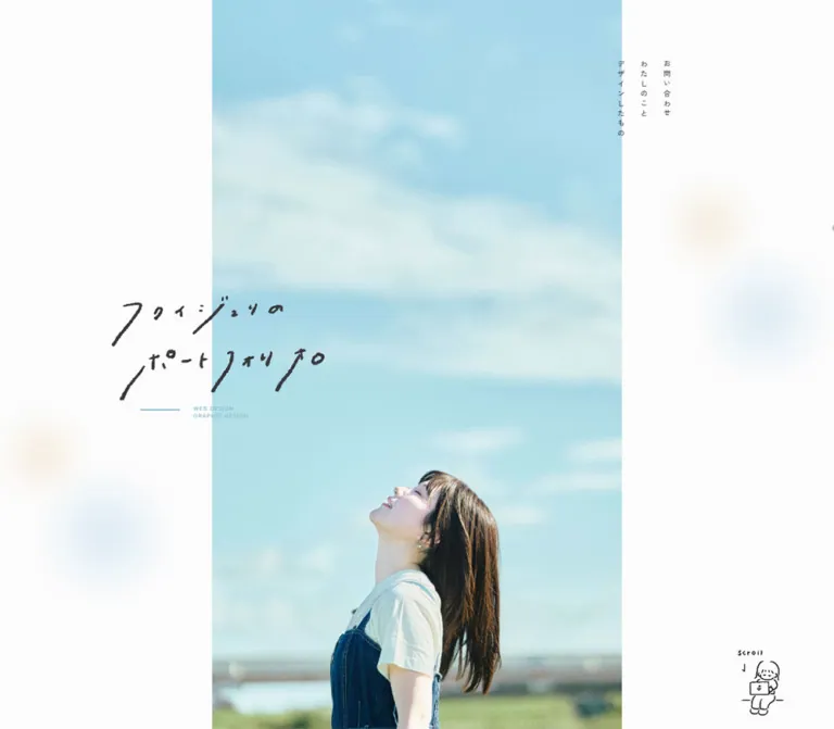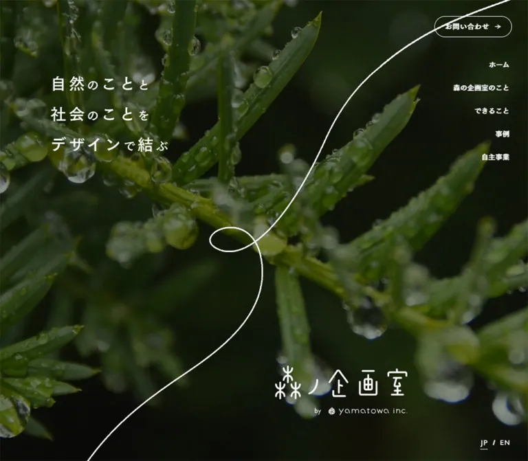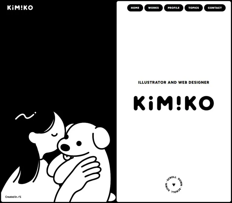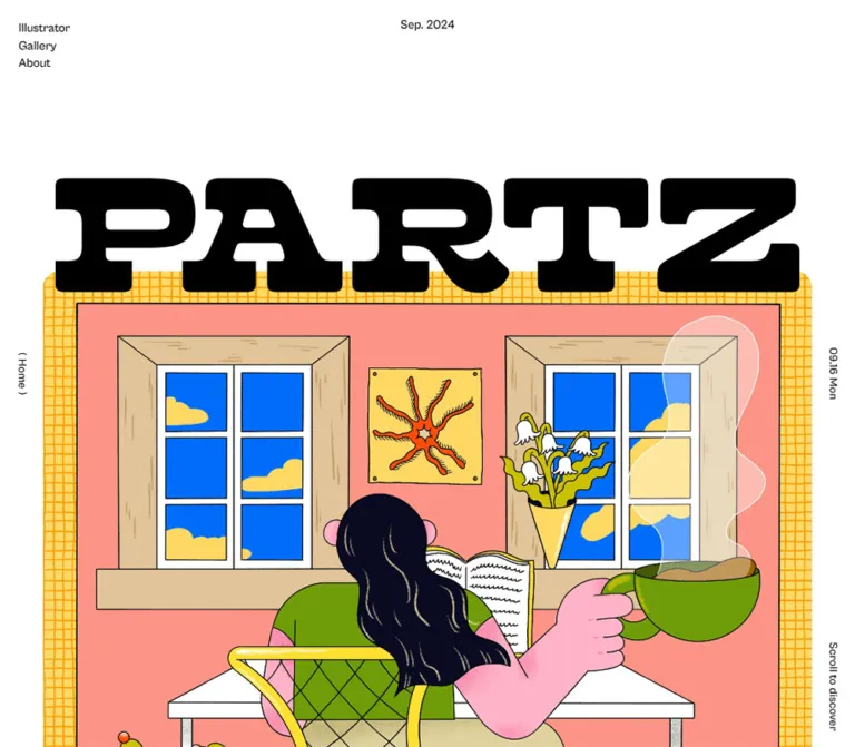
プレビュー準備中デザインリファレンスを見る
日本のWebデザインを、AIの制作リファレンスに。
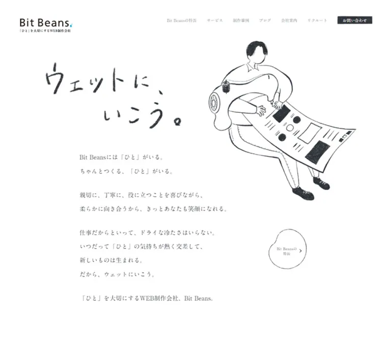
DESIGN REFERENCE
白い余白に明朝体と木炭調のイラストを組み合わせたWeb制作会社のサイト。豆形のリンク、相談目的別カード、制作工程、鮮やかな採用バナーが特徴。
オリジナルサイトを見るAn open white page where careful Mincho typography meets charcoal drawings and small cyan characters.
Website: bitbeans.com
Original URL: https://bitbeans.com/
Final URL: https://bitbeans.com/
Response: HTTP 200
Theme: light in the supplied captures; no theme selector was established.
Inspected: September 22, 2026. Supplied retrieval timestamp: 2026-09-22T14:59:39.362Z, equivalent to 23:59:39.362 JST.
Viewports: desktop 1440 × 1000 and mobile 390 × 844 CSS pixels.
Scope: the current corporate homepage. Visual captures cover the desktop opening, production process, and final footer, plus the mobile opening and final footer. Rendered text and element measurements additionally cover service discovery, client interviews, project rails, and other homepage content. Linked pages and expanded interaction states were not inspected.
Bit Beans presents a substantial company website through an unusually quiet visual shell. White space, dark gray Mincho text, and drawings of people establish an approachable editorial tone. The opening combines the handwritten slogan 「ウェットに、いこう。」 with a separate, readable company proposition and several paragraphs. It makes room for explanation before introducing the service pathways.
The page then becomes more structured: numbered service cards, client interviews, project previews, company strengths, a four-stage production process, articles, questions, staff information, and news. Small bean-shaped outline links connect these sections to deeper pages. The final promotional banners introduce strong color while the surrounding corporate interface remains restrained.
The essential relationship is between precise typesetting and imperfect artwork. Preserve the generous space, real Japanese serif text, charcoal texture, and asymmetrical bean contours together. A white background alone does not reproduce this design.
An open white page where careful Mincho typography meets charcoal drawings and small cyan characters.
Website: bitbeans.com
Original URL: https://bitbeans.com/
Final URL: https://bitbeans.com/
Response: HTTP 200
Theme: light in the supplied captures; no theme selector was established.
Inspected: September 22, 2026. Supplied retrieval timestamp: 2026-09-22T14:59:39.362Z, equivalent to 23:59:39.362 JST.
Viewports: desktop 1440 × 1000 and mobile 390 × 844 CSS pixels.
Scope: the current corporate homepage. Visual captures cover the desktop opening, production process, and final footer, plus the mobile opening and final footer. Rendered text and element measurements additionally cover service discovery, client interviews, project rails, and other homepage content. Linked pages and expanded interaction states were not inspected.
Bit Beans presents a substantial company website through an unusually quiet visual shell. White space, dark gray Mincho text, and drawings of people establish an approachable editorial tone. The opening combines the handwritten slogan 「ウェットに、いこう。」 with a separate, readable company proposition and several paragraphs. It makes room for explanation before introducing the service pathways.
The page then becomes more structured: numbered service cards, client interviews, project previews, company strengths, a four-stage production process, articles, questions, staff information, and news. Small bean-shaped outline links connect these sections to deeper pages. The final promotional banners introduce strong color while the surrounding corporate interface remains restrained.
The essential relationship is between precise typesetting and imperfect artwork. Preserve the generous space, real Japanese serif text, charcoal texture, and asymmetrical bean contours together. A white background alone does not reproduce this design.
--bb- are implementation aliases introduced here. No matching original semantic variable names were supplied.| Name | Value | Suggested token | Role and evidence |
|---|---|---|---|
| White Canvas | #ffffff |
--bb-paper |
Visually dominant page canvas; measured on the desktop header and interview cards. The root and body themselves report transparent backgrounds. |
| Charcoal Ink | #292d33 |
--bb-ink |
Measured text color throughout the sampled page; also a useful approximation for the darker illustration and control marks. |
| Quiet Card | #fafafa |
--bb-card |
Measured fill of the six purpose/service cards. Only slightly separated from the white page. |
| Navigation Gray | #91949a |
--bb-muted |
Measured resting desktop navigation text. Do not apply it to the main body copy. |
| Reversed White | #ffffff |
--bb-on-ink |
Measured contact-link text; visually used inside the dark process numbers. |
| Character Cyan | Approximately #00acd2 |
--bb-accent |
Estimated from the small bean character and logo accent. The exact asset color was not supplied. |
| Lower-page Slate | Approximately #65707f |
--bb-slate-estimate |
Estimated from the narrow gray region preceding the white footer in the mobile capture. Its full section context is outside that image. |
The primary consultation control looks like a charcoal rub or stamped rectangle. Its anchor reports a transparent background, so a flat CSS fill is only an approximation of the visible treatment. Likewise, the irregular outline around a bean link is not explained by the anchor's computed border-radius: 0.
The recruitment banner contains a cyan-to-pale-pink field behind black engraved scenery and heavy black lettering. The family-content banner combines orange-red, mustard yellow, white, and small blue details. The recipe banner uses warm photographic colors under white lettering.
Keep those colors inside their respective image compositions. They do not establish a multicolor button system, a gradient page background, or additional global themes.
The supplied root custom properties include many WordPress and code-highlighter presets. Their presence alone does not establish their use in the visible homepage. The default editor gradients, purple colors, and shadow presets should not be imported into this reference palette.
Measured source stack: YakuHanMP, A1明朝, "A1 Mincho", serif.
This stack appears on the sampled body, navigation, headings, cards, and links at both viewports. The visible result is a Japanese Mincho character with fine strokes and a relatively light overall color. It supports the conversational copy without making the page feel like a dense corporate brochure.
Body text uses weight 400. Main statements and card headings report 550. Preserve that distinction when the available font supports it; the evidence does not establish whether the supplied font is variable or which physical font files were loaded.
The opening paragraphs have particularly generous leading. Compact card descriptions use a much tighter 1.5 line-height. Reusing the hero's leading everywhere would make the service cards and interviews unnecessarily tall.
The handwritten slogan is an image, with the supplied DOM referencing index/kv_title_sp.webp. Its irregular strokes, changing character sizes, and diagonal rhythm are part of the artwork.
The Bit Beans wordmark is an SVG image. Its clean Latin lettering should not be treated as evidence for a second body font. The distorted RECRUIT lettering is also contained in promotional artwork.
Keep these image-based identities separate from real text headings. The homepage proposition is an actual h1; the handwritten slogan appears in an image inside a paragraph.
All desktop and mobile numbers below are measured computed values. Some line-heights are rounded for readability.
| Role | Desktop size / line-height | Mobile size / line-height | Weight | Tracking |
|---|---|---|---|---|
| Root and inherited body | 14.4 / 33.6px |
13.52 / 31.547px |
400 |
0.27px / 0.104px |
| Visible desktop navigation | 12.6 / 12.6px |
Closed menu in screenshot | 400 |
0.27px desktop |
| Main proposition | 30.6 / 44.2px |
28.73 / 46.515px |
550 |
0.03em / 0.02em |
| Opening paragraphs | 18 / 41.999px |
17.68 / 36.400px |
400 |
0.27px / 0.104px |
| Small section label | 14.4 / 33.6px |
13.52 / 31.547px |
400 |
Inherited |
| Large section statement | 32.4 / 46.8px |
21.84 / 35.36px |
550 |
0.03em / 0.02em |
| Section explanation | 14.4 / 24.48px |
13.52 / 22.984px |
400 |
Inherited |
| Purpose-card heading | 21.96 / 28.548px |
20.618 / 26.803px |
550 |
0.03em / 0.02em |
| Interview-card heading | 21.96 / 32.095px |
17.68 / 26px |
550 |
0.03em / 0.02em |
| Card description | 14.4 / 21.6px |
13.52 / 20.28px |
400 |
Inherited |
| Bean-link label | 12.6 / 17.892px |
11.44 / 16.245px |
400 |
0.42px at both widths |
| Project title | 12.6 / 29.4px |
12.48 / 29.12px |
400 |
Inherited |
The mobile main proposition stays almost as large as its desktop counterpart, while the large section statements become substantially smaller. This is selective responsive typography rather than uniform scaling.
The original sampled section labels are h2 elements, while the larger statements immediately below are paragraphs. That is a source anatomy observation. A new implementation can preserve the appearance while choosing a clearer heading hierarchy.
There is no verified source-wide spacing formula in the supplied evidence. Several desktop values use 4.5px increments, but this is insufficient to establish a universal base unit or breakpoint system.
| Relationship | Desktop | Mobile | Evidence |
|---|---|---|---|
| Standard content side margin | 180px |
About 31.2px |
Measured section/card alignment |
| Hero text left inset | 165.594px |
31.188px |
Measured |
| Slogan to main proposition | 54px |
About 41.594px |
Calculated rectangle separation |
| Main proposition to opening paragraphs | About 30.594px |
About 28.719px |
Calculated rectangle separation |
| Between opening paragraphs | 18px |
About 17.672px |
Calculated rectangle separation |
| Opening copy to purpose section | 108px |
About 41.594px |
Calculated rectangle separation |
| Section introduction to first purpose card | 54px |
About 24.953px |
Calculated rectangle separation |
| Purpose grid gap | 27px in both directions |
About 12.469px vertically |
Calculated from card positions |
| Purpose-card padding | 27px 31.5px |
16.64px 18.72px |
Measured computed padding |
| Interview text horizontal inset | 27px |
About 27.031px |
Calculated from card and text rectangles |
| Interview-card gap | 27px horizontal |
26px vertical |
Calculated |
| Card group to bean link | 27px |
About 16.625px |
Calculated |
| Paired footer-banner gap | Approximately 72px |
Approximately 30px vertically |
Screenshot estimate |
Do not replace all these relationships with one generic section gap. The opening, dense card groups, and final footer have different pacing.
| Element | Observed treatment | Implementation guidance |
|---|---|---|
| Purpose and interview cards | Computed 0px radius |
Keep square corners. |
| Promotional banners | Visually square rectangular image fields | Preserve their full composition and any transparent overflow. |
| Consultation control | Rough-edged dark rectangle | Use an appropriate texture asset; a flat rectangle is a fallback. |
| Bean links | Irregular, narrow outline with an indented bean silhouette | Use artwork or an SVG path for fidelity. An asymmetric CSS radius is only an approximation. |
| Process number marks | Visually circular charcoal discs | Preserve the textured fill and reversed numerals. |
No general rounded-card or pill-button system is established.
| Element | Desktop 1440 × 1000 |
Mobile 390 × 844 |
|---|---|---|
| Document height | About 11663px; HTML rectangle 11662.5px |
About 13213px; HTML rectangle 13213.016px |
| Header rectangle | 1440 × 72.891px |
390 × 55.25px |
| Header padding | 17.1px 13.5px 9px 27px |
21.84px 31.2px 0 20.8px |
| Header brand link | About 119.688 × 34.734px |
About 109.719 × 33.422px |
| Slogan image wrapper | 450 × 221.703px at (165.594, 117) |
246.469 × 121.422px at (71.766, 464.344) |
| Main proposition top | 392.703px |
627.359px |
| Main proposition height | 88.375px, two lines |
139.547px, three lines |
| Standard content width | 1080px |
About 327.625px |
| Purpose cards | 342px wide; about 265–267px tall |
About 327.625px wide; 238–240px tall |
| Interview cards | 342 × 540.563px |
About 327.625px wide; 482–510px tall |
| Bean-link anchor | 139.5 × 146.688px |
114.906 × 120.109px |
| Sampled project anchor including captions | 540 × 363.984px |
260 × 195.344px |
The desktop h1 and opening paragraphs have wide DOM rectangles extending to the right edge. Their visible text occupies much less space because of line breaks. Do not treat those rectangle widths as evidence that the text should run across the illustration.
Role: company identity, primary navigation, and direct consultation access.
The desktop header places a small SVG wordmark and location/service descriptor at the far left. A compact navigation group sits at the far right, followed by 「制作について相談する」 in white over a charcoal-textured rectangle.
The visible navigation consists of six entries: reasons to choose the company, services, work, employee blog, company information, and recruitment. The navigation uses 12.6px Mincho text in muted gray, with approximately 22.5px between the sampled top-level links.
The consultation anchor measures approximately 157.484 × 46.797px and has 14.4px padding. Its visible dark patch occupies less than the full anchor rectangle. Preserve the distinction between the painted shape and the clickable area.
On mobile, the horizontal navigation is replaced visually by a small sketch-like menu mark at the upper right. The brand is approximately 110px wide. The menu's opened appearance, keyboard behavior, and transition were not captured.
The header is absent from the supplied lower-page screenshots. The evidence does not establish whether it scrolls away, hides according to scroll direction, or follows another rule.
Role: express the company's attitude and explain its service proposition.
The desktop opening has three separate layers:
The drawing's visible footprint is approximately 650 × 675px, estimated from the screenshot. Its dark brush and shoes create concentrated black areas against otherwise light linework. The white background continues through the composition without a containing card or colored hero panel.
The mobile capture changes the visual order to figure, handwritten slogan, proposition, and body copy. Its figure raises letterforms and geometric shapes. The visible figure is approximately 205px wide and 320px tall. The difference in scene is observed, but its cause—responsive asset selection, timed variation, or another mechanism—is not established.
The current proposition is 「『ひと』の気持ちに向き合う、Web制作会社です。」, with the original UI using Japanese corner brackets around ひと. At mobile width it occupies three lines and remains visually prominent. The opening body begins near y = 796px, so most explanatory copy naturally sits below the first mobile viewport.
Role: introduce a content group without a large decorative title block.
A small section label sits above a larger Mincho statement. On desktop, an explanatory paragraph often occupies a separate column to the right and aligns toward the lower part of the heading group. The widths vary between sections; this is not evidence for one rigid two-column ratio.
For the purpose section, the label begins at x = 180px, the larger statement uses 32.4px type, and the right explanation uses 14.4px / 24.48px. The card group begins 54px below the introduction.
On mobile, the same pieces stack within approximately 31.2px side gutters. The explanation follows the large statement with about 12.5px of separation. Keep this small internal gap distinct from the larger gap before the cards.
Role: let visitors enter through the problem they want to solve.
Each card is one full-card anchor containing a numbered SVG, a small service category, a two-line need statement, and a short explanatory paragraph. The six topics cover company websites, system development, product/service sites, content publishing, recruitment sites, and ongoing operation.
Desktop cards form three columns and two rows. The measured equation is (1080 − 2 × 27) / 3 = 342px. Their fill is #fafafa, with square corners and 27px 31.5px padding. Heading weight is 550; body copy is 14.4px / 21.6px.
Mobile cards form one column with approximately 12.47px gaps. Their outer width is only slightly smaller than a desktop card, but their horizontal padding shrinks to 18.72px. Consequently, the mobile text area is approximately 290.19px wide, compared with 279px on desktop. This helps preserve the intended short headline lines.
The observed number assets are no01.svg through no06.svg. Avoid replacing them with brightly colored badges. No hovered appearance was supplied for these cards.
Role: provide a distinctive, quiet route to a complete section.
These links appear toward the right edge beneath card groups and near other section endings. A slightly taller-than-wide bean outline encloses a centered, usually three-line label and a small right-pointing mark.
The desktop anchor measures 139.5 × 146.688px, with 12.6px / 17.892px text and 0.42px tracking. Mobile dimensions are approximately 114.906 × 120.109px, with 11.44px / 16.245px text.
The purpose-section example reads 「Bit Beansにできることを見る」. Other instances lead to interviews, work, company strengths, production guidance, questions, and staff information.
This is a large outlined navigation shape containing small text. Keep the interior white and preserve the deliberately irregular contour. A conventional circle, rounded rectangle, or filled cyan button loses the distinctive relationship to the brand's bean character.
Role: support the service offering with a client's account of the project.
Each full-card link contains an image, a substantial headline, a client/site-type line, an outcome paragraph, and a reading label. Three cards share a desktop row at the same 342px width as the purpose cards.
The source image dimensions are 1024 × 699, 1024 × 698, and 1024 × 696, approximately 1.47:1. The measured text begins about 27px inside the card. Keep the photographic image edge aligned to the card edge while inset text sits below it.
Desktop cards measure approximately 540.56px tall. On mobile, they stack with 26px gaps and vary between approximately 482px and 510px tall. Their heading size drops to 17.68px, while horizontal text padding remains approximately 27px.
The cards have measured white backgrounds and square corners. Their transition declaration names transform, box-shadow, and border-color, each at 0.2s. The actual resting shadow, hover displacement, and hover border color are not established by the supplied fields.
Role: show the range of completed work through broad website previews and small captions.
The project section spans the viewport, while its introductory text begins at the standard content inset. The DOM includes two project groups with repeated sequences and horizontally displaced copies. Mobile rectangles directly establish two separate horizontal rows.
Sampled project links are 540px wide on desktop and 260px wide on mobile. The desktop horizontal pitch is approximately 594.89px, implying about 54.89px between anchors. Mobile pitch is approximately 291.19px, implying about 31.19px between anchors.
An item includes a landscape image and client/project captions. Many source images are 1024 × 572, approximately 1.79:1. The measured anchor height includes the captions and must not be mistaken for the image's aspect ratio.
The repeated content is consistent with a looping rail implementation. It does not establish motion direction, speed, automatic playback, or drag support. Do not count repeated copies as distinct projects, and do not expose decorative clones as repeated keyboard stops in a new implementation.
Role: explain how the team works together.
Rendered text establishes a small section label, a larger statement, an explanatory paragraph, three supporting points, and a compact facts line. The topics emphasize consultation before requirements are settled, assembling an appropriate team, and continued support after launch.
A bean-outline link to the reasons page is visible at the top right of the supplied process screenshot, above the next section. The full visual arrangement of the strengths content is not captured, so its columns, imagery, and detailed spacing remain unverified.
Role: explain the sequence of collaboration and provide rough planning ranges.
The desktop screenshot shows an open four-column timeline within the approximately 1080px content width. A thin, imperfect horizontal rule runs through four dark circular marks labeled 01 through 04. Each mark sits above a stage title and a short paragraph. The circles are approximately 71–72px in diameter; the four column starts are roughly 281px apart.
The stage titles describe listening, organizing objectives and approach, production with technical care, and continued improvement after publication. Text remains left aligned beneath each mark. There are no enclosing cards around the stages.
A smaller duration area sits below the timeline. It contains three compact label/value groups:
| Project type | Range stated by the page |
|---|---|
| Landing page | 1–2 months |
| Corporate website | Approximately 2–6 months |
| Large or complex website | 6 months to more than a year |
These are the page's editorial planning ranges, not independently measured project durations. A bean-outline link at the lower right leads to production guidance at /whats/faq/.
Mobile text confirms the same stages and duration groups, but no mobile screenshot or detailed rectangles establish their arrangement. A vertical timeline is a recommendation for reuse, not an observed mobile feature.
Role: extend the homepage beyond sales information into people, expertise, and current activity.
The desktop rendered evidence exposes six blog entries with image links, dates, categories, and titles. The mobile evidence exposes two. This establishes the difference between the captured outputs, but not the exact rule that limits entries.
The questions section contains an introduction and four question rows accompanied by + marks. This establishes an expansion affordance; no open answer, toggle animation, or single-open restriction was tested.
The staff section introduces the people involved and links to /whats/member/. The news section contains three dated links and an archive link. Their content order is verified, while their detailed visual styling is outside the supplied screenshot and element sample coverage.
Role: provide a clear contact route and deeper site navigation near the end of a long page.
Rendered evidence includes a consultation message, another 「制作について相談する」 link, a material-download link, and a link to the character introduction. The desktop footer content also includes a company description, grouped navigation, and social links. Those extensive navigation groups are absent from the supplied mobile rendered text.
The homepage identifies its operator as 有限会社Bit Beans in its title and company description, and the footer carries the Bit Beans copyright. The inspected evidence does not establish a named production credit for the current homepage.
Role: connect recruitment and other editorial destinations to the corporate site.
The recruitment artwork sits above two secondary banners. Its black engraved island/city scene, clouds, airship, large pale moon, and distorted RECRUIT lettering overlap a cyan-to-pink rectangular field. Some black-and-white scenery extends beyond that field into the white page.
On desktop, the entire recruitment composition spans approximately the 1080px content width. Below it, two approximately 504 × 171px banners sit side by side with a 72px gap. One uses playful animal illustration and saturated orange-red; the other uses a photograph of an open book with white lettering.
On mobile, the two secondary banners stack at approximately 338px wide, with about 30px between them. Their side gutters are approximately 26px, slightly narrower than the main text gutters. Preserve the full banner artwork rather than cropping it into a standard card ratio.
The secondary banner links point to external domains and display overlapping-square symbols. A new-tab opening behavior was not verified.
Role: conclude the page with company identity and practical information.
The desktop footer wordmark sits left aligned at the content inset and is approximately 175–180px wide. Japanese and English address lines sit underneath in small serif text. Policy links and the copyright line sit much lower and toward the right, leaving substantial empty space between the identity and legal information.
On mobile, the wordmark is approximately 140px wide and centered. Both address languages, the policy links, and the copyright line become centered stacked blocks. The phone number moves to its own line in the Japanese address. Preserve these intentional line breaks without preventing longer localized addresses from wrapping.
Role: retain a small brand presence and offer a route back to the start of the long document.
A cyan bean character appears near the lower left of all five current captures. A narrow PAGE TOP label with a short line appears near the lower right. Their recurring viewport-relative placement is consistent with persistent corner elements, although their CSS positioning was not supplied.
The page-top link has an observed destination of https://bitbeans.com/#top. Smooth scrolling, focus movement, and animation were not tested. The character-introduction link also exists in the rendered evidence, but the supplied fields do not establish the exact clickable bounds of the visible character.
On mobile, these accents sit close to body and legal text. A new implementation should reserve adequate clearance and use larger invisible hit areas without enlarging the artwork itself.
| Element or behavior | Supplied evidence | What can be concluded |
|---|---|---|
| Header transition | 0.13s ease-in-out |
A short transition is declared; the changed property and trigger were not established. |
| Brand-link transition | 0.2s ease-in-out |
Timing is available; the resulting visual state is unverified. |
| Interview cards | transform 0.2s, box-shadow 0.2s, border-color 0.2s, including prefixed equivalents |
These properties are transition-ready. A lift distance or shadow recipe cannot be recovered from this declaration. |
| Other sampled links | Many report transition: all |
No usable duration or visible state change is established by that field alone. |
| Project rails | Repeated items with large horizontal offsets | A repeated rail structure is supported; continuous animation and its timing are unverified. |
| Opening figure | Different scenes in desktop and mobile captures | Visual variation is supported; an animation sequence or responsive switching mechanism is not established. |
| Questions | Four question labels with + marks |
A disclosure affordance is supported; expanded behavior is unverified. |
| Page-top link | Anchor destination #top |
Destination is known; scrolling behavior was not tested. |
| Mobile menu | Closed sketch-like control is visible | Open layout, motion, focus handling, and dismissal are unverified. |
The readiness procedure waited for finite motion and temporarily paused perpetual animations before resuming them. These precautions improve capture stability; they do not provide a motion specification. Sampled elements reporting animation: none also do not rule out animation on ancestors, pseudo-elements, images, or JavaScript-controlled layers.
Recommended reuse: use brief 130–200ms feedback for navigation and cards, with visible focus states. Keep the layout fully usable without animation. If implementing moving rails or illustration sequences, add pause and reduced-motion behavior and establish their timing separately.
| Surface | Appearance | Function |
|---|---|---|
| Main page | White, visually untextured | Gives drawings and typography room to breathe. |
| Purpose cards | #fafafa, square |
Groups six practical entry points with minimal contrast. |
| Interview cards | White, square, image above inset text | Separates client stories through content structure. |
| Process section | Open white space with a thin drawn rule | Connects stages without introducing another card family. |
| Consultation control | Dark textured rectangular mark with white text | Strongest compact action treatment in the header. |
| Bean link | White interior with irregular dark outline | Distinctive secondary navigation. |
| Promotional artwork | Saturated image fields and illustration overflow | Adds visual variety at the bottom of the corporate page. |
A universal elevation scale is not established. Interview cards have a shadow transition declaration, but the evidence does not justify assigning shadows to every content block.
The core illustration language combines fine contour lines with rough, dark shading. People wear ordinary clothing; tools and graphic objects are exaggerated in scale. Bodies float diagonally or reach upward, adding movement to otherwise quiet layouts. Keep white areas open inside the figures and concentrate texture in selected objects, hair, or shoes.
The handwritten slogan has grain and uneven pressure. Its texture belongs to the lettering itself, not to the entire page background. Avoid adding a full-page paper grain or distress overlay merely because the artwork is hand drawn.
The cyan character provides a different kind of mark: small, flat, simple, and immediately recognizable. It is an accent against the gray linework, not the basis for a cyan interface theme.
Recruitment uses a more densely engraved illustration style. The family-content and recipe banners retain their own colorful identities. Interview and project images are separate content assets; the supplied screenshots do not show enough of their compositions to prescribe subject placement beyond the measured component structure.
Use normal high-quality image scaling. Nothing in the current captures establishes deliberate pixelated rendering.
The following theme paths are relative to:
https://bitbeans.com/bb_corporate/wp-content/themes/bb-corporate2024/assets/images/
| Asset | Observed relative path | Evidence and use |
|---|---|---|
| Corporate wordmark | common/logo.svg |
Header image with Bit Beans alternative text. |
| Handwritten slogan | index/kv_title_sp.webp |
Referenced in both viewport DOM samples. The _sp suffix does not make it mobile-only. |
| Purpose numbers | index/no01.svg through index/no06.svg |
Number graphics inside the six purpose links. |
| Navigation title artwork | common/header_title_why.svg, common/header_title_service.svg, common/header_title_corporate.svg, common/header_title_recruit.svg |
Referenced by navigation descendants; their expanded presentation was not captured. |
| Work title artwork | index/works_title.svg |
Referenced within navigation evidence. |
| Recruitment banner | common/banner_recruit_sp.webp |
Referenced footer recruitment image. |
| Family-content banner | common/banner_pekeronpa_sp.webp |
Referenced footer promotional image. |
| Recipe banner | common/banner_no-recipe.webp |
Referenced footer photographic banner. |
| Consultation illustration | index/kv_img3.webp |
Referenced inside a contact link; not sufficient to identify the opening figure's asset. |
Selected content paths are relative to:
https://bitbeans.com/bb_corporate/wp-content/uploads/
| Asset | Observed relative path | Supplied dimensions |
|---|---|---|
| First client interview image | 2026/07/client-voice_ucccoffeemuseum03.jpg |
1024 × 699 |
| Second client interview image | 2026/02/implem_voice03.jpg |
1024 × 698 |
| Third client interview image | 2026/01/bistem_voice06-1024x696.jpeg |
1024 × 696 |
| Museum project preview | 2026/07/ucccoffeemuseum_top_pc-1024x572.jpg |
1024 × 572 |
| Product project preview | 2026/01/pleasanter_top_pc-1024x572.jpg |
1024 × 572 |
| Blog image example | 2026/08/img04b.jpg |
1360 × 756 |
These are DOM references, not assets fetched separately for this analysis. The exact opening-character files, bean-outline asset, charcoal button texture, and process-disc files were not established. The theme directory name is not proof of a launch or redesign date.
The desktop page combines a narrow header with a much more inset content system. The standard sections occupy 1080px at the inspected width, leaving 180px side margins. The opening starts slightly farther left, at approximately 165.6px, while its illustration reaches close to the right edge.
Purpose and interview cards share the same three-column geometry, creating continuity between service choices and evidence. The project previews break out into horizontal rows across the viewport. The process section returns to the contained width and uses four open columns. Footer banners finally switch to one wide artwork followed by a two-column pair.
Do not force all these areas into one identical grid. Their related alignment is more important than making every component the same width.
At 390px, the principal text and card area is approximately 327.6px wide, with 31.2px side gutters. The final promotional banners use approximately 26px gutters and thus appear slightly wider.
The opening changes order instead of simply shrinking. The illustration takes a centered upper position; the slogan moves below it; the proposition and paragraphs then resume left alignment. The main proposition remains large, whereas later section statements reduce to 21.84px.
Service and interview groups become single-column stacks. Project previews retain a horizontal format with 260px items. The footer's paired banners stack, and its identity and legal information center.
The mobile page measures approximately 1550px taller than desktop, despite exposing fewer blog entries and omitting the desktop footer navigation groups from the rendered text. Stacked service and interview content accounts for a substantial part of the extra length.
Only two viewport widths were supplied. The original breakpoints, maximum container width, fluid interpolation formulas, tablet layout, and landscape behavior are unknown.
Recommended implementation: cap standard desktop sections at 1080px, use an 8vw mobile text gutter, and introduce a compact header before its navigation collides. The Quick Start uses a 60rem compact-header breakpoint and a 48rem single-column breakpoint as implementation choices. They are not recovered source values.
Let cards grow with text. Do not hardcode the measured document height or card heights as required output dimensions. Preserve the source's editorial line breaks where useful, while allowing text zoom and alternate copy to reflow.
These are recommendations for a new implementation, not verified original features:
h1 and use section headings that reflect the actual content hierarchy. The large statement can become the section heading while its small label remains an eyebrow.+ symbol alone to communicate state.44px.#ffffff.#292d33.#fafafa.#91949a.#00acd2.“Create a Japanese creative-company homepage using an open white canvas, charcoal Mincho typography, and large monochrome illustrations with fine outlines and rough charcoal shading. Pair a handwritten slogan image with a separate readable company proposition and generously spaced introductory paragraphs. Use a 1080px desktop content area, pale square service cards in three columns, three photographic client-interview cards, broad project-preview rails, and a four-stage open timeline. End sections with irregular bean-outline links containing small multiline labels. Keep cyan limited to a small brand character. On mobile, place the figure above the slogan and copy, stack service and interview cards, and center the final company information. Keep colorful recruitment and editorial banners intact. Treat unverified animation and menu behavior as separate implementation decisions.”
This is a practical adaptation using a conventional root font size. Desktop tokens reproduce measured values at 1440px; mobile overrides reproduce key values at 390px. Container caps and breakpoints are recommendations. The flat consultation fill, CSS bean contour, and solid process discs are fallbacks for artwork, not exact reproductions.
The expected structure is a .site-header containing .site-brand, .desktop-nav, and .menu-button; a .hero containing .hero__art, .hero__slogan, and .hero__copy; and content containers with the card and section classes below. Use real links and headings. Menu disclosure behavior and any project animation require separate implementation.
:root {
  /* Measured interface colors; cyan is an artwork estimate. */
  --bb-paper: #ffffff;
  --bb-ink: #292d33;
  --bb-card: #fafafa;
  --bb-muted: #91949a;
  --bb-accent: #00acd2;

  /* Observed font declaration; font files are not bundled. */
  --bb-font: YakuHanMP, 'A1明朝', 'A1 Mincho', serif;
  --bb-weight-body: 400;
  --bb-weight-heading: 550;
  --bb-body: 14.4px;
  --bb-body-leading: 33.6px;
  --bb-copy-leading: 1.5;
  --bb-tracking: 0.27px;
  --bb-heading-tracking: 0.03em;
  --bb-h1: 30.6px;
  --bb-h1-leading: 44.2px;
  --bb-intro: 18px;
  --bb-intro-leading: 42px;
  --bb-section-title: 32.4px;
  --bb-section-leading: 46.8px;
  --bb-card-title: 21.96px;
  --bb-interview-title: 21.96px;
  --bb-interview-leading: 32.0954px;
  --bb-small: 12.6px;

  /* Container cap and general gutter are recommended. */
  --bb-content: 1080px;
  --bb-gutter: 32px;
  --bb-grid-gap: 27px;
  --bb-card-pad-y: 27px;
  --bb-card-pad-x: 31.5px;
  --bb-interview-inset: 27px;
  --bb-section-space: 144px;
  --bb-group-space: 54px;
  --bb-bean-width: 139.5px;
  --bb-bean-height: 146.6875px;
  --bb-bean-text: 12.6px;
  --bb-work-width: 540px;
  --bb-work-gap: 54.89px;

  /* Source timings, without assuming original triggers. */
  --bb-fast: 130ms ease-in-out;
  --bb-feedback: 200ms ease-in-out;
}

* {
  box-sizing: border-box;
}

body {
  margin: 0;
  color: var(--bb-ink);
  background: var(--bb-paper);
  font-family: var(--bb-font);
  font-size: var(--bb-body);
  font-weight: var(--bb-weight-body);
  line-height: var(--bb-body-leading);
  letter-spacing: var(--bb-tracking);
}

img {
  display: block;
  max-width: 100%;
  height: auto;
}

button,
summary {
  font: inherit;
}

a {
  color: inherit;
}

.container {
  width: min(
    var(--bb-content),
    calc(100% - var(--bb-gutter) - var(--bb-gutter))
  );
  margin-inline: auto;
}

.site-header {
  position: absolute;
  z-index: 10;
  inset: 0 0 auto;
  display: flex;
  align-items: center;
  justify-content: space-between;
  gap: 24px;
  min-height: 72.89px;
  padding: 17.1px 13.5px 9px 27px;
  background: var(--bb-paper);
}

.site-brand {
  flex: 0 0 auto;
  width: 119.69px;
  text-decoration: none;
}

.desktop-nav {
  display: flex;
  align-items: center;
  gap: 22.5px;
  font-size: 12.6px;
  line-height: 1;
  color: var(--bb-muted);
}

.desktop-nav a {
  text-decoration: none;
}

.consult-link {
  display: inline-flex;
  align-items: center;
  justify-content: center;
  min-height: 46.8px;
  padding: 14.4px;
  color: var(--bb-paper);
  background: var(--bb-ink);
  border-radius: 0;
  text-decoration: none;
  line-height: 1.3;
  /* Replace the flat fill with suitable charcoal artwork. */
}

.menu-button {
  display: none;
  align-items: center;
  justify-content: center;
  width: 52px;
  min-height: 44px;
  padding: 0;
  color: var(--bb-ink);
  background: transparent;
  border: 0;
  cursor: pointer;
}

.hero {
  position: relative;
  isolation: isolate;
  padding-top: 117px;
}

.hero__art {
  position: absolute;
  z-index: 0;
  top: 170px;
  right: 2.2%;
  width: min(45vw, 650px);
  height: 675px;
  object-fit: contain;
  pointer-events: none;
  /* Figure dimensions are screenshot-based approximations. */
}

.hero__slogan {
  position: relative;
  z-index: 1;
  width: 450px;
  margin-left: 11.5%;
}

.hero__copy {
  position: relative;
  z-index: 1;
  margin: 54px 32px 0 11.5%;
}

.hero h1 {
  margin: 0;
  font-size: var(--bb-h1);
  font-weight: var(--bb-weight-heading);
  line-height: var(--bb-h1-leading);
  letter-spacing: var(--bb-heading-tracking);
}

.hero__body {
  max-width: 780px;
  margin-top: var(--bb-h1);
  font-size: var(--bb-intro);
  line-height: var(--bb-intro-leading);
}

.hero__body p {
  margin: 0;
}

.hero__body p + p {
  margin-top: 18px;
}

.content-section {
  margin-top: var(--bb-section-space);
}

.hero + .content-section {
  margin-top: 108px;
}

.section-head {
  display: grid;
  grid-template-columns: 1fr 1fr;
  align-items: end;
  gap: 54px;
}

.section-eyebrow {
  margin: 0;
  font-size: var(--bb-body);
  font-weight: 400;
  line-height: var(--bb-body-leading);
}

.section-title {
  margin: 0;
  font-size: var(--bb-section-title);
  font-weight: var(--bb-weight-heading);
  line-height: var(--bb-section-leading);
  letter-spacing: var(--bb-heading-tracking);
}

.section-description {
  margin: 0;
  line-height: 1.7;
}

.purpose-grid,
.interview-grid {
  display: grid;
  grid-template-columns: repeat(3, minmax(0, 1fr));
  gap: var(--bb-grid-gap);
  margin-top: var(--bb-group-space);
}

.purpose-card {
  display: block;
  padding: var(--bb-card-pad-y) var(--bb-card-pad-x);
  background: var(--bb-card);
  border-radius: 0;
  text-decoration: none;
}

.purpose-card__number {
  width: 44px;
  margin-bottom: 9px;
  /* Recommended placeholder size; source graphic size is unknown. */
}

.purpose-card__category {
  margin: 0 0 9px;
  font-size: var(--bb-body);
  line-height: 1.5;
}

.purpose-card__title {
  margin: 0 0 9px;
  font-size: var(--bb-card-title);
  font-weight: var(--bb-weight-heading);
  line-height: 1.3;
  letter-spacing: var(--bb-heading-tracking);
}

.purpose-card__description {
  margin: 0;
  line-height: var(--bb-copy-leading);
}

.interview-card {
  display: flex;
  flex-direction: column;
  min-width: 0;
  background: var(--bb-paper);
  border-radius: 0;
  text-decoration: none;
  transition: transform 200ms, box-shadow 200ms, border-color 200ms;
}

.interview-card > img {
  width: 100%;
  height: auto;
}

.interview-card__body {
  display: flex;
  flex: 1;
  flex-direction: column;
  align-items: flex-start;
  padding: var(--bb-interview-inset);
  line-height: 1.5;
}

.interview-card__title {
  margin: 0 0 12px;
  font-size: var(--bb-interview-title);
  font-weight: var(--bb-weight-heading);
  line-height: var(--bb-interview-leading);
  letter-spacing: var(--bb-heading-tracking);
}

.interview-card__body p {
  margin: 0 0 18px;
}

.interview-card__read {
  margin-top: auto;
  font-size: var(--bb-small);
}

.bean-link {
  position: relative;
  isolation: isolate;
  display: flex;
  align-items: center;
  justify-content: center;
  gap: 9px;
  width: var(--bb-bean-width);
  min-height: var(--bb-bean-height);
  margin: 27px 0 0 auto;
  padding: 13.5px 0 0 13.5px;
  text-align: center;
  text-decoration: none;
  font-size: var(--bb-bean-text);
  line-height: 1.42;
  letter-spacing: 0.42px;
}

.bean-link::before {
  content: '';
  position: absolute;
  z-index: -1;
  inset: 2px;
  border: 1px solid currentColor;
  border-radius: 52% 48% 49% 51% / 39% 57% 43% 61%;
  transform: rotate(-10deg);
  /* Approximation: replace with a drawn bean outline for fidelity. */
}

.bean-link::after {
  content: '›';
  font-size: 22px;
  line-height: 1;
}

/* Manual scrolling is an accessible fallback, not observed behavior. */
.work-rail {
  display: flex;
  gap: var(--bb-work-gap);
  overflow-x: auto;
  padding-inline: max(var(--bb-gutter), calc((100vw - 1080px) / 2));
  padding-block: 12px;
}

.work-card {
  flex: 0 0 var(--bb-work-width);
  min-width: 0;
  text-decoration: none;
}

.work-card img {
  width: 100%;
}

.work-card__title {
  margin: 0;
  font-size: 12.6px;
  font-weight: 400;
  line-height: 29.4px;
}

.process-list {
  position: relative;
  display: grid;
  grid-template-columns: repeat(4, minmax(0, 1fr));
  gap: 43px;
  margin: 54px 0 0;
  padding: 0;
  list-style: none;
}

.process-list::before {
  content: '';
  position: absolute;
  inset: 35.5px 0 auto;
  border-top: 1px solid var(--bb-ink);
}

.process-step {
  position: relative;
  min-width: 0;
}

.process-step__number {
  display: grid;
  place-items: center;
  width: 72px;
  height: 72px;
  margin-bottom: 18px;
  border-radius: 50%;
  color: var(--bb-paper);
  background: var(--bb-ink);
  font-size: 32px;
  line-height: 1;
  /* Flat fallback for the observed textured number disc. */
}

.process-step h3 {
  margin: 0 0 8px;
  font-size: 18px;
  font-weight: 400;
  line-height: 1.5;
}

.process-step p {
  margin: 0;
  line-height: 1.5;
}

.footer-promotions {
  margin-top: var(--bb-section-space);
}

.recruit-banner img {
  width: 100%;
  height: auto;
}

.footer-banners {
  display: grid;
  grid-template-columns: repeat(2, minmax(0, 1fr));
  gap: 72px;
  margin-top: 48px;
}

.footer-banners img {
  width: 100%;
  height: auto;
  border-radius: 0;
}

.footer-brand {
  width: 176px;
  margin-top: 48px;
}

.footer-address {
  margin-top: 24px;
  font-size: 11px;
  font-style: normal;
  line-height: 2.2;
}

.footer-legal {
  margin-top: 112px;
  padding-bottom: 64px;
  text-align: right;
  font-size: 13px;
  line-height: 2.3;
}

.page-top {
  position: fixed;
  z-index: 20;
  right: max(8px, env(safe-area-inset-right, 0px));
  bottom: max(36px, env(safe-area-inset-bottom, 0px));
  display: flex;
  align-items: center;
  gap: 9px;
  min-width: 44px;
  padding: 8px;
  writing-mode: vertical-rl;
  text-decoration: none;
  font-size: 12px;
  line-height: 1;
}

.page-top::before {
  content: '';
  width: 1px;
  height: 24px;
  background: currentColor;
}

:where(a, button, summary):focus-visible {
  outline: 2px solid var(--bb-ink);
  outline-offset: 5px;
}

@media (hover: hover) {
  /* Recommended feedback; original hover states were not captured. */
  .desktop-nav a:hover,
  .footer-legal a:hover {
    text-decoration: underline;
    text-underline-offset: 4px;
  }
}

@media (max-width: 60rem) {
  /* Connect this control to an accessible navigation disclosure. */
  .desktop-nav {
    display: none;
  }

  .menu-button {
    display: inline-flex;
  }
}

@media (max-width: 48rem) {
  :root {
    --bb-gutter: 8vw;
    --bb-body: 13.52px;
    --bb-body-leading: 31.5467px;
    --bb-tracking: 0.104px;
    --bb-heading-tracking: 0.02em;
    --bb-h1: 28.73px;
    --bb-h1-leading: 46.5152px;
    --bb-intro: 17.68px;
    --bb-intro-leading: 36.3996px;
    --bb-section-title: 21.84px;
    --bb-section-leading: 35.36px;
    --bb-card-title: 20.618px;
    --bb-interview-title: 17.68px;
    --bb-interview-leading: 26px;
    --bb-interview-inset: 27.04px;
    --bb-grid-gap: 12.48px;
    --bb-card-pad-y: 16.64px;
    --bb-card-pad-x: 18.72px;
    --bb-section-space: 62.4px;
    --bb-group-space: 24.96px;
    --bb-bean-width: 114.91px;
    --bb-bean-height: 120.11px;
    --bb-bean-text: 11.44px;
    --bb-work-width: 260px;
    --bb-work-gap: 31.2px;
  }

  .site-header {
    align-items: flex-start;
    min-height: 55.25px;
    padding: 21.84px 31.2px 0 20.8px;
    background: transparent;
  }

  .site-brand {
    width: 109.72px;
  }

  .menu-button {
    margin-top: -8px;
  }

  .hero {
    padding-top: 116px;
  }

  .hero__art {
    position: relative;
    inset: auto;
    width: min(208px, 60vw);
    height: 322px;
    margin: 0 auto 26.34px;
    object-fit: contain;
  }

  .hero__slogan {
    width: min(246.47px, 70vw);
    margin-inline: auto;
  }

  .hero__copy {
    margin: 41.6px var(--bb-gutter) 0;
  }

  .hero__body {
    margin-top: 28.73px;
  }

  .hero__body p + p {
    margin-top: 17.68px;
  }

  .hero + .content-section {
    margin-top: 41.6px;
  }

  .section-head {
    grid-template-columns: minmax(0, 1fr);
    gap: 12.48px;
  }

  .purpose-grid,
  .interview-grid {
    grid-template-columns: minmax(0, 1fr);
  }

  .interview-grid {
    gap: 26px;
  }

  .bean-link {
    margin-top: 16.64px;
    padding: 5.2px 0 0 5.2px;
  }

  .work-card__title {
    font-size: 12.48px;
    line-height: 29.12px;
  }

  /* Recommended mobile process layout; not visually inspected. */
  .process-list {
    grid-template-columns: minmax(0, 1fr);
    gap: 26px;
    margin-top: 32px;
  }

  .process-list::before {
    inset: 0 auto 0 35.5px;
    border-top: 0;
    border-left: 1px solid var(--bb-ink);
  }

  .process-step {
    display: grid;
    grid-template-columns: 72px minmax(0, 1fr);
    align-items: start;
    gap: 18px;
  }

  .process-step__number {
    margin-bottom: 0;
  }

  .footer-promotions {
    --bb-gutter: 6.667vw;
  }

  .footer-banners {
    grid-template-columns: minmax(0, 1fr);
    gap: 30px;
    margin-top: 48px;
  }

  .footer-brand {
    width: 140px;
    margin: 44px auto 0;
  }

  .footer-address {
    text-align: center;
    font-size: 12px;
    line-height: 1.5;
  }

  .footer-legal {
    margin-top: 32px;
    padding-bottom: 32px;
    text-align: center;
  }
}

@media (prefers-reduced-motion: reduce) {
  .site-header,
  .interview-card,
  .desktop-nav a {
    transition: none;
  }

  html {
    scroll-behavior: auto;
  }
}
The CSS intentionally leaves images at their natural aspect ratios and cards at content-driven heights. For a faithful opening, supply the appropriate figure artwork and author the observed heading breaks. For accessible page-top behavior, ensure the document contains a meaningful target with id="top".
Optional aliases for a project already using Tailwind v4. These do not imply that the original website uses Tailwind. Define the preceding --bb- properties first.
@theme inline {
  --color-paper: var(--bb-paper);
  --color-ink: var(--bb-ink);
  --color-quiet-card: var(--bb-card);
  --color-muted: var(--bb-muted);
  --color-character: var(--bb-accent);

  --font-editorial: var(--bb-font);

  --text-body: var(--bb-body);
  --text-body--line-height: var(--bb-body-leading);
  --text-proposition: var(--bb-h1);
  --text-proposition--line-height: var(--bb-h1-leading);
  --text-section: var(--bb-section-title);
  --text-section--line-height: var(--bb-section-leading);
  --text-card: var(--bb-card-title);
  --text-card--line-height: 1.3;
  --text-bean: var(--bb-bean-text);
  --text-bean--line-height: 1.42;

  --spacing-gutter: var(--bb-gutter);
  --spacing-card-gap: var(--bb-grid-gap);
  --spacing-section: var(--bb-section-space);
  --spacing-content: var(--bb-content);

  --radius-card: 0px;
}
14:59:39.362 UTC / 23:59:39.362 JST. Individual screenshot timestamps were not supplied.1440 × 1000 CSS pixels. Three current screenshots show the opening, production process, and final footer. Rendered document height is approximately 11663px.390 × 844 CSS pixels. Two current screenshots show the opening and final footer. Rendered document height is approximately 13213px.This reference describes the current homepage evidenced by those captures. Exact measurements, screenshot estimates, and implementation recommendations are identified separately throughout.
# Bit Beans — Style Reference

> An open white page where careful Mincho typography meets charcoal drawings and small cyan characters.

**Website:** [bitbeans.com](https://bitbeans.com/)
**Original URL:** https://bitbeans.com/
**Final URL:** https://bitbeans.com/
**Response:** HTTP 200
**Theme:** light in the supplied captures; no theme selector was established.
**Inspected:** September 22, 2026. Supplied retrieval timestamp: `2026-09-22T14:59:39.362Z`, equivalent to 23:59:39.362 JST.
**Viewports:** desktop `1440 × 1000` and mobile `390 × 844` CSS pixels.
**Scope:** the current corporate homepage. Visual captures cover the desktop opening, production process, and final footer, plus the mobile opening and final footer. Rendered text and element measurements additionally cover service discovery, client interviews, project rails, and other homepage content. Linked pages and expanded interaction states were not inspected.

Bit Beans presents a substantial company website through an unusually quiet visual shell. White space, dark gray Mincho text, and drawings of people establish an approachable editorial tone. The opening combines the handwritten slogan `「ウェットに、いこう。」` with a separate, readable company proposition and several paragraphs. It makes room for explanation before introducing the service pathways.

The page then becomes more structured: numbered service cards, client interviews, project previews, company strengths, a four-stage production process, articles, questions, staff information, and news. Small bean-shaped outline links connect these sections to deeper pages. The final promotional banners introduce strong color while the surrounding corporate interface remains restrained.

The essential relationship is between precise typesetting and imperfect artwork. Preserve the generous space, real Japanese serif text, charcoal texture, and asymmetrical bean contours together. A white background alone does not reproduce this design.
# Bit Beans — Style Reference

> An open white page where careful Mincho typography meets charcoal drawings and small cyan characters.

**Website:** [bitbeans.com](https://bitbeans.com/)
**Original URL:** https://bitbeans.com/
**Final URL:** https://bitbeans.com/
**Response:** HTTP 200
**Theme:** light in the supplied captures; no theme selector was established.
**Inspected:** September 22, 2026. Supplied retrieval timestamp: `2026-09-22T14:59:39.362Z`, equivalent to 23:59:39.362 JST.
**Viewports:** desktop `1440 × 1000` and mobile `390 × 844` CSS pixels.
**Scope:** the current corporate homepage. Visual captures cover the desktop opening, production process, and final footer, plus the mobile opening and final footer. Rendered text and element measurements additionally cover service discovery, client interviews, project rails, and other homepage content. Linked pages and expanded interaction states were not inspected.

Bit Beans presents a substantial company website through an unusually quiet visual shell. White space, dark gray Mincho text, and drawings of people establish an approachable editorial tone. The opening combines the handwritten slogan `「ウェットに、いこう。」` with a separate, readable company proposition and several paragraphs. It makes room for explanation before introducing the service pathways.

The page then becomes more structured: numbered service cards, client interviews, project previews, company strengths, a four-stage production process, articles, questions, staff information, and news. Small bean-shaped outline links connect these sections to deeper pages. The final promotional banners introduce strong color while the surrounding corporate interface remains restrained.

The essential relationship is between precise typesetting and imperfect artwork. Preserve the generous space, real Japanese serif text, charcoal texture, and asymmetrical bean contours together. A white background alone does not reproduce this design.

## How to Read This Reference

- **Measured** values come from the supplied rendered element rectangles and computed styles. Values are in CSS pixels unless stated otherwise.
- **Calculated** values are arithmetic derived from those measurements, such as column gaps or aspect ratios.
- **Estimated** values describe visible screenshot geometry or approximate artwork colors. They are not exact pixel samples or source declarations.
- **Recommended** values and behaviors belong to a reusable implementation. They are not claims about the original site's CSS or interactions.
- Token names beginning with `--bb-` are implementation aliases introduced here. No matching original semantic variable names were supplied.
- A computed font-family stack establishes the declaration, not which font file supplied every glyph.
- Some menu links and project copies have offscreen rectangles. Their presence in the DOM does not make them visible in the captured state.
- The supplied element sample ends within the project collection. Later sections therefore have less computed-style coverage, even where their text or screenshots are available.

## Tokens — Colors

### Default Palette

| Name | Value | Suggested token | Role and evidence |
| --- | --- | --- | --- |
| White Canvas | `#ffffff` | `--bb-paper` | Visually dominant page canvas; measured on the desktop header and interview cards. The root and body themselves report transparent backgrounds. |
| Charcoal Ink | `#292d33` | `--bb-ink` | Measured text color throughout the sampled page; also a useful approximation for the darker illustration and control marks. |
| Quiet Card | `#fafafa` | `--bb-card` | Measured fill of the six purpose/service cards. Only slightly separated from the white page. |
| Navigation Gray | `#91949a` | `--bb-muted` | Measured resting desktop navigation text. Do not apply it to the main body copy. |
| Reversed White | `#ffffff` | `--bb-on-ink` | Measured contact-link text; visually used inside the dark process numbers. |
| Character Cyan | Approximately `#00acd2` | `--bb-accent` | Estimated from the small bean character and logo accent. The exact asset color was not supplied. |
| Lower-page Slate | Approximately `#65707f` | `--bb-slate-estimate` | Estimated from the narrow gray region preceding the white footer in the mobile capture. Its full section context is outside that image. |

The primary consultation control looks like a charcoal rub or stamped rectangle. Its anchor reports a transparent background, so a flat CSS fill is only an approximation of the visible treatment. Likewise, the irregular outline around a bean link is not explained by the anchor's computed `border-radius: 0`.

### Color Within Artwork

The recruitment banner contains a cyan-to-pale-pink field behind black engraved scenery and heavy black lettering. The family-content banner combines orange-red, mustard yellow, white, and small blue details. The recipe banner uses warm photographic colors under white lettering.

Keep those colors inside their respective image compositions. They do not establish a multicolor button system, a gradient page background, or additional global themes.

The supplied root custom properties include many WordPress and code-highlighter presets. Their presence alone does not establish their use in the visible homepage. The default editor gradients, purple colors, and shadow presets should not be imported into this reference palette.

## Tokens — Typography

### Editorial Text

**Measured source stack:** `YakuHanMP, A1明朝, "A1 Mincho", serif`.

This stack appears on the sampled body, navigation, headings, cards, and links at both viewports. The visible result is a Japanese Mincho character with fine strokes and a relatively light overall color. It supports the conversational copy without making the page feel like a dense corporate brochure.

Body text uses weight `400`. Main statements and card headings report `550`. Preserve that distinction when the available font supports it; the evidence does not establish whether the supplied font is variable or which physical font files were loaded.

The opening paragraphs have particularly generous leading. Compact card descriptions use a much tighter `1.5` line-height. Reusing the hero's leading everywhere would make the service cards and interviews unnecessarily tall.

### Artwork Lettering and Wordmark

The handwritten slogan is an image, with the supplied DOM referencing `index/kv_title_sp.webp`. Its irregular strokes, changing character sizes, and diagonal rhythm are part of the artwork.

The Bit Beans wordmark is an SVG image. Its clean Latin lettering should not be treated as evidence for a second body font. The distorted `RECRUIT` lettering is also contained in promotional artwork.

Keep these image-based identities separate from real text headings. The homepage proposition is an actual `h1`; the handwritten slogan appears in an image inside a paragraph.

### Type Scale

All desktop and mobile numbers below are measured computed values. Some line-heights are rounded for readability.

| Role | Desktop size / line-height | Mobile size / line-height | Weight | Tracking |
| --- | --- | --- | --- | --- |
| Root and inherited body | `14.4 / 33.6px` | `13.52 / 31.547px` | `400` | `0.27px` / `0.104px` |
| Visible desktop navigation | `12.6 / 12.6px` | Closed menu in screenshot | `400` | `0.27px` desktop |
| Main proposition | `30.6 / 44.2px` | `28.73 / 46.515px` | `550` | `0.03em` / `0.02em` |
| Opening paragraphs | `18 / 41.999px` | `17.68 / 36.400px` | `400` | `0.27px` / `0.104px` |
| Small section label | `14.4 / 33.6px` | `13.52 / 31.547px` | `400` | Inherited |
| Large section statement | `32.4 / 46.8px` | `21.84 / 35.36px` | `550` | `0.03em` / `0.02em` |
| Section explanation | `14.4 / 24.48px` | `13.52 / 22.984px` | `400` | Inherited |
| Purpose-card heading | `21.96 / 28.548px` | `20.618 / 26.803px` | `550` | `0.03em` / `0.02em` |
| Interview-card heading | `21.96 / 32.095px` | `17.68 / 26px` | `550` | `0.03em` / `0.02em` |
| Card description | `14.4 / 21.6px` | `13.52 / 20.28px` | `400` | Inherited |
| Bean-link label | `12.6 / 17.892px` | `11.44 / 16.245px` | `400` | `0.42px` at both widths |
| Project title | `12.6 / 29.4px` | `12.48 / 29.12px` | `400` | Inherited |

The mobile main proposition stays almost as large as its desktop counterpart, while the large section statements become substantially smaller. This is selective responsive typography rather than uniform scaling.

The original sampled section labels are `h2` elements, while the larger statements immediately below are paragraphs. That is a source anatomy observation. A new implementation can preserve the appearance while choosing a clearer heading hierarchy.

## Tokens — Spacing & Shapes

There is no verified source-wide spacing formula in the supplied evidence. Several desktop values use `4.5px` increments, but this is insufficient to establish a universal base unit or breakpoint system.

### Spacing Scale

| Relationship | Desktop | Mobile | Evidence |
| --- | --- | --- | --- |
| Standard content side margin | `180px` | About `31.2px` | Measured section/card alignment |
| Hero text left inset | `165.594px` | `31.188px` | Measured |
| Slogan to main proposition | `54px` | About `41.594px` | Calculated rectangle separation |
| Main proposition to opening paragraphs | About `30.594px` | About `28.719px` | Calculated rectangle separation |
| Between opening paragraphs | `18px` | About `17.672px` | Calculated rectangle separation |
| Opening copy to purpose section | `108px` | About `41.594px` | Calculated rectangle separation |
| Section introduction to first purpose card | `54px` | About `24.953px` | Calculated rectangle separation |
| Purpose grid gap | `27px` in both directions | About `12.469px` vertically | Calculated from card positions |
| Purpose-card padding | `27px 31.5px` | `16.64px 18.72px` | Measured computed padding |
| Interview text horizontal inset | `27px` | About `27.031px` | Calculated from card and text rectangles |
| Interview-card gap | `27px` horizontal | `26px` vertical | Calculated |
| Card group to bean link | `27px` | About `16.625px` | Calculated |
| Paired footer-banner gap | Approximately `72px` | Approximately `30px` vertically | Screenshot estimate |

Do not replace all these relationships with one generic section gap. The opening, dense card groups, and final footer have different pacing.

### Border Radius

| Element | Observed treatment | Implementation guidance |
| --- | --- | --- |
| Purpose and interview cards | Computed `0px` radius | Keep square corners. |
| Promotional banners | Visually square rectangular image fields | Preserve their full composition and any transparent overflow. |
| Consultation control | Rough-edged dark rectangle | Use an appropriate texture asset; a flat rectangle is a fallback. |
| Bean links | Irregular, narrow outline with an indented bean silhouette | Use artwork or an SVG path for fidelity. An asymmetric CSS radius is only an approximation. |
| Process number marks | Visually circular charcoal discs | Preserve the textured fill and reversed numerals. |

No general rounded-card or pill-button system is established.

### Layout Measurements

| Element | Desktop `1440 × 1000` | Mobile `390 × 844` |
| --- | --- | --- |
| Document height | About `11663px`; HTML rectangle `11662.5px` | About `13213px`; HTML rectangle `13213.016px` |
| Header rectangle | `1440 × 72.891px` | `390 × 55.25px` |
| Header padding | `17.1px 13.5px 9px 27px` | `21.84px 31.2px 0 20.8px` |
| Header brand link | About `119.688 × 34.734px` | About `109.719 × 33.422px` |
| Slogan image wrapper | `450 × 221.703px` at `(165.594, 117)` | `246.469 × 121.422px` at `(71.766, 464.344)` |
| Main proposition top | `392.703px` | `627.359px` |
| Main proposition height | `88.375px`, two lines | `139.547px`, three lines |
| Standard content width | `1080px` | About `327.625px` |
| Purpose cards | `342px` wide; about `265–267px` tall | About `327.625px` wide; `238–240px` tall |
| Interview cards | `342 × 540.563px` | About `327.625px` wide; `482–510px` tall |
| Bean-link anchor | `139.5 × 146.688px` | `114.906 × 120.109px` |
| Sampled project anchor including captions | `540 × 363.984px` | `260 × 195.344px` |

The desktop `h1` and opening paragraphs have wide DOM rectangles extending to the right edge. Their visible text occupies much less space because of line breaks. Do not treat those rectangle widths as evidence that the text should run across the illustration.

## Components

### Site Header

**Role:** company identity, primary navigation, and direct consultation access.

The desktop header places a small SVG wordmark and location/service descriptor at the far left. A compact navigation group sits at the far right, followed by `「制作について相談する」` in white over a charcoal-textured rectangle.

The visible navigation consists of six entries: reasons to choose the company, services, work, employee blog, company information, and recruitment. The navigation uses `12.6px` Mincho text in muted gray, with approximately `22.5px` between the sampled top-level links.

The consultation anchor measures approximately `157.484 × 46.797px` and has `14.4px` padding. Its visible dark patch occupies less than the full anchor rectangle. Preserve the distinction between the painted shape and the clickable area.

On mobile, the horizontal navigation is replaced visually by a small sketch-like menu mark at the upper right. The brand is approximately `110px` wide. The menu's opened appearance, keyboard behavior, and transition were not captured.

The header is absent from the supplied lower-page screenshots. The evidence does not establish whether it scrolls away, hides according to scroll direction, or follows another rule.

### Opening Composition

**Role:** express the company's attitude and explain its service proposition.

The desktop opening has three separate layers:

1. A handwritten slogan image near the upper left.
2. A real-text proposition and three spacious paragraphs below it.
3. A very large monochrome figure on the right, carrying an oversized brush.

The drawing's visible footprint is approximately `650 × 675px`, estimated from the screenshot. Its dark brush and shoes create concentrated black areas against otherwise light linework. The white background continues through the composition without a containing card or colored hero panel.

The mobile capture changes the visual order to figure, handwritten slogan, proposition, and body copy. Its figure raises letterforms and geometric shapes. The visible figure is approximately `205px` wide and `320px` tall. The difference in scene is observed, but its cause—responsive asset selection, timed variation, or another mechanism—is not established.

The current proposition is `「『ひと』の気持ちに向き合う、Web制作会社です。」`, with the original UI using Japanese corner brackets around `ひと`. At mobile width it occupies three lines and remains visually prominent. The opening body begins near `y = 796px`, so most explanatory copy naturally sits below the first mobile viewport.

### Section Introduction

**Role:** introduce a content group without a large decorative title block.

A small section label sits above a larger Mincho statement. On desktop, an explanatory paragraph often occupies a separate column to the right and aligns toward the lower part of the heading group. The widths vary between sections; this is not evidence for one rigid two-column ratio.

For the purpose section, the label begins at `x = 180px`, the larger statement uses `32.4px` type, and the right explanation uses `14.4px / 24.48px`. The card group begins `54px` below the introduction.

On mobile, the same pieces stack within approximately `31.2px` side gutters. The explanation follows the large statement with about `12.5px` of separation. Keep this small internal gap distinct from the larger gap before the cards.

### Purpose / Service Card

**Role:** let visitors enter through the problem they want to solve.

Each card is one full-card anchor containing a numbered SVG, a small service category, a two-line need statement, and a short explanatory paragraph. The six topics cover company websites, system development, product/service sites, content publishing, recruitment sites, and ongoing operation.

Desktop cards form three columns and two rows. The measured equation is `(1080 − 2 × 27) / 3 = 342px`. Their fill is `#fafafa`, with square corners and `27px 31.5px` padding. Heading weight is `550`; body copy is `14.4px / 21.6px`.

Mobile cards form one column with approximately `12.47px` gaps. Their outer width is only slightly smaller than a desktop card, but their horizontal padding shrinks to `18.72px`. Consequently, the mobile text area is approximately `290.19px` wide, compared with `279px` on desktop. This helps preserve the intended short headline lines.

The observed number assets are `no01.svg` through `no06.svg`. Avoid replacing them with brightly colored badges. No hovered appearance was supplied for these cards.

### Bean-outline Section Link

**Role:** provide a distinctive, quiet route to a complete section.

These links appear toward the right edge beneath card groups and near other section endings. A slightly taller-than-wide bean outline encloses a centered, usually three-line label and a small right-pointing mark.

The desktop anchor measures `139.5 × 146.688px`, with `12.6px / 17.892px` text and `0.42px` tracking. Mobile dimensions are approximately `114.906 × 120.109px`, with `11.44px / 16.245px` text.

The purpose-section example reads `「Bit Beansにできることを見る」`. Other instances lead to interviews, work, company strengths, production guidance, questions, and staff information.

This is a large outlined navigation shape containing small text. Keep the interior white and preserve the deliberately irregular contour. A conventional circle, rounded rectangle, or filled cyan button loses the distinctive relationship to the brand's bean character.

### Client Interview Card

**Role:** support the service offering with a client's account of the project.

Each full-card link contains an image, a substantial headline, a client/site-type line, an outcome paragraph, and a reading label. Three cards share a desktop row at the same `342px` width as the purpose cards.

The source image dimensions are `1024 × 699`, `1024 × 698`, and `1024 × 696`, approximately `1.47:1`. The measured text begins about `27px` inside the card. Keep the photographic image edge aligned to the card edge while inset text sits below it.

Desktop cards measure approximately `540.56px` tall. On mobile, they stack with `26px` gaps and vary between approximately `482px` and `510px` tall. Their heading size drops to `17.68px`, while horizontal text padding remains approximately `27px`.

The cards have measured white backgrounds and square corners. Their transition declaration names transform, box-shadow, and border-color, each at `0.2s`. The actual resting shadow, hover displacement, and hover border color are not established by the supplied fields.

### Project Preview Rails

**Role:** show the range of completed work through broad website previews and small captions.

The project section spans the viewport, while its introductory text begins at the standard content inset. The DOM includes two project groups with repeated sequences and horizontally displaced copies. Mobile rectangles directly establish two separate horizontal rows.

Sampled project links are `540px` wide on desktop and `260px` wide on mobile. The desktop horizontal pitch is approximately `594.89px`, implying about `54.89px` between anchors. Mobile pitch is approximately `291.19px`, implying about `31.19px` between anchors.

An item includes a landscape image and client/project captions. Many source images are `1024 × 572`, approximately `1.79:1`. The measured anchor height includes the captions and must not be mistaken for the image's aspect ratio.

The repeated content is consistent with a looping rail implementation. It does not establish motion direction, speed, automatic playback, or drag support. Do not count repeated copies as distinct projects, and do not expose decorative clones as repeated keyboard stops in a new implementation.

### Company Strengths

**Role:** explain how the team works together.

Rendered text establishes a small section label, a larger statement, an explanatory paragraph, three supporting points, and a compact facts line. The topics emphasize consultation before requirements are settled, assembling an appropriate team, and continued support after launch.

A bean-outline link to the reasons page is visible at the top right of the supplied process screenshot, above the next section. The full visual arrangement of the strengths content is not captured, so its columns, imagery, and detailed spacing remain unverified.

### Production Process

**Role:** explain the sequence of collaboration and provide rough planning ranges.

The desktop screenshot shows an open four-column timeline within the approximately `1080px` content width. A thin, imperfect horizontal rule runs through four dark circular marks labeled `01` through `04`. Each mark sits above a stage title and a short paragraph. The circles are approximately `71–72px` in diameter; the four column starts are roughly `281px` apart.

The stage titles describe listening, organizing objectives and approach, production with technical care, and continued improvement after publication. Text remains left aligned beneath each mark. There are no enclosing cards around the stages.

A smaller duration area sits below the timeline. It contains three compact label/value groups:

| Project type | Range stated by the page |
| --- | --- |
| Landing page | 1–2 months |
| Corporate website | Approximately 2–6 months |
| Large or complex website | 6 months to more than a year |

These are the page's editorial planning ranges, not independently measured project durations. A bean-outline link at the lower right leads to production guidance at `/whats/faq/`.

Mobile text confirms the same stages and duration groups, but no mobile screenshot or detailed rectangles establish their arrangement. A vertical timeline is a recommendation for reuse, not an observed mobile feature.

### Employee Blog, Questions, Staff, and News

**Role:** extend the homepage beyond sales information into people, expertise, and current activity.

The desktop rendered evidence exposes six blog entries with image links, dates, categories, and titles. The mobile evidence exposes two. This establishes the difference between the captured outputs, but not the exact rule that limits entries.

The questions section contains an introduction and four question rows accompanied by `+` marks. This establishes an expansion affordance; no open answer, toggle animation, or single-open restriction was tested.

The staff section introduces the people involved and links to `/whats/member/`. The news section contains three dated links and an archive link. Their content order is verified, while their detailed visual styling is outside the supplied screenshot and element sample coverage.

### Consultation and Footer Navigation

**Role:** provide a clear contact route and deeper site navigation near the end of a long page.

Rendered evidence includes a consultation message, another `「制作について相談する」` link, a material-download link, and a link to the character introduction. The desktop footer content also includes a company description, grouped navigation, and social links. Those extensive navigation groups are absent from the supplied mobile rendered text.

The homepage identifies its operator as `有限会社Bit Beans` in its title and company description, and the footer carries the Bit Beans copyright. The inspected evidence does not establish a named production credit for the current homepage.

### Promotional Banner Group

**Role:** connect recruitment and other editorial destinations to the corporate site.

The recruitment artwork sits above two secondary banners. Its black engraved island/city scene, clouds, airship, large pale moon, and distorted `RECRUIT` lettering overlap a cyan-to-pink rectangular field. Some black-and-white scenery extends beyond that field into the white page.

On desktop, the entire recruitment composition spans approximately the `1080px` content width. Below it, two approximately `504 × 171px` banners sit side by side with a `72px` gap. One uses playful animal illustration and saturated orange-red; the other uses a photograph of an open book with white lettering.

On mobile, the two secondary banners stack at approximately `338px` wide, with about `30px` between them. Their side gutters are approximately `26px`, slightly narrower than the main text gutters. Preserve the full banner artwork rather than cropping it into a standard card ratio.

The secondary banner links point to external domains and display overlapping-square symbols. A new-tab opening behavior was not verified.

### Footer Identity and Legal Information

**Role:** conclude the page with company identity and practical information.

The desktop footer wordmark sits left aligned at the content inset and is approximately `175–180px` wide. Japanese and English address lines sit underneath in small serif text. Policy links and the copyright line sit much lower and toward the right, leaving substantial empty space between the identity and legal information.

On mobile, the wordmark is approximately `140px` wide and centered. Both address languages, the policy links, and the copyright line become centered stacked blocks. The phone number moves to its own line in the Japanese address. Preserve these intentional line breaks without preventing longer localized addresses from wrapping.

### Corner Character and Page-top Link

**Role:** retain a small brand presence and offer a route back to the start of the long document.

A cyan bean character appears near the lower left of all five current captures. A narrow `PAGE TOP` label with a short line appears near the lower right. Their recurring viewport-relative placement is consistent with persistent corner elements, although their CSS positioning was not supplied.

The page-top link has an observed destination of `https://bitbeans.com/#top`. Smooth scrolling, focus movement, and animation were not tested. The character-introduction link also exists in the rendered evidence, but the supplied fields do not establish the exact clickable bounds of the visible character.

On mobile, these accents sit close to body and legal text. A new implementation should reserve adequate clearance and use larger invisible hit areas without enlarging the artwork itself.

## Tokens — Motion & Interaction

| Element or behavior | Supplied evidence | What can be concluded |
| --- | --- | --- |
| Header transition | `0.13s ease-in-out` | A short transition is declared; the changed property and trigger were not established. |
| Brand-link transition | `0.2s ease-in-out` | Timing is available; the resulting visual state is unverified. |
| Interview cards | `transform 0.2s`, `box-shadow 0.2s`, `border-color 0.2s`, including prefixed equivalents | These properties are transition-ready. A lift distance or shadow recipe cannot be recovered from this declaration. |
| Other sampled links | Many report `transition: all` | No usable duration or visible state change is established by that field alone. |
| Project rails | Repeated items with large horizontal offsets | A repeated rail structure is supported; continuous animation and its timing are unverified. |
| Opening figure | Different scenes in desktop and mobile captures | Visual variation is supported; an animation sequence or responsive switching mechanism is not established. |
| Questions | Four question labels with `+` marks | A disclosure affordance is supported; expanded behavior is unverified. |
| Page-top link | Anchor destination `#top` | Destination is known; scrolling behavior was not tested. |
| Mobile menu | Closed sketch-like control is visible | Open layout, motion, focus handling, and dismissal are unverified. |

The readiness procedure waited for finite motion and temporarily paused perpetual animations before resuming them. These precautions improve capture stability; they do not provide a motion specification. Sampled elements reporting `animation: none` also do not rule out animation on ancestors, pseudo-elements, images, or JavaScript-controlled layers.

**Recommended reuse:** use brief `130–200ms` feedback for navigation and cards, with visible focus states. Keep the layout fully usable without animation. If implementing moving rails or illustration sequences, add pause and reduced-motion behavior and establish their timing separately.

## Surfaces

| Surface | Appearance | Function |
| --- | --- | --- |
| Main page | White, visually untextured | Gives drawings and typography room to breathe. |
| Purpose cards | `#fafafa`, square | Groups six practical entry points with minimal contrast. |
| Interview cards | White, square, image above inset text | Separates client stories through content structure. |
| Process section | Open white space with a thin drawn rule | Connects stages without introducing another card family. |
| Consultation control | Dark textured rectangular mark with white text | Strongest compact action treatment in the header. |
| Bean link | White interior with irregular dark outline | Distinctive secondary navigation. |
| Promotional artwork | Saturated image fields and illustration overflow | Adds visual variety at the bottom of the corporate page. |

A universal elevation scale is not established. Interview cards have a shadow transition declaration, but the evidence does not justify assigning shadows to every content block.

## Imagery

The core illustration language combines fine contour lines with rough, dark shading. People wear ordinary clothing; tools and graphic objects are exaggerated in scale. Bodies float diagonally or reach upward, adding movement to otherwise quiet layouts. Keep white areas open inside the figures and concentrate texture in selected objects, hair, or shoes.

The handwritten slogan has grain and uneven pressure. Its texture belongs to the lettering itself, not to the entire page background. Avoid adding a full-page paper grain or distress overlay merely because the artwork is hand drawn.

The cyan character provides a different kind of mark: small, flat, simple, and immediately recognizable. It is an accent against the gray linework, not the basis for a cyan interface theme.

Recruitment uses a more densely engraved illustration style. The family-content and recipe banners retain their own colorful identities. Interview and project images are separate content assets; the supplied screenshots do not show enough of their compositions to prescribe subject placement beyond the measured component structure.

Use normal high-quality image scaling. Nothing in the current captures establishes deliberate pixelated rendering.

### Observed Asset References

The following theme paths are relative to:

`https://bitbeans.com/bb_corporate/wp-content/themes/bb-corporate2024/assets/images/`

| Asset | Observed relative path | Evidence and use |
| --- | --- | --- |
| Corporate wordmark | `common/logo.svg` | Header image with Bit Beans alternative text. |
| Handwritten slogan | `index/kv_title_sp.webp` | Referenced in both viewport DOM samples. The `_sp` suffix does not make it mobile-only. |
| Purpose numbers | `index/no01.svg` through `index/no06.svg` | Number graphics inside the six purpose links. |
| Navigation title artwork | `common/header_title_why.svg`, `common/header_title_service.svg`, `common/header_title_corporate.svg`, `common/header_title_recruit.svg` | Referenced by navigation descendants; their expanded presentation was not captured. |
| Work title artwork | `index/works_title.svg` | Referenced within navigation evidence. |
| Recruitment banner | `common/banner_recruit_sp.webp` | Referenced footer recruitment image. |
| Family-content banner | `common/banner_pekeronpa_sp.webp` | Referenced footer promotional image. |
| Recipe banner | `common/banner_no-recipe.webp` | Referenced footer photographic banner. |
| Consultation illustration | `index/kv_img3.webp` | Referenced inside a contact link; not sufficient to identify the opening figure's asset. |

Selected content paths are relative to:

`https://bitbeans.com/bb_corporate/wp-content/uploads/`

| Asset | Observed relative path | Supplied dimensions |
| --- | --- | --- |
| First client interview image | `2026/07/client-voice_ucccoffeemuseum03.jpg` | `1024 × 699` |
| Second client interview image | `2026/02/implem_voice03.jpg` | `1024 × 698` |
| Third client interview image | `2026/01/bistem_voice06-1024x696.jpeg` | `1024 × 696` |
| Museum project preview | `2026/07/ucccoffeemuseum_top_pc-1024x572.jpg` | `1024 × 572` |
| Product project preview | `2026/01/pleasanter_top_pc-1024x572.jpg` | `1024 × 572` |
| Blog image example | `2026/08/img04b.jpg` | `1360 × 756` |

These are DOM references, not assets fetched separately for this analysis. The exact opening-character files, bean-outline asset, charcoal button texture, and process-disc files were not established. The theme directory name is not proof of a launch or redesign date.

## Layout & Responsive Behavior

### Desktop Structure

The desktop page combines a narrow header with a much more inset content system. The standard sections occupy `1080px` at the inspected width, leaving `180px` side margins. The opening starts slightly farther left, at approximately `165.6px`, while its illustration reaches close to the right edge.

Purpose and interview cards share the same three-column geometry, creating continuity between service choices and evidence. The project previews break out into horizontal rows across the viewport. The process section returns to the contained width and uses four open columns. Footer banners finally switch to one wide artwork followed by a two-column pair.

Do not force all these areas into one identical grid. Their related alignment is more important than making every component the same width.

### Mobile Structure

At `390px`, the principal text and card area is approximately `327.6px` wide, with `31.2px` side gutters. The final promotional banners use approximately `26px` gutters and thus appear slightly wider.

The opening changes order instead of simply shrinking. The illustration takes a centered upper position; the slogan moves below it; the proposition and paragraphs then resume left alignment. The main proposition remains large, whereas later section statements reduce to `21.84px`.

Service and interview groups become single-column stacks. Project previews retain a horizontal format with `260px` items. The footer's paired banners stack, and its identity and legal information center.

The mobile page measures approximately `1550px` taller than desktop, despite exposing fewer blog entries and omitting the desktop footer navigation groups from the rendered text. Stacked service and interview content accounts for a substantial part of the extra length.

### Breakpoint and Reflow Limits

Only two viewport widths were supplied. The original breakpoints, maximum container width, fluid interpolation formulas, tablet layout, and landscape behavior are unknown.

**Recommended implementation:** cap standard desktop sections at `1080px`, use an `8vw` mobile text gutter, and introduce a compact header before its navigation collides. The Quick Start uses a `60rem` compact-header breakpoint and a `48rem` single-column breakpoint as implementation choices. They are not recovered source values.

Let cards grow with text. Do not hardcode the measured document height or card heights as required output dimensions. Preserve the source's editorial line breaks where useful, while allowing text zoom and alternate copy to reflow.

## Do’s and Don’ts

### Do

- Use white, charcoal text, and almost-white service cards as the principal surface system.
- Keep the Mincho body and medium-weight headings; retain the distinct leading for opening paragraphs and card descriptions.
- Treat the handwritten slogan and wordmark as artwork.
- Give the opening illustration enough empty space to remain legible as a complete figure.
- Preserve the mobile sequence of figure, slogan, proposition, and copy.
- Reuse the three-column desktop geometry across service and interview cards.
- Keep purpose-card corners square and their backgrounds subtle.
- Use bean-outline links with small centered multiline labels.
- Connect the process with a fine drawn rule and textured numbered discs.
- Preserve the colorful footer banners as complete compositions.
- Separate verified responsive changes from recommended behavior at uninspected widths.

### Don't

- Don't replace all Japanese text with a geometric sans-serif.
- Don't turn the handwritten slogan into ordinary text in a vaguely similar display font.
- Don't add a global grain filter, glass blur, or heavy shadow system.
- Don't make cyan the default fill for every link or consultation action.
- Don't crop the recruitment artwork at the edge of its internal gradient rectangle.
- Don't infer a hero animation sequence from two different captured figures.
- Don't interpret duplicated project nodes as additional unique work.
- Don't present offscreen navigation descendants as an observed open menu.
- Don't transfer the desktop process layout to mobile as though it had been verified.
- Don't let persistent corner controls cover readable text or keyboard focus.

## Recommended Implementation Additions

These are recommendations for a new implementation, not verified original features:

- Preserve one meaningful `h1` and use section headings that reflect the actual content hierarchy. The large statement can become the section heading while its small label remains an eyebrow.
- Keep essential copy as HTML. Give the slogan its exact text alternative and use empty alternatives for purely decorative figures.
- Build full-card navigation as anchors with one clear accessible name. Avoid nested links or buttons inside an already clickable card.
- Give the mobile menu an accessible name, an expanded state, predictable focus behavior, and a keyboard-accessible close action.
- Use native disclosure elements or properly associated buttons and panels for questions. Do not rely on the `+` symbol alone to communicate state.
- Keep any looping project clones out of the accessibility tree and keyboard order. Provide a static or manually navigable alternative when motion is reduced.
- Review small muted navigation text for contrast and allow text enlargement. The measured gray should not become the color for all small text.
- Reserve space around the corner character and page-top control, including device safe areas. Their visible artwork can stay small while interactive targets remain at least approximately `44px`.
- Supply intrinsic image dimensions to reserve layout space. Load below-fold content progressively while prioritizing the opening composition.
- Test long Japanese titles, English address wrapping, intermediate widths, and enlarged text before fixing component minimum heights.

## Agent Prompt Guide

### Quick Color Reference

- Canvas and interview surfaces: `#ffffff`.
- Main text: `#292d33`.
- Purpose-card fill: `#fafafa`.
- Desktop navigation: measured `#91949a`.
- Small character accent: approximately `#00acd2`.
- Consultation treatment: textured charcoal with white text.
- Section links: thin charcoal bean outline, white interior.
- Bright gradients and orange/yellow colors: confined to their promotional artwork.

### Overall Prompt

“Create a Japanese creative-company homepage using an open white canvas, charcoal Mincho typography, and large monochrome illustrations with fine outlines and rough charcoal shading. Pair a handwritten slogan image with a separate readable company proposition and generously spaced introductory paragraphs. Use a 1080px desktop content area, pale square service cards in three columns, three photographic client-interview cards, broad project-preview rails, and a four-stage open timeline. End sections with irregular bean-outline links containing small multiline labels. Keep cyan limited to a small brand character. On mobile, place the figure above the slogan and copy, stack service and interview cards, and center the final company information. Keep colorful recruitment and editorial banners intact. Treat unverified animation and menu behavior as separate implementation decisions.”

### Example Component Prompts

1. **Opening:** “Compose a white desktop opening with a 450px-wide handwritten Japanese slogan at the left, 30.6px Mincho proposition below it, and 18px body copy with approximately 42px leading. Place a large charcoal line illustration on the right without a containing card. At 390px, center the figure first, then a 246px slogan, then left-aligned copy within 31px gutters.”
2. **Purpose card:** “Build a square, almost-white service link with a supplied numbered graphic, a small category label, a two-line medium-weight Mincho need statement, and a short description. Desktop width 342px with 27px by 31.5px padding; mobile width fills a 328px column with smaller padding. Avoid elevation and colorful badges.”
3. **Bean link:** “Create a roughly 140 by 147px outlined bean silhouette with a white interior, a centered three-line Mincho label, and a small right chevron. Use a drawn outline asset where available. On mobile, reduce the footprint to roughly 115 by 120px while preserving the label's breathing room.”
4. **Interview card:** “Create a square white client-story card with a full-width image near a 1.47:1 ratio, 27px inset text, a medium-weight headline, client context, a concise outcome paragraph, and a reading label. Use three columns on desktop and one on mobile. Let height follow the copy.”
5. **Process:** “Arrange four open stages on white, each beginning with a roughly 72px charcoal-textured number disc. Connect the disc centers with a thin imperfect line, then place a title and paragraph beneath each. Add three compact production-duration groups below and an outlined bean link at the right. A mobile vertical arrangement is an adaptation, not a verified source behavior.”
6. **Footer:** “Place a wide engraved recruitment illustration above two colorful rectangular banners. Preserve clouds and scenery that extend outside the internal gradient field. Stack the secondary banners on mobile, then center the wordmark, bilingual address, policy links, and copyright with generous white space.”

## Quick Start

### CSS Custom Properties

This is a practical adaptation using a conventional root font size. Desktop tokens reproduce measured values at `1440px`; mobile overrides reproduce key values at `390px`. Container caps and breakpoints are recommendations. The flat consultation fill, CSS bean contour, and solid process discs are fallbacks for artwork, not exact reproductions.

The expected structure is a `.site-header` containing `.site-brand`, `.desktop-nav`, and `.menu-button`; a `.hero` containing `.hero__art`, `.hero__slogan`, and `.hero__copy`; and content containers with the card and section classes below. Use real links and headings. Menu disclosure behavior and any project animation require separate implementation.

```css
:root {
  /* Measured interface colors; cyan is an artwork estimate. */
  --bb-paper: #ffffff;
  --bb-ink: #292d33;
  --bb-card: #fafafa;
  --bb-muted: #91949a;
  --bb-accent: #00acd2;

  /* Observed font declaration; font files are not bundled. */
  --bb-font: YakuHanMP, 'A1明朝', 'A1 Mincho', serif;
  --bb-weight-body: 400;
  --bb-weight-heading: 550;
  --bb-body: 14.4px;
  --bb-body-leading: 33.6px;
  --bb-copy-leading: 1.5;
  --bb-tracking: 0.27px;
  --bb-heading-tracking: 0.03em;
  --bb-h1: 30.6px;
  --bb-h1-leading: 44.2px;
  --bb-intro: 18px;
  --bb-intro-leading: 42px;
  --bb-section-title: 32.4px;
  --bb-section-leading: 46.8px;
  --bb-card-title: 21.96px;
  --bb-interview-title: 21.96px;
  --bb-interview-leading: 32.0954px;
  --bb-small: 12.6px;

  /* Container cap and general gutter are recommended. */
  --bb-content: 1080px;
  --bb-gutter: 32px;
  --bb-grid-gap: 27px;
  --bb-card-pad-y: 27px;
  --bb-card-pad-x: 31.5px;
  --bb-interview-inset: 27px;
  --bb-section-space: 144px;
  --bb-group-space: 54px;
  --bb-bean-width: 139.5px;
  --bb-bean-height: 146.6875px;
  --bb-bean-text: 12.6px;
  --bb-work-width: 540px;
  --bb-work-gap: 54.89px;

  /* Source timings, without assuming original triggers. */
  --bb-fast: 130ms ease-in-out;
  --bb-feedback: 200ms ease-in-out;
}

* {
  box-sizing: border-box;
}

body {
  margin: 0;
  color: var(--bb-ink);
  background: var(--bb-paper);
  font-family: var(--bb-font);
  font-size: var(--bb-body);
  font-weight: var(--bb-weight-body);
  line-height: var(--bb-body-leading);
  letter-spacing: var(--bb-tracking);
}

img {
  display: block;
  max-width: 100%;
  height: auto;
}

button,
summary {
  font: inherit;
}

a {
  color: inherit;
}

.container {
  width: min(
    var(--bb-content),
    calc(100% - var(--bb-gutter) - var(--bb-gutter))
  );
  margin-inline: auto;
}

.site-header {
  position: absolute;
  z-index: 10;
  inset: 0 0 auto;
  display: flex;
  align-items: center;
  justify-content: space-between;
  gap: 24px;
  min-height: 72.89px;
  padding: 17.1px 13.5px 9px 27px;
  background: var(--bb-paper);
}

.site-brand {
  flex: 0 0 auto;
  width: 119.69px;
  text-decoration: none;
}

.desktop-nav {
  display: flex;
  align-items: center;
  gap: 22.5px;
  font-size: 12.6px;
  line-height: 1;
  color: var(--bb-muted);
}

.desktop-nav a {
  text-decoration: none;
}

.consult-link {
  display: inline-flex;
  align-items: center;
  justify-content: center;
  min-height: 46.8px;
  padding: 14.4px;
  color: var(--bb-paper);
  background: var(--bb-ink);
  border-radius: 0;
  text-decoration: none;
  line-height: 1.3;
  /* Replace the flat fill with suitable charcoal artwork. */
}

.menu-button {
  display: none;
  align-items: center;
  justify-content: center;
  width: 52px;
  min-height: 44px;
  padding: 0;
  color: var(--bb-ink);
  background: transparent;
  border: 0;
  cursor: pointer;
}

.hero {
  position: relative;
  isolation: isolate;
  padding-top: 117px;
}

.hero__art {
  position: absolute;
  z-index: 0;
  top: 170px;
  right: 2.2%;
  width: min(45vw, 650px);
  height: 675px;
  object-fit: contain;
  pointer-events: none;
  /* Figure dimensions are screenshot-based approximations. */
}

.hero__slogan {
  position: relative;
  z-index: 1;
  width: 450px;
  margin-left: 11.5%;
}

.hero__copy {
  position: relative;
  z-index: 1;
  margin: 54px 32px 0 11.5%;
}

.hero h1 {
  margin: 0;
  font-size: var(--bb-h1);
  font-weight: var(--bb-weight-heading);
  line-height: var(--bb-h1-leading);
  letter-spacing: var(--bb-heading-tracking);
}

.hero__body {
  max-width: 780px;
  margin-top: var(--bb-h1);
  font-size: var(--bb-intro);
  line-height: var(--bb-intro-leading);
}

.hero__body p {
  margin: 0;
}

.hero__body p + p {
  margin-top: 18px;
}

.content-section {
  margin-top: var(--bb-section-space);
}

.hero + .content-section {
  margin-top: 108px;
}

.section-head {
  display: grid;
  grid-template-columns: 1fr 1fr;
  align-items: end;
  gap: 54px;
}

.section-eyebrow {
  margin: 0;
  font-size: var(--bb-body);
  font-weight: 400;
  line-height: var(--bb-body-leading);
}

.section-title {
  margin: 0;
  font-size: var(--bb-section-title);
  font-weight: var(--bb-weight-heading);
  line-height: var(--bb-section-leading);
  letter-spacing: var(--bb-heading-tracking);
}

.section-description {
  margin: 0;
  line-height: 1.7;
}

.purpose-grid,
.interview-grid {
  display: grid;
  grid-template-columns: repeat(3, minmax(0, 1fr));
  gap: var(--bb-grid-gap);
  margin-top: var(--bb-group-space);
}

.purpose-card {
  display: block;
  padding: var(--bb-card-pad-y) var(--bb-card-pad-x);
  background: var(--bb-card);
  border-radius: 0;
  text-decoration: none;
}

.purpose-card__number {
  width: 44px;
  margin-bottom: 9px;
  /* Recommended placeholder size; source graphic size is unknown. */
}

.purpose-card__category {
  margin: 0 0 9px;
  font-size: var(--bb-body);
  line-height: 1.5;
}

.purpose-card__title {
  margin: 0 0 9px;
  font-size: var(--bb-card-title);
  font-weight: var(--bb-weight-heading);
  line-height: 1.3;
  letter-spacing: var(--bb-heading-tracking);
}

.purpose-card__description {
  margin: 0;
  line-height: var(--bb-copy-leading);
}

.interview-card {
  display: flex;
  flex-direction: column;
  min-width: 0;
  background: var(--bb-paper);
  border-radius: 0;
  text-decoration: none;
  transition: transform 200ms, box-shadow 200ms, border-color 200ms;
}

.interview-card > img {
  width: 100%;
  height: auto;
}

.interview-card__body {
  display: flex;
  flex: 1;
  flex-direction: column;
  align-items: flex-start;
  padding: var(--bb-interview-inset);
  line-height: 1.5;
}

.interview-card__title {
  margin: 0 0 12px;
  font-size: var(--bb-interview-title);
  font-weight: var(--bb-weight-heading);
  line-height: var(--bb-interview-leading);
  letter-spacing: var(--bb-heading-tracking);
}

.interview-card__body p {
  margin: 0 0 18px;
}

.interview-card__read {
  margin-top: auto;
  font-size: var(--bb-small);
}

.bean-link {
  position: relative;
  isolation: isolate;
  display: flex;
  align-items: center;
  justify-content: center;
  gap: 9px;
  width: var(--bb-bean-width);
  min-height: var(--bb-bean-height);
  margin: 27px 0 0 auto;
  padding: 13.5px 0 0 13.5px;
  text-align: center;
  text-decoration: none;
  font-size: var(--bb-bean-text);
  line-height: 1.42;
  letter-spacing: 0.42px;
}

.bean-link::before {
  content: '';
  position: absolute;
  z-index: -1;
  inset: 2px;
  border: 1px solid currentColor;
  border-radius: 52% 48% 49% 51% / 39% 57% 43% 61%;
  transform: rotate(-10deg);
  /* Approximation: replace with a drawn bean outline for fidelity. */
}

.bean-link::after {
  content: '›';
  font-size: 22px;
  line-height: 1;
}

/* Manual scrolling is an accessible fallback, not observed behavior. */
.work-rail {
  display: flex;
  gap: var(--bb-work-gap);
  overflow-x: auto;
  padding-inline: max(var(--bb-gutter), calc((100vw - 1080px) / 2));
  padding-block: 12px;
}

.work-card {
  flex: 0 0 var(--bb-work-width);
  min-width: 0;
  text-decoration: none;
}

.work-card img {
  width: 100%;
}

.work-card__title {
  margin: 0;
  font-size: 12.6px;
  font-weight: 400;
  line-height: 29.4px;
}

.process-list {
  position: relative;
  display: grid;
  grid-template-columns: repeat(4, minmax(0, 1fr));
  gap: 43px;
  margin: 54px 0 0;
  padding: 0;
  list-style: none;
}

.process-list::before {
  content: '';
  position: absolute;
  inset: 35.5px 0 auto;
  border-top: 1px solid var(--bb-ink);
}

.process-step {
  position: relative;
  min-width: 0;
}

.process-step__number {
  display: grid;
  place-items: center;
  width: 72px;
  height: 72px;
  margin-bottom: 18px;
  border-radius: 50%;
  color: var(--bb-paper);
  background: var(--bb-ink);
  font-size: 32px;
  line-height: 1;
  /* Flat fallback for the observed textured number disc. */
}

.process-step h3 {
  margin: 0 0 8px;
  font-size: 18px;
  font-weight: 400;
  line-height: 1.5;
}

.process-step p {
  margin: 0;
  line-height: 1.5;
}

.footer-promotions {
  margin-top: var(--bb-section-space);
}

.recruit-banner img {
  width: 100%;
  height: auto;
}

.footer-banners {
  display: grid;
  grid-template-columns: repeat(2, minmax(0, 1fr));
  gap: 72px;
  margin-top: 48px;
}

.footer-banners img {
  width: 100%;
  height: auto;
  border-radius: 0;
}

.footer-brand {
  width: 176px;
  margin-top: 48px;
}

.footer-address {
  margin-top: 24px;
  font-size: 11px;
  font-style: normal;
  line-height: 2.2;
}

.footer-legal {
  margin-top: 112px;
  padding-bottom: 64px;
  text-align: right;
  font-size: 13px;
  line-height: 2.3;
}

.page-top {
  position: fixed;
  z-index: 20;
  right: max(8px, env(safe-area-inset-right, 0px));
  bottom: max(36px, env(safe-area-inset-bottom, 0px));
  display: flex;
  align-items: center;
  gap: 9px;
  min-width: 44px;
  padding: 8px;
  writing-mode: vertical-rl;
  text-decoration: none;
  font-size: 12px;
  line-height: 1;
}

.page-top::before {
  content: '';
  width: 1px;
  height: 24px;
  background: currentColor;
}

:where(a, button, summary):focus-visible {
  outline: 2px solid var(--bb-ink);
  outline-offset: 5px;
}

@media (hover: hover) {
  /* Recommended feedback; original hover states were not captured. */
  .desktop-nav a:hover,
  .footer-legal a:hover {
    text-decoration: underline;
    text-underline-offset: 4px;
  }
}

@media (max-width: 60rem) {
  /* Connect this control to an accessible navigation disclosure. */
  .desktop-nav {
    display: none;
  }

  .menu-button {
    display: inline-flex;
  }
}

@media (max-width: 48rem) {
  :root {
    --bb-gutter: 8vw;
    --bb-body: 13.52px;
    --bb-body-leading: 31.5467px;
    --bb-tracking: 0.104px;
    --bb-heading-tracking: 0.02em;
    --bb-h1: 28.73px;
    --bb-h1-leading: 46.5152px;
    --bb-intro: 17.68px;
    --bb-intro-leading: 36.3996px;
    --bb-section-title: 21.84px;
    --bb-section-leading: 35.36px;
    --bb-card-title: 20.618px;
    --bb-interview-title: 17.68px;
    --bb-interview-leading: 26px;
    --bb-interview-inset: 27.04px;
    --bb-grid-gap: 12.48px;
    --bb-card-pad-y: 16.64px;
    --bb-card-pad-x: 18.72px;
    --bb-section-space: 62.4px;
    --bb-group-space: 24.96px;
    --bb-bean-width: 114.91px;
    --bb-bean-height: 120.11px;
    --bb-bean-text: 11.44px;
    --bb-work-width: 260px;
    --bb-work-gap: 31.2px;
  }

  .site-header {
    align-items: flex-start;
    min-height: 55.25px;
    padding: 21.84px 31.2px 0 20.8px;
    background: transparent;
  }

  .site-brand {
    width: 109.72px;
  }

  .menu-button {
    margin-top: -8px;
  }

  .hero {
    padding-top: 116px;
  }

  .hero__art {
    position: relative;
    inset: auto;
    width: min(208px, 60vw);
    height: 322px;
    margin: 0 auto 26.34px;
    object-fit: contain;
  }

  .hero__slogan {
    width: min(246.47px, 70vw);
    margin-inline: auto;
  }

  .hero__copy {
    margin: 41.6px var(--bb-gutter) 0;
  }

  .hero__body {
    margin-top: 28.73px;
  }

  .hero__body p + p {
    margin-top: 17.68px;
  }

  .hero + .content-section {
    margin-top: 41.6px;
  }

  .section-head {
    grid-template-columns: minmax(0, 1fr);
    gap: 12.48px;
  }

  .purpose-grid,
  .interview-grid {
    grid-template-columns: minmax(0, 1fr);
  }

  .interview-grid {
    gap: 26px;
  }

  .bean-link {
    margin-top: 16.64px;
    padding: 5.2px 0 0 5.2px;
  }

  .work-card__title {
    font-size: 12.48px;
    line-height: 29.12px;
  }

  /* Recommended mobile process layout; not visually inspected. */
  .process-list {
    grid-template-columns: minmax(0, 1fr);
    gap: 26px;
    margin-top: 32px;
  }

  .process-list::before {
    inset: 0 auto 0 35.5px;
    border-top: 0;
    border-left: 1px solid var(--bb-ink);
  }

  .process-step {
    display: grid;
    grid-template-columns: 72px minmax(0, 1fr);
    align-items: start;
    gap: 18px;
  }

  .process-step__number {
    margin-bottom: 0;
  }

  .footer-promotions {
    --bb-gutter: 6.667vw;
  }

  .footer-banners {
    grid-template-columns: minmax(0, 1fr);
    gap: 30px;
    margin-top: 48px;
  }

  .footer-brand {
    width: 140px;
    margin: 44px auto 0;
  }

  .footer-address {
    text-align: center;
    font-size: 12px;
    line-height: 1.5;
  }

  .footer-legal {
    margin-top: 32px;
    padding-bottom: 32px;
    text-align: center;
  }
}

@media (prefers-reduced-motion: reduce) {
  .site-header,
  .interview-card,
  .desktop-nav a {
    transition: none;
  }

  html {
    scroll-behavior: auto;
  }
}
```

The CSS intentionally leaves images at their natural aspect ratios and cards at content-driven heights. For a faithful opening, supply the appropriate figure artwork and author the observed heading breaks. For accessible page-top behavior, ensure the document contains a meaningful target with `id="top"`.

### Tailwind v4 Token Mapping

Optional aliases for a project already using Tailwind v4. These do not imply that the original website uses Tailwind. Define the preceding `--bb-` properties first.

```css
@theme inline {
  --color-paper: var(--bb-paper);
  --color-ink: var(--bb-ink);
  --color-quiet-card: var(--bb-card);
  --color-muted: var(--bb-muted);
  --color-character: var(--bb-accent);

  --font-editorial: var(--bb-font);

  --text-body: var(--bb-body);
  --text-body--line-height: var(--bb-body-leading);
  --text-proposition: var(--bb-h1);
  --text-proposition--line-height: var(--bb-h1-leading);
  --text-section: var(--bb-section-title);
  --text-section--line-height: var(--bb-section-leading);
  --text-card: var(--bb-card-title);
  --text-card--line-height: 1.3;
  --text-bean: var(--bb-bean-text);
  --text-bean--line-height: 1.42;

  --spacing-gutter: var(--bb-gutter);
  --spacing-card-gap: var(--bb-grid-gap);
  --spacing-section: var(--bb-section-space);
  --spacing-content: var(--bb-content);

  --radius-card: 0px;
}
```

## Sources & Evidence

- [Current Bit Beans homepage](https://bitbeans.com/): the supplied original and final URL, HTTP 200 response, page title, rendered text, link destinations, element rectangles, and computed style samples.
- **Capture batch:** retrieved September 22, 2026 at `14:59:39.362 UTC` / `23:59:39.362 JST`. Individual screenshot timestamps were not supplied.
- **Desktop viewport:** `1440 × 1000` CSS pixels. Three current screenshots show the opening, production process, and final footer. Rendered document height is approximately `11663px`.
- **Mobile viewport:** `390 × 844` CSS pixels. Two current screenshots show the opening and final footer. Rendered document height is approximately `13213px`.
- **Measured coverage:** detailed computed values cover the header, opening text, purpose cards, interview cards, and portions of the project rails. Later sections rely on the supplied rendered text and the available screenshots.
- **Interaction coverage:** page loading and automated scrolling were part of capture preparation. No menu opening, question expansion, hover outcome, form submission, project dragging, or page-top activation was supplied as an observed interaction result.
- **Capture limitations:** initial observation lasted at least five seconds, readiness checks had finite time limits, and perpetual animations were paused temporarily and resumed. SharedWorkers and service workers were disabled. Delayed content and unexercised states may remain outside the evidence.
- **Analysis boundary:** no additional browsing, commands, linked-page inspection, or independent asset retrieval was performed. The CSS and Tailwind mapping are recommendations and were not browser-tested during this analysis.

This reference describes the current homepage evidenced by those captures. Exact measurements, screenshot estimates, and implementation recommendations are identified separately throughout.スタイルやページの種類、ジャンルが近いデザインを集めました。