プレビュー準備中デザインリファレンスを見る
DESIGN REFERENCE
PLATE(プレート)|食と器のグラフィックマガジン
巨大な黒いロゴ、料理と器の写真、豊かな余白で構成されたウェブマガジン。生成りの表紙、黒い特集ページ、朱色の案内帯を使い分け、モバイルでは雑誌の構成を縦に組み直しています。
PLATE / Food Graphic Magazine — Style Reference
A food magazine cover built from monumental black lettering, a sculptural pastry, and generous warm paper.
Website: plate.newtown.tokyo Original URL: https://plate.newtown.tokyo/ Final URL: https://plate.newtown.tokyo/ Theme: warm light cover and closing page, a black pastry chapter, and a muted gray-green donation section. Inspected: September 23, 2026, 06:31:32 JST, through the supplied browser evidence; retrieval timestamp September 22, 2026, 21:31:32.306 UTC. Viewports: desktop 1440 × 1000 CSS px and mobile 390 × 844 CSS px. Scope: the currently served Issue 01 magazine: cover, contents links, editorial introduction, Jekyll Hyde pastry feature, vessels feature, artisan profiles, donation links, and closing credits. Screenshots directly show the desktop cover, vessel introduction, and footer, plus the mobile cover and footer. Other sections are documented through the supplied rendered DOM and computed styles.
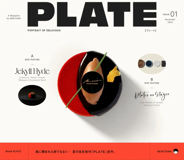
PLATE uses the hierarchy of a printed magazine. Its opening is a cover: an enormous masthead, issue metadata, a single dramatic food photograph, and two compact feature teasers. The orange-red strip beneath it introduces the publication and links to the publisher. The page then becomes an extended editorial sequence with contrasting chapter backgrounds, small captions, widely tracked section labels, and carefully constrained Japanese prose.
The strongest visual relationship is between heavy branding and delicate supporting material. The masthead is almost architectural; the cake has glossy, granular, and soft textures; the feature titles introduce fine serif lettering and calligraphy. Broad empty areas let these differences remain legible. The closing page repeats the masthead at almost the full available width, giving the document a clear visual ending.
閉じる
PLATE / Food Graphic Magazine — Style Reference
A food magazine cover built from monumental black lettering, a sculptural pastry, and generous warm paper.
Website: plate.newtown.tokyo Original URL: https://plate.newtown.tokyo/ Final URL: https://plate.newtown.tokyo/ Theme: warm light cover and closing page, a black pastry chapter, and a muted gray-green donation section. Inspected: September 23, 2026, 06:31:32 JST, through the supplied browser evidence; retrieval timestamp September 22, 2026, 21:31:32.306 UTC. Viewports: desktop 1440 × 1000 CSS px and mobile 390 × 844 CSS px. Scope: the currently served Issue 01 magazine: cover, contents links, editorial introduction, Jekyll Hyde pastry feature, vessels feature, artisan profiles, donation links, and closing credits. Screenshots directly show the desktop cover, vessel introduction, and footer, plus the mobile cover and footer. Other sections are documented through the supplied rendered DOM and computed styles.
PLATE uses the hierarchy of a printed magazine. Its opening is a cover: an enormous masthead, issue metadata, a single dramatic food photograph, and two compact feature teasers. The orange-red strip beneath it introduces the publication and links to the publisher. The page then becomes an extended editorial sequence with contrasting chapter backgrounds, small captions, widely tracked section labels, and carefully constrained Japanese prose.
The strongest visual relationship is between heavy branding and delicate supporting material. The masthead is almost architectural; the cake has glossy, granular, and soft textures; the feature titles introduce fine serif lettering and calligraphy. Broad empty areas let these differences remain legible. The closing page repeats the masthead at almost the full available width, giving the document a clear visual ending.
How to Read This Reference
- Measured means a value appears in the supplied computed styles or element rectangles. Measurements describe the captured state, not necessarily the underlying CSS formula.
- Derived means arithmetic based on those measurements, such as a 331.5px text column occupying 85% of a 390px viewport.
- Estimated means visually approximated from an original-page screenshot. The orange-red strip color, masthead artwork color, and image-object bounds fall into this category.
- Recommended means implementation guidance for a new project. The CSS classes, semantic tokens, breakpoint choice, and accessibility additions below are adaptations.
- Source font-variable names are reproduced where available. Other token names are descriptive aliases.
- Desktop and mobile were both captured, but no intermediate viewport was supplied. A visible stylesheet fragment contains an 840px tablet rule for line breaks; it does not establish every component breakpoint.
- The printed date, November 2023, identifies the issue. It is separate from the 2026 inspection date.
Tokens — Colors
Default Palette
| Name | Value | Suggested token | Evidence and role |
|---|---|---|---|
| Warm Paper | #fbfaf6 |
--color-paper |
Measured: body and footer background; also donation-link surfaces |
| Body Ink | #333333 |
--color-text |
Measured: utility text, feature metadata, footer text, and many headings |
| Masthead Ink | Approximately #202020 |
--color-brand-ink |
Estimated: the large PLATE artwork in the opening and footer |
| Announcement Orange | Approximately #ff482f |
--color-announcement |
Estimated: the full-width strip beneath the cover; its container color was not included in the sampled elements |
| Stage Black | #000000 |
--color-stage |
Measured: pastry-feature background; also selected light-section text |
| Reversed Paper | #f7f4f0 |
--color-reversed |
Measured: pastry-feature labels, captions, and prose; donation body text |
| Donation Gray-Green | #7e8a88 |
--color-donation |
Measured: donation-section background |
| White | #ffffff |
--color-white |
Measured: some shop-description text inside the black chapter |
| Vessel Backdrop | Approximately #e7e2d3 |
--color-vessel-backdrop |
Estimated: warm beige field behind the upper portion of the photographed vessel spread; may belong to the image |
The cake's saturated red, chocolate brown, gold leaf, and green garnish are photographic colors. The blue bowl and brown wooden plate also belong to the imagery. They do not establish additional UI action colors.
Section Palettes
| Region | Surface | Foreground | Treatment |
|---|---|---|---|
| Cover | Warm paper | Dark masthead and charcoal metadata | Photograph supplies the main color and depth |
| Announcement strip | Orange-red estimate | Measured black text | Flat cells separated by fine dark rules |
| Editorial introduction | rgba(251, 250, 246, 0.97) |
#333333 |
Nearly opaque paper surface, measured in the DOM |
| Pastry feature | #000000 |
Mostly #f7f4f0 |
A substantial dark chapter with spacious text and imagery |
| Vessels feature | Transparent sampled section container | Black and charcoal | The screenshot shows pale surfaces and natural photographic shadows; the section container alone does not identify every visible background |
| Donation | #7e8a88 |
Paper-colored headings and body | Broad color field with pale destination links |
| Closing page | #fbfaf6 |
#333333 and dark masthead artwork |
Credits and afterword above a large closing signature |
No theme selector is evidenced. These palette changes belong to the document's sections.
Tokens — Typography
Inter — Metadata and English Text
Measured source family: Inter, exposed through --s-font-e3b9c9e4.
Inter handles the small English labels, issue number, feature letters, navigation text, artisan names, donation heading, and live-text footer identity. Its weights range from very light artisan names to the heavy Donation heading. Small uppercase labels usually use moderate tracking; chapter labels use unusually large tracking.
The donation paragraph also reports Inter as its computed family. Its Japanese glyph fallback was not identified in the supplied evidence.
Japanese Editorial Families
| Family as recorded | Source variable | Verified uses |
|---|---|---|
見出ゴMB1 |
--s-font-8fb65672 |
Announcement sentence, introductory essay, Japanese masthead label, donation subheading and link labels, footer afterword |
こぶりなゴシック W1 JIS2004 |
--s-font-1292580c |
Pastry-feature prose, vessel introduction, artisan biographies, and Japanese shop information |
These are observed family names, not interchangeable generic Japanese sans-serif labels. Load the corresponding fonts only when available for the implementation. Any fallback stack is an adaptation, and line wrapping must be checked again after substitution.
Noto Sans JP and Quantico also appear in the supplied custom-property inventory. The sampled text does not establish a specific role for them here.
Masthead and Feature Lettering
The giant PLATE masthead has very heavy, broad uppercase forms. The Jekyll Hyde title uses fine, high-contrast serif lettering; Plates as Stages uses expressive calligraphy. Their font families and asset formats were not identified. Preserve their appearance through authorized artwork rather than assigning an invented font name.
The small footer PLATE link is different evidence: it is measured live text in Inter, 32px, weight 900, with 1.6px tracking. Do not use that measurement as the font specification for the enormous masthead artwork.
Type Scale
All values below are measured. Desktop and mobile values are listed separately where they differ.
| Role | Desktop | Mobile | Weight | Tracking |
|---|---|---|---|---|
| Masthead tagline | 14px / 19.6px |
10px / 14px |
700 | 0.05em |
| Japanese masthead label | 14px / 19.6px |
10px / 14px |
700 | 0.1em |
| Publisher and cover date | 11px / 15.4px |
10px / 14px |
500 | 0.05em |
| Cover Issue label | 14px / 14px |
11px / 11px |
500 | 0.05em |
| Cover issue number | 40px / 40px |
24px / 24px |
300 | Normal |
| Read PLATE / NEWTOWN | 14px / 19.6px |
12px / 16.8px |
600 | 0.05em |
| Announcement sentence | 18px / 27px |
16px / 24px |
400 | 0.05em |
| Feature letter A / B | 20px / 20px |
18px / 18px |
500 | Normal |
| SIDE FEATURE | 11px / 15.4px |
10px / 14px |
600 | 0.05em |
| Cover teaser byline | 11px / 15.4px |
Same | 300 | Normal |
| Mobile CONTENTS | Not visible in desktop cover | 20px / 28px |
600 | 0.1em |
| Introductory ABOUT | 16px / 22.4px |
Same | 600 | 0.05em |
| Introductory essay | 16px / 35.2px |
16px / 32px |
300 | -0.05em |
| Chapter ABOUT | 18px / 18–25.2px |
14px / 14–19.6px |
500 | 1em |
| Chapter DETAILS | 18px / 18px |
14px / 14px |
500 | Desktop 0.7em; mobile 1em |
| Pastry-feature prose | 14px / 30.8px |
13px / 26px |
400 | 0.1em |
| Vessel introductory statement | 28px / 56px |
18px / 36px |
400 | 0.3em |
| Artisan English name | 28px / 44.8px |
Same size and leading | 300 desktop; 200 mobile | 0.1em |
| Artisan biography | 13px / 26px |
Same | 400 | 0.03em |
| Donation heading | 90px / 90.9px |
64px / 64.64px |
900 | Normal |
| Donation subheading | 20px / 28px |
Same; wraps into two lines | 400 | 0.05em |
| Donation body | 15px / 30px |
14px / 28px |
400 | Normal |
| Footer PLATE link | 32px / 32px |
Same | 900 | 0.05em |
| Footer section heading | 18px / 25.2px |
Same | 600 | Normal |
| Staff credits | 12px / 18px |
Same | 500 | Normal |
| Afterword | 13px / 23.4px |
12px / 21.6px |
500 | -0.03em |
| Page top label | 12px / 16.8px |
Same | 500 | Normal |
The typography is not uniformly scaled down on mobile. The introductory essay remains 16px, artisan names remain 28px, and staff credits remain 12px. Hierarchy changes through composition as much as through font size.
Tokens — Spacing & Shapes
Measured root size: 16px at both viewports. Spacing character: tiny metadata gaps within much larger editorial intervals. Implementation principle: use a compact spacing scale for labels and separate section-spacing tokens for the long magazine rhythm. No universal source spacing unit was established.
Spacing Scale
| Use | Observed value | Status |
|---|---|---|
| Feature letter to SIDE FEATURE | 4px |
Derived from element rectangles at both viewports |
| Publisher-link icon gap | 8px desktop; 4px mobile |
Measured |
| Cover header top position | 12px desktop; 8px mobile |
Measured |
| Feature teaser internal gap | 20px desktop; 16px mobile |
Measured |
| Announcement text inset on mobile | 16px |
Measured text position |
| Footer horizontal padding | 20px |
Measured at both viewports |
| Donation-link padding | 20px |
Measured |
| Donation-link separation | 20px |
Derived from rectangles, horizontal on desktop and vertical on mobile |
| Intro date edge inset | 32px desktop; 16px mobile |
Measured text position |
| Footer container gap | 60px desktop; 28px mobile |
Measured |
| Donation container gap | 60px desktop; 48px mobile |
Measured |
| Donation vertical padding | 120px desktop; 80px mobile |
Measured |
| Pastry chapter top/bottom padding | 300px / 200px desktop; 240px / 80px mobile |
Measured |
Border Radius
| Element | Geometry | Evidence |
|---|---|---|
| Main sections and text regions | Square, 0px |
Measured |
| Cover teaser photographs | Elliptical | Screenshot observation; desktop approximately 160 × 120px |
| Desktop donation links | 1px radius |
Measured |
| Mobile donation links | 40px radius on 72px-high links |
Measured; visually a pill |
| Page top enclosure | Thin outlined pill | Screenshot observation; wrapper radius not supplied |
The oval teaser crops and pill controls are specific exceptions. They do not imply that every photograph or content region should be rounded.
Layout Measurements
| Element | Desktop: 1440 × 1000 | Mobile: 390 × 844 | Evidence |
|---|---|---|---|
| Cover-to-strip boundary | y = 900px |
y = 633px |
Measured main start; equivalent to 90% and 75% of the respective viewport heights, without proving a source vh rule |
| Large cover masthead | About 1008 × 193px, starting at x = 216px |
About 351 × 67px, starting near x = 19.5px |
Screenshot estimates; widths correspond to approximately 70% and 90% of the viewport |
| Cover header bounds | 1440 × 224.78px, y = 12px |
390 × 135.45px, y = 8px |
Measured |
| Feature A anchor | 504 × 297.39px, x = 0, y = 351.30px |
179.52 × 239.33px, x = 8px, y = 912px |
Measured |
| Feature B anchor | 504 × 305.95px, x = 936px, y = 347.02px |
179.52 × 275.16px, x = 202.48px, y = 912px |
Measured |
| Introductory essay width | 620px |
331.5px |
Measured; mobile is 85% of viewport width |
| Pastry ABOUT text width | 460px |
331.5px |
Measured |
| Pastry DETAILS text width | 460px |
310px |
Measured; mobile uses 40px side insets |
| Artisan biography width | 400px |
331.5px |
Measured |
| Donation paragraph width | 600px |
331.5px |
Measured |
| Donation destination links | Two 390 × 80px links |
Two stacked 300 × 72px links |
Measured |
| Footer | 1440 × 1000px |
390 × 844px |
Measured; one captured viewport high |
| Large closing masthead | About 1400 × 268px |
About 350 × 67px |
Screenshot estimates, with approximately 20px side margins |
Do not confuse the broad feature-link rectangles with the visible artwork width. On desktop, each anchor spans 35% of the viewport, while its title and oval photograph occupy a much narrower centered group.
Components
Magazine Cover Masthead
Role: publication identity and issue framing.
The desktop composition has three regions: a small publisher caption at the far left, the giant masthead across the central 70% of the viewport, and issue metadata at the far right. Below the masthead, PORTRAIT OF DELICIOUS aligns left and the source label 【プレート】 aligns right.
On mobile, the tagline and Japanese label move above the masthead. The masthead fills approximately 90% of the width. The date and issue number sit below it on the left, while the two-line publisher caption sits on the right. This is a deliberate reordering of a magazine cover, not simply a smaller desktop header.
Keep metadata in live text. Preserve the large wordmark's proportions through an appropriate artwork asset; a generic bold heading will not reproduce its shapes.
Cover Photograph
Role: the single dominant editorial subject.
The top-down pastry has a vivid red textured half, a glossy black half, a tan quenelle, a diagonal green garnish, a small black-and-gold label, and gold leaf. Its long soft shadow falls toward the lower right and merges into the pale canvas.
In the desktop capture, the pastry itself occupies roughly a 375–380px square around the central area below the masthead. In the mobile capture it occupies roughly a 245px square, beginning near y = 170px. These are visual subject bounds, not measured image-element dimensions; the surrounding image and shadow extend much farther.
Preserve the photograph's light direction, shadow, and empty background. Avoid adding a CSS drop shadow over a photograph that already contains the intended depth.
Side Feature Teasers
Role: two editorial entry points.
Feature A is ordered as letter A, SIDE FEATURE, short horizontal rule, Jekyll Hyde title, creator caption, and oval cake photograph. Feature B reverses the visual emphasis: oval vessel photograph first, then letter B, SIDE FEATURE, rule, Plates as Stages lettering, and a two-line caption.
Both groups are centered and unboxed. Their different ordering creates a subtle stagger even though they balance the main photograph. Desktop internal gaps are measured at 20px; mobile gaps are 16px. Supporting captions remain 11px on both viewports.
The observed destinations are #jekyllhyde and #stages. Click results, hover styling, and scrolling duration were not supplied.
Announcement and Publisher Strip
Role: introduction to the issue and access to publication/publisher links.
The desktop strip occupies the bottom 100px of the opening capture. It has three cells: Read PLATE, the Japanese announcement sentence, and NEWTOWN with a small illustrated face. Fine vertical rules divide the flat orange-red field. The two end cells are approximately 162px and 196px wide; these widths are screenshot estimates.
On mobile, the strip becomes two rows. Read PLATE and NEWTOWN share the upper row in approximately equal halves; the announcement sentence fills the lower row with 16px horizontal insets. The visible total height is about 131px, including rules, with an approximately 50px link row and an 80px announcement row.
The actual Read PLATE href is https://plate.newtown.tokyo/#credit. The supplied element list does not identify the element owning that ID. Do not assume this opens a separate reader or that the target must be the footer. NEWTOWN links to https://newtown.tokyo/.
The strip is observed at the cover boundary. Persistent or sticky behavior is unverified; normal document flow is the recommended starting implementation.
Mobile Contents Section
Role: relocates cover navigation into the reading sequence.
The mobile CONTENTS heading starts at document y = 824px, with 20px Inter, weight 600, and 2px tracking. The two feature anchors begin at y = 912px, arranged side by side rather than stacked. Each is approximately 179.52px wide, with 8px outer insets and approximately 15px between them.
The introductory essay section begins at y = 1268.16px. Retain this generous separation between the bright announcement band, the compact contents pair, and the editorial text. Do not leave the desktop teasers floating over the narrow cover photograph.
Editorial Introduction and Cover Credits
Role: explains the publication and credits the cover subject.
The desktop introduction begins at document y = 1000px. Its essay occupies a 620px-wide region on the left side of a broader composition, with a separate COVER ART WORKS area to the right. A small date sits near the upper-left edge, and a compact author signature appears farther down.
The essay uses measured 16px Japanese type with 35.2px leading and slightly negative tracking. On mobile it remains 16px, changes to 32px leading, and occupies 331.5px centered within the 390px viewport. The cover-art credit area follows below the essay, producing a 1151px-tall introduction instead of the desktop's approximately 783px section.
Keep the essay and cover credits distinct in the hierarchy. Their role is closer to an editor's note and an artwork caption than a feature-card group.
Pastry Feature Chapter
Role: a sustained close reading of the cake and its maker.
The sampled section is black, with pale typography. Its content includes the A / SIDE FEATURE marker, decorative title, creator and photography captions, ABOUT, DETAILS, CHEF, and shop information.
Desktop ABOUT and DETAILS prose appears in 460px-wide regions on the right half of the page, beginning at x = 850px. The Japanese body uses 14px type, 30.8px leading, and 1.4px tracking. On mobile these become centered reading blocks, typically 331.5px wide, with 13px type and 26px leading. DETAILS uses a narrower 310px column.
Use strong section-level contrast and large image intervals. The supplied screenshots do not show the complete dark chapter, so exact image crops and every image/text arrangement remain unverified. Its background, text treatment, chapter length, and sampled text positions are supported by the DOM.
Vessel Introduction
Role: introduces the relationship between the cake and four chosen vessels.
The desktop screenshot shows oversized blue, brown, and ivory vessels across the upper part of the viewport. Their outlines cross a horizontal change from beige to pale paper. The left vessel and the top of the central vessel extend beyond the capture boundary. The image preserves material detail and naturally cast shadows.
Below this composition, a widely tracked ABOUT label precedes a centered two-line Japanese statement: 「ケーキが役者なら、器は舞台」 and Jekyll Hydeのための4つの器. The measured statement uses 28px type, 56px leading, and 8.4px tracking on desktop; mobile values are 18px, 36px, and 5.4px.
The label-to-statement gap is 80px on desktop and 60px on mobile, derived from the element rectangles. A smaller cooperation caption follows. Preserve this quiet interval instead of moving text tightly against the vessels.
Three vessels are visible in the supplied crop, while the rendered text identifies four artisans. The crop is not evidence of a three-item carousel or a three-item content limit.
Artisan Profiles and Contact Blocks
Role: connects photographed vessels with their makers.
The page identifies Katsuya Matsumoto, Ayako Sasaki, Shuhei Okano, and mushimeganebooks. English names use light 28px Inter with 2.8px tracking. Desktop biography positions alternate between left and right regions; mobile biographies share a centered 331.5px reading width.
The biographies are restrained: 13px Japanese type, 26px leading, and 0.39px tracking at both sizes. The name weight changes from 300 on desktop to 200 on mobile. Small Instagram or website links follow the prose.
Shop and gallery information uses a bilingual name, description where present, map link, website link, and social links. Some mobile contact links place the icon above its caption, as indicated by their taller rectangles and text positions. Full visual verification of these middle-page blocks was not supplied.
Donation Section
Role: a separate editorial appeal with links to two external organizations.
This section introduces a measured #7e8a88 field. Donation is a heavy Inter heading at 90px on desktop and 64px on mobile. A smaller Japanese subheading follows, then a narrow body column and two pale links.
Desktop geometry is specific: 120px vertical padding, a 600px paragraph, and two 390 × 80px destination links separated by 20px. Their corners are almost square, with a measured 1px radius.
Mobile changes both layout and shape: 80px vertical padding, a 331.5px paragraph, and two stacked 300 × 72px links with 40px radii. Preserve this explicit responsive change rather than applying a universal button radius.
The link labels are 国境なき医師団 and UNICEF(ユニセフ). Their observed hrefs lead to external organization pages; no payment form or transaction interaction was inspected.
Closing Credits and Afterword
Role: closes the issue with publication information and a large visual signature.
The footer occupies exactly one viewport in each measured capture: 1000px on desktop and 844px on mobile. It uses the warm paper background and 20px horizontal padding.
A small live-text PLATE link and issue/date line appear first. Desktop staff credits and the afterword form two columns, with the afterword beginning at x = 720px. Mobile stacks the same content. A large stretch of empty paper separates this material from the oversized closing masthead.
The original-page footer explicitly records design and photography by Takashi Inukai (NEWTOWN), support by Emi kunioka (NEWTOWN), and the label generated by STUDIO. Treat the latter as platform attribution. The original page also independently credits calligraphy to OH SO PRETTY LETTERS in the vessels chapter.
Keep the final masthead near the lower edge with a small PORTRAIT OF DELICIOUS caption immediately above it. The negative space is part of the closing composition.
Page Top and Compact Home Identity
Role: unobtrusive navigation within a long publication.
Page top is shown inside a thin outlined pill near the upper-right corner of the footer, with an upward arrow. Its visual enclosure is approximately 102 × 32px on desktop and 126 × 32px on mobile. The label itself is measured at 12px Inter. Its recorded href is the root page URL, not a #top fragment; whether navigation is intercepted for scrolling was not verified.
A small home-linked PLATE mark appears at the top center of the desktop vessel capture. Its sampled link box is 128 × 24.53px on desktop and 100 × 19.16px on mobile, both at y = 12px in the supplied DOM state. The evidence does not establish its visibility threshold, fixed/sticky mechanism, or any color-changing behavior.
Tokens — Motion & Interaction
Measured Declarations
| Target | Recorded value | What it establishes |
|---|---|---|
| Body background | 0.5s cubic-bezier(0.4, 0.4, 0, 1) |
A background transition is declared; its trigger was not supplied |
| Many content elements and links | 0.3s cubic-bezier(0.4, 0.4, 0, 1) |
Common transition timing, including generated gradient-related custom properties |
| Sampled elements | animation: none |
No CSS keyframe animation is reported on those sampled elements in that state |
The gradient-related custom properties are not evidence of visible decorative gradients. Likewise, a transition declaration is not proof of a hover effect, entrance animation, or scroll transformation.
Navigation Evidence
| Control | Recorded destination | Verification limit |
|---|---|---|
| Read PLATE | /#credit |
Target ID ownership and click result not supplied |
| Feature A | /#jekyllhyde |
Anchor destination recorded; scrolling behavior unverified |
| Feature B | /#stages |
Anchor destination recorded; scrolling behavior unverified |
| NEWTOWN | Publisher website | Outbound href recorded |
| Compact PLATE / footer PLATE | Root page | Home href recorded |
| Page top | Root page | Smooth scrolling or routing interception unverified |
| Donation, social, map, and website links | External URLs | No destination interaction was exercised in the supplied evidence |
The capture process waited for a settled appearance and image decoding, with finite time limits. It temporarily paused perpetual animations during readiness checks and resumed them afterward. This supports analysis of the resulting layouts, but it does not establish a complete motion specification.
Recommended adaptation: keep navigation native and content available without animation. If adding feedback, use a restrained 300ms opacity or underline treatment with the recorded easing. Do not add automatic cake rotation, vessel sliding, parallax, or a moving announcement ticker without additional evidence.
Surfaces
| Surface | Appearance | Function |
|---|---|---|
| Cover paper | Warm, nearly white, without visible UI texture | Lets the food photograph and masthead dominate |
| Announcement band | Flat orange-red with fine rules | Introduces a strong horizontal boundary |
| Editorial paper | Pale continuous field | Supports long reading intervals and captions |
| Black chapter | Solid black | Creates a distinct atmosphere for the pastry feature |
| Vessel image field | Beige/pale photographic setting | Shows material, contour, and physical shadows |
| Donation field | Muted gray-green | Separates the appeal from the editorial features |
| Closing paper | Same measured warm paper as the body | Returns the document to the cover's visual language |
There is no general card-elevation system in the supplied captures. Depth comes mainly from the photographed objects. Use rules, color fields, type scale, and space to separate interface regions.
Imagery
Photography is the main expressive material. Preserve the difference between the pastry's velvety red surface, reflective black glaze, soft quenelle, and small gold detail. The vessels likewise depend on visible wood grain, glaze variation, and pale ceramic texture.
The opening photograph feels integrated into the page because its pale background and long shadow merge with the canvas. The teaser images are small oval editorial previews. The vessel spread is much larger and intentionally extends beyond parts of the captured frame. These are distinct cropping roles, not one reusable image-card treatment.
Typography artwork adds a second image language: the heavy PLATE masthead, delicate Jekyll Hyde title, and handwritten Plates as Stages title. A small illustrated face accompanies NEWTOWN in the announcement strip. Preserve these specific contrasts rather than replacing every graphic with one icon or font system.
Observed Asset References
Complete image URLs were not supplied. The DOM contains a truncated storage URL inside a background-image declaration; it is insufficient to create a reliable asset reference and is intentionally not reconstructed.
| Visible asset | Observed placement | Implementation guidance |
|---|---|---|
| Large PLATE masthead | Cover and footer | Preserve the original letterforms and approximately 5.2:1 visual proportions |
| Pastry with long shadow | Main cover | Use a high-resolution image with the intended background and shadow intact |
| Dark pastry preview | Feature A oval | Crop within an ellipse; retain the small illuminated subject against the dark setting |
| Vessel preview | Feature B oval | Preserve the line of varied vessels within the pale crop |
| Oversized vessel spread | Desktop vessels introduction | Retain natural textures and intentional edge cropping |
| Jekyll Hyde lettering | Feature A teaser | Use authorized lettering artwork; family not identified |
| Plates as Stages lettering | Feature B teaser | Preserve the calligraphic character; family not identified |
| NEWTOWN face illustration | Publisher link | Keep its small scale beside the word label |
No assets are bundled with this reference. Example class names below describe asset roles and are not claims about original filenames.
Layout & Responsive Behavior
Document Rhythm
The page is a long magazine, with measured document heights of approximately 16,079px desktop and 14,122px mobile. Its main chapters become shorter on mobile even though some text sections become taller.
| Section | Desktop height | Mobile height | Evidence |
|---|---|---|---|
| Editorial introduction | 782.70px |
1151px |
Measured |
| Pastry chapter | 5267.16px |
4450px |
Measured |
| Vessels chapter | 7259.91px |
5495.81px |
Measured |
| Donation | 768.89px |
912.63px |
Measured |
| Footer | 1000px |
844px |
Measured |
This rules out a simple assumption that every section merely grows taller as the viewport narrows. Image scale, spacing, and composition change alongside text wrapping.
Observed Rearrangements
| Element | Desktop | Mobile |
|---|---|---|
| Masthead captions | Below the large masthead | Above the large masthead |
| Publisher and issue metadata | Flank the masthead | Sit below it, publisher right and issue/date left |
| Feature teasers | Balance the cover photograph on both sides | Move below the announcement strip under CONTENTS |
| Announcement strip | Three cells in one row | Two link cells above a full-width sentence |
| Intro and cover credits | Separate desktop regions | Sequential vertical content |
| Pastry prose | Right-side reading regions | Centered narrow columns |
| Artisan biographies | Alternating desktop regions | Shared left alignment within centered mobile columns |
| Donation links | Two almost-square rectangles side by side | Two stacked pills |
| Footer credits and afterword | Two columns | One column |
| Closing masthead | Almost full width with 20px insets | Same inset principle at a smaller scale |
At 390px, a common prose width is 331.5px, giving 29.25px side margins. The masthead uses roughly 19.5px side margins, the footer 20px, and the announcement sentence 16px. Preserve these role-specific insets rather than forcing every region into one container.
Recommended breakpoint: 840px is a reasonable initial implementation breakpoint because it appears in the supplied line-break CSS fragment. Treat the component rules below as a proposed grouping at that width; the original component breakpoint declarations were not supplied. Check intermediate widths and text zoom before considering the adaptation complete.
Do’s and Don’ts
Do
- Build the opening as a magazine cover, with issue information and a single dominant subject.
- Keep the measured warm paper
#fbfaf6and body ink#333333distinct from estimated artwork colors. - Preserve the giant masthead at both ends of the document.
- Let the cake's photograph carry its color, gloss, texture, and shadow.
- Maintain the different ordering of the two feature teasers.
- Move those teasers into a two-column mobile contents section.
- Use separate typography treatments for metadata, editorial prose, chapter labels, and decorative lettering.
- Preserve the black pastry chapter and muted donation field.
- Keep the mobile donation links rounded while retaining the nearly square desktop version.
- Give the footer enough empty space to feel like the last page of an issue.
Don't
- Don't replace the editorial sequence with a sales-oriented feature grid and repeated conversion buttons.
- Don't identify the enormous masthead as Inter solely because the small footer link uses Inter.
- Don't substitute an arbitrary script font for the photographed or drawn feature lettering.
- Don't turn photographic colors into a large set of UI accents.
- Don't apply uniform rounded corners and shadows to every image.
- Don't keep the desktop side teasers floating over the mobile cover.
- Don't scale every text style down proportionally; several measured sizes stay unchanged.
- Don't remove the natural photographic shadow or add a second artificial one.
- Don't infer a carousel, parallax effect, sticky announcement band, or animated cake from static evidence.
- Don't change recorded link destinations based only on their visible labels.
Recommended Implementation Additions
These recommendations are additions for a new implementation, not verified features of the original page.
- Use a single accessible instance of each feature link and reposition it responsively, preserving a coherent reading and keyboard order.
- Provide a text equivalent for masthead and feature-title artwork. Decorative duplicates can use empty alternative text when the adjacent accessible name already supplies the same information.
- Give the small compact home mark a clear accessible name. Keep decorative arrows and the publisher-face illustration out of repeated link announcements.
- Preserve small visual labels while enlarging their interaction areas. Aim for at least 44px-high touch targets, particularly for Page top and social links.
- Use semantic headings for the chapter hierarchy and figures/captions for photographs. The supplied DOM mixes headings and paragraphs for visually similar roles.
- Recheck small reversed text on the gray-green donation surface. Dark text on that surface, or a darker surface behind pale text, is a practical contrast improvement.
- Keep text containers flexible under font substitution, zoom, and long names. Preserve the two-column contents where it fits, allowing a narrower-screen fallback if necessary.
- Supply responsive image sizes and explicit image dimensions. Prioritize the cover photograph and defer below-the-fold imagery.
- Honor reduced-motion preferences for any added transitions or smooth scrolling. Keep all prose visible without reveal scripts.
Agent Prompt Guide
Quick Color Reference
- Main paper: measured
#fbfaf6. - Text: measured
#333333; some light-section text uses black. - Giant masthead artwork: approximately
#202020. - Announcement band: approximately
#ff482f; verify against the intended asset or source color when available. - Pastry chapter: measured black with mostly
#f7f4f0text. - Donation field: measured
#7e8a88, with paper-colored links. - Photograph colors remain within the photographs.
Overall Prompt
“Create a responsive food and craft web magazine inspired by PLATE. Use warm paper #fbfaf6, a monumental black masthead, small Inter issue metadata, generous Japanese editorial leading, and one sculptural pastry photograph with a long natural shadow. Balance the desktop cover with two unboxed feature teasers using oval photographs and contrasting serif/calligraphic lettering. Place a flat orange-red announcement strip beneath the cover. On mobile, reorder the masthead captions, move the teasers into a two-column CONTENTS section, and split the announcement strip into two rows. Continue into a black pastry chapter, a pale vessel feature, a muted gray-green donation section, and a spacious closing page with another oversized masthead. Use the supplied artwork for distinctive lettering and photography. Treat motion beyond the recorded transition timings as unspecified.”
Example Component Prompts
- Cover masthead: “A warm-paper magazine cover with an extremely heavy black wordmark occupying the central 70% of a desktop viewport. Small publisher text sits to the left, issue number and date to the right. Place a compact uppercase tagline and Japanese label beneath the wordmark. On a phone, move these captions above a 90%-width wordmark and place the issue metadata below.”
- Feature teasers: “Two unboxed editorial anchors with centered 11px captions, A/B markers, short hairline dividers, and elliptical photographs. Feature A places its photograph last; feature B places its photograph first. Preserve their asymmetric internal order and move the pair into a two-column mobile contents area.”
- Announcement strip: “A flat orange-red publication strip with fine dark dividers, Read PLATE at left, a Japanese announcement sentence in the wide center, and a NEWTOWN label with a small face illustration at right. On mobile, put the two links in the first row and the sentence in a full-width second row.”
- Vessel introduction: “Oversized photographs of blue glazed, brown wooden, and ivory ceramic vessels crossing a beige-to-paper boundary. Leave substantial empty space below the objects before a widely tracked ABOUT label, a light two-line Japanese statement, and a small cooperation caption. Keep the photographic shadows natural.”
- Closing page: “A viewport-height warm-paper colophon with a small bold PLATE link, issue/date line, compact staff credits, and a Japanese afterword. Use two columns on desktop and a single column on mobile. Leave generous empty paper before a nearly full-width black masthead anchored near the bottom.”
Responsive Verification Prompt
“Compare the implementation at 1440 × 1000 and 390 × 844. Check caption reordering, cover-photo scale, teaser relocation, the two-row announcement band, approximately 85%-width mobile prose, stacked pill-shaped donation links, and the footer's empty space. Report artwork-dependent differences separately from CSS differences. Do not claim an interaction was reproduced unless its source behavior was verified.”
Quick Start
CSS Custom Properties
This is an implementation adaptation, not extracted source CSS. It combines measured colors and text treatments with explicitly estimated cover geometry. Grid is used for clarity even though the sampled source containers generally report flex layout.
Use an .issue-opening wrapper containing .cover, .issue-band, and .contents in that order. Inside the cover, .cover-masthead contains .cover-publisher, .masthead-lockup, and .cover-issue. The lockup contains .masthead-art followed by .masthead-captions; CSS reverses that pair on mobile. Place the two .feature-link anchors inside .feature-links.
Supply authorized photographs and lettering as images. Cover-image placement below is a starting point: the exact result depends on the empty space and shadow included in the chosen image. Link targets should retain the recorded destinations when adapting this publication.
:root {
  /* Measured original-page colors */
  --color-paper: #fbfaf6;
  --color-text: #333333;
  --color-stage: #000000;
  --color-reversed: #f7f4f0;
  --color-donation: #7e8a88;

  /* Visual estimates, not extracted color declarations */
  --color-brand-ink: #202020;
  --color-announcement: #ff482f;

  /* Observed families; fallback choices are recommendations */
  --font-ui: Inter, sans-serif;
  --font-jp-heading: '見出ゴMB1', 'Noto Sans JP', sans-serif;
  --font-jp-body: 'こぶりなゴシック W1 JIS2004',
    'Noto Sans JP', sans-serif;

  --text-caption: 11px;
  --text-utility: 14px;
  --text-chapter-label: 18px;
  --text-feature-letter: 20px;
  --text-artisan: 28px;
  --text-donation: 90px;
  --tracking-utility: 0.05em;
  --tracking-chapter: 1em;

  /* Reusable aliases based on observed intervals */
  --space-4: 4px;
  --space-8: 8px;
  --space-12: 12px;
  --space-16: 16px;
  --space-20: 20px;
  --space-32: 32px;
  --space-40: 40px;
  --space-60: 60px;
  --space-80: 80px;
  --space-120: 120px;
  --reading-width: 460px;
  --rule: 1px solid rgb(0 0 0 / 25%);

  /* Timing is observed; application to hover is recommended */
  --ease-editorial: cubic-bezier(0.4, 0.4, 0, 1);
  --motion-short: 300ms;
}

* { box-sizing: border-box; }

body {
  margin: 0;
  color: var(--color-text);
  background: var(--color-paper);
  font-family: var(--font-ui);
}

img { display: block; max-width: 100%; }
a { color: inherit; }
figure, h1, h2, h3, p { margin: 0; }

.issue-opening { position: relative; }

/* Height ratios reproduce the two supplied cover boundaries. */
.cover {
  position: relative;
  height: 90svh;
  min-height: 640px;
  overflow: hidden;
}

.cover-masthead {
  position: absolute;
  z-index: 1;
  inset: 12px 0 auto;
  display: grid;
  grid-template-columns: 15% 70% 15%;
  align-items: center;
}

.cover-publisher,
.cover-issue {
  text-align: center;
  font-size: 11px;
  font-weight: 500;
  line-height: 1.4;
  letter-spacing: var(--tracking-utility);
}

.cover-publisher { grid-column: 1; grid-row: 1; }
.cover-issue { grid-column: 3; grid-row: 1; }

.masthead-lockup {
  grid-column: 2;
  grid-row: 1;
  display: flex;
  flex-direction: column;
}

.masthead-art {
  width: 100%;
  height: auto;
}

.masthead-captions {
  display: flex;
  justify-content: space-between;
  gap: 12px;
  margin-top: 12px;
  font: 700 14px/1.4 var(--font-ui);
  letter-spacing: 0.05em;
}

.masthead-captions [lang='ja'] {
  font-family: var(--font-jp-heading);
  letter-spacing: 0.1em;
}

.cover-issue { display: grid; justify-items: center; gap: 4px; }
.cover-issue-line { display: flex; align-items: center; gap: 4px; }
.cover-issue-label { font-size: 14px; line-height: 1; }
.cover-issue-number { font-size: 40px; font-weight: 300; line-height: 1; }

/* Estimated composition box; retain the photograph's own shadow. */
.cover-art {
  position: absolute;
  top: 26%;
  left: 50%;
  width: min(56%, 800px);
  height: 74%;
  transform: translateX(-50%);
}

.cover-art img {
  width: 100%;
  height: 100%;
  object-fit: contain;
}

.contents-title { display: none; }

.feature-links {
  position: absolute;
  z-index: 2;
  top: 34.7svh;
  inset-inline: 0;
  display: flex;
  justify-content: space-between;
  align-items: center;
}

.feature-link {
  display: flex;
  flex-direction: column;
  align-items: center;
  gap: 20px;
  width: 35%;
  text-align: center;
  text-decoration: none;
}

.feature-marker { display: grid; gap: 4px; }
.feature-letter { font-size: 20px; font-weight: 500; line-height: 1; }
.feature-label { font-size: 11px; font-weight: 600; line-height: 1.4; letter-spacing: 0.05em; }
.feature-rule { width: 16px; height: 1px; background: currentColor; opacity: 0.6; }
.feature-title-art { width: 200px; max-width: 100%; height: auto; }
.feature-caption { max-width: 190px; font-size: 11px; font-weight: 300; line-height: 1.4; }
.feature-oval { width: 160px; max-width: 100%; aspect-ratio: 4 / 3; object-fit: cover; border-radius: 50%; }

.issue-band {
  display: grid;
  grid-template-columns: 162px minmax(0, 1fr) 196px;
  min-height: 100px;
  border-block: var(--rule);
  color: #000;
  background: var(--color-announcement);
}

.issue-band a {
  display: flex;
  align-items: center;
  justify-content: center;
  gap: 8px;
  padding: 16px;
  font: 600 14px/1.4 var(--font-ui);
  letter-spacing: 0.05em;
  text-decoration: none;
}

.issue-band-read { grid-column: 1; }
.issue-band-publisher { grid-column: 3; border-left: var(--rule); }
.issue-band-publisher img { width: 32px; height: auto; }

.issue-band-copy {
  grid-column: 2;
  grid-row: 1;
  display: flex;
  align-items: center;
  padding: 24px 40px;
  border-left: var(--rule);
  font: 400 18px/1.5 var(--font-jp-heading);
  letter-spacing: 0.05em;
}

.editorial-intro {
  padding: 120px 7.5%;
  background: rgb(251 250 246 / 97%);
}

.intro-layout {
  display: grid;
  grid-template-columns: minmax(0, 620px) minmax(180px, 1fr);
  align-items: center;
  gap: 80px;
}

.intro-copy {
  font: 300 16px/2.2 var(--font-jp-heading);
  letter-spacing: -0.05em;
}

.cover-credit { text-align: center; font-size: 12px; font-weight: 300; line-height: 1.6; }
.cover-credit img { margin: 32px auto; width: min(100%, 280px); }

.chapter--dark {
  padding-block: 300px 200px;
  color: var(--color-reversed);
  background: var(--color-stage);
}

.chapter-label {
  font: 500 var(--text-chapter-label)/1.4 var(--font-ui);
  letter-spacing: var(--tracking-chapter);
  text-align: center;
}

.chapter-spread {
  display: grid;
  grid-template-columns: minmax(0, 1fr) minmax(0, 1fr);
  align-items: center;
  gap: 40px;
}

.chapter-spread + .chapter-spread { margin-top: 160px; }
.chapter-photo { width: 100%; height: auto; }

.chapter-copy {
  width: min(var(--reading-width), 85%);
  margin-inline: auto;
  font: 400 14px/2.2 var(--font-jp-body);
  letter-spacing: 0.1em;
}

.chapter-copy .chapter-label { margin-bottom: 40px; }

.vessel-intro { padding: 120px 7.5%; text-align: center; }
.vessel-intro .chapter-label { margin-bottom: 80px; }
.vessel-statement { font: 400 28px/2 var(--font-jp-body); letter-spacing: 0.3em; }
.vessel-credit { margin-top: 24px; font: 400 14px/1.4 var(--font-jp-body); letter-spacing: 0.05em; }

.artisan-name { font: 300 28px/1.6 var(--font-ui); letter-spacing: 0.1em; overflow-wrap: anywhere; }
.artisan-copy { max-width: 400px; font: 400 13px/2 var(--font-jp-body); letter-spacing: 0.03em; }

.donation {
  display: grid;
  justify-items: center;
  gap: 60px;
  padding: 120px 0;
  color: var(--color-reversed);
  background: var(--color-donation);
}

.donation-heading { text-align: center; }
.donation-heading h2 { color: var(--color-paper); font: 900 90px/1.01 var(--font-ui); }
.donation-heading h3 { margin-top: 12px; color: var(--color-paper); font: 400 20px/1.4 var(--font-jp-heading); letter-spacing: 0.05em; }
.donation-copy { width: min(600px, 85%); font: 400 15px/2 var(--font-ui); }

.donation-links {
  display: grid;
  grid-template-columns: repeat(2, minmax(0, 1fr));
  gap: 20px;
  width: min(800px, 90%);
}

.donation-link {
  display: flex;
  align-items: center;
  justify-content: center;
  min-height: 80px;
  padding: 20px;
  border-radius: 1px;
  color: var(--color-text);
  background: var(--color-paper);
  font: 400 18px/1.4 var(--font-jp-heading);
  text-align: center;
  text-decoration: none;
}

/* Optional contrast improvement for small donation text. */
.donation--accessible .donation-copy { color: var(--color-brand-ink); }

.colophon {
  position: relative;
  display: flex;
  flex-direction: column;
  gap: 60px;
  min-height: 100svh;
  padding: 60px 20px 20px;
  background: var(--color-paper);
}

.colophon-header { margin-top: 50px; }
.colophon-brand { font: 900 32px/1 var(--font-ui); letter-spacing: 0.05em; text-decoration: none; }
.colophon-issue { display: flex; align-items: baseline; gap: 4px; margin-top: 8px; font-size: 12px; }
.colophon-issue strong { font-size: 14px; font-weight: 600; letter-spacing: 0.05em; }
.colophon-grid { display: grid; grid-template-columns: repeat(2, minmax(0, 1fr)); }
.colophon h3 { margin-bottom: 20px; font-size: 18px; font-weight: 600; line-height: 1.4; }
.staff-credit { font-size: 12px; font-weight: 500; line-height: 1.5; }
.platform-credit { display: inline-block; margin-top: 12px; }
.afterword { max-width: 560px; font: 500 13px/1.8 var(--font-jp-heading); letter-spacing: -0.03em; }
.closing-lockup { margin-top: auto; }
.closing-tagline { margin-bottom: 4px; font: 700 14px/1.4 var(--font-ui); letter-spacing: 0.05em; }
.closing-lockup img { width: 100%; height: auto; }

/* Recommended 44px hit area; the source pill looks about 32px high. */
.page-top {
  position: absolute;
  top: 14px;
  right: 20px;
  display: inline-flex;
  align-items: center;
  justify-content: space-between;
  gap: 12px;
  min-height: 44px;
  padding: 6px 16px;
  border: 1px solid currentColor;
  border-radius: 999px;
  font: 500 12px/1.4 var(--font-ui);
  text-decoration: none;
}

/* Recommended focus and feedback; source states were not tested. */
a:focus-visible { outline: 2px solid currentColor; outline-offset: 5px; }
.feature-link img { transition: opacity var(--motion-short) var(--ease-editorial); }
[id] { scroll-margin-top: 48px; }

@media (hover: hover) {
  .feature-link:hover img { opacity: 0.88; }
  .issue-band a:hover,
  .page-top:hover,
  .donation-link:hover { text-decoration: underline; text-underline-offset: 4px; }
}

/* Proposed component breakpoint; original grouping is unverified. */
@media (max-width: 840px) {
  :root { --text-chapter-label: 14px; }

  .cover { height: 75svh; min-height: 560px; }
  .cover-masthead { top: 8px; grid-template-columns: 5% 45% 45% 5%; row-gap: 12px; }
  .masthead-lockup { grid-column: 2 / 4; grid-row: 1; flex-direction: column-reverse; }
  .masthead-captions { margin: 0 0 4px; font-size: 10px; }
  .cover-publisher { grid-column: 3; grid-row: 2; justify-self: end; align-self: start; font-size: 10px; }
  .cover-issue { grid-column: 2; grid-row: 2; justify-self: start; gap: 0; font-size: 10px; }
  .cover-date { order: -1; }
  .cover-issue-label { font-size: 11px; }
  .cover-issue-number { font-size: 24px; }
  .cover-art { top: 145px; width: 100%; height: calc(100% - 205px); }

  .issue-band { grid-template-columns: repeat(2, minmax(0, 1fr)); min-height: 0; }
  .issue-band a { grid-row: 1; min-height: 50px; padding: 12px; gap: 4px; font-size: 12px; }
  .issue-band-read { grid-column: 1; }
  .issue-band-publisher { grid-column: 2; }
  .issue-band-publisher img { width: 24px; }
  .issue-band-copy { grid-column: 1 / -1; grid-row: 2; min-height: 80px; padding: 16px; border-left: 0; border-top: var(--rule); font-size: 16px; }

  .contents { padding: 60px 8px 80px; }
  .contents-title { display: block; margin-bottom: 60px; font: 600 20px/1.4 var(--font-ui); letter-spacing: 0.1em; text-align: center; }
  .feature-links { position: static; align-items: flex-start; gap: 15px; }
  .feature-link { width: calc((100% - 15px) / 2); gap: 16px; }
  .feature-letter { font-size: 18px; }
  .feature-label { font-size: 10px; }
  .feature-title-art { width: 100%; }

  .editorial-intro { padding: 120px 7.5% 60px; }
  .intro-layout { grid-template-columns: 1fr; gap: 80px; }
  .intro-copy { line-height: 2; }
  .chapter--dark { padding-block: 240px 80px; }
  .chapter-spread { grid-template-columns: 1fr; gap: 60px; }
  .chapter-spread + .chapter-spread { margin-top: 80px; }
  .chapter-copy { width: 85%; font-size: 13px; line-height: 2; }
  .chapter-copy--details { width: calc(100% - 80px); }
  .vessel-intro { padding-block: 80px; }
  .vessel-intro .chapter-label { margin-bottom: 60px; }
  .vessel-statement { font-size: 18px; }
  .vessel-credit { margin-top: 28px; font-size: 13px; }
  .artisan-name { font-weight: 200; }
  .artisan-copy { max-width: none; }

  .donation { padding-block: 80px; gap: 48px; }
  .donation-heading h2 { font-size: 64px; }
  .donation-heading h3 { max-width: 220px; margin: 8px auto 0; }
  .donation-copy { font-size: 14px; }
  .donation-links { width: min(300px, calc(100% - 40px)); grid-template-columns: 1fr; }
  .donation-link { min-height: 72px; border-radius: 40px; }

  .colophon { padding-top: 40px; gap: 28px; }
  .colophon-header { margin-top: 0; }
  .colophon-issue { margin-top: 4px; }
  .colophon-grid { grid-template-columns: 1fr; gap: 36px; }
  .colophon h3 { margin-bottom: 12px; }
  .platform-credit { margin-top: 8px; }
  .afterword { font-size: 12px; }
  .closing-tagline { font-size: 10px; }
  .page-top { right: 12px; }
}

@media (prefers-reduced-motion: reduce) {
  .feature-link img { transition: none; }
  html { scroll-behavior: auto; }
}
This CSS supplies the principal visual relationships and responsive changes. It does not recreate the original asset crops, every long-form spread, or the unverified compact-header visibility behavior. The intro layout and image intervals are starting recommendations, while the listed measured values remain the reference for refinement.
Tailwind v4 Token Mapping
Optional aliases for a project already using Tailwind v4. This is not evidence that the original site uses Tailwind. Define the properties above first.
@theme inline {
  --color-plate-paper: var(--color-paper);
  --color-plate-text: var(--color-text);
  --color-plate-brand: var(--color-brand-ink);
  --color-plate-announcement: var(--color-announcement);
  --color-plate-stage: var(--color-stage);
  --color-plate-reversed: var(--color-reversed);
  --color-plate-donation: var(--color-donation);

  --font-plate-ui: var(--font-ui);
  --font-plate-jp-heading: var(--font-jp-heading);
  --font-plate-jp-body: var(--font-jp-body);

  --text-plate-caption: 11px;
  --text-plate-utility: 14px;
  --text-plate-artisan: 28px;
  --text-plate-footer-brand: 32px;

  --spacing-plate-inset: 20px;
  --spacing-plate-section: 120px;
  --radius-plate-donation-desktop: 1px;
  --radius-plate-donation-mobile: 40px;
}
Sources & Evidence
- Inspected original and final page: PLATE — Food Graphic Magazine. The supplied retrieval reports HTTP 200 and an unchanged final URL.
- Capture timestamp:
2026-09-22T21:31:32.306Z, equivalent to September 23, 2026, 06:31:32.306 JST. - Desktop evidence: 1440 × 1000 CSS px; cover, vessel introduction, and closing-page screenshots, plus rendered text, links, custom properties, and computed element styles throughout the document.
- Mobile evidence: 390 × 844 CSS px; opening and closing screenshots, plus rendered text, links, custom properties, and computed element styles throughout the document.
- Measured document bounds: 16078.65625px high on desktop and 14121.59375px on mobile. Reported summary heights round upward to 16079px and 14122px.
- Recorded internal destinations: Feature A, Feature B, and Read PLATE. These are supplied href observations, not separately tested navigation outcomes.
- Observation limits: captures used settling and image-decoding checks with finite time limits. No hover, focus, click outcome, continuous motion sequence, intermediate-width capture, complete image-asset inventory, or full component stylesheet was supplied. SharedWorkers and service workers were disabled during inspection.
This reference analyzes the current page represented by that evidence. Exact computed values, visual estimates, derived proportions, and recommended implementation choices are identified separately throughout.
# PLATE / Food Graphic Magazine — Style Reference

> A food magazine cover built from monumental black lettering, a sculptural pastry, and generous warm paper.

**Website:** [plate.newtown.tokyo](https://plate.newtown.tokyo/)
**Original URL:** https://plate.newtown.tokyo/
**Final URL:** https://plate.newtown.tokyo/
**Theme:** warm light cover and closing page, a black pastry chapter, and a muted gray-green donation section.
**Inspected:** September 23, 2026, 06:31:32 JST, through the supplied browser evidence; retrieval timestamp September 22, 2026, 21:31:32.306 UTC.
**Viewports:** desktop **1440 × 1000 CSS px** and mobile **390 × 844 CSS px**.
**Scope:** the currently served Issue 01 magazine: cover, contents links, editorial introduction, Jekyll Hyde pastry feature, vessels feature, artisan profiles, donation links, and closing credits. Screenshots directly show the desktop cover, vessel introduction, and footer, plus the mobile cover and footer. Other sections are documented through the supplied rendered DOM and computed styles.

PLATE uses the hierarchy of a printed magazine. Its opening is a cover: an enormous masthead, issue metadata, a single dramatic food photograph, and two compact feature teasers. The orange-red strip beneath it introduces the publication and links to the publisher. The page then becomes an extended editorial sequence with contrasting chapter backgrounds, small captions, widely tracked section labels, and carefully constrained Japanese prose.

The strongest visual relationship is between heavy branding and delicate supporting material. The masthead is almost architectural; the cake has glossy, granular, and soft textures; the feature titles introduce fine serif lettering and calligraphy. Broad empty areas let these differences remain legible. The closing page repeats the masthead at almost the full available width, giving the document a clear visual ending.
閉じる
# PLATE / Food Graphic Magazine — Style Reference

> A food magazine cover built from monumental black lettering, a sculptural pastry, and generous warm paper.

**Website:** [plate.newtown.tokyo](https://plate.newtown.tokyo/)
**Original URL:** https://plate.newtown.tokyo/
**Final URL:** https://plate.newtown.tokyo/
**Theme:** warm light cover and closing page, a black pastry chapter, and a muted gray-green donation section.
**Inspected:** September 23, 2026, 06:31:32 JST, through the supplied browser evidence; retrieval timestamp September 22, 2026, 21:31:32.306 UTC.
**Viewports:** desktop **1440 × 1000 CSS px** and mobile **390 × 844 CSS px**.
**Scope:** the currently served Issue 01 magazine: cover, contents links, editorial introduction, Jekyll Hyde pastry feature, vessels feature, artisan profiles, donation links, and closing credits. Screenshots directly show the desktop cover, vessel introduction, and footer, plus the mobile cover and footer. Other sections are documented through the supplied rendered DOM and computed styles.

PLATE uses the hierarchy of a printed magazine. Its opening is a cover: an enormous masthead, issue metadata, a single dramatic food photograph, and two compact feature teasers. The orange-red strip beneath it introduces the publication and links to the publisher. The page then becomes an extended editorial sequence with contrasting chapter backgrounds, small captions, widely tracked section labels, and carefully constrained Japanese prose.

The strongest visual relationship is between heavy branding and delicate supporting material. The masthead is almost architectural; the cake has glossy, granular, and soft textures; the feature titles introduce fine serif lettering and calligraphy. Broad empty areas let these differences remain legible. The closing page repeats the masthead at almost the full available width, giving the document a clear visual ending.

## How to Read This Reference

- **Measured** means a value appears in the supplied computed styles or element rectangles. Measurements describe the captured state, not necessarily the underlying CSS formula.
- **Derived** means arithmetic based on those measurements, such as a 331.5px text column occupying 85% of a 390px viewport.
- **Estimated** means visually approximated from an original-page screenshot. The orange-red strip color, masthead artwork color, and image-object bounds fall into this category.
- **Recommended** means implementation guidance for a new project. The CSS classes, semantic tokens, breakpoint choice, and accessibility additions below are adaptations.
- Source font-variable names are reproduced where available. Other token names are descriptive aliases.
- Desktop and mobile were both captured, but no intermediate viewport was supplied. A visible stylesheet fragment contains an 840px tablet rule for line breaks; it does not establish every component breakpoint.
- The printed date, November 2023, identifies the issue. It is separate from the 2026 inspection date.

## Tokens — Colors

### Default Palette

| Name | Value | Suggested token | Evidence and role |
| --- | --- | --- | --- |
| Warm Paper | `#fbfaf6` | `--color-paper` | **Measured:** body and footer background; also donation-link surfaces |
| Body Ink | `#333333` | `--color-text` | **Measured:** utility text, feature metadata, footer text, and many headings |
| Masthead Ink | Approximately `#202020` | `--color-brand-ink` | **Estimated:** the large PLATE artwork in the opening and footer |
| Announcement Orange | Approximately `#ff482f` | `--color-announcement` | **Estimated:** the full-width strip beneath the cover; its container color was not included in the sampled elements |
| Stage Black | `#000000` | `--color-stage` | **Measured:** pastry-feature background; also selected light-section text |
| Reversed Paper | `#f7f4f0` | `--color-reversed` | **Measured:** pastry-feature labels, captions, and prose; donation body text |
| Donation Gray-Green | `#7e8a88` | `--color-donation` | **Measured:** donation-section background |
| White | `#ffffff` | `--color-white` | **Measured:** some shop-description text inside the black chapter |
| Vessel Backdrop | Approximately `#e7e2d3` | `--color-vessel-backdrop` | **Estimated:** warm beige field behind the upper portion of the photographed vessel spread; may belong to the image |

The cake's saturated red, chocolate brown, gold leaf, and green garnish are photographic colors. The blue bowl and brown wooden plate also belong to the imagery. They do not establish additional UI action colors.

### Section Palettes

| Region | Surface | Foreground | Treatment |
| --- | --- | --- | --- |
| Cover | Warm paper | Dark masthead and charcoal metadata | Photograph supplies the main color and depth |
| Announcement strip | Orange-red estimate | Measured black text | Flat cells separated by fine dark rules |
| Editorial introduction | `rgba(251, 250, 246, 0.97)` | `#333333` | Nearly opaque paper surface, measured in the DOM |
| Pastry feature | `#000000` | Mostly `#f7f4f0` | A substantial dark chapter with spacious text and imagery |
| Vessels feature | Transparent sampled section container | Black and charcoal | The screenshot shows pale surfaces and natural photographic shadows; the section container alone does not identify every visible background |
| Donation | `#7e8a88` | Paper-colored headings and body | Broad color field with pale destination links |
| Closing page | `#fbfaf6` | `#333333` and dark masthead artwork | Credits and afterword above a large closing signature |

No theme selector is evidenced. These palette changes belong to the document's sections.

## Tokens — Typography

### Inter — Metadata and English Text

**Measured source family:** `Inter`, exposed through `--s-font-e3b9c9e4`.

Inter handles the small English labels, issue number, feature letters, navigation text, artisan names, donation heading, and live-text footer identity. Its weights range from very light artisan names to the heavy Donation heading. Small uppercase labels usually use moderate tracking; chapter labels use unusually large tracking.

The donation paragraph also reports Inter as its computed family. Its Japanese glyph fallback was not identified in the supplied evidence.

### Japanese Editorial Families

| Family as recorded | Source variable | Verified uses |
| --- | --- | --- |
| `見出ゴMB1` | `--s-font-8fb65672` | Announcement sentence, introductory essay, Japanese masthead label, donation subheading and link labels, footer afterword |
| `こぶりなゴシック W1 JIS2004` | `--s-font-1292580c` | Pastry-feature prose, vessel introduction, artisan biographies, and Japanese shop information |

These are observed family names, not interchangeable generic Japanese sans-serif labels. Load the corresponding fonts only when available for the implementation. Any fallback stack is an adaptation, and line wrapping must be checked again after substitution.

`Noto Sans JP` and `Quantico` also appear in the supplied custom-property inventory. The sampled text does not establish a specific role for them here.

### Masthead and Feature Lettering

The giant PLATE masthead has very heavy, broad uppercase forms. The Jekyll Hyde title uses fine, high-contrast serif lettering; Plates as Stages uses expressive calligraphy. Their font families and asset formats were not identified. Preserve their appearance through authorized artwork rather than assigning an invented font name.

The **small footer PLATE link is different evidence**: it is measured live text in Inter, 32px, weight 900, with 1.6px tracking. Do not use that measurement as the font specification for the enormous masthead artwork.

### Type Scale

All values below are **measured**. Desktop and mobile values are listed separately where they differ.

| Role | Desktop | Mobile | Weight | Tracking |
| --- | --- | --- | --- | --- |
| Masthead tagline | `14px / 19.6px` | `10px / 14px` | 700 | `0.05em` |
| Japanese masthead label | `14px / 19.6px` | `10px / 14px` | 700 | `0.1em` |
| Publisher and cover date | `11px / 15.4px` | `10px / 14px` | 500 | `0.05em` |
| Cover Issue label | `14px / 14px` | `11px / 11px` | 500 | `0.05em` |
| Cover issue number | `40px / 40px` | `24px / 24px` | 300 | Normal |
| Read PLATE / NEWTOWN | `14px / 19.6px` | `12px / 16.8px` | 600 | `0.05em` |
| Announcement sentence | `18px / 27px` | `16px / 24px` | 400 | `0.05em` |
| Feature letter A / B | `20px / 20px` | `18px / 18px` | 500 | Normal |
| SIDE FEATURE | `11px / 15.4px` | `10px / 14px` | 600 | `0.05em` |
| Cover teaser byline | `11px / 15.4px` | Same | 300 | Normal |
| Mobile CONTENTS | Not visible in desktop cover | `20px / 28px` | 600 | `0.1em` |
| Introductory ABOUT | `16px / 22.4px` | Same | 600 | `0.05em` |
| Introductory essay | `16px / 35.2px` | `16px / 32px` | 300 | `-0.05em` |
| Chapter ABOUT | `18px / 18–25.2px` | `14px / 14–19.6px` | 500 | `1em` |
| Chapter DETAILS | `18px / 18px` | `14px / 14px` | 500 | Desktop `0.7em`; mobile `1em` |
| Pastry-feature prose | `14px / 30.8px` | `13px / 26px` | 400 | `0.1em` |
| Vessel introductory statement | `28px / 56px` | `18px / 36px` | 400 | `0.3em` |
| Artisan English name | `28px / 44.8px` | Same size and leading | 300 desktop; 200 mobile | `0.1em` |
| Artisan biography | `13px / 26px` | Same | 400 | `0.03em` |
| Donation heading | `90px / 90.9px` | `64px / 64.64px` | 900 | Normal |
| Donation subheading | `20px / 28px` | Same; wraps into two lines | 400 | `0.05em` |
| Donation body | `15px / 30px` | `14px / 28px` | 400 | Normal |
| Footer PLATE link | `32px / 32px` | Same | 900 | `0.05em` |
| Footer section heading | `18px / 25.2px` | Same | 600 | Normal |
| Staff credits | `12px / 18px` | Same | 500 | Normal |
| Afterword | `13px / 23.4px` | `12px / 21.6px` | 500 | `-0.03em` |
| Page top label | `12px / 16.8px` | Same | 500 | Normal |

The typography is not uniformly scaled down on mobile. The introductory essay remains 16px, artisan names remain 28px, and staff credits remain 12px. Hierarchy changes through composition as much as through font size.

## Tokens — Spacing & Shapes

**Measured root size:** 16px at both viewports.
**Spacing character:** tiny metadata gaps within much larger editorial intervals.
**Implementation principle:** use a compact spacing scale for labels and separate section-spacing tokens for the long magazine rhythm. No universal source spacing unit was established.

### Spacing Scale

| Use | Observed value | Status |
| --- | --- | --- |
| Feature letter to SIDE FEATURE | `4px` | Derived from element rectangles at both viewports |
| Publisher-link icon gap | `8px` desktop; `4px` mobile | Measured |
| Cover header top position | `12px` desktop; `8px` mobile | Measured |
| Feature teaser internal gap | `20px` desktop; `16px` mobile | Measured |
| Announcement text inset on mobile | `16px` | Measured text position |
| Footer horizontal padding | `20px` | Measured at both viewports |
| Donation-link padding | `20px` | Measured |
| Donation-link separation | `20px` | Derived from rectangles, horizontal on desktop and vertical on mobile |
| Intro date edge inset | `32px` desktop; `16px` mobile | Measured text position |
| Footer container gap | `60px` desktop; `28px` mobile | Measured |
| Donation container gap | `60px` desktop; `48px` mobile | Measured |
| Donation vertical padding | `120px` desktop; `80px` mobile | Measured |
| Pastry chapter top/bottom padding | `300px / 200px` desktop; `240px / 80px` mobile | Measured |

### Border Radius

| Element | Geometry | Evidence |
| --- | --- | --- |
| Main sections and text regions | Square, `0px` | Measured |
| Cover teaser photographs | Elliptical | Screenshot observation; desktop approximately 160 × 120px |
| Desktop donation links | `1px` radius | Measured |
| Mobile donation links | `40px` radius on 72px-high links | Measured; visually a pill |
| Page top enclosure | Thin outlined pill | Screenshot observation; wrapper radius not supplied |

The oval teaser crops and pill controls are specific exceptions. They do not imply that every photograph or content region should be rounded.

### Layout Measurements

| Element | Desktop: 1440 × 1000 | Mobile: 390 × 844 | Evidence |
| --- | --- | --- | --- |
| Cover-to-strip boundary | `y = 900px` | `y = 633px` | Measured main start; equivalent to 90% and 75% of the respective viewport heights, without proving a source `vh` rule |
| Large cover masthead | About `1008 × 193px`, starting at `x = 216px` | About `351 × 67px`, starting near `x = 19.5px` | Screenshot estimates; widths correspond to approximately 70% and 90% of the viewport |
| Cover header bounds | `1440 × 224.78px`, `y = 12px` | `390 × 135.45px`, `y = 8px` | Measured |
| Feature A anchor | `504 × 297.39px`, `x = 0`, `y = 351.30px` | `179.52 × 239.33px`, `x = 8px`, `y = 912px` | Measured |
| Feature B anchor | `504 × 305.95px`, `x = 936px`, `y = 347.02px` | `179.52 × 275.16px`, `x = 202.48px`, `y = 912px` | Measured |
| Introductory essay width | `620px` | `331.5px` | Measured; mobile is 85% of viewport width |
| Pastry ABOUT text width | `460px` | `331.5px` | Measured |
| Pastry DETAILS text width | `460px` | `310px` | Measured; mobile uses 40px side insets |
| Artisan biography width | `400px` | `331.5px` | Measured |
| Donation paragraph width | `600px` | `331.5px` | Measured |
| Donation destination links | Two `390 × 80px` links | Two stacked `300 × 72px` links | Measured |
| Footer | `1440 × 1000px` | `390 × 844px` | Measured; one captured viewport high |
| Large closing masthead | About `1400 × 268px` | About `350 × 67px` | Screenshot estimates, with approximately 20px side margins |

Do not confuse the broad feature-link rectangles with the visible artwork width. On desktop, each anchor spans 35% of the viewport, while its title and oval photograph occupy a much narrower centered group.

## Components

### Magazine Cover Masthead

**Role:** publication identity and issue framing.

The desktop composition has three regions: a small publisher caption at the far left, the giant masthead across the central 70% of the viewport, and issue metadata at the far right. Below the masthead, PORTRAIT OF DELICIOUS aligns left and the source label `【プレート】` aligns right.

On mobile, the tagline and Japanese label move **above** the masthead. The masthead fills approximately 90% of the width. The date and issue number sit below it on the left, while the two-line publisher caption sits on the right. This is a deliberate reordering of a magazine cover, not simply a smaller desktop header.

Keep metadata in live text. Preserve the large wordmark's proportions through an appropriate artwork asset; a generic bold heading will not reproduce its shapes.

### Cover Photograph

**Role:** the single dominant editorial subject.

The top-down pastry has a vivid red textured half, a glossy black half, a tan quenelle, a diagonal green garnish, a small black-and-gold label, and gold leaf. Its long soft shadow falls toward the lower right and merges into the pale canvas.

In the desktop capture, the pastry itself occupies roughly a 375–380px square around the central area below the masthead. In the mobile capture it occupies roughly a 245px square, beginning near `y = 170px`. These are **visual subject bounds**, not measured image-element dimensions; the surrounding image and shadow extend much farther.

Preserve the photograph's light direction, shadow, and empty background. Avoid adding a CSS drop shadow over a photograph that already contains the intended depth.

### Side Feature Teasers

**Role:** two editorial entry points.

Feature A is ordered as letter A, SIDE FEATURE, short horizontal rule, Jekyll Hyde title, creator caption, and oval cake photograph. Feature B reverses the visual emphasis: oval vessel photograph first, then letter B, SIDE FEATURE, rule, Plates as Stages lettering, and a two-line caption.

Both groups are centered and unboxed. Their different ordering creates a subtle stagger even though they balance the main photograph. Desktop internal gaps are measured at 20px; mobile gaps are 16px. Supporting captions remain 11px on both viewports.

The observed destinations are `#jekyllhyde` and `#stages`. Click results, hover styling, and scrolling duration were not supplied.

### Announcement and Publisher Strip

**Role:** introduction to the issue and access to publication/publisher links.

The desktop strip occupies the bottom 100px of the opening capture. It has three cells: Read PLATE, the Japanese announcement sentence, and NEWTOWN with a small illustrated face. Fine vertical rules divide the flat orange-red field. The two end cells are approximately 162px and 196px wide; these widths are screenshot estimates.

On mobile, the strip becomes two rows. Read PLATE and NEWTOWN share the upper row in approximately equal halves; the announcement sentence fills the lower row with 16px horizontal insets. The visible total height is about 131px, including rules, with an approximately 50px link row and an 80px announcement row.

The actual Read PLATE href is `https://plate.newtown.tokyo/#credit`. The supplied element list does not identify the element owning that ID. Do not assume this opens a separate reader or that the target must be the footer. NEWTOWN links to `https://newtown.tokyo/`.

The strip is observed at the cover boundary. Persistent or sticky behavior is unverified; normal document flow is the recommended starting implementation.

### Mobile Contents Section

**Role:** relocates cover navigation into the reading sequence.

The mobile CONTENTS heading starts at document `y = 824px`, with 20px Inter, weight 600, and 2px tracking. The two feature anchors begin at `y = 912px`, arranged side by side rather than stacked. Each is approximately 179.52px wide, with 8px outer insets and approximately 15px between them.

The introductory essay section begins at `y = 1268.16px`. Retain this generous separation between the bright announcement band, the compact contents pair, and the editorial text. Do not leave the desktop teasers floating over the narrow cover photograph.

### Editorial Introduction and Cover Credits

**Role:** explains the publication and credits the cover subject.

The desktop introduction begins at document `y = 1000px`. Its essay occupies a 620px-wide region on the left side of a broader composition, with a separate COVER ART WORKS area to the right. A small date sits near the upper-left edge, and a compact author signature appears farther down.

The essay uses measured 16px Japanese type with 35.2px leading and slightly negative tracking. On mobile it remains 16px, changes to 32px leading, and occupies 331.5px centered within the 390px viewport. The cover-art credit area follows below the essay, producing a 1151px-tall introduction instead of the desktop's approximately 783px section.

Keep the essay and cover credits distinct in the hierarchy. Their role is closer to an editor's note and an artwork caption than a feature-card group.

### Pastry Feature Chapter

**Role:** a sustained close reading of the cake and its maker.

The sampled section is black, with pale typography. Its content includes the A / SIDE FEATURE marker, decorative title, creator and photography captions, ABOUT, DETAILS, CHEF, and shop information.

Desktop ABOUT and DETAILS prose appears in 460px-wide regions on the right half of the page, beginning at `x = 850px`. The Japanese body uses 14px type, 30.8px leading, and 1.4px tracking. On mobile these become centered reading blocks, typically 331.5px wide, with 13px type and 26px leading. DETAILS uses a narrower 310px column.

Use strong section-level contrast and large image intervals. The supplied screenshots do not show the complete dark chapter, so exact image crops and every image/text arrangement remain unverified. Its background, text treatment, chapter length, and sampled text positions are supported by the DOM.

### Vessel Introduction

**Role:** introduces the relationship between the cake and four chosen vessels.

The desktop screenshot shows oversized blue, brown, and ivory vessels across the upper part of the viewport. Their outlines cross a horizontal change from beige to pale paper. The left vessel and the top of the central vessel extend beyond the capture boundary. The image preserves material detail and naturally cast shadows.

Below this composition, a widely tracked ABOUT label precedes a centered two-line Japanese statement: `「ケーキが役者なら、器は舞台」` and `Jekyll Hydeのための4つの器`. The measured statement uses 28px type, 56px leading, and 8.4px tracking on desktop; mobile values are 18px, 36px, and 5.4px.

The label-to-statement gap is 80px on desktop and 60px on mobile, derived from the element rectangles. A smaller cooperation caption follows. Preserve this quiet interval instead of moving text tightly against the vessels.

Three vessels are visible in the supplied crop, while the rendered text identifies four artisans. The crop is not evidence of a three-item carousel or a three-item content limit.

### Artisan Profiles and Contact Blocks

**Role:** connects photographed vessels with their makers.

The page identifies Katsuya Matsumoto, Ayako Sasaki, Shuhei Okano, and mushimeganebooks. English names use light 28px Inter with 2.8px tracking. Desktop biography positions alternate between left and right regions; mobile biographies share a centered 331.5px reading width.

The biographies are restrained: 13px Japanese type, 26px leading, and 0.39px tracking at both sizes. The name weight changes from 300 on desktop to 200 on mobile. Small Instagram or website links follow the prose.

Shop and gallery information uses a bilingual name, description where present, map link, website link, and social links. Some mobile contact links place the icon above its caption, as indicated by their taller rectangles and text positions. Full visual verification of these middle-page blocks was not supplied.

### Donation Section

**Role:** a separate editorial appeal with links to two external organizations.

This section introduces a measured `#7e8a88` field. Donation is a heavy Inter heading at 90px on desktop and 64px on mobile. A smaller Japanese subheading follows, then a narrow body column and two pale links.

Desktop geometry is specific: 120px vertical padding, a 600px paragraph, and two 390 × 80px destination links separated by 20px. Their corners are almost square, with a measured 1px radius.

Mobile changes both layout and shape: 80px vertical padding, a 331.5px paragraph, and two stacked 300 × 72px links with 40px radii. Preserve this explicit responsive change rather than applying a universal button radius.

The link labels are `国境なき医師団` and `UNICEF(ユニセフ)`. Their observed hrefs lead to external organization pages; no payment form or transaction interaction was inspected.

### Closing Credits and Afterword

**Role:** closes the issue with publication information and a large visual signature.

The footer occupies exactly one viewport in each measured capture: 1000px on desktop and 844px on mobile. It uses the warm paper background and 20px horizontal padding.

A small live-text PLATE link and issue/date line appear first. Desktop staff credits and the afterword form two columns, with the afterword beginning at `x = 720px`. Mobile stacks the same content. A large stretch of empty paper separates this material from the oversized closing masthead.

The original-page footer explicitly records design and photography by Takashi Inukai (NEWTOWN), support by Emi kunioka (NEWTOWN), and the label generated by STUDIO. Treat the latter as platform attribution. The original page also independently credits calligraphy to OH SO PRETTY LETTERS in the vessels chapter.

Keep the final masthead near the lower edge with a small PORTRAIT OF DELICIOUS caption immediately above it. The negative space is part of the closing composition.

### Page Top and Compact Home Identity

**Role:** unobtrusive navigation within a long publication.

Page top is shown inside a thin outlined pill near the upper-right corner of the footer, with an upward arrow. Its visual enclosure is approximately 102 × 32px on desktop and 126 × 32px on mobile. The label itself is measured at 12px Inter. Its recorded href is the root page URL, not a `#top` fragment; whether navigation is intercepted for scrolling was not verified.

A small home-linked PLATE mark appears at the top center of the desktop vessel capture. Its sampled link box is 128 × 24.53px on desktop and 100 × 19.16px on mobile, both at `y = 12px` in the supplied DOM state. The evidence does not establish its visibility threshold, fixed/sticky mechanism, or any color-changing behavior.

## Tokens — Motion & Interaction

### Measured Declarations

| Target | Recorded value | What it establishes |
| --- | --- | --- |
| Body background | `0.5s cubic-bezier(0.4, 0.4, 0, 1)` | A background transition is declared; its trigger was not supplied |
| Many content elements and links | `0.3s cubic-bezier(0.4, 0.4, 0, 1)` | Common transition timing, including generated gradient-related custom properties |
| Sampled elements | `animation: none` | No CSS keyframe animation is reported on those sampled elements in that state |

The gradient-related custom properties are not evidence of visible decorative gradients. Likewise, a transition declaration is not proof of a hover effect, entrance animation, or scroll transformation.

### Navigation Evidence

| Control | Recorded destination | Verification limit |
| --- | --- | --- |
| Read PLATE | `/#credit` | Target ID ownership and click result not supplied |
| Feature A | `/#jekyllhyde` | Anchor destination recorded; scrolling behavior unverified |
| Feature B | `/#stages` | Anchor destination recorded; scrolling behavior unverified |
| NEWTOWN | Publisher website | Outbound href recorded |
| Compact PLATE / footer PLATE | Root page | Home href recorded |
| Page top | Root page | Smooth scrolling or routing interception unverified |
| Donation, social, map, and website links | External URLs | No destination interaction was exercised in the supplied evidence |

The capture process waited for a settled appearance and image decoding, with finite time limits. It temporarily paused perpetual animations during readiness checks and resumed them afterward. This supports analysis of the resulting layouts, but it does not establish a complete motion specification.

**Recommended adaptation:** keep navigation native and content available without animation. If adding feedback, use a restrained 300ms opacity or underline treatment with the recorded easing. Do not add automatic cake rotation, vessel sliding, parallax, or a moving announcement ticker without additional evidence.

## Surfaces

| Surface | Appearance | Function |
| --- | --- | --- |
| Cover paper | Warm, nearly white, without visible UI texture | Lets the food photograph and masthead dominate |
| Announcement band | Flat orange-red with fine rules | Introduces a strong horizontal boundary |
| Editorial paper | Pale continuous field | Supports long reading intervals and captions |
| Black chapter | Solid black | Creates a distinct atmosphere for the pastry feature |
| Vessel image field | Beige/pale photographic setting | Shows material, contour, and physical shadows |
| Donation field | Muted gray-green | Separates the appeal from the editorial features |
| Closing paper | Same measured warm paper as the body | Returns the document to the cover's visual language |

There is no general card-elevation system in the supplied captures. Depth comes mainly from the photographed objects. Use rules, color fields, type scale, and space to separate interface regions.

## Imagery

Photography is the main expressive material. Preserve the difference between the pastry's velvety red surface, reflective black glaze, soft quenelle, and small gold detail. The vessels likewise depend on visible wood grain, glaze variation, and pale ceramic texture.

The opening photograph feels integrated into the page because its pale background and long shadow merge with the canvas. The teaser images are small oval editorial previews. The vessel spread is much larger and intentionally extends beyond parts of the captured frame. These are distinct cropping roles, not one reusable image-card treatment.

Typography artwork adds a second image language: the heavy PLATE masthead, delicate Jekyll Hyde title, and handwritten Plates as Stages title. A small illustrated face accompanies NEWTOWN in the announcement strip. Preserve these specific contrasts rather than replacing every graphic with one icon or font system.

### Observed Asset References

Complete image URLs were not supplied. The DOM contains a truncated storage URL inside a background-image declaration; it is insufficient to create a reliable asset reference and is intentionally not reconstructed.

| Visible asset | Observed placement | Implementation guidance |
| --- | --- | --- |
| Large PLATE masthead | Cover and footer | Preserve the original letterforms and approximately 5.2:1 visual proportions |
| Pastry with long shadow | Main cover | Use a high-resolution image with the intended background and shadow intact |
| Dark pastry preview | Feature A oval | Crop within an ellipse; retain the small illuminated subject against the dark setting |
| Vessel preview | Feature B oval | Preserve the line of varied vessels within the pale crop |
| Oversized vessel spread | Desktop vessels introduction | Retain natural textures and intentional edge cropping |
| Jekyll Hyde lettering | Feature A teaser | Use authorized lettering artwork; family not identified |
| Plates as Stages lettering | Feature B teaser | Preserve the calligraphic character; family not identified |
| NEWTOWN face illustration | Publisher link | Keep its small scale beside the word label |

No assets are bundled with this reference. Example class names below describe asset roles and are not claims about original filenames.

## Layout & Responsive Behavior

### Document Rhythm

The page is a long magazine, with measured document heights of approximately **16,079px desktop** and **14,122px mobile**. Its main chapters become shorter on mobile even though some text sections become taller.

| Section | Desktop height | Mobile height | Evidence |
| --- | --- | --- | --- |
| Editorial introduction | `782.70px` | `1151px` | Measured |
| Pastry chapter | `5267.16px` | `4450px` | Measured |
| Vessels chapter | `7259.91px` | `5495.81px` | Measured |
| Donation | `768.89px` | `912.63px` | Measured |
| Footer | `1000px` | `844px` | Measured |

This rules out a simple assumption that every section merely grows taller as the viewport narrows. Image scale, spacing, and composition change alongside text wrapping.

### Observed Rearrangements

| Element | Desktop | Mobile |
| --- | --- | --- |
| Masthead captions | Below the large masthead | Above the large masthead |
| Publisher and issue metadata | Flank the masthead | Sit below it, publisher right and issue/date left |
| Feature teasers | Balance the cover photograph on both sides | Move below the announcement strip under CONTENTS |
| Announcement strip | Three cells in one row | Two link cells above a full-width sentence |
| Intro and cover credits | Separate desktop regions | Sequential vertical content |
| Pastry prose | Right-side reading regions | Centered narrow columns |
| Artisan biographies | Alternating desktop regions | Shared left alignment within centered mobile columns |
| Donation links | Two almost-square rectangles side by side | Two stacked pills |
| Footer credits and afterword | Two columns | One column |
| Closing masthead | Almost full width with 20px insets | Same inset principle at a smaller scale |

At 390px, a common prose width is 331.5px, giving 29.25px side margins. The masthead uses roughly 19.5px side margins, the footer 20px, and the announcement sentence 16px. Preserve these role-specific insets rather than forcing every region into one container.

**Recommended breakpoint:** 840px is a reasonable initial implementation breakpoint because it appears in the supplied line-break CSS fragment. Treat the component rules below as a proposed grouping at that width; the original component breakpoint declarations were not supplied. Check intermediate widths and text zoom before considering the adaptation complete.

## Do’s and Don’ts

### Do

- Build the opening as a magazine cover, with issue information and a single dominant subject.
- Keep the measured warm paper `#fbfaf6` and body ink `#333333` distinct from estimated artwork colors.
- Preserve the giant masthead at both ends of the document.
- Let the cake's photograph carry its color, gloss, texture, and shadow.
- Maintain the different ordering of the two feature teasers.
- Move those teasers into a two-column mobile contents section.
- Use separate typography treatments for metadata, editorial prose, chapter labels, and decorative lettering.
- Preserve the black pastry chapter and muted donation field.
- Keep the mobile donation links rounded while retaining the nearly square desktop version.
- Give the footer enough empty space to feel like the last page of an issue.

### Don't

- Don't replace the editorial sequence with a sales-oriented feature grid and repeated conversion buttons.
- Don't identify the enormous masthead as Inter solely because the small footer link uses Inter.
- Don't substitute an arbitrary script font for the photographed or drawn feature lettering.
- Don't turn photographic colors into a large set of UI accents.
- Don't apply uniform rounded corners and shadows to every image.
- Don't keep the desktop side teasers floating over the mobile cover.
- Don't scale every text style down proportionally; several measured sizes stay unchanged.
- Don't remove the natural photographic shadow or add a second artificial one.
- Don't infer a carousel, parallax effect, sticky announcement band, or animated cake from static evidence.
- Don't change recorded link destinations based only on their visible labels.

## Recommended Implementation Additions

These recommendations are additions for a new implementation, not verified features of the original page.

- Use a single accessible instance of each feature link and reposition it responsively, preserving a coherent reading and keyboard order.
- Provide a text equivalent for masthead and feature-title artwork. Decorative duplicates can use empty alternative text when the adjacent accessible name already supplies the same information.
- Give the small compact home mark a clear accessible name. Keep decorative arrows and the publisher-face illustration out of repeated link announcements.
- Preserve small visual labels while enlarging their interaction areas. Aim for at least 44px-high touch targets, particularly for Page top and social links.
- Use semantic headings for the chapter hierarchy and figures/captions for photographs. The supplied DOM mixes headings and paragraphs for visually similar roles.
- Recheck small reversed text on the gray-green donation surface. Dark text on that surface, or a darker surface behind pale text, is a practical contrast improvement.
- Keep text containers flexible under font substitution, zoom, and long names. Preserve the two-column contents where it fits, allowing a narrower-screen fallback if necessary.
- Supply responsive image sizes and explicit image dimensions. Prioritize the cover photograph and defer below-the-fold imagery.
- Honor reduced-motion preferences for any added transitions or smooth scrolling. Keep all prose visible without reveal scripts.

## Agent Prompt Guide

### Quick Color Reference

- Main paper: measured `#fbfaf6`.
- Text: measured `#333333`; some light-section text uses black.
- Giant masthead artwork: approximately `#202020`.
- Announcement band: approximately `#ff482f`; verify against the intended asset or source color when available.
- Pastry chapter: measured black with mostly `#f7f4f0` text.
- Donation field: measured `#7e8a88`, with paper-colored links.
- Photograph colors remain within the photographs.

### Overall Prompt

“Create a responsive food and craft web magazine inspired by PLATE. Use warm paper #fbfaf6, a monumental black masthead, small Inter issue metadata, generous Japanese editorial leading, and one sculptural pastry photograph with a long natural shadow. Balance the desktop cover with two unboxed feature teasers using oval photographs and contrasting serif/calligraphic lettering. Place a flat orange-red announcement strip beneath the cover. On mobile, reorder the masthead captions, move the teasers into a two-column CONTENTS section, and split the announcement strip into two rows. Continue into a black pastry chapter, a pale vessel feature, a muted gray-green donation section, and a spacious closing page with another oversized masthead. Use the supplied artwork for distinctive lettering and photography. Treat motion beyond the recorded transition timings as unspecified.”

### Example Component Prompts

1. **Cover masthead:** “A warm-paper magazine cover with an extremely heavy black wordmark occupying the central 70% of a desktop viewport. Small publisher text sits to the left, issue number and date to the right. Place a compact uppercase tagline and Japanese label beneath the wordmark. On a phone, move these captions above a 90%-width wordmark and place the issue metadata below.”
2. **Feature teasers:** “Two unboxed editorial anchors with centered 11px captions, A/B markers, short hairline dividers, and elliptical photographs. Feature A places its photograph last; feature B places its photograph first. Preserve their asymmetric internal order and move the pair into a two-column mobile contents area.”
3. **Announcement strip:** “A flat orange-red publication strip with fine dark dividers, Read PLATE at left, a Japanese announcement sentence in the wide center, and a NEWTOWN label with a small face illustration at right. On mobile, put the two links in the first row and the sentence in a full-width second row.”
4. **Vessel introduction:** “Oversized photographs of blue glazed, brown wooden, and ivory ceramic vessels crossing a beige-to-paper boundary. Leave substantial empty space below the objects before a widely tracked ABOUT label, a light two-line Japanese statement, and a small cooperation caption. Keep the photographic shadows natural.”
5. **Closing page:** “A viewport-height warm-paper colophon with a small bold PLATE link, issue/date line, compact staff credits, and a Japanese afterword. Use two columns on desktop and a single column on mobile. Leave generous empty paper before a nearly full-width black masthead anchored near the bottom.”

### Responsive Verification Prompt

“Compare the implementation at 1440 × 1000 and 390 × 844. Check caption reordering, cover-photo scale, teaser relocation, the two-row announcement band, approximately 85%-width mobile prose, stacked pill-shaped donation links, and the footer's empty space. Report artwork-dependent differences separately from CSS differences. Do not claim an interaction was reproduced unless its source behavior was verified.”

## Quick Start

### CSS Custom Properties

This is an **implementation adaptation**, not extracted source CSS. It combines measured colors and text treatments with explicitly estimated cover geometry. Grid is used for clarity even though the sampled source containers generally report flex layout.

Use an `.issue-opening` wrapper containing `.cover`, `.issue-band`, and `.contents` in that order. Inside the cover, `.cover-masthead` contains `.cover-publisher`, `.masthead-lockup`, and `.cover-issue`. The lockup contains `.masthead-art` followed by `.masthead-captions`; CSS reverses that pair on mobile. Place the two `.feature-link` anchors inside `.feature-links`.

Supply authorized photographs and lettering as images. Cover-image placement below is a starting point: the exact result depends on the empty space and shadow included in the chosen image. Link targets should retain the recorded destinations when adapting this publication.

```css
:root {
  /* Measured original-page colors */
  --color-paper: #fbfaf6;
  --color-text: #333333;
  --color-stage: #000000;
  --color-reversed: #f7f4f0;
  --color-donation: #7e8a88;

  /* Visual estimates, not extracted color declarations */
  --color-brand-ink: #202020;
  --color-announcement: #ff482f;

  /* Observed families; fallback choices are recommendations */
  --font-ui: Inter, sans-serif;
  --font-jp-heading: '見出ゴMB1', 'Noto Sans JP', sans-serif;
  --font-jp-body: 'こぶりなゴシック W1 JIS2004',
    'Noto Sans JP', sans-serif;

  --text-caption: 11px;
  --text-utility: 14px;
  --text-chapter-label: 18px;
  --text-feature-letter: 20px;
  --text-artisan: 28px;
  --text-donation: 90px;
  --tracking-utility: 0.05em;
  --tracking-chapter: 1em;

  /* Reusable aliases based on observed intervals */
  --space-4: 4px;
  --space-8: 8px;
  --space-12: 12px;
  --space-16: 16px;
  --space-20: 20px;
  --space-32: 32px;
  --space-40: 40px;
  --space-60: 60px;
  --space-80: 80px;
  --space-120: 120px;
  --reading-width: 460px;
  --rule: 1px solid rgb(0 0 0 / 25%);

  /* Timing is observed; application to hover is recommended */
  --ease-editorial: cubic-bezier(0.4, 0.4, 0, 1);
  --motion-short: 300ms;
}

* { box-sizing: border-box; }

body {
  margin: 0;
  color: var(--color-text);
  background: var(--color-paper);
  font-family: var(--font-ui);
}

img { display: block; max-width: 100%; }
a { color: inherit; }
figure, h1, h2, h3, p { margin: 0; }

.issue-opening { position: relative; }

/* Height ratios reproduce the two supplied cover boundaries. */
.cover {
  position: relative;
  height: 90svh;
  min-height: 640px;
  overflow: hidden;
}

.cover-masthead {
  position: absolute;
  z-index: 1;
  inset: 12px 0 auto;
  display: grid;
  grid-template-columns: 15% 70% 15%;
  align-items: center;
}

.cover-publisher,
.cover-issue {
  text-align: center;
  font-size: 11px;
  font-weight: 500;
  line-height: 1.4;
  letter-spacing: var(--tracking-utility);
}

.cover-publisher { grid-column: 1; grid-row: 1; }
.cover-issue { grid-column: 3; grid-row: 1; }

.masthead-lockup {
  grid-column: 2;
  grid-row: 1;
  display: flex;
  flex-direction: column;
}

.masthead-art {
  width: 100%;
  height: auto;
}

.masthead-captions {
  display: flex;
  justify-content: space-between;
  gap: 12px;
  margin-top: 12px;
  font: 700 14px/1.4 var(--font-ui);
  letter-spacing: 0.05em;
}

.masthead-captions [lang='ja'] {
  font-family: var(--font-jp-heading);
  letter-spacing: 0.1em;
}

.cover-issue { display: grid; justify-items: center; gap: 4px; }
.cover-issue-line { display: flex; align-items: center; gap: 4px; }
.cover-issue-label { font-size: 14px; line-height: 1; }
.cover-issue-number { font-size: 40px; font-weight: 300; line-height: 1; }

/* Estimated composition box; retain the photograph's own shadow. */
.cover-art {
  position: absolute;
  top: 26%;
  left: 50%;
  width: min(56%, 800px);
  height: 74%;
  transform: translateX(-50%);
}

.cover-art img {
  width: 100%;
  height: 100%;
  object-fit: contain;
}

.contents-title { display: none; }

.feature-links {
  position: absolute;
  z-index: 2;
  top: 34.7svh;
  inset-inline: 0;
  display: flex;
  justify-content: space-between;
  align-items: center;
}

.feature-link {
  display: flex;
  flex-direction: column;
  align-items: center;
  gap: 20px;
  width: 35%;
  text-align: center;
  text-decoration: none;
}

.feature-marker { display: grid; gap: 4px; }
.feature-letter { font-size: 20px; font-weight: 500; line-height: 1; }
.feature-label { font-size: 11px; font-weight: 600; line-height: 1.4; letter-spacing: 0.05em; }
.feature-rule { width: 16px; height: 1px; background: currentColor; opacity: 0.6; }
.feature-title-art { width: 200px; max-width: 100%; height: auto; }
.feature-caption { max-width: 190px; font-size: 11px; font-weight: 300; line-height: 1.4; }
.feature-oval { width: 160px; max-width: 100%; aspect-ratio: 4 / 3; object-fit: cover; border-radius: 50%; }

.issue-band {
  display: grid;
  grid-template-columns: 162px minmax(0, 1fr) 196px;
  min-height: 100px;
  border-block: var(--rule);
  color: #000;
  background: var(--color-announcement);
}

.issue-band a {
  display: flex;
  align-items: center;
  justify-content: center;
  gap: 8px;
  padding: 16px;
  font: 600 14px/1.4 var(--font-ui);
  letter-spacing: 0.05em;
  text-decoration: none;
}

.issue-band-read { grid-column: 1; }
.issue-band-publisher { grid-column: 3; border-left: var(--rule); }
.issue-band-publisher img { width: 32px; height: auto; }

.issue-band-copy {
  grid-column: 2;
  grid-row: 1;
  display: flex;
  align-items: center;
  padding: 24px 40px;
  border-left: var(--rule);
  font: 400 18px/1.5 var(--font-jp-heading);
  letter-spacing: 0.05em;
}

.editorial-intro {
  padding: 120px 7.5%;
  background: rgb(251 250 246 / 97%);
}

.intro-layout {
  display: grid;
  grid-template-columns: minmax(0, 620px) minmax(180px, 1fr);
  align-items: center;
  gap: 80px;
}

.intro-copy {
  font: 300 16px/2.2 var(--font-jp-heading);
  letter-spacing: -0.05em;
}

.cover-credit { text-align: center; font-size: 12px; font-weight: 300; line-height: 1.6; }
.cover-credit img { margin: 32px auto; width: min(100%, 280px); }

.chapter--dark {
  padding-block: 300px 200px;
  color: var(--color-reversed);
  background: var(--color-stage);
}

.chapter-label {
  font: 500 var(--text-chapter-label)/1.4 var(--font-ui);
  letter-spacing: var(--tracking-chapter);
  text-align: center;
}

.chapter-spread {
  display: grid;
  grid-template-columns: minmax(0, 1fr) minmax(0, 1fr);
  align-items: center;
  gap: 40px;
}

.chapter-spread + .chapter-spread { margin-top: 160px; }
.chapter-photo { width: 100%; height: auto; }

.chapter-copy {
  width: min(var(--reading-width), 85%);
  margin-inline: auto;
  font: 400 14px/2.2 var(--font-jp-body);
  letter-spacing: 0.1em;
}

.chapter-copy .chapter-label { margin-bottom: 40px; }

.vessel-intro { padding: 120px 7.5%; text-align: center; }
.vessel-intro .chapter-label { margin-bottom: 80px; }
.vessel-statement { font: 400 28px/2 var(--font-jp-body); letter-spacing: 0.3em; }
.vessel-credit { margin-top: 24px; font: 400 14px/1.4 var(--font-jp-body); letter-spacing: 0.05em; }

.artisan-name { font: 300 28px/1.6 var(--font-ui); letter-spacing: 0.1em; overflow-wrap: anywhere; }
.artisan-copy { max-width: 400px; font: 400 13px/2 var(--font-jp-body); letter-spacing: 0.03em; }

.donation {
  display: grid;
  justify-items: center;
  gap: 60px;
  padding: 120px 0;
  color: var(--color-reversed);
  background: var(--color-donation);
}

.donation-heading { text-align: center; }
.donation-heading h2 { color: var(--color-paper); font: 900 90px/1.01 var(--font-ui); }
.donation-heading h3 { margin-top: 12px; color: var(--color-paper); font: 400 20px/1.4 var(--font-jp-heading); letter-spacing: 0.05em; }
.donation-copy { width: min(600px, 85%); font: 400 15px/2 var(--font-ui); }

.donation-links {
  display: grid;
  grid-template-columns: repeat(2, minmax(0, 1fr));
  gap: 20px;
  width: min(800px, 90%);
}

.donation-link {
  display: flex;
  align-items: center;
  justify-content: center;
  min-height: 80px;
  padding: 20px;
  border-radius: 1px;
  color: var(--color-text);
  background: var(--color-paper);
  font: 400 18px/1.4 var(--font-jp-heading);
  text-align: center;
  text-decoration: none;
}

/* Optional contrast improvement for small donation text. */
.donation--accessible .donation-copy { color: var(--color-brand-ink); }

.colophon {
  position: relative;
  display: flex;
  flex-direction: column;
  gap: 60px;
  min-height: 100svh;
  padding: 60px 20px 20px;
  background: var(--color-paper);
}

.colophon-header { margin-top: 50px; }
.colophon-brand { font: 900 32px/1 var(--font-ui); letter-spacing: 0.05em; text-decoration: none; }
.colophon-issue { display: flex; align-items: baseline; gap: 4px; margin-top: 8px; font-size: 12px; }
.colophon-issue strong { font-size: 14px; font-weight: 600; letter-spacing: 0.05em; }
.colophon-grid { display: grid; grid-template-columns: repeat(2, minmax(0, 1fr)); }
.colophon h3 { margin-bottom: 20px; font-size: 18px; font-weight: 600; line-height: 1.4; }
.staff-credit { font-size: 12px; font-weight: 500; line-height: 1.5; }
.platform-credit { display: inline-block; margin-top: 12px; }
.afterword { max-width: 560px; font: 500 13px/1.8 var(--font-jp-heading); letter-spacing: -0.03em; }
.closing-lockup { margin-top: auto; }
.closing-tagline { margin-bottom: 4px; font: 700 14px/1.4 var(--font-ui); letter-spacing: 0.05em; }
.closing-lockup img { width: 100%; height: auto; }

/* Recommended 44px hit area; the source pill looks about 32px high. */
.page-top {
  position: absolute;
  top: 14px;
  right: 20px;
  display: inline-flex;
  align-items: center;
  justify-content: space-between;
  gap: 12px;
  min-height: 44px;
  padding: 6px 16px;
  border: 1px solid currentColor;
  border-radius: 999px;
  font: 500 12px/1.4 var(--font-ui);
  text-decoration: none;
}

/* Recommended focus and feedback; source states were not tested. */
a:focus-visible { outline: 2px solid currentColor; outline-offset: 5px; }
.feature-link img { transition: opacity var(--motion-short) var(--ease-editorial); }
[id] { scroll-margin-top: 48px; }

@media (hover: hover) {
  .feature-link:hover img { opacity: 0.88; }
  .issue-band a:hover,
  .page-top:hover,
  .donation-link:hover { text-decoration: underline; text-underline-offset: 4px; }
}

/* Proposed component breakpoint; original grouping is unverified. */
@media (max-width: 840px) {
  :root { --text-chapter-label: 14px; }

  .cover { height: 75svh; min-height: 560px; }
  .cover-masthead { top: 8px; grid-template-columns: 5% 45% 45% 5%; row-gap: 12px; }
  .masthead-lockup { grid-column: 2 / 4; grid-row: 1; flex-direction: column-reverse; }
  .masthead-captions { margin: 0 0 4px; font-size: 10px; }
  .cover-publisher { grid-column: 3; grid-row: 2; justify-self: end; align-self: start; font-size: 10px; }
  .cover-issue { grid-column: 2; grid-row: 2; justify-self: start; gap: 0; font-size: 10px; }
  .cover-date { order: -1; }
  .cover-issue-label { font-size: 11px; }
  .cover-issue-number { font-size: 24px; }
  .cover-art { top: 145px; width: 100%; height: calc(100% - 205px); }

  .issue-band { grid-template-columns: repeat(2, minmax(0, 1fr)); min-height: 0; }
  .issue-band a { grid-row: 1; min-height: 50px; padding: 12px; gap: 4px; font-size: 12px; }
  .issue-band-read { grid-column: 1; }
  .issue-band-publisher { grid-column: 2; }
  .issue-band-publisher img { width: 24px; }
  .issue-band-copy { grid-column: 1 / -1; grid-row: 2; min-height: 80px; padding: 16px; border-left: 0; border-top: var(--rule); font-size: 16px; }

  .contents { padding: 60px 8px 80px; }
  .contents-title { display: block; margin-bottom: 60px; font: 600 20px/1.4 var(--font-ui); letter-spacing: 0.1em; text-align: center; }
  .feature-links { position: static; align-items: flex-start; gap: 15px; }
  .feature-link { width: calc((100% - 15px) / 2); gap: 16px; }
  .feature-letter { font-size: 18px; }
  .feature-label { font-size: 10px; }
  .feature-title-art { width: 100%; }

  .editorial-intro { padding: 120px 7.5% 60px; }
  .intro-layout { grid-template-columns: 1fr; gap: 80px; }
  .intro-copy { line-height: 2; }
  .chapter--dark { padding-block: 240px 80px; }
  .chapter-spread { grid-template-columns: 1fr; gap: 60px; }
  .chapter-spread + .chapter-spread { margin-top: 80px; }
  .chapter-copy { width: 85%; font-size: 13px; line-height: 2; }
  .chapter-copy--details { width: calc(100% - 80px); }
  .vessel-intro { padding-block: 80px; }
  .vessel-intro .chapter-label { margin-bottom: 60px; }
  .vessel-statement { font-size: 18px; }
  .vessel-credit { margin-top: 28px; font-size: 13px; }
  .artisan-name { font-weight: 200; }
  .artisan-copy { max-width: none; }

  .donation { padding-block: 80px; gap: 48px; }
  .donation-heading h2 { font-size: 64px; }
  .donation-heading h3 { max-width: 220px; margin: 8px auto 0; }
  .donation-copy { font-size: 14px; }
  .donation-links { width: min(300px, calc(100% - 40px)); grid-template-columns: 1fr; }
  .donation-link { min-height: 72px; border-radius: 40px; }

  .colophon { padding-top: 40px; gap: 28px; }
  .colophon-header { margin-top: 0; }
  .colophon-issue { margin-top: 4px; }
  .colophon-grid { grid-template-columns: 1fr; gap: 36px; }
  .colophon h3 { margin-bottom: 12px; }
  .platform-credit { margin-top: 8px; }
  .afterword { font-size: 12px; }
  .closing-tagline { font-size: 10px; }
  .page-top { right: 12px; }
}

@media (prefers-reduced-motion: reduce) {
  .feature-link img { transition: none; }
  html { scroll-behavior: auto; }
}
```

This CSS supplies the principal visual relationships and responsive changes. It does not recreate the original asset crops, every long-form spread, or the unverified compact-header visibility behavior. The intro layout and image intervals are starting recommendations, while the listed measured values remain the reference for refinement.

### Tailwind v4 Token Mapping

Optional aliases for a project already using Tailwind v4. This is not evidence that the original site uses Tailwind. Define the properties above first.

```css
@theme inline {
  --color-plate-paper: var(--color-paper);
  --color-plate-text: var(--color-text);
  --color-plate-brand: var(--color-brand-ink);
  --color-plate-announcement: var(--color-announcement);
  --color-plate-stage: var(--color-stage);
  --color-plate-reversed: var(--color-reversed);
  --color-plate-donation: var(--color-donation);

  --font-plate-ui: var(--font-ui);
  --font-plate-jp-heading: var(--font-jp-heading);
  --font-plate-jp-body: var(--font-jp-body);

  --text-plate-caption: 11px;
  --text-plate-utility: 14px;
  --text-plate-artisan: 28px;
  --text-plate-footer-brand: 32px;

  --spacing-plate-inset: 20px;
  --spacing-plate-section: 120px;
  --radius-plate-donation-desktop: 1px;
  --radius-plate-donation-mobile: 40px;
}
```

## Sources & Evidence

- **Inspected original and final page:** [PLATE — Food Graphic Magazine](https://plate.newtown.tokyo/). The supplied retrieval reports HTTP 200 and an unchanged final URL.
- **Capture timestamp:** `2026-09-22T21:31:32.306Z`, equivalent to September 23, 2026, 06:31:32.306 JST.
- **Desktop evidence:** 1440 × 1000 CSS px; cover, vessel introduction, and closing-page screenshots, plus rendered text, links, custom properties, and computed element styles throughout the document.
- **Mobile evidence:** 390 × 844 CSS px; opening and closing screenshots, plus rendered text, links, custom properties, and computed element styles throughout the document.
- **Measured document bounds:** 16078.65625px high on desktop and 14121.59375px on mobile. Reported summary heights round upward to 16079px and 14122px.
- **Recorded internal destinations:** [Feature A](https://plate.newtown.tokyo/#jekyllhyde), [Feature B](https://plate.newtown.tokyo/#stages), and [Read PLATE](https://plate.newtown.tokyo/#credit). These are supplied href observations, not separately tested navigation outcomes.
- **Observation limits:** captures used settling and image-decoding checks with finite time limits. No hover, focus, click outcome, continuous motion sequence, intermediate-width capture, complete image-asset inventory, or full component stylesheet was supplied. SharedWorkers and service workers were disabled during inspection.

This reference analyzes the current page represented by that evidence. Exact computed values, visual estimates, derived proportions, and recommended implementation choices are identified separately throughout.関連するデザイン
スタイルやページの種類、ジャンルが近いデザインを集めました。