プレビュー準備中デザインリファレンスを見る
DESIGN REFERENCE
ポルノグラフィティ VISUAL ALBUM「暁」
黒を基調に、暁を思わせる鮮烈なグラデーション、画面からはみ出す巨大な英字、アーティスト写真を重ねた音楽作品の特設サイト。動画一覧や作品情報は細い罫線と小さな見出しで整え、スマートフォンでは縦方向へ再構成している。
Pornograffitti / Visual Album “暁” — Style Reference
A cinematic album showcase: white type crosses a sunrise glow, then gives way to a dark, finely ruled film catalog.
Original URL: pornograffitti.jp/akatsuki-visual-album
Final URL: Same URL; supplied response status: 200.
Theme: dark, with a concentrated spectrum of color in the opening artwork.
Inspected: October 2, 2026, Japan Standard Time. The supplied capture record is timestamped 2026-10-01T18:46:10.663Z, equivalent to October 2 at 03:46:10.663 JST.
Viewports: desktop 1440 × 1000 and mobile 390 × 844 CSS pixels.
Scope: supplied desktop captures of the opening composition, a later music-video grid segment, and the footer; mobile captures of the opening composition and footer; rendered text, links, element geometry, and computed styles covering the complete page at both widths.
This is an artist and album showcase with substantial editorial and media content. Its sequence runs from an immersive opening composition through behind-the-scenes videos, teasers, fifteen music-video entries, screening information, album editions, sharing, and official destinations. Purchase links are part of that sequence rather than the dominant opening element.
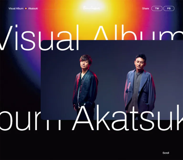
The opening combines a near-black canvas, a luminous yellow-to-violet field, a large photograph of the two artists, and exceptionally large, lightweight English lettering. Words extend beyond the viewport and alternate between foreground and background layers around the photograph. Below this composition, small English section labels, Japanese descriptions, rectangular media frames, and fine rules provide a restrained catalog structure.
The currently served page retains release and screening dates from 2022. Those dates describe its content; they do not establish that the website is discontinued or that an earlier design has been reconstructed.
閉じる
Pornograffitti / Visual Album “暁” — Style Reference
A cinematic album showcase: white type crosses a sunrise glow, then gives way to a dark, finely ruled film catalog.
Original URL: pornograffitti.jp/akatsuki-visual-album
Final URL: Same URL; supplied response status: 200.
Theme: dark, with a concentrated spectrum of color in the opening artwork.
Inspected: October 2, 2026, Japan Standard Time. The supplied capture record is timestamped 2026-10-01T18:46:10.663Z, equivalent to October 2 at 03:46:10.663 JST.
Viewports: desktop 1440 × 1000 and mobile 390 × 844 CSS pixels.
Scope: supplied desktop captures of the opening composition, a later music-video grid segment, and the footer; mobile captures of the opening composition and footer; rendered text, links, element geometry, and computed styles covering the complete page at both widths.
This is an artist and album showcase with substantial editorial and media content. Its sequence runs from an immersive opening composition through behind-the-scenes videos, teasers, fifteen music-video entries, screening information, album editions, sharing, and official destinations. Purchase links are part of that sequence rather than the dominant opening element.
The opening combines a near-black canvas, a luminous yellow-to-violet field, a large photograph of the two artists, and exceptionally large, lightweight English lettering. Words extend beyond the viewport and alternate between foreground and background layers around the photograph. Below this composition, small English section labels, Japanese descriptions, rectangular media frames, and fine rules provide a restrained catalog structure.
The currently served page retains release and screening dates from 2022. Those dates describe its content; they do not establish that the website is discontinued or that an earlier design has been reconstructed.
How to Read This Reference
- Measured means a value appears in the supplied computed styles or element rectangles. Measurements refer to the two inspected viewports, not an inferred universal stylesheet.
- Calculated means arithmetic based on those measurements, such as an aspect ratio or distance between elements.
- Visual estimate means an approximate reading of the original-page captures. These values were not obtained through pixel sampling.
- Recommended means implementation guidance for a new build. The starter CSS, breakpoint, gradient stops, and accessibility additions belong to this category unless explicitly tied to a measurement.
- Token names below are descriptive implementation aliases. The only supplied source custom property is
--swiper-theme-color: #007aff; it does not establish a visible blue interface accent. - Font families are supported by computed declarations. Font files and the actual resolved font for every glyph were not separately inspected.
- Scrolling was part of the supplied capture procedure. Playback, carousel controls, sharing, hover states, keyboard behavior, and external destinations were not exercised in the evidence.
Tokens — Colors
Default Palette
| Name | Value | Suggested token | Evidence and role |
|---|---|---|---|
| Night canvas | #070508 |
--canvas |
Measured on both HTML and BODY; the underlying page color |
| White foreground | #FFFFFF |
--ink |
Measured on body text, labels, headings, and links |
| Quiet rule | rgba(255,255,255,0.4) |
--rule |
Recommended approximation of the subdued grid and header rules; original opacity was not supplied |
| Strong rule | rgba(255,255,255,0.85) |
--rule-strong |
Recommended approximation for outlined controls and prominent footer divisions |
| Solar yellow | #FFDF00 |
--glow-yellow |
Visual approximation of the opening glow; decorative artwork color |
| Sunrise orange | #FF8A00 |
--glow-orange |
Visual approximation of the transition surrounding the yellow center |
| Hot magenta | #E90072 |
--glow-magenta |
Visual approximation of the outer warm band |
| Deep violet | #342375 |
--glow-violet |
Visual approximation of the glow approaching the dark canvas |
| Portrait navy | Approximately #20233D |
--portrait-backdrop |
Visual estimate from the photograph, not a measured component fill |
Only the canvas and white foreground are exact observed colors in this table. The saturated colors describe an image-like field with many intermediate hues; they are not a flat set of interface fills.
Color Behavior
The glow has a nearly white center and broad, softened bands of yellow, orange, magenta, violet, and dark blue. Fine grain prevents the boundary from looking like a perfectly clean vector gradient. On desktop, the brightest region sits near the top center. On mobile, the bright center sits lower within the upper portion of the screen, above the portrait.
The remainder of the interface stays largely white on black. Full-color video stills supply local variation. A low-contrast circular pattern appears behind the later content and footer; the mobile footer capture shows a smaller, much fainter version with subtle colored speckles.
The desktop Official Site navigation cell is a measured exception: white background, #070508 text. At the mobile viewport, the same destination has a transparent background and white text.
No theme selector is evidenced. The supplied blue library variable should not be promoted into a brand or action color.
Tokens — Typography
Archivo — Display and English Utilities
Computed family: Archivo, sans-serif.
Archivo appears in the oversized opening words, compact identity labels, section headings, navigation, carousel controls, detail links, share capsules, and official-account labels. Its weight changes are important: the desktop opening uses 100, while the phone opening uses 300. Small labels are usually 300, and action text commonly uses 400.
The result depends on light strokes and extreme scale contrast. Section headings remain small even when the content below them is visually large.
Japanese Content Stack
The body and music-video titles declare Noto Sans JP followed by Japanese system fallbacks. The supplied stack includes Noto Sans CJK JP, Noto Sans Japanese, Hiragino Kaku Gothic ProN, Hiragino Sans, Meiryo, MS PGothic, and additional localized family names.
Music-video titles use this stack even when the title is English, such as Zombies are standing out. Do not automatically apply Archivo to every Latin string.
Wordmarks and Embedded Lettering
The handwritten header wordmark and the two footer destination logos are visual assets. Their shapes should not be approximated by assigning a script or serif font to ordinary text. Large lettering embedded in video stills likewise belongs to the imagery.
Type Scale
All sizes in this table are measured unless marked otherwise. Values are written as font size / line height.
| Role | Desktop | Mobile | Weight and notes |
|---|---|---|---|
| Opening display words | 240 / 190px |
84.4 / 67.52px |
Archivo; 100 desktop, 300 mobile |
| Identity labels | 15 / 22.5px |
12 / 18px |
Archivo 300 |
| Section labels | 15 / 22.5px |
12 / 18px |
Archivo 300; heading boxes also include bottom padding and a rule |
| Section-navigation links | 15 / 22.5px |
12 / 18px |
Archivo 300 |
Navigation Official Site |
16 / 24px |
13 / 19.5px |
500 desktop, 300 mobile |
| Body base | 16 / 24px |
14 / 21px |
Japanese stack 400; individual paragraphs may override this |
| Music-video titles | 28 / 30.8px |
20 / 22px |
Japanese stack 400 |
| Movie album heading | 60 / 60px |
35.1 / 35.1px |
Archivo 400; mixed-language heading |
| Carousel controls | 16px, normal line height |
13px, normal line height |
Archivo 400 |
| Detail and purchase links | 20 / 30px |
15 / 22.5px |
Archivo 400 |
| Footer share labels | 26 / 39px |
22 / 33px |
Archivo 300 |
| Official-account labels | 16 / 24px |
14 / 21px |
Archivo 400 |
| Edition teaser link | 14 / 21px |
11 / 16.5px |
Japanese stack 700; sampled text color is dark |
| Copyright | Approximately 10px |
Approximately 10px |
Visual estimate; subdued gray |
Sampled letter spacing is normal. Avoid adding broad tracking to all English labels.
The opening line height is shorter than its font size. Preserve this tight line box while allowing glyphs to extend within their layered composition. The title rows should not become ordinary multiline headings.
Tokens — Spacing & Shapes
Layout character: very large intervals between sections, compact headings, tightly joined media entries, and generous empty space around the footer.
Spacing Scale
| Use | Desktop | Mobile | Evidence |
|---|---|---|---|
| Standard content gutter | 50px |
20px |
Measured section padding |
| Header vertical padding | 35px |
20px |
Measured |
| Section top padding | 150px |
100px |
Measured on both video rails, music videos, Movie, and CD / DVD |
| Section-label bottom padding | 15px |
5px |
Measured |
| Label box to first media target | 50px |
20px |
Calculated from rectangles |
| Video-rail gap | 10px |
6px |
Calculated from consecutive target positions |
| Music-card horizontal text inset | 25px |
20px |
Calculated from thumbnail and title positions |
| Thumbnail bottom to title top | 30px |
25px |
Calculated |
| Gap between carousel control boxes | 40px |
24px |
Calculated |
| Footer share-capsule gap | 10px |
10px |
Calculated |
| Official-account spacing | 40px horizontally |
20px vertically |
Calculated between link boxes |
Border Radius
| Element | Value | Evidence |
|---|---|---|
| Header share capsules | 14px |
Measured on 64 × 28px links |
| Footer share capsules | 20px |
Measured on 220 × 40px links |
| Music-video targets and ordinary links | 0 |
Measured target rectangles and visible square geometry |
| Portrait left corners | Approximately 40px desktop, 20px mobile |
Visual estimate; the right edge meets or continues beyond the visible frame |
| Play outline | Circle, approximately 120px diameter on desktop |
Visual estimate from the music-video capture |
Layout Measurements
| Element | Desktop | Mobile |
|---|---|---|
| Opening section | 1440 × 1000px |
390 × 844px |
| Header box | 1440 × 98px |
390 × 58.19px |
| Main section content width | 1340px |
350px |
| Section-navigation region | 84px high |
181px high |
| Behind-the-scenes target | 400 × 320px |
275 × 220px |
| Teaser target | 300 × 180px |
200 × 120px |
| Music-video thumbnail | 668 × 375.75px or 669 × 376.31px |
348 × 195.75px |
| Detail-link box | 550 × 36px |
175 × 28.5px |
| Footer destination link | 349 × 150px |
274 × 100px, then 274 × 99px |
| Footer region | 1277px high |
1243px high |
| Total document height | Approximately 11589.06px |
Approximately 12520.20px |
The video-gallery targets have a calculated 16:9 ratio. The behind-the-scenes and teaser button boxes instead measure 5:4 and 5:3. Those are target-box ratios; the evidence does not separately expose the intrinsic aspect ratio of every image inside them.
Components
Persistent Identity Header
Role: retain project identity and sharing access while the page scrolls.
The header remains at the top in the supplied opening, gallery, and footer captures. This supports persistent positioning, although its CSS position property was not included in the extract.
The desktop composition has three zones: a left identity reading Visual Album, a small spectrum-colored dot, and Akatsuki; a centered handwritten artist wordmark; and right-aligned Share, TW, and FB controls. A faint horizontal rule continues from the left identity toward the wordmark.
Use a transparent background so the header sits directly over the glow, imagery, or dark texture. At the measured desktop width, the header has 35px 50px padding. The two share links are 64 × 28px, separated by 5px.
At 390px, the identity uses 12px type and 20px outside padding. The artist wordmark moves to the right end of the row. Header sharing is absent from the visible mobile capture and rendered link inventory; footer sharing remains present. No hamburger control is evidenced.
Layered Opening Composition
Role: establish the album's visual identity before the content catalog begins.
The section exactly fills the inspected viewport height. Its principal layers are the dark canvas, the luminous colored field, enormous repeated type, and the artist photograph. Parts of the lettering appear in front of the photograph while other parts pass behind it.
The DOM contains matching text rows at the same coordinates with complementary white and transparent words. This is direct evidence for layered duplicate text. It does not, by itself, establish continuous marquee playback or an outlined-text effect.
At desktop size, the upper text row begins at y = 100px, and the lower row at y = 690px. The upper Visual begins partly outside the left edge at approximately x = -20.32px; the lower Album begins around x = -110.96px.
At mobile size, the rows begin at approximately y = 200.41px and y = 544.86px. Their left offsets are approximately -40.59px and -141.77px. Horizontal cropping remains deliberate rather than being removed to fit complete words.
The desktop portrait starts visually near (372, 200) and extends to the right edge, with a visible height of about 600px. On mobile, its visible left edge is near 62px, its top near 243px, and its bottom near 570px. These are screenshot estimates; the image element's complete geometry and crop settings were not supplied.
Keep both artists recognizable in the mobile crop. The large empty dark region below the lower text row is part of the phone composition. A small Scroll cue sits near the bottom right; a white circular companion is visible on desktop.
Section Navigation
Role: provide direct access to the major content groups.
The navigation begins just below the full-height opening, at document y = 1002px on desktop and 846px on mobile. Its links point to #bts, #teaser, #mv, #movie, and #release, followed by an official-site destination.
Desktop links occupy one horizontal band. The first five cells have measured widths of 185, 145, 145, 120, and 120px. A flexible empty region separates them from the 200px white official-site cell at the right edge.
Mobile changes to two columns within the 20px side insets. The five section links occupy three rows; the official-site destination occupies a separate full-width row beneath them. Section link boxes are 44px high. Preserve this visible navigation rather than inventing a collapsed menu.
Only the link destinations are verified. Smooth scrolling, active-section styling, and sticky behavior of this band are unverified.
Behind-the-Scenes and Teaser Rails
Role: browse related short-form media before the main video catalog.
Each section has a small English heading above a rule, a horizontal sequence of nine media entries, and right-aligned ( < ) prev and next ( > ) controls. The measured targets extend beyond the viewport, confirming the horizontal arrangement.
Behind-the-scenes targets are larger and taller: 400 × 320px on desktop and 275 × 220px on mobile. Teaser targets are 300 × 180px and 200 × 120px. Gaps reduce from 10px to 6px on mobile.
The exposed portion of the next item helps communicate continuation. Keep the two rails distinct in scale rather than normalizing them into identical cards. Captions identify the track and media type, such as 「暁」Behind The Scenes and 「暁」Teaser Movie.
The presence of previous/next buttons establishes available controls, not their tested behavior. Dragging, autoplay, looping, wrapping, and slide duration are not verified.
Music-Video Entry and Grid
Role: pair each full music video with a short editorial description.
Desktop uses two adjoining columns within the 1340px content area. A fine vertical divider separates them; there is no spacious card gutter. Thumbnail targets retain 16:9, followed by a title and a Japanese paragraph. The fifteen entries form eight rows, with VS occupying the final left-hand position.
The thumbnail is the visible playback target. In the supplied gallery capture, it carries a large, fine circular outline and a centered white triangular play mark. The circle is approximately 120px across on desktop. Its mobile size was not captured directly.
Titles use regular 28px type on desktop and 20px on mobile. Text starts 25px inside each desktop thumbnail edge and 20px inside on mobile. Desktop descriptions appear approximately 14px / 21px in the screenshot; their exact computed style was not included.
Mobile becomes a single sequence of full-width entries inside the 20px page gutters. Each thumbnail is 348 × 195.75px, with text inset further to x = 41px. Long descriptions remain visible instead of being replaced by compact summary cards.
Two visible entries, クラウド and ジルダ, show gray platform-style placeholder imagery in the desktop capture. Their titles and descriptions remain intact. Record these as observed media states; the evidence does not identify their cause or prove that playback is unavailable. They are not an intentional gray design theme.
Movie Information
Role: present the visual album's cinema-screening information.
A small Movie section label introduces a much larger mixed-language album heading. The measured heading size is 60px on desktop and 35.1px on mobile. Content includes two dated screening times, venue information, explanatory Japanese text, and a View More Detail destination.
The detail link is a restrained horizontal text action: 550 × 36px on desktop, aligned with the right side of the content area; 175 × 28.5px on mobile, occupying its right half. Its typography reduces from 20px to 15px.
The section's rendered text and selected geometry are available, but its complete visual arrangement is not shown in the supplied screenshots. Do not infer an additional poster, background image, or specific event-card layout.
CD / DVD Release Information
Role: connect the media collection to album details and purchasing.
The section contains New Album, a release date, a Japanese introduction, View More Detail, and BUY NOW. It then presents two limited editions and one standard edition, including formats, catalog numbers, prices, track lists, and bonus-video information.
The two main actions share the Movie section's right-aligned link dimensions. On desktop, their top positions differ by 56px, leaving 20px between the measured boxes. On mobile, the interval is 43.5px, leaving 15px between boxes.
Preserve the distinction between descriptive release information and the purchase destination. The evidence supports an external purchase link, not an on-page cart or checkout flow.
The sampled bonus teaser link uses dark text, unlike the main page foreground. Its containing surface was not included in the measurements, so a complete light-panel design cannot be established from that link alone. For a new implementation, use semantic edition groups and ordered track lists, but treat their detailed styling as an adaptation.
Footer Sharing
Role: offer a final sharing action after the release information.
A centered SHARE it on group contains two vertically stacked outlined capsules labeled Twitter and Facebook. Both viewports retain the same 220 × 40px geometry and 20px radius. Type reduces from 26px to 22px on mobile; the gap remains 10px.
There is substantial space after the capsules before the destination links: approximately 251px desktop and 201px mobile, calculated from their element rectangles. This spacing contributes to the footer's deliberate pacing.
Footer Destination Links
Role: connect the visual-album page to the artist's official site and the companion album site.
Desktop uses a wide Links label region followed by two adjacent logo tiles. The tiles begin at approximately x = 690px and 1040px, with 150px height and a 50px outside right gutter. Fine rules connect the row into one structure. Small diagonal arrows sit near the lower-right corners.
On mobile, the Links label occupies a left column about 115px wide and spans both rows. Two logo tiles stack to its right, beginning at x = 116px and reaching the viewport edge. Their visible content heights are 100px and 99px, separated by a rule.
Use the actual destination logos as artwork. Their differing proportions are part of the composition; they are not interchangeable text buttons.
Official Accounts and Copyright
Role: close the page with permanent artist destinations.
Desktop places Official Account at the left and five white icon-and-label links in a horizontal row at the right: YouTube, Instagram, Twitter, LINE, and Facebook. Link boxes are 36px high, with 40px gaps.
Mobile stacks the same accounts at the left, starting at x = 20px. Each link box is 28px high, with a 48px vertical pitch. The account section keeps generous separation from the destination tiles.
The copyright reads ©2022 Sony Music Labels Inc.. It is small and subdued, right-aligned in the desktop capture and centered near the bottom on mobile. This visible notice establishes the footer wording; no website production credit is independently established by the original-page evidence.
Tokens — Motion & Interaction
| Treatment | Supplied evidence | What can be concluded |
|---|---|---|
| Header transform | 1.5s cubic-bezier(0.33, 1, 0.68, 1) 0.5s |
A finite transform transition is declared; its starting transform and trigger were not supplied |
| Upper opening text | 1.5s cubic-bezier(0, 0.55, 0.45, 1) 0.5s |
A slow eased transform with a half-second delay is declared |
| Lower opening text | 1.5s cubic-bezier(0, 0.55, 0.45, 1) 0.2s |
Same easing and duration, with an earlier declared start |
| Repeated display tracks | Repeated words and paired white/transparent copies | Supports layered, repeatable tracks; continuous speed and direction are unverified |
| Persistent header | Same screen-top placement across scrolled captures | Persistence is visually supported; exact positioning and scroll-response logic are unknown |
| Media activation | Button elements and visible play symbols | Playback is offered; player placement, opening animation, and playback success are unverified |
| Rail navigation | Previous/next buttons and offscreen item rectangles | Horizontal navigation is offered; dragging and looping are unverified |
| Section navigation | Anchor URLs in rendered links | Targets are known; scrolling animation and active-state feedback are unknown |
| Decorative circular pattern | Visible in static captures | Appearance is supported; animation method, speed, and synchronization are unknown |
Sampled elements report animation: none. That is not proof that ancestors, scripts, pseudo-elements, video, or canvas contribute no motion. Likewise, a serialized transition: all without a supplied duration is not evidence of a visible transition.
The capture procedure waited for document loading, visible finite animations, sampled layout stability, and visible image decoding within time limits. Perpetual animations were paused during readiness checks and resumed afterward. These safeguards do not provide a motion recording or establish completion of delayed content.
For an adaptation, retain the documented easing only where an actual state change needs it. A static, fully visible opening is preferable to inventing an unsupported looping speed. Reduced-motion behavior is a recommended addition, not a verified original feature.
Surfaces
| Layer | Appearance | Structural purpose |
|---|---|---|
| Page canvas | Measured near-black #070508 |
Continuous background for the long page |
| Opening aura | Bright, grainy spectrum with a white-yellow core | Concentrates color and attention at entry |
| Artist photograph | Dark navy photographic field with rounded left corners | Primary identity image; intersects display type |
| Header | Transparent with white identity and utilities | Remains visually integrated with underlying content |
| Video catalog | Dark background, square imagery, fine shared rules | Organizes many works without detached elevated cards |
| Desktop official-site cell | Measured white with dark text | Distinct navigation destination |
| Footer | Near-black with subdued circular pattern | Adds texture while preserving legibility |
| Share controls | Transparent capsules with white outlines | Lightweight action emphasis |
No general shadow or glass-surface system is evident. Separation comes from image edges, typography, rules, and empty space. The portrait's rounded corners should not become a universal radius for every media card.
Imagery
The artist portrait is a formal studio photograph of two people against a deep navy setting. Dark clothing and restrained expressions contrast with red and magenta edge lighting. Keep the photograph's tonal depth: brightening all shadows would weaken its relationship to the dark page.
The opening glow suggests sunrise or a luminous horizon without depicting a literal landscape. Its broad colored bands and grain matter more than the precision of any one approximate hex value.
Music-video imagery remains varied and cinematic. In the supplied gallery segment, one still shows a bright white performance space with children, while another shows people embracing on a rooftop under a pale sky. Preserve each film's own palette and any lettering already embedded in its thumbnail.
The footer texture resembles a large circular or toroidal arrangement of fragmented dots and short marks. Describe it as a visual texture; the evidence does not establish WebGL, a video background, or a particular generative algorithm.
Observed Asset References
No original image filenames or asset URLs were supplied. The following inventory identifies observed roles without inventing paths.
| Asset role | Original-page evidence | Implementation requirement |
|---|---|---|
| Two-artist portrait | Desktop and mobile opening captures | Obtain an authorized image and tune the crop for both faces |
| Sunrise glow and grain | Both opening captures | Use authorized artwork or a clearly approximate gradient plus texture |
| Handwritten header wordmark | Mobile opening and scrolled desktop captures | Use the actual logo asset with a meaningful text alternative |
| Music-video stills | Desktop gallery capture and fifteen DOM entries | Supply a thumbnail per work; reserve its dimensions during loading |
| Circular background pattern | Desktop and mobile footer captures | Keep it decorative, low contrast, and behind content |
| Official-site and album-site logos | Both footer captures | Preserve their individual proportions |
| Social symbols | Both footer captures | Use recognizable monochrome platform assets; source file format is unknown |
Do not apply pixelated rendering to the photographs. Grain in the background and low-resolution placeholder imagery do not imply a site-wide pixel-art treatment.
Layout & Responsive Behavior
The page is a long scrolling document. It is not an application shell with an internally scrolling central panel. The measured header overlays the opening rather than consuming a separate block above it.
| Relationship | Desktop at 1440 × 1000 |
Mobile at 390 × 844 |
|---|---|---|
| Opening height | Full inspected viewport | Full inspected viewport |
| Display typography | 240px, weight 100 |
84.4px, weight 300 |
| Portrait placement | Strong right offset, broad landscape presentation | Smaller left offset, tighter crop, large dark space below |
| Header utilities | Identity, centered logo, share group | Identity and right-aligned logo |
| Section navigation | One horizontal band | Two-column links plus full-width official destination |
| Major section spacing | 150px above each heading |
100px above each heading |
| Video rails | Several visible entries | One entry plus part of the next, depending on rail |
| Music-video catalog | Two adjoining columns | One column |
| Detail actions | Right-aligned 550px boxes |
Right-aligned half-content-width boxes, 175px |
| Footer destinations | Label plus two horizontal tiles | Label spanning two stacked tiles |
| Official accounts | Horizontal row | Vertical list |
| Copyright | Right-aligned | Centered |
The phone display size, 84.4px, equals 10% of the inspected viewport height. The Movie heading, 35.1px, equals 9% of its width. These are arithmetic matches, not proof of the original CSS formulas.
Mobile middle-section arrangements are supported by DOM geometry rather than separate supplied screenshots. No intermediate breakpoint, tablet layout, landscape phone, browser-toolbar resize, or safe-area behavior was tested. The breakpoint used in the starter below is a recommendation.
Confine intentional horizontal overflow to the opening typography and media rails. Ordinary headings, paragraphs, edition details, and footer links should remain inside their assigned layout widths.
Do’s and Don’ts
Do
- Keep the measured near-black canvas and white foreground as the interface foundation.
- Concentrate saturated color in the opening artwork and individual film stills.
- Preserve the contrast between enormous light display type and small section labels.
- Change the opening weight from extremely thin desktop lettering to a sturdier mobile treatment.
- Keep selected words in front of the portrait and others behind it.
- Maintain square
16:9music-video frames, shared rules, and adjoining desktop columns. - Preserve the different target proportions of the two horizontal media rails.
- Retain full editorial descriptions and the fifteen-work sequence on mobile.
- Rebuild the footer's relationships for mobile, including the spanning
Linkslabel. - Treat artwork, logos, media availability, and accessible text as separate implementation concerns.
Don’t
- Don’t reduce the page to an opening image and a purchase button.
- Don’t replace Archivo with an arbitrary heavy display face or make all headings bold.
- Don’t force complete opening words to fit inside the viewport.
- Don’t turn every video entry into a detached rounded card with a shadow.
- Don’t spread the sunrise palette across navigation badges and buttons.
- Don’t use the supplied blue library variable as an observed brand color.
- Don’t reproduce gray media placeholders as intentional album artwork.
- Don’t infer a player modal, autoplay, cursor effect, or marquee speed from static captures.
- Don’t invent a mobile hamburger menu or hide the evidenced section links.
- Don’t interpret retained 2022 content as proof of an unavailable website.
Recommended Implementation Additions
These are recommendations for a new implementation, not verified features of the original:
- Provide one meaningful page heading and mark repeated decorative display rows
aria-hidden. This avoids announcing the album title many times. - Verify accessible names for thumbnail buttons and logo links. The extract contains empty button text, but does not include enough accessibility attributes to determine whether their names are missing.
- Give each video action a name combining the action and track title. Keep unavailable-thumbnail messaging distinct from an assertion that the video itself cannot play.
- Add visible keyboard focus indicators and ensure anchor targets remain visible below the persistent header.
- Increase effective hit areas around small sharing and carousel controls while retaining their visual proportions.
- Offer a reduced-motion mode with a static, complete opening. Any JavaScript animation must respect the same preference as CSS.
- Reserve thumbnail space to avoid layout movement. Load offscreen media progressively while keeping the opening portrait promptly available.
- If playback opens a dialog, add focus containment, Escape handling, and focus restoration; the original dialog behavior is unverified.
- Test header contrast over the bright glow. A subtle localized contrast treatment may be needed without adding an opaque full-width bar.
- Preserve readable mobile paragraph sizes. Any increase beyond the original should be treated as a deliberate accessibility adaptation.
Agent Prompt Guide
Quick Color Reference
- Exact page canvas:
#070508. - Exact main foreground:
#FFFFFF. - Approximate decorative spectrum: yellow
#FFDF00, orange#FF8A00, magenta#E90072, violet#342375. - Rules: fine, subdued white; proposed opacity around
0.4. - Primary control treatment: white text and thin outlines, with one white-filled official-site cell on desktop.
- Photograph: deep navy shadows and restrained red edge lighting.
Overall Prompt
“Create a long-form artist and visual-album showcase with a near-black #070508 canvas and white typography. Open with a full-height composition combining a grainy sunrise glow, a large right-offset studio portrait of two artists, and cropped Archivo display words. Alternate selected words above and below the photograph using aligned duplicate decorative rows. Use very light 240px display type at a 1440 × 1000 reference viewport, changing to approximately 84px and weight 300 at 390 × 844. Follow with compact section navigation, two differently sized horizontal video rails, and fifteen music-video entries in a finely ruled two-column catalog that becomes one column on mobile. Finish with release details, restrained text actions, outlined sharing capsules, logo destinations, and official accounts. Keep motion limited to supported finite transitions unless additional behavior is explicitly specified.”
Example Component Prompts
- Opening composition: “Build a dark full-viewport artist opening with a white-yellow glow fading through orange, magenta, and violet. Place a dark studio portrait toward the right with rounded left corners. Run oversized lightweight Archivo words across its top and lower edge, clipped by the viewport. Use separate aligned front and back text layers and keep one accessible semantic title.”
- Music-video entry: “Create a square-cornered
16:9thumbnail with a fine circular play outline centered over it. Place a regular Japanese title and a compact paragraph below, inset25pxon desktop. Join entries with one-pixel rules in two columns, then use one column and20pxtext insets on mobile. Avoid shadows and detached card gutters.” - Media rails: “Place nine behind-the-scenes items in a horizontal rail with
400 × 320pxdesktop target boxes and10pxgaps. Use a separate teaser rail with300 × 180pxtargets. On mobile, change them to275 × 220pxand200 × 120px, with6pxgaps. Keep small previous/next controls at the right. Do not assume autoplay.” - Footer destinations: “Create a black footer link band with a wide left label and two adjoining white-logo tiles on desktop. On a
390pxphone, use an approximately115pxlabel column spanning two stacked logo tiles. Add small diagonal arrows, fine white rules, and generous dark space around the band.” - Official accounts: “Use recognizable white platform icons with simple Archivo labels. Align all five accounts horizontally on desktop with
40pxgaps. Stack them at the left on mobile with a48pxrow pitch, followed by small centered copyright text.”
Quick Start
CSS Custom Properties
This is an unexecuted adaptation, not recovered source CSS. It reproduces measured endpoints and major relationships while using approximate gradient colors, rule opacity, portrait cropping, and a recommended 767px breakpoint. Load Archivo with weights 100–500 and the appropriate Japanese font separately. Supply authorized images and logos through markup; no asset URLs are invented here.
Suggested structure: .akatsuki-page contains .site-header, main, and .site-footer. The opening contains a portrait and two pairs of aligned .hero-row elements, one back layer and one front layer for each row. Hide the duplicated rows from assistive technology and provide a single semantic heading. Rails, playback, and previous/next controls require separate behavior; native horizontal scrolling below is a recommended fallback.
:root {
  /* Exact observed base colors */
  --canvas: #070508;
  --ink: #fff;

  /* Recommended approximations */
  --rule: rgb(255 255 255 / 0.4);
  --rule-strong: rgb(255 255 255 / 0.85);
  --glow-yellow: #ffdf00;
  --glow-orange: #ff8a00;
  --glow-magenta: #e90072;
  --glow-violet: #342375;

  --font-latin: Archivo, sans-serif;
  --font-jp: 'Noto Sans JP', 'Noto Sans CJK JP',
    'Noto Sans Japanese', 'Hiragino Kaku Gothic ProN',
    'Hiragino Sans', Meiryo, 'MS PGothic', sans-serif;

  --gutter: 50px;
  --section-space: 150px;
  --section-content-gap: 50px;
  --text-label: 15px;
  --text-body: 16px;
  --text-video-title: 28px;
  --rail-gap: 10px;
  --bts-width: 400px;
  --teaser-width: 300px;

  /* Proportional adaptation, not a verified source formula */
  --text-hero: min(16.6667vw, 24svh);
  --hero-weight: 100;
  --hero-leading: 0.791667;

  /* Timings from supplied computed styles */
  --ease-header: cubic-bezier(0.33, 1, 0.68, 1);
  --ease-display: cubic-bezier(0, 0.55, 0.45, 1);
}

* { box-sizing: border-box; }
body { margin: 0; background: var(--canvas); }
button, input, select, textarea { font: inherit; }
img { max-width: 100%; }

.akatsuki-page {
  color: var(--ink);
  background: var(--canvas);
  font: 400 var(--text-body) / 1.5 var(--font-jp);
}

.akatsuki-page a { color: inherit; }
.akatsuki-page button { color: inherit; cursor: pointer; }
.akatsuki-page [id] { scroll-margin-top: 110px; }

.sr-only {
  position: absolute;
  width: 1px;
  height: 1px;
  padding: 0;
  margin: -1px;
  overflow: hidden;
  clip-path: inset(50%);
  white-space: nowrap;
  border: 0;
}

.site-header {
  position: fixed;
  inset: 0 0 auto;
  z-index: 20;
  display: grid;
  grid-template-columns: 1fr auto 1fr;
  align-items: center;
  gap: 30px;
  padding: 35px var(--gutter);
  font: 300 var(--text-label) / 1.5 var(--font-latin);
  transition: transform 1.5s var(--ease-header) 0.5s;
}

.header-identity {
  display: flex;
  align-items: center;
  gap: 8px;
  min-width: 0;
  white-space: nowrap;
}

.identity-dot {
  flex: 0 0 12px;
  height: 12px;
  border-radius: 50%;
  background: radial-gradient(circle, #fff 5%,
    var(--glow-yellow) 25%, var(--glow-magenta) 48%,
    var(--glow-violet) 70%, transparent 75%);
}

.identity-rule {
  flex: 1;
  min-width: 0;
  height: 1px;
  margin-left: 2px;
  background: var(--rule);
}

.header-logo { display: block; width: 100px; height: auto; }
.header-share { display: flex; align-items: center; gap: 5px; justify-self: end; }
.header-share-label { margin-right: 10px; }

.header-share a {
  display: grid;
  place-items: center;
  width: 64px;
  height: 28px;
  border: 1px solid var(--rule-strong);
  border-radius: 14px;
  font-weight: 400;
  text-decoration: none;
}

.hero {
  position: relative;
  isolation: isolate;
  height: 100vh;
  height: 100svh;
  overflow: hidden;
}

.hero::before {
  content: '';
  position: absolute;
  inset: 0;
  z-index: 0;
  pointer-events: none;
  background: radial-gradient(ellipse 52% 77% at 50% 5%,
    #fff 0%, #fffbd9 7%, var(--glow-yellow) 23%,
    var(--glow-orange) 37%, var(--glow-magenta) 52%,
    var(--glow-violet) 65%, transparent 85%);
}

/* Tune these estimated bounds against the supplied portrait. */
.hero-portrait {
  position: absolute;
  z-index: 2;
  top: 20%;
  right: 0;
  left: 25.83%;
  height: 60%;
  overflow: hidden;
  border-radius: 40px 0 0 40px;
}

.hero-portrait img {
  display: block;
  width: 100%;
  height: 100%;
  object-fit: cover;
  object-position: center;
}

.hero-row {
  position: absolute;
  display: flex;
  gap: 50px;
  width: max-content;
  margin: 0;
  white-space: nowrap;
  pointer-events: none;
  font-family: var(--font-latin);
  font-size: var(--text-hero);
  font-weight: var(--hero-weight);
  line-height: var(--hero-leading);
  transition: transform 1.5s var(--ease-display) 0.5s;
}

.hero-row > * { flex: none; margin: 0; }
.hero-row--top { top: 10%; left: -20px; }
.hero-row--bottom { top: 69%; left: -111px; transition-delay: 0.2s; }
.hero-row--back { z-index: 1; }
.hero-row--front { z-index: 3; }
.hero-word--masked { color: transparent; }

.hero-scroll {
  position: absolute;
  z-index: 4;
  right: var(--gutter);
  bottom: 30px;
  display: flex;
  align-items: center;
  gap: 16px;
  font: 300 15px / 1.5 var(--font-latin);
}

.hero-scroll::after {
  content: '';
  width: 16px;
  height: 16px;
  border-radius: 50%;
  background: currentColor;
}

.section-nav {
  display: flex;
  margin-top: 2px;
  padding-left: 20px;
  border-block: 1px solid var(--rule);
}

.section-nav a {
  display: flex;
  align-items: center;
  justify-content: center;
  min-height: 82px;
  padding-inline: 30px;
  border-left: 1px solid var(--rule);
  font: 300 var(--text-label) / 1.5 var(--font-latin);
  text-decoration: none;
}

.section-nav .official-link {
  width: 200px;
  margin-left: auto;
  padding-inline: 0;
  color: var(--canvas);
  background: var(--ink);
  font-size: 16px;
  font-weight: 500;
}

.content-section { padding: var(--section-space) var(--gutter) 0; }
.section-label {
  margin: 0 0 var(--section-content-gap);
  padding-bottom: 15px;
  border-bottom: 1px solid var(--rule);
  font: 300 var(--text-label) / 1.5 var(--font-latin);
}

.media-rail {
  display: flex;
  gap: var(--rail-gap);
  overflow-x: auto;
  overscroll-behavior-inline: contain;
}

.rail-item { flex: 0 0 var(--bts-width); min-width: 0; }
.media-rail--teaser .rail-item { flex-basis: var(--teaser-width); }
.rail-media { display: block; width: 100%; aspect-ratio: 5 / 4; }
.media-rail--teaser .rail-media { aspect-ratio: 5 / 3; }
.rail-media img { display: block; width: 100%; height: 100%; object-fit: cover; }

.rail-controls {
  display: flex;
  justify-content: flex-end;
  gap: 40px;
  margin-top: 40px;
  font: 400 16px / 1 var(--font-latin);
}

.rail-controls button { padding: 0; border: 0; background: none; }

.video-grid {
  display: grid;
  grid-template-columns: repeat(2, minmax(0, 1fr));
  border-top: 1px solid var(--rule);
  border-left: 1px solid var(--rule);
}

.video-card {
  min-width: 0;
  border-right: 1px solid var(--rule);
  border-bottom: 1px solid var(--rule);
}

.video-trigger {
  position: relative;
  display: block;
  width: 100%;
  aspect-ratio: 16 / 9;
  padding: 0;
  border: 0;
  border-radius: 0;
  background: var(--canvas);
}

.video-trigger img {
  display: block;
  width: 100%;
  height: 100%;
  object-fit: cover;
}

.play-mark {
  position: absolute;
  inset: 50% auto auto 50%;
  display: grid;
  place-items: center;
  width: 120px;
  height: 120px;
  transform: translate(-50%, -50%);
  border: 1px solid var(--rule);
  border-radius: 50%;
  pointer-events: none;
}

.play-mark::after {
  content: '';
  margin-left: 4px;
  border-top: 10px solid transparent;
  border-bottom: 10px solid transparent;
  border-left: 18px solid var(--ink);
}

.video-copy { padding: 30px 25px 25px; }
.video-title { margin: 0 0 20px; font-size: var(--text-video-title); font-weight: 400; line-height: 1.1; }
.video-copy p { margin: 0; font-size: 14px; line-height: 1.5; }

.detail-link {
  display: flex;
  align-items: center;
  justify-content: space-between;
  width: min(550px, 100%);
  margin-left: auto;
  padding-bottom: 5px;
  border-bottom: 1px solid var(--rule);
  font: 400 20px / 1.5 var(--font-latin);
  text-decoration: none;
}

.detail-link + .detail-link { margin-top: 20px; }

/* Optional authorized decorative asset; no fabricated URL. */
.site-footer {
  background-image: var(--footer-texture, none);
  background-position: center;
  background-repeat: no-repeat;
  background-size: cover;
}

.footer-share {
  display: grid;
  justify-items: center;
  gap: 10px;
  padding: 250px var(--gutter);
}

.share-capsule {
  display: grid;
  place-items: center;
  width: 220px;
  height: 40px;
  border: 1px solid var(--rule-strong);
  border-radius: 20px;
  font: 300 26px / 1.5 var(--font-latin);
  text-decoration: none;
}

.footer-links {
  display: grid;
  grid-template-columns: minmax(0, 1fr) 350px 350px;
  padding-right: var(--gutter);
  border-block: 1px solid var(--rule-strong);
}

.footer-links-label {
  align-self: center;
  padding-left: var(--gutter);
  font: 300 var(--text-label) / 1.5 var(--font-latin);
}

.footer-tile {
  position: relative;
  display: grid;
  place-items: center;
  min-height: 150px;
  border-left: 1px solid var(--rule-strong);
}

.footer-tile img { display: block; width: 65%; max-width: 225px; height: auto; }
.footer-tile::after { content: '↗'; position: absolute; right: 26px; bottom: 20px; }

.official-accounts {
  display: flex;
  align-items: center;
  justify-content: space-between;
  gap: 30px;
  margin-top: 250px;
  padding-inline: var(--gutter);
  font-family: var(--font-latin);
}

.account-links { display: flex; flex-wrap: wrap; gap: 40px; }
.account-links a { display: inline-flex; align-items: center; gap: 14px; min-height: 36px; text-decoration: none; }
.account-links img, .account-links svg { width: 26px; height: 26px; }
.copyright { margin: 100px 0 0; padding: 0 var(--gutter) 50px; text-align: right; font: 400 10px / 1.5 var(--font-latin); color: #777; }

/* Recommended keyboard treatment */
.akatsuki-page :focus-visible { outline: 2px solid var(--ink); outline-offset: 4px; }

@media (max-width: 767px) {
  :root {
    --gutter: 20px;
    --section-space: 100px;
    --section-content-gap: 20px;
    --text-label: 12px;
    --text-body: 14px;
    --text-video-title: 20px;
    --rail-gap: 6px;
    --bts-width: 275px;
    --teaser-width: 200px;
    --text-hero: 10svh;
    --hero-weight: 300;
    --hero-leading: 0.8;
  }

  .akatsuki-page [id] { scroll-margin-top: 70px; }
  .site-header { grid-template-columns: minmax(0, 1fr) auto; gap: 10px; padding: 20px; }
  .header-logo { width: 70px; }
  .header-share { display: none; }
  .identity-dot { flex-basis: 8px; height: 8px; }

  .hero::before {
    background: radial-gradient(ellipse 90% 48% at 50% 15%,
      #fff 0%, #fffbd9 7%, var(--glow-yellow) 23%,
      var(--glow-orange) 37%, var(--glow-magenta) 52%,
      var(--glow-violet) 65%, transparent 85%);
  }

  .hero-portrait { left: 15.9%; top: 28.8%; height: 38.7%; border-radius: 20px 0 0 20px; }
  .hero-row { gap: 20px; }
  .hero-row--top { top: 23.745%; left: -41px; }
  .hero-row--bottom { top: 64.557%; left: -142px; }
  .hero-scroll { right: 40px; bottom: 20px; font-size: 12px; }
  .hero-scroll::after { display: none; }

  .section-nav { display: grid; grid-template-columns: repeat(2, minmax(0, 1fr)); padding-inline: 20px; }
  .section-nav a { min-height: 45px; justify-content: flex-start; padding-inline: 15px; border-bottom: 1px solid var(--rule); }
  .section-nav .official-link { grid-column: 1 / -1; width: auto; margin-inline: -20px; padding-inline: 20px; color: var(--ink); background: transparent; font-size: 13px; font-weight: 300; }
  .section-label { padding-bottom: 5px; }
  .rail-controls { gap: 24px; font-size: 13px; }
  .video-grid { grid-template-columns: minmax(0, 1fr); }
  .video-copy { padding: 25px 20px; }

  /* Readability adaptation; original mobile paragraph size was not supplied. */
  .video-copy p { font-size: 12px; line-height: 1.5; }
  .play-mark { width: 80px; height: 80px; }
  .detail-link { width: 50%; font-size: 15px; }
  .detail-link + .detail-link { margin-top: 15px; }
  .footer-share { padding-block: 200px; }
  .share-capsule { font-size: 22px; }
  .footer-links { grid-template-columns: 116px minmax(0, 1fr); padding-right: 0; }
  .footer-links-label { grid-row: 1 / span 2; align-self: start; padding-top: 20px; }
  .footer-tile { min-height: 100px; }
  .footer-tile + .footer-tile { border-top: 1px solid var(--rule-strong); }
  .footer-tile::after { right: 20px; bottom: 15px; }
  .official-accounts { display: block; margin-top: 30px; }
  .account-links { flex-direction: column; align-items: flex-start; gap: 20px; margin-top: 80px; }
  .account-links a { min-height: 28px; font-size: 14px; }
  .account-links img, .account-links svg { width: 24px; height: 24px; }
  .copyright { margin-top: 90px; padding-bottom: 40px; text-align: center; }
}

@media (prefers-reduced-motion: reduce) {
  .site-header, .hero-row { transition: none; }
  .akatsuki-page { scroll-behavior: auto; }
}
The CSS deliberately leaves content visible before scripting. Applying the measured transition declarations does not reproduce an unknown entrance state, continuous background motion, or media-player behavior. The static hero offsets represent the supplied frames, not a recovered animation timeline.
Tailwind v4 Token Mapping
Optional aliases for a project already using Tailwind v4. This does not identify the original site's framework. Define the custom properties above first.
@theme inline {
  --color-night: var(--canvas);
  --color-foreground: var(--ink);
  --color-rule: var(--rule);
  --color-solar: var(--glow-yellow);
  --color-sunrise: var(--glow-orange);
  --color-magenta: var(--glow-magenta);
  --color-violet: var(--glow-violet);

  --font-display: var(--font-latin);
  --font-content: var(--font-jp);

  --text-utility: var(--text-label);
  --text-content: var(--text-body);
  --text-video: var(--text-video-title);
  --text-opening: var(--text-hero);

  --spacing-page: var(--gutter);
  --spacing-section: var(--section-space);
  --spacing-rail: var(--rail-gap);
  --radius-share-small: 14px;
  --radius-share-large: 20px;
}
Sources & Evidence
- Original and final page: VISUAL ALBUM「暁」. The supplied browser record reports HTTP
200at the same original and final URL. - Capture record timestamp:
2026-10-01T18:46:10.663Z, or October 2, 2026 at 03:46:10.663 JST. Individual frame timestamps were not supplied. - Original-page desktop captures: opening composition, later music-video entries, and footer at
1440 × 1000CSS pixels. - Original-page mobile captures: opening composition and footer at
390 × 844CSS pixels. - Rendered DOM evidence at both viewports supplies page text, destination URLs, measured rectangles, font declarations, colors, padding, radii, and selected transition declarations. It establishes the middle-page structure beyond the portions shown in screenshots.
- Supplied inspection behavior includes an initial observation of at least five seconds, bounded waits for loading and stability, and scrolling through intermediate positions. SharedWorkers and service workers were disabled during inspection.
- Limitations: no additional browsing was performed; source asset paths, complete stylesheets, font-file loading, intermediate breakpoints, interactive playback, hover behavior, keyboard operation, and linked destinations were not verified. Two gallery thumbnails show gray placeholders of undetermined cause. Decorative background technology and continuous motion remain unknown.
This reference describes the page served at the recorded inspection time. Exact measurements, screenshot estimates, calculated relationships, and proposed implementation choices are identified separately throughout.
# Pornograffitti / Visual Album “暁” — Style Reference

> A cinematic album showcase: white type crosses a sunrise glow, then gives way to a dark, finely ruled film catalog.

**Original URL:** [pornograffitti.jp/akatsuki-visual-album](https://www.pornograffitti.jp/akatsuki-visual-album/)
**Final URL:** [Same URL](https://www.pornograffitti.jp/akatsuki-visual-album/); supplied response status: `200`.
**Theme:** dark, with a concentrated spectrum of color in the opening artwork.
**Inspected:** October 2, 2026, Japan Standard Time. The supplied capture record is timestamped `2026-10-01T18:46:10.663Z`, equivalent to October 2 at 03:46:10.663 JST.
**Viewports:** desktop `1440 × 1000` and mobile `390 × 844` CSS pixels.
**Scope:** supplied desktop captures of the opening composition, a later music-video grid segment, and the footer; mobile captures of the opening composition and footer; rendered text, links, element geometry, and computed styles covering the complete page at both widths.

This is an artist and album showcase with substantial editorial and media content. Its sequence runs from an immersive opening composition through behind-the-scenes videos, teasers, fifteen music-video entries, screening information, album editions, sharing, and official destinations. Purchase links are part of that sequence rather than the dominant opening element.

The opening combines a near-black canvas, a luminous yellow-to-violet field, a large photograph of the two artists, and exceptionally large, lightweight English lettering. Words extend beyond the viewport and alternate between foreground and background layers around the photograph. Below this composition, small English section labels, Japanese descriptions, rectangular media frames, and fine rules provide a restrained catalog structure.

The currently served page retains release and screening dates from 2022. Those dates describe its content; they do not establish that the website is discontinued or that an earlier design has been reconstructed.
閉じる
# Pornograffitti / Visual Album “暁” — Style Reference

> A cinematic album showcase: white type crosses a sunrise glow, then gives way to a dark, finely ruled film catalog.

**Original URL:** [pornograffitti.jp/akatsuki-visual-album](https://www.pornograffitti.jp/akatsuki-visual-album/)
**Final URL:** [Same URL](https://www.pornograffitti.jp/akatsuki-visual-album/); supplied response status: `200`.
**Theme:** dark, with a concentrated spectrum of color in the opening artwork.
**Inspected:** October 2, 2026, Japan Standard Time. The supplied capture record is timestamped `2026-10-01T18:46:10.663Z`, equivalent to October 2 at 03:46:10.663 JST.
**Viewports:** desktop `1440 × 1000` and mobile `390 × 844` CSS pixels.
**Scope:** supplied desktop captures of the opening composition, a later music-video grid segment, and the footer; mobile captures of the opening composition and footer; rendered text, links, element geometry, and computed styles covering the complete page at both widths.

This is an artist and album showcase with substantial editorial and media content. Its sequence runs from an immersive opening composition through behind-the-scenes videos, teasers, fifteen music-video entries, screening information, album editions, sharing, and official destinations. Purchase links are part of that sequence rather than the dominant opening element.

The opening combines a near-black canvas, a luminous yellow-to-violet field, a large photograph of the two artists, and exceptionally large, lightweight English lettering. Words extend beyond the viewport and alternate between foreground and background layers around the photograph. Below this composition, small English section labels, Japanese descriptions, rectangular media frames, and fine rules provide a restrained catalog structure.

The currently served page retains release and screening dates from 2022. Those dates describe its content; they do not establish that the website is discontinued or that an earlier design has been reconstructed.

## How to Read This Reference

- **Measured** means a value appears in the supplied computed styles or element rectangles. Measurements refer to the two inspected viewports, not an inferred universal stylesheet.
- **Calculated** means arithmetic based on those measurements, such as an aspect ratio or distance between elements.
- **Visual estimate** means an approximate reading of the original-page captures. These values were not obtained through pixel sampling.
- **Recommended** means implementation guidance for a new build. The starter CSS, breakpoint, gradient stops, and accessibility additions belong to this category unless explicitly tied to a measurement.
- Token names below are descriptive implementation aliases. The only supplied source custom property is `--swiper-theme-color: #007aff`; it does not establish a visible blue interface accent.
- Font families are supported by computed declarations. Font files and the actual resolved font for every glyph were not separately inspected.
- Scrolling was part of the supplied capture procedure. Playback, carousel controls, sharing, hover states, keyboard behavior, and external destinations were not exercised in the evidence.

## Tokens — Colors

### Default Palette

| Name | Value | Suggested token | Evidence and role |
| --- | --- | --- | --- |
| Night canvas | `#070508` | `--canvas` | Measured on both `HTML` and `BODY`; the underlying page color |
| White foreground | `#FFFFFF` | `--ink` | Measured on body text, labels, headings, and links |
| Quiet rule | `rgba(255,255,255,0.4)` | `--rule` | Recommended approximation of the subdued grid and header rules; original opacity was not supplied |
| Strong rule | `rgba(255,255,255,0.85)` | `--rule-strong` | Recommended approximation for outlined controls and prominent footer divisions |
| Solar yellow | `#FFDF00` | `--glow-yellow` | Visual approximation of the opening glow; decorative artwork color |
| Sunrise orange | `#FF8A00` | `--glow-orange` | Visual approximation of the transition surrounding the yellow center |
| Hot magenta | `#E90072` | `--glow-magenta` | Visual approximation of the outer warm band |
| Deep violet | `#342375` | `--glow-violet` | Visual approximation of the glow approaching the dark canvas |
| Portrait navy | Approximately `#20233D` | `--portrait-backdrop` | Visual estimate from the photograph, not a measured component fill |

Only the canvas and white foreground are exact observed colors in this table. The saturated colors describe an image-like field with many intermediate hues; they are not a flat set of interface fills.

### Color Behavior

The glow has a nearly white center and broad, softened bands of yellow, orange, magenta, violet, and dark blue. Fine grain prevents the boundary from looking like a perfectly clean vector gradient. On desktop, the brightest region sits near the top center. On mobile, the bright center sits lower within the upper portion of the screen, above the portrait.

The remainder of the interface stays largely white on black. Full-color video stills supply local variation. A low-contrast circular pattern appears behind the later content and footer; the mobile footer capture shows a smaller, much fainter version with subtle colored speckles.

The desktop `Official Site` navigation cell is a measured exception: white background, `#070508` text. At the mobile viewport, the same destination has a transparent background and white text.

No theme selector is evidenced. The supplied blue library variable should not be promoted into a brand or action color.

## Tokens — Typography

### Archivo — Display and English Utilities

**Computed family:** `Archivo, sans-serif`.

Archivo appears in the oversized opening words, compact identity labels, section headings, navigation, carousel controls, detail links, share capsules, and official-account labels. Its weight changes are important: the desktop opening uses `100`, while the phone opening uses `300`. Small labels are usually `300`, and action text commonly uses `400`.

The result depends on light strokes and extreme scale contrast. Section headings remain small even when the content below them is visually large.

### Japanese Content Stack

The body and music-video titles declare Noto Sans JP followed by Japanese system fallbacks. The supplied stack includes `Noto Sans CJK JP`, `Noto Sans Japanese`, `Hiragino Kaku Gothic ProN`, `Hiragino Sans`, Meiryo, MS PGothic, and additional localized family names.

Music-video titles use this stack even when the title is English, such as `Zombies are standing out`. Do not automatically apply Archivo to every Latin string.

### Wordmarks and Embedded Lettering

The handwritten header wordmark and the two footer destination logos are visual assets. Their shapes should not be approximated by assigning a script or serif font to ordinary text. Large lettering embedded in video stills likewise belongs to the imagery.

### Type Scale

All sizes in this table are measured unless marked otherwise. Values are written as font size / line height.

| Role | Desktop | Mobile | Weight and notes |
| --- | --- | --- | --- |
| Opening display words | `240 / 190px` | `84.4 / 67.52px` | Archivo; `100` desktop, `300` mobile |
| Identity labels | `15 / 22.5px` | `12 / 18px` | Archivo `300` |
| Section labels | `15 / 22.5px` | `12 / 18px` | Archivo `300`; heading boxes also include bottom padding and a rule |
| Section-navigation links | `15 / 22.5px` | `12 / 18px` | Archivo `300` |
| Navigation `Official Site` | `16 / 24px` | `13 / 19.5px` | `500` desktop, `300` mobile |
| Body base | `16 / 24px` | `14 / 21px` | Japanese stack `400`; individual paragraphs may override this |
| Music-video titles | `28 / 30.8px` | `20 / 22px` | Japanese stack `400` |
| Movie album heading | `60 / 60px` | `35.1 / 35.1px` | Archivo `400`; mixed-language heading |
| Carousel controls | `16px`, normal line height | `13px`, normal line height | Archivo `400` |
| Detail and purchase links | `20 / 30px` | `15 / 22.5px` | Archivo `400` |
| Footer share labels | `26 / 39px` | `22 / 33px` | Archivo `300` |
| Official-account labels | `16 / 24px` | `14 / 21px` | Archivo `400` |
| Edition teaser link | `14 / 21px` | `11 / 16.5px` | Japanese stack `700`; sampled text color is dark |
| Copyright | Approximately `10px` | Approximately `10px` | Visual estimate; subdued gray |

Sampled letter spacing is `normal`. Avoid adding broad tracking to all English labels.

The opening line height is shorter than its font size. Preserve this tight line box while allowing glyphs to extend within their layered composition. The title rows should not become ordinary multiline headings.

## Tokens — Spacing & Shapes

**Layout character:** very large intervals between sections, compact headings, tightly joined media entries, and generous empty space around the footer.

### Spacing Scale

| Use | Desktop | Mobile | Evidence |
| --- | --- | --- | --- |
| Standard content gutter | `50px` | `20px` | Measured section padding |
| Header vertical padding | `35px` | `20px` | Measured |
| Section top padding | `150px` | `100px` | Measured on both video rails, music videos, Movie, and CD / DVD |
| Section-label bottom padding | `15px` | `5px` | Measured |
| Label box to first media target | `50px` | `20px` | Calculated from rectangles |
| Video-rail gap | `10px` | `6px` | Calculated from consecutive target positions |
| Music-card horizontal text inset | `25px` | `20px` | Calculated from thumbnail and title positions |
| Thumbnail bottom to title top | `30px` | `25px` | Calculated |
| Gap between carousel control boxes | `40px` | `24px` | Calculated |
| Footer share-capsule gap | `10px` | `10px` | Calculated |
| Official-account spacing | `40px` horizontally | `20px` vertically | Calculated between link boxes |

### Border Radius

| Element | Value | Evidence |
| --- | --- | --- |
| Header share capsules | `14px` | Measured on `64 × 28px` links |
| Footer share capsules | `20px` | Measured on `220 × 40px` links |
| Music-video targets and ordinary links | `0` | Measured target rectangles and visible square geometry |
| Portrait left corners | Approximately `40px` desktop, `20px` mobile | Visual estimate; the right edge meets or continues beyond the visible frame |
| Play outline | Circle, approximately `120px` diameter on desktop | Visual estimate from the music-video capture |

### Layout Measurements

| Element | Desktop | Mobile |
| --- | --- | --- |
| Opening section | `1440 × 1000px` | `390 × 844px` |
| Header box | `1440 × 98px` | `390 × 58.19px` |
| Main section content width | `1340px` | `350px` |
| Section-navigation region | `84px` high | `181px` high |
| Behind-the-scenes target | `400 × 320px` | `275 × 220px` |
| Teaser target | `300 × 180px` | `200 × 120px` |
| Music-video thumbnail | `668 × 375.75px` or `669 × 376.31px` | `348 × 195.75px` |
| Detail-link box | `550 × 36px` | `175 × 28.5px` |
| Footer destination link | `349 × 150px` | `274 × 100px`, then `274 × 99px` |
| Footer region | `1277px` high | `1243px` high |
| Total document height | Approximately `11589.06px` | Approximately `12520.20px` |

The video-gallery targets have a calculated `16:9` ratio. The behind-the-scenes and teaser button boxes instead measure `5:4` and `5:3`. Those are target-box ratios; the evidence does not separately expose the intrinsic aspect ratio of every image inside them.

## Components

### Persistent Identity Header

**Role:** retain project identity and sharing access while the page scrolls.

The header remains at the top in the supplied opening, gallery, and footer captures. This supports persistent positioning, although its CSS `position` property was not included in the extract.

The desktop composition has three zones: a left identity reading `Visual Album`, a small spectrum-colored dot, and `Akatsuki`; a centered handwritten artist wordmark; and right-aligned `Share`, `TW`, and `FB` controls. A faint horizontal rule continues from the left identity toward the wordmark.

Use a transparent background so the header sits directly over the glow, imagery, or dark texture. At the measured desktop width, the header has `35px 50px` padding. The two share links are `64 × 28px`, separated by `5px`.

At `390px`, the identity uses `12px` type and `20px` outside padding. The artist wordmark moves to the right end of the row. Header sharing is absent from the visible mobile capture and rendered link inventory; footer sharing remains present. No hamburger control is evidenced.

### Layered Opening Composition

**Role:** establish the album's visual identity before the content catalog begins.

The section exactly fills the inspected viewport height. Its principal layers are the dark canvas, the luminous colored field, enormous repeated type, and the artist photograph. Parts of the lettering appear in front of the photograph while other parts pass behind it.

The DOM contains matching text rows at the same coordinates with complementary white and transparent words. This is direct evidence for layered duplicate text. It does not, by itself, establish continuous marquee playback or an outlined-text effect.

At desktop size, the upper text row begins at `y = 100px`, and the lower row at `y = 690px`. The upper `Visual` begins partly outside the left edge at approximately `x = -20.32px`; the lower `Album` begins around `x = -110.96px`.

At mobile size, the rows begin at approximately `y = 200.41px` and `y = 544.86px`. Their left offsets are approximately `-40.59px` and `-141.77px`. Horizontal cropping remains deliberate rather than being removed to fit complete words.

The desktop portrait starts visually near `(372, 200)` and extends to the right edge, with a visible height of about `600px`. On mobile, its visible left edge is near `62px`, its top near `243px`, and its bottom near `570px`. These are screenshot estimates; the image element's complete geometry and crop settings were not supplied.

Keep both artists recognizable in the mobile crop. The large empty dark region below the lower text row is part of the phone composition. A small `Scroll` cue sits near the bottom right; a white circular companion is visible on desktop.

### Section Navigation

**Role:** provide direct access to the major content groups.

The navigation begins just below the full-height opening, at document `y = 1002px` on desktop and `846px` on mobile. Its links point to `#bts`, `#teaser`, `#mv`, `#movie`, and `#release`, followed by an official-site destination.

Desktop links occupy one horizontal band. The first five cells have measured widths of `185`, `145`, `145`, `120`, and `120px`. A flexible empty region separates them from the `200px` white official-site cell at the right edge.

Mobile changes to two columns within the `20px` side insets. The five section links occupy three rows; the official-site destination occupies a separate full-width row beneath them. Section link boxes are `44px` high. Preserve this visible navigation rather than inventing a collapsed menu.

Only the link destinations are verified. Smooth scrolling, active-section styling, and sticky behavior of this band are unverified.

### Behind-the-Scenes and Teaser Rails

**Role:** browse related short-form media before the main video catalog.

Each section has a small English heading above a rule, a horizontal sequence of nine media entries, and right-aligned `( < ) prev` and `next ( > )` controls. The measured targets extend beyond the viewport, confirming the horizontal arrangement.

Behind-the-scenes targets are larger and taller: `400 × 320px` on desktop and `275 × 220px` on mobile. Teaser targets are `300 × 180px` and `200 × 120px`. Gaps reduce from `10px` to `6px` on mobile.

The exposed portion of the next item helps communicate continuation. Keep the two rails distinct in scale rather than normalizing them into identical cards. Captions identify the track and media type, such as `「暁」Behind The Scenes` and `「暁」Teaser Movie`.

The presence of previous/next buttons establishes available controls, not their tested behavior. Dragging, autoplay, looping, wrapping, and slide duration are not verified.

### Music-Video Entry and Grid

**Role:** pair each full music video with a short editorial description.

Desktop uses two adjoining columns within the `1340px` content area. A fine vertical divider separates them; there is no spacious card gutter. Thumbnail targets retain `16:9`, followed by a title and a Japanese paragraph. The fifteen entries form eight rows, with `VS` occupying the final left-hand position.

The thumbnail is the visible playback target. In the supplied gallery capture, it carries a large, fine circular outline and a centered white triangular play mark. The circle is approximately `120px` across on desktop. Its mobile size was not captured directly.

Titles use regular `28px` type on desktop and `20px` on mobile. Text starts `25px` inside each desktop thumbnail edge and `20px` inside on mobile. Desktop descriptions appear approximately `14px / 21px` in the screenshot; their exact computed style was not included.

Mobile becomes a single sequence of full-width entries inside the `20px` page gutters. Each thumbnail is `348 × 195.75px`, with text inset further to `x = 41px`. Long descriptions remain visible instead of being replaced by compact summary cards.

Two visible entries, `クラウド` and `ジルダ`, show gray platform-style placeholder imagery in the desktop capture. Their titles and descriptions remain intact. Record these as observed media states; the evidence does not identify their cause or prove that playback is unavailable. They are not an intentional gray design theme.

### Movie Information

**Role:** present the visual album's cinema-screening information.

A small `Movie` section label introduces a much larger mixed-language album heading. The measured heading size is `60px` on desktop and `35.1px` on mobile. Content includes two dated screening times, venue information, explanatory Japanese text, and a `View More Detail` destination.

The detail link is a restrained horizontal text action: `550 × 36px` on desktop, aligned with the right side of the content area; `175 × 28.5px` on mobile, occupying its right half. Its typography reduces from `20px` to `15px`.

The section's rendered text and selected geometry are available, but its complete visual arrangement is not shown in the supplied screenshots. Do not infer an additional poster, background image, or specific event-card layout.

### CD / DVD Release Information

**Role:** connect the media collection to album details and purchasing.

The section contains `New Album`, a release date, a Japanese introduction, `View More Detail`, and `BUY NOW`. It then presents two limited editions and one standard edition, including formats, catalog numbers, prices, track lists, and bonus-video information.

The two main actions share the Movie section's right-aligned link dimensions. On desktop, their top positions differ by `56px`, leaving `20px` between the measured boxes. On mobile, the interval is `43.5px`, leaving `15px` between boxes.

Preserve the distinction between descriptive release information and the purchase destination. The evidence supports an external purchase link, not an on-page cart or checkout flow.

The sampled bonus teaser link uses dark text, unlike the main page foreground. Its containing surface was not included in the measurements, so a complete light-panel design cannot be established from that link alone. For a new implementation, use semantic edition groups and ordered track lists, but treat their detailed styling as an adaptation.

### Footer Sharing

**Role:** offer a final sharing action after the release information.

A centered `SHARE it on` group contains two vertically stacked outlined capsules labeled `Twitter` and `Facebook`. Both viewports retain the same `220 × 40px` geometry and `20px` radius. Type reduces from `26px` to `22px` on mobile; the gap remains `10px`.

There is substantial space after the capsules before the destination links: approximately `251px` desktop and `201px` mobile, calculated from their element rectangles. This spacing contributes to the footer's deliberate pacing.

### Footer Destination Links

**Role:** connect the visual-album page to the artist's official site and the companion album site.

Desktop uses a wide `Links` label region followed by two adjacent logo tiles. The tiles begin at approximately `x = 690px` and `1040px`, with `150px` height and a `50px` outside right gutter. Fine rules connect the row into one structure. Small diagonal arrows sit near the lower-right corners.

On mobile, the `Links` label occupies a left column about `115px` wide and spans both rows. Two logo tiles stack to its right, beginning at `x = 116px` and reaching the viewport edge. Their visible content heights are `100px` and `99px`, separated by a rule.

Use the actual destination logos as artwork. Their differing proportions are part of the composition; they are not interchangeable text buttons.

### Official Accounts and Copyright

**Role:** close the page with permanent artist destinations.

Desktop places `Official Account` at the left and five white icon-and-label links in a horizontal row at the right: YouTube, Instagram, Twitter, LINE, and Facebook. Link boxes are `36px` high, with `40px` gaps.

Mobile stacks the same accounts at the left, starting at `x = 20px`. Each link box is `28px` high, with a `48px` vertical pitch. The account section keeps generous separation from the destination tiles.

The copyright reads `©2022 Sony Music Labels Inc.`. It is small and subdued, right-aligned in the desktop capture and centered near the bottom on mobile. This visible notice establishes the footer wording; no website production credit is independently established by the original-page evidence.

## Tokens — Motion & Interaction

| Treatment | Supplied evidence | What can be concluded |
| --- | --- | --- |
| Header transform | `1.5s cubic-bezier(0.33, 1, 0.68, 1) 0.5s` | A finite transform transition is declared; its starting transform and trigger were not supplied |
| Upper opening text | `1.5s cubic-bezier(0, 0.55, 0.45, 1) 0.5s` | A slow eased transform with a half-second delay is declared |
| Lower opening text | `1.5s cubic-bezier(0, 0.55, 0.45, 1) 0.2s` | Same easing and duration, with an earlier declared start |
| Repeated display tracks | Repeated words and paired white/transparent copies | Supports layered, repeatable tracks; continuous speed and direction are unverified |
| Persistent header | Same screen-top placement across scrolled captures | Persistence is visually supported; exact positioning and scroll-response logic are unknown |
| Media activation | Button elements and visible play symbols | Playback is offered; player placement, opening animation, and playback success are unverified |
| Rail navigation | Previous/next buttons and offscreen item rectangles | Horizontal navigation is offered; dragging and looping are unverified |
| Section navigation | Anchor URLs in rendered links | Targets are known; scrolling animation and active-state feedback are unknown |
| Decorative circular pattern | Visible in static captures | Appearance is supported; animation method, speed, and synchronization are unknown |

Sampled elements report `animation: none`. That is not proof that ancestors, scripts, pseudo-elements, video, or canvas contribute no motion. Likewise, a serialized `transition: all` without a supplied duration is not evidence of a visible transition.

The capture procedure waited for document loading, visible finite animations, sampled layout stability, and visible image decoding within time limits. Perpetual animations were paused during readiness checks and resumed afterward. These safeguards do not provide a motion recording or establish completion of delayed content.

For an adaptation, retain the documented easing only where an actual state change needs it. A static, fully visible opening is preferable to inventing an unsupported looping speed. Reduced-motion behavior is a recommended addition, not a verified original feature.

## Surfaces

| Layer | Appearance | Structural purpose |
| --- | --- | --- |
| Page canvas | Measured near-black `#070508` | Continuous background for the long page |
| Opening aura | Bright, grainy spectrum with a white-yellow core | Concentrates color and attention at entry |
| Artist photograph | Dark navy photographic field with rounded left corners | Primary identity image; intersects display type |
| Header | Transparent with white identity and utilities | Remains visually integrated with underlying content |
| Video catalog | Dark background, square imagery, fine shared rules | Organizes many works without detached elevated cards |
| Desktop official-site cell | Measured white with dark text | Distinct navigation destination |
| Footer | Near-black with subdued circular pattern | Adds texture while preserving legibility |
| Share controls | Transparent capsules with white outlines | Lightweight action emphasis |

No general shadow or glass-surface system is evident. Separation comes from image edges, typography, rules, and empty space. The portrait's rounded corners should not become a universal radius for every media card.

## Imagery

The artist portrait is a formal studio photograph of two people against a deep navy setting. Dark clothing and restrained expressions contrast with red and magenta edge lighting. Keep the photograph's tonal depth: brightening all shadows would weaken its relationship to the dark page.

The opening glow suggests sunrise or a luminous horizon without depicting a literal landscape. Its broad colored bands and grain matter more than the precision of any one approximate hex value.

Music-video imagery remains varied and cinematic. In the supplied gallery segment, one still shows a bright white performance space with children, while another shows people embracing on a rooftop under a pale sky. Preserve each film's own palette and any lettering already embedded in its thumbnail.

The footer texture resembles a large circular or toroidal arrangement of fragmented dots and short marks. Describe it as a visual texture; the evidence does not establish WebGL, a video background, or a particular generative algorithm.

### Observed Asset References

No original image filenames or asset URLs were supplied. The following inventory identifies observed roles without inventing paths.

| Asset role | Original-page evidence | Implementation requirement |
| --- | --- | --- |
| Two-artist portrait | Desktop and mobile opening captures | Obtain an authorized image and tune the crop for both faces |
| Sunrise glow and grain | Both opening captures | Use authorized artwork or a clearly approximate gradient plus texture |
| Handwritten header wordmark | Mobile opening and scrolled desktop captures | Use the actual logo asset with a meaningful text alternative |
| Music-video stills | Desktop gallery capture and fifteen DOM entries | Supply a thumbnail per work; reserve its dimensions during loading |
| Circular background pattern | Desktop and mobile footer captures | Keep it decorative, low contrast, and behind content |
| Official-site and album-site logos | Both footer captures | Preserve their individual proportions |
| Social symbols | Both footer captures | Use recognizable monochrome platform assets; source file format is unknown |

Do not apply pixelated rendering to the photographs. Grain in the background and low-resolution placeholder imagery do not imply a site-wide pixel-art treatment.

## Layout & Responsive Behavior

The page is a long scrolling document. It is not an application shell with an internally scrolling central panel. The measured header overlays the opening rather than consuming a separate block above it.

| Relationship | Desktop at `1440 × 1000` | Mobile at `390 × 844` |
| --- | --- | --- |
| Opening height | Full inspected viewport | Full inspected viewport |
| Display typography | `240px`, weight `100` | `84.4px`, weight `300` |
| Portrait placement | Strong right offset, broad landscape presentation | Smaller left offset, tighter crop, large dark space below |
| Header utilities | Identity, centered logo, share group | Identity and right-aligned logo |
| Section navigation | One horizontal band | Two-column links plus full-width official destination |
| Major section spacing | `150px` above each heading | `100px` above each heading |
| Video rails | Several visible entries | One entry plus part of the next, depending on rail |
| Music-video catalog | Two adjoining columns | One column |
| Detail actions | Right-aligned `550px` boxes | Right-aligned half-content-width boxes, `175px` |
| Footer destinations | Label plus two horizontal tiles | Label spanning two stacked tiles |
| Official accounts | Horizontal row | Vertical list |
| Copyright | Right-aligned | Centered |

The phone display size, `84.4px`, equals `10%` of the inspected viewport height. The Movie heading, `35.1px`, equals `9%` of its width. These are arithmetic matches, not proof of the original CSS formulas.

Mobile middle-section arrangements are supported by DOM geometry rather than separate supplied screenshots. No intermediate breakpoint, tablet layout, landscape phone, browser-toolbar resize, or safe-area behavior was tested. The breakpoint used in the starter below is a recommendation.

Confine intentional horizontal overflow to the opening typography and media rails. Ordinary headings, paragraphs, edition details, and footer links should remain inside their assigned layout widths.

## Do’s and Don’ts

### Do

- Keep the measured near-black canvas and white foreground as the interface foundation.
- Concentrate saturated color in the opening artwork and individual film stills.
- Preserve the contrast between enormous light display type and small section labels.
- Change the opening weight from extremely thin desktop lettering to a sturdier mobile treatment.
- Keep selected words in front of the portrait and others behind it.
- Maintain square `16:9` music-video frames, shared rules, and adjoining desktop columns.
- Preserve the different target proportions of the two horizontal media rails.
- Retain full editorial descriptions and the fifteen-work sequence on mobile.
- Rebuild the footer's relationships for mobile, including the spanning `Links` label.
- Treat artwork, logos, media availability, and accessible text as separate implementation concerns.

### Don’t

- Don’t reduce the page to an opening image and a purchase button.
- Don’t replace Archivo with an arbitrary heavy display face or make all headings bold.
- Don’t force complete opening words to fit inside the viewport.
- Don’t turn every video entry into a detached rounded card with a shadow.
- Don’t spread the sunrise palette across navigation badges and buttons.
- Don’t use the supplied blue library variable as an observed brand color.
- Don’t reproduce gray media placeholders as intentional album artwork.
- Don’t infer a player modal, autoplay, cursor effect, or marquee speed from static captures.
- Don’t invent a mobile hamburger menu or hide the evidenced section links.
- Don’t interpret retained 2022 content as proof of an unavailable website.

## Recommended Implementation Additions

These are recommendations for a new implementation, not verified features of the original:

- Provide one meaningful page heading and mark repeated decorative display rows `aria-hidden`. This avoids announcing the album title many times.
- Verify accessible names for thumbnail buttons and logo links. The extract contains empty button text, but does not include enough accessibility attributes to determine whether their names are missing.
- Give each video action a name combining the action and track title. Keep unavailable-thumbnail messaging distinct from an assertion that the video itself cannot play.
- Add visible keyboard focus indicators and ensure anchor targets remain visible below the persistent header.
- Increase effective hit areas around small sharing and carousel controls while retaining their visual proportions.
- Offer a reduced-motion mode with a static, complete opening. Any JavaScript animation must respect the same preference as CSS.
- Reserve thumbnail space to avoid layout movement. Load offscreen media progressively while keeping the opening portrait promptly available.
- If playback opens a dialog, add focus containment, Escape handling, and focus restoration; the original dialog behavior is unverified.
- Test header contrast over the bright glow. A subtle localized contrast treatment may be needed without adding an opaque full-width bar.
- Preserve readable mobile paragraph sizes. Any increase beyond the original should be treated as a deliberate accessibility adaptation.

## Agent Prompt Guide

### Quick Color Reference

- Exact page canvas: `#070508`.
- Exact main foreground: `#FFFFFF`.
- Approximate decorative spectrum: yellow `#FFDF00`, orange `#FF8A00`, magenta `#E90072`, violet `#342375`.
- Rules: fine, subdued white; proposed opacity around `0.4`.
- Primary control treatment: white text and thin outlines, with one white-filled official-site cell on desktop.
- Photograph: deep navy shadows and restrained red edge lighting.

### Overall Prompt

“Create a long-form artist and visual-album showcase with a near-black `#070508` canvas and white typography. Open with a full-height composition combining a grainy sunrise glow, a large right-offset studio portrait of two artists, and cropped Archivo display words. Alternate selected words above and below the photograph using aligned duplicate decorative rows. Use very light `240px` display type at a `1440 × 1000` reference viewport, changing to approximately `84px` and weight `300` at `390 × 844`. Follow with compact section navigation, two differently sized horizontal video rails, and fifteen music-video entries in a finely ruled two-column catalog that becomes one column on mobile. Finish with release details, restrained text actions, outlined sharing capsules, logo destinations, and official accounts. Keep motion limited to supported finite transitions unless additional behavior is explicitly specified.”

### Example Component Prompts

1. **Opening composition:** “Build a dark full-viewport artist opening with a white-yellow glow fading through orange, magenta, and violet. Place a dark studio portrait toward the right with rounded left corners. Run oversized lightweight Archivo words across its top and lower edge, clipped by the viewport. Use separate aligned front and back text layers and keep one accessible semantic title.”
2. **Music-video entry:** “Create a square-cornered `16:9` thumbnail with a fine circular play outline centered over it. Place a regular Japanese title and a compact paragraph below, inset `25px` on desktop. Join entries with one-pixel rules in two columns, then use one column and `20px` text insets on mobile. Avoid shadows and detached card gutters.”
3. **Media rails:** “Place nine behind-the-scenes items in a horizontal rail with `400 × 320px` desktop target boxes and `10px` gaps. Use a separate teaser rail with `300 × 180px` targets. On mobile, change them to `275 × 220px` and `200 × 120px`, with `6px` gaps. Keep small previous/next controls at the right. Do not assume autoplay.”
4. **Footer destinations:** “Create a black footer link band with a wide left label and two adjoining white-logo tiles on desktop. On a `390px` phone, use an approximately `115px` label column spanning two stacked logo tiles. Add small diagonal arrows, fine white rules, and generous dark space around the band.”
5. **Official accounts:** “Use recognizable white platform icons with simple Archivo labels. Align all five accounts horizontally on desktop with `40px` gaps. Stack them at the left on mobile with a `48px` row pitch, followed by small centered copyright text.”

## Quick Start

### CSS Custom Properties

This is an unexecuted adaptation, not recovered source CSS. It reproduces measured endpoints and major relationships while using approximate gradient colors, rule opacity, portrait cropping, and a recommended `767px` breakpoint. Load Archivo with weights `100–500` and the appropriate Japanese font separately. Supply authorized images and logos through markup; no asset URLs are invented here.

Suggested structure: `.akatsuki-page` contains `.site-header`, `main`, and `.site-footer`. The opening contains a portrait and two pairs of aligned `.hero-row` elements, one back layer and one front layer for each row. Hide the duplicated rows from assistive technology and provide a single semantic heading. Rails, playback, and previous/next controls require separate behavior; native horizontal scrolling below is a recommended fallback.

```css
:root {
  /* Exact observed base colors */
  --canvas: #070508;
  --ink: #fff;

  /* Recommended approximations */
  --rule: rgb(255 255 255 / 0.4);
  --rule-strong: rgb(255 255 255 / 0.85);
  --glow-yellow: #ffdf00;
  --glow-orange: #ff8a00;
  --glow-magenta: #e90072;
  --glow-violet: #342375;

  --font-latin: Archivo, sans-serif;
  --font-jp: 'Noto Sans JP', 'Noto Sans CJK JP',
    'Noto Sans Japanese', 'Hiragino Kaku Gothic ProN',
    'Hiragino Sans', Meiryo, 'MS PGothic', sans-serif;

  --gutter: 50px;
  --section-space: 150px;
  --section-content-gap: 50px;
  --text-label: 15px;
  --text-body: 16px;
  --text-video-title: 28px;
  --rail-gap: 10px;
  --bts-width: 400px;
  --teaser-width: 300px;

  /* Proportional adaptation, not a verified source formula */
  --text-hero: min(16.6667vw, 24svh);
  --hero-weight: 100;
  --hero-leading: 0.791667;

  /* Timings from supplied computed styles */
  --ease-header: cubic-bezier(0.33, 1, 0.68, 1);
  --ease-display: cubic-bezier(0, 0.55, 0.45, 1);
}

* { box-sizing: border-box; }
body { margin: 0; background: var(--canvas); }
button, input, select, textarea { font: inherit; }
img { max-width: 100%; }

.akatsuki-page {
  color: var(--ink);
  background: var(--canvas);
  font: 400 var(--text-body) / 1.5 var(--font-jp);
}

.akatsuki-page a { color: inherit; }
.akatsuki-page button { color: inherit; cursor: pointer; }
.akatsuki-page [id] { scroll-margin-top: 110px; }

.sr-only {
  position: absolute;
  width: 1px;
  height: 1px;
  padding: 0;
  margin: -1px;
  overflow: hidden;
  clip-path: inset(50%);
  white-space: nowrap;
  border: 0;
}

.site-header {
  position: fixed;
  inset: 0 0 auto;
  z-index: 20;
  display: grid;
  grid-template-columns: 1fr auto 1fr;
  align-items: center;
  gap: 30px;
  padding: 35px var(--gutter);
  font: 300 var(--text-label) / 1.5 var(--font-latin);
  transition: transform 1.5s var(--ease-header) 0.5s;
}

.header-identity {
  display: flex;
  align-items: center;
  gap: 8px;
  min-width: 0;
  white-space: nowrap;
}

.identity-dot {
  flex: 0 0 12px;
  height: 12px;
  border-radius: 50%;
  background: radial-gradient(circle, #fff 5%,
    var(--glow-yellow) 25%, var(--glow-magenta) 48%,
    var(--glow-violet) 70%, transparent 75%);
}

.identity-rule {
  flex: 1;
  min-width: 0;
  height: 1px;
  margin-left: 2px;
  background: var(--rule);
}

.header-logo { display: block; width: 100px; height: auto; }
.header-share { display: flex; align-items: center; gap: 5px; justify-self: end; }
.header-share-label { margin-right: 10px; }

.header-share a {
  display: grid;
  place-items: center;
  width: 64px;
  height: 28px;
  border: 1px solid var(--rule-strong);
  border-radius: 14px;
  font-weight: 400;
  text-decoration: none;
}

.hero {
  position: relative;
  isolation: isolate;
  height: 100vh;
  height: 100svh;
  overflow: hidden;
}

.hero::before {
  content: '';
  position: absolute;
  inset: 0;
  z-index: 0;
  pointer-events: none;
  background: radial-gradient(ellipse 52% 77% at 50% 5%,
    #fff 0%, #fffbd9 7%, var(--glow-yellow) 23%,
    var(--glow-orange) 37%, var(--glow-magenta) 52%,
    var(--glow-violet) 65%, transparent 85%);
}

/* Tune these estimated bounds against the supplied portrait. */
.hero-portrait {
  position: absolute;
  z-index: 2;
  top: 20%;
  right: 0;
  left: 25.83%;
  height: 60%;
  overflow: hidden;
  border-radius: 40px 0 0 40px;
}

.hero-portrait img {
  display: block;
  width: 100%;
  height: 100%;
  object-fit: cover;
  object-position: center;
}

.hero-row {
  position: absolute;
  display: flex;
  gap: 50px;
  width: max-content;
  margin: 0;
  white-space: nowrap;
  pointer-events: none;
  font-family: var(--font-latin);
  font-size: var(--text-hero);
  font-weight: var(--hero-weight);
  line-height: var(--hero-leading);
  transition: transform 1.5s var(--ease-display) 0.5s;
}

.hero-row > * { flex: none; margin: 0; }
.hero-row--top { top: 10%; left: -20px; }
.hero-row--bottom { top: 69%; left: -111px; transition-delay: 0.2s; }
.hero-row--back { z-index: 1; }
.hero-row--front { z-index: 3; }
.hero-word--masked { color: transparent; }

.hero-scroll {
  position: absolute;
  z-index: 4;
  right: var(--gutter);
  bottom: 30px;
  display: flex;
  align-items: center;
  gap: 16px;
  font: 300 15px / 1.5 var(--font-latin);
}

.hero-scroll::after {
  content: '';
  width: 16px;
  height: 16px;
  border-radius: 50%;
  background: currentColor;
}

.section-nav {
  display: flex;
  margin-top: 2px;
  padding-left: 20px;
  border-block: 1px solid var(--rule);
}

.section-nav a {
  display: flex;
  align-items: center;
  justify-content: center;
  min-height: 82px;
  padding-inline: 30px;
  border-left: 1px solid var(--rule);
  font: 300 var(--text-label) / 1.5 var(--font-latin);
  text-decoration: none;
}

.section-nav .official-link {
  width: 200px;
  margin-left: auto;
  padding-inline: 0;
  color: var(--canvas);
  background: var(--ink);
  font-size: 16px;
  font-weight: 500;
}

.content-section { padding: var(--section-space) var(--gutter) 0; }
.section-label {
  margin: 0 0 var(--section-content-gap);
  padding-bottom: 15px;
  border-bottom: 1px solid var(--rule);
  font: 300 var(--text-label) / 1.5 var(--font-latin);
}

.media-rail {
  display: flex;
  gap: var(--rail-gap);
  overflow-x: auto;
  overscroll-behavior-inline: contain;
}

.rail-item { flex: 0 0 var(--bts-width); min-width: 0; }
.media-rail--teaser .rail-item { flex-basis: var(--teaser-width); }
.rail-media { display: block; width: 100%; aspect-ratio: 5 / 4; }
.media-rail--teaser .rail-media { aspect-ratio: 5 / 3; }
.rail-media img { display: block; width: 100%; height: 100%; object-fit: cover; }

.rail-controls {
  display: flex;
  justify-content: flex-end;
  gap: 40px;
  margin-top: 40px;
  font: 400 16px / 1 var(--font-latin);
}

.rail-controls button { padding: 0; border: 0; background: none; }

.video-grid {
  display: grid;
  grid-template-columns: repeat(2, minmax(0, 1fr));
  border-top: 1px solid var(--rule);
  border-left: 1px solid var(--rule);
}

.video-card {
  min-width: 0;
  border-right: 1px solid var(--rule);
  border-bottom: 1px solid var(--rule);
}

.video-trigger {
  position: relative;
  display: block;
  width: 100%;
  aspect-ratio: 16 / 9;
  padding: 0;
  border: 0;
  border-radius: 0;
  background: var(--canvas);
}

.video-trigger img {
  display: block;
  width: 100%;
  height: 100%;
  object-fit: cover;
}

.play-mark {
  position: absolute;
  inset: 50% auto auto 50%;
  display: grid;
  place-items: center;
  width: 120px;
  height: 120px;
  transform: translate(-50%, -50%);
  border: 1px solid var(--rule);
  border-radius: 50%;
  pointer-events: none;
}

.play-mark::after {
  content: '';
  margin-left: 4px;
  border-top: 10px solid transparent;
  border-bottom: 10px solid transparent;
  border-left: 18px solid var(--ink);
}

.video-copy { padding: 30px 25px 25px; }
.video-title { margin: 0 0 20px; font-size: var(--text-video-title); font-weight: 400; line-height: 1.1; }
.video-copy p { margin: 0; font-size: 14px; line-height: 1.5; }

.detail-link {
  display: flex;
  align-items: center;
  justify-content: space-between;
  width: min(550px, 100%);
  margin-left: auto;
  padding-bottom: 5px;
  border-bottom: 1px solid var(--rule);
  font: 400 20px / 1.5 var(--font-latin);
  text-decoration: none;
}

.detail-link + .detail-link { margin-top: 20px; }

/* Optional authorized decorative asset; no fabricated URL. */
.site-footer {
  background-image: var(--footer-texture, none);
  background-position: center;
  background-repeat: no-repeat;
  background-size: cover;
}

.footer-share {
  display: grid;
  justify-items: center;
  gap: 10px;
  padding: 250px var(--gutter);
}

.share-capsule {
  display: grid;
  place-items: center;
  width: 220px;
  height: 40px;
  border: 1px solid var(--rule-strong);
  border-radius: 20px;
  font: 300 26px / 1.5 var(--font-latin);
  text-decoration: none;
}

.footer-links {
  display: grid;
  grid-template-columns: minmax(0, 1fr) 350px 350px;
  padding-right: var(--gutter);
  border-block: 1px solid var(--rule-strong);
}

.footer-links-label {
  align-self: center;
  padding-left: var(--gutter);
  font: 300 var(--text-label) / 1.5 var(--font-latin);
}

.footer-tile {
  position: relative;
  display: grid;
  place-items: center;
  min-height: 150px;
  border-left: 1px solid var(--rule-strong);
}

.footer-tile img { display: block; width: 65%; max-width: 225px; height: auto; }
.footer-tile::after { content: '↗'; position: absolute; right: 26px; bottom: 20px; }

.official-accounts {
  display: flex;
  align-items: center;
  justify-content: space-between;
  gap: 30px;
  margin-top: 250px;
  padding-inline: var(--gutter);
  font-family: var(--font-latin);
}

.account-links { display: flex; flex-wrap: wrap; gap: 40px; }
.account-links a { display: inline-flex; align-items: center; gap: 14px; min-height: 36px; text-decoration: none; }
.account-links img, .account-links svg { width: 26px; height: 26px; }
.copyright { margin: 100px 0 0; padding: 0 var(--gutter) 50px; text-align: right; font: 400 10px / 1.5 var(--font-latin); color: #777; }

/* Recommended keyboard treatment */
.akatsuki-page :focus-visible { outline: 2px solid var(--ink); outline-offset: 4px; }

@media (max-width: 767px) {
  :root {
    --gutter: 20px;
    --section-space: 100px;
    --section-content-gap: 20px;
    --text-label: 12px;
    --text-body: 14px;
    --text-video-title: 20px;
    --rail-gap: 6px;
    --bts-width: 275px;
    --teaser-width: 200px;
    --text-hero: 10svh;
    --hero-weight: 300;
    --hero-leading: 0.8;
  }

  .akatsuki-page [id] { scroll-margin-top: 70px; }
  .site-header { grid-template-columns: minmax(0, 1fr) auto; gap: 10px; padding: 20px; }
  .header-logo { width: 70px; }
  .header-share { display: none; }
  .identity-dot { flex-basis: 8px; height: 8px; }

  .hero::before {
    background: radial-gradient(ellipse 90% 48% at 50% 15%,
      #fff 0%, #fffbd9 7%, var(--glow-yellow) 23%,
      var(--glow-orange) 37%, var(--glow-magenta) 52%,
      var(--glow-violet) 65%, transparent 85%);
  }

  .hero-portrait { left: 15.9%; top: 28.8%; height: 38.7%; border-radius: 20px 0 0 20px; }
  .hero-row { gap: 20px; }
  .hero-row--top { top: 23.745%; left: -41px; }
  .hero-row--bottom { top: 64.557%; left: -142px; }
  .hero-scroll { right: 40px; bottom: 20px; font-size: 12px; }
  .hero-scroll::after { display: none; }

  .section-nav { display: grid; grid-template-columns: repeat(2, minmax(0, 1fr)); padding-inline: 20px; }
  .section-nav a { min-height: 45px; justify-content: flex-start; padding-inline: 15px; border-bottom: 1px solid var(--rule); }
  .section-nav .official-link { grid-column: 1 / -1; width: auto; margin-inline: -20px; padding-inline: 20px; color: var(--ink); background: transparent; font-size: 13px; font-weight: 300; }
  .section-label { padding-bottom: 5px; }
  .rail-controls { gap: 24px; font-size: 13px; }
  .video-grid { grid-template-columns: minmax(0, 1fr); }
  .video-copy { padding: 25px 20px; }

  /* Readability adaptation; original mobile paragraph size was not supplied. */
  .video-copy p { font-size: 12px; line-height: 1.5; }
  .play-mark { width: 80px; height: 80px; }
  .detail-link { width: 50%; font-size: 15px; }
  .detail-link + .detail-link { margin-top: 15px; }
  .footer-share { padding-block: 200px; }
  .share-capsule { font-size: 22px; }
  .footer-links { grid-template-columns: 116px minmax(0, 1fr); padding-right: 0; }
  .footer-links-label { grid-row: 1 / span 2; align-self: start; padding-top: 20px; }
  .footer-tile { min-height: 100px; }
  .footer-tile + .footer-tile { border-top: 1px solid var(--rule-strong); }
  .footer-tile::after { right: 20px; bottom: 15px; }
  .official-accounts { display: block; margin-top: 30px; }
  .account-links { flex-direction: column; align-items: flex-start; gap: 20px; margin-top: 80px; }
  .account-links a { min-height: 28px; font-size: 14px; }
  .account-links img, .account-links svg { width: 24px; height: 24px; }
  .copyright { margin-top: 90px; padding-bottom: 40px; text-align: center; }
}

@media (prefers-reduced-motion: reduce) {
  .site-header, .hero-row { transition: none; }
  .akatsuki-page { scroll-behavior: auto; }
}
```

The CSS deliberately leaves content visible before scripting. Applying the measured transition declarations does not reproduce an unknown entrance state, continuous background motion, or media-player behavior. The static hero offsets represent the supplied frames, not a recovered animation timeline.

### Tailwind v4 Token Mapping

Optional aliases for a project already using Tailwind v4. This does not identify the original site's framework. Define the custom properties above first.

```css
@theme inline {
  --color-night: var(--canvas);
  --color-foreground: var(--ink);
  --color-rule: var(--rule);
  --color-solar: var(--glow-yellow);
  --color-sunrise: var(--glow-orange);
  --color-magenta: var(--glow-magenta);
  --color-violet: var(--glow-violet);

  --font-display: var(--font-latin);
  --font-content: var(--font-jp);

  --text-utility: var(--text-label);
  --text-content: var(--text-body);
  --text-video: var(--text-video-title);
  --text-opening: var(--text-hero);

  --spacing-page: var(--gutter);
  --spacing-section: var(--section-space);
  --spacing-rail: var(--rail-gap);
  --radius-share-small: 14px;
  --radius-share-large: 20px;
}
```

## Sources & Evidence

- [Original and final page: VISUAL ALBUM「暁」](https://www.pornograffitti.jp/akatsuki-visual-album/). The supplied browser record reports HTTP `200` at the same original and final URL.
- Capture record timestamp: `2026-10-01T18:46:10.663Z`, or October 2, 2026 at 03:46:10.663 JST. Individual frame timestamps were not supplied.
- Original-page desktop captures: opening composition, later music-video entries, and footer at `1440 × 1000` CSS pixels.
- Original-page mobile captures: opening composition and footer at `390 × 844` CSS pixels.
- Rendered DOM evidence at both viewports supplies page text, destination URLs, measured rectangles, font declarations, colors, padding, radii, and selected transition declarations. It establishes the middle-page structure beyond the portions shown in screenshots.
- Supplied inspection behavior includes an initial observation of at least five seconds, bounded waits for loading and stability, and scrolling through intermediate positions. SharedWorkers and service workers were disabled during inspection.
- Limitations: no additional browsing was performed; source asset paths, complete stylesheets, font-file loading, intermediate breakpoints, interactive playback, hover behavior, keyboard operation, and linked destinations were not verified. Two gallery thumbnails show gray placeholders of undetermined cause. Decorative background technology and continuous motion remain unknown.

This reference describes the page served at the recorded inspection time. Exact measurements, screenshot estimates, calculated relationships, and proposed implementation choices are identified separately throughout.関連するデザイン
スタイルやページの種類、ジャンルが近いデザインを集めました。