プレビュー準備中デザインリファレンスを見る
DESIGN REFERENCE
織楽浅野|西陣織と音を伝えるQR帯プロジェクト
西陣織の帯づくりを写真と音への導線で紹介するプロジェクトサイト。深いオリーブ、生成り、金色の細線、大きな英字見出しと明朝体が、長い読み物に静かな緩急をつくります。
Shokuraku QR Obi / SHOKURAKU ASANO — Style Reference
A documentary journey through Nishijin weaving, framed by oversized lettering, dark olive space, and fine gold threads.
Website: obiproject.monopo.net Original URL: https://obiproject.monopo.net/ Final URL: https://obiproject.monopo.net/ Theme: photographic opening, alternating warm cream and dark olive sections, with muted gold process content. Inspected: October 2, 2026, 01:25:56 JST; supplied retrieval timestamp: October 1, 2026, 16:25:56.592 UTC. Viewports: 1440 × 1000 desktop and 390 × 844 mobile, in CSS pixels. Scope: the current Japanese project page: opening composition, introduction, four weaving-process chapters, QR Code Obi project explanation, behind-the-scenes content, contributor information, organization profiles, and footer. Visual evidence consists of three desktop captures and two mobile captures, supplemented by rendered text, link destinations, element bounds, and computed styles across the document.
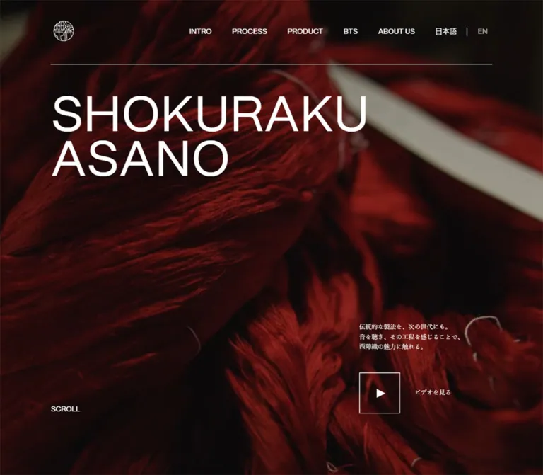
This is a long-form craft project and editorial brand experience. Its subject is the making of Nishijin obi, including the machinery, people, and sounds behind the finished textile. The opening establishes the material immediately: deep red yarn fills the viewport behind an enormous, regular-weight white title. Small Japanese serif copy and a spare square play control sit far below it.
The body alternates between warm cream and deep olive. The process sequence receives exceptional space: staggered photographs, narrow captions, circular listening controls, and delicate diagonal gold lines occupy a section more than ten desktop viewports tall. Broad empty areas are part of the composition. The ending returns to cream organization profiles and a large group photograph before a compact olive footer.
閉じる
Shokuraku QR Obi / SHOKURAKU ASANO — Style Reference
A documentary journey through Nishijin weaving, framed by oversized lettering, dark olive space, and fine gold threads.
Website: obiproject.monopo.net Original URL: https://obiproject.monopo.net/ Final URL: https://obiproject.monopo.net/ Theme: photographic opening, alternating warm cream and dark olive sections, with muted gold process content. Inspected: October 2, 2026, 01:25:56 JST; supplied retrieval timestamp: October 1, 2026, 16:25:56.592 UTC. Viewports: 1440 × 1000 desktop and 390 × 844 mobile, in CSS pixels. Scope: the current Japanese project page: opening composition, introduction, four weaving-process chapters, QR Code Obi project explanation, behind-the-scenes content, contributor information, organization profiles, and footer. Visual evidence consists of three desktop captures and two mobile captures, supplemented by rendered text, link destinations, element bounds, and computed styles across the document.
This is a long-form craft project and editorial brand experience. Its subject is the making of Nishijin obi, including the machinery, people, and sounds behind the finished textile. The opening establishes the material immediately: deep red yarn fills the viewport behind an enormous, regular-weight white title. Small Japanese serif copy and a spare square play control sit far below it.
The body alternates between warm cream and deep olive. The process sequence receives exceptional space: staggered photographs, narrow captions, circular listening controls, and delicate diagonal gold lines occupy a section more than ten desktop viewports tall. Broad empty areas are part of the composition. The ending returns to cream organization profiles and a large group photograph before a compact olive footer.
How to Read This Reference
- Measured means supplied DOM bounds, computed styles, or custom-property values. Measurements describe the recorded state, not every possible interaction state.
- Visual estimate means a dimension or treatment read from the supplied screenshots. These estimates are labeled and should not be treated as extracted CSS.
- Calculated means arithmetic based on recorded measurements, such as converting the desktop content width to a viewport percentage.
- Recommended means an implementation choice for a new build. Breakpoints, accessible behavior, missing media behavior, and the Quick Start are adaptations unless explicitly identified as source values.
- Source custom-property names are preserved where available. Additional token names are descriptive aliases.
- No further browsing, external-link inspection, command execution, or file access was performed. Playback, menu opening, dragging, and contributor disclosure behavior were not demonstrated by the supplied evidence.
Tokens — Colors
Default Palette
| Name | Value | Source token or evidence | Role and certainty |
|---|---|---|---|
| Deep Olive | #2c2e26 |
--color-gray-300; measured section backgrounds |
Process, contributor section, and footer; also introduction text on cream |
| Warm Cream | #e0ddd3 |
--color-gray-200; measured backgrounds and text |
Introduction, behind-the-scenes, and organization surfaces; contributor text on olive |
| Muted Gold | #c6b269 |
--color-yellow-100; measured process text and button fill |
Process headings, body copy, circular listening controls, and visually matching fine lines |
| White | #ffffff |
--color-white; measured hero and navigation text |
Opening title, hero copy, play control, and desktop navigation |
| Black | #000000 |
Measured text color | Behind-the-scenes and organization copy on cream |
| Yarn Red | #872025 |
--color-red-100 |
Declared source token; a specific visible component assignment was not supplied |
| Secondary Olive Gray | #41433b |
--color-gray-400 |
Declared source token; exact visible usage is unverified |
| Pale Gray | #f0f0f0 |
--color-gray-100 |
Declared source token; exact visible usage is unverified |
The hero's red is photographic: individual fibers range from bright rusty red to almost black. Do not replace that material with a flat #872025 background and consider the result equivalent. The declared red token does not establish the color of every visible strand.
Footer links look considerably dimmer than the seal in both footer captures. Their computed text color is cream, but effective opacity and ancestor compositing were not supplied. A muted cream treatment is appropriate for an adaptation; its exact opacity remains an estimate.
Section Color Pairings
| Region | Surface | Foreground | Character |
|---|---|---|---|
| Opening | Dark red yarn imagery | White | Cinematic, material-focused, highly sparse |
| Introduction | Warm cream | Deep olive | Quiet editorial explanation |
| Process | Deep olive | Muted gold | Long documentary sequence with thread-like geometry |
| QR Code Obi title | Within the dark process region | Muted gold | Large typographic transition |
| Product explanation | Background composition not visually supplied | White on desktop; gold on mobile, measured | Responsive color change is confirmed; its complete visual context is not |
| Behind the scenes | Warm cream | Black | Documentary context and image exploration |
| About the team | Deep olive | Warm cream | Contributor information |
| Organization profiles | Warm cream | Black | Background information, external links, and photography |
| Footer | Deep olive | Cream, visually muted for links | Restrained closing navigation |
These are section treatments, not selectable user themes. No theme switcher was observed.
Tokens — Typography
English Display and Utility Type
Declared source stack: "morigothic-regular.woff2", sans-serif through --font-en.
This is the literal family identifier in the supplied CSS evidence. The font file URL and font metadata were not supplied, so this reference does not expand it into a verified commercial font name.
English headings, navigation, roles, and utility labels use this sans-serif family. Sampled text is regular weight 400, with normal letter spacing. The large headings achieve impact through scale, capitalization, and tight line height rather than heavy weight or added tracking.
The two-line opening title is the most important typographic relationship: SHOKURAKU above ASANO, aligned to the main left gutter, with a line-height ratio of 0.9.
Japanese Editorial Type
Declared source stack: "yumin.ttf", serif through --font-ja.
Japanese paragraphs, process captions, and the desktop video label use this serif declaration. The visual character is a fine Japanese Mincho-style face. The exact font identity and downloadable asset location are unverified.
Body text remains 16px / 25.6px at both inspected widths. Mobile does not simply shrink all type. The opening statement is a separate, deliberately small 12px / 19.2px treatment.
Type Scale
All sampled roles below use weight 400 and normal tracking.
| Role | Desktop at 1440px | Mobile at 390px | Source or measurement |
|---|---|---|---|
| Opening title | 129.6px / 116.64px |
52px / 46.8px |
--size-huge-title: 9vw, mobile 52px; line height 0.9 |
| QR Code Obi title | 129.6px / 129.6px |
52px / 52px |
Same huge-title token, line height 1 |
| Intro heading | 57.6px / 69.12px |
44px / 52.8px |
--size-section-title: 4vw, mobile 44px; line height 1.2 |
| Process heading | 57.6px / 92.16px |
44px / 70.4px |
Section-title token, line height 1.6 |
| BTS and team headings | 57.6px / 69.12px |
44px / 52.8px |
Section-title token, line height 1.2 |
| Organization headings | 57.6px / 66.24px |
44px / 50.6px |
Section-title token, line height 1.15 |
| Japanese body | 16px / 25.6px |
16px / 25.6px |
Measured paragraphs |
| Product explanation | 16px / 27.2px |
16px / 27.2px |
Slightly looser line height 1.7 |
| Hero statement | 12px / 19.2px |
12px / 19.2px |
Measured paragraph |
| Desktop video label | 12px / 13.8px |
Not visible | Label reads ビデオを見る |
| Main navigation | 14px / 16.1px |
Off-canvas links: 28px / 32.2px |
Mobile menu was closed in the capture |
| Language links | 14px / 16.1px |
Off-canvas: 16px / 18.4px |
Japanese and English destinations exist |
| Process eyebrow | 14px / 22.4px |
14px / 22.4px |
STEP BY STEP |
| Contributor role | 18px / 20.7px |
18px / 20.7px |
Sponsor, Sound Designer, Videographer, Photographer |
| External profile link | 16px / 19.2px |
16px / 19.2px |
Uppercase label with northeast arrow |
| Footer link | 14px / 19.6px |
14px / 19.6px |
Mobile changes row geometry, not font size |
| Listening control | 12px / 13.8px |
12px / 13.8px |
White LISTEN label |
Wrapping and Hierarchy
Keep the intentional line breaks in large titles: SHOKURAKU / ASANO, QR CODE / OBI, BEHIND / THE SCENE, and ABOUT / THE TEAM. These stacked phrases establish a recurring editorial rhythm.
Do not apply the same line-height token to every heading. The process title has visibly looser measured leading than the opening title. Likewise, preserve the Japanese paragraph rhythm instead of borrowing the tighter English utility line height.
Tokens — Spacing & Shapes
Primary Geometry
| Element | Desktop measurement | Mobile measurement | Interpretation |
|---|---|---|---|
| Main content frame | 1152px, starting at x=144 |
351px, starting at x=19.5 |
Calculated as 80% and 90% of viewport width |
| Main side gutters | 144px each |
19.5px each |
Calculated as 10vw and 5vw |
| Standard copy token | min(508px, 40vw) |
100% |
Explicit --size-text-block values |
| Common copy width | 508px |
Usually 351px |
Intro and BTS mobile samples are about 354.89px; do not infer a new global gutter from this exception |
| Team content inset | Heading at x=144; profiles at x=788 |
x=29.25, width 331.5px |
Team uses a narrower mobile content frame than the main 90% frame |
| Hero | 1440 × 1000px |
390 × 844px |
Fills the recorded viewport |
| Header | 1152 × 126px |
351 × 132px |
Desktop padding 34px 0 40px; mobile 40px 0 |
| Header logo link | 52 × 52px |
52 × 52px |
Visible seal sits inside this box |
| Video button | 80 × 80px |
80 × 80px |
Size preserved on mobile |
| Listening button | 100 × 100px |
90 × 90px |
Circular; mobile reduction is modest |
| Footer | 162px tall |
444.375px tall |
Both use 40px top and bottom padding |
| Full document | 18688.5px |
15756.125px |
Approximately 19 viewport heights at either recorded size |
Spacing Scale
There is no supplied evidence of a single global spacing scale. The following values recur in measured relationships and can form an adaptation's spacing tokens.
| Value | Observed use |
|---|---|
8px |
Footer label-to-arrow gap |
12px |
Organization and contributor label-to-arrow gap |
20px |
Language separator padding; mobile footer row vertical padding; approximately the desktop photograph-pair gap |
28px |
Desktop play-button-to-label gap; process eyebrow/title and title/body gaps |
40px |
Desktop navigation gaps; hero paragraph-to-video-row gap; organization link-group gap; footer padding |
44px |
Measured mobile heading-to-description separation in organization profiles and BTS |
60px |
Desktop header-to-hero-title gap; profile copy-to-external-links separation |
100px |
Approximately the desktop final-image-to-footer clearance, visually estimated |
144px |
Desktop introduction heading inset below its section start |
200px |
Desktop process-step top/bottom padding and team section top/bottom padding |
800px |
Desktop process section bottom padding |
At 390 × 844, process and BTS outer padding is 84.4px, and team outer padding is 168.8px. These equal 10% and 20% of the recorded viewport height, respectively, but the supplied evidence does not prove the original CSS formulas. Each mobile process step has 195px top and 78px bottom padding; these equal 50vw and 20vw at the inspected width.
Shapes and Rules
- Square corners: sampled sections, links, and video controls have
0pxradius. Photographs and the final brand tile are square-cornered in the screenshots. - Circular exception: listening controls have measured
border-radius: 50%. - Fine lines: the header rule, video outline, menu strokes, and diagonal process lines look approximately
1pxthick. Thickness is a visual estimate, not a supplied border measurement. - No elevation system: the supplied screenshots show separation through flat color changes, image edges, whitespace, and lines. They do not show a reusable shadow or floating-card treatment.
- Identity mark: the round seal is detailed line artwork, not a generic circular icon or text set inside a border.
Components
Identity Header and Persistent Navigation
Anatomy: linked seal at the left, five section links at the right, then Japanese/English language links with a narrow vertical separator.
On desktop, the opening header occupies the 80%-wide content frame. The seal link is positioned at x=144, y=34 and measures 52 × 52px. Navigation labels sit around y=55, with 40px gaps between the main section links. A fine horizontal rule spans the frame at approximately y=125.
The visible navigation labels are INTRO, PROCESS, PRODUCT, BTS, and ABOUT US. Their destinations are #intro, #process, #product, #bts, and #aboutUs. The language destinations are the current root URL and /en/.
The navigation remains at the same upper-right screen position in the supplied scrolled desktop captures. The opening seal and rule do not remain visible there. This supports a persistent navigation layer, but the precise fixed/sticky implementation was not supplied. Do not make the entire opening header a permanently visible opaque bar.
Mobile Menu Trigger and Off-Canvas Navigation
Anatomy: the seal remains on the left; a two-stroke menu icon replaces the visible desktop link row.
The measured trigger is at x=313, y=54, with a 38 × 18.39px button box. The icon is two thin white horizontal strokes. The same icon remains near the top right in the mobile footer capture.
The closed-state DOM contains navigation links at x=430, outside the 390px viewport. Their font size is 28px, with approximately 60.19px between successive link tops. This is evidence of off-canvas placement, not proof of an observed opening transition. The panel background, complete open-state composition, focus behavior, dismissal behavior, and animation duration are unverified.
Recommended adaptation: retain the 38px-wide strokes within a minimum 44 × 44px hit area, and implement a labeled button with aria-expanded and aria-controls.
Full-Viewport Opening
Anatomy: full-bleed yarn imagery, white seal/navigation, two-line title, small statement, video control, and a desktop-only visible scroll cue.
At desktop size, the title begins at x=144, y=186; its two-line box is approximately 1152 × 233.25px. The large empty area below the title allows the yarn to remain the subject. The lower-right statement occupies a 260px column at x=1036, beginning around y=702.44.
On mobile, the title begins immediately below the 132px header, at x=19.5, y=132. Its font changes to 52px, keeping the same two-line hierarchy. The image fills the entire narrow viewport, producing a much closer view of the yarn. Exact media source dimensions and focal-point rules are unavailable.
The small statement preserves its three-line structure:
伝統的な製法を、次の世代にも。
音を聴き、その工程を感じることで、
西陣織の魅力に触れる。
The captured backgrounds have different compositions. Cropping and/or different media frames can explain this; the supplied evidence does not establish a video element, autoplay policy, loop duration, or background playback state.
Outlined Video Control
Anatomy: an 80px square transparent button, thin white outline, and a centered white right-pointing triangle. Desktop adds the Japanese label ビデオを見る to its right.
Desktop placement is x=1036, y=800, leaving 120px between the button bottom and viewport bottom. The label begins at x=1144, giving a 28px button-to-label gap.
Mobile placement is x=263.5, y=704, leaving 60px below the button. The statement is now to its left, in a 204px column, with a 40px gap to the button. The separate video label and desktop scroll cue are not visible.
The control's destination state was not captured. Do not invent a particular lightbox, player provider, close animation, or fullscreen behavior. The extracted button has no text content; that alone does not establish whether it has an accessible name.
Introduction Block
The opening transitions directly into a warm cream section. A large olive INTRO heading and a serif Japanese paragraph introduce the craft brand and the project's documentary intent.
On desktop, both heading and copy align to the left gutter and use a 508px column. The heading starts 144px below the section start, and the paragraph begins approximately 132px below the heading's bottom. On mobile, the heading begins 78px below the section start, and the heading-to-paragraph gap is 60px.
The full introduction region measures approximately 1481px on desktop and 1373px on mobile. The supplied screenshots do not show its complete imagery or graphic arrangement, so those dimensions should guide pacing rather than justify invented decorative content.
Process Chapter
Anatomy: introductory eyebrow and title, explanatory copy, four numbered craft chapters, large media areas, listening controls, supporting photographs, short captions, and diagonal lines.
The source order is:
01 デザイン— design.02 色染め— yarn dyeing.03 糸繰り— yarn winding.04 ジャカード織機— Jacquard loom.
The process region uses an olive background with gold text. Its measured height is approximately 10948px on desktop and 8654px on mobile. Individual desktop steps are approximately 2418–2445px tall; mobile steps are approximately 1870–1950px tall. These are content-state measurements, not recommended fixed heights.
The supplied process screenshot shows a staggered composition: a cropped landscape photograph on the left and a tall machinery detail on the right. The left image spans approximately 576px, or half of the content frame. The right image spans approximately 403px, or 35% of the frame, ending at the right gutter. A gold serif caption sits below it with about 44px of clearance.
Fine diagonal gold lines cross the otherwise empty olive space. They suggest individual threads without turning the background into a dense pattern. Their movement, if any, is unverified.
Circular Listening Control
Each process step contains a gold circular button with a white LISTEN label. The desktop control is 100px across; the mobile control is 90px across. These are the principal rounded interactive elements in an otherwise square-edged system.
Desktop control centers are at the page's horizontal midpoint. In the recorded mobile DOM, controls are instead positioned at x=228, near the beginning of each step. This is a substantial compositional change, not just proportional scaling.
The page text explicitly connects the process to sound, but no listening action was supplied. Playing, paused, loading, progress, active-label, and sound-mixing states remain unverified. Keep a future audio implementation tied to the relevant process chapter.
QR Code Obi Transition
The product-oriented passage begins with the very large stacked title QR CODE / OBI. It uses the same huge-title token as the opening, with 1 line height rather than 0.9.
Its paragraph describes the histories, machines, and hands embedded in an obi and a QR code that opens this story. No shopping cart, pricing module, scan widget, or purchasing flow was observed.
The paragraph is measured in white on desktop and gold on mobile, at 16px / 27.2px. Its desktop bounds extend across the process/BTS section boundary. Without a screenshot of that transition, the complete image layering and positioning cannot be reconstructed confidently.
Behind-the-Scenes Section
A cream surface returns after the long process region. Desktop places the stacked BEHIND / THE SCENE heading on the left and approximately 520px of Japanese copy on the right. On mobile, the heading and copy form a single vertical sequence with a 44px gap.
The copy discusses factory visits and music made from machinery sounds. A Drag label exists in the supplied DOM, suggesting an image-exploration affordance. The gallery itself was not demonstrated. Slide count, drag direction, snap behavior, cursor artwork, inertia, and touch support are unverified.
Recommended adaptation: make any horizontal gallery reachable with ordinary scrolling and keyboard controls, even if dragging is also offered.
Contributor Information
The ABOUT / THE TEAM region returns to olive, with cream headings and text. On desktop, its heading occupies the left column and contributor content begins at x=788 in a 508px column. On mobile, it uses a narrower 331.5px frame starting at x=29.25.
The original page explicitly presents these names and roles:
| Name | Displayed role |
|---|---|
| monopo | Sponsor |
| Andy Nagashima | Sound Designer |
| Issam Kechouri | Videographer |
| Nik Van Der Giesen | Photographer |
Content anatomy includes a name, role, WEBSITE link, and Japanese profile or quotation. The role is 18px; links are 16px; paragraphs are 16px / 1.6.
Several biography rectangles overlap later entries or extend beyond the section's recorded bounds. This extraction does not establish which descriptions were visibly expanded, clipped, or otherwise managed. Do not infer an all-open list, accordion, or animation from the text dump alone.
These displayed roles do not establish website design or development authorship. Also, the photographer's WEBSITE destination repeats the sound designer's URL in the supplied link sequence; a personal website for the photographer is therefore not endorsed here.
Organization Profiles and Image Pair
The closing cream region contains separate descriptions of Shokuraku Asano and monopo. Desktop uses a heading on the left and a 508px description on the right. WEBSITE and INSTAGRAM links sit beneath the copy, aligned toward the right edge, with thin northeast arrows.
Mobile stacks each heading, description, and link row. Links move to the left edge, while the 60px copy-to-links gap remains in the measured examples.
The final desktop image pair is especially distinctive: a large group portrait against a dark studio background occupies approximately 755 × 503px, followed by a black monopo identity tile of approximately 377 × 503px. The estimated gap is 20px. Together they span the 1152px frame, creating an approximately 2:1 column relationship.
The mobile ending shows the black brand tile occupying approximately the full 351px content width. Its upper edge is outside the screenshot, so its complete mobile aspect ratio and the preceding photograph arrangement are unverified.
Footer
Desktop anatomy: an olive band, white line-art seal on the left, and four small external links arranged horizontally at the right: 織楽浅野, MONOPO, FACEBOOK, and INSTAGRAM.
The footer measures 162px tall with 40px top and bottom padding. Link groups are separated by approximately 40px. Each link includes a northeast arrow separated from the label by 8px.
Mobile anatomy: a centered seal followed by four full-width rows. Each row measures approximately 60.59px, with 20px vertical padding, a right-aligned arrow, and a subtle bottom divider. The footer grows to approximately 444px tall while retaining the same 14px text.
The seal's visible artwork is approximately 64px across in the footer captures. An approximately 82px outer box is a useful implementation estimate consistent with the measured footer height; the actual footer logo element bounds were not supplied.
Tokens — Motion & Interaction
| Treatment | Evidence | What can be concluded |
|---|---|---|
| External-link feedback | Computed transition: opacity 0.1s ease-out |
A short opacity transition is defined; the target opacity and triggering state were not supplied |
| Persistent navigation | Navigation remains near the same screen coordinates in scrolled captures | Persistence is visually supported; exact positioning mechanism is unverified |
| Section navigation | Original-page fragment URLs are present | Section destinations exist; smooth scrolling, timing, and scroll offsets were not tested |
| Video action | Visible square play button and desktop label | An explicit media action is offered; resulting player state is unknown |
| Process sound | Four LISTEN buttons and sound-related copy |
Chapter-specific listening is intended; actual playback states are unknown |
| Mobile navigation | Closed trigger and links positioned outside the viewport | Off-canvas structure is supported; open-state motion was not observed |
| BTS image exploration | Drag appears in section DOM |
A drag affordance is suggested; its mechanics were not tested |
| Hero imagery | Different crops/compositions across supplied current captures | Moving media is possible, but playback, loop, and timing are not established |
| Process thread lines | Thin diagonal lines visible in a static capture | Geometry is observed; animated drawing, parallax, or scroll synchronization is not |
Most sampled elements report animation: none. Many report a generic transition: all without useful timing information. Neither observation rules out JavaScript-driven motion, child-element animation, or media playback elsewhere in the page.
The capture process waited for visible readiness and sampled stability, temporarily pausing perpetual animations during checks. This improves static inspection but is not an interaction recording.
Recommended motion policy: preserve the measured 100ms opacity feedback for links. Keep additional navigation or disclosure transitions brief and unobtrusive, and label their timing as a new implementation choice. Do not add decorative parallax merely because the page has a cinematic appearance.
Surfaces
| Layer | Appearance | Purpose |
|---|---|---|
| Opening media | Dark, detailed red fibers reaching every viewport edge | Establishes material before explanation |
| Editorial cream | Flat #e0ddd3 |
Introduction, BTS context, and organization profiles |
| Process olive | Flat #2c2e26 with gold text and fine diagonals |
Long, immersive craft documentation |
| Contributor olive | Same dark surface with cream text | Separates people and credits from process chapters |
| Video control | Transparent square with fine white outline | Media action without a large filled CTA |
| Listening control | Solid gold circle | Distinct, repeated chapter-level sound action |
| Brand tile | Visually near-black artwork with centered white monopo lettering | Graphic counterweight to the group photograph |
| Footer | Olive, white seal, subdued cream links | Quiet closure and external destinations |
No modal surface was visually inspected. Avoid describing a player backdrop, blur layer, rounded dialog, or lightbox frame as an original feature.
Imagery
The photography is tactile and documentary. The opening uses close views of thick red yarn, shallow focus, soft highlights, and deep shadows. The process detail shows aged machinery, rows of guides, and fine threads receding through the frame. These subjects give the geometry and colors a physical reason to exist.
Keep the industrial character of the craft: worn surfaces, mechanisms, tensioned threads, irregular fibers, and restrained workshop lighting. The typography is clean, but the images should not become sterile product renders.
The final group photograph changes scale from material detail to people. Its dark background connects visually to the adjacent black brand tile, while both remain clearly framed by cream space.
Observed Asset References
No image, video, audio, or font asset URLs were included in the supplied evidence. The following are visual references, not downloadable paths.
| Asset | Evidence | Reuse guidance |
|---|---|---|
| Circular Shokuraku seal | Opening and footer screenshots; linked SVG content in DOM | Use authorized original artwork; preserve internal line detail and proportions |
| Red yarn opening media | Desktop and mobile opening captures | Use a high-resolution source with enough crop flexibility for both viewports |
| Machinery and thread photographs | Desktop process capture | Combine landscape and portrait formats; preserve shadow detail and shallow focus |
| monopo group photograph | Desktop closing capture | Keep the wide group composition; avoid arbitrary face cropping |
| Black monopo identity tile | Desktop and mobile closing captures | Preserve the supplied mark and generous black surround |
| Process audio | Listening buttons and explanatory text | Source files and playback states are unavailable |
Use photographs at normal image rendering quality. Pixelation, halftone processing, illustrated substitutes, and invented asset paths would change the observed identity.
Layout & Responsive Behavior
Recorded Changes
| Relationship | Desktop | Mobile |
|---|---|---|
| Main frame | 80% viewport width | 90% viewport width |
| Main gutter | 144px |
19.5px |
| Huge title | 9vw, measured 129.6px |
Fixed source token 52px |
| Section heading | 4vw, measured 57.6px |
Fixed source token 44px |
| Japanese body | 16px / 1.6 |
Unchanged |
| Opening navigation | Five links plus language switch | Two-stroke trigger; links outside viewport |
| Header rule | Visible across frame | Not visible in mobile opening |
| Opening title offset | 60px below header |
Immediately below header |
| Opening media action | Statement above button/label group at right | Statement to the left of the button near bottom |
| Scroll cue and video label | Visible | Not visible |
| Listening controls | 100px, centered horizontally |
90px, repositioned toward right side of chapter opening |
| Organization descriptions | Heading and text in separate columns | Heading, text, and links stacked |
| Footer | Horizontal identity and links | Centered identity, four divided rows |
The mobile version preserves the long narrative. It does not compress the four craft chapters into small cards or hide the process behind a short summary. The recorded page is shorter in pixels but still approximately 19 mobile viewports long.
Some desktop layouts use deliberately unequal columns. The process screenshot's 50%/35% image widths and the final photograph pair's approximately 2:1 relationship are different compositions; a single universal two-column grid would flatten that distinction.
The breakpoint itself was not supplied. Only the 1440px and 390px states are confirmed. Tablet layout, intermediate title scaling, landscape mobile behavior, browser chrome changes, and safe-area treatment are unverified. The Quick Start uses a recommended 767px breakpoint and adds small-screen safeguards without presenting them as original CSS.
Do’s and Don’ts
Do
- Preserve the olive
#2c2e26, cream#e0ddd3, and gold#c6b269section relationships. - Let the yarn image fill the opening viewport and carry the red palette.
- Use regular-weight, uppercase English display type at a very large scale.
- Keep Japanese body copy in a fine serif face with
1.6line height. - Preserve intentional title line breaks and tight opening-title leading.
- Use different image proportions and asymmetric placement within the broad desktop frame.
- Retain substantial empty space around process photography and diagonal lines.
- Keep the video control square and the listening controls circular.
- Preserve the mobile 80px video control and readable 16px body copy.
- Treat the footer's mobile rows as a real layout change, with full-width targets and dividers.
- Keep contributor role claims tied to the original page's displayed wording.
Don’t
- Don't turn the process narrative into a generic feature-card grid.
- Don't replace material photography with a flat red gradient.
- Don't make every heading bold or widely tracked.
- Don't use gold as a general-purpose promotional button color throughout the page.
- Don't add rounded photograph cards, elevated panels, glass blur, or decorative shadows.
- Don't fill every empty region with copy, badges, icons, or calls to action.
- Don't make the desktop header an opaque sticky strip that hides the photography.
- Don't shrink every desktop measurement proportionally on mobile.
- Don't claim tested audio, video, dragging, menu transitions, or accordion behavior from static controls alone.
- Don't invent font identities, source asset paths, QR scanning behavior, or a purchase flow.
Recommended Implementation Additions
These are recommendations for a new implementation, not verified original features.
- Give the video and mobile-menu buttons explicit accessible names. Make listening controls identify their associated process chapter.
- Expand the menu's interactive hit area to at least 44px while retaining the thin 38px visual strokes.
- If the mobile navigation becomes a modal drawer, manage focus, support Escape, restore focus on close, and remove closed content from keyboard navigation.
- Use user-initiated audible playback and expose playing, paused, loading, and error states. Avoid allowing multiple process clips to compete unintentionally.
- Check the contrast of white 12px text on the gold listening controls, subdued footer links, and white persistent navigation over cream sections. A section-aware navigation color is a useful enhancement.
- Provide a static poster and reduced-motion alternative if the hero uses moving media. Pausing a video requires media logic; a CSS motion query alone is insufficient.
- Preserve meaningful image alternatives and provide captions or equivalent context for documentary media where available.
- Keep contributor descriptions in normal document flow or implement accessible disclosures. Do not reproduce apparent overlapping DOM rectangles as intentional text layout.
- Validate external destinations, especially the repeated photographer link, before reuse.
- Reserve media dimensions and load distant images progressively so the long document remains stable while scrolling.
Agent Prompt Guide
Quick Color Reference
- Process and footer surface:
#2c2e26. - Editorial surface:
#e0ddd3. - Process text, fine thread lines, listening controls:
#c6b269. - Opening typography and outline controls:
#ffffff. - Editorial text: olive in the introduction; black in the measured BTS and organization blocks.
- Red belongs primarily to photographic yarn.
#872025is a declared source token, not a substitute for the image. - Keep surfaces flat and corners square; reserve circles for the seal artwork and listening controls.
Overall Prompt
“Create a long-form Japanese craft project site documenting Nishijin obi production. Open with full-viewport, dark red yarn photography and a huge regular-weight white SHOKURAKU / ASANO title. Use an 80%-wide desktop content frame, a fine header rule, small uppercase navigation, and a sparse lower-right statement with an 80px outlined square play control. Alternate warm cream #e0ddd3 editorial sections with deep olive #2c2e26 process sections. On olive, use muted gold #c6b269 text, thin diagonal thread lines, staggered documentary photographs, and circular LISTEN controls. Pair clean English sans-serif headings with Japanese serif body copy at 16px/1.6. Preserve long pauses and asymmetric image placement. On a 390px phone, use a 90%-wide frame, a 52px opening title, 44px section headings, a two-stroke menu trigger, and the statement beside the play button. End with organization profiles, a wide group photograph beside a black brand tile on desktop, and an olive footer that becomes divided full-width rows on mobile. Treat unobserved playback, menu, and gallery mechanics as implementation decisions.”
Example Component Prompts
- Opening: “At 1440 × 1000, place a 52px seal box at x=144, y=34. Put a thin rule across the 1152px frame below the navigation. Set SHOKURAKU / ASANO at 129.6px, weight 400, line height 0.9, beginning at y=186. Use dark yarn photography, white text, and an 80px outlined square play button at the lower right. Leave the center open.”
- Process composition: “Build an olive editorial chapter with gold numbering and Japanese serif explanation. Use a broad landscape image toward the left and a narrower portrait machinery detail toward the right, separated by large empty space. Add a short gold caption beneath the detail and one or two very fine diagonal lines. Keep photographs square-cornered and avoid card containers.”
- Listening control: “Create a 100px muted-gold circle with a small white LISTEN label, reducing to 90px on mobile. It belongs to a specific weaving-process chapter. Provide accessible playback state in the implementation, without inventing an original progress-ring treatment.”
- Organization profile: “On warm cream, place a large two-line English heading at the left and 508px of Japanese serif copy at the right. Add uppercase WEBSITE and INSTAGRAM links with small northeast arrows beneath the copy. On mobile, stack the content and left-align the link group.”
- Closing image pair: “Within a 1152px desktop frame, pair a roughly 755 × 503px group portrait with a roughly 377 × 503px black identity tile. Use a 20px gap, square edges, and generous cream space. Use authorized photography and artwork rather than recreating the people or brand mark.”
- Mobile footer: “Create an olive footer with a centered white line-art seal and four understated 14px external-link rows. Each row has 20px vertical padding, a fine bottom divider, and a northeast arrow aligned to the right edge of the 90%-wide content frame.”
Quick Start
CSS Custom Properties
This is a usable visual scaffold, not a copy of the original stylesheet. Source colors, family identifiers, type sizes, and key measured dimensions are preserved. The breakpoint, hero darkening layer, muted-footer approximation, static thread geometry, and mobile stacking of unseen media are recommendations.
The family identifiers will use browser fallbacks until corresponding authorized @font-face definitions are provided. No font URLs are invented here. Supply the original seal and image assets separately. Put each intentional title line in a separate span.
:root {
  /* Observed source colors */
  --color-white: #fff;
  --color-gray-100: #f0f0f0;
  --color-gray-200: #e0ddd3;
  --color-gray-300: #2c2e26;
  --color-gray-400: #41433b;
  --color-yellow-100: #c6b269;
  --color-red-100: #872025;

  /* Semantic aliases */
  --color-paper: var(--color-gray-200);
  --color-olive: var(--color-gray-300);
  --color-gold: var(--color-yellow-100);
  --color-ink: #000;

  /* Literal source family identifiers; font files are not included */
  --font-en: 'morigothic-regular.woff2', sans-serif;
  --font-ja: 'yumin.ttf', serif;
  --size-huge-title: 9vw;
  --size-section-title: 4vw;
  --size-text-block: min(508px, 40vw);
  --text-body: 16px;
  --text-small: 12px;
  --text-nav: 14px;
  --leading-body: 1.6;

  /* Source-derived geometry */
  --frame-width: 80%;
  --logo-box: 52px;
  --video-size: 80px;
  --listen-size: 100px;
  --space-small: 20px;
  --space-medium: 40px;
  --space-large: 60px;
  --space-section: 200px;

  /* Visual estimates and recommended adaptations */
  --rule-width: 1px;
  --footer-logo-box: 82px;
  --footer-muted: color-mix(in srgb, var(--color-paper) 55%, var(--color-olive));
  --link-transition: opacity 100ms ease-out;
}

* { box-sizing: border-box; }
body {
  margin: 0;
  color: var(--color-ink);
  background: var(--color-paper);
  font-family: var(--font-en);
  font-weight: 400;
}
button, a { -webkit-tap-highlight-color: transparent; }
button { font: inherit; cursor: pointer; }
img { display: block; max-width: 100%; }
a { color: inherit; }
.frame { width: var(--frame-width); margin-inline: auto; }
.title-line { display: block; }
.copy {
  margin: 0;
  font-family: var(--font-ja);
  font-size: var(--text-body);
  line-height: var(--leading-body);
  font-weight: 400;
}
.copy-column { width: var(--size-text-block); max-width: 100%; }
.section-title {
  margin: 0;
  font: 400 var(--size-section-title)/1.2 var(--font-en);
  text-transform: uppercase;
}

.hero {
  position: relative;
  isolation: isolate;
  min-height: 100vh;
  min-height: 100svh;
  overflow: hidden;
  color: var(--color-white);
  background: var(--color-olive);
}
.hero__media {
  position: absolute;
  inset: 0;
  z-index: -2;
  width: 100%;
  height: 100%;
  object-fit: cover;
}
.hero::before {
  /* Recommended overlay; tune to the supplied image */
  content: '';
  position: absolute;
  inset: 0;
  z-index: -1;
  background: rgb(0 0 0 / 25%);
}
.hero__header {
  position: relative;
  display: flex;
  align-items: center;
  justify-content: space-between;
  padding-block: 34px 40px;
}
.hero__header::after {
  content: '';
  position: absolute;
  inset-inline: 0;
  bottom: 0;
  height: var(--rule-width);
  background: currentColor;
}
.brand-mark {
  display: block;
  width: var(--logo-box);
  height: var(--logo-box);
}
.brand-mark svg { display: block; width: 100%; height: 100%; }
.desktop-nav {
  /* Fixed positioning adapts the observed persistent navigation */
  position: fixed;
  z-index: 20;
  top: 54px;
  right: 10vw;
  display: flex;
  align-items: center;
  gap: 40px;
  color: var(--color-white);
  font: 400 var(--text-nav)/1.15 var(--font-en);
  text-transform: uppercase;
}
.desktop-nav a { text-decoration: none; }
.language-switch { display: flex; align-items: center; }
.language-switch a:first-child { padding-right: 20px; }
.language-switch a + a {
  padding-left: 20px;
  border-left: 1px solid currentColor;
}
.menu-toggle { display: none; }
.hero__title {
  margin: 60px 0 0;
  font: 400 var(--size-huge-title)/0.9 var(--font-en);
  letter-spacing: normal;
  text-transform: uppercase;
}
.hero__bottom {
  position: absolute;
  inset-inline: 10%;
  bottom: 120px;
  display: flex;
  align-items: flex-end;
  justify-content: space-between;
  gap: 40px;
}
.hero__scroll { font: 400 14px/1 var(--font-en); }
.hero__intro { width: 260px; }
.hero__copy {
  margin: 0 0 40px;
  font: 400 12px/1.6 var(--font-ja);
}
.hero__video-row { display: flex; align-items: center; gap: 28px; }
.hero__video-label {
  margin: 0;
  white-space: nowrap;
  font: 400 12px/1.15 var(--font-ja);
}
.play-button {
  display: grid;
  place-items: center;
  flex: 0 0 var(--video-size);
  width: var(--video-size);
  height: var(--video-size);
  padding: 0;
  border: var(--rule-width) solid currentColor;
  border-radius: 0;
  color: inherit;
  background: transparent;
}
.play-button::before {
  content: '';
  width: 0;
  height: 0;
  margin-left: 4px;
  border-top: 8px solid transparent;
  border-bottom: 8px solid transparent;
  border-left: 17px solid currentColor;
}

.section-light {
  padding-block: var(--space-section);
  color: var(--color-ink);
  background: var(--color-paper);
}
.intro { color: var(--color-olive); }
.split {
  display: grid;
  grid-template-columns: var(--size-text-block) var(--size-text-block);
  justify-content: space-between;
  gap: 40px;
}
.process {
  position: relative;
  overflow: hidden;
  padding-block: 200px 800px;
  color: var(--color-gold);
  background: var(--color-olive);
}
.process__eyebrow {
  margin: 0 0 28px;
  font: 400 14px/1.6 var(--font-en);
  text-transform: uppercase;
}
.process__title { margin-bottom: 28px; line-height: 1.6; }
.process-step { position: relative; padding-block: 200px; }
.listen-button {
  display: grid;
  place-items: center;
  width: var(--listen-size);
  height: var(--listen-size);
  padding: 0;
  border: 0;
  border-radius: 50%;
  color: var(--color-white);
  background: var(--color-gold);
  font: 400 12px/1.15 var(--font-en);
  text-transform: uppercase;
}
.process-images {
  display: grid;
  grid-template-columns: 50% 35%;
  justify-content: space-between;
  align-items: start;
}
.process-images figure { margin: 0; }
.process-images img { width: 100%; height: auto; }
.process-images figcaption {
  margin-top: 44px;
  font: 400 16px/1.6 var(--font-ja);
}
.thread-line {
  /* Static visual approximation; positioning should follow the media */
  position: absolute;
  top: 55%;
  left: -20%;
  width: 140%;
  height: 1px;
  pointer-events: none;
  background: linear-gradient(90deg, var(--color-gold), transparent);
  transform: rotate(22deg);
}
.product-title {
  margin: 0;
  font: 400 var(--size-huge-title)/1 var(--font-en);
  text-transform: uppercase;
}
.team {
  padding-block: 200px;
  color: var(--color-paper);
  background: var(--color-olive);
}
.profile-role { font: 400 18px/1.15 var(--font-en); }
.external-links {
  display: flex;
  flex-wrap: wrap;
  justify-content: flex-end;
  gap: 40px;
  margin-top: 60px;
}
.external-link {
  display: inline-flex;
  align-items: center;
  gap: 12px;
  color: inherit;
  font: 400 16px/1.2 var(--font-en);
  text-decoration: none;
  text-transform: uppercase;
  transition: var(--link-transition);
}
.about-media {
  display: grid;
  grid-template-columns: 2fr 1fr;
  gap: 20px;
  margin-block: 100px;
}
.about-media__photo { aspect-ratio: 3 / 2; }
.about-media img { width: 100%; height: 100%; object-fit: cover; }

.site-footer {
  padding-block: 40px;
  color: var(--color-paper);
  background: var(--color-olive);
}
.footer-inner {
  display: flex;
  align-items: center;
  justify-content: space-between;
  gap: 40px;
}
.footer-seal {
  width: var(--footer-logo-box);
  height: var(--footer-logo-box);
  object-fit: contain;
}
.footer-links { display: flex; gap: 40px; }
.footer-links a {
  display: flex;
  align-items: center;
  gap: 8px;
  color: var(--footer-muted);
  font: 400 14px/1.4 var(--font-en);
  text-decoration: none;
  text-transform: uppercase;
  transition: var(--link-transition);
}

/* Recommended interaction states; only transition timing is source-derived */
@media (hover: hover) {
  .external-link:hover, .footer-links a:hover { opacity: 0.65; }
}
:where(a, button):focus-visible {
  outline: 2px solid currentColor;
  outline-offset: 4px;
}

/* Recommended breakpoint; the original breakpoint was not supplied */
@media (max-width: 767px) {
  :root {
    --frame-width: 90%;
    --size-huge-title: 52px;
    --size-section-title: 44px;
    --size-text-block: 100%;
    --listen-size: 90px;
  }
  .desktop-nav { display: none; }
  .hero__header { padding-block: 40px; }
  .hero__header::after { display: none; }
  .menu-toggle {
    position: fixed;
    z-index: 30;
    top: 44px;
    right: calc(10vw - 3px);
    display: flex;
    flex-direction: column;
    align-items: center;
    justify-content: center;
    gap: 11px;
    width: 44px;
    height: 44px;
    padding: 0;
    border: 0;
    color: var(--color-white);
    background: transparent;
  }
  .menu-toggle span { width: 38px; height: 1px; background: currentColor; }
  .hero__title { margin-top: 0; }
  .hero__bottom { inset-inline: 5%; bottom: 60px; }
  .hero__scroll, .hero__video-label { display: none; }
  .hero__intro {
    display: flex;
    align-items: center;
    gap: 40px;
    width: 100%;
  }
  .hero__copy { flex: 0 1 204px; margin: 0; }
  .hero__video-row { flex: 0 0 80px; }
  .split { grid-template-columns: minmax(0, 1fr); gap: 44px; }
  .section-light, .process { padding-block: 10vh; }
  .process-step { padding-block: 50vw 20vw; }
  .team { padding-block: 20vh; }
  .team > .frame { width: 85%; }
  .external-links { justify-content: flex-start; }
  .process-images { grid-template-columns: 1fr; gap: 60px; }
  .about-media {
    /* Recommended stacking; the complete mobile pair was not captured */
    grid-template-columns: 1fr;
    margin-block: 40px 0;
  }
  .about-media img { height: auto; }
  .footer-inner { flex-direction: column; }
  .footer-links { width: 100%; flex-direction: column; gap: 0; }
  .footer-links a {
    justify-content: space-between;
    padding-block: 20px;
    border-bottom: 1px solid var(--color-gray-400);
  }
}

/* Recommended safeguard below the inspected phone width */
@media (max-width: 359px) {
  :root { --size-huge-title: 13.333vw; }
  .hero__intro { gap: 20px; }
}

@media (prefers-reduced-motion: reduce) {
  .external-link, .footer-links a { transition: none; }
  html { scroll-behavior: auto; }
  /* Pause moving media through the application's media controls. */
}
The CSS covers the visual shell and repeatable layout primitives. Navigation opening, accessible media playback, gallery operation, and contributor disclosures require separate behavior. Use content-driven section heights; do not hardcode the recorded 18,689px document height or individual chapter heights.
Tailwind v4 Token Mapping
Optional mapping for an implementation already using Tailwind v4. This is not evidence that the original site uses Tailwind. Define the properties above first.
@theme inline {
  --color-paper: var(--color-gray-200);
  --color-olive: var(--color-gray-300);
  --color-gold: var(--color-yellow-100);
  --color-yarn: var(--color-red-100);
  --font-display: var(--font-en);
  --font-editorial: var(--font-ja);
  --text-hero: var(--size-huge-title);
  --text-section: var(--size-section-title);
  --text-body: 16px;
  --text-caption: 12px;
  --spacing-video: var(--video-size);
  --spacing-listen: var(--listen-size);
  --spacing-section: var(--space-section);
}
Sources & Evidence
- Original and final website: Shokuraku QR Obi. The supplied inspection reports HTTP 200 and no URL change.
- Capture timestamp:
2026-10-01T16:25:56.592Z, equivalent to October 2, 2026, 01:25:56.592 JST. Individual screenshot timestamps were not separately supplied. - Desktop evidence: 1440 × 1000 viewport; opening, a process fragment, and the closing organization/footer region; recorded document height
18688.5px. - Mobile evidence: 390 × 844 viewport; opening and closing/footer region; recorded document height
15756.125px. - Rendered evidence: current Japanese text, original-page anchor and external-link destinations, source custom properties, computed typography and colors, selected element bounds, and explicit link transition declarations.
- Original-page section destinations: Intro, Process, Product, BTS, and About Us. Destinations were recorded; click behavior was not separately exercised.
- Inspection limits: no tested player opening, sound playback, open mobile menu, gallery drag, hover endpoint, contributor disclosure, English page, or external destination. No media manifest, font asset URLs, complete source stylesheet, or breakpoint declarations were provided. Readiness checks cannot establish semantic completeness or reveal every delayed state.
This reference describes the currently supplied Japanese page. Measured values, screenshot estimates, and implementation recommendations are distinguished throughout; unobserved interactions and intermediate responsive states remain unverified.
# Shokuraku QR Obi / SHOKURAKU ASANO — Style Reference

> A documentary journey through Nishijin weaving, framed by oversized lettering, dark olive space, and fine gold threads.

**Website:** [obiproject.monopo.net](https://obiproject.monopo.net/)
**Original URL:** https://obiproject.monopo.net/
**Final URL:** https://obiproject.monopo.net/
**Theme:** photographic opening, alternating warm cream and dark olive sections, with muted gold process content.
**Inspected:** October 2, 2026, 01:25:56 JST; supplied retrieval timestamp: October 1, 2026, 16:25:56.592 UTC.
**Viewports:** 1440 × 1000 desktop and 390 × 844 mobile, in CSS pixels.
**Scope:** the current Japanese project page: opening composition, introduction, four weaving-process chapters, QR Code Obi project explanation, behind-the-scenes content, contributor information, organization profiles, and footer. Visual evidence consists of three desktop captures and two mobile captures, supplemented by rendered text, link destinations, element bounds, and computed styles across the document.

This is a long-form craft project and editorial brand experience. Its subject is the making of Nishijin obi, including the machinery, people, and sounds behind the finished textile. The opening establishes the material immediately: deep red yarn fills the viewport behind an enormous, regular-weight white title. Small Japanese serif copy and a spare square play control sit far below it.

The body alternates between warm cream and deep olive. The process sequence receives exceptional space: staggered photographs, narrow captions, circular listening controls, and delicate diagonal gold lines occupy a section more than ten desktop viewports tall. Broad empty areas are part of the composition. The ending returns to cream organization profiles and a large group photograph before a compact olive footer.
閉じる
# Shokuraku QR Obi / SHOKURAKU ASANO — Style Reference

> A documentary journey through Nishijin weaving, framed by oversized lettering, dark olive space, and fine gold threads.

**Website:** [obiproject.monopo.net](https://obiproject.monopo.net/)
**Original URL:** https://obiproject.monopo.net/
**Final URL:** https://obiproject.monopo.net/
**Theme:** photographic opening, alternating warm cream and dark olive sections, with muted gold process content.
**Inspected:** October 2, 2026, 01:25:56 JST; supplied retrieval timestamp: October 1, 2026, 16:25:56.592 UTC.
**Viewports:** 1440 × 1000 desktop and 390 × 844 mobile, in CSS pixels.
**Scope:** the current Japanese project page: opening composition, introduction, four weaving-process chapters, QR Code Obi project explanation, behind-the-scenes content, contributor information, organization profiles, and footer. Visual evidence consists of three desktop captures and two mobile captures, supplemented by rendered text, link destinations, element bounds, and computed styles across the document.

This is a long-form craft project and editorial brand experience. Its subject is the making of Nishijin obi, including the machinery, people, and sounds behind the finished textile. The opening establishes the material immediately: deep red yarn fills the viewport behind an enormous, regular-weight white title. Small Japanese serif copy and a spare square play control sit far below it.

The body alternates between warm cream and deep olive. The process sequence receives exceptional space: staggered photographs, narrow captions, circular listening controls, and delicate diagonal gold lines occupy a section more than ten desktop viewports tall. Broad empty areas are part of the composition. The ending returns to cream organization profiles and a large group photograph before a compact olive footer.

## How to Read This Reference

- **Measured** means supplied DOM bounds, computed styles, or custom-property values. Measurements describe the recorded state, not every possible interaction state.
- **Visual estimate** means a dimension or treatment read from the supplied screenshots. These estimates are labeled and should not be treated as extracted CSS.
- **Calculated** means arithmetic based on recorded measurements, such as converting the desktop content width to a viewport percentage.
- **Recommended** means an implementation choice for a new build. Breakpoints, accessible behavior, missing media behavior, and the Quick Start are adaptations unless explicitly identified as source values.
- Source custom-property names are preserved where available. Additional token names are descriptive aliases.
- No further browsing, external-link inspection, command execution, or file access was performed. Playback, menu opening, dragging, and contributor disclosure behavior were not demonstrated by the supplied evidence.

## Tokens — Colors

### Default Palette

| Name | Value | Source token or evidence | Role and certainty |
| --- | --- | --- | --- |
| Deep Olive | `#2c2e26` | `--color-gray-300`; measured section backgrounds | Process, contributor section, and footer; also introduction text on cream |
| Warm Cream | `#e0ddd3` | `--color-gray-200`; measured backgrounds and text | Introduction, behind-the-scenes, and organization surfaces; contributor text on olive |
| Muted Gold | `#c6b269` | `--color-yellow-100`; measured process text and button fill | Process headings, body copy, circular listening controls, and visually matching fine lines |
| White | `#ffffff` | `--color-white`; measured hero and navigation text | Opening title, hero copy, play control, and desktop navigation |
| Black | `#000000` | Measured text color | Behind-the-scenes and organization copy on cream |
| Yarn Red | `#872025` | `--color-red-100` | Declared source token; a specific visible component assignment was not supplied |
| Secondary Olive Gray | `#41433b` | `--color-gray-400` | Declared source token; exact visible usage is unverified |
| Pale Gray | `#f0f0f0` | `--color-gray-100` | Declared source token; exact visible usage is unverified |

The hero's red is photographic: individual fibers range from bright rusty red to almost black. Do not replace that material with a flat `#872025` background and consider the result equivalent. The declared red token does not establish the color of every visible strand.

Footer links look considerably dimmer than the seal in both footer captures. Their computed text color is cream, but effective opacity and ancestor compositing were not supplied. A muted cream treatment is appropriate for an adaptation; its exact opacity remains an estimate.

### Section Color Pairings

| Region | Surface | Foreground | Character |
| --- | --- | --- | --- |
| Opening | Dark red yarn imagery | White | Cinematic, material-focused, highly sparse |
| Introduction | Warm cream | Deep olive | Quiet editorial explanation |
| Process | Deep olive | Muted gold | Long documentary sequence with thread-like geometry |
| QR Code Obi title | Within the dark process region | Muted gold | Large typographic transition |
| Product explanation | Background composition not visually supplied | White on desktop; gold on mobile, measured | Responsive color change is confirmed; its complete visual context is not |
| Behind the scenes | Warm cream | Black | Documentary context and image exploration |
| About the team | Deep olive | Warm cream | Contributor information |
| Organization profiles | Warm cream | Black | Background information, external links, and photography |
| Footer | Deep olive | Cream, visually muted for links | Restrained closing navigation |

These are section treatments, not selectable user themes. No theme switcher was observed.

## Tokens — Typography

### English Display and Utility Type

**Declared source stack:** `"morigothic-regular.woff2", sans-serif` through `--font-en`.

This is the literal family identifier in the supplied CSS evidence. The font file URL and font metadata were not supplied, so this reference does not expand it into a verified commercial font name.

English headings, navigation, roles, and utility labels use this sans-serif family. Sampled text is regular weight `400`, with normal letter spacing. The large headings achieve impact through scale, capitalization, and tight line height rather than heavy weight or added tracking.

The two-line opening title is the most important typographic relationship: `SHOKURAKU` above `ASANO`, aligned to the main left gutter, with a line-height ratio of `0.9`.

### Japanese Editorial Type

**Declared source stack:** `"yumin.ttf", serif` through `--font-ja`.

Japanese paragraphs, process captions, and the desktop video label use this serif declaration. The visual character is a fine Japanese Mincho-style face. The exact font identity and downloadable asset location are unverified.

Body text remains `16px / 25.6px` at both inspected widths. Mobile does not simply shrink all type. The opening statement is a separate, deliberately small `12px / 19.2px` treatment.

### Type Scale

All sampled roles below use weight `400` and normal tracking.

| Role | Desktop at 1440px | Mobile at 390px | Source or measurement |
| --- | --- | --- | --- |
| Opening title | `129.6px / 116.64px` | `52px / 46.8px` | `--size-huge-title: 9vw`, mobile `52px`; line height `0.9` |
| QR Code Obi title | `129.6px / 129.6px` | `52px / 52px` | Same huge-title token, line height `1` |
| Intro heading | `57.6px / 69.12px` | `44px / 52.8px` | `--size-section-title: 4vw`, mobile `44px`; line height `1.2` |
| Process heading | `57.6px / 92.16px` | `44px / 70.4px` | Section-title token, line height `1.6` |
| BTS and team headings | `57.6px / 69.12px` | `44px / 52.8px` | Section-title token, line height `1.2` |
| Organization headings | `57.6px / 66.24px` | `44px / 50.6px` | Section-title token, line height `1.15` |
| Japanese body | `16px / 25.6px` | `16px / 25.6px` | Measured paragraphs |
| Product explanation | `16px / 27.2px` | `16px / 27.2px` | Slightly looser line height `1.7` |
| Hero statement | `12px / 19.2px` | `12px / 19.2px` | Measured paragraph |
| Desktop video label | `12px / 13.8px` | Not visible | Label reads `ビデオを見る` |
| Main navigation | `14px / 16.1px` | Off-canvas links: `28px / 32.2px` | Mobile menu was closed in the capture |
| Language links | `14px / 16.1px` | Off-canvas: `16px / 18.4px` | Japanese and English destinations exist |
| Process eyebrow | `14px / 22.4px` | `14px / 22.4px` | `STEP BY STEP` |
| Contributor role | `18px / 20.7px` | `18px / 20.7px` | Sponsor, Sound Designer, Videographer, Photographer |
| External profile link | `16px / 19.2px` | `16px / 19.2px` | Uppercase label with northeast arrow |
| Footer link | `14px / 19.6px` | `14px / 19.6px` | Mobile changes row geometry, not font size |
| Listening control | `12px / 13.8px` | `12px / 13.8px` | White `LISTEN` label |

### Wrapping and Hierarchy

Keep the intentional line breaks in large titles: `SHOKURAKU / ASANO`, `QR CODE / OBI`, `BEHIND / THE SCENE`, and `ABOUT / THE TEAM`. These stacked phrases establish a recurring editorial rhythm.

Do not apply the same line-height token to every heading. The process title has visibly looser measured leading than the opening title. Likewise, preserve the Japanese paragraph rhythm instead of borrowing the tighter English utility line height.

## Tokens — Spacing & Shapes

### Primary Geometry

| Element | Desktop measurement | Mobile measurement | Interpretation |
| --- | --- | --- | --- |
| Main content frame | `1152px`, starting at `x=144` | `351px`, starting at `x=19.5` | Calculated as 80% and 90% of viewport width |
| Main side gutters | `144px` each | `19.5px` each | Calculated as `10vw` and `5vw` |
| Standard copy token | `min(508px, 40vw)` | `100%` | Explicit `--size-text-block` values |
| Common copy width | `508px` | Usually `351px` | Intro and BTS mobile samples are about `354.89px`; do not infer a new global gutter from this exception |
| Team content inset | Heading at `x=144`; profiles at `x=788` | `x=29.25`, width `331.5px` | Team uses a narrower mobile content frame than the main 90% frame |
| Hero | `1440 × 1000px` | `390 × 844px` | Fills the recorded viewport |
| Header | `1152 × 126px` | `351 × 132px` | Desktop padding `34px 0 40px`; mobile `40px 0` |
| Header logo link | `52 × 52px` | `52 × 52px` | Visible seal sits inside this box |
| Video button | `80 × 80px` | `80 × 80px` | Size preserved on mobile |
| Listening button | `100 × 100px` | `90 × 90px` | Circular; mobile reduction is modest |
| Footer | `162px` tall | `444.375px` tall | Both use `40px` top and bottom padding |
| Full document | `18688.5px` | `15756.125px` | Approximately 19 viewport heights at either recorded size |

### Spacing Scale

There is no supplied evidence of a single global spacing scale. The following values recur in measured relationships and can form an adaptation's spacing tokens.

| Value | Observed use |
| --- | --- |
| `8px` | Footer label-to-arrow gap |
| `12px` | Organization and contributor label-to-arrow gap |
| `20px` | Language separator padding; mobile footer row vertical padding; approximately the desktop photograph-pair gap |
| `28px` | Desktop play-button-to-label gap; process eyebrow/title and title/body gaps |
| `40px` | Desktop navigation gaps; hero paragraph-to-video-row gap; organization link-group gap; footer padding |
| `44px` | Measured mobile heading-to-description separation in organization profiles and BTS |
| `60px` | Desktop header-to-hero-title gap; profile copy-to-external-links separation |
| `100px` | Approximately the desktop final-image-to-footer clearance, visually estimated |
| `144px` | Desktop introduction heading inset below its section start |
| `200px` | Desktop process-step top/bottom padding and team section top/bottom padding |
| `800px` | Desktop process section bottom padding |

At 390 × 844, process and BTS outer padding is `84.4px`, and team outer padding is `168.8px`. These equal 10% and 20% of the recorded viewport height, respectively, but the supplied evidence does not prove the original CSS formulas. Each mobile process step has `195px` top and `78px` bottom padding; these equal `50vw` and `20vw` at the inspected width.

### Shapes and Rules

- **Square corners:** sampled sections, links, and video controls have `0px` radius. Photographs and the final brand tile are square-cornered in the screenshots.
- **Circular exception:** listening controls have measured `border-radius: 50%`.
- **Fine lines:** the header rule, video outline, menu strokes, and diagonal process lines look approximately `1px` thick. Thickness is a visual estimate, not a supplied border measurement.
- **No elevation system:** the supplied screenshots show separation through flat color changes, image edges, whitespace, and lines. They do not show a reusable shadow or floating-card treatment.
- **Identity mark:** the round seal is detailed line artwork, not a generic circular icon or text set inside a border.

## Components

### Identity Header and Persistent Navigation

**Anatomy:** linked seal at the left, five section links at the right, then Japanese/English language links with a narrow vertical separator.

On desktop, the opening header occupies the 80%-wide content frame. The seal link is positioned at `x=144, y=34` and measures `52 × 52px`. Navigation labels sit around `y=55`, with `40px` gaps between the main section links. A fine horizontal rule spans the frame at approximately `y=125`.

The visible navigation labels are `INTRO`, `PROCESS`, `PRODUCT`, `BTS`, and `ABOUT US`. Their destinations are `#intro`, `#process`, `#product`, `#bts`, and `#aboutUs`. The language destinations are the current root URL and `/en/`.

The navigation remains at the same upper-right screen position in the supplied scrolled desktop captures. The opening seal and rule do not remain visible there. This supports a persistent navigation layer, but the precise fixed/sticky implementation was not supplied. Do not make the entire opening header a permanently visible opaque bar.

### Mobile Menu Trigger and Off-Canvas Navigation

**Anatomy:** the seal remains on the left; a two-stroke menu icon replaces the visible desktop link row.

The measured trigger is at `x=313, y=54`, with a `38 × 18.39px` button box. The icon is two thin white horizontal strokes. The same icon remains near the top right in the mobile footer capture.

The closed-state DOM contains navigation links at `x=430`, outside the 390px viewport. Their font size is `28px`, with approximately `60.19px` between successive link tops. This is evidence of off-canvas placement, not proof of an observed opening transition. The panel background, complete open-state composition, focus behavior, dismissal behavior, and animation duration are unverified.

**Recommended adaptation:** retain the 38px-wide strokes within a minimum `44 × 44px` hit area, and implement a labeled button with `aria-expanded` and `aria-controls`.

### Full-Viewport Opening

**Anatomy:** full-bleed yarn imagery, white seal/navigation, two-line title, small statement, video control, and a desktop-only visible scroll cue.

At desktop size, the title begins at `x=144, y=186`; its two-line box is approximately `1152 × 233.25px`. The large empty area below the title allows the yarn to remain the subject. The lower-right statement occupies a `260px` column at `x=1036`, beginning around `y=702.44`.

On mobile, the title begins immediately below the 132px header, at `x=19.5, y=132`. Its font changes to `52px`, keeping the same two-line hierarchy. The image fills the entire narrow viewport, producing a much closer view of the yarn. Exact media source dimensions and focal-point rules are unavailable.

The small statement preserves its three-line structure:

> 伝統的な製法を、次の世代にも。
> 音を聴き、その工程を感じることで、
> 西陣織の魅力に触れる。

The captured backgrounds have different compositions. Cropping and/or different media frames can explain this; the supplied evidence does not establish a video element, autoplay policy, loop duration, or background playback state.

### Outlined Video Control

**Anatomy:** an `80px` square transparent button, thin white outline, and a centered white right-pointing triangle. Desktop adds the Japanese label `ビデオを見る` to its right.

Desktop placement is `x=1036, y=800`, leaving `120px` between the button bottom and viewport bottom. The label begins at `x=1144`, giving a `28px` button-to-label gap.

Mobile placement is `x=263.5, y=704`, leaving `60px` below the button. The statement is now to its left, in a `204px` column, with a `40px` gap to the button. The separate video label and desktop scroll cue are not visible.

The control's destination state was not captured. Do not invent a particular lightbox, player provider, close animation, or fullscreen behavior. The extracted button has no text content; that alone does not establish whether it has an accessible name.

### Introduction Block

The opening transitions directly into a warm cream section. A large olive `INTRO` heading and a serif Japanese paragraph introduce the craft brand and the project's documentary intent.

On desktop, both heading and copy align to the left gutter and use a `508px` column. The heading starts `144px` below the section start, and the paragraph begins approximately `132px` below the heading's bottom. On mobile, the heading begins `78px` below the section start, and the heading-to-paragraph gap is `60px`.

The full introduction region measures approximately `1481px` on desktop and `1373px` on mobile. The supplied screenshots do not show its complete imagery or graphic arrangement, so those dimensions should guide pacing rather than justify invented decorative content.

### Process Chapter

**Anatomy:** introductory eyebrow and title, explanatory copy, four numbered craft chapters, large media areas, listening controls, supporting photographs, short captions, and diagonal lines.

The source order is:

1. `01 デザイン` — design.
2. `02 色染め` — yarn dyeing.
3. `03 糸繰り` — yarn winding.
4. `04 ジャカード織機` — Jacquard loom.

The process region uses an olive background with gold text. Its measured height is approximately `10948px` on desktop and `8654px` on mobile. Individual desktop steps are approximately `2418–2445px` tall; mobile steps are approximately `1870–1950px` tall. These are content-state measurements, not recommended fixed heights.

The supplied process screenshot shows a staggered composition: a cropped landscape photograph on the left and a tall machinery detail on the right. The left image spans approximately `576px`, or half of the content frame. The right image spans approximately `403px`, or 35% of the frame, ending at the right gutter. A gold serif caption sits below it with about `44px` of clearance.

Fine diagonal gold lines cross the otherwise empty olive space. They suggest individual threads without turning the background into a dense pattern. Their movement, if any, is unverified.

### Circular Listening Control

Each process step contains a gold circular button with a white `LISTEN` label. The desktop control is `100px` across; the mobile control is `90px` across. These are the principal rounded interactive elements in an otherwise square-edged system.

Desktop control centers are at the page's horizontal midpoint. In the recorded mobile DOM, controls are instead positioned at `x=228`, near the beginning of each step. This is a substantial compositional change, not just proportional scaling.

The page text explicitly connects the process to sound, but no listening action was supplied. Playing, paused, loading, progress, active-label, and sound-mixing states remain unverified. Keep a future audio implementation tied to the relevant process chapter.

### QR Code Obi Transition

The product-oriented passage begins with the very large stacked title `QR CODE / OBI`. It uses the same huge-title token as the opening, with `1` line height rather than `0.9`.

Its paragraph describes the histories, machines, and hands embedded in an obi and a QR code that opens this story. No shopping cart, pricing module, scan widget, or purchasing flow was observed.

The paragraph is measured in white on desktop and gold on mobile, at `16px / 27.2px`. Its desktop bounds extend across the process/BTS section boundary. Without a screenshot of that transition, the complete image layering and positioning cannot be reconstructed confidently.

### Behind-the-Scenes Section

A cream surface returns after the long process region. Desktop places the stacked `BEHIND / THE SCENE` heading on the left and approximately `520px` of Japanese copy on the right. On mobile, the heading and copy form a single vertical sequence with a `44px` gap.

The copy discusses factory visits and music made from machinery sounds. A `Drag` label exists in the supplied DOM, suggesting an image-exploration affordance. The gallery itself was not demonstrated. Slide count, drag direction, snap behavior, cursor artwork, inertia, and touch support are unverified.

**Recommended adaptation:** make any horizontal gallery reachable with ordinary scrolling and keyboard controls, even if dragging is also offered.

### Contributor Information

The `ABOUT / THE TEAM` region returns to olive, with cream headings and text. On desktop, its heading occupies the left column and contributor content begins at `x=788` in a `508px` column. On mobile, it uses a narrower `331.5px` frame starting at `x=29.25`.

The original page explicitly presents these names and roles:

| Name | Displayed role |
| --- | --- |
| monopo | Sponsor |
| Andy Nagashima | Sound Designer |
| Issam Kechouri | Videographer |
| Nik Van Der Giesen | Photographer |

Content anatomy includes a name, role, `WEBSITE` link, and Japanese profile or quotation. The role is `18px`; links are `16px`; paragraphs are `16px / 1.6`.

Several biography rectangles overlap later entries or extend beyond the section's recorded bounds. This extraction does not establish which descriptions were visibly expanded, clipped, or otherwise managed. Do not infer an all-open list, accordion, or animation from the text dump alone.

These displayed roles do not establish website design or development authorship. Also, the photographer's `WEBSITE` destination repeats the sound designer's URL in the supplied link sequence; a personal website for the photographer is therefore not endorsed here.

### Organization Profiles and Image Pair

The closing cream region contains separate descriptions of Shokuraku Asano and monopo. Desktop uses a heading on the left and a `508px` description on the right. `WEBSITE` and `INSTAGRAM` links sit beneath the copy, aligned toward the right edge, with thin northeast arrows.

Mobile stacks each heading, description, and link row. Links move to the left edge, while the `60px` copy-to-links gap remains in the measured examples.

The final desktop image pair is especially distinctive: a large group portrait against a dark studio background occupies approximately `755 × 503px`, followed by a black monopo identity tile of approximately `377 × 503px`. The estimated gap is `20px`. Together they span the 1152px frame, creating an approximately `2:1` column relationship.

The mobile ending shows the black brand tile occupying approximately the full 351px content width. Its upper edge is outside the screenshot, so its complete mobile aspect ratio and the preceding photograph arrangement are unverified.

### Footer

**Desktop anatomy:** an olive band, white line-art seal on the left, and four small external links arranged horizontally at the right: `織楽浅野`, `MONOPO`, `FACEBOOK`, and `INSTAGRAM`.

The footer measures `162px` tall with `40px` top and bottom padding. Link groups are separated by approximately `40px`. Each link includes a northeast arrow separated from the label by `8px`.

**Mobile anatomy:** a centered seal followed by four full-width rows. Each row measures approximately `60.59px`, with `20px` vertical padding, a right-aligned arrow, and a subtle bottom divider. The footer grows to approximately `444px` tall while retaining the same 14px text.

The seal's visible artwork is approximately `64px` across in the footer captures. An approximately 82px outer box is a useful implementation estimate consistent with the measured footer height; the actual footer logo element bounds were not supplied.

## Tokens — Motion & Interaction

| Treatment | Evidence | What can be concluded |
| --- | --- | --- |
| External-link feedback | Computed `transition: opacity 0.1s ease-out` | A short opacity transition is defined; the target opacity and triggering state were not supplied |
| Persistent navigation | Navigation remains near the same screen coordinates in scrolled captures | Persistence is visually supported; exact positioning mechanism is unverified |
| Section navigation | Original-page fragment URLs are present | Section destinations exist; smooth scrolling, timing, and scroll offsets were not tested |
| Video action | Visible square play button and desktop label | An explicit media action is offered; resulting player state is unknown |
| Process sound | Four `LISTEN` buttons and sound-related copy | Chapter-specific listening is intended; actual playback states are unknown |
| Mobile navigation | Closed trigger and links positioned outside the viewport | Off-canvas structure is supported; open-state motion was not observed |
| BTS image exploration | `Drag` appears in section DOM | A drag affordance is suggested; its mechanics were not tested |
| Hero imagery | Different crops/compositions across supplied current captures | Moving media is possible, but playback, loop, and timing are not established |
| Process thread lines | Thin diagonal lines visible in a static capture | Geometry is observed; animated drawing, parallax, or scroll synchronization is not |

Most sampled elements report `animation: none`. Many report a generic `transition: all` without useful timing information. Neither observation rules out JavaScript-driven motion, child-element animation, or media playback elsewhere in the page.

The capture process waited for visible readiness and sampled stability, temporarily pausing perpetual animations during checks. This improves static inspection but is not an interaction recording.

**Recommended motion policy:** preserve the measured 100ms opacity feedback for links. Keep additional navigation or disclosure transitions brief and unobtrusive, and label their timing as a new implementation choice. Do not add decorative parallax merely because the page has a cinematic appearance.

## Surfaces

| Layer | Appearance | Purpose |
| --- | --- | --- |
| Opening media | Dark, detailed red fibers reaching every viewport edge | Establishes material before explanation |
| Editorial cream | Flat `#e0ddd3` | Introduction, BTS context, and organization profiles |
| Process olive | Flat `#2c2e26` with gold text and fine diagonals | Long, immersive craft documentation |
| Contributor olive | Same dark surface with cream text | Separates people and credits from process chapters |
| Video control | Transparent square with fine white outline | Media action without a large filled CTA |
| Listening control | Solid gold circle | Distinct, repeated chapter-level sound action |
| Brand tile | Visually near-black artwork with centered white monopo lettering | Graphic counterweight to the group photograph |
| Footer | Olive, white seal, subdued cream links | Quiet closure and external destinations |

No modal surface was visually inspected. Avoid describing a player backdrop, blur layer, rounded dialog, or lightbox frame as an original feature.

## Imagery

The photography is tactile and documentary. The opening uses close views of thick red yarn, shallow focus, soft highlights, and deep shadows. The process detail shows aged machinery, rows of guides, and fine threads receding through the frame. These subjects give the geometry and colors a physical reason to exist.

Keep the industrial character of the craft: worn surfaces, mechanisms, tensioned threads, irregular fibers, and restrained workshop lighting. The typography is clean, but the images should not become sterile product renders.

The final group photograph changes scale from material detail to people. Its dark background connects visually to the adjacent black brand tile, while both remain clearly framed by cream space.

### Observed Asset References

No image, video, audio, or font asset URLs were included in the supplied evidence. The following are visual references, not downloadable paths.

| Asset | Evidence | Reuse guidance |
| --- | --- | --- |
| Circular Shokuraku seal | Opening and footer screenshots; linked SVG content in DOM | Use authorized original artwork; preserve internal line detail and proportions |
| Red yarn opening media | Desktop and mobile opening captures | Use a high-resolution source with enough crop flexibility for both viewports |
| Machinery and thread photographs | Desktop process capture | Combine landscape and portrait formats; preserve shadow detail and shallow focus |
| monopo group photograph | Desktop closing capture | Keep the wide group composition; avoid arbitrary face cropping |
| Black monopo identity tile | Desktop and mobile closing captures | Preserve the supplied mark and generous black surround |
| Process audio | Listening buttons and explanatory text | Source files and playback states are unavailable |

Use photographs at normal image rendering quality. Pixelation, halftone processing, illustrated substitutes, and invented asset paths would change the observed identity.

## Layout & Responsive Behavior

### Recorded Changes

| Relationship | Desktop | Mobile |
| --- | --- | --- |
| Main frame | 80% viewport width | 90% viewport width |
| Main gutter | `144px` | `19.5px` |
| Huge title | `9vw`, measured `129.6px` | Fixed source token `52px` |
| Section heading | `4vw`, measured `57.6px` | Fixed source token `44px` |
| Japanese body | `16px / 1.6` | Unchanged |
| Opening navigation | Five links plus language switch | Two-stroke trigger; links outside viewport |
| Header rule | Visible across frame | Not visible in mobile opening |
| Opening title offset | `60px` below header | Immediately below header |
| Opening media action | Statement above button/label group at right | Statement to the left of the button near bottom |
| Scroll cue and video label | Visible | Not visible |
| Listening controls | `100px`, centered horizontally | `90px`, repositioned toward right side of chapter opening |
| Organization descriptions | Heading and text in separate columns | Heading, text, and links stacked |
| Footer | Horizontal identity and links | Centered identity, four divided rows |

The mobile version preserves the long narrative. It does not compress the four craft chapters into small cards or hide the process behind a short summary. The recorded page is shorter in pixels but still approximately 19 mobile viewports long.

Some desktop layouts use deliberately unequal columns. The process screenshot's 50%/35% image widths and the final photograph pair's approximately 2:1 relationship are different compositions; a single universal two-column grid would flatten that distinction.

The breakpoint itself was not supplied. Only the 1440px and 390px states are confirmed. Tablet layout, intermediate title scaling, landscape mobile behavior, browser chrome changes, and safe-area treatment are unverified. The Quick Start uses a recommended 767px breakpoint and adds small-screen safeguards without presenting them as original CSS.

## Do’s and Don’ts

### Do

- Preserve the olive `#2c2e26`, cream `#e0ddd3`, and gold `#c6b269` section relationships.
- Let the yarn image fill the opening viewport and carry the red palette.
- Use regular-weight, uppercase English display type at a very large scale.
- Keep Japanese body copy in a fine serif face with `1.6` line height.
- Preserve intentional title line breaks and tight opening-title leading.
- Use different image proportions and asymmetric placement within the broad desktop frame.
- Retain substantial empty space around process photography and diagonal lines.
- Keep the video control square and the listening controls circular.
- Preserve the mobile 80px video control and readable 16px body copy.
- Treat the footer's mobile rows as a real layout change, with full-width targets and dividers.
- Keep contributor role claims tied to the original page's displayed wording.

### Don’t

- Don't turn the process narrative into a generic feature-card grid.
- Don't replace material photography with a flat red gradient.
- Don't make every heading bold or widely tracked.
- Don't use gold as a general-purpose promotional button color throughout the page.
- Don't add rounded photograph cards, elevated panels, glass blur, or decorative shadows.
- Don't fill every empty region with copy, badges, icons, or calls to action.
- Don't make the desktop header an opaque sticky strip that hides the photography.
- Don't shrink every desktop measurement proportionally on mobile.
- Don't claim tested audio, video, dragging, menu transitions, or accordion behavior from static controls alone.
- Don't invent font identities, source asset paths, QR scanning behavior, or a purchase flow.

## Recommended Implementation Additions

These are recommendations for a new implementation, not verified original features.

- Give the video and mobile-menu buttons explicit accessible names. Make listening controls identify their associated process chapter.
- Expand the menu's interactive hit area to at least 44px while retaining the thin 38px visual strokes.
- If the mobile navigation becomes a modal drawer, manage focus, support Escape, restore focus on close, and remove closed content from keyboard navigation.
- Use user-initiated audible playback and expose playing, paused, loading, and error states. Avoid allowing multiple process clips to compete unintentionally.
- Check the contrast of white 12px text on the gold listening controls, subdued footer links, and white persistent navigation over cream sections. A section-aware navigation color is a useful enhancement.
- Provide a static poster and reduced-motion alternative if the hero uses moving media. Pausing a video requires media logic; a CSS motion query alone is insufficient.
- Preserve meaningful image alternatives and provide captions or equivalent context for documentary media where available.
- Keep contributor descriptions in normal document flow or implement accessible disclosures. Do not reproduce apparent overlapping DOM rectangles as intentional text layout.
- Validate external destinations, especially the repeated photographer link, before reuse.
- Reserve media dimensions and load distant images progressively so the long document remains stable while scrolling.

## Agent Prompt Guide

### Quick Color Reference

- Process and footer surface: `#2c2e26`.
- Editorial surface: `#e0ddd3`.
- Process text, fine thread lines, listening controls: `#c6b269`.
- Opening typography and outline controls: `#ffffff`.
- Editorial text: olive in the introduction; black in the measured BTS and organization blocks.
- Red belongs primarily to photographic yarn. `#872025` is a declared source token, not a substitute for the image.
- Keep surfaces flat and corners square; reserve circles for the seal artwork and listening controls.

### Overall Prompt

“Create a long-form Japanese craft project site documenting Nishijin obi production. Open with full-viewport, dark red yarn photography and a huge regular-weight white SHOKURAKU / ASANO title. Use an 80%-wide desktop content frame, a fine header rule, small uppercase navigation, and a sparse lower-right statement with an 80px outlined square play control. Alternate warm cream #e0ddd3 editorial sections with deep olive #2c2e26 process sections. On olive, use muted gold #c6b269 text, thin diagonal thread lines, staggered documentary photographs, and circular LISTEN controls. Pair clean English sans-serif headings with Japanese serif body copy at 16px/1.6. Preserve long pauses and asymmetric image placement. On a 390px phone, use a 90%-wide frame, a 52px opening title, 44px section headings, a two-stroke menu trigger, and the statement beside the play button. End with organization profiles, a wide group photograph beside a black brand tile on desktop, and an olive footer that becomes divided full-width rows on mobile. Treat unobserved playback, menu, and gallery mechanics as implementation decisions.”

### Example Component Prompts

1. **Opening:** “At 1440 × 1000, place a 52px seal box at x=144, y=34. Put a thin rule across the 1152px frame below the navigation. Set SHOKURAKU / ASANO at 129.6px, weight 400, line height 0.9, beginning at y=186. Use dark yarn photography, white text, and an 80px outlined square play button at the lower right. Leave the center open.”
2. **Process composition:** “Build an olive editorial chapter with gold numbering and Japanese serif explanation. Use a broad landscape image toward the left and a narrower portrait machinery detail toward the right, separated by large empty space. Add a short gold caption beneath the detail and one or two very fine diagonal lines. Keep photographs square-cornered and avoid card containers.”
3. **Listening control:** “Create a 100px muted-gold circle with a small white LISTEN label, reducing to 90px on mobile. It belongs to a specific weaving-process chapter. Provide accessible playback state in the implementation, without inventing an original progress-ring treatment.”
4. **Organization profile:** “On warm cream, place a large two-line English heading at the left and 508px of Japanese serif copy at the right. Add uppercase WEBSITE and INSTAGRAM links with small northeast arrows beneath the copy. On mobile, stack the content and left-align the link group.”
5. **Closing image pair:** “Within a 1152px desktop frame, pair a roughly 755 × 503px group portrait with a roughly 377 × 503px black identity tile. Use a 20px gap, square edges, and generous cream space. Use authorized photography and artwork rather than recreating the people or brand mark.”
6. **Mobile footer:** “Create an olive footer with a centered white line-art seal and four understated 14px external-link rows. Each row has 20px vertical padding, a fine bottom divider, and a northeast arrow aligned to the right edge of the 90%-wide content frame.”

## Quick Start

### CSS Custom Properties

This is a usable visual scaffold, not a copy of the original stylesheet. Source colors, family identifiers, type sizes, and key measured dimensions are preserved. The breakpoint, hero darkening layer, muted-footer approximation, static thread geometry, and mobile stacking of unseen media are recommendations.

The family identifiers will use browser fallbacks until corresponding authorized `@font-face` definitions are provided. No font URLs are invented here. Supply the original seal and image assets separately. Put each intentional title line in a separate `span`.

```css
:root {
  /* Observed source colors */
  --color-white: #fff;
  --color-gray-100: #f0f0f0;
  --color-gray-200: #e0ddd3;
  --color-gray-300: #2c2e26;
  --color-gray-400: #41433b;
  --color-yellow-100: #c6b269;
  --color-red-100: #872025;

  /* Semantic aliases */
  --color-paper: var(--color-gray-200);
  --color-olive: var(--color-gray-300);
  --color-gold: var(--color-yellow-100);
  --color-ink: #000;

  /* Literal source family identifiers; font files are not included */
  --font-en: 'morigothic-regular.woff2', sans-serif;
  --font-ja: 'yumin.ttf', serif;
  --size-huge-title: 9vw;
  --size-section-title: 4vw;
  --size-text-block: min(508px, 40vw);
  --text-body: 16px;
  --text-small: 12px;
  --text-nav: 14px;
  --leading-body: 1.6;

  /* Source-derived geometry */
  --frame-width: 80%;
  --logo-box: 52px;
  --video-size: 80px;
  --listen-size: 100px;
  --space-small: 20px;
  --space-medium: 40px;
  --space-large: 60px;
  --space-section: 200px;

  /* Visual estimates and recommended adaptations */
  --rule-width: 1px;
  --footer-logo-box: 82px;
  --footer-muted: color-mix(in srgb, var(--color-paper) 55%, var(--color-olive));
  --link-transition: opacity 100ms ease-out;
}

* { box-sizing: border-box; }
body {
  margin: 0;
  color: var(--color-ink);
  background: var(--color-paper);
  font-family: var(--font-en);
  font-weight: 400;
}
button, a { -webkit-tap-highlight-color: transparent; }
button { font: inherit; cursor: pointer; }
img { display: block; max-width: 100%; }
a { color: inherit; }
.frame { width: var(--frame-width); margin-inline: auto; }
.title-line { display: block; }
.copy {
  margin: 0;
  font-family: var(--font-ja);
  font-size: var(--text-body);
  line-height: var(--leading-body);
  font-weight: 400;
}
.copy-column { width: var(--size-text-block); max-width: 100%; }
.section-title {
  margin: 0;
  font: 400 var(--size-section-title)/1.2 var(--font-en);
  text-transform: uppercase;
}

.hero {
  position: relative;
  isolation: isolate;
  min-height: 100vh;
  min-height: 100svh;
  overflow: hidden;
  color: var(--color-white);
  background: var(--color-olive);
}
.hero__media {
  position: absolute;
  inset: 0;
  z-index: -2;
  width: 100%;
  height: 100%;
  object-fit: cover;
}
.hero::before {
  /* Recommended overlay; tune to the supplied image */
  content: '';
  position: absolute;
  inset: 0;
  z-index: -1;
  background: rgb(0 0 0 / 25%);
}
.hero__header {
  position: relative;
  display: flex;
  align-items: center;
  justify-content: space-between;
  padding-block: 34px 40px;
}
.hero__header::after {
  content: '';
  position: absolute;
  inset-inline: 0;
  bottom: 0;
  height: var(--rule-width);
  background: currentColor;
}
.brand-mark {
  display: block;
  width: var(--logo-box);
  height: var(--logo-box);
}
.brand-mark svg { display: block; width: 100%; height: 100%; }
.desktop-nav {
  /* Fixed positioning adapts the observed persistent navigation */
  position: fixed;
  z-index: 20;
  top: 54px;
  right: 10vw;
  display: flex;
  align-items: center;
  gap: 40px;
  color: var(--color-white);
  font: 400 var(--text-nav)/1.15 var(--font-en);
  text-transform: uppercase;
}
.desktop-nav a { text-decoration: none; }
.language-switch { display: flex; align-items: center; }
.language-switch a:first-child { padding-right: 20px; }
.language-switch a + a {
  padding-left: 20px;
  border-left: 1px solid currentColor;
}
.menu-toggle { display: none; }
.hero__title {
  margin: 60px 0 0;
  font: 400 var(--size-huge-title)/0.9 var(--font-en);
  letter-spacing: normal;
  text-transform: uppercase;
}
.hero__bottom {
  position: absolute;
  inset-inline: 10%;
  bottom: 120px;
  display: flex;
  align-items: flex-end;
  justify-content: space-between;
  gap: 40px;
}
.hero__scroll { font: 400 14px/1 var(--font-en); }
.hero__intro { width: 260px; }
.hero__copy {
  margin: 0 0 40px;
  font: 400 12px/1.6 var(--font-ja);
}
.hero__video-row { display: flex; align-items: center; gap: 28px; }
.hero__video-label {
  margin: 0;
  white-space: nowrap;
  font: 400 12px/1.15 var(--font-ja);
}
.play-button {
  display: grid;
  place-items: center;
  flex: 0 0 var(--video-size);
  width: var(--video-size);
  height: var(--video-size);
  padding: 0;
  border: var(--rule-width) solid currentColor;
  border-radius: 0;
  color: inherit;
  background: transparent;
}
.play-button::before {
  content: '';
  width: 0;
  height: 0;
  margin-left: 4px;
  border-top: 8px solid transparent;
  border-bottom: 8px solid transparent;
  border-left: 17px solid currentColor;
}

.section-light {
  padding-block: var(--space-section);
  color: var(--color-ink);
  background: var(--color-paper);
}
.intro { color: var(--color-olive); }
.split {
  display: grid;
  grid-template-columns: var(--size-text-block) var(--size-text-block);
  justify-content: space-between;
  gap: 40px;
}
.process {
  position: relative;
  overflow: hidden;
  padding-block: 200px 800px;
  color: var(--color-gold);
  background: var(--color-olive);
}
.process__eyebrow {
  margin: 0 0 28px;
  font: 400 14px/1.6 var(--font-en);
  text-transform: uppercase;
}
.process__title { margin-bottom: 28px; line-height: 1.6; }
.process-step { position: relative; padding-block: 200px; }
.listen-button {
  display: grid;
  place-items: center;
  width: var(--listen-size);
  height: var(--listen-size);
  padding: 0;
  border: 0;
  border-radius: 50%;
  color: var(--color-white);
  background: var(--color-gold);
  font: 400 12px/1.15 var(--font-en);
  text-transform: uppercase;
}
.process-images {
  display: grid;
  grid-template-columns: 50% 35%;
  justify-content: space-between;
  align-items: start;
}
.process-images figure { margin: 0; }
.process-images img { width: 100%; height: auto; }
.process-images figcaption {
  margin-top: 44px;
  font: 400 16px/1.6 var(--font-ja);
}
.thread-line {
  /* Static visual approximation; positioning should follow the media */
  position: absolute;
  top: 55%;
  left: -20%;
  width: 140%;
  height: 1px;
  pointer-events: none;
  background: linear-gradient(90deg, var(--color-gold), transparent);
  transform: rotate(22deg);
}
.product-title {
  margin: 0;
  font: 400 var(--size-huge-title)/1 var(--font-en);
  text-transform: uppercase;
}
.team {
  padding-block: 200px;
  color: var(--color-paper);
  background: var(--color-olive);
}
.profile-role { font: 400 18px/1.15 var(--font-en); }
.external-links {
  display: flex;
  flex-wrap: wrap;
  justify-content: flex-end;
  gap: 40px;
  margin-top: 60px;
}
.external-link {
  display: inline-flex;
  align-items: center;
  gap: 12px;
  color: inherit;
  font: 400 16px/1.2 var(--font-en);
  text-decoration: none;
  text-transform: uppercase;
  transition: var(--link-transition);
}
.about-media {
  display: grid;
  grid-template-columns: 2fr 1fr;
  gap: 20px;
  margin-block: 100px;
}
.about-media__photo { aspect-ratio: 3 / 2; }
.about-media img { width: 100%; height: 100%; object-fit: cover; }

.site-footer {
  padding-block: 40px;
  color: var(--color-paper);
  background: var(--color-olive);
}
.footer-inner {
  display: flex;
  align-items: center;
  justify-content: space-between;
  gap: 40px;
}
.footer-seal {
  width: var(--footer-logo-box);
  height: var(--footer-logo-box);
  object-fit: contain;
}
.footer-links { display: flex; gap: 40px; }
.footer-links a {
  display: flex;
  align-items: center;
  gap: 8px;
  color: var(--footer-muted);
  font: 400 14px/1.4 var(--font-en);
  text-decoration: none;
  text-transform: uppercase;
  transition: var(--link-transition);
}

/* Recommended interaction states; only transition timing is source-derived */
@media (hover: hover) {
  .external-link:hover, .footer-links a:hover { opacity: 0.65; }
}
:where(a, button):focus-visible {
  outline: 2px solid currentColor;
  outline-offset: 4px;
}

/* Recommended breakpoint; the original breakpoint was not supplied */
@media (max-width: 767px) {
  :root {
    --frame-width: 90%;
    --size-huge-title: 52px;
    --size-section-title: 44px;
    --size-text-block: 100%;
    --listen-size: 90px;
  }
  .desktop-nav { display: none; }
  .hero__header { padding-block: 40px; }
  .hero__header::after { display: none; }
  .menu-toggle {
    position: fixed;
    z-index: 30;
    top: 44px;
    right: calc(10vw - 3px);
    display: flex;
    flex-direction: column;
    align-items: center;
    justify-content: center;
    gap: 11px;
    width: 44px;
    height: 44px;
    padding: 0;
    border: 0;
    color: var(--color-white);
    background: transparent;
  }
  .menu-toggle span { width: 38px; height: 1px; background: currentColor; }
  .hero__title { margin-top: 0; }
  .hero__bottom { inset-inline: 5%; bottom: 60px; }
  .hero__scroll, .hero__video-label { display: none; }
  .hero__intro {
    display: flex;
    align-items: center;
    gap: 40px;
    width: 100%;
  }
  .hero__copy { flex: 0 1 204px; margin: 0; }
  .hero__video-row { flex: 0 0 80px; }
  .split { grid-template-columns: minmax(0, 1fr); gap: 44px; }
  .section-light, .process { padding-block: 10vh; }
  .process-step { padding-block: 50vw 20vw; }
  .team { padding-block: 20vh; }
  .team > .frame { width: 85%; }
  .external-links { justify-content: flex-start; }
  .process-images { grid-template-columns: 1fr; gap: 60px; }
  .about-media {
    /* Recommended stacking; the complete mobile pair was not captured */
    grid-template-columns: 1fr;
    margin-block: 40px 0;
  }
  .about-media img { height: auto; }
  .footer-inner { flex-direction: column; }
  .footer-links { width: 100%; flex-direction: column; gap: 0; }
  .footer-links a {
    justify-content: space-between;
    padding-block: 20px;
    border-bottom: 1px solid var(--color-gray-400);
  }
}

/* Recommended safeguard below the inspected phone width */
@media (max-width: 359px) {
  :root { --size-huge-title: 13.333vw; }
  .hero__intro { gap: 20px; }
}

@media (prefers-reduced-motion: reduce) {
  .external-link, .footer-links a { transition: none; }
  html { scroll-behavior: auto; }
  /* Pause moving media through the application's media controls. */
}
```

The CSS covers the visual shell and repeatable layout primitives. Navigation opening, accessible media playback, gallery operation, and contributor disclosures require separate behavior. Use content-driven section heights; do not hardcode the recorded 18,689px document height or individual chapter heights.

### Tailwind v4 Token Mapping

Optional mapping for an implementation already using Tailwind v4. This is not evidence that the original site uses Tailwind. Define the properties above first.

```css
@theme inline {
  --color-paper: var(--color-gray-200);
  --color-olive: var(--color-gray-300);
  --color-gold: var(--color-yellow-100);
  --color-yarn: var(--color-red-100);
  --font-display: var(--font-en);
  --font-editorial: var(--font-ja);
  --text-hero: var(--size-huge-title);
  --text-section: var(--size-section-title);
  --text-body: 16px;
  --text-caption: 12px;
  --spacing-video: var(--video-size);
  --spacing-listen: var(--listen-size);
  --spacing-section: var(--space-section);
}
```

## Sources & Evidence

- **Original and final website:** [Shokuraku QR Obi](https://obiproject.monopo.net/). The supplied inspection reports HTTP 200 and no URL change.
- **Capture timestamp:** `2026-10-01T16:25:56.592Z`, equivalent to October 2, 2026, 01:25:56.592 JST. Individual screenshot timestamps were not separately supplied.
- **Desktop evidence:** 1440 × 1000 viewport; opening, a process fragment, and the closing organization/footer region; recorded document height `18688.5px`.
- **Mobile evidence:** 390 × 844 viewport; opening and closing/footer region; recorded document height `15756.125px`.
- **Rendered evidence:** current Japanese text, original-page anchor and external-link destinations, source custom properties, computed typography and colors, selected element bounds, and explicit link transition declarations.
- **Original-page section destinations:** [Intro](https://obiproject.monopo.net/#intro), [Process](https://obiproject.monopo.net/#process), [Product](https://obiproject.monopo.net/#product), [BTS](https://obiproject.monopo.net/#bts), and [About Us](https://obiproject.monopo.net/#aboutUs). Destinations were recorded; click behavior was not separately exercised.
- **Inspection limits:** no tested player opening, sound playback, open mobile menu, gallery drag, hover endpoint, contributor disclosure, English page, or external destination. No media manifest, font asset URLs, complete source stylesheet, or breakpoint declarations were provided. Readiness checks cannot establish semantic completeness or reveal every delayed state.

This reference describes the currently supplied Japanese page. Measured values, screenshot estimates, and implementation recommendations are distinguished throughout; unobserved interactions and intermediate responsive states remain unverified.関連するデザイン
スタイルやページの種類、ジャンルが近いデザインを集めました。