プレビュー準備中デザインリファレンスを見る
日本のWebデザインを、AIの制作リファレンスに。
DESIGN REFERENCE
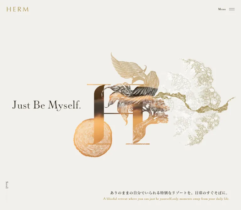
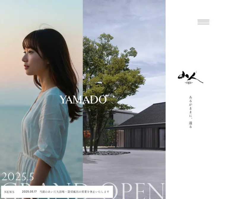
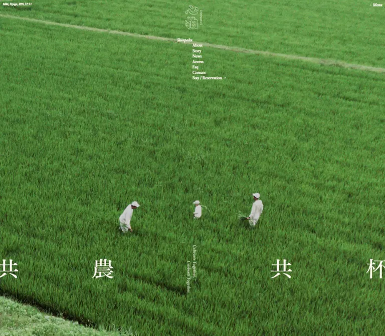
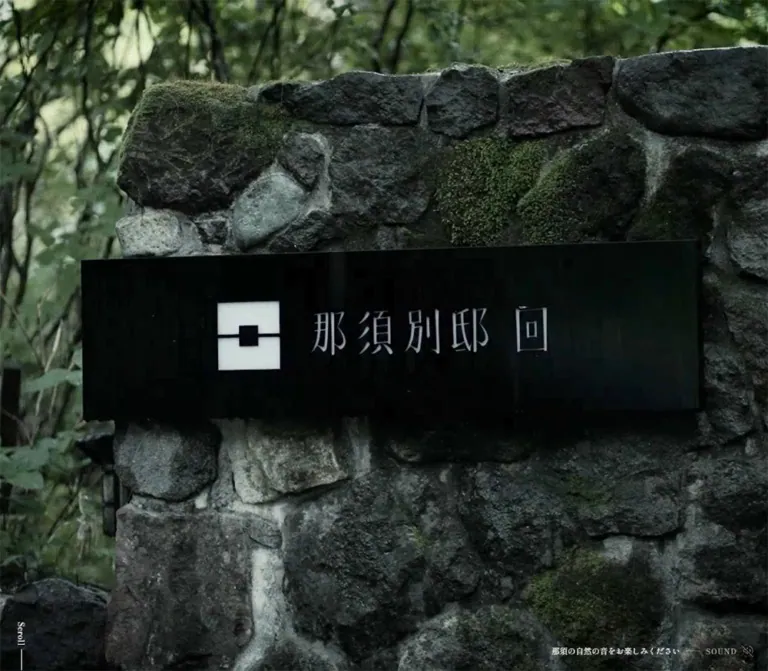
兵庫県洲本市の1日1組限定の宿、楽遊山荘。森を望む写真、手描きのロゴ、明朝体と欧文書体、広い余白が特徴。現行ページの計測値とスマートフォンでのレイアウト変化を整理。
オリジナルサイトを見るA forest view, a hand-drawn mountain mark, and quiet typography surrounded by generous space.
Website: rakuyusanso.com Original URL: https://rakuyusanso.com/ Final URL: https://rakuyusanso.com/ — HTTP 200, unchanged Theme: light, with a neutral interface and natural color supplied by photography Inspected: September 17, 2026, 05:39 JST; supplied retrieval timestamp: September 16, 2026, 20:39:10.284 UTC Viewports: desktop 1440 × 1000 CSS pixels; mobile 390 × 844 CSS pixels Document heights: approximately 5381px desktop and 4836px mobile Scope: the current homepage, including its opening state, mobile photographic hero, introductory copy, Room, Food, Neighbors, News, navigation markup, and footer. Interior-page layouts and the external booking experience were not inspected.
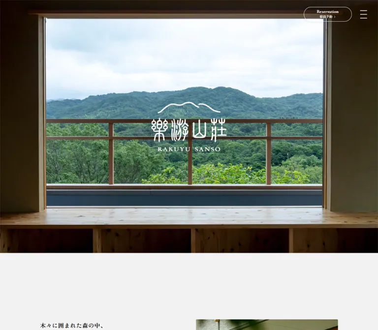
Rakuyu Sanso presents a lodge that accommodates one party per day in Sumoto, Hyogo. Its current mobile hero looks through a timber railing toward wooded hills. The identity combines a loose mountain outline, distinctive Japanese lettering, and the small uppercase name RAKUYU SANSO. The interface around it is restrained: black text, near-white surfaces, modest type sizes, brief English navigation phrases, and substantial vertical separation.
The homepage is a sequence of accommodation information and editorial introductions. Room, dining, neighboring businesses, and news each lead to their own destinations. Its strongest measured relationships are a broad desktop content area, smaller text groups within that area, paired Food and Neighbors columns, and a centered footer that becomes a long vertical composition on mobile.
Visual coverage is uneven. The desktop opening capture shows a partially revealed mark on white, and the intermediate desktop capture is blank. The desktop footer, mobile hero, and mobile footer are visible. Below-the-fold component geometry and typography are therefore documented from rendered DOM measurements; unseen images, reveal effects, and heading-child styles are not reconstructed.
A forest view, a hand-drawn mountain mark, and quiet typography surrounded by generous space.
Website: rakuyusanso.com Original URL: https://rakuyusanso.com/ Final URL: https://rakuyusanso.com/ — HTTP 200, unchanged Theme: light, with a neutral interface and natural color supplied by photography Inspected: September 17, 2026, 05:39 JST; supplied retrieval timestamp: September 16, 2026, 20:39:10.284 UTC Viewports: desktop 1440 × 1000 CSS pixels; mobile 390 × 844 CSS pixels Document heights: approximately 5381px desktop and 4836px mobile Scope: the current homepage, including its opening state, mobile photographic hero, introductory copy, Room, Food, Neighbors, News, navigation markup, and footer. Interior-page layouts and the external booking experience were not inspected.
Rakuyu Sanso presents a lodge that accommodates one party per day in Sumoto, Hyogo. Its current mobile hero looks through a timber railing toward wooded hills. The identity combines a loose mountain outline, distinctive Japanese lettering, and the small uppercase name RAKUYU SANSO. The interface around it is restrained: black text, near-white surfaces, modest type sizes, brief English navigation phrases, and substantial vertical separation.
The homepage is a sequence of accommodation information and editorial introductions. Room, dining, neighboring businesses, and news each lead to their own destinations. Its strongest measured relationships are a broad desktop content area, smaller text groups within that area, paired Food and Neighbors columns, and a centered footer that becomes a long vertical composition on mobile.
Visual coverage is uneven. The desktop opening capture shows a partially revealed mark on white, and the intermediate desktop capture is blank. The desktop footer, mobile hero, and mobile footer are visible. Below-the-fold component geometry and typography are therefore documented from rendered DOM measurements; unseen images, reveal effects, and heading-child styles are not reconstructed.
| Evidence area | What can be established | Main limitation |
|---|---|---|
| Desktop opening, 1440 × 1000 | Small, partially revealed identity on a white field | Completed desktop hero appearance is unverified |
| Desktop intermediate capture | A near-white viewport was captured | It does not reveal the appearance of the main content |
| Desktop footer | Black identity, centered contact information, social icons, horizontal navigation | Hover and focus states were not exercised |
| Mobile opening, 390 × 844 | Full-height forest photograph, railing, centered identity, pale captured appearance | Final opacity and transition sequence are unknown |
| Mobile footer | Centered vertical layout, stacked navigation, upper-right menu trigger | Menu opening behavior was not exercised |
| Rendered DOM at both widths | Text, links, section boundaries, type metrics, spacing, selected transition declarations | Image elements, heading children, keyframes, and complete CSS rules were not supplied |
| Name | Value | Source / reusable alias | Evidence and role |
|---|---|---|---|
| Reference Canvas | #F8F8F8 |
Source --bg-main, --light-gray; alias --canvas |
Declared background reference; useful as a stable implementation canvas |
| Footer White | #FFFFFF |
Source --white; alias --surface |
Measured footer background at both viewports |
| Primary Ink | #000000 |
Source --main-text, --title-text, --link-text, --black; alias --ink |
Measured body text, navigation, and footer foreground |
| Secondary Ink | #464646 |
Source --text-gray, --dark-gray; alias --muted |
Measured copyright color; also declared as a dark border color |
| Light Rule | #D7D7D7 |
Source --gray, --borderColor-default, --placeholder; alias --rule |
Available neutral token; a general visible divider system is not established |
| Desktop Body Sample | #FDFDFD |
Computed body background |
Captured state, not a separately named source theme |
| Mobile Body Sample | #F2F2F2 |
Computed body background |
Captured state, not proof of a mobile-only palette |
The body declares an infinite alternating animation named color. Its keyframes were not supplied. The different body samples cannot establish the animation endpoints or prove that the background difference comes from responsive styling. Keep the declared canvas token separate from these momentary computed values.
The current mobile photograph contributes muted greens, pale sky, and light timber. These are image colors, not verified interface tokens. No green button color or green section background is established by the evidence.
Blue slider-library and red validation variables also exist in the extracted custom properties. No visible homepage use was established, so they should not become accents in a recreation of this visual language.
Use black for the hierarchy, links, and small navigation details. Let white distinguish the footer from the very light main canvas without a strong border or shadow. Preserve the image as the source of environmental color.
The mobile hero looks washed out in the captured state. Treat that appearance as a limitation of the available state evidence, not an instruction to permanently reduce all photography or logo contrast.
Computed source stack:
ContenuRegular, 'Zen Old Mincho', 'Helvetica Neue', Arial,
'Hiragino Kaku Gothic ProN', 'Hiragino Sans', Meiryo, sans-serif
The body, introductory copy, section descriptions, English text links, telephone number, and copyright use this declared stack. Most measured body text has weight 500; the introductory heading uses 700.
The rendered footer has a quiet serif character. Preserve the relationship between the small Latin text and Japanese Mincho typography. Do not identify the wordmark lettering as one of these fonts: the logo is artwork.
Font files, loading results, and licensing information were not included. A new implementation needs authorized font resources; naming a family in CSS does not install it.
Navigation links omit ContenuRegular and begin with:
'Zen Old Mincho', 'Helvetica Neue', Arial,
'Hiragino Kaku Gothic ProN', 'Hiragino Sans', Meiryo, sans-serif
Both the offscreen menu links and visible footer links use weight 700. This creates emphasis without introducing large type, colored badges, or heavy containers.
The identity includes an irregular mountain line, custom Japanese lettering, and widely spaced uppercase Latin lettering. Keep these parts together as an approved asset rather than attempting to rebuild them with ordinary text.
The DOM establishes four bilingual headings: Room / お部屋, Food / お食事, Neighbors / ご近所さん, and News / お知らせ. Their wrappers use flex layout with a measured gap of 10px desktop and 4.16px mobile. The child font sizes and flex direction were not supplied. Do not treat the wrapper's inherited body size as the measured size of the English display word.
Recommended adaptation: stack a restrained English serif label above its Japanese counterpart. An English size around 30px desktop and 24px mobile is a practical starting point, not an extracted source value.
Values below are computed CSS pixels. Font size and line height are shown together.
| Role | Desktop size / line height | Mobile size / line height | Weight | Tracking |
|---|---|---|---|---|
| Default body | 16.00 / 28.00px |
14.56 / 25.48px |
500 |
Normal |
| Introductory heading | 22.00 / 38.51px |
18.72 / 32.76px |
700 |
0.03em |
| Introductory paragraph | 18 / 36px |
14.56 / 29.12px |
500 |
-0.03em |
| Room, Food, Neighbors descriptions | 16.00 / 28.00px |
13.52 / 23.66px |
500 |
Normal |
View more link |
18 / 21.6px |
15.6 / 18.72px |
500 |
Normal |
| Offscreen primary-menu link | 20.00 / 20.00px |
16.64 / 16.64px |
700 |
Normal |
| Offscreen booking link | 18 / 18px |
14.56 / 14.56px |
700 |
-0.03em |
| Footer navigation | 16.00 / 24.00px |
14.56 / 21.84px |
700 |
Normal |
| Telephone text | 16.00 / 28.00px |
14.56 / 25.48px |
500 |
Normal |
| Copyright | 10 / 10px |
10.40 / 10.40px |
500 |
Normal |
The default font-size variable changes between the supplied viewports:
/* Observed desktop custom property */
--fz-default: 1.111vw;

/* Observed mobile custom property */
--fz-default: 3.733vw;
At 1440px wide, 1.111vw = 15.9984px. At 390px wide, 3.733vw = 14.5587px. The default line-height multiplier is 1.75.
The exact media-query breakpoint is unknown. The Quick Start uses a recommended breakpoint and minimum font sizes rather than claiming the source formulas apply continuously at every width.
Density: small interface details separated by large, open sections.
Scaling: viewport-based typography and some viewport-based dimensions are directly evidenced. The complete spacing system is not exposed, so measured pixel dimensions should not be generalized into an invented universal unit.
| Use | Desktop | Mobile | Status |
|---|---|---|---|
| Main text-region side inset | 152.5px |
31.20px |
Measured; mobile applies to Room, Food, and Neighbors |
| Main text-region width | 1135px |
327.59px |
Derived from measured extents |
| News outer inset | 152.5px |
20.80px |
Measured |
| Intro section top padding | 250px |
72.8px |
Measured |
| Room section top padding | 160px |
76.96px |
Measured |
| Food / Neighbors section top padding | 158px |
62.4px |
Measured |
| News top / bottom padding | 156 / 158px |
76.96 / 78px |
Measured |
| Intro paragraph top padding | 28px |
27.04px |
Measured |
| Bilingual heading wrapper gap | 10px |
4.16px |
Measured; child layout incomplete |
| Room paragraph-to-link separation | 26px |
About 22.88px |
Derived from element bounds |
| Footer top / bottom padding | 90 / 72px |
62.4 / 31.2px |
Measured |
| Footer navigation horizontal gap | About 52.5px |
Not applicable | Derived between desktop links |
| Footer navigation vertical pitch | Not applicable | About 42.63px |
Derived between consecutive link tops |
At the inspected desktop width, the main content occupies approximately 78.82% of the viewport. The mobile Room, Food, and Neighbors text occupies 84%. These are relationships at the sampled widths, not verified global width formulas or maximum-width rules.
| Element or token | Value | Interpretation |
|---|---|---|
| Measured text links and footer containers | 0px radius |
Unboxed, square geometry |
| General source radius variable | 3px |
Declared; no evidence that it styles the main homepage imagery |
| Offscreen booking link | 63px desktop; 57.2px mobile |
Pill geometry on the measured menu booking control |
| Source border-width variable | 1px desktop; approximately 1.04px mobile |
Available rule width; not proof of a visible border on every component |
| Current mobile hero | Straight viewport edges | No rounded media container is visible |
No general shadow or elevation system is established. The visible footer relies on spacing, alignment, and the logo rather than a card boundary.
Coordinates below are document-space positions, not positions within the scrolled screenshots.
| Section | Desktop top / height | Mobile top / height | Interpretation |
|---|---|---|---|
| Opening / hero | 0 / 1000px |
0 / 844px |
Exactly one inspected viewport high |
| Introduction | 1000 / 784px |
844 / 737.33px |
Introductory copy and link |
| Room | 1784 / 1027.47px |
1581.33 / 617.09px |
Large region before measured room copy |
| Food and Neighbors | 2811.47 / 843.59px |
2198.42 / 1112.58px |
Two desktop columns become a mobile sequence |
| Textless section | 3655.06 / 652px |
3311 / 378.55px |
Content and imagery not established |
| News | 4307.06 / 443.59px |
3689.55 / 360.22px |
Bilingual label, one recorded article, archive link |
| Footer | 4750.66 / 630.17px |
4049.77 / 786.08px |
White identity and navigation region |
These heights describe the captured layout. Avoid hardcoding them as section heights in a new implementation: different images, text wrapping, fonts, and accessibility improvements will change the total document length.
Role: introduce the place through identity and landscape.
The hero section measures 1440 × 1000px on desktop and 390 × 844px on mobile. The current mobile screenshot shows wooded hills through a horizontal timber railing, with pale sky above and an interior sill or bench near the bottom. The photograph fills the viewport and is cropped narrowly for the phone.
The logo sits near the visual center. Its mobile artwork is approximately 210px wide and 140px high, estimated from the screenshot. The mountain line, Japanese lettering, and Latin name form one composition.
The desktop opening screenshot shows only a small, partially revealed identity on white. Do not interpret incomplete lettering as a second logo variant, or treat the blank field as the completed desktop hero.
Recommended implementation: use a full-height media region with a separately positioned logo asset. A cover crop is a practical technique, but the source's image-fit rule was not supplied. Keep the first meaningful frame available without waiting for an entrance animation.
Role: provide navigation access while leaving the photographic area visually open.
The mobile trigger has a measured box of 52 × 57.19px at x = 338px, y = 0. It occupies the upper-right corner of the 390px viewport. The footer screenshot shows three short black horizontal lines; the visible strokes are approximately 20px wide.
The mobile header node has a measured height of 0px. Its text includes Reservation / 宿泊予約, but a separate visible reservation-control rectangle was not supplied. The source header-height variables evaluate to 108px desktop and 104px mobile; these are configuration values, not measured occupied header heights.
The approximately 58px pale band above the mobile footer coincides with the portion of the page preceding the footer at that scroll position. It is not sufficient evidence of a permanent opaque header strip.
The trigger appears in the same upper-right area across the mobile captures. A persistent positioning strategy is reasonable for an adaptation, but its exact source positioning mechanism was not included.
Role: expose the site's destinations and external reservation route.
The DOM contains nine navigation destinations: home, about, room, food, neighbors, news, café, access, and contact. A separate link labeled 宿泊予約・空室カレンダー points to https://rakuyusanso.booking.chillnn.com/.
| Part | Desktop measurement | Mobile measurement |
|---|---|---|
| Navigation link box | 342 × 45px |
About 275.59 × 31.20px |
| Navigation type | About 20px, weight 700 |
About 16.64px, weight 700 |
| Booking link box | 342 × 63px |
About 306.80 × 57.19px |
| Booking radius | 63px |
57.2px |
| Foreground | White | White |
All of these menu links were above the viewport in the recorded coordinates. The opened panel's background, entrance direction, overlay treatment, focus behavior, and dismissal method are unverified. White text alone does not establish a particular dark panel color.
The booking control is the only measured pill-shaped action in this evidence. Do not extend that shape to every editorial link.
Role: describe the scale and atmosphere of the accommodation.
The introductory heading reads 木々に囲まれた森の中、 / 1日1組限定のお宿です。. On desktop its box begins at x = 152.5px, y = 1250px, with a width of 457px. The heading uses about 22px type, a 1.75 line-height, weight 700, and 0.03em tracking.
The paragraph beneath uses 18px / 36px, with slightly tightened tracking and 28px top padding. Its explicit line breaks create a slow reading rhythm. The View more link follows with a 26px separation from the paragraph box.
On mobile, the heading and paragraph boxes span the 390px viewport. The heading reduces to 18.72px, while the paragraph uses 14.56px / 29.12px. The text includes an additional line break. The about link is demonstrably centered at approximately x = 144.56px; text alignment for the heading and paragraph was not extracted.
Do not infer a specific adjacent photograph from the empty desktop space. Its asset and bounds are absent from the evidence.
Role: pair a concise English category name with its Japanese label.
The repeated content is an English word followed by a Japanese label. Typical heading wrapper height is 61px desktop and about 49.38px mobile. News adds padding to this wrapper.
Use one semantic heading containing both labels. Keep the Japanese label legible and close enough to read as a translation, rather than a separate category badge. Child sizes, direction, and alignment in the Quick Start are recommended choices because only wrapper measurements are available.
Role: continue to a dedicated information page without a large conversion button.
The repeated label is View more. The measured desktop link is about 121.80 × 21.59px, with 18px type, 18px right padding, and an inline-flex gap of 10.8px. Mobile reduces it to approximately 100.86 × 18.70px, with 15.6px type, 15.6px right padding, and a 4.68px gap.
The link has no measured fill or radius. Its internal decorative element was not included, so an exact arrow shape cannot be specified.
Placement varies by context. Intro and Room links are left aligned on desktop; Food and Neighbors links are centered within their columns. On mobile the intro link remains centered, while Room, Food, Neighbors, and News links align to their text insets.
Role: introduce the accommodation's interior experience.
The desktop text assembly separates the category heading from the description. The heading begins at x = 152.5px and measures 203px wide. The description begins at x = 499.5px and measures 788px wide. This produces a derived 144px gap between those measured boxes.
The description occupies two 28px lines in the sampled desktop layout. Its View more link sits below in the same right-hand column.
On mobile, the heading, four-line description, and link share a 327.59px text width with about 31.20px side insets. The heading moves above the description; the text size becomes approximately 13.52px / 23.66px.
A substantial region precedes this copy at both sizes. The extraction does not establish which images occupy it, their aspect ratios, or whether they move. Treat a large room-photo region as an adaptation choice until actual image evidence is available.
Role: present two complementary parts of the stay: dining options and nearby businesses.
At desktop size, both headings begin at the same vertical position, approximately y = 3438.47px. Each column is 522.5px wide. The first begins at x = 152.5px, the second at x = 765px, giving a derived gap of 90px.
Each measured text group contains a bilingual heading, descriptive paragraph, and View more link. The two paragraph boxes both measure 84px high, even though their text lengths differ. Their links align horizontally and are centered within the columns.
On mobile, Food precedes Neighbors vertically. Both use the same approximately 31.2px side inset, 327.6px text width, smaller description type, and left-aligned link. The overall paired section becomes taller, growing from approximately 844px to 1113px despite the narrower viewport.
No surrounding card fill, shadow, or border is established. Build these as open editorial sections rather than boxed cards.
A section with no extracted text appears between the Food / Neighbors region and News. It measures 652px high on desktop and approximately 378.55px on mobile, including top padding of 162px and 76.96px respectively.
The available screenshots do not reveal its content. It may contain visual material, but neither an image subject nor a gallery or slider behavior can be assigned from these measurements. If extending the design, this is an appropriate place for an optional landscape image, explicitly treated as a new design choice.
Role: provide a compact, current-information destination within the accommodation homepage.
The recorded entry is dated 2025.10.1 and titled 楽遊山荘プレス vol.01を発刊いたしました. It links to /news/108/; a separate View more link leads to /news/.
On desktop, the News heading occupies the left of the content region. The article area begins at x = 350.5px and measures 937px wide. The recorded article link occupies an 86px-high box.
On mobile, the heading moves above the article. The article region widens relative to the other text sections, using about 20.8px side insets and a 348.39px width. The article link box measures approximately 90.39px high. The archive link returns to an inset of approximately 31.2px.
The date is content, not an inspection timestamp. No article hover style, thumbnail treatment, or rule pattern is established by the supplied captures.
Role: close the page with clear identity, contact details, social links, and complete site navigation.
This is the most completely visible component at both widths. It uses a pure white background, black artwork and text, and a centered hierarchy:
The address is 〒656-1344 兵庫県洲本市五色町鳥飼浦2667-27. The visible telephone label is Tel. 090-2644-1137, with a measured destination of tel:+819026441137.
The logo link is approximately 198px wide on desktop and 156px wide on mobile. Its artwork height is visually estimated at about 130px and 104px respectively. The extracted inline anchor heights of 20px and 17px are text-line boxes; they are not the full logo artwork heights.
Desktop social links measure 18px wide with an approximately 18px gap. Mobile social links measure about 20.8px wide with a similar 20.8px gap. The visible icons are monochrome; their implementation library is unknown.
Desktop navigation forms one centered horizontal row. Its labels are 楽遊山荘について, お部屋, お食事, ご近所さん, お知らせ, カフェ, アクセス, and お問い合わせ. Mobile turns these into a centered vertical sequence, with link boxes approximately 275.59px wide and 27.05px high and a top-to-top pitch of approximately 42.63px.
The copyright remains © 2023 Rakuyu Sanso. Preserve it as observed content when documenting the page; it is not evidence that the current inspection or design dates to 2023.
| Treatment | Supplied value or observation | What is established | What remains unknown |
|---|---|---|---|
| Body animation | 3.4s cubic-bezier(0.215, 0.61, 0.355, 1) infinite alternate color |
An infinite alternating animation is declared | Keyframes, affected properties, endpoints, and perceived amplitude |
| Mobile menu-trigger transition | top 0.3s cubic-bezier(0.215, 0.61, 0.355, 1) |
The trigger can transition its top position | Trigger conditions and actual displacement |
| Offscreen booking-link transition | backdrop-filter 0.3s and background-color 0.3s, using the same cubic Bézier |
These properties have declared transitions | Hover values, filter amount, and visible result |
| Shared hover speed | Source --speed-hover: .3s |
A reusable timing token exists | Which other components consume it |
| Desktop opening mark | Partially revealed logo in a static capture | An incomplete opening state was visible | Draw order, fade duration, delay, and completion behavior |
| Mobile hero | Pale photograph and identity in the captured frame | This state was visible | Whether the appearance is transitional or persistent |
| Editorial links | Native destinations supplied | Navigation intent is explicit | Hover, focus, active, and visited styling |
A computed transition reported simply as all does not establish a nonzero duration. Do not convert those entries into assumed animations.
The capture process waited for document load, visible image decoding, layout stability, and finite motion within bounded time limits. Perpetual animations were paused during readiness checks and resumed. This does not guarantee that every delayed visual state finished: the blank and partially revealed desktop captures demonstrate the remaining uncertainty.
No menu opening, booking flow, slider advance, hover sequence, or keyboard interaction was recorded. There is no evidence sufficient to prescribe parallax, scroll-triggered fades, automatic slideshows, or smooth scrolling. A slider-library variable alone does not establish a working carousel.
Recommended motion: use the observed 300ms timing for restrained state changes where needed. Keep content visible by default, and provide reduced-motion behavior. Do not invent the source's unobserved entrance sequence.
| Layer | Observed appearance | Implementation guidance |
|---|---|---|
| Main canvas | Near-white body samples; declared #F8F8F8 reference |
Use a stable light neutral unless verified animation is required |
| Main section wrappers | Transparent computed backgrounds | Let spacing and content establish sections |
| Hero | Edge-to-edge mobile photograph with overlaid identity | Keep image and artwork as separate, readable layers |
| Footer | Opaque #FFFFFF |
Preserve a clean, centered closing region |
| Editorial links | Transparent, black, square | Keep them visually light |
| Offscreen menu controls | White text; booking control has pill geometry | Do not assign an unverified panel surface |
There is no evidenced need for glass cards, gradient panels, floating shadows, or a separate elevated-card system. The booking control's declared backdrop-filter transition does not justify applying blur throughout the page.
The verified photographic subject is the landscape seen from the lodge: wooded hills, sky, a timber railing, and a pale interior ledge. The framing connects the room to the surrounding environment. On mobile, the narrow crop retains the horizontal rail and the layered hillside rather than reducing the scene to an abstract green background.
The identity is equally important. Its irregular mountain contour and custom Japanese strokes supply the handmade character; the rest of the interface can remain typographically quiet. Use the approved logo asset rather than a substitute calligraphic font or a generic mountain icon.
No room, dining, neighborhood, or interlude image asset was supplied in the rendered extraction. Their subjects and compositions must remain unspecified in this reference. For a new implementation, use authentic photographs relevant to each section and verify their crop separately at desktop and mobile widths.
No image source URLs or font-file URLs were included in the supplied evidence. The entries below identify observed assets without inventing paths.
| Asset | Current-page evidence | Source path |
|---|---|---|
| Forest-and-railing hero photograph | Visible in the 390 × 844 opening capture | Not supplied |
| Hero / opening identity | Visible in the mobile hero and partially in the desktop opening | Not supplied |
| Black footer identity | Visible at both widths | Not supplied |
| Facebook and Instagram symbols | Visible in both footers; destinations present in DOM | Not supplied |
| Interior-section photographs | Not visually established | Not supplied |
Do not fabricate filenames, assume an icon library, or use CSS filters to claim an exact logo treatment. The mobile hero's multitone appearance does not establish a particular blend mode.
The first section equals the full inspected viewport height at both widths. After that, the page follows ordinary vertical document flow. The supplied geometry does not establish whether the hero uses vh, svh, dvh, or a JavaScript-calculated height.
Desktop content repeatedly spans from approximately x = 152.5px to x = 1287.5px. Within that area, the introduction is a narrower 457px text group, Room separates its label from an expansive description, Food and Neighbors form equal columns, and News places its category label beside the article region.
Mobile changes these relationships rather than proportionally shrinking the desktop grid:
The total mobile document is nevertheless shorter than desktop in these captures: approximately 4836px versus 5381px. Reduced section spacing and other vertical changes outweigh the additional stacking. Do not assume that a mobile version of this page must always be longer.
The exact responsive breakpoint, intermediate tablet behavior, safe-area handling, and landscape-phone layout are unknown. The Quick Start's breakpoint and fluid caps are recommendations. Test intermediate widths, long labels, font fallback, and text zoom before treating the adaptation as complete.
View more as a small editorial link rather than a large filled button.These are recommendations for a new implementation, not verified features of the original site:
aria-expanded, and aria-controls. If its panel behaves as a modal, implement appropriate focus management and Escape dismissal.#F8F8F8.#FFFFFF.#000000.#464646.#D7D7D7; use only where an actual component needs a rule.“Create a restrained accommodation homepage inspired by the verified current Rakuyu Sanso interface. Use a full-height landscape hero with a centered supplied mountain-and-lettering logo, a near-white canvas, black typography, and large vertical intervals. Use the declared ContenuRegular and Zen Old Mincho families when available. Keep the introductory heading around 22px on desktop with generous line height, and use small English View more links. Arrange Room with a label beside descriptive copy, Food and Neighbors as equal desktop columns, and News as a compact editorial region. On mobile, stack these groups and use approximately 8vw text insets. Finish with a white centered footer containing the supplied logo, address, telephone, two monochrome social icons, navigation, and small gray copyright. Keep content visible by default. Treat uncovered imagery, heading-child sizes, and menu behavior as explicit implementation choices.”
View more link. Position the desktop text in a 457px-wide group inside a broader 1135px content region. Reduce spacing and type on mobile; keep the continuation link centered there.”This is a usable adaptation, not a recovered stylesheet. It preserves measured colors, text proportions, and key desktop/mobile relationships while making several explicit choices:
48rem is a recommended breakpoint, not an observed source breakpoint.Load authorized font files separately. The font declarations below do not include invented resource URLs.
Suggested structure: .hero contains .hero__photo and .hero__brand; .menu-toggle contains three decorative spans; .section-title contains English and Japanese label elements; .room-copy, .feature-pair, and .news-layout provide the measured content relationships. Footer artwork and icons should be supplied assets.
:root {
  /* Observed neutral palette */
  --canvas: #f8f8f8;
  --surface: #ffffff;
  --ink: #000000;
  --muted: #464646;
  --rule: #d7d7d7;

  /* Declared source font families; load authorized files separately. */
  --font-body: ContenuRegular, 'Zen Old Mincho', 'Helvetica Neue',
    Arial, 'Hiragino Kaku Gothic ProN', 'Hiragino Sans', Meiryo,
    sans-serif;
  --font-nav: 'Zen Old Mincho', 'Helvetica Neue', Arial,
    'Hiragino Kaku Gothic ProN', 'Hiragino Sans', Meiryo,
    sans-serif;

  /* Source-derived scale with recommended readability limits. */
  --text-body: clamp(14px, 1.111vw, 18px);
  --text-detail: var(--text-body);
  --text-intro: 22px;
  --text-lead: 18px;
  --text-link: 18px;
  --text-copyright: 10px;
  --leading-body: 1.75;
  --leading-lead: 2;

  /* Recommended child sizes; only heading wrappers were measured. */
  --text-section-en: 30px;
  --text-section-ja: var(--text-body);
  --heading-gap: 10px;

  /* Adaptation of measured desktop relationships. */
  --content-width: min(78.819444vw, 1135px);
  --news-width: var(--content-width);
  --space-intro: 250px;
  --space-section: 160px;
  --space-pair: 158px;
  --pair-gap: 90px;
  --room-label-width: 203px;
  --room-copy-gap: 144px;
  --link-gap: 10.8px;

  --footer-top: 90px;
  --footer-bottom: 72px;
  --footer-logo-width: 198px;
  --social-art-size: 18px;
  --footer-nav-gap: 52.5px;

  /* Observed timing; application below is recommended. */
  --duration-ui: 300ms;
  --ease-ui: cubic-bezier(0.215, 0.61, 0.355, 1);
}

* {
  box-sizing: border-box;
}

body {
  margin: 0;
  color: var(--ink);
  background: var(--canvas);
  font-family: var(--font-body);
  font-size: var(--text-body);
  font-weight: 500;
  line-height: var(--leading-body);
}

a {
  color: inherit;
  text-underline-offset: 0.2em;
}

button {
  font: inherit;
}

img {
  max-inline-size: 100%;
}

.content {
  inline-size: var(--content-width);
  margin-inline: auto;
}

/* Recommended persistent trigger; source positioning was not extracted. */
.site-header {
  position: fixed;
  inset-block-start: 0;
  inset-inline-end: 0;
  z-index: 20;
}

.menu-toggle {
  display: flex;
  flex-direction: column;
  align-items: center;
  justify-content: center;
  gap: 7px;
  inline-size: 52px;
  block-size: 57.2px;
  padding: 0;
  border: 0;
  color: var(--ink);
  background: transparent;
  cursor: pointer;
}

.menu-toggle span {
  display: block;
  inline-size: 20px;
  block-size: 2px;
  background: currentColor;
}

/* Recommended stable, fully visible hero. */
.hero {
  position: relative;
  display: grid;
  place-items: center;
  min-block-size: 100vh;
  min-block-size: 100svh;
  overflow: hidden;
}

.hero__photo {
  position: absolute;
  inset: 0;
  inline-size: 100%;
  block-size: 100%;
  object-fit: cover;
  object-position: center;
}

.hero__brand {
  position: relative;
  z-index: 1;
  display: block;
  inline-size: min(54vw, 210px);
  block-size: auto;
}

.intro {
  padding-block-start: var(--space-intro);
}

.intro__copy {
  inline-size: min(100%, 457px);
}

.intro__title {
  margin: 0;
  padding-block-start: 8px;
  font-size: var(--text-intro);
  font-weight: 700;
  line-height: 1.75;
  letter-spacing: 0.03em;
}

.intro__text {
  margin: 28px 0 0;
  font-size: var(--text-lead);
  line-height: var(--leading-lead);
  letter-spacing: -0.03em;
}

.section {
  padding-block-start: var(--space-section);
}

/* Supply real media; its aspect ratio was not established by the evidence. */
.section-media {
  display: block;
  inline-size: 100%;
  block-size: auto;
  margin-block-end: 44px;
  border-radius: 0;
}

.section-title {
  display: flex;
  flex-direction: column;
  gap: var(--heading-gap);
  margin: 0;
  font-weight: 500;
}

.section-title__en {
  font-size: var(--text-section-en);
  line-height: 1;
}

.section-title__ja {
  font-size: var(--text-section-ja);
  line-height: 1.3125;
}

.description {
  margin: 0;
  font-size: var(--text-detail);
  line-height: 1.75;
}

.view-more {
  display: inline-flex;
  align-items: center;
  gap: var(--link-gap);
  margin-block-start: 26px;
  padding-inline-end: var(--text-link);
  font-size: var(--text-link);
  line-height: 1.2;
  text-decoration: none;
  transition: opacity var(--duration-ui) var(--ease-ui);
}

.room-copy {
  display: grid;
  grid-template-columns: var(--room-label-width) minmax(0, 1fr);
  column-gap: var(--room-copy-gap);
  align-items: start;
}

.feature-pair {
  display: grid;
  grid-template-columns: repeat(2, minmax(0, 1fr));
  gap: var(--pair-gap);
  padding-block-start: var(--space-pair);
}

.feature .description {
  margin-block-start: 28px;
}

.feature__more {
  text-align: center;
}

.feature__more .view-more {
  margin-block-start: 22px;
}

.news {
  padding-block: 156px 158px;
}

.news-layout {
  display: grid;
  grid-template-columns: 190px minmax(0, 1fr);
  gap: 8px;
  inline-size: var(--news-width);
  margin-inline: auto;
}

.news__entry {
  display: block;
  min-block-size: 86px;
  color: inherit;
  text-decoration: none;
}

.site-footer {
  padding-block: var(--footer-top) var(--footer-bottom);
  background: var(--surface);
  text-align: center;
}

.footer__brand {
  display: block;
  inline-size: var(--footer-logo-width);
  margin-inline: auto;
}

.footer__brand img {
  display: block;
  inline-size: 100%;
  block-size: auto;
}

/* Contact spacing is an adaptation around the supplied logo artwork. */
.footer__contact {
  margin-block-start: 44px;
  padding-inline: 16px;
  font-style: normal;
}

.footer__contact p {
  margin: 0;
}

.footer__contact a {
  text-decoration: none;
}

.footer__social {
  display: flex;
  justify-content: center;
  margin-block-start: 12px;
}

/* Recommended larger hit areas; artwork remains visually small. */
.footer__social a {
  display: grid;
  place-items: center;
  inline-size: 44px;
  block-size: 44px;
}

.footer__social :is(img, svg) {
  inline-size: var(--social-art-size);
  block-size: var(--social-art-size);
}

.footer__nav {
  display: flex;
  flex-wrap: wrap;
  justify-content: center;
  gap: 16px var(--footer-nav-gap);
  margin: 64px auto 0;
  padding: 0 24px;
  list-style: none;
}

.footer__nav a {
  display: flex;
  align-items: center;
  justify-content: center;
  min-block-size: 29px;
  font-family: var(--font-nav);
  font-weight: 700;
  line-height: 1.5;
  text-decoration: none;
}

.footer__copyright {
  margin: 80px 0 0;
  color: var(--muted);
  font-size: var(--text-copyright);
  line-height: 1;
}

/* Recommended interaction states, not recovered source states. */
:where(a, button):focus-visible {
  outline: 2px solid currentColor;
  outline-offset: 5px;
}

@media (hover: hover) {
  .view-more:hover {
    opacity: 0.65;
  }
}

/* Recommended breakpoint; measured mobile values are anchored at 390px. */
@media (max-width: 48rem) {
  :root {
    --text-body: clamp(14px, 3.733vw, 16px);
    --text-detail: clamp(13.5px, 3.467vw, 16px);
    --text-intro: 18.72px;
    --text-lead: 14.56px;
    --text-link: 15.6px;
    --text-copyright: 10.4px;
    --text-section-en: 24px;
    --heading-gap: 4.16px;
    --content-width: 84vw;
    --news-width: 89.333333vw;
    --space-intro: 72.8px;
    --space-section: 76.96px;
    --space-pair: 62.4px;
    --pair-gap: 62.4px;
    --link-gap: 4.68px;
    --footer-top: 62.4px;
    --footer-bottom: 31.2px;
    --footer-logo-width: 156px;
    --social-art-size: 20.8px;
  }

  .intro > .content {
    inline-size: 100%;
  }

  /* Centered intro text is a recommendation; link centering is measured. */
  .intro__copy {
    inline-size: 100%;
    text-align: center;
  }

  .intro__title {
    padding-block-start: 0;
  }

  .intro__text {
    margin-block-start: 27.04px;
  }

  .intro .view-more {
    margin-block-start: 18.72px;
  }

  .room-copy,
  .feature-pair,
  .news-layout {
    grid-template-columns: minmax(0, 1fr);
  }

  .room-copy {
    row-gap: 20.8px;
  }

  .feature .description {
    margin-block-start: 20.8px;
  }

  .feature__more {
    text-align: start;
  }

  .view-more,
  .feature__more .view-more {
    margin-block-start: 22.88px;
  }

  .news {
    padding-block: 76.96px 78px;
  }

  .news-layout {
    gap: 26px;
  }

  .news .section-title {
    padding-inline: 10.4px;
  }

  .news__entry {
    min-block-size: 90.4px;
  }

  .footer__nav {
    flex-direction: column;
    align-items: center;
    gap: 0;
    margin-block-start: 36px;
  }

  .footer__nav li {
    inline-size: min(100%, 275.6px);
  }

  .footer__nav a {
    min-block-size: 44px;
  }

  .footer__copyright {
    margin-block-start: 76px;
  }
}

@media (prefers-reduced-motion: reduce) {
  .hero,
  .hero__photo,
  .hero__brand,
  .menu-toggle,
  .view-more {
    animation: none;
    transition: none;
  }
}
The CSS supplies visual structure, not menu behavior or a booking integration. Wire controls to real, keyboard-operable behavior before presenting them as functional. The footer's expanded hit areas intentionally change its exact captured height.
Optional aliases for a project already using Tailwind v4. These do not imply that the original website uses Tailwind. Define the custom properties above first.
@theme inline {
  --color-canvas: var(--canvas);
  --color-surface: var(--surface);
  --color-ink: var(--ink);
  --color-muted: var(--muted);
  --color-rule: var(--rule);

  --font-editorial: var(--font-body);
  --font-navigation: var(--font-nav);

  --text-copy: var(--text-body);
  --text-detail: var(--text-detail-size, 0.875rem);
  --text-introduction: var(--text-intro);
  --text-continuation: var(--text-link);
  --text-section-label: var(--text-section-en);
  --text-copyright-label: var(--text-copyright);

  --spacing-section: var(--space-section);
  --spacing-introduction: var(--space-intro);
  --spacing-column-gap: var(--pair-gap);
}
For detail text, use the base CSS --text-detail directly in custom CSS or map it to a differently named Tailwind token such as --text-description: var(--text-detail). Avoid defining a token in terms of itself.
2026-09-16T20:39:10.284Z, equivalent to September 17, 2026, 05:39:10.284 JST.1440 × 1000 CSS pixels; document height approximately 5381px.390 × 844 CSS pixels; document height approximately 4836px.This reference describes the current supplied evidence. It does not reconstruct unseen desktop imagery, assign unverified interaction behavior, or claim that recommended CSS choices are recovered source rules.
# Rakuyu Sanso — Style Reference

> A forest view, a hand-drawn mountain mark, and quiet typography surrounded by generous space.

**Website:** [rakuyusanso.com](https://rakuyusanso.com/)
**Original URL:** https://rakuyusanso.com/
**Final URL:** https://rakuyusanso.com/ — HTTP 200, unchanged
**Theme:** light, with a neutral interface and natural color supplied by photography
**Inspected:** September 17, 2026, 05:39 JST; supplied retrieval timestamp: September 16, 2026, 20:39:10.284 UTC
**Viewports:** desktop 1440 × 1000 CSS pixels; mobile 390 × 844 CSS pixels
**Document heights:** approximately 5381px desktop and 4836px mobile
**Scope:** the current homepage, including its opening state, mobile photographic hero, introductory copy, Room, Food, Neighbors, News, navigation markup, and footer. Interior-page layouts and the external booking experience were not inspected.

Rakuyu Sanso presents a lodge that accommodates one party per day in Sumoto, Hyogo. Its current mobile hero looks through a timber railing toward wooded hills. The identity combines a loose mountain outline, distinctive Japanese lettering, and the small uppercase name RAKUYU SANSO. The interface around it is restrained: black text, near-white surfaces, modest type sizes, brief English navigation phrases, and substantial vertical separation.

The homepage is a sequence of accommodation information and editorial introductions. Room, dining, neighboring businesses, and news each lead to their own destinations. Its strongest measured relationships are a broad desktop content area, smaller text groups within that area, paired Food and Neighbors columns, and a centered footer that becomes a long vertical composition on mobile.

**Visual coverage is uneven.** The desktop opening capture shows a partially revealed mark on white, and the intermediate desktop capture is blank. The desktop footer, mobile hero, and mobile footer are visible. Below-the-fold component geometry and typography are therefore documented from rendered DOM measurements; unseen images, reveal effects, and heading-child styles are not reconstructed.
# Rakuyu Sanso — Style Reference

> A forest view, a hand-drawn mountain mark, and quiet typography surrounded by generous space.

**Website:** [rakuyusanso.com](https://rakuyusanso.com/)
**Original URL:** https://rakuyusanso.com/
**Final URL:** https://rakuyusanso.com/ — HTTP 200, unchanged
**Theme:** light, with a neutral interface and natural color supplied by photography
**Inspected:** September 17, 2026, 05:39 JST; supplied retrieval timestamp: September 16, 2026, 20:39:10.284 UTC
**Viewports:** desktop 1440 × 1000 CSS pixels; mobile 390 × 844 CSS pixels
**Document heights:** approximately 5381px desktop and 4836px mobile
**Scope:** the current homepage, including its opening state, mobile photographic hero, introductory copy, Room, Food, Neighbors, News, navigation markup, and footer. Interior-page layouts and the external booking experience were not inspected.

Rakuyu Sanso presents a lodge that accommodates one party per day in Sumoto, Hyogo. Its current mobile hero looks through a timber railing toward wooded hills. The identity combines a loose mountain outline, distinctive Japanese lettering, and the small uppercase name RAKUYU SANSO. The interface around it is restrained: black text, near-white surfaces, modest type sizes, brief English navigation phrases, and substantial vertical separation.

The homepage is a sequence of accommodation information and editorial introductions. Room, dining, neighboring businesses, and news each lead to their own destinations. Its strongest measured relationships are a broad desktop content area, smaller text groups within that area, paired Food and Neighbors columns, and a centered footer that becomes a long vertical composition on mobile.

**Visual coverage is uneven.** The desktop opening capture shows a partially revealed mark on white, and the intermediate desktop capture is blank. The desktop footer, mobile hero, and mobile footer are visible. Below-the-fold component geometry and typography are therefore documented from rendered DOM measurements; unseen images, reveal effects, and heading-child styles are not reconstructed.

## How to Read This Reference

- **Measured** means reported by the supplied rendered DOM, computed styles, or custom properties. Pixel values are rounded for readability unless their precision explains a formula.
- **Visually observed** means visible in the supplied current-page screenshots. Approximate artwork dimensions are identified as estimates.
- **Derived** means calculated from measured coordinates, such as a column gap or content width.
- **Recommended** means an implementation choice for a new project. It is not evidence of the original site's behavior.
- **Token names** introduced here are reusable aliases. Source variables are explicitly identified.
- A computed font-family declaration establishes the requested stack, not successful loading of every font or the face used for every glyph.
- Offscreen navigation was included in the DOM extraction. Its negative coordinates must not be interpreted as an open-menu screenshot.

| Evidence area | What can be established | Main limitation |
| --- | --- | --- |
| Desktop opening, 1440 × 1000 | Small, partially revealed identity on a white field | Completed desktop hero appearance is unverified |
| Desktop intermediate capture | A near-white viewport was captured | It does not reveal the appearance of the main content |
| Desktop footer | Black identity, centered contact information, social icons, horizontal navigation | Hover and focus states were not exercised |
| Mobile opening, 390 × 844 | Full-height forest photograph, railing, centered identity, pale captured appearance | Final opacity and transition sequence are unknown |
| Mobile footer | Centered vertical layout, stacked navigation, upper-right menu trigger | Menu opening behavior was not exercised |
| Rendered DOM at both widths | Text, links, section boundaries, type metrics, spacing, selected transition declarations | Image elements, heading children, keyframes, and complete CSS rules were not supplied |

## Tokens — Colors

### Default Palette

| Name | Value | Source / reusable alias | Evidence and role |
| --- | --- | --- | --- |
| Reference Canvas | `#F8F8F8` | Source `--bg-main`, `--light-gray`; alias `--canvas` | Declared background reference; useful as a stable implementation canvas |
| Footer White | `#FFFFFF` | Source `--white`; alias `--surface` | Measured footer background at both viewports |
| Primary Ink | `#000000` | Source `--main-text`, `--title-text`, `--link-text`, `--black`; alias `--ink` | Measured body text, navigation, and footer foreground |
| Secondary Ink | `#464646` | Source `--text-gray`, `--dark-gray`; alias `--muted` | Measured copyright color; also declared as a dark border color |
| Light Rule | `#D7D7D7` | Source `--gray`, `--borderColor-default`, `--placeholder`; alias `--rule` | Available neutral token; a general visible divider system is not established |
| Desktop Body Sample | `#FDFDFD` | Computed `body` background | Captured state, not a separately named source theme |
| Mobile Body Sample | `#F2F2F2` | Computed `body` background | Captured state, not proof of a mobile-only palette |

The body declares an infinite alternating animation named `color`. Its keyframes were not supplied. The different body samples cannot establish the animation endpoints or prove that the background difference comes from responsive styling. Keep the declared canvas token separate from these momentary computed values.

The current mobile photograph contributes muted greens, pale sky, and light timber. These are **image colors**, not verified interface tokens. No green button color or green section background is established by the evidence.

Blue slider-library and red validation variables also exist in the extracted custom properties. No visible homepage use was established, so they should not become accents in a recreation of this visual language.

### Color Application

Use black for the hierarchy, links, and small navigation details. Let white distinguish the footer from the very light main canvas without a strong border or shadow. Preserve the image as the source of environmental color.

The mobile hero looks washed out in the captured state. Treat that appearance as a limitation of the available state evidence, not an instruction to permanently reduce all photography or logo contrast.

## Tokens — Typography

### Main Text — ContenuRegular and Zen Old Mincho

**Computed source stack:**

```css
ContenuRegular, 'Zen Old Mincho', 'Helvetica Neue', Arial,
'Hiragino Kaku Gothic ProN', 'Hiragino Sans', Meiryo, sans-serif
```

The body, introductory copy, section descriptions, English text links, telephone number, and copyright use this declared stack. Most measured body text has weight `500`; the introductory heading uses `700`.

The rendered footer has a quiet serif character. Preserve the relationship between the small Latin text and Japanese Mincho typography. Do not identify the wordmark lettering as one of these fonts: the logo is artwork.

Font files, loading results, and licensing information were not included. A new implementation needs authorized font resources; naming a family in CSS does not install it.

### Japanese Navigation

Navigation links omit ContenuRegular and begin with:

```css
'Zen Old Mincho', 'Helvetica Neue', Arial,
'Hiragino Kaku Gothic ProN', 'Hiragino Sans', Meiryo, sans-serif
```

Both the offscreen menu links and visible footer links use weight `700`. This creates emphasis without introducing large type, colored badges, or heavy containers.

### Wordmark and Bilingual Section Labels

The identity includes an irregular mountain line, custom Japanese lettering, and widely spaced uppercase Latin lettering. Keep these parts together as an approved asset rather than attempting to rebuild them with ordinary text.

The DOM establishes four bilingual headings: `Room / お部屋`, `Food / お食事`, `Neighbors / ご近所さん`, and `News / お知らせ`. Their wrappers use flex layout with a measured gap of `10px` desktop and `4.16px` mobile. The child font sizes and flex direction were not supplied. Do not treat the wrapper's inherited body size as the measured size of the English display word.

**Recommended adaptation:** stack a restrained English serif label above its Japanese counterpart. An English size around 30px desktop and 24px mobile is a practical starting point, not an extracted source value.

### Type Scale

Values below are computed CSS pixels. Font size and line height are shown together.

| Role | Desktop size / line height | Mobile size / line height | Weight | Tracking |
| --- | --- | --- | --- | --- |
| Default body | `16.00 / 28.00px` | `14.56 / 25.48px` | `500` | Normal |
| Introductory heading | `22.00 / 38.51px` | `18.72 / 32.76px` | `700` | `0.03em` |
| Introductory paragraph | `18 / 36px` | `14.56 / 29.12px` | `500` | `-0.03em` |
| Room, Food, Neighbors descriptions | `16.00 / 28.00px` | `13.52 / 23.66px` | `500` | Normal |
| `View more` link | `18 / 21.6px` | `15.6 / 18.72px` | `500` | Normal |
| Offscreen primary-menu link | `20.00 / 20.00px` | `16.64 / 16.64px` | `700` | Normal |
| Offscreen booking link | `18 / 18px` | `14.56 / 14.56px` | `700` | `-0.03em` |
| Footer navigation | `16.00 / 24.00px` | `14.56 / 21.84px` | `700` | Normal |
| Telephone text | `16.00 / 28.00px` | `14.56 / 25.48px` | `500` | Normal |
| Copyright | `10 / 10px` | `10.40 / 10.40px` | `500` | Normal |

### Source Scaling

The default font-size variable changes between the supplied viewports:

```css
/* Observed desktop custom property */
--fz-default: 1.111vw;

/* Observed mobile custom property */
--fz-default: 3.733vw;
```

At 1440px wide, `1.111vw = 15.9984px`. At 390px wide, `3.733vw = 14.5587px`. The default line-height multiplier is `1.75`.

The exact media-query breakpoint is unknown. The Quick Start uses a recommended breakpoint and minimum font sizes rather than claiming the source formulas apply continuously at every width.

## Tokens — Spacing & Shapes

**Density:** small interface details separated by large, open sections.

**Scaling:** viewport-based typography and some viewport-based dimensions are directly evidenced. The complete spacing system is not exposed, so measured pixel dimensions should not be generalized into an invented universal unit.

### Spacing Scale

| Use | Desktop | Mobile | Status |
| --- | --- | --- | --- |
| Main text-region side inset | `152.5px` | `31.20px` | Measured; mobile applies to Room, Food, and Neighbors |
| Main text-region width | `1135px` | `327.59px` | Derived from measured extents |
| News outer inset | `152.5px` | `20.80px` | Measured |
| Intro section top padding | `250px` | `72.8px` | Measured |
| Room section top padding | `160px` | `76.96px` | Measured |
| Food / Neighbors section top padding | `158px` | `62.4px` | Measured |
| News top / bottom padding | `156 / 158px` | `76.96 / 78px` | Measured |
| Intro paragraph top padding | `28px` | `27.04px` | Measured |
| Bilingual heading wrapper gap | `10px` | `4.16px` | Measured; child layout incomplete |
| Room paragraph-to-link separation | `26px` | About `22.88px` | Derived from element bounds |
| Footer top / bottom padding | `90 / 72px` | `62.4 / 31.2px` | Measured |
| Footer navigation horizontal gap | About `52.5px` | Not applicable | Derived between desktop links |
| Footer navigation vertical pitch | Not applicable | About `42.63px` | Derived between consecutive link tops |

At the inspected desktop width, the main content occupies approximately `78.82%` of the viewport. The mobile Room, Food, and Neighbors text occupies `84%`. These are relationships at the sampled widths, not verified global width formulas or maximum-width rules.

### Border Radius and Rules

| Element or token | Value | Interpretation |
| --- | --- | --- |
| Measured text links and footer containers | `0px` radius | Unboxed, square geometry |
| General source radius variable | `3px` | Declared; no evidence that it styles the main homepage imagery |
| Offscreen booking link | `63px` desktop; `57.2px` mobile | Pill geometry on the measured menu booking control |
| Source border-width variable | `1px` desktop; approximately `1.04px` mobile | Available rule width; not proof of a visible border on every component |
| Current mobile hero | Straight viewport edges | No rounded media container is visible |

No general shadow or elevation system is established. The visible footer relies on spacing, alignment, and the logo rather than a card boundary.

### Measured Page Structure

Coordinates below are document-space positions, not positions within the scrolled screenshots.

| Section | Desktop top / height | Mobile top / height | Interpretation |
| --- | --- | --- | --- |
| Opening / hero | `0 / 1000px` | `0 / 844px` | Exactly one inspected viewport high |
| Introduction | `1000 / 784px` | `844 / 737.33px` | Introductory copy and link |
| Room | `1784 / 1027.47px` | `1581.33 / 617.09px` | Large region before measured room copy |
| Food and Neighbors | `2811.47 / 843.59px` | `2198.42 / 1112.58px` | Two desktop columns become a mobile sequence |
| Textless section | `3655.06 / 652px` | `3311 / 378.55px` | Content and imagery not established |
| News | `4307.06 / 443.59px` | `3689.55 / 360.22px` | Bilingual label, one recorded article, archive link |
| Footer | `4750.66 / 630.17px` | `4049.77 / 786.08px` | White identity and navigation region |

These heights describe the captured layout. Avoid hardcoding them as section heights in a new implementation: different images, text wrapping, fonts, and accessibility improvements will change the total document length.

## Components

### Opening State and Photographic Hero

**Role:** introduce the place through identity and landscape.

The hero section measures `1440 × 1000px` on desktop and `390 × 844px` on mobile. The current mobile screenshot shows wooded hills through a horizontal timber railing, with pale sky above and an interior sill or bench near the bottom. The photograph fills the viewport and is cropped narrowly for the phone.

The logo sits near the visual center. Its mobile artwork is approximately `210px` wide and `140px` high, estimated from the screenshot. The mountain line, Japanese lettering, and Latin name form one composition.

The desktop opening screenshot shows only a small, partially revealed identity on white. Do not interpret incomplete lettering as a second logo variant, or treat the blank field as the completed desktop hero.

**Recommended implementation:** use a full-height media region with a separately positioned logo asset. A cover crop is a practical technique, but the source's image-fit rule was not supplied. Keep the first meaningful frame available without waiting for an entrance animation.

### Header and Menu Trigger

**Role:** provide navigation access while leaving the photographic area visually open.

The mobile trigger has a measured box of `52 × 57.19px` at `x = 338px`, `y = 0`. It occupies the upper-right corner of the 390px viewport. The footer screenshot shows three short black horizontal lines; the visible strokes are approximately 20px wide.

The mobile header node has a measured height of `0px`. Its text includes `Reservation / 宿泊予約`, but a separate visible reservation-control rectangle was not supplied. The source header-height variables evaluate to `108px` desktop and `104px` mobile; these are configuration values, not measured occupied header heights.

The approximately 58px pale band above the mobile footer coincides with the portion of the page preceding the footer at that scroll position. It is not sufficient evidence of a permanent opaque header strip.

The trigger appears in the same upper-right area across the mobile captures. A persistent positioning strategy is reasonable for an adaptation, but its exact source positioning mechanism was not included.

### Offscreen Primary Navigation and Booking Link

**Role:** expose the site's destinations and external reservation route.

The DOM contains nine navigation destinations: home, about, room, food, neighbors, news, café, access, and contact. A separate link labeled `宿泊予約・空室カレンダー` points to `https://rakuyusanso.booking.chillnn.com/`.

| Part | Desktop measurement | Mobile measurement |
| --- | --- | --- |
| Navigation link box | `342 × 45px` | About `275.59 × 31.20px` |
| Navigation type | About `20px`, weight `700` | About `16.64px`, weight `700` |
| Booking link box | `342 × 63px` | About `306.80 × 57.19px` |
| Booking radius | `63px` | `57.2px` |
| Foreground | White | White |

All of these menu links were above the viewport in the recorded coordinates. The opened panel's background, entrance direction, overlay treatment, focus behavior, and dismissal method are unverified. White text alone does not establish a particular dark panel color.

The booking control is the only measured pill-shaped action in this evidence. Do not extend that shape to every editorial link.

### Introductory Statement

**Role:** describe the scale and atmosphere of the accommodation.

The introductory heading reads `木々に囲まれた森の中、 / 1日1組限定のお宿です。`. On desktop its box begins at `x = 152.5px`, `y = 1250px`, with a width of `457px`. The heading uses about `22px` type, a `1.75` line-height, weight `700`, and `0.03em` tracking.

The paragraph beneath uses `18px / 36px`, with slightly tightened tracking and `28px` top padding. Its explicit line breaks create a slow reading rhythm. The `View more` link follows with a 26px separation from the paragraph box.

On mobile, the heading and paragraph boxes span the 390px viewport. The heading reduces to `18.72px`, while the paragraph uses `14.56px / 29.12px`. The text includes an additional line break. The about link is demonstrably centered at approximately `x = 144.56px`; text alignment for the heading and paragraph was not extracted.

Do not infer a specific adjacent photograph from the empty desktop space. Its asset and bounds are absent from the evidence.

### Bilingual Section Heading

**Role:** pair a concise English category name with its Japanese label.

The repeated content is an English word followed by a Japanese label. Typical heading wrapper height is `61px` desktop and about `49.38px` mobile. News adds padding to this wrapper.

Use one semantic heading containing both labels. Keep the Japanese label legible and close enough to read as a translation, rather than a separate category badge. Child sizes, direction, and alignment in the Quick Start are recommended choices because only wrapper measurements are available.

### Editorial Text Link

**Role:** continue to a dedicated information page without a large conversion button.

The repeated label is `View more`. The measured desktop link is about `121.80 × 21.59px`, with `18px` type, `18px` right padding, and an inline-flex gap of `10.8px`. Mobile reduces it to approximately `100.86 × 18.70px`, with `15.6px` type, `15.6px` right padding, and a `4.68px` gap.

The link has no measured fill or radius. Its internal decorative element was not included, so an exact arrow shape cannot be specified.

Placement varies by context. Intro and Room links are left aligned on desktop; Food and Neighbors links are centered within their columns. On mobile the intro link remains centered, while Room, Food, Neighbors, and News links align to their text insets.

### Room Section

**Role:** introduce the accommodation's interior experience.

The desktop text assembly separates the category heading from the description. The heading begins at `x = 152.5px` and measures `203px` wide. The description begins at `x = 499.5px` and measures `788px` wide. This produces a derived `144px` gap between those measured boxes.

The description occupies two 28px lines in the sampled desktop layout. Its `View more` link sits below in the same right-hand column.

On mobile, the heading, four-line description, and link share a `327.59px` text width with about `31.20px` side insets. The heading moves above the description; the text size becomes approximately `13.52px / 23.66px`.

A substantial region precedes this copy at both sizes. The extraction does not establish which images occupy it, their aspect ratios, or whether they move. Treat a large room-photo region as an adaptation choice until actual image evidence is available.

### Food and Neighbors Pair

**Role:** present two complementary parts of the stay: dining options and nearby businesses.

At desktop size, both headings begin at the same vertical position, approximately `y = 3438.47px`. Each column is `522.5px` wide. The first begins at `x = 152.5px`, the second at `x = 765px`, giving a derived gap of `90px`.

Each measured text group contains a bilingual heading, descriptive paragraph, and `View more` link. The two paragraph boxes both measure `84px` high, even though their text lengths differ. Their links align horizontally and are centered within the columns.

On mobile, Food precedes Neighbors vertically. Both use the same approximately 31.2px side inset, 327.6px text width, smaller description type, and left-aligned link. The overall paired section becomes taller, growing from approximately 844px to 1113px despite the narrower viewport.

No surrounding card fill, shadow, or border is established. Build these as open editorial sections rather than boxed cards.

### Textless Interlude

A section with no extracted text appears between the Food / Neighbors region and News. It measures `652px` high on desktop and approximately `378.55px` on mobile, including top padding of `162px` and `76.96px` respectively.

The available screenshots do not reveal its content. It may contain visual material, but neither an image subject nor a gallery or slider behavior can be assigned from these measurements. If extending the design, this is an appropriate place for an optional landscape image, explicitly treated as a new design choice.

### News Region

**Role:** provide a compact, current-information destination within the accommodation homepage.

The recorded entry is dated `2025.10.1` and titled `楽遊山荘プレス vol.01を発刊いたしました`. It links to `/news/108/`; a separate `View more` link leads to `/news/`.

On desktop, the News heading occupies the left of the content region. The article area begins at `x = 350.5px` and measures `937px` wide. The recorded article link occupies an 86px-high box.

On mobile, the heading moves above the article. The article region widens relative to the other text sections, using about `20.8px` side insets and a `348.39px` width. The article link box measures approximately `90.39px` high. The archive link returns to an inset of approximately 31.2px.

The date is content, not an inspection timestamp. No article hover style, thumbnail treatment, or rule pattern is established by the supplied captures.

### Identity and Contact Footer

**Role:** close the page with clear identity, contact details, social links, and complete site navigation.

This is the most completely visible component at both widths. It uses a pure white background, black artwork and text, and a centered hierarchy:

1. Mountain-and-lettering logo with the Latin name beneath.
2. Postal address.
3. Telephone link.
4. Facebook and Instagram icons.
5. Eight site-navigation links.
6. Small gray copyright line.

The address is `〒656-1344 兵庫県洲本市五色町鳥飼浦2667-27`. The visible telephone label is `Tel. 090-2644-1137`, with a measured destination of `tel:+819026441137`.

The logo link is approximately `198px` wide on desktop and `156px` wide on mobile. Its artwork height is visually estimated at about 130px and 104px respectively. The extracted inline anchor heights of 20px and 17px are text-line boxes; they are not the full logo artwork heights.

Desktop social links measure 18px wide with an approximately 18px gap. Mobile social links measure about 20.8px wide with a similar 20.8px gap. The visible icons are monochrome; their implementation library is unknown.

Desktop navigation forms one centered horizontal row. Its labels are `楽遊山荘について`, `お部屋`, `お食事`, `ご近所さん`, `お知らせ`, `カフェ`, `アクセス`, and `お問い合わせ`. Mobile turns these into a centered vertical sequence, with link boxes approximately `275.59px` wide and `27.05px` high and a top-to-top pitch of approximately `42.63px`.

The copyright remains `© 2023 Rakuyu Sanso`. Preserve it as observed content when documenting the page; it is not evidence that the current inspection or design dates to 2023.

## Tokens — Motion & Interaction

| Treatment | Supplied value or observation | What is established | What remains unknown |
| --- | --- | --- | --- |
| Body animation | `3.4s cubic-bezier(0.215, 0.61, 0.355, 1) infinite alternate color` | An infinite alternating animation is declared | Keyframes, affected properties, endpoints, and perceived amplitude |
| Mobile menu-trigger transition | `top 0.3s cubic-bezier(0.215, 0.61, 0.355, 1)` | The trigger can transition its top position | Trigger conditions and actual displacement |
| Offscreen booking-link transition | `backdrop-filter 0.3s` and `background-color 0.3s`, using the same cubic Bézier | These properties have declared transitions | Hover values, filter amount, and visible result |
| Shared hover speed | Source `--speed-hover: .3s` | A reusable timing token exists | Which other components consume it |
| Desktop opening mark | Partially revealed logo in a static capture | An incomplete opening state was visible | Draw order, fade duration, delay, and completion behavior |
| Mobile hero | Pale photograph and identity in the captured frame | This state was visible | Whether the appearance is transitional or persistent |
| Editorial links | Native destinations supplied | Navigation intent is explicit | Hover, focus, active, and visited styling |

A computed transition reported simply as `all` does not establish a nonzero duration. Do not convert those entries into assumed animations.

The capture process waited for document load, visible image decoding, layout stability, and finite motion within bounded time limits. Perpetual animations were paused during readiness checks and resumed. This does not guarantee that every delayed visual state finished: the blank and partially revealed desktop captures demonstrate the remaining uncertainty.

No menu opening, booking flow, slider advance, hover sequence, or keyboard interaction was recorded. There is no evidence sufficient to prescribe parallax, scroll-triggered fades, automatic slideshows, or smooth scrolling. A slider-library variable alone does not establish a working carousel.

**Recommended motion:** use the observed 300ms timing for restrained state changes where needed. Keep content visible by default, and provide reduced-motion behavior. Do not invent the source's unobserved entrance sequence.

## Surfaces

| Layer | Observed appearance | Implementation guidance |
| --- | --- | --- |
| Main canvas | Near-white body samples; declared `#F8F8F8` reference | Use a stable light neutral unless verified animation is required |
| Main section wrappers | Transparent computed backgrounds | Let spacing and content establish sections |
| Hero | Edge-to-edge mobile photograph with overlaid identity | Keep image and artwork as separate, readable layers |
| Footer | Opaque `#FFFFFF` | Preserve a clean, centered closing region |
| Editorial links | Transparent, black, square | Keep them visually light |
| Offscreen menu controls | White text; booking control has pill geometry | Do not assign an unverified panel surface |

There is no evidenced need for glass cards, gradient panels, floating shadows, or a separate elevated-card system. The booking control's declared backdrop-filter transition does not justify applying blur throughout the page.

## Imagery

The verified photographic subject is the landscape seen from the lodge: wooded hills, sky, a timber railing, and a pale interior ledge. The framing connects the room to the surrounding environment. On mobile, the narrow crop retains the horizontal rail and the layered hillside rather than reducing the scene to an abstract green background.

The identity is equally important. Its irregular mountain contour and custom Japanese strokes supply the handmade character; the rest of the interface can remain typographically quiet. Use the approved logo asset rather than a substitute calligraphic font or a generic mountain icon.

No room, dining, neighborhood, or interlude image asset was supplied in the rendered extraction. Their subjects and compositions must remain unspecified in this reference. For a new implementation, use authentic photographs relevant to each section and verify their crop separately at desktop and mobile widths.

### Observed Asset References

No image source URLs or font-file URLs were included in the supplied evidence. The entries below identify observed assets without inventing paths.

| Asset | Current-page evidence | Source path |
| --- | --- | --- |
| Forest-and-railing hero photograph | Visible in the 390 × 844 opening capture | Not supplied |
| Hero / opening identity | Visible in the mobile hero and partially in the desktop opening | Not supplied |
| Black footer identity | Visible at both widths | Not supplied |
| Facebook and Instagram symbols | Visible in both footers; destinations present in DOM | Not supplied |
| Interior-section photographs | Not visually established | Not supplied |

Do not fabricate filenames, assume an icon library, or use CSS filters to claim an exact logo treatment. The mobile hero's multitone appearance does not establish a particular blend mode.

## Layout & Responsive Behavior

The first section equals the full inspected viewport height at both widths. After that, the page follows ordinary vertical document flow. The supplied geometry does not establish whether the hero uses `vh`, `svh`, `dvh`, or a JavaScript-calculated height.

Desktop content repeatedly spans from approximately `x = 152.5px` to `x = 1287.5px`. Within that area, the introduction is a narrower 457px text group, Room separates its label from an expansive description, Food and Neighbors form equal columns, and News places its category label beside the article region.

Mobile changes these relationships rather than proportionally shrinking the desktop grid:

- The introduction begins after 72.8px of section padding and uses full-width heading and paragraph boxes.
- Room, Food, and Neighbors use approximately 31.2px text insets.
- The Room heading moves above its paragraph.
- Food and Neighbors become separate vertical sections.
- News uses a wider article region with approximately 20.8px outer insets.
- Footer navigation becomes a centered vertical list.
- The footer becomes taller, increasing from approximately 630px to 786px.

The total mobile document is nevertheless shorter than desktop in these captures: approximately 4836px versus 5381px. Reduced section spacing and other vertical changes outweigh the additional stacking. Do not assume that a mobile version of this page must always be longer.

The exact responsive breakpoint, intermediate tablet behavior, safe-area handling, and landscape-phone layout are unknown. The Quick Start's breakpoint and fluid caps are recommendations. Test intermediate widths, long labels, font fallback, and text zoom before treating the adaptation as complete.

## Do’s and Don’ts

### Do

- Preserve the relationship between forest scenery, custom identity, and quiet text.
- Use the measured black, white, and neutral-gray interface palette.
- Keep Japanese navigation in the declared Mincho family when authorized font resources are available.
- Preserve generous line height and the modest introductory heading scale.
- Keep `View more` as a small editorial link rather than a large filled button.
- Maintain the desktop Food / Neighbors pairing and mobile vertical order.
- Give Room and News distinct desktop label-and-content relationships.
- Preserve the footer's centered sequence and mobile stacked navigation.
- Treat logo artwork dimensions separately from inline anchor line-box heights.
- Distinguish captured visual states from completed or untested states.

### Don’t

- Don’t reproduce the blank desktop capture as an intended empty main section.
- Don’t recreate an incomplete logo as a permanent brand variant.
- Don’t permanently wash out photography solely because the mobile capture is pale.
- Don’t use photographic greens as invented button or interface colors.
- Don’t infer image subjects, asset paths, or carousel behavior from empty geometric regions.
- Don’t equate a heading wrapper's inherited font size with its unmeasured child typography.
- Don’t interpret negative-coordinate navigation as a visible open menu.
- Don’t turn the footer into a dense multi-column directory on mobile.
- Don’t add rounded, shadowed cards around every information section.
- Don’t apply the source header-height variable as a fixed visible header height without verifying its use.

## Recommended Implementation Additions

These are recommendations for a new implementation, not verified features of the original site:

- Render essential copy and the initial hero image without depending on an animation-completion callback. A failed reveal should not leave the page blank.
- Give the menu trigger an accessible name, `aria-expanded`, and `aria-controls`. If its panel behaves as a modal, implement appropriate focus management and Escape dismissal.
- Give social links accessible names and expand their hit areas while retaining small monochrome artwork.
- Increase mobile navigation hit areas toward 44px. The measured footer link boxes are only about 27px high, although their vertical spacing is greater.
- Keep visible keyboard focus on all navigation and booking links.
- Preserve legibility during font loading and at text zoom. Do not depend on a particular line break to prevent overflow.
- Provide reduced-motion behavior and a complete static first frame. Avoid hiding content in the default CSS state.
- Use meaningful alternatives for informative photographs. Give the logo a concise accessible name and avoid duplicating the same brand announcement in adjacent text.
- Keep the external booking destination explicit. Its availability, policies, and booking interaction require separate verification.
- Declare image dimensions or aspect ratios from the actual supplied assets to reduce layout movement; do not guess them from blank content areas.

## Agent Prompt Guide

### Quick Color Reference

- Main canvas reference: `#F8F8F8`.
- Footer surface: `#FFFFFF`.
- Text, links, and monochrome details: `#000000`.
- Copyright and secondary text: `#464646`.
- Available light-rule token: `#D7D7D7`; use only where an actual component needs a rule.
- Environmental greens and timber tones belong to photography, not an invented UI accent system.

### Overall Prompt

“Create a restrained accommodation homepage inspired by the verified current Rakuyu Sanso interface. Use a full-height landscape hero with a centered supplied mountain-and-lettering logo, a near-white canvas, black typography, and large vertical intervals. Use the declared ContenuRegular and Zen Old Mincho families when available. Keep the introductory heading around 22px on desktop with generous line height, and use small English `View more` links. Arrange Room with a label beside descriptive copy, Food and Neighbors as equal desktop columns, and News as a compact editorial region. On mobile, stack these groups and use approximately 8vw text insets. Finish with a white centered footer containing the supplied logo, address, telephone, two monochrome social icons, navigation, and small gray copyright. Keep content visible by default. Treat uncovered imagery, heading-child sizes, and menu behavior as explicit implementation choices.”

### Example Component Prompts

1. **Mobile hero:** “A 390 × 844 reference composition with a full-height photograph looking through a timber railing toward wooded hills. Position the supplied lodge identity near the center at roughly 210px wide. Preserve readable logo contrast. Do not recreate a transient loading veil as the permanent treatment.”
2. **Introduction:** “A quiet two-line Japanese introduction with a 22px bold heading, 18px body copy at 2.0 line height, and a small `View more` link. Position the desktop text in a 457px-wide group inside a broader 1135px content region. Reduce spacing and type on mobile; keep the continuation link centered there.”
3. **Room copy:** “Within a 1135px desktop content width, place the bilingual category label in a 203px column, leave about 144px of separation, and place the description and small text link in the remaining 788px. Stack the label above the description on mobile with approximately 31px side insets.”
4. **Food and Neighbors:** “Two open desktop editorial columns, each approximately 522.5px wide with a 90px gap. Include bilingual labels, short descriptions, and centered text links. Stack Food before Neighbors on mobile and align their continuation links to the text inset. Do not invent image assets or card surfaces.”
5. **Footer:** “A pure-white, centered lodge footer with an approximately 198px-wide black logo on desktop and 156px on mobile. Follow with address, telephone, small Facebook and Instagram symbols, eight bold Japanese navigation links, and 10px gray copyright. Keep navigation horizontal on desktop and vertically spaced on mobile. Expand interactive hit areas without enlarging the logo or icon artwork.”

## Quick Start

### CSS Custom Properties

This is a usable adaptation, not a recovered stylesheet. It preserves measured colors, text proportions, and key desktop/mobile relationships while making several explicit choices:

- The canvas is static because the original body keyframes are unknown.
- `48rem` is a recommended breakpoint, not an observed source breakpoint.
- Desktop widths are capped for wider screens; the source cap was not supplied.
- Bilingual heading-child sizes and stacking are recommended.
- The hero is visible immediately; no loading overlay is reproduced.
- Social hit areas and mobile footer links are enlarged to 44px.
- Actual image proportions determine lower-page media height; document heights are not hardcoded.

Load authorized font files separately. The font declarations below do not include invented resource URLs.

Suggested structure: `.hero` contains `.hero__photo` and `.hero__brand`; `.menu-toggle` contains three decorative spans; `.section-title` contains English and Japanese label elements; `.room-copy`, `.feature-pair`, and `.news-layout` provide the measured content relationships. Footer artwork and icons should be supplied assets.

```css
:root {
  /* Observed neutral palette */
  --canvas: #f8f8f8;
  --surface: #ffffff;
  --ink: #000000;
  --muted: #464646;
  --rule: #d7d7d7;

  /* Declared source font families; load authorized files separately. */
  --font-body: ContenuRegular, 'Zen Old Mincho', 'Helvetica Neue',
    Arial, 'Hiragino Kaku Gothic ProN', 'Hiragino Sans', Meiryo,
    sans-serif;
  --font-nav: 'Zen Old Mincho', 'Helvetica Neue', Arial,
    'Hiragino Kaku Gothic ProN', 'Hiragino Sans', Meiryo,
    sans-serif;

  /* Source-derived scale with recommended readability limits. */
  --text-body: clamp(14px, 1.111vw, 18px);
  --text-detail: var(--text-body);
  --text-intro: 22px;
  --text-lead: 18px;
  --text-link: 18px;
  --text-copyright: 10px;
  --leading-body: 1.75;
  --leading-lead: 2;

  /* Recommended child sizes; only heading wrappers were measured. */
  --text-section-en: 30px;
  --text-section-ja: var(--text-body);
  --heading-gap: 10px;

  /* Adaptation of measured desktop relationships. */
  --content-width: min(78.819444vw, 1135px);
  --news-width: var(--content-width);
  --space-intro: 250px;
  --space-section: 160px;
  --space-pair: 158px;
  --pair-gap: 90px;
  --room-label-width: 203px;
  --room-copy-gap: 144px;
  --link-gap: 10.8px;

  --footer-top: 90px;
  --footer-bottom: 72px;
  --footer-logo-width: 198px;
  --social-art-size: 18px;
  --footer-nav-gap: 52.5px;

  /* Observed timing; application below is recommended. */
  --duration-ui: 300ms;
  --ease-ui: cubic-bezier(0.215, 0.61, 0.355, 1);
}

* {
  box-sizing: border-box;
}

body {
  margin: 0;
  color: var(--ink);
  background: var(--canvas);
  font-family: var(--font-body);
  font-size: var(--text-body);
  font-weight: 500;
  line-height: var(--leading-body);
}

a {
  color: inherit;
  text-underline-offset: 0.2em;
}

button {
  font: inherit;
}

img {
  max-inline-size: 100%;
}

.content {
  inline-size: var(--content-width);
  margin-inline: auto;
}

/* Recommended persistent trigger; source positioning was not extracted. */
.site-header {
  position: fixed;
  inset-block-start: 0;
  inset-inline-end: 0;
  z-index: 20;
}

.menu-toggle {
  display: flex;
  flex-direction: column;
  align-items: center;
  justify-content: center;
  gap: 7px;
  inline-size: 52px;
  block-size: 57.2px;
  padding: 0;
  border: 0;
  color: var(--ink);
  background: transparent;
  cursor: pointer;
}

.menu-toggle span {
  display: block;
  inline-size: 20px;
  block-size: 2px;
  background: currentColor;
}

/* Recommended stable, fully visible hero. */
.hero {
  position: relative;
  display: grid;
  place-items: center;
  min-block-size: 100vh;
  min-block-size: 100svh;
  overflow: hidden;
}

.hero__photo {
  position: absolute;
  inset: 0;
  inline-size: 100%;
  block-size: 100%;
  object-fit: cover;
  object-position: center;
}

.hero__brand {
  position: relative;
  z-index: 1;
  display: block;
  inline-size: min(54vw, 210px);
  block-size: auto;
}

.intro {
  padding-block-start: var(--space-intro);
}

.intro__copy {
  inline-size: min(100%, 457px);
}

.intro__title {
  margin: 0;
  padding-block-start: 8px;
  font-size: var(--text-intro);
  font-weight: 700;
  line-height: 1.75;
  letter-spacing: 0.03em;
}

.intro__text {
  margin: 28px 0 0;
  font-size: var(--text-lead);
  line-height: var(--leading-lead);
  letter-spacing: -0.03em;
}

.section {
  padding-block-start: var(--space-section);
}

/* Supply real media; its aspect ratio was not established by the evidence. */
.section-media {
  display: block;
  inline-size: 100%;
  block-size: auto;
  margin-block-end: 44px;
  border-radius: 0;
}

.section-title {
  display: flex;
  flex-direction: column;
  gap: var(--heading-gap);
  margin: 0;
  font-weight: 500;
}

.section-title__en {
  font-size: var(--text-section-en);
  line-height: 1;
}

.section-title__ja {
  font-size: var(--text-section-ja);
  line-height: 1.3125;
}

.description {
  margin: 0;
  font-size: var(--text-detail);
  line-height: 1.75;
}

.view-more {
  display: inline-flex;
  align-items: center;
  gap: var(--link-gap);
  margin-block-start: 26px;
  padding-inline-end: var(--text-link);
  font-size: var(--text-link);
  line-height: 1.2;
  text-decoration: none;
  transition: opacity var(--duration-ui) var(--ease-ui);
}

.room-copy {
  display: grid;
  grid-template-columns: var(--room-label-width) minmax(0, 1fr);
  column-gap: var(--room-copy-gap);
  align-items: start;
}

.feature-pair {
  display: grid;
  grid-template-columns: repeat(2, minmax(0, 1fr));
  gap: var(--pair-gap);
  padding-block-start: var(--space-pair);
}

.feature .description {
  margin-block-start: 28px;
}

.feature__more {
  text-align: center;
}

.feature__more .view-more {
  margin-block-start: 22px;
}

.news {
  padding-block: 156px 158px;
}

.news-layout {
  display: grid;
  grid-template-columns: 190px minmax(0, 1fr);
  gap: 8px;
  inline-size: var(--news-width);
  margin-inline: auto;
}

.news__entry {
  display: block;
  min-block-size: 86px;
  color: inherit;
  text-decoration: none;
}

.site-footer {
  padding-block: var(--footer-top) var(--footer-bottom);
  background: var(--surface);
  text-align: center;
}

.footer__brand {
  display: block;
  inline-size: var(--footer-logo-width);
  margin-inline: auto;
}

.footer__brand img {
  display: block;
  inline-size: 100%;
  block-size: auto;
}

/* Contact spacing is an adaptation around the supplied logo artwork. */
.footer__contact {
  margin-block-start: 44px;
  padding-inline: 16px;
  font-style: normal;
}

.footer__contact p {
  margin: 0;
}

.footer__contact a {
  text-decoration: none;
}

.footer__social {
  display: flex;
  justify-content: center;
  margin-block-start: 12px;
}

/* Recommended larger hit areas; artwork remains visually small. */
.footer__social a {
  display: grid;
  place-items: center;
  inline-size: 44px;
  block-size: 44px;
}

.footer__social :is(img, svg) {
  inline-size: var(--social-art-size);
  block-size: var(--social-art-size);
}

.footer__nav {
  display: flex;
  flex-wrap: wrap;
  justify-content: center;
  gap: 16px var(--footer-nav-gap);
  margin: 64px auto 0;
  padding: 0 24px;
  list-style: none;
}

.footer__nav a {
  display: flex;
  align-items: center;
  justify-content: center;
  min-block-size: 29px;
  font-family: var(--font-nav);
  font-weight: 700;
  line-height: 1.5;
  text-decoration: none;
}

.footer__copyright {
  margin: 80px 0 0;
  color: var(--muted);
  font-size: var(--text-copyright);
  line-height: 1;
}

/* Recommended interaction states, not recovered source states. */
:where(a, button):focus-visible {
  outline: 2px solid currentColor;
  outline-offset: 5px;
}

@media (hover: hover) {
  .view-more:hover {
    opacity: 0.65;
  }
}

/* Recommended breakpoint; measured mobile values are anchored at 390px. */
@media (max-width: 48rem) {
  :root {
    --text-body: clamp(14px, 3.733vw, 16px);
    --text-detail: clamp(13.5px, 3.467vw, 16px);
    --text-intro: 18.72px;
    --text-lead: 14.56px;
    --text-link: 15.6px;
    --text-copyright: 10.4px;
    --text-section-en: 24px;
    --heading-gap: 4.16px;
    --content-width: 84vw;
    --news-width: 89.333333vw;
    --space-intro: 72.8px;
    --space-section: 76.96px;
    --space-pair: 62.4px;
    --pair-gap: 62.4px;
    --link-gap: 4.68px;
    --footer-top: 62.4px;
    --footer-bottom: 31.2px;
    --footer-logo-width: 156px;
    --social-art-size: 20.8px;
  }

  .intro > .content {
    inline-size: 100%;
  }

  /* Centered intro text is a recommendation; link centering is measured. */
  .intro__copy {
    inline-size: 100%;
    text-align: center;
  }

  .intro__title {
    padding-block-start: 0;
  }

  .intro__text {
    margin-block-start: 27.04px;
  }

  .intro .view-more {
    margin-block-start: 18.72px;
  }

  .room-copy,
  .feature-pair,
  .news-layout {
    grid-template-columns: minmax(0, 1fr);
  }

  .room-copy {
    row-gap: 20.8px;
  }

  .feature .description {
    margin-block-start: 20.8px;
  }

  .feature__more {
    text-align: start;
  }

  .view-more,
  .feature__more .view-more {
    margin-block-start: 22.88px;
  }

  .news {
    padding-block: 76.96px 78px;
  }

  .news-layout {
    gap: 26px;
  }

  .news .section-title {
    padding-inline: 10.4px;
  }

  .news__entry {
    min-block-size: 90.4px;
  }

  .footer__nav {
    flex-direction: column;
    align-items: center;
    gap: 0;
    margin-block-start: 36px;
  }

  .footer__nav li {
    inline-size: min(100%, 275.6px);
  }

  .footer__nav a {
    min-block-size: 44px;
  }

  .footer__copyright {
    margin-block-start: 76px;
  }
}

@media (prefers-reduced-motion: reduce) {
  .hero,
  .hero__photo,
  .hero__brand,
  .menu-toggle,
  .view-more {
    animation: none;
    transition: none;
  }
}
```

The CSS supplies visual structure, not menu behavior or a booking integration. Wire controls to real, keyboard-operable behavior before presenting them as functional. The footer's expanded hit areas intentionally change its exact captured height.

### Tailwind v4 Token Mapping

Optional aliases for a project already using Tailwind v4. These do not imply that the original website uses Tailwind. Define the custom properties above first.

```css
@theme inline {
  --color-canvas: var(--canvas);
  --color-surface: var(--surface);
  --color-ink: var(--ink);
  --color-muted: var(--muted);
  --color-rule: var(--rule);

  --font-editorial: var(--font-body);
  --font-navigation: var(--font-nav);

  --text-copy: var(--text-body);
  --text-detail: var(--text-detail-size, 0.875rem);
  --text-introduction: var(--text-intro);
  --text-continuation: var(--text-link);
  --text-section-label: var(--text-section-en);
  --text-copyright-label: var(--text-copyright);

  --spacing-section: var(--space-section);
  --spacing-introduction: var(--space-intro);
  --spacing-column-gap: var(--pair-gap);
}
```

For detail text, use the base CSS `--text-detail` directly in custom CSS or map it to a differently named Tailwind token such as `--text-description: var(--text-detail)`. Avoid defining a token in terms of itself.

## Sources & Evidence

- [Rakuyu Sanso — current homepage](https://rakuyusanso.com/): original and final URL, with supplied HTTP status 200 and no redirect.
- Supplied retrieval timestamp: `2026-09-16T20:39:10.284Z`, equivalent to September 17, 2026, 05:39:10.284 JST.
- Supplied current-page desktop captures and DOM measurements at `1440 × 1000` CSS pixels; document height approximately `5381px`.
- Supplied current-page mobile captures and DOM measurements at `390 × 844` CSS pixels; document height approximately `4836px`.
- Rendered evidence includes section and link rectangles, text, destination URLs, computed typography, backgrounds, padding, selected transitions, animation declarations, and CSS custom properties.
- Visual inspection establishes the current mobile forest hero and both footer layouts. Desktop opening and intermediate visual states are incomplete; interior media assets and heading-child styles are not established.
- Scrolling was used during capture. No click-through page inspection, menu-opening sequence, booking interaction, hover sequence, keyboard test, or reduced-motion test was supplied.

This reference describes the current supplied evidence. It does not reconstruct unseen desktop imagery, assign unverified interaction behavior, or claim that recommended CSS choices are recovered source rules.スタイルやページの種類、ジャンルが近いデザインを集めました。