プレビュー準備中デザインリファレンスを見る
日本のWebデザインを、AIの制作リファレンスに。
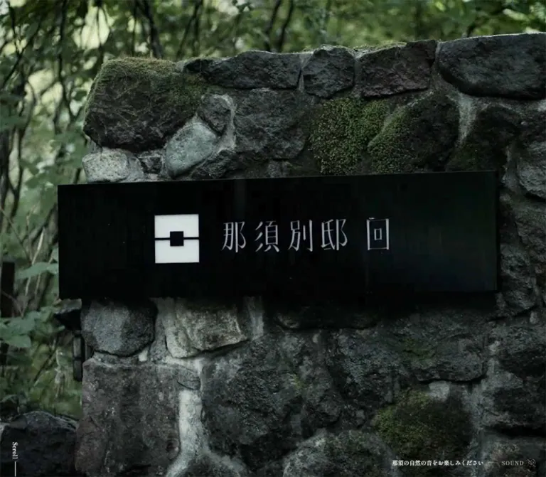
DESIGN REFERENCE
墨緑の明朝体、紙のような背景、大きな余白と日英併記を組み合わせた温泉旅館の公式サイト。全画面の情景表現から客室・料理・温泉、予約へとつなぐ構成。
オリジナルサイトを見るA quiet ryokan journal: dark material close-ups, pale textured paper, and vertical Mincho lettering held apart by generous space.
Website: Nasu Bettei KAI Original URL: https://bettei-kai.jp/ Final URL: https://bettei-kai.jp/ — HTTP 200; unchanged destination. Theme: pale paper and near-black green typography, alternating with dark photographic media. Inspected: September 17, 2026, Japan Standard Time. The supplied inspection timestamp is September 16, 2026, at 20:38:28.296 UTC. Viewports: desktop 1440 × 1000 CSS pixels; mobile 390 × 844 CSS pixels. Scope: the current official homepage, using three desktop captures, two mobile captures, and supplied rendered DOM/computed-style evidence. Visual coverage includes the opening media, the centered philosophy passage, reservations, and the footer. DOM coverage additionally documents the site directory, editorial passages, room links, cuisine, hot springs, news, FAQ, and access previews. Linked detail pages and the booking destination were not inspected.
Nasu Bettei KAI presents hospitality through material, typography, and pacing. The desktop opening fills the screen with a brown embossed floral surface; the mobile opening shows a dim interior with warm wall illumination and a dark rectangular screen above a wooden surface. Both leave the scene largely unobstructed, with small scroll and sound utilities near the bottom edge.
The paper sections replace visual density with considerable empty space. Japanese headings become vertical landmarks, while small Japanese and English paragraphs provide two distinct reading layers. Shippori Mincho B1 gives the Japanese text its delicate, traditional character; Bodoni Moda supplies contrasting Latin letterforms and generously tracked utility labels. A compact, square reservation button concentrates the strongest interface contrast.
This is a substantial hospitality homepage with editorial storytelling and routes into a larger website. Its observed document height is approximately 15,661px on desktop and 17,412px on mobile. Preserve the relationship between atmosphere, reading, practical information, and reservations when adapting it.
A quiet ryokan journal: dark material close-ups, pale textured paper, and vertical Mincho lettering held apart by generous space.
Website: Nasu Bettei KAI Original URL: https://bettei-kai.jp/ Final URL: https://bettei-kai.jp/ — HTTP 200; unchanged destination. Theme: pale paper and near-black green typography, alternating with dark photographic media. Inspected: September 17, 2026, Japan Standard Time. The supplied inspection timestamp is September 16, 2026, at 20:38:28.296 UTC. Viewports: desktop 1440 × 1000 CSS pixels; mobile 390 × 844 CSS pixels. Scope: the current official homepage, using three desktop captures, two mobile captures, and supplied rendered DOM/computed-style evidence. Visual coverage includes the opening media, the centered philosophy passage, reservations, and the footer. DOM coverage additionally documents the site directory, editorial passages, room links, cuisine, hot springs, news, FAQ, and access previews. Linked detail pages and the booking destination were not inspected.
Nasu Bettei KAI presents hospitality through material, typography, and pacing. The desktop opening fills the screen with a brown embossed floral surface; the mobile opening shows a dim interior with warm wall illumination and a dark rectangular screen above a wooden surface. Both leave the scene largely unobstructed, with small scroll and sound utilities near the bottom edge.
The paper sections replace visual density with considerable empty space. Japanese headings become vertical landmarks, while small Japanese and English paragraphs provide two distinct reading layers. Shippori Mincho B1 gives the Japanese text its delicate, traditional character; Bodoni Moda supplies contrasting Latin letterforms and generously tracked utility labels. A compact, square reservation button concentrates the strongest interface contrast.
This is a substantial hospitality homepage with editorial storytelling and routes into a larger website. Its observed document height is approximately 15,661px on desktop and 17,412px on mobile. Preserve the relationship between atmosphere, reading, practical information, and reservations when adapting it.
| Name | Value | Suggested token | Evidence and role |
|---|---|---|---|
| Forest Ink | #001204 |
--ink |
Measured rgb(0, 18, 4): body text, headings, and reservation-button fill |
| Paper | Approximately #f2f1ec |
--paper |
Visual estimate of the light textured canvas; not an extracted background declaration |
| Translation Gray | #727773 |
--caption |
Measured rgb(114, 119, 115): English editorial paragraphs |
| Utility Gray | #484d49 |
--link |
Measured rgb(72, 77, 73): English text links and external utilities |
| Reversed White | #ffffff |
--white |
Measured: reservation text, opening sound control, room labels, and hot-spring text |
| Source Black | #000000 |
--black |
Measured background of a sampled home-logo anchor; separate from the main text color |
| Fine Rule | rgba(0, 18, 4, 0.12) |
--rule |
Recommended approximation of the faint footer divider and small link rules |
| Relief Brown | Approximately #57452d |
Reference only | Estimated representative tone from the desktop opening image; not a recurring UI fill |
The nearly black text has a green component. Preserve #001204 for the main interface instead of replacing every dark element with neutral black. The distinction is subtle but suits the restrained palette.
The light background is visibly textured. Both the sampled body and many sections report transparent backgrounds, so their computed background values do not describe the final paper surface. The texture may belong to another element or rendering layer; its original placement and asset URL were not supplied.
Brown and amber belong to the photographic imagery. They are not evidence for a gold button system. Likewise, the colored partner banners in the footer retain their individual artwork without becoming general interface accents.
Paper sections use dark Japanese text, lighter English translations, and slightly darker utility links. The hot-spring module uses white text in the sampled state, creating an inverted reading treatment. Opening media also uses white bottom-edge utilities.
No selectable theme or dark-mode control was established by the supplied evidence.
'Shippori Mincho B1', serif.400 for body copy and navigation anchors.500 for major headings and the reservation label.13px / 27.3px, with 1.69px letter spacing.2.1; tracking 0.13em.The mobile body remains approximately 13px rather than shrinking in proportion to viewport width. Its measured value is 13.0045px; the extra decimal precision is not a meaningful visual difference.
'Bodoni Moda', 'Shippori Mincho B1', serif.11px / 19.8px, weight 400, tracking 1.54px or 0.14em.12px / 25.2px, weight 500, tracking 1.68px or 0.14em.#727773; utility links use #484d49.The Latin typography has its own scale and color rather than simply duplicating the Japanese styling. Keep that distinction while preserving readable contrast in a new implementation.
The opening sound-and-credit button is measured in Shippori Mincho B1 at 12px / 16.08px, with normal letter spacing. It is considerably denser than the editorial paragraphs.
The sampled HTML element reports Times, and the menu button itself reports Arial. These are computed values on container/control elements, not sufficient evidence to introduce Times or Arial as additional visible brand typefaces. The menu's visible lettering may be supplied by descendants or generated content that was not separately sampled.
| Role | Desktop measurement | Mobile measurement | Weight | Tracking |
|---|---|---|---|---|
| Japanese body | 13px / 27.3px |
Approximately 13px / 27.31px |
400 | 0.13em |
| English translation | 11px / 19.8px |
Approximately 11px / 19.81px |
400 | 0.14em |
| English detail/utility link | 12px / 25.2px |
Approximately 12px / 25.21px |
500 | 0.14em |
| Opening sound credits | 12px / 16.08px |
Approximately 12px / 16.09px |
400 | Normal |
| Narrative heading | 48px / 48px |
Approximately 36px / 36px |
500 | 0.2em |
| Room/cuisine/spring heading | 40px / 40px |
Approximately 32px / 32px |
500 | 0.2em |
| Reservation Japanese label | 15px / 21.45px |
Approximately 15px / 21.46px |
500 | 0.15em |
| Hot-spring numeral | 14px / 29.4px |
Approximately 14px / 29.41px |
500 | Approximately 1.69px |
| Sampled telephone anchor | 20px / 20px |
Approximately 20px / 20px |
400 | 0.14em |
| Reservation English sublabel | Visually about 10–11px |
Not independently measured | Unverified | Visually tracked |
The telephone row needs special care: a sampled anchor reports 20px, but the footer's numeric portion appears approximately 32px in the desktop screenshot. Nested telephone spans and the footer's complete computed styles were not supplied. Treat the larger number size as an estimate rather than an exact source token.
The source root is measured at 10px on desktop and approximately 10.0035px on mobile. Its responsive formula is unknown. The Quick Start uses explicit sizes with a conventional root instead of inventing a source scaling formula.
Density: small text and controls within unusually large editorial spaces. Geometry: square corners, fine rules, slender vertical text, and rectangular image/link regions.
| Use | Value | Evidence |
|---|---|---|
| Mobile prose side inset | 20px |
Measured: 350px text width inside a 390px viewport |
| Mobile directory side inset | 25px |
Measured: 340px total navigation width |
| Desktop corner-logo inset | 30px |
Measured top and left position |
| Mobile corner-logo inset | 20px |
Measured top and left position |
| Desktop opening sound inset | 20px right and bottom |
Calculated from its rectangle |
| Mobile opening sound inset | 10px right and bottom |
Calculated from its rectangle |
| Desktop bilingual column gap | 60px |
Calculated from adjacent paragraph rectangles |
| Mobile Japanese-to-English gap | 24px in several passages |
Calculated from paragraph rectangles |
| Centered passage translation gap | 34px |
Calculated in both viewport samples |
| Centered heading-to-copy gap | 100px desktop; about 80px mobile |
Calculated from heading and paragraph rectangles |
| Room rail gap | 20px desktop; 10px mobile |
Calculated from adjacent anchor positions |
| Initial narrative section top padding | 155px desktop; about 150px mobile |
Measured |
| Room section top padding | 200px desktop; about 150px mobile |
Measured |
These values describe several distinct spacing systems. Do not reduce the design to a single 8px scale: the 20/25/30px edge controls, 60px bilingual gutter, and much larger narrative intervals have different jobs.
| Element | Observed treatment |
|---|---|
| Reservation link | Measured 0px radius |
| Notice link | Measured 0px radius |
| Room-link boxes | Measured 0px radius |
| Logo anchors and navigation | Measured 0px radius |
| Footer partner banners | Visually rectangular, without rounded framing |
No general rounded-card or shadow-elevation system is visible in the supplied captures.
| Element | Desktop | Mobile | Status |
|---|---|---|---|
| Opening section | 1440 × 1000px |
390 × 844px |
Measured; exactly the inspected viewport |
| Corner home-link box | 50 × 50px |
40 × 50.02px |
Measured; mobile artwork shape should not be inferred from its anchor box |
| Menu-button box | 35 × 80px |
Approximately 35 × 80px |
Measured |
| First editorial Japanese/English columns | 400px each |
350px each, stacked |
Measured |
| Cuisine Japanese/English columns | 320px each |
350px each, stacked |
Measured |
| Centered philosophy text block | 700px |
350px |
Measured |
| Room-link box | 250 × 416.66px |
140.05 × 233.41px |
Measured; approximately 3:5 |
| Reservation button | 200 × 50px |
Approximately 200 × 50px |
Measured |
| Featured notice | 350 × 80px |
Approximately 340 × 80px |
Measured |
| Desktop reservation/footer content span | Approximately 1200px |
— | Screenshot estimate, from x≈120 to x≈1320 |
| Footer partner banner | Approximately 140 × 50px |
Approximately 140 × 50px |
Screenshot estimate; matching dimensions occur in other measured banner groups |
Tall heading rectangles sometimes include padding or stretched layout space. Their rectangle heights must not be mistaken for font size or literal glyph height.
Role: establish material and atmosphere before the visitor enters the main site content.
The opening section occupies the full inspected viewport at both sizes. The desktop frame shows an aged, brown floral relief with warm highlights and deep irregular recesses. The mobile frame shows a warmly lit interior, a dark rectangular screen, and a wooden horizontal surface. The physical material of the relief cannot be identified confidently from the image alone.
The principal frame has no large marketing headline, promotional card, or central booking panel. Its only visible UI consists of a small vertical Scroll cue at lower left and the music/sound control at lower right.
Different opening scenes across the desktop and mobile captures do not prove separate responsive assets. They could reflect different playback or capture moments. The supplied DOM does not identify the media element, video URL, poster, timeline, or autoplay behavior.
Recommended anatomy: a full-viewport media layer, a bottom-left scroll cue, and a bottom-right control layer. Select a crop that preserves the scene's meaningful forms rather than stretching it to the viewport.
Role: expose the media's sound affordance while keeping its credits visible.
The sampled button contains both the credit text and SOUND. The current page credits TARO ISHIDA for music and KAHORU NAKAMURA as performer. These names are independently visible in the original-page capture and DOM.
On desktop, the button occupies approximately 406.14 × 16.39px, positioned 20px from the right and bottom edges. Its credit text runs on one line. On mobile, the box becomes approximately 286.69 × 32.47px, 10px from the right and bottom; the music and performer credits occupy two lines.
A short fine rule separates the credits from the sound label, followed by a small crossed-speaker symbol in the captures. This communicates an apparent muted state, but actual audio output, toggling, persistence, and keyboard behavior were not tested.
A second sound button appears in the DOM alongside the source label 那須の自然の音をお楽しみください. Keep the distinction between the opening music credit and this later nature-sound prompt if reproducing the content structure.
Role: provide compact orientation during the paper-based reading experience.
The desktop philosophy screenshot shows a dark geometric home mark at the upper left and a menu control at the upper right. The mark uses a square form interrupted by a pale horizontal line and central square. Use an authorized logo asset; a visually similar generic symbol is not an adequate replacement.
The menu combines two thin horizontal strokes with a vertically arranged MENU label. Its sampled button box is 35px wide and 80px high. Desktop positioning is 30px from the top/right; the mobile sample places it 25px from the top and 20px from the right.
These controls are absent from the supplied opening and footer frames. Their exact reveal threshold, sticky behavior, and visibility logic were not established. The evidence supports contextual corner chrome, not an always-visible conventional header bar.
The DOM includes a substantial additional navigation group associated with the header. Its menu-opening interaction was not exercised, so its nonzero rectangles should not be treated as a verified open-menu screenshot.
Role: introduce the site's main destinations after the atmospheric opening.
The document contains a directory section immediately after the opening, beginning at y=1000px on desktop and y=844px on mobile. Its main destinations include 回る, 客室, 料理, 温泉, アクセス, よくある質問, and お知らせ, each paired with an English label.
Measured desktop links are 50px wide and 300px high, with a 55px horizontal pitch in the inline directory. The mobile equivalent distributes seven links across 340px, producing widths of approximately 48.57px and heights of 271.08px.
The directory is accompanied by a featured exhibition notice, external utility links, reservations, and partner banners. These supporting elements rearrange on mobile: the reservation action is centered, utility links form two columns, and the notice spans 340px.
This directory and the footer are related but distinct compositions. The footer contains eight destinations including Home, and its mobile banners use a different arrangement.
Role: explain the property's relationship to its place, history, and hospitality culture.
A typical desktop passage combines a slender vertical heading with two horizontal text columns. For the first passage, the heading begins around x=145px, the Japanese column at x=435px, and the English column at x=895px. Both prose columns are 400px wide, with a 60px gap.
Another passage places the heading on the right and moves the bilingual copy leftward. This alternating composition establishes rhythm without repeating identical centered blocks throughout the page.
Japanese copy uses dark 13px text and generous 27.3px line spacing. English copy uses lighter 11px Bodoni Moda with 19.8px line spacing. Preserve intentional short lines and stanza-like breaks where they carry the editorial pacing.
On mobile, the narrative heading remains a narrow vertical landmark and is centered above the text. Japanese and English become successive 350px-wide blocks, with approximately 24px between them. Both languages remain in the document; no language-switching behavior was demonstrated.
Role: create a quiet focal point around the recurring idea expressed by そして回る.
The desktop screenshot places this vertical heading on the center axis. Its measured box is 48px wide and 288px high. A 700px-wide centered text block begins 100px below the heading's box. Several short English/Japanese word pairs are followed by separated Japanese stanzas, then a lighter English translation.
The mobile heading measures approximately 36px wide and 216px high. Copy narrows to 350px, and the heading-to-copy interval becomes approximately 80px. The final Japanese sentence gains an additional line break, as does the English translation.
A small MAWARU link concludes the passage. Its measured 12px Bodoni styling matches the other detail links; its anchor includes 50px of trailing padding.
The heading's document position is exactly two viewport heights after its containing section starts in both samples: 2000px on desktop and 1688px on mobile. This is a measured spatial relationship, not proof of a particular pinning animation, empty spacer, or scroll-scrubbing technique.
Role: provide individual room entry points before the general room description.
The DOM contains ten distinct room destinations, labeled from 其の壱 through 其の十, repeated in several sets. Adjacent link boxes form a horizontal rail extending beyond both viewport edges.
Desktop boxes measure 250 × 416.66px with 20px gaps. Mobile boxes measure approximately 140 × 233.41px with 10px gaps. Both retain an approximately 3:5 portrait ratio. The sampled label color is white.
The repeated sets are consistent with a looping rail implementation, but automatic movement, drag gestures, speed, and controls were not verified. Do not interpret the repeated DOM as fifty distinct rooms.
The room introduction below uses a 40px desktop heading and two 400px prose columns. On mobile, the heading changes to a 32px horizontal treatment supported by its measured full-width box, followed by stacked Japanese and English copy. A right-aligned Guest Room detail link closes the text group.
Room photography itself is not visible in the supplied original-page screenshots. The measurements establish the link geometry, not the exact room-image crops or composition.
Role: connect the property's food offering to local ingredients and producers.
The desktop module reverses the editorial emphasis: the 料理 heading sits toward the right, while Japanese and English copy occupy two 320px columns separated by 60px. Its measured heading uses 40px type with 8px tracking.
On mobile, both prose blocks become 350px wide. The heading becomes a 32px horizontal line, and the Cuisine detail link sits at the right edge of the reading column.
The evidence documents copy and layout rectangles but does not provide a cuisine screenshot. Specific dishes, image arrangements, and transitions should therefore remain asset and implementation decisions rather than claimed observations.
Role: introduce the hot springs through an inverted text treatment and numbered media states.
The sampled desktop section is 680px high. The 温泉 heading and both language columns are white. The heading is 40px; Japanese and English paragraphs are 300px wide with a 60px gap. A white Hot Spring link continues the detail-link pattern.
On mobile, the section is approximately 1120.81px high. Its heading becomes a 32px horizontal line, and the two languages stack in 350px-wide blocks. Number labels occupy an earlier portion of the section.
Repeated content and pairs of numerals suggest multiple media states, but the supplied evidence does not establish the transition mechanism or which repeated nodes are active. Treat this as one feature with multiple states, not six consecutive copies of the same editorial section.
The white text is measured. The precise underlying image, darkening overlay, and media composition were not visually documented in the supplied captures.
Role: surface exhibitions and recent property announcements without interrupting the quiet visual system.
The featured exhibition notice is a square-cornered white link box measured at 350 × 80px on desktop and approximately 340 × 80px on mobile. Its text uses 13px Shippori Mincho B1 with a tighter 19.5px line height than the main body copy.
The later news section contains three dated entries and a News List link. Each entry combines a date, a category, and a title. Their existence and link destinations are documented, but the supplied screenshots do not establish the news section's exact row, image, or grid presentation.
Role: provide practical next steps after the main hospitality narrative.
Both previews contain a Japanese title, a short explanation, an English explanation, and a destination link. The evidence identifies links to /faq/ and /access/.
Do not implement an accordion merely because the page contains a FAQ preview. No expanding answers were demonstrated on the homepage. These are documented routes to further information.
Role: make booking and telephone contact easy to locate near the end of the page.
The desktop screenshot uses a broad horizontal composition: a vertical ご予約 heading at left, a small bilingual telephone prompt toward the center, a prominent telephone number, and the reservation button at right.
The content spans approximately 1200px, with 120px outer margins at the inspected desktop width. The reservation button is visibly 200px wide and 50px high. Its Japanese label sits above a small English Reserve sublabel. Thin white rules enter from the left and right edges around the button's vertical midpoint.
A faint full-width divider sits approximately 80px below the button. The next footer group begins roughly another 110px below that divider. These are screenshot estimates and should remain flexible with content length.
The telephone destination is tel:0287763180. The reservation link points to an external booking service. This verifies link intent, not the destination's behavior or booking flow.
The supplied mobile footer crop begins below the reservation band. Other mobile DOM instances confirm the approximately 200 × 50px button size, but the final mobile reservation band's exact arrangement is not visually established.
Role: close the narrative with full navigation, associated destinations, and property details.
The desktop footer has three major groups: the property identity at left, eight narrow navigation columns near the center-left, and external links with four partner banners at right. A small address sits at bottom left and copyright at bottom right. PageTop occupies the outer right edge as vertical text beneath a thin vertical rule.
Each navigation item places upright vertical Japanese near the top and a smaller, rotated English label toward the bottom. The Home item has a tiny square marker. This is a tall, typographic navigation structure, not a conventional horizontal footer link list.
The desktop partner banners form a 2 × 2 group. On mobile, the visible wordmark is centered above an eight-column navigation row. Four approximately 140 × 50px banners form a single stack on the left, while the external text links occupy a right-hand column. The address and copyright are centered beneath these groups.
The mobile footer therefore preserves its vertical navigation language while changing the larger grouping. It does not simply shrink the desktop's three-column arrangement.
| Target | Supplied declaration | What it establishes |
|---|---|---|
| Body text color | color 0.6s cubic-bezier(0.55, 0.05, 0.22, 0.99) |
A shared, relatively slow color transition |
| Home-logo container | transform 0.6s with the same easing |
Transform changes are anticipated; endpoints were not supplied |
| Home-logo anchor | Background and opacity, 0.6s |
Defined visual-state interpolation |
| Menu button | Transform, top, width, height, border, opacity, 0.6s |
Several menu-control properties can transition |
| Utility links | Color, 0.6s |
Gentle link-state changes; final hover colors unverified |
| Reservation button | Background and color, 0.6s |
Defined button-state transitions |
| Banner links | Transform and opacity, 0.6s |
Defined banner-state transitions; displacement unverified |
| Sound buttons | Opacity, 0.6s |
Defined control-state transition |
| Several mobile headings | Opacity and filter, 1.2s with the same easing |
Reveal-capable styling; filter values and trigger unverified |
Use cubic-bezier(0.55, 0.05, 0.22, 0.99) as the measured common easing. Do not replace it with spring motion when reproducing the supplied transition language.
The inspected samples report animation: none on the listed elements. That does not establish a static page: media, descendants, generated content, and JavaScript-driven transforms may behave separately.
#wrapper PageTop destination are present in the DOM.transition: all without a supplied duration is not evidence of a meaningful animated effect.Recommended motion policy: retain the measured 600ms transition family for subtle visual changes, use the measured 1.2s heading timing only where a reveal is actually needed, and keep content visible by default. Add explicit pause/reduced-motion handling for any new moving media or rail.
| Layer | Appearance | Purpose |
|---|---|---|
| Editorial canvas | Pale, subtly fibrous paper | Continuous background for narrative, reservations, and footer |
| Opening media | Edge-to-edge dark imagery | Establish material and atmosphere |
| General text region | Unboxed content on the same paper | Reading without card boundaries |
| Reservation action | Solid forest ink with white lettering | Concentrated action contrast |
| Featured notice | Small white rectangle | A distinct announcement within the larger composition |
| Partner artwork | Rectangular supplied banners | Preserve each destination's identity |
| Hot-spring text region | White typography; underlying visual not fully documented | Inverted feature treatment |
Separation comes primarily from distance, alignment, color changes, and a few fine rules. Avoid adding shadows or rounded panels to explain hierarchy that the layout already communicates.
The strongest verified imagery is tactile and closely framed. The desktop opening exposes raised floral contours, wear, warm highlights, and dark recesses. The mobile opening relies on warm light, quiet architectural planes, and a broad wooden surface. Both favor subdued tonal relationships over highly saturated promotional photography.
The paper texture is equally important. It remains visible through large empty regions in the philosophy and footer captures. Keep it fine enough to support small text; a coarse noise layer would change the character and reduce legibility.
For a new implementation, use authorized photography of the actual property and its materials. Recommended additional subjects include room details, interiors, food, and bathing spaces corresponding to the documented content sections. These are content-aligned recommendations, not claims about photographs visible in the supplied captures.
No original image, texture, logo, font-file, or media-file URLs were included in the supplied evidence. The following identifies visible resources without inventing asset paths.
| Resource | Evidence | Reuse guidance |
|---|---|---|
| Brown floral relief frame | Desktop opening capture | Preserve close cropping and material detail |
| Warm interior frame | Mobile opening capture | Preserve the architectural composition when selecting a portrait crop |
| Pale paper texture | Desktop philosophy/footer and mobile footer captures | Use an authorized subtle texture; retain a solid-color fallback |
| Geometric property mark | Desktop paper-state chrome and footer | Use the actual brand asset when authorized |
| Four partner banners | Desktop and mobile footer captures | Keep their rectangular aspect ratios and individual artwork |
| Room media regions | Measured linked boxes only | Geometry is known; image assets and crops remain unverified |
Natural photographic rendering is appropriate. Pixelated image scaling, heavy duotone processing, or artificial metallic UI effects are not supported by the supplied design.
The page uses ordinary long-document reading space rather than a fixed application shell. Full-viewport opening imagery leads into a site directory, editorial passages, hospitality features, practical links, reservations, and a substantial footer.
| Feature | Desktop | Mobile |
|---|---|---|
| Opening dimensions | One 1440 × 1000 viewport | One 390 × 844 viewport |
| Sound-credit layout | Single line; 20px edge insets | Two lines; 10px edge insets |
| Japanese body size | 13px | Approximately 13px |
| English body size | 11px | Approximately 11px |
| Narrative heading | 48px; vertical | 36px; centered vertical treatment supported by geometry |
| Room/cuisine heading | 40px; narrow vertical placement | 32px; horizontal full-width placement supported by geometry |
| Bilingual prose | Two columns, usually 400px or 320px each | Japanese followed by English, each 350px wide |
| Centered passage | 700px text width | 350px text width |
| Room rail | 250px-wide links; 20px gaps | Approximately 140px-wide links; 10px gaps |
| Footer partner group | Two columns and two rows | One four-banner stack beside text utilities |
| Footer address/copyright | Separated across the bottom | Centered and stacked |
The mobile layout retains spacious pacing. It reduces heading and media sizes but does not compress all typography. Much of the added document height comes from stacking bilingual content.
The two inspected widths do not reveal the original breakpoints or interpolation rules. A breakpoint around 1000–1100px is a reasonable starting recommendation for collapsing the wide editorial/footer arrangements, followed by testing with the actual content. It is not an extracted source value.
The long philosophy section and repeated rail states may interact with scrolling, but no scroll-hijacking, parallax, or pinning behavior can be claimed from the supplied rectangles alone. Avoid hardcoding the observed total document heights.
#001204.These are recommendations for a new implementation, not verified features of the original:
lang attributes.#001204.#f2f1ec, with a fine authorized texture.#727773.#484d49.#ffffff.“Create a Japanese ryokan homepage inspired by the current Nasu Bettei KAI reference. Begin with full-viewport, subdued material or interior imagery and small bottom-edge scroll and sound controls. Continue onto pale textured paper with near-black green #001204 typography. Use Shippori Mincho B1 for Japanese and Bodoni Moda for English, with small tracked copy and expansive whitespace. Alternate vertical Japanese narrative headings around paired language columns, then introduce a centered vertical philosophy heading. Include portrait room links, cuisine and hot-spring introductions, news, practical navigation, a compact rectangular reservation action, and a substantial footer. On mobile, stack bilingual paragraphs, reduce heading sizes, and retain vertical footer navigation. Treat media sequencing and interaction behavior as implementation decisions unless further evidence is supplied.”
そして回る vertically on the center axis, followed by 100px of space and small centered bilingual stanzas within a 700px block. Use faint paper texture, forest ink, and a lighter English translation. At phone width, reduce the heading to 36px, the text block to 350px, and the heading gap to 80px.”空室を見る above a small Reserve caption. Add short white horizontal rules entering from both side edges. Keep the component compact and free of shadows.”This is a reusable adaptation, not recovered source code. Exact colors, typography, button dimensions, rail sizes, and transition timing come from the supplied measurements. Paper color, rule opacity, the 1100px breakpoint, hover endpoints, and structural selectors are recommendations. Supply authorized font files and image assets separately; no asset filenames are assumed.
:root {
  /* Measured interface colors */
  --ink: #001204;
  --caption: #727773;
  --link: #484d49;
  --white: #ffffff;

  /* Estimated canvas and recommended rule treatment */
  --paper: #f2f1ec;
  --paper-image: none;
  --rule: rgb(0 18 4 / 12%);

  /* Measured font stacks and desktop sizes */
  --font-jp: 'Shippori Mincho B1', serif;
  --font-latin: 'Bodoni Moda', 'Shippori Mincho B1', serif;
  --text-body: 13px;
  --text-translation: 11px;
  --text-link: 12px;
  --text-story: 48px;
  --text-section: 40px;
  --tracking-jp: 0.13em;
  --tracking-latin: 0.14em;
  --tracking-heading: 0.2em;

  /* Measured component proportions */
  --room-width: 250px;
  --room-gap: 20px;
  --reserve-width: 200px;
  --reserve-height: 50px;
  --bilingual-gap: 60px;

  /* Measured transition family */
  --ease-kai: cubic-bezier(0.55, 0.05, 0.22, 0.99);
  --duration-ui: 600ms;
  --duration-reveal: 1200ms;
}

* { box-sizing: border-box; }
html { font-size: 100%; }
body { margin: 0; }

.kai-page {
  color: var(--ink);
  background-color: var(--paper);
  background-image: var(--paper-image);
  font: 400 var(--text-body) / 2.1 var(--font-jp);
  letter-spacing: var(--tracking-jp);
}

.kai-page a { color: inherit; }
.kai-page img { max-width: 100%; }

.wide-container {
  width: min(1200px, calc(100% - 50px));
  margin-inline: auto;
}

/* Full-viewport media shell; playback requires separate logic. */
.hero {
  position: relative;
  height: 100vh;
  height: 100svh;
  isolation: isolate;
  color: var(--white);
  background: var(--ink);
}

.hero__media {
  position: absolute;
  inset: 0;
  width: 100%;
  height: 100%;
  object-fit: cover;
}

.hero__scroll {
  position: absolute;
  left: 20px;
  bottom: 20px;
  writing-mode: vertical-rl;
  font-size: 11px;
  letter-spacing: 0.03em;
}

.hero__tools {
  position: absolute;
  right: 20px;
  bottom: 20px;
  display: flex;
  align-items: flex-end;
  gap: 20px;
  max-width: calc(100% - 70px);
  padding: 0;
  border: 0;
  border-radius: 0;
  color: inherit;
  background: transparent;
  font: 400 12px / 1.34 var(--font-jp);
  letter-spacing: normal;
  text-align: left;
  cursor: pointer;
  transition: opacity var(--duration-ui) var(--ease-kai);
}

.hero__credits br { display: none; }
.hero__sound { white-space: nowrap; }

/* Activate this chrome only in the intended content states. */
.corner-controls {
  position: fixed;
  inset: 0;
  z-index: 10;
  pointer-events: none;
}

.corner-controls[hidden] { display: none; }
.corner-controls > * { pointer-events: auto; }

.brand-link {
  position: absolute;
  top: 30px;
  left: 30px;
  width: 50px;
  height: 50px;
}

.brand-link img {
  display: block;
  width: 100%;
  height: 100%;
  object-fit: contain;
}

.menu-button {
  position: absolute;
  top: 30px;
  right: 30px;
  width: 35px;
  height: 80px;
  padding: 0;
  border: 0;
  color: var(--ink);
  background: transparent;
  cursor: pointer;
}

.menu-button::before {
  content: '';
  display: block;
  width: 35px;
  height: 11px;
  border-block: 1px solid currentColor;
}

.menu-button span {
  display: block;
  margin: 12px auto 0;
  writing-mode: vertical-rl;
  font: 400 13px / 1 var(--font-latin);
}

/* Editorial grid: exact desktop widths at a 1150px container. */
.editorial {
  display: grid;
  grid-template-columns: minmax(48px, 230px) repeat(2, minmax(0, 1fr));
  gap: var(--bilingual-gap);
  align-items: start;
  width: min(1150px, calc(100% - 40px));
  margin-inline: auto;
  padding-top: 155px;
}

.editorial__heading,
.poem__heading {
  margin: 0;
  writing-mode: vertical-rl;
  text-orientation: upright;
  font: 500 var(--text-story) / 1 var(--font-jp);
  letter-spacing: var(--tracking-heading);
}

.editorial__jp,
.editorial__en { margin: 0; }

.en,
.editorial__en {
  color: var(--caption);
  font: 400 var(--text-translation) / 1.8 var(--font-latin);
  letter-spacing: var(--tracking-latin);
}

.section-heading {
  margin: 0;
  writing-mode: vertical-rl;
  font: 500 var(--text-section) / 1 var(--font-jp);
  letter-spacing: var(--tracking-heading);
}

.poem {
  width: min(700px, calc(100% - 40px));
  margin-inline: auto;
  padding-block: 150px;
  text-align: center;
}

.poem__heading {
  width: max-content;
  margin: 0 auto 100px;
}

.poem p { margin: 0; }
.poem .en { margin-top: 34px; }
.poem .line-link { margin-top: 40px; }

.line-link {
  display: inline-flex;
  align-items: center;
  gap: 10px;
  color: var(--link);
  font: 500 var(--text-link) / 2.1 var(--font-latin);
  letter-spacing: var(--tracking-latin);
  text-decoration: none;
  transition: color var(--duration-ui) var(--ease-kai);
}

.kai-page .line-link { color: var(--link); }

.line-link::after {
  content: '';
  flex: 0 0 30px;
  height: 1px;
  background: currentColor;
  opacity: 0.25;
}

.line-link--detail::after { flex-basis: 40px; }

/* The small English caption size is a visual approximation. */
.reserve {
  position: relative;
  display: flex;
  flex-direction: column;
  justify-content: center;
  align-items: center;
  width: var(--reserve-width);
  min-height: var(--reserve-height);
  border-radius: 0;
  background: var(--ink);
  font: 500 15px / 1.43 var(--font-jp);
  letter-spacing: 0.15em;
  text-decoration: none;
  transition:
    background var(--duration-ui) var(--ease-kai),
    color var(--duration-ui) var(--ease-kai);
}

.kai-page .reserve { color: var(--white); }

.reserve small {
  font: 400 10px / 1.2 var(--font-latin);
  letter-spacing: 0.14em;
}

.reserve::before,
.reserve::after {
  content: '';
  position: absolute;
  top: 50%;
  width: 20px;
  height: 1px;
  background: currentColor;
}

.reserve::before { left: 0; }
.reserve::after { right: 0; }

/* Recommended native scrolling; original rail controls are unverified. */
.room-rail {
  display: flex;
  gap: var(--room-gap);
  overflow-x: auto;
  scroll-snap-type: x proximity;
}

.room-tile {
  position: relative;
  flex: 0 0 var(--room-width);
  aspect-ratio: 3 / 5;
  scroll-snap-align: start;
  background: var(--ink);
  text-decoration: none;
}

.room-tile img {
  display: block;
  width: 100%;
  height: 100%;
  object-fit: cover;
}

.room-tile__label {
  position: absolute;
  left: 20px;
  bottom: 20px;
  color: var(--white);
}

/* Footer anatomy: brand, navigation, and utilities/banner group. */
.site-footer {
  width: min(1200px, calc(100% - 50px));
  margin-inline: auto;
  padding-block: 100px 35px;
  border-top: 1px solid var(--rule);
}

.footer-main {
  display: grid;
  grid-template-columns: 140px 400px minmax(0, 1fr);
  gap: 40px;
}

.footer-nav {
  display: grid;
  grid-template-columns: repeat(8, minmax(0, 1fr));
  min-height: 250px;
}

.footer-nav a {
  position: relative;
  display: flex;
  flex-direction: column;
  align-items: center;
  justify-content: space-between;
  padding-top: 15px;
  text-decoration: none;
}

.footer-nav a[aria-current='page']::before {
  content: '';
  position: absolute;
  top: 0;
  width: 5px;
  height: 5px;
  background: currentColor;
}

.footer-nav .nav-ja {
  writing-mode: vertical-rl;
  text-orientation: upright;
}

.footer-nav .nav-en {
  writing-mode: vertical-rl;
  text-orientation: mixed;
  color: var(--caption);
  font: 400 11px / 1 var(--font-latin);
  letter-spacing: 0.14em;
}

.footer-aside {
  display: grid;
  grid-template-areas: 'utilities' 'partners';
  gap: 30px;
  width: 295px;
  justify-self: end;
}

.footer-utilities {
  grid-area: utilities;
  display: grid;
  justify-items: end;
  align-content: start;
}

.footer-partners {
  grid-area: partners;
  display: grid;
  grid-template-columns: repeat(2, 140px);
  gap: 15px;
}

.footer-partners img {
  display: block;
  width: 140px;
  height: 50px;
  object-fit: contain;
}

.footer-meta {
  display: flex;
  justify-content: space-between;
  gap: 20px;
  margin-top: 60px;
  font-size: 11px;
}

/* Recommended breakpoint, not an extracted source media query. */
@media (max-width: 1100px) {
  :root {
    --text-story: 36px;
    --text-section: 32px;
    --room-width: 140px;
    --room-gap: 10px;
  }

  .hero__tools { right: 10px; bottom: 10px; gap: 10px; }
  .hero__credits br { display: block; }
  .hero__scroll { left: 10px; bottom: 10px; }
  .brand-link { top: 20px; left: 20px; width: 40px; }
  .menu-button { top: 25px; right: 20px; }

  .editorial {
    grid-template-columns: minmax(0, 1fr);
    gap: 0;
    padding-top: 150px;
  }

  .editorial__heading { justify-self: center; }
  .editorial__jp { margin-top: 80px; }
  .editorial__en { margin-top: 24px; }
  .section-heading { writing-mode: horizontal-tb; }
  .poem__heading { margin-bottom: 80px; }

  .footer-main { grid-template-columns: minmax(0, 1fr); gap: 60px; }
  .footer-brand { justify-self: center; }
  .footer-nav { width: 100%; max-width: 400px; margin-inline: auto; }

  .footer-aside {
    grid-template-areas: 'partners utilities';
    grid-template-columns: 140px minmax(0, 1fr);
    gap: 20px;
    width: 100%;
  }

  .footer-partners { grid-template-columns: 140px; }
  .footer-meta { flex-direction: column; align-items: center; gap: 0; }
}

/* Recommended hover endpoints; source endpoints were not supplied. */
@media (hover: hover) {
  .kai-page .line-link:hover { color: var(--ink); }
  .reserve:hover { background: var(--link); }
}

.kai-page :focus-visible {
  outline: 2px solid currentColor;
  outline-offset: 4px;
}

@media (prefers-reduced-motion: reduce) {
  .kai-page *,
  .kai-page *::before,
  .kai-page *::after {
    animation: none !important;
    transition: none !important;
    scroll-behavior: auto !important;
  }
}
Apply kai-page to the page container. Set --paper-image only when a suitable authorized texture is available; the solid paper color is a functional fallback. The fixed corner controls require explicit visibility logic. Audio controls, menu state, video playback, and any animated rail require separate accessible behavior.
This example uses actual source labels and link destinations. It demonstrates the centered reading treatment and reservation anatomy, rather than reproducing the entire page.
<section class='poem' aria-labelledby='poem-title'>
  <h2 class='poem__heading' id='poem-title' lang='ja'>そして回る</h2>
  <p lang='ja'>Reは再び<br>Reは繰り返す...</p>
  <p class='en' lang='en'>Re means again<br>Re means repeat...</p>
  <a class='line-link line-link--detail' href='/mawaru/'>MAWARU</a>
</section>

<a class='reserve' href='https://reserve.489ban.net/client/bettei-kai/0/plan'>
  <span lang='ja'>空室を見る</span>
  <small lang='en'>Reserve</small>
</a>
Optional aliases for a project already using Tailwind v4. Define the custom properties above first. This does not imply that the original website uses Tailwind.
@theme inline {
  --color-ink: var(--ink);
  --color-paper: var(--paper);
  --color-caption: var(--caption);
  --color-utility: var(--link);
  --color-rule: var(--rule);

  --font-japanese: var(--font-jp);
  --font-editorial: var(--font-latin);

  --text-body: 13px;
  --text-translation: 11px;
  --text-utility: 12px;
  --text-narrative: var(--text-story);
  --text-feature: var(--text-section);

  --spacing-room: var(--room-width);
  --spacing-room-gap: var(--room-gap);
  --spacing-bilingual: 60px;
  --radius-control: 0px;
}
Measurements above describe the current captured homepage. Screenshot estimates and implementation recommendations are explicitly separated from computed values; undocumented media and interaction behavior remain open implementation decisions.
# Nasu Bettei KAI — Style Reference

> A quiet ryokan journal: dark material close-ups, pale textured paper, and vertical Mincho lettering held apart by generous space.

**Website:** [Nasu Bettei KAI](https://bettei-kai.jp/)
**Original URL:** https://bettei-kai.jp/
**Final URL:** https://bettei-kai.jp/ — HTTP 200; unchanged destination.
**Theme:** pale paper and near-black green typography, alternating with dark photographic media.
**Inspected:** September 17, 2026, Japan Standard Time. The supplied inspection timestamp is September 16, 2026, at 20:38:28.296 UTC.
**Viewports:** desktop 1440 × 1000 CSS pixels; mobile 390 × 844 CSS pixels.
**Scope:** the current official homepage, using three desktop captures, two mobile captures, and supplied rendered DOM/computed-style evidence. Visual coverage includes the opening media, the centered philosophy passage, reservations, and the footer. DOM coverage additionally documents the site directory, editorial passages, room links, cuisine, hot springs, news, FAQ, and access previews. Linked detail pages and the booking destination were not inspected.

Nasu Bettei KAI presents hospitality through material, typography, and pacing. The desktop opening fills the screen with a brown embossed floral surface; the mobile opening shows a dim interior with warm wall illumination and a dark rectangular screen above a wooden surface. Both leave the scene largely unobstructed, with small scroll and sound utilities near the bottom edge.

The paper sections replace visual density with considerable empty space. Japanese headings become vertical landmarks, while small Japanese and English paragraphs provide two distinct reading layers. Shippori Mincho B1 gives the Japanese text its delicate, traditional character; Bodoni Moda supplies contrasting Latin letterforms and generously tracked utility labels. A compact, square reservation button concentrates the strongest interface contrast.

This is a substantial hospitality homepage with editorial storytelling and routes into a larger website. Its observed document height is approximately 15,661px on desktop and 17,412px on mobile. Preserve the relationship between atmosphere, reading, practical information, and reservations when adapting it.
# Nasu Bettei KAI — Style Reference

> A quiet ryokan journal: dark material close-ups, pale textured paper, and vertical Mincho lettering held apart by generous space.

**Website:** [Nasu Bettei KAI](https://bettei-kai.jp/)
**Original URL:** https://bettei-kai.jp/
**Final URL:** https://bettei-kai.jp/ — HTTP 200; unchanged destination.
**Theme:** pale paper and near-black green typography, alternating with dark photographic media.
**Inspected:** September 17, 2026, Japan Standard Time. The supplied inspection timestamp is September 16, 2026, at 20:38:28.296 UTC.
**Viewports:** desktop 1440 × 1000 CSS pixels; mobile 390 × 844 CSS pixels.
**Scope:** the current official homepage, using three desktop captures, two mobile captures, and supplied rendered DOM/computed-style evidence. Visual coverage includes the opening media, the centered philosophy passage, reservations, and the footer. DOM coverage additionally documents the site directory, editorial passages, room links, cuisine, hot springs, news, FAQ, and access previews. Linked detail pages and the booking destination were not inspected.

Nasu Bettei KAI presents hospitality through material, typography, and pacing. The desktop opening fills the screen with a brown embossed floral surface; the mobile opening shows a dim interior with warm wall illumination and a dark rectangular screen above a wooden surface. Both leave the scene largely unobstructed, with small scroll and sound utilities near the bottom edge.

The paper sections replace visual density with considerable empty space. Japanese headings become vertical landmarks, while small Japanese and English paragraphs provide two distinct reading layers. Shippori Mincho B1 gives the Japanese text its delicate, traditional character; Bodoni Moda supplies contrasting Latin letterforms and generously tracked utility labels. A compact, square reservation button concentrates the strongest interface contrast.

This is a substantial hospitality homepage with editorial storytelling and routes into a larger website. Its observed document height is approximately 15,661px on desktop and 17,412px on mobile. Preserve the relationship between atmosphere, reading, practical information, and reservations when adapting it.

## How to Read This Reference

- **Measured** means a value appears in the supplied computed styles or element rectangles. Measurements describe the sampled state, not every state of the website.
- **Calculated** means a relationship was derived from those measurements, such as the spacing between adjacent room links.
- **Estimated** means an approximate visual reading of a supplied original-page screenshot. Paper color, footer offsets, and decorative rule lengths fall into this category.
- **Recommended** means guidance for a new implementation. Breakpoints, accessible focus treatments, and the reusable CSS are recommendations unless explicitly identified otherwise.
- All token and component names below are implementation aliases. The supplied custom-property maps were empty; no original CSS variable names were established.
- Nonzero DOM rectangles do not prove that an element was visible. In particular, duplicated navigation and repeated media content must not be interpreted as simultaneous visible panels.

## Tokens — Colors

### Default Palette

| Name | Value | Suggested token | Evidence and role |
| --- | --- | --- | --- |
| Forest Ink | `#001204` | `--ink` | Measured `rgb(0, 18, 4)`: body text, headings, and reservation-button fill |
| Paper | Approximately `#f2f1ec` | `--paper` | Visual estimate of the light textured canvas; not an extracted background declaration |
| Translation Gray | `#727773` | `--caption` | Measured `rgb(114, 119, 115)`: English editorial paragraphs |
| Utility Gray | `#484d49` | `--link` | Measured `rgb(72, 77, 73)`: English text links and external utilities |
| Reversed White | `#ffffff` | `--white` | Measured: reservation text, opening sound control, room labels, and hot-spring text |
| Source Black | `#000000` | `--black` | Measured background of a sampled home-logo anchor; separate from the main text color |
| Fine Rule | `rgba(0, 18, 4, 0.12)` | `--rule` | Recommended approximation of the faint footer divider and small link rules |
| Relief Brown | Approximately `#57452d` | Reference only | Estimated representative tone from the desktop opening image; not a recurring UI fill |

The nearly black text has a green component. Preserve `#001204` for the main interface instead of replacing every dark element with neutral black. The distinction is subtle but suits the restrained palette.

The light background is visibly textured. Both the sampled body and many sections report transparent backgrounds, so their computed background values do not describe the final paper surface. The texture may belong to another element or rendering layer; its original placement and asset URL were not supplied.

Brown and amber belong to the photographic imagery. They are not evidence for a gold button system. Likewise, the colored partner banners in the footer retain their individual artwork without becoming general interface accents.

### Palette Behavior

Paper sections use dark Japanese text, lighter English translations, and slightly darker utility links. The hot-spring module uses white text in the sampled state, creating an inverted reading treatment. Opening media also uses white bottom-edge utilities.

No selectable theme or dark-mode control was established by the supplied evidence.

## Tokens — Typography

### Japanese Editorial Typeface

- **Measured family:** `'Shippori Mincho B1', serif`.
- **Regular weight:** `400` for body copy and navigation anchors.
- **Medium weight:** `500` for major headings and the reservation label.
- **Body rhythm:** `13px / 27.3px`, with `1.69px` letter spacing.
- **Calculated proportions:** line height `2.1`; tracking `0.13em`.
- **Character:** fine, literary, and spacious. Vertical setting turns short headings into slender compositional elements.

The mobile body remains approximately 13px rather than shrinking in proportion to viewport width. Its measured value is `13.0045px`; the extra decimal precision is not a meaningful visual difference.

### Latin Editorial and Utility Typeface

- **Measured stack:** `'Bodoni Moda', 'Shippori Mincho B1', serif`.
- **English paragraphs:** `11px / 19.8px`, weight `400`, tracking `1.54px` or `0.14em`.
- **Utility links:** `12px / 25.2px`, weight `500`, tracking `1.68px` or `0.14em`.
- **Color:** English translations use `#727773`; utility links use `#484d49`.

The Latin typography has its own scale and color rather than simply duplicating the Japanese styling. Keep that distinction while preserving readable contrast in a new implementation.

### Utility Exceptions

The opening sound-and-credit button is measured in Shippori Mincho B1 at `12px / 16.08px`, with normal letter spacing. It is considerably denser than the editorial paragraphs.

The sampled HTML element reports Times, and the menu button itself reports Arial. These are computed values on container/control elements, not sufficient evidence to introduce Times or Arial as additional visible brand typefaces. The menu's visible lettering may be supplied by descendants or generated content that was not separately sampled.

### Type Scale

| Role | Desktop measurement | Mobile measurement | Weight | Tracking |
| --- | --- | --- | --- | --- |
| Japanese body | `13px / 27.3px` | Approximately `13px / 27.31px` | 400 | `0.13em` |
| English translation | `11px / 19.8px` | Approximately `11px / 19.81px` | 400 | `0.14em` |
| English detail/utility link | `12px / 25.2px` | Approximately `12px / 25.21px` | 500 | `0.14em` |
| Opening sound credits | `12px / 16.08px` | Approximately `12px / 16.09px` | 400 | Normal |
| Narrative heading | `48px / 48px` | Approximately `36px / 36px` | 500 | `0.2em` |
| Room/cuisine/spring heading | `40px / 40px` | Approximately `32px / 32px` | 500 | `0.2em` |
| Reservation Japanese label | `15px / 21.45px` | Approximately `15px / 21.46px` | 500 | `0.15em` |
| Hot-spring numeral | `14px / 29.4px` | Approximately `14px / 29.41px` | 500 | Approximately `1.69px` |
| Sampled telephone anchor | `20px / 20px` | Approximately `20px / 20px` | 400 | `0.14em` |
| Reservation English sublabel | Visually about `10–11px` | Not independently measured | Unverified | Visually tracked |

The telephone row needs special care: a sampled anchor reports 20px, but the footer's numeric portion appears approximately 32px in the desktop screenshot. Nested telephone spans and the footer's complete computed styles were not supplied. Treat the larger number size as an estimate rather than an exact source token.

The source root is measured at 10px on desktop and approximately 10.0035px on mobile. Its responsive formula is unknown. The Quick Start uses explicit sizes with a conventional root instead of inventing a source scaling formula.

## Tokens — Spacing & Shapes

**Density:** small text and controls within unusually large editorial spaces.
**Geometry:** square corners, fine rules, slender vertical text, and rectangular image/link regions.

### Spacing Scale

| Use | Value | Evidence |
| --- | --- | --- |
| Mobile prose side inset | `20px` | Measured: 350px text width inside a 390px viewport |
| Mobile directory side inset | `25px` | Measured: 340px total navigation width |
| Desktop corner-logo inset | `30px` | Measured top and left position |
| Mobile corner-logo inset | `20px` | Measured top and left position |
| Desktop opening sound inset | `20px` right and bottom | Calculated from its rectangle |
| Mobile opening sound inset | `10px` right and bottom | Calculated from its rectangle |
| Desktop bilingual column gap | `60px` | Calculated from adjacent paragraph rectangles |
| Mobile Japanese-to-English gap | `24px` in several passages | Calculated from paragraph rectangles |
| Centered passage translation gap | `34px` | Calculated in both viewport samples |
| Centered heading-to-copy gap | `100px` desktop; about `80px` mobile | Calculated from heading and paragraph rectangles |
| Room rail gap | `20px` desktop; `10px` mobile | Calculated from adjacent anchor positions |
| Initial narrative section top padding | `155px` desktop; about `150px` mobile | Measured |
| Room section top padding | `200px` desktop; about `150px` mobile | Measured |

These values describe several distinct spacing systems. Do not reduce the design to a single 8px scale: the 20/25/30px edge controls, 60px bilingual gutter, and much larger narrative intervals have different jobs.

### Border Radius

| Element | Observed treatment |
| --- | --- |
| Reservation link | Measured `0px` radius |
| Notice link | Measured `0px` radius |
| Room-link boxes | Measured `0px` radius |
| Logo anchors and navigation | Measured `0px` radius |
| Footer partner banners | Visually rectangular, without rounded framing |

No general rounded-card or shadow-elevation system is visible in the supplied captures.

### Layout Measurements

| Element | Desktop | Mobile | Status |
| --- | --- | --- | --- |
| Opening section | `1440 × 1000px` | `390 × 844px` | Measured; exactly the inspected viewport |
| Corner home-link box | `50 × 50px` | `40 × 50.02px` | Measured; mobile artwork shape should not be inferred from its anchor box |
| Menu-button box | `35 × 80px` | Approximately `35 × 80px` | Measured |
| First editorial Japanese/English columns | `400px` each | `350px` each, stacked | Measured |
| Cuisine Japanese/English columns | `320px` each | `350px` each, stacked | Measured |
| Centered philosophy text block | `700px` | `350px` | Measured |
| Room-link box | `250 × 416.66px` | `140.05 × 233.41px` | Measured; approximately `3:5` |
| Reservation button | `200 × 50px` | Approximately `200 × 50px` | Measured |
| Featured notice | `350 × 80px` | Approximately `340 × 80px` | Measured |
| Desktop reservation/footer content span | Approximately `1200px` | — | Screenshot estimate, from x≈120 to x≈1320 |
| Footer partner banner | Approximately `140 × 50px` | Approximately `140 × 50px` | Screenshot estimate; matching dimensions occur in other measured banner groups |

Tall heading rectangles sometimes include padding or stretched layout space. Their rectangle heights must not be mistaken for font size or literal glyph height.

## Components

### Opening Media

**Role:** establish material and atmosphere before the visitor enters the main site content.

The opening section occupies the full inspected viewport at both sizes. The desktop frame shows an aged, brown floral relief with warm highlights and deep irregular recesses. The mobile frame shows a warmly lit interior, a dark rectangular screen, and a wooden horizontal surface. The physical material of the relief cannot be identified confidently from the image alone.

The principal frame has no large marketing headline, promotional card, or central booking panel. Its only visible UI consists of a small vertical `Scroll` cue at lower left and the music/sound control at lower right.

Different opening scenes across the desktop and mobile captures do not prove separate responsive assets. They could reflect different playback or capture moments. The supplied DOM does not identify the media element, video URL, poster, timeline, or autoplay behavior.

**Recommended anatomy:** a full-viewport media layer, a bottom-left scroll cue, and a bottom-right control layer. Select a crop that preserves the scene's meaningful forms rather than stretching it to the viewport.

### Sound and Music Control

**Role:** expose the media's sound affordance while keeping its credits visible.

The sampled button contains both the credit text and `SOUND`. The current page credits `TARO ISHIDA` for music and `KAHORU NAKAMURA` as performer. These names are independently visible in the original-page capture and DOM.

On desktop, the button occupies approximately `406.14 × 16.39px`, positioned 20px from the right and bottom edges. Its credit text runs on one line. On mobile, the box becomes approximately `286.69 × 32.47px`, 10px from the right and bottom; the music and performer credits occupy two lines.

A short fine rule separates the credits from the sound label, followed by a small crossed-speaker symbol in the captures. This communicates an apparent muted state, but actual audio output, toggling, persistence, and keyboard behavior were not tested.

A second sound button appears in the DOM alongside the source label `那須の自然の音をお楽しみください`. Keep the distinction between the opening music credit and this later nature-sound prompt if reproducing the content structure.

### Contextual Corner Identity and Menu

**Role:** provide compact orientation during the paper-based reading experience.

The desktop philosophy screenshot shows a dark geometric home mark at the upper left and a menu control at the upper right. The mark uses a square form interrupted by a pale horizontal line and central square. Use an authorized logo asset; a visually similar generic symbol is not an adequate replacement.

The menu combines two thin horizontal strokes with a vertically arranged `MENU` label. Its sampled button box is 35px wide and 80px high. Desktop positioning is 30px from the top/right; the mobile sample places it 25px from the top and 20px from the right.

These controls are absent from the supplied opening and footer frames. Their exact reveal threshold, sticky behavior, and visibility logic were not established. The evidence supports contextual corner chrome, not an always-visible conventional header bar.

The DOM includes a substantial additional navigation group associated with the header. Its menu-opening interaction was not exercised, so its nonzero rectangles should not be treated as a verified open-menu screenshot.

### Site Directory

**Role:** introduce the site's main destinations after the atmospheric opening.

The document contains a directory section immediately after the opening, beginning at y=1000px on desktop and y=844px on mobile. Its main destinations include `回る`, `客室`, `料理`, `温泉`, `アクセス`, `よくある質問`, and `お知らせ`, each paired with an English label.

Measured desktop links are 50px wide and 300px high, with a 55px horizontal pitch in the inline directory. The mobile equivalent distributes seven links across 340px, producing widths of approximately 48.57px and heights of 271.08px.

The directory is accompanied by a featured exhibition notice, external utility links, reservations, and partner banners. These supporting elements rearrange on mobile: the reservation action is centered, utility links form two columns, and the notice spans 340px.

This directory and the footer are related but distinct compositions. The footer contains eight destinations including Home, and its mobile banners use a different arrangement.

### Bilingual Editorial Passage

**Role:** explain the property's relationship to its place, history, and hospitality culture.

A typical desktop passage combines a slender vertical heading with two horizontal text columns. For the first passage, the heading begins around x=145px, the Japanese column at x=435px, and the English column at x=895px. Both prose columns are 400px wide, with a 60px gap.

Another passage places the heading on the right and moves the bilingual copy leftward. This alternating composition establishes rhythm without repeating identical centered blocks throughout the page.

Japanese copy uses dark 13px text and generous 27.3px line spacing. English copy uses lighter 11px Bodoni Moda with 19.8px line spacing. Preserve intentional short lines and stanza-like breaks where they carry the editorial pacing.

On mobile, the narrative heading remains a narrow vertical landmark and is centered above the text. Japanese and English become successive 350px-wide blocks, with approximately 24px between them. Both languages remain in the document; no language-switching behavior was demonstrated.

### Centered Philosophy Passage

**Role:** create a quiet focal point around the recurring idea expressed by `そして回る`.

The desktop screenshot places this vertical heading on the center axis. Its measured box is 48px wide and 288px high. A 700px-wide centered text block begins 100px below the heading's box. Several short English/Japanese word pairs are followed by separated Japanese stanzas, then a lighter English translation.

The mobile heading measures approximately 36px wide and 216px high. Copy narrows to 350px, and the heading-to-copy interval becomes approximately 80px. The final Japanese sentence gains an additional line break, as does the English translation.

A small `MAWARU` link concludes the passage. Its measured 12px Bodoni styling matches the other detail links; its anchor includes 50px of trailing padding.

The heading's document position is exactly two viewport heights after its containing section starts in both samples: 2000px on desktop and 1688px on mobile. This is a measured spatial relationship, not proof of a particular pinning animation, empty spacer, or scroll-scrubbing technique.

### Room Rail and Room Introduction

**Role:** provide individual room entry points before the general room description.

The DOM contains ten distinct room destinations, labeled from `其の壱` through `其の十`, repeated in several sets. Adjacent link boxes form a horizontal rail extending beyond both viewport edges.

Desktop boxes measure `250 × 416.66px` with 20px gaps. Mobile boxes measure approximately `140 × 233.41px` with 10px gaps. Both retain an approximately 3:5 portrait ratio. The sampled label color is white.

The repeated sets are consistent with a looping rail implementation, but automatic movement, drag gestures, speed, and controls were not verified. Do not interpret the repeated DOM as fifty distinct rooms.

The room introduction below uses a 40px desktop heading and two 400px prose columns. On mobile, the heading changes to a 32px horizontal treatment supported by its measured full-width box, followed by stacked Japanese and English copy. A right-aligned `Guest Room` detail link closes the text group.

Room photography itself is not visible in the supplied original-page screenshots. The measurements establish the link geometry, not the exact room-image crops or composition.

### Cuisine Introduction

**Role:** connect the property's food offering to local ingredients and producers.

The desktop module reverses the editorial emphasis: the `料理` heading sits toward the right, while Japanese and English copy occupy two 320px columns separated by 60px. Its measured heading uses 40px type with 8px tracking.

On mobile, both prose blocks become 350px wide. The heading becomes a 32px horizontal line, and the `Cuisine` detail link sits at the right edge of the reading column.

The evidence documents copy and layout rectangles but does not provide a cuisine screenshot. Specific dishes, image arrangements, and transitions should therefore remain asset and implementation decisions rather than claimed observations.

### Hot-Spring Feature

**Role:** introduce the hot springs through an inverted text treatment and numbered media states.

The sampled desktop section is 680px high. The `温泉` heading and both language columns are white. The heading is 40px; Japanese and English paragraphs are 300px wide with a 60px gap. A white `Hot Spring` link continues the detail-link pattern.

On mobile, the section is approximately 1120.81px high. Its heading becomes a 32px horizontal line, and the two languages stack in 350px-wide blocks. Number labels occupy an earlier portion of the section.

Repeated content and pairs of numerals suggest multiple media states, but the supplied evidence does not establish the transition mechanism or which repeated nodes are active. Treat this as one feature with multiple states, not six consecutive copies of the same editorial section.

The white text is measured. The precise underlying image, darkening overlay, and media composition were not visually documented in the supplied captures.

### Featured Notice and News

**Role:** surface exhibitions and recent property announcements without interrupting the quiet visual system.

The featured exhibition notice is a square-cornered white link box measured at `350 × 80px` on desktop and approximately `340 × 80px` on mobile. Its text uses 13px Shippori Mincho B1 with a tighter 19.5px line height than the main body copy.

The later news section contains three dated entries and a `News List` link. Each entry combines a date, a category, and a title. Their existence and link destinations are documented, but the supplied screenshots do not establish the news section's exact row, image, or grid presentation.

### FAQ and Access Previews

**Role:** provide practical next steps after the main hospitality narrative.

Both previews contain a Japanese title, a short explanation, an English explanation, and a destination link. The evidence identifies links to `/faq/` and `/access/`.

Do not implement an accordion merely because the page contains a FAQ preview. No expanding answers were demonstrated on the homepage. These are documented routes to further information.

### Reservation Band

**Role:** make booking and telephone contact easy to locate near the end of the page.

The desktop screenshot uses a broad horizontal composition: a vertical `ご予約` heading at left, a small bilingual telephone prompt toward the center, a prominent telephone number, and the reservation button at right.

The content spans approximately 1200px, with 120px outer margins at the inspected desktop width. The reservation button is visibly 200px wide and 50px high. Its Japanese label sits above a small English `Reserve` sublabel. Thin white rules enter from the left and right edges around the button's vertical midpoint.

A faint full-width divider sits approximately 80px below the button. The next footer group begins roughly another 110px below that divider. These are screenshot estimates and should remain flexible with content length.

The telephone destination is `tel:0287763180`. The reservation link points to an external booking service. This verifies link intent, not the destination's behavior or booking flow.

The supplied mobile footer crop begins below the reservation band. Other mobile DOM instances confirm the approximately 200 × 50px button size, but the final mobile reservation band's exact arrangement is not visually established.

### Footer

**Role:** close the narrative with full navigation, associated destinations, and property details.

The desktop footer has three major groups: the property identity at left, eight narrow navigation columns near the center-left, and external links with four partner banners at right. A small address sits at bottom left and copyright at bottom right. `PageTop` occupies the outer right edge as vertical text beneath a thin vertical rule.

Each navigation item places upright vertical Japanese near the top and a smaller, rotated English label toward the bottom. The Home item has a tiny square marker. This is a tall, typographic navigation structure, not a conventional horizontal footer link list.

The desktop partner banners form a 2 × 2 group. On mobile, the visible wordmark is centered above an eight-column navigation row. Four approximately 140 × 50px banners form a single stack on the left, while the external text links occupy a right-hand column. The address and copyright are centered beneath these groups.

The mobile footer therefore preserves its vertical navigation language while changing the larger grouping. It does not simply shrink the desktop's three-column arrangement.

## Tokens — Motion & Interaction

### Measured Transition Declarations

| Target | Supplied declaration | What it establishes |
| --- | --- | --- |
| Body text color | `color 0.6s cubic-bezier(0.55, 0.05, 0.22, 0.99)` | A shared, relatively slow color transition |
| Home-logo container | `transform 0.6s` with the same easing | Transform changes are anticipated; endpoints were not supplied |
| Home-logo anchor | Background and opacity, `0.6s` | Defined visual-state interpolation |
| Menu button | Transform, top, width, height, border, opacity, `0.6s` | Several menu-control properties can transition |
| Utility links | Color, `0.6s` | Gentle link-state changes; final hover colors unverified |
| Reservation button | Background and color, `0.6s` | Defined button-state transitions |
| Banner links | Transform and opacity, `0.6s` | Defined banner-state transitions; displacement unverified |
| Sound buttons | Opacity, `0.6s` | Defined control-state transition |
| Several mobile headings | Opacity and filter, `1.2s` with the same easing | Reveal-capable styling; filter values and trigger unverified |

Use `cubic-bezier(0.55, 0.05, 0.22, 0.99)` as the measured common easing. Do not replace it with spring motion when reproducing the supplied transition language.

The inspected samples report `animation: none` on the listed elements. That does not establish a static page: media, descendants, generated content, and JavaScript-driven transforms may behave separately.

### Interaction Evidence and Limits

- Homepage links, telephone links, room anchors, the booking URL, and the `#wrapper` PageTop destination are present in the DOM.
- Sound and menu affordances are visible or represented as buttons, but their activated states were not tested.
- Room repetitions and offscreen positions support a rail structure; looping, autoplay, and dragging remain unverified.
- The inspection process traversed scrolling positions and waited for settling. It did not provide a continuous recording from which exact reveal timing or media sequencing could be reconstructed.
- A recorded `transition: all` without a supplied duration is not evidence of a meaningful animated effect.

**Recommended motion policy:** retain the measured 600ms transition family for subtle visual changes, use the measured 1.2s heading timing only where a reveal is actually needed, and keep content visible by default. Add explicit pause/reduced-motion handling for any new moving media or rail.

## Surfaces

| Layer | Appearance | Purpose |
| --- | --- | --- |
| Editorial canvas | Pale, subtly fibrous paper | Continuous background for narrative, reservations, and footer |
| Opening media | Edge-to-edge dark imagery | Establish material and atmosphere |
| General text region | Unboxed content on the same paper | Reading without card boundaries |
| Reservation action | Solid forest ink with white lettering | Concentrated action contrast |
| Featured notice | Small white rectangle | A distinct announcement within the larger composition |
| Partner artwork | Rectangular supplied banners | Preserve each destination's identity |
| Hot-spring text region | White typography; underlying visual not fully documented | Inverted feature treatment |

Separation comes primarily from distance, alignment, color changes, and a few fine rules. Avoid adding shadows or rounded panels to explain hierarchy that the layout already communicates.

## Imagery

The strongest verified imagery is tactile and closely framed. The desktop opening exposes raised floral contours, wear, warm highlights, and dark recesses. The mobile opening relies on warm light, quiet architectural planes, and a broad wooden surface. Both favor subdued tonal relationships over highly saturated promotional photography.

The paper texture is equally important. It remains visible through large empty regions in the philosophy and footer captures. Keep it fine enough to support small text; a coarse noise layer would change the character and reduce legibility.

For a new implementation, use authorized photography of the actual property and its materials. Recommended additional subjects include room details, interiors, food, and bathing spaces corresponding to the documented content sections. These are content-aligned recommendations, not claims about photographs visible in the supplied captures.

### Observed Asset References

No original image, texture, logo, font-file, or media-file URLs were included in the supplied evidence. The following identifies visible resources without inventing asset paths.

| Resource | Evidence | Reuse guidance |
| --- | --- | --- |
| Brown floral relief frame | Desktop opening capture | Preserve close cropping and material detail |
| Warm interior frame | Mobile opening capture | Preserve the architectural composition when selecting a portrait crop |
| Pale paper texture | Desktop philosophy/footer and mobile footer captures | Use an authorized subtle texture; retain a solid-color fallback |
| Geometric property mark | Desktop paper-state chrome and footer | Use the actual brand asset when authorized |
| Four partner banners | Desktop and mobile footer captures | Keep their rectangular aspect ratios and individual artwork |
| Room media regions | Measured linked boxes only | Geometry is known; image assets and crops remain unverified |

Natural photographic rendering is appropriate. Pixelated image scaling, heavy duotone processing, or artificial metallic UI effects are not supported by the supplied design.

## Layout & Responsive Behavior

The page uses ordinary long-document reading space rather than a fixed application shell. Full-viewport opening imagery leads into a site directory, editorial passages, hospitality features, practical links, reservations, and a substantial footer.

### Verified Responsive Changes

| Feature | Desktop | Mobile |
| --- | --- | --- |
| Opening dimensions | One 1440 × 1000 viewport | One 390 × 844 viewport |
| Sound-credit layout | Single line; 20px edge insets | Two lines; 10px edge insets |
| Japanese body size | 13px | Approximately 13px |
| English body size | 11px | Approximately 11px |
| Narrative heading | 48px; vertical | 36px; centered vertical treatment supported by geometry |
| Room/cuisine heading | 40px; narrow vertical placement | 32px; horizontal full-width placement supported by geometry |
| Bilingual prose | Two columns, usually 400px or 320px each | Japanese followed by English, each 350px wide |
| Centered passage | 700px text width | 350px text width |
| Room rail | 250px-wide links; 20px gaps | Approximately 140px-wide links; 10px gaps |
| Footer partner group | Two columns and two rows | One four-banner stack beside text utilities |
| Footer address/copyright | Separated across the bottom | Centered and stacked |

The mobile layout retains spacious pacing. It reduces heading and media sizes but does not compress all typography. Much of the added document height comes from stacking bilingual content.

The two inspected widths do not reveal the original breakpoints or interpolation rules. A breakpoint around 1000–1100px is a reasonable starting recommendation for collapsing the wide editorial/footer arrangements, followed by testing with the actual content. It is not an extracted source value.

The long philosophy section and repeated rail states may interact with scrolling, but no scroll-hijacking, parallax, or pinning behavior can be claimed from the supplied rectangles alone. Avoid hardcoding the observed total document heights.

## Do’s and Don’ts

### Do

- Preserve the exact forest-ink text color, `#001204`.
- Pair Shippori Mincho B1 with Bodoni Moda in their documented roles.
- Use vertical Japanese headings as compositional anchors.
- Keep Japanese and English as visually distinct reading layers.
- Leave generous space around small text instead of enlarging every label.
- Preserve the centered philosophy passage as a deliberate pause.
- Keep the reservation button rectangular, compact, and bilingual.
- Retain the tall footer navigation and its mobile eight-column structure.
- Preserve portrait room-link proportions across viewport sizes.
- Keep media credits and sound affordances legible over every frame.
- Treat the paper texture and photographic material detail as separate visual layers.

### Don't

- Don't turn the homepage into a generic stack of promotional cards.
- Don't replace the typography with a uniform sans-serif system.
- Don't make every heading horizontal simply to simplify the layout.
- Don't use bronze or gold as a new UI accent merely because it appears in the opening photograph.
- Don't add pill buttons, broad shadows, or decorative gradients to the paper sections.
- Don't assume every navigation group in the DOM was simultaneously visible.
- Don't treat repeated room or spring nodes as additional content items.
- Don't claim verified video playback, autoplay, drag controls, or menu behavior from static captures.
- Don't infer responsive asset swapping from the different opening scenes.
- Don't impose fixed section heights that clip translations when fonts or copy change.

## Recommended Implementation Additions

These are recommendations for a new implementation, not verified features of the original:

- Give the menu and sound controls explicit accessible names and state attributes. Keep visible music credits separate from the accessible toggle label when helpful.
- Provide keyboard focus indicators and adequate hit areas around the slender menu and text-link treatments.
- Use semantic headings and normal DOM reading order; apply vertical text through CSS rather than one element per character.
- Mark Japanese and English passages with appropriate `lang` attributes.
- Review the small gray English copy for contrast and reading comfort. Increase size or darken essential text where necessary while preserving the two-language hierarchy.
- If room content loops, keep duplicate visual items out of keyboard navigation and the accessibility tree. Provide one complete, reachable set of destinations.
- Supply a static media alternative and pause controls for moving content. Reduced-motion CSS alone cannot pause a video or JavaScript-driven rail.
- Keep reservations, telephone contact, and practical navigation available if media or reveal scripts fail.
- Load fonts and media without leaving essential text hidden. Use responsive images and appropriately sized posters once actual assets are available.

## Agent Prompt Guide

### Quick Color Reference

- Main text and reservation fill: measured `#001204`.
- Paper canvas: estimated `#f2f1ec`, with a fine authorized texture.
- English translation text: measured `#727773`.
- Utility links: measured `#484d49`.
- Reversed text: measured `#ffffff`.
- Rules: a faint ink tint; exact original rule color was not supplied.
- Brown and amber: photographic tones, not general-purpose UI accents.

### Overall Prompt

“Create a Japanese ryokan homepage inspired by the current Nasu Bettei KAI reference. Begin with full-viewport, subdued material or interior imagery and small bottom-edge scroll and sound controls. Continue onto pale textured paper with near-black green `#001204` typography. Use Shippori Mincho B1 for Japanese and Bodoni Moda for English, with small tracked copy and expansive whitespace. Alternate vertical Japanese narrative headings around paired language columns, then introduce a centered vertical philosophy heading. Include portrait room links, cuisine and hot-spring introductions, news, practical navigation, a compact rectangular reservation action, and a substantial footer. On mobile, stack bilingual paragraphs, reduce heading sizes, and retain vertical footer navigation. Treat media sequencing and interaction behavior as implementation decisions unless further evidence is supplied.”

### Example Component Prompts

1. **Editorial passage:** “Design a pale paper section with a 48px vertical Japanese heading and two 400px text columns separated by 60px. Japanese copy uses dark 13px Mincho with 2.1 line height; English uses gray 11px Bodoni with 1.8 line height. On a 390px phone, center a 36px vertical heading above sequential 350px text blocks.”
2. **Centered philosophy:** “Place `そして回る` vertically on the center axis, followed by 100px of space and small centered bilingual stanzas within a 700px block. Use faint paper texture, forest ink, and a lighter English translation. At phone width, reduce the heading to 36px, the text block to 350px, and the heading gap to 80px.”
3. **Reservation action:** “Create a square-cornered 200 × 50px forest-ink link with white `空室を見る` above a small `Reserve` caption. Add short white horizontal rules entering from both side edges. Keep the component compact and free of shadows.”
4. **Room rail:** “Build linked portrait media regions at a 3:5 ratio, 250px wide with 20px gaps on desktop and approximately 140px wide with 10px gaps on mobile. Use small white Japanese room identifiers. Provide accessible scrolling; do not assume automatic looping is required.”
5. **Footer:** “Arrange the property mark, eight narrow vertical bilingual navigation columns, external text links, and four rectangular partner banners on textured paper. Use a 2 × 2 banner group on desktop. On mobile, keep all eight navigation columns across the width, then place four stacked banners at left and external utilities at right.”
6. **Opening media controls:** “Overlay a subtle vertical Scroll cue at bottom left and music credits with a SOUND button at bottom right. Use white 12px serif text, 20px desktop edge insets, and 10px mobile insets. Wrap music and performer credits onto two lines on mobile. Provide explicit audio state without covering the main image.”

## Quick Start

### CSS Custom Properties

This is a reusable adaptation, not recovered source code. Exact colors, typography, button dimensions, rail sizes, and transition timing come from the supplied measurements. Paper color, rule opacity, the 1100px breakpoint, hover endpoints, and structural selectors are recommendations. Supply authorized font files and image assets separately; no asset filenames are assumed.

```css
:root {
  /* Measured interface colors */
  --ink: #001204;
  --caption: #727773;
  --link: #484d49;
  --white: #ffffff;

  /* Estimated canvas and recommended rule treatment */
  --paper: #f2f1ec;
  --paper-image: none;
  --rule: rgb(0 18 4 / 12%);

  /* Measured font stacks and desktop sizes */
  --font-jp: 'Shippori Mincho B1', serif;
  --font-latin: 'Bodoni Moda', 'Shippori Mincho B1', serif;
  --text-body: 13px;
  --text-translation: 11px;
  --text-link: 12px;
  --text-story: 48px;
  --text-section: 40px;
  --tracking-jp: 0.13em;
  --tracking-latin: 0.14em;
  --tracking-heading: 0.2em;

  /* Measured component proportions */
  --room-width: 250px;
  --room-gap: 20px;
  --reserve-width: 200px;
  --reserve-height: 50px;
  --bilingual-gap: 60px;

  /* Measured transition family */
  --ease-kai: cubic-bezier(0.55, 0.05, 0.22, 0.99);
  --duration-ui: 600ms;
  --duration-reveal: 1200ms;
}

* { box-sizing: border-box; }
html { font-size: 100%; }
body { margin: 0; }

.kai-page {
  color: var(--ink);
  background-color: var(--paper);
  background-image: var(--paper-image);
  font: 400 var(--text-body) / 2.1 var(--font-jp);
  letter-spacing: var(--tracking-jp);
}

.kai-page a { color: inherit; }
.kai-page img { max-width: 100%; }

.wide-container {
  width: min(1200px, calc(100% - 50px));
  margin-inline: auto;
}

/* Full-viewport media shell; playback requires separate logic. */
.hero {
  position: relative;
  height: 100vh;
  height: 100svh;
  isolation: isolate;
  color: var(--white);
  background: var(--ink);
}

.hero__media {
  position: absolute;
  inset: 0;
  width: 100%;
  height: 100%;
  object-fit: cover;
}

.hero__scroll {
  position: absolute;
  left: 20px;
  bottom: 20px;
  writing-mode: vertical-rl;
  font-size: 11px;
  letter-spacing: 0.03em;
}

.hero__tools {
  position: absolute;
  right: 20px;
  bottom: 20px;
  display: flex;
  align-items: flex-end;
  gap: 20px;
  max-width: calc(100% - 70px);
  padding: 0;
  border: 0;
  border-radius: 0;
  color: inherit;
  background: transparent;
  font: 400 12px / 1.34 var(--font-jp);
  letter-spacing: normal;
  text-align: left;
  cursor: pointer;
  transition: opacity var(--duration-ui) var(--ease-kai);
}

.hero__credits br { display: none; }
.hero__sound { white-space: nowrap; }

/* Activate this chrome only in the intended content states. */
.corner-controls {
  position: fixed;
  inset: 0;
  z-index: 10;
  pointer-events: none;
}

.corner-controls[hidden] { display: none; }
.corner-controls > * { pointer-events: auto; }

.brand-link {
  position: absolute;
  top: 30px;
  left: 30px;
  width: 50px;
  height: 50px;
}

.brand-link img {
  display: block;
  width: 100%;
  height: 100%;
  object-fit: contain;
}

.menu-button {
  position: absolute;
  top: 30px;
  right: 30px;
  width: 35px;
  height: 80px;
  padding: 0;
  border: 0;
  color: var(--ink);
  background: transparent;
  cursor: pointer;
}

.menu-button::before {
  content: '';
  display: block;
  width: 35px;
  height: 11px;
  border-block: 1px solid currentColor;
}

.menu-button span {
  display: block;
  margin: 12px auto 0;
  writing-mode: vertical-rl;
  font: 400 13px / 1 var(--font-latin);
}

/* Editorial grid: exact desktop widths at a 1150px container. */
.editorial {
  display: grid;
  grid-template-columns: minmax(48px, 230px) repeat(2, minmax(0, 1fr));
  gap: var(--bilingual-gap);
  align-items: start;
  width: min(1150px, calc(100% - 40px));
  margin-inline: auto;
  padding-top: 155px;
}

.editorial__heading,
.poem__heading {
  margin: 0;
  writing-mode: vertical-rl;
  text-orientation: upright;
  font: 500 var(--text-story) / 1 var(--font-jp);
  letter-spacing: var(--tracking-heading);
}

.editorial__jp,
.editorial__en { margin: 0; }

.en,
.editorial__en {
  color: var(--caption);
  font: 400 var(--text-translation) / 1.8 var(--font-latin);
  letter-spacing: var(--tracking-latin);
}

.section-heading {
  margin: 0;
  writing-mode: vertical-rl;
  font: 500 var(--text-section) / 1 var(--font-jp);
  letter-spacing: var(--tracking-heading);
}

.poem {
  width: min(700px, calc(100% - 40px));
  margin-inline: auto;
  padding-block: 150px;
  text-align: center;
}

.poem__heading {
  width: max-content;
  margin: 0 auto 100px;
}

.poem p { margin: 0; }
.poem .en { margin-top: 34px; }
.poem .line-link { margin-top: 40px; }

.line-link {
  display: inline-flex;
  align-items: center;
  gap: 10px;
  color: var(--link);
  font: 500 var(--text-link) / 2.1 var(--font-latin);
  letter-spacing: var(--tracking-latin);
  text-decoration: none;
  transition: color var(--duration-ui) var(--ease-kai);
}

.kai-page .line-link { color: var(--link); }

.line-link::after {
  content: '';
  flex: 0 0 30px;
  height: 1px;
  background: currentColor;
  opacity: 0.25;
}

.line-link--detail::after { flex-basis: 40px; }

/* The small English caption size is a visual approximation. */
.reserve {
  position: relative;
  display: flex;
  flex-direction: column;
  justify-content: center;
  align-items: center;
  width: var(--reserve-width);
  min-height: var(--reserve-height);
  border-radius: 0;
  background: var(--ink);
  font: 500 15px / 1.43 var(--font-jp);
  letter-spacing: 0.15em;
  text-decoration: none;
  transition:
    background var(--duration-ui) var(--ease-kai),
    color var(--duration-ui) var(--ease-kai);
}

.kai-page .reserve { color: var(--white); }

.reserve small {
  font: 400 10px / 1.2 var(--font-latin);
  letter-spacing: 0.14em;
}

.reserve::before,
.reserve::after {
  content: '';
  position: absolute;
  top: 50%;
  width: 20px;
  height: 1px;
  background: currentColor;
}

.reserve::before { left: 0; }
.reserve::after { right: 0; }

/* Recommended native scrolling; original rail controls are unverified. */
.room-rail {
  display: flex;
  gap: var(--room-gap);
  overflow-x: auto;
  scroll-snap-type: x proximity;
}

.room-tile {
  position: relative;
  flex: 0 0 var(--room-width);
  aspect-ratio: 3 / 5;
  scroll-snap-align: start;
  background: var(--ink);
  text-decoration: none;
}

.room-tile img {
  display: block;
  width: 100%;
  height: 100%;
  object-fit: cover;
}

.room-tile__label {
  position: absolute;
  left: 20px;
  bottom: 20px;
  color: var(--white);
}

/* Footer anatomy: brand, navigation, and utilities/banner group. */
.site-footer {
  width: min(1200px, calc(100% - 50px));
  margin-inline: auto;
  padding-block: 100px 35px;
  border-top: 1px solid var(--rule);
}

.footer-main {
  display: grid;
  grid-template-columns: 140px 400px minmax(0, 1fr);
  gap: 40px;
}

.footer-nav {
  display: grid;
  grid-template-columns: repeat(8, minmax(0, 1fr));
  min-height: 250px;
}

.footer-nav a {
  position: relative;
  display: flex;
  flex-direction: column;
  align-items: center;
  justify-content: space-between;
  padding-top: 15px;
  text-decoration: none;
}

.footer-nav a[aria-current='page']::before {
  content: '';
  position: absolute;
  top: 0;
  width: 5px;
  height: 5px;
  background: currentColor;
}

.footer-nav .nav-ja {
  writing-mode: vertical-rl;
  text-orientation: upright;
}

.footer-nav .nav-en {
  writing-mode: vertical-rl;
  text-orientation: mixed;
  color: var(--caption);
  font: 400 11px / 1 var(--font-latin);
  letter-spacing: 0.14em;
}

.footer-aside {
  display: grid;
  grid-template-areas: 'utilities' 'partners';
  gap: 30px;
  width: 295px;
  justify-self: end;
}

.footer-utilities {
  grid-area: utilities;
  display: grid;
  justify-items: end;
  align-content: start;
}

.footer-partners {
  grid-area: partners;
  display: grid;
  grid-template-columns: repeat(2, 140px);
  gap: 15px;
}

.footer-partners img {
  display: block;
  width: 140px;
  height: 50px;
  object-fit: contain;
}

.footer-meta {
  display: flex;
  justify-content: space-between;
  gap: 20px;
  margin-top: 60px;
  font-size: 11px;
}

/* Recommended breakpoint, not an extracted source media query. */
@media (max-width: 1100px) {
  :root {
    --text-story: 36px;
    --text-section: 32px;
    --room-width: 140px;
    --room-gap: 10px;
  }

  .hero__tools { right: 10px; bottom: 10px; gap: 10px; }
  .hero__credits br { display: block; }
  .hero__scroll { left: 10px; bottom: 10px; }
  .brand-link { top: 20px; left: 20px; width: 40px; }
  .menu-button { top: 25px; right: 20px; }

  .editorial {
    grid-template-columns: minmax(0, 1fr);
    gap: 0;
    padding-top: 150px;
  }

  .editorial__heading { justify-self: center; }
  .editorial__jp { margin-top: 80px; }
  .editorial__en { margin-top: 24px; }
  .section-heading { writing-mode: horizontal-tb; }
  .poem__heading { margin-bottom: 80px; }

  .footer-main { grid-template-columns: minmax(0, 1fr); gap: 60px; }
  .footer-brand { justify-self: center; }
  .footer-nav { width: 100%; max-width: 400px; margin-inline: auto; }

  .footer-aside {
    grid-template-areas: 'partners utilities';
    grid-template-columns: 140px minmax(0, 1fr);
    gap: 20px;
    width: 100%;
  }

  .footer-partners { grid-template-columns: 140px; }
  .footer-meta { flex-direction: column; align-items: center; gap: 0; }
}

/* Recommended hover endpoints; source endpoints were not supplied. */
@media (hover: hover) {
  .kai-page .line-link:hover { color: var(--ink); }
  .reserve:hover { background: var(--link); }
}

.kai-page :focus-visible {
  outline: 2px solid currentColor;
  outline-offset: 4px;
}

@media (prefers-reduced-motion: reduce) {
  .kai-page *,
  .kai-page *::before,
  .kai-page *::after {
    animation: none !important;
    transition: none !important;
    scroll-behavior: auto !important;
  }
}
```

Apply `kai-page` to the page container. Set `--paper-image` only when a suitable authorized texture is available; the solid paper color is a functional fallback. The fixed corner controls require explicit visibility logic. Audio controls, menu state, video playback, and any animated rail require separate accessible behavior.

### Minimal Component Markup

This example uses actual source labels and link destinations. It demonstrates the centered reading treatment and reservation anatomy, rather than reproducing the entire page.

```html
<section class='poem' aria-labelledby='poem-title'>
  <h2 class='poem__heading' id='poem-title' lang='ja'>そして回る</h2>
  <p lang='ja'>Reは再び<br>Reは繰り返す...</p>
  <p class='en' lang='en'>Re means again<br>Re means repeat...</p>
  <a class='line-link line-link--detail' href='/mawaru/'>MAWARU</a>
</section>

<a class='reserve' href='https://reserve.489ban.net/client/bettei-kai/0/plan'>
  <span lang='ja'>空室を見る</span>
  <small lang='en'>Reserve</small>
</a>
```

### Tailwind v4 Token Mapping

Optional aliases for a project already using Tailwind v4. Define the custom properties above first. This does not imply that the original website uses Tailwind.

```css
@theme inline {
  --color-ink: var(--ink);
  --color-paper: var(--paper);
  --color-caption: var(--caption);
  --color-utility: var(--link);
  --color-rule: var(--rule);

  --font-japanese: var(--font-jp);
  --font-editorial: var(--font-latin);

  --text-body: 13px;
  --text-translation: 11px;
  --text-utility: 12px;
  --text-narrative: var(--text-story);
  --text-feature: var(--text-section);

  --spacing-room: var(--room-width);
  --spacing-room-gap: var(--room-gap);
  --spacing-bilingual: 60px;
  --radius-control: 0px;
}
```

## Sources & Evidence

- **Inspected original and final page:** [Nasu Bettei KAI official homepage](https://bettei-kai.jp/). Both URLs are identical; the supplied response status is 200.
- **Capture timestamp:** September 16, 2026, 20:38:28.296 UTC, equivalent to September 17, 2026, 05:38:28.296 JST.
- **Desktop evidence:** 1440 × 1000 CSS-pixel viewport; supplied opening, philosophy, and reservation/footer captures; rendered text, links, element rectangles, and computed styles. Document height approximately 15,661.42px.
- **Mobile evidence:** 390 × 844 CSS-pixel viewport; supplied opening and footer captures; rendered text, links, element rectangles, and computed styles. Document height approximately 17,412.05px.
- **Inspection process:** the supplied browser observation waited for document loading, sampled layout/text stability, finite animation settling, and visible image decoding within stated time limits. Intermediate scrolling positions were traversed. SharedWorkers and service workers were disabled.
- **Interaction limits:** no menu activation, sound toggle, room-rail gesture, booking flow, or continuous media recording was supplied. Exact hover endpoints, media source files, image asset paths, reveal triggers, and original responsive breakpoints remain unverified.
- **Analysis method:** this reference was produced from the supplied original-page evidence. No additional browsing, command execution, or filesystem inspection was performed.

Measurements above describe the current captured homepage. Screenshot estimates and implementation recommendations are explicitly separated from computed values; undocumented media and interaction behavior remain open implementation decisions.スタイルやページの種類、ジャンルが近いデザインを集めました。