プレビュー準備中デザインリファレンスを見る
日本のWebデザインを、AIの制作リファレンスに。
DESIGN REFERENCE
職員の写真と力強い日本語コピー、赤い導線、多色の幾何学表現で、理念・仕事・求人・イベントを伝える採用サイト。
オリジナルサイトを見るEveryday working relationships, exceptionally bold promises, and colorful faceted shapes around a substantial recruitment portal.
Website: recruit.florence.or.jp Original URL: https://recruit.florence.or.jp/ Final URL: https://recruit.florence.or.jp/ Theme: light content surfaces, red brand accents, charcoal text, and multicolored geometric section framing Inspected: September 17, 2026, 04:01 JST; supplied retrieval timestamp: September 16, 2026, 19:01:28.416 UTC Viewports: 1440 × 1000 desktop and 390 × 844 mobile, in CSS pixels Scope: the current recruitment homepage, including its hero, mission introduction, staff stories, category links, organizational information, recruitment routes, job highlights, events, news, social links, and footer. Visual captures cover the desktop hero, people-category panel, and footer, plus the mobile hero and footer. Other homepage sections are supported by rendered DOM and computed styles. Linked destination pages were not inspected.
Florence presents recruitment as participation in a social mission. Large photographs of staff and working environments establish a human setting. Heavy Japanese headings carry the message, while a compact English line adds emphasis. Below the opening image, spacious editorial sections lead into practical routes for understanding the organization, meeting employees, finding jobs, and attending events.
The central visual relationship is between expansive photographic or colored regions and orderly white information surfaces. Rectangular images and simple arrow links keep content direct. Rounded charcoal buttons gather secondary navigation, while red identifies prominent recruitment and event controls. Blue and yellow facets introduce energy around the people section without turning each individual card into a decorative object.
This is a long homepage within a multipage recruitment website. Its navigation, article collections, audience-specific job routes, and extensive site map are essential parts of the design.
Everyday working relationships, exceptionally bold promises, and colorful faceted shapes around a substantial recruitment portal.
Website: recruit.florence.or.jp Original URL: https://recruit.florence.or.jp/ Final URL: https://recruit.florence.or.jp/ Theme: light content surfaces, red brand accents, charcoal text, and multicolored geometric section framing Inspected: September 17, 2026, 04:01 JST; supplied retrieval timestamp: September 16, 2026, 19:01:28.416 UTC Viewports: 1440 × 1000 desktop and 390 × 844 mobile, in CSS pixels Scope: the current recruitment homepage, including its hero, mission introduction, staff stories, category links, organizational information, recruitment routes, job highlights, events, news, social links, and footer. Visual captures cover the desktop hero, people-category panel, and footer, plus the mobile hero and footer. Other homepage sections are supported by rendered DOM and computed styles. Linked destination pages were not inspected.
Florence presents recruitment as participation in a social mission. Large photographs of staff and working environments establish a human setting. Heavy Japanese headings carry the message, while a compact English line adds emphasis. Below the opening image, spacious editorial sections lead into practical routes for understanding the organization, meeting employees, finding jobs, and attending events.
The central visual relationship is between expansive photographic or colored regions and orderly white information surfaces. Rectangular images and simple arrow links keep content direct. Rounded charcoal buttons gather secondary navigation, while red identifies prominent recruitment and event controls. Blue and yellow facets introduce energy around the people section without turning each individual card into a decorative object.
This is a long homepage within a multipage recruitment website. Its navigation, article collections, audience-specific job routes, and extensive site map are essential parts of the design.
| Name | Value | Evidence / suggested alias | Role |
|---|---|---|---|
| Florence Red | #dc000c |
Measured backgrounds and embedded brand SVG; --color-brand |
Solid header actions, event buttons, copyright band, brand artwork |
| White | #ffffff |
Measured surfaces and text; --color-surface |
Content panels, footer, reversed hero text, button labels |
| Light Canvas | #f8f8f8 |
Source --color-bg-fill-light; measured body |
Main page background and alternating content sections |
| Charcoal | #313841 |
Source --color-secondary; measured text and buttons |
Body text, category labels, arrows, ordinary navigation pills |
| Secondary Text | #586476 |
Source --color-text-secondary |
Supporting text token; exact component assignments are not fully recorded |
| Facet Blue | #4d54a7 |
Source --color-theme-bl-from and blue SVG artwork |
Lighter face of geometric blue decoration |
| Deep Facet Blue | #3f469b |
Source --color-theme-bl-to and blue SVG artwork |
Deeper blue section framing and contrasting facet |
| Bright Yellow | #ffc400 |
Source --color-theme-yl; consistent with captured geometry |
Large angular accents around the people panel |
| LINE Green | #4cc764 |
Measured social-link background | Dedicated LINE follow/contact block |
Red and charcoal have distinct jobs. The desktop header's prominent actions and event routes use red. General section links such as 人と仕事を知る use charcoal pills. The white people-category panel remains visually neutral even when surrounded by saturated geometry.
The navy wall in the opening photograph belongs to the image palette. Treat the interface's blue facet tokens separately from that photographic color.
| Definition | Source value | Confidence and use |
|---|---|---|
| Primary hover | #ea0000 |
Source-defined; the activated appearance was not captured |
| Secondary hover | #2e3c4f |
Source-defined; the activated appearance was not captured |
| Cool fill | #f0f3f8 |
Source-defined supporting surface |
| Warm fill | #eae0c8 |
Source-defined supporting surface; homepage application unverified |
| Pale blue fills | #d7d8e9, #edeef6 |
Source-defined supporting colors |
| Green accent range | #145941 to #2d8667 |
Source-defined; distinct from the measured LINE green |
| Purple accent range | #40006f to #814da7 |
Source-defined; placement unverified in the supplied captures |
| Red facet artwork | #d94040, #db1250 |
Fills inside the supplied floating-element SVG definition |
| Border hover | #d4deef |
Source-defined hover token; not a measured default divider color |
The footer dividers appear very pale blue-gray. Their exact default color was not provided. The Quick Start uses recommended approximation #e1e6ee for ordinary rules.
Generic WordPress preset colors and gradients also appear in the extraction. They do not establish the visible design palette and are excluded from this reference.
Computed stack: 'Noto Sans JP', 'SF Pro JP', 'SF Pro Text', 'Hiragino Kaku Gothic Pro', sans-serif.
This stack appears on body text, the H1, Japanese section headings, navigation, article titles, and buttons. The evidence establishes the computed family declaration, not which font file supplied every glyph.
500.700.900.1.8.1.5; the H1 parent uses 1.25.normal on sampled elements.The impression comes from weight and scale. Keep Japanese text solid and compact horizontally, with generous vertical rhythm around longer statements.
Computed stack on Follow us ! and copyright: Inter, 'SF Pro Text', 'SF Pro Icons', 'Helvetica Neue', Helvetica, sans-serif.
Inter is evidenced for these particular roles. The English hero line's descendant font declaration was not separately supplied, so its family should not be independently asserted.
The Florence wordmark and its small Japanese slogan are SVG artwork, represented in the source by --img-logo-brand. Preserve the artwork's italic lettering and proportions instead of recreating it with a text font.
The mission introduction also references a vector text mask, --mask-home-lead-tagline, and a colored triangle-map image. Its computed H2 background is red, but the asset structure supports a graphic text treatment; a plain red heading rectangle is not established by that background property alone.
Values below are measured computed sizes unless explicitly labeled otherwise.
| Role | Desktop size / line height | Mobile size / line height | Weight |
|---|---|---|---|
| Body | 18 / 32.4px |
16.64 / 29.952px |
500 |
| H1 parent | 72 / 90px |
43.68 / 54.6px |
900 |
| Major section H2 | 72 / 108px |
33.28 / 49.92px |
900 |
| Mission / news H2 | 63 / 94.5px |
33.28 / 49.92px |
900 |
| Mission paragraph | 40.5 / 81px |
18.72 / 37.44px |
700 |
| Staff-story title | 36 / 54px |
20.8 / 31.2px |
700 |
| Category-route title | 27 / 40.5px |
20.8 / 31.2px |
700 |
| Event / news title link | 18 / 27px |
16.64 / 24.96px |
700 |
| Standard navigation pill | 20.25 / 25.819px |
16.64 / 21.216px |
700 |
| Large event-route pill | 22.5 / 28.688px |
16.64 / 21.216px |
700 |
| Footer navigation | 15.75 / 28.35px |
14.56 / 26.208px |
500–700 |
| Legal links | 13.5 / 24.3px |
12.48 / 22.464px |
500 |
| Social heading | 27 / 40.5px |
24.96 / 37.44px |
700 |
Hero descendant limitation: the desktop Japanese lettering visually appears approximately 90px, larger than its measured 72px H1 parent. The English line appears approximately 45–48px on desktop and 24–26px on mobile. These are visual estimates because the individual spans were not measured. The Quick Start distinguishes the parent size from the estimated visible Japanese size.
The actual computed root is 18px on desktop and 16.64px on mobile. The source's --font-base: 16 is a conversion divisor, not the observed root size.
Many source lengths follow:
/* Observed source expression pattern */
calc(N * calc(1rem / 16))
For these expressions, one source design unit resolves to 1.125px on desktop and 1.04px on mobile. Examples:
80 × 1.125 = 90px.64 × 1.04 = 66.56px, measured after rounding as 66.547px.1140 × 1.125 = 1282.5px.2.625rem × 16.64 = 43.68px.The full root-size formula and breakpoint thresholds were not supplied. Matching these two endpoints does not recover the original responsive function.
These reusable aliases describe measured recurring proportions; only the explicitly named source properties are original token names.
| Suggested alias | Equivalent source amount | Desktop | Mobile | Typical use |
|---|---|---|---|---|
--space-xs |
0.25rem |
4.5px |
4.16px |
Small control gaps; source --spacer-xs |
--space-sm |
0.5rem |
9px |
8.32px |
Button gaps, compact vertical separation |
--space-md |
1rem |
18px |
16.64px |
Body-scale spacing and mobile outer gutters |
--space-lg |
1.5rem |
27px |
24.96px |
Source --spacer-md; card and control spacing |
--space-xl |
2rem |
36px |
33.28px |
Larger internal insets |
--space-2xl |
3rem |
54px |
49.92px |
Broad component separation |
--space-3xl |
4rem |
72px |
66.56px |
Section-scale clearance |
Section spacing is much larger than this basic scale in several areas. The mission section has measured top/bottom padding of 189 / 117px on desktop and 108.16 / 66.56px on mobile. Avoid compressing this into a uniformly tight card layout.
| Element | Observed treatment |
|---|---|
| Photographic category images | Visually square corners |
| Desktop header action buttons | Measured 0 radius |
| Main navigation pills | Effectively unlimited radius; computed value approximately 33,554,400px |
| Footer contact button | Measured 0 radius |
| LINE block | 18px desktop; 16.64px mobile |
| Footer outer element | Computed 45px desktop; 0 mobile; full corner exposure is not shown in the footer crop |
| Floating event group | Visually a capsule containing two smaller capsules |
Use a practical 999px radius for pills. The enormous computed source value is not a useful literal implementation requirement.
| Element | Desktop | Mobile |
|---|---|---|
| Document height at capture | 14772.02px |
13056.22px |
| Header | 1425 × 90px |
375 × 66.55px |
| Header home-link box | 300.38 × 55.13px |
232.95 × 42.13px |
| Header home-link left edge | 35.625px |
16.625px |
| General section width | 1282.5px |
Approximately 341.72px |
| Mission / footer content width | 1211.25px |
Approximately 341.75px |
| Standard navigation pill | 405 × 65.81px |
332.80 × 54.08px; constrained variants also occur |
| Category-panel column | Approximately 548.27px |
291.81px |
| Event / news item width | 410.39px |
307.55px |
| Event / news item gap | Calculated 32.06px |
Calculated 16.63px |
| Footer columns | 287.67 / 575.34 / 287.67px |
One stacked column |
| Footer column gap | Calculated 30.28px |
Content-dependent vertical separation |
Document height is a capture fact, not a recommended fixed height.
Role: identity, primary navigation, and immediate access to jobs and events.
The desktop header places the Florence artwork and 採用サイト label on the left. The right side contains a small corporate-site link above the principal navigation. フローレンスとは includes the smaller VISION・MISSION・CULTURE line. Dropdown affordances appear beside the organization and people categories, followed by news and FAQ links. Two rectangular action controls finish the row: イベント情報 and 求人情報.
The two action controls measure 157.5 × 63px each, with a 4.5px gap. Main category buttons use 18px bold text; smaller links and action labels use 15.75px.
Two visual states are evidenced:
The header remains at the top of the supplied scrolled captures. Its precise positioning implementation and state-change threshold were not provided.
Role: preserve identity while reducing navigation density.
The mobile header is approximately 66.55px high. The complete home-link box starts at x ≈ 16.63px and spans approximately 232.95px. A three-line menu icon occupies a measured button box of 41.59 × 66.55px near the right edge.
The hero state uses white artwork and a white menu icon. The footer capture shows the white-surface state with red artwork and red menu lines. Desktop navigation is not visibly laid out beside the mobile logo.
A mobile navigation subtree exists in the DOM, but no opened-menu capture or interaction result was supplied. Its opening animation, overlay treatment, focus behavior, and scroll locking remain unverified.
Role: introduce the organization through people and a forceful mission statement.
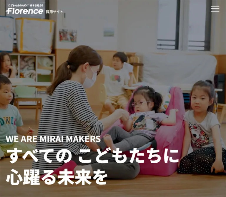
A large photographic media layer fills the initial view behind the header and headline. The desktop capture shows staff in an office with a deep blue wall. The mobile capture uses a close portrait crop. Both have a darkening treatment that keeps white text readable.
The headline is anchored low and left. Its measured box begins at y = 664.75px on desktop and y = 624.11px on mobile. Left padding follows the header identity inset: 35.625px desktop and approximately 16.625px mobile.
The visible hierarchy is:
WE ARE MIRAI MAKERS in bold uppercase Latin text.すべての こどもたちに and 心躍る未来を in much heavier Japanese lettering.Desktop presents the Japanese message over two broad lines. Mobile separates すべての, こどもたちに, and 心躍る未来を into three lines. Preserve these phrase relationships when controlling wrapping.
Visual estimate: a dark overlay around 30–40% opacity is a reasonable starting approximation, subject to the chosen image. No exact overlay declaration was supplied.
The hero section itself measures approximately 1200.25px high on desktop and 906.39px on mobile, extending beyond the first viewport. These outer dimensions do not prove a simple 100vh implementation.
Role: connect the opening promise to the organization's recruitment invitation.
A graphic mission heading precedes a large, deliberately paced paragraph. On desktop, the paragraph uses 40.5px bold type with 81px leading across a 1211.25px region. On mobile, it becomes 18.72px with 37.44px leading inside approximately 341.72px.
The content is broken into short statements about crossing professional and institutional boundaries for children and future generations. Maintain this rhetorical pacing instead of treating the paragraph as ordinary dense body copy.
Two charcoal pills follow: one for mid-career jobs and one for new graduates/internships. Desktop places 405px buttons side by side with approximately 30.28px between them. Mobile stacks 332.80px buttons with approximately 8.31px vertical separation.
The vector heading mask and triangle-map asset are evidenced, but their complete final appearance is outside the supplied screenshots.
Role: make the mission concrete through employee experiences.
Six story links are present in the supplied content. Their titles describe social issues, family support, career changes, organizational work, and personal growth.
Desktop title rectangles form two columns. The sampled right-column titles begin 117px lower than the corresponding left-column titles, establishing a staggered editorial rhythm in the recorded layout. Titles use 36px / 54px bold text and approximately 409.67px widths.
Mobile places these titles in one sequence, using 20.8px / 31.2px type. Sampled title widths are approximately 241.91px, inset farther than the main mobile gutter.
The collection's title typography and arrangement are measured. The complete image crops and any image masking for these six stories were not visually supplied; do not apply the global polygon mask to every story by assumption.
Role: provide three direct routes after the staff stories.
This is the clearest captured content module. A large white panel sits inside a blue geometric section, with yellow and gold angular forms extending around its edges.
The panel uses two equal desktop columns with an approximately 57.70px gap:
フローレンスの仲間たち.1日・1週間の流れ.対談・インタビュー.Image dimensions and ratios are visual estimates: approximately 4:3 for the left image and 7:3 for the two right images. Column widths and label typography are supported by DOM measurements.
Each category label sits directly below its image, in 27px bold charcoal text, with a small right chevron at the far edge. The images have square corners and no visible card shadow. A centered 405 × 65.81px charcoal pill leads to the broader people-and-jobs area.
Mobile DOM positions put the three category routes in one vertical sequence, with approximately 291.81px label widths and 20.8px type. Mobile image crops are unverified.
Role: connect applicants to the organization's mission, employee data, and working environment.
The section contains フローレンスとは, 数で知るフローレンスの人々, and フローレンスで働く6のわくわく.
The desktop DOM gives the first route a broad 1282.5px label region. The next two occupy approximately 609.19px each with a 64.13px gap. Mobile places all three in a single approximately 341.72px column.
The section heading has measured white text, while its route labels use charcoal. Exact background artwork and media crops are not included in the supplied visual captures.
Role: separate application audiences and expose current openings.
The recruitment section combines the English marker JOIN US, a heavy Japanese section heading, two audience routes, and a narrower list headed PICKUP求人.
Desktop audience-route labels occupy 513px columns with a 54px gap. Mobile stacks them at approximately 308.44px wide. A staff image asset is directly referenced for the mid-career route.
Highlighted job rows contain an occupation category followed by a longer position title. The sampled list is 954px wide on desktop and approximately 241.94px on mobile. Desktop rows are about 100.78px high; mobile rows grow to approximately 123–153px as titles wrap.
Keep these as readable linked rows with content-driven heights. Their narrower measure creates a more practical information layer inside the larger recruitment section.
Role: show current opportunities and organizational updates without overwhelming the page.
Both collections contain dates, image references, and linked titles. Their sampled item positions form horizontal sequences extending beyond the visible content area:
This supports a horizontally arranged rail with about three desktop items and one mobile item plus a glimpse of the next. Dragging, autoplay, pagination, arrow controls, and keyboard navigation were not exercised.
Events use a white section surface and two large red audience-route pills: 517.5 × 112.5px on desktop and approximately 341.72 × 83.19px on mobile. News uses the light canvas and a standard charcoal archive pill.
Preserve the distinction between ordinary linked article titles and the larger audience-routing controls.
Role: offer ongoing contact after the main recruitment content.
Follow us ! uses the measured Inter stack. A green LINE block is the dominant social element, combining its icon with explanatory copy. It measures approximately 590.48 × 211.5px on desktop and 341.75 × 285.13px on mobile, with a radius of 18px / 16.64px.
Desktop places Facebook, X, Wantedly, and Instagram links beside it in a compact arrangement with explanatory labels. Their icon columns measure 54px. On mobile, these four links become a single row of approximately 49.91px icon boxes; the explanatory labels are absent from the visible-text extraction.
Role: retain access to recruitment events while browsing the long homepage.
The capsule contains a charcoal イベント情報 label on white and two red inner pills labeled 中途 and 新卒, each with a white chevron. These links lead to event categories, not job application pages.
It appears near the lower right in desktop scrolled captures and near the bottom across the mobile capture. Approximate outer dimensions are 360 × 60px desktop and 338 × 50px mobile.
Measured inner link boxes are 103.5 × 42.75px desktop and 93.59 × 39.52px mobile. Type is 18px desktop and 14.56px mobile. The anchors themselves report transparent backgrounds, while the visible control is red; wrapper or decorative-layer styling contributes to the appearance.
The initial hero captures do not visibly show the capsule, despite its links being present in the DOM. Its exact visibility trigger is unverified.
Role: provide organization details, a full recruitment site map, and related Florence services.
Desktop uses a white three-column footer in a 1:2:1 proportion. The left column contains the Tokyo office details, organization/access links, and a square charcoal contact button. The center contains the recruitment site map. The right contains related service websites.
Fine horizontal rules separate groups. Internal routes use small chevrons. External links use a compact overlapping-square mark. This icon's shape is visible and also supported by the source SVG mask.
Mobile stacks the columns. Site-map categories and the disability-support group become button-based disclosure rows with red plus signs. The supplied mobile footer capture shows these groups collapsed. Opening behavior and expanded-state motion were not tested.
A centered legal-link row precedes the red copyright band. That band measures approximately 130.05px high on desktop and 111.86px on mobile, including substantial bottom padding that accommodates the floating capsule.
The original page identifies 認定NPO法人フローレンス in its title and brand link, and displays ©︎ NPO Florence in the footer. No production credit is established by the supplied original-page evidence.
| Treatment | Supplied declaration or evidence | What can be concluded |
|---|---|---|
| Header shadow | box-shadow 0.2s |
A short shadow transition is defined |
| Header links and controls | color 0.2s, background-color 0.2s |
Color changes are supported; exact hover endpoints were not captured |
| Story and category title links | opacity 0.2s |
Brief opacity feedback is defined |
| Standard pills and footer brand link | clip-path 0.6s cubic-bezier(0.785, 0.135, 0.15, 0.86) 0.1s |
A delayed clipping transition is defined; trigger and endpoint shapes are unverified |
| Floating event links | 0.4s transition shorthand |
Duration is evidenced; the changing property is not identified by this extract |
| LINE block | filter 0.1s |
Fast filter feedback is defined; filter values are unverified |
| Hero media | Video-poster asset reference and photographic captures | A video-oriented hero is indicated; playback settings and timing are unverified |
| Mobile footer groups | Buttons, red plus signs, collapsed screenshot state | Disclosure affordances are evidenced; activation results are unverified |
| Event and news rails | Successive items extend horizontally beyond the viewport | Rail geometry is evidenced; interaction mechanism is unverified |
The computed samples frequently report animation: none. This is a statement about the sampled elements at extraction time, not proof that the page has no JavaScript animation, media playback, or animated pseudo-elements.
A pause-icon mask exists in the source properties. Its availability does not establish that an accessible pause control was visible or functional in these captures.
Implementation recommendation: use the short color and opacity transitions for ordinary links. Introduce clipping reveals only after defining their actual start/end states. Keep all content visible in the static and reduced-motion versions.
| Layer | Appearance | Function |
|---|---|---|
| Hero media | Full-width photography with darkening | Human context and white-text contrast |
| Hero header | Transparent-looking, white details | Integrates identity with the opening image |
| Scrolled header | White, red branding, subtle shadow | Stable navigation over varied content |
| Main canvas | #f8f8f8 |
Separates major information sections |
| People panel | Flat white rectangle | Clear image-and-label navigation inside colored framing |
| Geometric framing | Blue faces with yellow/gold angular accents | Large-scale section character |
| General CTA | Charcoal capsule with white label and chevron | Section navigation |
| Event CTA | Red capsule with white label and chevron | Audience-specific event routing |
| Footer | White, thin rules, charcoal text | Dense but orderly navigation |
| Copyright band | Solid Florence red | Strong visual ending and space behind the floating control |
The header shadow token is source-defined as 0 calc(3 * 1rem / 16) calc(30 * 1rem / 16) #00000029, equivalent to approximately 0 3.375px 33.75px on desktop. Its opacity is about 16%. The captured category cards do not use comparable elevation.
Use photographs of actual people interacting: colleagues talking, staff assisting a child, and employees participating in an interview. The supplied content-panel photographs are bright, naturally colored, and grounded in recognizable workplaces. The hero's darker treatment is specific to its overlaid text.
The desktop people panel balances one group photograph against two closer activity/interview views. This variation gives the section rhythm while keeping all three routes equally legible. Preserve human faces and the relevant activity when choosing crops.
Geometric artwork operates around sections and graphic headings. It consists of angular planes with two-tone faces and sharp points. Large facets can extend beyond panel edges. Keep them behind content and outside critical reading areas.
Paths below are references found in the supplied original-page evidence. They were not fetched separately.
| Asset | Observed reference | Evidence-supported use |
|---|---|---|
| Portrait hero poster | /wp/wp-content/themes/recruit_florence/build/images/thumb-hero-video-poster-portrait.webp |
Hero fallback/poster reference; declared dimensions 351 × 629 |
| Triangle map | /wp/wp-content/themes/recruit_florence/build/images/bg-color-triangle-map.svg |
Decorative mission graphic; declared dimensions 1569 × 1024 |
| Mid-career staff image | /wp/wp-content/themes/recruit_florence/build/images/pict-mid-career-staff.webp |
Recruitment-route artwork reference |
| LINE icon | /wp/wp-content/themes/recruit_florence/build/images/sns-line.svg |
Prominent LINE block; declared 140 × 140 |
| Social icons | Same directory: sns-facebook.svg, sns-x.svg, sns-wantedly-wh.svg, sns-instagram.svg |
Other social destinations |
| Brand artwork | Embedded SVG in --img-logo-brand |
Florence wordmark and slogan; viewBox 175.11 × 44.89 |
| Mission lettering | Embedded SVG in --mask-home-lead-tagline |
Graphic text mask; viewBox 1039 × 231.89 |
| Floating facets | Embedded SVGs in --bg-obj-floating-element-bl and --bg-obj-floating-element-rd |
Two-tone geometric decoration |
| External-link symbol | Embedded SVG in --mask-ico-external |
Overlapping-square link mark |
The exact filenames for the three visible people-category photographs were not supplied. Do not invent an asset manifest for them.
The desktop page combines full-width regions with several nested content widths. General section headings align around 5% from the 1425px content edge. Mission and footer content align around 7.5%. Header identity and hero copy start at 2.5%. These distinct alignments contribute to the page's scale.
Mobile replaces these percentage relationships with an approximately 16.64px primary gutter, then adds deeper insets within selected story and recruitment modules.
| Area | Desktop observation | Mobile observation |
|---|---|---|
| Header | Full navigation and two rectangular action buttons | Brand plus hamburger control |
| Hero message | Broad, two-line Japanese statement | Three shorter Japanese lines over a portrait crop |
| Mission CTAs | Two pills in one row | Two stacked pills |
| Staff stories | Two columns with recorded vertical staggering | One story sequence |
| People-category panel | Large left image; two wide right images | Three vertically ordered routes in DOM |
| Organization links | Broad first route, two lower columns | One vertical column |
| Recruitment routes | Two audience columns | Stacked audience routes |
| Event/news items | Approximately three item widths across the viewport | One item with partial next-item visibility implied by coordinates |
| Social links | Large LINE block plus icon-and-label links | LINE block above a row of four icons |
| Footer | Three columns with visible nested links | Stacked groups with collapsed disclosure affordances |
| Floating event links | Compact lower-right group | Near-full-width bottom capsule |
The sampled document geometry includes approximately one viewport of separation between the mission section's end and the people section's start. The cause is not established. It may involve a scene wrapper, positioning, or a motion-related spacer; do not hardcode it as an empty content section.
Only the two supplied viewport sizes were inspected. No tablet, landscape-phone, zoom, or intermediate breakpoint behavior is verified. The Quick Start's breakpoint is an implementation choice.
900 headings, and 700 navigation labels.These are recommendations for a new implementation, not verified original-site features.
details/summary or equivalent buttons with aria-expanded. Keep destination links separately operable.#dc000c.#313841.#f8f8f8; panels and footer: #ffffff.#4d54a7 and #3f469b.#ffc400.#4cc764.#e1e6ee.“Create a Japanese nonprofit recruitment homepage inspired by the current Florence site. Build a substantial portal with mission copy, employee stories, organizational information, separate career routes, current jobs, event and news collections, social links, and a comprehensive footer. Open with a full-width workplace photograph or supported video poster under a dark overlay. Place a small uppercase English statement above extremely bold white Japanese copy near the lower left. Use the Noto Sans JP-led stack, charcoal text, white and pale-gray surfaces, Florence red for prominent actions, and large two-tone blue and yellow facets around selected sections. Use rectangular photographs, simple chevrons, charcoal navigation pills, and a compact floating event capsule. Reflow the navigation, image groups, and site map deliberately for mobile.”
中途 and 新卒, each with a white chevron. Link them to the corresponding event categories. Position the capsule near the lower right on desktop and near the bottom across mobile, with sufficient safe-area and content clearance.”This is an implementation adaptation, not recovered source CSS. It keeps the document root conventional and expresses the observed scale through --u. The interpolation matches the measured 390px and 1440px endpoints; its behavior between those widths is recommended. The 1200px breakpoint is also recommended.
The class contract assumes a header with data-tone='hero' or data-tone='solid', supplied light/dark brand artwork, a hero media layer, linked category cards, a floating event group, and footer disclosure groups. A component or small script must manage header/menu state. Use [hidden] for the event capsule when the chosen visibility rule requires it; the original threshold is unknown.
The starter uses the estimated desktop Japanese hero size and enlarges small floating-control touch targets to 44px. Its full-viewport hero is a practical adaptation of the captured opening composition, not a claim about the original section-height formula.
:root {
  /* Measured palette, with one recommended divider approximation. */
  --color-brand: #dc000c;
  --color-brand-hover: #ea0000;
  --color-ink: #313841;
  --color-ink-hover: #2e3c4f;
  --color-muted: #586476;
  --color-canvas: #f8f8f8;
  --color-surface: #ffffff;
  --color-blue: #4d54a7;
  --color-blue-deep: #3f469b;
  --color-yellow: #ffc400;
  --color-line: #4cc764;
  --color-rule: #e1e6ee;

  --font-jp: 'Noto Sans JP', 'SF Pro JP', 'SF Pro Text',
    'Hiragino Kaku Gothic Pro', sans-serif;
  --font-en: Inter, 'SF Pro Text', 'SF Pro Icons',
    'Helvetica Neue', Helvetica, sans-serif;

  /* Recommended interpolation through the measured scale endpoints. */
  --u: clamp(1px, 0.2666667vw, 1.125px);
  --text-body: calc(16 * var(--u));
  --text-hero-parent: calc(42 * var(--u));
  --text-hero-jp: calc(42 * var(--u));
  --text-hero-en: calc(24 * var(--u));
  --text-section: calc(32 * var(--u));
  --text-story: calc(20 * var(--u));
  --text-card: calc(20 * var(--u));
  --text-button: calc(16 * var(--u));
  --text-small: calc(14 * var(--u));
  --text-legal: calc(12 * var(--u));

  --space-xs: calc(4 * var(--u));
  --space-sm: calc(8 * var(--u));
  --space-md: calc(16 * var(--u));
  --space-lg: calc(24 * var(--u));
  --space-xl: calc(32 * var(--u));
  --space-2xl: calc(48 * var(--u));
  --space-3xl: calc(64 * var(--u));

  --header-height: calc(64 * var(--u));
  --page-gutter: var(--space-md);
  --content-max: calc(1140 * var(--u));
  --radius-pill: 999px;
  --radius-social: calc(16 * var(--u));
  --shadow-header: 0 calc(3 * var(--u)) calc(30 * var(--u)) #00000029;
  --safe-bottom: env(safe-area-inset-bottom, 0px);

  --motion-fast: 200ms ease;
  --motion-filter: 100ms ease;
  --motion-capsule: 400ms ease;
  --motion-wipe: 600ms cubic-bezier(0.785, 0.135, 0.15, 0.86);
  --motion-wipe-delay: 100ms;
}

* { box-sizing: border-box; }
body {
  margin: 0;
  color: var(--color-ink);
  background: var(--color-canvas);
  font: 500 var(--text-body)/1.8 var(--font-jp);
}
img, video { display: block; max-width: 100%; }
button, a { -webkit-tap-highlight-color: transparent; }
button { font: inherit; }
a { color: inherit; }
[hidden] { display: none !important; }
h1, h2, h3, p { margin-block-start: 0; }
section[id] { scroll-margin-top: calc(var(--header-height) + 16px); }

.container {
  width: calc(100% - 2 * var(--page-gutter));
  max-width: var(--content-max);
  margin-inline: auto;
}

.site-header {
  position: fixed;
  inset: 0 0 auto;
  z-index: 100;
  height: var(--header-height);
  color: var(--color-ink);
  background: var(--color-surface);
  box-shadow: var(--shadow-header);
  transition: box-shadow var(--motion-fast),
    background-color var(--motion-fast), color var(--motion-fast);
}
.header-inner {
  height: 100%;
  margin-inline: var(--space-md);
  display: flex;
  align-items: center;
  justify-content: space-between;
  gap: var(--space-md);
}
.brand {
  display: flex;
  align-items: end;
  gap: calc(12 * var(--u));
  color: var(--color-brand);
  text-decoration: none;
  font-size: var(--text-small);
  font-weight: 700;
  white-space: nowrap;
}
.brand-art { width: calc(140 * var(--u)); height: auto; }
.brand-art--light { display: none; }
.site-header[data-tone='hero'] {
  color: white;
  background: transparent;
  box-shadow: none;
}
.site-header[data-tone='hero'] .brand { color: white; }
.site-header[data-tone='hero'] .brand-art--light { display: block; }
.site-header[data-tone='hero'] .brand-art--dark { display: none; }
.site-nav, .header-actions { display: none; }
.menu-toggle {
  min-width: 44px;
  height: var(--header-height);
  padding: 0;
  border: 0;
  color: var(--color-brand);
  background: transparent;
  cursor: pointer;
}
.site-header[data-tone='hero'] .menu-toggle { color: white; }
.menu-toggle span {
  display: block;
  width: calc(40 * var(--u));
  height: 3px;
  margin-block: 8px;
  background: currentColor;
}
.mobile-nav {
  position: fixed;
  inset: var(--header-height) 0 0;
  z-index: 99;
  overflow-y: auto;
  padding: var(--space-lg);
  color: var(--color-ink);
  background: white;
}

.hero {
  position: relative;
  isolation: isolate;
  min-height: 100svh;
  display: grid;
  align-items: end;
  padding: calc(var(--header-height) + 48px) var(--space-md)
    calc(32 * var(--u));
  color: white;
  background: var(--color-ink);
}
.hero-media, .hero-shade { position: absolute; inset: 0; }
.hero-media { z-index: -2; overflow: hidden; }
.hero-media > :is(img, video) {
  width: 100%;
  height: 100%;
  object-fit: cover;
  object-position: var(--hero-position, 50% 50%);
}
.hero-shade {
  z-index: -1;
  background: rgb(0 0 0 / 35%); /* Visual approximation. */
}
.hero-title {
  margin: 0;
  font-size: var(--text-hero-parent);
  font-weight: 900;
  line-height: 1.25;
}
.hero-kicker {
  display: block;
  font-size: var(--text-hero-en);
  font-weight: 700;
}
.hero-jp { display: block; font-size: var(--text-hero-jp); }
.hero-line, .hero-phrase { display: block; }

.section-title {
  margin-bottom: var(--space-2xl);
  font-size: var(--text-section);
  font-weight: 900;
  line-height: 1.5;
}
.mission { padding-block: calc(104 * var(--u)) var(--space-3xl); }
.mission-copy {
  font-size: calc(18 * var(--u));
  font-weight: 700;
  line-height: 2;
}
.cta-pair {
  display: flex;
  flex-direction: column;
  align-items: center;
  gap: var(--space-sm);
  margin-top: calc(40 * var(--u));
}
.pill {
  display: grid;
  grid-template-columns: minmax(0, 1fr) auto;
  align-items: center;
  gap: 0.5em;
  width: min(100%, calc(320 * var(--u)));
  min-height: 3.25em;
  padding: 0.5em 1em 0.5em 1.5em;
  border: 0;
  border-radius: var(--radius-pill);
  color: white;
  background: var(--color-ink);
  font-size: var(--text-button);
  font-weight: 700;
  line-height: 1.275;
  text-decoration: none;
  transition: background-color var(--motion-fast);
}
.pill::after, .route-label::after {
  content: '';
  width: 0.45em;
  height: 0.45em;
  border-top: 2px solid currentColor;
  border-right: 2px solid currentColor;
  transform: rotate(45deg);
  margin-right: 0.2em;
}
.pill--red { background: var(--color-brand); }
.pill--event { width: 100%; min-height: calc(80 * var(--u)); }

.people-section {
  position: relative;
  isolation: isolate;
  overflow: hidden;
  padding-block: var(--space-3xl);
  background: var(--color-blue-deep);
}
.people-section > .container { position: relative; z-index: 1; }
.people-section .section-title { color: white; }
/* Recommended facet approximation; use supplied artwork for exact shapes. */
.people-section::before, .people-section::after {
  content: '';
  position: absolute;
  width: 28%;
  height: 70%;
  background: var(--color-yellow);
  pointer-events: none;
}
.people-section::before {
  left: -12%; top: 0;
  clip-path: polygon(0 0, 65% 0, 100% 75%, 25% 100%);
}
.people-section::after {
  right: -10%; bottom: -25%;
  clip-path: polygon(0 20%, 100% 0, 100% 100%, 25% 85%);
}
.route-panel { padding: var(--space-lg); background: white; }
.route-grid, .route-stack { display: grid; gap: var(--space-xl); }
.route-card { display: block; color: var(--color-ink); text-decoration: none; }
.route-card img {
  width: 100%;
  aspect-ratio: 3 / 2; /* Recommended mobile crop. */
  object-fit: cover;
  border-radius: 0;
}
.route-label {
  display: flex;
  align-items: center;
  justify-content: space-between;
  gap: 1em;
  margin: 0;
  font-size: var(--text-card);
  font-weight: 700;
  line-height: 1.5;
  transition: opacity var(--motion-fast);
}
.route-panel > .pill { margin: var(--space-2xl) auto 0; }

.story-grid { display: grid; gap: var(--space-2xl); }
.story-title { font-size: var(--text-story); font-weight: 700; line-height: 1.5; }
.content-rail {
  display: grid;
  grid-auto-flow: column;
  grid-auto-columns: 90%;
  gap: var(--space-md);
  overflow-x: auto;
  scroll-snap-type: x proximity;
  padding-bottom: var(--space-md);
}
.content-rail > article { min-width: 0; scroll-snap-align: start; }
.content-rail h3 { font-size: var(--text-body); line-height: 1.5; }

.follow-heading { font-family: var(--font-en); font-weight: 700; }
.follow-grid { display: grid; gap: var(--space-xl); }
.line-card {
  display: flex;
  flex-wrap: wrap;
  align-items: center;
  gap: var(--space-lg);
  padding: var(--space-lg) var(--space-xl);
  border-radius: var(--radius-social);
  color: white;
  background: var(--color-line);
  text-decoration: none;
  transition: filter var(--motion-filter);
}
.social-shortcuts {
  display: grid;
  grid-template-columns: repeat(4, minmax(0, 1fr));
  align-items: center;
  gap: var(--space-lg);
}
.social-shortcuts a { display: grid; justify-items: center; gap: var(--space-md); }
.social-shortcuts img { width: calc(48 * var(--u)); }
.social-shortcuts .social-copy { display: none; }

.event-dock {
  position: fixed;
  z-index: 110;
  left: 50%;
  bottom: calc(12px + var(--safe-bottom));
  transform: translateX(-50%);
  display: grid;
  grid-template-columns: auto 1fr 1fr;
  align-items: center;
  gap: var(--space-xs);
  width: min(calc(100% - 32px), 360px);
  padding: 4px;
  border: 3px solid var(--color-brand);
  border-radius: var(--radius-pill);
  background: white;
  font-size: var(--text-small);
  font-weight: 700;
}
.event-dock-label { padding-inline: 12px; white-space: nowrap; }
.event-dock a {
  display: flex;
  align-items: center;
  justify-content: center;
  gap: 0.7em;
  min-height: 44px; /* Recommended touch-target enlargement. */
  border-radius: var(--radius-pill);
  color: white;
  background: var(--color-brand);
  text-decoration: none;
  transition: background-color var(--motion-capsule);
}

.site-footer { margin-top: var(--space-3xl); background: white; }
.footer-grid { display: grid; gap: var(--space-md); padding-block: var(--space-2xl); }
.footer-grid h3 { font-size: var(--text-body); font-weight: 700; }
.footer-row, .footer-fold { border-bottom: 1px solid var(--color-rule); }
.footer-row { display: block; padding-block: calc(12 * var(--u)); text-decoration: none; }
.footer-fold summary {
  position: relative;
  padding: calc(12 * var(--u)) var(--space-xl) calc(12 * var(--u)) 0;
  list-style: none;
  font-size: var(--text-small);
  font-weight: 700;
  cursor: pointer;
}
.footer-fold summary::-webkit-details-marker { display: none; }
.footer-fold summary::after {
  content: '+';
  position: absolute;
  right: 4px;
  color: var(--color-brand);
}
.footer-fold[open] summary::after { content: '−'; }
.footer-fold-content { padding: 0 var(--space-md) var(--space-md); }
.footer-legal {
  display: flex;
  flex-wrap: wrap;
  justify-content: center;
  gap: var(--space-md);
  padding-block: var(--space-lg) var(--space-xl);
  font-size: var(--text-legal);
}
.copyright {
  margin: 0;
  padding: var(--space-md) var(--space-md) calc(80px + var(--safe-bottom));
  color: white;
  background: var(--color-brand);
  font: 700 var(--text-legal)/1.8 var(--font-en);
  text-align: center;
}

@media (min-width: 1200px) {
  :root {
    --header-height: calc(80 * var(--u));
    --page-gutter: 5%;
    --text-hero-parent: calc(64 * var(--u));
    --text-hero-jp: calc(80 * var(--u)); /* Visual estimate. */
    --text-hero-en: calc(40 * var(--u));
    --text-section: calc(64 * var(--u));
    --text-story: calc(32 * var(--u));
    --text-card: calc(24 * var(--u));
    --text-button: calc(18 * var(--u));
  }
  .container--narrow { width: 85%; }
  .header-inner { margin-inline: 2.5%; }
  .brand-art { width: calc(175 * var(--u)); }
  .menu-toggle, .mobile-nav { display: none; }
  .site-nav { display: flex; align-items: center; gap: calc(28 * var(--u)); }
  .header-actions { display: flex; gap: var(--space-xs); }
  .header-action {
    display: grid;
    place-items: center;
    width: calc(140 * var(--u));
    min-height: calc(56 * var(--u));
    border: 2px solid var(--color-brand);
    border-radius: 0;
    color: white;
    background: var(--color-brand);
    font-size: var(--text-small);
    font-weight: 700;
    text-decoration: none;
  }
  .site-header[data-tone='hero'] .header-action {
    border-color: white;
    background: transparent;
  }
  .hero { padding-inline: 2.5%; padding-bottom: calc(48 * var(--u)); }
  .hero-phrase { display: inline; }
  .mission { padding-block: calc(168 * var(--u)) calc(104 * var(--u)); }
  .mission-copy { font-size: calc(36 * var(--u)); }
  .cta-pair { flex-direction: row; justify-content: center; gap: calc(27 * var(--u)); }
  .pill { width: min(100%, calc(360 * var(--u))); }
  .pill--event { width: calc(460 * var(--u)); min-height: calc(100 * var(--u)); }
  .route-panel { padding: 5%; }
  .route-grid { grid-template-columns: repeat(2, minmax(0, 1fr)); gap: 5%; }
  .route-card img { aspect-ratio: 7 / 3; }
  .route-card--large img { aspect-ratio: 4 / 3; }
  .story-grid { grid-template-columns: repeat(2, minmax(0, 1fr)); }
  .story-grid > :nth-child(even) { margin-top: calc(104 * var(--u)); }
  .content-rail { grid-auto-columns: 32%; gap: 2.5%; }
  .follow-grid { grid-template-columns: repeat(2, minmax(0, 1fr)); }
  .social-shortcuts { grid-template-columns: repeat(2, minmax(0, 1fr)); }
  .social-shortcuts a { grid-template-columns: auto 1fr; align-items: center; }
  .social-shortcuts .social-copy { display: block; }
  .event-dock { left: auto; right: 24px; bottom: 18px; transform: none; }
  .footer-grid { grid-template-columns: 1fr 2fr 1fr; gap: 2.5%; }
  .footer-fold summary::after { display: none; }
}

@media (hover: hover) {
  .pill:hover { background: var(--color-ink-hover); }
  .pill--red:hover, .event-dock a:hover { background: var(--color-brand-hover); }
  .route-card:hover .route-label { opacity: 0.75; }
}

/* Recommended accessible focus and reduced-motion treatments. */
:where(a, button, summary):focus-visible {
  outline: 3px solid var(--color-ink);
  outline-offset: 4px;
  box-shadow: 0 0 0 7px white;
}
@media (prefers-reduced-motion: reduce) {
  *, *::before, *::after {
    animation: none !important;
    transition: none !important;
    scroll-behavior: auto !important;
  }
}
For desktop footer disclosure groups, set their open state in the component so all nested links remain visible. On mobile, allow the user to toggle them. The native disclosure approach above is a recommendation; the original DOM uses buttons.
The CSS supplies a static visual foundation. Hero video control, menu focus management, rail navigation, and header/capsule visibility require corresponding component behavior. CSS reduced-motion rules alone do not pause video.
Optional aliases for a project already using Tailwind v4. Define the properties above first. The original site's use of Tailwind is not established.
@theme inline {
  --color-florence: var(--color-brand);
  --color-charcoal: var(--color-ink);
  --color-page: var(--color-canvas);
  --color-panel: var(--color-surface);
  --color-facet-blue: var(--color-blue);
  --color-facet-deep: var(--color-blue-deep);
  --color-facet-yellow: var(--color-yellow);

  --font-japanese: var(--font-jp);
  --font-english: var(--font-en);
  --text-body-copy: var(--text-body);
  --text-section-heading: var(--text-section);
  --text-story-heading: var(--text-story);
  --text-route-heading: var(--text-card);
  --text-action: var(--text-button);

  --spacing-page-inset: var(--space-md);
  --spacing-panel-inset: var(--space-lg);
  --radius-capsule: var(--radius-pill);
  --radius-social-card: var(--radius-social);
  --shadow-navigation: var(--shadow-header);
}
2026-09-16T19:01:28.416Z, equivalent to September 17, 2026, 04:01:28.416 JST.This reference analyzes the supplied current-page evidence without additional browsing. Menu activation, footer expansion, hover endpoints, video playback and sound, carousel operation, exact breakpoints, and intermediate responsive states were not independently exercised. Current page identity, visible composition, measured typography, local geometry, and original-page attribution support the findings above.
# Florence Recruitment — Style Reference

> Everyday working relationships, exceptionally bold promises, and colorful faceted shapes around a substantial recruitment portal.

**Website:** [recruit.florence.or.jp](https://recruit.florence.or.jp/)
**Original URL:** https://recruit.florence.or.jp/
**Final URL:** https://recruit.florence.or.jp/
**Theme:** light content surfaces, red brand accents, charcoal text, and multicolored geometric section framing
**Inspected:** September 17, 2026, 04:01 JST; supplied retrieval timestamp: September 16, 2026, 19:01:28.416 UTC
**Viewports:** 1440 × 1000 desktop and 390 × 844 mobile, in CSS pixels
**Scope:** the current recruitment homepage, including its hero, mission introduction, staff stories, category links, organizational information, recruitment routes, job highlights, events, news, social links, and footer. Visual captures cover the desktop hero, people-category panel, and footer, plus the mobile hero and footer. Other homepage sections are supported by rendered DOM and computed styles. Linked destination pages were not inspected.

Florence presents recruitment as participation in a social mission. Large photographs of staff and working environments establish a human setting. Heavy Japanese headings carry the message, while a compact English line adds emphasis. Below the opening image, spacious editorial sections lead into practical routes for understanding the organization, meeting employees, finding jobs, and attending events.

The central visual relationship is between expansive photographic or colored regions and orderly white information surfaces. Rectangular images and simple arrow links keep content direct. Rounded charcoal buttons gather secondary navigation, while red identifies prominent recruitment and event controls. Blue and yellow facets introduce energy around the people section without turning each individual card into a decorative object.

This is a long homepage within a multipage recruitment website. Its navigation, article collections, audience-specific job routes, and extensive site map are essential parts of the design.
# Florence Recruitment — Style Reference

> Everyday working relationships, exceptionally bold promises, and colorful faceted shapes around a substantial recruitment portal.

**Website:** [recruit.florence.or.jp](https://recruit.florence.or.jp/)
**Original URL:** https://recruit.florence.or.jp/
**Final URL:** https://recruit.florence.or.jp/
**Theme:** light content surfaces, red brand accents, charcoal text, and multicolored geometric section framing
**Inspected:** September 17, 2026, 04:01 JST; supplied retrieval timestamp: September 16, 2026, 19:01:28.416 UTC
**Viewports:** 1440 × 1000 desktop and 390 × 844 mobile, in CSS pixels
**Scope:** the current recruitment homepage, including its hero, mission introduction, staff stories, category links, organizational information, recruitment routes, job highlights, events, news, social links, and footer. Visual captures cover the desktop hero, people-category panel, and footer, plus the mobile hero and footer. Other homepage sections are supported by rendered DOM and computed styles. Linked destination pages were not inspected.

Florence presents recruitment as participation in a social mission. Large photographs of staff and working environments establish a human setting. Heavy Japanese headings carry the message, while a compact English line adds emphasis. Below the opening image, spacious editorial sections lead into practical routes for understanding the organization, meeting employees, finding jobs, and attending events.

The central visual relationship is between expansive photographic or colored regions and orderly white information surfaces. Rectangular images and simple arrow links keep content direct. Rounded charcoal buttons gather secondary navigation, while red identifies prominent recruitment and event controls. Blue and yellow facets introduce energy around the people section without turning each individual card into a decorative object.

This is a long homepage within a multipage recruitment website. Its navigation, article collections, audience-specific job routes, and extensive site map are essential parts of the design.

## How to Read This Reference

- **Measured** values come from the supplied rendered rectangles and computed styles. Decimal values are retained where they explain the layout.
- **Visual observations** describe the five original-page captures. Approximate image dimensions, overlay strength, and small border details are identified as estimates.
- **Source-defined** values are CSS custom properties or asset references present in the supplied evidence. Their presence alone does not prove that every value is visibly used on this homepage.
- **Recommended** values and behaviors belong to the implementation guidance and Quick Start. They are not claims about the original implementation.
- Desktop content occupies a measured **1425px** width inside the 1440px viewport; mobile content occupies **375px** inside the 390px viewport. The remaining 15px is consistent with the capture's scrollbar gutter. Do not reproduce it as a permanent design margin.
- Hidden navigation and collapsed footer descendants retain entries in the extraction. Their rectangles do not establish visibility. Several section and descendant coordinates also overlap; use stable local dimensions and the captures instead of rebuilding the page from absolute document offsets.

## Tokens — Colors

### Core Palette

| Name | Value | Evidence / suggested alias | Role |
| --- | --- | --- | --- |
| Florence Red | `#dc000c` | Measured backgrounds and embedded brand SVG; `--color-brand` | Solid header actions, event buttons, copyright band, brand artwork |
| White | `#ffffff` | Measured surfaces and text; `--color-surface` | Content panels, footer, reversed hero text, button labels |
| Light Canvas | `#f8f8f8` | Source `--color-bg-fill-light`; measured body | Main page background and alternating content sections |
| Charcoal | `#313841` | Source `--color-secondary`; measured text and buttons | Body text, category labels, arrows, ordinary navigation pills |
| Secondary Text | `#586476` | Source `--color-text-secondary` | Supporting text token; exact component assignments are not fully recorded |
| Facet Blue | `#4d54a7` | Source `--color-theme-bl-from` and blue SVG artwork | Lighter face of geometric blue decoration |
| Deep Facet Blue | `#3f469b` | Source `--color-theme-bl-to` and blue SVG artwork | Deeper blue section framing and contrasting facet |
| Bright Yellow | `#ffc400` | Source `--color-theme-yl`; consistent with captured geometry | Large angular accents around the people panel |
| LINE Green | `#4cc764` | Measured social-link background | Dedicated LINE follow/contact block |

Red and charcoal have distinct jobs. The desktop header's prominent actions and event routes use red. General section links such as `人と仕事を知る` use charcoal pills. The white people-category panel remains visually neutral even when surrounded by saturated geometry.

The navy wall in the opening photograph belongs to the image palette. Treat the interface's blue facet tokens separately from that photographic color.

### Supporting Definitions

| Definition | Source value | Confidence and use |
| --- | --- | --- |
| Primary hover | `#ea0000` | Source-defined; the activated appearance was not captured |
| Secondary hover | `#2e3c4f` | Source-defined; the activated appearance was not captured |
| Cool fill | `#f0f3f8` | Source-defined supporting surface |
| Warm fill | `#eae0c8` | Source-defined supporting surface; homepage application unverified |
| Pale blue fills | `#d7d8e9`, `#edeef6` | Source-defined supporting colors |
| Green accent range | `#145941` to `#2d8667` | Source-defined; distinct from the measured LINE green |
| Purple accent range | `#40006f` to `#814da7` | Source-defined; placement unverified in the supplied captures |
| Red facet artwork | `#d94040`, `#db1250` | Fills inside the supplied floating-element SVG definition |
| Border hover | `#d4deef` | Source-defined hover token; not a measured default divider color |

The footer dividers appear very pale blue-gray. Their exact default color was not provided. The Quick Start uses **recommended approximation `#e1e6ee`** for ordinary rules.

Generic WordPress preset colors and gradients also appear in the extraction. They do not establish the visible design palette and are excluded from this reference.

## Tokens — Typography

### Japanese Interface and Editorial Text

**Computed stack:** `'Noto Sans JP', 'SF Pro JP', 'SF Pro Text', 'Hiragino Kaku Gothic Pro', sans-serif`.

This stack appears on body text, the H1, Japanese section headings, navigation, article titles, and buttons. The evidence establishes the computed family declaration, not which font file supplied every glyph.

- **Body weight:** `500`.
- **Navigation, article links, and buttons:** generally `700`.
- **Hero and major section headings:** `900`.
- **Body leading:** `1.8`.
- **Heading and card-title leading:** generally `1.5`; the H1 parent uses `1.25`.
- **Tracking:** `normal` on sampled elements.

The impression comes from weight and scale. Keep Japanese text solid and compact horizontally, with generous vertical rhythm around longer statements.

### English Utility Typography

**Computed stack on `Follow us !` and copyright:** `Inter, 'SF Pro Text', 'SF Pro Icons', 'Helvetica Neue', Helvetica, sans-serif`.

Inter is evidenced for these particular roles. The English hero line's descendant font declaration was not separately supplied, so its family should not be independently asserted.

### Brand Artwork and Graphic Text

The Florence wordmark and its small Japanese slogan are SVG artwork, represented in the source by `--img-logo-brand`. Preserve the artwork's italic lettering and proportions instead of recreating it with a text font.

The mission introduction also references a vector text mask, `--mask-home-lead-tagline`, and a colored triangle-map image. Its computed H2 background is red, but the asset structure supports a graphic text treatment; a plain red heading rectangle is not established by that background property alone.

### Type Scale

Values below are measured computed sizes unless explicitly labeled otherwise.

| Role | Desktop size / line height | Mobile size / line height | Weight |
| --- | --- | --- | --- |
| Body | `18 / 32.4px` | `16.64 / 29.952px` | `500` |
| H1 parent | `72 / 90px` | `43.68 / 54.6px` | `900` |
| Major section H2 | `72 / 108px` | `33.28 / 49.92px` | `900` |
| Mission / news H2 | `63 / 94.5px` | `33.28 / 49.92px` | `900` |
| Mission paragraph | `40.5 / 81px` | `18.72 / 37.44px` | `700` |
| Staff-story title | `36 / 54px` | `20.8 / 31.2px` | `700` |
| Category-route title | `27 / 40.5px` | `20.8 / 31.2px` | `700` |
| Event / news title link | `18 / 27px` | `16.64 / 24.96px` | `700` |
| Standard navigation pill | `20.25 / 25.819px` | `16.64 / 21.216px` | `700` |
| Large event-route pill | `22.5 / 28.688px` | `16.64 / 21.216px` | `700` |
| Footer navigation | `15.75 / 28.35px` | `14.56 / 26.208px` | `500–700` |
| Legal links | `13.5 / 24.3px` | `12.48 / 22.464px` | `500` |
| Social heading | `27 / 40.5px` | `24.96 / 37.44px` | `700` |

**Hero descendant limitation:** the desktop Japanese lettering visually appears approximately **90px**, larger than its measured 72px H1 parent. The English line appears approximately **45–48px** on desktop and **24–26px** on mobile. These are visual estimates because the individual spans were not measured. The Quick Start distinguishes the parent size from the estimated visible Japanese size.

## Tokens — Spacing & Shapes

### Responsive Unit

The actual computed root is **18px on desktop** and **16.64px on mobile**. The source's `--font-base: 16` is a conversion divisor, not the observed root size.

Many source lengths follow:

```css
/* Observed source expression pattern */
calc(N * calc(1rem / 16))
```

For these expressions, one source design unit resolves to **1.125px** on desktop and **1.04px** on mobile. Examples:

- Desktop header: `80 × 1.125 = 90px`.
- Mobile header: `64 × 1.04 = 66.56px`, measured after rounding as `66.547px`.
- Desktop standard container: `1140 × 1.125 = 1282.5px`.
- Mobile H1: `2.625rem × 16.64 = 43.68px`.

The full root-size formula and breakpoint thresholds were not supplied. Matching these two endpoints does not recover the original responsive function.

### Spacing Scale

These reusable aliases describe measured recurring proportions; only the explicitly named source properties are original token names.

| Suggested alias | Equivalent source amount | Desktop | Mobile | Typical use |
| --- | --- | --- | --- | --- |
| `--space-xs` | `0.25rem` | `4.5px` | `4.16px` | Small control gaps; source `--spacer-xs` |
| `--space-sm` | `0.5rem` | `9px` | `8.32px` | Button gaps, compact vertical separation |
| `--space-md` | `1rem` | `18px` | `16.64px` | Body-scale spacing and mobile outer gutters |
| `--space-lg` | `1.5rem` | `27px` | `24.96px` | Source `--spacer-md`; card and control spacing |
| `--space-xl` | `2rem` | `36px` | `33.28px` | Larger internal insets |
| `--space-2xl` | `3rem` | `54px` | `49.92px` | Broad component separation |
| `--space-3xl` | `4rem` | `72px` | `66.56px` | Section-scale clearance |

Section spacing is much larger than this basic scale in several areas. The mission section has measured top/bottom padding of **189 / 117px** on desktop and **108.16 / 66.56px** on mobile. Avoid compressing this into a uniformly tight card layout.

### Border Radius

| Element | Observed treatment |
| --- | --- |
| Photographic category images | Visually square corners |
| Desktop header action buttons | Measured `0` radius |
| Main navigation pills | Effectively unlimited radius; computed value approximately `33,554,400px` |
| Footer contact button | Measured `0` radius |
| LINE block | `18px` desktop; `16.64px` mobile |
| Footer outer element | Computed `45px` desktop; `0` mobile; full corner exposure is not shown in the footer crop |
| Floating event group | Visually a capsule containing two smaller capsules |

Use a practical `999px` radius for pills. The enormous computed source value is not a useful literal implementation requirement.

### Layout Measurements

| Element | Desktop | Mobile |
| --- | --- | --- |
| Document height at capture | `14772.02px` | `13056.22px` |
| Header | `1425 × 90px` | `375 × 66.55px` |
| Header home-link box | `300.38 × 55.13px` | `232.95 × 42.13px` |
| Header home-link left edge | `35.625px` | `16.625px` |
| General section width | `1282.5px` | Approximately `341.72px` |
| Mission / footer content width | `1211.25px` | Approximately `341.75px` |
| Standard navigation pill | `405 × 65.81px` | `332.80 × 54.08px`; constrained variants also occur |
| Category-panel column | Approximately `548.27px` | `291.81px` |
| Event / news item width | `410.39px` | `307.55px` |
| Event / news item gap | Calculated `32.06px` | Calculated `16.63px` |
| Footer columns | `287.67 / 575.34 / 287.67px` | One stacked column |
| Footer column gap | Calculated `30.28px` | Content-dependent vertical separation |

Document height is a capture fact, not a recommended fixed height.

## Components

### Persistent Site Header

**Role:** identity, primary navigation, and immediate access to jobs and events.

The desktop header places the Florence artwork and `採用サイト` label on the left. The right side contains a small corporate-site link above the principal navigation. `フローレンスとは` includes the smaller `VISION・MISSION・CULTURE` line. Dropdown affordances appear beside the organization and people categories, followed by news and FAQ links. Two rectangular action controls finish the row: `イベント情報` and `求人情報`.

The two action controls measure **157.5 × 63px** each, with a **4.5px** gap. Main category buttons use 18px bold text; smaller links and action labels use 15.75px.

Two visual states are evidenced:

- **Over the hero:** transparent-looking header, white artwork and labels, white outlined action buttons.
- **At lower scroll positions:** white header surface, red artwork, charcoal navigation, solid red action buttons, and a subtle shadow.

The header remains at the top of the supplied scrolled captures. Its precise positioning implementation and state-change threshold were not provided.

### Mobile Header

**Role:** preserve identity while reducing navigation density.

The mobile header is approximately **66.55px** high. The complete home-link box starts at x ≈ 16.63px and spans approximately 232.95px. A three-line menu icon occupies a measured button box of **41.59 × 66.55px** near the right edge.

The hero state uses white artwork and a white menu icon. The footer capture shows the white-surface state with red artwork and red menu lines. Desktop navigation is not visibly laid out beside the mobile logo.

A mobile navigation subtree exists in the DOM, but no opened-menu capture or interaction result was supplied. Its opening animation, overlay treatment, focus behavior, and scroll locking remain unverified.

### Photographic Hero

**Role:** introduce the organization through people and a forceful mission statement.

A large photographic media layer fills the initial view behind the header and headline. The desktop capture shows staff in an office with a deep blue wall. The mobile capture uses a close portrait crop. Both have a darkening treatment that keeps white text readable.

The headline is anchored low and left. Its measured box begins at **y = 664.75px** on desktop and **y = 624.11px** on mobile. Left padding follows the header identity inset: **35.625px** desktop and approximately **16.625px** mobile.

The visible hierarchy is:

1. `WE ARE MIRAI MAKERS` in bold uppercase Latin text.
2. `すべての こどもたちに` and `心躍る未来を` in much heavier Japanese lettering.

Desktop presents the Japanese message over two broad lines. Mobile separates `すべての`, `こどもたちに`, and `心躍る未来を` into three lines. Preserve these phrase relationships when controlling wrapping.

**Visual estimate:** a dark overlay around 30–40% opacity is a reasonable starting approximation, subject to the chosen image. No exact overlay declaration was supplied.

The hero section itself measures approximately **1200.25px** high on desktop and **906.39px** on mobile, extending beyond the first viewport. These outer dimensions do not prove a simple `100vh` implementation.

### Mission Introduction

**Role:** connect the opening promise to the organization's recruitment invitation.

A graphic mission heading precedes a large, deliberately paced paragraph. On desktop, the paragraph uses **40.5px bold type with 81px leading** across a 1211.25px region. On mobile, it becomes **18.72px with 37.44px leading** inside approximately 341.72px.

The content is broken into short statements about crossing professional and institutional boundaries for children and future generations. Maintain this rhetorical pacing instead of treating the paragraph as ordinary dense body copy.

Two charcoal pills follow: one for mid-career jobs and one for new graduates/internships. Desktop places **405px** buttons side by side with approximately **30.28px** between them. Mobile stacks **332.80px** buttons with approximately **8.31px** vertical separation.

The vector heading mask and triangle-map asset are evidenced, but their complete final appearance is outside the supplied screenshots.

### Staff-Story Collection

**Role:** make the mission concrete through employee experiences.

Six story links are present in the supplied content. Their titles describe social issues, family support, career changes, organizational work, and personal growth.

Desktop title rectangles form two columns. The sampled right-column titles begin **117px lower** than the corresponding left-column titles, establishing a staggered editorial rhythm in the recorded layout. Titles use **36px / 54px** bold text and approximately **409.67px** widths.

Mobile places these titles in one sequence, using **20.8px / 31.2px** type. Sampled title widths are approximately **241.91px**, inset farther than the main mobile gutter.

The collection's title typography and arrangement are measured. The complete image crops and any image masking for these six stories were not visually supplied; do not apply the global polygon mask to every story by assumption.

### People-Category Panel

**Role:** provide three direct routes after the staff stories.

This is the clearest captured content module. A large white panel sits inside a blue geometric section, with yellow and gold angular forms extending around its edges.

The panel uses two equal desktop columns with an approximately **57.70px** gap:

- Left: a large group photograph, approximately **548 × 411px**, followed by `フローレンスの仲間たち`.
- Upper right: a wide staff-and-child photograph, approximately **548 × 235px**, followed by `1日・1週間の流れ`.
- Lower right: a wide interview photograph with two seated people, approximately **548 × 235px**, followed by `対談・インタビュー`.

Image dimensions and ratios are visual estimates: approximately **4:3** for the left image and **7:3** for the two right images. Column widths and label typography are supported by DOM measurements.

Each category label sits directly below its image, in **27px bold charcoal text**, with a small right chevron at the far edge. The images have square corners and no visible card shadow. A centered **405 × 65.81px** charcoal pill leads to the broader people-and-jobs area.

Mobile DOM positions put the three category routes in one vertical sequence, with approximately **291.81px** label widths and **20.8px** type. Mobile image crops are unverified.

### Organization Routes

**Role:** connect applicants to the organization's mission, employee data, and working environment.

The section contains `フローレンスとは`, `数で知るフローレンスの人々`, and `フローレンスで働く6のわくわく`.

The desktop DOM gives the first route a broad **1282.5px** label region. The next two occupy approximately **609.19px** each with a **64.13px** gap. Mobile places all three in a single approximately **341.72px** column.

The section heading has measured white text, while its route labels use charcoal. Exact background artwork and media crops are not included in the supplied visual captures.

### Recruitment Routes and Highlighted Jobs

**Role:** separate application audiences and expose current openings.

The recruitment section combines the English marker `JOIN US`, a heavy Japanese section heading, two audience routes, and a narrower list headed `PICKUP求人`.

Desktop audience-route labels occupy **513px** columns with a **54px** gap. Mobile stacks them at approximately **308.44px** wide. A staff image asset is directly referenced for the mid-career route.

Highlighted job rows contain an occupation category followed by a longer position title. The sampled list is **954px** wide on desktop and approximately **241.94px** on mobile. Desktop rows are about **100.78px** high; mobile rows grow to approximately **123–153px** as titles wrap.

Keep these as readable linked rows with content-driven heights. Their narrower measure creates a more practical information layer inside the larger recruitment section.

### Event and News Collections

**Role:** show current opportunities and organizational updates without overwhelming the page.

Both collections contain dates, image references, and linked titles. Their sampled item positions form horizontal sequences extending beyond the visible content area:

- Desktop item width: **410.39px**, step approximately **442.45px**.
- Mobile item width: **307.55px**, step approximately **324.17px**.

This supports a horizontally arranged rail with about three desktop items and one mobile item plus a glimpse of the next. Dragging, autoplay, pagination, arrow controls, and keyboard navigation were not exercised.

Events use a white section surface and two large red audience-route pills: **517.5 × 112.5px** on desktop and approximately **341.72 × 83.19px** on mobile. News uses the light canvas and a standard charcoal archive pill.

Preserve the distinction between ordinary linked article titles and the larger audience-routing controls.

### Social Follow Area

**Role:** offer ongoing contact after the main recruitment content.

`Follow us !` uses the measured Inter stack. A green LINE block is the dominant social element, combining its icon with explanatory copy. It measures approximately **590.48 × 211.5px** on desktop and **341.75 × 285.13px** on mobile, with a radius of **18px / 16.64px**.

Desktop places Facebook, X, Wantedly, and Instagram links beside it in a compact arrangement with explanatory labels. Their icon columns measure **54px**. On mobile, these four links become a single row of approximately **49.91px** icon boxes; the explanatory labels are absent from the visible-text extraction.

### Floating Event Capsule

**Role:** retain access to recruitment events while browsing the long homepage.

The capsule contains a charcoal `イベント情報` label on white and two red inner pills labeled `中途` and `新卒`, each with a white chevron. These links lead to **event categories**, not job application pages.

It appears near the lower right in desktop scrolled captures and near the bottom across the mobile capture. Approximate outer dimensions are **360 × 60px** desktop and **338 × 50px** mobile.

Measured inner link boxes are **103.5 × 42.75px** desktop and **93.59 × 39.52px** mobile. Type is **18px** desktop and **14.56px** mobile. The anchors themselves report transparent backgrounds, while the visible control is red; wrapper or decorative-layer styling contributes to the appearance.

The initial hero captures do not visibly show the capsule, despite its links being present in the DOM. Its exact visibility trigger is unverified.

### Footer and Mobile Disclosure Rows

**Role:** provide organization details, a full recruitment site map, and related Florence services.

Desktop uses a white three-column footer in a **1:2:1** proportion. The left column contains the Tokyo office details, organization/access links, and a square charcoal contact button. The center contains the recruitment site map. The right contains related service websites.

Fine horizontal rules separate groups. Internal routes use small chevrons. External links use a compact overlapping-square mark. This icon's shape is visible and also supported by the source SVG mask.

Mobile stacks the columns. Site-map categories and the disability-support group become button-based disclosure rows with red plus signs. The supplied mobile footer capture shows these groups collapsed. Opening behavior and expanded-state motion were not tested.

A centered legal-link row precedes the red copyright band. That band measures approximately **130.05px** high on desktop and **111.86px** on mobile, including substantial bottom padding that accommodates the floating capsule.

The original page identifies `認定NPO法人フローレンス` in its title and brand link, and displays `©︎ NPO Florence` in the footer. No production credit is established by the supplied original-page evidence.

## Tokens — Motion & Interaction

| Treatment | Supplied declaration or evidence | What can be concluded |
| --- | --- | --- |
| Header shadow | `box-shadow 0.2s` | A short shadow transition is defined |
| Header links and controls | `color 0.2s, background-color 0.2s` | Color changes are supported; exact hover endpoints were not captured |
| Story and category title links | `opacity 0.2s` | Brief opacity feedback is defined |
| Standard pills and footer brand link | `clip-path 0.6s cubic-bezier(0.785, 0.135, 0.15, 0.86) 0.1s` | A delayed clipping transition is defined; trigger and endpoint shapes are unverified |
| Floating event links | `0.4s` transition shorthand | Duration is evidenced; the changing property is not identified by this extract |
| LINE block | `filter 0.1s` | Fast filter feedback is defined; filter values are unverified |
| Hero media | Video-poster asset reference and photographic captures | A video-oriented hero is indicated; playback settings and timing are unverified |
| Mobile footer groups | Buttons, red plus signs, collapsed screenshot state | Disclosure affordances are evidenced; activation results are unverified |
| Event and news rails | Successive items extend horizontally beyond the viewport | Rail geometry is evidenced; interaction mechanism is unverified |

The computed samples frequently report `animation: none`. This is a statement about the sampled elements at extraction time, not proof that the page has no JavaScript animation, media playback, or animated pseudo-elements.

A pause-icon mask exists in the source properties. Its availability does not establish that an accessible pause control was visible or functional in these captures.

**Implementation recommendation:** use the short color and opacity transitions for ordinary links. Introduce clipping reveals only after defining their actual start/end states. Keep all content visible in the static and reduced-motion versions.

## Surfaces

| Layer | Appearance | Function |
| --- | --- | --- |
| Hero media | Full-width photography with darkening | Human context and white-text contrast |
| Hero header | Transparent-looking, white details | Integrates identity with the opening image |
| Scrolled header | White, red branding, subtle shadow | Stable navigation over varied content |
| Main canvas | `#f8f8f8` | Separates major information sections |
| People panel | Flat white rectangle | Clear image-and-label navigation inside colored framing |
| Geometric framing | Blue faces with yellow/gold angular accents | Large-scale section character |
| General CTA | Charcoal capsule with white label and chevron | Section navigation |
| Event CTA | Red capsule with white label and chevron | Audience-specific event routing |
| Footer | White, thin rules, charcoal text | Dense but orderly navigation |
| Copyright band | Solid Florence red | Strong visual ending and space behind the floating control |

The header shadow token is source-defined as `0 calc(3 * 1rem / 16) calc(30 * 1rem / 16) #00000029`, equivalent to approximately **0 3.375px 33.75px** on desktop. Its opacity is about 16%. The captured category cards do not use comparable elevation.

## Imagery

Use photographs of actual people interacting: colleagues talking, staff assisting a child, and employees participating in an interview. The supplied content-panel photographs are bright, naturally colored, and grounded in recognizable workplaces. The hero's darker treatment is specific to its overlaid text.

The desktop people panel balances one group photograph against two closer activity/interview views. This variation gives the section rhythm while keeping all three routes equally legible. Preserve human faces and the relevant activity when choosing crops.

Geometric artwork operates around sections and graphic headings. It consists of angular planes with two-tone faces and sharp points. Large facets can extend beyond panel edges. Keep them behind content and outside critical reading areas.

### Observed Asset References

Paths below are references found in the supplied original-page evidence. They were not fetched separately.

| Asset | Observed reference | Evidence-supported use |
| --- | --- | --- |
| Portrait hero poster | `/wp/wp-content/themes/recruit_florence/build/images/thumb-hero-video-poster-portrait.webp` | Hero fallback/poster reference; declared dimensions `351 × 629` |
| Triangle map | `/wp/wp-content/themes/recruit_florence/build/images/bg-color-triangle-map.svg` | Decorative mission graphic; declared dimensions `1569 × 1024` |
| Mid-career staff image | `/wp/wp-content/themes/recruit_florence/build/images/pict-mid-career-staff.webp` | Recruitment-route artwork reference |
| LINE icon | `/wp/wp-content/themes/recruit_florence/build/images/sns-line.svg` | Prominent LINE block; declared `140 × 140` |
| Social icons | Same directory: `sns-facebook.svg`, `sns-x.svg`, `sns-wantedly-wh.svg`, `sns-instagram.svg` | Other social destinations |
| Brand artwork | Embedded SVG in `--img-logo-brand` | Florence wordmark and slogan; viewBox `175.11 × 44.89` |
| Mission lettering | Embedded SVG in `--mask-home-lead-tagline` | Graphic text mask; viewBox `1039 × 231.89` |
| Floating facets | Embedded SVGs in `--bg-obj-floating-element-bl` and `--bg-obj-floating-element-rd` | Two-tone geometric decoration |
| External-link symbol | Embedded SVG in `--mask-ico-external` | Overlapping-square link mark |

The exact filenames for the three visible people-category photographs were not supplied. Do not invent an asset manifest for them.

## Layout & Responsive Behavior

The desktop page combines full-width regions with several nested content widths. General section headings align around **5%** from the 1425px content edge. Mission and footer content align around **7.5%**. Header identity and hero copy start at **2.5%**. These distinct alignments contribute to the page's scale.

Mobile replaces these percentage relationships with an approximately **16.64px** primary gutter, then adds deeper insets within selected story and recruitment modules.

| Area | Desktop observation | Mobile observation |
| --- | --- | --- |
| Header | Full navigation and two rectangular action buttons | Brand plus hamburger control |
| Hero message | Broad, two-line Japanese statement | Three shorter Japanese lines over a portrait crop |
| Mission CTAs | Two pills in one row | Two stacked pills |
| Staff stories | Two columns with recorded vertical staggering | One story sequence |
| People-category panel | Large left image; two wide right images | Three vertically ordered routes in DOM |
| Organization links | Broad first route, two lower columns | One vertical column |
| Recruitment routes | Two audience columns | Stacked audience routes |
| Event/news items | Approximately three item widths across the viewport | One item with partial next-item visibility implied by coordinates |
| Social links | Large LINE block plus icon-and-label links | LINE block above a row of four icons |
| Footer | Three columns with visible nested links | Stacked groups with collapsed disclosure affordances |
| Floating event links | Compact lower-right group | Near-full-width bottom capsule |

The sampled document geometry includes approximately one viewport of separation between the mission section's end and the people section's start. The cause is not established. It may involve a scene wrapper, positioning, or a motion-related spacer; do not hardcode it as an empty content section.

Only the two supplied viewport sizes were inspected. No tablet, landscape-phone, zoom, or intermediate breakpoint behavior is verified. The Quick Start's breakpoint is an implementation choice.

## Do’s and Don’ts

### Do

- Lead with people and working relationships, then connect them to the recruitment mission.
- Preserve the white hero copy, low-left alignment, and deliberate Japanese phrase breaks.
- Use the measured Japanese font stack, strong `900` headings, and `700` navigation labels.
- Keep Florence red, charcoal, and the blue/yellow geometry in their observed roles.
- Use square photographic category images with labels directly underneath.
- Preserve the large-left/two-right arrangement of the desktop people panel.
- Distinguish event links from job links, including inside the floating capsule.
- Let the footer function as a comprehensive site map.
- Retain generous mission-text leading and broad section spacing.
- Treat mobile as a structural reflow with selective disclosures.

### Don’t

- Do not reduce the website to a single hero and one application button.
- Do not make every category a rounded, shadowed card.
- Do not turn photographic blues into additional interface brand colors without evidence.
- Do not apply the hero's darkening treatment to the bright category photographs.
- Do not replace the Florence artwork with a typed approximation.
- Do not assume every English label uses Inter.
- Do not copy hidden-menu rectangles or overlapping extraction coordinates into visible layouts.
- Do not claim autoplay, parallax, carousel dragging, or tested menu transitions from these static records.
- Do not render duplicated extracted heading strings as two visible headings.
- Do not copy source rem values while assuming the original root was 16px at both viewports.

## Recommended Implementation Additions

These are recommendations for a new implementation, not verified original-site features.

- Give the mobile menu an accessible name, expose its expanded state, support Escape, and manage focus when its panel behaves as an overlay.
- Implement footer disclosures with native `details`/`summary` or equivalent buttons with `aria-expanded`. Keep destination links separately operable.
- Provide at least 44px touch targets. The measured mobile event links and hamburger width fall slightly below that dimension.
- Keep a visible focus indicator on both white and colored surfaces. Account for the fixed header and bottom capsule when scrolling focused content into view.
- Provide a static hero poster and a clear pause mechanism if ongoing video is used. Honor reduced-motion preferences in both CSS and media logic.
- Make event/news rails keyboard reachable, keep navigation explicit, and expose a useful next-item preview without causing page-wide horizontal scrolling.
- Mark decorative facets and duplicate visual text layers as hidden from assistive technology. Keep one semantic heading per section.
- Give informative workplace photographs appropriate alternative text, while avoiding repeated descriptions when the adjacent link already supplies the necessary destination name.
- Reserve bottom space for the floating capsule and device safe area so legal links and final content remain reachable.

## Agent Prompt Guide

### Quick Color Reference

- Brand red: `#dc000c`.
- Main text and ordinary navigation pills: `#313841`.
- Main canvas: `#f8f8f8`; panels and footer: `#ffffff`.
- Geometric blues: `#4d54a7` and `#3f469b`.
- Geometric yellow: `#ffc400`.
- LINE block only: measured green `#4cc764`.
- Fine default rule: recommended approximation `#e1e6ee`.

### Overall Prompt

“Create a Japanese nonprofit recruitment homepage inspired by the current Florence site. Build a substantial portal with mission copy, employee stories, organizational information, separate career routes, current jobs, event and news collections, social links, and a comprehensive footer. Open with a full-width workplace photograph or supported video poster under a dark overlay. Place a small uppercase English statement above extremely bold white Japanese copy near the lower left. Use the Noto Sans JP-led stack, charcoal text, white and pale-gray surfaces, Florence red for prominent actions, and large two-tone blue and yellow facets around selected sections. Use rectangular photographs, simple chevrons, charcoal navigation pills, and a compact floating event capsule. Reflow the navigation, image groups, and site map deliberately for mobile.”

### Example Component Prompts

1. **Header:** “Build a persistent recruitment header with the supplied Florence artwork at left, a small recruitment label, desktop category navigation, and two square red action buttons. Over the hero, show white branding and outlined actions. On mobile, retain the brand and a three-line menu control. Use 90px desktop and approximately 66.6px mobile heights as reference measurements.”
2. **People-category panel:** “Place a flat white panel inside a deep-blue section with oversized yellow and blue angular facets. Use two equal desktop columns: a 4:3 group photograph on the left, and two approximately 7:3 activity/interview images on the right. Put a bold charcoal Japanese label and a small right chevron below each image. Add a centered charcoal pill beneath the group. Stack the routes on mobile.”
3. **Mission block:** “Create a spacious recruitment mission introduction with a graphic headline and short, deliberate Japanese statements. Use bold text with double line spacing: approximately 40.5px/81px on desktop and 18.72px/37.44px on mobile. Finish with separate charcoal pills for mid-career and new-graduate/internship routes.”
4. **Floating event capsule:** “Create a white capsule containing a charcoal event-information label and two red inner pills labeled `中途` and `新卒`, each with a white chevron. Link them to the corresponding event categories. Position the capsule near the lower right on desktop and near the bottom across mobile, with sufficient safe-area and content clearance.”
5. **Footer:** “Build a white recruitment site map with thin pale rules and charcoal text. Use a 1:2:1 desktop grid for office details, recruitment navigation, and related services. On mobile, stack the groups and use red-plus disclosure rows for nested categories. End with centered legal links and a solid red copyright band.”

## Quick Start

### CSS Custom Properties

This is an implementation adaptation, not recovered source CSS. It keeps the document root conventional and expresses the observed scale through `--u`. The interpolation matches the measured 390px and 1440px endpoints; its behavior between those widths is recommended. The **1200px breakpoint is also recommended**.

The class contract assumes a header with `data-tone='hero'` or `data-tone='solid'`, supplied light/dark brand artwork, a hero media layer, linked category cards, a floating event group, and footer disclosure groups. A component or small script must manage header/menu state. Use `[hidden]` for the event capsule when the chosen visibility rule requires it; the original threshold is unknown.

The starter uses the estimated desktop Japanese hero size and enlarges small floating-control touch targets to 44px. Its full-viewport hero is a practical adaptation of the captured opening composition, not a claim about the original section-height formula.

```css
:root {
  /* Measured palette, with one recommended divider approximation. */
  --color-brand: #dc000c;
  --color-brand-hover: #ea0000;
  --color-ink: #313841;
  --color-ink-hover: #2e3c4f;
  --color-muted: #586476;
  --color-canvas: #f8f8f8;
  --color-surface: #ffffff;
  --color-blue: #4d54a7;
  --color-blue-deep: #3f469b;
  --color-yellow: #ffc400;
  --color-line: #4cc764;
  --color-rule: #e1e6ee;

  --font-jp: 'Noto Sans JP', 'SF Pro JP', 'SF Pro Text',
    'Hiragino Kaku Gothic Pro', sans-serif;
  --font-en: Inter, 'SF Pro Text', 'SF Pro Icons',
    'Helvetica Neue', Helvetica, sans-serif;

  /* Recommended interpolation through the measured scale endpoints. */
  --u: clamp(1px, 0.2666667vw, 1.125px);
  --text-body: calc(16 * var(--u));
  --text-hero-parent: calc(42 * var(--u));
  --text-hero-jp: calc(42 * var(--u));
  --text-hero-en: calc(24 * var(--u));
  --text-section: calc(32 * var(--u));
  --text-story: calc(20 * var(--u));
  --text-card: calc(20 * var(--u));
  --text-button: calc(16 * var(--u));
  --text-small: calc(14 * var(--u));
  --text-legal: calc(12 * var(--u));

  --space-xs: calc(4 * var(--u));
  --space-sm: calc(8 * var(--u));
  --space-md: calc(16 * var(--u));
  --space-lg: calc(24 * var(--u));
  --space-xl: calc(32 * var(--u));
  --space-2xl: calc(48 * var(--u));
  --space-3xl: calc(64 * var(--u));

  --header-height: calc(64 * var(--u));
  --page-gutter: var(--space-md);
  --content-max: calc(1140 * var(--u));
  --radius-pill: 999px;
  --radius-social: calc(16 * var(--u));
  --shadow-header: 0 calc(3 * var(--u)) calc(30 * var(--u)) #00000029;
  --safe-bottom: env(safe-area-inset-bottom, 0px);

  --motion-fast: 200ms ease;
  --motion-filter: 100ms ease;
  --motion-capsule: 400ms ease;
  --motion-wipe: 600ms cubic-bezier(0.785, 0.135, 0.15, 0.86);
  --motion-wipe-delay: 100ms;
}

* { box-sizing: border-box; }
body {
  margin: 0;
  color: var(--color-ink);
  background: var(--color-canvas);
  font: 500 var(--text-body)/1.8 var(--font-jp);
}
img, video { display: block; max-width: 100%; }
button, a { -webkit-tap-highlight-color: transparent; }
button { font: inherit; }
a { color: inherit; }
[hidden] { display: none !important; }
h1, h2, h3, p { margin-block-start: 0; }
section[id] { scroll-margin-top: calc(var(--header-height) + 16px); }

.container {
  width: calc(100% - 2 * var(--page-gutter));
  max-width: var(--content-max);
  margin-inline: auto;
}

.site-header {
  position: fixed;
  inset: 0 0 auto;
  z-index: 100;
  height: var(--header-height);
  color: var(--color-ink);
  background: var(--color-surface);
  box-shadow: var(--shadow-header);
  transition: box-shadow var(--motion-fast),
    background-color var(--motion-fast), color var(--motion-fast);
}
.header-inner {
  height: 100%;
  margin-inline: var(--space-md);
  display: flex;
  align-items: center;
  justify-content: space-between;
  gap: var(--space-md);
}
.brand {
  display: flex;
  align-items: end;
  gap: calc(12 * var(--u));
  color: var(--color-brand);
  text-decoration: none;
  font-size: var(--text-small);
  font-weight: 700;
  white-space: nowrap;
}
.brand-art { width: calc(140 * var(--u)); height: auto; }
.brand-art--light { display: none; }
.site-header[data-tone='hero'] {
  color: white;
  background: transparent;
  box-shadow: none;
}
.site-header[data-tone='hero'] .brand { color: white; }
.site-header[data-tone='hero'] .brand-art--light { display: block; }
.site-header[data-tone='hero'] .brand-art--dark { display: none; }
.site-nav, .header-actions { display: none; }
.menu-toggle {
  min-width: 44px;
  height: var(--header-height);
  padding: 0;
  border: 0;
  color: var(--color-brand);
  background: transparent;
  cursor: pointer;
}
.site-header[data-tone='hero'] .menu-toggle { color: white; }
.menu-toggle span {
  display: block;
  width: calc(40 * var(--u));
  height: 3px;
  margin-block: 8px;
  background: currentColor;
}
.mobile-nav {
  position: fixed;
  inset: var(--header-height) 0 0;
  z-index: 99;
  overflow-y: auto;
  padding: var(--space-lg);
  color: var(--color-ink);
  background: white;
}

.hero {
  position: relative;
  isolation: isolate;
  min-height: 100svh;
  display: grid;
  align-items: end;
  padding: calc(var(--header-height) + 48px) var(--space-md)
    calc(32 * var(--u));
  color: white;
  background: var(--color-ink);
}
.hero-media, .hero-shade { position: absolute; inset: 0; }
.hero-media { z-index: -2; overflow: hidden; }
.hero-media > :is(img, video) {
  width: 100%;
  height: 100%;
  object-fit: cover;
  object-position: var(--hero-position, 50% 50%);
}
.hero-shade {
  z-index: -1;
  background: rgb(0 0 0 / 35%); /* Visual approximation. */
}
.hero-title {
  margin: 0;
  font-size: var(--text-hero-parent);
  font-weight: 900;
  line-height: 1.25;
}
.hero-kicker {
  display: block;
  font-size: var(--text-hero-en);
  font-weight: 700;
}
.hero-jp { display: block; font-size: var(--text-hero-jp); }
.hero-line, .hero-phrase { display: block; }

.section-title {
  margin-bottom: var(--space-2xl);
  font-size: var(--text-section);
  font-weight: 900;
  line-height: 1.5;
}
.mission { padding-block: calc(104 * var(--u)) var(--space-3xl); }
.mission-copy {
  font-size: calc(18 * var(--u));
  font-weight: 700;
  line-height: 2;
}
.cta-pair {
  display: flex;
  flex-direction: column;
  align-items: center;
  gap: var(--space-sm);
  margin-top: calc(40 * var(--u));
}
.pill {
  display: grid;
  grid-template-columns: minmax(0, 1fr) auto;
  align-items: center;
  gap: 0.5em;
  width: min(100%, calc(320 * var(--u)));
  min-height: 3.25em;
  padding: 0.5em 1em 0.5em 1.5em;
  border: 0;
  border-radius: var(--radius-pill);
  color: white;
  background: var(--color-ink);
  font-size: var(--text-button);
  font-weight: 700;
  line-height: 1.275;
  text-decoration: none;
  transition: background-color var(--motion-fast);
}
.pill::after, .route-label::after {
  content: '';
  width: 0.45em;
  height: 0.45em;
  border-top: 2px solid currentColor;
  border-right: 2px solid currentColor;
  transform: rotate(45deg);
  margin-right: 0.2em;
}
.pill--red { background: var(--color-brand); }
.pill--event { width: 100%; min-height: calc(80 * var(--u)); }

.people-section {
  position: relative;
  isolation: isolate;
  overflow: hidden;
  padding-block: var(--space-3xl);
  background: var(--color-blue-deep);
}
.people-section > .container { position: relative; z-index: 1; }
.people-section .section-title { color: white; }
/* Recommended facet approximation; use supplied artwork for exact shapes. */
.people-section::before, .people-section::after {
  content: '';
  position: absolute;
  width: 28%;
  height: 70%;
  background: var(--color-yellow);
  pointer-events: none;
}
.people-section::before {
  left: -12%; top: 0;
  clip-path: polygon(0 0, 65% 0, 100% 75%, 25% 100%);
}
.people-section::after {
  right: -10%; bottom: -25%;
  clip-path: polygon(0 20%, 100% 0, 100% 100%, 25% 85%);
}
.route-panel { padding: var(--space-lg); background: white; }
.route-grid, .route-stack { display: grid; gap: var(--space-xl); }
.route-card { display: block; color: var(--color-ink); text-decoration: none; }
.route-card img {
  width: 100%;
  aspect-ratio: 3 / 2; /* Recommended mobile crop. */
  object-fit: cover;
  border-radius: 0;
}
.route-label {
  display: flex;
  align-items: center;
  justify-content: space-between;
  gap: 1em;
  margin: 0;
  font-size: var(--text-card);
  font-weight: 700;
  line-height: 1.5;
  transition: opacity var(--motion-fast);
}
.route-panel > .pill { margin: var(--space-2xl) auto 0; }

.story-grid { display: grid; gap: var(--space-2xl); }
.story-title { font-size: var(--text-story); font-weight: 700; line-height: 1.5; }
.content-rail {
  display: grid;
  grid-auto-flow: column;
  grid-auto-columns: 90%;
  gap: var(--space-md);
  overflow-x: auto;
  scroll-snap-type: x proximity;
  padding-bottom: var(--space-md);
}
.content-rail > article { min-width: 0; scroll-snap-align: start; }
.content-rail h3 { font-size: var(--text-body); line-height: 1.5; }

.follow-heading { font-family: var(--font-en); font-weight: 700; }
.follow-grid { display: grid; gap: var(--space-xl); }
.line-card {
  display: flex;
  flex-wrap: wrap;
  align-items: center;
  gap: var(--space-lg);
  padding: var(--space-lg) var(--space-xl);
  border-radius: var(--radius-social);
  color: white;
  background: var(--color-line);
  text-decoration: none;
  transition: filter var(--motion-filter);
}
.social-shortcuts {
  display: grid;
  grid-template-columns: repeat(4, minmax(0, 1fr));
  align-items: center;
  gap: var(--space-lg);
}
.social-shortcuts a { display: grid; justify-items: center; gap: var(--space-md); }
.social-shortcuts img { width: calc(48 * var(--u)); }
.social-shortcuts .social-copy { display: none; }

.event-dock {
  position: fixed;
  z-index: 110;
  left: 50%;
  bottom: calc(12px + var(--safe-bottom));
  transform: translateX(-50%);
  display: grid;
  grid-template-columns: auto 1fr 1fr;
  align-items: center;
  gap: var(--space-xs);
  width: min(calc(100% - 32px), 360px);
  padding: 4px;
  border: 3px solid var(--color-brand);
  border-radius: var(--radius-pill);
  background: white;
  font-size: var(--text-small);
  font-weight: 700;
}
.event-dock-label { padding-inline: 12px; white-space: nowrap; }
.event-dock a {
  display: flex;
  align-items: center;
  justify-content: center;
  gap: 0.7em;
  min-height: 44px; /* Recommended touch-target enlargement. */
  border-radius: var(--radius-pill);
  color: white;
  background: var(--color-brand);
  text-decoration: none;
  transition: background-color var(--motion-capsule);
}

.site-footer { margin-top: var(--space-3xl); background: white; }
.footer-grid { display: grid; gap: var(--space-md); padding-block: var(--space-2xl); }
.footer-grid h3 { font-size: var(--text-body); font-weight: 700; }
.footer-row, .footer-fold { border-bottom: 1px solid var(--color-rule); }
.footer-row { display: block; padding-block: calc(12 * var(--u)); text-decoration: none; }
.footer-fold summary {
  position: relative;
  padding: calc(12 * var(--u)) var(--space-xl) calc(12 * var(--u)) 0;
  list-style: none;
  font-size: var(--text-small);
  font-weight: 700;
  cursor: pointer;
}
.footer-fold summary::-webkit-details-marker { display: none; }
.footer-fold summary::after {
  content: '+';
  position: absolute;
  right: 4px;
  color: var(--color-brand);
}
.footer-fold[open] summary::after { content: '−'; }
.footer-fold-content { padding: 0 var(--space-md) var(--space-md); }
.footer-legal {
  display: flex;
  flex-wrap: wrap;
  justify-content: center;
  gap: var(--space-md);
  padding-block: var(--space-lg) var(--space-xl);
  font-size: var(--text-legal);
}
.copyright {
  margin: 0;
  padding: var(--space-md) var(--space-md) calc(80px + var(--safe-bottom));
  color: white;
  background: var(--color-brand);
  font: 700 var(--text-legal)/1.8 var(--font-en);
  text-align: center;
}

@media (min-width: 1200px) {
  :root {
    --header-height: calc(80 * var(--u));
    --page-gutter: 5%;
    --text-hero-parent: calc(64 * var(--u));
    --text-hero-jp: calc(80 * var(--u)); /* Visual estimate. */
    --text-hero-en: calc(40 * var(--u));
    --text-section: calc(64 * var(--u));
    --text-story: calc(32 * var(--u));
    --text-card: calc(24 * var(--u));
    --text-button: calc(18 * var(--u));
  }
  .container--narrow { width: 85%; }
  .header-inner { margin-inline: 2.5%; }
  .brand-art { width: calc(175 * var(--u)); }
  .menu-toggle, .mobile-nav { display: none; }
  .site-nav { display: flex; align-items: center; gap: calc(28 * var(--u)); }
  .header-actions { display: flex; gap: var(--space-xs); }
  .header-action {
    display: grid;
    place-items: center;
    width: calc(140 * var(--u));
    min-height: calc(56 * var(--u));
    border: 2px solid var(--color-brand);
    border-radius: 0;
    color: white;
    background: var(--color-brand);
    font-size: var(--text-small);
    font-weight: 700;
    text-decoration: none;
  }
  .site-header[data-tone='hero'] .header-action {
    border-color: white;
    background: transparent;
  }
  .hero { padding-inline: 2.5%; padding-bottom: calc(48 * var(--u)); }
  .hero-phrase { display: inline; }
  .mission { padding-block: calc(168 * var(--u)) calc(104 * var(--u)); }
  .mission-copy { font-size: calc(36 * var(--u)); }
  .cta-pair { flex-direction: row; justify-content: center; gap: calc(27 * var(--u)); }
  .pill { width: min(100%, calc(360 * var(--u))); }
  .pill--event { width: calc(460 * var(--u)); min-height: calc(100 * var(--u)); }
  .route-panel { padding: 5%; }
  .route-grid { grid-template-columns: repeat(2, minmax(0, 1fr)); gap: 5%; }
  .route-card img { aspect-ratio: 7 / 3; }
  .route-card--large img { aspect-ratio: 4 / 3; }
  .story-grid { grid-template-columns: repeat(2, minmax(0, 1fr)); }
  .story-grid > :nth-child(even) { margin-top: calc(104 * var(--u)); }
  .content-rail { grid-auto-columns: 32%; gap: 2.5%; }
  .follow-grid { grid-template-columns: repeat(2, minmax(0, 1fr)); }
  .social-shortcuts { grid-template-columns: repeat(2, minmax(0, 1fr)); }
  .social-shortcuts a { grid-template-columns: auto 1fr; align-items: center; }
  .social-shortcuts .social-copy { display: block; }
  .event-dock { left: auto; right: 24px; bottom: 18px; transform: none; }
  .footer-grid { grid-template-columns: 1fr 2fr 1fr; gap: 2.5%; }
  .footer-fold summary::after { display: none; }
}

@media (hover: hover) {
  .pill:hover { background: var(--color-ink-hover); }
  .pill--red:hover, .event-dock a:hover { background: var(--color-brand-hover); }
  .route-card:hover .route-label { opacity: 0.75; }
}

/* Recommended accessible focus and reduced-motion treatments. */
:where(a, button, summary):focus-visible {
  outline: 3px solid var(--color-ink);
  outline-offset: 4px;
  box-shadow: 0 0 0 7px white;
}
@media (prefers-reduced-motion: reduce) {
  *, *::before, *::after {
    animation: none !important;
    transition: none !important;
    scroll-behavior: auto !important;
  }
}
```

For desktop footer disclosure groups, set their open state in the component so all nested links remain visible. On mobile, allow the user to toggle them. The native disclosure approach above is a recommendation; the original DOM uses buttons.

The CSS supplies a static visual foundation. Hero video control, menu focus management, rail navigation, and header/capsule visibility require corresponding component behavior. CSS reduced-motion rules alone do not pause video.

### Tailwind v4 Token Mapping

Optional aliases for a project already using Tailwind v4. Define the properties above first. The original site's use of Tailwind is not established.

```css
@theme inline {
  --color-florence: var(--color-brand);
  --color-charcoal: var(--color-ink);
  --color-page: var(--color-canvas);
  --color-panel: var(--color-surface);
  --color-facet-blue: var(--color-blue);
  --color-facet-deep: var(--color-blue-deep);
  --color-facet-yellow: var(--color-yellow);

  --font-japanese: var(--font-jp);
  --font-english: var(--font-en);
  --text-body-copy: var(--text-body);
  --text-section-heading: var(--text-section);
  --text-story-heading: var(--text-story);
  --text-route-heading: var(--text-card);
  --text-action: var(--text-button);

  --spacing-page-inset: var(--space-md);
  --spacing-panel-inset: var(--space-lg);
  --radius-capsule: var(--radius-pill);
  --radius-social-card: var(--radius-social);
  --shadow-navigation: var(--shadow-header);
}
```

## Sources & Evidence

- [Florence recruitment homepage](https://recruit.florence.or.jp/): original and final URL, supplied HTTP status 200, rendered title, link destinations, document content, computed styles, element rectangles, custom properties, and original-page captures.
- **Capture timestamp:** `2026-09-16T19:01:28.416Z`, equivalent to September 17, 2026, 04:01:28.416 JST.
- **Desktop evidence:** 1440 × 1000 CSS-pixel viewport; 1425px measured content width; hero, people-category panel, and footer screenshots; approximately 14772px document height.
- **Mobile evidence:** 390 × 844 CSS-pixel viewport; 375px measured content width; hero and collapsed-footer screenshots; approximately 13056px document height.
- **Capture method:** the supplied record reports an initial observation of at least five seconds, load/image/stability checks within finite limits, and scrolling through intermediate positions. Perpetual animations were temporarily paused during readiness checks and resumed. SharedWorkers and service workers were disabled.

This reference analyzes the supplied current-page evidence without additional browsing. Menu activation, footer expansion, hover endpoints, video playback and sound, carousel operation, exact breakpoints, and intermediate responsive states were not independently exercised. Current page identity, visible composition, measured typography, local geometry, and original-page attribution support the findings above.スタイルやページの種類、ジャンルが近いデザインを集めました。