プレビュー準備中デザインリファレンスを見る
DESIGN REFERENCE
東洋精器工業株式会社 採用サイト
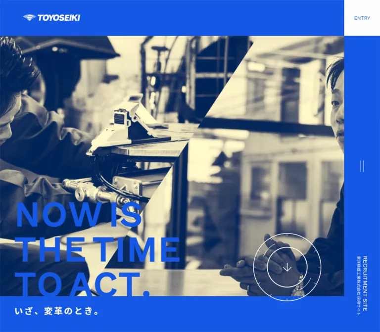
鮮やかな青、斜めに切り替えた人物写真、大きな英字見出し、精密な円形矢印が特徴の採用サイト。デスクトップの右固定ナビゲーションを、スマートフォンでは上部に集約。
TOYOSEIKI Recruitment — Style Reference
Vivid blue framing, diagonal workplace photography, and circular controls with the precision of instrument markings.
Website: toyoseiki-recruit.jp Original URL: https://toyoseiki-recruit.jp/ Final URL: https://toyoseiki-recruit.jp/ Theme: light content surfaces, saturated blue framing, and a dark footer; no theme switch was evidenced. Inspected: October 6, 2026, 00:39:51 JST; supplied retrieval timestamp: October 5, 2026, 15:39:51.773 UTC. Viewports: 1440 × 1000 desktop and 390 × 844 mobile, in CSS pixels. Scope: the current recruitment homepage, including its opening hero, company and work introductions, interview links, recruitment navigation, company handoff, and footer. Linked detail pages, the entry form, and the expanded menu were not inspected.
TOYOSEIKI presents recruitment through a strong architectural frame. Electric blue surrounds workplace photography, anchors navigation, and returns as a large recruitment surface. The opening photograph pairs hands-on technical work with conversation, divided by a steep diagonal. Large uppercase English copy overlaps the imagery; a smaller Japanese statement sits on the blue band below it.
This is a recruitment website homepage with several editorial routes. Company information, employee interviews, a working-day feature, and a three-year development plan lead toward requirements, FAQs, and an entry destination. Its reusable character comes from the relationship between oversized images, compact bilingual labels, generous section spacing, and fine circular arrow graphics. Rounded cards and shadows do not organize the inspected interface.
閉じる
TOYOSEIKI Recruitment — Style Reference
Vivid blue framing, diagonal workplace photography, and circular controls with the precision of instrument markings.
Website: toyoseiki-recruit.jp Original URL: https://toyoseiki-recruit.jp/ Final URL: https://toyoseiki-recruit.jp/ Theme: light content surfaces, saturated blue framing, and a dark footer; no theme switch was evidenced. Inspected: October 6, 2026, 00:39:51 JST; supplied retrieval timestamp: October 5, 2026, 15:39:51.773 UTC. Viewports: 1440 × 1000 desktop and 390 × 844 mobile, in CSS pixels. Scope: the current recruitment homepage, including its opening hero, company and work introductions, interview links, recruitment navigation, company handoff, and footer. Linked detail pages, the entry form, and the expanded menu were not inspected.
TOYOSEIKI presents recruitment through a strong architectural frame. Electric blue surrounds workplace photography, anchors navigation, and returns as a large recruitment surface. The opening photograph pairs hands-on technical work with conversation, divided by a steep diagonal. Large uppercase English copy overlaps the imagery; a smaller Japanese statement sits on the blue band below it.
This is a recruitment website homepage with several editorial routes. Company information, employee interviews, a working-day feature, and a three-year development plan lead toward requirements, FAQs, and an entry destination. Its reusable character comes from the relationship between oversized images, compact bilingual labels, generous section spacing, and fine circular arrow graphics. Rounded cards and shadows do not organize the inspected interface.
How to Read This Reference
- Measured means supplied DOM rectangles, computed styles, or source custom-property values. Measurements belong to the two inspected viewports, not every possible screen size.
- Visually observed means visible in the five original-page captures. Approximate dimensions and colors inferred from those captures are explicitly identified as estimates.
- Calculated means arithmetic derived from supplied measurements, such as the space between adjacent interview links.
- Recommended means an implementation choice for reuse. The CSS below is an adaptation, not recovered source code.
- Parent styles do not fully describe child text, images, SVGs, or pseudo-elements. This matters particularly for the hero headline, captions, and circular controls.
- Some middle-page modules are represented in the DOM but are not clearly revealed in the supplied screenshots. Their content and measured arrangement are documented without inventing unseen artwork or completed reveal states.
Tokens — Colors
Default Palette
| Name | Value | Evidence | Role |
|---|---|---|---|
| Recruitment Blue | #1458E4 |
Measured source --primary; computed header and recruitment backgrounds |
Main frame, hero lettering, recruitment surfaces, brand accents |
| Near White | #FDFDFD |
Measured source --light; computed body and utility-link backgrounds |
Content canvas, utility squares, reversed interface text |
| White | #FFFFFF |
Measured source --white; selected heading and paragraph styles |
Bright reversed text and fine control graphics |
| Body Ink | #111111 |
Measured body text color | Text on light content surfaces |
| Footer Charcoal | #232020 |
Measured footer background | Company identity and desktop sitemap |
| Company Navy | Approximately #0D278A |
Visual estimate from the company section | Dark blue transition between recruitment and footer |
| Copyright Black | Approximately #111111 |
Visual estimate of the lowest footer strip | Quiet terminal surface |
| Light Divider | Approximately #DEDEDE |
Visual estimate | Hairline divisions on the white content canvas |
| Dark Divider | Approximately #444040 |
Visual estimate | Footer column and row separation |
The hero photography has dark navy shadows and pale yellow highlights. A reusable approximation is #062A56 for shadows and #FFF6C5 for highlights, but these are visual estimates of image treatment, not measured interface colors.
Color Behavior
Blue is both a structural surface and a foreground accent. It fills the right navigation rail, the opening frame, and the recruitment area; the same blue also forms the large hero message. Near white provides a restrained contrast for content and utility links. The company block darkens the blue before the page closes in charcoal and black.
The supplied custom properties also include generic colors, gradients, and shadows from framework or editor presets. Their presence does not establish their use in the visible design. In particular, generic --blue: #007bff is not the observed brand blue.
Several link elements report a computed parent color of #9293A2, while their visible lettering or graphics appear blue or white. Treat this as incomplete parent-level evidence, not as a reason to introduce a prominent gray action color.
Tokens — Typography
Source Font Stack
The measured body stack begins with Work Sans and Noto Sans JP, followed by Japanese system fallbacks:
font-family:
  'Work Sans', 'Noto Sans JP',
  'ヒラギノ角ゴ ProN W3', 'Hiragino Kaku Gothic ProN',
  '游ゴシック体', 'Yu Gothic', YuGothic,
  'メイリオ', Meiryo, sans-serif;
These are declared family names. The evidence does not establish which font file rendered every individual glyph.
The Latin typography is clean, broad, and predominantly uppercase in display and navigation roles. Japanese text supplies descriptive labels, roles, and supporting information. The wordmark is graphic artwork; it should not be recreated by typing the company name in Work Sans.
Root and Body Scale
- Desktop root/body:
14px; body line height22.4px, or1.6. - Mobile root/body:
12px; body line height19.2px, also1.6. - Measured weights:
400and700across sampled elements. - Measured tracking: generally
normalon sampled parents. Visible display lettering and small copyright text may have descendant styling not included in the evidence.
Several sizes scale exactly with the root: 1.75rem becomes 24.5px/21px, and 1.5rem becomes 21px/18px. Fixed navigation dimensions do not follow that same ratio.
Type Scale
| Role | Desktop measured style | Mobile measured style | Qualification |
|---|---|---|---|
| Body and ordinary links | 14px / 22.4px, 400 |
12px / 19.2px, 400 |
Directly measured |
| Entry utility parent | 14px / 22.4px, 400 |
12px / 19.2px, 400 |
Child lettering may differ |
| Instagram utility parent | 14px / 22.4px, 400 |
10.2px / 19.2px, 400 |
Explicit mobile reduction |
| Hero H2 parent | 63.98px / 76.776px, 700 |
54.84px / 65.808px, 700 |
Not a measurement of every visible headline span |
| Japanese section introduction | 24.5px / 29.4px, 700 |
21px / 25.2px, 700 |
Examples include 会社を知る and 仕事を知る |
| Bilingual feature H2 parent | 24.5px / 29.4px, 400 |
21px / 25.2px, 400 |
English and Japanese children create a larger composite block |
| Work/recruitment H3 parent | 21px / 25.2px, 400 |
18px / 21.6px, 400 |
ONE DAY, REQUIREMENTS, FAQ |
| Director name H3 parent | 18.06px / 21.672px, 700 |
15.48px / 18.576px, 700 |
Role and name share a block |
| Interview caption H3 parent | 18.06px / 21.672px, 400 |
15.48px / 18.576px, 400 |
Visible caption appears smaller; child styles are unavailable |
| Statistic label | 14px / 16.8px, 700 |
12px / 14.4px, 700 |
Directly measured |
| Statistic value paragraph | 20.02px / 22.4px, 700 |
17.16px / 19.2px, 700 |
Individual numeral spans were not sampled |
Visual Display Sizes
The visible hero message is substantially larger than the ordinary type system. A practical visual approximation is 90–96px on desktop and 64–72px on the inspected phone, with three deliberate lines:
NOW IS
THE TIME
TO ACT.
Use the screenshot composition when tuning this treatment; copying only the H2 parent size will not necessarily reproduce it. The CSS adaptation uses 96px and 70px as starting values.
Desktop footer category headings appear approximately 34px. Copyright text appears approximately 8–9px with expanded tracking. Those values are estimates, not supplied computed styles.
Tokens — Spacing & Shapes
Spacing Scale
The design combines small fixed insets with unusually broad vertical intervals. It is not governed by one uniformly scaled spacing unit.
| Value | Evidence and use |
|---|---|
10px |
Measured mobile statistic padding above/below the label-value boundary |
20px |
Common content inset; mobile horizontal padding; calculated mobile interview gap |
30px |
Calculated desktop interview gap; measured vertical interval before company supporting text and link |
40px |
Director-label inset; mobile recruitment vertical padding; desktop rail-label bottom padding |
64px |
Mobile header/control size; desktop hero left inset; mobile work-section bottom padding |
80px |
Desktop menu hit box; desktop recruitment-link horizontal padding |
88px |
Desktop secondary circular-link box height and width for standalone arrows |
96px |
Calculated mobile interval from the start of the company/work group to its introductory heading |
100px |
Desktop rail width and utility-square dimensions |
120px |
Desktop work-section bottom padding and reserved title-to-arrow space in sampled work headings |
190px |
Desktop hero scroll-control dimensions |
240px |
Calculated desktop interval from the start of the company/work group to its introductory heading |
Border Radius
| Element | Observed treatment |
|---|---|
| Utility links | Square corners; measured radius 0 |
| Interview photography | Square corners |
| Recruitment navigation regions | Rectangular surfaces; measured radius 0 |
| Main content and footer | Flat, continuous sections |
| Arrow ornaments | Circular geometry drawn within otherwise unrounded link boxes |
Layout Measurements
| Element | Desktop: 1440 × 1000 | Mobile: 390 × 844 |
|---|---|---|
| Main content width | 1340px |
390px |
| Persistent navigation | Right rail, 100 × 1000px |
Top bar, 390 × 64px |
| Utility link | 100 × 100px |
64 × 64px |
| Menu button box | 80 × 80px |
64 × 64px |
| Header wordmark link box | About 160 × 16px, x = 64 |
140 × 14px, x = 20 |
| Hero section extent | First section begins at y = 1000px |
First section begins at y = 844px |
| Hero photo field | Approximately 1340 × 800px |
Approximately 390 × 716px |
| Interview link block | 561.11 × 495.70px |
301.73 × 279.31px |
| Interview gap | 30px, calculated |
20px, calculated |
| Footer total height | About 858.09px |
About 312.06px |
| Document height | 8197px |
6366px |
The wordmark measurements describe inline link rectangles, not necessarily the full painted bounds of the logo artwork.
Components
Persistent Navigation Frame
Role: keeps brand identity, application access, social access, and the menu affordance available throughout the page.
On desktop, the navigation header is a blue rail at x = 1340 with a width of 100px. ENTRY occupies the top square of this rail. INSTAGRAM occupies a second near-white square immediately to its left, at x = 1240. The blue rail continues to the bottom of the viewport.
A compact two-stroke button sits at the vertical center. In the desktop capture its strokes are vertical, inside an 80px square hit box. A small recruitment-site identifier runs vertically near the bottom of the rail. The separate white company wordmark remains at the upper left, with a 64px inset.
On mobile, the rail becomes a 64px-high top bar. The measured arrangement is:
- Wordmark: x = 20, width 140px.
- INSTAGRAM: x = 198, width 64px.
- ENTRY: x = 262, width 64px.
- Menu button: x = 326, width 64px.
The menu strokes become horizontal. The vertical recruitment identifier is not present in the supplied mobile rendered evidence. The open-menu layout and button behavior were not exercised.
Full-Viewport Hero
Role: establishes the recruitment message through the people and work of the company.
The opening occupies one inspected viewport height. Desktop photography starts approximately 100px below the top and ends at y = 900, leaving blue framing above and below. The content stops at the right navigation rail.
The image field juxtaposes a worker handling machinery on the left with a seated employee speaking on the right. A steep diagonal crosses from approximately 69% of the image width at the top to 31% at the bottom. These proportions are visual estimates. The photography has a navy-and-pale-yellow treatment that keeps the bright blue headline visually distinct.
The English message sits low and left, using three explicit lines. Its final line reaches the bottom edge of the photograph. The Japanese statement, いざ、変革のとき。, appears separately in white on the blue lower band. A large circular down-arrow control overlaps the image/band boundary at the lower right.
On mobile, the photographs are recomposed vertically. The machinery scene occupies the upper portion, and the interview scene occupies the lower portion, with a diagonal seam between them. This is art direction, not simply a narrower crop of the desktop composition. The English message remains large and close to the left edge.
Circular Arrow Language
Role: connects scrolling, navigation, and page return through a repeated technical motif.
The hero uses a thin outer circle with small perimeter marks, a smaller concentric circle, partial arcs, and a restrained down arrow. Desktop painted geometry is approximately 190px in diameter. The phone shows a circle approximately 76px in diameter.
The mobile hero anchor itself measures 76 × 190px; its visible ring is much smaller than its element height. Do not reproduce a 190px-tall visible oval from that rectangle.
Secondary links pair an uppercase label with a thin, partially open circular arrow. The desktop circle is about 88px; the mobile corporate-site circle appears about 76px. The page-top control uses concentric circles and an upward arrow, approximately 88px on desktop and 64px on mobile.
The circles resemble dial markings, but no rotation, progress semantics, or continuous animation was verified. Use purpose-specific directions: down for the about anchor, right for navigation, and up for page top.
Section Introductions
Role: divide the homepage into company, work, and recruitment topics.
The rendered labels include 会社を知る, 仕事を知る, and 採用を知る. The first two sit 240px below their section starts on desktop and 96px below them on mobile. Their horizontal inset remains 20px.
This broad separation creates editorial pacing between large modules. It should not be replaced everywhere with compact card-grid spacing. The recruitment introduction has a different preceding extent, so the 240px/96px interval is not a universal section-padding formula.
Cross Talk Feature
Role: links to a conversation between company leaders.
The DOM establishes an English/Japanese heading, two role-and-name blocks, and a VIEW MORE link to /crosstalk/. The named participants are shown in the original text as 馬杉 ゆかり and 阿瀬 亜希.
Desktop role blocks share y = 1998, with x positions of 40 and 810. On mobile, both begin at x = 40 and appear at different vertical positions, establishing a stacked arrangement. Their measured text widths change from 490px to 310px.
The VIEW MORE link is right aligned on desktop and approximately centered on mobile. Its computed text is near white, while the participant headings are blue. The supplied screenshots do not expose enough of this module to specify its full photographic composition or background construction.
Infographics Summary
Role: makes company facts scannable before linking to /infographics/.
Five facts appear in the current rendered text: 80 years since founding, 11 locations, 70 employees, more than 900 cumulative client companies, and an average tenure of 15 years. These are captured page contents, not independently verified company statistics.
Desktop measurements establish a three-item first row and a centered two-item second row. Statistic text blocks are approximately 199.33px wide. Labels have 20px of bottom padding, and value paragraphs have 20px of top padding.
Mobile changes to two columns and three rows, leaving the fifth item in the left column. Blocks measure 160px wide, and the corresponding internal padding reduces to 10px. The heading block changes from a tall, narrow desktop footprint of approximately 93.58 × 546.81px to a horizontal mobile block of 350 × 54.39px. The exact transform or writing-mode mechanism is not supplied.
Do not assume the parent paragraph size is the final numeral size; numeral descendants were not measured. Any pictograms or animated counters remain unverified.
Interview Strip
Role: presents employees as the main entry points into work-related stories.
The desktop capture shows large, natural-color workplace portraits, with role captions directly underneath. The first visible employee wears a dark suit, and the second wears a blue work jacket. White office interiors give these images a quieter treatment than the duotone hero.
Each link contains the photograph and its role caption. There is no enclosing rounded card, badge, or shadow. The first link starts at x = 20 and is about 561px wide. The second begins at x = 611.11; the third begins at x = 1202.22 and is partially cropped by the content boundary. The calculated gap is 30px.
On mobile, each link is about 302px wide with a 20px gap. The second begins at x = 341.73, leaving a visible continuation at the viewport edge. This preserves the horizontal sequence rather than stacking all four entries.
The desktop photograph is approximately 561 × 463px, an estimated aspect ratio near 1.21:1. The supplied evidence establishes the horizontal arrangement, but does not establish dragging, autoplay, looping, or a particular carousel library.
Work Feature Pair
Role: offers two additional routes: ONE DAY and THREE-YEAR PLAN.
The desktop DOM places the two bilingual headings on the same horizontal row, with an 88px arrow-link box near each panel's right edge. The middle screenshot shows a fine vertical divider between two broad light regions.
Mobile places the features one after another. Their heading y positions differ by approximately 475px, and each arrow-link box sits at x = 294 with a measured width of 76px. Heading padding reserved for the desktop arrow disappears on mobile.
The supplied middle screenshot contains substantial blank space where later content is present in the DOM. Do not treat that state as proof that the intended feature panels are empty; their imagery and reveal completion are unverified.
Recruitment Navigation Matrix
Role: gives requirements, frequently asked questions, and entry distinct, generous navigation areas.
The section has a measured blue background. On desktop, REQUIREMENTS and FAQ form two stacked rectangles on the left. ENTRY occupies a square on the right spanning their combined height.
- REQUIREMENTS: approximately
669 × 334.5px. - FAQ: approximately
669 × 333.5px. - ENTRY:
669 × 669px. - The measured positions leave approximately 1px between adjacent regions.
Text is near white. Ordinary recruitment headings combine an English label and Japanese explanation; the entry block also includes ENTRY FORM text. The whole regions are anchors to their respective pages, not form inputs on this homepage.
Mobile stacks all three links at approximately 389px wide. Requirements and FAQ become about 168px tall each; Entry is about 292px tall. Measured padding changes from 0 80px to 40px 20px.
Company Handoff
Role: directs visitors to the separate corporate website for fuller business information.
This is a dark blue band between recruitment content and the charcoal footer. It contains COMPANY, the Japanese label 会社情報, one short explanatory paragraph, and a CORPORATE SITE link paired with an open circular arrow.
Desktop content begins at x = 70. Mobile uses a 20px inset and a 350px text width, with the paragraph wrapping to two lines. The mobile band is approximately 356px high, calculated from the main and footer boundaries. Its heading begins 64px below the band start.
The recorded destination is https://www.toyoseikico.co.jp/. That destination was not inspected.
Footer and Page Top
Role: closes the page with company identity and, on desktop, a full sitemap.
The footer background is measured #232020. Desktop divides the upper footer into a company-information column and three navigation columns labeled ABOUT, BUSINESS, and RECRUIT. Thin dark rules separate the identity column and organize the navigation. Small dash-like marks precede links.
The company wordmark is white. The footer explicitly identifies 東洋精器工業株式会社, followed by its address and corporate/social links. The desktop sitemap repeats the editorial routes and adds news and privacy links.
Mobile omits the expanded sitemap from the supplied rendered text and links. It retains the logo, company identity, address, corporate/social links, and page-top control. The footer therefore becomes substantially shorter: about 312px instead of 858px.
A darker copyright strip finishes both layouts. The concentric PAGE TOP control sits near the lower right, close to the boundary between the charcoal body and the final strip. Its recorded destination is #page; the scroll animation was not tested.
Tokens — Motion & Interaction
Recorded Transition Declarations
| Target | Supplied transition | What it establishes |
|---|---|---|
| Header geometry | top 1s, width 1s, left 1s, all using cubic-bezier(0.19, 1, 0.22, 1) |
A declared slow ease-out for geometry changes; trigger not established |
| Instagram utility geometry | right 1s, width 1s, same easing |
Declared responsive/state movement |
| Menu button | transform 0.4s cubic-bezier(0.19, 1, 0.22, 1) |
Transform feedback is defined; exact state not supplied |
| Feature and recruitment headings | opacity 1s, transform 1s, using cubic-bezier(0.175, 0.885, 0.32, 1.275) |
Reveal-capable styling; start offsets and triggers unverified |
| VIEW MORE and circular navigation links | 0.64s cubic-bezier(0.165, 0.84, 0.44, 1) |
Declared transition timing; endpoint treatment unverified |
| Interview caption headings | 0.64s cubic-bezier(0.165, 0.84, 0.44, 1) |
Caption transition timing only |
| Footer text links | 0.4s cubic-bezier(0.165, 0.84, 0.44, 1) |
Shorter link transition timing |
The sampled elements report animation: none. This does not rule out animation on descendants, pseudo-elements, SVGs, or through scripts. Likewise, a bare transition: all without a positive duration is not evidence of a visible animated effect.
Observed Interaction Scope
The capture process traversed the page vertically. Screenshots at different scroll positions show the navigation remaining in place. The DOM records destinations for the utility links, editorial links, recruitment links, the hero #about anchor, and PAGE TOP's #page anchor.
No click outcome, hover endpoint, menu expansion, form behavior, interview-strip movement, or circle animation was supplied. The split character extraction of the Japanese hero statement does not prove a staggered text animation.
For reuse, preserve the measured easing vocabulary where relevant, but keep content visible by default. Add reveal states only after their behavior and reduced-motion fallback are implemented.
Surfaces
| Surface | Appearance | Function |
|---|---|---|
| Hero frame and navigation | Solid #1458E4 |
Persistent brand structure |
| Hero photograph | Navy shadows and pale yellow highlights | Visually unifies work and conversation |
| Editorial canvas | Near white, square image edges, fine dividers | Makes people and role labels prominent |
| Utility squares | Near-white fill with blue visible lettering | Clear access to Entry and Instagram |
| Recruitment regions | Blue with near-white type and narrow separations | Large, distinct navigation targets |
| Company band | Darker blue, estimated | Transitional destination for corporate information |
| Footer body | #232020 with restrained rules |
Dense desktop navigation and company identity |
| Copyright strip | Near black | Quiet page ending |
There is no evidenced general-purpose elevation system. Large flat areas, contrast changes, cropping, and rules establish hierarchy.
Imagery
The visible photography is specific to work: machinery, technical activity, employees in conversation, suits, blue workwear, and ordinary office interiors. Human subjects are central, but the equipment and setting remain legible enough to communicate the working environment.
Two treatments coexist:
- Opening imagery: a strong blue-and-cream duotone appearance, diagonal composition, and large overlapping typography.
- Interview imagery: natural color, soft indoor light, broad rectangular crops, and a plain caption beneath.
Do not apply the hero treatment indiscriminately to all photographs. The contrast between the processed opening and natural interview images is part of the page's rhythm.
Observed Asset References
No original image filenames, SVG paths, or font-file URLs were supplied. The following are visual references within the inspected captures, not recoverable asset paths.
| Visual asset | Evidence | Reusable requirement |
|---|---|---|
| White company wordmark | Desktop/mobile hero and footer captures | Preserve the supplied logo artwork and proportions when authorized |
| Machinery/work photograph | Desktop and mobile opening captures | Keep the employee, hands, and equipment recognizable |
| Seated conversation photograph | Desktop and mobile opening captures | Compose the face and hands deliberately around the headline |
| Employee interview photographs | Desktop middle capture | Use natural color and square corners; retain surrounding office context |
| Circular arrow graphics | Hero, corporate link, and footer captures | Thin concentric strokes, partial arcs, small arrowheads; add ticks only where visible |
The precise hero color-processing method is unknown. It may be baked into assets or implemented through rendering effects. Preprocessed images are a practical adaptation; they are not a claim about the source implementation.
Layout & Responsive Behavior
Observed Changes
| Aspect | Desktop | Mobile |
|---|---|---|
| Navigation structure | Full-height right rail | Full-width top bar |
| Content width | Viewport minus 100px rail | Full viewport width |
| Header actions | Two 100px squares | Two 64px squares plus 64px menu button |
| Hero arrangement | Side-by-side subjects with steep diagonal | Vertically arranged subjects with a shallower diagonal seam |
| Hero message | Large, inset 64px | Still large, effectively flush left |
| Director blocks | Same row | Stacked |
| Statistics | Three plus two | Two plus two plus one |
| Interview sequence | Two complete images plus part of the next | One complete image plus part of the next |
| Work features | Two adjacent panels | One after another |
| Recruitment links | Two stacked left cells beside one square | Three vertical regions |
| Company text inset | 70px | 20px |
| Footer sitemap | Three visible category columns | Absent from supplied mobile rendered evidence |
| Body size | 14px | 12px |
The source exposes generic breakpoint custom properties at 576, 768, 992, and 1200px. Those variables alone do not prove which breakpoint controls this layout. Only the two supplied viewport states were inspected.
The CSS adaptation below uses 768px as a recommended implementation breakpoint, not a recovered source rule. Intermediate widths, landscape phones, browser text enlargement, and safe-area behavior remain unverified.
The mobile header is already dense at 390px. At narrower widths, shrink the logo region before reducing action hit targets. Keep long utility labels legible and avoid allowing the interview track to create document-level horizontal overflow.
Do’s and Don’ts
Do
- Use measured
#1458E4as the dominant structural blue. - Preserve the desktop right rail and mobile top-bar transformation.
- Keep the hero's three-line English message and separate Japanese statement.
- Art-direct the mobile hero so both work and conversation remain visible.
- Combine large photography with small, direct role captions.
- Preserve the horizontal interview sequence and its partial next-item preview.
- Use circles, partial arcs, and restrained arrowheads as a coherent navigation language.
- Keep recruitment navigation as large adjoining regions.
- Use broad vertical spacing to distinguish company and work topics.
- Maintain the transition from blue to darker blue to charcoal near the page ending.
Don’t
- Don’t replace the right rail with an unrelated desktop navigation pattern when reproducing this reference.
- Don’t turn every editorial feature into a rounded, elevated card.
- Don’t use generic
#007BFFin place of the measured brand blue. - Don’t flatten the mobile hero into a severely cropped desktop image.
- Don’t assume all photography shares the opening duotone treatment.
- Don’t infer autoplay, dragging, counters, or ring rotation from static captures.
- Don’t treat parent font sizes as exact measurements of nested display lettering.
- Don’t copy blank capture regions as intentional empty modules.
- Don’t invent source asset paths, production credits, or unseen detail-page styling.
Recommended Implementation Additions
These recommendations describe a new implementation, not verified features of the original page.
- Give the menu button an accessible name and expanded state. Implement keyboard focus management and Escape behavior if it opens an overlay.
- Give icon-only arrows destination-specific names. Keep decorative circles and ticks out of the accessibility tree.
- Implement interview navigation with reachable links and keyboard-operable movement. Native horizontal scrolling is a reasonable starting point; autoplay is unnecessary.
- Keep a visible focus indicator on blue, white, and charcoal surfaces. Test actual hero text contrast against each image crop.
- Consider increasing mobile reading text above the observed 12px while retaining the visual hierarchy. Avoid making important content depend on tiny utility captions.
- Provide a reduced-motion mode and keep all essential content readable when reveal scripting fails.
- Use responsive image sources and explicit image dimensions. Preload only imagery necessary for the opening view; defer lower-page photographs.
- If the mobile footer sitemap is omitted, ensure the main navigation still exposes the same important destinations.
- Reserve space for fixed navigation and add anchor offsets so section headings are not covered on mobile.
Agent Prompt Guide
Quick Color Reference
- Brand frame and recruitment surface:
#1458E4. - Main light surface:
#FDFDFD. - Body text:
#111111. - Footer body:
#232020. - Company band: approximately
#0D278A; verify when matching authorized assets. - Hero image palette: navy shadows and pale yellow highlights, not a general yellow interface accent.
- Controls: thin blue or white strokes on their surrounding surface; no general drop-shadow treatment.
Overall Prompt
“Create a Japanese manufacturing recruitment homepage with a vivid blue architectural frame. At desktop width, reserve a 100px fixed rail on the right, place square Instagram and Entry links at the upper right, and keep a white company wordmark at the upper left. Build a viewport-height opening from two workplace photographs separated by a diagonal, using navy-and-pale-yellow image treatment. Overlay a large three-line English statement at the lower left and place a smaller Japanese statement in the blue lower band. Use fine concentric arrow controls, a horizontal strip of natural-color employee portraits, bilingual editorial headings, large adjoining recruitment links, a darker blue corporate-information band, and a charcoal sitemap footer. On mobile, convert the rail into a 64px top bar, recompose the hero vertically, stack editorial and recruitment panels, and retain a partial next interview preview.”
Example Component Prompts
- Navigation frame: “Design a saturated-blue right rail, 100px wide, with a near-white Entry square at the top and an adjacent Instagram square to its left. Center a minimal two-stroke menu affordance in the rail. At the phone breakpoint, arrange the logo and three 64px control regions in one fixed top bar.”
- Hero: “Pair a machinery work scene with an employee conversation scene using a steep desktop diagonal. Use blue-and-cream processed photography, oversized uppercase text on three lines, a white Japanese supporting statement, and a thin 190px concentric down-arrow ornament. Recompose the two subjects vertically on mobile.”
- Interview strip: “Use square-cornered natural-color office portraits approximately 561px wide on the desktop reference and 302px wide on the phone reference. Put a small role caption below each image, leave 30px/20px gaps, and expose part of the next item. Do not add shadows or category badges.”
- Recruitment navigation: “Create three blue link regions with white bilingual labels: Requirements and FAQ stacked in the left half, with Entry spanning the right half. Separate them with fine rules. Stack all three on mobile and give Entry extra height.”
- Footer: “Create a flat charcoal footer with a white logo and company information at left, three desktop sitemap columns, subtle rules, and a concentric page-top arrow near the lower right. Use a darker copyright strip. Provide a compact phone layout with company and external links.”
Quick Start
CSS Custom Properties
This is an implementation scaffold. Exact measured colors and navigation dimensions are retained. Hero display sizes, diagonal masks, the company navy, responsive breakpoint, and intermediate sizing are adaptations fitted to the supplied views.
Use a .page-column wrapper around the main content, company band, and footer. Keep .site-header outside that wrapper. Inside the header, use .brand, .header-actions, .menu-toggle, and .rail-label. The hero expects two preprocessed images with .hero-photo--work and .hero-photo--talk, three block-level headline spans, a caption, and a named scroll link. Supply authorized assets; no source filenames are assumed.
:root {
  /* Measured interface colors */
  --brand: #1458e4;
  --paper: #fdfdfd;
  --white: #fff;
  --ink: #111;
  --footer: #232020;

  /* Visual estimates for this adaptation */
  --company: #0d278a;
  --rule-light: #dedede;
  --rule-dark: #444040;

  --font-site: 'Work Sans', 'Noto Sans JP',
    'Hiragino Kaku Gothic ProN', 'Yu Gothic',
    YuGothic, Meiryo, sans-serif;

  --text-base: 14px;
  --text-section: 1.75rem;
  --text-feature: 1.5rem;
  --leading-body: 1.6;
  --leading-heading: 1.2;

  --rail: 100px;
  --frame: 100px;
  --inset: 20px;
  --hero-inset: 64px;
  --hero-display: 96px;
  --dial: 88px;
  --hero-dial: 190px;

  --ease-frame: cubic-bezier(0.19, 1, 0.22, 1);
  --ease-link: cubic-bezier(0.165, 0.84, 0.44, 1);
  --ease-reveal: cubic-bezier(0.175, 0.885, 0.32, 1.275);
}

* { box-sizing: border-box; }

html {
  font-size: var(--text-base);
  scroll-padding-top: 20px;
}

body {
  margin: 0;
  color: var(--ink);
  background: var(--paper);
  font-family: var(--font-site);
  line-height: var(--leading-body);
}

button, input, textarea, select { font: inherit; }
img { display: block; max-width: 100%; }
a { color: inherit; }

.page-column {
  min-width: 0;
  margin-right: var(--rail);
}

.site-header {
  position: fixed;
  z-index: 30;
  inset: 0 0 0 auto;
  width: var(--rail);
  background: var(--brand);
}

.brand {
  position: fixed;
  top: 43px;
  left: 64px;
  width: 160px;
}

.brand img { width: 100%; height: auto; }

.header-actions {
  position: fixed;
  top: 0;
  right: 0;
  display: flex;
}

.utility-link {
  display: grid;
  place-items: center;
  width: var(--frame);
  height: var(--frame);
  color: var(--brand);
  background: var(--paper);
  border-left: 1px solid rgb(20 88 228 / 25%);
  text-decoration: none;
  text-transform: uppercase;
  font-size: 1rem;
}

.menu-toggle {
  position: fixed;
  top: calc(50% - 40px);
  right: 10px;
  display: flex;
  justify-content: center;
  align-items: center;
  gap: 6px;
  width: 80px;
  height: 80px;
  padding: 0;
  border: 0;
  color: var(--white);
  background: transparent;
  cursor: pointer;
}

.menu-toggle span {
  width: 1px;
  height: 32px;
  background: currentColor;
  opacity: 0.7;
}

.rail-label {
  position: absolute;
  bottom: 40px;
  left: 50%;
  transform: translateX(-50%);
  color: var(--white);
  writing-mode: vertical-rl;
  font-size: 12px;
  line-height: 1.2;
  text-transform: uppercase;
}

.hero {
  position: relative;
  min-height: 700px;
  height: 100svh;
  background: var(--brand);
}

.hero-media {
  position: absolute;
  inset: var(--frame) 0 var(--frame);
  overflow: hidden;
}

/* Approximate masks; use separately art-directed photo crops. */
.hero-photo {
  position: absolute;
  top: 0;
  height: 100%;
  object-fit: cover;
}

.hero-photo--work {
  left: 0;
  width: 69%;
  clip-path: polygon(0 0, 100% 0, 45% 100%, 0 100%);
  object-position: center;
}

.hero-photo--talk {
  right: 0;
  width: 69%;
  clip-path: polygon(55% 0, 100% 0, 100% 100%, 0 100%);
  object-position: center;
}

/* Display sizes and weight are visual approximations. */
.hero-headline {
  position: absolute;
  z-index: 1;
  left: var(--hero-inset);
  bottom: var(--frame);
  margin: 0;
  color: var(--brand);
  font-size: var(--hero-display);
  font-weight: 500;
  line-height: 1.02;
  letter-spacing: 0.02em;
  text-transform: uppercase;
}

.hero-headline span { display: block; }

.hero-caption {
  position: absolute;
  bottom: 44px;
  left: var(--hero-inset);
  margin: 0;
  color: var(--white);
  font-size: 24px;
  font-weight: 700;
  line-height: 1.2;
  letter-spacing: 0.18em;
}

/* Simplified ring anatomy; use SVG for precise ticks and arcs. */
.dial {
  position: relative;
  display: inline-grid;
  place-items: center;
  flex: 0 0 auto;
  width: var(--dial);
  aspect-ratio: 1;
  border: 1px solid currentColor;
  border-radius: 50%;
  color: inherit;
  text-decoration: none;
}

.dial::before,
.dial::after {
  content: '';
  position: absolute;
  border-radius: 50%;
  pointer-events: none;
}

.dial::before {
  inset: 20%;
  border: 1px solid currentColor;
}

.dial::after {
  inset: 8%;
  border: 1px solid transparent;
  border-left-color: currentColor;
  border-right-color: currentColor;
  transform: rotate(20deg);
}

.dial svg { width: 22px; height: 22px; }

.hero-scroll {
  position: absolute;
  z-index: 2;
  right: 64px;
  bottom: 80px;
  width: var(--hero-dial);
  color: var(--white);
}

.section-intro {
  padding: 240px var(--inset);
}

.section-title {
  margin: 0;
  font-size: var(--text-section);
  font-weight: 700;
  line-height: var(--leading-heading);
}

.feature-title {
  margin: 0;
  font-size: var(--text-feature);
  font-weight: 400;
  line-height: var(--leading-heading);
}

.feature-title small {
  display: block;
  margin-top: 4px;
  font-size: 1rem;
  line-height: 1.6;
}

/* Native scrolling is a recommendation, not a source-library claim. */
.interview-track {
  display: grid;
  grid-auto-flow: column;
  grid-auto-columns: 43.162%;
  gap: 30px;
  padding: 0 20px 120px;
  overflow-x: auto;
  scroll-padding-inline: 20px;
  scroll-snap-type: x proximity;
}

.interview-card {
  min-width: 0;
  color: var(--ink);
  text-decoration: none;
  scroll-snap-align: start;
}

.interview-card img {
  width: 100%;
  aspect-ratio: 561.11 / 463;
  object-fit: cover;
}

.interview-caption {
  margin: 16px 0 0;
  font-size: 1rem;
  font-weight: 400;
  line-height: 1.2;
}

.recruit-grid {
  display: grid;
  grid-template-columns: repeat(2, minmax(0, 1fr));
  gap: 1px;
  background: rgb(255 255 255 / 25%);
  border: 1px solid rgb(255 255 255 / 25%);
}

.recruit-link {
  display: flex;
  align-items: center;
  justify-content: space-between;
  gap: 24px;
  min-height: 0;
  aspect-ratio: 2;
  padding: 40px 80px;
  color: var(--paper);
  background: var(--brand);
  text-decoration: none;
}

.recruit-link--entry {
  grid-column: 2;
  grid-row: 1 / span 2;
  aspect-ratio: 1;
  align-items: flex-start;
}

.company-band {
  padding: 80px 70px;
  color: var(--white);
  background: var(--company);
}

.company-band p { margin: 30px 0; }

.circle-link {
  display: inline-flex;
  align-items: center;
  gap: 40px;
  text-decoration: none;
  text-transform: uppercase;
}

.site-footer {
  position: relative;
  color: var(--paper);
  background: var(--footer);
}

.footer-body {
  display: grid;
  grid-template-columns: 315px minmax(0, 1fr);
  gap: 100px;
  min-height: 710px;
  padding: 120px 20px;
}

.footer-identity {
  display: flex;
  flex-direction: column;
  justify-content: flex-end;
  padding-right: 40px;
  border-right: 1px solid var(--rule-dark);
}

.footer-identity img { width: 160px; }

.footer-nav {
  display: grid;
  grid-template-columns: repeat(3, minmax(0, 1fr));
  align-content: start;
  gap: 40px;
}

.footer-nav h2 {
  margin: 0;
  font-size: 34px;
  font-weight: 400;
  line-height: 1.2;
}

.footer-nav ul {
  display: grid;
  gap: 20px;
  margin: 20px 0 0;
  padding: 20px 0 0;
  border-top: 1px solid var(--rule-dark);
  list-style: none;
}

.footer-nav a { text-decoration: none; }
.footer-nav li::before { content: '–'; margin-right: 10px; }

.copyright {
  display: grid;
  place-items: center;
  min-height: 148px;
  padding: 24px 20px;
  background: var(--ink);
  font-size: 9px;
  letter-spacing: 0.14em;
  text-align: center;
}

/* Recommended focus treatment. */
:where(a, button):focus-visible {
  outline: 2px solid currentColor;
  outline-offset: 5px;
}

/* Optional modest feedback; original hover endpoints are unknown. */
.circle-link .dial {
  transition: transform 0.64s var(--ease-link);
}

@media (hover: hover) {
  .circle-link:hover .dial { transform: translateX(4px); }
}

/* Recommended breakpoint; only the endpoint layouts were inspected. */
@media (max-width: 767px) {
  :root {
    --text-base: 12px;
    --rail: 0px;
    --frame: 64px;
    --hero-inset: 0px;
    --hero-display: clamp(54px, 17.95vw, 70px);
    --dial: 76px;
    --hero-dial: 76px;
  }

  html { scroll-padding-top: 84px; }

  .site-header {
    inset: 0 0 auto;
    width: 100%;
    height: 64px;
  }

  .brand {
    top: 24px;
    left: 20px;
    width: min(140px, calc(100vw - 224px));
  }

  .header-actions { right: 64px; }
  .utility-link--instagram { font-size: 10.2px; }

  .menu-toggle {
    top: 0;
    right: 0;
    width: 64px;
    height: 64px;
    flex-direction: column;
  }

  .menu-toggle span { width: 32px; height: 1px; }
  .rail-label { display: none; }
  .hero { min-height: 640px; }

  .hero-photo--work {
    width: 100%;
    height: 56%;
    clip-path: polygon(0 0, 100% 0, 100% 78.6%, 0 100%);
  }

  .hero-photo--talk {
    top: 44%;
    width: 100%;
    height: 56%;
    clip-path: polygon(0 21.4%, 100% 0, 100% 100%, 0 100%);
  }

  .hero-caption {
    bottom: 20px;
    font-size: 16px;
  }

  .hero-scroll { right: 20px; bottom: 20px; }
  .section-intro { padding: 96px 20px; }

  .interview-track {
    grid-auto-columns: 86.21%;
    gap: 20px;
    padding-bottom: 64px;
  }

  .recruit-grid { grid-template-columns: minmax(0, 1fr); }

  .recruit-link {
    min-height: 168px;
    aspect-ratio: auto;
    padding: 40px 20px;
  }

  .recruit-link--entry {
    grid-column: auto;
    grid-row: auto;
    min-height: 292px;
  }

  .company-band { padding: 64px 20px; }
  .circle-link { gap: 20px; }

  .footer-body {
    display: block;
    min-height: 228px;
    padding: 40px 20px 20px;
  }

  .footer-identity { padding: 0; border: 0; }
  .footer-nav { display: none; }
  .copyright { min-height: 84px; font-size: 8px; }
}

@media (prefers-reduced-motion: reduce) {
  .circle-link .dial { transition: none; }
  html { scroll-behavior: auto; }
}
The stylesheet supplies the visual shell, not menu scripting, full editorial content, exact SVG artwork, or all intermediate-width refinements. Keep the measured root sizes only if suitable for the intended audience; increasing mobile body text is a recommended accessibility adjustment.
Tailwind v4 Token Mapping
Optional aliases for a project already using Tailwind v4. This does not imply that the inspected website uses Tailwind. Define the custom properties above first.
@theme inline {
  --color-brand: var(--brand);
  --color-paper: var(--paper);
  --color-ink: var(--ink);
  --color-company: var(--company);
  --color-footer: var(--footer);

  --font-sans: var(--font-site);
  --text-body: var(--text-base);
  --text-section-title: var(--text-section);
  --text-feature-title: var(--text-feature);
  --text-hero: var(--hero-display);

  --spacing-frame: var(--frame);
  --spacing-rail: var(--rail);
  --spacing-content-inset: var(--inset);
  --spacing-dial: var(--dial);
  --spacing-hero-dial: var(--hero-dial);
}
Sources & Evidence
- Inspected original and final page: TOYOSEIKI recruitment homepage. The supplied response status was HTTP 200, and the original and final URLs are identical.
- Capture date: supplied retrieval timestamp
2026-10-05T15:39:51.773Z, corresponding to October 6, 2026, 00:39:51.773 JST. - Desktop evidence: 1440 × 1000 viewport, 8197px document height; opening hero, interview-area capture, footer capture, rendered text and links, element rectangles, computed styles, and custom properties.
- Mobile evidence: 390 × 844 viewport, 6366px document height; opening hero, company/footer capture, rendered text and links, element rectangles, computed styles, and custom properties.
- Observed navigation evidence: recorded hrefs include the homepage's
#aboutand#pageanchors, editorial detail paths, requirements, FAQ, and entry destinations. These targets establish navigation intent; their resulting pages or interactions were not exercised. - Inspection limitations: the collection waited for document loading, sampled layout stability, finite animation readiness, and visible image decoding within bounded time limits. Perpetual animations were paused during readiness checks and resumed afterward. These checks do not establish that every delayed reveal completed. SharedWorkers and service workers were disabled during collection.
- Analysis boundary: this reference uses only the supplied original-page captures and rendered evidence. No additional browsing, command execution, or file inspection was performed. Exact asset URLs, child-level display styles, menu states, hover endpoints, and linked-page designs remain unverified.
This document describes the current supplied homepage evidence. Measured values, visual estimates, and recommended implementation choices are identified separately throughout.
# TOYOSEIKI Recruitment — Style Reference

> Vivid blue framing, diagonal workplace photography, and circular controls with the precision of instrument markings.

**Website:** [toyoseiki-recruit.jp](https://toyoseiki-recruit.jp/)
**Original URL:** https://toyoseiki-recruit.jp/
**Final URL:** https://toyoseiki-recruit.jp/
**Theme:** light content surfaces, saturated blue framing, and a dark footer; no theme switch was evidenced.
**Inspected:** October 6, 2026, 00:39:51 JST; supplied retrieval timestamp: October 5, 2026, 15:39:51.773 UTC.
**Viewports:** 1440 × 1000 desktop and 390 × 844 mobile, in CSS pixels.
**Scope:** the current recruitment homepage, including its opening hero, company and work introductions, interview links, recruitment navigation, company handoff, and footer. Linked detail pages, the entry form, and the expanded menu were not inspected.

TOYOSEIKI presents recruitment through a strong architectural frame. Electric blue surrounds workplace photography, anchors navigation, and returns as a large recruitment surface. The opening photograph pairs hands-on technical work with conversation, divided by a steep diagonal. Large uppercase English copy overlaps the imagery; a smaller Japanese statement sits on the blue band below it.

This is a recruitment website homepage with several editorial routes. Company information, employee interviews, a working-day feature, and a three-year development plan lead toward requirements, FAQs, and an entry destination. Its reusable character comes from the relationship between oversized images, compact bilingual labels, generous section spacing, and fine circular arrow graphics. Rounded cards and shadows do not organize the inspected interface.
閉じる
# TOYOSEIKI Recruitment — Style Reference

> Vivid blue framing, diagonal workplace photography, and circular controls with the precision of instrument markings.

**Website:** [toyoseiki-recruit.jp](https://toyoseiki-recruit.jp/)
**Original URL:** https://toyoseiki-recruit.jp/
**Final URL:** https://toyoseiki-recruit.jp/
**Theme:** light content surfaces, saturated blue framing, and a dark footer; no theme switch was evidenced.
**Inspected:** October 6, 2026, 00:39:51 JST; supplied retrieval timestamp: October 5, 2026, 15:39:51.773 UTC.
**Viewports:** 1440 × 1000 desktop and 390 × 844 mobile, in CSS pixels.
**Scope:** the current recruitment homepage, including its opening hero, company and work introductions, interview links, recruitment navigation, company handoff, and footer. Linked detail pages, the entry form, and the expanded menu were not inspected.

TOYOSEIKI presents recruitment through a strong architectural frame. Electric blue surrounds workplace photography, anchors navigation, and returns as a large recruitment surface. The opening photograph pairs hands-on technical work with conversation, divided by a steep diagonal. Large uppercase English copy overlaps the imagery; a smaller Japanese statement sits on the blue band below it.

This is a recruitment website homepage with several editorial routes. Company information, employee interviews, a working-day feature, and a three-year development plan lead toward requirements, FAQs, and an entry destination. Its reusable character comes from the relationship between oversized images, compact bilingual labels, generous section spacing, and fine circular arrow graphics. Rounded cards and shadows do not organize the inspected interface.

## How to Read This Reference

- **Measured** means supplied DOM rectangles, computed styles, or source custom-property values. Measurements belong to the two inspected viewports, not every possible screen size.
- **Visually observed** means visible in the five original-page captures. Approximate dimensions and colors inferred from those captures are explicitly identified as estimates.
- **Calculated** means arithmetic derived from supplied measurements, such as the space between adjacent interview links.
- **Recommended** means an implementation choice for reuse. The CSS below is an adaptation, not recovered source code.
- Parent styles do not fully describe child text, images, SVGs, or pseudo-elements. This matters particularly for the hero headline, captions, and circular controls.
- Some middle-page modules are represented in the DOM but are not clearly revealed in the supplied screenshots. Their content and measured arrangement are documented without inventing unseen artwork or completed reveal states.

## Tokens — Colors

### Default Palette

| Name | Value | Evidence | Role |
| --- | --- | --- | --- |
| Recruitment Blue | `#1458E4` | Measured source `--primary`; computed header and recruitment backgrounds | Main frame, hero lettering, recruitment surfaces, brand accents |
| Near White | `#FDFDFD` | Measured source `--light`; computed body and utility-link backgrounds | Content canvas, utility squares, reversed interface text |
| White | `#FFFFFF` | Measured source `--white`; selected heading and paragraph styles | Bright reversed text and fine control graphics |
| Body Ink | `#111111` | Measured body text color | Text on light content surfaces |
| Footer Charcoal | `#232020` | Measured footer background | Company identity and desktop sitemap |
| Company Navy | Approximately `#0D278A` | Visual estimate from the company section | Dark blue transition between recruitment and footer |
| Copyright Black | Approximately `#111111` | Visual estimate of the lowest footer strip | Quiet terminal surface |
| Light Divider | Approximately `#DEDEDE` | Visual estimate | Hairline divisions on the white content canvas |
| Dark Divider | Approximately `#444040` | Visual estimate | Footer column and row separation |

The hero photography has dark navy shadows and pale yellow highlights. A reusable approximation is `#062A56` for shadows and `#FFF6C5` for highlights, but these are **visual estimates of image treatment**, not measured interface colors.

### Color Behavior

Blue is both a structural surface and a foreground accent. It fills the right navigation rail, the opening frame, and the recruitment area; the same blue also forms the large hero message. Near white provides a restrained contrast for content and utility links. The company block darkens the blue before the page closes in charcoal and black.

The supplied custom properties also include generic colors, gradients, and shadows from framework or editor presets. Their presence does not establish their use in the visible design. In particular, generic `--blue: #007bff` is not the observed brand blue.

Several link elements report a computed parent color of `#9293A2`, while their visible lettering or graphics appear blue or white. Treat this as incomplete parent-level evidence, not as a reason to introduce a prominent gray action color.

## Tokens — Typography

### Source Font Stack

The measured body stack begins with **Work Sans** and **Noto Sans JP**, followed by Japanese system fallbacks:

```css
font-family:
  'Work Sans', 'Noto Sans JP',
  'ヒラギノ角ゴ ProN W3', 'Hiragino Kaku Gothic ProN',
  '游ゴシック体', 'Yu Gothic', YuGothic,
  'メイリオ', Meiryo, sans-serif;
```

These are declared family names. The evidence does not establish which font file rendered every individual glyph.

The Latin typography is clean, broad, and predominantly uppercase in display and navigation roles. Japanese text supplies descriptive labels, roles, and supporting information. The wordmark is graphic artwork; it should not be recreated by typing the company name in Work Sans.

### Root and Body Scale

- **Desktop root/body:** `14px`; body line height `22.4px`, or `1.6`.
- **Mobile root/body:** `12px`; body line height `19.2px`, also `1.6`.
- **Measured weights:** `400` and `700` across sampled elements.
- **Measured tracking:** generally `normal` on sampled parents. Visible display lettering and small copyright text may have descendant styling not included in the evidence.

Several sizes scale exactly with the root: `1.75rem` becomes 24.5px/21px, and `1.5rem` becomes 21px/18px. Fixed navigation dimensions do not follow that same ratio.

### Type Scale

| Role | Desktop measured style | Mobile measured style | Qualification |
| --- | --- | --- | --- |
| Body and ordinary links | `14px / 22.4px`, 400 | `12px / 19.2px`, 400 | Directly measured |
| Entry utility parent | `14px / 22.4px`, 400 | `12px / 19.2px`, 400 | Child lettering may differ |
| Instagram utility parent | `14px / 22.4px`, 400 | `10.2px / 19.2px`, 400 | Explicit mobile reduction |
| Hero H2 parent | `63.98px / 76.776px`, 700 | `54.84px / 65.808px`, 700 | Not a measurement of every visible headline span |
| Japanese section introduction | `24.5px / 29.4px`, 700 | `21px / 25.2px`, 700 | Examples include `会社を知る` and `仕事を知る` |
| Bilingual feature H2 parent | `24.5px / 29.4px`, 400 | `21px / 25.2px`, 400 | English and Japanese children create a larger composite block |
| Work/recruitment H3 parent | `21px / 25.2px`, 400 | `18px / 21.6px`, 400 | ONE DAY, REQUIREMENTS, FAQ |
| Director name H3 parent | `18.06px / 21.672px`, 700 | `15.48px / 18.576px`, 700 | Role and name share a block |
| Interview caption H3 parent | `18.06px / 21.672px`, 400 | `15.48px / 18.576px`, 400 | Visible caption appears smaller; child styles are unavailable |
| Statistic label | `14px / 16.8px`, 700 | `12px / 14.4px`, 700 | Directly measured |
| Statistic value paragraph | `20.02px / 22.4px`, 700 | `17.16px / 19.2px`, 700 | Individual numeral spans were not sampled |

### Visual Display Sizes

The visible hero message is substantially larger than the ordinary type system. A practical **visual approximation** is 90–96px on desktop and 64–72px on the inspected phone, with three deliberate lines:

```text
NOW IS
THE TIME
TO ACT.
```

Use the screenshot composition when tuning this treatment; copying only the H2 parent size will not necessarily reproduce it. The CSS adaptation uses 96px and 70px as starting values.

Desktop footer category headings appear approximately 34px. Copyright text appears approximately 8–9px with expanded tracking. Those values are estimates, not supplied computed styles.

## Tokens — Spacing & Shapes

### Spacing Scale

The design combines small fixed insets with unusually broad vertical intervals. It is not governed by one uniformly scaled spacing unit.

| Value | Evidence and use |
| --- | --- |
| `10px` | Measured mobile statistic padding above/below the label-value boundary |
| `20px` | Common content inset; mobile horizontal padding; calculated mobile interview gap |
| `30px` | Calculated desktop interview gap; measured vertical interval before company supporting text and link |
| `40px` | Director-label inset; mobile recruitment vertical padding; desktop rail-label bottom padding |
| `64px` | Mobile header/control size; desktop hero left inset; mobile work-section bottom padding |
| `80px` | Desktop menu hit box; desktop recruitment-link horizontal padding |
| `88px` | Desktop secondary circular-link box height and width for standalone arrows |
| `96px` | Calculated mobile interval from the start of the company/work group to its introductory heading |
| `100px` | Desktop rail width and utility-square dimensions |
| `120px` | Desktop work-section bottom padding and reserved title-to-arrow space in sampled work headings |
| `190px` | Desktop hero scroll-control dimensions |
| `240px` | Calculated desktop interval from the start of the company/work group to its introductory heading |

### Border Radius

| Element | Observed treatment |
| --- | --- |
| Utility links | Square corners; measured radius `0` |
| Interview photography | Square corners |
| Recruitment navigation regions | Rectangular surfaces; measured radius `0` |
| Main content and footer | Flat, continuous sections |
| Arrow ornaments | Circular geometry drawn within otherwise unrounded link boxes |

### Layout Measurements

| Element | Desktop: 1440 × 1000 | Mobile: 390 × 844 |
| --- | --- | --- |
| Main content width | `1340px` | `390px` |
| Persistent navigation | Right rail, `100 × 1000px` | Top bar, `390 × 64px` |
| Utility link | `100 × 100px` | `64 × 64px` |
| Menu button box | `80 × 80px` | `64 × 64px` |
| Header wordmark link box | About `160 × 16px`, x = 64 | `140 × 14px`, x = 20 |
| Hero section extent | First section begins at y = `1000px` | First section begins at y = `844px` |
| Hero photo field | Approximately `1340 × 800px` | Approximately `390 × 716px` |
| Interview link block | `561.11 × 495.70px` | `301.73 × 279.31px` |
| Interview gap | `30px`, calculated | `20px`, calculated |
| Footer total height | About `858.09px` | About `312.06px` |
| Document height | `8197px` | `6366px` |

The wordmark measurements describe inline link rectangles, not necessarily the full painted bounds of the logo artwork.

## Components

### Persistent Navigation Frame

**Role:** keeps brand identity, application access, social access, and the menu affordance available throughout the page.

On desktop, the navigation header is a blue rail at x = 1340 with a width of 100px. ENTRY occupies the top square of this rail. INSTAGRAM occupies a second near-white square immediately to its left, at x = 1240. The blue rail continues to the bottom of the viewport.

A compact two-stroke button sits at the vertical center. In the desktop capture its strokes are vertical, inside an 80px square hit box. A small recruitment-site identifier runs vertically near the bottom of the rail. The separate white company wordmark remains at the upper left, with a 64px inset.

On mobile, the rail becomes a 64px-high top bar. The measured arrangement is:

- Wordmark: x = 20, width 140px.
- INSTAGRAM: x = 198, width 64px.
- ENTRY: x = 262, width 64px.
- Menu button: x = 326, width 64px.

The menu strokes become horizontal. The vertical recruitment identifier is not present in the supplied mobile rendered evidence. The open-menu layout and button behavior were not exercised.

### Full-Viewport Hero

**Role:** establishes the recruitment message through the people and work of the company.

The opening occupies one inspected viewport height. Desktop photography starts approximately 100px below the top and ends at y = 900, leaving blue framing above and below. The content stops at the right navigation rail.

The image field juxtaposes a worker handling machinery on the left with a seated employee speaking on the right. A steep diagonal crosses from approximately 69% of the image width at the top to 31% at the bottom. These proportions are visual estimates. The photography has a navy-and-pale-yellow treatment that keeps the bright blue headline visually distinct.

The English message sits low and left, using three explicit lines. Its final line reaches the bottom edge of the photograph. The Japanese statement, `いざ、変革のとき。`, appears separately in white on the blue lower band. A large circular down-arrow control overlaps the image/band boundary at the lower right.

On mobile, the photographs are recomposed vertically. The machinery scene occupies the upper portion, and the interview scene occupies the lower portion, with a diagonal seam between them. This is art direction, not simply a narrower crop of the desktop composition. The English message remains large and close to the left edge.

### Circular Arrow Language

**Role:** connects scrolling, navigation, and page return through a repeated technical motif.

The hero uses a thin outer circle with small perimeter marks, a smaller concentric circle, partial arcs, and a restrained down arrow. Desktop painted geometry is approximately 190px in diameter. The phone shows a circle approximately 76px in diameter.

The mobile hero anchor itself measures `76 × 190px`; its visible ring is much smaller than its element height. Do not reproduce a 190px-tall visible oval from that rectangle.

Secondary links pair an uppercase label with a thin, partially open circular arrow. The desktop circle is about 88px; the mobile corporate-site circle appears about 76px. The page-top control uses concentric circles and an upward arrow, approximately 88px on desktop and 64px on mobile.

The circles resemble dial markings, but no rotation, progress semantics, or continuous animation was verified. Use purpose-specific directions: down for the about anchor, right for navigation, and up for page top.

### Section Introductions

**Role:** divide the homepage into company, work, and recruitment topics.

The rendered labels include `会社を知る`, `仕事を知る`, and `採用を知る`. The first two sit 240px below their section starts on desktop and 96px below them on mobile. Their horizontal inset remains 20px.

This broad separation creates editorial pacing between large modules. It should not be replaced everywhere with compact card-grid spacing. The recruitment introduction has a different preceding extent, so the 240px/96px interval is not a universal section-padding formula.

### Cross Talk Feature

**Role:** links to a conversation between company leaders.

The DOM establishes an English/Japanese heading, two role-and-name blocks, and a VIEW MORE link to `/crosstalk/`. The named participants are shown in the original text as `馬杉 ゆかり` and `阿瀬 亜希`.

Desktop role blocks share y = 1998, with x positions of 40 and 810. On mobile, both begin at x = 40 and appear at different vertical positions, establishing a stacked arrangement. Their measured text widths change from 490px to 310px.

The VIEW MORE link is right aligned on desktop and approximately centered on mobile. Its computed text is near white, while the participant headings are blue. The supplied screenshots do not expose enough of this module to specify its full photographic composition or background construction.

### Infographics Summary

**Role:** makes company facts scannable before linking to `/infographics/`.

Five facts appear in the current rendered text: 80 years since founding, 11 locations, 70 employees, more than 900 cumulative client companies, and an average tenure of 15 years. These are captured page contents, not independently verified company statistics.

Desktop measurements establish a three-item first row and a centered two-item second row. Statistic text blocks are approximately 199.33px wide. Labels have 20px of bottom padding, and value paragraphs have 20px of top padding.

Mobile changes to two columns and three rows, leaving the fifth item in the left column. Blocks measure 160px wide, and the corresponding internal padding reduces to 10px. The heading block changes from a tall, narrow desktop footprint of approximately `93.58 × 546.81px` to a horizontal mobile block of `350 × 54.39px`. The exact transform or writing-mode mechanism is not supplied.

Do not assume the parent paragraph size is the final numeral size; numeral descendants were not measured. Any pictograms or animated counters remain unverified.

### Interview Strip

**Role:** presents employees as the main entry points into work-related stories.

The desktop capture shows large, natural-color workplace portraits, with role captions directly underneath. The first visible employee wears a dark suit, and the second wears a blue work jacket. White office interiors give these images a quieter treatment than the duotone hero.

Each link contains the photograph and its role caption. There is no enclosing rounded card, badge, or shadow. The first link starts at x = 20 and is about 561px wide. The second begins at x = 611.11; the third begins at x = 1202.22 and is partially cropped by the content boundary. The calculated gap is 30px.

On mobile, each link is about 302px wide with a 20px gap. The second begins at x = 341.73, leaving a visible continuation at the viewport edge. This preserves the horizontal sequence rather than stacking all four entries.

The desktop photograph is approximately 561 × 463px, an estimated aspect ratio near 1.21:1. The supplied evidence establishes the horizontal arrangement, but does not establish dragging, autoplay, looping, or a particular carousel library.

### Work Feature Pair

**Role:** offers two additional routes: ONE DAY and THREE-YEAR PLAN.

The desktop DOM places the two bilingual headings on the same horizontal row, with an 88px arrow-link box near each panel's right edge. The middle screenshot shows a fine vertical divider between two broad light regions.

Mobile places the features one after another. Their heading y positions differ by approximately 475px, and each arrow-link box sits at x = 294 with a measured width of 76px. Heading padding reserved for the desktop arrow disappears on mobile.

The supplied middle screenshot contains substantial blank space where later content is present in the DOM. Do not treat that state as proof that the intended feature panels are empty; their imagery and reveal completion are unverified.

### Recruitment Navigation Matrix

**Role:** gives requirements, frequently asked questions, and entry distinct, generous navigation areas.

The section has a measured blue background. On desktop, REQUIREMENTS and FAQ form two stacked rectangles on the left. ENTRY occupies a square on the right spanning their combined height.

- REQUIREMENTS: approximately `669 × 334.5px`.
- FAQ: approximately `669 × 333.5px`.
- ENTRY: `669 × 669px`.
- The measured positions leave approximately 1px between adjacent regions.

Text is near white. Ordinary recruitment headings combine an English label and Japanese explanation; the entry block also includes ENTRY FORM text. The whole regions are anchors to their respective pages, not form inputs on this homepage.

Mobile stacks all three links at approximately 389px wide. Requirements and FAQ become about 168px tall each; Entry is about 292px tall. Measured padding changes from `0 80px` to `40px 20px`.

### Company Handoff

**Role:** directs visitors to the separate corporate website for fuller business information.

This is a dark blue band between recruitment content and the charcoal footer. It contains COMPANY, the Japanese label `会社情報`, one short explanatory paragraph, and a CORPORATE SITE link paired with an open circular arrow.

Desktop content begins at x = 70. Mobile uses a 20px inset and a 350px text width, with the paragraph wrapping to two lines. The mobile band is approximately 356px high, calculated from the main and footer boundaries. Its heading begins 64px below the band start.

The recorded destination is `https://www.toyoseikico.co.jp/`. That destination was not inspected.

### Footer and Page Top

**Role:** closes the page with company identity and, on desktop, a full sitemap.

The footer background is measured `#232020`. Desktop divides the upper footer into a company-information column and three navigation columns labeled ABOUT, BUSINESS, and RECRUIT. Thin dark rules separate the identity column and organize the navigation. Small dash-like marks precede links.

The company wordmark is white. The footer explicitly identifies `東洋精器工業株式会社`, followed by its address and corporate/social links. The desktop sitemap repeats the editorial routes and adds news and privacy links.

Mobile omits the expanded sitemap from the supplied rendered text and links. It retains the logo, company identity, address, corporate/social links, and page-top control. The footer therefore becomes substantially shorter: about 312px instead of 858px.

A darker copyright strip finishes both layouts. The concentric PAGE TOP control sits near the lower right, close to the boundary between the charcoal body and the final strip. Its recorded destination is `#page`; the scroll animation was not tested.

## Tokens — Motion & Interaction

### Recorded Transition Declarations

| Target | Supplied transition | What it establishes |
| --- | --- | --- |
| Header geometry | `top 1s`, `width 1s`, `left 1s`, all using `cubic-bezier(0.19, 1, 0.22, 1)` | A declared slow ease-out for geometry changes; trigger not established |
| Instagram utility geometry | `right 1s`, `width 1s`, same easing | Declared responsive/state movement |
| Menu button | `transform 0.4s cubic-bezier(0.19, 1, 0.22, 1)` | Transform feedback is defined; exact state not supplied |
| Feature and recruitment headings | `opacity 1s`, `transform 1s`, using `cubic-bezier(0.175, 0.885, 0.32, 1.275)` | Reveal-capable styling; start offsets and triggers unverified |
| VIEW MORE and circular navigation links | `0.64s cubic-bezier(0.165, 0.84, 0.44, 1)` | Declared transition timing; endpoint treatment unverified |
| Interview caption headings | `0.64s cubic-bezier(0.165, 0.84, 0.44, 1)` | Caption transition timing only |
| Footer text links | `0.4s cubic-bezier(0.165, 0.84, 0.44, 1)` | Shorter link transition timing |

The sampled elements report `animation: none`. This does not rule out animation on descendants, pseudo-elements, SVGs, or through scripts. Likewise, a bare `transition: all` without a positive duration is not evidence of a visible animated effect.

### Observed Interaction Scope

The capture process traversed the page vertically. Screenshots at different scroll positions show the navigation remaining in place. The DOM records destinations for the utility links, editorial links, recruitment links, the hero `#about` anchor, and PAGE TOP's `#page` anchor.

No click outcome, hover endpoint, menu expansion, form behavior, interview-strip movement, or circle animation was supplied. The split character extraction of the Japanese hero statement does not prove a staggered text animation.

For reuse, preserve the measured easing vocabulary where relevant, but keep content visible by default. Add reveal states only after their behavior and reduced-motion fallback are implemented.

## Surfaces

| Surface | Appearance | Function |
| --- | --- | --- |
| Hero frame and navigation | Solid `#1458E4` | Persistent brand structure |
| Hero photograph | Navy shadows and pale yellow highlights | Visually unifies work and conversation |
| Editorial canvas | Near white, square image edges, fine dividers | Makes people and role labels prominent |
| Utility squares | Near-white fill with blue visible lettering | Clear access to Entry and Instagram |
| Recruitment regions | Blue with near-white type and narrow separations | Large, distinct navigation targets |
| Company band | Darker blue, estimated | Transitional destination for corporate information |
| Footer body | `#232020` with restrained rules | Dense desktop navigation and company identity |
| Copyright strip | Near black | Quiet page ending |

There is no evidenced general-purpose elevation system. Large flat areas, contrast changes, cropping, and rules establish hierarchy.

## Imagery

The visible photography is specific to work: machinery, technical activity, employees in conversation, suits, blue workwear, and ordinary office interiors. Human subjects are central, but the equipment and setting remain legible enough to communicate the working environment.

Two treatments coexist:

1. **Opening imagery:** a strong blue-and-cream duotone appearance, diagonal composition, and large overlapping typography.
2. **Interview imagery:** natural color, soft indoor light, broad rectangular crops, and a plain caption beneath.

Do not apply the hero treatment indiscriminately to all photographs. The contrast between the processed opening and natural interview images is part of the page's rhythm.

### Observed Asset References

No original image filenames, SVG paths, or font-file URLs were supplied. The following are visual references within the inspected captures, not recoverable asset paths.

| Visual asset | Evidence | Reusable requirement |
| --- | --- | --- |
| White company wordmark | Desktop/mobile hero and footer captures | Preserve the supplied logo artwork and proportions when authorized |
| Machinery/work photograph | Desktop and mobile opening captures | Keep the employee, hands, and equipment recognizable |
| Seated conversation photograph | Desktop and mobile opening captures | Compose the face and hands deliberately around the headline |
| Employee interview photographs | Desktop middle capture | Use natural color and square corners; retain surrounding office context |
| Circular arrow graphics | Hero, corporate link, and footer captures | Thin concentric strokes, partial arcs, small arrowheads; add ticks only where visible |

The precise hero color-processing method is unknown. It may be baked into assets or implemented through rendering effects. Preprocessed images are a practical adaptation; they are not a claim about the source implementation.

## Layout & Responsive Behavior

### Observed Changes

| Aspect | Desktop | Mobile |
| --- | --- | --- |
| Navigation structure | Full-height right rail | Full-width top bar |
| Content width | Viewport minus 100px rail | Full viewport width |
| Header actions | Two 100px squares | Two 64px squares plus 64px menu button |
| Hero arrangement | Side-by-side subjects with steep diagonal | Vertically arranged subjects with a shallower diagonal seam |
| Hero message | Large, inset 64px | Still large, effectively flush left |
| Director blocks | Same row | Stacked |
| Statistics | Three plus two | Two plus two plus one |
| Interview sequence | Two complete images plus part of the next | One complete image plus part of the next |
| Work features | Two adjacent panels | One after another |
| Recruitment links | Two stacked left cells beside one square | Three vertical regions |
| Company text inset | 70px | 20px |
| Footer sitemap | Three visible category columns | Absent from supplied mobile rendered evidence |
| Body size | 14px | 12px |

The source exposes generic breakpoint custom properties at 576, 768, 992, and 1200px. Those variables alone do not prove which breakpoint controls this layout. Only the two supplied viewport states were inspected.

The CSS adaptation below uses 768px as a **recommended implementation breakpoint**, not a recovered source rule. Intermediate widths, landscape phones, browser text enlargement, and safe-area behavior remain unverified.

The mobile header is already dense at 390px. At narrower widths, shrink the logo region before reducing action hit targets. Keep long utility labels legible and avoid allowing the interview track to create document-level horizontal overflow.

## Do’s and Don’ts

### Do

- Use measured `#1458E4` as the dominant structural blue.
- Preserve the desktop right rail and mobile top-bar transformation.
- Keep the hero's three-line English message and separate Japanese statement.
- Art-direct the mobile hero so both work and conversation remain visible.
- Combine large photography with small, direct role captions.
- Preserve the horizontal interview sequence and its partial next-item preview.
- Use circles, partial arcs, and restrained arrowheads as a coherent navigation language.
- Keep recruitment navigation as large adjoining regions.
- Use broad vertical spacing to distinguish company and work topics.
- Maintain the transition from blue to darker blue to charcoal near the page ending.

### Don’t

- Don’t replace the right rail with an unrelated desktop navigation pattern when reproducing this reference.
- Don’t turn every editorial feature into a rounded, elevated card.
- Don’t use generic `#007BFF` in place of the measured brand blue.
- Don’t flatten the mobile hero into a severely cropped desktop image.
- Don’t assume all photography shares the opening duotone treatment.
- Don’t infer autoplay, dragging, counters, or ring rotation from static captures.
- Don’t treat parent font sizes as exact measurements of nested display lettering.
- Don’t copy blank capture regions as intentional empty modules.
- Don’t invent source asset paths, production credits, or unseen detail-page styling.

## Recommended Implementation Additions

These recommendations describe a new implementation, not verified features of the original page.

- Give the menu button an accessible name and expanded state. Implement keyboard focus management and Escape behavior if it opens an overlay.
- Give icon-only arrows destination-specific names. Keep decorative circles and ticks out of the accessibility tree.
- Implement interview navigation with reachable links and keyboard-operable movement. Native horizontal scrolling is a reasonable starting point; autoplay is unnecessary.
- Keep a visible focus indicator on blue, white, and charcoal surfaces. Test actual hero text contrast against each image crop.
- Consider increasing mobile reading text above the observed 12px while retaining the visual hierarchy. Avoid making important content depend on tiny utility captions.
- Provide a reduced-motion mode and keep all essential content readable when reveal scripting fails.
- Use responsive image sources and explicit image dimensions. Preload only imagery necessary for the opening view; defer lower-page photographs.
- If the mobile footer sitemap is omitted, ensure the main navigation still exposes the same important destinations.
- Reserve space for fixed navigation and add anchor offsets so section headings are not covered on mobile.

## Agent Prompt Guide

### Quick Color Reference

- Brand frame and recruitment surface: `#1458E4`.
- Main light surface: `#FDFDFD`.
- Body text: `#111111`.
- Footer body: `#232020`.
- Company band: approximately `#0D278A`; verify when matching authorized assets.
- Hero image palette: navy shadows and pale yellow highlights, not a general yellow interface accent.
- Controls: thin blue or white strokes on their surrounding surface; no general drop-shadow treatment.

### Overall Prompt

“Create a Japanese manufacturing recruitment homepage with a vivid blue architectural frame. At desktop width, reserve a 100px fixed rail on the right, place square Instagram and Entry links at the upper right, and keep a white company wordmark at the upper left. Build a viewport-height opening from two workplace photographs separated by a diagonal, using navy-and-pale-yellow image treatment. Overlay a large three-line English statement at the lower left and place a smaller Japanese statement in the blue lower band. Use fine concentric arrow controls, a horizontal strip of natural-color employee portraits, bilingual editorial headings, large adjoining recruitment links, a darker blue corporate-information band, and a charcoal sitemap footer. On mobile, convert the rail into a 64px top bar, recompose the hero vertically, stack editorial and recruitment panels, and retain a partial next interview preview.”

### Example Component Prompts

1. **Navigation frame:** “Design a saturated-blue right rail, 100px wide, with a near-white Entry square at the top and an adjacent Instagram square to its left. Center a minimal two-stroke menu affordance in the rail. At the phone breakpoint, arrange the logo and three 64px control regions in one fixed top bar.”
2. **Hero:** “Pair a machinery work scene with an employee conversation scene using a steep desktop diagonal. Use blue-and-cream processed photography, oversized uppercase text on three lines, a white Japanese supporting statement, and a thin 190px concentric down-arrow ornament. Recompose the two subjects vertically on mobile.”
3. **Interview strip:** “Use square-cornered natural-color office portraits approximately 561px wide on the desktop reference and 302px wide on the phone reference. Put a small role caption below each image, leave 30px/20px gaps, and expose part of the next item. Do not add shadows or category badges.”
4. **Recruitment navigation:** “Create three blue link regions with white bilingual labels: Requirements and FAQ stacked in the left half, with Entry spanning the right half. Separate them with fine rules. Stack all three on mobile and give Entry extra height.”
5. **Footer:** “Create a flat charcoal footer with a white logo and company information at left, three desktop sitemap columns, subtle rules, and a concentric page-top arrow near the lower right. Use a darker copyright strip. Provide a compact phone layout with company and external links.”

## Quick Start

### CSS Custom Properties

This is an implementation scaffold. Exact measured colors and navigation dimensions are retained. Hero display sizes, diagonal masks, the company navy, responsive breakpoint, and intermediate sizing are adaptations fitted to the supplied views.

Use a `.page-column` wrapper around the main content, company band, and footer. Keep `.site-header` outside that wrapper. Inside the header, use `.brand`, `.header-actions`, `.menu-toggle`, and `.rail-label`. The hero expects two preprocessed images with `.hero-photo--work` and `.hero-photo--talk`, three block-level headline spans, a caption, and a named scroll link. Supply authorized assets; no source filenames are assumed.

```css
:root {
  /* Measured interface colors */
  --brand: #1458e4;
  --paper: #fdfdfd;
  --white: #fff;
  --ink: #111;
  --footer: #232020;

  /* Visual estimates for this adaptation */
  --company: #0d278a;
  --rule-light: #dedede;
  --rule-dark: #444040;

  --font-site: 'Work Sans', 'Noto Sans JP',
    'Hiragino Kaku Gothic ProN', 'Yu Gothic',
    YuGothic, Meiryo, sans-serif;

  --text-base: 14px;
  --text-section: 1.75rem;
  --text-feature: 1.5rem;
  --leading-body: 1.6;
  --leading-heading: 1.2;

  --rail: 100px;
  --frame: 100px;
  --inset: 20px;
  --hero-inset: 64px;
  --hero-display: 96px;
  --dial: 88px;
  --hero-dial: 190px;

  --ease-frame: cubic-bezier(0.19, 1, 0.22, 1);
  --ease-link: cubic-bezier(0.165, 0.84, 0.44, 1);
  --ease-reveal: cubic-bezier(0.175, 0.885, 0.32, 1.275);
}

* { box-sizing: border-box; }

html {
  font-size: var(--text-base);
  scroll-padding-top: 20px;
}

body {
  margin: 0;
  color: var(--ink);
  background: var(--paper);
  font-family: var(--font-site);
  line-height: var(--leading-body);
}

button, input, textarea, select { font: inherit; }
img { display: block; max-width: 100%; }
a { color: inherit; }

.page-column {
  min-width: 0;
  margin-right: var(--rail);
}

.site-header {
  position: fixed;
  z-index: 30;
  inset: 0 0 0 auto;
  width: var(--rail);
  background: var(--brand);
}

.brand {
  position: fixed;
  top: 43px;
  left: 64px;
  width: 160px;
}

.brand img { width: 100%; height: auto; }

.header-actions {
  position: fixed;
  top: 0;
  right: 0;
  display: flex;
}

.utility-link {
  display: grid;
  place-items: center;
  width: var(--frame);
  height: var(--frame);
  color: var(--brand);
  background: var(--paper);
  border-left: 1px solid rgb(20 88 228 / 25%);
  text-decoration: none;
  text-transform: uppercase;
  font-size: 1rem;
}

.menu-toggle {
  position: fixed;
  top: calc(50% - 40px);
  right: 10px;
  display: flex;
  justify-content: center;
  align-items: center;
  gap: 6px;
  width: 80px;
  height: 80px;
  padding: 0;
  border: 0;
  color: var(--white);
  background: transparent;
  cursor: pointer;
}

.menu-toggle span {
  width: 1px;
  height: 32px;
  background: currentColor;
  opacity: 0.7;
}

.rail-label {
  position: absolute;
  bottom: 40px;
  left: 50%;
  transform: translateX(-50%);
  color: var(--white);
  writing-mode: vertical-rl;
  font-size: 12px;
  line-height: 1.2;
  text-transform: uppercase;
}

.hero {
  position: relative;
  min-height: 700px;
  height: 100svh;
  background: var(--brand);
}

.hero-media {
  position: absolute;
  inset: var(--frame) 0 var(--frame);
  overflow: hidden;
}

/* Approximate masks; use separately art-directed photo crops. */
.hero-photo {
  position: absolute;
  top: 0;
  height: 100%;
  object-fit: cover;
}

.hero-photo--work {
  left: 0;
  width: 69%;
  clip-path: polygon(0 0, 100% 0, 45% 100%, 0 100%);
  object-position: center;
}

.hero-photo--talk {
  right: 0;
  width: 69%;
  clip-path: polygon(55% 0, 100% 0, 100% 100%, 0 100%);
  object-position: center;
}

/* Display sizes and weight are visual approximations. */
.hero-headline {
  position: absolute;
  z-index: 1;
  left: var(--hero-inset);
  bottom: var(--frame);
  margin: 0;
  color: var(--brand);
  font-size: var(--hero-display);
  font-weight: 500;
  line-height: 1.02;
  letter-spacing: 0.02em;
  text-transform: uppercase;
}

.hero-headline span { display: block; }

.hero-caption {
  position: absolute;
  bottom: 44px;
  left: var(--hero-inset);
  margin: 0;
  color: var(--white);
  font-size: 24px;
  font-weight: 700;
  line-height: 1.2;
  letter-spacing: 0.18em;
}

/* Simplified ring anatomy; use SVG for precise ticks and arcs. */
.dial {
  position: relative;
  display: inline-grid;
  place-items: center;
  flex: 0 0 auto;
  width: var(--dial);
  aspect-ratio: 1;
  border: 1px solid currentColor;
  border-radius: 50%;
  color: inherit;
  text-decoration: none;
}

.dial::before,
.dial::after {
  content: '';
  position: absolute;
  border-radius: 50%;
  pointer-events: none;
}

.dial::before {
  inset: 20%;
  border: 1px solid currentColor;
}

.dial::after {
  inset: 8%;
  border: 1px solid transparent;
  border-left-color: currentColor;
  border-right-color: currentColor;
  transform: rotate(20deg);
}

.dial svg { width: 22px; height: 22px; }

.hero-scroll {
  position: absolute;
  z-index: 2;
  right: 64px;
  bottom: 80px;
  width: var(--hero-dial);
  color: var(--white);
}

.section-intro {
  padding: 240px var(--inset);
}

.section-title {
  margin: 0;
  font-size: var(--text-section);
  font-weight: 700;
  line-height: var(--leading-heading);
}

.feature-title {
  margin: 0;
  font-size: var(--text-feature);
  font-weight: 400;
  line-height: var(--leading-heading);
}

.feature-title small {
  display: block;
  margin-top: 4px;
  font-size: 1rem;
  line-height: 1.6;
}

/* Native scrolling is a recommendation, not a source-library claim. */
.interview-track {
  display: grid;
  grid-auto-flow: column;
  grid-auto-columns: 43.162%;
  gap: 30px;
  padding: 0 20px 120px;
  overflow-x: auto;
  scroll-padding-inline: 20px;
  scroll-snap-type: x proximity;
}

.interview-card {
  min-width: 0;
  color: var(--ink);
  text-decoration: none;
  scroll-snap-align: start;
}

.interview-card img {
  width: 100%;
  aspect-ratio: 561.11 / 463;
  object-fit: cover;
}

.interview-caption {
  margin: 16px 0 0;
  font-size: 1rem;
  font-weight: 400;
  line-height: 1.2;
}

.recruit-grid {
  display: grid;
  grid-template-columns: repeat(2, minmax(0, 1fr));
  gap: 1px;
  background: rgb(255 255 255 / 25%);
  border: 1px solid rgb(255 255 255 / 25%);
}

.recruit-link {
  display: flex;
  align-items: center;
  justify-content: space-between;
  gap: 24px;
  min-height: 0;
  aspect-ratio: 2;
  padding: 40px 80px;
  color: var(--paper);
  background: var(--brand);
  text-decoration: none;
}

.recruit-link--entry {
  grid-column: 2;
  grid-row: 1 / span 2;
  aspect-ratio: 1;
  align-items: flex-start;
}

.company-band {
  padding: 80px 70px;
  color: var(--white);
  background: var(--company);
}

.company-band p { margin: 30px 0; }

.circle-link {
  display: inline-flex;
  align-items: center;
  gap: 40px;
  text-decoration: none;
  text-transform: uppercase;
}

.site-footer {
  position: relative;
  color: var(--paper);
  background: var(--footer);
}

.footer-body {
  display: grid;
  grid-template-columns: 315px minmax(0, 1fr);
  gap: 100px;
  min-height: 710px;
  padding: 120px 20px;
}

.footer-identity {
  display: flex;
  flex-direction: column;
  justify-content: flex-end;
  padding-right: 40px;
  border-right: 1px solid var(--rule-dark);
}

.footer-identity img { width: 160px; }

.footer-nav {
  display: grid;
  grid-template-columns: repeat(3, minmax(0, 1fr));
  align-content: start;
  gap: 40px;
}

.footer-nav h2 {
  margin: 0;
  font-size: 34px;
  font-weight: 400;
  line-height: 1.2;
}

.footer-nav ul {
  display: grid;
  gap: 20px;
  margin: 20px 0 0;
  padding: 20px 0 0;
  border-top: 1px solid var(--rule-dark);
  list-style: none;
}

.footer-nav a { text-decoration: none; }
.footer-nav li::before { content: '–'; margin-right: 10px; }

.copyright {
  display: grid;
  place-items: center;
  min-height: 148px;
  padding: 24px 20px;
  background: var(--ink);
  font-size: 9px;
  letter-spacing: 0.14em;
  text-align: center;
}

/* Recommended focus treatment. */
:where(a, button):focus-visible {
  outline: 2px solid currentColor;
  outline-offset: 5px;
}

/* Optional modest feedback; original hover endpoints are unknown. */
.circle-link .dial {
  transition: transform 0.64s var(--ease-link);
}

@media (hover: hover) {
  .circle-link:hover .dial { transform: translateX(4px); }
}

/* Recommended breakpoint; only the endpoint layouts were inspected. */
@media (max-width: 767px) {
  :root {
    --text-base: 12px;
    --rail: 0px;
    --frame: 64px;
    --hero-inset: 0px;
    --hero-display: clamp(54px, 17.95vw, 70px);
    --dial: 76px;
    --hero-dial: 76px;
  }

  html { scroll-padding-top: 84px; }

  .site-header {
    inset: 0 0 auto;
    width: 100%;
    height: 64px;
  }

  .brand {
    top: 24px;
    left: 20px;
    width: min(140px, calc(100vw - 224px));
  }

  .header-actions { right: 64px; }
  .utility-link--instagram { font-size: 10.2px; }

  .menu-toggle {
    top: 0;
    right: 0;
    width: 64px;
    height: 64px;
    flex-direction: column;
  }

  .menu-toggle span { width: 32px; height: 1px; }
  .rail-label { display: none; }
  .hero { min-height: 640px; }

  .hero-photo--work {
    width: 100%;
    height: 56%;
    clip-path: polygon(0 0, 100% 0, 100% 78.6%, 0 100%);
  }

  .hero-photo--talk {
    top: 44%;
    width: 100%;
    height: 56%;
    clip-path: polygon(0 21.4%, 100% 0, 100% 100%, 0 100%);
  }

  .hero-caption {
    bottom: 20px;
    font-size: 16px;
  }

  .hero-scroll { right: 20px; bottom: 20px; }
  .section-intro { padding: 96px 20px; }

  .interview-track {
    grid-auto-columns: 86.21%;
    gap: 20px;
    padding-bottom: 64px;
  }

  .recruit-grid { grid-template-columns: minmax(0, 1fr); }

  .recruit-link {
    min-height: 168px;
    aspect-ratio: auto;
    padding: 40px 20px;
  }

  .recruit-link--entry {
    grid-column: auto;
    grid-row: auto;
    min-height: 292px;
  }

  .company-band { padding: 64px 20px; }
  .circle-link { gap: 20px; }

  .footer-body {
    display: block;
    min-height: 228px;
    padding: 40px 20px 20px;
  }

  .footer-identity { padding: 0; border: 0; }
  .footer-nav { display: none; }
  .copyright { min-height: 84px; font-size: 8px; }
}

@media (prefers-reduced-motion: reduce) {
  .circle-link .dial { transition: none; }
  html { scroll-behavior: auto; }
}
```

The stylesheet supplies the visual shell, not menu scripting, full editorial content, exact SVG artwork, or all intermediate-width refinements. Keep the measured root sizes only if suitable for the intended audience; increasing mobile body text is a recommended accessibility adjustment.

### Tailwind v4 Token Mapping

Optional aliases for a project already using Tailwind v4. This does not imply that the inspected website uses Tailwind. Define the custom properties above first.

```css
@theme inline {
  --color-brand: var(--brand);
  --color-paper: var(--paper);
  --color-ink: var(--ink);
  --color-company: var(--company);
  --color-footer: var(--footer);

  --font-sans: var(--font-site);
  --text-body: var(--text-base);
  --text-section-title: var(--text-section);
  --text-feature-title: var(--text-feature);
  --text-hero: var(--hero-display);

  --spacing-frame: var(--frame);
  --spacing-rail: var(--rail);
  --spacing-content-inset: var(--inset);
  --spacing-dial: var(--dial);
  --spacing-hero-dial: var(--hero-dial);
}
```

## Sources & Evidence

- **Inspected original and final page:** [TOYOSEIKI recruitment homepage](https://toyoseiki-recruit.jp/). The supplied response status was HTTP 200, and the original and final URLs are identical.
- **Capture date:** supplied retrieval timestamp `2026-10-05T15:39:51.773Z`, corresponding to October 6, 2026, 00:39:51.773 JST.
- **Desktop evidence:** 1440 × 1000 viewport, 8197px document height; opening hero, interview-area capture, footer capture, rendered text and links, element rectangles, computed styles, and custom properties.
- **Mobile evidence:** 390 × 844 viewport, 6366px document height; opening hero, company/footer capture, rendered text and links, element rectangles, computed styles, and custom properties.
- **Observed navigation evidence:** recorded hrefs include the homepage's `#about` and `#page` anchors, editorial detail paths, requirements, FAQ, and entry destinations. These targets establish navigation intent; their resulting pages or interactions were not exercised.
- **Inspection limitations:** the collection waited for document loading, sampled layout stability, finite animation readiness, and visible image decoding within bounded time limits. Perpetual animations were paused during readiness checks and resumed afterward. These checks do not establish that every delayed reveal completed. SharedWorkers and service workers were disabled during collection.
- **Analysis boundary:** this reference uses only the supplied original-page captures and rendered evidence. No additional browsing, command execution, or file inspection was performed. Exact asset URLs, child-level display styles, menu states, hover endpoints, and linked-page designs remain unverified.

This document describes the current supplied homepage evidence. Measured values, visual estimates, and recommended implementation choices are identified separately throughout.関連するデザイン
スタイルやページの種類、ジャンルが近いデザインを集めました。