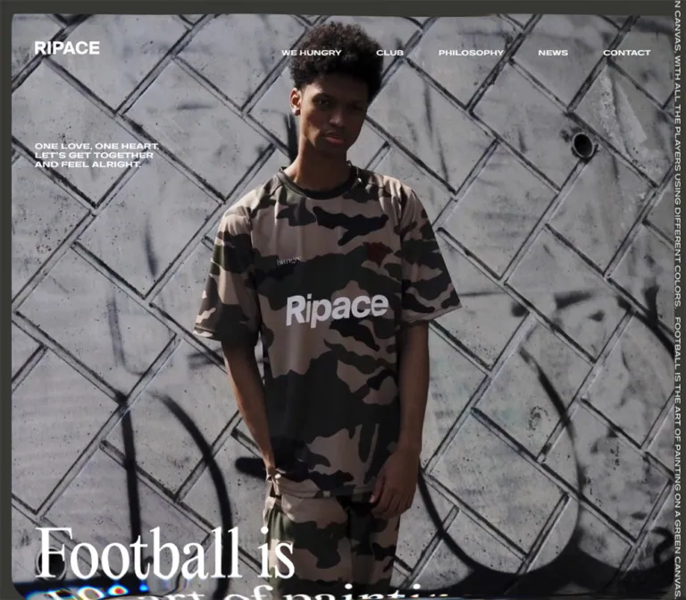
プレビュー準備中デザインリファレンスを見る
DESIGN REFERENCE
RIPACE|サッカークラブ公式サイト
ダークオリーブの背景と白い欧文タイポグラフィに、ストリート感のある写真を非対称に配置。大きな余白と画面端の歪み表現が印象的なサッカークラブの公式サイト。
RIPACE — Style Reference
A football club homepage presented as a streetwear editorial: dark olive, white lettering, staggered portraits, and rippled image edges.
Website: ripace.net Original URL: https://ripace.net/ Final URL: https://ripace.net/ Theme: dark olive canvas with white interface text Inspected: October 2, 2026, 03:41 JST; the supplied evidence timestamp is October 1, 2026, at 18:41:09.796 UTC. Viewports: 1440 × 1000 desktop and 390 × 844 mobile, in CSS pixels. Scope: the current homepage, identified by the document title “RIP ACE SOCCER CLUB.” Evidence comprises three desktop captures, two mobile captures, and rendered DOM/computed-style snapshots at both viewports. Internal destination pages, expanded navigation, language switching, and social destinations were not inspected.
RIPACE uses the visual vocabulary of fashion photography to introduce a football club. An almost full-screen portrait establishes the atmosphere, followed by a large statement and five photographic links to the club’s concept, social updates, philosophy, club information, and news. These links form an irregular editorial composition rather than a uniform card grid.
The interface remains deliberately spare. White uppercase navigation floats over photography and empty olive space. Compact captions sit directly below images. A large serif statement, clearly visible on mobile, contrasts with the wide sans-serif utility lettering. A repeated sentence runs sideways down the desktop screen edge, while localized image distortion introduces an analog, unstable quality.
The central relationship to preserve is large photographic surfaces, unequal widths, substantial empty space, and very small navigation. Mobile retains that relationship through alternating offsets rather than making every image full width.
閉じる
RIPACE — Style Reference
A football club homepage presented as a streetwear editorial: dark olive, white lettering, staggered portraits, and rippled image edges.
Website: ripace.net Original URL: https://ripace.net/ Final URL: https://ripace.net/ Theme: dark olive canvas with white interface text Inspected: October 2, 2026, 03:41 JST; the supplied evidence timestamp is October 1, 2026, at 18:41:09.796 UTC. Viewports: 1440 × 1000 desktop and 390 × 844 mobile, in CSS pixels. Scope: the current homepage, identified by the document title “RIP ACE SOCCER CLUB.” Evidence comprises three desktop captures, two mobile captures, and rendered DOM/computed-style snapshots at both viewports. Internal destination pages, expanded navigation, language switching, and social destinations were not inspected.
RIPACE uses the visual vocabulary of fashion photography to introduce a football club. An almost full-screen portrait establishes the atmosphere, followed by a large statement and five photographic links to the club’s concept, social updates, philosophy, club information, and news. These links form an irregular editorial composition rather than a uniform card grid.
The interface remains deliberately spare. White uppercase navigation floats over photography and empty olive space. Compact captions sit directly below images. A large serif statement, clearly visible on mobile, contrasts with the wide sans-serif utility lettering. A repeated sentence runs sideways down the desktop screen edge, while localized image distortion introduces an analog, unstable quality.
The central relationship to preserve is large photographic surfaces, unequal widths, substantial empty space, and very small navigation. Mobile retains that relationship through alternating offsets rather than making every image full width.
How to Read This Reference
- Measured means a value appears in the supplied computed styles or element rectangles. Coordinates are rounded to two decimals where useful.
- Derived means a value is calculated from those measurements, such as a card’s percentage of viewport width or a gap between adjacent links.
- Estimated means a visual approximation from an original-page capture. It is not a recovered stylesheet declaration.
- Recommended means implementation guidance for a new site. The CSS below is an adaptation, not extracted production code.
- All element coordinates in the component tables are document coordinates. A card near the top of a scrolled screenshot can therefore have a large document
yvalue. - Computed styles were supplied for selected elements, not every descendant. A heading wrapper’s inherited font size does not establish the size of lettering inside an uninspected child or graphic.
- Still captures establish appearance, not animation timing. Menu, hover, language, media playback, and distortion behavior remain unverified unless explicitly stated otherwise.
Tokens — Colors
Default Palette
| Name | Value | Source / suggested alias | Role and evidence |
|---|---|---|---|
| Olive Canvas | #373833 |
Source --c-green; alias --color-canvas |
Exact body background at both viewports; also the visible space between photographs |
| White Ink | #ffffff |
Source --c-white; alias --color-ink |
Exact computed body, navigation, caption-wrapper, and footer text color |
| Muted Language Text | Visually subdued white/gray | Suggested --color-muted: rgb(255 255 255 / 35%) |
JA appears dimmer than EN; the proposed opacity is a recommendation, not a measured value |
| Grid Utility | rgba(147, 148, 180, 0.08) |
Source --c-grid |
Present in custom properties; no visible page-wide grid is established by the captures |
White against the solid olive canvas has approximately 11.8:1 contrast, calculated from the two exact colors. Contrast over photography varies with the image and crop.
Palette Behavior
The page’s interface uses an extremely narrow palette. Concrete gray, camouflage brown, black clothing, a red wall, and a green shutter come from photography. They are not evidence of additional button or surface tokens.
Numerous WordPress color, gradient, and shadow presets appear in the supplied custom properties. Their presence does not show that the homepage uses them. Do not import those preset gradients, bright colors, or shadows into this visual system.
No theme selector or alternate interface palette was observed. The language control should not be interpreted as a theme control.
Tokens — Typography
Interface Sans Serif
- Measured family declaration:
Gatwick, sans-serif. - Measured body weight:
400. - Measured body size and line height:
16px / 16px. - Measured inherited tracking:
0.64px. - Roles: navigation, hero motto, feature captions, footer statement, social links, and language control.
- Character: broad uppercase lettering with a compact vertical profile. The small labels have a strong horizontal presence despite their small CSS font sizes.
The evidence establishes the computed family declaration, but does not include font files, face descriptors, or license information. Use Gatwick only when it is available and authorized. An Arial or generic sans-serif fallback is a practical substitute, not an exact typographic match.
Large Editorial Statement
The mobile capture visibly reads:
“Football is the art of painting on a green canvas, with all the players using different colors.”
Its lettering is a tall, high-contrast serif with tightly stacked lines. The family name is unverified. The corresponding sampled paragraph has no extracted text and retains an inherited Gatwick declaration; that wrapper measurement does not identify the visible serif lettering.
At 390px wide, the statement occupies approximately six lines. Its measured container begins at y = 548.86px and is 249.58px high, giving an average vertical allocation of approximately 41.60px per visible line. This is a layout observation, not a measured font size.
For an HTML-text adaptation, start with a serif fallback around 44px and a line height near 0.945, then adjust against the actual licensed type or artwork. Georgia is used below only as a recommended fallback. Desktop glyph size and line breaks were not visually captured in the supplied original-page screenshots.
Wordmark
The white RIPACE mark is a separate identity element. Its home-link box measures 99 × 27.23px on desktop and 75 × 20.63px on mobile. The sampled heading and anchor contain no extracted text, so their inherited 16px font size should not be used to rebuild the wordmark.
Prefer an authorized brand asset. Give the home link an accessible name independently of the graphic.
Type Scale
| Role | Desktop | Mobile | Evidence status |
|---|---|---|---|
| Body defaults | 16px / 16px, weight 400 |
Same | Measured; not a prescription for every visible text element |
| Primary navigation | 10px / 10px, 0.64px tracking |
Desktop links not visible | Measured |
| Hero motto | 11px / 14px, 0.64px tracking |
9px / 11px, 0.64px tracking |
Measured |
| Footer statement | 10px / 10px |
9px / 9px |
Measured |
| Social links | 10px / 10px |
9px / 9px |
Measured |
| Language button | 10px / 10px, normal tracking |
9px / 9px, normal tracking |
Measured |
| Single-line feature heading | 26px wrapper height |
22px wrapper height |
Measured box height; descendant font size unverified |
| Feature title starting point | Approximately 26px / 26px |
Approximately 22px / 22px |
Recommended approximation based on appearance and heading height |
| Feature eyebrow | Approximately 10–11px |
Approximately 9–10px |
Visual estimate; descendant styles not supplied |
| Large serif statement | Container height 618.86px |
Container height 249.58px |
Measured container; family and glyph sizes unverified |
The source also exposes --fs-s1: 12px, --fs-s2: 13px, --fs-s3: 16px, and --fs-s4: 22px. These are available source variables; the supplied evidence does not map each one to a particular visible caption.
Maintain the distinction between utility text, feature titles, and the serif statement. Enlarging all small labels or using the serif throughout would erase much of the observed hierarchy.
Tokens — Spacing & Shapes
Density: sparse page composition with tightly packed text inside individual labels. Geometry: flat, unboxed links; predominantly rectangular image fields; no observed general card-border or shadow system.
Measured Spacing
| Use | Desktop | Mobile | Status |
|---|---|---|---|
| Header padding | 60px 72px 0 |
35px 20px 0 |
Measured |
| Header horizontal inset | 72px, equivalent to 5vw |
20px |
Measured; desktop percentage derived |
| Primary navigation gaps | Approximately 72px between link boxes |
Not applicable in closed state | Derived from measured link coordinates |
| Hero motto origin | x = 72px, y = 218px |
x = 20px, y = 95px |
Measured |
| Image-to-caption separation | Approximately 15px |
Approximately 15px |
Derived from visible image geometry and caption positions; image rectangles were not supplied |
| Statement-to-first-feature gap | 180px |
100px |
Derived from measured paragraph and link bounds |
| Gap between successive feature links | Varies; some vertical ranges overlap | Exactly 100px |
Derived from link bounds |
| Final feature to footer box | 190px |
110px |
Derived |
| Footer padding | 40px 72px |
40px 10px |
Measured |
| Footer social-link gaps | Approximately 48px |
Approximately 6.5px |
Derived |
| Mobile footer statement-to-links gap | Not applicable to horizontal arrangement | 30px |
Derived |
Source section-spacing variables are --sec-pad-s: 100px and --sec-pad-l: 200px at both viewports. They should not replace every measured gap: the desktop statement-to-feature gap, for example, is 180px in the supplied layout.
Shapes and Edge Treatment
| Element | Observed treatment |
|---|---|
| Feature anchor and heading wrappers | Computed border-radius: 0px |
| Photograph fields | Predominantly rectangular; no visible enclosing card surface |
| Hero perimeter | Narrow olive framing with visible rippling and curved edge deformation in the captured state |
| Mobile menu symbol | Two short horizontal white strokes |
| Navigation and footer controls | Text without filled pills or outlined button containers |
The deformed image corners should not be generalized into a large border-radius token. The screenshots show a changing-looking visual edge treatment, while sampled interface wrappers remain square.
Viewport Variables
The supplied custom properties expose viewport-sized units:
| Variable | Desktop | Mobile |
|---|---|---|
--vw |
14.4px |
3.9px |
--vh |
10px |
8.44px |
--vmax |
14.4px |
8.44px |
These values correspond to one percent of the relevant inspected viewport dimension. Their presence does not reveal all layout formulas or the exact breakpoint rules.
Components
Persistent Header
Role: maintains brand identity and access to the main sections while photographs scroll beneath it.
The desktop header is transparent. The wordmark sits at x = 72px, y = 60px; navigation occupies the right half, with its text near y = 76px. There is no solid header band, divider, or visible shadow.
The five observed destinations are:
| Label | Destination |
|---|---|
| WE HUNGRY | /about/ |
| CLUB | /club/ |
| PHILOSOPHY | /philosophy/ |
| NEWS | /news/ |
| CONTACT | /contact/ |
Header elements retain approximately the same screen positions in the scrolled captures. This supports persistent positioning, although a computed position value was not supplied. A fixed header is a reasonable implementation adaptation.
On mobile, the logo reduces to 75px wide and moves to a 20px horizontal inset. The desktop navigation is not visible in the closed state. A two-line menu symbol appears near the upper-right corner, with roughly 20px-long strokes. Opening behavior, panel appearance, focus management, and navigation transitions were not observed.
Hero Media Frame and Motto
Role: establishes the club’s cultural and photographic identity before informational navigation begins.
The desktop opening capture is dominated by a person wearing camouflage football apparel against a concrete wall. The media begins approximately 24px from the left edge and 30px from the top, extending almost to the viewport bottom. Those frame dimensions are screenshot estimates because the media element’s rectangle was not supplied.
The motto is measured separately from the image:
“ONE LOVE, ONE HEART.
LET’S GET TOGETHER
AND FEEL ALRIGHT.”
It occupies a compact three-line block, 191.95 × 42px on desktop and 159.38 × 33px on mobile. Keep it small and left aligned. It is an atmospheric statement, with no observed adjacent CTA button.
On mobile, the image is approximately a 380 × 380px square inside 5px outer margins. The captured subject stands against a red graffiti-covered wall. The composition is cropped for a narrow screen rather than compressing the whole desktop frame.
Different scenes across the two captures could result from media state, responsive asset selection, or both. They do not establish a video implementation, autoplay behavior, playback controls, or a particular image sequence.
Large Philosophy Statement
Role: turns the club’s football-as-art idea into a major visual interval between the opening image and the feature links.
On mobile, approximately 164px of olive space separates the image’s lower edge from the visible serif statement. The statement begins around x = 20px, y = 549px and ends around y = 798px. The first feature link begins another 100px below it.
The visible mobile line arrangement is:
Football is
the art of painting
on a green canvas,
with all the players
using different
colors.
These are observed visual line breaks, not evidence that the original uses literal HTML breaks.
The corresponding desktop paragraph box begins at y = 1108.81px and has a height of 618.86px. Its lettering was outside the supplied desktop capture regions. Preserve the statement’s role and large scale without inventing an exact desktop font or line arrangement.
Editorial Feature Link
Role: provides navigation through photography and short labels.
Each feature is a block anchor containing an image region followed by a heading. There is no separate card background, perimeter border, button, or descriptive paragraph. The first two links add a small eyebrow above the main title.
| Feature | Caption anatomy | Destination |
|---|---|---|
| Brand concept | BRAND CONCEPT above WE HUNGRY |
/about/ |
| Social updates | RECENT NEWS above FACEBOOK PAGE |
https://www.facebook.com/RIPACE.net |
| Philosophy | PHILOSOPHY |
/philosophy/ |
| Club | OUR CLUB |
/club/ |
| News | NEWS |
/news/ |
The social-updates feature is an external Facebook link. It is distinct from the final internal NEWS link; the homepage evidence does not show a conventional article list with dates and summaries.
Measured Link Bounds
Each entry gives x, y; width × height in CSS pixels. Heights include the caption.
| Feature | Desktop: 1440 × 1000 | Mobile: 390 × 844 |
|---|---|---|
| Brand concept | 648, 1907.67; 576 × 640 |
89.20, 898.44; 280.80 × 340.80 |
| Social updates | 72, 2604.67; 432 × 639.63 |
20, 1339.23; 208 × 359.16 |
| Philosophy | 696, 3007.30; 672 × 488.36 |
63, 1798.39; 312 × 244.69 |
| Club | 216, 3673.66; 432 × 329 |
20, 2143.08; 234 × 193 |
| News | 840, 3885.66; 384 × 552.67 |
162, 2436.08; 208 × 314.16 |
The brand image is visibly square in the desktop capture. Club imagery is landscape at approximately 3:2; the final news portrait is approximately 3:4. Social-update geometry is also consistent with a 3:4 image. Philosophy geometry suggests an approximately 3:2 image after allowing for the caption and image-to-caption gap, but its artwork was not visible in the supplied captures.
On mobile, the combined brand heading box is 45px high. The social-updates heading is 67px high, consistent with an additional title line at its narrower width. Do not force every caption to the same fixed height.
Right-Edge Text Rail
Role: supplies a continuous typographic perimeter on desktop.
A repeated version of the football-as-art sentence runs sideways down the right screen edge. Its small white lettering and narrow footprint make it read as an editorial annotation, not a sidebar.
The rail is visible in all three desktop captures and absent from both mobile captures. Its changing visible text segment does not prove an automatic marquee. Positioning, repetition mechanism, timing, and scroll synchronization were not supplied.
For a new implementation, use a fixed decorative rail with sideways Latin text and mark duplicated content aria-hidden. Keep it outside navigation hit areas. A static version preserves the evidenced appearance without inventing motion.
Footer
Role: closes the visual sequence with the brand statement, social destinations, and language control.
The desktop footer is a transparent 100px-high flex region on the same olive canvas. It begins at approximately y = 4628.33px with 40px 72px padding. The football statement sits at the left in two compact uppercase lines. Twitter, Instagram, Facebook, and the language control align to the right.
The mobile footer is a 146px-high block with 40px 10px padding. Its statement spans a 370px-wide area and wraps into a 27px-high text block. The social row begins 30px below that block. Social names remain grouped at the left, while the language control aligns near the right edge.
The footer is in document flow. Its appearance at the viewport bottom in the final capture is not evidence of a fixed footer.
Language Control
The DOM identifies EN / JA as a button. Its measured box is 50.34 × 10px on desktop and 45.31 × 9px on mobile, with internal gaps of 5px and 4.5px, respectively.
EN is visually brighter than JA in the captures. The visible state therefore suggests the English presentation, but switching behavior and the resulting Japanese layout were not tested. Preserve the compact treatment while providing a larger usable target in a new implementation.
Tokens — Motion & Interaction
| Treatment | Evidence | What can safely be reproduced |
|---|---|---|
| Body color transition | Measured color 0.6s cubic-bezier(0.3, 0.1, 0.1, 1) |
The declared transition; its triggering state is unknown |
| Persistent header | Same approximate screen position across scrolled captures | Persistent placement; fixed positioning is a recommended implementation |
| Image-edge distortion | Visible ripples, compressed streaks, and localized color fringes | The visual character; duration, amplitude, and rendering technology are unknown |
| Hero scene variation | Desktop and mobile show different backgrounds/poses | Support suitable crops or media states without assuming autoplay |
| Desktop text rail | Repeated sideways sentence visible at the boundary | Static repetition; animation is unverified |
| Feature navigation | Rendered anchors with explicit URLs | Native link behavior; hover animation was not observed |
| Mobile menu | Closed two-line symbol visible | Closed-state appearance only |
| Language selection | Rendered button with EN / JA |
Visible control anatomy; state change unverified |
Most sampled elements report animation: none. That does not establish a motion-free page: the sample does not fully cover media, descendants, pseudo-elements, or JavaScript-rendered effects. Likewise, a transition summary of all without a duration is not evidence of a timed animation.
The distortion is concentrated around screen or image edges rather than presented as a uniform blur. Avoid inventing whole-page wobble, scroll hijacking, parallax depths, or hover zoom as documented behavior.
Recommended adaptation: keep the content usable as static images and native links. If a distortion layer is added, isolate it from text and controls, provide a reduced-motion alternative, and treat its timing as a new design decision. Do not apply the measured 600ms body color transition to every effect.
Surfaces
| Layer | Appearance | Function |
|---|---|---|
| Page canvas | Solid #373833 |
Connects the whole page and makes empty space an active compositional element |
| Header | Transparent, white mark and text | Remains visually light over both media and canvas |
| Hero | Large photographic field with a narrow olive perimeter | Establishes identity and atmosphere |
| Feature link | Bare photograph plus white caption | Makes imagery itself the navigation target |
| Text rail | Small white sideways lettering | Adds a desktop perimeter detail |
| Footer | Same olive canvas, no separating panel | Ends the page without introducing a new visual system |
| Distortion layer | Localized rippling and color separation | Adds character; implementation and stacking details are unverified |
There is no evidenced elevation scale, glass surface, colorful CTA fill, or rounded-card system. Separation comes from image boundaries, alignment, scale, and empty space.
Imagery
The photography combines football apparel with an urban editorial setting. Concrete seams, graffiti, structural beams, camouflage patterns, and a shutter provide hard textures around the subject. Framing ranges from a large standing portrait to a square seated portrait, a close-up, an architectural fragment, and a straightforward apparel portrait.
Keep the difference between these crops. A uniform collection of match-action photographs would change the identity established by the supplied page.
Observed Asset References
No original media filenames, image URLs, video URLs, or font-file paths were supplied. The following are visual references from the inspected homepage, not downloadable asset references.
| Asset role | Observed content | Confidence and limits |
|---|---|---|
| Desktop hero | Person in camouflage apparel against a gray concrete wall | Clearly visible; media type unverified |
| Mobile hero | Person in camouflage apparel against a reddish graffiti wall | Clearly visible; relationship to desktop media state unverified |
| Brand concept | Square seated portrait beneath structural beams, wearing dark apparel | Clearly visible in the desktop middle capture |
| Social updates | Partial hooded camouflage portrait | Only the upper portion is visible in the supplied middle capture |
| Philosophy | Artwork not visible in supplied captures | Link, position, and size are established by the DOM |
| Club | Graffiti-covered wall without a prominent portrait | Visible in desktop and mobile ending captures |
| News | Frontal portrait in a dark football shirt against a green shutter | Visible in desktop and mobile ending captures |
Use natural photographic detail, directional light, and the observed muted clothing/background colors. Keep the shirt graphics and framing legible. Avoid converting the photographs into flat duotones, adding a uniform colored overlay, or applying a heavy texture to the entire interface.
Use original assets only when authorized. The CSS can reproduce the layout system; it cannot recreate the identity of the photographic material.
Layout & Responsive Behavior
Desktop Composition
At 1440px wide, the page’s reported document height is 4728px. The header inset is 72px, or 5% of viewport width. The feature links use a wider set of alignments:
| Feature | Left position as viewport percentage | Width as viewport percentage |
|---|---|---|
| Brand concept | 45% |
40% |
| Social updates | 5% |
30% |
| Philosophy | 48.33% |
46.67% |
| Club | 15% |
30% |
| News | 58.33% |
26.67% |
These percentages are calculated from the measured coordinates. They are not confirmed source CSS formulas.
The social-updates and philosophy links occupy overlapping vertical ranges but separate horizontal areas. The club and news links do the same. This creates an alternating rhythm without overlapping the images themselves.
A useful reconstruction model is a 90vw content region divided into 27 equal columns. At 1440px, each column is 48px; the observed image widths and offsets align cleanly with that model. This is an analytical aid, not evidence that the original uses CSS Grid or a 27-column stylesheet.
Mobile Composition
At 390px wide, the reported document height is 3006px. The hero becomes approximately square, desktop navigation gives way to a menu symbol, and the right-edge text rail disappears.
The feature sequence remains deliberately uneven:
| Feature | Width | Left inset | Right inset |
|---|---|---|---|
| Brand concept | 280.80px, or 72vw |
89.20px |
20px |
| Social updates | 208px, or 53.33vw |
20px |
162px |
| Philosophy | 312px, or 80vw |
63px |
15px |
| Club | 234px, or 60vw |
20px |
136px |
| News | 208px, or 53.33vw |
162px |
20px |
Every successive feature begins 100px after the previous link’s bottom. This measurement includes the effect of wrapped captions: the layout does not assume that every caption has one line.
The first feature starts at y = 898.44px, below the initial 844px-tall viewport. The initial mobile view is therefore devoted to the portrait and large statement.
Responsive Limits
Only two viewport sizes were supplied. Exact breakpoints, tablet layouts, landscape behavior, safe-area handling, browser-chrome resizing, and intermediate type scaling were not established.
The CSS below uses a recommended 900px breakpoint. It preserves the two evidenced layout modes without claiming to recover the original media query. Test intermediate widths with the actual font and images, especially where desktop navigation competes for space or feature titles wrap.
Do’s and Don’ts
Do
- Keep the canvas at the measured
#373833and the primary lettering white. - Preserve a transparent, persistent header with a small white brand mark.
- Use photography as the main navigation surface.
- Maintain unequal image sizes and alternating horizontal placement.
- Retain the square, landscape, and portrait image proportions.
- Keep the feature title directly beneath its image, without an enclosing panel.
- Preserve the contrast between compact uppercase labels and the large serif statement.
- Keep the mobile feature sequence spaced by approximately
100pxbetween complete links. - Use the desktop text rail as a narrow decorative perimeter detail.
- Treat image distortion as a separate, optional rendering layer whose original timing is unknown.
Don’t
- Don’t turn the homepage into a uniform three-column card grid.
- Don’t make every mobile image full width or center every item.
- Don’t add pricing blocks, conversion buttons, or commerce controls unsupported by the page’s content.
- Don’t introduce rounded containers, panel shadows, glass blur, or colorful category badges.
- Don’t mistake colors inside photographs for interface action colors.
- Don’t use the inherited
16pxheading-wrapper size as the visible feature-title size. - Don’t assign a named serif family without evidence.
- Don’t assume that different hero frames prove autoplay video.
- Don’t describe an untested menu, language transition, or hover animation as an observed interaction.
- Don’t replace the visibly deformed edges with a universal border-radius rule.
Recommended Implementation Additions
These are recommendations for a new implementation, not verified features of the original:
- Give the logo link and menu control explicit accessible names. Implement the menu with
aria-expanded, a meaningful controlled region, keyboard access, and appropriate focus behavior. - Preserve the small visual size of the menu strokes while providing a touch target of at least approximately
44 × 44px. - Increase the usable target areas of language and footer controls. The measured text boxes alone are very small.
- Consider a larger utility-text mode or modestly larger mobile text. The original
9pxlabels are a stylistic observation, not an accessibility recommendation. - Render the large statement as accessible text or provide an equivalent text alternative if the visible lettering is artwork.
- Keep decorative duplicates of the statement out of the accessibility tree.
- Use meaningful alternative text where photographs communicate content; avoid repeating an adjacent link title unnecessarily.
- Add visible keyboard focus without requiring image distortion or hover to reveal a link.
- Supply stable media dimensions and responsive image candidates so loading does not move the captions.
- Preserve native scrolling. Pause optional decorative motion for reduced-motion preferences; video or canvas effects require explicit handling beyond CSS.
Agent Prompt Guide
Quick Color Reference
- Canvas and inter-image space:
#373833. - Logo, navigation, captions, statement, and social labels:
#ffffff. - Secondary language state: visibly muted; exact opacity unverified.
- Photography supplies the gray, brown, black, red, and green variation.
- No observed colorful action fill, card shadow, or gradient surface.
Overall Prompt
“Create a football club homepage inspired by RIPACE’s supplied current-page evidence. Use a dark olive #373833 canvas and white lettering. Pair a transparent persistent header with a small white wordmark and widely spaced uppercase navigation. Begin with a large urban football-apparel portrait and a compact three-line motto. Follow it with an oversized serif statement and five bare photographic navigation links of unequal widths: square brand concept, portrait social updates, landscape philosophy, landscape club, and portrait news. Arrange them in a staggered desktop composition with broad empty areas. On mobile, use a near-square hero, a two-line menu symbol, a tall serif statement, alternating image offsets, and 100px gaps between complete feature links. Keep footer controls small and unboxed. Distinguish evidenced appearance from optional distortion or media behavior.”
Example Component Prompts
- Header: “Build a transparent white-on-olive header. At 1440px, place a 99px-wide brand mark 72px from the left and 60px from the top; align five 10px uppercase links across the right side. At 390px, use a 75px-wide mark at a 20px left inset and a two-stroke menu symbol. The open menu design is unspecified.”
- Brand concept link: “Use a square editorial portrait above a small BRAND CONCEPT eyebrow and the title WE HUNGRY. Keep the link unboxed. At desktop, use approximately 40vw width starting at 45vw; at 390px, use 280.8px width and a 20px right margin.”
- Mobile feature sequence: “Create five photographic links with widths of 72vw, 53.33vw, 80vw, 60vw, and 53.33vw. Alternate their horizontal offsets and leave 100px between the bottom of each complete link and the next. Allow captions to wrap naturally.”
- Serif statement: “Set the football-as-art sentence in a tall, high-contrast serif, around 44px with tight leading on a 390px screen. The source family is unknown; use an explicitly labeled fallback. Place it after a large olive interval beneath the hero.”
- Footer: “Place a compact uppercase statement at left and Twitter, Instagram, Facebook, and EN / JA at right on desktop. On mobile, put the statement above a narrow social-and-language row. Use the same olive canvas and no border, panel, or shadow.”
- Optional distortion: “Add a progressive decorative treatment confined to media edges, using restrained ripples and localized color separation. Keep text and hit areas stable, offer a static reduced-motion version, and treat all timing as newly chosen rather than source-measured.”
Quick Start
CSS Custom Properties
This CSS is a practical adaptation of the two supplied layouts. Exact palette, interface defaults, header insets, small-label sizes, and footer spacing come from measured evidence. Feature widths follow measured ratios. Desktop vertical offsets are fitted approximations; the breakpoint, serif fallback, feature-title sizes, focus treatment, and menu hit area are recommendations.
Expected structure: .site-header contains .brand, .primary-nav, and .menu-toggle; .hero contains a media element and .hero__motto; .manifesto precedes .features; each .feature anchor contains an image and .feature__title, optionally with .feature__eyebrow. The footer contains .footer__statement and .footer__right, with social links and the language button inside the latter.
Use authorized assets in the image elements. This CSS does not provide a working menu, language switch, media sequence, or distortion renderer. Those behaviors need separate implementation. The serif fallback will not reproduce the original lettering exactly.
:root {
  /* Measured palette and interface defaults */
  --color-canvas: #373833;
  --color-ink: #fff;
  --font-ui: 'Gatwick', Arial, sans-serif;
  --tracking-ui: 0.64px;
  --weight-ui: 400;
  --motion-color: 600ms cubic-bezier(0.3, 0.1, 0.1, 1);

  /* Recommended fallbacks and approximations */
  --font-editorial: Georgia, 'Times New Roman', serif;
  --color-muted: rgb(255 255 255 / 35%);
  --text-feature: 26px;
  --tracking-feature: -0.04em;

  /* Measured or derived layout values */
  --page-inset: 5vw;
  --header-top: 60px;
  --logo-width: 99px;
  --text-utility: 10px;
  --feature-caption-gap: 15px;
  --mobile-feature-gap: 100px;
}

* {
  box-sizing: border-box;
}

body {
  margin: 0;
  color: var(--color-ink);
  background: var(--color-canvas);
  font-family: var(--font-ui);
  font-size: 16px;
  font-weight: var(--weight-ui);
  line-height: 1;
  letter-spacing: var(--tracking-ui);
  transition: color var(--motion-color);
}

a {
  color: inherit;
  text-decoration: none;
}

button {
  color: inherit;
  font: inherit;
  border: 0;
  border-radius: 0;
  background: transparent;
  cursor: pointer;
}

.site-header {
  position: fixed;
  inset: 0 0 auto;
  z-index: 30;
  display: flex;
  align-items: flex-end;
  justify-content: space-between;
  padding: var(--header-top) var(--page-inset) 0;
}

.brand {
  display: block;
  flex: 0 0 auto;
  width: var(--logo-width);
}

.brand img,
.brand svg {
  display: block;
  width: 100%;
  height: auto;
}

.primary-nav {
  display: flex;
  align-items: center;
  gap: 5vw;
  font-size: var(--text-utility);
  line-height: 1;
  text-transform: uppercase;
}

.menu-toggle {
  display: none;
}

/* Estimated hero geometry from the original-page captures. */
.hero {
  position: relative;
  height: calc(100svh - 30px);
  margin: 30px 24px 0;
  overflow: hidden;
}

.hero__media {
  display: block;
  width: 100%;
  height: 100%;
  object-fit: cover;
  object-position: center;
}

.hero__motto {
  position: absolute;
  top: calc(21.8svh - 30px);
  left: calc(5vw - 24px);
  z-index: 1;
  margin: 0;
  font-size: 11px;
  line-height: 14px;
  text-transform: uppercase;
}

/* Serif family and desktop scale are adaptation choices. */
.manifesto {
  margin: 7.56vw 5vw 180px;
  font-family: var(--font-editorial);
  font-size: clamp(72px, 9vw, 144px);
  font-weight: 400;
  line-height: 0.95;
  letter-spacing: -0.04em;
}

.features {
  display: flex;
  flex-direction: column;
  align-items: flex-start;
}

.feature {
  display: block;
  flex: 0 0 auto;
  margin: 0;
}

.feature img {
  display: block;
  width: 100%;
  aspect-ratio: var(--image-ratio);
  object-fit: cover;
}

.feature__title {
  margin: var(--feature-caption-gap) 0 0;
  font-size: var(--text-feature);
  font-weight: 400;
  line-height: 1;
  letter-spacing: var(--tracking-feature);
  text-transform: uppercase;
}

.feature__eyebrow {
  display: block;
  margin-bottom: 9px;
  font-size: 11px;
  line-height: 14px;
  letter-spacing: var(--tracking-ui);
}

/* Widths match measured ratios; vertical margins are fitted. */
.feature--concept {
  --image-ratio: 1;
  width: 40%;
  margin-left: 45%;
}

.feature--social {
  --image-ratio: 3 / 4;
  width: 30%;
  margin-top: 4vw;
  margin-left: 5%;
}

.feature--philosophy {
  --image-ratio: 3 / 2;
  width: 46.6667%;
  margin-top: -16.5vw;
  margin-left: 48.3333%;
}

.feature--club {
  --image-ratio: 3 / 2;
  width: 30%;
  margin-top: 12.4vw;
  margin-left: 15%;
}

.feature--news {
  --image-ratio: 3 / 4;
  width: 26.6667%;
  margin-top: -8.1vw;
  margin-left: 58.3333%;
}

/* Static decorative repetition; automatic movement is unverified. */
.edge-copy {
  position: fixed;
  top: 0;
  right: 12px;
  z-index: 20;
  height: 100svh;
  overflow: hidden;
  writing-mode: vertical-rl;
  text-orientation: mixed;
  white-space: nowrap;
  font-size: 10px;
  line-height: 1;
  text-transform: uppercase;
  pointer-events: none;
}

.site-footer {
  display: flex;
  align-items: center;
  justify-content: space-between;
  gap: 32px;
  margin-top: 190px;
  padding: 40px var(--page-inset);
  font-size: var(--text-utility);
  line-height: 1;
  text-transform: uppercase;
}

.footer__statement {
  max-width: 450px;
  margin: 0;
}

.footer__right,
.footer__links {
  display: flex;
  align-items: center;
  gap: 48px;
}

.language {
  display: flex;
  align-items: center;
  gap: 0.5em;
  padding: 0;
  letter-spacing: normal;
}

.language__inactive {
  color: var(--color-muted);
}

/* Recommended keyboard feedback, not an observed source state. */
a:focus-visible,
button:focus-visible {
  outline: 2px solid currentColor;
  outline-offset: 5px;
}

@media (hover: hover) {
  .primary-nav a:hover,
  .footer__links a:hover {
    text-decoration: underline;
    text-underline-offset: 0.3em;
  }
}

/* Recommended breakpoint; the original breakpoint is unknown. */
@media (max-width: 900px) {
  :root {
    --page-inset: 20px;
    --header-top: 35px;
    --logo-width: 75px;
    --text-utility: 9px;
    --text-feature: 22px;
  }

  .site-header {
    display: block;
  }

  .primary-nav {
    display: none;
  }

  .menu-toggle {
    position: absolute;
    top: 22px;
    right: 8px;
    display: block;
    width: 44px;
    height: 44px;
    padding: 0;
  }

  .menu-toggle::before,
  .menu-toggle::after {
    content: '';
    position: absolute;
    left: 12px;
    width: 20px;
    height: 2px;
    background: currentColor;
  }

  .menu-toggle::before {
    top: 16px;
  }

  .menu-toggle::after {
    top: 25px;
  }

  .hero {
    height: auto;
    aspect-ratio: 1;
    margin: 5px 5px 0;
  }

  .hero__motto {
    top: 90px;
    left: 15px;
    font-size: 9px;
    line-height: 11px;
  }

  .manifesto {
    margin: 164px 20px 100px;
    font-size: clamp(36px, 11.282vw, 64px);
    line-height: 0.945;
    letter-spacing: -0.045em;
  }

  .features {
    gap: var(--mobile-feature-gap);
  }

  .feature {
    margin-top: 0;
  }

  .feature--concept {
    width: 72%;
    margin-left: calc(28% - 20px);
  }

  .feature--social {
    width: 53.3333%;
    margin-left: 20px;
  }

  .feature--philosophy {
    width: 80%;
    margin-left: calc(20% - 15px);
  }

  .feature--club {
    width: 60%;
    margin-left: 20px;
  }

  .feature--news {
    width: 53.3333%;
    margin-left: calc(46.6667% - 20px);
  }

  .feature__eyebrow {
    margin-bottom: 12px;
    font-size: 9px;
    line-height: 11px;
  }

  .edge-copy {
    display: none;
  }

  .site-footer {
    display: block;
    margin-top: 110px;
    padding: 40px 10px;
  }

  .footer__statement {
    max-width: none;
  }

  .footer__right {
    justify-content: space-between;
    gap: 16px;
    margin-top: 30px;
  }

  .footer__links {
    gap: 6.5px;
  }
}

@media (prefers-reduced-motion: reduce) {
  body {
    transition: none;
  }

  /* Apply this hook to any optional CSS distortion layer. */
  .edge-effect {
    animation: none;
    transform: none;
  }
}
The desktop negative margins express the observed overlap of vertical ranges. They are appropriate only while the links remain horizontally separated. Check caption wrapping and intermediate widths with real content. The mobile rules remove those overlaps and use normal flow with a measured 100px gap.
The reduced-motion rule controls CSS effects only. A video, canvas, or other scripted renderer must also respond to the preference explicitly.
Tailwind v4 Token Mapping
Optional aliases for a project already using Tailwind v4. Define the custom properties above first. These mappings do not imply that the inspected website uses Tailwind.
@theme inline {
  --color-olive-canvas: var(--color-canvas);
  --color-white-ink: var(--color-ink);
  --color-muted-ink: var(--color-muted);

  --font-interface: var(--font-ui);
  --font-statement: var(--font-editorial);

  --text-utility: var(--text-utility);
  --text-feature-title: var(--text-feature);

  --spacing-page-inset: var(--page-inset);
  --spacing-caption-gap: var(--feature-caption-gap);
  --spacing-feature-gap: var(--mobile-feature-gap);
}
Sources & Evidence
- RIPACE homepage: original and final URL are identical; supplied HTTP status is
200; document title is “RIP ACE SOCCER CLUB.” - Capture timestamp:
2026-10-01T18:41:09.796Z, corresponding to October 2, 2026, at 03:41 JST. This reference analyzes the supplied inspection, not a separately performed live visit. - Desktop evidence: three original-page captures at
1440 × 1000, covering the opening portrait, a middle feature region, and the final club/news/footer region. The DOM reports a4728pxdocument height. - Mobile evidence: two original-page captures at
390 × 844, covering the opening portrait/statement and the final club/news/footer region. The DOM reports a3006pxdocument height. - Rendered evidence: body colors and font declaration, selected custom properties, header/footer padding, text metrics, feature-link rectangles, heading-wrapper rectangles, and link destinations. Media rectangles, descendant typography, font files, and media asset paths were not supplied.
- Inspection preparation: the supplied process waited for document load, bounded image decoding, sampled layout/text stability, and eligible finite animations. Perpetual animations were paused during readiness checks and then resumed. These checks do not prove that all delayed content or motion states were captured.
- Interaction limits: scrolling produced the supplied views. Link activation, hover states, menu opening, language changes, media playback, and distortion timing were not demonstrated. No internal destination page or external social page is included in this reference.
This document describes the current homepage evidenced by those captures and measurements. Estimated geometry, unidentified lettering, and recommended implementation behavior are explicitly distinguished from measured source values.
# RIPACE — Style Reference

> A football club homepage presented as a streetwear editorial: dark olive, white lettering, staggered portraits, and rippled image edges.

**Website:** [ripace.net](https://ripace.net/)
**Original URL:** https://ripace.net/
**Final URL:** https://ripace.net/
**Theme:** dark olive canvas with white interface text
**Inspected:** October 2, 2026, 03:41 JST; the supplied evidence timestamp is October 1, 2026, at 18:41:09.796 UTC.
**Viewports:** 1440 × 1000 desktop and 390 × 844 mobile, in CSS pixels.
**Scope:** the current homepage, identified by the document title “RIP ACE SOCCER CLUB.” Evidence comprises three desktop captures, two mobile captures, and rendered DOM/computed-style snapshots at both viewports. Internal destination pages, expanded navigation, language switching, and social destinations were not inspected.

RIPACE uses the visual vocabulary of fashion photography to introduce a football club. An almost full-screen portrait establishes the atmosphere, followed by a large statement and five photographic links to the club’s concept, social updates, philosophy, club information, and news. These links form an irregular editorial composition rather than a uniform card grid.

The interface remains deliberately spare. White uppercase navigation floats over photography and empty olive space. Compact captions sit directly below images. A large serif statement, clearly visible on mobile, contrasts with the wide sans-serif utility lettering. A repeated sentence runs sideways down the desktop screen edge, while localized image distortion introduces an analog, unstable quality.

The central relationship to preserve is **large photographic surfaces, unequal widths, substantial empty space, and very small navigation**. Mobile retains that relationship through alternating offsets rather than making every image full width.
閉じる
# RIPACE — Style Reference

> A football club homepage presented as a streetwear editorial: dark olive, white lettering, staggered portraits, and rippled image edges.

**Website:** [ripace.net](https://ripace.net/)
**Original URL:** https://ripace.net/
**Final URL:** https://ripace.net/
**Theme:** dark olive canvas with white interface text
**Inspected:** October 2, 2026, 03:41 JST; the supplied evidence timestamp is October 1, 2026, at 18:41:09.796 UTC.
**Viewports:** 1440 × 1000 desktop and 390 × 844 mobile, in CSS pixels.
**Scope:** the current homepage, identified by the document title “RIP ACE SOCCER CLUB.” Evidence comprises three desktop captures, two mobile captures, and rendered DOM/computed-style snapshots at both viewports. Internal destination pages, expanded navigation, language switching, and social destinations were not inspected.

RIPACE uses the visual vocabulary of fashion photography to introduce a football club. An almost full-screen portrait establishes the atmosphere, followed by a large statement and five photographic links to the club’s concept, social updates, philosophy, club information, and news. These links form an irregular editorial composition rather than a uniform card grid.

The interface remains deliberately spare. White uppercase navigation floats over photography and empty olive space. Compact captions sit directly below images. A large serif statement, clearly visible on mobile, contrasts with the wide sans-serif utility lettering. A repeated sentence runs sideways down the desktop screen edge, while localized image distortion introduces an analog, unstable quality.

The central relationship to preserve is **large photographic surfaces, unequal widths, substantial empty space, and very small navigation**. Mobile retains that relationship through alternating offsets rather than making every image full width.

## How to Read This Reference

- **Measured** means a value appears in the supplied computed styles or element rectangles. Coordinates are rounded to two decimals where useful.
- **Derived** means a value is calculated from those measurements, such as a card’s percentage of viewport width or a gap between adjacent links.
- **Estimated** means a visual approximation from an original-page capture. It is not a recovered stylesheet declaration.
- **Recommended** means implementation guidance for a new site. The CSS below is an adaptation, not extracted production code.
- All element coordinates in the component tables are document coordinates. A card near the top of a scrolled screenshot can therefore have a large document `y` value.
- Computed styles were supplied for selected elements, not every descendant. A heading wrapper’s inherited font size does not establish the size of lettering inside an uninspected child or graphic.
- Still captures establish appearance, not animation timing. Menu, hover, language, media playback, and distortion behavior remain unverified unless explicitly stated otherwise.

## Tokens — Colors

### Default Palette

| Name | Value | Source / suggested alias | Role and evidence |
| --- | --- | --- | --- |
| Olive Canvas | `#373833` | Source `--c-green`; alias `--color-canvas` | Exact body background at both viewports; also the visible space between photographs |
| White Ink | `#ffffff` | Source `--c-white`; alias `--color-ink` | Exact computed body, navigation, caption-wrapper, and footer text color |
| Muted Language Text | Visually subdued white/gray | Suggested `--color-muted: rgb(255 255 255 / 35%)` | `JA` appears dimmer than `EN`; the proposed opacity is a recommendation, not a measured value |
| Grid Utility | `rgba(147, 148, 180, 0.08)` | Source `--c-grid` | Present in custom properties; no visible page-wide grid is established by the captures |

White against the solid olive canvas has approximately **11.8:1 contrast**, calculated from the two exact colors. Contrast over photography varies with the image and crop.

### Palette Behavior

The page’s interface uses an extremely narrow palette. Concrete gray, camouflage brown, black clothing, a red wall, and a green shutter come from photography. They are not evidence of additional button or surface tokens.

Numerous WordPress color, gradient, and shadow presets appear in the supplied custom properties. Their presence does not show that the homepage uses them. Do not import those preset gradients, bright colors, or shadows into this visual system.

No theme selector or alternate interface palette was observed. The language control should not be interpreted as a theme control.

## Tokens — Typography

### Interface Sans Serif

- **Measured family declaration:** `Gatwick, sans-serif`.
- **Measured body weight:** `400`.
- **Measured body size and line height:** `16px / 16px`.
- **Measured inherited tracking:** `0.64px`.
- **Roles:** navigation, hero motto, feature captions, footer statement, social links, and language control.
- **Character:** broad uppercase lettering with a compact vertical profile. The small labels have a strong horizontal presence despite their small CSS font sizes.

The evidence establishes the computed family declaration, but does not include font files, face descriptors, or license information. Use Gatwick only when it is available and authorized. An Arial or generic sans-serif fallback is a practical substitute, not an exact typographic match.

### Large Editorial Statement

The mobile capture visibly reads:

“Football is the art of painting on a green canvas, with all the players using different colors.”

Its lettering is a tall, high-contrast serif with tightly stacked lines. The family name is **unverified**. The corresponding sampled paragraph has no extracted text and retains an inherited Gatwick declaration; that wrapper measurement does not identify the visible serif lettering.

At 390px wide, the statement occupies approximately six lines. Its measured container begins at `y = 548.86px` and is `249.58px` high, giving an average vertical allocation of approximately `41.60px` per visible line. This is a layout observation, not a measured font size.

For an HTML-text adaptation, start with a serif fallback around `44px` and a line height near `0.945`, then adjust against the actual licensed type or artwork. Georgia is used below only as a recommended fallback. Desktop glyph size and line breaks were not visually captured in the supplied original-page screenshots.

### Wordmark

The white RIPACE mark is a separate identity element. Its home-link box measures `99 × 27.23px` on desktop and `75 × 20.63px` on mobile. The sampled heading and anchor contain no extracted text, so their inherited `16px` font size should not be used to rebuild the wordmark.

Prefer an authorized brand asset. Give the home link an accessible name independently of the graphic.

### Type Scale

| Role | Desktop | Mobile | Evidence status |
| --- | --- | --- | --- |
| Body defaults | `16px / 16px`, weight `400` | Same | Measured; not a prescription for every visible text element |
| Primary navigation | `10px / 10px`, `0.64px` tracking | Desktop links not visible | Measured |
| Hero motto | `11px / 14px`, `0.64px` tracking | `9px / 11px`, `0.64px` tracking | Measured |
| Footer statement | `10px / 10px` | `9px / 9px` | Measured |
| Social links | `10px / 10px` | `9px / 9px` | Measured |
| Language button | `10px / 10px`, normal tracking | `9px / 9px`, normal tracking | Measured |
| Single-line feature heading | `26px` wrapper height | `22px` wrapper height | Measured box height; descendant font size unverified |
| Feature title starting point | Approximately `26px / 26px` | Approximately `22px / 22px` | Recommended approximation based on appearance and heading height |
| Feature eyebrow | Approximately `10–11px` | Approximately `9–10px` | Visual estimate; descendant styles not supplied |
| Large serif statement | Container height `618.86px` | Container height `249.58px` | Measured container; family and glyph sizes unverified |

The source also exposes `--fs-s1: 12px`, `--fs-s2: 13px`, `--fs-s3: 16px`, and `--fs-s4: 22px`. These are available source variables; the supplied evidence does not map each one to a particular visible caption.

Maintain the distinction between utility text, feature titles, and the serif statement. Enlarging all small labels or using the serif throughout would erase much of the observed hierarchy.

## Tokens — Spacing & Shapes

**Density:** sparse page composition with tightly packed text inside individual labels.
**Geometry:** flat, unboxed links; predominantly rectangular image fields; no observed general card-border or shadow system.

### Measured Spacing

| Use | Desktop | Mobile | Status |
| --- | --- | --- | --- |
| Header padding | `60px 72px 0` | `35px 20px 0` | Measured |
| Header horizontal inset | `72px`, equivalent to `5vw` | `20px` | Measured; desktop percentage derived |
| Primary navigation gaps | Approximately `72px` between link boxes | Not applicable in closed state | Derived from measured link coordinates |
| Hero motto origin | `x = 72px`, `y = 218px` | `x = 20px`, `y = 95px` | Measured |
| Image-to-caption separation | Approximately `15px` | Approximately `15px` | Derived from visible image geometry and caption positions; image rectangles were not supplied |
| Statement-to-first-feature gap | `180px` | `100px` | Derived from measured paragraph and link bounds |
| Gap between successive feature links | Varies; some vertical ranges overlap | Exactly `100px` | Derived from link bounds |
| Final feature to footer box | `190px` | `110px` | Derived |
| Footer padding | `40px 72px` | `40px 10px` | Measured |
| Footer social-link gaps | Approximately `48px` | Approximately `6.5px` | Derived |
| Mobile footer statement-to-links gap | Not applicable to horizontal arrangement | `30px` | Derived |

Source section-spacing variables are `--sec-pad-s: 100px` and `--sec-pad-l: 200px` at both viewports. They should not replace every measured gap: the desktop statement-to-feature gap, for example, is `180px` in the supplied layout.

### Shapes and Edge Treatment

| Element | Observed treatment |
| --- | --- |
| Feature anchor and heading wrappers | Computed `border-radius: 0px` |
| Photograph fields | Predominantly rectangular; no visible enclosing card surface |
| Hero perimeter | Narrow olive framing with visible rippling and curved edge deformation in the captured state |
| Mobile menu symbol | Two short horizontal white strokes |
| Navigation and footer controls | Text without filled pills or outlined button containers |

The deformed image corners should not be generalized into a large border-radius token. The screenshots show a changing-looking visual edge treatment, while sampled interface wrappers remain square.

### Viewport Variables

The supplied custom properties expose viewport-sized units:

| Variable | Desktop | Mobile |
| --- | --- | --- |
| `--vw` | `14.4px` | `3.9px` |
| `--vh` | `10px` | `8.44px` |
| `--vmax` | `14.4px` | `8.44px` |

These values correspond to one percent of the relevant inspected viewport dimension. Their presence does not reveal all layout formulas or the exact breakpoint rules.

## Components

### Persistent Header

**Role:** maintains brand identity and access to the main sections while photographs scroll beneath it.

The desktop header is transparent. The wordmark sits at `x = 72px`, `y = 60px`; navigation occupies the right half, with its text near `y = 76px`. There is no solid header band, divider, or visible shadow.

The five observed destinations are:

| Label | Destination |
| --- | --- |
| WE HUNGRY | `/about/` |
| CLUB | `/club/` |
| PHILOSOPHY | `/philosophy/` |
| NEWS | `/news/` |
| CONTACT | `/contact/` |

Header elements retain approximately the same screen positions in the scrolled captures. This supports persistent positioning, although a computed `position` value was not supplied. A fixed header is a reasonable implementation adaptation.

On mobile, the logo reduces to `75px` wide and moves to a `20px` horizontal inset. The desktop navigation is not visible in the closed state. A two-line menu symbol appears near the upper-right corner, with roughly `20px`-long strokes. Opening behavior, panel appearance, focus management, and navigation transitions were not observed.

### Hero Media Frame and Motto

**Role:** establishes the club’s cultural and photographic identity before informational navigation begins.

The desktop opening capture is dominated by a person wearing camouflage football apparel against a concrete wall. The media begins approximately `24px` from the left edge and `30px` from the top, extending almost to the viewport bottom. Those frame dimensions are screenshot estimates because the media element’s rectangle was not supplied.

The motto is measured separately from the image:

“ONE LOVE, ONE HEART.
LET’S GET TOGETHER
AND FEEL ALRIGHT.”

It occupies a compact three-line block, `191.95 × 42px` on desktop and `159.38 × 33px` on mobile. Keep it small and left aligned. It is an atmospheric statement, with no observed adjacent CTA button.

On mobile, the image is approximately a `380 × 380px` square inside `5px` outer margins. The captured subject stands against a red graffiti-covered wall. The composition is cropped for a narrow screen rather than compressing the whole desktop frame.

Different scenes across the two captures could result from media state, responsive asset selection, or both. They do not establish a video implementation, autoplay behavior, playback controls, or a particular image sequence.

### Large Philosophy Statement

**Role:** turns the club’s football-as-art idea into a major visual interval between the opening image and the feature links.

On mobile, approximately `164px` of olive space separates the image’s lower edge from the visible serif statement. The statement begins around `x = 20px`, `y = 549px` and ends around `y = 798px`. The first feature link begins another `100px` below it.

The visible mobile line arrangement is:

```text
Football is
the art of painting
on a green canvas,
with all the players
using different
colors.
```

These are observed visual line breaks, not evidence that the original uses literal HTML breaks.

The corresponding desktop paragraph box begins at `y = 1108.81px` and has a height of `618.86px`. Its lettering was outside the supplied desktop capture regions. Preserve the statement’s role and large scale without inventing an exact desktop font or line arrangement.

### Editorial Feature Link

**Role:** provides navigation through photography and short labels.

Each feature is a block anchor containing an image region followed by a heading. There is no separate card background, perimeter border, button, or descriptive paragraph. The first two links add a small eyebrow above the main title.

| Feature | Caption anatomy | Destination |
| --- | --- | --- |
| Brand concept | `BRAND CONCEPT` above `WE HUNGRY` | `/about/` |
| Social updates | `RECENT NEWS` above `FACEBOOK PAGE` | `https://www.facebook.com/RIPACE.net` |
| Philosophy | `PHILOSOPHY` | `/philosophy/` |
| Club | `OUR CLUB` | `/club/` |
| News | `NEWS` | `/news/` |

The social-updates feature is an external Facebook link. It is distinct from the final internal NEWS link; the homepage evidence does not show a conventional article list with dates and summaries.

#### Measured Link Bounds

Each entry gives `x, y; width × height` in CSS pixels. Heights include the caption.

| Feature | Desktop: 1440 × 1000 | Mobile: 390 × 844 |
| --- | --- | --- |
| Brand concept | `648, 1907.67; 576 × 640` | `89.20, 898.44; 280.80 × 340.80` |
| Social updates | `72, 2604.67; 432 × 639.63` | `20, 1339.23; 208 × 359.16` |
| Philosophy | `696, 3007.30; 672 × 488.36` | `63, 1798.39; 312 × 244.69` |
| Club | `216, 3673.66; 432 × 329` | `20, 2143.08; 234 × 193` |
| News | `840, 3885.66; 384 × 552.67` | `162, 2436.08; 208 × 314.16` |

The brand image is visibly square in the desktop capture. Club imagery is landscape at approximately `3:2`; the final news portrait is approximately `3:4`. Social-update geometry is also consistent with a `3:4` image. Philosophy geometry suggests an approximately `3:2` image after allowing for the caption and image-to-caption gap, but its artwork was not visible in the supplied captures.

On mobile, the combined brand heading box is `45px` high. The social-updates heading is `67px` high, consistent with an additional title line at its narrower width. Do not force every caption to the same fixed height.

### Right-Edge Text Rail

**Role:** supplies a continuous typographic perimeter on desktop.

A repeated version of the football-as-art sentence runs sideways down the right screen edge. Its small white lettering and narrow footprint make it read as an editorial annotation, not a sidebar.

The rail is visible in all three desktop captures and absent from both mobile captures. Its changing visible text segment does not prove an automatic marquee. Positioning, repetition mechanism, timing, and scroll synchronization were not supplied.

For a new implementation, use a fixed decorative rail with sideways Latin text and mark duplicated content `aria-hidden`. Keep it outside navigation hit areas. A static version preserves the evidenced appearance without inventing motion.

### Footer

**Role:** closes the visual sequence with the brand statement, social destinations, and language control.

The desktop footer is a transparent `100px`-high flex region on the same olive canvas. It begins at approximately `y = 4628.33px` with `40px 72px` padding. The football statement sits at the left in two compact uppercase lines. Twitter, Instagram, Facebook, and the language control align to the right.

The mobile footer is a `146px`-high block with `40px 10px` padding. Its statement spans a `370px`-wide area and wraps into a `27px`-high text block. The social row begins `30px` below that block. Social names remain grouped at the left, while the language control aligns near the right edge.

The footer is in document flow. Its appearance at the viewport bottom in the final capture is not evidence of a fixed footer.

### Language Control

The DOM identifies `EN / JA` as a button. Its measured box is `50.34 × 10px` on desktop and `45.31 × 9px` on mobile, with internal gaps of `5px` and `4.5px`, respectively.

`EN` is visually brighter than `JA` in the captures. The visible state therefore suggests the English presentation, but switching behavior and the resulting Japanese layout were not tested. Preserve the compact treatment while providing a larger usable target in a new implementation.

## Tokens — Motion & Interaction

| Treatment | Evidence | What can safely be reproduced |
| --- | --- | --- |
| Body color transition | Measured `color 0.6s cubic-bezier(0.3, 0.1, 0.1, 1)` | The declared transition; its triggering state is unknown |
| Persistent header | Same approximate screen position across scrolled captures | Persistent placement; fixed positioning is a recommended implementation |
| Image-edge distortion | Visible ripples, compressed streaks, and localized color fringes | The visual character; duration, amplitude, and rendering technology are unknown |
| Hero scene variation | Desktop and mobile show different backgrounds/poses | Support suitable crops or media states without assuming autoplay |
| Desktop text rail | Repeated sideways sentence visible at the boundary | Static repetition; animation is unverified |
| Feature navigation | Rendered anchors with explicit URLs | Native link behavior; hover animation was not observed |
| Mobile menu | Closed two-line symbol visible | Closed-state appearance only |
| Language selection | Rendered button with `EN / JA` | Visible control anatomy; state change unverified |

Most sampled elements report `animation: none`. That does not establish a motion-free page: the sample does not fully cover media, descendants, pseudo-elements, or JavaScript-rendered effects. Likewise, a transition summary of `all` without a duration is not evidence of a timed animation.

The distortion is concentrated around screen or image edges rather than presented as a uniform blur. Avoid inventing whole-page wobble, scroll hijacking, parallax depths, or hover zoom as documented behavior.

**Recommended adaptation:** keep the content usable as static images and native links. If a distortion layer is added, isolate it from text and controls, provide a reduced-motion alternative, and treat its timing as a new design decision. Do not apply the measured 600ms body color transition to every effect.

## Surfaces

| Layer | Appearance | Function |
| --- | --- | --- |
| Page canvas | Solid `#373833` | Connects the whole page and makes empty space an active compositional element |
| Header | Transparent, white mark and text | Remains visually light over both media and canvas |
| Hero | Large photographic field with a narrow olive perimeter | Establishes identity and atmosphere |
| Feature link | Bare photograph plus white caption | Makes imagery itself the navigation target |
| Text rail | Small white sideways lettering | Adds a desktop perimeter detail |
| Footer | Same olive canvas, no separating panel | Ends the page without introducing a new visual system |
| Distortion layer | Localized rippling and color separation | Adds character; implementation and stacking details are unverified |

There is no evidenced elevation scale, glass surface, colorful CTA fill, or rounded-card system. Separation comes from image boundaries, alignment, scale, and empty space.

## Imagery

The photography combines football apparel with an urban editorial setting. Concrete seams, graffiti, structural beams, camouflage patterns, and a shutter provide hard textures around the subject. Framing ranges from a large standing portrait to a square seated portrait, a close-up, an architectural fragment, and a straightforward apparel portrait.

Keep the difference between these crops. A uniform collection of match-action photographs would change the identity established by the supplied page.

### Observed Asset References

No original media filenames, image URLs, video URLs, or font-file paths were supplied. The following are visual references from the inspected homepage, not downloadable asset references.

| Asset role | Observed content | Confidence and limits |
| --- | --- | --- |
| Desktop hero | Person in camouflage apparel against a gray concrete wall | Clearly visible; media type unverified |
| Mobile hero | Person in camouflage apparel against a reddish graffiti wall | Clearly visible; relationship to desktop media state unverified |
| Brand concept | Square seated portrait beneath structural beams, wearing dark apparel | Clearly visible in the desktop middle capture |
| Social updates | Partial hooded camouflage portrait | Only the upper portion is visible in the supplied middle capture |
| Philosophy | Artwork not visible in supplied captures | Link, position, and size are established by the DOM |
| Club | Graffiti-covered wall without a prominent portrait | Visible in desktop and mobile ending captures |
| News | Frontal portrait in a dark football shirt against a green shutter | Visible in desktop and mobile ending captures |

Use natural photographic detail, directional light, and the observed muted clothing/background colors. Keep the shirt graphics and framing legible. Avoid converting the photographs into flat duotones, adding a uniform colored overlay, or applying a heavy texture to the entire interface.

Use original assets only when authorized. The CSS can reproduce the layout system; it cannot recreate the identity of the photographic material.

## Layout & Responsive Behavior

### Desktop Composition

At 1440px wide, the page’s reported document height is `4728px`. The header inset is `72px`, or `5%` of viewport width. The feature links use a wider set of alignments:

| Feature | Left position as viewport percentage | Width as viewport percentage |
| --- | --- | --- |
| Brand concept | `45%` | `40%` |
| Social updates | `5%` | `30%` |
| Philosophy | `48.33%` | `46.67%` |
| Club | `15%` | `30%` |
| News | `58.33%` | `26.67%` |

These percentages are calculated from the measured coordinates. They are not confirmed source CSS formulas.

The social-updates and philosophy links occupy overlapping vertical ranges but separate horizontal areas. The club and news links do the same. This creates an alternating rhythm without overlapping the images themselves.

A useful reconstruction model is a `90vw` content region divided into 27 equal columns. At 1440px, each column is `48px`; the observed image widths and offsets align cleanly with that model. This is an analytical aid, not evidence that the original uses CSS Grid or a 27-column stylesheet.

### Mobile Composition

At 390px wide, the reported document height is `3006px`. The hero becomes approximately square, desktop navigation gives way to a menu symbol, and the right-edge text rail disappears.

The feature sequence remains deliberately uneven:

| Feature | Width | Left inset | Right inset |
| --- | --- | --- | --- |
| Brand concept | `280.80px`, or `72vw` | `89.20px` | `20px` |
| Social updates | `208px`, or `53.33vw` | `20px` | `162px` |
| Philosophy | `312px`, or `80vw` | `63px` | `15px` |
| Club | `234px`, or `60vw` | `20px` | `136px` |
| News | `208px`, or `53.33vw` | `162px` | `20px` |

Every successive feature begins `100px` after the previous link’s bottom. This measurement includes the effect of wrapped captions: the layout does not assume that every caption has one line.

The first feature starts at `y = 898.44px`, below the initial 844px-tall viewport. The initial mobile view is therefore devoted to the portrait and large statement.

### Responsive Limits

Only two viewport sizes were supplied. Exact breakpoints, tablet layouts, landscape behavior, safe-area handling, browser-chrome resizing, and intermediate type scaling were not established.

The CSS below uses a recommended `900px` breakpoint. It preserves the two evidenced layout modes without claiming to recover the original media query. Test intermediate widths with the actual font and images, especially where desktop navigation competes for space or feature titles wrap.

## Do’s and Don’ts

### Do

- Keep the canvas at the measured `#373833` and the primary lettering white.
- Preserve a transparent, persistent header with a small white brand mark.
- Use photography as the main navigation surface.
- Maintain unequal image sizes and alternating horizontal placement.
- Retain the square, landscape, and portrait image proportions.
- Keep the feature title directly beneath its image, without an enclosing panel.
- Preserve the contrast between compact uppercase labels and the large serif statement.
- Keep the mobile feature sequence spaced by approximately `100px` between complete links.
- Use the desktop text rail as a narrow decorative perimeter detail.
- Treat image distortion as a separate, optional rendering layer whose original timing is unknown.

### Don’t

- Don’t turn the homepage into a uniform three-column card grid.
- Don’t make every mobile image full width or center every item.
- Don’t add pricing blocks, conversion buttons, or commerce controls unsupported by the page’s content.
- Don’t introduce rounded containers, panel shadows, glass blur, or colorful category badges.
- Don’t mistake colors inside photographs for interface action colors.
- Don’t use the inherited `16px` heading-wrapper size as the visible feature-title size.
- Don’t assign a named serif family without evidence.
- Don’t assume that different hero frames prove autoplay video.
- Don’t describe an untested menu, language transition, or hover animation as an observed interaction.
- Don’t replace the visibly deformed edges with a universal border-radius rule.

## Recommended Implementation Additions

These are recommendations for a new implementation, not verified features of the original:

- Give the logo link and menu control explicit accessible names. Implement the menu with `aria-expanded`, a meaningful controlled region, keyboard access, and appropriate focus behavior.
- Preserve the small visual size of the menu strokes while providing a touch target of at least approximately `44 × 44px`.
- Increase the usable target areas of language and footer controls. The measured text boxes alone are very small.
- Consider a larger utility-text mode or modestly larger mobile text. The original `9px` labels are a stylistic observation, not an accessibility recommendation.
- Render the large statement as accessible text or provide an equivalent text alternative if the visible lettering is artwork.
- Keep decorative duplicates of the statement out of the accessibility tree.
- Use meaningful alternative text where photographs communicate content; avoid repeating an adjacent link title unnecessarily.
- Add visible keyboard focus without requiring image distortion or hover to reveal a link.
- Supply stable media dimensions and responsive image candidates so loading does not move the captions.
- Preserve native scrolling. Pause optional decorative motion for reduced-motion preferences; video or canvas effects require explicit handling beyond CSS.

## Agent Prompt Guide

### Quick Color Reference

- Canvas and inter-image space: `#373833`.
- Logo, navigation, captions, statement, and social labels: `#ffffff`.
- Secondary language state: visibly muted; exact opacity unverified.
- Photography supplies the gray, brown, black, red, and green variation.
- No observed colorful action fill, card shadow, or gradient surface.

### Overall Prompt

“Create a football club homepage inspired by RIPACE’s supplied current-page evidence. Use a dark olive `#373833` canvas and white lettering. Pair a transparent persistent header with a small white wordmark and widely spaced uppercase navigation. Begin with a large urban football-apparel portrait and a compact three-line motto. Follow it with an oversized serif statement and five bare photographic navigation links of unequal widths: square brand concept, portrait social updates, landscape philosophy, landscape club, and portrait news. Arrange them in a staggered desktop composition with broad empty areas. On mobile, use a near-square hero, a two-line menu symbol, a tall serif statement, alternating image offsets, and 100px gaps between complete feature links. Keep footer controls small and unboxed. Distinguish evidenced appearance from optional distortion or media behavior.”

### Example Component Prompts

1. **Header:** “Build a transparent white-on-olive header. At 1440px, place a 99px-wide brand mark 72px from the left and 60px from the top; align five 10px uppercase links across the right side. At 390px, use a 75px-wide mark at a 20px left inset and a two-stroke menu symbol. The open menu design is unspecified.”
2. **Brand concept link:** “Use a square editorial portrait above a small BRAND CONCEPT eyebrow and the title WE HUNGRY. Keep the link unboxed. At desktop, use approximately 40vw width starting at 45vw; at 390px, use 280.8px width and a 20px right margin.”
3. **Mobile feature sequence:** “Create five photographic links with widths of 72vw, 53.33vw, 80vw, 60vw, and 53.33vw. Alternate their horizontal offsets and leave 100px between the bottom of each complete link and the next. Allow captions to wrap naturally.”
4. **Serif statement:** “Set the football-as-art sentence in a tall, high-contrast serif, around 44px with tight leading on a 390px screen. The source family is unknown; use an explicitly labeled fallback. Place it after a large olive interval beneath the hero.”
5. **Footer:** “Place a compact uppercase statement at left and Twitter, Instagram, Facebook, and EN / JA at right on desktop. On mobile, put the statement above a narrow social-and-language row. Use the same olive canvas and no border, panel, or shadow.”
6. **Optional distortion:** “Add a progressive decorative treatment confined to media edges, using restrained ripples and localized color separation. Keep text and hit areas stable, offer a static reduced-motion version, and treat all timing as newly chosen rather than source-measured.”

## Quick Start

### CSS Custom Properties

This CSS is a practical adaptation of the two supplied layouts. Exact palette, interface defaults, header insets, small-label sizes, and footer spacing come from measured evidence. Feature widths follow measured ratios. Desktop vertical offsets are fitted approximations; the breakpoint, serif fallback, feature-title sizes, focus treatment, and menu hit area are recommendations.

Expected structure: `.site-header` contains `.brand`, `.primary-nav`, and `.menu-toggle`; `.hero` contains a media element and `.hero__motto`; `.manifesto` precedes `.features`; each `.feature` anchor contains an image and `.feature__title`, optionally with `.feature__eyebrow`. The footer contains `.footer__statement` and `.footer__right`, with social links and the language button inside the latter.

Use authorized assets in the image elements. This CSS does not provide a working menu, language switch, media sequence, or distortion renderer. Those behaviors need separate implementation. The serif fallback will not reproduce the original lettering exactly.

```css
:root {
  /* Measured palette and interface defaults */
  --color-canvas: #373833;
  --color-ink: #fff;
  --font-ui: 'Gatwick', Arial, sans-serif;
  --tracking-ui: 0.64px;
  --weight-ui: 400;
  --motion-color: 600ms cubic-bezier(0.3, 0.1, 0.1, 1);

  /* Recommended fallbacks and approximations */
  --font-editorial: Georgia, 'Times New Roman', serif;
  --color-muted: rgb(255 255 255 / 35%);
  --text-feature: 26px;
  --tracking-feature: -0.04em;

  /* Measured or derived layout values */
  --page-inset: 5vw;
  --header-top: 60px;
  --logo-width: 99px;
  --text-utility: 10px;
  --feature-caption-gap: 15px;
  --mobile-feature-gap: 100px;
}

* {
  box-sizing: border-box;
}

body {
  margin: 0;
  color: var(--color-ink);
  background: var(--color-canvas);
  font-family: var(--font-ui);
  font-size: 16px;
  font-weight: var(--weight-ui);
  line-height: 1;
  letter-spacing: var(--tracking-ui);
  transition: color var(--motion-color);
}

a {
  color: inherit;
  text-decoration: none;
}

button {
  color: inherit;
  font: inherit;
  border: 0;
  border-radius: 0;
  background: transparent;
  cursor: pointer;
}

.site-header {
  position: fixed;
  inset: 0 0 auto;
  z-index: 30;
  display: flex;
  align-items: flex-end;
  justify-content: space-between;
  padding: var(--header-top) var(--page-inset) 0;
}

.brand {
  display: block;
  flex: 0 0 auto;
  width: var(--logo-width);
}

.brand img,
.brand svg {
  display: block;
  width: 100%;
  height: auto;
}

.primary-nav {
  display: flex;
  align-items: center;
  gap: 5vw;
  font-size: var(--text-utility);
  line-height: 1;
  text-transform: uppercase;
}

.menu-toggle {
  display: none;
}

/* Estimated hero geometry from the original-page captures. */
.hero {
  position: relative;
  height: calc(100svh - 30px);
  margin: 30px 24px 0;
  overflow: hidden;
}

.hero__media {
  display: block;
  width: 100%;
  height: 100%;
  object-fit: cover;
  object-position: center;
}

.hero__motto {
  position: absolute;
  top: calc(21.8svh - 30px);
  left: calc(5vw - 24px);
  z-index: 1;
  margin: 0;
  font-size: 11px;
  line-height: 14px;
  text-transform: uppercase;
}

/* Serif family and desktop scale are adaptation choices. */
.manifesto {
  margin: 7.56vw 5vw 180px;
  font-family: var(--font-editorial);
  font-size: clamp(72px, 9vw, 144px);
  font-weight: 400;
  line-height: 0.95;
  letter-spacing: -0.04em;
}

.features {
  display: flex;
  flex-direction: column;
  align-items: flex-start;
}

.feature {
  display: block;
  flex: 0 0 auto;
  margin: 0;
}

.feature img {
  display: block;
  width: 100%;
  aspect-ratio: var(--image-ratio);
  object-fit: cover;
}

.feature__title {
  margin: var(--feature-caption-gap) 0 0;
  font-size: var(--text-feature);
  font-weight: 400;
  line-height: 1;
  letter-spacing: var(--tracking-feature);
  text-transform: uppercase;
}

.feature__eyebrow {
  display: block;
  margin-bottom: 9px;
  font-size: 11px;
  line-height: 14px;
  letter-spacing: var(--tracking-ui);
}

/* Widths match measured ratios; vertical margins are fitted. */
.feature--concept {
  --image-ratio: 1;
  width: 40%;
  margin-left: 45%;
}

.feature--social {
  --image-ratio: 3 / 4;
  width: 30%;
  margin-top: 4vw;
  margin-left: 5%;
}

.feature--philosophy {
  --image-ratio: 3 / 2;
  width: 46.6667%;
  margin-top: -16.5vw;
  margin-left: 48.3333%;
}

.feature--club {
  --image-ratio: 3 / 2;
  width: 30%;
  margin-top: 12.4vw;
  margin-left: 15%;
}

.feature--news {
  --image-ratio: 3 / 4;
  width: 26.6667%;
  margin-top: -8.1vw;
  margin-left: 58.3333%;
}

/* Static decorative repetition; automatic movement is unverified. */
.edge-copy {
  position: fixed;
  top: 0;
  right: 12px;
  z-index: 20;
  height: 100svh;
  overflow: hidden;
  writing-mode: vertical-rl;
  text-orientation: mixed;
  white-space: nowrap;
  font-size: 10px;
  line-height: 1;
  text-transform: uppercase;
  pointer-events: none;
}

.site-footer {
  display: flex;
  align-items: center;
  justify-content: space-between;
  gap: 32px;
  margin-top: 190px;
  padding: 40px var(--page-inset);
  font-size: var(--text-utility);
  line-height: 1;
  text-transform: uppercase;
}

.footer__statement {
  max-width: 450px;
  margin: 0;
}

.footer__right,
.footer__links {
  display: flex;
  align-items: center;
  gap: 48px;
}

.language {
  display: flex;
  align-items: center;
  gap: 0.5em;
  padding: 0;
  letter-spacing: normal;
}

.language__inactive {
  color: var(--color-muted);
}

/* Recommended keyboard feedback, not an observed source state. */
a:focus-visible,
button:focus-visible {
  outline: 2px solid currentColor;
  outline-offset: 5px;
}

@media (hover: hover) {
  .primary-nav a:hover,
  .footer__links a:hover {
    text-decoration: underline;
    text-underline-offset: 0.3em;
  }
}

/* Recommended breakpoint; the original breakpoint is unknown. */
@media (max-width: 900px) {
  :root {
    --page-inset: 20px;
    --header-top: 35px;
    --logo-width: 75px;
    --text-utility: 9px;
    --text-feature: 22px;
  }

  .site-header {
    display: block;
  }

  .primary-nav {
    display: none;
  }

  .menu-toggle {
    position: absolute;
    top: 22px;
    right: 8px;
    display: block;
    width: 44px;
    height: 44px;
    padding: 0;
  }

  .menu-toggle::before,
  .menu-toggle::after {
    content: '';
    position: absolute;
    left: 12px;
    width: 20px;
    height: 2px;
    background: currentColor;
  }

  .menu-toggle::before {
    top: 16px;
  }

  .menu-toggle::after {
    top: 25px;
  }

  .hero {
    height: auto;
    aspect-ratio: 1;
    margin: 5px 5px 0;
  }

  .hero__motto {
    top: 90px;
    left: 15px;
    font-size: 9px;
    line-height: 11px;
  }

  .manifesto {
    margin: 164px 20px 100px;
    font-size: clamp(36px, 11.282vw, 64px);
    line-height: 0.945;
    letter-spacing: -0.045em;
  }

  .features {
    gap: var(--mobile-feature-gap);
  }

  .feature {
    margin-top: 0;
  }

  .feature--concept {
    width: 72%;
    margin-left: calc(28% - 20px);
  }

  .feature--social {
    width: 53.3333%;
    margin-left: 20px;
  }

  .feature--philosophy {
    width: 80%;
    margin-left: calc(20% - 15px);
  }

  .feature--club {
    width: 60%;
    margin-left: 20px;
  }

  .feature--news {
    width: 53.3333%;
    margin-left: calc(46.6667% - 20px);
  }

  .feature__eyebrow {
    margin-bottom: 12px;
    font-size: 9px;
    line-height: 11px;
  }

  .edge-copy {
    display: none;
  }

  .site-footer {
    display: block;
    margin-top: 110px;
    padding: 40px 10px;
  }

  .footer__statement {
    max-width: none;
  }

  .footer__right {
    justify-content: space-between;
    gap: 16px;
    margin-top: 30px;
  }

  .footer__links {
    gap: 6.5px;
  }
}

@media (prefers-reduced-motion: reduce) {
  body {
    transition: none;
  }

  /* Apply this hook to any optional CSS distortion layer. */
  .edge-effect {
    animation: none;
    transform: none;
  }
}
```

The desktop negative margins express the observed overlap of vertical ranges. They are appropriate only while the links remain horizontally separated. Check caption wrapping and intermediate widths with real content. The mobile rules remove those overlaps and use normal flow with a measured `100px` gap.

The reduced-motion rule controls CSS effects only. A video, canvas, or other scripted renderer must also respond to the preference explicitly.

### Tailwind v4 Token Mapping

Optional aliases for a project already using Tailwind v4. Define the custom properties above first. These mappings do not imply that the inspected website uses Tailwind.

```css
@theme inline {
  --color-olive-canvas: var(--color-canvas);
  --color-white-ink: var(--color-ink);
  --color-muted-ink: var(--color-muted);

  --font-interface: var(--font-ui);
  --font-statement: var(--font-editorial);

  --text-utility: var(--text-utility);
  --text-feature-title: var(--text-feature);

  --spacing-page-inset: var(--page-inset);
  --spacing-caption-gap: var(--feature-caption-gap);
  --spacing-feature-gap: var(--mobile-feature-gap);
}
```

## Sources & Evidence

- [RIPACE homepage](https://ripace.net/): original and final URL are identical; supplied HTTP status is `200`; document title is “RIP ACE SOCCER CLUB.”
- **Capture timestamp:** `2026-10-01T18:41:09.796Z`, corresponding to October 2, 2026, at 03:41 JST. This reference analyzes the supplied inspection, not a separately performed live visit.
- **Desktop evidence:** three original-page captures at `1440 × 1000`, covering the opening portrait, a middle feature region, and the final club/news/footer region. The DOM reports a `4728px` document height.
- **Mobile evidence:** two original-page captures at `390 × 844`, covering the opening portrait/statement and the final club/news/footer region. The DOM reports a `3006px` document height.
- **Rendered evidence:** body colors and font declaration, selected custom properties, header/footer padding, text metrics, feature-link rectangles, heading-wrapper rectangles, and link destinations. Media rectangles, descendant typography, font files, and media asset paths were not supplied.
- **Inspection preparation:** the supplied process waited for document load, bounded image decoding, sampled layout/text stability, and eligible finite animations. Perpetual animations were paused during readiness checks and then resumed. These checks do not prove that all delayed content or motion states were captured.
- **Interaction limits:** scrolling produced the supplied views. Link activation, hover states, menu opening, language changes, media playback, and distortion timing were not demonstrated. No internal destination page or external social page is included in this reference.

This document describes the current homepage evidenced by those captures and measurements. Estimated geometry, unidentified lettering, and recommended implementation behavior are explicitly distinguished from measured source values.関連するデザイン
スタイルやページの種類、ジャンルが近いデザインを集めました。