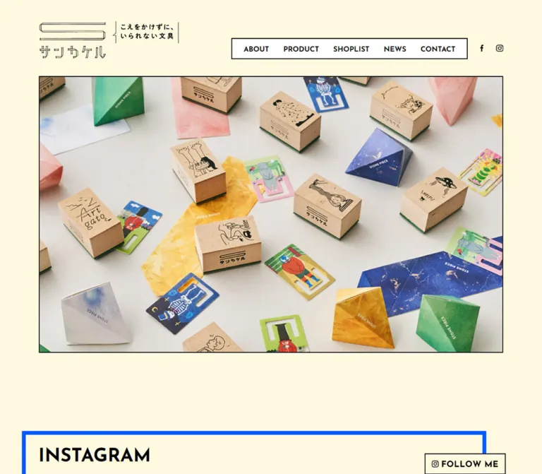
プレビュー準備中デザインリファレンスを見る
DESIGN REFERENCE
サンカケル|サンビー株式会社
クリーム色の背景に黒い罫線、鮮やかな緑の製品紹介、青い太枠を組み合わせた文具ブランドサイト。遊び心のある商品写真と英字見出し、余白を生かした構成が特徴。
SANKAKERU — Style Reference
A playful stationery catalog arranged on cream paper, with black outlines, blue frames, and a vivid green product stage.
Website: SANKAKERU / サンカケル
Original URL: https://www.sanby.co.jp/sankakeru/index.html
Final URL: https://www.sanby.co.jp/sankakeru/index.html — HTTP 200, unchanged
Theme: one observed light palette
Inspected: October 6, 2026, 01:21:58 JST; supplied capture timestamp 2026-10-05T16:21:58.450Z
Viewports: desktop 1440 × 1000; mobile 390 × 844 CSS pixels
Scope: the current brand homepage, including its header, opening image area, Instagram module, product lineup, brand introduction, news, and footer. Linked destination pages and opened menu states were not inspected.
SANKAKERU presents stationery through generous product photography and a small vocabulary of emphatic shapes. Warm cream supplies the continuous background. Black text, thin rectangular borders, oversized diagonal pagination, and a roof-shaped TOP marker establish the graphic language. Electric-blue frames punctuate the social and brand sections, while a full-width green field gives the product lineup its own visual territory.
This is a brand homepage with product discovery, social content, company information, and news. Its character comes from the relationship between fine illustrated identity artwork, bold English headings, rounded Japanese lettering, and colorful physical objects. Broad desktop spaces coexist with deliberately offset components; a single centered card grid would lose much of that composition.
閉じる
SANKAKERU — Style Reference
A playful stationery catalog arranged on cream paper, with black outlines, blue frames, and a vivid green product stage.
Website: SANKAKERU / サンカケル
Original URL: https://www.sanby.co.jp/sankakeru/index.html
Final URL: https://www.sanby.co.jp/sankakeru/index.html — HTTP 200, unchanged
Theme: one observed light palette
Inspected: October 6, 2026, 01:21:58 JST; supplied capture timestamp 2026-10-05T16:21:58.450Z
Viewports: desktop 1440 × 1000; mobile 390 × 844 CSS pixels
Scope: the current brand homepage, including its header, opening image area, Instagram module, product lineup, brand introduction, news, and footer. Linked destination pages and opened menu states were not inspected.
SANKAKERU presents stationery through generous product photography and a small vocabulary of emphatic shapes. Warm cream supplies the continuous background. Black text, thin rectangular borders, oversized diagonal pagination, and a roof-shaped TOP marker establish the graphic language. Electric-blue frames punctuate the social and brand sections, while a full-width green field gives the product lineup its own visual territory.
This is a brand homepage with product discovery, social content, company information, and news. Its character comes from the relationship between fine illustrated identity artwork, bold English headings, rounded Japanese lettering, and colorful physical objects. Broad desktop spaces coexist with deliberately offset components; a single centered card grid would lose much of that composition.
How to Read This Reference
- Measured values come from the supplied rendered DOM and computed styles. Dimensions are CSS pixels unless stated otherwise.
- Calculated values are arithmetic derived from those measurements, such as the hero's inner dimensions and gaps between grid items.
- Estimated values come from the current-page screenshots. These include the blue frame color, visible stroke thicknesses, and some graphical button dimensions.
- Recommended values belong to the reusable implementation below. They are not claims about the original stylesheet or behavior.
- Token names are implementation aliases. The supplied custom-property inventories were empty; no original token naming system was established.
- Some image-bearing links have very short inline text rectangles. Their reported heights are not reliable measurements of the visible artwork. Where appropriate, this document distinguishes link width, screenshot dimensions, and actual media-container bounds.
Tokens — Colors
Default Palette
| Name | Value | Suggested token | Role and evidence |
|---|---|---|---|
| Cream Paper | #fff9de |
--sk-paper |
Measured body background, rgb(255, 249, 222); also the mobile header background |
| Black Ink | #000000 |
--sk-ink |
Measured text color; visually repeated in outlines, icons, and pagination |
| Lineup Green | #22ad77 |
--sk-green |
Measured product-section background, rgb(34, 173, 119) |
| White Surface | #ffffff |
--sk-white |
Measured footer and active product-name background |
| Frame Blue | Approximately #0055ff |
--sk-blue |
Visual estimate for the saturated blue frames; no computed border color was supplied |
Keep these roles distinct. Green belongs to a whole product section; blue acts as a frame; white marks navigation, the product-name plaque, and the footer. Neither accent is established as a universal primary-button fill.
Lime, orange, cyan, pink, yellow, and navy appear inside product photography. They are image colors, not additional interface tokens. The corporate logo also contains a small red accent; it does not establish a red interaction system.
Theme Presets
Only the light presentation was observed. There is no evidence of selectable themes or a dark-mode treatment.
Tokens — Typography
Japanese Body and Product Text
The computed source stack is:
dnp-shuei-mgothic-std,
'ヒラギノ角ゴシック Pro',
'Hiragino Kaku Gothic Pro',
游ゴシック体,
'Yu Gothic',
YuGothic,
メイリオ,
Meiryo,
Osaka,
'MS Pゴシック',
'MS PGothic',
sans-serif
The first family is the declared Japanese face. Its rounded appearance complements the small illustrated stationery products. The computed stack is verified; individual font-file delivery and the actual face used for every glyph were not independently audited.
Body and descriptive text usually compute to weight 400, even where the screenshots look relatively substantial. The product-name plaque uses 600. Do not compensate for appearance by making every Japanese paragraph bold.
English Headings and Navigation
- Computed family:
'Josefin Sans', sans-serif. - Weight:
700for navigation, section headings, and the large product counter. - Tracking:
normalin the sampled elements. - Character: geometric, compact, and distinctive in its angular letterforms.
- Role: provides the strong editorial hierarchy against softer Japanese text and detailed product images.
The HTML element's reported Times family does not describe the visible interface: body and component rules override it.
Identity and Graphical Labels
The thin-line brand mark and custom Japanese wordmark are artwork, not a heading to recreate with ordinary type. The desktop lockup includes the source tagline “こえをかけずに、いられない文具”; the mobile header shows a compact mark without that adjacent tagline.
AND MORE and TOP are visible in the screenshots, but their rendered letter styling is not separately described by the supplied computed text records. Their visual treatment can be approximated with the display family; that is an implementation choice rather than a verified font assignment.
Type Scale
| Role | Desktop | Mobile | Weight | Evidence |
|---|---|---|---|---|
| General body | 15px / 24px |
13px / 20.8px |
400 |
Computed |
| Header/footer navigation | 17px / 27.2px |
Footer remains 17px / 27.2px |
700 |
Computed; desktop header links are hidden in the closed mobile state |
| Section heading | 44px / 44px |
30px / 36px |
700 |
Computed |
| Active product name | 30px / 48px |
20px / 32px |
600 |
Computed |
| Product description | 16px / 25.6px |
14px / 22.4px |
400 |
Computed |
| Current/total numerals | 118px |
60px |
700 |
Computed |
| Brand statement | 24px / 38.4px |
16px / 25.6px |
400 |
Computed |
| News links | 15px / 19.5px |
13px / 16.9px |
400 |
Computed |
| Corporate address | 14px / 22.4px |
11px / 17.6px |
400 |
Computed |
| Copyright | 10px / 16px |
7px / 11.2px |
600 |
Computed; display family |
| AND MORE lettering | Approximately 20–22px |
Approximately 20–22px |
Visually bold | Screenshot estimate |
The counter paragraphs compute to line-height: 0 and have zero-height text rectangles. This indicates a positioned numeral construction; it is not a reusable body-text rule. The Quick Start uses explicit counter geometry with normal line height instead.
Tokens — Spacing & Shapes
Density: sparse section composition, compact navigation, large photography, and a small number of strong outlines.
Base unit: no formal source spacing unit was established. The evidence contains both round pixel values and percentage-like container widths.
Spacing Scale
| Use | Desktop | Mobile | Status |
|---|---|---|---|
| Header height | 180px |
60px |
Measured |
| Logo top inset | 50px |
10px |
Measured |
| Opening section horizontal inset | 92px |
31.1875px |
Measured; mobile is approximately 8vw |
| Opening section bottom padding | 92px |
21px |
Measured |
| Common lower-page outer gutter | 130px for the news container |
19.5px |
Measured; mobile content width is 90vw |
| Product photo-to-caption gap | 20px |
10px |
Calculated from DOM rectangles |
| Social image column gap | 30px |
Approximately 16.63px |
Calculated from link positions and widths |
| Product section padding | 80px 0 160px |
40px 0 |
Measured |
| About section padding | 93px 0 80px |
40px 0 |
Measured |
| News section padding | 80px 0 153px |
40px 0 80px |
Measured |
Large spacing is part of the identity. In particular, desktop photography does not immediately collide with the following heading, and the news region has substantial breathing room above the white footer.
Border Radius
| Element | Treatment | Evidence |
|---|---|---|
| Product-name plaque | Square | Computed 0px radius |
| Navigation and action outlines | Square | Screenshot observation |
| Hero and product photography | Square, thin black frame | Screenshot observation |
| Blue panels | Square, heavy outline | Screenshot observation |
| TOP marker | Five-sided roof-like silhouette | Screenshot observation |
There is no observed rounded-card or soft-shadow elevation system. The natural shadows in product photographs belong to the photographed objects.
Layout Measurements
| Element | Desktop at 1440 × 1000 |
Mobile at 390 × 844 |
Status |
|---|---|---|---|
| Brand lockup | Approximately 333 × 88px, at x=92, y=50 |
80 × 43px, at approximately x=31.19, y=10 |
Desktop height calculated from logo container; mobile link box measured |
| Desktop navigation frame | Approximately 560 × 50px, near x=704, y=90 |
Replaced by a hamburger | Screenshot estimate |
| Opening media frame | 1256 × 728px, beginning at x=92, y=180 |
Approximately 327.63 × 692px, beginning at x=31.19, y=81 |
Calculated from section dimensions and padding; visually corroborated |
| Active product photo/link | 692 × 485.19px, at x=598 |
351 × 246.69px, at x=19.5 |
Measured |
| Product-name plaque | 258 × 86px |
180 × 43px |
Measured |
| Previous/Next button boxes | 25 × 40px |
25 × 40px |
Measured |
| AND MORE link | 163px wide |
163px wide |
Measured width; visible height approximately 50px |
| News container | 1180px wide |
351px wide |
Measured |
| Blue frame stroke | Approximately 9px |
Approximately 9px |
Screenshot estimate, consistent with inner-element offsets |
| Ordinary outlines | Approximately 1–2px |
Approximately 1–2px |
Screenshot estimate |
Components
Brand Header
Role: establish identity and provide access to the brand's main destinations.
The desktop header reserves 180px above the opening image. A fine-line S-shaped emblem and custom Japanese lettering occupy the left. The adjacent tagline makes the desktop identity lockup much wider than the mobile version.
On the right, ABOUT, PRODUCT, SHOPLIST, NEWS, and CONTACT sit inside one white rectangular frame. The measured navigation links use 17px bold Josefin Sans, with approximately 34px between adjacent link boxes. Facebook and Instagram icons sit outside the frame, separated from the main navigation.
At 390px, the header becomes a cream strip 60px high. The compact logo sits at an approximately 31px left inset; a three-line hamburger appears at the corresponding right side. The header remains visible in both the opening and lower-page mobile captures, consistent with fixed or sticky positioning. The exact positioning rule was not included in the evidence.
The mobile menu was not opened. Its panel appearance, animation, focus handling, and expanded layout remain unverified.
Opening Product Photograph
Role: introduce the physical objects before explanatory text.
The desktop opening image fills a thin black rectangle with no text overlay. It shows wooden illustration stamps arranged on diagonally divided lime-yellow and orange surfaces. Printed impressions repeat the miniature characters around the objects. Warm wood, sharply visible ink drawings, and real cast shadows give the composition its tactile quality.
The frame measures approximately 1256 × 728px within the supplied desktop viewport. It is followed by 92px of cream space, so the opening section ends exactly at document position y=1000 in this capture.
Mobile limitation: the supplied opening mobile screenshot shows a tall cream-filled outlined rectangle with no visible photograph. Its reserved frame is approximately 327.63 × 692px. This is an observed capture state, not evidence that an empty hero is intentional. Asset failure, delayed content, and visibility rules cannot be distinguished from the supplied material.
No hero autoplay, slide duration, or transition was established.
Instagram Module
Role: connect the brand presentation to recent social imagery.
The section has a large INSTAGRAM heading, a blue frame treatment, six image links, and a separate profile link. The blue upper edge is visible at the bottom of the opening mobile screenshot. The complete social module is not shown in the supplied current-page screenshots, so its detailed composition relies partly on the rendered geometry.
Desktop image-link widths are 254px, arranged at x=224, 508, and 792 across two rows. This gives a three-column footprint of approximately 822px, with 30px column gaps. The row pitch is 284px, consistent with square thumbnails plus a 30px gap; square image height is an inference rather than a supplied image-element measurement.
On mobile, the same six entries occupy two columns and three rows. Link widths are approximately 149.84px; their left positions are approximately 36.81px and 203.28px. The profile link moves from the desktop upper-right area to a centered position below the grid, retaining a 192px link width.
Do not treat the desktop social content as centered across the entire viewport. Its measured positions form an inset, offset arrangement.
Product Lineup
Role: introduce nine product groups through a large active photograph and distinctive navigation.
The whole section is measured green #22ad77. On desktop, the composition has a narrow control area on the left and a large photograph on the right.
Its anatomy is:
- Section title: LINE UP,
44pxbold Josefin Sans, positioned atx=212in the desktop capture. - Name plaque: the active label “一言のカケラ” on a white rectangle with a black outline. The box measures
258 × 86pxon desktop. - Counter and arrows: a large current numeral above-left of a diagonal slash, a total numeral below-right, an ITEM caption, and black chevrons on either side. The captured state reads
1 / 9. - Product figure: a
692 × 485.19pxlinked image atx=598, followed by descriptive Japanese text. The active image shows folded note papers in jewel-like triangular forms on a cyan background. - Catalog link: an outlined AND MORE action below the left-side controls, linking to the product page.
The source contains Previous and Next buttons, nine distinct product anchors, and duplicate first/last entries outside the active area. That is consistent with a carousel implementation using repeated boundary slides. It does not prove that wrapping, swipe gestures, or autoplay were exercised.
On mobile, the order changes to heading, name plaque, photograph, description, counter/arrows, and the centered catalog link. The photograph becomes 351px wide. The numerals shrink from 118px to 60px, while the chevron button rectangles remain 25 × 40px.
About SANKAKERU Panel
Role: explain the brand's approach to communication through stationery.
The desktop brand section returns to cream and uses a heavy blue rectangular frame. The visible lower frame spans approximately x=210 to x=1310, offset to the right of the news container's left edge.
The rendered geometry places ABOUT SANKAKERU toward the upper right, an additional graphic box on the right, and the brand statement toward the lower left. The desktop statement is 24px / 38.4px, occupying a 456px text width. The source copy reads:
サンカケルは「相手と自分」に
「気持ち×時間=手をカケル」を
お手伝いしたいそんな文具ブランドです。
The AND MORE action overlaps the panel's right boundary in the desktop screenshot. Its measured link begins at x=1193 and is 163px wide, extending beyond the frame's approximate right edge.
On mobile, ABOUT SANKAKERU wraps into two lines. The frame occupies the 351px main column, the statement becomes 16px / 25.6px, and the action moves inside the panel, centered below the copy.
Only the lower portion of this panel is visible in the supplied current screenshots. The subject of the upper decorative imagery cannot be described confidently from the unlabelled DOM boxes alone.
Outlined Actions
Role: provide secondary navigation without competing with product photography.
AND MORE uses a cream or section-colored interior, a thin black rectangular border, bold uppercase lettering, and square corners. The visible button is approximately 163 × 50px on both desktop and mobile.
The surrounding section determines placement: below the lineup controls, overlapping the desktop about frame, or centered inside the mobile about panel. Preserve this contextual placement instead of turning every action into a filled, rounded button.
The visible label is absent from the supplied link text extraction. Its exact construction—image artwork, generated content, or another graphical implementation—was not established.
News List
Role: provide a concise update index near the end of the homepage.
A centered NEWS heading sits above three dated links. Two long black horizontal rules enclose the entire list; individual items have no visible separators, cards, thumbnails, or category badges.
The desktop container is 1180px wide. Link text starts 20px inside its left edge, at x=150. Dates and titles share the same flowing text line. On mobile, the longer second update wraps to the row's left text edge rather than aligning under a separate title column.
The captured updates are dated June 17, 2026; January 28, 2025; and September 2, 2024. Their content supplies the list density, but these dates should remain data rather than becoming layout assumptions.
Typography changes from 15px / 19.5px to 13px / 16.9px. The mobile list retains substantial vertical padding despite its smaller text.
TOP Marker
Role: visually signal a return-to-top affordance.
The marker is a cream-filled polygon with a shallow peaked roof, a black outline, and centered TOP lettering. In desktop lower-page screenshots it is approximately 163 × 59px, near the bottom-right viewport edge. The mobile version is approximately 70 × 26px and appears above the footer.
The repeated desktop placement is consistent with a floating utility, but its visibility threshold and positioning mechanism were not supplied. Clicking it, smooth scrolling, and keyboard behavior were not tested.
Corporate Footer
Role: repeat navigation and establish the brand's corporate identity.
The footer changes the canvas to measured white. Desktop navigation runs in one line, followed by Facebook and Instagram icons. Beneath it are the corporate mark, a postal address, and a small right-aligned copyright line.
The current page identifies SANBY CO., LTD. / サンビー株式会社 through the visible corporate logo, copyright, and link to the corporate homepage. No production studio or individual creator is identified in the supplied original-page evidence.
Mobile navigation uses two rows: ABOUT, PRODUCT, SHOPLIST above NEWS, CONTACT, and the social icons. Navigation remains 17px, preserving its prominence. The corporate logo is approximately 224.63px wide on mobile, slightly wider than the measured desktop link width of 213.94px.
The original mobile address is 11px and copyright is only 7px. Those measurements are useful for fidelity, but a new implementation should increase the smallest legal text for readability.
Tokens — Motion & Interaction
| Treatment | Evidence | What can be concluded |
|---|---|---|
| Desktop link transition | Computed opacity 0.25s ease-in-out |
A 250ms opacity transition is defined; the target hover opacity is not supplied |
| Mobile sampled links | Computed transition reported as all |
No useful duration or visible transition is established by this shorthand alone |
| Product navigation | Previous/Next buttons, counter, adjacent slide positions, repeated boundary entries | Carousel structure is supported; transition timing, wrapping behavior, and swipe remain unverified |
| Mobile hamburger | Closed icon visible | Expanded panel and animation unverified |
| Mobile header persistence | Header appears at the top in both supplied mobile positions | Persistent presentation supported; fixed versus sticky rule unverified |
| TOP marker | Visible lower-page affordance | Activation and scroll animation unverified |
| Sampled element animations | Reported as none |
No keyframe animation is established on those elements; this does not rule out script-driven or asset animation |
| Opening photograph | One current desktop state and an empty mobile frame | No slideshow sequence or autoplay behavior established |
The capture process waited for layout stability, visible image decoding, and finite animations within bounded time limits. That improves confidence in the captured state but cannot establish behavior for controls that were not exercised.
Recommended adaptation: retain the measured 250ms link transition on hover-capable devices, provide equally clear keyboard focus, and use explicit user controls for product changes. Any new carousel duration, autoplay policy, or menu animation must be treated as an implementation decision.
Surfaces
| Layer | Appearance | Purpose |
|---|---|---|
| Page canvas | Flat cream #fff9de |
Connects the opening, social, about, and news sections |
| Main navigation | White rectangle with thin black outline | Groups the five desktop destinations |
| Product stage | Full-width green #22ad77 |
Separates the catalog showcase from surrounding content |
| Product-name plaque | White, black border, square corners | Identifies the active product |
| Social/about frame | Thick saturated blue outline over cream | Creates graphic emphasis without a filled card |
| Media frame | Thin black outline | Gives colorful photographs a crisp edge |
| Secondary action | Outlined rectangle with contextual interior | Links to deeper brand and product information |
| Footer | Flat white | Marks the corporate information region |
Structure comes from boundaries and color fields. Avoid adding elevation shadows, translucent glass, or decorative gradients to these interface surfaces.
Imagery
Product photography is the dominant source of color and detail. The desktop opening photograph uses wooden stamp blocks, small ink characters, and a diagonal division between yellow-green and orange paper. Objects are scattered with enough space to distinguish each illustration, while printed impressions connect the objects into a larger scene.
The active lineup photograph uses a different arrangement: folded triangular papers and unfolded strips on cyan. Navy, green, pink, yellow, and pale paper colors create a geometric still life. Real lighting and restrained shadows preserve the material quality of the stationery.
Use high-resolution images with normal image rendering. The fine stamp drawings and thin identity lines should remain crisp; there is no evidence for pixelated rendering or a global distressed texture.
Keep essential products away from crop-sensitive edges when preparing responsive alternatives. The tall mobile opening frame would require a deliberate portrait composition or a considered cropping policy. The supplied empty frame provides no evidence of the intended mobile photograph.
Observed Asset References
Image source URLs and filenames were not included in the observation packet. The following references identify visible roles and verified link destinations, not downloadable image paths.
| Asset or role | Evidence | Verified destination, where available |
|---|---|---|
| Desktop brand lockup | Thin emblem, Japanese wordmark, adjacent tagline | https://www.sanby.co.jp/sankakeru/index.html |
| Compact mobile logo | Approximately 80 × 43px; no adjacent tagline visible |
Same homepage |
| Opening stamp photograph | Visible in the desktop opening capture | No image URL supplied |
| Active folded-paper product photograph | Visible in LINE UP | https://www.sanby.co.jp/sankakeru/product.html#item01Sec |
| Six social thumbnails | Six individual post links and measured grid geometry | Individual Instagram post destinations in the rendered link inventory |
| Instagram profile action | 192px link width |
https://www.instagram.com/sankakeru_official/ |
| Product AND MORE action | Visible outlined label | https://www.sanby.co.jp/sankakeru/product.html |
| About AND MORE action | Visible outlined label | https://www.sanby.co.jp/sankakeru/about.html |
| Corporate logo | Visible SANBY company mark | https://www.sanby.co.jp/ |
Use authorized original assets where available. Do not invent asset filenames or substitute generated lettering for the brand marks.
Layout & Responsive Behavior
The document keeps the same section sequence at both measured widths. Its total reported height is 4473px on desktop and 3729px on mobile.
Measured Section Map
Positions are document-space coordinates from the supplied DOM, rounded to two decimals.
| Section | Desktop top / height | Mobile top / height |
|---|---|---|
| Header | 0 / 180px |
0 / 60px |
| Opening section | 180 / 820px |
60 / 734px |
1000 / 980px |
794 / 858.88px |
|
| Lineup | 1980 / 920.97px |
1652.88 / 773.86px |
| About | 2900.97 / 795px |
2426.73 / 731.31px |
| News | 3695.97 / 529.5px |
3158.05 / 357.56px |
| Footer | 4225.47 / 247.33px |
3515.61 / 213.23px |
Responsive Changes
- Header: wide identity lockup and framed navigation become a compact persistent logo/hamburger strip.
- Opening: the landscape desktop image area becomes a tall reserved mobile frame; the photograph itself is not visible in the supplied mobile state.
- Social grid: three columns become two; the profile action moves below the grid.
- Lineup: the desktop control/photo split becomes a vertical sequence, with controls beneath the description.
- About: an offset desktop composition becomes a contained mobile panel; the title wraps and the action moves inside.
- News: the broad list contracts to
351px, and long titles wrap naturally. - Footer: navigation wraps into two rows while retaining its
17pxtype size.
Desktop alignment deliberately varies: the opening uses 92px side margins, news uses 130px, the visible about frame starts around 210px, and the active product image starts at 598px. Preserve these relationships rather than forcing every section onto one left edge.
The actual source breakpoint was not supplied. The Quick Start uses a recommended 70rem breakpoint to accommodate the wide header; it is not a measured source value. Intermediate tablet and landscape layouts remain unverified.
Do’s and Don’ts
Do
- Keep the measured cream
#fff9deand lineup green#22ad77as the dominant surface colors. - Use blue as a strong outline, with its exact color verified separately when source styles become available.
- Pair bold Josefin Sans navigation and headings with the observed Japanese font stack.
- Preserve the fine brand artwork and its separate desktop/mobile lockups.
- Let product photography carry the visual richness.
- Keep square corners, thin black media borders, and rectangular actions.
- Preserve the oversized diagonal product counter as a recognizable component.
- Maintain the mobile reordering of product media, description, and controls.
- Keep dates and news titles in the same flowing row.
- Retain generous spacing and the desktop's offset panel alignment.
Don’t
- Don't reduce the homepage to a generic hero, feature-card grid, and conversion banner.
- Don't replace the lineup with a wall of equally weighted product cards.
- Don't turn every action into a green or blue filled button.
- Don't add pill shapes, card shadows, gradients, or glass effects.
- Don't describe the empty mobile hero as an intentional design feature.
- Don't infer carousel autoplay, swipe support, or animation timing from static captures.
- Don't use carousel clones as additional product records.
- Don't recreate graphical brand lettering with a convenient substitute font.
- Don't assume a short inline anchor rectangle describes the height of its image.
- Don't reproduce the mobile
7pxcopyright without considering readability.
Recommended Implementation Additions
These are recommendations for a new implementation, not verified features of the original:
- Give the hamburger an accessible name,
aria-expanded, and a controlled navigation region. Make expanded content usable with a keyboard. - Increase the hit areas around the
25 × 40pxcarousel chevrons and the small mobile TOP marker to at least44 × 44px, while retaining their visual proportions. - Expose the current product as an accessible status such as “Item 1 of 9.” Remove inactive cloned slides from keyboard navigation and the accessibility tree.
- Give linked product images meaningful names. A graphical AND MORE asset still needs a descriptive link name, such as “View all products.”
- Provide a reliable mobile hero image or an intentional fallback with useful content. Do not leave users dependent on an unexplained empty frame.
- Raise the smallest footer text to approximately
11–12pxand allow additional height when it wraps. - Use a logical heading hierarchy and an accessible page heading; the supplied section heading records use
H3elements. - Respect reduced-motion preferences for any added carousel, menu, or scrolling animation. Do not introduce autoplay without a pause mechanism.
Agent Prompt Guide
Quick Color Reference
- Canvas: measured cream
#fff9de. - Text and ordinary outlines: black
#000000. - Product section: measured green
#22ad77. - Navigation, name plaque, and footer: white
#ffffff. - Heavy frames: approximately blue
#0055ff; visual estimate. - Actions: black outlined rectangles, with no universal accent fill.
- Product-photo colors: image-specific, not additional interface tokens.
Overall Prompt
“Create a Japanese stationery brand homepage inspired by SANKAKERU's current visual system. Use warm cream #fff9de, black typography and thin outlines, a full-width green #22ad77 product section, and heavy square blue frames approximated by #0055ff. Pair bold Josefin Sans English navigation and headings with a rounded Japanese gothic text stack. Place a fine-line brand logo at the desktop upper left and a white framed navigation group at the right. Lead with a large framed still-life product photograph. Follow with a six-image social module, an asymmetric product carousel with a white name plaque and oversized diagonal current/total counter, a blue-framed brand statement, a ruled three-item news list, and a white corporate footer. On mobile, use a compact persistent header, two social columns, and move product controls below the photograph and description. Keep the composition flat, spacious, and square-cornered.”
Example Component Prompts
- Product lineup: “Build a green stationery showcase with LINE UP in 44px bold Josefin Sans. At desktop, place a white outlined Japanese product-name plaque and an oversized diagonal 1/9 counter to the left of a roughly 692 × 485px product photograph. Put the description below the image and an outlined AND MORE action below the controls. At mobile, stack the image and description before the counter.”
- Brand panel: “Create a cream brand-introduction panel with an approximately 9px electric-blue border. Use an offset desktop composition, with the English heading toward the upper right, Japanese statement toward the lower left, and a small outlined action overlapping the right edge. On mobile, contain everything within a 90vw frame and center the action.”
- News: “Create a centered NEWS heading above three date-and-title links between two thin black horizontal rules. Use no row cards or thumbnails. Keep dates inline with titles and allow the second line of a long mobile item to return to the row's left edge.”
- Header: “Create a cream header with authorized fine-line identity artwork at left and five bold uppercase links inside one white black-outlined rectangle at right. Place social icons outside the rectangle. At small widths, switch to the compact logo and a three-line menu control in a 60px persistent strip.”
- Product photography: “Art-direct a stationery still life using wooden illustration stamps or folded paper notes, saturated paper backdrops, visible natural materials, small humorous line drawings, and restrained real shadows. Keep essential objects legible in a black rectangular frame and prepare a separate mobile composition.”
Quick Start
CSS Custom Properties
This is an implementation scaffold, not recovered source CSS. Colors and type sizes identified as measured above are retained. Border widths, the blue color, responsive interpolation, the breakpoint, and hover opacity are adaptation values.
Supply authorized image assets and licensed font loading separately. Use a responsive <picture> for the desktop and compact mobile brand marks. The CSS deliberately keeps a real image visible in the mobile hero; it does not reproduce the unexplained empty capture.
Suggested component structure:
.site-headercontains.header-inner,.brand,.primary-nav,.header-social, and.menu-toggle..lineup-gridcontains.product-name,.product-figure,.pager, and.lineup-more..pagercontains previous/next buttons and.counter; the counter has.current,.total, and.item-labelchildren..news-listis a list of links with inline date/title content..footer-navhas five destination links and one.social-linksgroup.
:root {
  /* Measured colors */
  --sk-paper: #fff9de;
  --sk-ink: #000000;
  --sk-green: #22ad77;
  --sk-white: #ffffff;

  /* Visual estimate */
  --sk-blue: #0055ff;

  /* Observed font families; load licensed fonts separately */
  --sk-font-display: 'Josefin Sans', sans-serif;
  --sk-font-body: dnp-shuei-mgothic-std,
    'ヒラギノ角ゴシック Pro', 'Hiragino Kaku Gothic Pro',
    游ゴシック体, 'Yu Gothic', YuGothic, メイリオ, Meiryo,
    Osaka, 'MS Pゴシック', 'MS PGothic', sans-serif;

  --sk-body-size: 15px;
  --sk-heading-size: 44px;
  --sk-heading-line: 44px;
  --sk-counter-size: 118px;
  --sk-body-leading: 1.6;

  /* Adaptation geometry */
  --sk-rule: 2px;
  --sk-frame: 9px;
  --sk-content-width: 1180px;
  --sk-hero-gutter: clamp(32px, 6.3889vw, 92px);
  --sk-link-motion: opacity 250ms ease-in-out;
}

* { box-sizing: border-box; }

body {
  margin: 0;
  color: var(--sk-ink);
  background: var(--sk-paper);
  font-family: var(--sk-font-body);
  font-size: var(--sk-body-size);
  font-weight: 400;
  line-height: var(--sk-body-leading);
}

img { display: block; max-width: 100%; }
a { color: inherit; text-decoration: none; }
button { color: inherit; font: inherit; cursor: pointer; }

.page-width {
  width: min(90%, var(--sk-content-width));
  margin-inline: auto;
}

.section-title {
  margin: 0;
  font: 700 var(--sk-heading-size) / var(--sk-heading-line)
    var(--sk-font-display);
}

.site-header {
  height: 180px;
  padding: 50px var(--sk-hero-gutter) 40px;
}

.header-inner {
  display: flex;
  align-items: flex-end;
  justify-content: space-between;
  gap: 24px;
  height: 90px;
}

.brand { flex: 0 0 auto; }
.brand img { width: 333px; height: auto; }

.primary-nav {
  display: flex;
  align-items: center;
  gap: 34px;
  min-height: 50px;
  margin-left: auto;
  padding: 8px 27px;
  border: var(--sk-rule) solid var(--sk-ink);
  background: var(--sk-white);
  font: 700 17px / 1.6 var(--sk-font-display);
}

.header-social,
.social-links {
  display: flex;
  align-items: center;
  justify-content: center;
  gap: 30px;
}

.header-social { min-height: 50px; }
.menu-toggle { display: none; }

.hero {
  padding: 0 var(--sk-hero-gutter) var(--sk-hero-gutter);
}

.hero-media {
  aspect-ratio: 1256 / 728;
  margin: 0;
  overflow: hidden;
  border: var(--sk-rule) solid var(--sk-ink);
}

.hero-media img {
  width: 100%;
  height: 100%;
  object-fit: cover;
}

.social-section { padding: 93px 0 196px; }

.social-frame {
  position: relative;
  width: calc(100% - 80px);
  border: var(--sk-frame) solid var(--sk-blue);
}

.social-frame .section-title { padding: 30px; }

.social-grid {
  display: grid;
  grid-template-columns: repeat(3, minmax(0, 1fr));
  gap: 30px;
  width: min(822px, calc(100% - 110px));
  margin: 20px 0 30px 85px;
}

.social-grid img {
  width: 100%;
  aspect-ratio: 1;
  object-fit: cover;
}

/* Placement approximation; graphical profile artwork is separate. */
.profile-link {
  display: block;
  width: 192px;
  margin: 0 30px 30px auto;
}

.lineup {
  padding: 80px 0 160px;
  background: var(--sk-green);
}

.lineup-inner {
  width: min(90%, 1140px);
  margin-inline: auto;
}

.lineup-inner > .section-title { margin-left: 62px; }

.lineup-grid {
  display: grid;
  grid-template-columns: 340px minmax(0, 1fr);
  grid-template-areas:
    'name photo'
    'pager photo'
    'more photo';
  gap: 32px 108px;
  margin-top: 60px;
  align-items: start;
}

.product-name {
  grid-area: name;
  display: grid;
  place-items: center;
  width: 258px;
  min-height: 86px;
  margin: 4px 0 0 32px;
  border: var(--sk-rule) solid var(--sk-ink);
  background: var(--sk-white);
  font-size: 30px;
  font-weight: 600;
  line-height: 1.6;
}

.product-figure { grid-area: photo; margin: 0; min-width: 0; }

.product-figure img {
  width: 100%;
  height: auto;
  border: var(--sk-rule) solid var(--sk-ink);
}

.product-figure figcaption {
  margin-top: 20px;
  font-size: 16px;
  line-height: 1.6;
}

.pager {
  grid-area: pager;
  display: flex;
  align-items: center;
  justify-content: space-between;
  gap: 8px;
}

.counter {
  position: relative;
  width: 210px;
  height: 290px;
  font-family: var(--sk-font-display);
  font-weight: 700;
}

.counter::before {
  content: '';
  position: absolute;
  top: 48%;
  left: 0;
  width: 100%;
  height: 5px;
  background: currentColor;
  transform: rotate(-45deg);
}

.counter .current,
.counter .total {
  position: absolute;
  font-size: var(--sk-counter-size);
  line-height: 1;
}

.counter .current { top: 0; left: 0; }
.counter .total { right: 0; bottom: 25px; }

.counter .item-label {
  position: absolute;
  right: 0;
  bottom: 0;
  left: 0;
  text-align: center;
  font-size: 20px;
}

/* Recommended larger hit areas around the visible chevrons. */
.arrow {
  display: grid;
  place-items: center;
  flex: 0 0 44px;
  width: 44px;
  height: 44px;
  padding: 0;
  border: 0;
  background: transparent;
}

.arrow::before {
  content: '';
  width: 19px;
  height: 19px;
  border-top: 5px solid currentColor;
  border-right: 5px solid currentColor;
  transform: rotate(45deg);
}

.arrow[data-direction='previous']::before {
  transform: rotate(-135deg);
}

.outline-link {
  display: grid;
  place-items: center;
  width: 163px;
  min-height: 50px;
  padding: 10px;
  border: var(--sk-rule) solid var(--sk-ink);
  background: transparent;
  font: 700 22px / 1 var(--sk-font-display);
}

.lineup-more { grid-area: more; justify-self: center; }

.about-section { padding: 93px 0 80px; }

.about-frame {
  position: relative;
  display: flex;
  flex-direction: column;
  gap: 30px;
  width: calc(100% - 80px);
  min-height: 622px;
  margin-left: auto;
  padding: 30px 40px 44px;
  border: var(--sk-frame) solid var(--sk-blue);
}

.about-frame .section-title { text-align: right; }

.about-copy {
  max-width: 456px;
  margin: auto 0 0;
  font-size: 24px;
  line-height: 1.6;
}

.about-more {
  position: absolute;
  right: -46px;
  bottom: 50px;
  background: var(--sk-paper);
}

.news-section { padding: 80px 0 153px; }

.news-section .section-title {
  margin-bottom: 50px;
  text-align: center;
}

.news-list {
  margin: 0;
  padding: 25px 20px;
  border-block: var(--sk-rule) solid var(--sk-ink);
  list-style: none;
}

.news-list li { padding-block: 15px; }
.news-list a { font-size: 15px; line-height: 1.3; }
.news-list time { margin-right: 1em; white-space: nowrap; }

.site-footer {
  padding: 50px 0 20px;
  background: var(--sk-white);
}

.footer-nav {
  display: flex;
  align-items: center;
  flex-wrap: wrap;
  gap: 10px 35px;
  font: 700 17px / 1.6 var(--sk-font-display);
}

.company-logo { width: 214px; margin-top: 40px; }
.company-address { margin: 30px 0 0; font-size: 14px; }

.copyright {
  margin: 0;
  text-align: right;
  font: 600 10px / 1.6 var(--sk-font-display);
}

/* The opacity target is recommended; only timing was measured. */
@media (hover: hover) {
  a { transition: var(--sk-link-motion); }
  a:hover { opacity: 0.7; }
}

:where(a, button):focus-visible {
  outline: 3px solid var(--sk-ink);
  outline-offset: 5px;
}

/* Recommended breakpoint, not recovered from the original CSS. */
@media (max-width: 70rem) {
  :root {
    --sk-body-size: 13px;
    --sk-heading-size: 30px;
    --sk-heading-line: 36px;
    --sk-counter-size: 60px;
  }

  body { padding-top: 60px; }
  html { scroll-padding-top: 76px; }

  .site-header {
    position: fixed;
    inset: 0 0 auto;
    z-index: 20;
    height: 60px;
    padding: 0 8%;
    background: var(--sk-paper);
  }

  .header-inner { height: 60px; align-items: flex-start; }
  .brand { margin-top: 10px; }
  .brand img { width: 80px; }
  .primary-nav, .header-social { display: none; }

  .menu-toggle {
    display: grid;
    align-content: center;
    gap: 8px;
    width: 44px;
    height: 44px;
    padding: 4px;
    border: 0;
    background: transparent;
  }

  .menu-toggle span { height: 2px; background: currentColor; }

  /* Suggested open state; wire the button and ARIA state in JS. */
  .site-header[data-menu-open='true'] .primary-nav {
    position: absolute;
    top: 60px;
    right: 5%;
    left: 5%;
    display: flex;
    flex-direction: column;
    align-items: stretch;
    gap: 16px;
    padding: 20px;
  }

  .hero { padding: 21px 8%; }

  /* Fits the observed 692px mobile frame at an 844px viewport. */
  .hero-media {
    height: calc(100svh - 152px);
    min-height: 320px;
    aspect-ratio: auto;
  }

  .social-section,
  .about-section,
  .lineup { padding-block: 40px; }

  .social-frame, .about-frame { width: 100%; }
  .social-frame .section-title { padding: 30px 15px; }

  .social-grid {
    grid-template-columns: repeat(2, minmax(0, 1fr));
    gap: 16.6px;
    width: 95%;
    margin: 20px auto 40px;
  }

  .profile-link { margin: 0 auto 40px; }
  .lineup-inner > .section-title { margin-left: 0; }

  .lineup-grid {
    grid-template-columns: minmax(0, 1fr);
    grid-template-areas: 'name' 'photo' 'pager' 'more';
    gap: 30px;
    margin-top: 20px;
  }

  .product-name {
    width: 180px;
    min-height: 43px;
    margin: 0;
    font-size: 20px;
  }

  .product-figure figcaption { margin-top: 10px; font-size: 14px; }
  .pager { width: min(100%, 290px); margin-inline: auto; }
  .counter { width: 100px; height: 145px; }
  .counter::before { height: 3px; }
  .counter .item-label { font-size: 14px; }
  .lineup-more { margin-top: 10px; }

  .about-frame { min-height: 0; padding: 25px 15px 44px; }
  .about-frame .section-title { text-align: left; }
  .about-copy { max-width: none; margin-top: 30px; font-size: 16px; }

  .about-more {
    position: static;
    margin: 10px auto 0;
  }

  .news-section { padding: 40px 0 80px; }
  .news-section .section-title { margin-bottom: 30px; }
  .news-list { padding: 20px; }
  .news-list li { padding-block: 10px; }
  .news-list a { font-size: 13px; }

  .site-footer { padding: 20px 0 8px; }
  .site-footer .page-width { width: 86.4%; }

  .footer-nav {
    display: grid;
    grid-template-columns: repeat(3, minmax(0, 1fr));
    gap: 10px 8px;
    text-align: center;
  }

  .company-logo { width: 225px; margin-top: 20px; }
  .company-address { margin-top: 8px; font-size: 11px; }

  /* Readability addition: the observed mobile copyright was 7px. */
  .copyright { margin-top: 20px; font-size: 11px; }
}

@media (prefers-reduced-motion: reduce) {
  a { transition: none; }
  html { scroll-behavior: auto; }
}
This scaffold styles one active product. A carousel controller must separately update the image, name, description, destination, and current numeral together. It must also handle inactive slides and focus correctly. The blue about panel needs its actual authorized artwork to reproduce the source's internal visual balance.
The mobile hero height formula is chosen to match the single measured viewport. Test shorter screens, landscape devices, text zoom, and intermediate widths before treating it as a general responsive rule.
Tailwind v4 Token Mapping
Optional aliases for a project already using Tailwind v4. These do not imply that the original site uses Tailwind. Define the custom properties above first.
@theme inline {
  --color-paper: var(--sk-paper);
  --color-ink: var(--sk-ink);
  --color-lineup: var(--sk-green);
  --color-surface: var(--sk-white);
  --color-frame: var(--sk-blue);

  --font-display: var(--sk-font-display);
  --font-body: var(--sk-font-body);

  --text-body: var(--sk-body-size);
  --text-section: var(--sk-heading-size);
  --text-counter: var(--sk-counter-size);

  --spacing-content: 1180px;
  --spacing-action: 163px;
  --radius-square: 0px;
}
Sources & Evidence
- Original and final page: SANKAKERU homepage. The supplied observation reports HTTP 200 and no URL change.
- Capture timestamp:
2026-10-05T16:21:58.450Z, equivalent to October 6, 2026, 01:21:58.450 JST. - Visual evidence: three supplied desktop current-page captures at
1440 × 1000and two mobile captures at390 × 844, covering the opening, product area, and lower-page content. - Rendered evidence: page text, link destinations, section geometry, computed colors, typography, padding, transitions, and element rectangles at both viewports. These are the authority for values marked measured.
- Capture limits: readiness checks used bounded waits for layout, images, and finite animation. SharedWorkers and service workers were disabled. Delayed content and unexercised interactions remain unverified.
- Inspection limits: no additional browsing was performed. Image source URLs, the exact blue border color, complete source stylesheets, intermediate breakpoints, menu-open states, hover outcomes, and carousel transitions were not supplied. The empty mobile hero and partially shown social/about modules are explicitly accounted for above.
This reference describes the current homepage represented by the supplied capture evidence. Estimated tokens and the CSS/Tailwind scaffold are clearly separated from measured original-page values.
# SANKAKERU — Style Reference

> A playful stationery catalog arranged on cream paper, with black outlines, blue frames, and a vivid green product stage.

**Website:** [SANKAKERU / サンカケル](https://www.sanby.co.jp/sankakeru/index.html)
**Original URL:** https://www.sanby.co.jp/sankakeru/index.html
**Final URL:** https://www.sanby.co.jp/sankakeru/index.html — HTTP 200, unchanged
**Theme:** one observed light palette
**Inspected:** October 6, 2026, 01:21:58 JST; supplied capture timestamp `2026-10-05T16:21:58.450Z`
**Viewports:** desktop `1440 × 1000`; mobile `390 × 844` CSS pixels
**Scope:** the current brand homepage, including its header, opening image area, Instagram module, product lineup, brand introduction, news, and footer. Linked destination pages and opened menu states were not inspected.

SANKAKERU presents stationery through generous product photography and a small vocabulary of emphatic shapes. Warm cream supplies the continuous background. Black text, thin rectangular borders, oversized diagonal pagination, and a roof-shaped TOP marker establish the graphic language. Electric-blue frames punctuate the social and brand sections, while a full-width green field gives the product lineup its own visual territory.

This is a brand homepage with product discovery, social content, company information, and news. Its character comes from the relationship between fine illustrated identity artwork, bold English headings, rounded Japanese lettering, and colorful physical objects. Broad desktop spaces coexist with deliberately offset components; a single centered card grid would lose much of that composition.
閉じる
# SANKAKERU — Style Reference

> A playful stationery catalog arranged on cream paper, with black outlines, blue frames, and a vivid green product stage.

**Website:** [SANKAKERU / サンカケル](https://www.sanby.co.jp/sankakeru/index.html)
**Original URL:** https://www.sanby.co.jp/sankakeru/index.html
**Final URL:** https://www.sanby.co.jp/sankakeru/index.html — HTTP 200, unchanged
**Theme:** one observed light palette
**Inspected:** October 6, 2026, 01:21:58 JST; supplied capture timestamp `2026-10-05T16:21:58.450Z`
**Viewports:** desktop `1440 × 1000`; mobile `390 × 844` CSS pixels
**Scope:** the current brand homepage, including its header, opening image area, Instagram module, product lineup, brand introduction, news, and footer. Linked destination pages and opened menu states were not inspected.

SANKAKERU presents stationery through generous product photography and a small vocabulary of emphatic shapes. Warm cream supplies the continuous background. Black text, thin rectangular borders, oversized diagonal pagination, and a roof-shaped TOP marker establish the graphic language. Electric-blue frames punctuate the social and brand sections, while a full-width green field gives the product lineup its own visual territory.

This is a brand homepage with product discovery, social content, company information, and news. Its character comes from the relationship between fine illustrated identity artwork, bold English headings, rounded Japanese lettering, and colorful physical objects. Broad desktop spaces coexist with deliberately offset components; a single centered card grid would lose much of that composition.

## How to Read This Reference

- **Measured** values come from the supplied rendered DOM and computed styles. Dimensions are CSS pixels unless stated otherwise.
- **Calculated** values are arithmetic derived from those measurements, such as the hero's inner dimensions and gaps between grid items.
- **Estimated** values come from the current-page screenshots. These include the blue frame color, visible stroke thicknesses, and some graphical button dimensions.
- **Recommended** values belong to the reusable implementation below. They are not claims about the original stylesheet or behavior.
- Token names are implementation aliases. The supplied custom-property inventories were empty; no original token naming system was established.
- Some image-bearing links have very short inline text rectangles. Their reported heights are not reliable measurements of the visible artwork. Where appropriate, this document distinguishes link width, screenshot dimensions, and actual media-container bounds.

## Tokens — Colors

### Default Palette

| Name | Value | Suggested token | Role and evidence |
| --- | --- | --- | --- |
| Cream Paper | `#fff9de` | `--sk-paper` | Measured body background, `rgb(255, 249, 222)`; also the mobile header background |
| Black Ink | `#000000` | `--sk-ink` | Measured text color; visually repeated in outlines, icons, and pagination |
| Lineup Green | `#22ad77` | `--sk-green` | Measured product-section background, `rgb(34, 173, 119)` |
| White Surface | `#ffffff` | `--sk-white` | Measured footer and active product-name background |
| Frame Blue | Approximately `#0055ff` | `--sk-blue` | Visual estimate for the saturated blue frames; no computed border color was supplied |

Keep these roles distinct. Green belongs to a whole product section; blue acts as a frame; white marks navigation, the product-name plaque, and the footer. Neither accent is established as a universal primary-button fill.

Lime, orange, cyan, pink, yellow, and navy appear inside product photography. They are image colors, not additional interface tokens. The corporate logo also contains a small red accent; it does not establish a red interaction system.

### Theme Presets

Only the light presentation was observed. There is no evidence of selectable themes or a dark-mode treatment.

## Tokens — Typography

### Japanese Body and Product Text

The computed source stack is:

```css
dnp-shuei-mgothic-std,
'ヒラギノ角ゴシック Pro',
'Hiragino Kaku Gothic Pro',
游ゴシック体,
'Yu Gothic',
YuGothic,
メイリオ,
Meiryo,
Osaka,
'MS Pゴシック',
'MS PGothic',
sans-serif
```

The first family is the declared Japanese face. Its rounded appearance complements the small illustrated stationery products. The computed stack is verified; individual font-file delivery and the actual face used for every glyph were not independently audited.

Body and descriptive text usually compute to weight `400`, even where the screenshots look relatively substantial. The product-name plaque uses `600`. Do not compensate for appearance by making every Japanese paragraph bold.

### English Headings and Navigation

- **Computed family:** `'Josefin Sans', sans-serif`.
- **Weight:** `700` for navigation, section headings, and the large product counter.
- **Tracking:** `normal` in the sampled elements.
- **Character:** geometric, compact, and distinctive in its angular letterforms.
- **Role:** provides the strong editorial hierarchy against softer Japanese text and detailed product images.

The HTML element's reported Times family does not describe the visible interface: body and component rules override it.

### Identity and Graphical Labels

The thin-line brand mark and custom Japanese wordmark are artwork, not a heading to recreate with ordinary type. The desktop lockup includes the source tagline “こえをかけずに、いられない文具”; the mobile header shows a compact mark without that adjacent tagline.

AND MORE and TOP are visible in the screenshots, but their rendered letter styling is not separately described by the supplied computed text records. Their visual treatment can be approximated with the display family; that is an implementation choice rather than a verified font assignment.

### Type Scale

| Role | Desktop | Mobile | Weight | Evidence |
| --- | --- | --- | --- | --- |
| General body | `15px / 24px` | `13px / 20.8px` | `400` | Computed |
| Header/footer navigation | `17px / 27.2px` | Footer remains `17px / 27.2px` | `700` | Computed; desktop header links are hidden in the closed mobile state |
| Section heading | `44px / 44px` | `30px / 36px` | `700` | Computed |
| Active product name | `30px / 48px` | `20px / 32px` | `600` | Computed |
| Product description | `16px / 25.6px` | `14px / 22.4px` | `400` | Computed |
| Current/total numerals | `118px` | `60px` | `700` | Computed |
| Brand statement | `24px / 38.4px` | `16px / 25.6px` | `400` | Computed |
| News links | `15px / 19.5px` | `13px / 16.9px` | `400` | Computed |
| Corporate address | `14px / 22.4px` | `11px / 17.6px` | `400` | Computed |
| Copyright | `10px / 16px` | `7px / 11.2px` | `600` | Computed; display family |
| AND MORE lettering | Approximately `20–22px` | Approximately `20–22px` | Visually bold | Screenshot estimate |

The counter paragraphs compute to `line-height: 0` and have zero-height text rectangles. This indicates a positioned numeral construction; it is not a reusable body-text rule. The Quick Start uses explicit counter geometry with normal line height instead.

## Tokens — Spacing & Shapes

**Density:** sparse section composition, compact navigation, large photography, and a small number of strong outlines.

**Base unit:** no formal source spacing unit was established. The evidence contains both round pixel values and percentage-like container widths.

### Spacing Scale

| Use | Desktop | Mobile | Status |
| --- | --- | --- | --- |
| Header height | `180px` | `60px` | Measured |
| Logo top inset | `50px` | `10px` | Measured |
| Opening section horizontal inset | `92px` | `31.1875px` | Measured; mobile is approximately `8vw` |
| Opening section bottom padding | `92px` | `21px` | Measured |
| Common lower-page outer gutter | `130px` for the news container | `19.5px` | Measured; mobile content width is `90vw` |
| Product photo-to-caption gap | `20px` | `10px` | Calculated from DOM rectangles |
| Social image column gap | `30px` | Approximately `16.63px` | Calculated from link positions and widths |
| Product section padding | `80px 0 160px` | `40px 0` | Measured |
| About section padding | `93px 0 80px` | `40px 0` | Measured |
| News section padding | `80px 0 153px` | `40px 0 80px` | Measured |

Large spacing is part of the identity. In particular, desktop photography does not immediately collide with the following heading, and the news region has substantial breathing room above the white footer.

### Border Radius

| Element | Treatment | Evidence |
| --- | --- | --- |
| Product-name plaque | Square | Computed `0px` radius |
| Navigation and action outlines | Square | Screenshot observation |
| Hero and product photography | Square, thin black frame | Screenshot observation |
| Blue panels | Square, heavy outline | Screenshot observation |
| TOP marker | Five-sided roof-like silhouette | Screenshot observation |

There is no observed rounded-card or soft-shadow elevation system. The natural shadows in product photographs belong to the photographed objects.

### Layout Measurements

| Element | Desktop at `1440 × 1000` | Mobile at `390 × 844` | Status |
| --- | --- | --- | --- |
| Brand lockup | Approximately `333 × 88px`, at `x=92`, `y=50` | `80 × 43px`, at approximately `x=31.19`, `y=10` | Desktop height calculated from logo container; mobile link box measured |
| Desktop navigation frame | Approximately `560 × 50px`, near `x=704`, `y=90` | Replaced by a hamburger | Screenshot estimate |
| Opening media frame | `1256 × 728px`, beginning at `x=92`, `y=180` | Approximately `327.63 × 692px`, beginning at `x=31.19`, `y=81` | Calculated from section dimensions and padding; visually corroborated |
| Active product photo/link | `692 × 485.19px`, at `x=598` | `351 × 246.69px`, at `x=19.5` | Measured |
| Product-name plaque | `258 × 86px` | `180 × 43px` | Measured |
| Previous/Next button boxes | `25 × 40px` | `25 × 40px` | Measured |
| AND MORE link | `163px` wide | `163px` wide | Measured width; visible height approximately `50px` |
| News container | `1180px` wide | `351px` wide | Measured |
| Blue frame stroke | Approximately `9px` | Approximately `9px` | Screenshot estimate, consistent with inner-element offsets |
| Ordinary outlines | Approximately `1–2px` | Approximately `1–2px` | Screenshot estimate |

## Components

### Brand Header

**Role:** establish identity and provide access to the brand's main destinations.

The desktop header reserves `180px` above the opening image. A fine-line S-shaped emblem and custom Japanese lettering occupy the left. The adjacent tagline makes the desktop identity lockup much wider than the mobile version.

On the right, ABOUT, PRODUCT, SHOPLIST, NEWS, and CONTACT sit inside one white rectangular frame. The measured navigation links use `17px` bold Josefin Sans, with approximately `34px` between adjacent link boxes. Facebook and Instagram icons sit outside the frame, separated from the main navigation.

At `390px`, the header becomes a cream strip `60px` high. The compact logo sits at an approximately `31px` left inset; a three-line hamburger appears at the corresponding right side. The header remains visible in both the opening and lower-page mobile captures, consistent with fixed or sticky positioning. The exact positioning rule was not included in the evidence.

The mobile menu was not opened. Its panel appearance, animation, focus handling, and expanded layout remain unverified.

### Opening Product Photograph

**Role:** introduce the physical objects before explanatory text.

The desktop opening image fills a thin black rectangle with no text overlay. It shows wooden illustration stamps arranged on diagonally divided lime-yellow and orange surfaces. Printed impressions repeat the miniature characters around the objects. Warm wood, sharply visible ink drawings, and real cast shadows give the composition its tactile quality.

The frame measures approximately `1256 × 728px` within the supplied desktop viewport. It is followed by `92px` of cream space, so the opening section ends exactly at document position `y=1000` in this capture.

**Mobile limitation:** the supplied opening mobile screenshot shows a tall cream-filled outlined rectangle with no visible photograph. Its reserved frame is approximately `327.63 × 692px`. This is an observed capture state, not evidence that an empty hero is intentional. Asset failure, delayed content, and visibility rules cannot be distinguished from the supplied material.

No hero autoplay, slide duration, or transition was established.

### Instagram Module

**Role:** connect the brand presentation to recent social imagery.

The section has a large INSTAGRAM heading, a blue frame treatment, six image links, and a separate profile link. The blue upper edge is visible at the bottom of the opening mobile screenshot. The complete social module is not shown in the supplied current-page screenshots, so its detailed composition relies partly on the rendered geometry.

Desktop image-link widths are `254px`, arranged at `x=224`, `508`, and `792` across two rows. This gives a three-column footprint of approximately `822px`, with `30px` column gaps. The row pitch is `284px`, consistent with square thumbnails plus a `30px` gap; square image height is an inference rather than a supplied image-element measurement.

On mobile, the same six entries occupy two columns and three rows. Link widths are approximately `149.84px`; their left positions are approximately `36.81px` and `203.28px`. The profile link moves from the desktop upper-right area to a centered position below the grid, retaining a `192px` link width.

Do not treat the desktop social content as centered across the entire viewport. Its measured positions form an inset, offset arrangement.

### Product Lineup

**Role:** introduce nine product groups through a large active photograph and distinctive navigation.

The whole section is measured green `#22ad77`. On desktop, the composition has a narrow control area on the left and a large photograph on the right.

Its anatomy is:

1. **Section title:** LINE UP, `44px` bold Josefin Sans, positioned at `x=212` in the desktop capture.
2. **Name plaque:** the active label “一言のカケラ” on a white rectangle with a black outline. The box measures `258 × 86px` on desktop.
3. **Counter and arrows:** a large current numeral above-left of a diagonal slash, a total numeral below-right, an ITEM caption, and black chevrons on either side. The captured state reads `1 / 9`.
4. **Product figure:** a `692 × 485.19px` linked image at `x=598`, followed by descriptive Japanese text. The active image shows folded note papers in jewel-like triangular forms on a cyan background.
5. **Catalog link:** an outlined AND MORE action below the left-side controls, linking to the product page.

The source contains Previous and Next buttons, nine distinct product anchors, and duplicate first/last entries outside the active area. That is consistent with a carousel implementation using repeated boundary slides. It does not prove that wrapping, swipe gestures, or autoplay were exercised.

On mobile, the order changes to heading, name plaque, photograph, description, counter/arrows, and the centered catalog link. The photograph becomes `351px` wide. The numerals shrink from `118px` to `60px`, while the chevron button rectangles remain `25 × 40px`.

### About SANKAKERU Panel

**Role:** explain the brand's approach to communication through stationery.

The desktop brand section returns to cream and uses a heavy blue rectangular frame. The visible lower frame spans approximately `x=210` to `x=1310`, offset to the right of the news container's left edge.

The rendered geometry places ABOUT SANKAKERU toward the upper right, an additional graphic box on the right, and the brand statement toward the lower left. The desktop statement is `24px / 38.4px`, occupying a `456px` text width. The source copy reads:

> サンカケルは「相手と自分」に
> 「気持ち×時間=手をカケル」を
> お手伝いしたいそんな文具ブランドです。

The AND MORE action overlaps the panel's right boundary in the desktop screenshot. Its measured link begins at `x=1193` and is `163px` wide, extending beyond the frame's approximate right edge.

On mobile, ABOUT SANKAKERU wraps into two lines. The frame occupies the `351px` main column, the statement becomes `16px / 25.6px`, and the action moves inside the panel, centered below the copy.

Only the lower portion of this panel is visible in the supplied current screenshots. The subject of the upper decorative imagery cannot be described confidently from the unlabelled DOM boxes alone.

### Outlined Actions

**Role:** provide secondary navigation without competing with product photography.

AND MORE uses a cream or section-colored interior, a thin black rectangular border, bold uppercase lettering, and square corners. The visible button is approximately `163 × 50px` on both desktop and mobile.

The surrounding section determines placement: below the lineup controls, overlapping the desktop about frame, or centered inside the mobile about panel. Preserve this contextual placement instead of turning every action into a filled, rounded button.

The visible label is absent from the supplied link text extraction. Its exact construction—image artwork, generated content, or another graphical implementation—was not established.

### News List

**Role:** provide a concise update index near the end of the homepage.

A centered NEWS heading sits above three dated links. Two long black horizontal rules enclose the entire list; individual items have no visible separators, cards, thumbnails, or category badges.

The desktop container is `1180px` wide. Link text starts `20px` inside its left edge, at `x=150`. Dates and titles share the same flowing text line. On mobile, the longer second update wraps to the row's left text edge rather than aligning under a separate title column.

The captured updates are dated June 17, 2026; January 28, 2025; and September 2, 2024. Their content supplies the list density, but these dates should remain data rather than becoming layout assumptions.

Typography changes from `15px / 19.5px` to `13px / 16.9px`. The mobile list retains substantial vertical padding despite its smaller text.

### TOP Marker

**Role:** visually signal a return-to-top affordance.

The marker is a cream-filled polygon with a shallow peaked roof, a black outline, and centered TOP lettering. In desktop lower-page screenshots it is approximately `163 × 59px`, near the bottom-right viewport edge. The mobile version is approximately `70 × 26px` and appears above the footer.

The repeated desktop placement is consistent with a floating utility, but its visibility threshold and positioning mechanism were not supplied. Clicking it, smooth scrolling, and keyboard behavior were not tested.

### Corporate Footer

**Role:** repeat navigation and establish the brand's corporate identity.

The footer changes the canvas to measured white. Desktop navigation runs in one line, followed by Facebook and Instagram icons. Beneath it are the corporate mark, a postal address, and a small right-aligned copyright line.

The current page identifies SANBY CO., LTD. / サンビー株式会社 through the visible corporate logo, copyright, and link to [the corporate homepage](https://www.sanby.co.jp/). No production studio or individual creator is identified in the supplied original-page evidence.

Mobile navigation uses two rows: ABOUT, PRODUCT, SHOPLIST above NEWS, CONTACT, and the social icons. Navigation remains `17px`, preserving its prominence. The corporate logo is approximately `224.63px` wide on mobile, slightly wider than the measured desktop link width of `213.94px`.

The original mobile address is `11px` and copyright is only `7px`. Those measurements are useful for fidelity, but a new implementation should increase the smallest legal text for readability.

## Tokens — Motion & Interaction

| Treatment | Evidence | What can be concluded |
| --- | --- | --- |
| Desktop link transition | Computed `opacity 0.25s ease-in-out` | A 250ms opacity transition is defined; the target hover opacity is not supplied |
| Mobile sampled links | Computed transition reported as `all` | No useful duration or visible transition is established by this shorthand alone |
| Product navigation | Previous/Next buttons, counter, adjacent slide positions, repeated boundary entries | Carousel structure is supported; transition timing, wrapping behavior, and swipe remain unverified |
| Mobile hamburger | Closed icon visible | Expanded panel and animation unverified |
| Mobile header persistence | Header appears at the top in both supplied mobile positions | Persistent presentation supported; fixed versus sticky rule unverified |
| TOP marker | Visible lower-page affordance | Activation and scroll animation unverified |
| Sampled element animations | Reported as `none` | No keyframe animation is established on those elements; this does not rule out script-driven or asset animation |
| Opening photograph | One current desktop state and an empty mobile frame | No slideshow sequence or autoplay behavior established |

The capture process waited for layout stability, visible image decoding, and finite animations within bounded time limits. That improves confidence in the captured state but cannot establish behavior for controls that were not exercised.

**Recommended adaptation:** retain the measured 250ms link transition on hover-capable devices, provide equally clear keyboard focus, and use explicit user controls for product changes. Any new carousel duration, autoplay policy, or menu animation must be treated as an implementation decision.

## Surfaces

| Layer | Appearance | Purpose |
| --- | --- | --- |
| Page canvas | Flat cream `#fff9de` | Connects the opening, social, about, and news sections |
| Main navigation | White rectangle with thin black outline | Groups the five desktop destinations |
| Product stage | Full-width green `#22ad77` | Separates the catalog showcase from surrounding content |
| Product-name plaque | White, black border, square corners | Identifies the active product |
| Social/about frame | Thick saturated blue outline over cream | Creates graphic emphasis without a filled card |
| Media frame | Thin black outline | Gives colorful photographs a crisp edge |
| Secondary action | Outlined rectangle with contextual interior | Links to deeper brand and product information |
| Footer | Flat white | Marks the corporate information region |

Structure comes from boundaries and color fields. Avoid adding elevation shadows, translucent glass, or decorative gradients to these interface surfaces.

## Imagery

Product photography is the dominant source of color and detail. The desktop opening photograph uses wooden stamp blocks, small ink characters, and a diagonal division between yellow-green and orange paper. Objects are scattered with enough space to distinguish each illustration, while printed impressions connect the objects into a larger scene.

The active lineup photograph uses a different arrangement: folded triangular papers and unfolded strips on cyan. Navy, green, pink, yellow, and pale paper colors create a geometric still life. Real lighting and restrained shadows preserve the material quality of the stationery.

Use high-resolution images with normal image rendering. The fine stamp drawings and thin identity lines should remain crisp; there is no evidence for pixelated rendering or a global distressed texture.

Keep essential products away from crop-sensitive edges when preparing responsive alternatives. The tall mobile opening frame would require a deliberate portrait composition or a considered cropping policy. The supplied empty frame provides no evidence of the intended mobile photograph.

### Observed Asset References

Image source URLs and filenames were not included in the observation packet. The following references identify visible roles and verified link destinations, not downloadable image paths.

| Asset or role | Evidence | Verified destination, where available |
| --- | --- | --- |
| Desktop brand lockup | Thin emblem, Japanese wordmark, adjacent tagline | `https://www.sanby.co.jp/sankakeru/index.html` |
| Compact mobile logo | Approximately `80 × 43px`; no adjacent tagline visible | Same homepage |
| Opening stamp photograph | Visible in the desktop opening capture | No image URL supplied |
| Active folded-paper product photograph | Visible in LINE UP | `https://www.sanby.co.jp/sankakeru/product.html#item01Sec` |
| Six social thumbnails | Six individual post links and measured grid geometry | Individual Instagram post destinations in the rendered link inventory |
| Instagram profile action | `192px` link width | `https://www.instagram.com/sankakeru_official/` |
| Product AND MORE action | Visible outlined label | `https://www.sanby.co.jp/sankakeru/product.html` |
| About AND MORE action | Visible outlined label | `https://www.sanby.co.jp/sankakeru/about.html` |
| Corporate logo | Visible SANBY company mark | `https://www.sanby.co.jp/` |

Use authorized original assets where available. Do not invent asset filenames or substitute generated lettering for the brand marks.

## Layout & Responsive Behavior

The document keeps the same section sequence at both measured widths. Its total reported height is `4473px` on desktop and `3729px` on mobile.

### Measured Section Map

Positions are document-space coordinates from the supplied DOM, rounded to two decimals.

| Section | Desktop top / height | Mobile top / height |
| --- | --- | --- |
| Header | `0 / 180px` | `0 / 60px` |
| Opening section | `180 / 820px` | `60 / 734px` |
| Instagram | `1000 / 980px` | `794 / 858.88px` |
| Lineup | `1980 / 920.97px` | `1652.88 / 773.86px` |
| About | `2900.97 / 795px` | `2426.73 / 731.31px` |
| News | `3695.97 / 529.5px` | `3158.05 / 357.56px` |
| Footer | `4225.47 / 247.33px` | `3515.61 / 213.23px` |

### Responsive Changes

- **Header:** wide identity lockup and framed navigation become a compact persistent logo/hamburger strip.
- **Opening:** the landscape desktop image area becomes a tall reserved mobile frame; the photograph itself is not visible in the supplied mobile state.
- **Social grid:** three columns become two; the profile action moves below the grid.
- **Lineup:** the desktop control/photo split becomes a vertical sequence, with controls beneath the description.
- **About:** an offset desktop composition becomes a contained mobile panel; the title wraps and the action moves inside.
- **News:** the broad list contracts to `351px`, and long titles wrap naturally.
- **Footer:** navigation wraps into two rows while retaining its `17px` type size.

Desktop alignment deliberately varies: the opening uses `92px` side margins, news uses `130px`, the visible about frame starts around `210px`, and the active product image starts at `598px`. Preserve these relationships rather than forcing every section onto one left edge.

The actual source breakpoint was not supplied. The Quick Start uses a recommended `70rem` breakpoint to accommodate the wide header; it is not a measured source value. Intermediate tablet and landscape layouts remain unverified.

## Do’s and Don’ts

### Do

- Keep the measured cream `#fff9de` and lineup green `#22ad77` as the dominant surface colors.
- Use blue as a strong outline, with its exact color verified separately when source styles become available.
- Pair bold Josefin Sans navigation and headings with the observed Japanese font stack.
- Preserve the fine brand artwork and its separate desktop/mobile lockups.
- Let product photography carry the visual richness.
- Keep square corners, thin black media borders, and rectangular actions.
- Preserve the oversized diagonal product counter as a recognizable component.
- Maintain the mobile reordering of product media, description, and controls.
- Keep dates and news titles in the same flowing row.
- Retain generous spacing and the desktop's offset panel alignment.

### Don’t

- Don't reduce the homepage to a generic hero, feature-card grid, and conversion banner.
- Don't replace the lineup with a wall of equally weighted product cards.
- Don't turn every action into a green or blue filled button.
- Don't add pill shapes, card shadows, gradients, or glass effects.
- Don't describe the empty mobile hero as an intentional design feature.
- Don't infer carousel autoplay, swipe support, or animation timing from static captures.
- Don't use carousel clones as additional product records.
- Don't recreate graphical brand lettering with a convenient substitute font.
- Don't assume a short inline anchor rectangle describes the height of its image.
- Don't reproduce the mobile `7px` copyright without considering readability.

## Recommended Implementation Additions

These are recommendations for a new implementation, not verified features of the original:

- Give the hamburger an accessible name, `aria-expanded`, and a controlled navigation region. Make expanded content usable with a keyboard.
- Increase the hit areas around the `25 × 40px` carousel chevrons and the small mobile TOP marker to at least `44 × 44px`, while retaining their visual proportions.
- Expose the current product as an accessible status such as “Item 1 of 9.” Remove inactive cloned slides from keyboard navigation and the accessibility tree.
- Give linked product images meaningful names. A graphical AND MORE asset still needs a descriptive link name, such as “View all products.”
- Provide a reliable mobile hero image or an intentional fallback with useful content. Do not leave users dependent on an unexplained empty frame.
- Raise the smallest footer text to approximately `11–12px` and allow additional height when it wraps.
- Use a logical heading hierarchy and an accessible page heading; the supplied section heading records use `H3` elements.
- Respect reduced-motion preferences for any added carousel, menu, or scrolling animation. Do not introduce autoplay without a pause mechanism.

## Agent Prompt Guide

### Quick Color Reference

- Canvas: measured cream `#fff9de`.
- Text and ordinary outlines: black `#000000`.
- Product section: measured green `#22ad77`.
- Navigation, name plaque, and footer: white `#ffffff`.
- Heavy frames: approximately blue `#0055ff`; visual estimate.
- Actions: black outlined rectangles, with no universal accent fill.
- Product-photo colors: image-specific, not additional interface tokens.

### Overall Prompt

“Create a Japanese stationery brand homepage inspired by SANKAKERU's current visual system. Use warm cream `#fff9de`, black typography and thin outlines, a full-width green `#22ad77` product section, and heavy square blue frames approximated by `#0055ff`. Pair bold Josefin Sans English navigation and headings with a rounded Japanese gothic text stack. Place a fine-line brand logo at the desktop upper left and a white framed navigation group at the right. Lead with a large framed still-life product photograph. Follow with a six-image social module, an asymmetric product carousel with a white name plaque and oversized diagonal current/total counter, a blue-framed brand statement, a ruled three-item news list, and a white corporate footer. On mobile, use a compact persistent header, two social columns, and move product controls below the photograph and description. Keep the composition flat, spacious, and square-cornered.”

### Example Component Prompts

1. **Product lineup:** “Build a green stationery showcase with LINE UP in 44px bold Josefin Sans. At desktop, place a white outlined Japanese product-name plaque and an oversized diagonal 1/9 counter to the left of a roughly 692 × 485px product photograph. Put the description below the image and an outlined AND MORE action below the controls. At mobile, stack the image and description before the counter.”
2. **Brand panel:** “Create a cream brand-introduction panel with an approximately 9px electric-blue border. Use an offset desktop composition, with the English heading toward the upper right, Japanese statement toward the lower left, and a small outlined action overlapping the right edge. On mobile, contain everything within a 90vw frame and center the action.”
3. **News:** “Create a centered NEWS heading above three date-and-title links between two thin black horizontal rules. Use no row cards or thumbnails. Keep dates inline with titles and allow the second line of a long mobile item to return to the row's left edge.”
4. **Header:** “Create a cream header with authorized fine-line identity artwork at left and five bold uppercase links inside one white black-outlined rectangle at right. Place social icons outside the rectangle. At small widths, switch to the compact logo and a three-line menu control in a 60px persistent strip.”
5. **Product photography:** “Art-direct a stationery still life using wooden illustration stamps or folded paper notes, saturated paper backdrops, visible natural materials, small humorous line drawings, and restrained real shadows. Keep essential objects legible in a black rectangular frame and prepare a separate mobile composition.”

## Quick Start

### CSS Custom Properties

This is an implementation scaffold, not recovered source CSS. Colors and type sizes identified as measured above are retained. Border widths, the blue color, responsive interpolation, the breakpoint, and hover opacity are adaptation values.

Supply authorized image assets and licensed font loading separately. Use a responsive `<picture>` for the desktop and compact mobile brand marks. The CSS deliberately keeps a real image visible in the mobile hero; it does not reproduce the unexplained empty capture.

Suggested component structure:

- `.site-header` contains `.header-inner`, `.brand`, `.primary-nav`, `.header-social`, and `.menu-toggle`.
- `.lineup-grid` contains `.product-name`, `.product-figure`, `.pager`, and `.lineup-more`.
- `.pager` contains previous/next buttons and `.counter`; the counter has `.current`, `.total`, and `.item-label` children.
- `.news-list` is a list of links with inline date/title content.
- `.footer-nav` has five destination links and one `.social-links` group.

```css
:root {
  /* Measured colors */
  --sk-paper: #fff9de;
  --sk-ink: #000000;
  --sk-green: #22ad77;
  --sk-white: #ffffff;

  /* Visual estimate */
  --sk-blue: #0055ff;

  /* Observed font families; load licensed fonts separately */
  --sk-font-display: 'Josefin Sans', sans-serif;
  --sk-font-body: dnp-shuei-mgothic-std,
    'ヒラギノ角ゴシック Pro', 'Hiragino Kaku Gothic Pro',
    游ゴシック体, 'Yu Gothic', YuGothic, メイリオ, Meiryo,
    Osaka, 'MS Pゴシック', 'MS PGothic', sans-serif;

  --sk-body-size: 15px;
  --sk-heading-size: 44px;
  --sk-heading-line: 44px;
  --sk-counter-size: 118px;
  --sk-body-leading: 1.6;

  /* Adaptation geometry */
  --sk-rule: 2px;
  --sk-frame: 9px;
  --sk-content-width: 1180px;
  --sk-hero-gutter: clamp(32px, 6.3889vw, 92px);
  --sk-link-motion: opacity 250ms ease-in-out;
}

* { box-sizing: border-box; }

body {
  margin: 0;
  color: var(--sk-ink);
  background: var(--sk-paper);
  font-family: var(--sk-font-body);
  font-size: var(--sk-body-size);
  font-weight: 400;
  line-height: var(--sk-body-leading);
}

img { display: block; max-width: 100%; }
a { color: inherit; text-decoration: none; }
button { color: inherit; font: inherit; cursor: pointer; }

.page-width {
  width: min(90%, var(--sk-content-width));
  margin-inline: auto;
}

.section-title {
  margin: 0;
  font: 700 var(--sk-heading-size) / var(--sk-heading-line)
    var(--sk-font-display);
}

.site-header {
  height: 180px;
  padding: 50px var(--sk-hero-gutter) 40px;
}

.header-inner {
  display: flex;
  align-items: flex-end;
  justify-content: space-between;
  gap: 24px;
  height: 90px;
}

.brand { flex: 0 0 auto; }
.brand img { width: 333px; height: auto; }

.primary-nav {
  display: flex;
  align-items: center;
  gap: 34px;
  min-height: 50px;
  margin-left: auto;
  padding: 8px 27px;
  border: var(--sk-rule) solid var(--sk-ink);
  background: var(--sk-white);
  font: 700 17px / 1.6 var(--sk-font-display);
}

.header-social,
.social-links {
  display: flex;
  align-items: center;
  justify-content: center;
  gap: 30px;
}

.header-social { min-height: 50px; }
.menu-toggle { display: none; }

.hero {
  padding: 0 var(--sk-hero-gutter) var(--sk-hero-gutter);
}

.hero-media {
  aspect-ratio: 1256 / 728;
  margin: 0;
  overflow: hidden;
  border: var(--sk-rule) solid var(--sk-ink);
}

.hero-media img {
  width: 100%;
  height: 100%;
  object-fit: cover;
}

.social-section { padding: 93px 0 196px; }

.social-frame {
  position: relative;
  width: calc(100% - 80px);
  border: var(--sk-frame) solid var(--sk-blue);
}

.social-frame .section-title { padding: 30px; }

.social-grid {
  display: grid;
  grid-template-columns: repeat(3, minmax(0, 1fr));
  gap: 30px;
  width: min(822px, calc(100% - 110px));
  margin: 20px 0 30px 85px;
}

.social-grid img {
  width: 100%;
  aspect-ratio: 1;
  object-fit: cover;
}

/* Placement approximation; graphical profile artwork is separate. */
.profile-link {
  display: block;
  width: 192px;
  margin: 0 30px 30px auto;
}

.lineup {
  padding: 80px 0 160px;
  background: var(--sk-green);
}

.lineup-inner {
  width: min(90%, 1140px);
  margin-inline: auto;
}

.lineup-inner > .section-title { margin-left: 62px; }

.lineup-grid {
  display: grid;
  grid-template-columns: 340px minmax(0, 1fr);
  grid-template-areas:
    'name photo'
    'pager photo'
    'more photo';
  gap: 32px 108px;
  margin-top: 60px;
  align-items: start;
}

.product-name {
  grid-area: name;
  display: grid;
  place-items: center;
  width: 258px;
  min-height: 86px;
  margin: 4px 0 0 32px;
  border: var(--sk-rule) solid var(--sk-ink);
  background: var(--sk-white);
  font-size: 30px;
  font-weight: 600;
  line-height: 1.6;
}

.product-figure { grid-area: photo; margin: 0; min-width: 0; }

.product-figure img {
  width: 100%;
  height: auto;
  border: var(--sk-rule) solid var(--sk-ink);
}

.product-figure figcaption {
  margin-top: 20px;
  font-size: 16px;
  line-height: 1.6;
}

.pager {
  grid-area: pager;
  display: flex;
  align-items: center;
  justify-content: space-between;
  gap: 8px;
}

.counter {
  position: relative;
  width: 210px;
  height: 290px;
  font-family: var(--sk-font-display);
  font-weight: 700;
}

.counter::before {
  content: '';
  position: absolute;
  top: 48%;
  left: 0;
  width: 100%;
  height: 5px;
  background: currentColor;
  transform: rotate(-45deg);
}

.counter .current,
.counter .total {
  position: absolute;
  font-size: var(--sk-counter-size);
  line-height: 1;
}

.counter .current { top: 0; left: 0; }
.counter .total { right: 0; bottom: 25px; }

.counter .item-label {
  position: absolute;
  right: 0;
  bottom: 0;
  left: 0;
  text-align: center;
  font-size: 20px;
}

/* Recommended larger hit areas around the visible chevrons. */
.arrow {
  display: grid;
  place-items: center;
  flex: 0 0 44px;
  width: 44px;
  height: 44px;
  padding: 0;
  border: 0;
  background: transparent;
}

.arrow::before {
  content: '';
  width: 19px;
  height: 19px;
  border-top: 5px solid currentColor;
  border-right: 5px solid currentColor;
  transform: rotate(45deg);
}

.arrow[data-direction='previous']::before {
  transform: rotate(-135deg);
}

.outline-link {
  display: grid;
  place-items: center;
  width: 163px;
  min-height: 50px;
  padding: 10px;
  border: var(--sk-rule) solid var(--sk-ink);
  background: transparent;
  font: 700 22px / 1 var(--sk-font-display);
}

.lineup-more { grid-area: more; justify-self: center; }

.about-section { padding: 93px 0 80px; }

.about-frame {
  position: relative;
  display: flex;
  flex-direction: column;
  gap: 30px;
  width: calc(100% - 80px);
  min-height: 622px;
  margin-left: auto;
  padding: 30px 40px 44px;
  border: var(--sk-frame) solid var(--sk-blue);
}

.about-frame .section-title { text-align: right; }

.about-copy {
  max-width: 456px;
  margin: auto 0 0;
  font-size: 24px;
  line-height: 1.6;
}

.about-more {
  position: absolute;
  right: -46px;
  bottom: 50px;
  background: var(--sk-paper);
}

.news-section { padding: 80px 0 153px; }

.news-section .section-title {
  margin-bottom: 50px;
  text-align: center;
}

.news-list {
  margin: 0;
  padding: 25px 20px;
  border-block: var(--sk-rule) solid var(--sk-ink);
  list-style: none;
}

.news-list li { padding-block: 15px; }
.news-list a { font-size: 15px; line-height: 1.3; }
.news-list time { margin-right: 1em; white-space: nowrap; }

.site-footer {
  padding: 50px 0 20px;
  background: var(--sk-white);
}

.footer-nav {
  display: flex;
  align-items: center;
  flex-wrap: wrap;
  gap: 10px 35px;
  font: 700 17px / 1.6 var(--sk-font-display);
}

.company-logo { width: 214px; margin-top: 40px; }
.company-address { margin: 30px 0 0; font-size: 14px; }

.copyright {
  margin: 0;
  text-align: right;
  font: 600 10px / 1.6 var(--sk-font-display);
}

/* The opacity target is recommended; only timing was measured. */
@media (hover: hover) {
  a { transition: var(--sk-link-motion); }
  a:hover { opacity: 0.7; }
}

:where(a, button):focus-visible {
  outline: 3px solid var(--sk-ink);
  outline-offset: 5px;
}

/* Recommended breakpoint, not recovered from the original CSS. */
@media (max-width: 70rem) {
  :root {
    --sk-body-size: 13px;
    --sk-heading-size: 30px;
    --sk-heading-line: 36px;
    --sk-counter-size: 60px;
  }

  body { padding-top: 60px; }
  html { scroll-padding-top: 76px; }

  .site-header {
    position: fixed;
    inset: 0 0 auto;
    z-index: 20;
    height: 60px;
    padding: 0 8%;
    background: var(--sk-paper);
  }

  .header-inner { height: 60px; align-items: flex-start; }
  .brand { margin-top: 10px; }
  .brand img { width: 80px; }
  .primary-nav, .header-social { display: none; }

  .menu-toggle {
    display: grid;
    align-content: center;
    gap: 8px;
    width: 44px;
    height: 44px;
    padding: 4px;
    border: 0;
    background: transparent;
  }

  .menu-toggle span { height: 2px; background: currentColor; }

  /* Suggested open state; wire the button and ARIA state in JS. */
  .site-header[data-menu-open='true'] .primary-nav {
    position: absolute;
    top: 60px;
    right: 5%;
    left: 5%;
    display: flex;
    flex-direction: column;
    align-items: stretch;
    gap: 16px;
    padding: 20px;
  }

  .hero { padding: 21px 8%; }

  /* Fits the observed 692px mobile frame at an 844px viewport. */
  .hero-media {
    height: calc(100svh - 152px);
    min-height: 320px;
    aspect-ratio: auto;
  }

  .social-section,
  .about-section,
  .lineup { padding-block: 40px; }

  .social-frame, .about-frame { width: 100%; }
  .social-frame .section-title { padding: 30px 15px; }

  .social-grid {
    grid-template-columns: repeat(2, minmax(0, 1fr));
    gap: 16.6px;
    width: 95%;
    margin: 20px auto 40px;
  }

  .profile-link { margin: 0 auto 40px; }
  .lineup-inner > .section-title { margin-left: 0; }

  .lineup-grid {
    grid-template-columns: minmax(0, 1fr);
    grid-template-areas: 'name' 'photo' 'pager' 'more';
    gap: 30px;
    margin-top: 20px;
  }

  .product-name {
    width: 180px;
    min-height: 43px;
    margin: 0;
    font-size: 20px;
  }

  .product-figure figcaption { margin-top: 10px; font-size: 14px; }
  .pager { width: min(100%, 290px); margin-inline: auto; }
  .counter { width: 100px; height: 145px; }
  .counter::before { height: 3px; }
  .counter .item-label { font-size: 14px; }
  .lineup-more { margin-top: 10px; }

  .about-frame { min-height: 0; padding: 25px 15px 44px; }
  .about-frame .section-title { text-align: left; }
  .about-copy { max-width: none; margin-top: 30px; font-size: 16px; }

  .about-more {
    position: static;
    margin: 10px auto 0;
  }

  .news-section { padding: 40px 0 80px; }
  .news-section .section-title { margin-bottom: 30px; }
  .news-list { padding: 20px; }
  .news-list li { padding-block: 10px; }
  .news-list a { font-size: 13px; }

  .site-footer { padding: 20px 0 8px; }
  .site-footer .page-width { width: 86.4%; }

  .footer-nav {
    display: grid;
    grid-template-columns: repeat(3, minmax(0, 1fr));
    gap: 10px 8px;
    text-align: center;
  }

  .company-logo { width: 225px; margin-top: 20px; }
  .company-address { margin-top: 8px; font-size: 11px; }

  /* Readability addition: the observed mobile copyright was 7px. */
  .copyright { margin-top: 20px; font-size: 11px; }
}

@media (prefers-reduced-motion: reduce) {
  a { transition: none; }
  html { scroll-behavior: auto; }
}
```

This scaffold styles one active product. A carousel controller must separately update the image, name, description, destination, and current numeral together. It must also handle inactive slides and focus correctly. The blue about panel needs its actual authorized artwork to reproduce the source's internal visual balance.

The mobile hero height formula is chosen to match the single measured viewport. Test shorter screens, landscape devices, text zoom, and intermediate widths before treating it as a general responsive rule.

### Tailwind v4 Token Mapping

Optional aliases for a project already using Tailwind v4. These do not imply that the original site uses Tailwind. Define the custom properties above first.

```css
@theme inline {
  --color-paper: var(--sk-paper);
  --color-ink: var(--sk-ink);
  --color-lineup: var(--sk-green);
  --color-surface: var(--sk-white);
  --color-frame: var(--sk-blue);

  --font-display: var(--sk-font-display);
  --font-body: var(--sk-font-body);

  --text-body: var(--sk-body-size);
  --text-section: var(--sk-heading-size);
  --text-counter: var(--sk-counter-size);

  --spacing-content: 1180px;
  --spacing-action: 163px;
  --radius-square: 0px;
}
```

## Sources & Evidence

- **Original and final page:** [SANKAKERU homepage](https://www.sanby.co.jp/sankakeru/index.html). The supplied observation reports HTTP 200 and no URL change.
- **Capture timestamp:** `2026-10-05T16:21:58.450Z`, equivalent to October 6, 2026, 01:21:58.450 JST.
- **Visual evidence:** three supplied desktop current-page captures at `1440 × 1000` and two mobile captures at `390 × 844`, covering the opening, product area, and lower-page content.
- **Rendered evidence:** page text, link destinations, section geometry, computed colors, typography, padding, transitions, and element rectangles at both viewports. These are the authority for values marked measured.
- **Capture limits:** readiness checks used bounded waits for layout, images, and finite animation. SharedWorkers and service workers were disabled. Delayed content and unexercised interactions remain unverified.
- **Inspection limits:** no additional browsing was performed. Image source URLs, the exact blue border color, complete source stylesheets, intermediate breakpoints, menu-open states, hover outcomes, and carousel transitions were not supplied. The empty mobile hero and partially shown social/about modules are explicitly accounted for above.

This reference describes the current homepage represented by the supplied capture evidence. Estimated tokens and the CSS/Tailwind scaffold are clearly separated from measured original-page values.関連するデザイン
スタイルやページの種類、ジャンルが近いデザインを集めました。