プレビュー準備中デザインリファレンスを見る
DESIGN REFERENCE
おかねチップス|お金と仕事のTIPSをサクサク検索
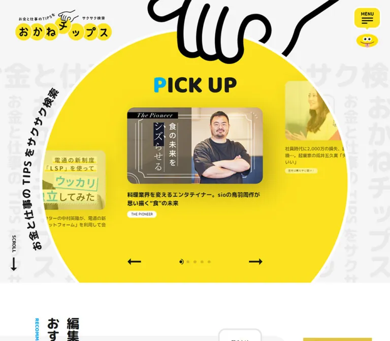
巨大な黄色い円形カルーセル、太い日本語書体、手描きのキャラクターが特徴の情報メディア兼求人ポータル。青い仕事探しナビゲーションと丸いボタンで、多彩な記事・求人情報を整理しています。
Okane Chips / おかねチップス — Style Reference
A bright yellow chip of editorial content, held by an oversized cartoon hand and surrounded by practical tools for working life.
Original URL: https://okanechips.mei-kyu.com/ Final URL: https://okanechips.mei-kyu.com/ Theme: light editorial surfaces, saturated yellow and blue navigation, and a dark legal footer. Inspected: supplied browser capture bundle retrieved October 5, 2026, at 06:15:55 JST — October 4, 2026, at 21:15:55.256 UTC. Viewports: desktop 1440 × 1000 CSS pixels; mobile 390 × 844 CSS pixels. Scope: the current homepage, including its featured-article stage, editorial recommendations, news collection, discovery sidebar, recruitment content, article search, directory panels, and footer. Visual evidence consists of three desktop captures and two mobile captures, supplemented by rendered text, links, element rectangles, and selected computed styles. Destination pages and opened menus were not inspected.
Okane Chips is an editorial and recruitment portal. Its homepage connects advice about money and work with interviews, job listings, worker discovery, and portfolio services. The design makes this extensive information architecture approachable through circular shapes, expressive mascots, heavy Japanese typography, and a cheerful yellow-and-blue palette.
The opening composition is unusually physical: an enormous outlined hand grips a yellow circular field containing editorial cards. Pale oversized Japanese lettering fills the background. Below that spectacle, the page becomes a long publication layout with vertical section titles, large and small article cards, supporting discovery modules, and repeated navigation. Preserve both scales: the playful opening artwork and the practical density of a substantial content website.
閉じる
Okane Chips / おかねチップス — Style Reference
A bright yellow chip of editorial content, held by an oversized cartoon hand and surrounded by practical tools for working life.
Original URL: https://okanechips.mei-kyu.com/ Final URL: https://okanechips.mei-kyu.com/ Theme: light editorial surfaces, saturated yellow and blue navigation, and a dark legal footer. Inspected: supplied browser capture bundle retrieved October 5, 2026, at 06:15:55 JST — October 4, 2026, at 21:15:55.256 UTC. Viewports: desktop 1440 × 1000 CSS pixels; mobile 390 × 844 CSS pixels. Scope: the current homepage, including its featured-article stage, editorial recommendations, news collection, discovery sidebar, recruitment content, article search, directory panels, and footer. Visual evidence consists of three desktop captures and two mobile captures, supplemented by rendered text, links, element rectangles, and selected computed styles. Destination pages and opened menus were not inspected.
Okane Chips is an editorial and recruitment portal. Its homepage connects advice about money and work with interviews, job listings, worker discovery, and portfolio services. The design makes this extensive information architecture approachable through circular shapes, expressive mascots, heavy Japanese typography, and a cheerful yellow-and-blue palette.
The opening composition is unusually physical: an enormous outlined hand grips a yellow circular field containing editorial cards. Pale oversized Japanese lettering fills the background. Below that spectacle, the page becomes a long publication layout with vertical section titles, large and small article cards, supporting discovery modules, and repeated navigation. Preserve both scales: the playful opening artwork and the practical density of a substantial content website.
How to Read This Reference
- Measured means a value supplied in the rendered DOM or computed-style evidence. Coordinates are CSS-pixel rectangles from the recorded state.
- Derived means arithmetic based on those measurements, such as the gap between two cards or an image height calculated from its intrinsic aspect ratio.
- Estimated means an approximate visual reading of a supplied original-page screenshot. Estimated colors are not pixel samples or recovered CSS declarations.
- Recommended means implementation guidance for a new project. The Quick Start uses implementation aliases and proposed breakpoints; it is not recovered source code.
- Some navigation structures occur more than once in the DOM. A nonzero rectangle does not establish that a hidden menu copy was visible. Use the screenshots to determine visibility and the computed records to establish component styling.
- Full-page text establishes content presence, but it does not expose every surface, icon, image treatment, or interaction. Components with limited visual coverage are identified below.
- The screenshots show different active articles. This supports a carousel interpretation together with repeated slide elements, but does not independently establish autoplay timing or swipe behavior.
Tokens — Colors
Default Palette
| Name | Value | Suggested token | Evidence and role |
|---|---|---|---|
| Editorial Yellow | #fbe21f |
--color-yellow |
Measured: background of the directory link labeled 記事一覧. Yellow also identifies editorial category navigation visually. |
| Hero Yellow | Approximately #ffe620 |
--color-hero-yellow |
Estimated: the large circular opening field appears brighter than the measured directory yellow. Its exact fill was not included in computed evidence. |
| Service Blue | #0089ce |
--color-service |
Measured: desktop service navigation, recruitment directory links, and mobile service-button text. |
| Link Cyan | #00adf1 |
--color-link |
Measured: general link color, the large article-list action, and a circular search control in the discovery area. |
| Favorites Red | #df4242 |
--color-favorite |
Measured: the お気に入りリスト directory link. This has a specific saved-items role. |
| Text Ink | #1a1a1a |
--color-ink |
Measured: body text, article titles, directory headings, and the desktop directory search button. |
| Light Gray | #f5f5f5 |
--color-canvas |
Measured: mobile header background. Similar gray surfaces are visible around the directory panels. |
| White | #ffffff |
--color-paper |
Measured: speech-bubble surfaces and reversed service-link text; also visible in the main reading field and directory panels. |
| Story Blue | Approximately #d9eef8 |
--color-story |
Estimated: pale-blue interview cards in the desktop discovery rail and the mobile service strip. Exact shared-token identity is unverified. |
| Pattern Gray | Approximately #e8e8e8 |
--color-pattern |
Estimated: oversized background lettering behind the circular feature. |
| Footer Ink | Approximately #1a1a1a |
--color-footer |
Estimated: the dark footer visually aligns with the measured text ink. Its own background declaration was not supplied. |
Color Relationships
Yellow carries brand character and editorial discovery. Blue carries work-related navigation, with a brighter cyan used for some general links and article actions. Red is reserved for favorites in the visible directory. These roles are more useful than treating every saturated color as an interchangeable primary action.
The hero uses black lettering on yellow; service pills use white lettering on blue. White outlines separate yellow menu artwork and the large yellow circle from nearby surfaces. The white main canvas lets full-color article posters remain legible without forcing their imagery into the interface palette.
The supplied custom-property list contains many standard publishing-system color, gradient, and shadow presets. Their presence does not establish visible usage. In particular, #0693e3 and the slider default #007aff should not replace the measured service blue or link cyan.
Only one page theme was observed. The black footer is a local surface treatment, not evidence of a selectable dark mode.
Tokens — Typography
Noto Sans JP — Editorial and Navigation Text
The measured body stack is:
font-family:
  'Noto Sans JP',
  'ヒラギノ角ゴ Pro W3',
  'Hiragino Kaku Gothic Pro',
  'メイリオ',
  Meiryo,
  'MS Pゴシック',
  sans-serif;
The computed stack establishes the intended family sequence. Font-file loading and the actual face used for every glyph were not independently verified.
- Body weight:
500. - Article titles, major navigation, and directory headings: predominantly
900. - Small category links:
700in the measured directory navigation. - Character: dense, assertive Japanese sans-serif with compact utility text and very heavy editorial emphasis.
- Tracking: generally normal. The recommendation introduction has measured tracking of
0.42pxon desktop and approximately0.224pxon mobile.
The heavy weight is a defining feature. Replacing it with a conventional 600-weight interface would substantially soften the visual hierarchy.
Wordmark and Illustration Lettering
The logo is artwork combining yellow discs, Japanese lettering, small captions, and a hand. Its measured H1 font size describes the containing element, not the visible logo lettering. Preserve the supplied logo artwork when available and authorized.
The curved opening lead is an SVG asset. The large PICK UP lettering is visible in the desktop screenshot, but its precise font declaration was not supplied. Do not infer a separate display-font family from its appearance.
A button wrapper reports Arial at the browser-default size. That wrapper value is insufficient evidence that the illustrated menu label uses Arial as a deliberate brand font.
Type Scale
| Role | Desktop measurement | Mobile measurement | Weight | Notes |
|---|---|---|---|---|
| Body copy | 14px / 25.004px |
13.1914px / 23.5598px |
500 |
Approximately 1.786 line height. |
| Active featured-article title | 20px / 30px |
13.1914px / 20.7368px |
900 |
Mobile significantly reduces the headline size. |
| Recommendation-card title | 16px / 25px |
13.1914px / 20.7368px |
900 |
Full-width mobile recommendation cards. |
| Lead news-card title | 20px / 30px |
13.1914px / 20.7368px |
900 |
Largest article within the news section. |
| Smaller news-card title | 16px / 25px |
11.3069px / 18.8825px |
900 |
Mobile retains two narrow columns. |
| Article category label | 12px / 18px |
11.3069px / 16.9603px |
500 |
Label surfaces belong to their containing component. |
| Article date | 12px / 12px |
11.3069px / 11.3069px |
500 |
Compact numeric metadata. |
| Desktop service navigation | 14px / 15.75px |
Mobile trigger: 13.1914px, normal line height |
900 |
Opening desktop bottom bar instead uses approximately 18px line height. |
| Directory action | 18px / 26.06px |
16.9603px / 24.5548px |
900 |
Large pill links. |
| Directory heading | 28px / 37–42.59px |
18.8448px / 34.8629–40.13px |
900 |
Line height differs between editorial and service headings. |
| Directory category text | 12px / 21.432px |
11.3069px / 20.1941px |
700 |
Yellow chip rows in the visible desktop directory. |
| About/contact links | 24px / 35px |
18.8448px / 32.9784px |
900 |
Underlined and visually prominent. |
| Sidebar category heading | 25px / 37.5px |
Not established | 900 |
Desktop discovery rail. |
Estimated display sizes: the visible desktop PICK UP title is approximately 54–58px. Large vertical Japanese section lettering appears approximately 40–48px on desktop and 32–36px on mobile. The supplied H2 records describe wrappers and do not expose all child typography; these display sizes remain estimates.
Root Sizing
The measured root is 10px on desktop and 9.4224px at the inspected mobile width. The ratio is 0.94224, and many utility dimensions follow that reduction. Other mobile components also receive explicit size and layout changes, so scaling the entire desktop interface by this ratio would be incorrect.
The underlying responsive root formula was not supplied. The Quick Start keeps a conventional root size and expresses the observed appearance through explicit component tokens.
Tokens — Spacing & Shapes
Density: a spectacular, spacious opening followed by compact editorial metadata and a long, information-rich page.
Shape vocabulary: circles, rounded image corners, capsule links, speech bubbles, and large white panels. Straight arrows and heavy black illustration outlines keep the rounded system from becoming visually weak.
Spacing Scale
These are recurring measurements and derived relationships, not proof of a single source spacing scale.
| Use | Desktop | Mobile | Evidence |
|---|---|---|---|
| Logo offset | 54px left, 32px top |
14.125px left, 12.234px top |
Measured. |
| Main mobile article gutter | — | 28.266px |
Measured repeated card origin. |
| Small news-card column gap | 50px |
22.609px |
Derived from adjacent rectangles. |
| Recommendation-card column gap | 50px |
Cards stack | Derived desktop geometry; measured mobile positions. |
| Directory-panel gap | 32px |
Single-column arrangement | Derived desktop geometry and visible mobile structure. |
| Directory action inset within panel | 64px per side |
Approximately 28.266px per side |
Derived from panel and action widths. |
| Directory action padding | 16px 47px |
15.0758px 28.2672px |
Measured. |
| Directory action vertical gap | 5px |
Approximately 7.531px |
Derived from successive link rectangles. |
| Active feature image-to-title gap | Approximately 23px |
Approximately 7.54px |
Derived using image aspect ratio and title position. |
| Standard desktop article image-to-title gap | Approximately 20px |
Component-dependent | Derived from news-card rectangles and intrinsic image sizes. |
| News-section top padding | 92px |
47.112px |
Measured. |
| Desktop category-row vertical padding | 13px top, 12px bottom |
Not established | Measured sidebar links. |
Border Radius
| Element | Value | Status |
|---|---|---|
| Directory action pills | 40px desktop; 37.6896px mobile |
Measured. |
| Ends of desktop service navigation | 25px |
Measured; interior segments have square corners. |
| Speech bubbles | 25px desktop; 23.556px mobile |
Measured. |
| Desktop directory search button | 50% on an 80 × 80px box |
Measured. |
| Featured image | Approximately 25px desktop and 18–20px mobile |
Screenshot estimate; anchor itself reports zero radius. |
| White directory panels | Approximately 25–30px |
Screenshot estimate. |
| Pale-blue story cards | Approximately 25px |
Screenshot estimate. |
| Small category chips | Fully rounded | Visually observed; exact wrapper radius unavailable. |
| Return-to-top control | Circular | Visually observed; approximately 60px desktop and 56px mobile. |
Layout Measurements
| Element | Desktop 1440 × 1000 | Mobile 390 × 844 |
|---|---|---|
| Document height | 10409.406px |
11448.328px |
| Logo box | 253 × 80px |
211.047 × 69.719px |
| Menu button composite | 100 × 157px, including the lower mascot |
67.828 × 53.094px; lower mascot not visible |
| Header service bar | 800 × 55.5px, beginning at (499, 31) |
Replaced visually by a full-width compact service strip |
| Opening bottom service bar | 640 × 40px, beginning at (400, 935) |
Not visible in the mobile opening |
| Active featured-article link | 480 × 396.172px, beginning at (480, 318.578) |
332 × 296.094px, beginning at approximately (29.164, 292.594) |
| Active feature image | Approximately 480 × 270.19px |
Approximately 332 × 186.88px |
| Neighboring feature width | 374.4px |
Approximately 254.644px |
| Yellow circular field | Approximately 1100px diameter | Approximately 500px diameter, extending beyond both viewport edges |
| Editorial main column | Approximately 1008.016px, starting at x = 57.594px |
Full page width, with internal article gutters |
| Recommendation-card width | 330.984px |
333.469px |
| Lead news-card width | 537.75px |
333.469px |
| Small news-card width | 333.5px |
155.422px |
| Article-list action | 717.016 × 80px |
Mobile action present; dimensions not included in the supplied excerpt |
| Directory-panel width | 560px |
333.469px |
| Directory action | 432 × 58.063px |
276.938 × 54.688px |
Image dimensions above are derived from the supplied 970 × 546 intrinsic image attributes and the measured rendered widths. They are not separate image-element measurements.
The desktop directory panels occupy x = 176–736px and x = 768–1328px. Their combined 1152px region is slightly right of the viewport center. Preserve that asymmetry only when reproducing the complete surrounding layout; it is not a universal centered-container rule.
Components
Brand Header and Menu Control
Role: persistent identity and navigation access.
The desktop wordmark floats at the upper left without a conventional full-width header slab. At the upper right, the menu control looks like a yellow speech balloon: thick white edging, a small downward point, black MENU text, and three black horizontal strokes of unequal length. A separate smiling yellow mascot sits underneath in the opening desktop state.
The logo and menu remain visible in the supplied desktop middle and lower-page captures. Their source declarations include positional transitions, supporting a header that changes presentation with page state. The exact scroll threshold and positioning implementation were not provided.
The mobile control is smaller and visually shows the hamburger without the desktop word label or lower mascot. The brand row has a measured gray background as part of a header approximately 169.594px high, including the two navigation rows below it. The mobile footer capture does not show a persistent header; do not assume desktop persistence carries over unchanged.
No opened menu screenshot or menu activation result was supplied. The repeated directory markup in the DOM is not sufficient to reconstruct a verified open state.
Service Navigation
Role: connects the publication with work and portfolio services.
Desktop navigation combines four blue segments into one capsule:
サクサク仕事探しワーカー探しポートフォリオメーカースカウト登録
The first and last segments have rounded outer ends. Interior edges are straight and separated visually by pale blue rules. Text is white, 14px, and weight 900. The portfolio label wraps onto two lines in the top desktop bar.
The opening screenshot places a compact 640px-wide version near the bottom of the viewport. The subsequent desktop captures show an 800px-wide version near the top. Both structures exist in the DOM. Their appearance is consistent with scroll-dependent switching, but the exact transition behavior was not exercised.
On mobile, a pale-blue strip presents a blue mascot, a centered work-search label, and a downward chevron. A button with that label is measured. Additional service links exist in the DOM, but their expanded visibility and interaction are unverified.
Mobile Category Strip
Role: provides immediate editorial discovery beneath the work-service strip.
A narrow horizontal row contains a search icon and bold category links. At 390px, the visible labels include 澤田経営道場コラム and ユニコーンメーカーズブック; additional measured links extend far beyond the viewport.
The visible row begins around y = 126px and ends near y = 170px. Category text measures 13.1914px, weight 900, with approximately 28.27px between adjacent links.
This is a horizontally overflowing category rail. Whether its original implementation supports touch scrolling, dragging, automatic movement, or a combination was not tested. A native keyboard-accessible horizontal scroller is a suitable recommended implementation.
Circular Featured-Article Stage
Role: makes selected articles the main visual event.
The component has several independent layers:
- A pale gray typographic backdrop using oversized, repeated Japanese lettering.
- A huge yellow circle with a white perimeter.
- An oversized black-outlined hand overlapping the circle from above.
- The desktop
PICK UPlabel, with a cyan first letter and black remaining letters. - An active article with a rounded poster, a heavy black title, and a compact white category capsule.
- Smaller, partially visible neighboring articles.
- A desktop scroll cue and service navigation; mobile pagination indicators.
The active desktop card is centered at 480px wide. Neighboring card bounds are 374.4px wide, a derived ratio of 0.78. They also occupy different vertical positions: the left neighbor is lower, while the right neighbor is higher in the supplied frame. The yellow treatment over their images and text reduces their prominence. Exact opacity, filter, and mask values were not supplied.
The active poster has a visible diffuse dark halo against the yellow field. Its exact shadow declaration is unknown. Keep any recreated emphasis local to this feature; the screenshots do not establish a general shadow system for every article.
On mobile, the active card is 332px wide with roughly 29px side clearance. Neighbors remain as narrow edge fragments. The circular field extends beyond the viewport sides and finishes around y = 712px; the patterned section continues to approximately y = 778px.
Five pagination marks are visible near the bottom of the mobile circle. One has a dark partial-ring appearance while the others are muted yellow dots. Their animation and activation behavior were not tested. The desktop opening supplied here does not visibly establish previous/next arrow controls.
The desktop PICK UP heading and curved left-side lead are not visible in the mobile frame. The exact distinction between hiding, clipping, and artwork overlap is unavailable.
Vertical Section Heading
Role: introduces major editorial and recruitment sections with a magazine-like rhythm.
Large heavy Japanese text is arranged vertically, with a narrow cyan English label beside it. Observed labels include RECOMMEND, NEW ARTICLE, and FIND A JOB.
Desktop headings occupy a left-side rail alongside content. On mobile, the recommendation heading moves to a centered position above the introductory copy, with its measured wrapper beginning at approximately y = 812px.
Treat vertical writing as typography, not a rotated horizontal paragraph. For a new implementation, use writing-mode: vertical-rl for Japanese and a separately oriented English label. The exact original writing-mode declarations were not included.
Editorial Article Card
Role: links an editorial image and headline while keeping category and date information compact.
The recurring anatomy is:
- A wide editorial image, usually close to 16:9.
- A multi-line title with weight 900.
- A small category link.
- A compact numeric date such as
2024.01.18.
Measured article anchors have transparent backgrounds, no padding, and zero border radius. Rounded image corners should therefore be applied to the image or its wrapper, not inferred from the anchor measurement.
The feature-stage variant uses a white category capsule directly on yellow. Other editorial category-link text is measured as white, but the containing badge backgrounds were not supplied. Do not assume every category label shares the feature-stage treatment.
Keep article and category destinations separate. The evidence includes distinct category links outside article anchors; a new implementation should avoid nesting one interactive link inside another.
Recommendation Section
Role: connects common work concerns with a small curated reading selection.
The section combines a vertical heading, an introductory paragraph, conversational prompts, mascot artwork, and two recommended articles. Measured speech bubbles use white fill, 25px desktop radii, and bold text.
The desktop introduction is approximately 400px wide. Two cards sit side by side at approximately 331px each, with a 50px gap. Their headlines measure 16px / 25px.
On mobile, the heading precedes a roughly 335px-wide introduction. Speech bubbles and artwork move into the vertical flow, and the two recommendation cards stack at approximately 333px wide. The recommendation section becomes substantially taller: approximately 1425px in the supplied mobile geometry versus approximately 737px for its desktop section rectangle.
The supplied images only reveal the beginning of this section on mobile. The detailed internal geometry above comes from DOM measurements, not a complete visual capture of its artwork.
New-Article Collection
Role: provides a browsable publication index with a clear lead item.
The desktop section contains one larger lead article followed by eight smaller articles in a two-column arrangement. The lead is about 538px wide; smaller cards are 333.5px wide with a 50px gap. A large cyan article-list link spans the approximately 717px content region at the bottom.
Mobile preserves this hierarchy rather than converting everything into a single list. The lead occupies the 333.47px inner width, while subsequent cards remain in two columns of approximately 155.42px with a 22.61px gap.
Metadata order changes for the smaller mobile cards: a date appears below the image and before the headline, followed by the category. Desktop dates are measured in the lower metadata region. Implement this deliberately; merely shrinking desktop cards does not reproduce the mobile structure.
Some mobile category labels wrap onto two lines. Card heights must accommodate those labels and variable headline lengths without cropping essential text.
Desktop Discovery Rail
Role: supports browsing alongside the main article collection.
The right-hand rail contains category navigation with article counts, a ranked popular-article collection, and interview stories. Category rows are measured at about 208px wide inside the rail, with 14px / 24.08px text and approximately 25px combined vertical padding. Longer names wrap and increase row height.
The supplied desktop text contains ten ranked popular articles. The mobile rendered text contains five and places the popular collection after the recruitment content. Counts and ranking entries are content data, not fixed design tokens.
The middle desktop capture shows the end of the story rail beside a large blank main region. The evidence does not establish whether this gap is solely due to unequal column lengths, reserved space, or incomplete content presentation. Do not create an arbitrary viewport-sized spacer to reproduce that one frame.
Worker Story Card
Role: introduces a person through role, portrait, interview theme, and company.
The desktop screenshot exposes pale-blue cards inside a larger light-gray rounded rail. The visible anatomy includes:
- A small muted hashtag or occupational category.
- A blue job title at the upper left.
- A small rounded portrait at the upper right.
- A bold personal name with a smaller honorific.
- A short black interview headline with a yellow underline highlight.
- A small circular company mark and underlined company name.
Visible cards are approximately 218px wide with roughly 20px internal insets and 25px corner radii. These dimensions are screenshot estimates. Headlines are visibly shortened in the narrow rail, while the full interview titles appear in the supplied text.
Finish the module with the compact bold link 働き者ストーリーをもっと見る and a right arrow. Keep the blue surface, yellow highlight, portrait, and company identity within the same card hierarchy.
Recruitment Discovery Section
Role: connects readers to jobs and organizations without leaving the publication's homepage structure.
The rendered evidence establishes a FIND A JOB section, a work-search introduction, a collection of short recruitment posts, and a popular-company collection.
Company entries contain an image, location, industry labels, company name, a statement, PR POINT, job titles, employment types, workplace-condition tags, and favorites-related text. Several entries repeat, consistent with a looping collection, but its movement and control behavior were not verified.
Detailed job-card surfaces and dimensions are not visible in the supplied captures. Reuse the measured blue service-navigation language for associated actions, but treat any proposed job-card layout as a recommendation rather than a recovered design.
The company selection differs between desktop and mobile evidence. This does not prove that responsive CSS determines which companies are shown; separate requests or dynamic content may account for it.
Article Search and Category Discovery
Role: makes the extensive archive searchable by topic or keyword.
The rendered page includes an article-search section labeled RESEARCH, keyword links, and category links. Keyword destinations use the /list/?s=… URL pattern. Examples include 請求業務, 納税, and 確定申告.
The visible desktop directory also includes a large gray search capsule with the placeholder キーワードで検索する. A black circular search button occupies its right end. The button is measured at 80 × 80px; the whole visible search shape is approximately 496 × 80px by screenshot geometry.
A GET form using the evidenced search URL pattern is a reasonable recommended implementation. The original form submission was not tested, and its form attributes were not included in the supplied records.
Two-Panel Directory
Role: repeats the site's two main destinations at the end of a long page.
Two large white rounded panels sit on a light-gray surface.
The editorial panel contains a mascot and heading, a yellow article-list action, category chips arranged in dense horizontal rows, the desktop search capsule, and a small underlined advertising link.
The recruitment panel contains a blue mascot and heading, six blue action pills, one red favorites pill, and a small underlined account/listing link. The pill labels are left aligned with a right arrow at the opposite end. Each desktop pill measures 432 × 58.063px, with 16px 47px padding and a 40px radius.
Category rows visibly continue beyond the editorial panel's available width and are clipped. Their DOM coordinates also extend beyond that panel. The capture does not establish whether those rows move automatically or are manually scrollable. A new implementation must keep every destination reachable.
Mobile stacks the panels. The service panel is approximately 333.47px wide, with 276.94px-wide action pills. The visible lower screenshot preserves the blue/red action distinction and the right-aligned secondary link.
Footer and Return-to-Top Control
Role: separates major site information from legal and external links.
On desktop, prominent underlined About and Contact links sit on the light-gray region below the directory. A row of seven recognizable social icons appears to their right. A dark full-width strip at the bottom contains small muted legal links on the left and copyright text on the right.
On mobile, About and Contact stack vertically. Social navigation moves into the dark footer, with a centered label above a horizontal icon row. Legal links form a left-aligned vertical list, and the copyright line is centered near the bottom. This is a structural rearrangement, not simply wrapped desktop content.
The upward-arrow control is a dark circle in the desktop captures and a white circle in the mobile footer capture. Its vertical position changes between desktop screenshots, so fixed positioning and footer-collision rules cannot be established. The DOM supplies a #wrapper destination; smooth scrolling was not tested.
Tokens — Motion & Interaction
| Treatment | Supplied declaration or evidence | What it establishes |
|---|---|---|
| Header presentation | height, background, and transform, each 0.4s cubic-bezier(0.215, 0.61, 0.355, 1) |
Defined transition properties; trigger and exact states remain unverified. |
| Logo positioning | top and left, same 400ms easing |
Positional changes are supported by CSS. |
| Logo link dimensions | width, height, and padding, same 400ms easing |
Responsive or state-dependent resizing is defined. |
| Standard links and pills | border, background, and color, same 400ms easing |
Color and border changes can transition; hover endpoint colors were not supplied. |
| Search buttons | background, same 400ms easing |
Background feedback is defined. |
| Sidebar category links | color and padding, same 400ms easing |
Color and spacing can change between states. |
| Mobile feature titles | opacity, same 400ms easing |
Title fading is defined; sequence and trigger are unknown. |
| Social links | 400ms with the same easing | A transition is declared; exact changing properties are unspecified in the excerpt. |
| Featured-article carousel | Active and reduced neighbors, repeated article elements, five mobile indicators | Carousel structure is strongly supported; autoplay, dragging, and transition duration were not tested. |
| Scroll and top links | Destinations #container and #wrapper |
Anchor targets exist; scrolling animation is unverified. |
| Menu and mobile service trigger | Button elements present | Controls exist; opening, dismissal, focus handling, and expanded layout were not exercised. |
A reusable measured motion token is:
--motion-duration: 400ms;
--motion-ease: cubic-bezier(0.215, 0.61, 0.355, 1);
Do not assign this duration to carousel travel merely because it is common among link transitions. Slider motion may be implemented elsewhere.
Many sampled elements report animation: none. This does not rule out animation on descendants, pseudo-elements, ancestors, or JavaScript-controlled transforms. Similarly, a bare transition: all without a supplied duration is not evidence of a visible timed effect.
The capture process waited for document load, image decoding, finite animation completion, and sampled layout stability within stated limits. Perpetual animations were temporarily paused for readiness checks and resumed. Those procedures improve screenshot stability but do not constitute an interaction test or guarantee semantic completeness.
Surfaces
| Layer | Appearance | Purpose |
|---|---|---|
| Opening background | Light gray with oversized pale lettering | Establishes brand texture outside the yellow disc. |
| Featured stage | Flat saturated yellow, white rim | Makes the selected editorial content dominant. |
| Main publication field | White, largely unboxed article groupings | Supports extended browsing and full-color images. |
| Speech bubble | White with rounded corners | Gives mascots a conversational voice. |
| Story card | Pale blue with yellow headline highlights | Distinguishes people-focused interview discovery. |
| Directory region | Light gray with large white panels | Separates comprehensive navigation from article content. |
| Editorial navigation | Yellow capsules with black text | Identifies archive and category destinations. |
| Work navigation | Blue capsules with white text | Identifies recruitment and worker-service destinations. |
| Favorites action | Red capsule with white text | Marks a specific saved-items destination. |
| Legal footer | Near-black field with muted text | Provides a firm end to the long page. |
Depth is mostly created by overlap, cropping, scale, and contrasting fills. The active hero image has localized visual shadowing, but there is no evidence for a universal elevated-card treatment. Avoid introducing glass blur, glossy gradients, or identical shadows on every module.
Imagery
The interface combines two distinct image families. Brand artwork is simple, high contrast, and cartoon-like: a very large outlined hand, smiling chip-shaped mascots, speech balloons, and a wordmark made from yellow discs. Editorial imagery is full color and frequently includes portraits, collaged backgrounds, names, and headlines embedded directly in the image.
The active desktop project-management poster contains three people or avatars, colored diagonal areas, and substantial embedded lettering. The mobile investment poster combines a portrait with peach, blue, and chart-like graphics. These are article-specific designs, not additional global interface palettes.
Preserve enough of each poster to retain its embedded text. Most supplied article assets are 970 × 546, but one is 970 × 535; a blanket crop to exact 16:9 would slightly alter that image. Use intrinsic proportions by default and define any editorial crop deliberately.
The pixelated avatar inside one poster is local content. It does not establish a pixel-art interface style. Logos, portraits, and SVG mascots should retain normal rendering quality.
Observed Asset References
All paths below belong to the inspected original website. They are references, not bundled files.
| Asset | Observed path | Evidence and use |
|---|---|---|
| Header mascot | /wp-content/themes/okanechips-new/assets/imgs/common/chara_1.svg |
Present in the header markup. |
| Editorial mascot | /wp-content/themes/okanechips-new/assets/imgs/common/chara_4.svg |
Present beside the news-section speech bubble; attributes specify 100 × 61. |
| Opening curved lead | /wp-content/themes/okanechips-new/assets/imgs/top/fv-lead.svg |
Attributes specify 120 × 536; alternative text matches the opening money-and-work lead. |
| Project-management poster | /wp-content/uploads/2023/09/fd78cee8ea2188d0aeb9792d8d4495a9-970x546.jpg |
Active desktop feature and an article-list item. |
| Investment poster | /wp-content/uploads/2024/01/cf406c49ae3ebc4e667bb9717926335c-970x546.jpg |
Active mobile feature, recommendation, and lead news article. |
| Money column poster | /wp-content/uploads/2023/10/ryo23-970x546.jpg |
Recommendation and news content. |
| Wider-ratio column poster | /wp-content/uploads/2023/08/ryocachi_21-970x535.jpg |
Demonstrates that not all editorial images have exactly the same ratio. |
The giant hand, logo, background pattern, and some other visible artwork were not accompanied by complete asset URLs in the supplied excerpt. Do not invent their paths or substitute an unrelated icon library for the brand illustration.
Layout & Responsive Behavior
Desktop Structure
The page begins with a nearly viewport-filling editorial stage. Floating brand controls remain visually separate from the feature artwork. Below it, a broad editorial region sits beside a narrower discovery rail. Within the editorial region, vertical section headings reserve a left-side area, leaving the article collection offset to the right.
The news collection uses a large lead item and smaller paired cards. Supporting advertisements are represented by measured 270 × 225px links after the editorial collection. Recruitment discovery and article search follow, then the two-panel directory and footer.
The total document height is approximately 10,409px at the inspected desktop viewport. This is a content-rich homepage, and its lower directory is a major navigation component rather than a small decorative footer.
Mobile Structure
The 390px layout makes several deliberate changes:
- The header becomes a visible gray brand row followed by a pale-blue service strip and a horizontal category strip.
- The feature circle becomes wider than the viewport while the active article remains approximately 332px wide.
- Desktop bottom service navigation is absent from the visible mobile feature stage.
- Vertical section headings center above their content.
- Recommendation cards stack at approximately 333px wide.
- The news lead remains full width, but smaller news cards retain two columns.
- Smaller-card dates move above their headlines.
- Popular articles and worker stories appear after the recruitment content in the rendered text order.
- Directory panels stack, About and Contact stack, and social navigation moves onto the dark footer.
The total mobile document height is approximately 11,448px. A single-column page shell does not imply that every internal component becomes one column.
Responsive Limits
Only the 1440px and 390px widths were inspected. Tablet layout, landscape behavior, exact media-query thresholds, browser zoom, safe-area behavior, and intermediate header states remain unverified.
The Quick Start uses recommended breakpoints at 1100px for the main page shell and 640px for compact article typography. These are adaptation choices, not recovered source breakpoints.
Do’s and Don’ts
Do
- Treat the page as an editorial and recruitment portal with multiple browsing paths.
- Preserve the oversized hand, circular feature field, pale typographic background, and small expressive mascots as a coordinated identity.
- Use the measured
#0089cefor work-service navigation and distinguish it from#00adf1links. - Use very heavy Japanese titles and compact, lighter dates and category metadata.
- Keep full-color article artwork and its embedded lettering readable.
- Preserve the mobile lead-plus-two-column news hierarchy.
- Use rounded pills with left-aligned labels and clear right arrows in the directory.
- Keep favorites red tied to its observed purpose.
- Reposition discovery and footer modules deliberately on mobile.
- Distinguish visible screenshot states from hidden or repeated DOM navigation.
Don’t
- Don’t replace the publication structure with a generic hero, feature grid, and single conversion funnel.
- Don’t use the directory yellow as a supposedly measured hero fill; the hero color is only estimated here.
- Don’t adopt every publishing-system preset as part of the brand palette.
- Don’t infer the visible logo typography from its H1 wrapper size.
- Don’t turn every article into a padded, elevated white card.
- Don’t treat the large blank area in one middle capture as a required spacing token.
- Don’t add unverified carousel arrows, autoplay intervals, menu animations, or hover colors and describe them as original behavior.
- Don’t crop embedded poster headlines or impose an exact ratio on every asset without checking it.
- Don’t retain hidden carousel clones as duplicate keyboard destinations.
- Don’t globally pixelate imagery because one article happens to contain a pixelated avatar.
Recommended Implementation Additions
These are recommendations for a new implementation, not verified original-site features:
- Give menu, search, carousel indicators, and return-to-top controls explicit accessible names. Connect expanded controls with
aria-expandedandaria-controls. - If a menu behaves as a modal, provide appropriate focus containment, Escape dismissal, and focus restoration. Do not infer modal behavior merely from its visual styling.
- Provide keyboard-operable carousel controls and a pause option if automatic movement is introduced. Hide duplicate slides from the accessibility tree and tab order.
- Respect reduced-motion preferences for header movement, carousel transitions, and moving category rows. Keep essential content visible when JavaScript or reveal effects fail.
- Review the small mobile news titles: the observed approximately 11.3px size is compact. A readable adaptation can raise these to 14px or use a single column at larger text settings.
- Check small white text on saturated blue and red surfaces for contrast. Heavy weight alone does not guarantee sufficient contrast.
- Keep social glyphs visually small while enlarging their interactive boxes to at least 44px where practical.
- Use one semantic date per article when possible and reposition it through layout rather than exposing duplicate dates to assistive technology.
- Supply intrinsic image dimensions and responsive image sources. Avoid delaying the first visible feature image unnecessarily.
- Ensure clipped category rails can be reached through scrolling or an equivalent complete navigation list.
Agent Prompt Guide
Quick Color Reference
- Measured editorial action yellow:
#fbe21f. - Estimated opening-circle yellow: approximately
#ffe620. - Measured service blue:
#0089ce. - Measured link cyan:
#00adf1. - Measured favorites red:
#df4242. - Measured text ink:
#1a1a1a. - Measured mobile header gray:
#f5f5f5. - Estimated story-card blue: approximately
#d9eef8. - Primary shape relationships: giant circle, rounded posters, capsule links, speech bubbles, and circular utility buttons.
Overall Prompt
“Create a Japanese editorial and recruitment homepage inspired by Okane Chips. Build an oversized yellow circular featured-article stage with a white rim, an overlapping black-outlined cartoon hand, pale oversized background lettering, and a centered editorial poster with a very heavy title. Place smaller subdued neighboring posters at the edges. Use Noto Sans JP with 500-weight body copy and 900-weight headings. Separate yellow editorial navigation from blue work-service navigation. Continue into vertical Japanese section headings, curated recommendations, a large lead news article followed by two-column article cards, a discovery rail, recruitment content, search, two rounded directory panels, and a dark legal footer. At 390px, stack recommendations but retain two columns for smaller news cards; move discovery modules into the page flow and social links into the dark footer. Use measured 400ms easing for utility transitions, while treating carousel timing and menu behavior as separate implementation decisions.”
Example Component Prompts
- Featured stage: “Create a large bright-yellow circle extending beyond the bottom of a desktop opening viewport. Center a 480px-wide rounded article poster, followed by a 20px/30px, weight-900 title and a small white category capsule. Add a white circle rim, low-contrast oversized Japanese background lettering, and authorized cartoon-hand artwork above. Keep neighboring cards approximately 78% of the active width. Do not invent autoplay timing.”
- Service navigation: “Build one blue capsule from four adjacent service links. Use
#0089ce, white 14px weight-900 text, pale segment dividers, and 25px rounded outer ends. Support a compact opening version and a wider header version without displaying both as duplicate keyboard navigation.” - Mobile news collection: “Within a 390px page, use approximately 28px outer gutters. Place a full-width lead article above two 155px columns separated by about 23px. Smaller cards show image, date, heavy title, and category in that order. Preserve variable headline and category heights.”
- Story card: “Design a narrow pale-blue interview card with a small rounded portrait at the upper right, a blue occupation label, bold person name, black headline with a yellow underline highlight, and a small company mark. Use approximately 25px corners and 20px insets; these dimensions are visual approximations.”
- Directory: “Create two large white rounded navigation panels on light gray. The editorial panel uses yellow archive and category links. The work panel stacks blue pill links and finishes with a red favorites link. Use left-aligned 18px weight-900 labels and right arrows. Stack panels on mobile and reduce action width to about 277px at a 390px viewport.”
- Responsive footer: “Keep large underlined About and Contact links on gray. On desktop, align a colorful social-icon row beside them and place legal links in a shallow black strip. On mobile, stack the major links, place social navigation inside the dark footer, then show legal links vertically and center the copyright line.”
Quick Start
CSS Custom Properties
This is a reusable adaptation of the measured components. It keeps a conventional root font size. Estimated colors and geometry are marked in comments. The CSS provides a static feature stage, article grids, directory controls, and responsive footer structure; it does not implement carousel playback, menu state, or scroll-triggered header switching.
Provide brand artwork separately. No unverified artwork paths or font-loading URLs are assumed.
:root {
  /* Measured colors */
  --color-yellow: #fbe21f;
  --color-service: #0089ce;
  --color-link: #00adf1;
  --color-favorite: #df4242;
  --color-ink: #1a1a1a;
  --color-canvas: #f5f5f5;
  --color-paper: #ffffff;

  /* Visual estimates */
  --color-hero-yellow: #ffe620;
  --color-story: #d9eef8;
  --color-pattern: #e8e8e8;
  --color-footer: #1a1a1a;
  --color-footer-text: #bfbfbf;

  --font-ui: 'Noto Sans JP', 'Hiragino Kaku Gothic Pro',
    Meiryo, sans-serif;
  --weight-body: 500;
  --weight-label: 700;
  --weight-heavy: 900;
  --text-body: 14px;
  --leading-body: 1.786;
  --text-title: 20px;
  --leading-title: 1.5;
  --text-card: 16px;
  --leading-card: 1.5625;
  --text-meta: 12px;

  --page-gutter: 4vw;
  --article-gap: 50px;
  --panel-gap: 32px;
  --panel-inset: 64px;
  --radius-pill: 40px;
  --radius-panel: 28px; /* Estimated */
  --radius-image: 25px; /* Estimated */
  --radius-bubble: 25px;
  --feature-width: 480px;

  --motion-duration: 400ms;
  --motion-ease: cubic-bezier(0.215, 0.61, 0.355, 1);
}

* { box-sizing: border-box; }

body {
  margin: 0;
  color: var(--color-ink);
  background: var(--color-paper);
  font: var(--weight-body) var(--text-body) /
    var(--leading-body) var(--font-ui);
}

button, input { font: inherit; }
button { cursor: pointer; }
img { display: block; max-width: 100%; height: auto; }
a { color: var(--color-link); }

/* Recommended focus treatment */
:where(a, button, input):focus-visible {
  outline: 3px solid var(--color-ink);
  outline-offset: 4px;
}

.site-header {
  position: relative;
  z-index: 20;
}

.brand {
  position: fixed;
  top: 32px;
  left: 54px;
  width: 253px;
}

.menu-control {
  position: fixed;
  top: 23px;
  right: 31px;
  display: grid;
  place-items: center;
  width: 100px;
  min-height: 80px;
  border: 5px solid white;
  border-radius: 26px;
  color: black;
  background: var(--color-hero-yellow);
  font-weight: var(--weight-heavy);
}

/* Optional header slot; application state controls visibility. */
.service-nav {
  display: flex;
  overflow: hidden;
  border-radius: 25px;
  background: var(--color-service);
}

.service-nav a {
  flex: 1;
  display: grid;
  place-items: center;
  min-height: 55.5px;
  padding: 12px 16px;
  color: white;
  text-align: center;
  text-decoration: none;
  font-size: 14px;
  line-height: 1.125;
  font-weight: var(--weight-heavy);
}

.service-nav a + a {
  border-left: 4px solid rgb(255 255 255 / 35%);
}

.mobile-service, .category-strip { display: none; }

/* Static composition; circle geometry is estimated. */
.feature-stage {
  position: relative;
  isolation: isolate;
  min-height: max(900px, 100svh);
  overflow: hidden;
  background: var(--color-canvas);
}

.feature-stage::before {
  content: '';
  position: absolute;
  z-index: -1;
  top: 100px;
  left: 50%;
  width: min(76.4vw, 1100px);
  aspect-ratio: 1;
  transform: translateX(-50%);
  border: 8px solid white;
  border-radius: 50%;
  background: var(--color-hero-yellow);
}

.feature-pattern {
  position: absolute;
  z-index: -2;
  inset: 180px 0 0;
  overflow: hidden;
  color: var(--color-pattern);
  font-size: 96px;
  font-weight: var(--weight-heavy);
  pointer-events: none;
}

.feature-hand {
  position: absolute;
  top: 0;
  left: 38%;
  width: 680px;
  pointer-events: none;
}

.feature-heading {
  position: absolute;
  top: 230px;
  left: 50%;
  margin: 0;
  transform: translateX(-50%);
  font-size: 56px; /* Estimated */
  line-height: 1.2;
  font-weight: var(--weight-heavy);
}

.feature-heading span { color: var(--color-link); }

.feature-card {
  position: relative;
  width: var(--feature-width);
  margin: 318.58px auto 0;
  color: var(--color-ink);
  text-decoration: none;
}

.feature-card img {
  width: 100%;
  border-radius: var(--radius-image);
}

.feature-card h2 {
  margin: 23px 0 12px;
  font-size: var(--text-title);
  line-height: var(--leading-title);
  font-weight: var(--weight-heavy);
}

.feature-category {
  display: inline-block;
  padding: 3px 14px;
  border-radius: 999px;
  background: white;
  font-size: 12px;
  line-height: 18px;
}

.publication {
  display: grid;
  grid-template-columns: minmax(0, 1fr) 258px;
  gap: 52px;
  margin: 100px var(--page-gutter);
}

.editorial-section {
  display: grid;
  grid-template-columns: 150px minmax(0, 1fr);
  gap: 40px;
  padding-block: 46px;
}

.section-heading {
  display: flex;
  flex-direction: row-reverse;
  align-items: flex-start;
  justify-content: center;
  gap: 14px;
  margin: 0;
}

.section-heading .jp {
  writing-mode: vertical-rl;
  font-size: 44px; /* Estimated */
  line-height: 1.35;
  font-weight: var(--weight-heavy);
}

.section-heading .en {
  writing-mode: vertical-rl;
  color: var(--color-link);
  font-size: 14px;
  font-weight: var(--weight-heavy);
}

.article-grid, .recommendation-grid {
  display: grid;
  grid-template-columns: repeat(2, minmax(0, 1fr));
  gap: 44px var(--article-gap);
}

.article-card { min-width: 0; }
.article-card > a { color: inherit; text-decoration: none; }
.article-card img { width: 100%; }

.article-card h3 {
  margin: 20px 0 12px;
  font-size: var(--text-card);
  line-height: var(--leading-card);
  font-weight: var(--weight-heavy);
}

.article-card--lead {
  grid-column: 1 / -1;
  width: min(100%, 537.75px);
  justify-self: center;
}

.article-card--lead h3 {
  font-size: var(--text-title);
  line-height: var(--leading-title);
}

.article-meta {
  display: flex;
  flex-wrap: wrap;
  align-items: center;
  justify-content: space-between;
  gap: 8px;
  font-size: var(--text-meta);
  line-height: 1.5;
}

.story-card {
  padding: 20px;
  border-radius: 25px;
  background: var(--color-story);
}

.story-card .role {
  color: var(--color-service);
  font-weight: var(--weight-heavy);
}

.story-card .portrait {
  float: right;
  width: 90px;
  margin-left: 10px;
  border-radius: 18px;
}

.story-card .headline {
  text-decoration: underline;
  text-decoration-color: var(--color-yellow);
  text-decoration-thickness: 4px;
  text-underline-offset: 2px;
}

.directory-region {
  padding: 64px var(--page-gutter) 100px;
  background: var(--color-canvas);
}

.directory {
  display: grid;
  grid-template-columns: repeat(2, minmax(0, 1fr));
  gap: var(--panel-gap);
  max-width: 1152px;
  margin-inline: auto;
}

.directory-panel {
  min-width: 0;
  padding: 36px var(--panel-inset);
  border-radius: var(--radius-panel);
  background: white;
}

.directory-panel h2 {
  margin: 0 0 26px;
  font-size: 28px;
  line-height: 1.5;
  font-weight: var(--weight-heavy);
}

.pill {
  display: flex;
  align-items: center;
  justify-content: space-between;
  gap: 20px;
  min-height: 58px;
  padding: 16px 47px;
  border: 0;
  border-radius: var(--radius-pill);
  color: white;
  background: var(--color-service);
  font-size: 18px;
  line-height: 1.448;
  font-weight: var(--weight-heavy);
  text-decoration: none;
  transition:
    color var(--motion-duration) var(--motion-ease),
    background-color var(--motion-duration) var(--motion-ease);
}

.pill + .pill { margin-top: 5px; }
.pill--editorial { color: var(--color-ink); background: var(--color-yellow); }
.pill--favorite { background: var(--color-favorite); }
.pill--archive { background: var(--color-link); }

/* Reachable overflow is a recommended addition. */
.chip-row {
  display: flex;
  gap: 5px;
  overflow-x: auto;
  padding-block: 5px;
}

.chip {
  flex: none;
  padding: 5px 15px;
  border-radius: 999px;
  color: var(--color-ink);
  background: var(--color-yellow);
  font-size: 12px;
  font-weight: var(--weight-label);
}

.search-form {
  display: flex;
  align-items: center;
  margin-top: 40px;
  border-radius: 999px;
  background: var(--color-canvas);
}

.search-form input {
  width: 100%;
  min-width: 0;
  padding: 20px 24px;
  border: 0;
  background: transparent;
}

.search-form button {
  flex: 0 0 80px;
  height: 80px;
  border: 0;
  border-radius: 50%;
  color: white;
  background: var(--color-ink);
}

.footer-meta {
  display: grid;
  grid-template-columns: 1fr auto;
  grid-template-areas: 'about social' 'legal copyright';
  align-items: center;
  gap: 0 32px;
  background: var(--color-footer);
}

.footer-about, .footer-social {
  align-self: stretch;
  padding: 36px 28px;
  background: var(--color-canvas);
}

.footer-about { grid-area: about; }
.footer-social { grid-area: social; }
.footer-legal { grid-area: legal; }
.footer-copyright { grid-area: copyright; }

.footer-about a {
  margin-right: 28px;
  color: var(--color-ink);
  font-size: 24px;
  font-weight: var(--weight-heavy);
  text-underline-offset: 6px;
}

.footer-legal, .footer-copyright {
  margin: 0;
  padding: 36px 28px;
  color: var(--color-footer-text);
  font-size: 12px;
}

.footer-legal a { color: inherit; }

.to-top {
  display: grid;
  place-items: center;
  width: 60px;
  height: 60px;
  margin-left: auto;
  border-radius: 50%;
  color: white;
  background: var(--color-ink);
  text-decoration: none;
}

/* Proposed shell breakpoint, not recovered source CSS. */
@media (max-width: 1100px) {
  .publication { grid-template-columns: minmax(0, 1fr); }
  .discovery-rail { min-width: 0; }
  .directory { grid-template-columns: minmax(0, 1fr); }
  .brand { position: absolute; }
  .menu-control { position: absolute; }
}

/* Proposed compact breakpoint; values target the 390px capture. */
@media (max-width: 640px) {
  :root {
    --page-gutter: 28.266px;
    --article-gap: 22.609px;
    --panel-inset: 28.266px;
    --radius-pill: 37.69px;
    --radius-image: 19px;
    --text-body: 13.1914px;
    --text-title: 13.1914px;
    --leading-title: 1.572;
    --text-card: 11.3069px;
    --leading-card: 1.67;
    --text-meta: 11.3069px;
    --feature-width: calc(100% - 58px);
  }

  .site-header {
    height: 169.594px;
    padding-top: 89px;
    background: var(--color-canvas);
  }
  .brand { top: 12.234px; left: 14.125px; width: 211.047px; }
  .menu-control { top: 23.547px; right: 17px; width: 67.83px; min-height: 53px; }
  .service-nav { display: none; }
  .mobile-service {
    display: grid;
    place-items: center;
    min-height: 37px;
    color: var(--color-service);
    background: var(--color-story);
    font-weight: var(--weight-heavy);
  }
  .category-strip {
    display: flex;
    align-items: center;
    gap: 28px;
    height: 43.594px;
    padding-inline: 28px;
    overflow-x: auto;
    white-space: nowrap;
  }
  .category-strip a { color: inherit; font-weight: var(--weight-heavy); }
  .feature-stage { min-height: 608.69px; }
  .feature-stage::before { top: 40px; width: 500px; }
  .feature-pattern { inset-block-start: 0; font-size: 48px; }
  .feature-hand { left: 40%; width: 300px; }
  .feature-heading { display: none; }
  .feature-card { margin-top: 123px; }
  .feature-card h2 { margin-top: 7.54px; }
  .publication { margin-block: 34px 64px; }
  .editorial-section { grid-template-columns: minmax(0, 1fr); gap: 30px; }
  .section-heading .jp { font-size: 33px; }
  .recommendation-grid { grid-template-columns: minmax(0, 1fr); }
  .recommendation-grid h3 { font-size: 13.1914px; line-height: 1.572; }
  .article-card--lead { width: 100%; }
  .article-card h3 { margin-top: 11px; }
  .directory-region { padding-block: 40px 64px; }
  .directory-panel h2 { font-size: 18.8448px; }
  .pill { min-height: 54.69px; padding: 15.076px 28.267px; font-size: 16.9603px; }
  .pill + .pill { margin-top: 7.53px; }
  .footer-meta {
    grid-template-columns: minmax(0, 1fr);
    grid-template-areas: 'about' 'social' 'legal' 'copyright';
  }
  .footer-about a { display: table; margin: 0 0 6px; font-size: 18.8448px; }
  .footer-social { color: white; background: transparent; text-align: center; }
  .footer-legal a { display: block; }
  .footer-copyright { text-align: center; font-size: 11px; }
  .to-top { width: 56px; height: 56px; color: var(--color-ink); background: white; }
}

/* Optional readability adaptation; changes the measured mobile scale. */
.readable-cards {
  --text-card: 14px;
  --text-meta: 12px;
}

@media (prefers-reduced-motion: reduce) {
  *, *::before, *::after {
    animation: none !important;
    transition: none !important;
    scroll-behavior: auto !important;
  }
}
Example Component Markup
These examples provide a working static article destination and an accessible directory action. The search form is a recommended implementation based on the observed keyword URL pattern; its original submission behavior was not tested.
<article class='feature-card'>
  <a href='https://okanechips.mei-kyu.com/real_interview/10914/'
     style='color: inherit; text-decoration: none'>
    <img
      src='https://okanechips.mei-kyu.com/wp-content/uploads/2023/09/fd78cee8ea2188d0aeb9792d8d4495a9-970x546.jpg'
      width='970'
      height='546'
      alt=''
    >
    <h2>プロジェクトを成功に導くために、PMが絶対にやるべきこと3選</h2>
    <span class='feature-category'>現役担当者に本音を聞く!</span>
  </a>
</article>

<a class='pill' href='https://okanechips.mei-kyu.com/works/job/'>
  <span>職種で探す</span>
  <span aria-hidden='true'>→</span>
</a>

<form class='search-form'
      role='search'
      action='https://okanechips.mei-kyu.com/list/'
      method='get'>
  <input type='search' name='s'
         aria-label='Search articles'
         placeholder='キーワードで検索する'>
  <button type='submit' aria-label='Submit article search'>
    <svg viewBox='0 0 24 24' width='28' height='28'
         fill='none' stroke='currentColor' stroke-width='2'
         aria-hidden='true'>
      <circle cx='10' cy='10' r='6'></circle>
      <path d='m15 15 6 6'></path>
    </svg>
  </button>
</form>
The empty article-image alternative text avoids repeating the adjacent linked headline. If a poster contains essential information not represented by that headline, provide an appropriate alternative instead. Brand-specific hand and mascot artwork should be added as separate assets, with decorative instances hidden from assistive technology.
Tailwind v4 Token Mapping
Optional mapping for a project already using Tailwind v4. This does not claim the original site uses Tailwind. Define the custom properties above first.
@theme inline {
  --color-editorial: var(--color-yellow);
  --color-feature: var(--color-hero-yellow);
  --color-work: var(--color-service);
  --color-action: var(--color-link);
  --color-saved: var(--color-favorite);
  --color-text: var(--color-ink);
  --color-surface: var(--color-paper);
  --color-muted-surface: var(--color-canvas);
  --color-interview: var(--color-story);

  --font-sans: var(--font-ui);
  --text-copy: var(--text-body);
  --text-editorial-title: var(--text-title);
  --text-article-title: var(--text-card);
  --text-metadata: var(--text-meta);

  --spacing-page: var(--page-gutter);
  --spacing-article: var(--article-gap);
  --spacing-panel: var(--panel-inset);

  --radius-directory: var(--radius-panel);
  --radius-poster: var(--radius-image);
  --radius-action: var(--radius-pill);
}
Sources & Evidence
- Inspected original and final page: https://okanechips.mei-kyu.com/. The supplied browser record reports HTTP 200 and identical original/final URLs.
- Capture timestamp:
2026-10-04T21:15:55.256Z, corresponding to October 5, 2026, at 06:15:55.256 JST. This is the supplied bundle retrieval timestamp; separate timestamps for individual screenshots were not provided. - Desktop evidence: 1440 × 1000 CSS-pixel viewport, approximately 10409.406px document height, with opening, intermediate, and lower-page screenshots plus rendered DOM text, links, rectangles, and computed styles.
- Mobile evidence: 390 × 844 CSS-pixel viewport, approximately 11448.328px document height, with opening and footer screenshots plus rendered DOM text, links, rectangles, and computed styles.
- Verified styling scope: supplied font stacks, sizes, weights, line heights, selected colors, padding, radii, transition declarations, element geometry, and asset URLs. Screenshot-only colors and geometry are explicitly estimated.
- Interaction scope: the supplied process observed the page and traversed scroll positions. No successful menu opening, search submission, favorites toggle, service-dropdown expansion, carousel drag, or keyboard interaction was documented.
- Readiness limitations: checks included at least five seconds of initial observation, a 15-second overall readiness limit, a five-second pending-image limit, and up to ten seconds per scroll position. SharedWorkers and service workers were disabled. Delayed content and unexercised behavior remain unverified.
- Analysis method: this reference uses only the supplied original-page evidence. No additional website visits, commands, or file inspection were performed. Source selectors, complete stylesheets, breakpoint formulas, and all illustration asset paths were not available.
This document describes the homepage served in the supplied current capture. Measurements describe that captured state; recommendations and reusable code describe an adaptation.
# Okane Chips / おかねチップス — Style Reference

> A bright yellow chip of editorial content, held by an oversized cartoon hand and surrounded by practical tools for working life.

**Original URL:** [https://okanechips.mei-kyu.com/](https://okanechips.mei-kyu.com/)
**Final URL:** [https://okanechips.mei-kyu.com/](https://okanechips.mei-kyu.com/)
**Theme:** light editorial surfaces, saturated yellow and blue navigation, and a dark legal footer.
**Inspected:** supplied browser capture bundle retrieved October 5, 2026, at 06:15:55 JST — October 4, 2026, at 21:15:55.256 UTC.
**Viewports:** desktop 1440 × 1000 CSS pixels; mobile 390 × 844 CSS pixels.
**Scope:** the current homepage, including its featured-article stage, editorial recommendations, news collection, discovery sidebar, recruitment content, article search, directory panels, and footer. Visual evidence consists of three desktop captures and two mobile captures, supplemented by rendered text, links, element rectangles, and selected computed styles. Destination pages and opened menus were not inspected.

Okane Chips is an editorial and recruitment portal. Its homepage connects advice about money and work with interviews, job listings, worker discovery, and portfolio services. The design makes this extensive information architecture approachable through circular shapes, expressive mascots, heavy Japanese typography, and a cheerful yellow-and-blue palette.

The opening composition is unusually physical: an enormous outlined hand grips a yellow circular field containing editorial cards. Pale oversized Japanese lettering fills the background. Below that spectacle, the page becomes a long publication layout with vertical section titles, large and small article cards, supporting discovery modules, and repeated navigation. Preserve both scales: the playful opening artwork and the practical density of a substantial content website.
閉じる
# Okane Chips / おかねチップス — Style Reference

> A bright yellow chip of editorial content, held by an oversized cartoon hand and surrounded by practical tools for working life.

**Original URL:** [https://okanechips.mei-kyu.com/](https://okanechips.mei-kyu.com/)
**Final URL:** [https://okanechips.mei-kyu.com/](https://okanechips.mei-kyu.com/)
**Theme:** light editorial surfaces, saturated yellow and blue navigation, and a dark legal footer.
**Inspected:** supplied browser capture bundle retrieved October 5, 2026, at 06:15:55 JST — October 4, 2026, at 21:15:55.256 UTC.
**Viewports:** desktop 1440 × 1000 CSS pixels; mobile 390 × 844 CSS pixels.
**Scope:** the current homepage, including its featured-article stage, editorial recommendations, news collection, discovery sidebar, recruitment content, article search, directory panels, and footer. Visual evidence consists of three desktop captures and two mobile captures, supplemented by rendered text, links, element rectangles, and selected computed styles. Destination pages and opened menus were not inspected.

Okane Chips is an editorial and recruitment portal. Its homepage connects advice about money and work with interviews, job listings, worker discovery, and portfolio services. The design makes this extensive information architecture approachable through circular shapes, expressive mascots, heavy Japanese typography, and a cheerful yellow-and-blue palette.

The opening composition is unusually physical: an enormous outlined hand grips a yellow circular field containing editorial cards. Pale oversized Japanese lettering fills the background. Below that spectacle, the page becomes a long publication layout with vertical section titles, large and small article cards, supporting discovery modules, and repeated navigation. Preserve both scales: the playful opening artwork and the practical density of a substantial content website.

## How to Read This Reference

- **Measured** means a value supplied in the rendered DOM or computed-style evidence. Coordinates are CSS-pixel rectangles from the recorded state.
- **Derived** means arithmetic based on those measurements, such as the gap between two cards or an image height calculated from its intrinsic aspect ratio.
- **Estimated** means an approximate visual reading of a supplied original-page screenshot. Estimated colors are not pixel samples or recovered CSS declarations.
- **Recommended** means implementation guidance for a new project. The Quick Start uses implementation aliases and proposed breakpoints; it is not recovered source code.
- Some navigation structures occur more than once in the DOM. A nonzero rectangle does not establish that a hidden menu copy was visible. Use the screenshots to determine visibility and the computed records to establish component styling.
- Full-page text establishes content presence, but it does not expose every surface, icon, image treatment, or interaction. Components with limited visual coverage are identified below.
- The screenshots show different active articles. This supports a carousel interpretation together with repeated slide elements, but does not independently establish autoplay timing or swipe behavior.

## Tokens — Colors

### Default Palette

| Name | Value | Suggested token | Evidence and role |
| --- | --- | --- | --- |
| Editorial Yellow | `#fbe21f` | `--color-yellow` | **Measured:** background of the directory link labeled `記事一覧`. Yellow also identifies editorial category navigation visually. |
| Hero Yellow | Approximately `#ffe620` | `--color-hero-yellow` | **Estimated:** the large circular opening field appears brighter than the measured directory yellow. Its exact fill was not included in computed evidence. |
| Service Blue | `#0089ce` | `--color-service` | **Measured:** desktop service navigation, recruitment directory links, and mobile service-button text. |
| Link Cyan | `#00adf1` | `--color-link` | **Measured:** general link color, the large article-list action, and a circular search control in the discovery area. |
| Favorites Red | `#df4242` | `--color-favorite` | **Measured:** the `お気に入りリスト` directory link. This has a specific saved-items role. |
| Text Ink | `#1a1a1a` | `--color-ink` | **Measured:** body text, article titles, directory headings, and the desktop directory search button. |
| Light Gray | `#f5f5f5` | `--color-canvas` | **Measured:** mobile header background. Similar gray surfaces are visible around the directory panels. |
| White | `#ffffff` | `--color-paper` | **Measured:** speech-bubble surfaces and reversed service-link text; also visible in the main reading field and directory panels. |
| Story Blue | Approximately `#d9eef8` | `--color-story` | **Estimated:** pale-blue interview cards in the desktop discovery rail and the mobile service strip. Exact shared-token identity is unverified. |
| Pattern Gray | Approximately `#e8e8e8` | `--color-pattern` | **Estimated:** oversized background lettering behind the circular feature. |
| Footer Ink | Approximately `#1a1a1a` | `--color-footer` | **Estimated:** the dark footer visually aligns with the measured text ink. Its own background declaration was not supplied. |

### Color Relationships

Yellow carries brand character and editorial discovery. Blue carries work-related navigation, with a brighter cyan used for some general links and article actions. Red is reserved for favorites in the visible directory. These roles are more useful than treating every saturated color as an interchangeable primary action.

The hero uses black lettering on yellow; service pills use white lettering on blue. White outlines separate yellow menu artwork and the large yellow circle from nearby surfaces. The white main canvas lets full-color article posters remain legible without forcing their imagery into the interface palette.

The supplied custom-property list contains many standard publishing-system color, gradient, and shadow presets. Their presence does not establish visible usage. In particular, `#0693e3` and the slider default `#007aff` should not replace the measured service blue or link cyan.

Only one page theme was observed. The black footer is a local surface treatment, not evidence of a selectable dark mode.

## Tokens — Typography

### Noto Sans JP — Editorial and Navigation Text

The measured body stack is:

```css
font-family:
  'Noto Sans JP',
  'ヒラギノ角ゴ Pro W3',
  'Hiragino Kaku Gothic Pro',
  'メイリオ',
  Meiryo,
  'MS Pゴシック',
  sans-serif;
```

The computed stack establishes the intended family sequence. Font-file loading and the actual face used for every glyph were not independently verified.

- **Body weight:** `500`.
- **Article titles, major navigation, and directory headings:** predominantly `900`.
- **Small category links:** `700` in the measured directory navigation.
- **Character:** dense, assertive Japanese sans-serif with compact utility text and very heavy editorial emphasis.
- **Tracking:** generally normal. The recommendation introduction has measured tracking of `0.42px` on desktop and approximately `0.224px` on mobile.

The heavy weight is a defining feature. Replacing it with a conventional 600-weight interface would substantially soften the visual hierarchy.

### Wordmark and Illustration Lettering

The logo is artwork combining yellow discs, Japanese lettering, small captions, and a hand. Its measured H1 font size describes the containing element, not the visible logo lettering. Preserve the supplied logo artwork when available and authorized.

The curved opening lead is an SVG asset. The large `PICK UP` lettering is visible in the desktop screenshot, but its precise font declaration was not supplied. Do not infer a separate display-font family from its appearance.

A button wrapper reports Arial at the browser-default size. That wrapper value is insufficient evidence that the illustrated menu label uses Arial as a deliberate brand font.

### Type Scale

| Role | Desktop measurement | Mobile measurement | Weight | Notes |
| --- | --- | --- | --- | --- |
| Body copy | `14px / 25.004px` | `13.1914px / 23.5598px` | `500` | Approximately 1.786 line height. |
| Active featured-article title | `20px / 30px` | `13.1914px / 20.7368px` | `900` | Mobile significantly reduces the headline size. |
| Recommendation-card title | `16px / 25px` | `13.1914px / 20.7368px` | `900` | Full-width mobile recommendation cards. |
| Lead news-card title | `20px / 30px` | `13.1914px / 20.7368px` | `900` | Largest article within the news section. |
| Smaller news-card title | `16px / 25px` | `11.3069px / 18.8825px` | `900` | Mobile retains two narrow columns. |
| Article category label | `12px / 18px` | `11.3069px / 16.9603px` | `500` | Label surfaces belong to their containing component. |
| Article date | `12px / 12px` | `11.3069px / 11.3069px` | `500` | Compact numeric metadata. |
| Desktop service navigation | `14px / 15.75px` | Mobile trigger: `13.1914px`, normal line height | `900` | Opening desktop bottom bar instead uses approximately `18px` line height. |
| Directory action | `18px / 26.06px` | `16.9603px / 24.5548px` | `900` | Large pill links. |
| Directory heading | `28px / 37–42.59px` | `18.8448px / 34.8629–40.13px` | `900` | Line height differs between editorial and service headings. |
| Directory category text | `12px / 21.432px` | `11.3069px / 20.1941px` | `700` | Yellow chip rows in the visible desktop directory. |
| About/contact links | `24px / 35px` | `18.8448px / 32.9784px` | `900` | Underlined and visually prominent. |
| Sidebar category heading | `25px / 37.5px` | Not established | `900` | Desktop discovery rail. |

**Estimated display sizes:** the visible desktop `PICK UP` title is approximately 54–58px. Large vertical Japanese section lettering appears approximately 40–48px on desktop and 32–36px on mobile. The supplied H2 records describe wrappers and do not expose all child typography; these display sizes remain estimates.

### Root Sizing

The measured root is `10px` on desktop and `9.4224px` at the inspected mobile width. The ratio is `0.94224`, and many utility dimensions follow that reduction. Other mobile components also receive explicit size and layout changes, so scaling the entire desktop interface by this ratio would be incorrect.

The underlying responsive root formula was not supplied. The Quick Start keeps a conventional root size and expresses the observed appearance through explicit component tokens.

## Tokens — Spacing & Shapes

**Density:** a spectacular, spacious opening followed by compact editorial metadata and a long, information-rich page.

**Shape vocabulary:** circles, rounded image corners, capsule links, speech bubbles, and large white panels. Straight arrows and heavy black illustration outlines keep the rounded system from becoming visually weak.

### Spacing Scale

These are recurring measurements and derived relationships, not proof of a single source spacing scale.

| Use | Desktop | Mobile | Evidence |
| --- | --- | --- | --- |
| Logo offset | `54px` left, `32px` top | `14.125px` left, `12.234px` top | Measured. |
| Main mobile article gutter | — | `28.266px` | Measured repeated card origin. |
| Small news-card column gap | `50px` | `22.609px` | Derived from adjacent rectangles. |
| Recommendation-card column gap | `50px` | Cards stack | Derived desktop geometry; measured mobile positions. |
| Directory-panel gap | `32px` | Single-column arrangement | Derived desktop geometry and visible mobile structure. |
| Directory action inset within panel | `64px` per side | Approximately `28.266px` per side | Derived from panel and action widths. |
| Directory action padding | `16px 47px` | `15.0758px 28.2672px` | Measured. |
| Directory action vertical gap | `5px` | Approximately `7.531px` | Derived from successive link rectangles. |
| Active feature image-to-title gap | Approximately `23px` | Approximately `7.54px` | Derived using image aspect ratio and title position. |
| Standard desktop article image-to-title gap | Approximately `20px` | Component-dependent | Derived from news-card rectangles and intrinsic image sizes. |
| News-section top padding | `92px` | `47.112px` | Measured. |
| Desktop category-row vertical padding | `13px` top, `12px` bottom | Not established | Measured sidebar links. |

### Border Radius

| Element | Value | Status |
| --- | --- | --- |
| Directory action pills | `40px` desktop; `37.6896px` mobile | Measured. |
| Ends of desktop service navigation | `25px` | Measured; interior segments have square corners. |
| Speech bubbles | `25px` desktop; `23.556px` mobile | Measured. |
| Desktop directory search button | `50%` on an `80 × 80px` box | Measured. |
| Featured image | Approximately `25px` desktop and `18–20px` mobile | Screenshot estimate; anchor itself reports zero radius. |
| White directory panels | Approximately `25–30px` | Screenshot estimate. |
| Pale-blue story cards | Approximately `25px` | Screenshot estimate. |
| Small category chips | Fully rounded | Visually observed; exact wrapper radius unavailable. |
| Return-to-top control | Circular | Visually observed; approximately 60px desktop and 56px mobile. |

### Layout Measurements

| Element | Desktop 1440 × 1000 | Mobile 390 × 844 |
| --- | --- | --- |
| Document height | `10409.406px` | `11448.328px` |
| Logo box | `253 × 80px` | `211.047 × 69.719px` |
| Menu button composite | `100 × 157px`, including the lower mascot | `67.828 × 53.094px`; lower mascot not visible |
| Header service bar | `800 × 55.5px`, beginning at `(499, 31)` | Replaced visually by a full-width compact service strip |
| Opening bottom service bar | `640 × 40px`, beginning at `(400, 935)` | Not visible in the mobile opening |
| Active featured-article link | `480 × 396.172px`, beginning at `(480, 318.578)` | `332 × 296.094px`, beginning at approximately `(29.164, 292.594)` |
| Active feature image | Approximately `480 × 270.19px` | Approximately `332 × 186.88px` |
| Neighboring feature width | `374.4px` | Approximately `254.644px` |
| Yellow circular field | Approximately 1100px diameter | Approximately 500px diameter, extending beyond both viewport edges |
| Editorial main column | Approximately `1008.016px`, starting at `x = 57.594px` | Full page width, with internal article gutters |
| Recommendation-card width | `330.984px` | `333.469px` |
| Lead news-card width | `537.75px` | `333.469px` |
| Small news-card width | `333.5px` | `155.422px` |
| Article-list action | `717.016 × 80px` | Mobile action present; dimensions not included in the supplied excerpt |
| Directory-panel width | `560px` | `333.469px` |
| Directory action | `432 × 58.063px` | `276.938 × 54.688px` |

Image dimensions above are derived from the supplied `970 × 546` intrinsic image attributes and the measured rendered widths. They are not separate image-element measurements.

The desktop directory panels occupy `x = 176–736px` and `x = 768–1328px`. Their combined 1152px region is slightly right of the viewport center. Preserve that asymmetry only when reproducing the complete surrounding layout; it is not a universal centered-container rule.

## Components

### Brand Header and Menu Control

**Role:** persistent identity and navigation access.

The desktop wordmark floats at the upper left without a conventional full-width header slab. At the upper right, the menu control looks like a yellow speech balloon: thick white edging, a small downward point, black `MENU` text, and three black horizontal strokes of unequal length. A separate smiling yellow mascot sits underneath in the opening desktop state.

The logo and menu remain visible in the supplied desktop middle and lower-page captures. Their source declarations include positional transitions, supporting a header that changes presentation with page state. The exact scroll threshold and positioning implementation were not provided.

The mobile control is smaller and visually shows the hamburger without the desktop word label or lower mascot. The brand row has a measured gray background as part of a header approximately `169.594px` high, including the two navigation rows below it. The mobile footer capture does not show a persistent header; do not assume desktop persistence carries over unchanged.

No opened menu screenshot or menu activation result was supplied. The repeated directory markup in the DOM is not sufficient to reconstruct a verified open state.

### Service Navigation

**Role:** connects the publication with work and portfolio services.

Desktop navigation combines four blue segments into one capsule:

1. `サクサク仕事探し`
2. `ワーカー探し`
3. `ポートフォリオメーカー`
4. `スカウト登録`

The first and last segments have rounded outer ends. Interior edges are straight and separated visually by pale blue rules. Text is white, 14px, and weight 900. The portfolio label wraps onto two lines in the top desktop bar.

The opening screenshot places a compact 640px-wide version near the bottom of the viewport. The subsequent desktop captures show an 800px-wide version near the top. Both structures exist in the DOM. Their appearance is consistent with scroll-dependent switching, but the exact transition behavior was not exercised.

On mobile, a pale-blue strip presents a blue mascot, a centered work-search label, and a downward chevron. A button with that label is measured. Additional service links exist in the DOM, but their expanded visibility and interaction are unverified.

### Mobile Category Strip

**Role:** provides immediate editorial discovery beneath the work-service strip.

A narrow horizontal row contains a search icon and bold category links. At 390px, the visible labels include `澤田経営道場コラム` and `ユニコーンメーカーズブック`; additional measured links extend far beyond the viewport.

The visible row begins around `y = 126px` and ends near `y = 170px`. Category text measures `13.1914px`, weight 900, with approximately `28.27px` between adjacent links.

This is a horizontally overflowing category rail. Whether its original implementation supports touch scrolling, dragging, automatic movement, or a combination was not tested. A native keyboard-accessible horizontal scroller is a suitable recommended implementation.

### Circular Featured-Article Stage

**Role:** makes selected articles the main visual event.

The component has several independent layers:

- A pale gray typographic backdrop using oversized, repeated Japanese lettering.
- A huge yellow circle with a white perimeter.
- An oversized black-outlined hand overlapping the circle from above.
- The desktop `PICK UP` label, with a cyan first letter and black remaining letters.
- An active article with a rounded poster, a heavy black title, and a compact white category capsule.
- Smaller, partially visible neighboring articles.
- A desktop scroll cue and service navigation; mobile pagination indicators.

The active desktop card is centered at 480px wide. Neighboring card bounds are 374.4px wide, a **derived ratio of 0.78**. They also occupy different vertical positions: the left neighbor is lower, while the right neighbor is higher in the supplied frame. The yellow treatment over their images and text reduces their prominence. Exact opacity, filter, and mask values were not supplied.

The active poster has a visible diffuse dark halo against the yellow field. Its exact shadow declaration is unknown. Keep any recreated emphasis local to this feature; the screenshots do not establish a general shadow system for every article.

On mobile, the active card is 332px wide with roughly 29px side clearance. Neighbors remain as narrow edge fragments. The circular field extends beyond the viewport sides and finishes around `y = 712px`; the patterned section continues to approximately `y = 778px`.

Five pagination marks are visible near the bottom of the mobile circle. One has a dark partial-ring appearance while the others are muted yellow dots. Their animation and activation behavior were not tested. The desktop opening supplied here does not visibly establish previous/next arrow controls.

The desktop `PICK UP` heading and curved left-side lead are not visible in the mobile frame. The exact distinction between hiding, clipping, and artwork overlap is unavailable.

### Vertical Section Heading

**Role:** introduces major editorial and recruitment sections with a magazine-like rhythm.

Large heavy Japanese text is arranged vertically, with a narrow cyan English label beside it. Observed labels include `RECOMMEND`, `NEW ARTICLE`, and `FIND A JOB`.

Desktop headings occupy a left-side rail alongside content. On mobile, the recommendation heading moves to a centered position above the introductory copy, with its measured wrapper beginning at approximately `y = 812px`.

Treat vertical writing as typography, not a rotated horizontal paragraph. For a new implementation, use `writing-mode: vertical-rl` for Japanese and a separately oriented English label. The exact original writing-mode declarations were not included.

### Editorial Article Card

**Role:** links an editorial image and headline while keeping category and date information compact.

The recurring anatomy is:

1. A wide editorial image, usually close to 16:9.
2. A multi-line title with weight 900.
3. A small category link.
4. A compact numeric date such as `2024.01.18`.

Measured article anchors have transparent backgrounds, no padding, and zero border radius. Rounded image corners should therefore be applied to the image or its wrapper, not inferred from the anchor measurement.

The feature-stage variant uses a white category capsule directly on yellow. Other editorial category-link text is measured as white, but the containing badge backgrounds were not supplied. Do not assume every category label shares the feature-stage treatment.

Keep article and category destinations separate. The evidence includes distinct category links outside article anchors; a new implementation should avoid nesting one interactive link inside another.

### Recommendation Section

**Role:** connects common work concerns with a small curated reading selection.

The section combines a vertical heading, an introductory paragraph, conversational prompts, mascot artwork, and two recommended articles. Measured speech bubbles use white fill, 25px desktop radii, and bold text.

The desktop introduction is approximately 400px wide. Two cards sit side by side at approximately 331px each, with a 50px gap. Their headlines measure `16px / 25px`.

On mobile, the heading precedes a roughly 335px-wide introduction. Speech bubbles and artwork move into the vertical flow, and the two recommendation cards stack at approximately 333px wide. The recommendation section becomes substantially taller: approximately 1425px in the supplied mobile geometry versus approximately 737px for its desktop section rectangle.

The supplied images only reveal the beginning of this section on mobile. The detailed internal geometry above comes from DOM measurements, not a complete visual capture of its artwork.

### New-Article Collection

**Role:** provides a browsable publication index with a clear lead item.

The desktop section contains one larger lead article followed by eight smaller articles in a two-column arrangement. The lead is about 538px wide; smaller cards are 333.5px wide with a 50px gap. A large cyan article-list link spans the approximately 717px content region at the bottom.

Mobile preserves this hierarchy rather than converting everything into a single list. The lead occupies the 333.47px inner width, while subsequent cards remain in two columns of approximately 155.42px with a 22.61px gap.

Metadata order changes for the smaller mobile cards: a date appears below the image and before the headline, followed by the category. Desktop dates are measured in the lower metadata region. Implement this deliberately; merely shrinking desktop cards does not reproduce the mobile structure.

Some mobile category labels wrap onto two lines. Card heights must accommodate those labels and variable headline lengths without cropping essential text.

### Desktop Discovery Rail

**Role:** supports browsing alongside the main article collection.

The right-hand rail contains category navigation with article counts, a ranked popular-article collection, and interview stories. Category rows are measured at about 208px wide inside the rail, with `14px / 24.08px` text and approximately 25px combined vertical padding. Longer names wrap and increase row height.

The supplied desktop text contains ten ranked popular articles. The mobile rendered text contains five and places the popular collection after the recruitment content. Counts and ranking entries are content data, not fixed design tokens.

The middle desktop capture shows the end of the story rail beside a large blank main region. The evidence does not establish whether this gap is solely due to unequal column lengths, reserved space, or incomplete content presentation. Do not create an arbitrary viewport-sized spacer to reproduce that one frame.

### Worker Story Card

**Role:** introduces a person through role, portrait, interview theme, and company.

The desktop screenshot exposes pale-blue cards inside a larger light-gray rounded rail. The visible anatomy includes:

- A small muted hashtag or occupational category.
- A blue job title at the upper left.
- A small rounded portrait at the upper right.
- A bold personal name with a smaller honorific.
- A short black interview headline with a yellow underline highlight.
- A small circular company mark and underlined company name.

Visible cards are approximately 218px wide with roughly 20px internal insets and 25px corner radii. These dimensions are screenshot estimates. Headlines are visibly shortened in the narrow rail, while the full interview titles appear in the supplied text.

Finish the module with the compact bold link `働き者ストーリーをもっと見る` and a right arrow. Keep the blue surface, yellow highlight, portrait, and company identity within the same card hierarchy.

### Recruitment Discovery Section

**Role:** connects readers to jobs and organizations without leaving the publication's homepage structure.

The rendered evidence establishes a `FIND A JOB` section, a work-search introduction, a collection of short recruitment posts, and a popular-company collection.

Company entries contain an image, location, industry labels, company name, a statement, `PR POINT`, job titles, employment types, workplace-condition tags, and favorites-related text. Several entries repeat, consistent with a looping collection, but its movement and control behavior were not verified.

Detailed job-card surfaces and dimensions are not visible in the supplied captures. Reuse the measured blue service-navigation language for associated actions, but treat any proposed job-card layout as a recommendation rather than a recovered design.

The company selection differs between desktop and mobile evidence. This does not prove that responsive CSS determines which companies are shown; separate requests or dynamic content may account for it.

### Article Search and Category Discovery

**Role:** makes the extensive archive searchable by topic or keyword.

The rendered page includes an article-search section labeled `RESEARCH`, keyword links, and category links. Keyword destinations use the `/list/?s=…` URL pattern. Examples include `請求業務`, `納税`, and `確定申告`.

The visible desktop directory also includes a large gray search capsule with the placeholder `キーワードで検索する`. A black circular search button occupies its right end. The button is measured at `80 × 80px`; the whole visible search shape is approximately `496 × 80px` by screenshot geometry.

A GET form using the evidenced search URL pattern is a reasonable recommended implementation. The original form submission was not tested, and its form attributes were not included in the supplied records.

### Two-Panel Directory

**Role:** repeats the site's two main destinations at the end of a long page.

Two large white rounded panels sit on a light-gray surface.

The editorial panel contains a mascot and heading, a yellow article-list action, category chips arranged in dense horizontal rows, the desktop search capsule, and a small underlined advertising link.

The recruitment panel contains a blue mascot and heading, six blue action pills, one red favorites pill, and a small underlined account/listing link. The pill labels are left aligned with a right arrow at the opposite end. Each desktop pill measures `432 × 58.063px`, with `16px 47px` padding and a 40px radius.

Category rows visibly continue beyond the editorial panel's available width and are clipped. Their DOM coordinates also extend beyond that panel. The capture does not establish whether those rows move automatically or are manually scrollable. A new implementation must keep every destination reachable.

Mobile stacks the panels. The service panel is approximately 333.47px wide, with 276.94px-wide action pills. The visible lower screenshot preserves the blue/red action distinction and the right-aligned secondary link.

### Footer and Return-to-Top Control

**Role:** separates major site information from legal and external links.

On desktop, prominent underlined About and Contact links sit on the light-gray region below the directory. A row of seven recognizable social icons appears to their right. A dark full-width strip at the bottom contains small muted legal links on the left and copyright text on the right.

On mobile, About and Contact stack vertically. Social navigation moves into the dark footer, with a centered label above a horizontal icon row. Legal links form a left-aligned vertical list, and the copyright line is centered near the bottom. This is a structural rearrangement, not simply wrapped desktop content.

The upward-arrow control is a dark circle in the desktop captures and a white circle in the mobile footer capture. Its vertical position changes between desktop screenshots, so fixed positioning and footer-collision rules cannot be established. The DOM supplies a `#wrapper` destination; smooth scrolling was not tested.

## Tokens — Motion & Interaction

| Treatment | Supplied declaration or evidence | What it establishes |
| --- | --- | --- |
| Header presentation | `height`, `background`, and `transform`, each `0.4s cubic-bezier(0.215, 0.61, 0.355, 1)` | Defined transition properties; trigger and exact states remain unverified. |
| Logo positioning | `top` and `left`, same 400ms easing | Positional changes are supported by CSS. |
| Logo link dimensions | `width`, `height`, and `padding`, same 400ms easing | Responsive or state-dependent resizing is defined. |
| Standard links and pills | `border`, `background`, and `color`, same 400ms easing | Color and border changes can transition; hover endpoint colors were not supplied. |
| Search buttons | `background`, same 400ms easing | Background feedback is defined. |
| Sidebar category links | `color` and `padding`, same 400ms easing | Color and spacing can change between states. |
| Mobile feature titles | `opacity`, same 400ms easing | Title fading is defined; sequence and trigger are unknown. |
| Social links | 400ms with the same easing | A transition is declared; exact changing properties are unspecified in the excerpt. |
| Featured-article carousel | Active and reduced neighbors, repeated article elements, five mobile indicators | Carousel structure is strongly supported; autoplay, dragging, and transition duration were not tested. |
| Scroll and top links | Destinations `#container` and `#wrapper` | Anchor targets exist; scrolling animation is unverified. |
| Menu and mobile service trigger | Button elements present | Controls exist; opening, dismissal, focus handling, and expanded layout were not exercised. |

A reusable measured motion token is:

```css
--motion-duration: 400ms;
--motion-ease: cubic-bezier(0.215, 0.61, 0.355, 1);
```

Do not assign this duration to carousel travel merely because it is common among link transitions. Slider motion may be implemented elsewhere.

Many sampled elements report `animation: none`. This does not rule out animation on descendants, pseudo-elements, ancestors, or JavaScript-controlled transforms. Similarly, a bare `transition: all` without a supplied duration is not evidence of a visible timed effect.

The capture process waited for document load, image decoding, finite animation completion, and sampled layout stability within stated limits. Perpetual animations were temporarily paused for readiness checks and resumed. Those procedures improve screenshot stability but do not constitute an interaction test or guarantee semantic completeness.

## Surfaces

| Layer | Appearance | Purpose |
| --- | --- | --- |
| Opening background | Light gray with oversized pale lettering | Establishes brand texture outside the yellow disc. |
| Featured stage | Flat saturated yellow, white rim | Makes the selected editorial content dominant. |
| Main publication field | White, largely unboxed article groupings | Supports extended browsing and full-color images. |
| Speech bubble | White with rounded corners | Gives mascots a conversational voice. |
| Story card | Pale blue with yellow headline highlights | Distinguishes people-focused interview discovery. |
| Directory region | Light gray with large white panels | Separates comprehensive navigation from article content. |
| Editorial navigation | Yellow capsules with black text | Identifies archive and category destinations. |
| Work navigation | Blue capsules with white text | Identifies recruitment and worker-service destinations. |
| Favorites action | Red capsule with white text | Marks a specific saved-items destination. |
| Legal footer | Near-black field with muted text | Provides a firm end to the long page. |

Depth is mostly created by overlap, cropping, scale, and contrasting fills. The active hero image has localized visual shadowing, but there is no evidence for a universal elevated-card treatment. Avoid introducing glass blur, glossy gradients, or identical shadows on every module.

## Imagery

The interface combines two distinct image families. Brand artwork is simple, high contrast, and cartoon-like: a very large outlined hand, smiling chip-shaped mascots, speech balloons, and a wordmark made from yellow discs. Editorial imagery is full color and frequently includes portraits, collaged backgrounds, names, and headlines embedded directly in the image.

The active desktop project-management poster contains three people or avatars, colored diagonal areas, and substantial embedded lettering. The mobile investment poster combines a portrait with peach, blue, and chart-like graphics. These are article-specific designs, not additional global interface palettes.

Preserve enough of each poster to retain its embedded text. Most supplied article assets are `970 × 546`, but one is `970 × 535`; a blanket crop to exact 16:9 would slightly alter that image. Use intrinsic proportions by default and define any editorial crop deliberately.

The pixelated avatar inside one poster is local content. It does not establish a pixel-art interface style. Logos, portraits, and SVG mascots should retain normal rendering quality.

### Observed Asset References

All paths below belong to the inspected original website. They are references, not bundled files.

| Asset | Observed path | Evidence and use |
| --- | --- | --- |
| Header mascot | `/wp-content/themes/okanechips-new/assets/imgs/common/chara_1.svg` | Present in the header markup. |
| Editorial mascot | `/wp-content/themes/okanechips-new/assets/imgs/common/chara_4.svg` | Present beside the news-section speech bubble; attributes specify `100 × 61`. |
| Opening curved lead | `/wp-content/themes/okanechips-new/assets/imgs/top/fv-lead.svg` | Attributes specify `120 × 536`; alternative text matches the opening money-and-work lead. |
| Project-management poster | `/wp-content/uploads/2023/09/fd78cee8ea2188d0aeb9792d8d4495a9-970x546.jpg` | Active desktop feature and an article-list item. |
| Investment poster | `/wp-content/uploads/2024/01/cf406c49ae3ebc4e667bb9717926335c-970x546.jpg` | Active mobile feature, recommendation, and lead news article. |
| Money column poster | `/wp-content/uploads/2023/10/ryo23-970x546.jpg` | Recommendation and news content. |
| Wider-ratio column poster | `/wp-content/uploads/2023/08/ryocachi_21-970x535.jpg` | Demonstrates that not all editorial images have exactly the same ratio. |

The giant hand, logo, background pattern, and some other visible artwork were not accompanied by complete asset URLs in the supplied excerpt. Do not invent their paths or substitute an unrelated icon library for the brand illustration.

## Layout & Responsive Behavior

### Desktop Structure

The page begins with a nearly viewport-filling editorial stage. Floating brand controls remain visually separate from the feature artwork. Below it, a broad editorial region sits beside a narrower discovery rail. Within the editorial region, vertical section headings reserve a left-side area, leaving the article collection offset to the right.

The news collection uses a large lead item and smaller paired cards. Supporting advertisements are represented by measured `270 × 225px` links after the editorial collection. Recruitment discovery and article search follow, then the two-panel directory and footer.

The total document height is approximately 10,409px at the inspected desktop viewport. This is a content-rich homepage, and its lower directory is a major navigation component rather than a small decorative footer.

### Mobile Structure

The 390px layout makes several deliberate changes:

- The header becomes a visible gray brand row followed by a pale-blue service strip and a horizontal category strip.
- The feature circle becomes wider than the viewport while the active article remains approximately 332px wide.
- Desktop bottom service navigation is absent from the visible mobile feature stage.
- Vertical section headings center above their content.
- Recommendation cards stack at approximately 333px wide.
- The news lead remains full width, but smaller news cards retain two columns.
- Smaller-card dates move above their headlines.
- Popular articles and worker stories appear after the recruitment content in the rendered text order.
- Directory panels stack, About and Contact stack, and social navigation moves onto the dark footer.

The total mobile document height is approximately 11,448px. A single-column page shell does not imply that every internal component becomes one column.

### Responsive Limits

Only the 1440px and 390px widths were inspected. Tablet layout, landscape behavior, exact media-query thresholds, browser zoom, safe-area behavior, and intermediate header states remain unverified.

The Quick Start uses **recommended** breakpoints at 1100px for the main page shell and 640px for compact article typography. These are adaptation choices, not recovered source breakpoints.

## Do’s and Don’ts

### Do

- Treat the page as an editorial and recruitment portal with multiple browsing paths.
- Preserve the oversized hand, circular feature field, pale typographic background, and small expressive mascots as a coordinated identity.
- Use the measured `#0089ce` for work-service navigation and distinguish it from `#00adf1` links.
- Use very heavy Japanese titles and compact, lighter dates and category metadata.
- Keep full-color article artwork and its embedded lettering readable.
- Preserve the mobile lead-plus-two-column news hierarchy.
- Use rounded pills with left-aligned labels and clear right arrows in the directory.
- Keep favorites red tied to its observed purpose.
- Reposition discovery and footer modules deliberately on mobile.
- Distinguish visible screenshot states from hidden or repeated DOM navigation.

### Don’t

- Don’t replace the publication structure with a generic hero, feature grid, and single conversion funnel.
- Don’t use the directory yellow as a supposedly measured hero fill; the hero color is only estimated here.
- Don’t adopt every publishing-system preset as part of the brand palette.
- Don’t infer the visible logo typography from its H1 wrapper size.
- Don’t turn every article into a padded, elevated white card.
- Don’t treat the large blank area in one middle capture as a required spacing token.
- Don’t add unverified carousel arrows, autoplay intervals, menu animations, or hover colors and describe them as original behavior.
- Don’t crop embedded poster headlines or impose an exact ratio on every asset without checking it.
- Don’t retain hidden carousel clones as duplicate keyboard destinations.
- Don’t globally pixelate imagery because one article happens to contain a pixelated avatar.

## Recommended Implementation Additions

These are recommendations for a new implementation, not verified original-site features:

- Give menu, search, carousel indicators, and return-to-top controls explicit accessible names. Connect expanded controls with `aria-expanded` and `aria-controls`.
- If a menu behaves as a modal, provide appropriate focus containment, Escape dismissal, and focus restoration. Do not infer modal behavior merely from its visual styling.
- Provide keyboard-operable carousel controls and a pause option if automatic movement is introduced. Hide duplicate slides from the accessibility tree and tab order.
- Respect reduced-motion preferences for header movement, carousel transitions, and moving category rows. Keep essential content visible when JavaScript or reveal effects fail.
- Review the small mobile news titles: the observed approximately 11.3px size is compact. A readable adaptation can raise these to 14px or use a single column at larger text settings.
- Check small white text on saturated blue and red surfaces for contrast. Heavy weight alone does not guarantee sufficient contrast.
- Keep social glyphs visually small while enlarging their interactive boxes to at least 44px where practical.
- Use one semantic date per article when possible and reposition it through layout rather than exposing duplicate dates to assistive technology.
- Supply intrinsic image dimensions and responsive image sources. Avoid delaying the first visible feature image unnecessarily.
- Ensure clipped category rails can be reached through scrolling or an equivalent complete navigation list.

## Agent Prompt Guide

### Quick Color Reference

- Measured editorial action yellow: `#fbe21f`.
- Estimated opening-circle yellow: approximately `#ffe620`.
- Measured service blue: `#0089ce`.
- Measured link cyan: `#00adf1`.
- Measured favorites red: `#df4242`.
- Measured text ink: `#1a1a1a`.
- Measured mobile header gray: `#f5f5f5`.
- Estimated story-card blue: approximately `#d9eef8`.
- Primary shape relationships: giant circle, rounded posters, capsule links, speech bubbles, and circular utility buttons.

### Overall Prompt

“Create a Japanese editorial and recruitment homepage inspired by Okane Chips. Build an oversized yellow circular featured-article stage with a white rim, an overlapping black-outlined cartoon hand, pale oversized background lettering, and a centered editorial poster with a very heavy title. Place smaller subdued neighboring posters at the edges. Use Noto Sans JP with 500-weight body copy and 900-weight headings. Separate yellow editorial navigation from blue work-service navigation. Continue into vertical Japanese section headings, curated recommendations, a large lead news article followed by two-column article cards, a discovery rail, recruitment content, search, two rounded directory panels, and a dark legal footer. At 390px, stack recommendations but retain two columns for smaller news cards; move discovery modules into the page flow and social links into the dark footer. Use measured 400ms easing for utility transitions, while treating carousel timing and menu behavior as separate implementation decisions.”

### Example Component Prompts

1. **Featured stage:** “Create a large bright-yellow circle extending beyond the bottom of a desktop opening viewport. Center a 480px-wide rounded article poster, followed by a 20px/30px, weight-900 title and a small white category capsule. Add a white circle rim, low-contrast oversized Japanese background lettering, and authorized cartoon-hand artwork above. Keep neighboring cards approximately 78% of the active width. Do not invent autoplay timing.”
2. **Service navigation:** “Build one blue capsule from four adjacent service links. Use `#0089ce`, white 14px weight-900 text, pale segment dividers, and 25px rounded outer ends. Support a compact opening version and a wider header version without displaying both as duplicate keyboard navigation.”
3. **Mobile news collection:** “Within a 390px page, use approximately 28px outer gutters. Place a full-width lead article above two 155px columns separated by about 23px. Smaller cards show image, date, heavy title, and category in that order. Preserve variable headline and category heights.”
4. **Story card:** “Design a narrow pale-blue interview card with a small rounded portrait at the upper right, a blue occupation label, bold person name, black headline with a yellow underline highlight, and a small company mark. Use approximately 25px corners and 20px insets; these dimensions are visual approximations.”
5. **Directory:** “Create two large white rounded navigation panels on light gray. The editorial panel uses yellow archive and category links. The work panel stacks blue pill links and finishes with a red favorites link. Use left-aligned 18px weight-900 labels and right arrows. Stack panels on mobile and reduce action width to about 277px at a 390px viewport.”
6. **Responsive footer:** “Keep large underlined About and Contact links on gray. On desktop, align a colorful social-icon row beside them and place legal links in a shallow black strip. On mobile, stack the major links, place social navigation inside the dark footer, then show legal links vertically and center the copyright line.”

## Quick Start

### CSS Custom Properties

This is a reusable adaptation of the measured components. It keeps a conventional root font size. Estimated colors and geometry are marked in comments. The CSS provides a static feature stage, article grids, directory controls, and responsive footer structure; it does not implement carousel playback, menu state, or scroll-triggered header switching.

Provide brand artwork separately. No unverified artwork paths or font-loading URLs are assumed.

```css
:root {
  /* Measured colors */
  --color-yellow: #fbe21f;
  --color-service: #0089ce;
  --color-link: #00adf1;
  --color-favorite: #df4242;
  --color-ink: #1a1a1a;
  --color-canvas: #f5f5f5;
  --color-paper: #ffffff;

  /* Visual estimates */
  --color-hero-yellow: #ffe620;
  --color-story: #d9eef8;
  --color-pattern: #e8e8e8;
  --color-footer: #1a1a1a;
  --color-footer-text: #bfbfbf;

  --font-ui: 'Noto Sans JP', 'Hiragino Kaku Gothic Pro',
    Meiryo, sans-serif;
  --weight-body: 500;
  --weight-label: 700;
  --weight-heavy: 900;
  --text-body: 14px;
  --leading-body: 1.786;
  --text-title: 20px;
  --leading-title: 1.5;
  --text-card: 16px;
  --leading-card: 1.5625;
  --text-meta: 12px;

  --page-gutter: 4vw;
  --article-gap: 50px;
  --panel-gap: 32px;
  --panel-inset: 64px;
  --radius-pill: 40px;
  --radius-panel: 28px; /* Estimated */
  --radius-image: 25px; /* Estimated */
  --radius-bubble: 25px;
  --feature-width: 480px;

  --motion-duration: 400ms;
  --motion-ease: cubic-bezier(0.215, 0.61, 0.355, 1);
}

* { box-sizing: border-box; }

body {
  margin: 0;
  color: var(--color-ink);
  background: var(--color-paper);
  font: var(--weight-body) var(--text-body) /
    var(--leading-body) var(--font-ui);
}

button, input { font: inherit; }
button { cursor: pointer; }
img { display: block; max-width: 100%; height: auto; }
a { color: var(--color-link); }

/* Recommended focus treatment */
:where(a, button, input):focus-visible {
  outline: 3px solid var(--color-ink);
  outline-offset: 4px;
}

.site-header {
  position: relative;
  z-index: 20;
}

.brand {
  position: fixed;
  top: 32px;
  left: 54px;
  width: 253px;
}

.menu-control {
  position: fixed;
  top: 23px;
  right: 31px;
  display: grid;
  place-items: center;
  width: 100px;
  min-height: 80px;
  border: 5px solid white;
  border-radius: 26px;
  color: black;
  background: var(--color-hero-yellow);
  font-weight: var(--weight-heavy);
}

/* Optional header slot; application state controls visibility. */
.service-nav {
  display: flex;
  overflow: hidden;
  border-radius: 25px;
  background: var(--color-service);
}

.service-nav a {
  flex: 1;
  display: grid;
  place-items: center;
  min-height: 55.5px;
  padding: 12px 16px;
  color: white;
  text-align: center;
  text-decoration: none;
  font-size: 14px;
  line-height: 1.125;
  font-weight: var(--weight-heavy);
}

.service-nav a + a {
  border-left: 4px solid rgb(255 255 255 / 35%);
}

.mobile-service, .category-strip { display: none; }

/* Static composition; circle geometry is estimated. */
.feature-stage {
  position: relative;
  isolation: isolate;
  min-height: max(900px, 100svh);
  overflow: hidden;
  background: var(--color-canvas);
}

.feature-stage::before {
  content: '';
  position: absolute;
  z-index: -1;
  top: 100px;
  left: 50%;
  width: min(76.4vw, 1100px);
  aspect-ratio: 1;
  transform: translateX(-50%);
  border: 8px solid white;
  border-radius: 50%;
  background: var(--color-hero-yellow);
}

.feature-pattern {
  position: absolute;
  z-index: -2;
  inset: 180px 0 0;
  overflow: hidden;
  color: var(--color-pattern);
  font-size: 96px;
  font-weight: var(--weight-heavy);
  pointer-events: none;
}

.feature-hand {
  position: absolute;
  top: 0;
  left: 38%;
  width: 680px;
  pointer-events: none;
}

.feature-heading {
  position: absolute;
  top: 230px;
  left: 50%;
  margin: 0;
  transform: translateX(-50%);
  font-size: 56px; /* Estimated */
  line-height: 1.2;
  font-weight: var(--weight-heavy);
}

.feature-heading span { color: var(--color-link); }

.feature-card {
  position: relative;
  width: var(--feature-width);
  margin: 318.58px auto 0;
  color: var(--color-ink);
  text-decoration: none;
}

.feature-card img {
  width: 100%;
  border-radius: var(--radius-image);
}

.feature-card h2 {
  margin: 23px 0 12px;
  font-size: var(--text-title);
  line-height: var(--leading-title);
  font-weight: var(--weight-heavy);
}

.feature-category {
  display: inline-block;
  padding: 3px 14px;
  border-radius: 999px;
  background: white;
  font-size: 12px;
  line-height: 18px;
}

.publication {
  display: grid;
  grid-template-columns: minmax(0, 1fr) 258px;
  gap: 52px;
  margin: 100px var(--page-gutter);
}

.editorial-section {
  display: grid;
  grid-template-columns: 150px minmax(0, 1fr);
  gap: 40px;
  padding-block: 46px;
}

.section-heading {
  display: flex;
  flex-direction: row-reverse;
  align-items: flex-start;
  justify-content: center;
  gap: 14px;
  margin: 0;
}

.section-heading .jp {
  writing-mode: vertical-rl;
  font-size: 44px; /* Estimated */
  line-height: 1.35;
  font-weight: var(--weight-heavy);
}

.section-heading .en {
  writing-mode: vertical-rl;
  color: var(--color-link);
  font-size: 14px;
  font-weight: var(--weight-heavy);
}

.article-grid, .recommendation-grid {
  display: grid;
  grid-template-columns: repeat(2, minmax(0, 1fr));
  gap: 44px var(--article-gap);
}

.article-card { min-width: 0; }
.article-card > a { color: inherit; text-decoration: none; }
.article-card img { width: 100%; }

.article-card h3 {
  margin: 20px 0 12px;
  font-size: var(--text-card);
  line-height: var(--leading-card);
  font-weight: var(--weight-heavy);
}

.article-card--lead {
  grid-column: 1 / -1;
  width: min(100%, 537.75px);
  justify-self: center;
}

.article-card--lead h3 {
  font-size: var(--text-title);
  line-height: var(--leading-title);
}

.article-meta {
  display: flex;
  flex-wrap: wrap;
  align-items: center;
  justify-content: space-between;
  gap: 8px;
  font-size: var(--text-meta);
  line-height: 1.5;
}

.story-card {
  padding: 20px;
  border-radius: 25px;
  background: var(--color-story);
}

.story-card .role {
  color: var(--color-service);
  font-weight: var(--weight-heavy);
}

.story-card .portrait {
  float: right;
  width: 90px;
  margin-left: 10px;
  border-radius: 18px;
}

.story-card .headline {
  text-decoration: underline;
  text-decoration-color: var(--color-yellow);
  text-decoration-thickness: 4px;
  text-underline-offset: 2px;
}

.directory-region {
  padding: 64px var(--page-gutter) 100px;
  background: var(--color-canvas);
}

.directory {
  display: grid;
  grid-template-columns: repeat(2, minmax(0, 1fr));
  gap: var(--panel-gap);
  max-width: 1152px;
  margin-inline: auto;
}

.directory-panel {
  min-width: 0;
  padding: 36px var(--panel-inset);
  border-radius: var(--radius-panel);
  background: white;
}

.directory-panel h2 {
  margin: 0 0 26px;
  font-size: 28px;
  line-height: 1.5;
  font-weight: var(--weight-heavy);
}

.pill {
  display: flex;
  align-items: center;
  justify-content: space-between;
  gap: 20px;
  min-height: 58px;
  padding: 16px 47px;
  border: 0;
  border-radius: var(--radius-pill);
  color: white;
  background: var(--color-service);
  font-size: 18px;
  line-height: 1.448;
  font-weight: var(--weight-heavy);
  text-decoration: none;
  transition:
    color var(--motion-duration) var(--motion-ease),
    background-color var(--motion-duration) var(--motion-ease);
}

.pill + .pill { margin-top: 5px; }
.pill--editorial { color: var(--color-ink); background: var(--color-yellow); }
.pill--favorite { background: var(--color-favorite); }
.pill--archive { background: var(--color-link); }

/* Reachable overflow is a recommended addition. */
.chip-row {
  display: flex;
  gap: 5px;
  overflow-x: auto;
  padding-block: 5px;
}

.chip {
  flex: none;
  padding: 5px 15px;
  border-radius: 999px;
  color: var(--color-ink);
  background: var(--color-yellow);
  font-size: 12px;
  font-weight: var(--weight-label);
}

.search-form {
  display: flex;
  align-items: center;
  margin-top: 40px;
  border-radius: 999px;
  background: var(--color-canvas);
}

.search-form input {
  width: 100%;
  min-width: 0;
  padding: 20px 24px;
  border: 0;
  background: transparent;
}

.search-form button {
  flex: 0 0 80px;
  height: 80px;
  border: 0;
  border-radius: 50%;
  color: white;
  background: var(--color-ink);
}

.footer-meta {
  display: grid;
  grid-template-columns: 1fr auto;
  grid-template-areas: 'about social' 'legal copyright';
  align-items: center;
  gap: 0 32px;
  background: var(--color-footer);
}

.footer-about, .footer-social {
  align-self: stretch;
  padding: 36px 28px;
  background: var(--color-canvas);
}

.footer-about { grid-area: about; }
.footer-social { grid-area: social; }
.footer-legal { grid-area: legal; }
.footer-copyright { grid-area: copyright; }

.footer-about a {
  margin-right: 28px;
  color: var(--color-ink);
  font-size: 24px;
  font-weight: var(--weight-heavy);
  text-underline-offset: 6px;
}

.footer-legal, .footer-copyright {
  margin: 0;
  padding: 36px 28px;
  color: var(--color-footer-text);
  font-size: 12px;
}

.footer-legal a { color: inherit; }

.to-top {
  display: grid;
  place-items: center;
  width: 60px;
  height: 60px;
  margin-left: auto;
  border-radius: 50%;
  color: white;
  background: var(--color-ink);
  text-decoration: none;
}

/* Proposed shell breakpoint, not recovered source CSS. */
@media (max-width: 1100px) {
  .publication { grid-template-columns: minmax(0, 1fr); }
  .discovery-rail { min-width: 0; }
  .directory { grid-template-columns: minmax(0, 1fr); }
  .brand { position: absolute; }
  .menu-control { position: absolute; }
}

/* Proposed compact breakpoint; values target the 390px capture. */
@media (max-width: 640px) {
  :root {
    --page-gutter: 28.266px;
    --article-gap: 22.609px;
    --panel-inset: 28.266px;
    --radius-pill: 37.69px;
    --radius-image: 19px;
    --text-body: 13.1914px;
    --text-title: 13.1914px;
    --leading-title: 1.572;
    --text-card: 11.3069px;
    --leading-card: 1.67;
    --text-meta: 11.3069px;
    --feature-width: calc(100% - 58px);
  }

  .site-header {
    height: 169.594px;
    padding-top: 89px;
    background: var(--color-canvas);
  }
  .brand { top: 12.234px; left: 14.125px; width: 211.047px; }
  .menu-control { top: 23.547px; right: 17px; width: 67.83px; min-height: 53px; }
  .service-nav { display: none; }
  .mobile-service {
    display: grid;
    place-items: center;
    min-height: 37px;
    color: var(--color-service);
    background: var(--color-story);
    font-weight: var(--weight-heavy);
  }
  .category-strip {
    display: flex;
    align-items: center;
    gap: 28px;
    height: 43.594px;
    padding-inline: 28px;
    overflow-x: auto;
    white-space: nowrap;
  }
  .category-strip a { color: inherit; font-weight: var(--weight-heavy); }
  .feature-stage { min-height: 608.69px; }
  .feature-stage::before { top: 40px; width: 500px; }
  .feature-pattern { inset-block-start: 0; font-size: 48px; }
  .feature-hand { left: 40%; width: 300px; }
  .feature-heading { display: none; }
  .feature-card { margin-top: 123px; }
  .feature-card h2 { margin-top: 7.54px; }
  .publication { margin-block: 34px 64px; }
  .editorial-section { grid-template-columns: minmax(0, 1fr); gap: 30px; }
  .section-heading .jp { font-size: 33px; }
  .recommendation-grid { grid-template-columns: minmax(0, 1fr); }
  .recommendation-grid h3 { font-size: 13.1914px; line-height: 1.572; }
  .article-card--lead { width: 100%; }
  .article-card h3 { margin-top: 11px; }
  .directory-region { padding-block: 40px 64px; }
  .directory-panel h2 { font-size: 18.8448px; }
  .pill { min-height: 54.69px; padding: 15.076px 28.267px; font-size: 16.9603px; }
  .pill + .pill { margin-top: 7.53px; }
  .footer-meta {
    grid-template-columns: minmax(0, 1fr);
    grid-template-areas: 'about' 'social' 'legal' 'copyright';
  }
  .footer-about a { display: table; margin: 0 0 6px; font-size: 18.8448px; }
  .footer-social { color: white; background: transparent; text-align: center; }
  .footer-legal a { display: block; }
  .footer-copyright { text-align: center; font-size: 11px; }
  .to-top { width: 56px; height: 56px; color: var(--color-ink); background: white; }
}

/* Optional readability adaptation; changes the measured mobile scale. */
.readable-cards {
  --text-card: 14px;
  --text-meta: 12px;
}

@media (prefers-reduced-motion: reduce) {
  *, *::before, *::after {
    animation: none !important;
    transition: none !important;
    scroll-behavior: auto !important;
  }
}
```

### Example Component Markup

These examples provide a working static article destination and an accessible directory action. The search form is a recommended implementation based on the observed keyword URL pattern; its original submission behavior was not tested.

```html
<article class='feature-card'>
  <a href='https://okanechips.mei-kyu.com/real_interview/10914/'
     style='color: inherit; text-decoration: none'>
    <img
      src='https://okanechips.mei-kyu.com/wp-content/uploads/2023/09/fd78cee8ea2188d0aeb9792d8d4495a9-970x546.jpg'
      width='970'
      height='546'
      alt=''
    >
    <h2>プロジェクトを成功に導くために、PMが絶対にやるべきこと3選</h2>
    <span class='feature-category'>現役担当者に本音を聞く!</span>
  </a>
</article>

<a class='pill' href='https://okanechips.mei-kyu.com/works/job/'>
  <span>職種で探す</span>
  <span aria-hidden='true'>→</span>
</a>

<form class='search-form'
      role='search'
      action='https://okanechips.mei-kyu.com/list/'
      method='get'>
  <input type='search' name='s'
         aria-label='Search articles'
         placeholder='キーワードで検索する'>
  <button type='submit' aria-label='Submit article search'>
    <svg viewBox='0 0 24 24' width='28' height='28'
         fill='none' stroke='currentColor' stroke-width='2'
         aria-hidden='true'>
      <circle cx='10' cy='10' r='6'></circle>
      <path d='m15 15 6 6'></path>
    </svg>
  </button>
</form>
```

The empty article-image alternative text avoids repeating the adjacent linked headline. If a poster contains essential information not represented by that headline, provide an appropriate alternative instead. Brand-specific hand and mascot artwork should be added as separate assets, with decorative instances hidden from assistive technology.

### Tailwind v4 Token Mapping

Optional mapping for a project already using Tailwind v4. This does not claim the original site uses Tailwind. Define the custom properties above first.

```css
@theme inline {
  --color-editorial: var(--color-yellow);
  --color-feature: var(--color-hero-yellow);
  --color-work: var(--color-service);
  --color-action: var(--color-link);
  --color-saved: var(--color-favorite);
  --color-text: var(--color-ink);
  --color-surface: var(--color-paper);
  --color-muted-surface: var(--color-canvas);
  --color-interview: var(--color-story);

  --font-sans: var(--font-ui);
  --text-copy: var(--text-body);
  --text-editorial-title: var(--text-title);
  --text-article-title: var(--text-card);
  --text-metadata: var(--text-meta);

  --spacing-page: var(--page-gutter);
  --spacing-article: var(--article-gap);
  --spacing-panel: var(--panel-inset);

  --radius-directory: var(--radius-panel);
  --radius-poster: var(--radius-image);
  --radius-action: var(--radius-pill);
}
```

## Sources & Evidence

- **Inspected original and final page:** [https://okanechips.mei-kyu.com/](https://okanechips.mei-kyu.com/). The supplied browser record reports HTTP 200 and identical original/final URLs.
- **Capture timestamp:** `2026-10-04T21:15:55.256Z`, corresponding to October 5, 2026, at 06:15:55.256 JST. This is the supplied bundle retrieval timestamp; separate timestamps for individual screenshots were not provided.
- **Desktop evidence:** 1440 × 1000 CSS-pixel viewport, approximately 10409.406px document height, with opening, intermediate, and lower-page screenshots plus rendered DOM text, links, rectangles, and computed styles.
- **Mobile evidence:** 390 × 844 CSS-pixel viewport, approximately 11448.328px document height, with opening and footer screenshots plus rendered DOM text, links, rectangles, and computed styles.
- **Verified styling scope:** supplied font stacks, sizes, weights, line heights, selected colors, padding, radii, transition declarations, element geometry, and asset URLs. Screenshot-only colors and geometry are explicitly estimated.
- **Interaction scope:** the supplied process observed the page and traversed scroll positions. No successful menu opening, search submission, favorites toggle, service-dropdown expansion, carousel drag, or keyboard interaction was documented.
- **Readiness limitations:** checks included at least five seconds of initial observation, a 15-second overall readiness limit, a five-second pending-image limit, and up to ten seconds per scroll position. SharedWorkers and service workers were disabled. Delayed content and unexercised behavior remain unverified.
- **Analysis method:** this reference uses only the supplied original-page evidence. No additional website visits, commands, or file inspection were performed. Source selectors, complete stylesheets, breakpoint formulas, and all illustration asset paths were not available.

This document describes the homepage served in the supplied current capture. Measurements describe that captured state; recommendations and reusable code describe an adaptation.関連するデザイン
スタイルやページの種類、ジャンルが近いデザインを集めました。