プレビュー準備中デザインリファレンスを見る
DESIGN REFERENCE
SHIPS any|2022–23 冬アウター特集
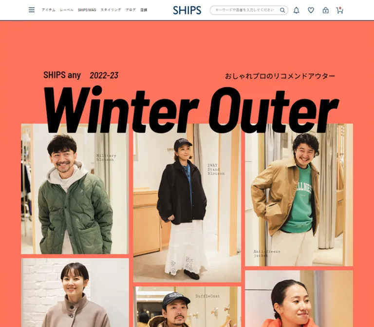
コーラル色の背景と巨大な斜体見出し、6人の着用写真が印象的なアウター特集。左右交互の編集記事に、星評価と購入導線を組み合わせた構成。
SHIPS any / Winter Outer — Style Reference
An oversized coral fashion cover followed by six photographic shopping stories.
Website: SHIPS any — Winter Outer
Original URL: https://www.shipsltd.co.jp/pages/shipsany-RecommendWinterOuter.aspx
Final URL: https://www.shipsltd.co.jp/pages/shipsany-RecommendWinterOuter.aspx
Theme: light retail shell, coral opening, and muted earth-tone editorial sections.
Inspected: October 2, 2026, 01:25:50 JST; supplied retrieval timestamp 2026-10-01T16:25:50.226Z.
Viewports: desktop 1440 × 1000 and mobile 390 × 844 CSS pixels.
Scope: the currently served editorial shopping feature: retail header, campaign masthead and portrait collage, six product stories, garment index, ratings and purchase links, production-credit line, and shared retail footer. Visual captures cover the desktop opening, a middle chapter, and the footer, plus the mobile opening and footer. Rendered text covers all six chapters; detailed element measurements cover the opening and the first four chapters.
The page pairs a conventional SHIPS shopping header with a much more expressive editorial feature. A coral field, enormous black italic title, and staggered portrait columns establish the opening. The photography shows people trying on winter outerwear inside a real shop, with warm lighting, mirrors, curtains, and natural gestures. Small typewriter-style garment labels sit within the photographs.
Below the opening, the layout becomes a sequence of magazine-like chapters. Each combines a large edge-aligned portrait, a narrower interview and detail-photo column, and a compact product rail. Japanese product names, English translations, black BUY pills, white rating capsules, and small outfit-price rows provide a repeated shopping structure. The large images alternate sides between chapters.
The visible 2022-23 season label belongs to the content currently served at this URL. This reference describes that current response; it does not reconstruct an earlier website or establish present product availability.
閉じる
SHIPS any / Winter Outer — Style Reference
An oversized coral fashion cover followed by six photographic shopping stories.
Website: SHIPS any — Winter Outer
Original URL: https://www.shipsltd.co.jp/pages/shipsany-RecommendWinterOuter.aspx
Final URL: https://www.shipsltd.co.jp/pages/shipsany-RecommendWinterOuter.aspx
Theme: light retail shell, coral opening, and muted earth-tone editorial sections.
Inspected: October 2, 2026, 01:25:50 JST; supplied retrieval timestamp 2026-10-01T16:25:50.226Z.
Viewports: desktop 1440 × 1000 and mobile 390 × 844 CSS pixels.
Scope: the currently served editorial shopping feature: retail header, campaign masthead and portrait collage, six product stories, garment index, ratings and purchase links, production-credit line, and shared retail footer. Visual captures cover the desktop opening, a middle chapter, and the footer, plus the mobile opening and footer. Rendered text covers all six chapters; detailed element measurements cover the opening and the first four chapters.
The page pairs a conventional SHIPS shopping header with a much more expressive editorial feature. A coral field, enormous black italic title, and staggered portrait columns establish the opening. The photography shows people trying on winter outerwear inside a real shop, with warm lighting, mirrors, curtains, and natural gestures. Small typewriter-style garment labels sit within the photographs.
Below the opening, the layout becomes a sequence of magazine-like chapters. Each combines a large edge-aligned portrait, a narrower interview and detail-photo column, and a compact product rail. Japanese product names, English translations, black BUY pills, white rating capsules, and small outfit-price rows provide a repeated shopping structure. The large images alternate sides between chapters.
The visible 2022-23 season label belongs to the content currently served at this URL. This reference describes that current response; it does not reconstruct an earlier website or establish present product availability.
How to Read This Reference
- Measured means a value appears in the supplied rendered DOM or computed-style records. Geometry is reported in CSS pixels, with long decimals rounded where useful.
- Derived means a calculation from measured geometry, such as the portrait column occupying approximately 37.335% of the page width.
- Visual estimate means an approximation from the supplied original-page captures. Background hex colors, several icon dimensions, and photographic crop sizes fall into this category. No pixel-color sampling was performed.
- Recommended means guidance for a new implementation. In particular, the mobile reflow and accessibility treatments below are additions, not observed features.
- Token names are implementation aliases. The supplied custom-property inventory is empty; it does not establish that the complete source contains no custom properties.
- This analysis uses the supplied evidence only. No additional browsing, asset retrieval, link activation, or filesystem inspection was performed.
Tokens — Colors
Default Palette
| Name | Value | Suggested token | Role | Evidence |
|---|---|---|---|---|
| Campaign Coral | Approximately #ff6e59 |
--color-coral |
Opening background and visible collage gutters | Visual estimate |
| Mouton Sand | Approximately #c9b783 |
--color-sand |
Background of the visible third product chapter | Visual estimate |
| Closing Taupe | Approximately #b99f83 |
--color-taupe |
Final chapter and production-credit area | Visual estimate |
| Editorial Black | #000000 |
--color-ink |
Headline, body text, product titles, primary BUY fill | Measured |
| White | #ffffff |
--color-white |
Header, rating capsules, BUY text, index labels | Measured for text and the global white canvas; capsule fill visually corroborated |
| Link Navy | #0a223c |
--color-link |
Computed profile and purchase-anchor color | Measured |
| Retail Navy | Approximately #003858 |
--color-retail-navy |
Header icon strokes, logo, footer banner outlines | Visual estimate; not interchangeable with a measured anchor color |
| Rating Gold | Approximately #f6c15f |
--color-rating |
Filled and partially filled stars | Visual estimate |
| Footer Gray | Approximately #eeeeee |
--color-footer |
Shared footer background | Visual estimate |
| Copyright Gray | Approximately #666666 |
--color-copyright |
Bottom copyright strip | Visual estimate |
The dominant campaign colors are flat fields. The photographs supply most of the texture and tonal variation. Black is the campaign's strongest contrast, while the retail shell uses navy for brand marks and utility graphics.
A computed anchor color does not always describe the visible label. The primary BUY anchor reports navy, but its nested text is explicitly white over black. Small outfit BUY labels similarly contain black text despite the enclosing anchor's navy color.
Section Color Behavior
The captures establish coral for the opening, sandy khaki for chapter 03, and taupe for the closing chapter. They do not provide a complete, verified background-color map for all six chapters. Keep other chapter colors configurable until their source values are available.
The bottom garment index appears over a translucent fade in the middle desktop capture. This is localized navigation treatment. It is not evidence of a general gradient or glass-surface system.
Tokens — Typography
Editorial Display — Barlow Semi Condensed
- Measured family:
YakuHanJP, 'Barlow Semi Condensed', sans-serif. - Hero size:
224px, weight700, line height224px. - Hero tracking:
-6.72px, equivalent to-0.03em. - Visual character: very large, heavy, condensed, and italic. The supplied style records omit
font-style; the slant is visible in the capture. - Other measured uses: numbered labels, Profile headings, profile links, outfit prices, and the outer BUY anchors.
The title is live text in the rendered DOM. Its scale, tight tracking, and overlap with photography create the cover-like composition. Do not substitute a generic wide sans-serif and expect the same silhouette.
Japanese Editorial Text — Noto Sans JP
- Measured family:
YakuHanJP, 'Noto Sans JP', sans-serif. - Weights: feature containers use
300; many individual paragraphs override to400; participant names and BUY labels use500. - Role: Japanese interviews, product names, explanatory captions, rating labels, and navigation captions.
- Character: restrained and relatively small beside the giant Latin title.
Keep the source stack order when these fonts are available. YakuHanJP appears in the computed stack; it should not be described as a separately verified custom display face.
Product Translations — Cutive Mono
- Measured family:
YakuHanJP, 'Cutive Mono', monospace. - Measured size:
14px / 19.6px, weight400. - Tracking:
-0.56px, equivalent to-0.04em. - Role: English garment names beneath Japanese headings.
Small labels on the hero photographs have a similar typewriter appearance. Their exact computed family and size are not included in the supplied element sample.
Shared Retail Interface — Roboto
- Measured family:
Roboto, '游ゴシック Medium', sans-serif. - Navigation:
12px / 18px, weight400. - Source root:
10px; the body is explicitly12px / 18px. - Role: the surrounding shop navigation and common site UI.
The feature and the retail shell use separate typographic systems. Preserve that distinction instead of applying the headline family to every interface element.
Type Scale
| Role | Size / line height | Weight | Tracking | Evidence |
|---|---|---|---|---|
| Winter Outer headline | 224px / 224px |
700 |
-6.72px |
Measured at both viewports |
| Hero brand and season | Approximately 32px |
Visually bold | Not measured | Visual estimate |
| Hero Japanese strapline | Approximately 24px |
Visually medium | Not measured | Visual estimate |
| Japanese garment heading | 22px / 30.8px |
400 |
Normal | Measured |
| Participant name | 20px / 20px |
500 |
Normal | Measured |
| Primary BUY visible label | 18px / 40px |
500 |
Normal | Measured; nested Noto Sans JP text |
| Opening introduction | 14px / 26.6px |
400 |
Normal | Measured |
| English garment translation | 14px / 19.6px |
400 |
-0.56px |
Measured |
| Product number | 14px / 14px |
300 |
Normal | Measured |
| Feature container, desktop | 13px / 26px |
300 |
Normal | Measured inherited style |
| Outfit price | 13px / 15.6px |
300 |
Normal | Measured |
| Profile heading | 13px / 13px |
500 |
0.52px |
Measured |
| Supporting editorial paragraph | 12px / 21.6px |
400 |
Normal | Measured |
| Rating label | 12px / 12px |
400 |
Normal | Measured |
| Profile social link | 12px / 12px |
500 |
0.48px |
Measured; 28px outer height with padding |
| Shared navigation | 12px / 18px |
400 |
Normal | Measured |
| Profile biography | 11px / 18.7px |
400 |
Normal | Measured |
| Garment-index caption | 11px / 16.5px |
400 |
Normal | Measured |
The zero-size H2 and metadata wrappers in the DOM are layout details. Their visible children have independent styling. Do not interpret the wrapper's font-size: 0 as the visible title size.
Tokens — Spacing & Shapes
Density: oversized photography and headline, compact supporting type, generous chapter padding, and tightly grouped commerce information.
Spacing Scale
| Use | Value | Evidence |
|---|---|---|
| Collage gutter | Approximately 14px |
Visual estimate consistent with three 375px columns inside 1153px |
| Price-row separation | Approximately 10px beyond the 15.6px line box |
Derived from repeated 25.6px row starts |
| Product heading to primary BUY | 20px |
Derived from measured element boundaries |
| Rating-row pitch | 63px |
Derived from measured label positions |
| Rating capsule height / intervening gap | Approximately 43px / 20px |
Visual estimate consistent with the 63px pitch |
| Rating-label left inset | 28px relative to the 265px rail |
Derived from measured x positions |
| Profile outer edge to text | Approximately 26px |
Derived; consistent with 25px padding plus a 1px border |
| Index caption padding | 5px 0 |
Measured |
| Index caption width / horizontal gap | 130px / 40px |
Measured width and derived gap |
| Portrait-to-story inset, odd chapters | 70px |
Derived |
| Story-to-product gap, odd desktop chapters | 70px |
Derived |
| Chapter content top / bottom padding | 110px / 100px |
Measured |
| Collage bottom to initial index | 110px |
Derived |
| Opening bottom padding | 85px |
Measured |
Border Radius
| Element | Shape | Evidence |
|---|---|---|
| Primary BUY | 9999px radius |
Measured |
| Rating capsule | Fully rounded ends | Visual observation; approximately half its 43px height |
| Search field | Rounded capsule | Visual observation |
| Number badges | Circular | Visual observation |
| Portraits and detail photos | Square corners | Visual observation |
| Profile box | Square corners with a fine border | Visual observation |
| Footer promotional banners | Rectangular, outlined | Visual observation |
The rounded forms belong to actions, scores, and small identifiers. The main photographic composition remains rectangular.
Layout Measurements
| Element | Desktop 1440 × 1000 |
Mobile 390 × 844 |
Interpretation |
|---|---|---|---|
| HTML width | 1440px |
390px |
Measured viewport-facing root |
| Body width | 1440px |
1100px |
Measured horizontal overflow on mobile |
| Headline box | 1030.625 × 224px |
1030.625 × 224px |
No headline downscaling in the supplied mobile state |
| Headline box x | 204.6875px |
34.6875px |
Centered within the wider layout canvas |
| Collage box | 1153 × 950px |
1100 × 906.328px |
Proportional collage resizing within the body |
| Collage top | 349px |
349px |
Measured |
| Large portrait region | 537.625 × 928px |
410.6875 × 772px |
Width approximately 37.335% of body |
| Remaining chapter region | 902.359px wide |
689.297px wide |
Approximately 62.665% of body |
| Supporting text column | 365.984px |
246.516px |
Narrows while remaining beside the other columns |
| Product rail | 265px |
265px |
Fixed width in both samples |
| Primary BUY | 265 × 43px |
265 × 43px |
Measured |
| Document height | Approximately 14056.48px |
Approximately 13440.89px |
Measured; not a target height for new content |
The portrait-region heights equal viewport height minus 72px at both inspected sizes. That is a useful derived relationship, but the underlying height declaration and positioning rules were not supplied.
Components
Shared Retail Header
Role: persistent shop identity and global shopping utilities.
The white header remains visible at the top of the opening, middle, and footer captures. Its visible lower edge is around 77px from the viewport top, with a thin navy rule. This supports persistent-header behavior; the exact fixed or sticky implementation is not included in the evidence.
The desktop anatomy is:
- A navy hamburger icon at the left.
- A compact horizontal navigation row, including
アイテム,レーベル,マガジン,スタイリング,ブログ,店舗, and発見. - A visually centered SHIPS logo.
- A rounded search field with a search icon.
- Notification, favorites, account/login, and cart utilities.
The four measured utility anchors are 44 × 44px. Their visible line icons occupy smaller central areas. The logo's anchor reports a 100px width; its 14px inline box height should not be mistaken for the artwork height.
The search field is approximately 272 × 38px, with a light gray border and a restrained shadow. It is one of the few visibly raised elements. Search submission, menu opening, account behavior, and utility destinations were not exercised.
A 40px-high news-link box appears in the DOM at y=72. Its artwork is not clearly visible in the captures. Do not invent an announcement banner to fill that record or treat the main element's y=112 coordinate as the header height.
Campaign Masthead
Role: introduce the feature as an editorial cover.
A narrow metadata row places SHIPS any and the season at the left, with おしゃれプロのリコメンドアウター toward the right. Below it, Winter Outer spans almost the entire centered headline width.
The measured title line box starts at y=180 and ends at y=404. The collage begins at y=349, creating a 55px overlap between their layout boxes. The black italic glyphs visibly cross into the top of the photographs. Preserve this layering and keep the heading above the images.
The title wrapper is approximately 1031px wide; the collage is wider at 1153px. This creates a slightly inset typographic composition inside a broader photographic frame.
Staggered Portrait Collage
Role: introduce all six participants and outerwear categories through photography.
The collage uses three equal-width columns separated by coral gutters. Each column contains two portraits with independent heights, producing staggered horizontal boundaries.
The visible order is:
| Column | Upper portrait | Lower portrait |
|---|---|---|
| Left | Military blouson | Stand-collar raglan long coat |
| Middle | 2WAY stand blouson | Duffle coat |
| Right | Anti-freeze jacket | Fake mouton blouson |
Approximate desktop upper-image dimensions are 375 × 453px, 375 × 551px, and 375 × 495px. These are visual estimates, not native asset dimensions. They explain the staggered composition more accurately than a uniform card grid.
Small black typewriter-style garment names sit over quieter parts of the photographs. Their positions vary to suit each image. Use per-image positioning rather than one universal caption corner.
The opening introduction is placed low in the collage area, within the left-column zone. Its measured text box is about 355px wide with five lines of 14px / 26.6px text. It explains that six fashion professionals tried on outerwear at the SHIPS any Shibuya store and evaluated it on a five-point scale.
Six-Item Garment Index
Role: present the six chapters as a compact visual directory.
Each item contains a garment cutout, a small circular number, and a Japanese label framed by thin white bracket-like edges. The labels are not filled cards.
The measured caption boxes are 130px wide. Their starting positions advance by 170px, giving 40px between caption boxes and a combined span of 980px. One- and two-line labels are vertically balanced.
The initial index is a 162px-high section below the collage. A second, compact presentation appears along the bottom of the middle desktop capture, over a fading background. The rendered text also contains the six labels twice.
The visual affordance suggests chapter navigation, but the supplied link list does not expose the index's handlers or fragment destinations. Click behavior, scrolling duration, selection tracking, and the meaning of outlined versus filled number circles remain unverified.
For a new implementation, use explicit in-page links and a programmatic current state. Any automatic active-chapter tracking would be an implementation addition.
Alternating Editorial Chapter
Role: combine a participant's recommendation with visual fit information and purchase access.
The content sequence is:
| Number | Garment | Participant | Source role and fit information |
|---|---|---|---|
| 01 | Stand-collar raglan long coat | 上枝 みどり | FREELANCE PR / 167cm / ONE SIZE |
| 02 | 2WAY stand blouson | 徳永 千夏 | STYLIST / 155cm / ONE SIZE |
| 03 | Fake mouton blouson | 小林 文 | EDITOR / 154cm / ONE SIZE |
| 04 | Duffle coat | 豊島 猛 | STYLIST / 168cm / LARGE |
| 05 | Military blouson | いくら 直幸 | EDITOR / 168cm / LARGE |
| 06 | Anti-freeze jacket | 庄 将司 | STYLIST / 175cm / X-LARGE |
Odd measured chapters place the large photograph at the left. Even measured chapters place it at the right. The full-width composition has no enclosing card border or shadow.
For chapter 01 at desktop width, the large portrait region occupies x=0–537.625. The narrative column begins at x=607.641 and is about 366px wide. The product rail begins at x=1043.625 and is 265px wide.
For chapter 02, the portrait starts at x=902.375. The narrative begins at x=466.375, while the product rail begins at x=65.688. These measured positions are not a perfectly mirrored version of chapter 01; preserve the broad alternation without claiming an exact symmetric source grid.
The narrative includes a participant name, role/height/size metadata, a longer recommendation, additional garment photographs, short explanatory paragraphs, and a profile box. Chapter height follows the content. The first four measured desktop chapters are approximately 1891–1924px tall.
The middle capture keeps a large portrait and product information visible beside later narrative content. This is consistent with a pinned editorial layout, but no scroll trace or positioning declarations establish the exact mechanism. Treat sticky portrait and rail behavior as a reproduction hypothesis until tested.
Product Information Rail
Role: make the featured garment identifiable and purchasable throughout its editorial treatment.
The 265px-wide rail contains:
- An offset white circular chapter number.
- A Japanese garment title at
22px / 30.8px. - An English translation at
14px / 19.6pxin Cutive Mono. - A full-width black BUY pill.
- Five white rating capsules.
- A compact list of outfit items and prices, with separate BUY links where present.
The number badge overlaps the heading's upper-left neighborhood rather than consuming a full row. The title can occupy one or two Japanese lines; the rail keeps the same width in both cases.
Primary BUY Pill
Role: take the reader to the featured outerwear product.
Measured outer dimensions are 265 × 43px, with a black background and 9999px radius. The visible white label uses Noto Sans JP at 18px, weight 500, with a 40px line box. A small diagonal arrow sits near the right end.
The supplied DOM records a 0.3s cubic-bezier(0.41, 0.12, 0.26, 0.97) transition on the anchor and nested label. The changed properties and hover endpoint were not captured.
The chapter 03 primary link points to the observed product URL. This establishes the link target only; the destination's current contents and stock status were not inspected.
Five-Criterion Rating Stack
Role: summarize the participant's assessment of the featured outerwear.
The five source labels are:
| Source label | Meaning |
|---|---|
着まわし力 |
Styling versatility |
あたたかさ |
Warmth |
スタイルアップ |
Flattering proportions |
トレンド感 |
Trend relevance |
軽さ |
Lightness |
Each row is a white capsule approximately 43px high, with black text on the left and gold stars on the right. Successive rows begin 63px apart. The visual system includes full, pale, and partially filled stars.
These are editorial assessments, not demonstrated rating-input controls. Do not make the stars editable or label them as customer-review aggregates without additional evidence. Numeric scores are not included in the supplied text extraction; avoid inventing a complete score dataset from the motif.
Outfit Purchase Rows
Role: expose the other garments used in each outfit.
A row pairs a compact category-and-price string with a small right-aligned BUY link and diagonal arrow. Prices use Barlow Semi Condensed at 13px / 15.6px, weight 300. The visible BUY text is medium-weight Noto Sans JP.
The list is visually unboxed. It has no quantity controls, availability badges, or add-to-cart button in the inspected feature.
Some source rows contain a price without a BUY link. Preserve that content distinction. Its cause is not established by the evidence, so do not automatically convert those rows into disabled buttons or out-of-stock messages.
Profile Box
Role: establish the contributor's professional context.
The biography is enclosed by a fine rectangular border that is only slightly darker than its chapter background. The fill remains the chapter color. There is no shadow or rounded card treatment.
The desktop box aligns with the approximately 366px narrative column. Its text sits about 26px inward from the outer edge. A small Profile heading uses Barlow Semi Condensed with 0.04em tracking. Biography text uses Noto Sans JP at 11px / 18.7px.
An Instagram icon precedes a linked handle. The measured profile-link padding is 8px 0 8px 20px, producing a 28px-high outer link box. The supplied DOM provides the profile destinations; their external pages were not visited.
Production Credit Line
Role: close the editorial feature before returning to the global retail footer.
A small centered line sits within broad taupe space. The original page visibly states: Design: Standfoundation co.,ltd. / Edit: Aya Kobayashi.
This is direct original-page credit evidence. No agency or editor website is linked in the supplied credit record, so none is inferred here.
Shared Retail Footer
Role: reconnect the feature to the wider store, services, corporate information, and social accounts.
The footer changes to light gray and uses a centered desktop content area approximately 1100px wide. Its visible anatomy is:
- Two larger reuse-market banners, approximately
378 × 83px, with navy outlines. - Four smaller promotional banners, approximately
260 × 56px, separated by 20px gaps. - Centered MENU, SERVICE / INFORMATION, and LINK groups.
- Inline text links separated by slashes.
- Brand-grouped social links using small gray marks within white circles.
- A full-width dark gray copyright strip, approximately 30px high.
A gray circular upward-chevron control is visible near the lower-right edge. Its appearance suggests a return-to-top action, but activation and scrolling behavior were not tested.
The desktop footer's broad spacing and multiple horizontal rows continue beyond the right edge of the mobile capture. It does not visibly become an accordion or a stacked mobile link list.
Tokens — Motion & Interaction
| Treatment | Evidence | What can be stated |
|---|---|---|
| Primary BUY transition | Computed 0.3s cubic-bezier(0.41, 0.12, 0.26, 0.97) |
Duration and easing are measured; hover colors and movement are unknown |
| Persistent retail header | Visible at the top of opening, middle, and footer captures | Persistent placement is supported; fixed versus sticky implementation is unknown |
| Bottom garment index | Visible at the bottom of the middle desktop capture | A compact overlay presentation exists; activation and exit thresholds are unknown |
| Large portrait/product persistence | Middle chapter composition | Pinning is plausible, but the exact scroll behavior is unverified |
| Product and profile navigation | Rendered anchor destinations | Destinations are recorded; navigation outcomes were not tested |
| Rating stars | Static visual presentation | No evidence of interactive rating input |
| Sampled element animation | animation: none throughout the supplied sample |
No keyframe animation is established for those sampled elements |
Other transition: all records |
No useful duration shown | Do not treat this alone as evidence of visible animation |
| Menu, search, return-to-top, index clicks | No interaction results supplied | Behavior remains unverified |
The capture process waited for loading, visible image decoding, and sampled layout stability, including an initial observation of at least five seconds. It also handled finite motion during readiness checks. These safeguards do not establish that every delayed effect was seen. Do not add parallax, animated stars, entrance choreography, or automatic carousels as purported source behavior.
For a new implementation, keep any feedback short and subordinate to reading. Reduced-motion support and keyboard-visible focus are recommended additions.
Surfaces
| Layer | Appearance | Purpose |
|---|---|---|
| Retail header | White with navy rule and outline graphics | Persistent store context |
| Opening | Flat coral | High-impact editorial cover |
| Photographs | Rectangular, natural color, no decorative frame | Human presence and garment texture |
| Chapter canvas | Muted, flat earth tone | Continuous background behind interview and product rail |
| Profile | Same chapter fill with a fine border | Quiet separation of biography |
| Primary action | Black capsule with white text | Strong purchase emphasis |
| Rating row | White capsule with black label and gold stars | Repeated evaluation structure |
| Chapter index overlay | Cutouts, white bracket labels, localized fading backdrop | Navigation over the current chapter |
| Shared footer | Light gray with navy-outlined banners | Retail information and services |
| Copyright strip | Dark gray with white text | Terminal page boundary |
Elevation is not the organizing principle. Scale, column placement, flat background fields, and photographic boundaries establish hierarchy.
Imagery
The photography is approachable and observational. People smile, stand naturally, and demonstrate garment shape inside a shop. Warm timber, pale flooring, fitting-room curtains, white brick, and mirrors recur as contextual surfaces.
The clothes provide tactile interest: quilted military fabric, fleece-like mouton, smooth reversible surfaces, wool-like coats, and casual jacket shells. Preserve enough image resolution to show texture. Do not apply pixelated rendering, heavy duotones, or artificial grain.
Use different image roles deliberately:
- Opening portraits: establish all six people and garments with varied crops and heights.
- Large chapter portrait: retain outfit silhouette and body proportions, including footwear where shown.
- Supporting photographs: explain the back, side, collar, lining, or reversible construction.
- Garment cutouts: isolate the outerwear for quick navigation recognition.
- Footer banners: retain their branded artwork as distinct retail promotions.
Observed Asset References
Original asset URLs, filenames, and intrinsic dimensions are not included in the supplied evidence. The references below identify visible assets without inventing paths.
| Asset group | Original-page evidence | Implementation requirement |
|---|---|---|
| Six opening portraits | Desktop opening capture, Image #1 | Preserve the three-column pairing and distinct crop heights |
| Third-chapter outfit portrait | Desktop middle capture, Image #2 | Use a tall image that preserves the outfit silhouette |
| Third-chapter reverse-side detail | Desktop middle capture, Image #2 | Pair construction detail with its explanatory paragraph |
| Six garment cutouts | Desktop middle capture, Image #2 | Use isolated garment artwork within consistent navigation bounds |
| Footer promotional banners | Desktop footer capture, Image #3 | Preserve original proportions and navy framing |
| Logo and utility graphics | Original desktop and mobile captures | Match visible artwork; no icon-library identity is established |
Use authorized source photography where available. CSS can reproduce the structure, but it cannot supply the specific participants, garments, or shop setting.
Layout & Responsive Behavior
Desktop Composition
The page is a long editorial document inside a persistent retail shell. Its opening is centered, while the chapters use full-width alternating compositions.
The collage measurements are consistent with a 1153px maximum width and an aspect ratio of 1153 / 950. This is a derived model, not a recovered CSS declaration. At desktop width, it leaves approximately 143.5px on each side.
The chapter split is consistently about 37.335% / 62.665% in the measured samples. Supporting text is narrower than the large portrait, and the 265px product rail remains compact. The opening title is disproportionately larger than every other text element, creating a deliberate shift from cover to article.
Observed Mobile Behavior
The supplied mobile state retains a desktop-width body:
- The HTML viewport is 390px wide, while the body and main feature are 1100px wide.
- The headline stays at 224px and its box stays approximately 1031px wide.
- The opening collage contracts to 1100px, not to 390px.
- The SHIPS logo anchor starts at x=510, outside the visible viewport. Its absence from the capture is positional, not evidence that it was intentionally hidden.
- The notification utility begins at x=917, with other utilities farther right.
- Odd-chapter narrative text begins around x=480.7, and the product rail begins around x=797.2.
- The footer retains its horizontal desktop layout and is cropped by the viewport.
The opening mobile capture therefore shows the left slice of a wide page: partial headline, the first portrait, and a small portion of the next column. It is not a stacked mobile layout.
Some container typography changes from 13px / 26px to 12px / 21.6px, and the narrative column narrows to approximately 246.5px. The wider composition nevertheless remains intact. Horizontal overflow is established by the measurements; touch panning and offscreen-control reachability were not tested.
Recommended Mobile Adaptation
For a new production implementation, use an explicitly redesigned narrow layout:
- Remove the 1100px body minimum and fit the campaign to the viewport.
- Scale the title while preserving its condensed italic character and photographic overlap.
- Keep the collage recognizable, using smaller proportional columns or an intentionally recomposed grid.
- Stack chapter photography, narrative, and product information in a logical reading order.
- Let product rails expand up to the available content width.
- Convert the six-item index into a horizontally scrollable strip with reachable focus targets.
- Reflow footer banners and link groups.
- Provide accessible access to all header utilities through a working compact navigation system.
The 1100px breakpoint in the Quick Start is a recommended implementation choice, not a discovered source breakpoint.
Do’s and Don’ts
Do
- Preserve the coral opening, enormous black italic heading, and title-over-photo overlap.
- Use the measured Barlow Semi Condensed, Noto Sans JP, and Cutive Mono roles when the fonts are available.
- Keep photographs rectangular and vary their heights in the opening collage.
- Retain the six-person editorial structure and garment-specific detail imagery.
- Alternate the large portrait side across chapters.
- Keep product information compact, with a clear 265px desktop rail.
- Repeat the black BUY pill and five white rating capsules consistently.
- Use the original Japanese criterion labels when reproducing the source UI.
- Preserve plain outfit rows that have no purchase link.
- Separate measured values from estimated background colors and recommended behavior.
- Document the observed mobile overflow honestly.
Don't
- Don't turn the feature into a uniform product-card grid.
- Don't reduce the opening title to a conventional modest heading.
- Don't round the photographs or add floating shadows around every content group.
- Don't replace the interview and fit information with generic promotional bullets.
- Don't make the stars interactive without a new, explicit product requirement.
- Don't treat editorial scores as customer-review aggregates.
- Don't assume every chapter uses the same background color.
- Don't invent hover endpoints, scroll animation, active-index logic, or asset filenames.
- Don't describe offscreen mobile controls as intentionally removed.
- Don't present the existing prices and links as proof of current stock or availability.
- Don't copy the source root size into a new project without checking all relative units.
Recommended Implementation Additions
These are improvements for a new implementation, not verified source features:
- Use a semantic H1 for the feature title, followed by chapter headings and named navigation landmarks.
- Make the six garment selectors actual fragment links, with sufficient
scroll-margin-topfor the persistent header. - Give repeated BUY links garment-specific accessible names.
- Represent ratings as labeled read-only values. Hide decorative stars from assistive technology and provide text such as “Warmth: 5 out of 5.”
- Provide a strong focus outline on product links, header utilities, and index items.
- Increase small profile and supporting text for narrow-screen reading rather than retaining every desktop text size.
- Review white index-caption contrast against the light chapter backgrounds. A darker backing or darker narrow-screen labels can improve legibility.
- Keep a pinned garment index from covering product links or the footer, and account for bottom safe-area insets.
- Use descriptive photo alternatives that explain the garment view; decorative cutouts can have empty alternatives when an adjacent label supplies the same meaning.
- Preserve image dimensions in markup to reduce layout movement, and defer noncritical later photographs.
- Respect reduced-motion preferences for any new scrolling or transition behavior.
Agent Prompt Guide
Quick Color Reference
- Opening coral: approximately
#ff6e59. - Visible third-chapter sand: approximately
#c9b783. - Closing taupe: approximately
#b99f83. - Measured text and primary action fill:
#000000. - Measured white text and white UI surfaces:
#ffffff. - Measured link-anchor navy:
#0a223c. - Gold stars: approximately
#f6c15f. - Shared footer: approximately
#eeeeee.
Treat the approximate values as implementation starting points, not recovered source declarations.
Overall Prompt
“Create a Japanese fashion editorial shopping feature inspired by SHIPS any Winter Outer. Place a restrained white retail header above a coral cover. Use a 224px desktop Barlow Semi Condensed headline, bold and italic with tight negative tracking, overlapping a three-column collage of six natural in-store outfit portraits. Give the portrait columns different image heights and small typewriter-style garment labels. Follow with six long chapters that alternate a large edge-aligned portrait, a narrow Noto Sans JP interview column, and a compact product rail. Each rail contains an offset circular number, Japanese garment name, Cutive Mono English translation, a black BUY capsule, five white rating capsules with gold stars, and small outfit-price links. Use flat earth-tone chapter backgrounds, square photography, fine profile-box borders, and a garment-cutout index. Add a clearly intentional mobile reflow; the supplied original mobile state retains a wide overflowing canvas.”
Example Component Prompts
- Opening collage: “Build three 375px portrait columns inside an approximately 1153px coral composition, with 14px gutters. Use varied portrait heights, a black italic headline overlapping the image tops, and small black typewriter labels positioned individually over quiet photographic areas. Keep the images square-cornered.”
- Product rail: “Create a 265px fashion recommendation rail with an offset white number circle, a 22px Japanese heading, a 14px Cutive Mono translation, and a 43px-high black BUY pill. Below it, place five white score capsules at a 63px pitch, then understated outfit-price rows.”
- Editorial chapter: “Compose a full-width fashion interview with a roughly 37.3% portrait region and a 62.7% information region. Use approximately 366px for narrative content and 265px for the desktop product rail. Give the information region 110px top breathing room. Alternate the large portrait side in the following chapter.”
- Profile box: “Place a square, lightly outlined biography box on the same earth-tone background as the article. Use a small tracked Barlow Semi Condensed Profile heading, compact Japanese biography text, approximately 25px inner padding, and an Instagram handle with a small icon.”
- Garment index: “Arrange six isolated outerwear cutouts over numbered circles and 130px-wide Japanese captions. Frame each caption with thin bracket-like white edges. For a new mobile implementation, make the strip horizontally scrollable and keyboard reachable; treat current-chapter tracking as an added behavior.”
Quick Start
CSS Custom Properties
This CSS is an implementation scaffold, not recovered source code. It preserves key desktop measurements, uses explicitly estimated background colors, and adds recommended mobile reflow. It keeps the surrounding project’s root font size unchanged by expressing measured dimensions in pixels.
Load the named fonts separately when available. No font-file or photograph URLs were supplied. Portrait pinning and rail pinning below are recommended approximations of the editorial composition; the original positioning rules were not captured.
:root {
  /* Measured colors */
  --color-ink: #000000;
  --color-white: #ffffff;
  --color-link: #0a223c;

  /* Visual estimates from the supplied captures */
  --color-coral: #ff6e59;
  --color-sand: #c9b783;
  --color-taupe: #b99f83;
  --color-retail-navy: #003858;
  --color-rating: #f6c15f;
  --color-footer: #eeeeee;
  --color-copyright: #666666;

  --font-ui: Roboto, '游ゴシック Medium', sans-serif;
  --font-body: YakuHanJP, 'Noto Sans JP', sans-serif;
  --font-display: YakuHanJP, 'Barlow Semi Condensed', sans-serif;
  --font-mono: YakuHanJP, 'Cutive Mono', monospace;

  --text-hero: 224px;
  --text-product: 22px;
  --text-person: 20px;
  --text-buy: 18px;
  --text-intro: 14px;
  --text-body: 13px;
  --text-caption: 12px;
  --text-small: 11px;

  --hero-width: 1153px;
  --headline-width: 1030.625px;
  --portrait-share: 37.335%;
  --story-width: 366px;
  --rail-width: 265px;
  --collage-gap: 14px;
  --chapter-gap: 70px;
  --chapter-top: 110px;
  --chapter-bottom: 100px;
  --pill-height: 43px;
  --pill-radius: 9999px;

  /* Header clearance estimated from the visible captures */
  --header-height: 77px;

  /* Measured duration and curve; endpoints below are recommendations */
  --motion-buy: 300ms cubic-bezier(0.41, 0.12, 0.26, 0.97);
}

*,
*::before,
*::after {
  box-sizing: border-box;
}

body {
  margin: 0;
  color: var(--color-ink);
  background: var(--color-white);
  font-family: var(--font-ui);
}

.campaign {
  font: 300 var(--text-body) / 2 var(--font-body);
}

.campaign img {
  display: block;
  max-width: 100%;
}

.campaign a {
  color: inherit;
}

.campaign :focus-visible {
  outline: 3px solid var(--color-ink);
  outline-offset: 4px;
}

/* Match the visible header clearance; provide navigation separately. */
.site-header {
  position: sticky;
  top: 0;
  z-index: 50;
  min-height: var(--header-height);
  background: var(--color-white);
  border-bottom: 1px solid var(--color-retail-navy);
}

.hero {
  padding: 85px 0;
  background: var(--color-coral);
}

.hero-heading {
  position: relative;
  z-index: 2;
  width: min(var(--headline-width), calc(100% - 32px));
  margin-inline: auto;
}

.hero-meta {
  display: flex;
  align-items: baseline;
  gap: 30px;
  min-height: 33px;
  font: 700 32px / 33px var(--font-display);
}

.hero-meta p {
  margin: 0;
}

.hero-season {
  font-style: italic;
}

.hero-meta .hero-strapline {
  margin-left: auto;
  font: 500 24px / 1.4 var(--font-body);
}

.hero-title {
  margin: -15px 0 0;
  font-family: var(--font-display);
  font-size: var(--text-hero);
  font-style: italic;
  font-weight: 700;
  line-height: 1;
  letter-spacing: -0.03em;
  white-space: nowrap;
}

.hero-collage {
  display: grid;
  grid-template-columns: repeat(3, minmax(0, 1fr));
  gap: var(--collage-gap);
  width: min(100%, var(--hero-width));
  margin: -55px auto 0;
}

.hero-column {
  display: flex;
  flex-direction: column;
  gap: var(--collage-gap);
  min-width: 0;
}

.hero-photo {
  position: relative;
  margin: 0;
}

.hero-photo img {
  width: 100%;
  height: auto;
}

.hero-photo figcaption {
  position: absolute;
  /* Set these per image to avoid faces and busy garment details. */
  inset-inline-start: var(--label-x, 65%);
  inset-block-start: var(--label-y, 24%);
  font: 400 13px / 1.1 var(--font-mono);
}

.hero-intro {
  margin: 20px;
  font: 400 var(--text-intro) / 1.9 var(--font-body);
}

.garment-index {
  display: grid;
  grid-template-columns: repeat(6, 130px);
  gap: 40px;
  width: max-content;
  max-width: 100%;
  margin: 110px auto 0;
  padding: 0;
  list-style: none;
}

.garment-index a {
  display: block;
  color: var(--color-white);
  text-decoration: none;
}

.index-art {
  position: relative;
  display: grid;
  place-items: center;
  height: 119px;
}

.index-art img {
  max-height: 100px;
  width: auto;
  object-fit: contain;
}

.index-number {
  position: absolute;
  top: 0;
  right: 11px;
  display: grid;
  place-items: center;
  width: 40px;
  height: 40px;
  border-radius: 50%;
  background: var(--color-white);
  color: var(--color-ink);
  font: 300 14px / 1 var(--font-display);
}

.index-label {
  position: relative;
  display: grid;
  place-items: center;
  min-height: 43px;
  padding: 5px 10px;
  text-align: center;
  font: 400 11px / 1.5 var(--font-body);
}

.index-label::before,
.index-label::after {
  position: absolute;
  top: 0;
  bottom: 0;
  width: 6px;
  border-block: 1px solid currentColor;
  content: '';
}

.index-label::before {
  left: 0;
  border-left: 1px solid currentColor;
}

.index-label::after {
  right: 0;
  border-right: 1px solid currentColor;
}

.look {
  display: grid;
  grid-template-columns: var(--portrait-share) minmax(0, 1fr);
  align-items: start;
  background: var(--section-bg, var(--color-sand));
  scroll-margin-top: calc(var(--header-height) + 16px);
}

.look-portrait {
  position: sticky;
  top: var(--header-height);
  height: calc(100vh - var(--header-height));
  margin: 0;
}

.look-portrait img {
  width: 100%;
  height: 100%;
  object-fit: cover;
  object-position: var(--portrait-position, center);
}

.look-body {
  display: grid;
  grid-template-columns: minmax(0, var(--story-width)) var(--rail-width);
  align-items: start;
  gap: var(--chapter-gap);
  min-width: 0;
  padding: var(--chapter-top) 70px var(--chapter-bottom);
}

.look-story {
  min-width: 0;
}

.person-name {
  margin: 0 0 12px;
  font: 500 var(--text-person) / 1 var(--font-body);
}

.person-meta {
  font: 400 13px / 1.5 var(--font-display);
}

.story-detail {
  margin: 40px 0;
}

.story-detail img {
  width: 100%;
  height: auto;
}

.story-detail figcaption {
  margin-top: 20px;
  font: 400 12px / 1.8 var(--font-body);
}

.look-rail {
  position: sticky;
  top: calc(var(--header-height) + 32px);
  min-width: 0;
}

.product-heading {
  position: relative;
  margin-bottom: 20px;
}

.product-number {
  position: absolute;
  top: -20px;
  left: -27px;
  display: grid;
  place-items: center;
  width: 40px;
  height: 40px;
  border-radius: 50%;
  background: var(--color-white);
  font: 300 14px / 1 var(--font-display);
}

.product-name {
  position: relative;
  margin: 0;
  font: 400 22px / 1.4 var(--font-body);
}

.product-translation {
  margin: 6px 0 0;
  font: 400 14px / 1.4 var(--font-mono);
  letter-spacing: -0.04em;
}

.campaign .buy-primary {
  position: relative;
  display: grid;
  place-items: center;
  width: 100%;
  min-height: var(--pill-height);
  border: 1px solid var(--color-ink);
  border-radius: var(--pill-radius);
  background: var(--color-ink);
  color: var(--color-white);
  font: 500 18px / 40px var(--font-body);
  text-decoration: none;
  transition: background-color var(--motion-buy), color var(--motion-buy);
}

.buy-primary .buy-arrow {
  position: absolute;
  right: 18px;
  font-size: 12px;
}

/* Recommended feedback; the original hover endpoint is unverified. */
@media (hover: hover) {
  .campaign .buy-primary:hover {
    background: var(--color-white);
    color: var(--color-ink);
  }
}

.rating-list {
  display: grid;
  gap: 20px;
  margin: 20px 0 30px;
}

.rating-row {
  display: flex;
  align-items: center;
  justify-content: space-between;
  gap: 12px;
  min-height: var(--pill-height);
  padding-inline: 28px;
  border-radius: var(--pill-radius);
  background: var(--color-white);
}

.rating-row dt {
  font: 400 12px / 1 var(--font-body);
}

.rating-row dd {
  margin: 0;
}

.stars {
  position: relative;
  display: inline-block;
  color: #fbedce;
  font: 16px / 1 monospace;
  letter-spacing: 3px;
  white-space: nowrap;
}

.stars-fill {
  position: absolute;
  inset: 0 auto 0 0;
  width: var(--rating-fill, 100%);
  overflow: hidden;
  color: var(--color-rating);
}

.outfit-list {
  display: grid;
  gap: 10px;
  margin: 0;
  padding: 0;
  list-style: none;
}

.outfit-list li {
  display: flex;
  justify-content: space-between;
  gap: 12px;
  font: 300 13px / 1.2 var(--font-display);
}

.outfit-list a {
  flex: none;
  font: 500 13px / 1.2 var(--font-body);
  text-decoration: none;
}

.profile {
  margin-top: 45px;
  padding: 25px;
  border: 1px solid rgb(0 0 0 / 18%);
}

.profile h3 {
  margin: 0 0 10px;
  font: 500 13px / 1 var(--font-display);
  letter-spacing: 0.04em;
}

.profile p {
  margin: 0 0 10px;
  font: 400 11px / 1.7 var(--font-body);
}

.profile a {
  display: inline-block;
  padding-block: 8px;
  color: var(--color-link);
  font: 500 12px / 1 var(--font-display);
  letter-spacing: 0.04em;
}

.look--reverse {
  grid-template-columns: minmax(0, 1fr) var(--portrait-share);
}

.look--reverse .look-portrait {
  grid-column: 2;
  grid-row: 1;
}

.look--reverse .look-body {
  grid-column: 1;
  grid-row: 1;
  grid-template-columns: var(--rail-width) minmax(0, var(--story-width));
  justify-content: space-between;
  padding-left: 65.7px;
}

.look--reverse .look-story {
  grid-column: 2;
  grid-row: 1;
}

.look--reverse .look-rail {
  grid-column: 1;
  grid-row: 1;
}

.production-credit {
  margin: 0;
  padding: 100px 24px 50px;
  background: var(--color-taupe);
  text-align: center;
  font: 500 13px / 1.5 var(--font-display);
}

.sr-only {
  position: absolute;
  width: 1px;
  height: 1px;
  padding: 0;
  margin: -1px;
  overflow: hidden;
  clip-path: inset(50%);
  white-space: nowrap;
  border: 0;
}

/* Recommended narrow layout; this differs from the captured overflow. */
@media (max-width: 1100px) {
  .hero {
    padding: 48px 0;
  }

  .hero-meta {
    flex-wrap: wrap;
    gap: 8px 20px;
    font-size: clamp(18px, 3vw, 30px);
    line-height: 1.2;
  }

  .hero-meta .hero-strapline {
    flex-basis: 100%;
    margin: 0;
    font-size: 14px;
  }

  .hero-title {
    margin-top: 12px;
    font-size: clamp(52px, 15.5vw, 170px);
  }

  .hero-collage {
    gap: 8px;
    margin-top: -10px;
  }

  .hero-column {
    gap: 8px;
  }

  .hero-photo figcaption {
    position: static;
    padding: 6px;
    font-size: 11px;
  }

  .hero-intro {
    margin: 12px 6px;
    font-size: 13px;
  }

  .garment-index {
    width: 100%;
    max-width: none;
    margin-top: 40px;
    padding: 8px 20px;
    gap: 20px;
    overflow-x: auto;
  }

  .look,
  .look--reverse {
    display: block;
  }

  .look-portrait {
    position: static;
    height: auto;
  }

  .look-portrait img {
    height: auto;
  }

  .look-body,
  .look--reverse .look-body {
    display: flex;
    flex-direction: column;
    gap: 40px;
    padding: 40px 24px 60px;
  }

  .look-story {
    width: 100%;
    font-size: 15px;
    line-height: 1.8;
  }

  .look-rail {
    position: static;
    width: min(100%, 420px);
    align-self: center;
  }

  .product-number {
    left: -12px;
  }

  .story-detail figcaption,
  .profile p {
    font-size: 14px;
    line-height: 1.8;
  }

  .production-credit {
    padding-top: 60px;
  }
}

@media (prefers-reduced-motion: reduce) {
  .campaign .buy-primary {
    transition: none;
  }
}
The portrait component assumes a .look-portrait sibling followed by .look-body, containing .look-story and .look-rail. The reverse modifier changes their desktop visual placement while retaining a consistent document order.
The following read-only rating markup demonstrates the star component. Its example score is implementation data, not a transcription of the full source rating set.
<dl class='rating-list'>
  <div class='rating-row'>
    <dt>着まわし力</dt>
    <dd>
      <span class='sr-only'>4.5 out of 5</span>
      <span class='stars' aria-hidden='true' style='--rating-fill: 90%'>
        ★★★★★
        <span class='stars-fill'>★★★★★</span>
      </span>
    </dd>
  </div>
</dl>
The scaffold does not implement the shared store menu, search, a conditional bottom dock, or active-chapter tracking. Those require their own accessible markup and behavior. For strict comparison with the supplied mobile capture, retain an approximately 1100px-wide canvas and the 224px headline instead of applying the recommended narrow-layout rules.
Tailwind v4 Token Mapping
Optional mapping for an implementation that already uses Tailwind v4. These aliases do not imply that the original site uses Tailwind. Define the custom properties above first.
@theme inline {
  --color-campaign-coral: var(--color-coral);
  --color-chapter-sand: var(--color-sand);
  --color-chapter-taupe: var(--color-taupe);
  --color-editorial-ink: var(--color-ink);
  --color-score-gold: var(--color-rating);
  --color-retail-link: var(--color-link);

  --font-editorial: var(--font-body);
  --font-campaign-display: var(--font-display);
  --font-product-translation: var(--font-mono);

  --text-cover: 224px;
  --text-garment: 22px;
  --text-participant: 20px;
  --text-purchase: 18px;
  --text-editorial-small: 12px;

  --spacing-collage-gap: 14px;
  --spacing-chapter-gap: 70px;
  --spacing-product-rail: 265px;
  --spacing-story-column: 366px;
  --radius-purchase: 9999px;
}
Sources & Evidence
- Inspected original and final page: SHIPS any — Winter Outer. Both URLs are identical; supplied HTTP status is
200. - Capture date:
2026-10-01T16:25:50.226Z, equivalent to October 2, 2026, 01:25:50.226 JST. The displayed season label is content, not the inspection date. - Desktop evidence:
1440 × 1000viewport; original-page opening, middle-chapter, and footer images; rendered text, links, element rectangles, and computed styles. Recorded document height is approximately 14056.48px. - Mobile evidence:
390 × 844viewport; original-page opening and footer images; rendered DOM showing a 1100px-wide body. Recorded document height is approximately 13440.89px. - Interaction evidence: scroll-position captures and rendered anchor destinations only. No supplied click, hover, search, purchase, menu, or keyboard-interaction results establish those behaviors.
- Style evidence: named computed font stacks, sizes, weights, line heights, text colors, primary-button fill and radius, element geometry, and the primary BUY transition. Background-color aliases and several graphic dimensions are visual estimates.
- Original-page attribution evidence: the visible SHIPS identity and copyright, plus the explicit production line naming Standfoundation co.,ltd. and Aya Kobayashi.
- Capture limitations: readiness checks waited for loading, decoded images, sampled layout stability, and applicable finite motion within bounded waits. SharedWorkers and service workers were disabled. Delayed content, unsampled styles, external destinations, intrinsic image dimensions, and unexercised interactions remain unverified. Device pixel ratio and exact screenshot scroll offsets were not provided.
This document describes the current page represented by the supplied inspection. The CSS, accessible semantics, mobile reflow, and proposed sticky behavior are reusable implementation guidance wherever they extend beyond the measured evidence.
# SHIPS any / Winter Outer — Style Reference

> An oversized coral fashion cover followed by six photographic shopping stories.

**Website:** [SHIPS any — Winter Outer](https://www.shipsltd.co.jp/pages/shipsany-RecommendWinterOuter.aspx)
**Original URL:** https://www.shipsltd.co.jp/pages/shipsany-RecommendWinterOuter.aspx
**Final URL:** https://www.shipsltd.co.jp/pages/shipsany-RecommendWinterOuter.aspx
**Theme:** light retail shell, coral opening, and muted earth-tone editorial sections.
**Inspected:** October 2, 2026, 01:25:50 JST; supplied retrieval timestamp `2026-10-01T16:25:50.226Z`.
**Viewports:** desktop `1440 × 1000` and mobile `390 × 844` CSS pixels.
**Scope:** the currently served editorial shopping feature: retail header, campaign masthead and portrait collage, six product stories, garment index, ratings and purchase links, production-credit line, and shared retail footer. Visual captures cover the desktop opening, a middle chapter, and the footer, plus the mobile opening and footer. Rendered text covers all six chapters; detailed element measurements cover the opening and the first four chapters.

The page pairs a conventional SHIPS shopping header with a much more expressive editorial feature. A coral field, enormous black italic title, and staggered portrait columns establish the opening. The photography shows people trying on winter outerwear inside a real shop, with warm lighting, mirrors, curtains, and natural gestures. Small typewriter-style garment labels sit within the photographs.

Below the opening, the layout becomes a sequence of magazine-like chapters. Each combines a large edge-aligned portrait, a narrower interview and detail-photo column, and a compact product rail. Japanese product names, English translations, black BUY pills, white rating capsules, and small outfit-price rows provide a repeated shopping structure. The large images alternate sides between chapters.

The visible `2022-23` season label belongs to the content currently served at this URL. This reference describes that current response; it does not reconstruct an earlier website or establish present product availability.
閉じる
# SHIPS any / Winter Outer — Style Reference

> An oversized coral fashion cover followed by six photographic shopping stories.

**Website:** [SHIPS any — Winter Outer](https://www.shipsltd.co.jp/pages/shipsany-RecommendWinterOuter.aspx)
**Original URL:** https://www.shipsltd.co.jp/pages/shipsany-RecommendWinterOuter.aspx
**Final URL:** https://www.shipsltd.co.jp/pages/shipsany-RecommendWinterOuter.aspx
**Theme:** light retail shell, coral opening, and muted earth-tone editorial sections.
**Inspected:** October 2, 2026, 01:25:50 JST; supplied retrieval timestamp `2026-10-01T16:25:50.226Z`.
**Viewports:** desktop `1440 × 1000` and mobile `390 × 844` CSS pixels.
**Scope:** the currently served editorial shopping feature: retail header, campaign masthead and portrait collage, six product stories, garment index, ratings and purchase links, production-credit line, and shared retail footer. Visual captures cover the desktop opening, a middle chapter, and the footer, plus the mobile opening and footer. Rendered text covers all six chapters; detailed element measurements cover the opening and the first four chapters.

The page pairs a conventional SHIPS shopping header with a much more expressive editorial feature. A coral field, enormous black italic title, and staggered portrait columns establish the opening. The photography shows people trying on winter outerwear inside a real shop, with warm lighting, mirrors, curtains, and natural gestures. Small typewriter-style garment labels sit within the photographs.

Below the opening, the layout becomes a sequence of magazine-like chapters. Each combines a large edge-aligned portrait, a narrower interview and detail-photo column, and a compact product rail. Japanese product names, English translations, black BUY pills, white rating capsules, and small outfit-price rows provide a repeated shopping structure. The large images alternate sides between chapters.

The visible `2022-23` season label belongs to the content currently served at this URL. This reference describes that current response; it does not reconstruct an earlier website or establish present product availability.

## How to Read This Reference

- **Measured** means a value appears in the supplied rendered DOM or computed-style records. Geometry is reported in CSS pixels, with long decimals rounded where useful.
- **Derived** means a calculation from measured geometry, such as the portrait column occupying approximately 37.335% of the page width.
- **Visual estimate** means an approximation from the supplied original-page captures. Background hex colors, several icon dimensions, and photographic crop sizes fall into this category. No pixel-color sampling was performed.
- **Recommended** means guidance for a new implementation. In particular, the mobile reflow and accessibility treatments below are additions, not observed features.
- Token names are implementation aliases. The supplied custom-property inventory is empty; it does not establish that the complete source contains no custom properties.
- This analysis uses the supplied evidence only. No additional browsing, asset retrieval, link activation, or filesystem inspection was performed.

## Tokens — Colors

### Default Palette

| Name | Value | Suggested token | Role | Evidence |
| --- | --- | --- | --- | --- |
| Campaign Coral | Approximately `#ff6e59` | `--color-coral` | Opening background and visible collage gutters | Visual estimate |
| Mouton Sand | Approximately `#c9b783` | `--color-sand` | Background of the visible third product chapter | Visual estimate |
| Closing Taupe | Approximately `#b99f83` | `--color-taupe` | Final chapter and production-credit area | Visual estimate |
| Editorial Black | `#000000` | `--color-ink` | Headline, body text, product titles, primary BUY fill | Measured |
| White | `#ffffff` | `--color-white` | Header, rating capsules, BUY text, index labels | Measured for text and the global white canvas; capsule fill visually corroborated |
| Link Navy | `#0a223c` | `--color-link` | Computed profile and purchase-anchor color | Measured |
| Retail Navy | Approximately `#003858` | `--color-retail-navy` | Header icon strokes, logo, footer banner outlines | Visual estimate; not interchangeable with a measured anchor color |
| Rating Gold | Approximately `#f6c15f` | `--color-rating` | Filled and partially filled stars | Visual estimate |
| Footer Gray | Approximately `#eeeeee` | `--color-footer` | Shared footer background | Visual estimate |
| Copyright Gray | Approximately `#666666` | `--color-copyright` | Bottom copyright strip | Visual estimate |

The dominant campaign colors are flat fields. The photographs supply most of the texture and tonal variation. Black is the campaign's strongest contrast, while the retail shell uses navy for brand marks and utility graphics.

A computed anchor color does not always describe the visible label. The primary BUY anchor reports navy, but its nested text is explicitly white over black. Small outfit BUY labels similarly contain black text despite the enclosing anchor's navy color.

### Section Color Behavior

The captures establish coral for the opening, sandy khaki for chapter 03, and taupe for the closing chapter. They do not provide a complete, verified background-color map for all six chapters. Keep other chapter colors configurable until their source values are available.

The bottom garment index appears over a translucent fade in the middle desktop capture. This is localized navigation treatment. It is not evidence of a general gradient or glass-surface system.

## Tokens — Typography

### Editorial Display — Barlow Semi Condensed

- **Measured family:** `YakuHanJP, 'Barlow Semi Condensed', sans-serif`.
- **Hero size:** `224px`, weight `700`, line height `224px`.
- **Hero tracking:** `-6.72px`, equivalent to `-0.03em`.
- **Visual character:** very large, heavy, condensed, and italic. The supplied style records omit `font-style`; the slant is visible in the capture.
- **Other measured uses:** numbered labels, Profile headings, profile links, outfit prices, and the outer BUY anchors.

The title is live text in the rendered DOM. Its scale, tight tracking, and overlap with photography create the cover-like composition. Do not substitute a generic wide sans-serif and expect the same silhouette.

### Japanese Editorial Text — Noto Sans JP

- **Measured family:** `YakuHanJP, 'Noto Sans JP', sans-serif`.
- **Weights:** feature containers use `300`; many individual paragraphs override to `400`; participant names and BUY labels use `500`.
- **Role:** Japanese interviews, product names, explanatory captions, rating labels, and navigation captions.
- **Character:** restrained and relatively small beside the giant Latin title.

Keep the source stack order when these fonts are available. YakuHanJP appears in the computed stack; it should not be described as a separately verified custom display face.

### Product Translations — Cutive Mono

- **Measured family:** `YakuHanJP, 'Cutive Mono', monospace`.
- **Measured size:** `14px / 19.6px`, weight `400`.
- **Tracking:** `-0.56px`, equivalent to `-0.04em`.
- **Role:** English garment names beneath Japanese headings.

Small labels on the hero photographs have a similar typewriter appearance. Their exact computed family and size are not included in the supplied element sample.

### Shared Retail Interface — Roboto

- **Measured family:** `Roboto, '游ゴシック Medium', sans-serif`.
- **Navigation:** `12px / 18px`, weight `400`.
- **Source root:** `10px`; the body is explicitly `12px / 18px`.
- **Role:** the surrounding shop navigation and common site UI.

The feature and the retail shell use separate typographic systems. Preserve that distinction instead of applying the headline family to every interface element.

### Type Scale

| Role | Size / line height | Weight | Tracking | Evidence |
| --- | --- | --- | --- | --- |
| Winter Outer headline | `224px / 224px` | `700` | `-6.72px` | Measured at both viewports |
| Hero brand and season | Approximately `32px` | Visually bold | Not measured | Visual estimate |
| Hero Japanese strapline | Approximately `24px` | Visually medium | Not measured | Visual estimate |
| Japanese garment heading | `22px / 30.8px` | `400` | Normal | Measured |
| Participant name | `20px / 20px` | `500` | Normal | Measured |
| Primary BUY visible label | `18px / 40px` | `500` | Normal | Measured; nested Noto Sans JP text |
| Opening introduction | `14px / 26.6px` | `400` | Normal | Measured |
| English garment translation | `14px / 19.6px` | `400` | `-0.56px` | Measured |
| Product number | `14px / 14px` | `300` | Normal | Measured |
| Feature container, desktop | `13px / 26px` | `300` | Normal | Measured inherited style |
| Outfit price | `13px / 15.6px` | `300` | Normal | Measured |
| Profile heading | `13px / 13px` | `500` | `0.52px` | Measured |
| Supporting editorial paragraph | `12px / 21.6px` | `400` | Normal | Measured |
| Rating label | `12px / 12px` | `400` | Normal | Measured |
| Profile social link | `12px / 12px` | `500` | `0.48px` | Measured; 28px outer height with padding |
| Shared navigation | `12px / 18px` | `400` | Normal | Measured |
| Profile biography | `11px / 18.7px` | `400` | Normal | Measured |
| Garment-index caption | `11px / 16.5px` | `400` | Normal | Measured |

The zero-size H2 and metadata wrappers in the DOM are layout details. Their visible children have independent styling. Do not interpret the wrapper's `font-size: 0` as the visible title size.

## Tokens — Spacing & Shapes

**Density:** oversized photography and headline, compact supporting type, generous chapter padding, and tightly grouped commerce information.

### Spacing Scale

| Use | Value | Evidence |
| --- | --- | --- |
| Collage gutter | Approximately `14px` | Visual estimate consistent with three 375px columns inside 1153px |
| Price-row separation | Approximately `10px` beyond the 15.6px line box | Derived from repeated 25.6px row starts |
| Product heading to primary BUY | `20px` | Derived from measured element boundaries |
| Rating-row pitch | `63px` | Derived from measured label positions |
| Rating capsule height / intervening gap | Approximately `43px / 20px` | Visual estimate consistent with the 63px pitch |
| Rating-label left inset | `28px` relative to the 265px rail | Derived from measured x positions |
| Profile outer edge to text | Approximately `26px` | Derived; consistent with 25px padding plus a 1px border |
| Index caption padding | `5px 0` | Measured |
| Index caption width / horizontal gap | `130px / 40px` | Measured width and derived gap |
| Portrait-to-story inset, odd chapters | `70px` | Derived |
| Story-to-product gap, odd desktop chapters | `70px` | Derived |
| Chapter content top / bottom padding | `110px / 100px` | Measured |
| Collage bottom to initial index | `110px` | Derived |
| Opening bottom padding | `85px` | Measured |

### Border Radius

| Element | Shape | Evidence |
| --- | --- | --- |
| Primary BUY | `9999px` radius | Measured |
| Rating capsule | Fully rounded ends | Visual observation; approximately half its 43px height |
| Search field | Rounded capsule | Visual observation |
| Number badges | Circular | Visual observation |
| Portraits and detail photos | Square corners | Visual observation |
| Profile box | Square corners with a fine border | Visual observation |
| Footer promotional banners | Rectangular, outlined | Visual observation |

The rounded forms belong to actions, scores, and small identifiers. The main photographic composition remains rectangular.

### Layout Measurements

| Element | Desktop `1440 × 1000` | Mobile `390 × 844` | Interpretation |
| --- | --- | --- | --- |
| HTML width | `1440px` | `390px` | Measured viewport-facing root |
| Body width | `1440px` | `1100px` | Measured horizontal overflow on mobile |
| Headline box | `1030.625 × 224px` | `1030.625 × 224px` | No headline downscaling in the supplied mobile state |
| Headline box x | `204.6875px` | `34.6875px` | Centered within the wider layout canvas |
| Collage box | `1153 × 950px` | `1100 × 906.328px` | Proportional collage resizing within the body |
| Collage top | `349px` | `349px` | Measured |
| Large portrait region | `537.625 × 928px` | `410.6875 × 772px` | Width approximately 37.335% of body |
| Remaining chapter region | `902.359px` wide | `689.297px` wide | Approximately 62.665% of body |
| Supporting text column | `365.984px` | `246.516px` | Narrows while remaining beside the other columns |
| Product rail | `265px` | `265px` | Fixed width in both samples |
| Primary BUY | `265 × 43px` | `265 × 43px` | Measured |
| Document height | Approximately `14056.48px` | Approximately `13440.89px` | Measured; not a target height for new content |

The portrait-region heights equal viewport height minus 72px at both inspected sizes. That is a useful derived relationship, but the underlying height declaration and positioning rules were not supplied.

## Components

### Shared Retail Header

**Role:** persistent shop identity and global shopping utilities.

The white header remains visible at the top of the opening, middle, and footer captures. Its visible lower edge is around 77px from the viewport top, with a thin navy rule. This supports persistent-header behavior; the exact fixed or sticky implementation is not included in the evidence.

The desktop anatomy is:

1. A navy hamburger icon at the left.
2. A compact horizontal navigation row, including `アイテム`, `レーベル`, `マガジン`, `スタイリング`, `ブログ`, `店舗`, and `発見`.
3. A visually centered SHIPS logo.
4. A rounded search field with a search icon.
5. Notification, favorites, account/login, and cart utilities.

The four measured utility anchors are `44 × 44px`. Their visible line icons occupy smaller central areas. The logo's anchor reports a 100px width; its 14px inline box height should not be mistaken for the artwork height.

The search field is approximately `272 × 38px`, with a light gray border and a restrained shadow. It is one of the few visibly raised elements. Search submission, menu opening, account behavior, and utility destinations were not exercised.

A 40px-high news-link box appears in the DOM at y=72. Its artwork is not clearly visible in the captures. Do not invent an announcement banner to fill that record or treat the main element's y=112 coordinate as the header height.

### Campaign Masthead

**Role:** introduce the feature as an editorial cover.

A narrow metadata row places SHIPS any and the season at the left, with `おしゃれプロのリコメンドアウター` toward the right. Below it, Winter Outer spans almost the entire centered headline width.

The measured title line box starts at y=180 and ends at y=404. The collage begins at y=349, creating a 55px overlap between their layout boxes. The black italic glyphs visibly cross into the top of the photographs. Preserve this layering and keep the heading above the images.

The title wrapper is approximately 1031px wide; the collage is wider at 1153px. This creates a slightly inset typographic composition inside a broader photographic frame.

### Staggered Portrait Collage

**Role:** introduce all six participants and outerwear categories through photography.

The collage uses three equal-width columns separated by coral gutters. Each column contains two portraits with independent heights, producing staggered horizontal boundaries.

The visible order is:

| Column | Upper portrait | Lower portrait |
| --- | --- | --- |
| Left | Military blouson | Stand-collar raglan long coat |
| Middle | 2WAY stand blouson | Duffle coat |
| Right | Anti-freeze jacket | Fake mouton blouson |

Approximate desktop upper-image dimensions are `375 × 453px`, `375 × 551px`, and `375 × 495px`. These are visual estimates, not native asset dimensions. They explain the staggered composition more accurately than a uniform card grid.

Small black typewriter-style garment names sit over quieter parts of the photographs. Their positions vary to suit each image. Use per-image positioning rather than one universal caption corner.

The opening introduction is placed low in the collage area, within the left-column zone. Its measured text box is about 355px wide with five lines of `14px / 26.6px` text. It explains that six fashion professionals tried on outerwear at the SHIPS any Shibuya store and evaluated it on a five-point scale.

### Six-Item Garment Index

**Role:** present the six chapters as a compact visual directory.

Each item contains a garment cutout, a small circular number, and a Japanese label framed by thin white bracket-like edges. The labels are not filled cards.

The measured caption boxes are 130px wide. Their starting positions advance by 170px, giving 40px between caption boxes and a combined span of 980px. One- and two-line labels are vertically balanced.

The initial index is a 162px-high section below the collage. A second, compact presentation appears along the bottom of the middle desktop capture, over a fading background. The rendered text also contains the six labels twice.

The visual affordance suggests chapter navigation, but the supplied link list does not expose the index's handlers or fragment destinations. Click behavior, scrolling duration, selection tracking, and the meaning of outlined versus filled number circles remain unverified.

For a new implementation, use explicit in-page links and a programmatic current state. Any automatic active-chapter tracking would be an implementation addition.

### Alternating Editorial Chapter

**Role:** combine a participant's recommendation with visual fit information and purchase access.

The content sequence is:

| Number | Garment | Participant | Source role and fit information |
| --- | --- | --- | --- |
| 01 | Stand-collar raglan long coat | 上枝 みどり | FREELANCE PR / 167cm / ONE SIZE |
| 02 | 2WAY stand blouson | 徳永 千夏 | STYLIST / 155cm / ONE SIZE |
| 03 | Fake mouton blouson | 小林 文 | EDITOR / 154cm / ONE SIZE |
| 04 | Duffle coat | 豊島 猛 | STYLIST / 168cm / LARGE |
| 05 | Military blouson | いくら 直幸 | EDITOR / 168cm / LARGE |
| 06 | Anti-freeze jacket | 庄 将司 | STYLIST / 175cm / X-LARGE |

Odd measured chapters place the large photograph at the left. Even measured chapters place it at the right. The full-width composition has no enclosing card border or shadow.

For chapter 01 at desktop width, the large portrait region occupies x=0–537.625. The narrative column begins at x=607.641 and is about 366px wide. The product rail begins at x=1043.625 and is 265px wide.

For chapter 02, the portrait starts at x=902.375. The narrative begins at x=466.375, while the product rail begins at x=65.688. These measured positions are not a perfectly mirrored version of chapter 01; preserve the broad alternation without claiming an exact symmetric source grid.

The narrative includes a participant name, role/height/size metadata, a longer recommendation, additional garment photographs, short explanatory paragraphs, and a profile box. Chapter height follows the content. The first four measured desktop chapters are approximately 1891–1924px tall.

The middle capture keeps a large portrait and product information visible beside later narrative content. This is consistent with a pinned editorial layout, but no scroll trace or positioning declarations establish the exact mechanism. Treat sticky portrait and rail behavior as a reproduction hypothesis until tested.

### Product Information Rail

**Role:** make the featured garment identifiable and purchasable throughout its editorial treatment.

The 265px-wide rail contains:

1. An offset white circular chapter number.
2. A Japanese garment title at `22px / 30.8px`.
3. An English translation at `14px / 19.6px` in Cutive Mono.
4. A full-width black BUY pill.
5. Five white rating capsules.
6. A compact list of outfit items and prices, with separate BUY links where present.

The number badge overlaps the heading's upper-left neighborhood rather than consuming a full row. The title can occupy one or two Japanese lines; the rail keeps the same width in both cases.

### Primary BUY Pill

**Role:** take the reader to the featured outerwear product.

Measured outer dimensions are `265 × 43px`, with a black background and `9999px` radius. The visible white label uses Noto Sans JP at `18px`, weight `500`, with a 40px line box. A small diagonal arrow sits near the right end.

The supplied DOM records a `0.3s cubic-bezier(0.41, 0.12, 0.26, 0.97)` transition on the anchor and nested label. The changed properties and hover endpoint were not captured.

The chapter 03 primary link points to [the observed product URL](https://www.shipsltd.co.jp/g/g724150046/). This establishes the link target only; the destination's current contents and stock status were not inspected.

### Five-Criterion Rating Stack

**Role:** summarize the participant's assessment of the featured outerwear.

The five source labels are:

| Source label | Meaning |
| --- | --- |
| `着まわし力` | Styling versatility |
| `あたたかさ` | Warmth |
| `スタイルアップ` | Flattering proportions |
| `トレンド感` | Trend relevance |
| `軽さ` | Lightness |

Each row is a white capsule approximately 43px high, with black text on the left and gold stars on the right. Successive rows begin 63px apart. The visual system includes full, pale, and partially filled stars.

These are editorial assessments, not demonstrated rating-input controls. Do not make the stars editable or label them as customer-review aggregates without additional evidence. Numeric scores are not included in the supplied text extraction; avoid inventing a complete score dataset from the motif.

### Outfit Purchase Rows

**Role:** expose the other garments used in each outfit.

A row pairs a compact category-and-price string with a small right-aligned BUY link and diagonal arrow. Prices use Barlow Semi Condensed at `13px / 15.6px`, weight `300`. The visible BUY text is medium-weight Noto Sans JP.

The list is visually unboxed. It has no quantity controls, availability badges, or add-to-cart button in the inspected feature.

Some source rows contain a price without a BUY link. Preserve that content distinction. Its cause is not established by the evidence, so do not automatically convert those rows into disabled buttons or out-of-stock messages.

### Profile Box

**Role:** establish the contributor's professional context.

The biography is enclosed by a fine rectangular border that is only slightly darker than its chapter background. The fill remains the chapter color. There is no shadow or rounded card treatment.

The desktop box aligns with the approximately 366px narrative column. Its text sits about 26px inward from the outer edge. A small Profile heading uses Barlow Semi Condensed with `0.04em` tracking. Biography text uses Noto Sans JP at `11px / 18.7px`.

An Instagram icon precedes a linked handle. The measured profile-link padding is `8px 0 8px 20px`, producing a 28px-high outer link box. The supplied DOM provides the profile destinations; their external pages were not visited.

### Production Credit Line

**Role:** close the editorial feature before returning to the global retail footer.

A small centered line sits within broad taupe space. The original page visibly states: `Design: Standfoundation co.,ltd. / Edit: Aya Kobayashi`.

This is direct original-page credit evidence. No agency or editor website is linked in the supplied credit record, so none is inferred here.

### Shared Retail Footer

**Role:** reconnect the feature to the wider store, services, corporate information, and social accounts.

The footer changes to light gray and uses a centered desktop content area approximately 1100px wide. Its visible anatomy is:

- Two larger reuse-market banners, approximately `378 × 83px`, with navy outlines.
- Four smaller promotional banners, approximately `260 × 56px`, separated by 20px gaps.
- Centered MENU, SERVICE / INFORMATION, and LINK groups.
- Inline text links separated by slashes.
- Brand-grouped social links using small gray marks within white circles.
- A full-width dark gray copyright strip, approximately 30px high.

A gray circular upward-chevron control is visible near the lower-right edge. Its appearance suggests a return-to-top action, but activation and scrolling behavior were not tested.

The desktop footer's broad spacing and multiple horizontal rows continue beyond the right edge of the mobile capture. It does not visibly become an accordion or a stacked mobile link list.

## Tokens — Motion & Interaction

| Treatment | Evidence | What can be stated |
| --- | --- | --- |
| Primary BUY transition | Computed `0.3s cubic-bezier(0.41, 0.12, 0.26, 0.97)` | Duration and easing are measured; hover colors and movement are unknown |
| Persistent retail header | Visible at the top of opening, middle, and footer captures | Persistent placement is supported; fixed versus sticky implementation is unknown |
| Bottom garment index | Visible at the bottom of the middle desktop capture | A compact overlay presentation exists; activation and exit thresholds are unknown |
| Large portrait/product persistence | Middle chapter composition | Pinning is plausible, but the exact scroll behavior is unverified |
| Product and profile navigation | Rendered anchor destinations | Destinations are recorded; navigation outcomes were not tested |
| Rating stars | Static visual presentation | No evidence of interactive rating input |
| Sampled element animation | `animation: none` throughout the supplied sample | No keyframe animation is established for those sampled elements |
| Other `transition: all` records | No useful duration shown | Do not treat this alone as evidence of visible animation |
| Menu, search, return-to-top, index clicks | No interaction results supplied | Behavior remains unverified |

The capture process waited for loading, visible image decoding, and sampled layout stability, including an initial observation of at least five seconds. It also handled finite motion during readiness checks. These safeguards do not establish that every delayed effect was seen. Do not add parallax, animated stars, entrance choreography, or automatic carousels as purported source behavior.

For a new implementation, keep any feedback short and subordinate to reading. Reduced-motion support and keyboard-visible focus are recommended additions.

## Surfaces

| Layer | Appearance | Purpose |
| --- | --- | --- |
| Retail header | White with navy rule and outline graphics | Persistent store context |
| Opening | Flat coral | High-impact editorial cover |
| Photographs | Rectangular, natural color, no decorative frame | Human presence and garment texture |
| Chapter canvas | Muted, flat earth tone | Continuous background behind interview and product rail |
| Profile | Same chapter fill with a fine border | Quiet separation of biography |
| Primary action | Black capsule with white text | Strong purchase emphasis |
| Rating row | White capsule with black label and gold stars | Repeated evaluation structure |
| Chapter index overlay | Cutouts, white bracket labels, localized fading backdrop | Navigation over the current chapter |
| Shared footer | Light gray with navy-outlined banners | Retail information and services |
| Copyright strip | Dark gray with white text | Terminal page boundary |

Elevation is not the organizing principle. Scale, column placement, flat background fields, and photographic boundaries establish hierarchy.

## Imagery

The photography is approachable and observational. People smile, stand naturally, and demonstrate garment shape inside a shop. Warm timber, pale flooring, fitting-room curtains, white brick, and mirrors recur as contextual surfaces.

The clothes provide tactile interest: quilted military fabric, fleece-like mouton, smooth reversible surfaces, wool-like coats, and casual jacket shells. Preserve enough image resolution to show texture. Do not apply pixelated rendering, heavy duotones, or artificial grain.

Use different image roles deliberately:

- **Opening portraits:** establish all six people and garments with varied crops and heights.
- **Large chapter portrait:** retain outfit silhouette and body proportions, including footwear where shown.
- **Supporting photographs:** explain the back, side, collar, lining, or reversible construction.
- **Garment cutouts:** isolate the outerwear for quick navigation recognition.
- **Footer banners:** retain their branded artwork as distinct retail promotions.

### Observed Asset References

Original asset URLs, filenames, and intrinsic dimensions are not included in the supplied evidence. The references below identify visible assets without inventing paths.

| Asset group | Original-page evidence | Implementation requirement |
| --- | --- | --- |
| Six opening portraits | Desktop opening capture, Image #1 | Preserve the three-column pairing and distinct crop heights |
| Third-chapter outfit portrait | Desktop middle capture, Image #2 | Use a tall image that preserves the outfit silhouette |
| Third-chapter reverse-side detail | Desktop middle capture, Image #2 | Pair construction detail with its explanatory paragraph |
| Six garment cutouts | Desktop middle capture, Image #2 | Use isolated garment artwork within consistent navigation bounds |
| Footer promotional banners | Desktop footer capture, Image #3 | Preserve original proportions and navy framing |
| Logo and utility graphics | Original desktop and mobile captures | Match visible artwork; no icon-library identity is established |

Use authorized source photography where available. CSS can reproduce the structure, but it cannot supply the specific participants, garments, or shop setting.

## Layout & Responsive Behavior

### Desktop Composition

The page is a long editorial document inside a persistent retail shell. Its opening is centered, while the chapters use full-width alternating compositions.

The collage measurements are consistent with a 1153px maximum width and an aspect ratio of `1153 / 950`. This is a derived model, not a recovered CSS declaration. At desktop width, it leaves approximately 143.5px on each side.

The chapter split is consistently about `37.335% / 62.665%` in the measured samples. Supporting text is narrower than the large portrait, and the 265px product rail remains compact. The opening title is disproportionately larger than every other text element, creating a deliberate shift from cover to article.

### Observed Mobile Behavior

The supplied mobile state retains a desktop-width body:

- The HTML viewport is 390px wide, while the body and main feature are 1100px wide.
- The headline stays at 224px and its box stays approximately 1031px wide.
- The opening collage contracts to 1100px, not to 390px.
- The SHIPS logo anchor starts at x=510, outside the visible viewport. Its absence from the capture is positional, not evidence that it was intentionally hidden.
- The notification utility begins at x=917, with other utilities farther right.
- Odd-chapter narrative text begins around x=480.7, and the product rail begins around x=797.2.
- The footer retains its horizontal desktop layout and is cropped by the viewport.

The opening mobile capture therefore shows the left slice of a wide page: partial headline, the first portrait, and a small portion of the next column. It is not a stacked mobile layout.

Some container typography changes from `13px / 26px` to `12px / 21.6px`, and the narrative column narrows to approximately 246.5px. The wider composition nevertheless remains intact. Horizontal overflow is established by the measurements; touch panning and offscreen-control reachability were not tested.

### Recommended Mobile Adaptation

For a new production implementation, use an explicitly redesigned narrow layout:

- Remove the 1100px body minimum and fit the campaign to the viewport.
- Scale the title while preserving its condensed italic character and photographic overlap.
- Keep the collage recognizable, using smaller proportional columns or an intentionally recomposed grid.
- Stack chapter photography, narrative, and product information in a logical reading order.
- Let product rails expand up to the available content width.
- Convert the six-item index into a horizontally scrollable strip with reachable focus targets.
- Reflow footer banners and link groups.
- Provide accessible access to all header utilities through a working compact navigation system.

The 1100px breakpoint in the Quick Start is a recommended implementation choice, not a discovered source breakpoint.

## Do’s and Don’ts

### Do

- Preserve the coral opening, enormous black italic heading, and title-over-photo overlap.
- Use the measured Barlow Semi Condensed, Noto Sans JP, and Cutive Mono roles when the fonts are available.
- Keep photographs rectangular and vary their heights in the opening collage.
- Retain the six-person editorial structure and garment-specific detail imagery.
- Alternate the large portrait side across chapters.
- Keep product information compact, with a clear 265px desktop rail.
- Repeat the black BUY pill and five white rating capsules consistently.
- Use the original Japanese criterion labels when reproducing the source UI.
- Preserve plain outfit rows that have no purchase link.
- Separate measured values from estimated background colors and recommended behavior.
- Document the observed mobile overflow honestly.

### Don't

- Don't turn the feature into a uniform product-card grid.
- Don't reduce the opening title to a conventional modest heading.
- Don't round the photographs or add floating shadows around every content group.
- Don't replace the interview and fit information with generic promotional bullets.
- Don't make the stars interactive without a new, explicit product requirement.
- Don't treat editorial scores as customer-review aggregates.
- Don't assume every chapter uses the same background color.
- Don't invent hover endpoints, scroll animation, active-index logic, or asset filenames.
- Don't describe offscreen mobile controls as intentionally removed.
- Don't present the existing prices and links as proof of current stock or availability.
- Don't copy the source root size into a new project without checking all relative units.

## Recommended Implementation Additions

These are improvements for a new implementation, not verified source features:

- Use a semantic H1 for the feature title, followed by chapter headings and named navigation landmarks.
- Make the six garment selectors actual fragment links, with sufficient `scroll-margin-top` for the persistent header.
- Give repeated BUY links garment-specific accessible names.
- Represent ratings as labeled read-only values. Hide decorative stars from assistive technology and provide text such as “Warmth: 5 out of 5.”
- Provide a strong focus outline on product links, header utilities, and index items.
- Increase small profile and supporting text for narrow-screen reading rather than retaining every desktop text size.
- Review white index-caption contrast against the light chapter backgrounds. A darker backing or darker narrow-screen labels can improve legibility.
- Keep a pinned garment index from covering product links or the footer, and account for bottom safe-area insets.
- Use descriptive photo alternatives that explain the garment view; decorative cutouts can have empty alternatives when an adjacent label supplies the same meaning.
- Preserve image dimensions in markup to reduce layout movement, and defer noncritical later photographs.
- Respect reduced-motion preferences for any new scrolling or transition behavior.

## Agent Prompt Guide

### Quick Color Reference

- Opening coral: approximately `#ff6e59`.
- Visible third-chapter sand: approximately `#c9b783`.
- Closing taupe: approximately `#b99f83`.
- Measured text and primary action fill: `#000000`.
- Measured white text and white UI surfaces: `#ffffff`.
- Measured link-anchor navy: `#0a223c`.
- Gold stars: approximately `#f6c15f`.
- Shared footer: approximately `#eeeeee`.

Treat the approximate values as implementation starting points, not recovered source declarations.

### Overall Prompt

“Create a Japanese fashion editorial shopping feature inspired by SHIPS any Winter Outer. Place a restrained white retail header above a coral cover. Use a 224px desktop Barlow Semi Condensed headline, bold and italic with tight negative tracking, overlapping a three-column collage of six natural in-store outfit portraits. Give the portrait columns different image heights and small typewriter-style garment labels. Follow with six long chapters that alternate a large edge-aligned portrait, a narrow Noto Sans JP interview column, and a compact product rail. Each rail contains an offset circular number, Japanese garment name, Cutive Mono English translation, a black BUY capsule, five white rating capsules with gold stars, and small outfit-price links. Use flat earth-tone chapter backgrounds, square photography, fine profile-box borders, and a garment-cutout index. Add a clearly intentional mobile reflow; the supplied original mobile state retains a wide overflowing canvas.”

### Example Component Prompts

1. **Opening collage:** “Build three 375px portrait columns inside an approximately 1153px coral composition, with 14px gutters. Use varied portrait heights, a black italic headline overlapping the image tops, and small black typewriter labels positioned individually over quiet photographic areas. Keep the images square-cornered.”
2. **Product rail:** “Create a 265px fashion recommendation rail with an offset white number circle, a 22px Japanese heading, a 14px Cutive Mono translation, and a 43px-high black BUY pill. Below it, place five white score capsules at a 63px pitch, then understated outfit-price rows.”
3. **Editorial chapter:** “Compose a full-width fashion interview with a roughly 37.3% portrait region and a 62.7% information region. Use approximately 366px for narrative content and 265px for the desktop product rail. Give the information region 110px top breathing room. Alternate the large portrait side in the following chapter.”
4. **Profile box:** “Place a square, lightly outlined biography box on the same earth-tone background as the article. Use a small tracked Barlow Semi Condensed Profile heading, compact Japanese biography text, approximately 25px inner padding, and an Instagram handle with a small icon.”
5. **Garment index:** “Arrange six isolated outerwear cutouts over numbered circles and 130px-wide Japanese captions. Frame each caption with thin bracket-like white edges. For a new mobile implementation, make the strip horizontally scrollable and keyboard reachable; treat current-chapter tracking as an added behavior.”

## Quick Start

### CSS Custom Properties

This CSS is an implementation scaffold, not recovered source code. It preserves key desktop measurements, uses explicitly estimated background colors, and adds recommended mobile reflow. It keeps the surrounding project’s root font size unchanged by expressing measured dimensions in pixels.

Load the named fonts separately when available. No font-file or photograph URLs were supplied. Portrait pinning and rail pinning below are recommended approximations of the editorial composition; the original positioning rules were not captured.

```css
:root {
  /* Measured colors */
  --color-ink: #000000;
  --color-white: #ffffff;
  --color-link: #0a223c;

  /* Visual estimates from the supplied captures */
  --color-coral: #ff6e59;
  --color-sand: #c9b783;
  --color-taupe: #b99f83;
  --color-retail-navy: #003858;
  --color-rating: #f6c15f;
  --color-footer: #eeeeee;
  --color-copyright: #666666;

  --font-ui: Roboto, '游ゴシック Medium', sans-serif;
  --font-body: YakuHanJP, 'Noto Sans JP', sans-serif;
  --font-display: YakuHanJP, 'Barlow Semi Condensed', sans-serif;
  --font-mono: YakuHanJP, 'Cutive Mono', monospace;

  --text-hero: 224px;
  --text-product: 22px;
  --text-person: 20px;
  --text-buy: 18px;
  --text-intro: 14px;
  --text-body: 13px;
  --text-caption: 12px;
  --text-small: 11px;

  --hero-width: 1153px;
  --headline-width: 1030.625px;
  --portrait-share: 37.335%;
  --story-width: 366px;
  --rail-width: 265px;
  --collage-gap: 14px;
  --chapter-gap: 70px;
  --chapter-top: 110px;
  --chapter-bottom: 100px;
  --pill-height: 43px;
  --pill-radius: 9999px;

  /* Header clearance estimated from the visible captures */
  --header-height: 77px;

  /* Measured duration and curve; endpoints below are recommendations */
  --motion-buy: 300ms cubic-bezier(0.41, 0.12, 0.26, 0.97);
}

*,
*::before,
*::after {
  box-sizing: border-box;
}

body {
  margin: 0;
  color: var(--color-ink);
  background: var(--color-white);
  font-family: var(--font-ui);
}

.campaign {
  font: 300 var(--text-body) / 2 var(--font-body);
}

.campaign img {
  display: block;
  max-width: 100%;
}

.campaign a {
  color: inherit;
}

.campaign :focus-visible {
  outline: 3px solid var(--color-ink);
  outline-offset: 4px;
}

/* Match the visible header clearance; provide navigation separately. */
.site-header {
  position: sticky;
  top: 0;
  z-index: 50;
  min-height: var(--header-height);
  background: var(--color-white);
  border-bottom: 1px solid var(--color-retail-navy);
}

.hero {
  padding: 85px 0;
  background: var(--color-coral);
}

.hero-heading {
  position: relative;
  z-index: 2;
  width: min(var(--headline-width), calc(100% - 32px));
  margin-inline: auto;
}

.hero-meta {
  display: flex;
  align-items: baseline;
  gap: 30px;
  min-height: 33px;
  font: 700 32px / 33px var(--font-display);
}

.hero-meta p {
  margin: 0;
}

.hero-season {
  font-style: italic;
}

.hero-meta .hero-strapline {
  margin-left: auto;
  font: 500 24px / 1.4 var(--font-body);
}

.hero-title {
  margin: -15px 0 0;
  font-family: var(--font-display);
  font-size: var(--text-hero);
  font-style: italic;
  font-weight: 700;
  line-height: 1;
  letter-spacing: -0.03em;
  white-space: nowrap;
}

.hero-collage {
  display: grid;
  grid-template-columns: repeat(3, minmax(0, 1fr));
  gap: var(--collage-gap);
  width: min(100%, var(--hero-width));
  margin: -55px auto 0;
}

.hero-column {
  display: flex;
  flex-direction: column;
  gap: var(--collage-gap);
  min-width: 0;
}

.hero-photo {
  position: relative;
  margin: 0;
}

.hero-photo img {
  width: 100%;
  height: auto;
}

.hero-photo figcaption {
  position: absolute;
  /* Set these per image to avoid faces and busy garment details. */
  inset-inline-start: var(--label-x, 65%);
  inset-block-start: var(--label-y, 24%);
  font: 400 13px / 1.1 var(--font-mono);
}

.hero-intro {
  margin: 20px;
  font: 400 var(--text-intro) / 1.9 var(--font-body);
}

.garment-index {
  display: grid;
  grid-template-columns: repeat(6, 130px);
  gap: 40px;
  width: max-content;
  max-width: 100%;
  margin: 110px auto 0;
  padding: 0;
  list-style: none;
}

.garment-index a {
  display: block;
  color: var(--color-white);
  text-decoration: none;
}

.index-art {
  position: relative;
  display: grid;
  place-items: center;
  height: 119px;
}

.index-art img {
  max-height: 100px;
  width: auto;
  object-fit: contain;
}

.index-number {
  position: absolute;
  top: 0;
  right: 11px;
  display: grid;
  place-items: center;
  width: 40px;
  height: 40px;
  border-radius: 50%;
  background: var(--color-white);
  color: var(--color-ink);
  font: 300 14px / 1 var(--font-display);
}

.index-label {
  position: relative;
  display: grid;
  place-items: center;
  min-height: 43px;
  padding: 5px 10px;
  text-align: center;
  font: 400 11px / 1.5 var(--font-body);
}

.index-label::before,
.index-label::after {
  position: absolute;
  top: 0;
  bottom: 0;
  width: 6px;
  border-block: 1px solid currentColor;
  content: '';
}

.index-label::before {
  left: 0;
  border-left: 1px solid currentColor;
}

.index-label::after {
  right: 0;
  border-right: 1px solid currentColor;
}

.look {
  display: grid;
  grid-template-columns: var(--portrait-share) minmax(0, 1fr);
  align-items: start;
  background: var(--section-bg, var(--color-sand));
  scroll-margin-top: calc(var(--header-height) + 16px);
}

.look-portrait {
  position: sticky;
  top: var(--header-height);
  height: calc(100vh - var(--header-height));
  margin: 0;
}

.look-portrait img {
  width: 100%;
  height: 100%;
  object-fit: cover;
  object-position: var(--portrait-position, center);
}

.look-body {
  display: grid;
  grid-template-columns: minmax(0, var(--story-width)) var(--rail-width);
  align-items: start;
  gap: var(--chapter-gap);
  min-width: 0;
  padding: var(--chapter-top) 70px var(--chapter-bottom);
}

.look-story {
  min-width: 0;
}

.person-name {
  margin: 0 0 12px;
  font: 500 var(--text-person) / 1 var(--font-body);
}

.person-meta {
  font: 400 13px / 1.5 var(--font-display);
}

.story-detail {
  margin: 40px 0;
}

.story-detail img {
  width: 100%;
  height: auto;
}

.story-detail figcaption {
  margin-top: 20px;
  font: 400 12px / 1.8 var(--font-body);
}

.look-rail {
  position: sticky;
  top: calc(var(--header-height) + 32px);
  min-width: 0;
}

.product-heading {
  position: relative;
  margin-bottom: 20px;
}

.product-number {
  position: absolute;
  top: -20px;
  left: -27px;
  display: grid;
  place-items: center;
  width: 40px;
  height: 40px;
  border-radius: 50%;
  background: var(--color-white);
  font: 300 14px / 1 var(--font-display);
}

.product-name {
  position: relative;
  margin: 0;
  font: 400 22px / 1.4 var(--font-body);
}

.product-translation {
  margin: 6px 0 0;
  font: 400 14px / 1.4 var(--font-mono);
  letter-spacing: -0.04em;
}

.campaign .buy-primary {
  position: relative;
  display: grid;
  place-items: center;
  width: 100%;
  min-height: var(--pill-height);
  border: 1px solid var(--color-ink);
  border-radius: var(--pill-radius);
  background: var(--color-ink);
  color: var(--color-white);
  font: 500 18px / 40px var(--font-body);
  text-decoration: none;
  transition: background-color var(--motion-buy), color var(--motion-buy);
}

.buy-primary .buy-arrow {
  position: absolute;
  right: 18px;
  font-size: 12px;
}

/* Recommended feedback; the original hover endpoint is unverified. */
@media (hover: hover) {
  .campaign .buy-primary:hover {
    background: var(--color-white);
    color: var(--color-ink);
  }
}

.rating-list {
  display: grid;
  gap: 20px;
  margin: 20px 0 30px;
}

.rating-row {
  display: flex;
  align-items: center;
  justify-content: space-between;
  gap: 12px;
  min-height: var(--pill-height);
  padding-inline: 28px;
  border-radius: var(--pill-radius);
  background: var(--color-white);
}

.rating-row dt {
  font: 400 12px / 1 var(--font-body);
}

.rating-row dd {
  margin: 0;
}

.stars {
  position: relative;
  display: inline-block;
  color: #fbedce;
  font: 16px / 1 monospace;
  letter-spacing: 3px;
  white-space: nowrap;
}

.stars-fill {
  position: absolute;
  inset: 0 auto 0 0;
  width: var(--rating-fill, 100%);
  overflow: hidden;
  color: var(--color-rating);
}

.outfit-list {
  display: grid;
  gap: 10px;
  margin: 0;
  padding: 0;
  list-style: none;
}

.outfit-list li {
  display: flex;
  justify-content: space-between;
  gap: 12px;
  font: 300 13px / 1.2 var(--font-display);
}

.outfit-list a {
  flex: none;
  font: 500 13px / 1.2 var(--font-body);
  text-decoration: none;
}

.profile {
  margin-top: 45px;
  padding: 25px;
  border: 1px solid rgb(0 0 0 / 18%);
}

.profile h3 {
  margin: 0 0 10px;
  font: 500 13px / 1 var(--font-display);
  letter-spacing: 0.04em;
}

.profile p {
  margin: 0 0 10px;
  font: 400 11px / 1.7 var(--font-body);
}

.profile a {
  display: inline-block;
  padding-block: 8px;
  color: var(--color-link);
  font: 500 12px / 1 var(--font-display);
  letter-spacing: 0.04em;
}

.look--reverse {
  grid-template-columns: minmax(0, 1fr) var(--portrait-share);
}

.look--reverse .look-portrait {
  grid-column: 2;
  grid-row: 1;
}

.look--reverse .look-body {
  grid-column: 1;
  grid-row: 1;
  grid-template-columns: var(--rail-width) minmax(0, var(--story-width));
  justify-content: space-between;
  padding-left: 65.7px;
}

.look--reverse .look-story {
  grid-column: 2;
  grid-row: 1;
}

.look--reverse .look-rail {
  grid-column: 1;
  grid-row: 1;
}

.production-credit {
  margin: 0;
  padding: 100px 24px 50px;
  background: var(--color-taupe);
  text-align: center;
  font: 500 13px / 1.5 var(--font-display);
}

.sr-only {
  position: absolute;
  width: 1px;
  height: 1px;
  padding: 0;
  margin: -1px;
  overflow: hidden;
  clip-path: inset(50%);
  white-space: nowrap;
  border: 0;
}

/* Recommended narrow layout; this differs from the captured overflow. */
@media (max-width: 1100px) {
  .hero {
    padding: 48px 0;
  }

  .hero-meta {
    flex-wrap: wrap;
    gap: 8px 20px;
    font-size: clamp(18px, 3vw, 30px);
    line-height: 1.2;
  }

  .hero-meta .hero-strapline {
    flex-basis: 100%;
    margin: 0;
    font-size: 14px;
  }

  .hero-title {
    margin-top: 12px;
    font-size: clamp(52px, 15.5vw, 170px);
  }

  .hero-collage {
    gap: 8px;
    margin-top: -10px;
  }

  .hero-column {
    gap: 8px;
  }

  .hero-photo figcaption {
    position: static;
    padding: 6px;
    font-size: 11px;
  }

  .hero-intro {
    margin: 12px 6px;
    font-size: 13px;
  }

  .garment-index {
    width: 100%;
    max-width: none;
    margin-top: 40px;
    padding: 8px 20px;
    gap: 20px;
    overflow-x: auto;
  }

  .look,
  .look--reverse {
    display: block;
  }

  .look-portrait {
    position: static;
    height: auto;
  }

  .look-portrait img {
    height: auto;
  }

  .look-body,
  .look--reverse .look-body {
    display: flex;
    flex-direction: column;
    gap: 40px;
    padding: 40px 24px 60px;
  }

  .look-story {
    width: 100%;
    font-size: 15px;
    line-height: 1.8;
  }

  .look-rail {
    position: static;
    width: min(100%, 420px);
    align-self: center;
  }

  .product-number {
    left: -12px;
  }

  .story-detail figcaption,
  .profile p {
    font-size: 14px;
    line-height: 1.8;
  }

  .production-credit {
    padding-top: 60px;
  }
}

@media (prefers-reduced-motion: reduce) {
  .campaign .buy-primary {
    transition: none;
  }
}
```

The portrait component assumes a `.look-portrait` sibling followed by `.look-body`, containing `.look-story` and `.look-rail`. The reverse modifier changes their desktop visual placement while retaining a consistent document order.

The following read-only rating markup demonstrates the star component. Its example score is implementation data, not a transcription of the full source rating set.

```html
<dl class='rating-list'>
  <div class='rating-row'>
    <dt>着まわし力</dt>
    <dd>
      <span class='sr-only'>4.5 out of 5</span>
      <span class='stars' aria-hidden='true' style='--rating-fill: 90%'>
        ★★★★★
        <span class='stars-fill'>★★★★★</span>
      </span>
    </dd>
  </div>
</dl>
```

The scaffold does not implement the shared store menu, search, a conditional bottom dock, or active-chapter tracking. Those require their own accessible markup and behavior. For strict comparison with the supplied mobile capture, retain an approximately 1100px-wide canvas and the 224px headline instead of applying the recommended narrow-layout rules.

### Tailwind v4 Token Mapping

Optional mapping for an implementation that already uses Tailwind v4. These aliases do not imply that the original site uses Tailwind. Define the custom properties above first.

```css
@theme inline {
  --color-campaign-coral: var(--color-coral);
  --color-chapter-sand: var(--color-sand);
  --color-chapter-taupe: var(--color-taupe);
  --color-editorial-ink: var(--color-ink);
  --color-score-gold: var(--color-rating);
  --color-retail-link: var(--color-link);

  --font-editorial: var(--font-body);
  --font-campaign-display: var(--font-display);
  --font-product-translation: var(--font-mono);

  --text-cover: 224px;
  --text-garment: 22px;
  --text-participant: 20px;
  --text-purchase: 18px;
  --text-editorial-small: 12px;

  --spacing-collage-gap: 14px;
  --spacing-chapter-gap: 70px;
  --spacing-product-rail: 265px;
  --spacing-story-column: 366px;
  --radius-purchase: 9999px;
}
```

## Sources & Evidence

- **Inspected original and final page:** [SHIPS any — Winter Outer](https://www.shipsltd.co.jp/pages/shipsany-RecommendWinterOuter.aspx). Both URLs are identical; supplied HTTP status is `200`.
- **Capture date:** `2026-10-01T16:25:50.226Z`, equivalent to October 2, 2026, 01:25:50.226 JST. The displayed season label is content, not the inspection date.
- **Desktop evidence:** `1440 × 1000` viewport; original-page opening, middle-chapter, and footer images; rendered text, links, element rectangles, and computed styles. Recorded document height is approximately 14056.48px.
- **Mobile evidence:** `390 × 844` viewport; original-page opening and footer images; rendered DOM showing a 1100px-wide body. Recorded document height is approximately 13440.89px.
- **Interaction evidence:** scroll-position captures and rendered anchor destinations only. No supplied click, hover, search, purchase, menu, or keyboard-interaction results establish those behaviors.
- **Style evidence:** named computed font stacks, sizes, weights, line heights, text colors, primary-button fill and radius, element geometry, and the primary BUY transition. Background-color aliases and several graphic dimensions are visual estimates.
- **Original-page attribution evidence:** the visible SHIPS identity and copyright, plus the explicit production line naming Standfoundation co.,ltd. and Aya Kobayashi.
- **Capture limitations:** readiness checks waited for loading, decoded images, sampled layout stability, and applicable finite motion within bounded waits. SharedWorkers and service workers were disabled. Delayed content, unsampled styles, external destinations, intrinsic image dimensions, and unexercised interactions remain unverified. Device pixel ratio and exact screenshot scroll offsets were not provided.

This document describes the current page represented by the supplied inspection. The CSS, accessible semantics, mobile reflow, and proposed sticky behavior are reusable implementation guidance wherever they extend beyond the measured evidence.関連するデザイン
スタイルやページの種類、ジャンルが近いデザインを集めました。