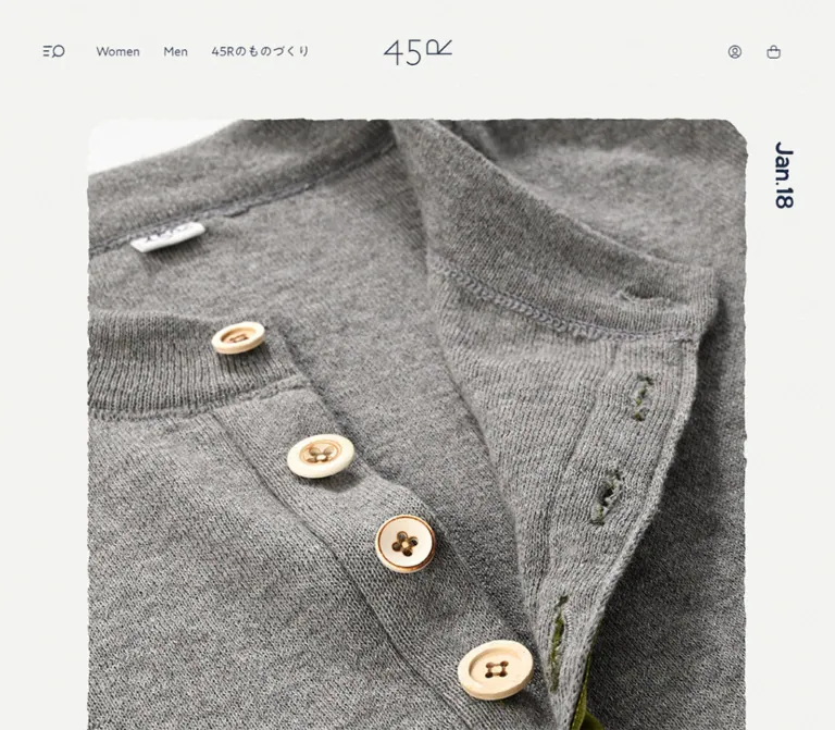
プレビュー準備中デザインリファレンスを見る
DESIGN REFERENCE
45R — 藍色と余白で服とものづくりを伝える公式サイト
藍色の文字、軽やかな書体、大きな商品写真と余白が特徴のブランド・通販導線サイト。商品レール、ニュース、コレクション紹介、配送案内モーダルの実測値とレスポンシブ構成を収録。
45R — Style Reference
Indigo typography, generous paper-like space, and clothing presented as an ongoing editorial collection.
Website: 45r.jp/ja Original URL: https://45r.jp/ja/ Final URL: https://45r.jp/ja/ Theme: light surfaces with deep indigo text and controls; a dark scrim appears behind the shipping dialog. Inspected: September 29, 2026, at 13:37:09.845 UTC / 22:37:09.845 JST, according to the supplied browser record. Viewports: 1440 × 1000 desktop and 390 × 844 mobile, in CSS pixels. Scope: the current Japanese brand homepage and shopping gateway, including its initial shipping dialog, header, product rails, editorial sections, collection features, corporate link, and footer. Three desktop captures show different document positions with the dialog open. Both mobile captures show the same dialog state. Underlying mobile layouts are documented through supplied DOM measurements.
45R combines a restrained interface with expressive clothing photography and illustrated details. Deep indigo replaces ordinary black across text, icons, and filled buttons. Light A1 Gothic headings introduce merchandise and editorial sections without overpowering the images. The page alternates horizontal product sequences, four-column news, broader editorial cards, and large collection stories. Substantial vertical space separates these different reading rhythms.
The first visible experience is also unusually important: a shipping information dialog sits over the homepage on desktop and becomes an almost full-screen paper surface on mobile. Its English heading and primary link dominate, while the Japanese explanation is smaller and muted. This dialog obscures much of the supplied imagery; its appearance is directly visible, while several underlying sections are known primarily through their measured structure.
閉じる
45R — Style Reference
Indigo typography, generous paper-like space, and clothing presented as an ongoing editorial collection.
Website: 45r.jp/ja Original URL: https://45r.jp/ja/ Final URL: https://45r.jp/ja/ Theme: light surfaces with deep indigo text and controls; a dark scrim appears behind the shipping dialog. Inspected: September 29, 2026, at 13:37:09.845 UTC / 22:37:09.845 JST, according to the supplied browser record. Viewports: 1440 × 1000 desktop and 390 × 844 mobile, in CSS pixels. Scope: the current Japanese brand homepage and shopping gateway, including its initial shipping dialog, header, product rails, editorial sections, collection features, corporate link, and footer. Three desktop captures show different document positions with the dialog open. Both mobile captures show the same dialog state. Underlying mobile layouts are documented through supplied DOM measurements.
45R combines a restrained interface with expressive clothing photography and illustrated details. Deep indigo replaces ordinary black across text, icons, and filled buttons. Light A1 Gothic headings introduce merchandise and editorial sections without overpowering the images. The page alternates horizontal product sequences, four-column news, broader editorial cards, and large collection stories. Substantial vertical space separates these different reading rhythms.
The first visible experience is also unusually important: a shipping information dialog sits over the homepage on desktop and becomes an almost full-screen paper surface on mobile. Its English heading and primary link dominate, while the Japanese explanation is smaller and muted. This dialog obscures much of the supplied imagery; its appearance is directly visible, while several underlying sections are known primarily through their measured structure.
How to Read This Reference
- Measured means supplied rendered element bounds or computed styles. Values are rounded where excessive decimal precision would be unhelpful.
- Calculated means arithmetic using those measurements, such as column gaps and content widths.
- Visual estimate means a proportion, color, or treatment read from a screenshot without a corresponding computed value.
- Recommendation means an implementation choice for reuse, not a verified feature of the original.
- Token names introduced here are descriptive aliases. Source custom properties are explicitly identified.
- The desktop dialog dims the underlying homepage. Do not sample that dimmed content as its normal palette.
- Offscreen navigation entries are present in the DOM. Their existence and typography are known; the opened navigation experience was not exercised.
- The supplied record contains computed styles, not the complete stylesheet or source breakpoint rules. Two measured endpoints do not establish the interpolation between them.
Tokens — Colors
Default Palette
| Name | Value | Suggested token / source property | Evidence and role |
|---|---|---|---|
| Indigo | #1C2940 |
--color-ink / --wp--preset--color--indigo |
Measured text, navigation, icons, and filled action backgrounds |
| White | #FFFFFF |
--color-white / --wp--preset--color--white |
Measured reversed button text and desktop circular close control |
| Muted gray | #838994 |
--color-muted / --wp--preset--color--light |
Measured secondary navigation text and muted rail controls; visually consistent with the dialog's Japanese copy, whose individual style was not sampled |
| Light line | #E5E7E9 |
--color-line / --wp--preset--color--line |
Source preset; also the measured background of mobile WOMEN and MEN shortcut tiles |
| Thin gray | #CCCED3 |
--color-thin / --wp--preset--color--thin |
Source preset; suitable for restrained outlines, but exact visible outline assignment was not measured |
| Paper approximation | approximately #F7F7F5 |
--color-paper |
Recommended approximation of the unobscured dialog surface; not an extracted source color |
| Scrim | black with approximately 0.5 opacity |
--color-scrim |
Black background is measured; opacity is a visual estimate |
The visible paper surfaces have a subtle fine-grain appearance. Neither the texture asset nor its compositing method was supplied. Use a quiet near-white base first; add texture only if an appropriate asset is available. The root and body both report transparent backgrounds, so their computed values do not identify the final visible page surface.
Additional Source Presets
| Source property | Value | Interpretation |
|---|---|---|
--wp--preset--color--restock |
#E1E0D7 |
Defined merchandise-related preset; application to the captured sections was not demonstrated |
--wp--preset--color--soldout |
#F17676 |
Defined availability-related preset; no visible sold-out treatment was verified |
Other exposed presets include vivid colors, gradients, and shadows. Their presence does not establish that the homepage uses them. The visible interface is predominantly indigo, light neutrals, and the colors within photography and illustration. No alternate theme selector was observed.
Tokens — Typography
A1 Gothic R — Body and Controls
- Measured family:
"A1 Gothic R", sans-serif; some paragraph records report only"A1 Gothic R". - Measured weight:
400. - Role: primary navigation, body copy, buttons, and footer utilities.
- Character: modest, open sans-serif forms with a softer editorial presence than a tightly packed commerce interface.
A1 Gothic L — Section and Collection Headings
- Measured family:
"A1 Gothic L". - Measured weight:
400. - Role:
New arrivals,Re stock,News,Contents, and the monthly collection title. - Treatment: large but light, with slightly negative tracking and generous line boxes.
The light appearance comes from a separately named face. Replacing it with the regular face at CSS weight 400 will not necessarily produce the same result.
A1 Gothic M — Navigation Hierarchy
The offscreen navigation uses "A1 Gothic M", also reported at weight 400. Primary drawer entries measure 16px on desktop and 18px on mobile. Small secondary entries remain around 12px. These values describe the rendered offscreen elements, not an inspected open drawer.
Icomoon — Identity and Symbols
The wordmark and sampled social symbols use icomoon. The desktop header wordmark has an 88px font-size declaration but an actual box of 88 × 33px. That declaration describes a custom glyph, not 88px ordinary text.
Use an authorized wordmark asset or the actual supplied glyph system. Typing 45R in a generic sans-serif will not reproduce the mark. Font file URLs and licensing information were not included in the evidence.
Type Scale
All measured text roles below report weight 400. Sizes refer to CSS pixels.
| Role | Desktop size / line height | Mobile size / line height | Tracking | Evidence |
|---|---|---|---|---|
| Root and inherited body | 16px / normal |
16px / normal |
Normal | Computed |
| Header category links | 16px / 35px |
Absent from the sampled visible header layout | Normal | Computed |
| Section heading | 50px / 100px |
30px / 60px |
-1.5px / -0.6px |
Computed, A1 Gothic L |
| Monthly collection heading | 60px / 74.006px |
40px / 46.204px |
-1.8px / -1.2px |
Computed, A1 Gothic L |
| Corporate feature heading | 32px / 41.6px |
24px / 31.2px |
Normal | Computed |
| Collection and corporate body | 14px / 22.4px |
14px / 22.4px |
Normal | Computed |
| Ginza introduction | 20px / 32px |
16px / 25.6px |
Normal | Computed |
| Product-section text link | 14px / 26.001px |
12px / 18.001px |
-0.42px / -0.48px |
Computed |
| Standard action label | 14px / 26.001px |
12px / 24.001px |
Normal | Computed |
| Large archive action | 16px / 32.002px |
12px / 17.144px |
Normal | Computed |
| Footer legal links | 12px / 20.001px |
10px / 20.001px |
-0.24px / -0.3px |
Computed |
| Shipping dialog heading | Approximately 36px |
Approximately 22px |
Visually close to normal | Screenshot estimate |
| Shipping explanation | Approximately 14px |
Approximately 14px |
Not measured | Screenshot estimate |
| Shipping Japanese note | Approximately 12px |
Approximately 10px |
Not measured | Screenshot estimate |
The News cards visibly distinguish small dates from larger Japanese titles. Their child text styles were not included in the sampled elements; do not treat the card anchor's inherited 16px value as a measurement of every child.
Tokens — Spacing & Shapes
Primary rhythm: 160px desktop section separation, commonly reduced to 80px on mobile. Page gutters: 80px desktop and 22px mobile. Shape language: mostly square media, subtly rounded actions, one restrained outlined corporate panel, and a circular desktop close button.
Spacing Scale
| Use | Desktop | Mobile | Evidence |
|---|---|---|---|
| Standard outer gutter | 80px |
22px |
Measured section positions |
| Narrow feature outer margin | 160px |
22px |
Measured hero and corporate feature positions |
| Common section separation | 160px |
80px |
Calculated between repeated section bounds |
| Product rail gap | 40px |
20px |
Calculated from consecutive item positions |
| News column gap | 30px |
16px |
Calculated |
| News row gap | 64px |
48px |
Calculated |
| Contents column gap | 32px |
Single column | Calculated |
| Contents row gap | 64px |
40px |
Calculated |
| Corporate panel padding | 80px |
54px 21px |
Computed |
| Corporate panel grid gap | 80px |
42px |
Computed |
| Contents section padding | 160px 0 |
60px 0 80px |
Computed |
| Header utility padding | Usually 15px |
Usually 15px |
Computed |
These are recurring observed dimensions, not proof of a universal spacing scale or a particular CSS unit system.
Border Radius
| Element | Value | Evidence |
|---|---|---|
| Product and editorial link boxes | 0 |
Computed |
| Filled action buttons | 6px |
Computed at both viewports |
| Corporate feature panel | 10px |
Computed |
| Desktop shipping close button | 50% |
Computed on a 56 × 56px button |
| Shipping panel | Visually square | Screenshot observation; panel style not sampled |
| Hero image boundary | Irregular, softened contour | Screenshot observation; not equivalent to a standard radius |
Layout Measurements
| Element | Desktop at 1440 × 1000 | Mobile at 390 × 844 |
|---|---|---|
| Document height | Approximately 11,875.25px |
Approximately 9,393.67px |
| Standard content width | 1280px |
346px |
| Hero link box | 1120 × 1303.98px, starting at (160, 149.98) |
346 × 560.03px, starting at (22, 110) |
| Product item link | 400 × 536px |
200 × 268px |
| News card width | 297.5px, four columns |
165px, two columns |
| Contents card width | 624px, two columns |
346px, one column |
| Corporate panel | 1120 × 488.78px |
346 × 599.14px |
| Header wordmark | 88 × 33px |
60 × 22px |
| Footer wordmark | 178 × 67.02px |
91 × 34px |
| Shipping panel | Approximately 800 × 600px at (320, 200) |
Approximately 378 × 832px at (6, 6) |
| Shipping global action | 279.83 × 46px at approximately (580.08, 607.92) |
346 × 40px at (22, 420) |
Panel dimensions are screenshot estimates; the action dimensions are measured. The hero's different aspect ratios indicate distinct responsive geometry, but the evidence does not identify the image-selection or cropping technique.
Components
Header
Role: persistent brand identity and access to shopping utilities.
The desktop composition has three visual zones: a custom menu/search-like glyph and New, Women, Men on the left; the 45R wordmark centered at x = 720px; and account and shopping-bag controls on the right. The logo begins at y = 50px. Category links use 16px regular type, with approximately 30px between their measured boxes.
Utility controls have larger interactive boxes than their visible line icons: account is 48 × 48px, the bag control is 42 × 48px, and the left button is 57 × 46px. Maintain that separation between icon size and target size.
The mobile DOM places the 60 × 22px header logo at (165, 72), below a 30px announcement strip. The shipping dialog overlays this header with a separate logo at y = 42px. Do not confuse these two logos when recreating the mobile state.
The header wrapper measures zero height despite visible child controls. This indicates that its wrapper height does not describe the visual header region. Sticky behavior and scroll-triggered hiding were not verified.
Navigation Panel — DOM Evidence Only
Role: organizes a large commerce and editorial information architecture.
The offscreen content includes search, update notices, an ITEMS group, a CONTENTS group, support links, account access, and social links. Major entries include New arrivals, Re stock, Pick Up, Women, Men, Goods, Collection, Coordinates, and Shop list.
Measured text-column widths are approximately 300px desktop and 304px mobile. Primary entries grow from 16px desktop to 18px mobile instead of simply shrinking. Legal and help links use muted gray.
Do not infer the complete open-panel composition, nested navigation transitions, focus management, or search results from this offscreen markup.
Hero and Date Marker
Role: gives the current merchandise story the largest visual area near the top of the page.
The desktop hero begins 150px from the document top and uses a narrower 1120px column than the later merchandise sections. Its visible upper contour is irregular, like a softly torn or hand-cut edge. A vertical Sep.29 date sits beside the image. An olive-colored garment is partly visible below the shipping panel.
The measured hero extends below the first viewport. Preserve that tall presentation rather than forcing it into a conventional short banner. On mobile, its measured box is 346 × 560px, but the dialog prevents direct visual evaluation of the crop and edge treatment.
The hero links to the new-arrivals store destination. An additional button exists near its lower edge, but its function is not established by the supplied text or captures.
Mobile Announcement and Category Shortcuts
Role: restores immediate shopping access when the desktop category links are absent from the compact header.
The mobile DOM contains a 390 × 30px indigo announcement strip with white 14px text. Its source label is 全国のお店で「45rpmの手帖」を配布しています.
Below the hero, WOMEN and MEN links form two 165 × 80px tiles with a 16px gap. Their background is the measured light gray #E5E7E9; corners remain square. Each combines an English category name with 商品一覧を見る.
These are measured mobile components beneath the overlay. Their unobscured appearance was not captured.
New Arrivals and Re Stock Rails
Role: exposes products without turning the entire homepage into a dense catalog.
Each section starts with a light 50px heading on the left and 全ての商品を見る on the right. Below it, image links occupy 400 × 536px boxes, separated by 40px. Three items fit the 1280px desktop content span; further items continue horizontally beyond the viewport.
The mobile version keeps the horizontal sequence: items become 200 × 268px with 20px gaps. The first starts at x = 22px and the second at x = 242px, leaving the next item partially visible within the viewport. This is a rail, not a two-column product grid.
Both sections contain ten product links in the supplied DOM. Below each sequence are an elongated control and two smaller directional-looking controls. Their positions and colors are measured; clicking, dragging, keyboard navigation, and autoplay were not tested.
The item ratio is exactly 400 / 536 = 50 / 67, retained at half size on mobile. Use that ratio when reproducing the measured boxes instead of rounding it to 3:4.
Filled Action
Role: provides a consistent destination cue across editorial features and overlays.
Use indigo fill, white regular text, 6px corners, and no visible elevation. A standard desktop feature action is approximately 200 × 46px with a 14px label. Its mobile counterpart is commonly 170 × 40px with a 12px label.
Archive actions below News and Contents are larger on desktop: 400 × 64px with 16px text. They reduce to 170 × 40px on mobile. The shipping action has a separate responsive width rule: intrinsic width on desktop and the full 346px inner content width on mobile.
Some source features contain button elements inside an outer anchor. For a new implementation, use one anchor with a visually styled action label inside it, avoiding nested interactive elements.
Coordinates Feature
Role: introduces outfit styling through a large visual composition.
This section sits after the two product rails and before the Ginza story. Its empty-text heading box measures approximately 885 × 226px desktop and 367 × 93.72px mobile, suggesting a graphical heading region; its exact artwork was not supplied unobscured.
A centered コーディネートを見る action measures 200 × 46px desktop and 170 × 40px mobile. Preserve the hierarchy of expressive media followed by a compact action, but do not invent the unseen visual layout.
Ginza Store Feature
Role: connects the brand's merchandise to its physical flagship experience.
The desktop section spans 1280px. Its explanatory paragraph narrows to approximately 832px and uses 20px text with 32px line height. A centered 4階茶馬亭をくわしく見る action measures approximately 293 × 46px.
On mobile, the paragraph fills the 346px content column at 16px / 25.6px. The action becomes approximately 182 × 40px and aligns to the left. This is a meaningful alignment change, not only a size reduction.
The source link targets the fourth-floor flagship story. The feature's complete media appearance is outside the unobscured screenshot evidence.
News Grid
Role: presents timely releases, styling updates, events, and service notices.
Desktop uses four 297.5px columns with 30px gaps. Eight articles form two rows, separated by 64px. Each card stacks a portrait image, an English date, and a Japanese title, without a visible card background, border, or shadow.
The middle desktop capture reveals a model in pink clothing, grouped plaid garments, dark textile imagery, and colorful illustration in the lower row. Images are approximately 297.5 × 399px by screenshot measurement, close to the merchandise image proportions.
Mobile changes to two 165px columns with a 16px gap and 48px between rows. Article boxes are approximately 311px tall in the measured state. Preserve natural title wrapping; do not force every Japanese title onto one line.
A centered archive action follows the grid. Dates and titles remain subordinate to the images, while the light News heading anchors the section.
Contents Grid
Role: presents longer-lived material and craft stories.
Desktop uses two 624px columns separated by 32px, with 64px between rows. Mobile uses one 346px column with 40px separation. Four entries are recorded: an indigo publication, garment-care services, an indigo curtain story, and denim-themed playing cards.
Cards combine media, a date, and a longer Japanese description. Their images were not independently visible in the supplied captures, so a precise media ratio is not asserted. The measured card heights include both media and variable text.
The section adds substantial internal breathing room: 160px above and below on desktop; 60px above and 80px below on mobile.
Monthly Collection Feature
Role: expands a seasonal clothing story into a larger editorial composition.
The desktop link is a full-width flex composition. The text block begins at approximately x = 960px and is 400px wide. OCTOBER COLLECTION 2026 occupies three lines at 60px / 74.006px in A1 Gothic L. Supporting Japanese copy uses 14px / 22.4px, followed by a 200 × 46px action.
On mobile, the composition becomes a block layout. The heading appears below the preceding media region, within the 346px content column, at 40px / 46.204px. Body text remains 14px rather than scaling down with the title.
The current text discusses tweed, felted knitwear, Shetland wool, flannel, denim, and patchwork. Those topics establish the story's subject, not the appearance of unseen imagery.
Indigo Craft Collection Feature
Role: connects collections to regional dyeing practices and material development.
The desktop composition spans 1280px with an 80px flex gap. Its measured text column is 480px wide. On mobile, a 346px media-sized region precedes the graphical heading and body, with a measured 50px flex gap.
Body typography remains 14px / 22.4px at both sizes. The action aligns with the text column. The heading has no extracted text, so its exact lettering and asset form should remain unspecified.
Corporate Feature Panel
Role: connects the consumer-facing brand to its company and manufacturing philosophy.
This is the clearest outlined container on the page. Desktop uses a 1120px-wide panel with 10px corners, 80px padding, and two 440px columns separated by 80px. Text occupies the left column and a painted landscape occupies the right. The visible illustration includes green hills, blue sky, and small flowers.
Mobile becomes a single 304px inner column within a 346px panel, using 54px 21px padding and a 42px gap. Measured text positions place the heading after the leading media region. The heading reduces from 32px to 24px; body text remains 14px.
The original page explicitly identifies 45rpm studio as the operator of 45R, and links this panel to its corporate website. This supports the operator relationship independently of the footer copyright.
Shipping Information Dialog
Role: directs visitors requiring delivery outside Japan to the official global website.
The desktop panel is approximately 800 × 600px, centered at (320, 200) in a 1440 × 1000 viewport. It has square corners, a pale subtly textured surface, and a dimmed page behind it. No pronounced shadow is visible.
Its anatomy is:
- A centered
Welcome to 45R websiteheading, approximately 36px. - A centered English shipping question and explanatory sentence.
- A smaller muted Japanese explanation.
- A fine horizontal separator interrupted by
Online store outside of Japan. - The indigo
Discover the Official Global Websitelink. - A separate white circular close control below the panel.
The divider spans approximately 640px. The global action is measured at 279.83 × 46px. The 56px circular close button begins at approximately y = 834px, leaving about 34px between the panel and the control.
On mobile, the panel nearly fills the viewport, leaving about 6px around its edges. A 60 × 22px wordmark sits at (165, 42). The close control moves to the upper right and becomes a transparent 50 × 50px target containing a thin cross. The heading is approximately 22px, the English sentence wraps, and the global link fills the 346px content width at y = 420px.
Large blank space remains below the mobile action. Preserve this quiet composition instead of vertically distributing the content across the full height.
The desktop dialog remains in the same viewport position while different page sections appear behind it. This supports viewport-anchored behavior. Dismissal, backdrop clicking, Escape handling, focus trapping, reappearance rules, and shipping-location detection were not tested. The recorded link destination is https://45rglobal.com/; its destination page was not inspected.
Footer
Role: closes the page with identity, utility navigation, and language destinations.
The desktop footer combines a large 178 × 67px wordmark, an indigo character illustration, and social links aligned toward the right. A thin horizontal rule separates this identity row from legal links, language choices, and copyright text.
The character is visibly drawn with irregular indigo linework and appears to be a dressed bulldog-like figure with small stars. It is an illustration, not an interface icon to redraw geometrically.
Mobile DOM measurements reduce the wordmark to 91 × 34px, place social links below it, and wrap legal links into multiple rows. Legal type decreases to 10px. The mobile footer remains hidden behind the dialog in the supplied screenshots, so its composition is supported by positions rather than an unobscured visual capture.
Tokens — Motion & Interaction
The supplied evidence exposes transition declarations. It does not contain interaction recordings demonstrating their complete before-and-after states.
| Element or treatment | Measured declaration | What can be concluded |
|---|---|---|
| Header margin | 0.2s cubic-bezier(0.445, 0.05, 0.55, 0.95) |
Margin changes are configured to animate; trigger not verified |
| Header transform | 0.5s cubic-bezier(0.445, 0.05, 0.55, 0.95) |
Transform changes are configured; scroll behavior not established |
| Navigation and utility color | color 0.2s |
Short color feedback is defined; destination colors were not sampled |
| Filled actions | color 0.3s, background 0.3s |
Text and fill can transition together; exact hover state unknown |
| Overlay backdrop | opacity 0.5s cubic-bezier(0.55, 0.085, 0.68, 0.53) |
A half-second backdrop opacity transition is defined |
| Desktop dialog close opacity | opacity 0.2s 0.5s |
A 200ms opacity transition has a 500ms delay |
| Desktop dialog close transform | transform 0.2s cubic-bezier(0.77, 0, 0.175, 1) 0.5s |
Transform feedback uses the same delay; actual displacement unknown |
| Unidentified hero control | opacity 0.3s |
Opacity transition only; purpose not verified |
Many elements report transition: all without a useful nonzero duration in the supplied record. Do not translate that into invented animation timings. Sampled elements report animation: none; this does not rule out motion on unreported descendants, media, pseudo-elements, or JavaScript-controlled regions.
The collection process waited for finite motion and layout stability, temporarily pausing perpetual animations during readiness checks. This procedure is not evidence that a particular perpetual animation exists on this page.
For reuse, retain restrained color feedback and the measured overlay timing where appropriate. Do not add automatic product scrolling, parallax, image zoom, or spring-based panel movement as if those were observed behaviors.
Surfaces
| Layer | Appearance | Evidence and purpose |
|---|---|---|
| Page canvas | Pale, visually paper-like | Seen through the scrim; exact base color and texture source unavailable |
| Merchandise and article cards | Unboxed media and text | Measured square link boxes with transparent backgrounds |
| Mobile category tiles | Flat #E5E7E9 rectangles |
Computed background and square corners |
| Corporate panel | Thin outline, 10px corners | Outline visible; corner radius measured; exact line color unmeasured |
| Primary action | Indigo fill and white text, 6px corners | Computed |
| Modal separation | Black translucent scrim | Black measured, opacity estimated; no visible blur |
| Shipping panel | Pale grain, square corners | Direct screenshot observation |
| Desktop close control | White circular disk | Computed 56px diameter and 50% radius |
There is no demonstrated general elevation system. Most hierarchy comes from image size, whitespace, typography, and a small number of rules or outlines.
Imagery
The current visible imagery mixes apparel photography with deliberately informal illustration. In the News capture, a fashion model wears layered pink clothing, another image groups plaid garments, and lower portions show dark textiles and brightly painted imagery. The corporate panel uses a pastoral painting; the footer uses expressive indigo character linework.
Keep fabric, garment silhouette, and styling legible. Avoid applying a uniform decorative filter that would flatten the differences between photography, illustration, and the indigo interface. The irregular hero boundary is a specific framing detail; ordinary news and product boxes remain rectangular.
The dialog hides most of the hero and several major visual features. No claims are made about unseen hero subjects, store-interior photography, complete collection compositions, or image animation.
Observed Asset References
Actual image URLs and filenames were not supplied. These references identify visible roles and measured regions, not downloadable assets.
| Asset role | Evidence | Reuse guidance |
|---|---|---|
| 45R wordmark | Custom icomoon glyph; visible in header, mobile dialog, and footer |
Use an authorized asset or the actual glyph; preserve its wide, thin geometry |
| Current hero media | Irregular desktop boundary and a partly visible olive garment; measured tall link box | Obtain the current authorized media and framing asset; do not substitute a generic rounded rectangle |
| News imagery | Pink outfit portrait, grouped plaid garments, textiles, and illustration | Preserve portrait proportions and subject-specific crops |
| Corporate illustration | Painted hills, sky, and flowers visible at the right edge of the panel | Keep illustration separate from photographic merchandise treatment |
| Footer character | Indigo line illustration visible beside the large logo | Preserve irregular drawing texture |
| Dialog surface texture | Fine grain visible on the pale panel | Asset and generation method unknown; use a plain pale fallback |
Do not invent asset paths. The CSS below provides layout and styling only; fonts, identity assets, photography, and illustrations require separate authorized resources.
Layout & Responsive Behavior
The homepage follows a clear sequence: hero, product rails, coordinates, flagship story, News, Contents, seasonal collection, indigo craft collection, corporate feature, and footer. Mobile adds an announcement strip and category shortcuts near the beginning.
| System | Desktop observation | Mobile observation |
|---|---|---|
| Main grid | 1280px content within 80px gutters | 346px content within 22px gutters |
| Narrow features | 1120px centered | Use the main 346px column |
| Section rhythm | Common 160px separation | Common 80px separation |
| Product discovery | Three 400px items across the content span, then horizontal continuation | 200px items with the next item partly visible |
| News | Four columns | Two columns |
| Contents | Two columns | One column |
| Monthly collection | Horizontal flex composition | Block composition with text below media |
| Corporate feature | Two 440px inner columns | One 304px inner column |
| Standard action | Usually 200 × 46px | Usually 170 × 40px |
| Shipping dialog | Centered panel with detached close disk | Almost full-screen panel with internal logo and upper-right close control |
The grid widths are directly reproducible from the measurements:
- Desktop News:
(1280 - 3 × 30) / 4 = 297.5px. - Mobile News:
(346 - 16) / 2 = 165px. - Desktop Contents:
(1280 - 32) / 2 = 624px. - Desktop corporate interior:
(1120 - 2 × 80 - 80) / 2 = 440px. - Mobile corporate interior:
346 - 2 × 21 = 304px.
These calculations explain the measured layouts; they do not reveal the original media-query thresholds. The Quick Start uses recommended breakpoints and interpolated gutters, with endpoint dimensions chosen to match the supplied measurements.
Mobile responsiveness is not uniform scaling. Body copy often stays at 14px, navigation entries become larger, grids change column count, and actions can change alignment. The hero changes proportions, while merchandise item proportions remain constant.
Do’s and Don’ts
Do
- Use
#1C2940consistently for primary text, icons, and action fills. - Preserve the distinction between A1 Gothic L headings, R body text, and M navigation entries.
- Give imagery more visual weight than interface boxes.
- Keep the 80px desktop and 22px mobile content gutters at the measured endpoints.
- Retain horizontal product rails on mobile, including a partial next item.
- Use four-to-two columns for News and two-to-one columns for Contents.
- Keep 6px button corners separate from square media and the 10px corporate panel.
- Treat the hero's irregular outline as a specific media treatment.
- Preserve the shipping dialog's major desktop-to-mobile structural change.
- Keep Japanese body text readable and allow editorial titles to wrap naturally.
Don’t
- Do not compress the homepage into a single campaign landing page or a dense product listing.
- Do not turn every article into a raised rounded card.
- Do not derive the normal palette from content darkened by the modal scrim.
- Do not use all exposed CMS color, gradient, and shadow presets as design tokens in active use.
- Do not recreate the wordmark with ordinary typed characters.
- Do not give the monthly collection heading a heavy bold weight when the measured face is light.
- Do not force the tall hero into a short desktop banner.
- Do not claim that product rails autoplay, the header hides on scroll, or the modal remembers dismissal without testing.
- Do not describe hidden mobile imagery as visually inspected.
- Do not reproduce nested anchor/button interactions when a single semantic link is sufficient.
Recommended Implementation Additions
These are recommendations for a new implementation, not verified features of the original:
- Use a native modal dialog or equivalent accessible implementation, with a programmatic title, keyboard dismissal, controlled focus, and inert background content while open.
- Keep the mobile close target at least 44 × 44px. Audit the measured 40px actions and smaller social targets; expand their hit areas without necessarily enlarging their visual symbols.
- Verify accessible names for icon-only controls and image-only product links. Empty extracted text does not prove that an accessible name is missing.
- Use meaningful image alternatives for merchandise and editorial stories. Treat decorative linework as decorative where appropriate.
- Provide operable previous/next controls and keyboard access if building a custom product rail. Native horizontal scrolling is a reasonable fallback.
- Avoid unnecessary first-visit obstruction where shipping information can be presented contextually. If retaining the dialog, provide an obvious way to continue browsing the Japanese site.
- Test muted text contrast and the original 10px mobile utility scale. A 12px minimum for supporting text is a reasonable accessibility adaptation.
- Preserve approved font loading and reserve media dimensions to reduce layout movement.
- Respect reduced-motion preferences for transitions added in a new implementation.
- Test short landscape viewports, zoomed text, and mobile browser chrome. Allow the dialog's content to scroll while keeping dismissal reachable.
Agent Prompt Guide
Quick Color Reference
- Main text, identity, line icons, and filled actions:
#1C2940. - Reversed action text and desktop close disk:
#FFFFFF. - Secondary utilities:
#838994. - Mobile category tiles and light separators:
#E5E7E9. - Thin-outline candidate:
#CCCED3, a source preset whose exact outline use is unverified. - Pale surface approximation:
#F7F7F5, recommended rather than measured. - Modal backdrop approximation:
rgb(0 0 0 / 0.5), with black measured and alpha estimated.
Overall Prompt
“Create a Japanese apparel brand homepage with the measured visual structure of the current 45R page. Use deep indigo #1C2940, pale paper-like surfaces, light A1 Gothic-style section headings, regular Japanese body copy, thin line icons, and large clothing imagery. At a 1440px viewport, use 80px content gutters and 160px section spacing. Alternate horizontal 400 × 536px merchandise rails, four-column News, two-column Contents, and large collection stories. Keep most media square-cornered and unboxed. Use restrained indigo actions with 6px corners. On a 390px viewport, use 22px gutters, 200 × 268px rail items, two-column News, single-column Contents, and stacked collection features. Use authorized identity and image assets; mark any unavailable artwork as a placeholder.”
Example Component Prompts
- Shipping dialog: “Build a centered pale 800 × 600px shipping-information panel with an indigo welcome heading, centered English explanation, smaller muted Japanese note, a fine divided caption, and a 280 × 46px global-store link. Put a separate 56px white circular close button 34px below it. At 390 × 844px, change to a panel with approximately 6px outside clearance, a small centered wordmark, an upper-right close target, and a 346 × 40px action. Keep a large quiet area below the content. Treat panel dimensions and text sizes as screenshot approximations.”
- Product rail: “Use a light 50px section heading and a small right-aligned view-all link above a horizontal sequence of square-cornered 400 × 536px product images, with 40px gaps. At mobile size, use a 30px heading and 200 × 268px images with 20px gaps. Preserve partial visibility of the next item and supply accessible scrolling controls.”
- News grid: “Create four unboxed portrait-image cards across a 1280px content area, with 30px column gaps and 64px row gaps. Stack a small date and a Japanese article title below each image. At mobile size, use two 165px columns with a 16px gap and 48px row gaps. Finish with a centered indigo archive link.”
- Corporate feature: “Create a subtly outlined panel with 10px corners, 80px desktop padding, and two 440px columns separated by 80px. Place brand-company copy on the left and an authorized pastoral illustration on the right. On mobile, use a 346px panel with 54px vertical and 21px horizontal padding, a 42px gap, and media above the text.”
- Collection story: “Use a large light three-line seasonal heading beside a substantial media region. Keep the desktop text column around 400px, with 60px heading type and 14px / 22.4px Japanese body copy. On mobile, place text below the media, reduce the heading to 40px, preserve the body size, and use a compact left-aligned indigo action.”
Quick Start
CSS Custom Properties
This is an implementation adaptation, not recovered source CSS. Colors, type roles, endpoint dimensions, and several transition values come from the supplied measurements. The paper color, scrim alpha, modal interior spacing, intermediate interpolation, and breakpoints are recommendations. The font declarations require separately licensed and loaded font resources.
:root {
  /* Measured source colors */
  --color-ink: #1c2940;
  --color-white: #fff;
  --color-muted: #838994;
  --color-line: #e5e7e9;
  --color-thin: #ccced3;

  /* Visual approximations */
  --color-paper: #f7f7f5;
  --color-scrim: rgb(0 0 0 / 0.5);

  /* Source family names; font files are not bundled */
  --font-body: 'A1 Gothic R', sans-serif;
  --font-heading: 'A1 Gothic L', sans-serif;
  --font-medium: 'A1 Gothic M', sans-serif;

  /* Recommended interpolation between measured layouts */
  --gutter: clamp(22px, 5.556vw, 80px);
  --content-max: 1280px;
  --narrow-max: 1120px;
  --section-space: 160px;
  --text-section: 50px;
  --text-collection: 60px;
  --rail-item: 400px;
  --rail-gap: 40px;
  --radius-action: 6px;
  --radius-panel: 10px;

  --motion-color: 200ms;
  --motion-action: 300ms;
  --motion-overlay: 500ms;
  --ease-overlay: cubic-bezier(0.55, 0.085, 0.68, 0.53);
}

* { box-sizing: border-box; }

body {
  margin: 0;
  color: var(--color-ink);
  background: var(--color-paper);
  font: 400 16px / 1.6 var(--font-body);
}

a { color: inherit; }
button { font: inherit; }
img { display: block; max-width: 100%; }

.container,
.narrow {
  width: calc(100% - 2 * var(--gutter));
  margin-inline: auto;
}

.container { max-width: var(--content-max); }
.narrow { max-width: var(--narrow-max); }
.section { margin-block-start: var(--section-space); }

.section-heading {
  display: flex;
  align-items: center;
  justify-content: space-between;
  gap: 20px;
  margin-bottom: 8px;
}

.section-heading h2 {
  margin: 0;
  font: 400 var(--text-section) / 2 var(--font-heading);
  letter-spacing: -0.03em;
}

.section-heading > a {
  flex-shrink: 0;
  font-size: 14px;
  line-height: 26px;
  letter-spacing: -0.03em;
  text-decoration: none;
}

.action {
  display: inline-flex;
  align-items: center;
  justify-content: center;
  min-width: 200px;
  min-height: 46px;
  max-width: 100%;
  padding: 8px 28px;
  border: 0;
  border-radius: var(--radius-action);
  color: var(--color-white);
  background: var(--color-ink);
  font: 400 14px / 26px var(--font-body);
  text-align: center;
  text-decoration: none;
  cursor: pointer;
  transition:
    color var(--motion-action),
    background-color var(--motion-action);
}

.action--archive {
  display: flex;
  width: 400px;
  min-height: 64px;
  margin: 80px auto 0;
  font-size: 16px;
  line-height: 32px;
}

/* Native scrolling is a recommended rail fallback. */
.product-track {
  display: grid;
  grid-auto-flow: column;
  grid-auto-columns: var(--rail-item);
  gap: var(--rail-gap);
  overflow-x: auto;
  padding-inline: max(var(--gutter), calc((100% - 1280px) / 2));
  padding-bottom: 16px;
  scroll-padding-inline: var(--gutter);
  scroll-snap-type: x proximity;
}

.product-link {
  display: block;
  scroll-snap-align: start;
}

.product-link img {
  width: 100%;
  aspect-ratio: 50 / 67;
  object-fit: cover;
  border-radius: 0;
}

.news-grid,
.contents-grid {
  display: grid;
  align-items: start;
}

.news-grid {
  grid-template-columns: repeat(4, minmax(0, 1fr));
  gap: 64px 30px;
}

.contents-grid {
  grid-template-columns: repeat(2, minmax(0, 1fr));
  gap: 64px 32px;
}

.story-card {
  display: block;
  min-width: 0;
  text-decoration: none;
}

.story-card img { width: 100%; height: auto; }

/* Portrait ratio and child text values are adaptations. */
.news-grid .story-card img {
  aspect-ratio: 50 / 67;
  object-fit: cover;
}

.story-card time {
  display: block;
  margin-top: 24px;
  color: var(--color-muted);
  font-size: 12px;
}

.story-card h3 {
  margin: 8px 0 0;
  font-size: 14px;
  font-weight: 400;
  line-height: 1.6;
}

.corporate-card {
  display: grid;
  grid-template-columns: repeat(2, minmax(0, 1fr));
  align-items: center;
  gap: 80px;
  padding: 80px;
  border-radius: var(--radius-panel);
  outline: 1px solid var(--color-thin);
  text-decoration: none;
}

.corporate-copy h2 {
  margin: 0 0 30px;
  font-size: 32px;
  font-weight: 400;
  line-height: 1.3;
}

.corporate-copy p {
  margin: 0 0 36px;
  font-size: 14px;
  line-height: 1.6;
}

/* Modal geometry matches the desktop capture approximately. */
.shipping-dialog {
  position: fixed;
  inset: 50% auto auto 50%;
  width: 800px;
  height: 600px;
  max-width: calc(100vw - 44px);
  max-height: calc(100dvh - 180px);
  margin: 0;
  padding: 0;
  transform: translate(-50%, -50%);
  overflow: visible;
  border: 0;
  border-radius: 0;
  color: var(--color-ink);
  background: var(--color-paper);
}

.shipping-dialog::backdrop {
  background: var(--color-scrim);
}

.shipping-inner {
  height: 100%;
  overflow-y: auto;
  overscroll-behavior: contain;
  padding: 70px 80px;
  text-align: center;
}

.shipping-brand { display: none; }

.shipping-title {
  margin: 0;
  font: 400 36px / 1.2 var(--font-medium);
}

.shipping-copy {
  margin: 64px 0 0;
  font-size: 14px;
  line-height: 1.6;
}

.shipping-note {
  margin: 8px 0 0;
  color: var(--color-muted);
  font-size: 12px;
  line-height: 20px;
}

.shipping-divider {
  display: flex;
  align-items: center;
  gap: 8px;
  margin: 72px 0 0;
  font-size: 12px;
  line-height: 22px;
}

.shipping-divider::before,
.shipping-divider::after {
  content: '';
  flex: 1;
  border-top: 1px solid var(--color-line);
}

.shipping-action {
  display: flex;
  width: max-content;
  margin: 44px auto 0;
}

.shipping-close {
  position: absolute;
  top: calc(100% + 34px);
  left: calc(50% - 28px);
  display: grid;
  place-items: center;
  width: 56px;
  height: 56px;
  padding: 0;
  border: 0;
  border-radius: 50%;
  background: var(--color-white);
  color: var(--color-ink);
  font: 400 22px / 1 sans-serif;
  cursor: pointer;
}

/* Recommended focus treatment; not sampled on the original. */
:where(a, button, [tabindex]):focus-visible {
  outline: 2px solid var(--color-ink);
  outline-offset: 4px;
}

/* Recommended intermediate layout, not an observed breakpoint. */
@media (min-width: 761px) and (max-width: 1100px) {
  .corporate-card { padding: 40px; gap: 40px; }
}

/* Recommended breakpoint matching the measured mobile endpoint. */
@media (max-width: 760px) {
  :root {
    --gutter: 22px;
    --section-space: 80px;
    --text-section: 30px;
    --text-collection: 40px;
    --rail-item: 200px;
    --rail-gap: 20px;
  }

  .section-heading { gap: 12px; margin-bottom: 11px; }
  .section-heading h2 { letter-spacing: -0.02em; }
  .section-heading > a {
    font-size: 12px;
    line-height: 18px;
    letter-spacing: -0.04em;
  }

  .action {
    min-width: 170px;
    min-height: 40px;
    padding: 8px 24px;
    font-size: 12px;
    line-height: 24px;
  }

  .action--archive {
    width: 170px;
    margin-top: 48px;
    line-height: 17.144px;
  }

  .news-grid {
    grid-template-columns: repeat(2, minmax(0, 1fr));
    gap: 48px 16px;
  }

  .contents-grid { grid-template-columns: 1fr; gap: 40px; }

  .corporate-card {
    grid-template-columns: minmax(0, 1fr);
    padding: 54px 21px;
    gap: 42px;
  }

  .corporate-media { grid-row: 1; }
  .corporate-copy h2 { font-size: 24px; margin-bottom: 24px; }

  .shipping-dialog {
    inset: 6px;
    width: calc(100% - 12px);
    height: calc(100dvh - 12px);
    max-width: none;
    max-height: none;
    transform: none;
  }

  .shipping-inner { padding: 110px 16px 32px; }

  .shipping-brand {
    position: absolute;
    top: 36px;
    left: 50%;
    display: block;
    width: 60px;
    height: 22px;
    transform: translateX(-50%);
  }

  .shipping-title { font-size: 22px; line-height: 1.3; }
  .shipping-copy { margin-top: 32px; }
  .shipping-note { margin-top: 22px; font-size: 10px; }
  .shipping-divider { margin-top: 52px; font-size: 11px; }

  .shipping-action {
    width: 100%;
    min-width: 0;
    margin-top: 20px;
    padding: 8px;
  }

  .shipping-close {
    top: 22px;
    right: 4px;
    left: auto;
    width: 50px;
    height: 50px;
    border-radius: 0;
    background: transparent;
  }
}

/* Recommended short-screen fallback keeps dismissal reachable. */
@media (min-width: 761px) and (max-height: 650px) {
  .shipping-dialog { max-height: calc(100dvh - 44px); }
  .shipping-close { top: 12px; right: 12px; left: auto; }
  .shipping-inner { padding: 64px 40px 32px; }
}

@media (prefers-reduced-motion: reduce) {
  .action { transition: none; }
  .product-track { scroll-behavior: auto; }
}
Dialog Markup and Behavior
This minimal adaptation uses native dialog behavior. The cross character is a functional placeholder for the original thin icon. Insert an authorized wordmark in the marked location. The example opens immediately to reproduce the captured state; production display rules require a separate product decision.
<dialog id="shipping-dialog" class="shipping-dialog"
        aria-labelledby="shipping-title">
  <a class="shipping-brand" href="https://45r.jp/ja/"
     aria-label="45R home">
    <!-- Insert the authorized 60 by 22 pixel wordmark here. -->
  </a>

  <div class="shipping-inner">
    <h2 id="shipping-title" class="shipping-title">
      Welcome to 45R website
    </h2>
    <p class="shipping-copy">
      Where are we shipping to?<br>
      If you would like to enjoy online-shipping from outside of Japan,
      please visit the official global website.
    </p>
    <p class="shipping-note" lang="ja">
      45Rのブランドサイトへようこそ。<br>
      日本国外への配送をご希望の方は、下記オフィシャルグローバルサイトをご覧ください。
    </p>
    <p class="shipping-divider">Online store outside of Japan</p>
    <a class="action shipping-action" href="https://45rglobal.com/">
      Discover the Official Global Website
    </a>
  </div>

  <form method="dialog">
    <button class="shipping-close" aria-label="Close shipping information"
            autofocus>×</button>
  </form>
</dialog>

<script>
  const shippingDialog = document.querySelector('#shipping-dialog');
  shippingDialog.showModal();
</script>
The CSS intentionally does not invent hover destination colors or reproduce an unobserved panel entrance. Native dialog dismissal is a recommended implementation mechanism, not a claim about the original site's code. This snippet has not been browser-tested within this analysis.
Tailwind v4 Token Mapping
Optional mapping for a project already using Tailwind v4. It does not imply that the original site uses Tailwind. Define the preceding custom properties first.
@theme inline {
  --color-brand: var(--color-ink);
  --color-surface: var(--color-paper);
  --color-secondary: var(--color-muted);
  --color-rule: var(--color-line);

  --font-sans: var(--font-body);
  --font-editorial: var(--font-heading);

  --text-section: var(--text-section);
  --text-season: var(--text-collection);

  --spacing-page: var(--gutter);
  --spacing-section-gap: var(--section-space);
  --spacing-product-width: var(--rail-item);
  --spacing-product-gap: var(--rail-gap);

  --radius-button: var(--radius-action);
  --radius-feature: var(--radius-panel);
}
For a production mapping, rename any project token that would otherwise reference itself; for example, map the section size to --text-section-title: var(--text-section) instead of redeclaring --text-section.
Sources & Evidence
- 45R Japanese homepage: original and final inspected URL, recorded with HTTP 200. All site-specific observations in this document come from the supplied captures, rendered text, links, element bounds, computed styles, and exposed custom properties for this page.
- Capture record: September 29, 2026, 13:37:09.845 UTC / 22:37:09.845 JST. Desktop viewport: 1440 × 1000. Mobile viewport: 390 × 844. Measured document heights: approximately 11,875.25px and 9,393.67px respectively.
- Visual coverage: three desktop document positions with the shipping dialog open, plus two mobile captures of the same near-full-screen dialog. The desktop background reveals parts of the header, hero, News grid, corporate feature, and footer. Mobile content below the dialog is documented through DOM evidence.
- Original-page operator evidence: the corporate feature states that 45rpm studio operates 45R and links to its corporate site. The footer displays
©45rpm studio co., ltd.. The linked corporate page was not separately inspected. - Recorded destinations: merchandise links point to the online store, the shipping action points to the official global website, and editorial links point to specific brand stories. Destination pages were not opened for this analysis.
- Observed state changes: supplied desktop captures show different scroll positions with the shipping panel retaining its viewport position. No modal dismissal, open navigation, product-rail operation, hover result, focus sequence, or destination navigation was supplied.
- Inspection limits: underlying content is substantially occluded; image asset URLs, complete CSS rules, exact breakpoint thresholds, font resources, texture implementation, and modal persistence logic were not provided. Readiness checks reduce transient capture errors but do not establish semantic completeness or verify delayed behavior. SharedWorkers and service workers were disabled during the recorded inspection.
This reference describes the current page represented by the supplied inspection. Recommendations and reusable code are explicitly distinguished from original-page measurements.
# 45R — Style Reference

> Indigo typography, generous paper-like space, and clothing presented as an ongoing editorial collection.

**Website:** [45r.jp/ja](https://45r.jp/ja/)
**Original URL:** https://45r.jp/ja/
**Final URL:** https://45r.jp/ja/
**Theme:** light surfaces with deep indigo text and controls; a dark scrim appears behind the shipping dialog.
**Inspected:** September 29, 2026, at 13:37:09.845 UTC / 22:37:09.845 JST, according to the supplied browser record.
**Viewports:** 1440 × 1000 desktop and 390 × 844 mobile, in CSS pixels.
**Scope:** the current Japanese brand homepage and shopping gateway, including its initial shipping dialog, header, product rails, editorial sections, collection features, corporate link, and footer. Three desktop captures show different document positions with the dialog open. Both mobile captures show the same dialog state. Underlying mobile layouts are documented through supplied DOM measurements.

45R combines a restrained interface with expressive clothing photography and illustrated details. Deep indigo replaces ordinary black across text, icons, and filled buttons. Light A1 Gothic headings introduce merchandise and editorial sections without overpowering the images. The page alternates horizontal product sequences, four-column news, broader editorial cards, and large collection stories. Substantial vertical space separates these different reading rhythms.

The first visible experience is also unusually important: a shipping information dialog sits over the homepage on desktop and becomes an almost full-screen paper surface on mobile. Its English heading and primary link dominate, while the Japanese explanation is smaller and muted. This dialog obscures much of the supplied imagery; its appearance is directly visible, while several underlying sections are known primarily through their measured structure.
閉じる
# 45R — Style Reference

> Indigo typography, generous paper-like space, and clothing presented as an ongoing editorial collection.

**Website:** [45r.jp/ja](https://45r.jp/ja/)
**Original URL:** https://45r.jp/ja/
**Final URL:** https://45r.jp/ja/
**Theme:** light surfaces with deep indigo text and controls; a dark scrim appears behind the shipping dialog.
**Inspected:** September 29, 2026, at 13:37:09.845 UTC / 22:37:09.845 JST, according to the supplied browser record.
**Viewports:** 1440 × 1000 desktop and 390 × 844 mobile, in CSS pixels.
**Scope:** the current Japanese brand homepage and shopping gateway, including its initial shipping dialog, header, product rails, editorial sections, collection features, corporate link, and footer. Three desktop captures show different document positions with the dialog open. Both mobile captures show the same dialog state. Underlying mobile layouts are documented through supplied DOM measurements.

45R combines a restrained interface with expressive clothing photography and illustrated details. Deep indigo replaces ordinary black across text, icons, and filled buttons. Light A1 Gothic headings introduce merchandise and editorial sections without overpowering the images. The page alternates horizontal product sequences, four-column news, broader editorial cards, and large collection stories. Substantial vertical space separates these different reading rhythms.

The first visible experience is also unusually important: a shipping information dialog sits over the homepage on desktop and becomes an almost full-screen paper surface on mobile. Its English heading and primary link dominate, while the Japanese explanation is smaller and muted. This dialog obscures much of the supplied imagery; its appearance is directly visible, while several underlying sections are known primarily through their measured structure.

## How to Read This Reference

- **Measured** means supplied rendered element bounds or computed styles. Values are rounded where excessive decimal precision would be unhelpful.
- **Calculated** means arithmetic using those measurements, such as column gaps and content widths.
- **Visual estimate** means a proportion, color, or treatment read from a screenshot without a corresponding computed value.
- **Recommendation** means an implementation choice for reuse, not a verified feature of the original.
- Token names introduced here are descriptive aliases. Source custom properties are explicitly identified.
- The desktop dialog dims the underlying homepage. Do not sample that dimmed content as its normal palette.
- Offscreen navigation entries are present in the DOM. Their existence and typography are known; the opened navigation experience was not exercised.
- The supplied record contains computed styles, not the complete stylesheet or source breakpoint rules. Two measured endpoints do not establish the interpolation between them.

## Tokens — Colors

### Default Palette

| Name | Value | Suggested token / source property | Evidence and role |
| --- | --- | --- | --- |
| Indigo | `#1C2940` | `--color-ink` / `--wp--preset--color--indigo` | Measured text, navigation, icons, and filled action backgrounds |
| White | `#FFFFFF` | `--color-white` / `--wp--preset--color--white` | Measured reversed button text and desktop circular close control |
| Muted gray | `#838994` | `--color-muted` / `--wp--preset--color--light` | Measured secondary navigation text and muted rail controls; visually consistent with the dialog's Japanese copy, whose individual style was not sampled |
| Light line | `#E5E7E9` | `--color-line` / `--wp--preset--color--line` | Source preset; also the measured background of mobile WOMEN and MEN shortcut tiles |
| Thin gray | `#CCCED3` | `--color-thin` / `--wp--preset--color--thin` | Source preset; suitable for restrained outlines, but exact visible outline assignment was not measured |
| Paper approximation | approximately `#F7F7F5` | `--color-paper` | Recommended approximation of the unobscured dialog surface; not an extracted source color |
| Scrim | black with approximately `0.5` opacity | `--color-scrim` | Black background is measured; opacity is a visual estimate |

The visible paper surfaces have a subtle fine-grain appearance. Neither the texture asset nor its compositing method was supplied. Use a quiet near-white base first; add texture only if an appropriate asset is available. The root and body both report transparent backgrounds, so their computed values do not identify the final visible page surface.

### Additional Source Presets

| Source property | Value | Interpretation |
| --- | --- | --- |
| `--wp--preset--color--restock` | `#E1E0D7` | Defined merchandise-related preset; application to the captured sections was not demonstrated |
| `--wp--preset--color--soldout` | `#F17676` | Defined availability-related preset; no visible sold-out treatment was verified |

Other exposed presets include vivid colors, gradients, and shadows. Their presence does not establish that the homepage uses them. The visible interface is predominantly indigo, light neutrals, and the colors within photography and illustration. No alternate theme selector was observed.

## Tokens — Typography

### A1 Gothic R — Body and Controls

- **Measured family:** `"A1 Gothic R", sans-serif`; some paragraph records report only `"A1 Gothic R"`.
- **Measured weight:** `400`.
- **Role:** primary navigation, body copy, buttons, and footer utilities.
- **Character:** modest, open sans-serif forms with a softer editorial presence than a tightly packed commerce interface.

### A1 Gothic L — Section and Collection Headings

- **Measured family:** `"A1 Gothic L"`.
- **Measured weight:** `400`.
- **Role:** `New arrivals`, `Re stock`, `News`, `Contents`, and the monthly collection title.
- **Treatment:** large but light, with slightly negative tracking and generous line boxes.

The light appearance comes from a separately named face. Replacing it with the regular face at CSS weight 400 will not necessarily produce the same result.

### A1 Gothic M — Navigation Hierarchy

The offscreen navigation uses `"A1 Gothic M"`, also reported at weight `400`. Primary drawer entries measure 16px on desktop and 18px on mobile. Small secondary entries remain around 12px. These values describe the rendered offscreen elements, not an inspected open drawer.

### Icomoon — Identity and Symbols

The wordmark and sampled social symbols use `icomoon`. The desktop header wordmark has an 88px font-size declaration but an actual box of 88 × 33px. That declaration describes a custom glyph, not 88px ordinary text.

Use an authorized wordmark asset or the actual supplied glyph system. Typing `45R` in a generic sans-serif will not reproduce the mark. Font file URLs and licensing information were not included in the evidence.

### Type Scale

All measured text roles below report weight 400. Sizes refer to CSS pixels.

| Role | Desktop size / line height | Mobile size / line height | Tracking | Evidence |
| --- | --- | --- | --- | --- |
| Root and inherited body | `16px / normal` | `16px / normal` | Normal | Computed |
| Header category links | `16px / 35px` | Absent from the sampled visible header layout | Normal | Computed |
| Section heading | `50px / 100px` | `30px / 60px` | `-1.5px` / `-0.6px` | Computed, A1 Gothic L |
| Monthly collection heading | `60px / 74.006px` | `40px / 46.204px` | `-1.8px` / `-1.2px` | Computed, A1 Gothic L |
| Corporate feature heading | `32px / 41.6px` | `24px / 31.2px` | Normal | Computed |
| Collection and corporate body | `14px / 22.4px` | `14px / 22.4px` | Normal | Computed |
| Ginza introduction | `20px / 32px` | `16px / 25.6px` | Normal | Computed |
| Product-section text link | `14px / 26.001px` | `12px / 18.001px` | `-0.42px` / `-0.48px` | Computed |
| Standard action label | `14px / 26.001px` | `12px / 24.001px` | Normal | Computed |
| Large archive action | `16px / 32.002px` | `12px / 17.144px` | Normal | Computed |
| Footer legal links | `12px / 20.001px` | `10px / 20.001px` | `-0.24px` / `-0.3px` | Computed |
| Shipping dialog heading | Approximately `36px` | Approximately `22px` | Visually close to normal | Screenshot estimate |
| Shipping explanation | Approximately `14px` | Approximately `14px` | Not measured | Screenshot estimate |
| Shipping Japanese note | Approximately `12px` | Approximately `10px` | Not measured | Screenshot estimate |

The News cards visibly distinguish small dates from larger Japanese titles. Their child text styles were not included in the sampled elements; do not treat the card anchor's inherited 16px value as a measurement of every child.

## Tokens — Spacing & Shapes

**Primary rhythm:** 160px desktop section separation, commonly reduced to 80px on mobile.
**Page gutters:** 80px desktop and 22px mobile.
**Shape language:** mostly square media, subtly rounded actions, one restrained outlined corporate panel, and a circular desktop close button.

### Spacing Scale

| Use | Desktop | Mobile | Evidence |
| --- | --- | --- | --- |
| Standard outer gutter | `80px` | `22px` | Measured section positions |
| Narrow feature outer margin | `160px` | `22px` | Measured hero and corporate feature positions |
| Common section separation | `160px` | `80px` | Calculated between repeated section bounds |
| Product rail gap | `40px` | `20px` | Calculated from consecutive item positions |
| News column gap | `30px` | `16px` | Calculated |
| News row gap | `64px` | `48px` | Calculated |
| Contents column gap | `32px` | Single column | Calculated |
| Contents row gap | `64px` | `40px` | Calculated |
| Corporate panel padding | `80px` | `54px 21px` | Computed |
| Corporate panel grid gap | `80px` | `42px` | Computed |
| Contents section padding | `160px 0` | `60px 0 80px` | Computed |
| Header utility padding | Usually `15px` | Usually `15px` | Computed |

These are recurring observed dimensions, not proof of a universal spacing scale or a particular CSS unit system.

### Border Radius

| Element | Value | Evidence |
| --- | --- | --- |
| Product and editorial link boxes | `0` | Computed |
| Filled action buttons | `6px` | Computed at both viewports |
| Corporate feature panel | `10px` | Computed |
| Desktop shipping close button | `50%` | Computed on a 56 × 56px button |
| Shipping panel | Visually square | Screenshot observation; panel style not sampled |
| Hero image boundary | Irregular, softened contour | Screenshot observation; not equivalent to a standard radius |

### Layout Measurements

| Element | Desktop at 1440 × 1000 | Mobile at 390 × 844 |
| --- | --- | --- |
| Document height | Approximately `11,875.25px` | Approximately `9,393.67px` |
| Standard content width | `1280px` | `346px` |
| Hero link box | `1120 × 1303.98px`, starting at `(160, 149.98)` | `346 × 560.03px`, starting at `(22, 110)` |
| Product item link | `400 × 536px` | `200 × 268px` |
| News card width | `297.5px`, four columns | `165px`, two columns |
| Contents card width | `624px`, two columns | `346px`, one column |
| Corporate panel | `1120 × 488.78px` | `346 × 599.14px` |
| Header wordmark | `88 × 33px` | `60 × 22px` |
| Footer wordmark | `178 × 67.02px` | `91 × 34px` |
| Shipping panel | Approximately `800 × 600px` at `(320, 200)` | Approximately `378 × 832px` at `(6, 6)` |
| Shipping global action | `279.83 × 46px` at approximately `(580.08, 607.92)` | `346 × 40px` at `(22, 420)` |

Panel dimensions are screenshot estimates; the action dimensions are measured. The hero's different aspect ratios indicate distinct responsive geometry, but the evidence does not identify the image-selection or cropping technique.

## Components

### Header

**Role:** persistent brand identity and access to shopping utilities.

The desktop composition has three visual zones: a custom menu/search-like glyph and `New`, `Women`, `Men` on the left; the 45R wordmark centered at x = 720px; and account and shopping-bag controls on the right. The logo begins at y = 50px. Category links use 16px regular type, with approximately 30px between their measured boxes.

Utility controls have larger interactive boxes than their visible line icons: account is 48 × 48px, the bag control is 42 × 48px, and the left button is 57 × 46px. Maintain that separation between icon size and target size.

The mobile DOM places the 60 × 22px header logo at `(165, 72)`, below a 30px announcement strip. The shipping dialog overlays this header with a separate logo at y = 42px. Do not confuse these two logos when recreating the mobile state.

The header wrapper measures zero height despite visible child controls. This indicates that its wrapper height does not describe the visual header region. Sticky behavior and scroll-triggered hiding were not verified.

### Navigation Panel — DOM Evidence Only

**Role:** organizes a large commerce and editorial information architecture.

The offscreen content includes search, update notices, an `ITEMS` group, a `CONTENTS` group, support links, account access, and social links. Major entries include `New arrivals`, `Re stock`, `Pick Up`, `Women`, `Men`, `Goods`, `Collection`, `Coordinates`, and `Shop list`.

Measured text-column widths are approximately 300px desktop and 304px mobile. Primary entries grow from 16px desktop to 18px mobile instead of simply shrinking. Legal and help links use muted gray.

Do not infer the complete open-panel composition, nested navigation transitions, focus management, or search results from this offscreen markup.

### Hero and Date Marker

**Role:** gives the current merchandise story the largest visual area near the top of the page.

The desktop hero begins 150px from the document top and uses a narrower 1120px column than the later merchandise sections. Its visible upper contour is irregular, like a softly torn or hand-cut edge. A vertical `Sep.29` date sits beside the image. An olive-colored garment is partly visible below the shipping panel.

The measured hero extends below the first viewport. Preserve that tall presentation rather than forcing it into a conventional short banner. On mobile, its measured box is 346 × 560px, but the dialog prevents direct visual evaluation of the crop and edge treatment.

The hero links to the new-arrivals store destination. An additional button exists near its lower edge, but its function is not established by the supplied text or captures.

### Mobile Announcement and Category Shortcuts

**Role:** restores immediate shopping access when the desktop category links are absent from the compact header.

The mobile DOM contains a 390 × 30px indigo announcement strip with white 14px text. Its source label is `全国のお店で「45rpmの手帖」を配布しています`.

Below the hero, WOMEN and MEN links form two 165 × 80px tiles with a 16px gap. Their background is the measured light gray `#E5E7E9`; corners remain square. Each combines an English category name with `商品一覧を見る`.

These are measured mobile components beneath the overlay. Their unobscured appearance was not captured.

### New Arrivals and Re Stock Rails

**Role:** exposes products without turning the entire homepage into a dense catalog.

Each section starts with a light 50px heading on the left and `全ての商品を見る` on the right. Below it, image links occupy 400 × 536px boxes, separated by 40px. Three items fit the 1280px desktop content span; further items continue horizontally beyond the viewport.

The mobile version keeps the horizontal sequence: items become 200 × 268px with 20px gaps. The first starts at x = 22px and the second at x = 242px, leaving the next item partially visible within the viewport. This is a rail, not a two-column product grid.

Both sections contain ten product links in the supplied DOM. Below each sequence are an elongated control and two smaller directional-looking controls. Their positions and colors are measured; clicking, dragging, keyboard navigation, and autoplay were not tested.

The item ratio is exactly `400 / 536 = 50 / 67`, retained at half size on mobile. Use that ratio when reproducing the measured boxes instead of rounding it to 3:4.

### Filled Action

**Role:** provides a consistent destination cue across editorial features and overlays.

Use indigo fill, white regular text, 6px corners, and no visible elevation. A standard desktop feature action is approximately 200 × 46px with a 14px label. Its mobile counterpart is commonly 170 × 40px with a 12px label.

Archive actions below News and Contents are larger on desktop: 400 × 64px with 16px text. They reduce to 170 × 40px on mobile. The shipping action has a separate responsive width rule: intrinsic width on desktop and the full 346px inner content width on mobile.

Some source features contain button elements inside an outer anchor. For a new implementation, use one anchor with a visually styled action label inside it, avoiding nested interactive elements.

### Coordinates Feature

**Role:** introduces outfit styling through a large visual composition.

This section sits after the two product rails and before the Ginza story. Its empty-text heading box measures approximately 885 × 226px desktop and 367 × 93.72px mobile, suggesting a graphical heading region; its exact artwork was not supplied unobscured.

A centered `コーディネートを見る` action measures 200 × 46px desktop and 170 × 40px mobile. Preserve the hierarchy of expressive media followed by a compact action, but do not invent the unseen visual layout.

### Ginza Store Feature

**Role:** connects the brand's merchandise to its physical flagship experience.

The desktop section spans 1280px. Its explanatory paragraph narrows to approximately 832px and uses 20px text with 32px line height. A centered `4階茶馬亭をくわしく見る` action measures approximately 293 × 46px.

On mobile, the paragraph fills the 346px content column at 16px / 25.6px. The action becomes approximately 182 × 40px and aligns to the left. This is a meaningful alignment change, not only a size reduction.

The source link targets the fourth-floor flagship story. The feature's complete media appearance is outside the unobscured screenshot evidence.

### News Grid

**Role:** presents timely releases, styling updates, events, and service notices.

Desktop uses four 297.5px columns with 30px gaps. Eight articles form two rows, separated by 64px. Each card stacks a portrait image, an English date, and a Japanese title, without a visible card background, border, or shadow.

The middle desktop capture reveals a model in pink clothing, grouped plaid garments, dark textile imagery, and colorful illustration in the lower row. Images are approximately 297.5 × 399px by screenshot measurement, close to the merchandise image proportions.

Mobile changes to two 165px columns with a 16px gap and 48px between rows. Article boxes are approximately 311px tall in the measured state. Preserve natural title wrapping; do not force every Japanese title onto one line.

A centered archive action follows the grid. Dates and titles remain subordinate to the images, while the light `News` heading anchors the section.

### Contents Grid

**Role:** presents longer-lived material and craft stories.

Desktop uses two 624px columns separated by 32px, with 64px between rows. Mobile uses one 346px column with 40px separation. Four entries are recorded: an indigo publication, garment-care services, an indigo curtain story, and denim-themed playing cards.

Cards combine media, a date, and a longer Japanese description. Their images were not independently visible in the supplied captures, so a precise media ratio is not asserted. The measured card heights include both media and variable text.

The section adds substantial internal breathing room: 160px above and below on desktop; 60px above and 80px below on mobile.

### Monthly Collection Feature

**Role:** expands a seasonal clothing story into a larger editorial composition.

The desktop link is a full-width flex composition. The text block begins at approximately x = 960px and is 400px wide. `OCTOBER COLLECTION 2026` occupies three lines at 60px / 74.006px in A1 Gothic L. Supporting Japanese copy uses 14px / 22.4px, followed by a 200 × 46px action.

On mobile, the composition becomes a block layout. The heading appears below the preceding media region, within the 346px content column, at 40px / 46.204px. Body text remains 14px rather than scaling down with the title.

The current text discusses tweed, felted knitwear, Shetland wool, flannel, denim, and patchwork. Those topics establish the story's subject, not the appearance of unseen imagery.

### Indigo Craft Collection Feature

**Role:** connects collections to regional dyeing practices and material development.

The desktop composition spans 1280px with an 80px flex gap. Its measured text column is 480px wide. On mobile, a 346px media-sized region precedes the graphical heading and body, with a measured 50px flex gap.

Body typography remains 14px / 22.4px at both sizes. The action aligns with the text column. The heading has no extracted text, so its exact lettering and asset form should remain unspecified.

### Corporate Feature Panel

**Role:** connects the consumer-facing brand to its company and manufacturing philosophy.

This is the clearest outlined container on the page. Desktop uses a 1120px-wide panel with 10px corners, 80px padding, and two 440px columns separated by 80px. Text occupies the left column and a painted landscape occupies the right. The visible illustration includes green hills, blue sky, and small flowers.

Mobile becomes a single 304px inner column within a 346px panel, using `54px 21px` padding and a 42px gap. Measured text positions place the heading after the leading media region. The heading reduces from 32px to 24px; body text remains 14px.

The original page explicitly identifies 45rpm studio as the operator of 45R, and links this panel to its corporate website. This supports the operator relationship independently of the footer copyright.

### Shipping Information Dialog

**Role:** directs visitors requiring delivery outside Japan to the official global website.

The desktop panel is approximately 800 × 600px, centered at `(320, 200)` in a 1440 × 1000 viewport. It has square corners, a pale subtly textured surface, and a dimmed page behind it. No pronounced shadow is visible.

Its anatomy is:

1. A centered `Welcome to 45R website` heading, approximately 36px.
2. A centered English shipping question and explanatory sentence.
3. A smaller muted Japanese explanation.
4. A fine horizontal separator interrupted by `Online store outside of Japan`.
5. The indigo `Discover the Official Global Website` link.
6. A separate white circular close control below the panel.

The divider spans approximately 640px. The global action is measured at 279.83 × 46px. The 56px circular close button begins at approximately y = 834px, leaving about 34px between the panel and the control.

On mobile, the panel nearly fills the viewport, leaving about 6px around its edges. A 60 × 22px wordmark sits at `(165, 42)`. The close control moves to the upper right and becomes a transparent 50 × 50px target containing a thin cross. The heading is approximately 22px, the English sentence wraps, and the global link fills the 346px content width at y = 420px.

Large blank space remains below the mobile action. Preserve this quiet composition instead of vertically distributing the content across the full height.

The desktop dialog remains in the same viewport position while different page sections appear behind it. This supports viewport-anchored behavior. Dismissal, backdrop clicking, Escape handling, focus trapping, reappearance rules, and shipping-location detection were not tested. The recorded link destination is `https://45rglobal.com/`; its destination page was not inspected.

### Footer

**Role:** closes the page with identity, utility navigation, and language destinations.

The desktop footer combines a large 178 × 67px wordmark, an indigo character illustration, and social links aligned toward the right. A thin horizontal rule separates this identity row from legal links, language choices, and copyright text.

The character is visibly drawn with irregular indigo linework and appears to be a dressed bulldog-like figure with small stars. It is an illustration, not an interface icon to redraw geometrically.

Mobile DOM measurements reduce the wordmark to 91 × 34px, place social links below it, and wrap legal links into multiple rows. Legal type decreases to 10px. The mobile footer remains hidden behind the dialog in the supplied screenshots, so its composition is supported by positions rather than an unobscured visual capture.

## Tokens — Motion & Interaction

The supplied evidence exposes transition declarations. It does not contain interaction recordings demonstrating their complete before-and-after states.

| Element or treatment | Measured declaration | What can be concluded |
| --- | --- | --- |
| Header margin | `0.2s cubic-bezier(0.445, 0.05, 0.55, 0.95)` | Margin changes are configured to animate; trigger not verified |
| Header transform | `0.5s cubic-bezier(0.445, 0.05, 0.55, 0.95)` | Transform changes are configured; scroll behavior not established |
| Navigation and utility color | `color 0.2s` | Short color feedback is defined; destination colors were not sampled |
| Filled actions | `color 0.3s, background 0.3s` | Text and fill can transition together; exact hover state unknown |
| Overlay backdrop | `opacity 0.5s cubic-bezier(0.55, 0.085, 0.68, 0.53)` | A half-second backdrop opacity transition is defined |
| Desktop dialog close opacity | `opacity 0.2s 0.5s` | A 200ms opacity transition has a 500ms delay |
| Desktop dialog close transform | `transform 0.2s cubic-bezier(0.77, 0, 0.175, 1) 0.5s` | Transform feedback uses the same delay; actual displacement unknown |
| Unidentified hero control | `opacity 0.3s` | Opacity transition only; purpose not verified |

Many elements report `transition: all` without a useful nonzero duration in the supplied record. Do not translate that into invented animation timings. Sampled elements report `animation: none`; this does not rule out motion on unreported descendants, media, pseudo-elements, or JavaScript-controlled regions.

The collection process waited for finite motion and layout stability, temporarily pausing perpetual animations during readiness checks. This procedure is not evidence that a particular perpetual animation exists on this page.

For reuse, retain restrained color feedback and the measured overlay timing where appropriate. Do not add automatic product scrolling, parallax, image zoom, or spring-based panel movement as if those were observed behaviors.

## Surfaces

| Layer | Appearance | Evidence and purpose |
| --- | --- | --- |
| Page canvas | Pale, visually paper-like | Seen through the scrim; exact base color and texture source unavailable |
| Merchandise and article cards | Unboxed media and text | Measured square link boxes with transparent backgrounds |
| Mobile category tiles | Flat `#E5E7E9` rectangles | Computed background and square corners |
| Corporate panel | Thin outline, 10px corners | Outline visible; corner radius measured; exact line color unmeasured |
| Primary action | Indigo fill and white text, 6px corners | Computed |
| Modal separation | Black translucent scrim | Black measured, opacity estimated; no visible blur |
| Shipping panel | Pale grain, square corners | Direct screenshot observation |
| Desktop close control | White circular disk | Computed 56px diameter and 50% radius |

There is no demonstrated general elevation system. Most hierarchy comes from image size, whitespace, typography, and a small number of rules or outlines.

## Imagery

The current visible imagery mixes apparel photography with deliberately informal illustration. In the News capture, a fashion model wears layered pink clothing, another image groups plaid garments, and lower portions show dark textiles and brightly painted imagery. The corporate panel uses a pastoral painting; the footer uses expressive indigo character linework.

Keep fabric, garment silhouette, and styling legible. Avoid applying a uniform decorative filter that would flatten the differences between photography, illustration, and the indigo interface. The irregular hero boundary is a specific framing detail; ordinary news and product boxes remain rectangular.

The dialog hides most of the hero and several major visual features. No claims are made about unseen hero subjects, store-interior photography, complete collection compositions, or image animation.

### Observed Asset References

Actual image URLs and filenames were not supplied. These references identify visible roles and measured regions, not downloadable assets.

| Asset role | Evidence | Reuse guidance |
| --- | --- | --- |
| 45R wordmark | Custom `icomoon` glyph; visible in header, mobile dialog, and footer | Use an authorized asset or the actual glyph; preserve its wide, thin geometry |
| Current hero media | Irregular desktop boundary and a partly visible olive garment; measured tall link box | Obtain the current authorized media and framing asset; do not substitute a generic rounded rectangle |
| News imagery | Pink outfit portrait, grouped plaid garments, textiles, and illustration | Preserve portrait proportions and subject-specific crops |
| Corporate illustration | Painted hills, sky, and flowers visible at the right edge of the panel | Keep illustration separate from photographic merchandise treatment |
| Footer character | Indigo line illustration visible beside the large logo | Preserve irregular drawing texture |
| Dialog surface texture | Fine grain visible on the pale panel | Asset and generation method unknown; use a plain pale fallback |

Do not invent asset paths. The CSS below provides layout and styling only; fonts, identity assets, photography, and illustrations require separate authorized resources.

## Layout & Responsive Behavior

The homepage follows a clear sequence: hero, product rails, coordinates, flagship story, News, Contents, seasonal collection, indigo craft collection, corporate feature, and footer. Mobile adds an announcement strip and category shortcuts near the beginning.

| System | Desktop observation | Mobile observation |
| --- | --- | --- |
| Main grid | 1280px content within 80px gutters | 346px content within 22px gutters |
| Narrow features | 1120px centered | Use the main 346px column |
| Section rhythm | Common 160px separation | Common 80px separation |
| Product discovery | Three 400px items across the content span, then horizontal continuation | 200px items with the next item partly visible |
| News | Four columns | Two columns |
| Contents | Two columns | One column |
| Monthly collection | Horizontal flex composition | Block composition with text below media |
| Corporate feature | Two 440px inner columns | One 304px inner column |
| Standard action | Usually 200 × 46px | Usually 170 × 40px |
| Shipping dialog | Centered panel with detached close disk | Almost full-screen panel with internal logo and upper-right close control |

The grid widths are directly reproducible from the measurements:

- Desktop News: `(1280 - 3 × 30) / 4 = 297.5px`.
- Mobile News: `(346 - 16) / 2 = 165px`.
- Desktop Contents: `(1280 - 32) / 2 = 624px`.
- Desktop corporate interior: `(1120 - 2 × 80 - 80) / 2 = 440px`.
- Mobile corporate interior: `346 - 2 × 21 = 304px`.

These calculations explain the measured layouts; they do not reveal the original media-query thresholds. The Quick Start uses recommended breakpoints and interpolated gutters, with endpoint dimensions chosen to match the supplied measurements.

Mobile responsiveness is not uniform scaling. Body copy often stays at 14px, navigation entries become larger, grids change column count, and actions can change alignment. The hero changes proportions, while merchandise item proportions remain constant.

## Do’s and Don’ts

### Do

- Use `#1C2940` consistently for primary text, icons, and action fills.
- Preserve the distinction between A1 Gothic L headings, R body text, and M navigation entries.
- Give imagery more visual weight than interface boxes.
- Keep the 80px desktop and 22px mobile content gutters at the measured endpoints.
- Retain horizontal product rails on mobile, including a partial next item.
- Use four-to-two columns for News and two-to-one columns for Contents.
- Keep 6px button corners separate from square media and the 10px corporate panel.
- Treat the hero's irregular outline as a specific media treatment.
- Preserve the shipping dialog's major desktop-to-mobile structural change.
- Keep Japanese body text readable and allow editorial titles to wrap naturally.

### Don’t

- Do not compress the homepage into a single campaign landing page or a dense product listing.
- Do not turn every article into a raised rounded card.
- Do not derive the normal palette from content darkened by the modal scrim.
- Do not use all exposed CMS color, gradient, and shadow presets as design tokens in active use.
- Do not recreate the wordmark with ordinary typed characters.
- Do not give the monthly collection heading a heavy bold weight when the measured face is light.
- Do not force the tall hero into a short desktop banner.
- Do not claim that product rails autoplay, the header hides on scroll, or the modal remembers dismissal without testing.
- Do not describe hidden mobile imagery as visually inspected.
- Do not reproduce nested anchor/button interactions when a single semantic link is sufficient.

## Recommended Implementation Additions

These are recommendations for a new implementation, not verified features of the original:

- Use a native modal dialog or equivalent accessible implementation, with a programmatic title, keyboard dismissal, controlled focus, and inert background content while open.
- Keep the mobile close target at least 44 × 44px. Audit the measured 40px actions and smaller social targets; expand their hit areas without necessarily enlarging their visual symbols.
- Verify accessible names for icon-only controls and image-only product links. Empty extracted text does not prove that an accessible name is missing.
- Use meaningful image alternatives for merchandise and editorial stories. Treat decorative linework as decorative where appropriate.
- Provide operable previous/next controls and keyboard access if building a custom product rail. Native horizontal scrolling is a reasonable fallback.
- Avoid unnecessary first-visit obstruction where shipping information can be presented contextually. If retaining the dialog, provide an obvious way to continue browsing the Japanese site.
- Test muted text contrast and the original 10px mobile utility scale. A 12px minimum for supporting text is a reasonable accessibility adaptation.
- Preserve approved font loading and reserve media dimensions to reduce layout movement.
- Respect reduced-motion preferences for transitions added in a new implementation.
- Test short landscape viewports, zoomed text, and mobile browser chrome. Allow the dialog's content to scroll while keeping dismissal reachable.

## Agent Prompt Guide

### Quick Color Reference

- Main text, identity, line icons, and filled actions: `#1C2940`.
- Reversed action text and desktop close disk: `#FFFFFF`.
- Secondary utilities: `#838994`.
- Mobile category tiles and light separators: `#E5E7E9`.
- Thin-outline candidate: `#CCCED3`, a source preset whose exact outline use is unverified.
- Pale surface approximation: `#F7F7F5`, recommended rather than measured.
- Modal backdrop approximation: `rgb(0 0 0 / 0.5)`, with black measured and alpha estimated.

### Overall Prompt

“Create a Japanese apparel brand homepage with the measured visual structure of the current 45R page. Use deep indigo #1C2940, pale paper-like surfaces, light A1 Gothic-style section headings, regular Japanese body copy, thin line icons, and large clothing imagery. At a 1440px viewport, use 80px content gutters and 160px section spacing. Alternate horizontal 400 × 536px merchandise rails, four-column News, two-column Contents, and large collection stories. Keep most media square-cornered and unboxed. Use restrained indigo actions with 6px corners. On a 390px viewport, use 22px gutters, 200 × 268px rail items, two-column News, single-column Contents, and stacked collection features. Use authorized identity and image assets; mark any unavailable artwork as a placeholder.”

### Example Component Prompts

1. **Shipping dialog:** “Build a centered pale 800 × 600px shipping-information panel with an indigo welcome heading, centered English explanation, smaller muted Japanese note, a fine divided caption, and a 280 × 46px global-store link. Put a separate 56px white circular close button 34px below it. At 390 × 844px, change to a panel with approximately 6px outside clearance, a small centered wordmark, an upper-right close target, and a 346 × 40px action. Keep a large quiet area below the content. Treat panel dimensions and text sizes as screenshot approximations.”
2. **Product rail:** “Use a light 50px section heading and a small right-aligned view-all link above a horizontal sequence of square-cornered 400 × 536px product images, with 40px gaps. At mobile size, use a 30px heading and 200 × 268px images with 20px gaps. Preserve partial visibility of the next item and supply accessible scrolling controls.”
3. **News grid:** “Create four unboxed portrait-image cards across a 1280px content area, with 30px column gaps and 64px row gaps. Stack a small date and a Japanese article title below each image. At mobile size, use two 165px columns with a 16px gap and 48px row gaps. Finish with a centered indigo archive link.”
4. **Corporate feature:** “Create a subtly outlined panel with 10px corners, 80px desktop padding, and two 440px columns separated by 80px. Place brand-company copy on the left and an authorized pastoral illustration on the right. On mobile, use a 346px panel with 54px vertical and 21px horizontal padding, a 42px gap, and media above the text.”
5. **Collection story:** “Use a large light three-line seasonal heading beside a substantial media region. Keep the desktop text column around 400px, with 60px heading type and 14px / 22.4px Japanese body copy. On mobile, place text below the media, reduce the heading to 40px, preserve the body size, and use a compact left-aligned indigo action.”

## Quick Start

### CSS Custom Properties

This is an implementation adaptation, not recovered source CSS. Colors, type roles, endpoint dimensions, and several transition values come from the supplied measurements. The paper color, scrim alpha, modal interior spacing, intermediate interpolation, and breakpoints are recommendations. The font declarations require separately licensed and loaded font resources.

```css
:root {
  /* Measured source colors */
  --color-ink: #1c2940;
  --color-white: #fff;
  --color-muted: #838994;
  --color-line: #e5e7e9;
  --color-thin: #ccced3;

  /* Visual approximations */
  --color-paper: #f7f7f5;
  --color-scrim: rgb(0 0 0 / 0.5);

  /* Source family names; font files are not bundled */
  --font-body: 'A1 Gothic R', sans-serif;
  --font-heading: 'A1 Gothic L', sans-serif;
  --font-medium: 'A1 Gothic M', sans-serif;

  /* Recommended interpolation between measured layouts */
  --gutter: clamp(22px, 5.556vw, 80px);
  --content-max: 1280px;
  --narrow-max: 1120px;
  --section-space: 160px;
  --text-section: 50px;
  --text-collection: 60px;
  --rail-item: 400px;
  --rail-gap: 40px;
  --radius-action: 6px;
  --radius-panel: 10px;

  --motion-color: 200ms;
  --motion-action: 300ms;
  --motion-overlay: 500ms;
  --ease-overlay: cubic-bezier(0.55, 0.085, 0.68, 0.53);
}

* { box-sizing: border-box; }

body {
  margin: 0;
  color: var(--color-ink);
  background: var(--color-paper);
  font: 400 16px / 1.6 var(--font-body);
}

a { color: inherit; }
button { font: inherit; }
img { display: block; max-width: 100%; }

.container,
.narrow {
  width: calc(100% - 2 * var(--gutter));
  margin-inline: auto;
}

.container { max-width: var(--content-max); }
.narrow { max-width: var(--narrow-max); }
.section { margin-block-start: var(--section-space); }

.section-heading {
  display: flex;
  align-items: center;
  justify-content: space-between;
  gap: 20px;
  margin-bottom: 8px;
}

.section-heading h2 {
  margin: 0;
  font: 400 var(--text-section) / 2 var(--font-heading);
  letter-spacing: -0.03em;
}

.section-heading > a {
  flex-shrink: 0;
  font-size: 14px;
  line-height: 26px;
  letter-spacing: -0.03em;
  text-decoration: none;
}

.action {
  display: inline-flex;
  align-items: center;
  justify-content: center;
  min-width: 200px;
  min-height: 46px;
  max-width: 100%;
  padding: 8px 28px;
  border: 0;
  border-radius: var(--radius-action);
  color: var(--color-white);
  background: var(--color-ink);
  font: 400 14px / 26px var(--font-body);
  text-align: center;
  text-decoration: none;
  cursor: pointer;
  transition:
    color var(--motion-action),
    background-color var(--motion-action);
}

.action--archive {
  display: flex;
  width: 400px;
  min-height: 64px;
  margin: 80px auto 0;
  font-size: 16px;
  line-height: 32px;
}

/* Native scrolling is a recommended rail fallback. */
.product-track {
  display: grid;
  grid-auto-flow: column;
  grid-auto-columns: var(--rail-item);
  gap: var(--rail-gap);
  overflow-x: auto;
  padding-inline: max(var(--gutter), calc((100% - 1280px) / 2));
  padding-bottom: 16px;
  scroll-padding-inline: var(--gutter);
  scroll-snap-type: x proximity;
}

.product-link {
  display: block;
  scroll-snap-align: start;
}

.product-link img {
  width: 100%;
  aspect-ratio: 50 / 67;
  object-fit: cover;
  border-radius: 0;
}

.news-grid,
.contents-grid {
  display: grid;
  align-items: start;
}

.news-grid {
  grid-template-columns: repeat(4, minmax(0, 1fr));
  gap: 64px 30px;
}

.contents-grid {
  grid-template-columns: repeat(2, minmax(0, 1fr));
  gap: 64px 32px;
}

.story-card {
  display: block;
  min-width: 0;
  text-decoration: none;
}

.story-card img { width: 100%; height: auto; }

/* Portrait ratio and child text values are adaptations. */
.news-grid .story-card img {
  aspect-ratio: 50 / 67;
  object-fit: cover;
}

.story-card time {
  display: block;
  margin-top: 24px;
  color: var(--color-muted);
  font-size: 12px;
}

.story-card h3 {
  margin: 8px 0 0;
  font-size: 14px;
  font-weight: 400;
  line-height: 1.6;
}

.corporate-card {
  display: grid;
  grid-template-columns: repeat(2, minmax(0, 1fr));
  align-items: center;
  gap: 80px;
  padding: 80px;
  border-radius: var(--radius-panel);
  outline: 1px solid var(--color-thin);
  text-decoration: none;
}

.corporate-copy h2 {
  margin: 0 0 30px;
  font-size: 32px;
  font-weight: 400;
  line-height: 1.3;
}

.corporate-copy p {
  margin: 0 0 36px;
  font-size: 14px;
  line-height: 1.6;
}

/* Modal geometry matches the desktop capture approximately. */
.shipping-dialog {
  position: fixed;
  inset: 50% auto auto 50%;
  width: 800px;
  height: 600px;
  max-width: calc(100vw - 44px);
  max-height: calc(100dvh - 180px);
  margin: 0;
  padding: 0;
  transform: translate(-50%, -50%);
  overflow: visible;
  border: 0;
  border-radius: 0;
  color: var(--color-ink);
  background: var(--color-paper);
}

.shipping-dialog::backdrop {
  background: var(--color-scrim);
}

.shipping-inner {
  height: 100%;
  overflow-y: auto;
  overscroll-behavior: contain;
  padding: 70px 80px;
  text-align: center;
}

.shipping-brand { display: none; }

.shipping-title {
  margin: 0;
  font: 400 36px / 1.2 var(--font-medium);
}

.shipping-copy {
  margin: 64px 0 0;
  font-size: 14px;
  line-height: 1.6;
}

.shipping-note {
  margin: 8px 0 0;
  color: var(--color-muted);
  font-size: 12px;
  line-height: 20px;
}

.shipping-divider {
  display: flex;
  align-items: center;
  gap: 8px;
  margin: 72px 0 0;
  font-size: 12px;
  line-height: 22px;
}

.shipping-divider::before,
.shipping-divider::after {
  content: '';
  flex: 1;
  border-top: 1px solid var(--color-line);
}

.shipping-action {
  display: flex;
  width: max-content;
  margin: 44px auto 0;
}

.shipping-close {
  position: absolute;
  top: calc(100% + 34px);
  left: calc(50% - 28px);
  display: grid;
  place-items: center;
  width: 56px;
  height: 56px;
  padding: 0;
  border: 0;
  border-radius: 50%;
  background: var(--color-white);
  color: var(--color-ink);
  font: 400 22px / 1 sans-serif;
  cursor: pointer;
}

/* Recommended focus treatment; not sampled on the original. */
:where(a, button, [tabindex]):focus-visible {
  outline: 2px solid var(--color-ink);
  outline-offset: 4px;
}

/* Recommended intermediate layout, not an observed breakpoint. */
@media (min-width: 761px) and (max-width: 1100px) {
  .corporate-card { padding: 40px; gap: 40px; }
}

/* Recommended breakpoint matching the measured mobile endpoint. */
@media (max-width: 760px) {
  :root {
    --gutter: 22px;
    --section-space: 80px;
    --text-section: 30px;
    --text-collection: 40px;
    --rail-item: 200px;
    --rail-gap: 20px;
  }

  .section-heading { gap: 12px; margin-bottom: 11px; }
  .section-heading h2 { letter-spacing: -0.02em; }
  .section-heading > a {
    font-size: 12px;
    line-height: 18px;
    letter-spacing: -0.04em;
  }

  .action {
    min-width: 170px;
    min-height: 40px;
    padding: 8px 24px;
    font-size: 12px;
    line-height: 24px;
  }

  .action--archive {
    width: 170px;
    margin-top: 48px;
    line-height: 17.144px;
  }

  .news-grid {
    grid-template-columns: repeat(2, minmax(0, 1fr));
    gap: 48px 16px;
  }

  .contents-grid { grid-template-columns: 1fr; gap: 40px; }

  .corporate-card {
    grid-template-columns: minmax(0, 1fr);
    padding: 54px 21px;
    gap: 42px;
  }

  .corporate-media { grid-row: 1; }
  .corporate-copy h2 { font-size: 24px; margin-bottom: 24px; }

  .shipping-dialog {
    inset: 6px;
    width: calc(100% - 12px);
    height: calc(100dvh - 12px);
    max-width: none;
    max-height: none;
    transform: none;
  }

  .shipping-inner { padding: 110px 16px 32px; }

  .shipping-brand {
    position: absolute;
    top: 36px;
    left: 50%;
    display: block;
    width: 60px;
    height: 22px;
    transform: translateX(-50%);
  }

  .shipping-title { font-size: 22px; line-height: 1.3; }
  .shipping-copy { margin-top: 32px; }
  .shipping-note { margin-top: 22px; font-size: 10px; }
  .shipping-divider { margin-top: 52px; font-size: 11px; }

  .shipping-action {
    width: 100%;
    min-width: 0;
    margin-top: 20px;
    padding: 8px;
  }

  .shipping-close {
    top: 22px;
    right: 4px;
    left: auto;
    width: 50px;
    height: 50px;
    border-radius: 0;
    background: transparent;
  }
}

/* Recommended short-screen fallback keeps dismissal reachable. */
@media (min-width: 761px) and (max-height: 650px) {
  .shipping-dialog { max-height: calc(100dvh - 44px); }
  .shipping-close { top: 12px; right: 12px; left: auto; }
  .shipping-inner { padding: 64px 40px 32px; }
}

@media (prefers-reduced-motion: reduce) {
  .action { transition: none; }
  .product-track { scroll-behavior: auto; }
}
```

### Dialog Markup and Behavior

This minimal adaptation uses native dialog behavior. The cross character is a functional placeholder for the original thin icon. Insert an authorized wordmark in the marked location. The example opens immediately to reproduce the captured state; production display rules require a separate product decision.

```html
<dialog id="shipping-dialog" class="shipping-dialog"
        aria-labelledby="shipping-title">
  <a class="shipping-brand" href="https://45r.jp/ja/"
     aria-label="45R home">
    <!-- Insert the authorized 60 by 22 pixel wordmark here. -->
  </a>

  <div class="shipping-inner">
    <h2 id="shipping-title" class="shipping-title">
      Welcome to 45R website
    </h2>
    <p class="shipping-copy">
      Where are we shipping to?<br>
      If you would like to enjoy online-shipping from outside of Japan,
      please visit the official global website.
    </p>
    <p class="shipping-note" lang="ja">
      45Rのブランドサイトへようこそ。<br>
      日本国外への配送をご希望の方は、下記オフィシャルグローバルサイトをご覧ください。
    </p>
    <p class="shipping-divider">Online store outside of Japan</p>
    <a class="action shipping-action" href="https://45rglobal.com/">
      Discover the Official Global Website
    </a>
  </div>

  <form method="dialog">
    <button class="shipping-close" aria-label="Close shipping information"
            autofocus>×</button>
  </form>
</dialog>

<script>
  const shippingDialog = document.querySelector('#shipping-dialog');
  shippingDialog.showModal();
</script>
```

The CSS intentionally does not invent hover destination colors or reproduce an unobserved panel entrance. Native dialog dismissal is a recommended implementation mechanism, not a claim about the original site's code. This snippet has not been browser-tested within this analysis.

### Tailwind v4 Token Mapping

Optional mapping for a project already using Tailwind v4. It does not imply that the original site uses Tailwind. Define the preceding custom properties first.

```css
@theme inline {
  --color-brand: var(--color-ink);
  --color-surface: var(--color-paper);
  --color-secondary: var(--color-muted);
  --color-rule: var(--color-line);

  --font-sans: var(--font-body);
  --font-editorial: var(--font-heading);

  --text-section: var(--text-section);
  --text-season: var(--text-collection);

  --spacing-page: var(--gutter);
  --spacing-section-gap: var(--section-space);
  --spacing-product-width: var(--rail-item);
  --spacing-product-gap: var(--rail-gap);

  --radius-button: var(--radius-action);
  --radius-feature: var(--radius-panel);
}
```

For a production mapping, rename any project token that would otherwise reference itself; for example, map the section size to `--text-section-title: var(--text-section)` instead of redeclaring `--text-section`.

## Sources & Evidence

- [45R Japanese homepage](https://45r.jp/ja/): original and final inspected URL, recorded with HTTP 200. All site-specific observations in this document come from the supplied captures, rendered text, links, element bounds, computed styles, and exposed custom properties for this page.
- **Capture record:** September 29, 2026, 13:37:09.845 UTC / 22:37:09.845 JST. Desktop viewport: 1440 × 1000. Mobile viewport: 390 × 844. Measured document heights: approximately 11,875.25px and 9,393.67px respectively.
- **Visual coverage:** three desktop document positions with the shipping dialog open, plus two mobile captures of the same near-full-screen dialog. The desktop background reveals parts of the header, hero, News grid, corporate feature, and footer. Mobile content below the dialog is documented through DOM evidence.
- **Original-page operator evidence:** the corporate feature states that 45rpm studio operates 45R and links to [its corporate site](https://45rpm.jp/ja/#work). The footer displays `©45rpm studio co., ltd.`. The linked corporate page was not separately inspected.
- **Recorded destinations:** merchandise links point to the online store, the shipping action points to [the official global website](https://45rglobal.com/), and editorial links point to specific brand stories. Destination pages were not opened for this analysis.
- **Observed state changes:** supplied desktop captures show different scroll positions with the shipping panel retaining its viewport position. No modal dismissal, open navigation, product-rail operation, hover result, focus sequence, or destination navigation was supplied.
- **Inspection limits:** underlying content is substantially occluded; image asset URLs, complete CSS rules, exact breakpoint thresholds, font resources, texture implementation, and modal persistence logic were not provided. Readiness checks reduce transient capture errors but do not establish semantic completeness or verify delayed behavior. SharedWorkers and service workers were disabled during the recorded inspection.

This reference describes the current page represented by the supplied inspection. Recommendations and reusable code are explicitly distinguished from original-page measurements.関連するデザイン
スタイルやページの種類、ジャンルが近いデザインを集めました。